APRIL 2024 IN CONVERSATION WITH VOL. 103

JOHANNESBURG
In-store interior design & 3D modelling services.
 Photos by Flavien Carlod and Baptiste Le Quiniou, for advertising purposes only. Roca Sant Julià.
Résidence. Sofa leather, designed by Philippe Bouix. Strophe. Armchair, designed by Sacha Lakic. Paris Paname. Cocktail tables, designed by Bruno Moinard.
– CAPE TOWN - MAURITIUS

French Art de Vivre




In Conversation with Geberit
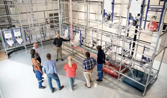
With a legacy that precedes them, being associated with expert quality on a global level, Geberit is the brand that continues to make strides in sanitary innovation. Their goal is simple: provide coordinated, flexible, and elegant products to suit every design. After 150 years of excellence, it was only fitting to have a chat with the iconic brand and find out how they are shaping the future of the sanitary industry.
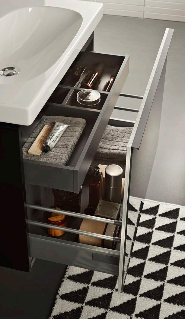

As a leader in bathroom innovation, what does the bathroom of the future look like to you?
This is a topic that's very wide-ranging. We can dive into everything from how colours and materials shape different moods to how technology is changing bathrooms. There's so much space in this topic. One big trend we're seeing is the growing importance of protecting our planet's resources. Geberit is always working on new ways to save water and improve our manufacturing processes.
With living spaces getting smaller, bathrooms are shrinking, too. It's hard to imagine losing that peaceful sanctuary, but our range of products at Geberit includes solutions to make the most of limited bathroom space, and we're constantly adding to this portfolio. We've got some really exciting innovations in the pipeline. Stay tuned to our digital channels to stay in the loop on all the latest developments.
After 150 years of service to the industry, what are the principles Geberit values the most?
Geberit’s mission has always been to continuously improve the quality of people’s lives. The principles that have guided the Geberit team since its inception are sustainability, customer focus, adaptability, and culture. This is seen through our actions, which are geared towards the long term; it is our duty to treat natural resources with care and respect. We base our relationship with our customers on trust and partnership, as they are our reason for being, and we know that as times change, so must we. Our ability to adapt, learn, and grow is key to the future success of the business. Most importantly, we live and breathe our company ethos.
www.geberit.co.za
5 / FEATURE /
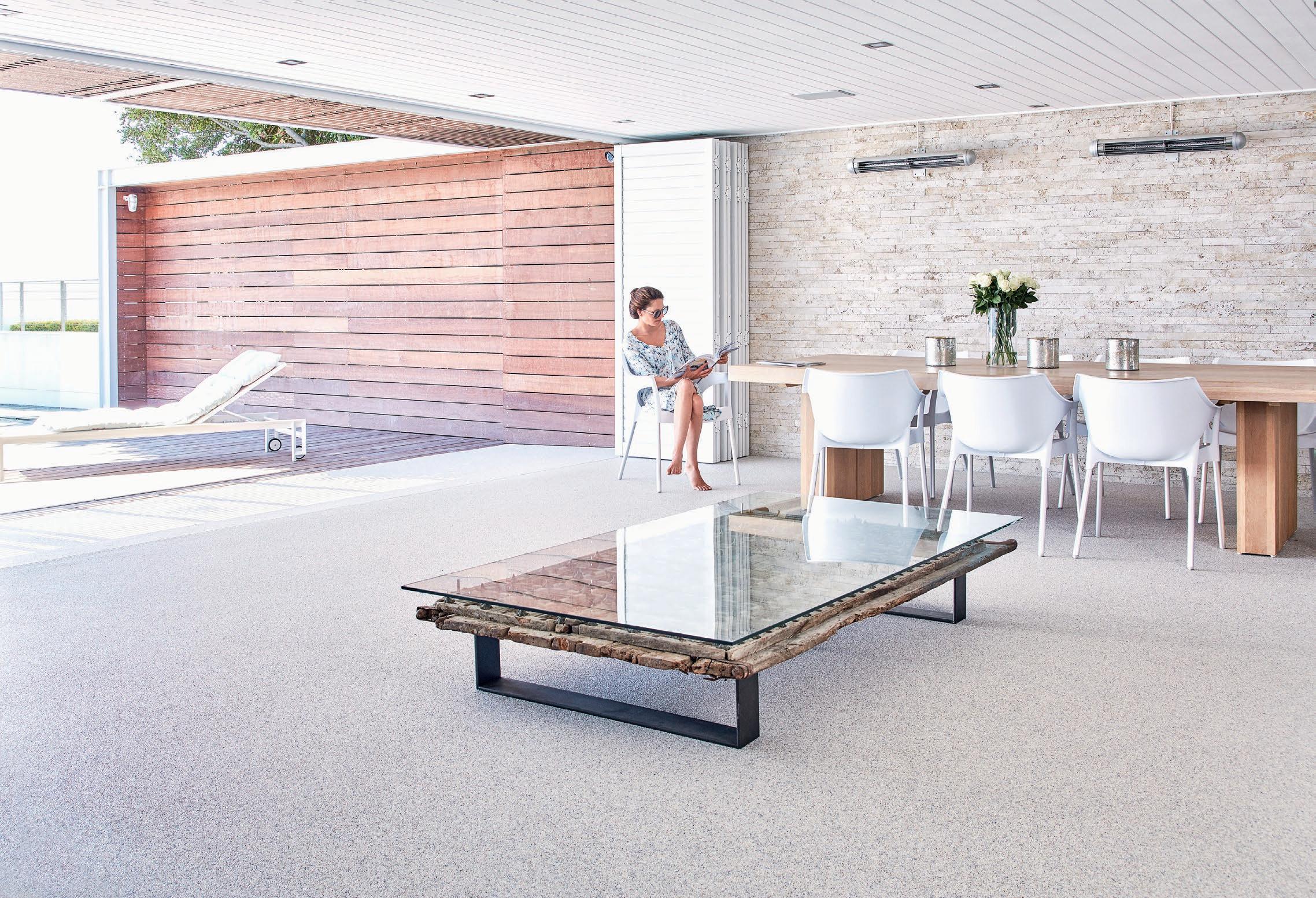
y Investment flooring.
y Unique, smooth and seamless.
y Low maintenance and durable.
y Timeless and luxurious.
y Impact-resistant.
y Stain-resistant.
y Scratch-resistant.
y Slip-resistant.
y Hygienic.
y Available in 48 colours.
y 100% UV stable and colour-fast.
y Can be applied directly over tiles.
y Quick, neat and tidy installation by certified and licensed applicators.
y Eco-friendly and sustainable.
y Available in 60 countries world wide.
FLOORING TO COMPLIMENT YOUR LIFESTYLE CLASSIC
Tel: 0861 782 789 • info@quartzcarpet.co.za • www.quartzcarpet.co.za
BRINGING INDOORS OUTSIDE

Welcome to the April issue of SCAPE Magazine!
This edition is the first of its kind for us. Through conversations that map the local industry, we've adopted a personal approach to exploring the intricacies of the people who shape design, architecture, and landscapes in our country. We could have presented projects and features in the same way we usually do, but with growth and change buzzing all around us, we decided April was the perfect time to delve into insightful discussions with some of the most exciting voices in these fields.
‘In Conversation With’ offers a unique opportunity to glean wisdom and perspective directly from key industry figures. From a quick chat with John Jacob Zwiegelaar and a stroll through the gardens of Franchesca Watson, to a deep dive into the details with Kate Otten, this issue brings you faceto-face with names that never cease to inspire. Posing burning questions,
we have sparked conversations that unravel the essence of contemporary design, the future of architecture, and the evolving landscape practices of SA (and even a few tales from time abroad told in between).
As you navigate these pages, we invite you to immerse yourself in a collection of meandering dialogues, where each exchange reveals new layers of understanding and innovation. The issue is a homage to the triumphs and challenges faced, offering perspective, igniting curiosity, and fostering a deeper appreciation and an open dialogue that is unequivocally essential for progression.
So, enjoy the journey as we uncover fascinating viewpoints and celebrate the diverse talents shaping the design, architecture, and landscape realms.
7 / LEADER /
Ed’s Note. C x
Chanel Besson Editor-in-Chief | Justine Coleman Key Account Manager | Sarah Ternent Designer | Caitlin Hancocks Commissioning Editor Michelle Greeff Communications & Content Manager | Brayden Knoop Media Manager | Reinhardt Pieters Account Manager Cover image by
Anton van Straaten

Town: 021 510 2846 | Paarden Eiland
011 262 3117 | Parkhurst
031 000 1000 | Umhlanga
Pearl
oak floors in beautiful places.
Cape
Johannesburg:
Durban:
nick@oggie.co.za www.oggieflooring.com
Valley. Architect: Fluid Architects. Interior: Duvenci Interiors. Oggie Oak Herringbone Rustic with WOCA Denmark Greymist UV Oil. ...herringbone

9 Navigate 13 In Conversation with Franchesca Watson Director & Garden Designer, Watson & Pellacini Garden Design Studio 40 In Conversation with Nico van der Meulen Director & Architect, Nico van der Meulen Architects 24 In Conversation with ARRCC Directors & Interior Designers Mark Rielly, Michele Rhoda & Jon Case 34 In Conversation with Dion Walters Director & Architect, Bomax Architects 29 In Conversation with NEO Architects Directors & Architects Wim Verbeek & Jurie Swart 17 In Conversation with Michael Lumby Director & Architect, ML-A 45 In Conversation with John Jacob Zwiegelaar Director & Interior Designer, John Jacob Interiors 57 In Conversation with Clinton Savage Director & Interior Designer, Clinton Savage Interiors and Architecture 52 In Conversation with Andrew Payne Director & Architect, Drew Architects 63 In Conversation with The MAAK Directors & Architects Ashleigh Killa & Max Melvill 67 In Conversation with Kate Otten Director & Architect, Kate Otten Architects 74 In Conversation with Earthworld Directors & Architects André Eksteen & Braam de Villiers
Coming Home with Malapa
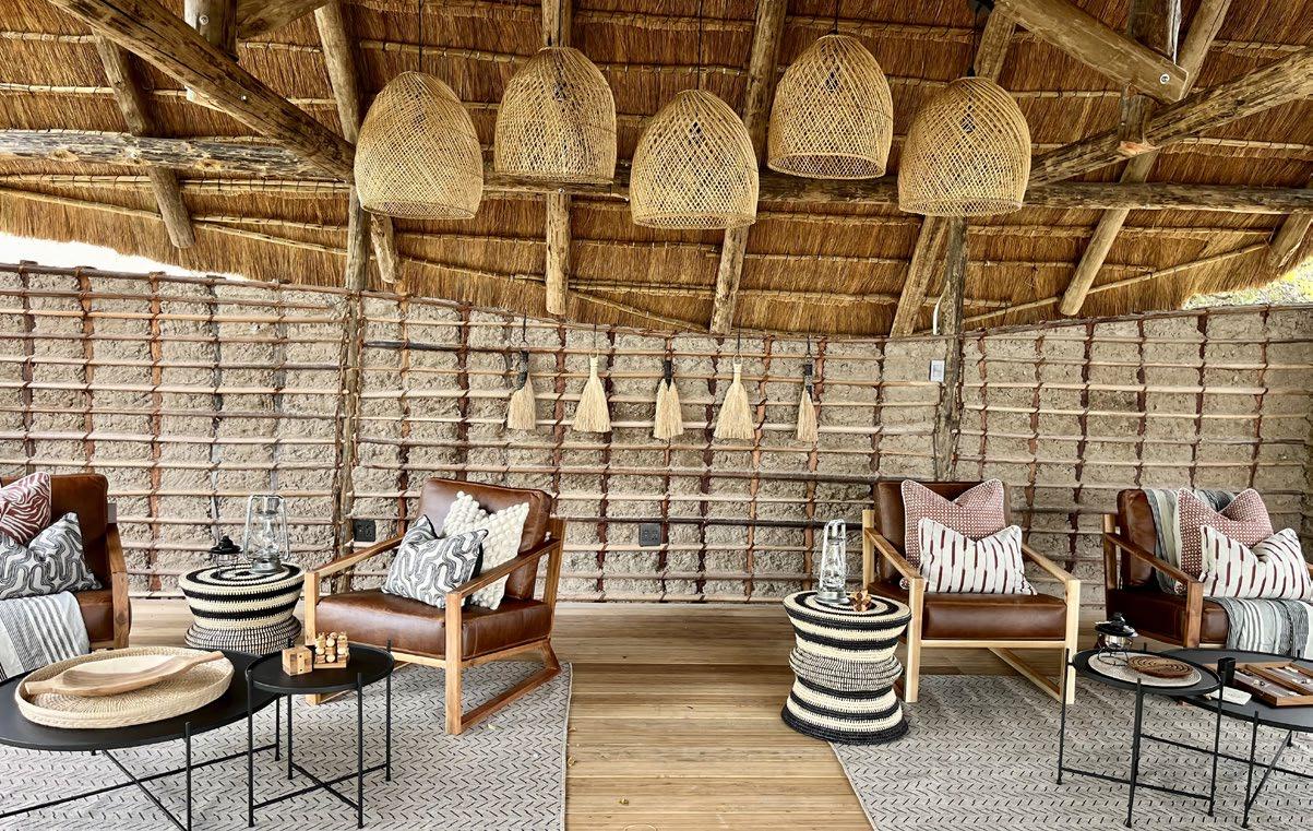
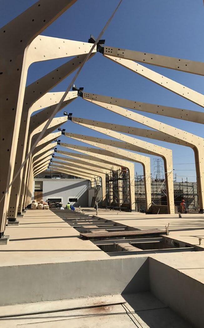
The Malapa way is all about offering a quality multi-disciplinary service to the construction industry to streamline and cost-engineer the entire process. We know that these efficiencies are realised in the early alignment of all disciplines, role players, and parameters in the construction process. That’s why client, budget, location, designers, engineers, costing experts, project management, in-house component design and manufacture, and on-site implementation, all come together and remain in constant mutual consideration and cohesion from the very start of our process.
10
/ FEATURE /
Innovative alternatives to the standard
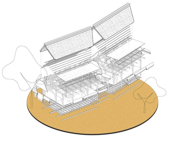
By engaging in innovative and modular alternatives to standard building methodologies (such as insulated wall and floor panels, lightweight concrete, tensile fabrics, and kit-form laminated pine structural elements designed and manufactured to precision tolerances), we design and produce structures that visually excite, provide elevated comfort, and offer protection from harsh environments, all while yielding a significant reduction in time, transport, and labour costs. While we constantly strive to develop methodologies that reduce environmental impact, we also aim to significantly enhance the visual impact of our structures and create the best possible end-user experience.
A service across Africa
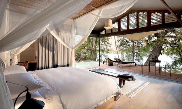
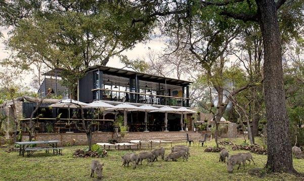
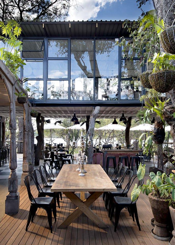
The Malapa team has a vast collective experience in implementing projects throughout Africa, from modularised student residences, container conversions, and singular structures such as bush tree houses and restaurants, all the way through to full delivery of remote lodges and camps. We thrive on engaging new challenges and problem solving no matter where our journey might lead us, be it at home in South Africa or further afield in, Zimbabwe, Zambia, Botswana, Tanzania, Mauritius, Mozambique, Namibia, Rwanda, and beyond.
Finessing the finer details
With a firm dedication to quality and streamlining the process comes an acute demand for attention to finer details. Fixed prices and a firm commitment to program deadlines, a tailored production process to best suit project requirements and location, and full service through all project stages including post-completion maintenance means we can guarantee that our management team is directly involved, every step of the way.
Join the adventure
Malapa’s inspirational adventures of 2023 include the completion of a fully-functional 7-room tented camp in the Liuwa Plain National Park, delivered in just 8 weeks, including back-of-house accommodation and site services. We are currently engaged with several other projects across Africa: a 5-star lodge in the Okavango Delta, a luxury lodge on the Ngorongoro Crater rim, and a tented lodge in production for Akagera National Park in Rwanda. And on the drawing board – a new luxury lodge in the Serengeti, a camp refurbishment in the Bangweulu Wetlands of Zambia, and a concept pop-up safari camp that can be set up anywhere and expand or contract to accommodate up to 80 people.
At Malapa we design to build. We hold much excitement and enjoyment in what we do and look forward to continually unlocking magical opportunities that beautifully complement the breathtaking African landscape in which we are most fortunate to work and facilitate dreams coming to life.
www.malapa.co.za

11 / FEATURE /

Franchesca Watson
In Conversation with
Photography by Heidi Bertish
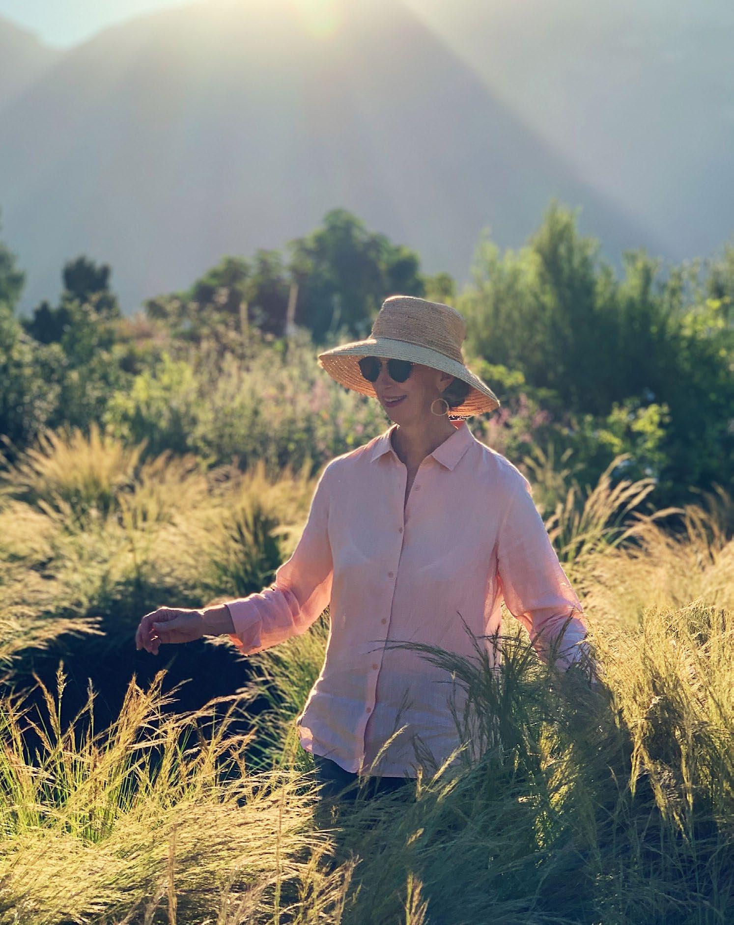
Garden designer, horticulturalist, and writer, Franchesca Watson is the perfect example of a landscape expert that navigates the industry with style and grace. Her designs include the Dylan Lewis Sculpture Garden, 7 Koppies Guesthouse in Franschhoek, and an array of enviable private gardens. Eager to explore the mind that is a gift to the public and residential grounds of South Africa, we sat down with Franchesca to talk about her first design, the countries that inspire her, and what it means to craft timelessness within the landscape.
What was the first garden you ever designed? Is there a key element from the design that you have continued to incorporate throughout your career?
I can’t remember the first garden I ever designed, but I remember vividly the first garden I ever designed for myself, and that I learnt much more designing for myself than when designing for others. When you design for yourself you are so much more prepared to take chances and try out ideas. I now make it a habit to think about every garden in two ways: what my client has verbalised to me, and what I would do if it was mine alone. Often, the final design is a fusion, and I think most clients really value the frank input of alternatives into the mix.
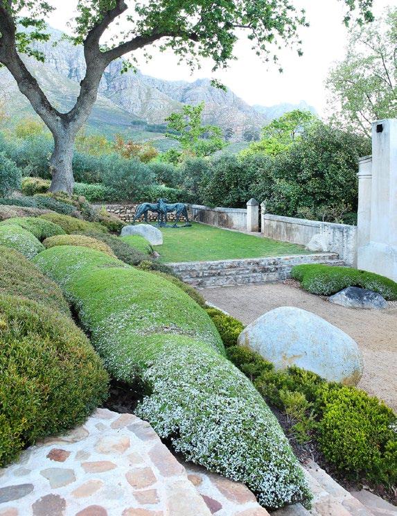
The garden I am thinking of was a tiny courtyard of a garden elements shop that I owned many years ago. The levels and the circulation were tricky, and there was so much to conceal along the boundary. I solved the problem with large trees in the foreground rather than at the back, and I still use this concept all the time; planting trees close to houses so you get a softening and coolness, while still seeing the views from under the branches.
What does a ‘timeless garden’ mean to you?
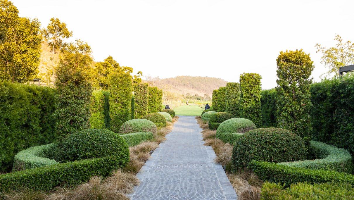
Timeless means that the garden may still be there in a century or two, with the trees fully mature, levels in place, and the pattern of the garden still making sense and still fostering happiness. It all starts with avoiding gimmicks and fads that will date the design, and using materials that last, making them sustainable, too. And choosing plants appropriate to the conditions of the site which will endure.
/ INTERVIEW /
Dylan Lewis Sculpture Garden, photography by Heidi Bertish
Leeu Estate, photography by Heidi Bertish
Which city or country has been most influential to your practice?
I collect and love things from almost anywhere I travel. As a young person, I spent quite a lot of time in Italy and France to understand the history of European gardens, and I do love the mediterranean climate gardens found there. Australia has also had a great influence on me, particularly in terms of gardens that are genuinely beautiful while being easy to maintain with clever solutions to rather stringent regulations. I passionately love the extremes of climates, particularly desert gardens and tropical gardens.
What is your favourite style of architecture to accompany your gardens?
I love any good architecture, although I sometimes struggle with High Victorian. My ideal architecture is quite strict and unfrilly. I respond to buildings that have some gravity and depth, good proportions, and especially those that sit well on the land, which often means low and long proportions, rather than being multi-storey. Flat, unconsidered façades worry me most, and I always try to soften or conceal them with the planting.

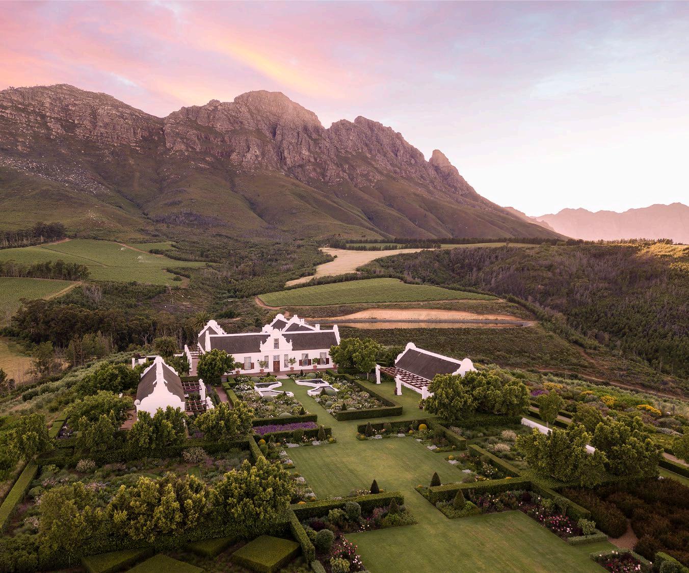
'Timeless means that the garden may still be there in a century or two, with the trees fully mature, levels in place, and the pattern of the garden still making sense and still fostering happiness.'
15 / INTERVIEW /
@franchescawatson www.franchescawatson.com
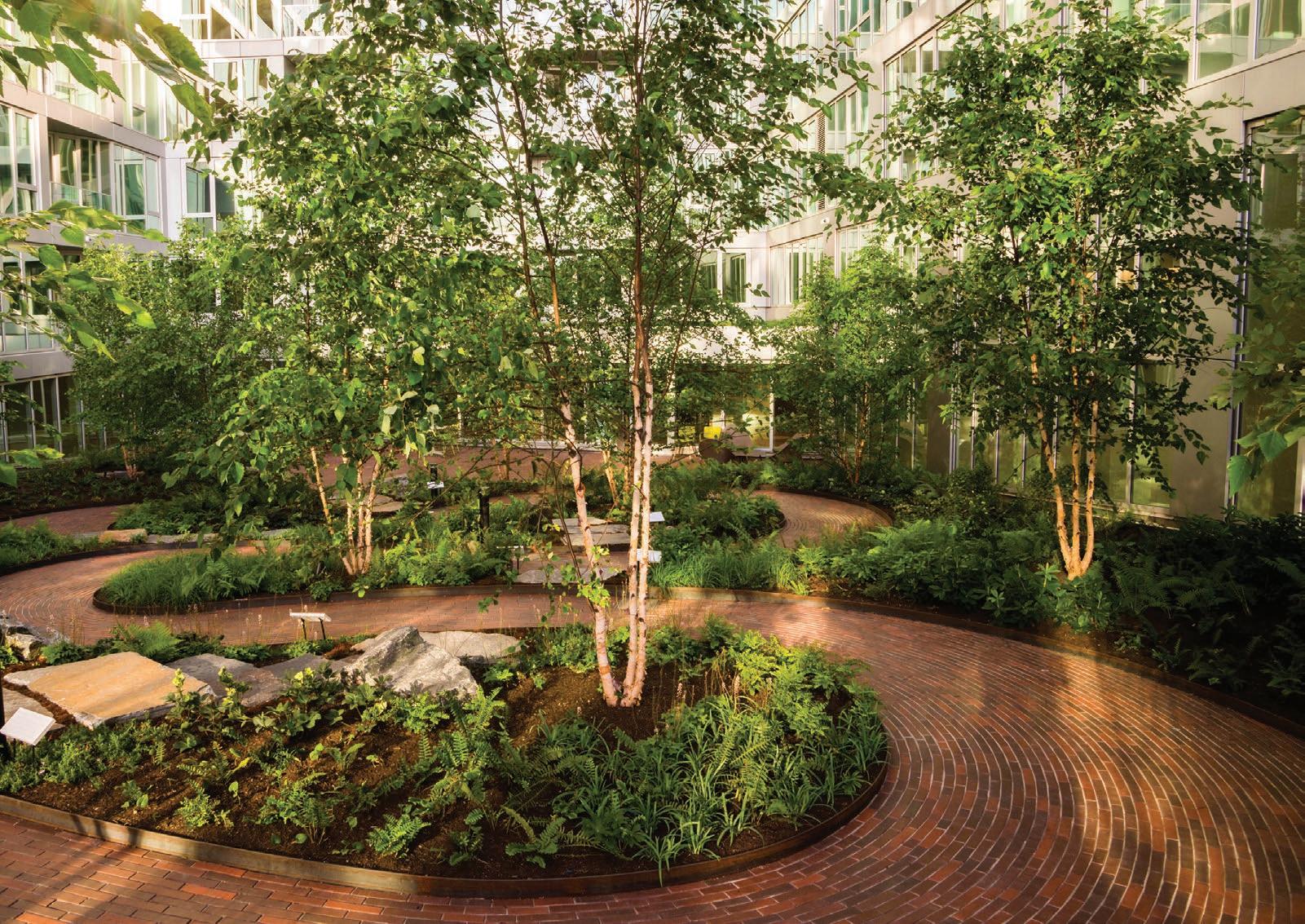
Quoin Rock Manor House, photography by Lionel Henshaw
REAL CLAY PAVING
With stylish, timeless appeal and impressive sustainability credentials - the enduring hues and textures of clay brick are low maintenance and look beautiful for a lifetime.
CBASA represents clay brick & paver manufacturers across Southern Africa and drives inclusive, sustainable practices in the industry. We inspire energy-efficient, contemporary architecture and paving that supports our local producers, landscapers and architects.
Free technical and construction guides for clay bricks & pavers at www.claybrick.org
FOECIOVEHT T H E CLAYBRICKINDUSTRY STYLE SUSTAIN SAVE SECURE
In Conversation with
Michael
Lumby
Photography by Tom Ross
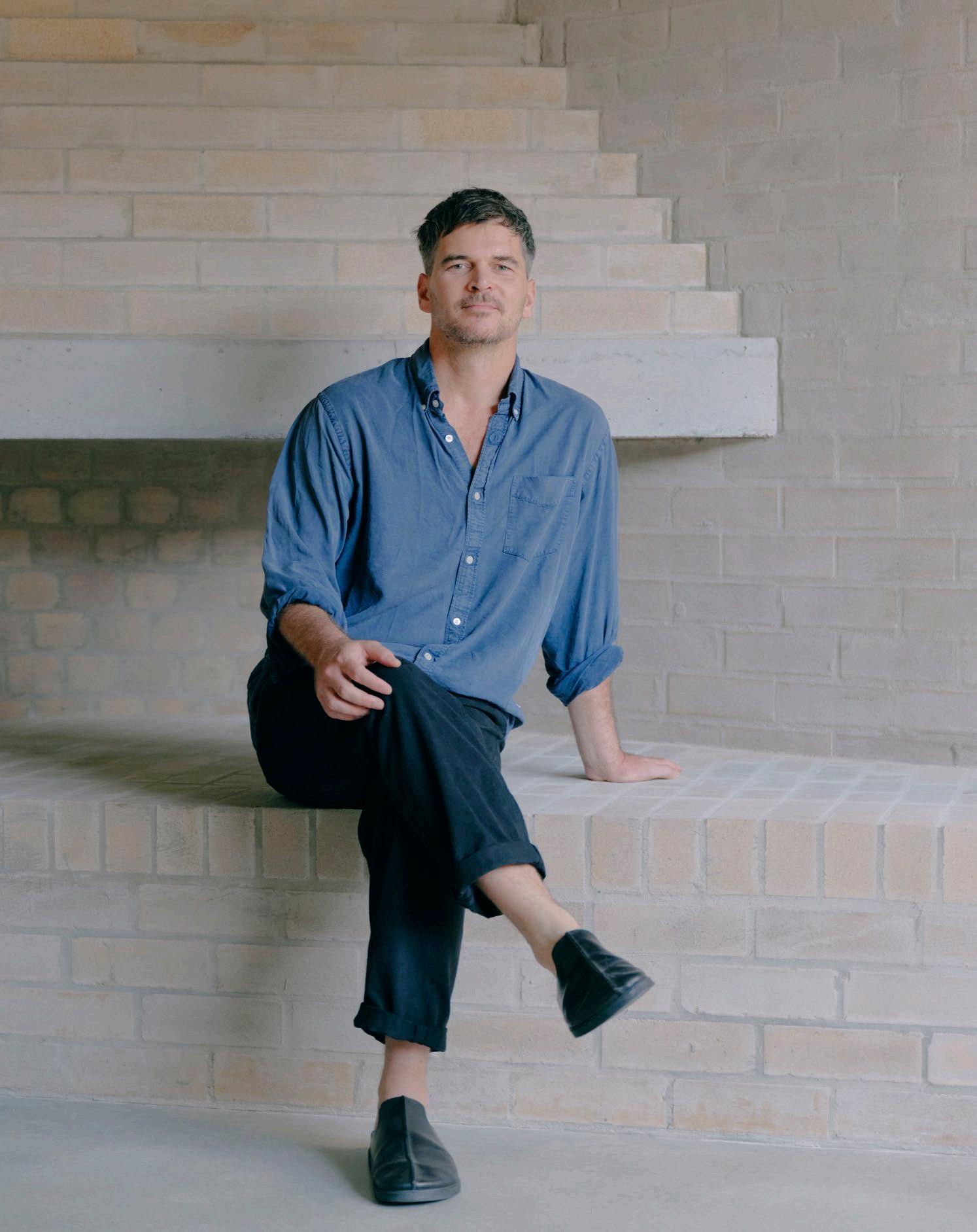
As the inventive mind and humble heart behind ML-A, Michael Lumby crafts the essence of elevated modern simplicity in his designs. Michael's journey began in South Africa and has recently seen him making a name for himself in the Australian architecture industry. Sharing snippets of this journey, he talks us through the art of collaboration, the designers that drive him, and the environments that help stimulate and manifest creativity.
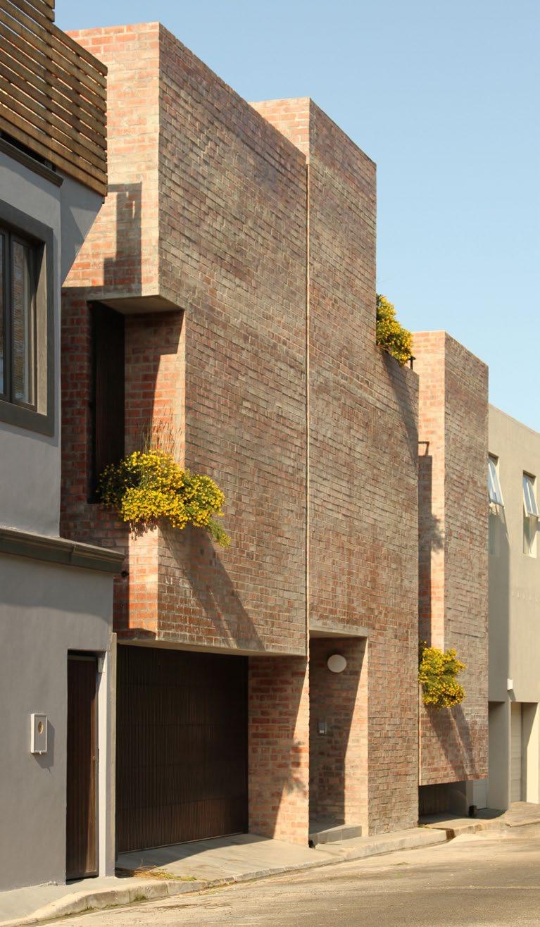
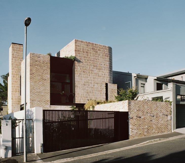
‘I think the key is to always be open to new ideas, whether you’re sketching in a notebook or behind a screen working on a seemingly mundane construction detail –there is opportunity everywhere.’
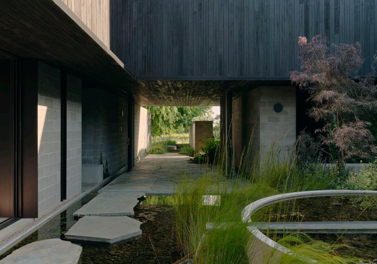
Your project Merricks Farmhouse, on which you collaborated with Nielsen Jenkins, is an Australianaward-winning masterpiece. How did the project come to be?
The clients were based between Cape Town and Melbourne, and via word of mouth and some luck, they gave me the chance to have a crack at a design for their new forever house. They loved it, so I teamed up with Nielsen Jenkins in Australia (we were friends after meeting 5 years earlier) to assist me in delivering the project. This was a massive opportunity for me and big step up in terms of budget – the project was halfway around the world, so there was a lot of newness and nerves floating around!
My favourite view in the house is the one from the back wing, through the courtyard, and then through the kitchen to the ocean. The slight level change allows a view down towards the landscape, and the building frames it perfectly. It was great to see it develop on site and culminate into this.
Is there an architect, local or international, that has influenced or inspired your practice throughout your career?
Early on in my career I was quite influenced by the works of John Pawson, particularly his own townhouse in London. It opened my eyes to how smart planning, attention to detail, and design rigour can result in minimal and restrained spaces.
For the past few years I’ve really enjoyed the work of Harquitectes, a Spanish firm that always has really inspiring approaches to layout, structure, sustainability, and materiality, often on a tight budget.
18
/ INTERVIEW /
146 Waterkant, photography by Rob Nicholls
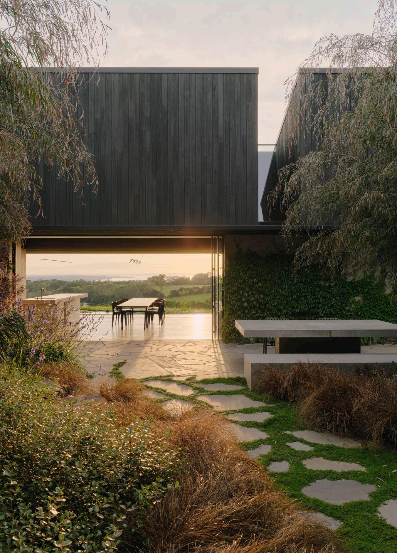 Merricks Farmhouse, photography by Tom Ross
If you could give your younger self one piece of career advice, what would it be?
Don’t take yourself too seriously; enjoy and learn.
What type of environment stimulates your creativity the most?
Where do you do your best thinking?
I’ve been swimming for exercise for about twenty years now. With all the stimuli that surrounds and distracts us day-to-day, I find the repetitive nature of laps underwater to be quite meditative, and I often emerge with new ideas for projects I’m wrestling with. I think the key is to always be open to new ideas, whether you’re sketching in a notebook or behind a screen working on a seemingly mundane construction detail –there is opportunity everywhere.
What’s on the cards for this year that you’re most excited about?
I have a few projects starting on site in SA this year, so I'm looking forward to doing some work back home again!

20 / INTERVIEW /
www.ml-a.co.za
@michael_lumby_architecture
House Campbell, photography by Shaun Lee
Merricks Farmhouse, photography by Tom Ross
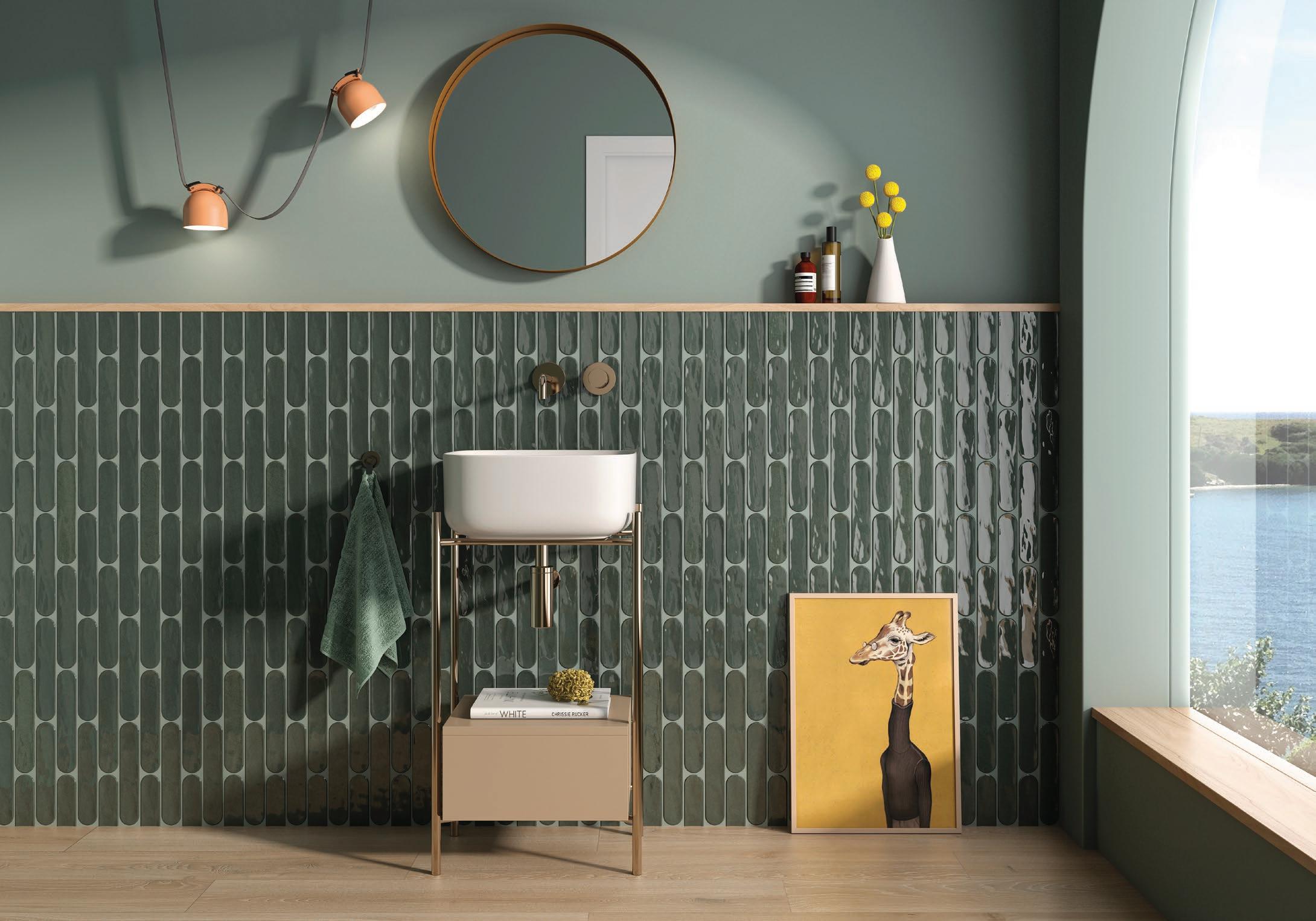
bulthaup In Conversation with
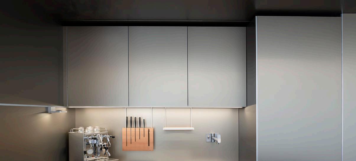
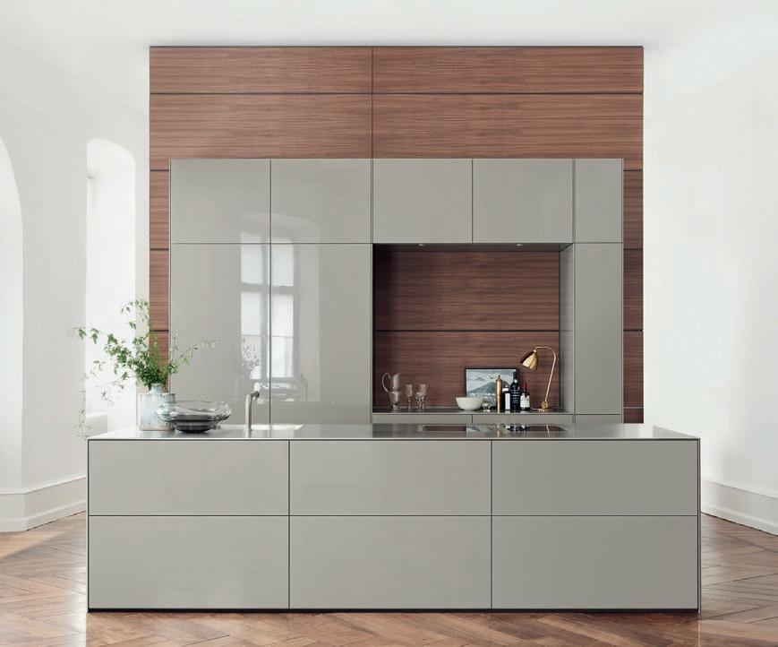
We’ve heard the phrase ‘Get me a bulthaup kitchen’ before. Defined as the designer's choice, this luxury brand is synonymous with sophistication and ingenuity, having earned prime space in some of SA’s most magnificent and inspired kitchens and living areas. We caught up with the South African design director Ramón Casadó to learn more about the art of the bulthaup brand.
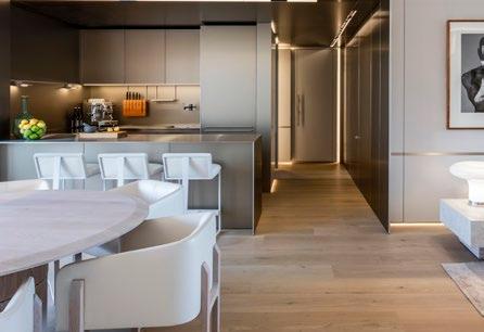
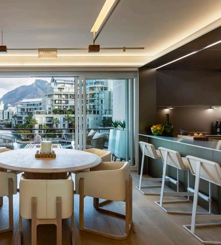
What separates bulthaup from other brands, and how would you define the perfect bulthaup client?
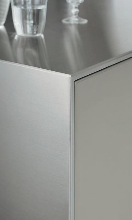
Bulthaup has built its reputation by being known for its commitment to quality materials, brilliant craftsmanship, timeless design, and superlative service, giving bulthaup clients a lasting legacy in the kitchen – the heart of every home. Produced by expert engineers and designers, these kitchens function at a different level and are built to last up to 20 years or more. Our kitchen systems bring together form, function, and material, so bulthaup clients can realise their dreams in conjunction with their bulthaup kitchen designer as their guide. In a world where we often experience disappointment about the quality of what we buy, it’s reassuring to know that our products have been tested in environments with up to 80% humidity, and can manage severe heat scenarios without damage.
Our clients and partners are those who have a passion for the best, who believe in the highest standards of quality and appreciate the attention to detail and the perfection of materials and craftsmanship that bulthaup stands for.
What value does it bring to work with design professionals or clients of the highest calibre, and how is that reflected in what you have managed to achieve over the years?
We brought bulthaup to South Africa more than 10 years ago, and we’ve been amazed and delighted by the spectacular homes in which we’ve created the finest kitchens in South Africa. By sheer size alone, the scale of our kitchens here are some of the largest that bulthaup does anywhere in the world. The impact of these kitchens on an exclusive luxury home can be both iconic and monumental. We believe the clients, the designers, and the architects are the stars of the show in creating a new home, and our role is to ensure that on our side, everything is flawless and fits perfectly. While we may not be nominated for the Academy Award for a starring role, we wouldn’t mind one in the Best Supporting category.
www.bulthaup.com
22 / FEATURE /
Photography by Niel Vosloo, courtesy of ARRCC
bulthaup takes care of the details so that you can enjoy a harmonious environment.
We design the environment for your moments. Visit us in Cape Town or Johannesburg. Our team looks forward to speaking with you.
CAPE TOWN
Waterway House, 3 Dock Road, V&A Waterfront, Cape Town 8002
T. +27 (0)21 419 5445
SANDTON
Central Square, 5 Lower Road, Morningside, Johannesburg 2196
T. +27 (0)11 262 5257

ARRCC
In Conversation with
 Cheetah Plains, photography by Adam Letch
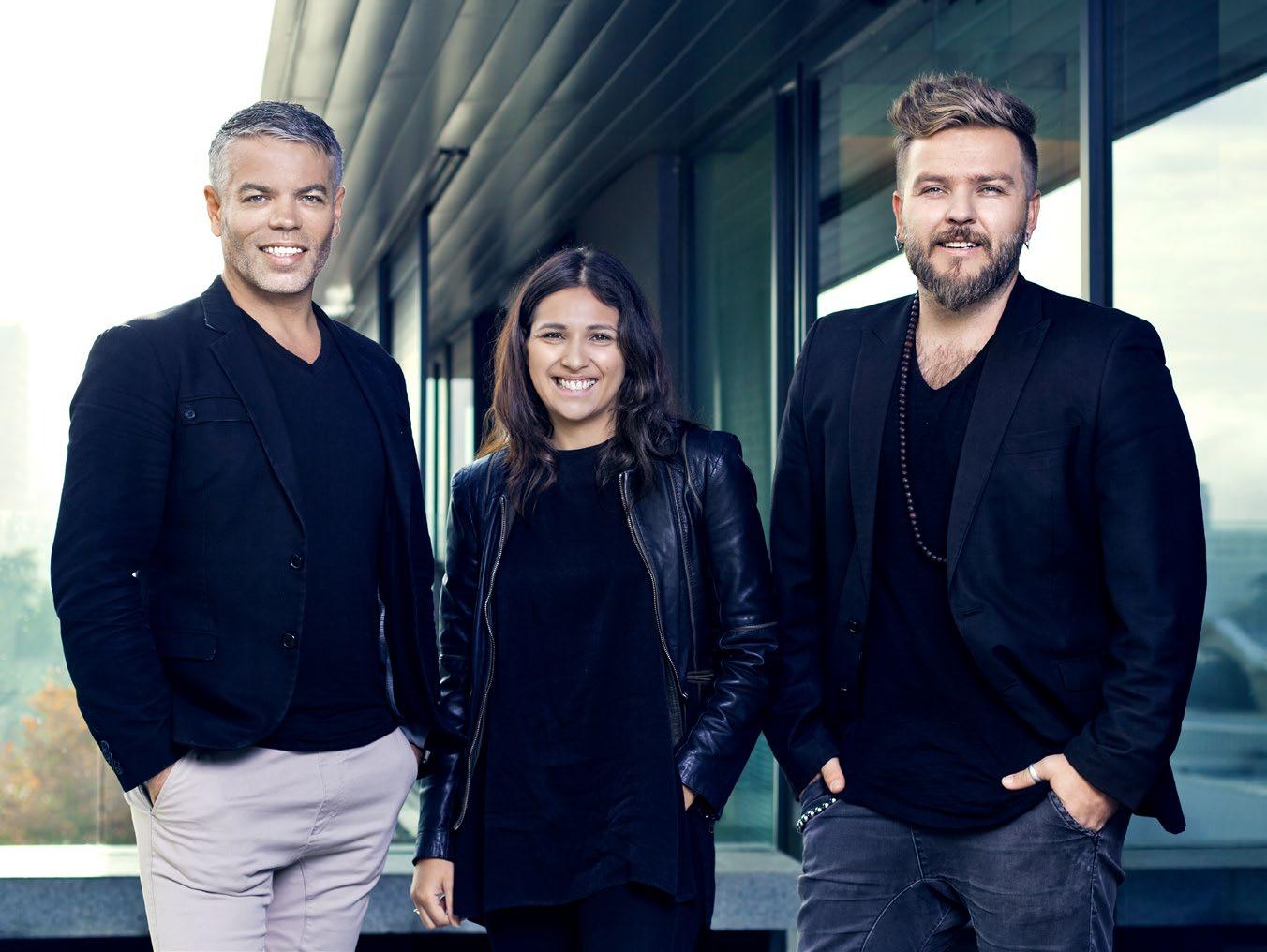
Acollection of gurus in interior architecture, interior design, and decor, ARRCC brings laid-back luxury not only to their home city Cape Town, but to the world. Their studio includes enough accolades and successes to ensure they tick all our boxes, presenting the art of curation at a superior level. To find out where the brand’s innate excellence comes from, we spoke to directors Mark Rielly, Michele Rhoda, and Jon Case on all things ARRCC.
What does laid-back luxury mean to you and how are you redefining it for South Africans in the various sectors?
We interpret ‘laid-back luxury’ as the ability to provide spaces where our clients’ homes feel like their own private and unique resorts, redefining its meaning. Through this design style, we aim to enhance our clients’ home environments through a humble and functional design coupled with honest materials, ultimately creating moments of unexpected delight, and adding enrichment to their daily lives.
Can you give us an unconventional piece of advice for aspiring or working interior designers in the country?
Embrace the art of storytelling in your designs, and create immersive experiences that evoke emotion. Rather than merely focussing on aesthetics or trends, consider the story you want your design to tell. Think about the client's personality, their passions, and the purpose of the space. Incorporate elements that speak to these aspects, whether it's through unique textures, curated artwork, or unexpected design elements. By weaving a compelling narrative into your designs, you not only create memorable spaces, but they become transformative experiences.
26 / INTERVIEW /
Mark Rielly, Michele Rhoda & Jon Case
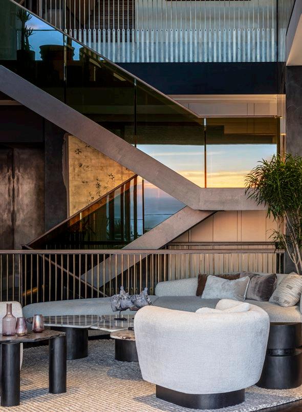
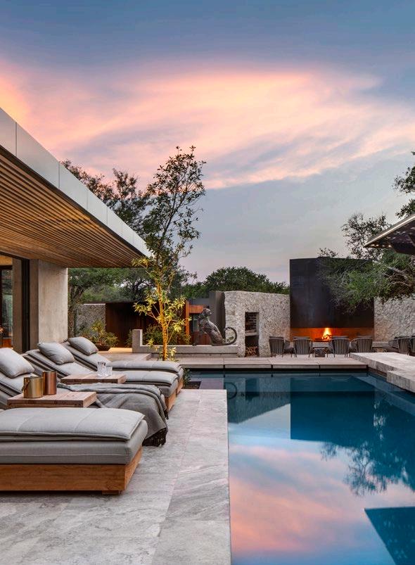
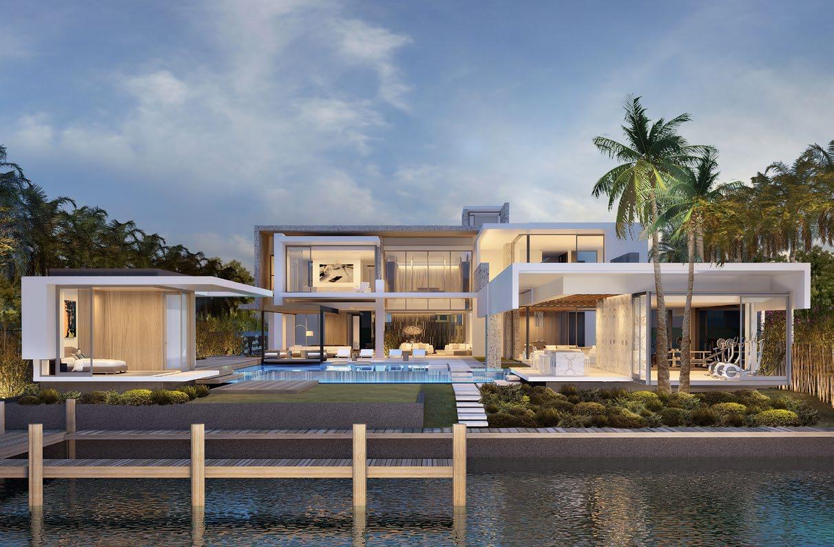 Cheetah Plains, photography by Adam Letch South Villa, photography by Niel Vosloo
Star 27, courtesy of ARRCC
Which would you say are ARRCC’s top 3 flagship projects?
Cheetah Plains Game Lodge
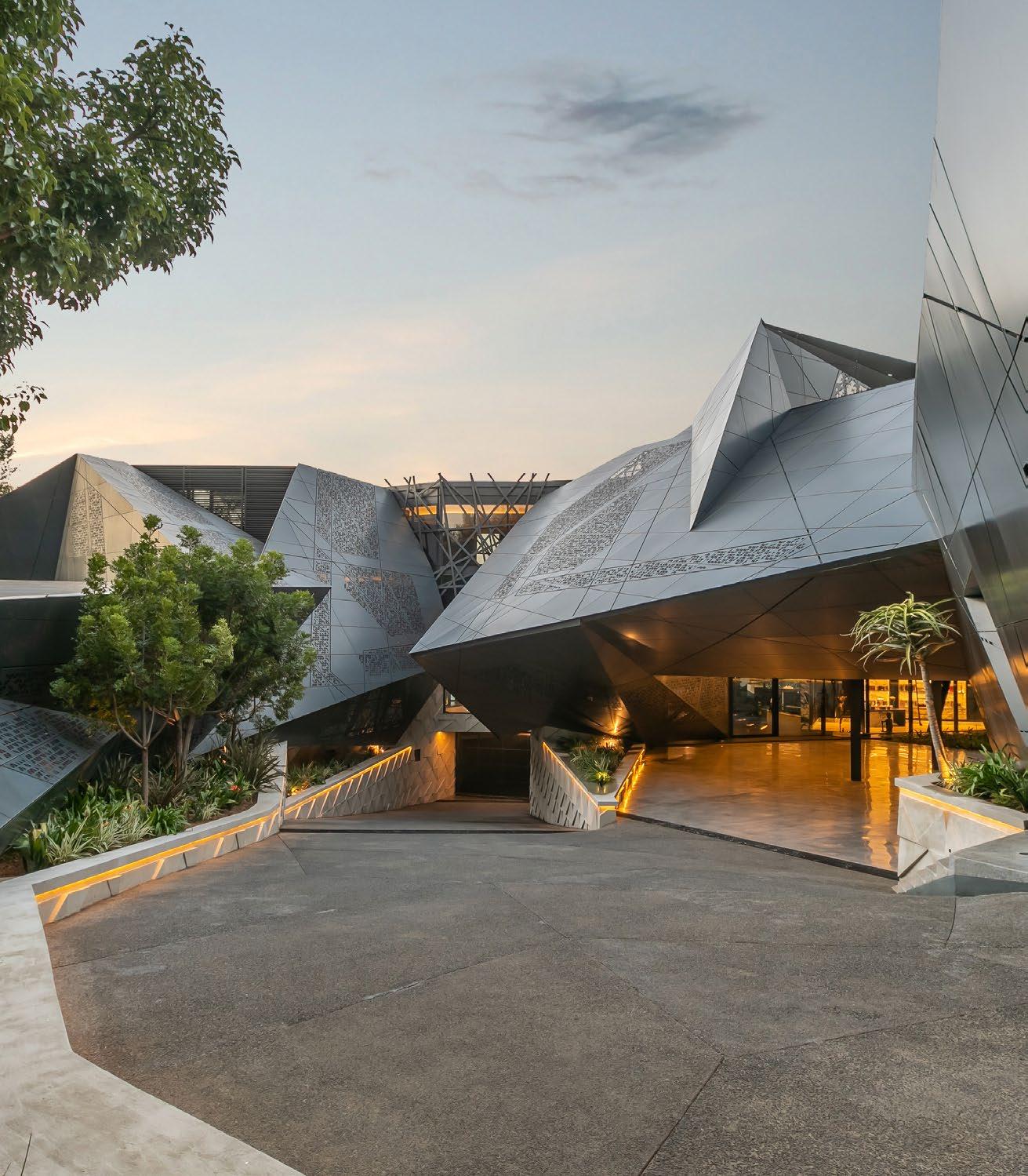
Cheetah Plains Game Lodge in the Sabi Sand Game Reserve in the Kruger National Park, South Africa, reinvents traditional safari-style architecture to create an altogether new safari experience of nature from within. Combining state-of-the-art sustainable architecture with a pioneering afro-minimalist aesthetic, Cheetah Plains contrasts confident contemporary inorganic forms with the natural landscape, creating something beautiful in the unexpected, creative contrast of seemingly opposing forces. Cheetah Plains has won multiple awards –most recently, Luxury Bush Villa, Global Winner at the World Luxury Hotel Awards. Other awards include the Best Resorts in the World category in the Conde Nast Traveler’s Choice Awards, Best Game Lodge at the HOSCO South Africa Luxury Tourism Awards, and Design Distinction in the IFI Global Award Program.
South Villa
South Villa is a five-story penthouse in the award-winning Clifton Terraces apartments on Victoria Road, Cape Town. Its elevated position on the iconic Lion’s Head takes in extravagant ocean views and local landmarks such as Table Mountain and Clifton’s pristine beaches. The interior decor and interior architecture, by ARRCC and OKHA, has stylistic connections to the style-modern movement of the Art Deco period of the 1920s and ‘30s. With this project, SAOTA, ARRCC, and OKHA have matched luxury with maturity and sophistication in a statement that enriches the conversation about the possibilities of the contemporary.
Star 27
Star 27 is topped to be one of ARRCC’s most iconic interiors and was our first project in Miami. Working closely with SAOTA, this project’s design has gained a celebrity following which has led to many more projects in Miami and Los Angeles. The villa is located on Star Island, the most sought-after real estate in Miami, and involved the complete uplifting of the existing house and relocating it at the entry to the property, to create a separate guest villa and to allow the new house to be built on the water frontage.
If you had to choose one material to feature in every ARRCC project, which would it be and why?
If ARRCC had to collectively choose one material to feature in every project, it would be natural stone. Whether it's marble, granite, limestone, or travertine, each type of stone offers timeless elegance in unique patterns, textures, and colours that can elevate the aesthetic of any space. From sleek countertops and statement fireplace surrounds to elegant flooring and luxurious bath features, natural stone is versatile and can be used in a myriad of applications to add texture and visual interest to a space. Incorporating natural stone into our designs also allows us to bring the beauty of the outdoors inside, creating a sense of harmony and connection to nature within the built environment.


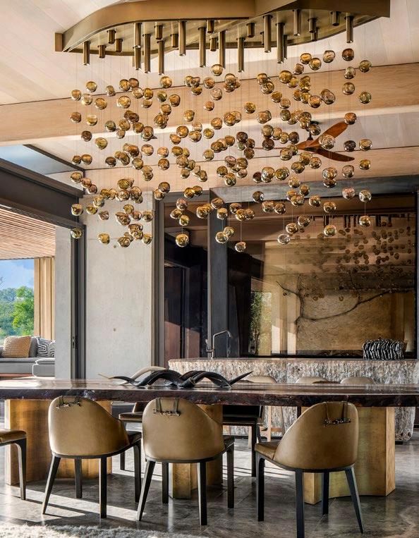
28 / INTERVIEW /
@_arrcc www.arrcc.com
Cheetah Plains, photography by Adam Letch
South Villa, photography by Niel Vosloo
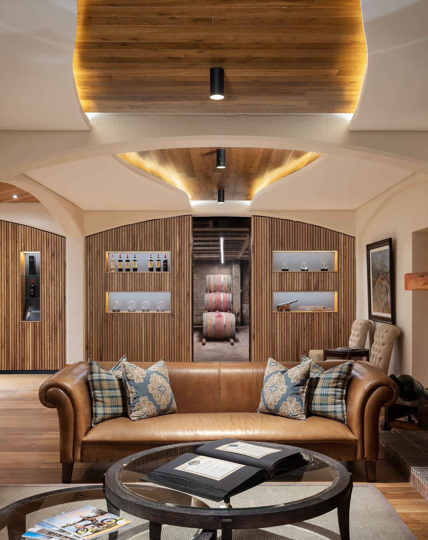
NEO Architects In Conversation with Kanonkop, photography by 3Sixty photography
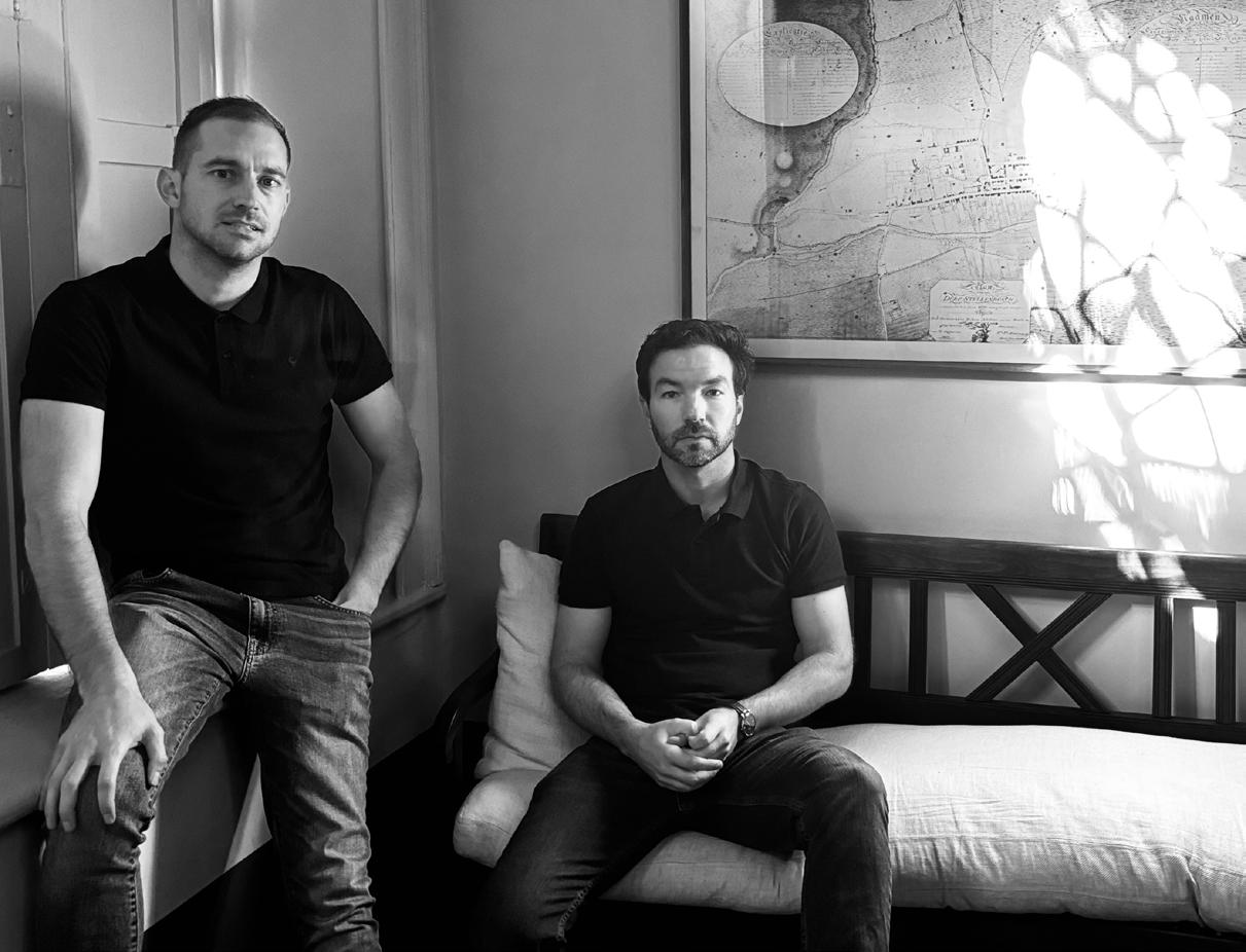
With a vision to turn the magic of stories into structures, NEO Architects crafts spaces that invite an essential fulfilment to daily life. We caught up with Jurie Swart and Wim Verbeek at their practice in Stellenbosch, where we looked beyond the human element to factor in our place amongst and within the landscape, seamlessly expressed through projects like Romansbaai Fynbos Estate and Lagom Cabin. Giving us the chance to glean some insight into their world, the team’s directors Jurie and Wim answer three questions we’ve been itching to ask.
NEO underwent a rebrand several years ago. How has this evolution influenced the practice, and which projects since the rebrand reflect that influence the most?
The rebranding of NEO Architects several years ago marked a significant turning point for our architectural firm. It not only revamped our visual identity but also reflects our core values, design philosophy, and approach to projects. This evolution has influenced various aspects of our practice, from the way we communicate with clients to the methodologies we employ in our designs.
In terms of projects that reflect the influence of our rebranding efforts, several standout examples come to mind. Among them, our recently completed Doxa Chapel in Pretoria stands out as an ideal representation of our evolved design ethos. From its inception, this project aimed to be more avant-garde than our usual design approach. Through meticulous attention to detail and innovative design strategies, we were able to deliver a unique landmark building that emphasises sustainability, community engagement, and marrying creativity with practical solutions.
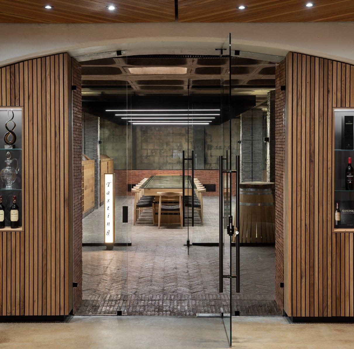
Another project that showcases the impact of our rebranding is the refurbishment of the Kanonkop Wine Estate’s tasting room. This might be a relatively small project compared to our overall collection of work, but it demonstrates our ability to adapt to various client needs, our commitment to reactivate spaces that inspire and breathe new life into underutilised or abandoned structures, and our revitalising of urban areas.
30 / FEATURE /
Wim Verbeek & Jurie Swart
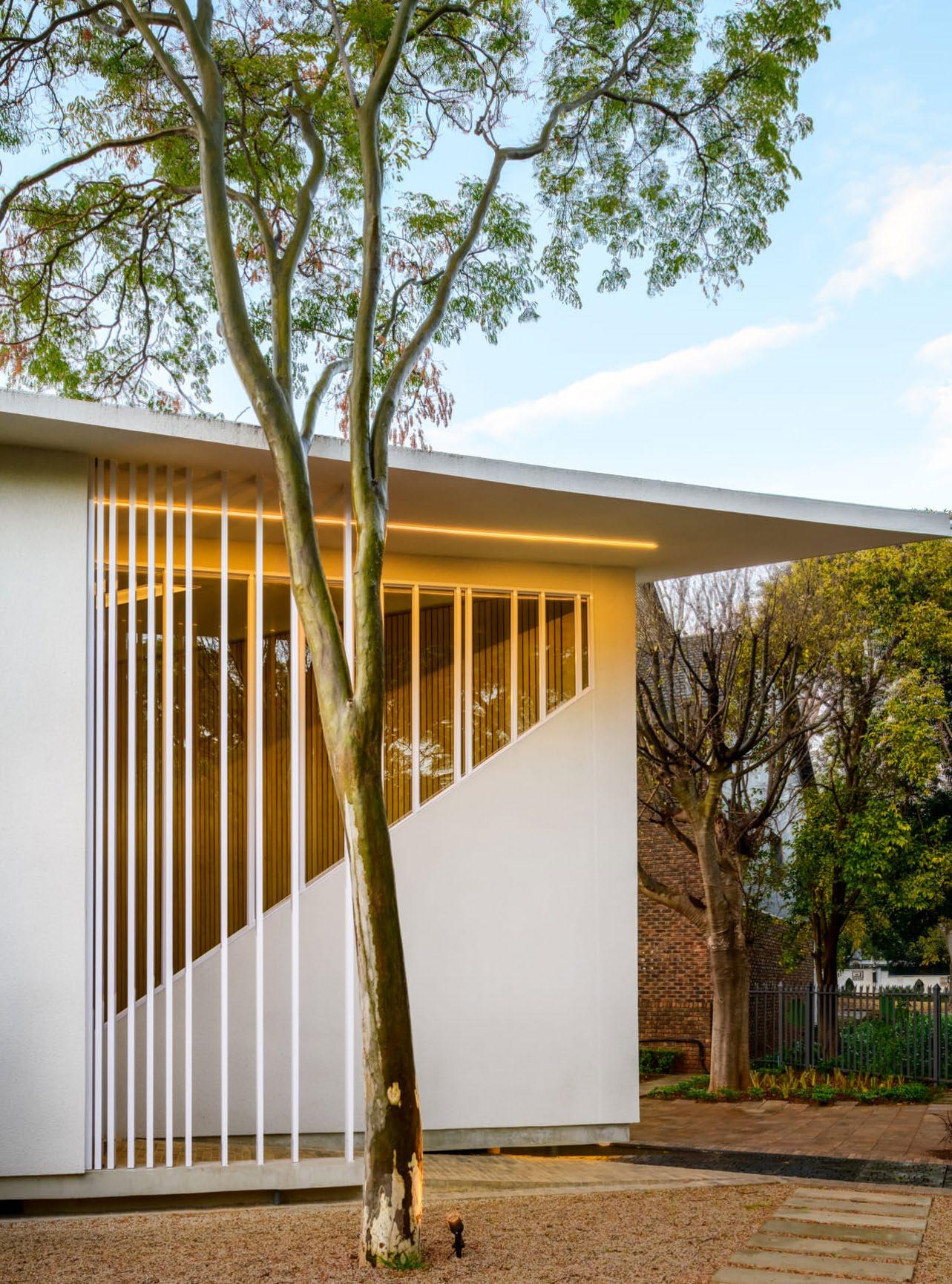
One of the most evident impacts of the rebranding has been the refinement of our design principles. Although the company has received several awards for architecture in the pre-branding era, we have embraced a more holistic approach that integrates sustainability, innovation, and human-centric design into every project we undertake. This shift in mindset has allowed us to create spaces that not only meet the functional requirements of our clients but also create a connection through our architecture.
Doxa Chapel, photography by Paris Brummer
What are your favourite requests to see in a client brief?
An overall well-defined brief to create a customised solution that aligns with the client's vision, needs, and preferences on its own is a welcome sight. Other than ‘there's no budget’, our favorite request is for the project to be unique to the vernacular of its surroundings.
Can you tell us about an upcoming project you’re especially excited about?
We are currently busy with a large commercial and multi-residential project in Paarl, where the architecture is reminiscent of the Meatpacking District in New York, with robust and industrial style finishes, but with a contemporary approach that pays homage to the historic value of the surrounding context.
PICTURED HERE
Hardwood Flooring: Hakwood Roofing: OWA | Lighting: Regent Lighting Solutions

@neo__architects
www.neoarchitects.co.za
32 / FEATURE /
Kanonkop, photography by 3Sixty Photography
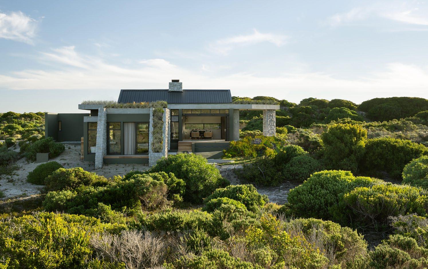
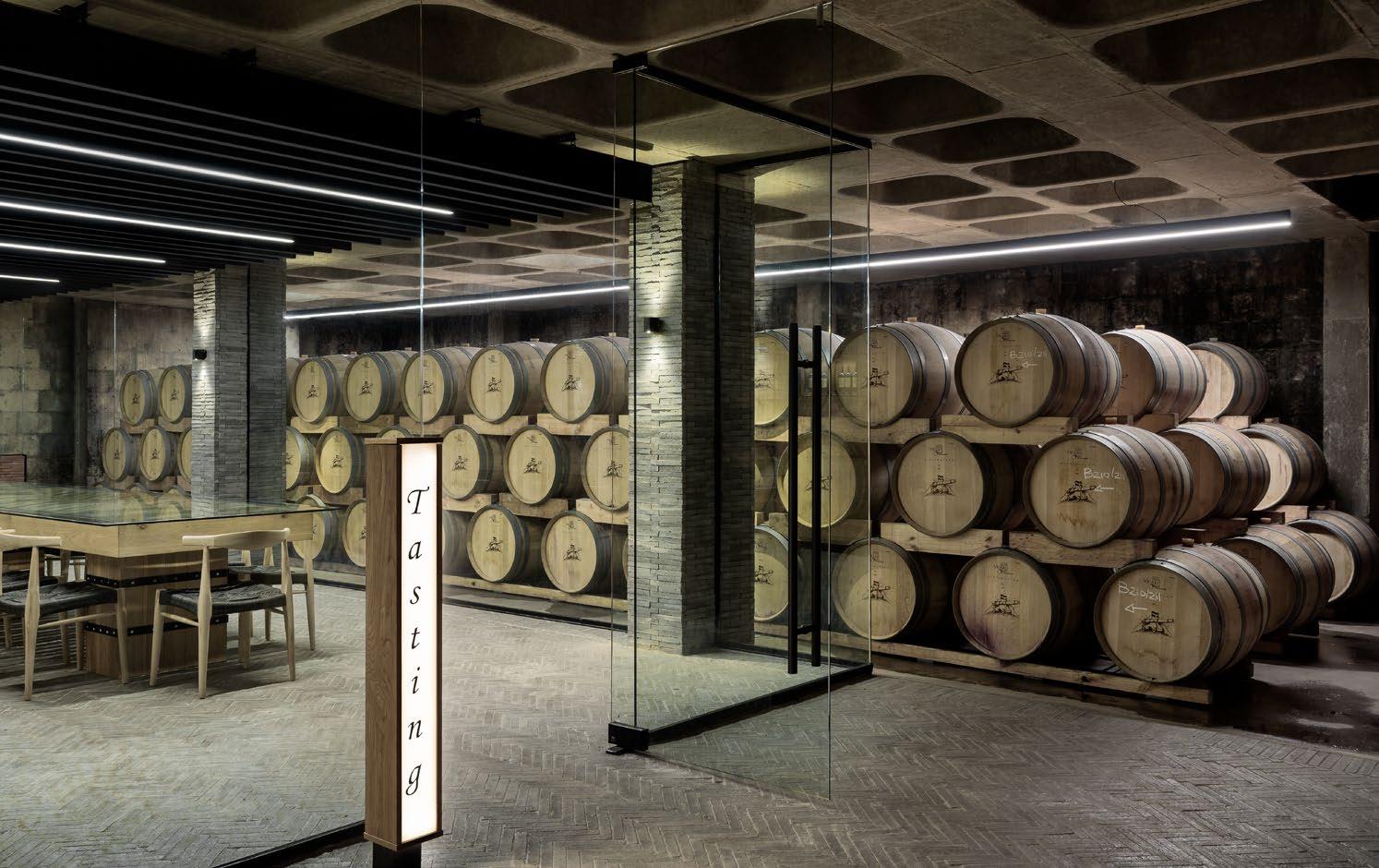
Lagom Cabin, photography by 3Sixty Photography

Dion In Conversation with Walters
Photography by Justin Munitz
For Dion Walters, the balance between creativity and sustainability are the stars that guide Bomax Architects. After founding the practice in 2000, Dion endeavoured on a course of minimising negative impact while maintaining architectural integrity and excellence. Today, he stands as a revered name in the industry, and we got to talk to him about the simple rules that shape his prolific portfolio and professional trajectory.
How would you describe minimalism at its best?
Minimalism isn't always visually striking; it's about balance. The forms themselves become the essence of beauty, necessitating precise composition. When unnecessary elements are removed from a design solution, clarity and impression are enhanced. Some decorative items may still be essential, and those should be retained. Our confidence stems from understanding the simple rule of discerning what can be omitted. When executed thoughtfully, this results in a more aesthetically pleasing minimalist design, aligning with our architectural ethos.
35 / INTERVIEW /
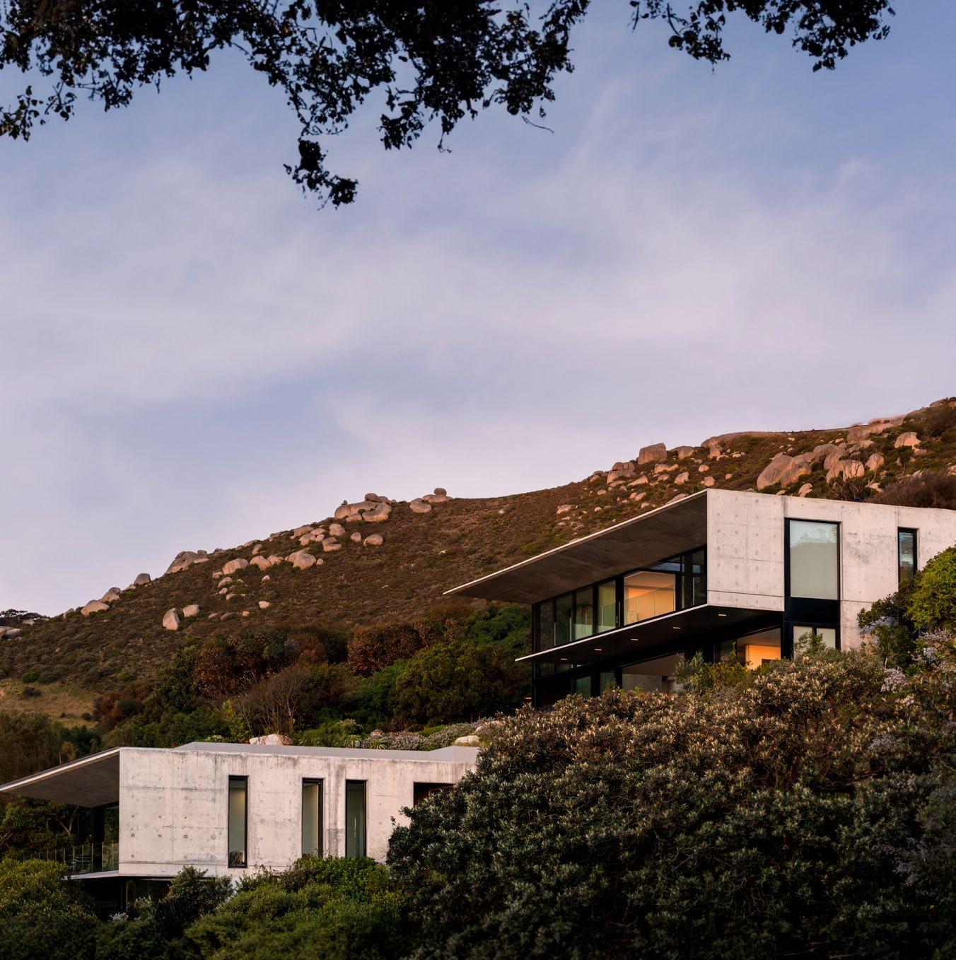
House Llandudno, photography by Paris Brummer
Which country’s architecture, aside from South Africa, inspires your practice the most?
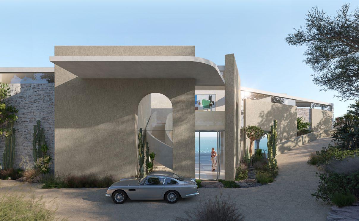
The Mediterranean architecture of Greece and Spain significantly influences our work. It’s a natural influence, given our similar climate, vegetation, and geology. The Greek vernacular architecture of the Cyclades offers a minimalist interpretation of the environment, embodying the barren landscape. The white surfaces allow other natural materials and vegetation to stand out as intended. The Macchia vegetation on the Mediterranean coast is similar to our Fynbos; its muted shades can express a highly stylistic landscape design that complements architecture. We appreciate this natural expression and strive for simplicity, aiming for architectural forms that harmonise with nature. Our most recent project, One Sunset, reflects the Mediterranean influence.
In Spain, the opulent contemporary architecture of the Costa Del Sol sets trends that also impact our designs. It's a dynamic, creative region where architecture responds to a glamorous lifestyle. While we maintain our simple, understated style, we're undoubtedly influenced by their approach when designing projects destined for those regions.

36 / INTERVIEW /
@bomax_architects www.bomax.co.za
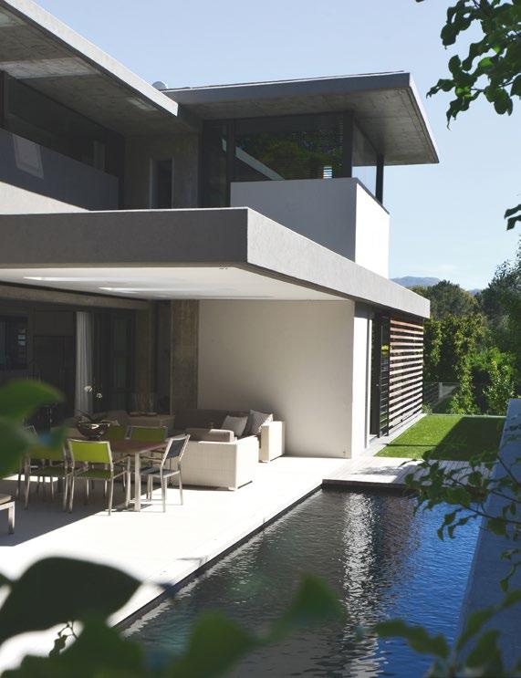
Thorn Street, photography by Dion Walters
One Sunset, courtesy of Bomax Architects
What was the first project of your career, and which of your recent designs reflect your growth the most when compared to that project?
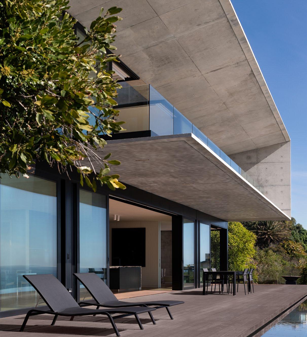
Bomax was established in 2000, and one of our initial notable projects was Thorn Street, located in the Upper Fernwood Estate of Newlands. It features an exposed off-shutter structure that remains visually appealing even today. Nearly twenty years later, our recently completed House Llandudno project represents an evolution of our design style. Here, we've refined our techniques in casting deeper cantilevers and longer spans, incorporating reinforced concrete with waterproofing additives where necessary.
37 / INTERVIEW /
House Llandudno, photography by Paris Brummer
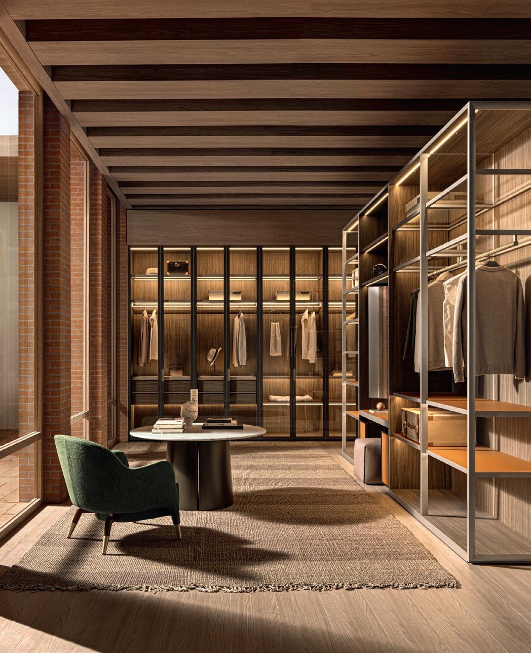
MOLTENI&C FLAGSHIP STORE WATERWAY HOUSE, 3 DOCK ROAD, V&A WATERFRONT, CAPE TOWN, 8001 T +27 (0)21 300 3453 CAPETOWN@MOLTENIGROUP.COM BY MC&D DESIGN HOUSE moltenigroup.com
Molteni&C: An Italian Design Story
Always in dialogue with new worlds, Molteni&C has travelled across stories and geographies since 1934 to internationalise itself, supporting precious and unique skills. As the brand intercepts the needs and desires of contemporary living, new skills are implemented on special projects worldwide to bring you Italian comfort at its finest.
The story of Molteni Mondo
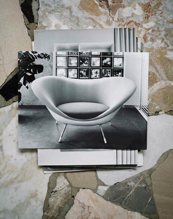
In their ever-stylish manner, Molteni&C are celebrating 90 years of innovation, design, industry, and corporate culture with a book, Molteni Mondo. An Italian Design Story. This cinematic object-book – opening with the set of the Compound in Brianza and closing with the master Gio Ponti and his Archive – is dedicated to the identity, history, and values of the brand founded in Giussano in 1934 by Angelo and Giuseppina Molteni.
Protagonists of design
The book’s titular factory, Molteni Mondo, has made production an endeavour to be respected, passed down, and developed from generation to generation. It has become one of the hubs of the creative process, making itself available to creative minds to explore their language and codes. At the centre is the representation of a world of objects and thoughts, ambitions and imperfections. This is how the great protagonists of design and architecture have always played a fundamental role in the processes of innovation: creating timeless products and interpreting social changes, such as the new collaborations with Herzog & De Meuron, Naoto Fukasawa, and Yabu Pushelberg.
Rethinking the future
As they near a century of excellence, a new division dedicated to ESG is born which accompanies the development of products designed and made with recycled materials. This department focusses on the revision of existing products, rethinking future developments with the implementation of new ESG principles.
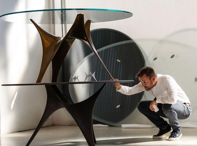
Molteni Group also pursues the strategy of becoming self-sufficient, with 65% of the energy consumed by Molteni&C already produced by the recently-installed photovoltaic system. Dynamic and everevolving, it’s easy to see how Molteni gives new meaning to ‘Made in Italy’.
‘In 2024, our company celebrates its ninetieth year of activity. Studying its history, we realised that it coincides with the history of Italian design. It begins in 1955 in Brianza with the first Selettiva di Cantù, also promoted by my father Angelo – an exhibition that had architects of the caliber of Gio Ponti, Alvar Aalto, and Carlo De Carli on the jury. At this important milestone, we want to share our goal for the future: spreading the culture of quality living throughout the world.’ - Carlo Molteni, President of the Molteni Group
www.moltenigroup.com
/ FEATURE /
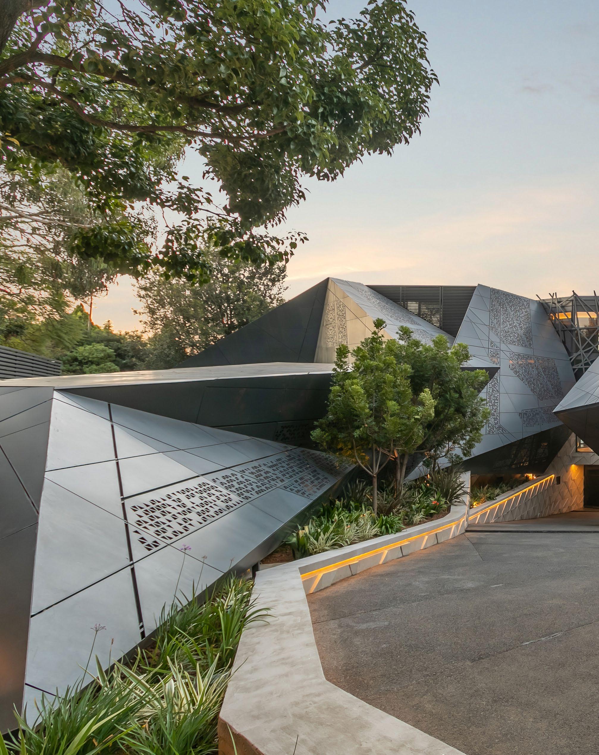
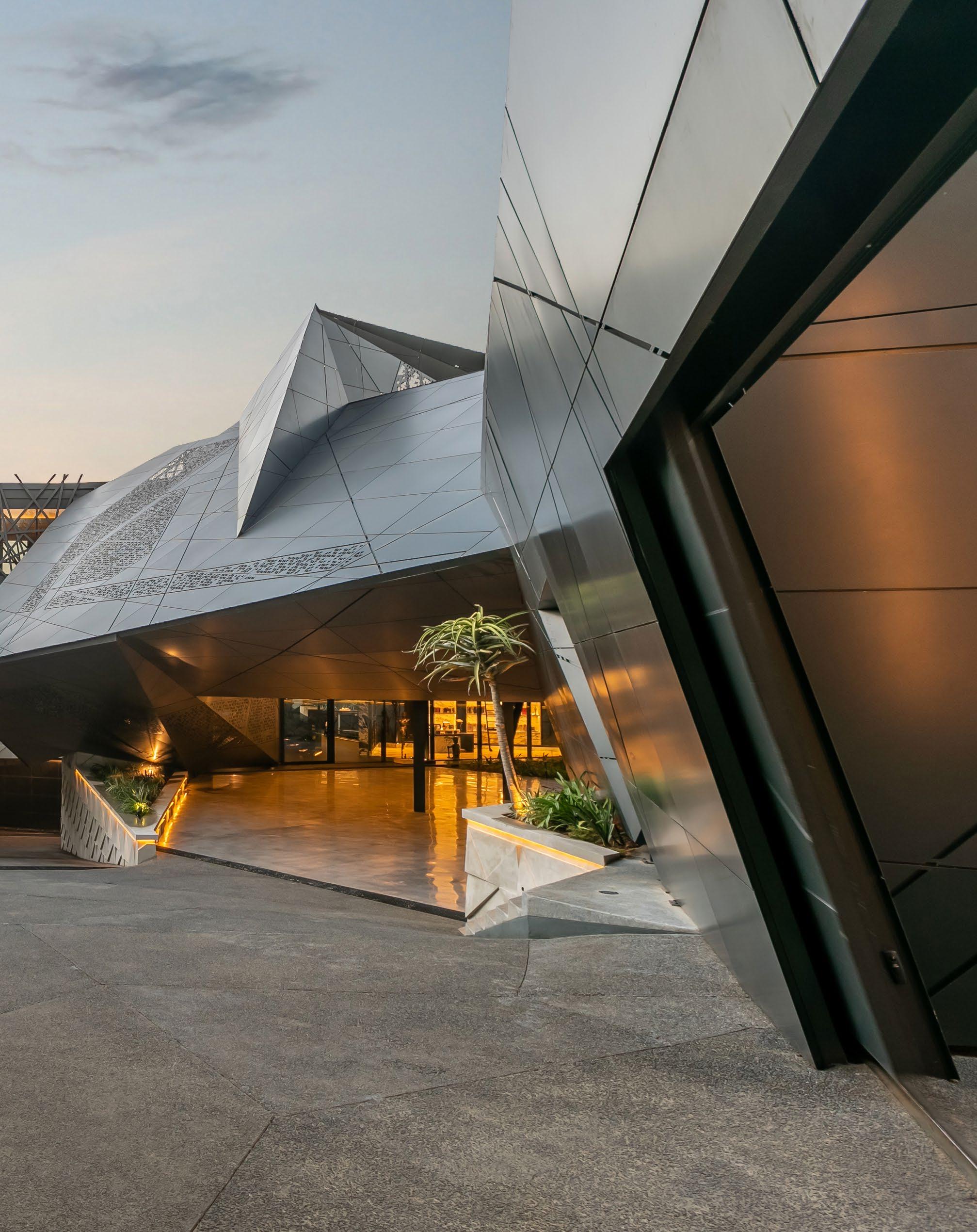
S Residence, photography by
Anton van Straaten
 Nico In Conversation with van der Meulen
Arenowned local architect that runs in the big leagues, to say the least, Nico van der Meulen has an expansive global portfolio (encompassing several thousand designs) that speaks volumes. His skills, together with his son, Werner, and a team of associate architects, expertly target the design of residence, but these homes go beyond the boundaries of everyday suburbia. In conversation with Nico, we uncover what it means to redefine residential luxury, the future of contemporary living, and the message that underlies it all.

‘Beyond the physical structures we create, our true legacy lies in the emotions and experiences we evoke within the spaces we design.’
How would you describe a ‘Nico van der Meulen client’?
Our clients represent individuals who share a profound appreciation for superb design, seeking homes that are not just living spaces but expressions of their identity and aspirations. We are drawn to those who understand the transformative power of architecture and desire residences that harmonise luxury with functionality. Our collaborative approach ensures that each project reflects the unique vision and lifestyle of our clients, resulting in homes that are both timeless and deeply personal.
S Residence is a brilliant step towards the future of residential architecture. Can you tell us more about the design narrative?
The genesis of S Residence is not merely a stride towards the future, but also a bold leap into redefining the paradigms of residential living. Beyond its architectural grandeur, S Residence symbolises the convergence of innovation and human-centric design. It stands as a testament to our commitment to crafting spaces that seamlessly blend form with function, fostering harmony between inhabitants and their environment. Each facet of its design narrative unfolds as a symphony of spatial choreography, embracing both tradition and innovation to create a timeless expression of contemporary living.
42 / INTERVIEW /
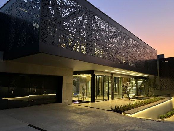
Sandton Residence, photography by Melanie Ezzi

 Victoria Residence, photography by Anton van Straaten
Kloof Road House, photography by David Ross
What quote stands out as one that has stayed with you and meant something to you in your career?
One quote that has left an indelible mark on my architectural journey is by Maya Angelou: 'I've learned that people will forget what you said, people will forget what you did, but people will never forget how you made them feel.' This quote encapsulates the essence of architecture as a form of emotional resonance. It reminds me that beyond the physical structures we create, our true legacy lies in the emotions and experiences we evoke within the spaces we design. With this in mind, I strive to infuse every project with a sense of warmth, comfort, and inspiration, ensuring that each building becomes not just a structure, but a cherished memory in the hearts of its inhabitants. Which of your newest or in-progress projects have excited and motivated you the most?
While all our projects are exciting in their own right, one that particularly ignites my passion is Pioneer Villa. As the largest project our firm has undertaken thus far, its sheer complexity and scale present a thrilling challenge for our team, pushing us to innovate and explore new design possibilities. Every aspect of Pioneer Villa is centred around the client's lifestyle, meticulously tailored to their individual requirements. With its opulent marvel of bespoke luxury living, we are inspired daily to tackle the unique opportunities and challenges this project presents, knowing that it has the potential to leave a lasting legacy in the world of architecture.

@nicovandermeulenarchitects www.nicovdmeulen.com
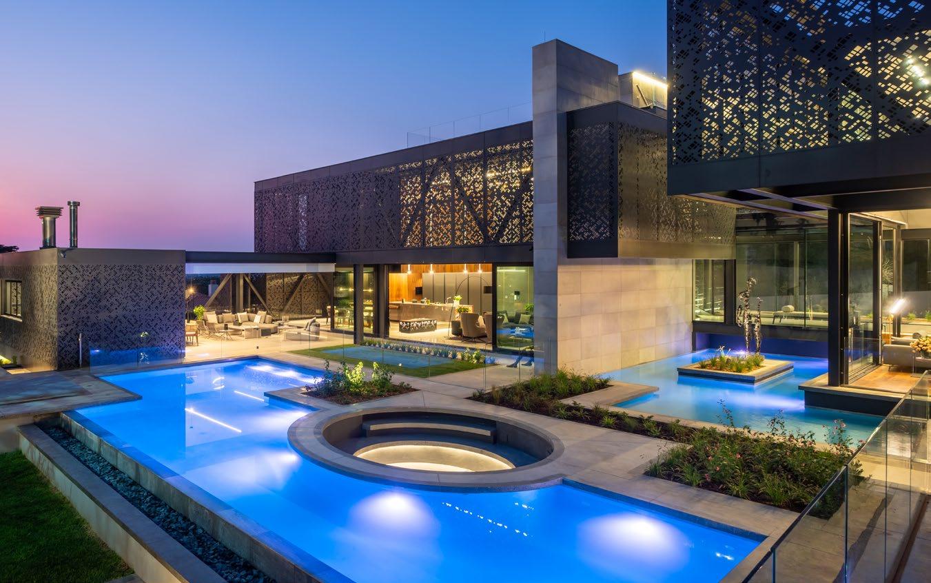
PICTURED HERE
Kitchens: DOCA | Furniture & wardrobes: MSLN, Porro | Screens & shutters: AC Screens & Shutters | Aluminium & glass: Qone Fenestration, Radiant Glass Concepts | Hardwood flooring: Oggie Flooring | Screed flooring: Teracoat | Lighting: Streamlight
Ceilings: Sky-Gardens | Home automation: BNC Technology | Sanware: Duravit, Hansgrohe | Fireplaces & braais: Beauty Fires
Tiling: Porcelanosa | Air conditioning & under floor heating: Reliance Eco | Lifts: Hands on Lifts
44
/ INTERVIEW /
Sandton Residence, photography by Franz Rabie

In Conversation with
John Jacob Zwiegelaar
Stepping into the sphere of residential and commercial interior design, you get luxury, and then you get luxury. John Jacob Zwiegelaar curates spaces that exude the latter, leaving an essence of splendour in every room he touches.
Skilled in the craft of the bespoke, John was a natural option for a quick chat on style, sophistication, and the approach to design that makes all the difference.
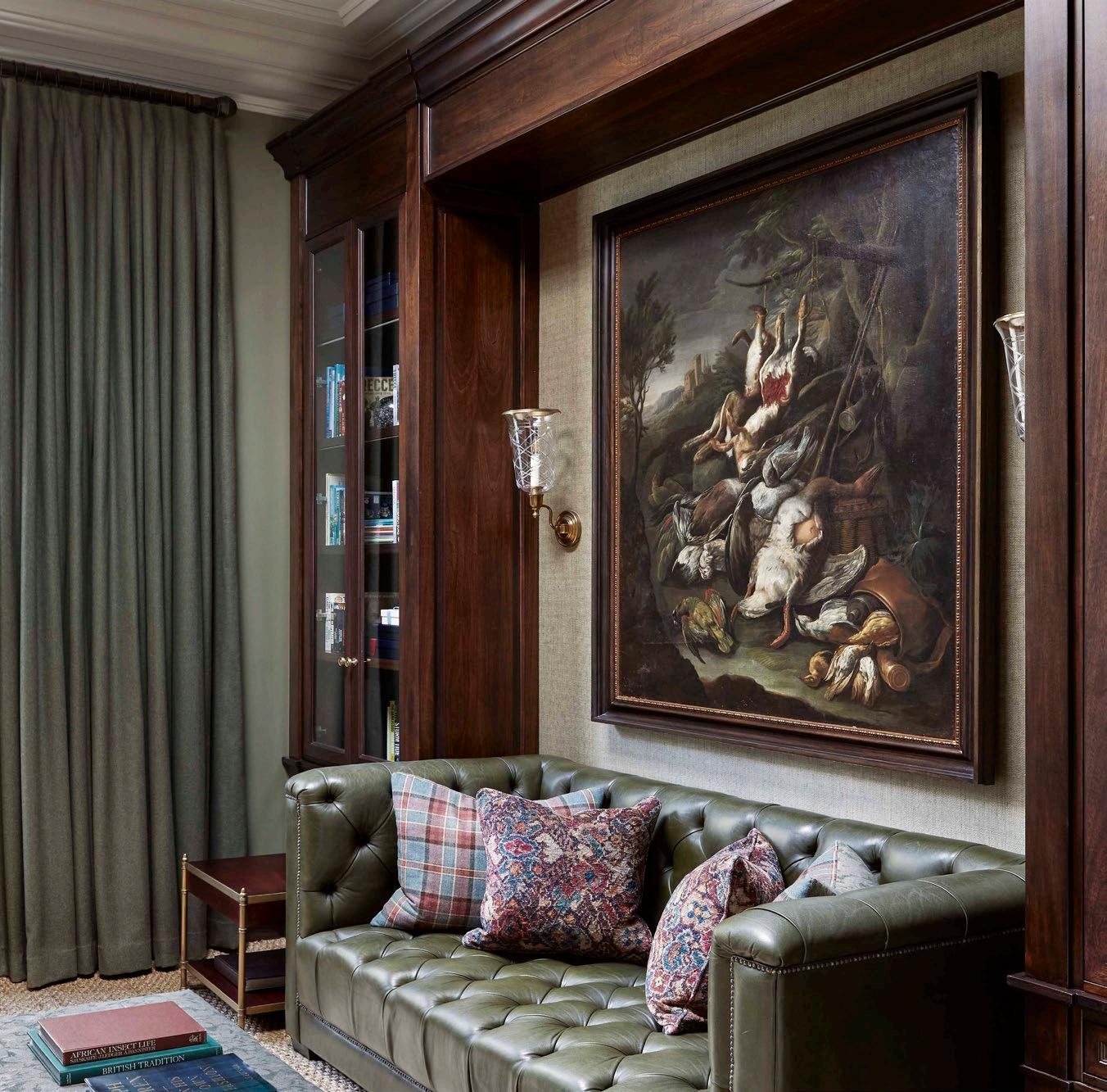
46 / INTERVIEW /
Photography by Elsa Young
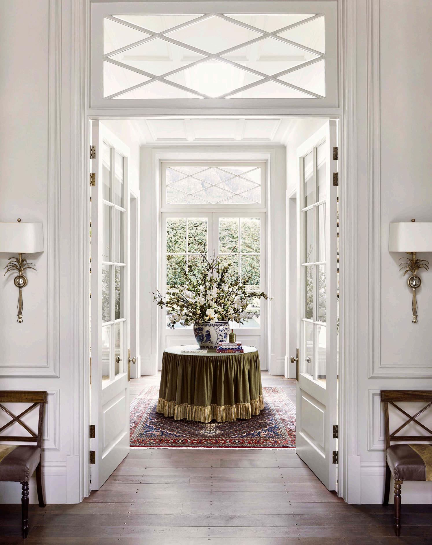
'I'm not really a designer that embodies a single style, but stylistically the common thread in my work is order.'
You’ve been named a style icon and top designer many times, and rightfully so. Who is your style icon – not only in design but in life in general?
I have so many. On the contemporary side, I would say Axel Vervoordt and Jean-Louis Deniot. On the classic side, Martin Brudnizki, Anouska Hempel, and Paolo Moschino.
Which of your projects do you feel embody the essence of your style the most?

I'm not really a designer that embodies a single style, but stylistically the common thread in my work is order. As my skills evolve, so does my style. @johnjacobinteriors www.johnjacobinteriors.com
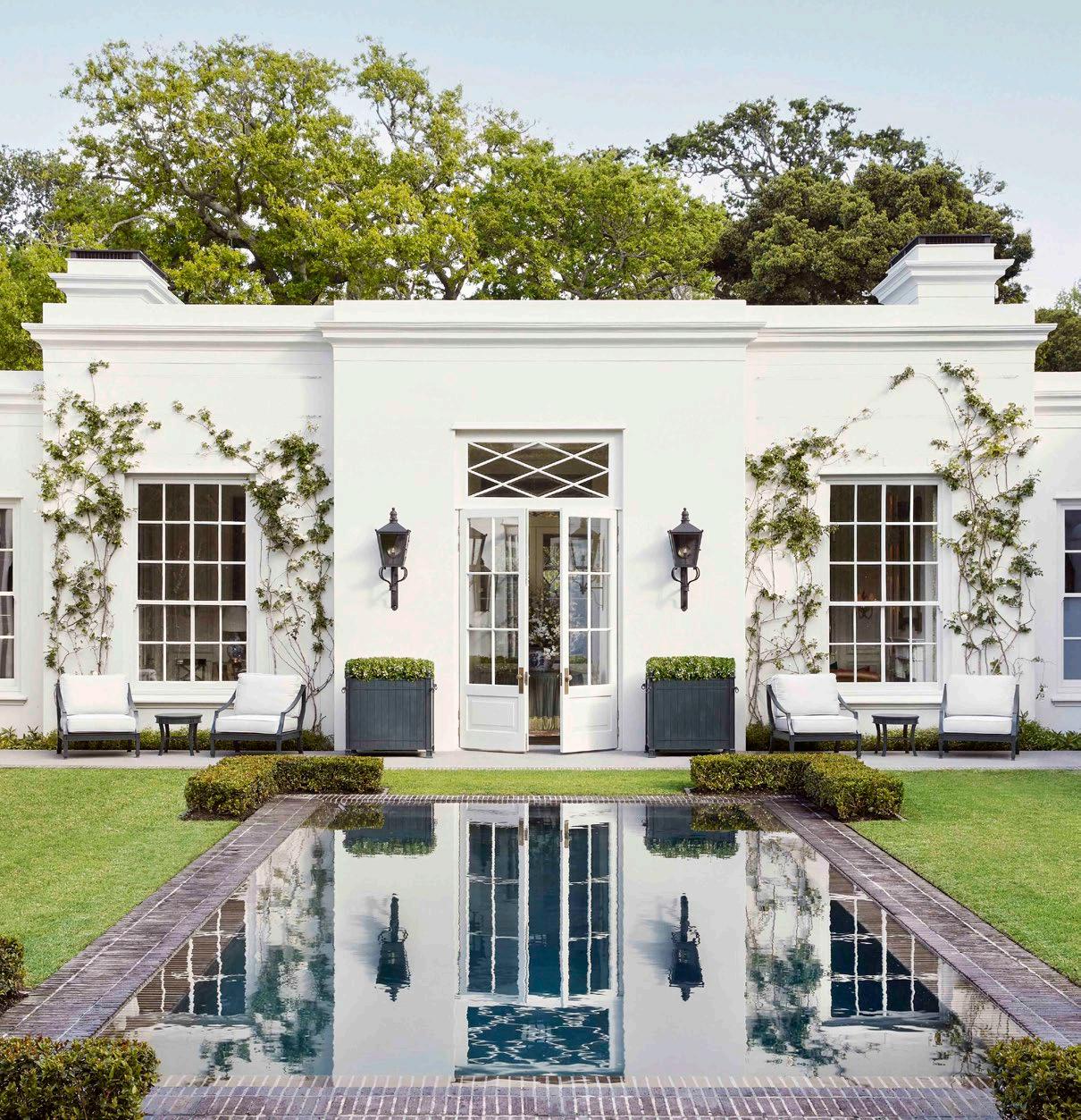
48 / INTERVIEW /
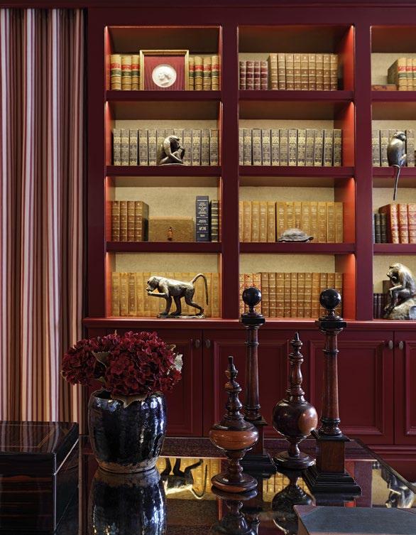

49 / INTERVIEW /

Is there a particular maker or brand that you love working with at the moment?
Pierre Cronje is still our best furniture maker in South Africa. Other makers I use often are Minotti and Holly Hunt on the modern side, while for a classic touch, I’d say Ralph Lauren is a favourite.
Your career has flourished since opening John Jacob Interiors, and is locally and globally admired and respected. What advice would you give to someone hoping to follow in your footsteps?
I wouldn’t describe design as a career. Design is a way of being. Being a good designer is all about sensitivity to your environment. This has nothing to do with taste – it has to do with how environments feel, rather than how they appear in pictures. Design is emotive. You are stimulating an emotional response in people, so stay sensitive and never stop paying attention to the details.
50 / INTERVIEW /
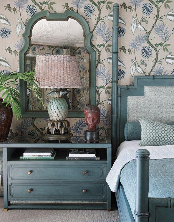
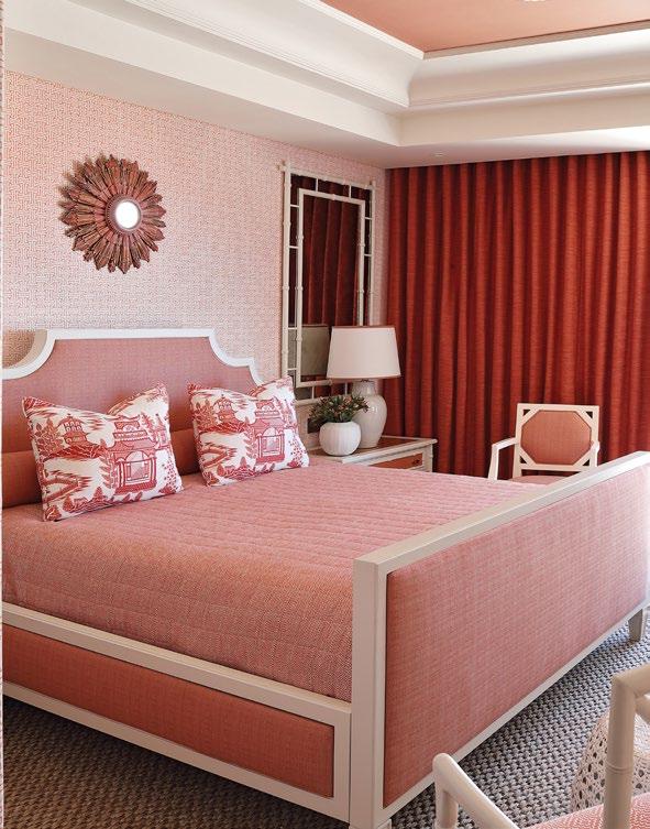
PICTURED HERE Tiling: Ann Sacks Sanware: Lefroy Brooks Furniture: Ralph Lauren Wallpaper: Colefax and Fowler, Thibaut

Luv. Nordic elegance.

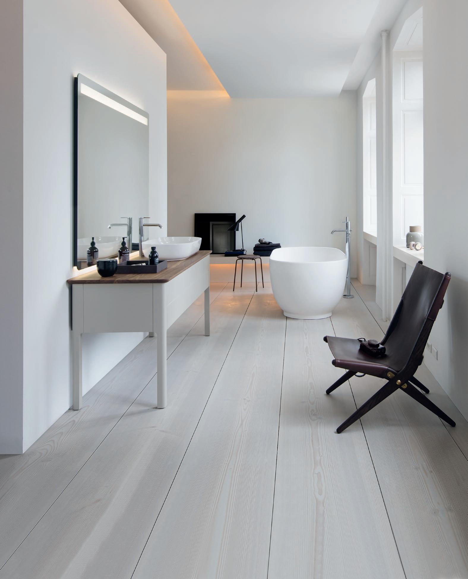
The design of Cecilie Manz‘ bathroom series Luv combines Nordic purism and timeless, emotional elegance. Soft shapes follow a stringent geometry. The result is a new unique design language with precise, clear and fi ne edges. For more information: Duravit South Africa (Pty) Ltd , 30 Archimedes Road, Kramerville, Sandton, Johannesburg, Telephone +27 (0) 11 555 1220, info@za.duravit.com and at www.duravit.com


In Conversation with
Andrew Payne
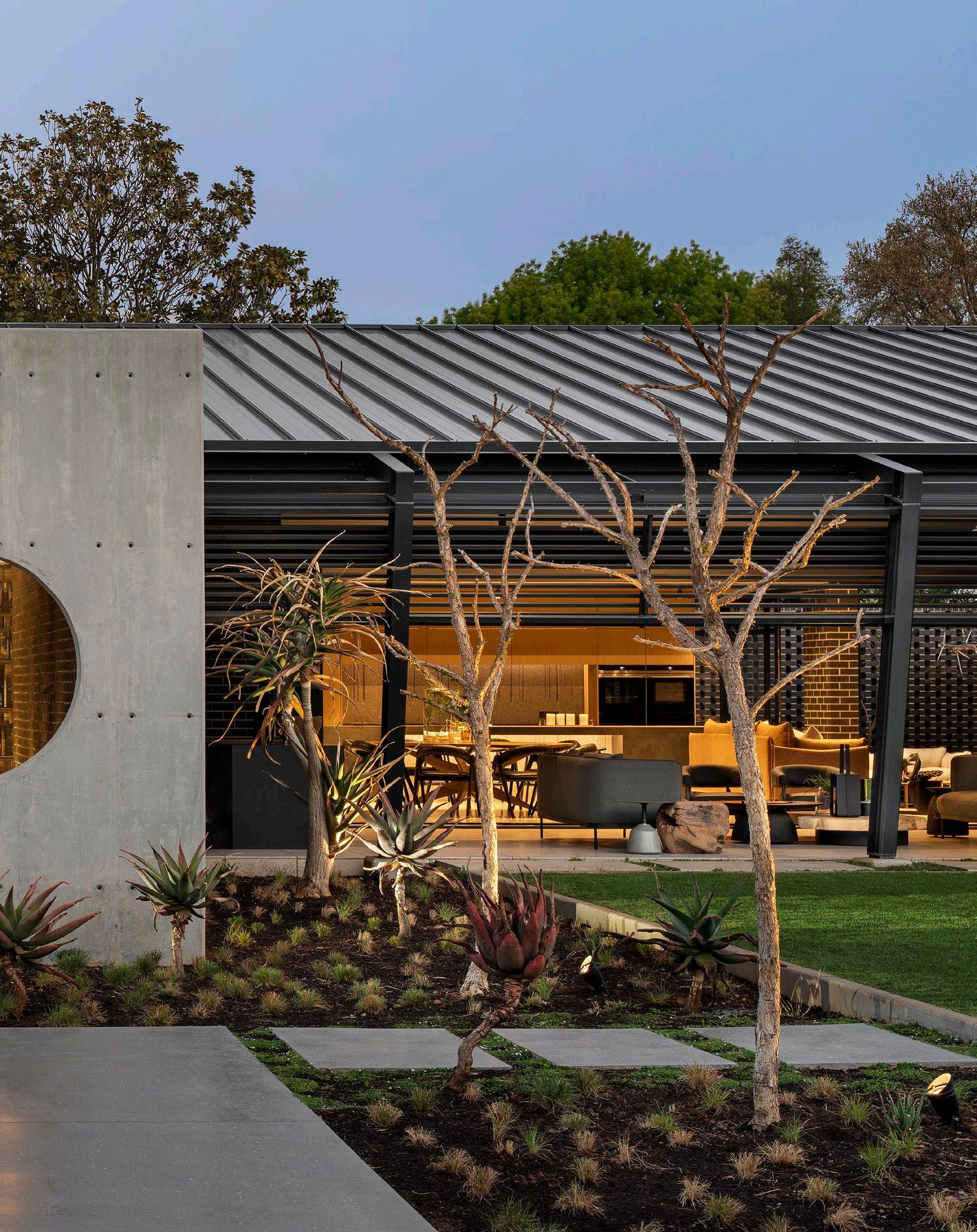
Black House, photography by Adam Letch
Danger Point, Black House, and Upside Down House – it might sound like a wild residential ride, but this is the speciality of Andrew Payne and his team at Drew Architects. Taking tailored designs and integrating them carefully into the landscape, Andrew’s practice is built on a passion for generating a personal impact through every home that materialises from the pages of his blueprints. We were fortunate enough to grab a few moments of Andrew’s time between sketches and site visits to find out what innovations are on his radar, what collaboration looks like in the practice, and what the conversation would sound like if structures could speak.
Which innovative new materials are you most excited about at the moment?
3D printing has always sparked excitement within me and the Drew team. Its potential to unlock a realm of possibilities within the design industry is truly remarkable. Not only does it enhance the efficiency of construction processes, but it also streamlines the transition from concept to reality. The capability for producing uniquely intricate designs with pinpoint accuracy, minimal material wastage, and seamless communication across all involved teams is groundbreaking. It forms a link between a modern society that moves forward at breakneck speeds and a timeless profession that is tailored to cater to the needs of humanity. When utilised effectively, 3D printing is revolutionising our inherently organic industry, and we’re enthusiastically embracing this wave of innovation.
How do you approach collaboration in your practice, for example when working in conjunction with migs + drew?
I’m a firm believer that if you put like-minded creatives together with shared passions and values, a shared work ethic, and a singular objective, that magic can happen. My primary company, drew, was founded 15 years ago in Joburg and migs + drew was born 10 years ago out of a 2014 Stellenbosch design competition collaboration with a like-minded UCT university friend, Miguel Ferreira da Silva. It was born from our mutual passions: beautiful, considered buildings and pristine natural environments, primarily focussed on interventions in magnificent, unspoiled natural landscapes across the country and continent (and soon the world). We are creatives, so we revel in every opportunity to stretch our minds and flex our creative muscles!
If you could have a conversation with any building(s) in the world, which would you choose and why?
It would probably be Barcelona Pavilion or Fallingwater, or locally, House Press on the Coromandel Estate… a few of my favourite buildings. The conversation would be about timelessness. Built in 1929, 1936, and 1974 respectively, they are, in my opinion, as relevant, appropriate, and appealing today as they were the day they were built: the true test of good, responsible design. The gravity of our responsibility as built environment specialists is significant and we should use this privilege to drive rigorous processes and wellconsidered and detailed responses.
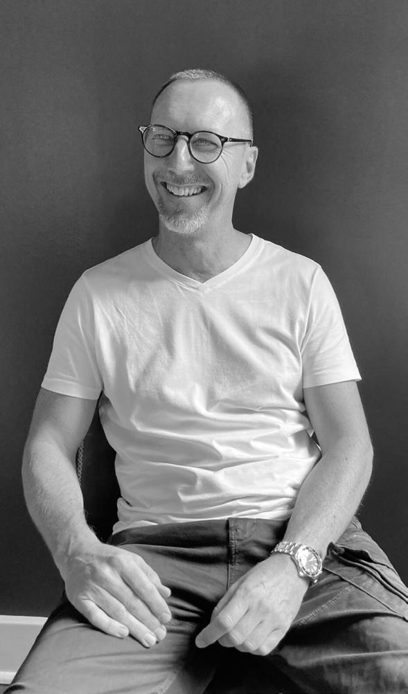

@drewarchitects
www.studiodrew.co.za
54 / INTERVIEW /
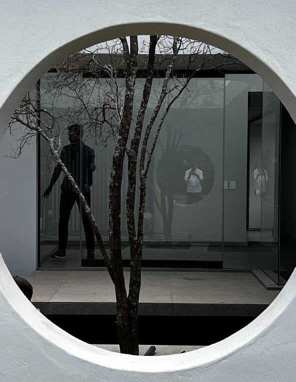
We’ve noticed that you love a porthole. Is there a story behind this attraction?
The porthole simply emerged on Black House as the perfect solution to the arrival and proved a playful but very successful balancing tool to contrast all the rectilinear geometry of the building’s frame and form. We fell in love with it as a device and have successfully used it on a few subsequent buildings. The curved line provides a less severe softness.
What is your most exciting build to date?
I read an interview with an architect once in which he said that being asked to name one’s favourite building was akin to asking a parent which of their children was their favourite, and I agree wholeheartedly with this. Being so close to each of our buildings for so long, I know every facet of them and see both perfection and flaws in all of them. It’s for both these reasons I love each one of them so much. I am very proud of my team and excited by what we have been able to achieve to date, and also very excited about a number of buildings we currently have on site and about the epic opportunities I know are just around the corner!
'It was born from our mutual passions: beautiful, considered buildings and pristine natural environments, primarily focussed on interventions in magnificent, unspoiled natural landscape.'
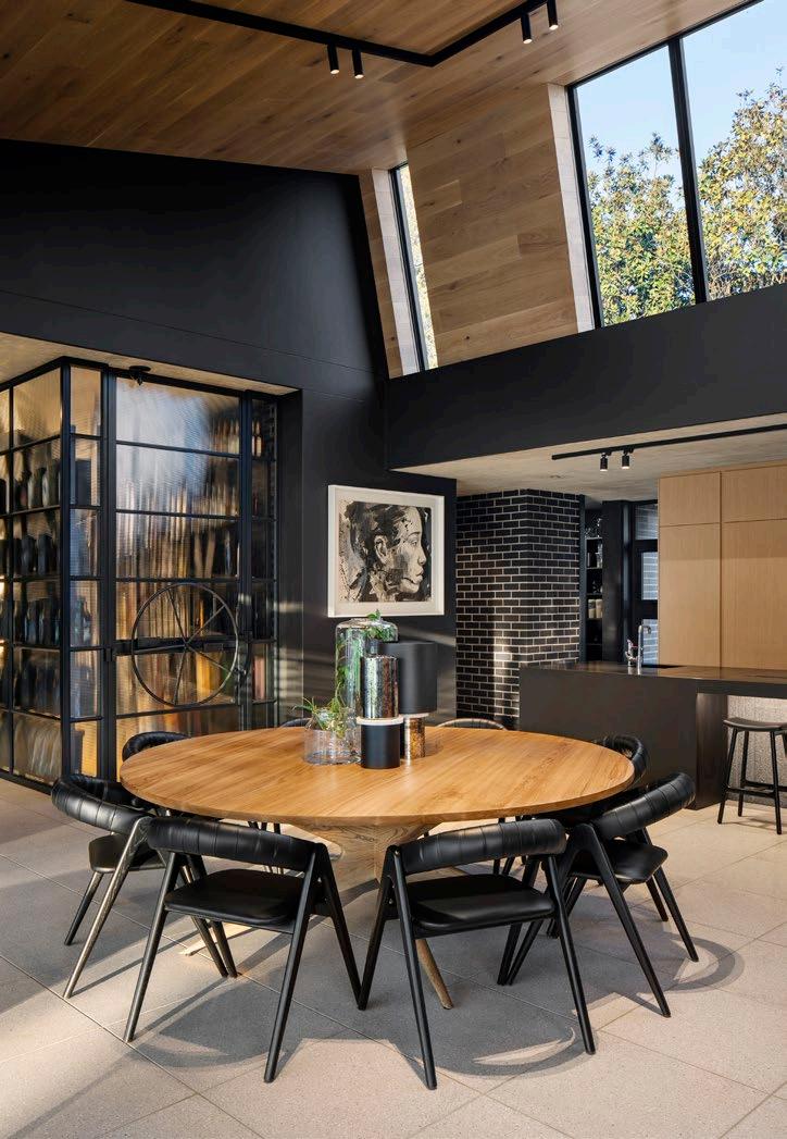
PICTURED HERE
55 / INTERVIEW /
Bricks: Corobrik | Timber cladding & decking: Rare Woods
Roofing: Safintra | Steel: LA Steel | Aluminium: IKON Aluminium
House 770, photography by Andrew Payne
Black House, photography by Adam Letch
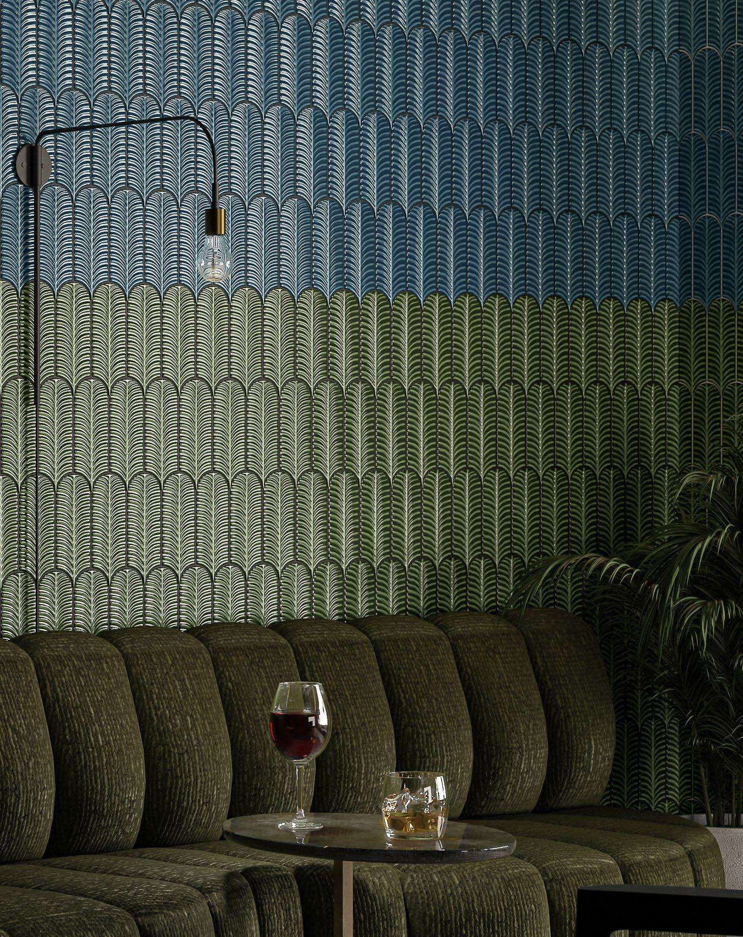


ALMA IN GREEN & MARINE ALMA THE COLLECTION PICKET TILE PERFECTION
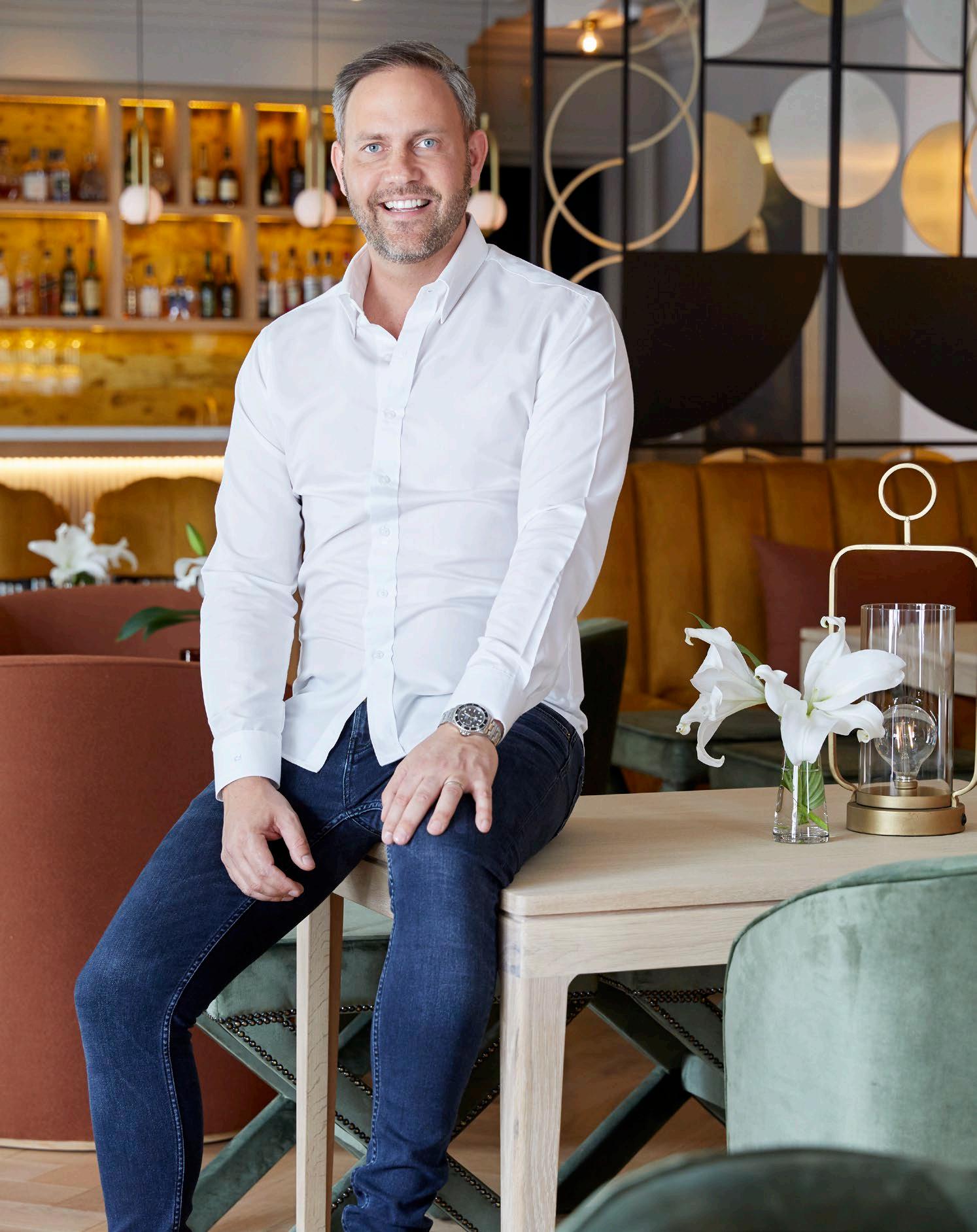
Clinton In Conversation with Savage
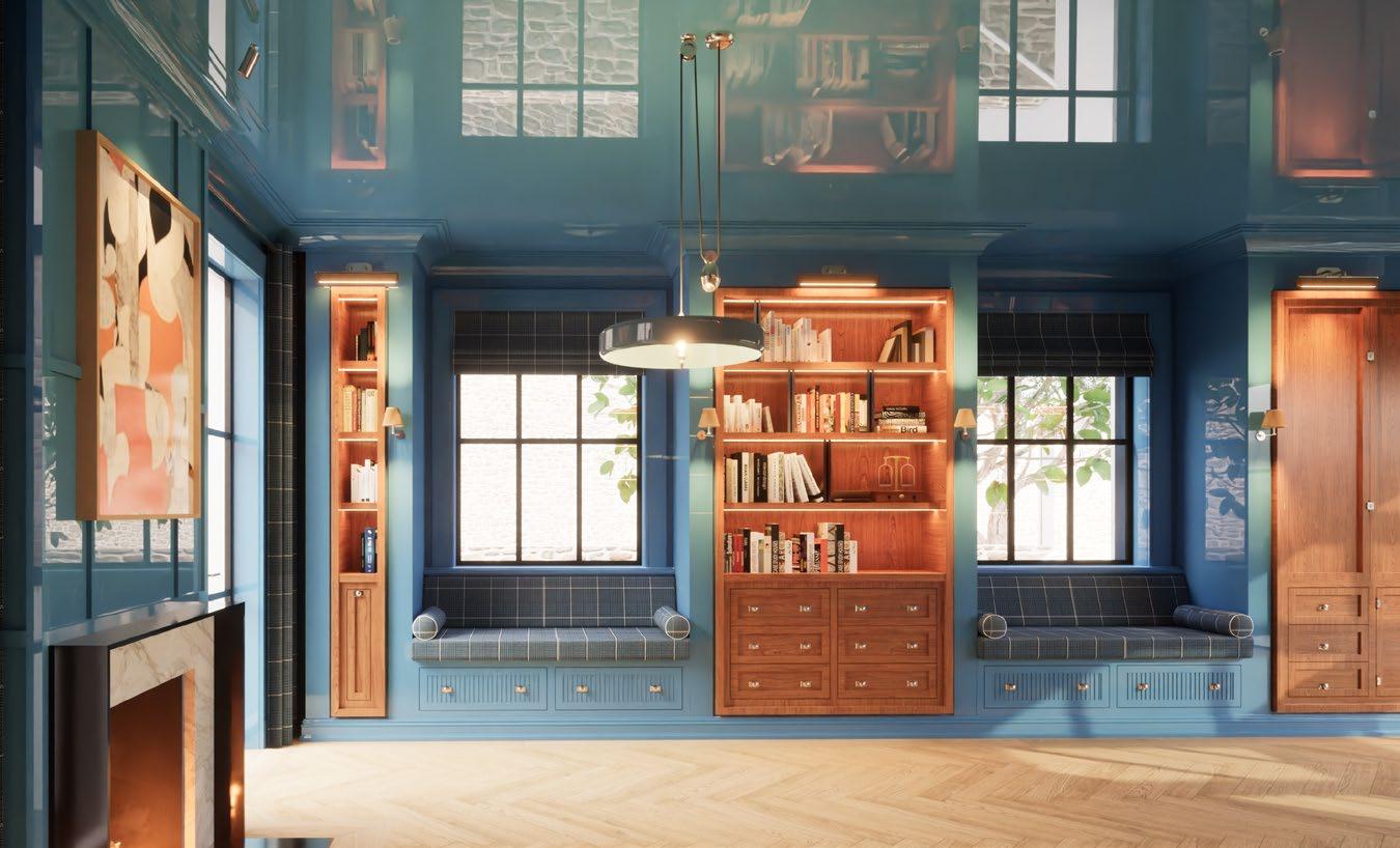
With a flair for style evolution across the residential and hospitality sectors, Clinton Savage is an exemplar of the most sophisticated side of the scene. His approach to interior architecture and design prioritises the combination of adaptability to client needs, stimulating the senses, producing interiors that stop you in your tracks, and challenging the boundaries of beauty. Impressing from Cape Town and Durban to Mozambique and Munich, a conversation with Clinton about his flagship project, the highs and lows of the work, and the use of the unassuming high gloss ceiling was one we couldn’t allow to pass us by.
/ INTERVIEW /
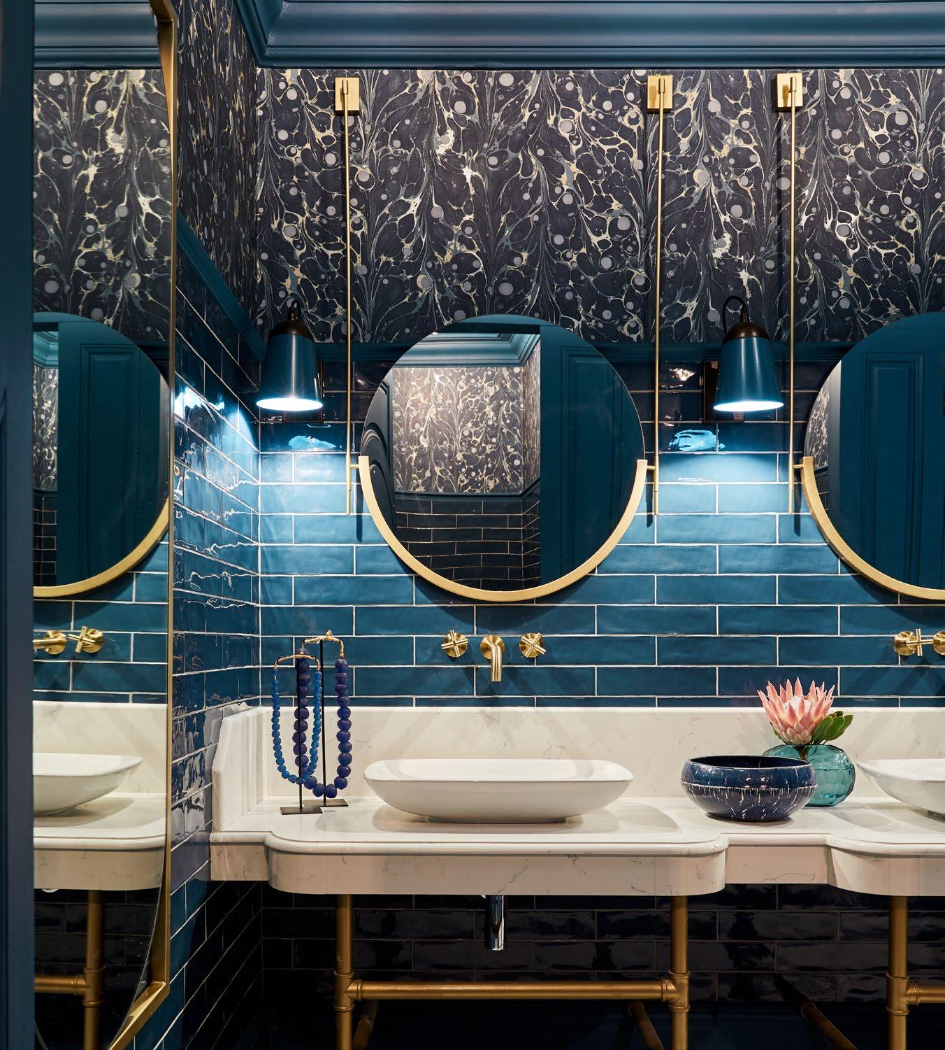
Erinvale Hotel & Spa, photography by Greg Cox


You have a portfolio of bright, bold, and brilliant designs. Which do you consider to be your flagship project?
Our flagship project featuring bold and brilliant designs would be our Erinvale Hotel & Spa Project. It was completed in 2022, and we love it as it epitomises the essence of a ‘feel-good’ space. It stands as a testament to our passion for crafting environments that evoke joy and comfort. The interiors feel collected and touch all the senses. They are both timeless and contemporary, a seamless blend of past and present.
What is the most unconventional product or element you’ve ever used in a project?
A high gloss ceiling in Constantia we are currently building; a mirror gloss, high shine ceiling introduces sophistication and allure, elevating the room's ambiance with timeless elegance and captivating drama. Meticulous preparation is essential to ensure a smooth and flawless surface before applying multiple thin coats of high gloss paint. Bright, rich colours maintain a contemporary classic aesthetic, while thoughtful lighting choices further enhance the shine. Traditional furnishings can complement the space's charm, and regular maintenance preserves the glossy finish, ensuring its lasting impact on the room's design.
Which part of the overall project process is most stressful, and which is most exciting?
The most stressful part often revolves around the initial stages, particularly the concept development and planning phase. This is where the vision for the project begins to take shape, and there's a lot of pressure to ensure that the design aligns with the client's expectations, budget, and functional needs. Juggling various ideas, addressing potential challenges, and making crucial decisions during this phase can be quite demanding.
However, despite the stress, it's also one of the most exciting phases of the project. It's here that creativity flourishes, and we have the opportunity to explore innovative concepts, experiment with different design elements, and envision the potential of the space. Collaborating with clients to bring their vision to life and witnessing their excitement as they see the design concepts come together is incredibly rewarding.
Moreover, the thrill of problem-solving and finding creative solutions to overcome design challenges adds an element of excitement to the process. While the initial stages may be stressful, they also lay the foundation for a fulfilling and exhilarating journey towards creating a truly remarkable interior space.
What are you currently working on that we can keep an eye out for?
We are currently busy with some super beautiful homes, both in SA and abroad, and are about to break ground on a very exciting wellness facility. Collaborating with wellness experts, we are crafting an immersive environment that nurtures the mind, body, and soul, setting new standards in luxury wellness architecture and interiors.

@clintonsavage
www.clintonsavage.co.za
59 / INTERVIEW /

60 PICTURED HERE Flooring: Oggie Flooring | Brass work: Ernst H. Design | Lighting: One to One by Martin Döller | Sanware: Flush Bathrooms Tiling: Decobella
Erinvale Hotel & Spa, photography by Greg Cox
Courtesy of Clinton Savage Interiors and Architecture

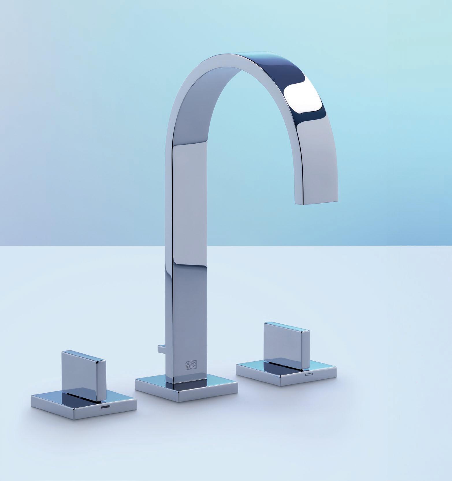
37 Paarden Eiland Rd, Paarden Eiland, Cape Town +27 21 511 7888 | www.flushbathrooms.co.za info@flushbathrooms.co.za Dornbracht MEM Three-hole basin mixer with pop-up waste - Chrome. Visit www.flushbathrooms.co.za to shop on-line for the latest imported tapware and sanware. OBJECTS OF DESIRE.

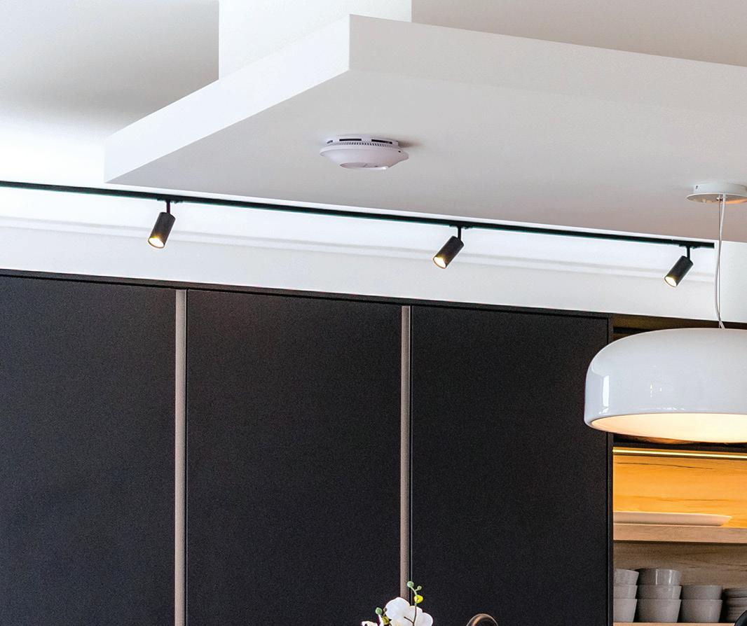
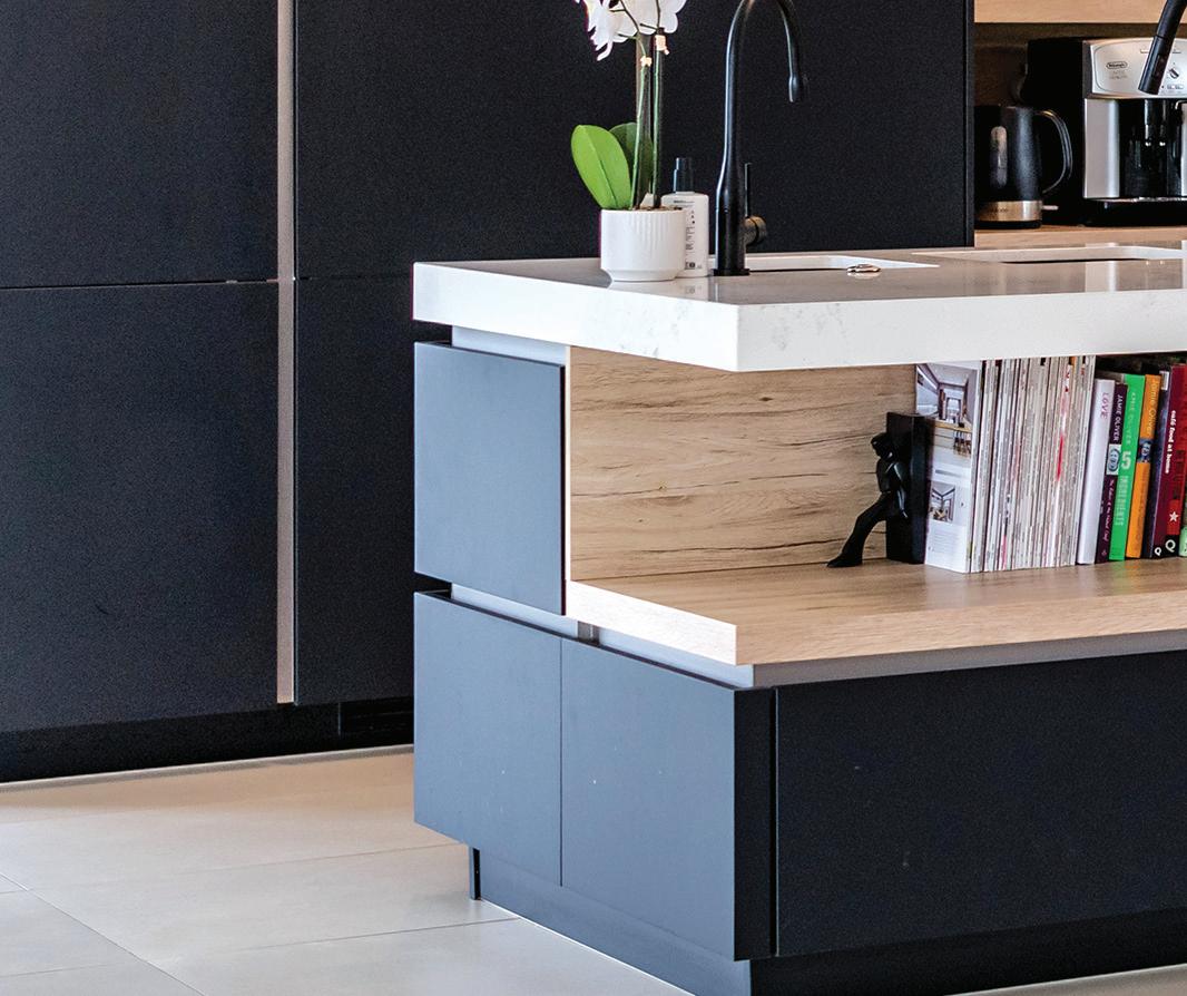

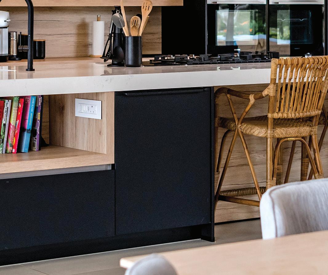

Email info@inside.co.za www.inside.co.za a kitchen for life Visit our showrooms Cape Town 021 422 1188 Level 1 10 Orphan Street Durban 063 562 9730 Shop 9, The Zen 31 Zenith Drive Umhlanga Rocks Plettenberg Bay 082 325 2569 Shop L14, Lookout Centre Courtyard 18 Main Street Cape Winelands 082 325 2569 Johannesburg 011 463 4403 22 Commerce cres Kramerville Sandton
The MAAK In Conversation with
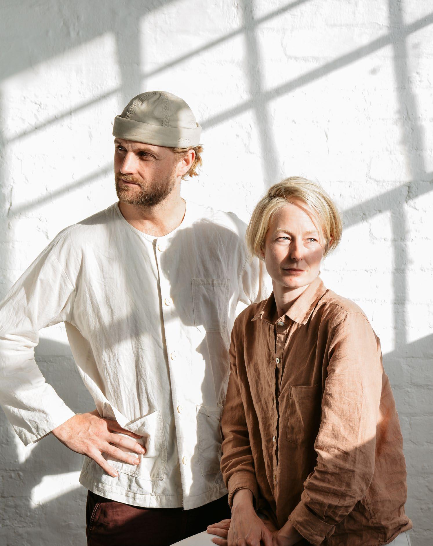
As models of design’s ability to act as a catalyst for improvement, there is nothing average about The MAAK co-founders Ashleigh Killa and Max Melvill. Their practice combines design with social impact through diverse endeavours. From the New Rest Valley Creche and the Desmond Tutu Testing Clinic to the Ulwazi Community Centre, their reach extends both locally and globally. Add incredibly moving installations to the list, and The MAAK is the epitome of the potential of the architectural craft. We caught up with Ashleigh and Max to learn more about their design approach and projects.
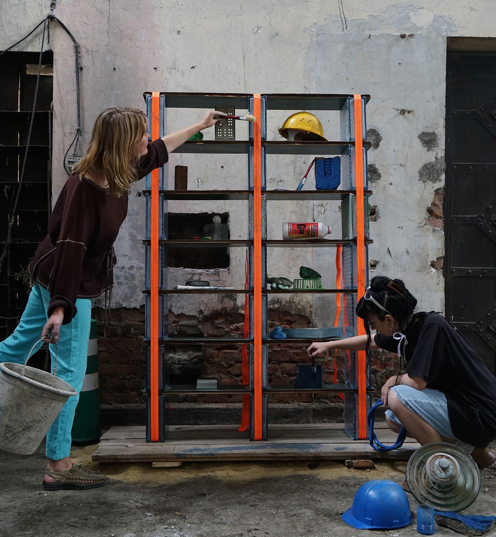
64 / INTERVIEW /
Love Thy Monsters, photography by Nika Kakabadze
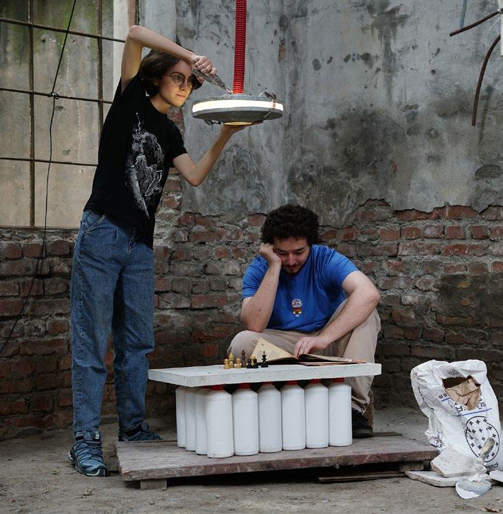

Can you tell us a bit more about RRRUBBLE and the work you did in Europe last year?
RRRUBBLE is an ongoing body of work by The MAAK and Space Saloon. It is a collaborative research project questioning the role and agency of materials in contemporary architectural production. Our first RRRUBBLE project, titled 'Futuro Pronto' (Fano, Italy, 2022) drew inspiration from Marc-Antoine Laugier’s ‘primitive hut’ to create an experimental pavilion structure which presented new architectural (and material) possibilities for the city’s rapidly changing port area. Since Fano, we have worked with different international architecture platforms to apply the RRRUBBLE methodology in four countries across Europe. The format, scale, and outcome of each iteration depends on the unique context of the work. In Georgia, as an example, we worked with the Tbilisi Architecture Biennial (TAB) to create an exhibition of site-specific furniture, ‘Love Thy Monsters’, that raises awareness around the illegal dumping of construction waste in Dighomi Meadows (one of the last remaining riparian forests in the region). The hyper-contextual furniture pieces created in the process formed part of a renovation project transforming part of a derelict power station into an active community space and listening bar for a local internet radio station, Mutant Radio. ‘Love Thy Monsters’ was part of our 2023 LINA fellowship and was co-funded by the European Union.
With your work being predominantly human-centric, when you start a project, how do you navigate prioritising the building’s end user and staying true to your ethos?
In many ways we are driven to un-learn architecture (or at least how it is typically practised). This includes how we approach each project and the various stakeholders involved. Different to residential or commercial projects, who pays for the buildings we create is often different to who uses them. In this light, we prefer to re-frame the ‘client’ (in the traditional sense of the word) as the financier and see the actual users of the spaces we create (school children, library learners, theatre makers, dancers, teachers, etc.), as our client(s). This re-languaging forces us to better engage in the intimate nuances and unique user needs of each new project. It is the input of the end user, more so than the financier (client), that we use to complete each brief and ultimately develop each scheme.
When you started The MAAK, what were some of your personal experiences that drove the direction of the practice? How have the practice and your approach evolved since then?
Looking back, The MAAK has really been more about people and process, than it has been about architecture. It is difficult to link this thought to specific personal experiences. Rather, it seems rooted in a collective understanding (shared by our team and collaborators) that architecture is as much about buildings as it is about craft, care, and kindness. Finding (and celebrating) these acts of human connection in our work has been central to our approach and it is fundamentally what keeps us interested in what we do. We have always seen The MAAK as a constant work in progress (#WIP) so we trust that our ideas, motivations, and method will continue to evolve as does our team.
65 / INTERVIEW /
Tell us more about the process and unique goals for your latest work in progress, the Rahmaniyeh Primary School Library.
We often talk about The MAAK as being a ‘process-based practice’. For us, this relies on trusting the ‘intuition’ of each project and encouraging a sense of equal agency with everyone involved in the process (from engineers to end-users, project collaborators, and so on). Two exciting workflows currently active for the Rahmaniyeh Primary School Library scheme are our engagement with Xanele Puren from The Otto Foundation and what we are doing with land activist and visual artist Zayaan Khan and photographer Kent Andreasen. With Xanele/ The Otto Foundation we have been involved in long-term engagement and ideation workshops with the learners of the school. These sessions are helping inform everything from unique architectural details and material choices to the eventual naming of the library. With Zayaan and Kent we have been exploring the natural clay reserves of the surrounding area/ site and are working towards collaborative gestures that address the geo-political responsibilities of working in District 6 (where the project is located). We are currently on site and can’t wait to see the tangible outcomes of these efforts finally take shape. Stay tuned!
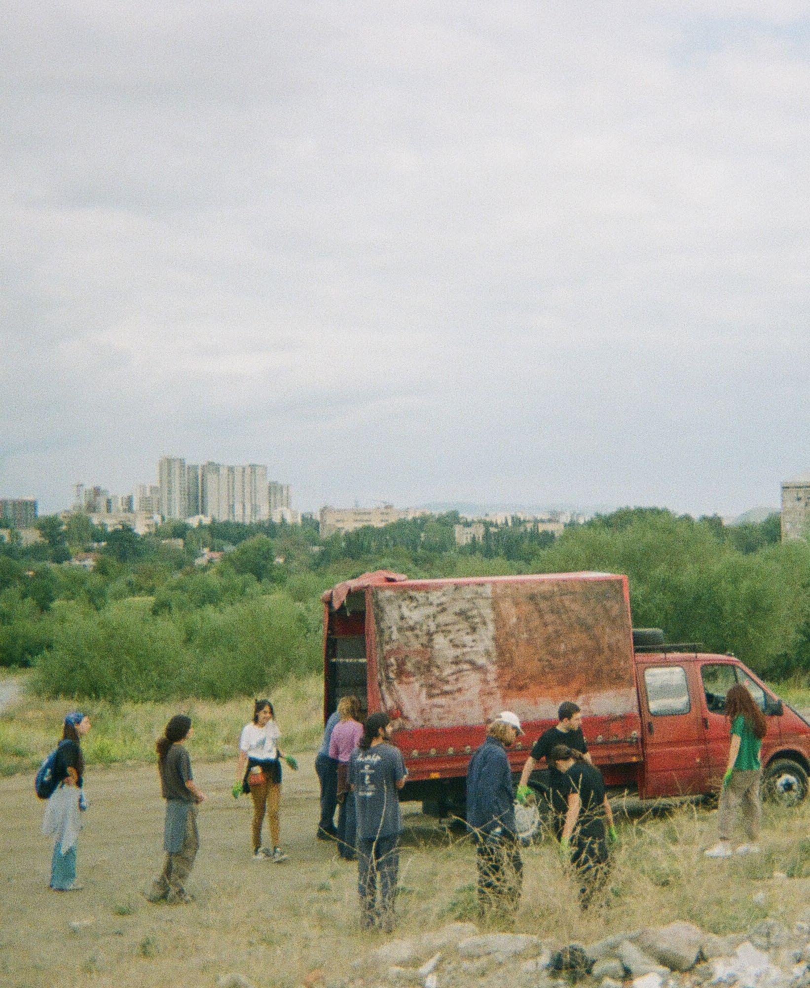

66 / INTERVIEW /
@the.maak www.themaak.co.za
Love Thy Monsters, photography by Christina Amundsen
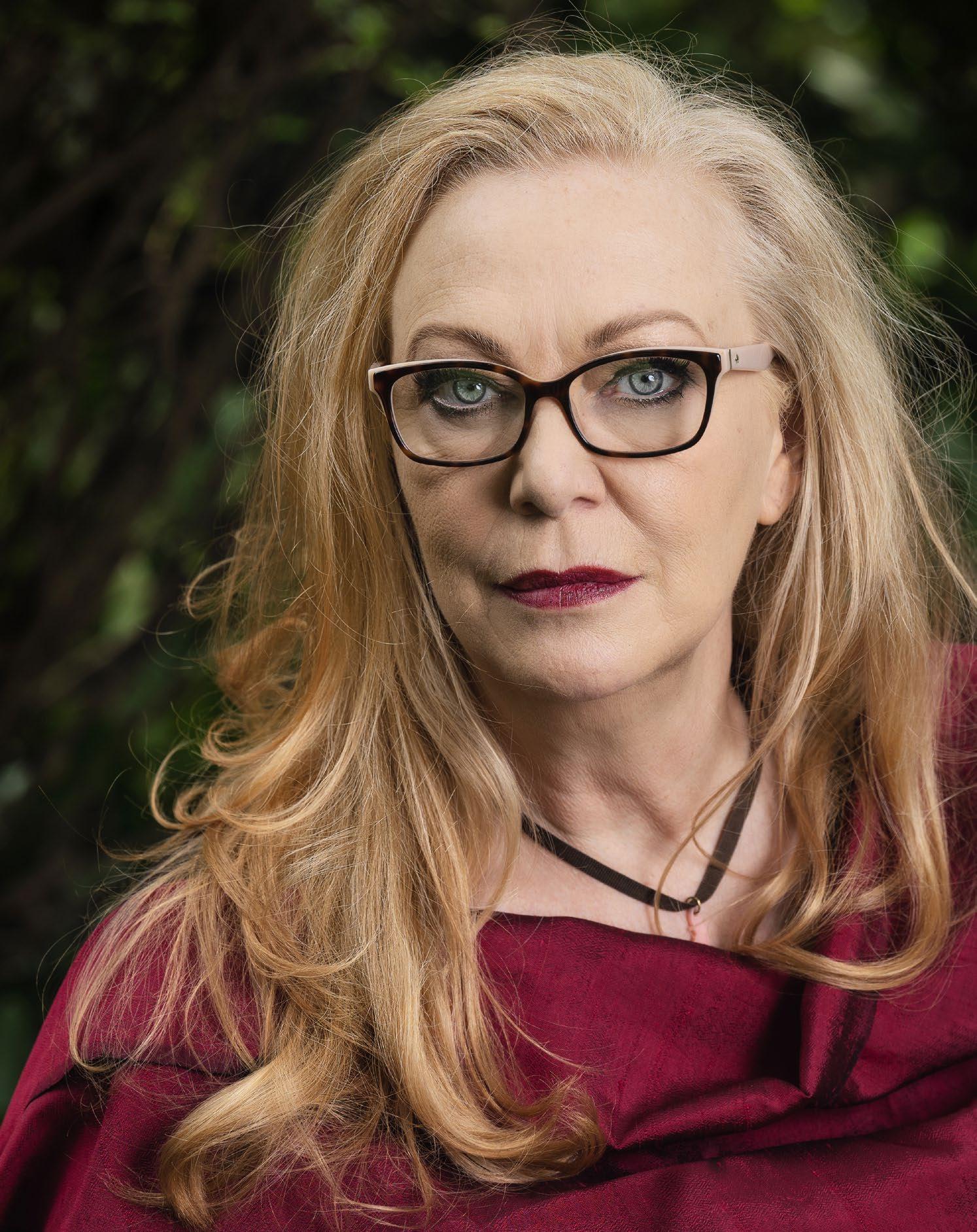 Kate Otten In Conversation with
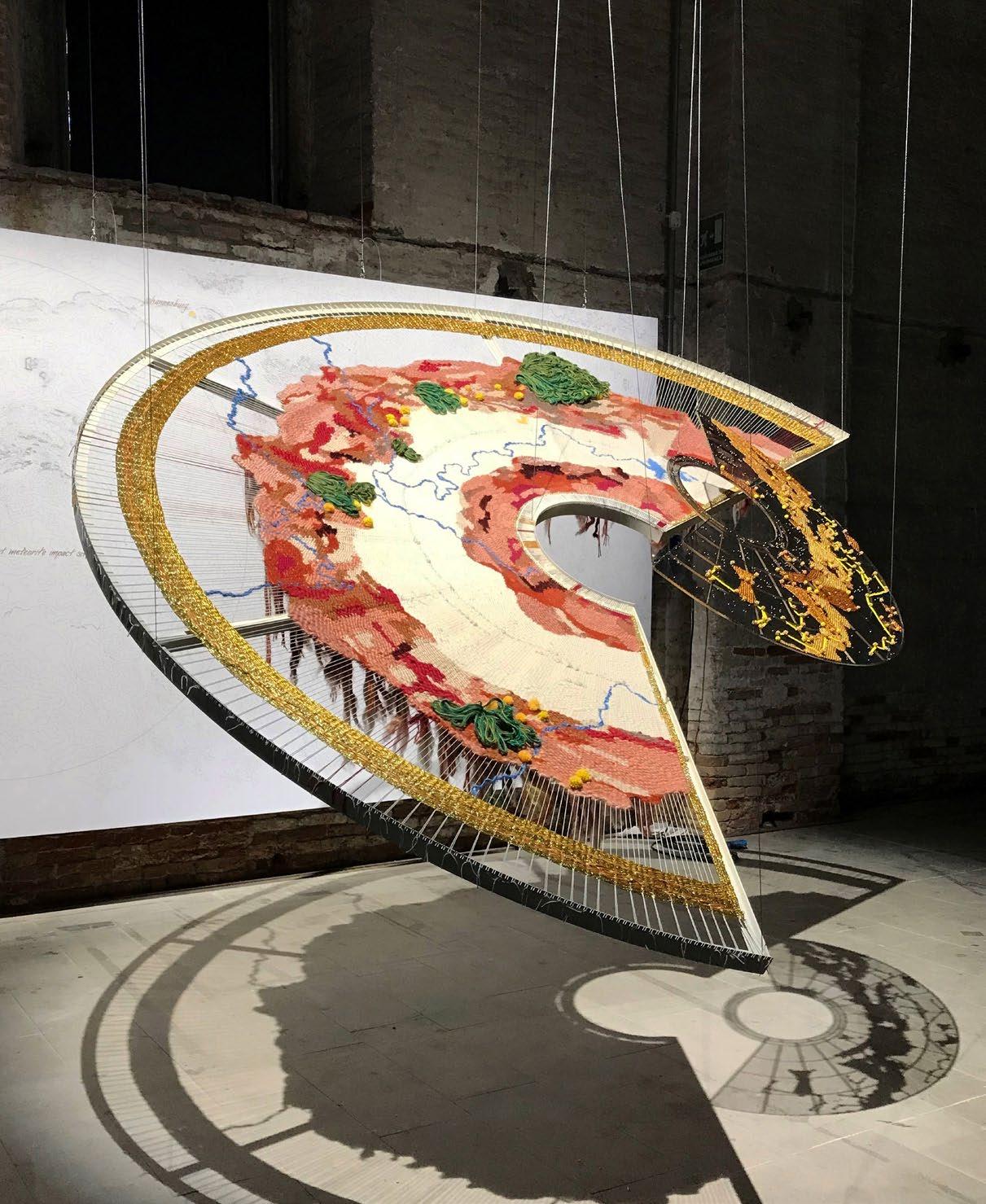
Kate Otten: The name alone conjures images of captivating homes, considered community spaces, and inspired interiors. Kate’s practice is guided by a keen eye for creating meaning through the unusual, the spirit of which shines not only through her architectural designs but also her installations, such as 'threads' at the 2023 Venice Biennale. Hanging onto her every word at each brilliant talk she has presented, what better way to hear more than through a conversation with the architect herself?

/ INTERVIEW /
'threads’ installed in Venice.

You recently had an incredible exhibition at the Venice Biennale 2023 – The Laboratory of the Future. Talk us through your involvement.
Participating in the Venice Biennale was simultaneously exhilarating, nerve-racking, and inspiring in equal measure. Lesley Lokko’s skilfully conceptualised and curated vision required every party to this magnificent collaboration to do and be their best. The focus on the global south was a breath of fresh air. Unlike previous architecture biennales where existing built work is re-represented in some way like an expo, most of the work for this exhibition was specifically conceptualised and made for the event, carefully curated such that the end vision and experience was so much more than the sum of its parts.
How did the reading of Johannesburg through the medium of thread come about, and how did it align with Lesley Lokko’s vision for the show?
Our section [at the biennale] was called ‘Dangerous Liaisons’. I live and work in Johannesburg – a city that is formed along a ridge with some of the deepest and richest seams of gold in the world. Our architectural work records, weaves together, and re-creates layers of Johannesburg and its people into new physical landscapes, all linked by an invisible thread – this ridge of gold.
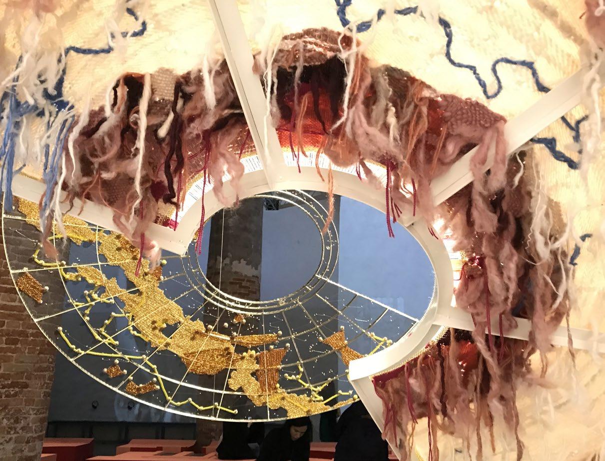
Our biennale piece, ‘threads’, is a 3-dimensional distillation of these ideas, or threads, that run through our work – mohair, glass beads, and shadow are used to tell this story. It is an intuitive reading of the physical, social, and political landscape of Johannesburg; a dangerous liaison between land and people, between great wealth and exploitation that followed the discovery of gold along the ridge.
'threads' tells a story that is a reading of the history and social geographies of Johannesburg. The play of light and shadow, the use of colour and pattern, and the hand-making and collaborative processes, all reflect our architecture, our proposition for the Laboratory of the Future.
69 / INTERVIEW /
'threads’ viewed from underneath.
How are you planning to keep experimenting with local crafts?
This is very much part of my language of making architecture, and I use the word ‘making’ quite pointedly. The choice of craft and material is a specific response to the context of each project. Available materials, available skills, and thinking about how we can use these resources to make meaning all influence how a local craft might be used.
Your approach to activism is largely inspired by your passion for architectural education that reaches beyond Western teachings. How is this exploration present in elements of your design?
A belief in the value of many knowledge systems other than a Western canon underscores all of my work. It speaks to how the use of earth as a building material, for example, or an interest in Islamic architecture, are threads woven through the work. Talking, drawing, and making are our tools of communication in the act of collaborating and sharing ideas and skills. Through our participation in lectures and mentorships, and by maintaining links with several schools of architecture, we engage and share knowledge with future generations of architects. We are alive to the social and environmental impact of architecture and its potential to destruct and to heal.
Your firm has a brilliantly varied portfolio across many sectors, but which one speaks to you the most at the moment?
It’s the variety that speaks to me. Different projects all have different briefs, sites, and client needs, so the response is tailored specifically to that project. This is not to say that the work does not cross-reference previous projects or core thinking; there is a common hand that can be seen through the work, but it is not a stylistic repeat button that gets pressed.
What are you currently working on?
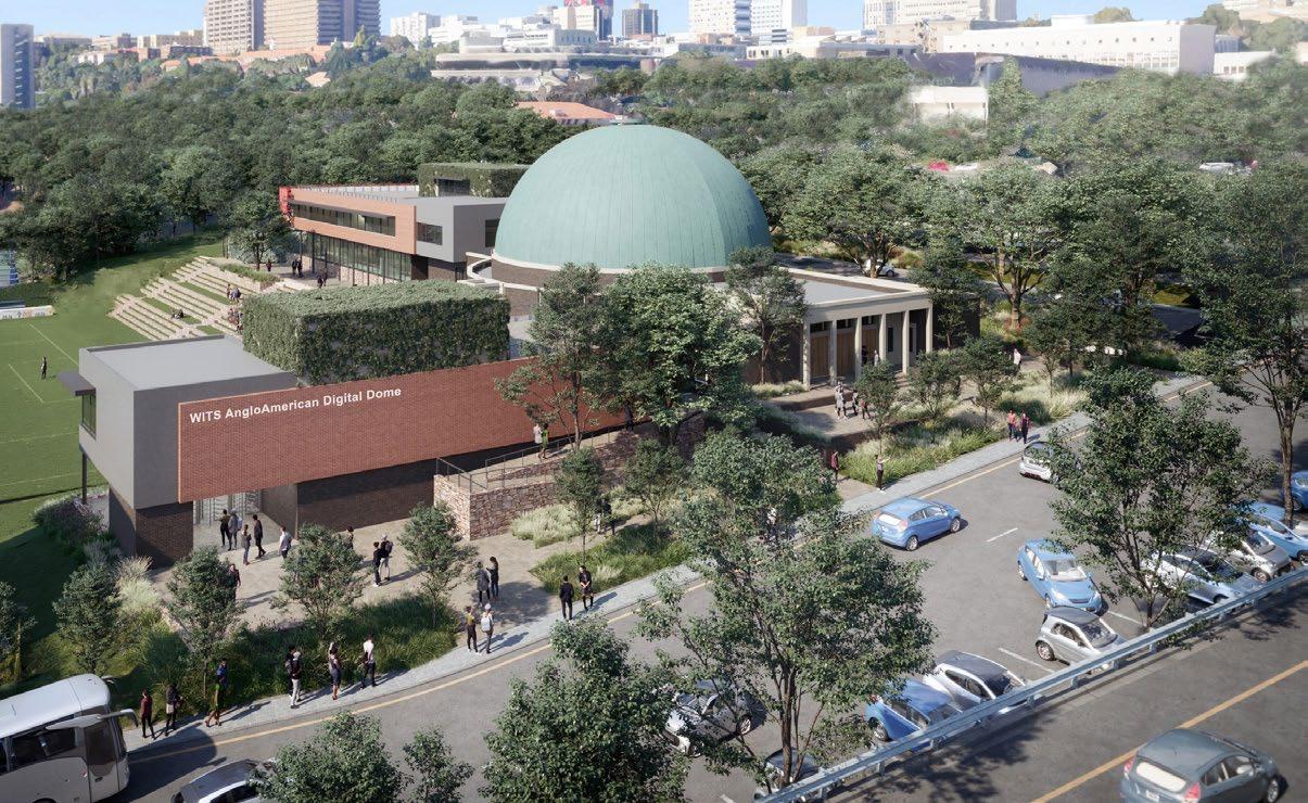
We've been doing quite a lot of work at the University of the Witwatersrand, including the conversion of the iconic Planetarium into a Digital Dome. I love the challenge of working with a powerful historic building like the Planetarium; how to maintain and enhance this resource but simultaneously move it into contemporary use. Another exciting project is the restoration and adaptation of a house designed by Pancho Guedes in Forest Town. My final year at Wits was also the last year Pancho was head of department and this house was being built while we were at varsity. The house was stripped of all its finishes and left abandoned for about 5 years. It’s wonderful to be able to nurture it back into shape. Both projects engage with reusing existing buildings – a very sustainable practice.


70 / INTERVIEW /
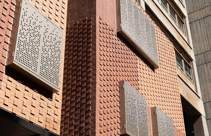
Wits University Gatehouse. New seminar rooms installed into an existing brutalist building link two sides of the building with a new patterned brick façade and shiny perforated screens. The new material language symbolised by red brickwork weathers well and is also more humanist.
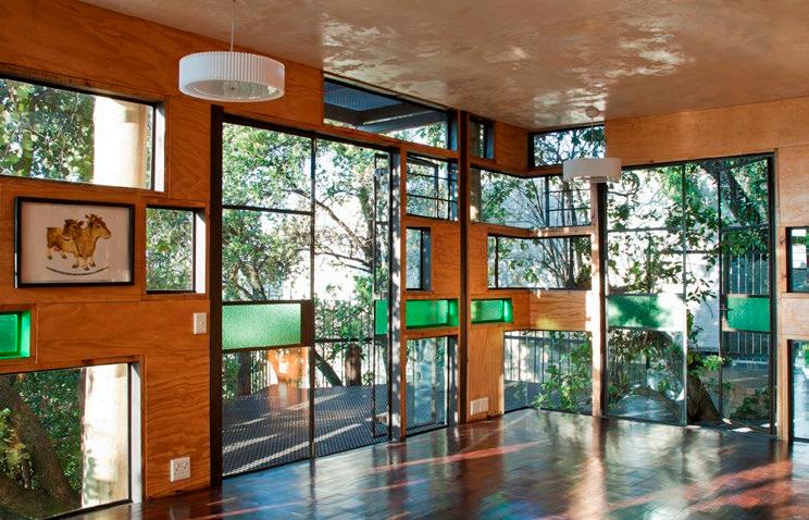
lulu kati kati's leafy, breezy middle level.

Your Women’s Jail Living Museum has been widely published and often referenced as your most influential work. What do you think has made this such a special and successful project for you?
The Women’s Jail Living Museum was a really important project for me. It happened at a very specific moment in South Africa’s history, and, in many ways, embodies the story of South Africa. Shortly after the elections in ‘94, there were several civic projects undertaken by the JDA and funded by Blue IQ that sought to make connections between the formerly separated communities and parts of Johannesburg. Constitution Hill, where the Women’s Jail is, was one of these projects. Working at Constitution Hill also connects back to ‘threads’ and my interest in the ridge, and the invisible link between the Johannesburg Fort, the Women’s Jail, Wits University, the randlord houses along the same ridge, my lulu kati kati on Melville ridge, and our work in Soweto.
House Schutte's handmade rammed earth walls.

We love the design of lulu kati kati, which houses the KOA Studio. Could you tell us about the idea behind this uniquely designed space?
My beloved lulu kati kati, my house that is not a house per se, but rather a living ‘organism’ that I have recently moved our studio into. It’s a wonderful full circle to be back in my castle on the ridge of Melville looking out at the koppies and beyond, nestled in the tree and surrounded by all the other trees, my babies that I planted 14 years ago! Lulu kati kati is one of my boldest ‘constructions for self’ – a real experiment in construction where the top floors are suspended from six massive gumpoles, 9.5m high, weighing over half a ton each. It is wonderful to experience the different levels of the structure; bright and sunny at the top, our studio, leafy and breezy in the middle, our lounge and meeting room, and our soon-to-be events space at the bottom nestled in the rocks and opening to the garden. I love being here.
Who has been your biggest professional influence?
The late Egyptian architect, Hassan Fathy, has long been my hero. He worked to re-ignite the knowledge and skill of building with sun-baked mud bricks and believed that beauty was a human right, especially in the homes he designed for the poor. His work is sensual and sustainable.
From Lesley Lokko, I learnt that architecture is not only in the built form, and that deep thinking and questioning are part of the process of making better architecture. Lesley challenges and inspires, and she sure isn’t scared of hard work!
How would you describe yourself?
A ‘cheerful humanist’, as Alan Lipman described me. I rail against mediocracy and see beauty in unexpected places. I am very particular, but more mellow as I grow older.

72 / INTERVIEW / @kateottenarchitects www.kateottenarchitects.com
Wits University Digital Dome. The historic Wits Planetarium becomes the new Digital Dome, still retaining its prominence from the passing highway.


OrbitX LED lights are locally designed, assembled and tested to provide excellent light at the lowest life cycle cost in the market. This has been confirmed from research by Stellenbosch University.
8-year guarantees provide peace of mind for zero maintenance during the long lifetime of OrbitX lights. High efficiency ensures minimal energy cost while maximising light output.
E N FO C U S
• Orbit LED Lights on average last 4 times longer than other LED lights and reduce landfill waste by as much as 75%
•
Are energy efficient with a near-unity power factor. This radically reduces your carbon footprint and energy usage by 50 to 67%
• Are recyclable and a void costl y disposable costs
• Are ideal t o use in conjunction wit h PV Plants (Solar Generation)
www.orbitx.co.za

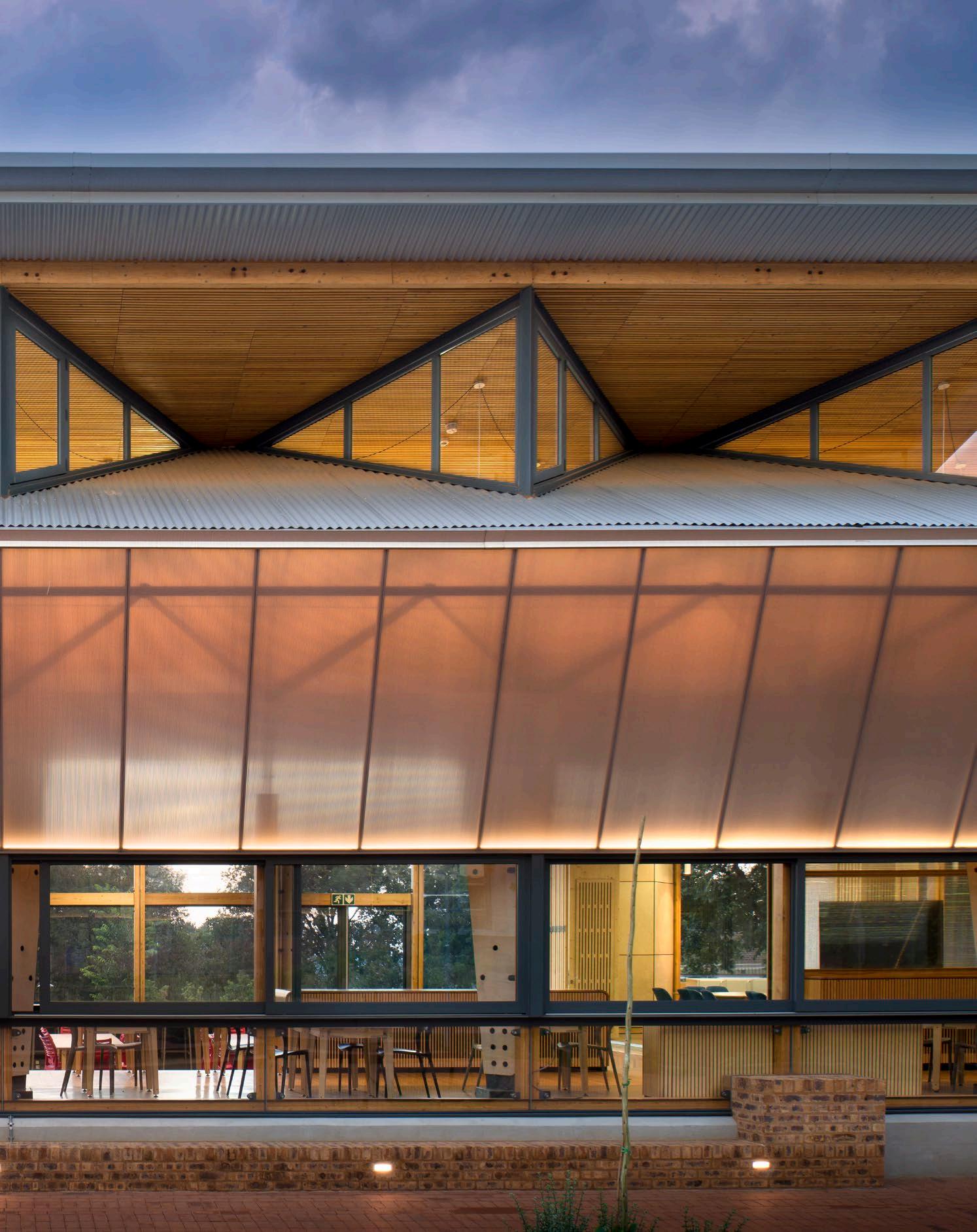
Future Africa Innovation Campus Dining Hall Photography by Dook Photography

In Conversation
Earthworld
with
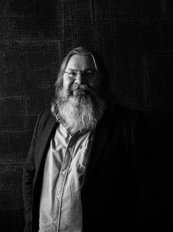
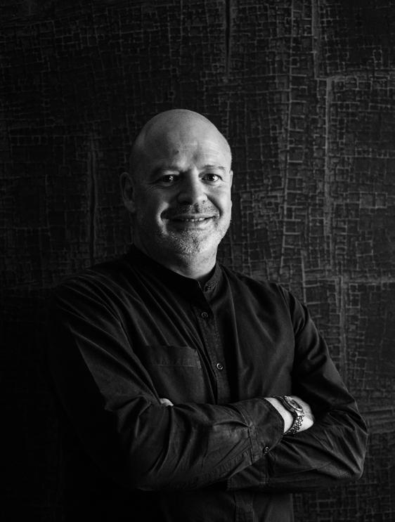
Headed up by André Eksteen and Braam de Villiers, Earthworld believes in design as the pursuit of beauty and meaning. Eager to learn more about their dynamic practice and holistic ethos that guides it, we spoke to André and Braam about their origin story, the epitome of their design practice, and a cool project that takes the idea of an office and makes it a curiously sustainable solution to uplifting communities.

The start of our manifesto captures our practice philosophy: ‘In the making of meaningful things...’ When we talk about a meaningful thing, it is something that transcends the physical, becoming an icon, not because of beauty but rather because of the contextual relevance to its users and makers. We consider ourselves to be makers, and when we use digital manufacturing we enhance the relevance to our users and open up the value chain to include unskilled labour and SMMEs.
A quote that we strongly identify with comes from Albert Einstein, who said, ‘The world as we have created it is a process of our thinking. It cannot be changed without changing our thinking.’
What is the origin story of Earthworld?
After completing our studies at the Department of Architecture, University of Pretoria (UP) in 1994, we both worked for the architecture firm Joubert, Kammeyer and De Villiers. The financial crisis in 1997 led to our being retrenched, and we went our separate ways. Braam received a Fullbright scholarship and graduated with a Master’s degree in bio-climatic design from the University of Arizona in 1998. When he returned to South Africa, he worked on small alteration and addition projects, then moved to John (Johannes) van de Werke’s house in Waterkloof, Pretoria.
André followed, and we were later joined by some of our friends and now fellow creatives, including Gerrit Wassenaar and Faan Nel.
One day, Braam made a diagram in his sketchbook, where he drew a line. On top, he wrote skyworld and below, earthworld. Earthworld sounded like an architecture practice, and so, in 2000, Earthworld was founded.

76 / INTERVIEW /
André Eksteen
Braam de Villiers

/ INTERVIEW /
If you had to choose one of your projects that best epitomises your design ethos, which would it be?
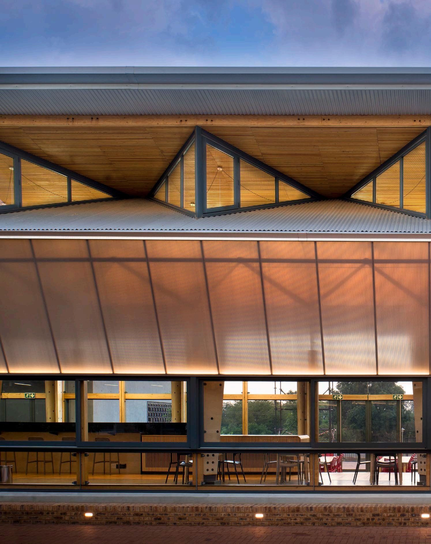
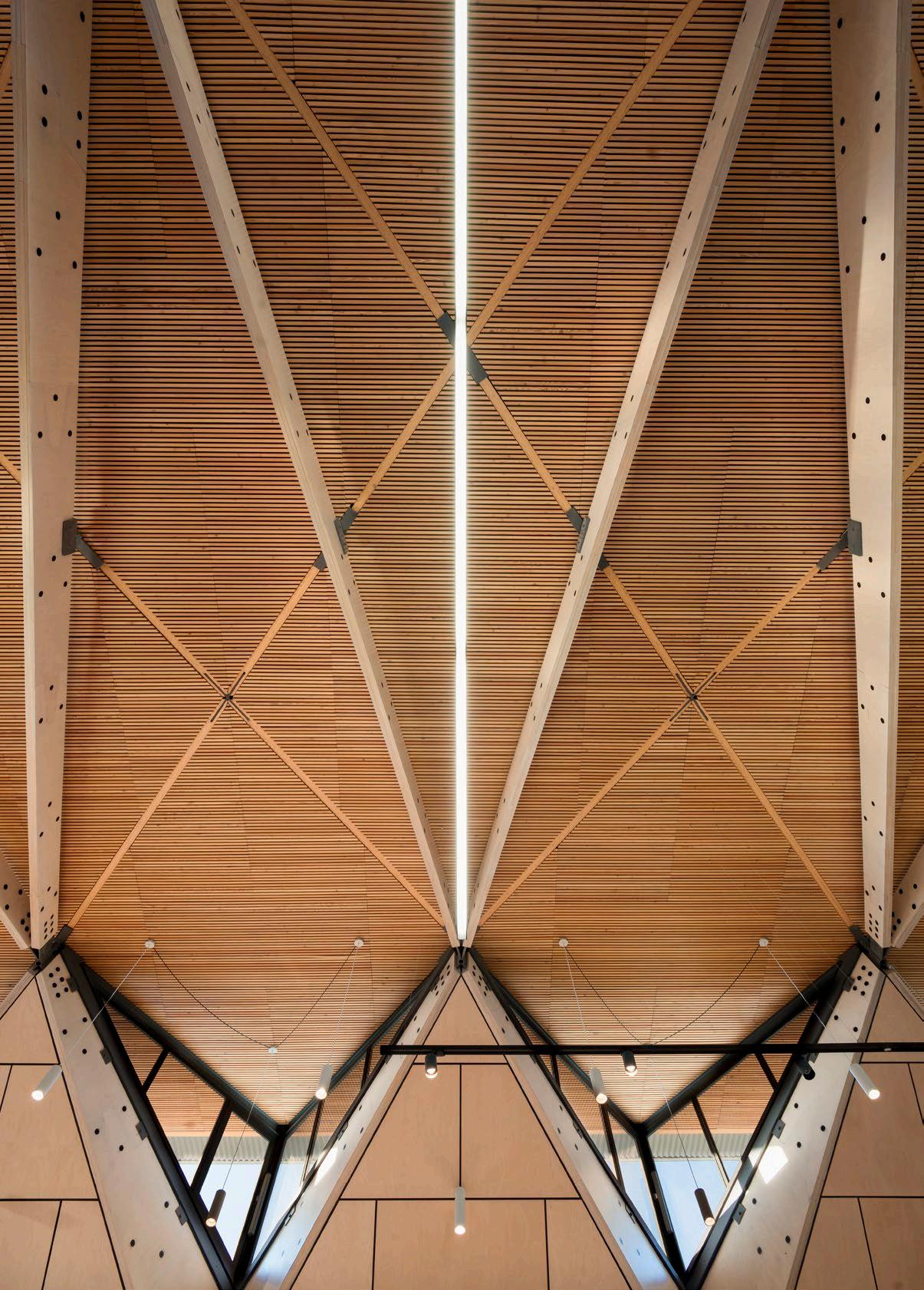
A project can shift paradigms if we proactively work toward changing systems. The Future Africa Innovation Campus at UP realised many of the normative positions investigated during our studies. However, if we had to choose only one of our projects, we would say that the Dining Hall, also known as ‘the Hub’ on the Future Africa Innovation Campus, is the best example of our ethos.
When we consider the brief of the Future Africa Campus, we looked at precedents and identified that the conventional approach at universities calls for clusters of buildings with some shared facilities central to the residential units. But these clusters still created islands and isolation. We undertook to re-imagine this typology and we designed centralised spaces for interaction. These spaces would facilitate collaboration, cultural interaction, and friendship. With the vast cultural diversity on the South African continent, the idea of sharing thoughts around dinner tables was at the core of the organisation. The landscape design also formed part of the system by re-introducing 56 orphan crops and allowing foraging to explore alternative cuisines and creative interaction around new tastes, textures, and colours. The Hub is a space where the whole campus can congregate, eat, and share ideas.
PICTURED HERE
Structural timber: Universal Plywoods | Polycarbonate sheeting: Palram | Furniture: Raw Studios, Chair Crazy, Sit SA, Table Tops Furniture

@earthworldarchitects www.ewarch.co.za

'A project can shift paradigms if we proactively work toward changing systems... These spaces facilitate collaboration, cultural interaction, and friendship.'
78 / INTERVIEW /

Tell us about your Office-in-aBox project and how your skills as architects influenced the design concept.
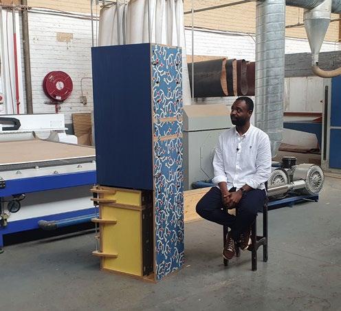
Office-in-a-Box is significant if we consider the importance of making. We won the Department of Trade Industry and Competition (DTIC) Award in Furniture Design for 2022 with Office-in-a-Box. Our skills as architects and specifically how we approach any project contributed to the success, since we first considered the context and developed a narrative from there.

The story starts with a systemic South African problem, where we have a community that is eager to learn new skills, yet lacks the opportunity to engage in the formal building industry. As architects and makers, we design the components, and then we decentralise the manufacturing process, where any group can collaborate to form their own company, setting up a factory or workshop where these components are made. Manufacturers can then determine their own capacity and capabilities, which can be improved upon over time, and any entrepreneur can become a supplier. Office-in-a-Box is a project that can easily be integrated within university studios, offices, or even student residences where space is sometimes limited.
The project, pursued in collaboration with Fourth Revolution, is important as it exemplifies our ethos that sustainability is much more than designing with ‘green technology’; it is environmental resilience, economic demands, and social sustainability, enabling users to become active citizens in shaping their environments.
79 / INTERVIEW /
Office-in-a-Box

Lan d s ca p i ng Irr i ga ti o n M a i n t e nan c e 2023 SALI Awards of Excellence: 3 Double Golds | 1 Gold & Silver |1 Silver & Gold | 1 Double Silver | 3 Silver & Bronze | 1 Silver www.countryline.co.za


 Photos by Flavien Carlod and Baptiste Le Quiniou, for advertising purposes only. Roca Sant Julià.
Résidence. Sofa leather, designed by Philippe Bouix. Strophe. Armchair, designed by Sacha Lakic. Paris Paname. Cocktail tables, designed by Bruno Moinard.
– CAPE TOWN - MAURITIUS


 Merricks Farmhouse, photography by Tom Ross


 Cheetah Plains, photography by Adam Letch


 Cheetah Plains, photography by Adam Letch South Villa, photography by Niel Vosloo
Star 27, courtesy of ARRCC


 Nico In Conversation with van der Meulen


 Victoria Residence, photography by Anton van Straaten
Kloof Road House, photography by David Ross


 Kate Otten In Conversation with
