COFFEE TABLE EDITION




Reliability is at the heart of our industry, and our Professional range is no different. Product innovation coupled with our value added services gives you a distinct advantage.
Our complete coating system, spanning preparation, trim, wall and textured coatings, is designed to ensure guaranteed product performance and value from start to finish.

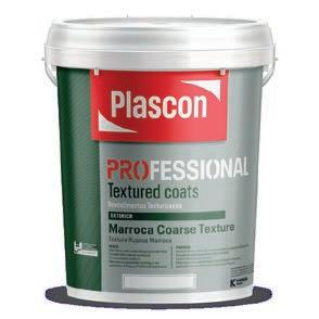
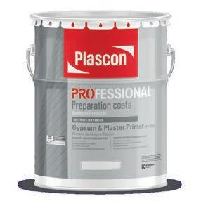
All Plascon Professional products with the Ecokind logo have VOC levels within the GBCSA standards for Green building ratings.
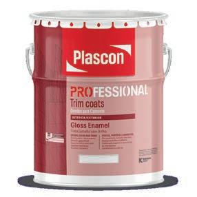
Designed for professionals.
@PlasconSA @PlasconSA @PlasconSA
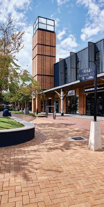
 Corobrik’s range offers you versatility in design & durability that lasts a lifetime.





y Allows children to play without risk of injury.
y Excellent shock absorption with high elasticity.
y Smooth and soft playground flooring.

y Critical Fall Height (CFH) legislation compliant.
y Suitable for indoor and outdoor areas (UV stable).
y Available in standard and bright EPDM colours.
y Quick and easy to install (D.I.Y).
y Held together with integrated connector pins.
y Ideal for children’s playgrounds, aquatic theme parks and landscaping.
y Wide variety of peripheral rubber playground accessories available.
y Low maintenance.
When was the last time you stopped to truly take in the great achievements of the industry you are a part of? We spend so much time caught up behind our desks, carrying the weight of the next deadline on our shoulders that we seldom get the chance to have a much-needed moment of repose. Take this opportunity to pause and reflect on what we’ve built, created, and, on a less literal level, rebuilt and recreated in 2022! This issue is our sixth annual Coffee Table Edition, and every year when our team sits down to piece this brag book together, it also marks our December reflection on another trip around the sun. The past year has been a time of rebuilding, both in terms of our industry rediscovering a sense of normality in-office and on-site and with our own SCAPE brand evolution. Our team has deliberated over hundreds of portfolios, watching and waiting in the wings as developments have risen brick by brick over the past few years until we can give them their rightful spotlight between our pages. We’re finally here, and we’re bouncing off the walls to unveil our curated coffee table book which highlights and showcases the exquisite facets of architecture, engineering, design, and build in South Africa. It’s a noteworthy end to a big year in build, and we leave this brilliant reminder of your achievements right here! We are poised towards exciting new adventures in 2023 and look forward to fuelling our collective passion for the industry together.
Like our buildings, we rise.
Chanel Besson EDITOR-IN-CHIEFRestaurant Klein JAN and Motse Lodge
Savile Row Tailored Environments, Anji Connell, ACID+ 32
Kritzinger Architects, Dominic Touwen and Camilla Fraser Design
40
Helderberg Environmental Centre Ebesa Architects, Viridian Consulting Landscape Architects 50
Weaver's Nest Anton de Kock Architecture, Contours Design Studio
Hasso Plattner d-school Afrika KMH Architects, Tarna Klitzner Landscape Architects, Design Lab
Radisson Blu Hotel Oceans Durban
Elphick Proome Architecture, Source Interior Brand Architecture
Nicol Corner
Cimato Moroldo Architects, SNA Architects
88
THE SEA Nelson Mandela University Ocean Sciences Campus Extension SVA International 94 CAP CLASSIQUE
Old Cape Quarter dhk Architects
100 ST JOHN'S PREPARATORY PENCHARC
108
SAVED BY THE BELL
Curro Durbanville BPAS Architects, cndv landscape architects
116
STANDING FIRM IN FAITH
Durban Christian Centre Elphick Proome Architecture
124
Nexus 1 Waterfall
LYT Architecture, Daniel Rebel Landscape Architects
the
142
CHRIS HANI LECTURE THEATRE
JAKUPA Architects and Urban Designers
The Rockefeller
Source Interior Brand Architecture
159
FIRST IMPRESSIONS. NOW.
Agora Apartments
TwoFiveFive Architects
132
2U South African Headquarters
Jacobs Parker Architecture, Trend Group Global, Paragon Interface
166
SENSATIONAL SUSU BUBBLE TEA
Cooked Studio
Station House
Vivid Architects, Inhouse Design Studio, Soda Custom
The Winchester Boutique Hotel
Source Interior Brand Architecture, GAPP Architects and Urban Designers


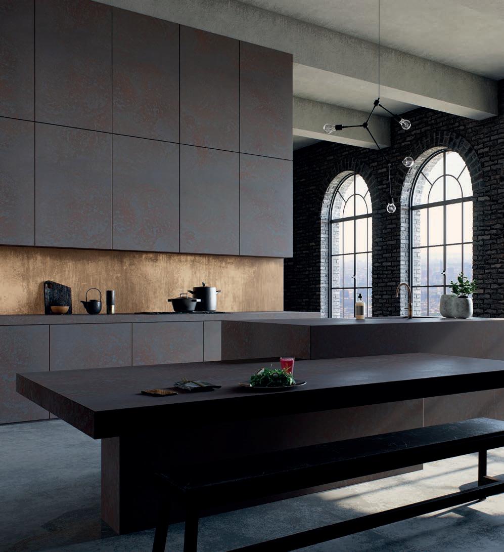
It’s either Caesarstone, or it’s not It’s the world’s best kitchen countertop, not because we say so, but because you do.


Size: 111 000 hectares
Location: Farm Korranaberg 296, Tswalu Kalahari Reserve, Van Zylsrus, Northern Cape
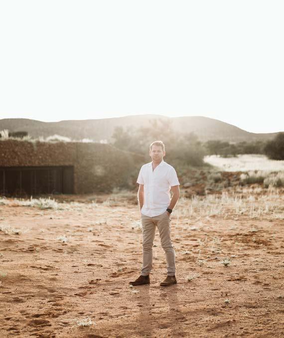
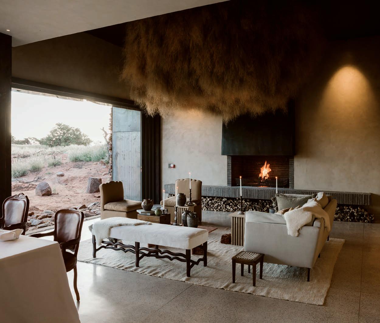
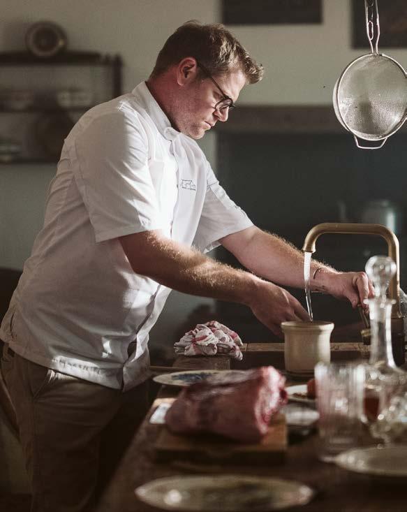
Set in the untamed Kalahari, the ultimate destination dining experience awaits at Restaurant Klein JAN and Motse Lodge. In a fusion of veld and food, South African-Namibian-based architects Savile Row have brought Michelin star chef JanHendrik van der Westhuizen’s vision to life on Tswalu Kalahari Reserve — and its’s a spectacle to behold...
Rooted in sustainability and actively taking a low-impact approach to responsible travel with conservation, community, and culture at its core, the Oppenheimer family have revived the Kalahari through sustainable ecotourism. Tswalu's remote location offers the ultimate off-the- beaten-track escape, with access to one of the world's last wilderness areas. A place of immense natural beauty, the vast unspoiled landscape of undulating red dunes, the Korannaberg Mountains, and expansive grassy plains merge with dense savannah reaching far across the African horizon. With one of the lowest footfalls in South Africa, Tswalu offers freedom to explore the game-rich habitats with a private safari vehicle, guide, and tracker, and with absolutely no time restraints. The only appointment you will have is dinner at Klein JAN, and this is one you will not want to miss.
The lodge is set against the rocky foothills of the Korranaberg Mountains overlooking the vast open plains of the Kalahari. The project involved extensively reworking the current structure to improve operations and comfort to ensure the guest experience inside the lodge is as exceptional as that provided by nature. Surrounded on all sides by the ‘green’ part of the Kalahari, and cloaked at night in a truly extraordinary display of the milky way, this location is the epitome of barefoot luxury, and as such, the architects drew their design inspiration from the colours, textures, forms, and unique fauna of the region. Their brief was to take what was a successful, loved destination and transform it into a laidback yet opulent environment that would also be comfortable and authentic. One of the major challenges they faced was the need to make fairly dramatic spatial planning changes to fix historic design flaws which impacted operational efficiency.
"ROOTED IN SUSTAINABILITY AND ACTIVELY TAKING A LOW-IMPACT APPROACH TO RESPONSIBLE TRAVEL WITH CONSERVATION, COMMUNITY, AND CULTURE AT ITS CORE."

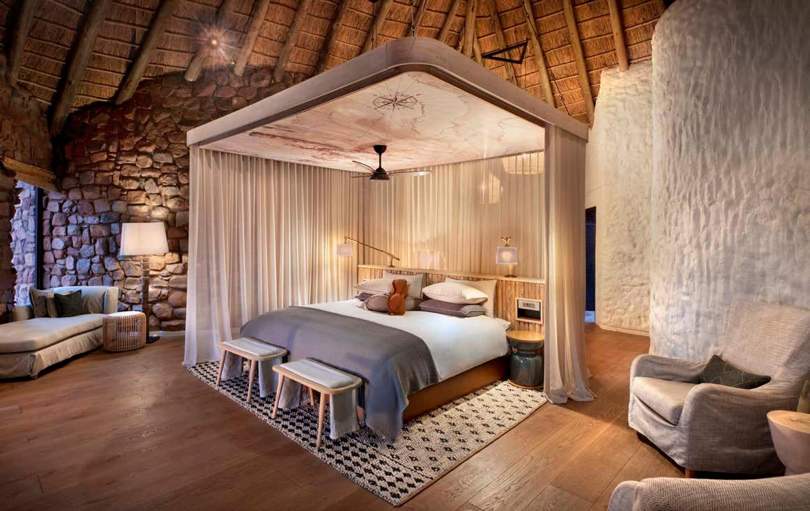
The architecture and interior design refurbishment of the nine suites/houses and the main public building happened within a four-month construction timeline. Each house (or legae) was altered and extended to improve the visual connection of the Kalahari to the internal spaces. The upgraded bedrooms and bathrooms received new fittings and finishes, and were opened up to the outdoors to create more space and light. The overall casual yet elegant design harnesses natural materials, textures, colours, and forms for both the buildings and the décor. Traditional thatch roofs, whitewashed walls, suspended light pendants, polished engineered timber floors, screed floors finished with cemcrete, and local artworks, come together to complete the calming, luxurious aesthetic.

The refurbed main public building received a covering on the front façade, creating an outdoor setting for guests to observe the watering hole. A new entrance and lounge bar take advantage of the Korranaberg views, while replanned public spaces with thermo-ash decking (a solid timber that can withstand the extreme heat and desert conditions) were installed outside. The gym, spa, and boutique store with a gallery were relocated to the repurposed outbuildings, and a new photographic studio for the guests to hone their photographic skills was also added to the facilities.
Client and project manager: Tswalu Kalahari Reserve

Architect: Savile Row Tailored Environments
Landscape architect: Dawid Klopper
Interior designer: Savile Row Tailored Environments and KRAAK Designed Hospitality

Structural engineer: MVD Kalahari Consulting Civil & Structural Engineers
Main contractor: Kobus Duvenage Builders
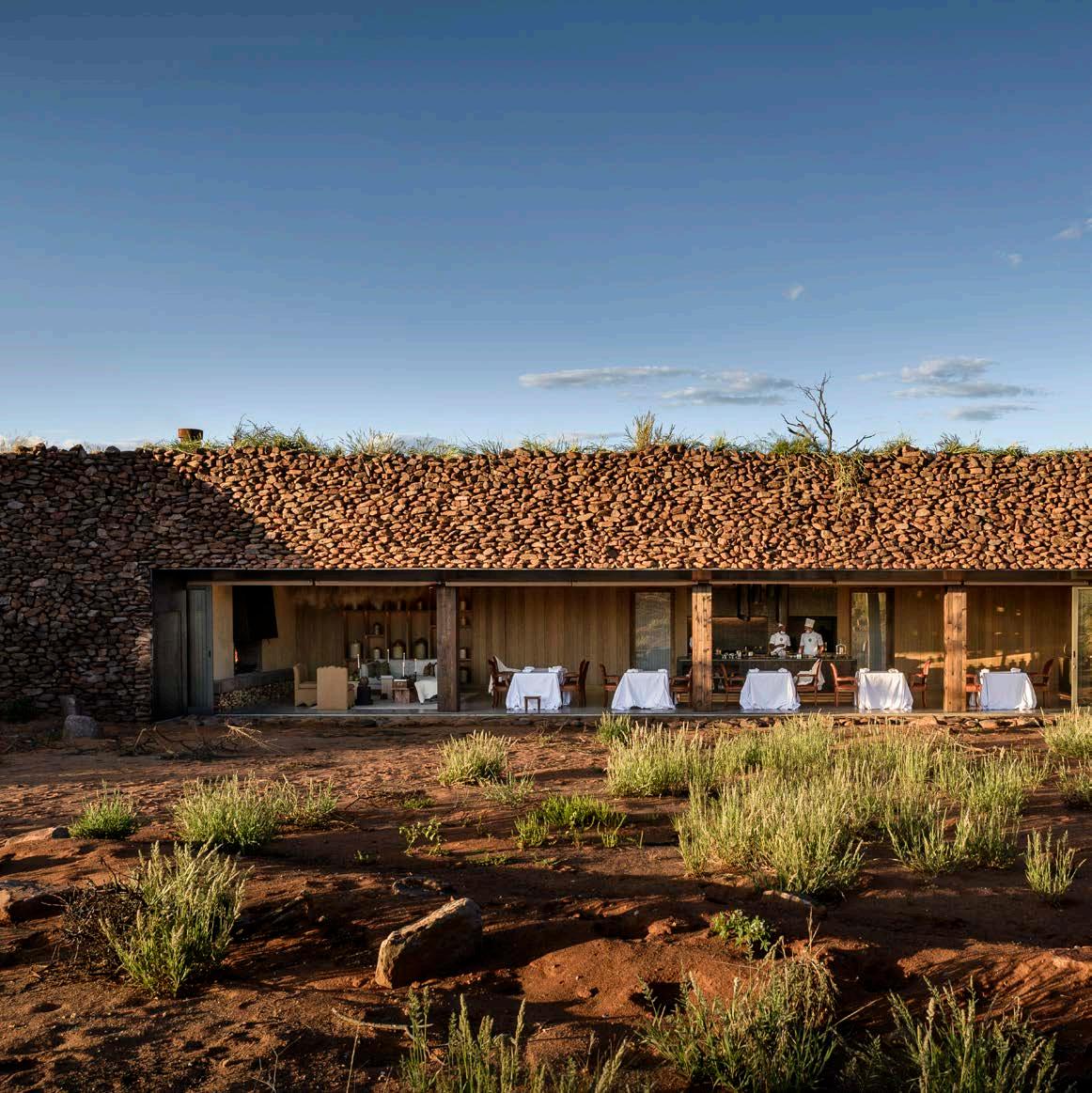
Adding to the already unique Tswalu experience, Jan-Hendrik van der Westhuizen has opened his longawaited South African destination restaurant at Tswalu Kalahari Reserve. Jan-Hendrik is the first South African chef to obtain a Michelin star with his French restaurant JAN in Nice, France. Backed by Nicky and Jonathan Oppenheimer's belief in Jan, the talented connoisseur has created something genuinely South African on his home soil, sharing Tswalu's commitment to celebrating local provenance, heritage, and culture. The brief for Klein JAN was to extend and include the humble 100-year-old Boscia House building without changing any of its features. Jan wanted it to look like his Ouma had just stepped out to hang up the washing and you can smell the food she is preparing on the stove. As such, the restaurant champions and celebrates his Afrikaans grandmother's Dutch-influenced farm cooking with new innovations of the humble favourites featuring lesserknown South African ingredients. Jan believes the food served needs a unique identity that captures who you are and where you are, and that it is not just about the food but about the whole experience — it should heighten all your senses.
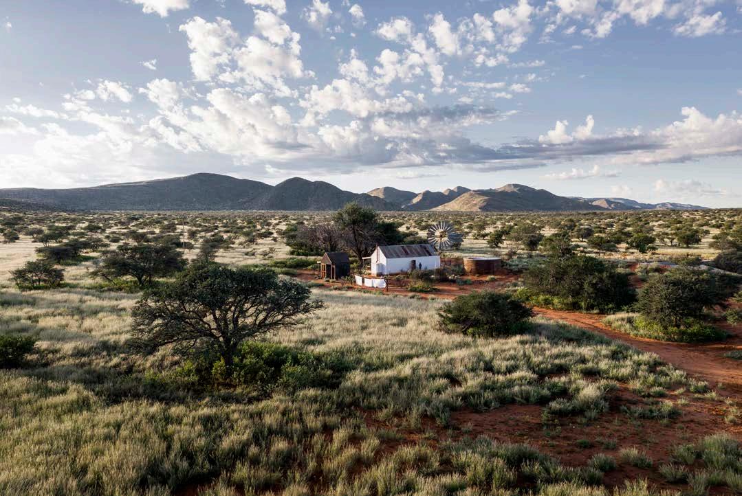
Klein JAN's beguiling setting in an unpretentious whitewashed century-old Victorian farmhouse with an old tin roof, is like a movie set awaiting the actors. An ancient-looking rusty corrugated metal building next to the house is the bathroom. An old multi-blade wind-powered water pump and a washing line with laundry billowing in the early evening light complete the scene. And it's pretty magical, evoking a sense of nostalgia—a journey back in time, to days gone by, and of farming folk toiling the land.
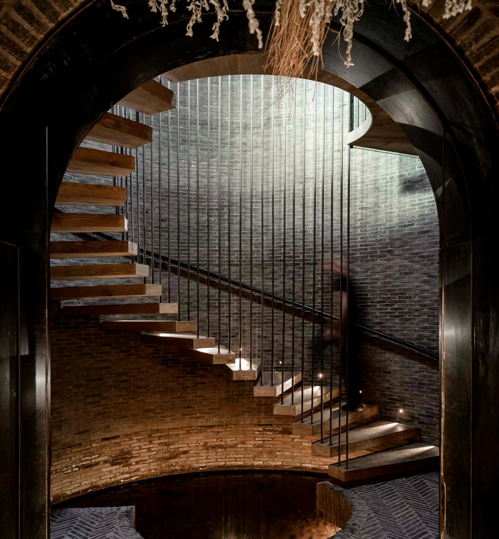
Storytelling is a fundamental aspect of the theatrical dining journey that is Klein JAN. The house sits under two deep-rooted Boscia albitrunca (shepherd's trees), one of the essential bushman’s forage trees in the Kalahari from which Boscia House takes its name. On the stoep (terrace), tables are dressed simply with white tablecloths and vases bearing branches. The interior enchants with its antique chairs and decorative dangling tumbleweeds. Guests are led behind the modest homestead towards a corrugated-iron reservoir, where the glowing outline of a door appears. The door creaks open, beckoning you inside a portal to another world. A spiralling timberand-steel stairwell above a cascade of water plunges deep into the earth below. As the dinner party descends deeper and deeper, a pungent aroma (the ‘petrichor’, a distinctive earthy smell when rain falls on dry soil) fills your nostrils, until you arrive at what appears to be an endless vaulted corridor. Rows and rows of gorgeous produce are lined up in a breathtaking 20-metre-long subterranean larder. This is JAN's underground root cellar, a naturally cool storehouse for all his raw, cured, and preserved locally sourced produce— which in the Kalahari Desert means from an area within a 400-kilometre radius!
As patrons journey spellbound and speechless through the cellar, they are invited to sample sensational delights from the cellar. The procession continues in a steady flow to the cheese room where a banquet of cheese, with spares to boot, is up for the taste. This is also where Jan's grandmother's original koolstoof (coal stove), the stove Jan learned to cook on as a child, takes pride of place in a homage to his Ouma Maria. The dinner party pass by a well-stocked wine cellar where a sliding door opens, revealing a vast contemporary space. As if moving in conjunction with the passage of time, it seems as though the guests have journeyed through the old and arrived at the new. Cut into the hillside with a glass-fronted opening, a sleek minimal space (and what Jan calls the 'new Kalahari') awaits. The contemporary 20-seat restaurant seamlessly opens up to the landscape beyond, where an incredible sunset draws the eyes like a magnet. A large streamlined linear kitchen island sits in the middle of the room, flanked at one end by a spectacular floor-to-ceiling bar and a fire and cosy sitting area in the other. The colours are mellow and muted; soft ambient music fills the room and simple white cloths drape the tables. The dining chairs exemplify how Jan has intentionally married old and new in the main restaurant. They're made from French oak wine barrels covered in a tight skin of Kalahari cow leather and draped in local sheepskin adorning the contemporary space.
Klein JAN is an architectural masterpiece in a wildly dramatic setting that succeeds in delivering an unforgettable narrative-driven culinary journey. Most of Klein JAN is unseen from the outside, appearing as a humble farmstead on first approach before revealing the wonder buried beneath the ochre Kalahari sand. The design takes its cues from the indigenous creatures seeking refuge by burrowing underground.

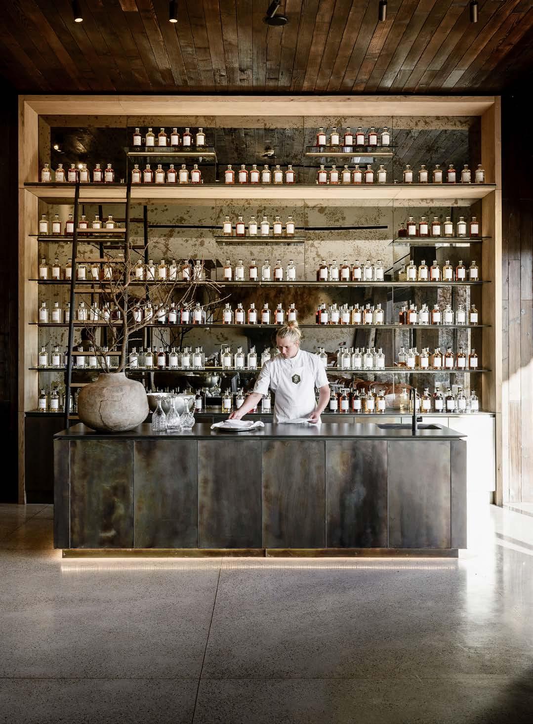
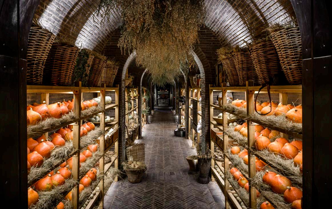
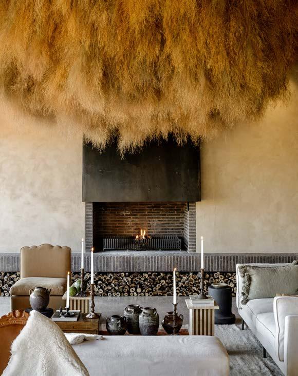
But apart from the building’s obvious element of surprise, the decision to set the restaurant into the earth was also to harness the known benefits of ‘thermal lag’ found in pit architecture. The order of spaces and experiences evolved to mirror Jan-Hendrik's personal culinary journey, with the Boscia House representing his traditional past and the restaurant his exciting future. The architects intentionally designed the space so that guests can travel through on a moving feast, and if you doubt architecture can move you, this experience will make you think again. It's genius.
This magical setting was created by Hannes van Kraak of KRAAK Designed Hospitality who was tasked with sourcing and styling the interior of Boscia House. The brief from Jan was to create a nostalgic theatre with a personal approach — a 'still life’ picture that comes to life. As event designers, this is exactly what KRAAK is accustomed to. However, whereas these installations are usually temporary, this time it would be permanent with each piece serving a different function. Hannes spent a year scouring for the perfect pieces. He decided to do the installation in the evening with the right light, focussing on the natural shadows provided by the rays of light entering through the vintage lace curtains. He would pour himself a tall glass of wine, listen to ambient music, and start placing each item exactly where it comes to life.

The brief for the landscape architect, Dawid Klopper, was to ensure the restaurant would be nestled into the environment. To do this, he recreated dunes and planted the area with dead trees to provide perches for local birds, with the knowledge that the seeds in their droppings will grow and establish a natural balance and a beautiful setting.
Klein JAN is a breathtaking, carefully curated theatrical performance. This extraordinary collaboration between humans, nature, and culture is truly food for the soul, and Tswalu is the magical setting that makes it possible.
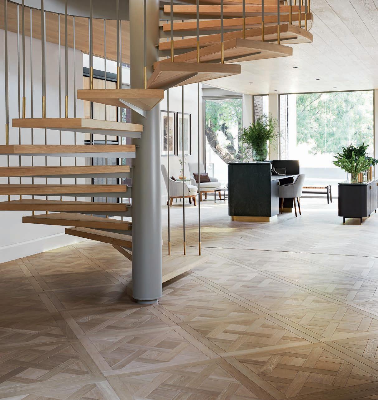
Flooring, feature walls, and ceiling
Cemcrete 011 474 2415
Countertops Caesarstone 083 608 5810
Furniture Savile Row Tailored Environments 011 234 8191
KRAAK Designed Hospitality 072 915 2226

Property size: 464 hectares
Boathouse size: 154 m2
Location: Provincial Road, Wortelgat Road, Stanford, Western Cape
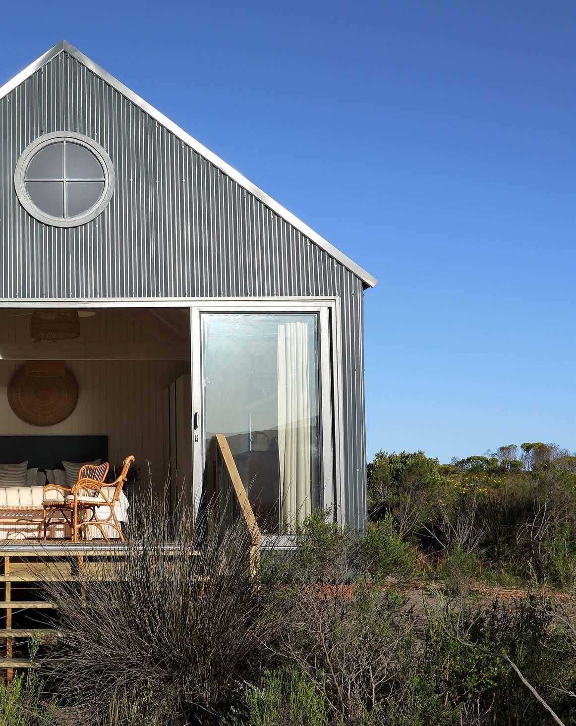
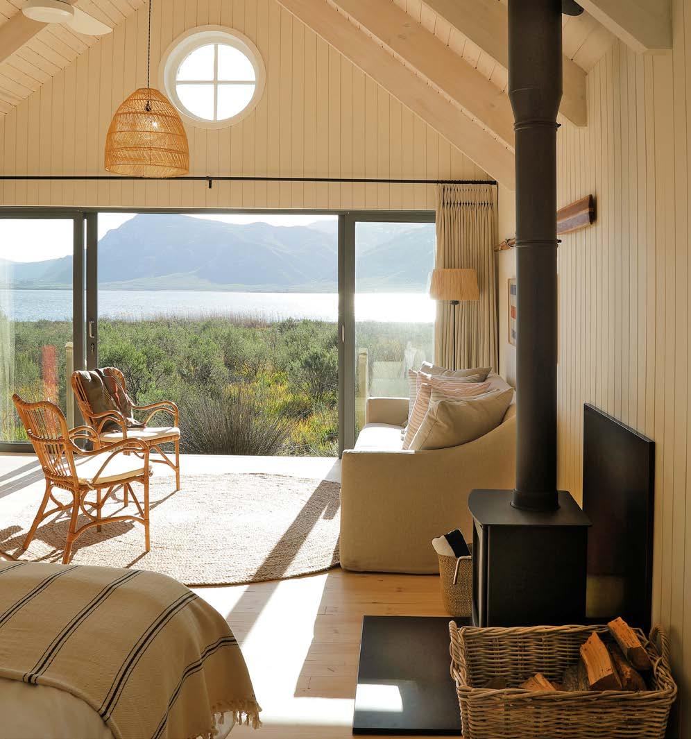
Located beside the tranquil waters of Klein River Lagoon overlooking the green slopes of the Maanschynkop Mountains, Coot Club offers an eclectic mix of traditional stone cottages and contemporary-line boathouses that blend seamlessly into the natural environment. A stone’s throw from the bird-rich Walker Bay Nature Reserve and just a ten-minute drive from Stanford village, the conservation-focussed precinct takes eco-tourism to a whole new level. Let’s step inside the award-winning Cape-based Kritzinger Architects’ inspired design in the Overberg...
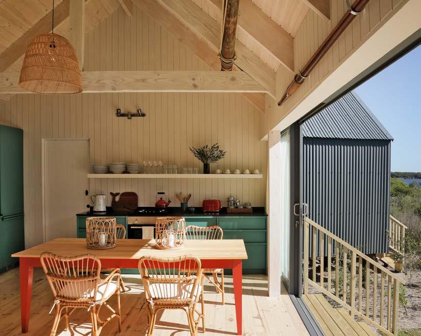
The brief from the client was to establish a unique lifestyle family retreat that would rekindle the spirit of adventure in us all. A place where people can enjoy the simple things in life, and children can flourish, play, and grow in a spectacular natural environment. One of the key considerations for the architects was to design accommodation for both shareholder and tourism/guest use. The aim was to build budget-driven, cost-conscious spaces with an open-plan living, dining, and kitchen concept and exceptional lagoon views. Kritzinger Architects built three three-bedroom, two-bathroom boathouses and one two-bedroom boathouse, all single storey.
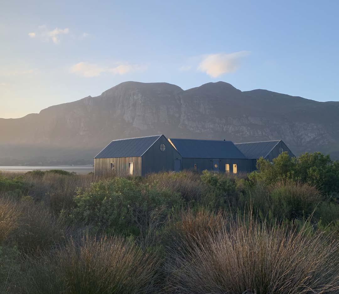
Conceptually, the architects sought to create a contextually appropriate design response that would reflect waterside living through the use of building forms that relate to the traditional boat sheds found along Klein River and other lagoon estuaries in the area. The intent was to contrast the new with the old and not to emulate the existing building typology.
Existing buildings, such as the historic Spookhuis, are generally monolithic and traditional in design, comprising primarily stone construction set on concrete foundations within the earth. The new design, on the other hand, offers a more ecological design approach by striving to minimise the build impact on the natural environment. This is achieved by raising the building platform above natural ground level and with an eco-friendly pile cap system. The overall weight of the building was minimised by using a lightweight modular timber structure clad with traditional Victorian-profile corrugated iron.
The architects wanted each new building form to read as a collection of small boathouses built alongside each other, rather than as a large single building with a big footprint.
"A place where people can enjoy the simple things in life, and children can flourish, play, and grow in a spectacular natural environment."
MEET THE TEAM
Client: Coot Club
Architect: Kritzinger Architects
Interior designer: Dominic Touwen and Camilla Fraser Design
Planning consultant: Plan Active
Quantity surveyor: RLB Pentad Quantity Surveyors
Engineer: Gadomski Consulting Engineers
Electrical engineer: Hermanus Trading & Electrical
Fire consultant: De Villiers & Moore
Wet services and plumbing fitter: Walker Bay Plumbers
Main contractor: T&B Log Homes
The advantage of this approach is that the scale and massing of the building is reduced while at the same time allowing natural light to penetrate the open spaces between the units, thereby encouraging the natural vegetation to grow as ‘green lungs’ through and around the buildings. This further enhances the feeling of living in nature and reduces the visual impact of the building through vegetative growth.
Unpacking the design Coot Club intentionally follows eco-sensitive design principles so as to be very ‘light on the earth’. The inspiration for the architecture was derived from the humble corrugated iron boat sheds found in the area, with particular reference to scale, form, and simplicity of construction. The design offers an ecological approach, by striving to minimise the build impact on riverine vegetation.
The architectural language embraces a nautical theme by incorporating elements such as porthole windows, decking, and timber construction reminiscent of traditional boat building techniques. The boathouses are well spaced apart within the landscape to ensure privacy, while at the same time offering easy access to the Spookhuis precinct. Part of the development strategy was to conserve the magnificent milkwood trees in the Spookhuis area and to plant additional milkwood trees on the property, focussing on the development area along the water’s edge as well as key access routes. The alien vegetation was removed and replaced with indigenous planting.
The horizontal building form has the advantage of being able to follow the natural contours of the land. This offered flexibility during construction as it allowed each of the units within the overall building form to be set out independently according to the contours, thereby morphing the building into the landscape. In addition to this, the pitched roofs serve to minimise the visual impact through a broken architectural roofscape as opposed to one single roof span.
Joinery
JB Designer Kitchens & Cupboards 084 200 2037
Fans Timber Fans 044 382 2369
Appliances
Smeg South Africa 011 463 1016

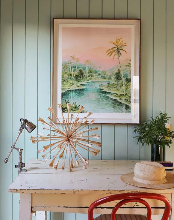
Therefore, rather than a large mass of lighting that would come from a single building form, the broken building form with its undulating roof scape gives the visual impression of ‘lanterns’ in the landscape. This ‘lantern’ effect reduces the scale of light when viewed at night from a distance, minimising the impact of potential light pollution.
The weathered colours, tones, and textures of the corrugated iron façades were carefully considered to soften the visual impact when viewed from a distance and to give the impression that the buildings are part of the landscape. To mitigate the boathouses’ visual impact even further, the buildings were designed to be singlestorey and placed on low-impact posts and beams to minimise the amount of disrupted soil and to maximise nature’s ability to live around and under the structures.
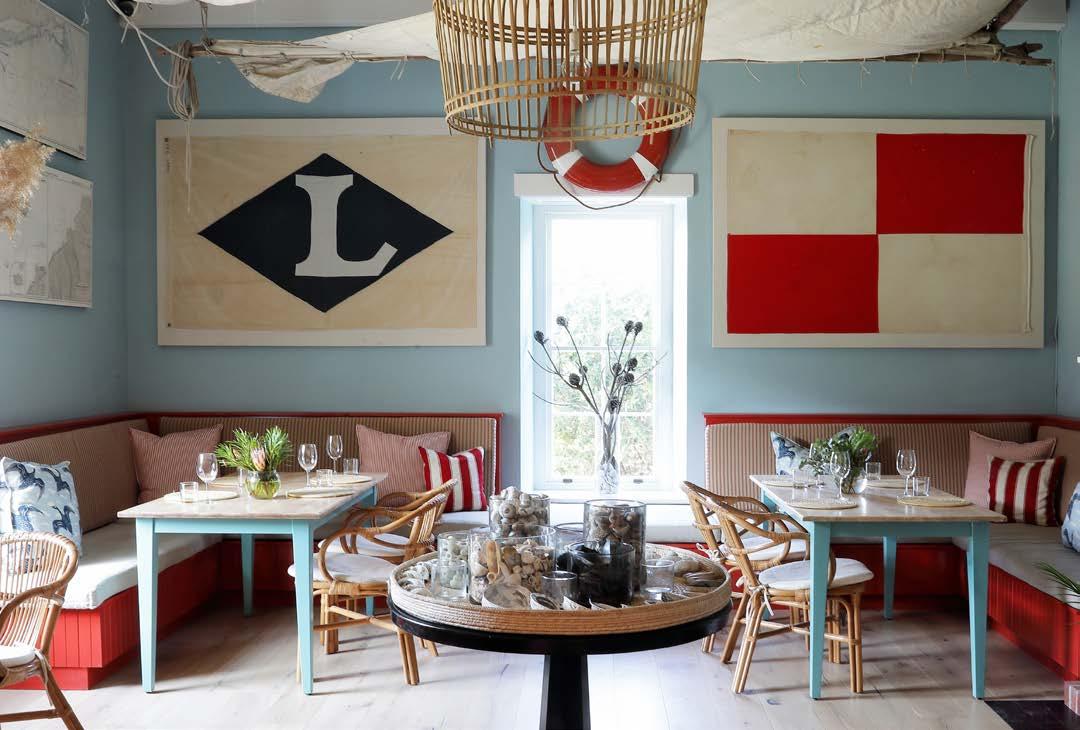
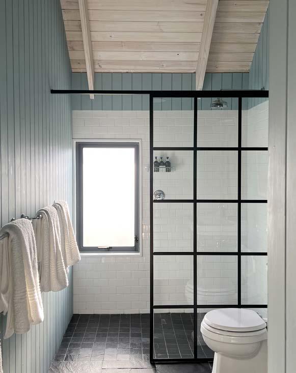
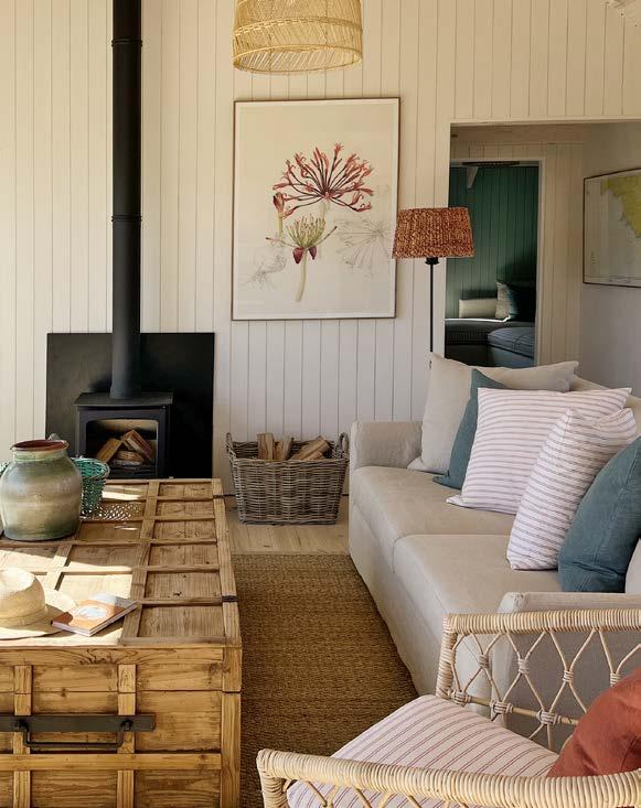
Each boathouse is uniquely furnished and painted in a palette of sailboat-inspired colours that reflect the environment and enhance the spirit of boathouse living. Internal wall cladding comprises vertical tongue and groove South African pine timber panels, which are painted. No skirtings or cornices were used, keeping the design simple and authentic — true to traditional boathouse style.

Size: 1150 m²
Location: Verster Avenue, Helderberg Nature Reserve, Somerset West, Cape Town, Western Cape
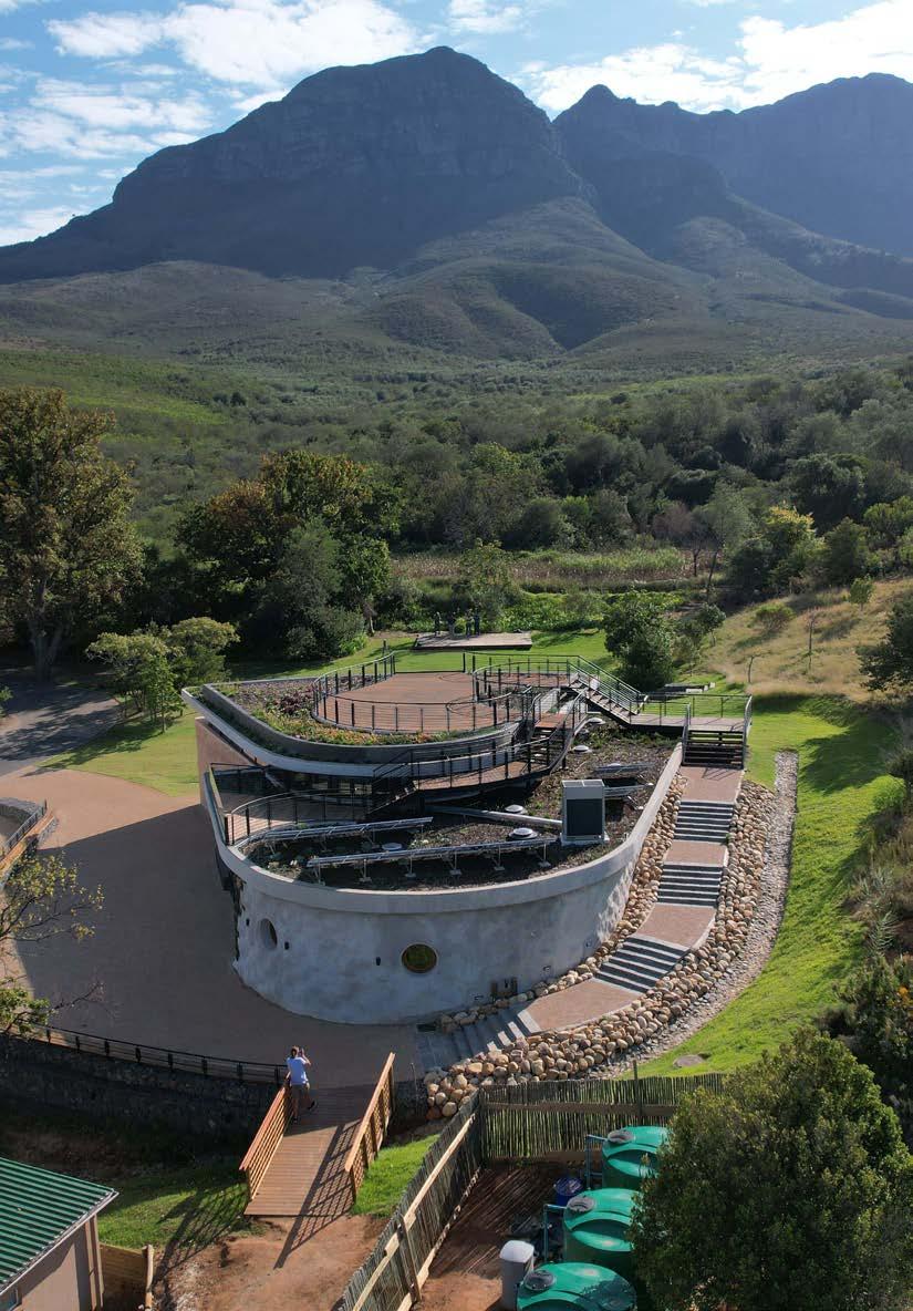
Located on the slopes of Helderberg Mountain overlooking the beautiful False Bay, the state-of-the-art, multi-purpose Helderberg Environmental Centre offers an inviting space for biodiversity education. The client’s initial design concept was spearheaded by Ashley Hemraj, Senior Architect of the City of Cape Town, to advance sustainable green architecture underpinned by sound passive design principles that are resource and energy-efficient and environmentally responsible. Let’s see how the project unfolded...
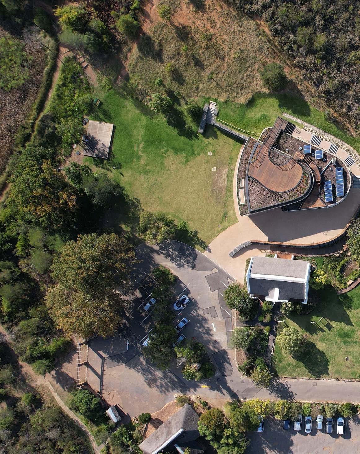
Ebesa Architects was appointed to design and construct a new educational facility for CoCT (City of Cape Town) in Helderberg Nature Reserve with Viridian Consulting Landscape Architects tasked to transform the sustainability of the landscape. The beautiful setting of the reserve makes it an ideal location to teach communities in and around Somerset West about the Western Cape’s plant and animal kingdom and our impact on it. As such, the staff at the reserve identified the need for an environmental education centre where school groups and visitors can be accommodated. The new building needed to house the current staff capacity as well as additional services, including a multi-purpose space and a two-tier roof garden overlooking the existing stage area to the north.
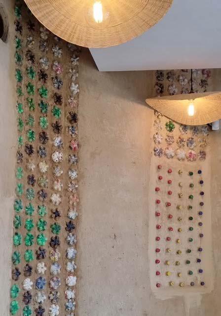
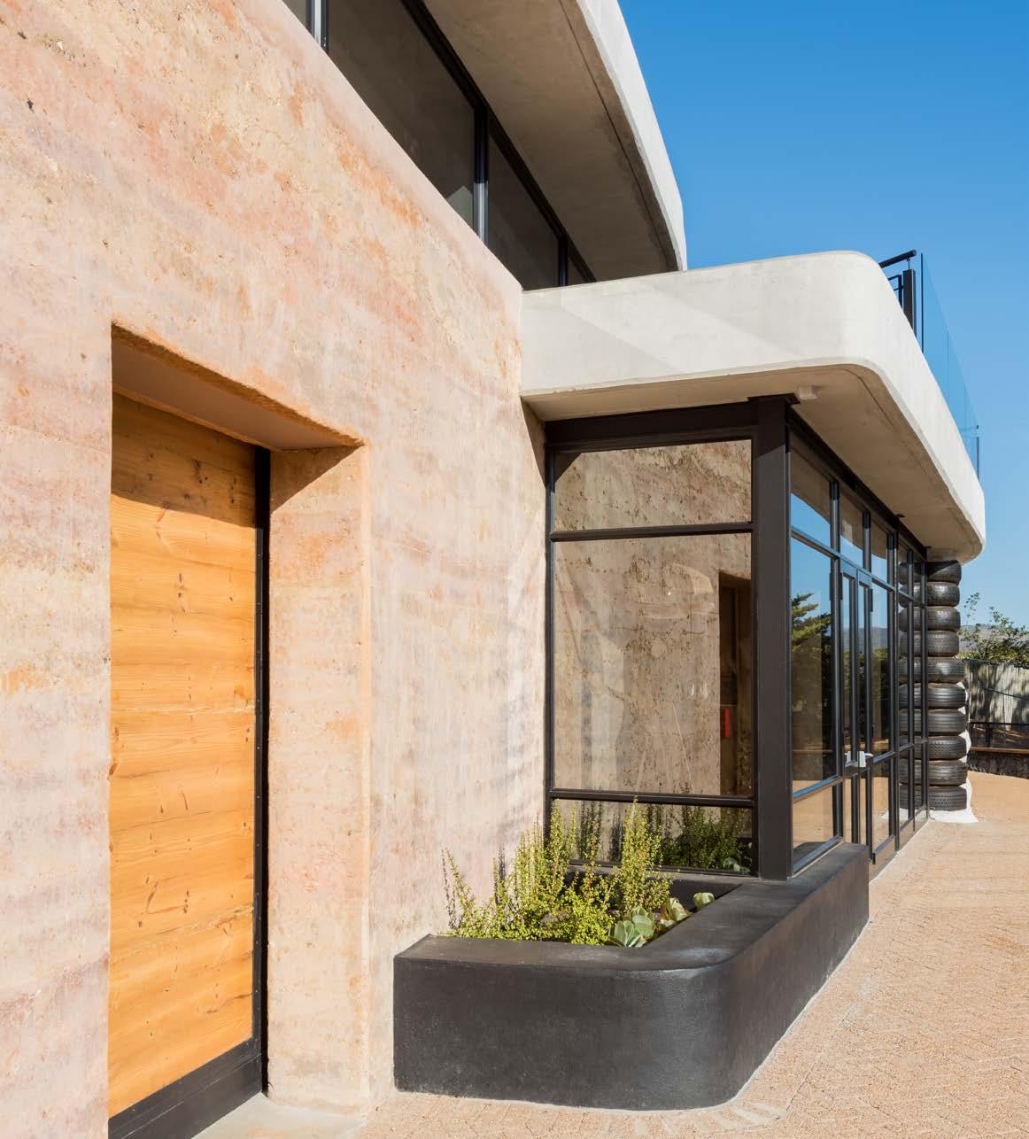
The project brief required the extensive use of recycled materials, such as reinforced tyre and rammed-earth technology for load-bearing walls (forming the building envelope), and the use of ecobricks for internal decorative dividing walls. Additionally, the project necessitated a strong emphasis on passive design interventions to achieve thermal performance during seasonal periods. Inspired by ‘biophilic design principles’, the building aimed to form a nexus between humans and the environment. This is evident in the design form, the orientation of the building, the use of natural materials and the expression thereof, the harnessing of natural sunlight, and passive ventilation, which filters through the internal spaces and roof garden.
The passive design approach introduced both active and passive solar energy storage and heating systems to the project. This includes the use of thermal performance material to control the ambient temperature internally; the recycling of greywater and harvesting of rainwater to minimise end-user energy consumption; the management of freshwater usage; and the processing of solid waste.
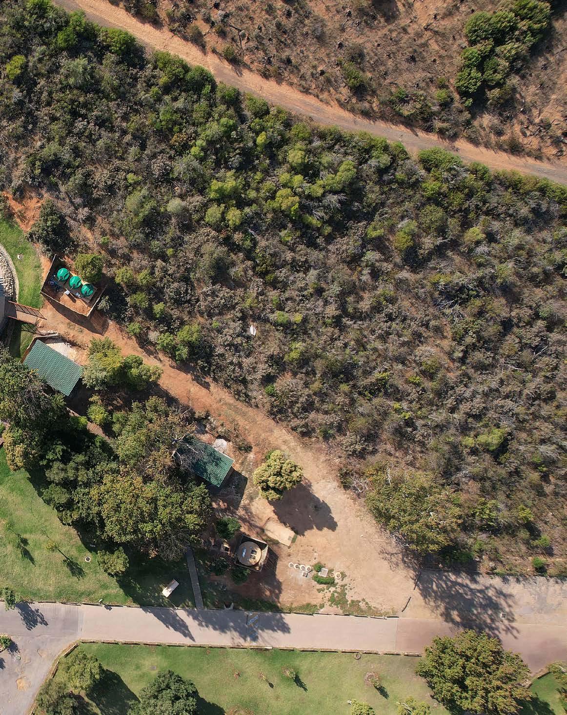
Before building commenced, Helderberg Nature Reserve already sported a small visitor centre and separate environmental education centre aimed mainly at school groups. However, the education centre was tucked away in a non-public part of the reserve, making it inaccessible to visitors. Therefore, a new vision for the reserve was to develop a combined visitor and environmental education facility to showcase green architecture. The site also housed various existing structures, including a heritage building, café and resource centre, male and female restrooms, a bird lookout post, and a concert stage.






Client: City of Cape Town, specifically Nature Conservation and the Urban Planning and Design Departments
Architect: Ebesa Architects
Landscape architect: Viridian Consulting Landscape Architects

Environmental consultant: Sillito Environmental Consultants
Landscape and irrigation contractor: Bantu Environmental Solutions
Principal agent: ENN JV
Quantity surveyor: Narker & Associates
Principal building contractor: The Construction Co.
Civil contractor: Regal Civils
Structural and mechanical engineer: NWE Consulting Engineers
HVAC installer: Khubanda Air Conditioning
Electrical installer: Power Trust
PV solar installer: Current Automation
Paint contractor: 1st Class Coatings
Specialist sub-contractor: Natural Building Collective
Rammed earth specialist sub-contractor: Simply Sustainable

Ceiling and bulkhead specialist sub-contractor: Ceil Wall Interiors
Occupational health and safety consultant: Frontline
www.viridian.co.za
www.ebesa.co.za
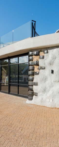
 A total of 830 recycled truck tyres filled with building rubble, sand from other construction sites, and ecobricks were used for the exposed tyre wall
"MATERIALS THAT WOULD OTHERWISE HAVE BECOME A BURDEN IN A LANDFILL WERE REUSED AND GIVEN A NEW LIFE . THE IDEA OF REPURPOSING AND UPCYCLING MATERIALS ALLOWS THIS CENTRE TO SPEAK TO SUSTAINABILITY AND WASTE SEQUESTRATION."
The remaining portion of the 403 hectares of the reserve utilises the locality in the most scenic of ways: boardwalk trails meander around the slopes of Helderberg West Peak, leading visitors to isolated seating areas overlooking the region’s indigenous flora and fauna, and the bird sanctuary beyond.
Several indigenous trees (mostly Afrocarpus) planted by ‘Friends of the Helderberg Nature Reserve’ over many years obstructed the site of the new building. The landscape architects applied for a permit to have them removed and, in exchange, a similar number of Cunonia capensis and Afrocarpus falcatus trees were planted in the reserve’s picnic and lawn areas. Additionally, initial funding for the project was established through the sale of pine trees on the slopes of the reserve, with some of the harvested timber being used in the building itself.
The goal was to integrate the building into the landscape in a non-imposing way by using environmentally sustainable construction methods and materials. The new building’s position functionally relates to the space between the former centre and the mountains and has been nestled into the embankment opening to the concert lawns.
Aided by the Natural Building Collective, the team workshopped the selection and implementation of alternative building materials. The outer layer of the building envelope, which was encroaching into the embankment, needed to be waterproofed extensively. This posed quite a challenge as the wall was constructed out of tyres and cobb. To address the matter, the walls were first layered with plaster to secure the cob and to provide a substrate to apply bitumen layers. This was followed by an additional layer of bubble drainage, sand, and finally, a French drain before the embankment wall was re-established.
The tyre wall started at a base width of 0.8 metres that narrowed towards 0.4 metres at the top. The outer rammed earth wall was particularly challenging, as it had to house the structural columns needed to support the coffered slab roof, enabling the design team to have the hall space free of any internal columns that could potentially interfere with the earth-ramming process. Local material was used for the rammed earth, as well as two different shades to create a colour movement within the wall. The wall was 0.6 metres thick and was coated with a protective layer to reduce the impact of weather over time. Lastly, a Bedouin tent structure was designed to clip on and off the building so that the client can use it for outdoor functions.
Apart from the sessions hosted inside the facility, the building itself was also designed to educate its visitors on its function and construction process. The three different wall types showcase the principle of carbon burying: the inner curved wall and foundations were constructed using rammed earth and repurposed building rubble, and the outer curved retaining wall was constructed from repurposed tyres. This massively reduced the amount of cement needed for construction (cement has one of the highest carbon footprints of all building materials).
A total of 830 recycled truck tyres were used for the tyre wall, which is approximately 40 metres long and 3.4 metres high. Building rubble, sand from other construction sites, and ecobricks were used to fill the tyres and the internal wall, while natural cob — an environmentally-friendly plaster mix — was used to cover the ecobricks instead of conventional cement-based plaster. Materials that would otherwise have become a burden in a landfill were reused and given a new life. The idea of repurposing and upcycling materials allows this centre to speak to sustainability and waste sequestration. The building is also a carbon sink, meaning it saves and absorbs more carbon than it uses. Additionally, the centre is fitted with a solar photovoltaic system to generate its own electricity.
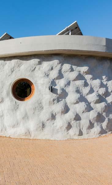
Polished concrete floors were used throughout while reclaimed materials were used for cladding, doors, and windows. Ecophon panels were used in the hall and boardroom for acoustic treatment. Roof lights and clerestory windows were used to bring in light from a higher level, and the round windows used in the office areas were constructed using civil drainage pipes penetrating the tyre wall construction. The front area of the hall was treated as a glass façade that could completely be opened to the outside, taking full advantage of the beautiful view and outside function area.
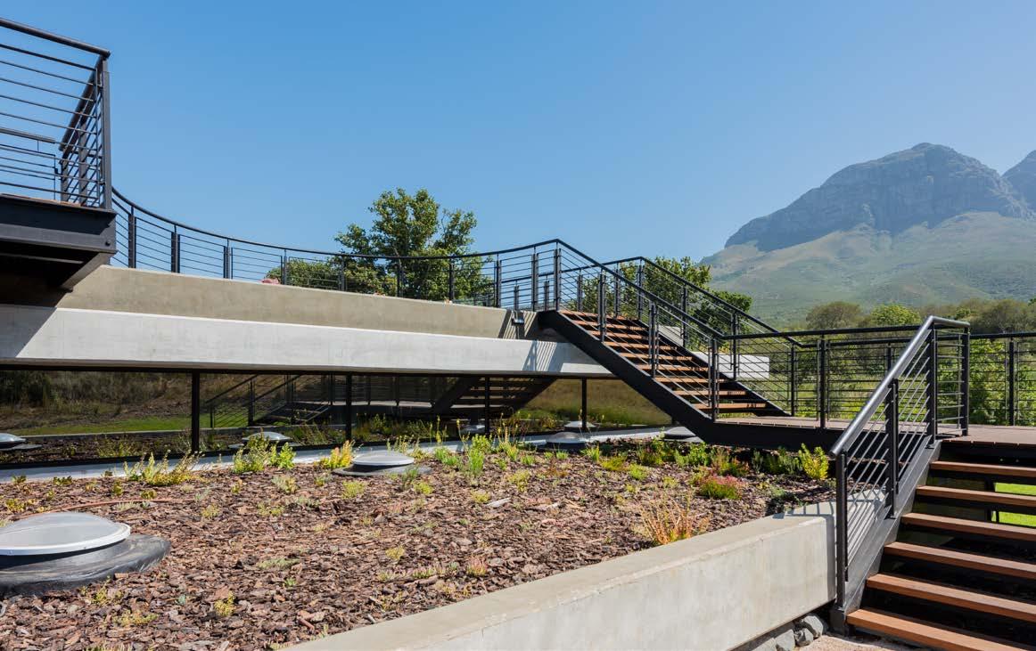
The roof structure was designed to span the entire hall area and to allow both people and plants on top. This was achieved by using a coffer slab on the upper structure. Glass balustrades were designed to protect the visitors and to create lookout points with minimal view disruption. The area was planted with low-growing indigenous planting featuring a variety of succulent species — a good choice considering that it would be hot and dry in summer and wet in winter.
Geoplast (a specialised drainage layer) was used to successfully regulate the drainage on the roof garden. It consists of a cup-like drainage structure that creates mini reservoirs to hold water, increasing soil moisture holding capacity on the roof while still allowing free drainage to prevent waterlogging. The garden also aids in the thermal comfort of the building and uses drip irrigation channelling captured rainwater and recycled greywater. Accessible for environmental education purposes, the rooftop garden houses solar panels that supply electricity to the centre.
A Maskam system creates a closed wastewater system which, along with water harvesting systems, supplements the water supply. Wastewater and rainwater from the new and existing facilities are captured and sent to the underground blackwater treatment system. There, wastewater passes through a four-chamber process before being pumped into storage tanks for the flushing of toilets in the new facility and existing ablution blocks. This ensures minimum water usage and zero water wastage. The treatment system makes use of bacteria and microorganisms to break down solids and treat the wastewater — a process that mimics nature without releasing harmful nitrates into the atmosphere.
The extensive, yet water-hungry, lawns which contribute to the site’s recreational value need a non-potable water source to meet their ongoing irrigation demand sustainably. These concert lawns are located on a natural drainage line with high groundwater levels. The natural seepage had previously allowed the lawns to retain their active growth throughout the dry summer months. Therefore, the new building was positioned across this natural seepage line, and a subsoil drainage system was used to divert the groundwater around the building to a constructed well point from where the water could automatically be pumped into storage tanks for irrigation.
When the available water exceeds the irrigation demand, it overflows into a constructed drainage channel that diverts rainwater and overland flow away from the building into a constructed natural soil pond located on the drainage line. This results in the reinstatement of the natural groundwater seepage, maintaining conditions for the existing trees and vegetation established along the drainage line. The pond has evolved into a year-round water feature, creating a habitat for a wider range of vegetation and fauna to be established close to the visitor centre. Timber decking walkways make the pond accessible to visitors and groups attending environmental education sessions. Plus, the placement of large sandstone boulders provides a place for visitors to rest or inch closer to the pond.
Paint Plascon 011 951 4500
Lighting Weylandts 021 914 1433
Spazio 011 555 5555 Eurolux 021 528 8400
Polished concrete countertops Decopol 079 523 5232
Joinery Fan Projects 061 170 9697
HVAC Daikin 021 528 3500
Ironmongery Contract Hardware 021 671 2071
Windows and doors iNTIME Aluminium 021 761 8100
Sanware Lixil 086 121 2121
Washroom cubicles Cubicle Solutions 076 843 5646
Glass balustrading Glasshopper Wetton 021 797 7209
Steel balustrading and staircase Pro Bar Welding Works 021 982 6984
Bedouin structure Tentickle Bedouin Tents & Canopies 021 593 6918
Concrete 180 Degrees Concrete Floor Services 079 070 4997

The LXME2 provides 12 stations out of the box, with modular upgrades for up to 48 stations. Control the LXME2 from anywhere, anytime with IQ4 Control on your desktop or mobile device Learn how the LXME2 Controller lineup can seriously simplify your job.


Size: 1215 m²
Location: 16 Higgo Road, Higgovale, Cape Town, Western Cape
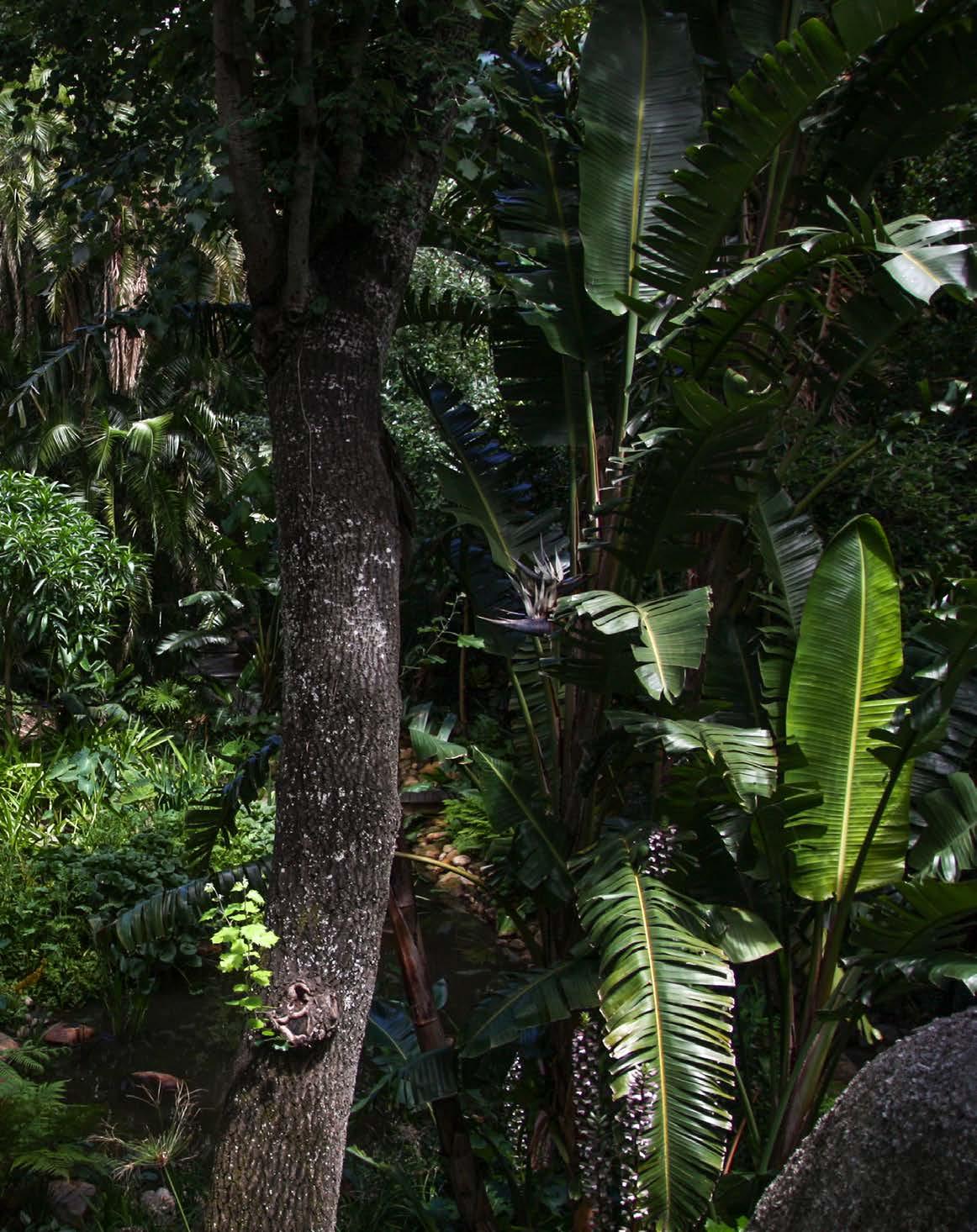
Nestled in the heart of Higgovale, Weaver’s Nest is the epitome of a lush, tropical paradise. With natural stone and water features cascading down a steep tree-lined slope, this one-of-a-kind residence posed a unique landscaping and architectural challenge the team stunningly overcame. Discover how the residential bird-hide became one of Cape Town’s most coveted listings...
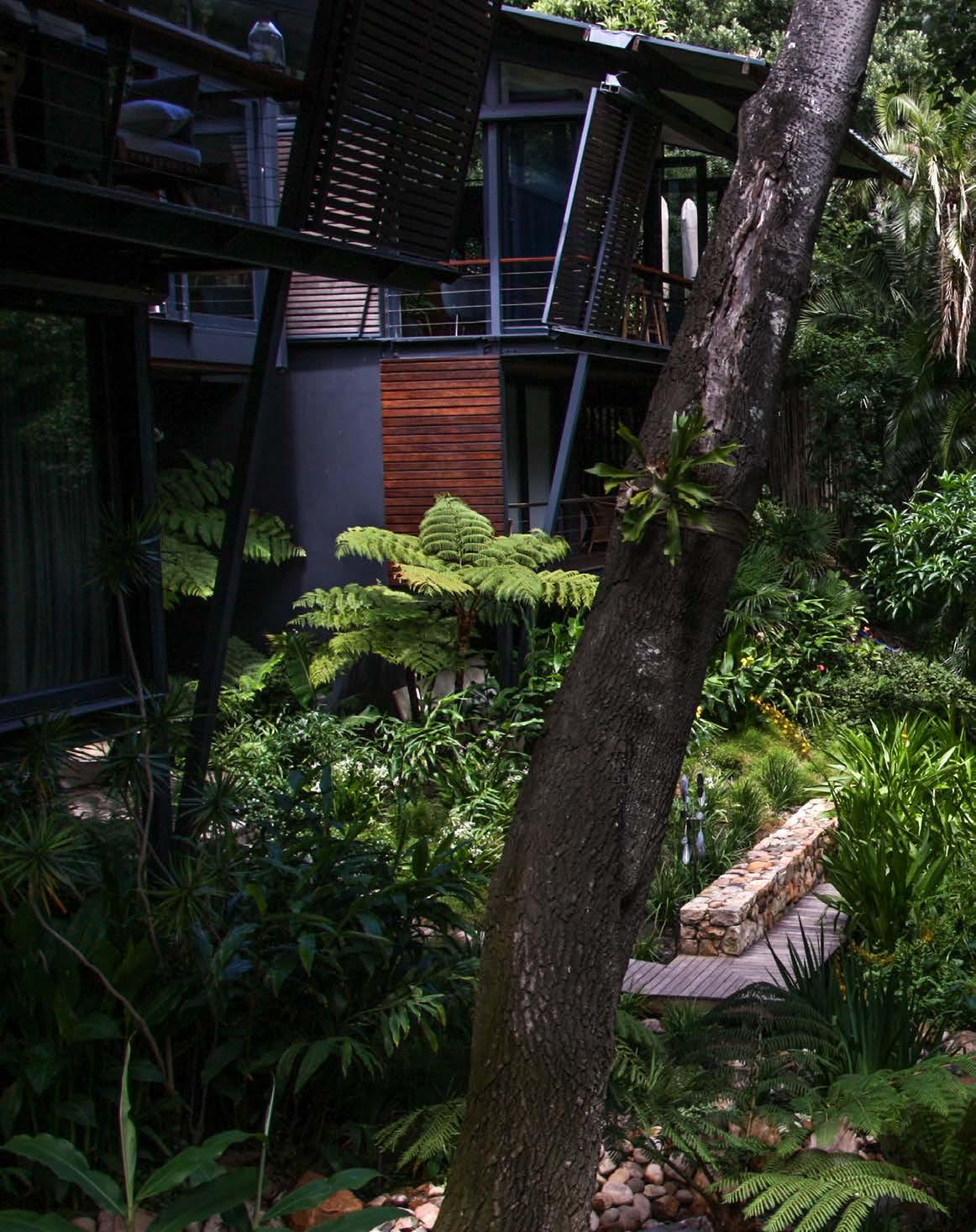
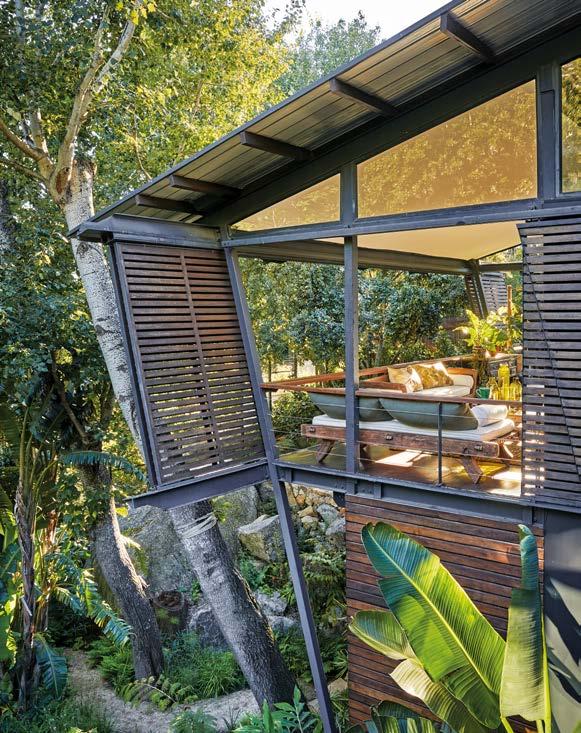
Synonymous with the residence’s name, Weaver’s Nest sits suspended in a forest of beautiful trees above a rippling stream. Covered in huge granite boulders and dense vegetation, the site is situated in an exceptionally steep fold of Table Mountain, with spectacular views of the mountain face and Lion’s Head. The erf straddles a small valley which forms part of the Cape Town City Council (CTCC) drainage system. With the residence almost floating in mid-air, retaining a serene relationship with nature, the site is unquestionably unique. The site’s dauntingly steep topography and coursing water posed a number of challenges. But with its phenomenal setting, plethora natural features, and interlinked accommodation perched on two cross walls with views through the tree-top foliage, Weaver’s Nest made for an incredibly exciting project.
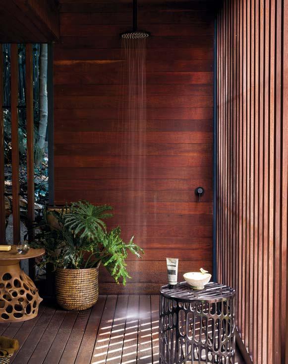
When the house was originally built by Sonja Petrus Spamer Architecture, it won a SAIA award of Merit for its light ‘footprint’ on the environment. The home is made from a number of separate structures, each one raised above the ground with minimal structural ‘tread’ on the earth. Both floors of the house sit way above ground, surrounded by tall trees, giving residents the sense of living in a forest. The original house was designed as two independent ‘pods’ on either side of the stream, connected by an open, elevated wooden corridor bridge at canopy height. One pod contained the living room and a bedroom, and the other another two bedrooms.
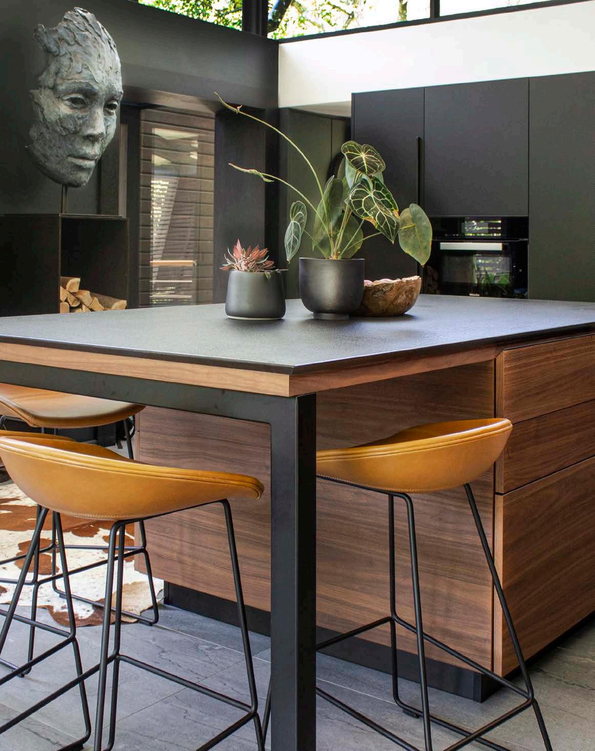
The client wanted to reimagine their newly acquired home by connecting the separate geometric ‘pods’ with a suspended dining room between them. The architect’s brief was to add this new dining room between the two pods without impairing the architectural integrity of the existing structure. Anton de Kock Architecturecreated an adjoining bridge made out of steel, glass, and timber as opposed to concrete and bricks, seamlessly merging the two living quarters. The connection is tenuous and made entirely out of glass. Humble and subservient to the scale of the pods, the space floats above the ground, allowing residents to enjoy the garden from lofty heights. The rest of the home was renovated in a similar fashion using the most beautiful timbers, stones, and metals.

The landscaping component by Lucy Schnell of Contours Design Studio formed a large part of the overarching renovation project and won a SALI Double Gold Award for Landscape Design and Construction. Despite the starting strengths of the site, the rest of the erf had not been developed after the original house was built, so it looked as if the old garden retaining walls were a hangover from the neighbouring property before it was subdivided. The brief was to create a tropical garden providing a lush green backdrop to the contemporary architecture of the house, whilst also celebrating the massive granite rocks that are as much part of the site as the steep slopes.
Another key component of the brief was to find a way to harness the water that flowed down the on-site drainage channels from time to time to create a permanent body of water. One of these channels is part of the CTCC stormwater drainage system and carries substantial amounts of water during a storm. It enters the site at the top and drains underneath the first ‘pod’ to exit at the bottom of the property. The quality of this water cannot be controlled. For example, if someone decides to wash paint buckets in the road above, this waste will eventually flow into the property. The second channel is an outflow channel from the waterworks above that releases water fairly regularly and without notice. This one enters one side of the property below the buildings, joins the first channel, and then exits at the same point. Therefore, the lowest reaches of the site were exceptionally wet and muddy, and overgrown with plants that had been left unattended for several years. It was hard to see the ground given the amount of growth, and the team felt, rather than saw, the ground when they squelched around the mud.

In addition to the drainage channels, one set of rocks on the south side of the first pod were partly obscured by accumulated mud. However, these had an intriguing knuckle quality about them — like a giant fist — and the client was very clear that these should be uncovered as far as possible with a pond flanking them on the lower side. The boulders were subsequently unearthed, exposed, and cleaned. The client envisioned the south-facing master bathroom suite to overlook this part of the garden below.
Given that the primary drainage through the site was right through the wet and muddy middle, with steep slopes on all sides, one of the key considerations was to improve access around the site in a way that one would keep one’s feet dry. To overcome this, the stream was tamed into manageable ponds, pools, and waterfalls, while many retaining structures were built to create terraces. The series of walls which cut across the valley at intervals down the site were clad in stone to connect them to the earth. Although they primarily serve as a design motif, bringing a sense of order to the otherwise uneven site, these terraces also provide the benefits of linking the two sides of the valley, doubling as bridges from one side of the water channel to the other, improving soil retention, functioning as weirs to dam the water, extra seating opportunities, as well as access points to planted areas.
The choice of hardscaping materials was determined by what was already on site. This meant sandstone was the material of choice for hard surfaces as well as the existing decking. One deck against the perimeter remained in place, while the second one was dismantled and repurposed as the central deck under the suspended dining room. Half of the boardwalk remained unchanged, so only a small portion of new boardwalk was installed to connect the old boardwalk to the newly positioned central deck.
Selecting the plant palette is always about weeding out the plants that don’t fit the vision and determining availability. In fact, this garden is still waiting for Gunnera manicata which has been commercially unavailable in the Western Cape since the drought in 2018. Since the site is variably shady and wet, and follows a lush tropical brief, the plants had to tick all these boxes.
The garden features Clivias, Cyatheas, Chlorophytums, three varieties of Plectranthus, two fern varieties, Acanthus mollis, and variegated Fatsia japonica. Large Schefflera arboricola and Philodendrons with Arthropodium cirratum cluster around the stairway descending to the storeroom from one end of the elevated walkway. The central area started out with Poganatherum paniceum interspersed with more Arthropodium cirratum, but these have now been replaced since a new spring has sprung, making the soil too wet for the former. Existing ginger and Canna plants were recycled back into the garden as well. The central deck was flanked primarily by existing tree ferns and Strelitzia nicolai with Mackaya bella and Jasminum multipartitum shrubs as additions. Ruellia brittoniana was an early settler which developed consistent powdery mildew before being removed after a year.
Copper HH Roofing 021 534 2020
Specialised kitchen wall unit, sinks, granite worktops and equipped section Valcucine 021 035 1737
Sanware Meir 021 5100489
Joinery
TKS Kitchens 021 510 8130
Ashley Robarts Kitchen Company 082 888 0295
Lighting Newport Lighting 021 447 0049
Light switches Lumen8 021 510 0702
Tiling Ceragran 021 465 8966
Carpets KBAC Flooring 021 464 4320
Fireplaces
SA Premier Fires 011 516 0294
Structural Steel Wehmeyer & Sons 021 853 5168
Aluminium
Aluplan Architectural Aluminium 021 701 2002
Eurostyle Aluminium Windows and Doors 021 552 8092
Marble and granite Marble Gallery 021 593 8223
Appliances Gaggenau 081 432 1087
Siemens 011 652 2000 Miele 011 875 9000
Stonework Stone Age Construction 021 875 5604
Irrigation
Hunter Industries, available at TurfManzi Irrigation 021 975 5578
Client: Francois Riley
Architect: Anton de Kock Architecture

Landscape designer: Contours Design Studio

Main contractor: Wayne Unser Construction
Engineer: Peter Wium Consulting Engineers
Waterway designer: Contours Design Studio and Clive Giliomee of Water in Motion
Plumber: ASA Plumbers
Electrician: LJ Taylor
Photographer: Nixx Milner and Lucy Schnell
Decking
Master Decks 021 704 0124
SUDS
Fibertex Nonwovens 021 701 3569
Building materials Afrimat 021 917 8840
Compost
Reliance Compost 0861 888 784
Trees Just Trees 021 871 1595
Trees South Africa 021 842 0003
Specimen plants

Elands Nursery 041 955 5671 Arboreta Nurseries 021 864 3857
Boschoff Nursery 021 703 2737
Fairholme Plants 082 550 8703
Garden King Landscaping 021 554 4065
Michells Wholesale Nursery 021 572 3930
Nonke Plants 021 887 6972
Plant Culture Farm Nursery 021 881 3467
Sebenza Farms 039 312 0378
Waterproofing
Engineered Plastics and Linings South Africa 066 245 4126
Closer to the water, the team planted Wachendorfia, Cyperus papyrus, Gunnera perpensa, Louisiana irises, and Berula erecta, along with a variety of water lilies in the deeper parts of the pond. Since then, Acorus gramineus has also found a home along the water’s edge. The foot of the giant rocks on the north side are flanked by a variety of soft Microlepia strigosa, Anthericum saundersiae, Veltheimia bulbs, existing Acanthus mollis, and large Strelitzia.
The high lookout point is shady and drier. This area is planted with primarily variegated Dianella tasmanica, Anemone japonica, Anthericum saundersiae, and Trachelospermum jasminoides. Astilbe plants pop up in the summer after winter dormancy. The verge is a repetitive combination of Trichilia emetica, Viburnum sinensis, Plectranthus ecklonii, Hypoestes aristata, Ligularia reniformis, and Dianella caerulea 'Little Jess'. In addition to this plant list, the client had a collection of existing plants that needed to be accommodated, and some of the smaller palms were recycled into the garden. In fact, most of the trees already existed on the property with only six additional trees being planted on the estate. Specific attention to detail was paid to the colour and texture of the foliage, ensuring longevity of the garden allowing the plants to survive under local conditions.
The client’s original vision and creative touch are very much a part of the success of this garden and build. The brief was clear and set the trajectory for realising their ambitions. Another key to Weaver’s Nest’s success is the improved accessibility throughout the site. The pathways provide a close and intimate experience, allowing residents to appreciate the many faces and angles of the garden. Plus, perhaps most importantly, its accessibility makes it so much easier to manage and maintain!
A professional landscape management team nurtured the garden during its first two years after establishment. These sessions were accompanied by a detailed scope of work assisting with future management of what to prune and when once handed over to the client’s own care. The site is lush and richly textured, with shades of green that can be experienced from a distance or from up close as one wanders through the garden. Water is a major linking element throughout the garden and an element that all creatures are drawn to, creating that irresistible pull. The sound of birds and frogs plopping adds a dimension to the garden that is more subtle than flowers. The light falling through the tree canopies sets up movement even if one can’t feel the breeze.
The build was undertaken in four phases around the greater renovation project and took about eighteen months from beginning to completion. The higgeldy-piggeldy, wheel-barrow unfriendly, and highly tree’d site made the use of a crane mostly impossible, and so every item that had to be taken off site and every new item coming onto site had to be carried by hand. Therefore, moving heavy materials, specifically large rocks, was a particularly big challenge. Getting enough men around an irregular object was the problem. To overcome this, the landscapers invested in steel I-beams to ramp the rocks off the vehicle with a crowbar because there was no tipping room. They then used a very strong sling-like contraption which allowed eight men to get around one rock. It was hard work getting the rocks to the valley, but it worked!
The old garden had several incoherent stone walls that needed to be demolished. Had the site been crane or wheel-barrow friendly, the team might have considered cladding the new garden walls with contemporary hornfels or similar dark stone, but having large quantities of sandstone already on the site made the decision for them. Turns out it was a good decision because the sandstone brings a warmth to the black finishes of the house.
It is always tricky landscaping behind builders, as the complexities of managing many trades on-site can make it difficult to line up the 'living’ materials efficiently. Keeping abreast of the construction timeline, and good communication between the construction and landscaping team is necessary. Knowing when to consult others experts in the field for their invaluable input, is also part of the long-term success of any project. It was clear that all parties were respectful of each other’s skills and working in the project’s best interests, not only their own scope of works, creating a successful end result. The symbiotic collaboration between the owners, the architect, the landscape designer, contractors, and various consultants resulted in a paradisal sanctuary at Weaver’s Nest.

Size: 5500 m²
Location: Corner of Woolsack and Cross Campus Road, Rosebank, Cape Town, Western Cape
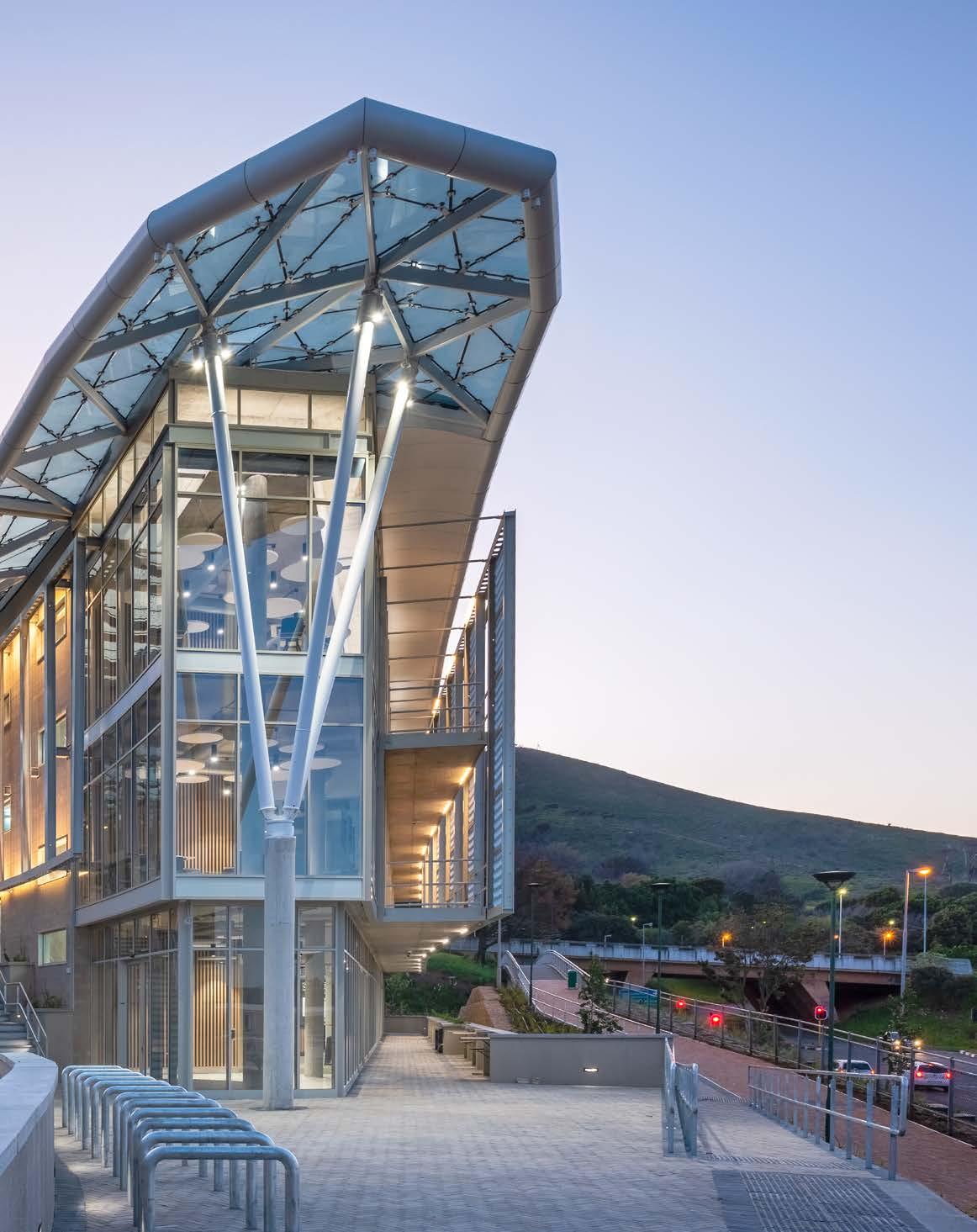
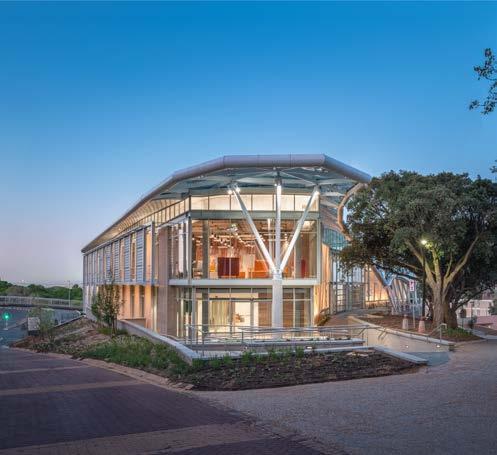
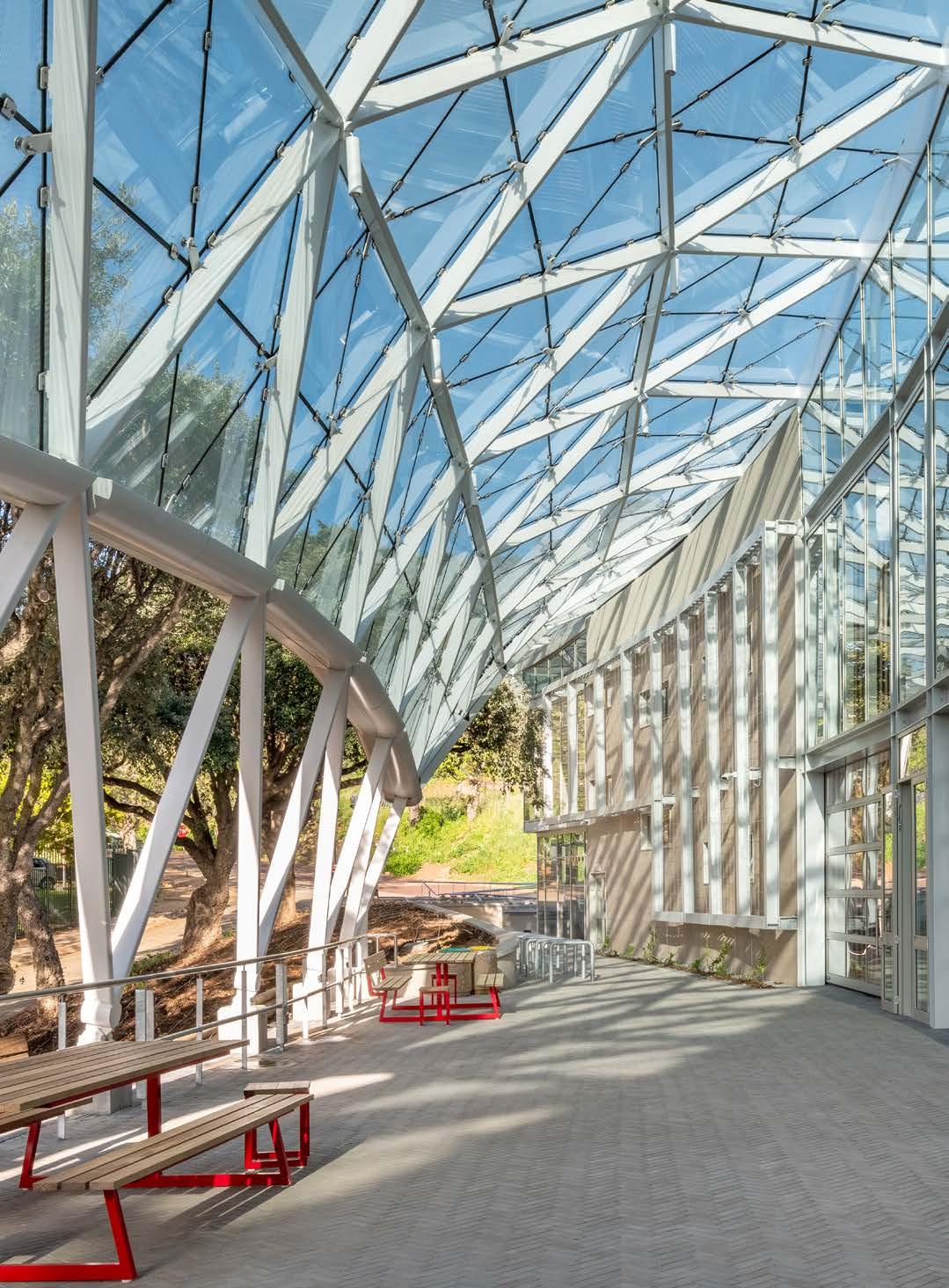
If you’ve driven along the University of Cape Town’s campus this past year, you would have seen the steady rise of the triangular-shaped HPI d-school Afrika with its futuristic design and large-span lattice shell roof. KMH Architects designed and co-created the innovative Hasso Plattner School of Design Thinking Afrika with many stakeholders, and the end result does not disappoint! Detailing the project’s design all the way through to its delivery, including its 6-Star Green Star-rating sustainability targets, read along to discover the making of this exquisite architectural and academic icon.
Joining its sibling schools at Stanford University and Postdam University, the Hasso Plattner d-school Afrika is the third Design Thinking school in the world and the only institute in Africa of its kind. Offering undergraduate, postgraduate, and organisation training programmes, the facility aims to equip bright minds in the practice and mindset of design thinking, furthering innovation within complex sociopolitical and economic contexts. The d-school was established in 2015, where it was temporarily located on the University of Cape Town (UCT) Graduate School of Business’ V&A Waterfront campus. The Hasso Plattner Foundation recognised the need for expansion by funding a dedicated new facility on the Middle Campus of UCT. Progressive and visionary in nature, the design of the new d-school sought to establish the academic building as a destination synonymous with innovation, futureforward research, and design-led creative thinking. Therefore, it was an absolute must for the building to achieve a 6-Star Green Star from the Green Building Council of South Africa (GBCSA) for the category of public and education buildings.
In October 2018, exactly four years before the project’s completion, the building was commissioned through an invited competition. Apart from the institute’s overarching aspirations for the building and the fact that the site had already been selected, the brief was incredibly open. So much so, that the size of the building and what it should house inside weren't clearly stipulated. Rather than submit a design concept that would invariably miss the mark, KMH Architects proposed a collaborative design process to develop the brief and building design through co-creation and codesign with the d-school and UCT stakeholders. Almost immediately a four-year synergistic journey began, merging the disciplines of design thinking and architectural design to build the HPI d-school Afrika.
The team first visited the Stanford and Potsdam d-schools to meet with the leadership, observe the teaching programmes, and see how the spaces in the respective facilities were being utilised. Upon their return to South Africa, a series of co-creation workshops took place to further define the approach and brief. Some of the key design objectives born out of these sessions include:
• The building should integrate with the university’s contextual fabric while still externally reflecting its unique function and status as a teaching platform.
• The structure should communicate that it offers a different kind of learning experience giving students the feeling that it’s an environment to test, fail, think, and act differently.
• Students should see collaboration and co making happening in flexible and configurable teaching and learning spaces.
• The building should support communal working, co creation, the use of vertical surfaces, outside teaching activities, and gatherings.
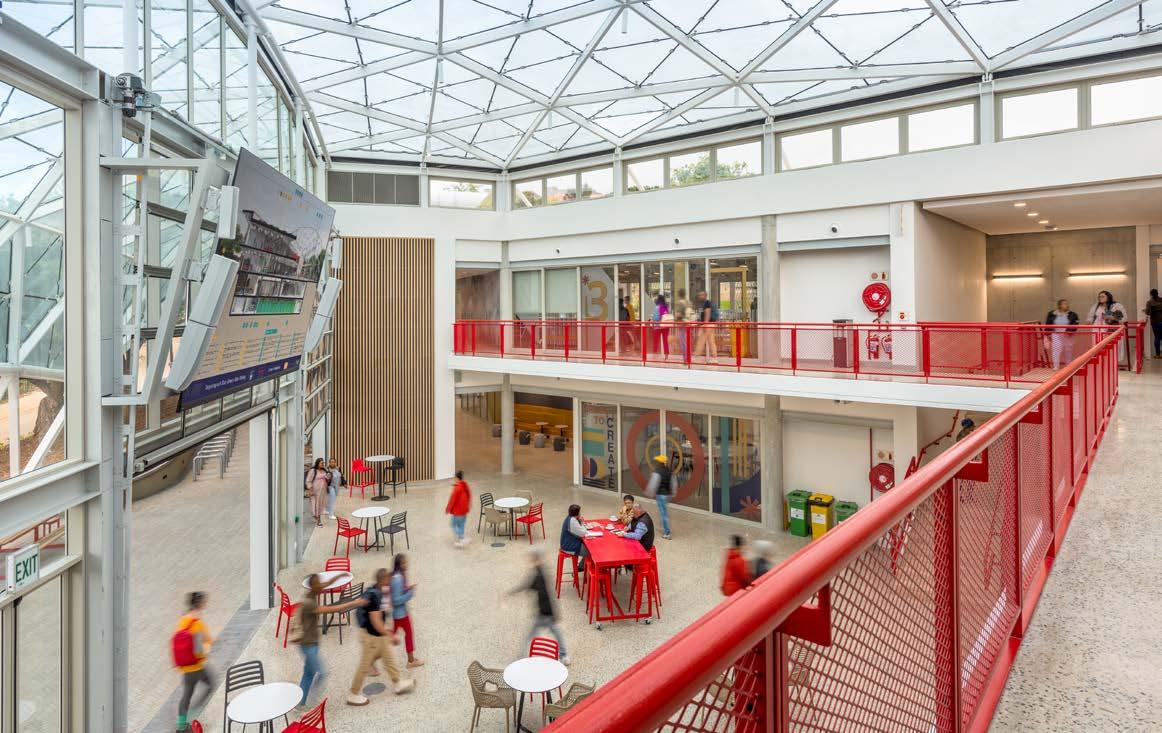

The building itself is envisioned to be a learning experience for users by showcasing its sustainability features and telling its environmental story through informational signage and digital displays of its energy and water usage. The principle of ‘teaching building’ ensures that the d-school can be a vehicle to visualise sustainability, involve users in the performance of the building, draft new behavioural norms, and underline the profound story buildings tell about using the earth’s resources and the ecosystems that sustain us.
Teaching design thinking is both collaborate and reflective, necessitating the need for ‘me’ and ‘we’ spaces. Above all, since the building forms part of a broader university community, the design needed to incorporate democratic open spaces to welcome the larger body of students. This ‘us’ space was realised through a centralised, roofed ‘town square’, where the roof structure both encloses an atrium and reaches out, providing shelter over an external courtyard located mid-away along the existing footpath across the site. The ‘we’ spaces make up the four teaching and learning studios, while the ‘me’ areas take the form of three reflection spaces at either end of the building.
As the d-school and its programmes evolve, the teaching and learning studios would need to evolve with them. Therefore, significant spatial flexibility was required to allow the school to easily re-purpose these spaces in the future. To achieve this, careful consideration was given to the location of permanent structural elements. The structural cores containing vertical circulation, bathrooms, kitchens, service risers, and shear elements form a spine along the southern edge of the building footprint, allowing large-span orthogonal space along the northern and western edges of the building kept free of any structural or building service constraints.
The d-school is built on a small triangular site, with a radiused hypotenuse shaped by an existing road lined with an avenue of beautiful cork oaks. The triangular building’s service spine tracks this radius, forming the southern side of the school. Large-span orthogonal studios make up the north and west sides of the triangular, pushing all the geometrical complexity of the site into the centre of the triangle. This was architecturally and structurally resolved through a singular, free-form lattice shell glass and steel roof. The form of the room was derived by abstracting the site’s geometry and topography and encompassing the existing footpath. This translates into a seamless experience of landscape and building along the southern boundary where the site opens onto campus.
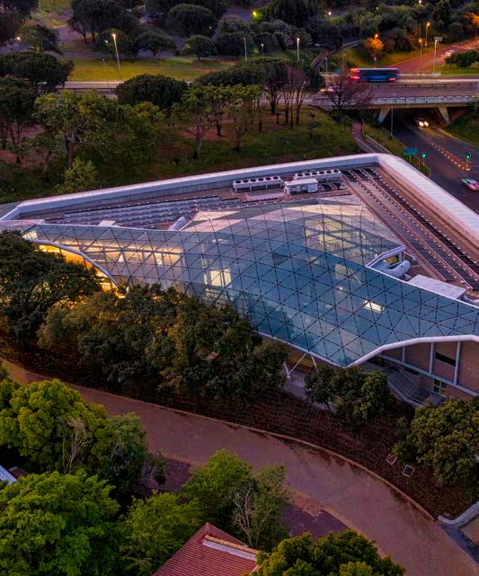
The building design went through a number of iterations to ensure that, when viewed from Rhodes Drive, the d-school would appear as a modest two-storey structure above ground, remaining in keeping with the adjacent Woolsack Residence and existing avenues of mature trees. However, since the building was developed to make maximum use of the site’s significant eight-and-a-half-metre fall, it actually provides four storeys, all entered off grade from the southern circulation spine.
The lowest floor, Level One, is a naturally ventilated semi-basement accessed by vehicular traffic off Cork Oak Road. This floor provides parking for 22 cars, five motorcycles, and ten bicycles. Six of the car parking bays are prioritised for electric or hybrid vehicles and are provided with charging stations. In addition to parking, the rainwater tank farm, plant rooms, and refuse room are accommodated here too.
While being partially retained below ground on two sides, Level Two is elevated above ground along its northern façade. This floor offers shared ‘us’ space for the benefit of the broader university community. The floor is accessed from the east and opens up onto an open-plan space containing a café serving food and coffee with a generous seating area that spills outside onto a north-facing terrace. Beyond the café are two large multi-purpose rooms, bathrooms, cyclist showers and changing facilities, and the remainder of the building plant rooms.
"Teaching design thinking is both collaborate and reflective, necessitating the need for ‘me’ and ‘we’ spaces."
Client: Hasso Plattner School of Design Thinking Afrika and the University of Cape Town
Architect: KMH Architects

Landscape architect: Tarna Klitzner Landscape Architects
Project manager and principal agent: Fluid Projects
Roof specialist engineer and contractor: Leaf Structures
Civil engineer: Welby-Solomon Consulting Engineers
Acoustic engineer: SRL South Africa
Electrical engineer: Ifindo Consulting Electrical and Mechanical Engineers
Mechanical and wet services engineer: WSP Group Africa
Fire engineer: De Villiers & Moore
Green building consultant: PJ Carew
Occupational health and safety consultant: Safetycon
Transport consultant: ITS Global
Interior designer: Design Lab
Quantity surveyor: RLB Pentad Quantity Surveyors
Main contractor: Haw & Inglis
Photovoltaic solar panels
Solareff 021 550 0907
Aluminium
Aluplan Architectural Aluminium 021 701 2002
Sandstone cladding Marble Classic 021 555 1592
ACM and sunscreens
First African Holdings 021 851 8500
Polished concrete
180 Degrees Concrete Floor Services 021 981 9832
Partitions and ceilings
CeilWall 021 386 2552
Lighting Bellco Electrical 021 440 7100
Sectional overhead façade doors
Tight Fit Garage Doors & Automation 082 875 3354
WC partitions, fixed and custom mobile whiteboards
Façade Projects 021 905 4474
Balustrades
Abelia Metal 021 905 4993
Roofing Leaf Structures 011 462 5701
Steel Mazor 021 556 1555
Levels Three and Four
Levels Three and Four accommodate the core functions of the d-school. Both floors are arranged around the central ‘us’ space comprising the atrium and roofed courtyard. The southern façade of the atrium incorporates three large glazed sectional-overhead doors, allowing the atrium and courtyard to connect seamlessly in one larger space when the doors are opened. The main entrance into the school is on Level Three off Cross Campus Way. Two learning and teaching studios have been placed along the northern side of the atrium which can be joined into one large space by opening a demountable acoustic wall.
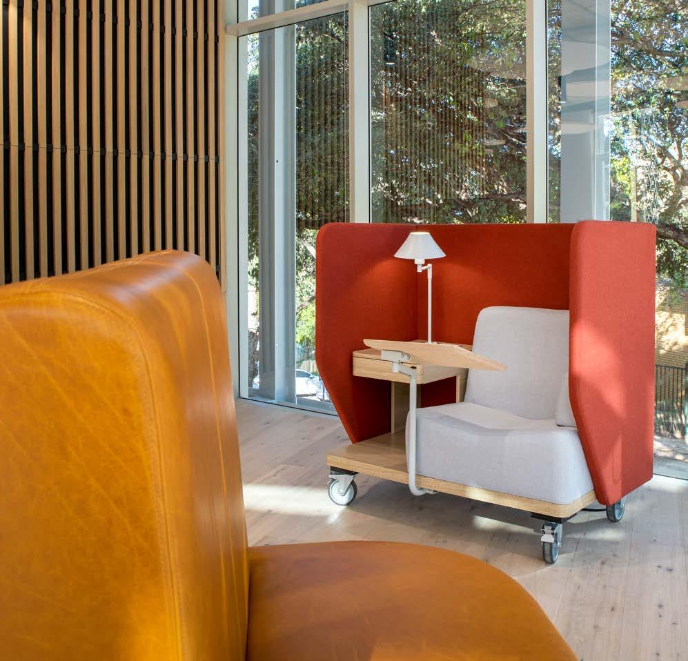
There are no cellular offices. The staff space is located alongside the main entrance route with a ‘flattened’ spatial hierarchy that encourages innovation and collaboration. The fit-out combines sitting and standing desks with purpose-made agile furniture and break-away alcoves. A Huddle Room separates the staff space from the atrium and functions as a semi-permeable boundary that can be accessed from either side as needed. On the eastern corner of the floor, an open-plan ‘chill space’ gives students a place away from the bustle to reflect. Level Four accommodates two additional studios and the HPI Lab, a postgraduate facility funded by the Hasso Plattner Institute. The second floor also accommodates the main reflection space with views of Upper Campus and Devil’s Peak. Small break-away balconies are provided on both levels, allowing students to take short breaks from the fast-paced studio sessions.
A collaborative and inclusive co-design process had to be adopted from the start to achieve the sustainability target of a 6-Star Green Star New Build rating. One of the building’s more innovative design features is the use of Thermo-Active Building Systems (TABS). This solution employs heated or cooled water which is run through pipes cast into the concrete slabs to harness the power of the building’s thermal mass and radiant temperatures to achieve user thermal comfort.
There is a delicate balance between having enough natural lighting and external views, which assist in occupants’ comfort and reduce the need for artificial lighting, and creating too much heat gain and glare in a building. The atrium uses fritted glass in the lattice shell roof to reduce the solar heat and glare while still allowing comfortable daylight levels. The façade utilises solar performance glass in conjunction with carefully positioned external passive shading elements.
The d-school is one of the first buildings on the UCT campus to implement a PV system on its roof. While this does not make the building self-sufficient, it greatly reduces its reliance on grid power. The building’s base electrical energy usage has also been targeted through efficient light fittings combined with daylight and occupancy sensors. As the flexibility of space is so important, the lighting and corresponding sensors are digitally addressable which allows the building to adapt as needed to meet the changing demands of its users and climate over time.
Harvested rainwater, water-saving devices, and electronic flushing all help to reduce the demand for municipal water. Energy and water metering is also provided on all major systems to assist the building managers with tracking and optimising operational efficiency. Indoor environmental quality is maintained through a mechanical solution that provides a combination of natural and mechanical ventilation with 100% fresh air, carbon dioxide monitoring, adequate daylighting, glare reduction, generous external views, low volatile organic compounds for all internal finishes, and suitable acoustic quality.
The character and materiality of Middle Campus, where prominent buildings like the Kramer Law Building and the Woolsack Residences were built in the early 1980s, differ significantly from Upper Campus. Wheaten face brick, brutalist concrete, and Lutyens plaster make up the predominant material palette. But in recent years two new notable buildings, the School of Economics and Masingene have softened this palette, introducing structural steel elements and flat roofs into the campus character. The d-school takes its cue from these two fine buildings, making use of a similar colour palette and materials, with the exception of face brick and Lutyens plaster which have been replaced with locally sourced sandstone cladding, providing a similar but elevated finish. The external finishes, comprising structural steel, aluminium sun shading, sandstone cladding, and glass and planted screens result in a building that integrates into the campus’s evolving character.
Paint
Midas
021 461 8324
Marmoran 011 887 0536
Timber flooring
Oggie Hardwood Flooring 021 510 2846
Acoustic baffles
Ecophon 012 657 2800
Furniture
Cecil Nurse 0861 633 423
Angel Shack 021 462 6752
Ergoform 021 461 2251 Chair Crazy 021 465 9991
Custom furniture Coney Timbers 083 259 6220
Custom furniture and joinery RMS Shopfitting 021 510 2133
Cork wall I Am Green 021 5101 567
Wallpaper
Cara Saven Wall Design 082 953 6246
Signage
Ultrasigns 021 510 3200

Lighting
Wireworld 021 950 6960
Rugs Hertex 021 948 4764
From the outset, interior architecture was understood to be one of the key design means to encourage creativity among students. The interior detailing consistently and deliberately exposes and celebrates building services, junctions, connections, and materials. I.e., what things are made of, how they are made and connected to each other, extending the theme of a ‘teaching building’. The building’s concrete mass must be exposed in order for the TABS design to work and provide radiant cooling. Thus, the off-shutter concrete soffits have been exposed and the vast majority of the floors are made of fine polished concrete. This, combined with off-shutter columns and an exposed steel secondary structure, forms the foundation of the interior aesthetic. All studio walls are painted white and many faced with vitreous enamel white boards. These elements create an artist’s studio look, where finishes are resilient, not overly refined, and tacitly give permission to be creative.
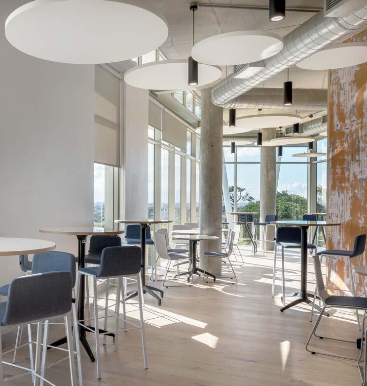
The d-school ‘red’ is an iconic part of all three HPI d-schools' character. This vibrant colour has been threaded throughout the building in various tertiary elements offset against the raw off-shutter and polished concrete finishes. Finally, light timber and a range of secondary colours are introduced through circulation spaces, bespoke furniture items, and graphics.
The new d-school building will form a centre of excellence at UCT and provide an environment in which collaboration and new ideas can flourish. In keeping with the ethos of the d-school, the project was made possible through innovative and collaborative thinking and teamwork. This integrates well with UCT’s goal of being a 'living laboratory’, a campus where students and staff can interact with research and real-life examples in their fields – in this case, an innovative building, designed, fabricated, and built through collaboration, with environmental sustainability at its core.


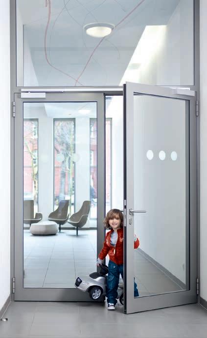
With every access and security choice you make impacting on factors such as usability, compliance, safety and aesthetics, you need fast, informed advice. Our experienced, qualified architectural consultancy team is dedicated to delivering exactly that and ready for your call!


Size: 12 600 m²
Location: 7 Lagoon Drive, Umhlanga, Durban, KwaZulu-Natal
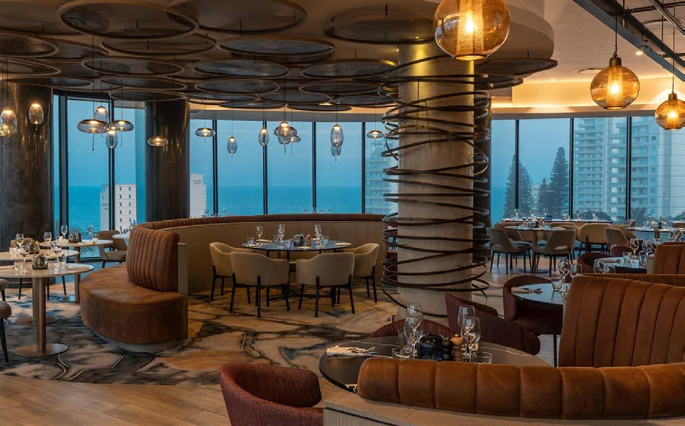
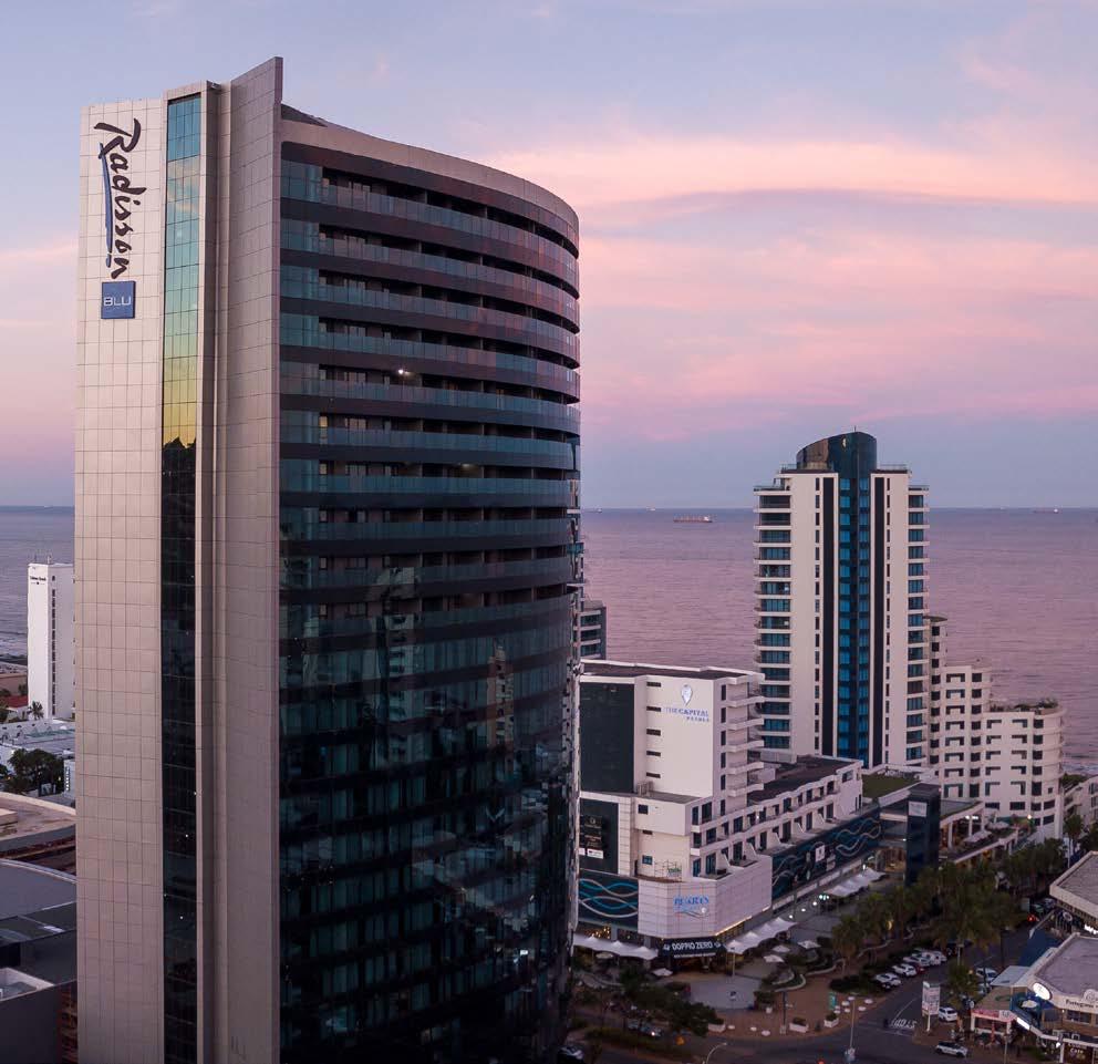
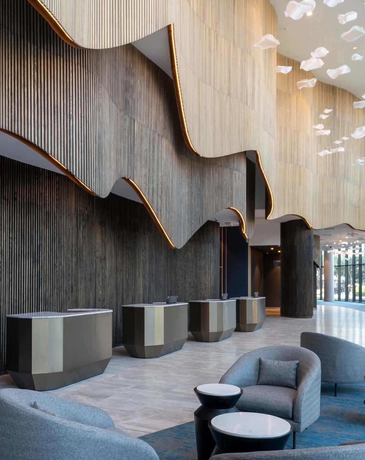
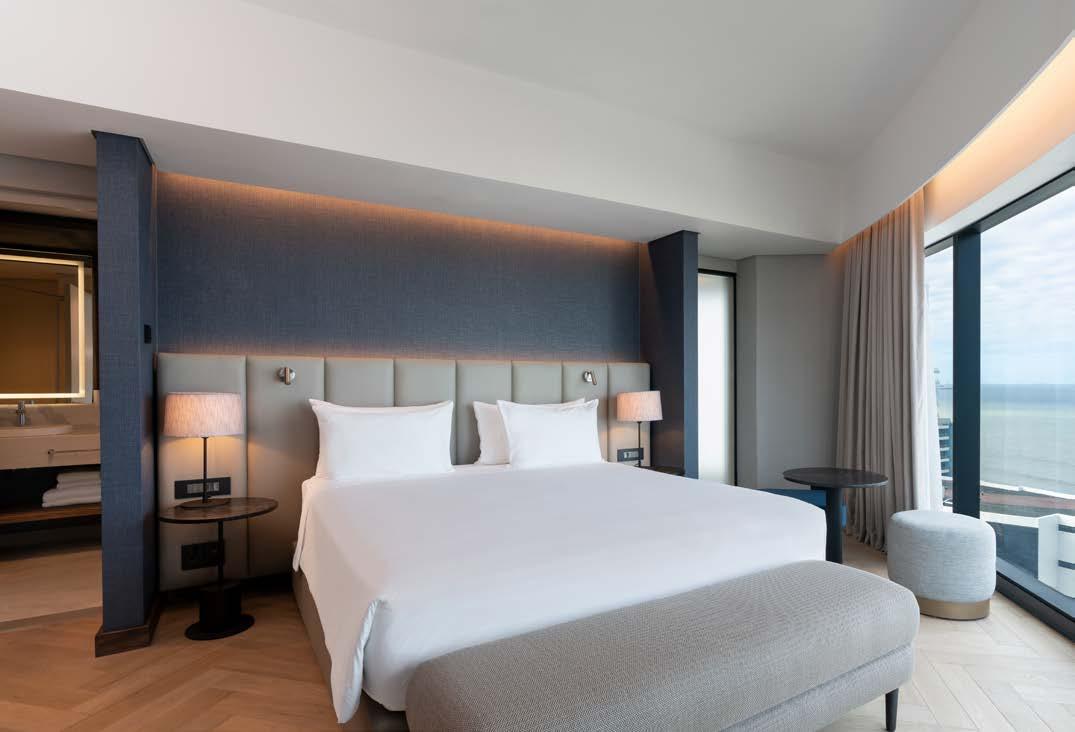
Rising above Durban’s ritzy seaboard, the contemporary Radisson Blu Hotel Umhlanga ushers in a new era of coastal glamour. Designed by the award-winning Durban-based Elphick Proome Architecture in joint venture with archiTRONIC architects and interior design by Source IBA, the impressively shiny skyscraper forms part of the larger Oceans Umhlanga mega-development, redefining the luxe lifestyle of this favourite holiday resort town.
Elphick Proome Architecture commenced design work on The Oceans — a R4.5 billion 231 000 m² high-end mixed-use development project stretching over 363 m² close to Durban’s beachfront — in October 2012. The site had previously been designed as a mixed-use precinct with several sites to be individually developed. However, this concept was abandoned in favour of a more coordinated, cohesive plan to build one mega development on a single large site. The Oceans development comprises a 36 000 m² world-class shopping mall, 800-seater state-of-the-art conference centre, 444 apartments spread across two residential towers, 3654 parking bays, as well as the 206 key Radisson Blu hotel. Rezoning involved significant interaction and negotiation with neighbours. The site is bounded by Lighthouse Road (the main entrance to Umhlanga) to the south, Ridge Road to the west, Lagoon Drive to the east, and Flamingo Lane to the north. Radisson Blu Hotel is situated approximately 12 metres from Ridge Road to Lagoon Drive, just five minutes from King Shaka International Airport, and close to several popular beaches.
From the onset of the conceptual planning stages, the architects were determined to respect the needs of the surrounding building users and to design a well-mannered building that would acknowledge its surroundings and respond positively to the local context. The plan was to create a plinth comprising two retail levels and four parking levels that would make up the level difference between Ridge Road and Lagoon Drive.
"Designed as a simple form with flowing circular lines and a limited palette of materials assembled as a smooth exterior, the structure makes for a strong, unashamedly modern architectural statement in the heart of Durban."
Client: Radisson Hotel Group
Architect: Elphick Proome Architecture in joint venture with archiTRONIC architects
Project manager: Tim Davis, Project Management South Africa
Developer: Edison Property Group, Oceans Umhlanga
Main contractor: WBHO
Quantity surveyor: Crane Construction Consultants
Structural and civil engineer: Sutherlands Consulting Engineers


Electrical engineer: IGODA Consulting, CKR KZN Consulting Engineers
Mechanical engineer: RPP KZN
Wet services engineer: Nala Consulting Engineers
Fire engineer: BVMS Fire Consultants
Lift consultant: S4E Solutions for Elevating
Landscape architect: Uys and White Landscape Architects
Interior design consultant: Source Interior Brand Architecture Health and safety: Marius Eppenberger of Eppen-Burger & Associates
Photographer: Patrick King, and Maxine Elphick
www.sourceiba.co.za @sourceiba
www.eparch.co.za
@elphick.proome.architecture
The three freestanding towers would then be developed above this plinth. In this way, the views from the properties to the north and west were respected; the importance of the land and sea breezes was acknowledged; the site would benefit from sunshine and daylight throughout the day; and, lastly, the effects of building shadows could be minimised.
Three freestanding towers were planned for the development: the hotel and hotel apartments to the south, and two residential towers spaced over the development to the north. The iconic tower of the hotel almost becomes the gateway to Umhlanga, with its excellent location and special alignment both protecting and enhancing the area’s view of the ocean upon entry. The architects envisaged the hotel building to be consistent with the theming of the exotic Oceans project. Designed as a simple form with flowing circular lines and a limited palette of materials assembled as a smooth exterior, the structure makes for a strong, unashamedly modern architectural statement in the heart of Durban.
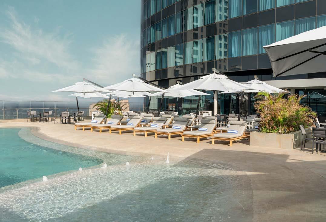
The five-star Radisson Blu Hotel is the Radisson Hotel Group’s fourteenth hotel in South Africa — a well-received addition to the affluent residential and entertainment hub of Umhlanga. The property features 206 rooms comprising luxury suites, junior suites, accessible and family rooms, as well as rooms for business travellers. Together with the normal front-of-house and back-of-house areas, the facilities also include a pool deck at Level Four and an expansive business centre and function area at Level Six, which features a subdivisible banquet hall with a seating capacity of 525 m². The floor area of the hotel totals 12 600 m².
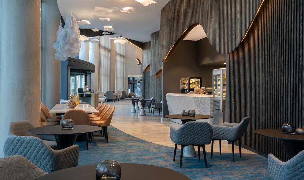
Above the hotel, some 7430 m² is occupied by 90 sectional title apartments and a spectacular penthouse at Level Twenty-Seven. These are accessed through separate lobbies and vertical circulation, and are fully integrated into the architectural form of the building. The hotel is conceived as the ‘exclamation mark’ of the development — the termination at the southern end of the building. The lobby is accessed via a landscaped court to the south, which features a porte-cochère, and integrated into a flowing shell pergola used as a scaling device within the space. The building also connects to the plinth and its parking levels to provide dedicated hotel
Façade aluminium composite panels
Façade Solutions 031 569 5024
City Glass & Aluminium 031 579 1605
Glazed windows City Glass & Aluminium 031 306 8818
Doors Afsan Projects 031 507 2456
Access control systems
dormakaba 011 510 1500
HVAC
Luft Technik 031 001 0560
Lifts KONE Elevators South Africa 011 087 1700
parking, servicing, and some back-of-house activities. At Level Zero and Level Two, the hotel has direct access to the luxury Oceans Mall, which is formally articulated through a piazza on the building’s northern edge. This public, urban feature space is entirely lined with vibrant restaurants and entertainment facilities, and is set to become the new heart of Umhlanga.
The deliberate omission of decorative elements and overly complex detailing come together to create a fairly neutral, minimalistic aesthetic that is respectful of the context and appropriately contemporary. The use of glass for the cladding ensures a light quality, low maintenance exterior envelope, whilst the reflective facetted façade subtly reflects surrounding buildings at lower levels and the sky and its clouds at upper levels. The beautiful reflection of the varying lights following the passage of the sun throughout the day also becomes a dynamic part of the aesthetic of the building. The taut, uninterrupted glazed shine of the hotel varies in the upper levels of the building with the positioning of apartment balconies. These are treated as negatively modulated elements and form simple slots in the envelope reminiscent of the gills of a manta ray. The building sits comfortably in its setting and is recognised as an iconic landmark in Durban.
SUPPLIERS
Balustrades
Façade Solutions 031 569 5024
Pool Poolwise 072 765 5049
Timber reception feature wall Shalom Interiors 031 301 1245
Lighting Edison Power 031 534 1329
Flooring Dereck Logan Flooring 031 205 1337
Interior and exterior tiling Duratile Designs 031 263 1192
Sanware Classic Luxury 031 579 1900
Ceiling and partitions Tekcent 031 569 2796
Wallpaper Wall Design 011 704 9780
Paint Plascon 0860 204 060 Marmoran 011 887 0536
Fire detection National Security & Fire 087 283 7247
Fire proofing Pyrocote 031 464 7893
Waterproofing
Industrial Linings Natal 031 579 1549



Size: 22 000 m²
Location: 2 Nicol Road, Bedfordview, Germiston, Johannesburg, Gauteng
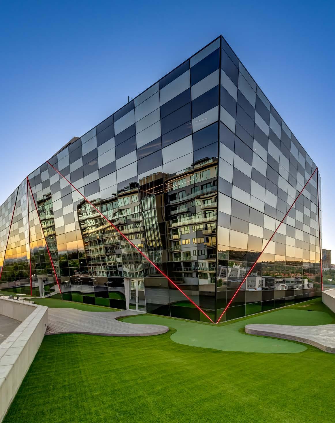
In the heart of Bedfordview, IUM’s big and bold new mixed-use office building stands tall. Designed with careful thought and consideration, the iconic design by Cimato Moroldo Architects harnessed the client’s unique corporate identity and vision, and aligned it with their design principles to create a truly iconic landmark in the commercial building landscape of South Africa.
Join SCAPE as we converge at the intersection of Nicol Corner...
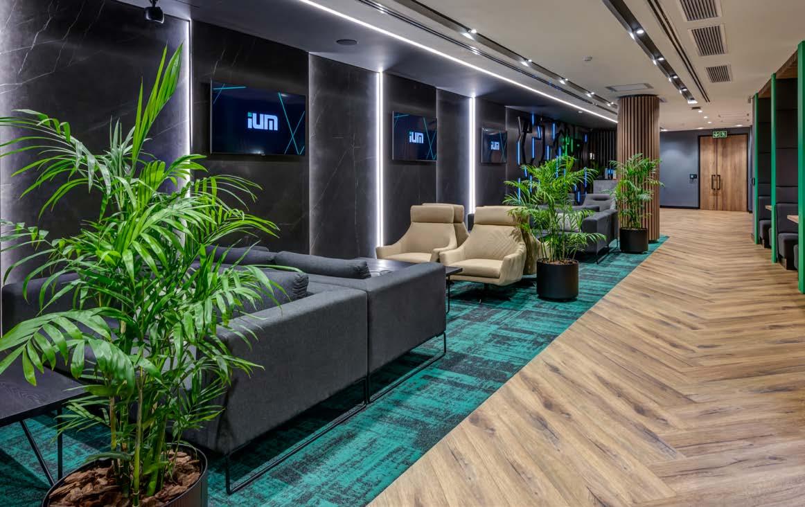
IUM prides itself in offering its clients state-of-the-art, tailored, and bespoke insurance products with the highest levels of service, which is why they wanted their building to reflect their corporate ethos. Cimato Moroldo Architects had previously designed two buildings for the client. Due to the expansion of the business, IUM was looking to move to bigger premises and had secured land in a prime location in Bedfordview, diagonally across from Eastgate Shopping Centre at the intersection of Nicol and Bradford Roads. The site originally contained a single-storey house, which was demolished before construction commenced.
Due to the building’s corner location in a high-visibility position, the land allowed for the creation of a design concept that makes a statement, both with the architectural design and for the client’s business. The brief was to create a ‘home-away-from-home’ and no expense was spared in developing a luxurious, relaxing place to work in. The client wanted a landmark modern building with a glass façade and allowed the architects the freedom to run with the brief. Nicol Corner also accommodates Africa’s first 6-star gym. This exclusive boutique fitness centre offers the very latest in training technology and equipment, and with a floor area of 3592 m² it can accommodate up to 5000 members. The gym has childcare facilities, spinning and Pilates studios, a fully kitted-out boxing training area, external training area, and a sprinting track.
The building consists of three components: a parking garage, the striking winged-podium that houses the boutique gym, and the box-shaped office component with its angled façades and statement lighting details. The parking garage has three levels of parking, one of which is at basement level. Although the original plan called for two basement levels of parking, difficult ground conditions required a change to the final parking design. The parking garage is disguised from the street level using aluminium screens, adding a decorative element that blends with the dynamic design of the building while concealing the parking levels within. The screens were also designed in a unitised style. Large three-by-four metre panels were made off-site and then installed onto the parking structure.
The second component, which houses the client’s boutique fitness centre, boasts the key statement piece of the design. A winged element that points towards the axis of the intersection with large glass panels spanning up to eight metres tall, allows maximum light into the space and helps to showcase the wing particularly well when lit up at night. The third and uppermost component incorporates four floors of offices and a fifth floor with a rooftop restaurant and in-house entertainment area for office staff. The LED lighting on the façade highlights the angled façade of the office component, picking up the diagonal angles of the glass sheets, and creating a striking light feature at night.

The building consists of a concrete frame built on pad footings. No piling was required and the only excavation was for the single-level basement. The three-storey parking structure includes a standard column grid. The podium floor that houses the gym also uses conventional reinforcement, while the office block uses a bonded post-tensioning cable construction.

Client: IUM
Architect: Cimato Moroldo Architects


Project manager and quantity surveyor: Kuun Consulting
Civil, structural, and façade engineer: Pure Consulting
Electrical engineer: KKA Consulting Electrical Engineers
Acoustic consultant: LINSPACE
Interior designer: Cimato Moroldo Architects
Gym interior designer: SNA Architects
Main contractor: Gothic Construction
Photographer: Malan Kotze
The span between columns is quite wide at ten-by-ten metres, and the post tensioning allowed for a thin slab to be laid. The building contains three cores: two at the rear and one at the centre, which contains the lift shaft. Ecotech garbage chutes were installed on every floor. Lastly, hooks for the façade panels were cast into the structure for ease of installation.
Nicol Corner is the first building in Africa to have its entire glass envelope façade specified with Frit Dot system glazing panels. These enamelled dots offer a variety of benefits, including a 30% decrease in energy consumption, decorative shading, and privacy, to name a few. The client requested the Frit Dot glazing as they had seen it effectively being used overseas. Although the initial investment appears expensive, it has the added benefit of not having to budget for blinds, which reduces the overall cost and allows for a clear, aestheticallypleasing façade.
The entire building’s interior pane is double-glazed with Frit Dot glazing. The external layer of the glazing on the office component has a performance-coating application, which was flipped at certain intervals, creating a ‘two tone’ glazing effect. This design feat can be attributed to the fact that the performance coating, which usually faces the interior, can also be rotated to the exterior and exposed to the weather. The result is a varying pattern of light and reflective, and dark and matte glazing.
The façade perfectly conforms to the geometry of the building. On the top office component, diagonal joints protrude out, the aluminium profiles adapting to the almost polygonal shape of the building’s design. Nearly every mullion contains a special splice plate that allows the unitised system to fit to the building’s profile, retaining a reliable weather line. Some panels had to be ‘bent’ back at the top corner to fit into the façade design, which was challenging, but achieving this enabled the irregular angles to be showcased within the façade. A wind screen on the top-floor restaurant level deflects wind and can almost be considered as structural glazing. Made from cantilevered glass arising from the perimeter glass, the two-metres tall wind stand glazing is also shaped to follow the geometry of the office component.
Façade and glazing
Genfødt Aluminium Technologies 082 466 5478
Lighting
Liquid Lighting 082 758 6877
Ironmongery Häfele 011 796 8100
Elevators
KONE Elevators South Africa 011 035 1800
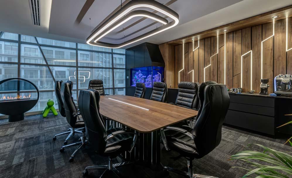
Signage
Sunway Signs & Branding Co. 011 397 3367
Ceilings OWA Ceiling Systems 011 786 5762
Decking
Moisture Shield Composite Decking 010 443 4440
Carpet MONN Carpets 011 462 6227
Paint Plascon 0860 204 060
Custom wallpaper Print Interior 072 586 1495
Sanware Hansgrohe 0861 111 941
Hydro taps and sinks
Franke 031 001 5000
The building’s air conditioning system uses Mitsubishi Electric’s energy-efficient Variable Refrigerant Flow (VRF) System for heating recovery, and boasts one of the most efficient HVAC systems per kilowatt of cooling capacity available in the world today. The rooftop is fitted with LG’s NeON R solar panels, which supplement the grid’s power supply. With an efficiency rating of 22.3%, these solar panels produce the highest power output per square metre, and are suited for a broad range of weather patterns. Automated energy-saving lighting installations are controlled by the RTI building management system. And along with the Paxton Access control system integrated with Hikvision cameras, the building’s security component is also automated.
An advanced networking setup that utilises Aruba’s next-generation technology offers a robust, unified, and secure wired and wireless network solution. HPE/Aruba Core and Access Switches make up the underlying foundation while the HPE/Aruba Wireless (Wi-Fi 6) network infrastructure provides a digital workplace for guests, gym members, and corporate users. Lastly, Aruba Clearpass has been used for network access control and security, while Aruba Airwave is deployed for additional management and visibility.
The building relies solely on two borehole systems and a rainwater harvesting system for the entire office’s water needs. Nicol Corner prides itself by making use of the latest rainwater harvesting technology and energyefficient water heating, with vertical landscaping found on various levels throughout the building.
The interior design of the building follows on from the cutting-edge external architecture. This results in a working space that is conducive to productivity while allowing teams to operate in a spacious, unrestricted setting. The workspaces are fitted out with AAA-grade finishes, giving a luxurious and artistic feel to the environment.
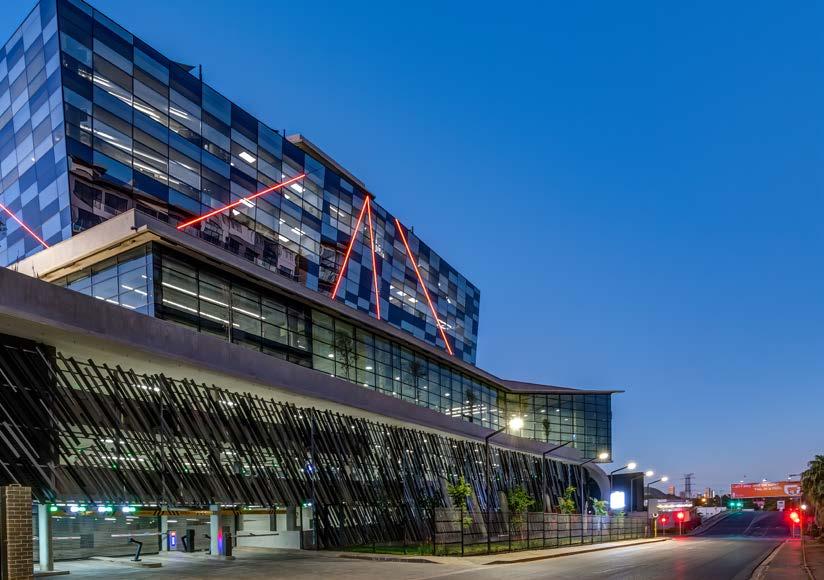
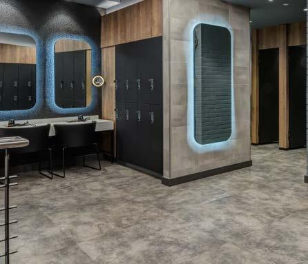
Nicol Corner achieved the brief from the client by creating a striking, modern landmark that makes a bold statement and maximises the exposure of the client’s business identity.
Custom WC basins and feature wall tiles
Wolkberg Casting Studios 071 506 4829
Custom shopfitting
FENIX, available from Max On Top 086 111 3495
EGGER, available from Kayreed Board & Timber 011 837 8602
PG Bison 011 897 5200 Blum 011 444 8118
Furniture
Tétris South Africa 010 500 9206
Appliances Liebherr 012 250 16 05 Siemens 081 432 1087 Venturas 011 453 8840
Stone Caesarstone 021 511 2353 Marble Classic 011 392 6700
Smart gas solutions Indigas 012 653 3295
Artificial turf and sprint track Synsport 087 803 1024
Gym equipment Technogym 011 707 2900


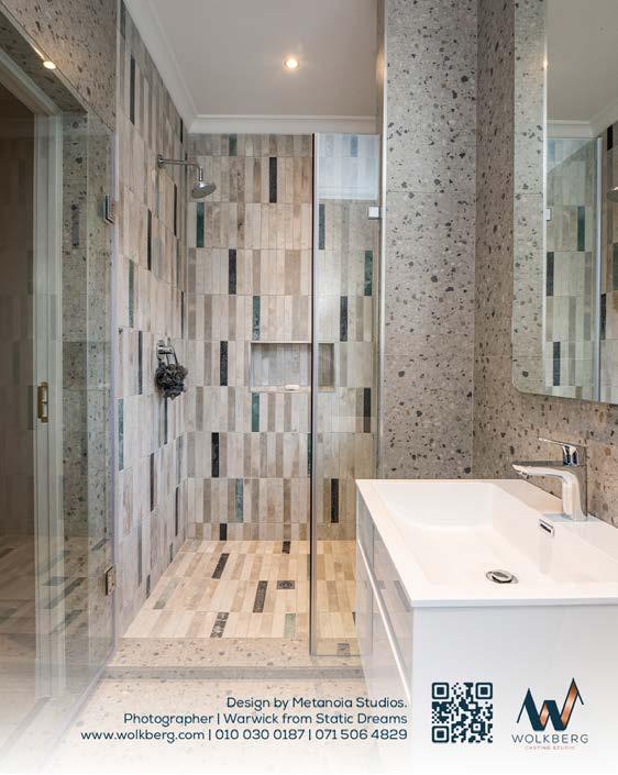




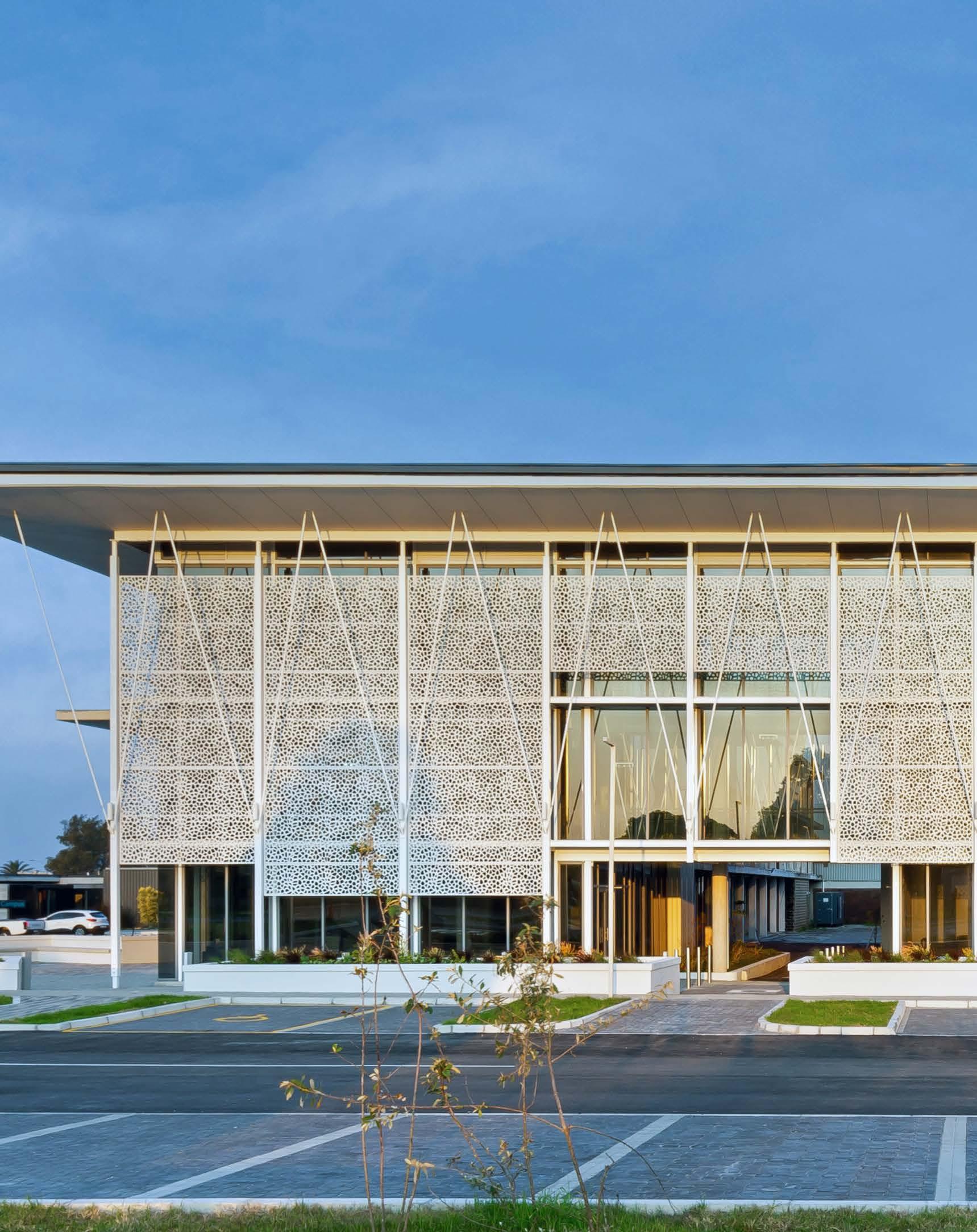
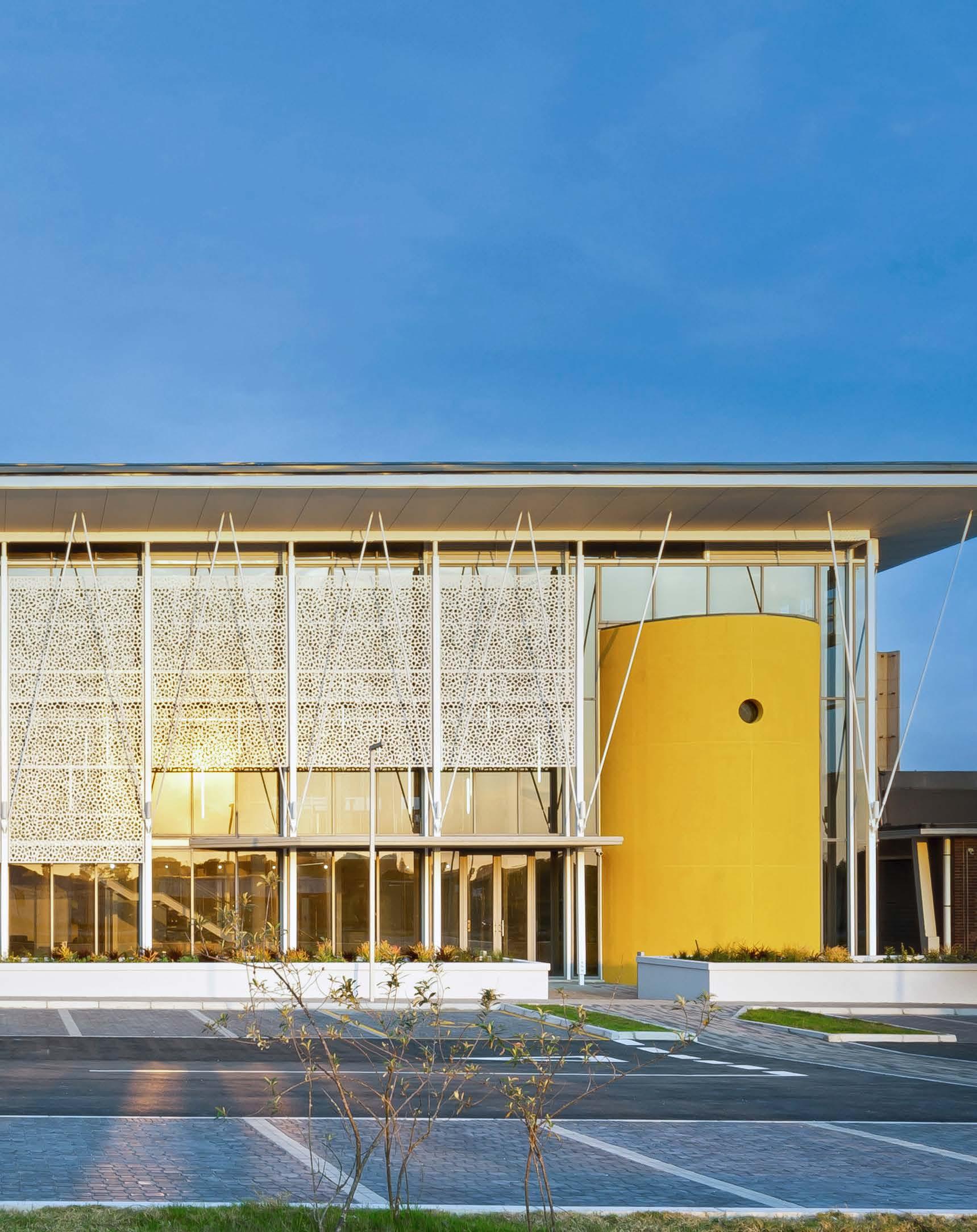
Size: 2200 m²
Location: Gomery Avenue, Summerstrand, Gqeberha, Eastern Cape
Without a doubt, 2022 has been the year of education buildings, and this façadefavourite at Nelson Mandela University is another fantastic addition to the academic honour roll. The talented team at SVA International designed a new extension to South Africa’s first dedicated Ocean Sciences Campus at Gomery Avenue, Gqeberha. From the dancing sunlight filtering through the patterned façade to the bright yellow accent wall, dive into the design of this sunny Eastern Cape sea-scape...
The client’s brief called for the creation of a new ‘entrance’ building and identity for the Nelson Mandela University Ocean Sciences Campus, while also providing a series of dedicated academic spaces within a specialised research environment.
The building is conceptualised as a large internal veranda space articulated as a triple-volume, multi-layered foyer that links the main circulation spine with the more private spaces within. The internal planning contains a number of dedicated research spaces, specialised laboratories, offices, meeting areas, as well as an eight-metredeep diving tank used for training purposes, which also forms an integral part of the western façade articulation.
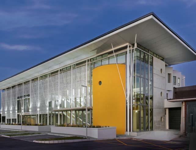
A three-dimensional sun-screen layer further articulates the main building façade while simultaneously defining a unique internal aesthetic through the ever-changing shadow patterns throughout the day. The building structure is conceptualised as a stereometric composition between exposed concrete and structural steel, distinctly articulated within the main foyer space to create a clear rhythm along the main circulation spine. Integrating the dive tank element into the main façade also posed a number of structural and circulation challenges while at the same time offering unique character presence along the main building façade.
Internally, the building seeks to integrate various layers of landscaping and passive design elements to give the main foyer space a ‘life-like’ aspect. This also offers users the opportunity to engage with the building on various levels either as a visitor or a dedicated user. The selection of internal finishes aims to find balance between long-term low maintenance and creating an overall spatial aesthetic of a distinctly contemporary academic institution.
The new building seeks to establish a clear visual identity and point of reference within the campus that has been largely dominated by two-storey utilitarian structures constructed throughout the 1970s. The external landscaping of the Ocean Sciences Campus is carefully integrated along the building edges to offer positive spaces with the opportunity for engagement and interaction.
Client: Nelson Mandela University
Architect: SVA International
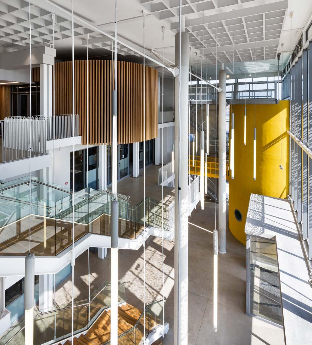

Lead architect: Tony Danev, Stephanie Janse van Vuuren, and Judy du Preez
Project manager: Nelson Mandela University
Principal contractor: WBHO Construction
Structural and civil engineer: BVI Consulting Engineers
Mechanical and electrical engineer: Bosch Projects
Quantity surveyor: Chimora Group
Photographer: Ray Truter Photography and SVA International
Façade
Hulabond, available at HBS Aluminium Systems 0861 246 444
Lighting Regent Lighting Solutions 011 474 0171
Flooring
Belgotex 082 415 3415 FloorworX 021 980 9000
Paint Dulux 0860 330 111 Plascon 0860 204 060
Decorative paint Marmoran 011 887 0536
Access control SALTO Systems South Africa 011 534 8489
Roofing Global Roofing Solutions 011 898 2900
HVAC Samsung 0860 726 7864
Ironmongery dormakaba 011 510 1500
Curtain wall system Sheerline 021 704 1802
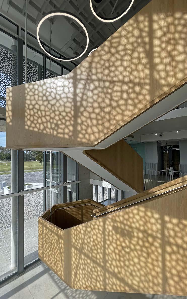
Countertops
Neolith 083 805 8698 FENIX, available at Max On Top 086 111 3495
Sanware Hansgrohe 021 447 7144 Geberit 021 555 0651

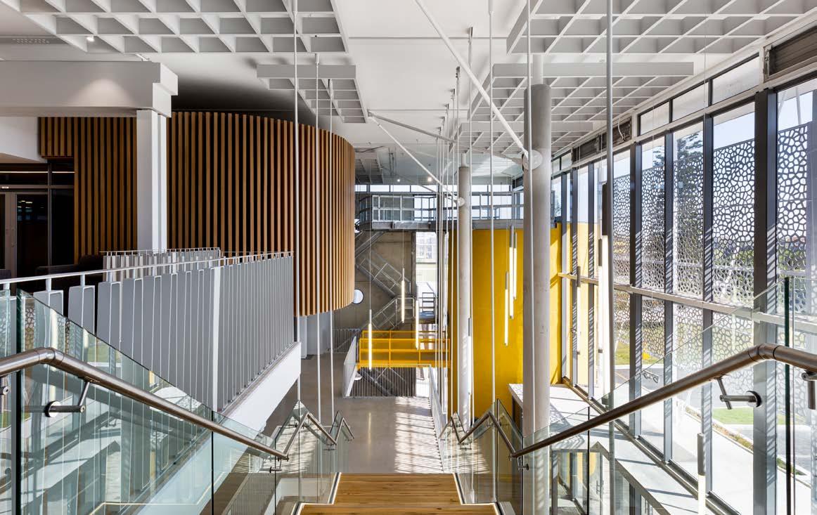
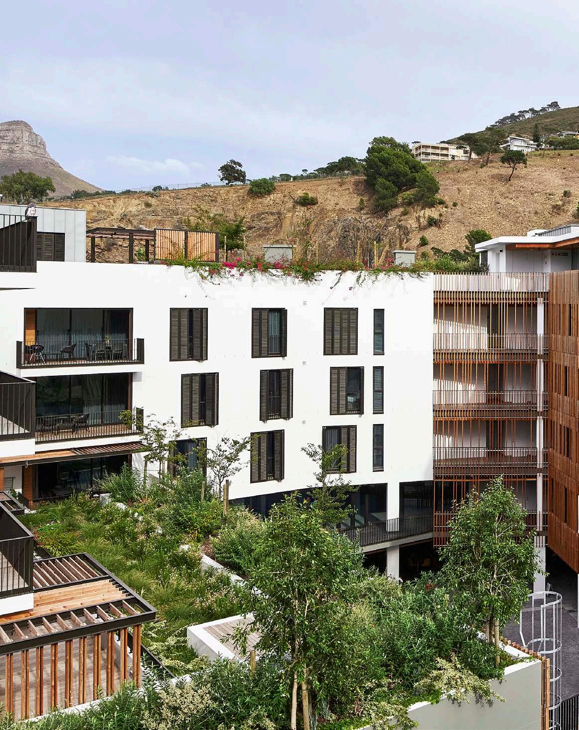
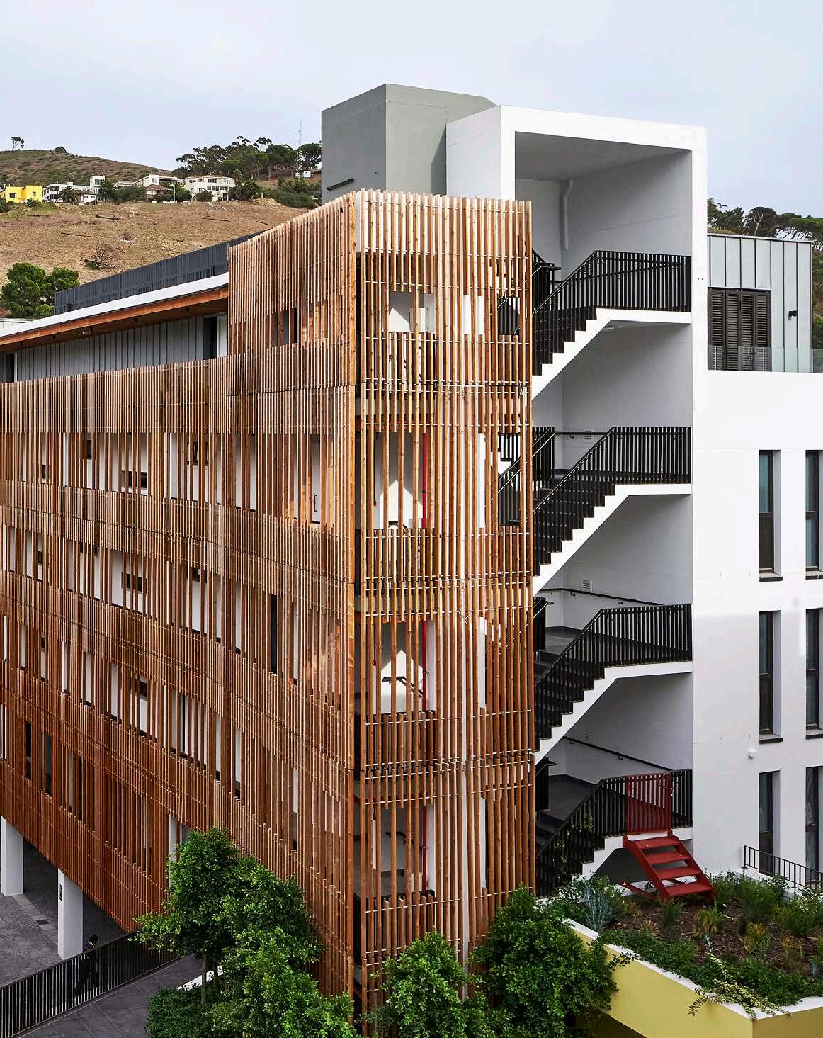
Size: 12 390 m²
Location: 18 Hudson Street, De Waterkant, Cape Town, Western Cape
Straddling the cobblestone streets and chic urban landscape of De Waterkant, the Old Cape Quarter refurbishment has scooped up not only a 4-Star Green Star-rating but also the Heritage Award at the 2022 SAPOA Property Development Awards for Innovative Excellence in recognition of its unique and respectful treatment of the historic suburb. Designed by the acclaimed, multidisciplinary studio dhk Architects, the Old Cape Quarter holistically integrates into its larger urban context, forming a connection between the experiential qualities of the inside and outside spaces.
The brief was to transform and maximise the bulk of the existing Cape Quarter Centre in Cape Town’s historic De Waterkant area into a vibrant mixed-use development while creating a balance between new contemporary elements and staying respectful of the surrounding heritage context. The zoning parameters allowed the addition of four residential levels onto the reconfigured existing parking, retail, and office levels. Moreover, activation of the street and courtyard frontages on multiple levels was also a priority.
Prior to the new incarnation of the existing Old Cape Quarter, the retail/office building had become increasingly disused as a result of the opening of the larger Cape Quarter Lifestyle Centre some years ago, and was in need of an extensive upgrade. The design concept allowed for an honest dialogue between heritage and contemporary elements, forming a hybrid of architecture that politely enhances the building’s street presence on Hudson, De Waterkant, and Dixon Streets.
The new interpretation, as a true mixed-use development with retail, office, and residential components surrounding a publicly-accessible courtyard, allows the surrounding community to positively interact as tenants or patrons, facilitating the meeting of like-minded people. The site area is 3 475 m² and the building area is 12 390 m² over eight levels, including three basement parking levels, retail spaces on the ground floor, offices on the first floor, and four apartment levels, a swimming pool, and two penthouses.
Rather than demolish and rebuild an entirely new building on the site of the original buildings, it was decided to retain the existing structure, street façades, and parking below by building on top of it. The design aimed to respectfully contrast the heritage buildings on Waterkant and Hudson Street with new architectural interventions (all in white and set back from the multicoloured street frontages that are typical of the De Waterkant area), while still carefully incorporating the existing façades on Hudson, Waterkant, and Dixon Street into the design.
A complex structural intervention was required to carry the load of the four additional floors being added to the existing structure. Therefore, a number of foundations together with temporary steel structures needed to be rebuilt to facilitate this. Plus, the strengthening and/or replacement of columns and slabs. Reconfiguring the existing internal layouts and courtyard footprint, as well as adding four levels to the existing structure, led to a unique intervention in the form of an innovative, layered hybrid development.
The smaller scale and fragmented character of the historic De Waterkant context was referenced throughout the design, rather than merely mimicked as a pastiche. This was achieved by fragmenting the building mass into smaller distinct plastered masonry forms, respectfully set back from the existing street frontages. In contrast to the expressed slab edges and maximised glazing seen in most high-end residential schemes in Cape Town, the Old Cape Quarter utilises punctured window apertures, which vary in size, alignment, and depth, offering a dynamic and contemporary addition to the existing buildings.
SUPPLIERS
Concrete AfriSam South Africa 011 670 5500
Lighting Harris Electrical 021 821 4000
Lights by Linea 021 511 6116
Eagle Lighting 021 424 4071
Eurolux 021 528 8400
Spazio 011 555 5555
Paving Boss Paving 021 439 5500
Cladding Rheinzink 021 671 2600
“OLD CAPE QUARTER RECEIVED THE 2022 FULTON AWARD FOR ‘INNOVATION AND INVENTION IN CONCRETE’ AND THE CONSTRUCTION WORLD’S BEST PROJECTS AWARD IN THE ARCHITECTS CATEGORY.”

Paint Dulux 0860 330 111
Signage
Upfront Media 021 510 6395
Aluminium, glass, glazing, and façade Mazor Aluminium 021 556 1555
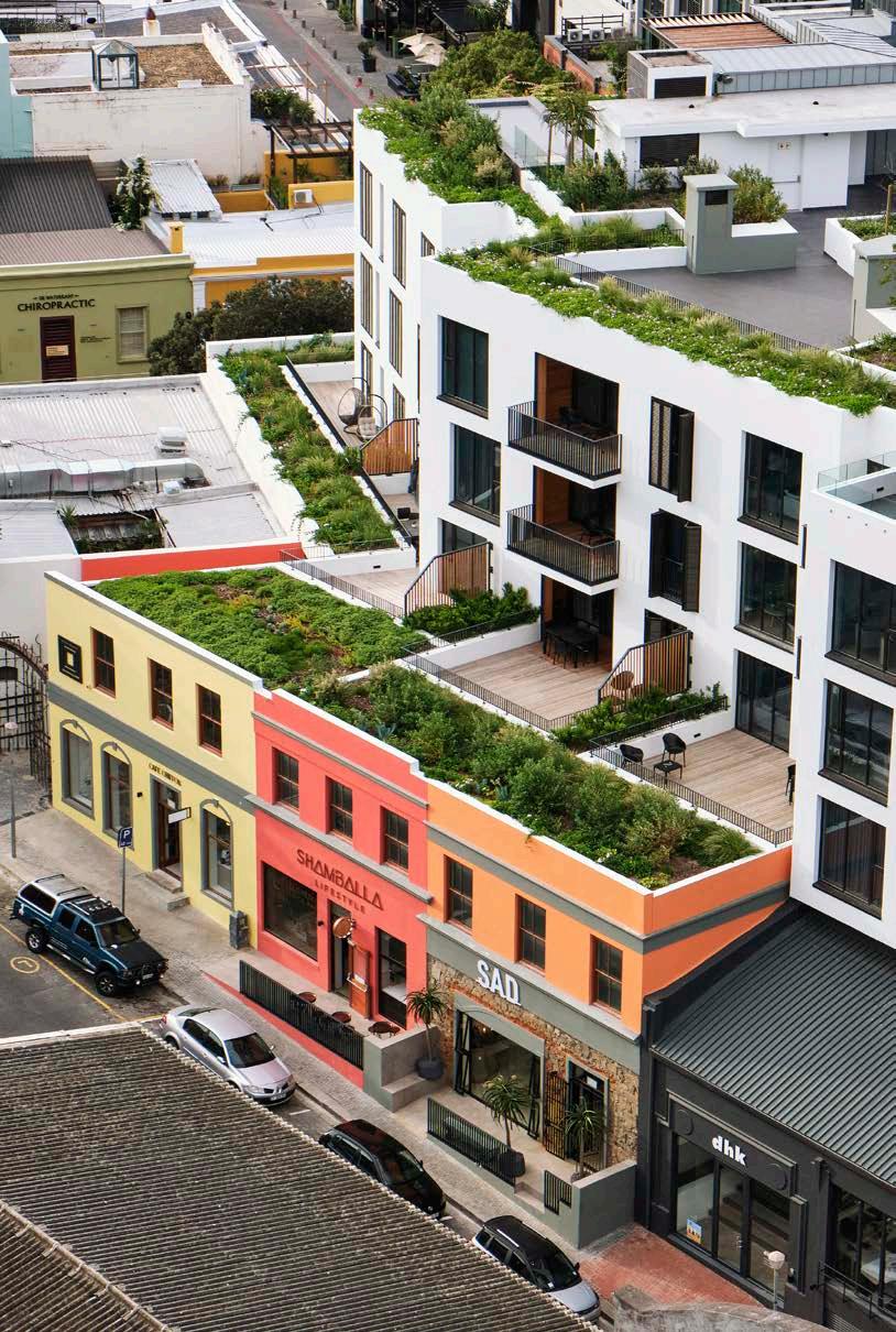
Wall insulation and screed SADCON Building and Maintenance 073 766 3337
Tiling Tiles by Tactile 021 461 4944 Lime Green Sourcing Solutions 021 447 2254
Flooring
Oggie Hardwood Flooring 021 510 2846
Walls SADCON Building and Maintenance 073 766 3337
Gabriel & Sons 078 142 7736 Claytile 021 884 4589
Cupboards
Inside Living 021 422 1188
The building is designed around a central courtyard with flanking and cascading planted terraces. The biophilic oasis-like effect created in the courtyard and across the exterior façades of the building was achieved through the extensive use of larch timber – which lines the balconies and makes up the courtyard façade screens – coupled with significant planting in the courtyard and on the first, second, and fifth-floor terraces. These features created a softer residential character in a very dense built environment. Extensive timber screening, pergolas, and cladding in the courtyard and external façades also helped to ease and situate the architecture within its urban context.
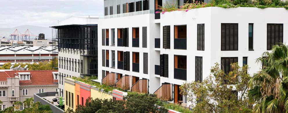
The courtyard is open to the eastern common boundary edge from the first floor upwards towards the neighbouring office building. This design detail intends to minimise the impact of the development on its neighbour in terms of light and views, and also helps to form a perimeter block with very positive interaction between both sites while minimising the impact of the additional four floors flanking the courtyard.
A complex structural intervention was needed in order to carry the load of the four additional floors being added onto the existing structure. This required rebuilding a number of foundations together with strengthening and/ or rebuilding columns. The complex adaption of structure and bespoke details throughout the project, as well as the heritage considerations of the development in a suburb known for its historical houses, necessitated close consultation with De Waterkant Civic (an official commenting body) and Heritage Western Cape, leading to a successful outcome.
Old Cape Quarter is an exclusive and sophisticated residential development that will feature clean contemporary lines, floor-to-ceiling windows, bedrooms with shutters, and Rheinzink cladding on the penthouse level, all set within the existing multi-coloured fabric of the De Waterkant precinct, resulting in a well-proportioned and elegant architectural solution.
Client: Tower Property Fund
Architect: dhk Architects

Project manager: Igual Project Managers
Quantity surveyor: Smith & Co Quantity Surveyors
Structural designer: Sutherland Engineers
Principal contractor: GVK-Siya Zama Building Contractors
Specialist sub-contractor: VSL Construction Solutions, Franki Africa, and Siyazama Steel
Paint contractor: Whiteheads Painting Contractors
Photographer: Sean Gibson Photography
Design lead: Pierre Swanepoel, Partner of dhk Architects
MEET THE TEAM
"THIS DESIGN DETAIL INTENDS TO MINIMISE THE IMPACT OF THE DEVELOPMENT ON ITS NEIGHBOUR IN TERMS OF LIGHT AND VIEWS."
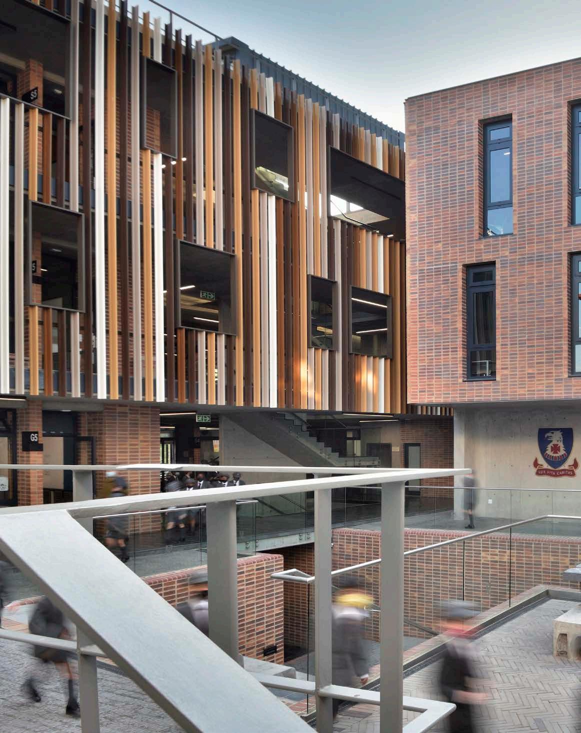
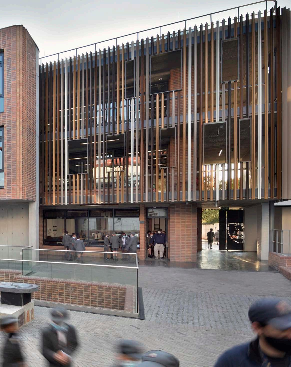
Size: 3350 m²
Location: 17 St Patrick Road, Houghton Estate, Johannesburg, Gauteng
St John’s College boasts an enviable architectural heritage dating back to the early 1900s, with alterations made to the original buildings in 1925, 1939, and again in 1957 to accommodate a growing enrolment list. Since its humble beginnings, the campus has evolved to meet the needs of twenty-first-century students and flexible pedagogical requirements, with the latest intervention seen at St John’s Preparatory School.
The St John’s Preparatory School campus is well known in Johannesburg as an educational landmark situated on Houghton Ridge. The outcrop was identified by Sir Herbert Baker and Frank Fleming as the appropriate site for a new school, with the foundation stone being laid in January 1907. The ensuing incremental development has graced the suburbs with buildings of stature and beauty, enjoyed by all who are fortunate enough to attend the school or to teach there, as well as by those who appreciate its architectural and cultural significance from the public realm.

It is worth noting that the integration of the buildings into ‘the koppie’ and its surrounds has been accomplished through a sensitivity to massing and the use of materials that continue to impress today. All major developments on the campus were scrutinised by various heritage committees, having first been subject to an internal approval process which was both collaborative and discursive.
The lead architect, Mark Pencharz of PENCHARC, was privileged to continue undertaking work amongst this canvas of historic and architecturally rich group of structures. Being a member of the building committee, Pencharz contributed and advised the school on its building strategy over an extended period. This thorough knowledge of context covering not only architectural design and services but also changing requirements in education and sport, allowed PENCHARC to work closely with the school in formulating the brief.
After recently completing the new Pre-Preparatory School for St John's, which used a classroom module size of more than 80 m², there was considerable pressure to find a way to create equitable teaching and learning spaces for the Preparatory School housed in the old structures designed by Fleming. The 40 m² classrooms, some of which included open fireplaces, had clearly served their best years of service. The team needed to find space on a crowded campus for 18 new classrooms and a modern science laboratory and maker space, all preferably clustered in a central area easily accessible from the existing Prep and having its own identity within the overall college campus. The facility had to deliver cutting-edge design in terms of current trends in learning, and of course, endeavour to be exemplary in terms of comfort and best practices in passive sustainability building science theory.
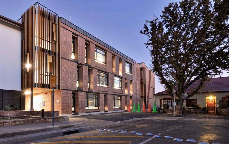
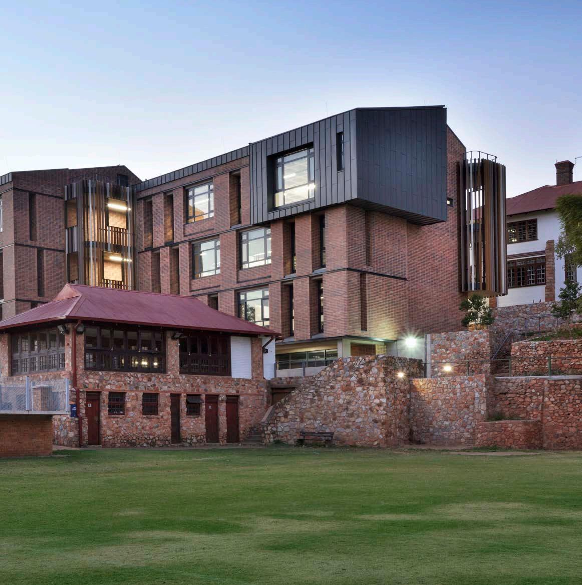
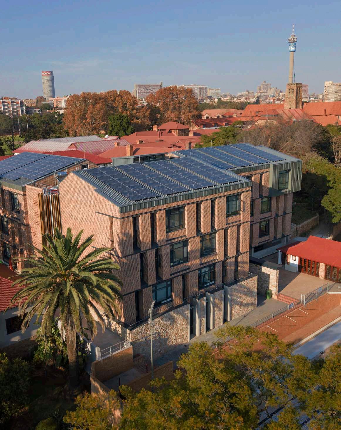

" THE INTEGRATION OF THE BUILDINGS, SOME OF WHICH ARE OF CONSIDERABLE SCALE, INTO ‘THE KOPPIE’ AND ITS SURROUNDS HAS BEEN ACCOMPLISHED THROUGH A SENSITIVITY TO MASSING AND THE USE OF MATERIALS THAT CONTINUE TO IMPRESS TODAY. "
PENCHARC's history with new builds on the campus raised awareness of not underestimating the possible complications and costs associated with developing new ground. The underlying geological formation of the ridge had not disappointed in surprising and challenging the experienced geotechnical and structural engineers before, and this project proved no exception to that precedent.
Demolition of the old house historically used as the sanatorium (hospital) for the boarders, provided the space the team needed to squeeze the new school into what appeared to be the only space available, other than the compromised option of cannibalising much-needed sports fields.
The new build took on the form of an enclosing L-shape, providing the traditional internal quadrangle that characterises the best of the Baker structures. Seen from above, the campus could be interpreted as a series of beads on a necklace. The string being the axial line of the ridge, and the beads the buildings with their focal points as quadrangles.
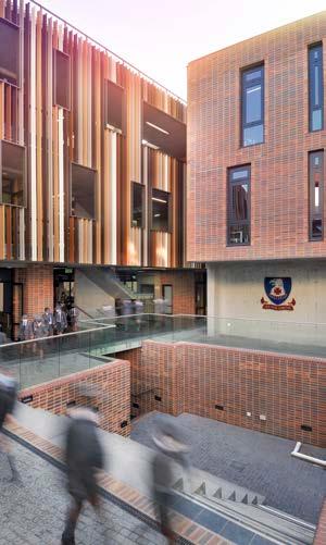
The available space proved to be a ‘goldilocks’ solution, with the structures locking into the constrained area on all sides with less than half a metre tolerance. The architects were not disappointed by the complexity of the foundations. Blasting and diamond-cutting solid quartzite situated just below natural ground level on the southern portion and sinking friction piles 30 metres deep and 15 metres to the north, necessitated innovative structural solutions that gave the geotechnical engineers sleepless nights.
Although having initially undertaken as best a geotechnical survey as possible with the existing structures limiting full access, the team needed to contend with a dynamic design process as the bulk excavations uncovered new information which necessitated complete design reviews on the fly. The result is a structural solution that is radically prototypical and most likely will be the subject of a future geotechnical engineering theory paper.
PENCHARC was constantly reminded of the irony demonstrated by the old Baker and Fleming structures which had patently managed to sidestep the treacherous founding conditions with hardly a crack in their façade in sight.
Health and safety vigilance is always paramount when building in an operating environment. Keeping the boys from wandering onto the site proved easier than dealing with the noise and dust. Teaching through jackhammering of solid rock is not for the faint-hearted. Looking up from time to time from their busy site to the surrounding classroom windows, the team would often see groups of inquisitive, small faces squashed against the taped-up windows as the boys were treated to spectator seats in the construction arena. Somewhat unintentionally, this process of observation became part of a didactic teaching process. With some luck, some of the learners may well pursue a career in design and construction.
Construction of the foundations and buildings was undertaken under a separate main contract. The COVID-19 lockdown caught the team towards the end of the process which, while taking away some of the muchanticipated excitement in delivering the project, was well managed by all concerned.
Client: St John’s College
Architect: PENCHARC
Quantity surveyor: Schoombie Hartmann
Civil and structural engineer: RMCE
Geotechnical engineer: Geoid Geotechnical Engineers
Electrical engineer: Aftek Consulting Engineers
Wet services engineer: DSB Consulting Engineers
Fire consultant: Building Code Consultants and Kuphele Sustainability consultant: PJC Consulting Surveyor: Wimberley & Associates Demolition and earthworks: Zero Azania Electrical contractor: Tesla Electrical Main contractor: Gothic Construction Photographer: Michael Schmucker, studio88
Aluminium doors, windows, shopfronts, and façade Alumac 011 615 0340
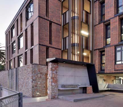
PV solar system NESA Power 011 326 3903
Joinery
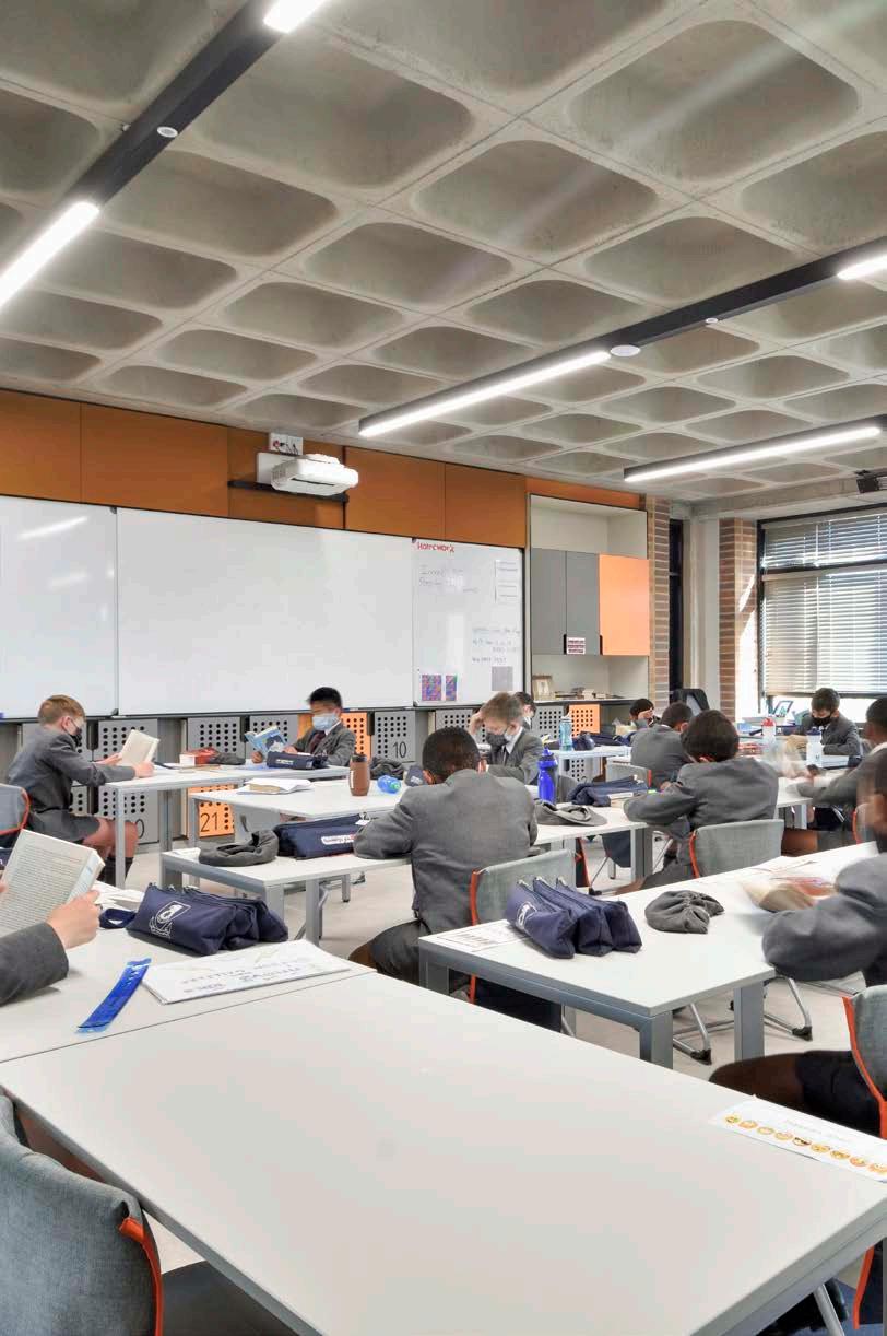
QP Shopfitters 082 301 8870
Roofing
GM Roofing Solutions 011 465 4075
Klip-Tite™, available at Global Roofing Solutions 011 898 2900
Cladding Rheinzink 021 671 2600 Rohde Roofing 082 395 0095
Structural steel SE Steel Fabricators 011 953 4584
Glass balustrading Steel Studio 011 608 1963
Precast concrete Specialised Precast Elements 012 333 3788
Acoustic doors
Aluglass Bautech 011 451 8400


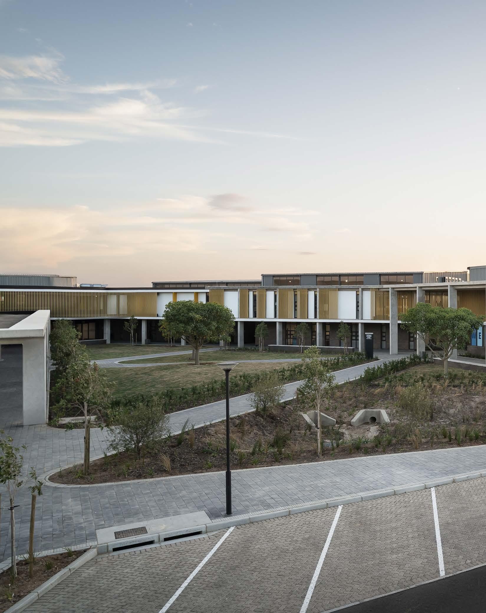
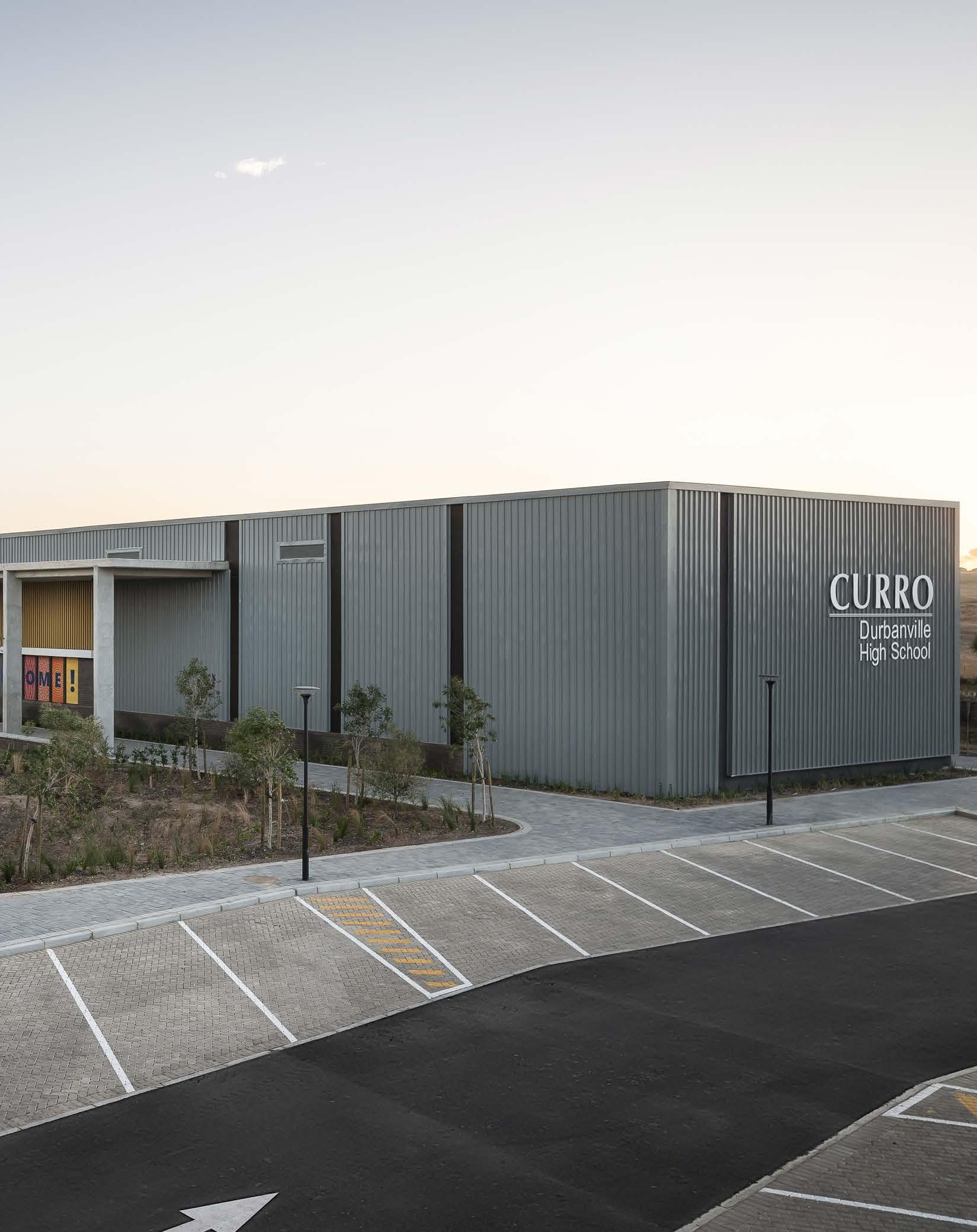
Size: 9800 m²
Location: 2 Akademia Avenue, Groot Phesantekraal Estate, Durbanville, Cape Town, Western Cape
Curro Durbanville, the first school to open under the JSE-listed private education group in the late 1990s, has built a brand new contemporary high school campus with the capacity to house 1000 learners and room for further expansion.
Located to the northeast of Durbanville, the site for Curro Durbanville High School forms part of the larger urban plan for the Phesantekraal area. The site is accessed on the west side from two turning circles which had predetermined positions, providing the campus with main and secondary access points. The campus borders the busy Okavango Road on the east side. Existing pylons with a 31-metre-wide servitude cross the north end of the site, restricting development in this zone to parking and low-level planting. The site slopes down towards the south side where it borders a wetland area.
The brief called for a high-quality innovative school with a range of cultural and sports facilities. It was important that the design process was not isolated to a single author. The pupil-centric scheme came together through collaborative engagement with learners, teachers, and other consultants. Learners were tasked with presenting their own ideas and initiatives for their ‘ideal’ new school. They expressed their vision through interactive drawing and model-building sessions, which presented the architects with a unique client brief. Further inspiration was drawn from the surrounding landscape and the mountains in the distance, the colour of the canola fields, and the materiality of existing structures located on and around the site. The design emits an exciting take on form, texture, and scale. The site was handed over to the main contractor at the beginning of November 2020 and completed at the end of 2021.
The basis of how children develop is learning achieved through interaction. Children first experience interactions with the adults in their lives (parents and teachers), secondly with peers, and thirdly through interaction with their surrounding environment — the physical space in which learners mature, also known as 'The Third Teacher'. The design aimed to capture and promote the value of this concept in its layout, spatial qualities, layering, furniture, and finishes to create a positive, stimulating educational environment.
A series of layout configurations were assessed for the campus. During this process, determining factors such as site conditions and constraints, accommodation requirements (programme), the orientation of sports fields, the potential shade-cast of structures, connectivity between respective facilities, as well as the internal road link between the access points were taken into consideration to find the most suitable layout.
Client: Curro
Architect: BPAS Architects

Landscape architect: cndv landscape architects
Structural. civil, and electrical engineer: KLS Consulting Engineers
Mechanical and fire engineer: FMWE Consulting Engineers
Quantity surveyor: Calcoli
Acoustic engineer: Mackenzie Hoy Consulting Engineers
Audio visual consultant: PJK Project Management
Interior designer: B-Sense and ORC
Electrical installer: Harris Electrical
Main contractor: MNK Projects
Photographer: 3sixty Photography
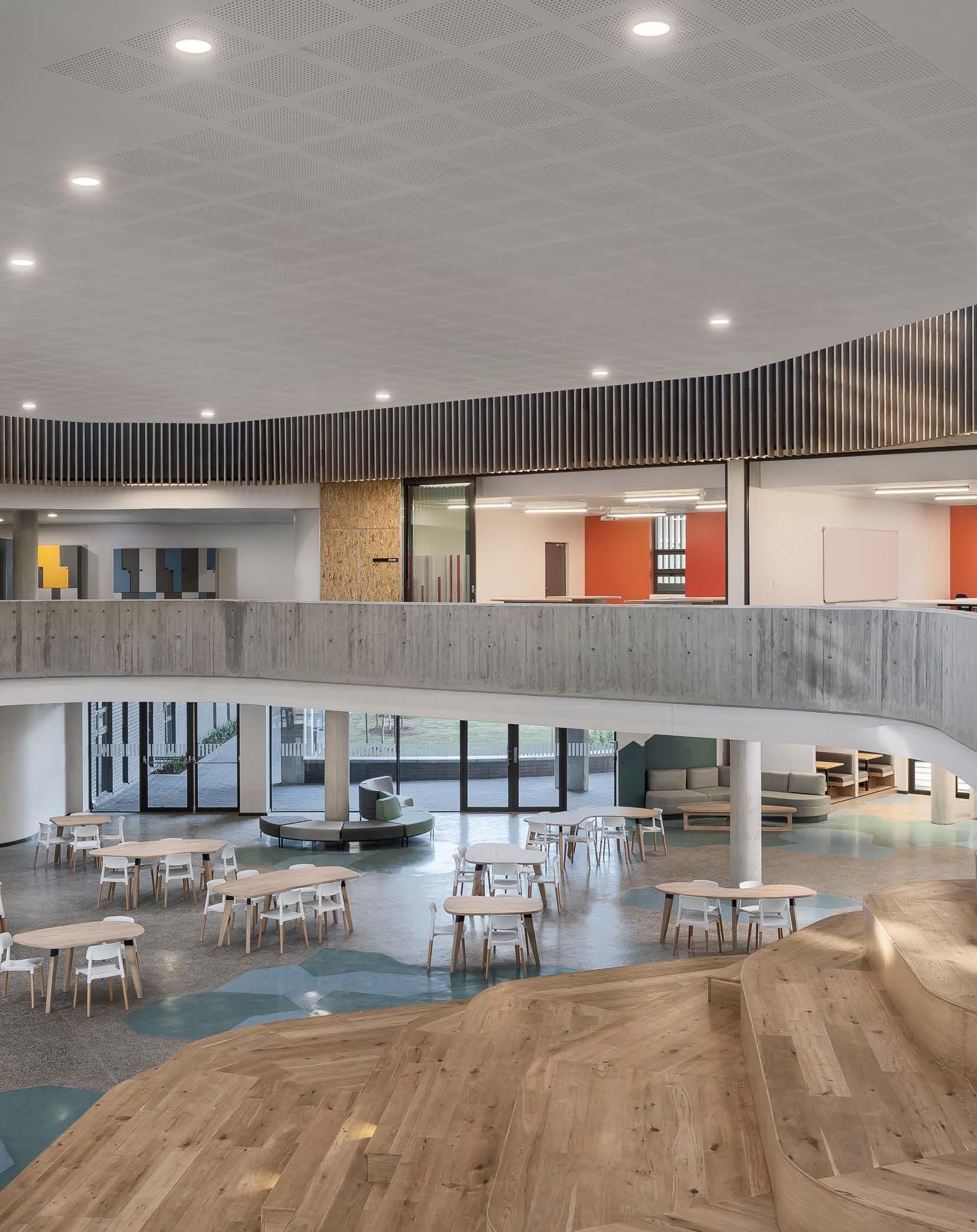
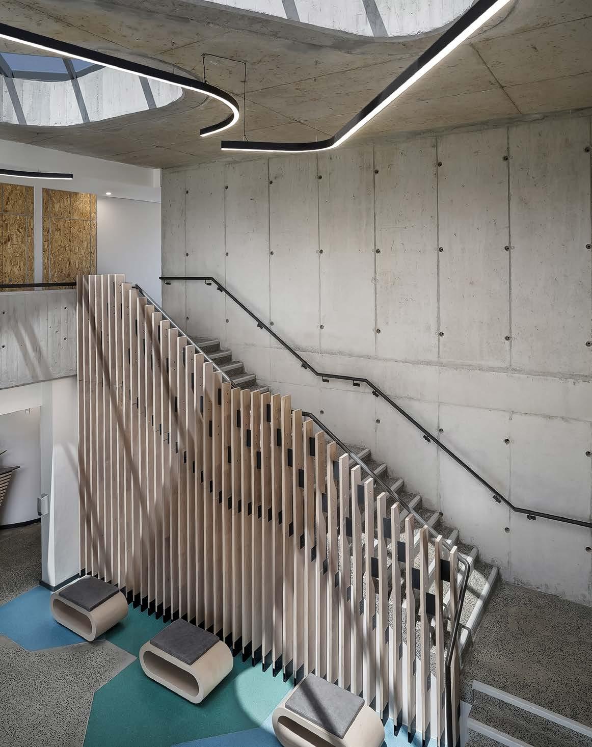

Brick Corobrik 011 871 8600
Vinyl flooring Polyflor South Africa 011 609 3500
Sanware Geberit 011 444 5070 Lecico 021 531 9848 Cobra 0861 21 21 21
Aluminium shopfront, glass, skylights & sunscreens Go Green 021 945 1156
Flooring
Flowcrete 021 551 7885
Tiling
RAKO, available at Tiletoria 021 511 3125
Cafeteria and consumer science kitchen equipment Catermarket 021 949 7325
Oak veneer atrium seating African Heartwood 082 559 1029
The U-shaped building footprint frames the southern corner of the site, which formulates a forecourt defined by the auditorium and hall on either side. It ‘embraces’ the learners and visitors as they enter, while also acting as a protective buffer from the elements. The building height was kept moderately low by spreading the accommodation over wider floorplates, thereby relating to the surrounding context of the existing and upcoming urban skyline. The architecture is non-stylistic. It responds to site conditions such as climate, contours, accessibility, and connectivity, resulting in a site-specific design.
The conventional ‘school typology’ consisting of classrooms that are framed by four walls was challenged with the concept of constant interaction between spaces. The classes become permeable and adaptive with furniture, such as combinable tables, specifically designed for the hybrid and flexible use of each space. Diversity is emphasised through juxtaposed slanted columns and colours in the atrium learning space, embracing difference and uniqueness in a collective and safe environment.
Usually, the classroom is inclusive and private, hallways and passages are semi-private, and the playground is the public space. Now, an art classroom opens into an atrium that can be turned into a gallery or exhibition area, also sharing space with the cafeteria. The cafeteria has a practical kitchen which is used for consumer studies by the hospitality learners. The consumer studies classroom is linked to the cafeteria as well. This type of design provides flexibility and hybrid use, essential for a school that will always be adapting to future needs.
The classrooms and laboratories are placed around an atrium and internal courtyard space respectively, allowing daylight to filter in. Organically shaped walkways, which host collaborative spaces, together with slanted columns and colourful interior elements create visual interest and a sense of playfulness. Overall, the school responds well to the site through its sustainability considerations, non-stylised architecture, and ability to go from conventional to flexible.
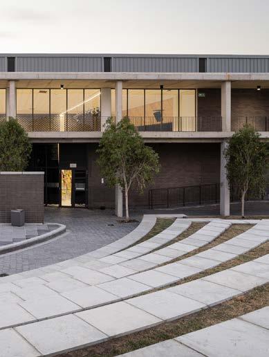
OSB fire cabinets
Unique Kitchens 021 981 9393
Ironmongery dormakaba 011 510 1500
Lighting Regent Lighting Solutions 021 552 7622
Ceilings and partitions Saint Gobain 012 657 2800
Acoustic ceilings OWA 021 531 7511
Pavers C.E.L Paving Products 021 905 5998
Waterproofing
GP Koning 021 703 9544
Bathroom cubicles Façade Projects 021 905 4474
Artificial turf, landscaping a nd sport fields Turftech 087 087 4168
Sport, tennis courts, paving & landscaping Trompie Group 086 123 5296
Structural steel Triomf Staalwerke 021 862 1630
Shopfitting, data & security installations
GRIT Procurement Solutions 012 741 3460
Thermal insulation IsoBoard 021 983 1140
Roofing, steel sheeting, and cladding Safintra Building Solutions 011 323 6300
Safal Steel South Africa 031 782 5500
Architect Louis Khan once told his students: ‘If you are ever stuck for inspiration, ask your materials for advice.’ This philosophy was considered throughout the design process, resulting in a rich and robust material palette with innovative applications thereof. Patterned brickwork acts as a wayfinding method at entrances while contributing to the aesthetics of the building. The auditorium is cladded with sheet metal which forms a prominent node at the main entrance. Off-shutter concrete roofing links the programme components (auditorium, classroom spaces, and hall) — a finish that is pulled through to the interiors and complemented by the warmth of natural wood elements.
Steel trusses were used in the auditorium, hall, and dance and drama studios to create free-span structures. A noteworthy feature on the 'tail-ends' of the U-shaped building for the auditorium and hall is the pre-painted SAFLOK 700 steel substrate sheeting the team used for the roof and wall cladding as an added rain screen.
The dynamic plan enhances the flow of users in and through the building. The overall layout is strategically arranged with the more public spaces on the main access side (parking, forecourt, hall with viewing deck towards the cricket oval, auditorium, and the administration component), and the private secure spaces on the south side (dance and drama studios, music rooms, cafeteria, laboratories, and classrooms).
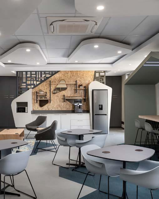
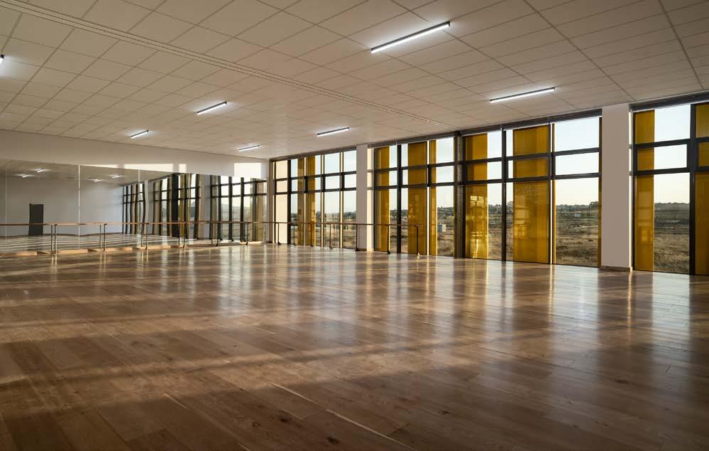
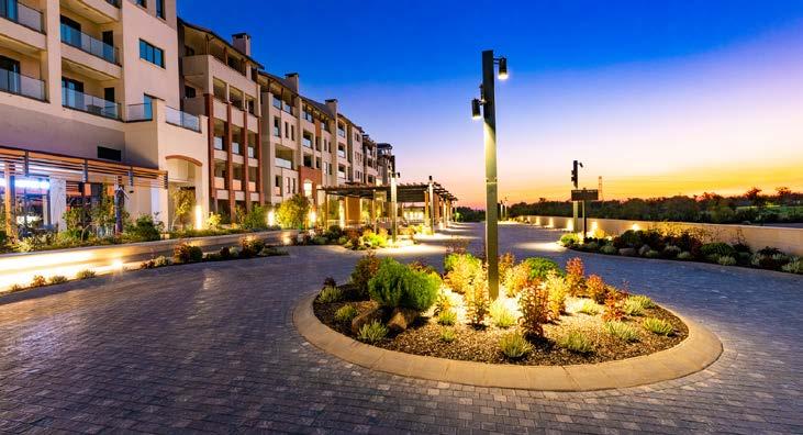
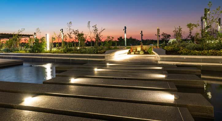
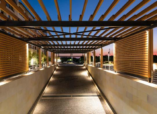
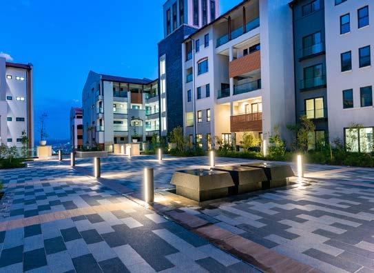
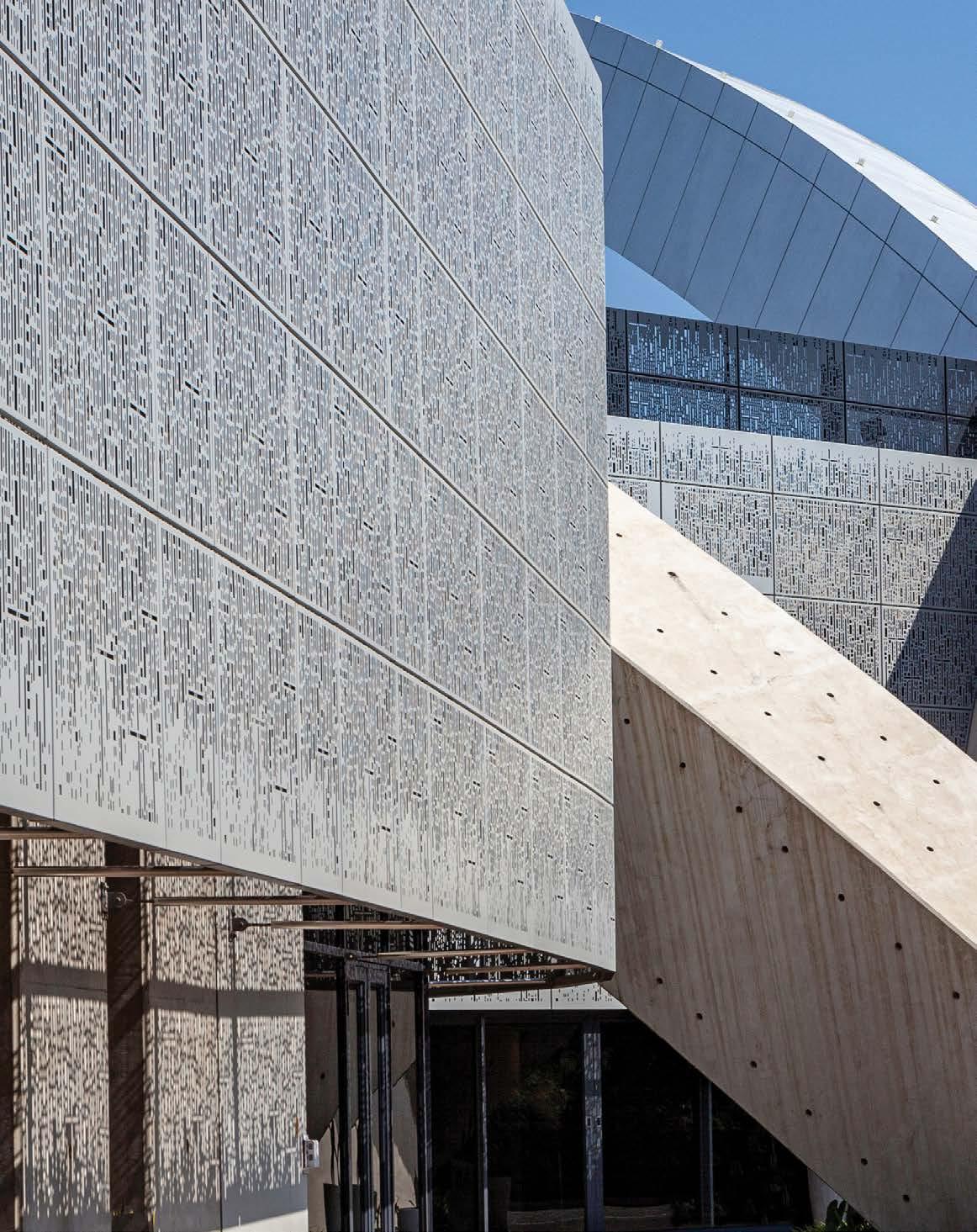
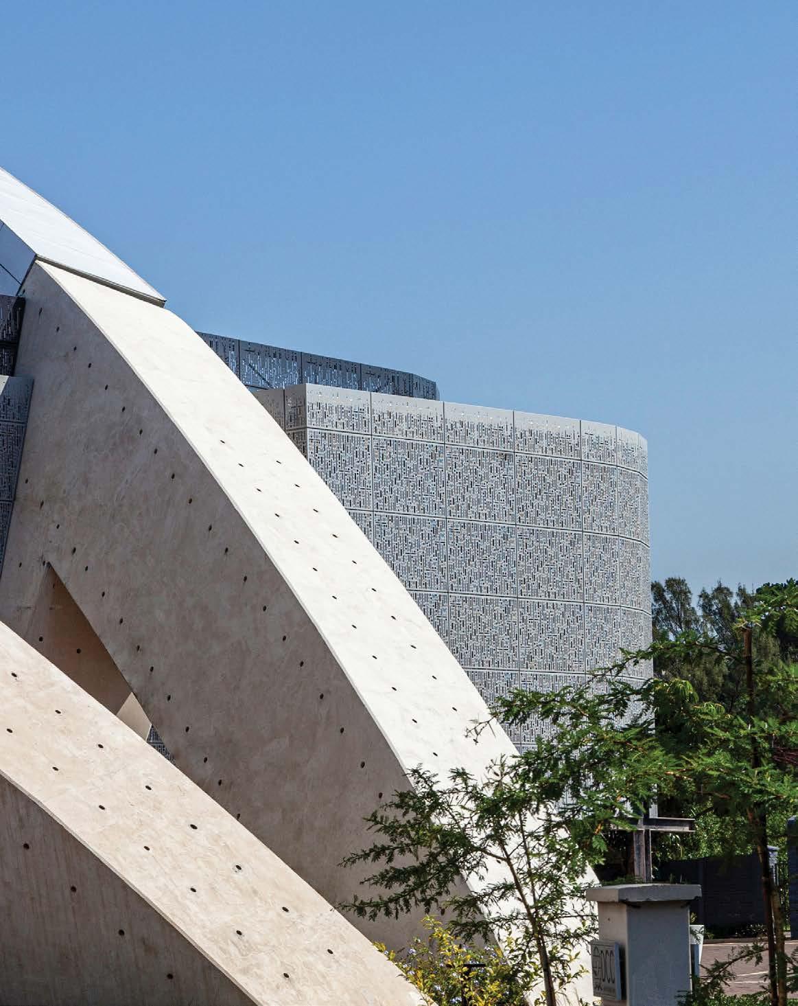
Size: 6300 m²
Location: 39 Garth Road, Mayville, Durban, KwaZulu-Natal
Rising from the ashes after a devastating fire, the rebuilt Durban Christian Centre cuts a powerful image in its context. Designed by Elphick Proome Architecture to accommodate a congregation of 3500 members, the auditorium, chapel, and teaching areas amalgamate to form a single church precinct in the heart of Durban.
A spiritual home to more than 5500 congregants and a local informal settlement, the loss of the well-known church was a devastating blow to the community. Therefore, with very strong emotional ties to the original 'Jesus Dome’ built in the 90s, the client wanted to retain and reinforce the original quality of the landmark church. However, simply replacing the original dome was not an architecturally sound idea, both spatially and acoustically. As such, the challenge was to combine the idea of a dome with an acoustically-superb auditorium, served by a multitude of related spaces.
After extensive architectural and engineering research on how to support an economical, long-span roof over a 3500-seat auditorium, the team decided on three connecting arches – effectively 'slivers' of a sphere – that would suspend an enclosure over an acoustically-planned auditorium. This solution delivers the two primary goals of the design brief: an iconic 'virtual dome' and a church space with excellent acoustic properties. The auditorium as the core space is enveloped by the entrance, foyer, a small chapel, upper-level teaching spaces, and performance and technical service functions.
The visual strength of the virtual ‘dome' serves as a unique urban feature. Its vast structure dominates from a distance when seen from the adjacent highway. And sculpturally, the church entices passers-by on streetaccess level, welcoming congregants through its striking entrance. This powerful architectural element is counterpointed by a series of simple enclosures that respond transparently or solidly to outdoor spaces. Veiled screens deliver an external fine-grained scale, juxtaposing the overt dominance of the arches.
Unlike many charismatic churches that thrive in wealthy societies, the Durban Christian Centre serves a less privileged community. Therefore, the severe financial limitations in budget consistently impacted this project, halting construction for some months and necessitating considerable resourcefulness. The combination of strong leadership, a vibrant community, and the meaningfulness found within their personal faith, served us well as architects. The materials, finishes, and services were treated as raw and stripped down to their bare state to create an honest and authentic quality. This is evident where some of the elements that were saved from the church fire were incorporated into the interior design.
From a technical point of view, the building embodies significant creativity. The limited footprint auditorium was entirely acoustically derived, incorporating complex diffusion and bespoke absorption panels in consultation with an engineer.
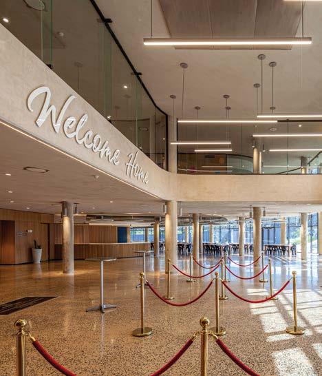
"
THE CHALLENGE WAS TO COMBINE THE IDEA OF A DOME WITH AN ACOUSTICALLYSUPERB AUDITORIUM, SERVED BY A MULTITUDE OF RELATED SPACES."
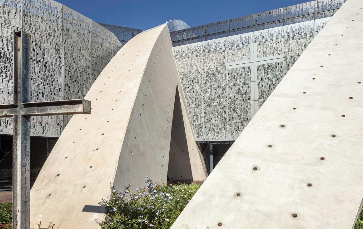
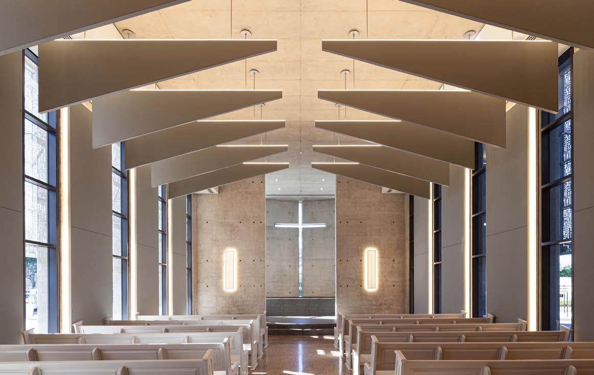 Three connecting arches suspend the enclosure to create a 'dome effect'
The Durban Christian Centre is home to an auditorium, foyer, small chapel, upper-level teaching rooms, and techincial service areas
Architect: Elphick Proome Architecture
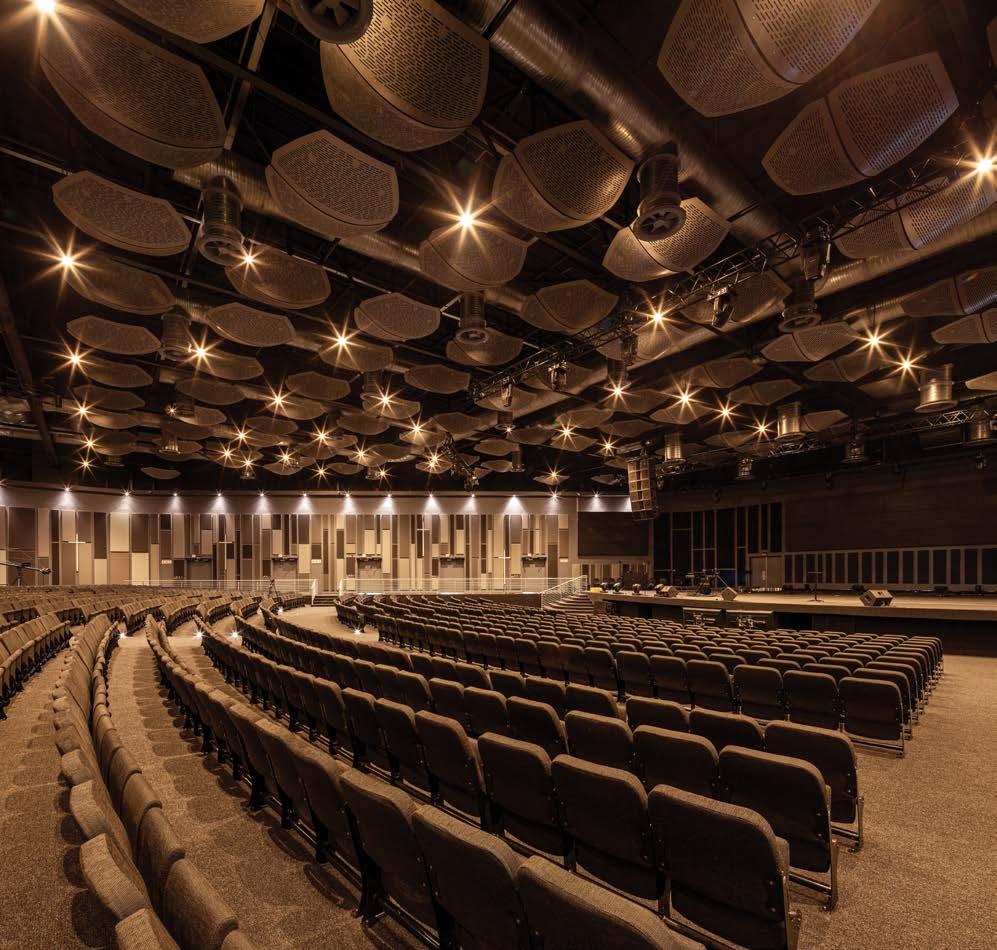
Main contractor: Stefanutti Stocks
Project manager: M3 Africa Consulting
HVAC engineer: Spoormaker & Partners
Quantity surveyor: RLB Pentad Quantity Surveyors
Electrical engineer: Arup

Interior designer: _novospace
Fire and wet services engineer: Spoormaker & Partners
Structural and civil engineer: NJV Consulting Engineers
Photographer: Karl Beath
Cladding
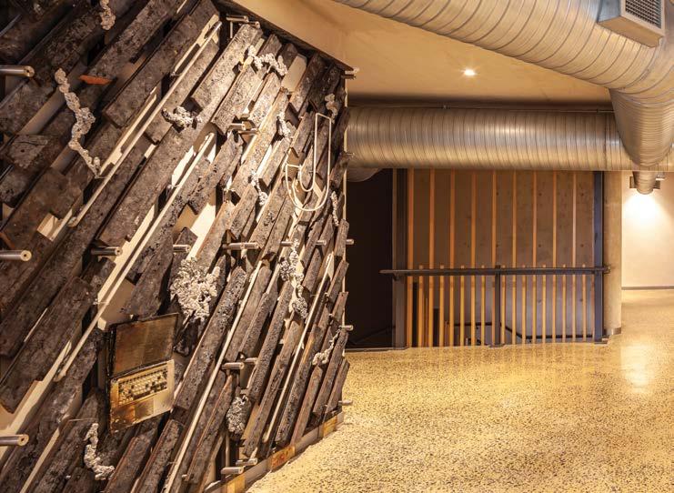
Alsysco 021 931 6202 Façade Solutions 031 569 5024
Hulabond, available from HBS Aluminium Systems 011 626 3330
Paint Dulux 0860 330 111
Lighting Swanlite 031 201 0000 Sanware Duravit 011 555 1220 Grohe 010 5934 556
Insulation Brits Nonwoven 031 710 7701
Waterproofing Polyglass, available from MAPEI 011 552 8476
Quartz surfaces Caesarstone 083 608 5810
Tiling Duratile Designs 031 263 1192
Ironmongery Impact Engineering 032 947 1054 dormakaba 011 510 1500
Melamine faced board Melawood, available from PG Bison 011 897 5200
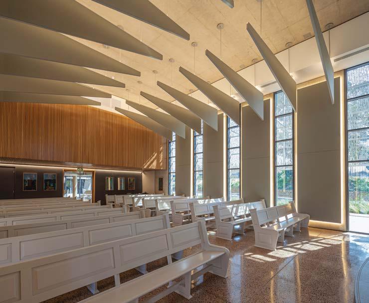
Auditorium seating Rodlin Design 011 444 2061
However, the real innovation lies in the auditorium's roof structure where an intensely collaborative design process demystified complex engineering geometry and the execution of unconventional construction methodologies. The elegant steel arches sprung off massive concrete anchors, celebrate the memory of the original Jesus Dome while allowing the new structure to become an iconic urban landmark in its own right. This technical achievement has been recognised by the steel industry for the ingenuity and innovation displayed through the use of steel to produce such a unique project.
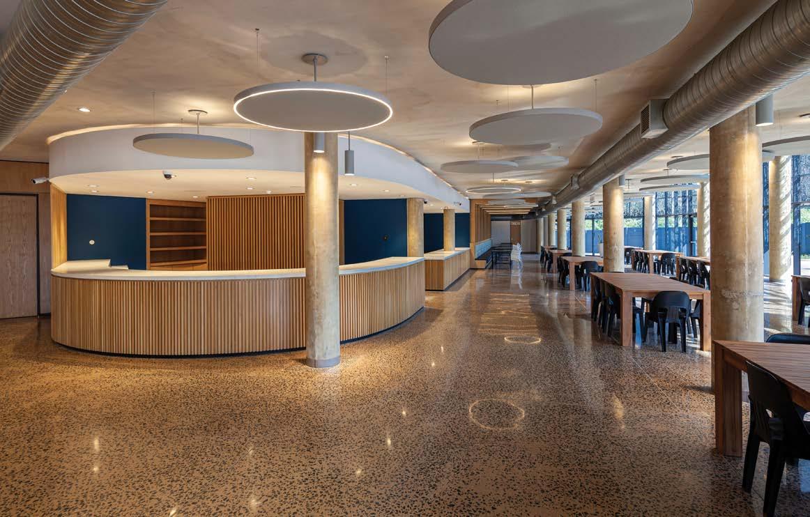
 The rebuilt Durban Christian Centre cuts a powerful image in its context
The church's leadership and vibrant community served the architects well during the building process
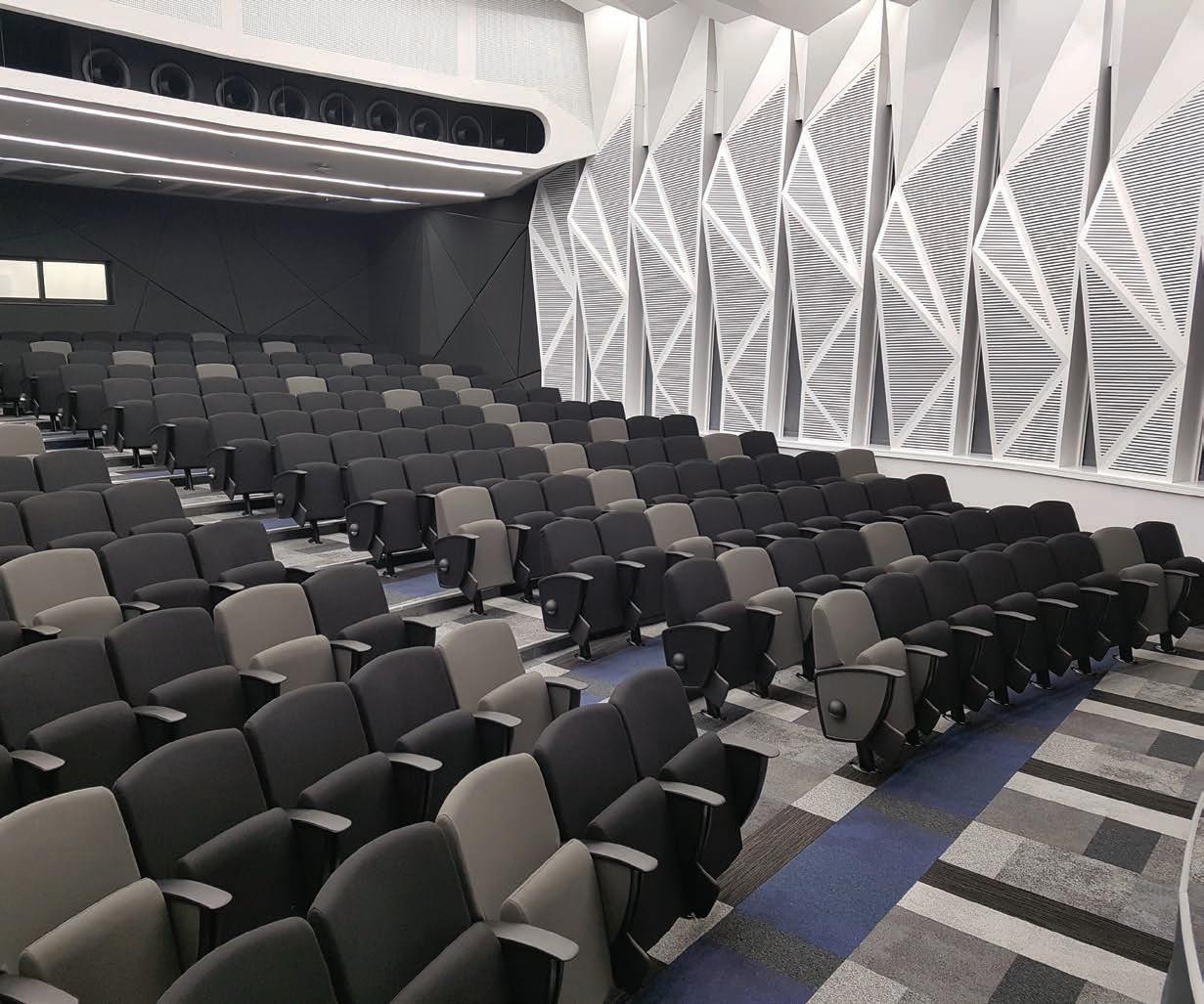
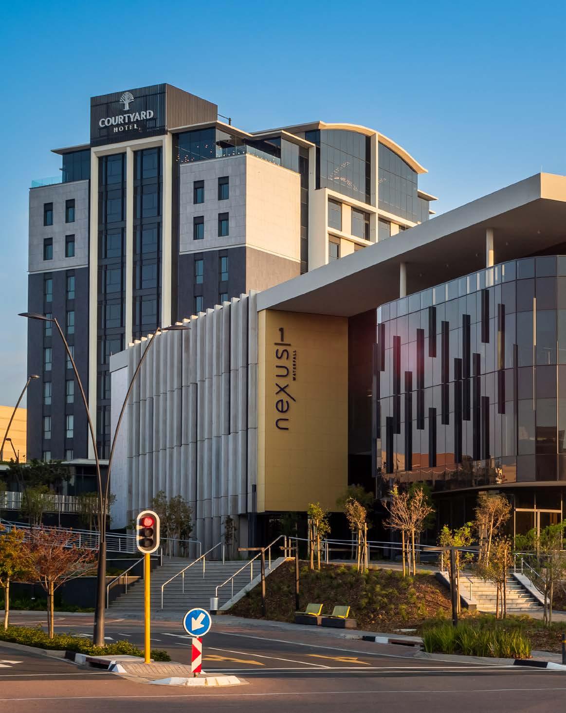

Size: 6874 m²
Location: 9 Karkloof Crescent, Jukskei View, Waterfall City, Midrand, Gauteng
Situated in the economic hub of Midrand just ten minutes from the Gautrain station and across the road from Mall of Africa, the Nexus 1 building is another proud landmark within the 32 000 m² Nexus Waterfall mixed-use precinct. The premier commercial development includes a hotel, restaurants, and three P-Grade office buildings, all arranged around a central landscaped piazza and built on top of an impressive super basement. With sustainability at its core, Nexus 1 paves the way for urban architecture with a light touch...
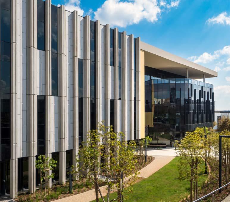
LYT Architecture’s coherent architectural style was called upon to design the entire Nexus precinct, including two future buildings still to come. The strategic positioning of this flagship project, developed by Attacq, is transforming the landscape of Waterfall City. Following the successful completion of the Courtyard Hotel Waterfall City in 2021, the client’s brief to the architects for Nexus 1 was to create a commercial office building with a distinctive architectural style and a minimum of a 4-star GBCSA Green Star rating.
Fortunately, Nexus 1’s central core and the surrounding office space have access to natural lighting. This positive aspect was intentionally maximised to take advantage of its energy-saving benefits, with the added reward of promoting end-user well-being. Two fire escapes are located within the central core of the building, availing the entire perimeter for office space and allowing easy sub-divisibility for tenant suites. The entrance to the lobby can alternatively be accessed from the road or the central piazza. An entertainment terrace is located on the third floor and the rooftop level features a mechanical plant with a full photovoltaic solar system installation. Nexus 1’s surrounding landscaped central piazza is accessible from all buildings on the square and accommodates operative cyclist and pedestrian routes, linked to an integrated urban design framework connecting nearby residential and commercial precincts to the mall and Nexus Waterfall.
Three materials were utilised to create the glazed and solid façade: glass, precast concrete fins, and ventilated porcelain tiles in various shades of grey. This multi-faceted treatment responds to the orientation of each elevation, accentuating visual interest while remaining true to the uncluttered visual language found throughout Waterfall City. The composition is dominated by vertical elements which generate a visual impression of height. The colour palette complements the adjacent Courtyard Hotel Waterfall City, completed by the same architectural team in 2021.
Nexus 1 was awarded a net-zero carbon rating (level one) for the building’s effective and efficient layout and design as well as its active systems. The 23O kWp solar power system produces enough green energy to equate the demand of the base building systems (i.e., the HVAC, common areas, lighting, lifts, and hot water), resulting in zero operational emissions.
"THREE MATERIALS WERE UTILISED TO CREATE THE GLAZED AND SOLID FAÇADE: GLASS, PRECAST CONCRETE FINS, AND VENTILATED PORCELAIN TILES IN VARIOUS SHADES OF GREY."
Client: Attacq
Architect: LYT Architecture

Project manager: Metrum Project Management
Quantity surveyor: RLB Pentad Quantity Surveyors
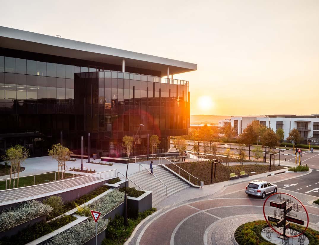
Civil and structural engineer: Pure Consulting
Electrical engineer: Classen Auret
Mechanical engineer: Adaptive Resource Engineers
Main contractor: Archstone Construction South Africa
Wet services: Spoormaker & Partners
Fire consultant: Plantech Fire Protection
Sustainability consultant: Solid Green Consulting
Health and safety consultant: Cairnmead
Landscape architect: Daniel Rebel Landscape Architects
Photographer: Franz Rabe Natural Photography
Lighting
The building’s peak electrical demand is actively reduced by the use of photovoltaic systems while the office lighting design ensures the use of artificial lighting with minimal energy consumption. The energy use of 1.5 W per m² per 100 lx was set for the office lighting power densities.
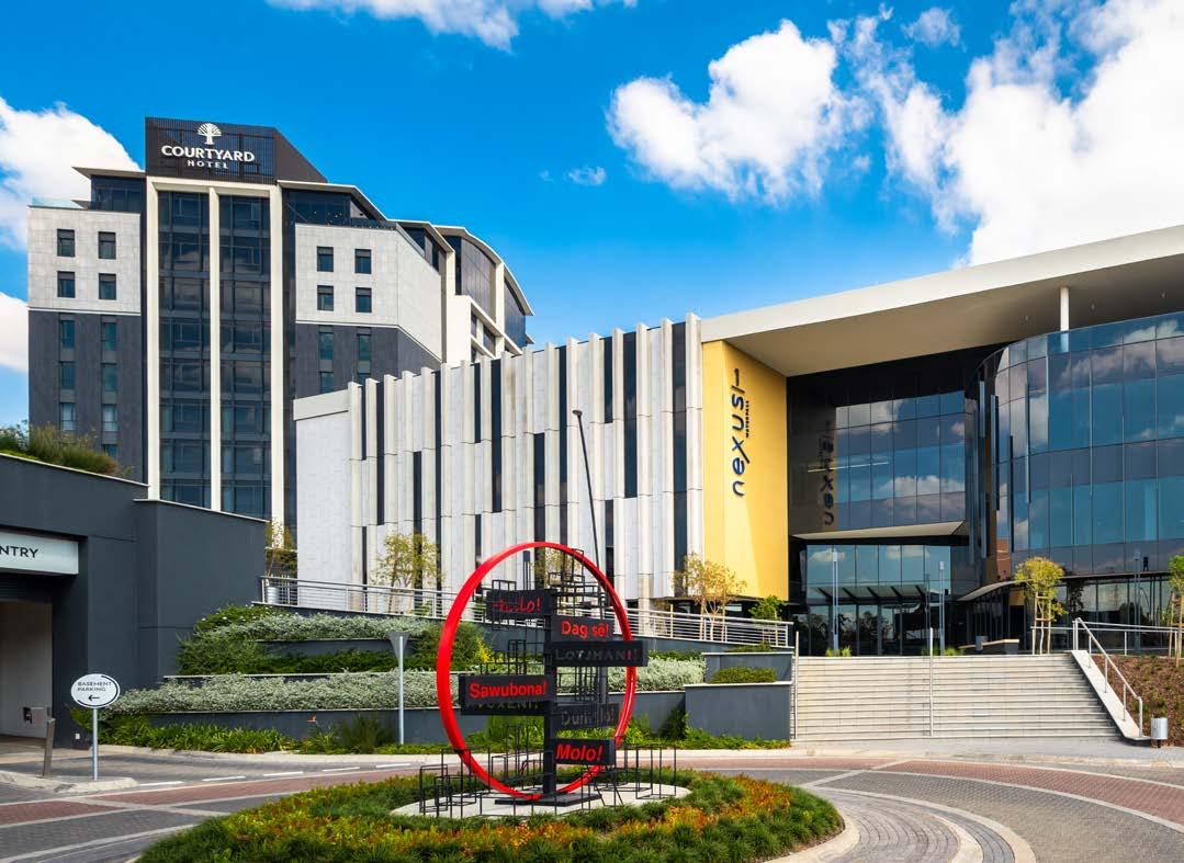
Gathering information is key to understanding and managing building systems, and assessing opportunities to save water. The Nexus 1 building treads lightly through the use of water-efficient fittings that limit occupant water usage to 0.56 litres daily per m². Sub-metering of major water consumption systems is also in place. A project-specific waste management plan was developed and implemented to minimise the contribution of waste going to landfills, reducing the environmental impact of the project. Furthermore, hybrid electric vehicle and cyclist facilities also encourage end-users to utilise environmentally-friendly routes when commuting to the precinct.
The landscaping by Daniel Rebel Landscape Architects made use of a combination of hard- and softscapes. Appropriate street furniture was integrated into the overall design, providing a functional and pleasant outdoor space for end-users and pedestrians alike. Working in collaboration with LYT Architecture to create a welcoming entry, the team set out to draw attention to the Nexus 1 building by using an array of visitor paths as well as various landscaping heights.



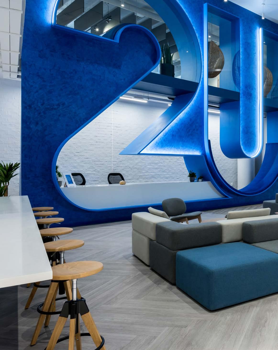
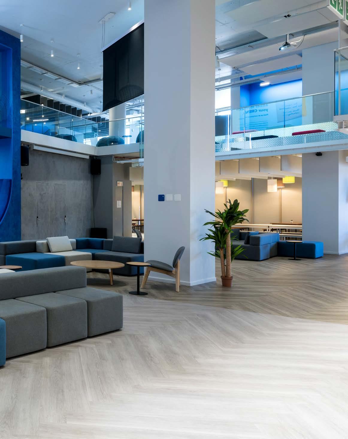
Size: 15 500 m²
Location: 358 Victoria Road, Salt River, Cape Town, Western Cape
Dreaming of a space that would be highly functional and represent their collaborative culture of excellence, 2U has found its Cape Town home in this smart working hub. A far cry from the generic, multi-tenant office building, this Salt River structure has been converted into a single-user headquarters with opportunities to meet, focus, and socialise throughout the seven floors. With 100% open-plan seating, the hierarchy-less floorplan boasts a fun and unique design that promotes holistic employee well-being. From the architectural considerations to the interior fitout, find out what makes 2U’s new regional base the envy of every office...
Client: 2U
Developer: Swish Properties
Architect: Jacobs Parker Architecture
Interior architect: Paragon Interface


Tenant fitout, and build and project implementation: Trend Group
Main contractor: Isipani Construction
Quantity surveyor: BTKM Quantity Surveyors
HVAC, fire, wet services, and lifts engineer: Sutherland Engineers
Electrical engineer: RWP Consulting Engineers / Rawlins Wales Cape
Traffic engineer: Trafficon
www.paragon.co.za @paragongroupza

www.jacobsparker.co.za @jacobsparkerarchitects
www.trendgroupglobal.com @trendgroup_global
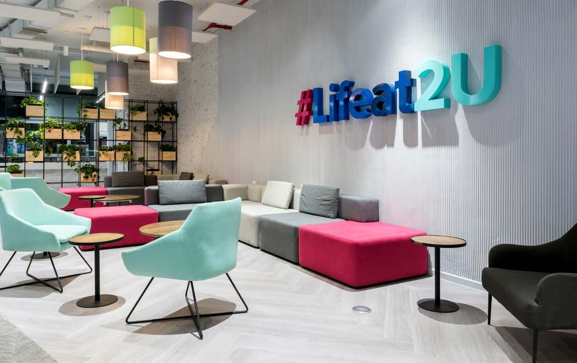
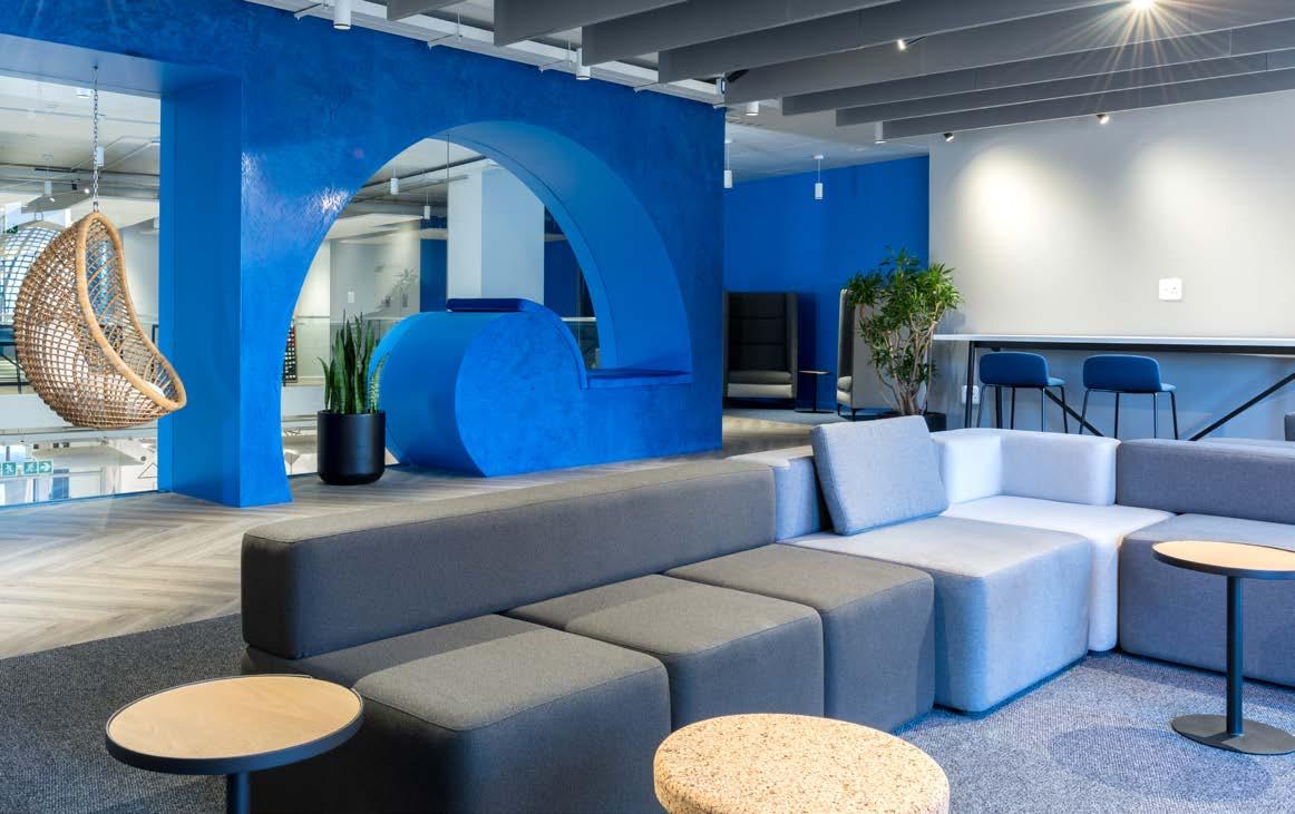
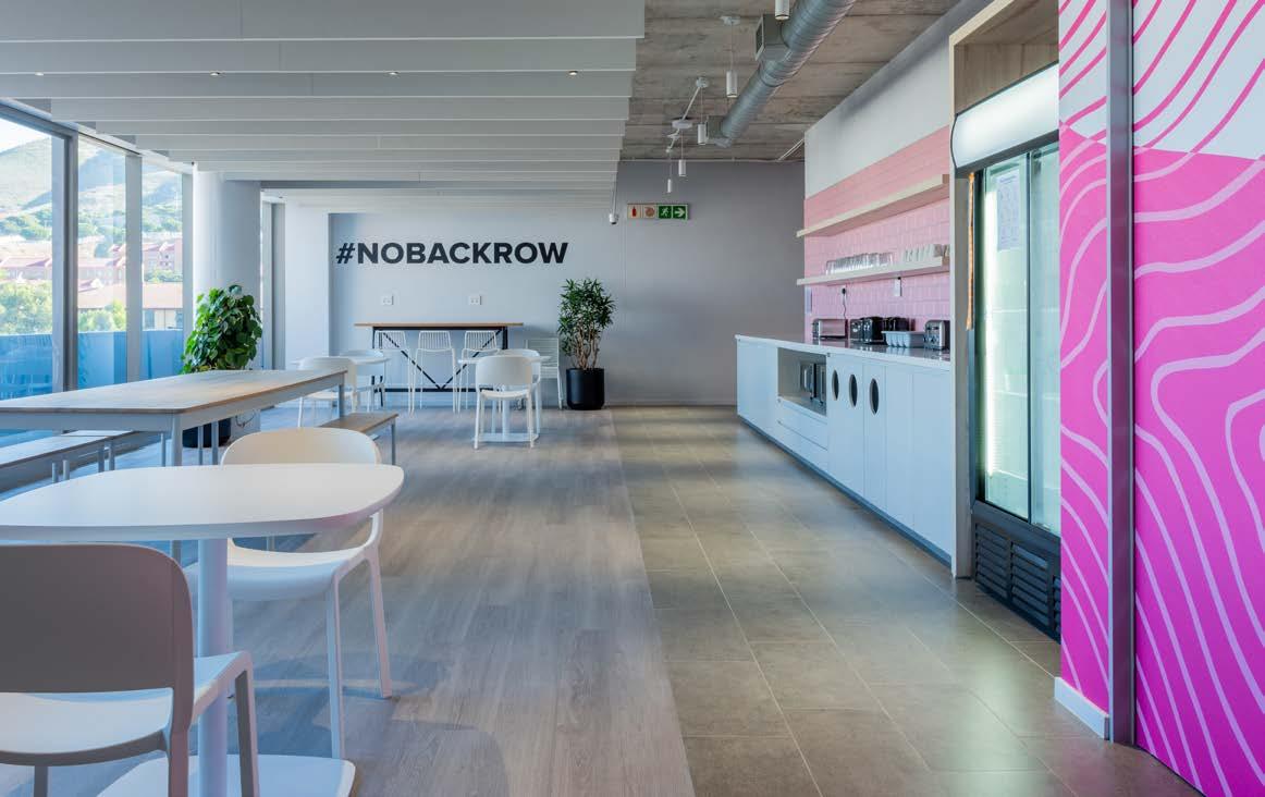
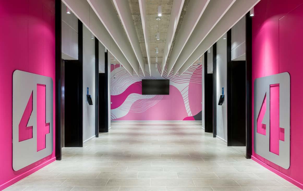
Before the project could commence, an existing warehouse, factory shop, and office building on the corner of Victoria and Dickens in Salt River had to be demolished. Jacobs Parker Architects considered retaining and refurbishing the existing office building, but the structure did not lend itself to being adapted into a functional and efficient, contemporary commercial building for 2U’s new regional campus headquarters. The three cleared sites were then consolidated into a single 10 252 m² area where a 15 500 m² A-grade commercial building was erected.
In addition to office space, the newly built mixed-use construction had to include technical support and IT areas, production space for the creation of video lectures and e-learning platforms, 1250 m² of ground floor retail space, and four levels of underground parking containing 678 parking bays. The brief also required full compliance with the anchor tenant 2U’s design guidelines, including optimal building energy efficiency and 24/7 operation during loadshedding. The developer provided the complete installation of mechanical, electrical, wet services, and fire services, while leaving a ‘white box’ for tenant installation. With the exception of a portion of the ground floor occupied by retail, the first phase of the build is entirely tenanted by 2U. The company’s growth forecast indicates that the space being designed in Phase Two will also be taken by 2U.
Aiming to relate both to the existing context and be a catalyst for future development, Jacobs Parker Architects conceptualised the design to be a ‘wall building’ with an articulated façade to Victoria Road, ample northern exposure, and beautiful views over Table Bay. Contrary to most conventional office buildings of this scale, the development does not have a single front door or main entrance. Instead, the accessible ground-floor façade is permeable, allowing pedestrians to enter a courtyard which will be tenanted by coffee shops, restaurants, and other facilities to create a vibrant public plain. Furthermore, echoing the tradition of colonnaded façades along Victoria Road, a pedestrian colonnade has been carved into the brick mass of the building, creating a visual impact from a distance and providing shelter for pedestrians. Turning the corner up Dickens Road, the colonnade also sets up a pedestrian connection to the future phases of the development. Furthermore, the building is designed to accommodate an additional two floors in a lighter aesthetic, serving as an architectural expression of the zoning scheme setback requirements.
To reduce the scale of the building without losing valuable gross leasable area, the architects decided to express the façade as three distinct masses. Visible from Durham Avenue, the brick mass of the western façade cuts a prominent presence with intermittent glass ‘cut-outs’ and terraces where special functions are located inside the building. On the eastern end, the façade becomes an open pedestrian entrance. Reduced by two floors and with a suspended glass ‘pop-out box’, the building mass provides both shelter and a flow of movement into the courtyard. The neighbouring student residence functions as the courtyard backdrop, creating the impression of a larger urban forecourt with plenty of student activity. The building’s heavy brick mass pays homage to the site’s rich history as a brickyard, while the recessed glazing panels create depth and shading for the panels. The floor slabs have been expressed as exposed concrete slab edges to delineate floors and give the façade a sense of scale and legibility. Spontaneous sheets of curtain wall glazing appear as if disrupting the regularity and rhythm of the standard ROK clay bricks. Clear and simple in its architectural aesthetic, the building refuses to rely on expensive finishes or other ‘add-ons’ to ‘enhance’ the design.
2U is fitted out with LED lighting and motion sensors, as well as a Thermally Activated Building System (TABS) in lieu of conventional HVAC. The overall environmental impact of the building has also been reduced by leaving the façades unplastered and unpainted, requiring fewer materials. Plus, in terms of having a positive socioeconomic impact, the exposed brick façades are a labour-intensive construction method, resulting in more job creation during the construction process.
The project encountered several obstacles along the way, slowing progress down considerably. There was a delay in the issuing of one of the demolition permits, which meant the existing buildings were demolished out of sequence. Unable to rectify the situation, the phasing of the work remained out of step throughout the
"The client wanted to infuse a ‘cultural experience’ throughout the building by connecting business units together. The cultural spaces enhancing this unique experience include a jazz bar, a culture hub with music and games, and pause areas."
duration of the construction, with the main lift core lagging the balance of the structure. As a result, the lifts caused a somewhat delayed commencement date. To slow things down a bit further, Covid-19 lockdown occurred shortly after the bulk excavation and lateral support were completed, leading to more delays in project delivery. Another element that added complexity to an already tight programme, was that the contractually-stipulated landlord service installations needed to be done concurrently with the tenant installation under main contractor supervision. Due to onerous lease terms, there were some clauses pertaining to breach that were difficult to reconcile between the anchor tenant lease and construction contract, causing additional difficulties.
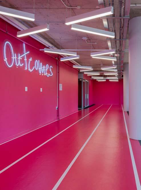
Right before the project kicked off, the client, international ed-tech company 2U and parent company of edX, bought local South African online education company GetSmarter. As a result, one of the fundamental goals in the design was to combine the strong brand and culture of both 2U and GetSmarter by promoting culture and collaboration, and focus and fun. One of the ways this was accomplished was by bringing both the pink shade of GetSmarter and the blue tones of 2U into the design. For example, the sweatbox gym was designed using the former’s trademark pink.

Bricks
Corobrik 021 888 2300
Piling
Franki, available at Keller South Africa 021 371 5137
Windows and doors glazing systems
World of Windows 021 551 3235
Furniture
Pedrali, imported and available at Design Lab 010 900 3535
Feature reception desk finish Marmoran 011 887 0536
Tiling Lime Green Sourcing Solutions 021 447 2254
Carpet tiles Belgotex 082 415 3415
Gym flooring
Gerflor Sports Flooring 010 753 2332
With Paragon Interface as the design lead and Trend Group responsible for the tenant fitout, and the build and project implementation, the office was broken down into four driving spatial zones:
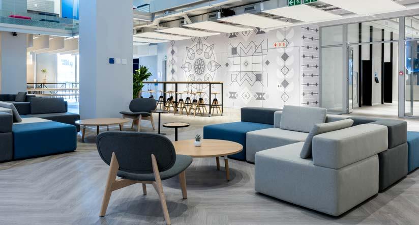
Located on the ground floor, the reception area is connected to the first floor via a double-volume space. Functioning as the heart of 2U’s workspace, this area comprises a coffee shop, as well as a canteen and meal service area. It also features a giant 2U logo rendered in 3D. A Paragon intervention, the massive blue logo made from medium-density fibreboard and a plaster coating is the envy of all the other 2U offices. Plus, with its long padded seat and integrated collaborative space, the life-size logo is the most Instagrammable spot in the building.
Despite being an ed-tech business, the building is neither client nor student-facing, catering solely to the staff, with each element designed to enhance the work environment’s culture. The client wanted to infuse a ‘cultural experience’ throughout the building by connecting business units together. The cultural spaces enhancing this unique experience include a jazz bar, a culture hub with music and games, and pause areas.
2U values employee well-being, so creating a variety of calm and active support spaces that would encourage physical, emotional, intellectual, and spiritual health at work, was a major consideration for the design. The client brief also called for generous use of natural light which Paragon heeded by locating the open-plan neighbourhoods against the façade edge to ensure outward-facing views and light. The active and calm workspaces include areas such as the wellness centre, a headspace room, prayer rooms, and the sweatbox gym. The idea behind the innovative headspace room was to have a space where staff can go after an intense meeting to collect their thoughts. The room is located centrally so as to be easily accessible, and may only be used by four people at any given time. The design also included a contemplation area inside the gym, as well as a mother’s room and a sickroom.
The global workspaces incorporate a range of areas designed to facilitate concentration and attention, as well as employee well-being and collaboration. An amphitheatre with padded seats and drop-down screens functions as a type of ‘town hall’ where Cape Town staff can connect with global 2U offices and meet colleagues in other cities.
The area around Victoria Road in Salt River was once home to some of South Africa’s most well-known textile and clothing factories, creating countless employment opportunities. However, the era of cheap imports completely devastated the area causing many to shut up shop. The opening of 2U’s new South African base will have a massive impact on the suburb, breathing new life into the once lively area of Cape Town. In keeping with the site’s history in textiles, Trend Group sourced and manufactured as much of the fitout as they could in South Africa. Their furniture arm, Design Lab, procured all the furniture designed by Paragon and Trend with at least 90% of it locally manufactured and delivered in 12 weeks.
The project took 18 months to finalise, with the bulk of the design being completed during Covid-19 over Zoom calls. With 1283 workstations planned, Paragon asked the client if anything should be altered due to the impact of remote working on the workplace. Fortunately, no changes were necessary and the project could go forward as planned. 2U’s new regional headquarters offer a cohesive work environment with a strong company culture, a variety of individual and collaborative workspaces, and an emphasis on employee well-being and global connectivity.
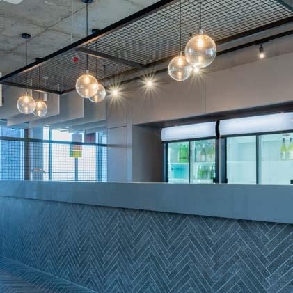


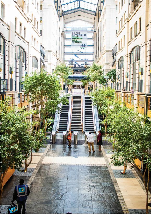
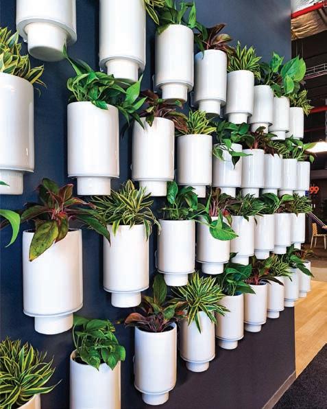

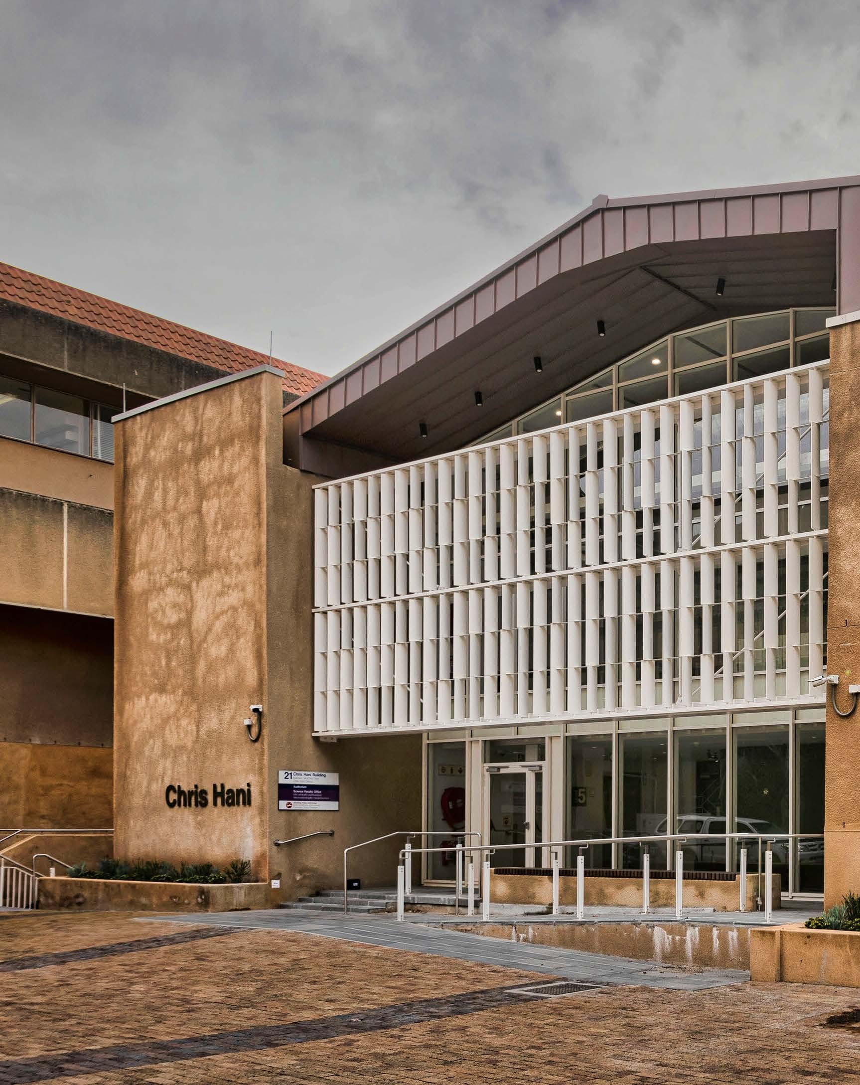
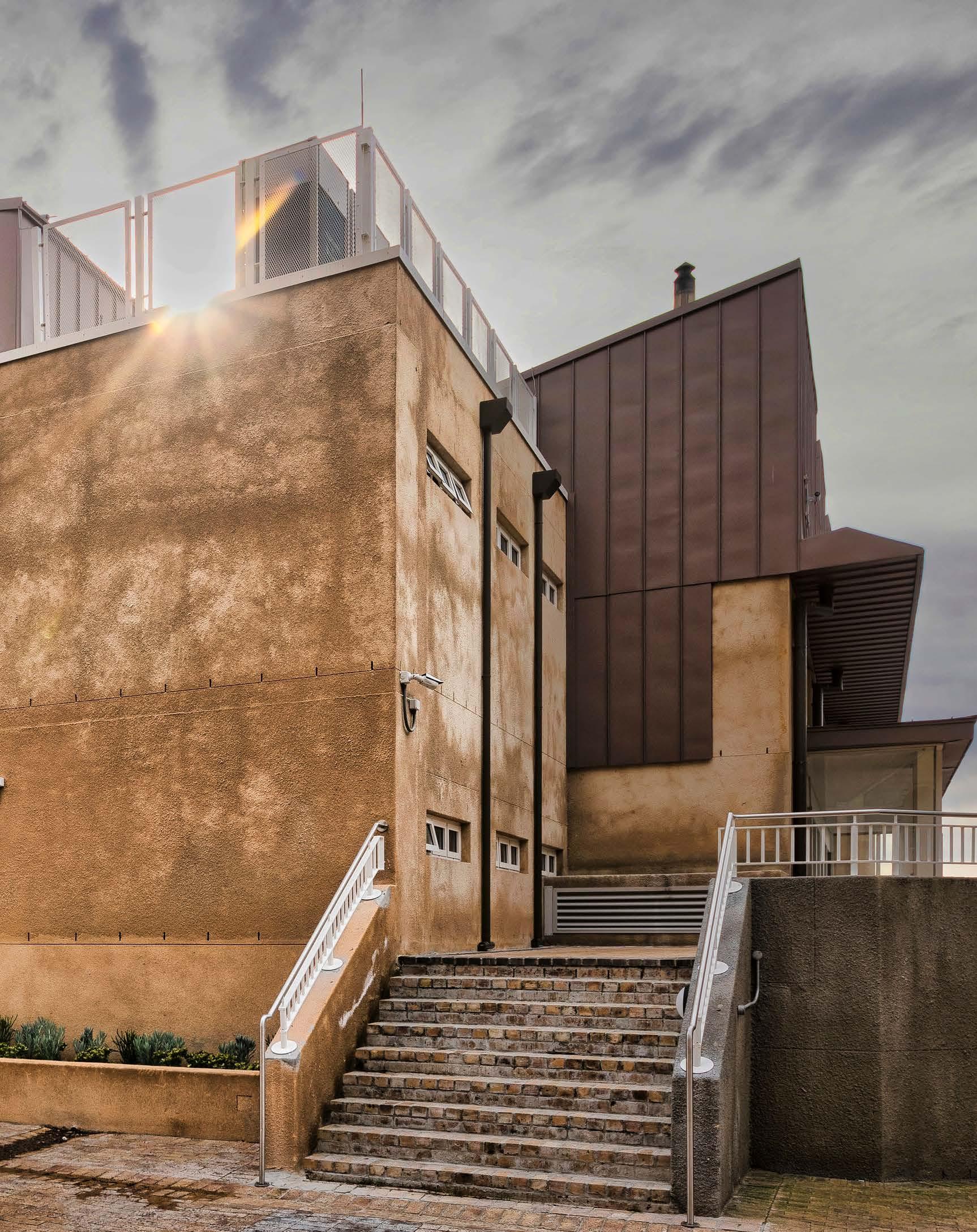
Size: 2549 m2
Location: University of Cape Town, Upper Campus, Rondebosch, Cape Town, Western Cape
Bagging a Silver Award at the Global Future Design Awards and placing runner-up in the 2022 World Design Awards, the UCT Chris Hani Lecture Theatre by JAKUPA Architects and Urban Designers is a beacon for heritage preservation and innovative adaptive reuse in architecture. Honouring the legacy of Apartheid-hero Chris Hani, there’s much more to this award-winning design than meets the eye...
The Chris Hani Lecture Theatre, formerly known as the New Science Lecture Theatre, was seen as an underutilised learning space on the University of Cape Town’s Upper Campus. JAKUPA Architects and Urban Designers was approached to adapt the building to suit contemporary learning standards by being conducive to innovative teaching, student-led learning initiatives, mentoring, and peer tutoring. The firm was appointed to provide design services for a variety of spaces, including a student concession area with an outdoor courtyard and a formal lecture venue at basement level. The upper two floors needed to accommodate the Science Learning Centre and associated Science Faculty Administrative Office suite.
The building is named after the late anti-apartheid struggle hero, Chris Hani. The renaming was just one part of a multifaceted transformation project committed to overcoming the legacy of Apartheid and colonialism in the university system and to make UCT a home for all. The Chris Hani Remembrance Project was initiated by JAKUPA to illustrate and celebrate the legacy of Chris Hani throughout the building. Following consultation with the Hani Family, the project drew on identifying feature walls within the building and transforming them to function as illustrative installations, graphically developed by JAKUPA.
In the context of UCT’s rich legacy of heritage buildings on Upper Campus, adaptive reuse was seen as an appropriate form of historic preservation and conscientious transformation. This approach restores cultural significance to sites that would otherwise succumb to functional redundancy due to restrictive heritage grading, listing, and protection. In the race for empty land and new developments, it is easy to demolish and forget the rich architectural history behind old buildings. However, contrasting old with new is a seasoned method of approaching heritage within the built environment. Examples of this approach include Neri&Hu’s Shanghai offices which repurposed an industrial building into a new office block, and Herzog & de Meuron’s CaixaForum in Madrid, where radical adaptation of the existing building retained noteworthy elements while forging a new form of architecture. Likewise, instead of discarding the unique form of the older building to make way for the new, JAKUPA embraced the opportunity to repurpose the New Science Lecture Theatre as the Chris Hani Lecture Theatre to thrive as a renewed beacon for design.
The science building has been repurposed into a cluster of contemporary learning spaces. Originally built in 1948, the lecture theatre was one of the first buildings on campus to reinterpret the typology of Modernism, playing with architectural forms, materials, elements, and the positive interface with University Avenue (including an arrival portico, lobby, and foyer), to create a grand historical campus design typology. The re-adaption acknowledged the avenue's incremental layering over time, and therefore included a major reconfiguration of the internal spatial arrangement while retaining key heritage elements.
Regarded as a significant heritage building with a Grade II/PHS area status, the exterior and façade treatment of the existing building incorporated textured ‘university plaster’ details, sunscreen fins, travertine cladding elements, and modernist steel columns in an attempt to create a building of particular interest within the framework of the staid adjacent architectural forms. The building is constrained on all sides, with University Avenue and Chemistry Mall to the east and west, and the John Day and Molecular Biology buildings to the south and north. The building interface along Chemistry Mall to the west was decidedly ‘back of house’ utilitarian, with ad-hoc additions and levels that did not facilitate either accessibility or a positive street interface.
SUPPLIERS
Carpets
KBAC Flooring 021 464 4320
Vinyl flooring
Polyflor South Africa 011 609 3500
Gerflor South Africa 010 753 2332
Engineered timber flooring
Lalegno South Africa 021 851 0054
Tiling
Ceramica 073 147 3477
Douglas Jones 086 166 7242
Lighting Bellco Electrical 021 440 7100 BEKA Schréder 021 510 8900
Joinery and fixed furniture Library Joiners & Interiors 021 797 5798
"The historic continuity of the mid-century design typology was to be retained, while the key elements of the 1948 building could be integrated."
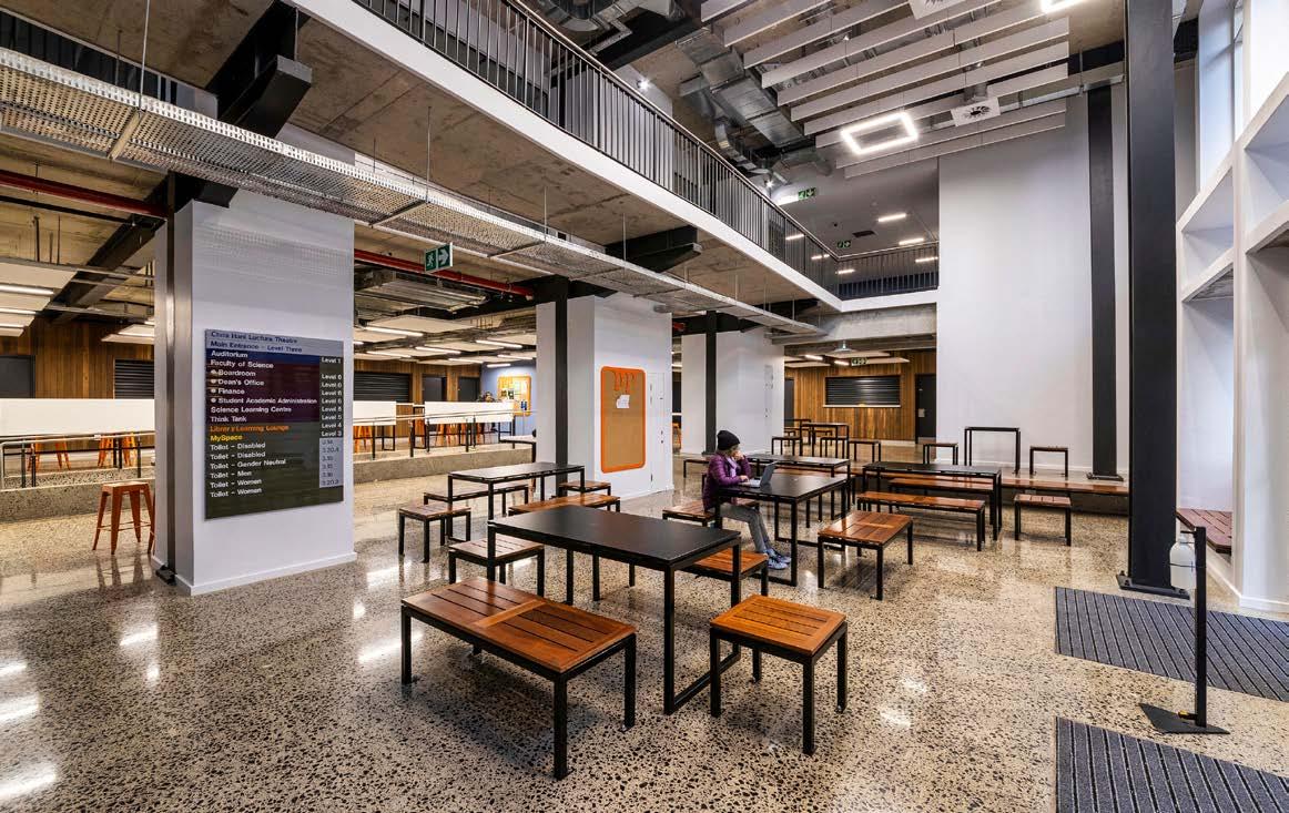
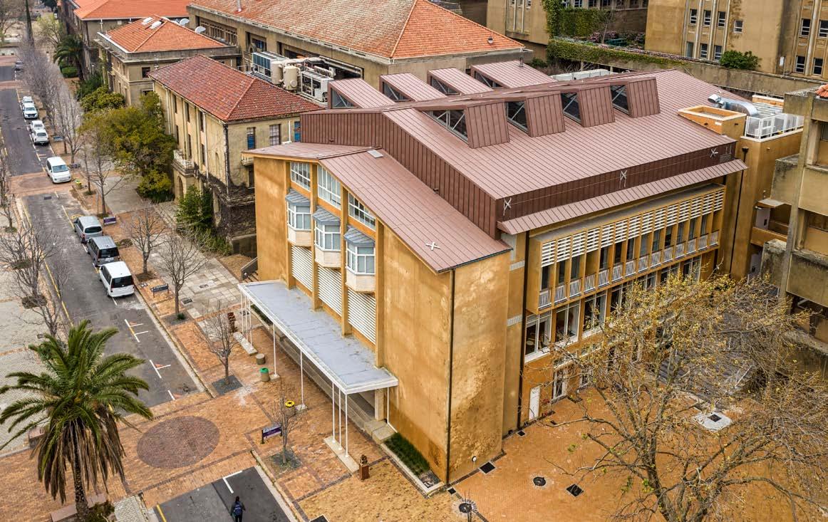

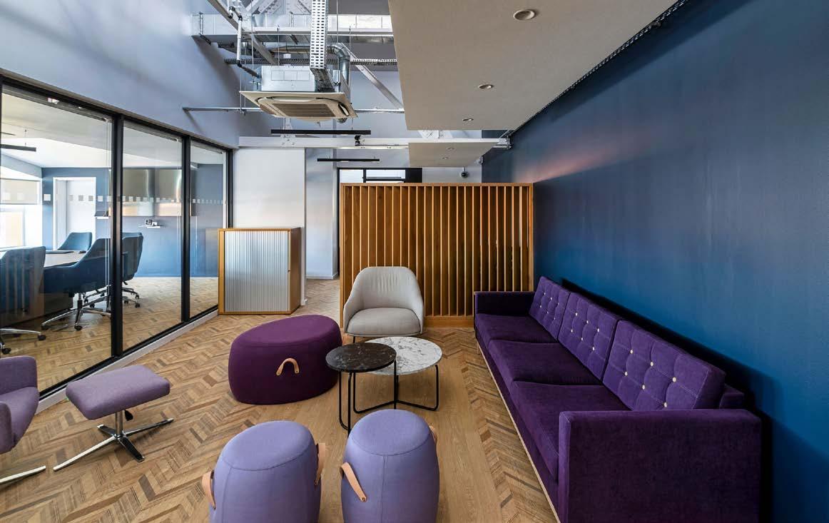
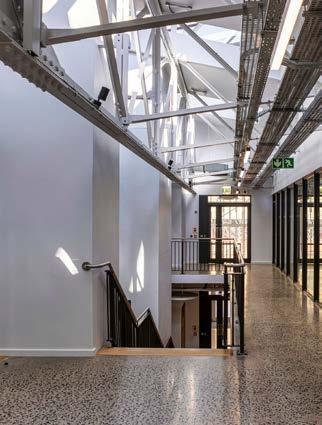
Four plausible approaches were considered, including a simple renovation and alteration of the existing building, retention of the façade only with a new building behind it, a complete demolition with new infill, and a radical reconfiguration incorporating partial rebuilding. The architects decided to adopt the last-mentioned approach as it would deliver an optimum balance between the heritage criteria and the academic programme spatial needs. The redesigned concept needed to address a core heritage concern, namely the building’s interface and response to the two adjacent and dissimilar campus zones. The historic continuity of the mid-century design typology was to be retained, while the key elements of the 1948 building could be integrated.
The first design objective was to create a student/social amenity towards the northern end of Upper Campus, along University Avenue, by making use of the space adjacent to the building and creating new linkages between Chemistry Mall and University Avenue. The relationship between the courtyard and ground floor of the building is intensified by the double-volume vertical connection to the library. The existing desks from the old lecture theatre were re-purposed and used as timber cladding for the food kiosks on the ground floor.

The second design objective was to create a new ‘front of house’ entrance to Chemistry Mall. The existing roof trusses, once removed, were adapted and re-used in the new building design. Exposing the roof trusses and allowing light to penetrate the roof, a deceivingly simple operation of pushing and pulling, revealed the layers of spatial potential within a rather ordinary building configuration. Throughout, there is an expressed intention to juxtapose such new insertions against the old, never losing touch with the building’s past.
The renovation strategy was to demolish the floors of the existing building, while primarily retaining the east entrance façade and the northern façade. The interior had the intact lecture theatre, with its memorable revolving floor. The staircases on either side of the entrance portico were retained along with the windows and façade elements. Constructing a new basement involved underpinning the existing structure. The new floors were then constructed, mediating the existing levels of the retained staircases, University Avenue, and Chemistry Mall. University plaster was applied to integrate with the language of the larger campus context, alongside more contemporary materials like white aluminium which was used for windows, doors, and screens as well as Rheinzink, introduced as a compatible roofing material. The building is universally accessible, allowing for differently-abled persons to adequately access all spaces within the building in addition to accommodating versatile bathroom needs on every floor.
Versatile in practice, JAKUPA deployed every aspect of their design capabilities, from the architecture and interior design to the furniture selection and graphic design. The interior design approach made use of a careful selection of colours, textures, and surfaces to assist not only the users with wayfinding within the building, giving each floor an identity, but to also create contemporary spaces that stimulate innovative teaching and learning experiences.
Kantey & Templer Consulting Engineers (K&T) was appointed by UCT to undertake the structural and civil engineering, as well as the initial geotechnical investigation. This discreetly complex structural redevelopment involved a myriad of structural engineering techniques. During demolition, excavation, and construction, the existing heritage-graded reinforced concrete (RC) façade and front-of-house needed to be preserved with minimal disruption to the extremely limited space available for construction work. K&T made efficient use of the existing building’s in-place heritage-graded structural steel roof elements to keep existing façades propped, thus reducing time and cost, and allowing construction efficiencies.
The new double-volume height basement lecture theatre was excavated from below the foot of an existing reinforced concrete retaining wall, which was efficiently converted into a permanent lateral support wall, working together with the lateral support to be installed below.
Soft seating, desks, and chairs
Ergofrom 021 461 2251
Lecture theatre fixed furniture Rodlin Design 011 444 2061
Façade
EverGlaze Aluminium & Glass Specialist 079 048 9992

Aluminium louvres and screens
Etherington Aluminium 021 981 9667
Windows WindorWorks 021 823 7933
Roofing Rheinzink 021 671 2600
Signage Metalgrapho 021 510 5960
Balustrades TGS Concepts 021 875 5652
This resulted in a towering vertical excavation face of some fourteen metres below ground level on the western elevation. Furthermore, lateral support piles and capping beams also served to underpin existing façade foundations during basement excavation. At ground-floor level, huge RC transfer beams, spanning up to fifteen metres, and having a depth of up to two metres, facilitated a column-free basement lecture theatre space beneath, while allowing a change in column grid for the four levels above. These upper levels were wisely designed in weight-saving ‘composite construction’ – a system of steel beams working together with thin RC slabs – reducing loads on transfer structures. Potentially high deflections, symptomatic of the composite construction, were reduced to almost nothing by pre-cambering of steel beams, allowing the beautifully functional polished concrete floor slabs to shine with an even shimmer. All these concrete and steel beams were designed with numerous sizeable penetrations to accommodate the passage of a multitude of HVAC and electrical services commensurate with the functional requirements of a modern facility of this kind.
On the uppermost level, the existing RC columns were extended, and the existing twenty-one-metre-long heritage-graded structural steel lattice girders were reinstalled. These girders worked together with reimagined roof trusses that thoroughly respected the original roof, but with modifications to allow large triangular skylightlike protrusions that now bathe the previously hidden roof structure in natural light.
Most of these structural challenges and engineered solutions are now essentially veiled by the wonderfully preserved façade of the Chris Hani Lecture Theatre, leaving visitors merrily none-the-wiser to the complexity involved in birthing this project.
First Floor: Learning Library Lounge

Client: University of Cape Town
Architects and interior designer: JAKUPA Architects and Urban Designers

Main contractor: Isipani Construction
Civil and structural engineer: Kantey & Templer Consulting Engineers
Quantity surveyor: RLB Pentad Quantity Surveyors
Mechanical engineer: Sparq Consulting
Electrical engineer: S. Ismail Consulting Electrical Engineers
Fire engineer: Tom Esterhuizen & Associates
Heritage consultant: Rennie Schurr Adendorff
Occupational health and safety consultant: Construct Safe Consultants
MEET THE TEAM www.jakupa.co.za
Photographer: Terry February Photography
"Most of these structural challenges and engineered solutions are now essentially veiled by the wonderfully preserved façade of the Chris Hani Lecture Theatre."



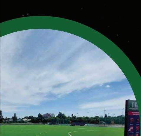


You deserve to love the home you’re in.
Light up your home with South African coastal quality lights. Lifetime Lighting offers a unique 10-year warranty against corrosion. Visit our website to view the full range of Path Lighting | Wall Mounts | Bollards | Columns | Garden Lights
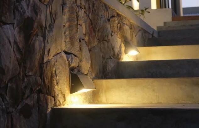
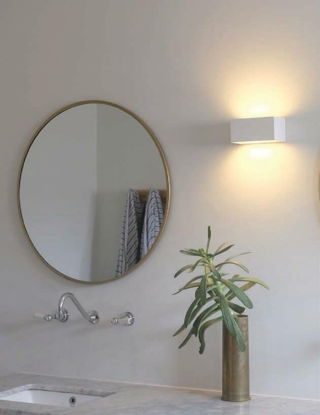
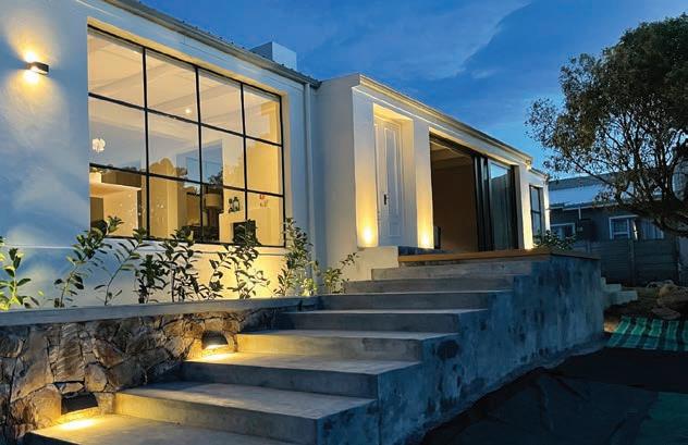
Available at leading lighting stores or online: www.lifetimelighting.co.za | 033 346 0466 | lifetimelighting@matelec.co.za

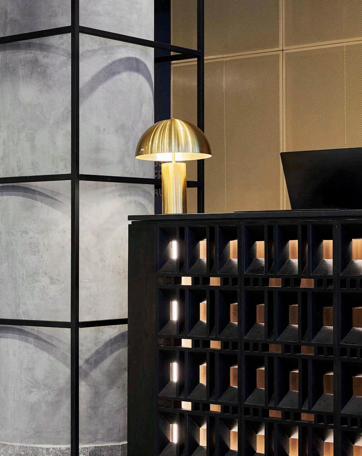


Size: 16 000 m2
Location: 12 Christiaan Barnard Street, Foreshore, Cape Town, Western Cape
Situated in the heart of Cape Town’s Foreshore Precinct at Harbour Place, The Rockefeller is the embodiment of sophisticated, vibrant urban luxury. Making your way to the multifaceted restaurant and suites designed by the talented Source Interior Brand Architecture is tantamount to entering an eclectic cultural hub, replete with curvaceous and provocative finer details that ooze with urban charm. This inner-city stunner has bagged the Best HighRise Development in South Africa Award at the 2021-22 African Property Awards, and we totally understand why!
The brief from the client was fairly straightforward: create an exciting and dynamic interior that would speak to a younger, savvy audience that knows what they want. Contrary to what the name suggests, the aesthetic was not in reference to the Rockefeller Center in New York, but rather a nod to the concept of Cape Town’s bustling inner-city living. As The Rockefeller is one of the first of many new planned developments in the Foreshore, there is currently no real ‘neighbourhood’ to speak of. Therefore, we set out to create a neighbourhood of our own within the constraints of The Rockefeller site. This was done through creating typical neighbourhood pockets by basing specific interior elements on neighbourhood areas.
For example, the lounge area of The Rockefeller Hotel’s lobby with its large planters was dubbed the ‘Parklet’ due to its more relaxed seating arrangement and softer styling, while the seating area within the restaurant was dubbed the ‘Bus Stop’ for its fast pace and energy. The ‘Bus Stop’ was suitably decorated with expressive wallpaper and neon lighting, mimicking layers of old posters found on lampposts and bus stops around the city.

Tiling
Lime Green Sourcing Solutions 021 447 2254
Gym flooring KBAC Flooring 021 464 4320
Wallpaper
Cara Saven Wall Design 082 953 6246
Gym equipment TechnoGym 010 823 2922
Precast plaster moulding Plaster Art 021 531 3609
Pillars, planters, and seating accents Cemcrete 021 555 1034
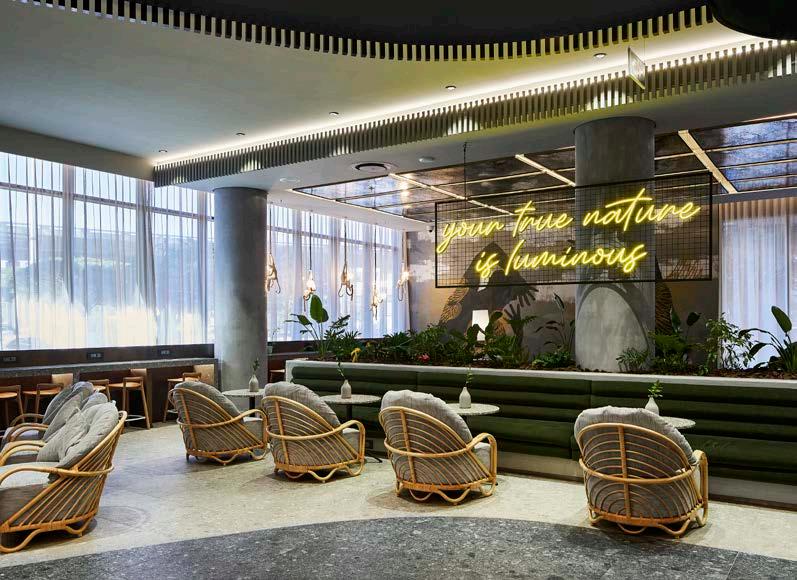
Chainlink architectural curtains Oniro Concepts 083 408 4962
Engineered stone Cannata & Sons 021 205 1903
Paint Dulux 0860 330 111
Bespoke shopfitting C&H Joiners 051 410 9700
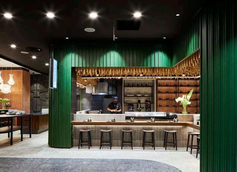
Bespoke seating Wunders 021 035 1737
Acoustic operable walls Varilux 021 852 1716
Clay bricks Claytile 021 884 4589
Client: Ryan Joffe Properties, Narrative, The Rockefeller Hotel
Architect: MLB Architects
Interior designer: Source Interior Brand Architecture
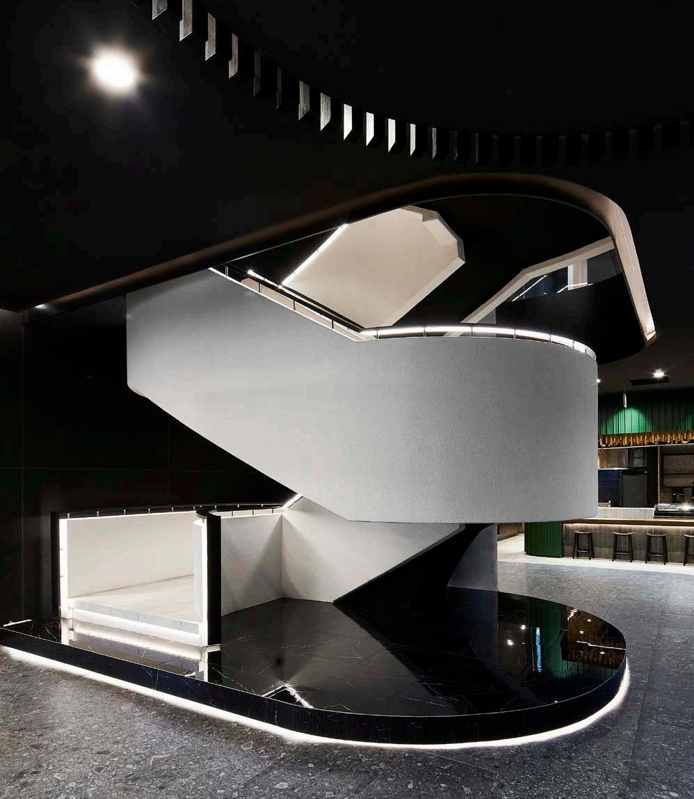
Civil, structural, electrical, electronic, and façade engineer: Sutherland Engineers

Quantity surveyor: JMHT Quantity Surveyors
Contractor: WBHO
Photographer: Sean Gibson Photography
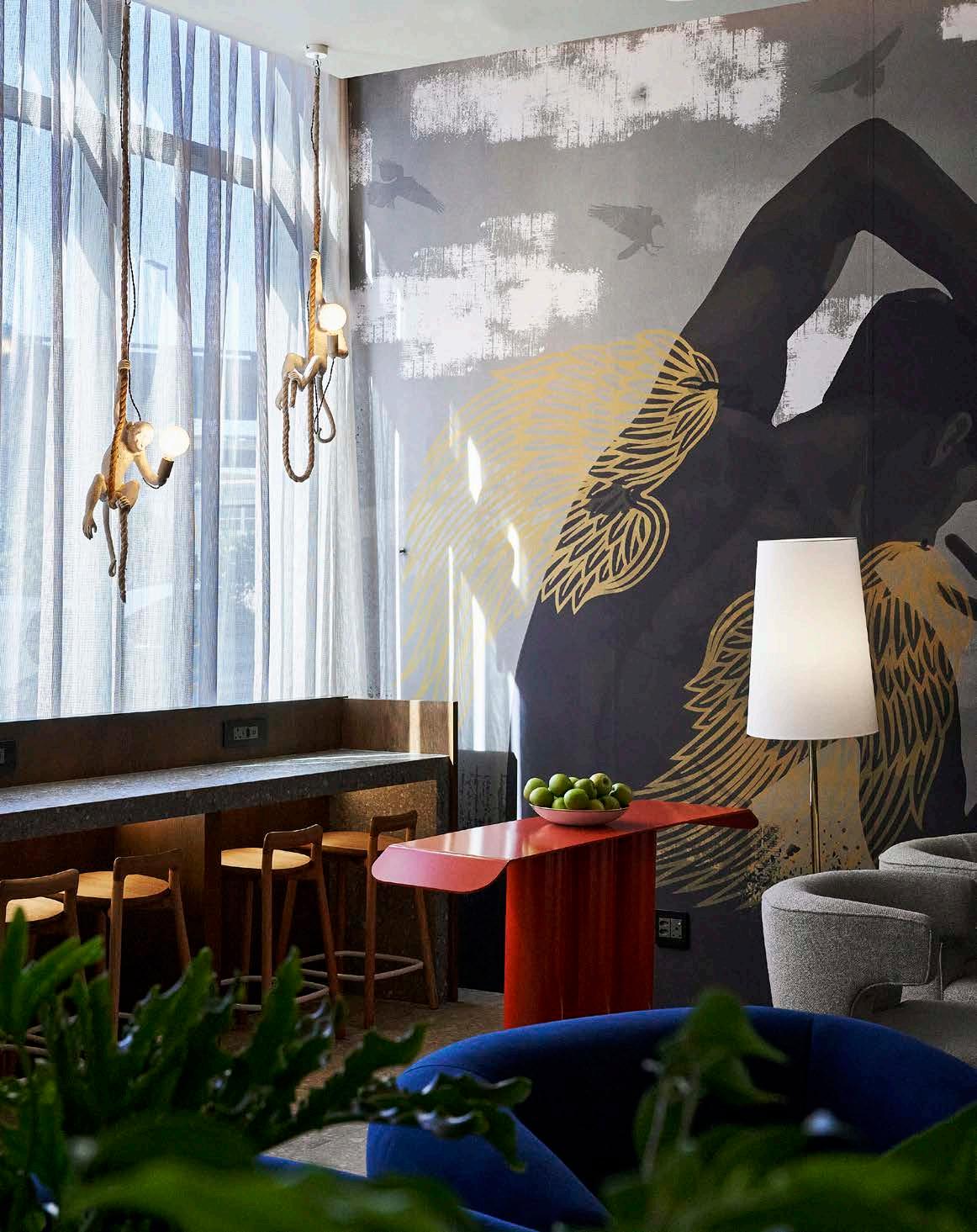
The brief and choice of colour palette, materials, textures, fabrics, and graphic motifs for the design concept of the restaurant were developed based on the following key principles:
The city as muse: Business vs pleasure, grit vs glamour, structure vs organic, crowded vs isolated, and day vs night.
The layout as a neighbourhood: Logical flow, self-sustainable, urban oasis, long stay vs short stay, and business vs pleasure.
The people as energy: Creating a space for the mavericks, the travellers, the businessmen, and the free spirits.
Infrastructure as surface treatment inspiration: Concrete, asphalt, steel, glass and reflection, street art and graffiti, plants, and growth.
One of the considerations we needed to be mindful of, was that the restaurant needed to be fully functional throughout the day. Therefore, the spaces had to be inviting across the various stages of food service. We aimed at breaking the restaurant area up into smaller, more intimate pockets to avoid the feeling of sitting in large open spaces. These smaller spaces allowed us to play with various levels of expression to differentiate between them, whilst still remaining part of the bigger aesthetic. Elements such as the neon lighting and graphic motifs were used to define spaces and create those Instagram-worthy moments.
As with most hospitality projects, there were a fair number of obstacles and challenges to overcome. With The Rockefeller specifically, the main challenge was to utilise the relatively small public zones in such a manner that they would not only be functional throughout the day for various needs but also provide an exciting and memorable experience for visitors.
As with most developments these days, spaces need to work really hard to be cost effective, and in order to achieve this, it needs to be both practical and interesting. Another obstacle was that the surrounding area was not fully developed yet by the time The Rockefeller would be complete; therefore, the hotel needed to be able to function as a standalone urban oasis of sorts that remains intriguing and lively for people throughout the day, and not just for a specific period of time.
As with most of our projects, we always aim to use local craftsmen and designers where possible as it stipulates and expands the local design narrative. Finishes were chosen that could best convey the desired urban edge aesthetic to reflect the inner city. Finishes such as concrete and graffiti-inspired wallpaper were offset against polished stone and golden tiles to create a beautiful contrast between grit and glamour.
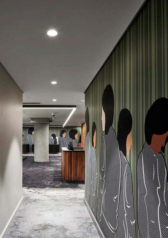
Globally, inspiring and trending design concepts and interests revolve around layered storytelling, thoughtful exploration, collected history, and grounded authenticity. This creates a perfect sentiment within which to present our ongoing obsession in future commercial interior projects: proudly homegrown design that showcases the depth of African legacy and the inherent sophistication of our continent.


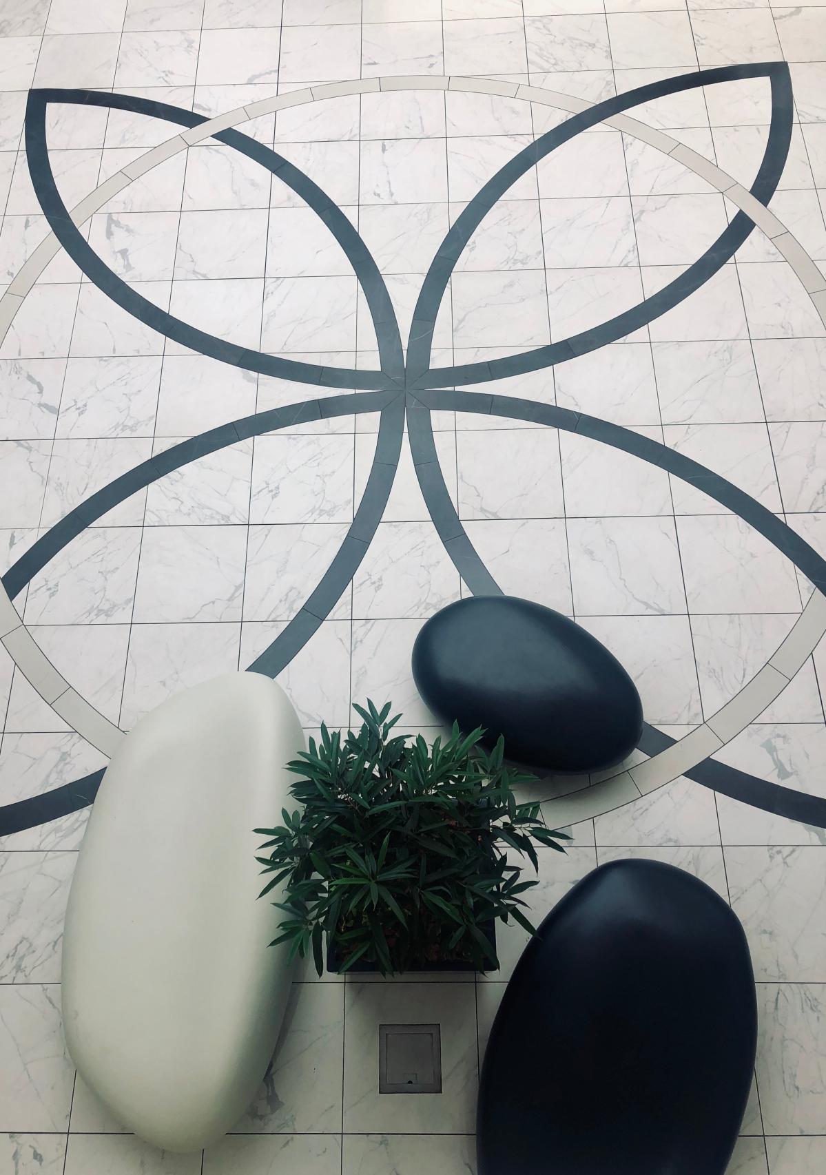
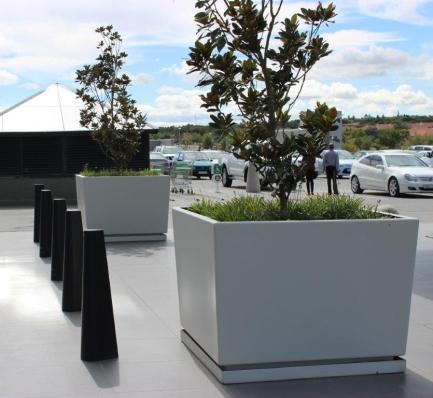
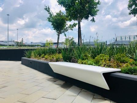








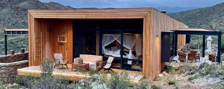


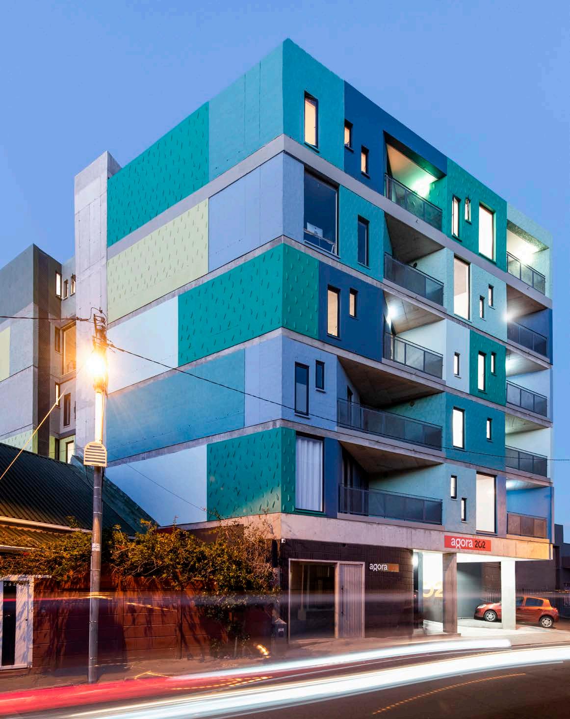


Size: 1350 m² Location: 202 Lower Main Road, Observatory, Cape Town, Western Cape
First impressions count, and this bold beauty certainly manages to capture bystanders’ attention. Honouring the colours and plastering techniques used in the vibrant suburb of Observatory, Agora Apartments is built to blend in while standing out from the crowd. Designed by André Krige and Theo Kruger of TwoFiveFive Architects this striking building incorporates ingenious design techniques on its façade to integrate into its natural and architectural environment in Cape Town.
Located in the complex socio-economic suburb of Observatory with its rich history and cultural diversity, the Agora Apartments demanded a high level of community involvement and public participation during the design process. The expectation from the outset was a building that would be contextually relevant and financially viable. It was also important to deliver an offering that would transcend the market 'norm' for the area, not just to those who are familiar with Observatory, but to the broader city too.
As such, the brief was to design a future-focussed building created for the ‘now’ (Agora means ‘now’ in Portuguese). The building needed to provide as many residential apartments as feasible and at least one parking bay per unit. The apartment block was going to be rented out to a target market composed of ‘young professionals’, and therefore needed to meet that design objective.
During the development planning stages, the surrounding environment comprised predominantly single-storey structures. However, the suburb’s context changed drastically over the past three years, and this played a vital role in the subsequent scheme. To maximise the feasibility of the design and remain within the statutory development controls of the stand, the proposed scheme required nearly six levels above ground, built to zerometre building lines, on four boundaries.
So, the following questions remained:
• How can one remain sensitive to the scale of the buildings in the area?
• How does one relate to the context in a manner that is familiar but fresh at the same time?
Since it was evident that the apartment scheme could not be made smaller, the resulting design concept was simple: ‘Let’s hide it’. The architects used a drone to capture footage of the site’s context and then extrapolated contextual data to create a form of architectural camouflage for the façade. These photographs were aggressively pixelated and reduced to a base colour scheme for the building envelope. One façade was designed to be contextually relevant in relation to the mountain backdrop, and the other to celebrate the harbour beyond.
TwoFiveFive Architects went even further in their treatment of the façade, introducing a range of diverse plaster techniques found within a one-kilometre radius of the development, including everything from fish scales and scallops through to banana plaster. This variety of ‘old’ plaster techniques required the involvement of local plaster artisans to train the young team on-site.
Architect and principal agent: TwoFiveFive Architects
Structural engineer: MISC Engineering
Electrical engineer and fire consultant: Frame Consulting Engineers
Mechanical engineer: De Villiers & Moore
Quantity surveyor: Peregrine Quantity Surveyors
Main contractor: HFO Construction Photographer: Paris Brummer

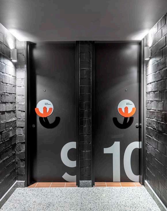
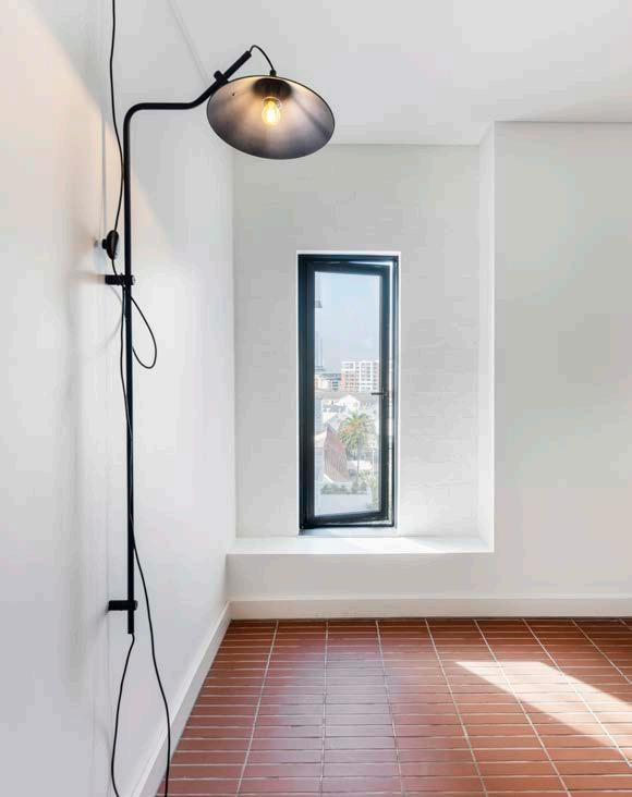
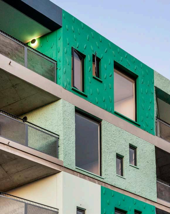

Paint Plascon 021 505 2400
Tiling Mazista 021 511 6640
Lighting Spazio 011 555 5555
Aluminium windows and doors Glassmen West Coast 021 552 4862
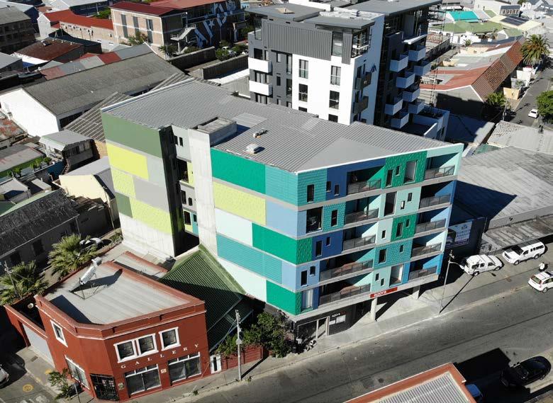
Steel kitchens and cupboards Kink Design 083 463 8649
Custom counters Notation Design 079 772 9340
Sanware Geberit 011 444 5070
Taps and mixers Hansgrohe 086 1111 941
Ironmongery QS Products 011 792 3334
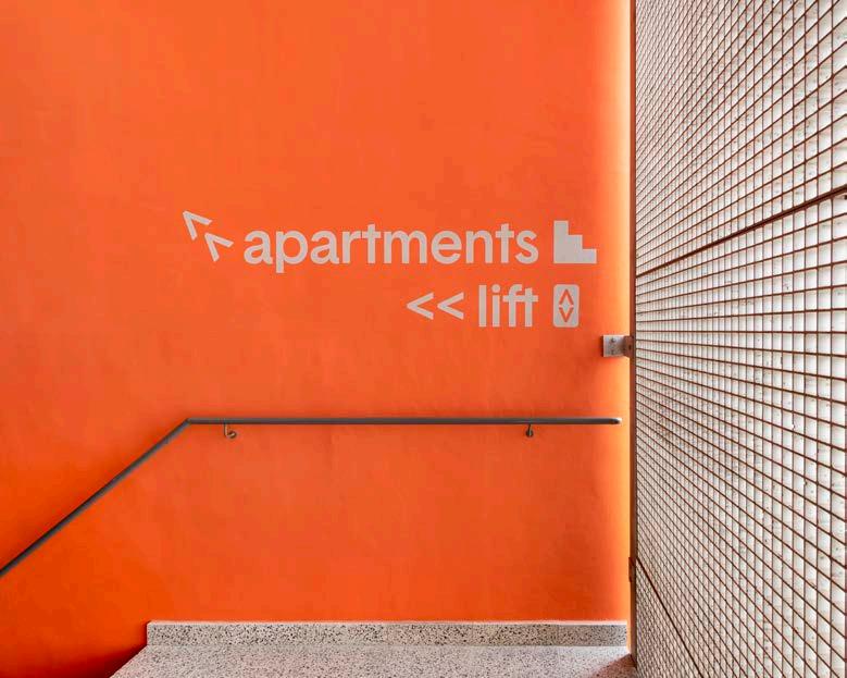
A retail space was introduced alongside the public entrance to the apartments to activate the pedestrian edge on Lower Main Road. This, combined with new trees on the Nansen Road sidewalk, served to soften the public engagement of the scheme. Lastly, setbacks were created (some over kitchens and others recessed into the façade) for natural light and ventilation on the zero-metre building lines, further enhancing the quality of life within the apartments.
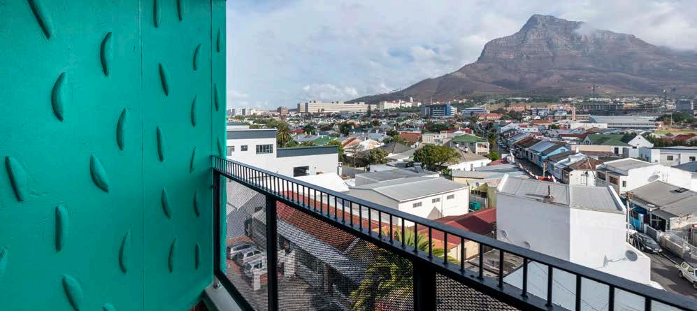
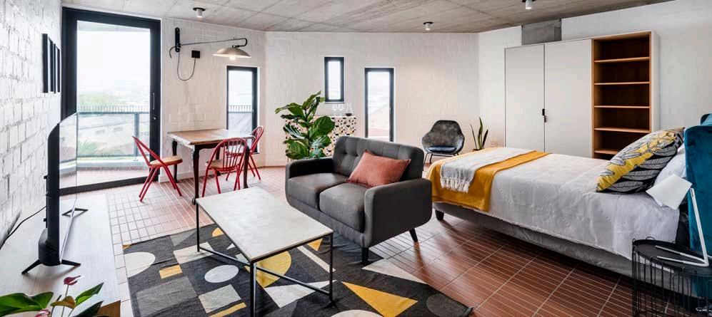
For the interiors, the team wanted to support local design as far as possible. Custom light fittings were commissioned by designers like Joe Paine, custom terrazzo tops in a playful green colour were manufactured by Notation Design, and custom-made steel kitchens and lighting were commissioned from Kink Design. The apartment block’s brand identity was designed by Carina Comrie from Büro Comrie which, in turn, was introduced into the wayfinding and signage elements.
Furthermore, the architects introduced purpose-made door handles with cheeky yet positive messages throughout the building. A few noteworthy examples include, 'Go Get Them!' and 'Hello, Good Looking'. Agora Apartments has become an icon in Observatory and is not only incredibly well received by the community but also its new tenant.
South Africa is in the midst of a water crisis, one which will only get worse unless we all start focusing on reducing our demand for water. Have you considered how to ensure your gardens and landscapes, as well a those of your clients, are water wise?

One of the solutions to maintaining a successful low water use garden lies with the humble succulent. Succulents use very little water but can also save you time and money. They can be almost maintenance-free but provide a wide variety of distinctive shapes, colours, and sizes to suit any garden or landscape. Also, if you or your clients are the travelling types, succulents will put your mind at ease, as they require very little care.
By using succulents in your garden you can ensure that your garden remains green and colourful all year round. In fact, there are many indigenous aloes that flower specifically during the dry and cold winter periods.
Succulents are able to adapt to seasonal changes quite effectively and sometimes show red and orange highlights on their leaves in response to these changes.
The adaptive mechanisms used by many succluents has resulted in an incredible variety of interesting leaf forms and plant shapes, including paddle leaves, tight rosettes, and bushy or trailing columns of teardrop leaves. In South Africa, we have many species that fall within these categories, such as Bulbine, Carpobrotus, Aloes, Crassula, and Delosperma.

For more information on the care and maintenance of indigenous succulents, visit the Water Wise website, or have a look at the resources on offer by the South African National Biodiversity Institute (SANBI).

Succulents are low or no water use plants that have thick fleshy leaves and stems with the ability to adjust moisture levels during dry or poor conditions.

Specialised in using the science of consumer buying behaviour, experiential design, and human curiosity, Cooked Studio is an eclectic interior architecture and design studio behind the buzzing Susu Bubble Tea café in De Waterkant, Cape Town. Winning the title of the Most Innovative Hospitality Interior Architecture Studio in South Africa at the Lux Life Hospitality Awards 2022, come and explore the interiors that made Susu an overnight TikTok and Instagram sensation.
"By creating a playground with fully functional elements, including a seesaw, swing, a portal mirror in the lounge bulkhead, and oversized, colourful furniture, we sculpted a tea shop that feels like an adventure for Susu’s customers."

Size: 58 m²
Location: Cape Quarter Lifestyle Centre, De Waterkant, Cape Town, Western Cape
Behind the brief
Susu Bubble Tea is the new sister brand of existing Momo Tea – the first authentic Taiwanese bubble tea brand in South Africa that was launched in 2018. We as Cape Town-based interior design studio, Cooked Studio, had the privilege of working with Momo’s founders, Samuel Boaz and Henry Francisco Castillo Kanashiro, over the past few years. So, we were of course delighted to reconnect upon hearing that the Momo Kiosk we designed for the brand in 2021 gained major success on Instagram and TikTok. Teens and varsity students just couldn’t get enough joy from sharing the photos and videos of the colourful juices, milky teas, and Momo slush beverages online.
In January 2022, Henry and Sam approached us again for their latest project: a new bubble tea café, located in the Cape Quarter Lifestyle Village in De Waterkant, Cape Town. Apart from a few practical considerations for the back-of-house, the brief this time around was simply: ‘Make it Instagrammable!’ Essentially, the more brand exposure online, the better. We received the brief in mid-January and presented the concept to the client within two weeks. By mid-February we were liaising with contractors and costing out the full project with all construction details. After just three months, the store opened its doors in April 2022.
The previous store used to be an art gallery, so we pretty much had a blank canvas. Apart from needing to install air conditioning and get some existing drainage reticulation points up and running, the structure itself was, fortunately, ready to go and waiting for a fresh start. The Cape Quarter Lifestyle Centre is finally coming back to life after many years, with quirky Asian-inspired stores and cafés. As the Momo and Susu beverages are super bright and colourful, fun to make, great to look at, and even more delicious to drink, we were passionate about giving the products a worthy home to match. We had free reign to develop a new colour palette for the brand while playing with human curiosity.
I always begin every project by determining who the space’s users are and how we can use design to create a sense of connection for them. By exploring the little character displayed on the Momo/Susu branded cup packaging, and thinking about who ‘he’ is, what he would be doing, who his friends would be, and what his world would look like, we started to flesh out the concept. In particular, I’ve always loved this creature’s whiskers and eyes, so I quickly began sketching out how we could use lines and spheres to honour those elements.
The ultimate goal was to create a space that would be the place to take pictures and videos in Cape Town. Therefore, we had to keep in mind how each corner of the space would be viewed through a cell phone lens and from multiple angles. We also wanted the café to be a place where students and adults are encouraged to reconnect with their inner child in a fun and unique environment. By creating a playground with fully functional elements, including a seesaw, swing, a portal mirror in the lounge bulkhead, and oversized, colourful furniture, we sculpted a tea shop that feels like an adventure for Susu’s customers.
As we were working with a Taiwanese brand, through discovery discussions with our client, we learned the importance of feng shui as being an auspicious value rather than the typical appropriation of the practice.
MEET THE TEAM
Interior designer: Cooked Studio
Project manager:Teqture and JKL Holdings
Plant sourcer, styler, and installer: Naak Botanical Studio
Interior photographer: Lionel Henshaw Photography
Interior Designer and Founder of Cooked Studio
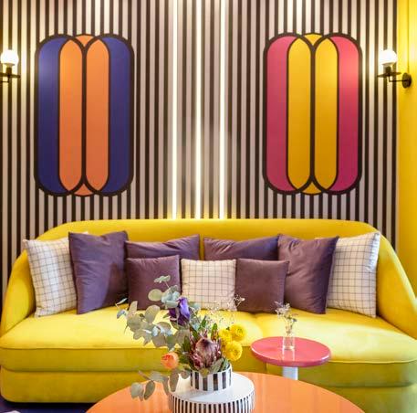

As a result, we had to make careful decisions regarding the balance and energy of how money and profit would move throughout the space. Certain types of plants needed to be considered, and making sure that traffic flowed to the point-of-sale from both entrances was a vital consideration.

By working tirelessly on each detail with some incredible people, ensuring every element was custom made and curated to fit into the magical world of Susu Bubble Tea, the end result has been a roaring success. We custom designed every element apart from the barstools, pendant lights, and vases, so that each element in this space had a partner of sorts. For example, the striped wallpaper connects to the striped Bloom Space vase; the vase’s pill-shaped element matches the form of the pendant lights; the ottoman fabric was custom designed and measured to read well with the tiled wall; complementing colours bounce off each corner of the space; etc.
One big challenge was that, because there are offices above the store, our build and design times were restricted to evenings. One night my team were installing the bulkhead mirror at two in the morning and one of the pieces fell and shattered. We decided to switch to mirror Dibond after that instead! We are so pleased that people have responded especially well to design elements like the mirror bulkhead portal, the oversized seesaw, banana swing photobooth, and large furniture items that were intentionally designed to bring out the nostalgia of sitting on ‘grown-up’ furniture as a child. As Susu Bubble Tea expands and new cafés start opening in other parts of the country soon, I'm looking forward to seeing how each store will have its own unique Susu twist.
Custom sofas and upholstery Hertex Fabrics 021 461 7420 Giraffe Designs 021 824 4100
Decorative vases Bloom Space 082 700 3610

Paint Plascon 0860 20 40 60 Dulux 086 033 0111
Lighting K.Light 021 552 4370
Custom shopfitting Teqture 083 285 0009 or 082 903 7300
Hourglass stools Chair Crazy 021 465 9991
Flooring Tilespace 021 510 2081 Pudlo 076 941 7344
Wall treatments Custom designed by Cooked Studio 079 696 8295
Signage and printing Sign Facets 011 900 4065
Banana artwork feature wall Render Intent
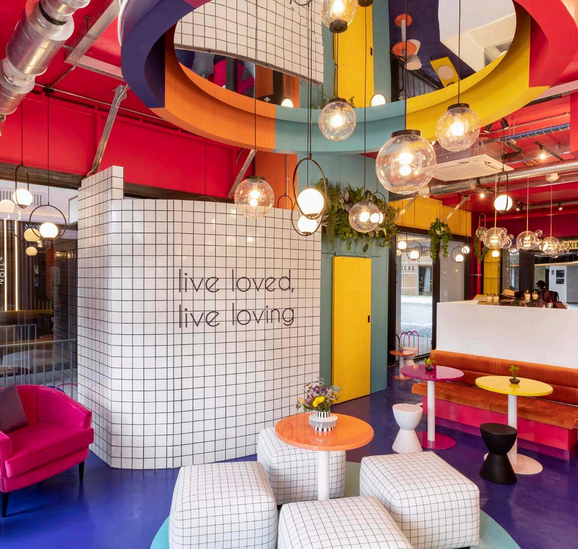
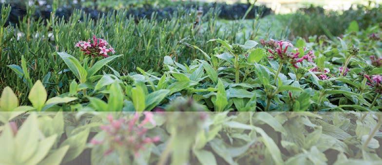


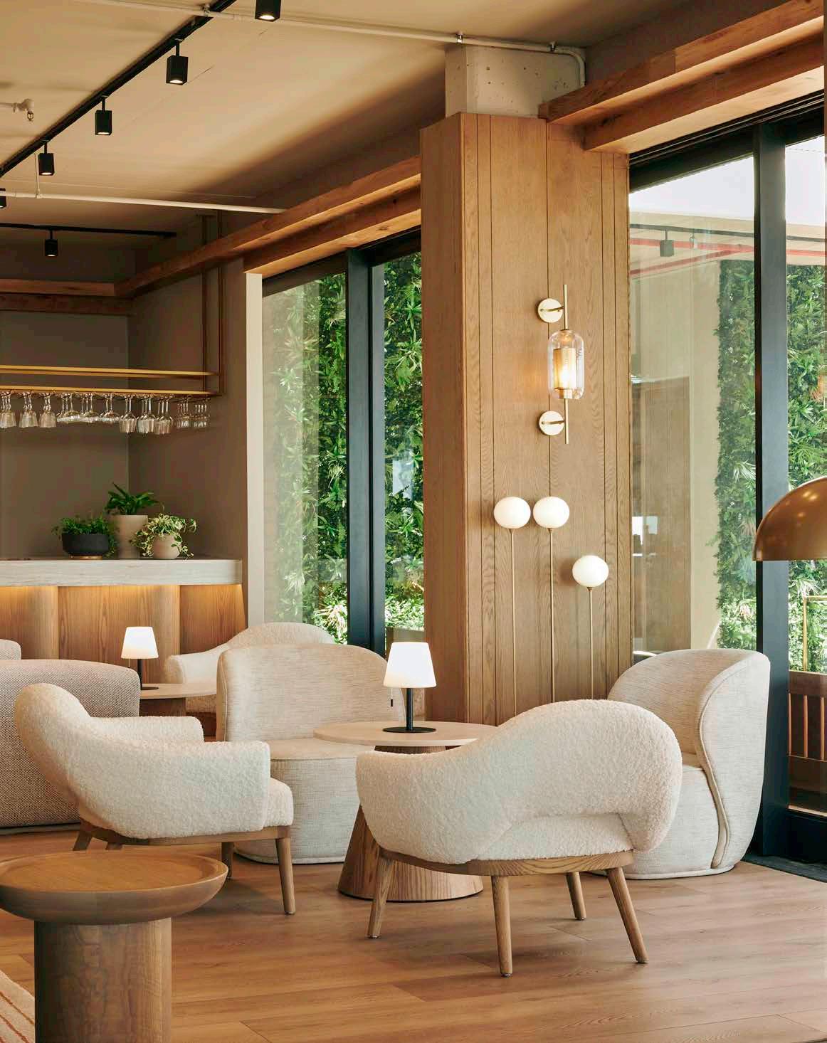 Image by The Kove Collection
Size: 28 550 m²
Location: 19 Kloof Road, Sea Point, Cape Town, Western Cape
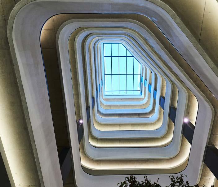
Ultra-convenient and brand spanking new, the one-of-a-kind Station House has officially opened on Sea Point’s Kloof Road and it’s decked with everything you could ever dream of. Located in fabulous Fresnaye and within a stone's throw of the promenade, this iconic collaboration by the Berman Brothers, D2E Properties, and Vivid Architects is the ultimate match in modern living in one of the most soughtafter destinations on the continent.
The development was initially a partnership between Hosken Consolidated Investments (HCI) and the Berman Brothers Group (BBG). The first brief was to design a ground and 17-storey slender tower block to comply with a GB7 rezoning. The design thinking behind this was that, while the tower would be taller, it would be less invasive to the neighbourhood with the slim form allowing more light and views into the surrounding area. This proposed scheme was approved by Municipal Planning Tribunal, but unfortunately got dismissed by Mayoral Committee. The architects then had to redesign the building within the GB5 and GR5 zoning constraints, maximising the permissible bulk. It was at this point during the development that HCI was bought out by D2E Properties who continued the strategic partnership with BBG. The Berman Brothers actually grew up in the original building where the Station House is situated, so after developing and rehabilitating buildings across Sea Point for the past 31 years, it’s fitting that they should experience a full circle moment of coming back to their roots. It took BBG several years to acquire all the surrounding properties on this prime site and then to consolidate them into a sizeable piece of land (just over 3000 m²) large enough for the critical bulk of a substantial development.
The concept and narrative behind Station House were largely based on the site, its location, and the client’s brief. The building sits on a very rich historical site opposite the Sea Point Tram Station which was opened in 1862 and once linked Sea Point to Camps Bay, serving as an important cog in the wheel of modern transportation and trade. It’s also across the road from the old Sea Point Fire Station and Saul Solomon’s Temple, a gathering spot for four different religious groups over the decades. In addition, Station House is stationed on very significant Sea Point intersection, where Main Road connects with Regent Road to Kloof Road. In Vivid Architects’ minds, it was a place of convergence and community, and they really wanted that to resound in the building concept and narrative right from the start.
For the developers it was all about location, location, location. BBG and D2E wanted to bring a unique, world-class product offering to Cape Town that many locals will not have witnessed before. The primary aim was to deliver on the cutting-edge expectations while keeping it as affordable as possible. Station House has both a permanent residential and hotel component, with 201 luxury apartments made up of studios, one-beds, two-beds, three-beds, and penthouse units, as well as 44 suites forming part of the on-site boutique hotel spanning the first three floors. The development follows a micro-living approach with an emphasis on the ‘sleep small, live large’ concept. The design sought to create a strong sense of community within the building, while simultaneously drawing on the city’s majestic views and global appeal.
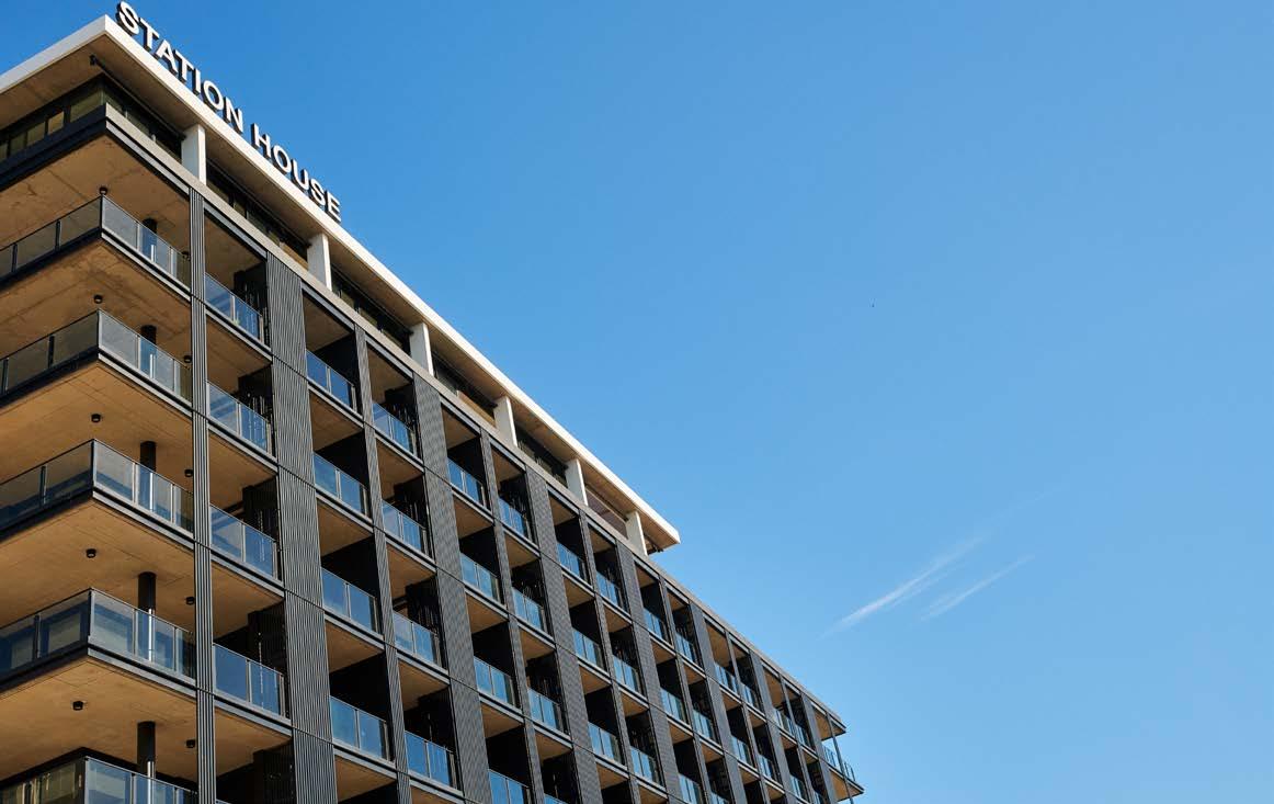
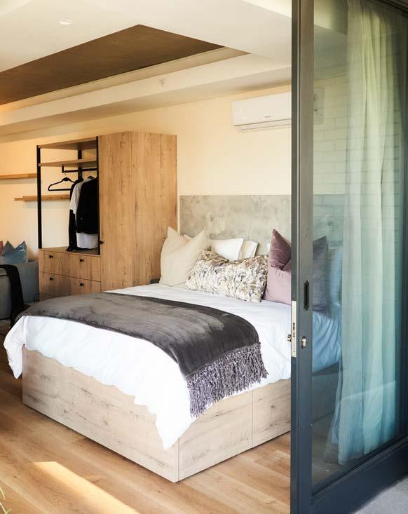
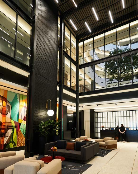
When sitting down with the architects, the developers had a very clear vision of what they wanted to achieve. The brief can simply be summed up as “give me a reason to leave the building”. Station House certainly delivers on that front, offering everything you could possibly think of.
The 12-storey, mixed-use lifestyle building is a home, a workplace, a retail space, and a food and entertainment venue all in one. Residents and hotel guests have access to amenities such as a gym and yoga pod, business centre and pods, co-working areas, a private residential lounge and entertainment hub, outdoor braai areas (we are South African, after all), an outdoor kinetic gymnasium, pet park, private swimming pool and deck located on the tenth floor, on-site laundry, waterless car wash, secure basement parking and storage, and 24-hour concierge and security. The building is able to function off the electrical grid, with generators providing full power, and there is also a water reticulation and water filtration system. Moreover, a bespoke community app has been created for the development which allows users to make bookings at all of the facilities within the building. To round off the Station House’s unmatched level of convenience, the building also houses a flagship signature Pick n Pay store and two restaurants and bars. Why would you ever want to leave with all this on your doorstep?
Station House is home to two new restaurants by the Kove Collection: Sonny and Irene on the ground floor and The Nines on the ninth floor. With the slogan ‘not-your-average neighbourhood café bakery’, Sonny and Irene was designed to celebrate café-style classics with a contemporary twist. Affectionately named after owner Paul Kovensky’s grandparents, the uber-stylish restaurant features an open kitchen, full-service bakery and patisserie, as well as a designer cocktail bar. The interior perfectly blends an air of Art Deco nostalgia with modern sensibilities. Dressed in a pastel pink and green colour palette with soft marble and oak elements, as well as a widely photographed custom flamingo wall finish, it should come as no surprise that this pink paradise has become a Sea Point hotspot. Then there’s The Nines — an elegant rooftop restaurant and cocktail lounge with 270-degree views, located on the ninth-floor penthouse of Station House. The luxurious yet warm and inviting aesthetic features organic shades of sand, tan, and stone adorned with plush leather couches, designer armchairs, and oak panelling. With floor-to-ceiling glass, as well as a massive deck extending out from the restaurant, The Nines takes full advantage of the stunning ocean views.
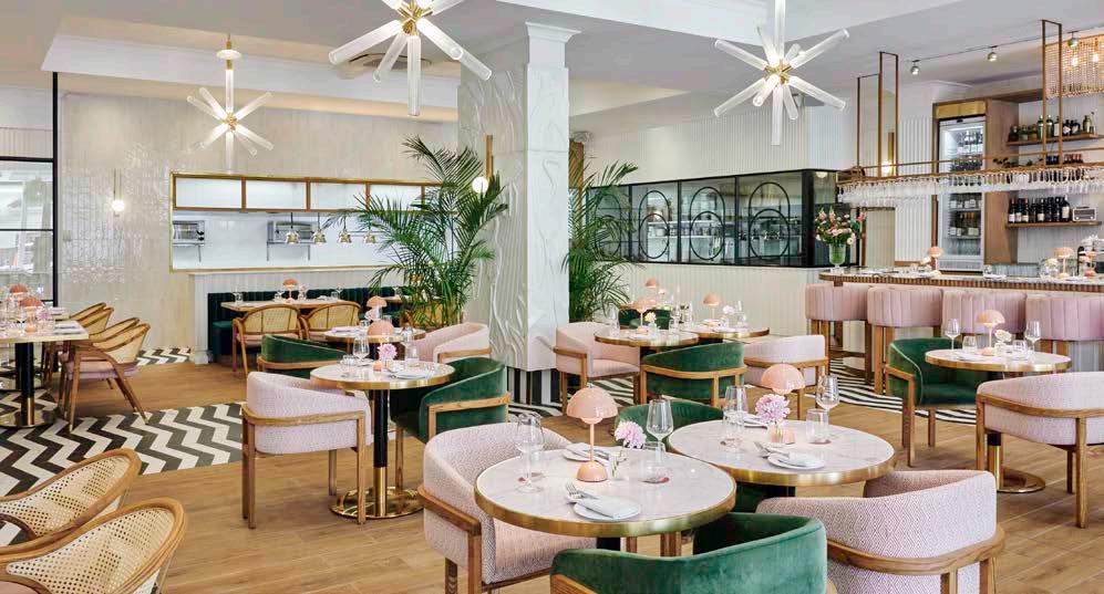
"THE INTERIOR PERFECTLY BLENDS AN AIR OF ART DECO NOSTALGIA WITH MODERN SENSIBILITIES."
Developer: Berman Brothers Group and D2E Properties
Architect: Vivid Architects
Main contractor: R+N Master Builders (Sep 2021-Oct 2022), Haw & Ingels (basement construction - May 2019)
Structural contractor: Viva Cape Projects (top structure) WBHO (ground and mezzanine levels)
Project manager and BIM coordinator:: CAPEX Projects
Quantity surveyor: Smith & Co.
Structural engineer: Moroff & Kuhne
Mechanical, wet and fire services engineer: Spoormaker & Partners
Electrical engineer: QDP Lighting and Electrical Design
Lift engineer: Solutions for Elevating
Interior designer, Station House: Inhouse Design Studio
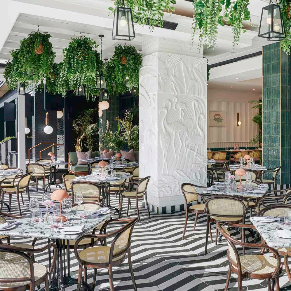
Interior designer, Sonny & Irene and The Nines: Soda Custom
Landscape designer: Arrow Landscapes
Health and safety consultant: Safetycon
HVAC SFI Group 0860 555 734
Aluvent 021 946 3511
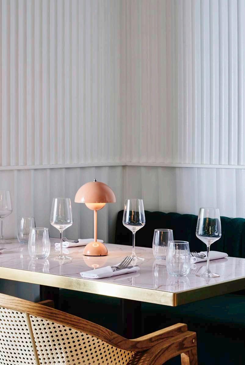
Ceiling Ceiling & Partition Concepts 021 511 8343
A&E Ceilings 021 905 7704
Façade Façade Solutions 067 113 1036
Tilt Screens 078 787 0895 Aluglass Cape 021 683 9094
Aluminium glazed windows and sliding doors World of Windows 021 551 3235
Signage Ultra Signs 021 510 3200
Countertops Sangengalo Marble & Granite 021 907 1680
Luxury vinyl flooring Aspen Flooring 021 511 6640
Timber flooring Oggie Hardwood Flooring 021 510 2846
Decking Contour Decks 021 794 8361
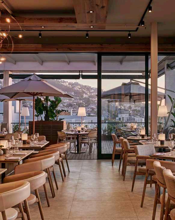
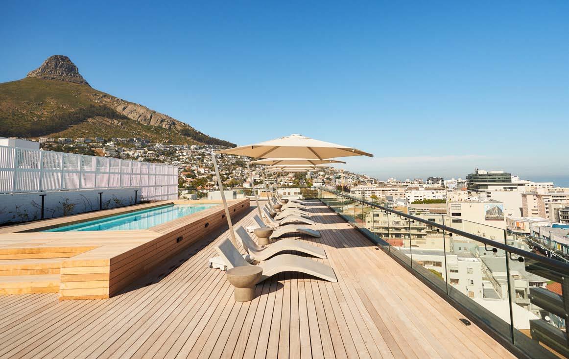
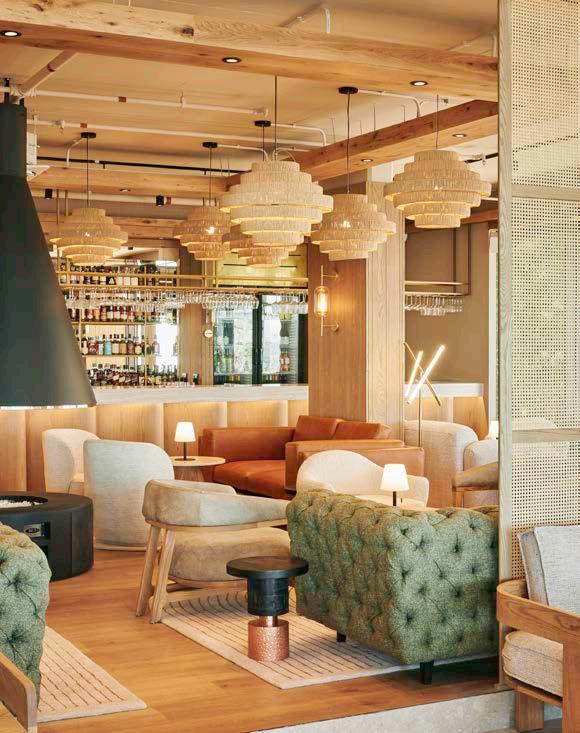

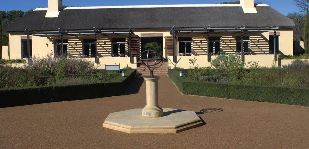

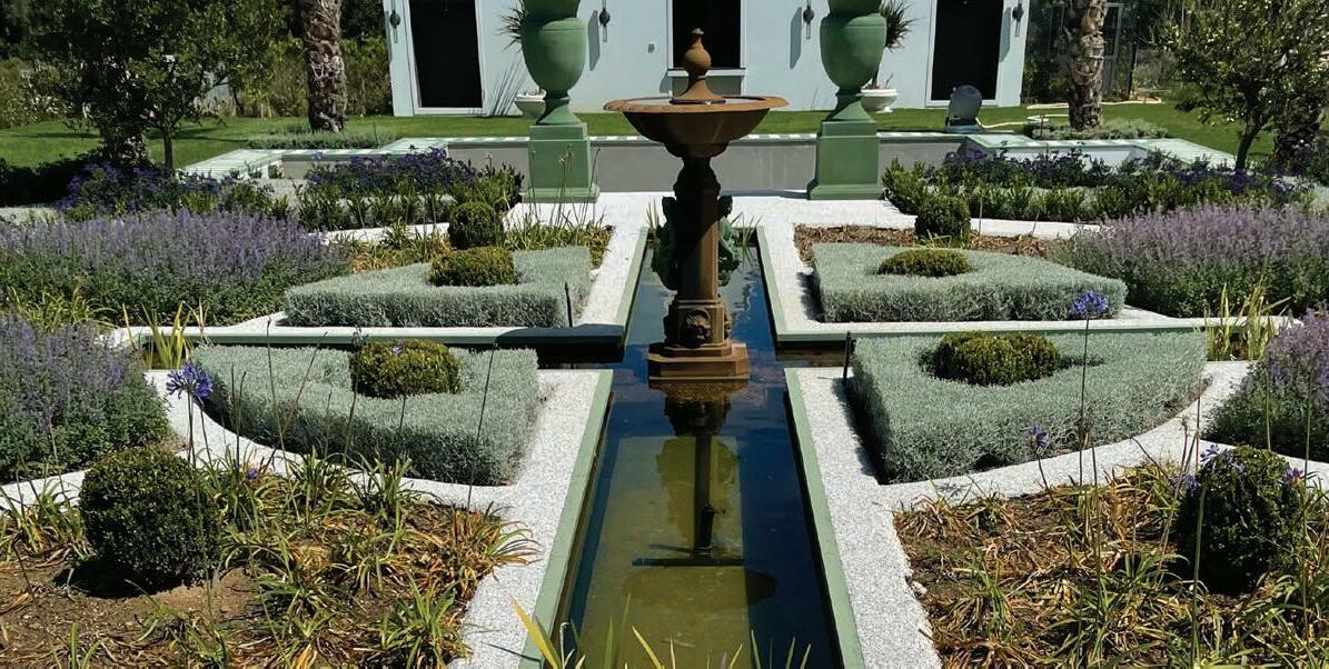

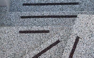
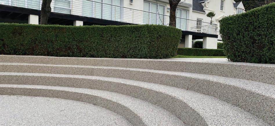


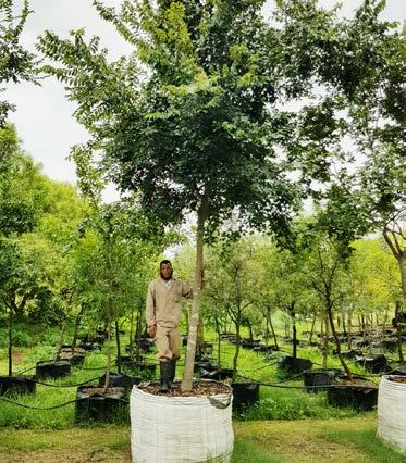




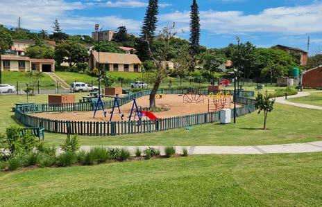


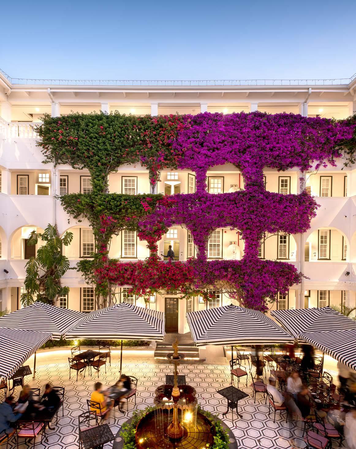
Size: 2300 m²
Location: 221 Beach Road, Sea Point, Cape Town
Celebrating a century of gracing the scenic front row seat of Sea Point, the grande dame of the promenade has undergone an extensive makeover before making its comeback as The Winchester Boutique Hotel. With respect to the original building as the guiding principle throughout the overhaul, Source Interior Brand Architecture (IBA) has created a scheme that pays homage to the historic architecture and layers of memories, delivering on the grandeur and unique sense of place of this Cape Town landmark, while still adequately addressing the needs of contemporary travellers. Let’s step inside the beloved halls of The Winchester Boutique Hotel to find out what the suite life is all about...
With a history dating back to the roaring 1920s, the Cape Dutch Revival style Winchester Boutique Hotel was originally built on the Sea Point beachfront as a residential apartment block in 1922. Yes, on the beach and not across from the Promenade and Beach Road as it is today. Previously known as The Winchester Mansions, the building’s iconic inner courtyard used to be a parking space for vehicles, accessed directly through the current front door. In 1958, the building was purchased by Mr and Mrs Harvey (the titular namesakes of the redesigned Harvey’s Bar), who turned the apartment block into a hotel before eventually passing the property down the family line to the Wainfords who still own it today. In November 2021, after a two-year refurbishment by GAPP Architects and Urban Designers and Source IBA, the beautifully reimagined Winchester Boutique Hotel reopened to the public under the management of Newmark Hotels, reminding Capetonians why they fell in love with the matriarch of the Mother City in the first place.
The renovation was originally prompted by the need for an infrastructure upgrade, particularly relating to the plumbing and bathrooms. Many exterior walls and corridors had untidy exposed drainage and plumbing pipes, so the upgrade presented an opportunity to relocate and conceal many of them. Further investigation led to the discovery of more challenges, such as the need to upgrade haphazardly installed electrical and HVAC systems.Certain staircases needed to be closed off and new ones added to meet fire-safety compliance laws. Furthermore, the team needed to find a way to create space for standard contemporary hotel conveniences like air conditioning. Due to the salty sea air from the Atlantic, many of the concrete slabs on the front façade had corroded, requiring carbon patching and the addition of new support beams. The owners and architects also became aware that the building was starting to show increasing signs of decay and dilapidation, prompting a more extensive proposal to structurally refurbish the whole building and not just redo the interior and rebranding.
Source IBA was initially brought on board as a hospitality design consultant and commissioned by the client to provide an overview of the potential of the building. This report set the tone for what then became the brief for the refurbishment, and the team was appointed to execute key parts of the interior architecture and design, brand design, and signage design. The firm worked closely with the owners of the hotel who are well-versed in design and involved in informed debates around the final design elements and objectives. The first design objective was to deliver on the expectations this evocative building and Cape Town landmark demanded. The second design objective was to rationalise the room types. From a hospitality management perspective, it makes business sense to have a similar number of equally proportioned rooms. The challenging factor for the design team was finding inspired finishes that complied with the technical requirements – essentially, finding a balance between context and the intended look and feel.
It was important to the team at Source IBA that, by respecting the property’s past, they would not end up creating interiors akin to the typical stage sets for period dramas. Rather, they wanted the interiors to pay homage to the hotel’s proud history through inventive referencing. In other words, ensuring the design enhances the DNA and the heart and soul of The Winchester while simultaneously bringing a fresh, contemporary feel to the hotel.
SUPPLIERS
Sanware
Meir from Flush Bathrooms 021 511 7888
Tiling
Lime Green Sourcing Solutions 021 447 2254
Tile House 021 506 3020

Countertops
WOMAG 021 447 6161
Rugs and carpets
MONN Carpets 021 555 0751
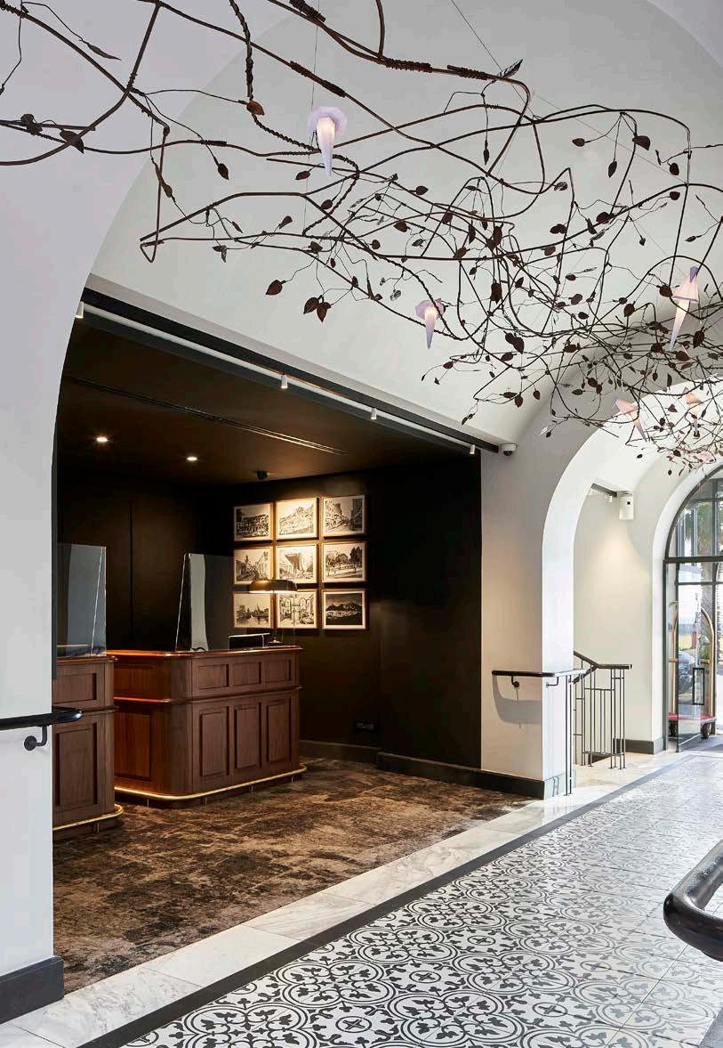
Custom signage, prints, and wallpaper
Cara Saven Wall Design 082 953 6246
Lemon Collection 061 294 8742
Fabrics
Eshanima Fabrics and Wall Coverings 021 447 2187
Furniture
Southern Hospitality 021 204 7004
Parasols
Cape Umbrellas 021 448 6012
Lighting Light World 021 023 2661
Architect: GAPP Architects and Urban Designers
Lead architects: Andrew Flint and Lisa Doucha
Interior architect and designer: Source Interior Brand Architecture
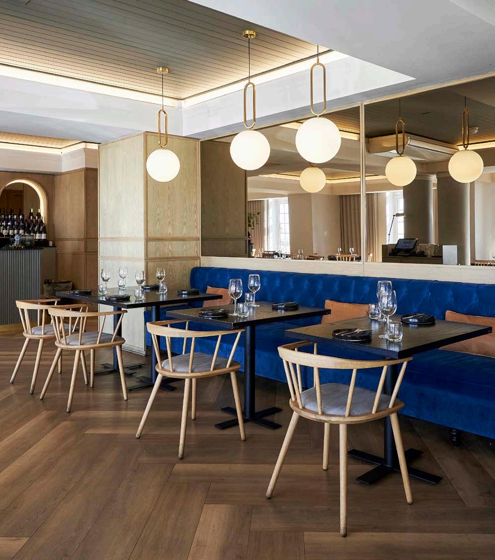

Main contractor: GVK-Siya Zama
Cost consultant: MLC Construction Cost Consultants
Project manager: Turner & Townsend
Landscape designer: Carrie Latimer Landscape Design
Photographer: DOOK and Sean Gibson Photography
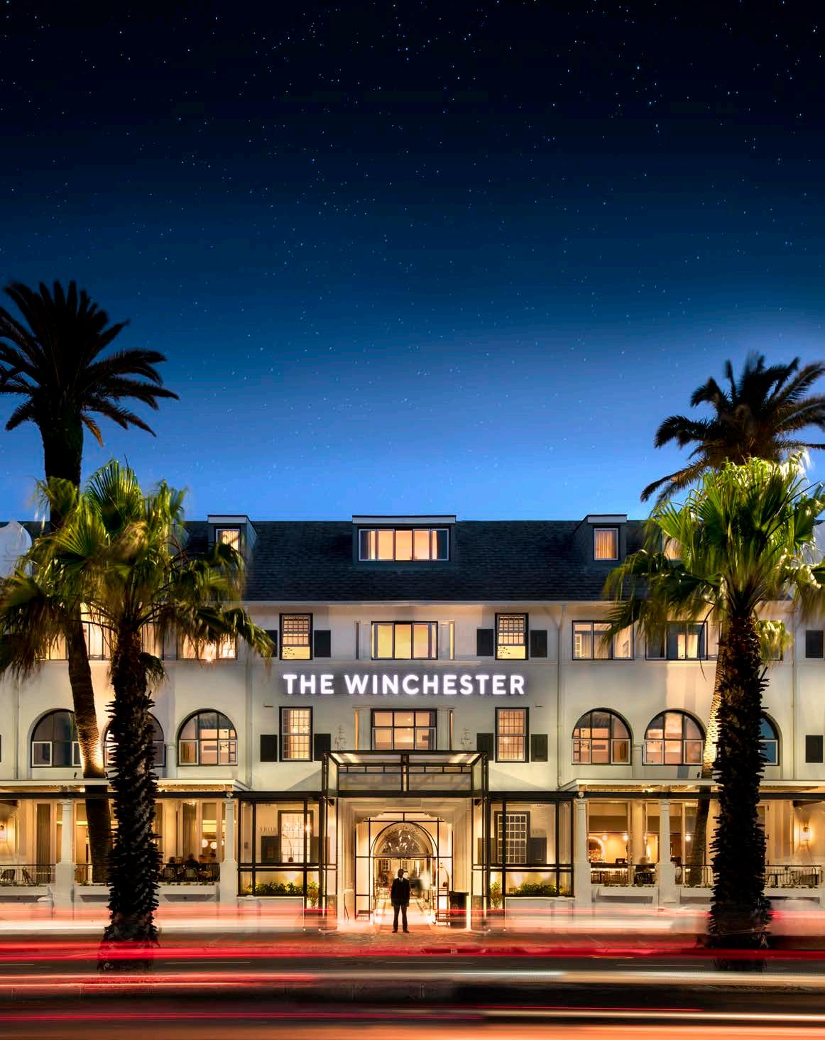
The design team retained, and in some cases reinstated, historic details to the interior architecture, allowing furnishings, colouration, quirky details, and styling to add modern appeal. This enabled the scheme to remain fluid and infinitely updateable by changing only moveable items and soft furnishings.
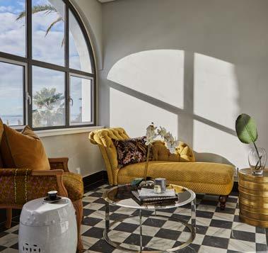
The décor and design of the 76 guest rooms and suites saw a modern revival of sorts, with carpets, bathrooms, and fittings being entirely replaced while a careful selection of furniture pieces combined to form a contemporaryclassic style that celebrates the history of the hotel. As part of the extensive refurbishment, Source IBA and GAPP Architects repositioned the hotel’s sea-facing suites on the front façade to take full advantage of their spectacular views across the Atlantic Ocean and Robben Island in the distance. These prime spot, sought-after rooms were reconfigured to better align with the arched windows, creating spacious suites replete with private balconies and signature terraces overlooking the Sea Point promenade. On par with the modern comforts guests have come to expect from luxury hotels, the palatial en-suite bathrooms offer elaborate amenities such as expansive showers and elegant freestanding baths, not to mention the champagne-hued brushed-metal fittings that hint at the golden age of travel.
To foreground the timeless arches, the architects removed the porte-cochère at the front doorway, effectively drawing attention to the archways leading from the reworked reception into the central courtyard. Upon entering the chic monochrome abode, guests are met with clean lines and dark wood panelling – the epitome of cosy elegance. Throughout the rooms and public spaces, a smart, eyecatching black-and-white palette manages to create an atmosphere that is both sleek and snug. The minimalistic design is offset by vintage furniture, layered textiles, striking signature chandeliers, and artwork collected by the Wainfords over the years – the combination of old and new capturing the character and charm of the building’s century-long history.
The monochromatic colour scheme extends to the iconic and widely photographed central courtyard, where the new hexagon porcelain tiles, extensive landscaping, reinstallation of the signature fountain, and, of course, the famous bougainvillea that had to be nurtured throughout the renovation, collectively revive the hotel’s signature interior. Beyond the courtyard, overlooking the refurbished pool terrace with its bold black-and-white striped sun loungers and redone landscaping, The Constance Room is another reimagined space designed to house boutique conferencing facilities. Combined with the renovated sea-facing terrace, Harvey’s Bar, and restaurant Shoreditch House, Source IBA has breathed new life into the beloved boutique hotel’s wide range of offerings.
In the past, many guests and visitors would wilfully overlook unwanted details (such as the exposed plumbing), mentally editing their experience to match their romantic fantasies of its character. This largely guided the refurbishment, leading the architects and designers to retain the recognisable elements and erase what people ignored from reality. Through adaptive reuse, they successfully delivered the dream-like nostalgia Cape Town locals and tourists alike call to mind when they think about the timeless monument of The Winchester Boutique Hotel.
"THROUGHOUT THE ROOMS AND PUBLIC SPACES, A SMART, EYE-CATCHING BLACK-AND-WHITE PALETTE MANAGES TO CREATE AN ATMOSPHERE THAT IS BOTH SLEEK AND SNUG."
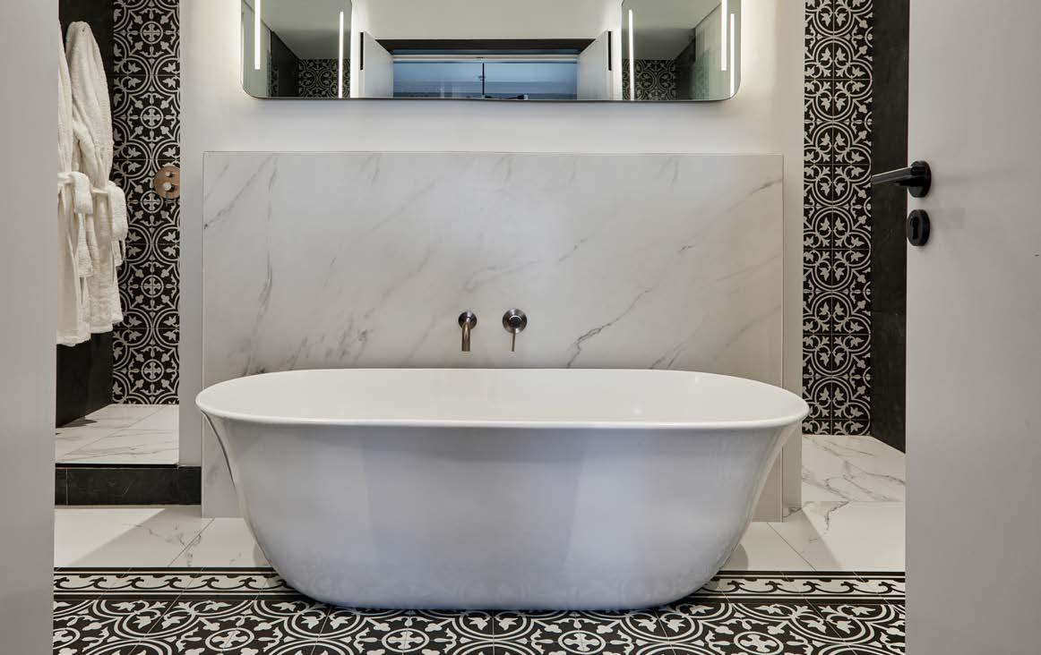
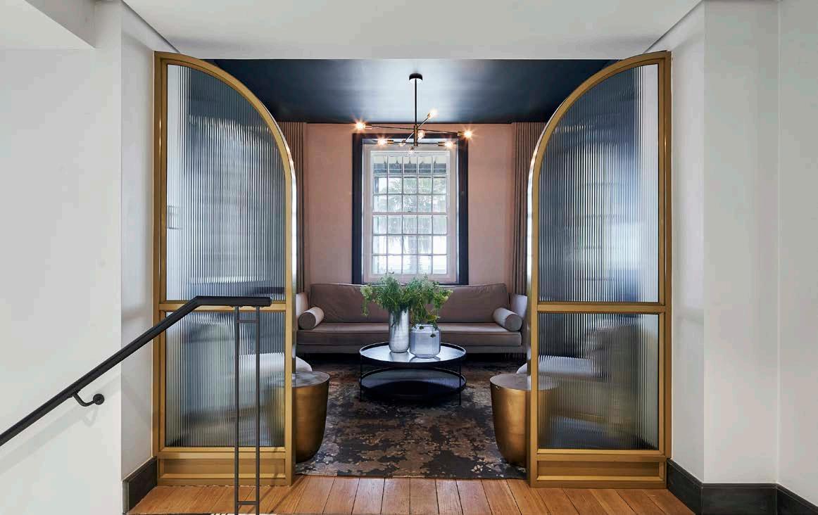 The monochrome palette tastefully extends into the hotel's bathrooms. Photography by Greg Cox Private lounge area. Photography by Sean Gibson
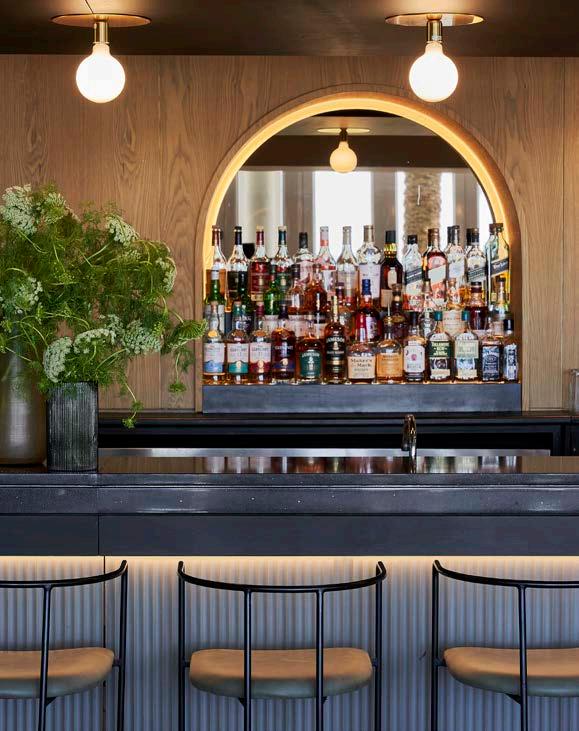
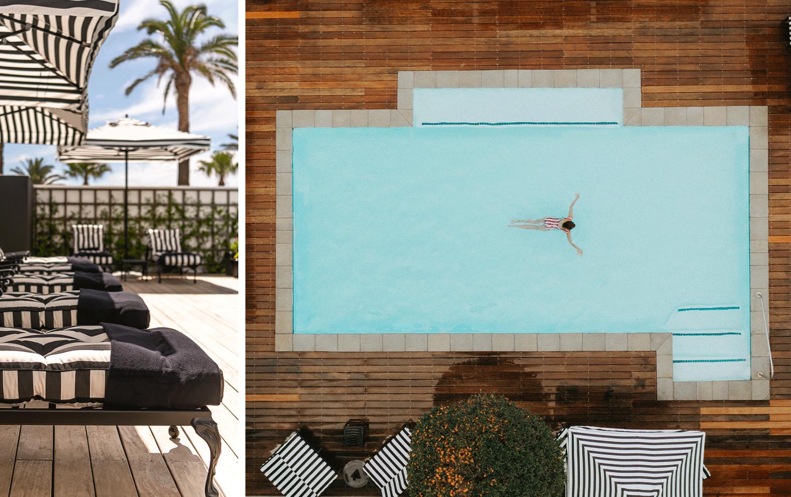
 Image by Sean Gibson Photography
Image by Sean Gibson Photography
Image by Sean Gibson Photography
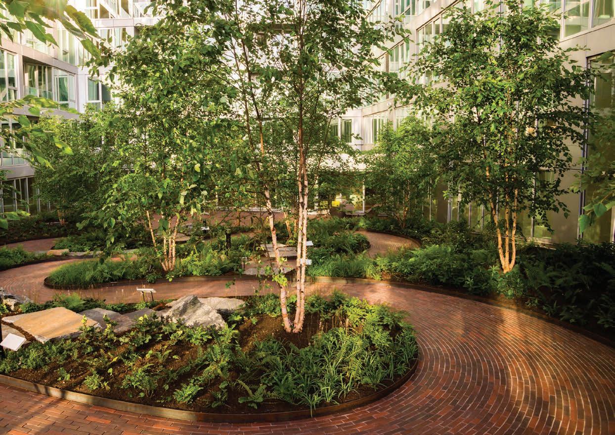
With stylish, timeless appeal and impressive sustainability credentials - the enduring hues and textures of clay brick are low maintenance and look beautiful for a lifetime.
CBASA represents clay brick & paver manufacturers across Southern Africa and drives inclusive, sustainable practices in the industry. We inspire energy-efficient, contemporary architecture and paving that supports our local producers, landscapers and architects.
Free technical and construction guides for clay bricks & pavers at www.claybrick.org
Tapware in Brushed Nickel, Tiger Bronze, Gun Metal, Champagne, Polished Chrome and Matte Black. Available throughout South Africa. www.meirsa.co.za - 021 510 0489
