

Excellence takes time, but we’re here now.


*Launching


Excellence takes time, but we’re here now.


*Launching

The answer for any landscaper needing to work in noise-sensitive areas is here – the STIHL FSA 90. This professional, battery powered brushcutter is limitless, meeting your every need for areas such as office parks, schools, hospitals, and residential estates.
The FSA 90 is powered by a 36-volt Lithium-ion battery that drives the compact, brushless, electronicallycontrolled (EC) motor, which is energy-efficient, has low vibration, and is virtually wear-free. This machine comes standard with a 260 mm, two-sided grass cutting blade, made more efficient with a guard around the nylon head to protect trees and shrubs from damage. It is also advantageously compatible with the AutoCut mowing head. The STIHL ECOSPEED partial load function allows the user to control the brushcutter’s speed via the operating handle, a useful feature that can increase the run time of the battery.
As part of the STIHL AP System PRO Battery Powered range of tools, the FSA 90 offers interchangeable batteries for reduced downtime and added convenience – exceptionally handy when multiple operators are in the field. This machine also offers leading STIHL go-anywhere mobility and convenience, with environmentally-conscious features such as being ultra silent with zero emissions. In fact, it’s so quiet that no ear protection is needed.
Besides avoiding the high cost of fuel for professionals with multiple teams, there is no more hassle with keeping every group supplied with fuel, and no headaches with providing safe storage. To add to its excellence, this model is ideal for working over extended periods, with its easy cutting action assisted by the machine’s light weight (only 3.2 kg without the battery). The bike handle offers enhanced control over the grass cutting blade, allowing the machine to be easily guided and making it highly effective when slicing through thicker vegetation. For extra protection and all-day comfort, a double shoulder harness evenly distributes the weight of the machine.

The FSA 90 combines an impressive cutting action with all of the benefits of battery power. Professional landscapers need hardworking machines that are reliable, cost-effective, comfortable to use over extended periods, and which deliver an impressive performance, day after day. With this dynamic machine, large-area cutting has never been easier.


y Interior and exterior flooring.
y Unique, smooth and seamless.
y Low maintenance and durable.
y Timeless and luxurious.
y Investment flooring.
y Stain-resistant.
y Scratch-resistant.
y Impact-resistant.
y Hygienic.
y Available in 48 colours.
y 100% UV stable and colour-fast.
y Can be applied directly over tiles.
y Eco-friendly and sustainable.
y Installed by certified and licensed national applicators.
y Available in 60 countries world wide.

Welcome home, or rather, welcome to the volume that gives the design lens new perspective, where blueprints intertwine with individuality, and dwellings become poetry in motion. The Residential Issue is an invitation to venture beyond the conventional, to explore the sanctuaries where South Africa's industry masterminds craft their own narratives of living. Step into a neighbourhood where architects are both creators and clients, envisioning their ideal abodes. Here, we offer an intimate look at the Midas touch of the designer, as we delve into the minds of these visionaries, witnessing the manifestation of full creative freedom within the confines of their own homes.
We’ve also asked some of SA’s key residential designers to each take on a room in the home as we embark on a unique tour, where every square metre tells its own tale, where designers and architects are invited to imagine their ideal spaces. From the serenity of bedrooms to the vibrancy of living areas, each corner unveils a symphony of form and function personified.
The Residential Issue is about witnessing artistry at its best, where homes transcend mere structures to become reflections of who inhabit them.

Cape Town: 021 510 2846 | Paarden Eiland
Johannesburg: 011 262 3117 | Parkhurst
Durban: 031 000 1000 | Umhlanga nick@oggie.co.za www.oggieflooring.com
Bishopscourt. Designed by Zeanne & Goss.


The essence of creating a home lies in the curation of a space that offers relaxation, entertainment, and the opportunity to create everlasting memories. Essential doesn’t have to mean complicated, though. What if something as fundamental as the floor beneath us could transform an indoor or outdoor space into a haven of comfort and style?

Homes and outdoor spaces should be designed to nurture a relaxed frame of mind where home life is enjoyable, low-maintenance, and most importantly, sustainable. With Eva-Last, it’s practically effortless to create durable and sustainable spaces, ensuring less stress and more peace of mind in the long term.
Outdoor entertainment redefined
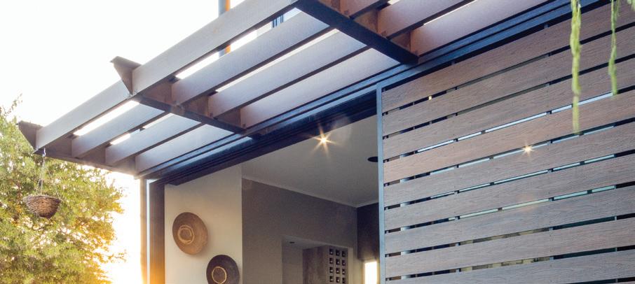
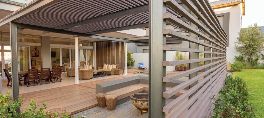
Picture this: a crackling fire pit, comfortable seating, and a backdrop of stunning outdoor decking. Well, you don’t just have to picture it; you can now reimagine outdoor spaces by creating zones that seamlessly blend functionality with aesthetic appeal by using any of Eva-Last’s three superior bamboo composite decking ranges, be it Apex Plus, Infinity, or Eva-tech. These ranges not only add a touch of elegance to entertainment areas, but their unique properties are also designed to withstand South Africa’s harsh climate, requiring minimal maintenance over time.
We all know that outdoor braai areas are a quintessential aspect in any South African home, and with beautiful designs and finishes, you can add tremendous value to any property. Eva-Last understands the importance of this approach, which is where our bamboo composite decking comes in. It allows you to match unique aesthetics, withstand biodegradation, and is no match for stains – requiring only basic cleaning. What’s more, this innovation is especially safe with its slip-resistant nature.
While Eva-Last is renowned for its outdoor solutions, our commitment to enhancing living spaces extends indoors. A seamless transition from an outdoor oasis to indoor living area is achievable, courtesy of Eva-Last’s indoor flooring options, which bring the beauty of nature indoors without compromising on comfort. Designed to be fabulous, functional, and forever, Eva-last’s TIER flooring is an SPC (Stone Polymer Composite) flooring that mimics the natural warmth and texture of timber without the environmental impact of deforestation. Simply put, it is luxurious, low-maintenance, and easy-to-install, both highly durable whilst also being heat- and water-resistant – the perfect combination for indoor flooring.
From fire pits to decking and indoor flooring, Eva-Last’s innovative products are designed to make flooring design easier, classier, and more sustainable for the future.
www.eva-last.co.za


With a focus on what makes for the ultimate design across every square metre of the home, SCAPE catches up with thirteen industry icons to share how they each view specific spaces across residential design. Join us as we take you on a ‘tour de chambre’ through unique spaces and rooms within the home. From Ohkre’s exploration of the perfect kitchen, to the living room as imagined by Studio 19, the master ensuite by Bone Design Studio, and even a view from the outside looking in by Fabian + Make, Room by Room is a full tour of the insights into crafting excellent abodes from some of South Africa’s most influential design minds.




With Phillip Nel & Heinrich van Zyl, Ohkre Collective
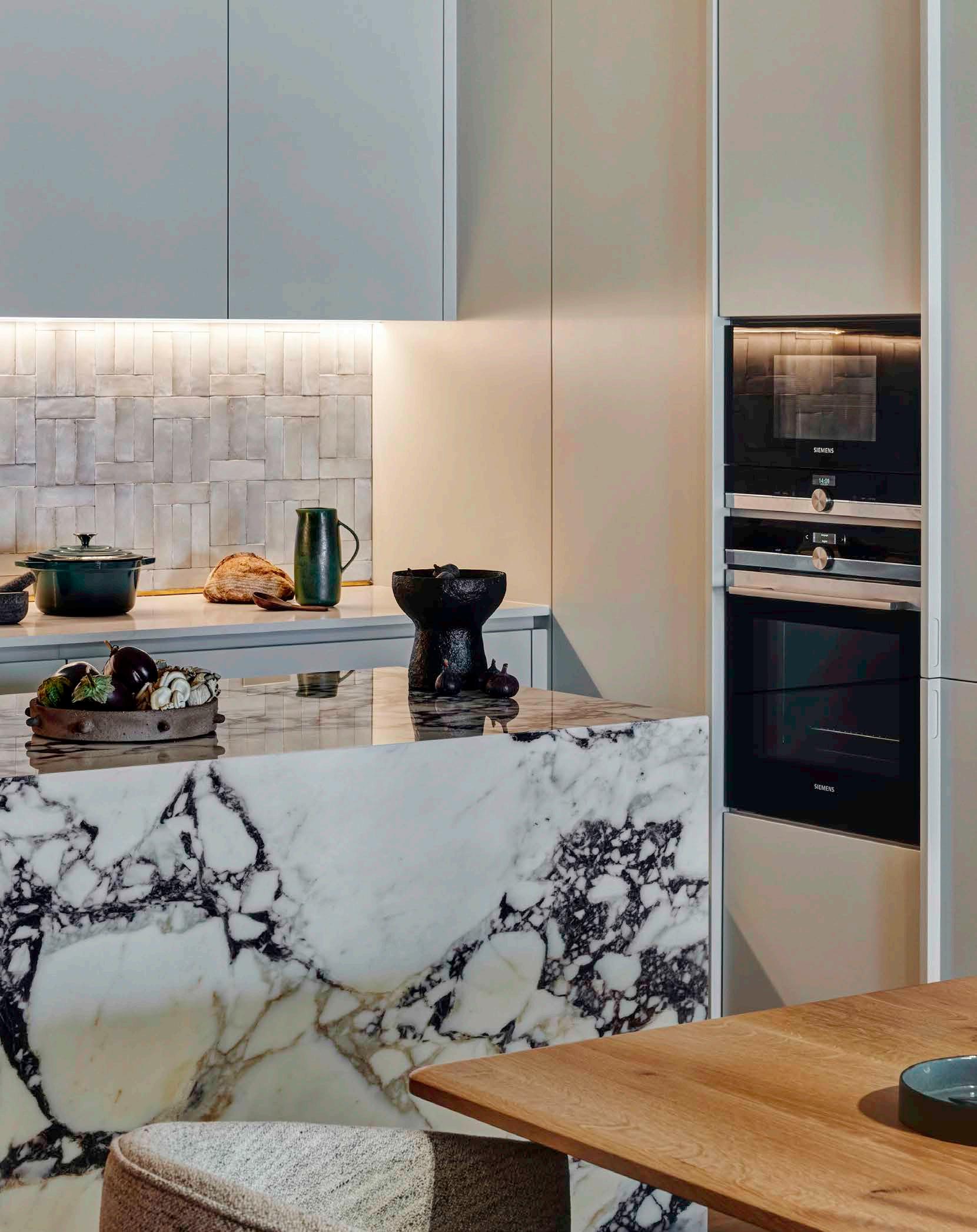
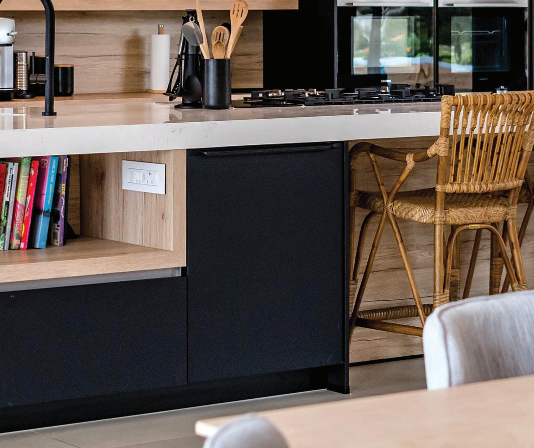
In the world of luxury residential designs, the kitchen isn't just for cooking — it's the heart of the home. The curation of intimate spaces follows a journey of seamlessly blending style with practicality, transforming everyday moments into something extraordinary. For us, the kitchen is no exception and forms a key part of the residential design practice. But what constitutes our ideal kitchen curation?
Fundamental to our approach is achieving a harmonious balance between form and function, which we pursue by infusing our insights with our distinct personal charm. Serving as the focal point of culinary creativity, shared moments between family, and social gatherings, a kitchen isn't quite right without thoughtful layouts, ergonomic considerations, and intuitive functionality. Through meticulous attention to detail and craftsmanship, our idea of the perfect kitchen integrates high-end appliances, custom cabinetry, and ample storage, ensuring both visual elegance and practical efficiency.
As part of the very basics of design, and yet capable of great influence, colours and shapes are instrumental in crafting the atmosphere of a culinary space. Our design ethos embraces a palette of sophisticated hues and playful accents to imbue each kitchen with its unique character. Whether it's the sleek lines of a contemporary island or the warmth of natural textures, every element is carefully selected to evoke a sense of refined luxury that highlights personal style.
Lighting plays a pivotal role in accentuating the beauty and functionality of the perfect kitchen. From statement pendant lights to discreet under-cabinet illumination, the selection of lighting fixtures is guided by a commitment to creating layers of ambience while enhancing visual comfort. Understanding the transformative power of lighting is essential to leveraging it to your advantage – using it to accentuate architectural features and elevate the overall aesthetic appeal of the space.


‘As
part of the
very basics of design, and yet capable of great influence, colours and shapes are instrumental in crafting the atmosphere of a culinary space.'
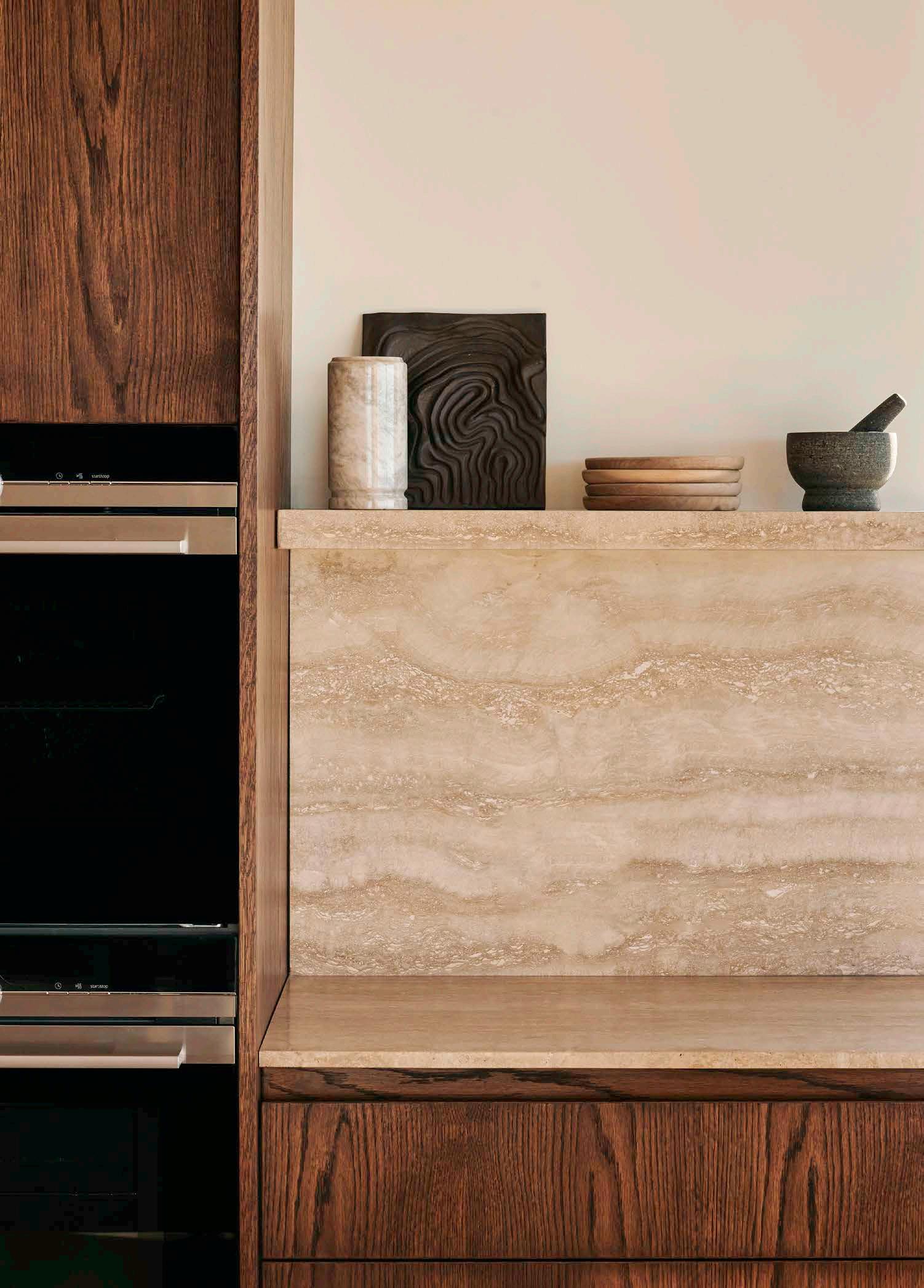
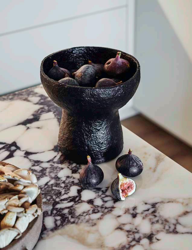
Our approach to selecting materials and integrating culinary innovation is driven by a passion for excellence, an approach we believe helps pave the path to an impeccable kitchen. A discerning eye for exquisite materials, from luxurious marble countertops to meticulously crafted artisanal tiles, ensures that every aspect of a kitchen exudes quality and sophistication. Additionally, the seamless incorporation of culinary technology enhances the cooking experience, embracing state-of-the-art innovations that elevate both efficiency and enjoyment.
Timeless design is the hallmark of every luxury kitchen. Abstaining from short-lived trends in favour of enduring aesthetics, we appreciate clean lines, refined finishes, and understated opulence. Design should stand as an enduring testament to excellence, achievable through a commitment to craftsmanship and quality, ensuring that each space remains captivating and relevant for years to come.
Style, functionality, and timeless elegance – these lay the foundation for the kitchens that exude excellence through every detail. With a focus on creativity, innovation, and superior craftsmanship, our version of perfect is found in the aim to exceed expectations and deliver kitchens that inspire joy and satisfaction for generations to come.

Phillip and Heinrich's brands to watch:


 With Mia Widlake & Debbie Votin, Studio 19
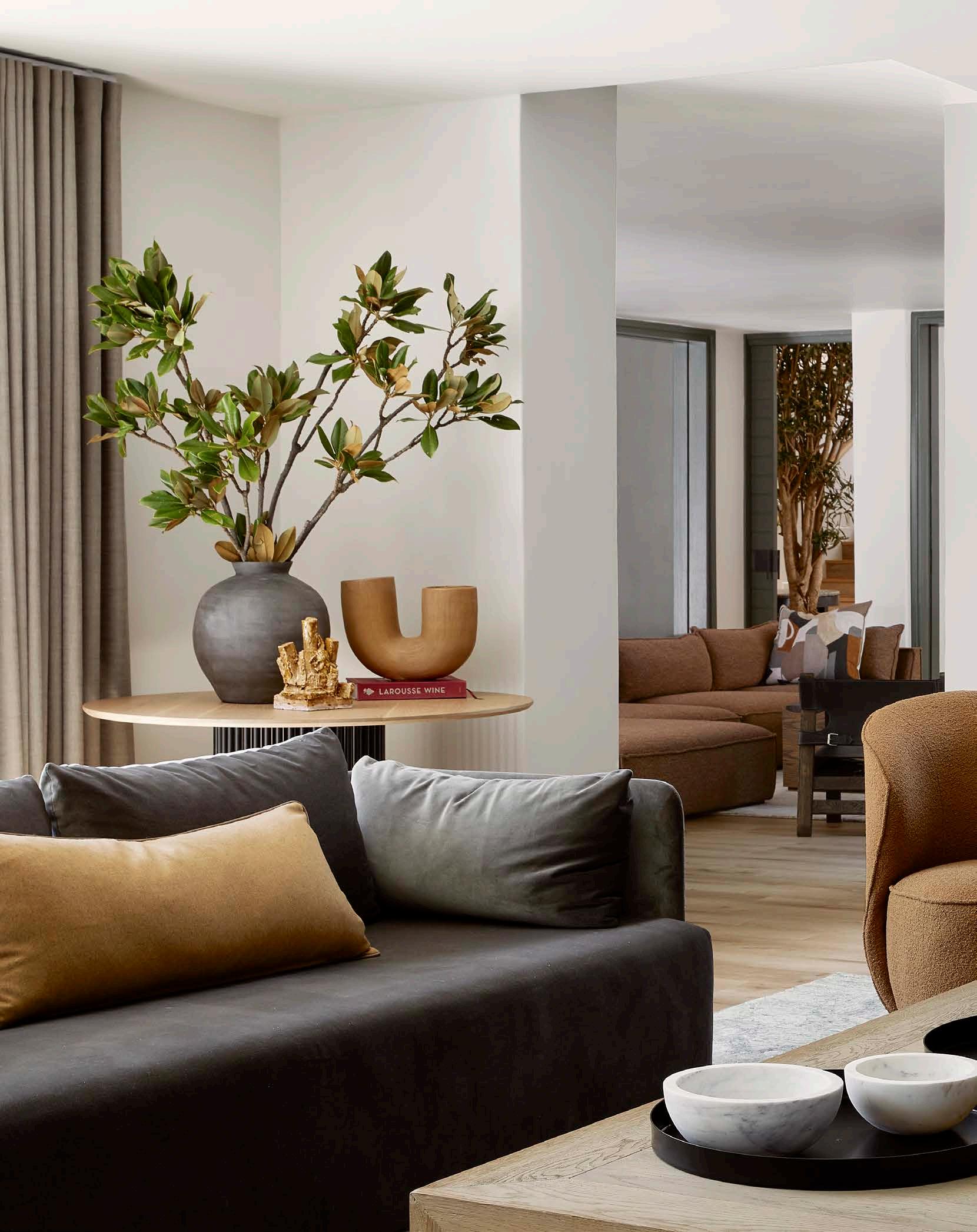
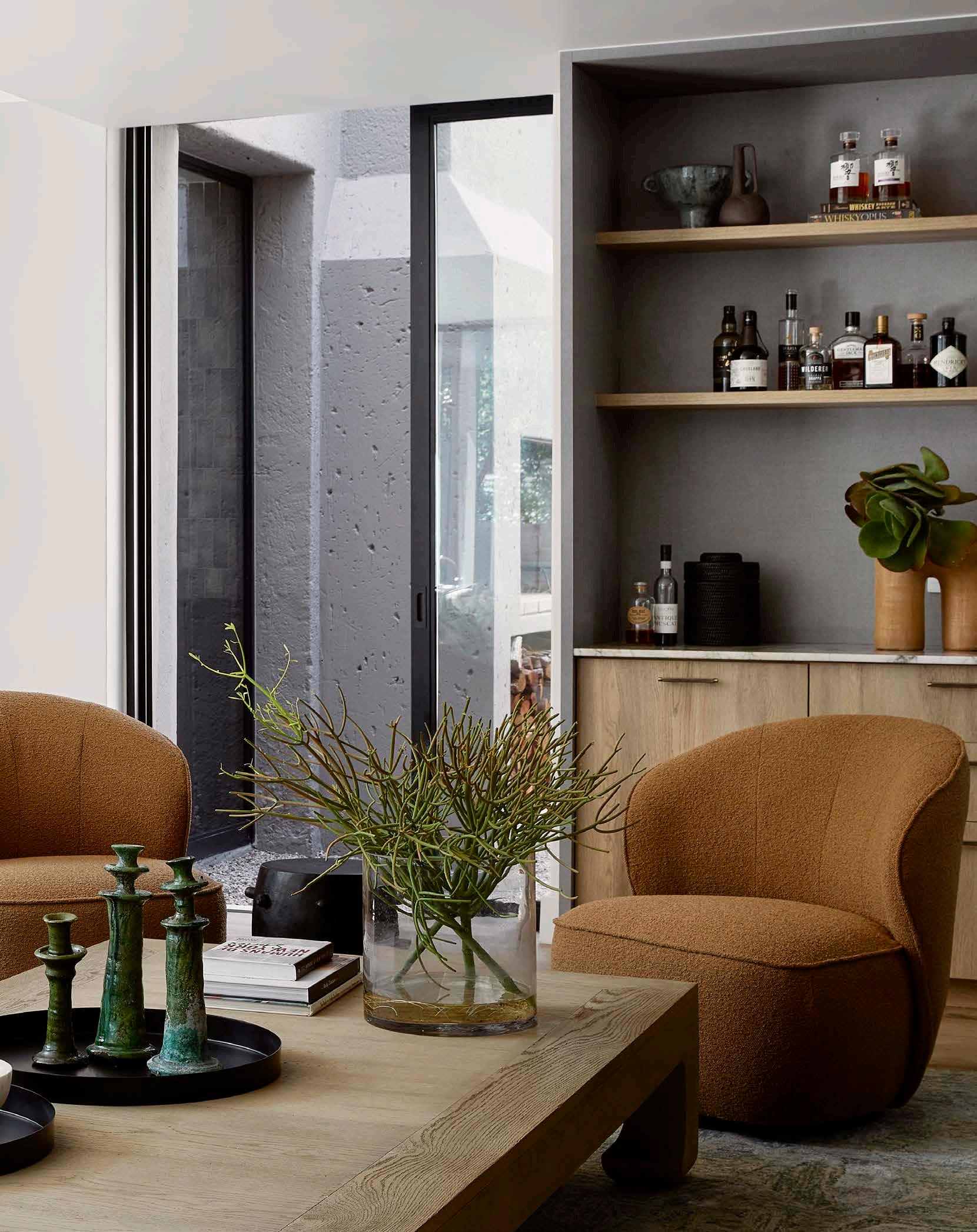
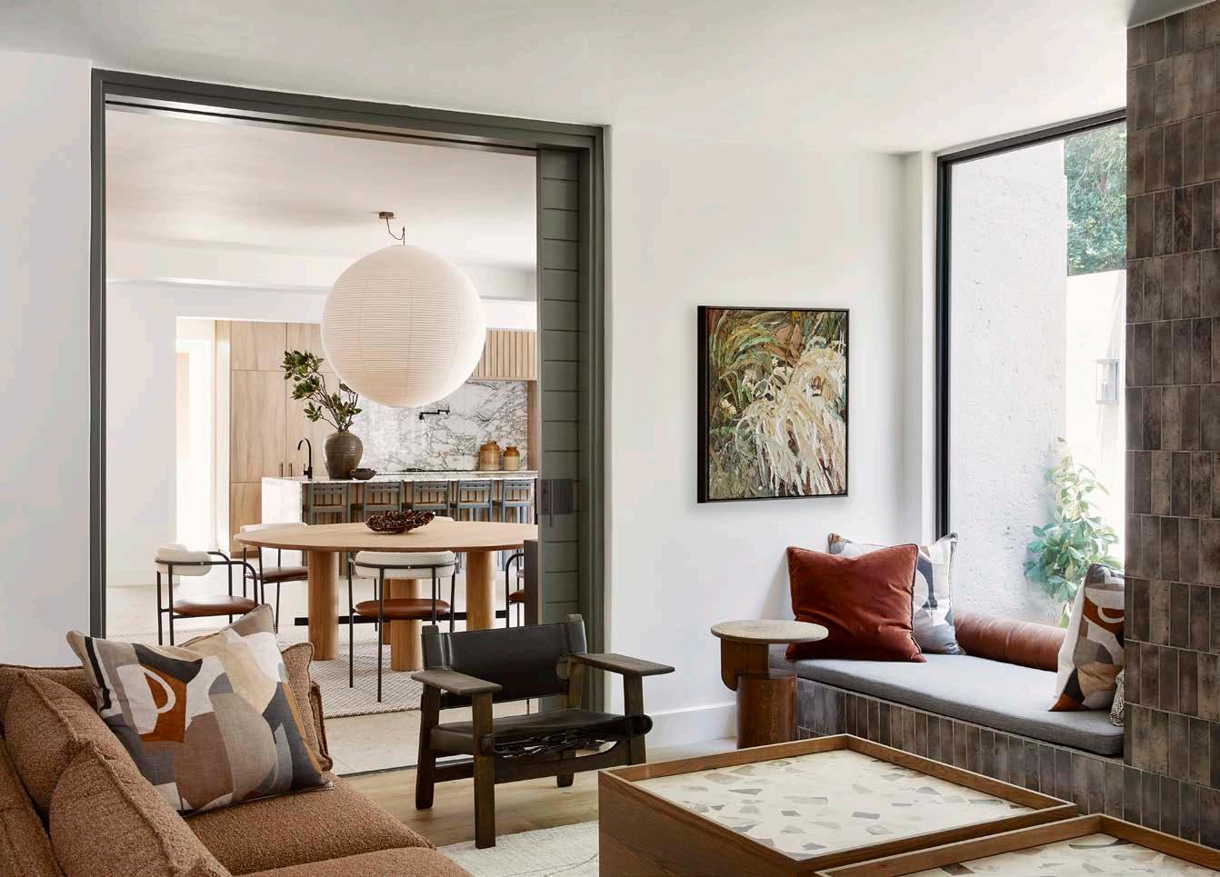
As designers with keen eyes for aesthetics and functionality, the quest for creating the perfect living room has always been an intriguing journey for us. The living room holds a special place in the home – it serves as a sanctuary for relaxation, a space for socialising, and a reflection of personal style and taste.
Channelling equilibrium
Our perfect living room strikes a harmonious balance between comfort, functionality, and visual appeal. It should be a space that welcomes you with open arms, evoking a sense of warmth and tranquillity. This comes through in warm and inviting hues like soft neutrals, earthy tones, and calming blues to create a cozy ambience, while pops of vibrant colours or bold patterns inject personality and visual appeal. Similarly, incorporating a mix of shapes such as curved furniture pieces for a softer look or angular accents for a contemporary feel add an essential dimension and character to the space.
Versatile illumination
The right lighting plays a crucial role in setting the mood of the perfect living room. By combining various sources of illumination, such as overhead fixtures, task lighting, and ambient lighting, a versatile environment emerges which caters to different activities and occasions. Natural light is also a valuable asset in making this space ideal, as it not only brightens but also enhances the overall aesthetics by bringing an element of nature inside.
Mia and Debbie's brands to watch:
Wiid Design, ferm LIVING, Sarah Heinamann Studio, Oggie Flooring, Lemon Furniture, Artmar Natural Stone
 Photography by Elsa Young


When it comes to selecting products and materials for the living room, we have a penchant for pieces that blend mastery of craft with timeless style. Luxurious fabric combinations like velvet and linen exude elegance, while natural materials such as wood, stone, and metal lend a sense of sophistication and texture to the decor. We have found that including statement pieces like a sculptural coffee table, a plush area rug, the odd vintage item, or a striking piece of art can elevate the design and infuse a sense of personality and uniqueness into the space.
In today's dynamic design landscape, certain elements surpass the transient. Incorporating biophilic design elements, such as indoor plants and natural motifs, is one of our prevailing standards that brings a sense of nature and well-being into the living room. Sustainable materials and eco-friendly practices are also continuously gaining traction, which we love, as they reflect a growing awareness of environmental consciousness in design –a must in any room that can be considered near perfect.


Designing the perfect master bedroom involves creating a union between what one needs and what one wants. The master suite is where we begin each day, and where we retreat after a hard or a great one. To accommodate the individual, the goal for the bedroom is to craft a space that serves as a sanctuary under every circumstance, prioritising both leisure and value in every detail.

At the heart of the ideal master bedroom is the mattress, which I view as the cornerstone of comfort. Opting for a high-quality mattress ensures a restful retreat, promoting a good night's sleep. Enhancing this foundation involves layering the mattress with exquisite linen and plush down inners, inviting a touch of luxury to the sleeping experience. Next, the choice of blankets becomes crucial for the perfect experience. Blankets should cater to each season while also introducing texture and colour to enhance the room. To elevate the visual allure, throw cushions should be strategically placed to create depth and intrigue, transforming the bed into a focal point. These additions not only contribute to a divine overall bedroom aesthetic but also offer extra comfort and support.
The importance of lighting cannot be overstated in crafting the perfect atmosphere. Lamps with warm, relaxing hues set the mood, while task lighting near the bedside caters to splendid late-night reading sessions. The interplay of light and shadow also adds a layer of sophistication to the space, making it all the more sublime.
Finally, storage solutions are essential in perfecting a bedroom’s design. Bedside tables provide a convenient home for personal items, keeping the space clutter-free while still contributing to the elegance of the space. These days, cable management should also be carefully considered to cater to everyday devices, maintaining a clean and organised appearance. Built-in cupboards adorned with mirrors serve a classic dual purpose, creating an illusion of depth and offering additional storage.


In essence, the perfect master bedroom is a specially curated haven that meets its owner’s physical, emotional, and aesthetic needs. It invites inhabitants to retreat from the demands of the day, offering a private space for relaxation, while also providing a practical environment for essential tasks. The result is a well-balanced sanctuary that reflects the homeowner's personality and promotes a sense of tranquillity and well-being.

 With Nicola Orpen & Hayley Turner, Bone Design Studio
Photography by Sean Gibson
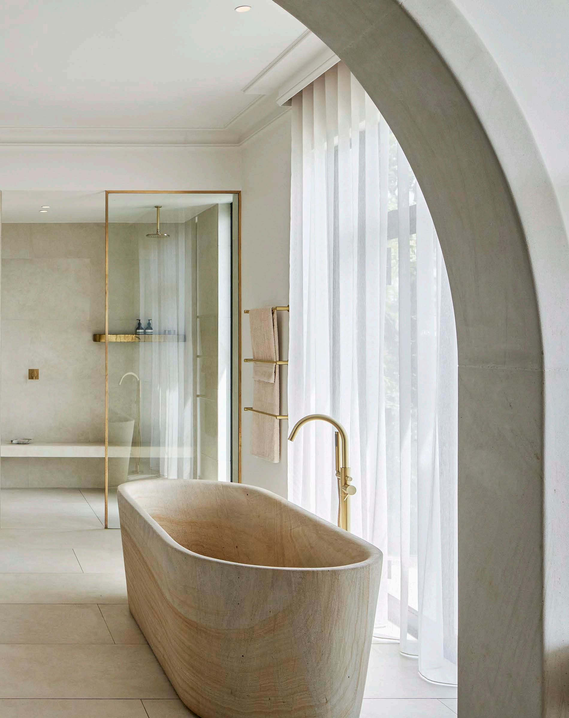
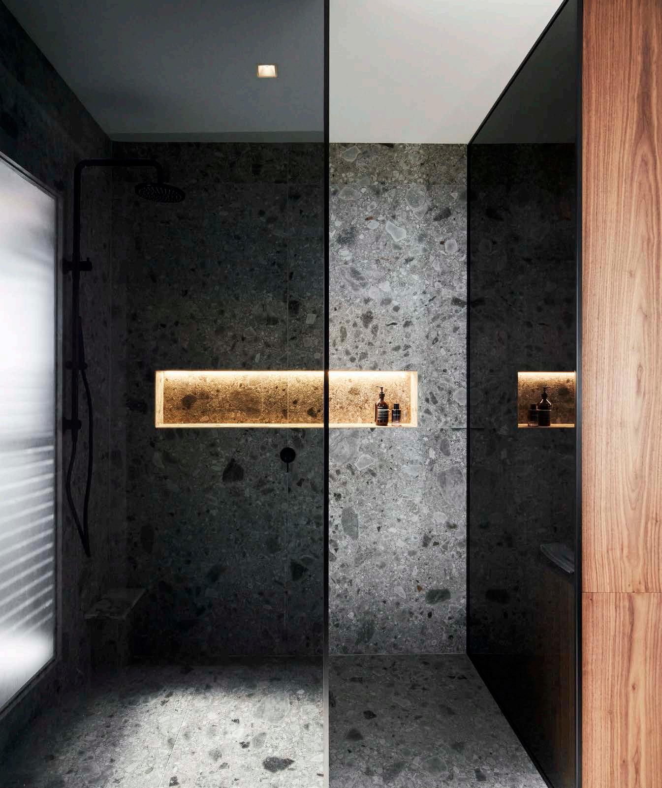
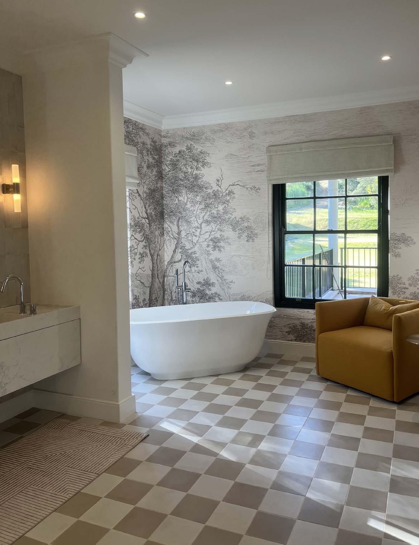
Bathroom design is one of the most challenging areas in the home as there are many material relationships and junction detailing in quite a small space. The balance of material selection, glazing detailing, joinery, and sanware selection need to create a cohesive feel without fighting each other. A perfect bathroom achieves this synergy in the detailing, but also has a feature piece or a point of focus within the space; sandstone carved custom bath, statement vanity, or a cladded WC area.

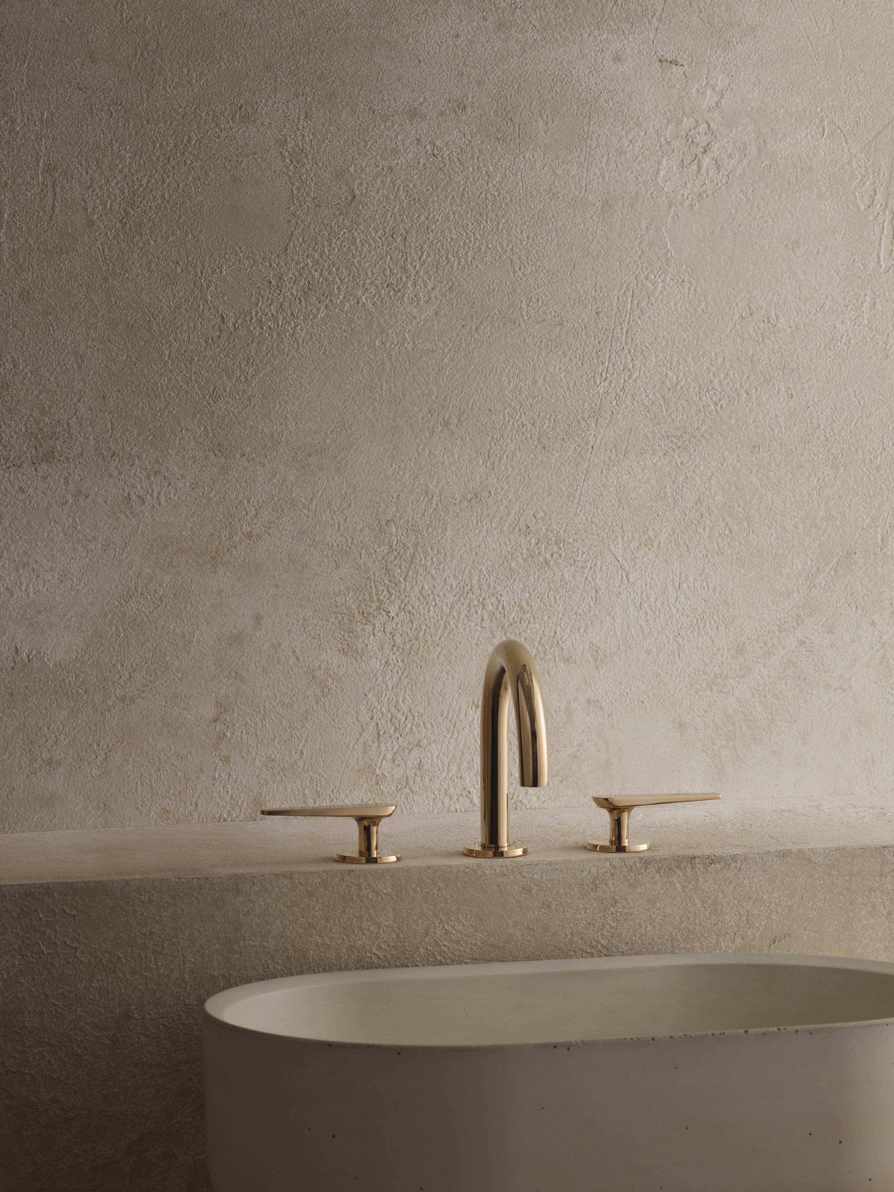
We love the Australian sanware brand Meir, as it uses electroplating for longevity and comes in an array of finishes – brass, black, champagne –which work well with any colour scheme and concept. For vanities and mirrors we always custom design these to fit the space. Integrated marbled tops give an air of sophistication, while marine plywood carcasses are a must for practicality. With timber drawer fronts on soft close runners, this touch point becomes a luxurious experience.
What’s in for us this season? Curved showers are a trend we’re happy to see is still around. Small stacked format wall tiles with larger natural stone floor tiles create a classy complement. Graphic wallpapers for powder rooms also add an elegantly vibrant atmosphere. Finally, tinted shower glazing such as smoke glass is becoming a popular feature in excellent bathroom design for 2024.

Colour choice is crucial in achieving the perfect mood. When designing a jewel box bathroom, the drama is created through deep tones, such as walnut timbers, graphic marbles, and darker shades of paint. When trying to create a more classic space, our favourites are ivory tones with oak timbers, Arabescato marble, and brass sanware fittings to achieve a dateless finish.
The best lighting design in the bathroom needs a combination of overhead downlighting and side mirror lighting for daily tasks like applying makeup or shaving. The fitting selection, however, is where we like to have some fun and enhance the bathroom concept. We love brass fixtures with reeded glass for an eclectic feel, while back-lit LED lighting on the mirrors makes for a more contemporary aesthetic. A feature pendant in a guest bathroom is also an impactful design choice.


With Sarika Jacobs & Quintin Gilman, ARRCC

Our ideal entertainment area in the home is undeniably one with a distinct character and which reflects an edited approach; where palettes and integration of various elements elevate gatherings and foster memorable experiences. While prioritising comfort and practicality, the perfect indoor entertainment area includes raw minimalism and organic materials paired with sophisticated detailing and layered luxury.

Lighting and high-tech media integration are essential for top-quality entertainment spaces. LED strip lights, pendant lights, or dimmable overhead fixtures contribute to mood, along with high-definition TVs and cutting-edge surround sound systems for ultimate multimedia enjoyment. These should, of course, integrate effortlessly within the interior architecture of the space. The goal is to create a sensory experience that serves as a backdrop for the delights of everyday living, resulting in inviting environments.
Only the exceptional
Colour and exceptional fabrics and textures strongly influence our design ideals in this area of the home. A varied art collection allows for spaces with a dynamic dialogue between the artworks and furnishings, and the combination of these elements produces inviting and captivating spaces. Multi-functional living zones are excellent because they can offer one spacious entertainment space or separate intimate spaces, and even spill out onto terraces and the garden as a natural extension. We love the inclusion of organic shapes and elegant curves in furniture selections, to balance the strong linear lines of architecture and to create an elegant play of form.
We’re not trend followers at heart, and instead enjoy an approach where a unique design direction is formulated, taking inspiration from various aspects of a site; the location, views, the architecture, and personal style. Custom-designed, bespoke pieces are especially captivating for timeless interiors. This timelessness is ideally generated with neutral colour palettes, quality products, and understated luxury in the design language.
Although we steer clear of trends, certain topics are very in, and we can’t help but agree: biophilic design, sustainability, and wellness-focussed design. What to avoid? All-white interiors and excessive ornamentation.
Sarika and Quintin's brands to watch:
Togo Sofas by Ligne Roset
 Photography by Paris Brummer

What is the conversation that a house has with its surrounding landscape? What ideas does it communicate through its form and materials? How does it positively interact with its inhabitants and with a first-time viewer? This dialogue – the one between a building, its surroundings, and the first experience one has with it – is what shapes the first impression.

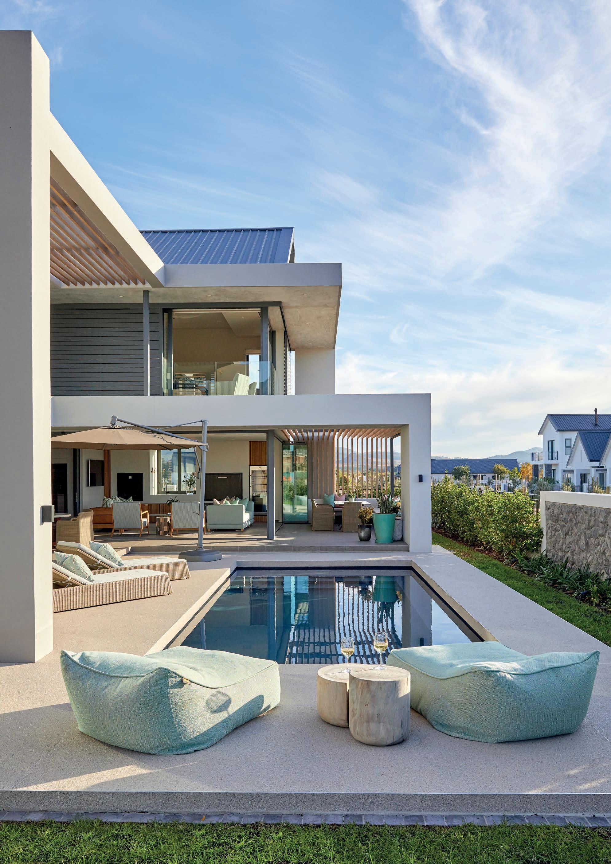
My idea of a residence’s perfect first impression is when key natural and built features are incorporated in the exterior of the house. What makes this an epitome of perfection to me is when these details are used to offer a peek at the house from the road through the property’s flora, with materials like raw concrete and burnt timber allowing it to blend into its leafy site. An opening in the street view of the façade also allows a noteworthy first impression when giving a glimpse of features such as a planted courtyard at the centre of the house.
A light and delicate roof gives the impression of floating over minimal wall elements, masterfully echoing the natural canopies of its surroundings. Verdant greenery can be used to see through and reflect off the surface of the glazing, firmly planting the house into its surroundings. The architectural language should be simple and understated, making for a perfectly seamless exterior design. The first impressions of the house can thus accomplish a clear expression of its core values upfront: harmony with nature and simplicity.
Another exterior I find achieves my ultimate goal for a first impression is when a collection of bold cubic forms are balanced precariously on a planted earth bank. This is best incorporated when the forms take their cue from slopes and rock formations in the background – a brilliant way of using the natural landscape as inspiration. The simplicity of the forms works well when contrasted by the complexity of their arrangement and the variety of natural materials used in symmetry with its surroundings, such as stone, raw concrete, and timber. These stylistic choices do not yield to a fleeting first impression; the ideas emerge and interact with the viewer impactfully as they move progressively across the house.
For the first encounter with a home to offer an experience that is built to last, a holistic approach to integrating the natural with the man-made is essential. It is in this that a memorable, visceral reaction is inspired – the ultimate achievement of any first impression.
Ross's brands to watch:
Studio Masson
Newport Lighting
Your Space Bathrooms
WOMAG
Cabinetworks


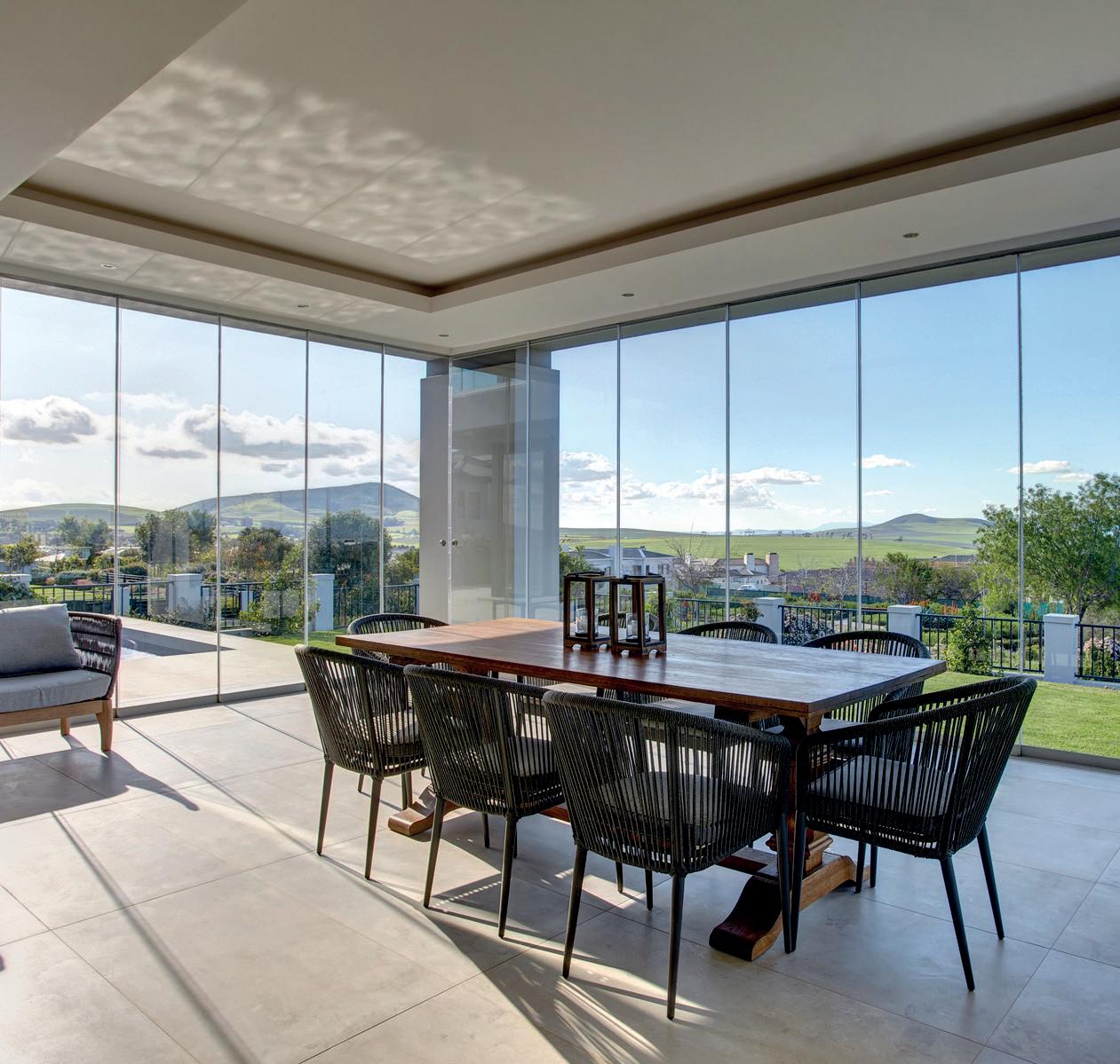

With Lauren Bolus, Fabian + Make
The residential façade’s purpose is traditionally threefold: to provide protection from the elements, to add structural support, and to create the all-important first impression of the structure. While the practicalities of the façade are evident, it’s the visual design aspects that generate a perception of and reaction to any home. This is what brings the dweller (and us architects) the most pleasure during the design of the façade, and something that is achieved through consideration of the utmost care.
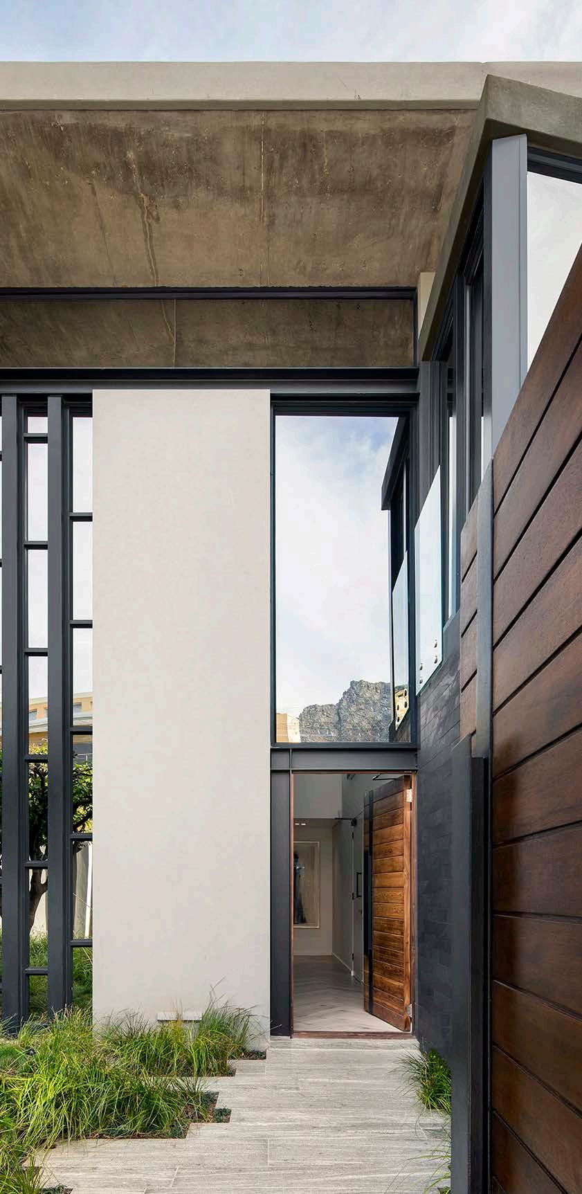
A home’s façade is a statement expressed to its surroundings, and I believe the perfect façade should offer an experiential factor. The entrance, in particular, serves as a preview of what awaits you inside (and should not be excluded when considering the façade), setting the opening tone for the story beyond. Façades should strive to create a peak in interest in either the glass design or the concrete; something that is connected to the materials and concept of the house within. The ultimate exterior incorporates unique elements to generate intrigue. Consider a bold handle for the front door –something in brass, marble, or steel is always a winner – to make the welcoming experience a distinct threshold between outside and inside.
When it comes to colour, I opt for different tones of neutral hues, reserving the more daring colours for the interior finishes. A remarkable way of incorporating colour gently is through the use of planting and greenery which adds life (along with that subtle splash of colour) to the façade – a style choice that brings value beyond the visual.
Designing the ideal façade ultimately comes down to the choice of materials. The same material can be used in different textures, as is often achieved with stone: combining polished, honed, and brushed finishes in the same space provides contrast and curiosity. Natural stone allows for finer details that cannot be achieved with composite stone and thus makes for a façade that reaches these expectations of excellence. As an alternative to stone, Lunawood is amazing for cladding, both vertically and horizontally.
Lauren's brands to watch: Lunawood cladding, Off Shutter Concrete products

A combination of smooth concrete, textured concrete, and textured painted surfaces (like trowelling vertical lines into painted surfaces) can also add to the spirit of a home’s exterior with great effect.
Material choice not only contributes to texture, but also to shape. Curved off-shutter concrete can create striking new shapes, and a trend which is still relevant and effective for this is fluting – with every material from timber to marble. Rectilinear structures are no longer the only option for a fabulous façade; it’s time to make way for curves in all the right places.


@fabianarchitects_makestudio www.fama.co.za




Reliability is at the heart of our industry, and our Professional range is no different. Product innovation coupled with our value added services gives you a distinct advantage.
Our complete coating system, spanning preparation, trim, wall and textured coatings, is designed to ensure guaranteed product performance and value from start to finish.
All Plascon Professional products with the Ecokind logo have VOC levels within the GBCSA standards for Green building ratings.
Designed for professionals. @PlasconSA
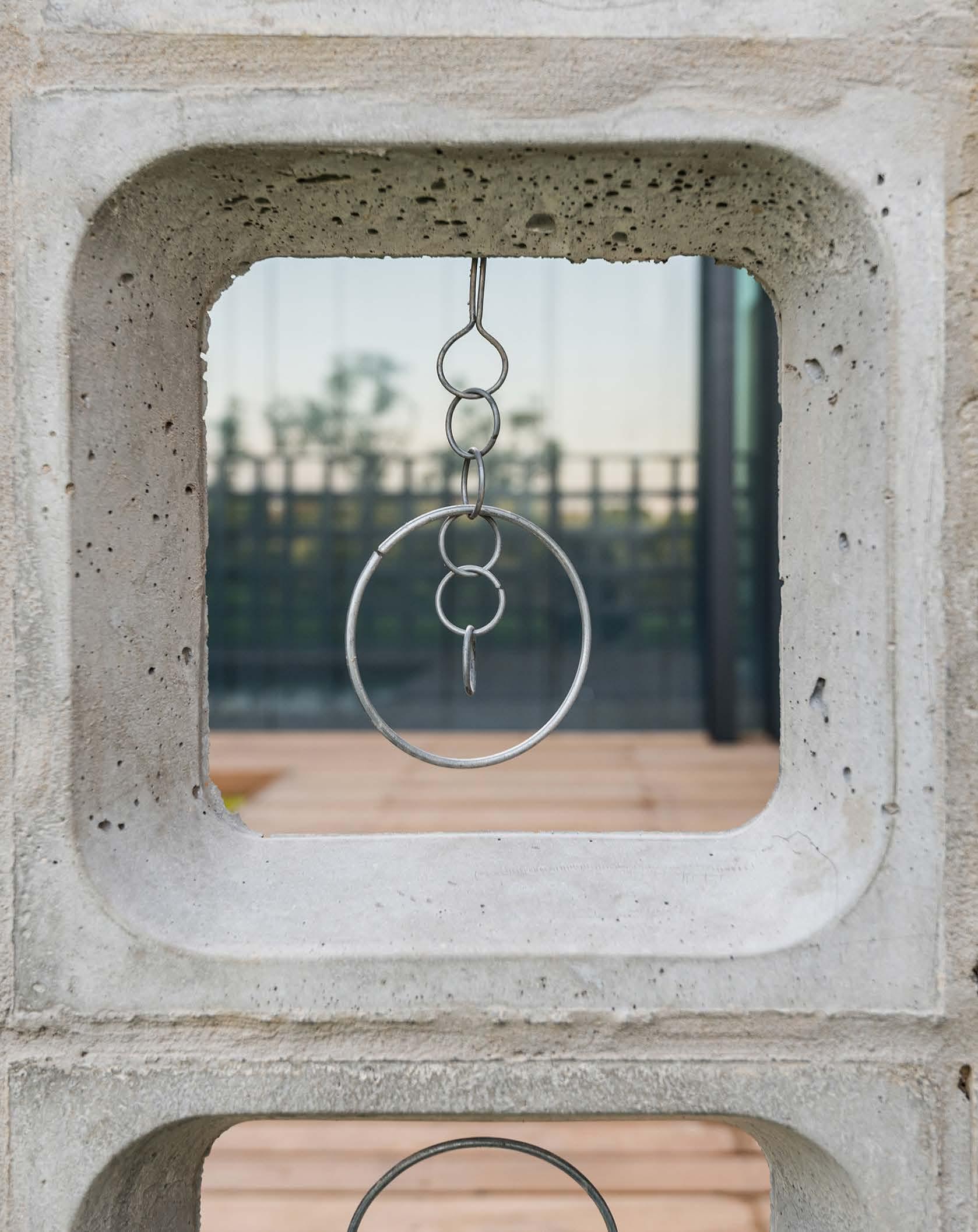
In a country blessed with abundant natural beauty and a vibrant outdoor culture, the significance of well-designed outdoor leisure and entertainment spaces cannot be emphasised enough. My design philosophy is rooted in the understanding that outdoor spaces are extensions of indoor living areas, seamlessly integrating architecture with the surrounding landscape. In South Africa, where outdoor living is ingrained in the cultural fabric of its communities, I believe in elevating these spaces beyond mere utility, transforming them into places of relaxation, socialisation, and inspiration.

Corobrik
Wolkberg Casting Studios
Kalki Ceramics
Tilt Screens
Fenster Aluminium
Zuberi Flooring
The ultimate outdoor entertainment area for the home has a deep appreciation for the diverse natural landscapes that define South Africa. The space should be carefully considered to celebrate its unique surroundings. Thoughtful site analysis and strategic placement of amenities make it possible to embrace views, optimise natural light, encourage passive heating and cooling strategies, and create seamless transitions between indoor and outdoor living spaces.
Reflecting personality in a space is essential, best done, I believe, by incorporating warm earth tones and natural materials to respond contextually through architecture. This allows the space to evoke a sense of balance between the built fabric, and surrounding landscape, while bold hues and geometric patterns aim to emphasise and relate back to the homeowner’s identity.
Central to my idea of the perfect outdoor space is the concept of versatility and adaptability. Understanding that life is dynamic and multi-faceted, whether for entertainment or leisure, excellent design should aim to be flexible, accommodating a wide range of activities and functions.
Architecture plays a pivotal role in enriching lives by fostering connections to our natural surroundings. By redefining these spaces through carefully considered design, cultural sensitivity, and environmental consciousness, the perfect outdoor environment not only relates to style, needs, and lifestyle; it encourages a deeper connection to the world we inhabit.


Midrand Branch |


Tel: +0861-358-437 (FLUIDR)
Cape Town Branch |
Tel: +021-982-3546
www.fluidra.com
jnascimento@fluidra.co.za
RESIDENTIAL &
Learn
RELIABLE PERFORMANCE.
DEPENDABLE SERVICE.
Get growing with Hunter’s best-in-class commercial irrigation solutions! Our highly efficient rotors, valves, and controllers use cutting-edge, water-saving technologies to ensure landscapes thrive while keeping costs down. For time-tested products, world-class service, and profitable relationships, partner with Hunter.

Centurion Branch |
Tel: +012-661-4561
Nelspruit Branch | Tel: +013-741-1292/3
Louis Trichardt Branch | Tel: +015-516-6841
Bloemfontein Branch | Tel: +051-432-7319
Durban Branch | Tel: +031-569-2215
Cape Town Branch | Tel: +021-551-0790
IRRIGATION | Built on Innovation®
Port Elizabeth Branch | Tel: +041-581-8987
Windhoek – Namibia Branch | Tel: +26461-237-203
National Tel: +0861-TURFAG (887324)
www.turf-ag.co.za sales@turf-ag.co.za

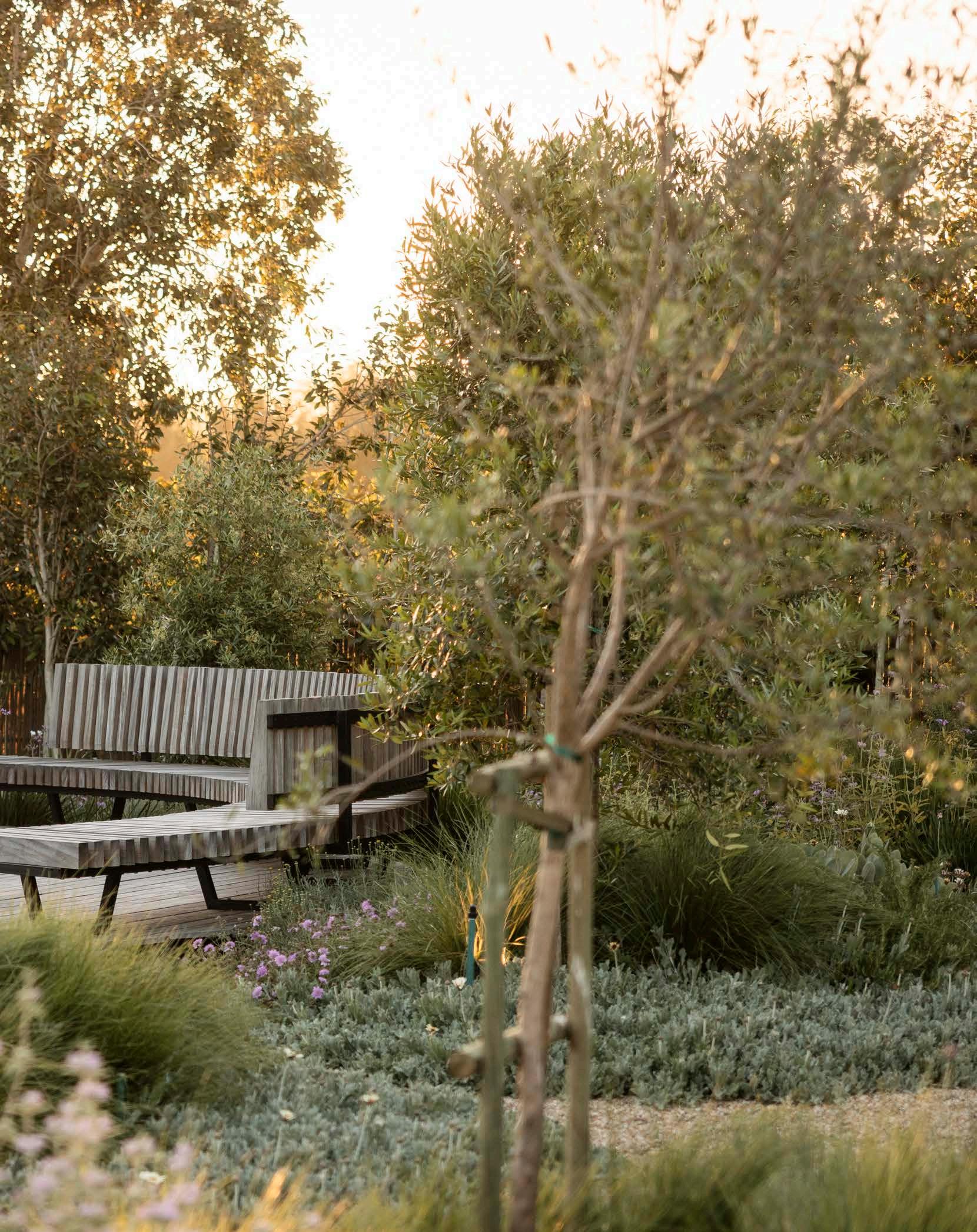
Aperfect residential garden is, of course, subject to every person’s taste and needs. What might be perfect for one person changes for the next. For me, the perfect garden is about understanding the ideal use of space and focussing on what will have the biggest impact. From plant palettes and materials to key features and use of lighting, this is a walk through my dream garden.
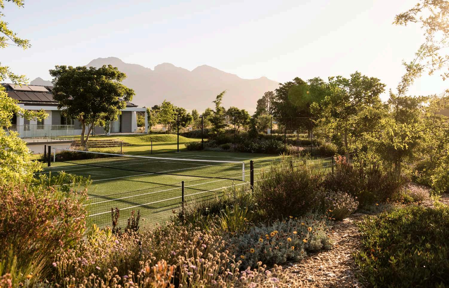
Plant palettes are informed by a number of factors: home and garden style, colour palette, and height and form requirements. Despite these logistics, I think the best approach to plant palettes is to keep them minimalist, as this offers a more confident and impactful design outcome. Speaking of palettes, go-to colours on my list right now include grey and white, with yellow for a modern pop of colour.
At the moment my favourite materials for the garden include solid granite stone – a versatile and strong option which works well in a stone wall for a lovely natural shape and texture. I also love using untreated garapa hardwood and timber lawn steps, walkways, pergolas, and benches. And then there is the classic klompie brick. It even works for raised planters, which I recently discovered.
When it comes to lighting in the garden, my favourite aspect to focus on can be summed up in two words: golden hour. Curating a space which highlights these times of day are essential for my perfect garden. I find achieving this is done best with a combination of both lightweight and mature trees in strategic spots to let the light in just right. Ultimately, my perfect garden is the epitome of a retreat – the part of the home that feels like a holiday! The romance of a hammock, the ambience of warm lighting at night, an unpredictable planting island, it’s all about the invitation to work a little less and enjoy more nature.


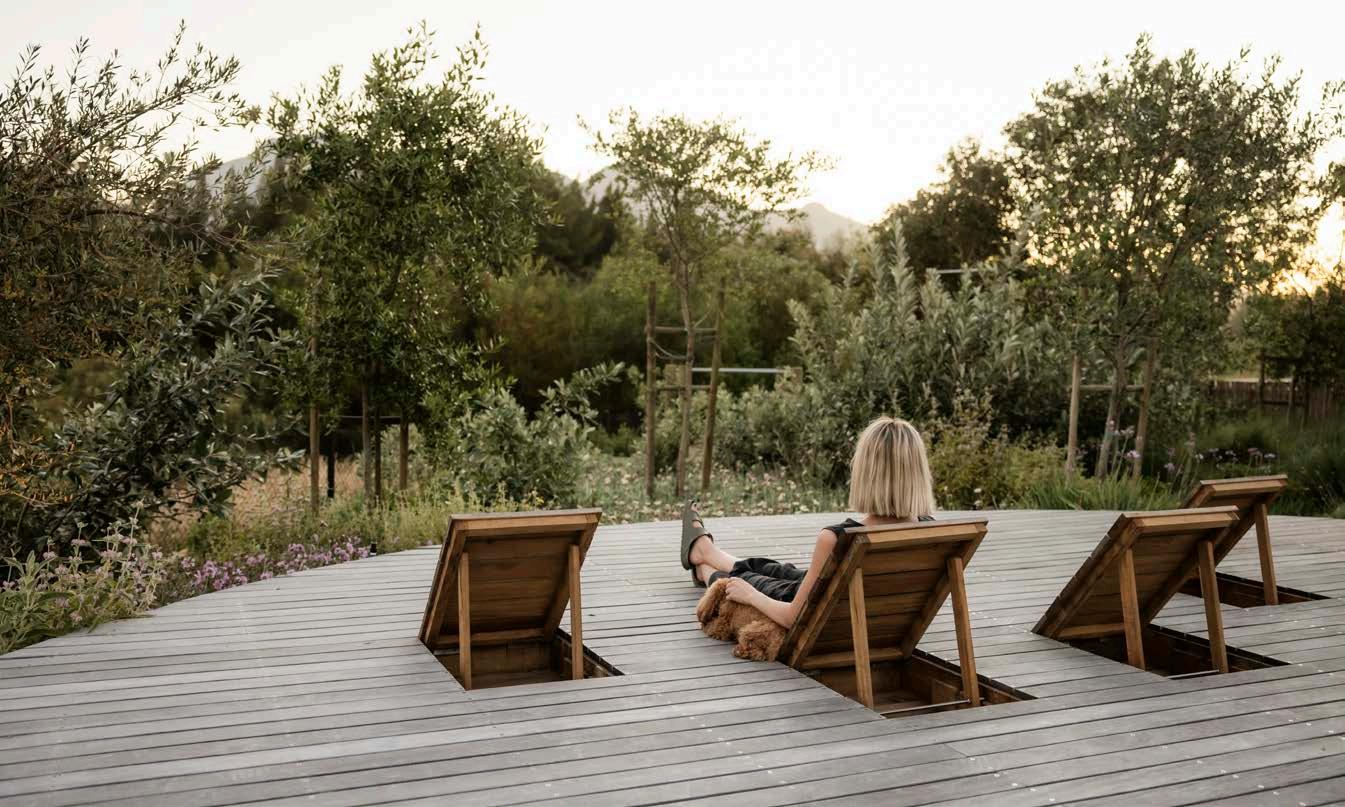
Josephine's brands to watch:
Stonecast, Plaisir du Jardin, Bloc Outdoor, Revelstone, Lanes Ceramic Works, Hoi P’loy, Spazio Lighting, Indigenus, Trees South Africa Photography by Rebecca Ann Raw Photography by Paris Brummer
 with Bryce Henderson


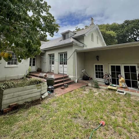
On the many walks through my neighbourhood with my dog, I was always drawn to a dilapidated house peering through overgrown shrubs and trees. Upon first discovering it, I was working with an agent in the area viewing homes that weren’t ticking many of my boxes... until she called me about this one. When I had the opportunity to view it off-market, I walked in, and despite the holes in the roof, rotten floor boards, and smell of damp, I knew this would be a magnificent project. Before

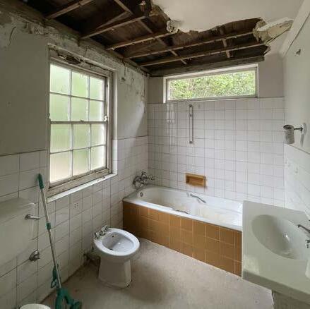
Heritage building turned home
Woodsprings House plays a significant role in the history and heritage of the greater Newlands area. It was believed to form part of the original red house estate, of which J.M. Hiddingh is on the title deed. The goal was to restore the original fabric while injecting new life and a modern flow of living. The reality of tackling a heritage building is often the neglect, as was found in Woodsprings, but that was only further motivation to tackle the project. Additional square metres needed to be added, but my approach was that the new extensions should not predictably blend in with that deemed part of the heritage structure. Instead, I wanted it to stand in contrast to the original fabric, highlighting the story of the building.
The main challenge, albeit the reason I was drawn to the property, was its heritage status. There were hurdles to clear before my design intentions made it across the line, but it was well worth it when the end result was a harmonious link between the restored heritage of the main house paired with the contemporary contrasting pavilion at the back. As the process had to be sensitively managed, there were several design iterations and changes after engagements with heritage stakeholders. But once finalised, construction ran in one phase over 14 months under close monitoring by a heritage practitioner.
Ode to materiality
It was essential to me that the materiality of the project in the core of the house remained true to its era. I tried as far as possible to restore and renew the original and existing materials to maintain this essence of the house’s past. However, the extension required something new, such as the honed granite floors with a timber off-shutter ceiling. Although a modern change, the choice of materials still pays homage to the original Oregon pine flooring.
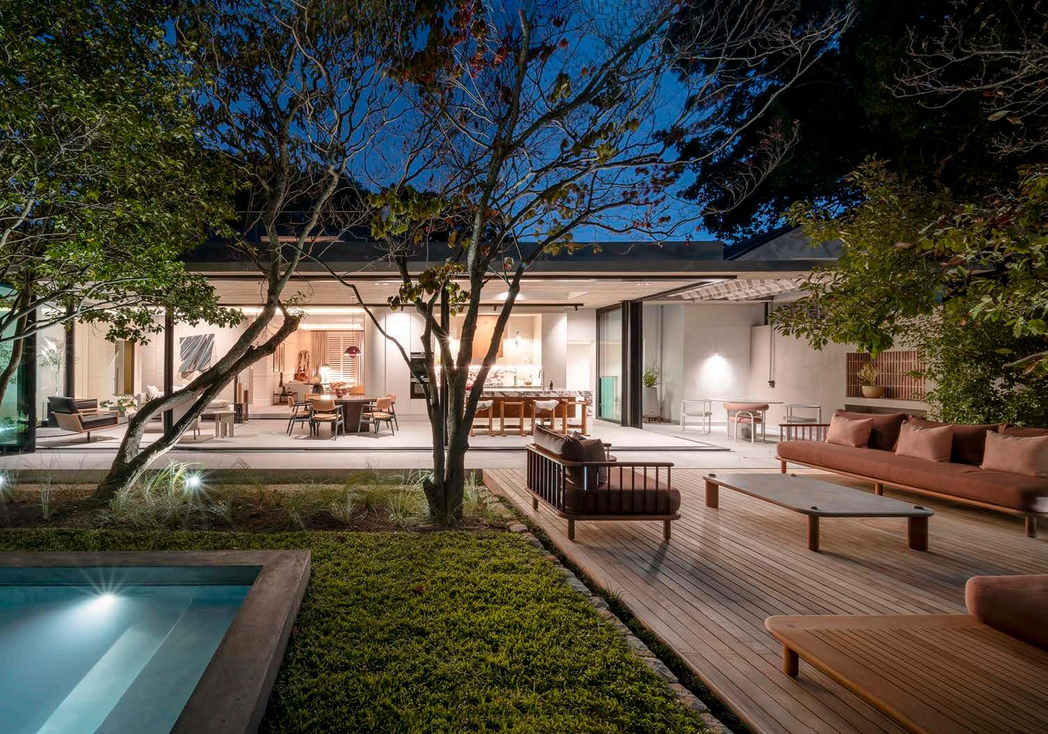
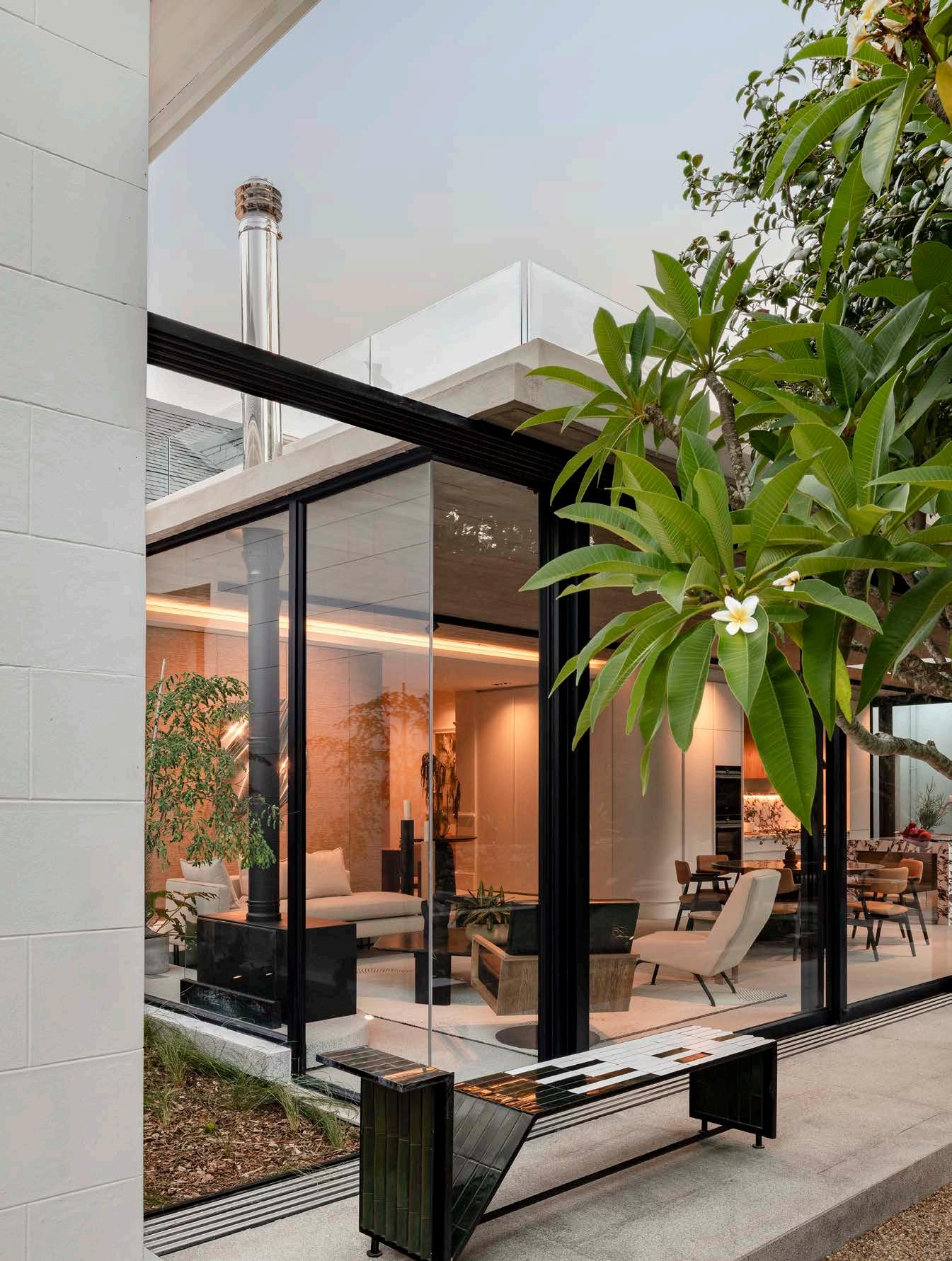
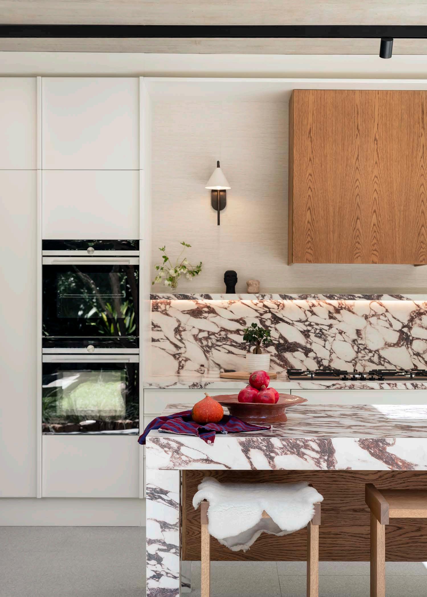
When viewing the property, I saw through the large, unruly garden to the trees that had been fighting for sun between the shrubs, naturally forming sculptural trunks. I knew the design had to capitalise on the feeling of being in nature, despite the urban proximity. The original house lacked this flow to the outside, and so the idea for a glass ‘viewing box’ ignited. My favourite part of the house? The open plan living area. This space acts as a view finder to appreciate the details through glass courtyards while the newly located living area seamlessly blends into the garden.
Being my own client was daunting – when designing for clients you feel a sense of confidence that seems to lapse when you need to make personal design decisions. However, the freedom to design what you want and with whatever materials you like is truly exhilarating and liberating. And still, with it comes an immense responsibility to yourself and the project, requiring you to set boundaries for yourself and the project to ensure the process takes a house and turns it into a home. Once you can appreciate that, there’s no looking back.


On a historic site on the corner of Cape Town CBD’s Bree and Strand Streets stands The Barracks – a building with a fascinating story dating back three centuries. The Barracks was originally a warehouse, but when architect and heritage specialist Gabriël ‘Gawie’ Fagan accepted the commission to restore it, the potential grew into that which catered for the area in a modern way.

This rehabilitation endeavour began when the developer commissioned Gabriël Fagan Architects to restore the site’s heritage significance while transforming the building into commercial and residential premises. By referencing styles from the 1880s, the design maintained the building’s façade aesthetic while bringing a touch of contemporary living that revived the structure. All the authentic heritage fabric was retained, with old yellowwood beams and floors salvaged to showcase the history of this landmark.
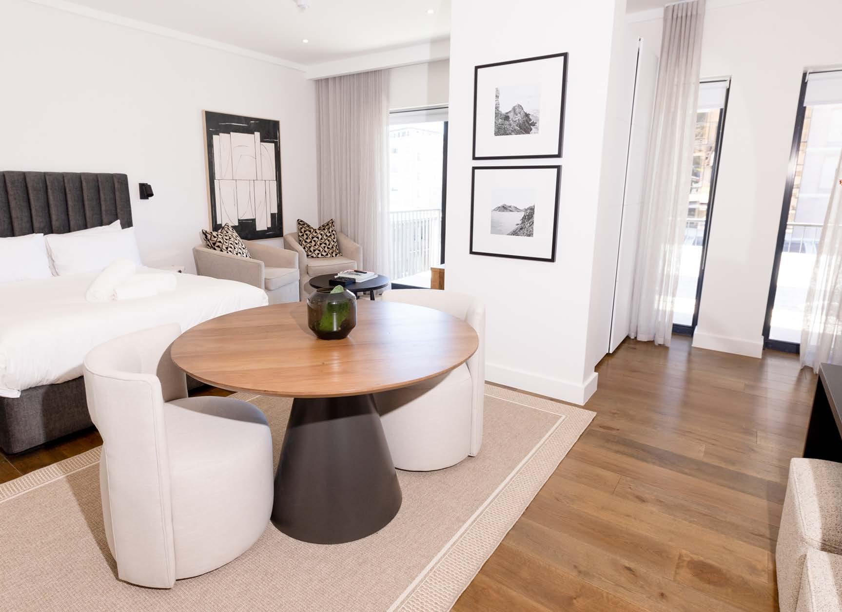
As the development prepared for Phase 2 of the project – to realise the residences of the building’s new objective – Inside Projects was approached to offer their expertise. The scope of the job included casting a new concrete slab over the existing heritage building, which provided the springboard to create parking, three floors of apartments, a rooftop Wellness Centre, pool, and garden. Completed in 2023, The Barracks now offers 66 micro apartments with a combination of one- and two-bedroom units. A ground floor retail area is populated by top-class vendors, including coffee shops, restaurants, and upmarket stores, providing residents with easy access to a cosmopolitan lifestyle – successfully achieving the development’s goals.
The turnkey service that Inside Projects provided included interior design and build services. Along the way, they faced unique challenges due to the micro apartments' limited space, but persevered to arrive at the perfect solution. Space was optimised through strategic design choices, including importing compact kitchens, integrated desks, built-in storage units, and wall-mounted bathroom vanities and mirrors. Faced with the post-pandemic economic downturn and rising construction costs, Inside Projects was also tasked with finding creative solutions to identify alternative products that balanced costeffectiveness while maintaining quality standards.
The project adopted an innovative contract structure, moving away from the traditional single main contractor model. Inside Projects worked alongside the 'shell and core' main contractor, specialising in the construction management of the white box apartments. This unique setup ensured the developer received quality material and delivery throughout the white box apartment construction. From finishes and fittings to equipment and joinery, their contribution was pivotal in the journey which gave The Barracks a fresh start.




 Photography courtesy of Stretch Architects
‘I have no idea where this will lead us, but I have a definite feeling it will be a place both wonderful and strange.’ We can’t say for sure, but we sense that the mirrored-living adventure of Stephen Hitchcock and Dave Long began with a similar sentiment to that of Twin Peaks character Dale Cooper. To build a home ground that catered for both their families, the directors of Stretch Architects embarked on a journey that is not only a testament to their friendship but also to their knack for innovative city-life solutions. This is that story.
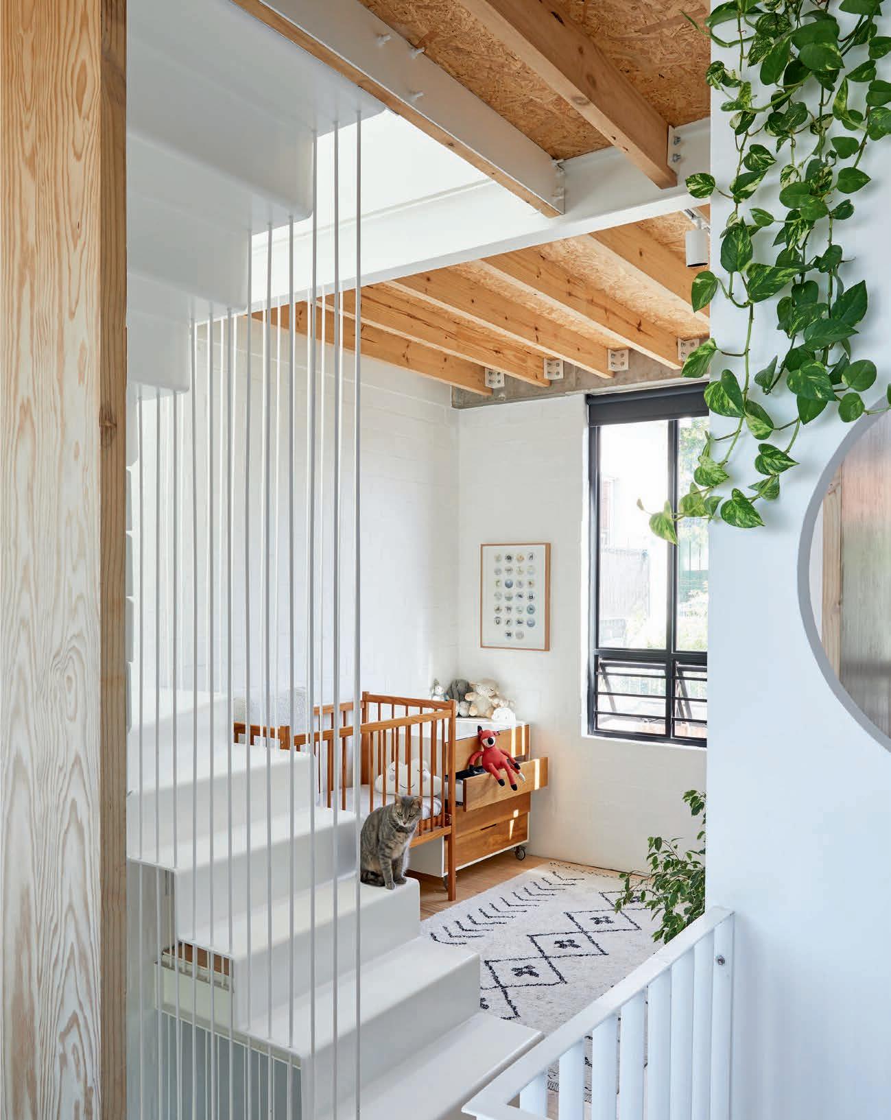
Living in the city has become increasingly unaffordable, and building or buying a home is near impossible. As young architects, Dave and Stephen challenged themselves to figure out a way to buy and build in the city on a small budget. Around the time they were looking for a solution to this problem, the City of Cape Town introduced new bylaws to encourage densification – two dwellings could be built on one property without requiring special permission from the city or neighbours. This meant that one piece of land could now accommodate two families, giving them the chance to pool their collective resources as two couples.
So, they decided to acquire the plot together and divide the costs of construction. You could say this was meant to be, as they had always appreciated community and teamwork. Twin Peaks made it possible for them to create a mini community of shared space, friendship, and family.
Stephen and Dave agree that this usually leads to some of the most interesting design solutions. Since there were no proper founding conditions, while excavating they uncovered an old house that was demolished and 'buried' many years ago. The solution? Underpinning the neighbour’s building, parts of her foundations were left visible in the house – the perfect place to build a couch! Although a total of 189 m², the ground floorplan of each unit measures approximately 37 m², while each of the upper floors is around 29 m². It’s a highly pragmatic response.
Their favourite parts of the process include the opportunity to take advantage of the new densification zoning schemes. Being able to build from scratch meant they could optimise the space and improve their responses to the challenges and restrictions. It also meant that they could embrace the views up to the mountains and down to the CBD and ocean while addressing the tricky privacy issues. By actively dealing with the privacy between the two units, they now have a retreat when needed but also shared spaces when desired.
With a plan to be client-free architects by 2030, the project of selfdesigning their homes is certainly a step in the right direction. All it took was pooling resources, an appreciation for building communities, and the willingness to develop interesting design solutions to share the land.
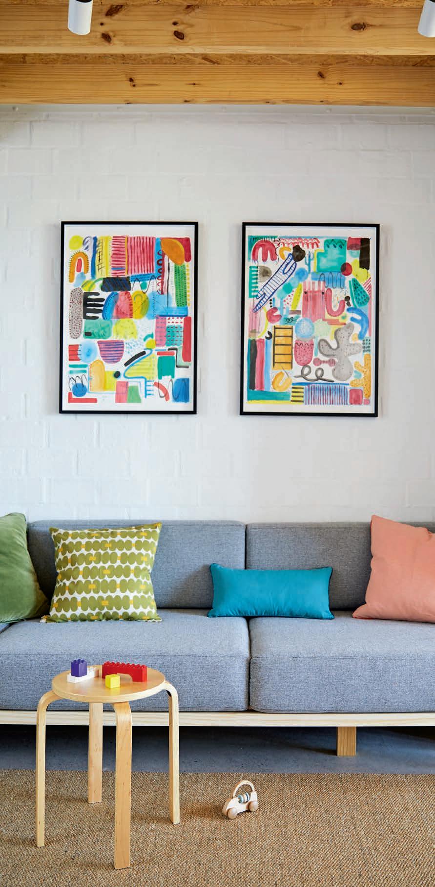


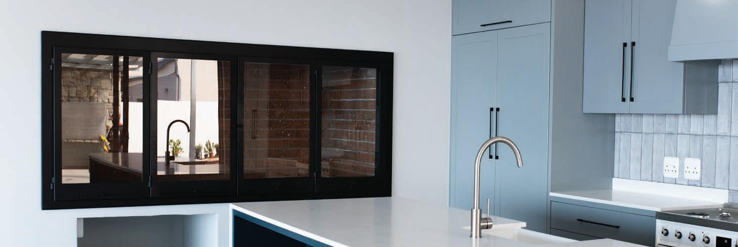
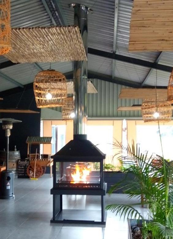
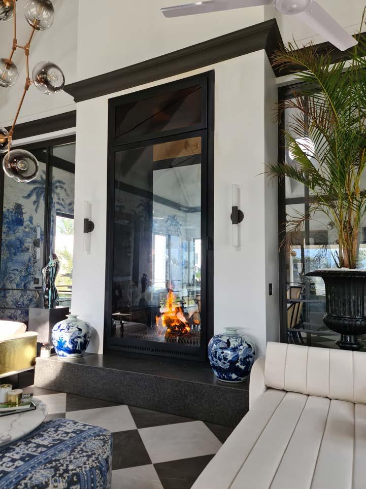


When Johannesburg-based architect and founding director of Paragon Group, Anthony Orelowitz, embarked on the adventure to design his own home, he knew it was going to be a project in reinventing what it means to create a haven in the city. The time had come for him to be his own client and incorporate more than two decades of architectural experience into fostering his family’s well-being. What started as a self-designed residential space became a beating heart and comforting hearth; the suburban sanctuary of the Orelowitz house.
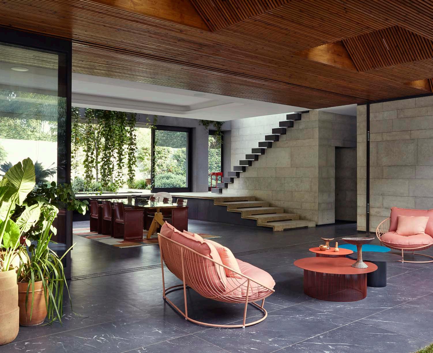
‘In Johannesburg, there is no mountain,’ says Anthony. ‘There’s no sea... Here, you have to create your own habitat.’ That was the basis of his approach to Johannesburg’s character when he decided to design his home in the city’s famously forested suburbs. Anthony is primarily a commercial architect; his firm, Paragon Group, is responsible for some of the city’s most significant architectural landmarks. This would be his first residential design in 15 years. Nevertheless, working closely with architect Elliot Marsden and interior designer Julia Day, he conjured a vision that at once perfectly suited the city and presented itself utterly unlike its neighbours.
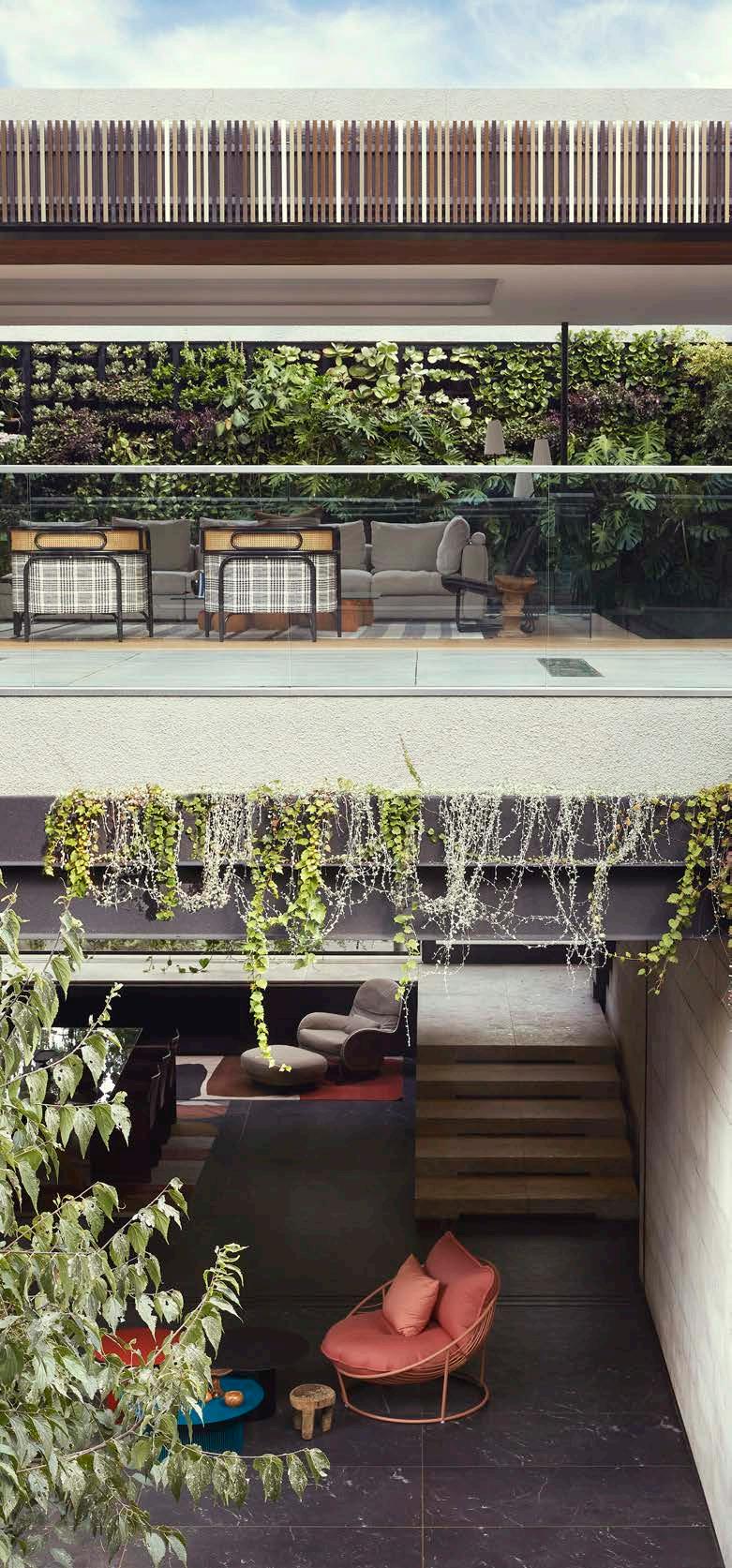
The plot of land Anthony was to build his home on had previously been a tennis court. An unusual setting, the property is accessed via a long driveway at the end of a ‘panhandle’, surrounded by neighbours on all sides. The real luck lay in the fact that this spot was a sort of self-contained island with a huge jungle of trees. Accordingly, to create his personal habitat, Anthony turned to the archetype of the atrium house: an internal courtyard wrapped by the house around all sides, creating a peaceful sanctuary at its heart, stretching itself open to the sky. For Anthony, it is a ‘self-contained oasis in the city’ where he gets to live life like in paradise.
Rather than simply surround the central courtyard, however, Anthony describes the way in which he pushed the landscape through the pavilions and out to the very edges of the site. ‘The ground plane washes through the house completely from one end to the other,’ he says. This creates a type of secondary courtyard, offering private, peaceful nooks under the trees.
Despite its sophistication, Anthony injected into the house a flair for playfulness, found in the way the house rises to create an upper level in the treetops, carefully designed around branches that lean into and over the house. It is the adult treehouse we all want, and which he couldn’t resist. The effect is a sense of space knitted together vertically in much the same way as it is horizontally, drawing you up to the terraces as much as to the house and gardens on ground level. Anthony designed the structure ‘upside down’, with the bedrooms on the ground level, nestled under the trees, and the living and outdoor entertainment areas on the upper level. The goal was to be able to wake in the morning and have the ground beneath him, to be surrounded by the forest he curated.
Another key goal for this cherished space was to generate sensory feedback when touching surfaces throughout the house, from the walls to the floors, a quality Anthony finds rejuvenating. The rough sensuality of the stone, the lushness of the plants, and the elemental presence of the air and water lean away from the minimalism of European Modernism, going instead in the direction of the abundant, sensual tropical Modernism with its early origins in Brazil.
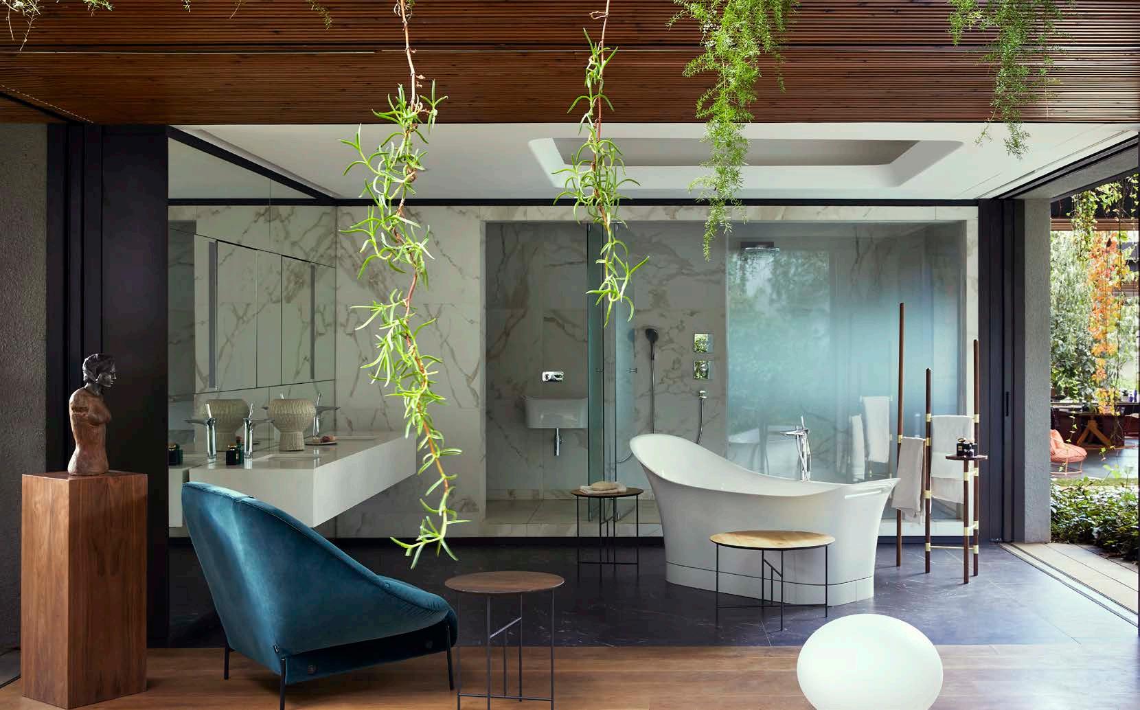
The care taken with the detailing means that the transitions between inside and out become seamless, natural. Slatted timber cladding wraps the walls and ceilings, with door and window frames so precisely integrated so as to make the thresholds imperceptible. The lighting is concealed and designed so that in the evening the quality of light both inside and outside is consistent. The effect is slightly magical, conjuring an image of the mystical Hogwarts with its secret passages and trick stairs. 'You’ve got hidden passages and concealed spaces behind spaces,’ he reveals of the intricate composition. The ways in which the walls and screens can be opened or closed in Anthony’s house mean that it can be quite magically reconfigured, forever shifting and changing shape in a marvelously theatrical way, all while maintaining cohesion with the natural flow of the surroundings.
Anthony’s personal project shows that as a designer your favourite space in any city can be your own home, and this is undoubtedly your invitation to do so. @paragongroupza
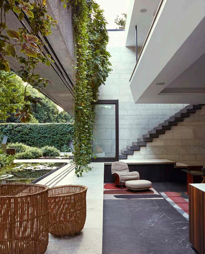

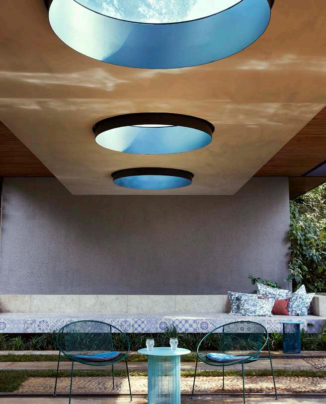
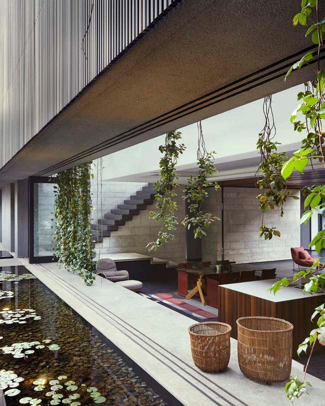

‘The tactile dimension and natural qualities bring a certain earthiness inside, but that feeling is enhanced by the way light comes into the house, the way air flows over a pond and up through a skylight, the movement and variations in temperature.'

A top quality bonding agent used for plastering onto difficult surfaces. Waterbased and ideal for keying smooth surfaces. No time consuming and messy chipping required. Comes with a proven track record of quality as the market leader.
BEWARE OF CHEAP IMITATIONS!
EASY-TO-FOLLOW INSTRUCTIONS ON THE BUCKET!

QUALITY RESULTS GUARANTEED!
AVAILABLE in 1, 3, 5, 10 & 25 Litres
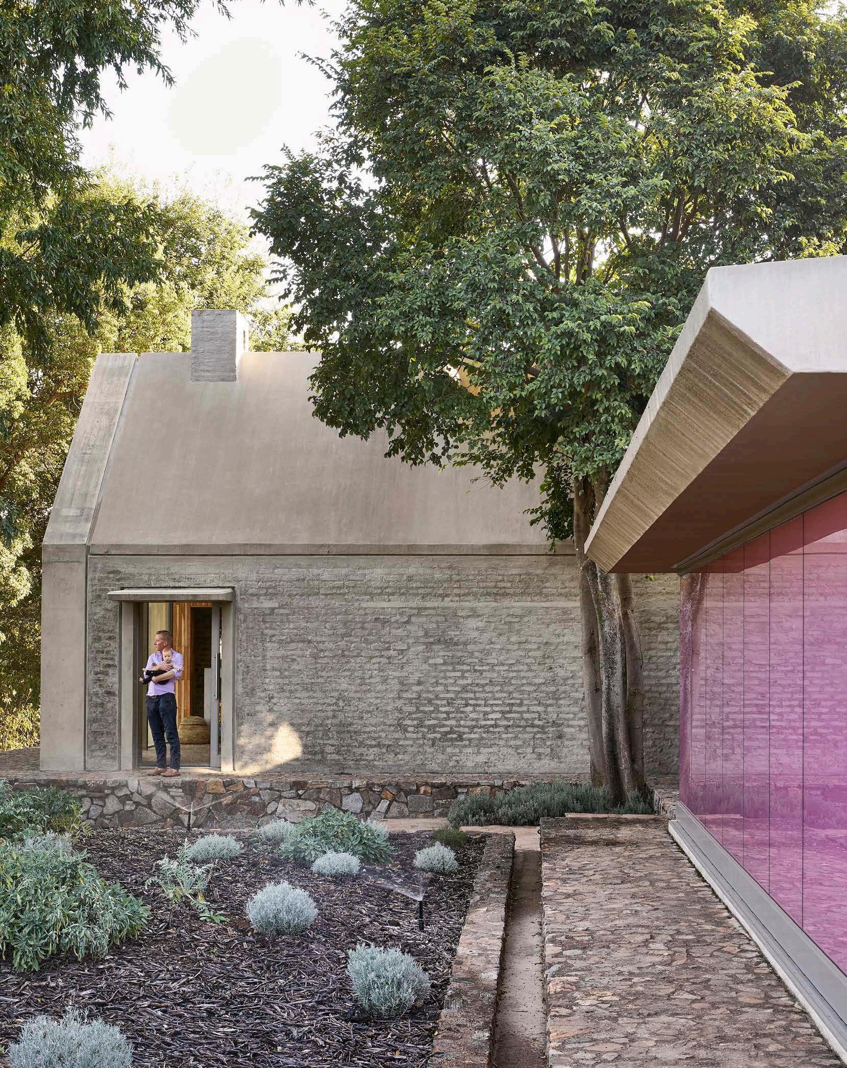
When Lee de Wit set his sights to find the perfect location for his family home, a farm in the Cradle of Humankind is what presented itself as the natural choice. Over the course of four years, this barn-like structure was transformed into a large kitchen, with an accompanying organic vegetable garden, and ultimately into a haven for the De Wit family.


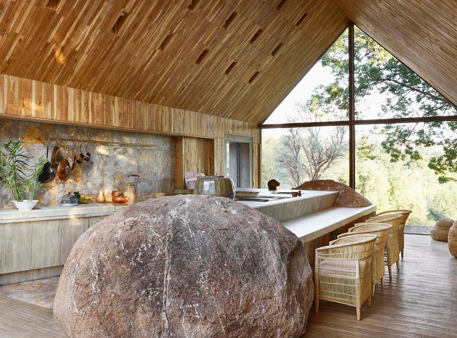
Caught between a purely natural landscape and an artistic one – and, on top of that, set on the grounds of humanity’s earliest known origins – the original farmhouse, where Lee’s grandfather lived for a time, got him thinking. It wasn’t the kind of spot you could entirely return to nature. It wasn’t particularly beautiful, of any architectural merit, or historical value. Still, it didn’t make sense to demolish it for those reasons alone. ‘What do you do with that?’ What is now known as The Farm Kitchen is an attempt at solving this mystery.
In times when environmental impact is constantly on the brain, and building on such an intriguing site, Lee knew that wasting materials would not do. So, he set himself the challenge of reusing what was already there. Building on earth that has known the presence of humans for millions of years inevitably raises questions about our relationship with our environment. Lee’s response to this sensitive context was to re-create a dwelling that would embody a simple but profound notion: it is the earth that sustains us.
While much of the land on the farm was being rehabilitated and returned to nature, the question of sustenance was still central. Lee was interested in what he could grow himself. The architectural answer he arrived at responded with fundamentals: a garden and a kitchen. Beyond practicality and sustainability, these elements carried personal associations, too. ‘My father taught me how to build a house,’ says Lee. He sees the words ‘food’ and ‘kitchen’ practically interchangeable with his mother, and his brother Wesley taught him about gardening, bringing the endeavour full circle with his upbringing.
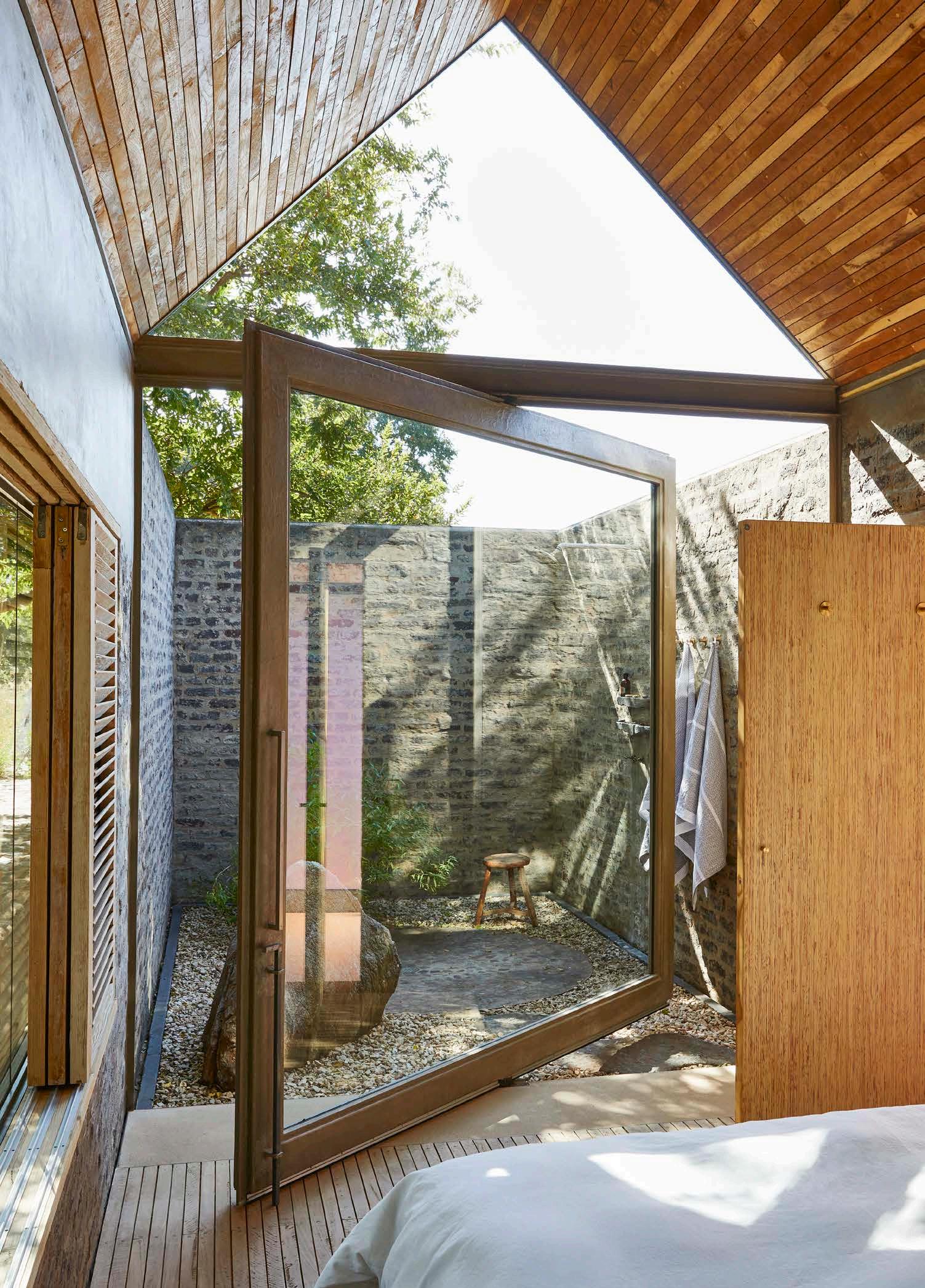
When you stand at the kitchen counter and cook, you look out over the vegetable garden with a conscious awareness of where the ingredients come from. For those not cooking, it’s ‘about the sensory engagement of watching people preparing food’. The giant granite boulders that bookend the kitchen counter, to the geologically literate, are an anomaly. The ground here is dolomite, not granite; the boulders don’t belong, but they are mementoes from the family’s previous farm and make for a heightened personal touch to this beloved space.
Although The Farm Kitchen responds well to the natural landscape, it fundamentally resists the urge to perch on it and take in a pristine view. As far as Lee is concerned, that would be a disservice to the real history of the land here. The view might be wonderful, but this non-folly is focussed elsewhere. ‘You’re coming here to use the garden,’ he says. ‘That remains key to contemplating our place here.’
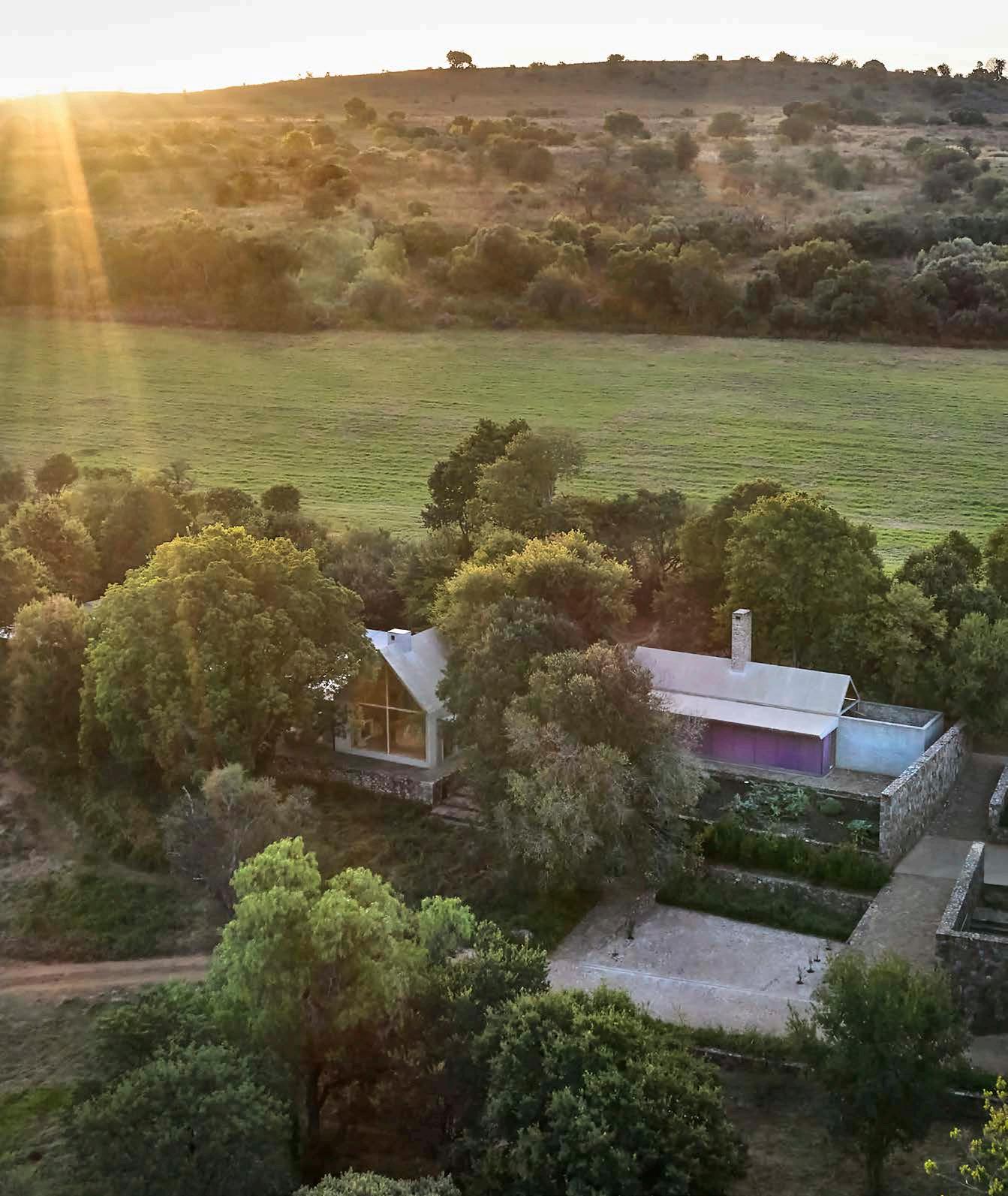
'This is the sustenance,’ Lee says of the garden and kitchen. ‘This is where it’s transformed.'




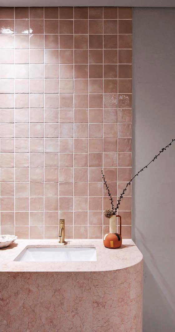
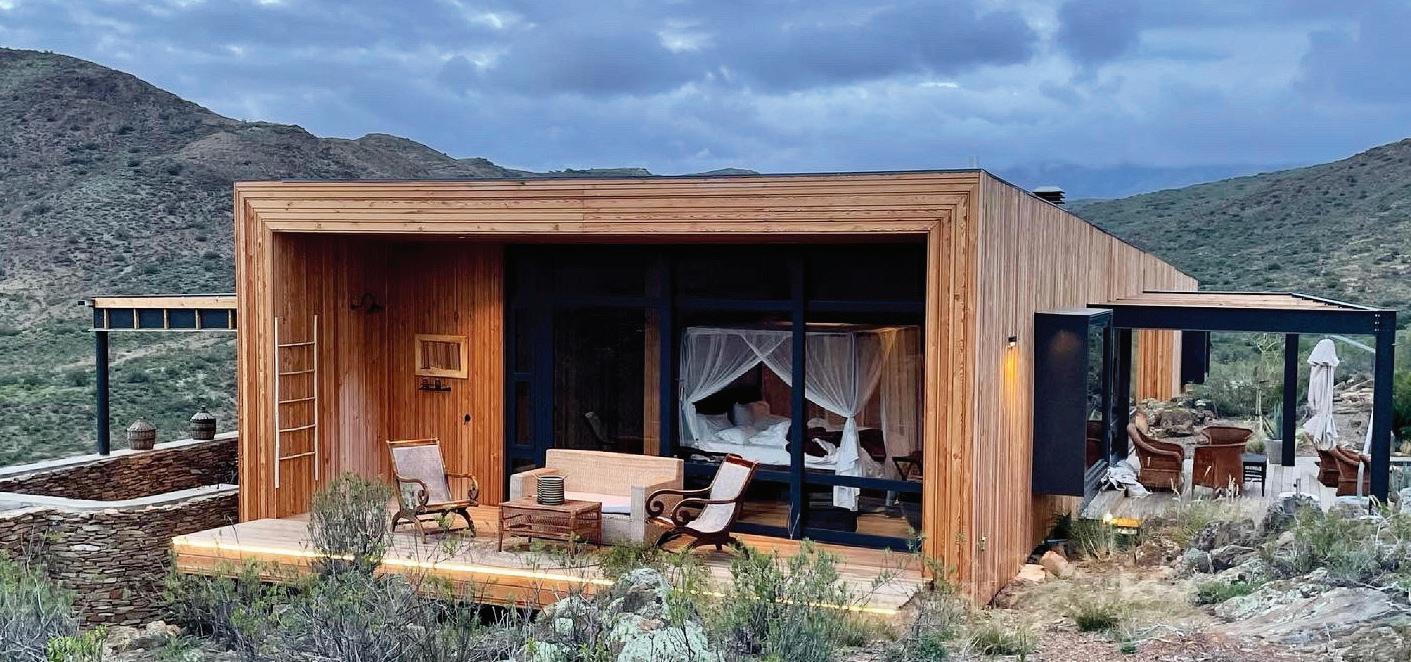
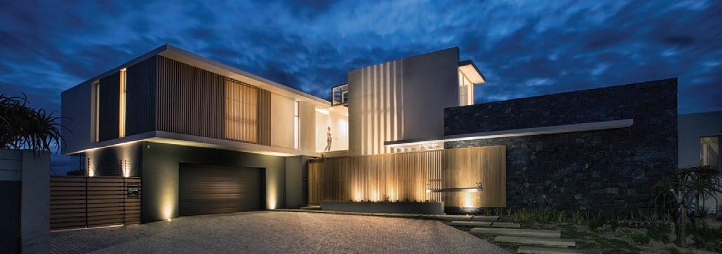
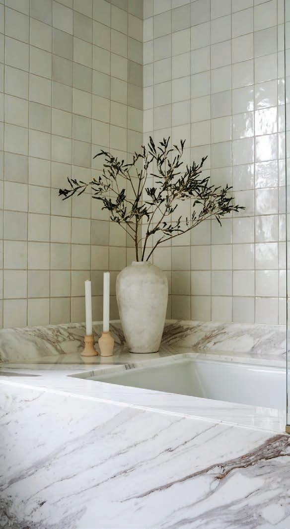
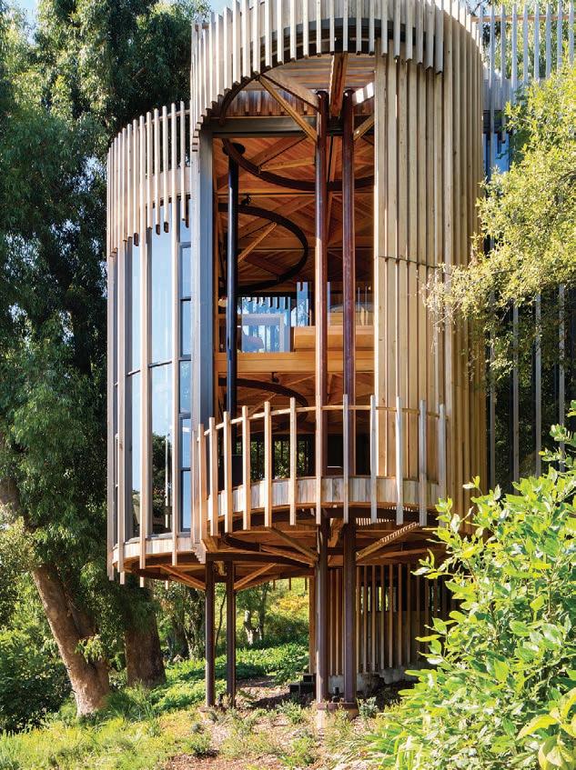


Found sitting squarely on the shoulders of the city’s beloved Lion, Beyond House is a contemporary space made to nurture life and art, where the ultimate comfort of modern living is considerately combined with elemental architecture inspired by its breathtaking setting. The home, which belongs to architect Stefan Antoni and was designed by his firm SAOTA, steps out from a steep hillside that drops off to the bustling strip of Camps Bay’s white-sand beaches to the Twelve Apostles, and further.

On the journey to visiting Stefan’s home, an entryway appears from Nettleton Road, offering a carefully composed impression of four lower stories with tantalising glimpses of two more levels towering above (it’s no wonder where the house gets its title). The lower levels host six bedrooms, built specially for Antoni’s family, three of which can be interlinked for a shared family suite, and to a double-volume entertainment space kitted with a spa, games, and a cinema.
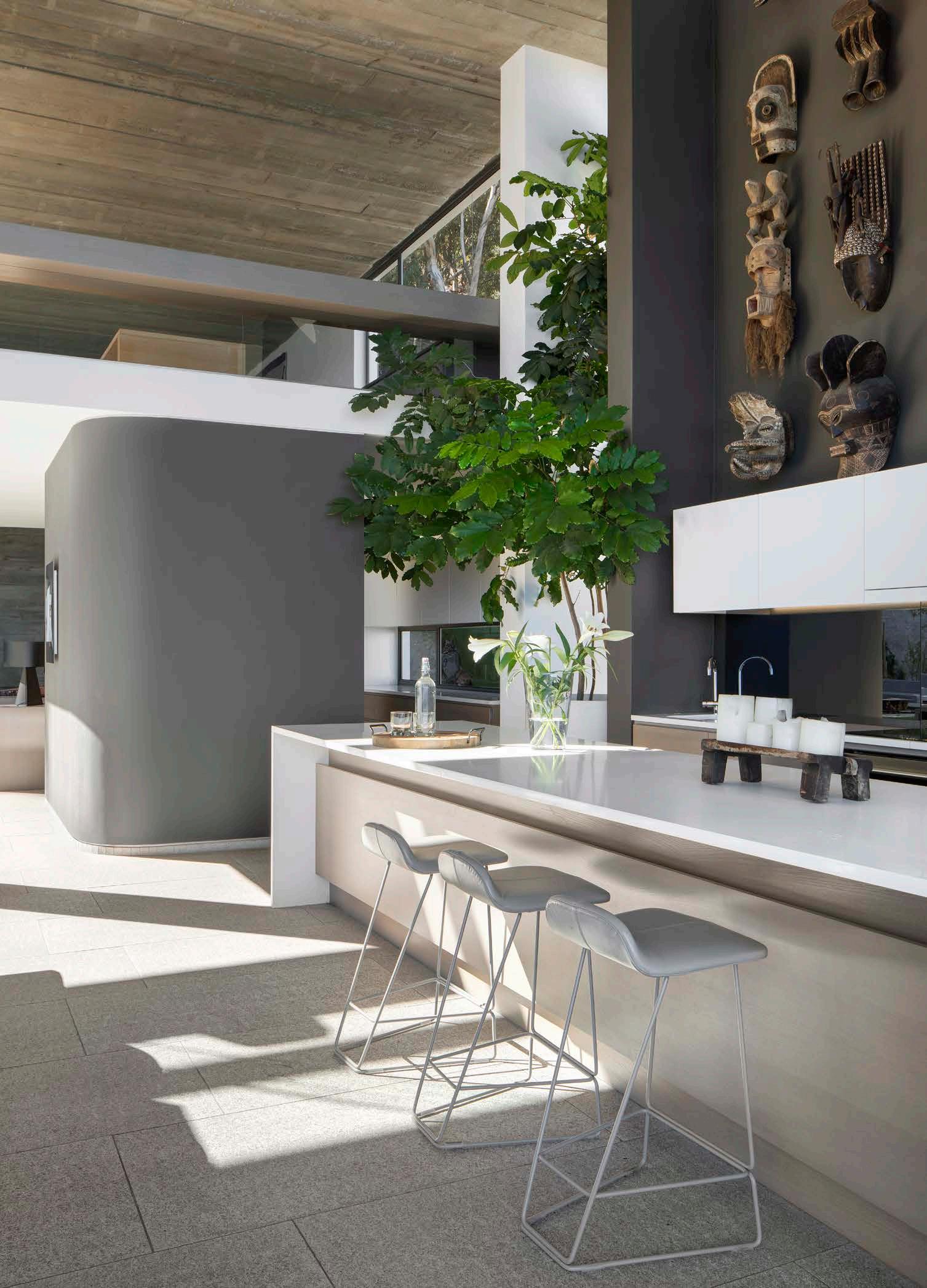
The primary living area is all the way at the top of the building – an expansive, double-height open-plan space which houses the kitchen, bar, dining, living, and family rooms, as well as a winter lounge, study, and art studio at a mezzanine level. The boundaries between indoor and outdoor are merged by the inclusion of glazed lines, creating a continuously transparent space. Linked to this is a generous garden at the back, which is essentially a private piece of Table Mountain National Park. Add an infinity pool which stretches out towards the sea in front of the garden, and you have but a part of the epitome of self-designed luxury living.
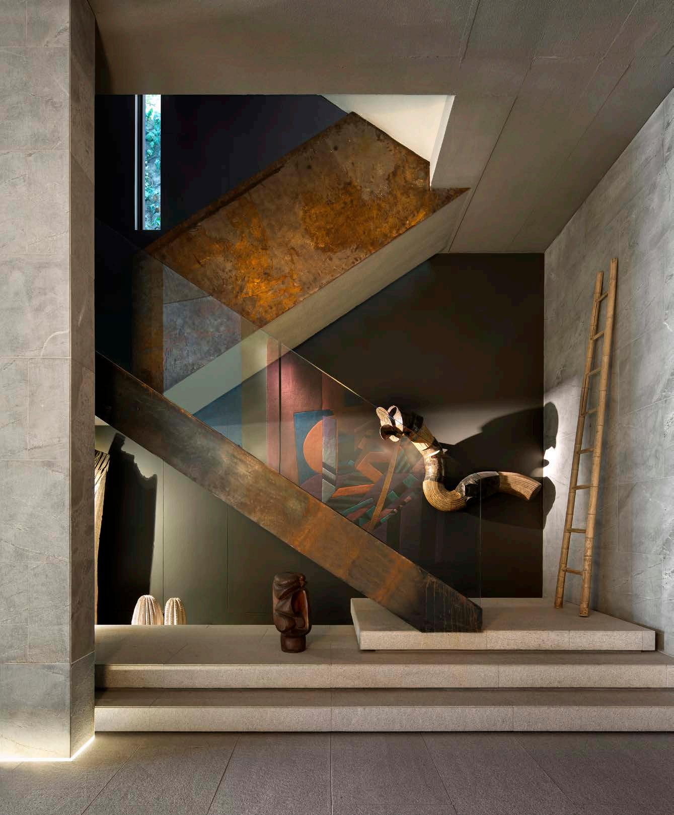
Taking inspiration from one of the fathers of modern architecture, the entrance façade responds to the architect and designer Le Corbusier’s definition of this sacred practice: a ‘magnificent play of masses brought together in light’. The journey through space and light that follows once you enter is clearly inspired by the Modernist movement, a theme which continuously inspires Stefan’s taste in interiors. From the chiaroscuro contrasts of the vast entrance hall, the space lures you upwards towards the generous light of the upper living levels.
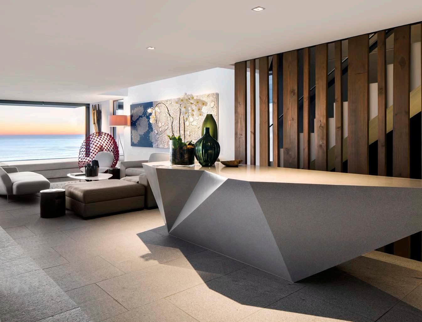
The overall spatial experience is equally considered; the house feels like a robust, seamless form whose functions are defined by intersecting planes, ceilings, and floor treatments. This concept is found in the macro scale of the bar, which slides dramatically out of the house, floating over the pool with a glass floor, to the material scale of the rough concrete over the main living room and timber ceiling on the level below. (In the true spirit of this house, this feature is made from the very same blemished boards which shuttered the concrete above.)
The masterful interplay of light, space, and raw materiality in the house highlights Stefan’s bespoke collection of contemporary South African art that adorns the ample surfaces and walls. The lines between home and gallery are blurred – art and life collide between these walls. From the Paul Blomkamp tapestry and Paul Edmunds sculpture which animate the mystical entrance hall to Porky Hefer’s playful (and inhabitable) ‘Blowfish’ which floats within the double volume entertainment area, to the African masks beside and above the kitchen, this evolving home gallery is always carefully curated to complement the architecture.
With the interiors curated by ARRCC and OKHA (SAOTA’s stylish siblings), this home speaks to Stefan’s legacy as a design icon who knows what it means to embrace sophistication in every area of your home life, and, well, beyond...

‘The overall spatial experience is equally considered; the house feels like a robust, seamless form whose functions are defined by intersecting planes, ceilings, and floor treatments.'


