


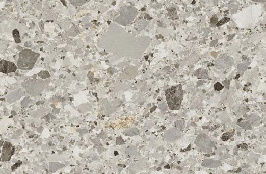
Seamless and striking
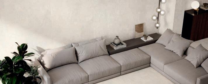
In the dynamically evolving industry of interior design, large-format tiles have proven an impactful trend, reimagining our perception of how to incorporate them in modern architecture. Here, size redefines space and transforms predictable surfaces into breathtaking works of art. How exactly is this effect achieved? Let’s dive into the craft of large-format tiles and explore how they make a bold statement in contemporary architecture, pushing the traditional boundaries of creativity and aesthetics.
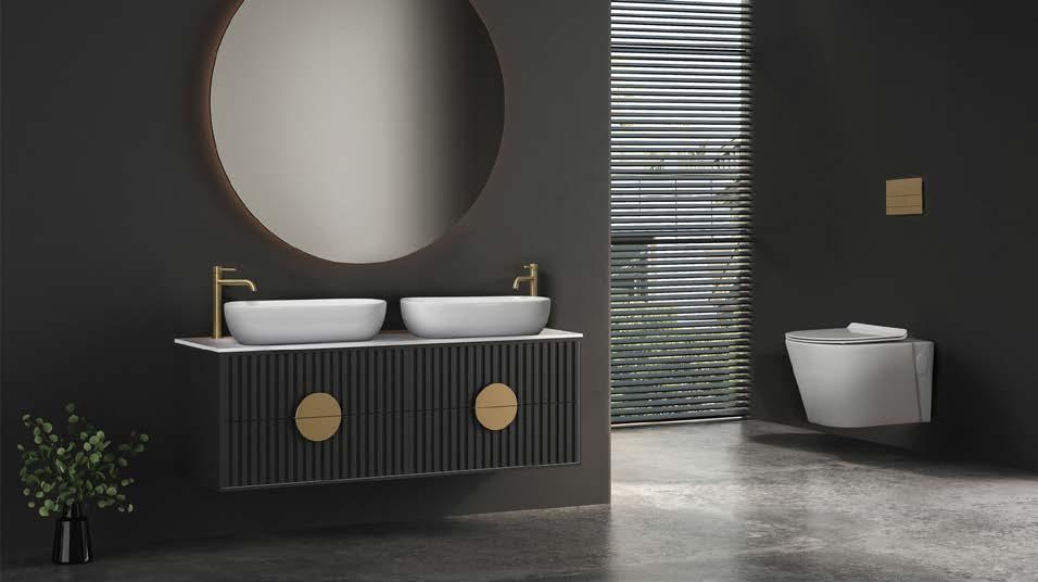
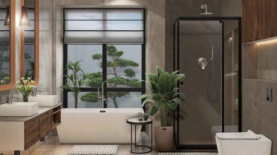
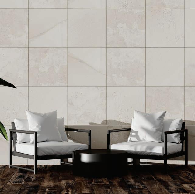
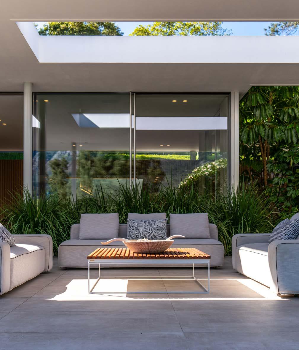
Traditional tiles have long been revered for their versatility and durability, but the limitations of small sizes led to a fragmented appearance in larger spaces. Large-format tiles have gained popularity as architects and designers seek to create seamless and visually striking surfaces with fewer grout lines.
Elegance, uninterrupted
One of the most significant advantages of large-format tiles is the sense of uninterrupted elegance they bring. With fewer grout lines breaking up the surface, the eye is drawn to the sheer beauty of the product itself, allowing the natural patterns, colours, and textures to take centre stage. This simplified and seamless look provides a contemporary, minimalist appeal to every room.
The illusion of space
In smaller rooms, large tiles can create the illusion of spaciousness. By covering the floor and walls with the same large tiles, boundaries blur and the space appears larger and more open. This technique is particularly useful in modern apartments or compact living spaces, where maximising the perceived size is essential to successful design.
Beyond just bold
While opting for bigger tiles makes a bold visual statement, this design choice is also highly practical. With fewer grout lines to clean, they are easier to maintain, making them an ideal choice for high-traffic areas or commercial spaces that demand regular cleaning. Large-format tiles have ushered in a new era of artistic expression and design possibilities in modern architecture. From creating the illusion of more space to streamlining the maintenance process, large-format tiles have earned their place as a forward-thinking force in contemporary design. So, if you’re looking to make a captivating impact in your next architectural endeavour, large-format tiles hold the potential for remarkable design that never goes out of style.
www.stiles.co.za
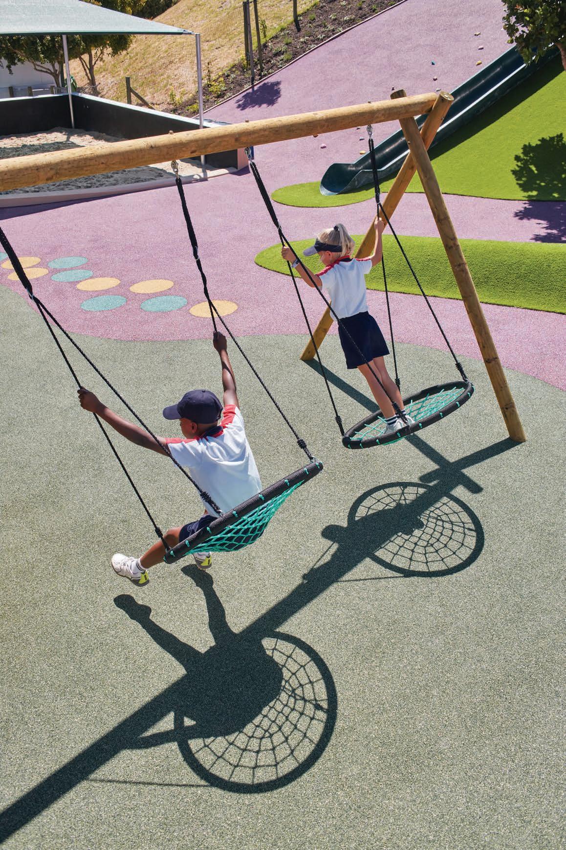
• Suitable for multi-sport areas, playgrounds, landscaping and public parks.
• Ultra-durable, flexible and impact resistant surfacing.
• Low maintenance & sustainable.
• Available in 15 colours or multiple blends.
• Excellent shock absorption with high elasticity.
• Suitable for indoor or outdoor areas.
• Smooth and soft playground flooring allows children to play without risk of injury.
• Wet pour rubber can be applied at any thickness to conform to legal requirements.
• Licensed installers throughout Sub-Saharan Africa.

Welcome to our May issue of SCAPE Magazine, where we embark on a journey through Big Builds and architectural wonders that redefine skylines and reshape cityscapes. From towering skyscrapers to iconic landmarks and the interiors reimagining the headquarters of tomorrow, this issue celebrates the awe-inspiring structures that leave an indelible mark on our urban landscapes. Prepare to be transported to local spaces and through cities around the globe, each boasting their own unique personality. From the sleek lines of modernist masterpieces to the intricate façades of buildings of the future, it’s time to explore the diversity of architectural expression that shapes the way we experience our cities.
As we present this big issue, we are thrilled to share that our team has just returned home to the Mother City from Milan Design Week in April, where we were immersed in a world of cutting-edge design and inspiration. Bright-eyed and eager to share our experience with you, we invite you to turn to page 36 for an inside look into SCAPE taking on Milan Design Week.
Happy reading, and may these pages ignite your passion for architecture and design in the commercial realm.
Ed’s Note.

Crafting Tomorrow’s Skylines
The future of South Africa's commercial giants
19
Parc
Clichy-Batignolles
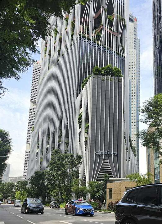
Georg van Gass's favourite big build 51
In Conversation With
Peerutin Karol Directors Giovanni Pivetta & Henning van As
21
The Next Frontier in Façades
Big builds & first impressions
29
Switching Desks
The continued evolution of office interiors
34
SCAPE Does Salone
Join us as we take on Milan Design Week 2024
CONTRIBUTORS
59
In Conversation With
Industrial Evolution
Plumblink by Empowered Spaces Architects 77
The Next Generation of Offices
Kingsway Tower
Adjaye Associates Accra CEO Kofi Bio 64
South32 by PAPER Studio 83 A Patterned Landscape
Roxanne Kaye's favourite big build
Adorning Ellipse Waterfall with Lorenzo Nassimbeni
Waterside Workspace
V&A Waterfront Office Space by SVA International 63
A Centrepiece for Pazhou
Star River Headquarters by Skidmore, Owings & Merrill
69
Green Point Stadium
Luyanda Mpahlwa's favourite big build
Landseer Collen, BPAS Architects | Georg van Gass, GASS Architecture Studios | Greg Gordge, Elphick Proome Architecture | Luyanda Mpahlwa, Design Network | Gabriël Hugo, LYT Architecture | Giovanni Pivetta & Henning van As, Peerutin Karol | Kofi Bio, Adjaye Associates | Roxanne Kaye, SAOTA | SVA International | Empowered Spaces Architects | PAPER Studio | Lorenzo Nassimbeni, dhk Architects, GREENinc, Andrew Kerrin | Skidmore, Owings & Merrill


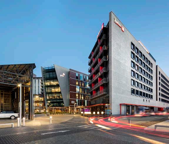
Walking through the Oxford Parks precinct, on the bustling corner of one of Johannesburg’s most stylish urban spots, stands the bright Radisson RED Rosebank. To complement the mixed-use precinct, the upmarket new hotel needed not only a great architecture firm (who other than dhk Architects?), but also the finishing touches that would elevate it. That’s where Eva-Last stepped in. With decking, cladding, and pergolas, Eva-Last helped the forwardthinking green hotel level up its status in style.

Sustainable at heart
The 222-room hotel was designed as a substantial building that was architecturally sophisticated yet functional and would enhance the upper-class area’s appeal. As a brand, Radisson RED has a commitment to sustainable design. This ethos mirrors that of the development requirements of the Oxford Parks precinct, which mandates all construction within the zone to adhere to a minimum five-star Green Star rating. It is also in keeping with the motto of Eva-Last, who were the perfect partners to contribute durability and excellence.
The essence of lasting durability
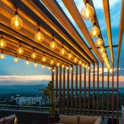
Eva-Last was selected to meet the rigorous aesthetic and environmental criteria for the Raddison RED Rosebank. Their task was to kit out the seventhfloor outdoor terrace, which features a swimming pool, terrace bar, and gym. The brand supplied composite decking and pergolas for the 80 m² terrace, making it the prime entertainment area of the hotel. Exposed to both regular heavy foot traffic and outdoor weather conditions, the space needed to be completed to the highest and most durable quality, and Eva-Last delivered.
While being selected for the products’ aesthetic appeal and sophisticated design in this prime location, Eva-Last’s decking and pergolas were also ideal in that they are crafted to maintain their attractiveness while withstanding Johannesburg’s harsh weather. With no signs of discoloration, fading, cracking, or warping, the Eva-tech, I-Series decking, and Lifespan beams were the finishing touches on the space that brings ultimate outdoor leisure to Radisson RED Rosebank.
‘Eva-Last was chosen due to the durability and low-to-no maintenance requirements of the product. The products matched the design intent from look and feel, to incorporation of light spaces. The deck was also used to house the pool pumps, which was a clever design initiative. We are satisfied with both the aesthetics and lack of wear-and-tear apparent from the products.’ – Charmaine Spasojevic, Lead Fixer, Radisson RED Hotel, Rosebank
www.eva-last.co.za



The future of South Africa’s commercial giants
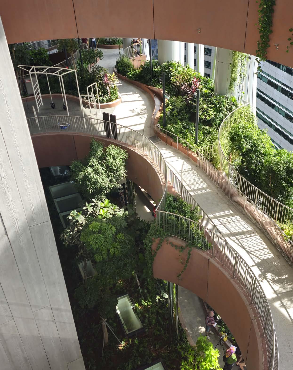
Vibrant, multi-use spaces are currently dominating commercial building practices in South Africa. A shift which is a beautiful reflection of South Africa’s rich culture of community, this trend is loaded with potential. These physical spaces embody the community-orientated local reality and create a sense of belonging and ownership. They drive foot traffic and benefit businesses and consumers alike. They are the future of our country’s skyline.
The nature of mixed-use
This mixed-space approach to developments is being seen in both new builds and in the reimagining of existing structures across the country. A key aspect of these types of builds is that they are user-oriented spaces. Developers understand that the needs of the people who will use the building have to inform a project from the beginning. Building occupants and visitors also respond to how well a space is designed to enhance their quality of life. This means incorporating natural elements like daylight, vegetation, colour, and nature-inspired forms to benefit physical and mental health. Across the world, nature is being brought into spaces in unexpected ways, which enhances well-being and could even reduce energy costs.
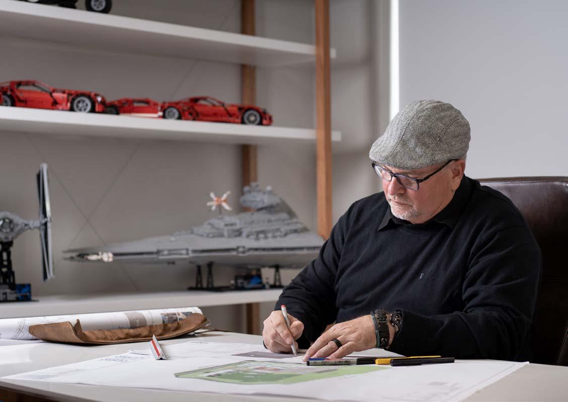
In South Africa, our climate gives us a significant advantage in terms of how we think about outside spaces. ‘South African design of outdoor spaces, both public and private, is something that we do a lot better than many other countries. With smart design, incorporating relevant materials and vegetation, a functional outdoor space can work well as part of a multi-purpose development,’ agrees Philip du Toit, Project Architect at BPAS Architects.
 LANDSEER COLLEN Director & Architect
@bpas_architects
www.bpas.co.za
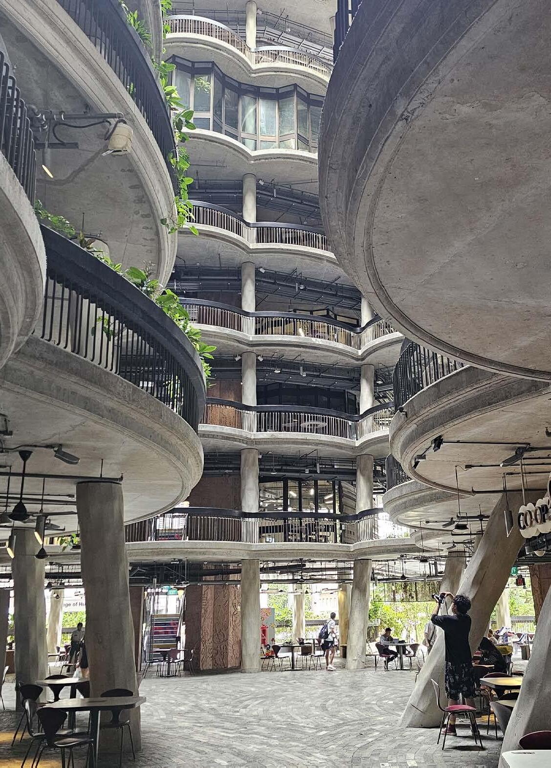
‘Buildings don’t have to extend to their maximum limit; the “in-between” spaces can be used to create rest areas, courtyards, community spaces, and play sections.’

International inspiration
There are also international trends that South African design can benefit from. One of these is thinking about how a building interacts with passers-by from the street level. Some spaces in South Africa only offer up their charm once you’re inside the premises, but buildings also need to participate in the public domain. This is done very well in certain regions in Europe, where most buildings have social and commercial spaces extending into the streets.
Another trend that South African mixed-use spaces can benefit from is applying creative thinking to the liminal spaces between buildings. Buildings don’t have to extend to their maximum limit; the ‘in-between’ spaces can be used to create rest areas, courtyards, community spaces, and play sections.
Old buildings, new life
‘Understanding the market and the social context by thoroughly investigating what people in the area need, and providing just that, is part of what makes mixed-use spaces so successful,’ adds Du Toit. In South Africa, there are existing structures in key geographical areas (such as the Johannesburg CBD) that can be redeveloped to create new multi-purpose spaces. Reinvigorating outdated and abandoned buildings as mixed-use properties can transform them into hubs of activity that contribute to economic growth and community rejuvenation.
As developers and designers explore this multi-purpose trend, it’s important for commercial spaces to prioritise sustainability, inclusivity, and innovation while staying true to the local context, embracing and nurturing community. After all, that is the foundation of the South African way of living.
‘A key aspect of these types of builds is that they are user-oriented spaces.’
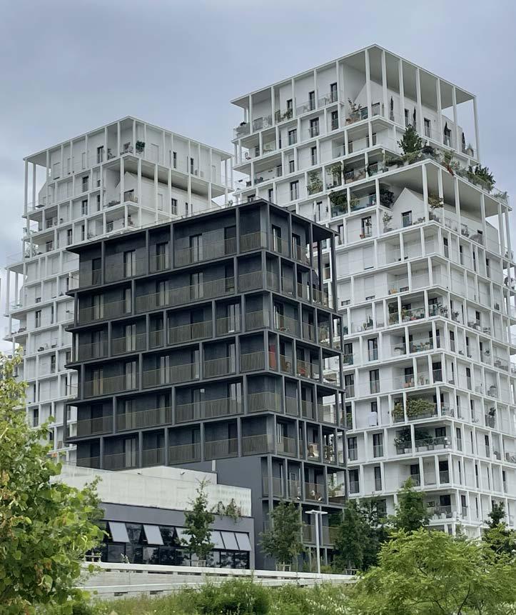
The Parc Clichy-Batignolles, in the Martin Luther King Precinct in Paris, exemplifies the transformative power of large-scale, sound urban design and thoughtful architecture in revitalising a formerly neglected area. The park serves as a masterful anchor, grounding the urban landscape and fostering a harmonious dialogue between the towering built forms that surround it. The adjacent buildings, with their carefully considered envelopes, not only respect the pedestrian experience but also contribute to a rich and cohesive urban fabric, demonstrating a successful synthesis of architecture and urbanism.
SCAPE asks industry icons: What is your favourite big build?
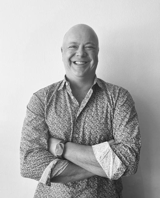
 GEORG VAN GASS Founder & Architect
@gass_architecture_studios

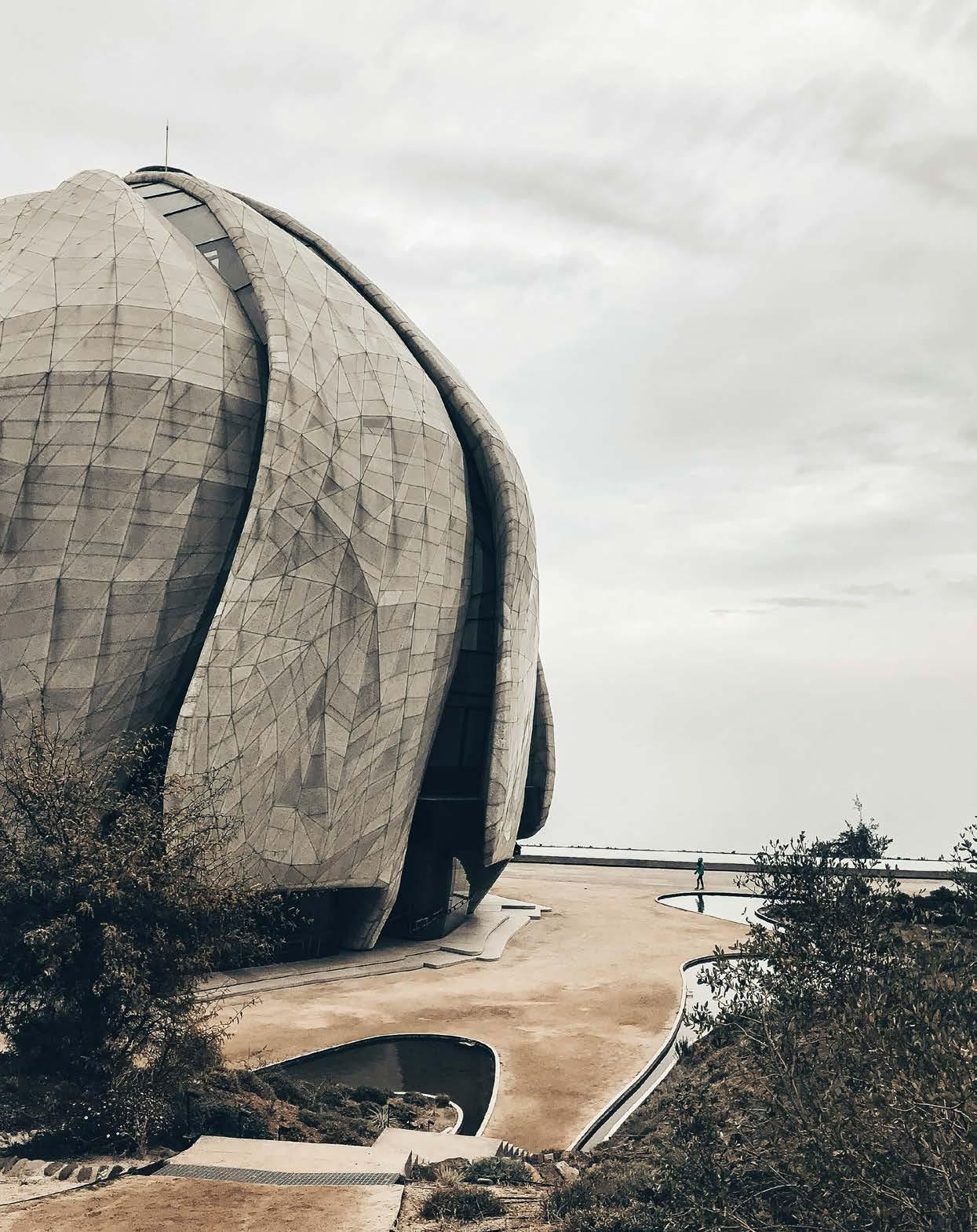
Building façades, being responsible for approximately 40% of global energy consumption and 33% of greenhouse gas emissions, play a crucial role in mitigating environmental impact within the built environment. The future of architectural façades offers the promise of innovative design with sustainability at its core. Building exteriors are not mere static structures. They are becoming dynamic and responsive, embracing advanced materials and integrated technologies that are paving the way for redefined aesthetics.
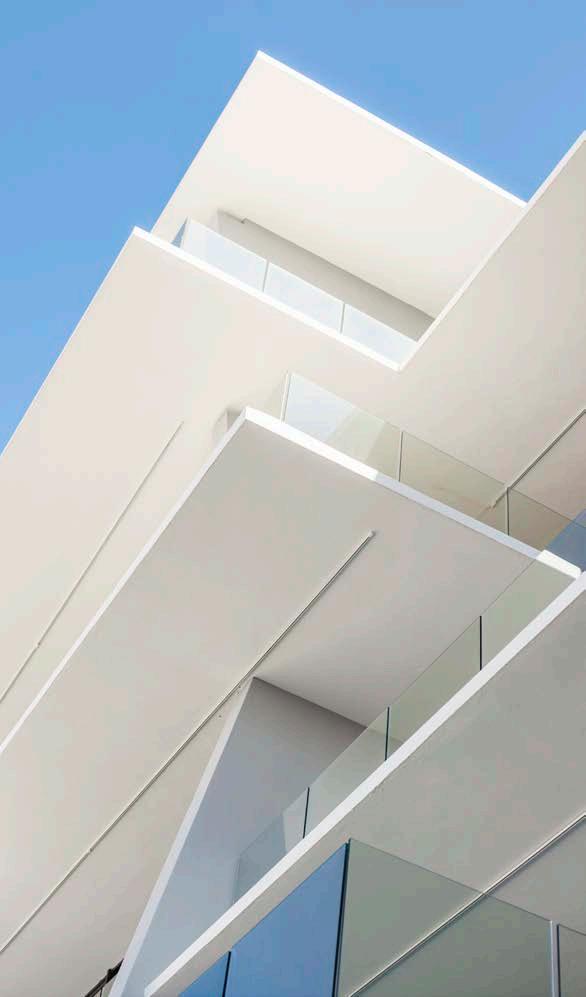
Advancements in building materials that are reshaping the way we construct and design the structures of tomorrow are in abundance. There have been notable strides in manufacturing techniques, enabling the creation of larger and more intricate glazed applications. A frameless glass façade, featuring expansive full-height single fluted panels, is a prime example of these strides. There is also a growing emphasis on the development of advanced Smart Glass or Electrochromic glazing. This incorporates film technology that responds to external climatic conditions by electronically adjusting opacity levels – a profound innovation in climatic protection.
Another intriguing and burgeoning technology is Cross-laminated timber (CLT). This innovative material comprises multiple layers of wooden boards or planks stacked crosswise and bonded together, resulting in robust, sizable panels. CLT boasts numerous advantages: remarkable structural integrity, sustainability stemming from its renewable nature and carbon-sequestering capabilities, shortened construction schedules, improved thermal efficiency, and a natural, inviting appearance that harmonises beautifully with contemporary architectural styles. The recycling of materials is already a well-established practice, but given the current global waste challenges, it presents an exceptional opportunity for the construction industry. We are witnessing a surge of creative façade applications that incorporate recycled elements, including items like ice cream containers, plastic seats, and discarded construction materials, such as used roof tiles. This strategy offers an innovative and sustainable approach to building design.
The advent of 3D-printed buildings marks a groundbreaking shift in the construction industry. This innovative technology utilises large-scale 3D printers to create entire building components or even entire structures layer by layer, offering unparalleled design freedom and precision. It has the potential to revolutionise the construction process, making it faster, more cost-effective, and environmentally friendly by reducing waste. Housing prototypes based on what is called the Tecla System in Italy are recent experiments in the 3D-printed construction of a fully natural, recyclable, and carbon-neutral material: raw earth. A mixture of water, fibre, and chemical binder is mixed with soil and covered with a sprayapplied waterproofing layer to produce this inspired material.
Ironmongery: dormakaba | Glazing: rebCON | Artevia concrete flooring: Lafarge | Glass: C&C Safety Glass | Cladding: Marley Building Systems/Etex
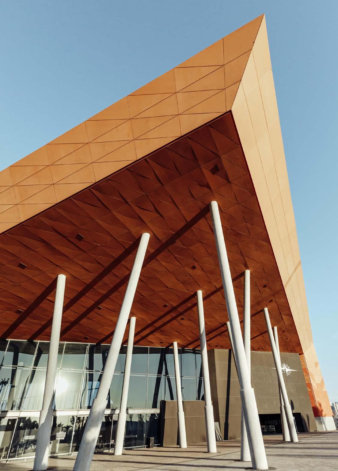 Nelson Mandela Cruise Terminal, photography by Maxine Elphick Photography
The well-known architectural approach of biophilic design integrates natural elements and patterns into the built environment to enhance human well-being. This design strategy encompasses elements like natural light, greenery, water features, and organic materials, fostering a deeper connection to nature and yielding visually appealing spaces that promote both physical and mental health. Although well-known, it should not be overlooked how powerful a response this type of design can offer, for example when integrating foliage as a natural extension of a façade.
Ephemeral, cloud-like façades, characterised by eroding lattice structures, represent an intriguing and fascinating architectural concept. These designs provide a powerful fusion of artistic impermanence, tactile quality, and innovation, especially within pavilion architecture. Drawing inspiration from natural elements, they create a sense of transience and poetic beauty that appeals to the human senses and offers a tactile experience within the built environment. This architectural response also promotes structures that substantially harmonise with their surroundings, offering a unique blend of functionality and aesthetic innovation.
The final trend for the future of façades is AI-assisted design. This is a trend that continues to grow, leveraging artificial intelligence engines to optimise and personalise architectural and interior design. These systems can assist designers to both plan and visualise building concepts through remarkably simple inputs, streamlining the overall process. AI-generated images derived from descriptive textual prompts can yield provocative and exhilarating, yet seemingly impossible, façade concepts. As it continues to develop, we are sure to see more impressive influence on the industry.
We live in an unprecedented age where the convergence of computational technologies and advanced manufacturing processes are empowering us to accomplish what was once far beyond our reach. Architectural façades are where aesthetics meet innovation and sustainability takes centre stage. By embracing sustainable materials, energy efficiency, and creative design, we shape a more harmonious world. Façades are not just walls; they're a pathway to a beautiful, sustainable future.

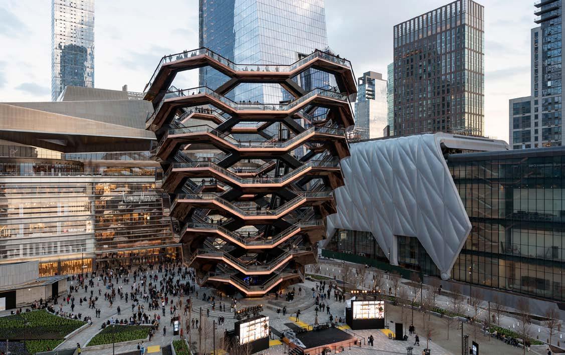
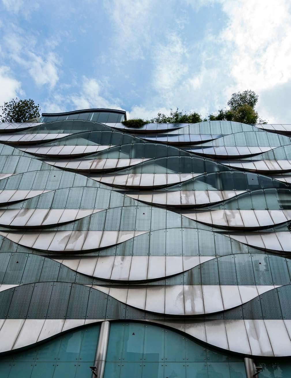
‘Architectural façades are where aesthetics meet innovation and sustainability takes centre stage.’


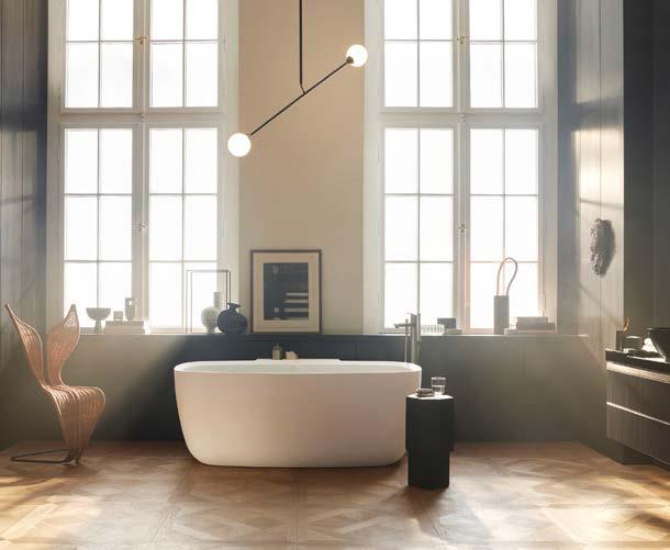
design approach adopted for Aurena is visible in the balance between colour harmony and materials. The textured wooden surface option creates a warm, welcoming atmosphere, while the white marblelook ceramic panels and the black lacquered glass create a classic, sophisticated effect.
From the hand of an architect
Aurena is an interior-design all-rounder; equally well-suited for use in private or guest bathrooms, as well as in signature properties such as hotels, medical offices, or restaurant restrooms. To ensure a harmonious design throughout, Antonio Citterio incorporated matching bathtubs, toilets, a bidet, and a mirror.
Being an architect, Citterio knows all too well the requirements and issues of the commercial segment in particular. As a result, his Aurena range with Duravit is an offering of the ultimate solutions that meet market demands.
In architecture, the Golden Ratio is a classic formula for aesthetic harmony and everyday practicality. For designer and architect Antonio Citterio, it was the undoubted source of inspiration for his bespoke range for Duravit: Aurena.
Expert proportions
Antonio Citterio’s goal was to create an expertly proportioned surface for the washing area, made entirely of ceramics. The design includes vanity tops with integrated dividers and precise, elegant contours which are ideal for the tidy storage of bathroom accessories. A basin can be integrated into this ceramic console, or the console can be combined with an above-counter washbasin made from ceramics or glass. Compact basin sizes prioritise large vanity tops, while an aluminium profile frame with a stainless-steel finish combines the console and vanity unit.
Space for storage
Furniture played an integral part in the design of the Aurena range. A shelving unit made entirely of aluminium with an inlaid mesh base offers open storage space, complemented by a central element with two drawers on the double washstand. A closed alternative is a furniture unit with two drawers which can be wall-mounted or placed on a metal frame.
Special surfaces for impactful rooms
When designing furniture, Antonio Citterio thinks beyond pure form and considers the overall effect of the object on the room. The innovative


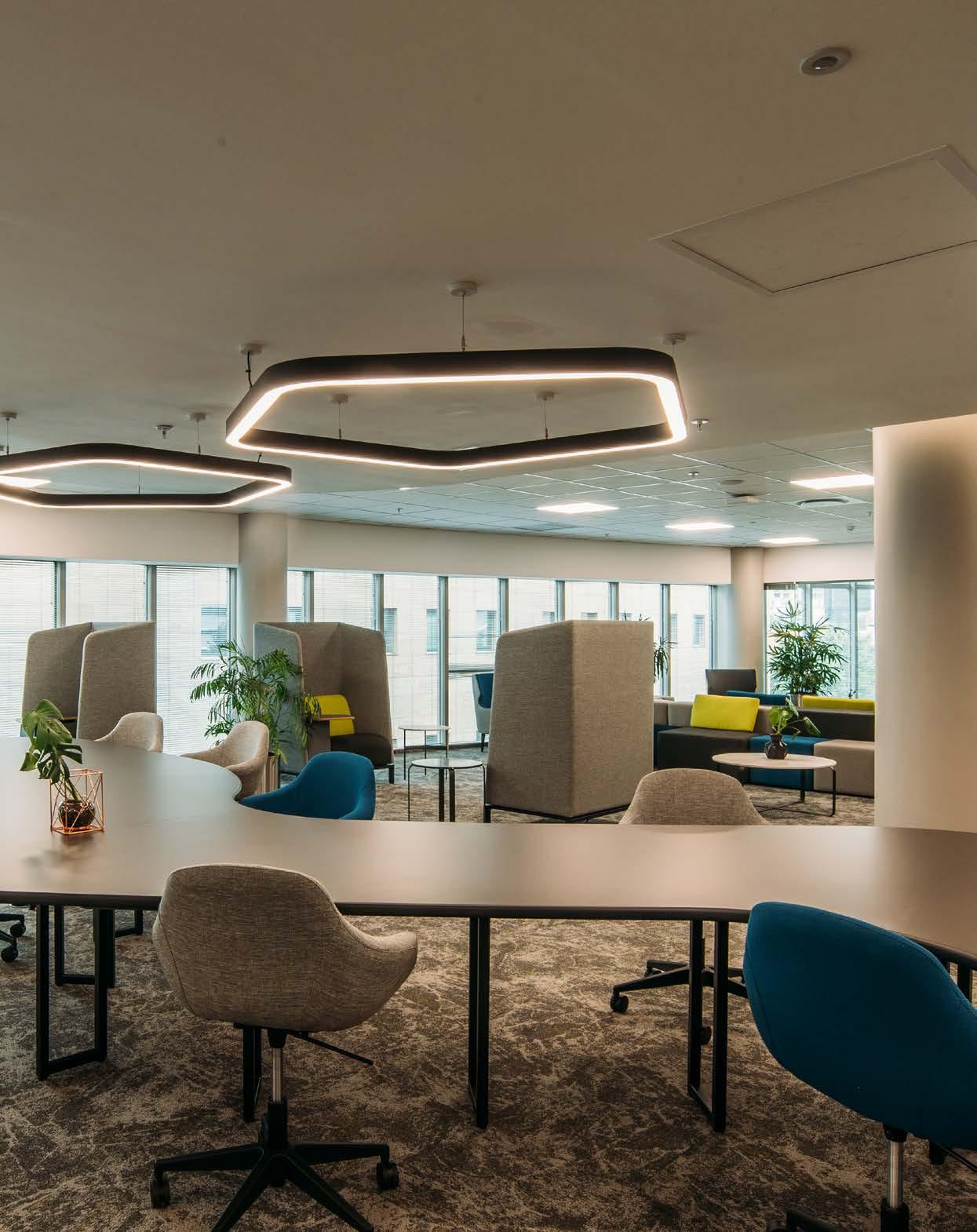
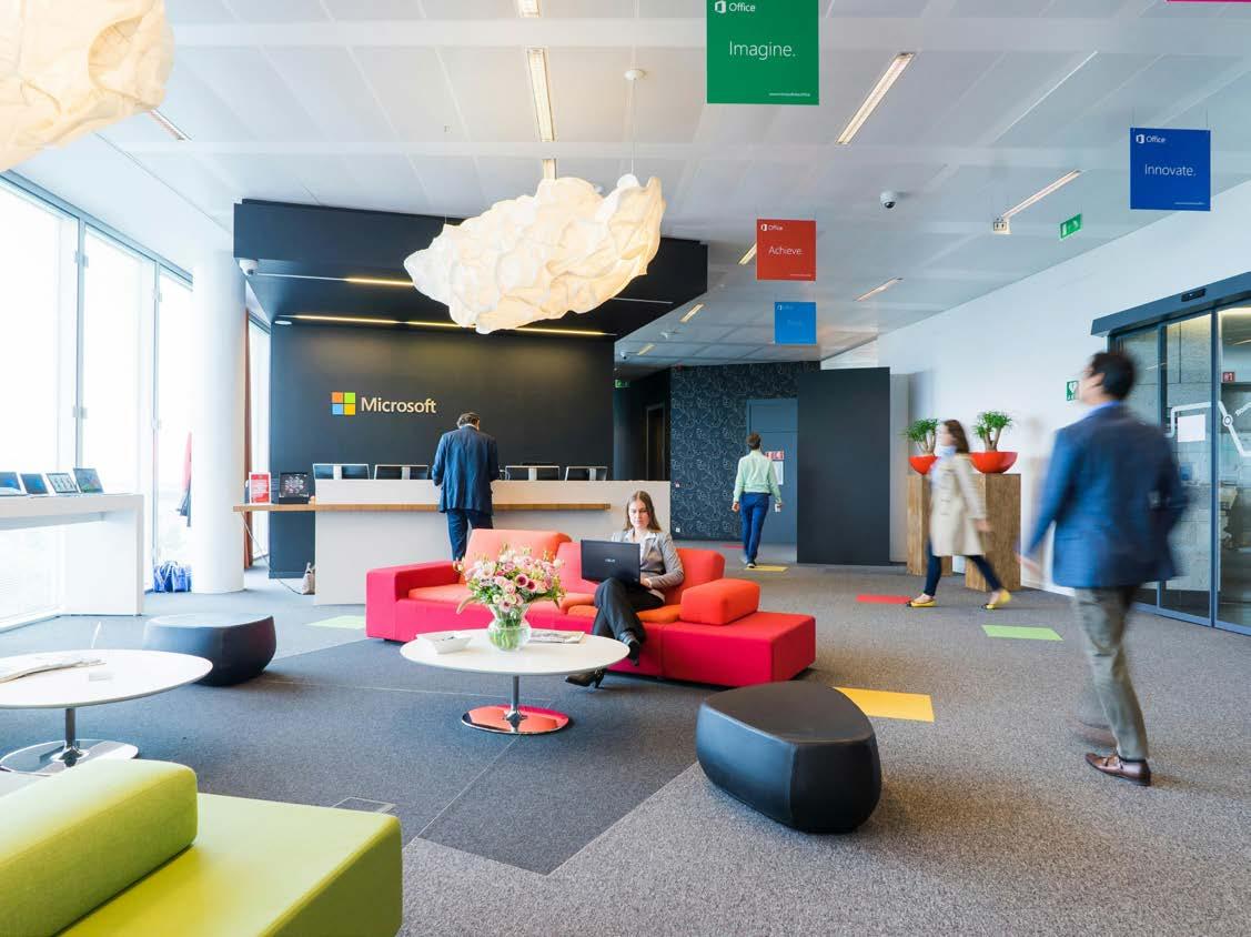
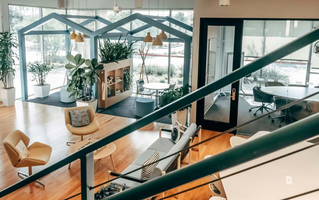
The continued evolution of office interiors
The past few years have seen marked changes, but we haven’t finished altering the ways we inhabit the big commercial builds known as office blocks. While these changes weren’t intended to be long-term, they have persisted into a fairly recovered world and remain relevant. Restrictions triggered by the pandemic forced companies to adapt, and we were all faced with new challenges to accommodate remote working. Many of these measures soon became the norm and the ‘new way of working’. Today, it has altered the benchmark for a normal day at the office. But what does that mean for office interior design?
The motivation and the means
This global shift has shown us that it is, in fact, possible to work differently, despite many decades of a largely rigid approach to designing office environments. An impressive number of companies were able to adapt, provided they had the means to facilitate this change, but many others struggled. Certain types of work simply aren’t conducive to working remotely. Even after endless mark-ups on a screen, nothing quite matches the energy of sitting around a table and sketching ideas on a piece of paper with colleagues.
The hybrid solution
In these shifting boundaries of home and office life, hybrid working was born. Office design had to evolve to accommodate the needs of both remote and in-office employees. Regardless of personal preference, no one can argue that paying for an empty office building is financially viable. Industry-wide, there has subsequently been a drop in the number of new builds, with a rise in office refurbishments, as companies make necessary changes to reduce overhead costs. Not only did this model change the way we approach workspaces, but it also brought with it new minimum requirements to enable work to happen.
Post-Covid design strategies
There are a few things we know for sure. Open plan offices can be reduced by more than half in size if staff are only required to come to the office 2-3 days a week. Unassigned desks can be supplemented by ancillary areas to do less-focussed tasks. Collaborative areas have replaced the need for multiple meeting rooms, by offering a range of efficient set-ups to accommodate different ways of working.


PICTURED HERE:
For Dojo's Berlin Headquarters, UNDPLUS showcases the latest in commercial office design. A functional space that offers aesthetic intrigue and dynamic interaction in its openness, this design speaks of the office environment of the future.
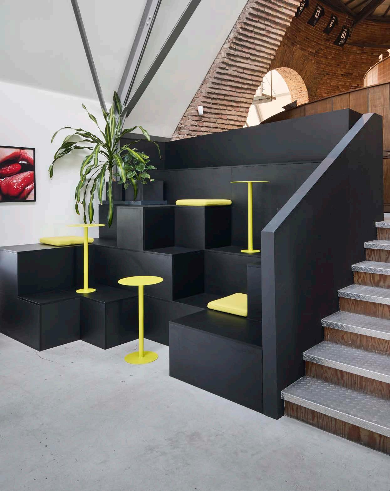
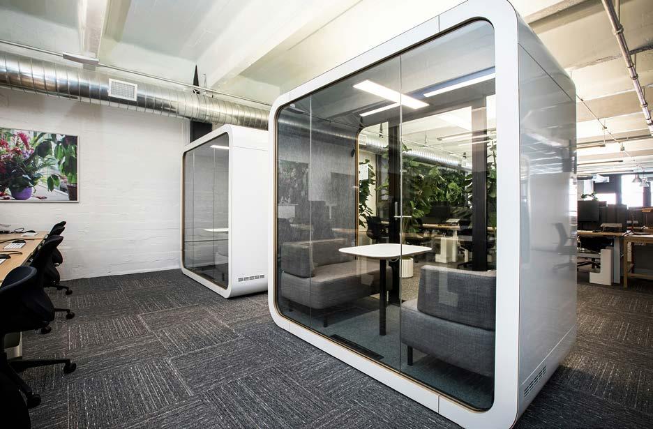
Flexible furniture and versatile layouts ensure that areas can easily be adapted to suit changing needs. The close proximity of workstations to collaboration areas and breakaway spaces improves workflow and productivity by minimising wasted space and maximising efficiency. These areas are no longer exclusive and should be clustered together to enable a simple transition between physical and virtual work, making it easier for employees to navigate the office and collaborate effectively. Quiet zones can be identified and demarcated for focussed or deep work when individuals need to work undisturbed for longer periods of time. Individual, enclosed booths are also located centrally or along corridors to provide temporary privacy for online meetings or personal calls.
Comfort vs functionality
Good design can have a positive effect on the way we work by increasing productivity. It can shape how we interact with our environment, and ultimately our attitudes, experiences, and behaviours. The change back from home to office has raised certain expectations of comfort versus functionality. Comfortable work environments contribute to employee well-being, job satisfaction, and overall productivity. Finding the right balance between comfort and functionality means that spaces that are optimised for different tasks and work styles ensure that employees have the resources and tools on hand to perform effectively.
We know that communication and connectivity are paramount. In an age where your smartphone is like a second skin, we take our work with us wherever we go. Features such as integrated AV systems and connectivity infrastructure can serve well in this case to streamline daily tasks and facilitate collaboration among remote and in-office teams.
Community and company culture
One of the biggest challenges of hybrid working is maintaining company culture and a sense of community. Communal spaces, shared amenities, and branding elements all promote cohesion and teamwork. A sense of belonging can be a powerful driver of employee engagement. It is up to organisations to seek office design which can cultivate stronger, more cohesive teams by promoting a culture of inclusivity and teamwork.
Finally, a hybrid office requires continuous improvement, with the ability to recognise when a system does not work, identify ways to improve it, and know when change is needed. More importantly, it requires the willingness to adapt by fostering a culture of flexibility and resilience for the future of corporate life.
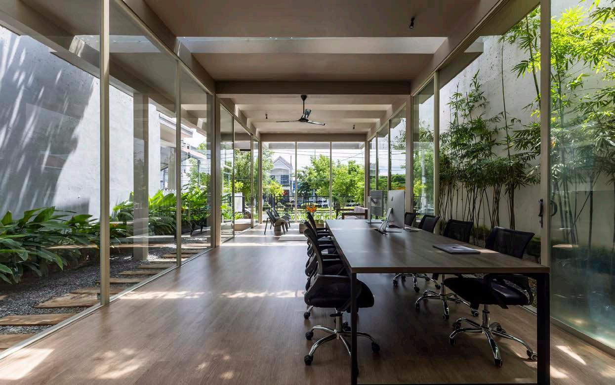 Office for Trees by Pham Huu Son Architects, photography by Hiroyuki Oki

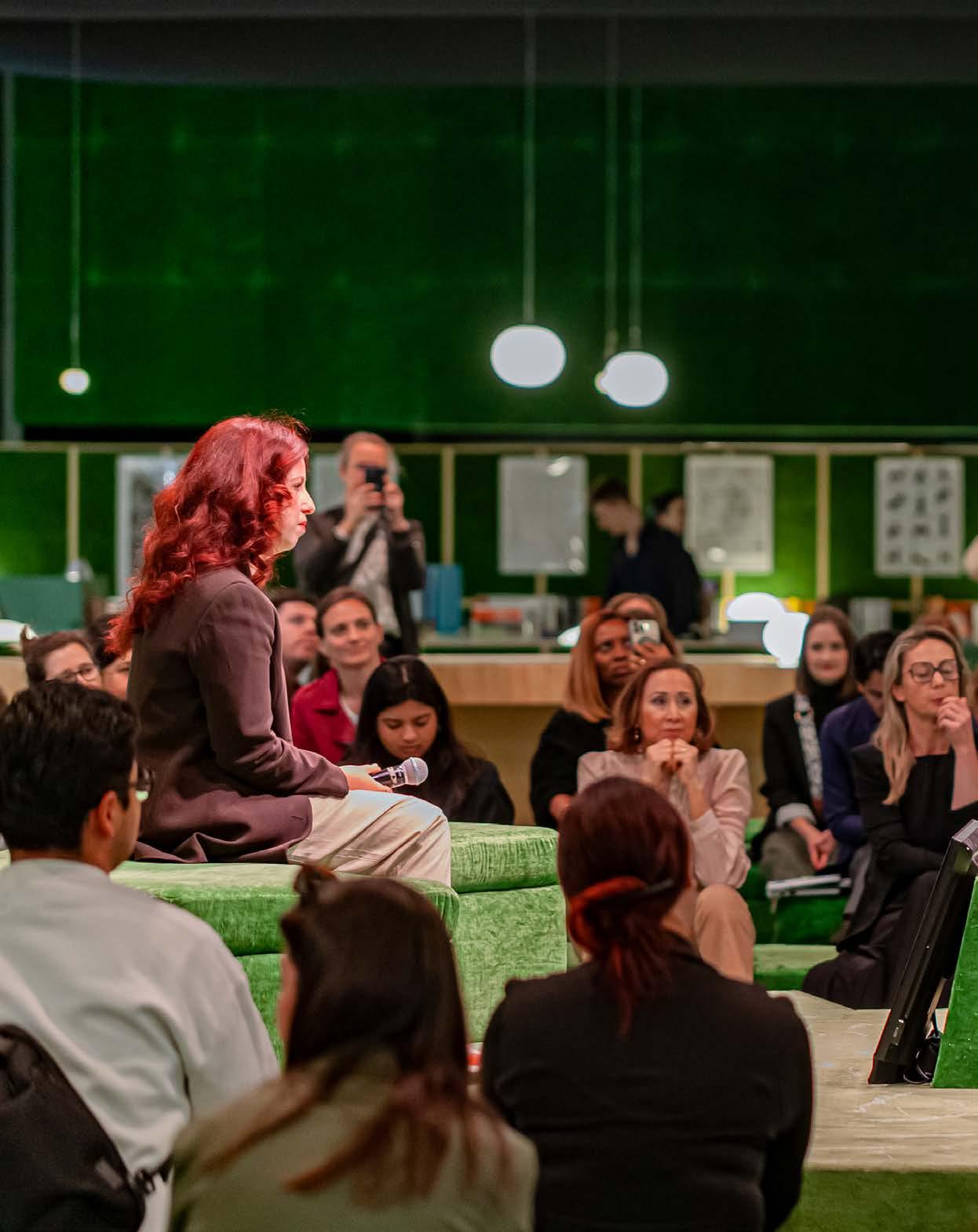

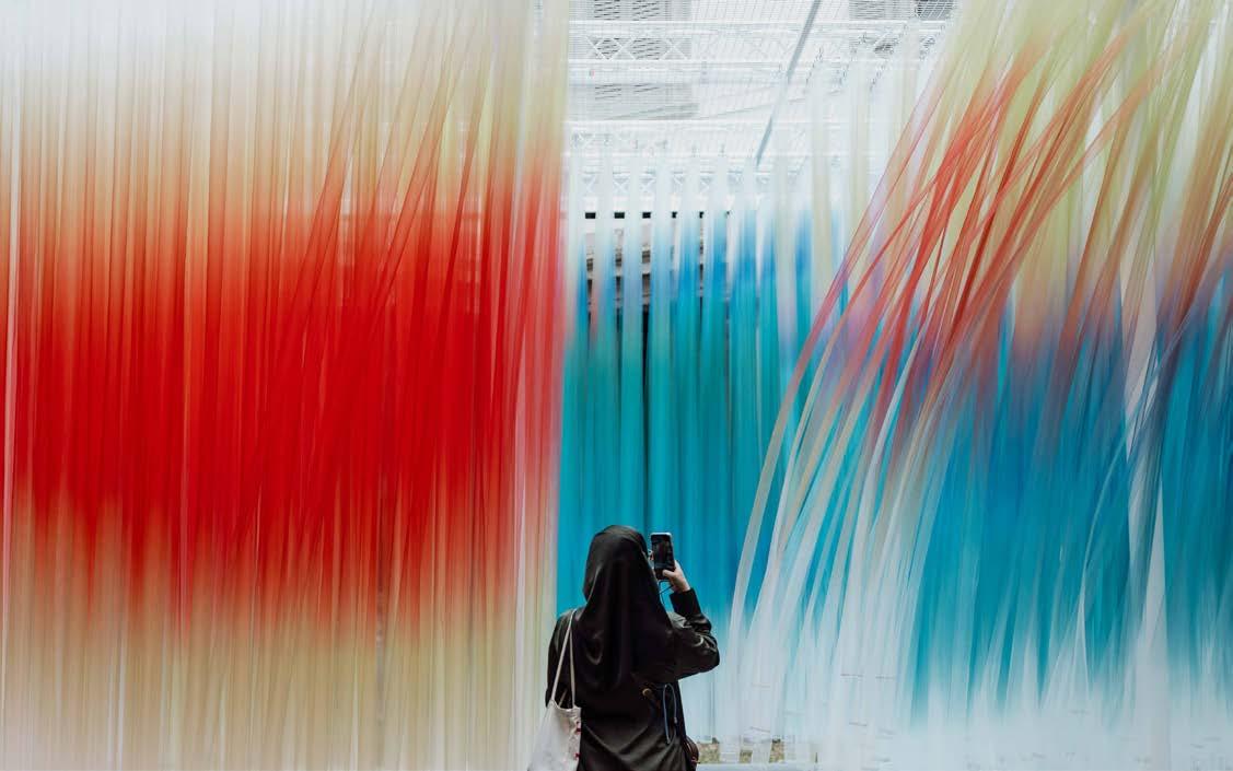
If your feet don’t hurt and you aren’t flying on one too many espressos, you’re not doing it right! Don’t get me wrong, we’ve mapped and tracked the innovations that emerge from Milan Design Week for years, but being there in the flesh is a whole new ball game! I can honestly say that we’ve never experienced anything like it! The electricity in the air, coupled with the diversity of attendees, meant that Salone was nothing short of spectacular. We met brands, designers, and architects from not only Italy, but also Mexico, Spain, China, France, Venezuela, Nigeria, the U.S.A., Germany, and a fair few that have slipped my mind trying to encompass the event in words (no small feat).
‘It was clear: we were as close to the heartbeat of design as it gets.’
When you ‘do’ Milan Design Week, you expect to see an explosion of talent and innovation. Less expected is the sheer magnetism that rings through the air; a connection of like-minded delegates that seems to occur so effortlessly. In the creases and corners of Salone’s floor plan, a passion for design comes alive. This effortlessness is realised because we’re all there with one thing in common, DESIGN! It’s the language everybody speaks! Aside from 10 halls brimming with the most magnificent and sophisticated bathroom, kitchen, and furnishings stands I have ever seen (can we even call them stands?), to the installations dotted around town which reimagined courtyards and historical landmarks as hubs of connectivity, we were reminded constantly to connect to the experience on a deeper level. All of this excitement was peppered with conversations and roundtables where architects like Diébédo Francis Kéré, John Pawson, and Jeanne Gang sat within reach. It was impossible not to fan girl! And then there were the showrooms. Drool-worthy collections and fashion houses jumped in on the action, all undulating down Brera’s side streets and spilling onto street corners.
From exploring the grand installations to delving into showroom presentations and immersing ourselves headfirst into the atmosphere of Salone del Mobile, here are the 10 SCAPE standouts and themes that continue to spark conversation at our HQ.
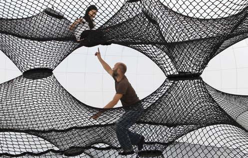
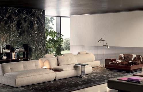
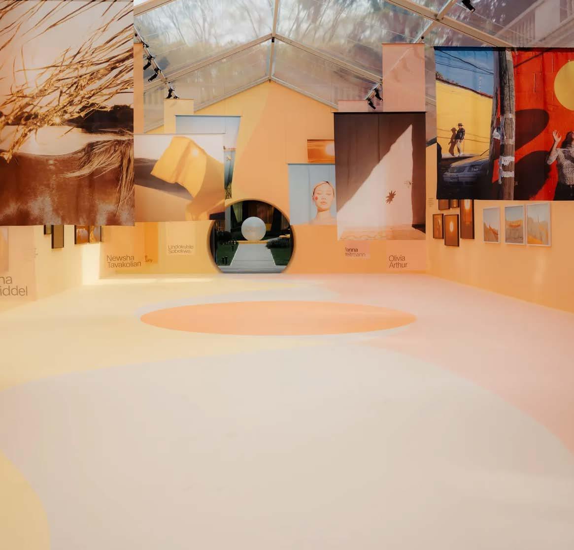
From the moon to the sun, the heavens are in the design spotlight. Giampiero Tagliaferri’s ‘Supermoon’ marks not only a new chapter for Minotti, but also a journey through time in interiors, as demonstrated in the immersive experience they hosted. The organic upholstery, made of velvet boucle and leather, includes shapes reminiscent of the lunar phases. Keeping to this sentiment, the sofa collection lends itself to reconfiguration. Overall, ‘Supermoon’ brings a celestial yet classic simplicity to the sophisticated living space. Following the celestial inspiration, Veuve Clicquot presented ‘Emotions of the Sun’ at Fuorisalone. The installation was a collection of artworks by various photographers, highlighted by translucent draping, that emanated the aura of the sun in all its alluring glory. Then, in Palazzo Clerici, Porsche took visitors on a journey through waking dreams with an installation designed by Numen/For Use. ‘The Pattern of Dreams’ was inspired by Porsche’s Pepita pattern which was first launched in the 1960s. The installation consisted of black and white metal frames crafted into nets for visitors to sit or lie in – a transportation pocket to waking dreams.
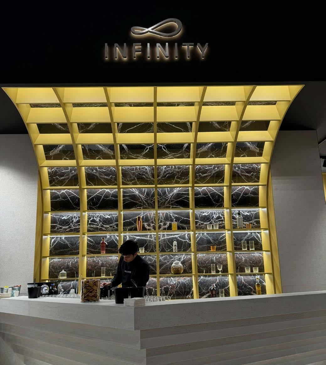
As an Italian surface brand that has travelled to our local shores, Infinity Surfaces returned to its roots to present the epitome of excellence in engineering. Large-scale slabs cladding a larger-than-life stand allowed the scale of this incredible product to do all of the talking. The pièce de résistance was the bar which took centre stage at this stand, with a backdrop as dramatic as it was elegant, backlit to perfection and enveloping the guests as they entered the space. With the charming Infinity team and their passionate-about-the-product posture to their guests, it's no wonder they're our top pick to partner with for the SCAPE Awards of Excellence.

An Italian design story with Molteni&C
Molteni&C turns 90! The elegance of near century-old Italian design excellence is the heart and soul of furniture fundi Molteni&C. Aside from the most exquisite furnishings on display, we couldn't get enough of the immersive secret room, transporting us into the Polaroid-style film studio where we got a personal look into the brand, its journey, and ethos. Personality, pizzazz, and the epitome of luxury design collided at the Molteni&C stand. Aside from this quirky side room, the brand celebrated its history by hosting a campaign to showcase iconic pieces like the D.154.2 armchair by Gio Ponti.
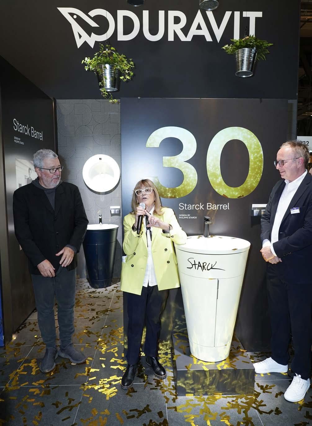
Duravit showcased its iconic Starck Barrel – an innovation that celebrates its 30th anniversary this year! To mark this milestone, the bucketlike piece has been given an upgrade with a new range of colours for its stylish features.
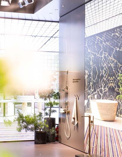
Showcasing the best in bathroom design, AXOR’s booth at the Salone was an exquisite presentation of their finest creations. From the Citterio C by Antonio Citterio collection to the ShowerSelect ID thermostat programme, the booth was a brilliant celebration of the power of exceptional design.
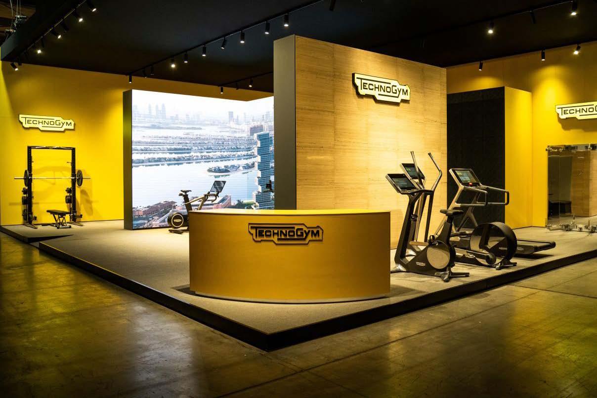
Technogym's ‘Design to Move’ exhibition was a celebration of the brand’s 40th anniversary. The exhibition revealed 40 unique benches designed by 40 creatives from across the world.
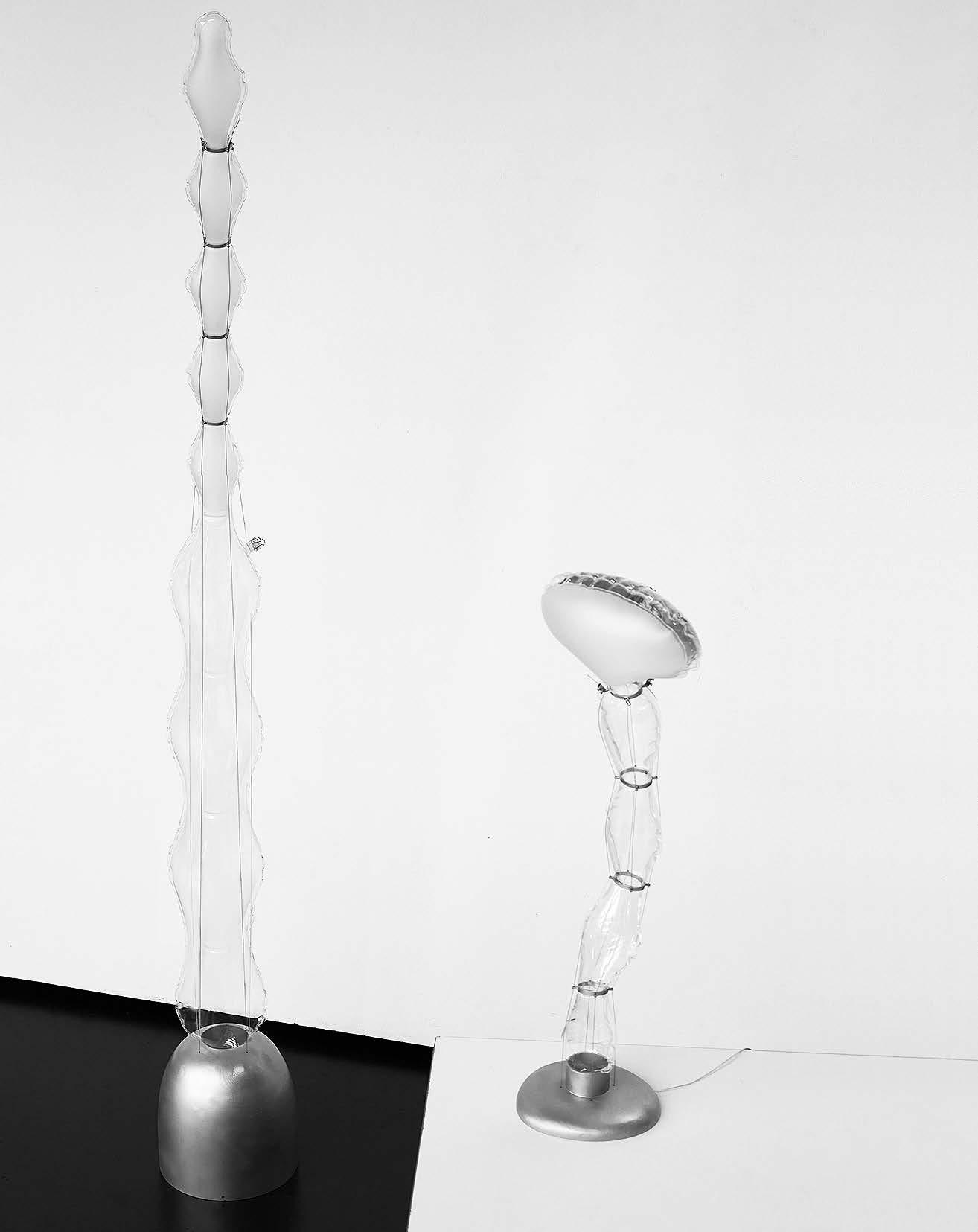
Founded and curated by Marva Griffin, SaloneSatellite is an exploration of the talents under 35 years old that are shaping the industry. Celebrating its 25th anniversary, this year's presentation of the ingenuity by young designers focussed on contemporary living to launch those on the verge of their careers. We couldn't get enough of this exhibition space, visiting it twice during our time at Salone. We also had the pleasure of listening in on a round table of past winners and meeting and interviewing the talented Lani Adeoye, 2022 Winner of the SaloneSatellite and esteemed juror for our inaugural SCAPE Awards of Excellence.
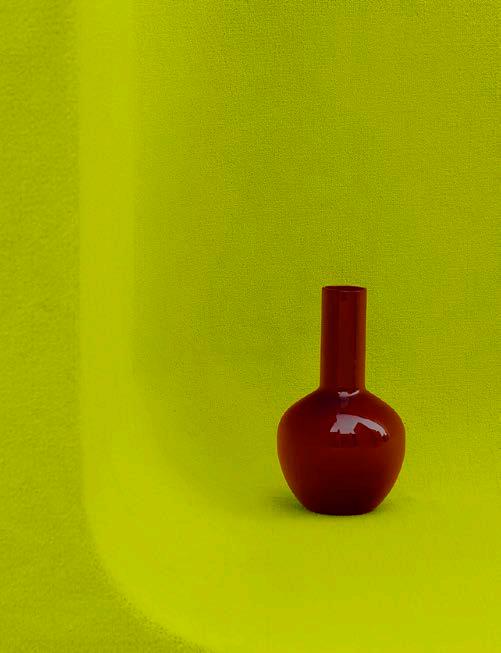

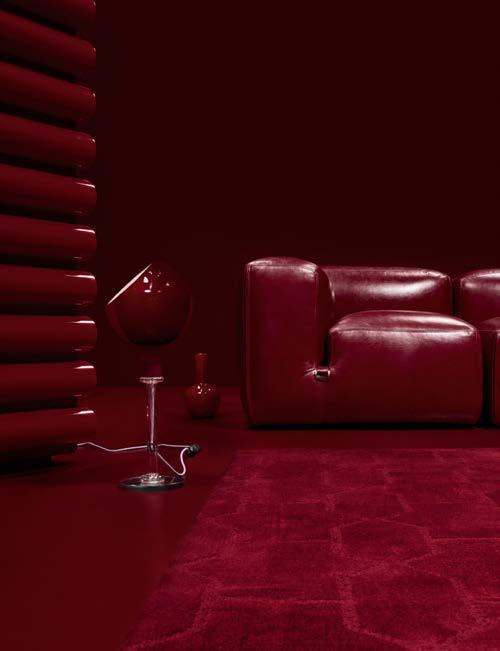
• Burgeoning Burgandy
• Shock Me in Electric Green
• Pastel Appeal
• Hues of Blue
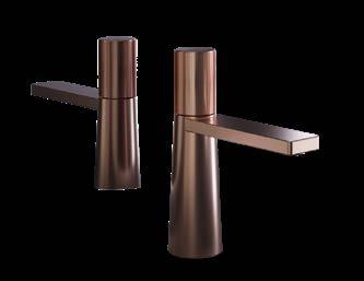
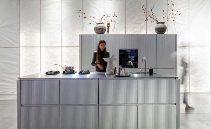
This design choice engages in a dynamic alternative function: combine the elements with technology to create simplicity that remains elegant. In an unusual residential twist, Meridiani Living Interiors brought metallic finishing to lounge and bedroom wall panels. Atelier Biagetti also took metallics for a spin with The Mind Teaser – a furniture piece with multiple configurations that is reminiscent of a Rubik’s Cube, if the whole thing were made of a plush metal and could open up as your seat. Then there were the kitchens... A stainless-steel island may seem a design choice only for the most serious of chefs, but design brands Scavolini, Sachi, and more are counting on home cooks of all kinds to take up the aesthetic. Back at SaloneSatellite, emerging designers used stainless steel or aluminium to create everything from chairs to etageres to lighting. Inexpensive, recyclable, and accessible, these metals are a particularly astute choice for the conscious consumer and certainly we've seen the trend extend to sophisticated bathroom and lighting solutions in Jaquar’s gorgeous metallics.

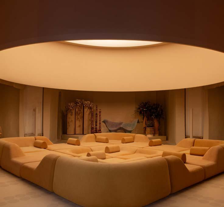
Connecting with one’s roots was at the forefront of some of the best designers’ minds if the Salone was anything to go by. Roche Bobois’s 'Bamboo Mood' is a prime example of a bespoke collection designed by the celebrated Jiang Qiong Er. Having premiered at Milan Design Week, the collection, presented at the brand’s Milan showroom, consists of a pastel-perfect array of modern pieces. The magic comes through in the cultural infusion that Jiang brings – the Chinese symbolism of bamboo.
Saudi Arabia’s ‘Design Space AlUla’ transported visitors to the ancient city’s natural and cultural oasis of a landscape – right in the heart of Milan’s historic design district, Brera. Designed by Sabine Marcelis and CLOUD, the installation was illuminated by monumental lighting resembling a sun, sought to explore the rich material expressions and traditional crafts of the region, offering reinterpretations of its biodiversity, expansive desertscape, and cultural customs through diverse perspectives.
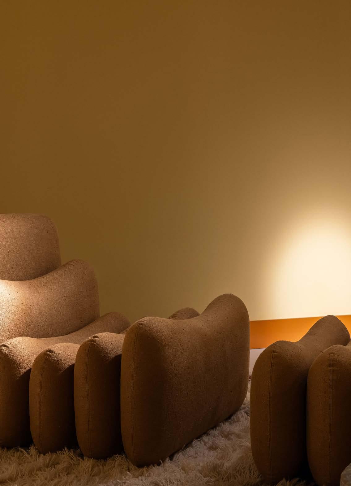
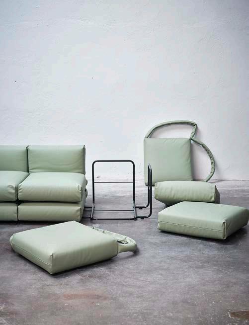
A sign of the continuation of flexible and dynamic furniture for the future, the modular approach highlights the advantages of adaptability. Brands fully embraced the segmented reality. The new Talenti Venice range encompasses this for the outdoors. A sectional fabric garden set that is composed of sofa, table, chairs, and sunbeds, it not only encourages a personal touch to furniture composition but also emulates the look and feel of floating on water. A few of the abundance of modular ranges include Yves Behar's Peaks seating system for Moooi, Kettal’s new Insula system, and Loro Piana’s tribute to the ‘mother of modular furniture’ Cini Boeri.
Additional System Armchair by Joe Colombo for Tacchini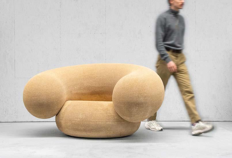
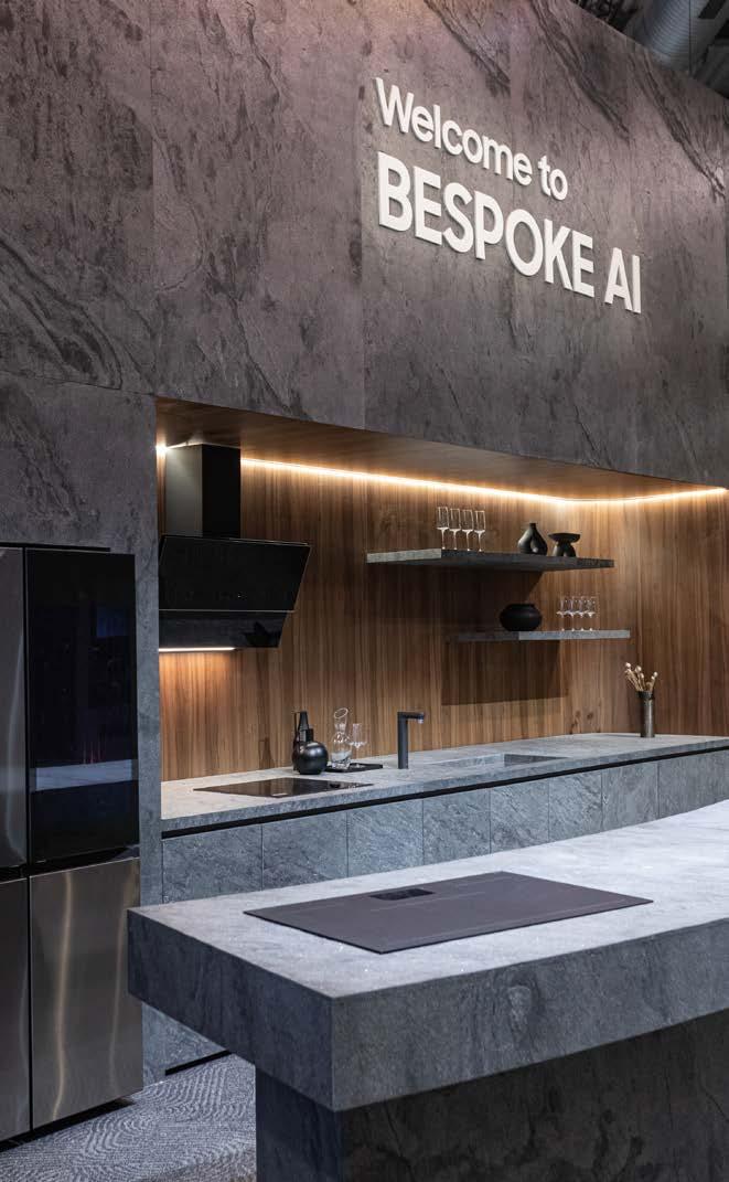
A tech-driven consumer market is gaining momentum, along with a movement to tech-driven craftsmanship. From smart kitchens to 3D printing techniques, design is experiencing an innovative new approach which influences both the maker and the end user. With revolutionary technology on display, everything from regeneration to allin-one smart stoves are the future of the kitchen, bathroom, and beyond. For Samsung’s display, the brand presented ‘Newfound Equilibrium’ – a showcasing of their brand’s commitment to human-centred innovation through their Bespoke AI system. A visual delight, the exhibition stood for harmony between humans and technology.
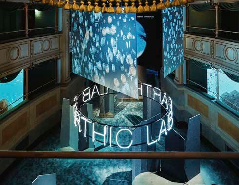
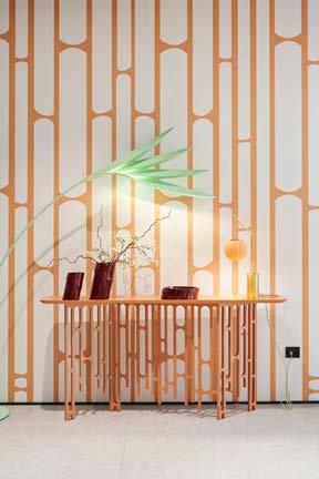
Designing in connection with nature – one of the industry’s ultimate goals – is a perspective that was integral to the 2024 Salone, with a key theme of aligning with the environment. Hermès took inspiration from nature in form and materials with a flat lay presentation combining elements like terracotta, brick, stones, and wood. For OKHA, their Sculpted Forms collection, which launched at the Valcucine showroom in Milan, was dreamed up to be ‘sculpted seating for the human landscape’. Naturally curved and comfortable, their latest furniture range not only holds the body with grace, but also creates the illusion of floating above the ground with grace.
The Cosentino Earthic Lab X Formafantasma, located at the Teatro Gerolamo, created a thought-provoking installation with a new perspective on the world of surfaces. The collaboration aims to raise awareness about the importance of design beyond mere aesthetics, prioritising ethical production processes.
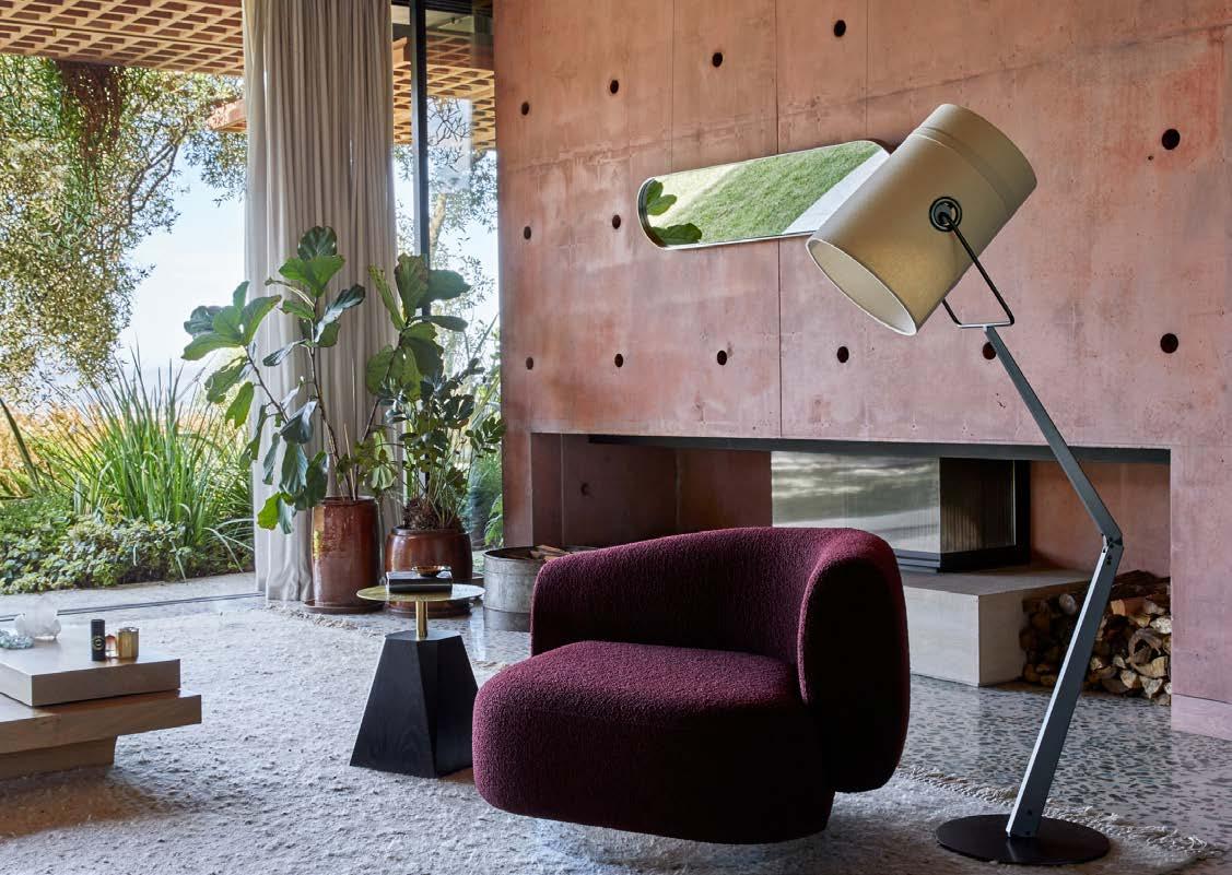

In an expertly designed space curated to celebrate their 90th anniversary, Molteni&C brought their rich history to life at this year’s Salone del Mobile.Milano. The Home Concept immersive booth, designed by Vincent Van Duysen, displayed the latest in luxury living, showcasing furniture designs for the kitchen, lounge, and even outdoor spaces. Visitors were welcomed to tour the display home, experiencing the high-quality craftsmanship that has made Molteni&C an industry inspiration across the globe.
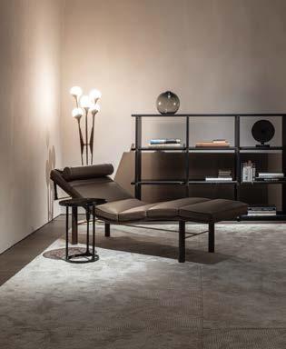
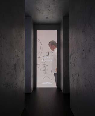
The ‘Experience Room’ was an exhibition of videos, archival photographs, and a display of their best designs – including the brand’s exclusive recreation of the mid-century, Latin American-inspired D.154.2 armchair originally designed by Gio Ponti. Also on show was their elegant new modular system which takes this increasingly appealing style to a new level of contemporary luxury, as well as exhibitions and installations to launch their legacy in print with Molteni Mondo An Italian Design Story. As Milan Design Week came to a close and visitors faded into the distance until next year, the brand’s celebration remained in the city’s atmosphere, with a clear message trailing in the air: nobody understands the culture of quality living quite like Molteni&C.
www.molteni.it
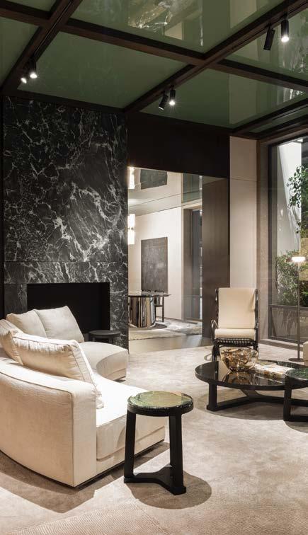
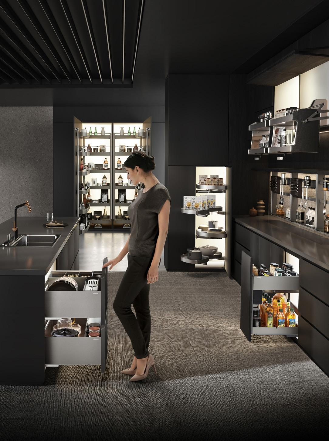
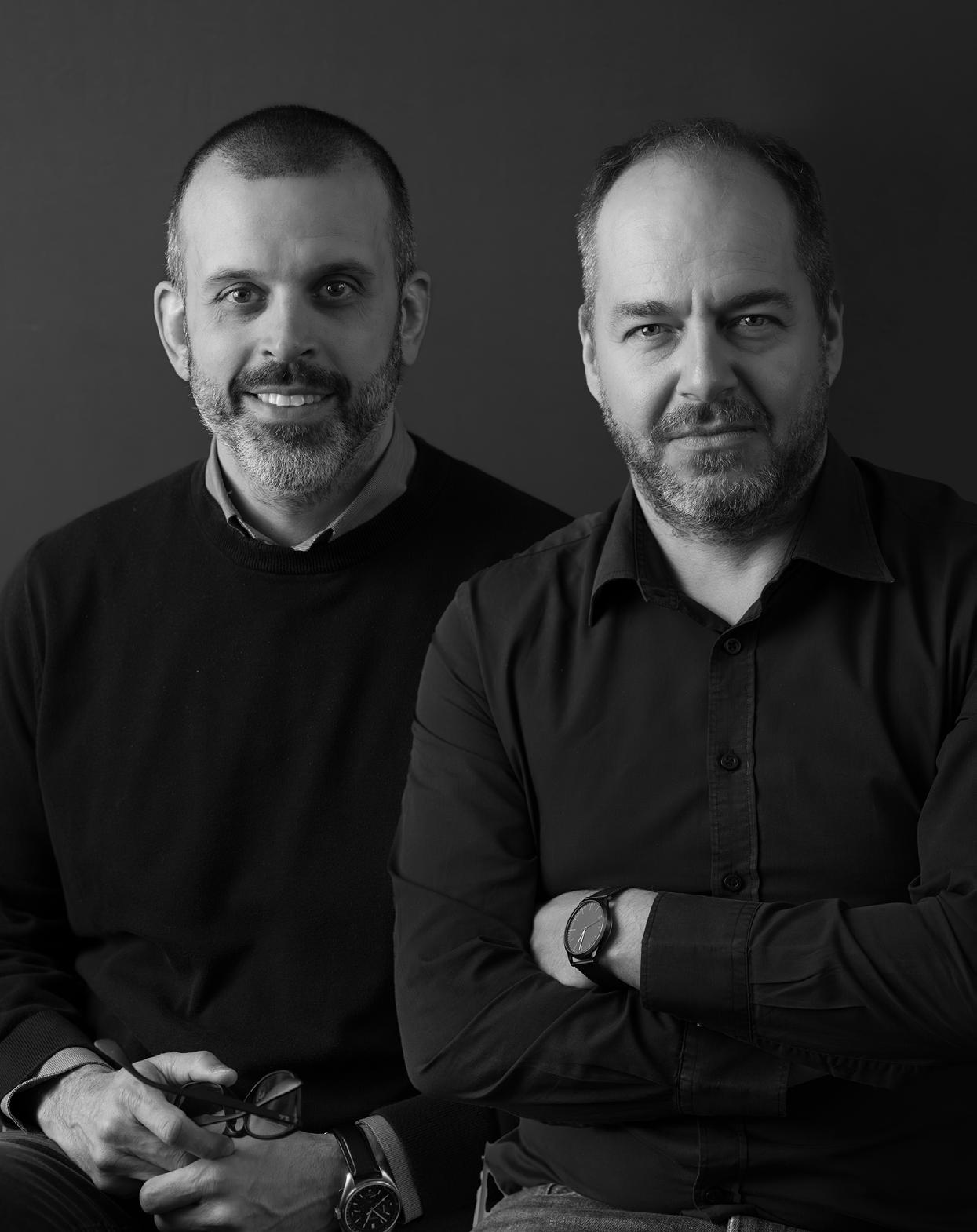
Stepping into the roles of Directors at Peerutin Karol, Henning van As and Giovanni Pivetta are reaching great new heights in the architectural industry. To celebrate their appointment and get to know Henning and Giovanni a little better, we sat down to ask about their design ethos, their goals, and what you can expect to see in the near future.
‘Architecture is vast, complex, and a well-mixed combination of art and science, philosophy and mathematics, freedom and rules. I believe the key to enjoying all of this is to never stop learning.’
- Giovanni Pivetta

‘Being able to strike a balance and allowing yourself to be detail-orientated and meticulous, but also fast on your feet and adaptable, has helped me immensely in my work.’ - Henning van As
Congratulations on your new positions as Directors at Peerutin Karol! What are you most excited about in this new venture?
Henning: I feel it is something that I was always building towards, but now will have to grow into further. My position and experience have been closer to the design side in the practice, but now as Technical Director I will be in a position to better manage and have influence over the later stages of projects. I’m excited that this will bring a clearer translation from design intent and concept to actual built buildings, with less compromise on design and the integrity of the concepts.
Giovanni: Working at Peerutin Karol is an absolute pleasure; I am deeply grateful to Simmy, David, Tarryn, and Eitan for giving me the opportunity to play a more integral part of the practice. I’m proud to be a new director of this exceptional team of architects and I hope I will keep bringing my experience and competence. I am eager to continue sharing my passion for design and mentoring the next generation of architects who join our studio.
What are some new developments in the firm we can expect to see, and what are some new projects you’re gearing up to roll out that we should keep an eye out for?
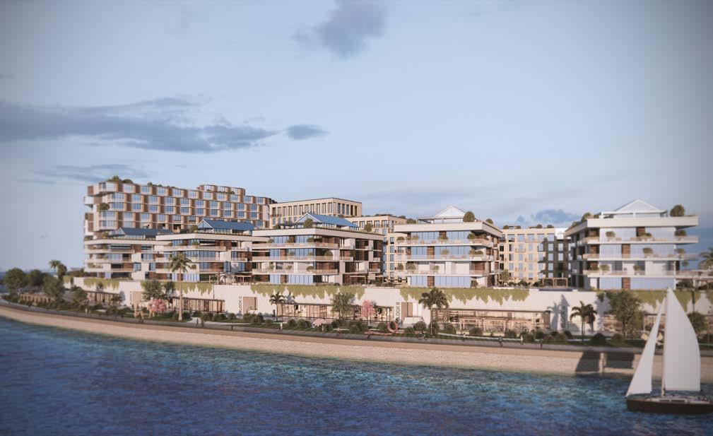
Giovanni: We are currently busy with an urban master plan of an ‘island’ in Lagos. Technically, it’s reclaimed land from the lagoon, about 70 hectares with a secure high-end single residential estate, a series of mixed-use buildings, a hotel, and a picturesque waterfront with a promenade and a marina, all connected by green parks, sports facilities, and a fitness trail.
We are also in the design stages for a sports academy just out of Abuja, Nigeria, an office headquarters for the largest coal mining company in Zambia, and in Cape Town we have an extensive alteration and addition of a single residential villa in Bantry Bay under construction. Probably the most exciting project is a joint venture with another renowned South African architectural studio in the Indian Ocean.
Henning: We can’t say much more about this secret project in the Indian Ocean yet. But because of its exceptional requirements and extremely high standards, this project has allowed us to explore our abilities on multiple levels. Through the use of available technologies in ways that we have never tried before, this is especially true for our collaborative BIM models and the use of AI in design; we believe we exceeded the project’s demands.
We’re very interested in the description of Peerutin Karol as being both design-driven and also business-minded in the sense of being able to deliver on time and within budget. Is this a philosophy that comes from the top, or does the firm actively seek members who have this dichotomy of strength in the working environment?
Henning: I would say that both are true. Peerutin Architects was built on the strengths of the two founding partners, Simmy Peerutin and David Peerutin. As the business has grown it was understood that to continue this legacy, future directors would need this range of skills. Therefore, early on, Tarryn Cohen was appointed as Director to support the management side of the practice. The merger of the renowned commercial practice of Louis Karol with Peerutin in 2021 only strengthened the team by adding Eitan Karol as Director of Business Development. Now, with the appointment of Giovanni as Design Director and myself as Technical Design Director, we have set the stage to continue this legacy forward.
Giovanni: It certainly comes from the top, but more as our approach to architecture rather than a business model. At Peerutin Karol, you are presented with the invaluable opportunity to fully immerse yourself in the significance of two critical elements in contemporary architecture: Solid design skills and robust strategic management. These encompass a deep understanding of architectural principles, innovative construction technology, attention to detail, and the ability to translate concepts into tangible designs. It underscores the significance of effective planning, organisation, and coordination throughout the project life cycle.
Can you tell us more about the collaborative aspects of your work?
Henning: As Technical Design Director the aim is to support each other from the early stages, to find creative design solutions that are appropriate, esthetical, and practical. With my design background and having worked closely together with Giovanni, the intent is that unforeseen design challenges that usually come up further in the technical development stage can be addressed and collaboratively solved. To this end we have adapted the way we are using Revit, our technical design documentation software, to more seamlessly host design layers that allow it to be a more responsive design tool.
Giovanni: Henning and I come from different work experiences and over the years we developed different competencies, bringing unique skills to the table, which is a great asset in architecture. Sometimes we may have different visions for a project, but we see this as an opportunity rather than a handicap. In our collaborative process, we often divide responsibilities based on our strengths, allowing us to work efficiently at different stages of the design process. Despite working on different aspects of the project, we maintain open communication to keep each other informed of our progress. This ensures that the project receives the attention and consideration it deserves at every stage.
Describe your design modus operandi in one sentence.
Henning: Creative problem solving with passionate but flexible design.
Giovanni: Dare with respect.
You both have extensive international experience in your practices. How will this aid you in your career path at Peerutin Karol going forward?
Henning: In Europe, specifically Germany, I learned to be very meticulous and correct. I learned to speak German early on and was able to immerse myself in the culture. The environment is very traditional, and things take time. Being able to strike a balance and allowing yourself to be detailorientated and meticulous, but also fast on your feet and adaptable, has helped me immensely in my work. I hope that this experience will help to further grow the firm, keeping it a competitor in the international arena and especially in Africa.
Giovanni: My background and experience have certainly played a pivotal role in shaping my professional life. Growing up, studying, and working in Italy, renowned for its rich architectural heritage, has profoundly influenced me as an architect. In any Italian city, a mere stroll is likely to unveil a Roman building, a medieval castle, a Renaissance church, a modernist institutional building, or a contemporary, ultra-high-tech building. I still have a strong connection with my Italian roots, so I try to stay updated on the latest design trends, philosophies, and technologies that Europe, and especially Italy, can offer. Architecture is vast, complex, and a well-mixed combination of art and science, philosophy and mathematics, freedom and rules. I believe the key to enjoying all of this is to never stop learning.

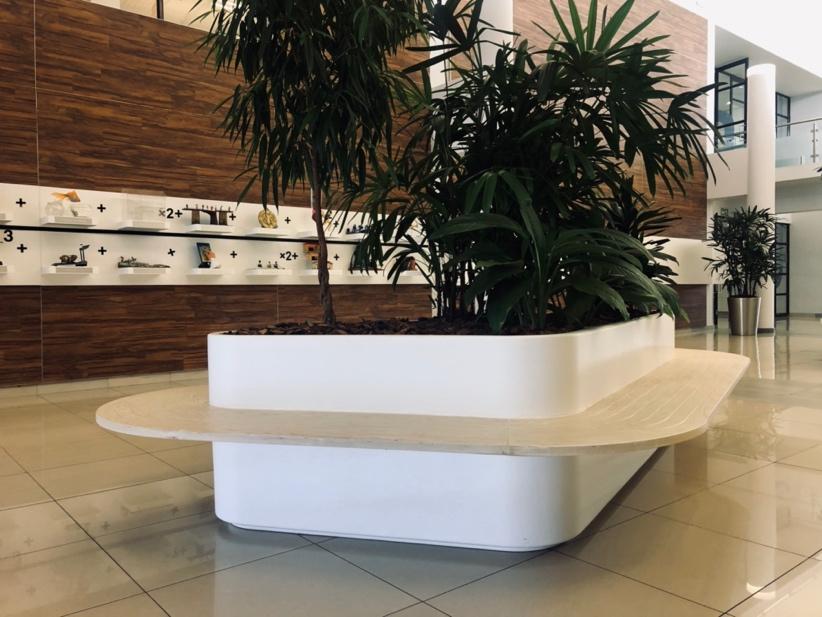
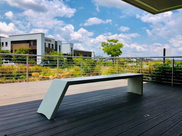

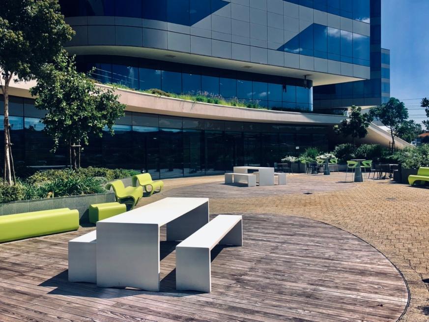

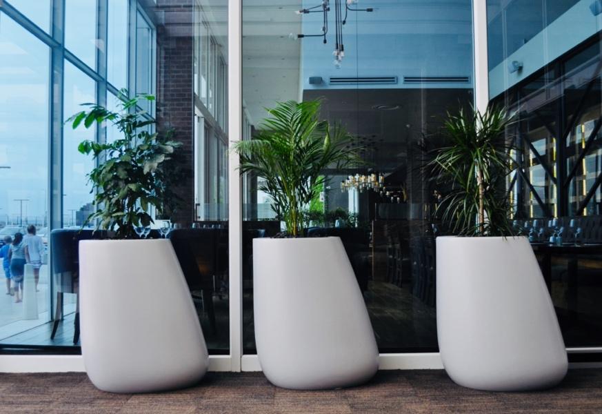
Igneous Concrete began with a vision to create a material that was both weather resistant and water repellent, and had design longevity to suit spaces along the South African north coast of KwaZulu-Natal. A family-run business since 2008, owned by brothers Brent and Oliver Youens, the brand has grown from featuring in private residences to extensive installations that have seen the reshaping of key locations across the country.
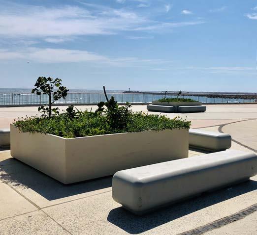
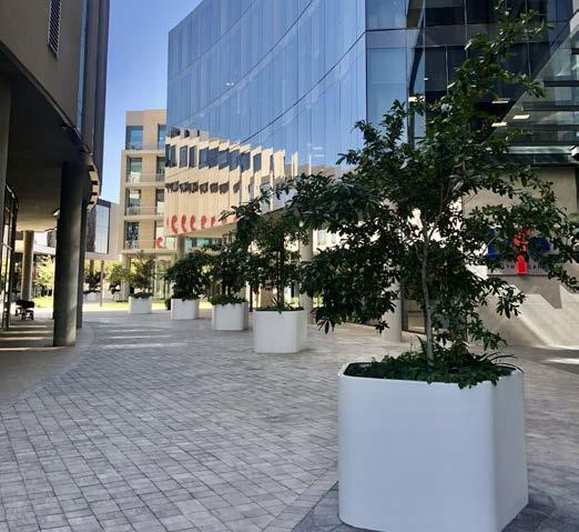
The extent of Igneous Concrete’s reach covers the Sandton, Rosebank, and Pretoria skylines, as well as the Ballito, Umhlanga, and Durban commercial and public zones. Then there’s a long list of retail, office park, and government national key point buildings throughout South Africa and the continent that feature this top-quality brand, too.
Broadening your scope
Known for its durability and high-quality finish, Igneous’s resin-based polyconcrete has launched the brand to success, with the factory expanding to now include over 120 standard mould forms as well as in-house CNC machinery for custom manufacturing. Their extensive catalogue includes an impressive range of seating and furniture, pots and planters (both unique and more standard landscaping shapes), public space installations (including bins, bollards, counter fronts, canopies, and signage), and bench and wall panelling applications. For the big builds across our country, Igneous provides a full scope of items with the manufacturing capability to work to scale. 30 years of experience in civil engineering, construction, and contracts provides further support to the polyconcrete team –through on-site installation, reticulation, and maintenance.
Low
Igneous polyconcrete is a relatively low-maintenance material and is resistant to heavy chemical and alcohol cleaning. The result is excellent hygiene comparability for medical and fitness spaces, as well as communal eating and work zones. Igneous therefore has an extensive listing of installations in retail, university and learning institutions, public open areas, and government buildings that have high traffic and usage requirements.
As a proudly South African team, with extensive experience and partnership with leading architectural, interior, and landscaping companies, their resulting key collaborations include Discovery Health, Sasol, Deloitte, Oxford Parks, and the Menlyn Maine precinct. What’s more, FNB Urban Savannah and Campuses, OR Tambo International Airport, Standard Bank Rosebank and Campuses, Investec, V&A Waterfront, and the new Amazon development in Cape Town all fall under their list of clients. With a reputation like this, there couldn’t be a better testament to the brilliance of Igneous Concrete.

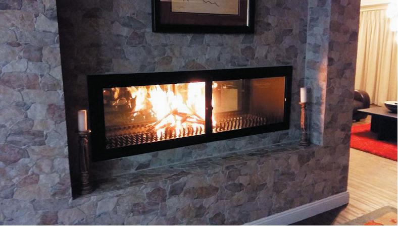
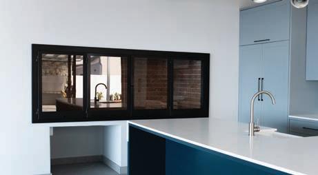
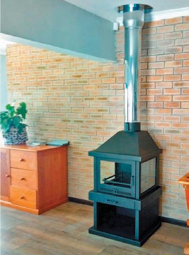
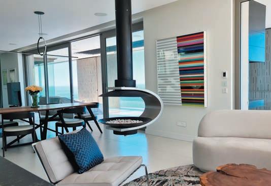
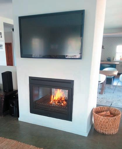
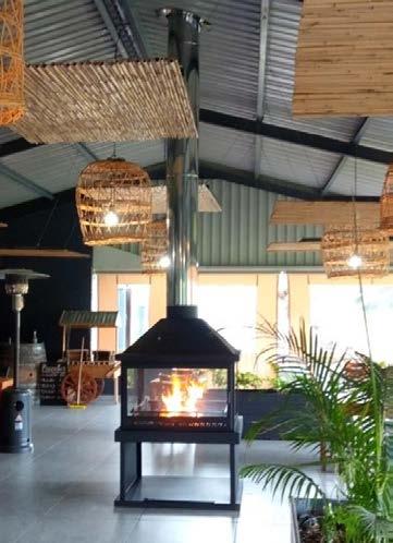
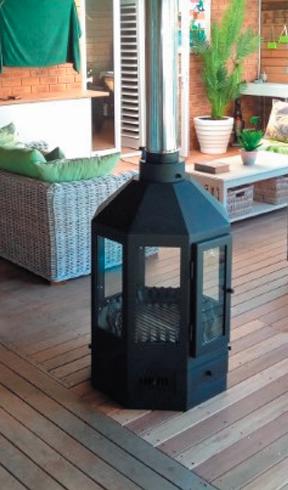
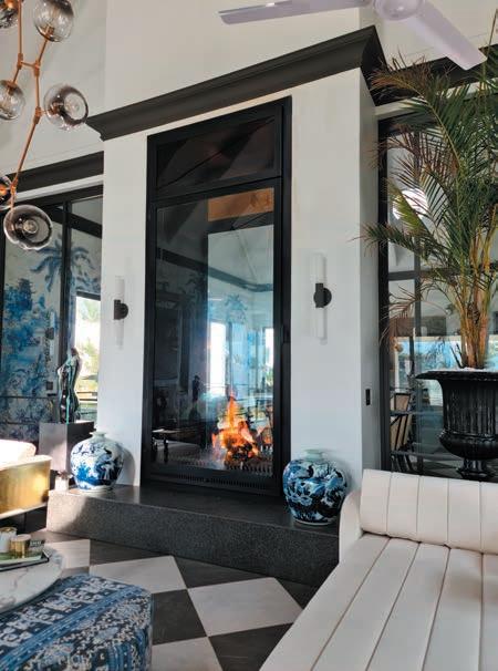
Thermo Fires is a Cape Town-based designer and manufacturer of braais and replaces. We strive to bring our customers the broadest range of good-quality products at competitive prices, coupled with sound knowledge and a wealth of experience. Since 2003, our name has become synonymous with one of the largest ranges of quality and custom products. Our motto, “Leadership through Quality.” embodies our vision to become the preferred supplier to the discerning architect, builder, and customer. If you do not see what you want on our website, contact us. Chances are, we can do it.


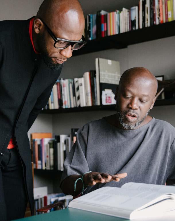
As CEO of the Adjaye Associates Accra Studio, Kofi Bio has proven instrumental to the team during his role over the past decade. Having not only worked closely with Sir David Adjaye to launch the Accra Studio, Kofi has also been an essential part of projects like the National Cathedral of Ghana and the Ghana Trade Fair redevelopment. Already familiar with our local landscape – Kofi is working with the Mbeki Foundation on the Thabo Mbeki Presidential Centre – we welcome his expertise as he joins the jury for the SCAPE Awards of Excellence and chats to us about the brilliance of the big build, materials and techniques, and industry responsibility.
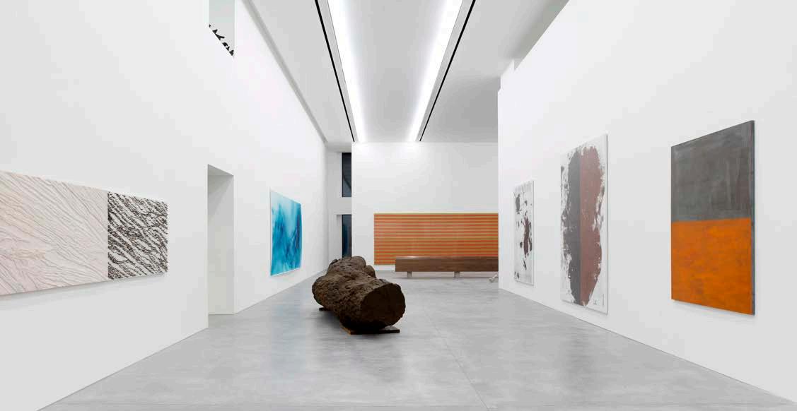
Adjaye Associates' body of work exemplifies the magnificence and brilliance of large-scale commercial and mixed-use architecture. How has your work in this sector evolved, and what do you believe is Adjaye Associates' greatest contribution to the sector?
Our work has pushed the industry forward through continuous evolution and by adapting to the emerging questions and demands of our society. However, it’s not just about answering the present; it is about addressing the future. We mediate the realms of the macro (encompassing the urban, infrastructural, and global) and the micro (attending to the pavilion, details, and materiality) in tandem. In doing so, our approach builds momentum into our large-scale designs. For example, hybridising the art and retail elements in Aïshti Foundation led to the reimagining of how the National Cathedral of Ghana functions within the civic heart of Accra. Through testing across the globe, we can empower our clients to embrace what may seem like risks, both architectural and typological, but are, in truth, opportunities to set innovative precedents.
Which materials and techniques are you most excited about at the moment?
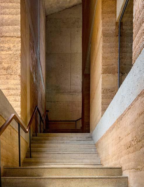
For the past 4 to 5 years, our studio has been leading efforts in exploring and expanding the potential of rammed earth. Currently, Adjaye Associates has several projects that incorporate soil from their respective sites, embracing sustainability while honouring the buildings’ contexts and ecology. Among these endeavours is dot.ateliers — a community-oriented space near Accra’s waterfront dedicated to artistic production — commissioned for the artist Amoako Boafo. The distinctive structure emerges from its site as a monolithic three-story earthen structure, characterised by stacked volumes. Other completed projects include a private office, an earthen residential villa, and a beach resort, each thoughtfully integrated into their natural setting through form and materiality.
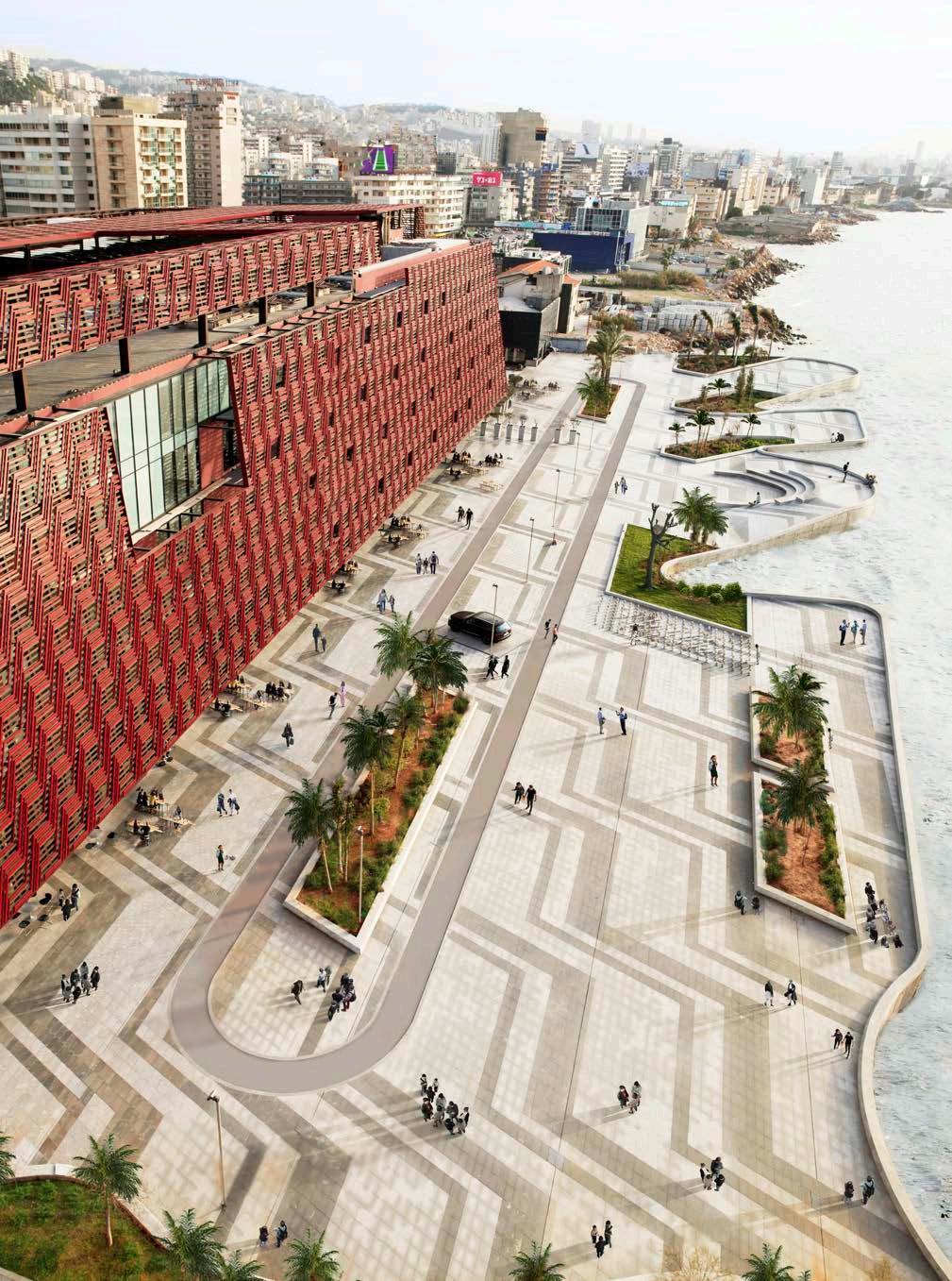 Aïshti Foundation, photography by Guillaume Ziccarelli
What are you hoping to see more of from the global industry in a time where ‘impossible’ is a word that seems less threatening than before?
I don’t believe ‘impossible’ will ever become less threatening. As global citizens, our responsibility is to continuously improve the world we inhabit — a role which may feel daunting. Nonetheless, reimagining our world and pushing the boundaries of what is possible is precisely the task of the architect. As there are a plethora of concerns to address, we practise actively listening and working with our clients and community stakeholders to find specificity. Through this, we strive to set precedents for experiments in materiality, such as multi-storey rammed earth structures, or offer training for the next generations of African architects — a post-independence dream on the continent that Adjaye Associates, and other firms, made possible. Through perpetually refining and redefining our projects, our office and the global industry are constantly pushing the realm of possibility together. It is this care in innovation that I hope to see more of.
@adjayeassociates www.adjaye.com
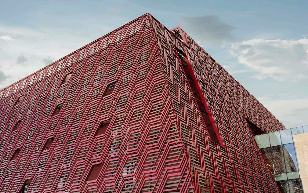
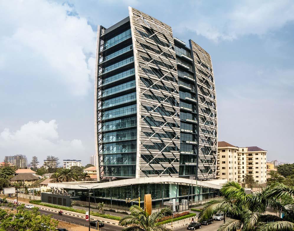

Embodying the feeling of Lagos and designed by SAOTA, Kingsway Tower is my favourite big building. It has this distinctive form, subtly mimicking the square sails of the traditional boats on the lagoon which have long been part of the horizon. In a sense, the building conveys that gentle city breeze. The folded perforated aluminium screens on the tower’s façade (in addition to being functional in responding directly to local climatic conditions) have become its iconic identifier. Careful to avoid any directly literal comparisons, arranged in multiple shifting layers, they create interesting shadows, and the pattern abstracts its inspiration from the tropical vegetation, especially the palm trees, making the building really ‘of its place’. I keep going back to this building; it captures a moment in time for me of my early career at SAOTA, and it continues to inspire me.
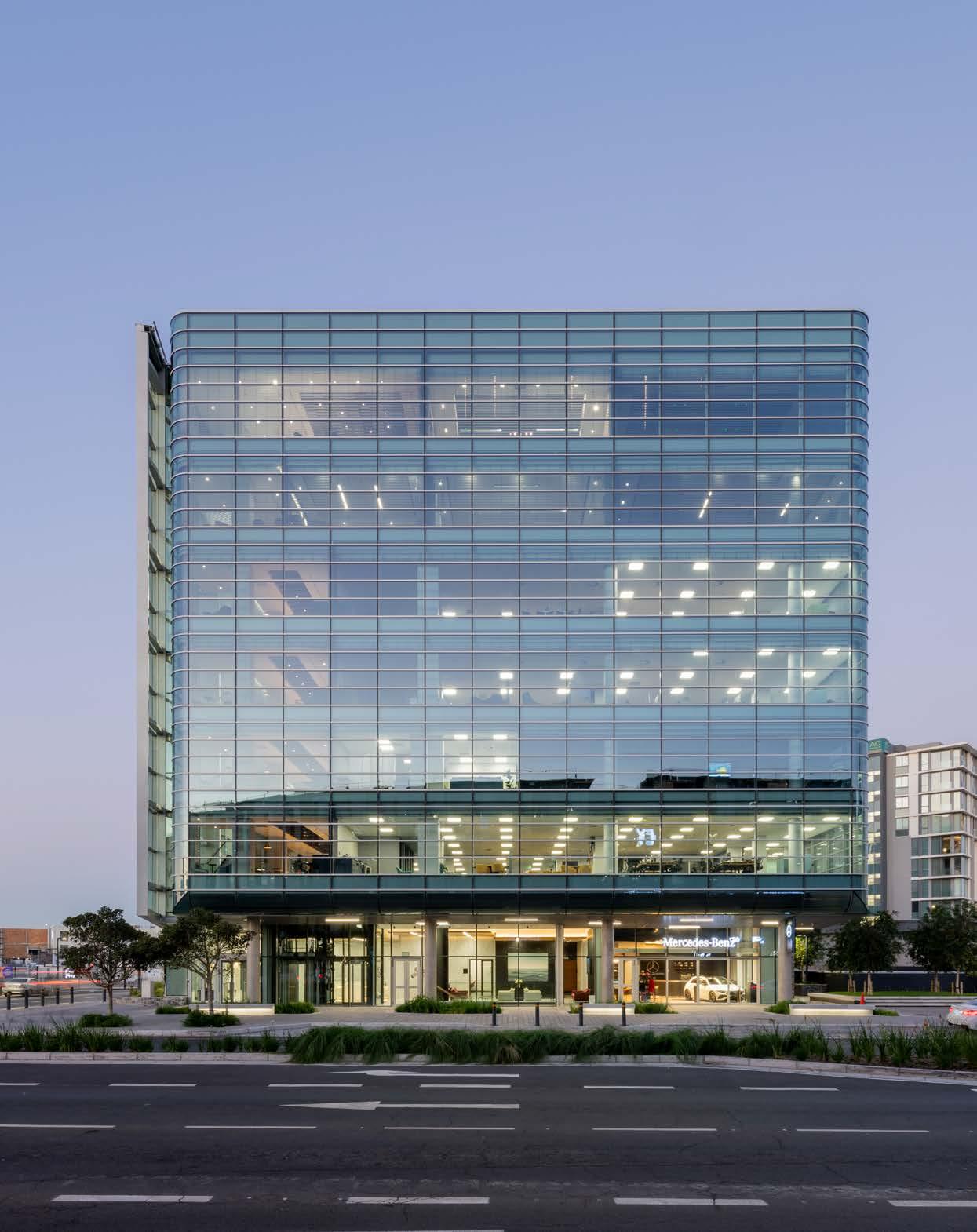
V&A Waterfront Office Space by SVA International
Size: 10 880 m²
Cost: R320 million
Completed: 2023
Location: V&A Waterfront, Cape Town
The Cape Town skyline is a vision of bold builds, with new giants added to the view constantly. As everything from corporate to commerce grows, the spaces that carry the locals grow, too. Landing on the hotspot of the V&A Waterfront, this new office space, designed by SVA International, has taken the idea of a waterside workspace on a shining new journey.
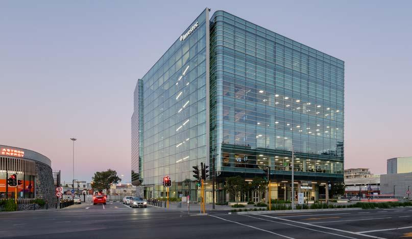
SVA International’s work on 14 Dock Road started when the V&A Waterfront found themselves ready for a contemporary building with an architectural envelope stylishly representative of their brand. The building, elevated appropriately, needed to provide users with the best access to views of the surrounding landscape – city, sea, and mountains in all their glory.
The new office space would replace an existing fuel station, which needed to be decommissioned, demolished, and rebuilt on the adjacent site. Subtle references to acknowledge the original shoreline, which cuts diagonally across the site, were introduced in design elements, like the soffit of the Atrium ceiling, which crosses the entrance threshold. A link to Duncan Road also had to be accommodated and the railway crossing levels taken into account. This meant lowering part of the basement under the road between the new fuel station and 14 Dock Road.
An elegant building solution
‘Restraint is defined as the means to prevent from expressing something, to limit, keep under control, or moderate. In design, we can say that restraint is the intersection of working within constraints and practicing humility as designers. Designers too often see constraints as something restricting what they want to do.’ - Doug Chiang
Practising restraint in design is just another way of saying that form follows function, or letting the building tell you what it wants to be, as Louis Khan once said. All aspects of the building design, from building mass and façade treatment to fixing details, incorporated this practice of restraint to present an elegant contemporary building solution. The building was also designed to achieve a 5-star Green Star rating. Cyclist and pedestrian facilities, EV bays, greywater, solar panels, and selective sustainable sanitaryware are only a few of the initiatives in restraint and consideration that contributed to this successful Green Star rating.
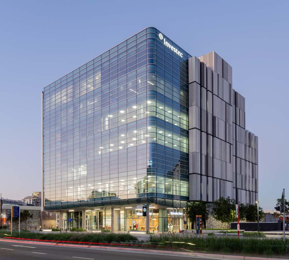
The façades, which face a street that sees thousands of visitors and guides locals and tourists alike to one of the city’s main hubs, needed to bring an aesthetically pleasing design contribution. 14 Dock Road is ideally situated to admire Signal Hill, Table Mountain, the harbour, and the working dock, so the office floor plate proportions had to be carefully shaped to maximise these priceless views from anywhere within the office. Glazing modules were horizontally fenestrated to minimise view obstruction and horizontal mullions were carefully positioned. The glass type selection was also meticulous and had to ensure comfort levels inside were met without obscuring the views onto the office floors from the street.
The client brief, climatic conditions, achieving sustainable design, and appropriate design choices were all informants when selecting the right materials. For the treatment of the main façade, the proportions of the building were one of the main influences, leading SVA to wrap the main façade with a transparent fabric that would accentuate the building’s form, maximise views, and respond to the programme while still practising restraint.
Tiling: LimeGreen | Epoxy flooring: Sika | Raised access flooring: Pentafloor | Paving: C.E.L. Paving Products | Sanware: Geberit, Hansgrohe | Lighting: Regent Lighting Solutions, Rubicon | Roofing: Safintra | Ceiling: Gyproc, Decolite | Façade: Saint Gobain | HVAC: Trane
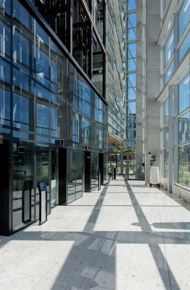
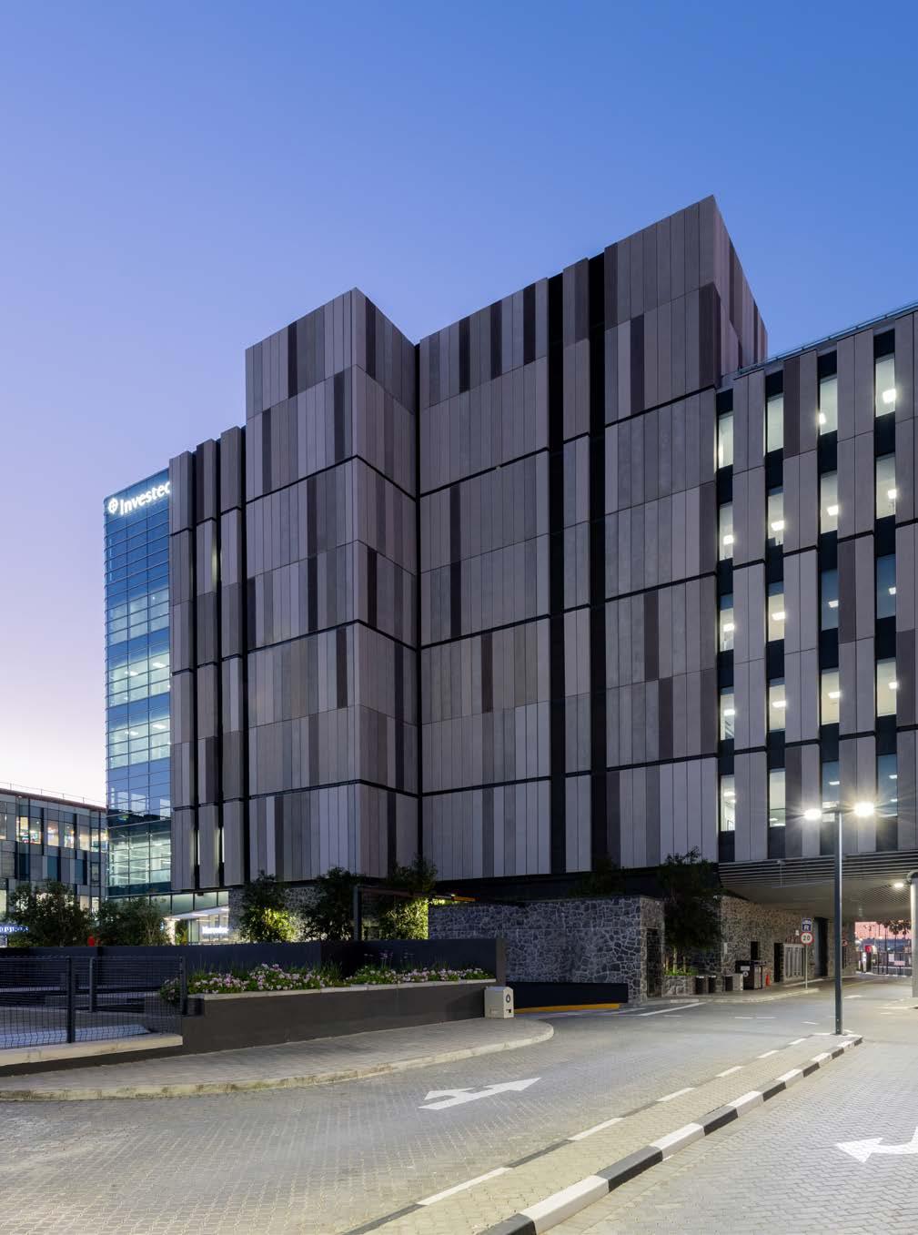
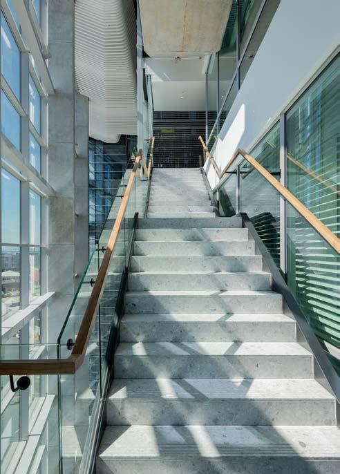
The material choice for the Atrium was guided by the fact that an uninterrupted, transparent viewing window would communicate to the public street, affording the building a sense of civic presence while allowing those inside the building to interact with the street via the stair window that connects office floors. The main façade fabric also wraps into the Atrium, creating the illusion that the Atrium is a space given to the street. The South face of the building needed to respond to climatic orientation and the harsh coastal environment, most appropriately tackled with precast concrete – an aged moss-grown concrete wall that will not age. Weighty concrete panels, with their deep-slotted windows and vertical fenestration, juxtapose the softer curved glazed façade with its horizontal articulation, creating a perfectly balanced duet. That is, ultimately, what 14 Dock Road offers to its environment – a well-balanced and sophisticated structure that gives more than it takes and pushes the quality of building big to new heights.
‘Practising restraint in design is just another way of saying that form follows function, or letting the building tell you what it wants to be, as Louis Khan once said.’

 GIOVANNI DOLPH Associate Executive
@sva.international www.svarchitects.com
MEET THE TEAM
Client: V&A Waterfront | Architects: SVA International | Interior Architects: Paragon | Landscape Architect: Yes& Studio | Main Contractor: WBHO Project Manager: Igual | Quantity Surveyor: RLB Pentad, BH&A | Structural, Façade & Civil Engineer: Sutherland Engineers | Mechanical Engineer: Triocon | Fire Engineer: Ekcon Consulting Engineers | Lift Consultant: Projitech | Greenstar Consultant: Solid Green Consulting | Traffic Engineer: Innovative Transport Solutions | Acoustic Consultant: Machoy | Photographer: Johan Lourens Photography
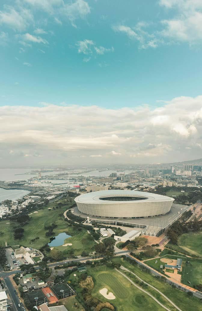
 TLUYANDA MPAHLWA Founder, Director & Architect @designnetwork_za
www.designnetwork.co.za

he euphoria of the 2010 FIFA World Cup may have faded, but it has been 15 years since the Green Point Stadium was completed, and what a legacy this big build has left on our urban environment. The bold stadium remains one of the most iconic designs of any stadium in the 21st century, and the transformation of the urban landscape around the Stadium only enhances this marvel. The Green Point common was transformed to a world-class urban park which offers better connectivity to the V&A Waterfront, extending the walkability of the entire precinct, resulting in an incredible revitalisation of the broader Stadium Precinct. The other significant legacy was the improvement of Helen Suzman Boulevard which incorporates the MyCiti Station directly adjacent to the Stadium. With the urban transformation not yet complete, these developments, launched through the Green Point Stadium, are undoubtedly set to further broaden Cape Town’s urban horizons.

Plumblink by Empowered Spaces Architects
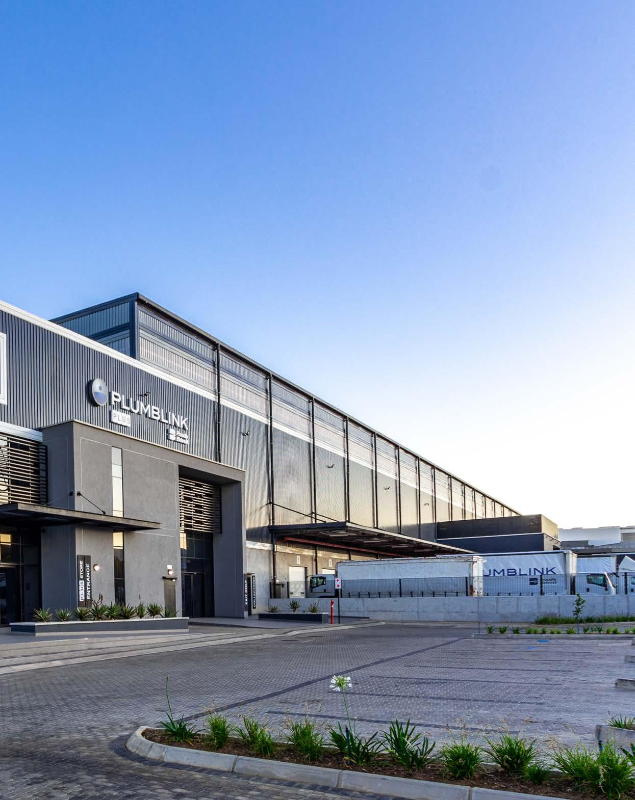
To establish their new home in Waterfall City, local plumbing giant Plumblink called on Empowered Spaces
Architects to craft a structure worthy of their name. The task was to amalgamate Plumblink’s Midrand-based head office, logistics, and customer collection into a colossal new 14 500 m² facility. The result is a design that emerges as a fusion of traditional warehouse pragmatism and contemporary office elegance.
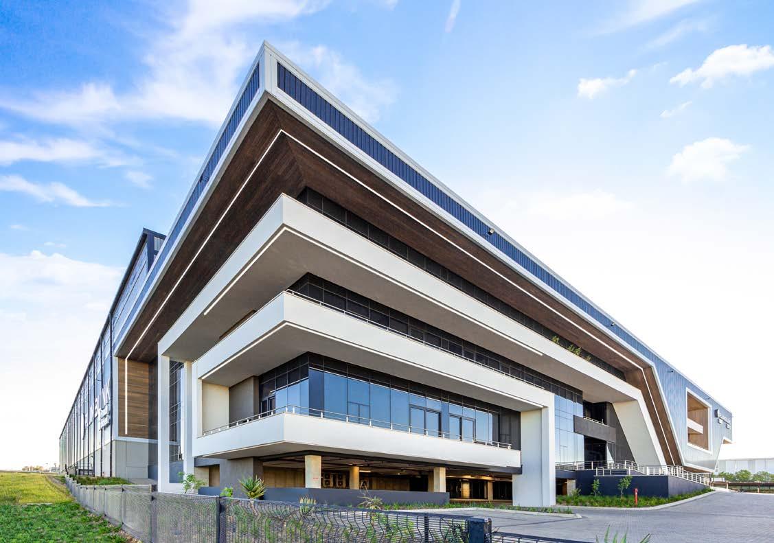
Size: 14 500 m²
Completed: 2023
Location: Waterfall City, Midrand
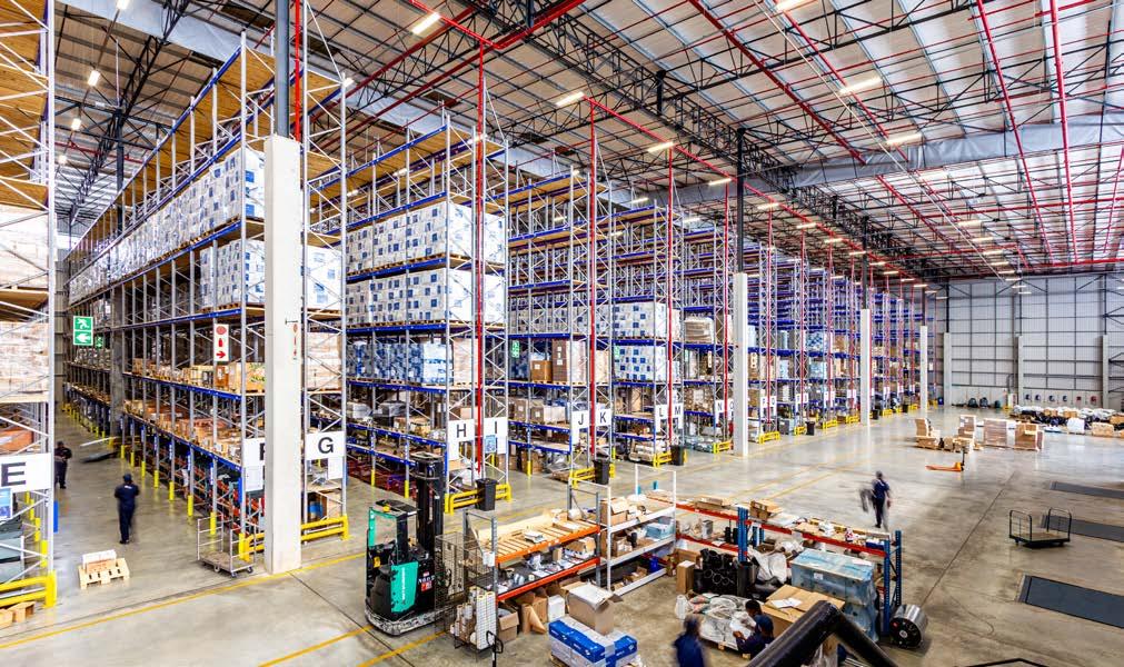
Consolidating various business facets under one roof presented an opportunity to cultivate a cohesive company culture and elevate Plumblink's corporate identity. The facility is multi-use, with 2000 m² of office space spread over 3 storeys, 800 m² of showroom, and order collection spaces alongside extensive warehousing. Positioned along the Buccleuch interchange, the building can be seen from the main arterial traffic routes connecting Johannesburg and Pretoria. This strategic placement offers panoramic city vistas whilst amplifying brand visibility to passing traffic, a key asset in Plumblink's growth strategy. Positioned as a frontrunner in the industry, Plumblink’s relocation places them in a highly accessible and well-connected locale, aligning perfectly with the needs of the expanding customer demographic.
Traditional warehouse meets modern office
Architecturally, the facility seamlessly blends traditional warehouse elements with modern office design. The façade arises from juxtaposing industrial materials, like corrugated sheeting and raw concrete, with large glazing sections and balconies that add a contemporary aesthetic. Timber clad sections add texture and warmth, contrasting against the other elements. Additionally, the horizontal linear cladding that cascades across each floor evokes a sense of fluidity, while verdant foliage softens the urban landscape, harmonising nature with architecture. The design elements not only enhance aesthetics but also foster functional social spaces, emphasising the synthesis of form and purpose.

The essence of Plumblink
Plumblink's industrial essence is underscored as you enter the reception where you are greeted with raw, exposed surfaces and services. The spacious and luminous triple-volume atrium and reception area, along with its sculptural staircase, create a welcoming entrance space from where you can access the corporate offices and adjacent showroom. Planted partitions and polished concrete floors exude contemporary elegance, blending the internal aesthetics to serve the diverse needs of Plumblink's showroom, warehouse, and office spaces.
environmental responsibility
The building is not only a massive feat in terms of design and aesthetics. It is also a testament to the brand’s consideration beyond itself. By implementing water-saving fixtures, adopting efficient waste management practices, supporting progressive environmental initiatives, and the use of recycled building materials, Plumblink demonstrates its commitment to being environmentally responsible, presenting a 4-star Green Rated building.
Drawing on the brand’s context to guide their design, Empowered Spaces Architects masterfully crafted a space that fulfils all of Plumblink’s needs. Balancing practicality and function, form and style, and even environmental consideration, the new facility in Waterfall City is a bold and modern approach to large-scale working spaces.
Aluminium & glass: Diri Aluminium |
Ironmongery: Buchel Handles Hinges & Locks | Timber cladding: Eva-Last @empowered_spaces_architects www.espaces.co.za


Heat a room to 30 C
Cool a room to 14 C
Heat water to 70 C
Chill water to 10 C
All from one system simultaneously!
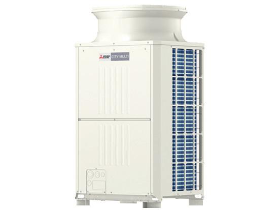
The world’s first two-pipe heat recovery system that Simultaneously Cools and Heats
CITY MULTI R2 series offers the ultimate freedom and flexibility, cool one zone whilst heating another.
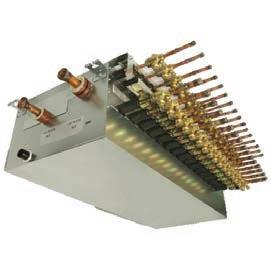
The BC controller is the technological heart of the CITY MULTI R2 series. It houses a liquid and gas separator, allowing the outdoor unit to deliver a mixture of hot gas for heating, and liquid for cooling, all through the same pipe. The innovation results in virtually no energy being wasted. Depending on capacity, up to 50 indoor units can be connected with up to 150% connected capacity. Reusable energy at its

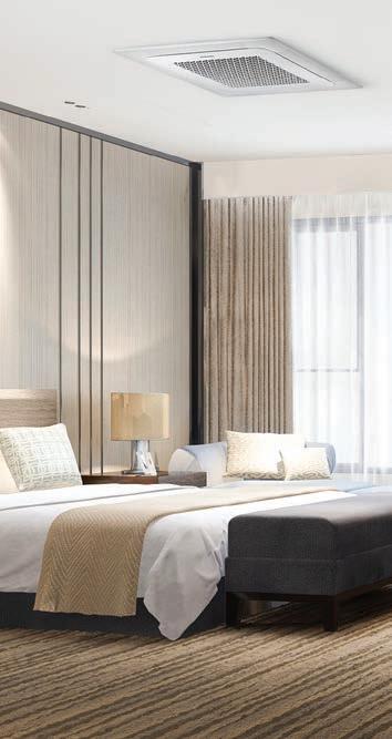
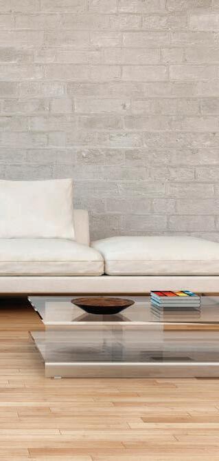

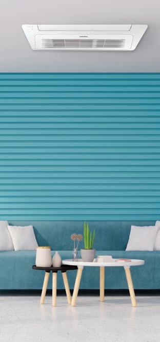

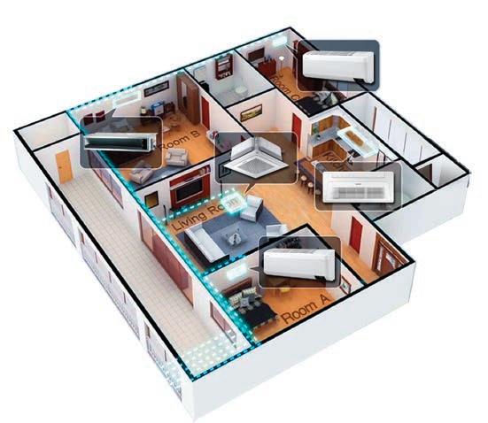
The Samsung FJM is a multi-zone residential and light commercial system that offers up to five different indoor units connected to one outdoor unit and multiple control options. With minimal installation space, it’s a flexible option for homes or offices with many rooms.
Efficiency- saves energy and the environment. Save money every day with Samsung’s Digital Inverter technology. Unlike conventional fixed-speed compressors, the FJM compressor automatically adjusts its speed to maintain the set temperature without frequently switching on and off. You’re guaranteed to get powerful and quiet performance, and optimised power usage which reduces energy consumption by up to 70%, saving you money.



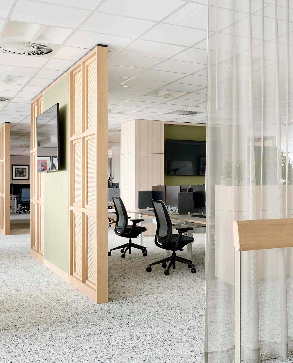
Blurring the lines between residential and commercial design, South32 South Africa is an office that represents the next generation of workspaces. It is the type that brings people together, giving each the opportunity to choose their own path that best supports their work and personal well-being. Coming fresh off the success and lessons from their work on the Singapore office design, PAPER Studio saw the potential to bring a global structure to local shores, and the result was undoubted design success.
Completed: 2022
Location: Johannesburg
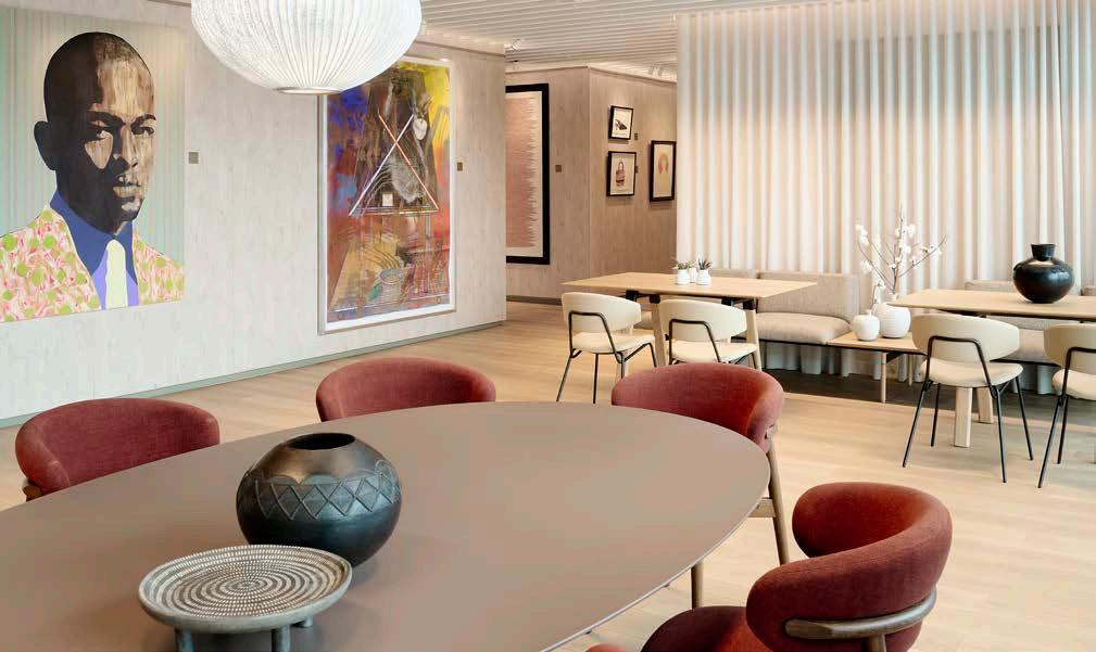
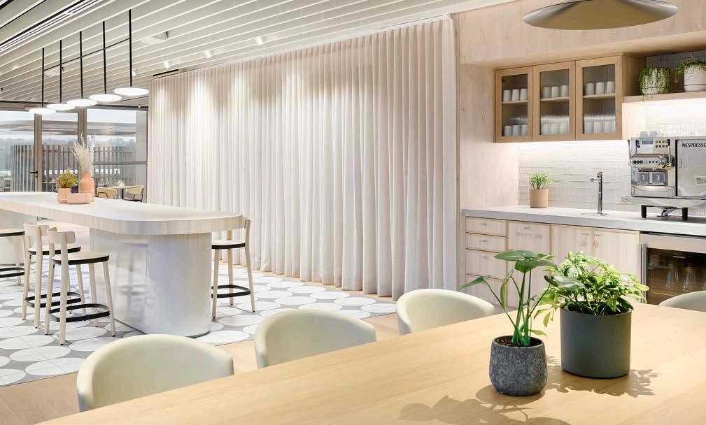
Located in Johannesburg, the South African office of Australian mining and metals company South32 is an effort in consolidation, going from three levels to a single floor plate of 2400 m². This came after the Covid-19 pandemic had turned notions of normality upside down, changing the way we work and live. It became necessary to learn new behaviours, adopt new technologies, and adjust to new ways of working, furthered by the adoption of flexible work arrangements and a subsequent reduction in the need for office space.
Beyond meeting these new needs, the entire workspace was designed to carefully attend to the needs that were present long before office dynamics around the world changed – the ‘unique functions’ and requirements of each team. Although an open-plan communicative workplace, the ‘neighbourhoods’ have equivalent access to amenities and support spaces such as utility areas, lockers, phone booths, meeting rooms, VC rooms, and wellness facilities. There are spaces for respite and contemplation, spaces for concentration, and spaces for social investigation.
PAPER approached the selection of materials and suppliers through a carbon impact lens and a focus on principles like biophilia, wellness, and embracing local culture. As a space to be experienced with strong connections to its sense of place within South Africa, partnerships with local artists and designers were implemented. Carpet backings were made from recycled plastic, with each supplier committed to sustainable production and the potential for repurpose. Even the entrance ottomans were made from recycled plastic packets by local interior designer KeHuMile.


DAVID REY & CAMILA GIACOIA
@designpaper_studio www.designpaper.com.au

Carpets: Shaw Carpets | Flooring: Oggie
Flooring | Furniture: Mobilia, Herman Miller, Steelcase, Mitsotso
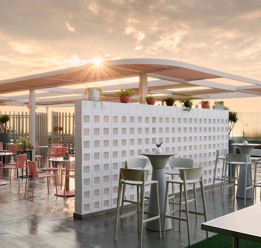
The element of biophilia morphs into wellness with the spaces and office and amenities being strategically positioned to promote movement throughout the day. Air supply is channeled into all meeting rooms, so when the air conditioning is not in use, fresh air continues to flow. The air conditioning system has been designed in thermal zones with adjustable duct valves enabling greater control and energy efficiency.
The design of the workspace prioritises creating a sense of privacy, with each area connected via straight, wide passages to better support those physically impaired. The multi-purpose room is also fitted with hearing augmentation hardware with headsets available at reception. In addition to the efficient air conditioning system, LED lighting was installed throughout the office, with occupancy and daylight sensors. This means that if not in use or necessary, the lights will be dimmed or turned off.
The highlight of the new Johannesburg office is the 400 m² outdoor balcony, previously under-utilised yet revived through local cultural reference. The design is inspired by a South African kraal, which is traditionally a safe place for livestock. Over time, these largely unused settings have been repurposed in South Africa to gather people in spaces that provide comfort and security. Here, in the South32 office, the purpose proves similar, a testament to the company’s work culture and the design team’s successful execution.

Water footprint awareness refers to our understanding and consciousness of the amount of freshwater used by individuals, communities, businesses, or products throughout their lifecycle.
It involves recognizing the impact of daily activities, consumption patterns, and production processes on water resources. The concept of water footprint considers not only direct water usage but also the indirect water usage embedded in the production and supply chain of goods and services. By making individuals and organizations aware of their water footprints, it becomes possible to inspire positive changes in behaviour and encourage the adoption of waterconscious practices. This awareness contributes to a more informed and environmentally responsible approach to water management, helping to address global water challenges and promote a sustainable future.
Practical illustrations of how to stay mindful of your water footprint:
1. Employee Education Programs:
• Encouragement: Implement water conservation training programs for employees.
• Example: “Organize workshops to educate employees about water-efficient practices in the workplace. Empower them with knowledge on how to contribute to water conservation efforts.”
2. Water-Efficient Fixtures:
• Encouragement: Install water-efficient fixtures in workplace restrooms and kitchens.
• Example: “ Start by upgrading office facilities with
low-flow faucets, and water-efficient toilets and then move on to consider sensor-activated taps. These changes contribute to a more sustainable and water-conscious workplace.”
3. Regular Maintenance:
• Encouragement: Emphasize the importance of regular maintenance of water infrastructure to prevent water wastage.
• Example: “Incorporate regular checks for leaks and plumbing issues as part of the office maintenance routine. Quick turn-around times can prevent unnecessary water wastage.”
4. Smart Landscaping:
• Encouragement: Promote water-conscious landscaping practices around the office.
• Example: “Opt for native plants and implement efficient irrigation systems and practices in the office landscaping. It not only enhances the workplace environment but also conserves water.”
Rand Water is still upholding its commitment to encourage water-saving behaviours among its supporting clients in its service region by using the Water Wise brand.
#BeWaterWise



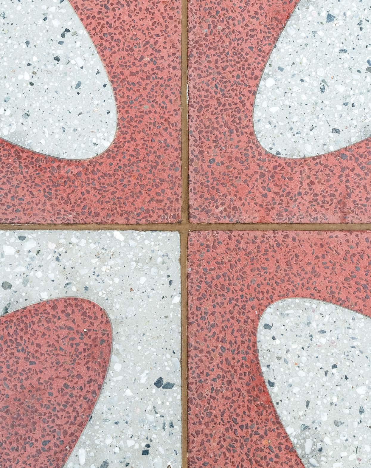
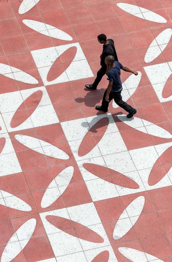
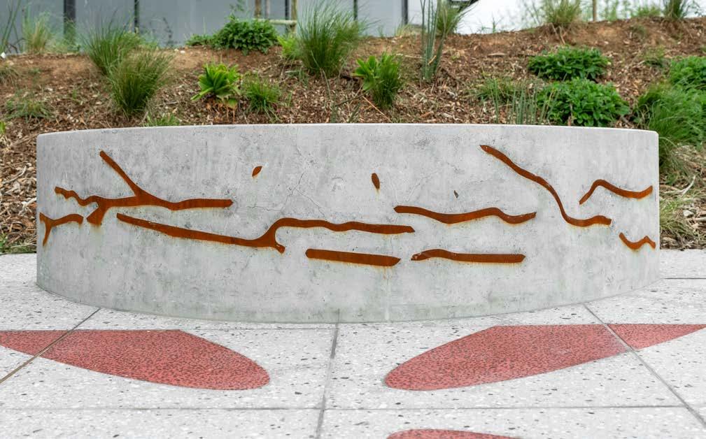
Named A Patterned Landscape, the surface artwork project at Ellipse Waterfall celebrates the public Midrand space at various scales – urban, architectural, landscape, and detail. The space is a key precinct in the broader Waterfall City environment. Conceptualised as a ‘landscape within a landscape’, the forecourt of the new development designed by dhk Architects lent itself to the creativity of architect and conceptual artist Lorenzo Nassimbeni, accompanied by landscaping by GREENinc Landscape Architecture + Urbanism, to transform the piazza's design into an allegory of the surrounding Highveld.
Size: 330 m²
Cost: R 600 000
Location: Midrand, Johannesburg
The art and the architecture
When contracted to contribute his creative insight, Nassimbeni was asked to design either a mural, sculpture, or surface artwork as the proposed addition to the Ellipse Waterfall piazza. For the artist, a mural would have been too two-dimensional, whilst a sculpture would perhaps invite a multitude of interpretations by the public, some of which may not be congruent with the conceptual intentions of the project. The natural choice turned out to be a surface artwork, allowing for a practical and spatially integrated intervention with the luxury apartment building.
The artwork needed to draw people into the piazza and help orient them. An important consideration was the aesthetic nature of the planted landscape, which is a key feature in the overall design, connecting the building to the precinct and ultimately the context of Midrand. The surface artwork is a response to this, defining itself as a landscape of sorts. It is a spatial element which refers to the architectural language of the building of which the planted landscape is a part. The surface artwork had to incorporate a strong visual interest. By referring directly to the elliptical geometry of the building, and in particular its form, the geometric language of the pattern elevates the abstract nature of the design.
Once the concept design proposal was approved, the artist worked closely with GREENinc to integrate the surface artwork with the planted landscape of the piazza. Union Tiles created a custom-designed terrazzo tile to suit the conceptual direction and practical considerations of the artwork. Calling on Afrocentric language as requested, Nassimbeni incorporated the elliptical Shweshwe pattern of a particular Basotho blanket into the artwork’s design, which has significance in its reference to the natural landscape of the area. The approach was to build the primary unit of the pattern as a 600 x 600 mm composite tile. Per 600 x 600 mm unit, eight separate tiles were used, each of which was water jet cut into segments and put together like a jigsaw puzzle.
Specialist industrial designer Wolkberg collaborated on the project for the creation of the concrete seats. The process used a method of translating a two-dimensional drawing representing the Midrand natural landscape into a steel element set into the curve of the seat. The tiled surface incorporates a tree next to the concrete seat to create an intimate environment within the overall space.
Visual and visceral
SUPPLIERS:
Tiles: Union Tiles | Concrete seats: Wolkberg Casting Studios
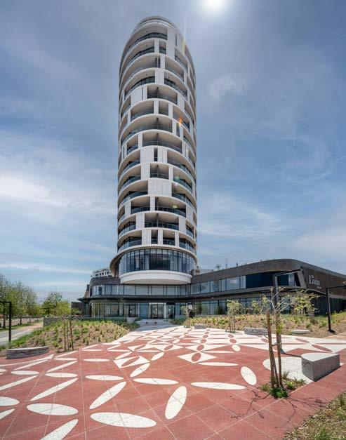
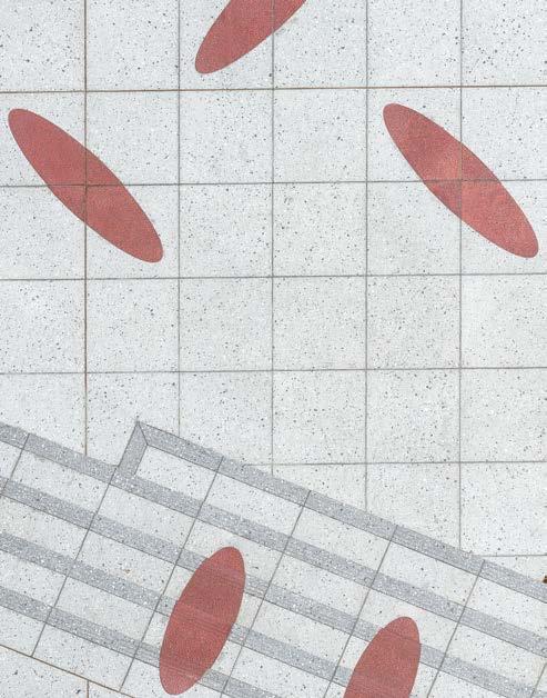
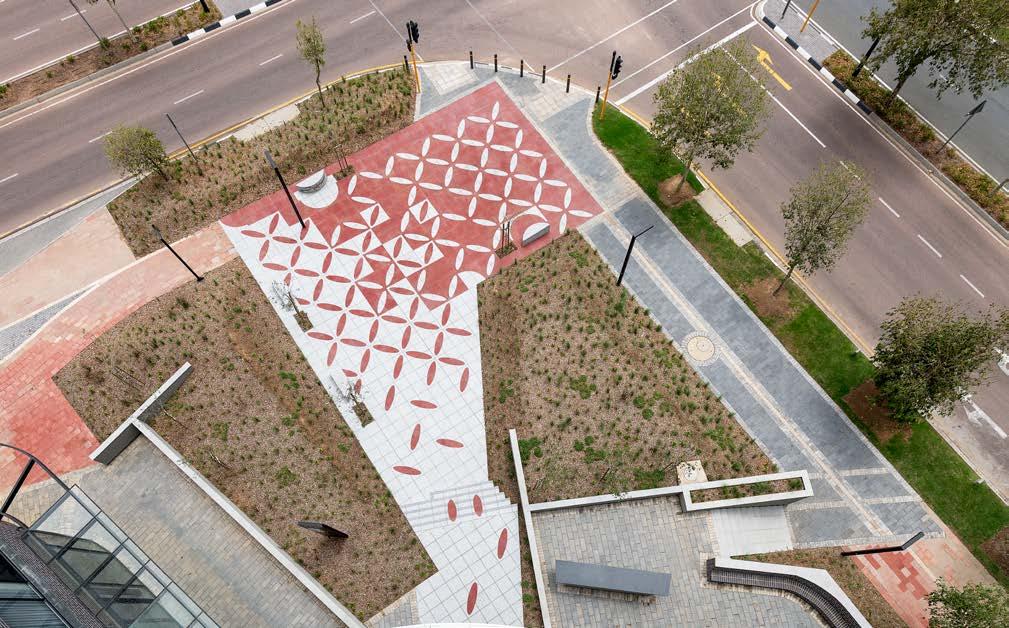

Although there is a focus on the tiling aspect of the project, the concrete seats and affiliated trees provide a three-dimensional aspect to the overall composition. The tiled pattern is best experienced from the upper levels of the tower when it comes to understanding the overall concept of how the pattern changes as it travels toward the entrance of the building. This experience is largely visual. The seats and trees provide spaces where the pedestrian can experience the tiled pattern at a detailed scale – the texture and colour of the tiles are almost tangible. At this level, the experience of the surface artwork becomes visceral.
The union between architecture, landscape, and art at Ellipse Waterfall brings the idea of a livable and lively neighbourhood to fruition. Offering Highveld views, many uses, and accessibility, the only thing that could improve a building and landscape combination like this one was art. Thanks to the elliptical intrigue of Lorenzo Nassimbeni’s creative tile and concrete designs, the piazza is a platform that makes the building and landscape sing.
‘The landscape design became the middle ground between context and building, and tries to tie these public and private needs and functions together. Design language, materiality, and built form all work together to achieve this goal and are the product of collaboration between multiple professionals (Architects, Engineers, Landscape Architects, Artists, Urban Designers). I suppose the approach is to see the forest for the trees.’ - Andrew Kerrin, Landscape Architect
‘The most successful projects are those where it’s difficult to say what is architecture, what is landscape architecture, and what is art. Our aim with the landscape design is to improve the project – to make it more usable and comfortable and environmentally sensitive and prettier, of course – but not to stand apart as something separate or competitive.’ - Stuart Glen, Founder & Director, GREENinc Landscape Architecture + Urbanism
‘Done right, public art inspires us to stop and think about the spaces where we are. It offers a greater sense of place and reflects the character of its context and purpose. Lorenzo’s concept integrated well into the architectural identity of the building, in colour, texture, and tone. More than that, it achieves the goal of using art to enhance the building’s identity and offers a creative expression of the building’s presence within the Highveld context.’ - Peter Fehrsen, Co-founder and Partner, dhk Architects

@lorenzo_nassimbeni
www.lorenzonassimbeni.com


MEET THE TEAM
Artist: Lorenzo Nassimbeni | Design Assistants: Kamal Ranchod, Ilaena Napier, Rafiq Paulsen | Landscape Architect: GREENinc Landscape Architecture + Urbanism | Architect: dhk Architects | Client: Attacq & Tricolt | Project Manager: Tricolt | Main Contractor: Barrow | Tiling Contractor: B Ehlers Tiling and Modernising CC | Photographer: Paris Brummer
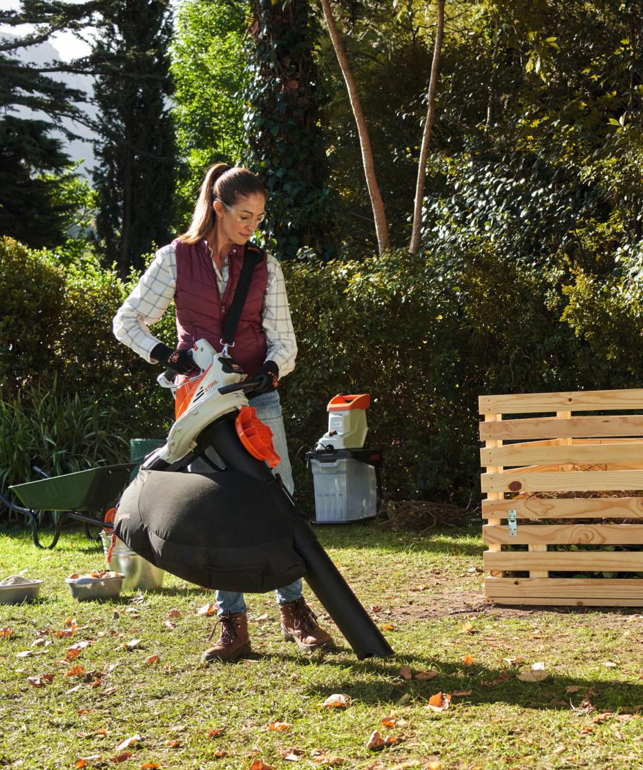
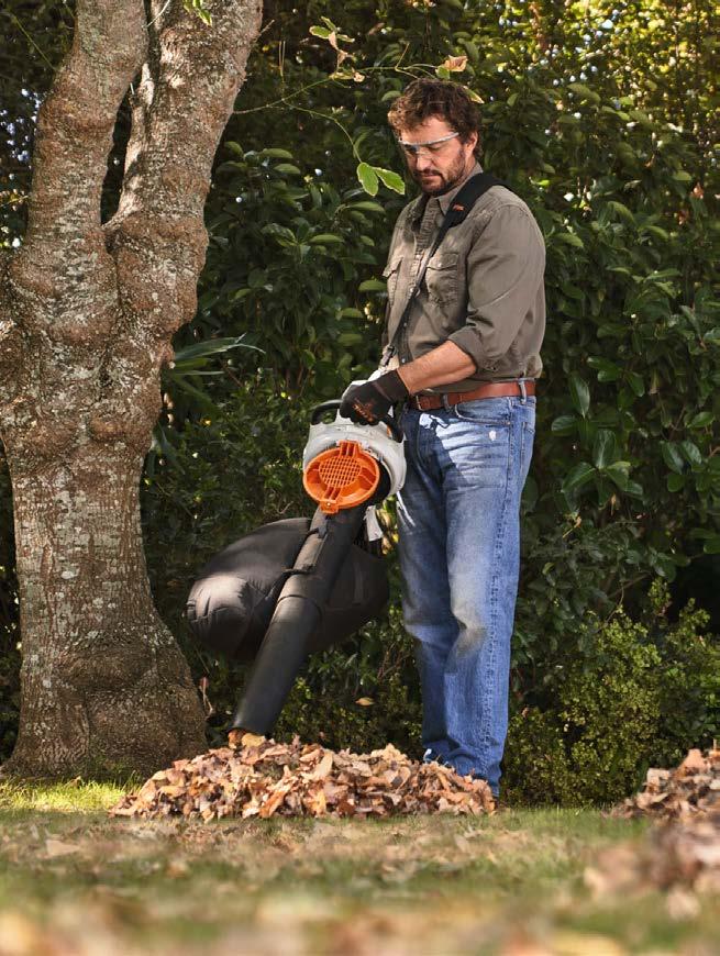

The versatile, go-anywhere SHA 56 is the first battery-powered blower-vacuum shredder in the STIHL lineup. The SHA 56 makes light work of numerous tasks – essential for professionals with multiple sites to attend to.
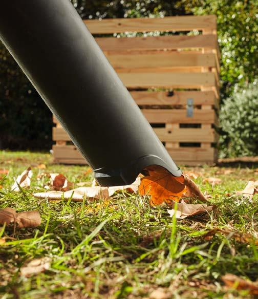

Efficient every time
The SHA 56 offers endless advantages. Use it in blower mode to gather larger volumes of debris into piles, and then vacuum everything up. Its performance equals that of the STIHL BGA 56 blower, but with so much more! When in vacuum-shredder mode, a metal blade on the fan wheel smoothly shreds suctioned material. This organic mulch can immediately be returned straight back to the soil on site, providing insulation from heat and frost, and preventing soil erosion caused by the elements. Effective mulching means approximately a third less water evaporates from the soil compared with unprotected earth, so less watering is necessary. The shredding process also offers an impressive 10:1 volume reduction.
A low-noise solution
Extremely quiet, the SHA 56 requires no hearing protection, making it ideal for noise-sensitive areas such as office parks and urban gardens. It is part of the AK system and is powered by a high-performance AK battery, providing up to 25 minutes of runtime on a single charge. This must-have machine comes with two tubes, one for each operating function, which can be changed without any tools. Simply click the required tube into place, twist the ergonomic handle 180°, and you’re ready to go.
Work made comfortable
When in vacuum mode, the 40L catcher bag connects directly to the vacuum tube. The bag’s asymmetrical design means shredded material collects on one side, allowing users to keep working freely and comfortably as the bag fills, ensuring optimal use of the 40L capacity. It also features an extra-long zipper for easy and thorough emptying. An added bonus – professional users wanting to check on operating data can link the SHA 56 to the STIHL connected app and portal.
For a machine that helps you work smarter, greener, and quieter, choose the new SHA 56 and enjoy healthy gardens, made easy.


OrbitX LED lights are locally designed, assembled and tested to provide excellent light at the lowest life cycle cost in the market. This has been confirmed from research by Stellenbosch University.
8-year guarantees provide peace of mind for zero maintenance during the long lifetime of OrbitX lights. High efficiency ensures minimal energy cost while maximising light output.
• Orbit LED Lights on average last 4 times longer than other LED lights and reduce landfill waste by as much as 75%
•
Are energy efficient with a near-unity power factor. This radically reduces your carbon footprint and energy usage by 50 to 67%
• Are recyclable and a void costl y disposable costs
• Are ideal t o use in conjunction wit h PV Plants (Solar Generation)

Star River Headquarters by Skidmore, Owings & Merrill
On the tiny island of Pazhou Island, Guangzhou is the host to the new Star River Headquarters. A sculptural addition to the business district, the Star River Headquarters is a centrepiece of the conceptualised city block, which combines green space with covered walkways and multiple levels of retail and commerce. Designed by Skidmore, Owings & Merrill, this giant in the sky is a build that moulds shape and form to stand out above the rest.
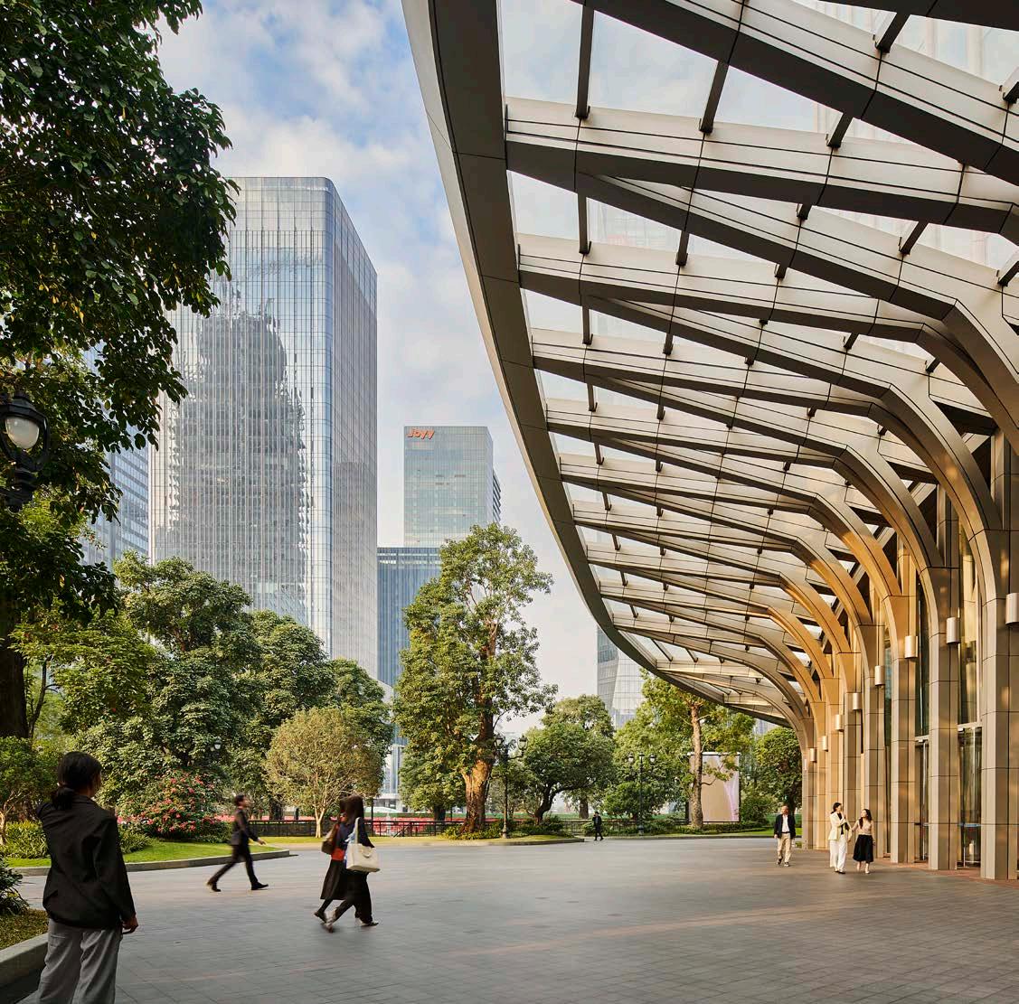
Completed: 2023
Location: Guangzhou, China
The island of Pazhou emerged as a distinguished modern centre of commerce and trade following its history of trade along the Pearl River. The new headquarters are an emblem of this transformation. From afar, the tower’s pleated façades ascend in a curved taper, casting light and shadow in a unique pattern. The building is located near two other builds designed by SOM – the Guangzhou Chamber of Commerce and SANY Irootech Pazhou – Star River Headquarters is an innovation in a new type of commercial building, reimagining the skyline and landscape of urban China.
Located on a public plaza, Star River HQ is not only a highlight of the skyline but also a contemporary contribution to the lush landscape that surrounds it. A canopy wraps around the base of the building and extends above it, while mechanical spaces are hidden to make way for the covered pedestrian arcade at the end of the street. Visitors are welcomed by a stair-lined entrance, where they can access retail stores and the subway below the building – a considered addition to the design.
Engineering efficiency
The tower, with its tapering profile that reduces wind impact, is designed and engineered to make it seamlessly efficient. To offer clear views of the Pearl River, the rounded ‘corners’ don’t use columns and as such maximise lease spans to highlight the bright floors. The façade also plays its part in the seamless efficiency of the design; individual bays are created by the pleats in the facade, which are suited to both the closed and open offices in the building. To top it off, a latticed structure at the crown of the building is home to a greenhouse. Here you’ll find an array of heritage specimen plants, with an inviting pool for the public reflected in the traditional pavilion.
A positive workspace
The goal for the building is threefold: minimise embodied carbon, reduce energy consumption, and create an enjoyable, healthy workspace. This is achieved by the pleated façade, which shades the exterior wall to reduce direct solar radiation while diffusing daylight to reach deep into the interior spaces. Together with high-performance curtainwall systems and thermal insulation, the outer envelope reduces typical cooling loads and improves indoor comfort all year long. Mullions, found along the entire height of the building, provide user-operable panels for natural ventilation, acting as a source of fresh air.
SOM’s work on the Star River HQ incorporates a comprehensive, integrated building management system that combines environmental control standards, plant monitoring, and a user interface to allow for efficient operations. With both the environment and its people at the forefront of their priorities, both the company and the designers have created a space that brings joy and comfort to promote well-being – a goal that every commercial build should have.
Client: Guangzhou Star River Commercial Investment and Development Co. | Architect: Skidmore, Owings & Merrill | LDI: Guangzhou Design Institution | Interior Designers: ChengChung + Design | Contractor: Zhongtian Construction Group | Structural Engineering & MEP: SOM | Lighting: Leox Design Partnership | Façade: Shanghai PFT Construction Consulting Co. | Photographer: Seth Powers
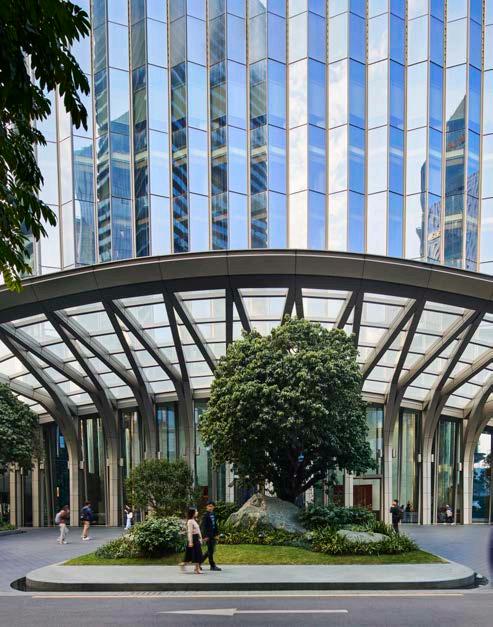
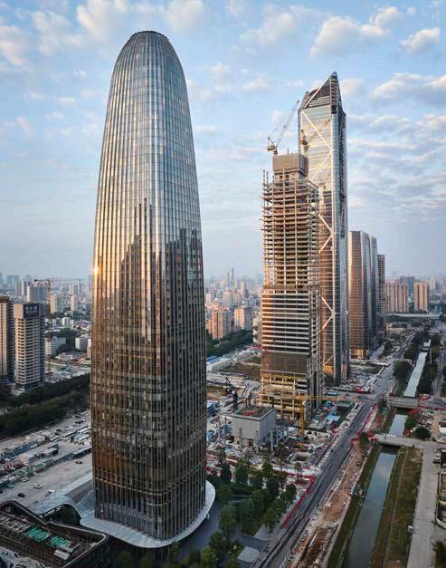
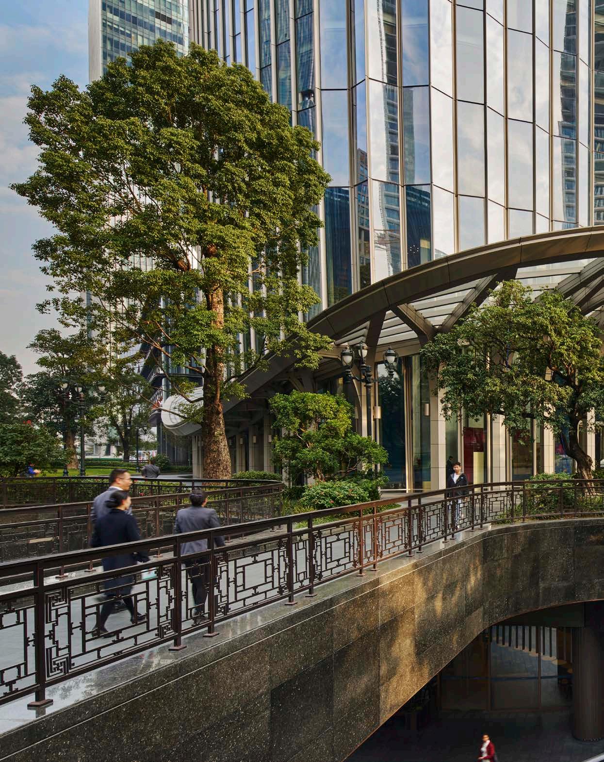

‘Star River HQ is not only a highlight of the skyline but also a contemporary contribution to the lush landscape that surrounds it.’
