6 minute read
Dramatic forms and gentle refl ections


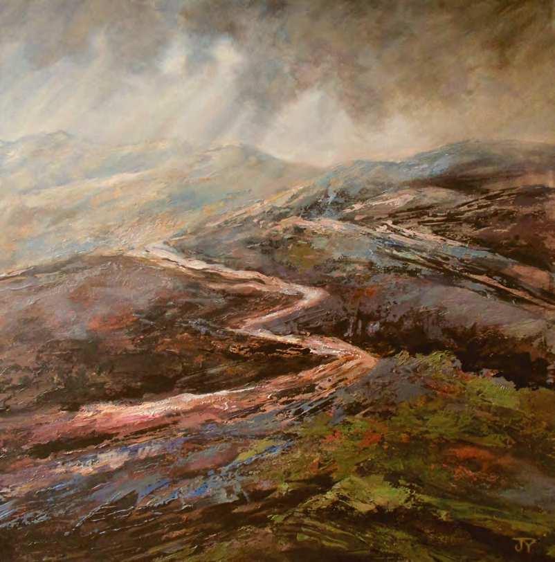
p River Valley Mists, acrylic on canvas, 193/43291/2in (50375cm). I kept the colours very subdued and used the texture as a broken surface to drag a dry brush and palette knife across, thus creating a shattered impressionistic effect t Low Moorland Cloud, acrylic on gessoed hardboard, 233/43233/4in (60360cm). This work was all about the brooding colours and atmosphere of the autumn moors. I kept the sweeps of colour suggestive and broken. The path was cut through by scraping a palette knife through the paint. The clouds were painted in loosely with wet washes
Advertisement
transparent wash of colour to achieve a subtle unifying haze or a soft glow. I apply paint by splattering, dry brushing in thick layers with a palette knife for a less controlled approach. I often scrape back layers to reveal small remnants of underpainting. The paint is so strong and stable that you can keep working the surface, creating bold and subtle effects. Using various textures, marks and brushstrokes creates an impressionistic, multi-layered landscape that allows the painting to gradually emerge.
By adding texture to the underpainting with either paint or gesso, detail can be suggested with a dry brush dragged at an angle over the textured ground; this will pick up the raised surface and highlight the detail, implying light interacting with the landscape. I also use thicker texture in areas, which works particularly well in landscapes to describe uneven ground, grass, rocky outcrops or branches. It can attract the viewer’s attention and help with the addition of lines, paths and patches of light, to lead the eye through the composition and stop at strategic points.
Glazes
I am a great fan of glazes and use them throughout the painting. I often start by applying thin base layers to work over later with thicker paint. Because a white ground is so distracting, I start by covering the surface with either a mid-tone or loose wet washes of paint, filling in the mid-toned shapes and the dark areas of shadow. This helps me to see how the composition is looking and how the colours and tones are working together.
As the work progresses I use glazes of colour over large areas to take the tones down a notch. This unifies the painting, so that I can paint highlights and shadows on top of the resulting subtle colour, which helps make the cleaner, lighter colours sing.
When glazes are loosely worked over each other a number of times they also leave an interesting layered effect where the previous marks are still
visible. It is also effective to allow very thin washes of colour to find their own way across a painting, especially in the sky. When wet paint is allowed to drip through textures it creates some wonderful unplanned effects as the paint picks out some of the detail. I find that layering glazes encourages me to look into the painting and search for half-exposed, underlying detail.
Experimental and traditional
This loose, intuitive way of approaching landscapes gives me much enjoyment and many surprises. Because I am keen to keep my work representational, I constantly refer to the original photographs. To avoid getting bogged down in detail, I might hide my source material to concentrate on the inspiration of the initial scene. Working directly from any brisk on-the-spot sketches also helps you to concentrate on the main areas of interest and ignore unnecessary information. As I near the final stages of the artwork, I again rely on more traditional painting methods, using tonal values, balance of colour and a variety of brushstrokes to bring the whole painting together.
I enjoy the mix of less controlled methods of applying paint, alongside more disciplined brushwork. If it starts to look too tight, I will add splashes of paint and palette-knife effects; if the painting becomes too loose I will add more detail, striving towards a happy mix of experimental and traditional painting.
MATERIALS
l Brushes: Daler-Rowney System 3 1in, 3/4in and 1/2in flats, Graduate rigger l Acrylics: Daler-Rowney System 3: titanium white; Winsor & Newton Galeria cadmium yellow deep, lemon yellow, yellow ochre, raw sienna, burnt sienna, burnt umber,
Hooker’s green, sap green, process cyan, ultramarine, deep violet; Winsor & Newton
Professional Acrylic: perylene maroon (worth the price because there is no rich deep red like it ) l Daler-Rowney System 3 Acrylic Gesso
Primer l Support: MDF
u STAGE T WO
Still working with loose brushstrokes, I laid down more areas of local colour using a soft ultramarine, white and purple mix, with a small touch of burnt umber for the distance and the sky reflected in the river. The dark tones of the main tree trunks, larger branches and shadows of the trees went in with a wet mix of burnt sienna, black and violet
DEMONSTRATION Filtered Dawn
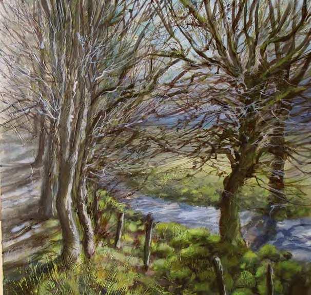
t STAGE ONE
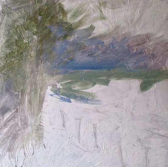
Working on gesso-primed board I very loosely drew the basic shapes of my composition, then applied a thicker layer of gesso in areas where most detail would be; a palette knife was used to make branch and grass-like marks in the gesso. I then started to fill in the basic midtoned colours and shapes, very loosely with a 1in flat brush and a mix of ultramarine, deep violet, Hooker’s green and white, with varying amounts of burnt umber to take the freshness out of the colours and make them recess. At this stage I am finding the tones, the colours and the main source of light, so I do not have anything too distinct at this point
p STAGE THREE
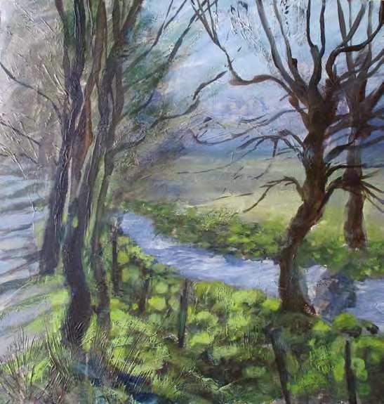
Adding loose dabs of colour along the river bank with a flat brush, I was still unsure about how much detail to add. I often work very rapidly at this stage to gain a feel of the painting and judge how my eye is being led through the work. I put in dark base colours using burnt umber, Prussian blue and purple, then layered bright suggestions of mosscovered rocks in different mixes of sap green, ultramarine, ochre, cadmium yellow and white
p STAGE FOUR
I started painting in the details of the trees, which are the main area of interest with the low, early spring sunlight light shining through them. These were a wet mix of burnt umber, black and purple, applied with a rigger brush held lightly by the tip in a jerky, half-controlled manner; I wanted natural-looking branches and twigs with energy in the brushmarks. A wet mix of white and purple was added to indicate more branches with sunlight falling on them. I started to add a few subtle areas of glaze in a thin watery mix of raw sienna over the bright greens to tone them down and began to form the shadows of the trees on the left
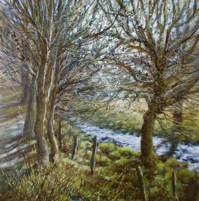
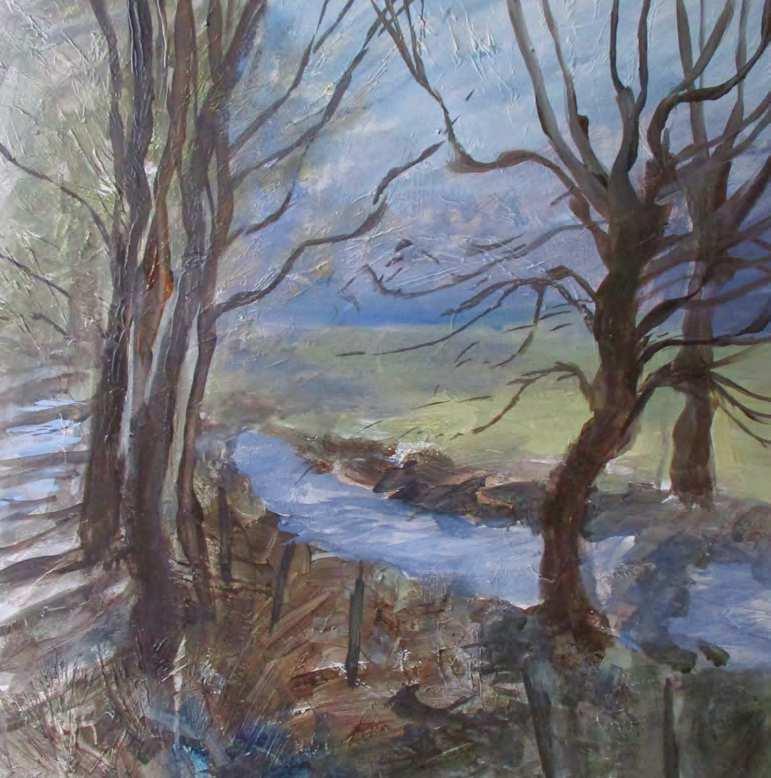
t STAGE FIVE
At this point the trees needed more emphasis so I added more branches, along with white splashes to indicate sunlight glinting through. I was aiming for a tangle of twigs in the enclosing canopy with cool spring sunlight blazing in at an angle. Realising that the river was detracting from my main subject I added a glaze of ochre and sap green. I also used a small brush to paint tiny areas of shimmering light showing through the branches with a mix of ultramarine and white


