10 minute read
Keeping it fresh


As Helen Tarr demonstrates, careful preparation and pre-mixing the colours are the keys to creating a lively painting of roses in oils
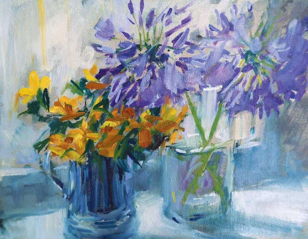
p Hypericum and Agapanthus in Sunshine, oil on board, 8310in (20.5325.5cm). The glancing light brings the complementary colours of these flowers to life as they stand on this sunny windowsill
Advertisement
have been painting the flowers
Ifrom my garden, along with various pots, jars and vases, since the first coronavirus lockdown forced me to look closer to home for subjects to paint from direct observation. Roses in particular have long been my artistic nemesis, so of course I choose to paint them frequently!
I had one simple objective with this work: that it should be a lively response to the subject. I know from bitter experience that it is too easy to take a promising painting and inadvertently wreck it, and that I have to exercise enormous self-control to retain the light touch and relaxed look to my work that I strive for. Lots of squinting and thinking in more abstract terms helps too (this is a pale pink oval, that is a dark area, etc).
Helen Tarr
has BA and MA degrees in fine art. She exhibits widely and her work is in British and international collections. Helen is also a qualified tutor and has taught art classes and workshops for over 20 years, as well as providing painting demonstrations and critique evenings for art societies. www.helentarr.co.uk
Setting up
I set up the still life so that, from an oblique angle, I was able to see the back of the flowers reflected in the mirror, bringing depth and interest to the composition. I always set up my equipment and palette in the same way so that I can easily find what I need as I paint. I lay brushes that are in use on the pochade box with my palette pots and tuck a large cloth into the belt of my apron for dabbing brushes as I work. My palette is usually held in my left hand.
I chose to work on a premium cotton board from Jackson’s Art, which I underpainted with pale umber acrylic paint. The 8310in board is the perfect size for a painting that can be largely completed within a couple of hours before the light changes drastically. The warm grey underpainting becomes a useful ground and allows me to work briskly as there are no ‘empty’ white gaps to cover up.
Preparing to paint
My first step was to pre-mix the key colours. I have discovered that this initial focus on colour and palette saves time and effort while painting. Knowing that you already have the right colours (checked by holding the mix
This photograph shows my set up
MY PRE-MIXED COLOURS
l Blue-brown made from burnt umber and ultramarine blue; I used this for sketching out and to rough-in the darkest areas of tone and to darken other colours. l Pinks: a soft, mid-toned pink from magenta, yellow ochre and titanium white for the roses; I created a lighter tone by adding more titanium white, and a dark, warm tone by adding burnt sienna. A cooler deep pink was made by adding a little ultramarine blue to the mid-tone. l Blues: the darkest purple-blue for the agapanthus was a mix of magenta and ultramarine blue lightened with titanium white for the lighter tonal values. l Dark greens: I adapted the basic blue-brown mix with cobalt blue and chrome yellow to create a warm, deep green, and added more ultramarine blue to this to create a cool, blackish green for the darkest rose leaves. l Lime-green: the vibrant lime background colour was created by mixing chrome yellow with a smidgeon of ultramarine blue and a touch of titanium white. l Greys: burnt sienna and ultramarine blue with unbleached titanium for the warm greys on the mirror frame, mantelpiece and glassware. Adding yellow ochre and titanium white to this mix created the warm cream for the jug and mantelpiece edge.
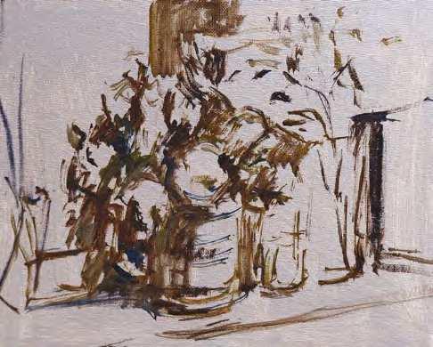
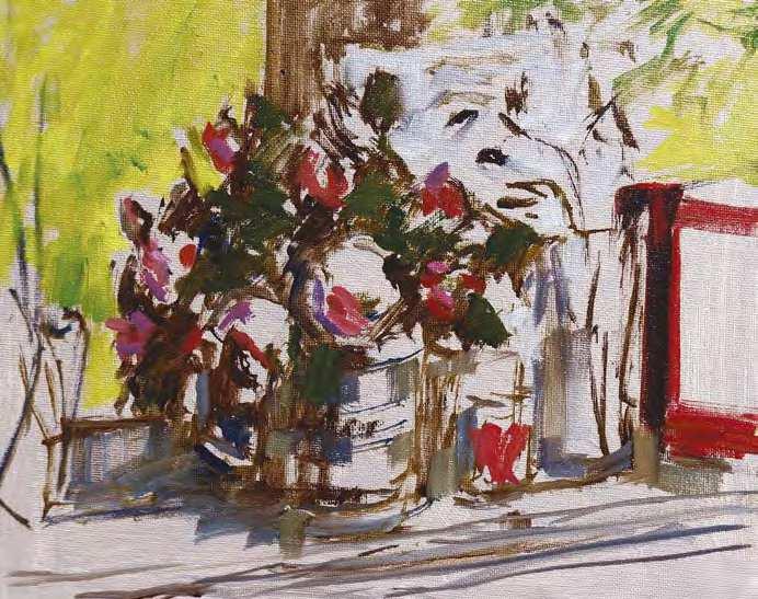
t STAGE ONE
I began by sketching out the composition using a No. 4 pointed round brush and the dark blue-brown mix diluted with Sansodor. I then roughly blocked in the darkest areas – this involved some intense squinting to simplify the subject and reveal the overall shapes and tonal values. Through this process I was able to identify where the ‘lost’ edges would be, in particular where the jug handle and the leaves were in shadow and the transparent glass vase merged with the light background. This is usually a good moment to assess the composition – ideally it should look exciting, balanced and strong.
MATERIALS
l Oils: Michael Harding titanium white, warm white, unbleached titanium, bright yellow lake, burnt sienna, burnt umber, ultramarine blue, Winsor & Newton chrome yellow, yellow ochre, quinacridone magenta, cobalt blue, indigo. l Sansodor thinners. l Liquin, to increase flow and give a rich glossy finish to the paint. l Brushes: Rosemary & Co Ivory Nos. 4 to 7 curved long flats, long filberts and extra long flats for much of the painting; No. 4 egbert for the strokes and flicks of the flowers; No. 4 rigger for the stalks.
on a palette knife in front of the subject and squinting at it with one eye) allows a level of freedom and generosity with the paint that I find harder to create by mixing as I go. There is still plenty of mixing to be done as the work develops but having this central scheme prepared in advance is a great way to keep the palette cohesive and disciplined. I often find that this process gives me such a quantity of beautiful, bespoke colours that I can quickly paint a second version of the subject, too.
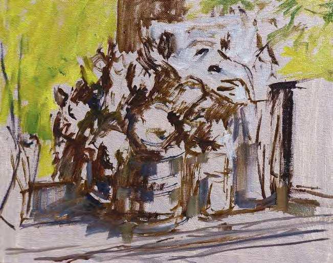
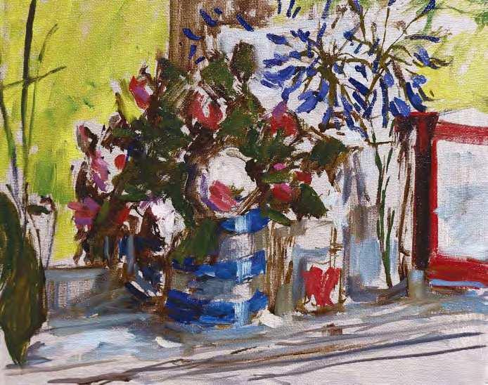
p STAGE T WO
I added the bright lime greens in the background using a No. 6 long filbert; this made the pale umber underpainting into a mid-tone, and gave me a strong colour context for the other colours to react with. It also created an exciting foil for the pinks, blues, mauves and reds that were to follow. I also dashed in some thinned titanium white to suggest the white, cellophane-wrapped drawing standing behind the vases to lighten the value of the space around the agapanthus flowers
HELEN’S TEN TOP TIPS FOR PAINTING EXPRESSIVE R OSES IN OILS
1 Have the light source to one side of the roses, this will enhance their shape. If the light is coming from directly behind you the roses will appear flatter. 2 Select the right brush for the job. A filbert or curved flat brush is perfect for describing the shape of a petal in one or two strokes. A rigger will make light work of stalks and touches of light. 3 Lightly sketch in the composition with thinned oils, then roughly block-in large areas of dark shadow. This quickly allows you to see and assess the layout of your painting. 4 Pre-mix the colours of the roses, leaves and other key areas of the painting. If these mixes look good together on your palette they should look good in your painting. Mix tertiary colours to complement or echo your key colours. 5 Check colours and values by holding the mixed paint in front of the subject on a palette knife and squinting at it through one eye, then adjust as necessary. The right colour and value will help you to paint efficiently with less reliance on detail and drawing. 6 Stand or sit well back from your canvas or board and hold your brushes at arm’s length by the end of the handle. This gives a lively, loose mark and helps you avoid painting unnecessary details. 7 Apply the paint in dabs and strokes without blending, to avoid dullness. Use mid-tones to transition from dark to light, or subtle shifts of colour or temperature to create visual blends. 8 Think of the flower heads as simple sphere or egg shapes, then observe how light and shade describe their threedimensional form. This will help you retain the shape of the flower as you develop the painting. 9 Simplify the subject where possible. Step back and squint at the painting and your subject from time to time to assess the overall tonal relationships. Keep your initial intention and focal point in mind as you work, it’s easy to get distracted. 10 Set yourself a time limit. Two hours should be about right for a small work. This way you will naturally prioritise the key elements of the painting, keeping your colours fresh and your brushwork lively.
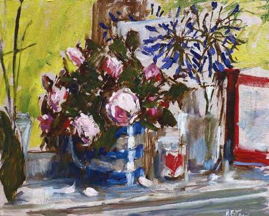
p STAGE THREE
I focused on the darkest tones next, bringing rich greens to the rose leaves, deepening the shadows behind the jug and adding the deep red of the heart on the candle holder and card using a mix of magenta and burnt sienna. The rich dark pinks on the roses helped to define their positions and the turn of their heads
p STAGE FOUR
I lightened the deep blue that I had used on the jug with unbleached titanium and titanium white and took this pale blue-grey across the shaded side of the candle holder and vase, and the mid-toned shadows cast onto the mantel shelf. I added pale pink to the roses and fallen petals to bring them forwards and develop their shape. Mid-tone blues were added to the jug, then lightened and carried through the composition in the shadows on the shelf and reflections on the glassware. The narrow No. 4 egbert was used to flick in the elongated flowers of the agapanthus using the deep purple mix. I added titanium white to the mix and used the same brush to dash in highlights, creating shape and movement, and used the No. 4 rigger to suggest the dark green stalks. Then the pot, dark leaf and stems of the orchid were added and created a frame on the left-hand side
p STAGE FIVE
The painting was coming into its own and I needed enormous self-control to resist fiddling. The palest pinks were added to define the lightest petals and streaks of light were dashed onto the jug and glassware. At this point I wondered if the painting was complete and stopped work for the day. So far, I had spent one hour and forty minutes on the piece
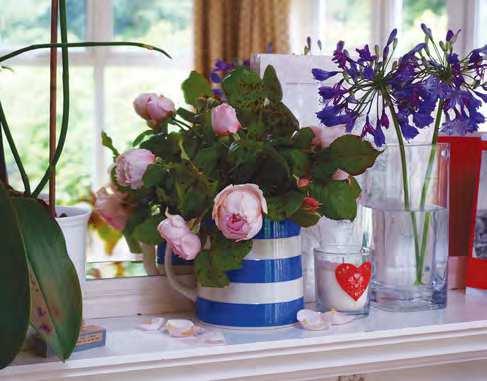
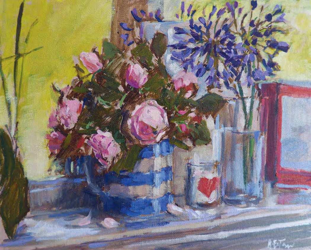
q FINISHED PAINTING
Roses in a Cornish Jug, oil on board, 8310in (20.5325.5cm). The next day I decided to throw caution to the wind and develop it further. I had kept my palette covered overnight and had plenty of mixed colours left. The roses were a beautiful, delicate pink and I knew that a little more time spent on them would enhance them as the focal point of the composition. I was able to paint with a light touch and avoid over-working them. I added more of the mid-toned pink to the petals, and touched in deeper pinks to define the petals and enhance the silhouetted roses reflected in the mirror. A little titanium white added to the lime green was used to soften and simplify the background, obliterating the distracting edge of the white orchid pot on the left. I also added more petals to the agapanthus and pale neutral greys were used throughout the objects on the mantelpiece to reduce the tonal range a little and create a more unified effect. I brightened the blue stripes on the jug with cobalt blue and titanium white and warmed the cream stripes with a mix of unbleached titanium and titanium white, which I also added to the front edge of the mantelpiece. Finally a touch of warm white was used for highlights on the shelf and fallen petals. At this point I put down my brushes, feeling that I had done justice to this gorgeous subject without losing the freshness and immediacy of my initial marks
Watch Helen painting hydrangeas in acrylics on PaintersOnline: https://www.painters-online.co.uk/community-videos/painting-hydrangeas-in-acrylics/


