6 minute read
Add water to your landscape


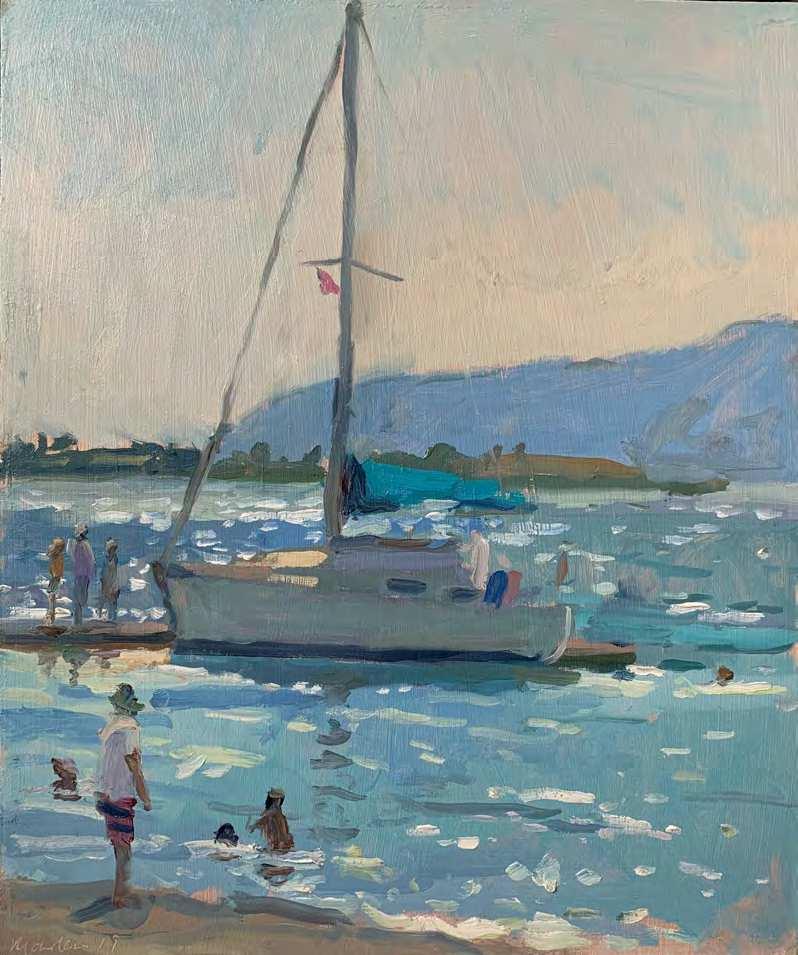
Late Day, the Witterings, oil, 9310in (23325.5cm)
Follow Sarah Manolescue as she demonstrates a plein-air landscape of a riverside scene in oil, with details of her outdoor painting kit
Advertisement
enerally speaking, painting
Gthe landscape en plein air is a relaxing pastime. Add any kind of water to the mix and you instantly up the ante – when you’re attempting to paint it, it can change in an instant with the light, tide or even the gentlest of breezes. It’s also a mirror for the landscape, which is why I am so drawn to it, but it presents the greatest challenge and makes the largest contribution to the pile of unsuccessful paintings in my studio! A struggle it often is, but one I gravitate towards because to capture water successfully in paint is a beautiful thing, and none more so than en plein air.
Check the tide
From where I am located I can get to the Sussex coast to paint beaches and marinas, or to countryside rivers and the more structured River Thames meandering through London. Each pose a different kind of challenge and where I go will depend on my mood. Weather is a consideration and so is the tide. Before heading to the coast I will have checked and double-checked the weather and tide times (these can be found online and are generally accurate). It doesn’t pay to forget to check – I did once when I was intending to do a demonstration painting for this very article and I had a wasted journey. The tide was so far out I could barely see it and by the time it came back in the light was terrible.
Light and water
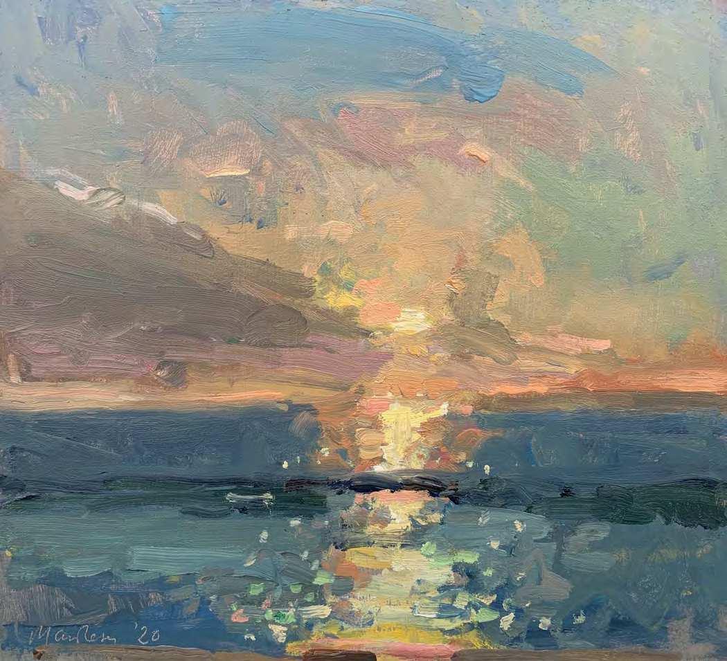
The coast will invariably be more energetic and unpredictable in nature, so if that’s what you are seeking, head there. It is also an excellent spot to catch the sunset (although a clear sky
with the sun dropping towards the water can be absolutely blinding, so beware!). If it is reflections you crave, a river or harbour will serve you well. Spots close to city bridges offer up exciting material with boats, barges and the bridges creating great compositional opportunities.
If you paint towards the sun – contrejour – you will see bleached-out colour in the water, but in exchange you get great sparkle that is a joy to paint. A trick I’ve learnt is to go quite dark, certainly darker than you think, in tone for the sky so the light on the water really pops. If you are looking away from the sun the colour returns, and portraying this successfully can create a fantastic sense of depth. With large expanses of water I find the most predominant colour and loosely block in the whole area. I can then work into this with other colours where I see them, becoming lighter, darker, warmer or cooler. If the water you are painting is relatively still and your reflections are clear, work on both the water and surroundings simultaneously. For example, if you have large cloud formations rolling overhead, see how they reflect in the water as they
p Pink Boots, oil, 9310in (23325.5cm) go. Make sure your water reflects its surroundings at all times and if something isn’t working, don’t be afraid to wipe and have another go.
Dealing with change
Wind can play absolute havoc with reflections, particularly on a wide expanse of river and the temptation is to change your painting in a bid to keep up. Be decisive from the outset about how your reflections will look and err on the side of caution by keeping things simple. Note which colours you see and confidently place them down; perfection isn’t necessary because everything will be moving around all the time, accurate mixing is key here.
By its very nature, water is ever changing, so with any painting that it features in, the goal is to get a sense of it rather than true representation. Have fun making it your own! TA
SARAH’S PLEIN-AIR PAINTING EQUIPMENT
l Pochade (I use an Open Box M, 11314in). l Tripod (Manfrotto 190XPRO). l Rags and tissues for wiping brushes, correcting paintings, etc. l Medium: I carry a small bottle of turps and pour a little into a jam jar lid to dip my brush into. l Brush washer filled with turps or brush cleaner – I go for the smallest I can find (various sizes are available from Jackson’s or Amazon). l Assortment of brushes – mine are Rosemary & Co and Pro Arte Acrylix, mainly filberts, rounds and a few flats. l Panel carrier (Raymar). l A range of pre-prepared panels in various sizes. l Oil paint – this is my standard palette for plein-air painting: DalerRowney Artists Colours blue black, raw umber, oxide of chromium, Rowney rose, cadmium scarlet, yellow ochre, cadmium yellow, Naples yellow; Michael Harding ultramarine blue, cerulean blue, cobalt blue, kings blue deep, terre verte, viridian, zinc white; Winsor & Newton cadmium lemon, Jackson’s titanium white. I squeeze a good amount of each colour onto my pochade before I leave and take both whites with me to top up.
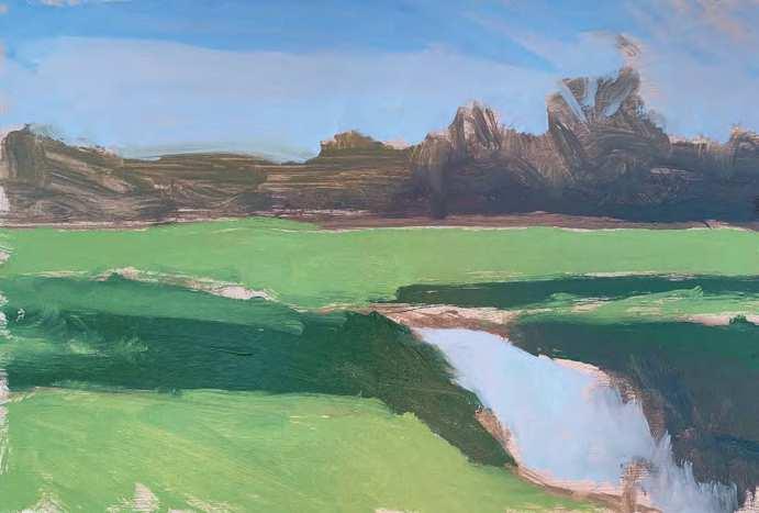
t This was the scene I was painting. I was drawn to the river leading the eye in and across the view from right to left. Although the river isn’t a huge part of the composition, my challenge was to make it the focal point. Reflecting the sky on a clear day, the water is partly in shadow from nearby trees and I liked the contrast of the two areas. The river water was flowing but there was still flood water, which served to break up the dark green areas of shadow
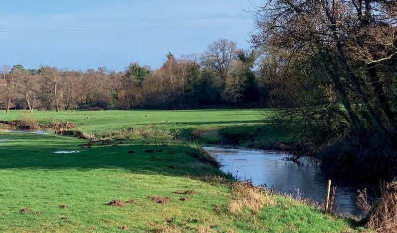
DEMONSTRATION: Geese by the River Wey
u STAGE ONE
I chose an 8312in MDF board primed and tinted with acrylic pale umber. These dimensions helped to keep the focus on the foreground and the river. Using a mix of burnt sienna and kings blue deep thinned with turps, I sketched out the basic composition: the shape of the river, the bank of trees on the horizon and the large area of shadow
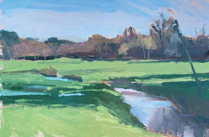
u STAGE THREE
I started to add some detail with thicker paint, adding darker and lighter areas to the bank of trees to break them up, but not so much that they became distracting. I mixed a stronger, brighter blue and added to the water close to the river edge, and some terracotta areas too, smudging it all a little with my finger to enhance the impression of fluidity. I marked out the course of the river with foliage in the same colour used for the bank of trees. I loosely marked in the flood water with the punchy blue mix, and some lighter stripes of green to further break up the large area of shadow
t STAGE T WO
Using slightly thinned mixes, I blocked in all large areas of colour ready to work into and refine. For the bank of trees, I darkened the mix I made to sketch out by adding more burnt sienna, a little ultramarine blue and a touch of oxide of chromium. The dark shadow green is oxide of chromium and ultramarine blue, lightened for the rest of the green areas with some cadmium yellow and titanium white. For the sky, I used ultramarine blue and white, adding more white and a touch of Rowney rose to push the area closer to the horizon towards pink. I used this for the river also. I noticed that the green area close to the foreground trees was darker, so added a little blue black to the dark green mix