7 minute read
A brilliant combination


Liquid acrylics make a great base for coloured pencil work, as Liz Seward shows with a lively spring landscape
fter 40 years of painting it’s
Advertisement
Agood to know that there are still some materials that excite me beyond measure. One of these is acrylic ink, or Golden High Flow Liquid Acrylics. Beautiful, intense jewel-like colours combine with a fluidity that is fascinating to watch as it moves and blends on the paper. Then, once the first application is dry, the inks can be used to continue the work or the initial layer of paint can be used as an underpainting for other media.
Firm favourites
I had used inks as a basis for dry media for decades, using them with pastels, pastel pencils and water-soluble wax crayons, then about 20 years ago I decided to try coloured pencils with the inks. I was more than pleased with the result but was dubious about the permanence of the pencils, so I put this particular combination on the back burner. Then some years ago I acquired my first set of Caran d’Ache Luminance 6901, which is one of the most lightfast ranges available. Since then, this particular combination has become a firm favourite, combining as it does the brightness of the inks with the subtlety and accuracy of the pencils.
I am lucky enough to live surrounded by trees and woodland so of course they are a favourite subject of mine, believing as I do that you should paint what you know. I have painted many different types of landscapes over the years, many en plein air, but in my studio I can experiment more and try a different approach with a subject that I know instinctively – especially if it involves more equipment than I am prepared to carry around. I have bookcases full of sketchbooks that I have filled and in one of them I found a fairly comprehensive sketch of a bluebell wood. I’m sure there was a photograph as well but that has been consigned to history; in any case the drawing gives me all the information that I need as I know this subject as well as I know my own face.
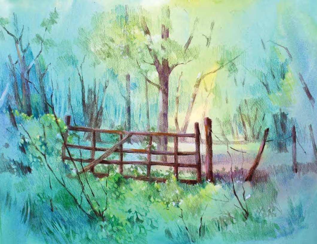
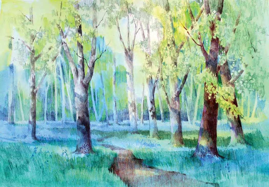
p The Gate into the Woods, ink and coloured pencil on Fabriano Artistico HP paper 140lb (300gsm), 14319in (25.5348cm). This old gate has been slowly deteriorating for years and certainly will not prevent anyone from walking into the woods. I thought I would record it before it finally disintegrates. Painted with the same palette of liquid acrylics as used for Bluebell Path (pages 40–41) with the addition of burnt sienna, and the same selection of pencils, I had fun with the starkness of the gate and the softness of the undergrowth around it
MATERIALS
l Golden High Flow Acrylic: hansa yellow light, phthalo green, ultramarine blue, titanium white. l Caran d’Ache Luminance 6901
Coloured Pencils: chromium oxide green, grass green, dark English green, violet grey, cobalt blue, ultramarine blue, indanthrene blue, burnt ochre, sepia 50%, sepia, carmine lake; blender. l Fabriano Artistico HP watercolour paper 650gsm.
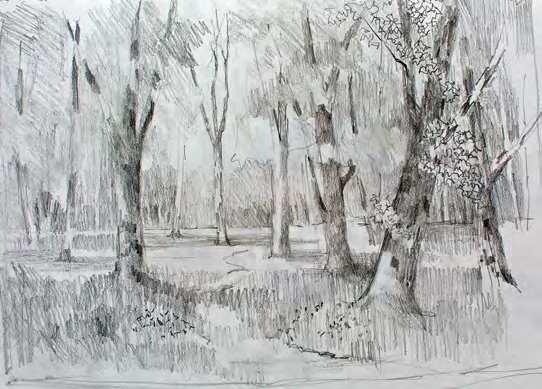
u STAGE ONE
Using a full tonal range from the white of the paper to almost black from the 3B pencil I was able to indicate distance with soft grey tones, middle distance with darker greys and foreground with crisp dark marks that would create depth. Using the same pencil I transferred the drawing onto a piece of HP watercolour paper of the same proportions
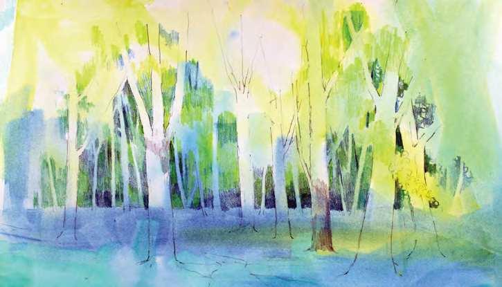
p STAGE THREE
Using medium cobalt blue, ultramarine blue and indanthrene blue pencils, all sharpened to a fine point with a metal sharpener, I carefully defined the distant trees by colouring the areas around them; I did it this way because the trees will look as though they ‘belong’ to the picture more, and I didn’t want to lay all that lovely liquid acrylic colour and immediately cover it up with pencil. They will all have the liquid acrylic colours running through them and by varying the tone around them I can bring them forward or send them into the background. I also started to define the edges of the leaves in the trees further forward. Getting ahead of myself, I couldn’t resist trying a bit of violet grey on the foreground trees, indicating branch shadows to define the trees as round
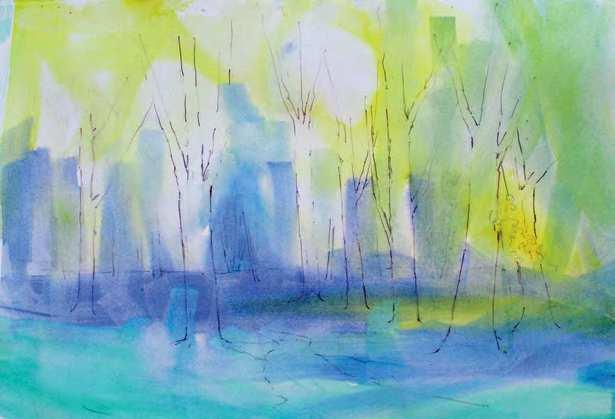
t STAGE T WO
Having wet the paper all over I laid the yellow in places where I knew I was going to need it – the sunnier patches of grass and the foliage of the trees, then ultramarine where the distant trees and the large patches of bluebells would be, and finally pthalocyanine green for the foreground grass. These were laid wetin-wet on the wet paper, and from time to time I tilted the board to encourage the liquid acrylics to flow into certain places – don’t do this anywhere that can’t take a bit of mess! I call this phase ‘painting with gravity’, and it produces many of the tree shapes that I will use in the distance. Then I left it to dry completely
LIZ’S TOP TIPS
l Keep a sketchbook and carry it with you regularly. It’s amazing how often using it relieves boredom and fills dull moments. l Even if you are working from photographs, it’s useful to draw the composition from the photo before you paint – to decide composition, what to leave out and tonal values. l Liquid acrylics are beautiful but messy so always protect valued surfaces and clothes. When dry it is very difficult to remove, even a thin film. l Keep your pencils sharp; I use a metal pencil sharpener with a replaceable blade, but I know many artists prefer knives to protect the integrity of the lead inside the wood casing. If this is the case, a sandpaper block is very useful for creating a point. l Learning to vary the pressure on the tip of the pencil to create variations in tone takes practice. A few minutes a day is all it needs. l Always use the smoother watercolour papers (Hot Pressed). Cold pressed and Rough give a very grainy finish that takes over visually. l I’m often asked about what direction to make the pencil strokes in. The answer is do whatever is most comfortable to you, but make it consistent. I’m left-handed so my natural stroke is diagonal but over the years I have trained myself to make vertical strokes for more strength and less movement. A blender is useful for areas where the strokes are too obvious.
u STAGE FOUR
This is the bit I’d been waiting for! Using oxide of chromium green I started to shape the branches with leaves on, again working largely in the negative space, preserving much of the original liquid acrylic colour. I then coloured some of the leaves in the middle distance that are against the sky. After that I threaded the branches and tree trunks through the leaves using lost-and-found techniques. I used violet grey for the paler tones; sepia 50%, sepia and carmine lake for the darker tones, varying the pressure on the pencil tip as required. As variety is the spice of life, I ran some burnt ochre over the darker tones on some of the foreground trees to warm them up
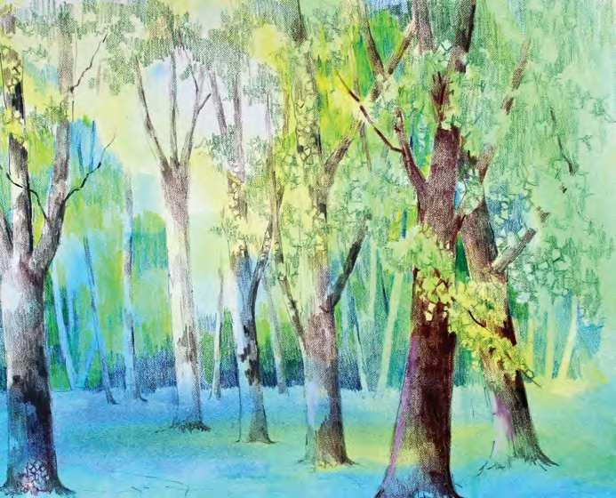
p FINISHED PAINTING
Bluebell Path, coloured pencil over liquid acrylics, 14319in (25.5348cm). Using the same four colours I used for the tree trunks, I defined the path that weaves through the wood. Running these colours over the original green liquid acrylic resulted in a slightly different effect to the trees but provides a general harmony to the piece. The edges of the path were defined by a broken line with a sepia pencil, and again burnt ochre was used to warm up sunnier areas. Dark English green and grass green were used for the shadows in the grassy areas – some have a straight edge and some a ragged edge to describe lighter clumps of grass in front of them. Applying more pressure on the ultramarine pencil resulted in some shadows in the bluebell areas. In the foreground I indulged myself and put in more defined bluebells with the same colour. Returning to the liquid acrylics, I mixed titanium white with a very small amount of ultramarine and lightened the middle-distance bluebells to enhance the sunny effect, and create some lighter flowers in the foreground. I then completed the tree in the middle distance with violet grey and cobalt blue and decided to leave well alone Liz Seward
taught and demonstrated for 36 years and is a member of The Society of Women Artists and the Society of Floral Painters. She has exhibited widely and won many awards for her work. Liz teaches residential courses at Dedham Hall and demonstrates to art societies. www.sewardart.co.uk


