The Perfect Serve

Style Guide


The aim is to Create platforms that will grow into industry standards through documenting the food and lifestyle industries in a way that has never been done before in Botswana.
The Perfect Serve is a definitive guide to the PULSE of Botswana’s colourful culinary and lifestyle culture, punctuated by great moments of friendship & conviviality.

This Brand Identity Toolkit serves to define the visual character of the brand, and furthermore bring the powerful ideas around its dynamic development to life.
The Toolkit is designed to be simple and easy to use, for maximum impact and effective communication. Contained herein are the necessary guidelines for the correct and consistent use of all elements of our brand identity, allowing audiences to buy into our corporate vision and ambition through its expression.
By following the guidelines, you will be able to competently promote and maintain the correct and consistent application of the TPS Brand, thus contributing to its continuous wellbeing.

This section sums up the graphic and typographic elements that constitute the brand identity.
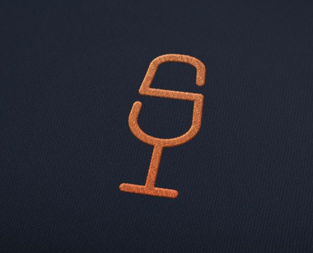
The The Perfect Serve Logo is a distinct, timeless symbol of sophistication and pride, stylishly packaged into a modernistic, typographical sculpture, that expresses in exquisite short hand, our leadership, expertise and good standing in Botswana and Africa’s food experience
The primary use case, in full colour applications directed at marketing audiences, the logo is set in shimmering graduations of Orange and charcoal greys.
This section explores the approved colour specifications, including their Primary and Secondary usage.

Colour Palette
The The Perfect Serve range of Primary colours expands to consist of Orange tones, to a charcoal grey.
C 0 R 242 G 103 B 36
M 74 Y 98 K 0
This section tackles the basic concept and creative engineering of the The Perfect Serve logo.
Create platforms for ideas sharing, inspiration and collaborations on trends within the modern Food and Bev industries .

Stage 1
What is The Perfect Serve?
The Perfect Serve is a definitive guide to the PULSE of Botswana’s colourful culinary and lifestyle culture, punctuated by great moments of friendship & conviviality.
Stage 2
Purpose
Create platforms for ideas sharing, inspiration and collaborations on trends within the modern Food and Bev industries .
Stage 3
Icon Relationship
This means
Stage 4
Customization
From an ordinary type, the Letter “S” is then transformed to mimic a glass.
The Glass resemles Lifestyle, Food, Beverage, and Celebration.
This section outlines the correct and consistent use of the The Perfect Serve logo.
The secondary treatment is a flat colour application, which is suitable for embroidery and other uses cases where gradient effects can not be achieved easily and reliably, but colour tint can be accommodated.
A minimum area of isolation is required to assure the visibility, integrity and dignity of the The Perfect Serve brand in all communications, and in particular during co-branding situations.
The monochrome variant of the logo applies in instances where stamping, embossing and solid colour backgrounds make it impractical or impossible to achieve the flat two tone effect.
The The Perfect Serve logo’s monotone application is especially important for black and white applications such as fax sheets, and other official communication materials.
For uncompromised viewing and maximum recognition, the TPS logo must conform to minimum size specifications.
Whenever the ‘TPS’ typographic symbol is presented in its defining lockup with the ‘ The Perfect Serve
expansion it must never fall below the minimum recommendeddimensions of 20mm x 25mm.
Any exceptions to this rule require specific authorisation.
The following rules apply to the The Perfect ServeLogo:
1. Don’t introduce a keyline to the The Perfect Serve Logo.
2. Don’t alter the colours of the The Perfect Serve Logo outside the realm of specific guidelines.
3. Don’t alter the proportion of the The Perfect Serve Logotype.
4. Don’t alter the positioning of the The Perfect Serve Logotype.
5. Don’t stretch or squash the The Perfect Serve Logo or Logotype.
6. Don’t use the The Perfect Serve Logo as an outline.
This section unpacks the official brand typefaces, typographicaland usage specifications, and usage guidelines.

Kelson Sans serves as the TPS brand’s primary typeface. It is an elegant sans serif family with exquisite dimensions and classic proportions, whose large variety of fonts stretches from delicate lights to delightfully heavy bolds.
Kelson Sans Light
The quick brown fox jumps over a lazy dog.
ABCDEFGHIJKLMNOPQRSTUVWXYZ
abcdefghijklmnopqrstuvwxyz
1234567890
Regular
The quick brown fox jumps over a lazy dog.
ABCDEFGHIJKLMNOPQRSTUVWXYZ
abcdefghijklmnopqrstuvwxyz
1234567890
Bold
The quick brown fox jumps over a lazy dog.
ABCDEFGHIJKLMNOPQRSTUVWXYZ
abcdefghijklmnopqrstuvwxyz
1234567890
Calibri is a winning candidate for our secondary typeface. It is a modern sans serif family that replaced long serving classics such as Arial and Time New Roman, as the default typeface in various Microsoft products upon its public release in 2007.
Calibri is a versatile choice for correspondence and other internally sourced communications, as it is freely available and pre-installed across a range of computer platforms.
47 Light Condensed
The quick brown fox jumps over a lazy dog.
ABCDEFGHIJKLMNOPQRSTUVWXYZ abcdefghijklmnopqrstuvwxyz
1234567890
45 Light
The quick brown fox jumps over a lazy dog.
ABCDEFGHIJKLMNOPQRSTUVWXYZ abcdefghijklmnopqrstuvwxyz
1234567890
57 Light Condensed
The quick brown fox jumps over a lazy dog.
ABCDEFGHIJKLMNOPQRSTUVWXYZ abcdefghijklmnopqrstuvwxyz
1234567890
45 Light Oblique
The quick brown fox jumps over a lazy dog.
ABCDEFGHIJKLMNOPQRSTUVWXYZ abcdefghijklmnopqrstuvwxyz
1234567890
67 Bold Condensed
The quick brown fox jumps over a lazy dog.
ABCDEFGHIJKLMNOPQRSTUVWXYZ abcdefghijklmnopqrstuvwxyz
1234567890
55 Roman
The quick brown fox jumps over a lazy dog.
ABCDEFGHIJKLMNOPQRSTUVWXYZ abcdefghijklmnopqrstuvwxyz
1234567890
67 Bold Condensed Oblique
The quick brown fox jumps over a lazy dog.
ABCDEFGHIJKLMNOPQRSTUVWXYZ abcdefghijklmnopqrstuvwxyz
1234567890
55 Oblique
The quick brown fox jumps over a lazy dog.
ABCDEFGHIJKLMNOPQRSTUVWXYZ abcdefghijklmnopqrstuvwxyz
1234567890
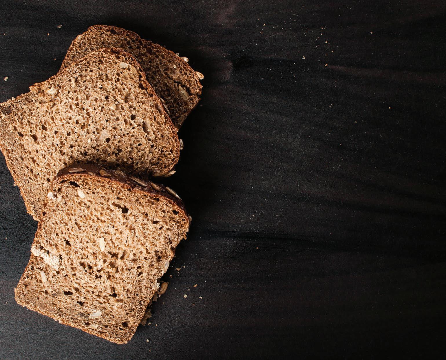
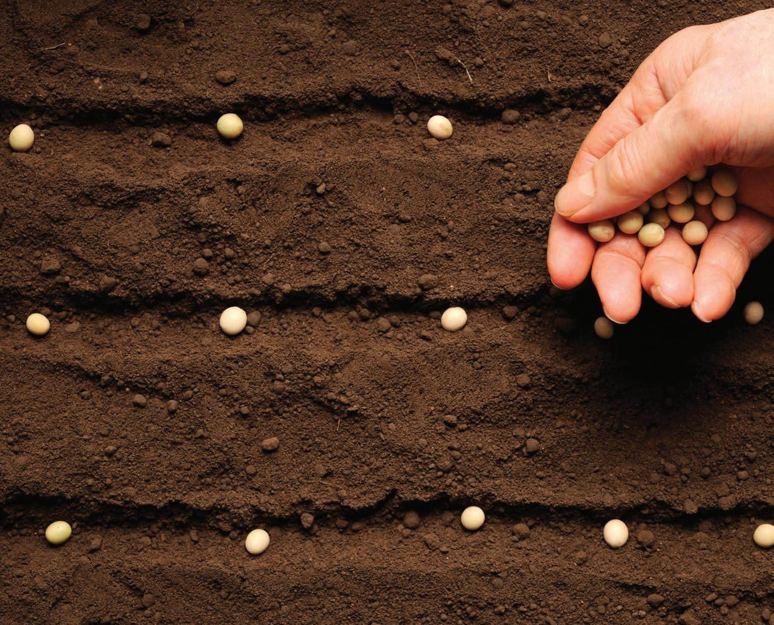
This section describes the brand’s image, photographic style and visual concept recommendations.


Typical TPS images must follow basic tenets of high quality production value photography, which should be well composed and deliberately anchored around high resolution content, dramatic lighting, clear depth of field, vivid colour schemes as well as interesting subjects and perspectives.
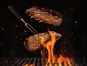

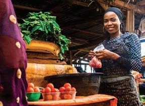
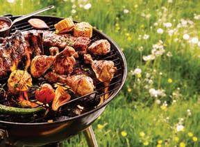

Ideal visuals must be of high quality production value, with dramatic lighting, clear depth of field, vivid colour and unique perspectives.

This section rationalises the arrangement and execution of layouts and elements in adverts.
Do not attempt to reconstruct the Advert. Only official artwork may be used.
Headline
Sub Headline
Body Copy
Image Box
Visual Area
Logo
Signature
The image may then be placed, and any adjustments made to enhance legibility of copy must comply with image treatment guidelines as provided.
Our winters are the warmest
We have perfect breakfasts online for you and your family. Find out more on our website. www.theperfectserve.com


This section comes into play during the collaboration of brand identities of TPS and affiliates.
In instances where the TPS logo must appear with a partner brand on TPS driven or controlled communications, our mark retains its primary position as shown in the example.
The partner signature will appear to the left of our mark, observing the clear space rule and a 75% size reduction in relation to the TPS logo.
Our winters are the warmest
100%90%
90%90%
