COLOR THEORY

IND5325 RAQUEL SANT ANNA 2023
M.1 M.2 M.3 M.4 M.5 M.6 M.7 M.8 M.9 M.10 COLOR + CULTURE p. 9 QUIZ: COLOR + THEORY p.15 COLOR + DESIGNER p.17 QUIZ: COLOR + PERCEPTION p.25 COLOR + ENVIRONMENT p.27 QUIZ: COLOR + HEALTH p.35 QUIZ: COLOR + BALANCE p.37 COLOR + RETAIL | MATE. P.39 COLOR + WORKPLACE | Linked In p.49 COLOR + HOSPITALITY | The Setai Hotel p.57 2 ABOUT ME p. 3
TABLE OF CONTENTS
ABOUT ME
3
RAQUEL SANT ANNA
I am from Brazil, and this is how we say “HI” in Portuguese

As you can see, this is only a small part of me

At my very end, this is what I like to wear, COMFORTABLE SHOES

To go FURTHER, JOYFUL and a bit DISTRACTED


OI
I LIKE CONNECTING, OBSERVE, LISTEN, AND BEING SILLY SOMETIMES
I AM CONSTANTELY AMUSED BY SUTTLE DETAILS


MAYBE THAT IS WHY MAY
FAVORITE COLOR IS MOSS GREEN
I LIKE TO COMMUNICATE BUT NOT NECESSARY TO SPEAK

NICE TO MEET YOU!


Well, CLUES are better than definitions sometimes OR At least more FUN
M.1 COLOR + CULTURE
7
INTRODUCTION
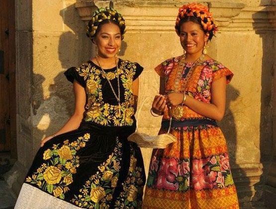
Colors express tradition and history of culture around the world. Thus, color meanings, symbolism and perceptions can vary significantly from one place to another , this is a color cross-culture diversity.

Let’s explore a bit about color symbolism in Brazil and Mexico

8
Brown Drinking coffee is a tradition among brazillian families. Sense of comfort and belonging


Forest Green flourish the perception of being close to nature. A sense of protection and belonging


Shades of blue brings calm and tranquility

Orange crops, very tropical, energizing and vibrant


01 Brazil 9
Red Vibrant and vital. Represents the creative and destructive forces. Sunlight, blood and fire


02 Mexico 10
Mexican Pink Natural pigment, Vivid and festive
CONCLUSION
The colors through cross culture has the power to identify and communicate. It can influence people cultural behavior and history a place

11
M.2
QUIZ COLOR + THEORY
12
COLOR + THEORY
Chapter 2
This chapter introduces the properties of light (reflection, diffraction and refraction), and how color can be combined in many different way to become a new color (additive and subtractive) Light is not only beauty but wavelength, temperature and can impact our health and the way we percept things.
Albert H. Munsell


(1858 – 1918)
Creator of “Color tree” organizes, compiles and guide us through the three dimensions of colors (Hue, value and saturation)
I was fascinated with the work of Johannes Itten (1888-1967), and his holistic approach to create art.

13
M.3 COLOR + DESIGNER
14
LA MURALLA ROJA
Ricardo Bofill

15
LA MURALLA ROJA

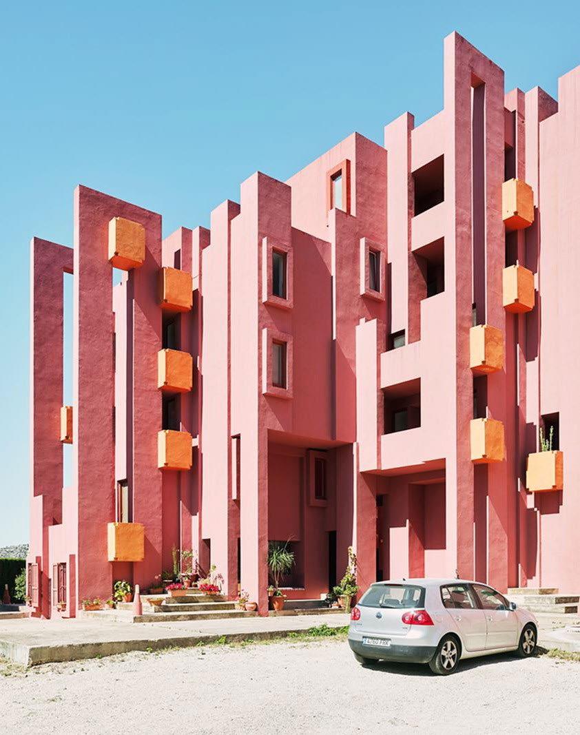
CALPE, ALICANTE, SPAIN
RESIDENTIAL
CLIENT: PALOMAR S.A
ARCHITECT: RICARDO BOFILL

YEAR: 1973
Design Inspiration
Architect
Born in Barcelona, Spain Founder of Taller de Arquitecture (RBTA)
 Ricardo Bofill
1939 – 2022
Ricardo Bofill
1939 – 2022
Kashab - popular architecture of the North Africa, made of adobe of North Africa) ABOUT 16
Roof terraces: solariums, pool, and a sauna. Other floors: 50 apartments ( 60 sqm studios, and two and three-bedroom of 80 and 120 sqm)

The labyrinth of this recreated Kasbah corresponds to a precise geometric plan based on the typology of the Greek cross with arms 5 meters long, these being grouped in different ways, with service towers (kitchens and bathrooms) at their point of intersection.


FLOOR PLAN 17
Circulation - reinterpretation of the Mediterranean tradition of the Kasbah for division between public and private spaces


18
LAYOUT
COLOR PALETTE
Color Palette - used to distinct architectural elements, according to their structural functions, and to benefit wayfinding

Tones of red - accentuate the contrast with the landscape. Area: Facade
Tones of Blue - ranging from sky-blue to indigo and event violet, depending on weather the intention is to contrast with the sky or create visually continuity with it. Area: Stairs and circulation surfaces
Optical Effect - The intensity of the colors is also related to the light and shadow of the daylight. The contrast and blending of these elements create a greater illusion of space and a fascinating aesthetic
 #033c95
#d7948b #b72c0f #ae7bbd #70b3e7
#033c95
#d7948b #b72c0f #ae7bbd #70b3e7
19
#203864
La Muralla Roja by Ricardo Bofill is an iconic architecture masterpiece, that is constantly interacting with the environment. The design is in harmony with the silhouette of the mountain cliff, and the colorful palette revels a new emotion every time the daylight changes.
Colors play an important role in the design of La Muralla Roja, on the inside defining spaces and easy way finding, while outside reveling itself. The hue intercalate between moments of blend and contrast with nature depending on the daylight.
La Muralla is a good example of the impact of colors regarding emotions, movement and interaction.
CONCLUSION
20
M.4
QUIZ
COLOR ASSOCIATION + PERCEPTION
21
COLOR ASSOCIATION + PERCEPTION
Chapter 3
Chapter 3 explores the interaction with color.
Each individual makes its own perception and association influenced by culture, traditions, age, society, politics, entertainment/media and fashion.
Individuals can also develop an emotional attachment to a color related to a significant object.
Color can also affect the spatial perception, the size of a room, its shape and mass
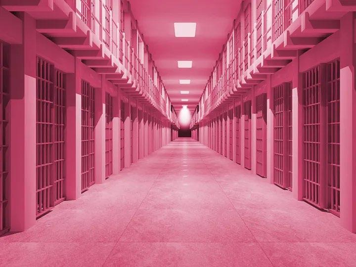
“Pink is used to calm violent prisioner in jails. The color surpresses anger, antagonistic, and anxiety-ridden behavior among prisioners: Even if a person tries to be anger or aggressive in the presence of pink, he can’t” (Color Matters, 2008, 2)

22
M.5 COLOR + ENVIRONMENT FILM ANALYSIS
23
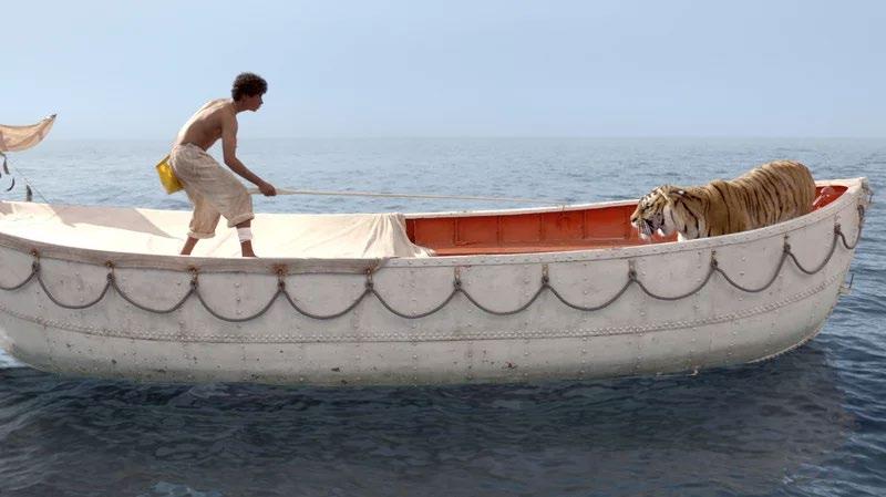
LIFE OF PI

Directed by: Ang Lee
Based on Life of Pi by Yann Martel
Main Character – Pi Patel Tiger – Richard Parker
Synopsis:
Life of Pi, tells the adventure of Pi Patel, a teenage boy who survived months adrift in a lifeboat with a savage Bengal tiger named Richard Parker.24
ORANGE
Associated to Hinduism and Buddhism. It is considered a sacred color. The color orange helps to develop the character Pi Patel, because it symbolizes his spiritual roots. Orange gives emotional support for him, as seen inside the boat.


SCENE: Pi Patel joined a traditional Indian dance class just to see the girl he fell in love with.


SCENE
The character was adrifted for days in a boat with a tiger. Pi Patel had to create an alternative floating platform to avoid being close to the tiger that was is inside the boat.
YELLOW
The sun determines the color palette for the scene. Yellow represents recovering the energy, a moment of contemplation, a break and calmness despite the magnitude of the drama the character was in.
After class, Pi Patel had the change to talk to Anandi.
#a98943 #b44c1d #8f4030
25
#eefbe5 #eadf64 #c38f0c #9c6505 #a02d04 #5b5642
GREENThe color green represents the nature. The hue green recharges Pi Patel with hope and beauty. Green – Green is the color of beauty, joy, hope, imaginary, dream, fantasy, magic, emotion
BLUE
Dark blue creates drama and mystery. In this scene loneness

SCENE
Moment that the character finally had a break of the tiger, so able to be involved with the fascinating presence of sea creatures.
SCENE:
The ocean was full of translucent jellyfish, beautifully and intimidating. At some point a big whale jumped out o the water very close to Pi Patel tossing him out of his float. He was able to swim back safely.

Pi had been a drifted for several days in despair. But his faith kept him a believer and connected to any sign of hope.
The range of dark blue saturation creates subtleties and grades of shade resulting in a mysterious light that scene required.
26
#27bda3 #086758 #05443a
#03220f #000000
#1f778c #042645 #195677 #050e23
Conclusion:
Color symbolism offers cues to a scene and enhance the emotions and feelings. Colors empower a message and set the mood for the history.
In Life of Pi, blue, orange and green are the predominant hues. Each scene are empowered by different saturations and value of them setting the magic or drama needed.

27
M.6 COLOR + HEALTH
28
Color can influence people’s health and well-being; mood and behavior says some studies.
Researches have shown that it is important to use an appropriated color palette and natural materials inside a space, in addition to “natural views and Lighting”. Those aspects have been “shown to advance healing and recovery” (MHFDG, p.2-3, 2010) Mental Health Facilities Design Guide.
In addition, The National Alliance on Mental Illness (NAMI), the aspects mentioned above can benefit daily function and well being, specially for those suffering of mental health conditions as anxiety, depression, attention deficit hyperactivity disorder (ADHD).
In other words, choosing an appropriated and personalized color palette (values and saturation) is an important aspect when creating a design for a better quality of life, mood and health.
Chromotherapy is the “practice of using colored light and color in the environment to cure specific illness and in general to bring about beneficial health effect” (Hope & Walch, 1900, p.75)

YELLOW + Natural light: improve breath
BLUE + Natural light: improve migraine and irritability
GREEN + Natural light: improve depression
29
M.7 COLOR + BALANCE
30
COLOR + BALANCE
Chapter 5
Color balance is our ability to perceive equality or visual weight in harmony.

“Research indicates that people are more attracted to objects that contain symmetry” (Lidwell, Holden, & Butler, 2003, pp.190-191)
Colors has the ability to create three types of balance when designing a space: symmetric – both sides are equal (formal balance); Asymmetric – informal balance Radial – radiating from a central axis
Color Balance can be achieved with the combination of value contrast, intensity contrast, hue, size of color area.
(Ellinger, 1980, p.28)
“Balance enforces the demand for oppositional groups”
31
M.8
COLOR + RETAIL
32
MATE FLAGSHIP STORE


FLAGSHIP STORE: KOBENHAVN, DENMARK ARCHITECTURES: SPACON & X

33
MATE.
Since 2016, Mate. has offering eletric bicycles, portable, and foldable for a very diverse customers. Mate’s bike help solving problems of dense traffic congestion, climate change, and health issues.


FREEDOM MOBILITY HEALTY
34
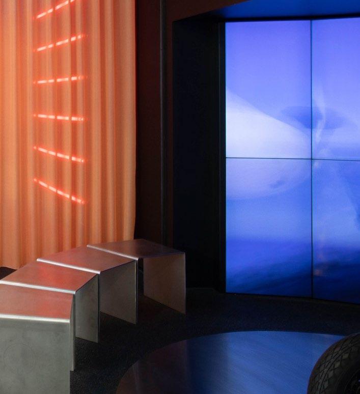
1. CONTRAST OF HUE
CONCEPT OF EMPHISIS
2. CONTRAST OF VALUE
3. CONTRAST OF A DESIGN FEATURE

The vibrant orange is an eye-catching and leads the client to the focal point Bike.
The color orange is bringing the idea of energy and stimu- lates activity. It helps to accent the forms of landscaping and its different terrains.
The screen projects an array of multi environment with different values and set the mood for the product. The dark blue captures a moment when the bikers stop by to apreciate the view The lighter violet gives the lightness required for the speed wanted for an adventure

The element stainless steel is constantly used in the space to relate to the materiality of the bikes. The stainless steel is contrasting with the softness of other elements found in the place, as carpet and wood.


35
4. CONTRAST OF TEXTURE
5. FOCAL POINT
CONCLUSION
The MATE. Flagship store at Copenhagen is a stateof-art and uses color contrast as key element to express the multi- tude of environments and terrains to use MATE. bike. The design uses colors as a tool emphisis and as an eye-catching for clients to get close to the product. The color contrast, value, design feature, focal point are elements that help to emphisize not only the products but also communicate brand concept and values.
The contrast of texture explores the diversity of environments and terrains. It emphisizes the ideia of versatility, preferences and lifestyle.
Curtain - Mountains and its irregular terrain Asfalt + Metal - City verticality
Digital projection - 3D texture
Area of contemplation, where the bike are single exposed and stands out from any other distraction
36
M.9 COLOR + WORKPLACE
37
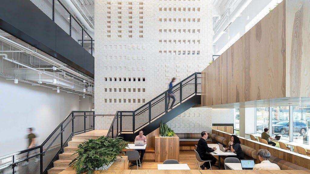
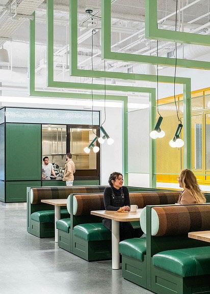
LinkedIn Corporation
Launched in 2003, LinkedIn is a social media platform for professional networking and career development.


FIRM: Gensler
CLIENT: LinkedIn
SIZE: 200,000 sqft
YEAR: 2022
LOCATION: Omaha, Nebraska, USA
38
#0274b3
LINE
CONTRAST OF LINES
Vertical lines
Represent strengh ans stability. Perception of a larger space.


Horizontal lines
Perception and sensation of space being restful, relaxing and calm. Perception of a wider space
In this picture the lines are working together to lead the eyes towards the usage of the space.

SHAPE

COLOR
Analogous Harmony
Three adjacent hues offer an inviting. It is approprieted for hospitality spaces
SHAPES create visual drama and interesting focal point.
Contrast of forms
Diagonal: zigzag light fixture is an informal design and add dynamic
Circle: Light fixture and bench represent soft movement, rhythm, and a sense of freedom
COLOR Red
Accent color that creates a focal point and brings a touch of warm to this social environment.
7a9c6a f2b409 ab6937 39
bb1c06
PATTERN

PATTERN is the repetitive ar- rangment of shapes and color.

The arragment of this textured wall plays harmouniously with the brick voids and extru tions .

The rectangle forms of the bricks layed in diferent direc - tions creates the perception of weight, volume and mass.
COLOR
Neutral tones or acromatic add simplicity and have a posi- tive affect in focus area, where concentration is necessaty.
TEXTURE
TEXTURE
Wood brick cushion |M esh railing
Different texture in an environment compose diversity of sensorial ex- perience for the eyes, emotions and touch.
COLOR
Complementary colors are nice to- gether, add harmony to the space, visual interest.In this case, the warm yellow and the cool blue hue create balance and a vivid con- trast.

3e454f eae9e5 b7a28d 40
c98604 135eb9
CONCLUSION
Colors can be an important and powerful tool in a workplace environment. It can impact on how employees and client use and perceive the space, as wayfinding, productivity and wellbeing.

M.10 COLOR + HOSPITALITY
42
THE SETAI

43
HOTEL IN MIAMI BEACH
VARIETY
Is a principal of design that uses a combination of elements to create Diversity
Hues
Shapes
Forms
Pattern
Texture
Color Palette:
Diversity Contrast Interest
ROOM
At one of the suites is possible to see the presence of a variety of elements that generates visual spots to be explored, as the linear horizontal shelves that merges to the vertical entrance and wall upholstery inside the bedroom; The linear cues are contrasting with the round edges found on the furniture. This composition creates visual movement and flow inside the space and collaborate to the impression of a bigger and dynamic room.

#752904 #d1d0cb #bfa085 #a66838 #593926
44
CONTRAST
Is the juxtaposition of different forms, lines, or colors in a space “ to intensify each element’s properties and produced a more dynamic expressiveness”
BAR
At the bar there is a lots o contrasts working together in a harmonious composition. The texture on the floor, pendants with clean lines and the pattern of the cabinets. The variety of accent lights emphasizes each important elements in the space.

45
Color, variety and design elements as tools to create interest COURTYARD
This beautiful setting has natural elements as water, wood and light (fire). The design explores the idea of privacy and intimacy when incorporating islands to the layout. The reflection on water and all the horizon layers create an atmosphere of mystery that invites users to explorer.

46
CONCLUSION
Project use of color and variety
The Setai Hotel is composed by a small range of color to reach sophistication and hospitality. It is notable that The Setai Hotel successfully created a combination of color and patterns to define contrasts between elements as wood, texture and lighting. Each room has its own drama and comfort, welcoming guests in an atmosphere of calmness and elegance.


47
REFERENCES
Hystoryplex. Brazil flag meaning. Retrieved from https://historyplex.com/ brazil-flag-meaning
Color Coffe: Psychology and meaning. Retrieved from htts://www. lifepersona.com/color-coffee-psychology-andmeaning-brown
Jacob Olesen. Color Meanings and Symbolism in Mexican Culture. Re- trieved from htts://www.colormeanings.com/color-meanings-symbolism-mexican-culture/

Nazanin. Facts about Mexican culture and the meaning of their colors (2021). Retrieved from https://colors.dopely.top/inside-colors/facts- about-mexican-culture-and-the-meaning-of-their-colors/ Ron Reed. (n.d.). Color Plus Design, Transforming Interior Space (3rd edition). Fairchild Books.
AD Classics: La Muralla Roja / Ricardo Bofill. (n.d.). Archdaily. Retrieved February 2, 2023, from https://www.archdaily.com/332438/ad-classics-la-muralla-roja-ricardo-bofill?ad_medium=gallery
La Muralla Roja. (n.d.). Ricardo Bofill. Retrieved February 2, 2023, from https://ricardobofill.com/projects/la-muralla-roja
Kasbah of Algiers. (n.d.). UNESCO World Heritage Convention. Retrieved February 2, 2023, from https://whc.unesco.org/en/list/565/gallery/
Colours as Symbols in Life of Pi. (n.d.). Research Gate.
https://www.researchgate.net/publication/294699280_Colours_as_Symbols_in_Life_of_Pi
https://www.archdaily.com/993296/mate-flagship-store-spacon-andx/638ecaa98bb5480170fc890d-mate-flagship-store-spacon-and-x-photo?next_project=no
LinkedIn Omaha | Projects. (n.d.). Gensler.from https://www.gensler.com/projects/linkedin-omaha
Reed, R. (2021b). Color Plus Design: Transforming Interior Space: Vol. Chapter 10, Color + Variety+ Design Elements (3rd edition).
The Setai Hotel in Miami Beach. (n.d.). The Setai Hotel. Retrieved April 5, 2023,fromhttps://www.thesetaihotel.com/
48 M.9 M.10 M.1 M.3 M.5 M.8 THANK YOU! M.2| M.4 | M.6 | M7