1 minute read
UI Kit
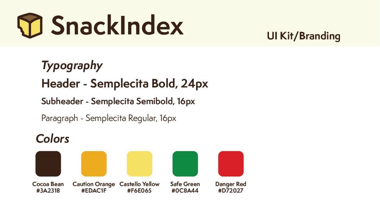
dessert. The colors all followed the same scheme, though they also were tested repeatedly to ensure that the theme could maintain AAA color contrast for web compliance using the Figma plugin A11y. The other colors were used to communicate the safety levels of the food items that users would come across.
The UI Kit was rather simplistic in nature as the application was very text based and not so dependent on icons to communicate the app components. With that said, icons were sized according to Apple’s Human Interface Design specifications, with 44px buttons throughout, as well as a 16px body text. Special focus on the components was made to ensure the safety of food items from a quick glance.
Advertisement


