ANIME BOOK OF THE BIG DRAWING

THE COMPLETE
STEP-BY-STEP GUIDE


THE COMPLETE
STEP-BY-STEP GUIDE


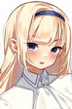

CHRISTOPHER HART


Special thanks to Art Joinnides and Carrie Kilmer for giving me the opportunity to produce a comprehensive book for aspiring anime artist s.
Get Creative 6
An imprint of Mixed Media Resources, LLC
19 W. 21st Street, Suite 601 New York, NY 10010
Editor PAM KINGSLEY
Creative Director
IRENE LEDWITH
Book Design
DIANE LAMPHRON
Art Directors
DIANE LAMPHRON
JENNIFER MARKSON
Contributing Artists
AKANE
ANZU
CHRISTOPHER HART
KOUKUBOTA
KURI NYANN
PH MARCONDES
TABBY CHAN
Chief Executive Officer
CAROLINE KILMER
President ART JOINNIDES
Chairman
JAY STEIN


Copyright © 2024 Art Studio LLC
All rights reserved. No part of this publication may be reproduced or used in any form or by any means—graphic, electronic, or mechanical, including photocopying, recording, or information storage-and-retrieval systems—without written permission of the publisher.
The written instructions, photographs, designs, projects, and patterns are intended for the personal, noncommercial use of the retail purchaser and are under federal copyright laws; they are not to be reproduced in any form for commercial use. Permission is granted to photocopy for the personal use of the retail purchaser.
None of the advice, suggestions, or comments the author offers in this book are meant as legal advice or as a substitute for legal advice. He is not a lawyer or an expert in legal matters. His comments are solely his opinions, based on his extensive experience in the professional arts, writing, and publishing.
Library of Congress Cataloging-inPublication Data is available upon request. Note: This book is intended for use by adults. If children are permitted to use this book, be sure to provide them with child-safe supplies.
ISBN 978-1-68462-083-8
Manufactured in China
1 3 5 7 9 10 8 6 4 2

Introduction 4
Getting Started 6
Mastering Anime Eyes & Hairstyles 16
Expressions Every Anime Artist Needs to Know 32
Figure Drawing Basics for Anime 48
Creating Outfits 70
Amazing Poses Step by Step 88
Character Design 118
The 9 Must-Know Genres of Anime 150
Creating Scenes & Stories 174
So, You Want to Be an Anime Artist 214
Index 222


This book is a complete course for the aspiring anime artist. Within its covers, you’ll discover helpful art principles and techniques that will lift your skills and enable you to draw a wide range of popular character types.
These are the foundational skills of anime. They’re easy to understand and to put into practice. With them, you can take your art to new levels. They’re essential for drawing heads, expressions, and poses, learning the secrets of character design, and telling a story visually
The purpose of this book is to ignite your creativity and couple it with effective art instruction so you can draw the style that you love: anime. The visual examples and instruction in this book work as well for artists who prefer pencil and paper as they do for those who prefer a digital tablet. This is a massive book, and it can give you massive skills. Let’s dive in.


The farther down the face the features (the nose and mouth) are placed, the smaller they appear.
The eyebrows are drawn close to the eyes.

The forehead is large but the chin is small—the opposite of the upwardlooking angle.
The ears are drawn higher on the head.
At this angle, we can see the top of the head and where the strands of hair converge.

The neck is overlapped by the chin and can’t be seen at this angle.
Add a shine to the top of the head; there’s too much hair to leave it undefined.
The mouth is drawn toward the bottom of the chin.


If you haven’t drawn angles like these before and it feels a little awkward, trust the proportions.

Some books teach you how to draw the anime eye. But which eye is that? There are different eyes for different characters, for different looks. The same is true of hairstyles. Let’s see how it’s done with a few popular styles.

Let’s start with the basic eye. Once you’ve got the foundation, you can use it to create different variations.
The easiest way to draw this important feature is to take note of the proportions. The eyes are drawn just below the halfway point of the head, as measured from top to bottom.
In anime, the iris takes up more room than the white of the eye, which is the opposite of how it appears in realistically drawn people.
Two horizontal guidelines align the eyes on the top and bottom.

Top half of the head
Eyes are drawn just below the halfway mark.
Bottom half of the head
Eyes are adaptable. They can be adjusted to go with current styles and fashions, personalities, and ages.
The nose should be centered between the eyes.

Hair flops over the head, into wavy curls. Relaxed hair doesn’t retain its shape but instead creates a random look, which is fun and dynamic.

After you’ve gotten used to using two guidelines for the eyes, you can use just one instead.
This character appears a bit older than the previous one because the eyeballs are slightly smaller. Bigger eyes make a character look younger.
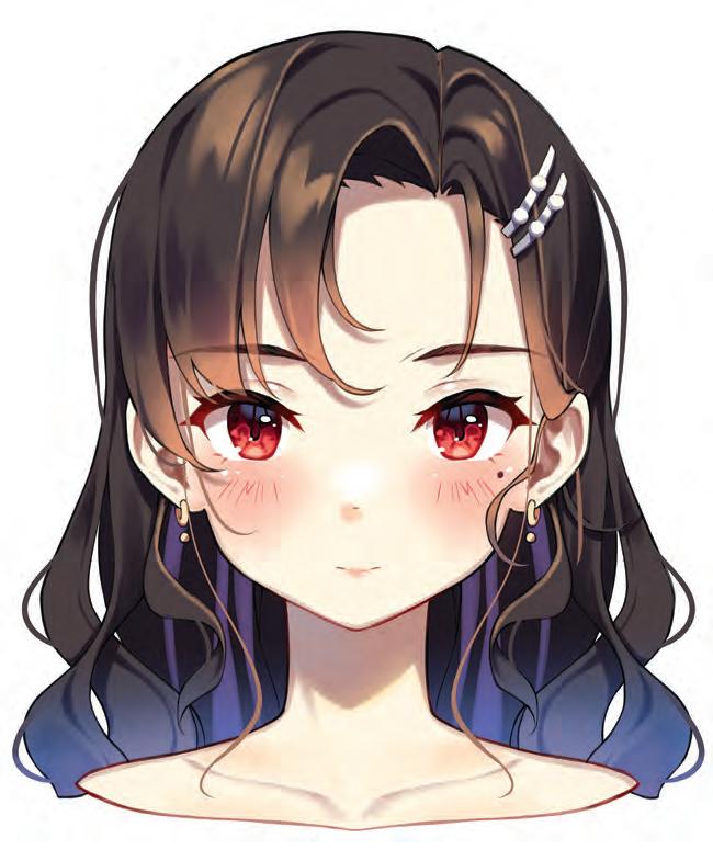
Upper eyelids have thickness; bottom eyelids do not. By reducing the size of the mouth, the eyes become the focus of the face.
We’ll start off with some of anime’s most popular expressions.
There are many types of cute expressions—silly cute, guilty cute, confused cute, to name a few. Here, we’ll tackle the basic cute smile.

The head is wide, to make room for big eyes. The first step establishes the facial guidelines.
The shoulders, which are slightly raised, are part of the expression.
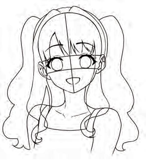
The eyes are the first feature to be drawn. They’re the anchor of the face.

The eyebrows appear as if they were covered by transparent bangs.
The upper lip is horizontal, the lower lip curved.
Cute expressions are wide-eyed, straightforward, and welcoming.

If all of your characters think the same, where would the fun be in that? Bring in the skeptical guy. He refuses to go along with the group.
Rest the chin in a V between the thumb and index finger.

Ruffled hair and rumpled clothing reflect his state of mind.

Show a lot of eye action: one eyebrow goes up while the other goes down; it creates intensity.

The brim of the cap is pulled to one side.
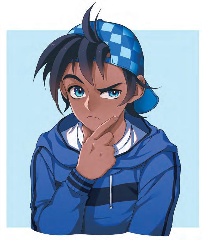
The eyes are focused like a laser beam; draw a small shine in both of them.
When it comes to art technique, a lot of emphasis is placed on avoiding a stiff pose. But there are times when straight legs work better than bent ones. The walk, in a profile, is one such case.
Don’t bend the knees too much. It makes a character look as if they’re falling forward.

The back leg can have some bend to it, but the front leg, which extends forward, should be almost completely straight.
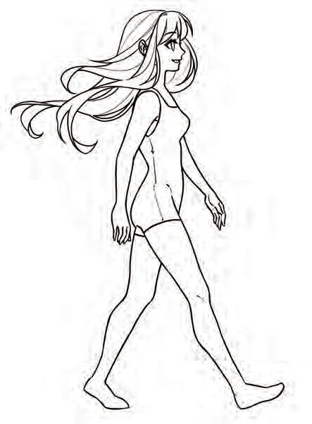
The back heel points up; the front heel points down.

Straighten the front knee.
The posture is upright in a relaxed walk but can change if the character is in a hurry.
The most prominent curve in the body, and the one responsible for creating a natural-looking posture, is the lower back.
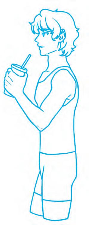
The front and the back of the torso are drawn with straight lines—not too interesting.

If you were to draw a straight line down the back, the body would stiffen. It needs a curve to create visual rhythm. Without it, the character doesn’t look relaxed.
Add a small curve above the hips, and the same pose looks natural. DO!

DONE!
A flowing back line brings ordinary standing poses to life.
In the first chapter, Getting Started, we learned how to turn the head at different angles while retaining a consistent look. But the body has personality, too. So, we’re going to put it all together and try a few simple turnarounds of the entire figure—with an adorable anime creature who exudes personality.
The body is as cute as the head. Everything is symmetrical in a front view—the left side of the face and body is the same as the right side.
This little guy is based on two circles, as you can see from the red guidelines.
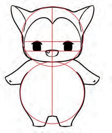
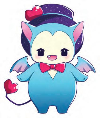
By turning our little guy to the right, the centerline (the red line running down the middle of the figure) shifts to the right, so the guideline now curves and indicates plumpness.
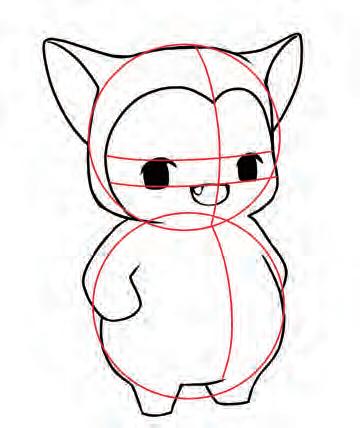

We started with a front angle, which is a flat view (doesn’t show depth). Next, we turned to a ¾ view, which does show depth. Continuing to turn our little friend, we end up in a side view, which, once again, is a flat look, but pleasing in its simplicity.
At this angle, the back of the head is prominent.

The edge of the face is emphasized at this angle.
Only one eye. And the mouth can be omitted.
The arm and leg are drawn in the middle of the body.

This view stresses posture, because so much is hidden that the posture becomes a more important element by default. This character has a funny posture in that he’s leaning forward. This is also a symmetrical pose.
The lines of the back overlap the arms.
The centerline goes directly down the middle of the head and body, just like the front pose.

The head tilts back to counterbalance the forwardleaning posture.
Hands are drawn at the same level on both sides.

Big, round eyes are the basis for many cute character types. The phone is pressed flat against the face.

Small but expressive mouth
Draw shines in the eyes.

A big, open hood allows the viewer to see her face.
Concept This girl lives for anime conventions. At school, she’s one of many, but at the conventions, she’s famous. Her kawaii-themed outfit gives anxiety attacks to other attendees who only brought cat ears.
When you draw oversized clothing that hides the contours of the figure, erase the underlying guidelines.

Draw any cute design or tiny character you like on the hoodie.

Oversized earrings
Accessories are essential for characters at anime conventions.


Many artists specialize in one or more genres. You may find one in this chapter that inspires you. Anime fans think in terms of genres. Therefore, by placing your work in the right genre, you can target viewers who may be predisposed to the material you’re developing. This chapter is designed to introduce you to a selection of cool character types in today’s most popular genres. Think of it as a visual template for creative ideas.
This genre features brave young heroes who embark on fantastical quests. Sometimes they bring cute mascots to protect them on their journey. Their stories may be set in a different time and place. They will need determination and a lot of luck to get past the dangers that lie ahead.
Features of this genre can include:
• Childlike characters and animals
• F ighting poses that are more funny t han they are threatening
• Cute proportions: big heads with s mall bodies
• Lots of action
• Fantastical backgrounds
The basic head shapes are cute and round.
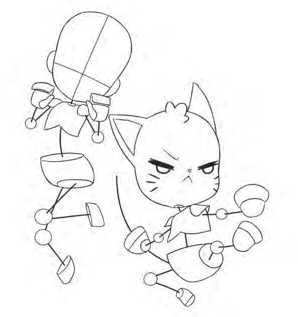
Both characters pull their knees in to create an action pose.
When you have two characters in a scene, leave a little space between them so the action will be easy to see.
Draw a big arch in her back.

The two figures’ poses contrast: her arms are pulled in but the cat’s are extended.

The girl’s hand positions mimic a cat’s paws.
on the

The cat’s expression is so serious! But he’s still cute, which is in keeping with the genre.
This is a very cool and inventive subgenre of fantasy. In it, characters are swept away to another world, which can be anything you want it to be, from an earth-like planet to a world made of illusions.

Notice the plotting of the layout. To keep it from being too busy, the top character strikes the dramatic pose, while the bottom one looks more stable. Drawing is artistic, but it’s also strategic!

The outstretched arm is the most dramatic part of the pose because it’s extended at a diagonal.
Her body is drawn at a diagonal, toward the left, while his is straight up and down. That contrast creates interest.
The male’s front shoulder is turned forward, ready for battle.

Don’t let her extended arm touch his raised arm. That would result in something called a tangent.
KEY
For more on tangents, see page 181.

Leaping, flying, and being ready to defend themselves are important skills for characters of any action-fantasy genre but arriving in another world speaks specifically to the Isekai genre.
This genre reminds us that there’s magic in our everyday lives. It provides a fun alternative to other fast-moving genres of anime. Slice of Life explores relationships, with some good-natured humor.

To stage the two characters, draw them side by side with minimum overlap.
When drawing a visual joke, make sure nothing overlaps the funny part, which is the boy’s face.
Curl her fingers to allow the viewer to see as much of his face as possible.

Zero in on the action with a waist-up shot (also called a medium shot).
Position him facing front.
KEY
When something funny is happening, give it room.
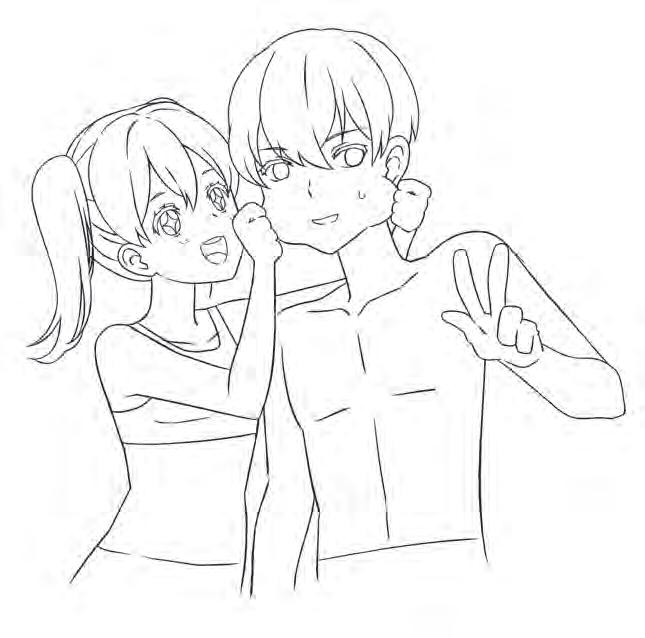
That’sgottahurt!


makes the scene look off-kilter and a bit kooky.
Only the most determined characters start out on an impossible quest. The path is filled with obstacles that must be overcome. Along the way, the hero may acquire some odd friends and encounter fierce enemies. Heroes on a quest often travel with companions—human or not.
The creature and teenager face front to give the viewer a clear look at them and establish an emotional connection.

The boy’s stick-figure construction shows a lot of motion (the arms and legs coming at us dynamically). The creature does not, in order to avoid what artists refer to as “eye fatigue.”
KEY
The creature’s wings can’t possibly carry his weight. However, it’s more important that they match his cute personality.
Draw the creature’s far limbs, which are overlapped by his body.
Because of perspective, the foot and leg coming toward us are drawn to appear slightly larger than the back foot and leg.


Foreshortening is why the fist is enlarged while the arm behind it is compressed.
The teen’s figure leans to the left in a long, curved line.
A spotty, green background gives the impression they are deep in a forest.

To make it appear that the teen is coming at us, show the underside of his shoe.
More than just horror, the paranormal genre features intriguing characters that stir the imagination. You’ll have to keep your wits about you in this strange world, where nothing is what it seems and things can transform before your very eyes.
This is a symmetrical pose. Symmetrical poses look calm—but in this case, it’s the calm before the storm. Draw her head first, then the hands in front of it for the correct placement.

Drawing wide open eyes with dots for pupils creates an eerie look.
Hair falls below the shoulders, then curves inward.
Fingertips should be just below the eyes.

Level the shoulders.
Draw the eyes and nose between the hands so the viewer can see them.
Bring the elbows close to each other and have each come to a point.

Hair flows down the forehead.
There are no whites in her eyes, just big, red, spooky irises.

The heavy use of shadow gives this character a mysterious look.
In a magical fantasy world, all things are possible, but only one choice is the correct one. The others lead to danger. That setup provides the suspense that keeps the audience engaged. In anime, magic is as much an attitude as it is a power. It’s often possessed by cheerful, adventurous types.
Draw the arm extended on a diagonal.

Keep the knees together and feet apart.
Create a kitten by drawing little arms and legs on a puffball of a body.
Draw short, wavy ponytails.
This is an “air pose,” the two characters jumping and striking a pose as if they were weightless.
Because of the ¾ view, the far ponytail is mostly overlapped by the head.

This is a ¾ view, with her head and body turned slightly to the right.
Follow the S-shaped guideline for the tail of the kitty.

Draw small circles for the eyes.
Draw a split upper lip.
The kitty’s tummy curves outward for a cute look.
The two patterned stars behind these friends reflect the energy of the poses and provide more fun than a literal background.

In a world of fantasy and magical friends, everything is fun. You can make your characters come alive by focusing on an exuberant pose, expression, and colorful costume.


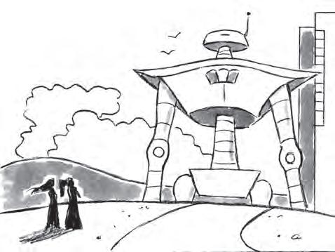


The colors in the background are soft. This forces the viewer’s eye to focus on the scene in the foreground, which is defined, detailed, and boldly colored.
Position the bubble at head level or above. Less frequently, it is placed nearer to the ground.
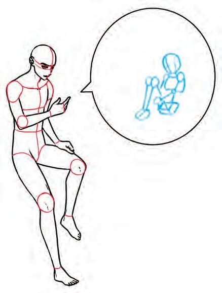
Keep the figure in the insert simple because it needs to be small.
An insert can be any shape. The main character does not look at or see the character in the insert—it’s not visible to them.

Start to draw in the details of each of their environments.

Leave ample space around the character in the insert so it doesn’t appear to be a real boundary.
Position the insert close enough to the other character so they appear to be relating to it.
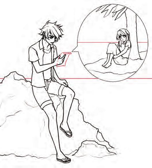
Draw horizontal water lines for both characters; they should be at different levels. If they were the same, it would break the illusion that the two characters are in different locations.
This is an inventive, entertaining way to include a second character in a scene. Let’s suppose this character is far away but you’d still like to include them. All you need is to create what is called an insert, which is basically a bubble within the scene. Draw your character in the insert, bringing them into the scene even though they are not physically there.

I have no idea how the kitten is going to carry that bone anywhere. But I think I know who’s going to help.
A accessories, 133, 138, 147 action characters, 134 after-school outfits, 74–77 age of characters choosing, 123 ear position, 21 eye size, 19 by genre, 170 postures, 57
AI humanoid concept, 134–137 air pose, 162–163 alignment, 52 angles, 54, 75, 91, 122 animals, 170–173, 190–191 animators, 216–217 anime fan concept, 146–147 anime fashion follower outfits, 78–79 anxious personality traits, 125 Anzu, 218–219 arms, 55 counterposing, 86 natural looking, 64 artistic type outfits, 80–81 asymmetry, 56, 65, 108
back, lower, 69 background details, 92, 97, 101, 107, 113, 157, 159, 164–165, 169, 172, 193 back views character figure, 121 human body, 55 r unning, 59 bad characters, 22 beltlines, 66–67 best friend outfits, 82–83 busybody expressions, 42
C
caring characters, 21 caught in a magical spell pose, 102–103 character design a ge of characters, 123 angles, 122 back views, 121 defined, 118 front views, 120 personality of characters, 124–125 side views, 121

signature poses, 126–132 ¾ views, 120
character-driven expressions, 38–43
character templates, 8–9 charming pose, 108–111 close positioning, 176 close-ups, 179, 210 clothing. see outfits clueless teen character, 128–129
Collins, Wallace E. J., III, 220–221 color, adding, 137 commissions, 221 composition, 175, 178, 199 concepts
AI humanoid, 134–137 anime fan, 146–147 defined, 134 emotional girl, 148–149 enchanted boy, 144–145 geeky boy, 138–139 she’s a little different, 140–143 confusion, 128–129 contrast, 81, 83, 105, 199 copyright, 220–221 costume changes in character, 84–85 out of character, 86–87 couple dynamics basic construction, 184 implied characters, 186–187 mirror pose, 184–185 trust issues, 186–187 unlikely friends, 190–191 curving lines, 91 cute adventure genre, 152–153, 170–171 cute characters, 20, 34
Ddefeated warrior pose, 114–117 depth, 94, 177
detail shots, 179 devious pose, 90–93 distant positioning, 176, 179 doorways, 180 dramatic poses, 134, 154–155 dystopian genre, 168–169
Eears, 10, 21 elbows, 51, 52 emotional girl concept, 148–149 enchanted boy concept, 144–145 estrangement, 176 exaggeration intensity, 196–199 perspective shots, 192–193 reversing perspective, 194–195 expressions all choked up, 46 busybodies, 42 character-driven, 38–43 cute smiles, 34 exaggerated, 44–47 fearless, 40–41 hilarity, 45 over the top, 44 rejected, 46 resentful, 43 skeptical, 35 snobby, 38–39 speechless, 36 upset, 37 eyeglasses, 23 eyelids, 20 eyes caring, 21 emotional, 46 oversized, 20 positioning, 10, 18 proportions, 18 shine in, 20, 46, 149 stylish, 19 wicked, 22
F faces close-ups, 179 front views, 8–9, 10–11 head tilt—down, 15, 176 head tilt—up, 14, 176 proportions, 8–9 side views, 8–9, 12–13 fan art, 221
fantasy genre, 154–155, 162–163
fearless expressions, 40–41 feelings, communicating, 57 fingers raised, 61 floating poses, 104–107 focal point, 178 foregrounds, 178 framing, 178, 180 friendly personality traits, 124 friendship, 176, 190–191 front views character figure, 120 faces, 8–9, 10–11 hairstyles, 24 human body, 50–52 ponytails, 31 r unning, 58 full shots, 179 fury, 45 futuristic landscapes, 204–207 G geeky boy concept, 138–139 genres and character age, 170 cute adventure, 152–153, 170–171 dystopian, 168–169 isekai, 154–155 josei, 172–173 magical fantasy, 162–163 paranormal, 160–161 remarkable journey, 158–159 romance, 166–167 slice of life, 156–157 specializing in specific, 151 spooky comedy, 140–143 thrillers, 164–165 graphic novel artists, 218–219 grounding, 181 guidelines, 8, 10, 204
H hairstyles bangs, 28–29 drop cuts, 27 dynamic, 196 front views, 24 long, 25, 161 modest cuts, 27 pigtails, 30–31 ponytails, 30–31 positioning, 10 shaggy cuts, 27
shine in, 149 short, 26–27 side views, 24 wavy hair, 29 hand positions, 60–61 heroic pose, 98–101 holding phones, 60, 186–187 horizon line, 177, 179 human body back views, 55 front views, 50–52 side views, 53 ¾ views, 54
Iimplied characters, 186–187 inserts, 186–187, 210 intellectual property attorneys, 220–221 intensity, 196–199 isekai genre, 154–155
Jjeans, 66–67 josei genre, 172–173 joyfulness, 94–97
L laughter, 45 layering, 183 layout, 175 leaning against a wall, 62 legs proportions, 50 r unning, 58–59 standing, 57 walking, 68 light sources, 77
M
magical fantasy genre, 162–163 metaphors, 180, 196 mirror pose, 184–185 motion, 102, 104, 113
N
nice guy, 124
O offering items, 61 outfits after-school, 74–77 anime fashion follower, 78–79 ar tistic type, 80–81 best friend, 82–83
in character costume changes, 84–85 out of character costume changes, 86–87 school uniforms, 66–67, 72–73 overlapping, 122, 182 oversized eyes, 20 over the top expressions, 44
Pparanormal genre, 160–161 partial backgrounds, 164–165 personality traits, 124–125 perspective, 78, 94, 99, 144, 158 guidelines, 204 looking down on a character, 192–193 looking up at a character, 194–195 pets, 170–173, 190–191 phones, holding, 60, 186–187 points of view, 208 poses adjusting, 65 air, 162–163 a symmetrical, 52, 56, 65 casual, 54, 57 caught in a magical spell, 102–103 charming, 108–111 clueless teen, 128–129 counterposed arms, 86 creating stable, 91 defeated warrior, 114–117 devious, 90–93 dramatic, 134, 154–155 enhancing with background details, 92 f loating, 104–107 heroic, 98–101 leaning against a wall, 62 mirror, 184–185 prima donna, 126–127 prominent curve, 69 relaxed, 164 r unning, 58–59, 94–97, 112–113 side angle, 144 spy secret identity, 130–132 standing, 57 symmetrical, 56, 160, 166 walking, 57, 68 positioning beltlines, 66–67 character, 95
distant, 176, 179 ears, 10, 21 eyes, 10, 18 hairlines, 10 hairstyles, 10 hands, 60–61 height differences, 176 nearness, 176 postures, 57 prima donna character, 126–127 proportions and age of character, 123 eyes, 18 faces, 8–9 human body, 50–55 public transit scene, 200–201
R reference points, 9 rejection, 46 remarkable journey genre, 158–159 resentful expressions, 43 reveals, 213 reversing perspective, 194–195 romance genre, 166–167 running back views, 59 danger run, 112–113 front views, 58 joyful run, 94–97
S scenes
creating, 200 development of, 210 futuristic landscapes, 204–207 public transit, 200–201 schools, 200–202 school settings, 200–202 school uniforms, 66–67, 72–73 secret identities, 130–132 settings, 175 shading, 11, 206

shadows, 11, 54, 77, 145, 161, 169, 181, 192, 206 shine, 20, 46, 149 shoes, 86 shoulders, 51, 52, 53, 54 side views character figure, 121 faces, 8–9, 12–13 hairstyles, 24 human body, 53 silhouetting, 183, 207 skeptical expressions, 35 slice of life genre, 156–157 smiles, 34, 96 snobby expressions, 38–39 snowy scenes, 110–111 special effects, 102–103 speechless expressions, 36 spies, 130–132, 133, 138 spooky comedy concept, 140–143 standing, 57 stressed guy, 125 stylish characters, 19 symmetry, 56, 160, 166
T tangents, 63, 154, 181 tears, 46 ¾ views, 54, 120, 162 thriller genre, 164–165 trademarks, 221 train stations, 200–201 two-character scenes, 152
U
upset expressions, 37 V vanishing guidelines, 194–195, 204 villains, 22, 90–93 visual storytelling, 208–213
W walking, 57, 68 warriors, defeated pose, 114–117 wicked characters, 22 wide shots, 210 winged creatures, 158–159 worry, 148–149 writing, 61
Y Yamauchi, Cindy, 216–217 223
CHRISTOPHER HART is the world’s leading author of art instruction books, with over 8 million copies sold and titles translated into over 20 languages. He is the author of the The Master Guide to Drawing Anime series, which has sold over 800,000 copies. His books offer artists accessible and clearly written step-by-step instruction on a wide variety of learn-how-to-draw subjects.




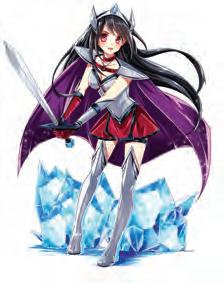


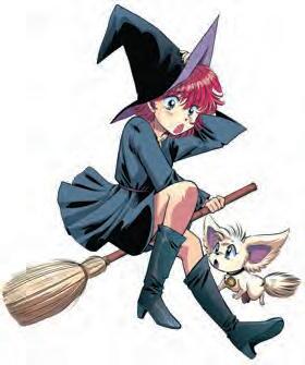


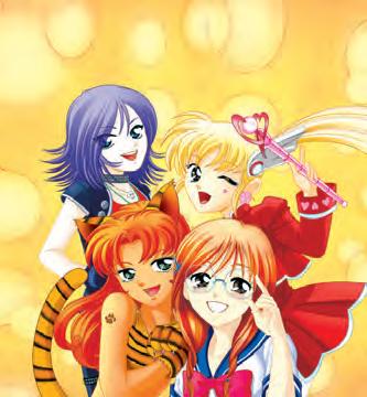

This is the ultimate how-to guide, combining hundreds of exciting visuals with easy-to-follow stepby-step instructions. With The Big Book of Drawing Anime, you can create your own unforgettable characters in no time!
Every aspect of anime is covered—how to draw faces with engaging expressions, stylish outfits, fun poses, and so much more. You’ll also learn basic techniques in figure drawing and composition that will help you create dynamic characters and memorable anime and manga scenes.
From how to draw anime’s most popular character types to the secrets of visual storytelling, it’s all here. Jump in!

