1 minute read
Editing Tips to Help You

Drop Shadow
You can use a drop shadow to enhance the readability of your text.
Advertisement
Just Once
A lower third should only be used once. If the speaker appears more than once, use it the first time that the person appears.
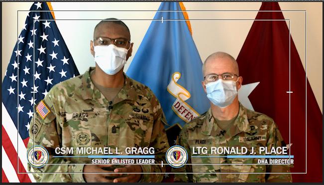
DHA & MHS
When using a lower third for anyone associated with DHA or MHS, make sure you use the appropriate logo. Branding guides are available at health.mil/brand
HOW SHOULD A LOWER THIRD LOOK?
A lower third should not be too complicated. When you are not sure what to use, always stick to the basics. Follow the tips that are on the previous page to have an easier experience.
Also keep in mind the following tips if you don’t plan to use a pre-made lower third:
+ Stay away from distracting colors and using too many at the same time.
+ If you use contrasting colors between the background element and the typography, your text will stand out.

+ Avoid lengthy text — keep it short and to the point.
+ Make sure your lower third is in the title-safe area. Your lower third should never block something your viewer needs to see.
+ You can use animations for your lower third, but always keep in mind to not have it visually distracting from your content.