
HANNAH RYAN hannah-design.co hannahryandesigns@gmail @hannahsmi1in
My name is Hannah Ryan and I’m a creative visionary. I work as a multi-disciplinary designer across many different fields of design to create carefully crafted innovative solutions. I graduated from Texas A&M University, Corpus Christi with a Bachelor of Art in Graphic Design in May 2023.
I enjoy working in the creative field; I have a passion for perfection in design, no matter the subject. I’m a hard-working creative with real-world experience. I also do freelance work during my spare time and have participated in multiple local non-profit design projects. I have such a passion for design.

As you work your way through this portfolio book, I hope the greatest takeaway you have is that I love what I do.

HANNAH Design Co. Portfolio
carefully crafted & innovative solutions
CAMPAIGNS Bluebell* Ghia Le Spritz Glossier MOBILE APP Creative Brief WaterMe* PUBLICATION Evergreen Magazine *This project is showcased as a case study. About the Designer
portfolio contents
BLUEBELL
The Complete Rebrand + Case Study
Blue Bell Creameries has been serving sweet scoops of homemade ice cream since 1907. The rebrand aims to showcase the rich history of the creamery while refreshing and modernizing to keep up with emerging ice cream brands. The new and improved Bluebell has a strong brand voice that speaks to a large audience who value tradition, memories, and ice cream.

BRANDING LONG FORMAT CROSS-PLATFORM
HANNAH Design Co. Portfolio
Similar to the brand’s original logo, the new Bluebell logo incorporates the look and feel of tradition. In order to keep brand equity, the new logo incorporates a serif font that is a modern, softer version of its predecessor. However, the previous spelling of “Blue Bell” was changed to the singular word “Bluebell,” which is the correct spelling of the flower the company is named after. Continuing with tradition, the previous cow mark has been adapted to incorporate the bluebell flower, which is native to Brenham, Texas. The cow mark in combination with the wordmark gives the viewer a sense of nostalgia.


The dynamic mark works as an ever-changing logo. The primary mark serves as a symbol for the Bluebell flower, but the counters of the “B” are changed to incorporate Bluebell’s bold flavor profiles on packaging material and promotional collateral relating to a specific flavor.


NEW LOGO FORMER LOGO DYNAMIC MARK
LOGO & DYNAMIC MARK
Bluebell Rebrand Campaign
COLOR COMBINATIONS
The new Bluebell color palette incorporates the colors of the bluebell flower. The neutral tones give a sense of calmness like nights under the starry Texas skies. In addition to the primary color palette, each of our flavors is assigned a color palette that showcases the flavor profile.


HANNAH Design Co. Portfolio
TYPOGRAPHY
Bluebell’s new brand includes three typefaces that help tell our story visually. “Melburch Township” is used as a display typeface; Melburch is a bold sans serif typeface with a hint of country flair. “The Dodger” is used for subtitles and captions; this monotype, allcaps font reminds us of the good ‘ole days with its vintage inspiration. “Marion” is our body copy font. This serif typeface sells the traditional feel of our brand and contrasts well with our more modern typefaces.
Bluebell Rebrand Campaign
BRAND STATIONERY
Bluebell’s new stationery is a breath of fresh air. The subtle touches of tradition run across all assets in this kit. This is an example of how the core brand elements work together to tell the story of the brand.

HANNAH Design Co. Portfolio
MERCH


The launch of the new brand called for a fresh line of retail to show it off. Here are a few new wearable items that pay homage to the brand and its roots. Also, the store now offers branded gallon coolers.


Bluebell Rebrand Campaign
PACKAGING


The new packaging shows off the dynamic logo in action. Each flavor gets its own logo and set of colors to match the delicious flavor on the inside of the carton. The product reveals on the front of the label is a unique way to show off what’s inside. The bold unity of all the flavors sitting on the shelf together makes them stand out against the competition.

HANNAH Design Co. Portfolio
OUT-OF-HOME
Here’s a look at how the new brand looks in environmental graphics. The billboards utilize quickwit headlines and panel extensions are a great way to showcase the brand’s new packaging design for those who haven’t seen the rebrand yet.


Bluebell Rebrand Campaign
SOCIAL MEDIA


In order to garner the attention of the younger generations, having a strong social media presence for this brand is key. Here’s a look at the new profile feed that features content ranging from lifestyle to all things flavor. In order to engage with the audience, a randomizer face filter was created that picks out the user’s flavor for them. I also created some GIF animations that can be used on social stories.


ANIMATED GIPHYS

GIF 1 KEYFRAME 1 GIF 2 KEYFRAME 1 1:2 2:2 1:3 2:3 1:4 2:4 1:5 2:5 HANNAH Design Co. Portfolio









 bluebell 3h
Message
Rebrand Campaign
ANIMATED FACE FILTER Bluebell
ANNUAL REPORT
Here’s a look at how the new brand looks in longformat text. This publication design would be used to show stakeholders and partners how the company did in terms of business the year before. While the packaging of the brand is colorful and friendly, the annual report has a clean, corporate visual feel.

HANNAH Design Co. Portfolio


Bluebell Rebrand Campaign
EVERGREEN
28 Page Magazine

Evergreen isn’t just your typical fashion publication; this magazine focuses on sustainable ways to interact with clothing. Created in response to the overconsumption of single-use garments in recent years, this magazine strives to move the fashion industry from a linear model to a circular one because fashion should be evergreen. Covering topics from sustainable swaps to the acceleration of the fashion trend cycle, Evergreen aims to lend readers one major takeaway: anyone can build a sustainable closet.
BRANDING


PUBLICATION
CREATIVE WRITING
HANNAH Design Co. Portfolio
H1 Bookmania

The cover for this issue of Evergreen has gone through a lot of refinement. The first iteration incorporates more of the rainbow color palette of the brand. With each progression, the color is taken away to emphasize the serious message of the feature story: Who Made My Clothes? In the final iteration, the woman on the cover is reaching up towards the “G” in Evergreen in clarity, drawing the eye up from the striking hand-done type.
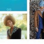

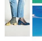
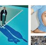
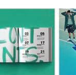
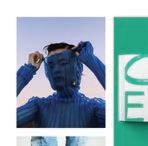

COVER DESIGN Evergreen Magazine


HANNAH Design Co. Portfolio


Evergreen Magazine
WATERME

Mobile App Prototype

WaterMe is a plant watering reminder app that tracks your plant watering activity. The original app is very basic; the single user task is to water plants. The interface is also very basic; white text on a black background, emojis as icons, and overall just looks pretty outdated.
Through my knowledge and understanding of UI/ UX design, I worked through this project to produce a more functional mobile app prototype. I began by doing research on the existing app, then conducting a user study. From there, I rebranded the current WaterMe, and gave the overall app some much needed personality.

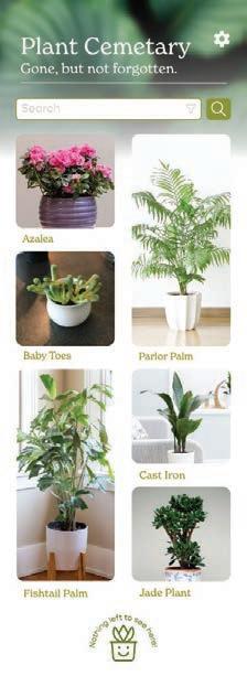
Expanding from the original app, the new and improved WaterMe includes many new features and functions that make the user the ultimate plant parent. With an intuitive design, WaterMe allows the user to organize and keep track of numerous plants. Users also have the option to organize plants into “Rooms,” a feature unique to WaterMe. See the many ways this app stands out against its competitors.

HANNAH Design Co. Portfolio
BRANDING UI/UX REDESIGN
USER EXPERIENCE RESEARCH

Before diving into any project, I always begin with thorough research. I started by examining the first app and how it works, noting any limitations or ideas for improvement I may have with the initial app walkthrough. After I felt like I knew what the app does and why people use it, I read through the reviews of what people had to say about it. I took down notes of what works well and what doesn’t; I also noted any good suggestions for improvements from the reviews to gauge the type of target audience this app has. I then began to look at some competitor apps.. I selected the top 3 highest-rated competitors, downloaded their apps, and noted how they worked and what could be elevated with WaterMe.
ORIGINAL APP INTERFACE

WaterMe Mobile App
THE REDESIGN

In order to create a cohesive redesign, I came up with two user personas to base the interface design and experience on. The personalities of these user personas define the look and feel of the app.

With logos, I like to start with a list of words that represent the new brand’s values. I keep this list close by as I start sketching some logo ideas. Sometimes these sketches are rough; I feel like sometimes the best way to get to a good idea is to draw out the bad ones. I sketched about thirty logo ideas, and from the thirty I narrowed them down to three refined logo sketches. The final version of the logo is fresh, modern, and natural.

APP ICON BEFORE & AFTER NEW LOGO HANNAH Design Co. Portfolio
With app design, I always start with a list of the features and functions I want the app to hit. With these in mind, I sketch out a map of how the app will flow. This helps me figure out each possible step the user may go through when using the app. After I have a good idea of how the app flows from page to page, I start creating wireframes. Wireframes are essentially templates of how each app screen will look; this includes the placement of text, buttons, photos, etc. These also allow me to ideate how the app functions and looks. After the wireframes are created, I start designing. I use the wireframes as a jumping-off point for each screen; this allows me to work faster and focus on how the finished product will work. Once each screen is designed, I begin prototyping.
LOW
FIDELITY WIREFRAMES


USER INTERFACE DESIGN WaterMe Mobile App
USER TESTED TO PERFECTION


With app design, it is important to test the app before submitting it for development. WaterMe went through many rounds of user tests and revisions before the final prototype was finished. It is important for me as the designer to understand how people will instinctively interact with the app. This involved me sitting down with the user and simply watching what they do when they interact with the app. I never tell them what they should do; in the real world, I won’t be there to tell them how to properly use the app. If the user did something that I didn’t expect them to, I made a note of it and revised that specific function to work without error.

HANNAH Design Co. Portfolio

WaterMe Mobile App
GLOSSIER
Web Redesign, Catalog, & Print Ads

Glossier Inc. is a globally admired digital beauty ecosystem, with a primary audience of indie web surfers, ages 14-38. The brand is minimal yet bold and edgy with the perfect amount of softness. Their brand is unique, clean, and unforgettable. Glossier currently has four brick-and-mortar shops, though a large majority of their clientele purchases online. I chose this client for multiple portfolio projects in hopes of developing a standout campaign with a savvy strategy. Starting with a website redesign created in Adobe XD, followed by a 20-page spring catalog, and two print ads for the brand.

UI/UX PUBLICATION ADVERTISING HANNAH Design Co. Portfolio
It’s the Lavender Balm Dot Com

I absolutely love the new Balm Dot Com flavors Glossier is putting out, but I have a special place in my heart for the Lavender. I’m in love with this new formula; the color is so natural and beautiful, and it feels like silk, so hydrating and glossy. I am obsessed!


Fiona, 34
Skin Shade: Medium
Skin Type: Oily

@Glossier Glossier.com/Balm-DotCom Shop our Cult Favorite. Glossier.com/Cloud-Paint Shop Our Stratosphere. Cheeks in the Clouds. TESTIMONIAL AD VISUAL METAPHOR AD Glossier Design Goodies

HANNAH Design Co. Portfolio
HIGH FIDELITY WIREFRAME
WEBSITE REDESIGN
In order to have a strong digital presence and online experience as cool as their delivery packaging, I redesigned an interactive web prototype. With 89% of consumers purchasing online, I aimed to bring the Glossier personality to life through the web, creating an experience for the user that is intuitive, memorable, and visually engaging. I made sure to not only improve the functionality of the website, but foster a closer connection between the brand and it’s audience.

FINAL SCREEN DESIGNS

Mov ng B nn Mov ng Bann Mov ng Bann Mov ng Banne Mov n Banne Mov n Banne Mov g Banne Mov g B nne Mov ng B nne Mov ng B nner Welcome. Newsletter Sign Up Recei e email upda on stuff you probabl want to know about ncl di g pro u ts la che d nts U b ibe nyt Wanna stay up to date? Your Email Here These will be a carousel of logos from testimonials Promotion information will go here. Testimonial copy will be up here. pp ng on orders ov $30 F ee hipp ng on orders ov $30 F ee hipp ng on orders ov $30 F ee hipp ng on orders ov r $30 F ee hipp ng on orders ov r $30 ee hipp ng on orders ov
Glossier Design Goodies
SPRING CATALOG
The Glossier Spring catalog is a great way to reach their audience by using a medium the brand has not explored in great depth. The catalog incorporates favorite products like skincare and makeup, and includes a skincare guide. The catalog incentivizes customers to subscribe in order to get exclusive deals on their online shop.

HANNAH Design Co. Portfolio


Glossier Design Goodies


HANNAH Design Co. Portfolio

Glossier Design Goodies
CREATIVE BRIEF
Branding + Mobile App Prototype

When asked to take a small survey, 90% of people answered that they work creatively. Two of the most common post-grad concerns expressed by users is networking and continued learning. To solve these problems, I created a mobile app that offers users a variety of projects under multiple creative disciplines. The goal of the app is to work as a tool for portfolio building, creative thinking, and networking.

BRANDING UI/UX HANNAH Design Co. Portfolio
DEFINING UX PROBLEMS


Many people explained that they wanted to continue learning new skills and software after graduating, but are concerned that they will face burnout, a lack of motivation, or just don’t know where to start.
By creating a mobile app that offers a variety of project briefs, users will have the tools and motivation to continue the learning process post-graduation.

USER PAIN POINTS
Creative Brief Mobile App


HANNAH Design Co. Portfolio

Creative Brief Mobile App
LE SPRITZ
Print Ad Series, Social Media Ads
Ghia drinks are the all-natural, non-alcoholic solution for social gathering refreshment needs. I elected to create multi-media advertisements for their signature aperitif drink, Le Spritz.

Le Spritz is a taste of summer in a can, so I wanted to show off the sensation of drinking Le Spritz. I created a print ad series of each Le Spritz flavor. Each “paradise” scene for the cans was rendered in Adobe Dimension.
Since Ghia is fresh on the mocktail scene, I created some social media ads to show off Le Spritz to new customers. The three-story ads utilize user-generated content, user interaction, and casual promo. The three main feed ads work cohesively with the print ads to allude to the flavor of Ghia’s signature drink.
ADVERTISING
SOCIAL MEDIA 3D RENDERING
HANNAH Design Co. Portfolio


ORGANIC STORY ADS PAID POST ADS Ghia Ad Campaign


 GHIA GINGER PRINT AD
GHIA SODA PRINT AD
HANNAH Design Co. Portfolio
GHIA LIME & SALT PRINT AD

Ghia Ad Campaign


 bluebell 3h


 GHIA GINGER PRINT AD
GHIA SODA PRINT AD
