REGENERATE
MCLENNAN DESIGN'S NEW OFFICES
THE FABRIC OF GREAT PLACES
JASON F. MCLENNAN UNIVERSITY OF IDAHO
MCCALL FIELD CAMPUS

CONTRIBUTE
THE CIRCULAR ECONOMY

ASIF DIN
A Quarterly Journal from McLennan Design. Rediscovering our relationship to the natural world. Volume 5 Issue 2
- Henri Matisse
It is wonderful to be welcoming in the Spring weather once again on beautiful Bainbridge Island. The earliest cherry and plum blossoms are appearing on the trees in my orchard and while morning temperatures are crisp, the days are getting longer and generally warmer.
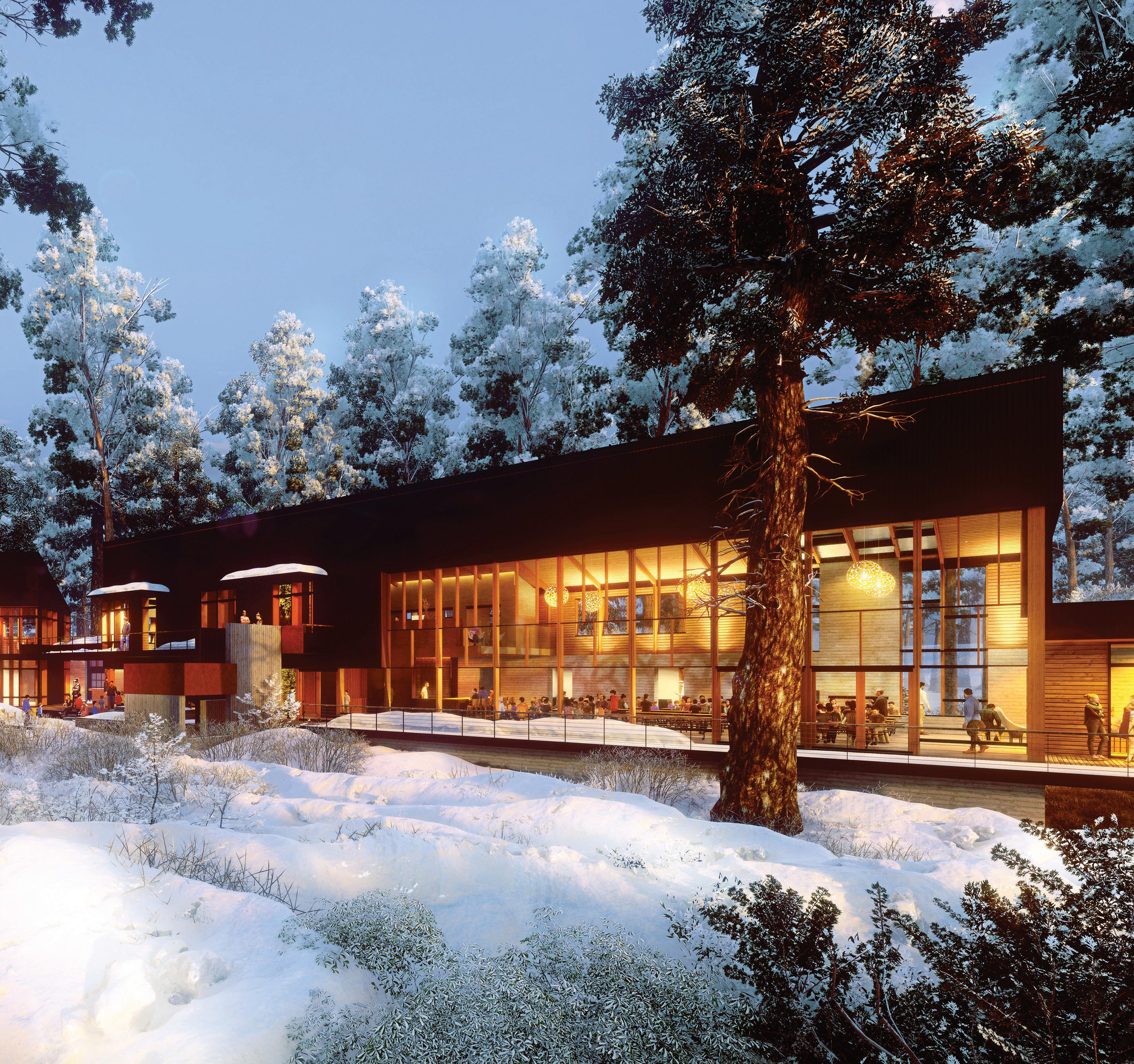
This issue is one of updates and early peeks at new projects. The cover is showing our new concept design of the McCall Field House for the University of Idaho – a future living building dining hall and academic complex. Our team has been hard at work for months – working with our client to define the project and propose a concept design that has been very well received. We share some early renderings and concept plans to reveal our process and current progress.
Similarly, work on our future office in Fort Ward, Bainbridge Island continues – we are behind, but good progress has been made and we hope to share the finished results in our summer issue. For now a sneak peek is provided!
The issue also focuses more broadly for the first time on Perkins&Will, with the main story I wrote on the importance of "Fabric Buildings” featuring many recent projects within the company. Other contributions from various studios will grow and expand in future issues as we continue our integration into the firm.
With each spring I find myself rejuvenated by new life and fairer weather and hoping that this will be the year that larger positive societal shifts begin moving us towards a more just and regenerative future!
Sincerely,

 Jason F. McLennan Principal, McLennan Design Chief Sustainability Officer, Perkins&Will
“ There are always flowers for those who want to see them.

EDITOR-IN-CHIEF GRAPHIC DESIGN CONTRIBUTORS

SOCIAL MEDIA


SPRING 2023
JASON F. MCLENNAN
SUSAN CROY ROTH
JOSH FISHER AND ASIF DIN
McLennan Design respectfully acknowledges the Suquamish and Duwamish peoples, who, throughout the generations, stewarded and thrived on the land where we live and work.

May 2023, Volume 5, Issue 2
LOVE + REGENERATION is a quarterly publication of McLennan Design, LLC.
© 2023 by McLennan Design / Perkins&Will. ALL RIGHTS RESERVED. Content may not be reproduced in whole or in part without written permission and is intended for informational purposes only.
Cover: Rendering of the McCall Field Project

4
Regeneration of a Historic Building

McLennan Design’s New Offices

The Fabric of Great Places
Jason F. McLennan
You Wake the Dead to Life
Rumi
University of Idaho


McCall Field Project
The Circular Economy

Asif Din - Sustainability Director at Perkins&Will

5
6 12 28 30 38 REGENERATE LEAD ELEVATE INSPIRE CONTRIBUTE navigate
McLennan Design / Perkins&Will
BAINBRIDGE ISLAND
The Bainbridge Island studio of Perkins&Will has reimagined this historic 1911 stables structure as its future home designed to Living Building Challenge standards. This registered historic retrofit is scheduled to open this summer.

6 SPRING 2023
OF SOUTH FACADE
RENDERING
PROGRESS UPDATE
ISLAND STUDIO
To ensure the historic character of the Stables building is preserved, the new design carefully coexists with the original form but now stabilizes and updates it. Each glazing module sits within the existing wall openings, originally used to allow passage of horse-drawn carriages. Even the new exterior wood siding pays homage to the original structure, with the historic tongue-andgroove profiles replicated.


7
STABLES BEFORE RENOVATION
INSTALLING NEW DOORS AND WINDOWS
REVITALIZING A COMMUNITY
By renovating an existing structure, the embodied carbon of the project is dramatically reduced.
Additionally, salvaged materials are used throughout the buildingincluding innovative aluminum-clad wood windows made with reclaimed douglas fir - to further reduce carbon impacts.


 STABLES BUILDING INTERIOR WITH ADDED BRACING
RENDERING OF KITCHEN AND LIVING ROOM SPACE
8
RECLAIMED DOUGLAS FIR WINDOWS
COMMUNITY ASSET
Within this century-old frame, a new building emerges, complete with state-of-the-art mechanical systems and countless sustainable design strategies. The renovation project is targeting 6 of the 7 Living Building Challenge petals.

PROGRESS TO DATE:
• The building’s roof and floors are now complete, with all windows and doors installed, as well as skylights in place.
• Interior framing and rough in plumbing has also been completed.
• Exterior siding and interior electrical and mechanical rougn in work is next up!
Stay tuned for the next issue of LOVE+REGENERATION when we share the completed project prior to move in!
9
INTERIOR FRAMING COMPLETE

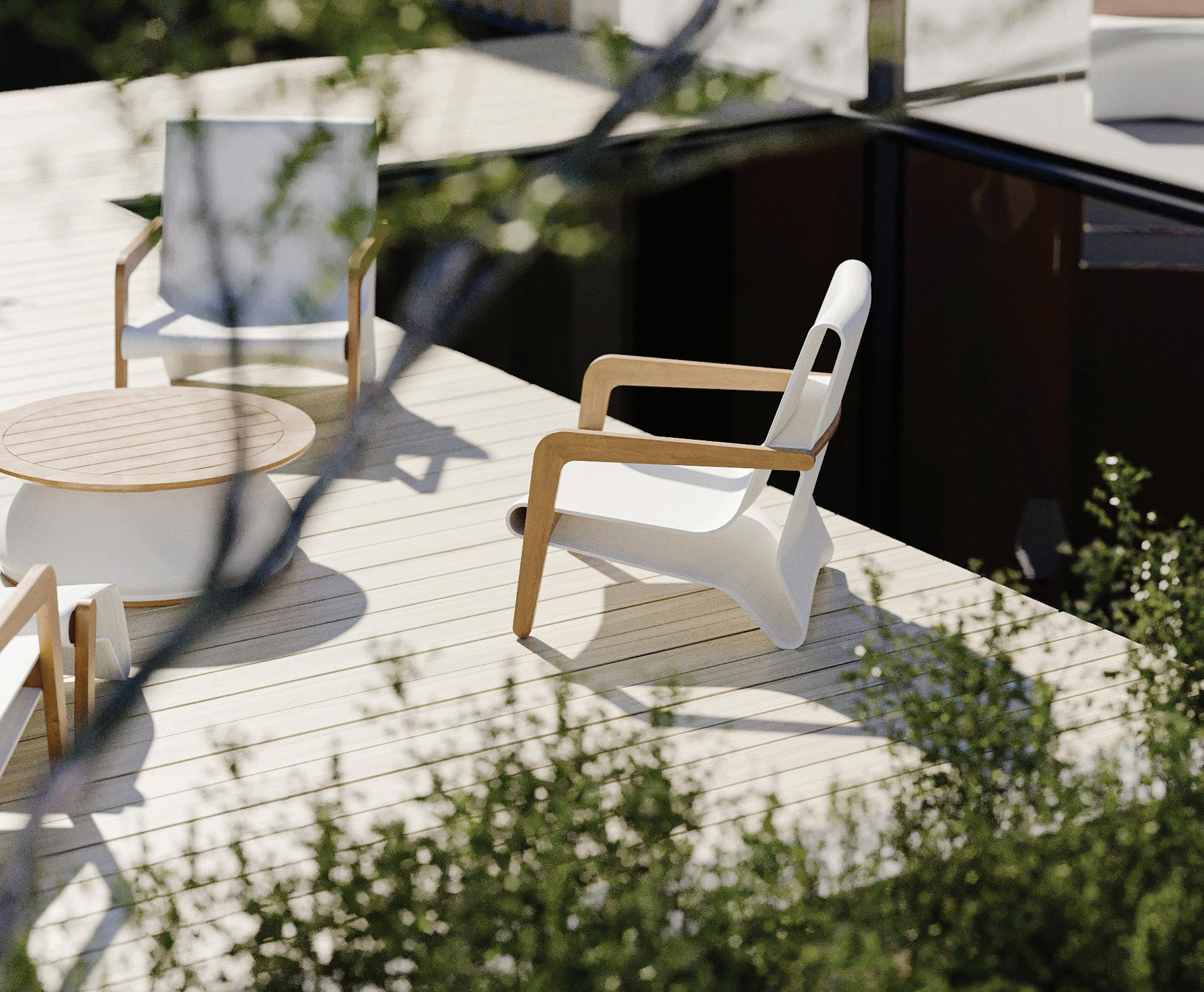
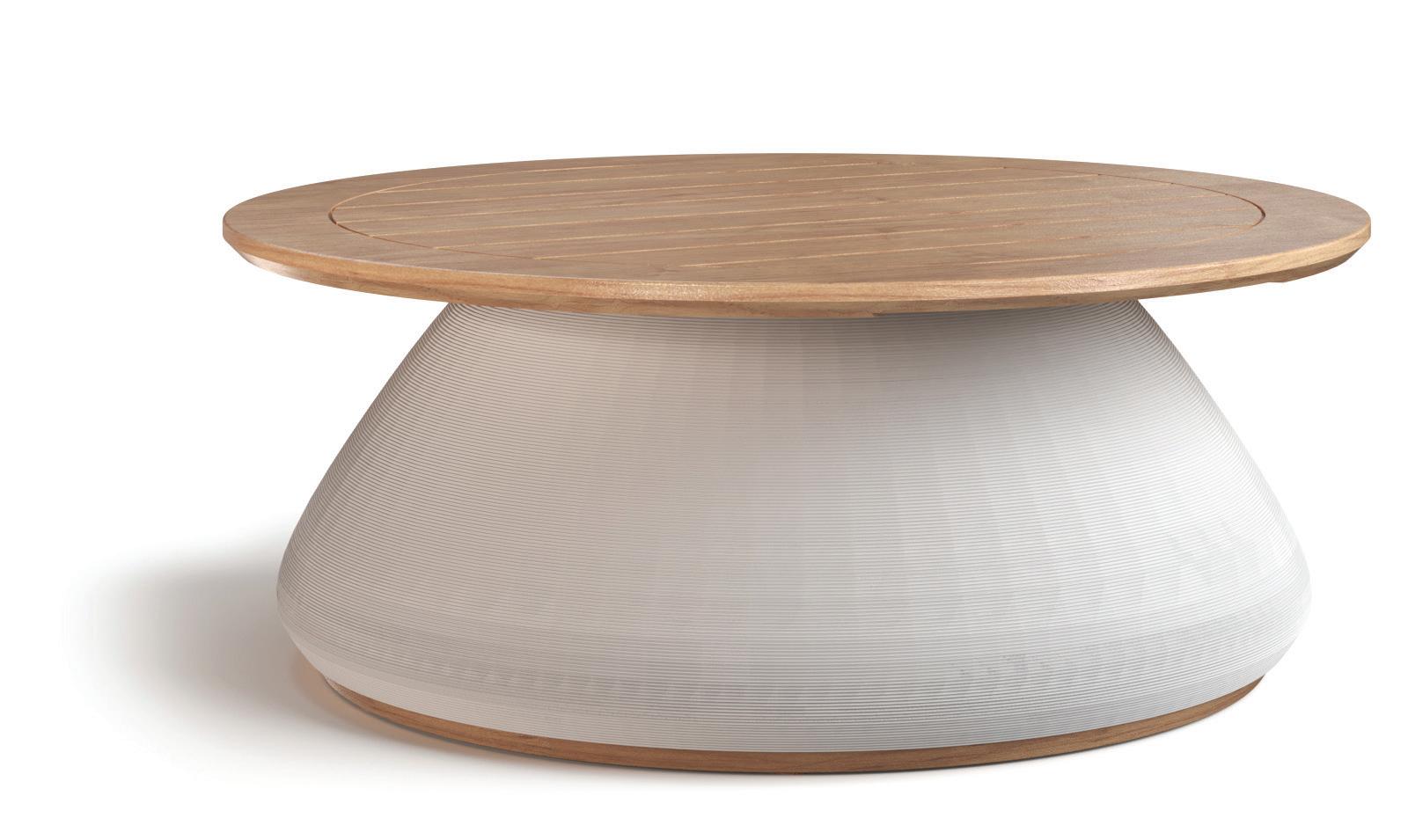
McLennan Design Outdoor Office Furniture by:
FROM WASTE TO WANTED
3D PRINTED ON DEMAND
3D printing enables Model No. to cost-effectively customize client projects, reduce production related waste by approximately 90%, and cut carbon emissions more than 50% compared to traditional furniture companies. The company's studio and micro-factory uses solar and wind powered energy, holds no inventory, and sources and ships domestically.
REGENERATIVE + BIODEGRADABLE MATERIALS
Model No. has a series of its own bio-resins upcycled from plant waste, domestic FSC® Certified (FSC-C125400) or salvaged hardwoods and other non-toxic and sustainably certified materials that replace wasteful petroleum-based material, can biodegrade 100% in under 3 years, and are 100% recyclable.


RETHINKING FURNITUREA BETTER WAY
With a circular approach employing plant based materials and 3D printing, Model No. is rethinking furniture with its mission-driven architect and design collaborators who see our problem clearly: Building and turnover of commercial interiors generate well-over a third of the world’s CO2 emissions and produce an endless stream of waste.
WWW.MODEL-NO.COM • INFO@MODEL-NO.COM. 11
THE FABRICOF GREAT PLACES
IN PRAISE OF GREAT ‘BACKGROUND’ BUILDINGS

12
Jason F. McLennan

13
Scan the pages of most architecture magazines or follow news coverage of important new buildings, and you’ll notice the focus is often on the most iconic and “heroic” architecture. It makes sense that mega projects and those with great civic and cultural significance get attention. Typically designed by the most notable names in architecture, these projects can help put a neighborhood, a city, or even an entire country on the map. Think about how the Sydney Opera House changed perceptions of Australia, or how The Guggenheim Museum introduced the world to Bilbao, Spain.
Yes, heroic, big-budget projects may serve as high-profile landmarks and places of public gathering. But hero worship has always been a distorted lens through which to look at architecture and the profession as a whole. Seattle is known for the Space Needle and New York for the Empire State Building, but we know both cities are much, much more than that. Indeed, judging the quality of a city by its skyscraper, cathedral, castle, or museum is like judging a person by their hairstyle or wardrobe.
Our day-to-day experience of a place is profoundly shaped not by its famous monumental architecture, but by its urban fabric: the colorful tapestry of hundreds of smaller—often more unassuming—yet equally beautiful buildings that make up the totality of the community. What is the housing stock like? What does the typical building on Main Street look like? How do everyday civic and cultural institutions get expressed architecturally? What is the quality of the streetscape and its urban design? What materials, textures, colors, and shapes comprise the buildings, parks, and public squares?
Imagine yourself for a moment in one of your favorite cities or towns. I’m willing to bet your memories conjure feelings of cultural richness and human connection. These feelings are the hallmarks of a great urban experience; they reflect a place’s unique identity and zietgiest. By the way, I’m also willing to bet your favorite places aren’t your favorite just because of their architectural icons. For me, Barcelona is not just the Sagrada Familia; it’s also Los Ramblas and all of its colorful details, both large and small, grand and subtle, precious and imperfect. The most wonderful places in the world are those whose urban fabric elevates them from standard to sublime.

SPRING 2023 14
Background Buildings Defined
World class urban fabrics are quilted with beautiful buildings that have several defining characteristics:
Their architecture and design are perfectly suited to their purpose. Design features are never hyperbolic or superfluous, but rather measured and intentional.
They’re appropriate for their given time, place, and climate. They don’t feel alien to their surroundings, and are generally built from local and regional materials.
They express dignity and elegance without pretension.
They elevate the public realm and enhance the pedestrian experience.

They are conceptually clear—with the outside “speaking to” the insiden a cohesive dialogue.
Their facades aren’t showy, but can offer moments here and there of whimsy and delight.
They serve people’s basic day-to-day needs.
They are human in scale, warm and inviting, and make people feel they belong. They tend to exemplify a “long life, loose fit” ethos, meaning they can be repurposed over time.
Unfortunately, in North America we lost a lot of our rich urban fabric in the 1950s with the dawn of sprawling suburbia, the proliferation of the personal automobile, and a perverted infatuation with capitalism over civic good. Many of our communities are now marked by construction that is banal and soulless, littered with fast food restaurants and architectural one-liners that reflect a commercial brand. Worse yet, many of the new construction buildings in our communities today are barely designed at all, let alone designed by architects; they’re the product of the lowest first-cost budget possible.
I believe there is no better time than now to reinvest in our urban fabric—to design consistently beautiful, thoughtful, functional buildings at every scale (not just the monolithic) and in full support of healthy, sustainable communities. Every building should breathe life, love, and vibrancy into our cities. They should elevate and enrich the human experience of the common place. Today, some of the world’s best examples of these buildings may hide in the shadows of “statement” architecture, but for all they give back to a city and its people, they should be celebrated just as heroically.
This year I had the great honor of reviewing a large volume of work by my colleagues at Perkins&Will and was struck by the number of great “fabric” buildings that the firm in many of its studios across the globe have produced. I’ve selected a few to highlight as exemplars of this type of building in several cities in which we practice.
15
1
2 3 4 5 6 7 8 9
1222 22nd Street, NW Washington DC
This project was originally built as a Cadillac dealership in 1922 and then had a long history of holding vehicles for White House Secret Service. Built at a time when many buildings had ‘great bones’, the building featured high floor-to-floor heights and a strong, simple structure. The 58,000sf structure was brought back to life with a sensitive new façade that helps activate the ground plane and a completely transformed interior. Ground floor commercial space, a new canopy, and an additional new partial floor on the roof continued its transformation.
The design team let the history of the building speak for itself, without gimmicks or pretension. Looking at before and after photos shows the careful changes to the façade – creating a new cornice line to accentuate the ground plane, use of contrasting brick within the structural grid and new windows, entry canopies and planters. The result is a dignified reinvigoration of a nice piece of the capitals’ history. A strong, purposeful background building. This building achieved LEED Core & Shell Gold Certification.
 Halkin Mason Photography
SPRING 2023
Exterior Entry • Revitalized Facade


17
Historic Photos of 1222 22nd Street NW
Halkin Mason Photography
Exterior Facade with New Rooftop Living and Green Space
KSP - 45-18 Court Square
New York, NY
Another example of a sensitive adaptive reuse project, this renovation adds a modern addition in a tasteful and refined manner. The project - acting as a catalyst for an emerging life sciences district in Long Island City, takes queues from its history while expanding the developable parcel into a unique, thoughtful whole. Its clever and sexy without being crass and over the top. Like all good fabric buildings, it makes the neighborhood it's in better for it. Like any good preservation project, there is no confusion between old and new, and both sides of the duality are made more interesting by the conversation across the eras.

18
North Facade showing new/old juxtoposition
Chris Cooper
The project leverages the framework of a pre-depression era structure by infilling the remaining zoning envelope to create a thoughtful and unique integration of building services with a clear, rational, modular expression.


 Chris Cooper
Chris Cooper
North Facade
Chris Cooper
Chris Cooper
Chris Cooper
North Facade
The Peterborough Arena and Aquatic Centre
Peterborough, Ontario, Canada
Not all background buildings need to be renovations or adaptive reuse. There is an art to doing these buildings from the ground up – and creating the kind of environments that are both fresh, yet feel like they might always have been there. In Ontario, every community has a hockey rink – and they are an important part of the fabric of Canadian life.
This wonderful new community centre in Peterborough also hosts a library. Lots of former pro’s have come from this city and you can imagine coming here to watch future Bob Gainey’s, Steve Larmers, Corey Perry’s and Corry Stillman’s if you are a hockey geek. With its orange wrap and curved entry - it is fun and whimsical, yet is also a simple and welcoming facility –a big box with style and clear cues back to its park surroundings – it has strong conceptual clarity – you know what it is, where you are going and what you’ll find inside – nothing more or less. Many such arena’s do less with much more – this one does a lot with less.
 Exterior Southeast Entry


North Plaza Entry
Family Tree Clinic
Minneapolis, MN
Family Tree Clinic is another new build that is not trying to do more than its should, and by doing so manages to do everything it needs. It is a solid new piece of the Minneapolis fabric serving a population that needs and deserves a welcoming place in the community. The 17,000sf building is a clinic serving the LGBTQ+ community and does so in a dignified manner. There is a certain bravery in the design – the main brickwork is refined and reserved and clearly fits within the context of the street – and yet as you begin to get close, you see how color is used to draw you in. Murals visible on the corner and backside are a celebration of culture, neither hiding nor in your face. Great background buildings express the essence of what they are – and this one says “we belong here, we are part of this place”. Great love and care went into this wonderful new facility.

22
Exterior West Facade - A Dignified City Addition


23
Artist murals express the power of healing
Daylit Wayfinding Stair
Corey Gaffer
The Sugar House Island Primary School
London, England
The Sugar House Island Primary School, located in London, (a city that truly understands how background buildings together can make for the fabric of a world’s great city) is a lovely new school for young children. Many new schools are in your face affairs that feel dated not long after they are completed, but not this one. While being new and modern, it at the same time feels timeless – has it been there for 30 years or just 3 months? Also us ing brick, the details are gorgeous and the result is a school that is grounded, dependable and friendly. It does not condescend to the children or try to force inauthentic expression. Its just beautifully executed and designed with care. The careful choice of color, the highly restrained palette and loving attention to brick coursing, it is almost like a school child wearing a respectable school uniform – but with crazy braids in her hair that allows individual uniqueness to shine through the conformity. Solid, dependable and safe – exactly where you want your kids to be –but never boring.

24 SPRING 2023
Exterior Southwest Corner Exhibits a Stong, Calming Presence


Rooftop Play and Garden Space
Indoor-Outdoor Classroom
Tim Crocker
Tim Crocker
Tim Crocker
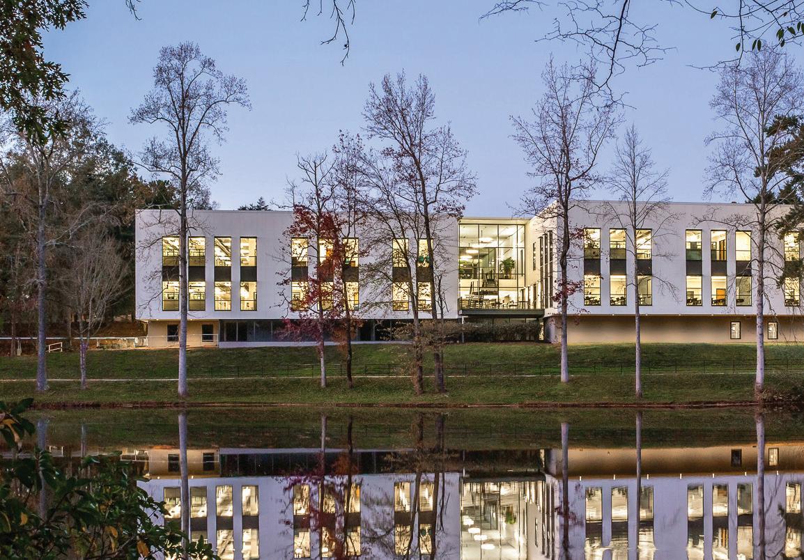
ASHRAE Global Headquarters

Atlanta, GA
And finally I’ll mention a project that my team designed in collaboration with Houser Walker Architects in Atlanta, Georgia. We took a dilapidated 1970’s energy hog – and transformed it into one of the most energy efficient buildings in the south, now powered by renewable energy. A deep energy retrofit and an entirely new façade, brought back to life a building typology that is common across America – the typical post-war glass and concrete boxes that are often unfortunate background buildings now abandoned in so many places.
Doing it right and also affordably gives hope.
ASHRAE won an AIA Honor Award in 2022.
26
South Exterior View


27
Renovated North Entry
Atrium
Jonathan Hillyer
Jonathan Hillyer
Jonathan Hillyer
Exterior Before Renovation
You wake the dead to life

28
SPRING 2023 elevate
Rumi
You wake the dead to life, you fountain of grace, you fire in thickets of tangled thought.
Today you arrived beaming with laughter that swinging key that unlocks prison doors.
You are hope's beating heart. You are a doorway to the sun. You are the one I seek and the one who seeks me. Beginning and end.
You greet need with generous hands. You flood us with spirit,
rising from the heart, lifting thought.
Rare one, you reveal the pleasure of wisdom and practice.
Beyond these, what is there but excuses and deceit?
We lust after the afterlife. We stew over trinkets. We stage battles between black and white. Our ears are plugged with twisted delusions.
You carry the cure.
Silence!
I'm in a hurry. Leave the paper. Break the pen. The cupbearer is here, jug in hand.
Meet us in the land of insight, camped under ecstasy's flag.
29
Inspiring the lives of future generations through education and outreach in Idaho’s first Living Building at The McCall Field Campus.
By Joshua Fisher

31
Dining Hall
FALL 2021
T he McCall field campus, established in 1939, and part of the University of Idaho’s College of Natural Resources, has evolved into a year-round, high-demand collegiate and K-12 program, and in so doing has largely outgrown its almost 100-year-old facilities in beautiful McCall, Idaho.
The McLennan Design team is honored to have been selected by the University to help support the future visions and planning for the McCall Field Campus, home to the McCall Outdoor Science School (MOSS). Our team has been collaborating with U of I and MOSS faculty to imagine the long-term potential for the campus and how needed new facilities could exemplify the mission and values of the organization through the construction of a dining hall and classroom facility. Together we envision buildings that are healthy to inhabit, built responsibly, and provide transformative inspiration and education for generations of students, faculty, and community who will engage with the campus.

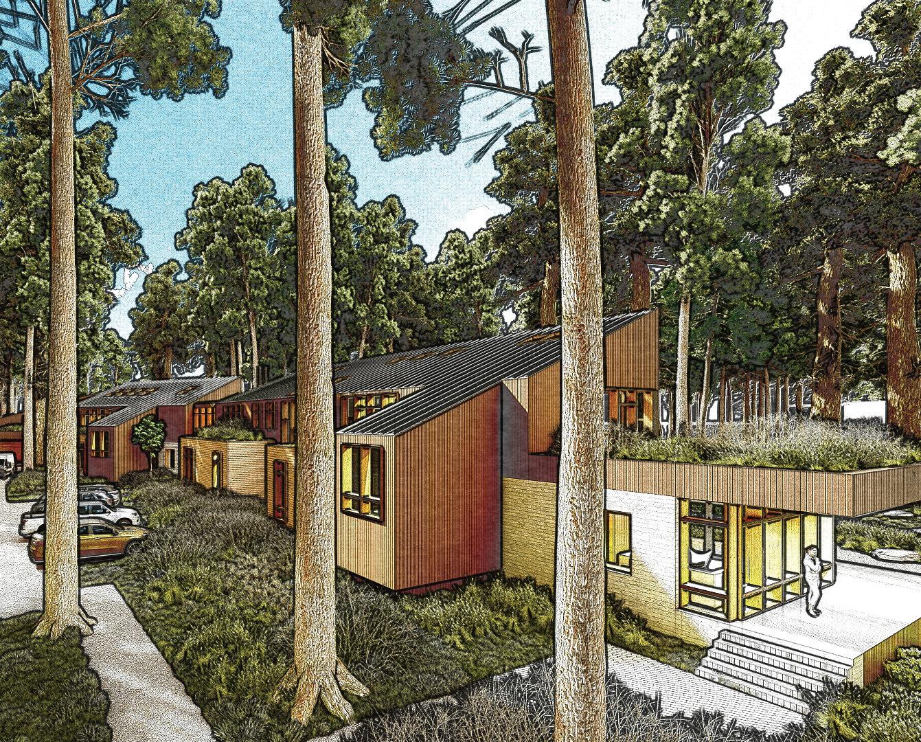
Nestled between a dense forest of towering Ponderosa Pines, a backdrop of alpine lakes, and surrounded by the Payette National Forest and mountain ranges, McCall Field Campus (MFC), provides inspiring graduate and K-12 educational, ecological, and recreational programs that many people remember fondly for decades. Rooted in the desire to connect people, place, and science through transformative experiences, the program works to inspire the lives of participants and communities across Idaho. The 14-acre education and research campus include cabins that welcomes students for weekly, seasonal, and semester durations and provides students, faculty, and communities with access to water, forest, and mountain ecosystems for scientific research and discovery.
The University of Idaho’s McCall Field Campus has delivered place-based learning experiences as Idaho’s first residential outdoor science school for over 81 years. Since its inception, thousands have studied here and left inspired, curious, and empowered to do more. In 2001, MOSS was established to expand offerings and experiences for K-12 students from across Idaho and pair them with College of Natural Resources (CNR) students for weekly, seasonal, and semester-based programing. One of the goals of the
program for CNR freshmen, transfer students, and K-12 participants at MFC is to gain experience in every natural resource and discipline offered at U of I.
The University, in partnership with industries and organizations from across Idaho - recognize, that to ensure the longevity and sustainability of Idaho’s natural resources, it’s water, timber, and thriving agricultural ecosystems - that future generations must be experienced in stewardship practices and understand the interconnectedness of all things. However, after almost a century, the campus is strained under the effects of time, evolving program needs, and rapidly increasing demand. To continue growing and thriving, Idaho’s economy needs more STEM-educated citizens who can take on complex challenges and MFC can grow to meet this urgent need.
DINING HALL & OUTDOOR GATHERING AREA
TEACHING & LEARNING CENTER
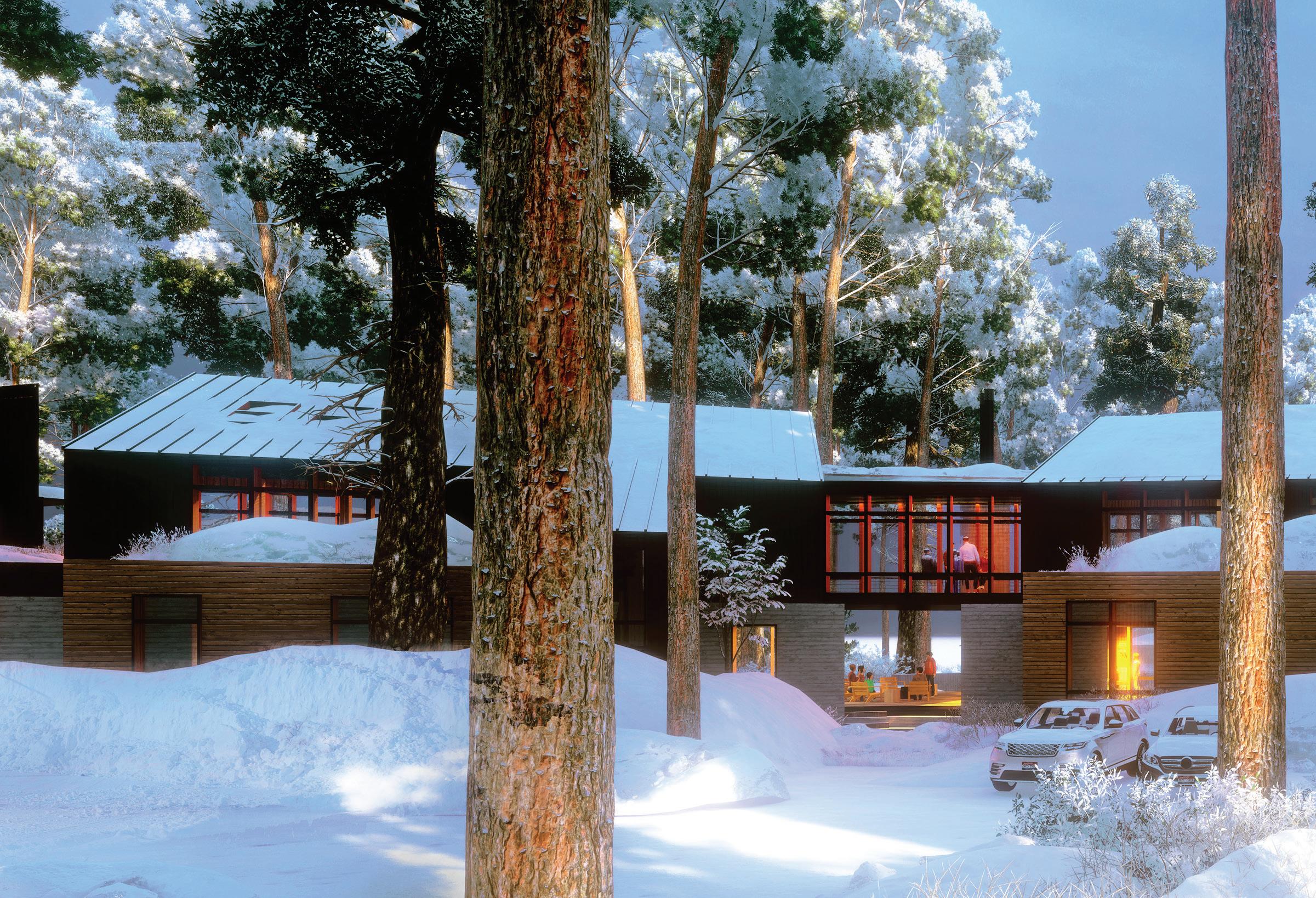
THE FUTURE CAMPUS WILL RENOVATE THE HISTORIC 1960'S LODGE, REGENERATE THE LANDSCAPE, AND PROVIDE A NEW SOUTH SIDE TEACHING & LEARNING CENTER AND NEW DINING HALL.


33
INTERIOR OF THE LIVING BUILDING CHALLENGE DINING HALL CONCEPT
FALL 2021
A Campus in Need of Rejuvenation and REGENERATION
To continue meeting these needs, the campus, which now is a year-round program, has far outgrown the original mid 1900’s cabins. Originally built as summer cabins, they are now used not only for sleeping accommodations but also as make-shift office space, classroom instruction, dining facilities and even maintenance storerooms.

The MFC and U of I team recognized that the need for new facilities should be accomplished through a new masterplan and architecture that enhances and echos the vision and mission of the program. The Living Building Challenge was identified as an ideal way to articulate what future buildings could be like on campus as examples of deep-rooted environmental stewardship.
In the late summer of 2022, McLennan Design and the U of I team began collaborating together on how the MFC can strategically grow into the future of natural resources research and education as a campus, and to begin developing designs for a new Dining Hall and Teaching and Learning Center. Our team was able to visit the site on several occasions, experiencing firsthand the beauty of the landscape and seeing in person the K-12 programming. From an in-depth planning process, we worked to develop a new masterplan for the campus and concept designs for a dining hall, classroom buildings and maintenance building.
While the design will continue to evolve as we begin Schematic Design in May, we thought we’d share the current concept renderings that showcase the future Living Buildings in Idaho –likely the first in the State!

Project Team
Jason F. McLennan: Lead design and Principal in Charge
Joshua Fisher: Project Designer and Lead Visualizations
Johanna Collins: Project Architect
CENTER
DINING HALL (PHASE 1) & TEACHING AND LEARNING
DINING HALL
We’re really excited to be working with McLennan Design! We are looking forward to having buildings that reflect both the growing program needs and the relationship that we want to cultivate with our people and place, and working with the McLennan team has been a great process that has helped us to clarify our vision.
KARLA EITEL, PhD, MS, MEd, '07, '04 Director, McCall Field Campus and Outdoor Science School Research Professor of Place-based Environmental Education
Plans for the renovation and new facilities create a safe, sustainable, and inspiring landscape for learning. The transformed McCall Field Campus will be a teaching campus, that connects theory to practice, forest to lake, and people to place.
36
SOUTH SIDE OF TEACHING AND LEARNING CENTER
It’s a pleasure working with McLennan Design! They simultaneously helped stretch our understanding of the Living Building Challenge, while making it achievable for our campus, and more importantly for our students who will for generations know what it means to build sustainably.

 DENNIS BECKER, Ph.D., '02 Dean | Professor of Natural Resource Policy
THE CIRCULAR ECONOMY
Asif Din
The concept known as Circular Economy uses the lens of material management to make sure that resources are not used indiscriminately. As a starting point, the goal is for the minimization of waste produced across all life cycle stages of a building material, as well as looking to maintain material value through reuse. A wide range of strategies are used to ensure that materials are fit for reuse and do not end up in a landfill. Earth’s resources are finite and cannot be infinitely replenished. In recent years, the amount of human-made mass has exceeded all living biomass.1 It is paramount, therefore, that we do everything we can to maximize the viable lifespans of our building materials. The longer our materials last, and the more times they can be reused, the less new material must be made.
The circular economy has two main classifications of material components: technological items – which need to be kept at their highest value in the system as long as possible –and biological materials that can be returned to the earth for decomposition.
Many new regulations have been implemented that focus on reducing waste taken to landfill in the process of construction. This is beneficial for increasing material resources – the less we waste, the less we have to produce – but it does not do much to help retain material value. Material value is often defined in two ways – functionally, and financially. Another way to think of this is as usefulness - if a product can retain its functional or financial usefulness, more care will be taken to reuse it rather than discard it.Currently, when the term “recycling” is used, it does not refer to a closed loop system, wherein 100% of the recycled material is reused. Far from it, only a small fraction of the existing “recycled” materials are used in a new product.

SPRING 2023
1 Elhacham, E., Ben-Uri, L., Grozovski, J. et al. Global human-made mass exceeds all living biomass. Nature 588, 442–444 (2020). https://doi.org/10.1038/s41586-020-3010-5

39
An example of circular design can be seen at the new hospital in St Pancras, London, in which an adaptable façade has been designed to accommodate internal programmatic changes. As the interior layout of the building may change to adapt tovarious needs or uses, so too can the modules of the façade be moved to suit. Likewise, the mechanical and electrical systems within the building also follow a modular design, allowing the building to be easily converted (with suitable module replacement of the façade) into a commercial or residential usage in the future.

To reuse the maximum number of materials already in existence, differing models have been put forward, such as “Buildings as Material Banks” and “Urban Mining”. These various models all essentially describe the same core concept – to reimagine our urban fabric and existing building stock as libraries of alreadymanufactured materials ready to be repurposed.
By examining embodied carbon and life cycle analyses (Module D of ISO 15978), we have been exploring how corporate interiors can benefit from a circular materials approach. In order to be most beneficial, this process should begin at the earliest opportunity in the design of the project, using design and procurement strategies to enable a circular future.
Addressing embodied carbon in interiors projects is crucial, as the embodied carbon of an office building’s interiors can quickly surpass the embodied carbon of the shell and core if replaced any more than once in 10 years.
40
Project Oriel, in London, is a new shared home in St Pancras for Moorfields Eye Hospital and the UCL Institute of Ophthalmology
LIFE CYCLE LOOP

With the current turnover rate in office space, building interiors are often retrofit far more frequently than once every decade. As designers, we need to establish what we are responsible for specifying and make sure that these elements can be specified in the most circular method we can. As such, our process is dominated by the specification of interior furnishes and fittings.

Accounting for the initial embodied carbon of a new building’s interiors can be quickly optimized. However, quite often, much of an office building’s interiors are replaced long before the end of their service lifespan. This is a waste of materials, carbon, and money. Much greater accountability is needed to track interior retrofits across the industry, within company accounts through IFRS (International Financial Reporting Standards) and other accounting mechanisms.
It is important not to think solely about capital expenditure, but also to take into account the residual value that remains after the fit out cycle. This is a key part of thinking about circular design processes. However, this way of thinking is not a part of the current status quo. Often, we have clients who request interior retrofits of their current office spaces with an expected lifespan of less than 5 years, which is expensive and wasteful.
41
DESIGN PROCESS
In order to be most efficient with our analysis, we have developed a streamlined approach for analyzing circular materials strategies. Rather than measuring everything in a project, we quickly identify the top 20 capital carbon (stages A1-A5 of EN 15978) contributors within our current design, in order to establish a baseline. We then use a range of tools and processes to explore alternate methods that these items can be substituted for to increase their residual value in terms of carbon.
For tenant improvement projects in existing spaces, a pre-demolition audit is conducted when the space is taken over. This audit is
conducted before strip-out, to look for useful materials that can be remanufactured, such as tables and chairs. This allows used furniture to be taken apart, tested, and re-warranted before being utilized in the new project. In many instances, clients cannot even identify a remanufactured piece of furniture from a new one, and these reclamations typically occur at a significant cost reduction from newly purchased items.
From this initial audit, materials can be sourced and identified for repurposing –such as tables that are no longer required either being joined together or cut down to meet client requirements.
TOP 20 PRODUCTS CARBON CONTRIBUTORS

SPRING 2023
THE CURRENT DESIGN - ARCHITECTURE 42
This repurposing is roughly at the same cost as a new piece of furniture, depending on whether elements require new veneers or finishes. We emphasize the use of biogenic materials wherever possible. These materials can have long lifespans – such as solid wood items –or short lifespans – such as acoustic panels made of paper that can be readily composted after their useful life.
If a technological item is required, it should have a long service life and be fully reparable so that the item becomes an investment. Some items we have purchased for clients include a minimum resale value back to the manufacturer after a fixed term, to ensure the product cycle is continued. Certain elements lend themselves better to this methodology, such as materials that are made of a single material (as opposed to composites that are glued together) with the minimum number of parts. The more parts a product has, the less easily it is recycled or reused, due to the increased difficulty places the various parts in their correct process streams.
Whenever we specify casework or furniture, we request a full set of assembly and disassembly drawings. This discourages the use of glues, nails, rivets, and other destructive fasteners that damage the material, so elements of furniture can be easily repaired or rebuilt. Naturally, this leads to solutions that are more modular and can be readily repurposed for client needs.

43
When considering long-lifespan products, we need to know the ingredient list of the chemicals within the products, to ensure long term exposure to these materials will be non-toxic for human health. The most problematic chemicals are often found within surface finishes, paints and varnishes. Reporting the transparency of products is key, and avoiding products with high VOCs or Red List chemicals is crucial for ensuring human health.

Specifying materials from sources as close as possible to the location of final use alleviates the burden of large fluctuations in component pricing. These fluctuations are becoming increasingly common, due to large supply chains which in many cases are global. By keeping the supply chain shorter, more certainty in pricing and delivery times can be obtained, allowing for design within a tighter (circular) loop.
We have encountered numerous barriers to this circular approach. Clients often request sequencing requirements when moving from one property to another, which has required us to demonstrate an order of operations to ensure that existing materials are preserved, restored, and delivered to the new location, rather than simply being discarded. Within our new designs, we have enhanced our Building Information Modeling to Building Asset Modeling, developing a live operations and maintenance manual that can be handed to facility managers. This requires each material to be recorded with passporting information - i.e. ingredients, remaining service life, end of life processes, structural properties, etc. to provide the next user/designer with enough information on its characteristics and properties to take it from this life cycle to the next.
The material information not only includes the physical attributes and ingredients, but also manufacturer contracts and the identification of which elements can be recycled into various material streams. This allows users to return the components to their point of origin, along with assisting in tracking manufacturer buyback prices as mentioned earlier. Some of this is included in the extended producer responsibility laws that we are now seeing emerge. This can be complemented with other alternate business models such as leasing and maintenance contracts, allowing products to be “rented” long-term and returned when no longer needed. Transitioning to a fully circular economy will require new ways of thinking. The notion of “possessions” needs to be dissolved. We must move away from thinking we are owners of products, and rather view ourselves as custodians, caring for the materials until they can be handed over to someone who will find the material more useful. This hand-off should occur regardless of the financial transaction that accompanies it. By implementing the strategies described above, we are seeing the carbon balance (rather than thinking of a static carbon figure, even if it is split into life cycle stages) of our new fit outs to be in the region of a 70% reduction compared to a business-as-usual model.
This new thinking is not without its consequences on aesthetics. It often requires the use of more natural materials and colors, and a close examination of potential failure points, such as fasteners. Fasteners pose several pitfalls: firstly, exposed fasteners present problems with security, as they are more easily tampered with or removed. Specialized fasteners – such as screws with star or allen heads –lead to the risk that items are not disassembled properly at the end of their service life. As a rule, we specify standard fasteners –Phillips or flat head screws – but recommend concealing them. This approach allows the products to be readily taken apart, but requires instructions to do so properly, which ensures careful disassembly. We are now designing with remanufactured client furniture alongside a mix of vintage pieces, complemented with robust new products that have good design elements and information to make sure they are fit for their next life. We hope to apply this methodology of circular economy in all our future work, not just in interior retrofits.

45

Lichen Collection
Designed by Jason F. McLennan, the founder of the Living Product Challenge, and his team at McLennan Design, Mohawk Group is proud to introduce the Lichen Collection, the first floorcovering to achieve Living Product Challenge Petal Certification. Inspired by assemblages of multi-hued, multi-textured lichens and their regenerative role in our ecosystem, the Lichen Collection is on the path to give more resources back to the environment than it uses during its entire life cycle.


47
ABOUT MCLENNAN DESIGN

In July 2022, McLennan Design merged with global architecture and design firm Perkins&Will to accelerate and scale up decarbonization. One of the world’s leading multi-disciplinary regenerative design practices, McLennan Design focuses on deep green outcomes in the fields of architecture, planning, consulting, and product design. The firm uses an ecological perspective to drive design creativity and innovation, reimagining and redesigning for positive environmental and social impact.
Founded in 2013 by global sustainability leader and green design pioneer Jason F. McLennan and joined by partner Dale Duncan, the firm dedicates its practice to the creation of living buildings, net-zero, and regenerative projects all over the world. As the founder and creator of many of the building industry’s leading programs including the Living Building Challenge and its related programs, McLennan and his design team bring substantial knowledge and unmatched expertise to the A/E industry. The firm’s diverse and interdisciplinary set of services makes for a culture of holistic solutions and big picture thinking.

ABOUT JASON F. MCLENNAN


Jason F. McLennan is considered one of the world’s most influential individuals in the field of architecture and green building movement today, Jason is a highly sought out designer, consultant and thought leader. The recipient of the prestigious Buckminster Fuller Prize, the planet’s top prize for socially responsible design, he has been called the Steve Jobs of the green building industry, and a World Changer by GreenBiz magazine. In 2016, Jason was selected as the Award of Excellence winner for Engineering News Record- one of the only individuals in the architecture profession to have won the award in its 52-year history.
McLennan is the creator of the Living Building Challenge – the most stringent and progressive green building program in existence, as well as a primary author of the WELL Building Standard. He is the author of seven books on Sustainability and Design used by thousands of practitioners each year, including The Philosophy of Sustainable Design. McLennan is both an Ashoka Fellow and Senior Fellow of the Design Future’s Council. Jason serves as the Chief Sustainability Officer at Perkins&Will and is the Managing Principal at McLennan Design.
49


 Jason F. McLennan Principal, McLennan Design Chief Sustainability Officer, Perkins&Will


 STABLES BUILDING INTERIOR WITH ADDED BRACING
RENDERING OF KITCHEN AND LIVING ROOM SPACE


 Halkin Mason Photography


 Chris Cooper
Chris Cooper
North Facade
Chris Cooper
Chris Cooper
Chris Cooper
North Facade
 Exterior Southeast Entry


 DENNIS BECKER, Ph.D., '02 Dean | Professor of Natural Resource Policy


