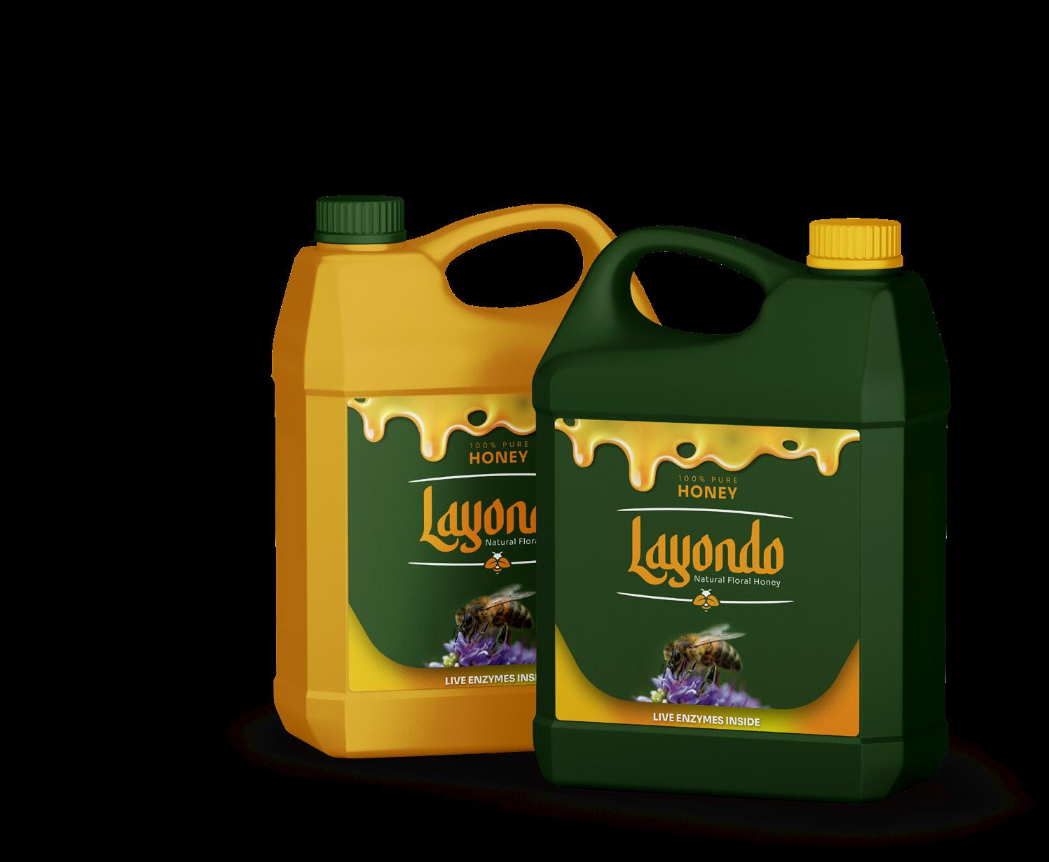

BRAND PALETTE
The word mark Logo for Layondo Honey is to make its own statement as it stands out.
LOGO MARK


The word mark Logo for Layondo Honey is to make its own statement as it stands out.
Sora typeface was designed to capture Soramitsu’s spirit and heritage resulting in a type family with cues of low-resolution aesthetics and early screen typography but without nostalgia, as every decision was considered towards the crisp digital environment of today.
