Artist Germaine Koh dabbles, Mason Studio’s dumplings nourish, and Montreal cyclists lead a biking revolution. / L’artiste Germaine Koh bricole, les raviolis de Mason Studio régalent et les Montréalais·es révolutionnent le vélo.
Creativity has its place
Issue 28
La créativité a sa place
Numéro 28
Redefining Project Management
Discover what sets us apart in the realm of project and portfolio management.
Global Collaboration Facilitated
Worldwide Synergy: Planisware's global platform breaks down geographical barriers, enabling seamless collaboration. With multi-language support and cross time zone functionality, your teams, wherever they are, can work together effectively and efficiently.
User-Centric Design
Intuitive and Adaptable: Crafted with the user in mind, our software offers a balance of simplicity and sophistication. Whether you're a project management novice or a seasoned pro, Planisware's interface is tailored for ease of use and maximum efficiency.
Robust Analytics and Reporting
Data-Driven Decisions: Transform data into actionable insights with Planisware’s powerful analytics. Our tools provide comprehensive reporting capabilities, giving you the clarity and foresight to make informed decisions and stay ahead of the curve.
Advanced Integration Capabilities
Seamless Connectivity:
Planisware's platform excels in integrating with your existing systems, ensuring a cohesive workflow. From CRM tools to financial software, experience a unified approach to project management.
Planisware: Empowering You to Lead, Innovate, and Succeed.
Transforming the Future, One Project at a Time!
Planisware’s 2023: A Year of Empowering Change
Client Success: Last year was about empowering our clients to become catalysts for change. With Planisware, organizations worldwide are reshaping how they strategize, plan, and execute projects.
Innovative Solutions for Every Challenge: Our suite of project management software tools is a way for businesses to harness creativity, efficiency, and agility. We're helping turn bold visions into awe-inspiring realities.
Global Impact, Local Touch: With thriving operations across Europe, North America, and APAC, Planisware’s global footprint is expanding rapidly, delivering project management solutions that transcend borders.
A Vision for Tomorrow: Our roadmap for 2024 is set, eyeing a future of relentless growth and excellence. At Planisware, we’re not just keeping pace with the Project Economy; we’re defining it.
Cybersecurity for Business
s01ve helps businesses meet the evolving requirements for cyber insurance and ensures you receive the coverage you need. Our service offering is designed to protect businesses from the financial and operational impacts of cyber incidents, while also aiming to lower cyber insurance premiums and provide higher coverages in case an incident occurs.
Partnering To Protect Your Digital World
s01ve's approach to protecting businesses is holistic and driven by a commitment to creating bottom line value for clients. We take an operational view of your business from training of your staff to our proprietary Business Email Compromise (BEC) app AuthRequest.io, we’re fostering a secure digital environment for you.
s01ve.io is composed of a diverse group of professionals:
Cybersecurity experts IT specialists Former law enforcement cybercrime investigators
s01ve emphasizes the importance of cybersecurity education, and preparedness against potential cyber-attacks. We assess your organization. Our managed IT services ensure that businesses can focus on their core operations, leaving the technology management to s01ve's experts. In the event of a cyber incident, s01ve's incident response management is on call 24/7 to support businesses in minimizing damage and returning to normal operations swiftly.
THE STARTING BLOCK / BLOCK DE DÉPART In the year 2024 (so divisible!) Block aims to hit the right balance. / En l’an 2024 (si clivant!), Block vise l’équilibre 9
THE MOMENT / LE MOMENT Dumplings, conversation and a truly multipurpose office. / Raviolis, échanges et un vrai bureau multifonction 10
MY SPACE / MON ESPACE A mini scaffold and big brushes in Marigold Santos’ Calgary studio. / Mini-échafaudage et maxi-pinceaux dans l’atelier calgarien de Marigold Santos 15
THE BUSINESS / L’ENTREPRISE Resonance’s Chris Fair on the “place power” of cities. / Les « pouvoirs » des villes avec Chris Fair de Resonance 16
ARTIST’S BLOCK / ART EN BLOCK Joy Walker’s block flops and folds. / Le cube en mouvement de Joy Walker 18
THE INTERIOR / L’INTÉRIEUR A Toronto private club designed for women, by women. / Un club privé torontois conçu pour les femmes par des femmes 20
THE CREATOR / LA CRÉATRICE On the cover:
Artist and organizer Germaine Koh is a happy collaborator. / En couverture : l’artisteorganisatrice Germaine Koh est une collaboratrice heureuse 26
WORK-IN-PROGRESS / LE CHANTIER
Architect Safoura Zahedi finds spirituality in fractal geometries. / Pour l’architecte Safoura Zahedi, motifs géométriques riment avec spiritualité 32
THE CONVERSATION / LA CONVERSATION On cycling infrastructure breeding bike culture in Montreal. / On discute infrastructure cyclable et culture du vélo à Montréal
38
MADE / FABRIQUÉ A candle so fragile it gets shipped in a block of ice. / Une délicate bougie livrée dans un bloc de glace 42
MAKE ROOM FOR THE ARTS / PLACE À L’ART Sum Artist’s José Bautista mural at 99 Spadina. / José Bautista, une murale torontoise signée Sum Artist 45
THE 1 KM GUIDE / 1 KM AUTOUR
The best coffee, thali and zeroproof drinks in one Ottawa neighbourhood. / Café, thali et boissons non-alcoolisées au cœur d’Ottawa
46
NOW & THEN / D’HIER À AUJOURD’HUI Toronto’s historic Silver Plate Building won’t tarnish. / À Toronto, la forge Silver Plate continue de reluire 48
RETHINK / REPENSÉ Labelling to find beauty where you are. / Étiqueter son ressenti pour voir la beauté 49
THE BLUEPRINT / LE PLAN D’ACTION How to make your own perfect dumpling. / Fait maison : votre ravioli parfaitement plié 50
FILL IN THE BLANK / VEUILLEZ COMBLER L’ESPACE Eric Lachance’s urban infill. / La dent creuse d’Eric Lachance 51
Jeremy Paul is a strategist at Whitman Emorson who strives to tell compelling stories that resonate with brands and their audiences. For this issue, he peeked at Calgary-based artist Marigold Santos’ studio (My Space, p. 15). / Stratège chez Whitman Emorson, Jeremy Paul aime raconter de passionnantes histoires qui font écho aux marques et à leur public. Dans ce numéro, il a jeté un œil à l’atelier calgarien de l’artiste Marigold Santos (Mon espace, p. 15).
Joy Walker (Artist’s Block, p. 18) is a Montreal-born, Toronto-based multidisciplinary artist, educator and former textile designer who has exhibited widely both locally and internationally. / Artiste multidisciplinaire, formatrice et ex-conceptrice textile, Joy Walker, Montréalaise basée à Toronto, expose son travail à l’international (Art en Block, p. 18).
Sara Frizzell is an Ottawa-based multimedia storyteller who has produced content for CBC News, Metroland and the Banff Centre for Arts and Creativity, among others (The 1 KM Guide, p. 46). / Rédactrice multimédia basée à Ottawa, Sara Frizzell produit du contenu pour CBC News, Metroland et le Centre des arts de Banff entre autres (1 km autour, p. 46).
Eric Lachance is an artist interested in the intersection of human activity and the built environment, and the historical significance of objects and iconography. Lachance contributed our Fill in the Blank (inside back cover). / L’artiste Eric Lachance s’intéresse au croisement de l’activité humaine et du bâti, ainsi qu’au sens historique des objets et de l’iconographie (Veuillez combler l’espace, 3e de couverture).
BLOCK IS PUBLISHED TWICE A YEAR. / BLOCK EST PUBLIÉ DEUX FOIS PAR AN.
INSPIRING MOVEMENT FOR LIFE
Your Integrated Healthcare Solution
At Therapy X, clients have access to a dedicated team of healthcare experts who engage in ongoing communication and collaboration. Services offered include physiotherapy, chiropractic care, massage, therapy, facial stretch, therapy, and personal training.
Book your Appointment Today
Therapy X is more than just a clinic; it’s a cornerstone of well-being and a hub of healing. We invite you to step into a world where health is holistic, care is collaborative, and every step forward is celebrated.
While the rare and sublime inspire and instill fear, many creatives seek something altogether more elusive: balance. / Quand le rare et le sublime inspirent la crainte, on cherche quelque chose d’encore plus insaisissable : l’équilibre.
MMXXIV, otherwise known as 2024, may come to be known for two extreme natural events, at least in the western hemisphere. April’s total solar eclipse passed over major populated U.S. and Canadian cities— including Niagara Falls, Ont., and Montreal—affording locals and those who made the trek, clear skies permitting, a glimpse of the corona.
Also promising to blot out the sun, a rare double brood of cicadas, amounting to over a trillion of the screaming winged insects, is set to emerge from the earth to moult and mate in much of the United States, darkening skies and sending entomophobes indoors. Broods XIII and XIX will overlap for the first time in more than two centuries, in what’s being described as a bacchanalia for both bug and beast.
While the rare and sublime inspire and instill fear, many creatives seek something altogether more elusive: balance. Sure, it’s a buzzword, but there’s a reason whole industries (not to mention cicada-rivalling broods of influencers) are dedicated to finding and maintaining it.
Balance between our home and work lives. Between the sympathetic and parasympathetic nervous systems. Balancing the natural environment around and within. This issue of Block looks at how some creatives—and even cities—practise and achieve balance.
There’s interiors firm Mason Studio (The Moment, p. 10), which gives new meaning to “mixed-use,” harmonizing various functions in its Toronto office. Chris Fair of the Vancouver-based consultancy Resonance (The Business, p. 16) tells us how great cities hit the right note between livability and lovability. Artist and organizer Germaine Koh (The Creator, p. 26) finds fellowship through creative collaboration and community. And, finally, artist Eric Lachance (Fill in the Blank, inside back cover) achieves a literal balancing act, but figuratively too, and playfully.
“As a kid, I wanted to play hockey on the streets,” says Lachance. “Now as an adult kid, I want to store chairs in unconventional places.”
He asks anyone who comes by an errant stool or seat to text him at (416) 450-5343 so he can add it to the precarious pile.
MMXXIV, alias 2024, pourrait se démarquer côté hémisphère occidental par deux événements naturels extrêmes. Le premier est l’éclipse solaire totale du 8 avril, admirée par les nombreux habitant·e·s, et touristes, de grandes villes états-uniennes et canadiennes, dont Montréal et Niagara Falls.
Le second est la horde de cigales qui s’apprête à assombrir le ciel des États-Unis : des milliards d’insectes ailés, au chant assourdissant, vont sortir de terre pour s’accoupler. Pour la première fois depuis plus de 200 ans, deux espèces naîtront en même temps, le groupe XIII et le groupe XIX, dans ce qui promet d’être une bruyante bacchanale. De quoi faire fuir les entomophobes!
Quand le rare et le sublime inspirent la crainte, on cherche quelque chose d’encore plus insaisissable : l’équilibre. Bien sûr, c’est un mot à la mode, mais ce n’est pas sans raison que des industries (et une nuée d’influenceurs et d’influenceuses) consacrent leur temps à lui courir après.
L’équilibre entre notre vie professionnelle et personnelle. Entre notre système nerveux sympathique et parasympathique. Entre ce qui nous entoure et ce qui nous habite. Ce numéro de Block s’intéresse à cette recherche de l’équilibre par des créatifs et créatives.
Dans Le moment (p. 10), le cabinet d’architecture d’intérieur Mason Studio redéfinit le mot « multiusage » en harmonisant les différentes fonctions de son bureau torontois. Dans L’entreprise (p. 16), Chris Fair de l’agence-conseil vancouvéroise Resonance, nous raconte comment certaines métropoles arrivent à faire vibrer à l’unisson habitabilité, attractivité et prospérité. Dans La créatrice (p. 26), l’artisteorganisatrice Germaine Koh trouve l’apaisement au travers de la collaboration. Enfin, en troisième de couverture, l’artiste Eric Lachance comble l’espace en réalisant un beau numéro d’équilibriste.
« Petit, je voulais jouer au hockey dans la rue, confie ce dernier. Aujourd’hui, mon âme d’enfant veut empiler des chaises dans des lieux insolites. » Il demande d’ailleurs à toute personne qui trouve un siège abandonné de le texter au 416-450-5343 pour qu’il l’ajoute à sa pile.
The Starting Block / Block de départ
Germaine Koh’s self-built Home Made Home: Hemlock Micro Studio (2016) on Saltspring Island, B.C. / Hemlock, le mini-atelier de Germaine Koh signé Home Made Home sur l’île Saltspring en C.-B. (2016).
2024-01-19
10:00 EST/HNE
BY / PAR KRISTINA LJUBANOVIC PHOTOS BY / PAR SCOTT NORSWORTHY
The vinyl sign on the window glazing, in friendly script, reads “nourish.” Inside, an exhibit of 11 chefs, restaurateurs and culinary experts and the tools of their trade: a basket of potatoes, a masher, colanders, a crimper and cutter. Perched on a mound of flour (more than 100 pounds of it!), 11 recipe cards, each a unique culinary take on a theme.
Pierogi, wontons and momo, oh my.
This curated exploration of all things dumpling is the creation of Toronto-based interiors firm Mason Studio; the exhibition accompanied by a series of events that will see curious (and hungry) patrons descend on their Junction Triangle office/event space/gallery/studio.
In a curtain-clad room just beyond the exhibit, hundreds of dumpling-shaped clay sculptures hang daintily from the ceiling. There event participants will be guided by exhibitors AnthroDish and Pastaio, The Depanneur and Lokum Eats in making dumplings by hand, sampling their creations and, also, conversation.
Why the pillowy-shaped delight? “I’m going to be bold and say that every culture has a dumpling,” says Stanley Sun, Mason’s co-founder and creative director. Truthfully, “it’s more so that the dumpling opens up conversations.”
As designers of high-concept restaurants (the Downtown sibling to the Michelin Star–rated Alobar is their latest), the exhibit and event series is an opportunity to test and innovate. The “organic bean shape” and the mixed counter- and dining-heights of the tables create what Sun calls “purposely awkward” moments, prompting, he hypothesizes, different perspectives and interactive encounters.
“Design is design. It’s not really the end goal of what we’re trying to achieve,” says Sun. “There’s so much more value in providing spaces that allow for people to connect.”
Mason’s vision for this space, when they relocated to the two-storey former welding shop nearly two years ago, was to create something truly mixed-use; a testing ground and community hub. “Let’s reinvent what our office could be,” says Sun. And they’ve done just that: inviting in their neighbours, hosting partner exhibits, giving over a portion of the office to the DesignTO team ( Nourish is part of the Toronto design festival’s 2024 lineup) and even, for one installation, flooding the space with water to create a pond.
Today, the space, awaiting its guests, is quiet and inviting. The calm before the kimchi?
“Even though it’s a white box, it’s like, let’s screw it up, you know?” says Sun.
LEFT: Mason Studio’s co-founders Stanley Sun and Ashley Rumsey conceived their office as an event space, gallery, library—and a comment on the future of work. “Anybody who’s still doing rows of desks in 10 years may not be understanding what’s happening socially and culturally,” says Sun. / À GAUCHE : Les cofondateurs de Mason Studio, Stanley Sun et Ashley Rumsey, ont réinventé la notion de bureau, qui fait aussi office de bibliothèque et d’espace événementiel et d’exposition. « Quiconque travaillera en rangée dans 10 ans n’aura pas compris ce qu’il se passe sur le plan social et culturel », selon Stanley Sun.
« Nourish », c’est ce qu’on peut lire sur la sympathique affiche en vitrine. À l’intérieur, 11 chef·fe·s, restaurateur·trice·s ou expert·e·s culinaires et leurs indispensables : patates, presse-purée, passoire, coupe-pâte et pince à chiqueter. Perchées sur une montagne de farine (plus de 45 kilos!), 11 fiches-recettes.
Pierogi, wontons, momos… miam!
Cette exploration du ravioli sous tous ses angles est organisée par le cabinet d’architecture d’intérieur torontois Mason Studio. La série d’événements, qui accompagne l’exposition, incite le public curieux (et gourmand) à débarquer dans son bureau-galerie-atelier, situé dans Junction Triangle.
Au plafond, des centaines de ravioles, sculptées dans l’argile, se balancent doucement. C’est là que les participants réaliseront ces petits carrés de pâte farcis, guidés par les exposant·e·s AnthroDish, Pastaio, The Depanneur et Lokum Eats. S’ensuivra une séance de dégustation, bien entendu.
Pourquoi avoir choisi ce régal en forme de nuage? « Parce que chaque culture a son ravioli, lance Stanley Sun, cofondateur et directeur de création de Mason Studio. Mais surtout parce qu’il suscite l’intérêt, et donc les discussions. »
Pour ces créateur·trice·s de restaurants conceptuels (le dernier en date étant l’Alobar du centre-ville, petit frère de l’étoilé Michelin de Yorkville), cet événement est l’occasion de tester et d’innover. La « forme de fève » et le mélange de deux hauteurs de table, classique et comptoir, donnent lieu à des situations « volontairement gênantes », selon Stanley Sun, synonymes de perspectives différentes et de rencontres interactives.
« L’aménagement d’un lieu n’est pas une fin en soi, poursuit-il. L’important, c’est de livrer un espace qui permet aux gens d’entrer en contact. »
D’ailleurs l’idée, lors de l’emménagement de Mason Studio, voilà deux ans, dans cet ancien atelier de soudure, était d’en faire un espace multiusage, à la fois terrain d’essai et centre communautaire.
« On voulait réinventer la notion de bureau », explique-t-il. Pari réussi : ils y invitent leurs voisins, y tiennent des expositions en partenariat, en cèdent une partie à l’équipe de DesignTO (Nourish est au programme de l’édition 2024 du festival de design de Toronto) et, pour une installation, le remplissent même d’eau pour créer une mare.
Aujourd’hui, l’espace attend tranquillement ses invité·e·s. Le calme avant la vapeur?
« Ça a beau être une boîte blanche, on peut quand même la bousculer, n’est-ce pas? » conclut-il.
LEFT: The flour that holds the recipe cards from the 11 collaborators gives the space a “less precious” and “more playful” feel. / À GAUCHE : Le tas de farine qui sert de présentoir aux fiches-recettes des 11 chef·fe·s crée une ambiance à la bonne franquette.
BELOW: The clay dumplings are another icebreaker or point of conversation. “There’s value in the process of making,” says Sun. / CI-DESSOUS : Les raviolis en argile sont un moyen de briser la glace ou d’alimenter la conversation. Stanley Sun en est convaincu : « Faire de ses mains est valorisant. »
“Design is design. It’s not really the end goal of what we’re trying to achieve. There’s so much more value in providing spaces that allow for people to connect.” / « L’aménagement d’un lieu n’est pas une fin en soi, poursuitil. L’important, c’est de livrer un espace qui permet aux gens d’entrer en contact. »
Nourish was the winner of the 2024 DesignTO Awards Best in Festival Event. Find dumpling recipes from the 11 collaborators at the QR code. / Nourish a été élu meilleur événement du festival DesignTO 2024. Scannez le code QR ci-contre pour découvrir les 11 recettes de raviolis.
ACTION-PACKED
Different Strokes Traits distinctifs
Marigold Santos is a multidisciplinary artist exploring notions of—and the tensions between—diaspora and selfhood, with a background in printmaking, painting, tattooing and more. She sees her varied pursuits as “interconnected mediums that inform each other.” Santos let us explore her Calgary heritage-building-situated studio to glimpse the day-to-day items that shape her work and world. / Marigold Santos explore les notions de diaspora et d’individualité, et les tensions qui existent entre elles. Gravure, peinture, tatouage… pour l’artiste pluridisciplinaire, ses diverses activités sont « des médiums interconnectés s’influençant les uns les autres ». On visite son atelier, situé dans un bâtiment patrimonial calgarien, pour jeter un œil sur les objets qui façonnent son quotidien.
1. Brushes / Les pinceaux
“I paint with really small or really big brushes—there’s no in-between. This is reflected in my work. There are massive sweeping marks, but then there are also teenytiny details. I like the tension of working at different scales; they require different endurances and provide different results.” / « J’en utilise de très petits ou de très gros : il n’y a pas de juste milieu. Cela se voit d’ailleurs dans mon travail. On y trouve de grands balayages et de minuscules détails. J’aime la tension qu’il y a dans la peinture à différentes échelles : pour chacune, l’endurance et le résultat sont différents. »
2. Painter’s Tape / Le ruban de masquage
“Purely practical, it may be representative of how detail-oriented I am—and the boundless creativity that can happen between the borders. This particular tape is my favourite. The right amount of tackiness. Can’t work without it. I don’t even know the brand; my husband gets it for me. He’s my supplier!” / « Purement pratique, il représente peut-être mon souci du détail et la créativité sans bornes qui naît entre ces bornes justement. Celui-ci est mon préféré : adhésif, juste ce qu’il faut! Je ne peux rien faire sans lui. Je n’en connais pas la marque, c’est mon mari qui me l’achète. Il est mon fournisseur! »
3. Mini Scaffold / Le mini-échafaudage
“This scaffold is integral to everything I do in my studio. A lot of my work is on a large scale, so I need it to create. It’s used as a platform or even a seat from time to time. I like that it is proportional to me; I’m kind of a mini person, so it’s nice to have a mini scaffold.” / « Il participe à tout ce que je fais dans l’atelier. Comme je travaille beaucoup à grande échelle, c’est un indispensable. Je m’en sers aussi de plateforme ou de siège de temps en temps. Et puis, il m’est proportionnel : c’est bien pour une mini-personne d’avoir un mini-échafaudage! »
4. Books / Les livres
“The books are particular to my heritage, about traditional weaving, embroidery, textiles and pre-colonial ways of thinking. As a person of a diaspora, I don’t have the opportunity to be directly connected to my culture all the time. I still link to the Philippines through my parents, but these are a way for me to be tethered to my culture and provide a different aspect of learning.” / « Ils sont liés à mon histoire, mon patrimoine. Ils parlent de tissage traditionnel, de broderie, de textiles ou de modes de pensée précoloniaux. En tant que membre d’une diaspora, j’ai rarement l’occasion d’être en contact direct avec ma culture. Je suis toujours liée aux Philippines par mes parents, mais ces livres me rattachent à ma culture et participent à mon apprentissage. »
5. Black Ink / L’encre noire
“Black is a very important visual component of my work—in every discipline. There are a lot of light and fluid colours, but also a lot of heavy, solid black shapes that make a grounding place for the eye. I use black both as a focal point and a foundation.” / « Le noir est un élément visuel important de mon travail, dans chaque discipline. Il y a beaucoup de couleurs claires, mais également beaucoup de formes noires denses, qui ancrent le regard. Le noir me sert à la fois de base et de point focal. »
BY / PAR JEREMY PAUL
Place Power Lieux de pouvoirs
AS TOLD TO / PROPOS RECUEILLIS PAR MÉLANIE RITCHOT ILLUSTRATION BY / PAR JOE MAGEE
We spoke to Chris Fair, president of Resonance—the consultancy behind the World’s Best Cities, ranking the best places in the eyes of visitors, investors and residents alike—about the process of placemaking.
About a decade ago, we were working on a strategy to attract more visitors to the south and east of Ireland, and they gave us a map of more than 1,000 tourism assets—castles, hotels and monuments. We had to think about what really mattered to the international visitor, so we started mining data from Tripadvisor to understand how people were consuming Ireland as a place. That was really the genesis of the Best Cities methodology, a hybrid approach using core statistical data on things that we know attract people or investment, but also including experiential factors.
It has been a journey to understand which factors shape perception of place and how you put them together to evaluate what we call the “place power” of one city versus another. We look at three indicators. The first is the livability of the city, which covers things like the affordability of housing and access to health care. The second is lovability, which reflects experiential factors like nightlife, culture, restaurants and outdoor activities. The third piece is prosperity, which includes economic indicators but also a lot of human indicators like educational attainment, how shared prosperity is between people in a city, and poverty rates.
They do overlap, but every city is different, and the things that shape the performance of place evolve over time. We’ve seen that things like walkability and cycling networks in cities have a much stronger correlation with where young professionals are moving over the last four or five years. Housing is becoming more important, and it’s less about affordability and more about attainability. Heat stress and air quality issues resulting from wildfires are emerging as factors. I think placemaking is underappreciated in cities. It’s often seen as a “nice to have” rather than a “need to have.” The value of it is not just community well-being; it can be a key driver of economic development because the relative vibrancy of places determines where businesses are forming.
On parle aménagement et réappropriation de l’espace public avec Chris Fair, président de Resonance, le cabinet-conseil à l’origine du classement des villes les plus agréables du monde qu’on soit touriste, investisseur ou résident.
Il y a 10 ans environ, on travaillait sur une stratégie pour attirer plus de visiteurs dans le sud et l’est de l’Irlande. On nous a remis une carte qui recensait plus de 1 000 attraits touristiques : châteaux, hôtels et monuments. On a alors dû réfléchir à ce qui comptait le plus aux yeux du touriste international et on s’est servi des données de Tripadvisor pour comprendre comment les gens consommaient l’Irlande. C’est ainsi qu’est née la méthodologie de classement des villes, un hybride qui combine les statistiques de base sur des éléments qui, on le sait, attirent les gens ou les investissements, avec les facteurs expérientiels.
On a mis du temps à savoir quels facteurs façonnaient la perception d’un lieu et comment les assembler pour évaluer ce qu’on appelle le « pouvoir » d’une ville. On regarde trois indicateurs. Le premier est l’habitabilité : logements abordables, facilité d’accès aux soins de santé, etc. Le deuxième est l’attractivité : vie nocturne, culture, restaurants et activités de plein air. Le troisième est la prospérité, qui comprend à la fois des indicateurs économiques et humains, comme le niveau d’éducation, le partage des richesses entre les citoyens et le taux de pauvreté.
Ils ont beau se recouper, chaque ville est différente. Et les éléments qui font le succès d’un lieu évoluent au fil du temps. On remarque, par exemple, une plus forte corrélation depuis quatre ou cinq ans entre le potentiel piétonnier et cyclable d’une ville et l’emménagement des jeunes professionnels. Le logement gagne en importance, et c’est moins une question de prix que d’accessibilité.
La chaleur et les problèmes de qualité de l’air résultant des feux de forêt sont, eux, des facteurs émergents.
Je crois que l’aménagement de l’espace public urbain est sousestimé. Il est souvent vu comme un embellissement au lieu d’une nécessité. Sa valeur n’est pas qu’un bien-être collectif, c’est aussi un moteur de développement économique, car la vitalité relative d’un lieu détermine le choix d’implantation des entreprises.
THE BEST ADVICE I’VE EVER RECEIVED / LE MEILLEUR CONSEIL QU’ON M’AIT DONNÉ
“It came from Dr. Peter Bishop, who was a professor at the University of Houston: ‘Change is hard, but stagnation is fatal…’ Whether it’s in an ecosystem, a city or our personal lives, stasis inevitably leads to decline. Rather than resisting change, we need to embrace it to realize our full potential.” / Il vient de Peter Bishop, professeur à l’université de Houston : « Le changement est difficile, mais la stagnation est fatale. » Que ce soit dans un écosystème, une ville ou notre vie, l’inertie conduit inévitablement au déclin. Plutôt que de résister au changement, il faut en profiter pour réaliser son plein potentiel.
Untitled (Cube)
by/de Joy Walker
In cutting canvas to create a two-dimensional drawing, Joy Walker formed a cube that “appears to protrude, recede and bend,” she says, “giving it a sense of dimension and precarity.” / En découpant de la toile pour créer un dessin en 2D, Joy Walker a formé un cube qui « semble à la fois protubérant, fuyant et fléchi, ce qui lui donne dimension et précarité », explique-t-elle.
by
Photo
/ par Toni Hafkenscheid
Artist’s Block /
Ahead of the Curve
Courbe ascendante
BY / PAR MARYAM SIDDIQI
PHOTOS COURTESY OF / OFFERTES PAR VERITY
PHOTOS BY / PAR FM&CO. PHOTOGRAPHY
The Verity Club was created for women, by women, with interior design to match.
The private club opened its doors 21 years ago as a space for some of Toronto’s most innovative, creative and powerful women to connect personally and professionally. It was a venue for coworking before working from wherever was a thing. For founder and CEO Mary Aitken, it’s always been about fostering a space away from the corporate world, one where connections are easily made, but one that also allows for privacy when needed.
Harvey Cowan, the architect behind the interior of the restored historic chocolate factory—which now houses amenities like an ozonated pool, a Pilates studio and a library—was a personal friend of Aitken’s. “I said to him, ‘This needs to be a place where everybody’s not visible,’ ” Aitken explains. “The task was to create spaces that, through the nature of their design, gave members privacy.”
Indeed, the members’ lounge curves in a way that creates nooks for private conversation between spaces for socializing. The flow of the three-level club is almost instinctual, a natural progression from shortterm workspaces like “the perch,” which features bar seating at the top of a staircase overlooking Queen Street, to enclosed offices for those who need to concentrate or make confidential calls, to event spaces, such as the Toronto room, where member lunches and dinners and the club’s twice-monthly speaker series occur.
Le club Verity a été créé pour les femmes, par les femmes et sa déco, conjuguée au féminin.
Il y a 21 ans, le club privé ouvrait ses portes pour accueillir quelquesunes des femmes les plus puissantes, innovantes et créatives de Toronto. Le but? Nouer des liens tant personnels que professionnels et cotravailler à une époque où le télétravail n’existait pas. Pour Mary Aitken, fondatrice et PDG, l’idée a toujours été de proposer un endroit à l’écart du monde de l’entreprise, qui facilite les contacts tout en préservant l’intimité lorsque nécessaire.
Harvey Cowan, l’architecte qui a aménagé cette ancienne, et immense, chocolaterie, abritant notamment aujourd’hui une piscine ozonée, une salle de pilates et une bibliothèque, est un ami de Mary Aitken. « Je lui ai demandé d’invisibiliser la clientèle, explique-telle. De concevoir des espaces qui, de par leur agencement, offraient de l’intimité aux membres. »
Et ce fut chose faite. Le salon ondule, formant des coins propices aux conversations privées entre deux points de rencontre. Le déroulé des trois étages est quasi instinctif, une progression naturelle allant de stations de travail de courte durée, comme « le perchoir », composé de tabourets de bar en haut d’un escalier donnant sur la rue Queen, à des bureaux fermés pour la concentration et les appels confidentiels, en passant par des espaces événementiels, comme la salle Toronto, où se déroulent les dîners, soupers et conférences bimensuelles du club.
LEFT: A view to Verity’s relaxed and inviting space. Curvaceous details create moments of intimacy and privacy within an overall social setting. / À GAUCHE : Le salon accueillant du club Verity, où les lignes courbes créent des zones d’intimité dans un espace qui favorise le lien social.
“The task was to create spaces that, through the nature of their design, gave members privacy.” / « L’idée était de concevoir des espaces qui, de par leur agencement, offraient de l’intimité aux membres. »
ABOVE: Secrette is the French-inspired speakeasy above the Michelin-recognized restaurant George, featuring small plates and blood orange and elderflower foam-topped cocktails. / CI-DESSUS : Chapeautant le restaurant George recommandé par le guide Michelin, Secrette, un bar intimiste à la française, sert des cocktails à l’orange sanguine et au sureau, accompagnés de bouchées.
NEXT PAGE (clockwise from left): Led by executive chef Lorenzo Loseto, George opened its doors (sourced from Les Puces flea market in Paris) in 2003; Sweetgrass is one of Toronto’s few women-only spas; pinks, purples and natural hues distinguish Verity’s spaces. / PAGE CI-CONTRE (dans le sens horaire) : Sweetgrass, un des rares spas de Toronto réservés aux femmes; la palette singulière de Verity : du rose, du violet et des teintes naturelles; dirigé par le chef Lorenzo Loseto, George a ouvert ses portes (chinées aux Puces de Paris) en 2003.
“We just had Wes Hall here,” Aitken says of the entrepreneur and Dragons’ Den personality, “and Carolyn Bennett is going to speak on International Women’s Day.” The politician was one of the club’s founding members.
Not all of Verity’s 65,000-square-foot space is just for members. The club includes several spaces open to the public: George, a Michelinrecognized restaurant known for its tasting menus; Secrette, an intimate cocktail bar hidden on the club’s top floor; Sweetgrass Spa, which offers a full menu of facial and body treatments; and The Ivy at Verity, a foursuite boutique hotel.
For members, they’re connected through the club, while the public accesses each through a separate entrance. And through design elements, they all call back to each other. Thick wooden French doors in George, which Aitken found in Les Puces, the well-known flea market in Paris, echo an antique armoire in the members’ lounge that she brought back from the same market. “Not at the same time,” she says.
« On vient d’y recevoir Wes Hall, l’homme d’affaires et investisseur “Dragon”, poursuit-elle, et on attend Carolyn Bennet pour la Journée internationale des droits des femmes. » La politicienne était une des membres fondatrices du club.
Les 6 000 m2 que compte Verity ne sont pas réservés qu’aux membres. Plusieurs lieux sont ouverts au public : George, un restaurant gastronomique recommandé par le guide Michelin; Secrette, un bar à cocktails intimiste caché au dernier étage; Sweetgrass, un spa offrant des soins à la carte et The Ivy at Verity, un hôtel boutique de quatre suites.
Ces lieux comportent tous deux entrées : l’une pour les membres par accès direct, l’autre pour le public. Et se répondent en écho via leur déco : portes françaises en bois massif pour George, chinées aux Puces de Paris par Mary Aitken elle-même, contre armoire ancienne pour le salon, rapportée du même marché. « Mais pas en même temps », précise-t-elle.
The colour scheme throughout the club, hotel and Secrette includes bright pinks and purples, with natural hues like terracotta and stone intertwined for balance, and there are loads of floral prints. “Toronto has a lot of months that are just grey. I wanted this to be a place where you came in and it was like a warm embrace as you entered,” Aitken says. Artwork adds more colour to the space, much of it by members, who are invited to display pieces for sale.
Aitken conceived of Verity, which operates as a not-for-profit, as that all-important third space, a place away from home and work. “I always like to think of what happens in that space,” she says. “It’s not just a third space to sit, read a book or the paper, and savour a glass of wine. It’s the connection, the new ideas, the businesses that are started.”
BELOW: Verity is tucked into a historic Queen East Toronto building.
Founder Mary Aitken envisioned it as a “third place” and community for women to find professional and social supports and balance.
/ CI-DESSUS : Le club Verity est niché dans un bâtiment historique de Toronto. Mary Aitken, sa fondatrice, l’a conçu comme « un troisième lieu », permettant aux femmes d’y trouver soutien et équilibre tant sur le plan professionnel que social.
La palette du club, de l’hôtel et de Secrette se décline dans des tons de violet et de rose vif, équilibrés par des teintes minérales de pierre et de terre cuite, le tout parsemé de multiples motifs floraux. « Il fait souvent gris à Toronto. Je voulais un intérieur chaleureux, qui vous accueille à bras ouverts dès l’entrée. » Les œuvres d’art exposées ici et là ajoutent, elles aussi, de la couleur : la plupart sont signées par les membres et sont à vendre si tel est leur souhait.
Mary Aitken a conçu Verity, qui a le statut d’OBNL, comme ce troisième lieu qui n’est ni la maison ni le travail, et qui a toute son importance. « J’aime la dynamique de cet endroit, conclut-elle. Ce n’est pas qu’un troisième lieu pour lire un livre ou le journal en sirotant un verre. Ce sont aussi les liens qui s’y tissent, les idées qui y germent et les entreprises qui y démarrent. »
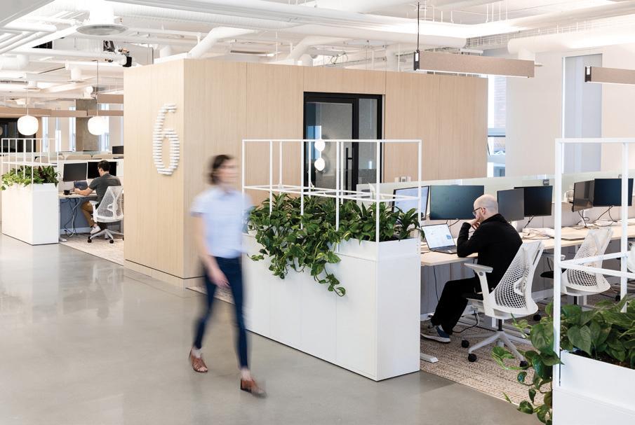
Flexible work environments that bring people together.
Trulioo, Vancouver Office Edit Studios
Photography Emma Peters and Brett Ryan
Shifting Current Au gré des courants
Artist and organizer Germaine Koh shows us we’re all connected—and debunks the lone, tortured genius myth. / Nous sommes tous liés, selon l’artiste-organisatrice Germaine Koh, qui déboulonne en passant le mythe du génie solitaire.
BY / PAR XIMENA GONZÁLEZ PHOTOS BY / PAR ALANA PATERSON
A VAST
and eclectic portfolio conceals a common thread that weaves Germaine Koh’s work together: she finds parallels where others see divergence.
“I first got into art because I was a person who wasn’t prepared to specialize in a single topic,” says Koh, a visual artist and organizer based in Vancouver.
In one of her public art pieces, Still Flowing , the wind blows a series of aluminum pennants hung atop a grouping of flagpoles, emulating a school of fish in the nearby Still Creek, in Burnaby, B.C.
After 35 years of uninterrupted artistic practice, and with a recent Governor General’s Award in visual and media arts under her belt, Koh is a staunch generalist, and her drive to explore new realms remains unquenched.
A few years ago, Koh reimagined a public bench at a Vancouver bus stop as a teeter-totter, reminding transit users of the importance of collaboration. In at least three galleries she’s installed an intricate system of stainless-steel stanchions with velvet ropes that, connected to a nearby body of water via sensors, move up or down following the tide. “The way this works serves to connect us to the world outside that our buildings usually go to great lengths to insulate us from,” Koh explains.
By extrapolating the ubiquity of the familiar, Koh’s installations bring attention to our connection to the environment, and each other. She achieves this in subtle ways, often through play. “The underlying ethos behind my work is an attempt to suggest that fields and phenomena that may not seem to be connected in fact have similarities,” Koh says. “What my work ends up doing is trying to create situations in which we realize that maybe we’re not so disconnected from other people as we feel sometimes.”
UN PORTFOLIO
aussi vaste qu’éclectique dissimule le fil conducteur du travail de Germaine Koh : établir des parallèles là où d’autres voient des divergences.
« Je me suis dirigée vers l’art au départ, car je ne me sentais pas prête à me spécialiser dans un seul sujet », explique l’organisatrice et artiste visuelle basée à Vancouver.
Dans Still Flowing, une de ses œuvres d’art public, une série de fanions en aluminium, accrochés en haut d’un ensemble de 17 mâts, oscillent au rythme du vent, tel un banc de poissons dans le ruisseau voisin de Still Creek à Burnaby, en Colombie-Britannique.
Après 35 ans de pratique et un prix du Gouverneur Général en arts visuels et médiatiques, Germaine Koh est une généraliste convaincue, toujours désireuse d’explorer de nouveaux domaines.
En 2018, elle réimaginait le banc d’un arrêt de bus vancouvérois sous forme de balançoire à bascule, rappelant aux usagers du transport collectif l’importance de la collaboration. Elle a aussi installé, dans quelques musées, un système de poteaux chromés reliés entre eux par des cordes de velours qui, grâce à des capteurs, montent et descendent au gré des flots du plan d’eau le plus proche. « Cette installation nous relie au monde extérieur quand nos immeubles s’évertuent à nous en couper », lance-t-elle.
En extrapolant l’ubiquité du familier, Germaine Koh attire l’attention sur nos liens avec l’environnement et avec les autres. Elle le fait de manière subtile et le plus souvent ludique. « Ma philosophie de base est de tenter de montrer que des phénomènes, ou des domaines, qui ne semblent pas liés ont, en fait, des similitudes. Par mon travail, j’essaie de créer des situations dans lesquelles on prend conscience qu’on n’est peut-être pas si déconnectés les uns des autres qu’on le croit parfois. »
Sometimes the connections made by spectators take Koh by surprise. In Overflow , Koh used damaged, refundable glass bottles to evoke the invisible economy of East Hastings, in downtown Vancouver. But passersby saw more in the glistening, neatly arranged bottles. “It got adopted by the neighbourhood as an unofficial memorial to victims of substance abuse in the Downtown Eastside,” she says. “Because these bottles have a sort of elegy feeling, [they] stand in for people.”
As a generalist or jack of all trades, Koh relies on the expertise others share with her to bring her ideas to life, she says. “One of the things that is really satisfying to me—and the reason I move between realms—is to learn new things.”
A decade ago, Koh created a smartphone app for Marpole, one of Vancouver’s oldest neighbourhoods, to display the area’s lesserknown history as a food-source hub. The community’s past and present overlap in interactive map layers outlining former hunting and gathering spots essential to First Nations trade, and edible plants and soup kitchens in place today.
For WARES , a 2023 installation Koh characterizes as a quasi-fashion line, she learned from traditional weavers how to make fabric from scratch. More recently, she put on a hard hat and steel-toed boots to build an artist community on Salt Spring Island, where Koh and her partner own land. Her entrepreneurial spirit is evident in this endeavour. “I pose as if I am a property developer,” she says. “But I’m actually focused on small-scale, self-built buildings.”
Home Made Home, now a social enterprise that builds micro-homes and studios for artists, has slowly become central to Koh’s practice, as she’s seen too many colleagues displaced by Vancouver’s insatiable redevelopment.
The official launch of this ongoing project dates back to 2014—though inklings of it can be traced to the early 2000s—evidenced in an evergrowing number of installations constructed in collaboration with a group of like-minded folks. “The project is an umbrella to advocate for alternative forms of housing,” Koh explains.
Her research on vernacular housing led Koh to learn that a home can be constructed by its users, and it can take the shape they desire. “A hundred years ago, houses were not being built by specialized builders,” she says. “They were built by the families who were going to live in them.”
Et parfois, ce sont les liens faits par le public qui prennent l’artiste par surprise.
Dans Overflow, elle a soigneusement aligné des centaines de bouteilles en verre consignées pour figurer l’économie invisible de la rue East Hastings de Vancouver. Mais le public est allé plus loin : « Le quartier en a fait un mémorial officieux pour les victimes de la toxicomanie du Downtown Eastside. Parce que ces bouteilles sont une sorte d’élégie, chacune représentant une personne. »
Pour donner vie à ses idées, cette touche-à-tout s’appuie sur le savoir-faire partagé : « Apprendre de nouvelles choses me satisfait pleinement, c’est la raison pour laquelle je navigue entre plusieurs domaines. »
En 2014, elle développait une application pour téléphone permettant de localiser les ressources alimentaires méconnues de Marpole, un des plus vieux quartiers de Vancouver. Passé et présent se superposent sous forme de cartes interactives, indiquant tant les anciens lieux de chasse et de cueillette essentiels aux Premières Nations que les plantes comestibles et les soupes populaires actuelles.
Pour WARES, une installation datant de 2023 qu’elle qualifie de collection quasi-mode, elle apprend à fabriquer du tissu avec des artisans tisserands. Puis, elle enfile bottes et casque de chantier pour bâtir une communauté d’artistes sur l’île Saltspring, où elle possède un terrain. Son esprit d’entreprise est une évidence : « Je me pose en promotrice immobilière, mais je me concentre en réalité sur de petits bâtiments, construits de mes mains. »
Entreprise sociale de construction de micromaisons et d’ateliers pour artistes, Home Made Home est devenue l’activité première de Germaine Koh, qui a vu trop de collègues déplacés par l’insatiable redéveloppement de Vancouver.
C’est au début des années 2000 et sous forme de toiles d’araignées géantes que l’idée germe dans sa tête. Lancé officiellement en 2014, ce projet « est un beau prétexte pour défendre d’autres modèles de logement », affirme-t-elle.
Au fil de ses recherches sur l’habitat local, elle découvre qu’une maison peut être construite par ses futurs occupants avec la configuration de leur choix. « Il y a 100 ans, les maisons n’étaient
PREVIOUS SPREAD: Germaine Koh in the RWG coat, woven of fibres from recuperated clothing and part of the WARES series made from deconstructed waste textiles and driven by natural cycles—a counterpoint to the fashion industry’s consumption-driven seasonality. / PAGE PRÉCÉDENTE : Germaine Koh porte son manteau RWG en fibres de vêtements récupérés. Il fait partie de la série WARES : des objets textiles confectionnés à partir de chutes de tissu et guidés par les saisons, en opposition aux pratiques de surproduction et de surconsommation de la mode jetable.
RIGHT: For more than 10 years, Koh has been imagining and executing alternate forms of housing that take the form the user, not the developer, desires. / À DROITE : Depuis plus de 10 ans, Germaine Koh imagine et réalise des logements qui prennent la forme souhaitée par son occupant·e, et non son promoteur.
“One of the things that is really satisfying to me—and the reason I move between realms—is to learn new things.” /
« Apprendre de nouvelles choses me satisfait pleinement, c’est la raison pour laquelle je navigue entre plusieurs domaines.
»
The Creator / La créatrice
Koh is part of Community Fabric, an ad hoc collective of artists, curators, and textile and costume designers from diverse cultural backgrounds who practise amateur weaving as a form of community and to create space for conversation.
/ Germaine Koh fait partie de Community Fabric, un collectif d’artistes, couturières et autres fabricants de textile d’origines culturelles variées qui pratiquent le tissage amateur pour créer aussi du lien social.
The Creator / La créatrice
The Creator / La créatrice
Home Made Home proves that everyday spaces and unassuming structures can become rooms for dwelling in, a community even. Koh shows this by experimenting with different materials, forms and locations.
She’s used salvaged construction materials to build a movable kiosk and scrap textiles to erect a tent in Toronto’s Small Arms Inspection Building. She’s reimagined the phone booth as a timeless, multi-functional space. She’s even found space to build a home over a gallery’s entry threshold and inside a wall, something Koh calls a “parasitic” installation.
“There’s way more room to sustain different kinds of housing in our world than we are necessarily willing to admit,” she says. “It’s just a matter of political will, whether we let those things exist.”
pas construites par des professionnels, mais par les familles qui allaient y vivre. »
Home Made Home est la preuve que des structures modestes peuvent se transformer en pièces à habiter, et même en communauté. Germaine Koh le démontre en variant les matières, les silhouettes et les lieux.
Elle se sert de matériaux de récupération pour construire un kiosque mobile, puis de vieux tissus pour dresser une tente au centre culturel SAIB de Mississauga. Elle métamorphose une cabine téléphonique en un espace multifonction intemporel. Elle réussit même à nicher une maison au-dessus du porche d’un musée et une autre à l’intérieur d’un mur : deux installations parasites, comme elle les appelle.
« Dans notre monde, il y a beaucoup plus de place qu’on veut bien l’admettre pour différentes formes d’habitation, conclut-elle. C’est juste une question de volonté politique. »
BELOW (clockwise from bottom left): Koh’s weavings use recuperated or home-grown fibres and plastics; a 2008 installation at the Vancouver Art Gallery showed changing tide levels and was streamed over the internet; the Home Made Home: Lululiving structure en route to be exhibited at Richmond Art Gallery; and Overflow, a site-specific process-based project at Centre A and in collaboration with United We Can bottle depot. / CI-DESSOUS (dans le sens horaire) : Des fibres et du plastique récupérés en attente d’être tissés; une installation datant de 2008 au musée des beaux-arts de Vancouver, qui se mouvait au gré des flots et était diffusée en ligne; Lululiving, une structure habitable signée Home Made Home, en route pour une exposition au centre d’art de Richmond en C.-B.; Overflow, une installation in situ créée pour le Centre A de Vancouver, en collaboration avec le dépôt de verre United We Can.
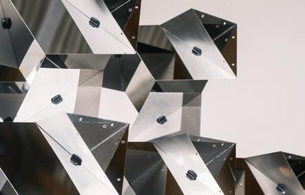
Safoura Zahedi at work on the fractalized installation she presented at the 2024 Interior Design Show. The polished mirror finish extends the geometry and captures the viewer. “You become one with the pattern,” she says. / Safoura Zahedi travaille sur son « installation fractalisée », présentée à l’IDS, le salon du design d’intérieur canadien en 2024. L’effet miroir décuple la géométrie et reflète votre regard : « On ne fait plus qu’un ou qu’une avec le motif », d’après elle.
by / par Kurtis
Photo
Chen
Part to Whole Tout et partie
Geometry, for Safoura Zahedi, is equal parts professional project, path to spirituality—and a means to deciphering her whole self as an artist and architect. / La géométrie, selon Safoura Zahedi, est à la fois un projet professionnel, un chemin vers la spiritualité et un moyen de se décoder en tant qu’architecte et artiste.
BY / PAR KRISTINA LJUBANOVIC
When she thinks back to her childhood, architect Safoura Zahedi sees geometrical patterns, fractals and arabesques unfurl behind closed eyelids.
A product of a beautiful mind? Yes, and a mother who’s an artist and graphic designer. “I remember she had this book, which she compiled herself over the years, of all these different patterns she had collected,” says Zahedi. “In graduate school, every time I would get stuck or needed a moment to creatively meditate, I would take the book and flip through and let my eyes blur into [the patterns].”
While Zahedi’s parents hail from Isfahan in Iran, once the capital of Persia under the Safavid dynasty and a cradle of culture and innovation in the region, she was born in Japan (also known, putting it mildly, for its design legacy).
Her pursuit of geometry was almost preternaturally determined; a birthright.
“For me, it’s not so much the nostalgia of it but the wisdom we can build on,” says Zahedi. Her own architectural thesis compared (and critiqued) contemporary Islamic architecture against the historical context, which saw “very sophisticated spatial manifestations of the geometry,” much of it coinciding with the mathematical and scientific innovations of the Islamic Golden Age from the eighth to 16th centuries.
“There is a lot to learn from the heritage and material culture that can then inform digital craft and today’s architecture using contemporary tools, digital fabrication and computational design,” she says.
In 2022, Zahedi took a sabbatical year away from practising architecture and launched a 365-day field research project, a “longer journey of exploring,” which took her to 17 countries and more than 40 cities across major historic Islamic dynasties. The travels allowed her to connect with artisans and craftspeople in different locales
Il suffit qu’elle ferme les yeux et pense à son enfance pour que Safoura Zahedi voie défiler arabesques, fractales et autres formes géométriques.
Le produit d’un esprit observateur? Oui, et d’une mère artiste et graphiste. « Je me souviens qu’elle avait ce carnet, rempli de motifs différents rassemblés au fil des ans, explique celle qui combine aujourd’hui les métiers d’architecte et d’artiste. À l’université, chaque fois que j’étais en panne d’idée, ou que j’avais envie d’une séance de méditation créative, je le feuilletais et laissais mon regard s’y perdre. »
Les parents de Safoura Zahedi sont originaires d’Ispahan en Iran, ancienne capitale de la Perse sous la dynastie safavide et berceau de culture et d’innovation. Elle, elle est née au Japon, pays également connu, c’est le moins qu’on puisse dire, pour son architecture.
La géométrie était donc une voie toute tracée, un droit de naissance.
« Pour moi, ce n’est pas de la nostalgie, c’est plutôt de la sagesse que j’en retire », explique-t-elle. Dans sa thèse, elle comparait (et critiquait) l’architecture islamique contemporaine au contexte historique, qui a vu « des manifestations spatiales très sophistiquées de la géométrie », qui coïncidaient pour la plupart avec les innovations mathématiques et scientifiques de l’âge d’or, du VIIIe au XVIe siècle.
« Il y a beaucoup à apprendre de la culture matérielle, qui peut influencer l’artisanat et l’architecture d’aujourd’hui avec l’aide de la fabrication numérique et de la conception par ordinateur », poursuit-elle.
En 2022, elle prend une année sabbatique : 365 jours d’étude de terrain, « un long voyage exploratoire » à travers les principales dynasties islamiques qui la conduit dans 17 pays et plus de 40 villes. Elle y rencontre des artisans (qu’elle met en relation), observe les répétitions de styles et de techniques d’une région à l’autre, ou leurs
PHOTOS COURTESY OF / OFFERTES PAR SAFOURA ZAHEDI
Safoura Zahedi’s travels took her to 17 countries (documented on Instagram @365daysofgeometry), including Morocco (top left), Portugal, Spain, Egypt, Turkey, Uzbekistan, India, Thailand, Cambodia, Malaysia and Singapore, to observe patterns in architecture and across various craft disciplines. / Lors de son voyage exploratoire, Safoura Zahedi a visité 17 pays, dont le Maroc (en haut à gauche), le Portugal, l’Espagne, l’Égypte, la Turquie, l’Ouzbékistan, l’Inde, la Thaïlande, le Cambodge, la Malaisie et Singapour. Son but? Observer les motifs dans l’architecture et l’artisanat local, le tout documenté sur son compte Instagram : @365daysofgeometry.
Zahedi was able to interact with artisans at work, like this plaster carver in Fez, Morocco (left) and see themes and variations on the geometries, like the muqarnas structure (below at centre, in Bukhara, Uzbekistan), in both palatial and public settings. / Elle a rencontré de nombreux artisans, comme ce graveur sur plâtre à Fès (ci-contre) et contemplé les multiples variations géométriques des motifs ornementaux, comme ces muqarnas à Boukhara (ci-dessous au milieu), tant dans les palais que dans les lieux publics.
The pyramidal installation consists of just two elements: the steel fractals and 3D-printed connecting nodes. Much of Zahedi’s testing process was determining the correct ratio of weight to strength, “because we’re designing it to be stable in endless iterations.”/ Sa sculpture pyramidale se compose de deux éléments : une série de formes en acier, reliées entre elles par des nœuds imprimés en 3D. Safoura Zahedi l’a longuement testée pour déterminer le bon rapport entre poids et résistance, de manière à ce que « chaque répétition soit stable ».
(and connect them with one another), observe how styles and techniques repeat across regions or get locally inflected, and witness the complex geometries integrate into public spaces, for the enjoyment of all.
Zahedi doesn’t consider the 3D patterning mere decoration or ornament, which, in accordance with a Western architectural education, would render it superfluous—or worse, elitist. By her advanced understanding, it is essential, facilitating contemplation, meditation and spirituality. “Geometrically complex spaces have mental and physical benefits” relevant to the contemporary urban context, Zahedi argues. Indeed, fractal or self-repeating patterns, commonly observed in nature—ocean waves or the branches of a tree—when integrated into built structures produce “some of the same effects as looking at nature,” she says.
In returning to Toronto, Zahedi put her learnings into practice, creating a “fractalized installation” that debuted at the Interior Design Show, then went on to the DesignTO and Glisten festivals. The pyramidal structure consists of two essential elements: laser-cut
déclinaisons, et note toute géométrie complexe intégrée dans l’espace public pour le plaisir de tous.
Pour elle, les motifs en 3D ne sont pas de simples décorations, ce qui, conformément à la culture architecturale occidentale, les rendrait superflus, ou pire, élitistes. Elle les considère au contraire comme des indispensables, qui facilitent la contemplation, la méditation et la spiritualité. « Les lieux géométriquement complexes ont des bienfaits psychologiques et physiques », tout à fait pertinents dans le contexte urbain actuel. Quand ils sont intégrés au bâti, les figures fractales et les motifs qui se répètent, telles les vagues ou les branches d’un arbre, « produisent les mêmes effets que si on regardait la nature ».
À son retour, Safoura Zahedi met son nouveau savoir en pratique en imaginant une « installation fractalisée », qui est exposée au Salon du design de Toronto, puis aux festivals DesignTO et Glisten. Sa sculpture pyramidale se compose d’une série de formes en acier découpées au laser, reliées entre elles par des nœuds imprimés en 3D, le tout pliable et réutilisable. L’autre plus? La finition effet miroir qui donne une impression d’infini.
Photos by / par Kurtis Chen
steel shapes and 3D-printed connecting nodes, all flat-packable and reusable. The polished mirror finish extends the piece, infinitely.
“Geometry as a visual language is about reflecting on how we’re all connected,” she says, revealing the spiritual in the mathematical. “Multiplicity within unity, unity within multiplicity; every part depends on the whole, and the whole depends on the parts.”
For Zahedi, this work and the entire ongoing pursuit—the research, travel, education (she’s creating an online course on Islamic geometry for The King’s Foundation School of Traditional Arts in London, England, and teaches at Toronto Metropolitan University)—is about connecting the dots between her ethnicity, spirituality and chosen path and profession.
“A huge part of it, for me, is bringing together these different parts of myself and wanting to connect to my own cultural heritage as a designer and an architect,” she says.
“It is me putting myself forward, as a whole person.”
The exhibitions feature large-scale dichromatic prints of geometries witnessed in her travels, connecting the historic to the contemporary. “Why I love working with geometry is being able to open up conversations with people, and also between people who may otherwise not feel they have things they can connect on.” / L’exposition présente des impressions dichromatiques à grande échelle des motifs géométriques observés au cours de son voyage, qui relient passé et présent. « J’aime la géométrie parce qu’elle me permet d’engager la conversation avec les gens et elle les fait aussi parler entre eux : ce sujet de conversation les relie. »
« La géométrie est aussi un langage visuel qui propose une réflexion sur les liens qui nous unissent, confie-t-elle, révélant le spirituel dans le mathématique. La multiplicité au sein de l’unité, l’unité au sein de la multiplicité; chaque élément dépend du tout et le tout dépend de chacun. »
Recherches, voyages, formation (elle enseigne à l’Université métropolitaine de Toronto et prépare un cours en ligne sur la géométrie islamique pour la King’s Foundation School of Traditional Arts de Londres), l’ensemble du travail de Safoura Zahedi consiste à établir des relations entre son appartenance ethnique, sa spiritualité et sa profession.
« Ma mission, en tant qu’architecte, est de réunir ces différentes parties de moi et de me rapprocher de mon héritage culturel.
C’est moi, qui me mets en avant, en tant que personne à part entière. »
Photo by / par Bruno Belli
Photo by / par Ryunosuke Kikuno on / sur Unsplash
Bike Revolution La révolution vélo
BY / PAR MAGALI BEBRONNE AND DAVID BEITEL AS TOLD TO / PROPOS RECUEILLIS PAR DANIEL BROMBERG
It’s 2024 and the two-wheelers are gaining with Montreal’s safe-cycling infrastructure, which breeds bike culture—and good behaviour. David Beitel, data services lead at Eco-Counter, and Magali Bebronne, director of programs at non-profit VéloQuébec, joined Block to chat about how bike infrastructure also boosts local economic activity and even tourism. (And they have the data to back it up.)
MAGALI BEBRONNE: There are various reasons why Montreal is one of the biggest cycling cities in North America. There’s really a cycling culture that exists here. It’s not only a good cycling city, but also a city of cyclists. Data tells us that one in seven people in Montreal cycled on a daily basis in 2018. The numbers from 2023 should be even more impressive, as the pandemic gave cycling rates a huge boost.
DAVID BEITEL: The city made an important push in the late 2000s by building safe-cycling infrastructure in downtown areas that were some of the first fully protected cycling lanes in North America. This project required a lot of political courage at the time, being implemented at the expense of [car] lanes or parking spaces. By 2010, Montreal was counting over a million bike trips in the main downtown corridor. These were big numbers. A million cyclists a year is a significant number of users, all travelling safely.
En 2024, les deux-roues prennent une longueur d’avance à Montréal grâce à une infrastructure cyclable sécuritaire, qui multiplie les déplacements et les bons comportements. Un réseau vélo qui stimule aussi l’activité économique locale et même le tourisme. On en parle, chiffres à l’appui, avec David Beitel, responsable des études de données à Eco-compteur, et Magali Bebronne, directrice des programmes à l’OBNL Vélo Québec.
MAGALI BEBRONNE : Parmi les raisons qui font de Montréal l’une des plus grandes villes cyclables nord-américaines, il y a la culture du vélo. Montréal n’est pas qu’une ville où il fait bon pédaler, c’est aussi une ville de cyclistes. En 2018, les chiffres montrent qu’un Montréalais ou une Montréalaise sur 7 utilisait un vélo au quotidien. Ceux de 2023 devraient être encore plus impressionnants, car la pandémie a favorisé l’usage du vélo.
DAVID BEITEL : La Ville a mis un grand coup de pédale à la fin des années 2000 en aménageant un réseau cyclable sécuritaire. Ces voies faisaient d’ailleurs partie des premières pistes cyclables entièrement protégées en Amérique du Nord. Il fallait un vrai courage politique à l’époque pour mettre en œuvre un tel projet au détriment des voies [automobiles] ou des places de stationnement. En 2010, Montréal
In some ways, [the city] fell victim to its own success. Despite it being a very efficient way of moving people, when you’re pushing a thousand people through a three-metre-wide corridor in a one-hour peak period, there’s bound to be congestion. The city took it a step further by committing to build a new type of infrastructure, the REV [Réseau Express Vélo], a network of unidirectional cycling lanes with two-and-a-half-metrewide allowances on either side of the road to accommodate different cyclists pedalling at different speeds, and in even greater volumes.
MB: Any new bike infrastructure project undoubtedly causes a lot of friction. If you listen to elected officials or attend international forums, you realize there’s no way of avoiding it. Whether you’re eliminating two parking spots or 200, you’ll have the same kind of “bike-lash,” so might as well make it worth it. Be brave and go for the projects that are really going to be game changers. And we’re seeing that the REV created a new standard for what bike infrastructure should be.
DB: We’re seeing a big increase in cycling, with data showing there are a lot of new bike trips being generated when you provide direct and safe routes from major population centres of the city to others. And it ultimately shows that we’re creating new options for people to use the transportation mode of their choice—one that works for them. The REV and facilities like it are moving us in that direction.
MB: The number of serious injuries among cyclists has dropped 62 percent since 2020, all while having 29 percent more cyclists and 51 percent more cars on the roads. The key is that the physical cycling network grew by 111 percent. The city now says its network extends 901 kilometres, which is mostly cleared in the winter. It proves that developing safe infrastructure keeps people safe.
DB: Right. Evidence shows that if you increase the number of cyclists but improve the infrastructure, certain designs help reduce collision frequency. Speed is a major player in terms of the severity of the injury, so if we can provide designs that reduce speeds at turning locations and intersections, it has a huge impact on the severity of collisions when they do occur.
MB: There are also indicators like BIXI, a public bicycle-sharing system and great local success story. Each year BIXI is adding more stations and breaking ridership records. Some suburbs are being very ambitious in the number of shared bikes made available, understanding this is an effective mobility option.
DB: It’s true. We often talk about cycling as a “central borough” thing, but it’s catching on in suburban municipalities and boroughs, too.
It creates a virtuous cycle: Good infrastructure breeds good behaviour. I believe we’re now designing and implementing bike facilities that are conducive to safer behaviour.
MB: Beyond safety, many international studies show how increasing access for pedestrians and cyclists helps boost economic activity.
DB: There’s been no major loss of users on Saint-Denis Street after the REV opened. In fact, the evidence shows it’s been quite good for commercial real estate, and, for the most part, businesses seem to be thriving. Vacancy rates have tumbled, and the number of transactions— and their values—have increased compared to arteries that don’t have similar bike infrastructure.
MB: Tourists are also embracing these new facilities. It was remarkable how many online content creators featured the urban landscape last summer. In particular, pedestrianized streets got a lot of clout, and people overall were amazed at the vibrancy and the experience on Mont-Royal Avenue and several other commercial streets. These are the kinds of initiatives that can put us on the map.
DB: BIXI’s most popular day last year was Saturday, May 27, with 67,000 bike trips occurring. The greatest use of bike infrastructure is typically on weekdays, so the fact that the top day was on a weekend suggests there’s a good proportion of [people engaging in] recreational use. It’s a great way to improve and increase tourism across the city, undeniably.
MB: Having already accomplished so much, we now need to go beyond the central neighbourhoods. The city has a great vision for 2027, aiming to provide safe bike infrastructure and new transportation options in other neighbourhoods, and to different segments of the population.
DB: With more bike infrastructure in the suburbs, we’ll naturally see more people choosing to bike. I expect to see an explosion of cyclists in those locations—at least relative to what we’re seeing today—and that will be an indicator that the seeds we’re planting today yield great results in the next five years.
“[Montreal] is not only a good cycling city, but also a city of cyclists.” / « Montréal n’est pas qu’une ville où il fait bon pédaler, c’est aussi une ville de cyclistes. »
comptait plus d’un million de déplacements à vélo dans son axe du centre-ville. C’est un nombre considérable : un million de cyclistes par an, c’est beaucoup d’usagers qui circulent tous en sécurité.
D’une certaine manière, elle a été victime de son succès. Même si le vélo est un mode de transport très efficace, lorsqu’on fait passer un millier de personnes dans une voie de 3 m de large à l’heure de pointe, il y a forcément des embouteillages. La Ville est allée encore plus loin en s’engageant à construire un nouveau type d’infrastructure : le REV [Réseau express vélo], un réseau de voies cyclables unidirectionnelles avec une marge de manœuvre de 2,5 m de chaque côté pour permettre les dépassements et accueillir plus de cyclistes, du plus au moins rapide.
M. B. : Tout nouveau projet d’axe cyclable entraîne obligatoirement des frictions. Il suffit d’écouter les élus ou d’assister à des forums internationaux pour s’en rendre compte. Que l’on supprime 2 ou 200 places de stationnement, il y aura toujours les anti-vélos qui monteront au filet, alors autant que ça en vaille la peine. Il faut prendre son courage à deux mains et appuyer les projets qui changeront la donne. Le constat, c’est que le REV a établi une nouvelle norme en matière d’infrastructure cyclable.
“It creates a virtuous cycle: Good infrastructure breeds good behaviour.” / « Cela crée un cercle vertueux : une bonne infrastructure engendre de bonnes pratiques. »
D. B. : Les chiffres montrent aussi que la mise en place d’axes directs et sécurisés entre les quartiers à forte densité génère une augmentation des nouveaux déplacements à vélo. Au final, on crée de nouvelles options : les gens peuvent utiliser le mode de transport de leur choix, celui qui leur convient. Le REV et les installations du même type nous poussent dans cette direction.
M. B. : Depuis 2020, le nombre de blessés graves chez les cyclistes a chuté de 62 %, alors que les rues comptent 29 % de cyclistes et 51 % d’automobilistes en plus. Selon la Ville, le réseau cyclable a augmenté de 111 % et s’étend aujourd’hui sur 901 km, dont la majorité est déneigée en hiver. La preuve qu’une infrastructure sécurisée améliore la sécurité.
D. B. : Tout à fait. Il est prouvé que si on augmente le nombre de cyclistes tout en améliorant l’infrastructure, la fréquence des collisions diminue. La vitesse est un facteur important de gravité des blessures, donc si certains aménagements la réduisent dans les virages et aux intersections, les collisions sont également moins violentes.
M. B. : La grande réussite locale qu’est BIXI, le système public de vélopartage, est aussi un bon indicateur. Tous les ans, il ajoute des stations et bat des records d’affluence. Ayant compris l’efficacité de
ce mode de locomotion, certains arrondissements se montrent très ambitieux quant au nombre de vélos en libre-service mis à disposition.
D. B. : C’est exact. Quand on pense déplacement à vélo, on pense souvent quartiers centraux. Mais on retrouve le même engouement en périphérie. Cela crée un cercle vertueux : une bonne infrastructure engendre de bonnes pratiques. Je crois que les axes cyclables que l’on conçoit aujourd’hui favorisent une conduite sécuritaire.
M. B. : Et pas que! Des études internationales montrent que plus on rend les rues accessibles aux piétons et aux cyclistes, plus l’activité économique y gagne.
D. B. : Après l’ouverture du REV, il n’y a pas eu de perte majeure des usagers de la rue Saint-Denis. En fait, les chiffres montrent que cela a été bénéfique pour l’immobilier commercial et que les commerces, pour la plupart, semblent prospérer. Le taux d’inoccupation a dégringolé et le nombre de transactions, et leur valeur, ont augmenté par rapport aux artères ne disposant pas de la même infrastructure cyclable.
M. B. : Les touristes sont aussi friands de ces nouveaux aménagements. L’été dernier, bon nombre de créateurs et créatrices de contenu en ligne en ont fait écho. Les rues piétonnes ont particulièrement été encensées. Le public, dans son ensemble, était enchanté de la piétonnisation de l’avenue du Mont-Royal et autres rues commerçantes. C’est ce genre d’initiative qui nous démarque et nous fait connaître.
D. B. : Le samedi 27 mai 2023, BIXI a enregistré 67 000 déplacements à vélo : un record! Normalement, la fréquentation se concentre en semaine. Cette affluence un samedi laisse penser qu’une bonne proportion de personnes utilise le vélo à des fins récréatives. C’est sans aucun doute un bon moyen d’améliorer et d’accroître le tourisme urbain.
M. B. : Nous devons poursuivre sur cette belle lancée en allant hors des quartiers centraux. Montréal a un grand plan pour 2027 : étendre l’infrastructure cyclable sécuritaire à d’autres quartiers et offrir ce nouveau mode de transport à différents segments de la population.
D. B. : Plus il y aura de pistes cyclables, plus les gens opteront naturellement pour le vélo. Je m’attends à une explosion du nombre de cyclistes dans ces quartiers, du moins proportionnelle à ce qu’on voit aujourd’hui. Et ce sera un indicateur : les graines qu’on est en train de planter produiront de grands résultats dans les cinq prochaines années.
64.0 by/signé Omer Arbel
BY / PAR EVAN PAVKA
PHOTOS COURTESY OF / OFFERTES PAR OMER ARBEL OFFICE
1. First, solid beeswax is melted so it can be poured into a custom mould consisting of a standard five-gallon pail filled with shards of roughly crushed ice and a central void that contains a wick. As the honey-coloured substance meets the frozen base, the vessel is spun. This motion forces wax into cracks and openings, creating “tendrils” that extend from the core. / Omer Arbel commence par faire fondre la cire d’abeille pour pouvoir la couler dans un moule sur mesure, composé d’un seau classique d’une vingtaine de litres rempli de glace grossièrement concassée et muni d’une mèche en son centre. En tournant, ce dernier entraîne le liquide couleur miel entre les éclats gelés, créant ainsi des vrilles.
2. Once cooled, the form is removed from the pail and rinsed with water, allowing the remaining ice to steadily thaw without damaging the delicate wax filaments. / Il laisse refroidir la cire, puis sort la forme du seau et la passe sous l’eau pour éliminer la glace restante sans abîmer les filaments graciles.
From concrete and copper to brass and wax, Vancouver-based Omer Arbel is known for his singular handling of materials. To wit, projects by the multidisciplinary designer and his eponymous office often emerge as artifacts of experimental and exploratory processes. The coral-like 64 candle is no different. Fragile and bespoke, it tests the limits of industrial methods, all while poetically evoking the rituals embedded in the everyday. / Béton, cuivre ou cire, Omer Arbel est connu pour sa façon singulière de manier les matières. Les réalisations de ce designer multidisciplinaire, et de son atelier vancouvérois du même nom, émergent le plus souvent d’une démarche exploratoire et expérimentale. 64, sa bougie style corail, ne fait pas exception à la règle. Délicate et inimitable, elle teste les limites des méthodes industrielles tout en évoquant les rituels du quotidien avec poésie.
3. The distinct lattice unique to each version is then recast, frozen in a new block of ice, as the final object is too delicate to ship unprotected. Only when this second container melts—the last trace of its production— can the candle be lit. (It then melts itself.) / Trop fragile pour être expédié sans protection, l’enchevêtrement ainsi obtenu, unique en son genre, est alors figé dans un nouveau bloc de glace. La bougie ne pourra être allumée qu’après la fonte de ce second contenant et finira sa vie en fondant elle-même.
4. A natural evolution of the difficult-to-distribute design was the release of its “recipe” as a limited run of 64 non-fungible tokens (NFTs). “Certain concepts can be limited by the restraints of physical materials,” Arbel says, “so with an NFT we found a way to offer both [the physical] work and a conceptual idea.” / Cet objet d’art qui s’évanouit en fumée a pris la forme d’une série limitée de 64 jetons non fongibles, ou NFT en anglais. « Certains concepts sont limités par les contraintes de la matière physique, explique Omer Arbel. Le NFT est un moyen de proposer à la fois l’œuvre et l’idée conceptuelle. »
W e p r o v i d e a
s u p p o r t i v e
c o m m u n i t y , d r o p - i n
s e r v i c e s , m e n t a l
h e a l t h c o u n s e l l i n g ,
c a s e m a n a g e m e n t , a n d h o u s i n g .
f r i e n d s o f r u b y . c a
Freeze Frame Arrêt sur image
BY / PAR EMILY WAUGH
“Bautista with a drive. Deep left field... No doubt about it!” / « Bautista frappe. Au fond du champ gauche… C’est plié! »
QUAND WHEN
Sum Artist (Toronto muralist Paul Glyn-Williams) was contacted about a new project that had “something to do with the Blue Jays,” he knew right away the occasion that demanded commemoration at an epic scale: José Bautista’s historic 2015 bat flip when, after crushing a three-run homer that would eventually win the intense playoff game, Bautista, in an unplanned release of charged emotion, tossed his bat so high in the air, it seemed it might never come down.
In a way it didn’t. His signature two-tone Marucci maple bat remains suspended mid-air on T-shirts, posters, mugs, tote bags, phone cases—and in the minds of fans across the country. Now, thanks to Sum Artist, in collaboration with art agency Muros and the Toronto Blue Jays, it is permanently inscribed into the city’s fabric at Allied’s 99 Spadina Avenue.
“There’s only so many ways you can spin a real picture,” Sum Artist says of his approach to depicting such a well-known image. Instead of simply putting “a photograph on the wall,” he worked—with only an eight-day deadline to paint the entire 35-by-60-foot wall—to capture the movement and the raw emotion embodied in that exact moment in time.
Bautista’s bat, time-shifted in triplicate as it rises into the sky; the mixture of relief and accomplishment on his face (rendered in detail down to the individual beard hair); the unbridled joy of his teammates leaping over the dugout fence; and the dreamlike crowd cheering with their arms in the air or holding each other in disbelief—all together freeze-frame this dynamic and emotional “Where were you when?” moment in Canadian sports history.
“That’s one of the most beautiful things about a moment like that is that we all get to experience it together,” Sum Artist says. “It was phenomenal to do that painting; not just the creation of the art, but everything that came with it.”
le muraliste torontois Paul Glyn-Williams, alias Sum Artist, a été contacté pour un projet « en lien avec les Blue Jays », il a immédiatement pensé au lancer de bâton historique de José Bautista en 2015. Rappelez-vous, après avoir frappé un circuit de trois points qui allait permettre de remporter ce match des séries éliminatoires, Bautista, dans un élan d’émotion, a lancé son bâton si haut qu’on a cru qu’il ne retoucherait jamais terre.
Et, d’une certaine façon, il est bel et bien resté dans les airs. Son bâton Marucci en érable bicolore est en suspension sur une multitude de t-shirts, affiches, tasses, sacs, coques de téléphone et dans la mémoire de tous les partisans. Aujourd’hui, grâce à la collaboration de Sum Artist avec l’agence artistique Muros et les Blue Jays de Toronto, il s’inscrit à jamais dans le paysage urbain, sur l’immeuble d’Allied situé au 99, avenue Spadina.
« Il n’y a pas mille façons de donner de l’effet à une vraie image », explique-t-il. Au lieu de reproduire simplement « une photo sur un mur », il a essayé de saisir le mouvement et l’émotion brute de l’instant. Et ce, en huit jours à peine pour une surface à peindre de 195 m2
On y voit le bâton de Bautista en triples exemplaires, qui tournoie dans le ciel; l’expression de son visage où se mêlent soulagement et satisfaction (et où chaque poil de barbe est détaillé); le déchaînement de joie de ses coéquipiers qui enjambent la clôture; et la foule onirique qui exulte, les mains levées, ou n’en revient tout simplement pas. Un véritable arrêt sur image d’un grand moment du sport canadien, aussi dynamique qu’émouvant.
« Le plus beau dans un moment comme celui-là, c’est qu’on le vit tous ensemble, conclut Sum Artist. C’était phénoménal de réaliser cette murale, pas seulement d’un point de vue artistique, mais pour tout ce qui est venu avec. »
Photo courtesy of / offerte par Muros
Steps away from Ottawa’s most iconic sights, including Parliament Hill and the Rideau Canal, The Chambers buildings are witness to Canadian history on display. But the neighbourhood is also where artists, chefs and entrepreneurs are imagining what’s next for the capital. Jim Dean, creative director of The Haunted Walk, shares a few top (and spooky) spots nearby. / À deux pas des sites emblématiques que sont la colline du Parlement et le canal Rideau, l’édifice Central et son complexe de tours à bureaux contemplent l’histoire du Canada pendant qu’artistes, chefs cuisiniers et entrepreneurs du quartier imaginent la capitale de demain. Jim Dean, directeur de création de The Haunted Walk, le spécialiste des balades hantées à Ottawa, nous donne ses bonnes adresses.
1. LITTLE VICTORIES COFFEE ROASTERS
44 ELGIN STREET
Walking and running clubs meet at this elegant coffee shop before heading off down the Rideau Canal’s paths, and the spot is peak peoplewatching for tourists and parliamentarians. / Les clubs de marche et de course à pied se retrouvent dans cet élégant café avant de s’élancer sur les sentiers du canal Rideau. Ouvrez grand les yeux : c’est aussi l’arrêt des touristes et parlementaires.
2. OTTAWA ART GALLERY
50 MACKENZIE KING BRIDGE
After decades in cramped quarters, the Ottawa Art Gallery has new spacious digs. The whole block comes alive when it and the 20-some art, theatre and dance groups in the Arts Court put on the Pique festival four times a year. / Après des années à l’étroit, la Galerie d’art d’Ottawa vous accueille dans son nouvel et vaste espace. Elle organise aussi quatre fois par an, avec une vingtaine de troupes de théâtre, de danse et autres artistes, le festival Pique dans la Cour des arts.
3. POT & PANTRY
254 ELGIN STREET
Perfect your negroni or knife skills in a class or, if Wednesday, indulge in bread and chewy, salty cookies from Almanac Bakery at this charming kitchen and home-goods store. / Perfectionnez votre negroni ou vos techniques de découpe lors d’un cours dans ce charmant magasin d’articles ménagers. Le mercredi, régalezvous de pain frais et biscuits salés de la boulangerie Almanac.
4. THALI
136 O’CONNOR STREET
At his latest restaurant, Ottawa celeb Joe Thottungal's introduced the city to thali, which puts sweet, salty, sour and spicy Indian flavours all on one plate. / Dans son nouveau restaurant, Joe Thottungal nous fait découvrir un des plaisirs de la cuisine indienne : le thali, un plateau rond sur lequel sont réunis le salé, le sucré, l’acide, l’amer, l’astringent et le piquant.
5. PERFECT BOOKS
258 ELGIN STREET
A cozy space to spend time, this independent bookshop is always hosting readings, drawing in local authors and poets. Catch the staff at Ottawa International Writers Festival events, too. / Une librairie indépendante où il fait bon flâner, écouter une lecture par une autrice ou un poète locaux ou s’informer lors des éditions du Festival international des écrivains d’Ottawa.
6. KNYOTA
104 BANK STREET
This bottle shop is doing something different: nothing it sells is alcoholic. Owner Benson Mutalemwa gives good recos and the store has the best selection of zero-proof drinks, bar none. / On se boit un verre sans alcool? Ça tombe bien, ce magasin ne vend que ça. Le meilleur choix en ville, accompagné des conseils du propriétaire Benson Mutalemwa.
TOP SPOTS / RECOMMANDÉ PAR
From the Haunted Walk’s Jim Dean / Jim Dean de Haunted Walk.
7. FAIRMONT CHÂTEAU LAURIER
1 RIDEAU STREET
“Constructed by the Grand Trunk Railroad, Ottawa’s grand castle was to be opened by its president, Charles Melville Hays, in 1912. Tragically, he perished on the Titanic , and today, the suite bearing his name is notorious for paranormal sightings of Hays himself.” / « Construit par le Grand Trunk Railway, le château devait être inauguré en 1912 par son président, Charles Melville Hays, qui a malheureusement péri dans le naufrage du Titanic quelques jours plus tôt. On dit aujourd’hui que son fantôme apparaît dans la suite qui porte son nom. »
8. BECKTA DINING & WINE
150 ELGIN STREET
“Once the home of a physician to the governors-general of Canada, a figure has been spotted at an upper window, and unseen hands have sent objects flying. As a peace offering, the restaurant leaves cognac and a cigar on the mantel for the doctor.” / « Dans cette ancienne résidence d’un médecin des gouverneurs généraux, une silhouette a été aperçue à la fenêtre et des mains invisibles ont fait voler des objets. En signe de paix, le restaurant laisse au docteur un cognac et un cigare sur la cheminée. »
King Street’s Silver Lining La rue King sur un plateau d’argent
BY / PAR SYDNEY LONEY
If you were married in Canada in the late 1800s, you may well have unwrapped a silver tea set on your wedding day. Or an ornate silver butter dish. Or an elegant silver serving platter. And there’s a good chance that all these shiny, Victorian-era gifts would have been forged in a rectangular red-brick factory at 570 King Street West in Toronto. Also known as the Silver Plate Building, the factory was built in 1882 and was home to the Toronto Silver Plate Company, which employed more than 100 men and women by 1888. The company manufactured both silver and silver-plated products that made their way into Canadian homes by way of travelling salesmen.
At the time, the factory was lauded for being the first (and only) of its kind in Canada to manufacture silver products using raw materials; now, the building is recognized as one of the earliest surviving factory complexes in the King West neighbourhood. The property was added to the City of Toronto Heritage Register in 2005, thanks to its classic four-storey rectangular shape, red-brick cladding with stone trim, arched window frames and slate gable roof. Although the factory stopped manufacturing silver and silver-plated products in 1929, you might come across goods bearing the Toronto Silver Plate Company stamp in antique shops across the country.
Les couples qui se sont mariés au Canada à la fin des années 1800 ont certainement déballé un service à thé en argent. Ou un beurrier ouvragé en argent. Ou encore un élégant plateau en argent. Et il y a de fortes chances que tous ces brillants cadeaux de l’ère victorienne aient été façonnés dans la forge en brique rouge située au 570, rue King Ouest à Toronto.
Construit en 1882, le bâtiment, connu aussi sous le nom de Silver Plate, abritait la Toronto Silver Plate Company qui, dès 1888, employait plus de 100 hommes et femmes. L’entreprise forgeait de la vaisselle et autres objets en argent et plaqué argent, qui étaient ensuite vendus de porte à porte.
À l'époque, on chantait les louanges de cette première (et unique) usine du genre au Canada à fabriquer des articles argentés à partir de matières premières; des nos jours, l'immeuble est reconnu comme l'un des plus anciens complexes industriels du quartier King West. Il doit son inscription au registre patrimonial de la Ville de Toronto en 2005 à sa forme rectangulaire classique à trois étages, à son revêtement de brique rouge aux finitions de pierre, à ses fenêtres en arc de cercle et à son toit à pignon en ardoise. La forge a cessé son activité en 1929, mais il n’est pas rare de retrouver de la vaisselle portant le poinçon de la Toronto Silver Plate au détour d’une brocante.
LEFT / À GAUCHE : From / De Industries of Canada: Historical and Commercial Sketches of Toronto and Environs, Its Prominent Places and People, Representative Merchants and Manufacturers, Its Improvements, Progress and Enterprise. (Toronto: M.G. Bixby, 1886) 195; RIGHT / À DROITE : Photo by / par Doublespace Photography courtesy of / offerte par Allied REIT
On Beauty Beauté en vue
BY / PAR YVONNE GAVAN ILLUSTRATION BY / PAR JASON LOGAN
“You know, if it wasn’t for the sewer smell, I’d quite like it here,” I told my friend as we walked through a tree-lined lake park in our neighbourhood one afternoon. But secretly, there was a whole list of things I’d mentally labelled as “don’t like” that day, including the mosquitos and the intense humidity.
We were in one of the city’s most desirable areas, in a much coveted and rare green space. But I was finding it hard to witness beauty there. Not only on that particular day, but most days since moving to the chaos of Dhaka, the vastly overcrowded capital of Bangladesh, a few months earlier.
I told myself that I needed beauty in my surroundings to feel happy, calm and balanced; thinking of the stunning Regency architecture in our north London neighbourhood, or the view of jagged hills when we’d lived in rural southern Africa.
That weekend, during an online meditation retreat, I was introduced to a simple concept that intrigued. “Feeling tone,” I was taught, is the gut reaction we have to an experience, either pleasant, unpleasant or neutral. A direct translation of the Pali word Vedana, it’s a way to gain insight into how we experience the world.
Over the next few weeks, I tried to notice this process of labelling, and the more I registered my biases, the less offended I was and the more expansive my experiences became.
Walking by the lake, I’d look up, mesmerized by the pattern of leaves and vines that sheltered me from the sun. I enjoyed the feel of cool air on my face as I bumped along in a rickshaw, watching parakeets deftly swoop between spindly palms. Above the bustle of people and traffic, there was something strangely still and beautiful about the marbled surface of the moon that hung on the concrete edge of an unfinished building. It seemed to
articulate something familiar yet entirely new that I was feeling. And it wasn’t just me.
“You’ve got to see these,” my husband excitedly told me, swiping through images of woodblock prints by a Bangladeshi artist on his phone. What seemed at first like a mess of abstract lines turned out to be a series of close studies of Dhaka’s construction sites. Tangled wires and scaffolding as complex and intricate as fractals.
The city’s inhabitants understood what I had started feeling—they felt it too. “Unexpected beauty” was how the craft vendor described cloth bags printed with images of the battered and rusted blue sides of Dhaka’s buses that he was selling.
bâtiments de style Regency de notre quartier londonien ou les collines déchiquetées de notre village d’Afrique australe.
Cette fin de semaine, pendant un atelier de méditation en ligne, je découvrais un concept qui piquait ma curiosité : la « tonalité du ressenti », à savoir la prise de conscience de notre sensation à un instant T, qui peut être agréable, désagréable ou neutre. Traduction directe du mot pali vedanā, c’est un moyen de comprendre notre perception du monde.
Les semaines suivantes, j’essayais d’étiqueter mon ressenti. Plus je me rendais compte de mes préjugés, moins je me formalisais et plus mes expériences s’amplifiaient.
“Something’s changed,” I told my friend. “Dhaka’s different.” This time we were facing each other in a café, eating shingara from a paper bag. “I don’t believe it’s Dhaka that’s changed,” she said, gently tearing the hot pastry apart. “It’s you.” / « Tu sais, s’il n’y avait pas cette odeur d’égouts, je me plairais bien ici. » Cette phrase, je la lançais à mon amie pendant une promenade autour du lac, dans le parc de notre quartier. Et je gardais pour moi toutes les autres choses qui me dérangeaient ce jour-là, dont les moustiques et l’humidité étouffante.
On était dans un des rares espaces verts de la ville, un endroit agréable et prisé. Mais je peinais à en voir la beauté. Cette journée en particulier et toutes les autres ou presque depuis que j’étais arrivée, quelques mois plus tôt, dans le chaos de Dacca, la capitale surpeuplée du Bangladesh.
Je me disais que j’avais besoin de beauté autour de moi pour être heureuse, apaisée et équilibrée, me rappelant les superbes
Je me promenais le long du lac le nez en l’air, fascinée par la forme des feuilles et autres plantes grimpantes qui m’abritaient du soleil. Entre deux secousses de pousse-pousse, je profitais du vent sur mon visage tout en admirant l’adresse des perruches voletant d’un palmier à l’autre. Au-dessus de l’agitation de la ville, la surface marbrée de la lune, suspendue à l’arête en béton d’un bâtiment inachevé, avait quelque chose d’étrangement calme et beau. Ce que je ressentais était à la fois familier et entièrement nouveau. Et je n’étais pas la seule.
« Il faut que tu voies ça », me pressait mon mari avec enthousiasme en faisant défiler sur son téléphone des impressions réalisées par un artiste bangladais à partir de tampons de bois. Ce qui ressemblait à première vue à un fouillis de lignes abstraites représentait les chantiers de construction de Dacca : un enchevêtrement d’échafaudages aussi complexes qu’une fractale.
Même le vendeur de sacs en toile, sur lesquels s’affichaient les bus bleus de Dacca tout rouillés, me parlait de beauté insoupçonnée.
En partageant des shingaras sortis d’un sac en papier, je confiais à mon amie que quelque chose avait changé, que Dacca était différente. « Ce n’est pas Dacca qui a changé, me répondit-elle avant de croquer dans son beignet, c’est toi. »
Balanced Flavours
En bonne et due forme
ILLUSTRATION BY / PAR GRANT IRVING
What’s in a dumpling? No, really, what’s in there? Block asked Ada Mok and Cam Pounder of feasTO—Canada’s first dumpling pop-up food truck and winners of the Food Network’s Food Truck Face Off —to take us through the process of creating their perfectly pretty OG Pork dumpling. The recipe is based on Ada’s mom’s dumplings that she grew up with in Hong Kong. Try it yourself. / C’est fait comment un ravioli chinois? Un vrai. Block a demandé à Ada Mok et Cam Pounder de feasTO, un camion de bouffe torontois qui ne sert que des dumplings et gagnant du Food Truck Face Off, de nous montrer la recette (et le pliage) de leur beau et savoureux OG Pork. Sa recette est basée sur celle des raviolis de la maman d’Ada, qui a grandi à Hong Kong. À vous d’essayer!
INGREDIENTS
wrapper / Disque de pâte à base de farine
Ingredients are apportioned according to the “magical ratio of ones,” says feastTO. That’s 1 pound of pork, 1 cup of all the vegetables, 1 tablespoon of all the aromatics and sauces. Egg is for egg wash. Yields 40 to 50 dumplings.
FOLDING INSTRUCTIONS
1. Start with a circle wrapper in your hand.
2. Scoop filling into the middle.
3. Brush the edges of the wrapper with egg wash.
4. Fold over and create pleats individually until you’ve run out of room.
5. Aim for eight pleats per dumpling, as “Ada is superstitious and eight is her favourite number.”
Selon feastTO, les ingrédients sont divisés en portion de « 1 » : une livre de porc, une tasse de légumes combinés, une cuillère à soupe d’herbes et de sauces. L’œuf sert à badigeonner. Produit 40 à 50 raviolis.
LE PLIAGE
1. Poser un disque de pâte sur la paume de la main.
2. À l’aide d’une cuillère, déposer la farce au milieu.
3. À l’aide d’un pinceau, badigeonner le bord avec l’œuf additionné d’eau.
4. Replier et former les plis un par un tout le long du demi-cercle.
5. Viser 8 plis par ravioli, car « Ada est superstitieuse et le 8 est son chiffre porte-bonheur. »
Ground pork / Porc haché
Garlic / Ail
Soy sauce / Sauce soya
Sesame oil / huile de sésame Ginger / Gingembre
Fish sauce / Sauce de poisson Sugar / sucre Egg / Œuf Onion / Oignon
Flour
EACH ISSUE, WE ASK AN ARTIST: WHAT WOULD YOU DO WITH YOUR OWN
UN ARTISTE CE QU’IL FERAIT DE SA PROPRE DENT CREUSE
URBAN INFILL? / DANS CHAQUE NUMÉRO, NOUS DEMANDONS À
BY / PAR ERIC LACHANCE
GERMAINE KOH, BY ALANA PATERSON, MARCH 27, SALT SPRING ISLAND
GERMAINE KOH PAR ALANA PATERSON, 27 MARS, ÎLE SALTSPRING