The
Cordwainers
Creativity has its place Issue 25 La créativitè a sa place Numéro 25
/ En grande pompe Maguire’s two founding sisters redesign the shoe industry Les cofondatrices de Maguire remodèlent l’industrie de la chaussure

C.I.T.É. COLLABORATIVE l INNOVATIVE l TEAMING l ENVIRONMENTS
FURNITURE SOLUTIONS l WWW.GROUPELACASSE.COM
Commercial - Educational - Healthcare


Inclusivity starts with everyone. VISIT US AT www.levelplayingfield.com or connect: Building Audits | Drawing Reviews | Planning and Guidelines | RHF Cer�fica�on Why don’t our spaces? Striving to develop accessible environments in our work, shop, and play since 2015 LinkedIn | Facebook | Instagram | Twi�er
The Starting Block 7 Contributors 9
THE MOMENT Foraging for apples with Guelph’s Revel Cider 11 MY SPACE News clippings and Sharpie-scribbled lists in Jim Shedden’s home office 15
THE BUSINESS Level Playing Field’s Darby Lee Young on removing physical barriers 16
ARTIST’S BLOCK Karen Kraven’s block is made with scraps and offcuts 18 THE INTERIOR Architecture firm Patriarche’s sober designs are uplifting 20
THE CREATOR On the cover: Myriam and Romy Belzile-Maguire, sisters and co-founders of footwear brand Maguire, are taking the less trodden path 26
WORK-IN-PROGRESS Gander Airport’s recent transformation opens it to non-travellers 32
THE CONVERSATION On accessibility: an alternative to building code 38 MADE A wall hanging by Inuk seamstress, printmaker and ceramicist Gayle Uyagaqi Kabloona 42
MAKE ROOM FOR THE ARTS Artist Shepard Fairey’s mural Paix et Justice peers over Montreal 45
THE 1 KM GUIDE Foreign films, “truffle central,” public art and other Toronto sights and stops 46
NOW & THEN Built on beef: The spirit behind the Burns Building is what shaped the West 48 RETHINK Running through/from chronic pain 49
FILL IN THE BLANK Angelo Dolojan’s urban infill 50
Block de départ 7 Nos collaborateurs 9
LE MOMENT Cueillette de pommes pour la cidrerie Revel de Guelph 11 MON ESPACE Le bureau torontois de Jim Shedden, où les listes sont manuscrites 15 L’ENTREPRISE Suppression d’obstacles avec Darby Lee Young de Level Playing Field 16
ART EN BLOCK Le bloc en chutes de tissus de Karen Kraven 18 L’INTÉRIEUR Les réalisations sobres et inspirantes du cabinet d’architecture Patriarche 20
LES CRÉATRICES En couverture : Myriam et Romy Belzile-Maguire, sœurs et cofondatrices de la marque de chaussures Maguire, sortent des sentiers battus 26
LE CHANTIER Rénové, l’aéroport de Gander ouvre ses portes aux non-voyageurs 32 LA CONVERSATION Accessibilité : une option au code du bâtiment 38 FABRIQUÉ La tenture de Gayle Uyagaqi Kabloona, couturière, graveuse et céramiste inuite 42 PLACE À L’ART La murale de Shepard Fairey, Paix et Justice, regarde Montréal 45 1 KM AUTOUR Haltes torontoises, entre films étrangers, chocolaterie et art public 46 D’HIER À AUJOURD’HUI L’édifice Burns ou l’esprit d’entreprise qui a marqué l’Ouest canadien au fer rouge 48 REPENSÉ Course à pied et douleurs chroniques 49 VEUILLEZ COMBLER L’ESPACE La dent creuse d’Angelo Dolojan 50
Contents / Table des matières BLOCK / 5
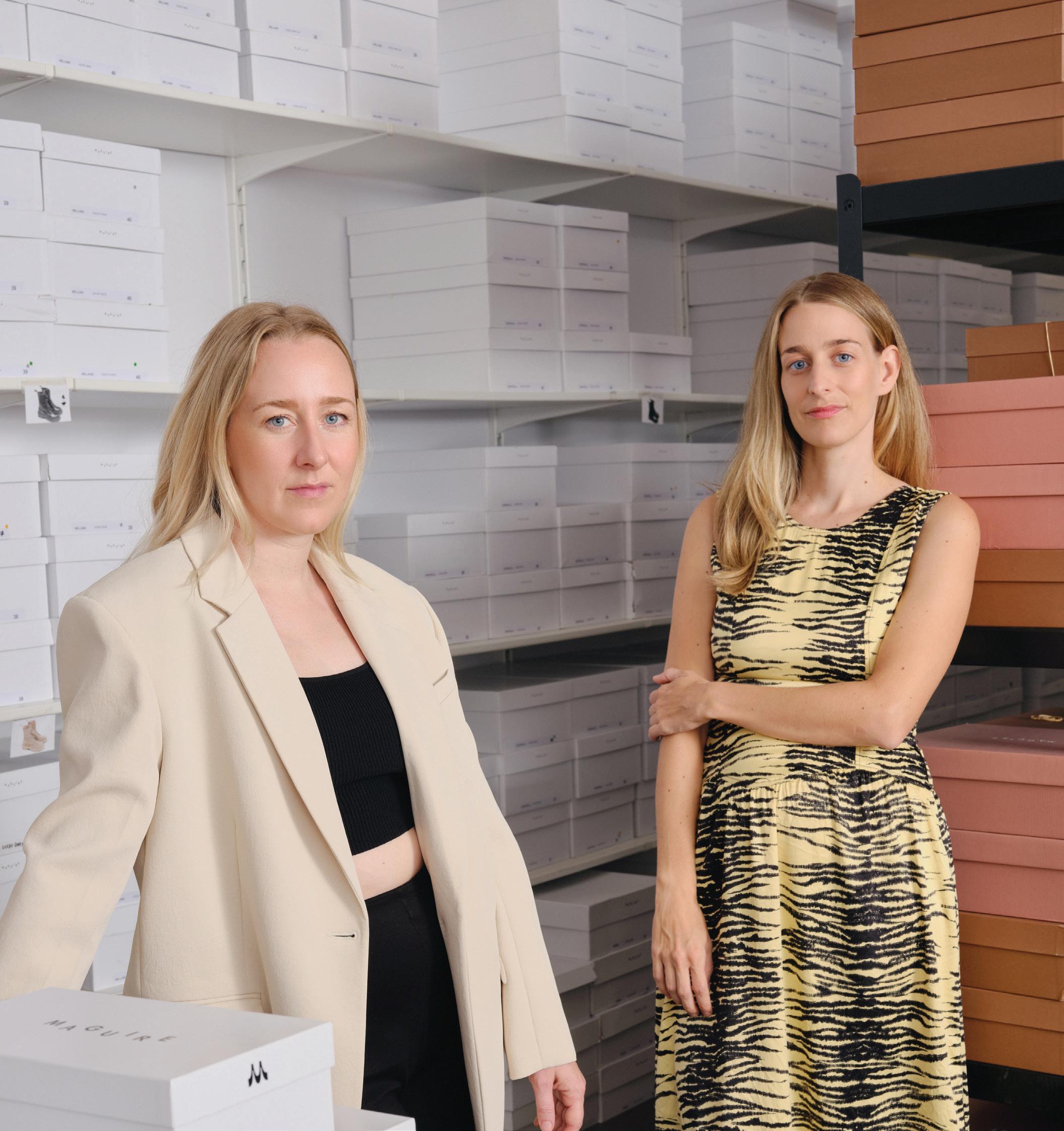
ON THE COVER / EN PAGE COUVERTURE MYRIAM AND/ET ROMY BELZILE-MAGUIRE PHOTO BY / PAR RICHMOND LAM
W e p r o v i d e a s u p p o r t i v e c o m m u n i t y , d r o p - i n s e r v i c e s , m e n t a l h e a l t h c o u n s e l l i n g , c a s e m a n a g e m e n t , a n d h o u s i n g . f r i e n d s o f r u b y
c a

.
Designers and creatives see things not as they are but as they should be. / L’accès est à la base de toute bonne conception. Les architectes et autres designers voient le monde non pas comme il est, mais comme il devrait être.
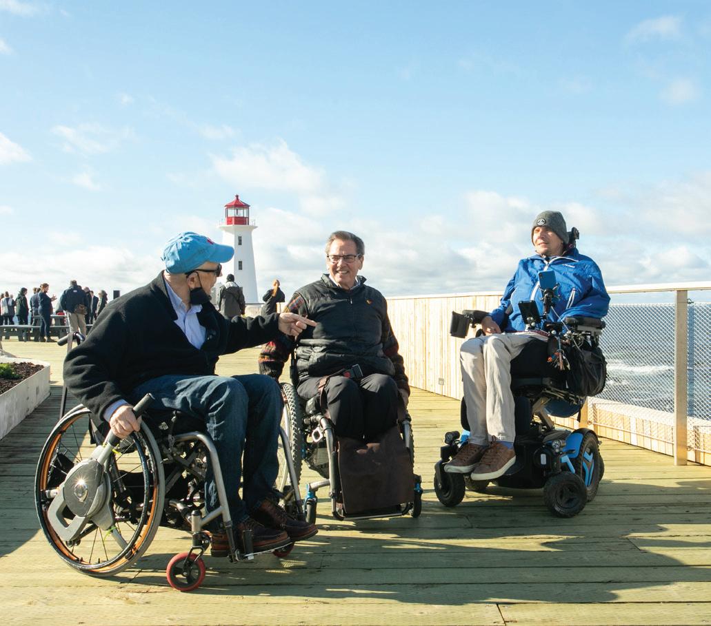
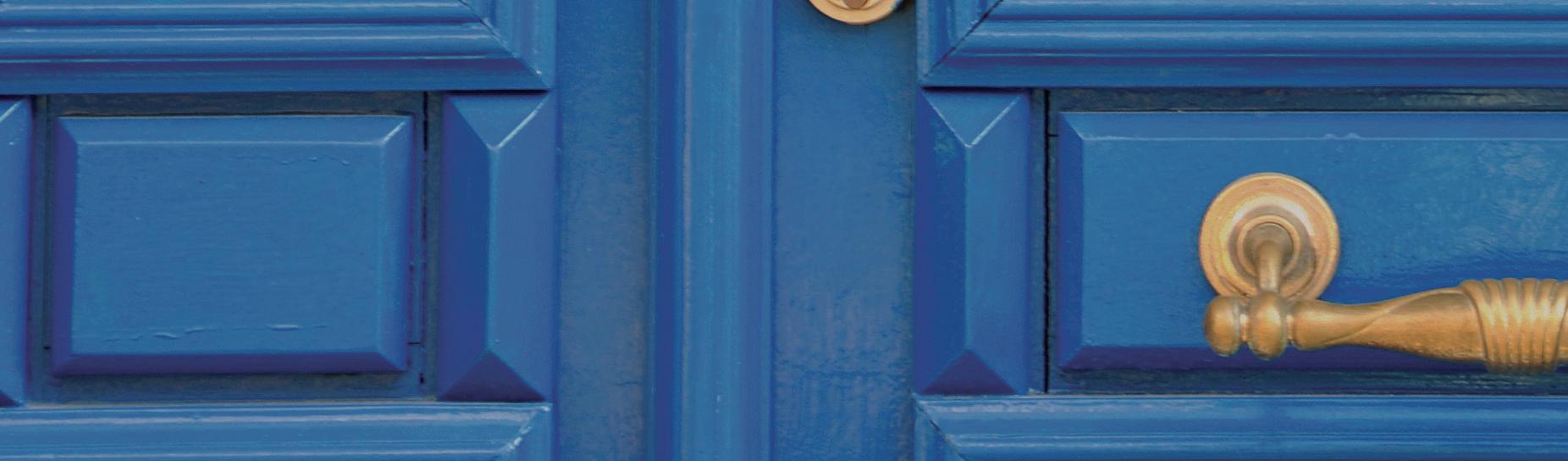
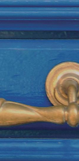
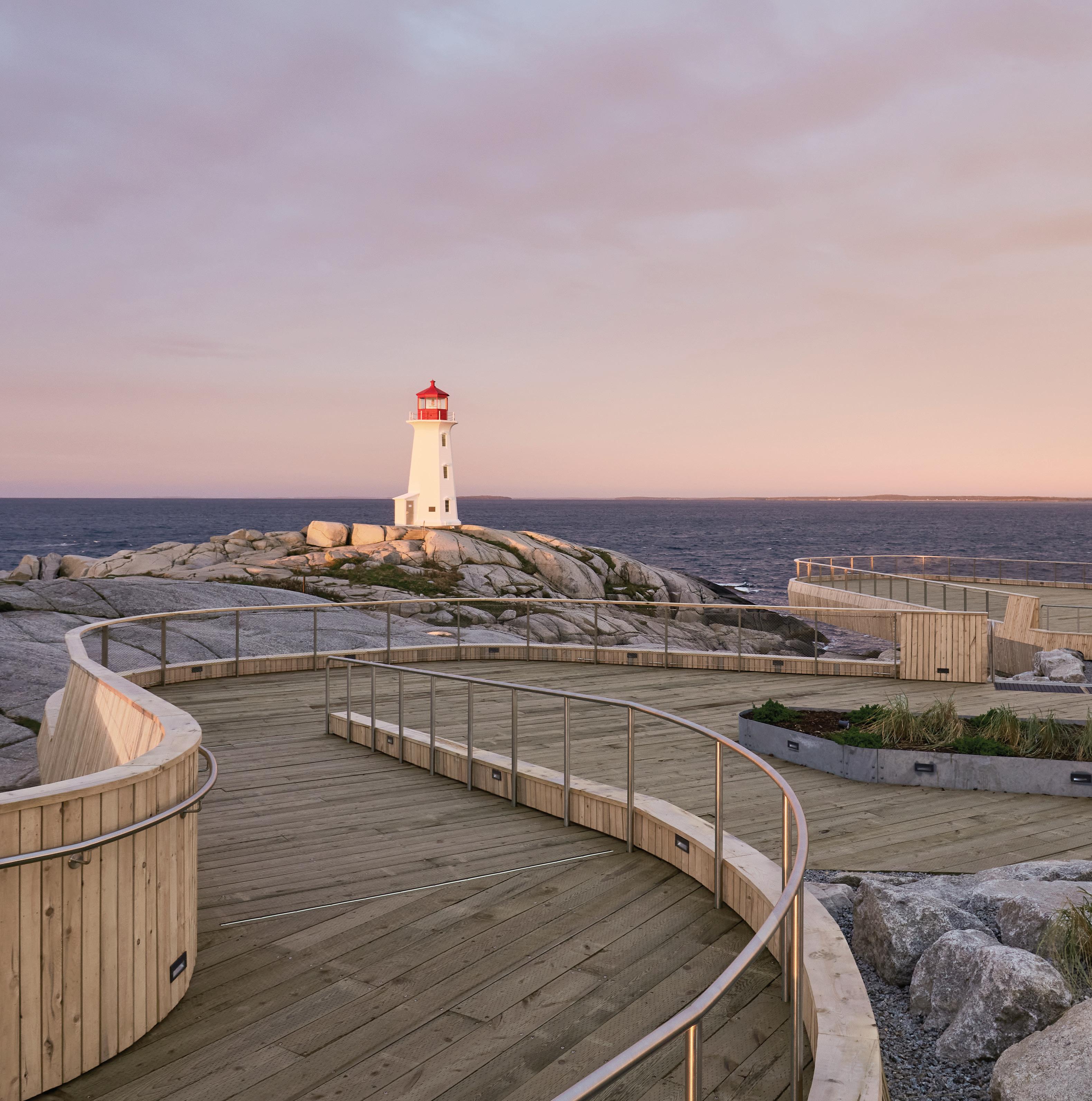
The Peggy’s Cove Lighthouse project achieved a Gold rating through the RHFAC program. Allied is working with the Rick Hansen Foundation to explore ways to improve inclusivity and access across its buildings. / Le site touristique de Peggy’s Cove a obtenu la certification d’or en matière d’accessibilité de la part de la Fondation Rick Hansen. Allied collabore avec cette dernière afin d’améliorer l’inclusivité et l’accès à ses immeubles.
Peggy’s Cove Lighthouse is perched on a rocky outcrop, scarred by glaciers and smoothed by wind, overlooking the Atlantic Ocean. The scene is exactly as you might picture it—with one notable addition. A viewing platform (and paths, washrooms, parking stalls and other features) has made the natural wonder accessible for the first time to those not willing or able to scramble across slippery, wave-battered rocks. The project, spearheaded by federal and provincial governments and designed by architect Omar Gandhi, with input from local residents and the Rick Hansen Foundation Accessibility Certification program, is a truly remarkable achievement of considered design.
At the root of good design is access. Designers and creatives see things not as they are but as they should be . They create an interface between a problem and its solution—between an object and its user so that user has a portal to a service or experience that would otherwise be unavailable. This issue of Block focuses on design and access, in both expected and unexpected ways, while celebrating those who are making our world more inclusive.
Take our cover subjects (The Creator, p 26), two Montreal-based sisters who are redesigning the shoe industry to give people access to high-quality and ethically made footwear. We also visit Gander Airport in Newfoundland (Work-in-Progress, p. 32), where the airport authority, with the help of designer Jessica Waterman, is refreshing and opening up the space to give locals and visitors access to an inspiring environment and incredible history. We speak with Level Playing Field’s founder Darby Lee Young (The Business, p. 16) (you may know her from the Fluevog shoe named in her honour) and the Rick Hansen Foundation’s Brad McCannell and Kristen Habermehl (The Conversation, p. 38), who are each bringing increased access to their clients—and the one in five Canadians who identify as having a disability—from the Calgary Stampede all the way to Peggy’s Cove.
Le phare de Peggy’s Cove se dresse face à l’Atlantique sur un affleurement rocheux façonné par les glaciers et lissé par le vent. La scène est telle que vous l’imaginez, à un important détail près : une plateforme panoramique (plus un sentier, un stationnement et des toilettes) rend pour la première fois ce site touristique accessible aux personnes ayant de la difficulté à se déplacer. Le projet, piloté par les gouvernements fédéral et provincial et conçu par l’architecte Omar Gandhi, avec la participation des résidents et de la Fondation Rick Hansen, qui évalue et certifie l’accessibilité, est une réalisation remarquable à tout point de vue.
L’accès est à la base de toute bonne conception. Les architectes et autres designers voient le monde non pas comme il est, mais comme il devrait être. Ils créent une interface entre un problème et sa solution, entre un objet et son utilisateur afin que ce dernier ait accès à un lieu ou à un service non disponible autrement. Ce numéro de Block est consacré à l’accessibilité, prévue ou imprévue, tout en mettant à l’honneur ceux et celles qui rendent notre quotidien plus inclusif.
Dans Les créatrices (p. 26), on fait la connaissance de deux sœurs montréalaises qui remodèlent l’univers de la chaussure pour rendre la qualité accessible au plus grand nombre. Dans Le chantier (p. 32), les non-voyageurs ont désormais accès au magnifique passé moderniste de l’aéroport de Gander à Terre-Neuve, grâce à l’administration aéroportuaire et à la designer Jessica Waterman. Dans L’entreprise (p. 16), on discute avec la fondatrice de Level Playing Field, Darby Lee Young — vous connaissez peut-être la chaussure Fluevog qui porte son nom — et avec Brad McCannell et Kristen Habermehl de la Fondation Rick Hansen dans La conversation (p. 38) qui, chacun à leur façon, suppriment les obstacles barrant la route à leurs clients, et à un Canadien sur cinq ayant un handicap, du Stampede de Calgary à l’anse de Peggy’s Cove.
The Starting Block / Block de départ BLOCK / 7
At the root of good design is access.

Gabrielle Drolet (Rethink, p. 49) is a Montreal-based writer and cartoonist whose work has appeared in The New York Times , The New Yorker , The Globe and Mail and elsewhere. / Journaliste et dessinatrice montréalaise, Gabrielle Drolet (Repensé, p. 49) collabore entre autres avec The New York Times, The New Yorker et The Globe and Mail

Isa Tousignant is a Montreal creative who loves a good story, whether it’s from celebrity chefs, gemologists, arena rockers or shoe-designing sisters (The Creator, p. 26). / Créatrice de contenu montréalaise, Isa Tousignant aime toutes sortes d’histoires, qu’elles soient de cuisine, de bijoux, de musique ou de chaussures (Les créatrices, p. 26).
Karen Kraven is an artist of Eastern European, Jewish and Dutch descent whose work (Artist’s Block, p. 18) explores the body and family folklore in the textile and garment industry. / Artiste d’origine est-européenne, juive et hollandaise, Karen Kraven (Art en Block, p. 18) explore le monde du textile à la recherche du corps et du folklore.
EDITOR-IN-CHIEF / RÉDACTRICE EN CHEF
Kristina Ljubanovic
CREATIVE DIRECTORS / DIRECTRICES ARTISTIQUES
Yasemin Emory, Whitney Geller, Jacqueline Lane
MANAGING EDITOR / DIRECTEUR DE LA RÉDACTION
Claire Reis
COMMISSIONING EDITOR / RESPONSABLE DES COMMANDES
Mélanie Ritchot
PHOTO & ILLUSTRATION EDITOR / ICONOGRAPHE
Catherine Dean
ASSISTANT PHOTO & ILLUSTRATION EDITOR / ASSISTANT ICONOGRAPHE
Michael Nyarkoh
DESIGNERS / GRAPHISTES
Julie MacKinnon, Laura Weatherston TRANSLATOR / TRADUCTRICE
Catherine Connes
COPY EDITORS - PROOFREADERS / RÉVISEURES - CORRECTRICES
Suzanne Aubin, Jane Fielding, Lesley Fraser
ALLIED
Curtiss Randolph constructs tableaux and faux documentary scenes, merging realism, surrealism and gonzo journalism, and draws inspiration from theatre and stage productions (My Space, p. 15). / S’inspirant du théâtre et de sa mise en scène, Curtiss Randolph construit des tableaux et des scènes de faux documentaires, combinant réalisme, surréalisme et journalisme gonzo (Mon espace, p. 15).
134 Peter Street, Suite 1700 Toronto, Ontario M5V 2H2 Canada (416) 977-9002 info@alliedreit.com alliedreit.com
WHITMAN EMORSON
213 Sterling Road, Studio 200B Toronto, Ontario M6R 2B2 Canada (416) 855-0550 inquiry@whitmanemorson.com whitmanemorson.com
BLOCK IS PUBLISHED TWICE A YEAR. / BLOCK EST PUBLIÉ DEUX FOIS PAR AN.
Contributors / Nos collaborateurs BLOCK / 9
ILLUSTRATIONS BY / PAR KAGAN MCLEOD
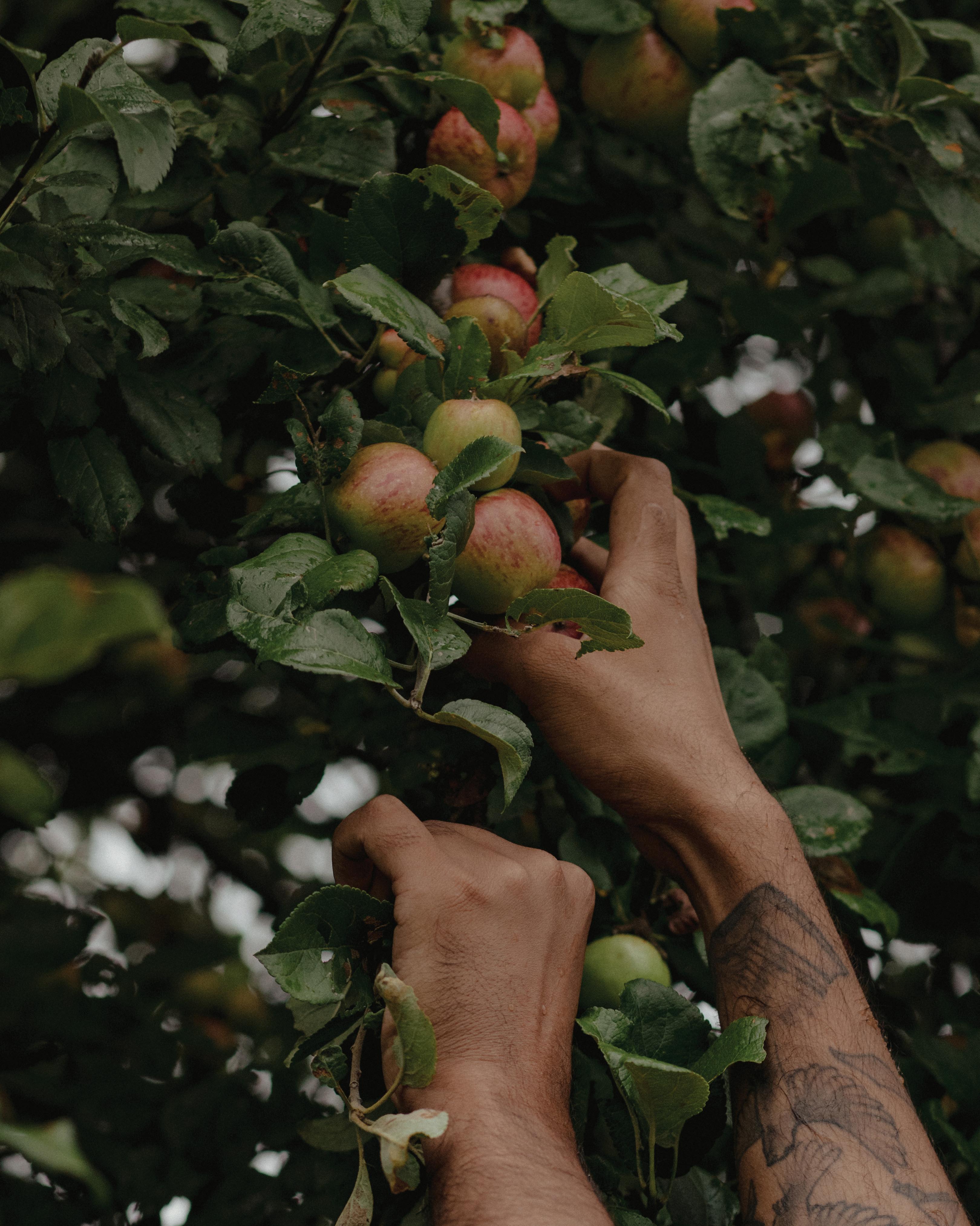
Washed by rain and foraged by a team of four—ingredients for an Ontario cidery. / Le fruit du travail d’une cidrerie ontarienne, récolté sous la pluie.
 BY / PAR MARYAM SIDDIQI PHOTOS BY / PAR CHLOË ELLINGSON
The Moment / Le moment BLOCK / 11 TUES. AUGUST 30 9:18 A.M. MARDI 30
9H18
AOÛT
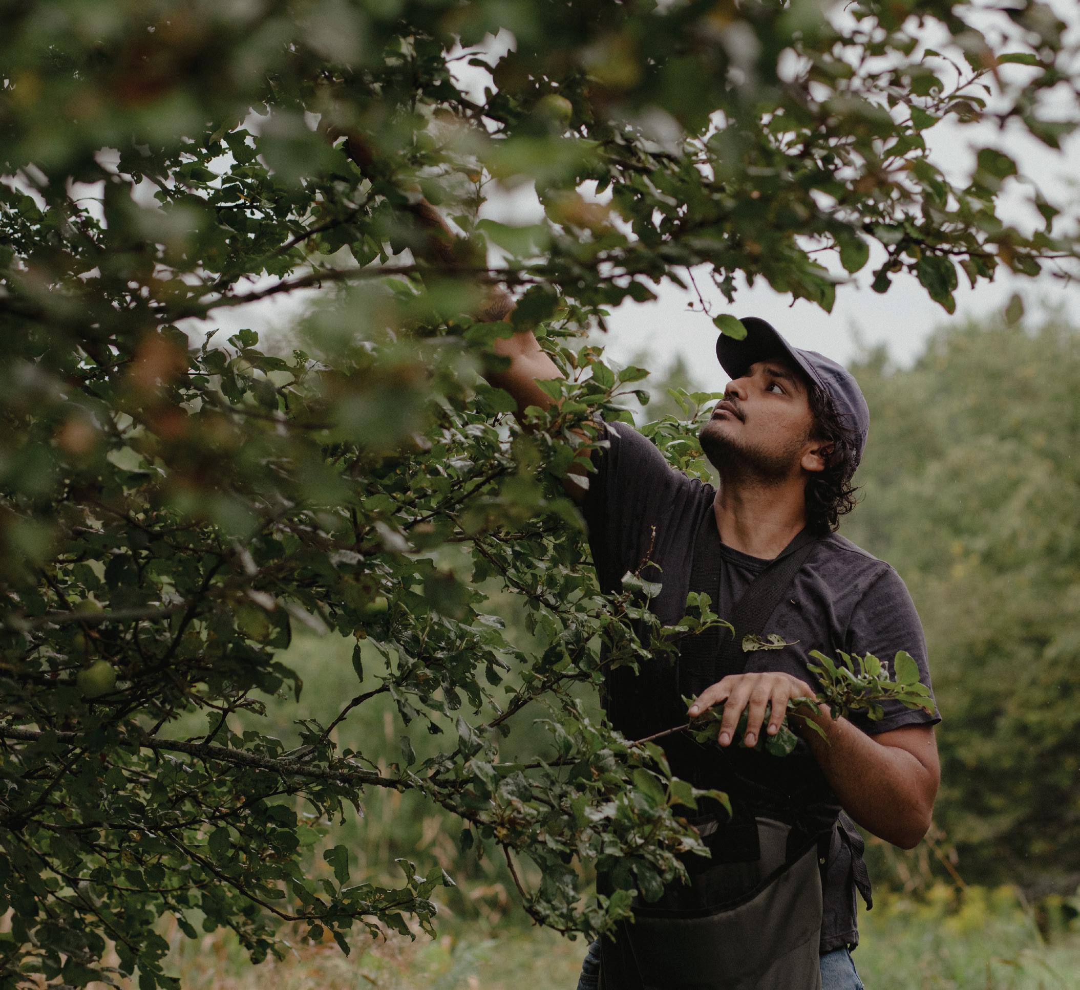
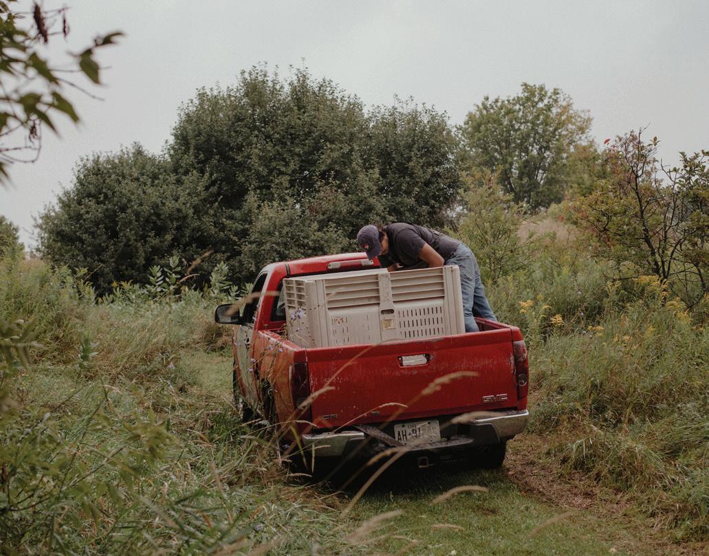
ABOVE: Tariq Ahmed, Revel Cider’s founder, had a goal to collect 1,800 kilograms of apples from the orchard he and his team visited in August. Ahmed was the sole employee at the cidery in 2014. He now leads a team of 10. / CI-DESSUS : Tariq Ahmed, fondateur de la cidrerie Revel, cueillera 1800 kilos de pommes dans ce verger qu’il a visité en août. Seul employé en 2014, il dirige à présent une équipe de 10 personnes.
RIGHT: Revel Cider’s production team scopes out locations and takes field trips to forage for ingredients to be fermented into cider. Revel’s seasonal producebased cider has found an international audience. / À DROITE : L’équipe de production part en repérage sur le terrain pour dénicher fruits et plantes à fermenter. Les cidres saisonniers de Revel ont su séduire un public international.
The Moment / Le moment 12
The light rain is a reprieve from the intense heat and humidity that southern Ontario has been experiencing all summer. It’s also Mother Nature’s way of giving a rinse to the wild apples about to be picked by a crew from Revel Cider.
As three members of the Guelph-based cidery’s production team lay a mat on the knee-high grass, prop a ladder against high-up branches and grab their picking poles, Tariq Ahmed, Revel’s founder, points to a spot in the distance. “We just found that one today,” he says of a tree about 20 metres away. “We were picking these three here yesterday and just missed it.” The new-found tree is bursting with small red apples.
It’s prime picking time, and Ahmed explains that their hope is to collect about 1,800 kilograms of apples from the trees on the Caledon farm where Sonnen Hill Brewing is based. That volume of fruit should generate 1,000 litres of cider.
Ahmed launched Revel in 2014 as a one-man operation. Today the company has a team of 10 producing 80 different types of ciders, though not all of them are available at the same time—it depends on what nature provides. “Foraging is a big part of what we do, and over the course of the year, we’re picking different flowers and botanicals as they come into season,” he says.
Four days prior to this rainy morning, Ahmed scoped out this location to get a sense of what the bounty might be. “I drove up expecting to find one tree; then [brewery owner] Calum Hill took me to the property and there were 50 trees,” he says.
This is Ahmed’s first year foraging at this site. Normally, in the late days of August, they’d be preparing nectarines. “We’re usually handpitting a couple thousand pounds of nectarines at this time, which has historically taken us two weeks,” he explains. But with a new pitting machine in the arsenal, they can do that volume in one day.
The cider resulting from the apples harvested from these trees will be shipped throughout North America and as far away as Sweden and Shanghai. “Our customers are excited to try new things,” Ahmed says. “For us, and [me] personally, it’s exciting to make new things.”
La pluie fine offre enfin un répit à cette région du sud de l’Ontario après l’intense chaleur humide qui a sévi tout l’été. C’est aussi une manière pour Dame Nature d’épousseter les pommes sauvages que la cidrerie Revel, située à Guelph, s’apprête à cueillir.
Alors que trois membres de l’équipe étendent une bâche dans l’herbe haute, appuient une échelle contre un tronc et s’emparent de leur cueille-fruits, Tariq Ahmed, fondateur de Revel, pointe un pommier du doigt à une vingtaine de mètres de là. « On ne l’a vu qu’aujourd’hui. On était pourtant là hier pour la cueillette, mais on l’a loupé. » L’arbre ainsi démasqué croule sous les petites pommes rouges.
Il est temps de l’alléger. Au total, le verger de la ferme Caledon, où se trouve la brasserie Sonnen Hill, fournira 1 800 kilos de pommes à Tariq, qu’il transformera en 1 000 litres de cidre.
C’est en solo qu’il a lancé Revel en 2014. Aujourd’hui, l’entreprise emploie 10 personnes, qui produisent 80 cidres différents. Soumis au bon vouloir de Dame Nature — encore elle —, tous ne sont pas disponibles en même temps. « Nous sommes avant tout des cueilleurs. Nous ramassons les fruits, fleurs et plantes en fonction des saisons », explique-t-il.
Tariq avait repéré le lieu quatre jours avant ce matin pluvieux : « Je suis venu jusqu’ici en espérant trouver un pommier ou deux. C’est le propriétaire, Calum Hill, qui m’a fait faire le tour. Au final, il y en a 50! »
C’est la première année que Tariq fait la cueillette de pommes ici. Normalement, fin août, il est occupé avec les nectarines. « D’habitude, on est en train de dénoyauter environ 900 kilos de nectarines à la main. Ça nous prenait deux semaines jusqu’à présent. » Mais grâce à une toute nouvelle dénoyauteuse, le travail est abattu en 24 heures.
Le cidre fabriqué à partir de la variété de pommes cueillies aujourd’hui sera envoyé aux quatre coins de l’Amérique du Nord et ira même jusqu’en Suède et à Shanghai.
« Nos clients aiment la nouveauté, conclut-il. Comme nous. C’est motivant pour nous de créer de nouveaux produits. »
The Moment / Le moment BLOCK / 13
“…we’re picking different flowers and botanicals as they come into season.” / « Nous ramassons les fruits, fleurs et plantes en fonction des saisons. »


Complete our simple application. One of our trusted, licensed mortgage agents will reach out to complete the process. Scan this code. We have a mortgage for every scenario, including: First time buyers Self-employed applicants Contract employees New to Canada applicants Refinance Investment properties Second homes and co ages Ge ing a mortgage with The Mortgage Coach is as easy as 1,2,3. coaching you through the mortgage process 1 2 3 @themortgagecoach.ca themortgagecoach.ca 416.405.8698 4th-489 Queen Street East, Toronto, Ontario M5A 1V1
Stacks Empilade
At the Art Gallery of Ontario (AGO), Jim Shedden publishes catalogues and curates exhibitions (notably the recent I AM HERE: Home Movies and Everyday Masterpieces). But those aren’t the only irons in this multi-hyphenate’s fire. He has also made books on film and culture (some in his former role at Bruce Mau Design) and hosts a podcast called 1000 Songs from his Toronto home office and more. / Au Musée des beaux-arts de l’Ontario (AGO), Jim Shedden publie des catalogues et organise des expositions, I AM HERE: Home Movies and Everyday Masterpieces étant la dernière en date. Mais ses activités ne s’arrêtent pas là : depuis son bureau chez lui à Toronto, cet ex de chez Bruce Mau Design fait des livres sur le cinéma et la culture, anime le balado 1000 Songs et bien d’autres choses.
BY / PAR KRISTINA LJUBANOVIC PHOTO BY / PAR CURTISS RANDOLPH
1. The Toronto Telegram Newsstand / Porte-journaux du Toronto Telegram
“I put copies of newspapers in it from the day my daughter was born, which was during the ice storm. And copies of my DIY Toronto [a fanzine/poster on Toronto culture from 1975 to 1989].” / « J’y ai mis les journaux du jour de la naissance de ma fille, pendant la tempête de verglas. Et les exemplaires de mon DIY Toronto [un fanzine sur la culture torontoise, paru de 1975 à 1989]. »
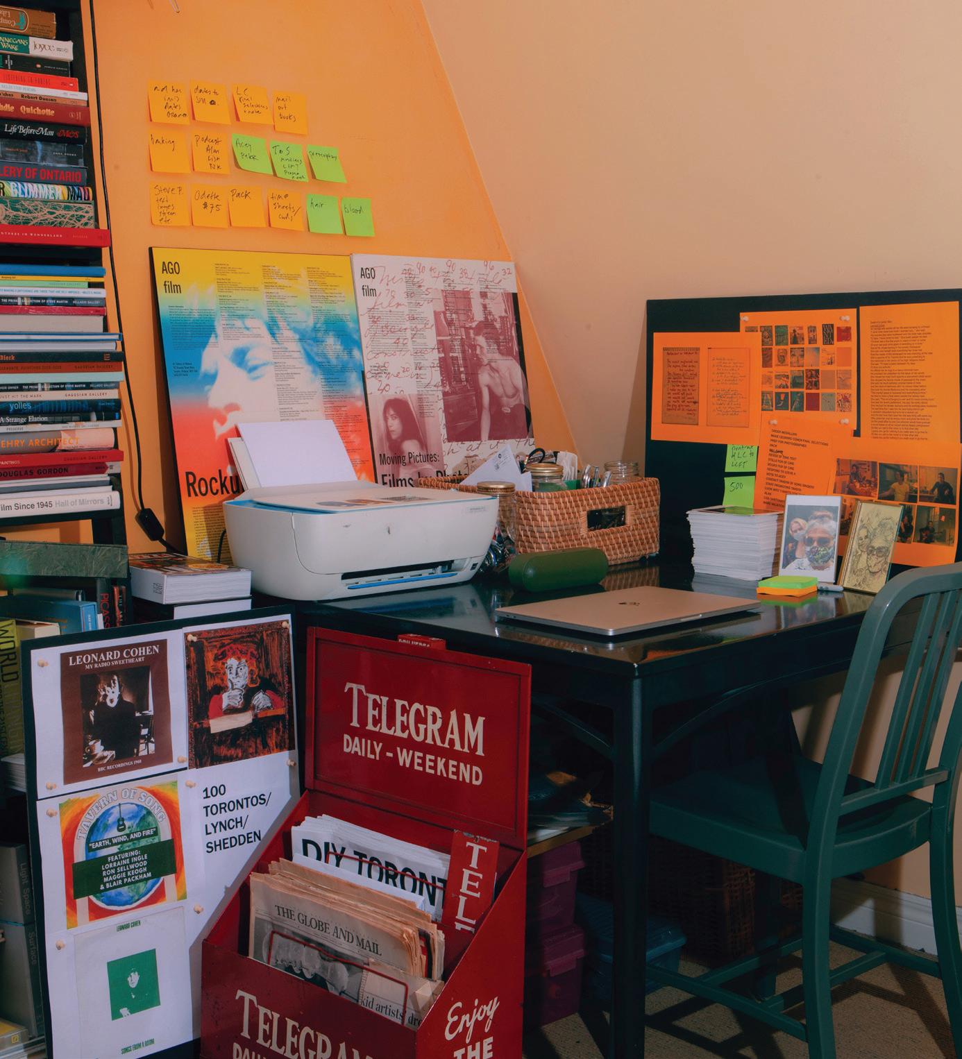
2. To-do Lists / Listes « À faire » “I have my work, and all these things I do that are not work, and all the things I don’t have to do but really should do. I have [the lists] electronically, but I need to use a Sharpie and keep changing them up so they’re not too clean.” / « Il y a le travail, plus toutes les choses hors travail, plus tout ce que je devrais faire même si je n’y suis pas obligé. J’ai leur pendant virtuel, mais j’aime la version papier et les changer de place pour qu’elles n’aient pas l’air trop propres. »
3. I AM HERE Postcard Stack and Portrait / Cartes postales et portrait I AM HERE
“I have a copy of every single postcard that was in the exhibition. Someone saw this postcard of [my wife] Shellie and [daughter] Meredith and they drew it, and we have no idea who it was. I want to post it eventually on Instagram saying ‘Thank you’ and ‘Who are you?’” /
« J’ai un exemplaire de chaque carte postale de l’exposition. Quelqu’un, on ne sait pas qui, a vu celle avec Shellie [sa femme] et Meredith [sa fille] et l’a dessinée. J’ai l’intention de la publier sur Instagram pour dire merci et demander qui en est l’auteur. »
4. Emeco Chair and Table / Table et chaise Emeco “My chair is definitely Emeco. I don’t know how vintage it is except to say that I bought it in 2001 so it’s at least that old. The table is light aluminum—and older. The person who sold it to me said it was Emeco 1940s. I think that it’s possibly 1940s but probably not Emeco.” / « Ma chaise est une Emeco, c’est sûr. J’ignore de quand elle date, tout ce que je sais c’est que je l’ai achetée en 2001. La table en aluminium est plus ancienne. La personne qui me l’a vendue m’a dit que c’était une Emeco des années 1940. Les années 1940, c’est possible, Emeco, moins. »
5. Books / Livres
“I have the [Bruce] Mau stack. Then there are AGO books. Some are both.” / « J’ai ma collection de [Bruce] Mau. Et les livres de l’AGO. Certains sont les deux à la fois. »
My Space / Mon espace BLOCK / 15
1 5 2 4 3
Free Entry Entrée
libre
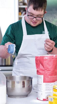
We spoke to Darby Lee Young—one of Canada’s Top 40 Under 40, a Top 25 Women of Influence recipient and the namesake of a Fluevog shoe—about her vision for inclusive environments. / On parle facilité d’accès et inclusion avec Darby Lee Young, qui fait partie des 25 Canadiennes les plus influentes au pays et qui a une chaussure Fluevog à son nom.
As a born-and-raised Calgarian with cerebral palsy, I’ve always experienced barriers in enjoying the city’s amenities with my friends and family. The built environment is not designed for people like me, who require ease of access, so I decided to do something about it.
In 2015, I founded Level Playing Field, an accessibility consulting firm where I make use of my personal experience to design inclusive spaces for people of all abilities. My disability gives me first-hand insight into the intricacies of universal access. Paying attention to the small details of how we use a space is what allows people like me to get around comfortably and safely—and complying with building code requirements is not enough.
By taking a holistic approach with our work at Level Playing Field, we ensure that everyone has the freedom and ability to enter a space and feel welcome, whether they have a disability or not. After all, anyone who is able-bodied is only temporarily so. To do this, it’s essential that our input be considered at the concept design phase. Finding accessible solutions when a design has been completed—or, worse, already built—is not only costly; it also limits our ability to successfully deliver equal opportunities to access.
Accessibility is more than just ticking a box. For those of us with a disability of any kind, everywhere we go, we must consider the grade of a building’s access ramp, the location of a door’s push button, the size of washroom stalls, the height of countertops and even the availability of safe emergency exits.
For this reason, a key aspect of my practice is reframing accessibility as a right rather than a special consideration. People with disabilities should be treated as equal members of society, not just accommodated.
THE BEST ADVICE I’VE EVER RECEIVED / LE MEILLEUR CONSEIL QU’ON M’AIT DONNÉ
“You never know if you can be part of a project unless you ask. [Entrepreneurs] have to understand that there are going to be ‘nos’ along the way, but sooner or later those ‘nos’ will turn into ‘yeses.’” / « Celui qui ne demande pas ne saura jamais s’il peut faire partie d’un projet. [Les entrepreneurs] doivent comprendre qu’il y aura des “non” en cours de route, mais qu’un jour ou l’autre, ces “non” deviendront des “oui”… »
Je suis née à Calgary avec une paralysie cérébrale. Depuis mon enfance, je ne peux profiter pleinement des aménagements urbains en famille ou entre amis. Le bâti n’est pas pensé pour les personnes comme moi, qui ont besoin d’une facilité d’accès. D’où mon envie de faire bouger les choses.
En 2015, j’ai fondé Level Playing Field, une agence de conseil en accessibilité. Je me sers de mon expérience pour concevoir des lieux inclusifs, qui s’adressent à tous, peu importe les aptitudes. Mon handicap me permet de comprendre la complexité de l’accès universel et ses subtilités. C’est grâce à une analyse minutieuse d’un espace et de la manière dont on l’utilise que j’arrive à me déplacer en sécurité.
Se conformer au code du bâtiment ne suffit pas. C’est pour cela que Level Playing Field s’appuie sur une approche holistique pour veiller à ce que tout un chacun, avec un handicap ou non, ait la liberté d’entrer dans un lieu et de s’y sentir le bienvenu. Car, à bien y penser, un corps valide n’est que temporaire. Pour mener notre mission à bien, il est essentiel d’être présent dès la phase de conception. Trouver des solutions une fois que le projet est élaboré ou pire, déjà construit, est non seulement coûteux mais limite notre capacité à offrir l’égalité des chances d’accès.
L’accessibilité, c’est avant tout du concret : l’angle de la pente de la rampe d’accès, l’emplacement du bouton-poussoir qui ouvre la porte, la dimension du cabinet de toilette, la hauteur du comptoir et même l’existence d’une sortie de secours sécuritaire.
Tous les jours, Level Playing Field s’applique à faire de l’accessibilité un droit et non une attention particulière. La société doit considérer les personnes handicapées comme des membres à part entière, et pas simplement les arranger.
The Business / L’entreprise 16
AS TOLD TO / PROPOS RECUEILLIS PAR XIMENA GONZÁLEZ ILLUSTRATION BY / PAR JULIA MERCANTI
The Business / L’entreprise BLOCK / 17
Gather by/de Karen Kraven
Karen Kraven’s block is made with offcuts (100% cotton fleece with 95% cotton and 5% spandex rib) sourced from Montreal’s Chabanel Garment District. “These scraps drift in the periphery, alongside the body, shifting between form and function,” says the artist. / Karen Kraven a réalisé son bloc à partir de retailles (100 % laine polaire, 95 % coton et 5 % élasthane) récupérées à Montréal dans le quartier Chabanel, dit de la guenille. « Ces petits bouts sont à la dérive, le long du corps, oscillant entre forme et fonction », explique l’artiste.
EACH ISSUE, WE ASK AN ARTIST TO CREATE A BLOCK USING THE MEDIUM AND APPROACH OF THEIR CHOICE. / DANS CHAQUE NUMÉRO, NOUS DEMANDONS À UN ARTISTE DE CRÉER EN TOUTE LIBERTÉ UNE ŒUVRE D’ART FAÇON BLOC.
18 Artist’s Block / Art en Block
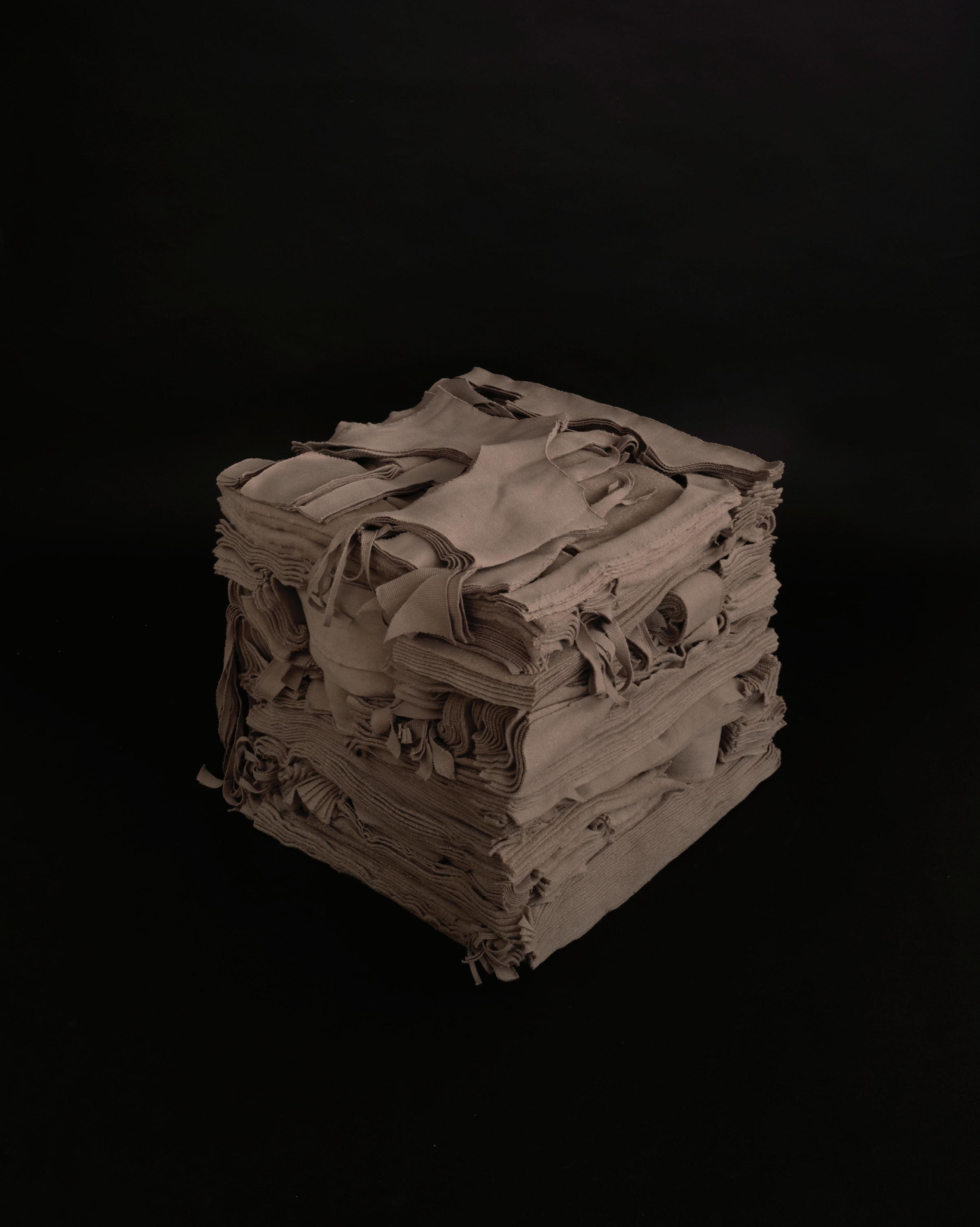
BLOCK / 19
Artist’s Block / Art en Block
The Interior / L’intérieur 20
Timeless (and Timely) Architecture Une architecture dans l’air du temps
Patriarche creates contemporary spaces—using a multidisciplinary, human-centred approach—that function as an extension of the user. / Par son approche multidisciplinaire et humanisante, Patriarche conçoit des espaces contemporains centrés sur l’usage.
BY / PAR DANIEL BROMBERG PHOTOS BY / PAR STÉPHANE GROLEAU COURTESY OF / OFFERTES PAR PATRIARCHE
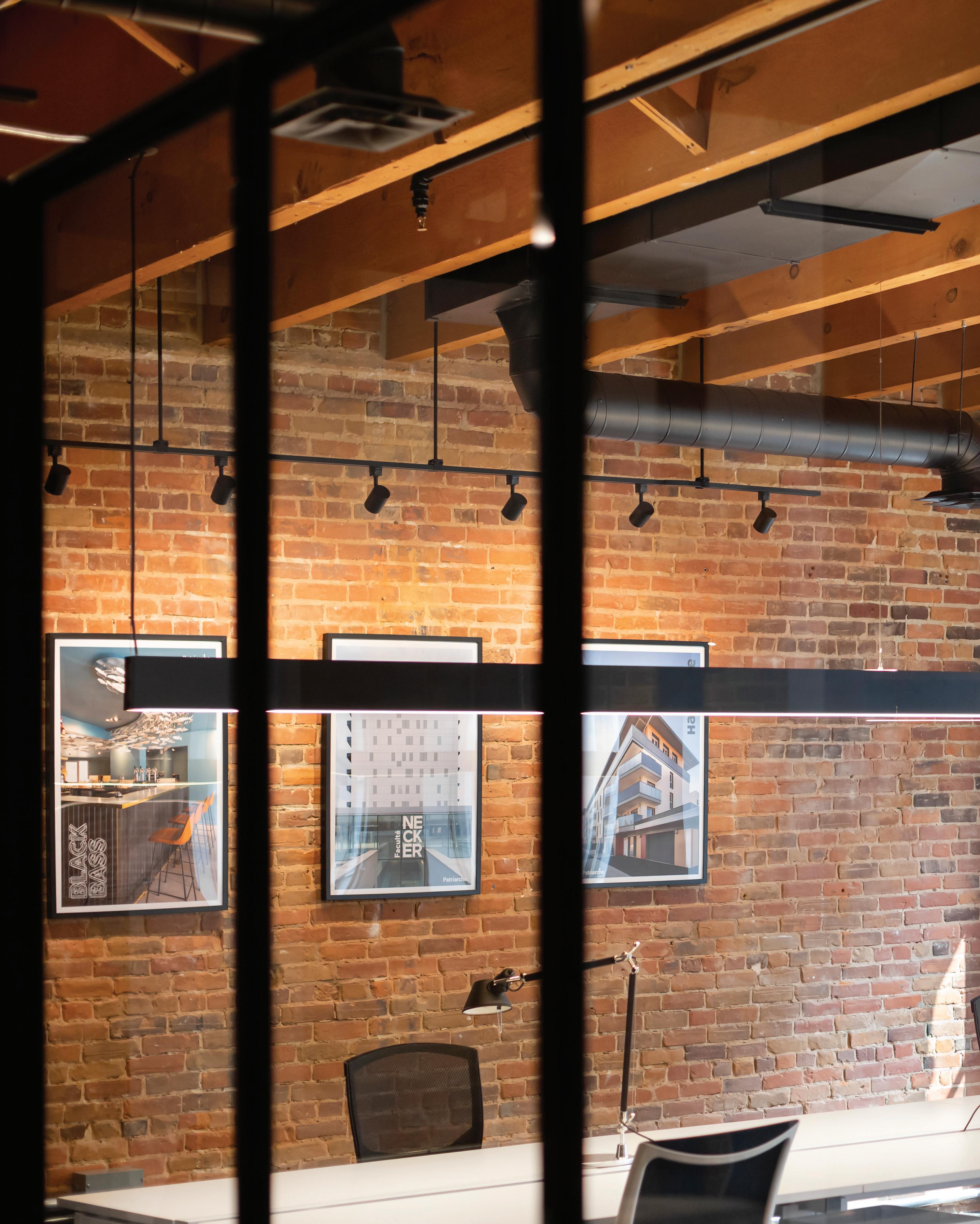
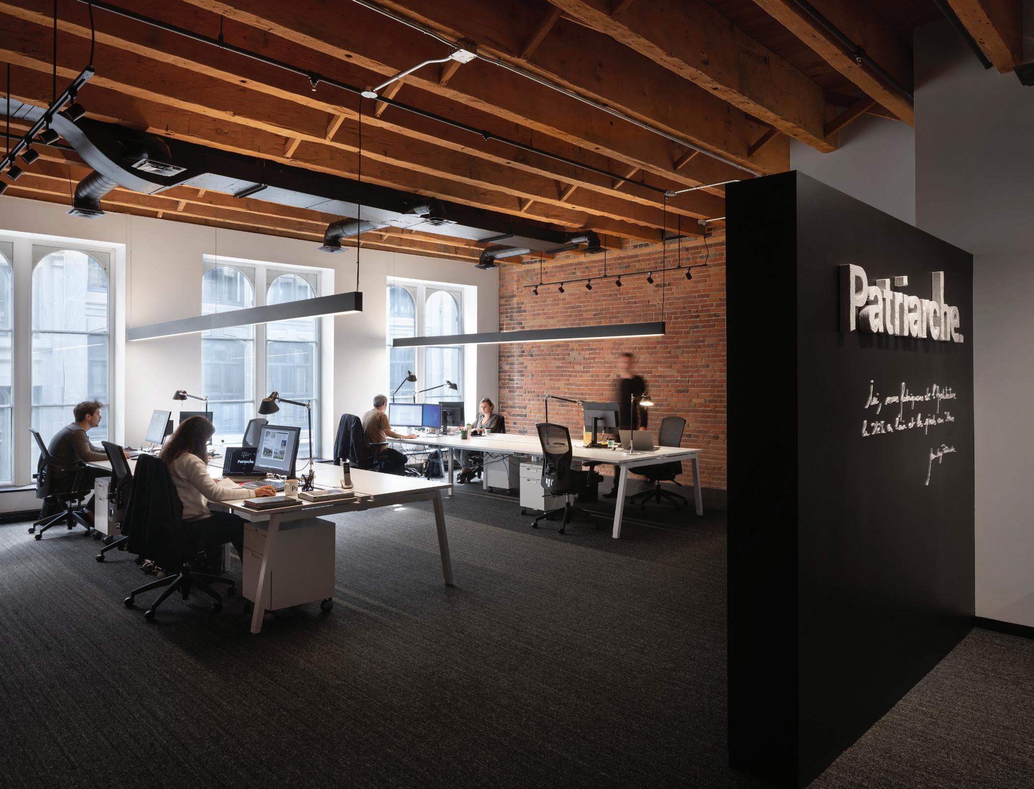
Stepping into architecture firm Patriarche’s Montreal office, one immediately feels transported to both the past and the future in a fusion of culture, creativity and functionality.
Located in Allied’s 85 Rue Saint-Paul Ouest building, which dates to 1861, the office was renovated before opening in 2019. When Patriarche was selecting the location for their sole Montreal branch (they have others in Paris, Bordeaux, Lyon, London, Basel and Quebec City), the historic quarter of Old Montreal was the obvious choice.
“It’s an attractive area for our employees to come and work every day,” says Luc Bélanger, partner and director of North American operations. “Not to mention, the idea of contributing to the preservation of a historic building, while reimagining its interior space, is part of our DNA.” / Situés au 85, rue Saint-Paul Ouest à Montréal, les bureaux de Patriarche conjuguent créativité et fonctionnalité au passé comme au futur.
C’est tout naturellement que ce cabinet d’architecture international, qui possède des agences à Paris, Bordeaux, Lyon, Bâle, Londres et Québec, choisit le quartier historique du Vieux-Montréal pour y implanter son antenne montréalaise. Il s’y installe en 2019, dans un espace entièrement rénové par ses soins, niché dans un immeuble datant de 1861 et appartenant à Allied.
« C’est un quartier attrayant pour nos employés, qui viennent y travailler tous les jours, explique Luc Bélanger, architecte associé et directeur des agences nord-américaines. Sans compter que le fait de participer à la préservation d’un bâtiment historique, tout en en réimaginant l’intérieur, fait partie de notre ADN. »
The Interior / L’intérieur BLOCK / 21
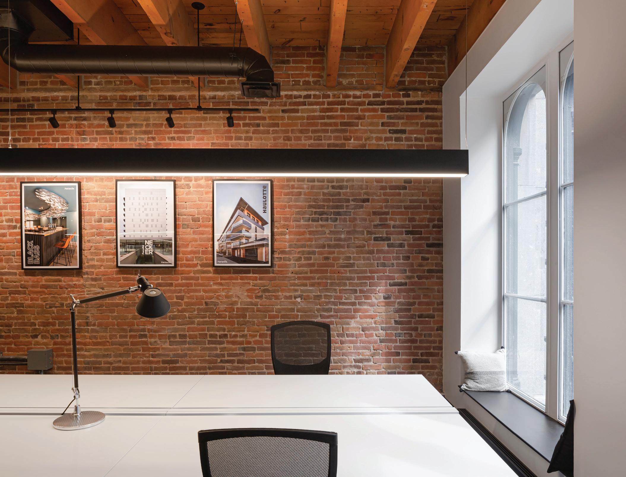
PREVIOUS SPREAD: Patriarche’s employees share long rectangular desks surrounded by red brick walls and exposed beams overhead. / DOUBLE PAGE PRÉCÉDENTE : Les employés de Patriarche partagent de longues tables rectangulaires dans un décor de briques et poutres de bois.
ABOVE LEFT: A quote from Jean-Loup Patriarche on the entrance wall says, “Here, we make (build/create/ design/produce) architecture with our heads in the air and our feet on the ground.” / CI-DESSUS : La citation dans l’entrée résume la mission de l’agence, signée par Jean-Loup Patriarche.
ABOVE RIGHT: Patriarche’s mission is to use every bit of technical, sociological and scientific know-how available when designing a space. A current project is the management of the restoration of the Notre-Dame Cathedral in Paris. / À DROITE : Lors de l’aménagement d’un espace, l’équipe utilise toutes les connaissances techniques, sociologiques et scientifiques à sa disposition. Un de ses projets en cours? La gestion de la restauration de Notre-Dame de Paris.
The Interior / L’intérieur 22
“The preservation of a historic building, while reimagining its interior space, is part of our DNA.” / « La préservation d’un bâtiment historique, tout en réimaginant l’intérieur, fait partie de notre ADN. »
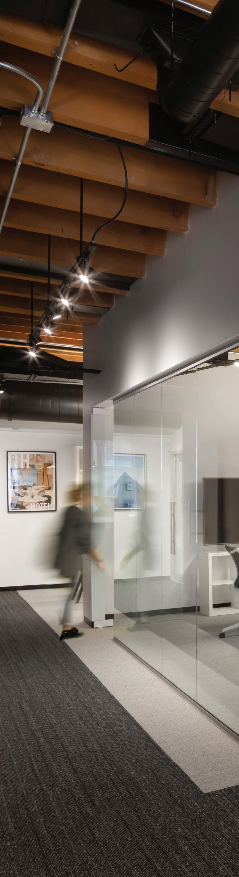
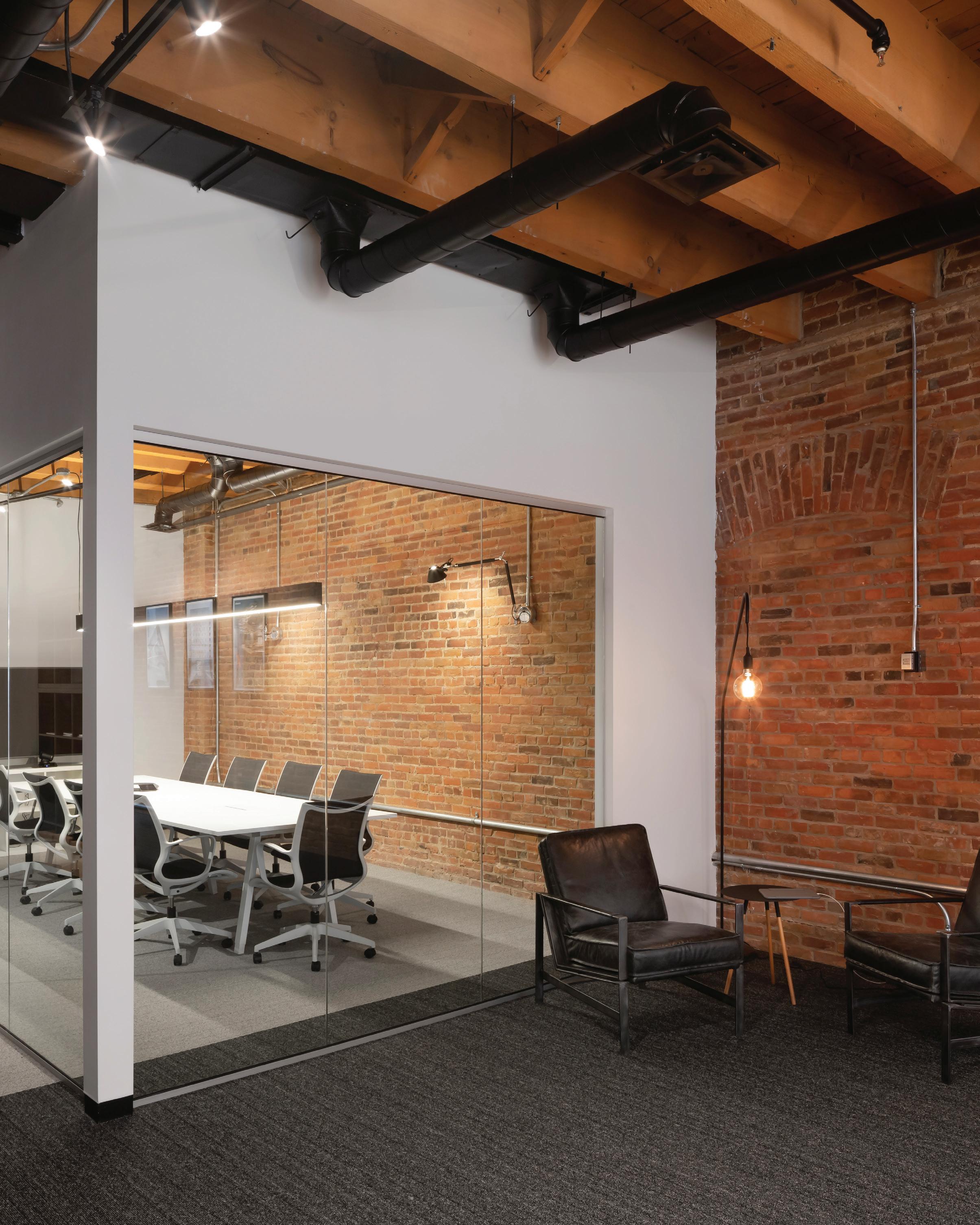
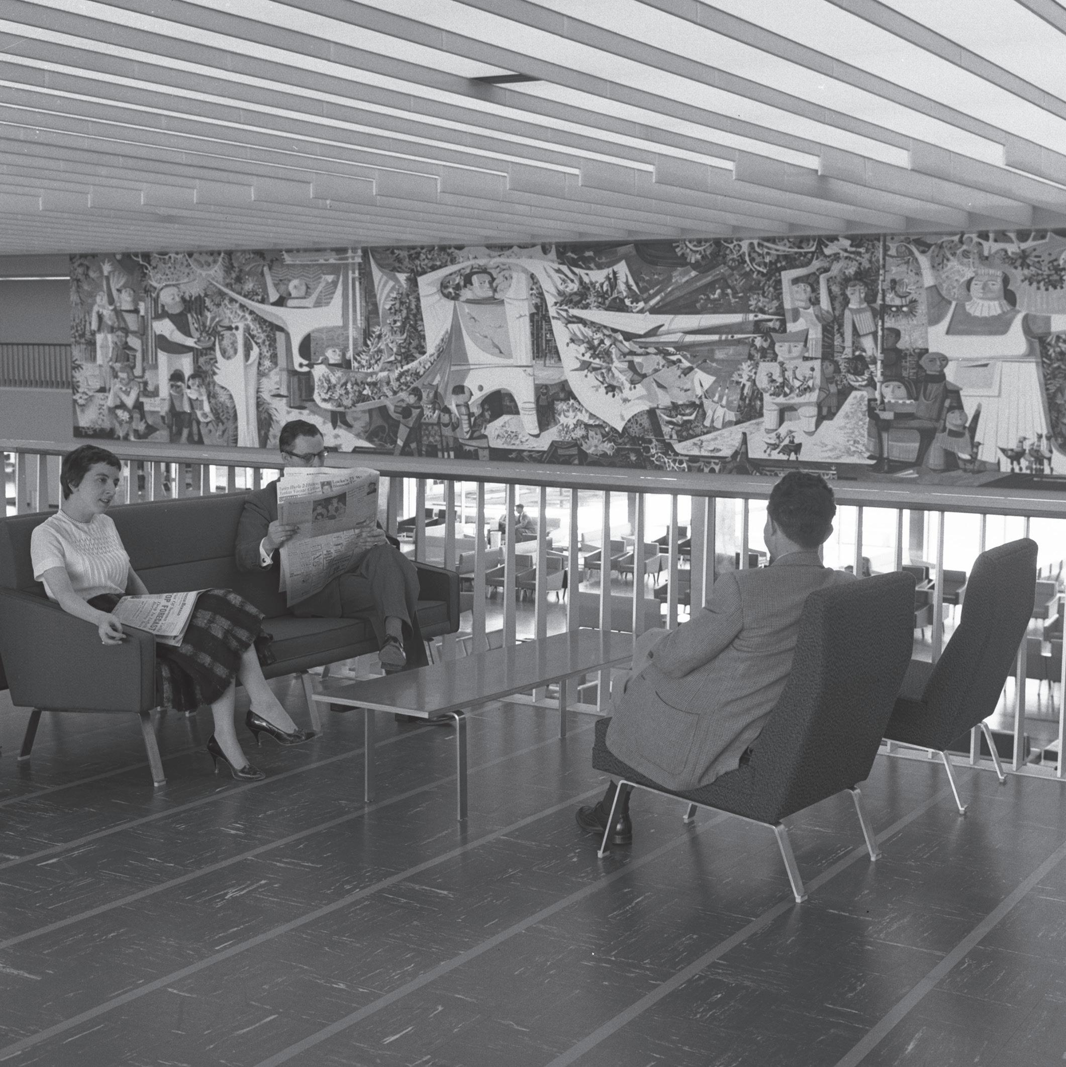
The multinational, multidisciplinary firm is composed of teams of architects, landscape architects, project managers, interior designers and graphic and user experience (UX) designers. When creating the interior of the Montreal office, Patriarche prioritized an open concept. Employees share long rectangular desks in rooms characterized by red brick walls and exposed beams that sweep the ceiling.
The company’s mission is to create what they call “augmented architecture,” integrating every ounce of technical, sociological and scientific knowledge available into the design process. In other words, for Patriarche, a physical space is not merely built and inert—it is, by necessity, an extension of the users and their needs.
As they did with their Montreal office, they do for their clients: Patriarche prioritizes open spaces in their projects, to encourage collaboration, and modern or natural lighting and green spaces to help drive productivity. “We do not even attempt to build something until we’ve tested the functionality of the space,” Bélanger says.
Encadrée de murs de brique et d’un plafond aux poutres apparentes, la grande aire ouverte accueille autour de longues tables aux lignes droites l’équipe multidisciplinaire, composée d’architectes, de paysagistes, de designers d’intérieur, de gestionnaires de projet, de graphistes et de concepteurs d’expérience utilisateur (UX).
Leur mission? Offrir une nouvelle forme d’architecture : l’architecture augmentée, qui intègre toutes les connaissances techniques, sociologiques et scientifiques disponibles dans la méthode de conception. Autrement dit, pour Patriarche, un espace physique n’est pas qu’un lieu bâti inerte, c’est aussi et surtout une extension de l’utilisateur et de ses besoins.
Ce que l’agence a fait pour son bureau montréalais, elle l’applique à ses clients : dans ses projets, Patriarche priorise le concept d’aire ouverte, pour favoriser la collaboration, les espaces verts et la lumière naturelle pour stimuler la productivité. « On n’essaie même pas de bâtir quoi que ce soit avant d’avoir testé les fonctionnalités du lieu », affirme le directeur.
The Interior / L’intérieur BLOCK / 23
This aspect of their mission—consciously designing space around the user—is what they call “sobriety,” a term that president Damien Patriarche has called an unbreakable rule in their projects. Put into practice, it amounts to architecture that is simple, elegant, functional and humanizing.
This human-centred design approach extends beyond current users to future generations. Patriarche uses collective intelligence to do and build better, both on a day-to-day basis and in the longer term. “We propose architecture that unfolds in all its simplicity to limit our carbon footprint and ensure respect for social, environmental, economic and geopolitical contexts,” says Bélanger.
This is how Patriarche balances being a leader in its domain—outrightly refusing to be placed in a box—with the sober attitude required today to practise architecture (given that the building sector plays a principal role in global greenhouse gas emissions, waste production and energy and raw-material consumption). While seeking to ensure the economy of ambitious projects, Patriarche imagines sustainable, transformable and low-energy projects whenever possible—wherever they are on the globe—and makes them a reality. / Cet aspect de leur mission, concevoir un espace centré sur l’usage, est ce que le PDG Damien Patriarche appelle la « sobriété » : un principe immuable qui, dans la pratique, se traduit par une architecture simple, élégante, fonctionnelle et humanisante.
Une approche plus humaine qui est également destinée aux générations futures. Patriarche se sert de l’intelligence collective pour construire mieux, au quotidien et à long terme. « On propose une architecture qui se déploie en toute simplicité afin de limiter notre empreinte carbone et de veiller au respect des contextes sociaux, environnementaux, économiques et géopolitiques », affirme Luc Bélanger.
Patriarche a ainsi trouvé le juste équilibre entre sa position de leader dans son domaine, refusant catégoriquement toute étiquette, et l’humilité exigée aujourd’hui par la pratique de son métier, sachant que l’industrie de la construction joue un rôle majeur dans l’émission des GES, la production de déchets et la consommation d’énergie et de matières premières. Tout en faisant l’économie de projets ambitieux, les architectes augmentés se concentrent sur des réalisations durables, transformables et non énergivores.
RIGHT: A glassed-in conference room provides visibility and transparency in a shared office environment. / À DROITE : Dans cet espace de travail en commun, la salle de conférence vitrée procure visibilité et transparence.
The Interior / L’intérieur 24
The Interior / L’intérieur BLOCK / 25
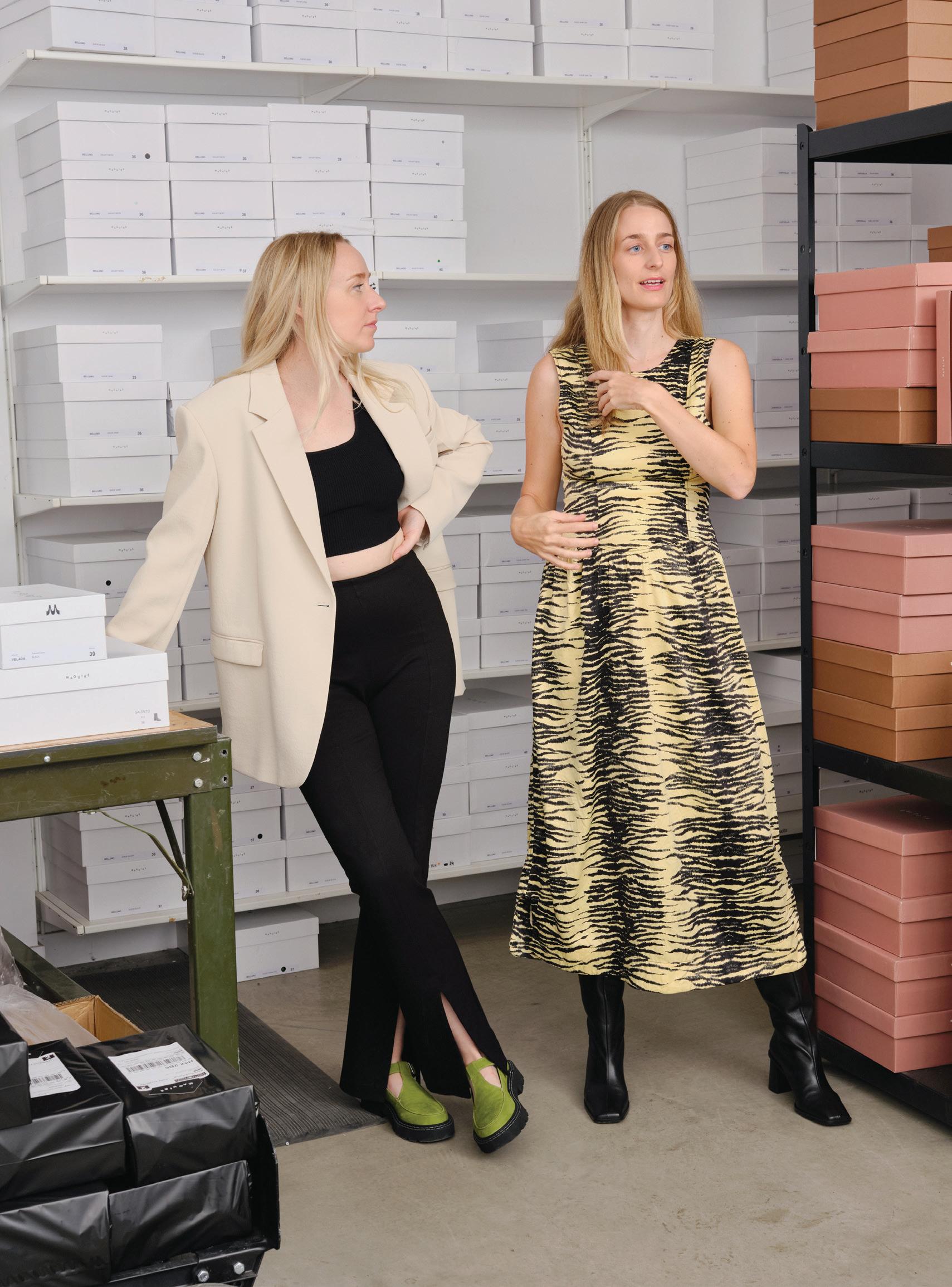
26 The Creator / Les créatrices
The sisters behind Montreal-based footwear brand Maguire are rewriting the rules of how to make and sell shoes, one pair at a time. / De la confection à la vente, les deux sœurs derrière la marque montréalaise Maguire réinventent l’univers de la chaussure, une paire à la fois.
Bold Steps À belle allure
BY / PAR ISA TOUSIGNANT PHOTOS BY / PAR RICHMOND LAM
Walk along Saint-Laurent Boulevard, through Montreal’s Mile End neighbourhood, and your eyes are sure to be drawn to Maguire’s storefront—and inside. The local brand’s footwear designs are uniquely attractive, mixing a sort of chic, effortless wearability with a standout colour palette in buttery leathers. The price tags sit proudly on view next to every mouth-watering pair. These luxe shoes are arrestingly affordable.
“High end, fair price” has been a tag line in Maguire’s business plan from the brand’s inception, when co-founding sisters Myriam and Romy Belzile-Maguire launched their first product in 2016. It was a sneaker available in black or white. They produced 200 pairs, presented them at a local artisan fair and sold out in a weekend. With this, they knew they were onto something.
Maguire’s approach to business flies in the face of the traditional fashion industry. Though most of the brand’s devotees make their purchases online, sales peaked when Myriam and Romy opened bricksand-mortar spaces to display their wares. The Montreal space is one of three locations, along with Toronto, launched in 2020, and their New York shop, which opened in June this year. The latter was a dream of Myriam’s, made manifest years before she thought possible, all thanks to Maguire’s dedicated clientele.
Se promener sur le boulevard Saint-Laurent, dans le Mile-End montréalais, sans être attiré par la vitrine de Maguire, et avoir envie d’en pousser la porte, est fortement improbable. Les chaussures proposées par cette marque locale ont un charme bien à elles : à la fois chics et pratiques, elles se déclinent dans des nuances éblouissantes et des cuirs doux comme une caresse.
« Du haut de gamme au juste prix », tel est le mot d’ordre des sœurs et cofondatrices Myriam et Romy Belzile-Maguire depuis 2016, date du lancement de leur premier modèle : une espadrille, offerte en noir et en blanc. Elles en ont fabriqué 200, puis ont tout vendu en l’espace d’une fin de semaine à une foire artisanale locale. Ces débuts très prometteurs les ont motivées.
Leur approche commerciale va à contre-courant de l’industrie traditionnelle de la mode. Bien que la plupart de leurs clientes fassent leurs achats en ligne, elles ont vu leurs ventes décoller à l’ouverture de leurs boutiques : la première à Montréal, la deuxième à Toronto en 2020 et la troisième inaugurée en juin dernier à New York. Avec cette dernière, Myriam réalise son rêve beaucoup plus tôt que prévu, et elle le doit à la fidélité de sa clientèle.
The Creator / Les créatrices BLOCK / 27
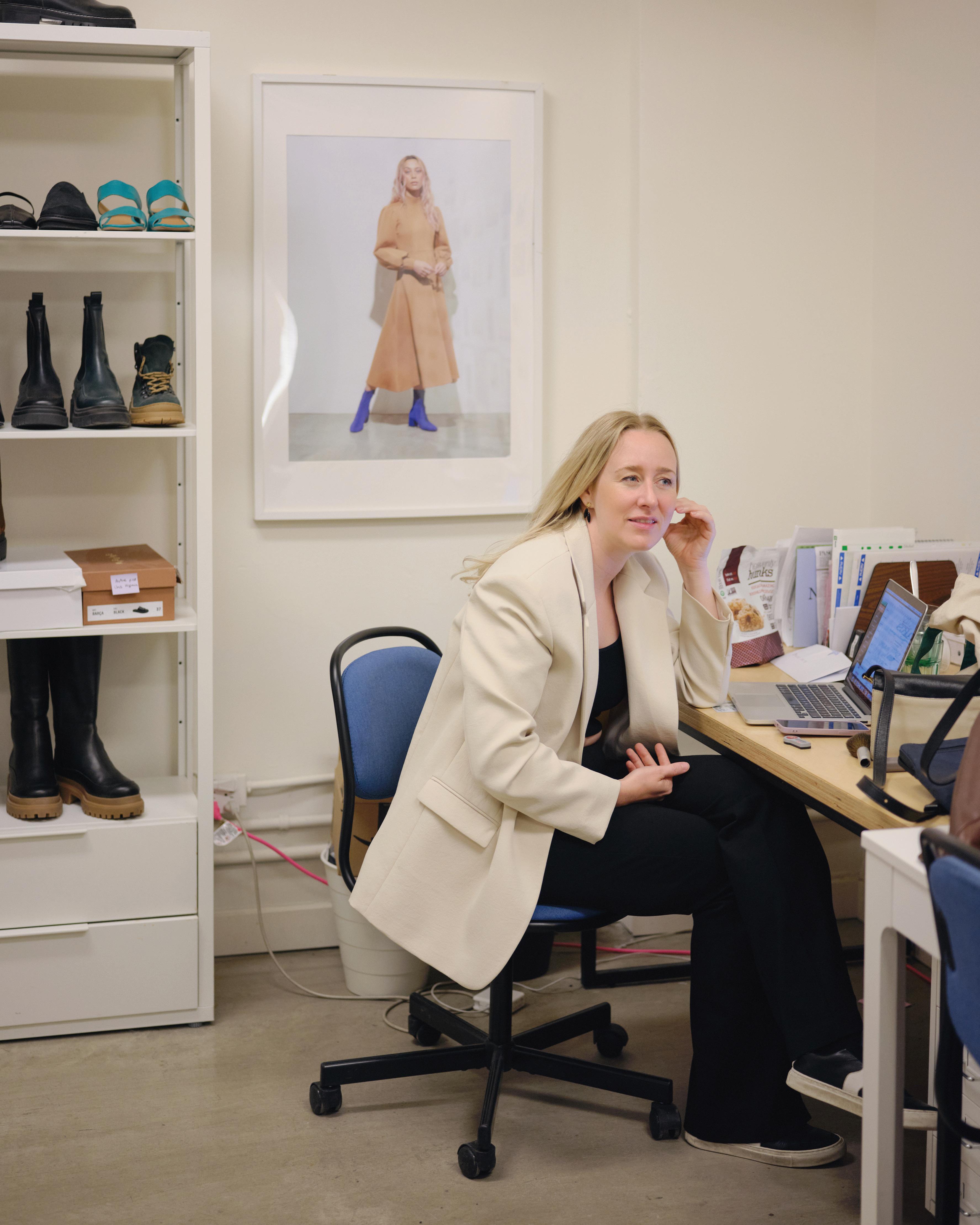
PREVIOUS SPREAD: Myriam (left) and Romy Belzile-Maguire at Maguire in Montreal. / DOUBLE PAGE PRÉCÉDENTE : Myriam (à gauche) et Romy Belzile-Maguire dans leur boutique à Montréal.
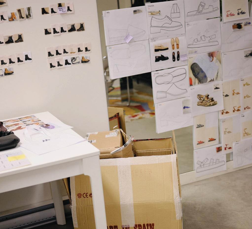
RIGHT: Process images and shoe design mock-ups collaged across a mirror. The Belzile-Maguire sisters make design tweaks based on customer feedback on a regular basis. / À DROITE : Sur le miroir, des illustrations et des images du processus de confection. Les sœurs Belzile-Maguire modifient régulièrement leurs modèles en fonction du retour des clientes.
OPPOSITE PAGE: Myriam Belzile-Maguire studied footwear design at Cordwainers at the London College of Fashion and then worked in the industry before co-founding the eponymously-named brand, which answers the question “Quality or affordability?” with a resounding “Both.” / CI-CONTRE : Qualité ou prix abordables? Les deux chez Maguire, puisqu’avant de cofonder la marque, Myriam Belzile-Maguire s’est spécialisée dans la confection de chaussures à l’école Cordwainers du London College of Fashion, puis a travaillé plusieurs années dans ce secteur.
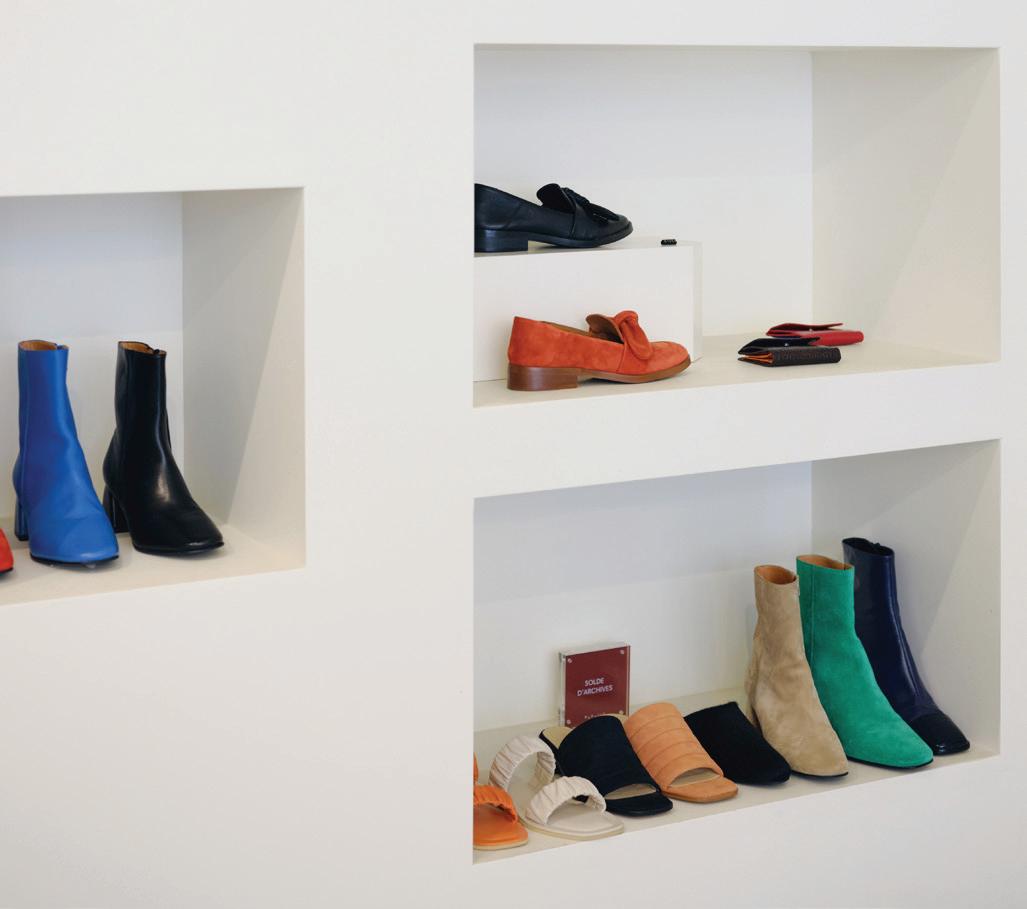
Maguire’s shoes are refined and design-forward, combined with a sense of practicality and weather-ready wearability. Flat soles are the norm, with a few moderate heels in the inventory for special occasions. Silhouettes range from sleek soft-leather ballerinas to chunky-soled loafers and Chelsea boots you can walk for miles in. With about 30 models per season, the inventory is split between perennial classics available year-round and limited, now-or-never models. Each season, new pops of colour and textures are revealed. This pre-fall collection’s features include cream shearling-and-cowhide clogs, pastel penny loafers and minimalist slip-ons in a jewel-toned rainbow of emerald green, lapis lazuli blue and carnelian orange.
The footwear is made in Portugal, Italy and Spain, and the craftsmanship is flawless—and constantly evolving. The BelzileMaguire sisters respond to their customers’ feedback with tweaks and improvements.
Myriam specialized in footwear design at Cordwainers at the London College of Fashion (where Jimmy Choo studied) before working in just about every department of the Aldo Group over the course of six years. From product design to sourcing to wholesale, her path was an extraordinary education—partly because it taught her what she wanted to do differently.
“After producing such large quantities with both material and aesthetic limitations, I was yearning for the opposite,” she says. She wanted to work with European factories, with small production runs and top-quality materials like leather and sheepskin. She also wanted to provide a living wage to those working at every stage of production, from factory to showroom floor. “I wanted to create high-end footwear that would bring reasonable profit to the company but at prices that would be fair to both consumers and the factories making them.”
Les chaussures signées Maguire affichent des silhouettes élégantes, qui emboîtent le pas aux tendances tout en étant prêtes à déjouer les caprices météo. Le talon plat règne en maître, même si quelques confrères plus haut perchés s’invitent à l’occasion. Ballerines en cuir aux lignes épurées, flâneurs à semelle crantée et autres bottillons Chelsea pensés pour la marche à pied composent la collection, qui se partage entre classiques offerts à l’année et nouveautés en série limitée. Environ 30 modèles voient le jour par saison, affichant de nouvelles teintes et textures. À surveiller cet automne : les sabots crème en vachette et peau lainée, les flâneurs pastel et les mules minimalistes aux couleurs joyaux, dont le vert émeraude, le bleu lapis-lazuli et l’orange cornaline.
Dotées d’un savoir-faire indéniable et à l’écoute de leurs clientes, Myriam et Romy cherchent toujours à améliorer leurs produits, fabriqués au Portugal, en Italie et en Espagne.
C’est en Angleterre, à l’école Cordwainers du London College of Fashion (la même que Jimmy Choo), que Myriam s’est spécialisée dans la confection de chaussures avant d’écumer tous les services du Groupe Aldo les six années suivantes. Conception de produit, approvisionnement ou vente en gros, elle y a appris les ficelles du métier tout en réfléchissant à ce qu’elle pourrait faire différemment.
« Après de la vente en grandes quantités avec des limites matérielles et esthétiques, j’ai décidé que j’allais faire l’inverse », explique-t-elle. D’où son choix d’une production en petites séries, dans des usines européennes, à partir de matières de qualité tels le cuir et la peau lainée. Elle souhaitait également offrir un salaire décent tout au long du processus de fabrication. « J’avais envie que la qualité du produit soit bonne et le profit raisonnable, mais aussi que le prix soit plus juste pour les clientes et pour les usines. Un modèle un tiers, un tiers, un tiers en quelque sorte », poursuit-elle.
28
The Creator / Les créatrices
BLOCK / 29 The Creator / Les créatrices
The solution was to adopt a direct-to-consumer model, à la Everlane and Warby Parker, that meant Maguire could avoid the pitfalls of wholesale, including last-minute changes, delivery delays and contract cancellations. But it also meant taking on the full brunt of responsibility for the marketing, sales and consumer experiences.
“We basically spent a whole year [living] in our first store,” laughs Romy, the other half of Maguire’s winning equation, whose previous career was spent in advertising and communications. She fondly remembers the days when they shared a space with an eyewear shop. That year produced some invaluable learnings, to wit: Shoe shopping is full of pain points. There’s the competition between salespeople on commission, the back-and-forth schlep from front- to back-ofhouse, where sizes are stored, and the pressure both of these put on consumers. So, in typical Maguire fashion, they flipped the script.
“We liked the model of self-service that some big-box stores can offer, where you can easily find your size yourself, but we wanted to create a hybrid model where our employees would still be there to advise,” says Romy. How it works: Customers browse the Maguire website, try different styles and sizes, assisted by the friendly (sans commission) staff, at the store nearest to them and then later purchase online with free shipping. It’s a fully symbiotic relationship between the virtual and real-life shopping experiences.
Typically, a shoe brand produces new collections all the time (and in large quantities) in an attempt to spur excitement and it’s a matter of guessing what will sell. That model creates waste, transience and lowered product standards. Maguire is working to change that cycle. Their goal is durability and a transparent, provable sustainability. According to their no-waste philosophy, all their shoe styles, whether in season or not, stay available until stock runs out. They’ve got a longterm view, and as their consistent organic growth attests, it works.
Maguire’s goal is durability and a transparent, provable sustainability. / Maguire, elle, a décidé de s’inscrire dans la durée et dans la transparence.
La solution? Adopter un modèle de vente directe au consommateur, à la Everlane ou à la Warby Parker, pour éviter les pièges de la vente en gros, notamment les changements de dernière minute, retards de livraison et annulations de contrat. La contrepartie? Assumer l’entière responsabilité du marketing, de la vente et de l’expérience client.
« On a passé notre première année en boutique », lance Romy en riant. Cette experte en communication, sa précédente carrière, se rappelle avec nostalgie ce local partagé avec une lunetterie, où elle a découvert que la vente de chaussures était une voie pavée de points de friction : la concurrence entre les vendeurs à la commission et les vaet-vient incessants dans l’arrière-boutique à la recherche de la bonne pointure exercent une forte pression sur la clientèle. Résultat? Les sœurs ont réécrit le scénario, dans le style Maguire bien évidemment.
« On aimait l’idée de libre-service offert par certains magasins, où on peut chercher sa pointure soi-même, mais on préférait une structure hybride dans laquelle nos employés seraient présents pour prodiguer leurs conseils », poursuit-elle. Chez Maguire donc, les clientes magasinent sur le site Web, puis viennent en boutique essayer les modèles et profiter des conseils du personnel (non commissionné) et enfin achètent en ligne sans frais de livraison : une symbiose parfaite entre le virtuel et le réel.
Généralement, afin de susciter l’engouement, une marque de chaussures sort sans arrêt, et en grande quantité, de nouveaux produits, sans savoir vraiment ceux qui feront mouche. Ce schéma, qui s’inscrit dans l’instant, est synonyme de gaspillage et de basse qualité. Maguire, elle, a décidé de s’inscrire dans la durée et dans la transparence. Selon sa philosophie zéro déchet, tous les modèles, saisonniers ou non, restent en vente jusqu’à épuisement des stocks. Cette vision à long terme, appuyée par une croissance continue, semble bel et bien marcher.
30
The Creator / Les créatrices

Work-in-Progress / Le chantier 32
Photo by / par Shawn Taylor, courtesy of / offerte par Gander International Airport Authority
An Iconic Stopover
Escale historique
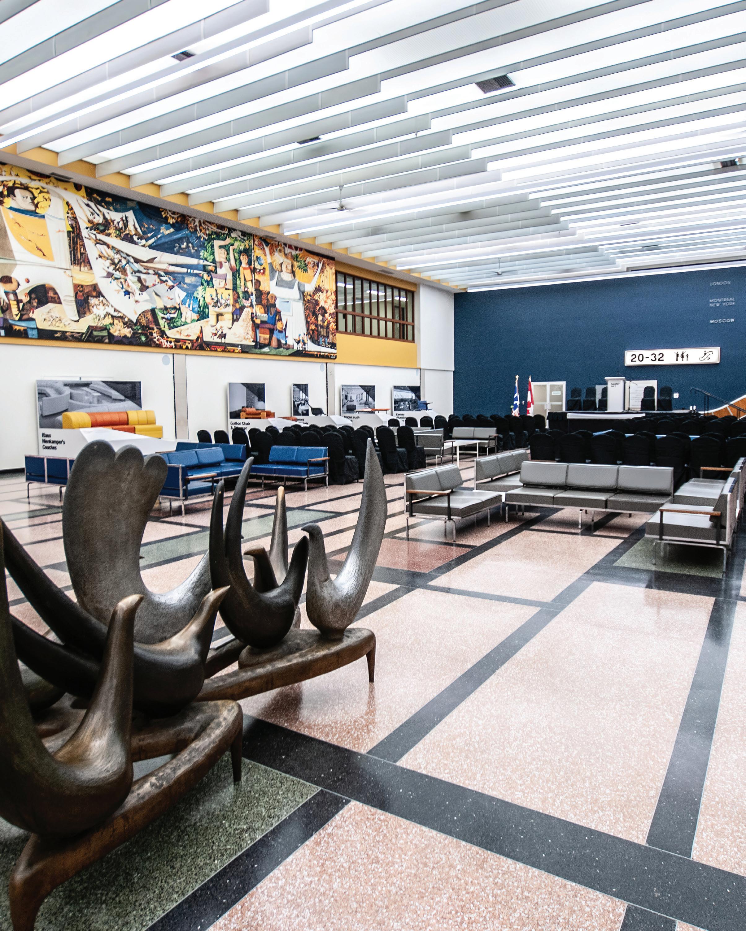
Gander Airport’s International Lounge—and its proud history—is now accessible to the non-travelling public. / Zoom sur le passé moderniste de l’aéroport international de Gander, désormais accessible aux non-voyageurs.
BY / PAR ANDREW WATERMAN
It would be difficult to overstate how unlikely the Gander Airport International Lounge is, namely because it exists in Gander—a town with a population of fewer than 12,000 that’s situated somewhere between St. John’s and Corner Brook, Newfoundland.
Since the 1970s, the only way residents of the small town could get a glimpse of the sleek furniture and 22-metre egg tempera mural by Kenneth Lochhead, titled Flight and Its Allegories , that graces the airport’s modernly appointed lounge was through a pane of glass.
Visible, yet off-limits.
But after two and a half years of redesigning, repainting, reupholstering and refurbishing, the lounge finally opened to the general public in June of this year.
“The joke is that Gander is the most cosmopolitan backwater on Earth,” says Reg Wright, president and CEO of the Gander International Airport Authority.
The airport saw its first plane land in 1938 and, because of its geographic location, became the main staging point for the movement of Allied aircraft to Europe during the Second World War. It also became a refuelling stop for transoceanic traffic, necessitating the construction of a new $3-million terminal in 1959. At this time, Gander was one of the busiest international airports in the world, but by the early 1960s “jet age,” stopovers became less frequent and the airport disused.
That’s how Gander inherited an impeccably designed, world-class airport lounge. (The town and airport both saw renewed interest thanks to their role receiving airplanes and travellers diverted after the September 11 attacks, depicted in the hit musical Come From Away .)
La démesure qui caractérise la salle d’embarquement de l’aéroport de Gander a de quoi surprendre : la ville du même nom, située quelque part entre St. John’s et Corner Brook à Terre-Neuve, compte moins de 12 000 habitants.
Depuis les années 1970, ces derniers ne peuvent admirer l’élégant mobilier et l’imposante fresque de Kenneth Lochhead, peinte à la détrempe à l’œuf sur 22 mètres de long et intitulée Flight and Its Allegories, qu’à travers un panneau vitré.
Visible, mais inaccessible.
En juin dernier, après deux ans et demi de réaménagement, restauration et remise à neuf, la salle d’embarquement des vols internationaux ouvre enfin ses portes au grand public.
« Gander est le trou perdu le plus cosmopolite du monde », lance en souriant Reg Wright, PDG de Gander International Airport Authority.
C’est en 1938 que l’aéroport voit atterrir son premier avion. En raison de sa situation géographique, il devient vite le principal site d’escale des appareils alliés à destination de l’Europe pendant la Seconde Guerre mondiale. Il se transforme également en point de ravitaillement en carburant pour le trafic transocéanique, nécessitant en 1959 la construction d’un nouveau terminal de 3 millions de dollars. À cette époque, il fait partie des aéroports internationaux les plus fréquentés. Au début des années 1960, l’avion à réaction envahit le ciel : les arrêts à Gander étant dorénavant superflus, il perd de sa superbe mais en garde une salle d’embarquement de première classe. (En 2011, la ville et l’aéroport reviendront tous deux dans l’actualité en recevant les avions déroutés, et leurs passagers, après les attentats terroristes du 11 septembre. Cet accueil chaleureux a d’ailleurs inspiré la comédie musicale à succès Come From Away.)
Work-in-Progress / Le chantier BLOCK / 33
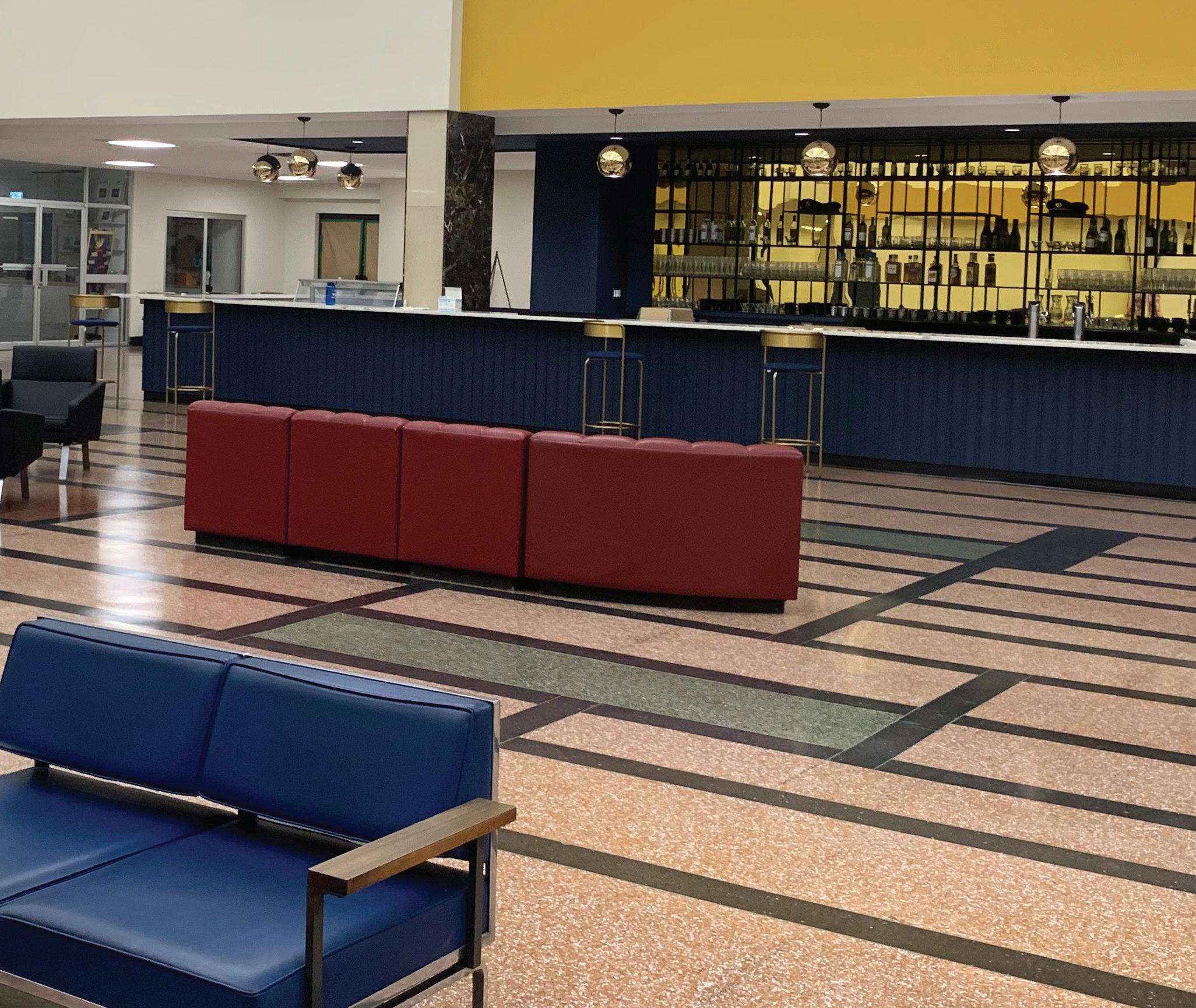
Wright says the lounge has been a topic of conversation in the community for a long time. “We got tired of keeping it [in] a vacuum.” Hence, the $1.5-million restoration of the mezzanine and lounge, famous for its Piet Mondrian-esque terrazzo floors and mid-century furniture (much of it Canadian in origin). Now, it also houses a museum detailing the airport’s rich history.
And while the area used to be enjoyed only by international travellers lucky enough to have a layover, it’s now available and accessible for wider use.
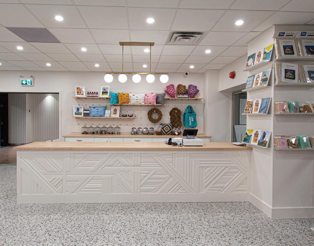
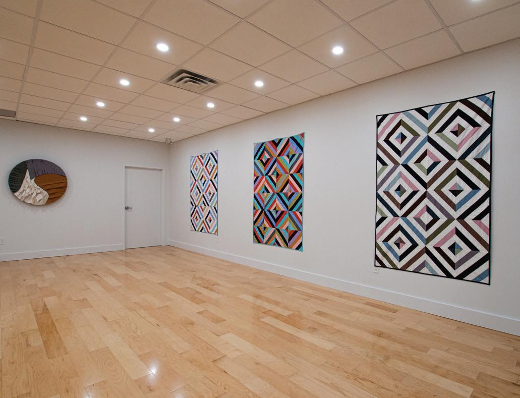
In addition, there are three new rooms—a gift shop, an art gallery and a community conference room—all conceived and built by local designer Jessica Waterman—as well as a newly designed bar. It’s in that small area, which Wright and others call one of Canada’s best-preserved modernist rooms, that royals, celebrities and countless others have spent layovers on their way from Europe to North America by plane.
Cela fait longtemps que la rénovation du hall des départs et de sa mezzanine, célèbre pour sa fresque, son sol en terrazzo à la Mondrian et ses meubles modernistes signés en majorité par des designers canadiens, alimente les conversations locales. « On avait envie de le sortir du néant », explique Reg Wright. D’où des travaux de 1,5 million de dollars et une plus grande accessibilité : les voyageurs internationaux ne sont plus les seuls à pouvoir en profiter.
On y trouve aujourd’hui un musée, qui raconte l’histoire de l’aérogare et des nombreuses têtes couronnées et célébrités qui y ont fait escale, ainsi qu’une boutique de souvenirs, une salle de conférence et un espace d’exposition, tous trois imaginés et aménagés par l’artiste locale Jessica Waterman. À cela s’ajoute un bar flambant neuf.
PREVIOUS SPREAD: The Gander Airport International Lounge has been called one of Canada’s best-preserved modernist rooms. Both the mural, Kenneth Lochhead’s Flight and Its Allegories, and sculpture, Arthur Price’s Birds of Welcome, are rich in metaphors referencing the wonders of air travel (with nary a plane in view). / DOUBLE PAGE PRÉCÉDENTE : On dit de la salle d’embarquement de l’aéroport de Gander qu’elle est l’un des intérieurs modernistes les mieux préservés du pays. Tant la fresque de Kenneth Lochhead, Flight and Its Allegories, que la sculpture d’Arthur Price, Birds of Welcome, évoquent la féérie du voyage dans les airs (sans un seul avion en vue).
THIS PAGE (CLOCKWISE FROM TOP LEFT) : Designer Jessica Waterman installs a custom feature made entirely of painted wood trim—these “trimscapes,” as Waterman calls them, “are reminiscent of runways and planes”; Waterman sourced all the products—by local craftspeople from the island—for sale in the gift shop; the newly built Gallery 59 displaying Waterman’s quilts and weavings. / CETTE PAGE (dans le sens horaire) : La designer Jessica Waterman installe un élément entièrement réalisé en bois peint. Ces « trimscapes », comme elle les appelle, « rappellent les pistes et les avions ». Elleétait aussi chargée de trouver les articles en vente dans la boutique de souvenirs : que des produits locaux et artisanaux. Quant à ses courtepointes et autres créations tissées, elles sont accrochées dans la nouvelle Gallery 59.
Work-in-Progress / Le chantier 34
Photos courtesy of / offertes par Jessica Waterman
The bar, however, was a project of its own. “It was a 1980s bar, totally unfunctional,” says Garrett Watton, supervisor of structural maintenance. “The old plastic booths with the fuchsia and teal colours looked awful.” Newly reupholstered in burnished tones, the bar booths have a refreshed look that’s reminiscent of the airport’s golden era.
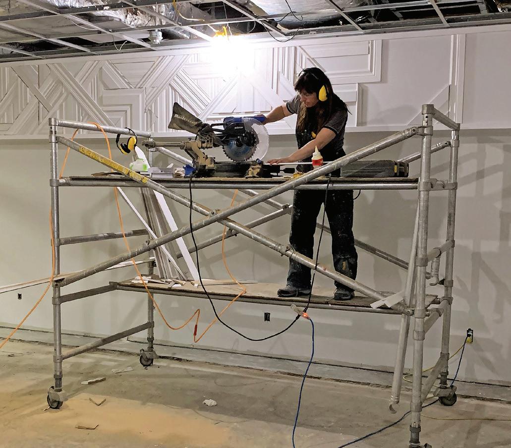
Besides the bar, the gift shop has been completely redesigned and serves as an entrance to the lounge. Waterman designed that room from scratch, adding her clean, bright, delicate-but-sturdy style of wooden art. She also built the art gallery, where portraits of people connected to the airport (taken by German photographer Alexander Spraetz) currently hang.
« Le bar qui datait des années 1980 était tout sauf pratique, explique Garrett Watton, directeur de l’entretien des bâtiments. Les vieux box en plastique couleur rose fuchsia et bleu sarcelle étaient horribles. » Habillés de jaune et d’orange brûlés, ils rappellent à présent l’âge d’or de l’aéroport. Juste à côté, la boutique de souvenirs sert de passerelle à la salle d’embarquement. Entièrement conçue par Jessica Waterman, elle porte sa signature d’ébéniste : des lignes aussi brutes que nettes et des nuances aussi délicates qu’éclatantes. L’espace expo, qu’elle a également réalisé, sert, quant à lui, de toile de fond à une série de portraits pris par le photographe allemand Alexander Spraetz.
LEFT: The gold-toned mirrored plexi and black shelving behind the bar reflects the historical mid-century period and patterning of the terrazzo floors. / À GAUCHE : Derrière le bar, le plexiglas aux tons dorés et les étagères noires reflètent l’époque moderniste tout comme les motifs du sol en terrazzo.
BELOW: Waterman worked with Toronto-based designer Jovana Randjelovic to create elevation drawings with material and fixture specifications for the spaces. / CI-DESSOUS : Jessica Waterman a fait appel à l’architecte torontoise Jovana Randjelovic pour réaliser ces vues en élévation, détaillant matériaux et équipement.
Work-in-Progress / Le chantier BLOCK / 35
Drawing courtesy of / dessin offerte par Jessica Waterman
Photo courtesy of / offerte par Gander International Airport Authority
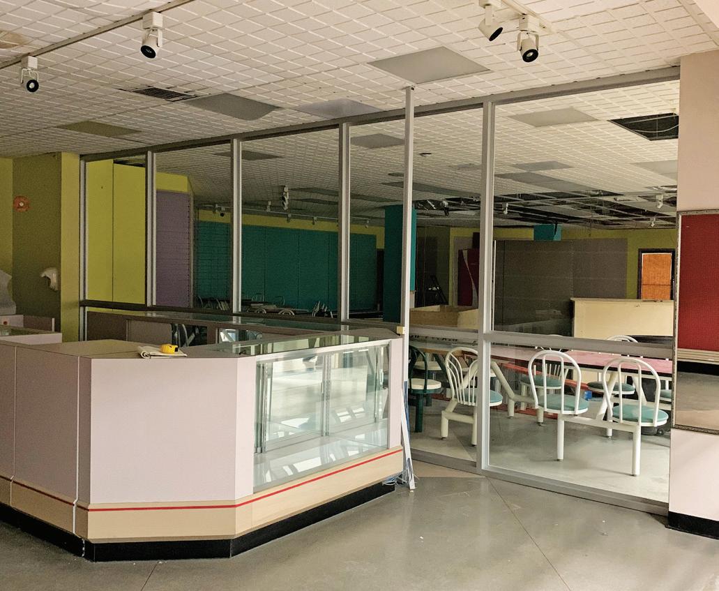
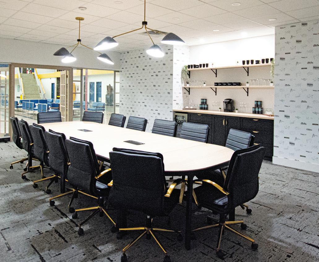
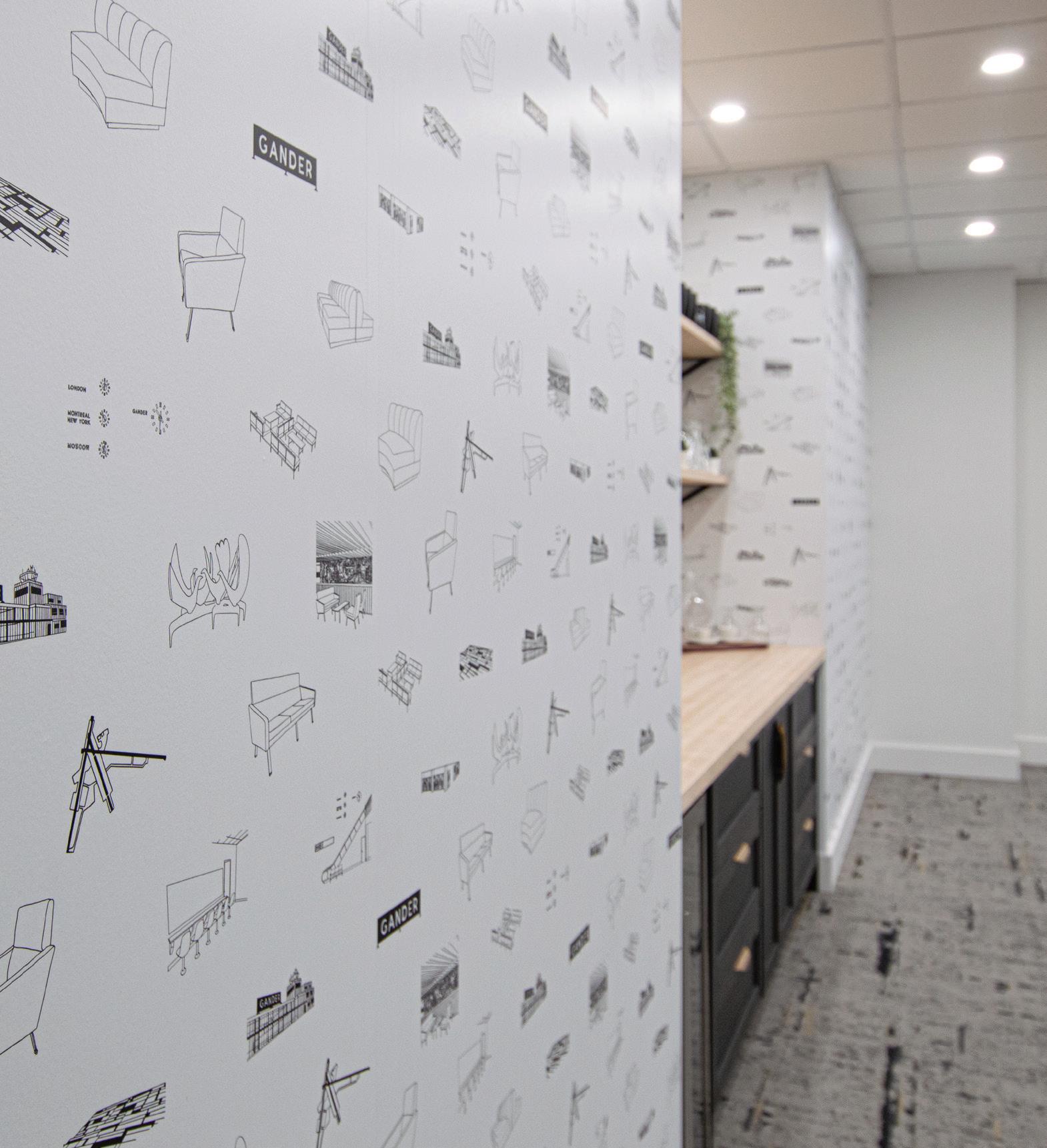
CLOCKWISE FROM TOP LEFT: The gift shop and art gallery areas prerenovation; the newly built and furnished conference room, which is available for community use; Waterman created a custom wallpaper for the conference room, featuring iconic elements of the airport, including the artworks, historical furniture and Gander sign. “If you look out the window, they’re all there,” she says. / DANS LE SENS HORAIRE : La boutique de souvenirs et l’espace expo avant rénovation. La salle de conférence flambant neuve, qui peut servir à des activités communautaires. Jessica Waterman a créé le papier peint de la salle de conférence, qui reprend des éléments emblématiques de l’aéroport : les œuvres d’art, le mobilier d’époque et l’enseigne notamment. « Si vous regardez par la fenêtre, ils sont tous là », commente-t-elle.
Work-in-Progress / Le chantier 36
Photos courtesy of / offertes par Jessica Waterman
LEFT: Travellers in 1959 enjoy a moment of respite and the view from the mezzanine. On designing the additional rooms, Waterman says: “There was no competing with this space, with the magic. [The additions] needed to be functional for today and feel fresh and new. We could have done mid-centurymodern furniture, but you can’t get better than what exists out here.” / À GAUCHE : Les voyageurs en 1959 font une pause en admirant la vue depuis la mezzanine. À propos de l’aménagement des pièces supplémentaires, Jessica Waterman explique « qu’il fallait qu’elles soient fonctionnelles et actuelles. Il n’y avait aucune rivalité avec cet espace, qui est tout simplement magique. On aurait pu reproduire des meubles modernistes, mais on n’aurait jamais fait mieux que l’existant. »
In the new community conference room, Waterman’s handdrawn wallpaper of the original Gander Airport sign is featured. It also includes renditions of the historical furniture and Arthur Price’s sculpture Birds of Welcome
“Because the space is a bit of a time capsule . . . there [was] a big burden on the designer to come in and do things that [wouldn’t be] obtrusive,” Wright says.
Achieving that was the cause of some panic for Waterman. “The room [was] difficult because of all the colours and tones competing within the space,” she says. “We designed a new bar that looks as if it was built in 1959 with the rest, using blue paint and marble countertops that blend well with other aspects of the space.”
After beginning this project, Wright spent a good deal of time worrying about taking a step in the wrong direction and whether that would be reflected by public opinion. “Were we in a position where we couldn’t change a molecule without criticism?” he remembers wondering.
But, he says, “the response has been universally good—very positive. There’s a whole new generation getting introduced to the space.” Since opening to the public, they’ve seen about 300 visitors a day.
Dans la salle de conférence, le papier peint au motif de l’enseigne originale de l’aéroport, dessiné par l’artiste, côtoie Birds of Welcome, une sculpture en bronze d’Arthur Price, et des réinterprétations du mobilier d’époque.
« Le fait que cet endroit soit une sorte de capsule témoin pèse sur l’artiste, qui doit y apporter sa touche sans s’imposer », ajoute le PDG. Jessica Waterman nous confie avoir quelque peu paniqué : « La pièce est difficile à aménager à cause de toutes les couleurs qui se font concurrence. Grâce à la peinture bleue et à un comptoir en marbre, qui se marient bien avec le reste, on a pu imaginer un nouveau bar qui semble dater de 1959. »
Au début, Reg Wright n’était pas sûr d’avoir fait les bons choix et s’inquiétait de l’opinion publique. Il se demandait s’il pouvait changer le moindre détail sans être critiqué en bien ou en mal. Le voilà rassuré : « Dans l’ensemble, le projet a été très bien reçu, la critique est positive. Et toute une nouvelle génération découvre ce lieu », conclut-il. Depuis son ouverture au public, 300 visiteurs par jour se laissent transporter par ce petit bijou de l’art moderne canadien.
Work-in-Progress / Le chantier BLOCK / 37
Photo from / de Library and Archives Canada
In 2021, an accessible viewing platform opened at Peggy’s Cove, making it possible for people who use a wheelchair or have other accessibility needs to enjoy the iconic lighthouse site in Nova Scotia. The site achieved a Gold rating from the RHFAC. / En 2021, la municipalité néo-écossaise de Peggy’s Cove s’est dotée d’une plateforme panoramique accessible, permettant aux personnes en fauteuil roulant ou se déplaçant avec difficulté de profiter de la beauté naturelle du site, son anse et son phare, notamment. Ces installations ont obtenu la certification d’or de la FRH.
The Conversation / La conversation 38
Photo by / par Maxime Brouillet
Beyond Code Code
d’accès
Starting in 1985, B.C.-born activist Rick Hansen rolled across 34 countries—40,000 kilometres in total—in his wheelchair, raising awareness about people with disabilities and their potential. Today, the Rick Hansen Foundation continues to advocate for an inclusive, accessible world. Brad McCannell, who joined the foundation to lead the development of its Accessibility Certification program (RHFAC), and program instructor Kristen Habermehl talked with Block about the often-unseen impacts of making spaces accessible and why building code can’t fix the problem. / Dans les années 1980, Rick Hansen, activiste britannocolombien, parcourt 40 000 kilomètres en fauteuil roulant afin de sensibiliser les populations des 34 pays traversés au potentiel des personnes handicapées. Aujourd’hui, la Fondation Rick Hansen (FRH) continue de militer en faveur d’un monde inclusif et accessible. Brad McCannel, chargé du programme de certification de l’accessibilité, et Kristen Habermehl, formatrice en accessibilité, discutent de la question avec Block : les effets souvent invisibles de la mise en accessibilité et les raisons de l’impuissance du code du bâtiment.
BY / PAR BRAD MCCANNELL AND KRISTEN HABERMEHL
Brad McCannell: The Rick Hansen Foundation’s mission statement to remove barriers for people with disabilities is broad on purpose so we can come at the problem from every possible direction. The trouble is, it has turned into a game of Whac-A-Mole. That’s where the RHFAC program comes in. It’s not another standard; it’s a rating system. We’re not the code police coming in and wagging our finger, telling you all the things you did wrong. We identify a site’s current level of accessibility so people know where to start.
Kristen Habermehl: One thing I really appreciate is how vastly different the Rick Hansen Foundation’s approach is from any other I’ve seen. I’ve never had a building manager come away saying they didn’t like the process. We have a positive approach and celebrate what’s been done well—even if we have to work hard to find one accessible thing in the building. Nine times out of 10, people just don’t understand what accessibility is supposed to look like. I’ve had people follow me around on ratings, rolling up mats as we go, saying they had no idea they were a tripping hazard.
Brad McCannell : L’énoncé de mission de la FRH, à savoir supprimer les obstacles auxquels se heurtent les personnes ayant un handicap, est large pour une bonne raison : nous permettre d’aborder le problème sous n’importe quel angle. Pour éviter de nous éparpiller, on a créé le programme de certification. Ce n’est pas un autre règlement, c’est un système d’évaluation. Nous ne sommes pas là pour pointer les erreurs du doigt. Nous sommes là pour évaluer l’accessibilité d’un lieu afin que vous sachiez par où commencer.
Kristen Habermehl : La FRH se distingue par son approche, très différente de tout ce que j’ai vu auparavant. C’est vraiment intéressant. Je n’ai jamais entendu un gestionnaire de bâtiment se plaindre du processus. Même si on doit travailler fort pour trouver une seule chose accessible, notre discours reste positif et on met en avant tout ce qui a été bien réalisé. Neuf fois sur dix, les gens ne savent pas en quoi consiste vraiment l’accessibilité. Lors de mes évaluations, j’en ai vu certains enlever des paillassons en me disant qu’ils n’avaient jamais pensé qu’on risquait de trébucher dessus.
The Conversation / La conversation BLOCK / 39
BM: Being adversarial doesn’t help, so we wanted to bring industry to the table. Part of the problem is following regulations without understanding the impact. Almost 50 % of Canadian adults have or have had a permanent or temporary disability, or live with someone who does, yet we are still treated as a non-market. We often say if you build it, they will come.
KH: I was part of the Peggy’s Cove development from the initial design right through construction and to completion. In the summer, they achieved RHFAC Gold for what they accomplished. Seeing the number of people of every single ability using that space, interacting together and enjoying it equally, is the most rewarding thing you can imagine.
BM: Codes don’t address any kind of cultural issues or support building owners and tenants in making meaningful change. The code approach is “Thou shall do,” not “Thou shall understand.” Another issue is planners not understanding the population they’re building for. Architects need a lot more training too, but the bottom line is it’s not their decision. If management doesn’t prioritize accessibility, it won’t get in there.
KH: Before I knew about the RHF, I was working with my husband in our design/build company, and we completed a project for someone who needed full accessibility added to an existing home. We saw that we had significant gaps in our knowledge. By the end of my first RHFAC training session, my whole world had shifted. It was like all the kindling was in place and somebody lit the match. You don’t know what you don’t know.
BM: That’s an important point. Once you start seeing barriers to people with disabilities, you can’t stop seeing them.
KH: When you get to work with people who are the decision makers, they begin to realize what they don’t understand. It’s an amazing experience to work with people who haven’t understood what true, meaningful access looks like and then be part of helping them apply it.
BM: Meaningful access is really about that whole experience of using a facility from the moment you walk in the front door.
KH: To me it means somebody can independently and safely navigate the built environment with dignity. That means they don’t need somebody to help them up a steep ramp, for example.
BM: One of the biggest things to check is access to emergency exits. The building code works really hard at getting people with mobility disabilities into buildings, but it doesn’t give any thought to getting us out. There’s no requirement for emergency exits to be accessible. The next time you’re standing in front of an elevator, notice that little plaque that says “In case of fire, take stairs.” Where’s the little plaque that tells me what to do?
When you look at your facility, those kinds of things need to be identified really early so they can be addressed in the planning phase. If you have a building that meets all the building code’s minimum requirements, you’re still missing about 70 % of people with disabilities.
KH: And it doesn’t take much more money if you can do this in the planning stage.
BM: The problem when doing it the other way around is that the lifespan of buildings is 50 to 80 years. When you build in a problem, it becomes inaccessible by design. A good example of people recognizing this is the Royal Architectural Institute of Canada now incentivizing its members to take the RHFAC training course to help with that shift.
When someone wants their building to be accessible, my first question is “Accessible to whom?” People who are blind? People who are deaf? Is it going to be accessible to all people with all disabilities at all times? It doesn’t mean anything to say your building is accessible without saying—or knowing—to whom.
KH: One of the things that fascinates me every time I do a rating is how unaware employers are of the opportunity to hire from a greater pool of very capable employees if their buildings are accessible.
BM: The Conference Board of Canada says 57 % of people with physical disabilities who are willing and able to work are unemployed because of barriers in the workplace. This has so many other implications, too, because if we have jobs, we can have a bank account. If we have a bank account, we can get a credit card. If we have a credit card, we can get loans. If we have mortgages, maybe they’ll start building houses for us instead of against us.
KH: The truth is, if you’re not currently living with a disability, you’re a TAB—temporarily able-bodied. We are all just one step, one trip, one medical situation away from joining those who need further accessibility.
BM: And until we have access to the built environment, like the TABs, we can’t achieve full participation. If you can’t get in your car or get a taxi and go downtown to hit a pub, go to a friend’s house or join a protest, then you do not have full citizenship. COVID-19 showed us that really well. All of a sudden, the able-bodied population was like, “Oh my god, I can’t go to work, I can’t take a bus, I can’t go to a movie.” Welcome to our world.
KH: I think it’s up to every Canadian to start desiring meaningful access in all of our communities. People have to understand why it needs to happen, and that’s when we will really see momentum.
To learn more about how to improve your accessibility, visit WWW.RICKHANSEN.COM/RHFAC
The Conversation / La conversation 40
B. M. : L’opposition ne mène à rien, la discussion avec les constructeurs, si, puisqu’une partie du problème consiste à suivre les règlements sans en comprendre les répercussions. Presque 50 % des adultes canadiens ont un handicap temporaire ou permanent ou vivent avec quelqu’un qui en a un, pourtant nous ne sommes toujours pas considérés comme un marché. On dit souvent que si c’est bien conçu, on viendra.
K. H. : J’ai participé au projet de Peggy’s Cove, en Nouvelle-Écosse, de la conception à la construction. Cet été, ces installations ont obtenu la certification d’or en matière d’accessibilité. Voir des visiteurs de toutes capacités utiliser ce lieu, interagir et en profiter d’égal à égal est la chose la plus gratifiante qu’on puisse imaginer.
B. M. : Le code du bâtiment n’aide pas les propriétaires ou locataires à apporter des changements significatifs. Il est là pour dire quoi faire, pas pour comprendre. Idem du côté des urbanistes, qui ne comprennent pas les besoins de la population. Les architectes auraient également besoin d’une formation plus poussée, mais la décision finale ne leur appartient pas. Si les décideurs ne priorisent pas l’accessibilité, ça n’avancera pas.
K. H. : Avant d’entendre parler de la FRH, je travaillais avec mon mari dans notre entreprise d’aménagement. Un de nos clients souhaitait qu’on rende sa maison entièrement accessible et nous, on se rendait compte de nos lacunes en la matière. Après ma première formation en accessibilité à la FRH, ma vision du monde a changé. Le tas de petit bois était déjà fait, il suffisait que quelqu’un craque l’allumette. On ne voit pas ce qu’on ne sait pas.
B. M. : C’est un point important. Une fois qu’on commence à voir les obstacles sur la route des personnes handicapées, on en voit partout.
K. H. : Les décideurs qui collaborent avec nous prennent conscience petit à petit de ce qu’ils ne comprenaient pas, de ce qu’est le libre accès pour tous. C’est une expérience formidable que de les aider à le mettre en pratique.
B. M. : Le libre accès, c’est utiliser pleinement un lieu à partir du moment où on en franchit la porte.
K. H. : Pour moi, c’est se déplacer dans un lieu bâti en toute autonomie, en toute sécurité et en toute dignité. C’est ne pas avoir besoin d’aide pour monter une rampe d’accès un peu trop raide, par exemple.
B. M. : Une chose à vérifier absolument, c’est les issues de secours. Le code du bâtiment se préoccupe de plus en plus de l’entrée des personnes à mobilité réduite dans les bâtiments, mais ne réfléchit pas assez à leur sortie. L’accessibilité des issues de secours n’est pas une obligation. La prochaine fois que vous prendrez l’ascenseur, regardez le petit panneau qui vous dit de prendre les escaliers en cas d’incendie. Il est où le petit panneau qui me dit quoi faire, à moi?
Cela fait partie des choses qui doivent être prises en compte dès
le départ, dès la phase de planification. Un bâtiment qui répond à toutes les exigences minimales du code néglige les besoins de 70 % des personnes handicapées.
K. H. : Et cela ne coûte pas beaucoup plus cher si on le prévoit dès le départ.
B. M. : Le problème, lorsqu’on procède dans l’autre sens, est que la durée de vie d’un bâtiment est de 50 à 80 ans. L’architecture existante devient un frein, rendant tout aménagement difficile. Heureusement, il y a une prise de conscience : l’Institut royal d’architecture du Canada incite désormais ses membres à suivre la formation en accessibilité de la FRH. Quand quelqu’un veut rendre son bâtiment accessible, je lui demande toujours accessible à qui? Aux personnes malvoyantes? Malentendantes? Accessible en tout temps, quel que soit le handicap? Cela ne sert à rien de dire qu’un bâtiment est accessible sans préciser, ou sans savoir, à qui.
K. H. : À chaque évaluation, je suis surprise de constater que les employeurs ne réalisent pas à quel point l’inaccessibilité de leur bâtiment les prived’un grand nombre d’employés parfaitement compétents.
B. M. : Selon le Conference Board du Canada, 57 % des personnes ayant un handicap physique, désireuses et capables de travailler sont sans emploi à cause d’obstacles sur le lieu de travail. Et les répercussions sont multiples, car si on a un emploi, on peut avoir un compte en banque. Si on a un compte en banque, on peut avoir une carte de crédit. Si on a une carte de crédit, on peut obtenir un prêt. Et si on a un prêt hypothécaire, alors peut-être que quelqu’un commencera à construire des maisons pour nous et non contre nous.
K. H. : Une autre réalité? Toute personne qui n’a pas de handicap est une personne temporairement valide. Il suffit d’un faux pas, d’un mauvais virage, d’une maladie pour qu’elle rejoigne ceux et celles qui ont besoin d’une plus grande accessibilité.
B. M. : Et tant qu’on n’aura pas accès au bâti comme tout le monde, notre participation à la société sera incomplète. Si on ne peut pas prendre un taxi ou un bus pour aller boire un verre au centre-ville, souper chez des amis ou manifester, alors on n’est pas un citoyen à part entière. La COVID-19 en a été un bel exemple. Tout à coup, la population valide ne pouvait pas aller travailler, ni prendre le bus, ni aller au cinéma. Bienvenue dans notre monde!
K. H. : Je crois que le choix du libre accès pour la collectivité est entre les mains de chaque Canadien et Canadienne. Plus on sera nombreux à en comprendre l’intérêt, plus l’élan se concrétisera.
Pour savoir comment améliorer votre accessibilité, visitez WWW.RICKHANSEN.COM/FR
The Conversation / La conversation BLOCK / 41
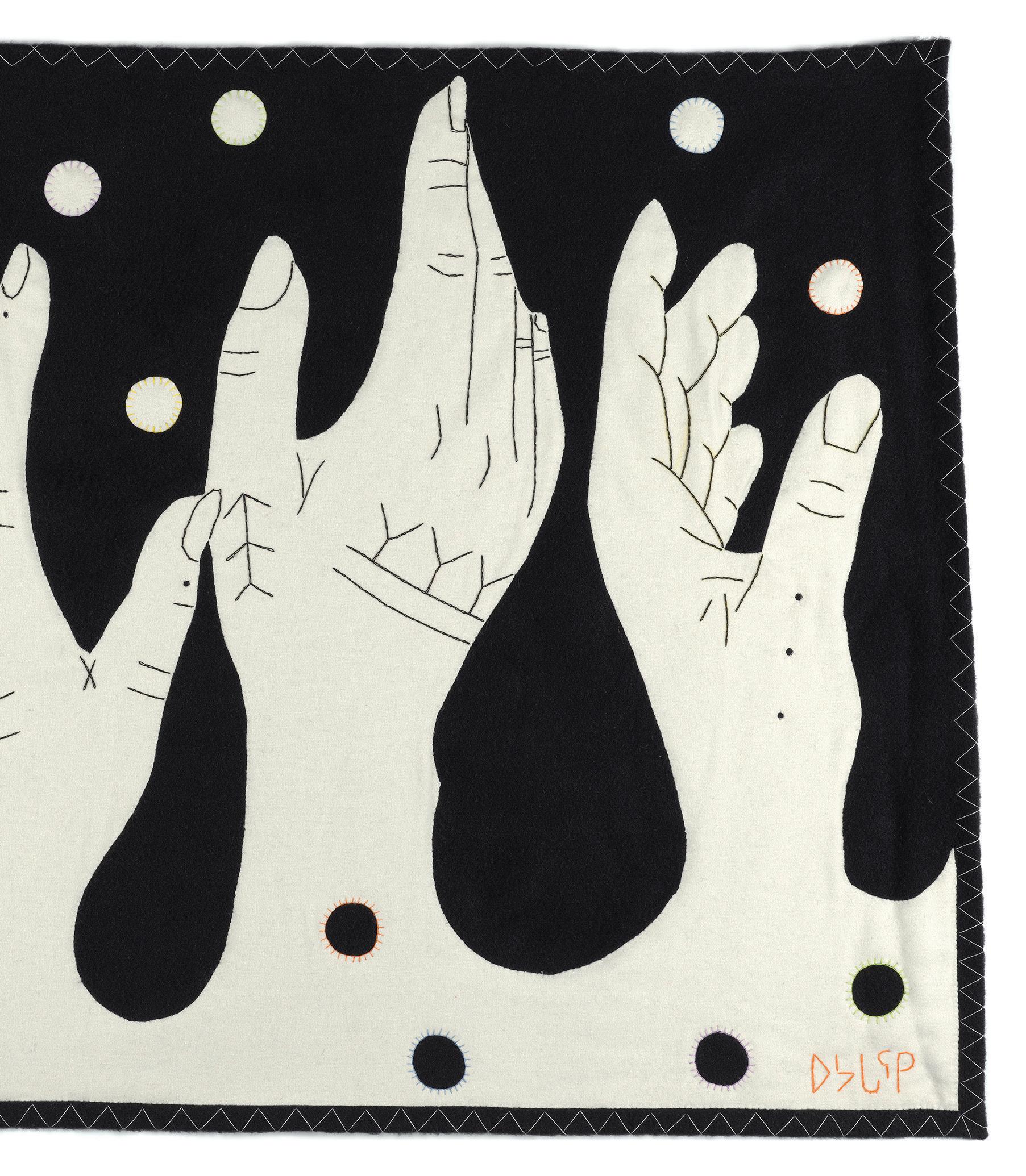
Uvagut by/de Gayle Uyagaqi Kabloona
BY / PAR MÉLANIE RITCHOT
The wall hanging commissioned by Canada Goose titled Uvagut, which means “all of us” in Inuktitut, is Kabloona’s monochromatic take on the medium and only her second wall hanging ever. / Commandée par Canada Goose, cette tenture monochrome s’intitule Uvagut, qui signifie « nous tous » en inuktitut.
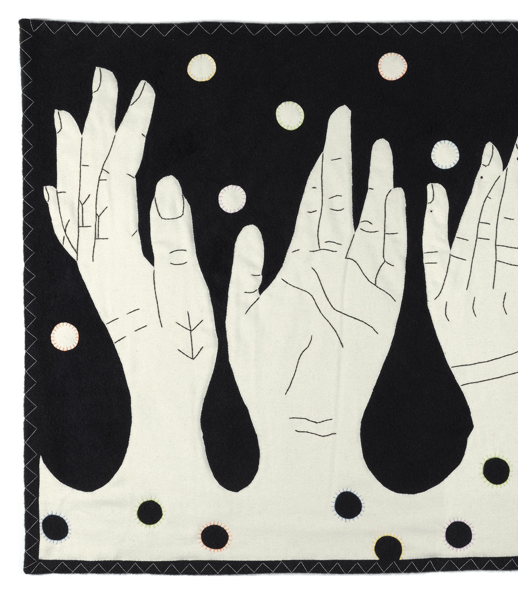
After completing her first wall hanging, which used a bold colour palette that’s typical to the North, Kabloona found a white melton wool that she wanted to work with. Here, it’s contrasted against black duffel wool and features a blanket stitch. / Après une première tenture aux couleurs vives, typique du Nord, Gayle Uyagaqi Kabloona jette son dévolu sur une laine Melton blanche, qu’elle combine à un tissu de laine épais en Duffel noir et un point de feston.
Although she remembers watching her grandmother, back in Baker Lake, Nunavut, confidently (and without using a pattern) cut out pieces of fabric to be stitched together, Kabloona’s process starts with a sketch, and she eventually creates a giant pattern using a projector. / C’est sans patron et sans trembler que sa grand-mère de Baker Lake, au Nunavut, découpait ses morceaux de tissu destinés à être assemblés. Gayle Uyagaqi Kabloona préfère, elle, commencer par un croquis, qu’elle agrandit ensuite à l’aide d’un projecteur.
Made / Fabriqué 42
A few months ago, Ottawa-based printmaker and ceramicist Gayle Uyagaqi Kabloona came across artworks by her grandmother and great-grandmother in the Art Gallery of Guelph’s collection, where she exhibited over the summer. Seeing her matriarchs’ works, many for the first time, inspired Kabloona to teach herself how to sew textile wall hangings—a medium traditional to Nunavut Inuit—right down to the different stitches used. / En explorant la collection du musée ontarien Art Gallery of Guelph où elle a exposé cet été, Gayle Uyagaqi Kabloona, graveuse et céramiste à Ottawa, tombe sur des œuvres réalisées par sa mère et sa grand-mère, dont la plupart lui sont inconnues. Inspirée par cette découverte, elle décide d’apprendre les différents points de couture pour créer ses propres tentures murales, un art traditionnel du Nunavut.
Each of the five hands sewn onto the seven-by-four-foot background is embroidered with traditional Inuit tattoos, the dots symbolizing family, life and fertility. / Les cinq mains cousues sur ce rectangle de 213 cm x 122 cm sont brodées de tatouages inuits traditionnels. Les ronds symbolisent la famille, la vie et la fertilité.
Kabloona says she likes showing the traditional markings, which are commonly seen in her prints, in her work. “I’m part of the generation that’s coming back to what we were told wasn’t going to work for us, [after] colonialism tried to push us away from our culture.” / L’artisane aime le savoir-faire ancestral et elle le montre dans ses créations, ses estampes notamment. « Le colonialisme a tenté de nous éloigner de notre culture. Je fais partie de la génération qui revient vers ce dont on a voulu nous dissuader. »
Made / Fabriqué BLOCK / 43
Photo courtesy of / offerte par Canada Goose, Inc.


www.ricardas.com
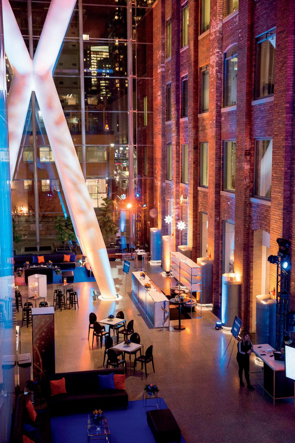
info@ricardas.com Modern Inspired French Cuisine E N D L E S S E L E G A N C E W I T H O L D A N D N E W L O C A T E D I N T H E H E A R T O F D O W N T O W N T O R O N T O , R I C A R D A ' S I S S I T U A T E D I N A S T U N N I N G H I S T O R I C A L B U I L D I N G W I T H A L L U R I N G M O D E R N A R C H I T E C T U R E . L E D B Y E X E C U T I V E C H E F J U L I E N L A F F A R G U E , R I C A R D A ' S I S O P E N F O R L U N C H A N D W E E K E N D B R U N C H , S E R V I N G I N S P I R E D F R E N C H C U I S I N E R I C A R D A ' S O F F E R S T W O S P E C T A C U L A R E V E N T S P A C E S , T H E Q R C A T R I U M A N D T H E R E S T A U R A N T . B O T H S P A C E S A R E T R A N S F O R M A B L E T O S U I T M A N Y G U E S T S I Z E S .
134 Peter Street, Toronto, ON (416) 304-9134
Eyes Open Un œil averti
BY / PAR SARA BARON-GOODMAN
Fans may recognize Shepard Fairey’s distinctive socially minded, colour-blocked art from Barack Obama’s presidential campaign poster (with one word, “HOPE,” emblazoned at the bottom) or from his iconic clothing line OBEY’s logo. Fairey’s latest larger-than-life ode to justice, titled Paix et Justice , can be seen peering over the Montreal skyline from the side of an Allied building in the lower Plateau.
Commissioned as part of the 2022 MURAL Fest, Fairey’s mural calls to attention some of the most pressing issues of the day—the war in Ukraine, mass shootings in the United States, climate change and racial and gender inequality.
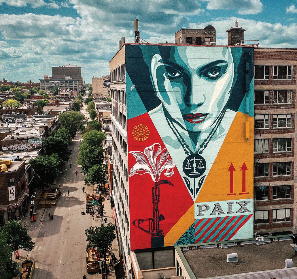
While these themes were at the forefront of Fairey’s mind when he was creating the piece, he affirms that his art is open to interpretation. His interpretation? The woman in the mural, laden with pro-justice imagery, makes direct eye contact with the viewer, imploring them to “navigate the world with their conscience fully engaged,” he says. Fairey sees her as an archetype of the activist, begging viewers not to turn their eyes away from issues that are right in front of us.
With its scales growing from a plant, the woman’s necklace is her pro-justice medallion, and the gun with the flower emerging from its muzzle is a simple pro-peace, anti-violence symbol. “Justice is a term that can apply to many things, but the areas I’m most concerned with are justice around equality and the environment,” he says. “In many regards, this is about seeing all parts of the globe as equal in deserving protection from climate change and environmental destruction... I hope people who view the mural think about some things they may not have otherwise.”
You can find the mural adorning 3575 Saint-Laurent, and inspiring passersby with its complex and layered message. / Les amateurs reconnaîtront les couleurs graphiques et le coup de pinceau socioengagé de Shepard Fairey, créateur de l’emblématique logo de sa marque de vêtements Obey et de la non moins célèbre affiche de la campagne présidentielle de Barack Obama, Hope. Sa dernière œuvre, une ode à la justice plus grande que nature, se déploie quant à elle sur le flanc d’un immeuble d’Allied, situé dans le quartier montréalais du Plateau-Mont-Royal.
Réalisée en 2022 dans le cadre du festival Mural, elle attire l’attention sur des questions d’actualité : la guerre en Ukraine, les fusillades de masse aux États-Unis, le réchauffement climatique et les inégalités raciales et de genre.
Même s’il avait ces sujets en tête lors de la conception, l’artiste urbain laisse à chacun sa libre interprétation.
La sienne? Le personnage féminin, paré de symboles pro-justice, plonge dans les yeux de son interlocuteur, l’implorant de « parcourir le monde en s’impliquant pleinement », explique-t-il. Il voit en cette femme l’archétype de l’activiste, qui nous demande de ne pas détourner le regard face aux problèmes.
La balance de la justice, qu’elle porte en pendentif, est aussi le fruit d’une plante. L’arme à la fleur sortant du canon représente la paix, la non-violence. « On peut appliquer le mot justice à beaucoup de domaines, poursuit-il, ceux qui me préoccupent le plus sont l’égalité et l’environnement. On doit mettre toutes les parties du globe sur un même pied d’égalité quand il s’agit de les protéger des changements climatiques et de la destruction écologique.
J’espère que cette murale donnera matière à réflexion aux passants, leur fera voir les choses autrement », conclut-il.
Le message de justice et de paix signé Shepard Fairey se trouve au 3575, boulevard Saint-Laurent à Montréal.
Make Room for the Arts / Faites place à l’art BLOCK / 45
Photo by / par Jon Furlong, courtesy of / offerte par MURAL Fest
BY / PAR HELAENA PEZZANO ILLUSTRATION BY / PAR ADRIAN FORROW
The 1 KM Guide / 1 KM Autour 46
19 Duncan Street 19 Rue Duncan 1 2 3 4 5 6 8 7 9 ADELAIDE ST W KING ST W RICHMOND ST W QUEEN ST W DUNDAS ST W JOHN ST SIMCOE ST 19 DUNCAN ST DUNCAN ST PETER ST SPADINA AVE
Located at the nexus of Queen West and the historic fashion and entertainment districts, 19 Duncan Street in Toronto is surrounded by trendy cafés, restaurants and bars, unique boutiques and world-class entertainment venues. The area is also home to some of the most creative agencies and organizations in the city—many residing in nearby Allied buildings—making it a living cultural hub. It’s hard to turn a corner without feeling inspired by what you see or where you can go next. / Situé à la charnière entre Queen West et les quartiers de la mode et du divertissement du Vieux Toronto, le 19 Duncan Street est entouré de bars, cafés et restaurants branchés, de boutiques uniques en leur genre et de salles de spectacle à la renommée internationale. On y trouve également une multitude d’entreprises créatives, installées pour la plupart autour de l’immeuble d’Allied. Difficile de ne pas se laisser inspirer par ce lieu grouillant de vie et de propositions culturelles.
1. 401 RICHMOND
401 Richmond Street West
Originally a tin lithography factory at the turn of the 20th century, 401 Richmond is now a thriving arts centre. The heritage-designated building is home to a unique mix of galleries, microenterprises and boutiques. One of these, Spacing Store, is the go-to for authentic Toronto-centric merch, and bookstore Swipe Design focuses on indie design titles. Check their website for art openings, exhibitions, events, talks and more. / Ancien atelier de lithographie sur métal, le 401 Richmond est aujourd’hui un centre d’art niché au cœur d’un bâtiment patrimonial, qui accueille un pétillant mélange de galeries, salles d’exposition et microentreprises. Parmi elles, Spacing Store, la boutique de souvenirs torontois par excellence, et Swipe Design, une librairie indé qui propose livres graphiques et déco design. Expos, événements, conférences? Visitez le site Web.
2. TIFF BELL LIGHTBOX
350 King Street West
Home to the Toronto International Film Festival, this five-storey cultural complex is a film lover’s paradise. Catch a foreign first-run film or retrospective, browse rotating art exhibitions, dine in the bistro among filmgoers or visit TIFF’s own Film Reference Library, which includes a noncirculating collection of videos, photographs, posters and other cinema-related artifacts. /
Ce centre culturel de cinq étages, qui abrite le Festival international du film de Toronto, est un paradis pour cinéphiles. On peut y voir des projections de films étrangers en avant-première, des rétrospectives, des expositions temporaires, faire une pause au bistro et parcourir la riche collection de la Film Reference Library, qui comprend vidéos, photos, affiches et autres objets liés au cinéma.
3. SOMA CHOCOLATEMAKER
443 King Street West
See chocolate makers in action in the experimental kitchen of this boutique chocolate factory dubbed “truffle central” by its founders. Indulge in the handmade truffles (you won’t regret it!) or choose from a variety of “bean to bar” chocolate bars, cookies or gelato (available year-round). / Surnommé « le centre de la truffe » par ses propriétaires, cet atelier-boutique fabrique ses chocolats sous vos yeux dans sa cuisine expérimentale. Craquez pour ces petits bijoux cacaotés (vous ne le regretterez pas!) ou jetez votre dévolu sur les tablettes, les biscuits, les crèmes glacées ou le chocolat en poudre maison.
4. THE PASTURE AT TORONTO-DOMINION CENTRE
66 Wellington Street West
When you need to retreat from the hustle and bustle of the downtown core, visit The Pasture —a public art display by Canadian
sculptor Joe Fafard. Flanked by the TorontoDominion Centre towers, this grassy courtyard is the perfect setting to take in Ludwig Mies van der Rohe’s striking architecture while enjoying a shaded breather. / Une belle échappatoire à l’agitation du centre-ville?
The Pasture, une installation d’art public signée par le sculpteur canadien Joe Fafard. Encadrée par les tours du Toronto-Dominion Centre, cette cour gazonnée est l’endroit idéal pour admirer l’architecture de Ludwig Mies van der Rohe ou ruminer un projet.
5.-9. DINER’S DELIGHTS
Start your day with a fresh brew—and a “worldfamous” cookie—from Le Gourmand ( 5) or try the signature brunch at Peter Pan Bistro ( 6). Stop by Piccolo ( 7) for an aperitivo before dinner at La Carnita ( 8), a lively street-style Mexican hot spot. Cap off your night sipping bubbly in Coffee Oysters Champagne’s hidden speakeasy ( 9). / À vos papilles! Commencez la journée par un bon café, et un biscuit « célèbre dans le monde entier », chez Le Gourmand (5) ou par le brunch signature de Peter Pan Bistro (6). Arrêtez-vous chez Piccolo (7) pour l’apéro avant de souper chez La Carnita (8), un resto mexicain combinant tacos et art urbain. Terminez la soirée en sirotant des bulles dans l’arrièresalle (faussement clandestine) du Coffee Oysters Champagne (9).
The 1 KM Guide / 1 KM Autour BLOCK / 47
Leading the Herd Fort comme un bœuf
Built on beef, Calgary’s historic Burns Building embodies the entrepreneurial spirit that shaped the West. / À Calgary, l’édifice Burns incarne l’esprit d’entreprise qui a marqué l’Ouest canadien au fer rouge.
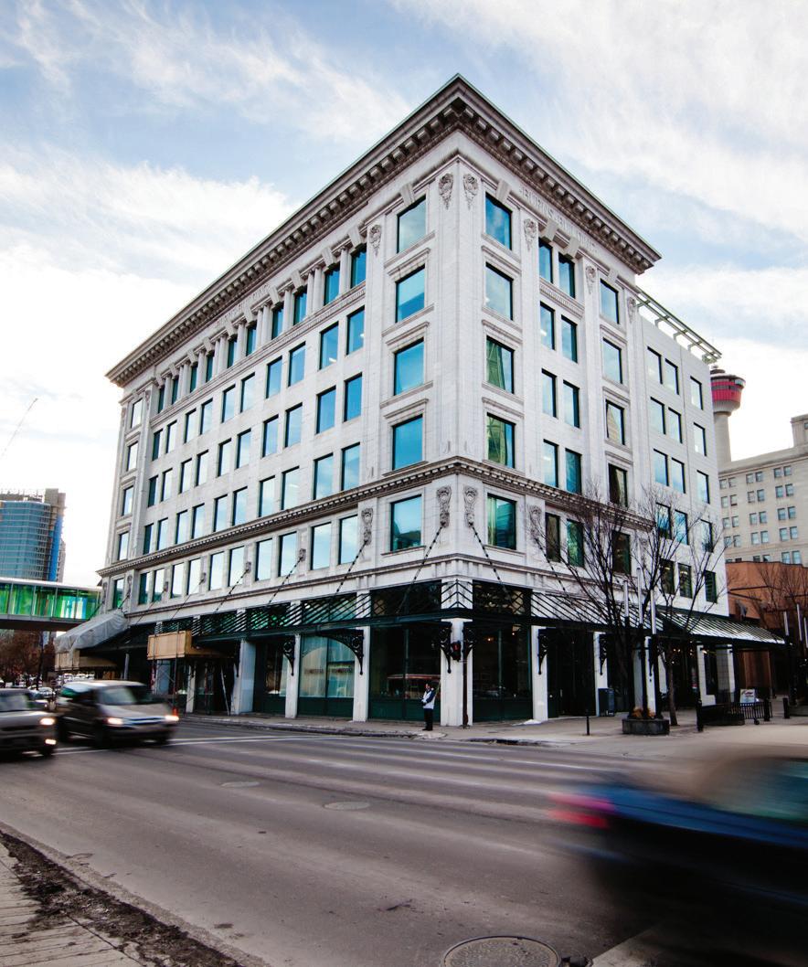 BY / PAR SYDNEY LONEY
Patrick Burns was born in Oshawa, Ontario, in 1856. As the fourth of 11 children in an Irish immigrant family, his living conditions were humble and his access to education limited. When he turned 22, he headed west in search of fame and fortune—and found both. It started with a single cow, which Burns bought on credit and later sold for four dollars. By 1912, he was running six cattle ranches and heading up the largest meatpacking company in the region. That year, construction began on the six-storey building at 237 8th Avenue SE that still bears his name.
Designed by William Stanley Bates, the Burns Building was built in the Chicago style of architecture with steel-reinforced concrete framing and a flat roof adorned with a terracotta cornice. Green and white marble corridors were paired with modern conveniences, like natural gas lighting. The ground floor housed one of Burns’ many retail meat markets.
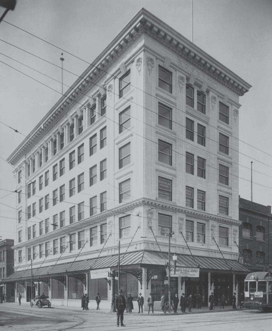
Burns, Calgary’s first millionaire and a renowned philanthropist, helped found the Calgary Stampede and was appointed to the Senate in 1931 in recognition of the impact he had on the development of Western Canada. Although he died in 1937, his legacy lives on in his building, which became part of Calgary’s Performing Arts Centre in 1981 and received heritage designation in 1987. Allied acquired the building—and maintains its namesake’s legacy—exactly 100 years after Burns broke ground. / Patrick Burns naît en 1856 à Oshawa, en Ontario, dans une famille d’immigrants irlandais. Quatrième d’une fratrie de onze, il vit une enfance modeste sans grand accès à l’éducation. À 22 ans, il fait ses valises direction l’ouest pour y chercher fortune et gloire. Il y trouvera les deux. Il commence par acheter une première vache à crédit, qu’il revend quatre dollars. En 1912, il est à la tête de six ranchs et de la plus grande usine de conditionnement de viande de la région. Cette même année, il fait construire au 237, 8e Avenue SE le bâtiment de six étages qui porte encore son nom.
Son architecte, William Stanley Bates, imagine une structure en béton armé, coiffée d’un toit plat orné d’une corniche en terre cuite, le tout inspiré de l’École de Chicago. À l’intérieur, il combine marbre vert et confort moderne, comme l’éclairage au gaz naturel. Le rez-dechaussée accueille l’une des nombreuses boucheries de Patrick Burns.
Premier millionaire de Calgary et réputé pour sa philanthropie, l’éleveur devenu homme d’affaires participe à la création du Stampede et est nommé au sénat en 1931 en reconnaissance de son influence sur le développement de l’Ouest canadien. Il mourra six ans plus tard.
Emblématique, l’édifice Burns est intégré au Performing Arts Centre de Calgary en 1981, avant de devenir bien patrimonial en 1987. Allied l’acquiert en 2012, 100 ans après le début des travaux, et continue depuis d’en préserver l’héritage.
Now & Then / D’hier à aujourd’hui
Top / En haut: Photo courtesy of / offerte par Libraries and Cultural Resources Digital Collections, University of Calgary. Bottom / En bas: Photo courtesy of / offerte par Allied REIT.
48
ca./vers 1914-’20s ca./vers 2012
Running Je cours
BY / PAR GABRIELLE DROLET ILLUSTRATION BY / PAR JASON LOGAN
“I want to become a person who runs,” said Norah, sitting across from me at a small table on the balcony. It was a cool, damp evening— Saint Patrick’s Day—and our conversation was scored by the sound of distant, drunken shouting. I had just moved to Montreal.
“Me too,” I said. A lie, but an innocent one—the kind you tell people you’re trying to become friends with. “Maybe we could go together?” She smiled and nodded. “We should!”
I took a sip of Irish beer and thought about all the times I’d tried running in the past. It was always the same: I’d spend days convincing myself to do it, get exhausted within minutes and return home red-faced and panting. I performed this ritual about once annually, always concluding that running wasn’t for me. On the balcony, my hands stiff from the cold, I decided to give it one more shot.
Nervous that I wouldn’t be able to keep up with Norah, I downloaded an app with guided runs and set out on my own the next day, just to see how much I was capable of. As I pushed myself to go faster, already weary and gasping, the voice in my headphones urged me to slow down.
“You’re not in a race,” the man from the app reminded me. “And even if you were, you’d need to be running at a sustainable pace.”
I made a conscious effort to slow down until running felt fine—almost easy. I started noticing the world around me. I spotted murals I’d never seen, squirrels chasing each other at the park, a man throwing small rocks into the fountain. And another thing happened: For a moment, I stopped being aware of how much pain I was in.
A year and a half before this, I had developed a nerve injury that would become chronic, causing constant pain throughout my upper body. It barred me from doing most forms of exercise comfortably, as well as most of the hobbies I loved. Now, suddenly, I felt a sense of control over myself and my body that I hadn’t experienced in months.
When I ended my run, instead of chastising myself for how long the loops around my apartment had taken, I was proud to have run at all—and excited at the thought of running faster the next time.
I’ve been running since—sometimes with my friend, but more often on my own. Though I’ve gotten faster overall, there are still bad days, and I’ve come to love them. As a chronically ill person constantly fighting to keep up with the world around me, I’ve found running to be an unexpected form of solace—a brief period where I can go at my own speed, even if that’s not very fast. / « J’ai envie de me mettre à la course à pied. »

Norah était assise en face de moi sur le balcon. La soirée était fraîche, notre conversation entrecoupée par les cris lointains des fêtards de la Saint-Patrick. Je venais d’emménager à Montréal.
« Moi aussi », lui répondis-je. Un mensonge en réalité, mais sans méchanceté, un de ceux qu’on dit pour essayer de se faire des amis. « On pourrait courir ensemble? » Elle hocha la tête en souriant : « Avec plaisir! »
En buvant une gorgée de bière irlandaise, je me rappelais les fois où j’avais tenté de courir. C’était à tous les coups pareil : je passais des jours à me motiver puis, rouge et essoufflée au bout de quelques minutes, j’abandonnais. Je concluais toujours ce rituel en me disant que la course n’était pas faite pour moi. Sur le balcon, les mains engourdies par le froid, je décidais de retenter ma chance.
Inquiète à l’idée de ne pouvoir suivre Norah, je téléchargeais une appli de course et commençais seule dès le lendemain, histoire de voir de quoi j’étais capable. Alors que, déjà à bout de souffle, je tâchais d’accélérer, la voix dans les écouteurs m’en dissuada.
Ce n’est pas une compétition, me dit-elle. Et même si c’en était une, il faut modérer son allure.
Je m’appliquais donc à ralentir jusqu’à ce que je me sente bien, que courir devienne presque facile. Je commençais à regarder autour de moi : les murales auxquelles je n’avais jamais prêté attention, les écureuils dans le parc, l’homme qui jetait des roches dans la fontaine. Et soudain, ma douleur s’envola… pour un temps du moins.
Un an et demi auparavant, je m’étais abîmé un nerf : cette inflammation, devenue chronique, me causait une douleur constante dans tout le haut du corps. Elle m’empêchait quasi toute forme d’exercice et me privait de mes activités préférées. Aujourd’hui, je reprenais le contrôle, une sensation oubliée depuis des mois.
À la fin de mon parcours, au lieu de m’autoflageller pour le temps mis à trottiner autour de mon appartement, j’étais fière d’avoir couru et impatiente à l’idée d’aller plus vite la prochaine fois.
Depuis, je cours. Avec des amis parfois, seule la plupart du temps. Même si j’ai augmenté la cadence, certains jours restent difficiles. J’ai appris à les aimer : courir est un réconfort purement fortuit, un bref moment durant lequel cette personne atteinte d’une maladie chronique, qui lutte chaque jour pour emboîter le pas au monde qui l’entoure, peut enfin vivre à son rythme.
Rethink / Repensé BLOCK / 49
BY / PAR ANGELO DOLOJAN
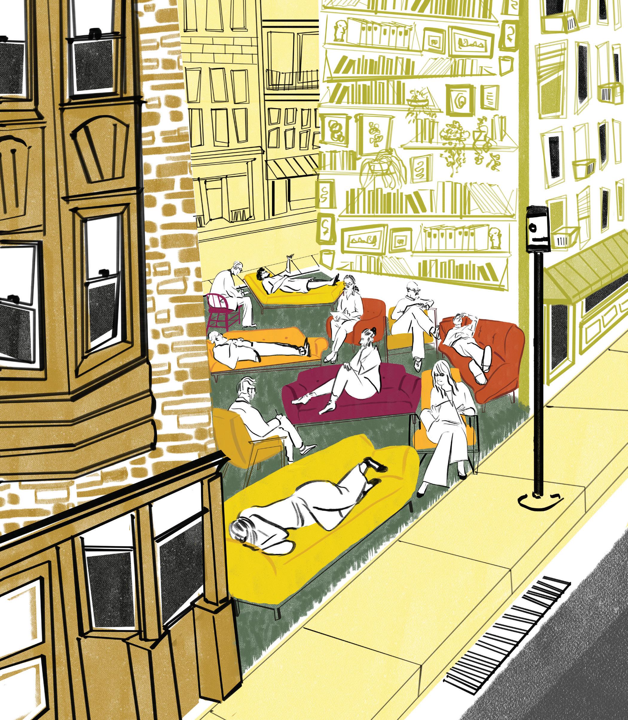
EACH ISSUE, WE ASK AN ARTIST: WHAT WOULD YOU DO WITH YOUR OWN URBAN INFILL? / DANS CHAQUE NUMÉRO, NOUS DEMANDONS À UN ARTISTE CE QU’IL FERAIT DE SA PROPRE DENT CREUSE
Fill in the Blank / Veuillez combler l’espace 50
PARISIAN SPEAKEASY, BUT MAKE IT TORONTO.


SPEAKEASY BAR
111C QUEEN ST.EAST, TORONTO |
ON OPENTABLE
BOOK
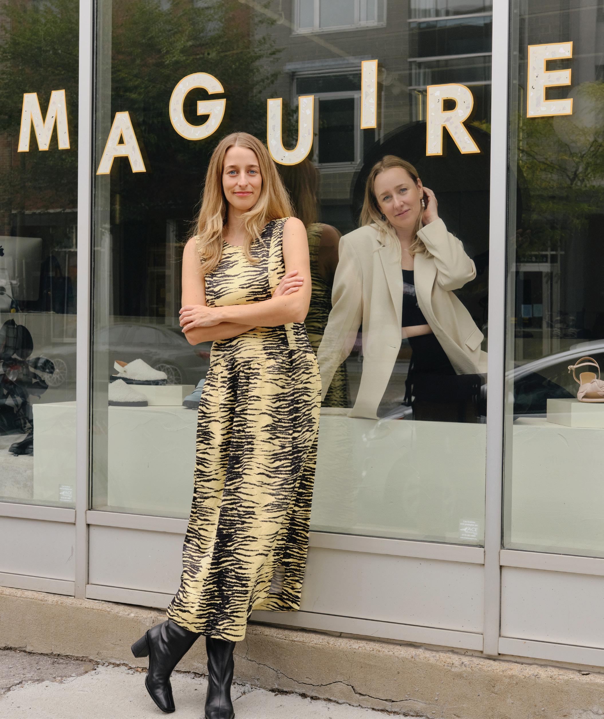 ROMY AND MYRIAM BELZILE-MAGUIRE, BY RICHMOND LAM, SEPTEMBER 6, MONTREAL / ROMY ET MYRIAM BELZILE-MAGUIRE, PAR RICHMOND LAM, 6 SEPTEMBRE, MONTRÉAL
