Rio Kaneki’s block printing shows influence, Montreal neighbours green an alley and ballroom organizers walk the talk. / Les gravures sur bois de Rio Kaneki font bonne impression, une ruelle montréalaise verdit et le ballroom affleure.
THE STARTING BLOCK / BLOCK DE DÉPART On this issue’s theme: community. / Le thème de ce numéro : la communauté. 7
THE MOMENT / LE MOMENT Berries, parsley and sage: the greening of one Montreal alleyway. / Bleuets, sauge et persil : le verdissement d’une ruelle montréalaise. 8
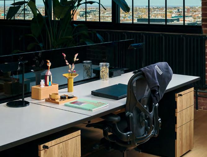
MY SPACE / MON ESPACE A meta office space outfitted with icons of modern design. / Un bureau montréalais habillé d’icônes du design moderne. 13
THE BUSINESS / L’ENTREPRISE ZN Advisory’s Zain Nayani on building community resilience through planning. / La résilience par la planification avec Zain Nayani de ZN Advisory. 14
ARTIST’S BLOCK / ART EN BLOCK Justin Ming Yong’s block is quilted and strapped. / Le cube emballé et emballant de Justin Ming Yong. 16
THE INTERIOR / L’INTÉRIEUR Tech company Unity’s Montreal office is made for people. / Le bureau montréalais de l’entreprise Unity rime avec collaboration. 18
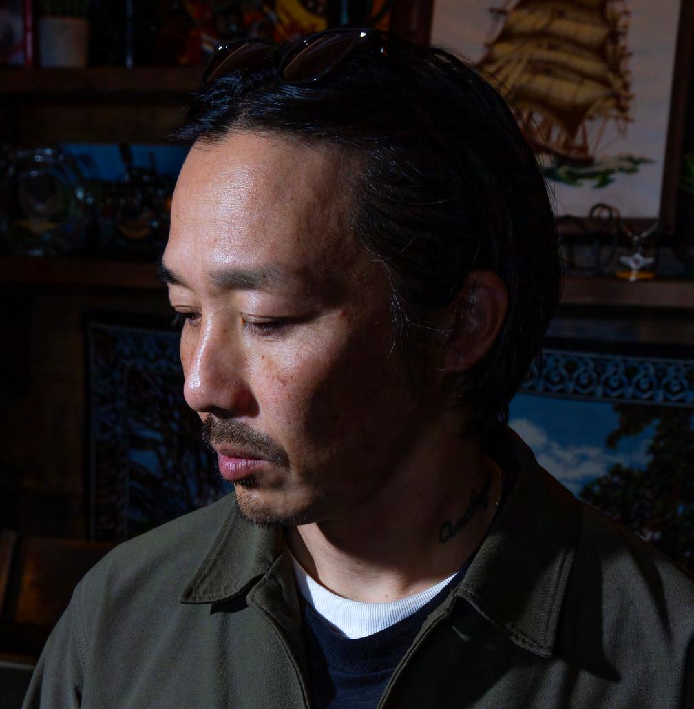
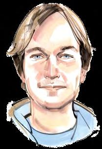
THE CREATOR / LE CRÉATEUR On the cover: West Coast graphic designer and block-print maker
Rio Kaneki carves his own path. / En couverture : Rio Kaneki, graphiste et xylograveur à Victoria, trace son sillon. 24
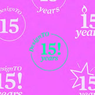
WORK-IN-PROGRESS / LE CHANTIER Growing a festival for Toronto’s design community, 15 years in. / Le festival du design de la communauté torontoise fête ses 15 ans.
30
THE CONVERSATION / LA CONVERSATION On giving ballroom’s subculture a platform. / On discute de la sous-culture du ballroom. 36
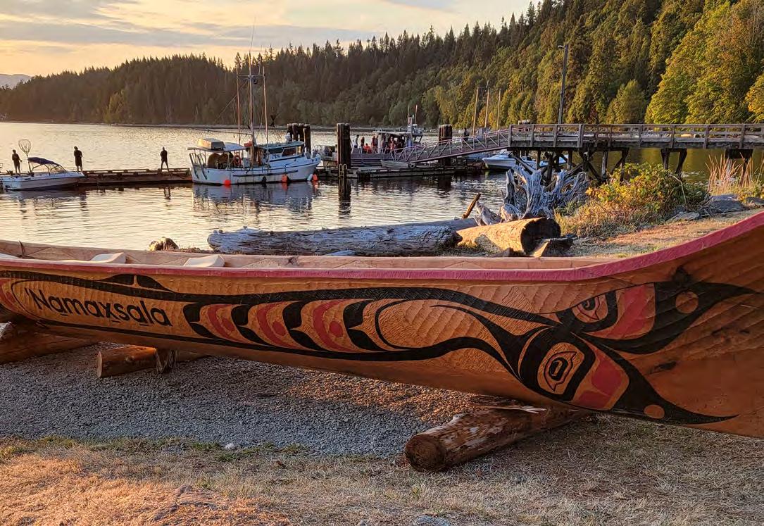
MADE / FABRIQUÉ A traditional canoe carved for the first time in a century. / Un canot traditionnel sculpté pour la première fois en 100 ans.
40
MAKE ROOM FOR THE ARTS / FAITES PLACE À L’ART Art is alive, well and in the open at The Well. / L’art s’expose à ciel ouvert à The Well à Toronto. 43
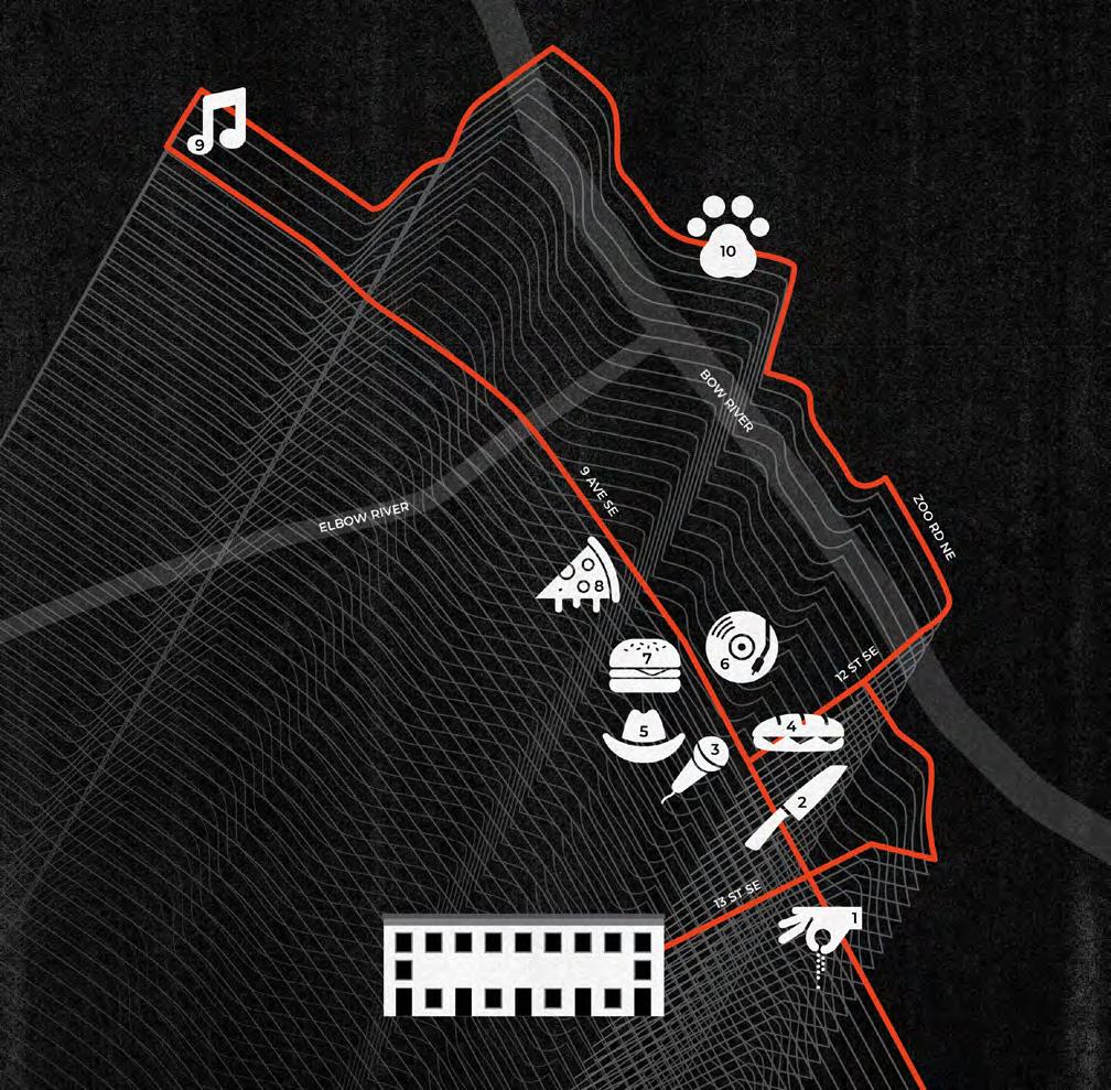
THE 1 KM GUIDE / 1 KM AUTOUR A spice merchant, open-mic night, a sandwich stop and more in Calgary’s oldest neighbourhood. / Un marchand d’épices, une soirée scène ouverte, une sandwicherie, entre autres, dans le plus vieux quartier de Calgary. 44
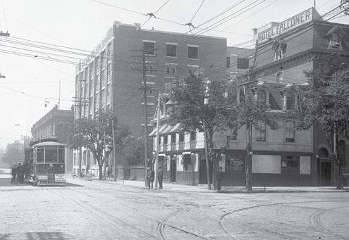
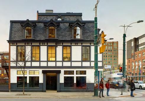
NOW & THEN / D’HIER À AUJOURD’HUI A King West hub that’s come a long way. / Un centre de King West en pleine évolution.
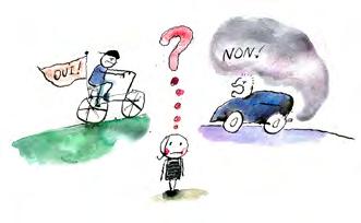
RETHINK / REPENSÉ Redefining community through conflict. / Redéfinir la communauté au travers du conflit.
46
47
THE BLUEPRINT / LE PLAN D’ACTION Match the collective noun to the group of individuals. / On associe groupes d’individus et noms collectifs. 48
FILL IN THE BLANK / VEUILLEZ COMBLER L’ESPACE Eric Kostiuck’s urban infill. / La dent creuse d’Eric Kostiuck. 49
Savannah Stewart is a Montreal-based journalist who's passionate about community reporting (Rethink, p. 47). She's the managing editor of The Rover, an independent journalism project, and a regular contributor to Cult MTL. / Journaliste à Montréal, Savannah Stewart est passionnée par la vie communautaire (Repensé, p. 47). Elle est directrice de la rédaction de The Rover, un journal indépendant, et écrit régulièrement dans Cult MTL
Valerie Strom is a Vancouver Island muralist and oil painter. Self-taught, she finds inspiration in her deep love of people and the human experience (The Business, p. 14). / Muraliste et peintre à l’huile autodidacte, Valerie Strom habite sur l’île de Vancouver. Son inspiration? Son amour des gens et l’expérience humaine (L’entreprise, p. 14).
A photographer and marketing communications professional based in Victoria, Matt MacLeod found his passion at a young age—being a positive influence in the world. He shot this issue’s cover subject (The Creator, p. 24). / Matt MacLeod, photographe et professionnel en communication à Victoria, a découvert sa passion dès son plus jeune âge : avoir une influence positive sur le monde. On lui doit les clichés de Rio Kaneki (couverture et Le créateur, p. 24).
Justin Ming Yong is a Toronto-based artist who, through his quilt-making practice, explores an unconventional, modern approach in an otherwise classic folk-art medium. He contributed our Artist’s Block (p. 16). / Artiste à Toronto, Justin Ming Yong revisite l’art de la courtepointe en y apportant originalité et modernité. Il a réalisé le cube d’Art en Block (p. 16).
ILLUSTRATIONS BY / PAR KAGAN MCLEOD BLOCK IS PUBLISHED TWICE A
$975 TAX INCLUDED
One-on-one sessions with our restaurant profit experts. Ever made $20k in 4 hours? Increase your profitability by more than our fees — guaranteed. 100+ new restaurant openings. North America’s leading hospitality consulting company.
Over 1,000 clients since 2001.
Community can be a congress, swarm or pride and, occasionally, a raucous riot. / Une communauté peut
être une assemblée, un essaim, une fierté et, à l’occasion, une meute.
There’s no shortage of pop psychology articles devoted to the topic of community; how civilization came to be when bands of nomadic travellers decided to settle down, raise crops and form societies; and how we, as humans, need it to survive.
Society is a scaleless word that can apply to any number of people living or communing in an organized fashion, making decisions on how they conduct themselves and sharing work or interests (or so says the Cambridge Dictionary ). Today, we can just as easily claim membership in our global village as in any number of highly niche groups (maybe online, maybe whose members have never met in person) aligned on a hobby, belief or interest.
Whatever it is that connects you to your community, or however many you identify with, what’s certain is that you’re better for it. From benefits to longevity—identified by Dan Buettner in his bestselling book Blue Zones—to the sense of purpose or belonging it brings, community can help you live a longer life, a better one, and maybe even save it.
Allied’s tenants form a community that spans various industries and regions. Allied serves this pan-Canadian community through its spaces, this magazine and the (upcoming) launch of the Block by Allied amenity hub in Toronto’s King West Village. To celebrate this expansion of Allied’s commitment to connecting and supporting its users, we focus this issue, broadly, on the theme of community (and proudly feature more Allied tenants than ever).
There’s Zain Nayani, an advocate for Indigenous Nations (The Business, p. 14) who, coming from Pakistan, brings his own post-colonial perspective to bear on his community-bolstering efforts. Then there’s the community of creators linked through 3D software engine Unity’s products. Block peeks at the company’s well-used, collaboration-supporting Montreal space (The Interior, p. 18). Looking beyond Allied’s community of users, we speak with the founding members of Function (The Conversation, p. 36)—a platform that supports and celebrates Canada’s nascent ballroom community and provides a sense of belonging to its members (some who are vulnerable). And, for pure enjoyment, there’s The Blueprint (p. 48), where we ask readers to match the community of animals, people or things to its appropriate collective noun.
Because community can be a lifesaver, but it can also be a congress, swarm or pride and, occasionally, a raucous riot
Il y a pléthore d’articles de psychologie consacrés à la vie en collectivité, de la naissance de la civilisation quand les populations nomades décidèrent de se sédentariser, de cultiver la terre et de former des sociétés, à la notion de sociabilité, clé de la survie de l’espèce humaine.
Une société est un ensemble d’individus vivant en groupes organisés plus ou moins nombreux, caractérisés par leurs règles et réunis pour une activité commune ou par des intérêts communs (dixit Le Robert). Aujourd’hui, on peut aussi bien se revendiquer citoyen du monde que membre de notre segment de niche, dont les participants, qui ne se sont peut-être jamais rencontrés en personne, partagent les mêmes centres d’intérêt ou les mêmes croyances.
Quel que soit le lien qui vous unit à votre communauté, sachez que vous vous en portez mieux. De ses bienfaits sur la longévité, démontrés par Dan Buettner dans son livre à succès Les zones bleues, au sentiment d’utilité ou d’appartenance qu’elle procure, la communauté vous aide à vivre mieux et plus longtemps, voire vous sauve la vie.
Les locataires d’Allied forment une communauté créative variée, qui s’étend d’un océan à l’autre. Allied met à leur disposition des espaces de travail, ce magazine et bientôt un futur centre d’agrément dans le King West Village à Toronto, qui portera le nom de Block par Allied. Pour mettre à l’honneur cet engagement à tisser des liens entre personnes créatives, ce numéro de Block est consacré à la notion de communauté (et met en lumière plus de locataires d’Allied que jamais).
Dans L’entreprise (p. 14), on découvre Zain Nayani : ce défenseur des Premières Nations, originaire du Pakistan, se sert de sa perspective postcoloniale pour soutenir toute action communautaire. Dans L’intérieur (p. 18), on jette un œil sur le nouveau bureau montréalais de la communauté de créateurs et de développeurs de jeux 3D de Unity, entièrement pensé pour favoriser la collaboration. Dans La conversation (p. 36), on discute avec les cofondateurs de Function10 : une plateforme de ballroom qui offre un espace sécuritaire et un sentiment d’appartenance à ses membres. Enfin, dans Le plan d’action (p. 48), on s’amuse à associer des communautés d’animaux, de personnes ou d’objets à leur nom collectif.
Parce que la communauté est certes une bouée de sauvetage, mais peut également être une assemblée, un essaim, une fierté, et, à l’occasion, une meute
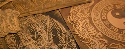
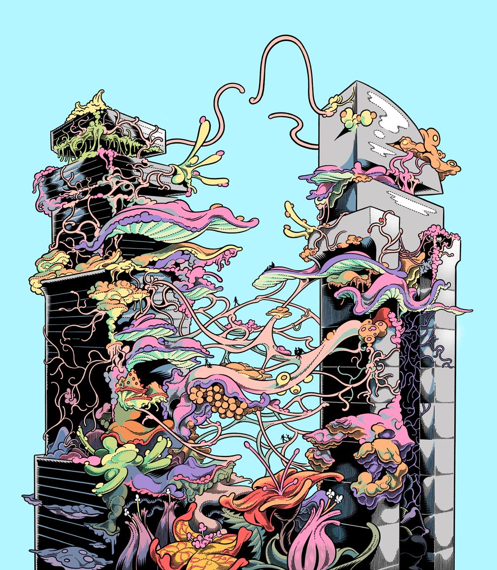
Cover subject Rio Kaneki’s wood blocks, and his work more broadly, show the graphic artist’s range of influences—historical, familial, cultural. / Les gravures sur bois de Rio Kaneki, à la une, montrent l’éventail des influences de cet artiste-graphiste : historiques, familiales, culturelles.
2024-08-24
BY / PAR DANIEL BROMBERG
BY / PAR DANIEL BROMBERG
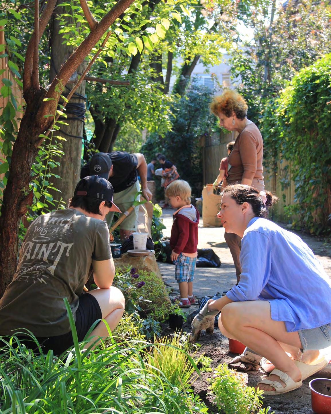
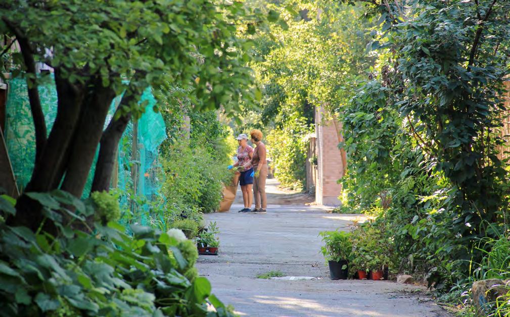
The sun is climbing the late-summer sky as residents of Montreal’s famously hip Plateau-Mont-Royal gather in the shadows of a back alley.
Sounds ominous, but, in truth, the neighbours are here to enact a shining example of urban renewal. Surrounded by bags of earth and potted seedlings and trees, they are planting a ruelle verte (green alley).
A source of pride for residents across the island, the City of Montreal’s ruelles vertes program takes public space and turns it into a driver of community in the urban core. As one of the Plateau’s project organizers, Carole Yerochewksi, indicates, it is a process. “It began last October by requesting official support from the alley’s residents,” by signing and submitting forms, she explains. “More than half said ‘yes.’”
Today, dozens of Plateau dwellers gather—some with coffee in hand, others with gardening tools at the ready—to work on the final stages of an initiative that will undoubtedly breathe new life into the alley.
In a city where many residents are apartment dwellers and renters, the municipally funded program helps address the lack of access to green space. “The city creates new planting spaces by removing concrete or adding planters to the alley,” explains Elyse MichaudSimard, a specialist in landscape architecture from the Ville de Montréal. “We then plant edible plants and herbs like blueberries, raspberries, parsley and sage–all perennials.”
Green alleys help reduce the heat-island effect, create a safe space for children to play and serve as common ground to meet and befriend your neighbours. Ruelles vertes naturally breed collaboration among residents as well as a sense of pride in physically contributing to the urban landscape. Often, that’s what keeps people tied to the projects and ensures their longevity.
Originally from Toronto, Maggie MacDonald emphasizes how the initiative has strengthened bonds between neighbours. “Our children are safer and more stimulated by the outdoors,” she says. “Friendships are formed easily, especially between kids, who get to experience nature in the city.”
En cette fin d’été montréalaise, pendant que le soleil monte dans le ciel, un petit groupe de résidents du quartier du Plateau-Mont-Royal se rassemblent dans l’ombre d’une ruelle.
Mystérieux? Pas tant que ça… Ils s’apprêtent à participer à un brillant exemple d’aménagement urbain. Entourés de sacs de terreau, de paillis et de plantes en pot, ils vont verdir leur ruelle.
Source de fierté des citoyens de l’île, le programme des ruelles vertes de Montréal transforme l’espace public grâce à la mobilisation de ses riverains. Et c’est toute une organisation, comme l’explique Carole Yerochewksi, une des initiatrices du projet du Plateau. « On a commencé par demander les autorisations des résidents de la ruelle en octobre dernier, puis on a préparé et envoyé le plan d’aménagement. Plus de la moitié ont dit oui. »
Aujourd’hui, café chaud et pelle à la main, ils sont prêts pour l’étape finale : donner une nouvelle vie à leur ruelle.
Dans une ville où beaucoup vivent en appartement, le programme financé par la municipalité permet de multiplier l’accès aux espaces verts. « On retire de l’asphalte pour créer des platebandes ou on installe des bacs de plantation, explique Elyse Michaud-Simard, agente technique en architecture de paysage pour la Ville de Montréal. Puis, on y plante des arbustes comestibles et des fines herbes, comme des bleuets, des framboisiers, du persil ou de la sauge, uniquement des vivaces. »
Les ruelles vertes contribuent à réduire les îlots de chaleur urbains, sécurisent l’espace de jeu des enfants et favorisent la socialisation entre voisins. Leur collaboration est essentielle à l’accomplissement du projet et participer au verdissement de leur milieu de vie leur procure un sentiment d’appartenance. Grâce à ce dernier, ils restent attachés au projet et en assurent la longévité.
Originaire de Toronto, Maggie MacDonald souligne combien cette initiative a resserré les liens entre voisins : « Nos enfants sont plus en sécurité et plus intéressés par l’extérieur. On se lie plus facilement d’amitié, surtout les enfants, et on peut découvrir la nature en ville. »
PHOTOS
PREVIOUS SPREAD: The process of greening an alley fosters intergenerational collaboration as neighbours of all ages carry plants, push wheelbarrows and bury their hands in the dirt for the promise of a greener future. / PAGE PRÉCÉDENTE : le verdissement d’une ruelle favorise la collaboration intergénérationnelle : les voisins de tous âges positionnent les plantes, manient la pelle et jouent les mains dans la terre en rêvant à un avenir plus vert.
BELOW: Detour through a ruelle verte and find another world, filled with multicoloured blooms, street art and vegetation. / À GAUCHE : entrer dans une ruelle verte, c’est entrer dans un autre monde, rempli de fleurs multicolores et d’art de rue.
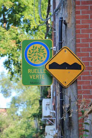
RIGHT: Green alleys are often designated by official signage, marking the hundreds of green spaces peppered throughout Montreal. Take these as an invitation to enter and enjoy. / À DROITE : un panneau officiel signale les centaines de ruelles vertes qui parsèment la ville de Montréal, tel une invitation à l’exploration et au plaisir.
Ruelles vertes naturally breed collaboration among residents as well as a sense of pride in physically contributing to the urban landscape. Often, that’s what ensures their longevity. / La collaboration des résidents est essentielle. Participer au verdissement de leur milieu de vie leur procure un sentiment d’appartenance et assure la longévité de la ruelle verte.
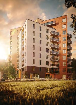
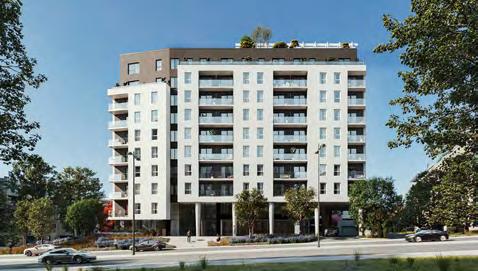
Élever l’immobilier
Groupe HD est une entreprise québécoise spécialisée dans l'investissement, le développement, la construction et la gestion immobilière. Son ambition est de redéfinir l'habitat de demain en concevant et réalisant des projets d'envergure, pensés pour répondre aux besoins des communautés et des municipalités. L'entreprise repense continuellement ses méthodes de développement afin de créer des espaces de vie intégrés et durables pour les générations actuelles et futures.
À ce jour, Groupe HD est impliqué dans une douzaine de projets, totalisant plus de 4 000 unités résidentielles, réparties entre copropriétés et immeubles multi-locatifs.
Plus qu'une simple croissance, son objectif est d'inspirer une transformation réelle dans l'industrie immobilière en proposant des projets innovants, durables et porteurs de sens, adaptés aux besoins de ses clients et partenaires. Groupe HD est déterminé à changer la donne et à construire des habitations garantes d’avenir.
Taking real estate higher
Groupe HD is a Quebec-based company specializing in investment, development, construction, and property management. Its ambition is to redefine tomorrow’s housing by designing and delivering large-scale projects that meet the needs of communities and municipalities. The company continuously rethinks and adapts its development methods to create integrated and sustainable living spaces for present and future generations.
To date, Groupe HD is involved in a dozen projects, totaling over 4,000 residential units, including condominiums and multi-rental buildings.
More than just growth, its goal is to inspire real transformation in the real estate industry by offering innovative, sustainable, and meaningful projects that meet the needs of its clients and partners. Groupe HD is determined to make a difference and build homes that are future-proof.
groupehdimmobilier.ca
High Design Hautement design
When Herman Miller acquired Knoll, two canonical brands banded and Möbel, a Montreal showroom and the certified dealer of their office and residential furniture, expanded into this 15,000-square-foot multi-level space (an Allied property)—with 360-degree views, no less—in Outremont. “We use furniture to delineate, creating different areas and moods,” says senior designer Rana Achkar from her meta office space surrounded by icons of modern design. / À l’acquisition de Knoll par Herman Miller, deux marques cultes ont fusionné et Möbel, salle d’exposition montréalaise et distributeur agréé de leurs mobiliers et matériel de bureau, s’est agrandi en s’installant à Outremont dans un bien appartenant à Allied : 140 m2 avec une vue à 360 degrés. « Les meubles nous servent à délimiter des espaces et créer différentes ambiances », explique la designer principale Rana Achkar, entourée d’icônes du design moderne.
1. Task Chair & Desk / La chaise et le bureau
“The chair is Aeron, from Herman Miller. It’s in MoMA’s collection in New York and a bestseller. The desk is Knoll Antenna Design’s benching with a smoked glass screen.” / « La chaise, c’est une Aeron de Herman Miller : un modèle populaire, qui est dans la collection du MoMA à New York. Le bureau, c’est un Knoll Antenna Design, surmonté d’un écran en verre fumé. »
2. Girard Wooden Doll / La figurine en bois
“The little person is by Alexander Girard. He was a designer for Herman Miller, but he really did it all.
Interior and industrial design, textiles. This is one of his little sculptures. They’re cute; they have feathers for hair.” / « Elle est signée Alexander Girard. Ancien designer de Herman Miller, c’est un touche-à-tout : design intérieur, industriel, textile. Là, c’est une de ses sculptures en bois, toute jolie avec sa plume en guise de cheveux. »
3. Möbel Merch / Les articles Möbel
“There’s a sweater from C’est Beau, and we’re creating candles for our clients with another Montreal company, Feu&Co. We’re testing out which scent is best. We voted, and I think the one we like most is Palo Santo.” / « Il y a un chandail de C’est beau et on fabrique des bougies pour nos clients avec Feu&Co., une autre entreprise montréalaise. On est en plein test de parfums et, pour l’instant, notre préférence va à Palo Santo. »
4. Laptop / Un ordinateur portable “It’s heavy and big—a dinosaur. When I see clients, I’ll bring it along and designers ask, ‘Can you do 3D on it?’ They’re impressed.” / « Il est grand et lourd, un vrai dinosaure. Quand je rencontre des clients, ils me demandent si je peux faire de la 3D dessus. Ils n’en croient pas leurs yeux. »
5. 3D-Printed Owl / Un hibou imprimé en 3D “We bought a 3D printer and printed [scale models of] tables and chairs for a client, to show them how they could move things around in their space. It was easier to do it this way because they were lawyers and not the most visual. We called it ‘live design.’” / « On a acheté une imprimante 3D et imprimé des maquettes de tables et de chaises pour un cabinet d’avocats afin de leur montrer comment aménager leur espace. La visualisation a été beaucoup plus facile ainsi. On a appelé cette méthode le design en direct. »
BY / PAR KRISTINA LJUBANOVIC
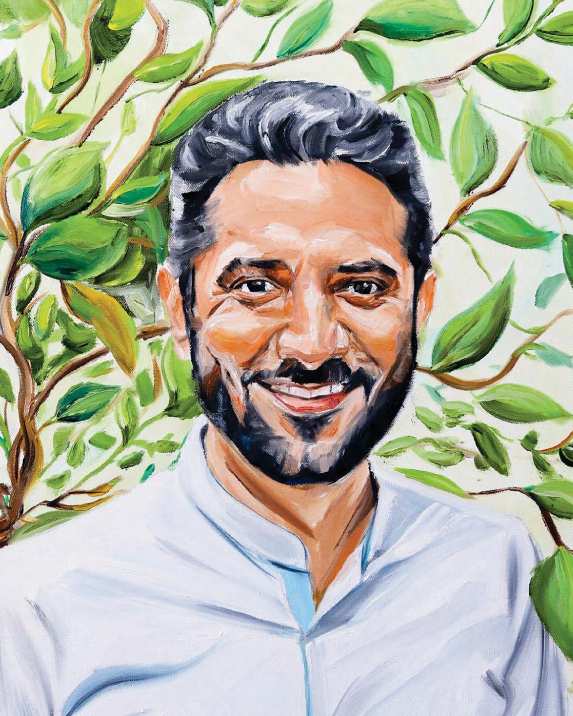
Resilience Built
Tuteur de résilience
BY / PAR HANNAH MACREADY
ILLUSTRATION BY / PAR VALERIE STROM
We spoke to Zain Nayani, the founder and CEO of ZN Advisory, a firm exclusively supporting Indigenous communities, about achieving resiliency through planning and his post-colonial perspective, having grown up in Pakistan.
Thirteen years ago, I arrived in Canada from Karachi, Pakistan, seeking stability amid a personal and social crisis back home. Canada was seen as a land of opportunity, a place where anyone could achieve their dreams. At 23, I pursued an MBA at Simon Fraser University to build a better future.
It was during that time that I came across an article about a grassroots Indigenous movement to combat the ongoing impacts of colonization. The emphasis on collective responsibility, mutual aid and the preservation of cultural heritage resonated deeply with me, having grown up in a culture and family where the values of giving and community care were ingrained.
But the story also unsettled me. I hadn’t known that a country like Canada, so progressive on the surface, harboured such deep social injustices. I wanted to know more about this country’s history, about its original peoples. My curiosity led me to an internship with the Kanaka Bar (T’eqt’’aqtn’mux) band in British Columbia.
Initially, I was there to help plan for a community economic-development project, brought on by the success of a profitable hydroelectric system. But as I immersed myself in the community, I realized this wasn’t just about money—it was about healing and resilience.
Working primarily on the reserve, I saw first-hand how the community was faced with capacity issues, deficiencies in staffing, time, money, technology and the like—all a result of stolen land, people and history. It became clear that resilience couldn’t be built with a one-size-fits-all solution. It required deep understanding, respect and a commitment to supporting these communities. What was supposed to be a brief internship stretched into eight months, then five years, and continues to be a great relationship today.
The experience reshaped my approach to reconciliation. I learned that true engagement starts with understanding and, then, action. I hope to inspire others to embrace this perspective for meaningful, lasting change.
On parle résilience par la planification et perspective postcoloniale avec Zain Nayani, fondateur et PDG de ZN Advisory, une entreprise consacrée au soutien des communautés autochtones.
Il y a 30 ans, en pleine crise sociale et personnelle, je quittais le Pakistan et ma ville de Karachi. Direction le Canada, en quête de stabilité sur une terre d’opportunités, où chacun pouvait réaliser ses rêves. À 23 ans, j’étudiais au MBA à l’université Simon Fraser dans le but de bâtir un avenir meilleur.
C’est à cette époque que je suis tombé sur un article à propos d’un mouvement autochtone luttant contre les répercussions actuelles de la colonisation. L’accent était mis sur la responsabilité collective, l’entraide et la préservation du patrimoine culturel. Ayant grandi dans une famille et une culture prônant les valeurs du don et de la collectivité, cela a fait écho en moi.
Cela m’a également troublé. J’ignorais qu’un pays comme le Canada, si progressiste en apparence, dissimulait de telles injustices sociales. Je voulais en savoir plus sur son histoire et ses premiers peuples. Ma curiosité m’a conduit à faire un stage chez la Kanaka Bar (T’eqt’’aqtn’mux) en Colombie-Britannique.
Au départ, j’étais là pour participer à la planification d’un projet de développement économique, rendu possible par la rentabilité d’un système hydroélectrique. Sauf qu’en m’immergeant dans la communauté, je me suis rendu compte que ce n’était pas qu’une question d’argent, mais aussi de guérison et de résilience.
En travaillant dans la réserve, j’ai vu les problèmes de capacité, de manque de personnel, de temps, d’argent, de technologies et j’en passe, tous dus au vol de territoire, de peuple, d’histoire. Il était clair que la résilience ne passerait pas par une solution unique. Il faudrait une profonde compréhension, du respect et un engagement à soutenir ces communautés. Ce qui devait être un bref stage a duré huit mois, puis cinq ans, et s’est transformé aujourd’hui en une belle relation. Cette expérience a façonné mon approche de la réconciliation. J’ai appris qu’un vrai engagement commence par la compréhension. L’action vient après. J’espère que d’autres adopteront mon point de vue pour un changement significatif et durable.
THE BEST ADVICE I’VE EVER RECEIVED / LE MEILLEUR CONSEIL QU’ON M’AIT DONNÉ
“The Creator gave each and every one of us two great gifts: life and the power of choice.” / « Le Créateur a fait deux grands cadeaux à chacun d’entre nous : la vie et le pouvoir de choisir. »
Untitled / Sans titre
by/de Justin Ming Yong
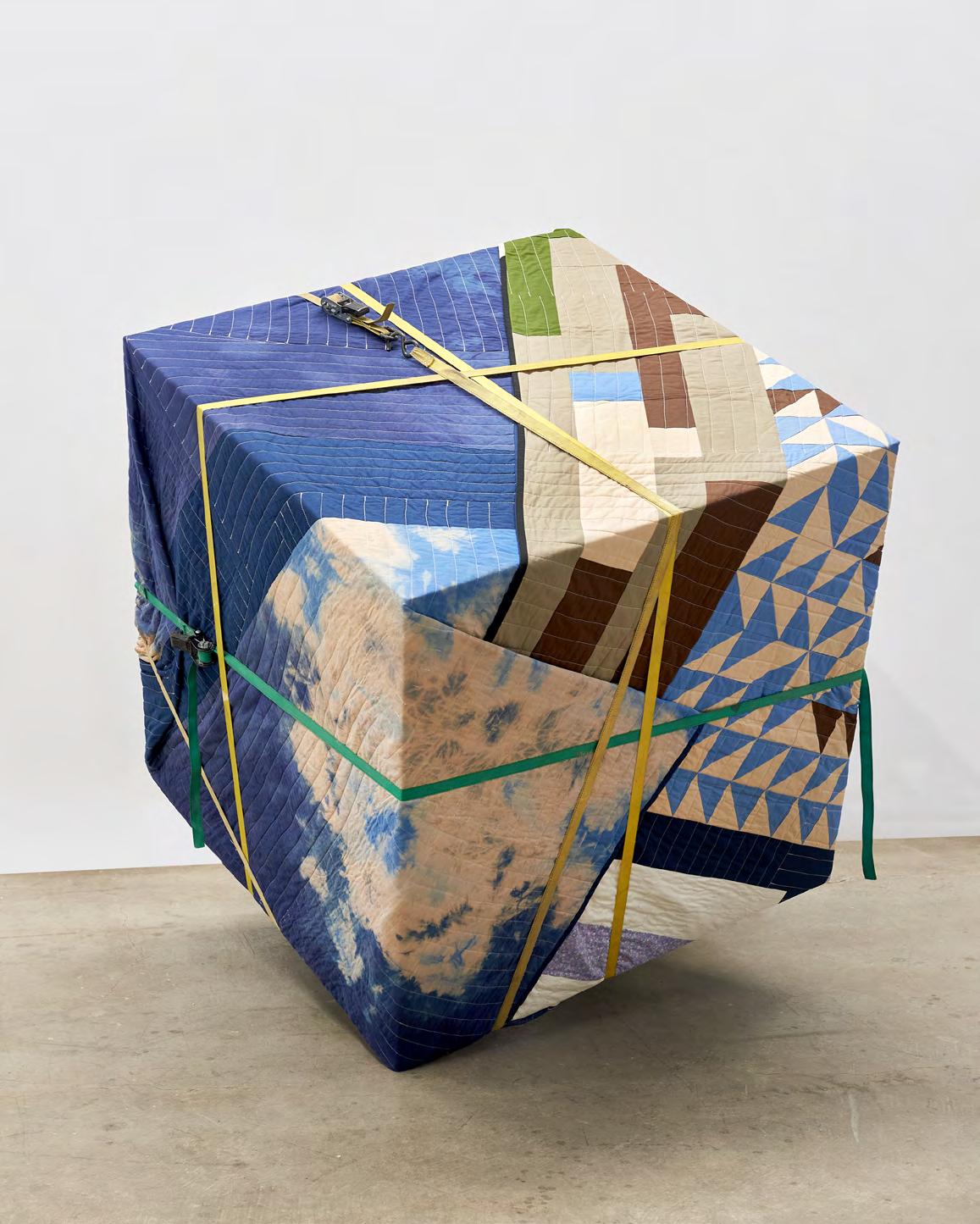
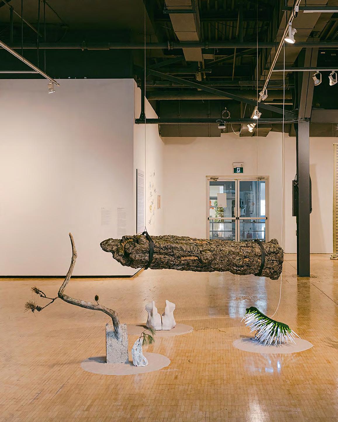
Tidily wrapped and secured with ratchet straps, Justin Ming Yong’s quilted block resembles a fragile article, or artwork, in a moving blanket—though the “rich composition of materiality, shape and colour,” says Yong, “far removes it from the mundane.” / Soigneusement emballé et sécurisé par des sangles à cliquet, le cube de Justin Ming Yong prend des airs d’article fragile, ou d’œuvre d’art, prêt pour un déménagement. « Matières, lignes, couleurs… sa riche composition l’éloigne de la banalité », explique l’artiste.
Artist’s Block / Art en Block
by / par
Photo
Adrien Williams
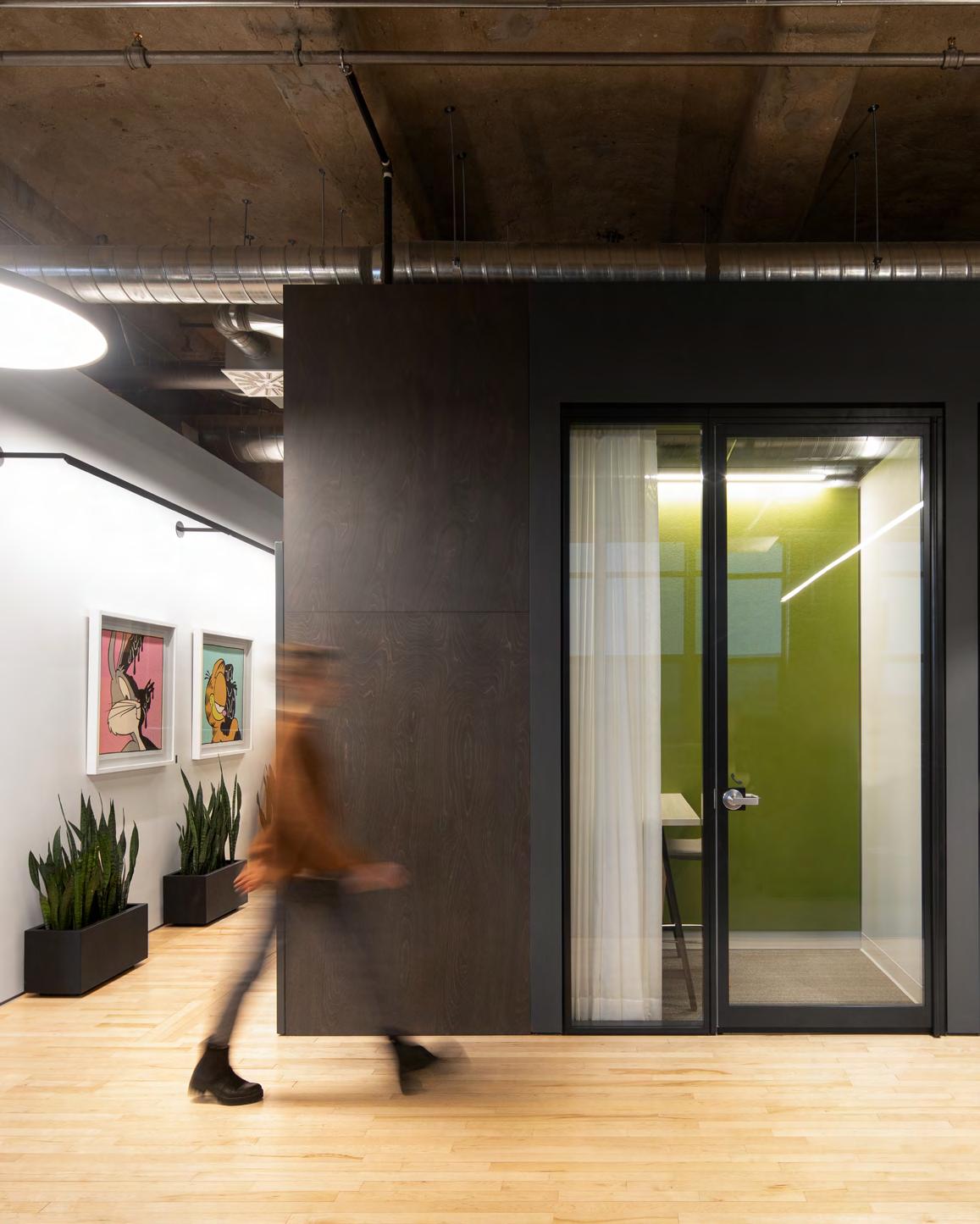
The Interior / L’intérieur
3D and IRL Jeux et réalité
BY / PAR DANIEL BROMBERG
PHOTOS COURTESY OF / OFFERTES PAR UNITY
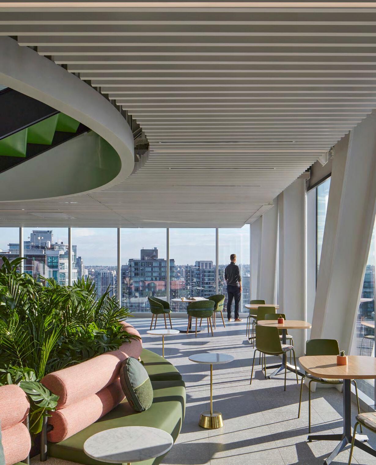
Standing before a large hall filled with modern furniture, impossibly sleek light fixtures and a bustling cafeteria, it takes only a few seconds for the vision behind this award-winning space to reveal itself.
“We felt we had an opportunity to create a place that people would be proud of, a place where people would want to come,” says Marc Cinq-Mars, Unity Technologies’ senior director of brand. For him, this vast space is the heart of the tech company’s Montreal office.
Unity, a world-leading cross-platform 2D and 3D game engine (and community of creators and developers to boot), saw significant growth during the pandemic. In renovating four storeys of the historic Nordelec building in the city’s Pointe-Saint-Charles neighbourhood, the goal was not simply aesthetic (though it is pleasing in this regard); it was to create a shared space where people with the same purpose, mission and objectives could succeed.
The interior design, by local firm NEUF architect(e)s, honours the building’s heritage with elements like exposed brick, original columns and preserved flooring, while modern features subtly infuse the space with Unity’s identity. Circulation through the space was inspired by Montreal’s alleyways, and the walls are adorned with local art pieces and Indigenous place names for office wings.
Espace aéré, mobilier moderne, luminaires ultraépurés, cafétéria animée, il suffit de balayer ce bureau primé du regard pour en deviner la vision.
« On a senti qu’on avait l’occasion d’aménager un endroit dont les gens seraient fiers, où ils auraient envie de venir », lance Marc Cinq-Mars, directeur de marque chez Unity Technologies. Pour lui, ce lieu est le cœur du bureau montréalais de l’entreprise.
Chef de file des jeux multiplateformes 2D et 3D (et communauté de créateurs et développeurs de talent), Unity a connu une importante croissance durant la pandémie. La rénovation des quatre étages de l’édifice Nordelec dans le quartier de Pointe-Saint-Charles n’avait pas qu’un objectif esthétique (bien que le résultat soit splendide); l’idée était de créer un espace partagé, consacré à la réussite de personnes ayant la même mission et les mêmes buts.
L’aménagement intérieur, signé par l’agence montréalaise NEUF architect(e)s, combine des caractéristiques d’origine du bâtiment, dont briques apparentes, colonnes et plancher de bois franc, avec des éléments contemporains, qui diffusent l’identité d’Unity en toute subtilité. La circulation dans l’espace s’inspire des ruelles montréalaises, des œuvres d’art locales ornent les murs et les ailes du bureau portent des noms de lieux régionaux.
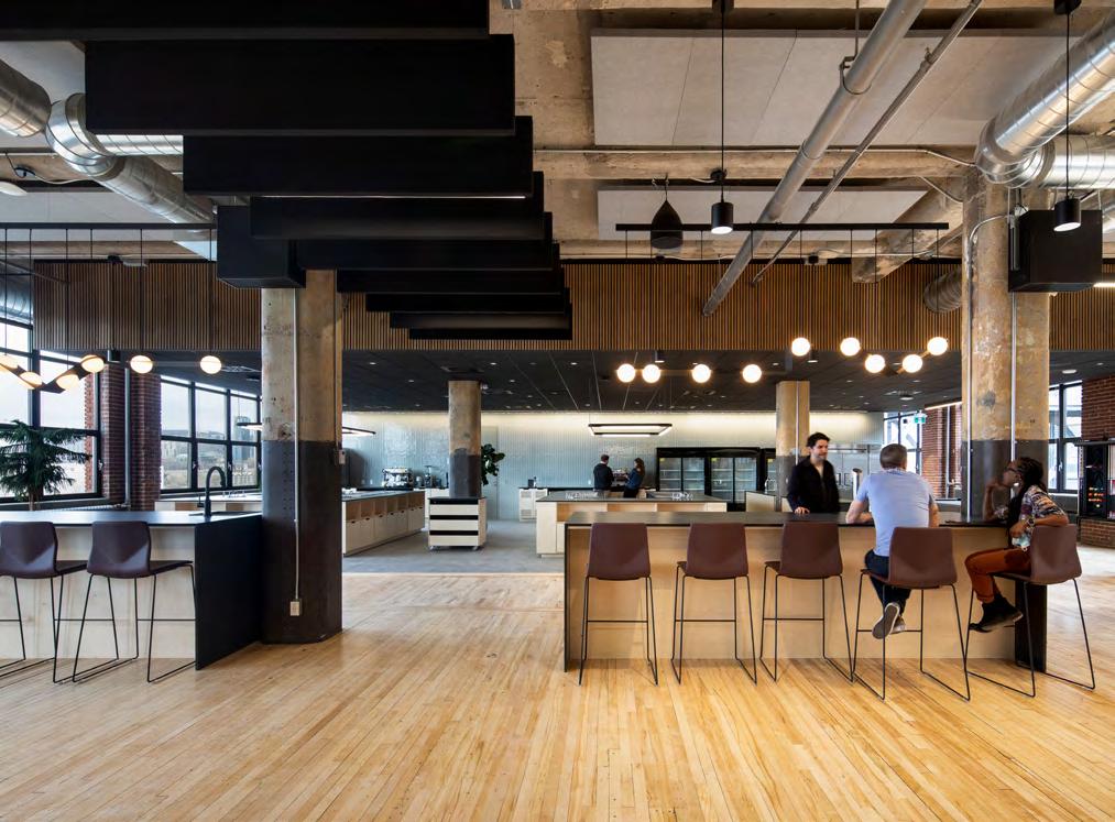
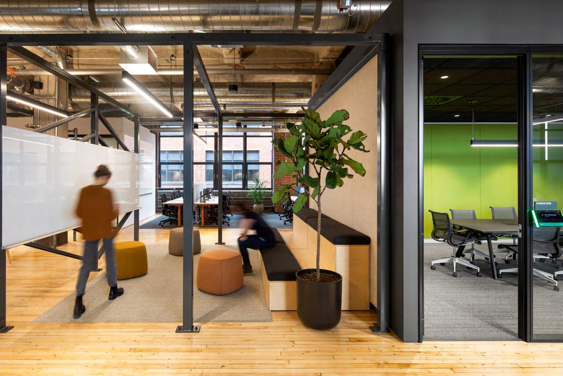
LEFT: A variety of spaces for various functions; small rooms, with felt-panelled sound-absorbing walls, are for calls or solo work. Circulation throughout was inspired by the city’s alleyways. / À GAUCHE : à chaque espace, sa fonction. Les petites pièces aux murs habillés de panneaux acoustiques en feutre servent aux appels ou au travail en solo. La circulation s’inspire des ruelles montréalaises.
“We found a healthy balance between the essence and the soul of the building while applying our own DNA.”
/ « On a trouvé un juste équilibre entre l’essence et l’âme du bâtiment, tout en y appliquant notre ADN. »
ABOVE: NEUF architect(e)s was awarded the Grand Prix for Interior Design at the Gala des Grands Prix du Design in 2022 (among others) for the project. For Unity’s team, the space is a café and home and host to Bièrecredi, game jams and celebrations. / CI-DESSUS : pour cette réalisation, NEUF architect(e)s a reçu plusieurs récompenses, dont celle de Grand lauréat dans la catégorie bureau du Gala des grands prix du design en 2022. Pour l’équipe de Unity, cet espace rime avec café, détente, découvertes de jeux et bièrecredi
OPPOSITE PAGE: A whiteboard, stools and bleacher seating for planning, brainstorming and ideation, alongside a more traditional conference room. / PAGE CI-CONTRE : un tableau blanc, des poufs et des gradins pour réfléchir, organiser, imaginer à côté d’une salle de réunion plus classique.
by / par Adrien Williams
Photos
The renovation’s impact is evident in how the space fosters community and collaboration. Each wing’s workspace was designed to encourage teamwork, with multiple seating areas (some featuring couches and whiteboards, others offering bunk beds) and multi-use meeting rooms for teams to congregate or for private work. The design eliminated hierarchical seating areas as none of the employees, including senior management, have individual offices.
And while the renovation met the desire for a shared space, it also allowed Unity to show off its ethos, blending local culture with an international outlook. “I find pride in the fact that we found a healthy balance between the essence and the soul of the building itself while applying our own DNA over it,” Cinq-Mars says.
According to Pierre-Paul Giroux, vice-president of Muse, one of Unity’s products, the Montreal office, with nearly 550 employees, boasts one of the most engaged in-office teams. “People were able to rediscover the human connection that was lost during the pandemic, and we were so proud of that,” Giroux says.
Tout a été pensé pour favoriser l’esprit d’équipe et la collaboration : de multiples zones, meublées de fauteuils, de canapés et même de banquettes façon lits superposés, invitent au travail collectif et informel, tandis que des salles vitrées multiusages permettent de se réunir autour d’une table centrale ou de se concentrer en solo. La notion de bureau individuel a été éliminée : aucun des employés, y compris les gestionnaires, n’en a.
Dans cet espace partagé, Unity affiche sa philosophie d’entreprise, mêlant culture locale et perspective internationale. « Je suis fier qu’on ait pu trouver un juste équilibre entre l’essence et l’âme du bâtiment, tout en y appliquant notre ADN », poursuit Marc Cinq-Mars.
Selon Pierre-Paul Giroux, vice-président de Muse, un des produits d’Unity, l’équipe montréalaise, qui compte près de 550 personnes, est l’une des plus engagées. « Les gens ont pu redécouvrir les liens humains, qu’on avait perdus pendant la pandémie, et on en est très fiers », explique-t-il.
Tout comme Marc Cinq-Mars, il confirme que la rétroaction est en
The Interior / L’intérieur
Cinq-Mars and Giroux say that employee feedback has been overwhelmingly positive. “In Unity’s flat organizational structure, where everyone has a voice, the lack of complaints about the new space speaks volumes. The office was designed with flexibility in mind, able to expand or contract as needed, ensuring it remains adaptable as the company grows,” Cinq-Mars says.
As Unity’s second-largest office globally, and a main hub, the Montreal office is one that they will continue to invest in. As it stands, it reflects their mission: to have a space that celebrates creativity differently and a place the team is proud to call their own.
très grande majorité positive. « Dans la hiérarchie horizontale d’Unity, où chacun a voix au chapitre, le manque de plaintes à propos du nouvel espace en dit long. Le bureau a été conçu pour être flexible : il peut s’agrandir ou se contracter selon les besoins, garantissant ainsi son adaptabilité à la croissance de l’entreprise », ajoute Marc Cinq-Mars.
Deuxième bureau d’Unity à l’échelle mondiale, et pôle principal, l’espace montréalais est l’un de ceux dans lesquels l’entreprise continuera d’investir. Dans sa forme actuelle, il est à l’image de sa mission : célébrer la créativité autrement et susciter un fort sentiment d’appartenance.
BELOW: For a tech company, there’s a noted absence of digital displays and elements in the office. The architects left the steel and concrete structure bare, and the space is enhanced by natural light and views of the monumental Farine Five Roses neon sign, erected in 1948. / CI-DESSOUS : une absence notable dans cet antre de la tech? Les éléments numériques. À la place, la structure en acier et béton apparent, laissée par les architectes, la lumière naturelle et la vue sur le néon Farine Five Roses, icône du patrimoine industriel datant de 1948.
by / par Russell Gagnon
Photo
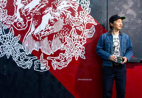
Analog Influence Art à répétition
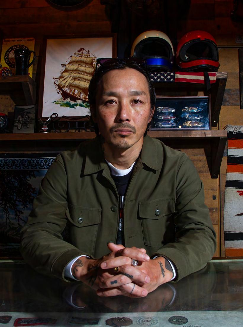
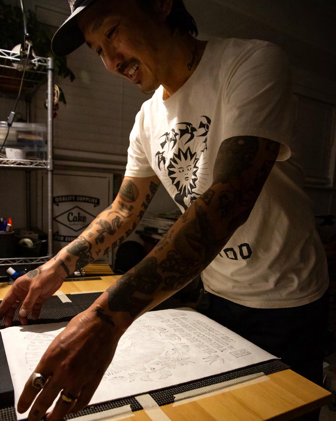
Self-taught graphic designer Rio Kaneki carves space for his block prints and converging Japanese and Western influences. /
Graphiste autodidacte, Rio Kaneki grave ses blocs de bois en conjuguant les influences japonaises et occidentales.
BY / PAR MÉLANIE RITCHOT PHOTOS BY / PAR MATT MACLEOD
LENTEMENT, SLOWLY
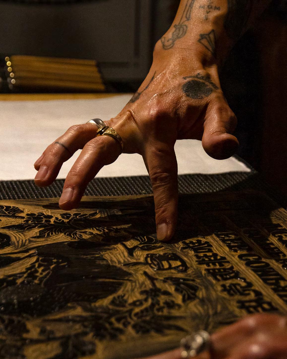
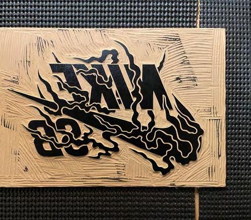
and methodically, narrow lines of wood are chiselled from a block, revealing characters and illustrations as the remnants fall away. One misstep and the hours-long process must begin anew. Once an image is carved to standard, it’s rolled with ink and pressed onto a page, the carved sections reserving blank space. Woodblock printing was invented in Japan in the 12th century, but Victoria-based, Japanese-born graphic designer Rio Kaneki has adapted the medium for his timeless logo and brand designs that merge traditional Japanese imagery with Western skate, punk rock and tattoo art.
In 2021, the owners of Fernwood Coffee Company, a local roastery and café, asked him to create a linoleum block print for the café, giving him creative freedom save for a few details. Kaneki hand-carved an intricate illustration of Pharaoh’s Horses, infamous in tattoo lore, incorporating a cup of coffee, botanicals, the company’s name and kanji, Japanese writing adapted from Chinese characters, that translate to “fine coffee roastery,” “family” and “local.”
It took three attempts to carve out the bold lines and typography reminiscent of a vintage sign, and the third and final block took more than 20 hours to carve. “It’s such a physical, analog process—I don’t want it to look a hundred percent perfect,” Kaneki says. Then it came time to put the design to paper. “I like the idea of having a little bit of ink rejection; it makes the block print much more unique,” he says, adding that perfection, in this medium, is near impossible anyway. “You can control how much pressure you use, but at the end of the day, it’s almost just luck.”
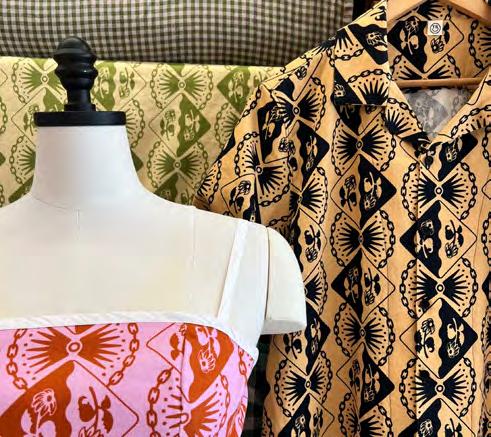
Kaneki, never straying too far from the skate community he credits for his success (he’s created designs for Goodnews Skateshop in Victoria and others), has recently leaned into an interest in Japanese textiles, releasing a line of patterned fabrics in collaboration with The Sewing Club. The
méthodiquement, de fines lamelles de bois sautent sous l’action du ciseau, révélant des caractères et des images. Une seule fausse manœuvre et les longues heures de travail sont réduites à néant. Le dessin en relief est ensuite encré et pressé contre une feuille, tout ce qui est gravé apparaîtra en blanc. La xylogravure a été inventée au Japon au 12e siècle, mais Rio Kaneki, graphiste d’origine japonaise basé à Victoria, a adapté le procédé pour son logo et des marques qui combinent imagerie traditionnelle japonaise et univers de la planche à roulettes, du punk rock et du tatouage.
En 2021, les propriétaires de Fernwood Coffee Company, un torréfacteur local, lui ont commandé une linogravure pour leur café, lui donnant toute liberté de création à quelques détails près. Il a gravé une illustration des chevaux du pharaon, tristement célèbres dans le milieu du tatouage, encerclés de feuillage, d’une tasse à café, du nom de l’entreprise et de kanjis : des idéogrammes japonais dérivés des caractères chinois, qui se traduisent par « torréfaction de café de qualité », « famille » et « local ».
Il lui a fallu trois essais pour ciseler les lignes impétueuses et la typographie rappelant les enseignes rétro, le dernier bloc de linoléum lui ayant demandé une vingtaine d’heures de travail. « C’est tellement physique et répétitif que je ne vise pas la perfection, explique Rio Kaneki. Vient ensuite le moment du transfert sur papier. Ça ne me dérange pas s’il y a un petit rejet d’encre, ça la rend encore plus singulière. » Et d’ajouter que la perfection, dans sa discipline, est quasi impossible : « On peut maîtriser la pression qu’on applique mais, au final, c’est presque que de la chance. »
Lui, qui s’éloigne peu de la communauté des plancheurs à laquelle il attribue sa réussite (il a notamment réalisé le graphisme du Goodnews Skateshop de Victoria), s’est intéressé aux textiles japonais et vient de
PREVIOUS SPREAD: Kaneki is a fixture in Victoria’s skateboard scene and an internationally featured designer. His work is instantly recognizable for its Japanese and Western influences. / PAGE PRÉCÉDENTE : le travail de Rio Kaneki, partie intégrante de la communauté des plancheurs de Victoria, est immédiatement reconnaissable à ses influences japonaises et occidentales.
THIS PAGE: The Sewing Club in Victoria printed bolts of fabric designed by Kaneki as part of their local artist series. / CI-CONTRE : dans le cadre de sa série sur les artistes locaux, The Sewing Club a imprimé des rouleaux de tissu imaginé par Rio Kaneki.
The
Creator / Le créateur
design echoes traditional American tattoo style—Japanese-influenced in itself—in its bold lines and limited colour palette and is available in four colourways. While Kaneki’s work is painted mural-size, hung in businesses, printed on apparel and tattooed, across the West Coast and beyond, the Fernwood block-print commission is what shifted the former screen printer’s independent graphic design career.
“The Fernwood piece was kind of a game changer, and that was the very first design where I incorporated the kanji,” Kaneki says. “It ended up like a poster; all their information is on there. It’s a functioning object rather than just a framed piece of art on the wall.” The function of a piece is a priority for Kaneki, and he wants his work to be usable or wearable, in a nod to the designed items he was drawn to growing up: packaging labels, skateboard magazines, shoes and album covers.
Kaneki hails from Yaizu, Japan, and started skateboarding as a teenager. He remembers flipping through issues of Thrasher Magazine and Transworld Skateboarding , which weren’t distributed in the country. “They came so sporadically; we were all itching for those things to come out,” he says. They weren’t translated into Japanese, yet the bold visuals drew him in. Album covers were the same. Kaneki was struck by the impact of U.S. band Black Flag’s logo: four staggered vertical black bars. “It was so distinctive and almost shocking,” he says.
After Kaneki moved to Tokyo at 17, the owner of a local skate shop told him about a screen-printing gig nearby. He got the job, and when the company’s designer left, Kaneki thought to himself, “I’m going to be that person” and learned how to work with the design software. “YouTube wasn’t the same back then; there weren’t tutorials. I think I bought hard-copy instructions from eBay.” A few years and learn-as-hewent design gigs later, he moved to Victoria.
sortir une ligne de tissus en collaboration avec The Sewing Club. Le motif fait écho aux grands classiques du tatouage américain, lui-même influencé par le Japon, dans son esthétique et la palette restreinte, qui se décline en seulement quatre coloris. Si, aujourd’hui, les œuvres de Rio Kaneki s’affichent sur des murs, sur des devantures, sur des vêtements et sur la peau, c’est la commande de Fernwood qui a fait basculer la carrière de cet ex-sérigraphe devenu graphiste indépendant. « La gravure pour Fernwood a changé la donne, car c’est la première fois que j’incorporais des kanjis. C’est en fait une vraie affiche, contenant tous les renseignements utiles. C’est un objet fonctionnel, et non une œuvre d’art à encadrer. » La fonction est primordiale pour ce créateur, qui souhaite que son travail soit utilisé ou porté, en clin d’œil aux articles qui l’attiraient dans sa jeunesse : les emballages, les magazines de planches à roulettes, les chaussures et les pochettes d’albums.
Rio Kaneki a grandi à Yaizu, où adolescent, il faisait de la planche. Il se rappelle feuilleter les numéros de Thrasher Magazine et de Transworld Skateboarding, qui étaient rares au Japon. « Ils n’arrivaient pas régulièrement et on les attendait toujours avec impatience », lance-t-il. Ils n’étaient pas traduits en japonais non plus, pourtant les visuels lui plaisaient. Idem pour les pochettes d’albums. Le logo du groupe américain Black Flag l’a percuté de plein fouet : quatre bandes noires à la verticale. « C’était si singulier, presque scandaleux », se souvient-il.
C’est en arrivant à Tokyo à 17 ans, par l’intermédiaire d’un magasin de planches à roulettes, qu’il trouve son premier emploi chez un sérigraphe. Une véritable révélation qui le pousse à apprendre à se servir du logiciel de conception. « Le YouTube de l’époque n’était pas
Photo courtesy of / offerte par Rio Kaneki
“It’s such a physical, analog process—I don’t want it to look a hundred percent perfect.” / « C’est tellement physique et répétitif que je ne vise pas la perfection. »
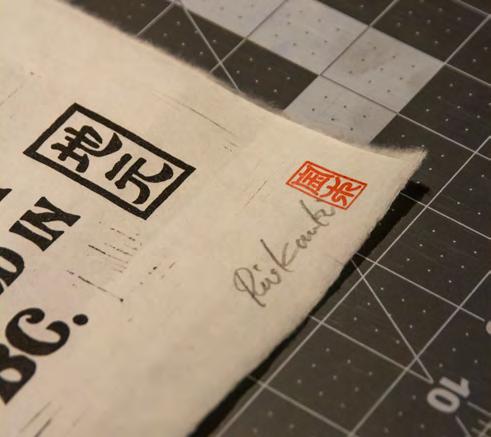
Kaneki has hand-printed a limited-edition run of the infamous Fernwood design on Japanese paper, featuring Pharaoh’s Horses, which symbolize power and nobility (and are based on an 1848 painting by John Frederick Herring Sr.). / Rio Kaneki imprime en édition limitée sur du papier japonais la linogravure réalisée pour Fernwood, représentant les chevaux du pharaon, symboles du pouvoir et de la noblesse (d’après le tableau de John Frederick Herring Sr datant de 1848).
pour se retrouver imprimées dans le bon sens.
A hand-printed and signed impression. Kaneki likes to keep his print process analog. Of late, he’s been delving more into hand-painting murals and signs, appreciating the imperfections. / CI-DESSUS (À DROITE) : la signature de Rio Kaneki sur ses impressions à la main. Dernièrement, il se consacre davantage à la peinture de murales et d’enseignes, dont il aime les imperfections.
Using the Yellow Pages as his database, Kaneki made a list of 13 screen printers in B.C.’s capital and dropped off resumés at each. He was brushed off by most; his English was limited at the time, but he got one positive response that day—he was pretty sure—from the owner of Mega Screen Productions. “He said something like ‘Come back on Wednesday’ and ‘Give me a shot,’” Kaneki says, reminiscing. “I didn’t know what that meant. I went home, and my old roommate said, ‘He’s going to give you a job, man, congratulations.’” Kaneki worked at his craft through mentorship at the print shop, launched a clothing company and collaborated with local skate and surf brands.
Once Kaneki’s block prints gained traction, he got a message from Nike requesting a collaboration. Kaneki designed graphics for Nike Skateboarding’s 2024 spring line of apparel, which featured a blockprinted illustration of a dragon passing through the Nike logo, centred in an ornamental frame and surrounded by cherry blossoms. At their design meeting, he shared a story with the Nike team. In the 1980s, Kaneki was spending time with an uncle, who was home in Japan from recent travels. He wore a pair of Nike Air Max shoes with a fluorescent pink swoosh on the side. Kaneki recognized the logo from the (then) recent release Back to the Future . “I was so stoked.” That moment, Kaneki says, he had decided he wanted to design shoes one day, which was the first time he thought specifically about the design process. “It all kind of came full circle, and I got to inform my uncle that I got a job with Nike before he passed away.”
le même qu’aujourd’hui, les tutoriels n’existaient pas. Je crois bien que j’ai acheté un manuel sur eBay », poursuit-il. Quelques années et quelques contrats plus tard, il déménage à Victoria.
À l’aide des Pages jaunes, il dresse la liste des 13 ateliers de sérigraphie de la capitale britanno-colombienne et envoie son CV. Il essuie refus sur refus, son anglais étant limité, mais décroche une réponse positive de la part du propriétaire de Mega Screen Productions. « Il m’a dit quelque chose comme “reviens donc mercredi et on fera un essai”. Je n’ai pas compris sur le coup. Je suis rentré chez moi et mon coloc m’a félicité en m’expliquant que j’étais embauché. »
Grâce au mentorat, Rio Kaneki peaufine son art de l’impression, lance une ligne de vêtements et collabore avec de multiples marques locales de planche à roulettes et de surf.
Ses gravures gagnant en popularité, il reçoit un jour un appel de Nike lui proposant une collaboration : le graphisme de la collection printemps 2024 de Nike Skateboarding. Il réalise l’estampe d’un dragon agrippé au logo de Nike dans un cadre ouvragé, sur fond de nuages et de fleurs de cerisier. Lors de la réunion de création, il raconte une histoire à l’équipe présente : dans les années 1980, il passe du temps avec son oncle de retour au Japon après un long voyage. Ce dernier porte une paire de Nike Air Max flanquée de la virgule stylisée rose fluo. Rio Kaneki reconnaît le logo du film Retour vers le futur, qui venait de sortir. « J’étais surexcité! », confie-t-il. C’est à cet instant qu’il s’est dit qu’un jour, il dessinerait des chaussures et s’est mis à y réfléchir concrètement. « La boucle est aujourd’hui bouclée. Et mon oncle a su que j’avais décroché un boulot chez Nike avant son décès. »
ABOVE (left): Kaneki carved two linocut designs for Nike SB (Skateboarding), both printed on apparel: first, a simpler emblem showcasing the Nike swoosh and second, an elaborate design featuring a dragon. The inversely carved images flip to their proper orientation when printed. / CI-DESSUS (À GAUCHE) : Rio Kaneki a réalisé deux linogravures pour Nike SB (Skateboarding), imprimées sur des vêtements. La première représente la virgule Nike, la seconde, un dragon. Elles sont gravées à l’envers
RIGHT:
A view of the DesignTO-curated Shared Terrain group exhibition at Harbourfront Centre (2022). The festival’s artistic guidelines state: “DesignTO embraces an expansive definition of design; we welcome unconventional and transdisciplinary practices. We use the terms ‘artist’ and ‘designer’ interchangeably.” / Vue de l’exposition collective Shared Terrain au Harbourfront Centre (2022). Selon la ligne artistique du festival : « La définition du design de DesignTO est large : nous accueillons les pratiques transdisciplinaires et non conventionnelles. Nous utilisons les termes “artiste” et “designer” de manière interchangeable. »
by / par Christine
Photo
Lim
A Grassroots Fest Grows Up Petit salon devenu grand
The team behind DesignTO, an annual festival celebrating all things—and we mean all things—design, is helping gather and grow Toronto’s design and design-curious community. / L’équipe de DesignTO, le salon annuel du tout-design, et on insiste sur tout, fédère et fait grandir le design torontois et les curieux et curieuses de design.
BY / PAR KRISTINA LJUBANOVIC
PHOTOS COURTESY OF / OFFERTES PAR DESIGNTO
Toronto at January’s tail end is known well, by residents, for its wind tunnels, frigid cold and crusted-over snowbanks that are impenetrable to shovel or boot and a suspect shade of brown-grey.
Not the happiest time of year to get spiffy and take to the streets to check out some experimental design shows. But year after year, a steadily growing mass of people—from within the design industry and outside of it—have done just that. DesignTO, a 10-day festival, Canada’s largest celebration of design, has been the warming flame beckoning a community of creatives, aficionados and admirers out of deep hibernation.
“As much as January in the city sucks, it really gets people out of their warm homes into a cold city—but then back into warm spaces for events,” says Michael Madjus, DesignTO’s director of marketing.
DesignTO, née the Toronto Design Offsite Festival, turns 15 this year. “We’re entering the teen years,” says Madjus. “A little rebellious, pushing boundaries where we can.” But then, the non-profit arts and culture organization behind the fest has always been pulling or pushing at the definition of design—and even the idea of what a festival can be.
“I think we’ve been quite adaptive,” says Deborah Wang, DesignTO’s artistic director and a co-founder of the event, which launched in 2011 as seven exhibitions along a strip of Dundas Street West. In 2025, the “festival without a venue,” as Wang calls it, will extend from Richmond Hill Public Library to displays at Yonge-Dundas (soon to be Sankofa) Square and in the city’s busiest transit hub, Union Station.
And what might you see at DesignTO? Browsing the archive of previous years hosted on the festival’s website, designto.org (where you can also find the 2025 fest schedule), you'll find that the exhibitions and installations range broadly, from a symposium on waste management
Toronto fin janvier est bien connue de ses habitants pour ses rues venteuses, son froid glacial et ses bancs de neige gelés à la couleur douteuse, dans lesquels ni pelle ni botte ne s’enfonce.
Ce n’est certainement pas le meilleur moment de l’année pour se faire chic et partir courir les salons de design. Pourtant, année après année, de plus en plus de gens, professionnels ou non, se prêtent au jeu. S’étalant sur dix jours, DesignTO, le plus grand festival de design au Canada, fait volontiers sortir de leur hibernation créatifs, aficionados et curieux de tout poil.
« Bien que janvier ne soit pas le mois le plus agréable, les Torontois abandonnent la douceur de leur foyer pour affronter les rues froides et retrouver la chaleur de notre événement », lance Michael Madjus, directeur marketing de DesignTO.
L’ex-Toronto Design Offsite Festival fête ses 15 ans cette année. « On entre dans notre adolescence, poursuit Michael Madjus, on se rebelle un peu, on teste les limites. » Même si l’OBNL artistique et culturel à l’origine de l’événement s’est toujours donné pour mission de revisiter la définition du design, tout comme la notion de festival.
« Je crois qu’on a su s’adapter », confirme Deborah Wang, directrice artistique de DesignTO et cofondatrice du festival, lancé en 2011 dans la rue Dundas Ouest sous la forme de sept expositions. En 2025, le « festival sans adresse », comme elle l’appelle, s’affichera de la bibliothèque de Richmond Hill à la place Yonge-Dundas (bientôt Sankofa) ainsi qu’à la gare Union, plaque tournante du transport public torontois. Qu’est-ce que DesignTO nous réserve de beau cette année? En jetant un œil aux archives de son site web, designto.org, où se trouve aussi le programme 2025, on s’aperçoit de la diversité des expositions, allant d’un symposium sur la gestion des déchets (Trash Talk, 2023) à
LEFT: Harbourfront Centre has long been a preferred venue for DesignTOcurated exhibitions. A festival-goer (top) photographs a work at Future Matters (2024) and (bottom) the Future Retrospectives (2020) show. RIGHT: DesignTO is for anyone who loves design. The 2017 festival launch party, with an installation by DFZ (top), and the White Out (2015) thematic exhibition (bottom). / À GAUCHE : le Harbourfront Centre a longtemps été le lieu d’exposition préféré de DesignTO. Un festivalier (en haut) photographie une œuvre de Future Matters (2024) et un autre (en bas) le spectacle de Future Retrospectives (2020). À droite : DesignTO est pour tous les amoureux du design. La soirée de lancement du festival 2017 avec l’installation de DFZ (en haut) et (en bas) l’exposition thématique White Out (2015).
by
Photo by / par Bruno Belli
Photo
/ par Christine Lim
LEFT and ABOVE: Festival posters showcase each year’s look and feel, by a changing roster of contributors including Adrian Forrow (2019); Edwina Mui, Minju Roh and Tanveer Sobnack from the OCAD U Design4 Program (2020); Vicky To (2022); Hwa-Jin Jun (2023); aftermodern.lab (2021); and Aaryan Pashine and Amir Khoshnevis (2024). The latter are the coding illustrators behind this year’s festival poster, assisted by HwaJin Jun. / À GAUCHE ET CI-DESSUS : les identités visuelles du festival, année après année, affiche par affiche, signées Adrian Forrow (2019), Edwina Mui, Minju Roh et Tanveer Sobnack du programme Design4 de l’EADO (2020), Vicky To (2022), HwaJin Jun (2023), aftermodern.lab (2021), Aaryan Pashine et Amir Khoshnevis (2024). Ces derniers, deux illustrateurs-programmeurs, ont été aidés par Hwa-Jin Jun.
Photo by / par Saghi Malekanian
Photo by / par Marcin Barciak
Members of DesignTO’s executive team (left to right): executive director Jeremy Vandermeij, artistic director Deborah Wang and director of marketing Michael Madjus. The festival’s full team consists of just 16 people across programming, marketing, operations and special projects, though more than 100 volunteers come aboard during festival week, covering close to 300 shifts across the 10 exhibition- and event-packed days. / L’équipe de direction de DesignTO (de gauche à droite) : Jeremy Vandermeij, directeur général, Deborah Wang, directrice artistique, et Michael Madjus, directeur marketing. Au total, l’équipe ne compte que 16 personnes réparties entre la programmation, le marketing, l’exploitation et les projets spéciaux. Plus de 100 bénévoles sont présents durant le salon, comblant près de 300 postes au cours des dix jours de festivités.
( Trash Talk, 2023) to a sculptural installation of 100 found chairs stacked precipitously ( At what point does irrational thought become rational? , 2024).
That kind of variety is encoded in the festival’s artistic guidelines, and Wang sees it as something that’s been there from the beginning. “I think the structure of the festival and the way we plan it allows for a kind of fluidity, an openness to experimentation, and what I call our very stretchy definition of design.”
Organizing it is a months-long process for the small executive team, which includes Wang, Madjus, head of programming Robyn Wilcox and executive director Jeremy Vandermeij. “Once a festival ends, we are planning the next one,” says Wang. That involves building relationships with venues, media and financial partners and organizing calls for participation. Madjus helps develop the unique look and feel each year. For 2025, they worked with design studio aftermodern.lab and two coding illustrators, OCAD University grads, who produced generative artwork for the festival’s visual identity.
un empilage sculptural de 100 chaises récupérées en trois mois (At what point does irrational thought become rational?, 2024).
Selon Deborah Wang, cet éclectisme s’inscrit dans la ligne artistique du festival, et ce, depuis ses débuts : « La structure du festival et la manière dont on l’organise nous autorisent une certaine fluidité, une ouverture à l’expérimentation et notre définition très souple du design, comme j’aime à l’appeler. »
Son organisation demande des mois de travail à la petite équipe de direction, composée de Deborah Wang, Michael Madjus, Robyn Wilcox, responsable de la programmation et Jeremy Vandermeij, directeur général. « Dès la fin du festival, on planifie le prochain », poursuit Deborah Wang. Ce qui implique d’établir des relations avec les futurs lieux d’exposition, les médias, les partenaires financiers et de lancer les appels à participation. Michael Madjus se charge de l’identité visuelle. Pour 2025, il a collaboré avec le studio aftermodern.lab et deux illustrateurs-programmeurs diplômés de l’EADO, qui ont réalisé des œuvres d’art génératives.
“Making it real, I think, is the hardest part. Lots of real things have to happen. A lot of physical objects have to get places. A lot of people have to get places,” says Wang. “That’s the not-fun part.” What is the fun part? Fifteenth-anniversary logo experimentations (above) and partygoers at DesignTO’s 2018 launch event (left). / « Le rendre réel est, je crois, le plus dur. Beaucoup de choses doivent se produire. Beaucoup d’objets doivent trouver leur place. Beaucoup de gens doivent trouver leur place. Ce n’est pas le plus amusant », confie Deborah Wang. Le plus amusant? La recherche du logo du 15 e anniversaire (ci-dessus) et la soirée de lancement, ici en 2018 (à gauche).
Come January, they’ll be joined by a large team of volunteers who help the events and exhibitions run smoothly, in spaces across Toronto proper and beyond—and not just white-cube galleries (see: public libraries and storefronts). That’s because while design can be art, it is also essential and functional, affecting all our lives. Madjus sees DesignTO as a festival for everyone. “There was a time when it felt like we were very much by designers for designers, but we reached a tipping point, and a new audience: the general public.”
Since 2011, the annual fest has drawn nearly one million visitors and showcased more than 6,500 designers and creators.
“I’m not a bigger-equals-better kind of person,” says Wang, when asked about her aspirations for future growth. “You reach a natural point, a size that fits the city you’re in, the condition and culture.” And with more than 100 exhibitions and events happening from January 24 to February 2, the team has their hands full. Says Wang, “You can’t get bored.”
En janvier, de nombreux bénévoles viendront leur prêter mainforte pour veiller au bon déroulement des événements dans les différents lieux de la ville, et pas seulement dans des galeries d’un blanc immaculé. Car le design est de l’art mais de l’art fonctionnel, qui a une incidence sur notre vie quotidienne. Pour Michael Madjus, DesignTO est ouvert à tout le monde : « Il fut un temps où on était vraiment qu’entre designers, mais ça a changé, on a su intéresser le grand public. »
Depuis 2011, presque un million de visiteurs ont fréquenté DesignTO, qui a exposé plus de 6500 artistes et designers.
« Je ne suis pas du genre à penser que plus c’est grand, mieux c’est , répond Deborah Wang à ma question sur l’avenir du festival.
On a atteint une taille qui correspond à la ville, à ses conditions, à sa culture. » Et l’équipe a du pain sur la planche avec plus de 100 expositions qui se dérouleront du 24 janvier au 2 février. « Impossible de s’ennuyer! » conclut-elle.
Photo by / par
Jono Details
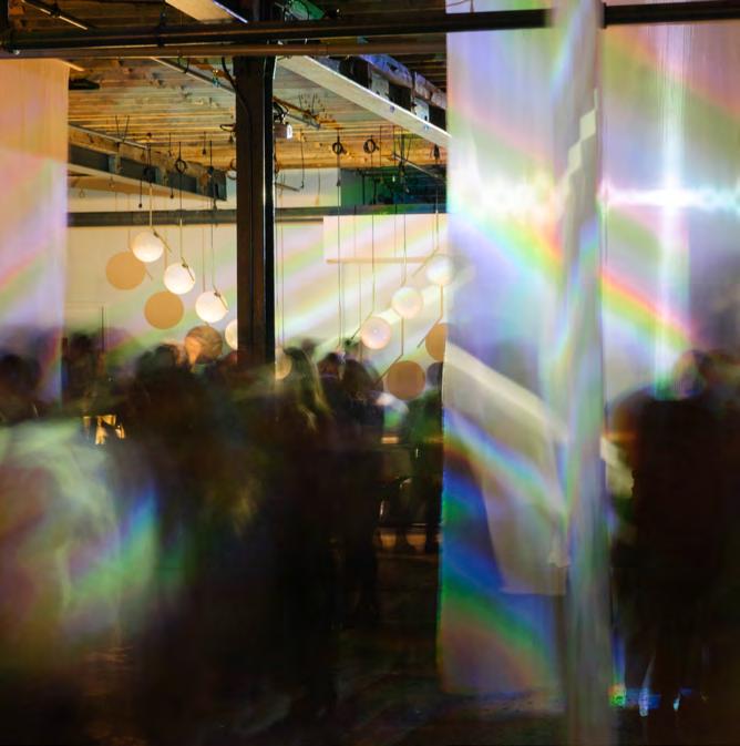
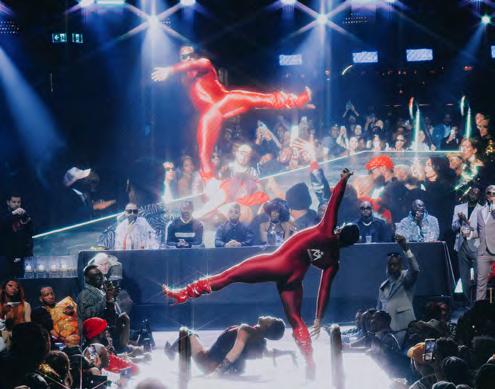
Class Of workshops, led by ballroom legends, bring the community together to learn the fundamentals of this expressive art form. NEXT SPREAD: At Function’s World AIDS Day Ball (2022). / Les ateliers Class Of animés par des légendes du ballroom, enseignent les fondamentaux de cet art expressif à la communauté. Page suivante : Au bal de la Journée mondiale de lutte contre le sida en 2022, organisé par Function.
by
Photo
/ par Kirk Lisaj
The House That Ballroom Built La maison du ballroom
BY
/ PAR NIKOLAOS THÉBERGE-DRITSAS AND / ET TAMAR CARTER AS TOLD TO / PROPOS RECUEILLIS PAR JEREMY PAUL
PHOTOS COURTESY OF / OFFERTES PAR FUNCTION
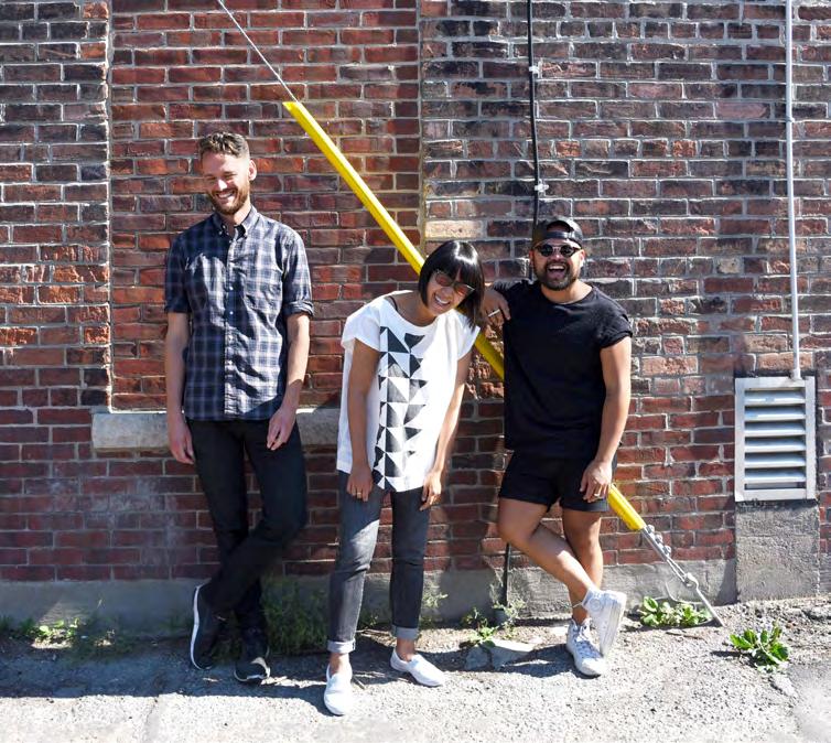
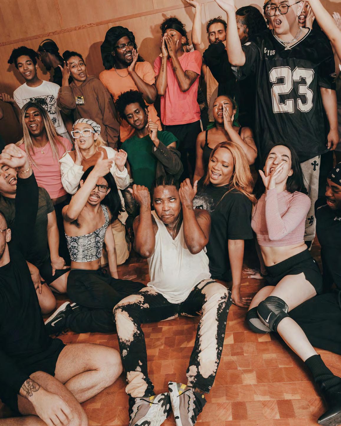
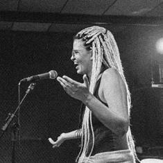
Started in the 1970s in New York, ballroom, as an underground subculture for Black and Latino queer people, has always been centred on community— providing space and a voice for those who have been silenced. Fifty years later, the world is gradually embracing the scene, allowing this once-hidden art form to shine in the mainstream. Nikolaos (Nikk) Théberge-Dritsas and Tamar Carter, co-founders of Function, a platform for ballroom in Canada, joined Block to discuss the evolution of the culture and how they’re helping push it forward.
NIKK THÉBERGE-DRITSAS: So T [Tamar], since the first World AIDS Day Ball in 2021, where we first dreamed of Function, we’ve worked hard to honour the ballroom art and give it room to blossom without getting in its way. From then to now, how do you feel about the current state of the Canadian ballroom scene?
TAMAR CARTER: Seeing different pockets of the community grow in Vancouver, Calgary, Edmonton and Ottawa—all of these new scenes across Canada point to Function as the benchmark. It’s flattering
Née dans les années 1970 à New York au sein de la communauté queer noire et latine, la culture ballroom [salle de bal en français] est une sous-culture qui offre un espace sécuritaire et une voix à tous ceux et celles réduit·es au silence. Cinquante ans plus tard, le monde s’ouvre, permettant à cette forme d’art souterraine d’émerger au grand jour. On parle de cette évolution et de ses conséquences avec Nikolaos (Nikk) Théberge-Dritsas et Tamar Carter, qui ont cofondé la plateforme de ballroom canadienne Function.
NIKK THÉBERGE-DRITSAS : Dis-moi, T. [Tamar], depuis le premier bal de la Journée mondiale de lutte contre le sida en 2021, quand on a commencé à rêver de Function, on a travaillé fort pour le ballroom et son épanouissement. Où penses-tu qu’on en est aujourd’hui?
TAMAR CARTER : Je vois différentes scènes qui se développent à Vancouver, Calgary, Edmonton ou Ottawa, et toutes prennent Function comme point de repère. C’est flatteur parce que ça correspond à notre mission. Function est une réponse aux besoins de la communauté.
T. C. : Ils et elles veulent « marcher »* dans un bal Function et l’amènent de la même manière que toi ou moi le dirions à nos enfants, en tant
because it aligns with our mission. Function is a response to the needs of the community.
TC: They want to walk* a Function Ball, and they bring it the same way you or I would tell our kids, as house** parents, to bring it. I’m optimistic for the first time in many years about the landscape of ballroom.
NT-D: It’s so funny because you literally just stole my line. You and I are from two different generations, and even for me, when I came to ballroom, it still felt very secluded and underground. It needed a catalyst to grow and encourage people from across the country to engage with us and take it seriously.
TC: Absolutely! Obviously with ballroom becoming a bigger part of the mainstream with Beyoncé’s Renaissance and TV shows like Pose, there’s been criticism around the “bastardization of ballroom.” On a personal level, you’ve gotten backlash for being a leading figure in the community while being a white man. How do you feel about this?
NT-D: I’ve always been involved in the scene because I love it so much and believe in it. That I have to prove I’m worthy of being in this space is essential—and that’s true for anybody who's not Black, trans or queer.
TC: Do you think slowly losing the underground portion of the culture makes us sellouts, or do you think it’s beneficial since it gives us more opportunities?
NT-D: I think that you and I do a great job making sure that when accepting funds there are no strings attached. Or that when strings are attached, they don’t get in the way of the actual culture. I have my qualms when powerful mainstream creatives want to use the culture but don’t showcase the people—especially when they have all the resources in the world.
TC: Exactly. And even within the ballroom world, it can be disappointing to see people who are pointing fingers at us as “part of the problem” show up at our functions. But because it is culture first, we understand how important it is for them to be at balls like ours, at home. Even if it leaves a bitter taste.
NT-D: At the end of the day, we make sure ballroom is for everyone. Speaking of, I’m curious to know your perspective on these smaller Canadian markets growing their ballroom communities without the proper foundations. How do you feel about starting a ballroom scene without the presence of the Black queer community who holds the foundation of the culture?
TC: It’s certainly interesting to experience. But having been there, you see and understand how necessary ballroom is to every ecosystem, to every queer scene, so that people like myself can find it. I’m grateful for those people across Canada who are not visible minorities that have opened up ballroom scenes, because it gives those Black and
brown queer kids a place to belong and thrive. I would not be where I am today had it not been for ballroom. It is not just Black people in ballroom who have fed into me. Our work is Black-led but inclusionary. Of course, it’s here to uplift and highlight Black voices, but you can only do that if they’re there. If there’s not enough Black people there, there still must be a scene that welcomes those Black voices.
NT-D: So true, sister. I know we’ve talked a lot about the expansion of ballroom, but now I’m curious to hear about what anchors you in the community. After a decade in the business, why haven’t you run for the woods yet?
TC: I’ve tried to run many times, if I’m being candid, but I’ve never felt more sure of anything than ballroom. It feels like I have a Ph.D. in what I do. I have the right to be here. Every time things get difficult, I go back to what I’ve contributed to the space. My accolades are not for me to feel hot—it’s for me to give back. This is a labour of love. I love the community and the people who make it. Even those who hate me I love. How about you, Nikk? What keeps you going?
NT-D: Being in ballroom—at the capacity that I am—is the most challenging thing I do. It has also brought me so much in terms of finding purpose, finding myself and giving me a creative outlet to explore my identity that my background otherwise would’ve never allowed me to. I think it’s important to empower the folks who are in ballroom because it is such a beautiful space. I often feel like the next generation has everything they need to be successful. They have it. They just have never been given that chance. I feel a certain duty to provide that chance. I’m excited for them and to see the fruits of their labour!
TC: Oh, they better bring it to the fourth annual World AIDS Day Ball this December.
NT-D: And you know they will!
by
Photo
/ par Kirk Lisaj
que parents de la « maison »**. Pour la première fois depuis très longtemps, je suis optimiste quant à l’avenir du ballroom.
N. T-D. : C’est trop drôle, j’allais dire exactement pareil. Toi et moi sommes de deux générations différentes, et au début, même à moi, le ballroom me paraissait à l’écart du monde, clandestin. Il avait besoin d’un catalyseur pour se développer et donner envie aux gens de s’y engager et de le prendre au sérieux.
T. C. : Tout à fait! Et maintenant qu’il s’affiche en public, grâce à Renaissance de Beyoncé et à des émissions télé comme Pose, on entend des critiques comme quoi il serait en train de s’abâtardir. Toi, qui as eu des réactions négatives en tant qu’homme blanc et figure de proue de la communauté, quel est ton sentiment?
N. T-D. : Je me suis toujours impliqué parce que ça me plaît et que j’y crois. Le fait que je doive prouver que j’en suis digne est essentiel, et c’est vrai pour toute personne qui n’est pas noire, ni trans ni queer.
T. C. : Penses-tu que la perte de ce côté souterrain de la culture ballroom fait de nous des vendus ou, au contraire, que cela nous ouvre des portes?
N. T-D. : Je crois que toi et moi, on fait bien en veillant à ce que les fonds qu’on accepte ne soient pas assortis de conditions. Ou que, s’il y a des conditions, elles n’aillent pas à l’encontre du ballroom. J’ai des scrupules quand je vois des personnalités qui veulent utiliser le ballroom sans mettre en valeur les gens, particulièrement quand elles ont toutes les ressources du monde.
“My accolades are not for me to feel hot—it’s for me to give back. This is a labour of love.”/ « Je ne distribue pas d’accolades pour me faire du bien, mais pour rendre la pareille. C’est un travail d’amour.
»
T. C. : Exactement. Et même dans le milieu du ballroom, c’est décevant de voir des personnes assister à nos bals tout en nous pointant du doigt comme « faisant partie du problème ». Mais la culture passe avant tout, donc on comprend combien c’est important pour elles d’être là, chez elles. Même si ça laisse un goût amer.
N. T-D. : Au bout du compte, on doit s’assurer que le ballroom est accessible à tous et à toutes. À ce propos, je suis curieux d’avoir ton avis sur ces petits marchés canadiens qui développent leur scène ballroom sans la présence de la communauté queer noire, qui est à la base de cette culture.
T. C. : C’est une expérience intéressante. Quand on y va, on voit et on comprend à quel point le ballroom est nécessaire à tout écosystème,
à tout milieu queer. Je suis reconnaissante à ces personnes qui n’appartiennent pas à des minorités visibles d’organiser des bals parce qu’elles offrent aux jeunes queers, à la peau noire ou brune, un lieu d’appartenance et d’épanouissement. Sans le ballroom, je ne serai pas là où je suis aujourd’hui. Il n’y a pas que la culture noire qui m’a nourrie. Notre activité est certes menée par des noirs, mais elle est inclusive. Son but est bien sûr de mettre en lumière les voix noires, mais on ne peut le faire que si elles sont présentes. Si elles ne sont pas là, il faut bien qu’elles aient une scène qui les accueille.
N. T-D. : C’est tellement vrai, ma sœur. Bon, assez parlé du développement du ballroom. Ce que je voudrais savoir maintenant, c’est ce qui te retient dans la communauté. Après dix ans de ballroom, tu n’as pas envie d’aller voir ailleurs?
T. C. : J’ai essayé plusieurs fois. Mais, pour être franche, je n’ai jamais été aussi sûre d’une chose que du ballroom. C’est comme si j’avais un doctorat en ballroom. Je me sens légitime. Dans les moments difficiles, je me remémore tout ce que j’ai accompli. Je ne distribue pas d’accolades pour me faire du bien, mais pour rendre la pareille. C’est un travail d’amour. J’aime la communauté et les personnes qui la composent. J’aime même celles qui me détestent. Et toi, Nikk, qu’estce qui te retient ici?
N. T-D. : Organiser des bals, à mon niveau, est pour moi super motivant. Cela m’a aussi beaucoup apporté, m’a permis de me trouver un but, de me découvrir et m’a fourni un exutoire créatif pour explorer mon identité, chose que je n’aurais pu faire vu le milieu d’où je viens. Je crois que cette émancipation qu’offre le ballroom est importante, c’est vraiment un bel espace. J’ai souvent l’impression que la nouvelle génération a tout ce qu’il faut pour réussir. Et elle l’a. C’est juste qu’on ne lui en a jamais donné la chance. Et c’est un peu mon devoir que de le faire. J’ai hâte pour elle et hâte de voir le fruit de son travail!
T. C. : Oh, il faut qu’elle nous montre ça en décembre, au bal de la Journée mondiale de lutte contre le sida.
N. T-D. : Elle le fera, tu peux en être sûre!
Editor’s notes / NDLR :
* Ball participants “walk” (dance, perform, lip-sync and compete) in different categories, both epitomizing and satirizing gender constructs.
** Houses, in ball culture, are alternative families that provide shelter and safety to 2SLGBTQIA+ members. They are often named after fashion brands and led by “mothers” and “fathers,” who are experienced in the scene.
*Les participant·es au bal « marchent », à savoir se mesurent les un·es aux autres, dans différentes catégories (danse, chant, etc.), incarnant et parodiant à la fois les constructions de genres.
**Les « maisons » sont des familles parallèles qui servent de refuge aux membres 2SLGBTQIA+. Elles portent souvent des noms de marques de mode et ont à leur tête des « pères » et des « mères » expérimenté·es.
Namaxsala by/signé
Three Master Carvers/ trois maîtres sculpteurs
BY / PAR MÉLANIE RITCHOT
PHOTO COURTESY OF / OFFERTE PAR NANWAKOLAS COUNCIL
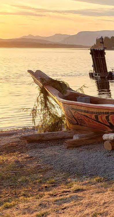
1. The plan was to cut down a tree for the project, but the carvers stumbled upon the perfect windfall log when scoping out the area: a red cedar about 600 to 700 years old, Udzistalis Junior Henderson estimates, and already conveniently split down the centre. / Les trois sculpteurs avaient prévu d’abattre un arbre, mais en explorant le site, ils sont tombés sur ce cèdre rouge, ou thuya géant, déraciné par le vent. Selon Udzistalis Junior Henderson, il devait avoir 600 ou 700 ans, et, pratique, son tronc était déjà fendu dans la longueur.
2. Chainsaws were used for the shaping and hand tools for the finishings, with design choices made on the spot. “We had some drawings on the shack we stayed in, but other than that there were no drawings, no blueprints,” Henderson says. Separate pieces were added for the bow and stern, bringing the final canoe length to over 30 feet. / Scies à chaîne et ciseaux à bois se sont mis en action, les décisions étant prises au fur et à mesure. « On n’avait ni maquette, ni plan, simplement quelques esquisses griffonnées dans la cabane qui nous abritait », expliquet-il. Le canot fait presque dix mètres de long en comptant la proue et la poupe, qui sont des pièces rapportées.
3. Once carved, the vessel was suspended above ground and filled partially with water. All the while, rocks had been heating by a fire for hours. “When they got red hot, we piled them into the canoe and threw bark overtop
and let it sit for a while,” Henderson says. The steaming process widened the canoe by just under a foot, adding stability. / Une fois le façonnage terminé, ils l’ont suspendu et ont rempli son fond d’eau. Pendant ce temps, des pierres chauffaient près du feu. « Lorsqu’elles sont devenues brûlantes, on les a empilées dans le canot, puis recouvertes d’écorce et on a attendu. » Ce bain de vapeur l’a élargi d’environ 30 cm, le rendant plus stable.
4. The painted motif, representing a whale, was designed by Heh-mah-khoo-doh-gah (Great Chief Lady) Jessica Chickite of We Wai Kai First Nation. / La baleine peinte sur son flanc a été imaginée par Heh-mah-khoodoh-gah (Grande Cheffe) Jessica Chickite de la Première Nation We Wai Kai.
5. Cedar boughs were laid across the bow for its maiden voyage from Kelsey Bay Spit in Sayward to Cape Mudge on Quadra Island— a 12-hour journey—where it was escorted to shore by two other canoes and welcomed after a traditional request to come ashore, performed by Henderson. / Sa proue décorée de rameaux de cèdre, il a entamé son voyage inaugural : une traversée de 12 h de la baie Kelsey à Sayward jusqu’au cap Mudge de l’île Quadra. À son arrivée, il a été escorté par deux canots, puis a accosté après qu’Udzistalis Junior Henderson lui a demandé, comme le veut la tradition, de toucher terre.
A north Vancouver Island forest and a naturally felled cedar. Three master carvers camped out for 30 days. That’s what it took to revive a piece of culture dormant for over a century. “It was really kind of magical,” says Udzistalis Junior Henderson (Wei Wai Kum), describing the cross-Nation and cross-generation collaboration between himself, See-wees Max Chickite (We Wai Kai) and Gayusdisa’las Karver Everson (K’ómoks). Merging Elder and community knowledge with modern methods, the three crafted a traditional canoe later named Namaxsala (together as one). / Une forêt au nord de l’île de Vancouver, un cèdre, trois maîtres sculpteurs et 30 jours en pleine nature, c’est ce qu’il aura fallu pour redonner vie à un morceau de culture endormi depuis plus d’un siècle. « C’était magique », lance Udzistalis Junior Henderson (Wei Wai Kum) pour décrire cette collaboration entre Nations et générations. Avec See-wees Max Chickite (We Wai Kai) et Gayusdisa’las Karver Everson (K’ómoks), ils ont combiné savoir-faire des anciens et méthodes modernes pour fabriquer un canot traditionnel, nommé Namaxsala (voyager ensemble).
Art in the Open Art en plein air
BY / PAR KRISTINA LJUBANOVIC
THE WELL
is a 7.8-acre open-air experience of food, shopping and entertainment covered by the largest latticed glass roof of its type in North America, casting dynamic shadows on the mid-block passages of Toronto’s King West Village.
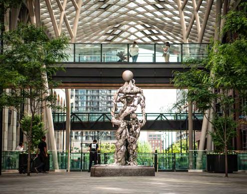
Now, add an art crawl to the list of things you can do at the AlliedRioCan joint venture. Whether you're strolling the colonnades, criss-crossing the three-storey space via bridges or surfacing into the restaurant-lined atrium, there’s public art to be seen in both traditional and unexpected forms.
Take Emergence by Brooklyn-based artist Dustin Yellin. Standing more than 10 feet tall, the stainless-steel figural sculpture situated at the Wellington Street entrance is more than meets the eye. Approach it and you'll notice the agglomeration of Canadian and Southern Ontario–inspired and sci-fi references, including a blue jay, a trillium flower, the Canadarm, a five-pin-bowling pin and a wormhole to a distant galaxy.
A decidedly quieter (but no less inspired) contribution to the arts program at The Well can be found at Draper Park, at the western edge of the site. A cast-bronze kitty, modelled after resident feline Dizzy, greets and guards beds of fragrant catnip and cast-metal chairs. Designed by Montreal-based Claude Cormier et Associés, the tiny park is a foil to CCxA’s east-end dog-themed Berczy Park.
Elsewhere within The Well complex, murals delight and surprise and functional artworks—sinuous and blocky reclaimed-lumber benches by Toronto designers Brothers Dressler—provide a perch for taking in the scene. Nearby, off a vast glazed office lobby at Front and Spadina, The Globe and Mail newspaper’s salvaged art deco doors are a monument to the site’s storied past (and present, since the Toronto Star relocated its head office here) in publishing.
Add to this the art collection at FourFifty (a selection of works is visible in the residential building’s lobby), the paid-entry Arcadia Earth immersive art installation and the weekly artisanal market and the obvious takeaway is—apart from that crafted Mandy’s salad—that art is alive and well and very much woven into the fabric of daily life at The Well.
THE WELL,
c’est 7,8 acres de restaurants, boutiques et autres lieux de divertissement regroupés sous une incroyable verrière treillissée, la plus grande d’Amérique du Nord, qui projette ses ombres dynamiques en plein cœur du King West Village à Toronto.
Le plus de cette coentreprise Allied-RioCan? Une virée artistique. L’art public s’expose sous toutes ses formes le long des colonnades ou au détour d’une des passerelles traversant le complexe de trois étages.
Prenons par exemple Emergence de l’artiste new-yorkais Dustin Yellin. Du haut de ses trois mètres, cette sculpture figurative en acier inoxydable, située à l’entrée de la rue Wellington, se distingue par ses détails. Approchez-vous pour admirer l’agglomération de références d’inspiration canadienne, sud-ontarienne et de science-fiction : geai bleu, fleur de trille, quille de quilles à 5, Canadarm ou encore tunnel spatiotemporel menant à une galaxie lointaine.
Une contribution plus paisible (mais non moins inspirante) se trouve au parc Draper, à l’extrémité ouest du site. Un chat en bronze, vous accueille tout en gardant un œil sur les platebandes un arrangement de chaises en métal sculpté. Imaginé par l’agence montréalaise Claude Cormier et Associés, ce mini-parc sert à mettre en valeur le parc Berczy au thème canin, dans l’est.
Ailleurs, ce sont des murales qui surprennent et ravissent les yeux ou des œuvres plus fonctionnelles, comme ces bancs ondulants en bois récupéré des designers torontois Brothers Dressler qui offrent une pause aux pieds fatigués. Non loin de là, à l’angle des rues
Front et Spadina, les anciennes portes art déco du Globe and Mail s’affichent dans un grand hall vitré en souvenir du passé éditorial du lieu (et en hommage à son présent puisque le Toronto Star y a transféré son siège social).
Ajoutez à cela la collection du FourFifty (dont quelques œuvres sont visibles dans le hall de l’immeuble), l’installation immersive Arcadia Earth et le marché artisanal hebdomadaire, et vous comprendrez que l’art s’est taillé une place de choix dans la vie quotidienne de The Well.
Photo courtesy of / offerte par The Well
The Woodstone, Inglewood
1215 13 Street SE, Calgary
Nestled in Calgary’s oldest neighbourhood, the Woodstone (also known as the Calgary Woodworkers’ building) boasts the charm of an Edwardian-style warehouse amid Inglewood’s vibrant scene. Quirky shops, high-end restaurants and Bow River–side outdoor spaces foster an ideal environment to nourish and inspire the team at TRGR (pronounced Trigger), a creative advertising agency co-led by Geoff Hardwicke. Hardwicke shares a few go-to spots near TRGR’s 1911-built office, and associate creative director Brad Connell, drawing on generative art techniques, illustrates. / Datant de 1911, le Woodstone (connu aussi sous le nom de bâtiment des menuisiers) affiche son charme de style édouardien au cœur de l’agitation d’Inglewood, le plus vieux quartier de Calgary. Boutiques insolites, restaurants chics et berges aménagées de la rivière Bow forment le décor idéal pour nourrir l’imagination de l’équipe de TRGR (on prononce Trigger), l’agence publicitaire codirigée par Geoff Hardwicke. Voici ses bonnes adresses, illustrées par Brad Connell, directeur de création de TRGR, au moyen de l’art génératif.
1. THE SILK ROAD SPICE MERCHANT
1419 9 AVENUE SE
“It’s so good that when we visit Toronto, we’ll bring spices with us for our friends and family there.” / « Des épices de grande qualité. Quand je vais à Toronto voir ma famille et mes amis, je leur en apporte toujours. »
2. KNIFEWEAR
1316 9 AVENUE SE
“A super-cool shop run by a couple of chefs; they sell any type of cooking knife you might need, and they sharpen your knives (and axes) too.” / « Une boutique super cool, tenue par deux cuisiniers. On y trouve tous types de couteaux de cuisine et un service d’aiguisage (couteaux et haches). »
3. IRONWOOD STAGE AND GRILL
1229 9 AVENUE SE
“They have great live music, weekend concerts and open-mic nights. I particularly enjoy going during Calgary’s jazz festival, and the food is good too.” /« De la très bonne musique avec concerts la fin de semaine et soirées scènes ouvertes. J’aime y aller pendant le festival de jazz. Et on y mange bien. »
4. SPOLUMBO’S
1308 9 AVENUE SE
“If we’re having a staff event or a planning session with a client and can’t leave the
office, I’ll go over there to get some awesome sandwiches.” / « Si on organise un événement au bureau entre nous, ou une séance de travail avec un client, je leur commande leurs délicieux sandwichs. »
5. SMITHBILT HATS
914 11 STREET SE
“They are known for custom-made cowboy hats. You can watch them make your hat!” / « Ils sont connus pour leurs chapeaux de cowboy sur mesure. On peut même les regarder faire! »
6. RECORDLAND LIMITED
1208 9 AVENUE SE
“Vinyl is back, and if you like music, you could spend hours in this old-school record shop. It’s dark and dingy, and that’s what makes it such a cool experience.” / « Le vinyle est de retour. Si on aime la musique, on peut passer des heures dans ce magasin à l’ancienne. Sombre et miteux juste ce qu’il faut pour être cool. »
7. THE NASH
925 11 STREET SE
“My go-to if I’m meeting a client for lunch; it’s got great service, good food and the cool vibe of Inglewood’s historic National Hotel.” / « Mon lieu de prédilection pour un repas avec un client : bon service, bons plats et
l’ambiance historique du National Hotel d’Inglewood. »
8. LINA’S ITALIAN PIAZZA
1023 9 AVENUE SE
“Great pizza and salads, and if you need to grab something like cream for your coffee, Lina’s is the place to go.” / « Les pizzas et les salades sont excellentes. Et Lina’s vous dépanne quand vous manquez de crème pour votre café. »
9. STUDIO BELL
850 4 STREET SE
“Not too far down 9th Avenue is Studio Bell, the National Music Centre. And across the street is the Central Library, which is a beautiful building that hosts many local events.” / « C’est le Centre national de musique, pas très loin de la 9e Avenue. Juste en face, il y a la Bibliothèque centrale, un superbe bâtiment qui accueille de nombreux événements. »
10. ST. PATRICK’S ISLAND
“A great place to get some fresh air. It is so nice on a sunny day and is home to the Calgary Zoo. A favourite place for taking kids and seeing animals of all kinds!” / « Un bel endroit pour prendre l’air. Très agréable quand il fait beau. Le zoo de Calgary a élu domicile sur l’île, c’est la balade en famille par excellence. »
A Hub Reinvented Un hôtel réinventé
FROM THE BLOCK ARCHIVE / TIRÉ DES ARCHIVES DE BLOCK
BY / PAR HOWARD AKLER
When Samuel Richardson, a veteran of the British cavalry, hung his sabre in 1873, he settled in Toronto and built a two-storey Tudor house at 460 King Street West. Two years later, he added a third storey, topped by a trio of gabled windows and a mansard roof, and opened the Richardson House Hotel. Business boomed, and a four-storey brick annex was completed in 1887. After Richardson died in 1904, the hotel underwent several name changes before it became the Spadina Hotel in 1916. The structure was added to the city’s heritage list in 1985, though its significance was also historic; in the 1960s and ’70s, its bar was the epicentre of the city’s burgeoning punk and queer scenes. The hotel closed in 1997, was given a garish paint job and was renamed The Global Village Backpackers Hostel.
In 2014, Allied Properties REIT purchased the building and began a full restoration. The mansard roof was repaired, a century of cladding was scraped away and everything inside was stripped to its brick-andbeam essentials. Block first featured 460 King Street West two years later, in 2016. Then, the building was home to a café and tech education company. Today, the historic spot is on the verge of yet another transformation. In 2025, it will become Block by Allied, an amenity hub for Allied’s tenants across Toronto. After 140 years of tending to the weary and thirsty, the northwest corner of King and Spadina will again be put to service—as a place of connection and community.
Quand Samuel Richardson, vétéran de la cavalerie britannique, raccroche son sabre en 1873, il s’installe à Toronto et y fait construire une maison de deux étages, style Tudor, au 460, rue King O. Deux ans plus tard, il en ajoute un troisième : une mansarde ajourée de grandes lucarnes. L’hôtel Richardson House est né. Les affaires marchent tellement bien qu’en 1887, il ouvre une annexe : un bâtiment de brique adjacent de quatre étages. Après sa mort en 1904, l’hôtel change plusieurs fois de nom avant de devenir, en 1916, l’hôtel Spadina. Inscrit au patrimoine torontois depuis 1985, son architecture et son histoire sont d’égale importance. Dans les années 1960 et 1970, son bar est le lieu de rendez-vous des communautés punk et homosexuelle. L’hôtel Spadina ferme en 1997 et, après un coup de peinture haut en couleur, se transforme en auberge de jeunesse : The Global Village Backpackers Hostel.
En 2014, Allied Properties REIT rachète l’édifice et le rénove du sol au plafond. Le toit mansardé est réparé et l’intérieur, complètement mis à nu pour ne garder que les poutres et murs de brique. Transformé en café et pôle d’innovation technologique, Block le met à l’honneur en 2016. Aujourd’hui, le 460, rue King O. est prêt à se métamorphoser à nouveau. En 2025, il deviendra Block by Allied, un centre d’agrément pour les locataires d’Allied. Après 140 ans de service auprès des voyageurs, le coin nord-ouest des rues King et Spadina sera à nouveau un lieu de rencontre et d’esprit communautaire.
Rethink / Repensé
Paths La voie
BY / PAR SAVANNAH STEWART ILLUSTRATION BY / PAR JASON LOGAN
Just when I felt myself losing my community spirit, I flew away from Montreal.
After two pandemic years and a bitter breakup, my neighbourhood of Pointe-SaintCharles was no longer welcoming but, rather, more indifferent, like a bad boyfriend who makes no effort.
Take the vélorue incident after the borough installed a bike path on Island Street. Flanked on both sides by picnic tables and a public garden, it was a seemingly innocuous installation to curb car use and give the community another place to meet and play. The result? Insults, vandalism, intimidation. I think back to the many windows lining the street and their identical signs. “NON À LA VÉLORUE” they read, glaring down at anyone enjoying the installation below. Thankfully, most are gone now.
Then, I lost faith in my notion of community–that it meant enthusiastic cooperation and peaceful conflict resolution. I avoided walking down Island because I didn’t want to be seen enjoying something so contentious. If you must hide your feelings to avoid disagreement, then surely you don’t have much of a community at all.
And then I left. Seven months in Guadeloupe, a Caribbean island, and seven months in Corsica, in the Mediterranean Sea.
In the rocky mountains of Corsica, it might seem at first glance that everyone falls swiftly into agreement, over what clothes to wear, what values to espouse—and how to move the region forward while under the thumb of French governance. Of course, that would be too easy. Disagreement is everywhere: between the sovereigntists and the autonomists, the city dwellers and the country folk, the youth and the elderly.
While we were driving along the winding
roads to the family home of a new acquaintance, she recounted the latest village drama. Two factions were at war, divided by a proposed road extension, and it was getting ugly. We turned a corner and she pointed at the road in question. I cackled at the sight of a large banner hanging from a fence: “NON À L’EXTENSION DE RUE.”
What struck me about Corsicans, a notoriously tight-knit community, was that though disagreement abounded, the strength of their ties never wavered. What held them together was much stronger than any difference of opinion, and it compelled them to find a way to work things out, even when things got unpleasant.
There was a lesson in there and, with it, a softening of the part of my heart that had hardened. Perhaps I had expected too much in my narrow perception of what community should look like.
I came back to Montreal with a renewed appreciation for the city and the quaint little corner of it that I call home. It hadn’t changed, but I had. / J’ai décollé de Montréal au moment même où je sentais mon esprit communautaire me quitter.
Après deux ans de pandémie et une séparation douloureuse, mon quartier de Pointe-Saint-Charles était devenu indifférent, un peu comme un amoureux qui ne fait plus d’effort.
coopération enthousiaste et une résolution pacifique des conflits. J’ai contourné la rue Island pour ne pas être vue en train d’apprécier ce lieu de controverse. Quand on doit cacher ses sentiments pour éviter les désaccords, la vie en collectivité n’existe plus vraiment.
Puis, je suis partie. Sept mois en Guadeloupe, un archipel des Caraïbes, et sept mois en Corse, une île en Méditerranée.
À première vue, dans les montagnes corses, tout le monde semble assez d’accord sur la manière de s’habiller et les valeurs à défendre, dont l’évolution de la région toujours sous la coupe du gouvernement français. Une vision simpliste, bien entendu. Le désaccord est partout : entre les souverainistes et les autonomistes, les ruraux et les urbains, les jeunes et les anciens.
En roulant le long d’une route sinueuse, une nouvelle connaissance me raconte le dernier drame survenu dans son village. Deux factions s’affrontaient, divisées par un projet de prolongement routier, et ce n’était pas beau à voir.
Parlons de l’incident de la vélorue, aménagée rue Island. Apparemment inoffensive avec d’un côté ses tables à pique-nique et de l’autre son jardin collectif, elle était censée réduire la circulation automobile tout en offrant aux citoyens un espace de rencontre. Résultat? Insultes, vandalisme et intimidation. Je me souviens des pancartes accrochées aux fenêtres. «NON À LA VÉLORUE », pouvait-on y lire, comme des dizaines de regards furieux lancés à quiconque voulant profiter du lieu. Heureusement, la plupart ont disparu.
C’est là que j’ai perdu confiance en ma définition de la collectivité, à savoir une
Au sortir d’un virage, elle pointe du doigt la route en question. J’ai pouffé à la vue de la banderole accrochée à la clôture : « NON À L’EXTENSION ». Ce qui m’a frappée chez les Corses, une communauté réputée tricotée serrée, c’est que, malgré les multiples désaccords, la force des liens ne faiblit jamais. Ce qui les unit est plus puissant que n’importe quelle divergence d’opinions, et les pousse à trouver des compromis, même en cas de situation tendue.
J’y ai vu une leçon, qui a su adoucir mon cœur endurci. Peut-être que j’en attendais trop, que je me faisais une idée exagérée de la collectivité.
À mon retour à Montréal, j’ai porté un autre regard sur la ville et ce joli petit coin que j’appelle mon chez-moi. Il n’avait pas changé; moi, si.
Match Them! En bonne et due forme
ILLUSTRATION BY / PAR PAUL KAWAI
A parliament of owls. A crash of rhinos. An ingratitude of children. A bodge of DIYers. Collective nouns are where we’ve collectively decided to have a spot of fun with language. Can you match the collective noun to the group of individuals? / Un parlement de hiboux. Une échouerie de phoques. Un nuage de sauterelles. Une meute de photographes. Les noms collectifs, désignant un ensemble d’individus ou d’objets, sont souvent amusants ou poétiques. Saurez-vous former les bonnes associations?
ANSWER KEY / RÉPONSES
EACH ISSUE, WE ASK AN ARTIST: WHAT WOULD YOU DO WITH YOUR OWN URBAN INFILL? / DANS CHAQUE NUMÉRO, NOUS DEMANDONS À UN ARTISTE CE QU’IL FERAIT DE SA PROPRE DENT CREUSE
BY / PAR ERIC KOSTIUCK
Work is a pain in the …
65% of employees say their workplace set-up contributes to their aches and pains.
You don’t have to go to work in pain.
Canadian chiropractors are here to help. We offer non-invasive, drug-free treatments that will keep you moving and thriving.
Repetitive motions, awkward postures, poor ergonomics, and other workplace influences can lead to chronic pain. That’s why the Canadian Chiropractic Association created the ‘Healthier Workforce, Stronger Business’ workplace musculoskeletal (MSK) health toolkit with tips and strategies to aid your body while you work.
neck. Literally.
Our Toolkit Provides:
Ergonomic tips to optimize your workspace for improved comfort and productivity.
Leadership strategies to help foster a culture of well-being among your teams.
Exclusive access to our MSK-experts offering tailored lunch & learns.
Don’t wait until discomfort turns into downtime. Scan the QR code and start making changes now.