Women of ALPFA
BRAND GUIDE
FEBRUARY
2024
Contents Mission . . . . . . . . . . . . . . . . . . . . . . . . . . . . . . . . . . . . . . . . . . . . . . . . . 4 Tagline . . . . . . . . . . . . . . . . . . . . . . . . . . . . . . . . . . . . . . . . . . . . . . . . . 4 Tone . . . . . . . . . . . . . . . . . . . . . . . . . . . . . . . . . . . . . . . . . . . . . . . . . . . 4 Women of ALPFA is . . . . . . . . . . . . . . . . . . . . . . . . . . . . . . . . . . . . . . 5 Women of ALPFA isn’t . . . . . . . . . . . . . . . . . . . . . . . . . . . . . . . . . . . . 5 Logo . . . . . . . . . . . . . . . . . . . . . . . . . . . . . . . . . . . . . . . . . . . . . . . . . . . 6 Logo Clear Space 7 Logo Minimum Size 7 Incorrect Usage . . . . . . . . . . . . . . . . . . . . . . . . . . . . . . . . . . . . . . . . . . . . . . . . . . . 8 Co-Branding . . . . . . . . . . . . . . . . . . . . . . . . . . . . . . . . . . . . . . . . . . . . . 9 Co-Branding with another ALPFA program . . . . . . . . . . . . . . . . . . . . . . . . . . . 9 Co-Branding with an outside organization . . . . . . . . . . . . . . . . . . . . . . . . . . . . 9
Colors . . . . . . . . . . . . . . . . . . . . . . . . . . . . . . . . . . . . . . . . . . . . . . . . . 10 Main Colors 10 Typeface . . . . . . . . . . . . . . . . . . . . . . . . . . . . . . . . . . . . . . . . . . . . . . . 11 Primary Font 11 Secondary Font 12 Accent Font . . . . . . . . . . . . . . . . . . . . . . . . . . . . . . . . . . . . . . . . . . . . . . . . . . . . . . . 12 Type Style Sheet . . . . . . . . . . . . . . . . . . . . . . . . . . . . . . . . . . . . . . . . . . . . . . . . . . 13 Graphic Elements . . . . . . . . . . . . . . . . . . . . . . . . . . . . . . . . . . . . . . . . 14 Usage Examples . . . . . . . . . . . . . . . . . . . . . . . . . . . . . . . . . . . . . . . . . 15
Mission
misión | missão
Empowering the next generation of Latina thinkers, innovators, and leaders .
Tagline
eslogan | slogan
Inspire . Elevate . Empower .
Tone
tono de voz | tom de voz
The overall tone of ALPFA communications is empowered and inclusive We are an organization that represents a wide and varied ethnic group that spans multiple countries and continents and speaks multiple languages Using inclusive language that represents our membership is important, not only for us, but for our members and partners as well
Membership
The tone of ALPFA communications to membership should be informal, consistent, and informative
The tone is community-focused and human-centered It shouldn’t sound as though you are addressing an unknown party or a corporation, but rather your ALPFAmilia! The members are our colleagues, our friends, and the foundation of ALPFA; the tone in which you address them should reflect that
Corporate Partners or any External Communications
The tone of ALPFA communications to corporate partners is, and should be, different to the tone we use when addressing membership The tone for these communications is professional, clear, and cohesive
Women of ALPFA is . . .
Women
of ALPFA es . . . |
Authenticity
Equitable
Leadership
Empowerment
Belonging
Community
Joy
Women of ALPFA é . . .
Family
Home
Growth
Compassion
Strength
Proud
Passionate
Women of ALPFA isn’t . . .
Women of ALPFA no es . . . |
Non-partisan
Boastful
Mean-spirited
Close-minded
Apathetic
Women of ALPFA não é . . .
Insulting
Rude
Dull
Brash
Ostracizing
Logo
logotipo | logotipo
The Women of ALPFA logo is the face of the program; the primary visual expression that we use to identify WOA This means that we need to be careful to use it correctly and to do so consistently
Download the Women of ALPFA Logo here
Logo Clear Space
Clear space is a safe zone around the logo that should be around the logo at all times This means that nothing else should be within the logo’s clear space
Clear space allows the logo to breathe, maximize the visibility and make the best impact
A good
rule of thumb about clear space
Logo Minimum Size
is that is should be about the
in
To ensure readability, we have a minimum logo size for the Women of ALPFA logo: 0 75 inches 75 in
same size as the “of ALPFA” bar
the logo!
Incorrect Usage
Please exercise care when using both the ALPFA logo DO NOT modify, change or otherwise alter any of the logo elements (color, typeface, proportions, etc )
We have prepared a few incorrect uses of the logo on this page as an example of what NOT to do
DO NOT: change the logo’s orientation or rotation
DO NOT: disproportionally scale or resize the logo
DO NOT: change the color of the logo, even if it looks similar OR is another ALPFA color
DO NOT: display the logo with color combinations that render it unreadable
DO NOT: add an outline or stroke to the logo or display the logo as an outline .
Welcome!
DO NOT: display any additional text or graphics within the logo’s clear space or add any effects to the logo
`
Co-Branding
Co-Branding with another ALPFA program
The ALPFA Logo is meant to be used in conjunction with our programing and specialty logos, with the exception of the ALPFA Pride logo
When using more than one ALPFA logo, separate the two logos with a thin vertical line . Best practice to keep things clean and easy to read is to use the all black or all white versions of both logos so that there aren’t to many colors If a Full Color logo must be used, make sure it is the other is all one color
Co-Branding with an outside organization
When co-branding with an outside organization or partner being mindful of placement and size is important The ALFPA logo and the partner logo should be the same size and should follow the clear space regulations for both ALPFA and the other organitization
There are two ways to co-brand, one is with the ALPFA logo as shown below on the left Same as with co-branding with ALFPA programs, the two logos are separated with a thin line in ALFPA grey Depending on the logos and placement needs, they can be horizontal or stacked
The other option, if the partner logo and the ALPFA logo do not fit together nicely (for example, if the partner logo is just a line of text), is to just use the acronym “ALPFA” in Metropolis Black To separate the logos in this case, please use a lowercase “X” as shown below on the right
Colors
paleta de colores | paleta de cores
Colors communicate almost instantly Women of ALPFA’s color palette spreads across different visual elements including social media posts, websites, marketing ads, event design, merchandise and more
Main Colors
R:
C:
HEX: B95B80
Pantone 7432 C
185 G: 91 B: 128
27 M: 77 Y: 29 K: 1
Pantone 321 C
R: 3 G: 138 B: 150
C: 184 M: 29 Y: 38 K: 3
HEX: 038A96
Pantone 2623 C
R: 97 G: 36 B: 102
C: 71 M: 100 Y: 28 K: 16
HEX: 612466
Typeface
tipografía | tipografia
Primary Font
A systematic approach to typography will create a clear and consistent visual hierarchy and will give a sense of clarity and structure
We use two font family typefaces: Metropolis and Montserrat Our primary, preferred typeface is Metropolis, with Montserrat being used for web-based projects or when Metropolis is unavailable/ unable to be used While both fonts have a large range of weights, ALPFA primarily uses Bold, SemiBold and Light for the majority of our text needs
Metropolis Bold
Aa Bb Cc Dd Ee Ff Gg Hh Ii Jj
Kk Ll Mm
Nn Oo Pp Qq Rr Ss Tt Uu Vv
Ww Xx Yy Zz
0 1 2 3 4 5 6 7 8 9
! @ # $ % ^ & * ( ) ? . ,
Metropolis Semi-Bold
Aa Bb Cc Dd Ee Ff Gg Hh Ii Jj
Kk Ll Mm
Nn Oo Pp Qq Rr Ss Tt Uu Vv
Ww Xx Yy Zz
0 1 2 3 4 5 6 7 8 9
! @ # $ % ^ & * ( ) ? . ,
Metropolis Light
Aa Bb Cc Dd Ee Ff Gg Hh Ii Jj
Kk Ll Mm
Nn Oo Pp Qq Rr Ss Tt Uu Vv
Ww Xx Yy Zz
0 1 2 3 4 5 6 7 8 9
! @ # $ % ^ & * ( ) ? . ,
Secondary Font
Used in HTML, Powerpoint, or wherever the use of a standard operating system (OS) typeface is required
Our secondary font for any web material (this includes Canva) is Montserrat We use the regular weight for standard copy and the bold weight for titles and anything that needs to be called to attention
Montserrat Bold
Aa Bb Cc Dd Ee Ff Gg Hh Ii Jj Kk Ll Mm
Montserrat Semi-Bold Aa Bb Cc Dd Ee Ff Gg
Montserrat Light
Aa Bb Cc Dd Ee Ff Gg
Hh Ii Jj Kk Ll Mm Nn Oo Pp Qq Rr Ss Tt Uu Vv Ww Xx Yy Zz
Accent Font
With Women of ALPFA, we have included one accent font to be used sparingly to call attention, add elegance or otherwise add visual interest . This font is a script font called Good Vibrations .
Good Vibrations
0 1 2 3 4 5 6 7 8 9 ! @ # $ % ^ & * ( ) ? . ,
Nn Oo Pp Qq Rr Ss Tt Uu Vv Ww Xx Yy Zz
Hh
Uu
0 1 2 3 4 5 6 7 8 9 ! @ # $ % ^ & * ( ) ? . ,
Ii Jj Kk Ll Mm Nn Oo Pp Qq Rr Ss Tt
Vv Ww Xx Yy Zz
0
! @ # $
*
. ,
1 2 3 4 5 6 7 8 9
% ^ &
( ) ?
Nn
Uu
0 1 2 3 4 5 6 7 8 9 ! @ # $ % ^ & * ( ) ? . ,
Aa Bb Cc Dd Ee Ff Gg Hh Ii Jj Kk Ll Mm
Oo Pp Qq Rr Ss Tt
Vv Ww Xx Yy Zz
Type Style Sheet
ALPFA, and Women of ALPFA by default, relies on a systematic approach to typography that will create a clear and consistent visual hierarchy and give a sense of clarity and structure to our more text-based deliverables
Shown below are the standard size and weight you should be using for different parts of the copy.
Metropolis
Title 1
Title 2
Metropolis Bold 29pt Type/34pt Leading
Metropolis Bold 21pt Type/25pt Leading
Headline Metropolis Bold 16pt Type/20pt Leading
Subtitle
Metropolis Semi Bold 12pt Type/15pt Leading
Copy Metropolis Light 10pt Type/14pt Leading
Caption Metropolis Light 7pt Type/10pt Leading
Montserrat
Title 1
Montserrat Bold 29pt Type/34pt Leading
Title 2 Montserrat Bold 21pt Type/25pt Leading
Headline
Montserrat Bold 16pt Type/20pt Leading
Subtitle Montserrat Semi Bold 12pt Type/15pt Leading
Copy Montserrat Light 10pt Type/14pt Leading
Caption Montserrat Light 7pt Type/10pt Leading
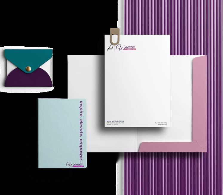
Graphic Elements
Download these graphic elements here Other Women of ALPFA specific assets can be found here It will be updated periodically.
Usage Examples
If you have any questions about Women of ALPFA branding please email: marketing@national alpfa org
