1 minute read
Title font: Playfair Display and Riverhack
TITLE FONTS
There are two different fonts used for the titles: Mark Black and Playfair Display Black. They are used for very different function inside the book and should not be changed for any reason. We have another font that is used for very specific titles, the final games number or to underline in the title very specific word.
Advertisement
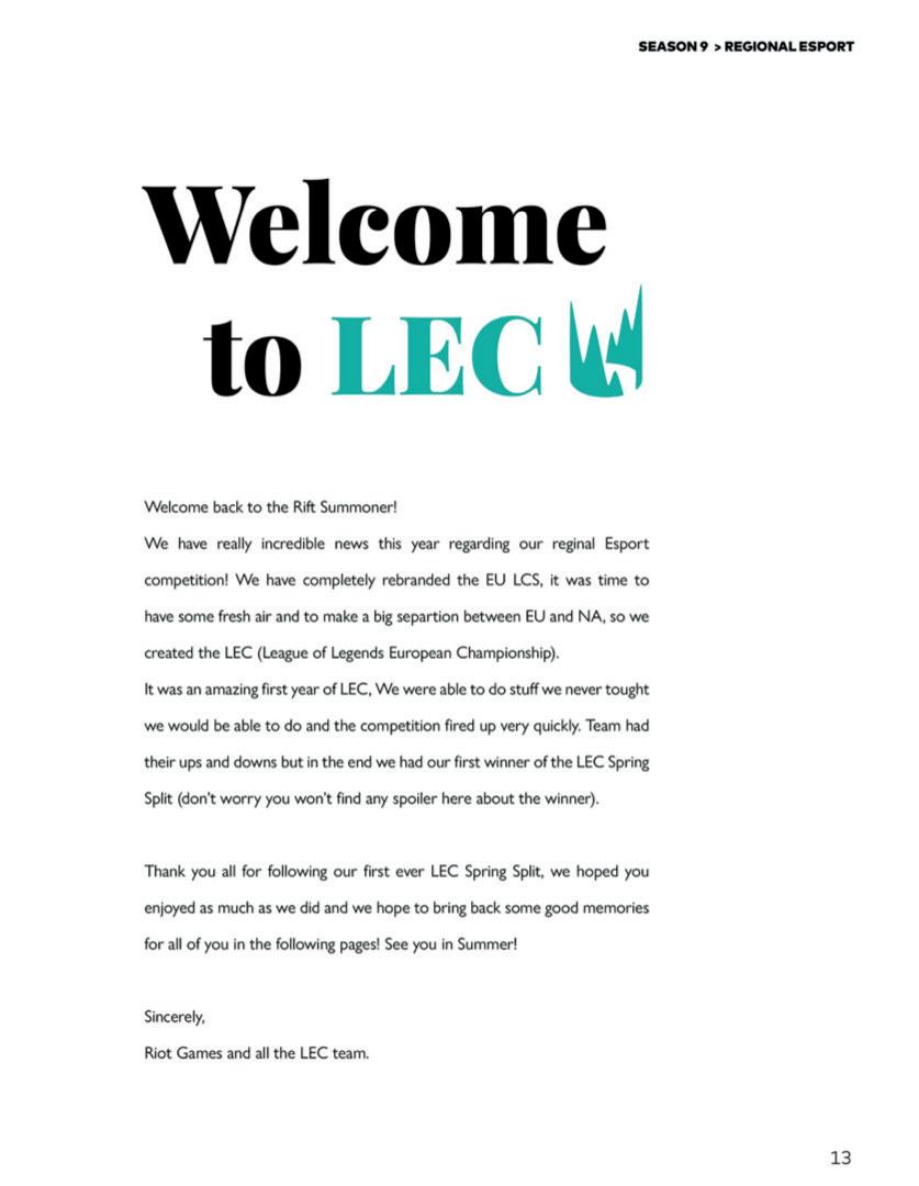
PLAYFAIR DISPLAY Playfair Display is the title font found only in a certain type of pages: introduction to events and champions quotes. The usage of this font in other different ways cannot be possible.
PLAYFAIR DISPLAY FOR CHAMPIONS SPREADS When we have the champions page, we use Playfair Display to write down a champion’s quotes on the side of the page where there is not written text. Playfair display will be used in its Black and Italic version.
Quotes dimension points: 43 pt with 51,6 pt leading.
PLAYFAIR DISPLAY FOR INTRODUCTION PAGES Playfair display is one of the first font the reader will see when opening the book for the first time. This font will be used mainly in introductory pages like the Spring Split, Summer Split, MSI and Editor’s letter one. In this case the font will be used in its Black Regualar version.
Title dimension points: 72 pt on 86,4 pt leading.
Playfair Display the quick brown fox jumps over the lazy dog THE QUICK BROWN FOX JUMPS OVER THE LAZY DOG 1234567890 !”£$%&/ ()=?ì+èùàòéù*§°éç@#[]#]

PLAYFAIR DISPLAY RIVERHACK

RIVERHACK Riverhack is a very particular font used only in very specific occasions and sometimes is up to the person paging to decide to use it or not, but only in some cases.
We will find always this font used for the text GAME 1 etc.. for other usages like in titles to emphatize particular words, it’s up to the person paging. But for games, it mandatory and necessary.
Font dimension: 72pt


