1 minute read
Title font: Mark Black
TITLE FONTS
There are two different fonts used for the titles: Mark Black and Playfair Display Black. They are used for very different function inside the book and should not be changed for any reason. We have another font that is used for very specific titles, the final games number or to underline in the title very specific word.
Advertisement
MARK BLACK Mark Black is the main font used for all the titles inside the book, regarding articles for the esport or the introduction pages for the reworked or new champion. The font will be used in different size, talking about champions or articles. Champions name is to be very visible and big, while for the articles titles we have a lot more text and we do not expect a pages just for the title. Mark Black will be used only in capital letters.
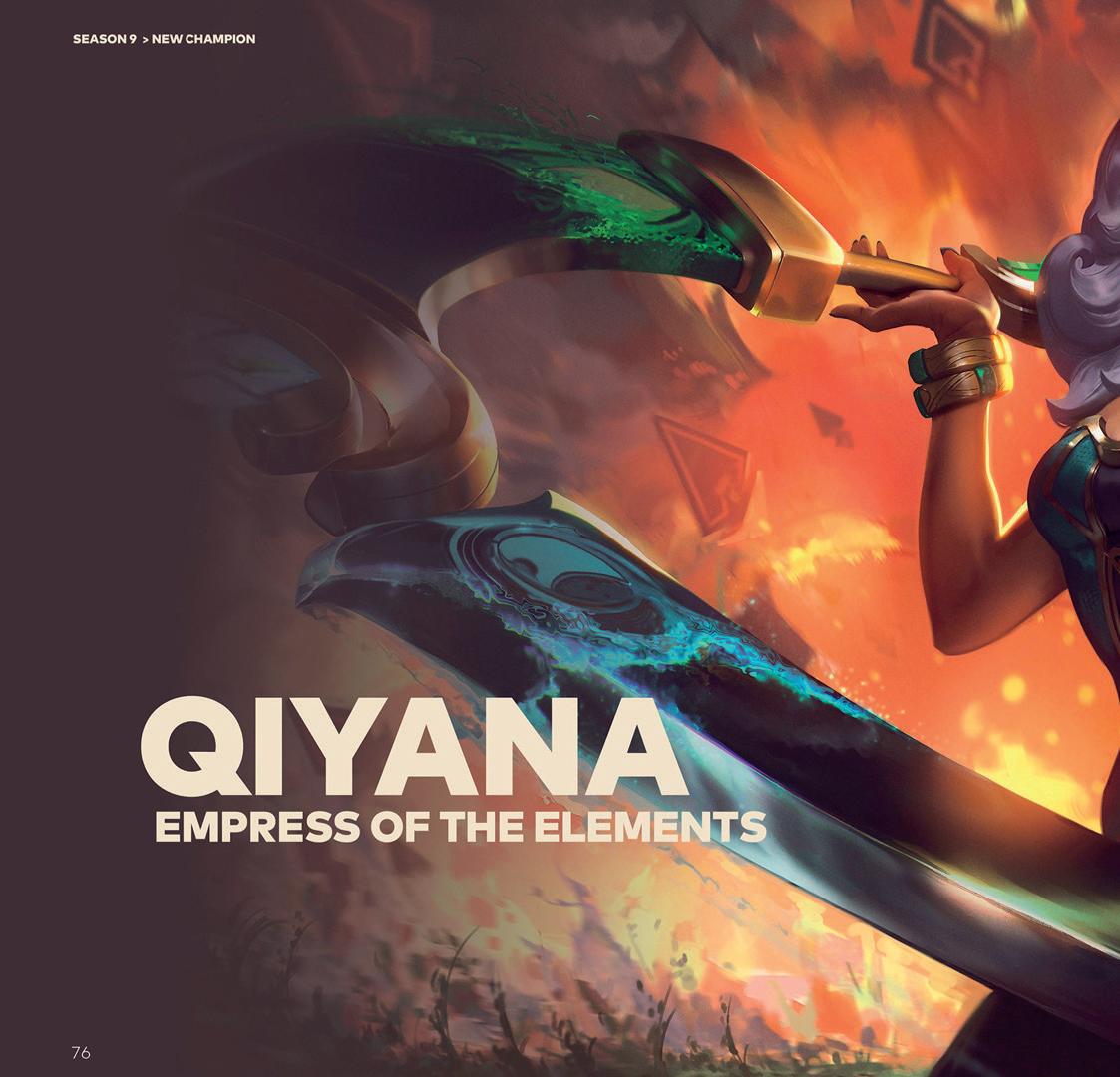
MARK BLACK FOR CHAMPIONS SPREADS When we have the champions page, we use Mark Black to hightlight their name and the subtitles describing them briefly. In the first page we have the campion basic splash art and on the right or the lest of the image, based on the direction is drawn, we have the name. The position on the text in the original splash art may vary based on the colors used.
Title (champion name) dimension: 100pt Subtitle dimension: 34pt
In the second spread we still have the name of the champion, but we highlight the subtitle. The dimensions remains the same but the subtitle is skew by 10 degrees. For every champion page this rules must be followed. There cannot be any changes to it.

Mark Black will also be used as titles for the champion abilities with the dimension of: 14pt.
MARK BLACK FOR ARTICLES SPREAD For articles pages we have standard points for the titles, if they are too big we have the options to reduce it.
MARK BLACK

MARK BLACK THE QUICK BROWN FOX JUMPS OVER THE LAZY DOG THE QUICK BROWN FOX JUMPS OVER THE LAZY DOG 1234567890 !”£$%&/ ()=?ì+èùàòéù*§°éç@#[]#]


