BRAND BOOK DIGITAL MARCA


We hope this guide helps you better understand our brand.
What do we mean by brand?
Our Propose
Our Promise
Our Mission
Our Values
Our Personality
Our Brand Pilars
Our Positioning
Why are words so important?
What’s the meaning of brand voice & tone of voice?
Tone of voice
Brand voice
Taglines
Key audiences
Writing Principles: How to write like our brand
Writing web copy
Writing for Social media
Writing Tips - creating structured content
Writing a press release
A short Treatise on Grammar
Approved vocabulary
Unapproved vocabulary
Logo
Typography
Grid system
Colour Palette
Photography Tone
BRAND TOOLS
Our identity is not just a logo. It’s a brand identity composed of several core elements that come together to create a distinctive look and feel and that makes Portugal Ceramics recognizable and relatable. The following pages will guide you through our brand’s core elements. They will assist you in designing and creating compelling communications with a high degree of creative flexibility.
Our brand strategy
for as a brand, you will be able to understand how can we attract a community who share our beliefs.
compass that guides our brand story, actions, behaviours, and decision-making process.
Mastery
Credibilityiours and attitudes.
Credibility
Collaboration
Sustainability
Exigency
Adaptability
We know our craft Credibility is a result of behaviours and attitudes. Build each other’s possibilities.
Inspire the industry to reimagine itself and balance the unbalanced. Deliver the exceptional, every day. Always find the right solution.
The purpose of the brand is the reason why the brand exists. It is the reason why we decided to offer our products and services and not others. It is what drives the brand (and the organization) towards a future vision. Everything the brand must be grounded and aligned with this purpose.
enjoyment of the Portuguese Ceramics’ value, and expand its international reach, reputation and impact.
Our brand promise is the central benefit that we are committed to delivering to our customers consistently. It’s what motivates our customers to choose Portugal Ceramics. It is how we deliver our purpose. It is what we offer and it’s what captures the attention, emotions and minds of our customers.
Authentic ceramic solutions made possible by bringing together soulful legacy, creativity, industrial know-how and culture.
Portugal Ceramics’s personality is a mirror of our portuguese soul. These traits are the humanized characteristics that describe us as a brand. Our personality guides our behaviors and decisions. We think about our brand personality as a set of emotional triggers with which people can relate and connect.
Personality Detailed
Portuguese Ceramics is what Portuguese companies do: their capacity to innovate meaningfully while creating value, the way they act in every single touchpoint, the way they honor their commitments, the way they relate with their audiences, the way they know their craft and the way they communicate. The brand is well aware that without respect it’s impossible to build long lasting relationships and that respect has everything to do with performance, reputation and trust. The brand inspires companies to set hight quality standards and then exceed them, and to pay special attention to service because service is where transactions are transformed into relationships. The brand recognizes the importance of providing a sense of security to their audiences, valuing the consistent delivery of what’s promised.
The brand is aware that relationship is ahead of information. The brand knows that it needs to go beyond communication, it needs to go beyond recognition. The brand fights for Portuguese ceramics to be perceived not only as quality but as having a touch of desirability, regardless of price (not necessarily exclusive or high end), function or audience - the brand wants Portuguese ceramics to be desired, even craved, by distributors, advocates, designers, artists and consumers (end users).
The brand wants to nurture emotional connections with its audiences. And because the brand is aware that being emotional is much more than its tone of communication, the brand promotes genuine connections that are based in actions - getting close and personal.
The brand is committed to put the Portuguese companies on a pedestal. To show the world our design aesthetics and refined industrial craftsmanship, inherited from a rich and strong tradition. The brand knows that the Portuguese Ceramics companies’ commitment is one of the most distinctive factors within the industry as a whole - whether a difficult deadline, small scale product collection or a demanding client specification, Portuguese ceramic companies go above and beyond to deliver what’s promised, never lacking in quality and rigorousness.
The brand fights to make sure the world knows that our unique love for challenges and dedicated atitude, our ability to provide custom made solutions and our will to unravel a problem, makes us the go-to place, when it comes to demanding, or special, requests. The brand wants the market to be aware that Portuguese ceramic companies are absolutely focused on their clients’ needs. Also, the brand is committed to help companies understand that sustainability is not a business fad. It’s here to stay and companies should take the biggest responsibility of all: to make the world a better place for everyone.
The brand fights to inspire companies to adopt strategies that leverage the whole industry competitiveness. It urges them to understand the critical success factors that make a difference in crucial moments.
The brand knows that a piece of ceramics - from tiles to decorative objects - is more than a functional object and serves more purposes than those related with the basic human needs. The brand is aware that without the people who live in homes, buildings and towns, this places are nothing but empty spaces. Aware of this, the brand urges Portuguese companies to produce ceramic objects, surfaces and tiles where pragmatism meets beauty, and innovation completes tradition and values. Because these objects are things that define who people are, how they express themselves and what they stand for - as people wrap dreams, desires, stories and memories around them.
For that reason the brand strives to promote the design of products, driven by style and purpose. This brand will empower architects, designers, distributors and end-user to understand the beauty and value of Portuguese ceramics and all the emotional value it carries. Ceramics that are beautifully designed and exceptionally made, that will make every single one feel pleased, good and confident. Because when design ends, emotion always begins.
The brand inspires Portuguese companies to design beautiful, practical, and solution- driven objects that work for everyone - if brands are not aesthetically stimulating and functionally effective they will not stand out and they will merge with the crowd. The brand wants the world to be aware that Portuguese ceramics have a storied history of craftsmanship and innovation, that resulted in the interplay of heritage and contemporary elegancewether inspired by nature, culture or imaginary worlds. The brand fights for the Portuguese Ceramics to inspire architects and designers into creating liveable spaces where people feel comfortable, ambiences that reflect their personality and where they can enjoy their everyday life, but also to amplify imagination, conceptual ideas that will - with Portuguese ceramics - elevate spaces to higher levels of wonder and admiration.
The brand wants to highlight and promote two driving forces that characterize Portuguese ceramics: ingenuity and imagination. Powered by a rich heritage of endless generations working with ceramics, mixed with a natural drive to bring things together, the brand pursues opportunities to advocate the Portuguese Ceramics industry’s capacity to create original products that balance design, beauty and functionality, and surprise with finishings that make all the difference. The brand wants to promote Portuguese companies’ skills and capabilities - anchored in the highest disciplines of style and know-how.
The brand wants to promote the Portuguese companies creative ability that seamlessly blend traditional craftsmanship with forward looking production methods and technology.
The brand is set on letting Portuguese Ceramics’ creativity flow, celebrating and rewarding skills and craftsmanship, but also creating new ways to inspire people.
Personality Detailed
The brand believes that how and where products are made really matters. The brand loves Portugal’s ceramics heritage and it’s proud of it - the country’s long and vast experience as designers and manufacturers is the core of its capacity to focus on craftsmanship to produce singular, distinctive, modern well-made objects.
The brand is proud of the country’s legacy of knowledge and craftsmanship, that has passed across generations, and the strong commitment with the local communities. The brand encourages authenticity and fights for every piece created to have something that speaks its legacy and provenance. The brand wants to make a positive contribution to the industry’s positioning and strives for the world to be aware of its value (quality and design wise).
Having a long history and a rich ceramic tradition, the Portuguese ceramics production is proof of a unique and talented heritage that is handed down from generation to generation. In every piece designed, Portuguese ceramics showcase the mastery of processes, materials and imagination. The brand knows it’s high time for the market to know how gifted and capable - both technical and creative - Portuguese ceramic companies are. The brand will advocate for these concepts of talent, restless capability and imagination - that have largely gone unacknowledged - to come to light when it comes to define Portuguese ceramics.
Just as the Portuguese ceramic companies vary from highly technical advanced to small family productions, from tile manufacturing to decorative objects and tableware - bringing a great diversity to the market - so will the brand need to offer different communication claims to very different audiences. The brand is keen on advocating Portuguese ceramics as the best solution providers to every stakeholder along the value chain. This means creating versatile actions and communication touchpoints that will speak directly to the hearts and minds of different audiences, communicating the Portuguese ceramics different products and atributes.
OUR BRAND STRATEGY
Overview Portugal Ceramics’s positioning is based on the following 5 core pillars:
1. For singularity
2.. Value added for all
3. Client Centric
4. For Sustainable Living
5.. For diversity
Positioning
What is it that makes us unique?
What is it about Portuguese ceramics that the world should be aware of? Why should people choose us? To buy from us instead of any others?
Because there’s something special about us. A resolute character formed by legacy, know-how, craftsmanship, creativity, design and innovation. And, above all, something unique that speaks trough every piece of ceramics we create.
An obsessive desire to deliver what seems almost impossible. An unmatched will to offer what our clients need. To figure out a problem. To provide a solution where other see none. Our unparalleled attitude that always fights to deliver the demanding, the special orders, the small batches, the tailor-made. To deliver the exceptional, every day. To deliver the art of possibility.
We want different audiences to associate Portuguese Ceramics (tableware and decorative ceramics & floor and wall tiles) with the idea of Mastering Possibility - of making things happen in a unique way. Especially when customers are looking for a partner to respond to a specific request. Being masters of possibility has everything to do with our willingness to solve problems and be helpful. With our obsessive desire to deliver the right answer to our clients’ challenges. And with our resolute character that is deeply influenced by our legacy and by our culture. By our unique capacity to blur the lines between contemporary design, art and tradition. Between craftsmanship, creativity, innovation and industrial know-how. “Mastering possibility” highlights our unparalleled attitude to always fight to deliver the demanding, the unconventional, the tailor-made. To deliver the exceptional, every day. To deliver the art of possibility.
This is about what we believe as a brand and how you we communicate towards a shared vision.
By articulating what we stand for as a brand, you will be able to understand how can we attract a community who share our beliefs.
OUR VERBAL IDENTITY
The words we use are an essencial part of how we promote ourselves. Through words, we align our image to our promise and delivery. This is what creates a consistent brand experience. A Brand’s voice has to do with how the brand speaks and with what the brand says. It is the verbal expression of the brand. It is the revelation of the brand identity. Our Brand Voice tells our narrative and what we stand for. This is our vocal essence and it should never change.
What we aim to
Verbal identity is very importante because in every piece of content we publish we aim to:
We want the markets to know Portugal Ceramics and its purpose and values. To help create value to our companies our brand will using language that inspires and encourages the markets to follow the brand and to get to know our uniqueness.
We want to reinforce our positioning and the idea that portuguese ceramics are more than meets the eye. Our brand language should focus on our main differentiating points and how we help our clients make the right decision by choosing portuguese ceramics.
Tell clients and followers what they need to know, not just what we want to say. Give them the information they need concerning the products, along with opportunities to inspire them and to change things for good. Remember that the product is not the brand.
Always do your best effort to understand Portugal Ceramics’s place in our customers’ mind. Avoid dramatic storytelling and grandiose claims. Focus on our real strengths. Focus on our authenticity, relevance and difference. Focus on their needs and expectations.
The way we write aspirational and empowering content is by being aware of our voice and our tone. This section explains the difference between voice and tone, and lays out the elements of each as they apply to Portugal Ceramics.
What’s the difference between voice and tone? Think of it this way: You have the same voice all the time, but your tone changes. You might use one tone when you’re with your closest friends, and a different tone when you’re in a meeting with someone that you don’t know.
Your tone also changes depending on the emotional state of the person you’re addressing. You wouldn’t want to use the same tone of voice with someone scared or upset as you would with someone who’s laughing. The same is true for Portugal Ceramics. Our voice doesn’t change much from day to day, but our tone might need to change according to the circumstances.
Tone of voice
Portugal Ceramics’s tone is informal and always emotional. So, always remember to write like a human, and don’t be afraid to break a few rules if it makes your writing more relatable.
When you’re writing, consider the reader’s state of mind: Are they puzzled and seeking for help? Are they excited about the new collection? Are they trying to learn more about the brand in order to gain more confidence? Once you have an idea of their emotional state, you can adjust your tone accordingly.
The brand tone is exciting and clear.
Because it’s deeply committed with the idea of creating a clear positioning for the brand “Art of Possibility” the brand has a reinforcing and innovative tone that should reflect our companies’ goals and state of work.
Before you start writing, ask yourself: What purpose does this serve? Is it useful? Who is going to read it? What do they need to know?
Write in a way that suits the situation. Just like you do in faceto-face conversations, adapt your tone depending on who you’re writing to and what you’re writing about (this is especially important on social media).
Keep it simple and clear: use simple words and sentences.
Our Tone
Tone of voice it’s not about what you say, but rather the way you say it, and the impression it makes on everyone who reads or hears you. We believe that the brands communications should be:
Our name is a very powerful element - of the many our brand’s identity has - that our brand has to tell its story. Names work as way finders, used by people to locate and choose the brand over its competitors. In a name, we carry so many attributes, associations, experiences, and information that people immediately understand and accept. As a brand we exist to promote our companies and their products and services. Our name is:
Our signature is deeply related with our brand positioning. The signature reflects the willingness of Portuguese ceramic companies to find the right answer to the challenges that their customers bring to them. The industry’s inborn drive to bring things together and make everything possible - creativity, legacy, knowledge and culture.
Bringing the word art to the signature allows us to reinforce and highlight our industry’s creativity and design capacity and, at the same time, fight the ideia that our industry is just “production unit” oriented.
We are the pursuers of authenticity. That unique blend of heritage, culture and imagination emphasized by will and passion. We seek it. We long for it. And we put it in everything we do.
Our DNA is creative, our skill refined, our dedication unquestionable and this is what makes us extraordinary. We believe that for every single challenge there’s a very particular answer. And here lies the cornerstone of our quest - to work on solutions until there is no problem. That’s why we emphasize simplicity and function through emotion and creativity. That’s why we bring together contemporary design and art, legacy and technology. Because this balanced dichotomies are at the core of our capacity to create singular, distinctive, well-made objects.
We say that how and where products are designed and made really matters. Now, more than ever before. And because there’s no living without life, we are actively committed into creating a better planet for all.
Putting all our talent and all our efforts into creating products that respect our natural resources, that last for generations and resist the test of time. Products that are born from nature and designed for every purpose and usage.
We believe that blurring the lines between design and art is what creates truthful connections that know no limits. We want our ceramics to bring emotions to life and bring people and spaces together. We want to help people celebrate stories, preserve memories and express their dreams. Because as we dream, we mould the shape of our future.
As we nurture a world of infinite possibilities, we fight to deliver the exceptional every day.
We are Portugal Ceramics, and this is the art of possibility.
OUR VERBAL IDENTITY
Important note
Always think about your audience. Who is actually reading our content? Who are we talking to? What do they want to know about? Focus on your audience and write about the key issues that concern them, don’t try a “me, me, me” attitude.
The main audiences
Tableware and Decorative Ceramics
Interior Designers
Distributors
Influencers / Advocates
End users
The main audiences Floor and Wall Tiles
Architects and real estate investors
Distributors
End users
Tableware and Decorative Ceramics
Creating beautiful and inspiring objects for every home. This is the art of possibility. This is Portugal Ceramics.
Details that amplify the smallest of differences. This is the art of possibility. This is Portugal Ceramics.
Combining the intuitive and the rational, the practical and the extravagant. This is the art of possibility. This is Portugal Ceramics.
Deliver the exceptional, every day. This is the art of possibility. This is Portugal Ceramics.
We find the very particular answer to every specific challenge of yours. This is the art of possibility. This is Portugal Ceramics.
Listening to your needs. Surprising you with tailor made collections. This is the art of possibility. This is Portugal Ceramics.
Our DNA is creative, our craft refined, our dedication unquestionable. This is the art of possibility. This is Portugal Ceramics.
Tableware and Decorative
Ceramics
The interplay of heritage and contemporary elegance. This is the art of possibility. This is Portugal Ceramics.
We blend the boundaries of culture, design and know-how to produce singular objects. This is the art of possibility. This is Portugal Ceramics.
Objects that refine your perceptions, shift the understanding of spaces and connect with your emotions. This is the art of possibility. This is Portugal Ceramics.
Objects that inspire you to have a profound relationship with the world. This is the art of possibility. This is Portugal Ceramics.
Objects that interconnect people. This is the art of possibility. This is Portugal Ceramics.
Objects with storied history. This is the art of possibility. This is Portugal Ceramics.
Objects with timeless appeal that care about the future. This is the art of possibility. This is Portugal Ceramics.
Objects that resit the test of time and accumulate stories and memories. This is the art of possibility. This is Portugal Ceramics.
Key messages
Floor and Wall Tiles
Ceramic solutions that add value to your projects and take care of our planet. This is the art of possibility. This is Portugal Ceramics.
We create beautifully designed and exceptionally made tiles that enhance your projects.
Portugal Ceramics, we deliver the art of possibility.
We create solutions that empower your dreams. This is the art of possibility, this is Portugal Ceramics.
Unique solutions that are tailor-made to your project’s specific needs.
Portugal Ceramics, we deliver the art of possibility.
Beautifully designed and exceptionally made tiles that enhance your project’s value. This is the art of possibility. This is Portugal Ceramics.
Longevity of timeless design means respect for the future. This is the art of possibility. This is Portugal Ceramics.
Quality meets design. This is the art of possibility. This is Portugal Ceramics.
Finding the right answer to your challenge. This is the art of possibility. This is Portugal Ceramics.
Floor and Wall Tiles
Beautifully designed quality products that make your business more competitive. This is the art of possibility. This is Portugal Ceramics.
Pragmatism meets beauty and design completes tradition. This is the art of possibility. This is Portugal Ceramics.
Empower your dreams. This is the art of possibility. This is Portugal Ceramics
Refine your perceptions and let space play with your emotions. This is the art of possibility. This is Portugal Ceramics.
Objects that inspire you to have a profound relationship with the world. This is the art of possibility. This is Portugal Ceramics.
Spaces that express your style and what you stand for. This is the art of possibility. This is Portugal Ceramics.
To keep the brand identity from feeling uncoherent, we present a framework of core components, so that the elements existing inside of it can be as free and expressive as we want. Structural elements like our logo, colour palette, and typography are meant to keep the visual identity grounded and consistent. These core components work together to ensure our brand is recognizable wherever it appears.
The flexible elements of our brand, like photography, should celebrate creative yet classical expression. It allows us to communicate with a wider range of emotions, take more risks, and showcase our craftsmanship approach.
Important note
The logo is the most visual element in our visual identity - a universal signature across all Portugal Ceramics’s communication. It’s a guarantee of quality that should unite everything together. Because the logo is such a recognizable and highly visible brand asset, it must be always applied consistently wherever it appears.
Logo
The logo itself consists of a wordmark and an icon. The wordmark embodies much of the brand’s unique spirit in its classical yet with modern twist characters. Optical kerning, refined lightweight and defined clear space, as well as well-delineated placement help make it as instantly recognizable as possible at all sizes and in all contexts.
The icon is a semiotic representation of the two main sectors of ceramics - being the utilitary and decorative ceramics represented by a circular shape, and the floor and wall tiles are represented by a 45 rotated square. The simplicity of the icon translates our modern approach to design and our long-term thinking.
Our brand is dynamic and ready to tackle every challenge. This way, our logo is ready to be used in various versions depending on the type of communication and use.
Use the primary version of the logo every time is possible: in print and digital materials. This can be used in corporate business cards, letters, merchandising, brand tags and other types of communication
We can use the compact version of the logo when the center alignment doesn’t quite fit the layout grid defined for the communication touchpoint. Use this version always when using left alignments layouts.
One other way you can use the compact version is by breaking the space between the icon and the word mark. This version can be applied in vertical or horizontal layouts, making the overall communication dinamic. Only use this version has footer or header signatures. Never in the middle/center of the layouts.
The vertical logo should only be used in very tight vertical layouts such as vertical banners.
Logo Variations
Our logo is based on a simple and refined typace and formal central alignment. It was carefully designed to maintain its characteristics while allowing for perfect legibility at any size on any application. When you use our logo, its location relative to the resident objects is important. To protect the clarity and visual integrity of the logo, it has a clear space zone. It must always appear legibly on a clear background. Incorrect use may result in the logo losing its properties among other elements.
The main thing you should pay attention to is the clean space near the logo.
Observe graphics above and use it to ensure the logo will work correctly between other elements.
Clearspace exceptions
Special case exceptions can be considered as the logo placement depends on the type of communication and use.
Preferable in all brand communications the logo should be placed on the bottom or top of the composition. The logo should be center aligned - this is one of the main composition aspects that will make everything look coherent. On digital communications such as call-to-actions and websites, the logo should be top aligned. As a second option, we can use our breaking logo instead.
Scale and dimensions
There are no predetermined sizes for Portugal Ceramics’s logo. Scale and proportion must always ensure the correct usage of the logo, but the overall scale will be determined by the available space, aesthetics, function and visibility. While it is important to keep the proportions and overall premium yet modern aesthetics, keep in mind readability and visibility at all times. We want to be noticed.
There is no maximum preset size for the logo. Upper scale when needed.
Maximum size: There is no preset maximum size for the logo. Upper scale when needed.
Smallest size: 5mm height / 14pt on type. Keep the same height for the breaking logo and vertical logo versions.
Logo dont’s
Here are some guidelines for you to follow when using our logo. It must remain the same within the variations mentioned before. These will ensure its graphic quality and visual coherence.
Do not change typeface.
Do not stretch or distort the logo in any way.
Do not use lowercase.
Do not change kearning.
Do not change colors. Approved colors only.
Do not modify the icon or switch element placement.
OUR VISUAL IDENTITY
Overview
Typography plays a pivotal role in our brand visual identity. Using it correctly allows us to create easily identifiable messaging that is clear from distraction and, this way, deeply contributes to better brand recognition and awareness.
Our main font is Almarena Display and we use the fonts various weights and versions to assure a coherent and branded communication.
Almarena is a modern yet classical and elegant font family that perfectly reflects the style of our brand. The font has two different styles - Display and Regular - which has a wide range of different weights that allows you to create beautiful harmonious designs. The use of one or another style depends on the task you are doing. In every communication piece, make sure to apply basic typographic rules and respect the typeface design. Hierarchy is vital for creating good, readable and elegant communication, so keep in mind that typography needs to be treated carefully.
Primary typeface
abcdefghijklmnopqrstuvxywz
ABCDEFGHIJKLMNOPQRSTUVXYWZ
0123456789!?@€%&^$*()_+[]”:
Secondary typeface
abcdefghijklmnopqrstuvxywz
ABCDEFGHIJKLMNOPQRSTUVXYWZ
0123456789!?@€%&^$*()_+[]”:
Where to use Almarena Display?
Almarena Display is the main font of our brand typography scheme. Although a large number of Moneta Display weights are available, allowing a full range of creative expression, Almarena Display Regular or light should be the most used weight for our brand marketing materials across all art forms. You should use Almarena Display when writing headlines, titles, and short promotional sentences. For these purposes, depending on the length and scale of text, the primary choice should be all caps for print promotional materials.
Where to use Almarena?
Almarena is the simplest / less detailed version of Almarena Display. You should use it on print call-to-actions and smaller scale, subtitles or longer pieces of text. Use it whenever the materials where the text is being printed or produced need to be clearly read and legible at very small x weights. This is the prefered typeface for product tags information and also product descriptions on hangtags and digital materials (website descriptions, main body copy, etc).
It is important to organize typography in a hierarchical system according to relative importance or inclusiveness through scale and function depending on communication. When a variety of type sizes and weights are used, the differences between them must be recognisable. The contrast should create clear, elegant and consistent pieces of communication.
This is the body copy, set in Almarena Regular and it’s meant for longer content and information. It is set in 10pt with 15pt between lines. Fugite nimusdam vellitasinte maio. Acimporro et odit et as alique ex eum am aut ullestiores elis ut aut experunte nis ventis excero ex et unt. Uda commo odis rem res sam excepreped moluptatem et.
OUR VISUAL IDENTITY
Our composition system is elegant in its simplicity of use. To achieve a classic and elegant feel in every communication design piece it is vital to building a balanced and harmonious layout.
Our grid is a system made of a series of parallel straight lines and they should serve as an armature on which you can organize all the visual and verbal elements rationally and easily.
Grids bring order to the page - they are the structural foundation for the consistent organization of all graphic, text and photographic elements. Our grid system maintains a consistent visual identity for our brand.
Using the grid system - Print Layouts
The column system for print materials is defined by the underlying grid divided into nine columns. It creates an ideal framework for all types of content and resembles a classic and art-like design. The column grid provides the flexibility for combining text with images in a large number of ways, according to the needs of each context or material communication. All elements should be aligned, balanced and proportional, creating strong professional layout designs.
The flexible grid system will allow you to develop all kinds of layouts - from the most basic, to the most complex. To maintain overall coherence throughout all brand communication materials, these are some basic layouts that, when combined with the correct use of typography, will guarantee an elegant and harmonious design.
Three column grid half page with footnotes
Stand-out element with footnotes
Stand-alone element. Feel free to play around and place stand-alone element in assymetric positions.
Some visual tension is advised, but use it carefully.
Using
The grid setup is distributed not only to print materials but also to digital media, such as a website or digital presentations. Below is our preferred grid set up according to the different layouts.
9 Column Grid Setup
Used in 16:9 Presentation, all A sizes (horizontal), legal (horizontal), tabloid (horizontal), letter (horizontal).
9 Column Grid Setup - Preview 16:9 Presentation
Using the grid system - Digital Layouts
For vertical digital displays like a mobile app, a 4 column grid can also be used. This will allow you to better arrange a layout according to the screen specifications. For complex layouts, don’t forget to use the full extent of the 4 column grid and all its vertical lines.
SUBHEAD IN ALL CAPS
CALL-TO-ACTION
Used for promotional banners, vertical screen displays or square displays.
Hil tem re consultus iam esses vedut Eces unto eum quiatia sam sunt quaes duntur?
Ipsam ut opta prae qui int venihitiis exernat usciend itaeped que labo. Non pe vit peliquo enem apis placcusa a nusae conseque volorem quaerias etureruntis nimpelenti si officid eat et quos aborent, accabor.
KNOW OUR BRANDS →
OUR VISUAL IDENTITY
Colour plays a huge role in how our audience perceives us. They are a key visual element of our identity. Consistent use of colours will contribute to the cohesive and harmonious look of the brand identity across all relevant media. Our colour pallete is as diverse as our ceramics and rich as their quality. The colour pallete has 4 neutral tones inspired in the ceramics raw materials and a set of other contrasting colours that sould be used with moderation to provide contrast. When applying colours always remember that every application is meant to be fine and elegant. Don’t make everything too bright or too dark; use these colours to achieve a contemporary yet classic artsy mood.
OUR VISUAL IDENTITY
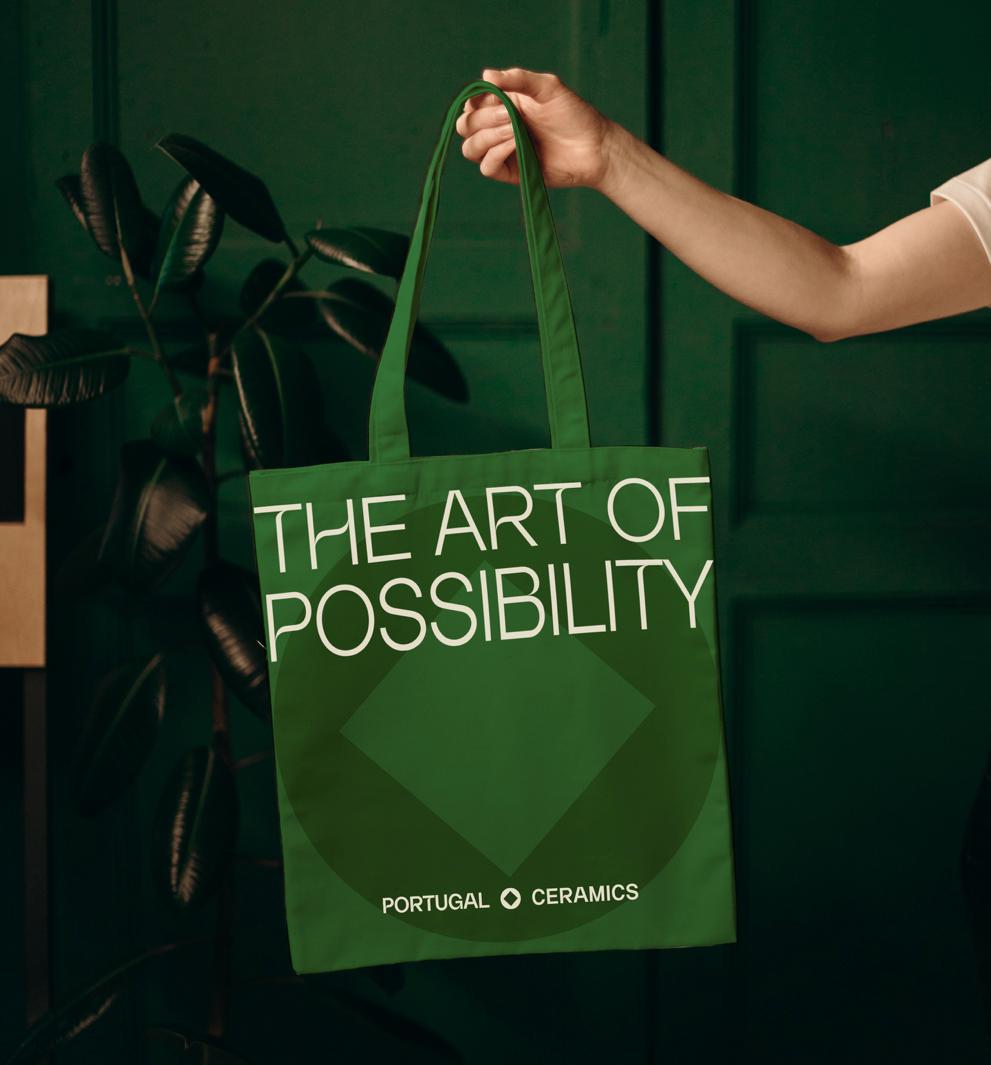
The graphic universe is a fundamental part of our brands communication. It is through it that we are able to create modern, dynamic layouts while keeping our brand recognition across all materials. Born out of our brand icon, the graphic universe is based on two basic geometric shapes: the square and the circle. Although small in number and simple in design, the wide variety of combinations allow our brand to always be dynamic and innovative.
We use these shapes to frame our promotional communication as well as other branded content.
The graphic universe shapes can be used isolated - as a stand out elements or they can be used as masks to frame images. They can also be used as patterns to create promotional or merchandising materials. Both usages can be combined into a variety of elements that focus on brand recognition and awareness.
Social Media is one of our greatest communication platforms and our main goal is to promote our brands products and collections, contributing to the overall portuguese ceramics awareness.
Our brands and sector companies are diverse in lot’s of aspectsfrom organization size to the way they operate - and although that is one of our assets as a sector, we should communicate in a way that unites us all around our main positioning. To achieve that it is important to keep our brand coherent and cohesive so we can maximise communication efforts.
It is advised to use our grid communication templates in order to assure every product is given the same status of importance no matter what company they belong to.
When communicating or promoting wall and floor tiles products, we should mask that image with the Framed Square-Square shape.
When communicating decorative of tableware, mask with Framed Circle-Square shape.
OUR VISUAL IDENTITY
Clean, bold, detailed, beautiful, Portugal Ceramics’s objects and tiles should be shot at stunning angles, with high-resolution close-ups or art-like mood. Smooth contrast and clean lighting transitions are advised. We’re not visually loud, so photography must avoid harsh shadows and very bright contrasting colors. Every piece should be displayed in a sophisticated manner.
Our goal as a sector brand is to promote our brands portfolios and collections, so it is ok to use and publish our brands imagery and photoshoots. This way you’ll be giving our brands a wider reach and wider audience. But, with this in mind, be carefull to select images that, when it comes to decorative and utilitarian objects, focus on the quality of the materials, but they also should push boundaries of product imagery using focus lighting techniques to bring dynamic to the photo. We want our products to rise to the level of functional art objects, so the stars of the pictures should be the products. The angles of the picture must be visually interesting and somehow dramatic to capture interest.
When capturing or displaying ambient photos, never cheapen the imagery. High-end artistic quality is the way to go. For the ceramic tiles be carefull to follow architectural trends, we want our products to look at the edge of design and innovation trends. Go for clean, carefully placed environments and never forget to make the environments livable. Our tiles are made for making places feel comfortable and designed for people, so present aspect of humanity in the photographs.
Extended and beauty imagery should show features and details of the product, but never at the expense of aesthetic value. In this chapter, you can see some pictures of photography references.

Note: These images were produced by our brands. They do not belong to us. They are here to display what kind of angles, lighting and imagery should inspire our brand communication.

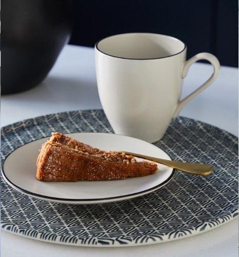

Note: These images were produced by our brands. They do not belong to us. They are here to display what kind of angles, lighting and imagery should inspire our brand communication.

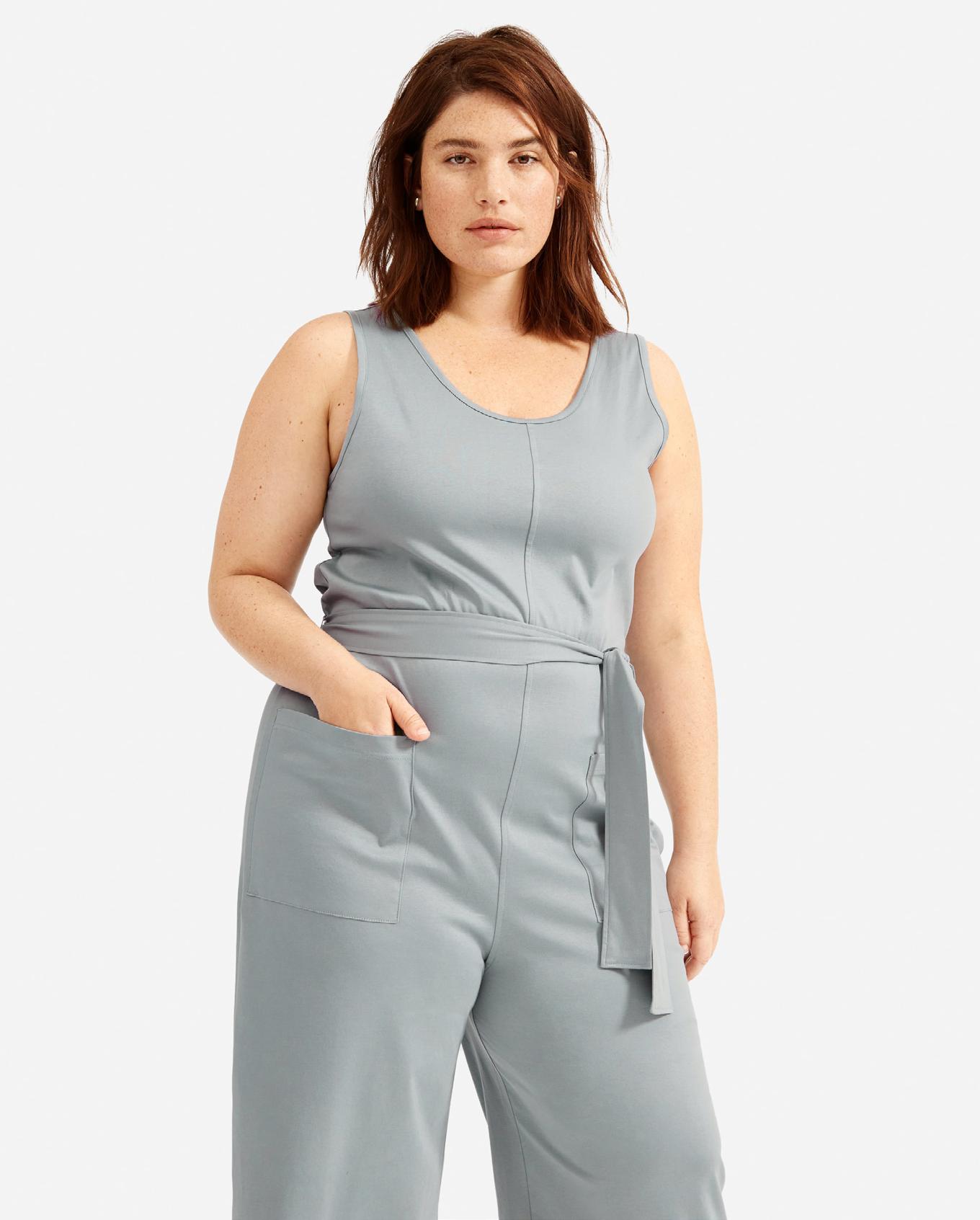

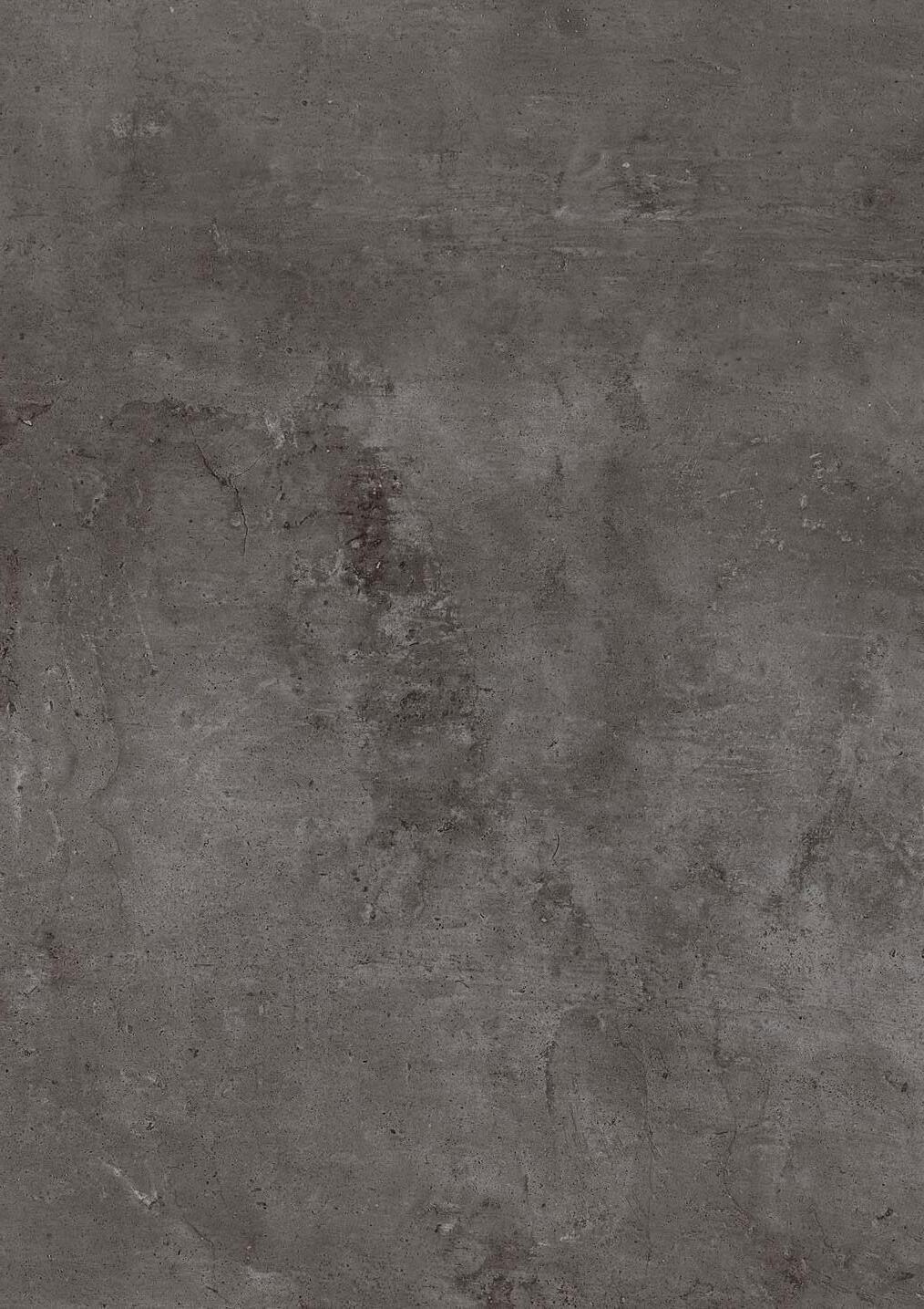
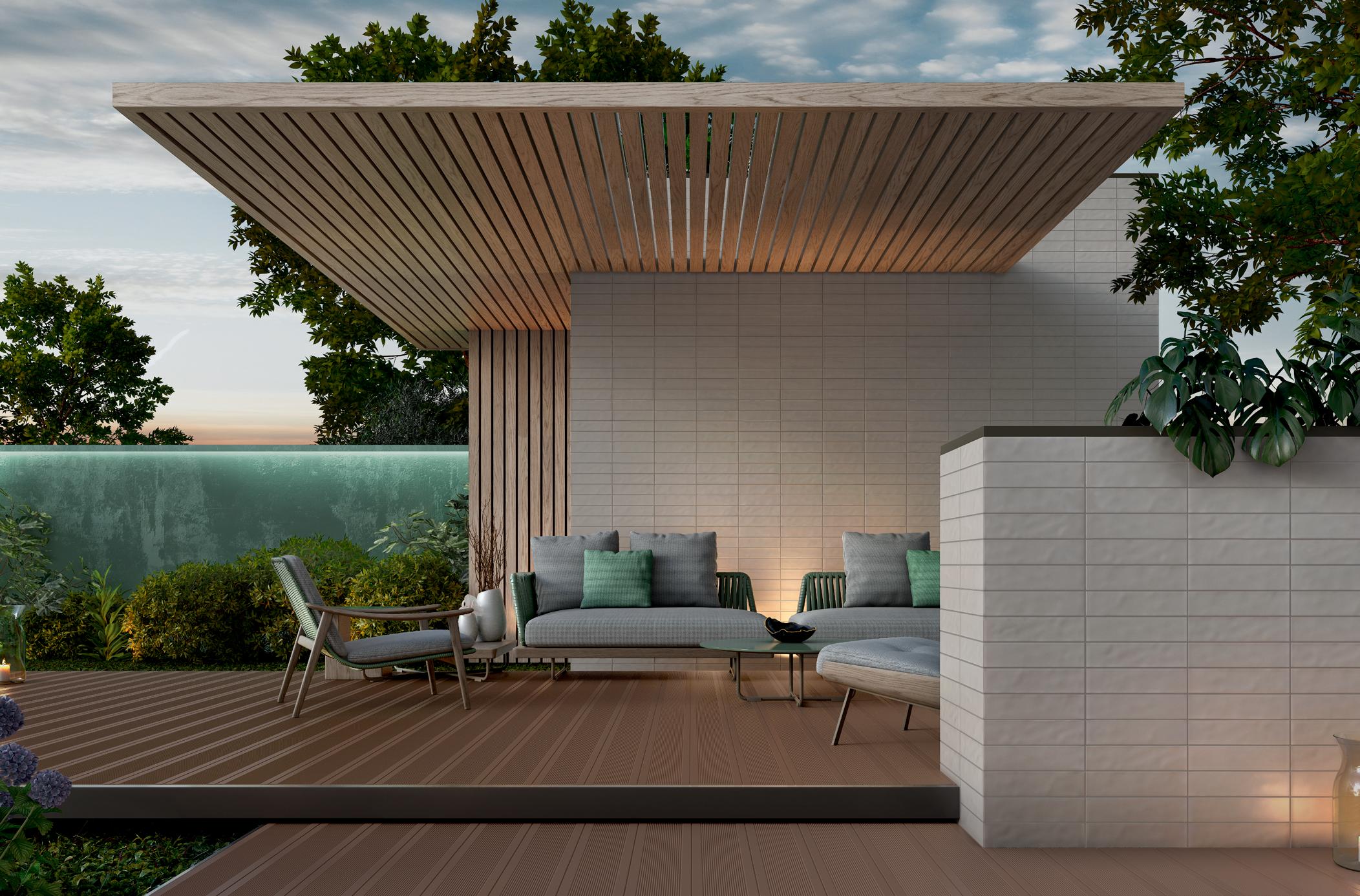


OUR VISUAL IDENTITY
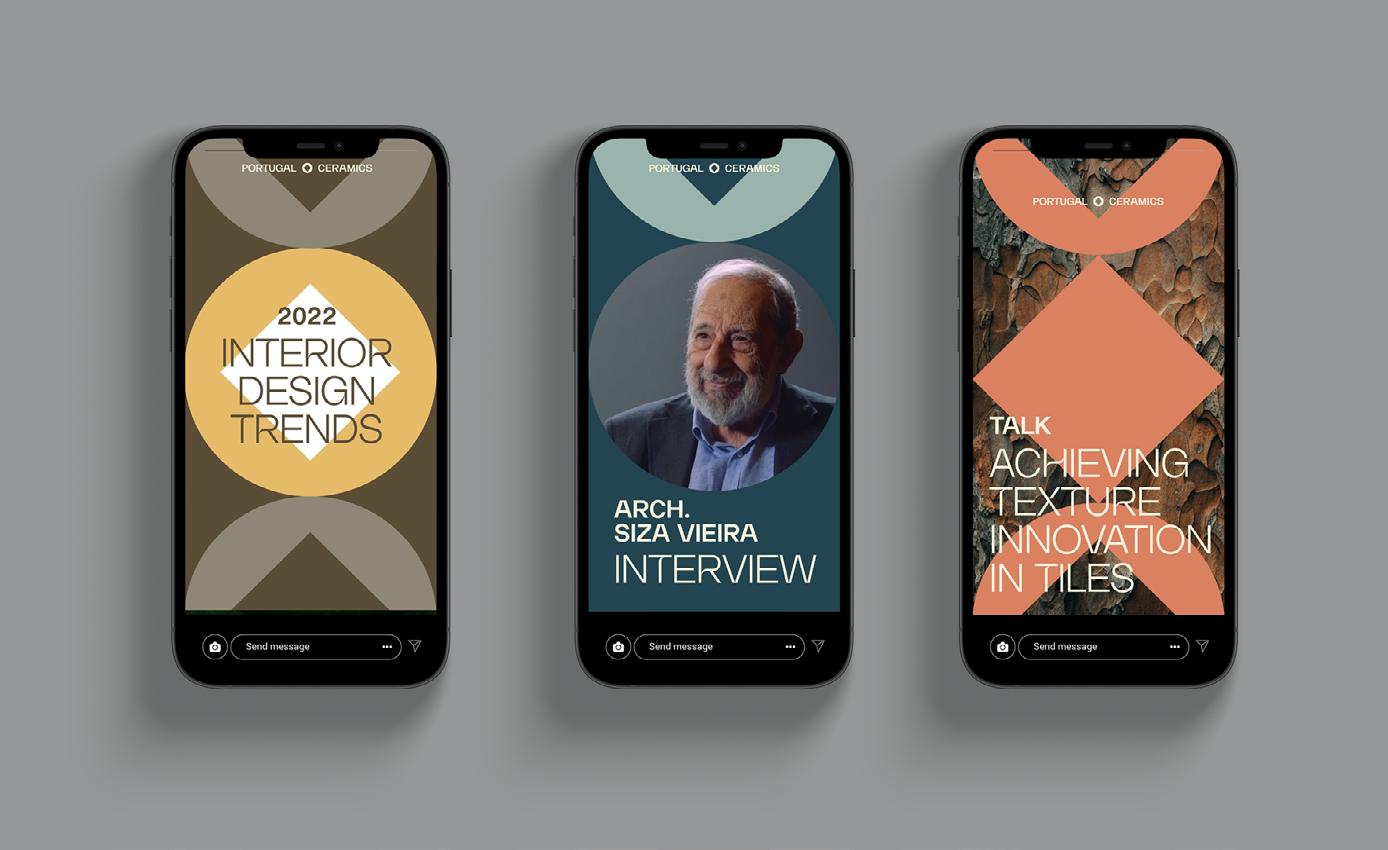
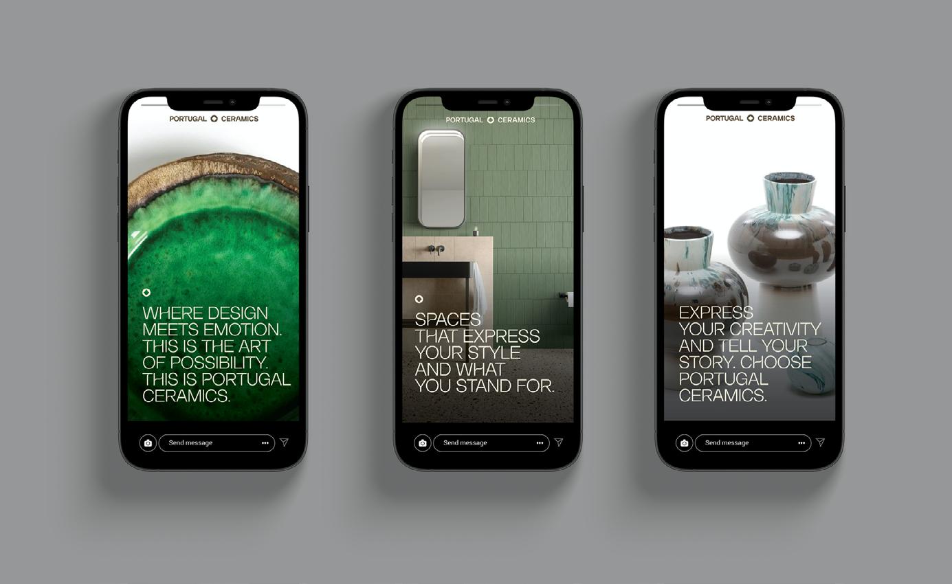
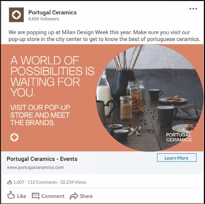
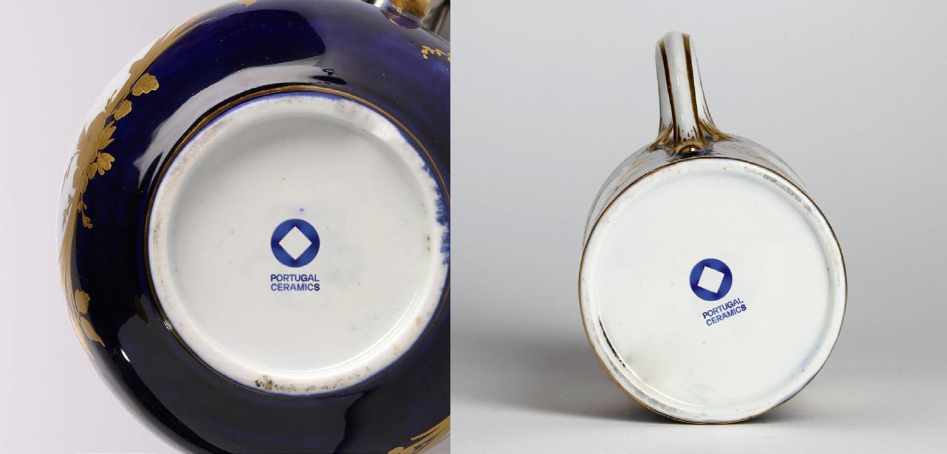
To help you understand and forsee how all our brand elements come together to create meaningull, successfull communication materials, we gathered some fictionary examples of various types of materials - being printed promotional advertsing and outdoor communication, digital outputs or even merchandising. We hope this section of our brand guidelines creates a clear picture of how coherently and thoughtfully we should present ourselves.



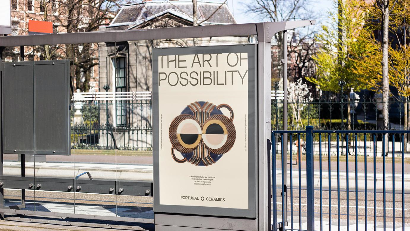
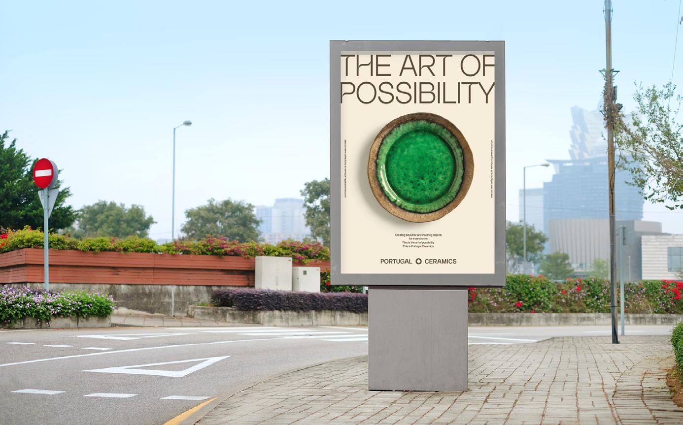

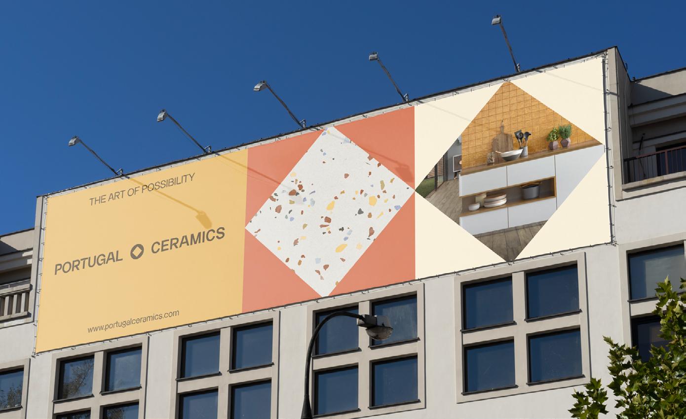
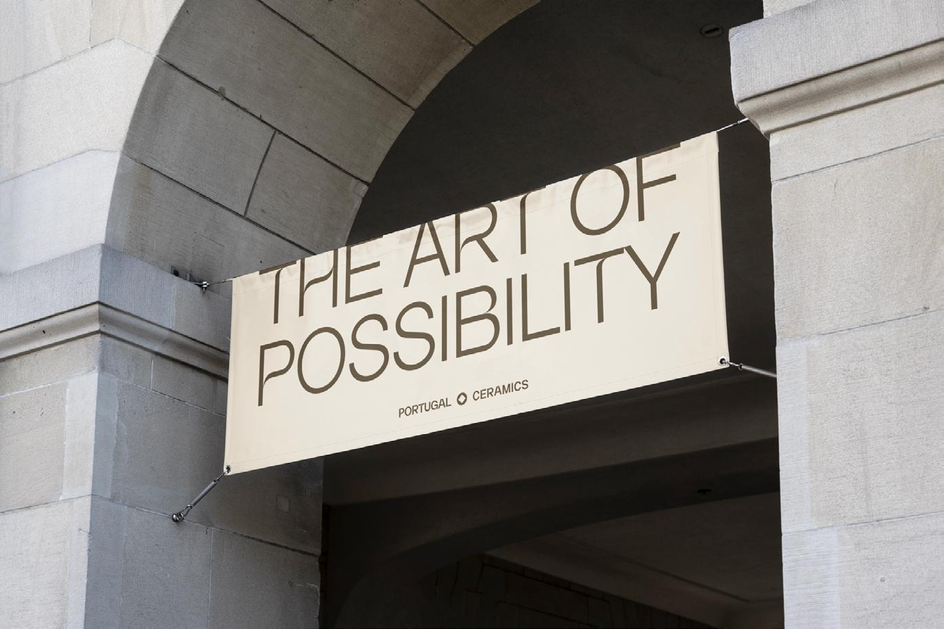
This guide was made for designers, brand managers, photographers, art directors, advertising agencies an all those who will cooperate with our brand.
By following these rules and guidelines we hope to guarantee the correct application of our verbal and visual identity.