LIVERPOOL JOHN MOORES ARCHITECTURAL PORTFOLIO BA ARCHITECTURE
TOM HOWARTH
CONTENTS
BA Year 3 Semester 2:
6123AR Comprehensive Design Project (CDP)
BA Year 3 Semester 1:
6121AR Weather or not (Design)
6122AR Weather or not (Resolution)
BA Year 2 Semester 2:
5123AR Streetscape (Design)
5124AR Streetscape (Resolution)
BA Year 2 Semester 1:
5121AR City Design
5122AR Building in the City
BA Year 1 Semester 2:
5123AR A Place for Crafting (Design)
5124AR A Place for Crafting (Resolution)
02 - 25 26 - 38 39 - 40 41 - 57 58 - 59 60 - 69 70 - 77 78 - 84 85 - 89 01
CONTENTS
Design Brief
Concept
Site Analysis
Design Development
Models
Plans
Section
Key Drawings and Models
Environmental Design
Structural Work
TOM HOWARTH CDP: BIRKENHEAD SCHOOL OF ART
02
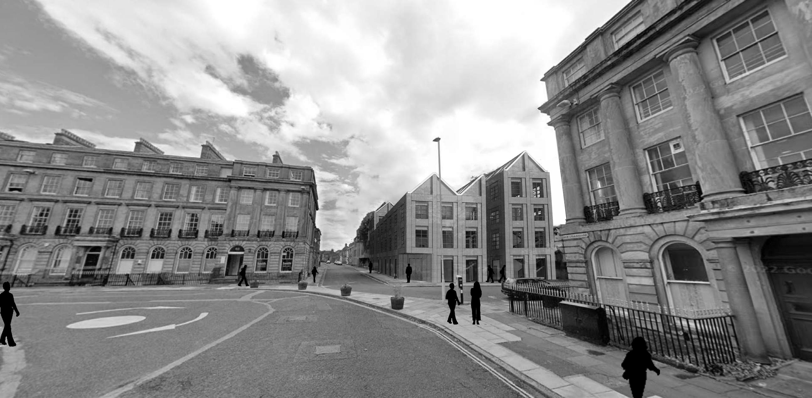
The brief for the CDP project of the final year of the degree was the design a new school of arts building that would sit within either the Northern or Southern corner of Hamilton Square. This site features a context that is of high georgian quality and has been granted the grade 2 listed title, which means that any design for a new building must carefully respond to this architectural quality and whilst having its own identity, should avoid resorting to pastiche. This new school building would provide facilities for a number of disciplines like fine art, photopography, 3D workshop and more. The design challenged me to look at how a school of art can be reinvented and create a modern setting. A personal decision for the direction of this brief is to create facilities and features that embrace the unity of the community of Birkenhead with the education demogrphic that will be introduced as a result. With accessible studio spaces and environments that are both public and private use, the design of the new School of Arts building will be one that becomes a precedent for how other schools may take form.
03 DESIGN BRIEF
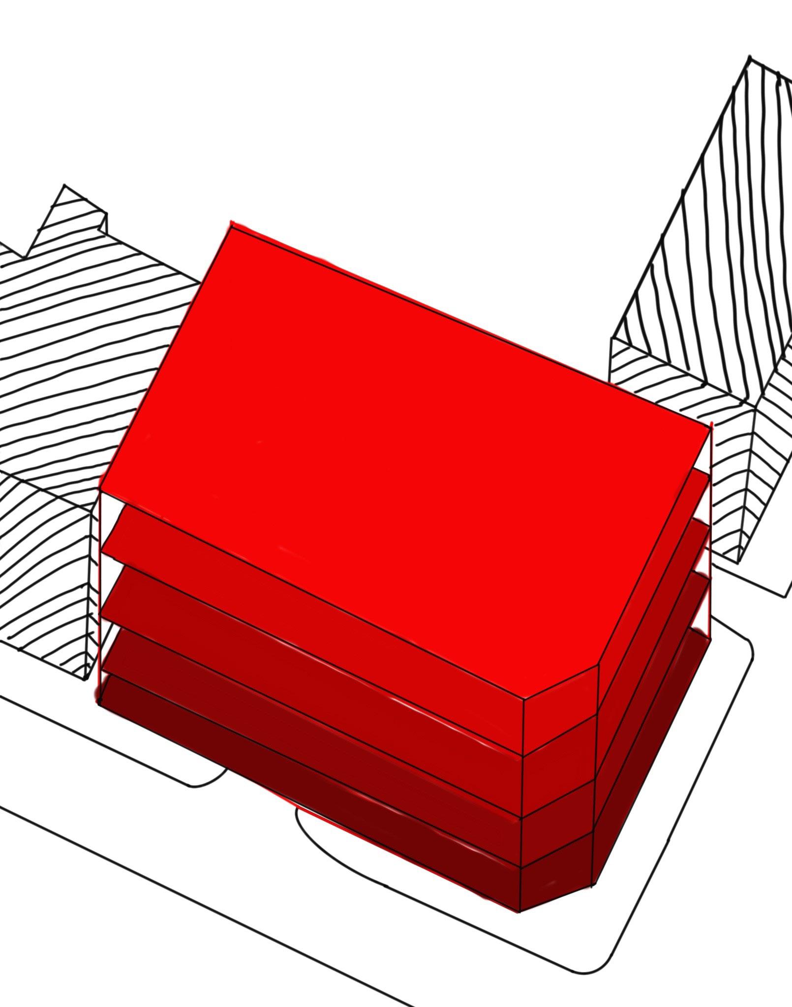
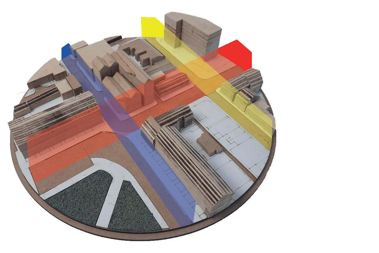
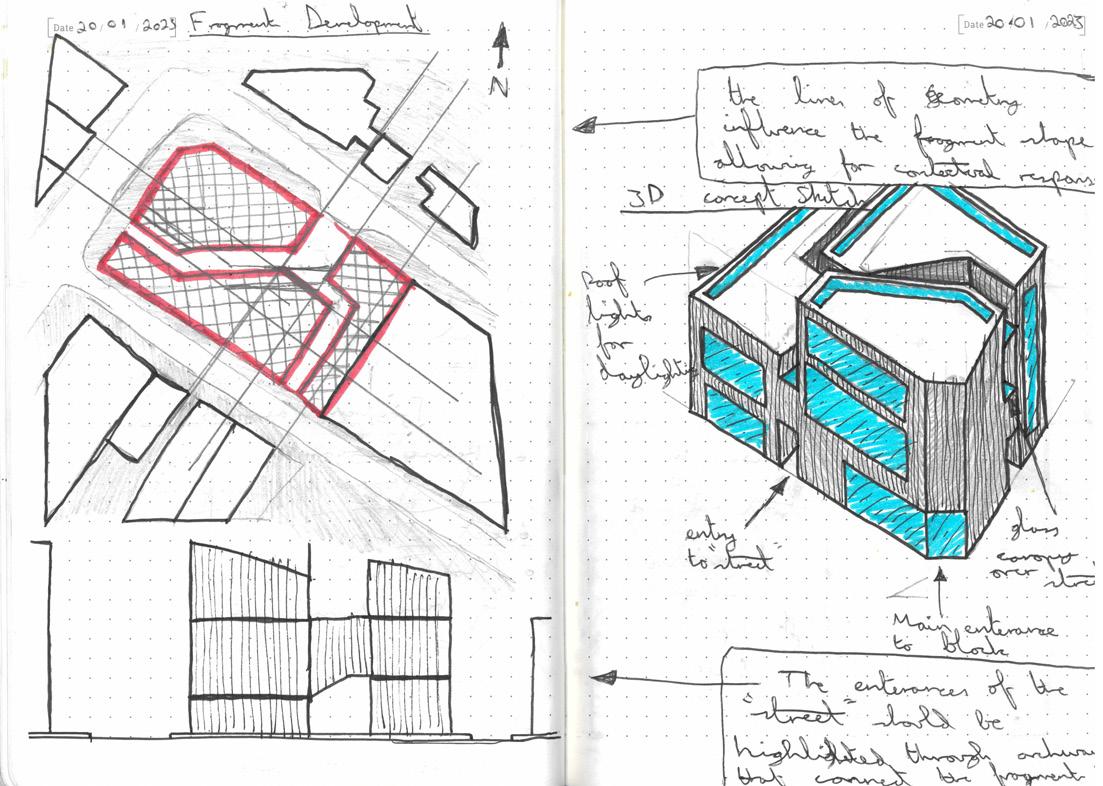
The overarching concept that underpins the design of the Birkenhead School of Arts is derived from the site analysis stage of the Comprehensive Design Project. Initial observations taken from the Hamilton Square site visit, discovered that the Laird grid which was imposed onto the town gives the area a much more connected atmosphere. What is considered the smaller site out of the two alterative corners of the site, is made to feel much larger as a result of this grid. The thematic research that was taken before the design process started, looking into the power of the facade and how it can be used a tool to unite the internal and external environments as opposed to being a feature that separates the two sides. The grid will be a feature that is used for the internal layout of the school to create a scheme that feels inclusive and well connected, aiming to unify the community with the educational demographics. The grid is a key aspect of Hamilton Square and will be a key aspect to the design of the school.
04 CONCEPT
Laird Grid Model Diagram
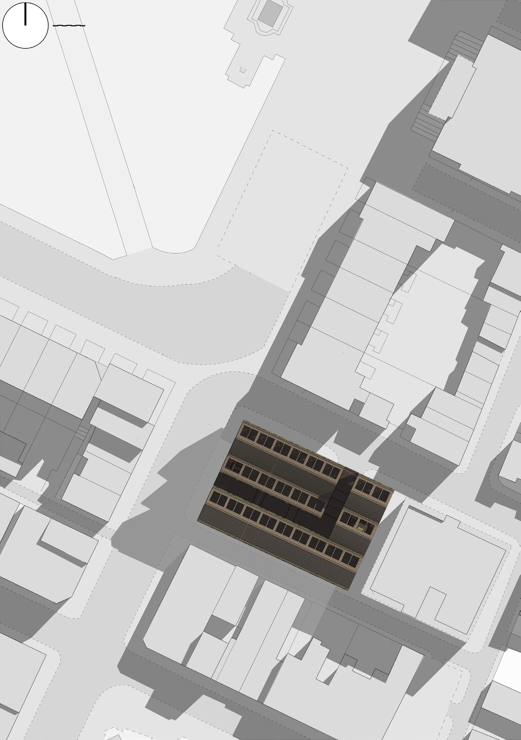
05 SITE PLAN
06 SITE ANALYSIS
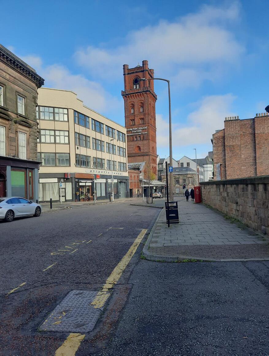
Photograph of Hamilton Square Station
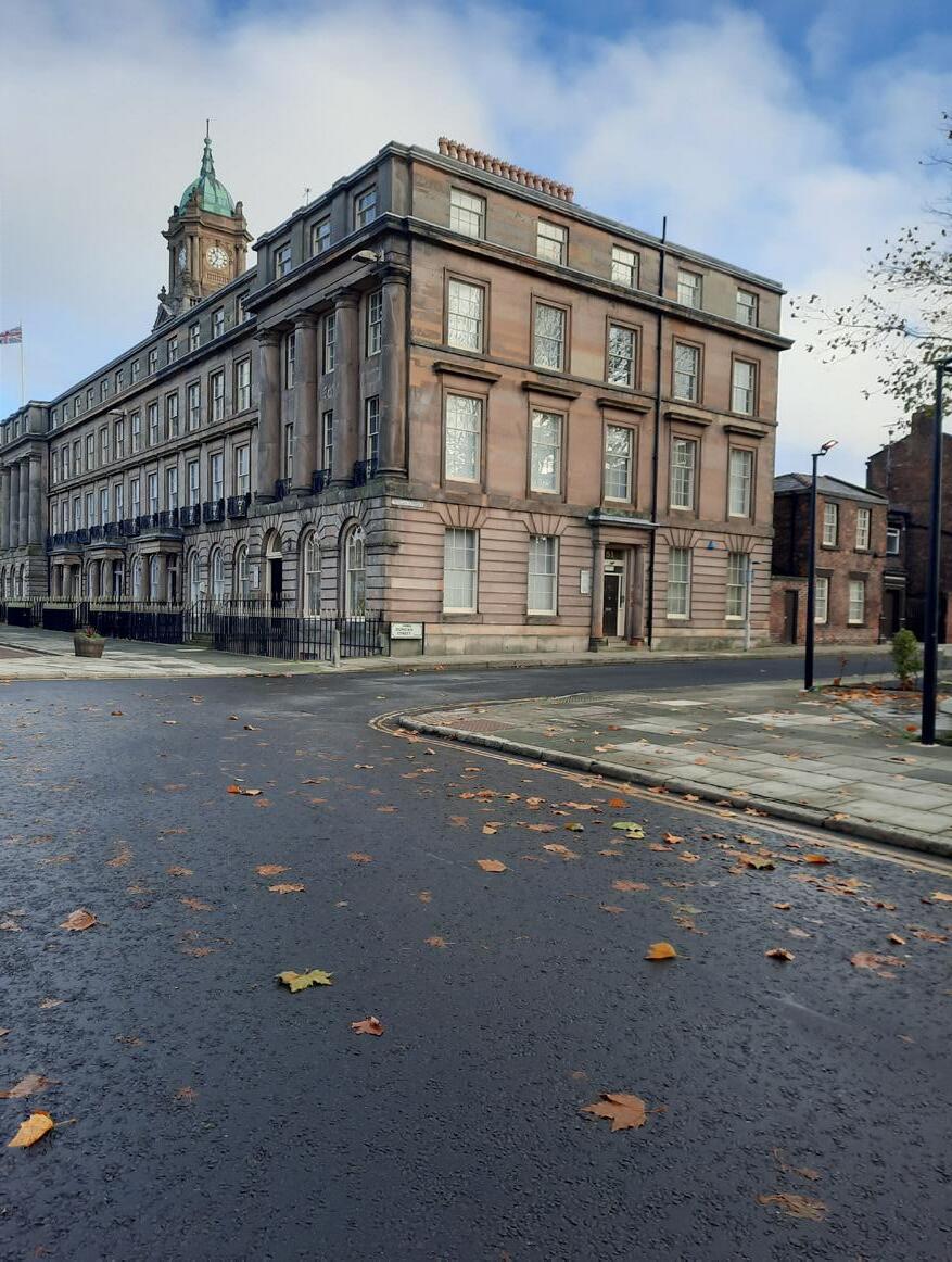
Photograph of the Parallel Context to the Site
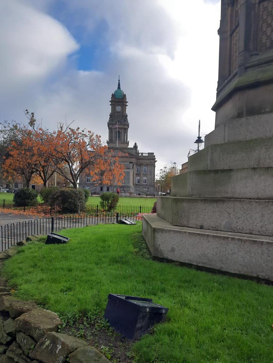
Photograph from Hamilton Square Park of Town Hall
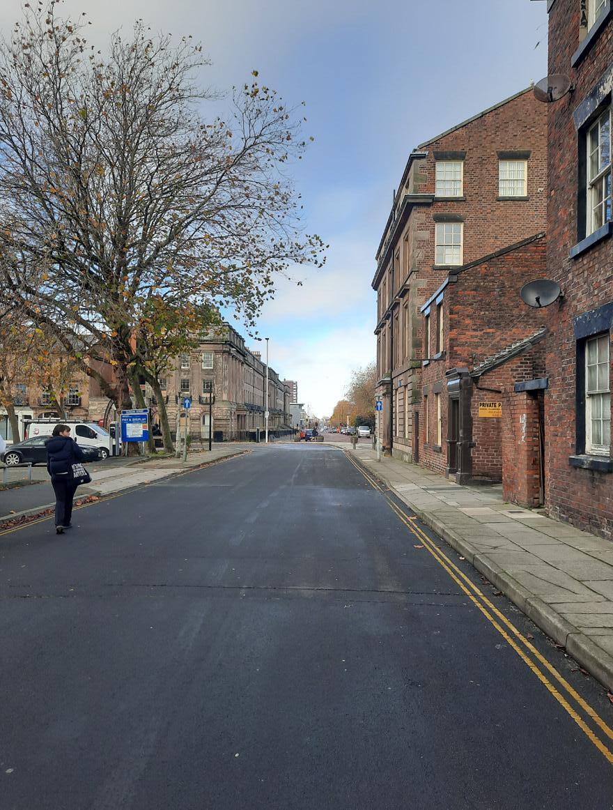
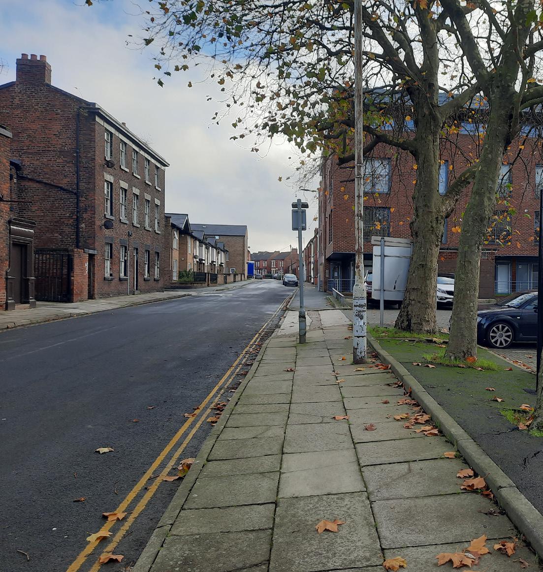
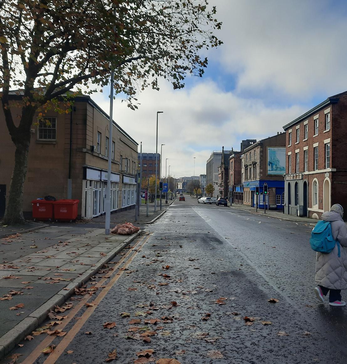
07 LAIRD GRID PRESENCE
Photographs of the Laird Grid Witnessed from the Site
08 CONTEXT FACADE STUDY
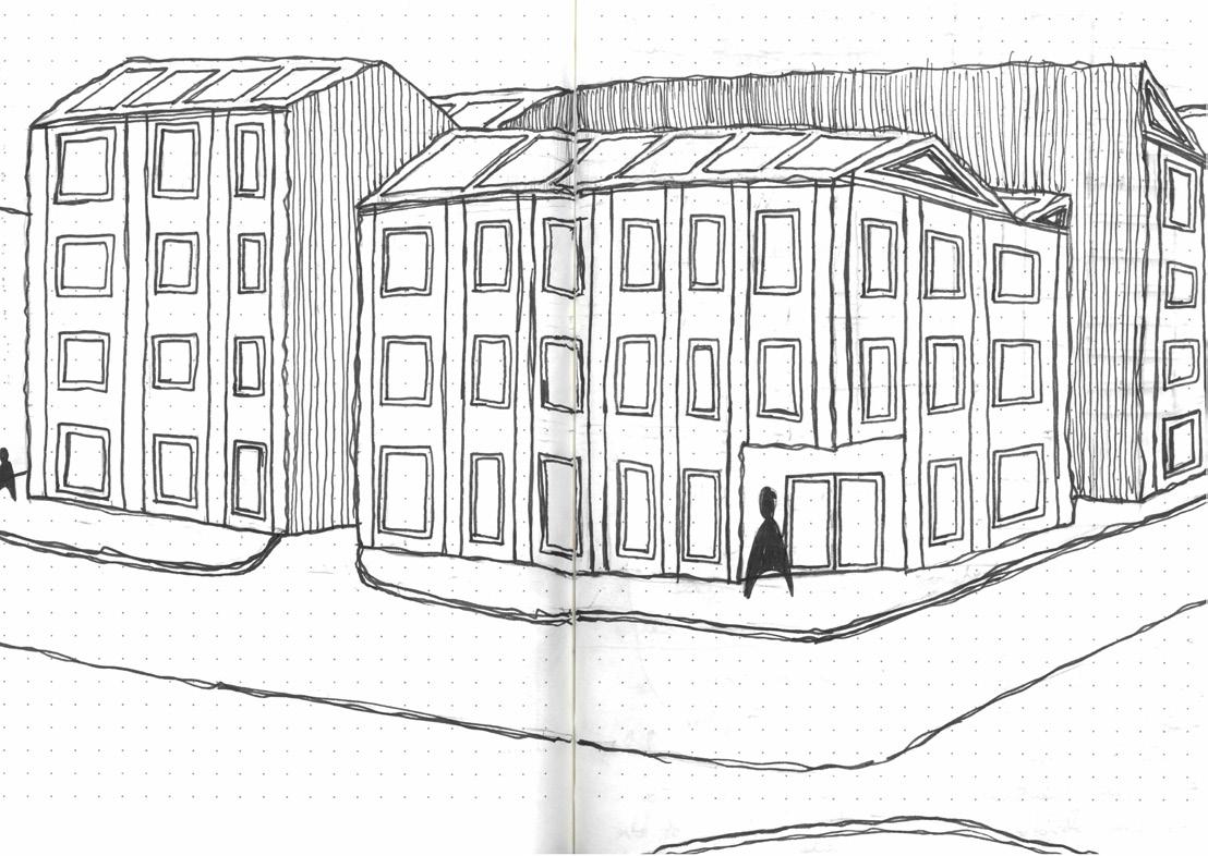
Facade analysis of site context: Facade analysis of site context:
Facade Analysis of Surrounding Context
Context Material Palate:


09
CONTEXT MATERIAL PALETTE
10 DESIGN DEVELOPMENT
and Parti
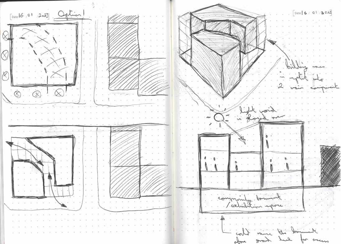
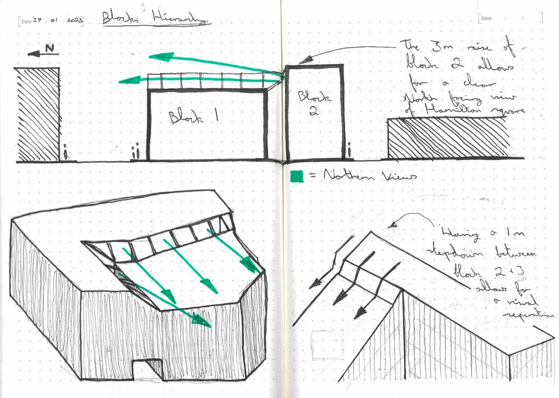
Design Journal
Diagrams
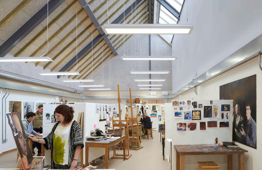
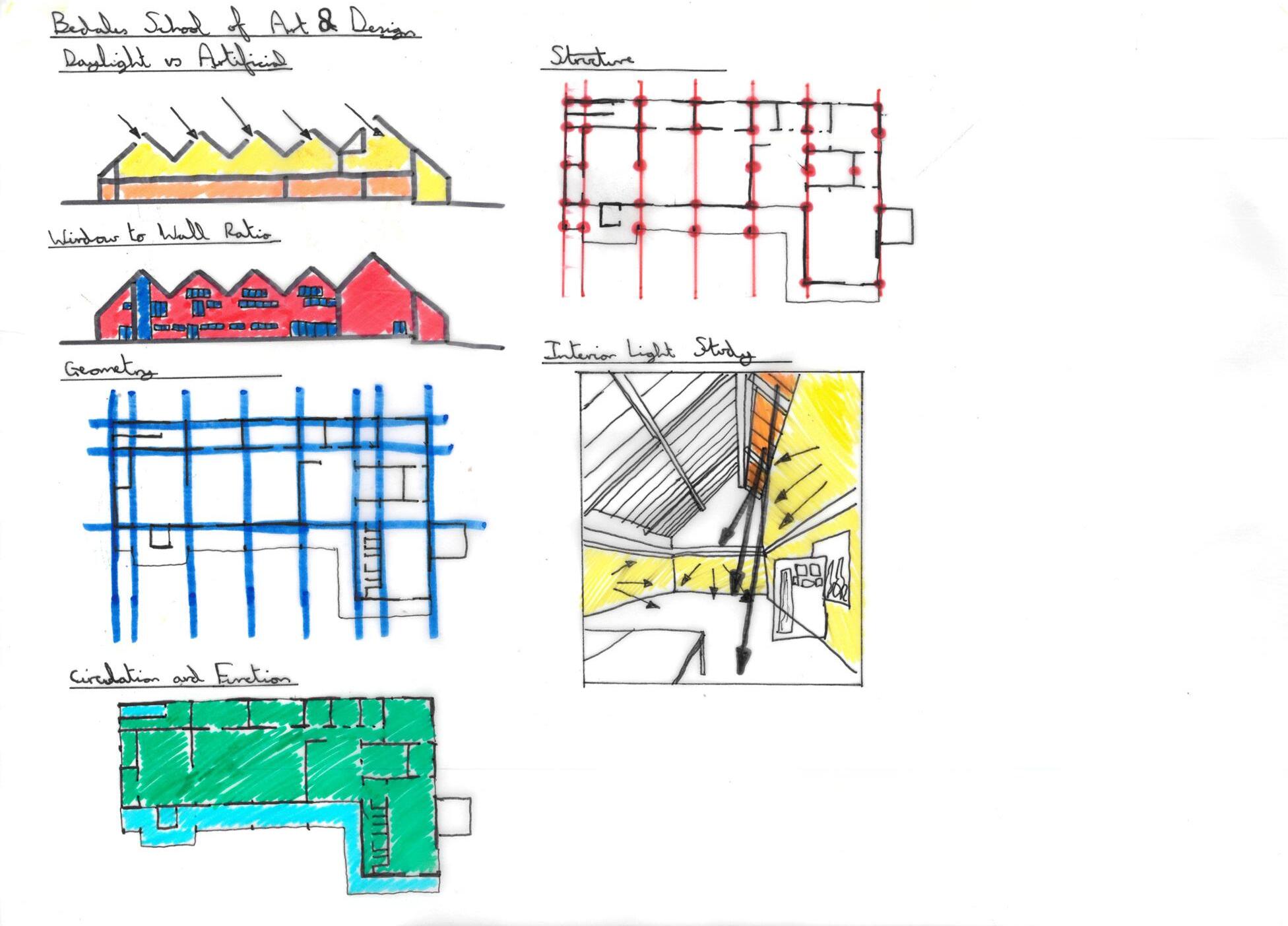
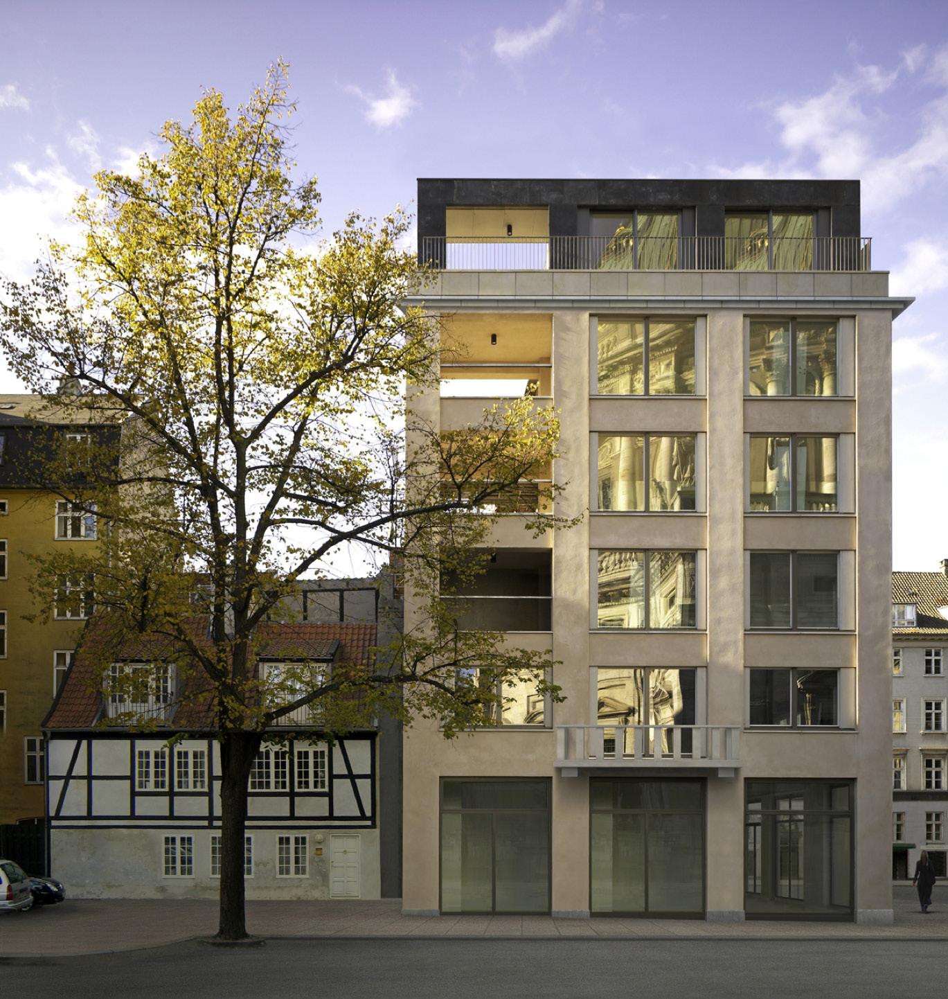
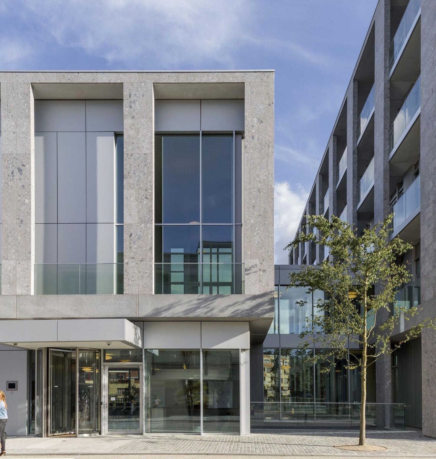
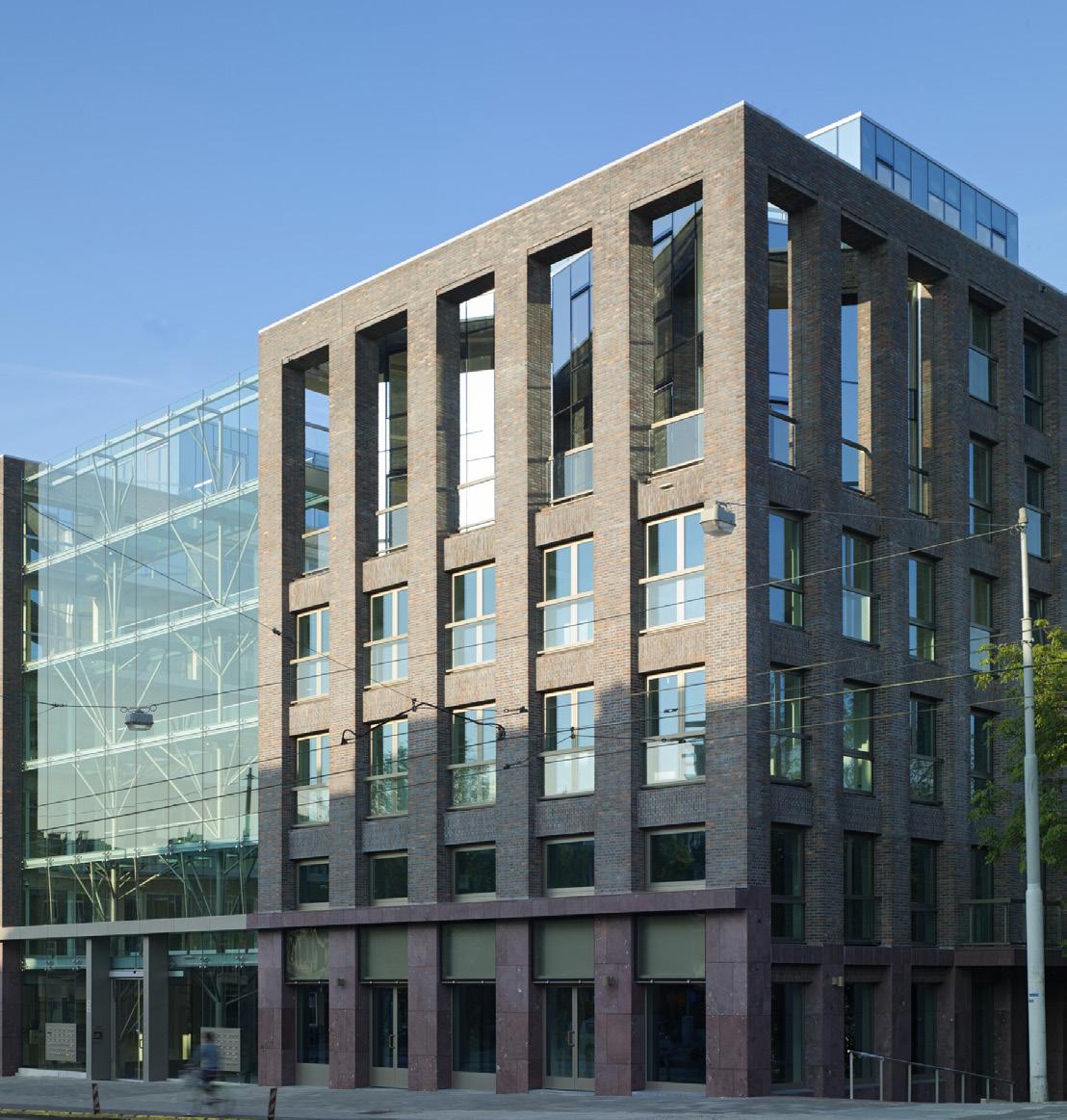
The two precedents selected to inform the design development of the School of Arts were Bedales School of Art and Design (left) and Tony Frettons buildings facades (right). Bedales gave a base point on the layout of the scheme as well as highlighting how a grid could depict the spacial orientation. Anougher key feature inspired by Bedales, was the utilize the pitched roof form, which would create internal environments that make best use of the natural North light.
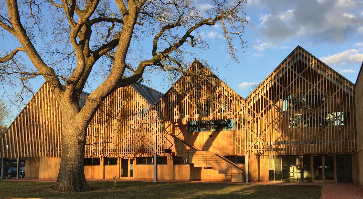
Tony Frettons buildings which are shown to the right are a key influencer in the design of the Birkenhead School of Arts facade. Similar to the context of Hamilton Square, Georgian architecture has a seperation of the layers, that is visible externally. This breakdown of a bottom, middle and top section which is part of that architectural language. Tony Frettons architecture continues this language through a more modern setting. This feature is one that is present through my design.
11 PRECEDENT ANALYSIS
12
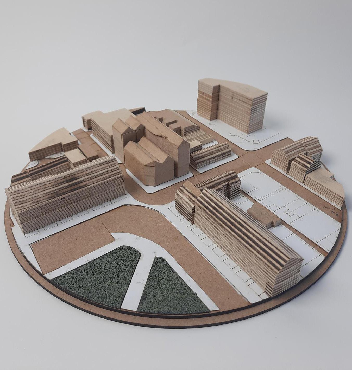
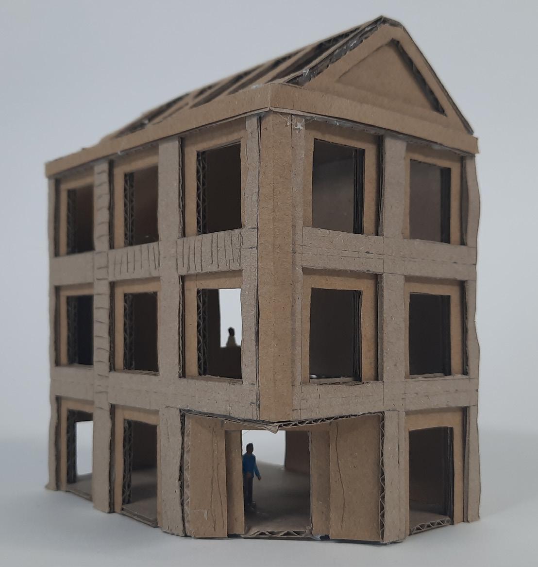
13 MODEL EXPERIMENTATION
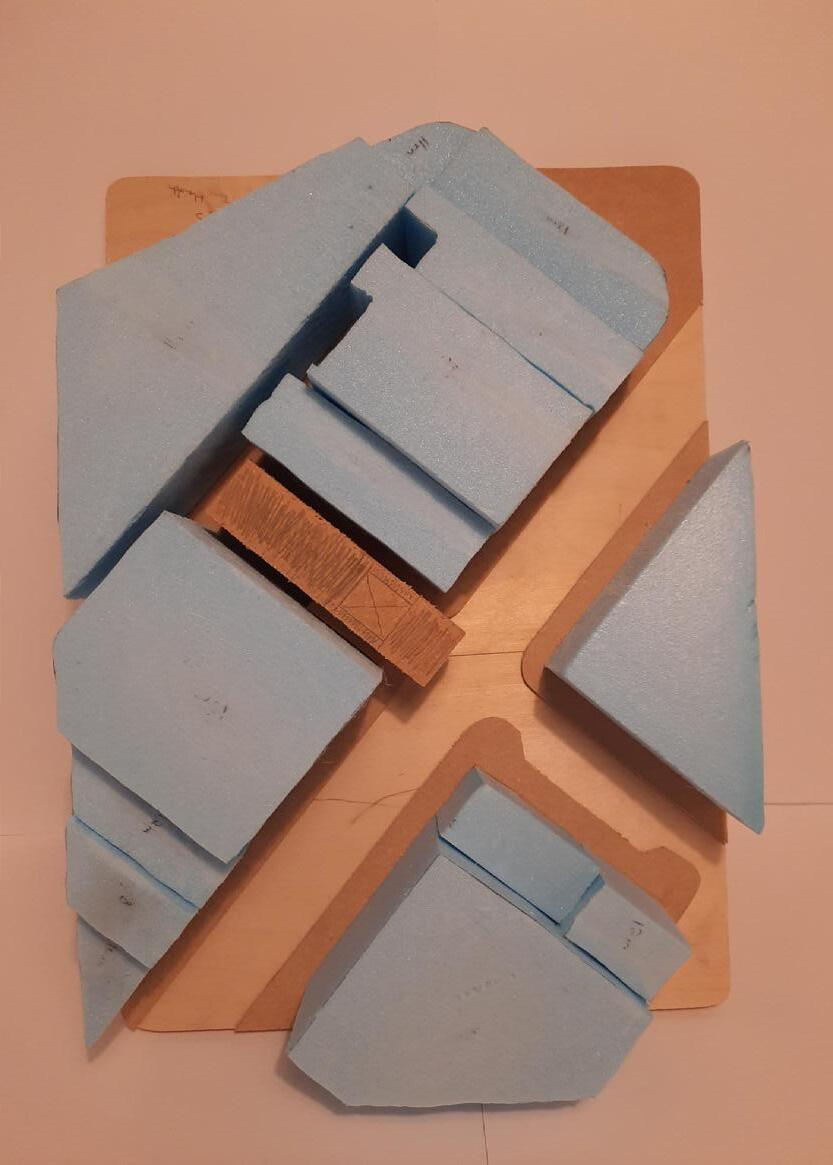
1:500 Site Model
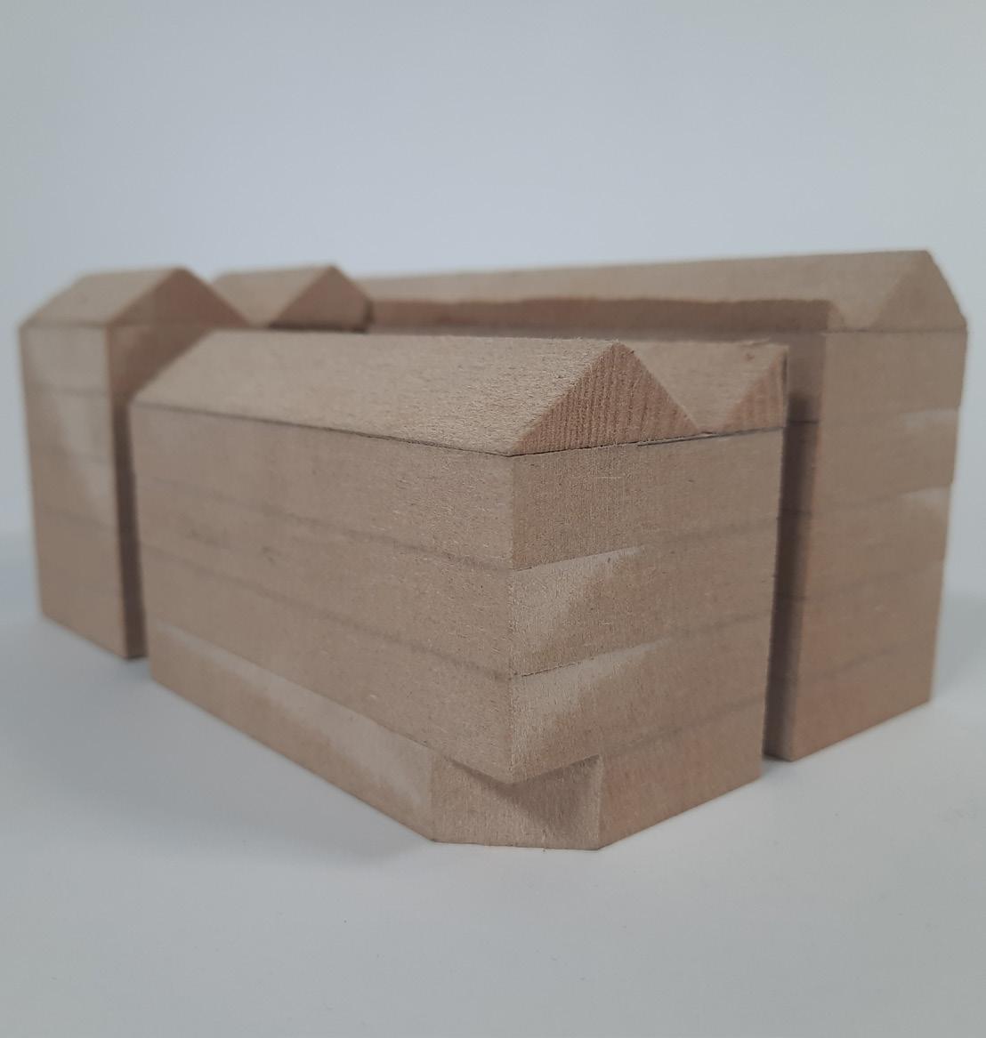
Developed Massing Model
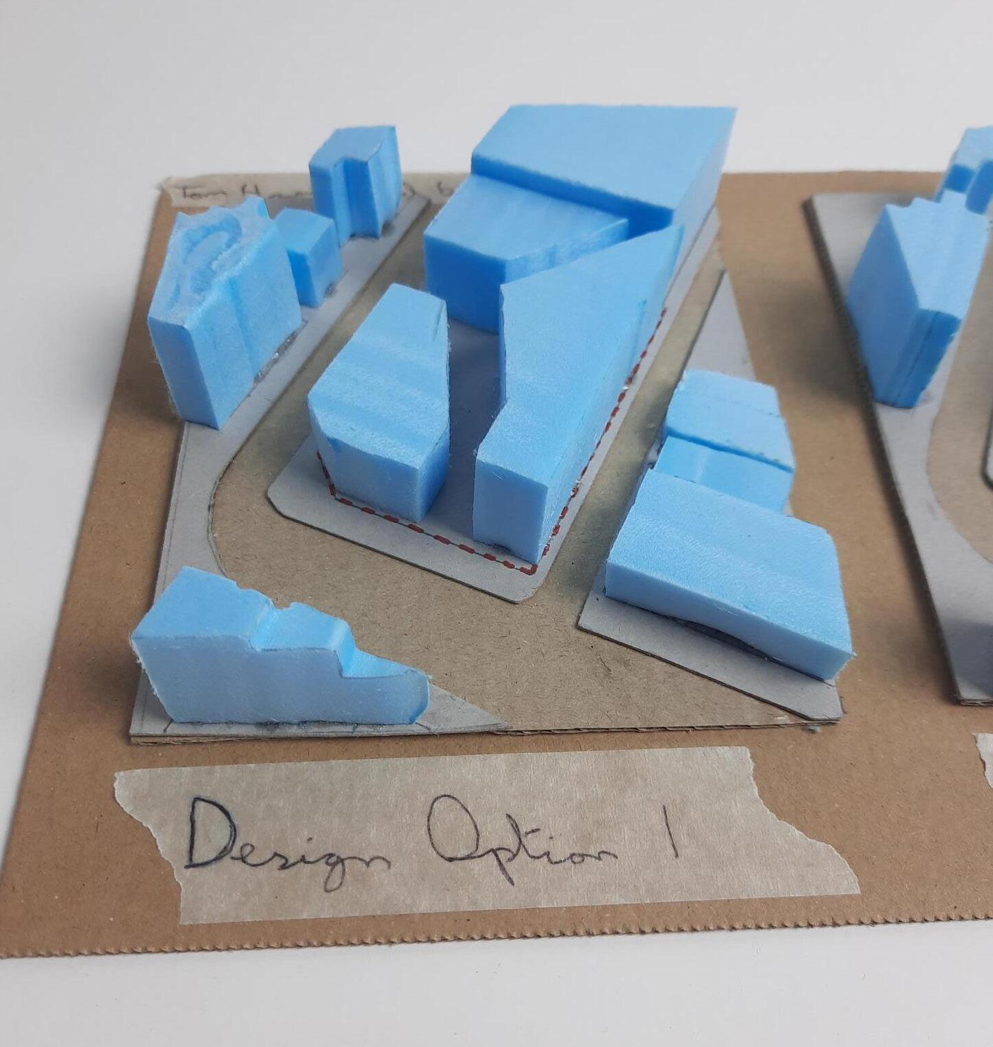
Initial Design Massing Model
14
1:200 Facade Development Model
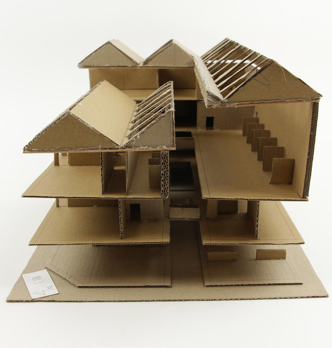
1:100 Development Model
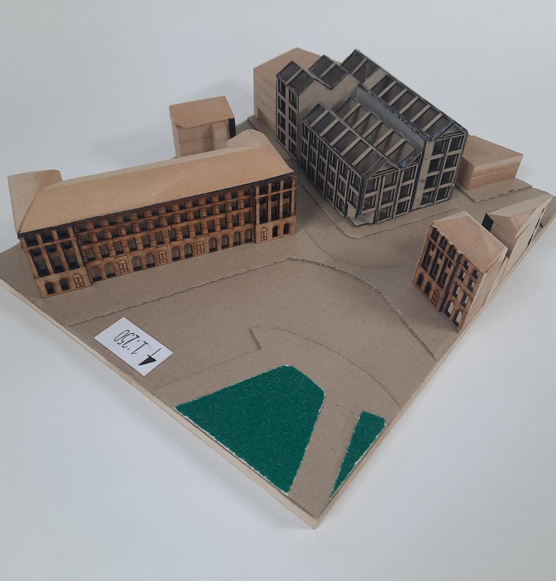
1:250 Context Model

15


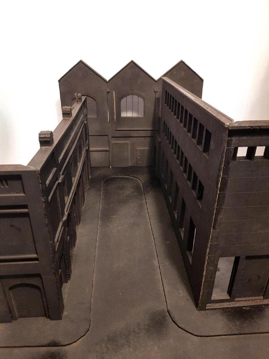
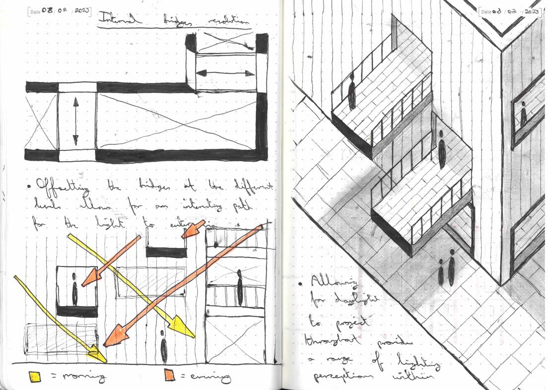
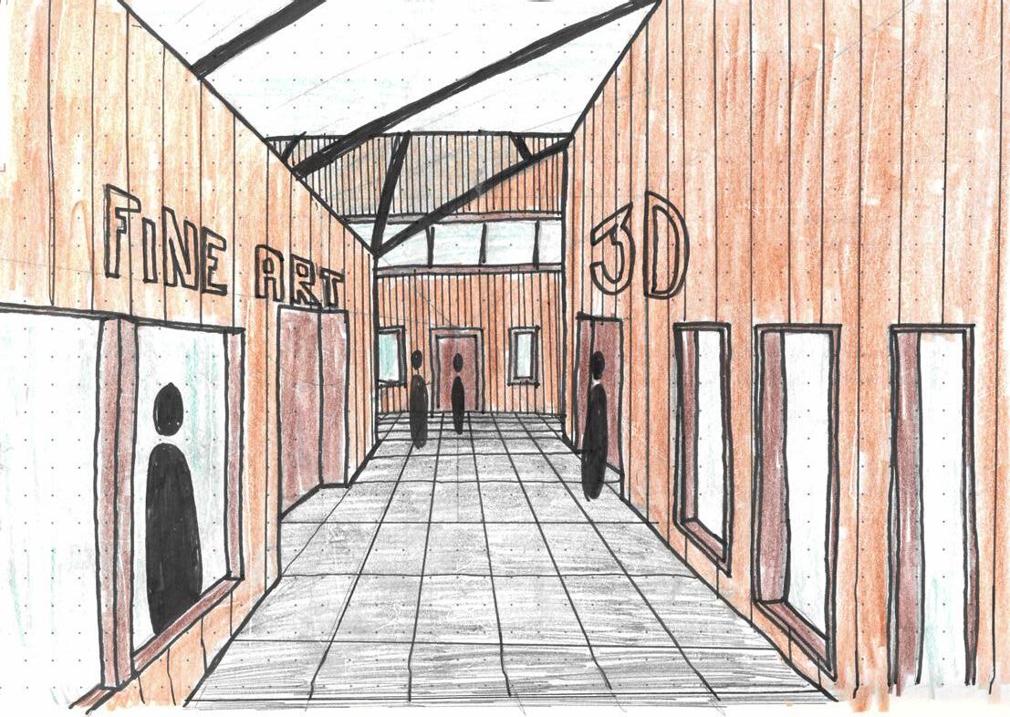
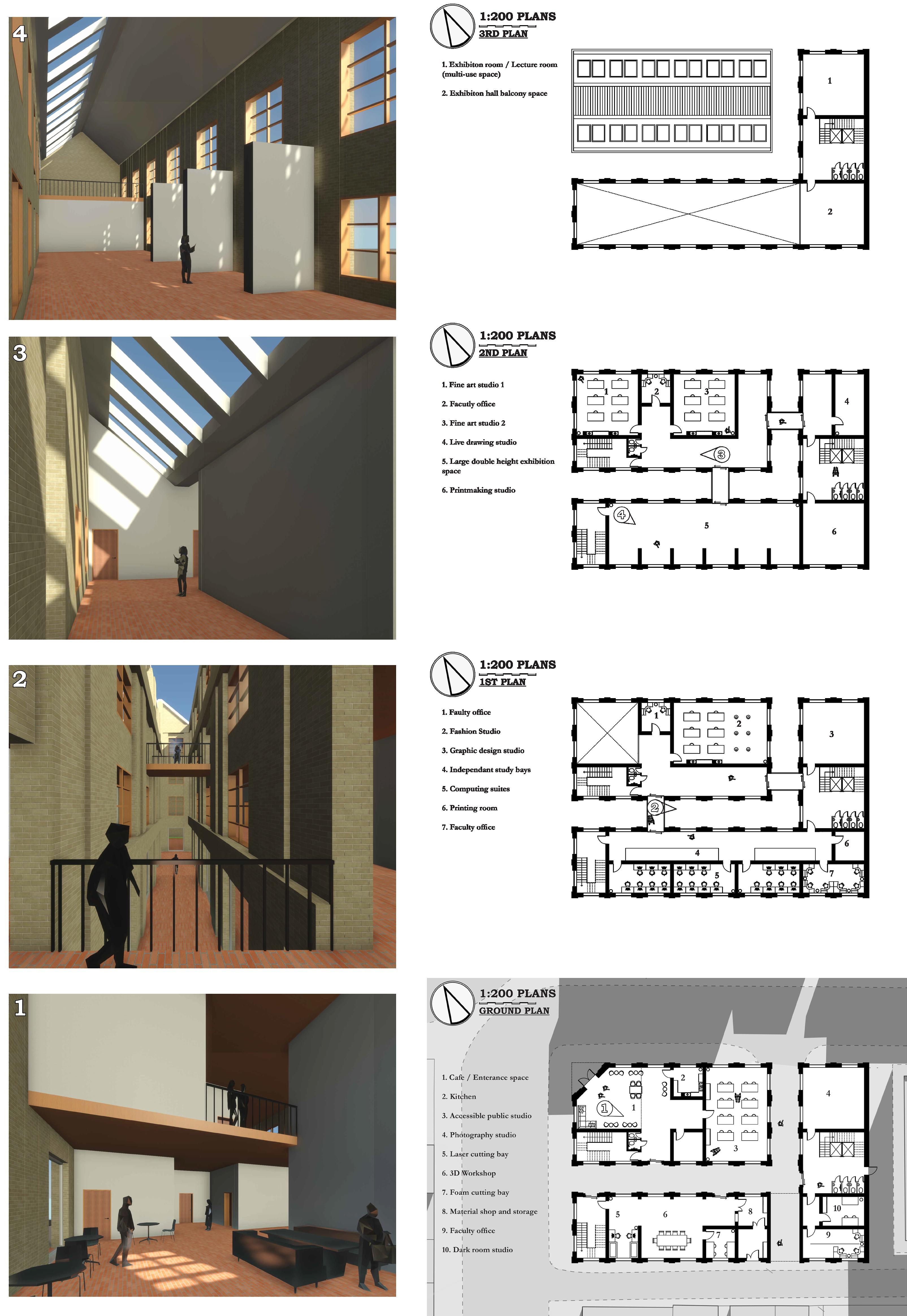
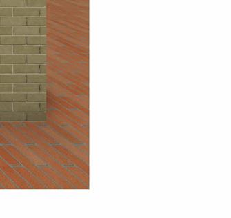
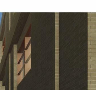
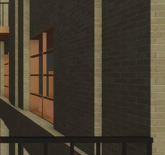
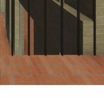
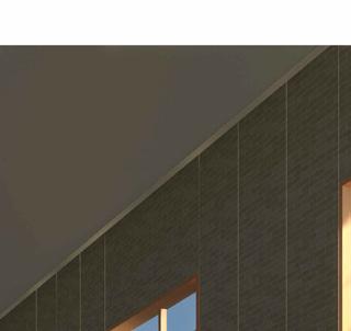
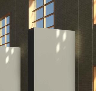
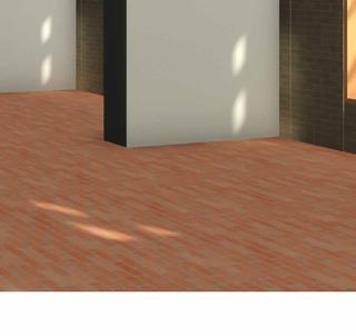
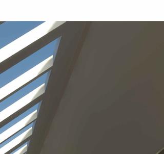
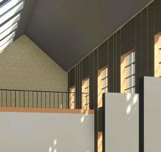
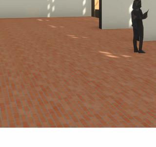
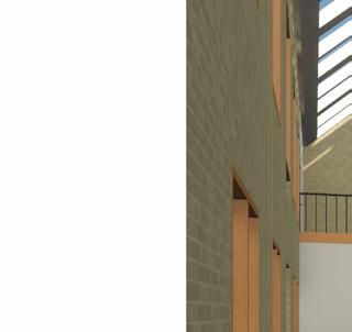
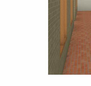
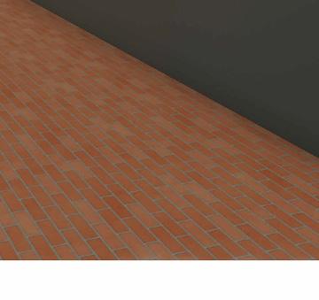
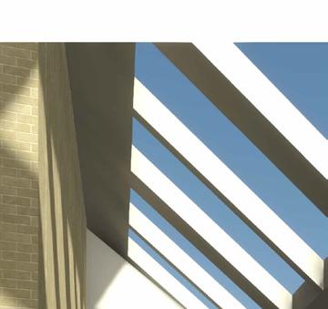
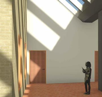
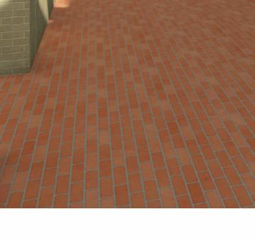
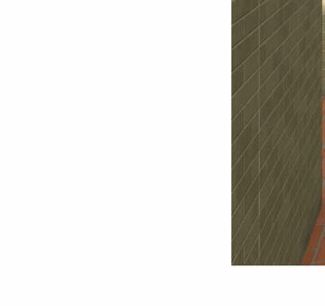
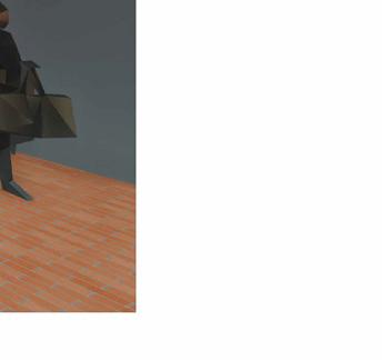
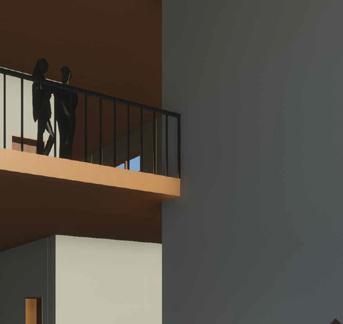
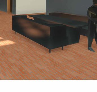
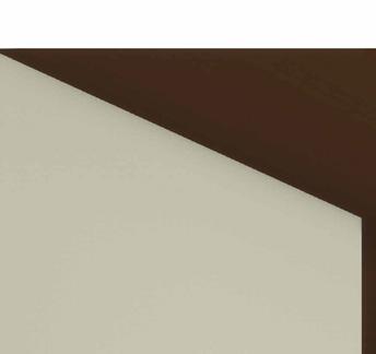
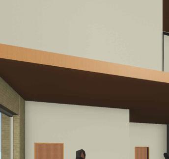
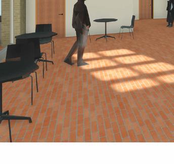
The visualisations to the right show images from around the School of Arts in key spaces found within the scheme. The top left image is of the double height cafe space at the public entrance. The top right image is taken from the top floor of the smaller block of the school, showcasing the rooflight and the brick tile flooring that features throughout the design. The bottom right image is of the double height gallery space that features within the top rear section. Finally the bottom right image shows the bridges that connect the two blocks that make up the school and provide views down into the internal street feature of the scheme.
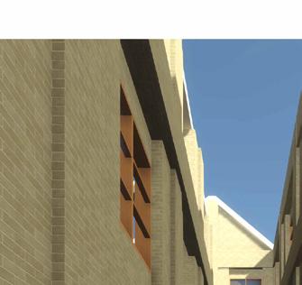
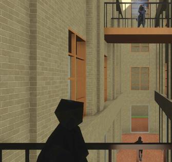
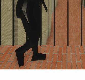
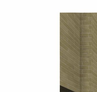
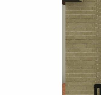

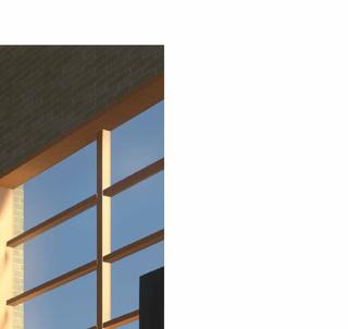
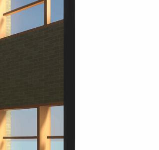
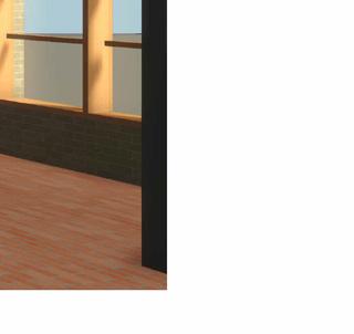






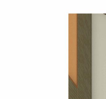
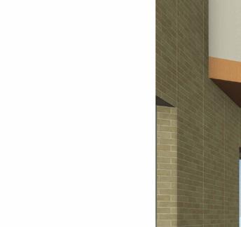
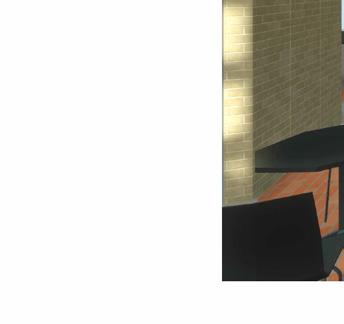
17 INTERNAL SPACES VISUALISATIONS
1:100 SHORT SECTION AND ELEVATION
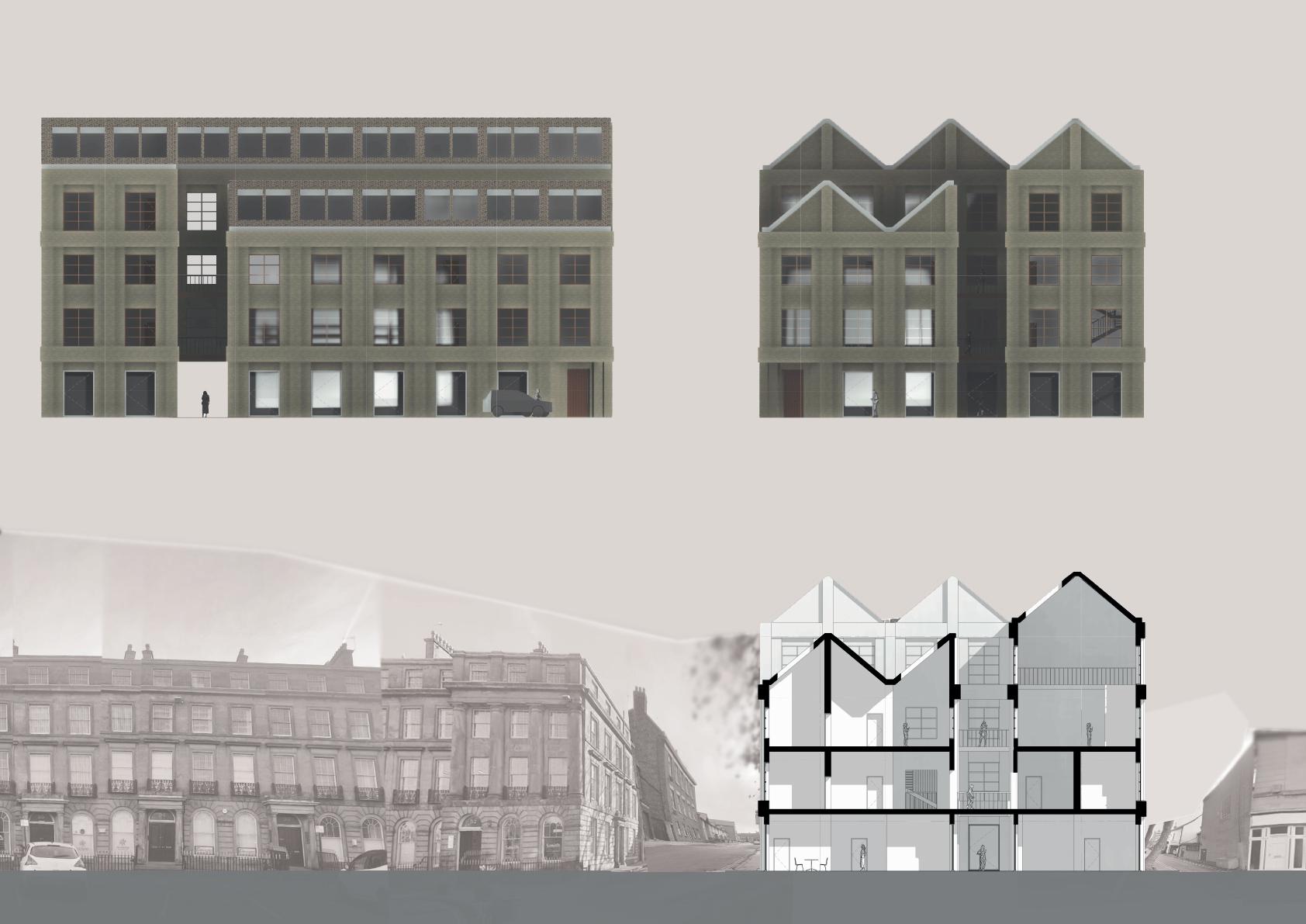
NORTH ELEVATION WEST ELEVATION
18 SECTION AND ELEVATIONS
SHORT SECTION
19 FINAL MODEL
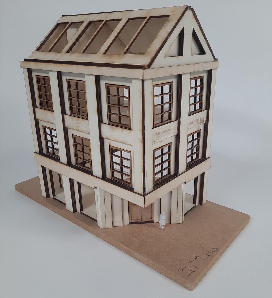
1:50 Final Model Facade View
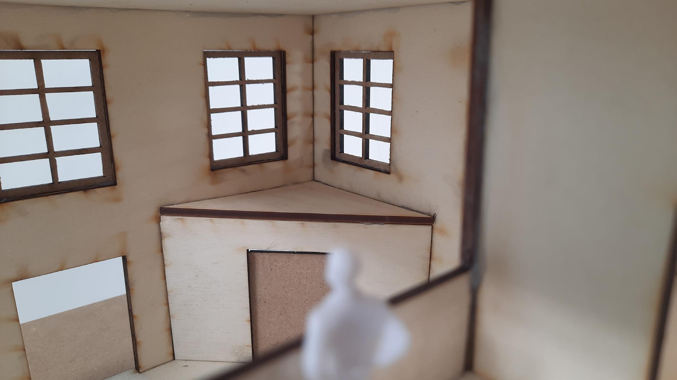
1:50 Final Model Internal View
20
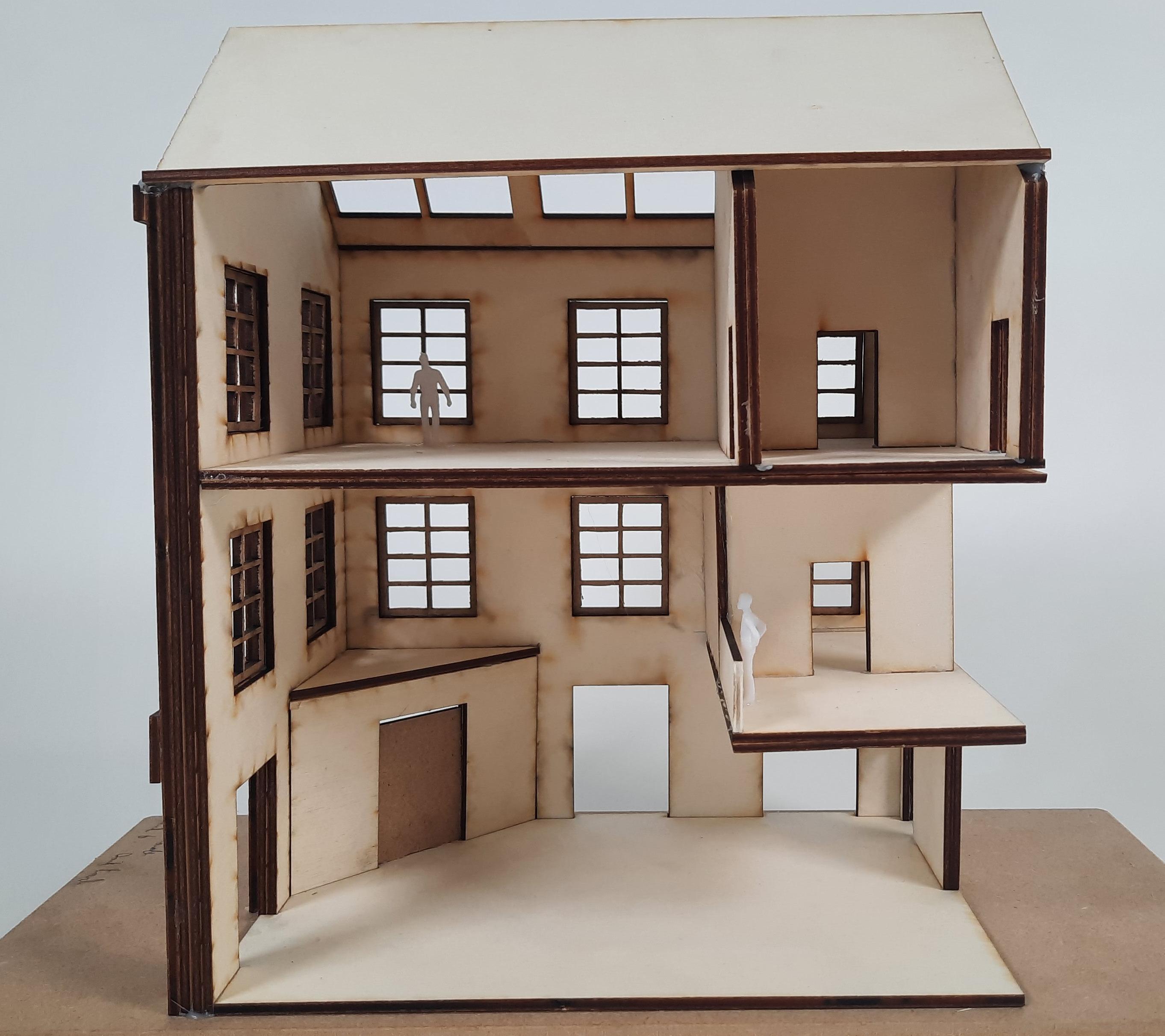
1:50 Final Model Spacial Section View


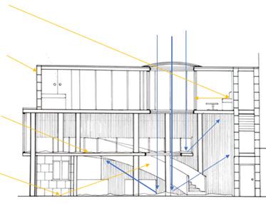
21 ENVIRONMENTAL STRATEGY SUMMER SECTION


WINTER SECTION 22
STRUCTURAL MODEL 23
STRUCTURE AND CONSTRUCTION
DETAIL (1:20)
5mm blue slate roof tile
Horizontal battens for roof tiles
vertical battens for roof tiles
Aliminium layer to repel water out from within roof structure
Damp Proof Coarse
280mm x 175mm Aluminium guttering
50mm Birchwood sill and window framing
120mm CLT wall bracing panel
300mm x 700mm primary Glulam beam
160mm Mycelium based insulation panel
50mm Cavity spacing
Precast concrete facade panel
Stone finish adhesive layer
40mm sandstone finish
1 6 5 4 3 2 1 3 2 4 5 6 14 13 12 11 10 9 8 7 7 8 9 10 CONSTRUCTION DETAIL 24
Roof to Wall Construction Detail
20mm Reclaimed brick tile floor
40mm Screed layer
12mm Underfloor heating pipes
20mm Mycelium based insulation panel
15mm OSB floor base layer
100mm x 300mm secondary Glulam beams
Acoustic ceiling hangers (reduce noise pollution from higher levels)
30mm Plasterboard finish
Aluminium finish to allow for rain run off
Triple glazed windows
20mm drip channel on stone finish
Breather membrane
Concrete slab foundation
Concrete pad foundation
15 19 21 20 22 17 16 18 15 16 17 18 19 20 21 22 23 28 27 26 25 24 28 27 26 25 24 23 25 Floor
to Wall Construction Detail
CONTENTS
Design Brief
Concept
Site Analysis
Design Development
Models
Plans
Section
Key Drawings and Models
Environmental Design
TOM HOWARTH WEATHER OR NOT: REDWOOD ARC
26
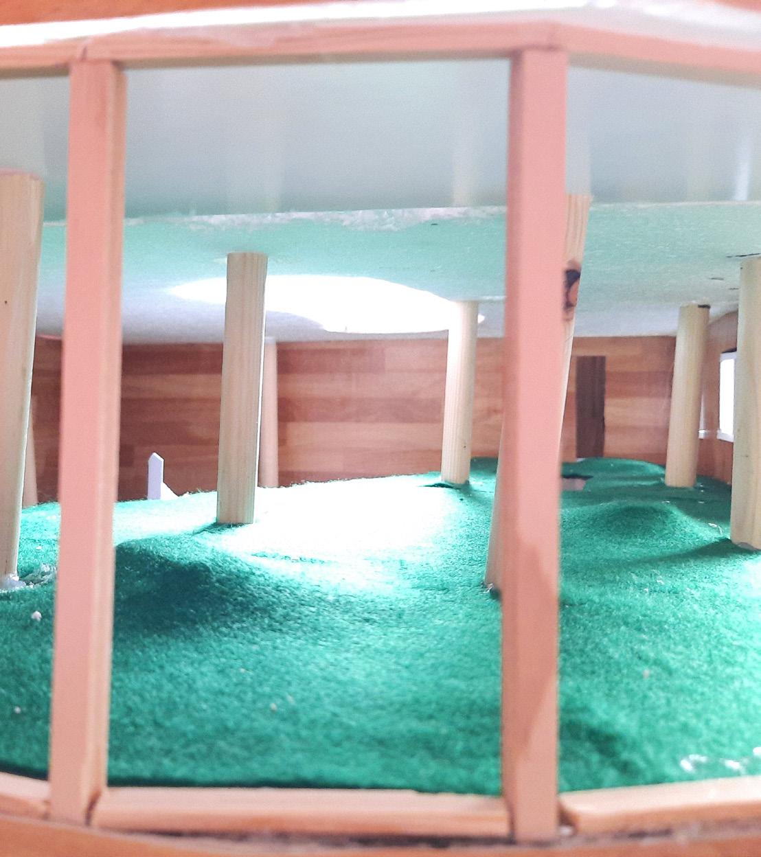
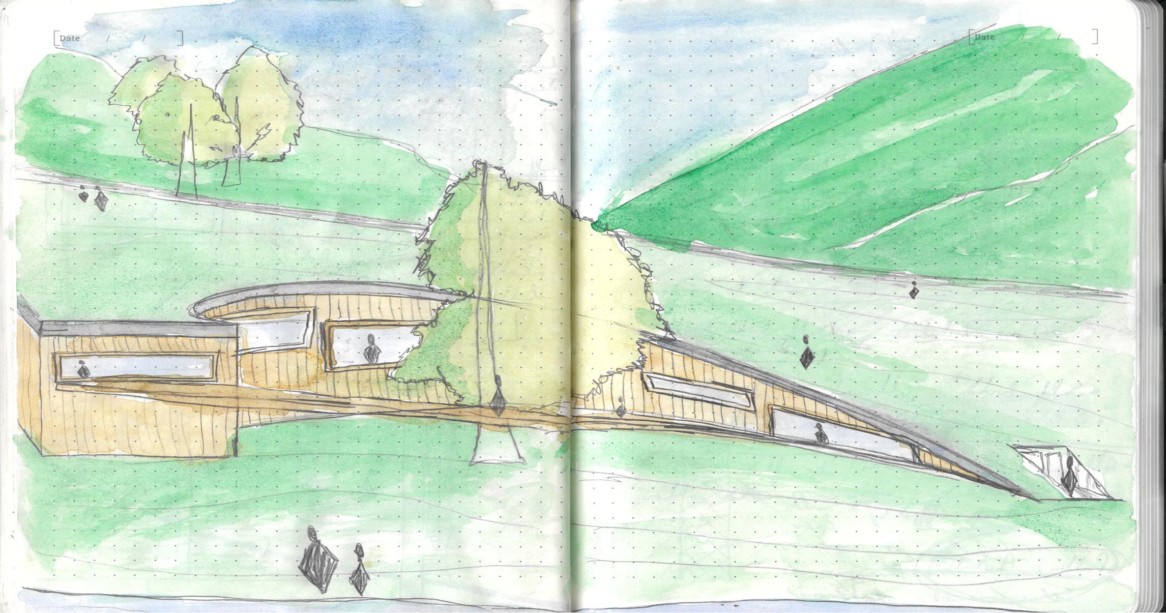
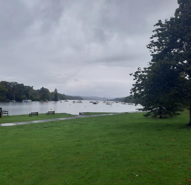
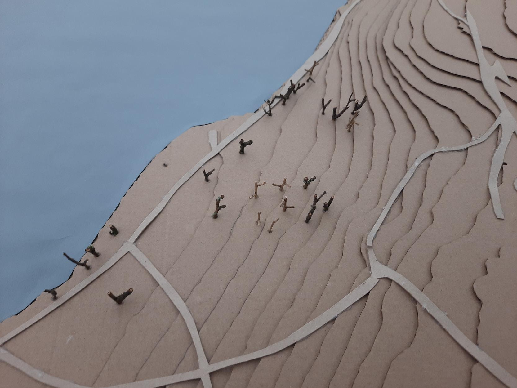
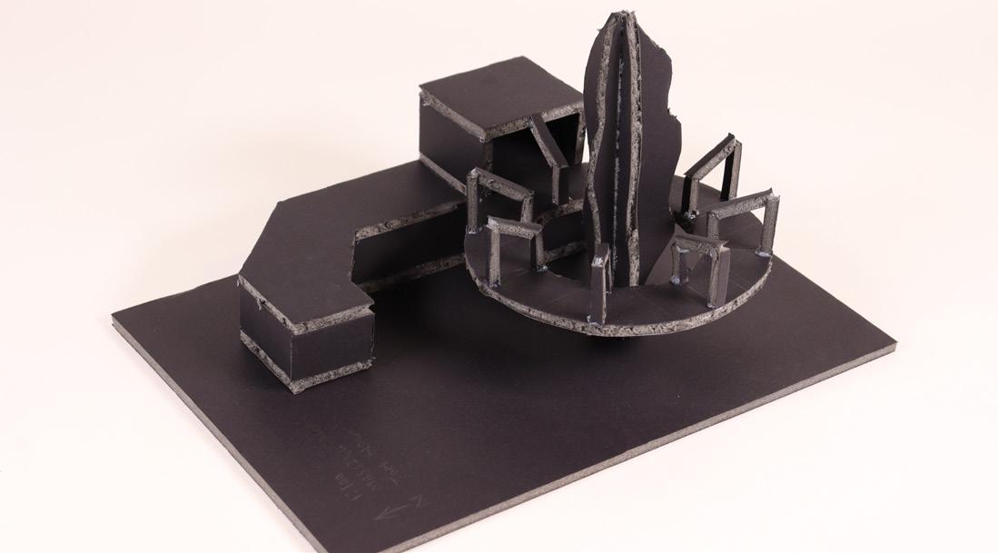
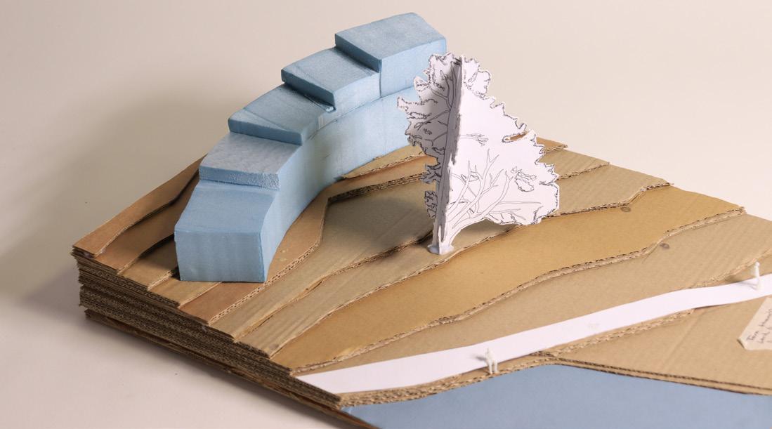
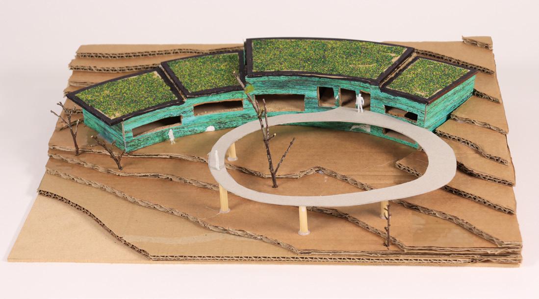
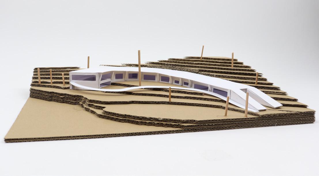
The weather or not project was a sustainability and climate research based building that would, in its basic programme, feature a laboratory space that would investigate an aspect of the climate crisis. The other space were created around the labratorys role. Within the umbrella topic of the climate crisis, the lab would study its effect on plant life, specifically the trees that had been imported to the site by the previous owner of the land.
Redwood Arc focusses on its effect on biodiversity and resource depletion to reduce its environmental impact. Through the careful consideration of materials and the functions of the building, the Arc works to support the landscape it resides in to produce a unity between the natural and artificial environments. The buildings aims is to use the research gathered about climate changes effect on the trees through tree core sampling, and pass this information to the general public who can experience this research on a more personal level and take a more active approach to the current climate crisis.
DESIGN BRIEF
27
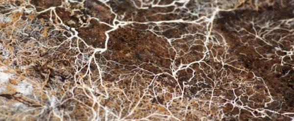
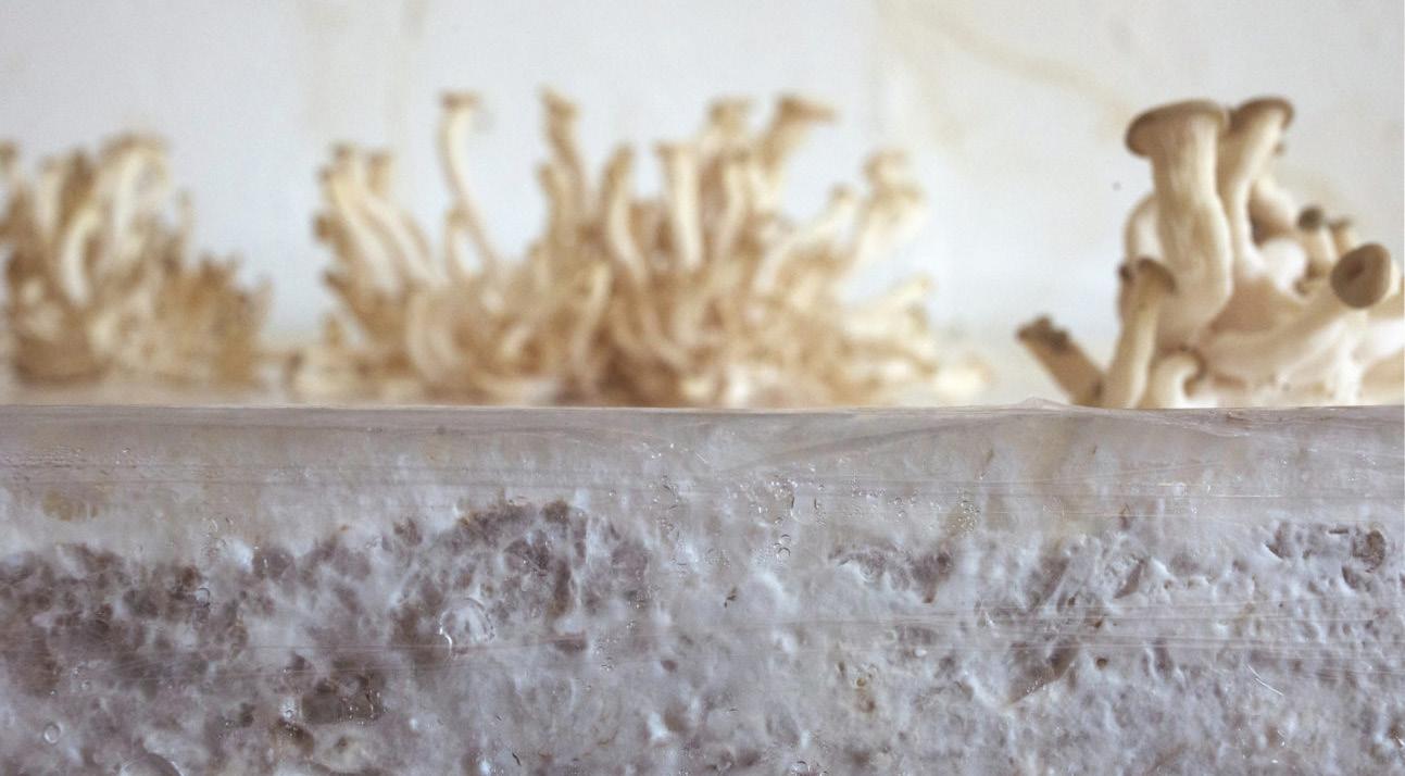
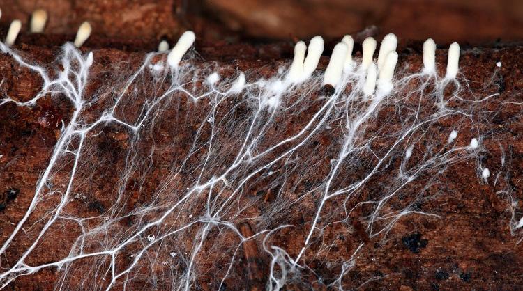
Both the form and function of Redwood Arc was inspidered by the research into sustainable design strategies before ides where formed. the specific area of research I investigated was the use of biomaterials, specifically the combination of mycelium fungus with agricultural fibres to produce low energy insulation panels. This practise allowed for low emission and more natural and sustainable materiality for the building and would keep the carbon footprint of the project to a minimum.
Mycelium fungus, when grown naturally in woodland areas like those in the lake district, has an unique ability to allow the local trees to communicate with one another. This link grants the trees the power to warn the area of potential dangers and risks so they can adapt to the conditions. That communication link is a concept that is integrated into this design, with the laboratory acting as the fungus that relays its data to the rest of the site and its inhabitants, keeping them up to date with relevant developments that are a result of the climate crisis and the affect it will have and has already had on the surrounding trees and landscape.
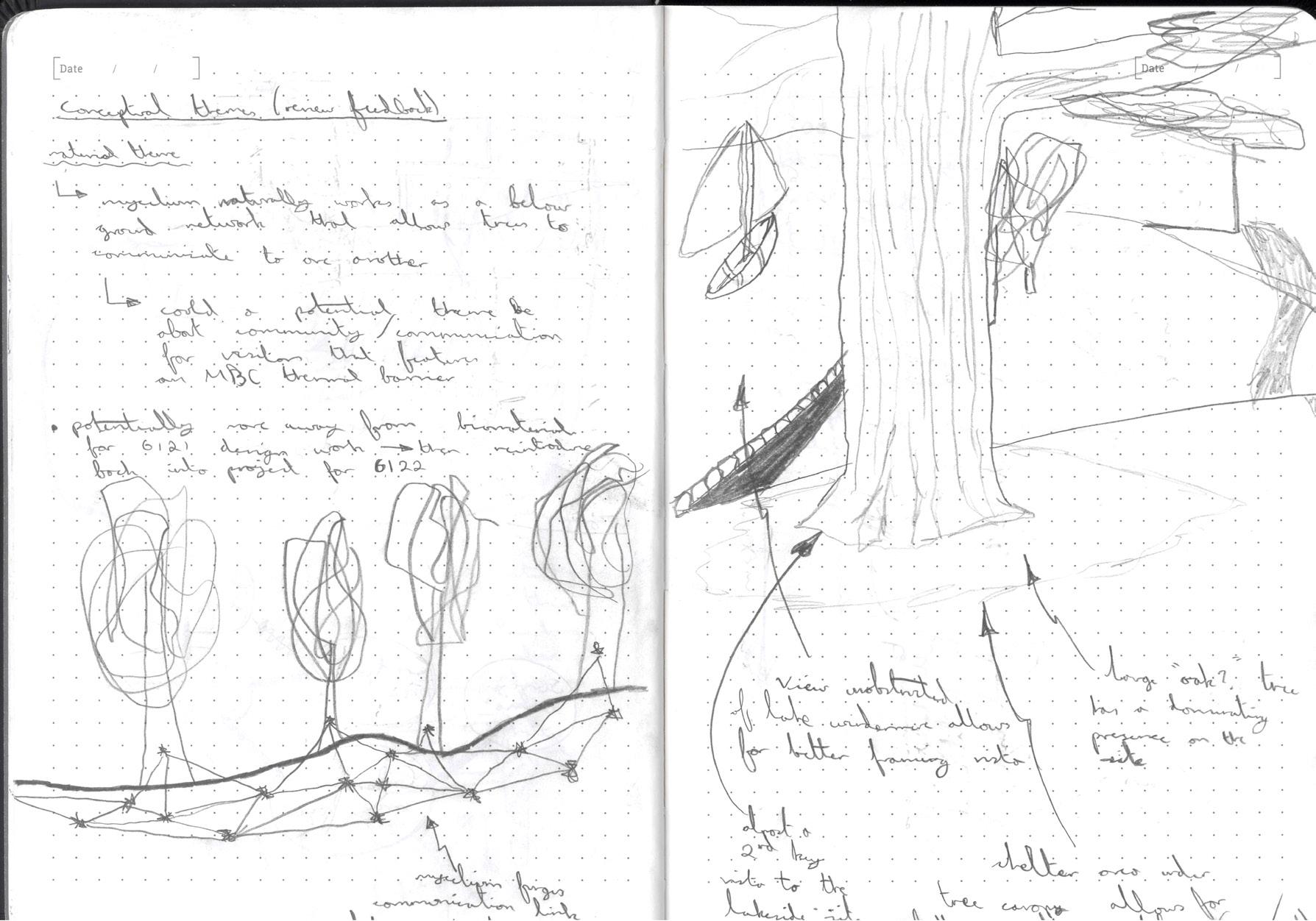
CONCEPT
28
Site Images Of Ecology and Potential spaces


SITE ANALYSIS 29
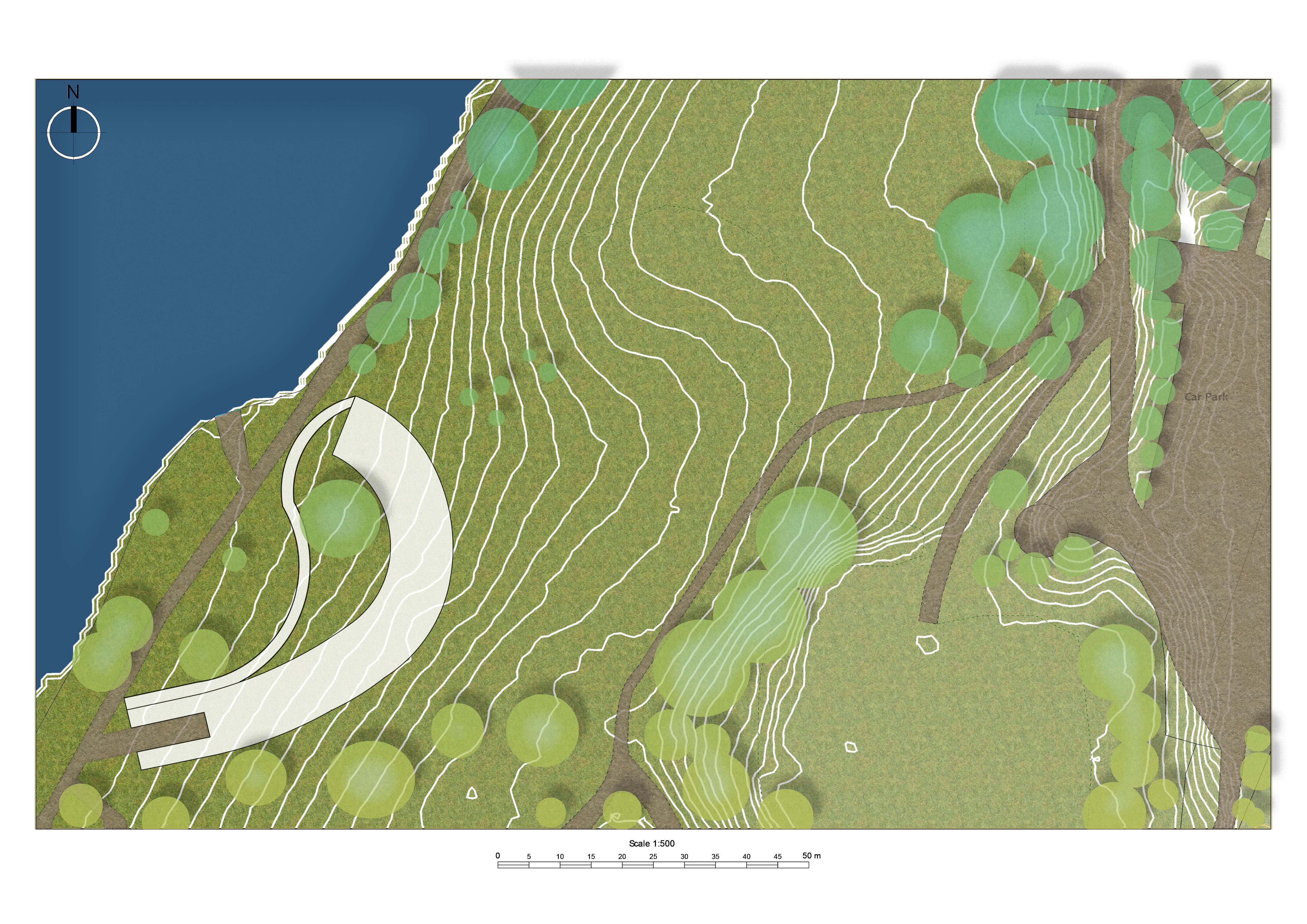
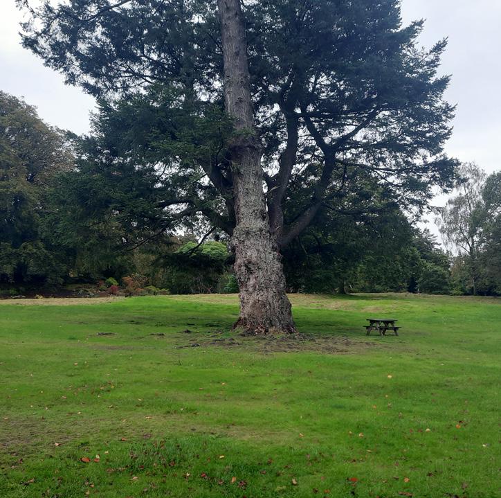
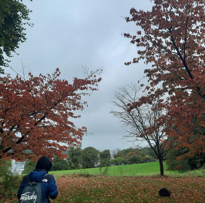
30
31
Site Images Of Ecology and Potential spaces
DESIGN DEVELOPMENT: MODELS 32
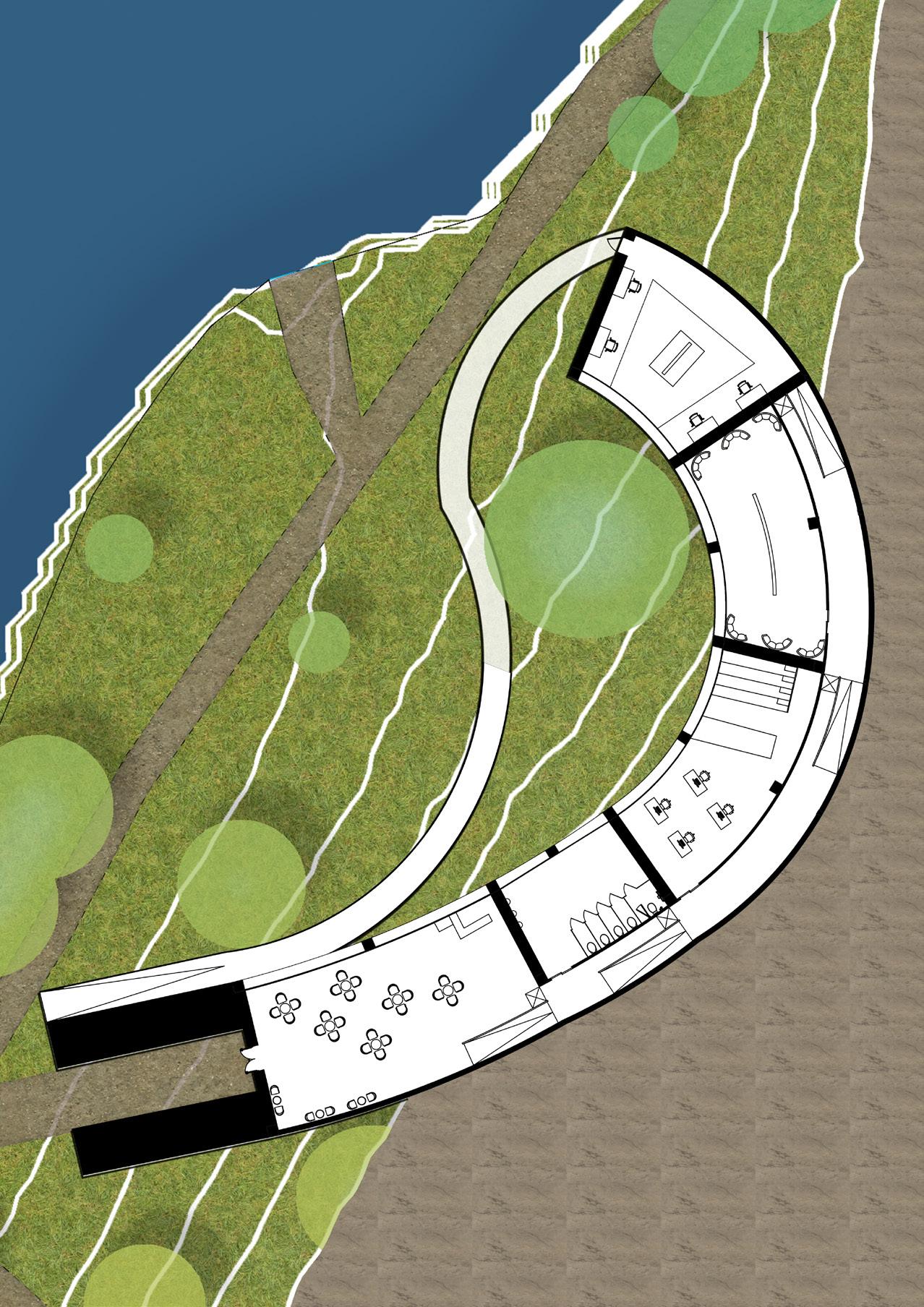

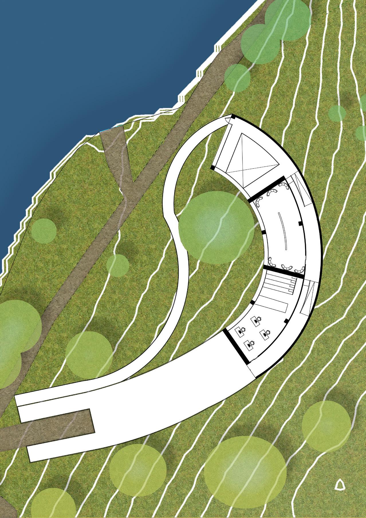
1:200 PLANS 33
Site Images Of Ecology and Potential spaces
Site Images Of Ecology and Potential spaces
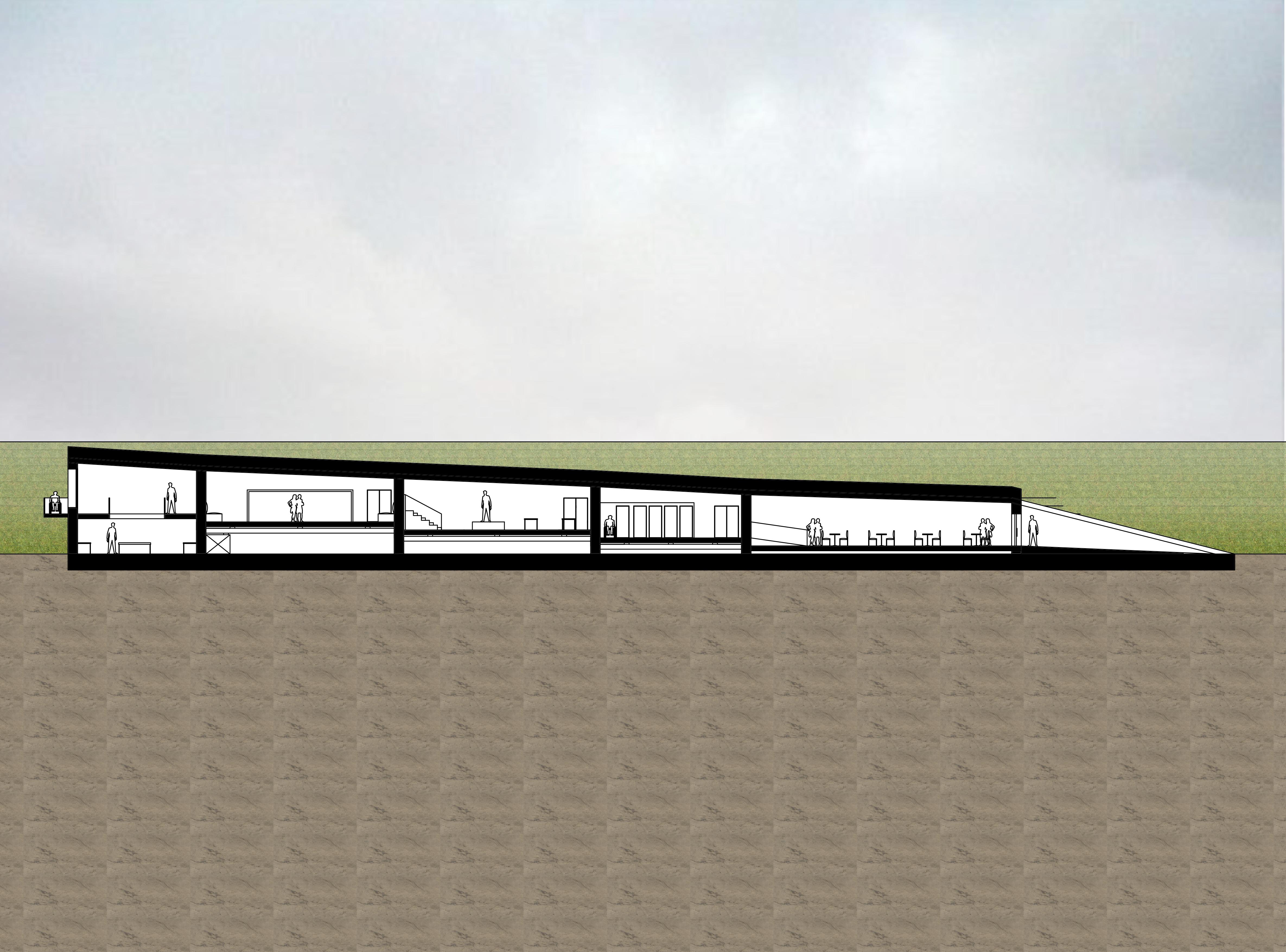
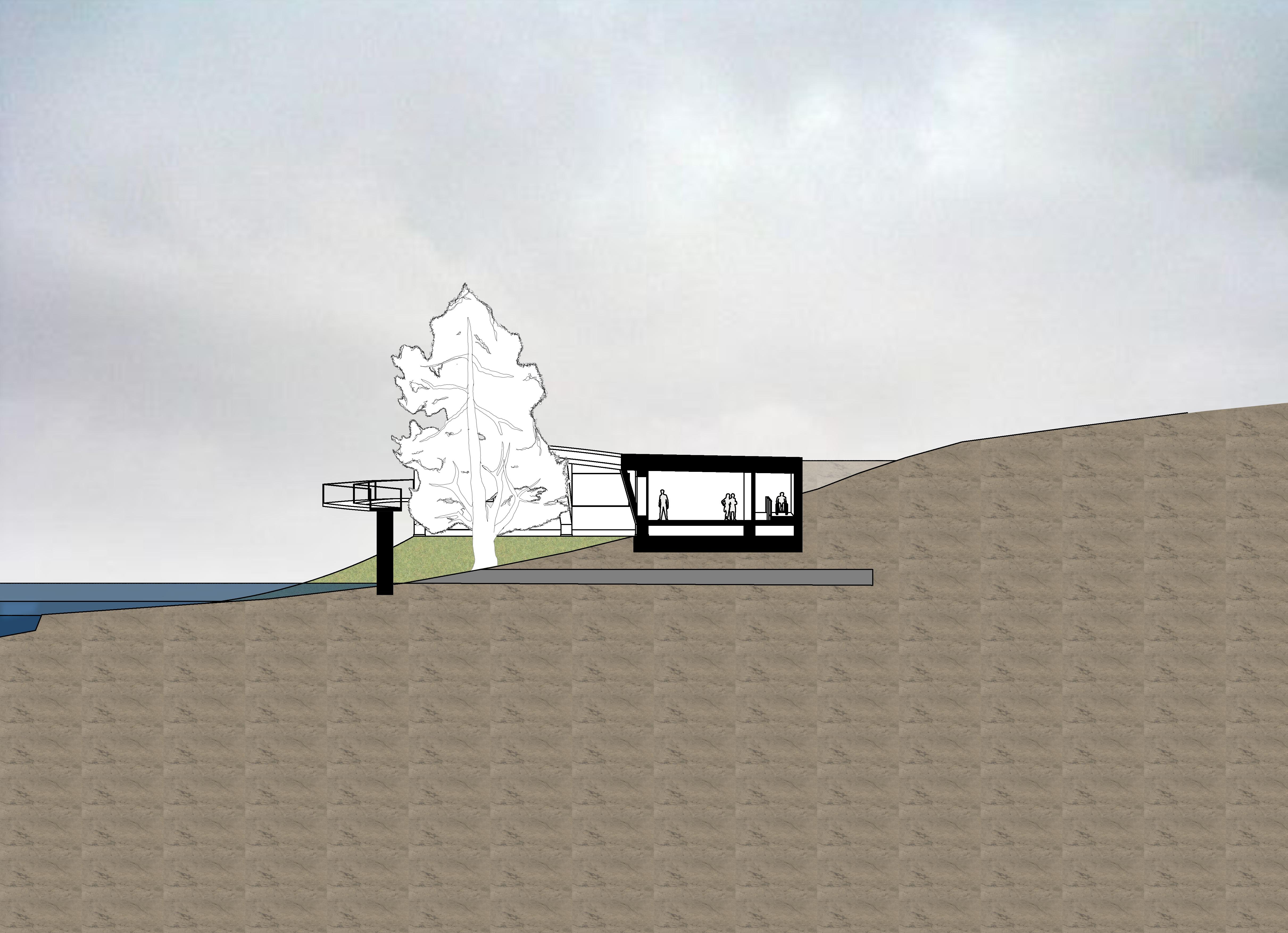
1:200 SECTIONS 34
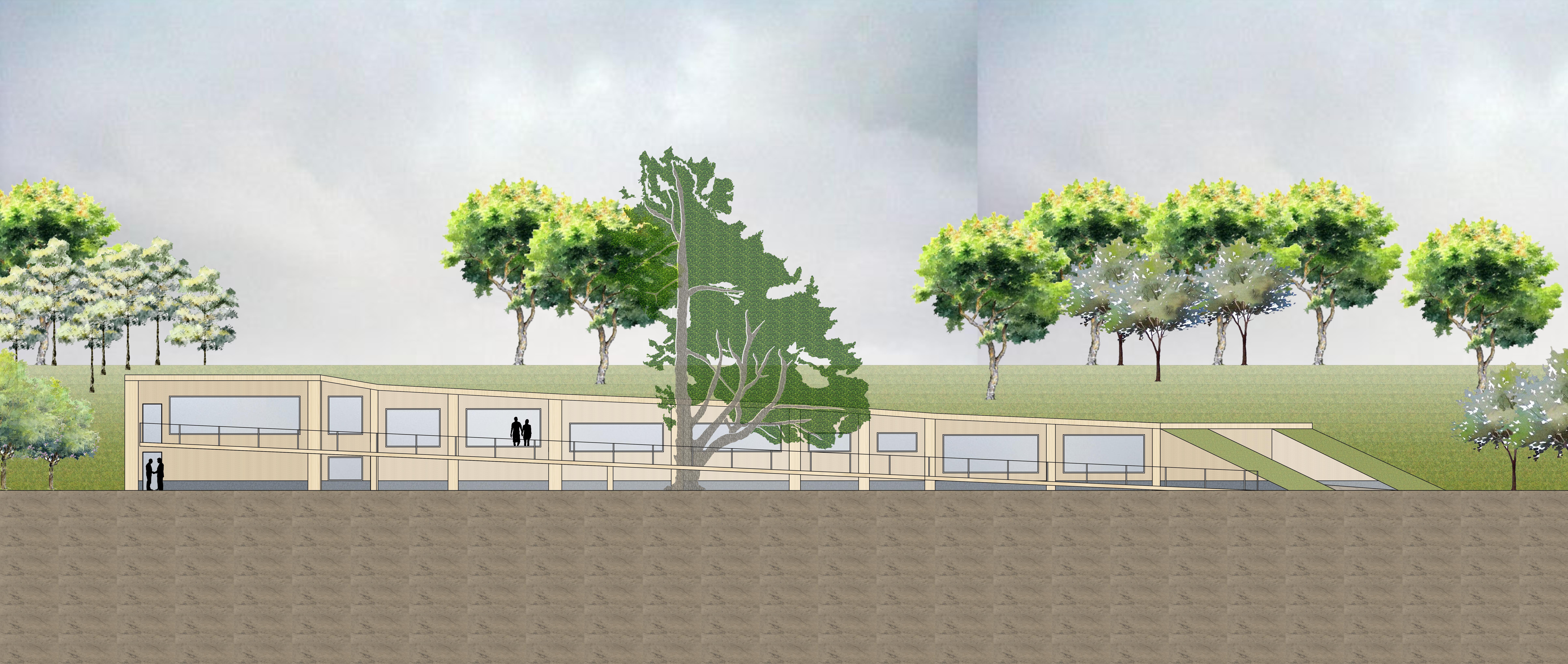
1:100 ELEVATION 35

36
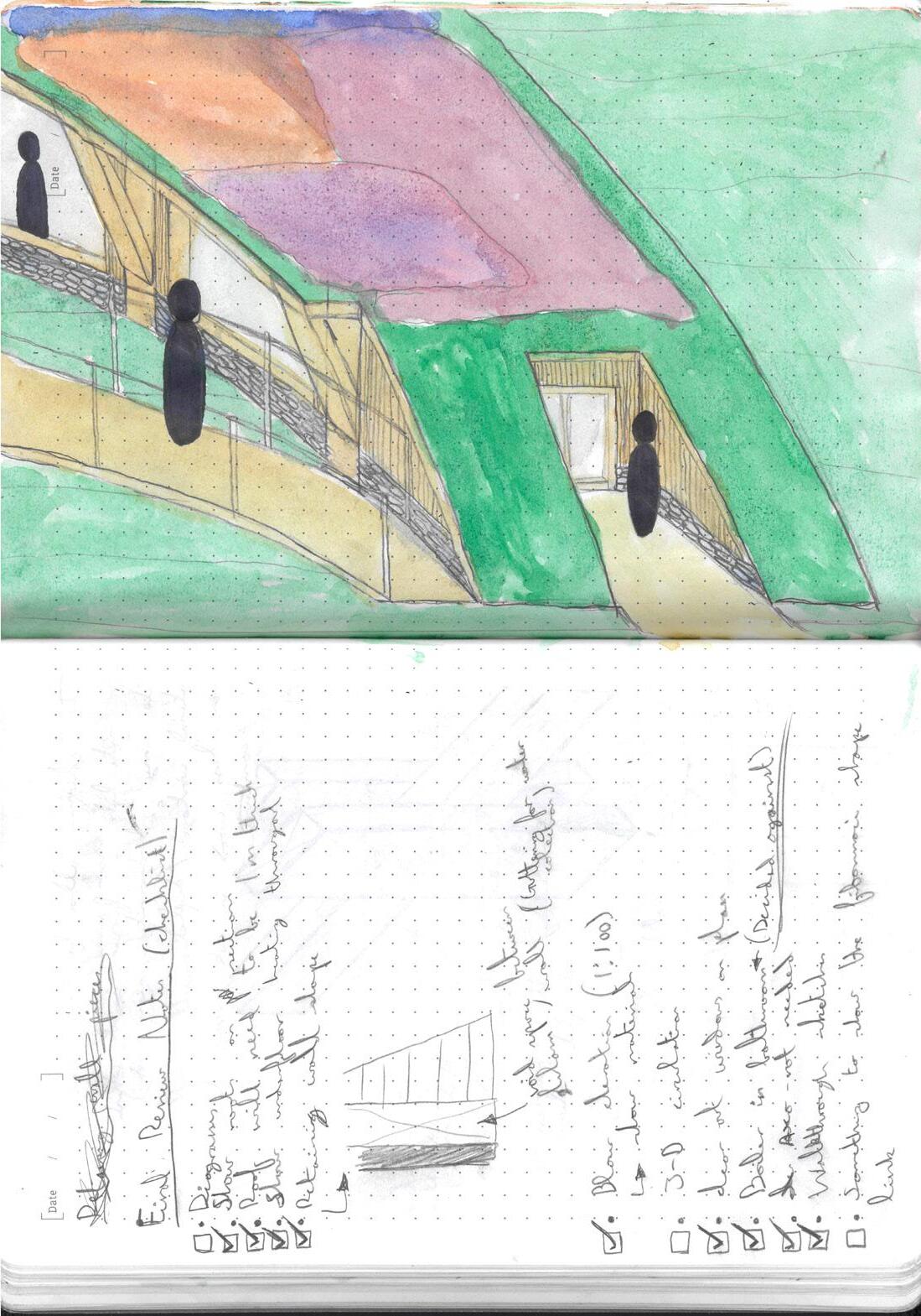
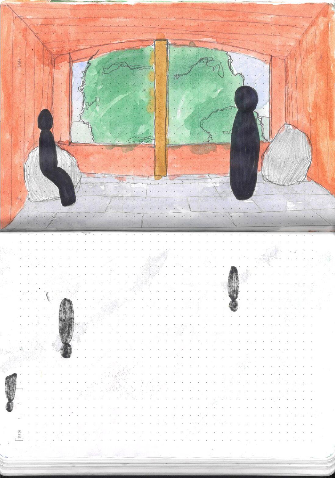
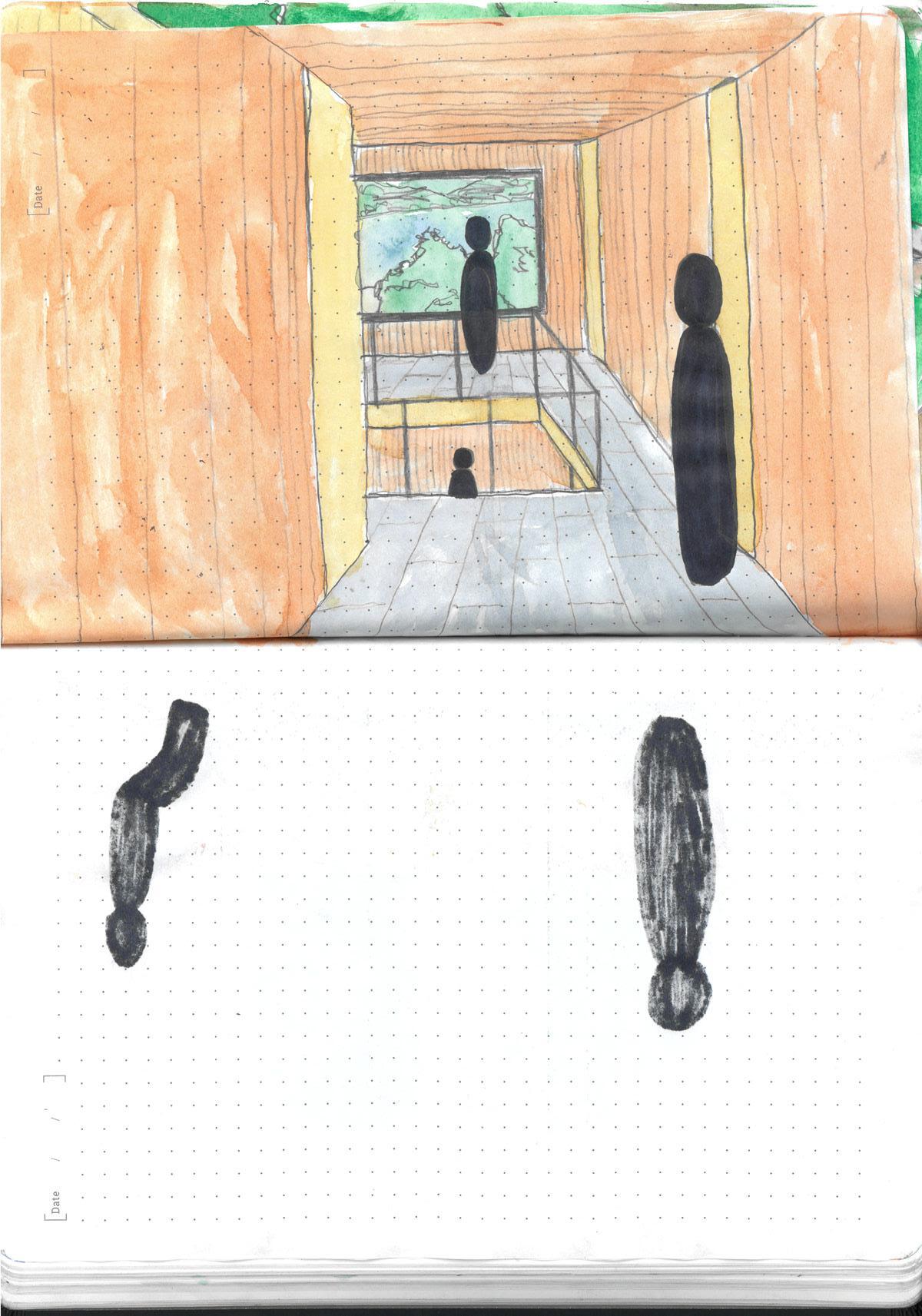
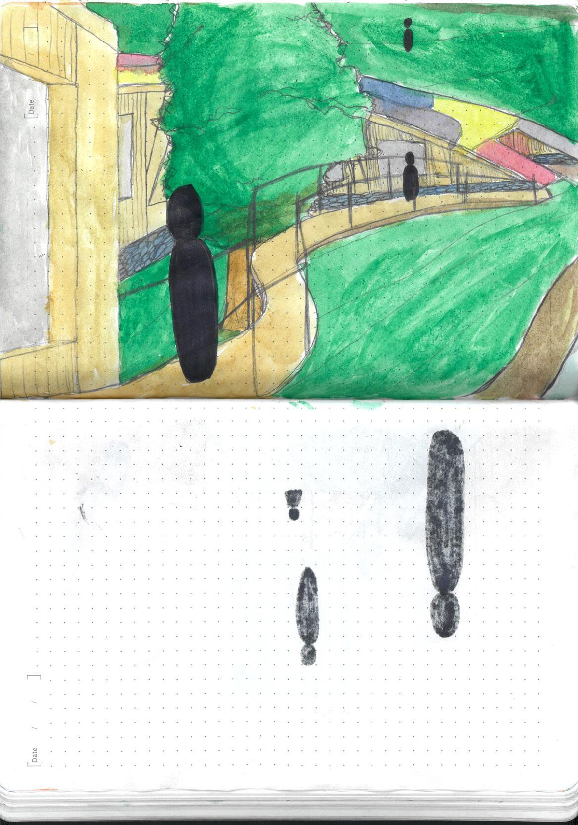
VISUALISATION AND MODELS 37
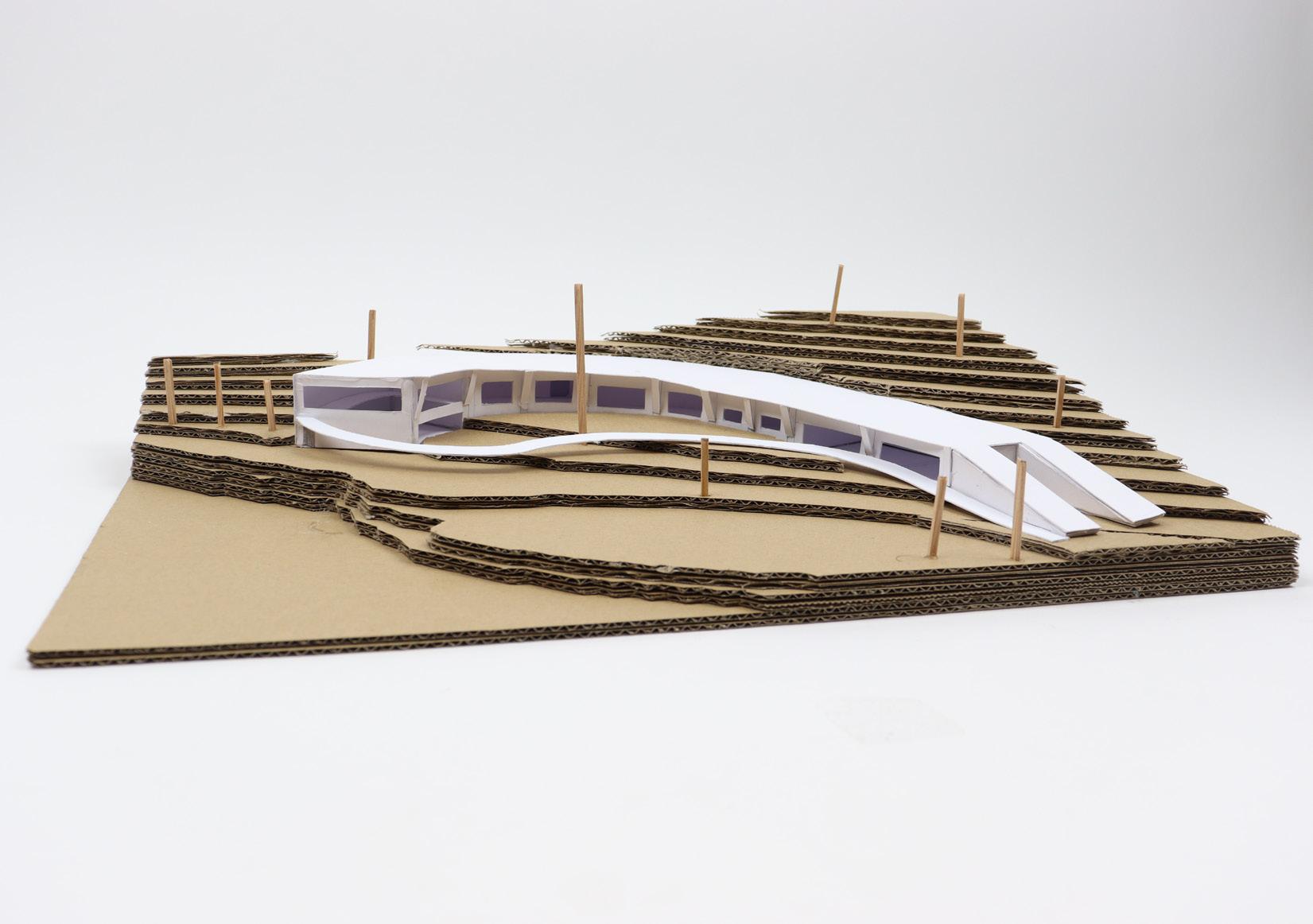
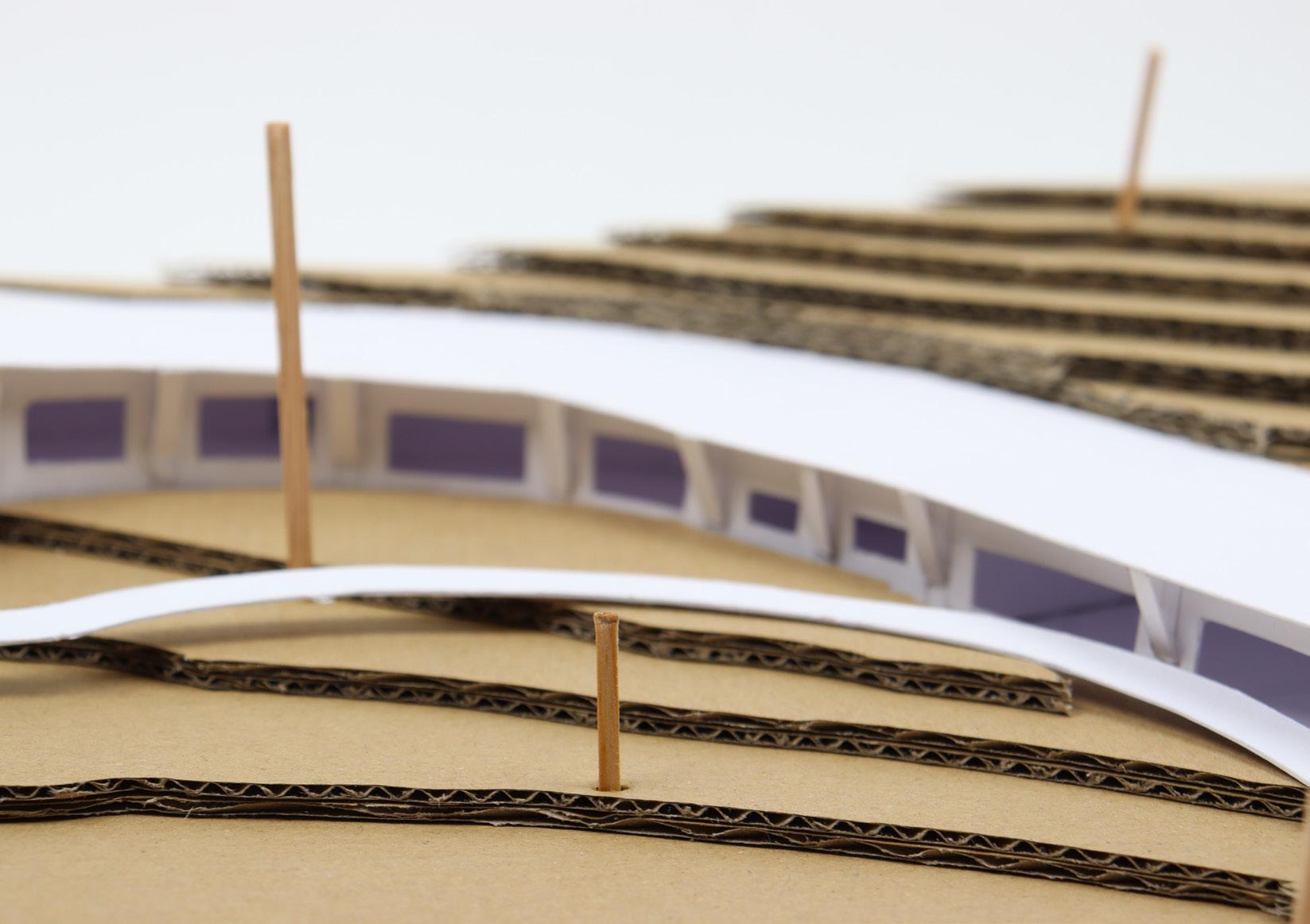
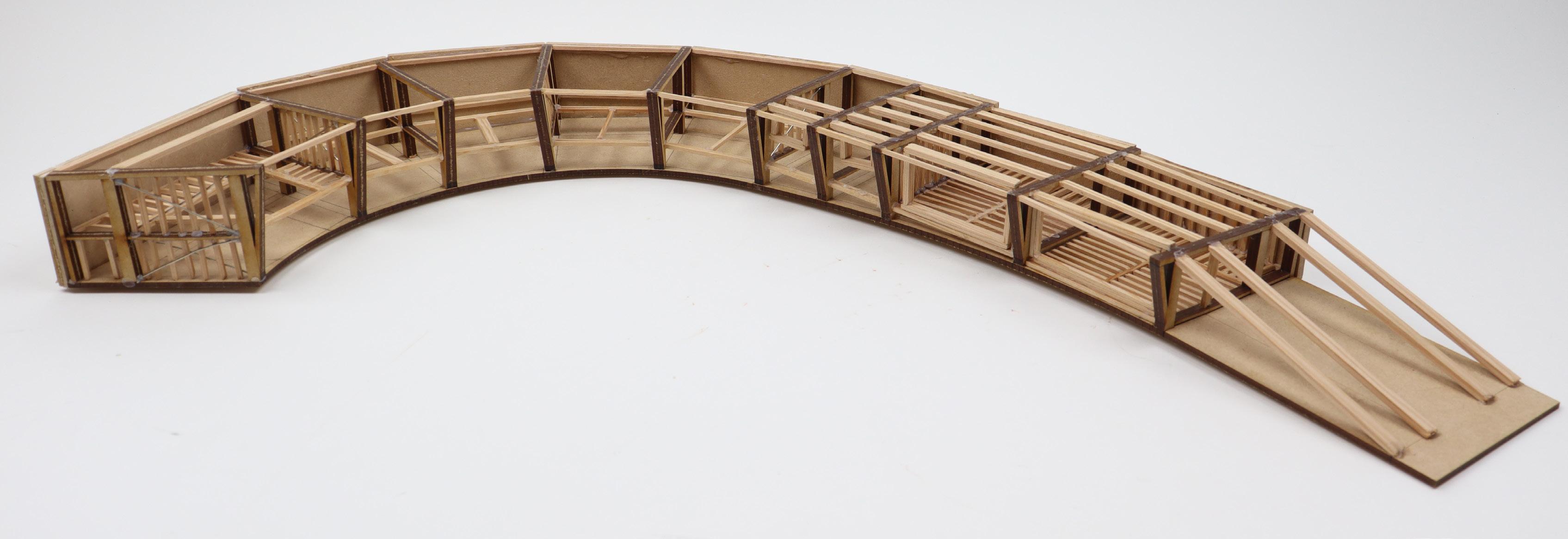
38
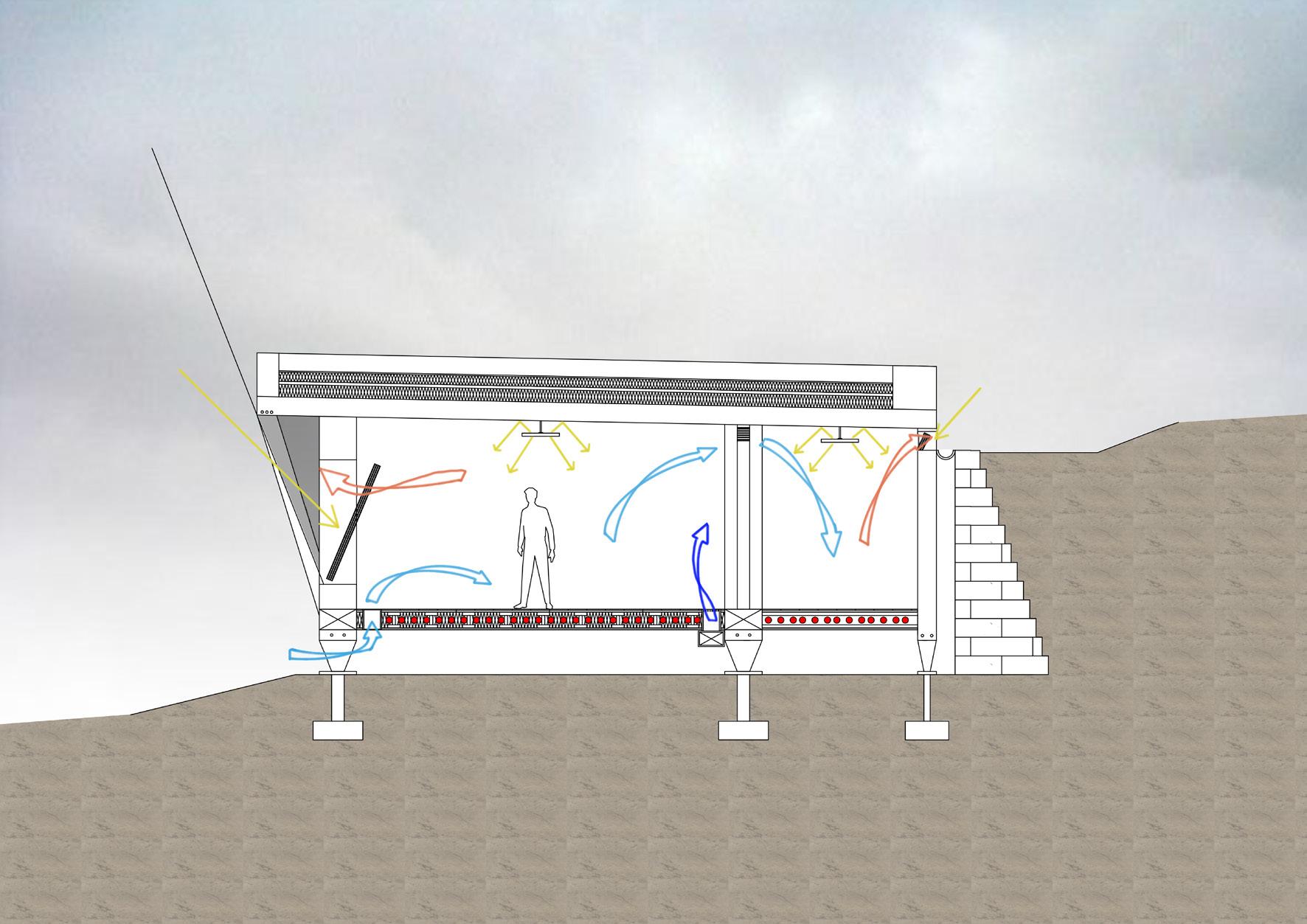

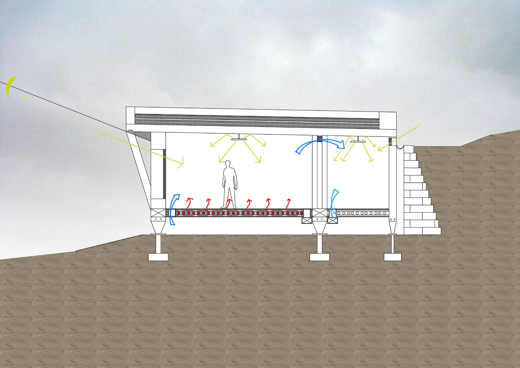

ENVIRONMENTAL STRATEGY 1:50 SECTIONS 39
Site Images Of Ecology and Potential spaces
Site Images Of Ecology and Potential spaces
STREETSCAPE:
CONTENTS TOM HOWARTH 40 Design Brief Concept Site Model Design Development Programme Material Precedent Site Model Structure Model Plans Section Axonometric Detail Mode 02-03 04-05 06-07 08-09 10-11 12-13 14-15 16-17 18-19 19-20 20-1 22-23 24-25
ROSCOE CANOPY
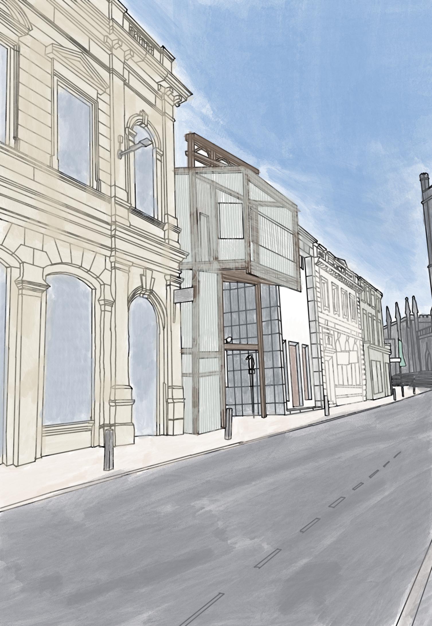
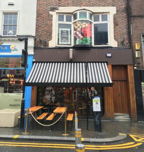
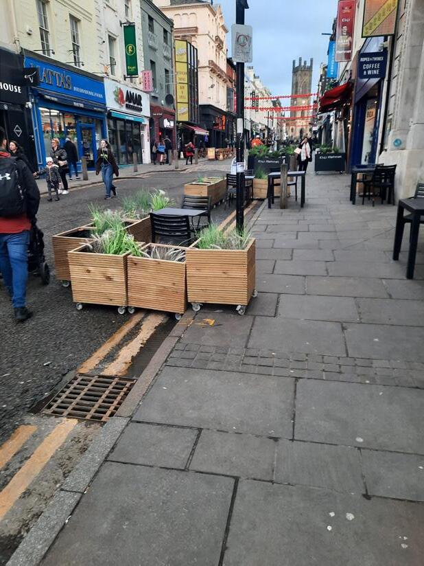
This project entailed exploring how the global pandemic has affected our streets and urban landscapes, and how they may need to be adapted to survive in a digital world. The lockdowns provided a reason for people to avoid the outdoors and almost created a fear or hesitance to venture back out into our towns and cities, which results in places such as Bold Street fighting to maintain their purpose and relevance in today’s society.
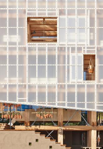
Timber as a material with its strength and its renewable nature makes it a perfect choice to be the primary element for the structure and the fabric of the proposal. Using the resource and exploring its form and properties to manipulate it into a range of styles allows for a durable building That is less damaging to the site. With a global shift towards adapting our current building practices and lifestyles to a more renewable method that is less harsh on our landscapes and our planet, timber allows for strong and beautiful structures to be built without the need for high production emissions and comes with a significantly smaller carbon footprint.
DESIGN BRIEF 41
Post Covid High Street
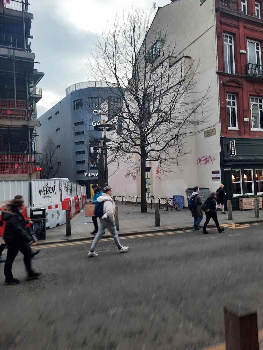
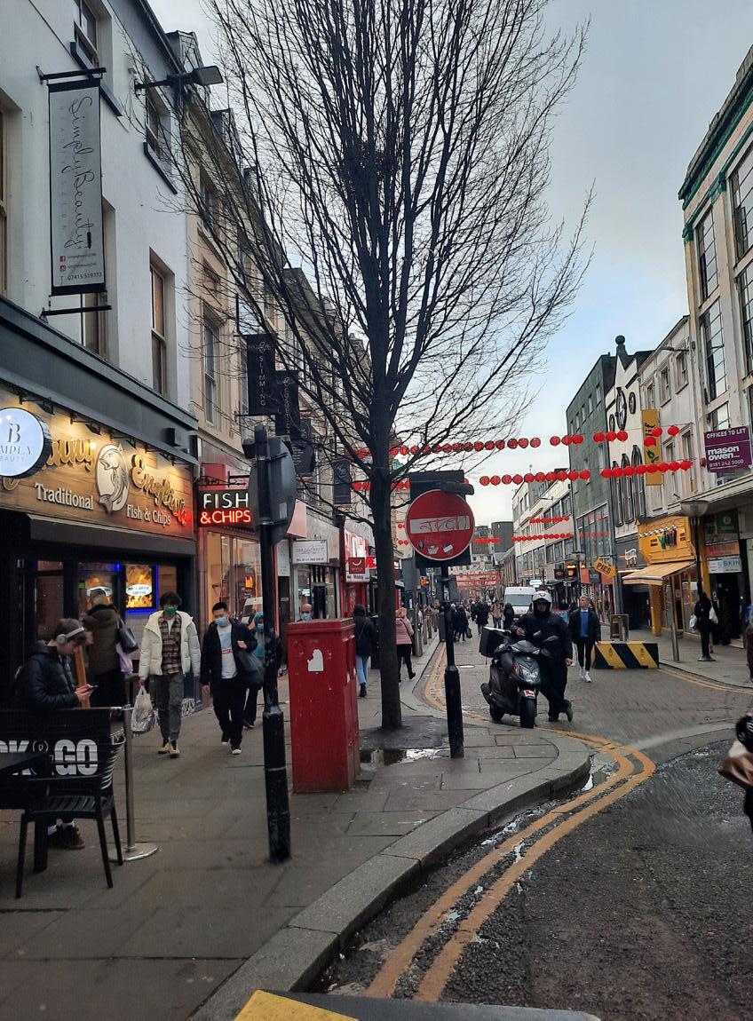
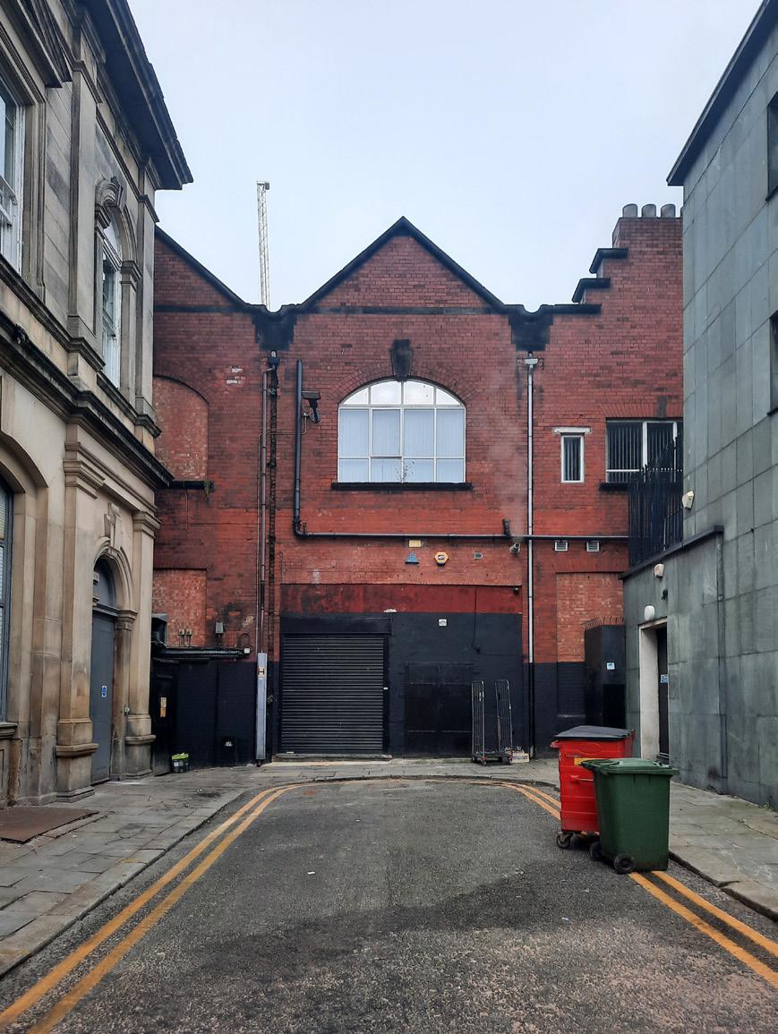
Ecology 42 Open spaces of Bold Street How People Meet
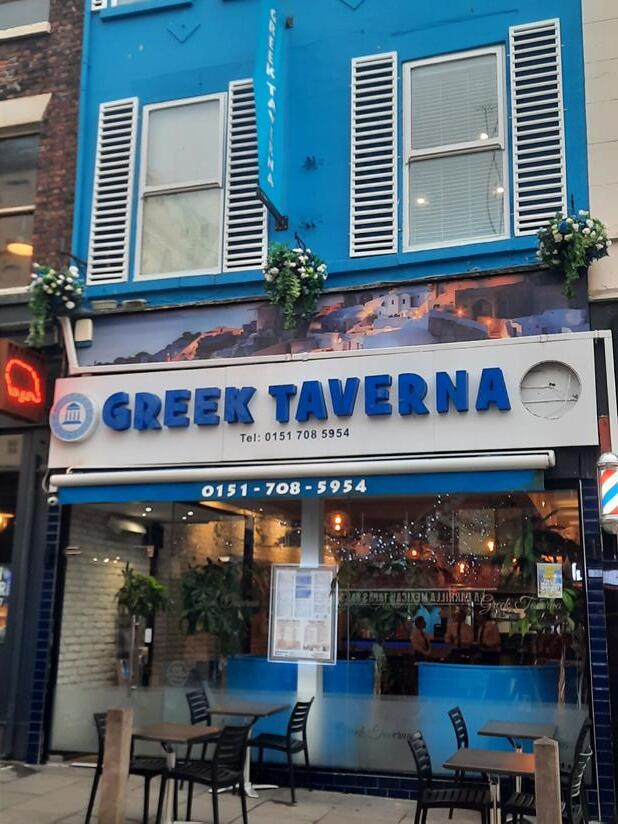
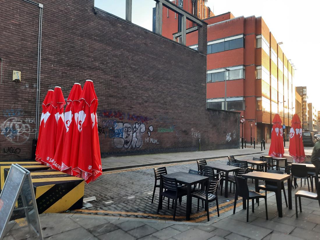
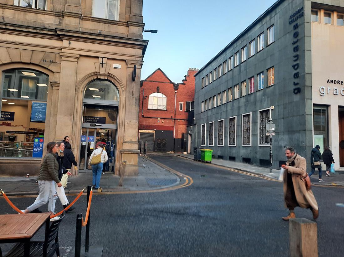
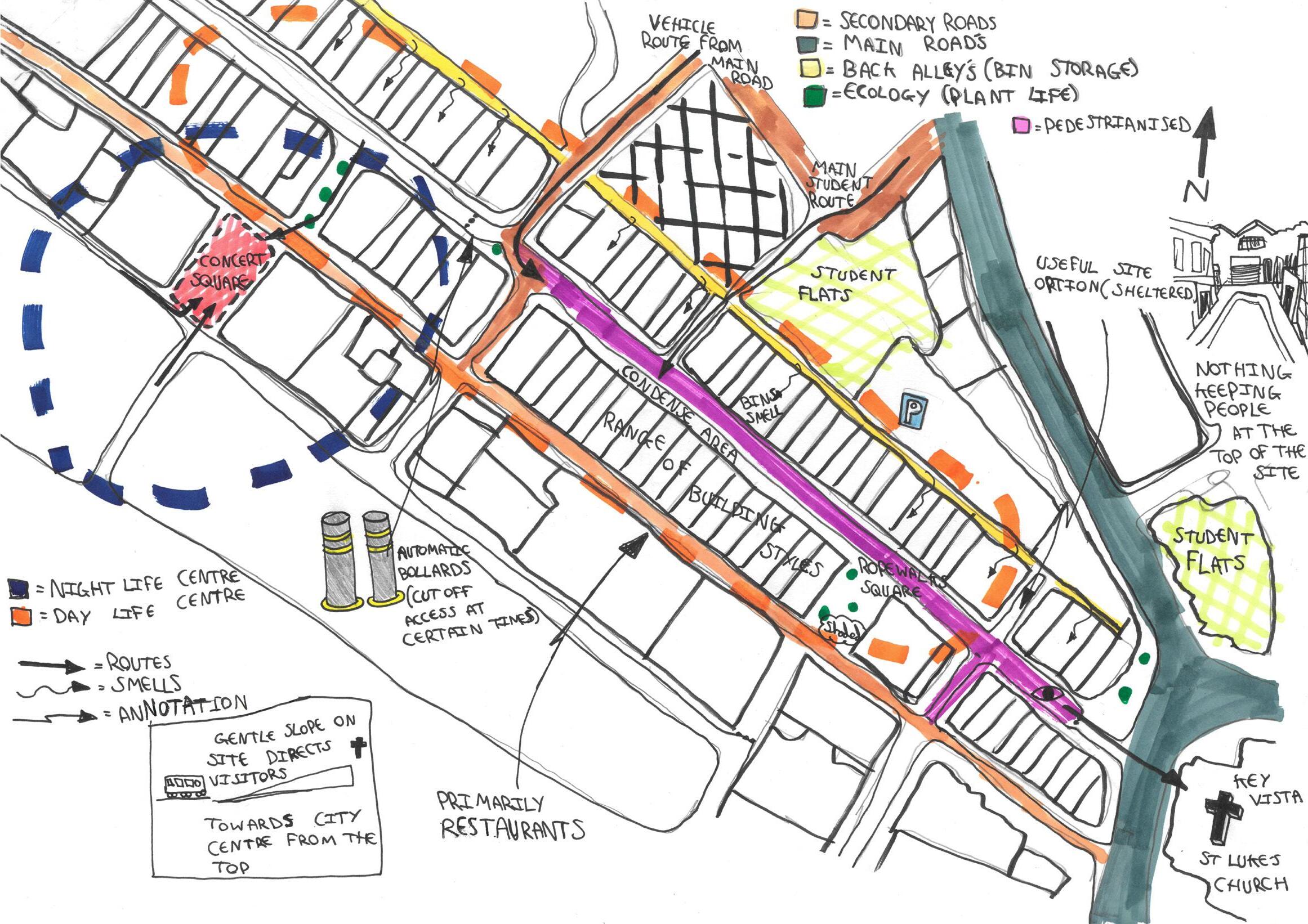
SIITE OBSERVATIONS | THE STREET 43
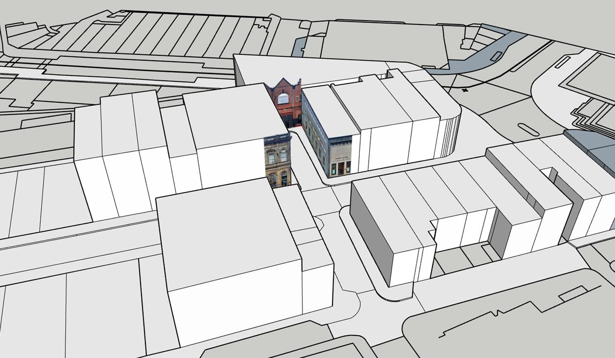
Site Images Of Ecology and Potential spaces Streescape Anaysis Drawing 1:500 and 3D Site plan

44
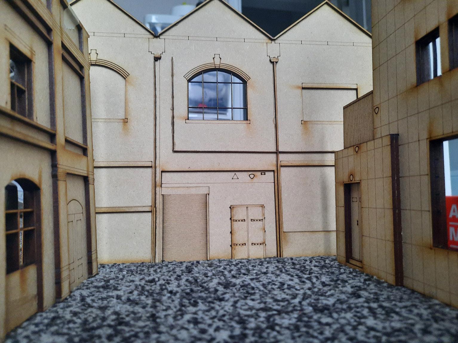
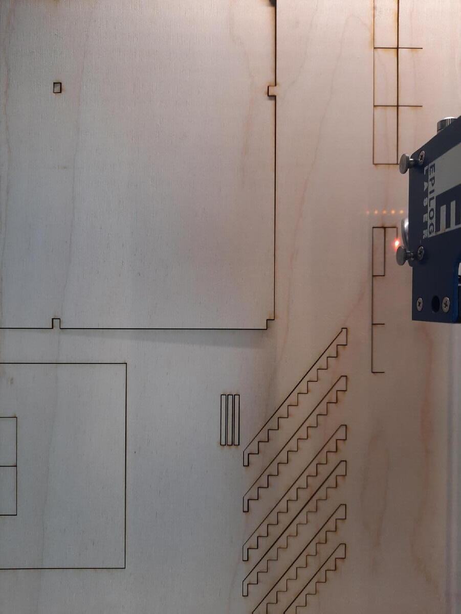 Laser cutting material layers
45 SITE MODEL | The Material Facade
Assembly
46 Local Site Analysis Drawing 1:50 99 ANDREW COLLINGE g r a d u a t e s
Kengo Kuma
Nest We Grow

MATERIAL PRECEDENTS 47


48 Structural Model 1:50


49
PHYSICAL SITE MODEL
Site Model 1:50


50
Site Model With Concept Within 1:50


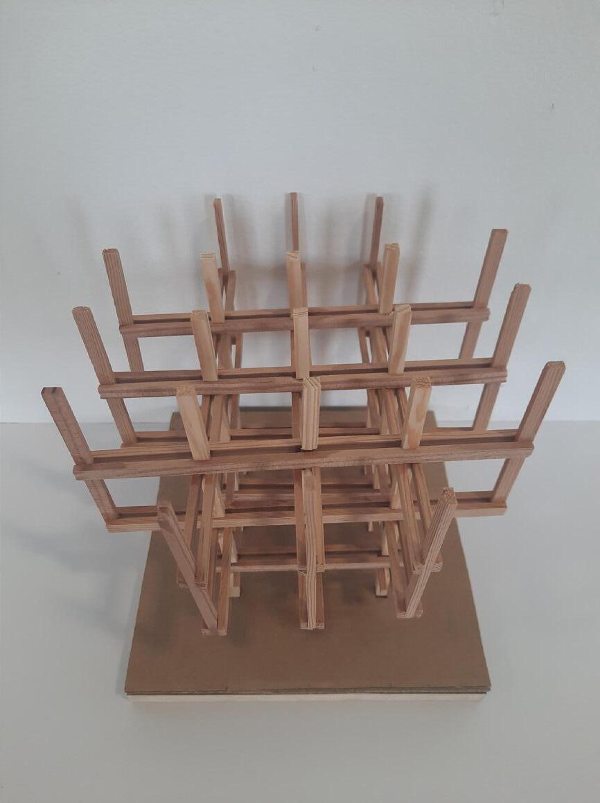
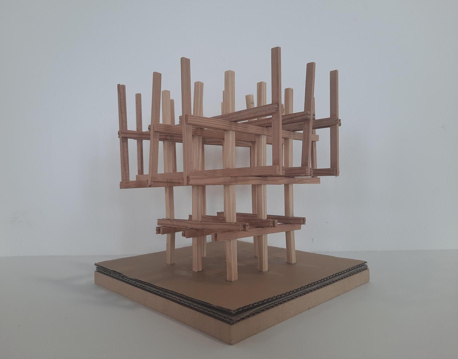
51 STRUCTURAL MODEL
Structural Model 1:20


52 MASSING MODEL
Massing Model 1:200


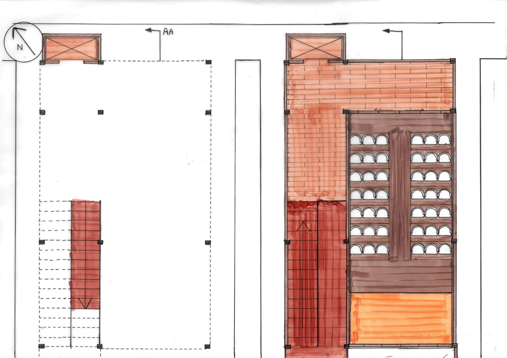
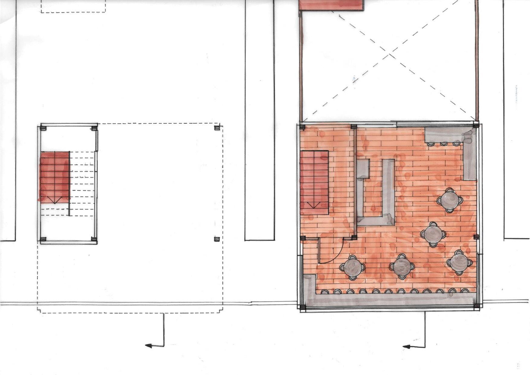
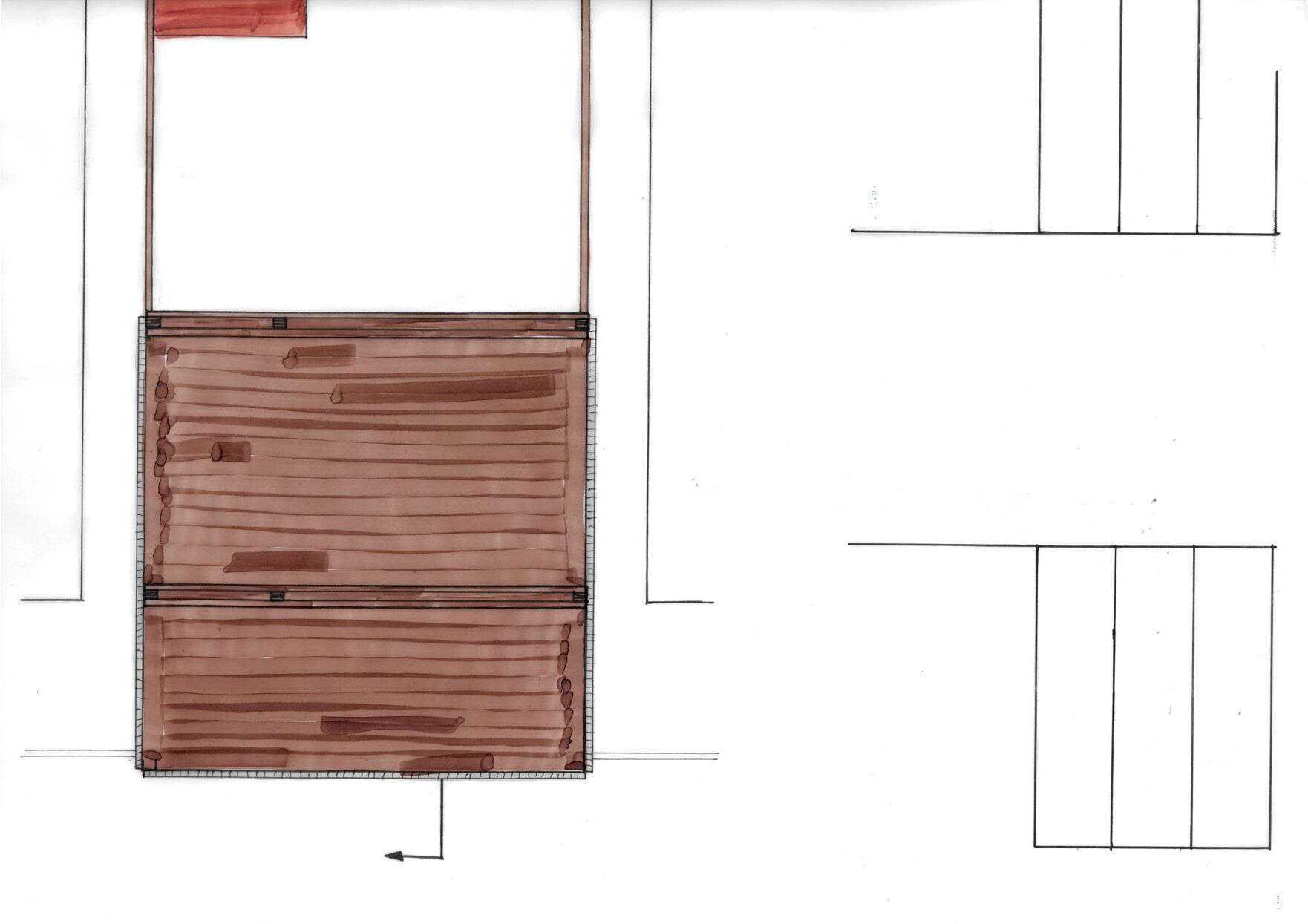
53 PLANS Ground, 1st, Roof Plans 1:50

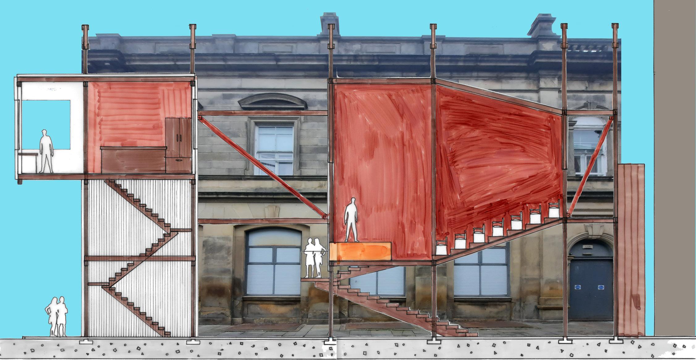
54 SECTION
Rendered Section 1:50

55 CONCEPT ART
Concept Sketch Using Procreate

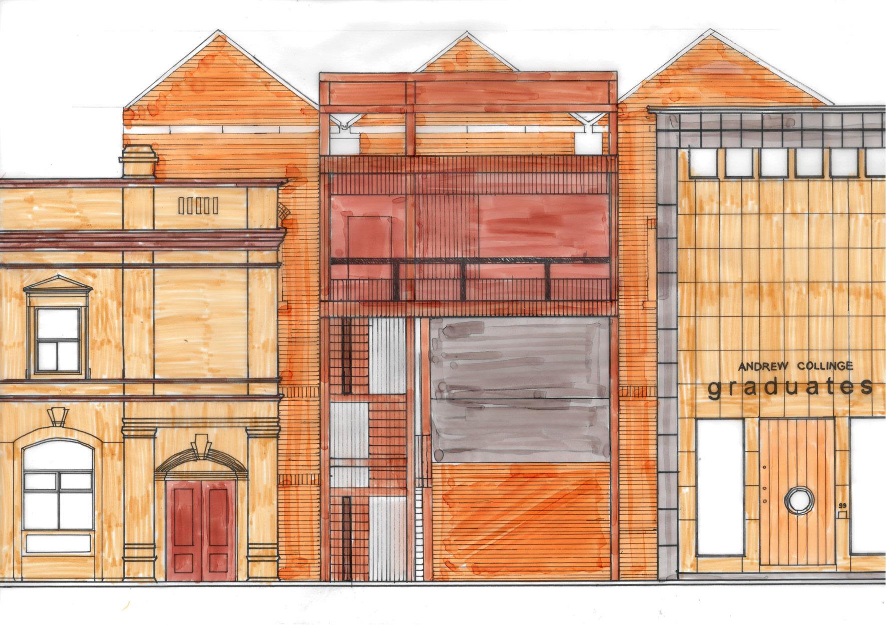
56 ELEVATION
Rendered Elevation 1:50


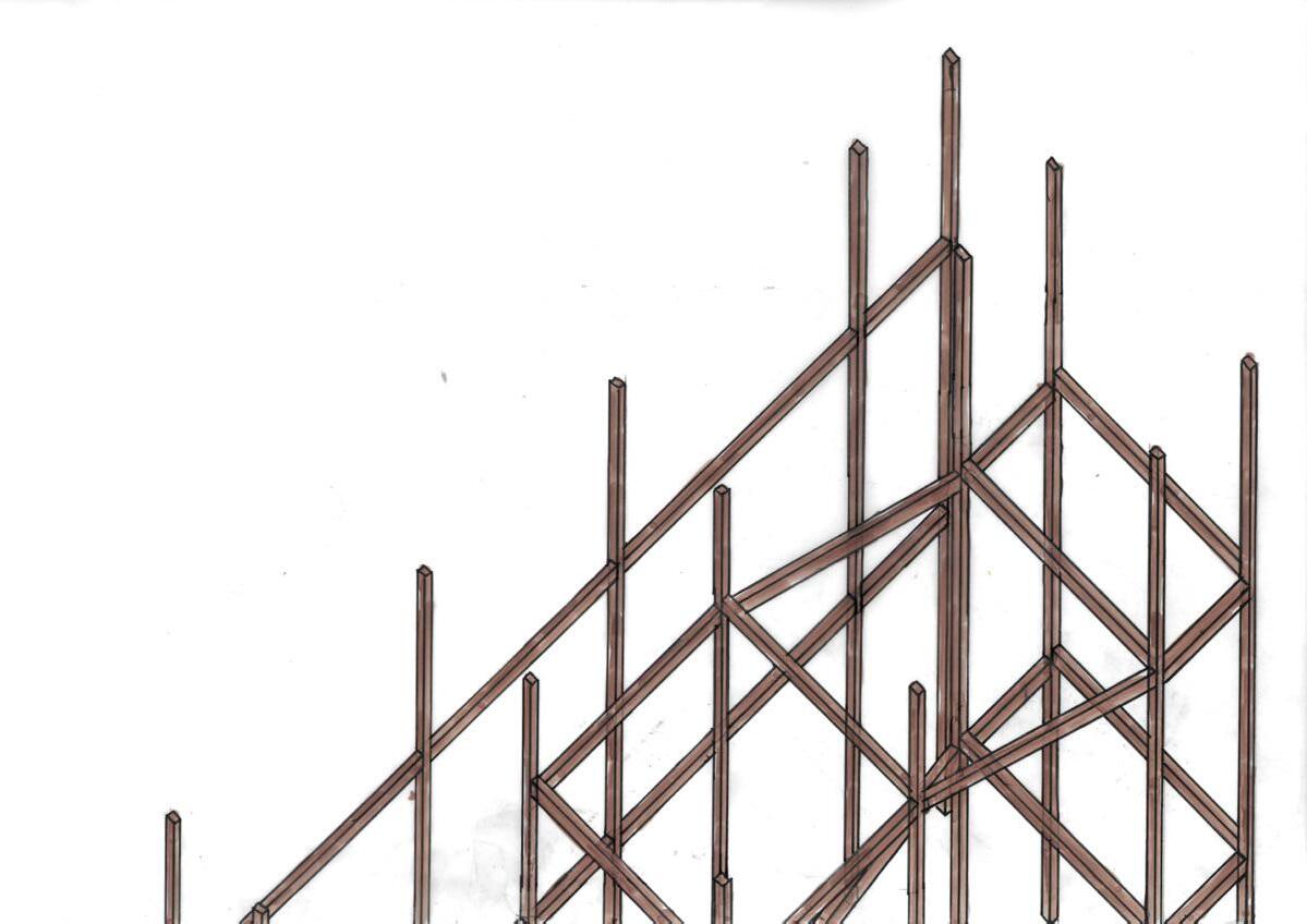
57 AXONOMETRIC Structural Axonometric 1:50
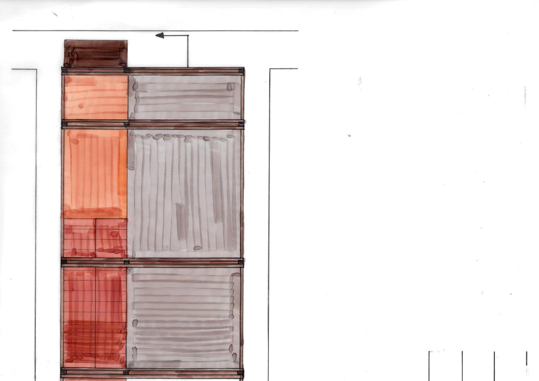
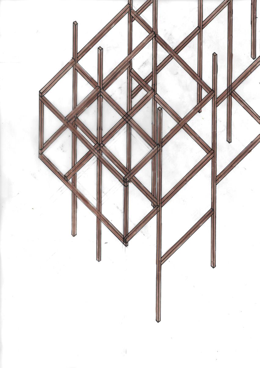
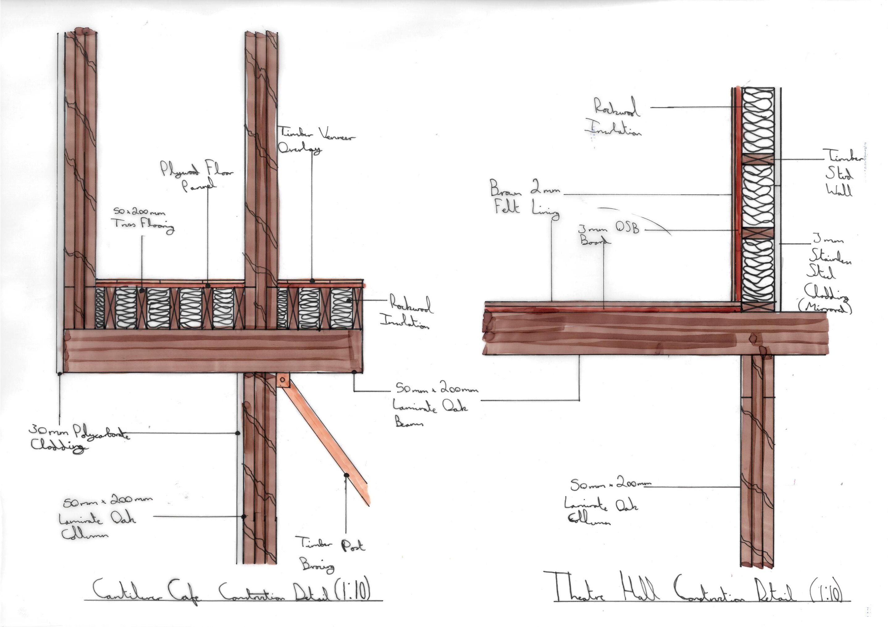
Rendered Wall Details (Cafe And Theatre Hall)
1:20

58 DETAIL

59 Tom Howarth CITY DESIGN Design Brief Site Analysis Plans Sections Sketchup Model Model CONTENTS 21-22 23-24 25-26 27-28 29 30
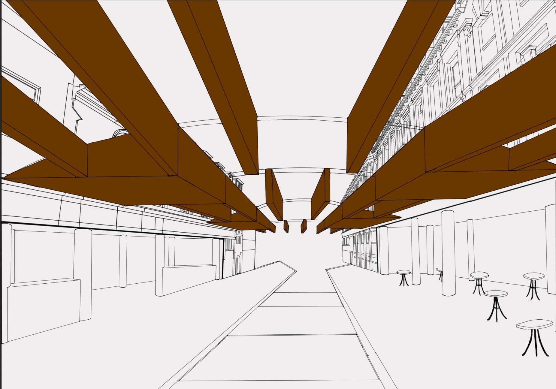
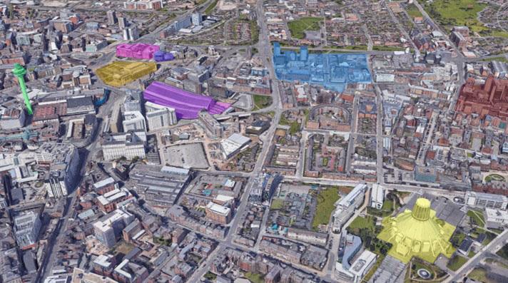
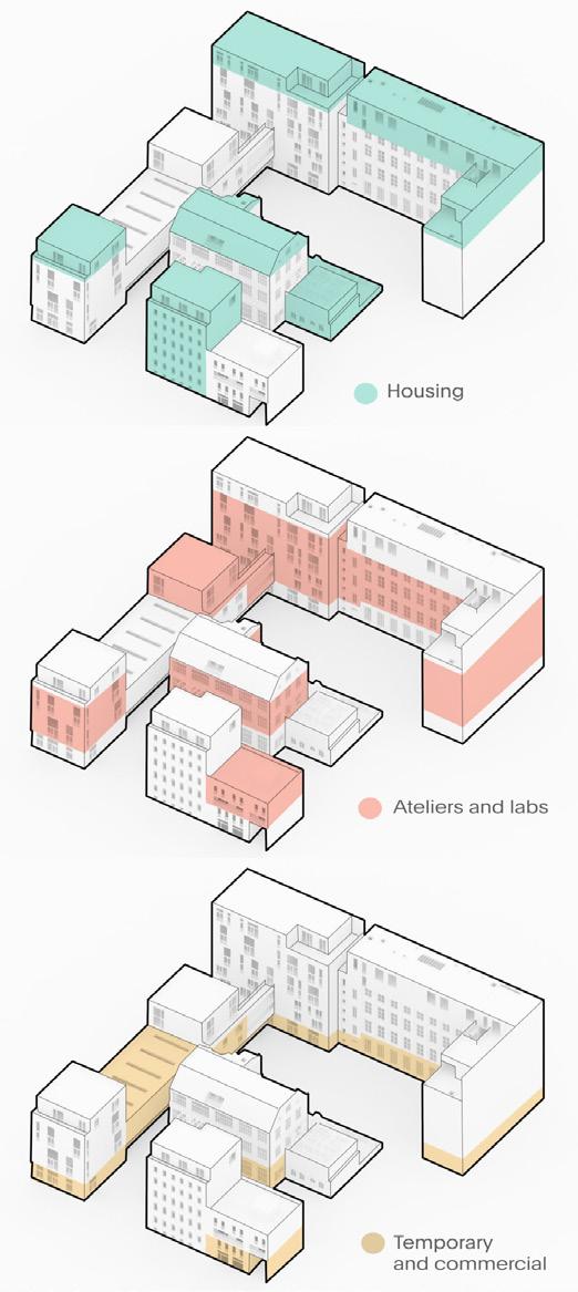
The 5121AR module, city design introduced urban planning to us and made us, in groups of 3 produce an strategy to resolve an issue that arose during the site analysis of the fabric district of Liverpool.
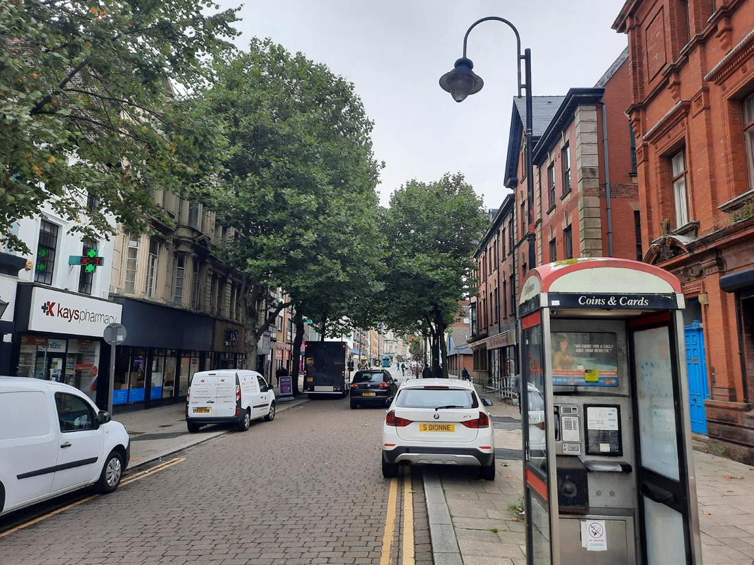
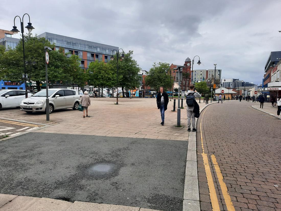
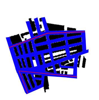
Our strategy looked into providing a place at which people can come together and build a sense of community in the chosen site, London Road which runs parallel to the 2 TJ Hughes shopping malls.
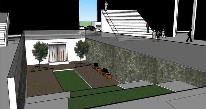
The end result was a canopied street that was transformed into an area that celebrated the various cultures that call the fabric district home. The covered street provided services such as rest and seating points, display environments for arts and performances, and the main focal point being the street food vendors which would line the pedestrianised area

60 DESIGN BRIEF
Concept Art For Urban Strategy


61 SITE PHOTOS
Ecology Photographs of Liverpool Fabric District
Key Connections of Liverpool From Fabric District


62 SITE ANALYSIS
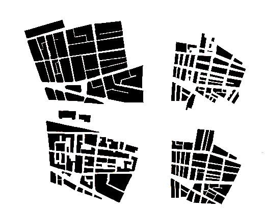
Historical Layout Change of Site (1850 - 2000)
63 PLANS Ground Floor Plan 1:50
64 Roof Plan 1:50
Rendered Section AA


65 SECTIONS
1:50


66 Rendered Section BB 1:50

SKETCHUP MODEL 67
Google Sketchup Rendered Concept Model
Massing Model 1:100

MODEL 68
BUILDING IN THE CITY TOM HOWARTH CONTENTS Design Brief Site Plan Precedent Analysis Plans Elevations Section Roof Plan Model 69 31 32 33 34 35 36 37 37 Retrofit Section 1:50
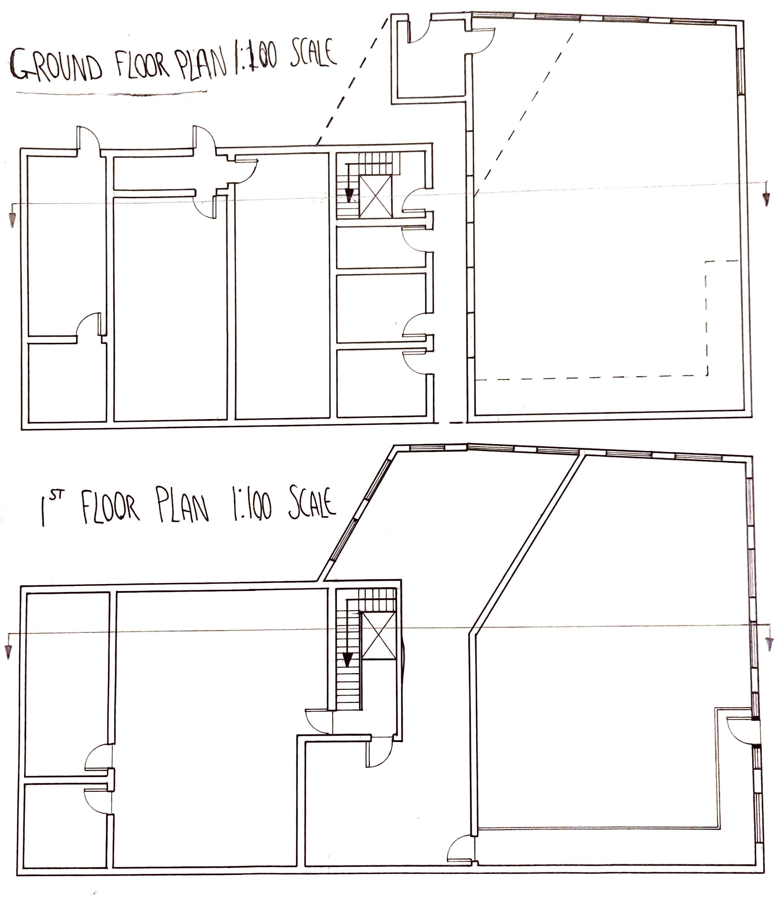
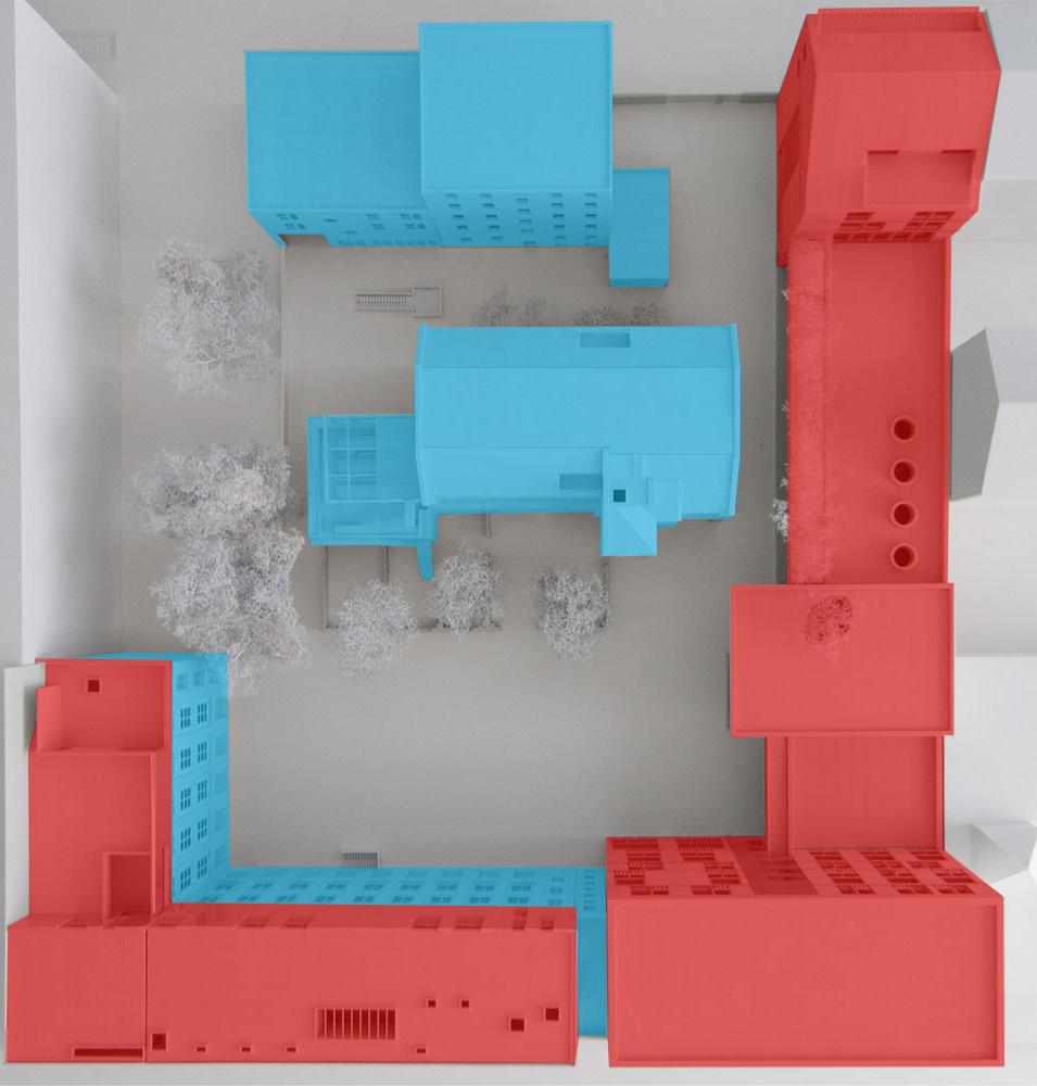
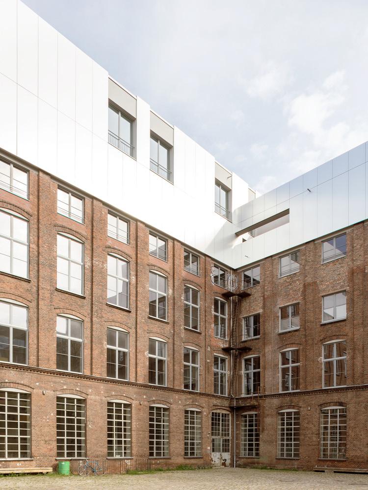
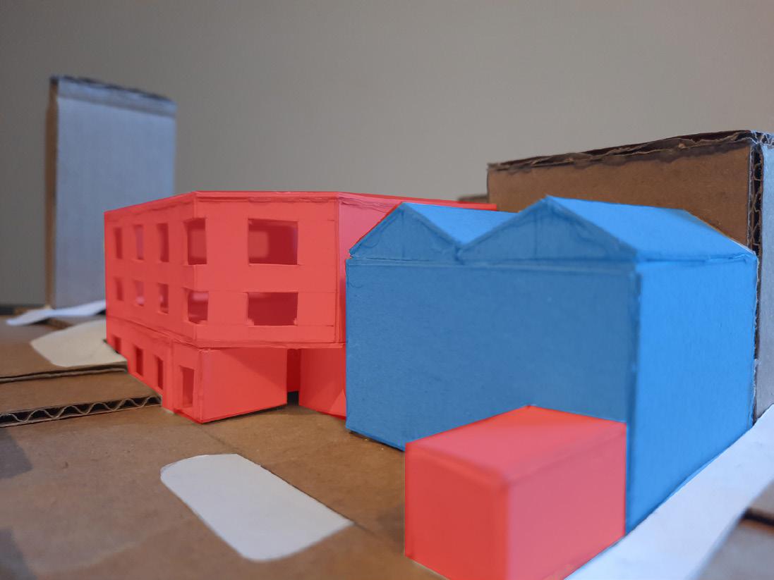
The infill and retrofit module introduced both the idea of renovating forgotten architecture and blending it with an infill strategy, as well as educating us in AutoCAD to produce smart and professional looking plans and sections.

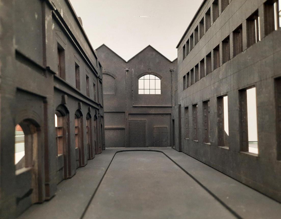
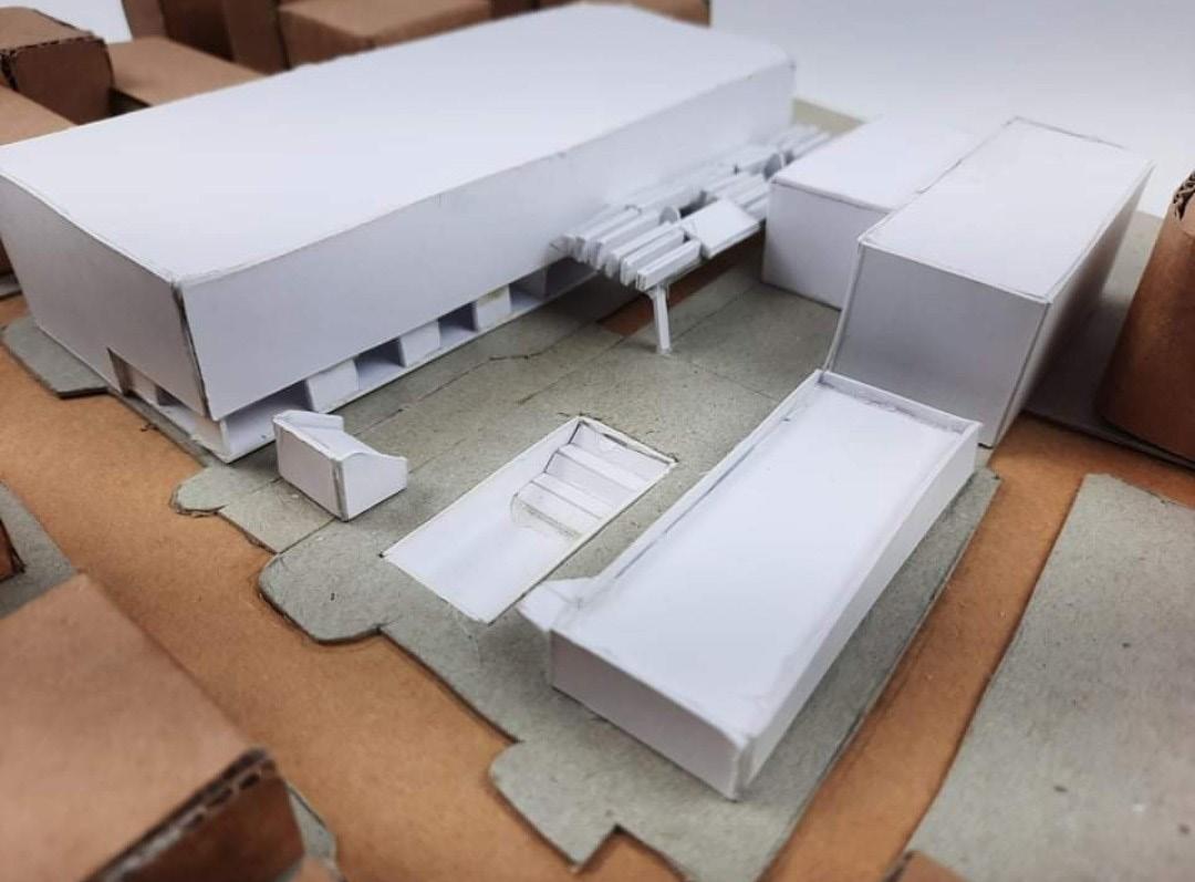
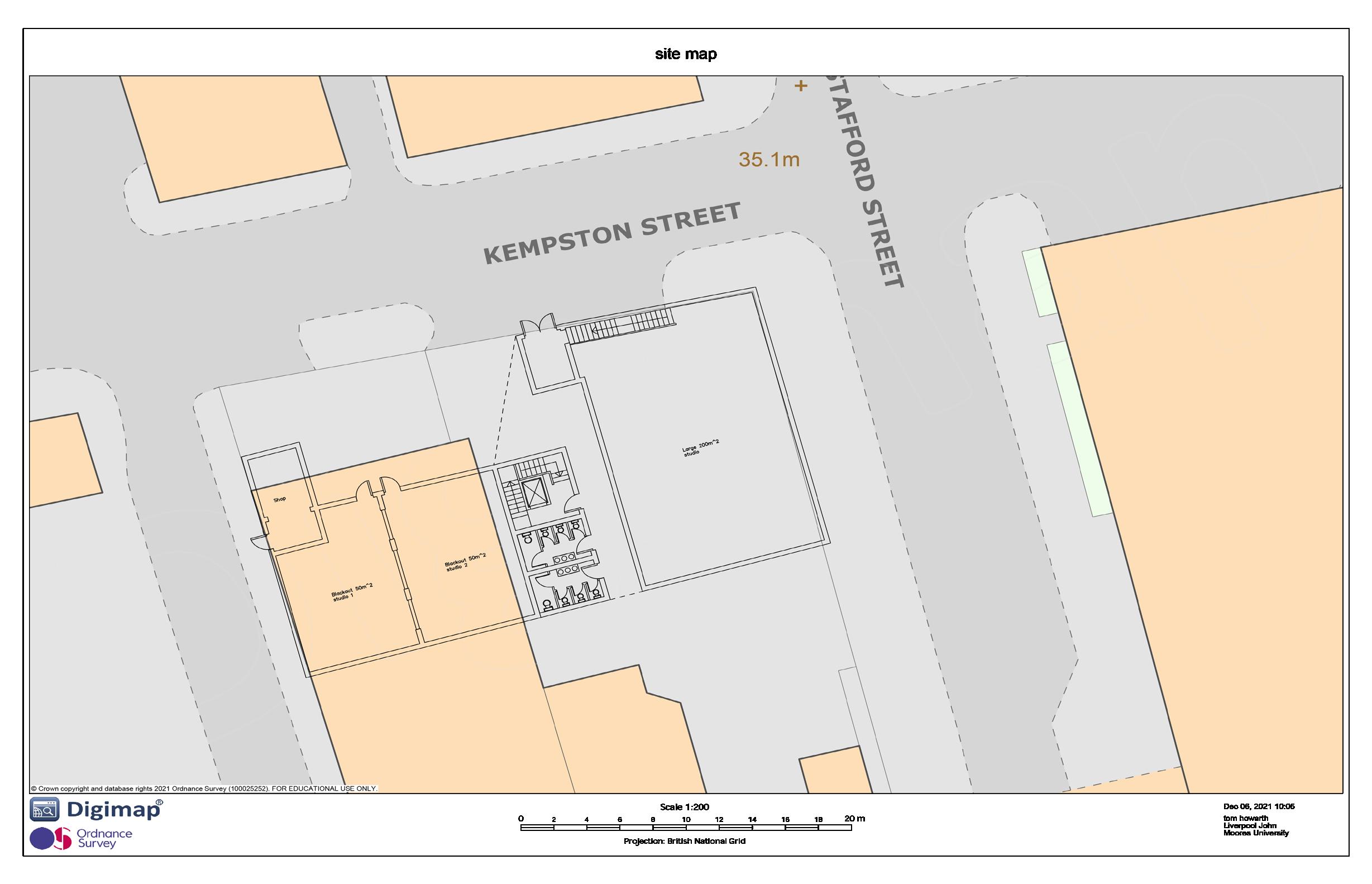
The lack of site analysis was due to our chosen site being within our group project in the previous urban planning module, London Street of the fabric district. The retrofit building was situated at the rear of the smaller TJ Hughes building and was due to be demolished which made it a perfect choice.
Once Completed the newly proposed programme for the concept was a photography studio with multiple different sized studios that was fit for, based off my own choice, fashion photography. This was due to the fabric district providing that link around its material history
DESIGN BRIEF 70

71 SITE PLAN Site Plan With Ground Floor Plan Overlaid 1:50


72 PRECEDENT ANALYSIS
Lindower 22 Precedent Analysis of Existing Infill and Retrofit Project
73 PLANS
Floor Plans Basement Level to Roof Plan 1:50
74 ELEVATION
Floor Plans Basement Level to Roof Plan 1:50
75 SECTIONS Section
1:50
AA and BB


76 ROOF PLAN AND MODEL 1 2
Roof Plan 1:50
Massing Model of Retrofit (BLUE) and Infill (RED) Project 1:50
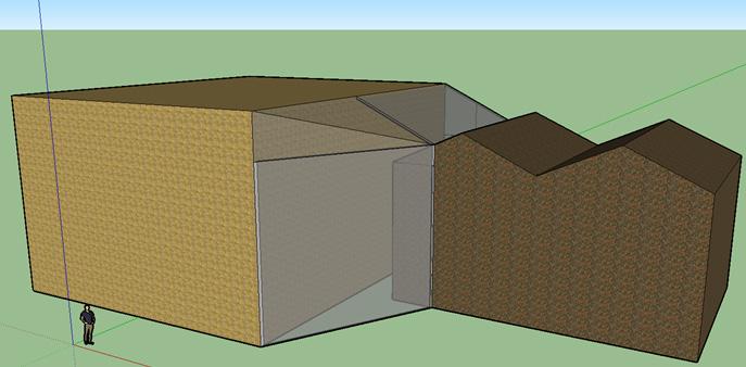
Infill and Retrofit Glazed Corridor Sketchup Model

77 TOM HOWARTH A PLACE FOR CRAFTING
Design Brief Craft Idealised Crafting Space Site Analysis Plans Sections Axonometric Perspective Section Wall Details Model 39 40 41 42-43 44 45 45 46 47 48
CONTENTS
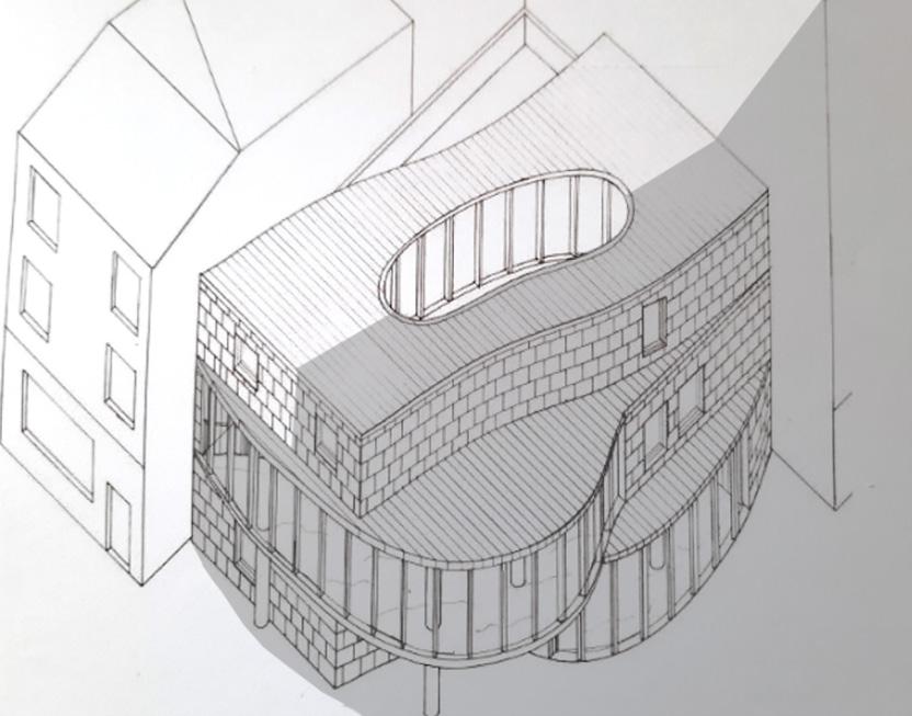
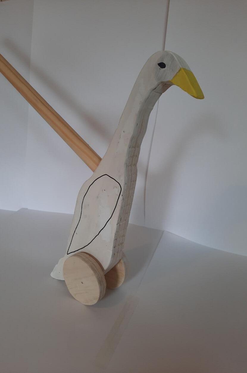
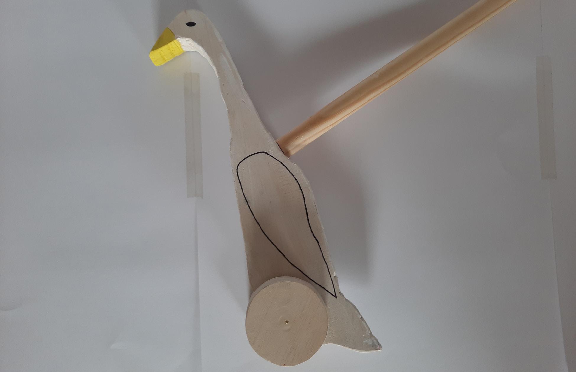
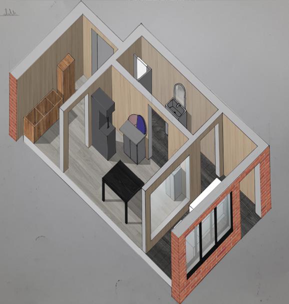
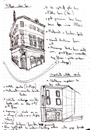
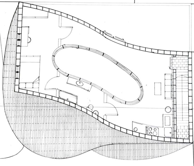
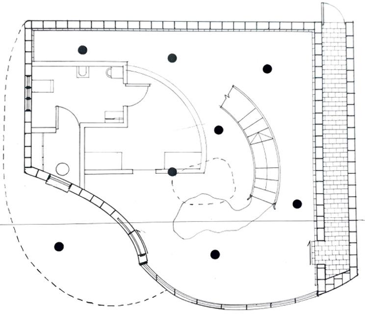
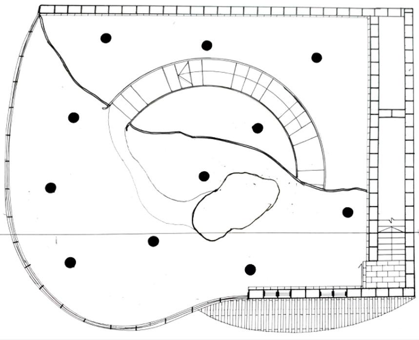
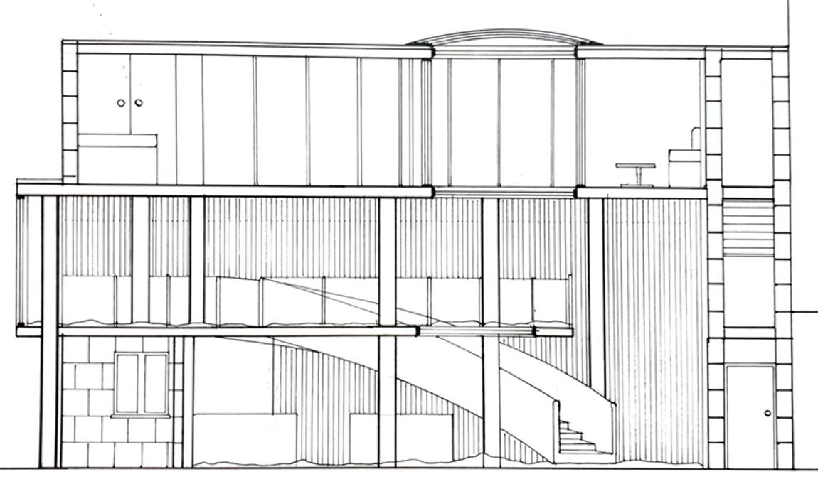
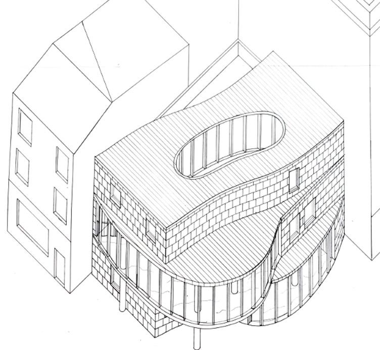
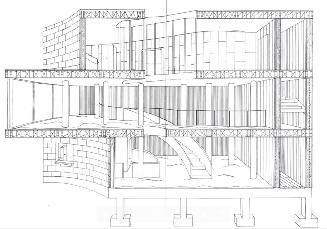
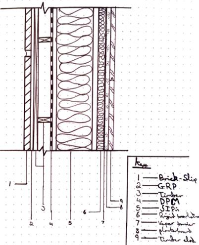
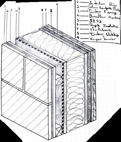
The place for crafting project was the first large scale design project that we were introduced to, throughout the duration of the BA degree. It started with creating an axonometric of an idealised crafting space which would produce a crafted object within and then sell on, in my case, a wooden goose toy.
The project then progressed to be a design project to create a multi storey building within that liverpool that could both produce and sell the crafted object, as well as having an accomodation for the owner and producer.
The heart of my design with both the building and the crafted object itself was the playfulness and the imagination that children have when playing with these toys. And this building would help nurture that experience and that imagination that they have when stepping foot into this structure.

78 DESIGN BRIEF


79 CRAFT
Timber Wheeled Goose Toy (Crafted Object)


 Laser cutting material layers
