1
IOANNIS IOANNIDIS
PORTFOLIO
Liverpool John Moores University

Ioannis Ioannidis About the Author
Architecture
Bachelor of Arts - Honours
i.ioannidis.24@gmail.com
CONTENTS
BA Level 6 Semester 2: Comprehensive Design Project
The Deck
BA Level 6 Semester 1: Weather or Not
Gummer’s How Visitor Centre
BA Level 5 Semester 2: BIM Study
2
(9-12)
(4-9)
(13)


3
ROUGH PROPOSAL 5123/4
BA Level 6 Semester 2: Comprehensive
Design Project
The Deck

4

5


SECOND FLOOR
1.
2. Two-person sauna (1/2)
3. Six-person sauna (1/1)
4. Circulation

GROUND FLOOR
1. Void looking down to the lower ground level
2. Public circulation area
3. Atrium
4. Changing Village entrance
5. Reception/pool office
6. Lockers
7. Changing cubicles
8. Accesible WC
9. WC
10. Stairs up to upper ground level
11. Stairs down to lower ground level


pool
seating 14. Relaxation pool 15. Pool store-room 3 5 9 13 12 10 11 14 15 UPPER GROUND
Stairs down to ground floor 2. Lazy river entry 3. Hot bubble pool pod (1/4) 4. Lazy river exit 5. Store-room 6. Access to emergency exit stairways 7. Circulation space 8. Stairs up to second floor FIRST FLOOR 1. Roof terrace 2. Entrance/circulation space 3. Café kitchen 4. Access to emergency exit stairways 1 2 1 4 3 4 5 6 8 UG 1F 3
12. 25m
13. Poolside
1.
level
Stairs down to upper ground
space
Five person sauna
Access to emergency exit stairways 7. Store-room 2 1 4 3 1F 1 2 3 4 2F
5.
(1/3) 6.


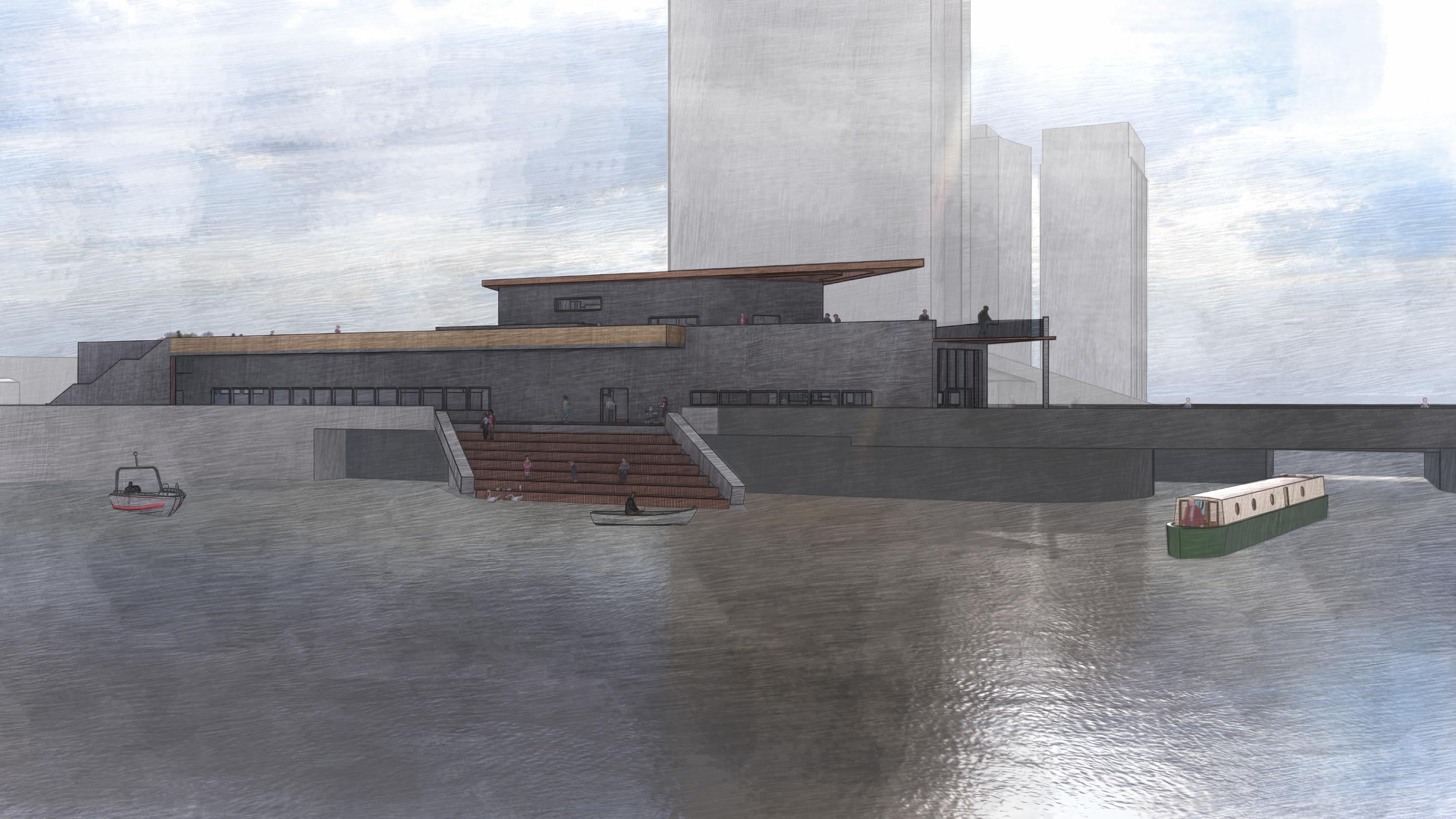
The ramp elevates people from the city level to the Deck itself which rewards them with some of the best views of the Liverpool waterfront. It is made up of three flights of stairs which face north and two connecting landings which together, create a meandering journey up. Throughout the entire ramp, larger steps stretch to each side which provide abundant seating space for visitors wanting to enjoy the views of Princes Dock and the three graces.
8


“Public” scenes
The upper row of public scenes are still shots of various locations in and around the building which are accessible by members of the public. The row below displays a scene for each floor of the buiding which is a unique part of the building’s programme.
“Programme” scenes


9
a. Approaching from the city
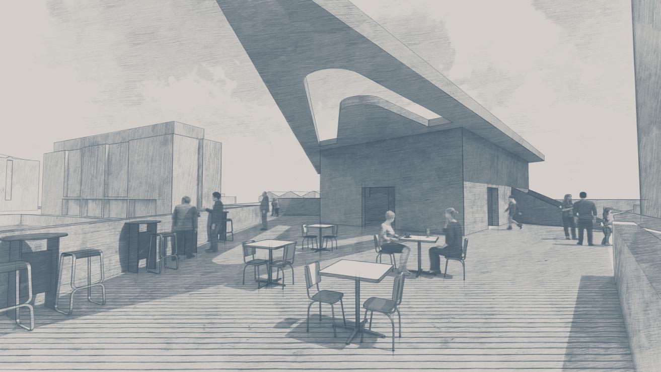
b. Open air cafeteria (first floor)
c. Public space (ground floor)
d. Atrium (ground floor)
f. Ground Floor -25m pool
e. Lower ground - Ice baths
g. Upper ground - Lazy river
h. Second Floor - Saunas
BA Level 6
Semester 1: Weather or Not
Gummer’s How Visitor Centre

10


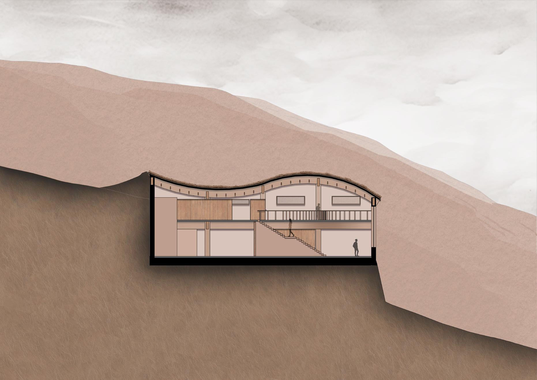
Inspired by the mountainous landscape around the site and throughout the Lake District, I decided to make the staircase a feature of the visitor centre. While the upper half appears normal and simple, from the landing moving down, they begin to curve to one side. In doing so they meander repeatedly, appearing like contours. They reiterate the significance of the steepness each visitor has overcome to reach the building.


For aesthetic reasons, the glulam structure was left exposed both on the building’s interior and exterior. It instantly draws attention to the sloping roof which in turn directs the visitor’s eyes down the hill to the breathtaking views.


Lighting

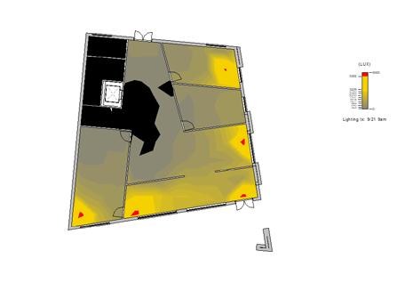
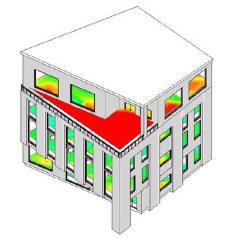
The initial model for the office building featured large windows which spanned up to 4m. Logically this resulted in the building being over-lit, due to its East and South faces bordering a street and therefore un-obstructed. The Illumination and Daylight Factor diagrams illustrate the excessive light being allowed into the building across all floors.


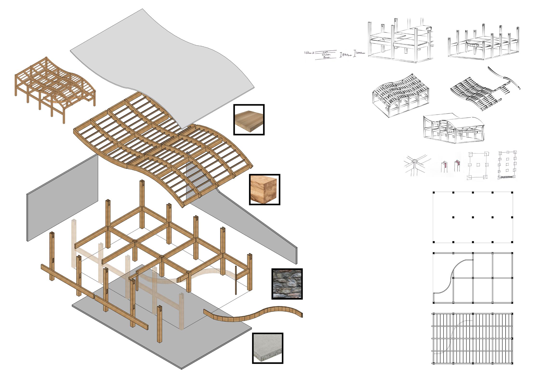
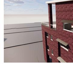
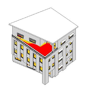
In order to reduce the Illuminance and Daylight factor readings, decided to insert window awnings. These will attach to the building’s exterior and extend outwards and downwards at an angle of 25°. The fixed awnings are located above the windows which allowed in the most light in order to help reduce the amount of sunlight that reaches the glazed surface without compromising the view. Horizontally mounted louvres were also inserted for the upper part of chosen windows on the first and third floor, which help reduce the amount of light entering the office.


To further reduce the illuminance and daylight factor, replaced the 2X3m windows on the South face of the First and Second floors with square 2X2m windows. kept the fixed awnings which proved to reduce the readings significantly on the East side, and proceeded to extending the roof. It now overhangs by 1m to the South, and by 0.75m on the other faces.


The desired Illuminance range is between 300-700LUX and the ideal Daylight Factor range is 2.5% to 5%. The final model is mostly in these desired ranges. To further develop this building and improve lighting conditions, would insert more louvres on the Southernmost corner of the third floor and NorthEastern corner of the second floor.


13
Initial
Improved
Final Lighting
Lighting Analysis
Lighting Analysis
Analysis
Ground Floor Plan 1:200 First Floor Plan 1:200 Second Floor Plan 1:200 Third Floor Plan 1:200 Structure North-facing Section 1:200 East-facing Section 1:200 South Elevation 1:200 East Elevation 1:200


