Keke, Tanya

Page 1

PORTFOLIO

INTERIOR ARCHITECTURE

2024
KEKE TANYA BA (HONS)

BA Level 6, Semester 2 Comprehensive Design Project

BA Level 6, Semester 1

Interior Re-modelling Project & Supporting Studies

BA Level 5, Semester 2 Explorative Project

BA Level 5, Semester 1

03

04

02 01 Adaptive Reuse

BA Level 4, Semester 2 A Place for Crafting

BA Level 4, Semester 1 Archifilm

06 05

PAGE CONTENTS
01
BA
COMPREHENSIVE DESIGN PROJECT
LEVEL 6, SEMESTER 2

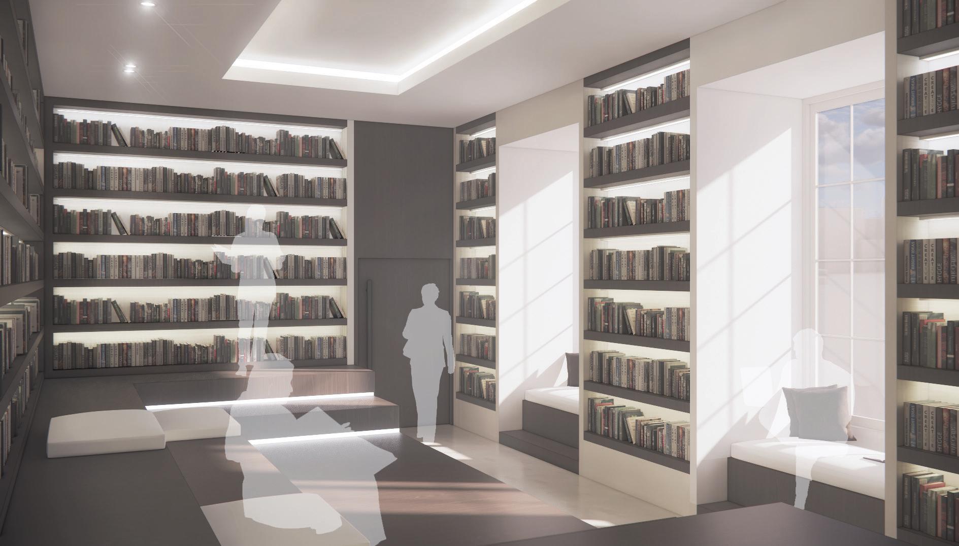
This project will explore a 24-hour hotel which gains inspiration from Greek mythology alongside drawing inspiration from meeting venues such as the Athenaeum Club as a group alongside Lyceum institutions as a debating forum, both current and historic, to essentially create a contemporary, modern version of this.

The overall outcome of this hotel design will aim to create a space for contemporary philosophers to gather amongst one another to enable debate and discussion. Knowledge is power. We should aspire to reach a level of intellectual, higher power.

Each facility within this design scheme, located across the basement level through to the first floor, will reflect those similar to The Lyceum, Liverpool and The Athenaeum Club, Liverpool. The sole purpose being to rebuild a space in which is intended to create a sense of community between those who aspire to reach a higher power of knowledge. This will be the foundation of the selection process for the hotel’s clientele.

Researching as well as analysing both current and historic Athenaeum and Lyceum institutions throughout the decades has effectively enabled the knowledge of constructing well crafted, functioning hotels, expressed through a captivating design. As we advance into modern day architecture, we should prioritise the function of this type of hospitality, alongside the development of what constitutes a ‘hotel’.

Only those who aspire to reach a higher level of education will attain the highest power of knowledge, uplifting themselves to a ‘god-like’ status which will differ from those members whose status will remain at a ‘mortal’ status.

How do we think within a space? How do we feel within a space? How do we act and interact within a space? A well constructed building design should hold the power to answer all of these questions from the second we cross the barrier from the outside world into this unique space. A home away from home.

06 Tanya Keke 2024 Portfolio PROJECT ANALYSIS
DESIGN BRIEF CONCEPT HIGHER POWER LEARNING EDUCATION DEBATE ENLIGHTENMENT PHILOSOPHY MEETING PLACE DISCUSSION COMMUNITY KNOWLEDGE CONNECTION COMMUNICATION

The brief for this project states that a design for a 24-hour hotel should be thoughtfully constructed to accommodate its desired clientele which. Furthermore this project aims to explore the context, history and design refurbishment of the former NatWest Bank Building, otherwise known as National Westminster Bank).

Located on Castle Street, the Grade II listed building is composed of essentially two buildings, divided by a single party wall of approximately 150cm. Currently, the smaller body of the building of the former bank, on the left hand side, host’s a restaurant, Pho, on the ground level while the upper floor and larger body of the building remains unoccupied
Tanya Keke 2024 Portfolio 07 SITE
NATWEST BUILDING SITE THE ATHENAEUM CLUB THE LYCEUM

• WC - Male

• DDA WC

• Conference Room (2)

• Central Library

• Coffee Room

• Storage

• WC - Female

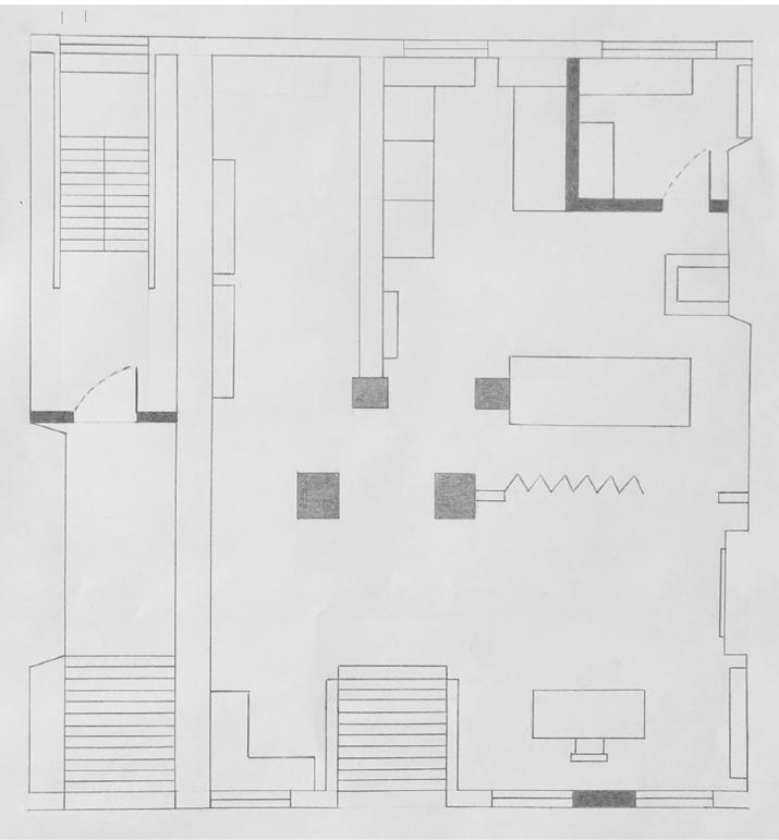
08 Tanya Keke 2024 Portfolio DESIGN LAYOUT | FLOOR PLAN
BASEMENT
10m

• Lobby

• DDA WC (2)

• WC - Male

• WC - Female

• Bookstore

• Central Library

• Restaurant & Bar

• Kitchen

• Reception

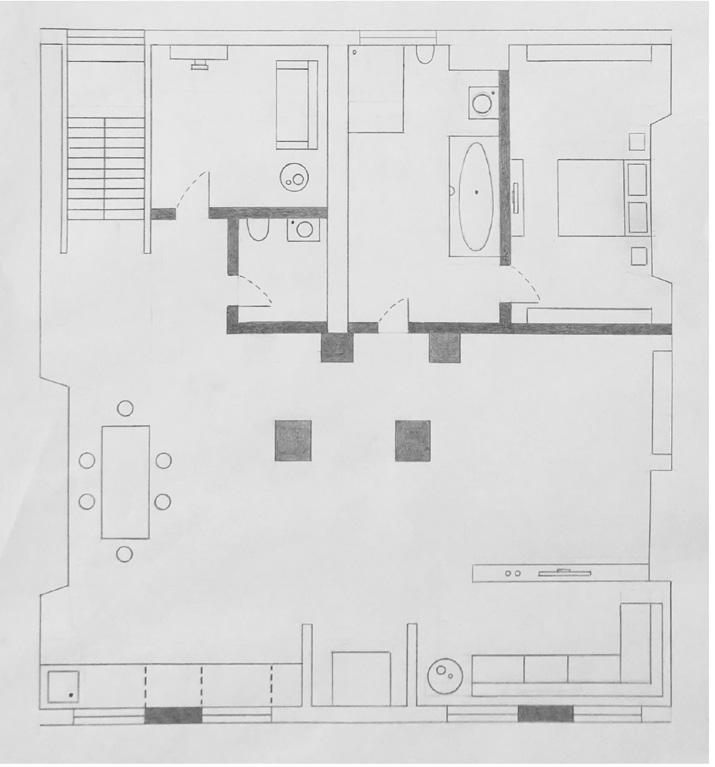
2024 Portfolio Tanya Keke 09 DESIGN LAYOUT | FLOOR PLAN
GROUND FLOOR
10m

• Private Room (2)

• Central Library

• Balcony Pod (4)

• Library

10 Tanya Keke 2024 Portfolio DESIGN LAYOUT | FLOOR PLAN
MEZZANINE 10m

• Bedroom | Standard (6)

• Bedroom | Wheelchair Accessible

• Reading Area

• Laundry Room

• Courtyard

2024 Portfolio Tanya Keke 11 DESIGN LAYOUT | FLOOR PLAN
10m
FIRST FLOOR
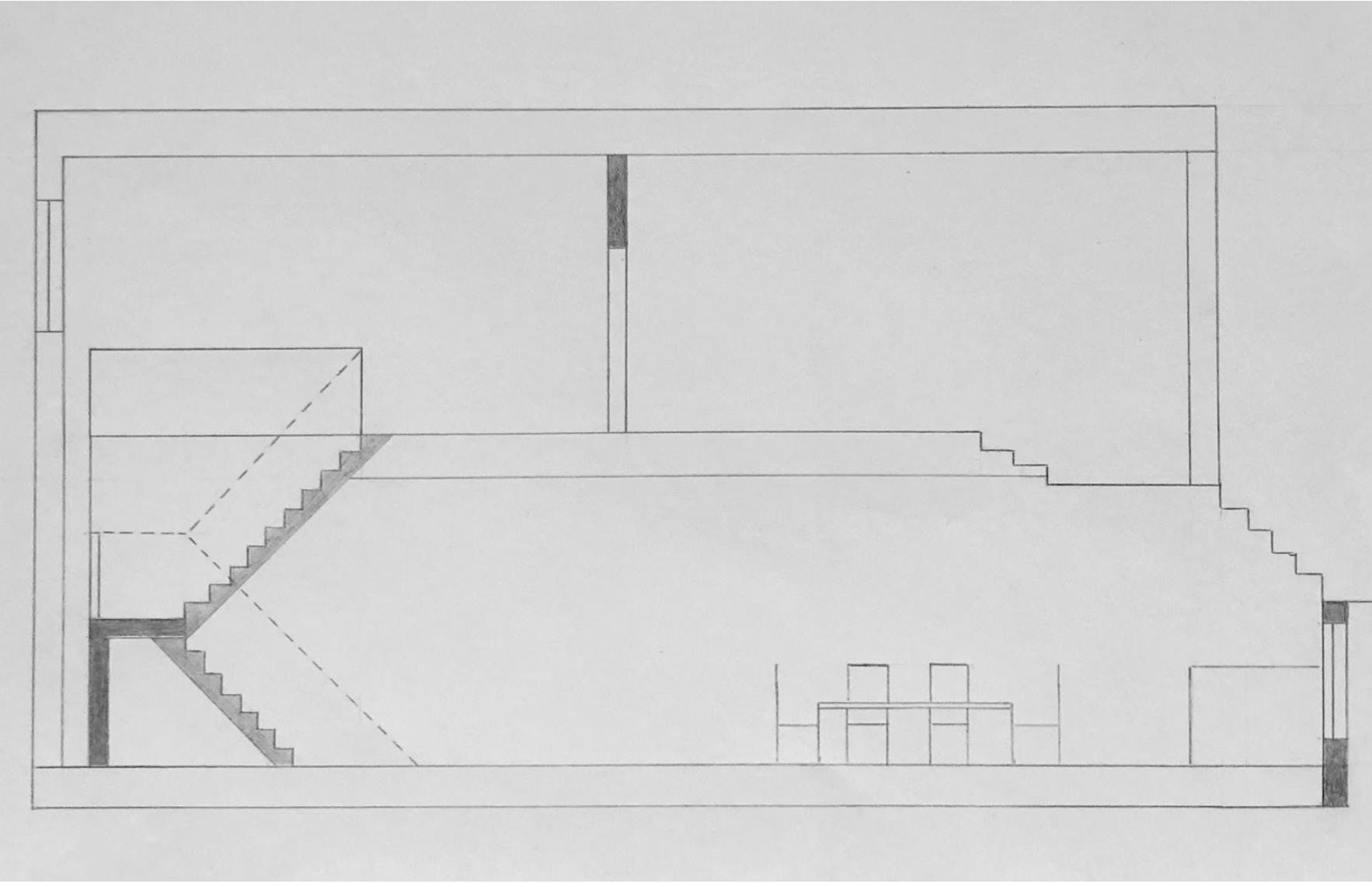
12 Tanya Keke 2024 Portfolio DESIGN LAYOUT | SECTION
2024 Portfolio Tanya Keke 13
14 Tanya Keke 2024 Portfolio DESIGN LAYOUT | SECTION
2024 Portfolio Tanya Keke 15

TIMBER

22mm timber planks used as this would mirror the circular shape of this feature. Using standard wood would prevent the inner structure to curve in the way that is desired.

Timber sub-frame is shot fired into steel column

STRUCTURE COLUMNS

x 75mm structure columns

STEEL COLUMN

254mm x 254mm steel column for main structural support

PLYWOOD

15mm plywood

SFS

150mm x 75mm SFS placed around the structure in 600mm intervals. SFS on a curved steel base on the ground floor and basement

16 Tanya Keke 2024 Portfolio Tanya Keke 2024 Portfolio 16 DETAIL | STRUCTURE
250mm
5 9 1 4 8 11 10 1 4 5 3 2 3 2 1 5 4 MARBLE 3Omm thick marble 8 LIGHT CAVITY Diffusion
light distribution CEMENT BOARD 20mm thick cement board LED LIGHTING 9 10 11 1m
space for even
2024 Portfolio Tanya Keke 17
| STRUCTURE
DETAIL

PLYWOOD

15mm plywood, at a height of 1000mm

PLASTERBOARD

15mm plasterboard, at a height of 1000mm.

BATTEN

x 50mm steel battens bolted to plywood

TIMBER

22mm timber planks mounted onto plywood, at a height of 1100mm.

120mm x 200mm ‘C’ shaped steelwork which mimics the shape of the staircase

PLYWOOD

15mm plywood ‘wrapped’ around the handrail, extending down to each stair

PLASTERBOARD

15mm plasterboard ‘wrapped’ around the exterior of the handrail, extending to each stair

18 First Name Surname 2020 Portfolio DETAIL | HANDRAIL & STAIRCASE
PFC STEELWORK
6 7 5 7 6 5 2 3 4 1 1 2 3 4
75mm

TIMBER PLUG

10mm diameter hole drilled through to plywood, fixed with lost head screws

Timber plug is unlikely to be noticed after the process of sanding down the timber, as sawdust would essentially fill the plug.

TIMBER

PLYWOOD

15mm plywood cover

BATTEN

75mm x 50mm steel battens bolted to plywood

PLASTERBOARD

15mm plasterboard

2024 Portfolio Tanya Keke 19
| HANDRAIL & STAIRCASE
DETAIL
22mm timber 12 10 11 9 10 8 9 10 9 10 11 8 12 1m
20 Tanya Keke 2024 Portfolio VISUAL
2024 Portfolio Tanya Keke 21
22 Tanya Keke 2024 Portfolio VISUAL
2024 Portfolio Tanya Keke 23
24 Tanya Keke 2024 Portfolio VISUAL
2024 Portfolio Tanya Keke 25 VISUAL
26 Tanya Keke 2024 Portfolio VISUAL
Tanya Keke 2024 Portfolio 27 VISUAL
28 Tanya Keke 2024 Portfolio VISUAL
Tanya Keke 2024 Portfolio 29 VISUAL
30 Tanya Keke 2024 Portfolio VISUAL
Tanya Keke 2024 Portfolio 31 VISUAL
02
SEMESTER
INTERIOR RE-MODELLING PROJECT & SUPPORTING STUDIES BA LEVEL 6,
1

Digital webform is a web-based, intellectual product group that emerged in the early millennial years. Within a decade, the company consolidated their international reputation in Paris and Japan and are now looking to expand their sites in England, specifically in the city of Liverpool. The Bank of England on Castle Street, Liverpool is proposed to be the designated building which will act as a host for Digital Webform during the next decade.

The product of manufacture for the company’s Liverpool branch will focus on large scale artificial light installations Digital Webform and the building in use will manage the development, production and sales for each product.

This project will focus on how we can use blended lighting throughout a workplace design while acknowledging the psychological and physiological impacts of light on the human body and how lighting design in the workplace can influence our performance and well being.

We will often be exposed to both natural daylight and artificial light throughout our daily routines. It is therefore important that we are able to find a balance between these two sources of light as they are both essential to the design of a work environment.

The use of blended lighting links well to my concept as I plan to incorporate both types of light sources into this design during opposing times in the day. During daylight hours the design should be simple in its minimalism, prioritising maximum entry of natural light into the building. Once natural light is at its lowest potential, the building should transform into a lighting exhibition illuminated by artificial light.

The product of manufacture will be artificial light installations, of a large scale. To ensure high quality products, it is crucial that employees within this work environment are regularly exposed to the required amount of sunlight on a daily basis.

34 Tanya Keke 2024 Portfolio PROJECT ANALYSIS
BRIEF
DESIGN
CONCEPT

Located on Castle Street, Liverpool, the official opening of the Bank of England Liverpool Branch occurred during the year of 1827, which was then later declared a grade I listed building in 1985. Following closure in 1986, the former Bank of England building remains unoccupied and available for lease. BANK OF

The ‘River of Light’ festival is an outdoor illumination of light, consisting of various large scale artificial light installations. This live art gallery runs along Liverpool Waterfront following a two kilometre, self guided trail. Here, I have outlined the trail for ‘River of Light 2023’

2024 Portfolio Tanya Keke 35 SITE
ENGLAND

• Office (4)

• Meeting Room (2)

• Canteen

• Break Room

• DDA WC

• WC Male

• WC Female

FLOOR

• Reception

• Cafe

• Lounge

• Digital Art Gallery

• Product Display

FLOOR

36 Tanya Keke 2024 Portfolio
LAYOUT | FLOOR PLAN
DESIGN
FIRST
GROUND
BASEMENT | BULLION YARD
2024 Portfolio Tanya Keke 37 DESIGN LAYOUT | SECTION

This side view elevation from Cook Street shows the renovated extension towards the back of the building, which was once simply a flat roof above the bullion yard. This extension runs from the edge of the building, through to the ground and first floor. Extending the first floor has proven well as this alongside the ground floor as they now commence a similar halt, in which the bullion yard begins.

The main focal point of the design is the light installation which runs central through each floor. The surrounding areas of this light source are intended to have a relaxing and calming nature about them. This includes the lounge on the ground floor and either side of the partition created on the first floor.

38 Tanya Keke 2024 Portfolio DESIGN LAYOUT | ELEVATION & SECTION
2024 Portfolio Tanya Keke 39 DETAIL DETAIL 1 DETAIL 2 DETAIL 3 1. Custom Made Box Section | Stainless Steel 2.
| Stainless Steel 3.
Wall 4.
| Concrete 5.
|
2.
|
3.
1.
|
2.
3. Laminated Toughened Glass 4. Custom Made Box Section | Stainless Steel DETAIL 3 Exposed Steel Framing DETAIL 2 Handrail DETAIL 1 Light Installation 3 2 1 1 2 3 4 5 3 4 1 2
Frame
Existing
Flooring
False Ceiling 1. Custom Made Box Section
Stainless Steel
Wire Cable
Steel
Light Installation
Custom Made Handrail
Stainless Steel
Bolts
40 Tanya Keke 2024 Portfolio VISUAL
2024 Portfolio Tanya Keke 41 VISUAL
42 Tanya Keke 2024 Portfolio VISUAL
2024 Portfolio Tanya Keke 43 VISUAL
44 First Name Surname 2020 Portfolio

BA LEVEL 5, SEMESTER 2

2020 Portfolio First Name Surname 45 03 EXPLORATIVE PROJECT

For this project, the brief states that the aim of the programme is to select and research an avant garde fashion designer and the fashion design industry in order to design a retail fashion/ performance space around your interpretation of his / her personality and work. Further to this, the brief states that we are required to design a retail / performance outlet which consists of a retail showcase shop / performance space capable of hosting catwalk shows and promotional events associated with the fashion house.

Fashion is a high profile commercial business, as such the designed interior should relate to and promote the ethos of the fashion brand. The fashion designer that I have selected to focus on throughout this project is Alexander Mcqueen. For this project, I plan to research and analyse Alexander Mcqueen, specifically one of his famous fashion collections. The fashion collection of which will be the foundation of my design is the Alexander Mcqueen Spring/Summer of 2022.

My aim for this project was to design a multifunctional fashion/performance space which accommodates a fashion exhibition alongside a retail department for users to be able to have a personal shopping experience. Alexander Mcqueen’s collections often incorporate natural elements throughout each design which took their forms and raw materials from the natural world in a creative and artistic way. Throughout the interior of this exhibition, I wanted to create a contrast between the natural and the unnatural, all while keeping Mcqueen’s philosophy alive and evident within this space.

A transition from light to dark will be evident within my design by placing lighter/brighter designs in close proximity to the main entrance of the exhibition, gradually placing darker designs towards the back of the exhibition as users move through the building.

Stairs should flow throughout the space, along the floors as well as up the walls and through the ceiling to create an unusual and unnatural interior which should contrast well with the natural designs of the collection. Creating a minimal interior to accompany the dramatised staircases running throughout the floors could be interpreted as if one was walking through ‘clouds’, similar to “A show in the sky” which was used to describe the Alexander Mcqueen Spring/Summer 2022 fashion show.

46 Tanya Keke 2024 Portfolio PROJECT ANALYSIS
DESIGN BRIEF CONCEPT

The building of which will be refurbished for this fashion exhibition/performance space will be the New Zealand House, situated in Liverpool. Currently, the ground floor of this building is occupied by a sports bar, however for this project, we should focus on the ground floor of the building which has a mezzanine level incorporated into the layout.

2024 Portfolio Tanya Keke 47 SITE
NEW ZEALAND HOUSE
48 Tanya Keke 2024 Portfolio
LAYOUT | ELEVATION REAR ELEVATION
DESIGN
SIDE ELEVATION FRONT ELEVATION

• Retail Department

• Fitting Room (2)

• Storage MEZZANINE

• Fashion Exhibition

• WC - Female

• WC - Male

• DDA WC (2) GROUND FLOOR

2024 Portfolio Tanya Keke 49 DESIGN LAYOUT | FLOOR PLAN
50 First Name Surname 2020 Portfolio
2020 Portfolio First Name Surname 51 04
REUSE
SEMESTER
ADAPTIVE
BA LEVEL 5,
1

PROJECT

As I am planning for this venue to occupy multiple acts simultaneously, I will need to consider the following spaces within my design to accommodate each act before they take to the stage as well as after. The Moth Club provides a lounge area and a green room in a smaller space located upstairs. The green room is designated for the multiple acts who perform through the week. I have taken this idea into consideration and I plan to create designated practice rooms and green rooms therefore, my design will require these spaces throughout the venue. The main aim for this design proposal is to restore this once famous building to its full potential by renovating and modernising the building to create a trendy new multifunctional live music venue.

I believe that the Williamsburg Hall of Music and the Moth Club are two exceptional precedent studies that demonstrate the direction in which I want to take my design.

The Moth Club programmes a wide variety of music genres throughout the week such as pop music, soul music, house music to 70s & 80s disco music. Taking inspiration from this, I will aim to create a relaxed and enjoyable environment where people can experience a variety of styles each night from amateur and upcoming artists. A wide variety of genres will be encouraged to join this community each week such as jazz, pop, rock and rhythm and blues. Although bands will be permitted, they may have to be limited in size as the space of the venue is limited itself.

The Williamsburg Hall of Music is a tri-level versatile venue which is perfect for hosting various special events such as weddings, corporate events or holiday parties, meetings or product launches and tv/movie shoots. The Moth Club are also known for hosting a variety of events such as stand-up comedy performances and bingo nights, cabaret, karaoke and interactive film screenings. As I am creating a multifunctional venue, I would also encourage other events to take place in my design such as burlesque and possibly comedy acts as well as live music. These acts will also take place on the same stage as the live musicians. This is taking inspiration from the Williamsburg Hall of Music.

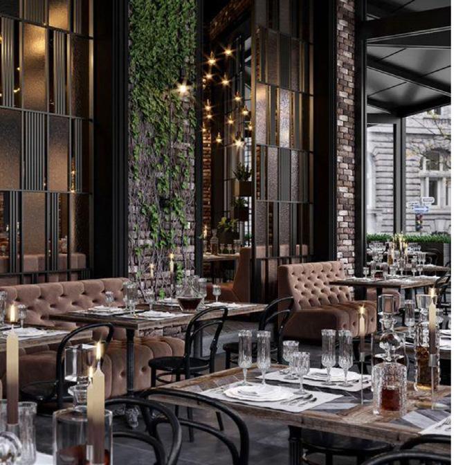
In regards to interior design, the Moth Club definitely conforms to a very retro and dated aesthetic however, I admire the unique and chic aesthetic in which the Williamsburg Hall of Music conforms to. I feel that this interior design works well for this venue as it creates a sense of sophistication within a trendy and fashionable environment. There is also a small amount of exposed structure throughout the Williamsburg Hall of Music which gives it an industrial element. I will take inspiration from this and aim to create a relaxed environment with a chic and trendy interior design.

52 Tanya Keke 2024 Portfolio
ANALYSIS
CONCEPT
DESIGN

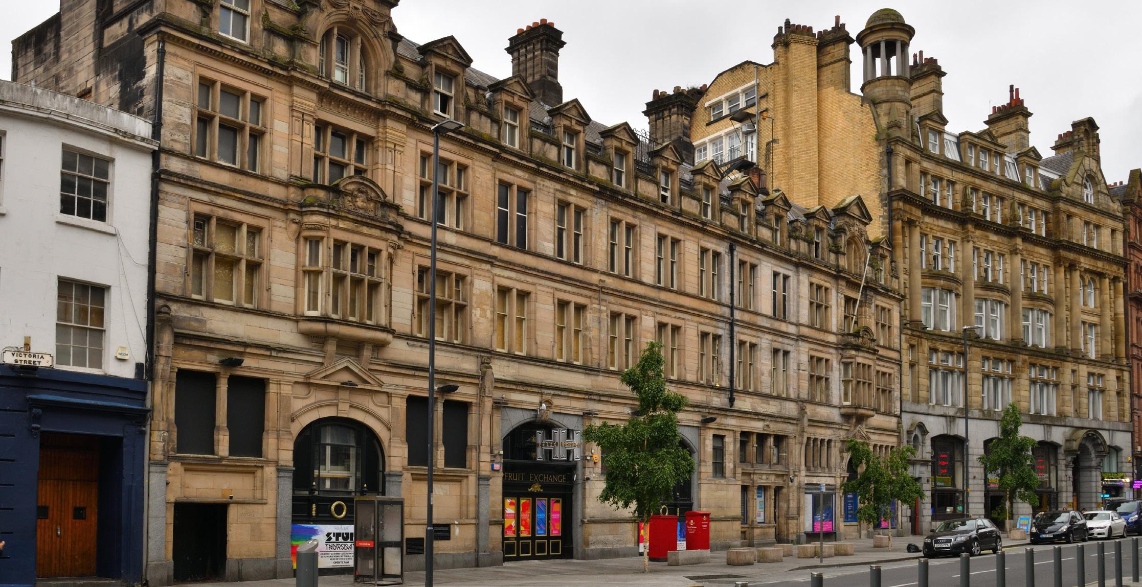
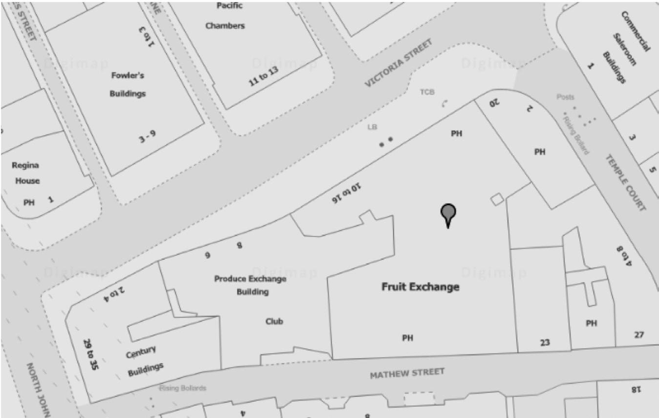
Fruit Exchange can be located in Victoria Street in the city centre of Liverpool. The building itself has a large interior area, however the rooms are quite irregular in shape and are therefore not ideal for standard use to buyers.

In 1992 the building was put up for sale for either refurbishment or demolishment. It was marketed as a prime location in Liverpool city centre as Victoria Street is at the forefront of the building and Mathew Street is directly behind the building. The fourstorey building has been vacant for many years, excluding the ground floor which has been serving as a pub and the well known LGBT Heaven nightclub in recent years.

2024 Portfolio Tanya Keke 53 SITE
FRUIT EXCHANGE

• Bar

• Seating Area

54 Tanya Keke 2024 Portfolio
FIRST FLOOR DESIGN LAYOUT | FLOOR PLAN
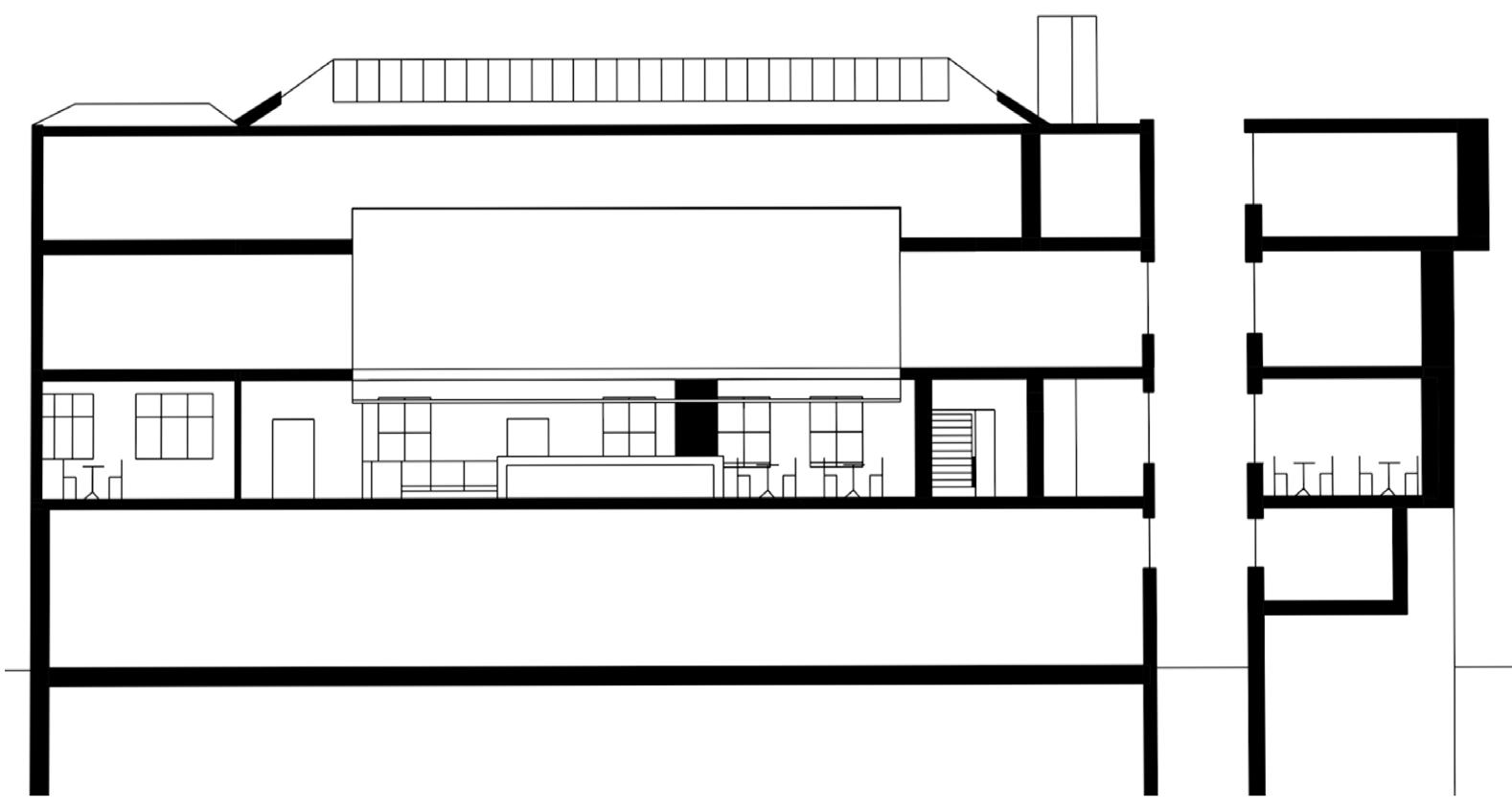
2024 Portfolio Tanya Keke 55 DESIGN LAYOUT | SECTION
05 A
CRAFTING BA
SEMESTER
PLACE FOR
LEVEL 4,
2

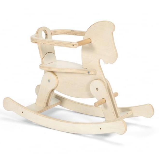
The building I had chosen to develop was Duke Street which is located in Liverpool. I had designed my building with a workshop on the ground floor, specifically for crafting rocking horses, and a living area in the basement to accommodate two residents. During the process of researching the history and origins of rocking horses alongside the assembly and crafting process which I feel has allowed me to gain a deeper understanding of the craft and this has led me to develop an area in which I can produce my chosen craft.

Rocking horse’s are essentially a child’s toy which is shaped like a horse and mounted on rockers or springs, similar to a rocking chair. The toy works when the child sits on the horse and begins to rock backwards and forwards. The gentle rocking motion of the horse is very soothing and comforting to children. The rocking horse has many beneficial qualities such as the improvement of gross motor skills. Gross motor skills involve the big muscles of the body such as the arms and legs, and therefore, by learning new push and pull motions they begin working their upper body muscles and lower body muscles. They also benefit from developing balance and coordination. Rocking horses nowadays come in many shapes and sizes. This is also dependent on the age of the child usings the toy. All rocking horses are made in a way that is safe for all ages, however a rocking horse for older toddlers and preschoolers is slightly different to rocking horses for infants which host padded seats and security straps.

58 Tanya Keke 2024 Portfolio PROJECT ANALYSIS
CONCEPT

• Workshop

• Painting Room

• Storage GROUND FLOOR

SECTION

• Dining Area

• Bedroom

• Office

• Living Room

• Kitchen

• Bathroom

• WC BASEMENT

2024 Portfolio Tanya Keke 59
FLOOR
SECTION
DESIGN LAYOUT |
PLAN &
60 Tanya Keke 2024 Portfolio MODEL | ROCKING HORSE
2020 Portfolio First Name Surname 61 MODEL | ROCKING HORSE
62 First Name Surname 2020 Portfolio
2020 Portfolio First Name Surname 63 06 ARCHIFILM BA LEVEL 4, SEMESTER 1

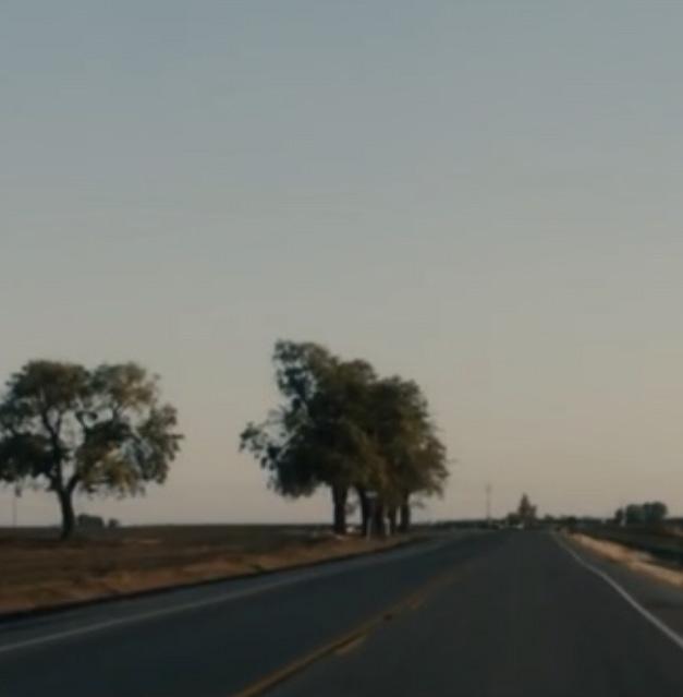
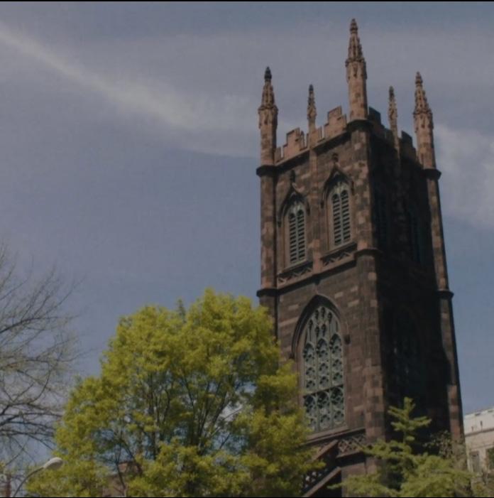
After watching the film ‘Lady Bird’ by Greta Gerwig, 2017, I then selected various scenes throughout the film which I thought had architectural significance which I then proceeded to sketch as a short story board. Subsequently, I had found myself drawn to the sketch of the bridge in comparison to the other sketches. This sketch then became the primary influence of the following project.

One of the main storylines throughout the film is the conflict between a mother and daughter with themes, in my opinion, of opposing sides, contrasting elements and conflict vs resolution. I had also noticed the mother and daughter’s relationship frequently alternating their positive and negative emotions and their roles in the relationship. These would include love and hate, up and down, calm and dramatic, warm and cold. This story line inspired me to design a ‘tunnel’ like building in the middle of the bridge that would create a ‘meeting point’ where both sides would be able to join together a a neutral point of resolution

The gates at either end of the bridge represent the conflict between both sides. The bridge itself would represent the resolution and coming together of both sides. Finally, the benches inside the ‘tunnel’ represent communication.

64 Tanya Keke 2024 Portfolio PROJECT ANALYSIS
CONCEPT
2024 Portfolio Tanya Keke 65 SITE
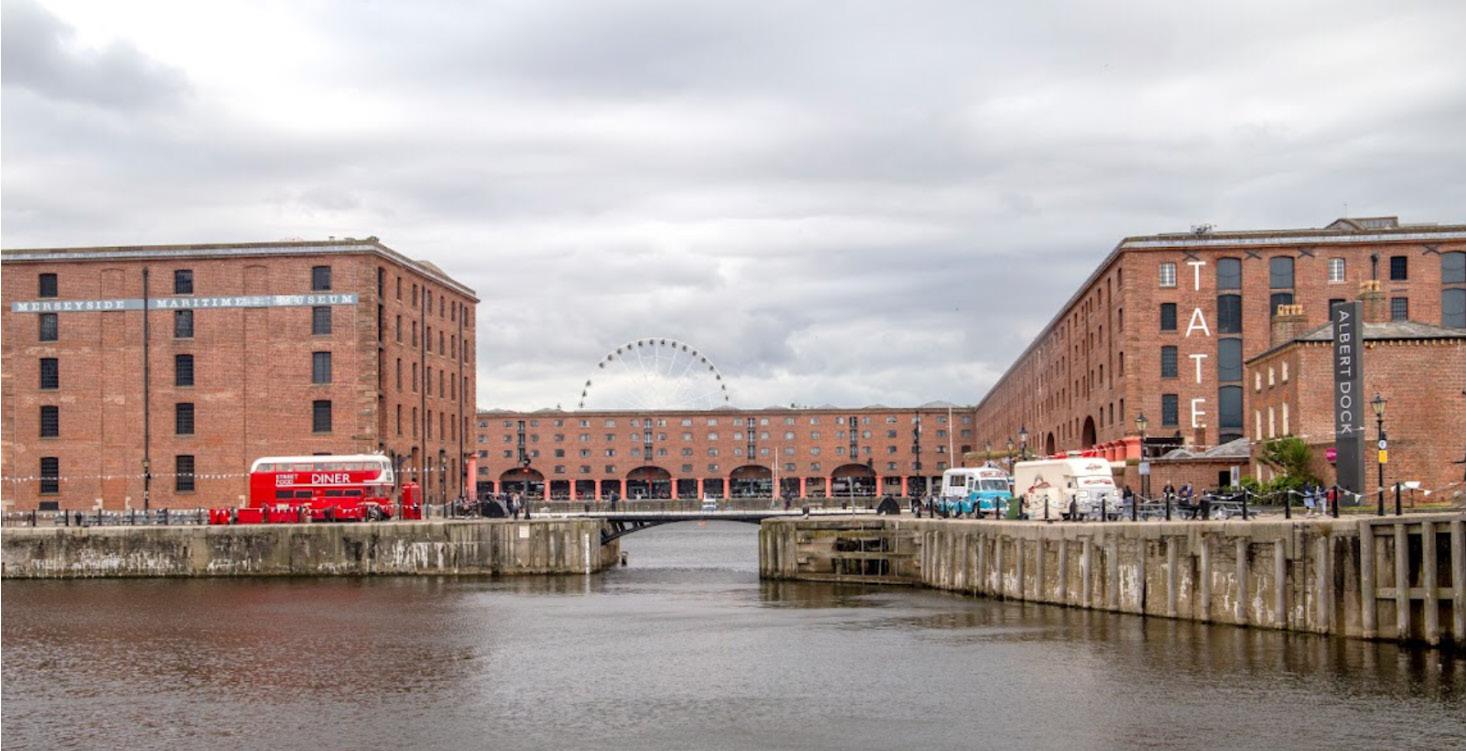
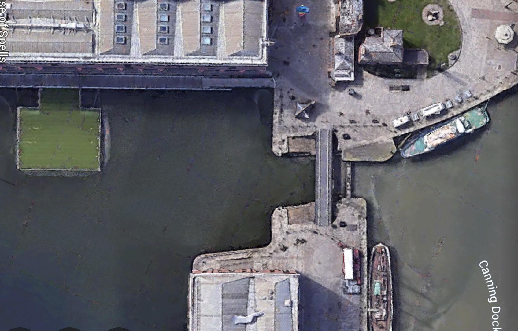
The Albert Dock bridge, located in Liverpool, should host the final design of this project. ALBERT DOCK
66 Tanya Keke 2024 Portfolio ARCHIFILM | SCENE
2024 Portfolio Tanya Keke 67 ARCHIFILM | SCENE

PORTFOLIO

68 First Name Surname 2020 Portfolio
2024
KEKE TANYA BA (HONS) INTERIOR ARCHITECTURE

Turn static files into dynamic content formats.

Create a flipbook
Issuu converts static files into: digital portfolios, online yearbooks, online catalogs, digital photo albums and more. Sign up and create your flipbook.