


thanks to: Alan Summers / Andrew Hooper / Bernadine Murray Chris Bebbington / Chris Millward / Cian Quayle Clare Dickens / Danny Sandford / David Raffo Delphine Wilson / Drew West / Gareth Price / Greg Fuller Hannah Thomas / Janey Deng Klingelfuss / Jeremy Turner Kevin Furlong / Lynne Bell / Lynne Connolly Maggie Jackson / Maxine Bristow / Paula Johnson Rebecca Falcon / Sarah Connor / Simon Grennan Simon Owen / Simon Winter / Stephen Clarke Steve Carrick / Tabitha Jussa / Tim Daly / Tom Hignett Tom McGuirk / Tracey Hall / Tracy Piper-Wright Catalogue Branding designed by: Jess Bickley / Liv Buckley / Kim Roberts / Emma Hughes / Izzy Warburton


fashion marketing &
& communication
singleartfinehonours&combined honours


• This body of work has been left untitled. It was created under oppressive conditions using an uncomplicated approach and basic techniques. Whilst being a vibrant character, I chose to allow my work to speak for itself without my personality feeding into the final compositions. I followed in the footsteps of many famous (and some infamous) women trying to empower themselves through their bodies. This informed my exhibition to send a message to those struggling with their self-confidence and body types that we are all beautiful.
I have found myself finding beauty in everything during and after this project and I hope that my audience can walk away feeling beautiful and proud to have the bodies they do.
magdalena addis Fine art & EDUCATION studies magdaaddis14@gmail.com

IDA andskar fine art & graphic design • ida.a@live.se • idaandskar.com
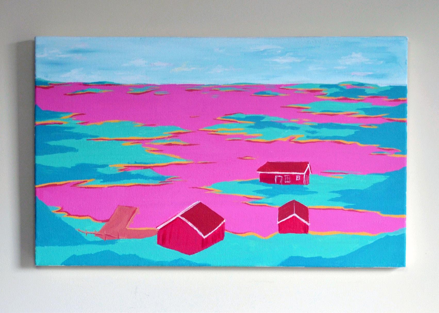
During my three years of university, I have worked on projects revolving aroundenvironmental questions. A subject I not only find very interesting but one that is important.Most of us are aware of the worldwide problems that our planet is facing, but there are sidesof the issue that don’t get enough attention. The series of abstract landscape art I have painted represent something that I always helddear, the Stockholm Archipelago, Skärgård. At first glance a beautiful scenery out at sea withthousands of islands that decorate it. Yet behind the beautiful view lies one of the mostpolluted seas. I have represented this by outlining the beauty of the organic landscape usingcolour that does not Evenbelong.themost beautiful landscape hides a side that we have destroyed, that can yet berestored.
mark ashcroftFineart I love imperfections. A real painting with imperfections on an uneven surface is a true painting. Here I am; accept me who I am trying to be, a painting, not a photograph.Iamreal.

a painting style that depicts both abstraction and representation in the same piece of work. I have used the portrait as a starting point for me to then explore ways in which this could be distorted or shifted into an image that becomes abstracted but at the same time shows elements of representation and figuration.
elliot BAMford fine art • ebamford94@gmail.com • ebamford94.wixsite.com/elliotbamfordart • universityOverinstagram.com/@elliotbamford_artthecourseofmyfinalyearatIhavebeencomingupwith
Taking inspiration from the likes of Francis Bacon and more recent artists such as Wyatt Mills I have tried to use these influences to come up with artwork that best represents my style and where I’d want it to go in years to come. I have now found a way of working that suits me and will allow to further explore my visual language.

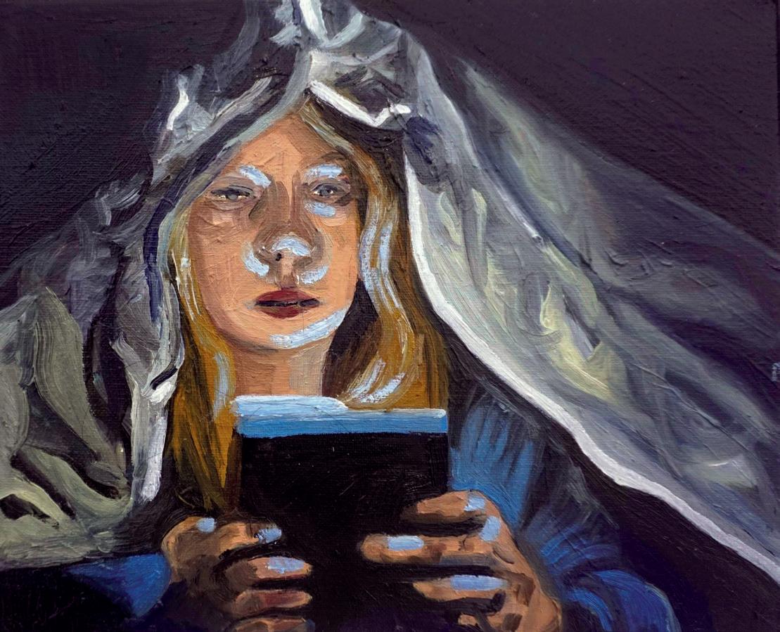
My recent practice has visually explored how artificial blue light from devices such as laptops and mobile phones illuminate the face when in a dark room. My subjects tend to be lit by this single light source; I use a dark background to try and show how lighting can dramatically change the reflections and shadows on the face. My subject matter is therefore familiar in our contemporary world. I am however inspired by art history, particularly early Renaissance paintings and my fascination with the technique of chiaroscuro, the dramatic effect of contrasting light and shadow. I have chosen to work with oil paints to mirror traditional techniques within this contemporary framework.
holly cunliffe Fine art & Photography hollysophiaart@gmail.com • facebook.com/ @hollysophiaart • instagram.com/@hollysophiaart •
Laura De Longa fine art & Graphic Design • lauraloveartist@gmail.com • lauraloveartist.co.uk • instagram.com/lauraloveartist
The journey to finalise my finished piece for the exhibition was long. It took me a while to find my creative flow, and zone in on what I wanted to use as my subject. The lightbulb moment came as I woke from slumber, a random thought came that I should work on Cancel Culture. During my research on cancel culture, I decided to work with famous icons, such as Miss Piggy and Mr Potato Head, who have been cancelled due to their prefixes and behaviour. Not being real human beings but toys and puppets, made the cancelling even more preposterous.
The painting signifies the removal and distortion of time and ideas, with blurred lines of what was then and is now. Miss Piggy and Mr Potato Head will always exist, and their personalities and traits should always remain with them, and not be erased.

danielle Finefinchart danielle.mfinch1@gmail.com • Perfectionism is typically regarded as a good trait; however, the negative mental and physical effects expose the critical inner voice of a perfectionist’s struggle to constantly present as perfect, internalised within their core, linked to their worth.
Through an exploration of the female gender, the expectations and idealisation women must navigate led me to explore motherhood’s link to female roles within society. My work developed from capturing how to be the perfect mother in today’s patriarchy via the juxtaposition of fertility and birth, towards textile structures which explore the tension of perfect and imperfect. Through exploring my gender via the perfect mother ideal, I came to realise I had unconsciously been navigating my own need to be perfect, the manipulation of fabric in repetitive, organised patterns, against organic, uneven surfaces, a metaphor for perfect and imperfect and the tension of accepting imperfection as a perfectionist.

lois garnett fine art & EDUCATION Studies • loislolo2000@gmail.com • 19091046.wixsite.com/myprofessionalpracti • instagram.com/@lois.garnettvpe @loisgarnett
My work shown in this degree show is informed by the art movements Minimalism and Pattern and Decoration. Whilst the work can promote a number of different interpretations, I employ a confident, colourful, and responsive approach to catch the viewer’s attention. When studying in my third and final undergraduate year, I had aspirations to become an art therapist. I’ve put that on hold to take up the role of the next Vice President of Education for the University of Chester’s Student Union. I will of course always remain a creative practitioner with my work a dialogue between the viewer and myself.

eloise johnsonFineart I left out the face so you don’t know if it is me.

britany jones Fine art & Graphic Design • britanyrjonesfineartist@gmail.com • instagram.com/ britany.r.jones_fine_artist Adding and subtracting sand and acrylic in layers I painted a replantation of an excavation, my project was heavily based on the process of an archaeology, Excavations and rediscovery. Making links between archaeologist during and their Excavation and myself while making my supporting and final works for this project.

nia jonesfineart niameganjones@hotmail.com • instagram.com/niajonesartworkBlue.•


alice love Fine art Our view of flowers can be subjective, but they are great for all occasions. I made them a focus within my painting practice as they tend to make people happy. I wanted the same reaction to happen when people saw my However,paintings.Ihad unintentionally created darker images with a brightened contrast leading to a more sombre reading of the work. Accepting this position I continued with the colour scheme and tonal values, whilst gradually adapting and altering the style in which I painted. An increasingly abstract approach was a successful choice as I found a perfect balance to play with the familiar and recognisable attributes of flowers within a two dimensional semi-abstract painting practice.

elise lynn Fine art & spanish studies e.c.lynn@outlook.com • I work with accessible and utilitarian objects and materials, across all mediums, but predominantly in sculpture and installation. Central to my work is the interrogation of process, presence, and labour, with an importance placed on the embodiment of action. This specific body of work centres on a ball of string as a vessel for process; it is a tool of both measurement and mapping, but also a tool for isolating a space or an object from its environment. The work intends to convey and evidence our presence in the objects and spaces around us, how we disrupt and subvert those spaces, raising up those actions and impacts as works of art. The ball of string operating as an object that evidences time and process examines the idea that our objects hold our stories and that these objects, and our impacts on the spaces around us, will become our legacy.

Most of my works are true to reality and are reflections of such observations. While sometimes these are portrayed metaphorically, I tend to not over-explain my works and sometimes exhibit without any description of the piece to let the audience engage with the works themselves. I believe that each person has a unique mind, memories, and knowledge and, therefore, can have their dialogue with my works separate from my own. When someone interacts with my art, I would like them to think of their interpretation of the work rather than place my words into their minds
nataliia marchuk Fine art • nataliamarchant@gmail.com • nataliamarchant.com • withThroughoutinstagram.com/@natalia_march_artmypractice,Iexperimentavarietyofmediums.Iliketouse my observation of the world and people around me to project into my art.

• Colour and contrast are central to my practice. I use strong colours in some paintings and mix contrasting patterns in others to give my work a contemporary expressionist sense which challenges traditional artistic ideas. I have always been interested in contemporary abstract expressionism, especially by the use of colour, gestural marks, subjectivity, and subliminal meaning in art. I find these really broaden the mind to deeper understandings of art. I am enthusiastic about creation and process and want to embody expressionist ideas of conveying inner emotions.
scarlett o'connorFineart scarlettioc@icloud.com

nia EDUCATIONrobinsonStudies& Fine art • niarobins301@gmail.com • linkedin.com/in/niaellen •
Madeinstagram.com/@robins.enduringaperiodofself-exploration, the ‘Backwards in Coming Forwards’ collection incorporates repetitive techniques within an overarching minimalist aesthetic. In many instances, I self-accused myself of working within my comfort zone too often, and so I felt the need to add a visual foil to the repeated units I gravitated towards. I attempted to distance myself from what I saw as creative stagnation through incorporating new concepts, specifically ‘contemporary nostalgia’, an idea informed by the mass-produced toys I grew up with at the start of the third millennia. This idea features heavily in the collection exhibited in this catalogue and the 2022 CASC degree show. Towards the end of the academic year, I began viewing my artistic comfort zone more favourably. Repetitive art-making has long been a meditative process within my personal and professional life. Since then, I’ve become a firm believer that there are opportunities for creative growth by being Backwards in Coming Forwards.

Nowadays, people can make high quality portraits with a simple mobile phone. I believe traditional portrait painting should not become a lost art, yet simultaneously we should acknowledge the new ways people can create art with a camera. In my practice, I combine both approaches.
Using gel lights, I created colourful portrait references and experimented with how the lighting meets the skin. I wanted my models to recreate classical poses so that the compositions looked timeless except for the acidic colours. With these references, I created realistic portraits with oil paints. I also made visible the skill of painting and the points where technology is limited. Leaving areas of the painting untouched or unfinished is something a camera cannot do. Yet, for my art, the oil paints and camera worked together to create a new approach to portraiture.
maria schmidt english literature & fine art marianataportraits@gmail.com • marianatalieschmid.wixsite.com/website • instagram.com/marianataportraits •

rafaella theofanous Fine art • Mythrafaela@hotmail.commainpracticeispainting and drawing. In these works, I have always loved bringing together unrelated objects with the result of creating a new story or generating a deeper meaning. If my personal work doesn’t have these two attributes I get bored and never finish it. In the exhibited images, I started by abstracting the figure in a simple way. Then I analyse what I could translate from the abstract figure and further develop it with new ideas. The main objects I have depicted in this fusion are a tree, a piece of wood, a rose, a figure, and the characteristics of an owl.

katie thomasfineart katieelin00@gmail.com
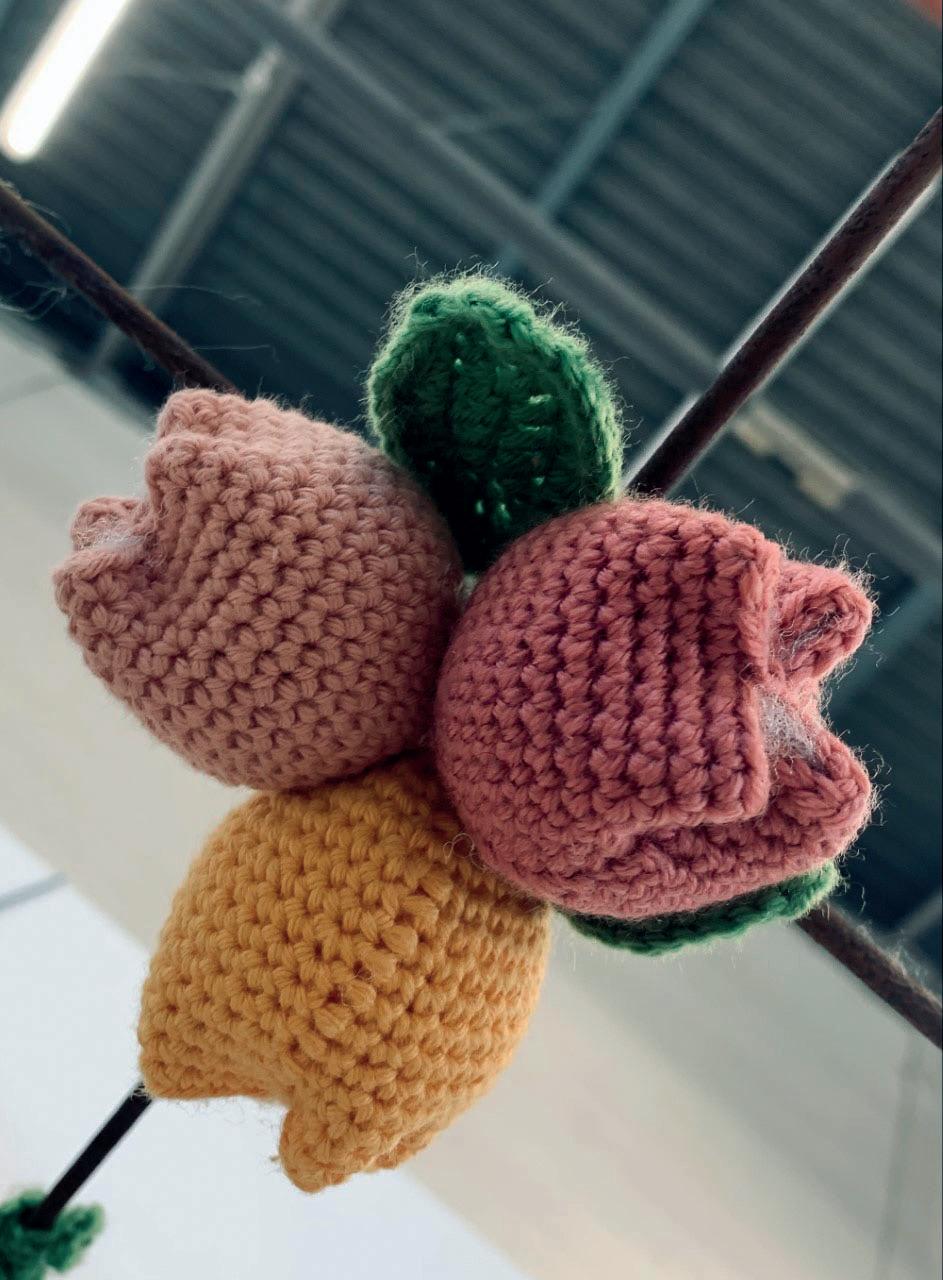
• This piece has been made by crocheting over one hundred flowers to hang from the ceiling for you to stand beneath and to feel a sense of calmness and happiness as you take in the array of colours and textures displayed above you. Influenced by a variety of beauty that Mother Nature has to offer us, I have attempted to recreate realistic representations of some flowers we can find on our nature walks and have placed them together to create a sensory space for everyone.
isabelle weaver-jones Fine art & graphic design • isyweaverj23@gmail.com • gallerythisofAntooffiguresimagesoldInInDesigntheinformrecordprojecthasTheandpiecesdegreeOverinstagram.com/@isysillustrationsthelastthreeyearsmycombinedhasallowedmetoproducemultipleofworkthatdemonstratemyFineArtGraphicDesignskills.loveandpassionIhaveforvinylrecordsheavilyinspiredmyGraphicDesignandfuelledmyambitiontocreatesleeves.Iletthesoundofthemusicmydesignswhicharecreatedusingmediumsofmono-print,biropen,andPhotoshopsoftware.contrast,myFineArtpractisereferstophotographicportraits,implicatingsuchinnewworks.Theportraitsandaredrawninmypreferredmediummono-print,usingdelicate-colouredinkscreateanintricate,andghostlyeffect.enigmatic,thoughambiguoushistorythesitter’spastlifeisencapsulatedinwork,becomingapresencewithinthespace.


singledesignfAshionhonours

annie dinis fashion design ahsdinis@gmail.com
• Bates Motel and the parallels and differences the series had with the movie Psycho.
For my collection I wanted to be inspired by the concept of duality; how two completely extreme worlds/minds and their clashing elements may conflict and somehow combine into 1 together, (like a complicated and simultaneous connection/reflection as well as a dichotomy/paradox) and somehow maintain a balance of key design elements throughout the collection.
Some of my early brainstorming keywords in this project were: toxic femininity/ masculinity, femme fatale, hyper feminine/ girly, cycle/spiral, twisted, reflection/ mirroring, extremes, connection, parallels/ similarities and differences, 2 sides of the same coin, good and evil, destruction and healing, insanity/madness, beautiful/rotting, delicate and strong, power struggle/ imbalance, identity/perception and conflict (of the self).
After I started with more complicated design ideas, I then progressed to exploring more minimalistic approaches and styles to challenge myself.

journey by attending at LIPA Sixth Form College between 2017-2019 in Liverpool doing costume design, he has always had an interest within fashion since an early age, which he is now going onto launch a mens streetwear brand named JSD menswear which is an anagram of his name, originally was named J the label but wanted something more original so that’s where JSD came into play, within the brand he has made a six look collection called FRAGILE!!! all late 90s early 2000s inspired trendy looks with big graphic prints that are inspired by mental health more specifically anxiety John says that he wanted to make awareness of mental health as he has experience of anxiety and wanted to create a message on how someone can be so fragile by using a metaphor of a graphic butterfly to show that anxiety isn’t all about sadness.
Johninstagram.com/JSDMenswearStevenDobiestartedoffhis fashion
john Steven dobie fashion design • johndobie817@gmail.com •

mariefashiongarciadesign woodama.myportfolio.com • instagram.com/@muuminne •
The theme for my final collection was video games, using nostalgic imagery and colours from my favourite games. My brand, woodama, stems from my love of Japanese culture and technology and minimalism. As with the collection, woodama aims to bring joy and comfort to its wearers while still having a unique feeling.

katriona heritage fashion design • katrionaheritage@gmail.com • ownstrength,customerschiffonmaintainingelementshercustomersachievable,Thewhatbeautifulbrandwork.herstudyinginterestmanipulations.printingsaCollege.DesignfashionHeritageDuringvinstagram.com/kmh_misssensational2017–2019youngdesignerKatrionabeganhercreativejourneywithinwhilstcommittingtotheArt&DiplomacourseatCanterburyShecompletedthediplomawithbeautifuldisplayofbotanicalscreen-whichincludedmultipletextileFromayoungageherwithintextiledesignhasgrown,aFashionDegreehelpeddevelopedskillswithinbothhandandmachineThelaunchofherluxurywomenswearMissSensational,hasanaimtocreatepieceswhichfitanyone,nomattertheirageorsize.brandbelievesinmakingthepossiblethereforetherequirementsofwillalwayscomefirst.WithincollectionAnatomy,she’susedtextilefromdigitalprintstoknitwear,theluxurylookwithindelicatefabrics.Katrionaaimisthatallwillbeprovidedwithafeelingofconfidentandthattheyaretheirboss.

Amy Rebecca Jenkins is a young creative womenswear designer born in Liverpool with a strength in surface print and constructed textiles. She started her artistic journey from a very young age, going on to pursue a level 3 diploma within art & design at collage in 2017. It was here she was able to express her creativity within the fashion world, going on to make the life changing decision to move away from home in an effort to expand her knowledge.
Amy is currently finishing up her degree at the university of Chester in hopes of a degree in fashion design. Jenkins latest collection is called “It’s My Body” and focuses on how society has unrealistic expectations of what and how we should treat our bodies, paying great attention to inclusivity and creating garments that make the consumer feel sexy and confident as “clothing should fit you! You shouldn’t fit the clothing.”
amyfashionjenkinsdesign

sally paterson fashion design • paterson461@gmail.com • Theinstagram.com/nalas.ukthemeformyfinalcollection
designs incorporate hidden pockets and a modular approach builds each outfit. The collection includes optional collars and daytime pocket bags that can be added to each outfit. A black wool and metallic coat and a hand knitted sweater are offered as heritage items to be cherished forever.
is Parachutes Not Tents. The inspiration for this collection came from the changing size and shape of women over the last 50 years. I wanted to explore designs that offer the flexibility to accommodate life changes that impact the body shape, and to develop a capsule collection of luxury clothes that can be worn by women of all shapes and sizes from UK 8 -16. The collection represents premium investment pieces featuring traditional and contemporary material, generous cuts, and refined finishing touches. It is fully aligned to the sustainability principle Buy Better, Buy Consideredless.


fAshion marketing & communication single honours
My Final Major Project outcome shows a creative collaboration between Chanel and Dover Street Market. This collaboration looks to allow luxury brands to create a new emotional connection with Gen Z, using the philosophy of Dover Street Market to inform a new brand experience and in turn community for brands who wish to maintain their heritage, authenticity and status, using Chanel as the facilitating brand for this.
olivia buckley fashion marketing & communication livvyjai@aol.com • instagram.com/@livvyjai_fmc •

The message is portrayed through focusing on authentic and responsible marketing methods moving away from the current issues associated with sustainability such as greenwashing.
olivia eggington fashion marketing & communication My project proposes a new and more responsible approach for Gymsharkto remain relevant, competitive and sector leading in the athleisure market. It identifies a marketing strategy for this concept and proposes a brand collaboration with Christopher Raeburn who is challenging the industry by creating upcycled designs. It sheds a new light on the athleisure market, which is currently over-reliant on overproduction and the use of non-ecofriendly materials, by reducing the negative impact it is having on the environment. Sustaining current practice would not only be damaging to the planet but also highly incompatible with the new consumers of Generation Z onwards.

krista hellon fashion marketing & communication kristahelloncreative@gmail.com instagram.com/@kristahelloncreative
•
My FMP has allowed me to learn new software like adobe After Effects as part of my digital skillset.
•
My FMP highlights the emotional disconnect between luxury designer brands and Generation Z and focuses on reinventing the emotion and extremity of Lee Alexander McQueen’s showmanship with a contemporary tenderness that reaches people. My concept juxtaposes human emotion with technology as a tool to expand the horizons for self-expressionwearablethroughNFTs.
My project explores the possibility of a wearable NFT collection for the brand Alexander McQueen, inspired by key moments from the McQueen archive. McQueen was a visionary, and therefore it makes sense that he would have been one of the first innovators of wearable tech and NFTs in the luxury fashion realm. My project explores the possibilities of luxury designer brands communicating with virtual reality in new ways through 3D scanning, animation and film and demonstrates how smaller brands can enter metaverse marketing without a financialsignificantinput.

heleena houston fashion marketing & communication • heleenahouston@hotmail.co.uk • theconceptoforange.com • “Myinstagram.com/heleenahoustonfmcfinalmajorprojectfocusesonaneed to put people before profit. Allowing brands to visualise how they can capture their future consumer; primarily Gen-Z, where they can develop meaningful and trustworthy relationships for both the consumer and brands’ Throughfuture.theanalogy of different market levels, I aim to experiment with taking two brands and placing them into the opposite market level to what they already cater for. Applying the bubble-up and trickle-down fashion theories, I will be able to visualise these brands in a new and creative way.
Using Matty Bovan as a placeholder to demonstrate how other brands such as his, can in fact work at a lower level, where a new consumer can become invested within the brand. Secondly, taking a more middle brand, that of Outsider’s Division, and placing them into a more visionary and conceptual world, ultimately widening their consumer base. How does the future of brands like these, look? Using drama and naivety throughout this entire process, I aim to create something that is moving for the viewer, something colourful, bold, and impactful.”

luke owen fashion marketing & communication wondermanstudios@gmail.com • lukeowenfashion.com • instagram.com/LukeOwenFashion • My FMP for my fashion marketing and comms course is all about digital fashion and the creation of digital fashion assets within physical reality. My work is based on the illusion of the digital and physical realities combining through a project called New Codes. New Codes is the application of digital fashion on streetwear brands and how we can cater augmented/ virtual reality assets to create something tangible for the Metaverse and the future of fashion itself. This final product is built upon 3D asset creation and what this can look like via green screen editing of real world modelling and styling. The reason for this was to re-think how we can create 3D assets for digital realities in a new way that promotes an organic and human way of digitalconsumingfashion.

sophie taylor fashion marketing & communication • sophietaylorfashion@yahoo.com • sophietaylorfashio.wixsite.com • instagram.com/@sophietaylorcreative & @forangelstudios
“For Angel Studios” is the name of my FMP, and it surrounds a new, future-proofed way of media creation and communication. The creative studio’s intention is to work with and for brands, to create unique media packages, with the format and aesthetics catered to consumers with brand identity at its core. This is the answer to my selfassigned brief of future-proofing fashion media, combatting industry oversaturation and the gap for meaningful media beyond data. To visually show how it would work, I intend to create multiple different media packages for brands at different levels. These packages include creating media for a fictitious collaboration between TANK magazine and retailer END., for MOTEL ROCKS, and concept ‘Pink Springboard’. As a creative I value content creation, creative direction and have a flair for visually narrating a story, and these identifiers are core to the heart of For Angel Studios.

My project is based around Denim and tackling the issue of overconsumption and educating the next generation of fashion consumers. Through putting thoughtfulness and consideration into our purchasing decisions and teaching the next generation – Generation Alpha to be conscious consumers, the fashion industry can prevent the idea of “throw away” culture and fast fashion and create a better and more sustainable industry for future consumers.
millie wright fashion marketing & communication milliewright02@gmail.com • milliewrightcreative.com • instagram.com/@milliewrightcreative •
My concept is an educational Instagram platform targeted at Generation Alpha consumers – The Instagram campaign will be filled with engaging posts and reels that will educate the next generation of luxury consumers on issues within the fashion industry. My project is based around the first edition of the campaign which will promote taking care of your denim. Through building an online community of likeminded, youthful consumers and educating them on how to be conscious consumers, the campaign aims to change the mindset of a generation.

singleDESIGNGRAPHIChonours&combinedhonours

Designis not limited to one creative subject, but it’s a bridge connecting other parts of life, helping us solve problems and newcreateideas.
at Createnovafilmpro.andInspire albangraphicajutidesign ajcreative3@gmail.com • adsgnstu.wixsite.com/my-site • instagram.com/a.dsgn.stu •
At the start of the year, I set a target to use inspiration from multiple creative sources to further develop my ideas as a creative. Combining motion graphics, illustration, fashion, audio design and other creative fields allowed me to push and break the traditional rules of graphic design. By doing this my creative knowledge has expanded and influenced a wide range of new ideas in the creative space. Taking inspiration from Sci-fi and Dystopian themes, influenced me to explore more with motion graphics creating a short film (New Vision) for my exhibition project. The project was developed over 5 months, and it brings a new unique style to film. The project is available via YouTube

ida andskar fine art & graphic design • ida.a@live.se • idaandskar.com/ • youtube | ida andskär
As far as I can remember my father has shared his passion for nature and fishing. Sadly thisdoes not only involve lovely trips out at sea but also making sure we understand the diresituation around the world when it comes to overfishing and farming fish. In this short animated movie, I wanted to celebrate my father’s dedication to the cause butalso raise awareness of the problem. A problem that the seafood industry hides from theaverage consumer: The fish you buy in-store is farmed. Not only is it unhealthy but is adanger to our ecosystem and the long-term health of the sea as a whole. I am only aware of this problem thanks to my dad and with the help of this animation I havedone the right thing to raise the problem with you. Tack Pappa.

jackgraphicarnolddesign directedbyjackaria@gmail.com • jackariadesign.wixsite.com/jackariadesign •
I wanted to experiment with a variety of mediums this year, from photography to animation and back to illustration. This combination of practices has helped me gain the understanding I need when it comes to the work and development that goes behind designing and outcome. My work that I am using in the exhibition is a visual representation of what I have seen recently in the Garden Quarter District here in Chester. There are many small details that relate to the surrounding area and what people see day to day that live around that area in particular.

emily beard graphic design

• Having an interest in Film and TV outside of university, my exhibition piece is inspired by the concept of creating graphic props for the screen. I based my project on a novel “Whose Body?” by Dorothy L. Sayers, a crime mystery set in London 1923, and used my props to create a trailer as if the book would be made into a TV show.
JessicaGraphicBickleyDesign Jessica.bickley@hotmail.co.uk • jessicabickley1.wixsite.com/jessbickleydesigns • instagram.com/jessbickley.designs • youtube.com/channel/UCBi2ctHCnbeoffSHlnoyWkw
Over these past few years, I’ve been able to experiment across multiple areas of Graphic Design including illustration, motion design, branding, editorial and typography. This has enabled me to achieve my final piece, by combining all these skills and using multiple software across Adobe Creative Cloud. Although at points I thought my laptop would burn a hole through my desk from having all these programs open simultaneously, it would’ve been worth it, as I’m now able to showcase something I am proud of that represents what I can do and who I am as a designer.

Throughout my university experience I have explored the many different areas of Graphic Design, leading me to discover that my main topic of interest lies within the Media Industry, specifically in relation to Branding, Advertising and Photography.
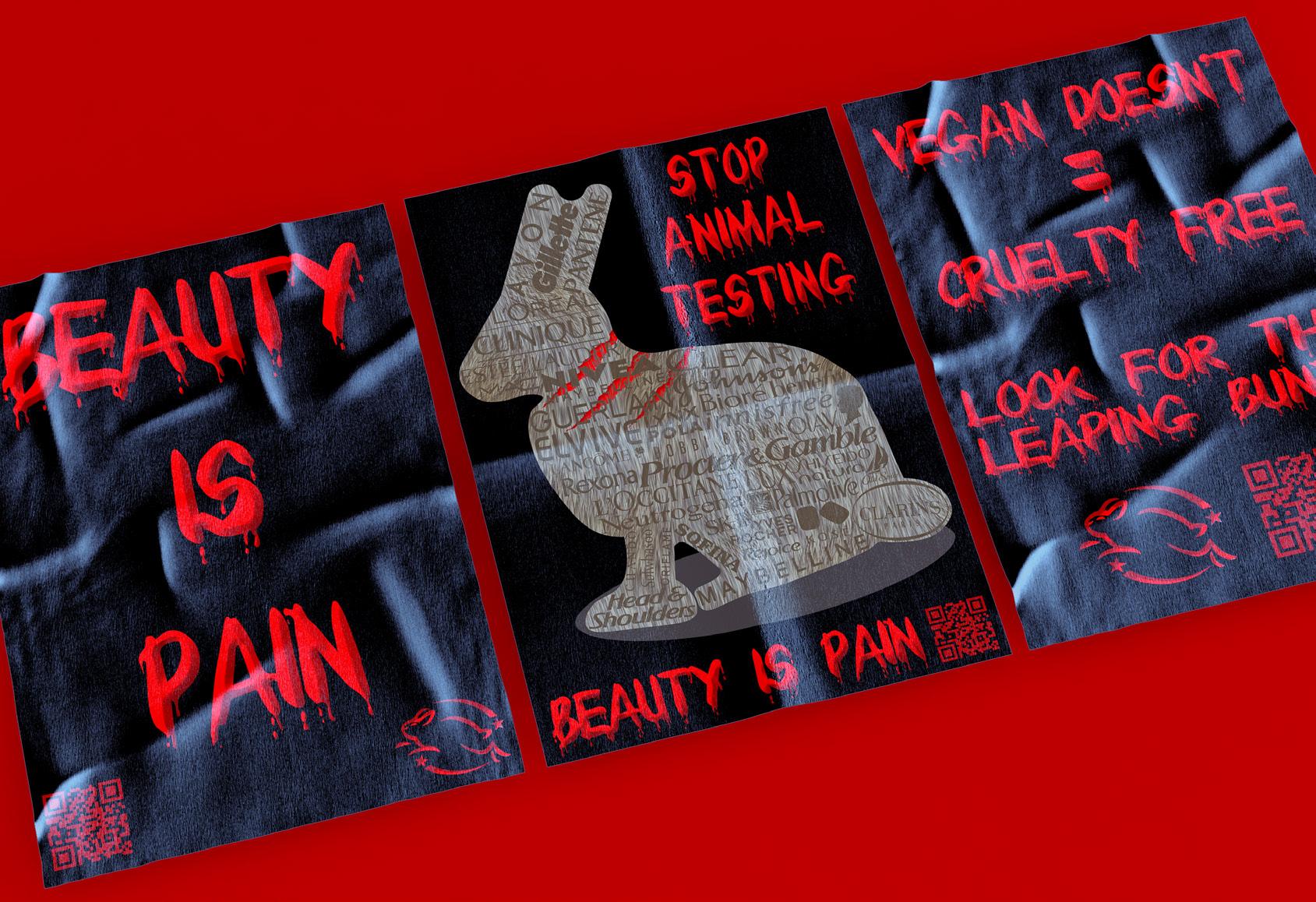
During the last 4 years at UoC I have been able to explore my creativity whilst also gaining vital industry knowledge and refining my technical skillset with digital software’s such as the Adobe Suite and HavingProCreate.grownup in a small North Wales town surrounded by a sizeable family and rural landscape these can often be found evidenced in my artwork, alongside that, personal inspirations such as my core values and interests also largely contribute to my creations. An example of this is my featured Beauty is Pain project, which combines my core value of advocating against animal cruelty and my skills as a designer to create a shock campaign to encourage the viewer to switch to cruelty free products.
LIV GraphicBuckleyDesign • Liv.Caitlin53@gmail.com • 1817836.wixsite.com/livbuckley53 • linkedin.com/in/liv-buckley53/ • instagram.com/livbuckleyuoc
stanGraphiccooperDesign VACDesigns@outlook.com • stancooper1996.wixsite.com/website-5 • linkedin.com/in/stan-cooper-3175b7a6/ • instagram.com/designsbyvac/ •
I am a graphic designer, illustration artist, and printing specialist. As I started skateboarding as a young teenager, the skateboard designs influenced me to learn adobe software. I started with making backgrounds for the old YouTube channels to then designing for people who Livestream gaming content on the platform Twitch. University has allowed me to develop my skills in different areas such as the many methods of printing and also to think about the way I layout my typeface-based documents. I did always struggle to find my area in design, the University of Chester has helped me find that place where I am now and has helped me develop my knowledge of design incredibly.

Looking across the board of most technical work, whether carpentry, engineering or music, women range from 15-26% on It’saverage.notjust a music industry thing, it’s a technological thing. Most women generally aren’t interested in these careers but those that are, often find themselves fighting in a man’s world. I personally never felt being a woman was negative, it just made me want to prove myself more. There are lots of good female DJs that need to be seen/heard, but not just because they are female- which is also an Realissue.talent does not matter what gender you are, but women need to be given more opportunities.
dissertation research, I discovered a lack of encouragement or engagement at school with girls in technology and music.
laura de longa fine art & Graphic Design • lauraloveartist@gmail.com • lauraloveartist.co.uk • Afterinstagram.com/Lauraloveartist20yearsasaDJ,Idecidedto
focus on the statistics of women in the music industry, whilst trying to raise awareness that would entice young women into the Fromindustry.my

My exhibition piece”La Havana” is a client brief that shows the luxurious and unique corporateidentity of an auto dealership.
iwona domagalaGraphicDesign idomagala22@gmail.com • https://idomagala22.wixsite.com/graphicdesignblog • The realm of graphic design allows for the expression of any creativepotential, which is why I fell in love with it. It allows me to express my ownsense of style while still meeting the demands of customers. It makes mehappy to see clients satisfied with my work; I follow their brief with a heavysprinkling of my own flair. I am a freelance graphic designer that will go above and beyond to ensurethat each client’s requirements are one in a million. I take pride in offering aservice that makes customers happy with their purchases.

One thing graphic design has taught me is to take risks. By doing so, you are pushing yourself out of your comfort zone and setting yourself apart from others. Be bold and provide something new. We regret the things we didn’t do, not what we did. Before starting university, I didn’t know what I wanted to do but I knew it was something creative. 3 years later I’ve found what I enjoy most within Graphic Design, Brand design and illustrations. I learnt there is so much more to branding than what meets the eye and want to carry on developing my skills within branding on Adobe software’s providing a service to customers. I have enjoyed growing as an artist and building my confidence in my artwork. I hope to in the future carry-on problem solving and growing as an artist.
abi GraphicevansonDesign • abbieevanson1@icloud.com • abbieevanson1.wixsite.com/blog • instagram.com/@abbieevanson_design

hollyGraphicevansonDesign hollyevanson@outlook.com • hollyevanson.wixsite.com/website-1 • linkedin.com/in/holly-evanson-2761411b8/ • instagram.com/@hollyevansondesign •
One thing Graphic Design has taught me is to not always go for the obvious approach and think about how the design could potentially turn out if I looked at it from a different perspective. This could go horribly wrong, but you could learn valuable design knowledge which could be used for a completely piece of work but not suitable for that specific piece. But trying new things is how you stand out from others and grow in design. Through my years at University, I have learnt that branding and illustration have been my passion within Graphic Design. I have found that I excel when I experiment different design techniques for final pieces of work which helps me to show confidence in my work. I have enjoyed tackling different challenges within design and showing that branding really does not just entail a logo, there is so much more to make a brand successful. I hope to in the future to keep pushing myself out of my comfort zone and try new areas of design I have not worked on yet.

anya farrell Graphic Design • anya.cfarrell@gmail.com • ThisTheinstagram.com/anyafgraphicsWaterfallpieceismytakeonmodernised ukiyo-e, a Japanese woodblock painting popular during the Edo period (1615 – 1868). The theme is based on folklore when a Koi travels up the golden river to become a dragon as a reward for its determination and perseverance. Inspiration came from this project after recently completing an essay focusing on Japanese Irezumi tattooing.

If graphic design has taught me anything, it is that you cannot please everyone. Some will love it; some will hate it, and some will simply not get it. However, the purpose of design is not to please, it is to solve. As a determined people pleaser, I have always found this a hard pill to swallow, but that is also what I love most about the practice. I am constantly thrown out of my comfort zone, always trying to find a solution to every problem. Through illustration, branding, and typography, I have discovered countless different approaches to problem solving which has the potential to change anyone’s outlook. I concentrate all my energy into the work that I do. This is why my exhibition piece is a representation of me, what I have learnt and who I am as a designer. Purely celebrating everything that is graphic design.
ann GraphicfergusonDesign anniemfergo@gmail.com • ann marie ferguson | dribbble • amf graphic designer | facebook • instagram.com/@amf_graphic_designer •


carolina gorman photography & Graphic Design • carolinagormanbatlles@gmail.com • carolinagorman99.mypixieset.com • thatpoemscase.thatonlyInshowHowhow3manyThisriesBecausefeelingthetoInsteadHowinstagram.com/@carolina.gormandoyoudescribelove?ofgivingameaninganddefinitiontheword,itiseasierforpeopletoexplainandtheimportanceofthewordlove.oflove…manyfeelingsandmemocometomind.projectcombinesfamouslettersofdifferentpeople,authors,artists...bookswithdiversetypesoflovethatshowtounderstandanddescribethem.doweunderstandlove?Howdoweit?oursocietymanypeoplethinkthatthevalidtypeofloveistheromanticoneisperceivedinfilms,butthisisnottheTheprojectaimstoshowthroughandletterstheseveraltypesofloveexist.

adamGraphicgreenDesign adamgreen2120@gmail.com • instagram.com/Mangy_Designs • My work’s purpose is to explore meaningful songs in an implicit way and celebrate iconic musicians. I use typography to visualise this journey exploring the lyrics and forming them into shapes to alternatively show their meaning. I use my work to show that art comes in all different styles and forms and can have a lot of meanings.

tom GraphicgreensladeDesign • greenslade6@icloud.com • tomgdesign.co.uk • Myinstagram.com/@tomgdesign_nameisTom,andifyou’rehere at my exhibition, then you’ll be looking at some goofy looking aliens. If you’re not there at my exhibition then you’ll be somewhere else reading about my aliens. Fun fact of the day, the blue alien is named Christopher and he is usually modelled by me, so in a way you are looking at me. When I’m not illustrating my aliens fighting over sneakers, then I’ll be doing other creative activities such as type design, poster design, book cover design and the list goes on. For my career, I just want to be a full-time creative, and to work in all different areas such as architecture, fashion, and music production to name a few. I’m doing this for the 17-year-old Tom who thought that I had to be a businessman in a suit to change the world.

jackGraphicgwytherDesign jackg.creative@gmail.com • jackgcreative.co.uk • jackg_creative •
During the last 3 years I have had the chance to try out and develop my skills in several areas ranging in digital and traditional art forms. As a designer I specialise in photography and editorial design, through developing my passion in these areas I have noticed they go hand in hand. I am now ready to move on and pursue a career in the arts, more specifically photography and videography. I have always had a passion for photography, being able to capture special moments, changing landscapes and document events. I hope that now, I can get a job in journalism photography while persuing my freelance business to expand my client base. The image shown on the right is expressing normalising men wearing dresses and equality within the fashion industry, using stereotypical colour, and the visual language of fashion magazines to reinforce the message.

gabby hardy Graphic Design • gabschloe626@hotmail.co.uk • gabrielle.hardy.75 • gabrielle.hardyguides.3 • creativeotherinthesomeIprintinglearnnotishowOnlyobstacletryperspectivesolvingAsinstagram.com/gabrielle_h_artistanartist,withdyslexia,Ienjoyproblemonbriefsbyaddingmyownandcreativepractice.IalwaysmyhardestonallthatIdo,ifIhitanIdonotgiveup,Ijustworkharder.thefearlesscanbegreat,andthisisIapproachmywork.MymainpracticeGraphicDesignandPhotography,butIamlimitedtojustthesepractices,Iliketodifferenttypesofmediafromscreentoembroidery.amdescribedasboldandabitbonkers,butofthebestpeopleandartistsare.Infuture,IamgoingtobeanArtteacherHighSchools,intheUKandbeyondintocountries,butIamgoingtokeepmyvisiongoing.

rebeccaGraphicharrisDesign rebecca.l.harris@hotmail.com • etsy.com/uk/shop/TrambustoStudio • instagram.com/@trambustostudio •
I’ve spent the past three years winging it. I have learned a lot and finally figured out what grown up job I want. Secondary school art and design teaching. Writing about the current system helped me think about the teacher I want to be. I’ll start with the typical “I want to be a fun teacher” but I also want to be the teacher that supports every student possible whilst promoting art education and careers. Art education is not only about drawing and painting, but also about historical understanding and building essential skills for careers. Developing my skills and confidence is still important to me as a designer. This is done through my small business on Etsy. Though selling things like stickers and greeting cards might sound lame to many, who cares? It’s a business I hope to develop a lot from where it started alongside my teaching career.

I’m an illustrator and creator. Art has not only been a hobby of mine since I was a child but an inspiration and something I’ve always wanted to pursue a career in. In September of 2022 I’ll be starting a PGCE course to do secondary teaching Art. It’s always been a passion and dream of mine to teach in a subject that I feel so in love with. I hope to one day inspire young artists in such a beautiful subject that deserves more recognition.
georgia hill graphic design • georgia_esp@icloud.com • Myinstagram.com/@g_is_artsynameisGeorgiaEveHilland
emmagraphichughesdesign emmafleurhughes@outlook.com • emmafleurhughes.wixsite.com/website • instagram.com/emma_artaccount •
If my three years at university has taught me anything, it is that I am an artist. I am not just a student who studied Graphic Design, I am now an artist ready to take on the next step in my career. More specifically, I am wanting to work in Set Design, and have a career in this particular art. University has helped me find this passion and has given me the opportunity to express my talent to others. I hope to one day work for a company, working alongside a film or theatre production team such as director and script writers, creating famous sets for audiences to experience. I express my love for set design in all of my work. Thus, my final exhibition piece is made up of four miniature models of famous sets from films. I have thoroughly enjoyed learning particular skills at university and plan to use them throughout all of my work, as I continue to be the artist that I am.

Maddie photographyHumphries&graphicdesign • maddiejhumphries@gmail.com • madeleinejphotography.mypixieset.com • changestrengths,bywithnewcollaborationuniqueengagement.useIcommunicateprojectsconceptsandinterestedresponsescreativemediumsseamlesslywaysgraphicproblem-solving.faithfullyTextmadeleinejdesign.myportfolio.comandimagehavealwaysworkedalongsideeachotherincreativeAsaphotographeranddesigner,Iusemypracticetofindtoblendthesetwopassionsofmineutilisingdigitalandanalogueinawaythatnotonlysolvesproblems,butalsoprovokesandemotionsincontext.Iaminsocialengagement,communityconnectionandhaveexploredthesethroughoutuniversitybycreatingthatbringpeopletogethertoandshareexperiences.hopeafteruniversityIcancontinuetomyworktoencourageactionandIthinkartanddesignisaindustrythatrequiresourindividualofexperiencestobringaboutandexcitingideaswecouldn’tcomeupalone.Justliketextandimage,joiningtogetherourcollectivewecancreatethingsthatwilltheworld.

Britany Jones Fine Art & graphic design britanyrjonesfineartist@gmail.com • instagram.com/britany.r.jones_fine_artist •
This project was based on a campaign that I came up with arguing about the issue of fashion inequality and their out-dated sizing for clothes, and I was pointing out how stupid this problem is due to us modern people in this day and age being all shapes and sizes, and still lacking in diversity in clothes. These images would be mounted onto MDF for the final piece and would be activity-based. Like with traditional paper dolls, you would be able to interact with them and dress each doll up.

I am a graphic designer and illustrator, Over the course of my three years at universitymy passion for design has grown massively, I enjoy the challenge of creating and adapting work to find solutions for the design process I’m working on.
Ihave developed an interest in Branding, typography and illustration and other creative fields,and I know that my goal is to have career in the creative industry. My exhibition pieces are based on positive mental health and speaking up about the thoughts and feeling that may be affecting you, I’ve enjoyed experimenting with type in my final year as I like that words can have a deeper meaning behind them and can make you question what is being said.
luke graphicjonesdesign • lukejcreative01@gmail.com • lukejcreative01.wixsite.com/lukejdesign

tomgraphicjonesdesign

megan lees graphic design • megan_lees@yahoo.com • instagram.com/@designbymegs_ • Graphicinstagram.com/@rose.craftcreationsDesign.Whathasittaughtme?
It has taught me to think outside the box, to look at work from a different perspective and express myself through my design work. These are skills which I can reflect onto students that I teach as a design technology teacher in the not too distant future. If I was asked 3 years ago what I thought my next step would be once I had finished university, I would have said a designer or photographer, not a teacher for 11-16 year olds. I plan to look at ways to grow my small side business, Rose Craft Creations, creating Jesmonite homeware products. The piece of work shown, is a piece from my Jesmonite homeware collection. These pieces are available to order over Instagram and at The Country Cook’s Lader in Fryup, North Yorkshire.

I am a designer and illustrator who likes to tell stories and I like it when people can see a different point of view in my work. I often use metaphors to add depth to a story, thus inspiring people to explore and wonder about it. Based on this I would say I am a romantic. I like to pursue different visual communication methods and mediums and to explore different painting styles and techniques. In this work, the protagonist is an ordinary Englishman who sets off to a strange land to face an unknown environment -what would it be like to be someone who doesn’t often do adventurous things? The story is set in the 1970s, when travel to South Africa was on the rise. The protagonist is asked by his company to go to South Africa, not exactly for work, but because he has something on his mind and needs a break. The journey, which had been smooth sailing, is interrupted by torrential rain due to difficult roads, and along the way he has to go through some thrilling adventures to get out of his misery.
YI graphicLiangdesign Liangyi997225@gmail.com • isblogandsomethingmore.wordpress.com • instagram.com/liangyigraphicdesign •

I am a creative illustrator and designer who loves to use bright and bold colours. I use plants, animals, different cultures and my imagination to produce illustrations using a limited number of colours to present my findings and or interpretations of the subject. Detail is good but it can be tiresome to look at, therefore I prefer to get straight to the point, here it is. No very small details that need to squint your eyes at or concentrate very hard on just a solid and bold piece of work that is easy and enjoyable to look at. The featured catalogue image is from the Asian culture, specifically looking at Pakistan. This is one of the works from a project I am currently working on. Researching Henna and finding the meanings behind the details within the many designs allowed me to produce brightly colours work and produce my own designs/patterns.
zarina mirza graphic design • zarina.mirza@hotmail.com • izarinadesign.com • instagram.com/zm.ar_ts

I am a graphic designer from the North West, Ellesmere Port. My primary area of expertise is in branding and I have a keen interest in illustration.
Another area of inspiration originates from media in the horror genre including Happy Tree Friends, The Lost Boys and The Vampire Diaries. These shows and films have guided my style in the past few years and by using these inspirations, I hope to create pieces of work that evoke similar emotive responses. In the future, I would like to create brand identities, explore typographical styles and further develop my illustrative ability within a design agency in Liverpool or Manchester.
kay palphreymangraphicdesign k.palphreyman@outlook.com • kpalphreyman.tumblr.com • instagram.com/sinxmvticdesign •
I am heavily inspired by album artwork from artists in the alternative music scene such as Hot Milk, Motionless in White, and nothing,nowhere. that feature darker colour palettes, unique typographical styles and tongue-in-cheek quips.

abby roberts graphic design • abbylouise78@gmail.com • Overa1914431.myportfolio.com/workthepastyear,Ihavefoundwhere my passion and interests lie in graphic design, for me, it’s in illustration and branding. I enjoy the strategy and problem-solving in branding and illustration has been something I have enjoyed from a young age. This year I have developed my style and confidence in illustration, specifically children’s illustration, allowing me to illustrate and write my own children’s book. Here is one of the screenprints I created based on work-life balance. This is quite different from my usual work, but I wanted to draw attention to a key issue in the country. I used illustration to create a piece which hopes to connect with the public.

The past three years at university have allowed me to express my love and admiration for video games, as they are often what inspires me the most through their art direction. I aspire to be a game designer that evokes emotive responses through storytelling and visual effects, even if it is a minor role. As I evolve as a 20 something, my work continues to grow with me, whether game design-related or not. I will forever have a strong passion for art, as that will never change.
kimgraphicrobertsdesign kimrobo04@gmail.com • kimrobo04.wixsite.com/website • instagram.com/@ksizxle • https://linktr.ee/KSizzle_ • I often struggled with what type of designer I wanted to be throughout my artistic journey until studying Graphic Design. It has allowed me to find new passions I did not know I had until now and to carve a path where I can truly express myself without any boundaries.

kamila soroka graphic design • kamsor2012@gmail.com • kamilasoroka.wordpress.com
As a designer, I enjoy working with mixed media and different tools to produce my work. I find that my work excels when I have experimented with a wide range of techniques and materials to gather ideas and inspiration from whatever is around me. By using various mediums, I have discovered my strengths which I aim to continue developing in my future work. In my recent projects, I have concentrated on using printmaking techniques, laser cutting and animation which I found to be my most enjoyable and successful pieces. As seen in my exhibition piece, I also like to use my past textiles experiences to work with materials such as fabrics and combine them with other art methods to create unique designs.
My approach to my work focuses on experimentation and the processes of creating the designs. I aim to continue my practice and gain further experience by constantly exploring new ideas and developing my knowledge.

• I am an artist, graphic and web designer. As an explorer of creative practices, the idea of using asingle medium is not for me. I enjoy the challenge of learning different mediums andimplementing them within all walks of my design practice. Studying graphic design has onlyheightened this feeling. My context will always be about finding a way to bridge mediums andpractices. By combining different approaches, I hope to create unique experiences through mywork, whether they are digital or physical. My long term goals are to keep learning and pushingthe boundaries of my work further. Inspiration for me comes from all over, from simple lifeexperiences to wider world concepts. With this in mind, I intend to keep working in the graphicand web design sector but plan to travel to gain more experience in my practice.
robyngraphicwalkerdesign stormcloudlegendrw@gmail.com • stormcloudlegend.com • instagram.com/@Stormcloudlegend


izzy graphicwarburtondesign • isabellawarburtondesigns@hotmail.com
• izzybee0602.wixsite.com/my-site-1
• linkedin.com/in/isabella-warburton-771a0b1b7/
I am a graphicdesigner whose interests lie in illustration, branding, and photography. Studying graphic design at a higher level has allowed me to further develop these mediums while gaining new skills and knowledge aboutareas of design I had yet to discover. I love the challenges I am presented with at universityand the person I have moulded into because of them.
I am constantly gaining confidence to produce work with uncharted mediums through experimentation and further pushing myself out of my comfort zone ready for a future in the design world. I hope to further push my boundaries to see my full potential by constantly expanding my knowledge of different software and further refining my style of work.

Over the last three years my combined degree has allowed me to produce multiple pieces of work that demonstrate my Fine Art and Graphic Design skills.
The love and passion I have for vinyl records has heavily inspired my Graphic Design project and fuelled my ambition to create record sleeves. I let the sound of the music inform my designs which are created using the mediums of mono -print, biro pen, InDe sign and Photoshop software. In contrast, my Fine Art practise refers to old photographic portraits, implicating such images in new works. The portraits and figures are drawn in my preferred medium of mono- print, using delicate-coloured inks to create an intricate, and ghostly effect. An enigmatic, though ambiguous history of the sitter’s past life is encapsulated in this work, becoming a presence within the gallery space.
isabelleFineweaver-jonesart&graphicdesign isyweaverj23@gmail.com • instagram.com/@isysillustrations •

The goal for my exhibition piece was to create a Nike prototype shoe inspired by Frankenstein. Combining 3 pre-existing Nike shoes into one new unique style.
Kelan Wilkie graphic design • kelanwilkie@gmail.com • kelanwilkie.wixsite.com/website-2 • Myinstagram.com/kelanwilkie01nameisKelanWilkie,andIam a graphic designer. My long-term goal is to eventually work in the creative field continuing to advance my skills as a graphic designer. Although I have been studying Graphic design for over 5 years now and have also been freelance working alongside this my interests still span across a range of different medias from video making, illustrations, editing and much more.


singleDESIGNINTERIORhonours

eveinteriorbrammardesign
The Cocoon An overgrown and abandoned site on the outskirts of ChesterCity Centre, overlooking the River Dee and meadows has beenconverted into a bespoke home for a client seeking an escapefrom a crowded city. The focus is to create a luxury home whichhas little to no impact on the natural environment. The home willbe a space to reconnect with the natural environment and itsthoughtful design will enhance the well-being of the user. Theproposal explores techniques which encourage biodiversity at thesite and minimise disturbance to the local flora and fauna.

robyn parker interior design • robynparkera2@gmail.com
The project was designed for children, with their needs at the centre of the entire Throughdesign.rigorous research, this project was able to take inspiration from various teaching methodologies such as Forest Schooling, Montessori and Waldorf/Steiner.
The teaching methodologies are applied to the design in a way in which it does not focus on one methodology but instead draws on the positive design aspects of many in order to create a cohesive scheme. Throughout this project, there was a specific emphasis placed on creating flexible, inclusive, and accessible spaces for children where they can feel safe to explore and learn freely without limits.
Located in Northumberland, Goosehill First School is a much-loved community treasure, a school that’s initial building had stood since the early 1900’s. The aim of this project was to create a safe and flexible space for all children to learn to their fullest ability.

chelseainteriorquizondesign chelseaquizon03@gmail.com • chelseaquizon.design • instagram.com/@chelseaquizondesign •
The word “Balanghai” means a large wooden boat used by settlers in prehistoric times to carry a large family on their voyage across the sea forming a small community. Balanghai symbolises the resourcefulness of Filipinos when it comes to problem solving. Balanghai is a series of live-work settlements for displaced families in the Philippines. The proposal tackles the ongoing housing problems in the country that leaves millions of Filipinos homeless especially during typhoon season. Its key focus is to utilise the underdeveloped Estero de Vitas to make way for new homes on water that are low-cost and uses the country’s natural resources mainly bamboo known for their robust properties as a building material. Balanghai aims to improve the quality of life for families by providing communal amenities such as community garden, courtyards for private and large gatherings to create a sense of connection.

iona interiorsullivandesign • ionaksullivan2001@gmail.com • instagram.com/interiordesign.iona
St Mary’s has been rejuvenated by creating modern interventions to sit inside the historic walls. The pods in St Mary’s are designed to house and encourage creativity, including spaces for community cooking, arts and crafts and performing arts.
Exploring materiality and form has led the pods to be designed organically to mimic the churches interior arches. A minimal pallet of locally sourced timber glass fixtures and corten steel creates a contemporary feel. Industrial lights build a glow from inside the church, encouraging you to enter.
St Mary’s church, a forgotten building in Chester’s city centre has been redesigned with modern interventions to create a hub for the community called The Neighbourhood at St Mary’s. With a focus of how the pandemic has affected communities, making individuals feel isolated, The Neighbourhood intends to encourage socialising and experiences through activities to reduce loneliness.

Collaborative and independent work spaces provide visitors with the opportunity to meet, work as a group or individual using a flexible rental system. Rooftop overnight residences, external break out space and bar allow guests to unwind or have more informal discussions as part of their visit. The floors below houses co-working, social and rejuvenation areas that incorporate planting and natural lighting to promote health and well-being. The ground floor offers flexible exhibition space, an auditorium and restaurant which is surrounded by a double height planted buffer zone that separates the interior from the city beyond.
• Paradise Circus car park, a structure set for demolition in the centre of Birmingham, has been re-imagined as a mixed-use coworking facility. In a location that benefits from local transport networks and UK wide rail links the facility provides space for locals, short-stay visitors and overnight guests to utilise as they visit the city.
ellieinteriorturnerdesign ellie.drifthouse@icloud.com

singlephotographyhonours&combinedhonours

‘The Prom’ is nestled alongside the River Mersey and Irish Sea estuary. Walking along the waterside, the diversity of people the prom attracts became clear. From pirates to ex-locals, dog-walkers and fishermen; each person has a personal connection. I seek to capture a moment– of a singular place and time. I gravitate towards those that stand out from the crowd. I ask these strangers for their portrait, making the image there and then before they can think too much. These honest representations depict a journey and with that I want to encourage stories and memories to emerge. The work creates a narrative and as such the people pictured provoke contemplation within each of us. Each line, blemish, expression is a culmination of life experiences unique to that person – a significantly beautiful notion. I document an individual working through life’s everyday trials, choosing to spend that moment walking along ‘The Prom’.
samphotographybyers
byers_photography@outlook.com • instagram.com/byers_photography •

My project is based on Wales. Wales is a country with hundreds of beautiful landscapes, everywhere you look there is something that shines through. I have lived in Wales my whole life and always been a very patriotic person in a family of patriotic people. Me and my family love going on walks together and seeing different landscapes. We also had most of our summer holidays in Wales, some just my parents and brother and others with my grandparents, aunty and uncle and cousins. These holidays are such a huge part of my childhood, exploring areas of Wales that I had never seen before. Throughout my whole photography journey, I would always come back to Welsh landscapes, that’s where it all started for me. Taking pictures with my dad on holidays or days out, copying each photo he took in the hope they would turn out as good as his. It felt right that my final degree show was showcasing the thing that made me fall in love with photography in the first place.
nia photographybithell • niaabithell@hotmail.co.uk • instagram.com/@bithellphotography

tomosphotographycelt
‘The Beautiful Game’: A Football Season Story As a child raised in rural Wales, I was always playing football. Today, my passion for ‘The Beautiful Game’ is as strong as ever and has been the inspiration for my football photography journey. Following a league football team, called Chester Nomads 3rds, my aim is to create a ‘Football Season Story’. Initially my vision was to capture the moments that would otherwise be lost forever. A moment within a competitive sport can pass quickly and once you miss it, it’s gone! However, I realised that the focal point of my photography journey also involved revealing the passion and camaraderie of the players and expressing the beauty of the game. My work attempts to explore depth and context as well as summing up the emotions felt. My vision aims to develop an intimate approach, capturing the empathy, anticipation and determination of the players as well as the attention to detail

carlie photographyflaherty • carlieflaherty98@gmail.com • a1910714.myportfolio.com/ • instagram.com/@carlieflaherty98_photography
I decided to look at urban street fashion for my project as I wanted to look at the different types of street fashion and I also wanted to look at the urban locations around Chester. This project has allowed me to explore new places around Chester and find some great urban locations. I believe that this project has allowed me to explore new locations that I wouldn’t normally work within, but they have helped create so great images.
I chose this subject because I really like fashion photography and I wanted to develop my skills with working on location and not just in the studio. I decided on street fashion because fashion is a big part of our society as it allows people to express themselves and it allows people to wear what they feel comfortable in.

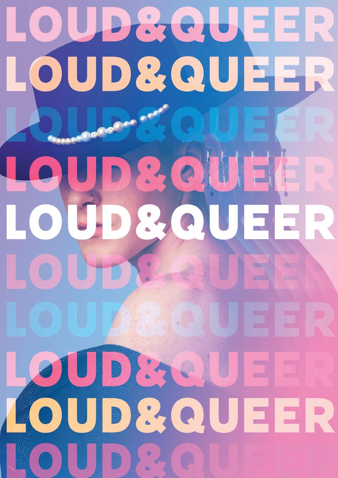
carolina gorman photography & Graphic design carolinagormanbatlles@gmail.com • carolinagorman99.mypixieset.com • instagram.com/@carolina.gorman • Loud & Queer is a project about identity, pride and exposure. I wanted to explore and get to know the photographers who portray and document LGBTQ+ people, and I want to be part of this new representation. The representation of the Queer collective has been growing and becoming truly visible over the last few years. The project aims to show the people who are part of this collective in a very genuine and close way to the viewer, I want to show that we are all equal. Each photo session arises from a conversation with each person to find out what they like and how they want to show themselves and how they feel like part of the community. Many countries and communities still don’t accept the community and that’s why I think it’s important to make this community visible in a natural and nonstereotypical way.
Maddie photographyHumphries&Graphicdesign • maddiejhumphries@gmail.com • madeleinejphotography.mypixieset.com • thewejoiningupnewcollaborationuniqueengagement.useIcommunicateprojectsconceptsandinterestedresponsescreativemediumsseamlesslywaysgraphicproblem-solving.faithfullyTextmadeleinejdesign.myportfolio.comandimagehavealwaysworkedalongsideeachotherincreativeAsaphotographeranddesigner,Iusemypracticetofindtoblendthesetwopassionsofmineutilisingdigitalandanalogueinawaythatnotonlysolvesproblems,butalsoprovokesandemotionsincontext.Iaminsocialengagement,communityconnectionandhaveexploredthesethroughoutuniversitybycreatingthatbringpeopletogethertoandshareexperiences.hopeafteruniversityIcancontinuetomyworktoencourageactionandIthinkartanddesignisaindustrythatrequiresourindividualofexperiencestobringaboutandexcitingideaswecouldn’tcomewithalone.Justliketextandimage,bytogetherourcollectivestrengths,cancreatethingsthatwillchangeworld.

I aimed to show the life of a single mother and her daughter after recently moving into a new home, the project shows their day-to-day life and is all narrowed down to a few photos, which can never give you the full picture, just a glimpse. It explores their surrounding and their relationship with where they live, and their support system in friends and family. I have not finished this project fully; I intend to keep documenting after this academic year so make sure you follow me, to keep tabs on what I’m doing.
celtphotographythomas celtdavid@hotmail.co.uk • instagram.com/@photosbycelt • Since I figured out how to use a camera I’ve always obsessed with the idea of documenting, people places, or both. The project I am currently working on is a documentation of both things, separate and intwined together.


lara photographythomas • laraluisphotography@outlook.com • laraluisphotography.com • thisdeeplyreligiousArtandbeautyproduceThroughoutnursingconsideredshetreatingAccordingmodernof24Thepressurebreastfeeding,womentheThroughinstagram.com/@laraluisphotographymyprofessionalwork,Ihavehadopportunitytocapturemanydifferentpost-partum,allofwhich,thatwerespokeaboutthesocietalthatsurroundedit.pressuretocoverup,tostopfeedingbymonths,tokeepithidden.Thewholeactbreastfeedingisstilltabooeveninthissociety.totheEqualityActof2010,awomanunfavourablybecauseisbreastfeedingachildofanyageissexdiscrimination.Yettheactofisstillfrowneduponbymanyinsociety.thisproject,Iamhopingtoworkthatdisplaystheartandbetweenamotherfeedingherchildshowcaseitthewayitdeservestobe.historypaintingsandelementsofdepictionsoftheVirginMaryinspiredmyworkthroughoutproject.

elliott photographytreanor ellphotos@outlook.com • ellphotos.wixsite.com/portfolio • instagram.com/ellvisuals_ • Photography has forever been a passion of mine and since September 2021, I have been focused on developing my sports photography work as well as developing my skills in other genres such as bird photography. Following the end of my university degree, I now have a clear goal of where I want to be and what I want to do. The images shown are just a small example of what I have been creating and my Instagram and Website are home to rest of my work.

amy photographywhalon • amy.whalon@hotmail.co.uk • amywhalon.myportfolio.com • instagram.com/amywhalonphotography
Ex Terra Luceum
This project focuses on the glass industry in the town of St Helens, Merseyside. The aim of this work is to explore the relationship between the town and the industry it has prospered from. Highlighting the working-class past of the town, and the way in which this has moulded a modern St Helens into becoming the place it is today; told through the locations that have played a role in this history; and capturing them in a contemporary setting. As well as this, I wanted to explore the relationship this has created between the glass industry and the people of St Helens, myself included, and the way this has affected how I view glass as a product and industry.


singledesignproducthonours
mollyproductbowmandesign namwobm@icloud.com • mollybowman01.wixsite.com/mollybowman • instagram.com/@design_by_molly •
The Pure Charge system is the future of electric car charging for those with parking restrictions at home. The Pure Charge service provides a safe, accessible place for people without driveways to charge their electric car. Pure Charge does this in a way previously not available to the consumer and is much more than just a charger. The Pure Charge environment is centered around the user’s wants and needs, providing a fast and convenient car charging experience alongside the opportunity for shops or cafes. Car charging no longer needs to be a chore, but something that people will want to do and enjoy.

Peopleelliottcasey.wixsite.com/elliottcaseyhavealwaysresortedtousing bags and carriers to transport their belongings from one place to another. Whether this is carrying items to the beach or going to school, in most cases people still struggle with transporting a weight that is too heavy to Thiscarry.project was set by Cabin Max, a luggage design and manufacturing company and is based on the scenario of outdoor music festivals, a situation where people struggle to carry heavy loads. The Jubilee trolley is designed to ease the strain for attendees of outdoor music festivals, built to be flexible and simple to use by all. Mainly aimed at younger adults, the styling reflects this user who make up the majority audience at festivals. The Jubilee’s aim is to transport festival necessities more easily so that the user can enjoy their festival experience.
elliott casey product design • elliott.casey@hotmail.co.uk •

danielproductflemingdesign dfleming427@gmail.com • dfleming427.wixsite.com/product-design •
REVIVE provides local and reliable streetside charging in dedicated parking bays for users without access to private parking. Inapp booking makes charging convenient and guaranteed. Supplying multiple chargers via pop up bollards allows numerous vehicles to charge throughout the day. When not in use, the charging device will lower, minimising visual pollution and reducing trip hazards. A kiosk is available to activate charge points and book time slots, with free Wi-Fi whilst charging to encourage user productivity.
The kiosk design also features planting and recycled materials in an approach to provide a more sustainable electronic charger.
For electric vehicle owners, 80% charge at home for convenience. Without private parking, this is not possible. Shared street parking is unreliable with users unable to guarantee a spot.

matthew green product design • mattgreendesign08@gmail.com • 1806338.wixsite.com/my-site • instagram.com/mattgreendesign I joined the Product Design course in the third year after completing a Furniture Design and Make HND. The HND progressed my making skills, but I still lacked some basic skills in the overall design process. During the third year of the Product Design course, I was able to develop my skills and become a better designer while also continuing making furniture. My major project is multifunctional outdoor furniture, which was new to me as I hadn’t made outdoor or multifunction furniture before, but I saw this as a challenge I could overcome. My final piece features a gateleg table top, a planting trough and shelves which suits Zest’s ‘Grow Your Own’ range which allows people to enjoy the satisfaction and benefits of growing their own produce.

cameronproducthaighdesign 11cameronhaigh11@gmail,com • 1cameronhaigh11.wixsite.com/my-site • instagram.com/haigh_design •
In society today we are becoming more aware of how our actions are impacting the environment around us. Because of this we are seeing people use more sustainable travel, recycling and seeing companies reduce packaging for their products. One great example of this is the growing number of people who are now using reusable bottles and mugs instead of buying singleuse versions of them and throwing them away after one use.
The aim of the project is to create a food container that meets the needs of the future. This involves looking at current food systems and products we currently have in place, their flaws and different ways we could make them more sustainable.

kieran lloyd product design • dochertydesigns.com • timeproduct,manufactureAllharvest,thancarbonnegative,fibre.yieldthanneedsisalternativebenefitssustainableNaturalfundamentalandindustrialdrivingsustainableenvironmentallyIninstagram.com/@dochertydesignaworldthatisincreasinglyconscious,andwheredevelopmentisnowthekeyforceinmanymanufacturingandprocesses,theuseofmaterialstheirimpactontheenvironmentistoeffectivedesign.hempfibreisoneofthebestcompositesavailable,withalltheofitsenvironmentallyunfriendlycarbonfibre.Thehempplantversatileandextremelyfastgrowing.It50%lesswatertosurviveperseasoncotton,consistentlyproducesahighandistheworld’sstrongestnaturalTheproductionofhempiscarbonwhichmeansitabsorbsmorefromtheatmosphereduringgrowthisemittedbytheequipmentusedtoprocessandtransportit.ofthesefactorsreduceemissionsfromandduringthelifecycleofthemakingitthebestmaterialofitsfortravelproducts.

Rethinking how play is conducted was the challenge. Research and development led to a concept that allowed children to receive their Happy Meal toy in a playful and imaginative way. This also gives parents the option of when their child will receive the toy, giving them the decision about when their child plays. Giving parents this control allows easier management of energetic, misbehaving or fussy children inside the fast-food restaurant, whilst still providing an entertaining play experience for the children.
danielproductmeehandesign danielmeehan31@outlook.com • 3165646.wixsite.com/danielmeehan • This project is based on insights after conducting thorough observational, qualitative and online research around how children play. Despite the introduction of new play equipment such as iPads and projectors, the opinion of the target audience is that Happy Meal toys are still the most popular “play” item McDonalds can offer their customers.

erin productmilesdesign • erinbmiles3@gmail.com • erinbmiles1.wixsite.com/ebmilesdesign • instagram.com/ebmiles_design
Over the past 30 years, children’s freedom to play outside has been significantly eroded. Much of this situation is a consequence of the ways in which adults have planned and designed the built environments in which children live. This project is designed to solve part of this problem by introducing an element of play into the daily walk. Arroyo creates play opportunities for children whilst walking, with different forms of sensory stimulation. Light up stepping stones and arches provide a physical and visual experience while the chimes mounted inside create an audible journey.

The product allows the user to experience that euphoria you get when eating out, with the pleasure of having everything you need in front of you.
kai newton-inghamproductdesign ingham_designs@outlook.com • kaiinghamkai9.wixsite.com/kaiingham/contact-5 • instagram.com/ingham_designs •
The aim for this project is to combine the simple pleasure of fine dining with home cooking allowing the user to take this experience wherever they desire, from a chaotic office to a peaceful bench. Even though the main the feature is to elevate the experience it is just as important for the product to be sustainable. Essen is a food container that allows the user to separate each component of a meal, to later assemble it on the plate enjoying fine dining outside the restaurant.

First Published June 2022 © University of Chester, Department of Art & Design. All rights reserved. No part of this publication may be reproduced, stored in a retrieval system or transmitted in any form or by any means without the permission of the publisher. www.cascgallery.co.uk


