OPEN HOUSE
INTERIOR AND EXTERIOR DESIGN
SPRING 2023
 LONG BEACH ISLAND’S HOME DESIGN MAGAZINE

SPRING 2023
 LONG BEACH ISLAND’S HOME DESIGN MAGAZINE


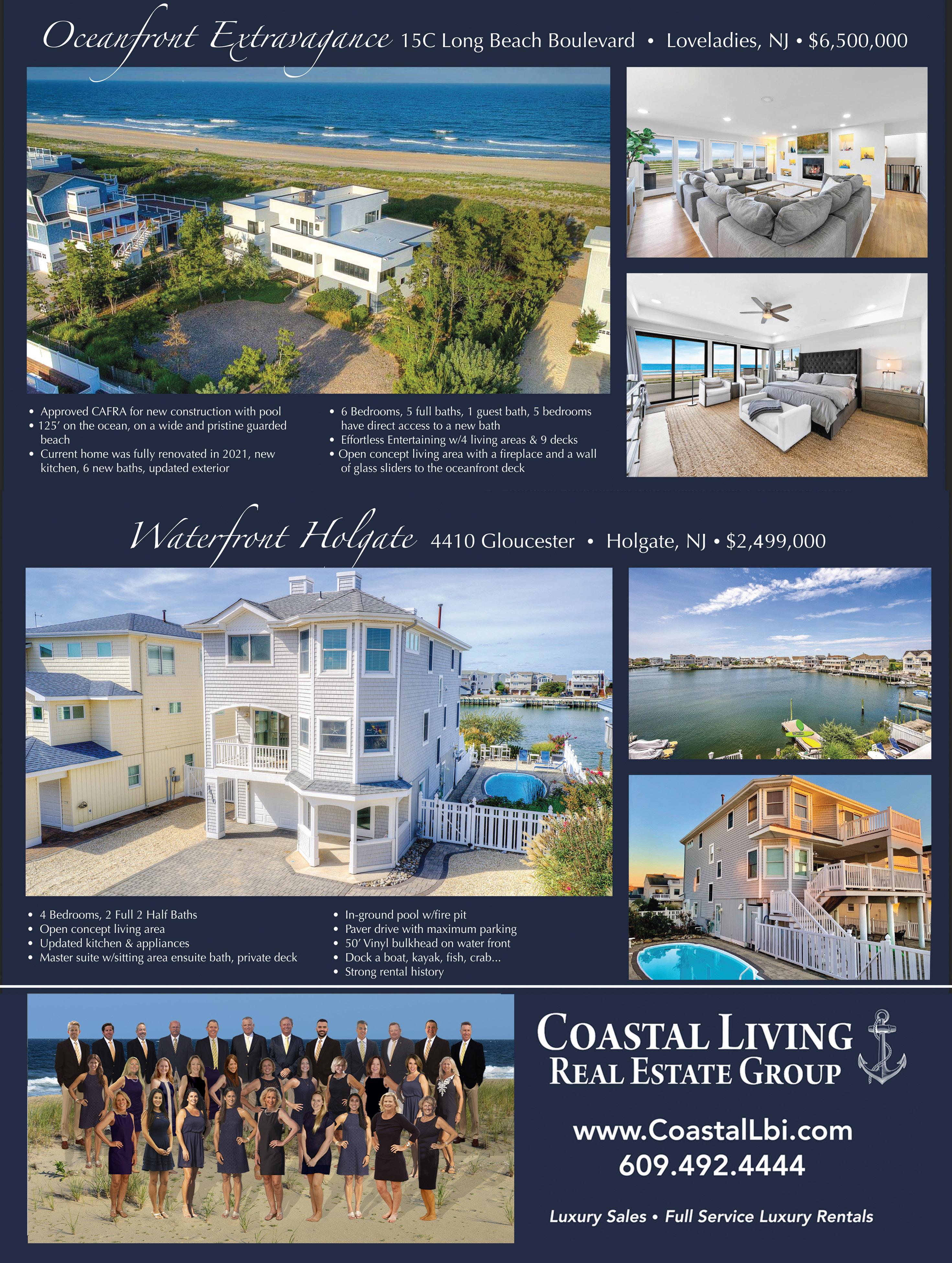

Our team of experienced agents specialize in the unique and dynamic LBI market, and we pride ourselves on helping our clients find their dream home or vacation rental on this coastal paradise. With a range of properties to suit most tastes and budgets, we’re confident we can help you find your place on LBI. With our personalized approach to customer service, we’ll work tirelessly to ensure that you find a property to meet your needs, So why wait? Contact us today and let our expert team guide you on your journey to LBI living!


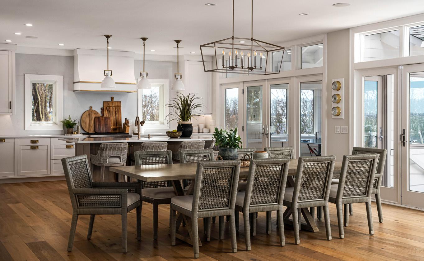
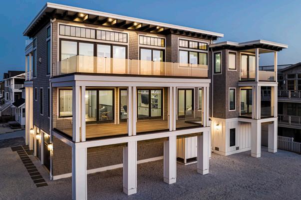


It’s hard to comprehend where the time has gone. We contemplate this as we welcome our 7th (yes, seventh!) season of Open House Magazine here on Long Beach Island. What started in 2014 as a single seasonal Bay Magazine feature of the island’s best-of-thebest in architecture and design, became such a high demand topic, that a few years later, we decided to dedicate an entire publication—Open House—strictly focusing on this beautiful, creative and awe-inspiring industry niche: The Homes of LBI, and everything that goes into planning, designing, creating, building, and adorning them.
In this issue we strive to bring you, yet again, an inside peek at one of the island’s most exclusive and stunning ocean front properties. Our cover story home was designed by the world-famous legendary architects, Gwathmey & Siegal, and built by one of LBI’s very own born and bred homebuilder, in a career highlight project, A. Richard Aitken. This high-profile home’s story is a must-read.
In addition to beautiful homes and many of our island’s talented homebuilders and craftsman, we also bring you stellar interior designs from the industry’s leading coastal home interior innovators. With the exterior of a home being just as important as the interior (arguably more important, especially during the warm weather months), we would be remiss not to highlight the various landscape design artists, retail stores, service providers and industry experts who will be sharing their trade secrets with our readers in this issue.
We hope you enjoy this season’s highlights as much as we have!


CO-FOUNDER | CHAIRMAN PUBLISHER
GARY HENDERSON
CO-FOUNDER | EDITORIAL CREATIVE DIRECTOR
FARRELL DUNLEAVY
VP OPERATIONS
LUELLEN HENDERSON
CONTRIBUTING EDITOR

LISA SIMEK
PHOTOGRAPHERS

JOHN MARTINELLI
MICHAEL SPARK
MICHAEL JOHN MURPHY
CONTRIBUTING WRITERS

LISA SIMEK
DENISE PETTI
SARAH HODGSON
ELAINE SISKO
THOM SWEENEY
SUSAN FIELD
CAROLYN MIJAL

Everything for the Home of your Dreams
 WRITTEN BY DENISE PETTI PHOTOS BY MICHAEL SPARK
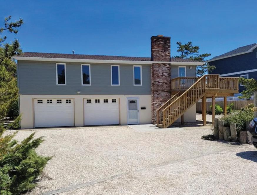
LBI beach houses have come a long way from the casual beach bungalows of yesteryear. Nearly extinct now are the old surf shacks and duplexes with dusty subfloors and dark paneled interiors. The handful that do remain standing are few and far between, now relics hidden just off the boulevard, often sandwiched between the latest and greatest megabuilds. Merely driving or walking by an LBI original beach house inspires fond childhood memories for days gone by, the sentimental pull of salty, sandy heartstrings.
“Ask any LBIslander who has spent a lifetime of summers on this little sandbar,” says Victoria Grimes of Serenity Design. “They’ll have a story about those quaint little beach homes of their youth.”
It’s been said that change is the only constant, to resist change is futile, and that the old must give way to the new. This is especially poignant in the wake of Superstorm Sandy, which ushered in the inevitable redrawing of FEMA flood maps, rewriting of township codes and reengineering building materials. LBI residents had no choice but to begin answering to a force much stronger than nostalgia: Mother Nature.
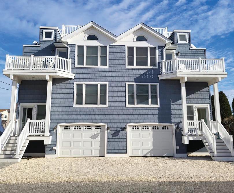
With stronger and more frequent storm activity, rising sea levels, coastal flooding and increased tornado risk, today’s beach homes are now required to either be lifted and substantially improved to comply with current elevation ratings or torn down and replaced with brand new structures that are taller, stronger, and far bigger than their charming predecessors.
“There is a plethora of large properties that now exemplify not just the latest and greatest in building standards, but also the expressed desire of many an LBI buyer and resident,” says Grimes.
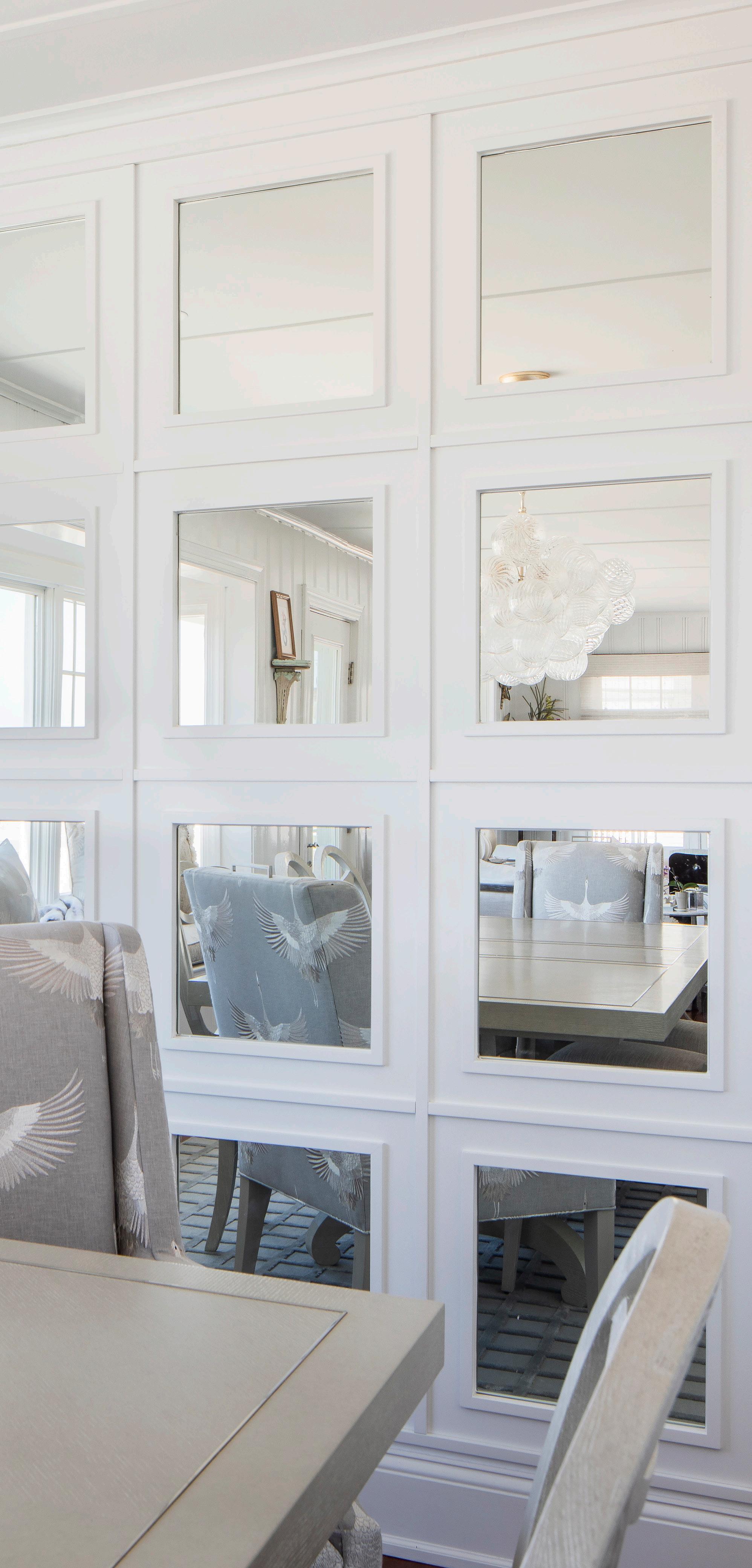
Even as the island’s quaint and humble landscape gives way to a more grand and modern aesthetic, it remains true that many homeowners still endeavor to bid a respectful nod and preserve their cherished island memories.
Simply put, more and more residents are embracing the notion, “You can take the house out of LBI, but you can’t take LBI out of the house.”
“We are working closely with homeowners and builders to identify creative ways to honor the island’s character and charm,” says Grimes.
From architectural elements to interior selections, each aspect is carefully considered, incorporating contemporary features and state-of-the-art building materials with furnishings and accessories that deliver that casual comfort and breezy tranquility, for which LBI is known and loved. The goal is to preserve and maintain the feeling of island tradition that is so unique to the many beloved little beach towns.
“Wood trim and raised paneling, for example, have become features in high demand,” says Grimes. “It almost pays homage while making a fresh, distinctive statement.”
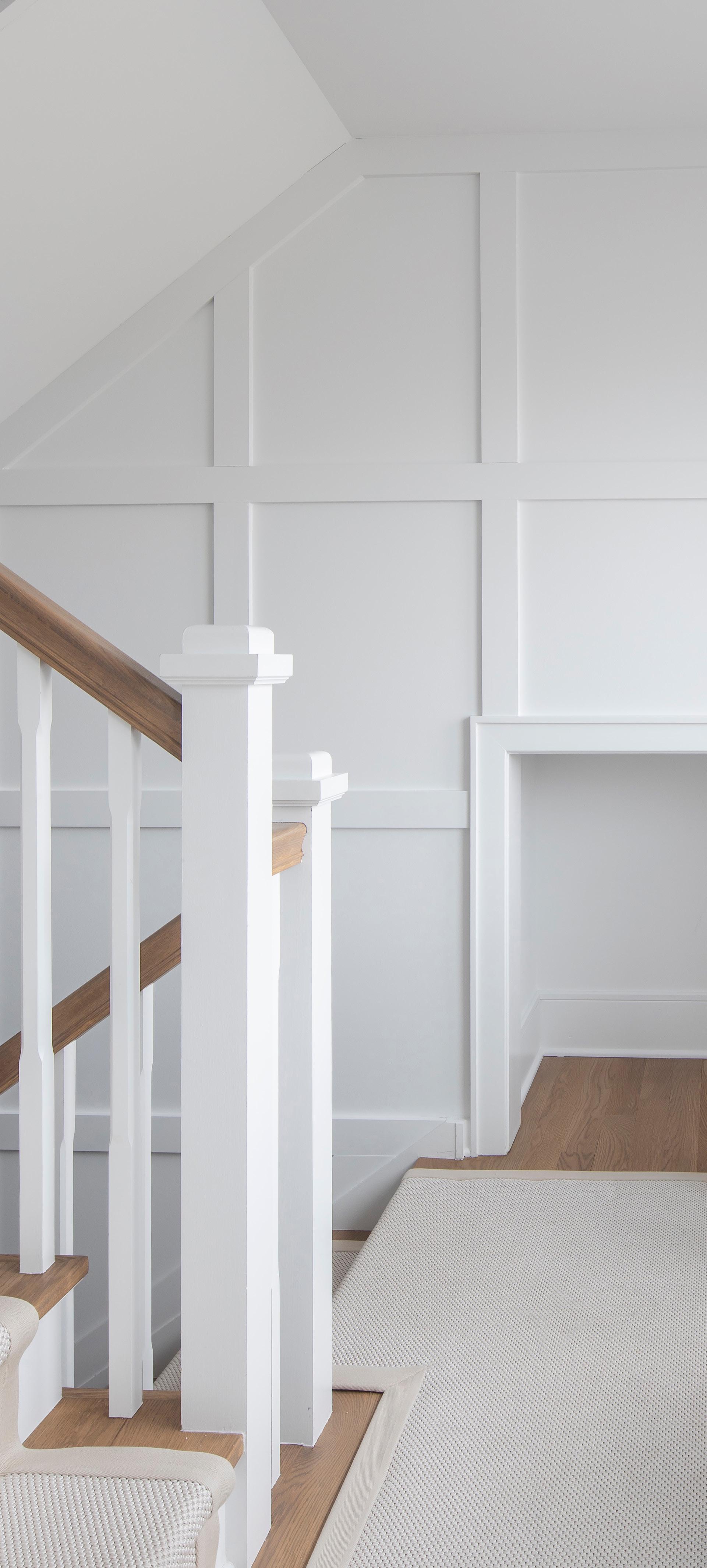
Inspired by the island’s original paneling, beadboard is not just for half baths and sunrooms anymore. Entire floor-to-ceiling foyers and hallways are being covered in beadboard in today’s new builds. Traditionally installed vertically with narrow spacing, the new “BeachBoard” and “V-Groove” products are made of wider planks and rotated horizontally to convey an updated, upscale look.
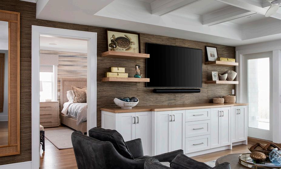
“Wall treatments are usually painted white,” Grimes says. “However we are also seeing bold, rich colors such as dark gray and black on statement walls, which deliver dramatic contrast against some of the lighter and brighter coastal textiles we use.”
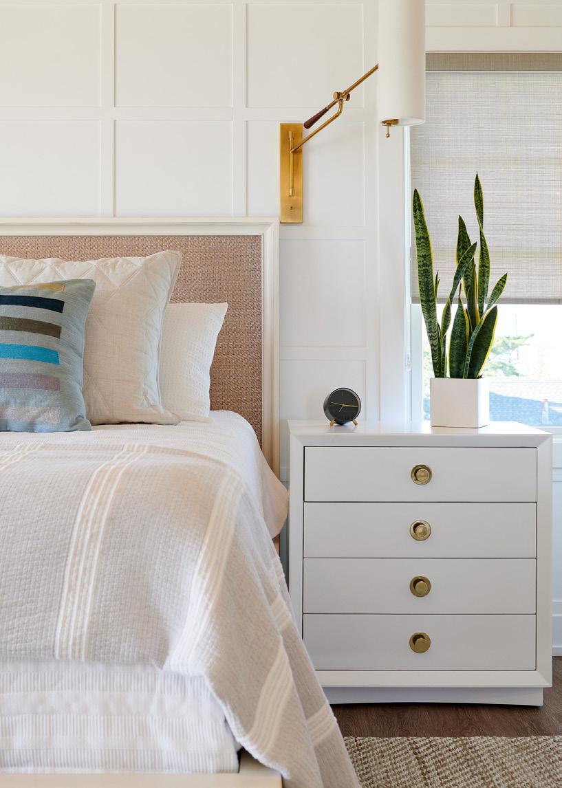
From square boxes to intricate designs, wall treatments are being used to emphasize living spaces, creating drama and visual interest. Whether behind a headboard or on a staircase, these details can be found in nearly any new home build or renovation project, from Holgate to Barnegat Light, and everywhere in between.
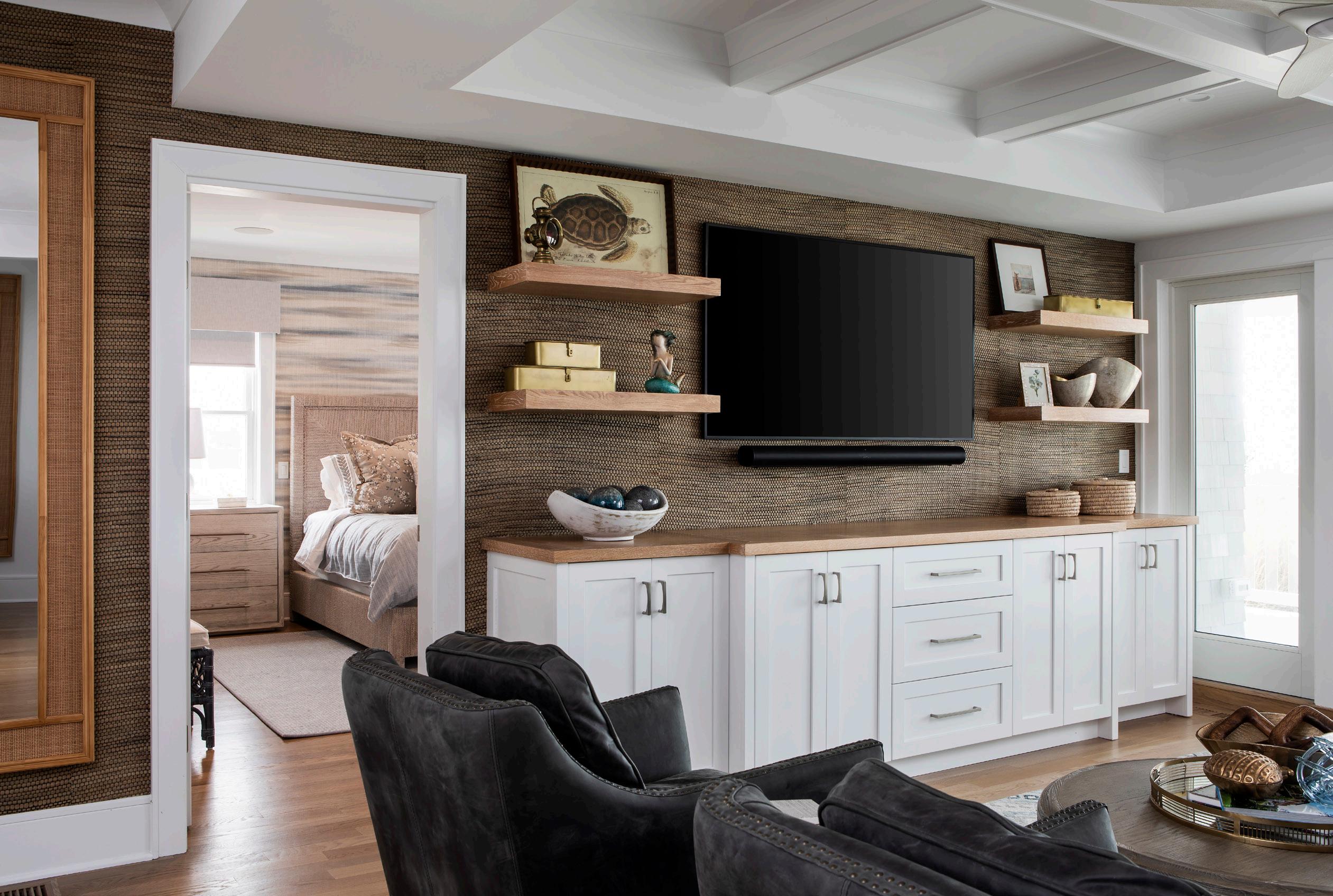
The resurrection of wallpaper is another flourish ushering in a chic flair with nostalgic nuance. For many years wallpaper had been rendered obsolete, and not just at the beach.
“Homeowners tended to shy away, if not cringe at the very thought of wallpaper,” Grimes says. “It was seen as tedious to install and even more tedious to remove. It really had a bad rap for a while, even viewed as tired and tacky.”
Over the past couple of years though, wallpaper has made a delightful comeback with fresh new textures that evoke depth and character. Grass cloth, in particular, comes in countless patterns,
grains and colors which lends itself well to allowing a space to truly breathe. A variety of textures are available, from chunky to smooth, and a practical vinyl option also exists for bathroom use.
Grass cloth isn’t the only wallpaper product that’s having its day in the sun when it comes to coastal interiors. There are a myriad of wallpaper designs, from classic to funky, the latter of which can be used to bring some wit and whimsy, especially where there may be lots of kids occupying the space. Picture a school of blowfish or a giant octopus on the wall, or even a custom mura. Today it’s all possible with wallpaper.
Whether new or vintage, simple or sophisticated, traditional or timeless, a home can look and feel however we wish and dream it to be.
“Inspired coastal design starts with a vision,” Grimes says. “Serenity Design is here to help bring that vision to life.





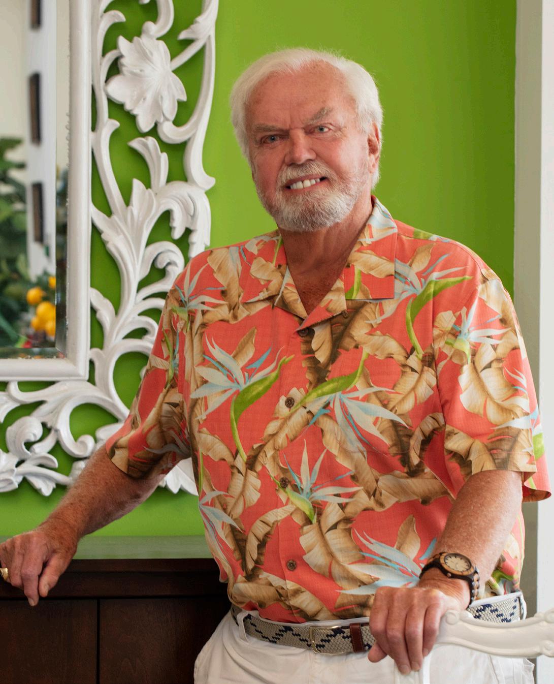
In this Ask the Designer column, Thom Sweeney shares her ideas for how to decorate coastal homes with a touch of brown palette, and how to prevent your home from looking like a Home Goods advertisement.
Thom Sweeney is a renowned interior designer with more than 30 years’ experience creating breathtakingly experiential residential, hospitality, commercial and retail environments on Long Beach Island and beyond. Passionate about creating interiors that are personal, distinctive and inspired, he has produced some of the most elite Manhattan brownstones to Palm Beach mansions, as well as all of the island’s Weddings of Distinction venues. Thom has designed both the largest and the smallest homes on LBI—and many more in between. His retail showroom, Thom Sweeney Interiors, is located within The Gunning River Mall at 849 West Bay Avenue in Barnegat, follow his firm on Instagram @ThomSweeneyInteriors.
Q. I’ve heard that brown is trending as a popular color in home décor. I remember it from the 70’s with little fondness. What is your take on that news? -Susie
R., Surf CityA. Well, Susie, my advice to you is not to get too hung up on the latest forecasts. They don’t always work for our individual situations. For example, since you currently live on the Island and probably have a coastal style going on, I wouldn’t advise replacing your sea glass palette with brown any time soon. However, if you have Regatta Blue and white going on, an injection of brown does work with that particular combination of colors.
In fact, most of the major fabric mills are currently offering contemporized designs which include those three colors. And, when used in the right proportion, it can have a very snappy, fresh look, unlike the 70’s browns which were generally paired with gold and
hunter green for a very depressing color combination. And, in case you hadn’t noticed, Susie, brown is CERTAINLY not emerging as a color in furniture. Nor will it EVER, until we’ve tired of the less formal reclaimed, natural and gray washed finishes that have taken over the world completely these days. Please remember to slap your hand when you are tempted to buy something just because it’s trending. Those things often end up just being trendy.
Q. When I see things at the store or on-line that catch my eye, I buy them. Then, when they arrive home, they don’t necessarily fit in or match with the style of what we already have. When someone in the family rolls their eyes at the sight of my latest purchase, I immediately get defensive and call my taste “eclectic,” however the more this happens, I’m worried that in my case, this may be another word for no taste. Any advice on how to get our place to look more like a home rather than a Home Goods? -Ms. Compulsive, Barnegat
A. We need to get you from COMPULSIVE to CURATED, and that’s not an easy thing to do. One the one hand, you obviously derive pleasure from the purchase of yet another “family” or “welcome” sign for the kitchen (Ugh!). Know that there is a huge difference between eclectic and hodgepodge. Remember that old adage: Beauty is in the eye of the beholder. And in this case, as the buyer, YOU are the “beholder” for the rest of the family. That is a big responsibility, and we’ve got to help you get it right.
First of all, sit in every room, one room at a time, in a comfortable chair positioned so that you can see virtually every item in the room, and be sure to have a large black trash bag with you (That helps with the curating). Now the first question to ask yourself is: Is there a cohesiveness to this room? That’s an important word to remember, because it’s also your goal. Be objective and analytical. Are the styles, or periods of the furniture too dissimilar? Is there a color clash or disparity between items? Are some things too whimsical? Too country? Too formal? Too glam? Start curating. Get rid of the wonderful “peeling paint” picture frame that’s on the mahogany end table. Move it to another room that has a more informal style. And that print of Dogs Playing Poker over the mahogany end table? How about replacing it with a nice botanical? You get the idea. And if you find this too daunting a task, ask one of your trusted friends (whose house you’ve always coveted) to help you out. Not only will they be flattered that you asked them for their input, but you will also appreciate their objectivity and good taste.
You just don’t know where to find that last perfect accessory that you’re picturing... or that elusive chair to complete your vision? Well guess what. We DO. We have all the things you need to complete your dream home, priced from practically free to unaffordable. Call us today and tell us what you’re looking for.


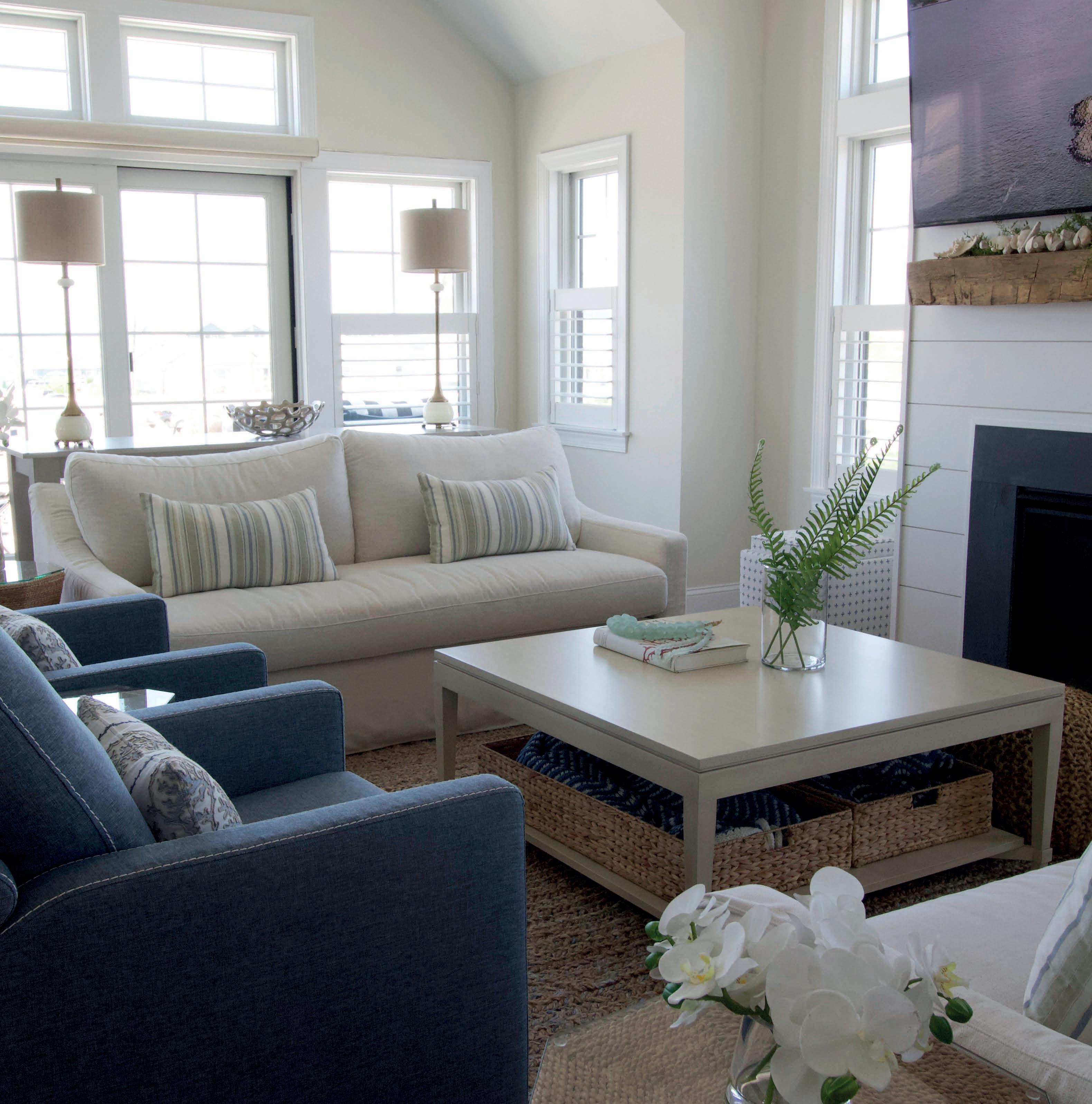
UNMATCHED COASTAL SELECTIONS. DESIGNED YOUR WAY.
If you’ve ever fallen in love with a bold piece of furniture or artwork—only to wonder how you could ever make it work in your home—you are not alone. Expertly arranging furniture and accessories around a focal point, while keeping the area inviting and comfortable is no easy feat. Luckily, we’ve tapped the talented designers at Oskar Huber Furniture & Design to break down everything one needs to know about seamlessly blending a cherished piece of stellar artwork or statement furniture into any design space.
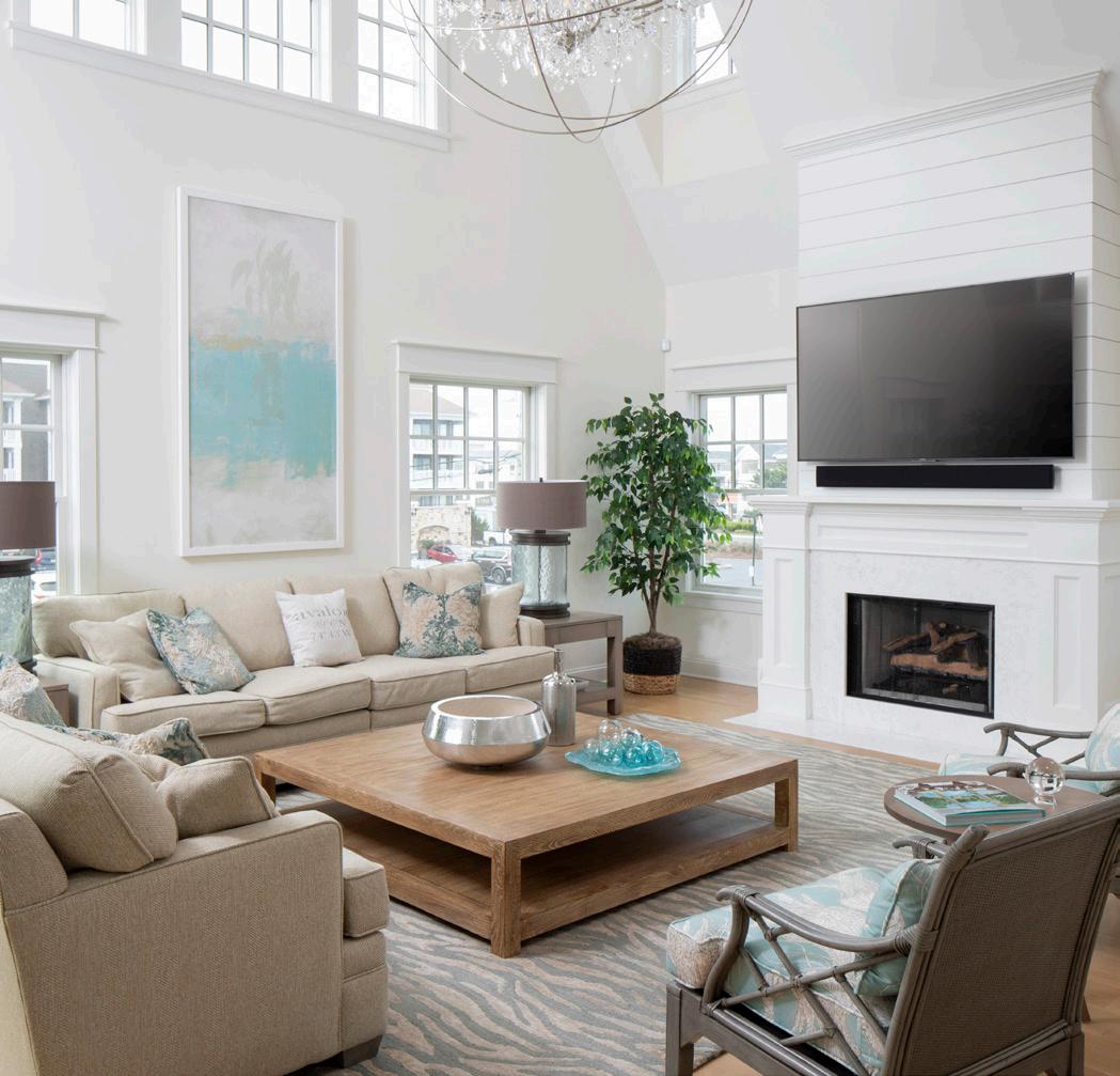
The focal point of a room should be the first thing you see when entering the space. It can be anything like an architectural feature or unique accessory, such as a special picture, light fixture, or dramatic piece of furniture. Sometimes an outdoor view is the focal point, such as bay windows overlooking the glimmering sea. But figuring out the perfect central point of a room should not leave one feeling overwhelmed. Think outside the box about how to manufacture an aesthetic hub by visiting the Oskar Huber showroom in Shop Bottom. Their designers offer helpful solutions and can point you in the right direction. They will help you get creative with wall paint, rug patterns, luxurious furniture, or even a piece of artwork or a specific arrangement of indoor plants that will give guests something to talk about upon entering your home.
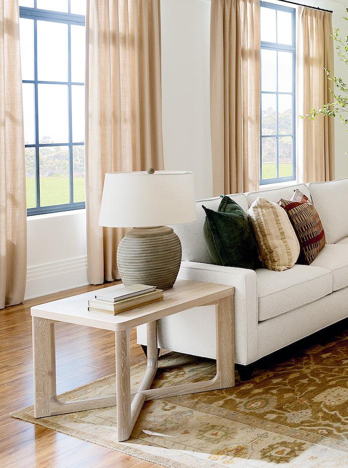
How you choose to adorn your walls says a lot about you, your style, what’s important to you, as it naturally personalizes your space. Have a piece of art that you are particularly drawn to? Use this as the stepping stone to build your room. Walls are your best platform for display, and sometimes, a whole room may revolve around one piece of art.
Marcia McCracken, interior designer at Oskar Huber, suggests considering, “What mood does the Art piece have? Does your Art invigorate you, does it have a sense of mystery, is it calm and peaceful, does it create a happy joyful feeling, a whimsical fun feeling, is there a sense of elegance or a more relaxed casual feeling? A good practice is to write 5 feeling words that describe your Artwork, and this will help determine the design direction of a room and help identify furniture and accents that will work best with the overall vibe inspired by this art piece.”
For example, if the artwork evokes warmth and relaxation, then the consideration of softer, natural fibers and textures would be incorporated into the aesthetic. If the painting is colorful, exciting and stimulating, then the use of other complimenting bright, fun fabrics and design elements would be considered. Long Beach Island aesthetics tend to lean casual and focus on bringing the outdoors-in with varying natural elements, and this is usually a commonality with all coastal designs.
The important discussions with your designer would involve deciding what the homeowner would like to keep versus what they would like to change in their space. It’s about listening and understanding the client, how the homeowner communicates their vision to designer, and then identifying the designs that would bring the aesthetic that they want into the space, defining the mood of the room.
Artwork is not the only thing that can help inspire the decor of a room. Although specific lighting rules may vary, one’s light source and fixtures definitely need to speak to the aesthetic you are trying to achieve. Lighting fixtures could either match or be a different genre as the stand alone, standout piece. “A classic chandelier might lend a more traditional style to a room while a wicker or wooden fixture adds a casual rustic charm to a given
space,” notes McCracken. The texture of wicker can then be translated into warm wood accents throughout furniture and accents. Adding rustic accessories that tie into that theme create a repetition of texture and style— which reinforce a cohesive, polished look. Alternatively, investing in a showstopping light fixture anchors the entire room and sets the tone for the rest of the space— whether that be deciding to tone down the remainder of the room or accentuate the light source.
A focal point does not have to be fixed on or be a part of a wall, however. Bold flooring choices and furniture pieces can also be strong visual features that capture attention. Large, striking furniture pieces can also be your focal point when your room has no distinguishing architectural features.
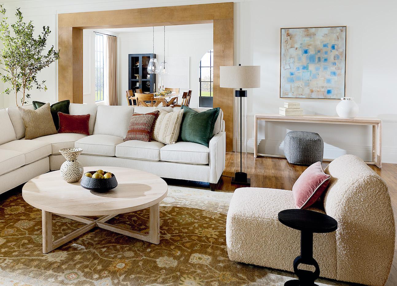
In a living room or family room, for example, the couch is the first element that one usually notices upon entering. An inviting couch in a bold color can bring in drama, and a sofa in a unique fabric or an odd shape, like a U-shape, or architectural details like wooden accent trim on certain pieces, offers much visual interest.
Sometimes the focal furniture is an unusual find, an antique item or a colorful accent piece. Be sure that when incorporating this piece of furniture, one doesn’t get hung up in having it blend it. “Don’t focus on ensuring that every element in a room matches,” says McCracken.” “Alternatively, try to hone in on picking three main colors, with multiple shades of the same color intermixed, and subtly incorporating them throughout the space, she adds.” Curated design doesn’t have to use much color to make it feel as if there is color in the room. Often times, too much variety of different colors can be hard to harmonize without looking too busy.
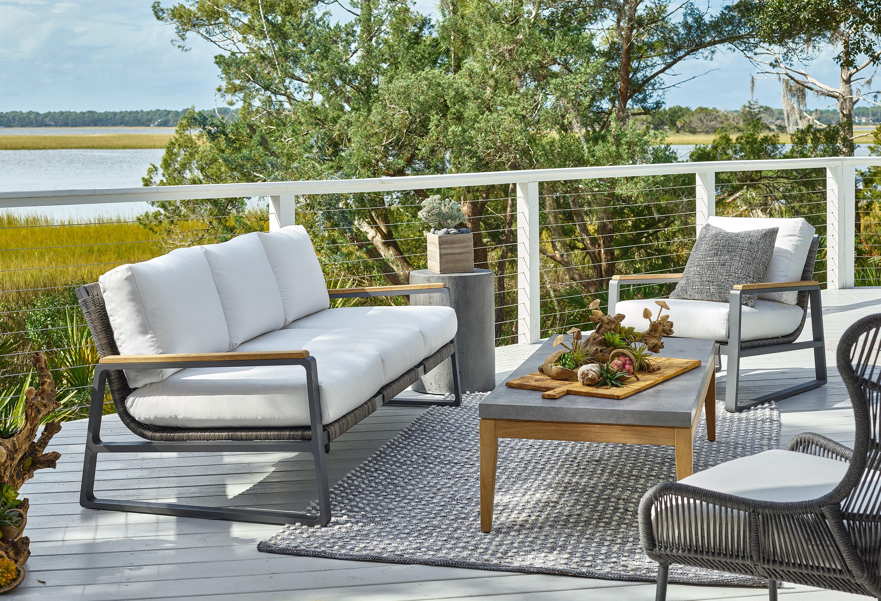
One of the most popular focal point textiles of a room is the rug. Arguably, a rug is the most important element that dictates the aesthetic of a room—whether one chooses to have it be the focal point to not. It’s easy to tweak the other accessories and accents in a room to fit the rug, but finding a perfect rug after furniture, accessories, textiles, and paint colors are set—well, that’s going to take a lot more critical thinking.
Marcia McCracken suggests that homeowners look to a specific pattern for inspiration when planning your space. A rug or even just throw pillows can be a great place to start. Using the colors from an area rug as a starting point gives the option to pull coordinating pieces and accessorize a complete space. Sometimes it’s a little accessory, like the patterned throw pillow that accents the rug, which bases the color palette and drive the design of an entire room.
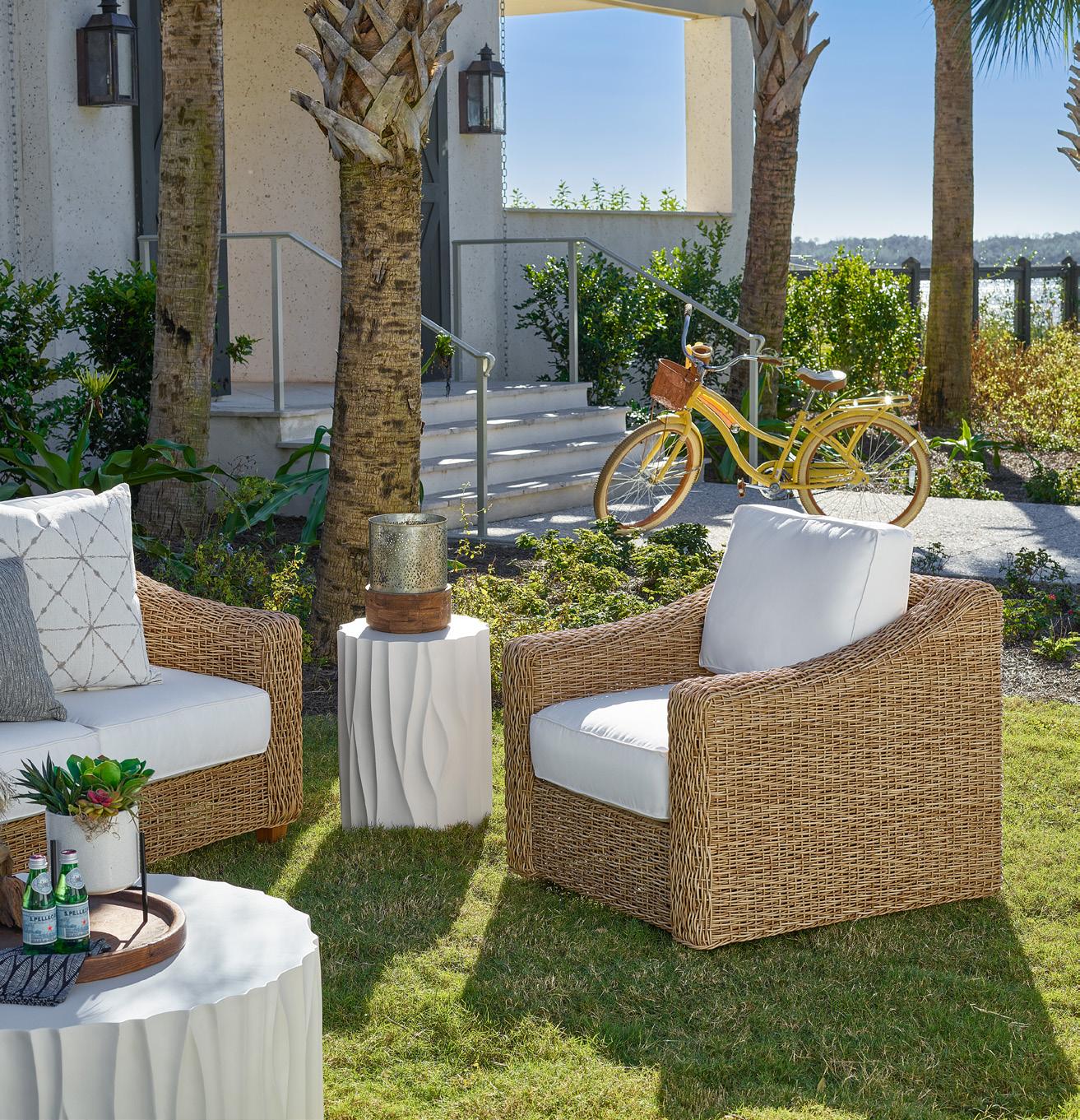
It is important to note that if your statement piece has a pattern on it, however, don’t be afraid to combine it with other patterned accents. “The trick to mixing patterns,” explains McCracken, “is remembering not to mix patterns of the same scale.” She continues, “pair a large pattern, like a bold stripe, with a smaller more intricate print to help create balance, otherwise two or three large patterns thrown together could look garish.”
McCracken adds that as a team, the Oskar Huber designers try to work with the items that homeowners want to keep when redesigning their home. Often times this requires a curated perspective, as too many items that are strong might take over, but the designers are experts of knowing what to tone down, and how to accentuate the pieces that really
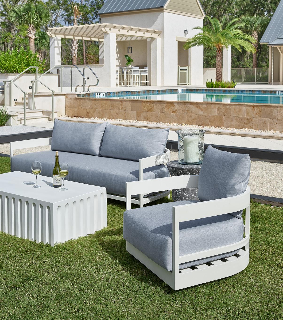
would work with the elevated updates to design. Layering accents is oftentimes the trick here.
Another element of design that McCracken feels strongly about is displaying at least two colors in a room. As a rule of thumb, she shares that layering color does help give the eye something more interesting to look at; one might not even notice that you are seeing more than three colors, as even the most subtle of differences help make a room more interesting. In the LBI-region, she often works with shades of blue, and since the colors are in the same palette, all the blues work together. She stresses not to be hung up on one color, such as blue, for example as this can sway towards a bright chartreuse or green tone. The options are limitless.
Whether you take a hint from the texture, color palette, or style of that must-have furniture piece you can’t resist, there are plenty of ways to design an entire room around a work of art as your focal point or standout piece of furniture. Don’t believe it? Pop into the Oskar Huber Furniture & Design showroom and speak to one of their professional interior designers. They will let you in on more than a few of their trade secrets with a complimentary design consultation.






 Interior Design
to
It’s safe to say homeowners typically don’t daydream about buying a smaller home. But less maintenance responsibility, increased cash flow, and greater flexibility is definitely an upside to not living large. After all, the time and money formerly spent on cleaning and upkeep can now go toward fun things—which is precisely why downsizing can be a step forward, not backward.

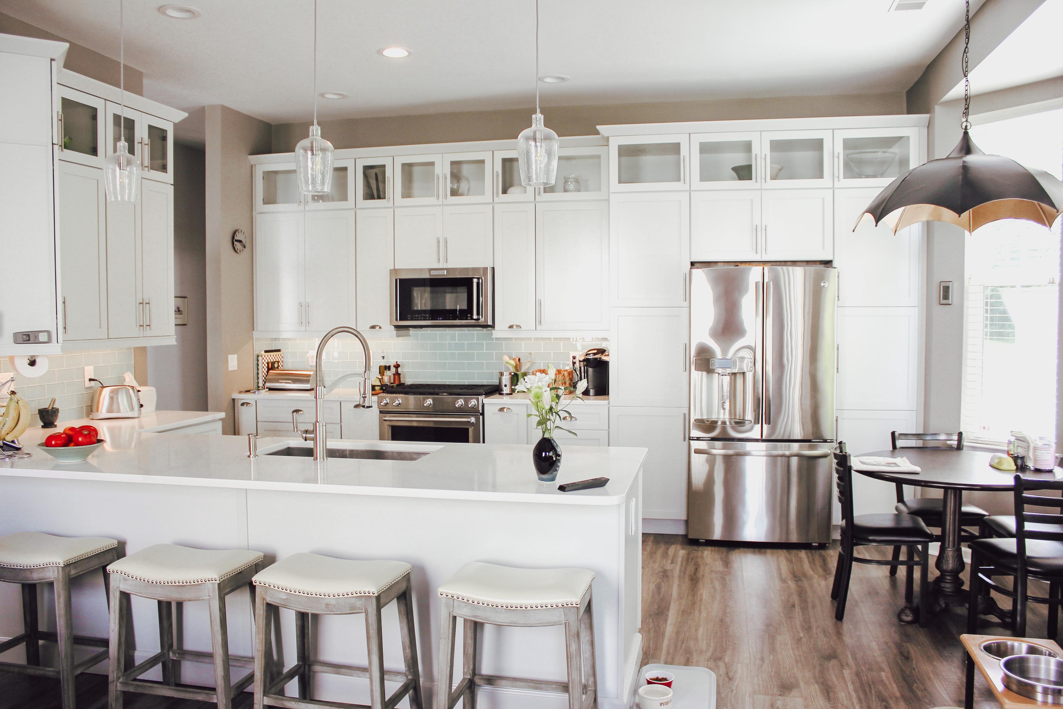
Being an empty nester often prompts one to make a few changes in their personal lives. With her adult sons off fulfilling their dreams, it was time for one local homeowner to shift her focus back to how—and where—she wanted to spend this next chapter of her life. Choosing to downsize from her family’s center hall Colonial in Mahwah and relocate to a new construction build within a new 55+ community in Barnegat was the first step, and ultimately, gave her the chance to start fresh at the shore in more ways than one.
Barely meeting the age requirement to move into the 55+ community, our homeowner still works full time (and, from home) in the travel industry. While on the younger side of the active-adult community, she saw this as an opportunity to live a simpler, low-maintenance lifestyle (goodbye, snow shoveling!) in a walkable neighborhood with easy access to amenities such as culture, restaurants and social activities. The conundrum was, how to downsize from a large family home that was full of nostalgic items that have naturally accumulated over the years, and simultaneously decorate a brand-new home that literally had nothing inside except for basic builder grade, bare white walls.
Feeling a tad overwhelmed, she needed assistance curating her new living space after the de-cluttering, condensing, recycling and organizing. The answer came in the form of a recommendation from her real estate agent and friend, the same woman who had sold her the home, “You must meet with the one and only, LBI’s Thom Sweeney!”
Apprehensive, as she had never worked with an interior designer before and didn’t know what to expect, she looked up Thom Sweeney Interior’s Instagram profile (@thomsweeneyinteriors). After browsing through the photos on his feed, she decided that his subdued client-centric design approach wasn’t at all “frou-frou” or fussy (which was why she always had a hesitation working with designers in the past). Hopeful, she met with Thom in person and they instantly connected with delightful, easy-going conversation and a ton of laughter. She had found a designer who understood her and how to fulfill her vision (not their own). She had found her designer.
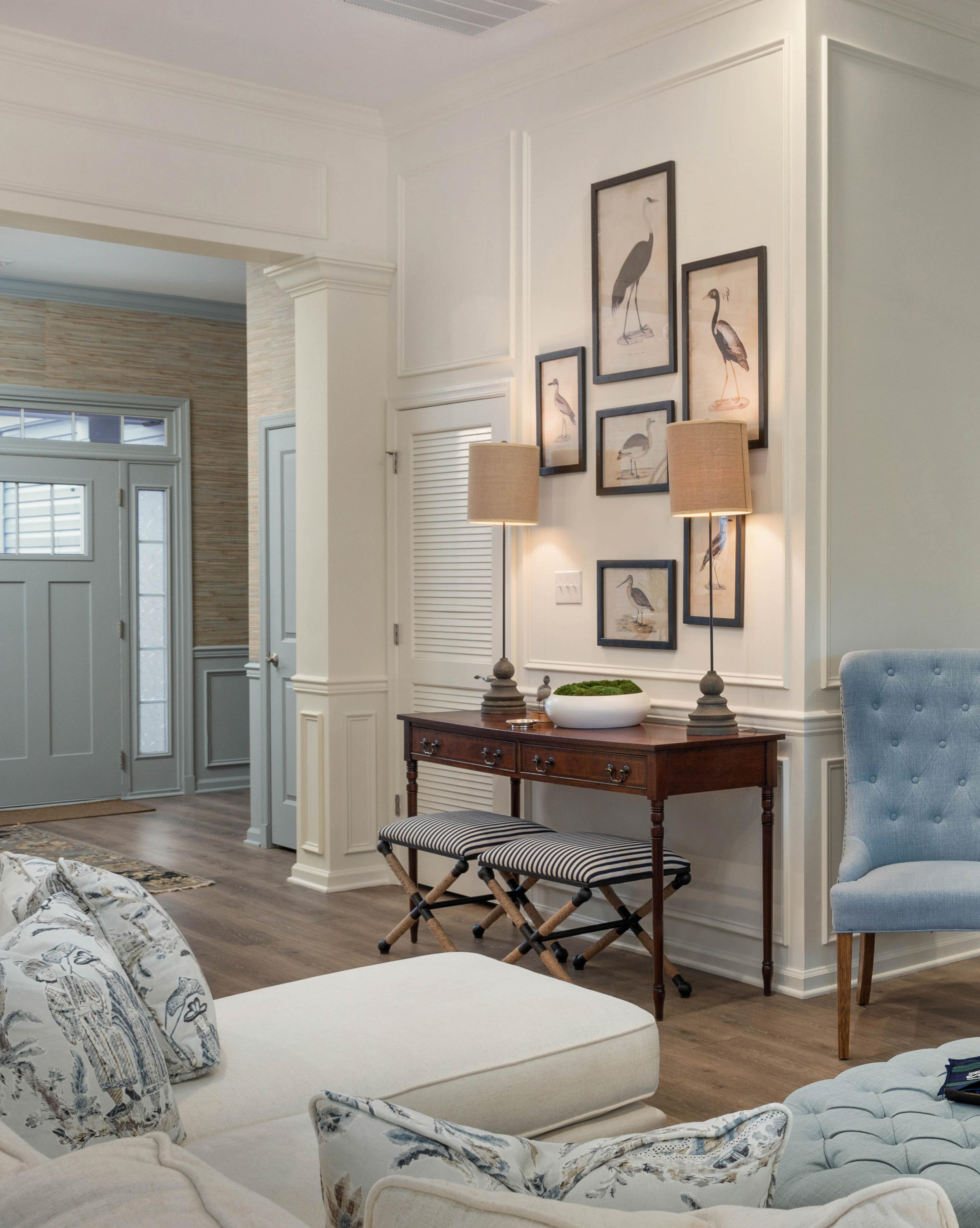
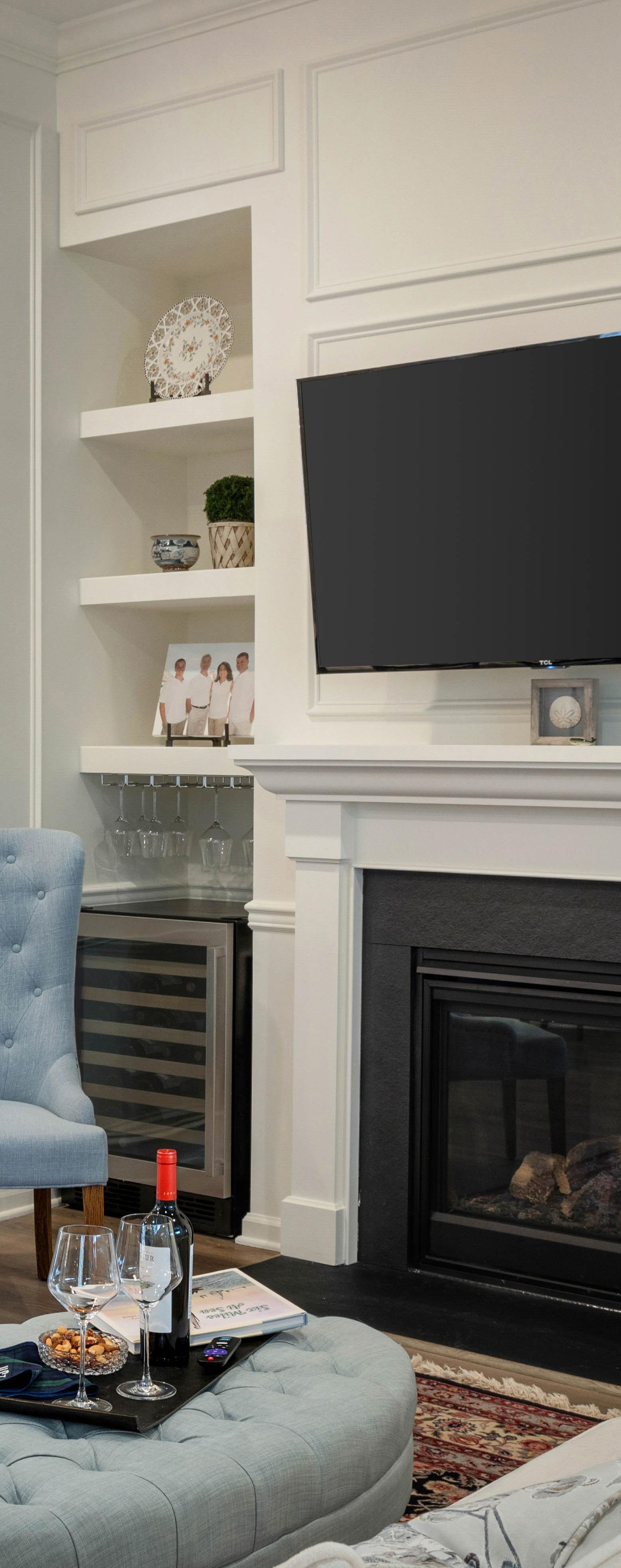
She decided to bring all of the dark cherry furniture from her old house with her to the new, brighter (and smaller-scale) home. There were quite a few sentimental objects that she couldn’t bare to part with, yet she simply couldn’t figure out how to harmoniously integrate them into the new aesthetic. This process was something that Thom Sweeney was able to expertly guide her through. Marie Kondo-ing their way through all of the homeowner’s most precious belongings, the designer was able to work with the homeowner’s desire to preserve as many items as possible and repurpose them into her new aesthetic. From antique plates from Portugal to ornate trays from the Middle East, a precious ceramic egg from Japan, China cabinets and more, Sweeney knew exactly how to integrate her family heirlooms and keepsakes into a rich, elegant and luxurious aesthetic that remained warm, casual and inviting.
Thom notes of the process, “We were very sensitive to her wanting to keep meaningful objects and therefore special attention was paid to include some of the wellloved art from ‘the old house,’ which brought a level of comfort to her and her boys.” That’s not to say that Sweeney didn’t draw a hard line on things he thought would not be compatible with the look he was trying to achieve for her. He and his team strived to think of every detail that would make her feel like the new space was truly a reflection of her personality—right down to subtle details including monogrammed towels.
Since the family hadn’t redecorated for many years, Sweeney knew it was also time to revamp the older objects within the new space by carefully selecting her crossover items and enhancing them with modern compliments. At the same time that his team helped curate Jeanne’s furniture, rugs and accessories (all the while suggesting they re-use as much as possible), they also added novel pieces that were more compatible with the fresh design. Oftentimes there were pieces, such as a standout light fixture or paneled curtains over a window, even a puffy blue coffee table in the living room that the homeowner confessed she “never would have in a million years chosen for herself,” but absolutely loves how the finish product turned out. She attributes that part of that success is due to giving Sweeney the creative freedom to “do his thing” and trust in the process, while keeping an open mind to consider his recommendations. She knew that the end result would be more miraculous than she could have ever envisioned.
One of our homeowner’s favorite clever design elements that Thom configured was retrofitting her dining room to double as an office workspace. Since the dining room
was already equipped with a table and chairs, it would have been left as one of the most under-utilized spaces in the home. Thom notes of his bright idea, “When we met, she was working off of a small desk in the kitchen leaving no room for a kitchen table! That wasn’t working. She didn’t have enough room to spread out and she didn’t want to use one of the two extra bedrooms as an office, because she wanted the boys to each have a room when they visited. So, I decided to design the dining room to function as her day-to-day office, with a minimum changeover to become the dining space when needed.”
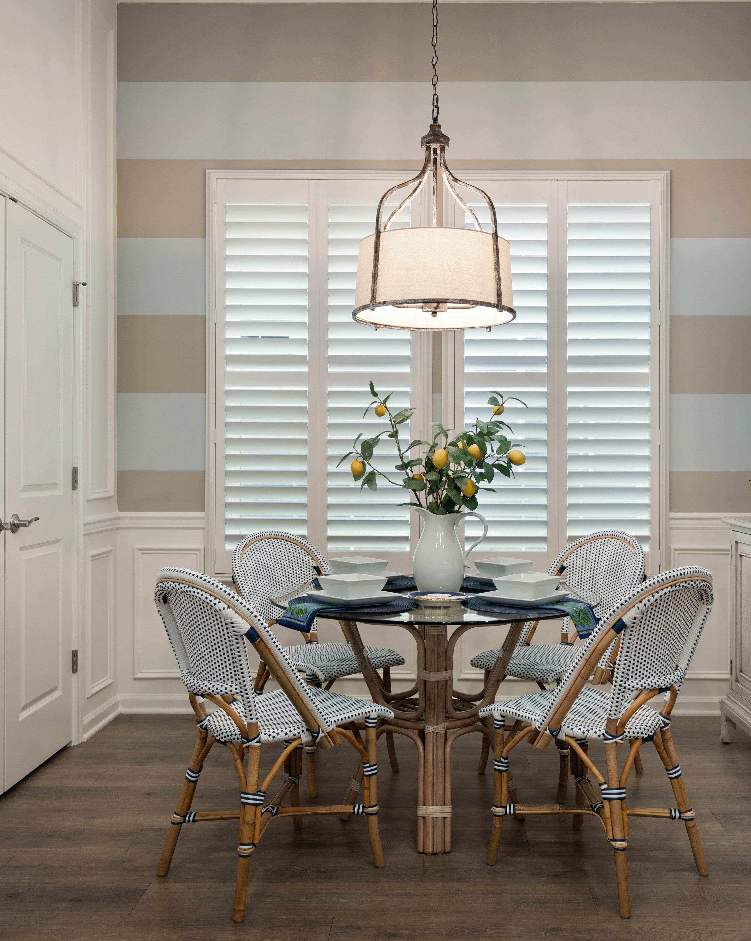
Out went the China closet, and in came a buffet credenza unit. This was also prime opportunity to incorporate light into the room to counteract the darker, cherry furniture. He found brighter furniture components
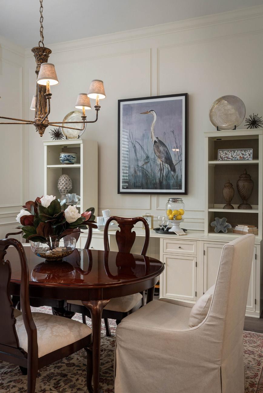
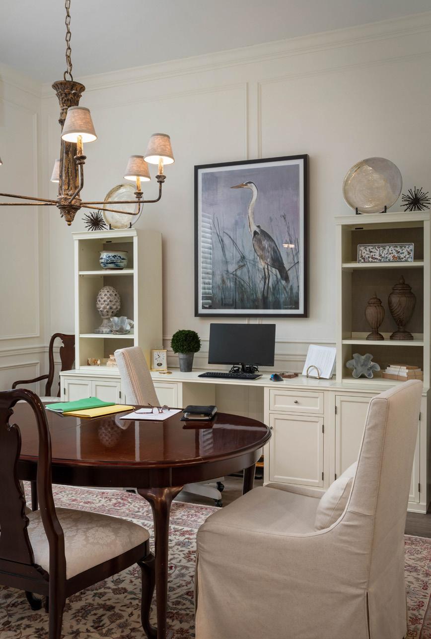
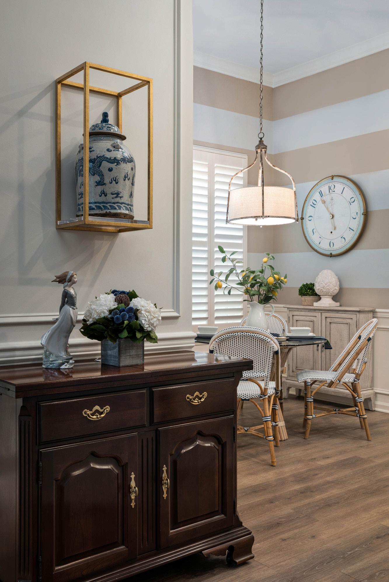
that would enable her to have a desk area that doubles as a buffet when company is expected, and as a credenza when she is working. The dining room table added lots of additional work space which enabled the homeowner to spread out her paperwork. The design team played around with clever accessories and elegant furnishings such as brightly colored host and hostess chairs to create an office zone in the dining room—all of which could be packed up, stowed, with paperwork and monitors tucked neatly away when the time came to use the space as a dining room instead of an office.
Additionally tasked with warming up the home, Sweeney and his team achieved this aesthetic by adding the appropriate color and texture throughout each of the spaces. They made a presentation which included wallcoverings in the foyer, powder room, both bathrooms, and the main bedroom. The homeowner was overjoyed that the grasscloth wall coverings in both her bedroom and the foyer just took each of those spaces to a whole other level. Sweeney notes, “We suggested grasscloth wallpaper in the foyer to add a sense of arrival and drama to that area. The wall covering was also added in the main bedroom and bath, and also the hall bath and powder room, to give warmth to the ‘white ice palace’ that she bought from the builder.” These details as well as the homeowner’s extensive art collection elevated the mood of the rooms and certain-
ly integrated the much-desired essentials of warmth, texture and charm.
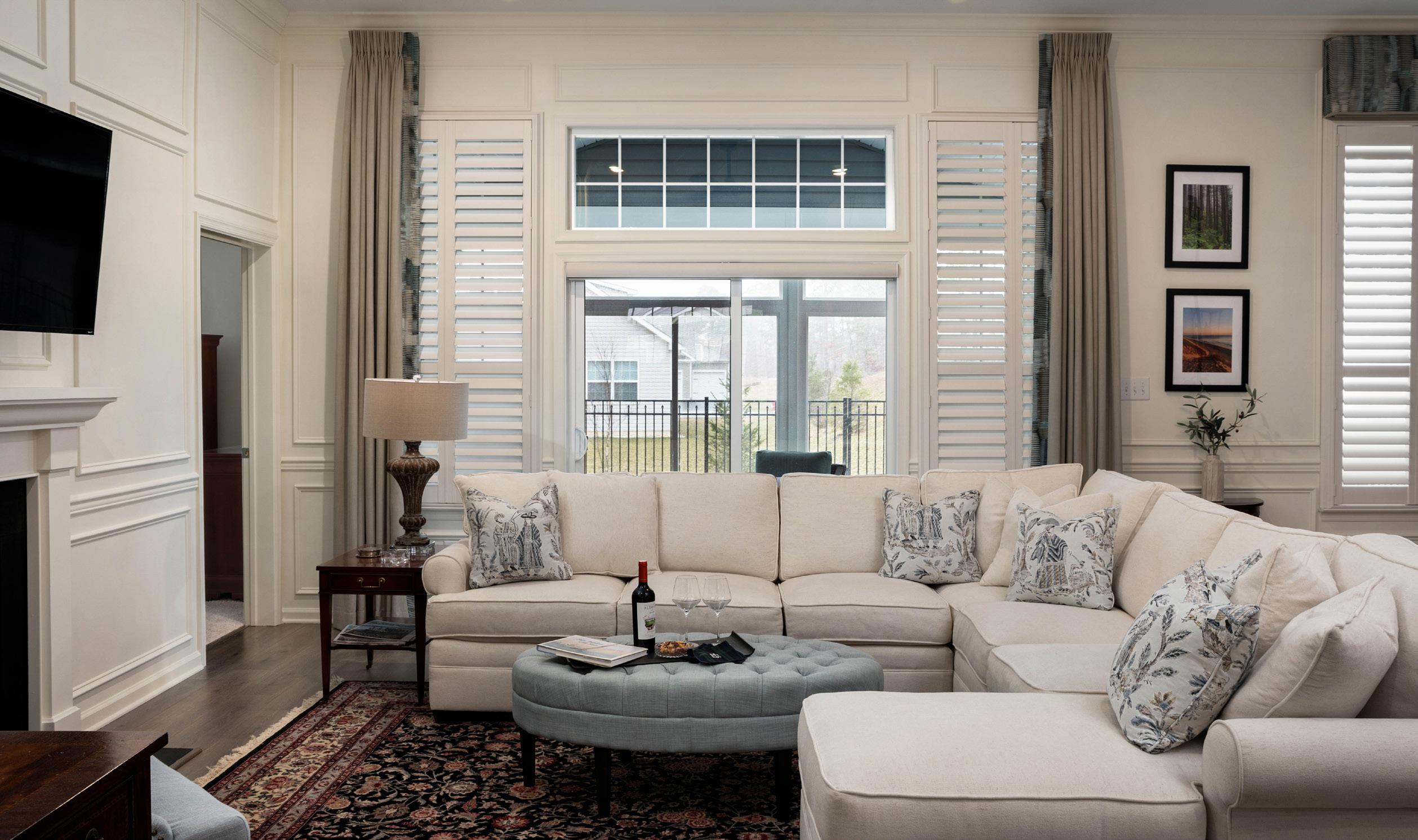
Furthermore, Sweeney’s design team proposed crown molding and extensive picture frame molding to replicate wainscoting, floor to ceiling, in the living and dining room area, which would give the illusion of paneled walls. Not only would this detail help define separate spaces in an otherwise open floor plan, but the intricate trimwork also accentuates the height of the area while adding an architectural touch that the newer “white wall” builder homes generally don’t include.
While the thought of working with an Interior Designer may have seemed daunting to our homeowner at the beginning of her journey, “downsizing is not for the faint of heart,” Sweeney likes to say, in retrospect she couldn’t have ever have done it without the help of Thom and his team. Not only was the project inspiring, full of laughs and artistically enlightening—one never truly comprehends how many textile options are available until a professional brings books of swatches to your lap— it was a great exercise in keeping an open mind and trying something new. Our homeowner couldn’t be happier with the entire process of working with Thom Sweeney Interiors, as not only is she absolutely in love with the outcome, but she was also thrilled to have made a new friend in the process.
Interior Design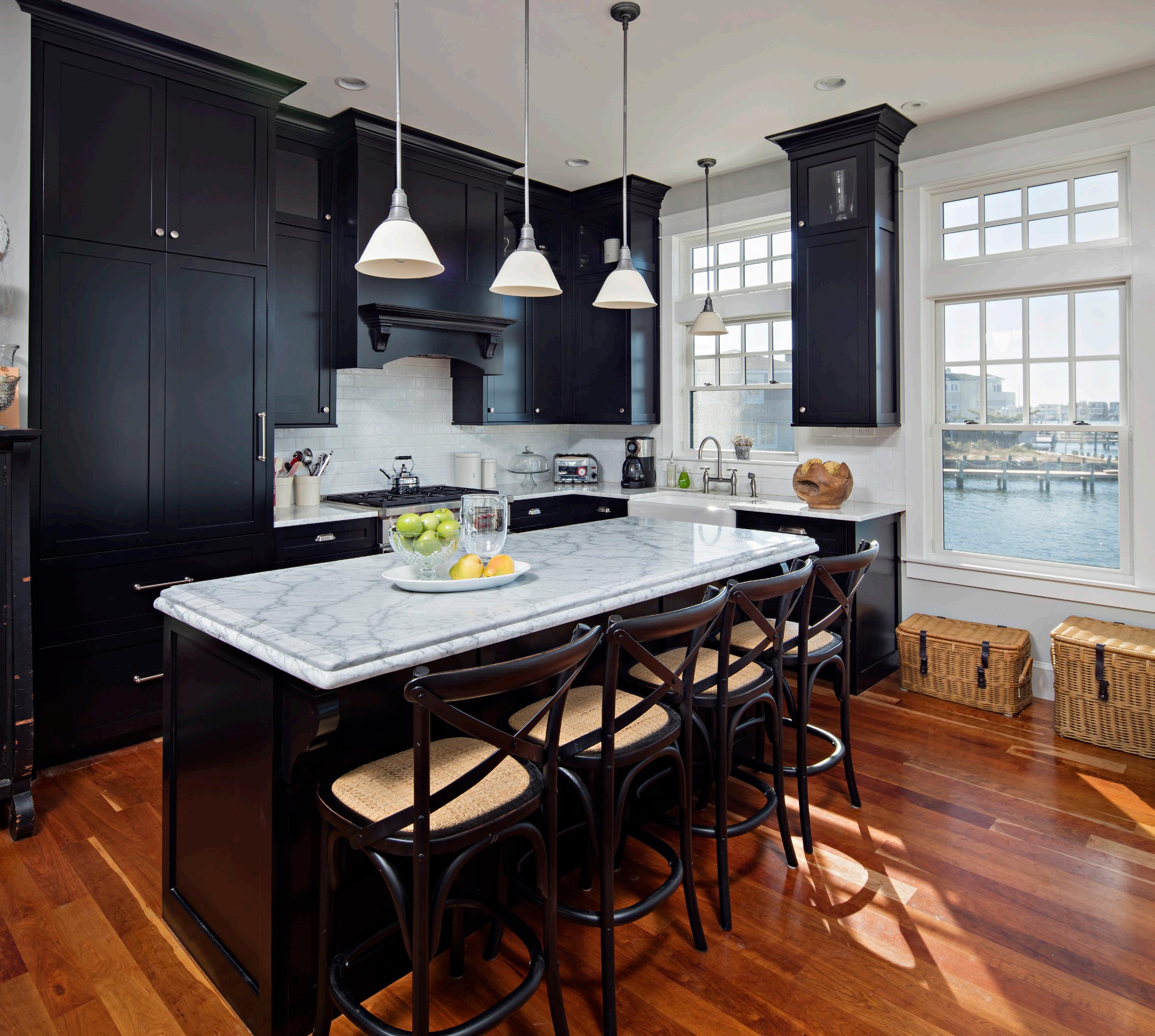



 WRITTEN BY DENISE PETTI PHOTOS BY MICHAEL SPARK
There are some places in this world that just strike you a certain way, stir warm and fuzzy feelings inside, and seem to transport a person back to a simpler, lovelier time. A newly renovated historic home in Beach Haven, owned by Mick and Sandra Curran, is one such place.
Longtime summer residents of LBI for more than twenty years now, Mick and Sandra were taking a leisurely stroll one day, back in 2020, along the historic street of Atlantic Avenue, when they walked past what appeared to be a pretty bad looking home. Staked in the ground was the For Sale sign of longtime friend and real estate agent, Barb Cona of Coastal Living Real Estate Group. The rest, as they say, is literal history.
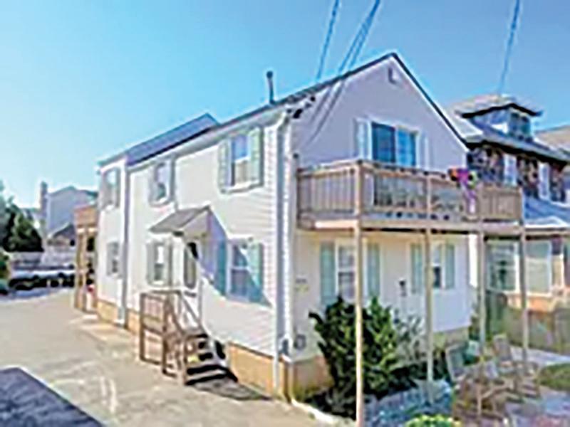
“As soon as they called, I knew this property was meant for Sandra and Mick,” said Barb. “Their vision of its potential was inspiring. They transformed an old house into something really special, maximizing every inch with exquisite detail, and bringing forth a stunning three-story masterpiece.”
As a career home inspector and builder Mick took one look at the home and knew they would be able to remodel it. Situated in the historic district, the Currans’ favorite part of the island, they loved the classic old homes on the street and the charm that it lent to Beach Haven. With that, they deliberated about what the renovation project might entail and began to assemble a vision for creating an aesthetic that would adapt and complement this historic neighborhood.
“If you look at the streets between Second and Third,” Sandra said, ”There’s just some really beautiful old homes there. We wanted to build something in keeping with those existing structures.”
As a southern girl herself, Sandra has always appreciated the tasteful beauty and historic charm of old houses. From brick pavers to cedar shakes, she took inspiration from the town of Charleston, South Carolina, populating her Pinterest board with reams of inspired designs.
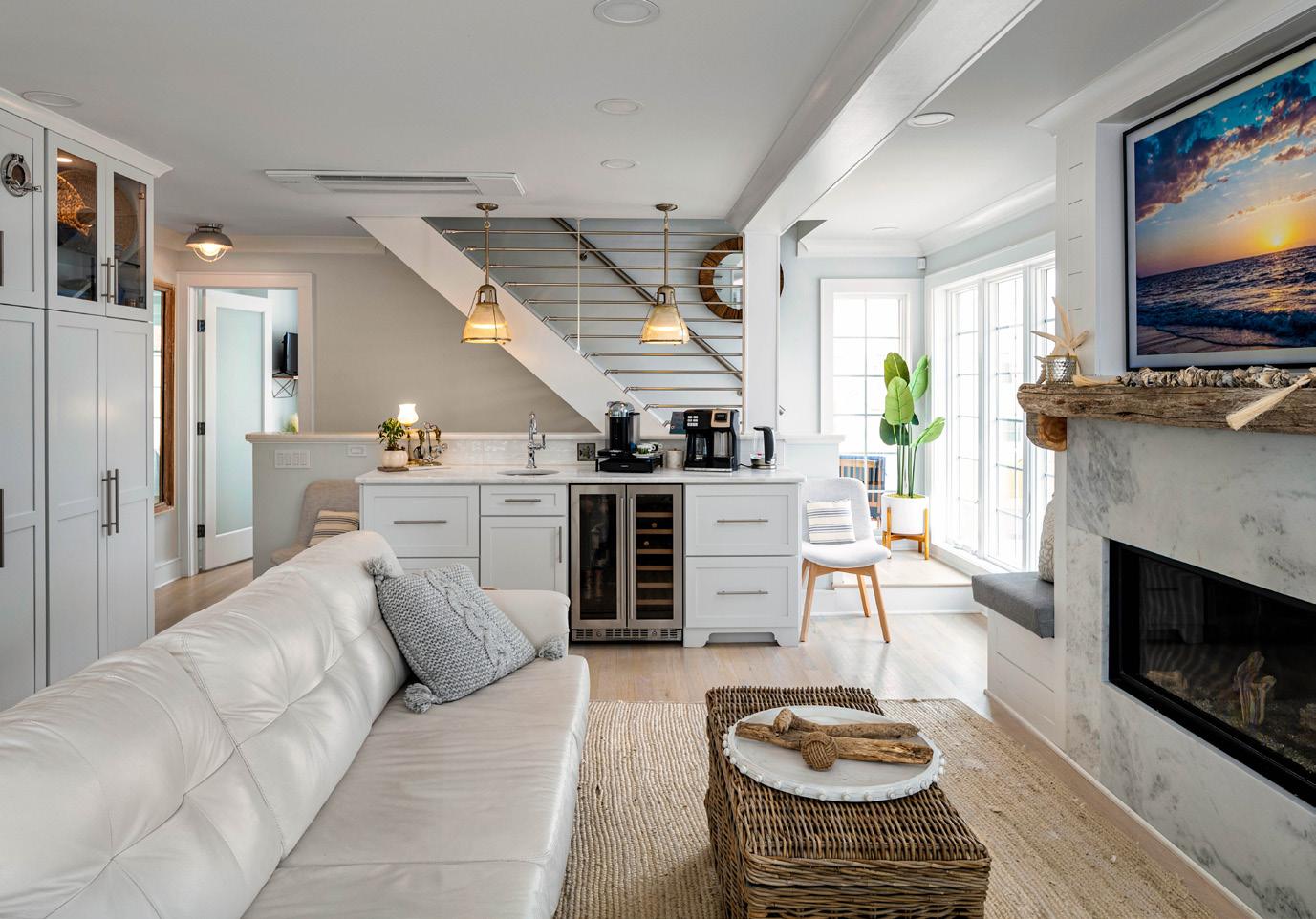
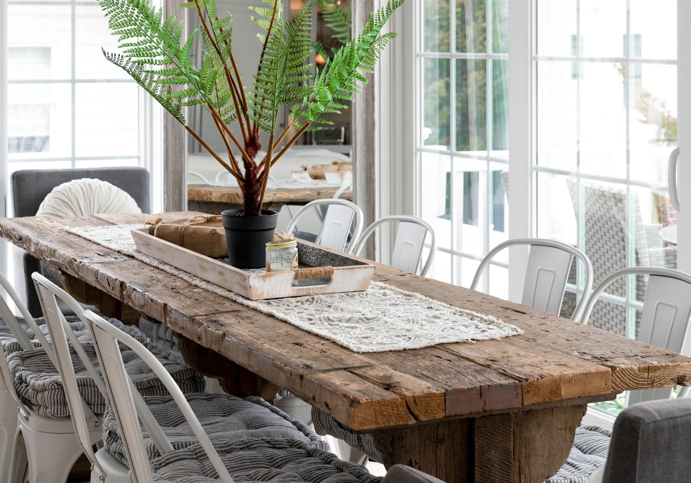
“I would show Mick and he’d sketch something on a piece of paper and hand it to me,” Sandra recalled. “I would hand it back and he told me to stop sending him pictures because he couldn’t do all the things that I wanted to do. He knew I was mad, so he stayed up all night and redrew the plans for me.”
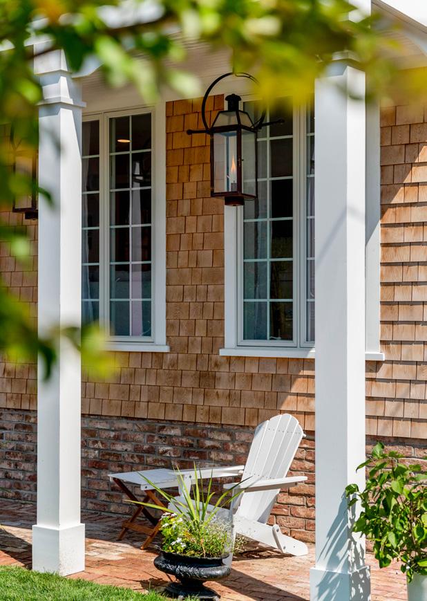
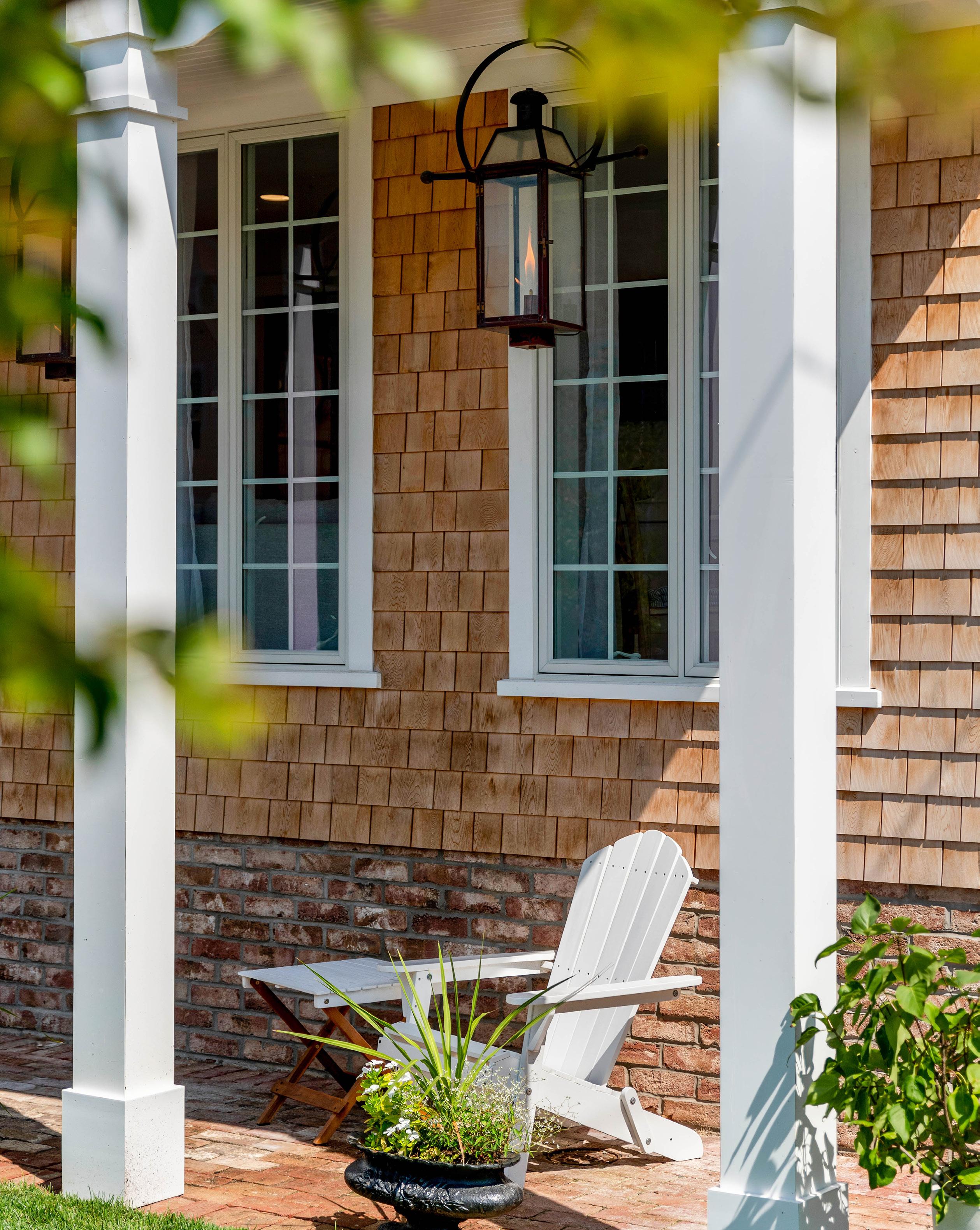
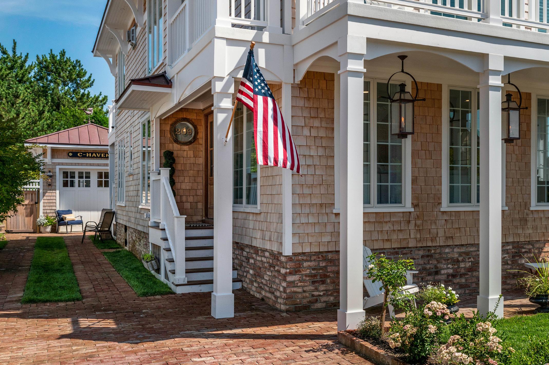
The old expression of “Happy wife, happy life” aside, Mick went to Sandra the next day with a revised vision sketched out on a napkin. It included multiple wraparound decks, a classic copper hip roof, gas lanterns and a widow’s walk - a railed turret that is more like a crown adorning the home than a traditional rooftop deck.
Mick joked, “I may not be a trained designer or architect by any means, but I’m able to put a drawing together and give it the right direction. We’re still married, so I guess we made it.”
With that, the design for C-Haven was born, named after the first initial of the family’s last name. A total gut, the couple was committed to preserving as much of the original 1950 home’s materials as they could, such as the original doors and door knobs. If something couldn’t be saved, the couple was determined to replace it with natural materials including wood, marble, and other finishes, in keeping with the area’s history.
Going into the project, the Currans already had great respect for and existing relationships with neighbors and members of the town’s historic society. Although the property is not listed on any formal historic registries - and therefore not required to remain within the confines of historic preservation guidelines - the goal was to maintain the historical integrity of the property, staying true to the character and the charm of the area in Beach Haven.
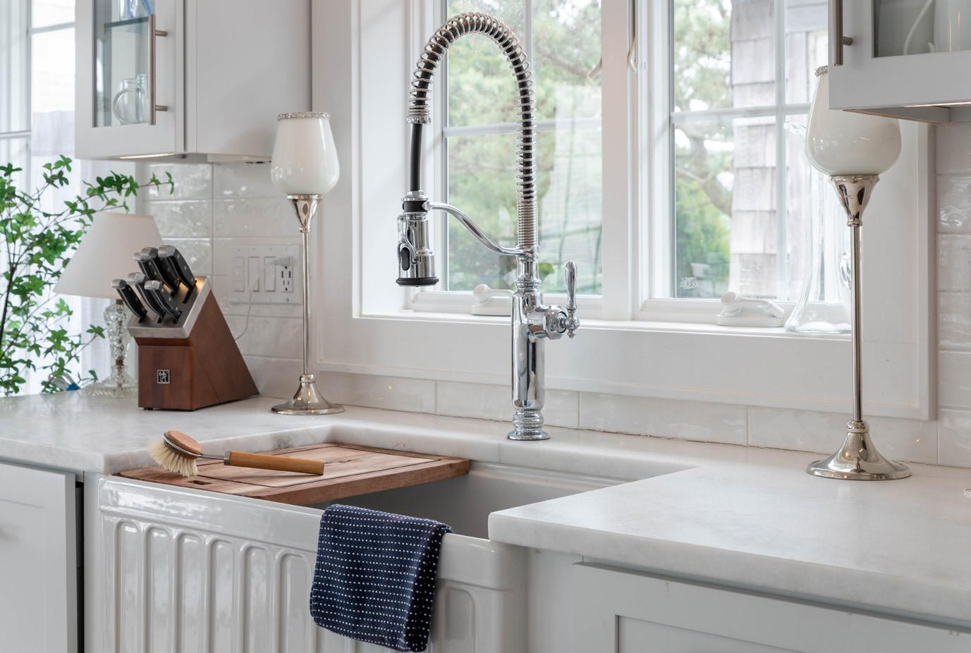
“A lot of folks would walk by the house and had a lot of positive commentary, which we really appreciated,” Mick said. “They like that we are trying to keep it consistent with the neighborhood. So even though we didn’t have to comply with any rules, we set out to do the things that they would have wanted to see done.” No stranger to contracting, Mick has been kicking around the building and real estate trades since he was a teenager.
“I’ve been doing this my whole life,” he says. “As a real estate home inspector and builder for thirty years, we leaned on that learned experience, evaluating things we’ve tried and liked, and weaving whatever worked well into the renovation.”
With his vast experience and insight from all of the projects successfully completed over the years, Mick and Sandra hired Jay Madden Architect who designed and submitted the working drawings and architectural renderings to the township.
One factor that would carry substantial weight was how the home’s foundation was built on the lot. Beach homes that went up in the fifties and sixties along that side of Atlantic Avenue were traditionally set directly on the
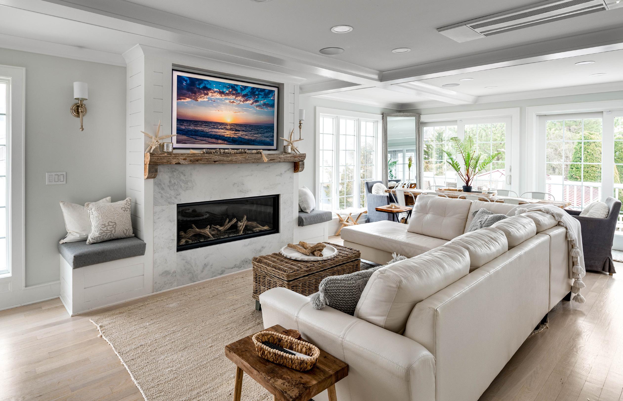
sand. This played a critical role in the Curran’s proposed remodel. If the first floor of the home had been rated below base flood elevation, then the couple would have had no choice but to raise it. This had them evaluating the cost of keeping, raising and remodeling it versus the cost in knocking it down and rebuilding from scratch.
“We were really lucky in that regard, that we were able to keep an old house that for whatever reason, whoever had built it made the foundation substantially higher than every other home around it. We’re talking three to four feet higher.”
Formerly a duplex, the home’s original layout of the first floor was preserved with a few modifications to enhance views on the various levels of the home. The intelligent design provides separate living spaces across multiple floors along with duplicate kitchens and laundry, perfect for families seeking privacy and practical independence. While the home will be utilized mainly by the Curran family, it will also be available for rental guests on a very limited basis.
“Our three kids - Mickey, Alex and Rhett - all love it because they have the downstairs with their own living room, kitchen, bedrooms and decks,” Sandra said. “The
home is really laid out perfectly for families to be in there comfortably and enjoy their own private spaces.”
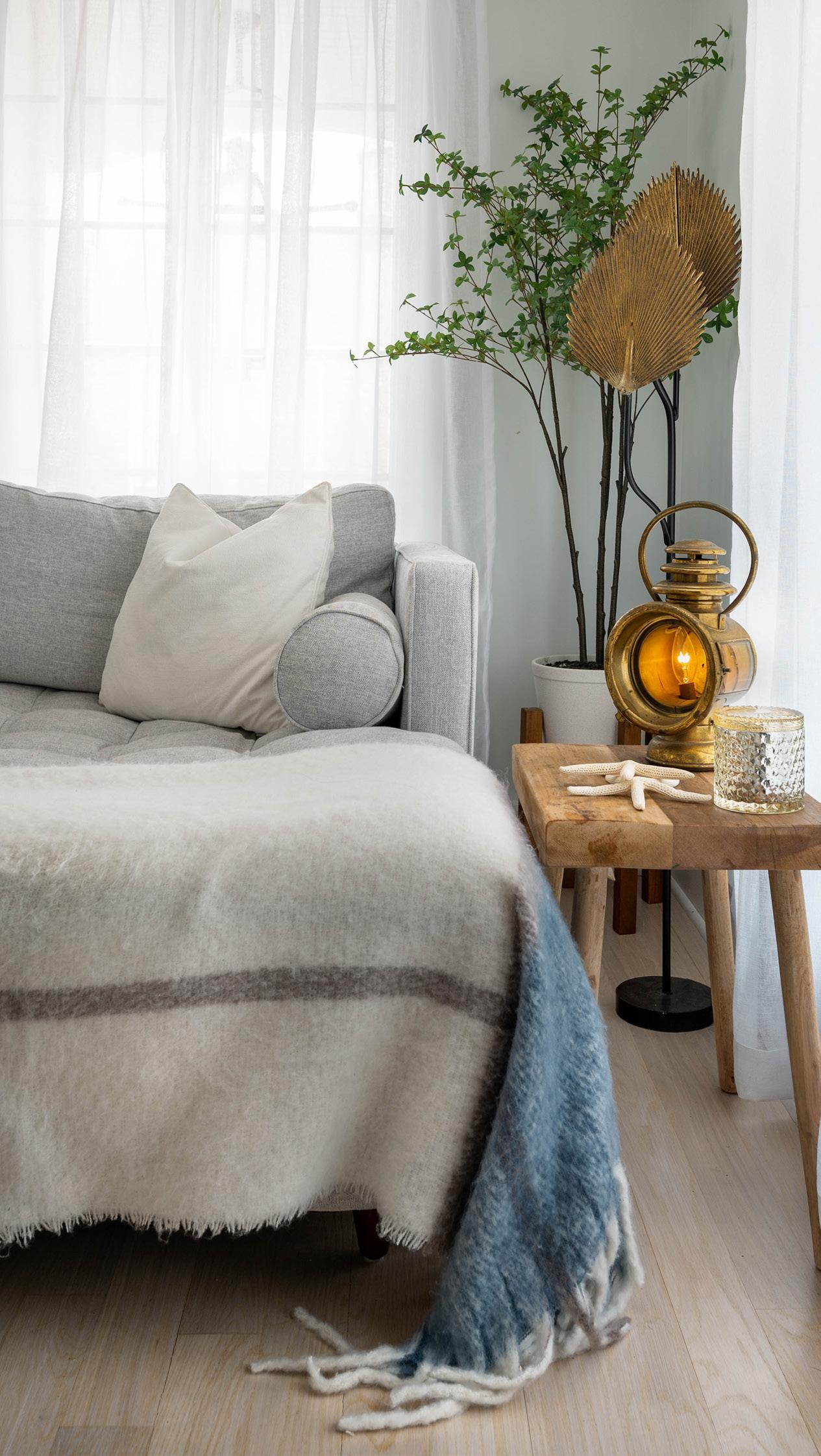
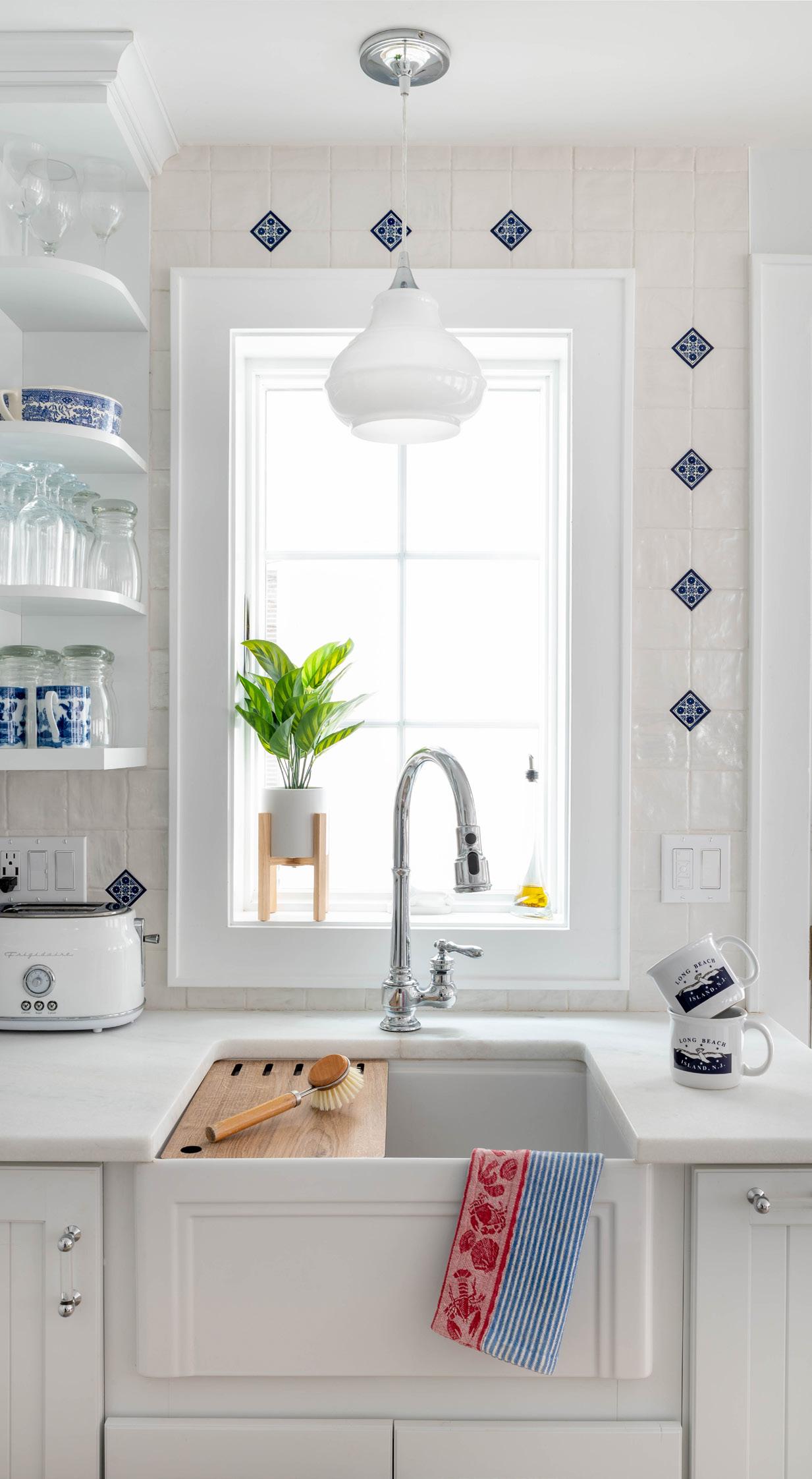
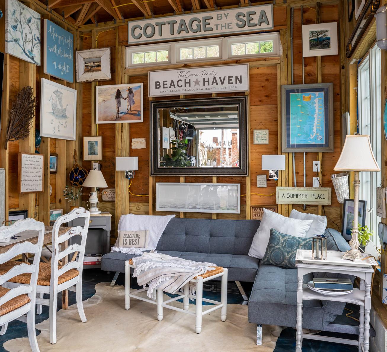
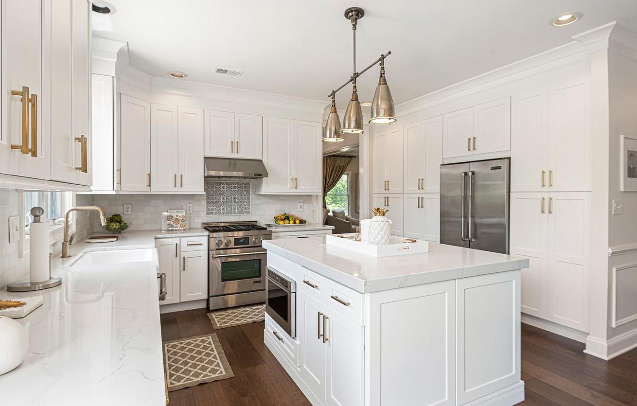
Sandra loves to travel and spends a good deal of time going to different antique dealers and shops. On a recent trip, she brought custom tile from Italy, which was ultimately installed in one of the home’s new kitchens. The range has an antique aesthetic to it and the kitchens and baths all have classic marble finishes throughout. Unique transom windows purchased at a local antique fair were from an old house on the island that had been torn down.
Six foot floor to ceiling windows make a dramatic statement throughout, bringing in maximum light and balancing the numerous modern features with historic flair. Other nostalgic elements in the home include antique light fixtures, vanities, accent pieces and select furnishings purchased at various local shops along the island.
The third floor primary suite has a dreamy wraparound deck, perfect for enjoying a cup of tea and reading a book in between gazing at the fantastic ocean views. A fabulous primary outdoor shower is an added bonus amenity to this level.
Beach houses of yesteryear often had detached garages as well. This was an added element that the Currans absolutely wanted to feature in their build.
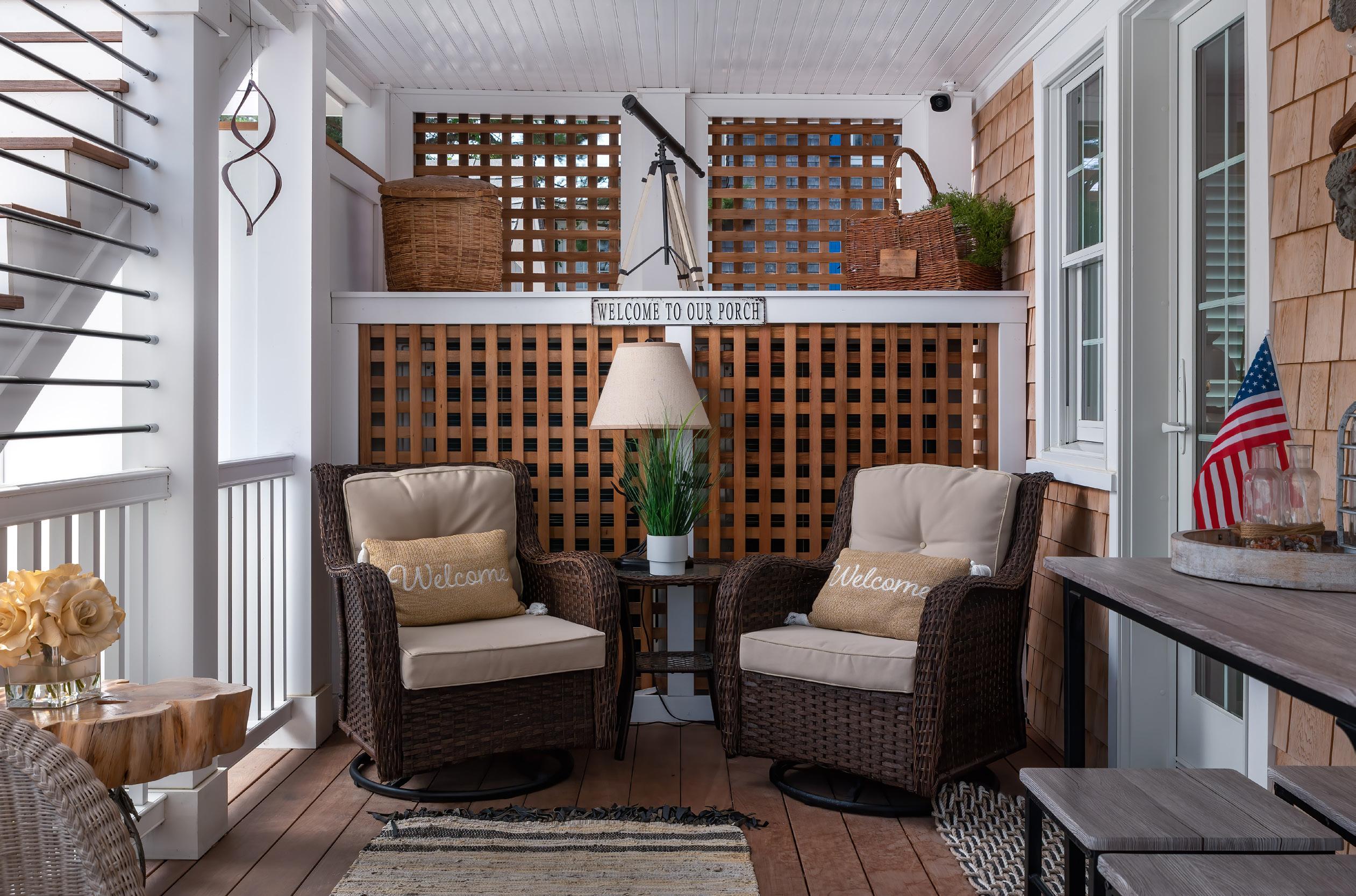
“I always wanted a detached garage,” Mick said. “I like the idea of having that separate building to throw the bikes in there and you can play ping pong and it’s outside… kind of a separate space. So it worked out really well because we have a pool too, so it works well doubling as a pool cabana.”
A little bit of old, a little bit of new, some modern things, some antique, it all comes together in an exquisite, elegant, eclectic representation of where history and future collide in a contemporary celebration of style and design. And while the Currans plan to retire there one day, this stunning renovation is far more than just a destination.
“This is our family’s legacy,” Mick said. “Beach Haven has been very good to us, so we want to leave something for them when we’re no longer with this world… something that fits in and looks like it grew out of the ground here.”




 WRITTEN BY DENISE PETTI
PHOTOS BY JOHN MARTINELLI
Going into her home build, this Surf City homeowner had already earned some real-world “street smarts” in the construction world. With several prior custom-build and kitchen design projects under her belt, the homeowner knew exactly the kind of experience she wanted to have in building her new home—and also what she decidedly did not want. While recognizing that bumps in the road are inherent with any home project, she was determined to mitigate those bumps by ensuring that she looked at every angle of the initial planning process. To that end, she prioritized the selection of her building and design team, seeking the appropriate people to understand her vision and bring it to life.
Highly recommended by her close friend and realtor, Ross Newsom of Newsom Builders and Contractors fit the bill for her perfect building partner. Contrary to his looming, linebacker-level appearance, Ross brings incredible comfort to his homeowners. He understands that building a home is mentally, physically and emotionally taxing, and makes sure he is always available to his clients.
Committed to hands-on involvement throughout the build, nothing gets lost in translation and he is able to evolve the plan as needed in order to remain accommodating and flexible for his homeowners. This “real-time designing,” as the homeowner termed it, was an absolute game-changer for her. Ross’ accessibility created a high degree of trust in their relationship, ultimately taking the home development process to a new level. The homeowner learned she could depend on his expert vision and experience, allowing custom touches and subtle alterations that truly elevated the end result. Furthermore, his central position through all stages of the project allowed for a seamless experience without the back paperwork and external estimates that often hold up a building process.
With her builder secured, next on the priority list was a kitchen designer who would be able to continue the strong sense of collaboration with both the homeowner and Ross. Ross recommended she reach out to Woodhaven Lumber & Millwork, where she met with Kitchen Design Specialist Yasmin Deren. Woodhaven is uniquely positioned to service many touch points in the building process, from simple foundational materials like dimensional lumber to more intricate elements like
kitchen design and installation. They offer many high quality lines of flooring and cabinetry, but what truly sets them apart from other vendors is their commitment to their customer’s experience through exemplary service. With this focus, it’s no surprise that Yasmin was exactly what the homeowner was looking for.
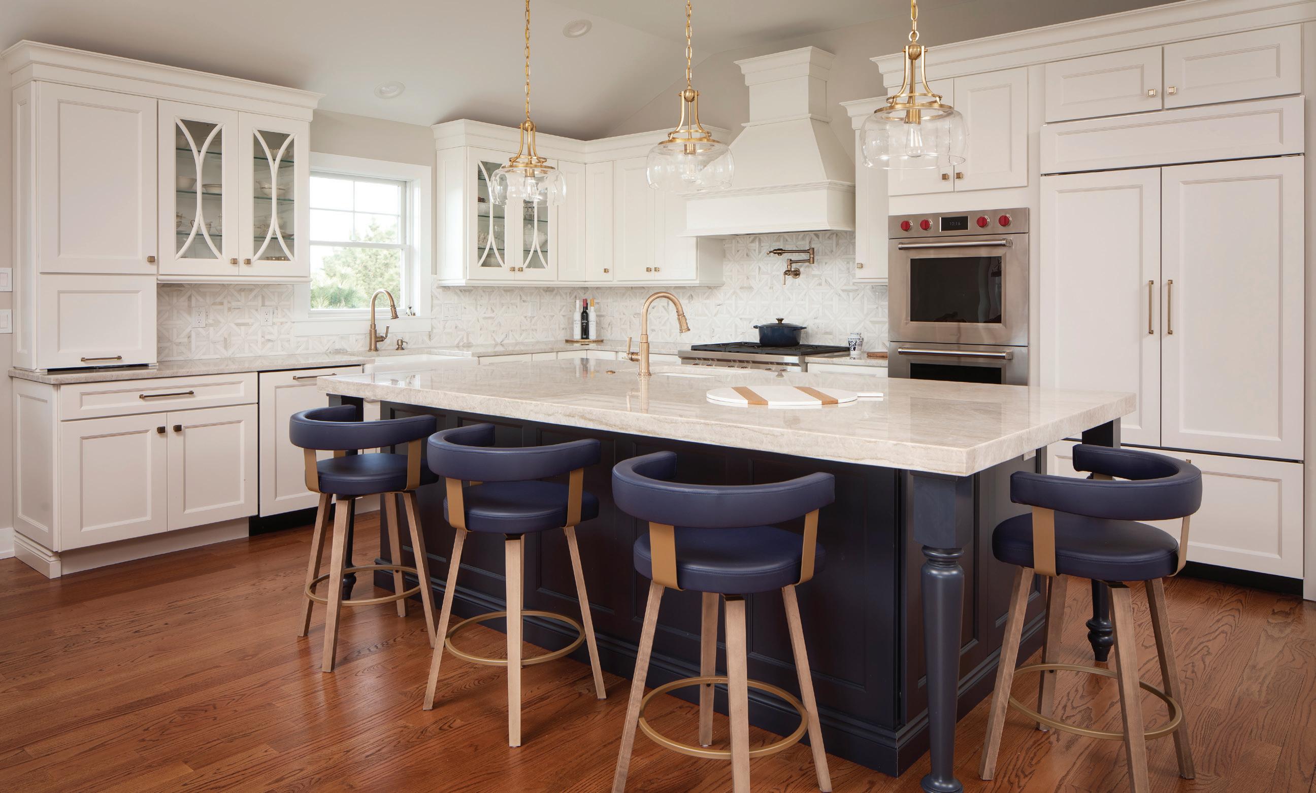
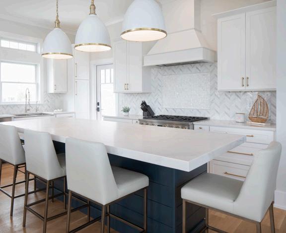
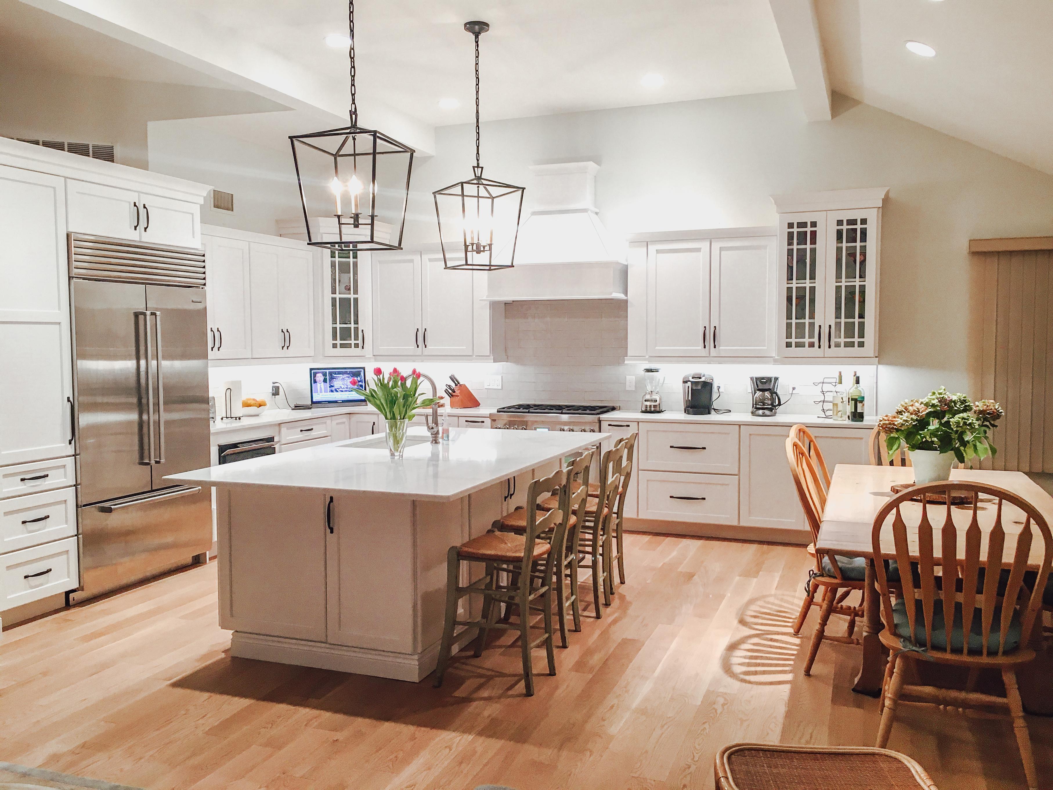
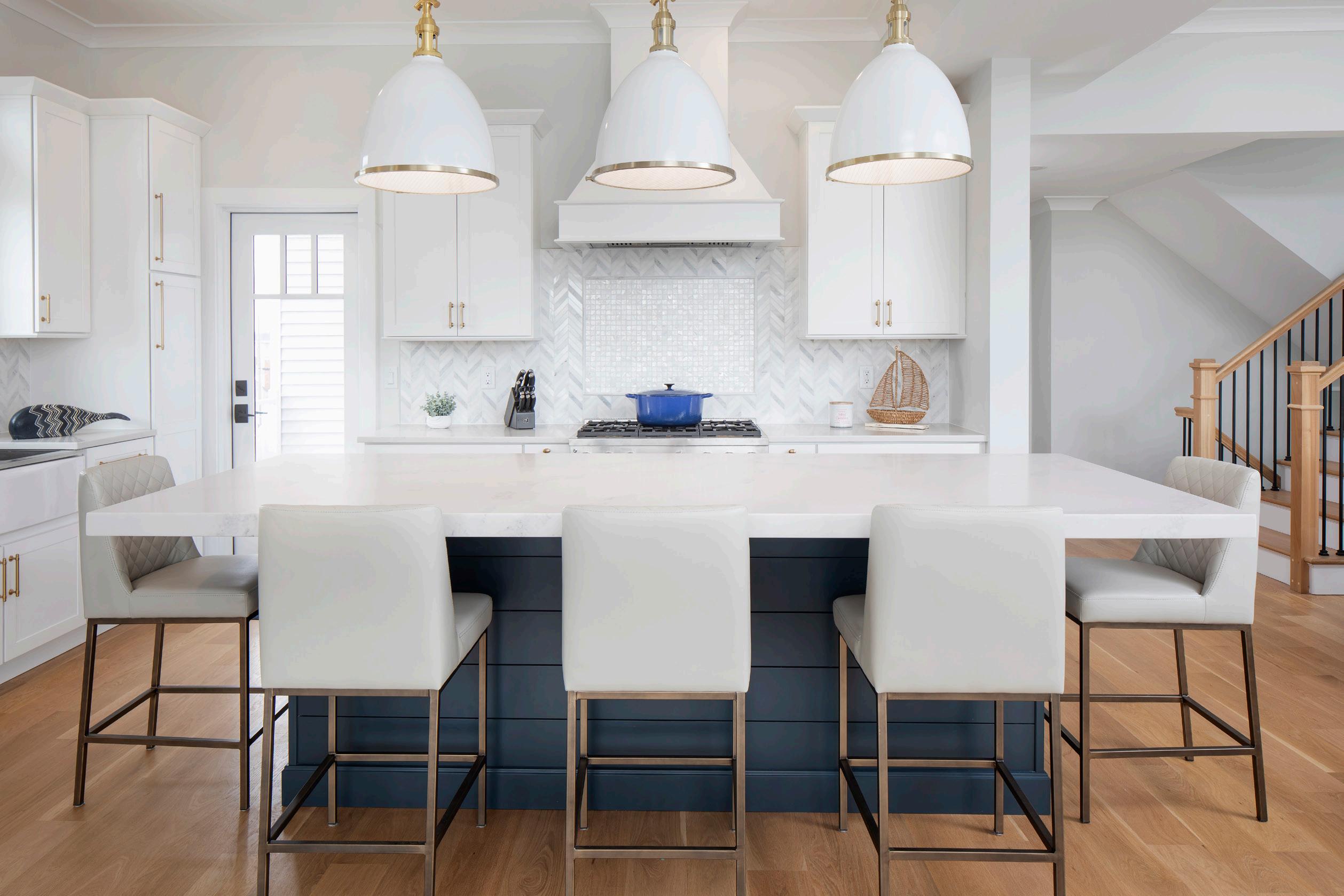
Yasmin understood that the kitchen was unquestionably the heart of the home in this project and fully appreciated the homeowner’s depth of vision to customize her unique space. As Yasmin says, “The more information a client can provide, the better,” so she can develop a comprehensive list of the options, features and enhancements available. Her goal is always to bring all of the customer’s wishes together to create a cohesive end result that perfectly matches their dream. Yasmin and the homeowner created a vision board, showcasing a coastal aesthetic that was timeless and natural. The homeowner wanted her space to be infused with the sense of calm inherent in being so close to the beach. Simple, shaker-style cabinets in a soft white allow the space to feel clean and bright, while tasteful accessories and lighting make it warm and inviting. Sleek drawer and cabinet pulls add a modern element that keep the space from feeling overly nautical.
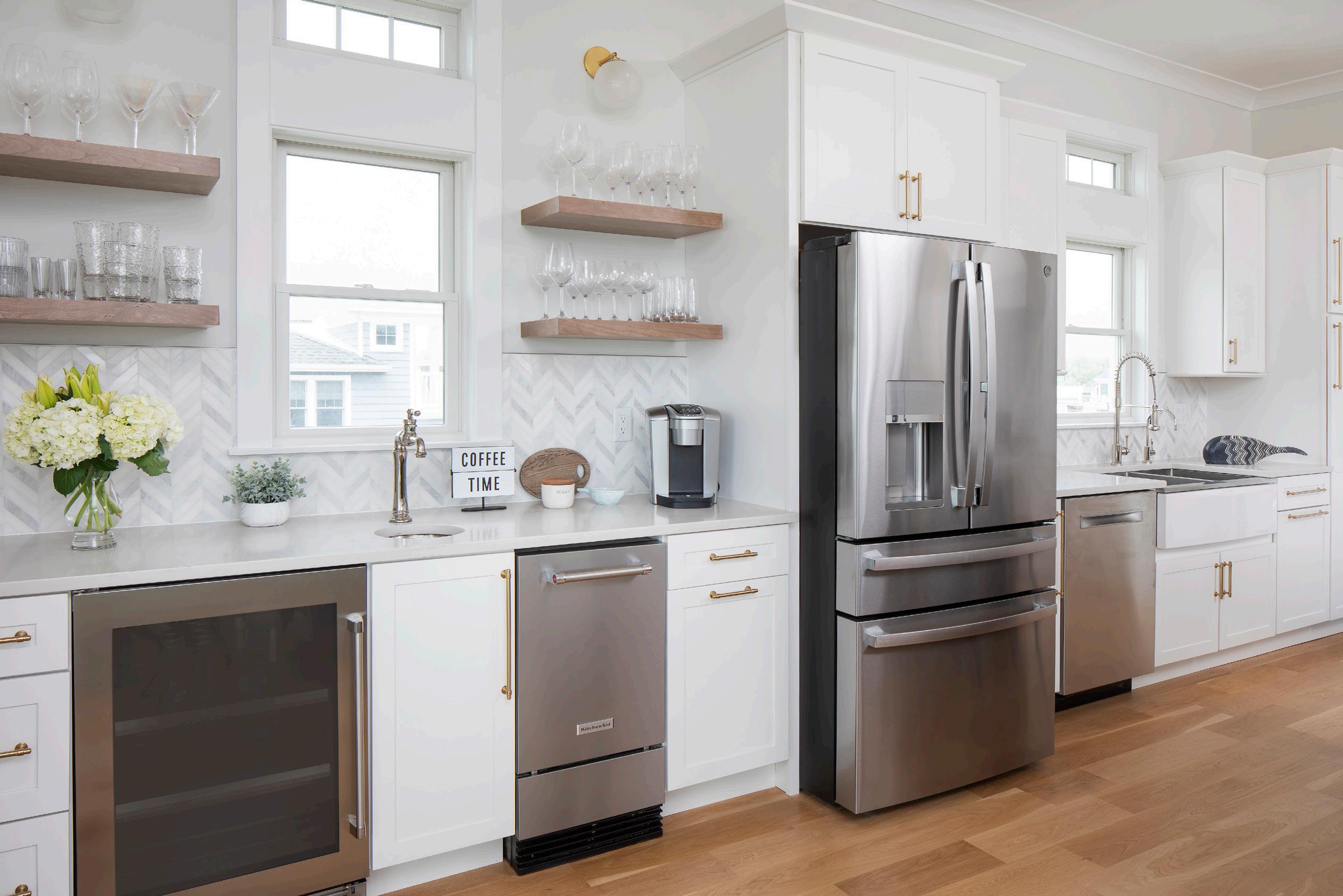
The homeowner’s goal was to create a space that was sophisticated, yet functional, and she had a good sense of what her family needed. With a limited blueprint to accommodate large gatherings, the homeowner and Yasmin developed a custom layout, in which every inch of the space was meticulously planned. The design essentially centered around specific zones for every aspect of kitchen life. The sink is flanked by a pantry and fridge, creating a designated staging and cleanup space. The spacious stove area is perfect to indulge multiple cooks in the family. A wet bar is thoughtfully situated adjacent to the dining area, ensuring that no one has to go into the working kitchen space for drinks or silverware. Additionally, the dining table is positioned by sliding doors which offer not only extended seating, but also beautiful ocean views. It is the many subtle details, like a trash pullout in each station, that make the room so welcoming and user-friendly. Yasmin’s expertise allowed her to make functionality recommendations while keeping the homeowner’s wish list top of mind.
One challenging building and design factor was the exceptionally tall kitchen ceiling—a staggering 12 feet high. Both Ross and Yasmin artfully guided the homeowner in how to use these to her advantage, striving for an open, instinctual flow without feeling overwhelming. They decided on simple crown moulding on the cabinetry, but balanced it with a striking wood hood that ran the full ceiling height.
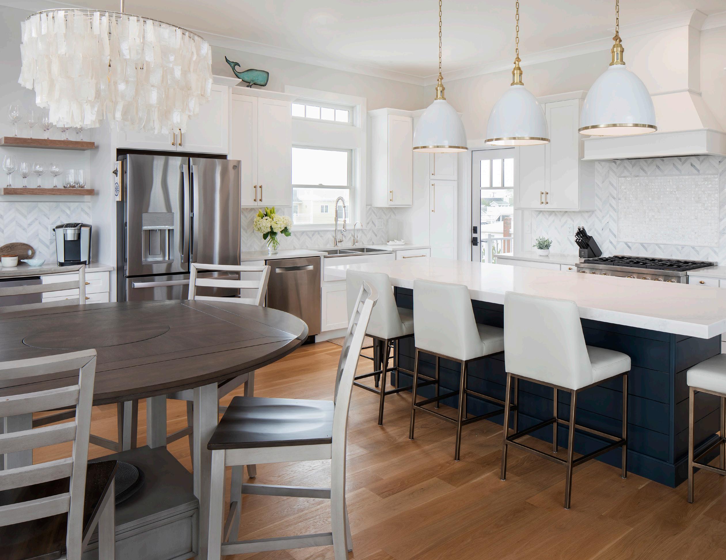
The true showstopper, however, is the unabashedly massive shiplap island. A subtle navy blue called “Poolhouse” with added visual interest in the dimensional drawers and doors, it tastefully breaks up the flow of white while still feeling cohesive within the space. The island was part of the homeowner’s vision board, and Yasmin worked with several other specialists at Woodhaven to make this dream a reality. The Woodhaven team had to get creative in knowing what materials they had to work with in-house and how to put them together to make the custom island, intricately measuring, calculating, and designing. The team spent hours meticu-
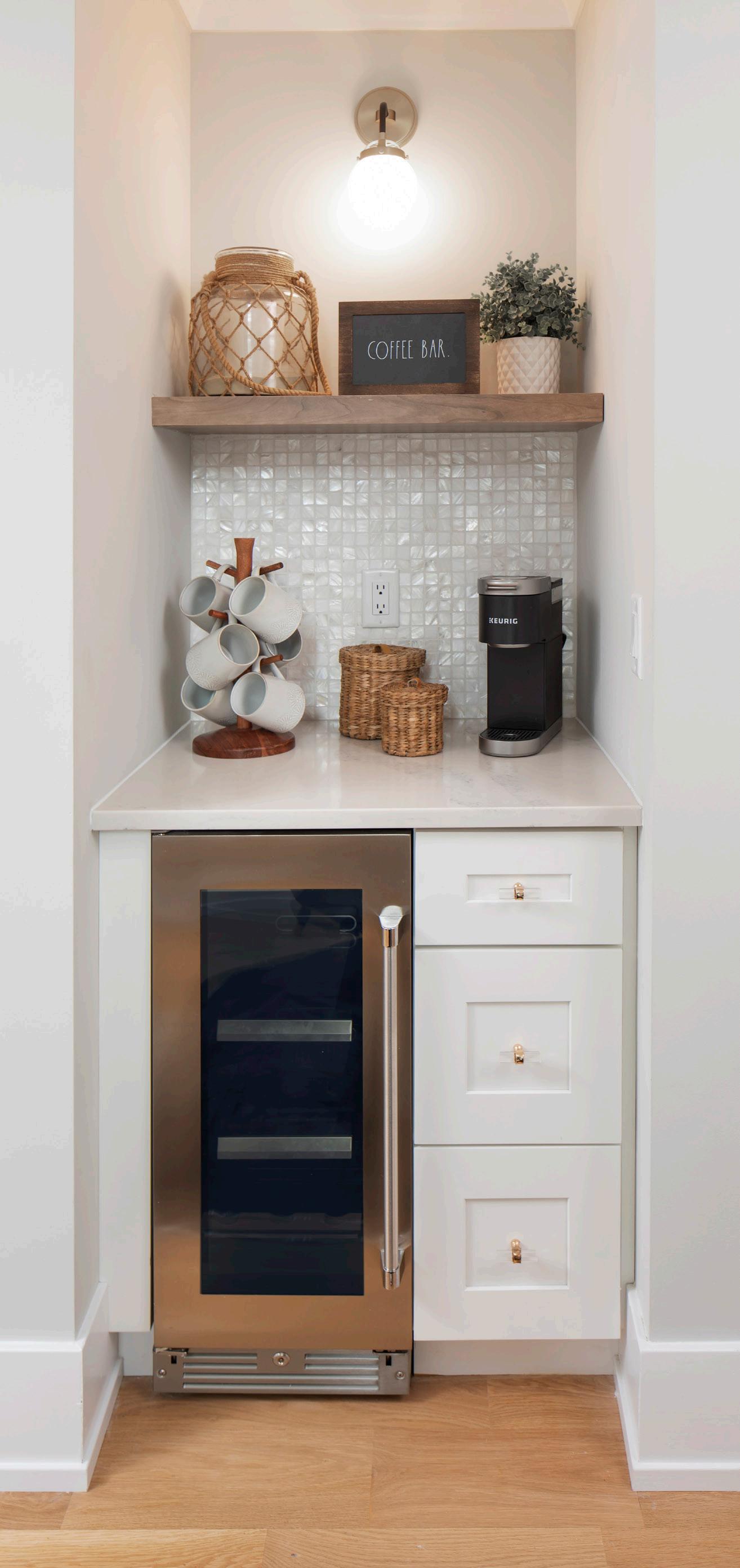
lously refining the space between the stove, island and dining table, moving the various components mere inches one way or the other until a perfect flow was achieved.
This overall functionality in the kitchen is credit to both Yasmin and Ross. Yasmin designed a symmetrical plan that was subtle, allowing your eyes to easily move through the space without it feeling boring or predicable. The homeowner’s desire for symmetry was something Ross also paid attention to, from the very beginning of the project. It required a lot of planning and forethought. He took the time to lay tape out on the floor once framing was complete, ensuring doors would swing the right direction and ample walking room was promised around furniture and cabinetry. Elements of the central kitchen
are echoed throughout the home to add a sense of cohesion and stay true to the homeowner’s focus on hospitality.
Newsom, the homeowner and Yasmin walked handin-hand from start to finish, a collaboration not often seen in the construction world. And the result is stunning. The homeowner was often on-site, helping to make those important last-minute adjustments while being in the space, taking it a step beyond paper. But on days when she was not available, she had no hesitation in handing the reins over to Ross or Yasmin. The entire experience truly exceeded her expectations and she is absolutely ecstatic with the result. “To see them realize their dream is so rewarding,” claims Ross. Yasmin and her team at Woodhaven couldn’t agree more.

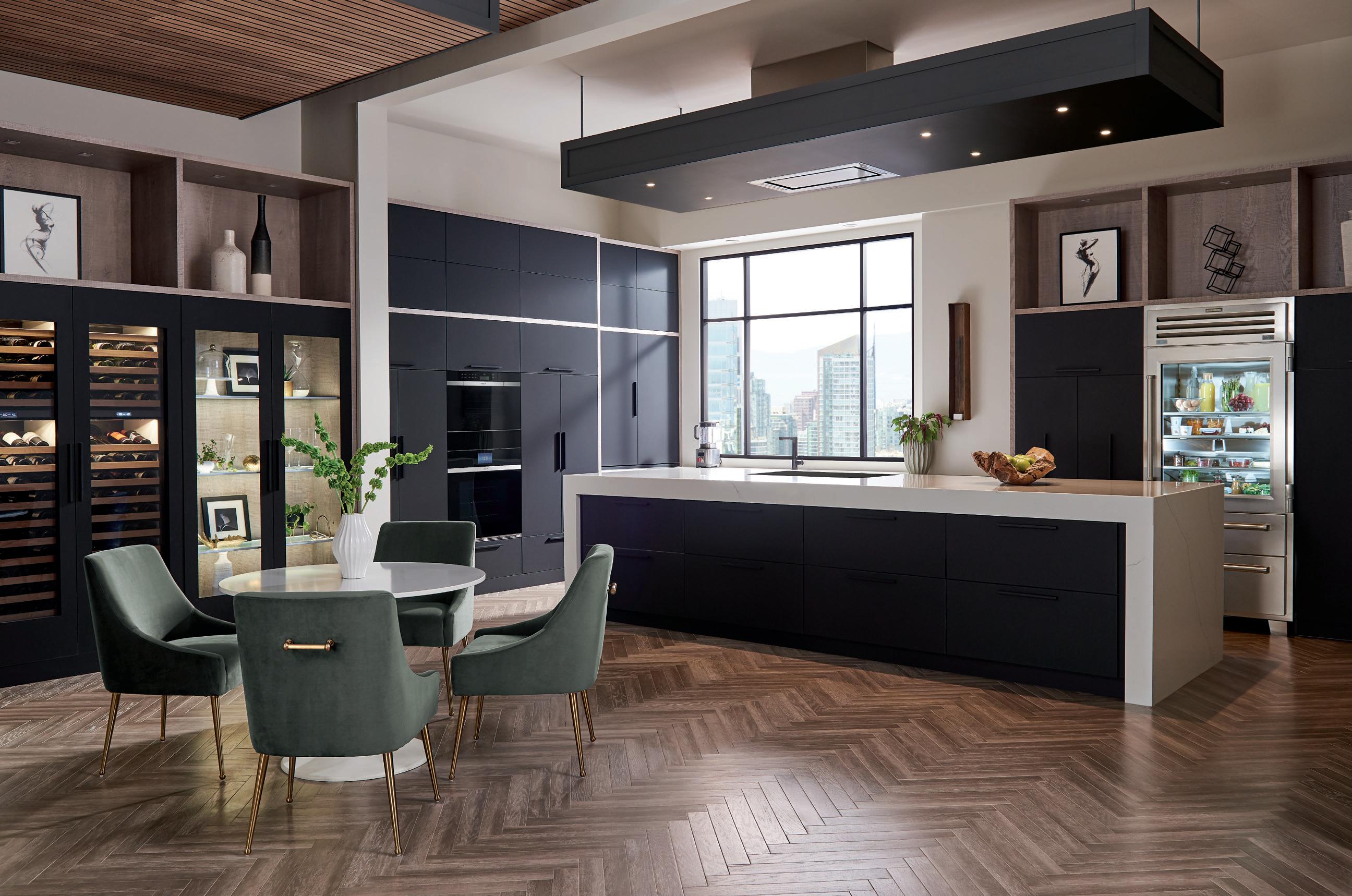
In a world where big-box reigns supreme, West Creek’s Anchor Appliance is shaking things up. How? By matching chain store prices without compromising on that classic mom and pop customer service.
Since 1968, Anchor Appliance has been the go-to for local residents in search of major home appliances from top brands like Sub-Zero, Wolf, Jenn-Air, KitchenAid, GE, Thermidor, Bosch, and LG. Jeremiah Kalm, who acquired the company in 2017, attributes their long-term success to their tireless and fervent commitment to customer service.
When consumers opt for chain stores in their search for the best deal on home appliances, they fail to see what’s lurking beneath a tempting price tag: hidden fees and indifference.
“Big appliance retailers tend to itemize everything their orders that inflate the overall purchase. We only use premium connections and make it a flat price for delivery, installation and removal,” said Kalm.

While chains subcontract deliveries and installations, Anchor’s delivery and install teams are employees of the company, so customers can expect the same care and attention they received on the showroom floor.
Care like that is a rarity these days, especially when it comes to shopping for home appliances. After all, the typical sales associate at a corporate retailer is more concerned with the bottom line and less concerned with the shopper’s long-term experience. If you have an issue with a product after purchase, you can expect nothing more than an automated customer service representative and infinite phone queues.
Conversely, the tight-knit staff at Anchor Appliance are trained to accommodate and educate the custom-
ers they serve. Kalm’s sales team has a well-rounded understanding of the brands they distribute so they can provide knowledgeable, functional recommendations that suit your specific needs.
“Customers will often come in with the generic plans from the architect, and based on the size of the kitchen and their lifestyle, we try to tailor the appliances that suit them the best,” said Kalm.
Beyond sales and installs, the Anchor team is also at the ready for equipment repairs and maintenance. Kalm prefers to maintain a tight service area (approximately 10-15 miles within their West Creek location), so that in the busier, summer months, customers are still guaranteed assistance when needed.
“Because service is so important to me, I don’t feel comfortable doing sales outside of my normally traveled area,” said Kalm. “More important than any sale are my customers. A lot of companies are great at making sales, but there is no personal connection between them and the customer. If something goes wrong, they simply tell their customer to call the manufacturer.”
Despite a busy schedule as owner of Anchor Appliance, Kalm himself is eager to jump in when a problem needs resolving.
“I will absolutely get involved and either speak with the customer on the phone or in the store. I don’t know the last time the CEO of any of the larger chains ever addressed a customer issue.”
For more information about Anchor Appliance and their hands-on customer service, visit their website at www.anchorappliance.com.


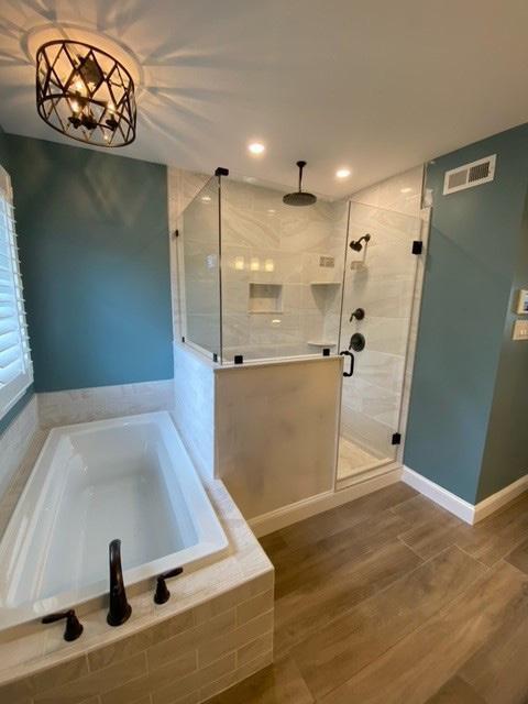
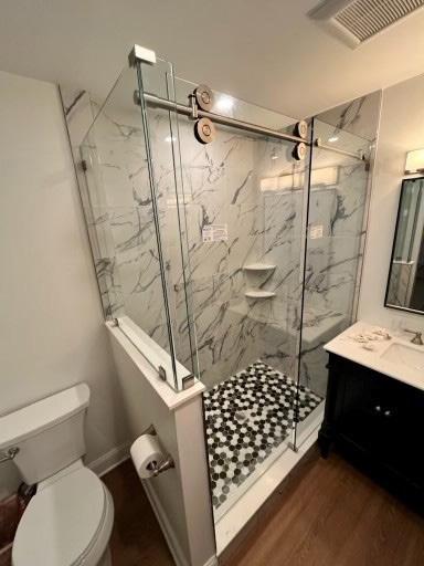
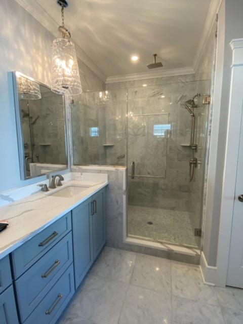
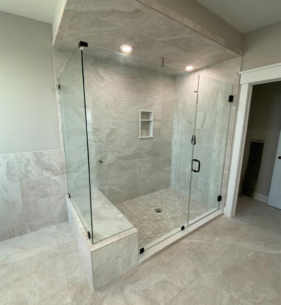
Are you looking for a simple way to create dramatic change in your bathroom? Frameless glass shower doors could be the solution. And to make the upgrade even easier, Twin Glass Company is located right over the bridge in Manahawkin. In business since 1946, they are a third generation family-owned business boasting south Jersey’s largest frameless glass shower door showroom. Their expansive selection is also available to view in their original Egg Harbor Township location.
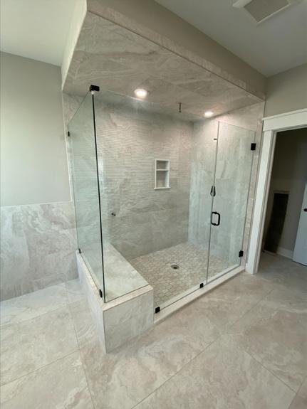
The beauty in frameless glass shower doors lies in their ability to complement nearly any aesthetic. They are simultaneously relaxing, yet elegant. Both crisp and airy. These doors can lend a spa-like feel to your bathroom, creating an oasis right at home. Frameless glass doors can also enhance the natural light and serve to maximize the space in your bathroom, which is especially great for smaller spaces.
Their advantages extend beyond just physical appeal, though. Frameless glass shower doors are also quite practical. They are an absolute breeze to clean and completely eliminate the cumbersome washing and replacing of traditional shower curtains. Additionally, as their name suggests they are frameless, which means there is virtually no space for dirt, soap scum or mold to collect so they actually stay cleaner longer.
The most cumbersome part of frameless glass shower doors lies merely in deciding which ones are best suited for your bathroom. This is where working directly with Twin Glass Company has its merits. They
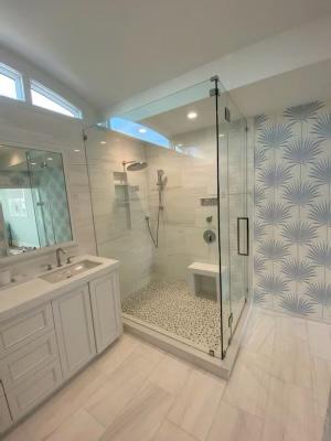
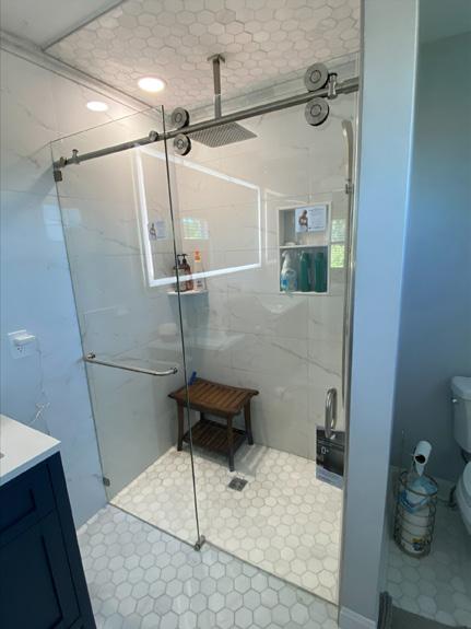
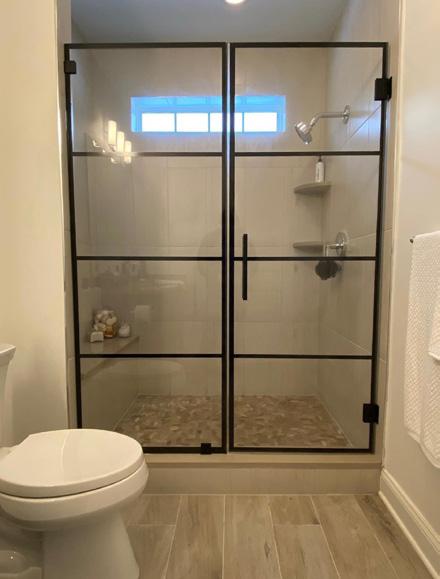
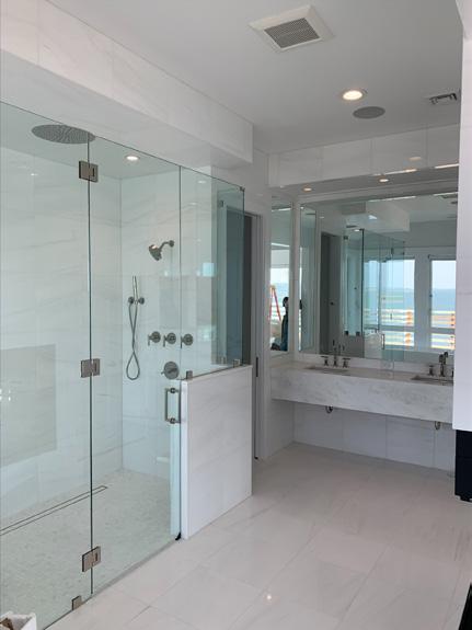
provide a myriad of shapes and styles from which to choose, including Neo-angle, L-shaped, custom enclosures and even steam showers. Even the glass itself is offered in multiple options, from classic, clear glass to more unique, bold patterns. And their extensive selection of hardware allows you to further customize not only the look, but also the functionality of your doors, with a great deal of flexibility in regard to motion. Twin Glass will put together a design to complement any space configuration and take their time walking customers through the process.
Not only does Twin Glass work one-on-one with each homeowner to completely develop a custom design, but they are also the ones who create and install the enclosures. As most walls within a home are generally not perfectly plumb, their team of experts knows how to measure and install with great precision so that your doors will fit perfectly, virtually eliminating the fear of leaking water. While their breadth of skills and knowledge ensure truly outstanding results, they even provide their customers an exceptional warranty for added peace of mind.
A one-stop-shop, so to speak, is a feature hard to find for any home project, setting Twin Glass Company apart in an overly saturated industry. Providing top-ranked levels of professionalism, integrity and craftsmanship, their customers are promised a seamless experience from start to finish. With a showroom conveniently located on Route 72 in Manahawkin, you can stop by on your next trip to the island to begin imagining your new bathroom!
We are a local, all volunteer non-profit organization with a mission to support local food pantries as they assist our residents with their basic food needs and to help educate the public of the basic food needs of individuals and families in our area.


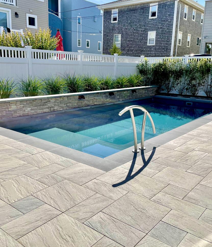
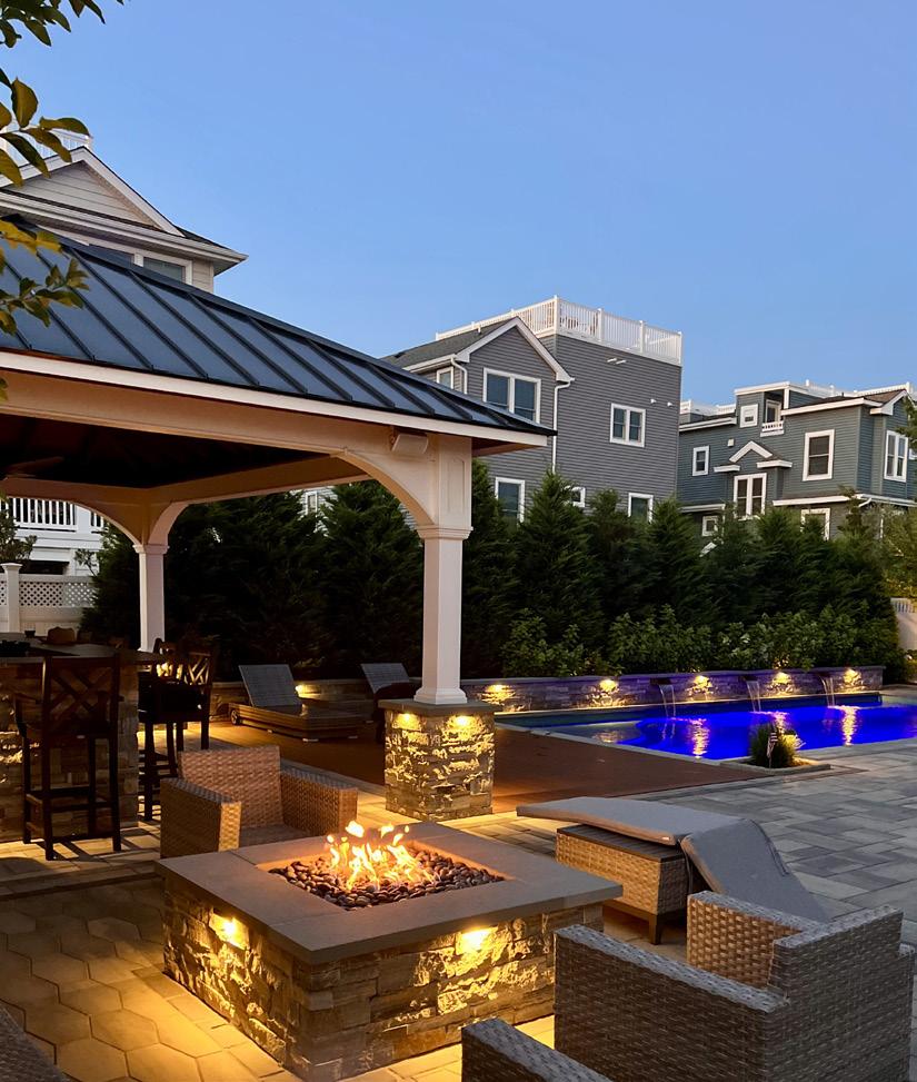
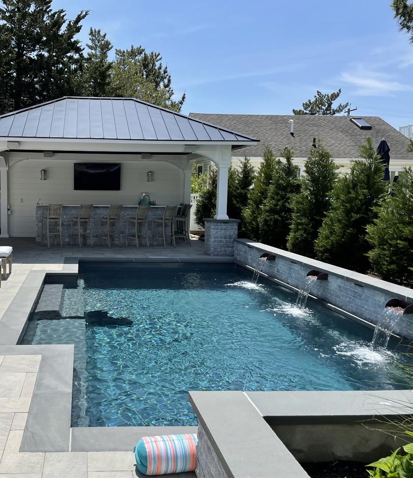
As the weather is changing and summer days are on the horizon the experts at David Ash Landscape are ready, willing, and able to help you create the backyard oasis of your dreams. The 2023 season is making a splash and popping up across LBI are Plunge Pools. So, let’s talk about Plunge Pools.

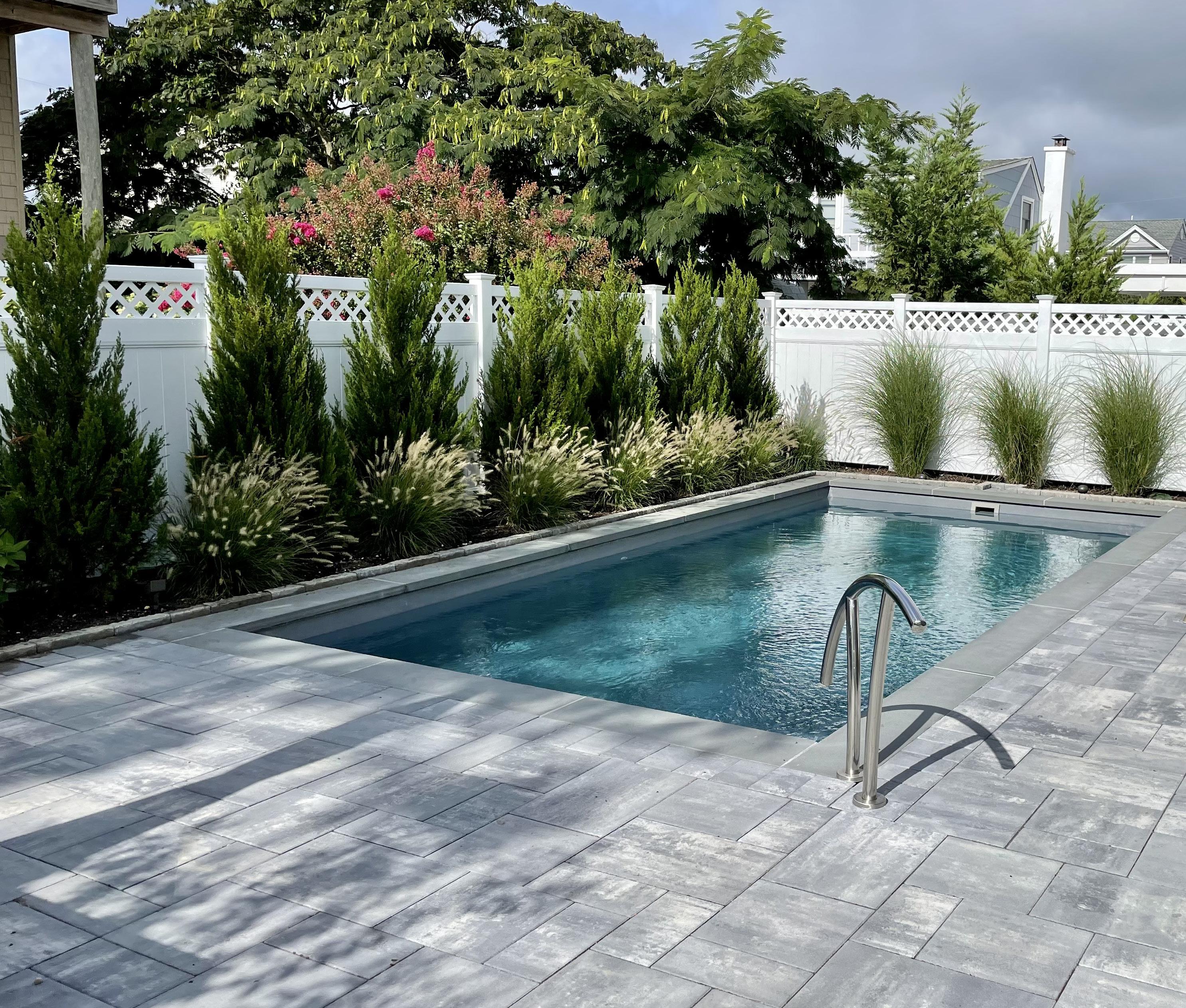
When designing outdoor living areas here in LBI, limited space is an all to common occurrence felt among homeowners. A smart solution for limited space is a stylish, functional, compact option that allows for maximum utilization of your yard for either a firepit, outdoor kitchen, or recreation area. Plunge pools fit in almost any outdoor space, making them very popular on the island. Plunge pools are fully functional pools,
that require less maintenance than a traditional pool. After a great day at the beach a plunge pool is the perfect place to take a dip or have a drink with friends.
The team at David Ash Landscape utilizes their years of experience and expertise combined with the latest state of the art designing software to create breathtaking stunning back yard paradises that combine function and style. Each and every homeowner’s own unique vision will become a reality when working with David and his team.
The versatility of plunge pools is another reason why they’re so popular in Long Beach Island. They come in a variety of shapes and sizes, which means they can
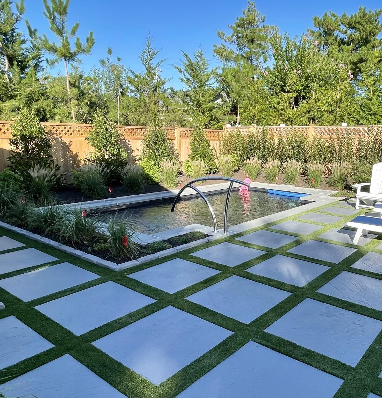
fit into almost any outdoor space. This makes them a great option for homeowners who want a pool but don’t have the space for a traditional one. Additionally, plunge pools can be designed to blend seamlessly into your backyard, allowing you to create a cohesive and stylish outdoor living area.
Design options are limitless when it comes to these types of pools and inspiration can be found from the most coastal chic back yard designs to hidden tropical paradise in Bali. Soak away the days worries and unwind with a refreshing drink in your own backyard sanctuary.
Maintaining a plunge pool is also much easier than maintaining a traditional pool. Because they require less water, fewer chemicals, and less energy to heat, they are much more cost-effective and require less upkeep. This means you can spend more time enjoying your pool and less time worrying about maintenance.
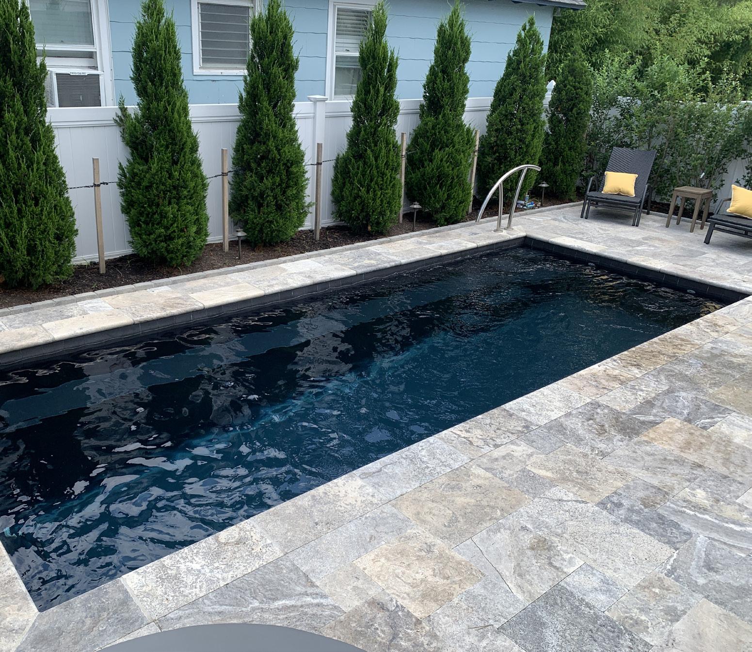
After a long day at the beach, a plunge pool is the perfect place to relax and unwind. Whether you want to take a refreshing dip, enjoy a drink with friends, or simply soak up the sun, this new trend is one that will bring timeless value into your next backyard project. David Ash Landscape is located at 908 Long Beach Blvd, Surf City NJ 08008, 609-494-7007.


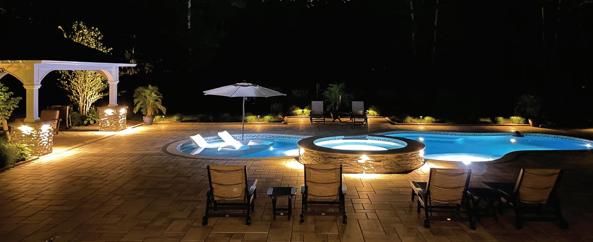


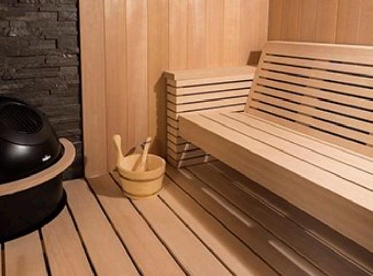
WE SELL AND SERVICE 2 FULL LINES OF FRESH WATER SALT SYSTEM SPAS


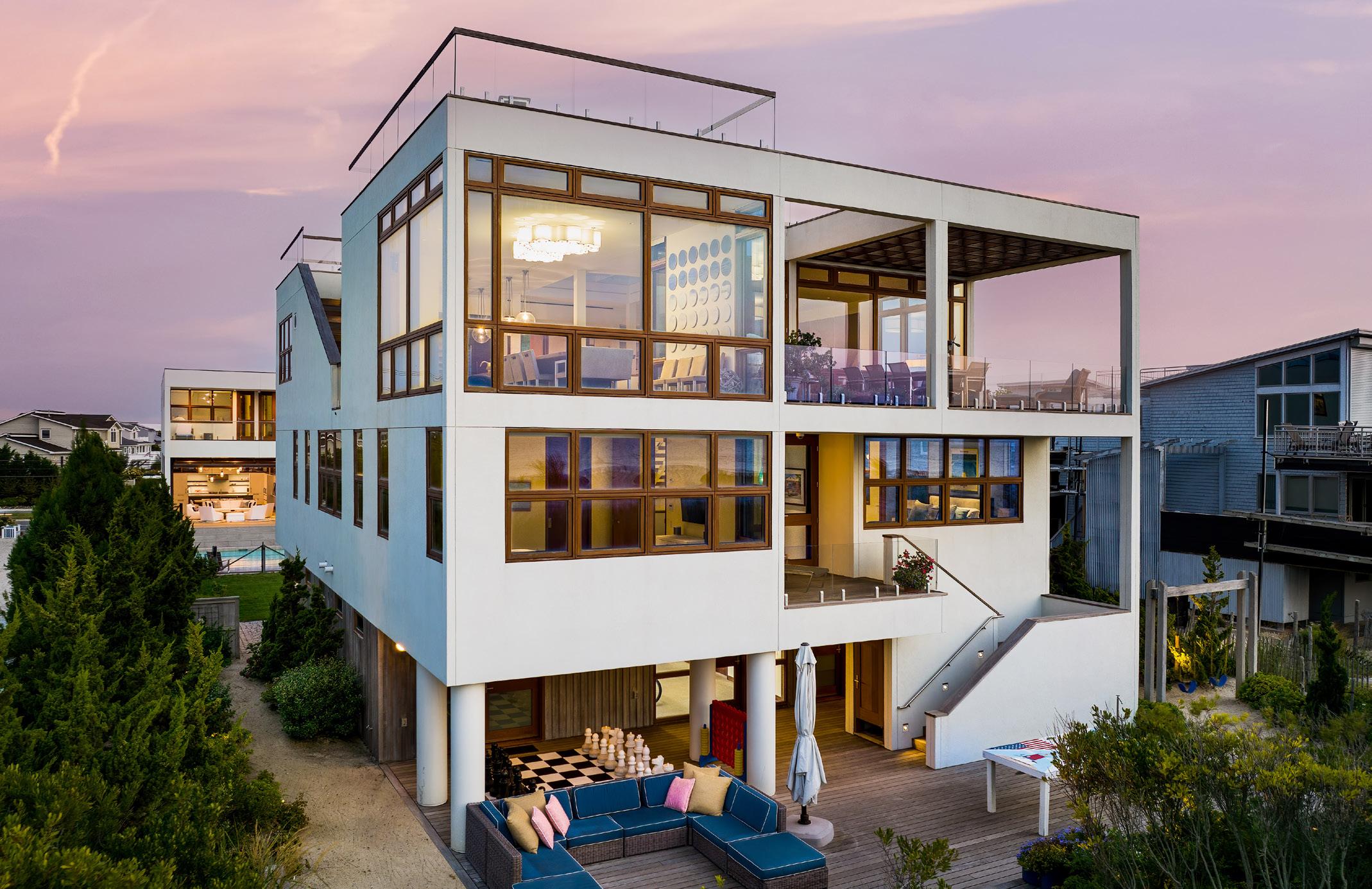
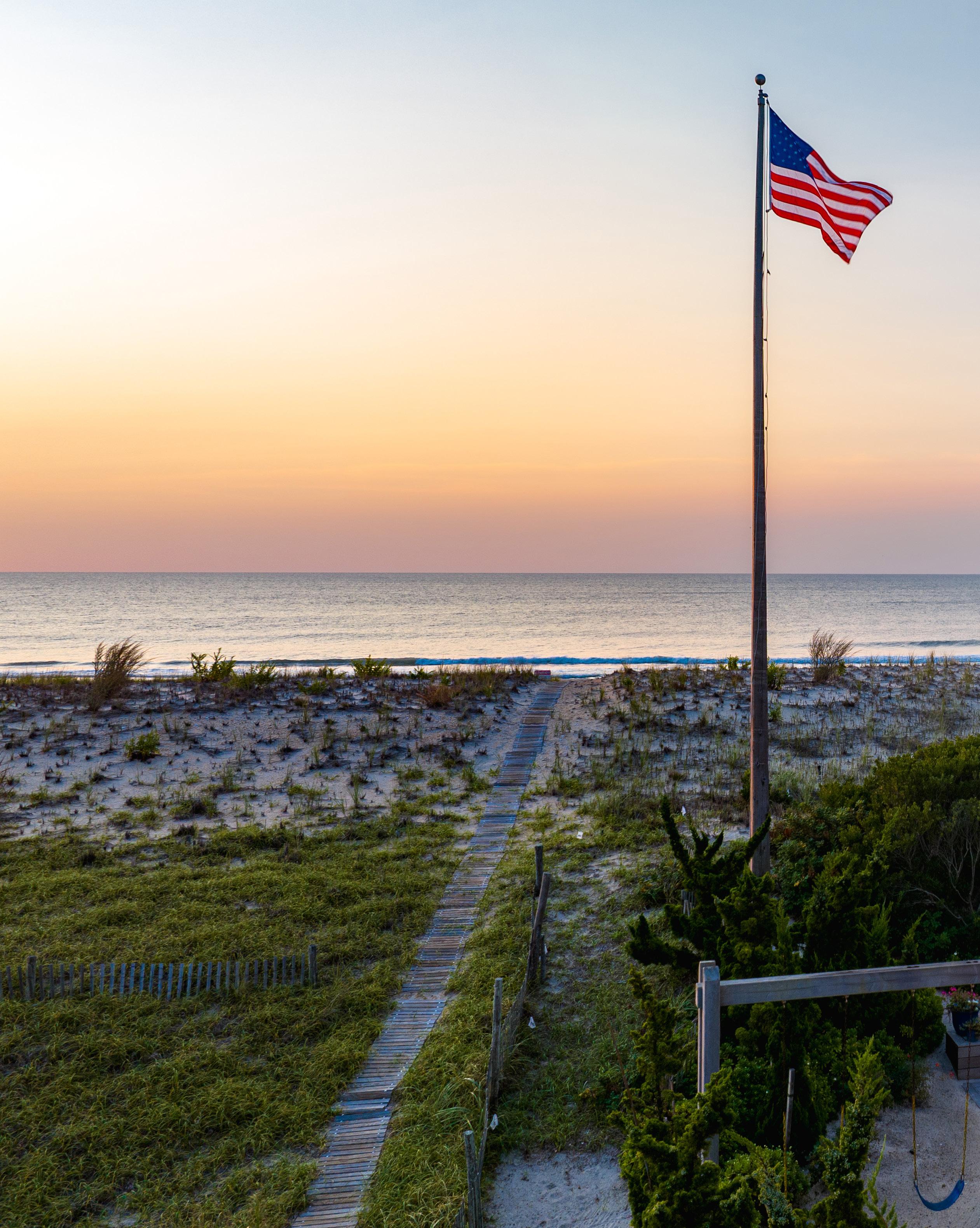
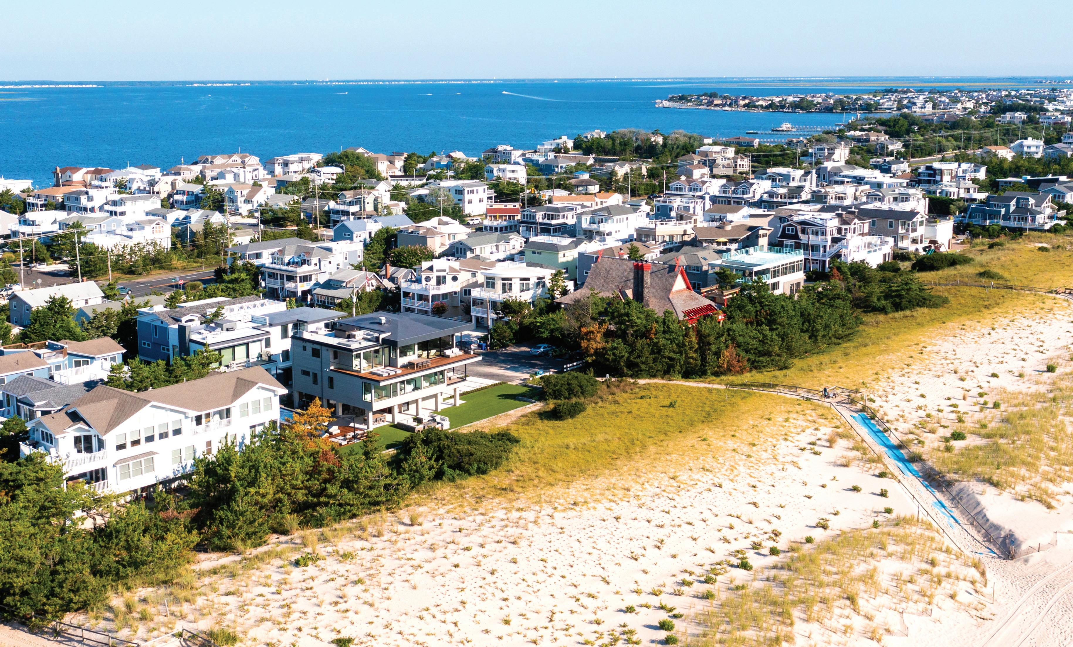
Among a string of coastal homes that blend into their environment, we a peek inside one standout home whose architectural design and craftsmanship left us appreciating every facet of masterwork.
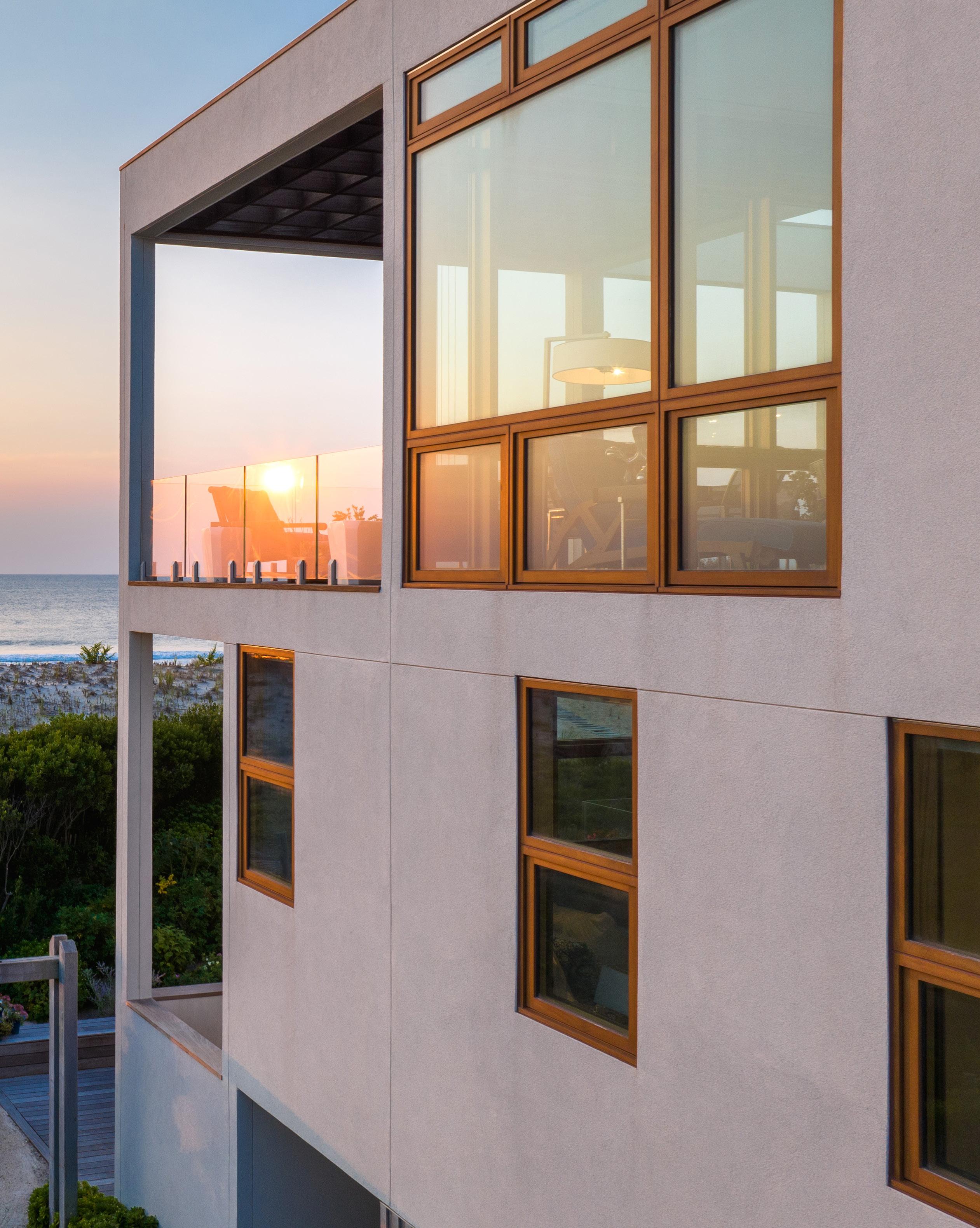
It’s not every day that a home on Long Beach Island is constructed by such a high-profile trifecta of legendary architectural firm, a homebuilding dynasty engrained with Scandinavian artisanship, and one of the most iconic kitchen designers of the 21st Century.
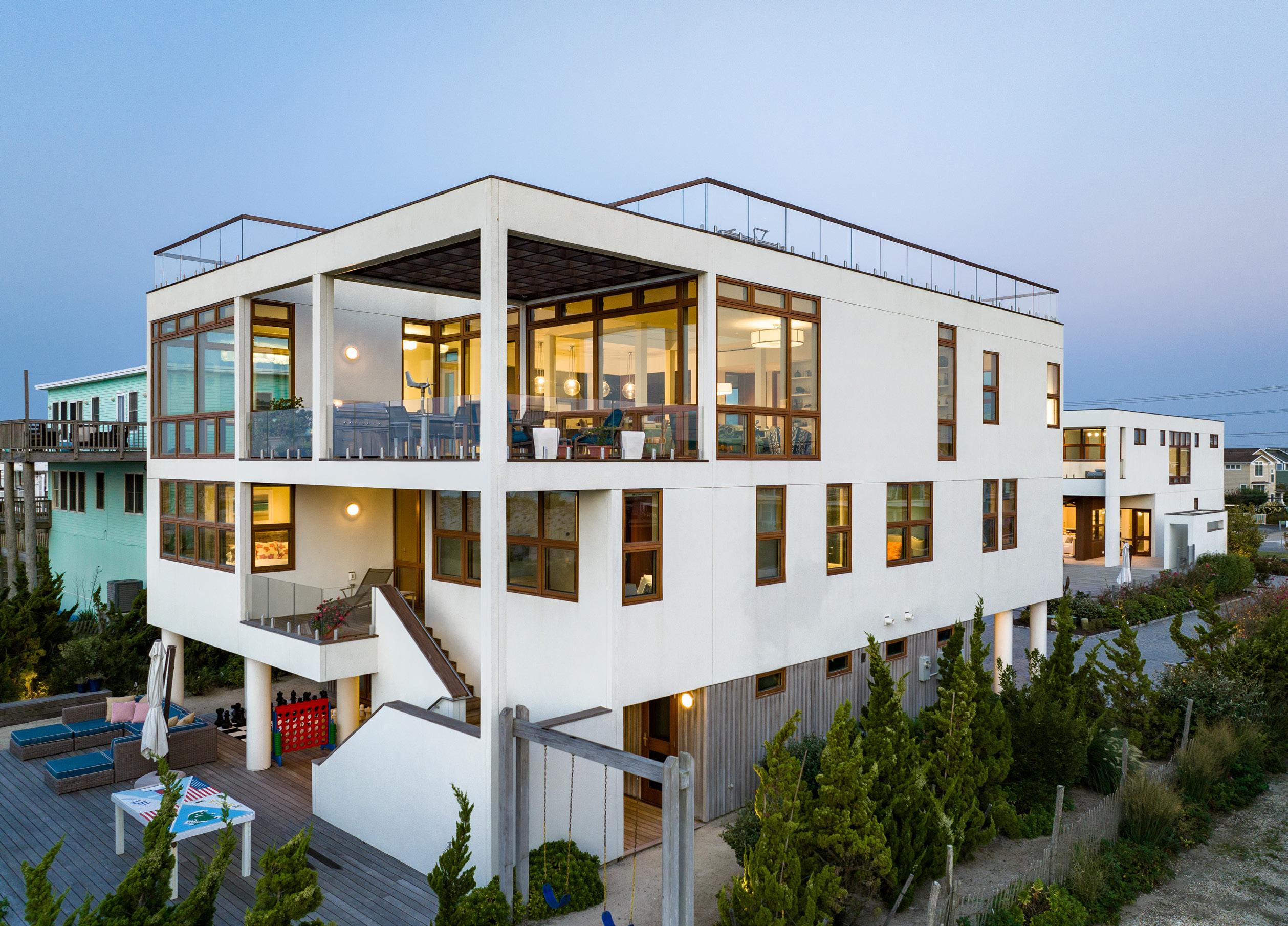
For one family in particular, their decision to establish roots on the northern end of the island went beyond their father’s fondest memories of summering with his grandparents in Harvey Cedars. This family was looking to create a precarious balance between a gathering haven and a coastal refuge, a place for both socializing as well as intimate downtime; a modern-day sanctuary to feed the needs of a family’s collective soul. It was hard to fathom a greater privilege for them than owning a portion of LBI coastline and building their dream family home at the ocean’s edge.
The makings of a romanticized beach home—a true work of art and craftsmanship—one would never think that this home (full of white furniture, mind you) is one
in which everyone is welcomed, and encouraged, to kick their feet up and have a cocktail or two without anyone hovering over them with a coaster or napkin.
The owners [who run a real estate development company with a $3.5 billion portfolio of apartment buildings, hotels, and commercial and retail properties] are the brains behind the W Hotel in Hoboken, the Standard East Village, various apartment complexes on the Staten Island waterfront and Williamsburg. More recently, they collaborated on the inspired country retreat, INNESS— an Upstate New York compound of boutique cabins and resort-like amenities (including a five-star restaurant) sandwiched between the Catskill and Shawangunk mountain ranges—where sophistication meets the wilderness. With plenty of practice creating authentically experiential projects that are unique, fulfill the needs of the market and attract people, it is no surprise that the same sleek, yet relaxed, essence was conveyed throughout the main home and adjacent guest quarters of this North Beach residence.
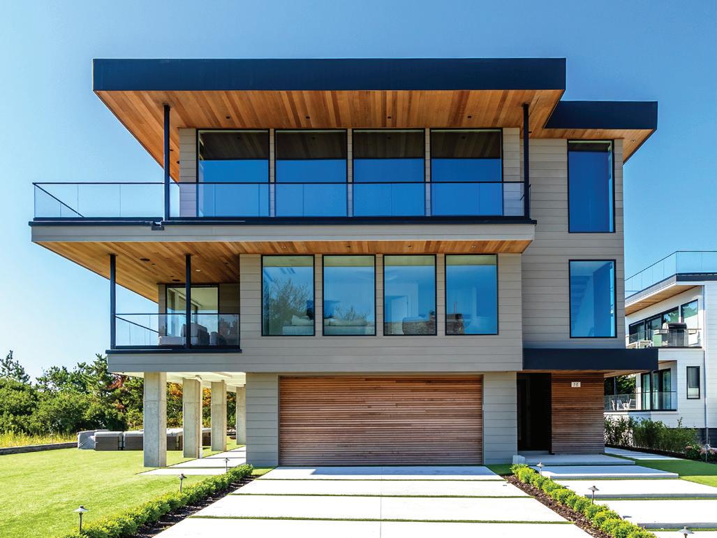
The 6,595 square foot, 6-bedroom, 8-bathroom, ocean front [main] house was designed for a couple and their three adult children who love to entertain, but, likewise, cherish their time away from the city. This is also why they built a second, 4-bedroom, 5-bathroom, guest home on the property— offering the homeowners ample space to host visitors while safeguarding moments of seclusion to experience the quaint respite that the beaches of LBI have to offer.
Undoubtedly, having such a notable background meant that the homeowners were well-equipped with the resources of the industry’s key players at their fingertips, so they tapped one of the most celebrated architectural firms to design their dream coastal abode: Gwathmey Siegel & Associates (presently known as Gwathmey Siegel Kaufman & Associates).
For more than four decades, Charles Gwathmey (one of the prominent architects collectively dubbed the “New York Five”) and Robert Siegel worked on numerous award-winning projects together, including renovating
and augmenting Frank Lloyd Wright’s Guggenheim Museum, injecting a dose of Modernism into Princeton’s Neo-Classical Whig Hall, and reinvigorating Yale University’s Paul Rudolph Hall. The firm was also behind Astor Place, a 21-story luxury loft building in the East Village, and Soho Mews, the luxury penthouses of New York City’s Soho Cast Iron Historic District known to harbor celebrities including Justin Timberlake and Jessica Biel, Oscar de la Renta and Jessica Chastain. Throughout the years, Gwathmey and Siegel also maintained a stream of glamorous residential projects—from renovating an 18th-century barn (one of many Gwathmey Siegal devised homes) for Steven Spielberg to designing Hamptons abodes and Manhattan apartments for Faye Dunaway and Jerry Seinfeld. Even Tom Hanks and Rita Wilson own a 14,500-square foot, $26 million Gwathmey Siegel–designed Pacific Palisades, California, home perched atop a cliffside overlooking the ocean as their main residence.
Along with Gwathmey Siegel Senior Associates Kang H. Chang and Gregory Karn, this North Beach residence
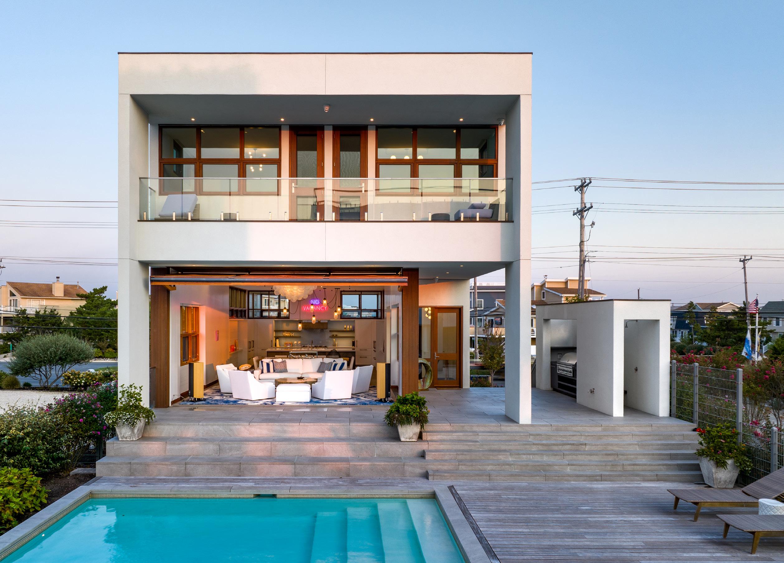
was designed in true Gwathmey form—modern and with a passion for geometrical complexity— although the details are tucked within a seemingly minimalist cubist exterior. [It just so happened that this oceanfront was the last Gwathmey Siegel design ever made, as Charles Gwathmey had passed away before ever getting to see the finished product. The Senior Associates that had formerly worked there, Kang H. Chang and Gregory Karn, were later hired to design the guest house.] Architectural plans in hand, the family commissioned none other than builder A. Richard Aitken, Jr., known for his wood craftsmanship and artisanal touch, to build their dream home, entrusting him to bring this vision to fruition. They broke ground in 2012—just before Sandy hit the island—and completed the main home in 2015. Five years later, during the height of the COVID pandemic, the guest home was completed seamlessly—despite the shortages and delays other homeowners were troubled with.
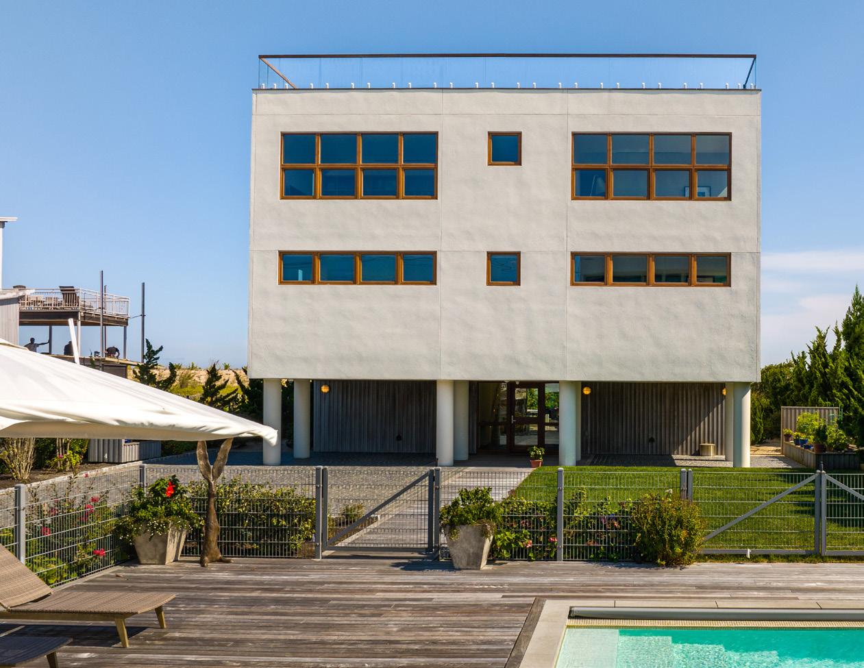
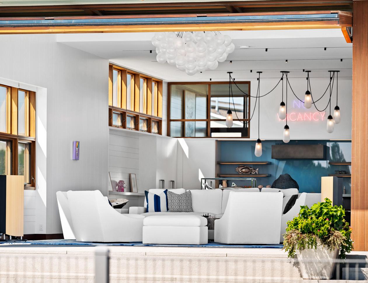
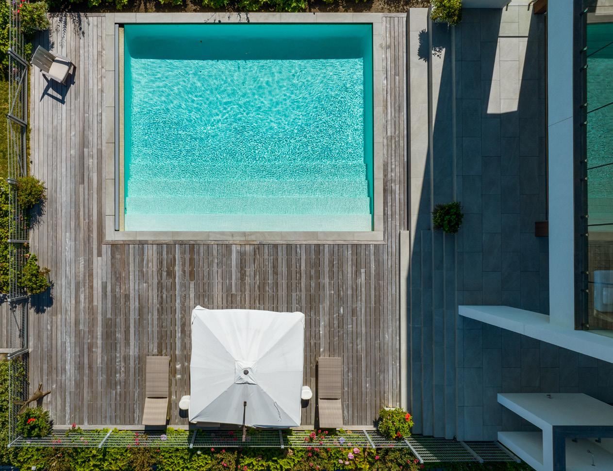
Little did the building team know how much regression would occur after Superstorm Sandy pommeled the island, especially in North Beach. When the dust had settled and waterlines receded post-hurricane, Aitken went to survey the construction site and found that six feet of under slab was pushed away after the storm, leaving a gaping hole under the concrete foundation slab that had been poured earlier around all of the plumbing, electrical conduit, as well as the thermal well infrastructure. The ocean had literally undermined, or carved out, the ground from underneath the foundation of the home. Such a major setback required experience, knowledge, ingenuity and quick thinking. Would they rip up five inches of concrete slab, back fill all of the sand and set the project back substantially with time and budget in order to redo it all? There had to be a way to replace the ground from underneath the slab in a safe and efficient manner.
The solution was apparent to Aitken. He became the first builder on LBI to mud jack, or backfill the hole, with a flowable fill concrete that, in accordance with the structural engineers and local building department, met the requirements to wash away if a storm like Sandy ever hit the area again. This concrete and sand mix backfill Aitken worked to create with the concrete supplier had a customized compaction rating that ensured the build could go on, up to code, salvaging all of the hard work and time already put into the foundation of the home.
Despite any curveball thrown his way, the builder marched on.
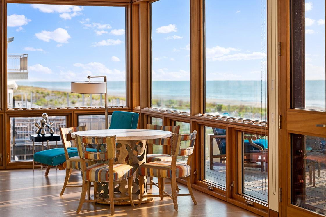
In one instance, the homeowners wanted to ensure that every room in the home had a view of the water (whether that be the ocean or the bay). They commissioned six figures worth of 12-foot, floor-to-ceiling Duratherm sapele mahogany windows. The only problem was that these windows yielded a ¼ inch reveal and, at the time, the building department wouldn’t allow spray foam insulation due to the fire hazard—which was the builder’s insulation of choice since the flat roof could not be vented. Naturally, Aitken dove into researching alternate options because he wanted to avoid having to lower the ceiling with the additional layer of 5/8 fire retardant sheet rock as required, because it would have covered the architectural line where the windows met the ceiling, being as the windows that were ordered very oversized. He figured out a way to enclose the
spray foam with intumescent paint, since it is considered the lightest form of passive fire protection. With up to a 2-hour fire resistance on wood, steel and gypsum, this state-of-the-art coating was painted onto all of the spray foam insulation, allowing for construction to carry on without the additional sheet rock layer or compromising the integrity of the window installation.
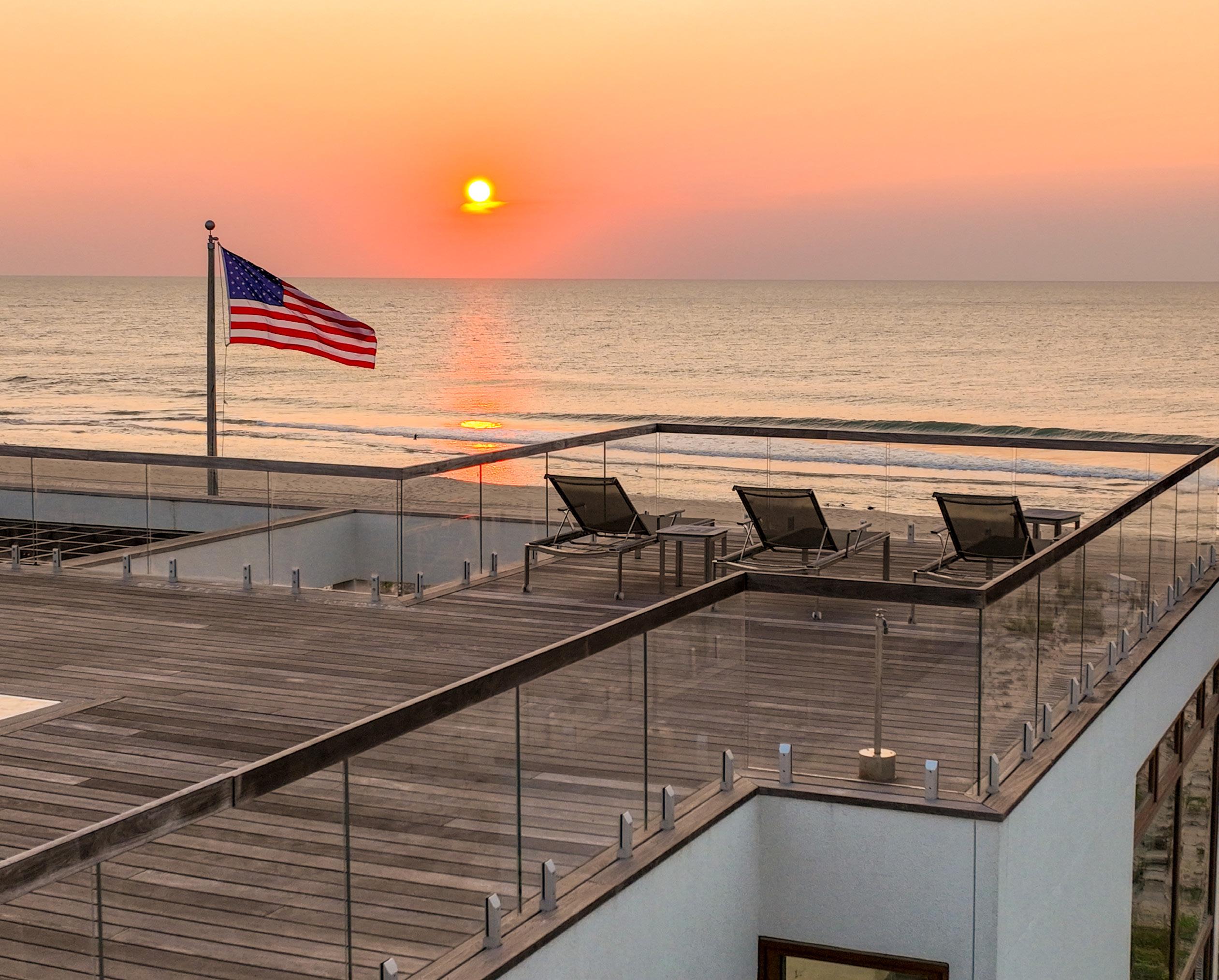
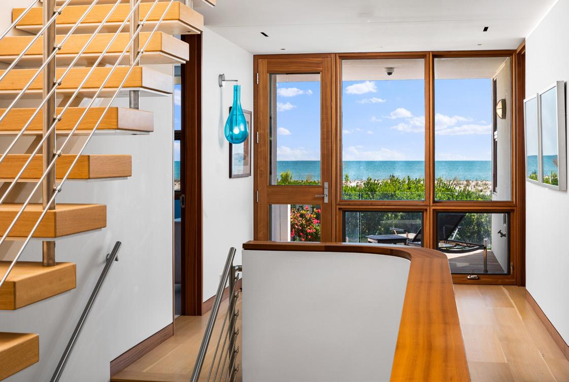
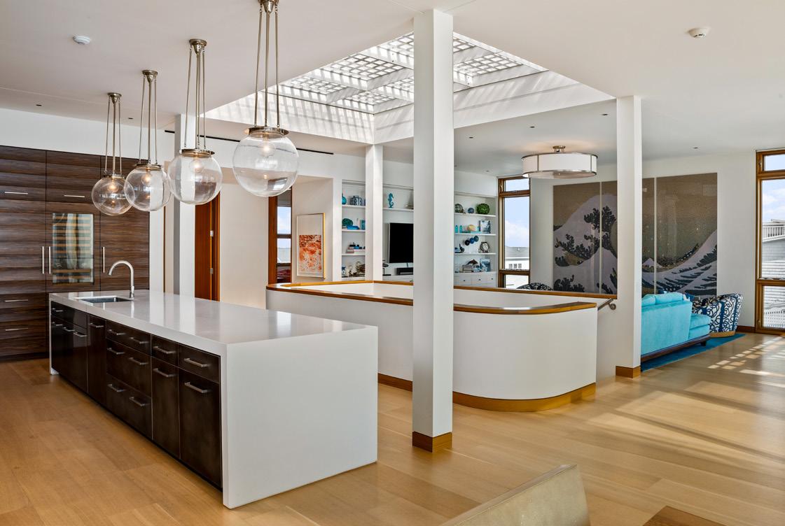
Other than the rockstar design and build team, what else makes such a home luxurious? It’s a combination of features that all provide a living experience of quality, comfort, authenticity, and effortless class. There is a 12x16-foot walkable skylight installed seamlessly with the flooring of the rooftop deck, and frameless glass railings on all decks for an unobstructed view of the Atlantic Ocean. The construction of the home focuses on
a 44-inch grid with stud centers of 11 inches, forcing all components to be in line, intentional, evenly spaced, and maximizing volume. In place of the typically desired grand-scale garage, pool, or home elevator, there are nine separate geothermal heating and cooling units installed, fed by six 500-foot wells, around the home’s perimeter that remarkably harness breakthrough environmental sustainability and economic benefits. With this configuration, each room has its own heating & cooling system.
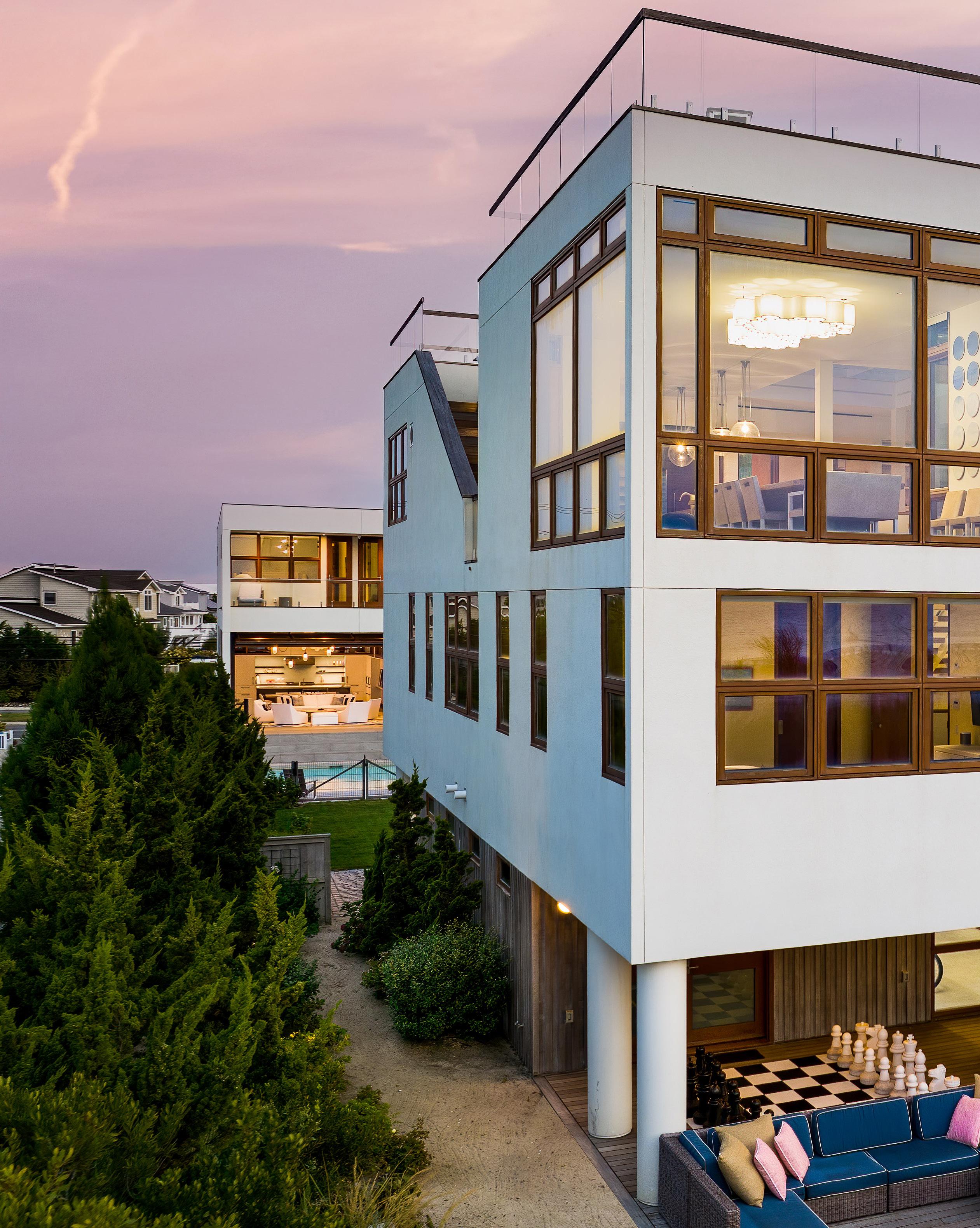
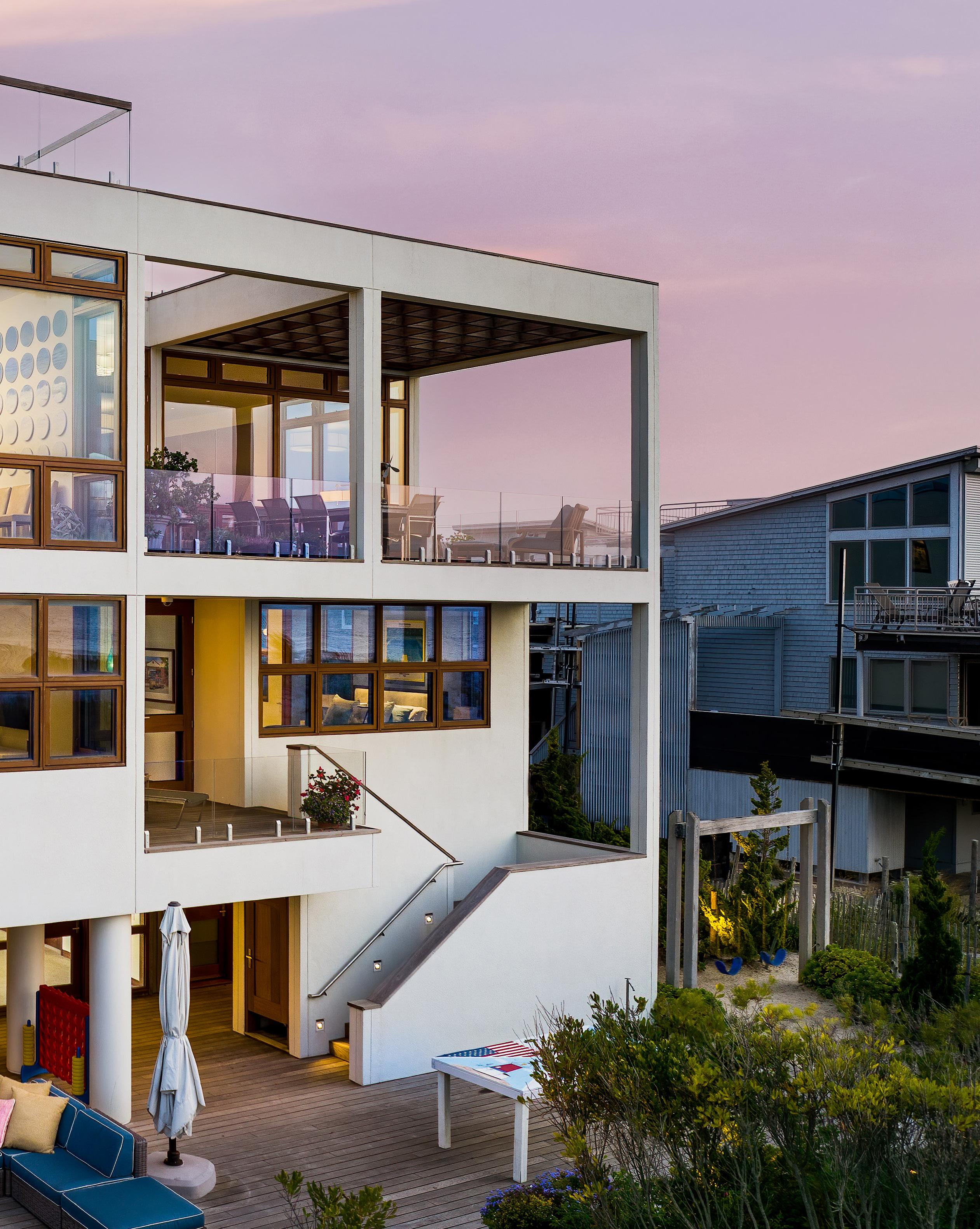
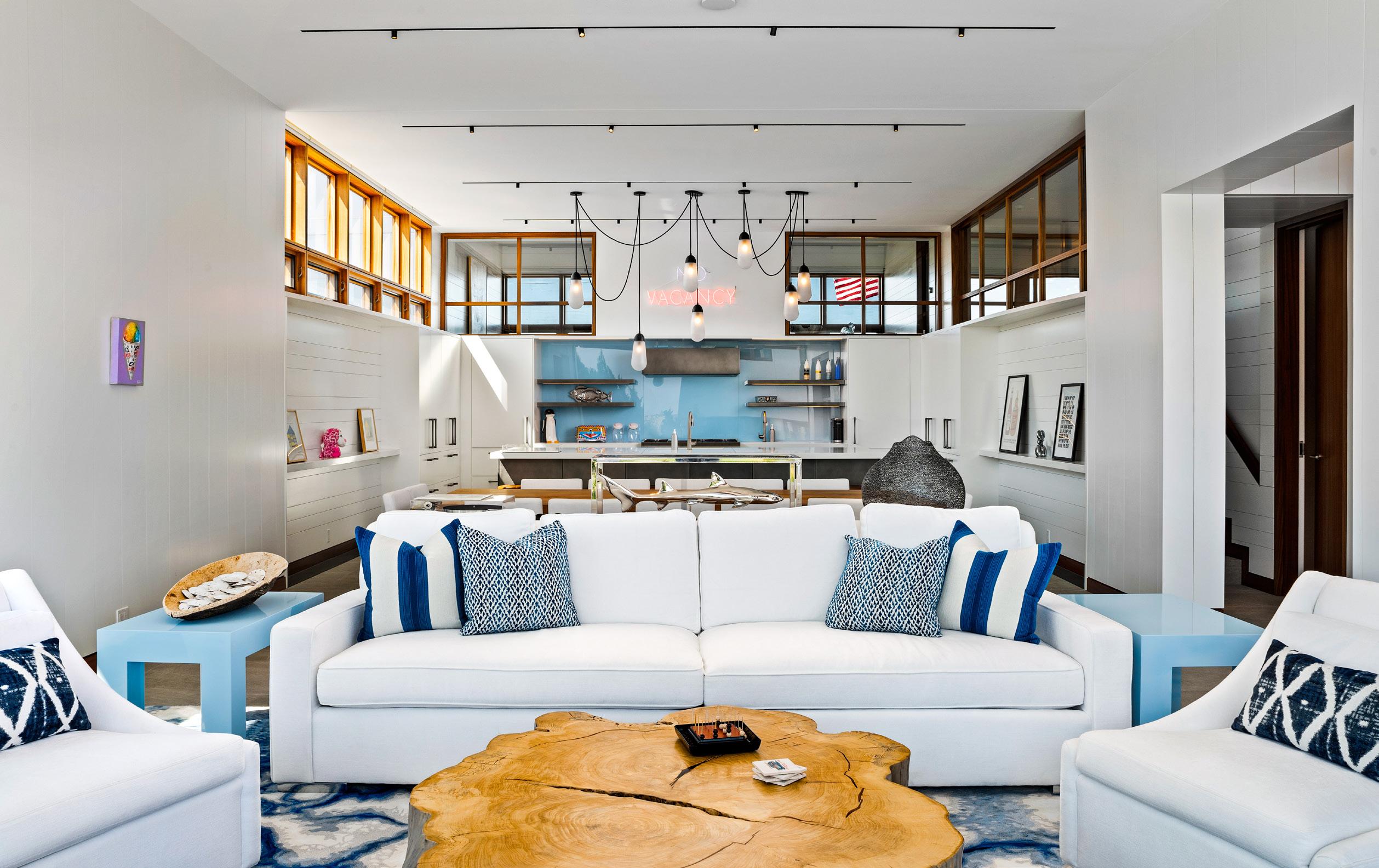
At the center of this area of the home is a stunning open concept kitchen-living-dining area and the top of a staircase with geometric curves and a glass ceiling housing the aforementioned skylight built into the rooftop deck. The home’s art and furniture echo its architectural style. There is a photo collage wall comprised entirely of chic black and white of snapshots of the family’s children—one per every summer of their lives that they’ve spent been on LBI— celebrating the best parts of life, and displayed in juxtaposition with the colorful and playful furniture & decorative accents; ornate light fixtures were installed to suggest clouds above the dining table, and even a three-paneled recreation of Katsushika Hokusai’s famous “The Great Wave off Kanagawa,” using ocean plastic pollution as the medium, hangs with delight. Flooded with natural
sunlight, these spaces flow seamlessly from private retreats to sprawling gathering spots.
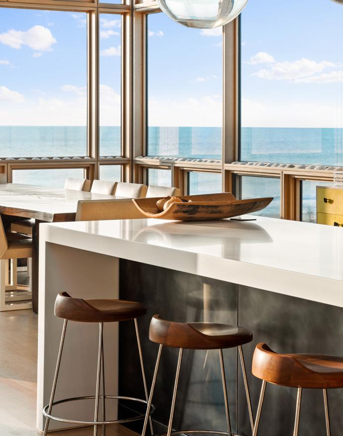
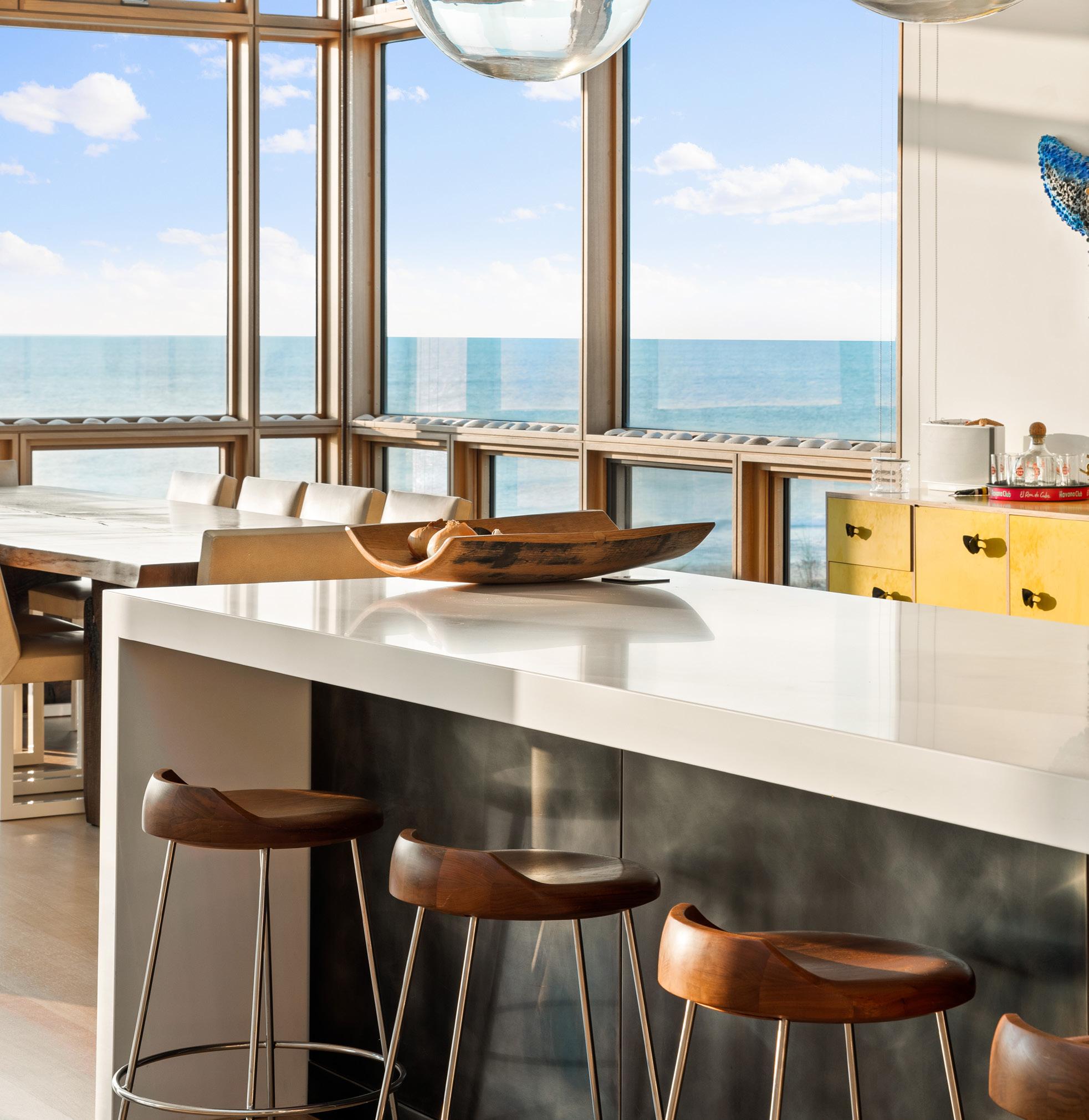
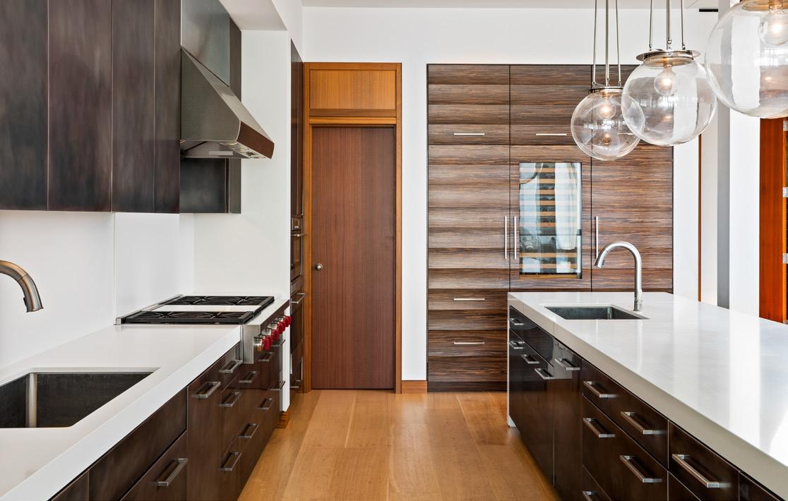
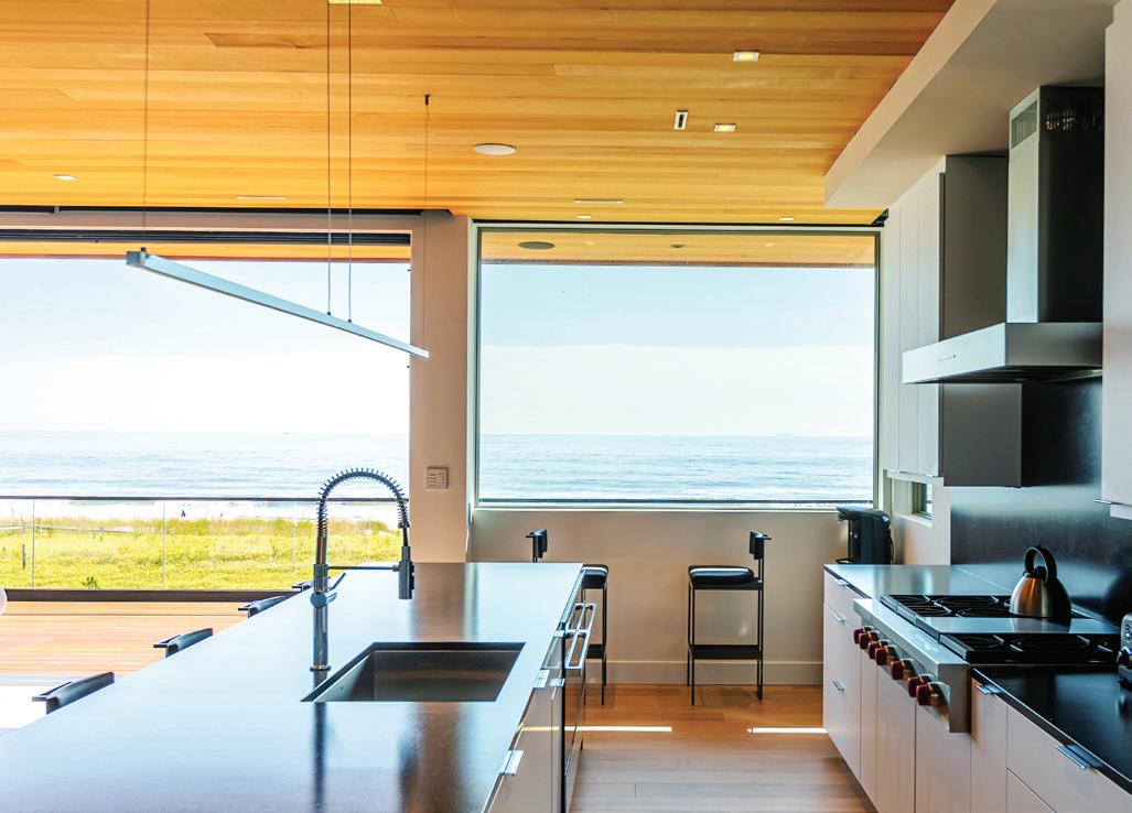
All of the interior design was undertaken by Frank DelleDonne Interiors and carefully curated to match the vibrant and joyful glow of the family’s matriarch. Invoking the happiness of color was the main source of inspiration for the home. The kitchen of the main house, conceived by DelleDonne and executed by the luxury American-made architectural status symbol, St. Charles New York, connotes class and taste, with this inviting charm. The kitchen, with its pewter faced cabinet doors, enormous waterfall island surrounded by modern barstools, along with the raw wood, live edge, free form dining table is not only the heart of the home for gathering and hosting (the kitchen seats 8 and the
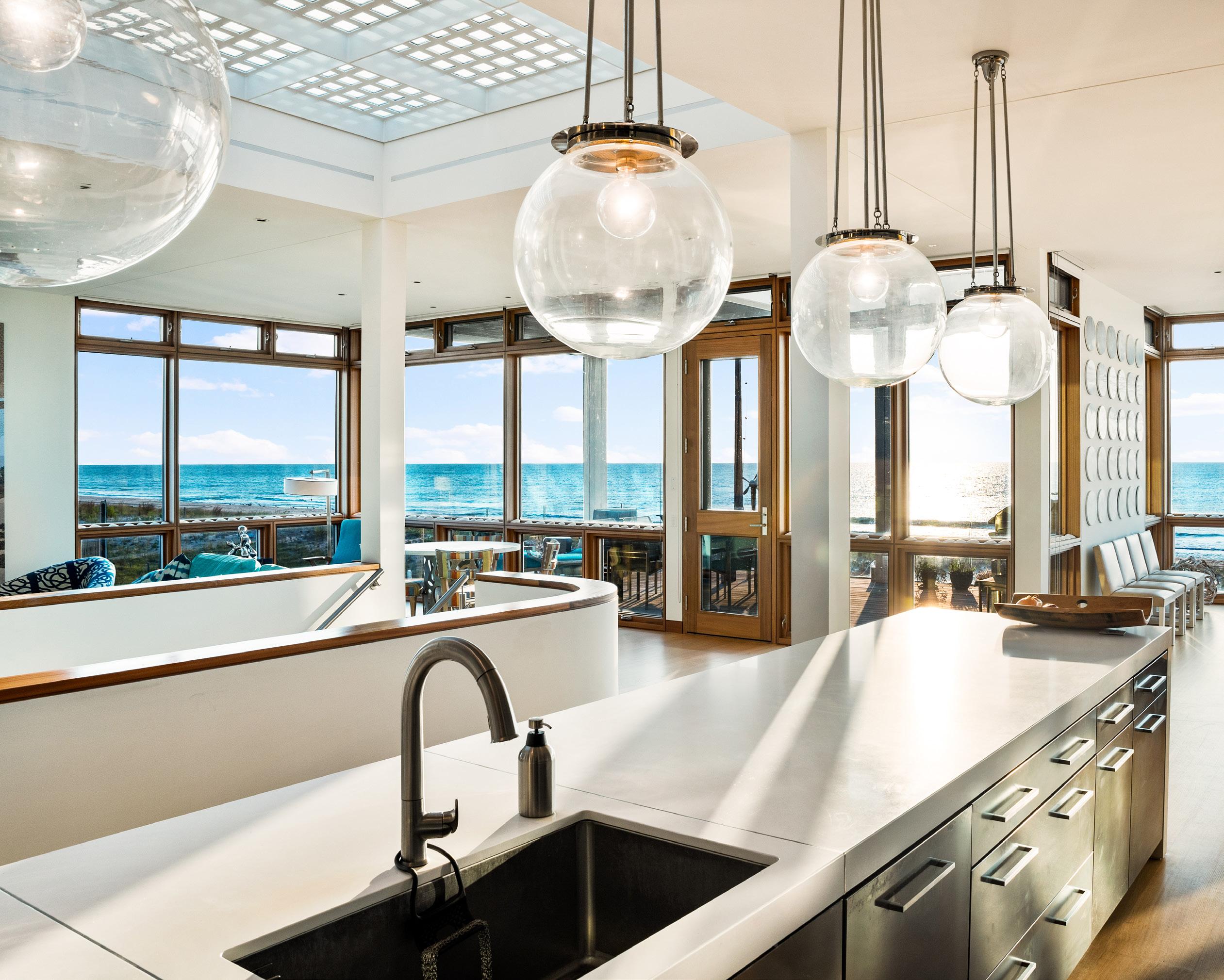
dining area can seat 14 comfortably), but its details can be revered for novelty and refinement. It defines what a simplistic, detail-oriented kitchen is capable of today. The guest house kitchen was later also designed and executed entirely under DelleDonne’s direction, with bespoke woodworking cabinet artisans.
The homeowners were so happy with their original main house that a few years later they came to Aitken a second time with the request to build a second home: The pool house, which doubles as guest quarters, located on the same piece of property. Following the theme of the main residence, the second home also boasts an ensuite bathroom within each of its [4] bedrooms so that all guests can savor in an element of privacy. Contrary to the main house, the guest house
does not follow a reverse living arrangement, that way guests are able to walk inside and outside freely, with easy [stairless] access to both the pool and beach entrances.
The highlight of the guest home is certainly the custom upward acting door that essentially opens up the entire pool-facing wall of the structure. At first glance, one may confuse this upward acting door with a traditional garage door or a rolling hurricane shutter door, but upon closer inspection, it’s easy to spot the intricacy of its application and function. Not only does this door not require the tracks that a traditional garage door does, but it’s unlike anything ever seen in a catalogue. Why, you may ask? Well, because Aitken conceptualized and fashioned the entire door from

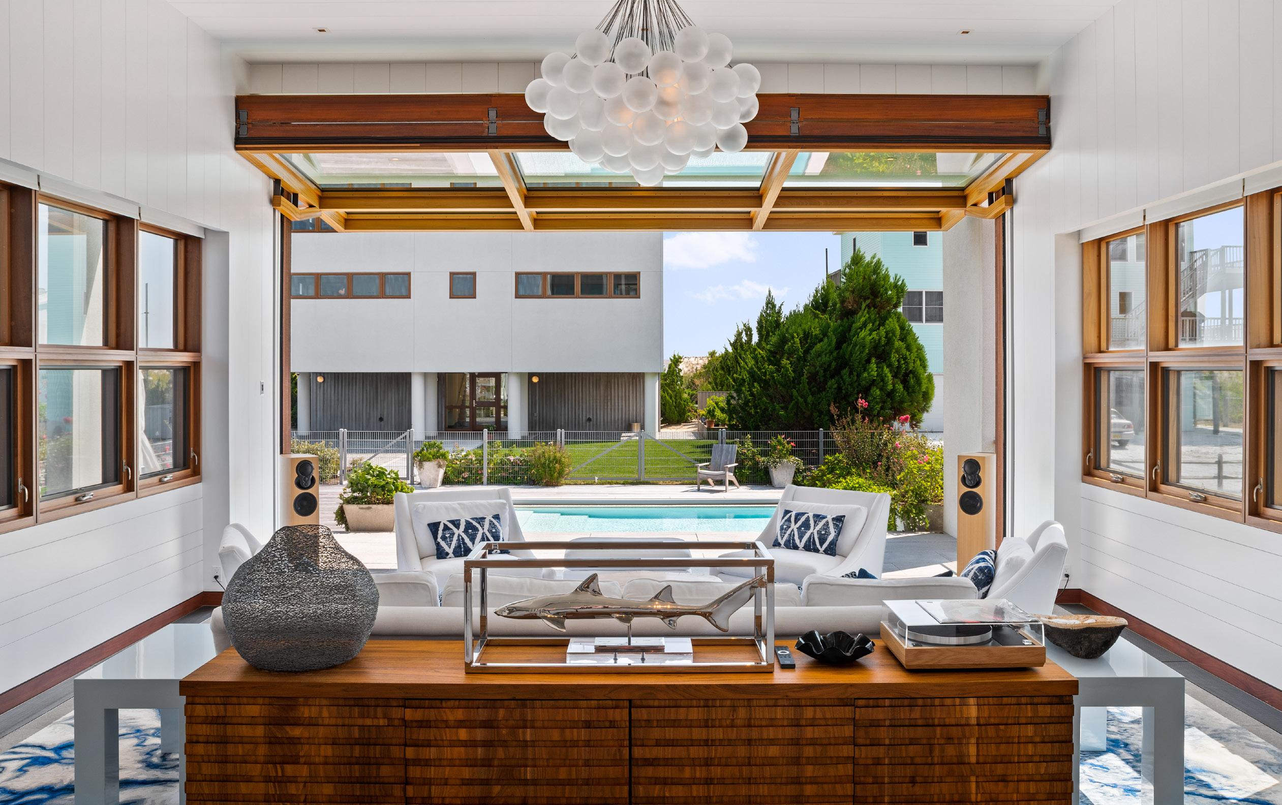
scratch. With a motto of, “If you can draw it, we can build it,” he and his team triangulated with each of the three different companies [along with the architects] to ensure both form and function of this proposed door concept were being met—and he didn’t give up until both were accomplished. The team constructed the metal frame, devised a motor, and manufactured custom fitted glass for the door. Aitken’s carpentry team trimmed the entire frame out with mahogany and, as an Andersen Certified Contractor, they also glazed the glass windows into the doorframe themselves. Now that it is assembled and installed, this complex door seems nothing short of effortless to open [and shut] with the simple push of a button.
From the light fixtures to the 11-inch engineered wood floor planks that were fitted “as flat and smooth as glass,” everything about this house is luxurious, but in a casual-cool way. It is magnificent, but not ostentatious. It appreciates its surroundings, it is a great use of space, it capitalizes on light, and carefully utilizes refined, quality materials. While the view is the main attraction, and the home with its furnishings may play supporting roles, the stunning architecture and quality craftsmanship keep the focus where it should be: on enjoying a balmy breeze, the warm sun on one’s face, and the company of good friends.



 NJ Home Improvement Contractor | License # 13H02727800
New Home Warranty Registered Builder | License # 039844




As experts at designing and building homes all along Long Beach Island, Walters knows the lay of the land in and out and can find the ideal location to build the home that suits your lifestyle and respects your financing needs. By your side every step of the way, they offer one stop shopping with in-house real estate, architecture and custom home services at the Jersey Shore.

Walters has a passionate mission, progressive vision and blueprint for success.
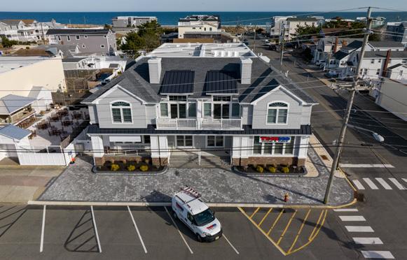
“We have streamlined all the different services that Walters offers into a single business model for an enhanced client experience,” said Matthew Gaudet-Walters, Director of Business Development for Walters. “We’re excited to open our new office this Summer 2023 and make the homebuilding process as smooth and enjoyable as possible for our clients.” Walters’ impressive new office with a modern aesthetic is located at 701 Central Avenue. It can be seen upon entering or exiting Long Beach Island, across from Ron Jon Surf Shop and adjacent to The Gateway LBI.
The Architecture Studio and Design Center are just a couple highlights of the new building and Walters’ single business model. Walters Architecture is led by industry veteran Arnold Boyle, AIA. “The Walters Architectural division continues to assess and reinvent home designs based on what the public desires to see in their future homes,” said Arnold. “Our goal is to ‘future-proof’ your home by personalizing it to make it more in line with how you live now.”
The Design Center is led by Interior Designer Janelle Welch, who helps homebuyers select all the finishes and colors for your new home. “Walters does not offer preset packages with options,” said Janelle. “We are not a production building company. We personally walk our clients through every step of the process to ensure they are getting a home that is livable, unique and exactly the way they envisioned it to be.”
“We have connected to our homebuyers in new and different ways and promise to continue to do our part in making their home buying dreams a reality in whatever way they feel most comfortable,” said Gaudet-Walters.
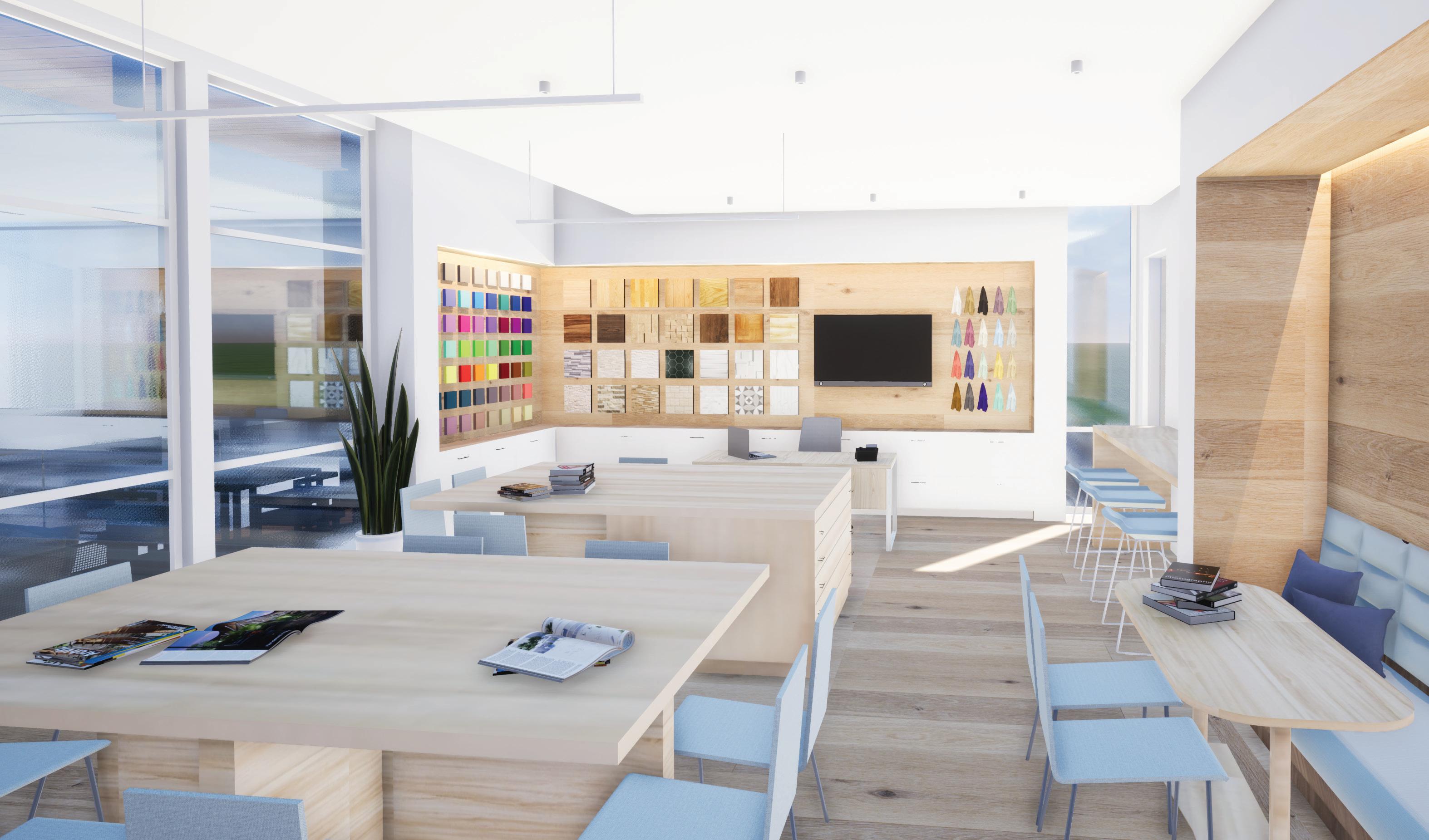
“We personally walk our clients through every step of the process to ensure they are getting a home that is livable, unique and exactly the way they envisioned it to be.”
– JANELLE WELCH, INTERIOR DESIGNER
“That has always been, and will continue to be, what inspires so many families to build with Walters.”
Looking to the future, in addition to its new Ship Bottom location, Walters will also maintain its corporate building located at 500 Barnegat Boulevard North in Barnegat.

Walters has been building quality homes at the Jersey Shore since 1984. The company offers three divisions, Architecture, Custom Homes and Realty, to offer all-inclusive services that seamlessly bring a homebuyer’s dream vision to reality. Walters Architecture is a completely complimentary service that allows homebuyers to work with in-house architects to design the perfect home with the latest technology and quality building materials. Walters Realty offers full-service brokerage experts that help homebuyers find the right homesite depending on their desired location. Walters Custom Homes offers newly designed custom home plans that help homebuyers through the homebuilding process. Every custom home built by Walters meets or exceeds the energy efficiency requirements for ENERGY STAR® certification. Walters is located at 500 Barnegat Boulevard North, Building 400, Barnegat, NJ 08005. To learn more, call 609.597.6999 or visit waltershomes.com


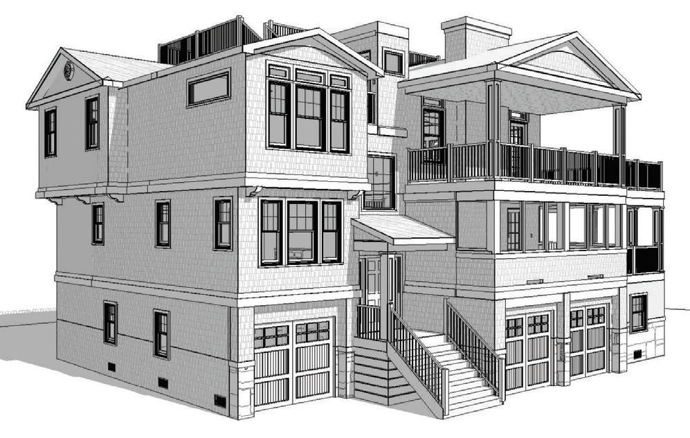
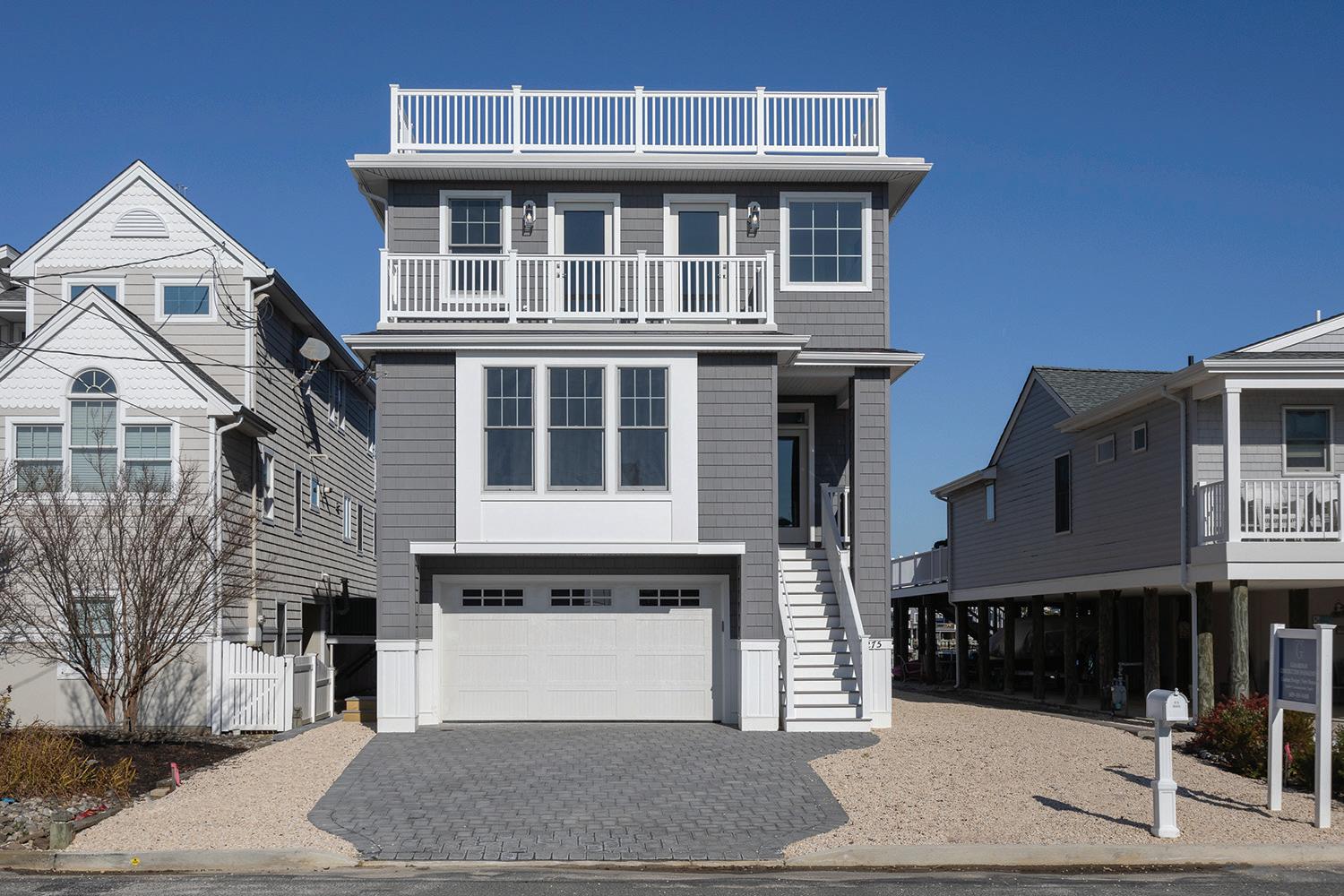
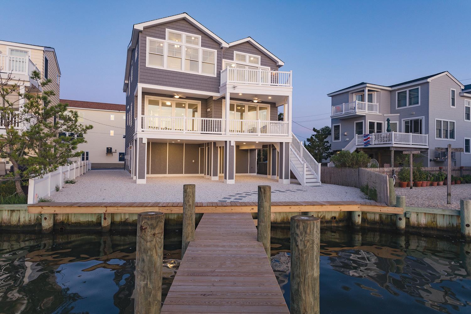
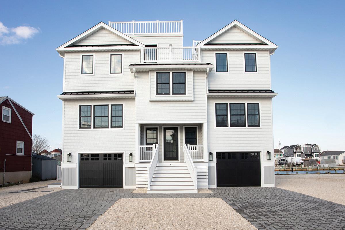
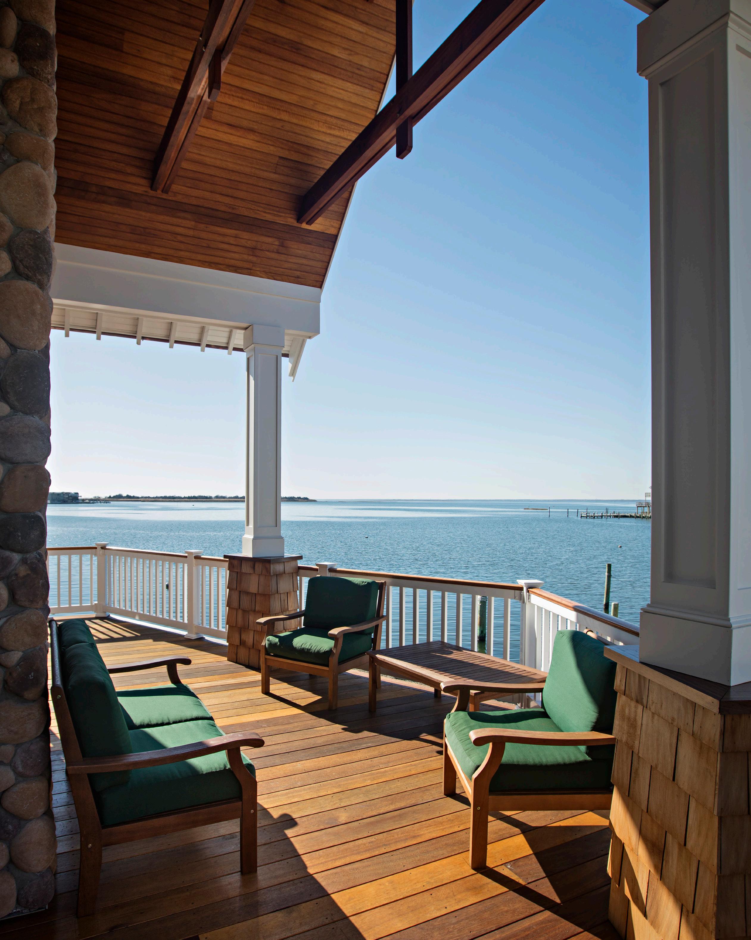
Imagine opening your eyes to greet a beautiful summer morning on Long Beach Island. You take a deep breath followed by a sip of your morning coffee, basking in the soothing warmth and peace that surrounds you. You could sit there for hours; peacefully reading a book, taking a snooze, listening to the sound of the ocean waves ebb and flow through the open windows.
One man on LBI has spent every waking hour of his thirty-year career imagining just that. Michael Pagnotta, owner and principal architect of Michael Pagnotta Architecture + Construction in Ship Bottom, has been designing and building energy efficient homes on the island since 1990. He and his designers are masters at maximizing the attributes of each unique home while creating energy and spatial optimization to deliver the absolute highest and best use for their clients’ financial investment.
“It all ties into the best use of resources,” Pagnotta said. “The question we ask ourselves is how do we streamline the process as much as we can? That’s because when a home is designed well we can rest knowing we made the best use of our clients’ time and money.”
Pagnotta and his team of designers and builders see everything through the architect’s lens, therefore when conceptualizing a project, they first take into consideration the arrangement of living spaces and what they require.
Long Beach Island’s standard lot size is either 40’ x 100’ or 50’ x 100’ and typically limited to 33% to 35% lot coverage, resulting in a structure that has a footprint of about 2,000 square feet or less, assuming the presence of exterior decks. Pagnotta’s team de-
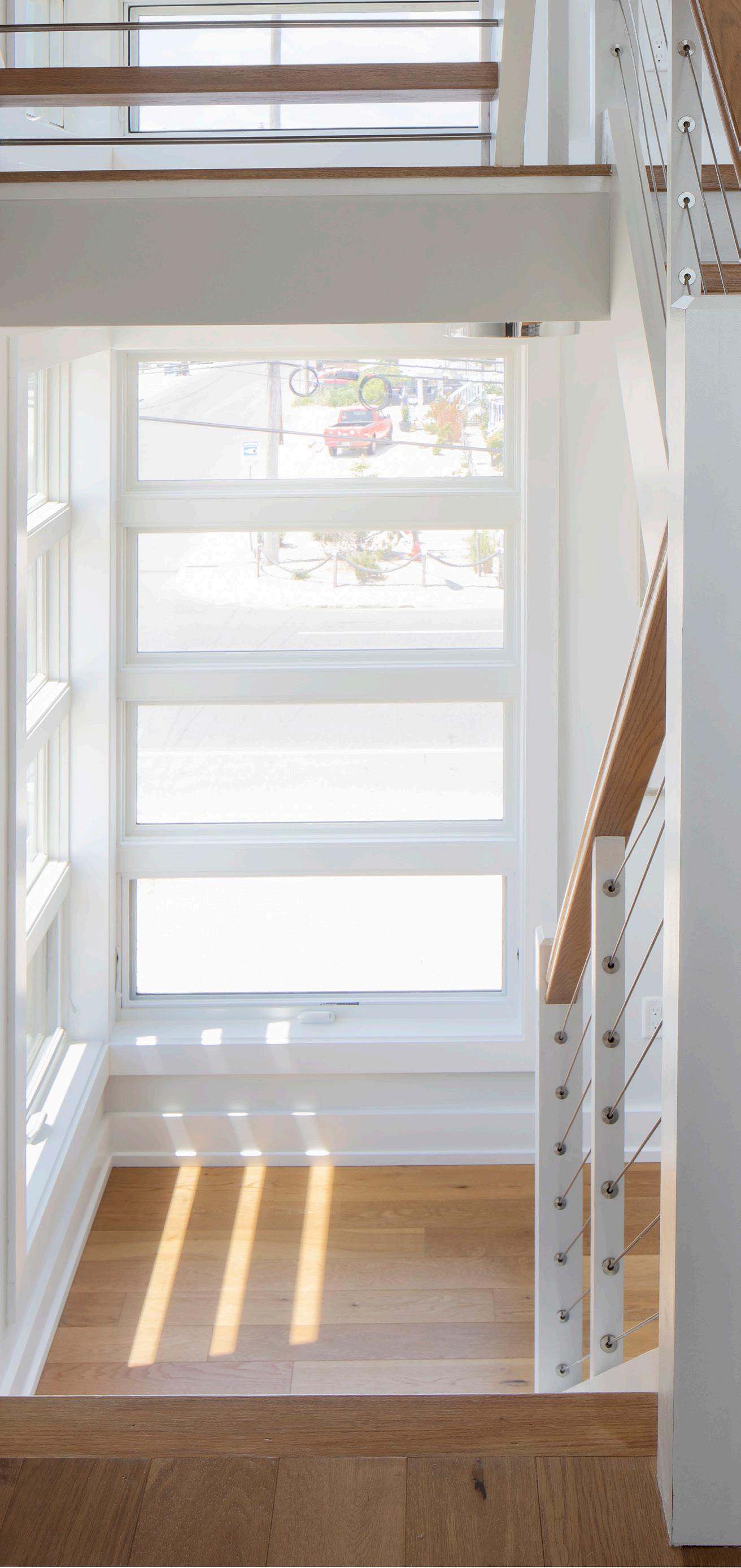
termines the various orientations that would be most favorable and advantageous, both energetically and spatially, and configures it all around the allotted coverage.
A primary challenge that Pagnotta successfully converts into opportunity is the solar orientation of the home. A coastal home is subject to relentless exposure to direct solar gain, which is the process by which sunlight will enter a home through south-facing windows. Solar heat is absorbed by the floors and walls which then heats the home, creating an environment in which the air conditioning units work harder, resulting in increased utility costs.
Pagnotta takes pride in utilizing architecture and design to achieve energy efficiency rather than the homeowner having to rely on gimmicky mechanized systems that are not nearly as effective. Incorporating special rooflines,
windows, and overhangs keeps the afternoon sun from mercilessly assaulting a home’s vulnerable energy spots. Use of high-performance Andersen low energy glass windows protects against the absorption of excess heat, and even the location of the windows themselves are configured so that direct gain is minimized or avoided wherever possible.
Long Beach Island’s geographic position also subjects it to harsh north winds. Pagnotta deploys strategic design tactics that help orient various rooms and areas of the home in such a way that it resists winds while working in aesthetic harmony to capitalize on available views. Outdoor living areas, for example, may face south to naturally act as a wind barrier.
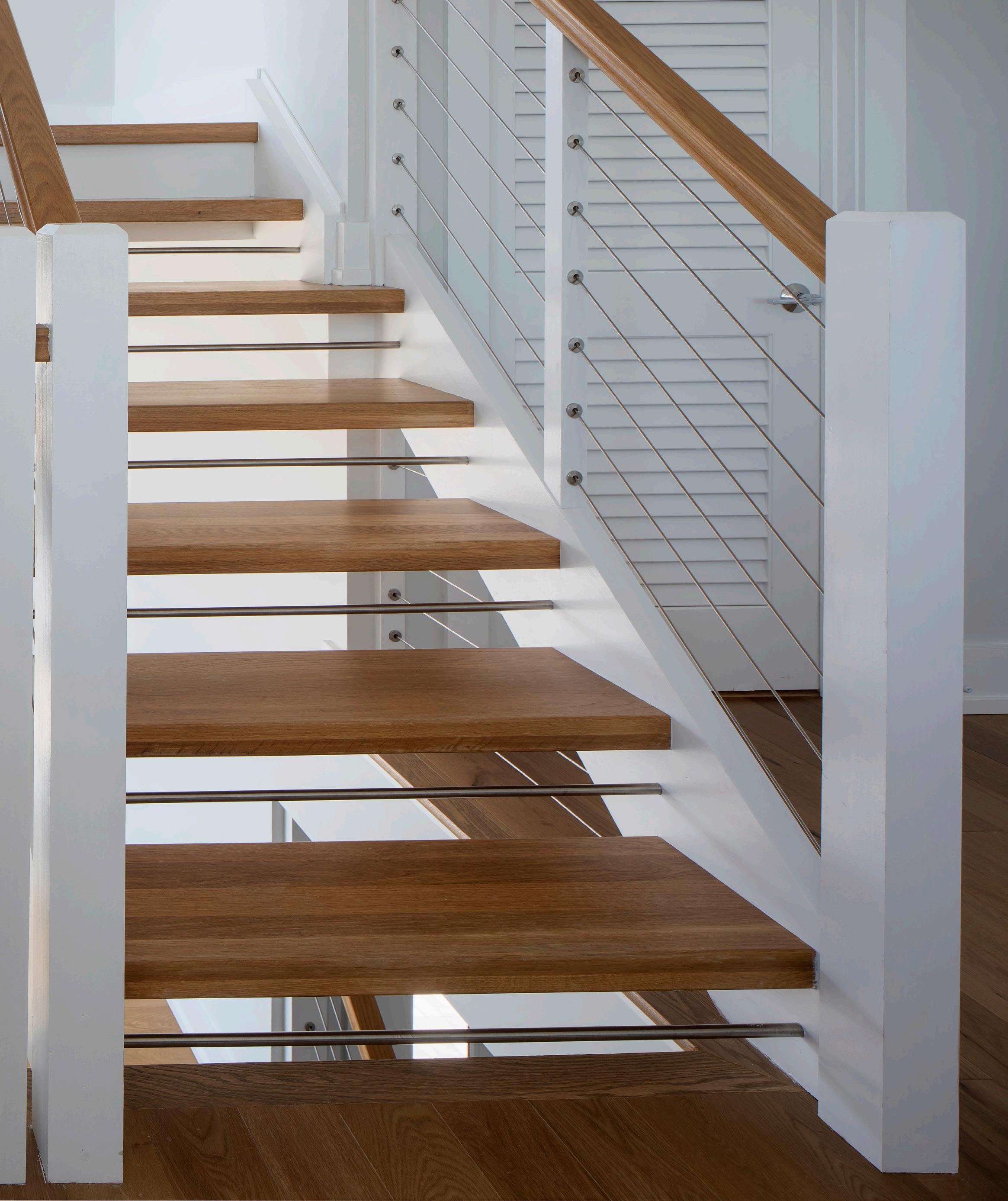
Allocating utilities, mechanicals, laundry, bathrooms, and elevators to non-view sides of the home leaves the rest of the space available for marrying efficiency with enjoyment. Common application includes open floor plans with fewer hallways along with centrally located stairs so that no opportunity for spatial optimization is overlooked or underutilized.
“Often we’re designing homes that have to live through many different types of experiences and
different gathering sizes,” Pagnotta said. “We have to come up with communal spaces that can accommodate Thanksgiving or Christmas and then we have private areas where there may be a couple that wants to be there for the weekend.”
From intimate spaces to dining spaces, a spatially and energy efficient custom home design is where science, math and art meet. It needs to be flexible enough to accommodate two to four people one day and twenty people on a weekend. Flexibility within the spaces is key so they can accommodate all the different settings in a family throughout the lifecycle of the home.
“It helps that I’ve gone through several lifecycles myself,” Pagnotta concludes. “So I understand how a beach house works and how people utilize a beach home throughout the years.”
From a little kid napping on the couch, to a young adult sunning on the deck, to a grandparent reading a book on the covered porch, the many different ways that an LBI beach house is enjoyed means making sure you have the right team in place when designing a spatially comfortable, energy efficient canvas where beautiful memories begin.
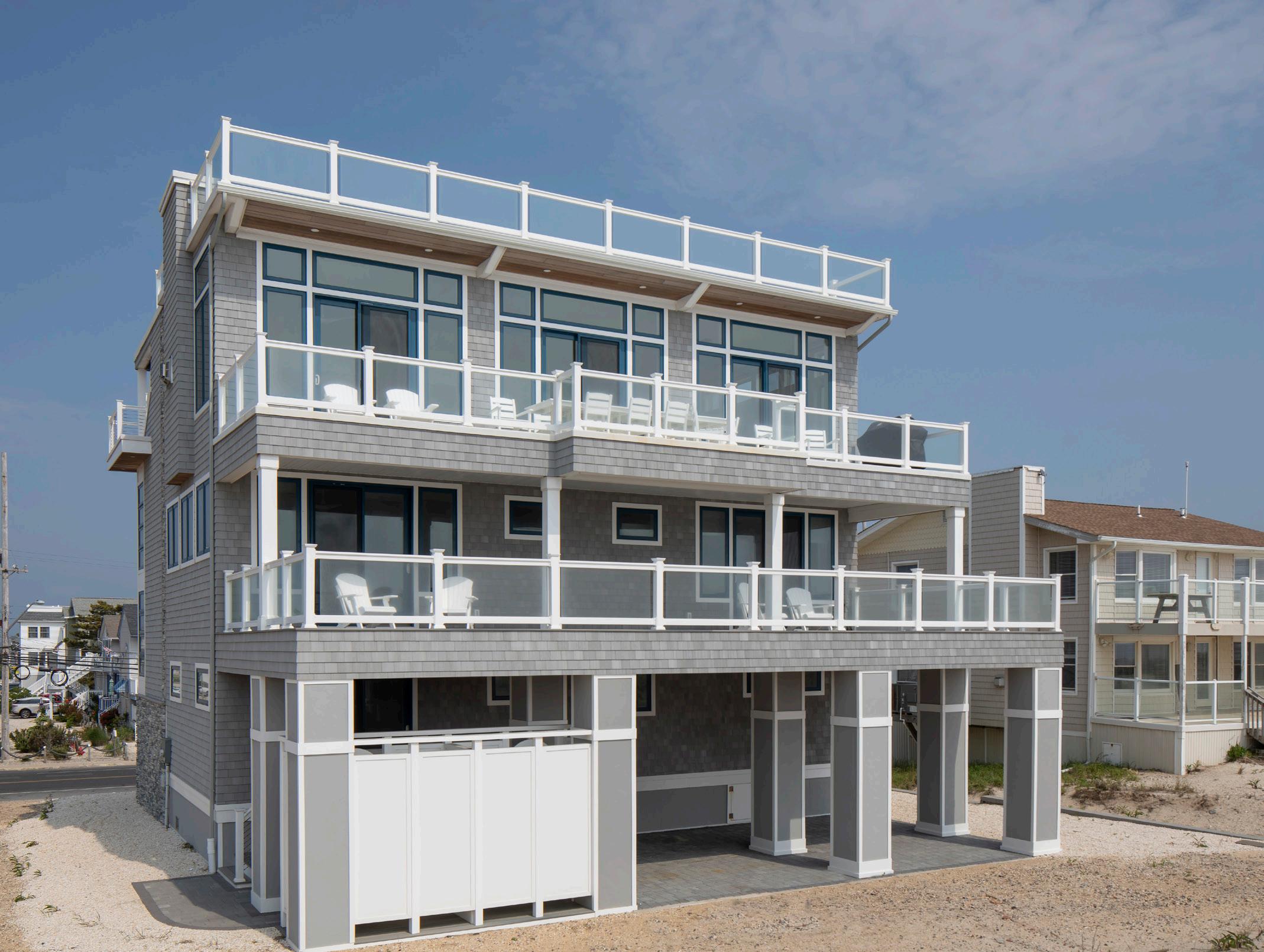
LONG BEACH ISLAND’S PREMIER REAL ESTATE MAGAZINE
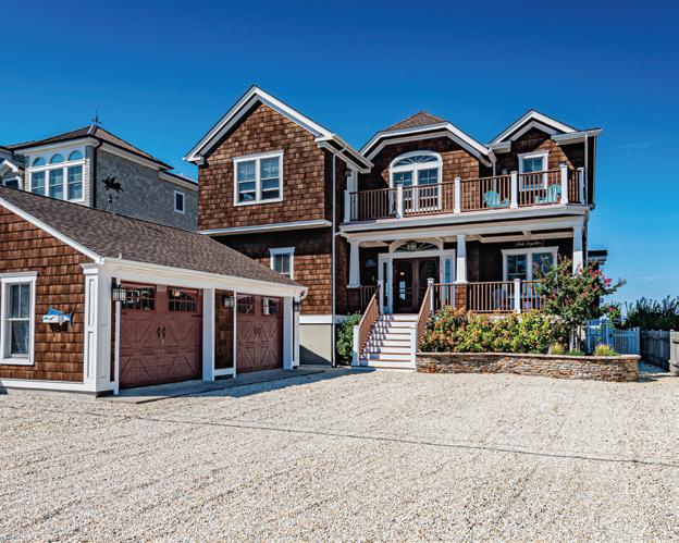
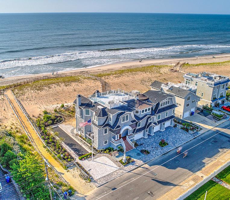
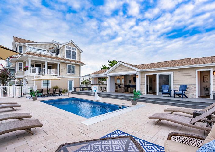
PUBLISHED FOUR TIMES A YEAR, 5,000 COPIES OF THE BOOK LONG BEACH ISLAND’S PREMIER REAL ESTATE MAGAZINE, ARE PRINTED AND DISTRIBUTED ON LONG BEACH ISLAND AND VICINITY, IN STRATEGIC HIGH VOLUME LOCATIONS. PLUS 20,000 DIGITAL COPIES, WILL BE EMAILED TO CLIENTELE.
PUBLICATION DATES & AD DEADLINES
Published
MARCH 1,2023
Publication JUNE 1, 2023
Publication AUGUST 1, 2023
AD DEADLINE 6/22/23
Publication
OCTOBER 1, 2023
AD DEADLINE 8/25/23
CONTACT
GARY@BAY-MAG.COM
 WRITTEN BY DENISE PETTI PHOTOS BY MICHAEL SPARK
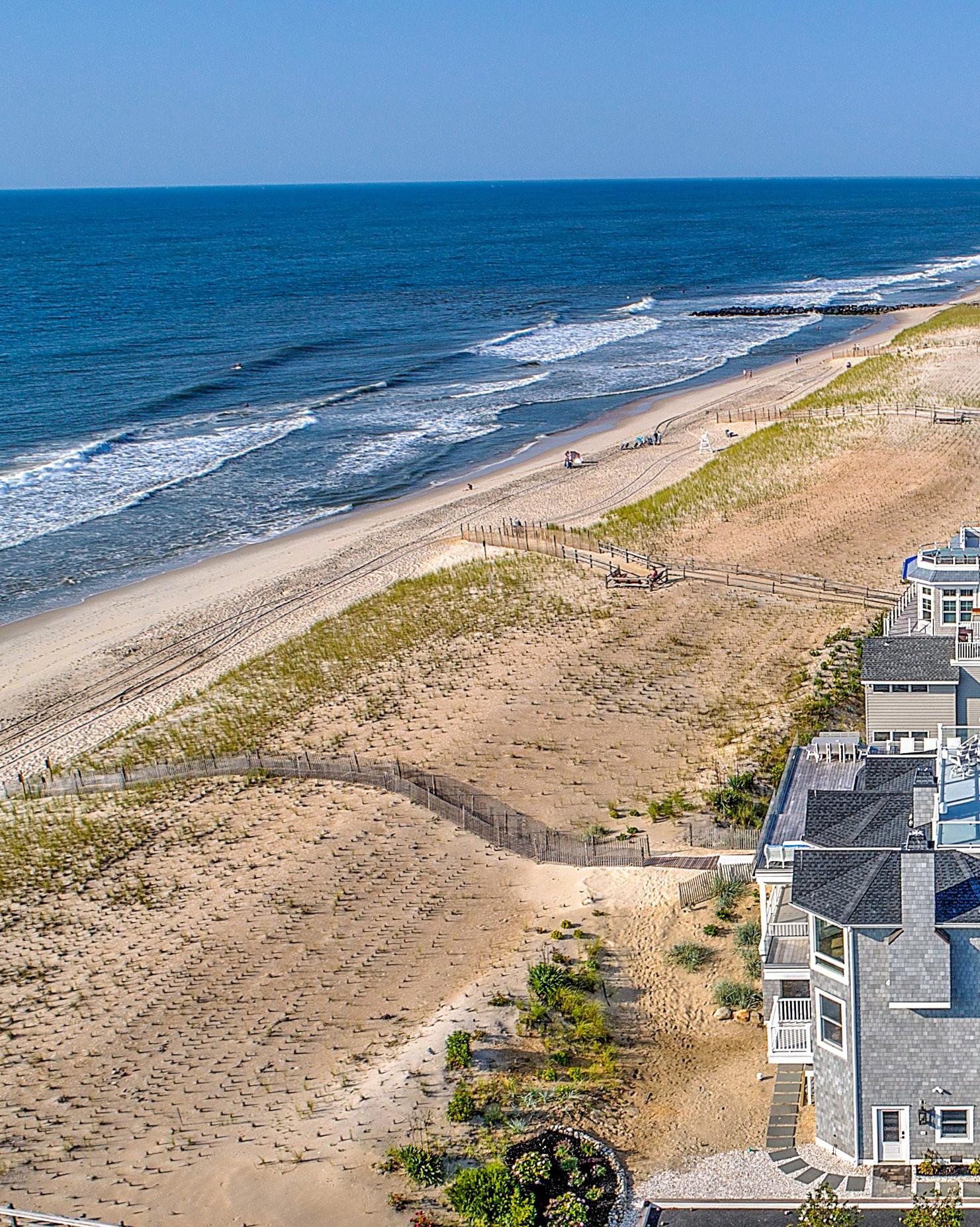
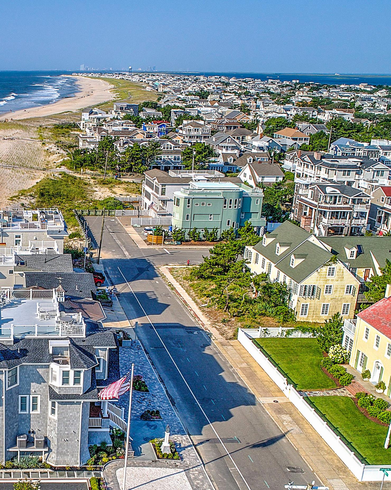
When Kyle and Autumn Chapple turned their home-buying sights to Long Beach Island, it was seven years after Superstorm Sandy had left her indelible mark on the New Jersey coastline. These avid beach lovers and their family of wave riders from North Jersey opted to fix their gaze on a special slice of beachfront paradise located in desirable Beach Haven.
The home that once stood there, having been torn down following the notorious storm, gave way to a vacant lot that sat off-market and undeveloped ever since. So the Chapples took it upon themselves to make the owner an offer and procured this prime piece of real estate at the close of 2019, mere weeks before the world would seemingly stop turning on its axis, all but halted by a global pandemic.
Who could have predicted what a fortuitous purchase this would prove to be, particularly with home values subsequently inflating to record double digit percentages? The Chapples’ little piece of heaven on the Atlantic Ocean would soon go on to become the stuff of dreams.
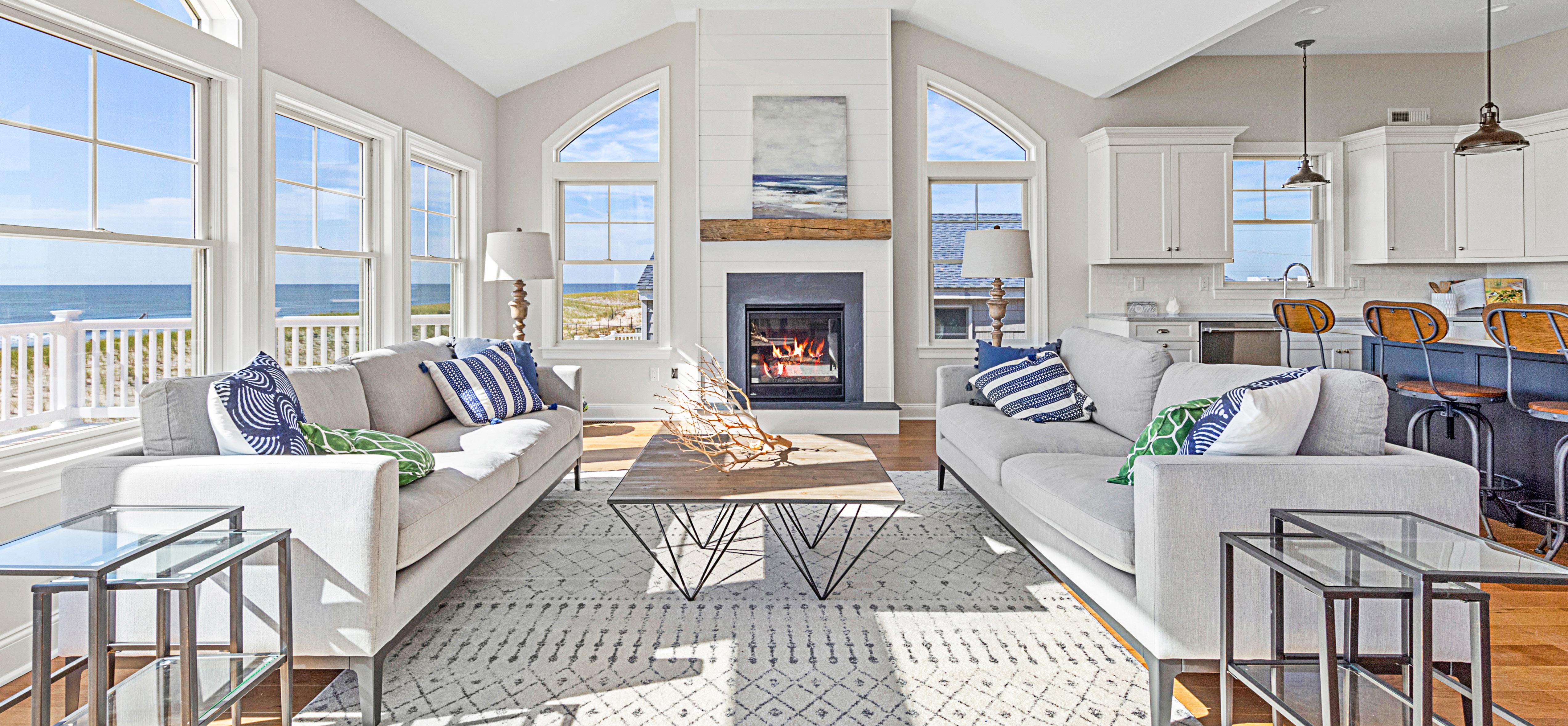
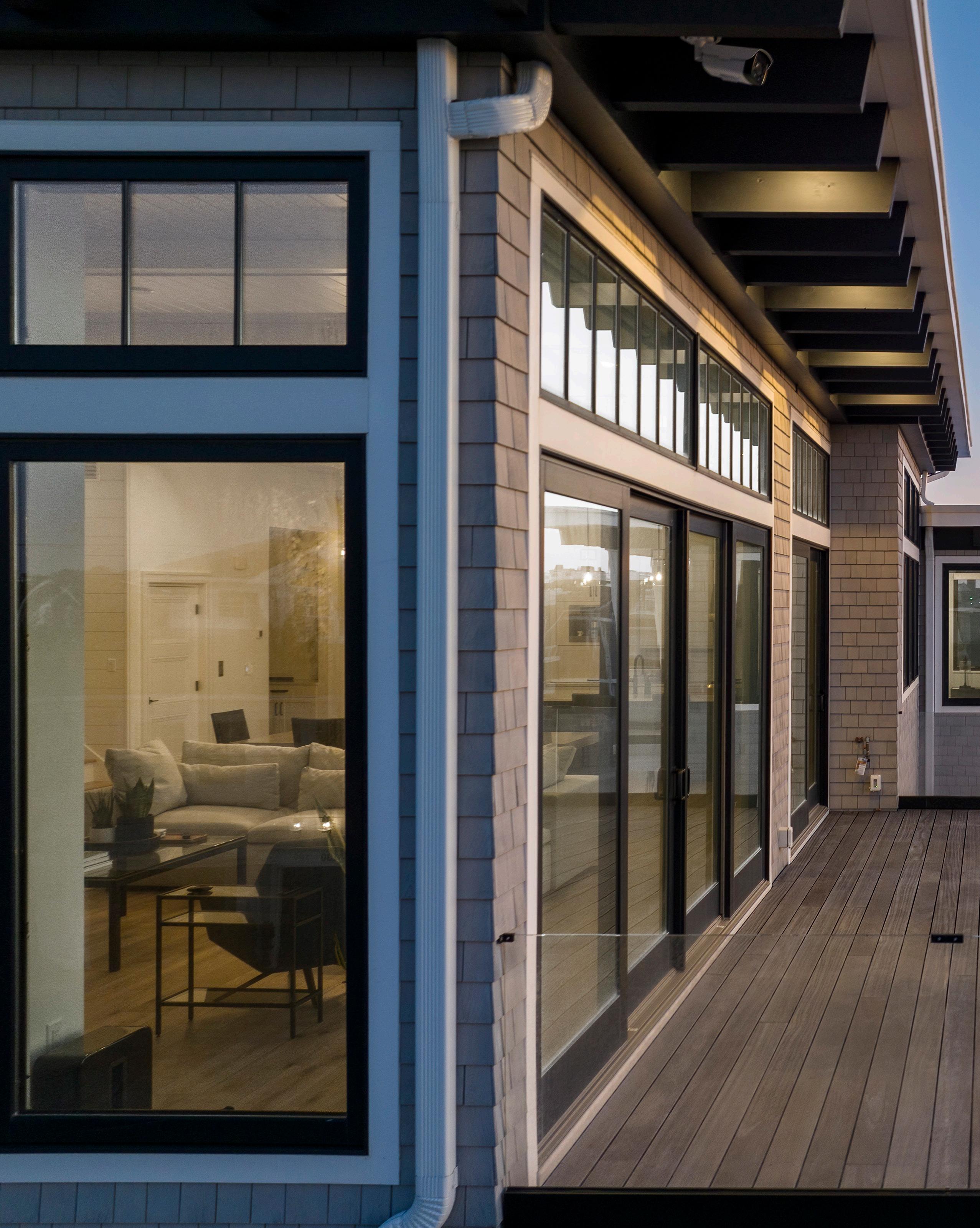
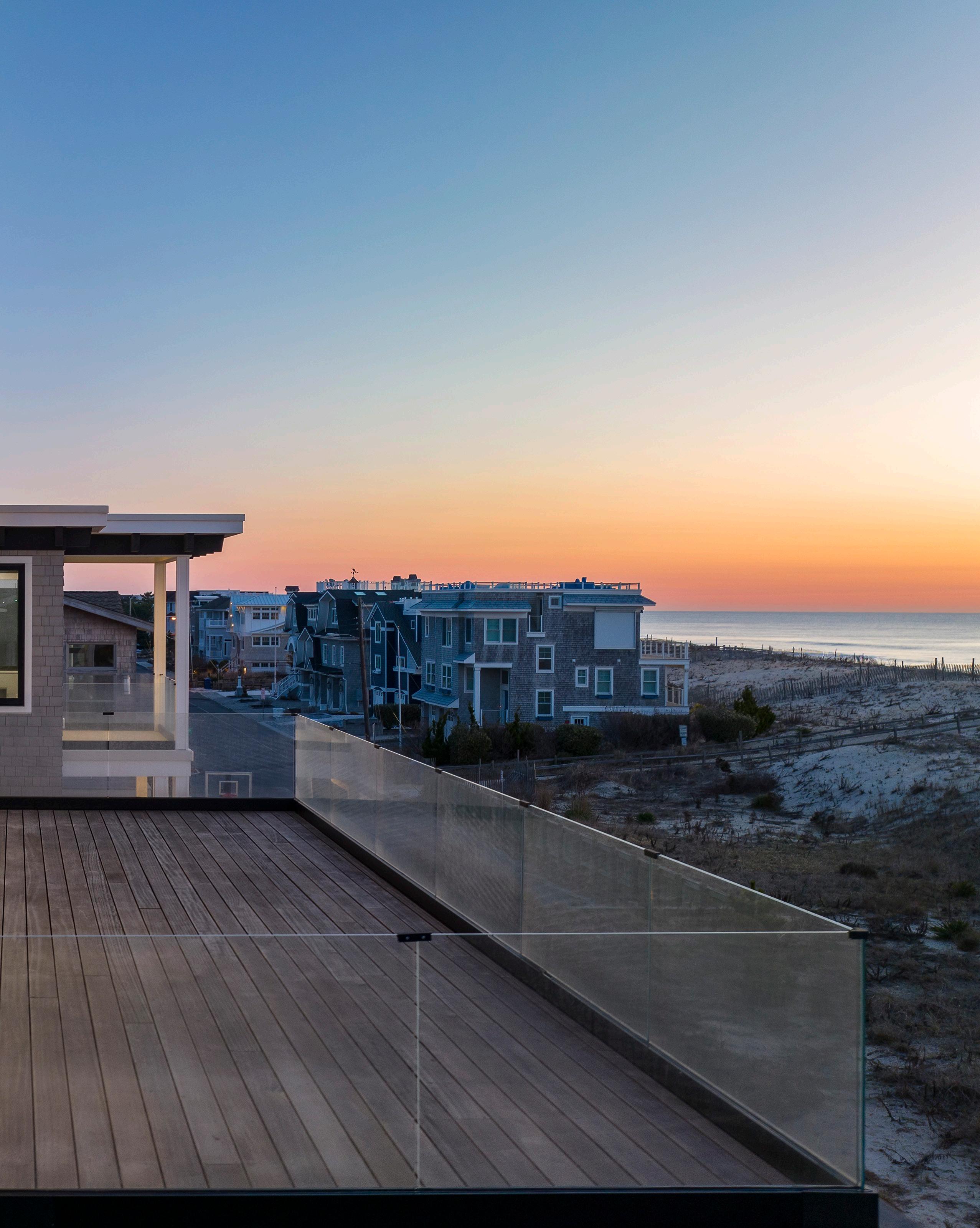
“Kyle and the kids love to surf,” Autumn Chapple said. “So we said to ourselves, ‘Wouldn’t it be great if we could see the waves from all our bedrooms?’”
With that in mind, the Chapples began visualizing their vacation dream home. Enter the team of Thomas J. Keller Building Contractor, who through initial conversations, meetings and getting to know the couple, quickly and clearly understood their needs. Having worked with many fine architects over the years with differing styles, they arranged for an introduction to Will Esarey of Handline Architect, who they knew would be a perfect fit to help take the Chapples’ vision and use it to drive the stunning aesthetic of the home’s inspired design.
The home conveys a contemporary flair while inviting a free and easy vacation vibe. With such a strong focus on maximizing and capitalizing on the spectacular views, the priority was to create an open, airy floor plan with large windows and high ceilings for absorbing the 180 degree ocean panorama. The result strikes a rare and

respectable balance: Luxurious, yet approachable. State of the art, yet cozy, casual and comfortable.
The Chapples worked with the Keller team to conceptualize a unique exterior design that is striking upon approach with distinctive columns framing the entryway. The cedar shake siding is offset by a section of white board and batten, offering an attractive contrast. Immensely tall, single pane custom Andersen casement windows are bold and beautiful in their simplicity, complimenting the stylish black corbels that perfectly punctuate where the roof meets the eaves.
Upon entry, you ascend an open staircase and, despite its cool minimalism, there is a cozy warmth and approachable feel to the visually engaging design. From industrial-chic lighting selections to the white oak wide plank floors, every selection seems to invite you to make yourself right at home and linger awhile.
The first level bids welcome with a bright and cheerful family room overlooking sand and surf, where kids can hang out inside to play games and watch TV or step through the sliders and relax, rain or shine, on the oceanfront deck. A highlight is a hand-crafted full
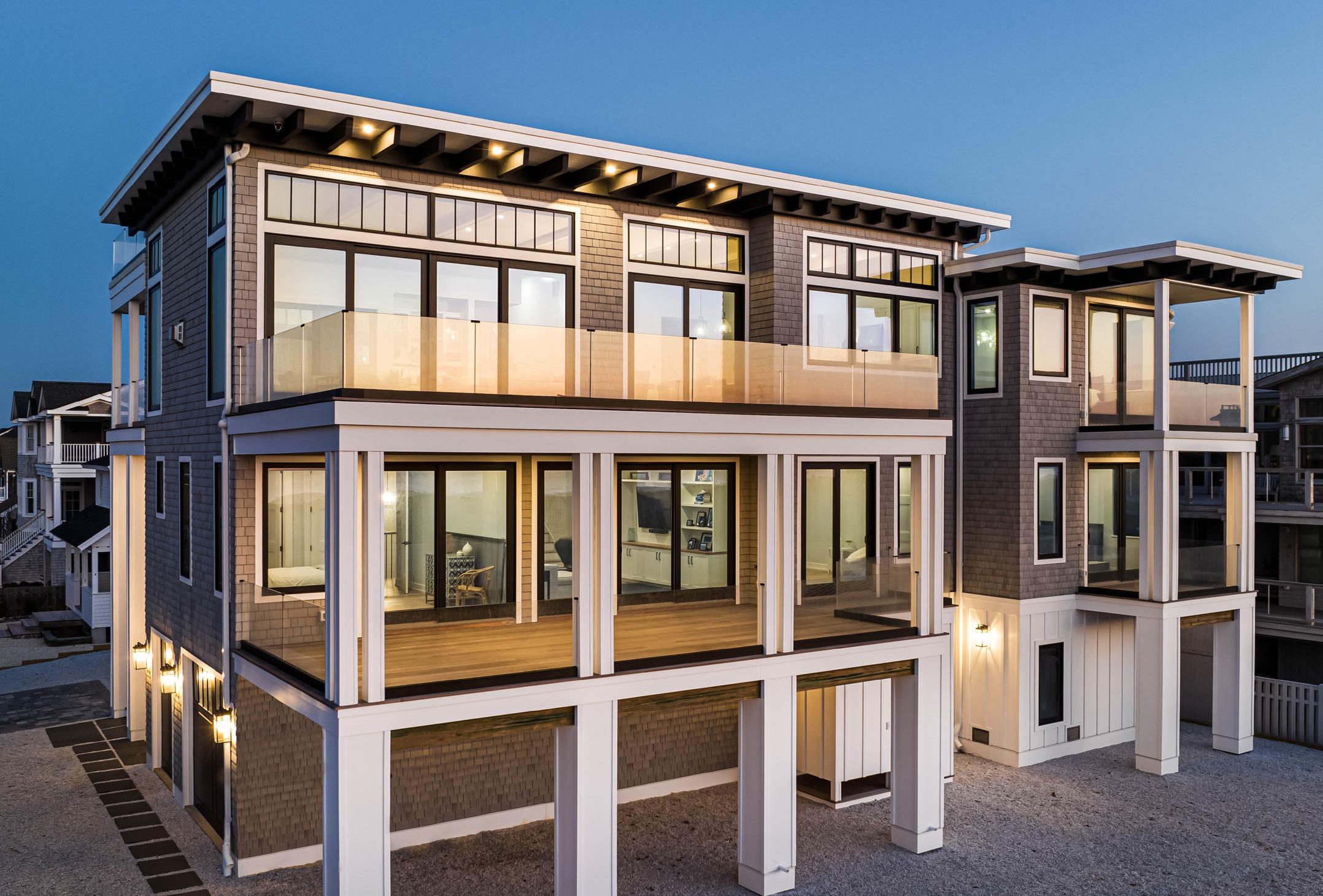
wall built-in, made of quarter sawn white oak with a hand sanded, wood butter finish top, exuding both beauty and function.
Light wood elements set against white walls and black windows convey a relaxed, casual motif. The Chapples opted against crown molding in favor of simple clean lines and custom 8 foot three-panel solid wood interior doors, spanning nearly the full vertical height on each floor throughout the house.
Cleverly concealed behind an immense sliding barn door, is a space with laundry, powder room and storage. Down the hallway is a recessed bookcase built into what would have otherwise been unused space. Instead, it serves as a decorative shelving component for housing books, decor, and more. Family bedrooms are also found on this level of the home with their own oceanfront decks and en suite baths, each with their own unique geometric pattern tile flooring.
Ascending to the top level, you are met with a breathtaking main living space that makes it difficult to decide where to look first. One could absorb the astounding views in this open and visually arresting area that seems to expand and extend beyond the wall of win-

dows and transoms, where the indoors and outdoors meet. Or look upward to see the custom woodwork covered ceiling, which complements the room’s clean, linear lines. Minimal comfortable furnishings pull the space together.
From sunrise to sunset this multifaceted designed home offers all day enjoyment with its breezy, open deck on the east side and gorgeous covered porch on the west side. Whether sunbathing, reading a book, or dining undercover during a summer rain shower, magnificent ocean views make this home a true showpiece from every room, every deck, every floor, and every vantage point. The premium hardwood decking along with glass rails that surround the home off the living areas, offers inviting and sophisticated accents for all-weather enjoyment and appreciating the arc of the day.
Moving into the open concept kitchen, the smart design capitalizes on the sweeping views of the Atlantic Ocean. A large slab of Quartz distinguishes the grand island, along with all the luxury amenities of a modern day kitchen, including Wolf and Sub Zero appliances. A neutral color palette of whites, blacks and grays are offset by a pop of foggy ocean blue for the base of the island, also incorporated into the tile backsplash of the beverage
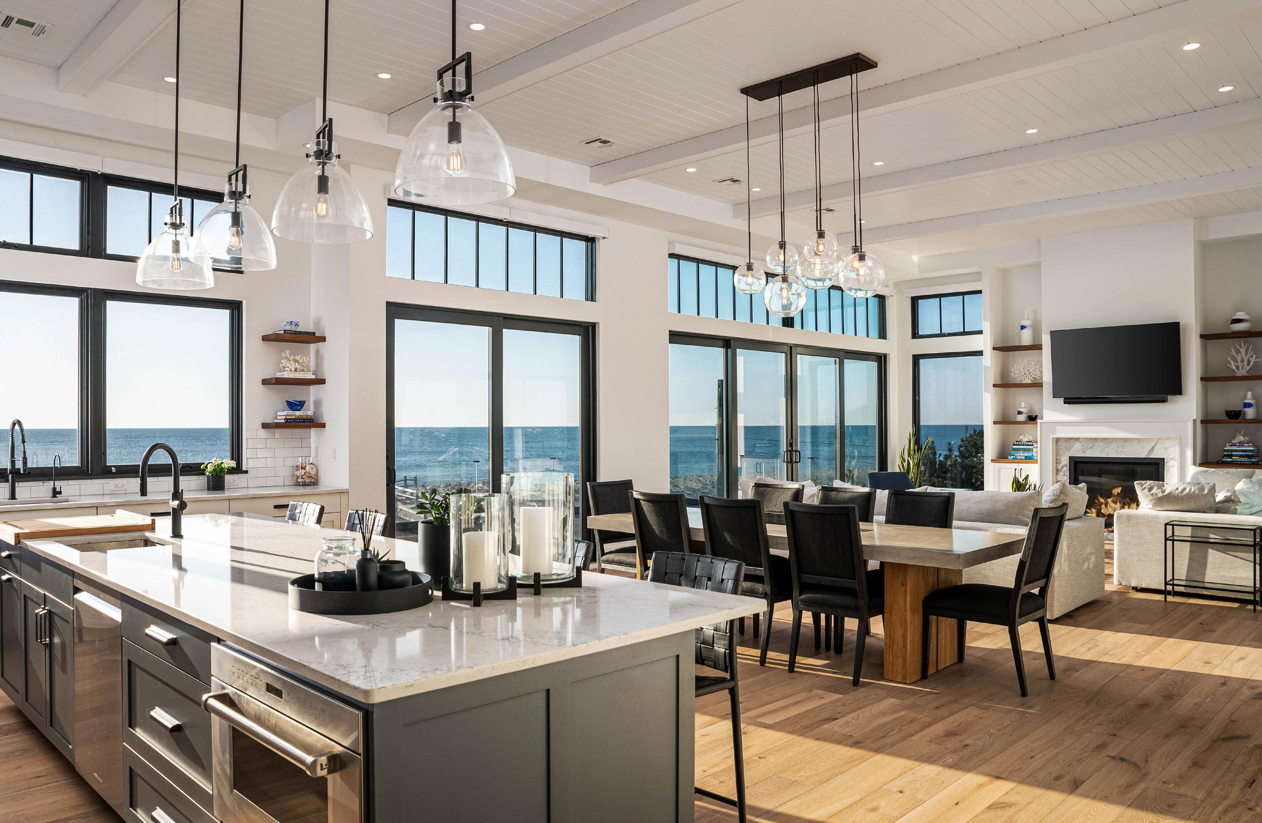
center. A built-in Miele coffee system also adds a lovely touch. More than a nook, it’s rather a caffeinated command center with a cabinet garage featured beneath for tucking small appliances neatly away and out of sight. A butler’s pantry is located just off the kitchen as well, complete with a tall, sleek wine refrigerator, extra counter space and walk-in pantry.
Beyond the kitchen is the primary suite with its handcrafted half-wall room divider, which doubles as a bookcase, tastefully separating the suite’s entryway from the walk-in closet. The en suite is bright and luxurious with a large soaker tub and glass enclosed stall shower with custom tile and elegant fixtures. The highlight of the primary suite, as with practically every room in the home, is the private oceanfront balcony, perfect for sipping coffee at the dawn of day or a cocktail at the close of it.
When building a second home, especially from a distance, it’s critical to have a relationship with a builder you can trust. Often, with new home construction, building details and the process in general is not always black and white. With specifics around pricing, availability and selections often difficult to wrangle in, clear communication between client and builder is a critical component.
“We just felt immediately comfortable,” Kyle said. “The Keller team truly understood what was really important to us, especially with regard to timing. They were very down to earth and we felt we weren’t going to have any surprises in the end. With the fluctuation of prices, we were a little worried because there were so many unknowns and we couldn’t be there in person. They were up front about everything, which is what we really liked and wanted.”
Having come right off of the heels of the pandemic, the Chapples weren’t sure how they were going to navigate their build remotely, especially as it related to overseeing the construction process and supply chain challenges. Crediting the Keller team’s exceptional communication process and ability to plan ahead, the Chapples never wavered in their confidence that materials would be ordered and arrive on schedule, timetables would be met and the home completed when promised.
“They were all over it,” Kyle said. “Their ability to
talk to us - they just kept it easy and simple - and the quality of their craftsmanship assured us they wouldn’t cut any corners. They treated our build like it was their own home. They were really proud of the build and the design, which got us excited from the get-go.”
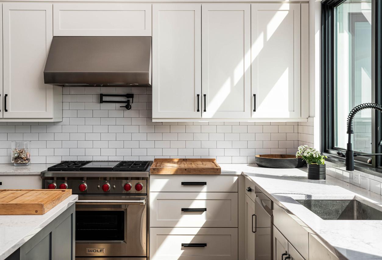
The result is a phenomenal, premium, luxury coastal home with any and every amenity and convenience a homeowner could want, while still feeling like you’re simply hanging out and relaxing at the beach.
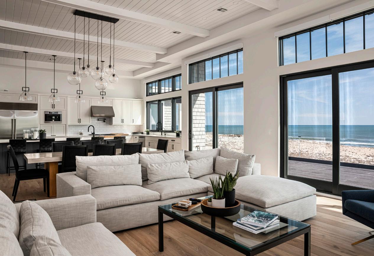
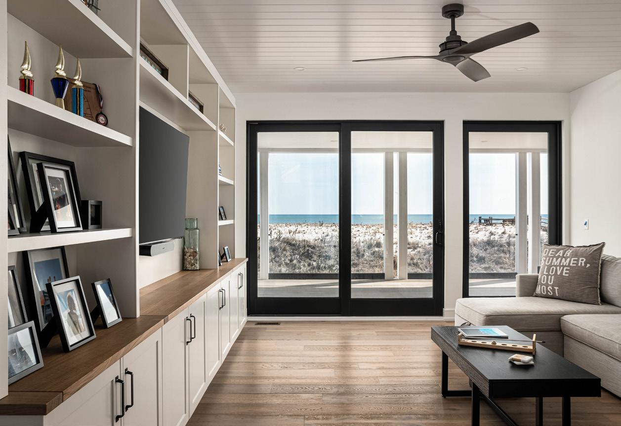
The outdoor space is currently coming together with plans for a backyard cabana and tiki bar to complement the existing in-ground pool. For now, the Chapples will continue to build those special memories on the beach, swimming and surfing the waves they love most. After all, few things are better than spending quality time in the sun and sand as a family, enjoying the place they designed and built to appreciate the beauty and splendor of life well-lived.
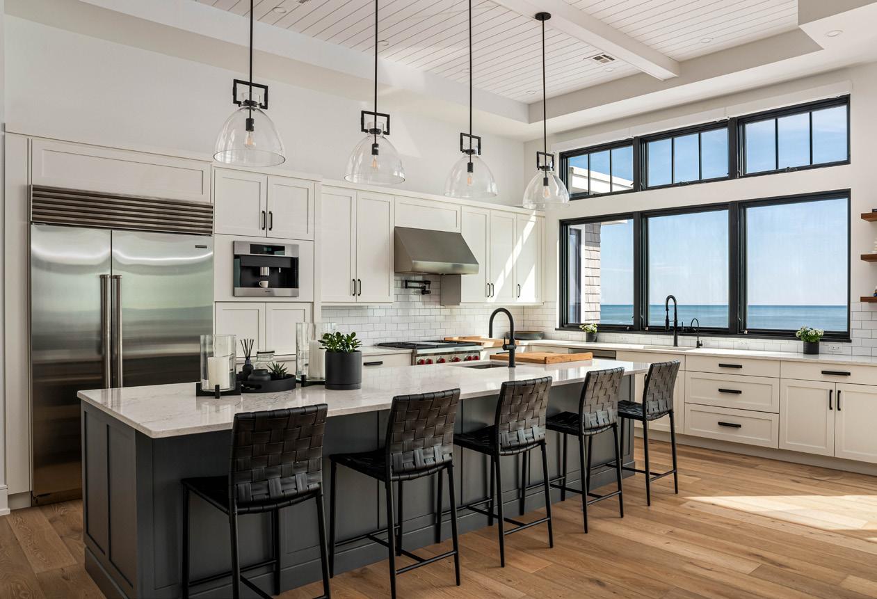
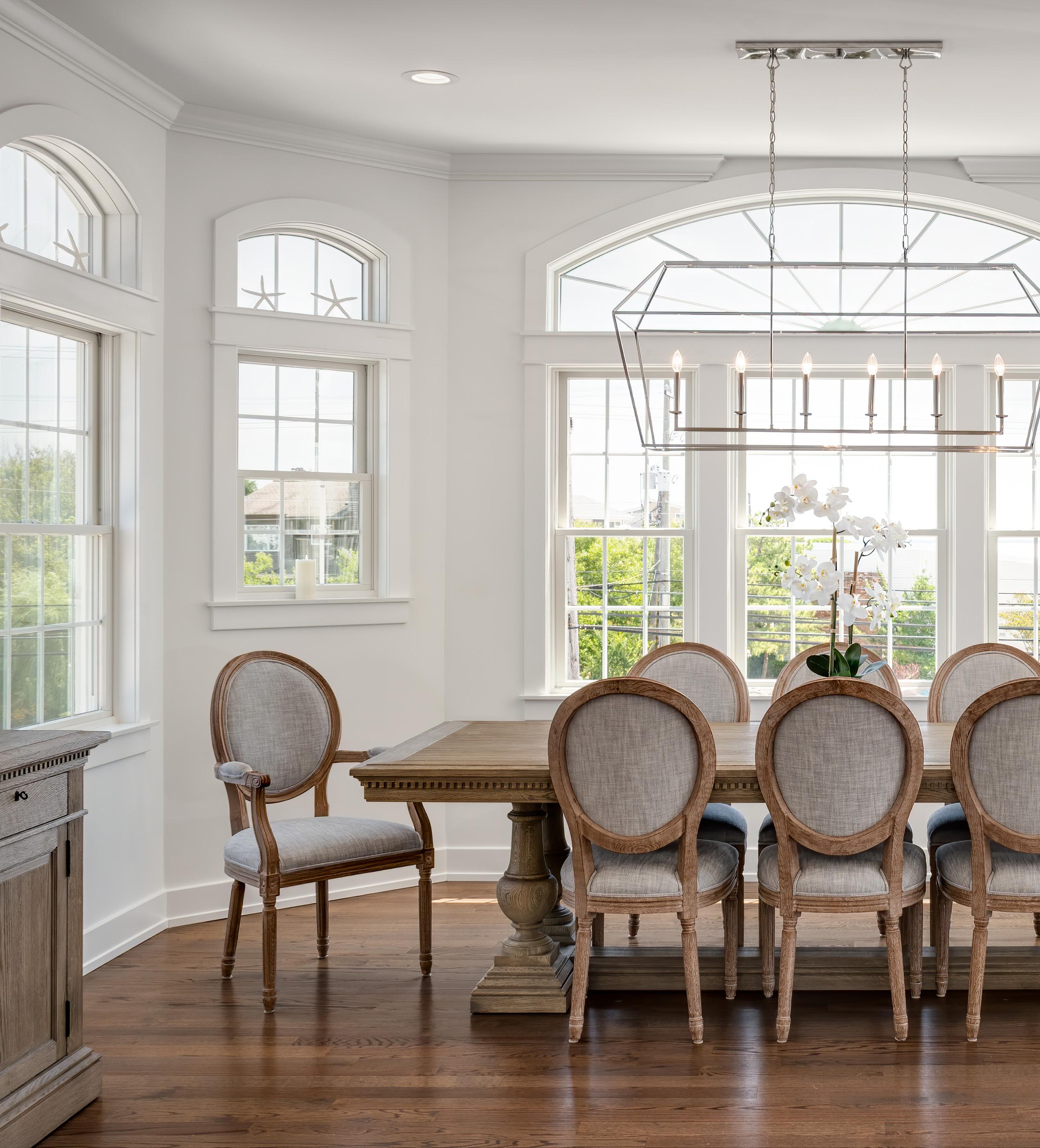
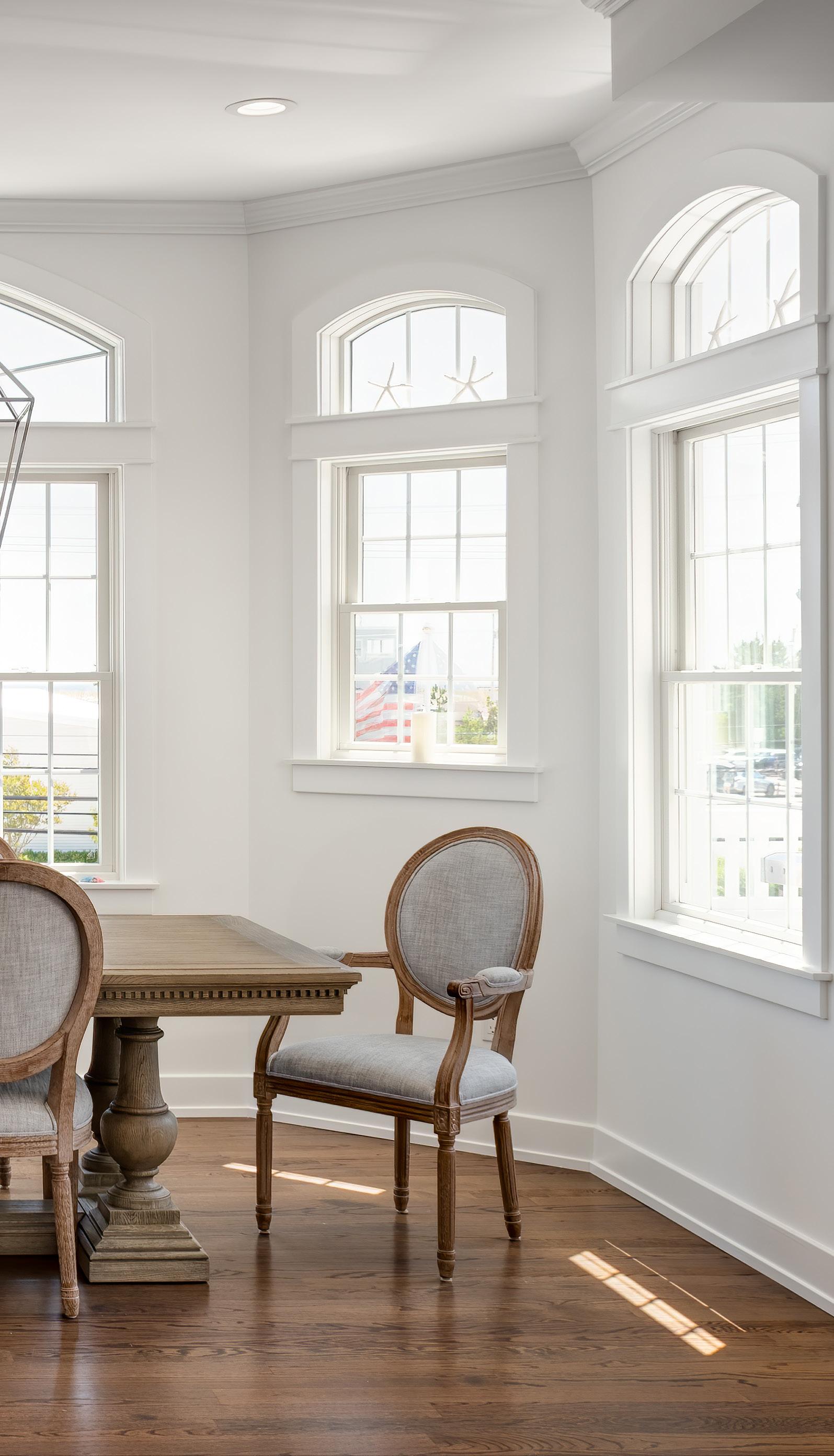




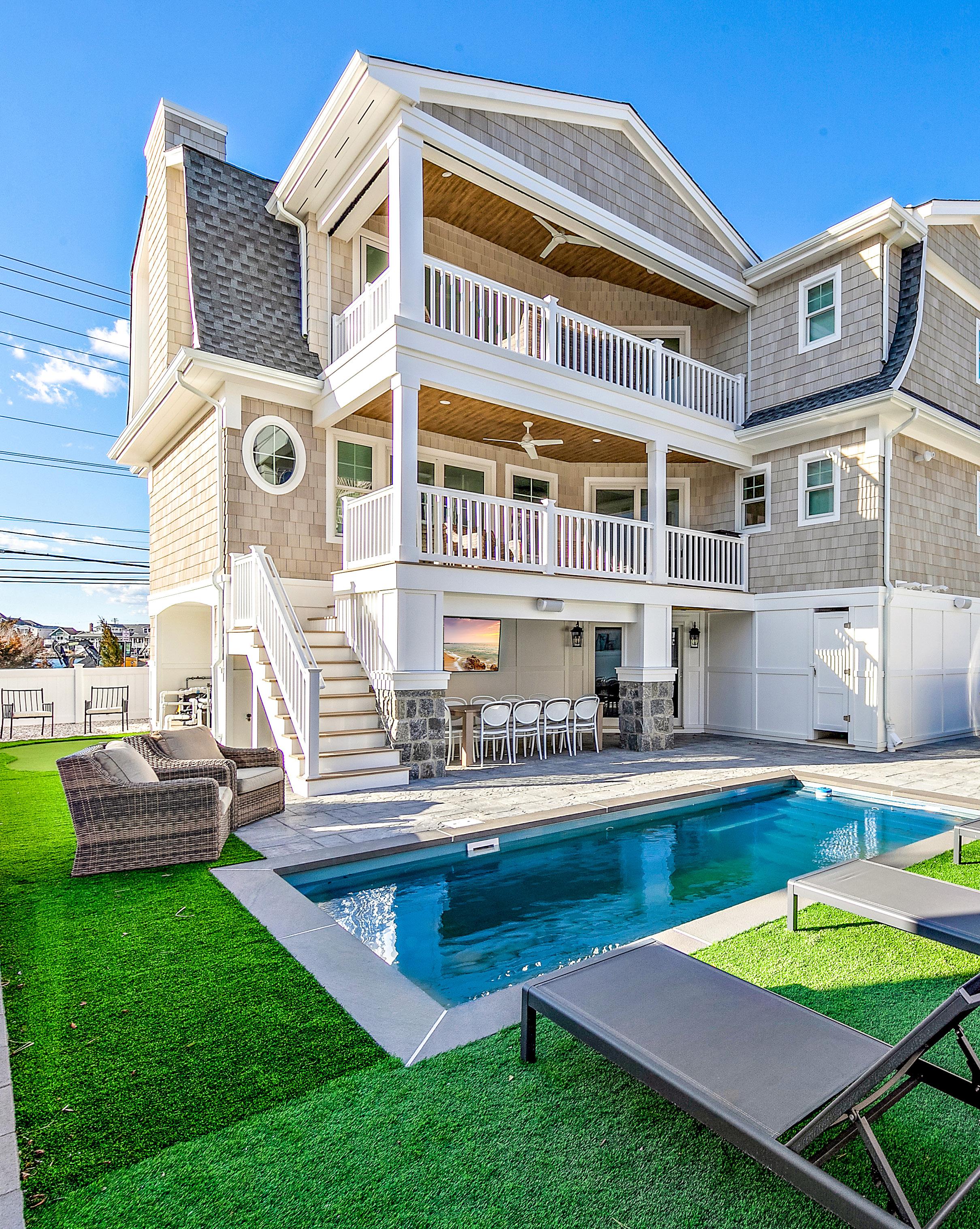
For centuries now, visitors have been drawn to the salty, seaside respite of Harvey Cedars to relax, fish, and make hay while the sun shines. New residents, Michael and Dorothy Gervasio, are no exception and will soon be whiling away the summer hours with family and friends, soaking up the sweet life and making precious beach memories to last a lifetime.
The dream began back in 2021, at the height of the intense Covid-19 housing market. With inventory at an all-time low, competition at an all-time high, and home values inflated to record numbers, Michael and Dorothy hadn’t yet found a house they loved. With expertise in both commercial and residential real estate, the Gervasios are no strangers to a property search and looking for the right deal. As they scoured and toured the few homes available for sale on the island at the time, they found themselves repeatedly running into Edward Freeman, managing partner of The Freeman Group. This local agent, they felt, had his finger decisively on the pulse of the current market. He made an impression with his knowledge, contacts, and local insight and they quickly developed a strong rapport.
“We started off on the south end of the island,” Freeman recalled. “Our first day together, we looked at a few new construction homes, but it wasn’t long into the process that we realized we had to find a lot and do a custom build. So we dropped what we were doing and started looking into other options.”
The couple agreed, especially given how few homes were listed on the market. With prices considerably inflated and bidding wars creating intense competition, it gave the couple a lot of factors to consider.
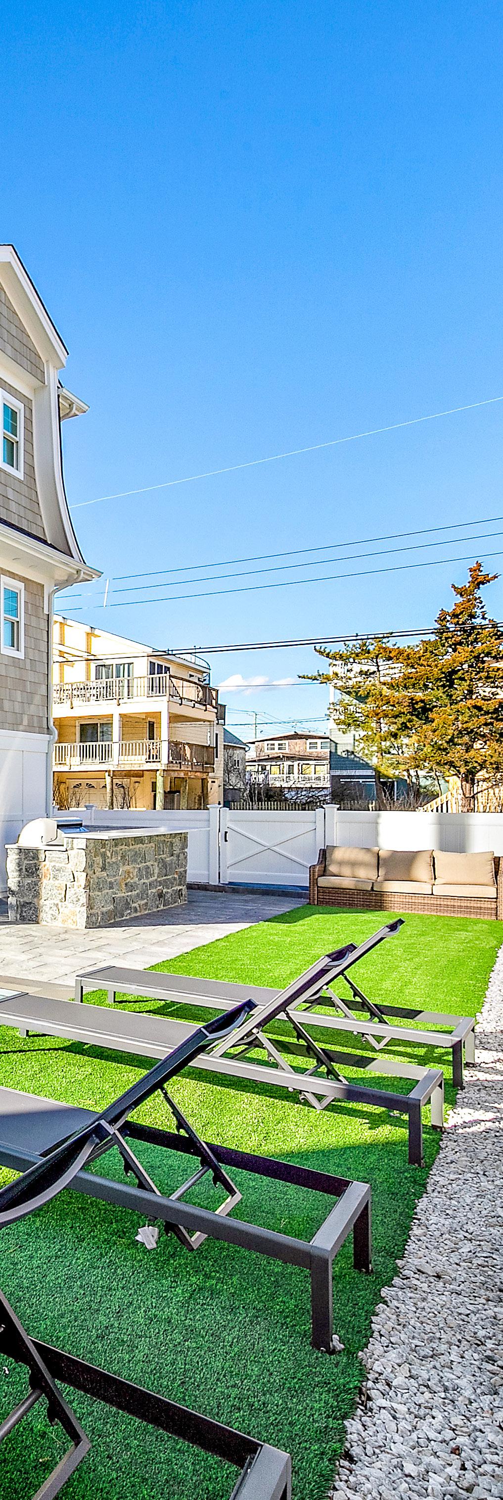
“We decided,” said Michael, “If we were going to invest at that level and we weren’t seeing anything with the kind of style and upgrades we expected, then let’s find the right location and do it ourselves. Building our own house would give us the opportunity to create a fully customized home and create instant equity, even in an inflated market.”
Soon thereafter, Freeman notified the couple of one client he knew of who was marketing a property as a spec home to be built on an ocean block lot in Harvey Cedars. There was a current home already on the property that the investor had planned to tear down and develop.
“Having spent some time with Dorothy and Michael and getting an understanding of what they wanted in a home,” Freeman said, “I knew that they had exquisite taste and they weren’t going to get the kind of finishes and customization they desired from a spec house. It wasn’t going to have the architectural detail or the kind of kitchen or materials they liked. The lot in Harvey Cedars presented an opportunity because it had some size and width to it, which provided for the pool they wanted and would lend a nice presence to the street.”
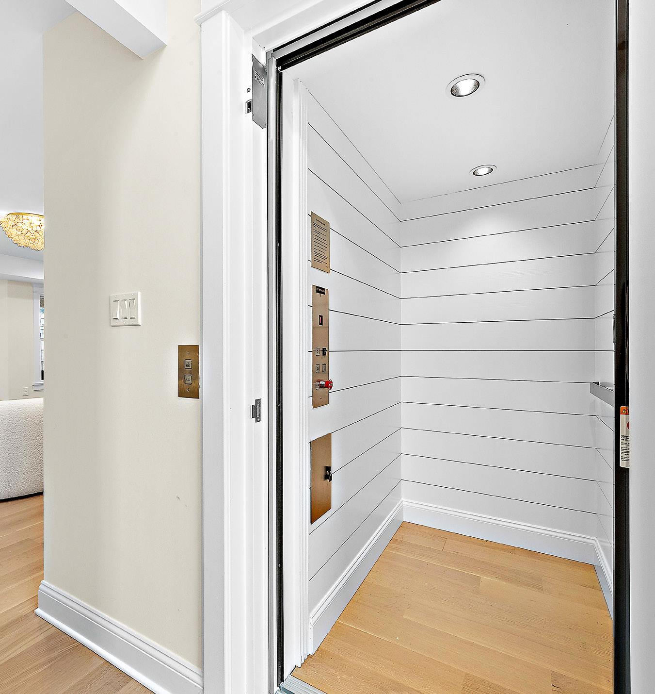
After investigating the opportunity further, they learned that this particular investor did not want to get involved with building a custom home. So with that, the Gervasios consulted with Freeman about crafting a win:win proposition which would include having the investor demolish the existing structure, clear the contents, and deliver the lot vacant to the Gervasios. They would then bring in their own team to design and build the oceanside beauty that matched the picture they held in their minds’ eye.
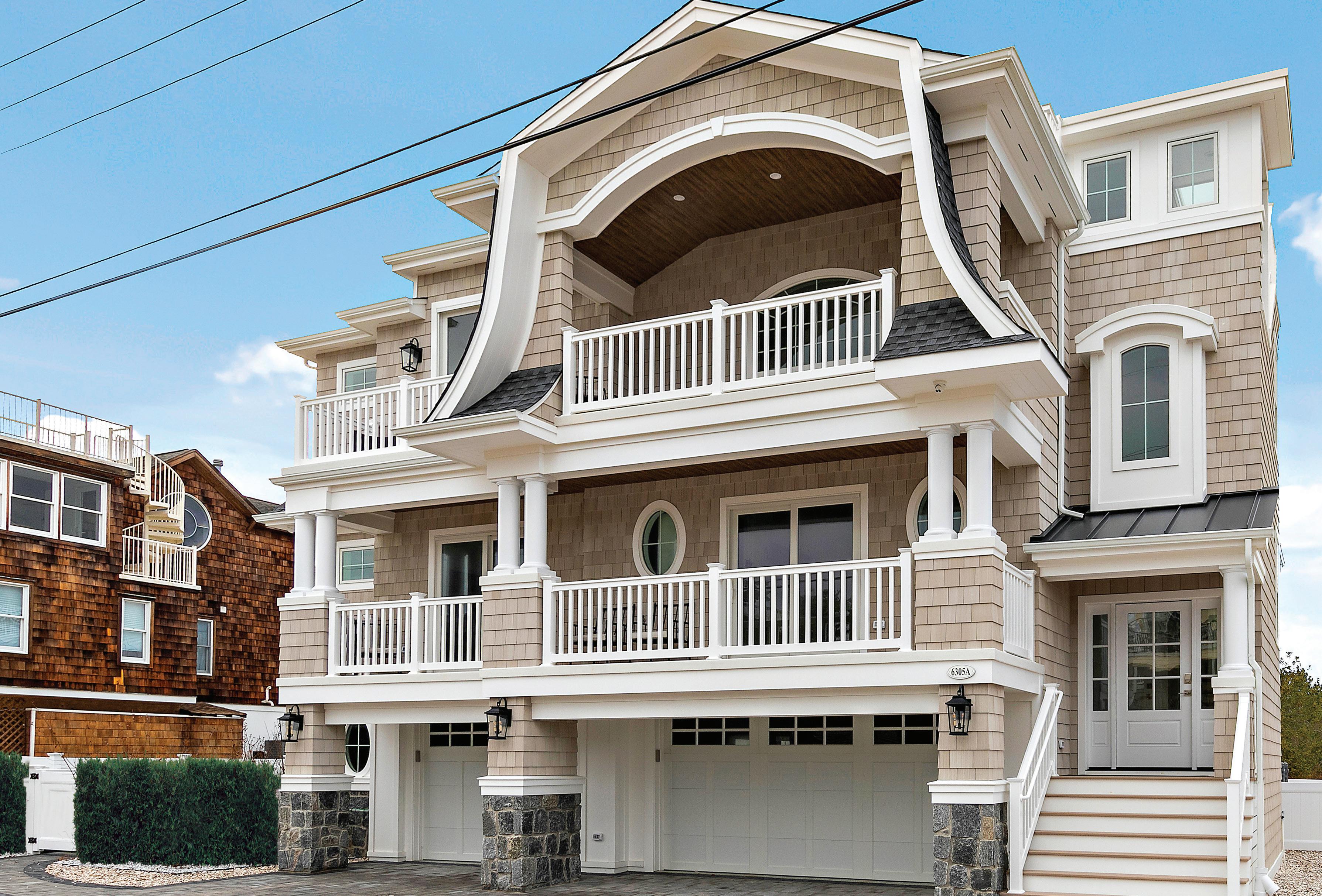
John Casale of JS Pro Construction was the Gervasios’ home builder of choice. A local contractor with deep roots in home renovation projects and a formidable new construction portfolio on the island, Michael and Dorothy felt immediately comfortable with John’s process and style. With the couple’s primary home being located in Upper Saddle River, Bergen County, communication was a critical factor in making sure things would run smoothly in their absence.
“We developed a good rapport from the very beginning,” said Michael Gervasio. “John and I developed the kind of relationship where I could call him right now and I know he will pick up the phone for me. That was important because this project was a big deal for us and we wanted to make sure we got the attention and responsiveness we needed.”
A recent recipient of the Pro Builder’s Top 40 under 40 award, John Casale maintains that integrity is at the center of everything his company believes and does. A builder who personally gets his hands dirty and works in the field right alongside his crew, Casale believes that delivering high quality service means more than the customer being just another number.
“I think the reason we hit it off so well with Michael and Dorothy is because our approach is very one-on-one. We are all about the customer,” said Casale. “We pride ourselves on transparency: this is who we are, this is
what we offer for your full custom home experience to fit your taste and budget. We’re just honest and upfront from the start. There are no hidden costs.”
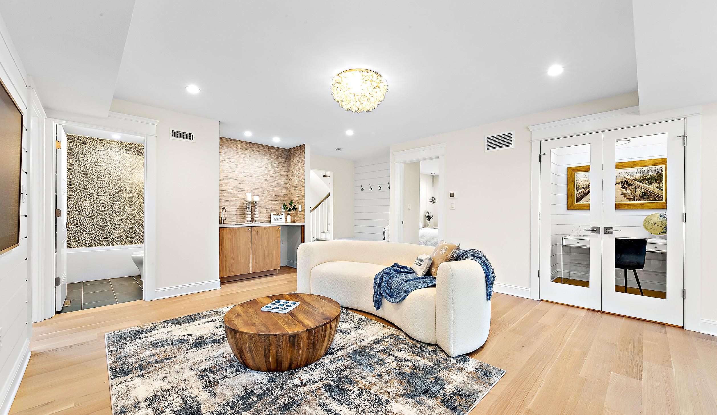
With deed to the land procured, construction crew secured, and approved plans from Michael Pagnotta Architecture in hand, the Gervasios finally broke ground in February 2022 on a grand coastal home design inspired by the classic beach estates of the Hamptons.
The front elevation is captivating with its stately and oversized Dutch Colonial roofline, consistent with LBI’s burgeoning new construction aesthetic. Located just four houses from the beach, the home is uniquely situated on one of the thinnest parts of the island, affording incredible 360 degree panoramic views of both ocean and bay from the rooftop deck.
Ascending to the first floor of the home, you can take the stairs or take the elevator, complete with white shiplap detail and clear glass door. There’s a recessed entry cubby bench with baskets for stowing flip flops and hooks for hanging beach towels and beach bags. The first floor also bids welcome with a comfortable gathering space with
This area is set off beautifully with a sleek wet bar, contrasted by the rich, warm texture of beautiful sea-
The Frame Samsung Smart TV set on a shiplap wall.grass wallpaper. There is a shared full bath located just off the space, awash in hues of blues and greens. A large porthole-style mirror and nautical vanity light set a tone of casual sophistication paired together with a visually pleasing scalloped mosaic tile treatment on the shower wall.
The first of four first-level bedrooms boasts a clever custom built-in bunk bed system with a decorative Providence-style railing pattern. Coastal sconces align the interior of the bunk walls, offering soft light for reading and relaxing in bed. A built-in combination bookcase and dresser offers clever use of recessed space and custom three-panel wood doors complement the beautiful matching trim work, evocative of a more traditional craftsman aesthetic.
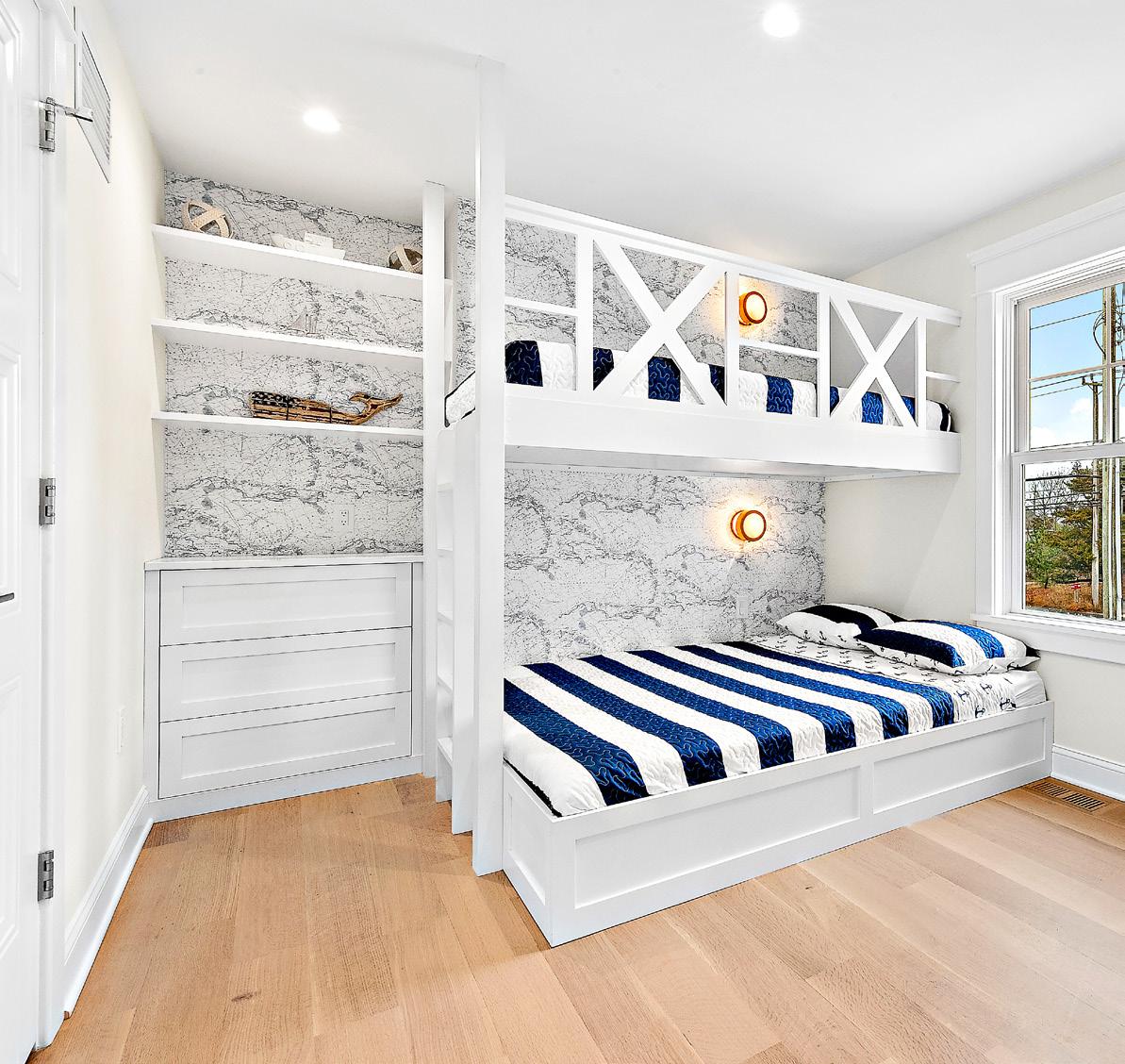
Three additional bedrooms are found on this first level, one being another bunk room with a unique wave wallpaper design that is both whimsical and bold in its focal statement. Across the hall is a quaint little office space separated by glass French doors for added privacy. Flanking the office are two additional bedrooms, each with their own en suite bathrooms and private decks for sitting, relaxing and enjoying partial bay and lagoon views.
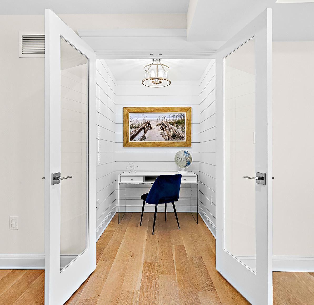
Just off of the first floor living space, sliders open diagonally onto a lovely covered deck overlooking the swimming pool and outdoor entertainment areas. The use of space here delivers not just beautiful visual appeal but also intelligent design. Guests are shielded from the elements as they gather beneath a gorgeous composite wood ceiling with ceiling fan and recessed lighting for enjoyment of the space, come rain or shine.
Moving to the top floor of this reverse-living home, you are immediately greeted by a grand kitchen boasting a large center island with a single slab of quartz. A recessed Miele coffee station is built into a wall of pantry cabinets along with the Sub Zero refrigerator, inset with natural light wood cabinetry finishes.
Clean, simple off-white cabinetry is classically accessorized with elongated brushed brass hardware fixtures complementing the stunning royal blue La Cornue gas range, which translates more like a piece of fine jewelry than a staple kitchen appliance. A grand palladium window overlooks yet another deck where guests can dine and enjoy ocean views to the right and bay views to the left.
Soaring shiplap ceilings in the great room create drama and expansiveness, with a wall of windows on one side that offer spectacular sunset views of the bay and causeway, and a wall of accordion doors on the other, combining indoor/ outdoor living and opening to yet another deck that overlooks a remarkable backyard oasis that features a saltwater swimming pool, dining area, outdoor kitchen and even a little putting green.
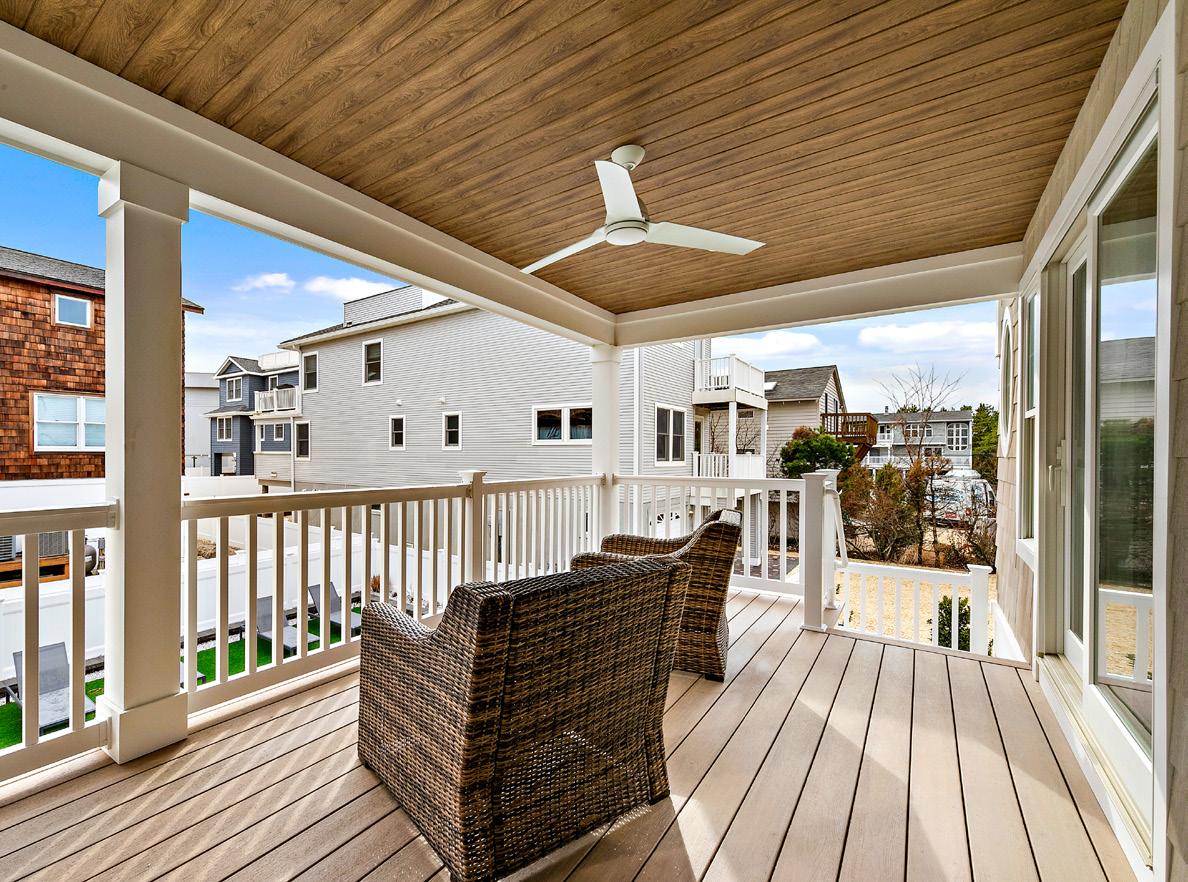
The primary suite is located just beyond the kitchen and makes a stunning statement with its contemporary four poster bed and modern accouterments. The en suite bathroom features a tasteful vanity base, reminiscent of antique European furniture, with a beautiful marble top and double sinks that complement a massive glass shower with marble tile. An inviting private balcony rounds out the primary suite, beckoning one to come and sit with a cup of coffee at sunrise or a glass of wine at the close of day.
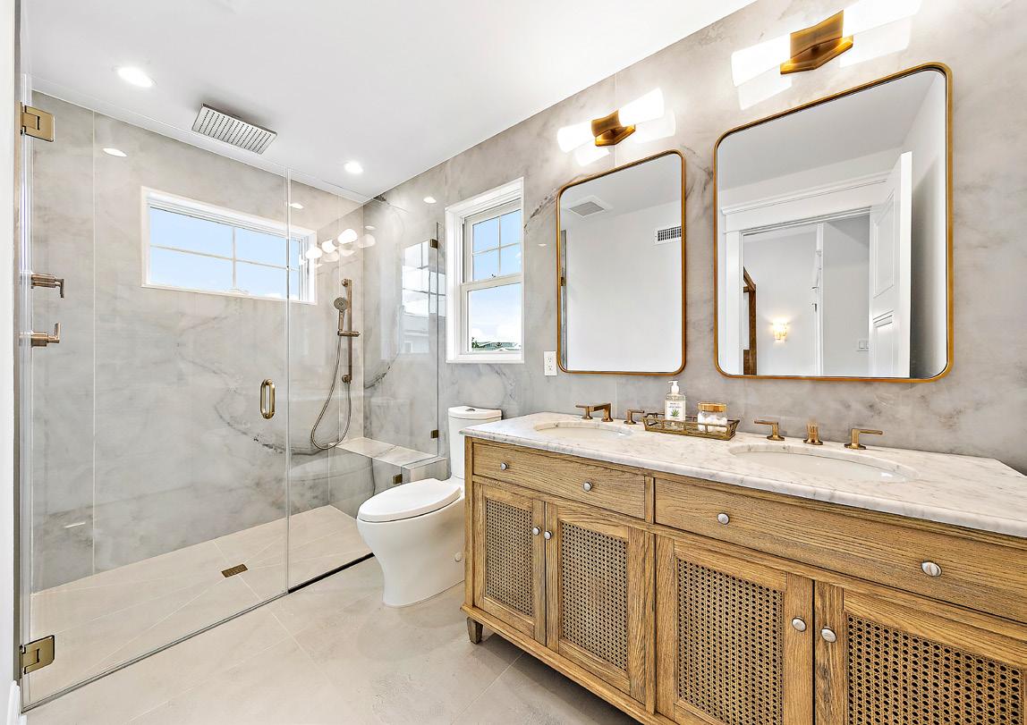
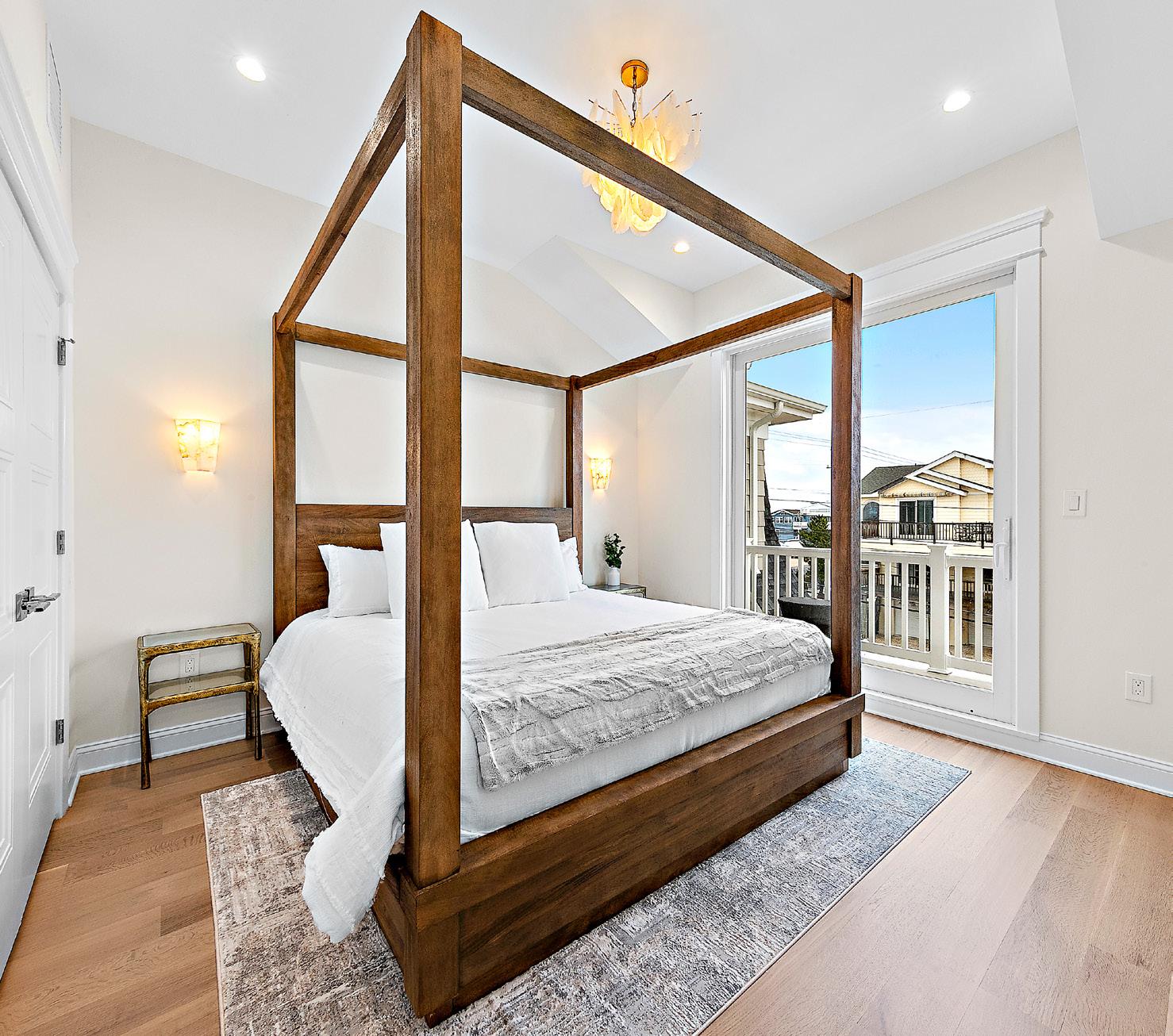
From tip to tail, rooftop to railing, driveway to doorstep, the Gervasios finally have the beach house they envisioned. Every touch and every flourish has clearly been thoughtfully considered and selected, working in effortless tandem to bring in vast amounts of island light and lightness. The eye moves from one beautiful feature to another; from the warm and inviting natural wide plank wood floors to the stunning custom three-sided glass fireplace that quite literally warms the whole space. This summer Dorothy and Michael and family will reap the fruits of many an individual’s labor, thanks in large part to the agent, the architect and the builder who made their island home dream come true.
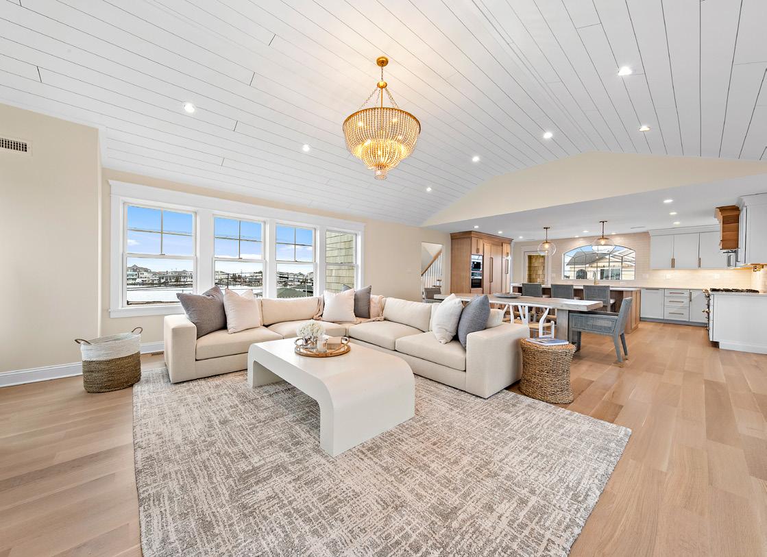
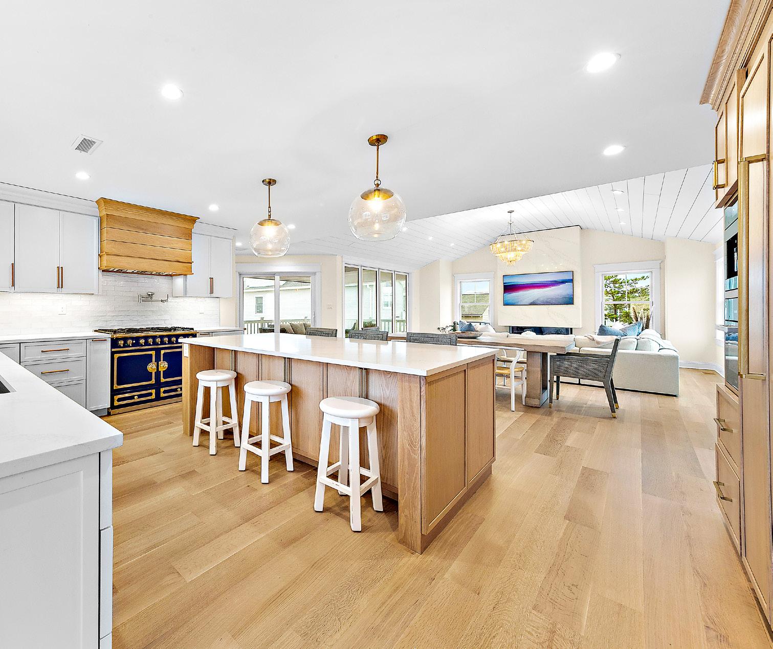
Great things are happening at Valley National Bank.

Great things are happening at Valley.
Trusted Mortgage Pr Years Jersey Shore Expertise


Established Relationships with Local Realtors, Builders, and Attorneys


Primary / Second / Vacation Home Specialist
Ask me about:
Primary, Second & Investment Mortgages
Two-Unit, Second Home Financing
New Construction, Single-Close Homes
Modular Home Financing & LLC Financing
NEW CONSTRUCTION, Single-Close Homes Modular Home Financing & LLC Financing
“Valley’s wide variety of competitively priced mortgages has put me in a position to do more for my clients. At the end of the day, that’s all I really care about. I look forward to representing Valley for years to come and continuing my tradition of serving the community that I love.”

Hotel LBI offers the charm of a summer home paired with world class amenities. Relax in your well-appointed room, enjoy a cocktail and watch the sunset on the rooftop, or escape for a day of fun in the sun on our majestic island.

Located on the west side of the building, the Hotel’s main restaurant provides upscale dining, driven by the bounty of our local farmers and fishermen.
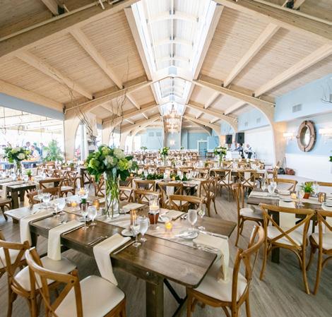


Visit our Market located next to the front desk for grab & go items. We carry frozen foods, beer, wine, souvenirs, candy, snacks and much more.
Hotel guests can stop by for a delicious lunch and refreshing drinks by our yearround swimming pool. Tide Pool is open during the summer season.


For guests who don’t want to miss their daily workout, we offer state of the art treadmills, stair machines, weights & more.
A cozy atmoshphere to gather with friends, grab a drink by the fireplace and a bite to eat in Hotel LBI’s Living Room.
With a retractable roof, enjoy our pool rain or shine. In addition to our heated pool, guests can also experience our lounge splash pad, jetted hot tub & indoor games and fun for all ages.
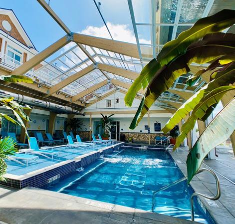
Watch an LBI sunset on our top deck & relax in one of our cozy outdoor lounges. The Rooftop features handcrafted cocktails & breathtaking, uncontested bay views.
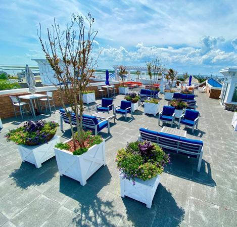
Hotel LBI offers over 3,700 square feet event space, with vaulted ceilings, gas fireplace and panoramic windows overlooking the charming seaside town of Ship Bottom.
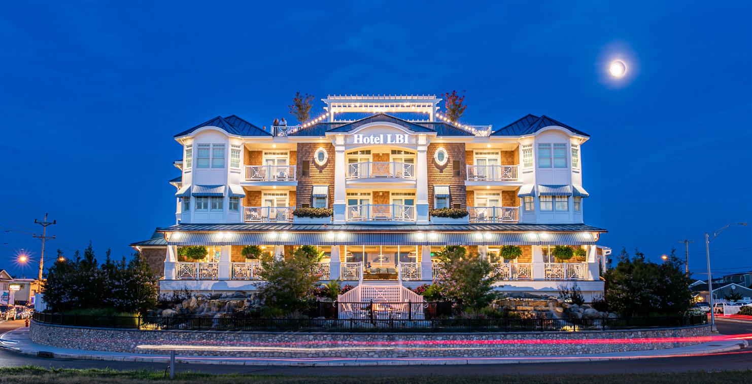
The Boatyard is a gathering place to come together for casual food and drink, meet up with your family and friends, bring your dog, play games, and enjoy a day on the bay. Arrive by water or land.
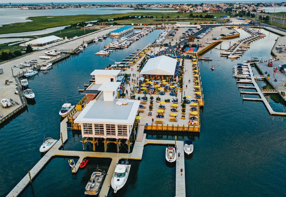
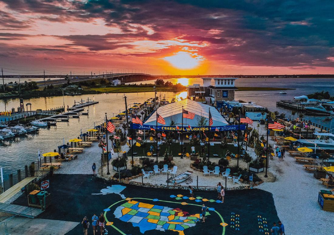
THEBOATYARDNJ.COM | (609) 494-1371
Causeway Marina offers marina slips and storage, fuel for boats and personal watercraft, kayak rentals and boat rentals for crabbing/fishing or simply to enjoy a day on the bay!
THEBOATYARDNJ.COM | (609) 494-1371
Eat with friends and family at our indoor and outdoor dining area or enjoy the coziness of a firepit after playing one of the available lawn games!
THEMAINLANDNJ.COM | (609) 481-6120

The Mainland Adventure Park offers a huge variety of heart-pumping attractions including over 50 aerial activities, 50 foot climbing wall, 4 extended zip lines, go kart track, a kids course & much more!
THEMAINLANDNJ.COM | (609) 481-6111

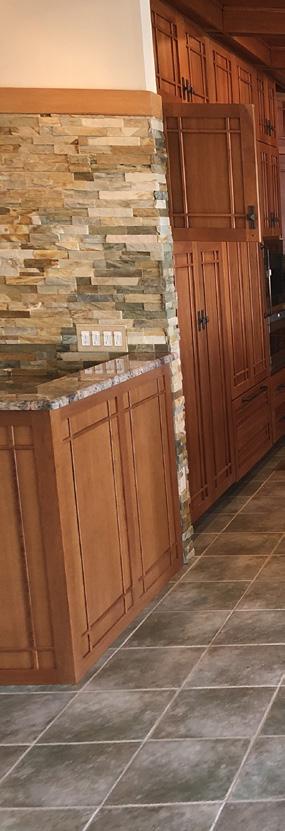
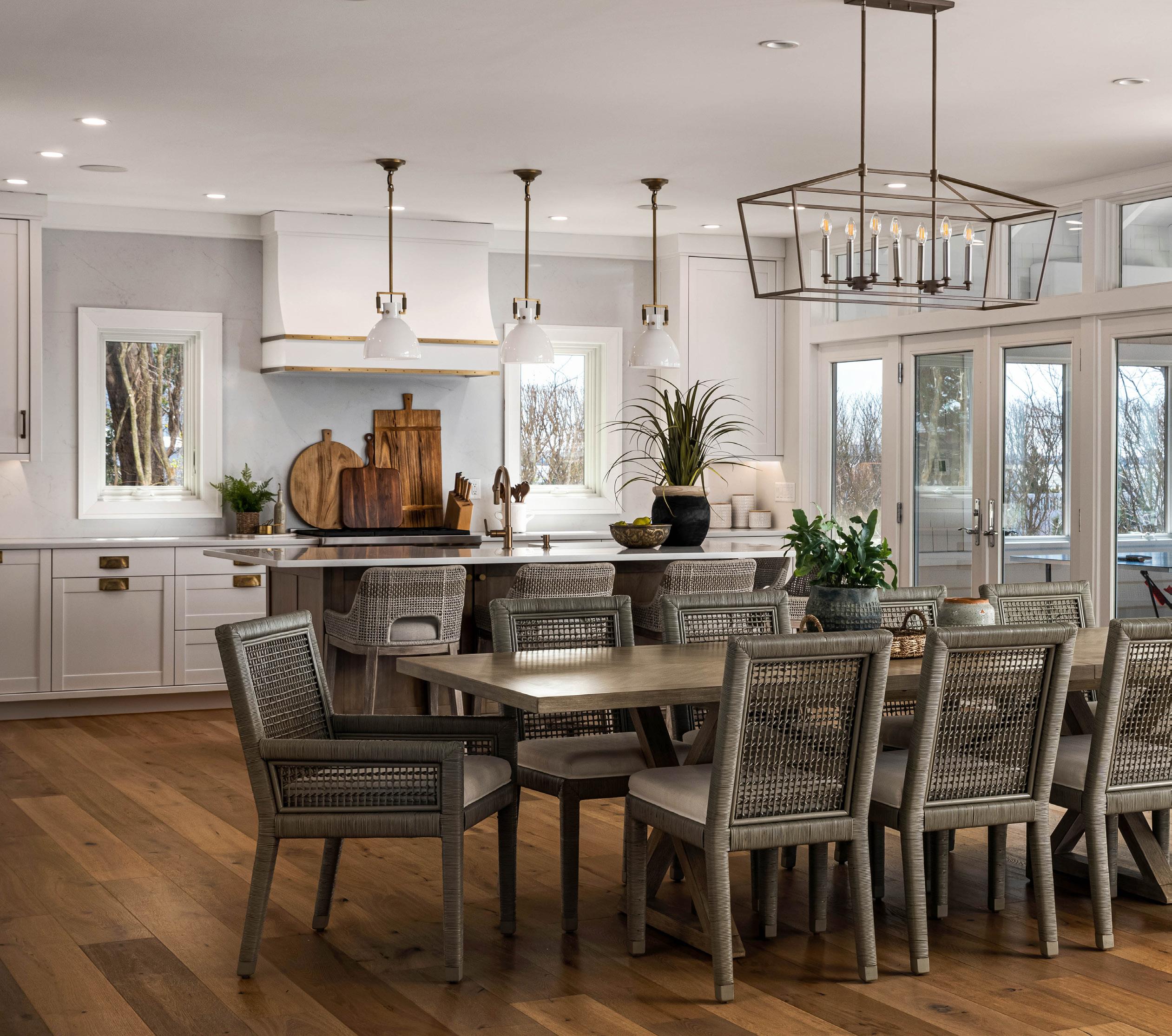 WRITTEN BY ELAINE SISKO, REYNOLDS LANDSCAPING
PHOTOS BY MICHAEL SPARK
One Property--an enviable waterfront lot in Loveladies, built in 1995, commanding outstanding, unobstructed views over Barnegat Bay and featuring a handsome Craftsman-Style home.
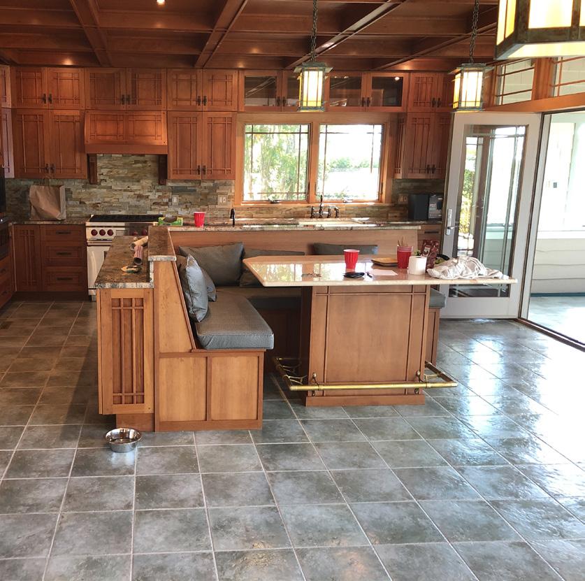
Three Homeowners—over a 25-year span, each with their own individual set of priorities, style preferences and ideas for the site and its development.
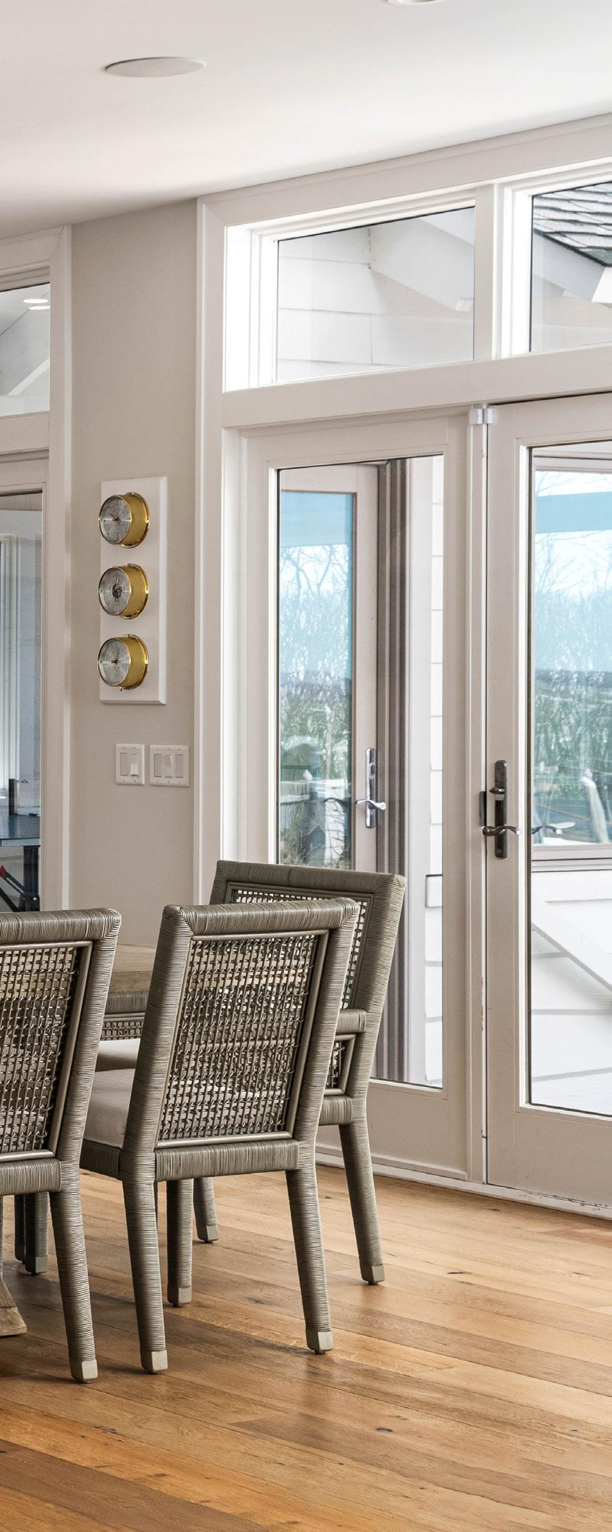
The Common Thread—each entrusted Reynolds Landscaping/Mark Reynolds Project Management with the responsibility to translate a vision for the site into reality and, in the process, create the home of their dreams.
The property was purchased in 1994 by Gerard and Paula Fagan with an intention to provide a summer retreat for their young, active family. The impressive house was designed by Jay Madden to take full advantage of the sweeping bayfront views, however, the grounds lacked the panache of this elegant home. After attending the annual LBI House Tour, a forum for showcasing premier residences on LBI, the couple was repeatedly drawn to the outdoor living areas designed and built by Reynolds Landscaping—their innovative designs unique to each property and their expert craftsmanship along with their seamless transition from interior to exterior living.
After an introductory meeting, the couple was convinced that Reynolds Landscaping was the obvious candidate to perform the design of their outdoor living area and transform the space to fit their lifestyle and individual tastes. The Fagan’s were impressed with the easy, open, two-way dialog established by Mark Reynolds, his natural listening skills and his ability to create and communicate a clear, concise vision for the project, capturing all the priorities requested. In the end, the Fagan’s never regretted their decision to move forward with Reynolds Landscaping. Complete satisfaction was achieved and the original intentions for the site were preserved.
The couple continued to employ Reynolds for the property maintenance and additional upgrades until selling the property in 2007.
‘We loved working with Mark and Peg Reynolds and their genuine desire to get the job done right. Mark even went so far as to rip up the pavers in the front yard three times until he was satisfied that the aesthetics and functionality of the design were perfect. Their attention to detail and professionalism was refreshing and unparallel.”— Gerard and Paula Fagan, Original Owners 1994-2007
In 2007, this property changed hands, purchased by Joe and Judy Franlin. With a large extended family of children and grandchildren, the couple saw opportunity for expansion of both the home and property to create not only additional living space for the household and their multi-generational outdoor pursuits but also potential to transform this architectural showpiece to reflect their personal taste and style.
Through high praise from the former owners along with obvious visual affirmation of their professionalism, craftsmanship and design skills as observed from the condition of the house and gardens, the Franlins’ were sold from the start on Reynolds Landscaping to manage their home renovation project. By this time, the skill set of Reynolds Landscaping had expanded significantly to include full divisions encompassing landscaping
and conceptual design, carpentry, low-voltage lighting and maintenance services.
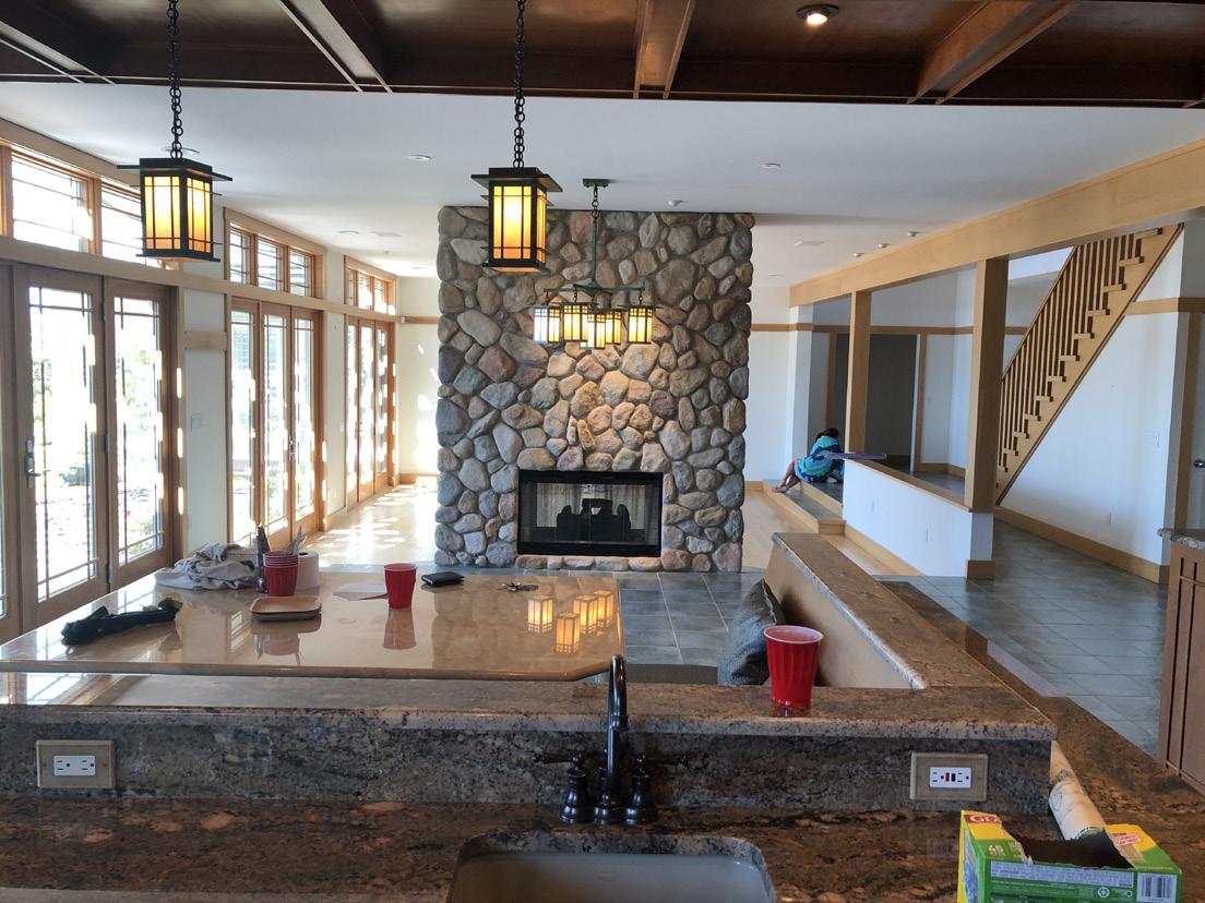
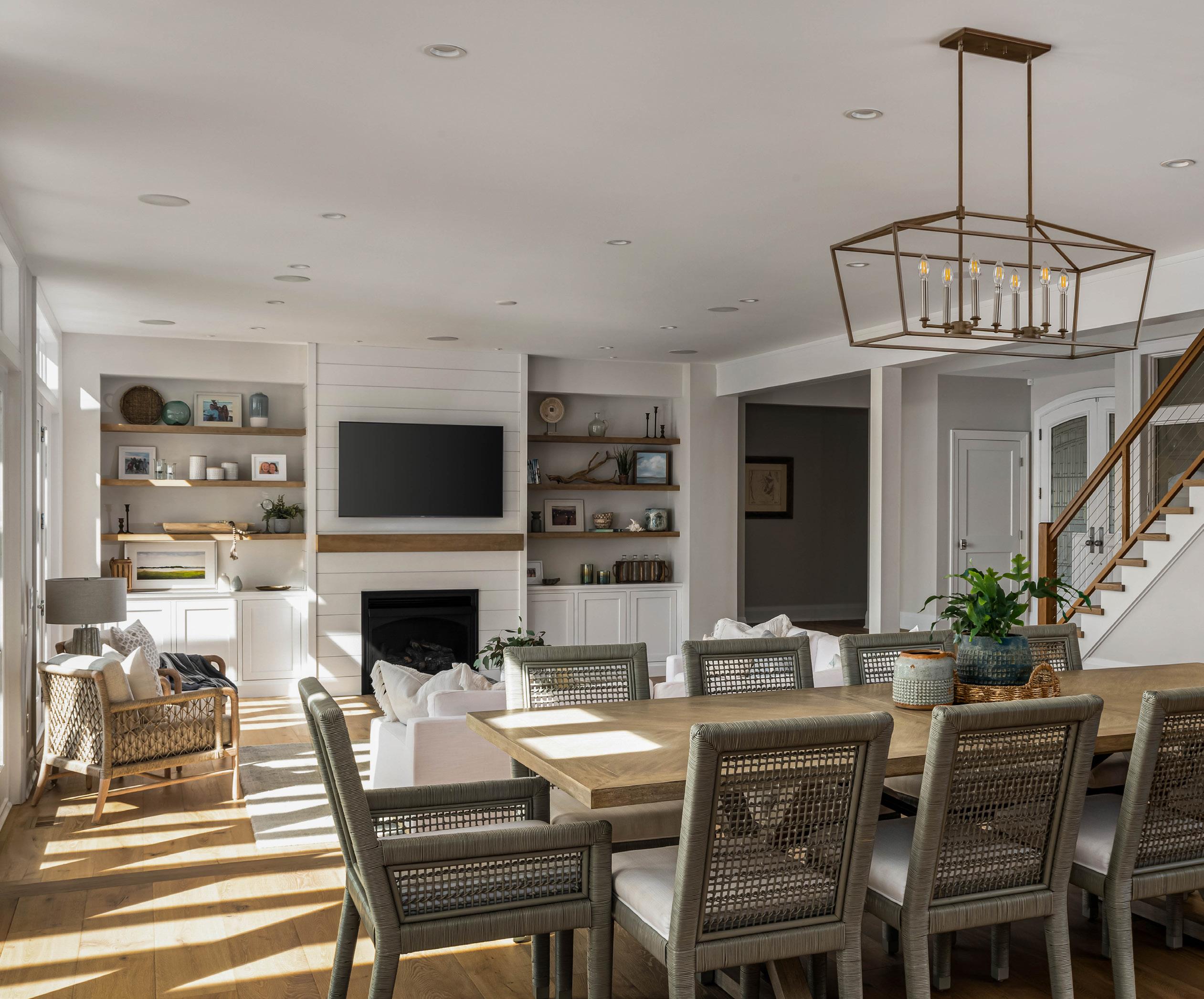
The homeowners worked with Jay Madden, the original architect of the home, to design a new guest wing for the residence—expanding the living space to accommodate individual family households. Meanwhile, Reynolds Landscaping adapted the outdoor living area to accommodate this new structure--creating a smooth transition from interior to exterior living.
Surveying the unique and highly personalized outdoor living spaces created by Reynolds Landscaping throughout their neighborhood, the Franlins wanted to undertake a complete renovation of the property tailored to their indi-
vidual needs for the space. Again, through open, two-way communication, a concise vision for the property renovations was established—centered around a large U-shaped outdoor kitchen oriented to capture the sweeping bayside panorama and a fully remodeled gunnite swimming pool.
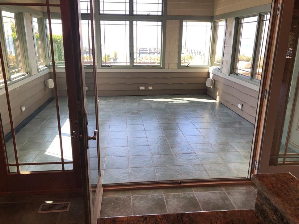
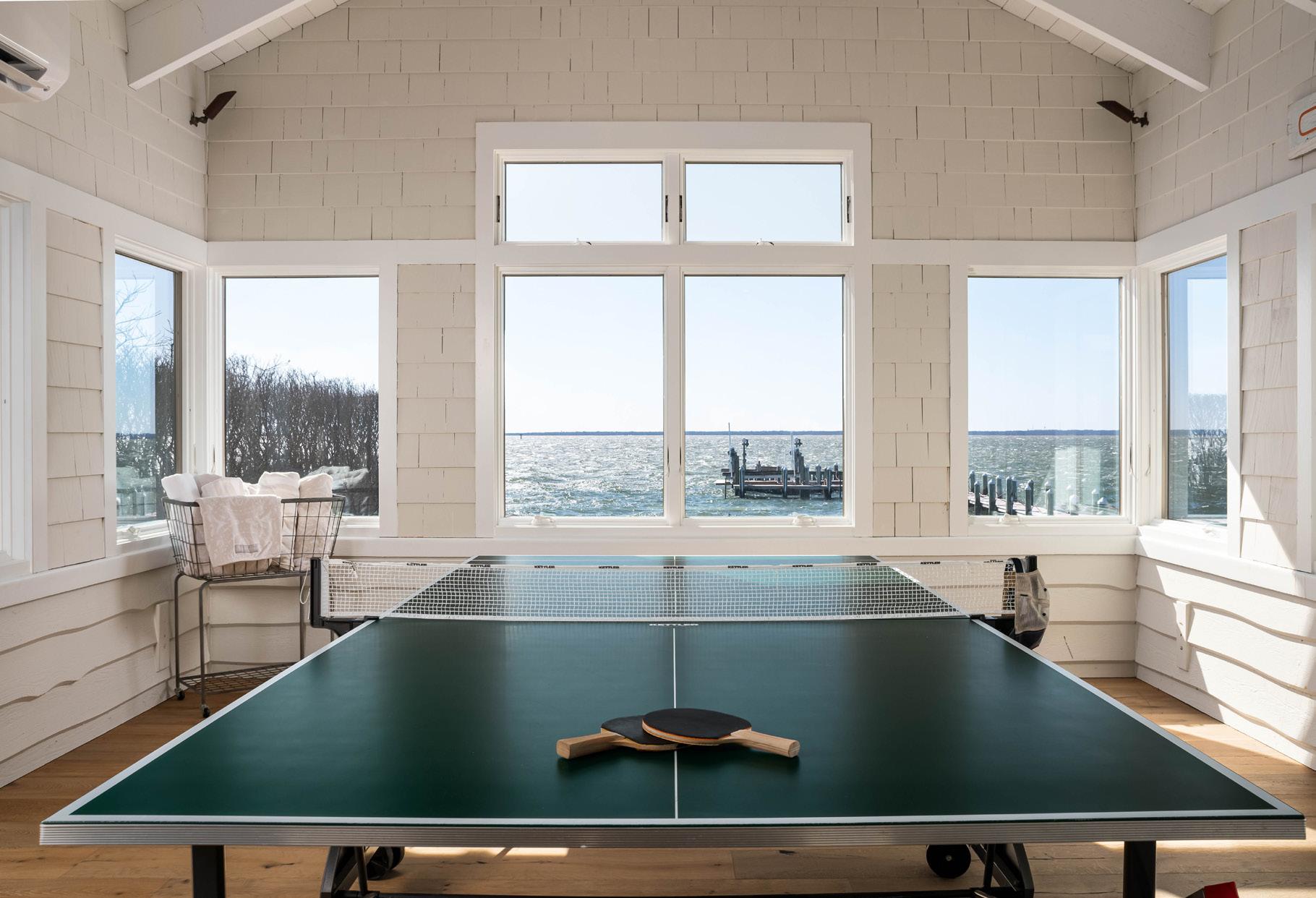
For intimate and personalized activities, a series of small satellite patios, constructed of natural travertine tiles, were interspersed throughout the property. They housed distinct functional elements—a hot tub, natural stone firepit, a Craftsman-style trellised sitting area--connected to each other by a series of modular travertine stepping-stone pads and surrounded by lush, summer-flowering plants that framed the awe-inspiring bayside views. Privacy plantings lined the property and container groupings, filled with colorful annual flowers, created a focal point drawing the eye from place to place.
The homeowners achieved complete satisfaction through a design-construction that fulfilled the family’s diverse functional outdoor needs all the while smoothly transitioning to the Craftsman-style home and interior without compromise to aesthetics. The house, and its grounds, have been a perennial highlight on LBI tours and have been showcased in design magazines and architectural articles—proving once again the enduring quality of this beautiful design-built project and its attraction to the next generation of homeowners.
“It is often said that you forget your cares when you cross the Causeway onto LBI. We always felt like we were transported to a tropical oasis. The variety of plantings, the attention to detail and their collaboration with us convinced us that to the Reynolds family, it is more than a business…it is a way of life.” — Joe and Judy
Franlin, Former Owners 2007-2019
By the time that Joe and Judy Franlin sold their property in 2019, Reynolds Landscaping had developed into a multi-dimensional, full-service design-build business—establishing Mark Reynolds Project Management (MRPM) as a separate construction management company. From new home construction to home additions, from kitchen makeovers to new deck installations— MRPM, with a cache of highly professional and experienced project managers, carpenters and sub-contractors, was now able to service all the interior and exterior service requirements of their long-time clientele.
Already owning a home on LBI, the new homeowners fell in love with this bayfront property, its home and exterior surroundings. They were more than content with the function and aesthetics of the outdoor living area. Nevertheless, the couple wished to update the interior space to reflect their individual taste and style. As in the past, and based upon high recommendations from the former owners, they contacted Mark Reynolds and did not hesitate to contract with MRPM to translate their ideas into reality.
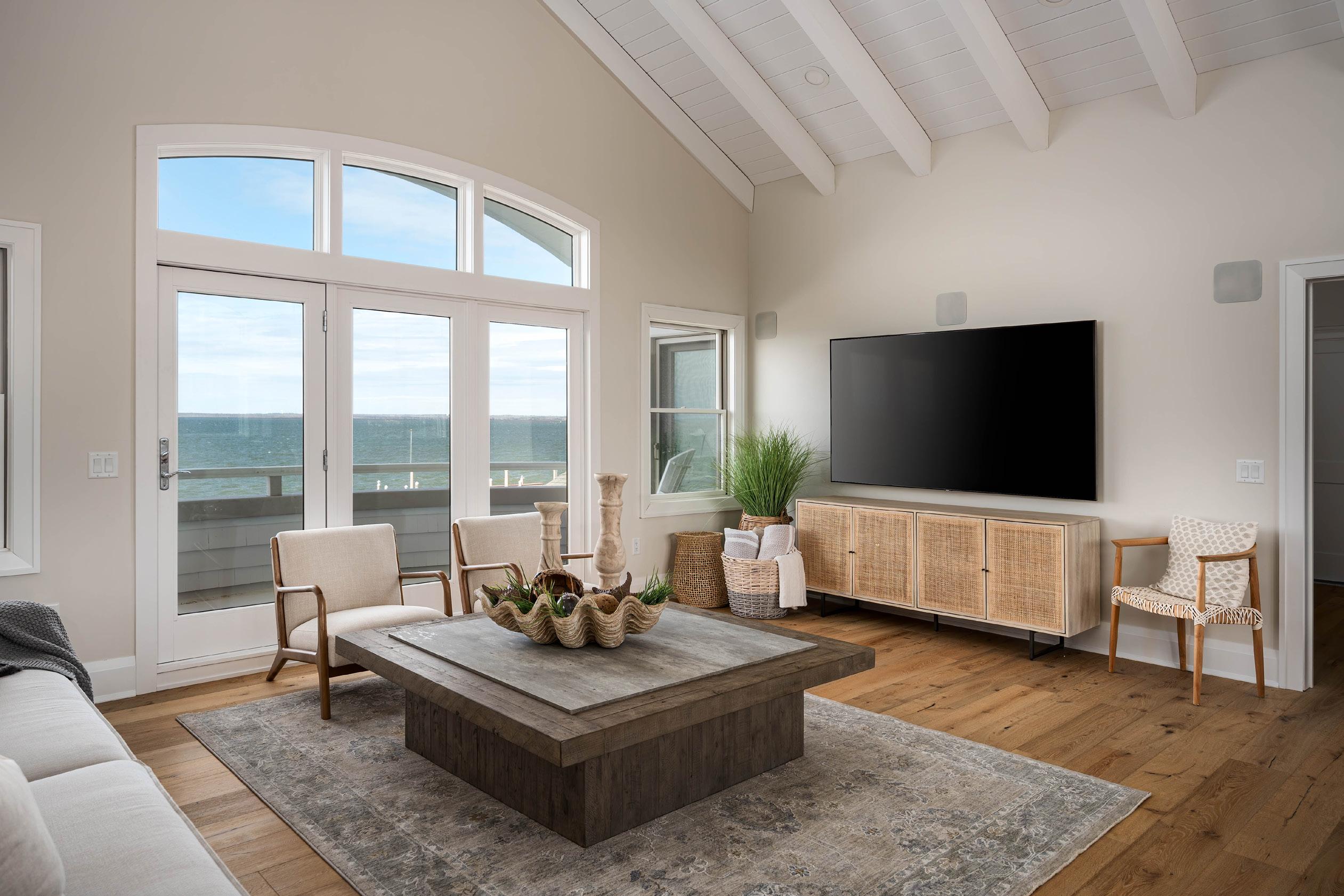
The existing interior design of the house reflected a Craftsman architectural influence--filled with rich natural wood treatments and details characteristic of this early 20th Century design tradition. The new homeowners, however, preferred a more contemporary coastal aesthetic--envisioning a light-filled, open floor plan with simple design elements offset by cool, pale color hues of white.
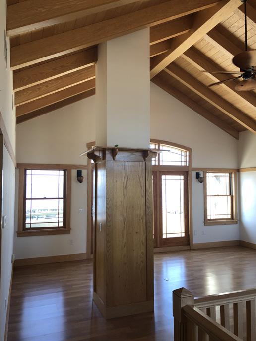
A kitchen concept for the new space had already been developed, however, Mark Reynolds collaborated with the client’s designer to ensure a smooth construction process and preserve their intentions for the space. Mark, along with the homeowners and their interior designer, managed the design-build process for the master bedroom suite and great room living spaces. Reynolds provided 3-D renderings for the new rooms and their window configuration—allowing all to visualize the new orientation and updated specifications before the start of construction.
To achieve this transformation, walls were removed along with a centrally located interior fireplace to create a
large open floor plan and sizable great room for gathering and entertaining. A new fireplace with inset cabinet surround was positioned along the exterior wall to maintain the integrity of this open space. In the master bedroom suite, a new window configuration was designed and installed by MRPM to not only bathe the room with light but also to capture the full effect of the magnificent bay views beyond. Low-voltage LED lighting was also added to the residence—extending the new ambiance into evening hours.
Lighter, cooler paint colors, trims and moldings replaced the darker wood treatments on the ceilings and walls. The central red oak staircase was treated with a bleach and stain to match the newly engineered white oak floors which, along with a clean, streamlined cable railing system further enhanced this updated design and architectural style. With the finishing touches completed, the transformation of this interior space successfully reflected the contemporary aesthetics of the new homeowners.
Mark’s deep understanding of the history of our home, the aesthetics of the Loveladies Harbor community, and keen eye for detail gave us tremendous excitement to work with him. After the project, we consider the de-
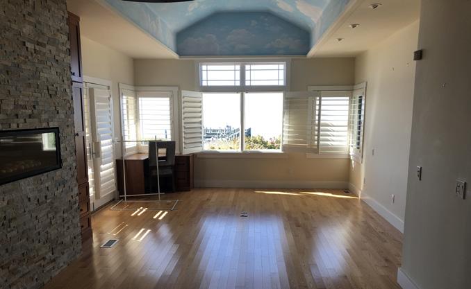
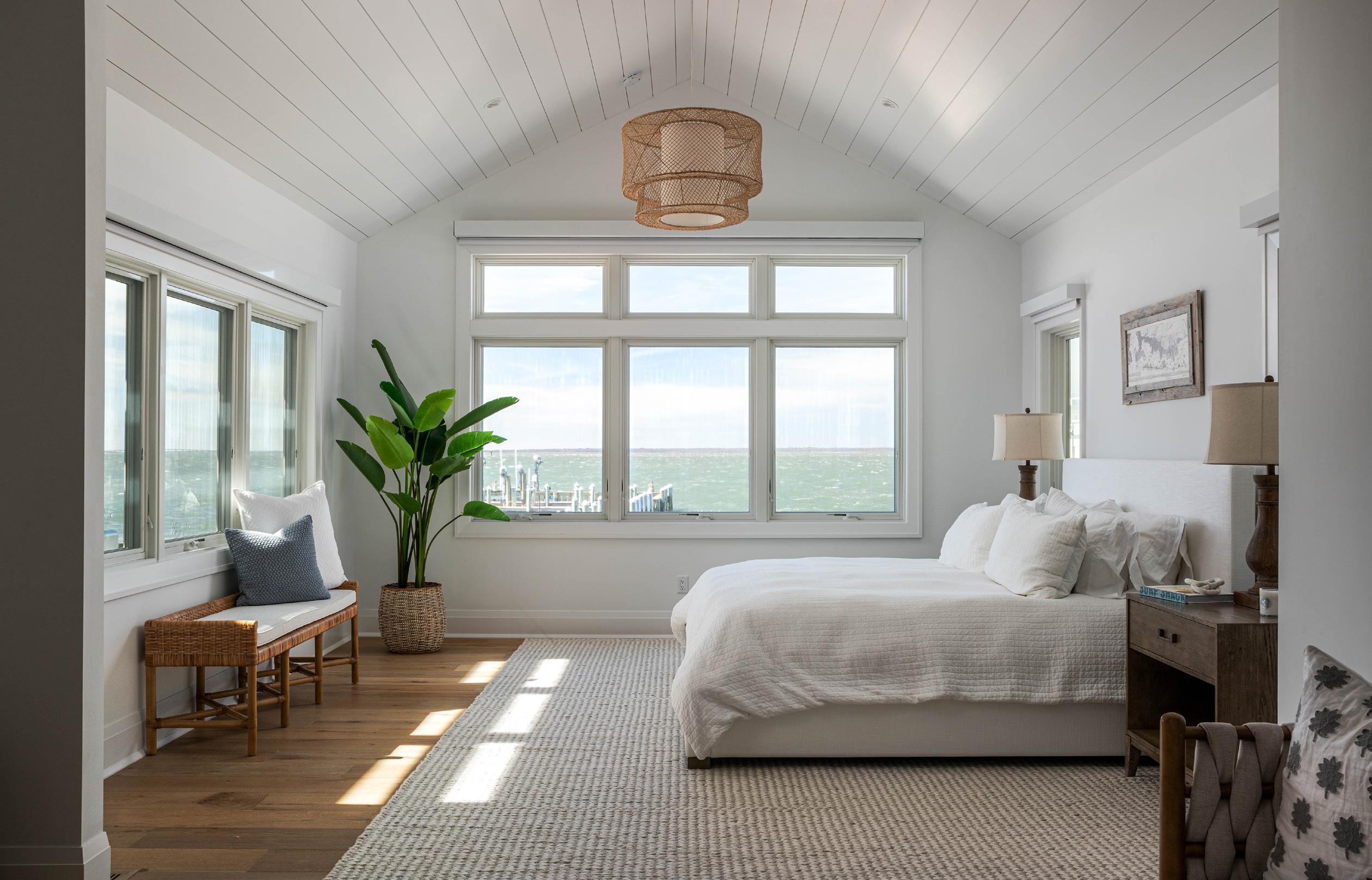
cision to work with Reynolds as one of the best we’ve made. He found ways to respect the heritage of the home while updating it both aesthetically and technologically bringing it to 2020 standards. Thanks to Mark, this venerable home will bring joy to our family, just as it has for the prior owners, for many, many years.” — Current Homeowners 2019 - Present
The ability to translate a client’s vision into a practical yet aesthetic reality requires creativity and ingenuity on the part of the contractor along with an innate ability to listen and communicate. These skills were evident time after time over a 25-year span in the expansion and transformation of this stunning property by both Reynolds Landscaping and Mark Reynolds Project Management. Client satisfaction was achieved, and repeated partnerships developed as new life was infused onto this property without compromise to its lasting design and overall functionality.
To find out more about the services offered by both Mark Reynolds Project Management and Reynolds Landscaping or to schedule an appointment, please contact Mark Reynolds via phone at 609-597-6099 or via e-mail at mark@reynoldslbi.com.

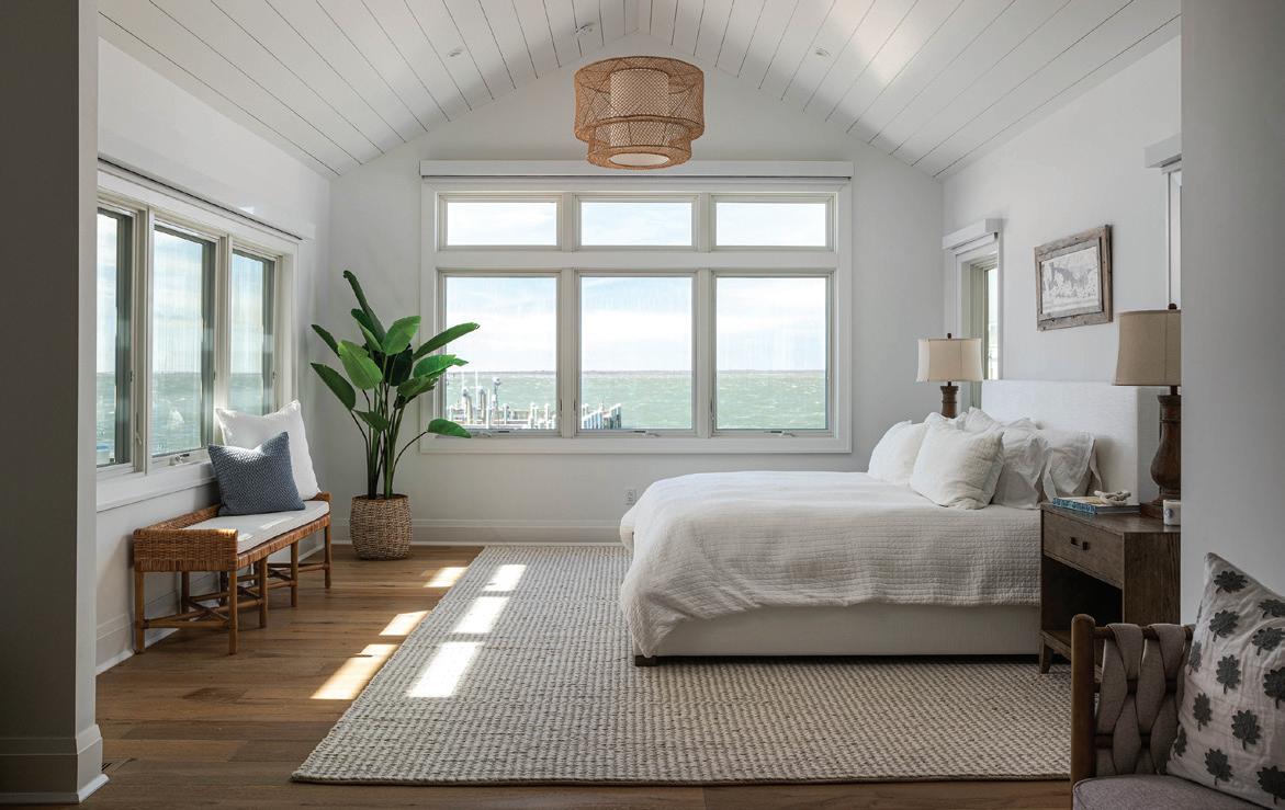
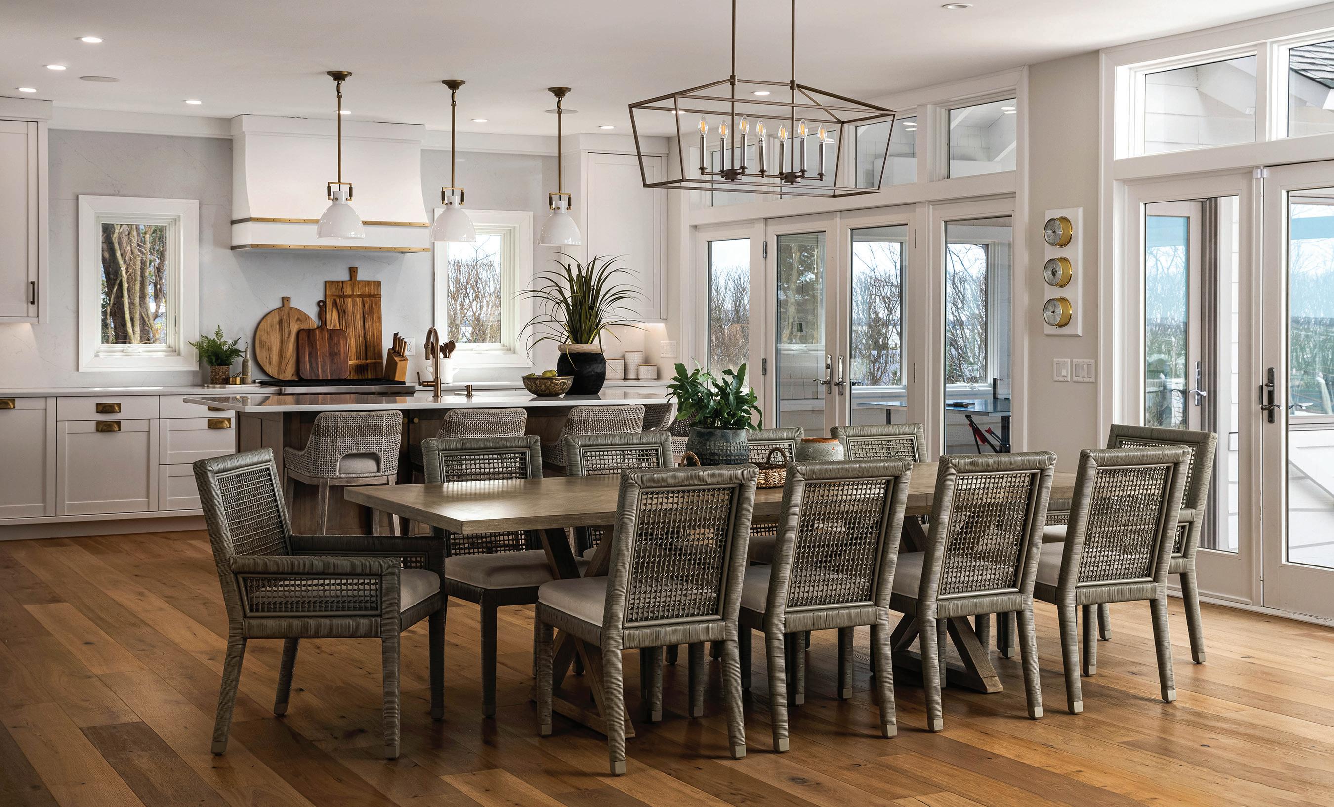


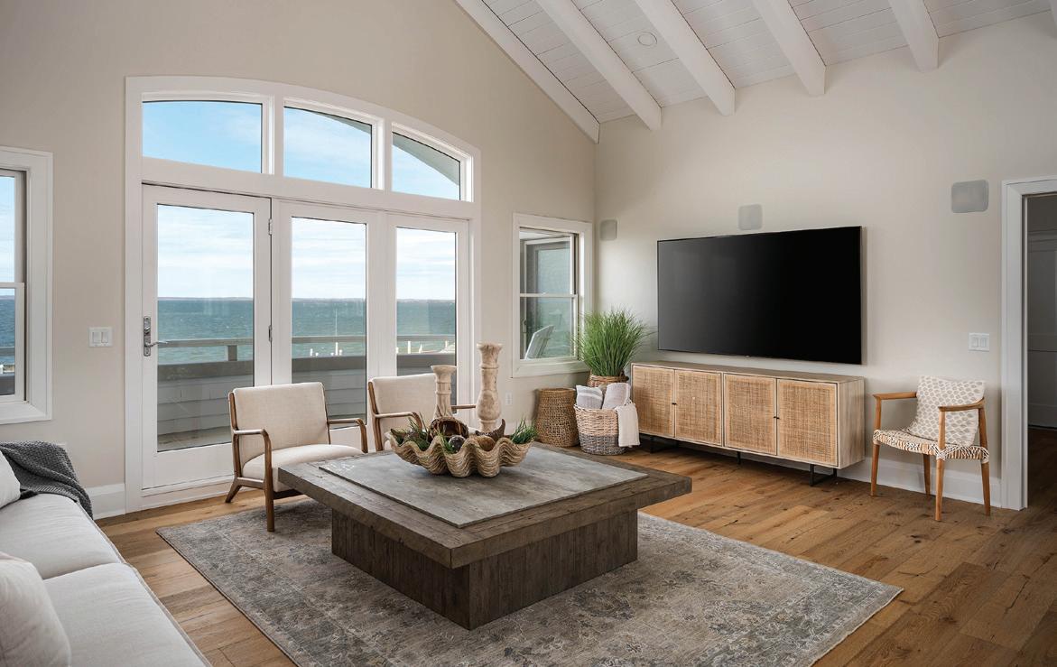


Suffering a loss to your home, be it big or small, can be a frightening and uneasy experience. Many times, homeowners don’t know where to begin or what to do. At Anderson Insurance Agency, our in-house Claims Specialist, Michael McMahon takes the lead on such matters.

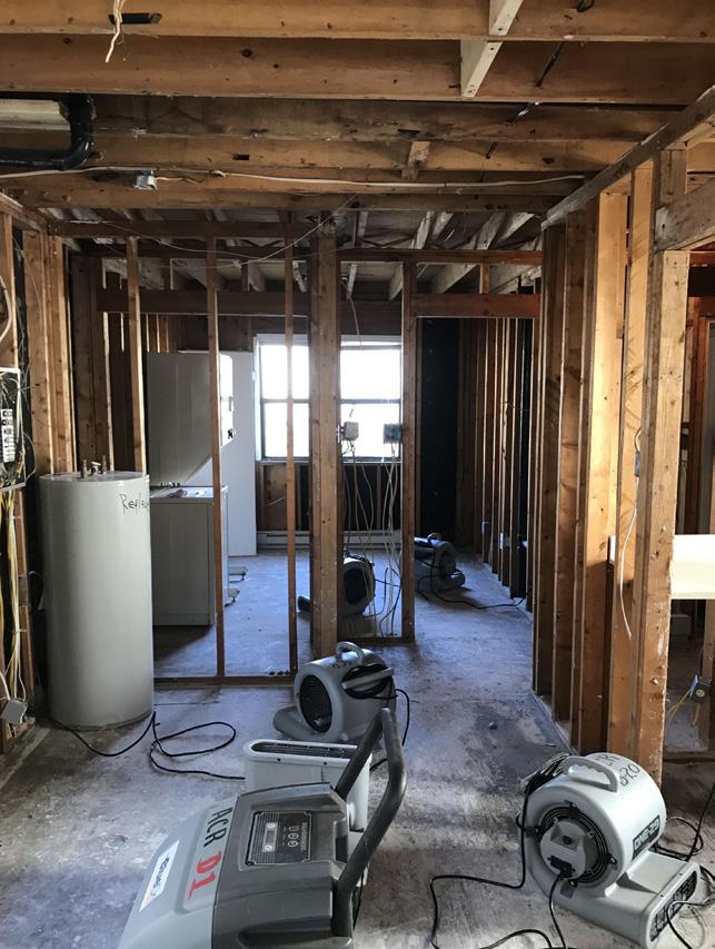


Many agencies designate a specialist to handle claims, and we felt that appointing Michael to the role was fitting given his wealth of insurance knowledge and experience. As an owner of Anderson Insurance Agency, Michael is not only extremely enthusiastic when it comes to insurance coverages and forms (especially Flood), but he also holds a Certified Insurance Counselor designation - which is among the most respected in the industry.
While some insurance agencies require clients to report their claims to insurance companies directly, we wanted to make life a little easier for our clients and streamline the entire process.
For policyholders filing a claim, Michael is by their side through each step of the process, monitoring the entire claim from the first report to the closing notice while ensuring that the carrier, adjusters and all other parties involved are doing their part.
From flooding to a major fire, Michael and our Account Managers are happy to assist for any event that may result in a claim. Rather than navigate the uncertain waters with a pricey public adjuster, our team wants to cut out the middleman and help you find a swift resolution for your housing woes. The catch? There is none. Our agency’s claim service and handling are of no additional cost to our clients.
Adding Michael as the in-house Claims Specialist to our company has been just one small change we’ve made since we acquired Anderson Insurance Agency in 2019 and merged operations with McMahon Insurance Agency. Initially, we didn’t want to make major sweeping
changes, especially since the existing Anderson Insurance Agency was a highly-regarded business with a strong staff and reputation. There was no need to shake things up.
Internally however, it’s been a challenge to run two different agencies. Between separate IT systems and websites, as well as managing confusion with carriers, we feel it is time to move all of our operations under one name: McMahon Insurance Agency.
Clients can rest assured that other than a new name, a combined website, new stationery items and, now, a brand new Claims Specialist, the same great staff and service will remain the same at McMahon Insurance Agency.
For more information about our in-house Claims Specialist as well as updates regarding our upcoming rebrand to McMahon Insurance Agency, please visit us at www.aiainsure. com or www.mcmahoagency.com.
“We’ve
-Stephen from Barnegat, NJ


“Everything was great. We love Brenda!”
-Nicole from Waretown, NJ
“Absolutely amazing! Marieli’s Crew was phenomenal! Over the top!

-Jennifer from Stafford, NJ

The mission of the Jetty Rock Foundation is to protect our oceans and waterways, and support those who build their lives around them.

JOIN US FOR OUR SUMMER EVENTS AND HELP MAKE A LASTING IMPACT ON LBI
8 TH ANNUAL
HOPSAUCE FESTIVAL
Craft Beer, Hot Sauce, and Music Festival
JUNE 17, 2023
Veterans Memorial Park Beach Haven, NJ | 11am-5pm
15 TH ANNUAL
JETTY COQUINA JAM
All Women's Charitable Surf Contest
JULY 23, 2023
68th Street Beach
Brant Beach, NJ | 8am-5pm
*Including the inaugural Littleneck Jam!
ALL PROCEEDS BENEFIT THE JETTY ROCK FOUNDATION
For more information on the Jetty Rock Foundation and our summer events, please scan the QR code
2023 marks the tenth anniversary that Techno Sound and Video has been serving homeowners on Long Beach Island. Since day one, owner Nick Oramas and his team have credited the quality relationships they have built with their valued customers, their commitment to quality and service, and ongoing education with the company’s explosive growth.
Sales are up substantially with the company increasing their sales from last year, even as products had previously been backordered for some six months or more. Even so, the Techno team managed to successfully ride the wave of two consecutive seasons of supply chain challenges, complete with a relocation to a brand new office. Construction delays combined with transitional logistics found the team displaced for a full summer in a temporary office off the island, which was only made more complicated by the required storage of existing on-hand inventory.
At the end of August 2022, the whole team packed up and moved to their shiny, new location in Ship Bottom.
Staff members doubled as the moving crew, taking hours off from work to relocate all their computers and equipment, as well as the company’s full stockroom.
“I had my first meeting with a customer in the new, completely empty space,” says owner Oramas. “I went to the store and bought a plastic table and tablecloth. I told my client, ‘You’re my first person!’ We had a good laugh.”
Techno’s beautiful new location on the corner of 20th Street and Long Beach Boulevard has a state-of-the art conference room, brand new desks and a bright showroom featuring one of the company’s most popular products on display: The Frame Samsung Smart TV, which hangs on a shiplap wall above an electric fireplace.
With its ability to display museum-quality digital art that looks like the real thing, The Frame allows artwork to be displayed when the TV is not being actively watched. Samsung has its own Art Store, which you
can easily explore right on the TV, or homeowners may also upload and display their own personal photos and artwork collection. The Frame can be customized with a stylish bezel to fit any décor and be hung flush against the wall to look just like the real thing.
“It came out great,” Oramas says. “When customers and builders walk into our showroom and see it in person, it’s as good as sold.”
Along with the Smart TV, one of the most popular products that techno offers is the Sonos Home Audio system, an app-based platform that links many streaming surfaces such as Pandora, Spotify, SiriusXM, Apple Music, and more.
“You can do practically anything with Sonos,” Oramas says. “We can power a whole house that’s already wired with speakers and volume controls. We integrate Sonos in existing surround sound systems and offer portable speakers, both wired and wireless. There’s a lot of different options with Sonos, so it’s a very popular product.”
While Sonos was especially challenging to get during the pandemic, Techno was fortunate enough to be a platinum dealer, and therefore had the largest inventory and subsequently the biggest increase in sales in the region.
“The Sonos jobs we were hired to do for new construction will all be done by this summer, and we already have the systems in stock,” Oramas says. “We’re taking new orders now and we’re able to fulfill the jobs within a week, where before there were times we couldn’t even do the jobs at all because we didn’t have the product.”
It’s a business that is always changing, from state of the art sound systems to single panel control pads to whole home technology control. Oramas and his team are constantly evolving. Staying on top of emerging technology and having technicians that understand and can do it all is a key part of techno’s success.
“There’s always something new out there,” Oramas says. “So it’s important to stay knowledgeable and current with all of the things as they roll out.”
The latest and greatest developments center around voice technology and home surveillance. According to Oramas, home security cameras have come a long way.
“The artificial intelligence (AI) surrounding facial recognition technology allows the camera to identify the difference between, say, a person, a car or a dog. Traditional surveillance cameras record motion, but the latest AI
can distinguish if a tree is swaying, so it may not record that particular movement, but if a person is walking on your property, it will pick up and record the motion.”
Oramas says that although some do-it-yourself surveillance companies, such as Ring or Nest, are making the installation of security surveillance more accessible and widespread, he warns that they do have their limitations. In addition to monthly fees, these solutions also consume WIFI resources, and run the risk of presenting network vulnerabilities, false alerts, and limited field of view, to name just a few.
“We install hardwired and ethernet powered cameras,” he says. “There are normal dome style cameras and varifocal bullet cameras, which are especially popular on oceanfront homes, where the homeowner is able to zoom down the beach.”

A varifocal camera allows you to adjust between its top and bottom limits on its view angle. This means that you have the ability to manually set both the view angle and level of zoom. A standard camera is 2.8mm lens, so the varifocal lens allows you to zoom up to 12mm, which offers a much wider view for seeing further and more clearly, as compared to the PTZ (Pan-Tilt-Zoom) cameras which certainly have their limitations.
“We installed surveillance on one home and they had


us put a varifocal camera on the roof looking at the ocean,” recalls Oramas. “We incorporated an HDMI splitter that transmitted to every TV on every floor in the house, to show whatever was happening on the beach.”
When it comes to surveillance, though, especially as it pertains to short-term rentals, Nick cautions homeowners to think twice before installing interior cameras such as nanny cams, particularly with audio recording capability.

“I’ve had people ask about that type of surveillance,” Oramas says, “ People are concerned about their homes and their pools and the liability, however, there are privacy violations to consider.”
The main restriction when it comes to audio surveillance at home is that you cannot record someone else’s conversation without their knowledge or permission. This is because most security cameras for domestic use are considered an invasion of privacy, and so the law generally protects people from having their conversations recorded without their consent.
This dynamic exists even as voice automation and voice control systems become the industry standard. With Siri, Alexa and Google becoming familiar household
voices, these services actively acquire information for advertisers, then use that data to sell products and services themselves or else sell it to a third party. To that end, there is one company which Oramas says is different from all the others: Josh AI is a product that more and more homeowners have begun to inquire about. According to the Josh AI website:
Josh will never use client information for marketing purposes or sell user data to third parties. Unlike the mass-market voice assistants, Josh’s sole focus is on providing the best smart home experience possible.
“Josh AI keeps all of the data within the ecosystem,” Oramas says. “Users don’t have to worry about their information being used or sold, which is one of the primary concerns when dealing with voice technology.”
The Josh AI website details the critical components of a premium operating system for the home demands that the actions and words spoken behind closed doors stay there. They assure the privacy of their clients and their families, while committing to optimizing how their technology solution secures the data it collects.
One way or another, the demand for voice control is on the rise and Nick and his team of Techno experts expect to see more of it in the coming years.

