CALIFORNIA HOMES
THE MAGAZINE OF ARCHITECTURE THE ARTS & DISTINCTIVE DESIGN

THE NEW
HILLS Classics
MILL VALLEY PRESIDIO HEIGHTS
PACIFIC HEIGHTS HOLLYWOOD
TRENDS KITCHEN

PERFECTLY SEARED SCALLOPS AT 425º

THE MAGAZINE OF ARCHITECTURE THE ARTS & DISTINCTIVE DESIGN

MILL VALLEY PRESIDIO HEIGHTS
PACIFIC HEIGHTS HOLLYWOOD

PERFECTLY SEARED SCALLOPS AT 425º
Monogram’s Professional Induction Range represents the finest in culinary precision, transforming your kitchen into a masterpiece of accuracy. Take the guesswork out of cooking and create refined culinary masterpieces with ease.
Elevate Everything. VISIT YOUR






MAKE ROOM FOR ALL OF YOU


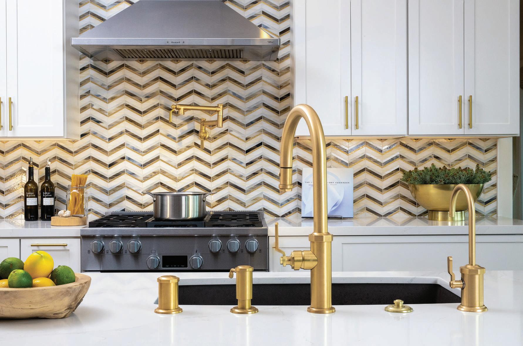
Our curated selection of faucets, plumbing fixtures and cutting-edge appliances make us your complete design solution under one umbrella.
Our curated selection of faucets, plumbing fixtures and cutting-edge appliances make us your complete design solution under one umbrella.
Let us make your dream kitchen or bath a reality!
Let us make your dream kitchen or bath a reality!


www.nativecoastappliance.com
www.nativecoastappliance.com
www.faucetsnfixtures.com


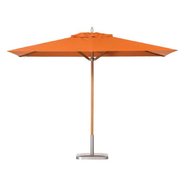
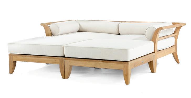
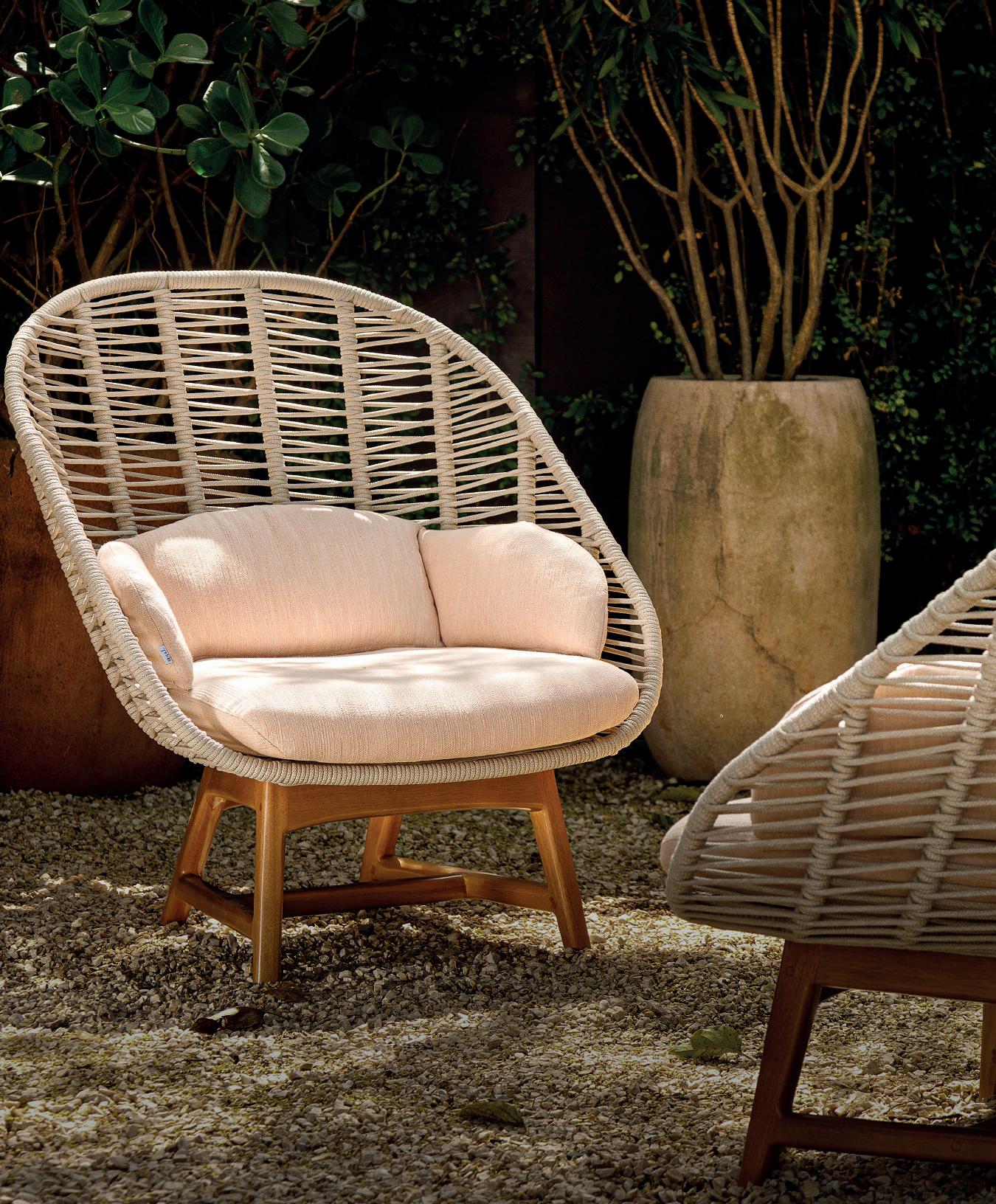
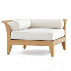
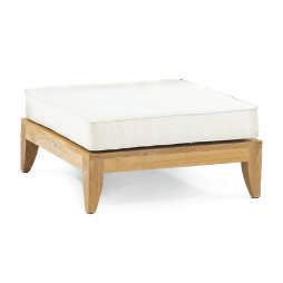
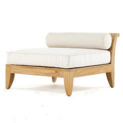
Designed with timeless elegance in mind, the Aman Dais Collection exudes both style and sophistication. Its soft, slender, graceful lines, and low profile frames will gracefully integrate into any setting. Remarkably functional, it’s three distinct pieces can be configured to fit any space or style. From large parties to lazy Sunday afternoons, the Aman Dais would be the place that everyone would end up lounging in. Aptly named, Aman Dais roughly translates to “Platform of Peace”.






YOUR LAND. YOUR TRAIL. YOUR LEGACY.

WE BUILD TRAILS ON PRIVATE PROPERTY THAT SERVE AS EFFECTIVE FIREBREAKS & GIVE ACCESS TO PREVIOUSLY IMPASSIBLE LAND.



Passionate about connecting people to their land & nature. ies, homes and properties from f Pr or current & future generations to

• Passionate about connecting peopl to their land and nature.
• Protecting families, homes and properties from fire.
• Providing a legacy for current and future generations to enjoy.
ng, enjoying and fully connecting w of Randy’s passions. He weaves th trail builds. As a business, Trailsca es the ability to fully enjoy one ’ s pro al to every home. Trails enable an tion to the land thus allowing hom access otherwise inaccessible areas. In ma trails are becoming as important as drivew providing access to multiple points of inte
Exploring, enjoying and fully connecting with nature is one of Randy’s passions. He weaves that passion into his trail builds. As a business, Trailscape truly believes the ability to fully enjoy one’s property is essential to every home. Trails enable an instant connection to the land thus allowing homeowners to access otherwise inaccessible areas. In many ways, trails are becoming as important as driveways providing access to multiple points of interest.
In addition, trails offer a higher level of safety, security and trails are constructed in a way that they are wide enough w on either side of excess brush that they naturally create effective fire breaks which help protect our clients, their families and their properties ”
In addition, trails offer a higher level of safety, security and value. “Our trails are constructed in a way that they are wide enough with clearance on either side of excess brush that they naturally create effective fire breaks which help protect our clients, their families and their properties.”

access through
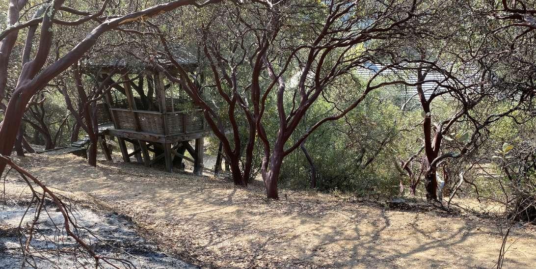
This wildfire burned right up to our trail and stopped in its tracks. You can see the burnt vegetation and charred land. All photography courtesy of Trailscape.

Randy Martin has an award-winning team of professionals who design, build and maintain trails for private landownersand public entities. He often likes to share that, “while it may appear that trail construction is simple “landscaping,” this is not the case. Trail building is both art and science. The art part is augmenting the natural beauty and giving the user a sense of flow. While building a trail is not “rocket” science, it is the science of solving multiple terrain challenges and making the trail last for decades.”
Randy Martin has an award-winning team of professionals who design, build and maintain trails for private landowners and public entities. He often likes to share that, "while it may appear that trail construction is simple "landscaping," this is not the case. Trail building is both art and science. The art part is augmenting the natural beauty and giving the user a sense of flow. While building a trail is not “rocket” science, it is the science of solving multiple terrain challenges and making the trail last for decades."


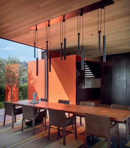
ABOVE Located in the winding Hollywood Hills, architect Paul McClean designed this modern home embedded into the land with sweeping views. Pocketing glass sliders to either side of the great room pull in natural light, and cross breezes while a skylight illuminates the staircase descending to the lower floor. See story beginning on page 68. Photograph by Manolo Langis.
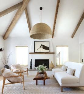
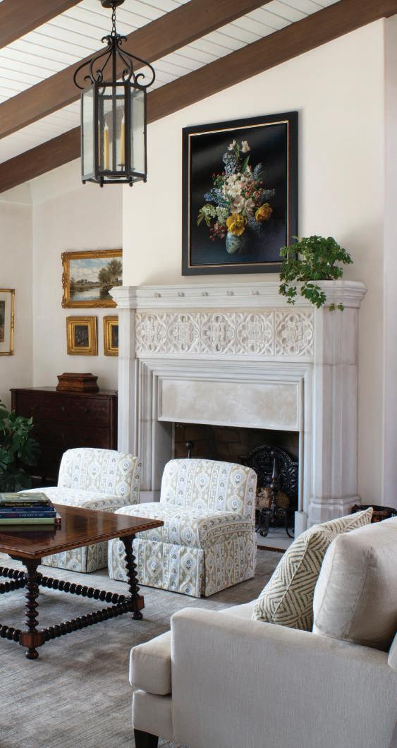
RIGHT Designer Ann Lowengart’s clients purchased a Mediterranean Revival home in a tree-lined neighborhood of Mill Valley to raise their young children. The design team selected an ivory blend of linen and wool fabric from Rogers & Goffigon for the flat Roman shades flanking the fireplace in the living room. The architect Brad Hubbell of Hubbell Daily Architecture + Design added rustic wood beams to the space, accenting the ceiling height and the house’s aesthetics. See story beginning on page 92. Photograph by Paul Dyer
68 PERCHED IN THE HOLLYWOOD HILLS
McClean Design Tailor A House
To A Confined Site
Text by Michael Webb
Photography by Manolo Langis
76
JULIE & JULIA
Interior Designer Julie Rootes
Gave A Stately Julia Morgan-
Designed House A Chic Refresh
—While Preserving Its Essence
Text by Deborah Kirk
Photography by Aubrie Pick
84 ON DECK IN PACIFIC HEIGHTS
Designer Amanda Barnes
Reenergizes A Turn-Of-The-Century San Francisco Home With Warm, Modern Sensibilities
Text by Roger Grody
Photography by Stephanie Russo
92
MEDITERRANEAN MINIMALISM
Ann Lowengart Interiors
Revives A Mill Valley Home
Text by Kendra Boutell
Photography by Paul Dyer
Styling by Yedda Morrison
36 BOOKS
California Houses: Creativity in Context
Text by Michael Webb
The Houses of KAA Design
Text by Grant Kirkpatrick and Duan Tran
REVIEWED BY KATHY BRYANT
39 NOTEBOOK
39 Visionary | Katrien van der Schueren
42 Places | Checker Hall
44 Product | Round Up
46 Product | Outdoor Living
48 Cloth & Paper | Nathan Turner Fabrics
50 Cloth & Paper | Farrow & Ball
52 Spotlight | California Closets
54 WORLD OF DESIGN Conserving LA’s Modernist Legacy BY MICHAEL WEBB
56 DESIGN PROFILE Shawback Design Updates A Napa Tasting Lounge BY KENDRA BOUTELL
PHOTOGRAPHY BY PAUL DYER
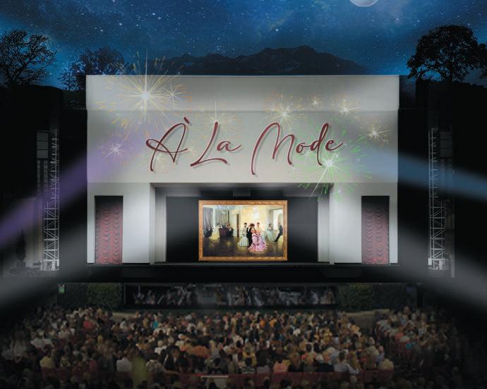
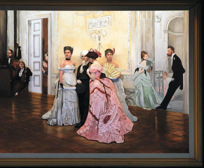
Watch as art literally comes to life on stage, with people posing to look just like famous artworks. Plus, enjoy great stories, live original music, and exciting surprises. Look closely! See if you can catch them blinking – it's a magical night under the stars. Early ticket purchase recommended, this event is highly sought after and draws art enthusiasts from around the world. Don’t miss it!



We hope you enjoy this Summer issue of California Homes Magazine, featuring more of the best of California design and architecture, including the departments Notebook and World of Design. We are also proud to include the yearly feature on kitchen trends.

The world looks to California for forward thinking design and style, and California Homes has showcased the best in architecture, interior design, landscape, artisans and builders for over twenty-eight years. We sincerely appreciate our readers and advertisers as you are what keeps California Homes growing. We are proud to announce that the magazine is now sold at several newsstands located at airports within California, including San Francisco, LAX, John Wayne, Burbank, and San Jose, and also at Dallas-Fort Worth airport in Texas. We will continue striving to grow and present to you, our readers, the best of architecture, interior design and lifestyle. Have a wonderful summer in beautiful California.
Susan McFadden Editor in Chief
ROBYN WISE
Santa Barbara–based writer and editor Robyn Wise specializes in art and design. Her writing has appeared in Dwell, Luxe Interiors + Design, California Home + Design, the Santa Barbara Independent, and HENRY, among other publications. In this issue, she focuses on a midcentury home remodeled by Butler Armsden. See her story beginning on page 41.

Stephanie is an interiors and hospitality photographer located in Sacramento, California. Her admiration for design coupled with an innate love for travel led her to pursue photographing places + spaces over 10 years ago. Her love for photography is only rivaled by that of her family. See her photography beginning on page 84.

Manolo Langis, architect by training, photographer through life. Through his keen sense of space paired with his aesthetic eye, Manolo captures architecture and nature at their finest moments. Pairing technique with ever changing environment, Manolo creates soft yet evocative photographs. His work is featured internationally. See his photography beginning on page 70.



SUMMER 2024
PUBLISHER Heidi Gerpheide
EDITOR-IN-CHIEF Susan McFadden
ART DIRECTOR Megan Keough
EDITOR-AT-LARGE Kendra Boutell
ART EDITOR Kathy Bryant
CONTRIBUTING WRITERS
Roger Grody
Deborah Kirk
Michael Webb
Robyn Wise
CONTRIBUTING PHOTOGRAPHERS
Paul Dyer
Manolo Langis
Stephaine Russo
Aubrie Pick
ASSOCIATE PUBLISHER Linda McCall ORANGE COUNTY
ACCOUNT EXECUTIVE Marlene Locke ORANGE COUNTY
ACCOUNT EXECUTIVE Richard Rothenberg LOS ANGELES
MEDIA CONSULTANT Jo Campbell Fujii
NEWSSTAND CONSULTANT John Ponomarev, Choice Circulation Consulting
EDITORIAL & ADVERTISING OFFICES
949.640.1484
SUBSCRIPTION INFORMATION
California Homes Magazine PO Box 8655 Newport Beach, CA 92658
Subs@calhomesmagazine.com
NEWSSTAND
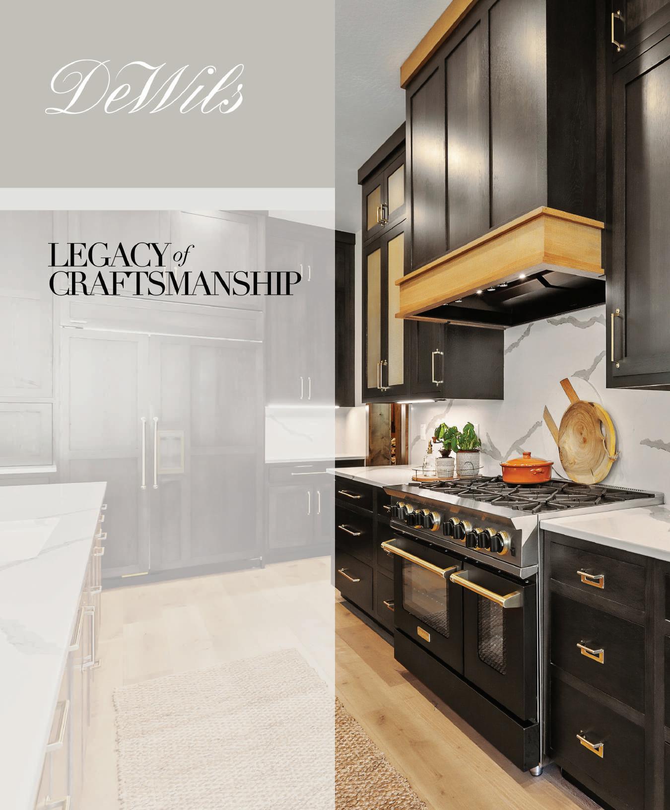
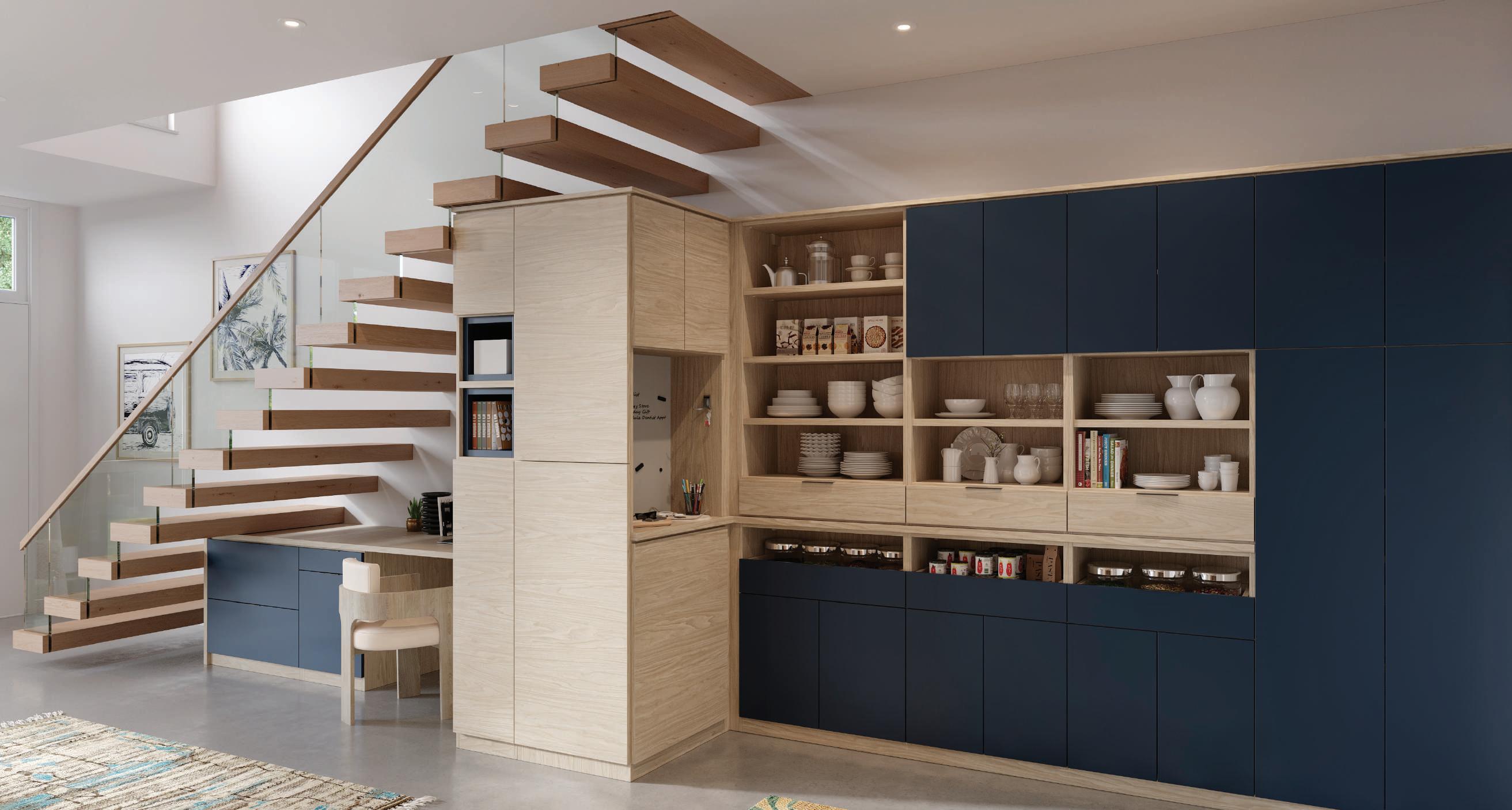
At DeWils, we challenge the conventional notion that cabinetry is confined to kitchens. The versatility of DeWils cabinetry extends far beyond culinary spaces, emerging as a transformative element in home design.
Explore a world where cabinetry becomes a canvas for expression, blending functionality with aesthetics. From sleek, modern designs to timeless classics, our diverse range of cabinetry includes framed, frameless, and inset construction options, catering to every taste and design style. Imagine the seamless integration of storage solutions in your living room, bedroom, or home office – where form meets function effortlessly.
DeWils Fine Cabinetry is a third-generation, familyowned and operated manufacturer of high-quality cabinetry dedicated to enhancing the beauty and functionality of interior spaces and bringing creative solutions to cabinetry that blend functionality and aesthetics seamlessly.
Visit dewils.com to find a showroom near you, and learn more about our cabinetry and our commitment to sustainability and innovation.

Ed Ruscha
Standard Station, 1966
Color screenprint on commercial buff paper, 25 5/8 x 40 inches
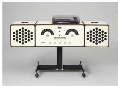
BELOW
Achille and Piergiacomo Castiglioni
RR126 Stereo System
Manufactured by Brionvega, 1965
Joy Division
Unknown Pleasures
Poster
Designed by Factory
Records after Peter Saville, 1979
The Los Angeles County Museum of Art presents Ed Ruscha/Now Then, the artist’s first retrospective in over 20 years. Conceived in collaboration with Ed Ruscha, this comprehensive retrospective presents Ruscha’s remarkable career and extensive exploration of all media, including painting, drawing, printmaking, photography and books. With over 250 works, the exhibition features his most acclaimed works alongside lesser-known aspects of his more than 60-year practice. The exhibition is on view through October 6, 2024.
For more information, please visit, lacma.org
SFMOMA celebrates ground-breaking design that enhances and visualizes our musical experience in Art of Noise, on view until August 18, 2024. From concert posters to record albums, phonographs to digital music players, handheld radios to surround sound, Art of Noise takes visitors on an exploration of how design has shaped our relationship to music over the last century.
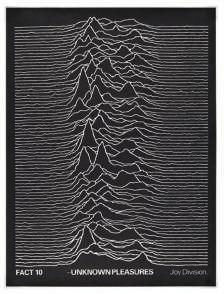
Museum goers have the rare opportunity to see a floor-to-ceiling installation of rock posters and album covers. The exhibition covers the Floor 7 galleries with 800 artworks, 550 posters, 150 album covers, 100 design objects and four large-scale installations.
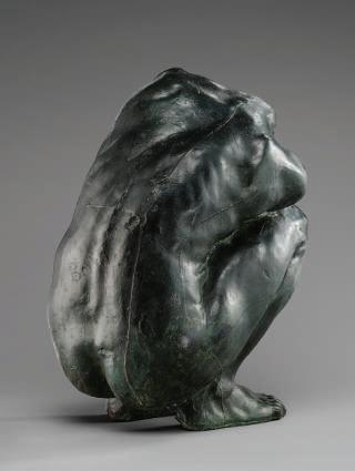
Celebrated for her brilliance during a time when women sculptors were rare, Camille Claudel was among the most daring and visionary artists of the late 19th century. Although today she is remembered for her dramatic life story—her passionate relationship with Auguste Rodin and 30-year internment in psychiatric institution, her art remains little known outside of France. Including about 60 sculptures, this major exhibition seeks to reevaluate Claudel’s work and affirm her legacy within a more complex genealogy of Modernism. This exhibit remains through July 21, 2024.
For more information, please visit, getty.edu

For more information, please visit, sfmoma.org


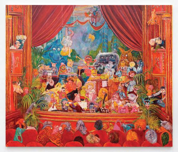
New paintings by LA artist Keith Mayerson will be shown in My American Dream; City of Angels through July 20, 2024 at the Karma Gallery. Myerson’s work emerged in the early 1990s as highly crafted, narrative drawings and paintings. The exhibition brings together two new series of oil paintings..
In the primary room is a series of vignettes set across California— Laguna Beach at sunset, Skateboarder magazine and others that construct a personal narrative about the artist’s relationship to his chosen city. The second group of works focus on America’s national parks.
The gallery is located at 7351Santa Monica Blvd., West Hollywood, 90046. For more information, call 310.736.1367 or visit karmakarma.org
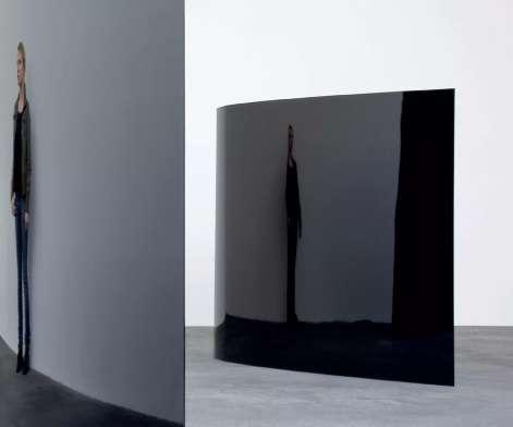
Pace is pleased to present two-artist exhibition of work by Alicja Kwade and Agnes Martin, including two large-scale sculptures, in dialogue with a selection of paintings and works on paper by Martin. This will be Kwade’s first significant presentation of new work in LA.
Kwade is known internationally for sculptures, largescale public installations, films, photographs and works on paper that engage poetically and critically with scientific and philosophical concepts. In her contemplative works, which dismantle boundaries of perception, she challenges commonly accepted ideas and beliefs while proposing new modes of seeing and understanding reality. The exhibit runs from May 18-June 29, 2024.
The gallery is located at 1201 South La Brea Avenue, Los Angeles. For more information, please visit pacegallery.com
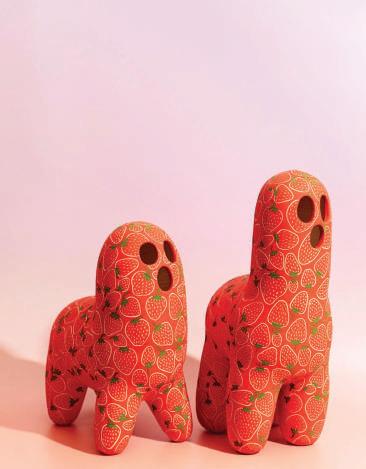
The Eleanor Harwood Gallery presents two artists, Liz Walsh and Holly Coley in As a Seed Imagines a Flower through June 22, 2024. Born in Los Angeles, Holly Coley comes from a family of artists. Her clay practice is informed by drawing and painting and her work is inspired by modern and ancient art, invented mythologies, 1990s and Satanic Panic. Her pots are treated as her canvases.
Liz Walsh lives and works in LA and is inspired by the plant life and city sprawl of California. Her practice is focused on the mix between technology and the entropy of the natural world. These themes appear in her work through the depiction of cockpits and flora as well as mythic animals and exaggerated fauna.
Eleanor Harwood Gallery is located at 1275 Minnesota Street,Suite 105, San Francisco 94107. For more information, call 415.867.7770 or visit eleanorharwood.com
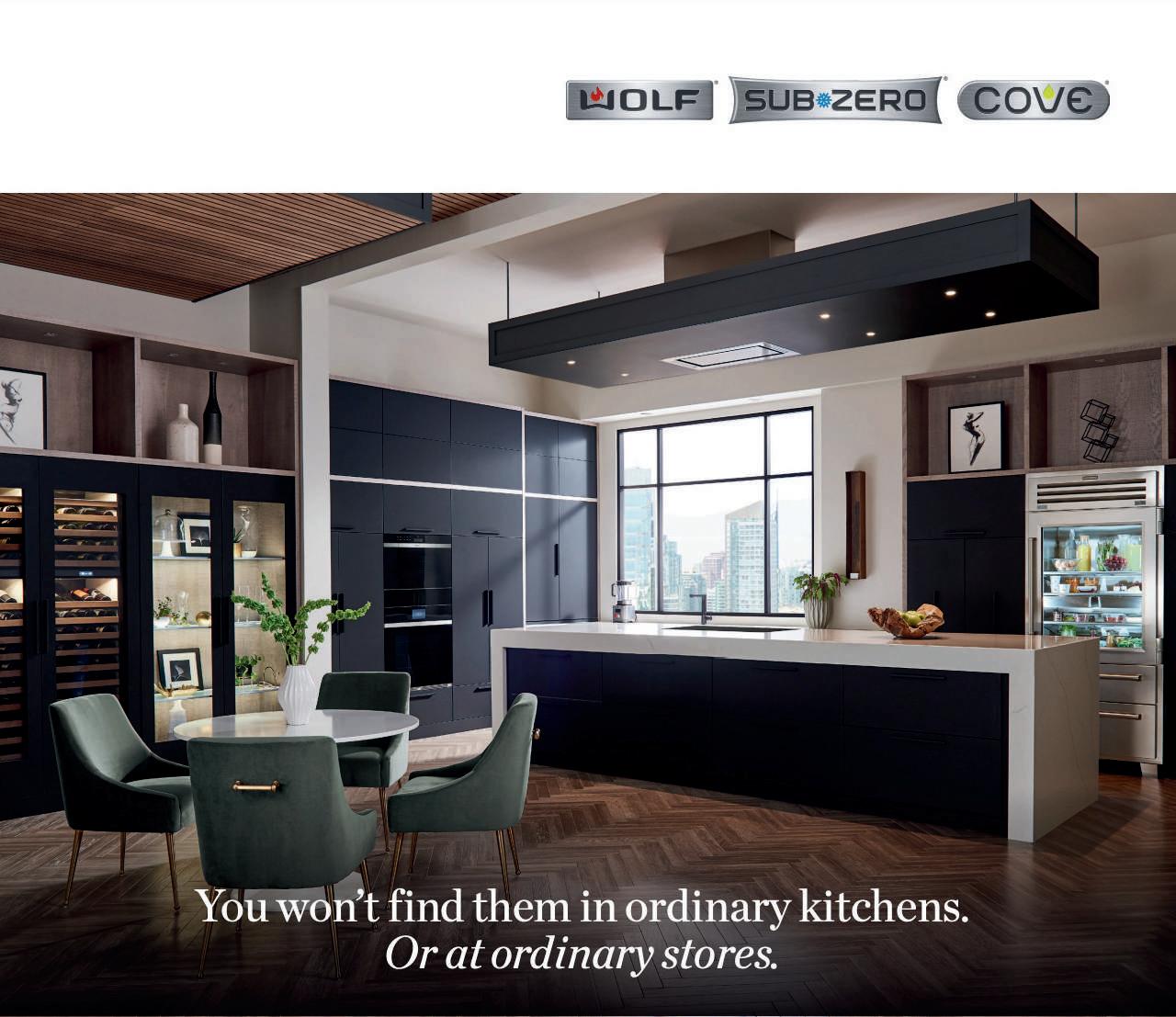

Sub-Zero, the preservation specialist. Wolf, the cooking specialist. Cove, the dishwashing specialist. Find them exclusively at The Luxury Kitchen.
Sub-Zero, the preservation specialist. Wolf, the cooking specialist. Cove, the dishwashing specialist. Find them exclusively at The Luxury Kitchen.
Sub-Zero, the preservation specialist. Wolf, the cooking specialist. Cove, the dishwashing specialist. Find them exclusively at The Luxury Kitchen.

540 N La Cienega Blvd.
West Hollywood, CA
540 N La Cienega Blvd.
323-417-5881
540 N La Cienega Blvd.
West Hollywood, CA
Monday — Friday: 9am — 6pm
323-417-5881
West Hollywood, CA
Monday — Friday: 9am — 6pm
323-417-5881
Monday — Friday: 9am — 6pm
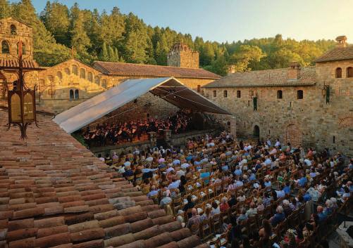
Festival Napa Valley, recognized for transforming California wine country into a cultural destination, has an exciting lineup for its 2024 Summer Season, July 6-21. Featuring innovative classical, jazz, contemporary, opera and dance productions paired with Napa Valley’s unparalleled food, wine and hospitality, the lineup offers something for everyone. The Festival’s signature celebration of exceptional food, wine and music is set to take place on the Heritage Resort’s Grand Reserve lawn on Saturday July 13. Lionel Richie will headline the arts gala on July 14. Other highlights include tributes to Sophia Loren and Henry Mancini, with more than 60 concerts and events at iconic venues throughout Napa Valley.
For more information, visit festivalnapavalley.org
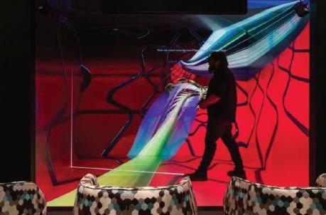
Three of Santa Monica’s leading cultural institutions; Bergamot Station Arts Center, Santa Monica College and 18th Street Arts Center in collaboration with other art venues present a new, innovative six-month long festival that celebrates the synthesis of art and science by focusing on the diverse and fascinating works of digital art. There has never been a time when and art and technology were not synergistically intertwined. DNA Festival Santa Monica delves into the very ethos at the heart of this creative love affair. ‘DNA: 4th of 4, 1st of Many’ group exhibition at the Barrett Gallery. Celebrate a 40-year survey of over 20 artists at the intersection
of art and science. Join Bergamot Station Arts Center in their 30 Year Anniversary Celebration and accompanying DNA shows on September 7th. And for the finale on November 21st, in collaboration with University of Nebraska Medical School’s advanced imaging and holographic laboratory–Alina Kalinouskaya dancer and concept artist, along with producer Dr. Gregory Carpenter will be conducting and transmitting a long-range performance.
For more information, please visit dnafestivalsm.com
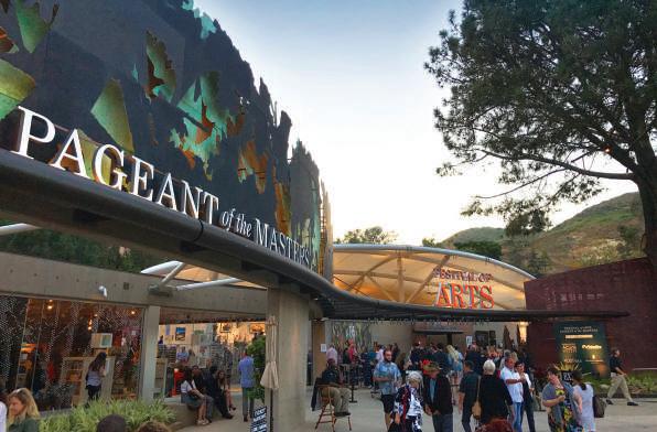
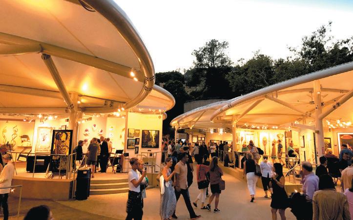
Set in a beautiful open-air gallery, the Festival of Arts is a highly acclaimed juried fine art show featuring the work of over 100 award-winning artists. From paintings, glass, ceramics, photography and more, the Festival of Arts showcases a variety of mediums and artwork styles for avid collectors and festival goers to browse and purchase directly from the artists.
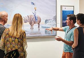
In addition the artwork on display, visitors may enjoy art demonstrations, live music performances, art classes, special events and more. The Festival runs July 3-August 30, 2024.
The location is 650 Laguna Canyon Road, Laguna Beach. For more information, visit lagunafestivalofarts.org or call 949.494.1145.


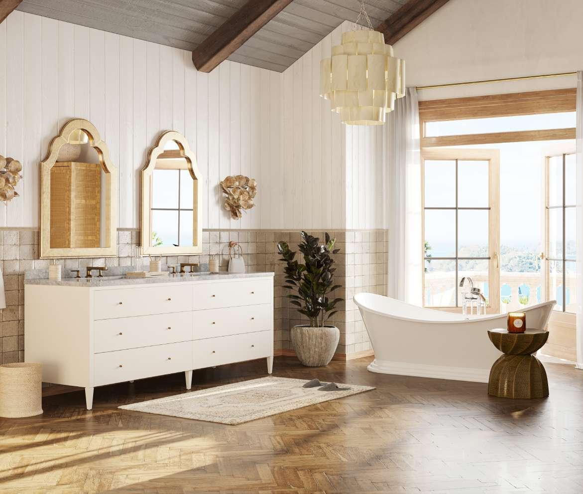
Premade Vanities | 6-Collections | Ready to Ship | Multiple Finishes
Hardware Options | Freestanding or Wall Mount
Countertop Options | Single or Double Basin

Author Michael Webb, almost a legend in Southern California for his encyclopedic knowledge of architecture, has penned this compelling, illustrated journey through 36 unique houses built in the past decade that capture the spirit of California. Included with the dramatic images of the houses are floor plans.
As Webb says in the Introduction,”Nearly all were shaped by a dialogue between owner and architect, as well as site and budget. Large or small, urban or rural, they demonstrate the extraordinary range of invention emerging from established and younger architects.”
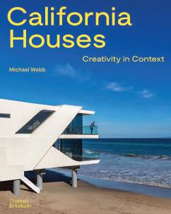
The houses are grouped in three thematic sections: Engaging Nature, Weaving the Urban Fabric and Viewing Town & Country. Each home has its own personality, though most are characterized by a free flow of space, abundant natural light and openness to nature.
In California, a high level of sustainability is mandated by progressive legislation. This is reinforced by the desire of architects and owners to do the right thing.
Notable for the diversity of homes it presents, California Houses will inspire anyone interested in both modern architecture and the draw of California living. CH
California Houses: Creativity in Context
Text by Michael Webb
304 pages, 345 illustrations Hardcover
$65 US
ISBN: 978-0500027127 Thames & Hudson
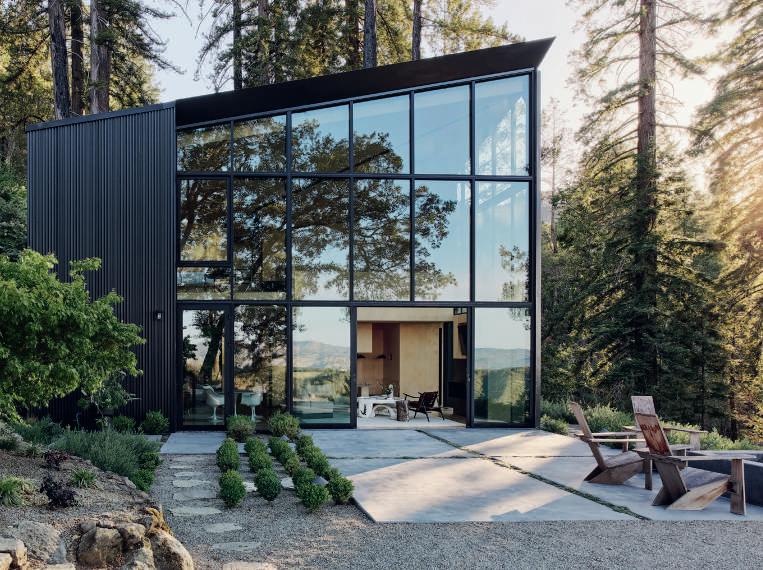
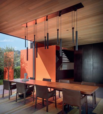
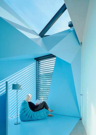
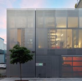
ABOVE Mount Veeder Outpost in Napa County was designed by Atelier Jorgensen.
RIGHT Olson Kundig designed Collywood in West Hollywood. This house could be described as kinetic sculpture.
BELOW Ogrydziak Prillinger Architects (OPA) created this hidden house in San Francisco behind a cedar-wood windscreen.
BELOW RIGHT Veev Design created this Light Box house in San Francisco. This is a house of layers, from the internal shear walls to the transparency of the glass enclosed bedroom.
Text by Grant Kirkpatrick and Duan Tran
Foreword by Mayer Rus
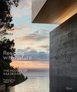
This monograph of recent houses by a leading California architecture and landscape firm, KAA Design, celebrates sophisticated modern living and that ethereal California dream. Here Grant Kirkpatrick and Duan Tran of KAA Design share their process for creating personal environments that conform to each client’s lifestyle and setting.
As Mayer Rus writes in the Foreword,”There is nothing superficial about the relationships of KAA’s houses with their surroundings. The buildings are deferential to their sites while also standing out, enhancing their natural environs, a respectful meeting of equals. Houses grow from their sites as trees grow from rock and soil.”
These stunning houses exemplify why California is important in modern living. The houses are inspired by early California modernism and Asian traditions. The Strand in Manhattan Beach rises out of a berm of sea grasses; the Tree House is nestled in an array of mature cork oaks, rare Torrey pines and Southern magnolias. Multiple views of each house and plan give readers inspiration.
As Grant Kirkpatrick says: “We see ourselves as perpetuating and morphing the modernism that started with Wright and his disciples… California modernism has so much to do with relationship with nature.” And this book illustrates their dynamic connection to nature and provides ideas to dream about. CH
Residing with Nature: The Houses of KAA Design
Text by Grant Kirkpatrick and Duan Tran
Foreword by Mayer Rus
256 pages, color illustrations
Hardcover, 10 x 12 inches
$65 US
ISBN:978-0-8478-9957-9
Rizzoli New York
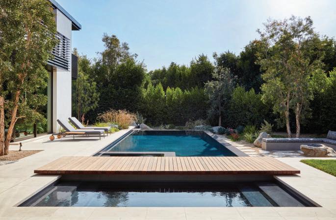
LEFT This Santa Monica house has a wooden bridge crossing the pool. A lush garden of Mediterranean trees and succulents fans the pool.
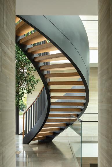
ABOVE Enveloping a tree, a curving steel-and-wood staircase sweeps upward in this South Bay Retreat which overlooks the Pacific Ocean.
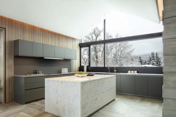
BELOW In Aspen, Colorado, this residence, without compromising its modernist principles, speaks the language of a contemporary ski chalet.
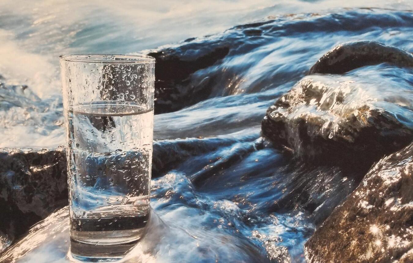

• Your family is faced with a new and serious threat in household water
• PFAS and PFOS “Forever Chemicals” are in our tap water and do not dissipate. These toxins cause serious illness, cancers, liver disease, low fertility and birth weight and more
• The EPA has confirmed 89.3 million people throughout the U.S. have tap water testing positive for the toxic “Forever Chemicals”



SALT-FREE CONDITIONING
No more slimy, off-me feeling. the environment.
Water Visionary in Orange County for 37 years - Rick Allen, CEO of Pure Elements, Inc.
Water Visionary in Orange County for 45 years - Rick Allen, CEO of Pure Elements, Inc
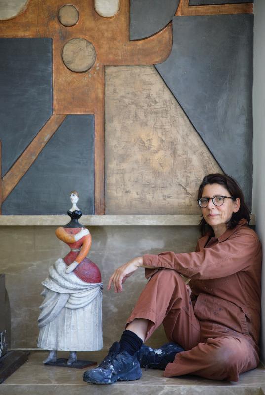
PRONOUNCED GEOMETRIC SHAPES organic-looking, intuitively formed—and reverence for the inherent beauty of raw materials are the cornerstones of Katrien van der Schueren’s site-specific wall sculptures and custom interior work. With lively, abstract expressionist lines and incredible surface textures, her large-scale dimensional murals in clay, plaster, concrete and metal have a brutalist character that’s similarly rough-hewn and monumental but, as van der Schueren puts it, is “more poetic and warm—there’s always a softness.”
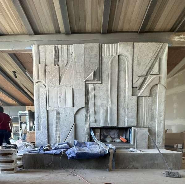
ABOVE “Architectural context shapes my work,” says van der Schueren about what influenced this bold, brutalist fireplace surround made in concrete and clay (shown prior to receiving its black plaster finish).
The Los Angeles–based sculptor grew up in Belgium and France surrounded by artists and lived in a household where, “if you wanted something, you had to build it yourself,” she explains. All grown up, van der Schueren lives by the same example. After establishing a successful art framing business and custom furniture fabrication studio (both still operate out of her vast warehouse complex near West Hollywood), the artist decided to focus on her greatest interest: sculpting her own creations vertically, directly on the wall in situ.
“Materials-driven” is how van der Schueren classifies her aesthetic, and she often devises her own palette, mixing clay with plaster or bio resins depending on the need. “I make my own formulas,” she reveals, including a custom concrete-based clay she can apply vertically because it dries quickly. In this aspect, her work is performative and embraces improvisation. “I start with a drawing, but most often it changes in process,” she explains. “I’m guided by what the clay wants to do and the environment I’m working in.”
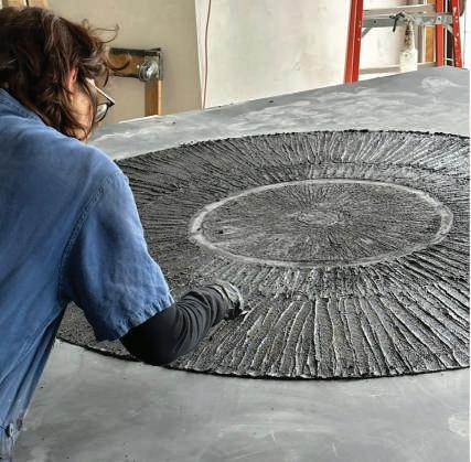
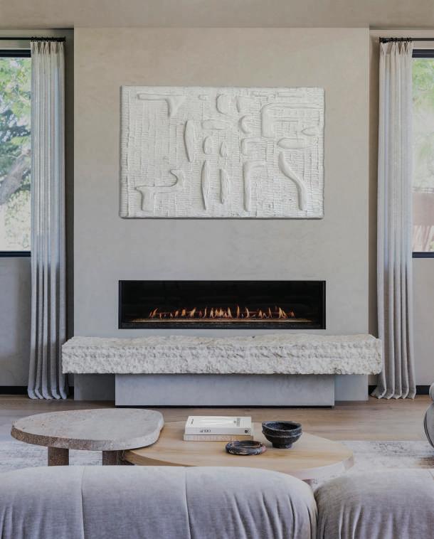
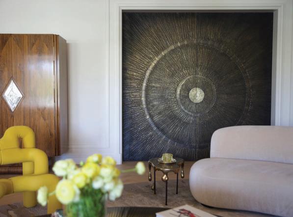
ABOVE/BELOW In her Los Angeles studio, the artist puts countless hours of hand-sculpting into a bronzed patina. Her spare, all-white mural for a living room adds organic texture and asymmetrical geometries to the minimalist space.
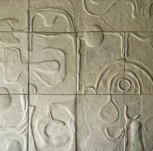
ABOVE There’s always a layer of fine detailing to appreciate up close. “I think about how the piece looks from every angle,” says van der Schueren.
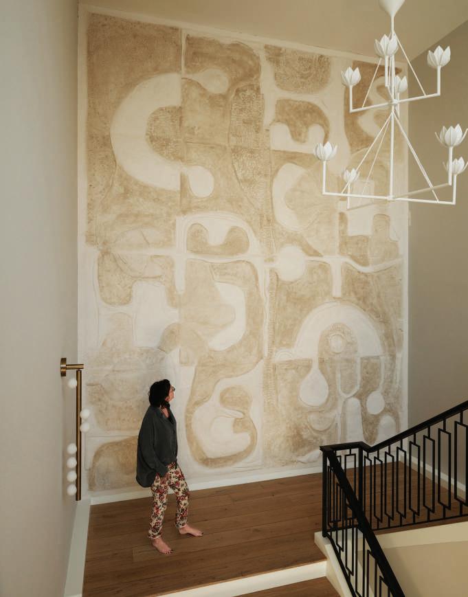
LEFT A gigantic wall piece in Venetian plaster commands the foyer of this Los Angeles home.
BOTTOM LEFT Liquid bronze over plaster gives visual heft to a pair of pocket doors while keeping them light enough to slide.
For example, van der Schueren’s original design for a massive fireplace surround evolved while she hand-sculpted it over the course of three weeks amid the home’s stark, minimalist surroundings. “I felt the intense need to start curving my lines to counterbalance the home’s angular architectural style.” The same is true of another hefty wall piece, which, made for an outdoor kitchen space, was conceived as a clean field of all white but ended up exuding an earthy, warm Primitivism more attuned to the setting, with charcoal and burnt orange pigments and liquid bronze accents.
For larger commissions, van der Schueren builds the work vertically in her studio in panels then seams it together on-site with additional handfinishing. Such was the case in creating a gigantic piece for a grand stairwell landing beneath a sky light in a longtime client’s home. A combination of finely detailed concrete and plaster molded over hardwood panels (“I used a Venetian plaster finish that has a bit of shimmer to it,” she says) the 20x15 foot mural flows with shifting light and shadow. No matter the context or application, van der Schueren finds energy and artistic truth in the element of risk. “It’s an intense thing to sculpt directly on the wall—there’s limited time to shape the material, so having complete creative control over the work is key to its success.” CH KVDSART.com
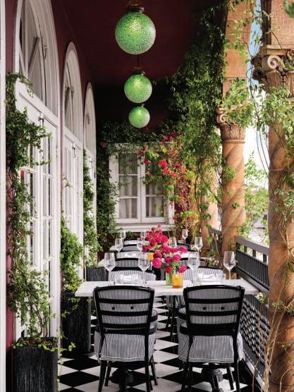
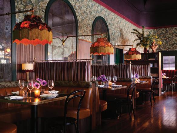
CHECKER HALL, the former Masonic Hall serving the Highland Park community for over one hundred years, has received a seductive refresh that fits perfectly with the creative neighborhood. Celebrity designer Martyn Lawrence Bullard incorporated the history of the building into his thoughtful design. The shape of the bar was inspired by the building’s former life as a Masonic Temple, with beautiful details–bespoke lighting and luxurious backend bar seats. The walls are covered in wallpaper, Royal Fernery, designed by Bullard for Cole & Sons; it complements the clubby fluted wood paneling, rich
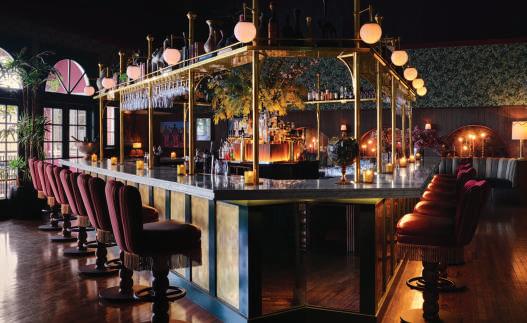
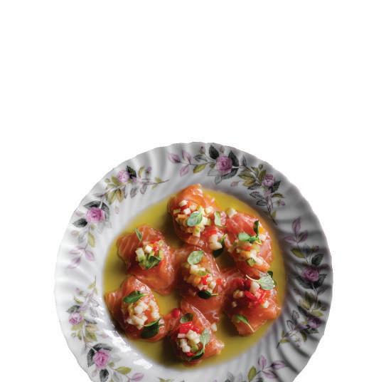
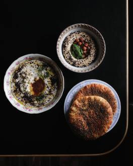
color palette, and plush velvet banquettes. Towards the front of the restaurant is a space for live music that adds to the ambiance. Then, you step out to the terrace, a light-filled space filled with lush greenery and flowers for a quaint and relaxing setting. The rotating menu is Levantine-inspired repertoire of shared plates and entrees seamlessly cultivated by Chef Gabe Kennedy’s worldly travels, which include Whipped Feta, Kingfish Crudo, Burrata with fig preserve, caramelized honey, and lemon, and French Fries with Harissa Aioli. Signature skewers: spiced chicken with gremolata, fresh herbs and chickpeas, a chili garlic maitake mushroom, King Salmon, and Flaming Cheese; a wide selection of vegetable dishes with Mediterranean flavors, Harissa, lemon, and honey; and larger plates including line-caught Black Cod, whole Branzino, show stopping Chicken Schnitzel, Steak Frites served au poivre and last but not least, the Checker Hall Burger with pastureraised beef topped with Gruyere. CH 104 North Avenue 56, 2nd floor, Highland Park, 323.826.7367, checkerhall.com

NEW TECHNOGYM RUN. The training experience that paves the way to a healthier future.
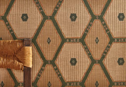
A geometric grass cloth shown in green/ochre, inspired by Tuareg reed rugs, reflects the well-traveled eye of the designer Peter Dunham.
Available at his Los Angeles showroom, Hollywood at Home, and several showrooms nationwide. peterdunhamtextiles.com
A Selection of Products that Caught our Discerning Eye that will Elevate the Look of Any Room
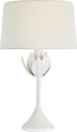
The Alberto cordless lamp designed by Julie Neill has a rechargeable LED light source with a touch dimmer. Perfect for dressing up outdoor seating areas and tables for warm-weather dining. visualcomfort.com
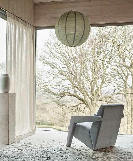
The chair is covered in Antoinette fabric in Maya, a plush and decadent velvet made of 100% kid mohair. The Glacier rug in Fiji plays off the contrast of the silk pattern over a wool base. Beautiful Alpaca linen sheer drapes in Breathless.
Available in Los Angeles and Laguna Niguel at thomaslavin.com and in San Francisco at desousahughes.com, rosemaryhallgarten.com
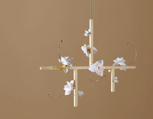
The Lure Collection chandelier and pendant are made of hand-cast leaves and flowers. Each fixture is unique and can be customized with different sizes, finishes, and flowers. Available at gardeshop.com, pelledesigns.com
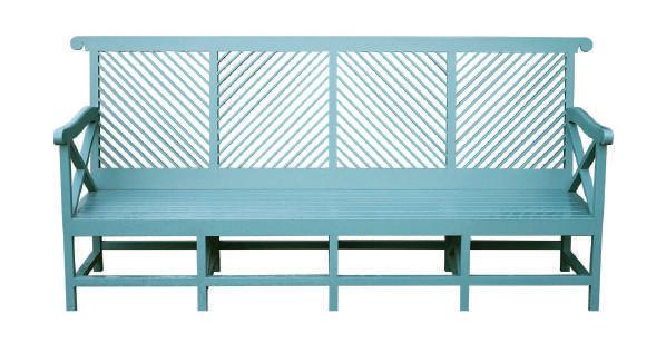
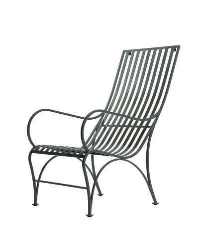
Renowned for their commitment to research, curation, and artisanal craftmanship, Munder-Skiles furniture are legacy pieces to keep for generations. The Almodington Bench, painted powder blue, is a meticulous replica of the original four-panel bench that is considered one of the earliest garden benches in America.
The Swan Lounge Chair, painted Sweden green, was inspired by a wooden chair crafted by the Adirondack sled company. With a dedication to ergonomics, crucial elements for posture and comfort have been incorporated. munder-skiles.com
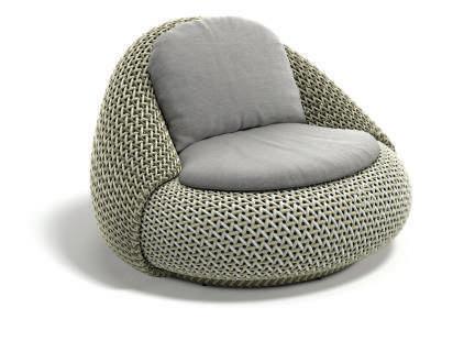
The new collection from Dedon is inspired by nature and ergonomically designed for comfort.
Designed by Stephen Burks, the Kida Lounge Chair is an open and airy wrapped organic form.
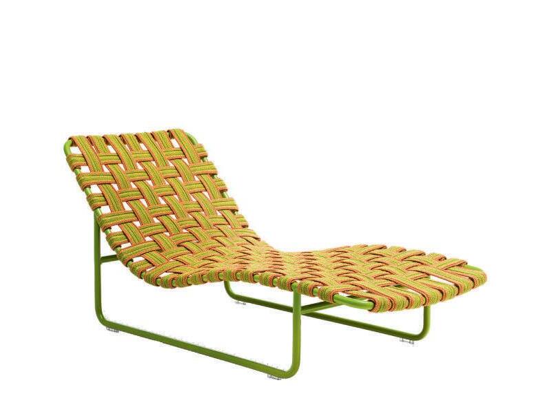
The Atolo Lounge Chair, shown in Spring Mist, designed by Claudio Bellini, has natural curves made of a weave in three harmonious colors.
Available in Los Angeles at the Pacific Design Center in their flagship showroom, dedon.de, and in the San Francisco Design Center at dunkirksf.com
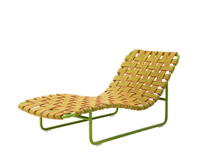
The Baleari 3 lounge chair has an aluminum structure available in several finishes, fixed and hand-woven, with two color elastic belts in rope yarn.
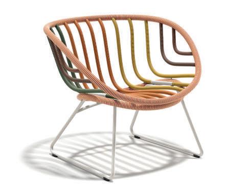
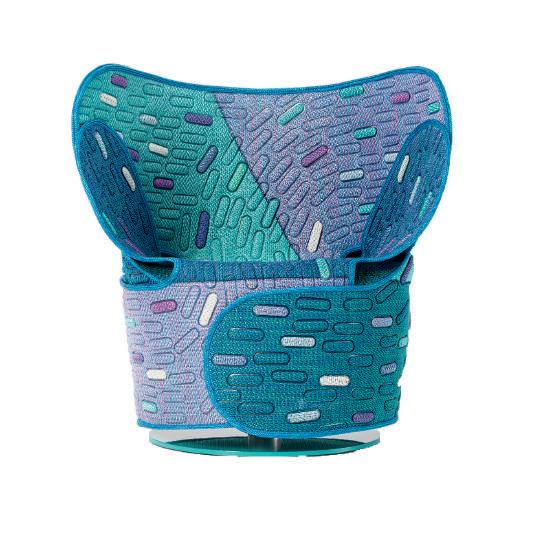
The Hana-arashi armchair, designed by Nendo, combines the Japanese relationship with nature with the Paola Lenti Mottainai series of collections, which embody the ethos of waste not. The materials used are repurposed from Maris cutoffs. Available in Los Angeles at robinabenson.com, paolalenti.it

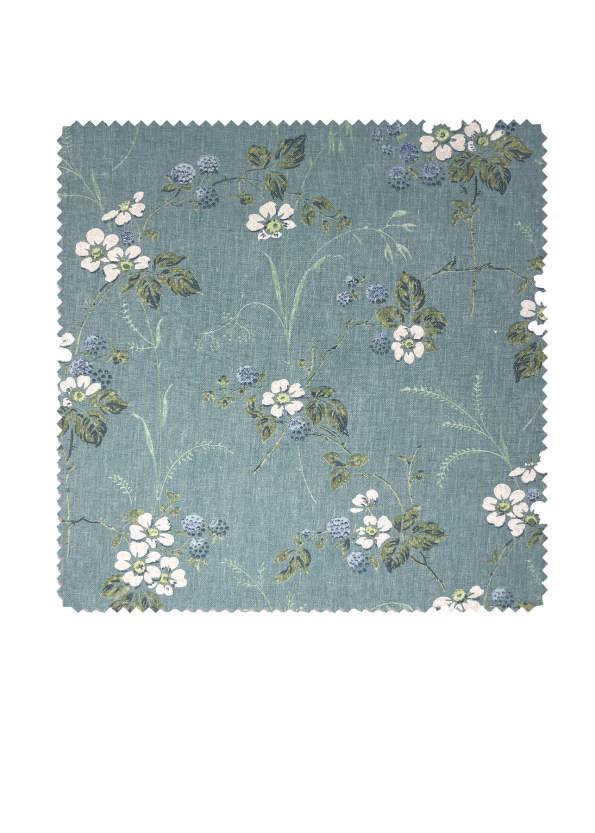
INTERIOR DESIGNER AND COOKBOOK
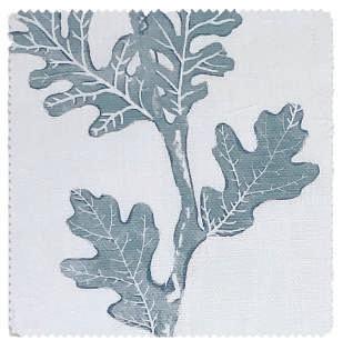
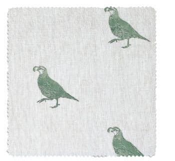
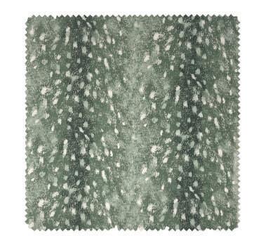
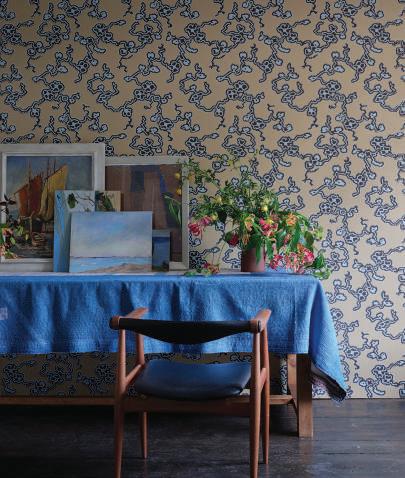
author Nathan Turner is the voice of California’s relaxed and refined style. His love for the terrain and beauty of the state directs his design, and he has launched his first fabric collection inspired by his childhood memories of his family ranch in the foothills of the Sierra Nevada. “I translated all of my wonderful memories of growing up in California into this collection,” says Turner. Classic motifs like chintz, quilting, animal prints, and plaids get a modern makeover in Turner’s hands. Before cottage core was a trend, the designer infused clients’ homes and his own with a relaxed California charm. Now, you can create the same look in your home with over thirty prints, each a homage to the wild and natural beauty of the Golden State. CH nathanturner.com
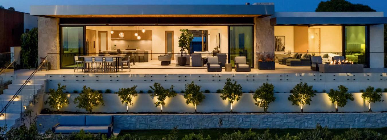
ADG IS ONE OF THE BEST kept secrets in the country. And it seems that the best-of-the-best keep ADG on speed dial. Projects range from traditional to modern with a pen stroke and ink wash by founder Gerald Oleskerand his team. From curbside to pool side, the architectural approach is integrating the metal works as if they are part of the architectural experience with design and fabrication essential to the experience. This Brandon Architects’ home actively engaged the ADG team with the interior designer to sculptand create a seamless vibe. Over 2,000projects worldwide this is the #adgAdvantage that the best-of-the-best collaborate with intention.

 PHOTOGRAPHY BY MANOLO LANGIS

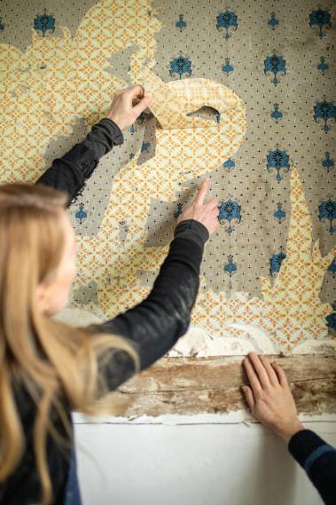
A NEW COLLECTION from Farrow & Ball inspired by patterns discovered during a renovation of the Chateau de Purnon nestled in the French Loire Valley. Creative Director Charlotte Cosby has reimagined the patterns to transform both modern and traditional spaces. She said, “When I first saw the original patterns, I was just blown away. They’re so beautiful and intricate that it’s astonishing to think they’d be tucked away and forgotten for all those years. It was like discovering a treasure trove that I could not wait to share with the world.”
LEFT Achard pattern is a modern interpretation of the pattern pictured below. Shown in White Tie No. 2002
MIDDLE Discovering layers of forgotten wallpaper at the Chateau du Purnon that became the inspiration for the new collection
BELOW Barace was discovered in the attic but originally crowned the bed of Madame de la Barace’s mother. Shown in Wine Dark No. 308, Lobster No. CB7, and Drop Cloth No. 282
Farrow & Ball Presents a Collection Inspired by Wallpaper Discovered in a French Chateau Under Restoration in the Loire Valley
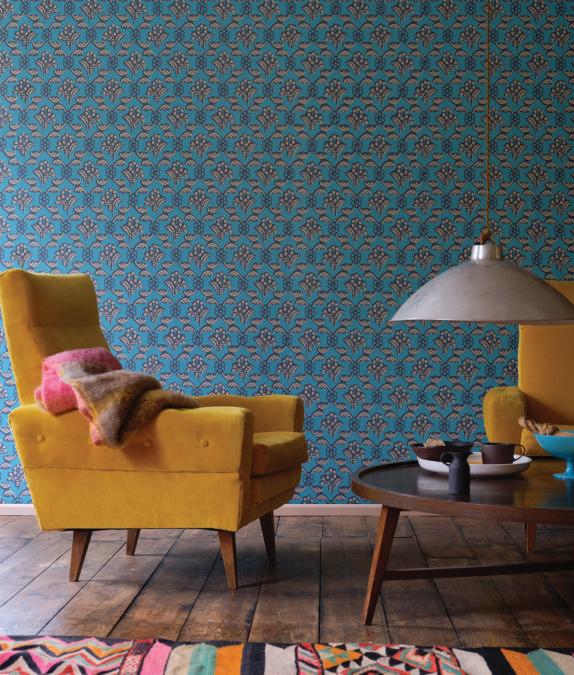
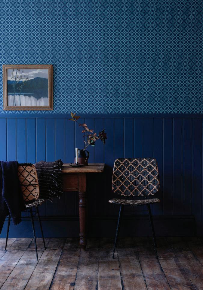
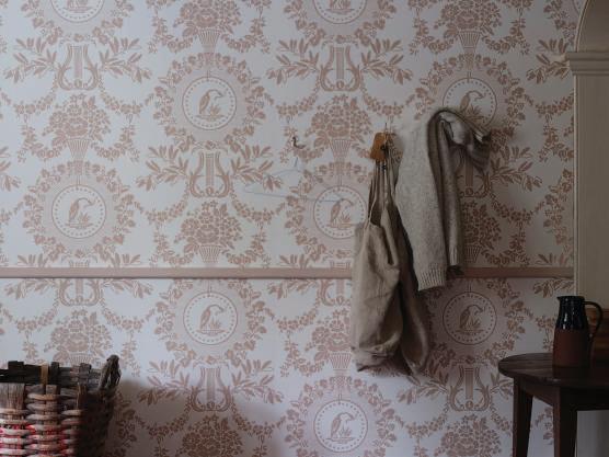
LEFT Archard was named after the noble family that built the chateau. The original paper was uncovered in a less formal room, the linen press. Shown in Stiffkey Blue No. 281 and Dix Blue No. 82
RIGHT Purnon shown in Off-Black No. 57 and Arsenic No. 214
BOTTOM LEFT Purnon, with a captivating heron motif, makes an elegant statement. This pattern was discovered on an 18th-century folding screen. Shown in Pointing No. 2003 and Setting Plaster No. 231
BOTTOM RIGHT Adelaide was found in the dressing room of the daughter of the family who built the chateau. Reimagined into a bigger, bolder design, it still has delicate charm.
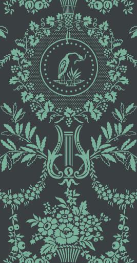
The traditional methods of production used by Farrow & Ball replicate the original papers’ texture, depth, and feel. The new wallpapers are made using roller blocks or flatbed printing with paint, depending on the pattern. The most striking pattern of the collection is Purnon, named after the Chateau. Featuring classical elements that symbolize peace, abundance, and prosperity. In contrast, Adelaide is an abstract floral pattern bigger and bolder than the original inspiration while retaining a delicate charm. CH farrow-ball.com
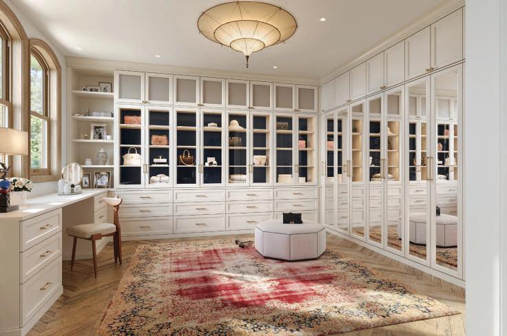
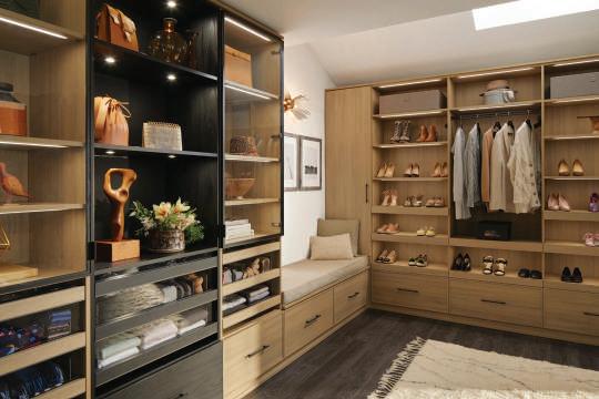
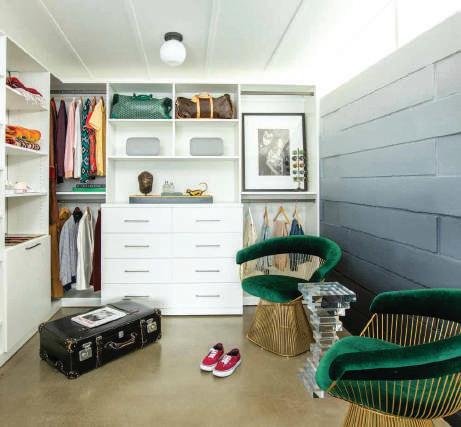
WITH A COMMITMENT to innovation and craftsmanship, California Closets has established itself as a leader in the industry, transforming spaces in homes into organized sanctuaries that reflect their owners’ unique tastes and lifestyles.
But it’s not just about aesthetics; functionality is key. California Closets ensures that every inch of the walk-in is optimized for storage, with cleverly designed shelves, drawers, and hanging rods that accommodate clothing, shoes, accessories, and more. No longer will items be crammed into overstuffed drawers or lost in the depths of the closet; instead, everything will have its rightful place, easily accessible, and impeccably organized.
In essence, California Closets redefines the walk-in closet concept by infusing it with elegance, functionality, and a touch of indulgence. With glass doors, lighting, and plenty of storage, a walk-in becomes more than just a place to store clothes; it becomes a sanctuary—a space where luxury meets practicality, and where dreams are brought to life. CH
Locations throughout Northern & Southern California 800.436.3104, californiaclosets.com
With glass doors, lighting, and plenty of storage, a walk-in becomes more than just a place to store clothes; it becomes a sanctuary—a space where luxury meets practicality, and where dreams are brought to life.

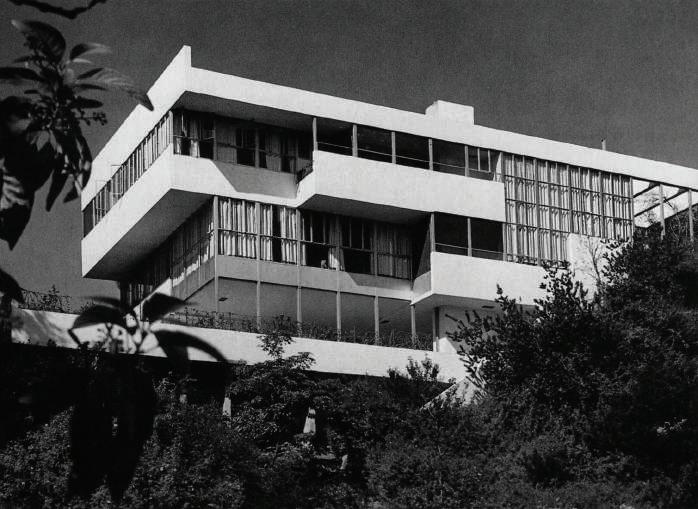
EGA, the partnership of Swiss-born Frank Escher and Ravi GuneWardena from Sri Lanka, are both inventive architects and custodians of Los Angeles’ rich legacy of modern houses. Working from their office in Silver Lake, they’ve restored a succession of classics including John Lautner’s iconic Chemosphere in the Hollywood Hills and the steel framed house that Charles and Ray Eames built for themselves in Pacific Palisades. The international art dealers Iwan and Manuela Wirth commissioned EGA to restore the Lovell Health House, Richard Neutra’s 1929 masterpiece perched on a hillside overlooking Griffith Park. This is a work in progress, along with the house that Lautner built
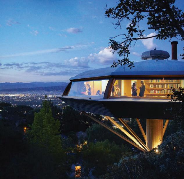
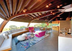
ABOVE John Lautner’s Chemosphere House (1960) overlooks the San Fernando Valley. Commissioned by an engineer, it was restored for publisher Benedikt Taschen. Photos (c) Josh White
LEFT Gregory Ain’s Greene House (1952) in Silver Lake was destroyed by fire, meticulously recreated by EGA, and furnished by the owner. Photo (c) Janna Ireland for himself in 1939 when he first moved to LA.
There are so many vintage modern houses in southern California that a cottage industry of restoration experts has grown up to conserve and renew them for a new generation of owners. What distinguishes EGA’s work from that of many other LA practitioners is their fidelity to original plans and details. As Escher observes, “Before touching anything we will spend several months exploring archival and print material while interviewing experts on the system of construction. Architects

need to absorb all the subtleties of the work they are restoring and channel the spirit of its designer.”
GuneWardena shares that concern, “Unless it’s broken, we see no reason to replace it,” he says.
One of EGA’s favorite architects is A. Quincy Jones. They restored the 1948 demo house that he built to promote the Crestwood Hills Housing Association and the luxurious Tyre house in Holmby Hills. There, the challenge was to tidy up a warren of private spaces that later owners had created and open up the public spaces that were originally designed to conceal servant areas.
The firm is completing work on the house that Paul Williams, a pioneering Black architect, built for his family in 1952 in the Lafayette Park district of midtown LA. Much of his archive was destroyed in a fire but plans for the house were discovered in the Getty Archive, rolled up with drawings for a later project. EGA investigated the walls and recreated a rich palette of greens—Williams’ favorite color— that had been whitewashed.
Another victim of fire was the Greene House that Gregory Ain built on a slope above Silver Lake. Completed in 1952, it was gutted in 2018, leaving only one wall and part of the roof. The present owner was deeply attached to the home she had lost and commissioned EGA to recreate it. Blueprints were badly scorched but EGA discovered that the plan was based on a show house that Ain designed two years earlier for the MoMA garden in New York. Based on this and careful measurements of the ruins, the architects did a meticulous recreation of the two-story house with its butterfly roof. Ash screen walls and cabinetry layer the living spaces and the owner made a judicious selection of furniture. There’s a joyous exuberance in the way that every element of the house flows into the next, while giving every space a pleasing intimacy. CH
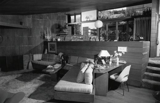
ABOVE John Lautner’s sketch and the original interior of the house he designed for himself in Silver Lake soon after his arrival in Los Angeles in 1939. Images courtesy Getty Research Institute
BELOW Richard Neutra’ Lovell Health House (1929) in Los Feliz is a masterpiece, currently under restoration for the Swiss art dealers Iwan and Manuela Wirth. Photo: Julius Shulman Archive, (c) Getty Research Institute
“Architects need to absorb all the subtleties of the work they are restoring and channel the spirit of its designer.” GuneWardena shares that concern, “Unless it’s broken, we see no reason to replace it.”
– FRANK ESCHER & RAVI GUNEWARDENA
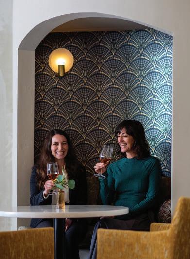
SHAWBACK DESIGN chose a palette inspired by vineyard fruit varietals from Alpha Omega Collective for its tasting lounge in downtown Napa. The designers collaborated with Centric General Contractors to expand and upgrade the collective, which separates into two spaces: an existing dark wood bar reclaimed from the Wine Spectator Magazine’s Victorian-style headquarters and a bright new tasting room annex. Shawback installed a classic two-tiered ring chandelier composed of hand-blown glass to contrast with the coffered ceilings in the bar.
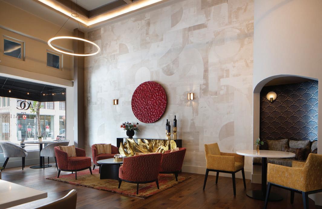
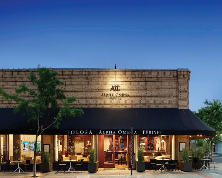
LEFT Napa’s Mediterranean climate encourages guests to linger outside. Shawback selected functional white tables designed by Konstantin Grcic paired with Vondom’s black Africa Chairs.
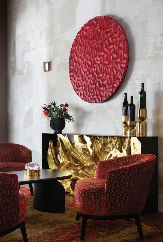
BELOW The jacquard velvet’s modern geometric motifs on the tub chairs mimic the wine-colored wood wall disk’s carving.
BOTTOM LEFT Shawback chose a statement piece for the console. A teak root is cast in resin to immortalize its natural beauty and then finished in gold leaf.
Phillip Jeffries’ tone-on-tone ivory collage wallcovering creates the backdrop for the collective’s new tasting room. A focal seating group centers on a red wall disk carved from wood by artist Joseph Graci, mimicking the end of a cork stained with red wine; it surmounts a gold and black console cast from a tree trunk. Minimalist lounge chairs sourced by Shawback in Northern Portugal and upholstered in Casamance’s brick-colored jacquard velvet provide the perfect place for wine tasting. A seating nook displays a night-colored art deco-inspired wallpaper inset with dining chairs covered in a rich amber grospoint. CH
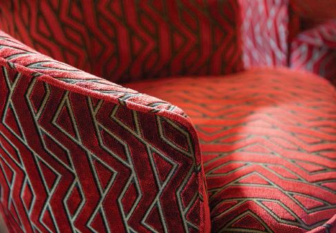
OPPOSITE TOP A lunar-shaped alabaster Halette Wall Sconce glows against Astek’s dark blue and silver wall covering, evoking a night harvest.
OPPOSITE BOTTOM A modern circular pendant with ambient light echoes the wood wall disk and dining table shapes. Shawback anchored the seating group with a contemporary Tibetan rug.
Without Forfeiting Functionality, the Kitchen has Become the Space Where Fashionable Design Trends Converge
BY ROGER GRODY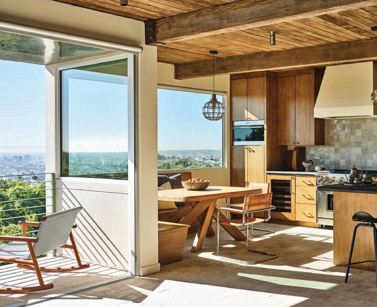
FUNCTIONALITY has always been a priority in kitchen design, but the once-exclusively utilitarian space has now morphed into a showplace for chic aesthetics. The newfound glamour of the kitchen is reinforced by open floorplans that put the “heart of the home” on permanent display. The kitchen, however, has maintained the multifunctionality it adopted during the pandemic, accommodating homework, videoconferencing and entertaining. With food preparation only part of the equation, designers are combining elevated aesthetics with state-of-the-art performance.
The National Kitchen + Bath Association (NKBA) reports the monochromatic white kitchen is fading from the scene. But unlike avocado green or harvest gold from the ’70s, contemporary kitchens are splashed with rich saturated colors. An NKBA survey reveals that changes in the use of color, primarily to introduce a sense of nature and wellness, is the most prominent forward-tracking trend. Designer Morgan Newfield, who suggests greens are now eclipsing overused blues, observes, “Clients are no longer afraid to mix cool and warm colors.” Celebrity designer Martyn Lawrence Bullard adds, “People want to experience joy in their environments, so monotonous interiors are being banished in favor of expressive colors.”
NKBA survey respondents still favor easy-tomaintain minimalist settings, but designers are incorporating natural materials to mitigate any sense of austerity. Modernism is tempered by traditional architectural details that contribute to an inviting, nostalgic vibe. “There’s a noticeable push toward traditional elements, which are being layered back into designs, but in a fresher way,” says Meredith Gullion of Cooper Pacific Kitchens. Echoing another NKBA survey finding, designer Kristi Will reports, “There’s strong interest in sustainability, but especially in kitchens that accommodate indoor-outdoor living.” On these pages, some of California’s premier kitchen designers blend functionality with glamour. CH
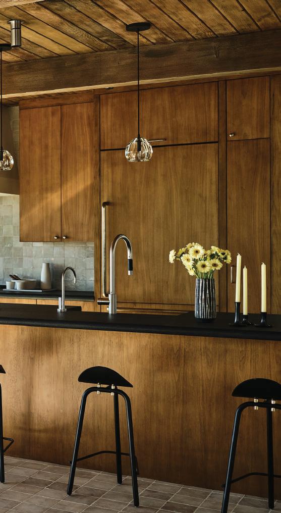
In a mid-century residence in Los Angeles’ Los Feliz neighborhood, Newfield Design created an elegantly rustic kitchen that suits the home’s heritage and hillside setting. “The client, a young executive, was interested in having the home pared-back but tricked-out, while retaining its jewel box quality,” says principal Morgan Newfield. The L.A.-based designer preserved the original Douglas fir ceilings and had her custom-designed cabinetry crafted from warm bleached walnut. Counters are topped in leathered Absolute Black granite and a Native Trails farmhouse sink with a Dornbracht matte platinum faucet is carved into a peninsula. Black leather-lined Castor biker stools from Twentieth provide seating, and handblown glass pendants are suspended from above. Zellige tiles from Zia Tile comprise the backsplash, with a custom pearl-hued hood over a Wolf range. Sub-Zero refrigeration products are integrated into clean-lined cabinetry with white bronze pulls from Rocky Mountain Hardware. Underfoot are limestone tiles, and generous outdoor views reinforce the use of natural materials. Adjoining the main kitchen space is a nook with a Pierre Chapo table acquired in Paris, illuminated by a beguiling vintage pendant. newfielddesign.com
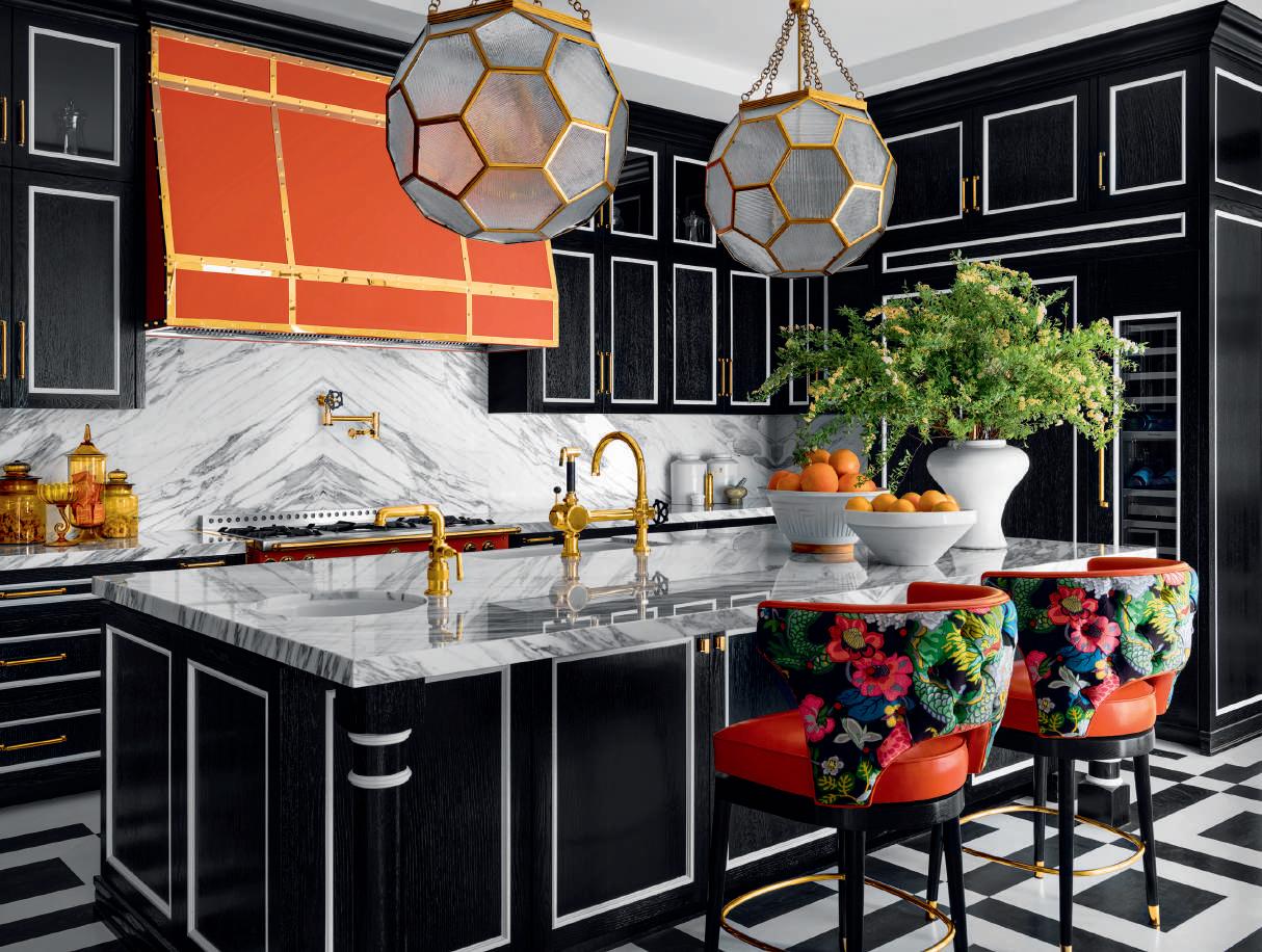
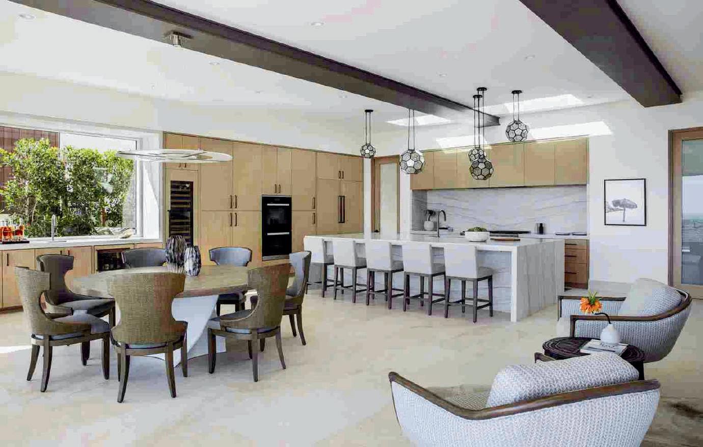
In Beverly Hills, interior designer Martyn Lawrence Bullard created a dramatic Hollywood Regency-style kitchen for RuPaul, one of his many celebrity clients. Accommodating this client’s personality and fondness of orange, Bullard reports, “Ru works from this space and wanted it to feel as luxe as the rest of his home.” Cerused and ebonized white oak cabinetry features white detailing, echoing the blackand white-stained oak floor from the designer’s couture line at Duchateau, while the countertops and book-matched backsplash are layered in richly-veined Arabescato marble. Oversized honeycomb-patterned pendants, Bullard’s design
for Corbett Lighting, hang above an island paired with custom orange stools featuring a flamboyant chinoiserie fabric from Schumacher. Faucets and pot-fillers from Waterworks’ Regulator series introduce a nostalgic industrial quality, and their unlacquered brass finishes complement cabinetry hardware from The Golden Lion. A Michelin chef-worthy La Cornue range—it is painted burnt-orange, one of Bullard’s own custom colors for the revered manufacturer—sits beneath a matching custom hood. The L.A.-based designer’s emphasis on functionality ensures, despite all the glam, that this kitchen is not purely show business. martynlawrencebullard.com
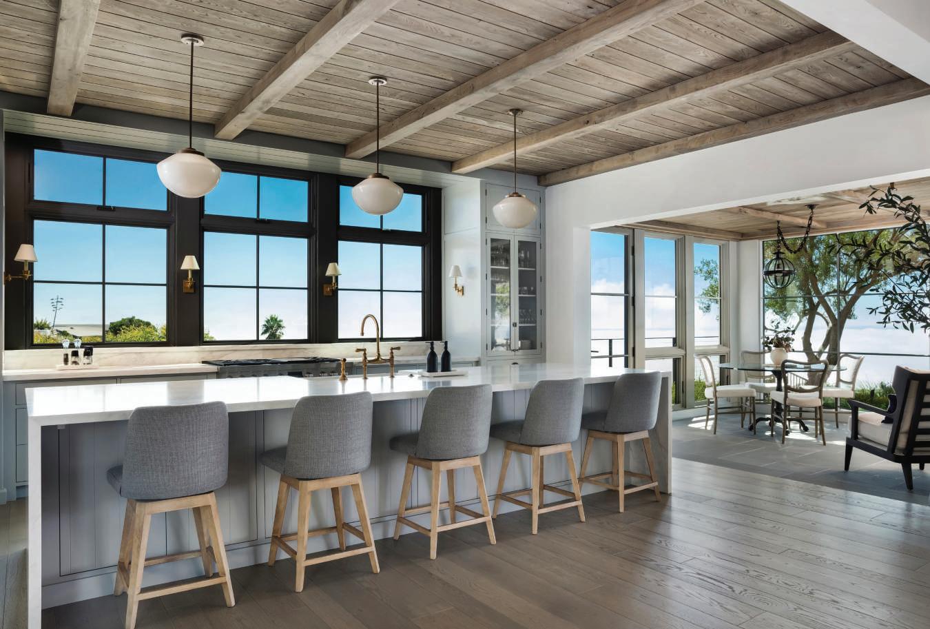
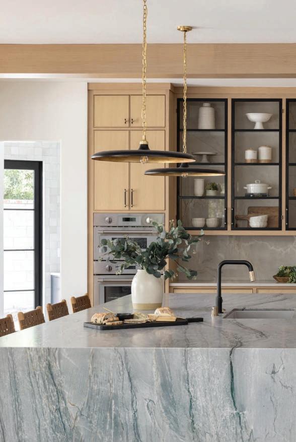
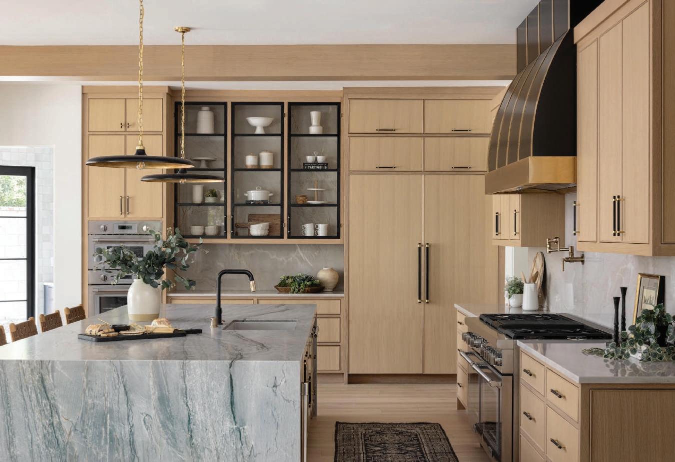
In Rossmoor, Faucets N Fixtures collaborated with Tamara René Designs on a kitchen that is family-friendly yet a showplace for guests. “My kitchens look like pieces of custom furniture,” reports Tamara Avila, principal of Tamara René Designs, whose detailing provides subtle nods to the home’s traditional exterior. Distinctive pendants from Visual Comfort hang over a 12-foot, waterfall-edge island sheathed in quartzite, ideal for entertaining. Combining refined aesthetics with functionality are a faucet and pot-filler from Brizo via Faucets N Fixtures, featuring contrasting finishes. “Pot-fillers are like extra jewelry, but so practical,” explains Avila. A different quartzite enriches
the backsplash and perimeter, and a custom hood sits above a Thermador range, a brand offered by Native Coast Appliance Gallery. Custom cabinetry (with Colonial Bronze hardware from Faucets N Fixtures) mirrors white oak ceiling beams, introducing a nostalgic quality despite a contemporary aesthetic. The cabinetry is punctuated by black metal-framed glass cabinets with stone backing, a showstopper when illuminated. “Our experts were able to assist the designer in executing her vision for this stunning kitchen,” says Joel Warners, CEO of Faucets N Fixtures. faucetsnfixtures.com; tamararenedesigns.com
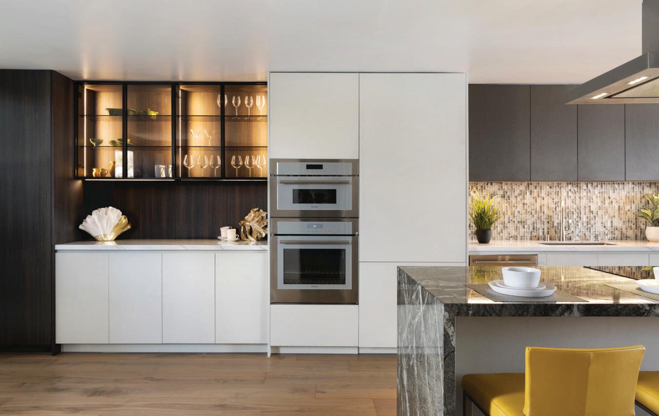
“Clients are looking for natural grains and textures,” says Moon Shirvanian, owner and CEO of Chic Design Group, noting a departure from the sleek, lacquered finishes favored several years ago. For a harborside townhome in Huntington Beach, her firm utilized cabinetry by Modulnova, a fashionable Italian brand exclusively represented by Chic Design Group. Available in a wide range of finishes and colors, these products provide both flexibility and a wow factor, ideally suited to open floor plans. Noting they effectively conceal culinary equipment, Shirvanian explains, “People want a functional kitchen that doesn’t look like a kitchen,” and adds,
“When we use these products in other spaces, it provides a sense of harmony throughout the home.” Designer Judy Stout of Chic Design Group selected a warm eucalyptus finish for pantry and wall cabinets, integrated Thermador appliances into pearl-white cabinets and introduced a bronze-finished section above a mosaic backsplash that provides a traditional accent. A prominent island with waterfall edge is clad in quartzite, while contrasting white marble covers the perimeter. Reinforcing a desirable connection to the outdoors, this kitchen offers breathtaking harbor views. chicdesigngroupco.com
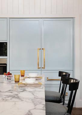
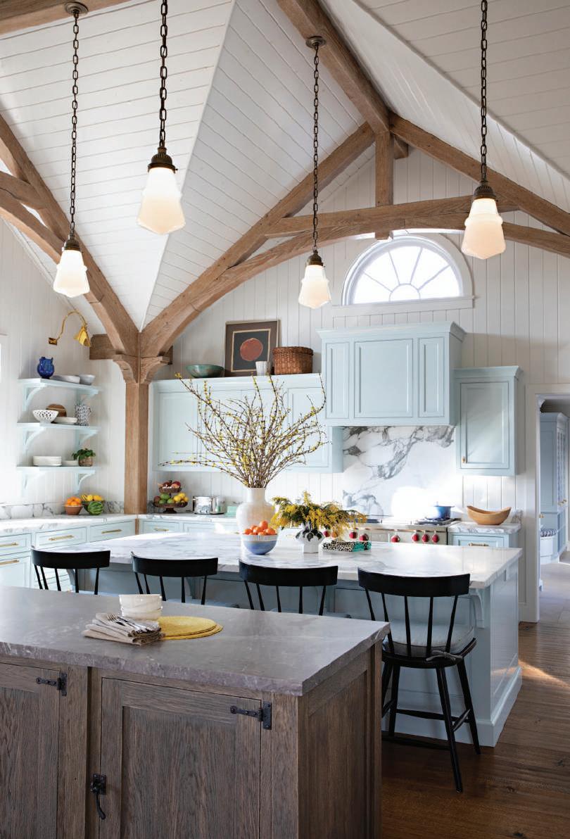
Acclaimed for classically-inspired aesthetics, Evens Architects—its sister firm KAA Design is renowned for modernism—conceived a Colonial-inspired residence in Agoura Hills, built by Bruder Construction. Interior design finishes from West Hollywood-based Lucas Studio honor the architecture, and principal Joe Lucas reports the traditional-themed kitchen is integrated into a soaring great room whose curvilinear beams create a sense of drama. Vertical tongue-and-groove paneling and traditionally detailed cabinetry—the color is an inviting light blue with green undertones—reinforce a vintage-inspired aesthetic. Lucas says of the design choice, “A beautiful color, something other than white, really makes cabinetry stand out.” The backsplash is sheathed in richly veined Calacatta marble, reprised on the perimeter and generously-proportioned main island. A second island, which separates the kitchen and family room, is a custom-stained oak element that reads like a piece of furniture, topped with leathered Mont Blanc marble. Pendants from Urban Electric Co. reinforce a warm, traditional vibe, as do brass sconces by Ann-Morris. A farmhouse sink from Rohl is paired with a Waterworks faucet whose unlacquered brass finish mirrors cabinet hardware from Rejuvenation. evensarc.com; lucasstudioinc.com
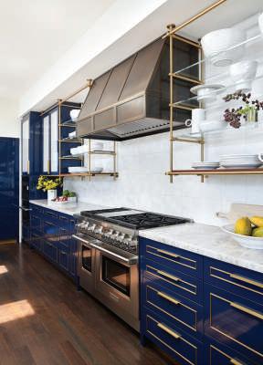
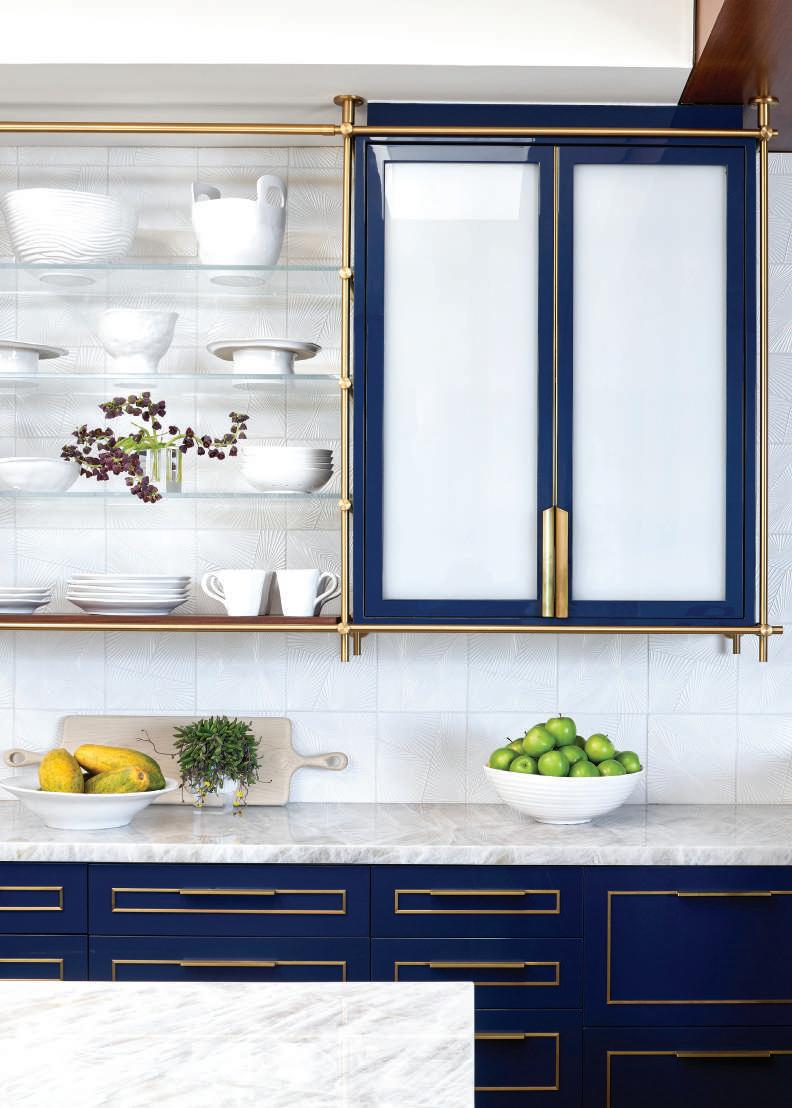
In Manhattan Beach, Half Moon Baybased Kristi Will Interior Design created a kitchen that reflects an elegant fusion of glamour and modernism. “The inspiration was to embrace the crispness of a nautical palette through reflective materials with a depth of color,” says principal Kristi Will, who sought to accommodate the family’s penchant for entertaining. A proponent of color in the kitchen, the designer energized this space through lacquered nautical blue cabinetry—enhanced with hand-patinaed brass detailing and custom hardware—from Amuneal, with some uppers fitted with Bendheim architectural glass. The prominent indigo-stained anegre island and perimeter are sheathed in Cristallo quartzite. “The stone has an illuminating quality that’s almost translucent,” suggests Will. The island is paired with Holly Hunt leather-backed stools from McGuire Furniture, while handblown glass pendants by Lindsey Adelman add elegance. Above a premium Wolf range is a custom bronze-patinaed hood by Amuneal, flanked by a brass-and-glass shelving system from the same artisanal manufacturer. Comprising the backsplash are textured, Kelly Wearstler-designed tiles from Ann Sacks, as platinum-finished faucets by Dornbracht complete this fashion-forward yet family-friendly kitchen. kristiwilldesign.com
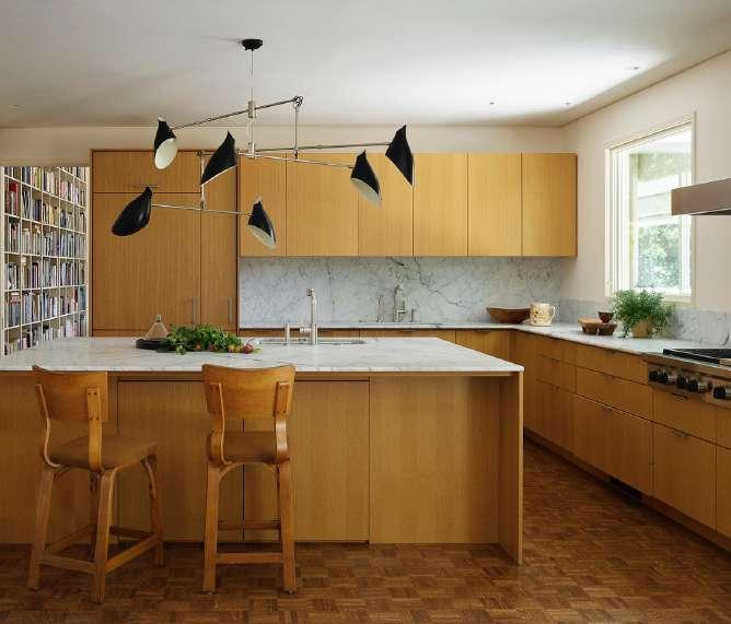
In Woodside—at a home rumored to be designed by architect Cliff May, father of the California ranch house—Butler Armsden Architects introduces a kitchen that respects the home’s modern themes while complementing its equestrian setting. Glenda Flaim, managing principal of the San Francisco firm specializing in luxury residential design, reports her team sought to present a distinctive mid-century modern aesthetic while incorporating natural materials to connect the home to its site. “The clients, serious cooks and entertainers, wanted a place where people could congregate…a comfortable kitchen that’s not too precious,” explains Flaim. The clean lines of custom white oak cabinets by Henrybuilt present a warm minimalism, and the home’s original parquet floor metaphorically connects the space to majestic oaks on the property. The island and perimeter are topped with Carrara marble, as is the backsplash, and faucets from Dornbracht feature a matte platinum finish. A fanciful mobile-esque chandelier by David Weeks Studio anchors the entire space and reinforces a quintessential mid-century modern vibe. Butler Armsden paired a custom stainless-steel hood with an integrated Wolf range, along with appliances from Miele and Sub-Zero. butlerarmsden.com

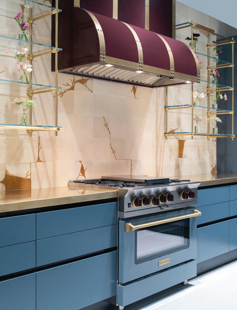
In Los Angeles’ prestigious Hancock Park enclave, five existing spaces were combined to create a new kitchen, infused with both traditional and modern elements. Cooper Pacific Kitchen’s senior designer Meredith Gullion, who collaborated with interior designer Melanie Rechnitz of MR Design, reports, “We felt it was important to honor the home’s architecture,” noting that the stately Tudor-style residence was designed by prominent architect Roland Coate. Gullion cites the kitchen’s coffered ceiling, glazed subway tile backsplash and herringbone walnut floor as elements inspired by the home’s 1928 vintage. Black soapstone with delicate white veining crowns a formidable white oak island, illuminated by a cage-style chandelier by Foundry Lighting. The room’s dark pewter-blue perimeter cabinetry is topped with complementary grey-veined quartzite. The kitchen’s farmhouse sink is sourced from Rohl (as is an island prep sink), paired with polished nickel Waterstone faucets that present a counterpoint to the cabinetry’s aged brass hardware. A custom hood with satin brass and polished stainless-steel accents sits over a chef-worthy BlueStar range, while Sub-Zero and Wolf appliances are concealed within the cabinetry. cooperpacific.com

TEXT MICHAEL WEBB
PHOTOGRAPHY MANOLO
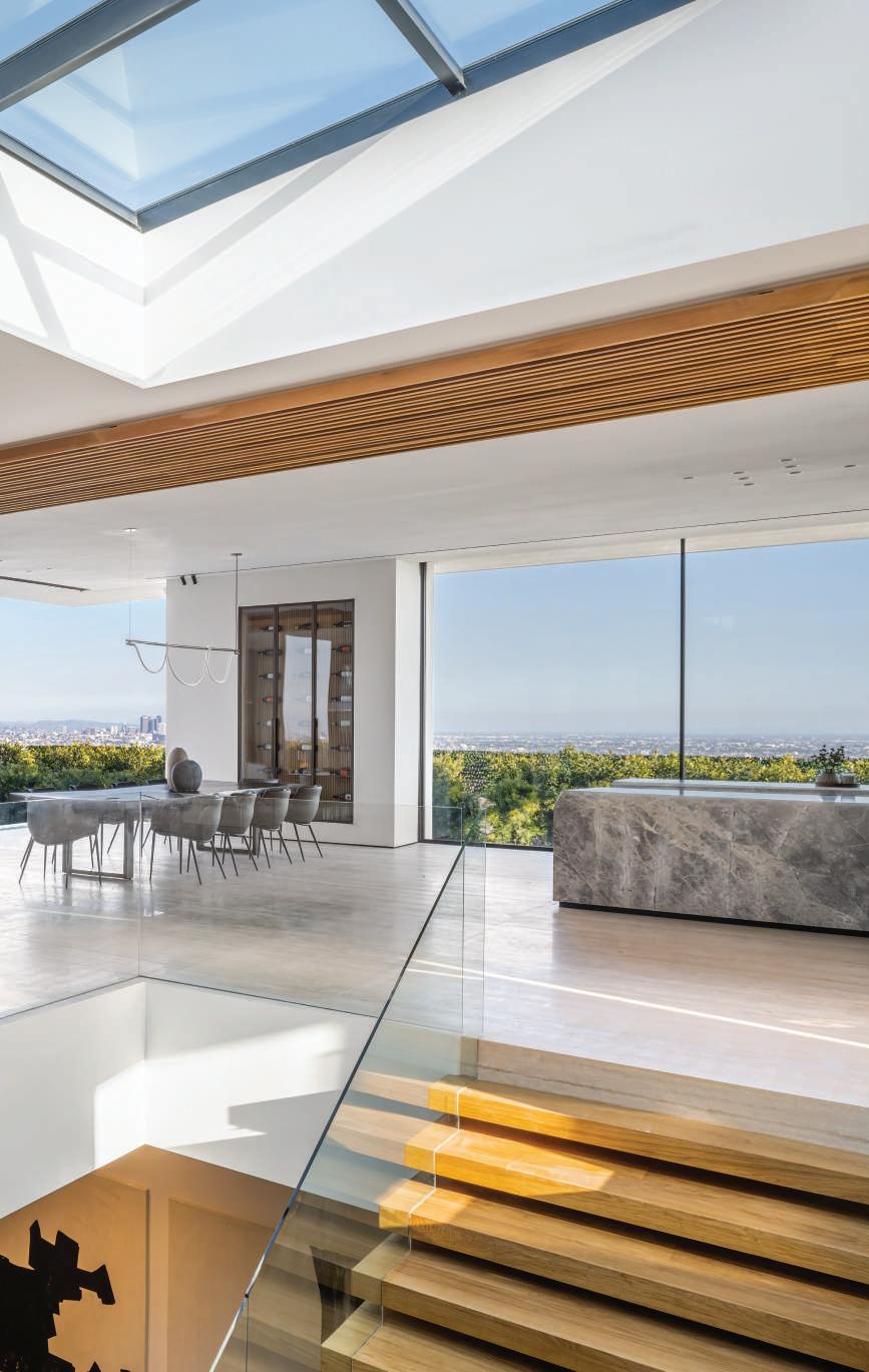
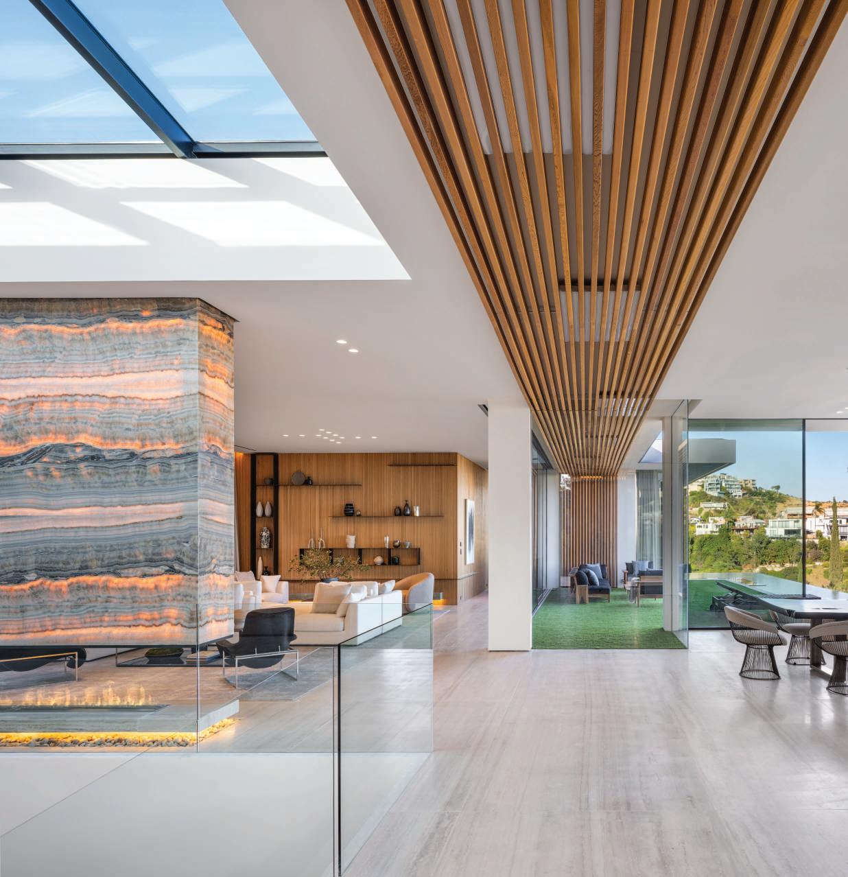
Pocketing glass sliders to either side of the great room pull in natural light and cross breezes, while a skylight illuminates the staircase descending to the lower floor.
THE HOLLYWOOD HILLS are alive with the sound of construction and especially along the Bird Streets. McClean Design have put their stamp on this coveted enclave of steep, winding roads, creating a succession of cool, contemporary houses that are embedded in the land but open up to sweeping views over the city. In contrast to the palatial facades that advertise great wealth north and south of Sunset Boulevard, these houses conceal their expanse, valuing privacy over ostentation.
Tanager is one of four houses McLean built for sale on a cul-de-sac, and it is as well tailored and thoughtfully laid out as their custom homes. The architects were challenged to create a feeling of spaciousness, indoors and out, on a narrow lot and within a mandatory height limit of fourteen feet. Over the past two decades they’ve learned how to resolve such problems in a creative way.
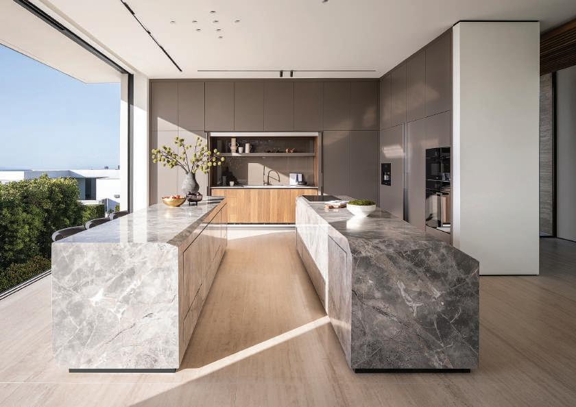
ABOVE Chamfered marble blocks serve as islands in the kitchen, which have an open-air character.
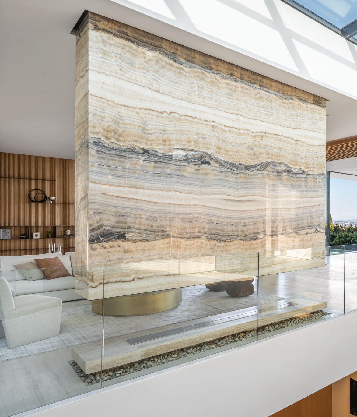
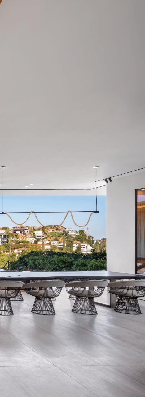
LEFT Oak paneling and a backlit onyx hood over the hearth bring warmth to an expanse of pale travertine. Warren Platner’s wire-framed dining chairs contribute to the spirit of airiness.
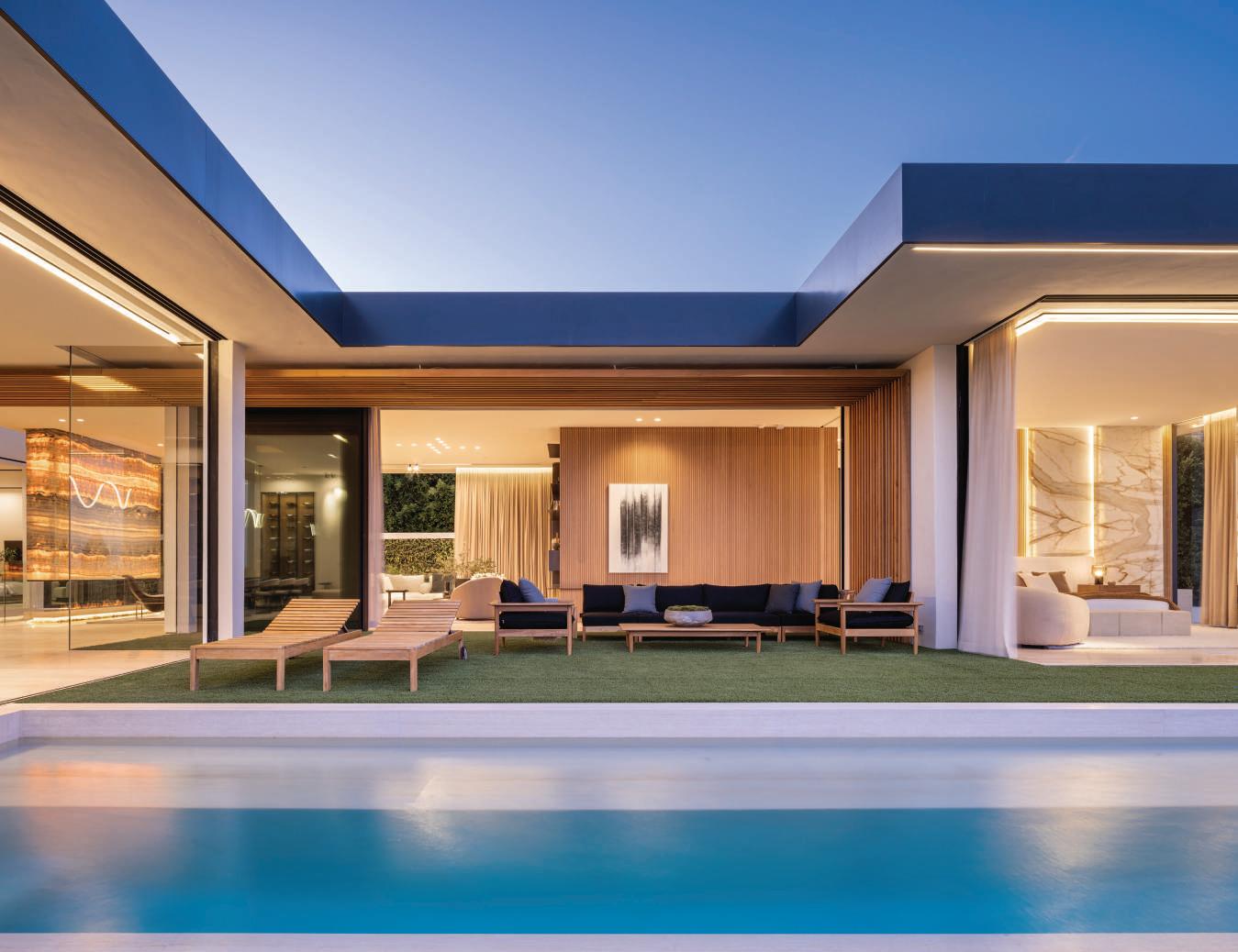
Water softens the crisp geometry of the architecture, casting reflections and bouncing natural light into basement rooms. Interiors open to the landscape through pocketing glass sliders, shaded by projecting roof planes. Wood and stone complement steel window frames and structural beams.
From the street you would never guess that Tanager encloses 10,500 square feet on two levels or that the living areas and primary suite open onto a broad pool terrace.
The travertine façade is enlivened with a black metal grill that screens the home office window. A ramp descends to the garage and lower story, while steps ascend to the entry at the upper level. A massive wooden door pivots open and
you step into a great room that flows out to the terrace on one side and a narrow light well bounded by a living wall that masks the hillside.
As you wander around this space, you realize how versatile it is: open and enclosed, intimate and expansive. At one end there’s an open kitchen with twin blocks of chamfered marble serving as counters. When the sliders are fully retracted on both sides you feel you are floating high above the city. A soffit of wood bars runs the length of the room and descends the far wall, drawing your gaze forward. An onyx hood over an open hearth doubles as a room divider that changes in tone through the day, becoming as vibrant as molten lava when backlit after dark.
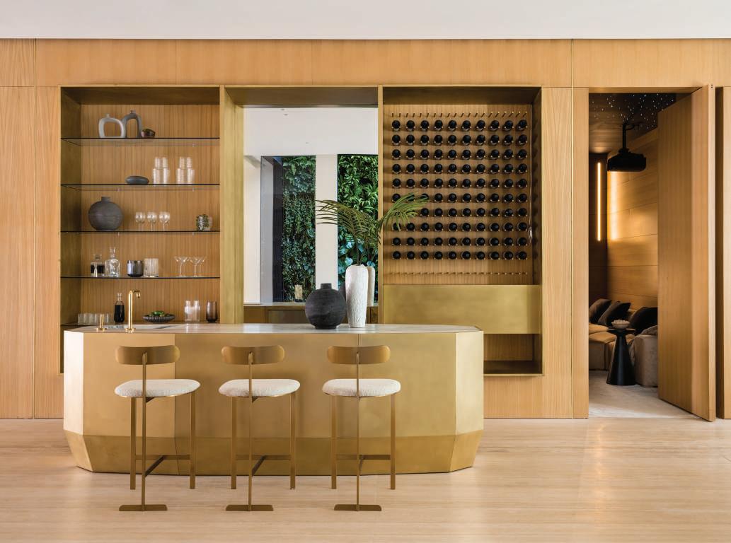
ABOVE An elegant bar complements a sybaritic home theater and wine room at the lower level, which is embedded in the hillside. Two guest rooms receive abundant natural light.
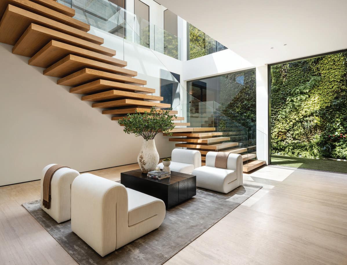
OPPOSITE Tehila Shelef brought her Mediterranean sensibility to the the design of the interiors, selecting an understated mix of modern classics and custom furnishings to complement such bold architectural gestures as the cantilevered oak staircase. A living wall masks the retaining wall to the rear of the house, providing a vibrant backdrop to a narrow courtyard.
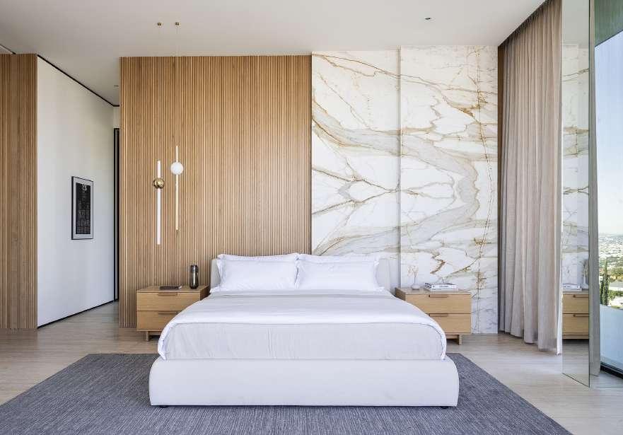
A pool wraps around the primary suite at the far end of the house like a moat that is also a mirror of the sky and its bathroom features a tinted lucite tub set on a richly toned onyx platform.
Tehila Shelef, who heads her eponymous studio in Tel Aviv, had a fruitful collaboration with McClean Design. Drawing on her experience of creating upscale interiors in the Middle East, she infused the house with a fresh, Mediterranean quality. Luxurious materials and refined detail complement the minimalism of the architecture, adding a layer of rich color and pattern. The understated furnishings are a mix of custom designs and modern classics by the Eames,
Warren Platner and Vladimir Kagan.
A skylight illuminates a staircase of massive oak treads cantilevered from the wall. At this basement level two guest bedrooms open onto a terrace, while the gym and recreation area are lit from the linear courtyard and there’s a sybaritic home theater.
“Life today is so hectic that one needs a sanctuary,” says Paul McClean who opened his office in Orange twenty-five years ago. “Our team tries to edit out discordant elements and create a place of serenity.” Contemporary Living: McClean Design, a monograph on the firm’s work in California over the past five years, will be published by Rizzoli USA in October. CH

“Life today is so hectic that one needs a sanctuary. Our team tries to edit out discordant elements and create a place of serenity.”
- PAUL MCCLEAN
OPPOSITE TOP A tinted lucite tub rests on an onyx platform in the principal bathroom.
BELOW/OPPOSITE BOTTOM A pool wraps around two sides of the fully glazed primary suite with its sheltering roof canopy. When the shades are drawn back, the owners awake to sweeping views over the city, while a hedge serves as a privacy screen to shut out neighboring properties.
INTERIOR DESIGNER JULIE ROOTES GAVE A STATELY JULIA MORGAN—DESIGNED HOUSE A CHIC REFRESH WHILE PRESERVING ITS ESSENCE
TEXT DEBORAH KIRK | PHOTOGRAPHY AUBRIE PICK
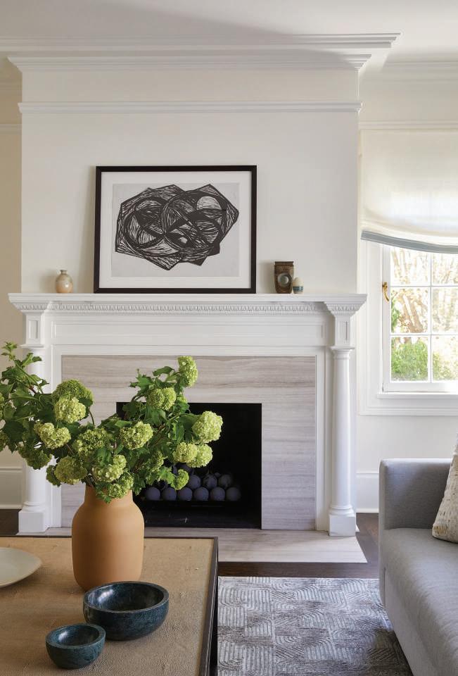
LEFT The light-filled living room features Julia Morgan’s original fireplace, which Rootes updated with a limestone surround from Da Vinci Marble.
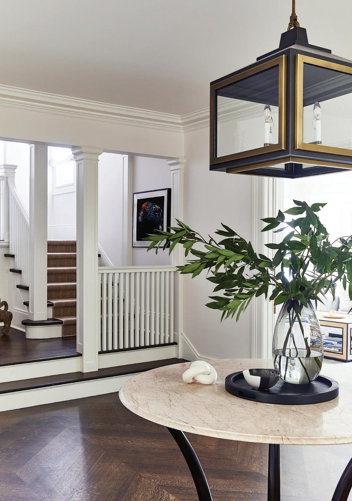
OPPOSITE Herringbone white oak flooring complements the original staircase, as do an Alfonso Marina marble-topped table and lantern-like Urban Electric light fixture.
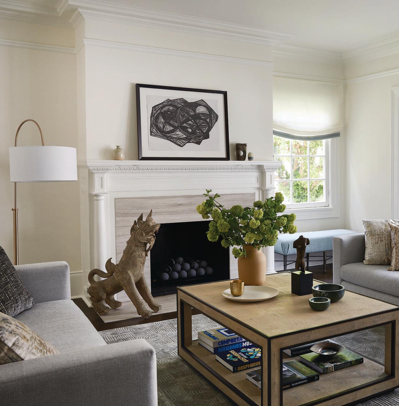
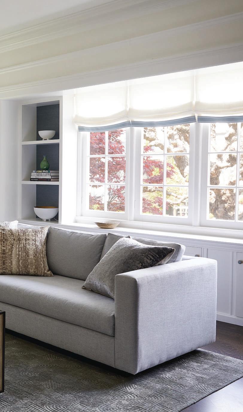
ABOUT FIVE YEARS AGO, a young San Francisco couple came across a 1908 house by legendary architect Julia Morgan and knew it could be a perfect fit. Drawn to the house’s backstory, signature design features, and park-like garden setting, they saw how well the space could be adapted for their needs.
One reason the couple felt a connection to the property is that they have a deep and distinguished history in San Francisco that goes back many generations, making the Morgan-designed residence in the Presidio Heights neighborhood an especially resonant choice. Additionally, they had previously worked with local interior designer Julie Rootes—and knew she would immediately understand how to elegantly and sensitively refresh this iconic home.
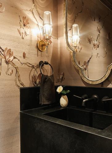
ABOVE/BELOW The powder bath is a small jewel box of a room with a Philip Jeffries printed wall covering and Porta Romana mirror.
LEFT Art advisor Caroline Brinckerhoff consulted on the selection of artworks, while Rootes chose an A Rudin coffee table, custom sofa, and Rogers and Goffigon fabric for the window treatment.
“The Morgan house gave us a strong foundation to work with,” Rootes explains. “Our goal was to keep the house elevated and stylish, but to reconfigure some of the spaces for how people live today.” Working with Sutro Architects and Cairn Construction, the design team enlarged the kitchen and family room to create a more expansive living area that opens onto the garden outside. “That was the pivotal architectural change,” Rootes says. “We kept the integrity of Morgan’s work, which can be seen in elements like the original fireplaces and mantles.”
Rootes had a hand in all the interior spaces, but her favorite is the master bedroom.
“The room is very tranquil, and I love the soft palette,” she says of the soothing green and tan hues. Perhaps most strikingly, Rootes chose exquisite, hand-painted silk wall panels from de Gournay that she describes as a “showstopper.”
One challenge Rootes faced was how to imbue the home with a high level of sophistication while still making it super-functional for the couple, their 11-year-old son, and their pet cats. To that end, Rootes chose performance fabrics for the upholstery in the family room.
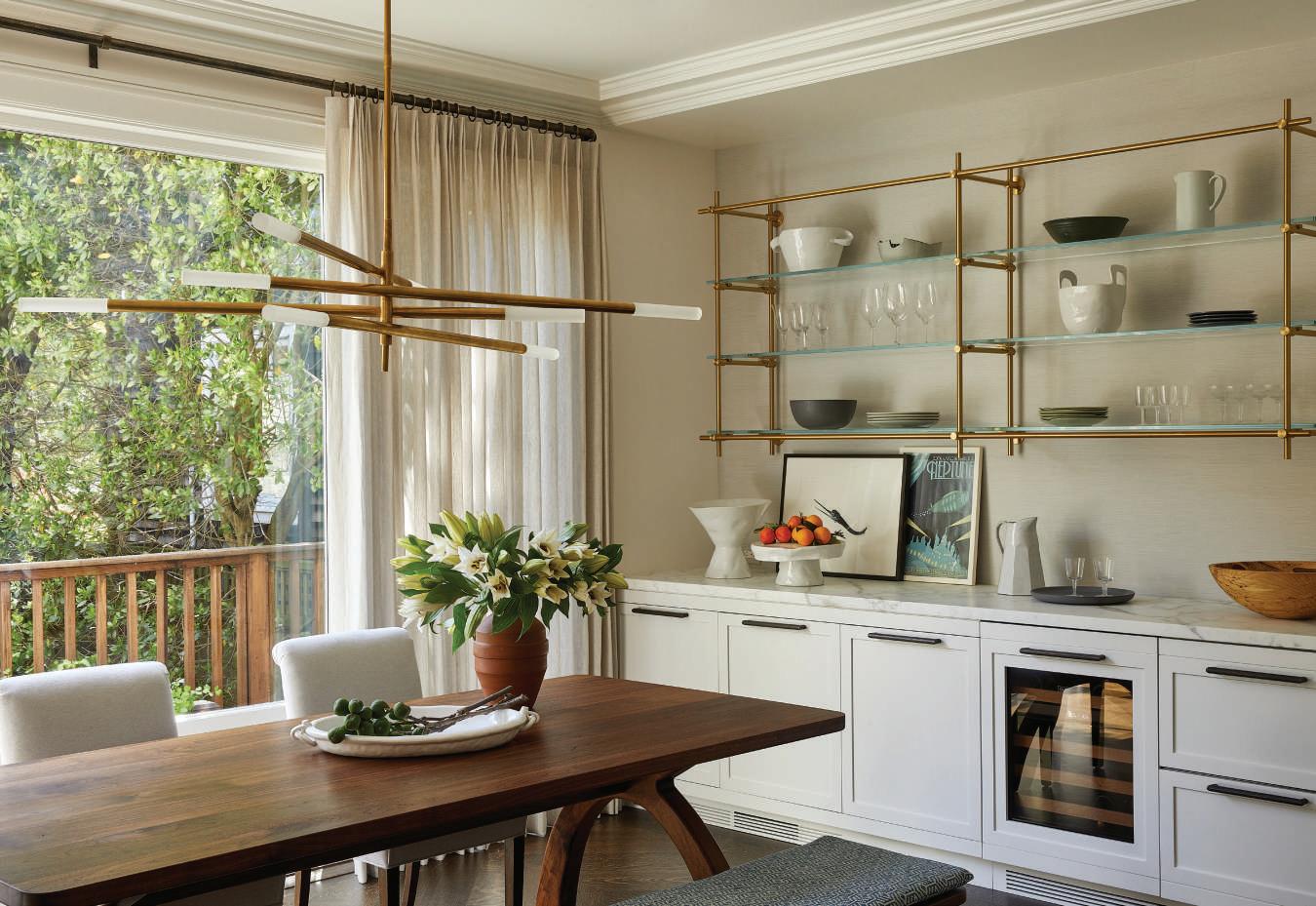
The dining room, which boasts plentiful natural light, features a dining table by Oakland’s Jacob May and a bronze light fixture from Visual Comfort & Co.
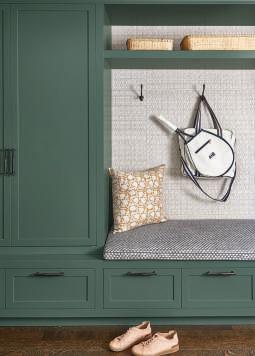
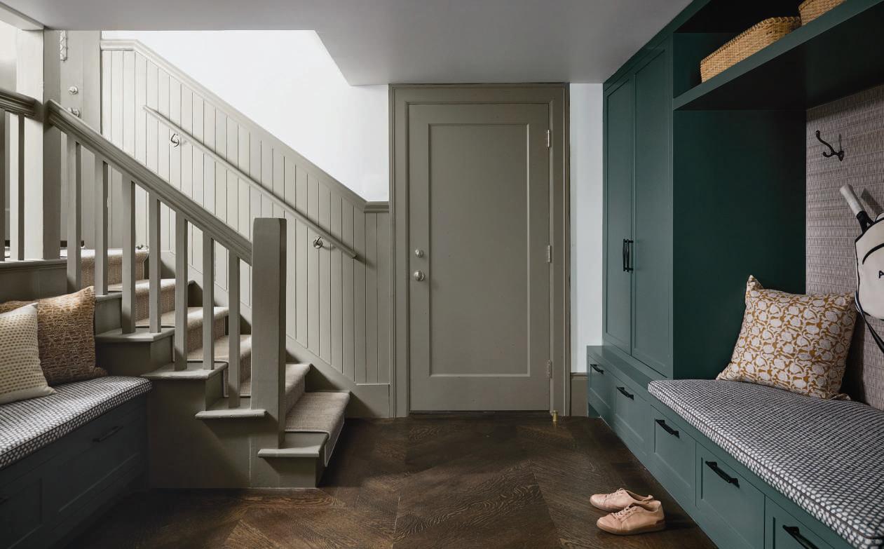
ABOVE/BELOW The house’s mud room, off the garage, has built-in benches covered in Fermoie fabric and cabinets painted in Garden Oasis from Benjamin Moore.
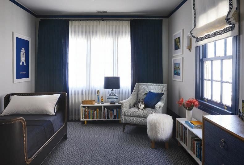
LEFT Rootes designed a cozy bedroom for the couple’s 11-year-old son with a leather sleigh bed from RH Teen, rug from Stark, and Urban Electric sconces.
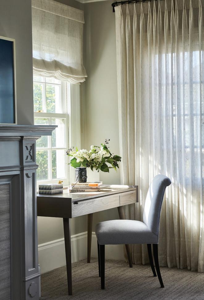
Rootes retained the original Julia-Morgan designed fireplace in the office, to which she added a neutral rug from Stark and window treatments from Susan Lind Chastain.
And to be sure they’d last, she did her due diligence, subjecting the materials to cat scratches and intentional wine spills (they held up beautifully). She also concealed a bar and a workstation behind cabinet doors, making it easy to remove clutter from view when entertaining.
Similarly, the dining room—which features a walnut table by Oakland’s Jacob May and a dramatic bronze articulating chandelier from Visual Comfort & Co.—is well-suited for hosting guests without being stuffy or forbidding.
Design solutions such as these come naturally to Rootes, especially because she has a personal interest in this type of creative problem-solving.
“I have three kids, so I definitely understand the needs of a young family,” she says. “Throughout, I really felt that my clients and I were on the same page in terms of how people live and what their priorities are. And it was a dream to work on it. Now the house feels inviting and livable, yet it still has this wonderful ‘wow’ factor.” CH
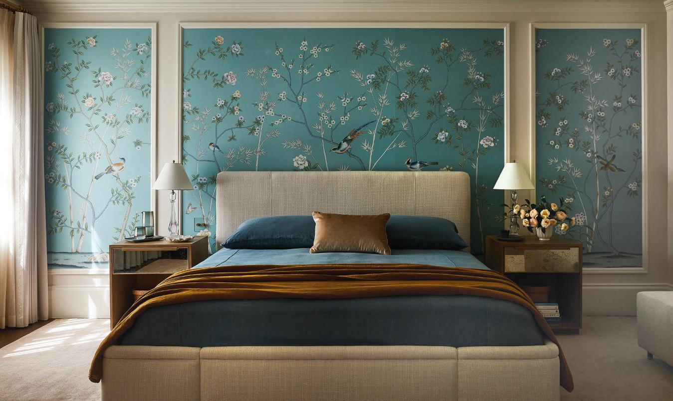

ABOVE Striking handpainted silk wall panels from de Gournay frame the serene master bedroom, which includes a custom upholstered bed, Bungalow Classic nightstands, and a custom rug from Mark Nelson Designs.
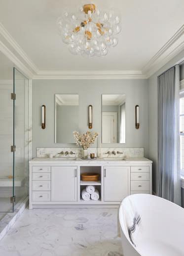
LEFT/RIGHT The spa-like master bath is outfitted with a tub and faucets from Waterworks, Da Vinci Marble floor and countertops, and Urban Electric sconces.
DESIGNER AMANDA BARNES REENERGIZES A TURN-OF-THE-CENTURY SAN FRANCISCO HOME WITH WARM, MODERN SENSIBILITIES
TEXT ROGER GRODY | PHOTOGRAPHY STEPHANIE RUSSO
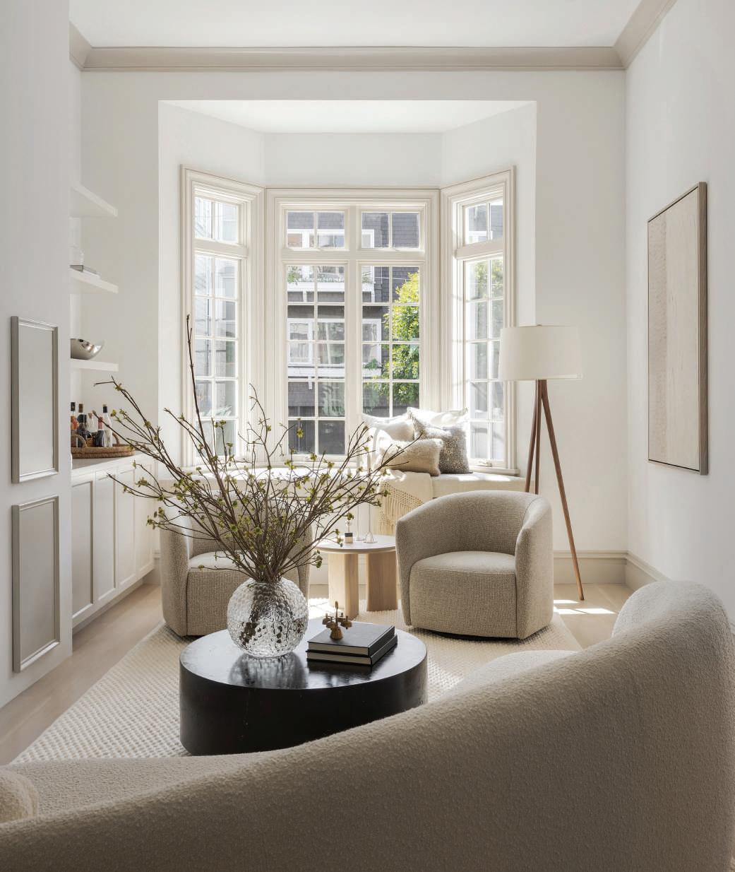
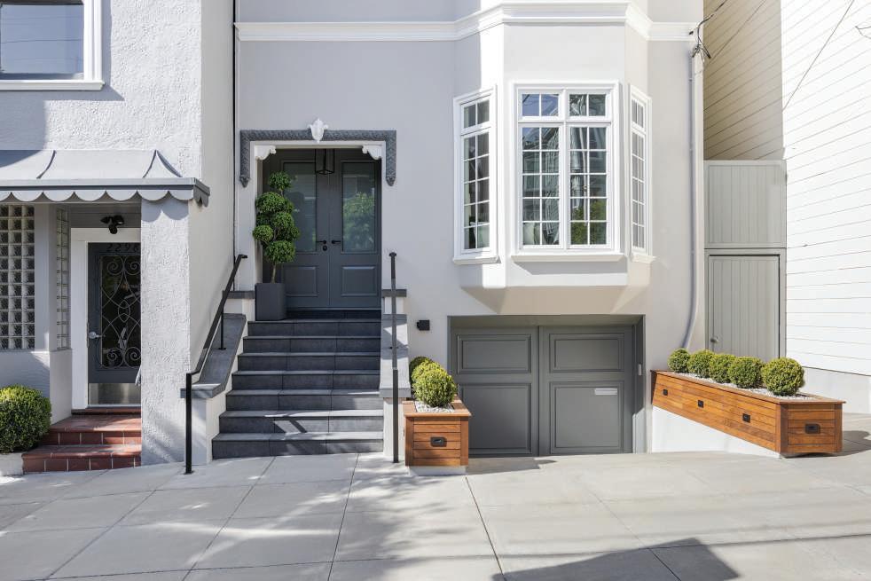
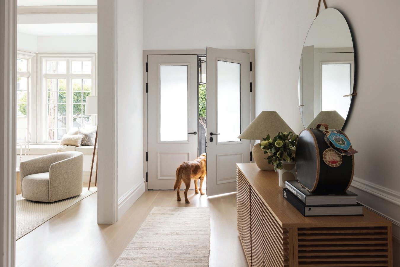
FOR A VINTAGE RESIDENCE in San Francisco’s treasured Pacific Heights enclave, Amanda Barnes Interiors applied an elegant simplicity to a vertical residential concept, honoring the heritage of a home built in 1900 while accommodating a contemporary lifestyle. The clients—the husband is a San Francisco native with a large Italian family, his wife is from Sweden with a penchant for modern Scandinavian design—desired contemporary aesthetics but appreciated their home’s Victorian architecture. Founder and principal designer Amanda Barnes sought to balance contrasting cultures and styles in a residence that enriches its occupants and their frequent guests.
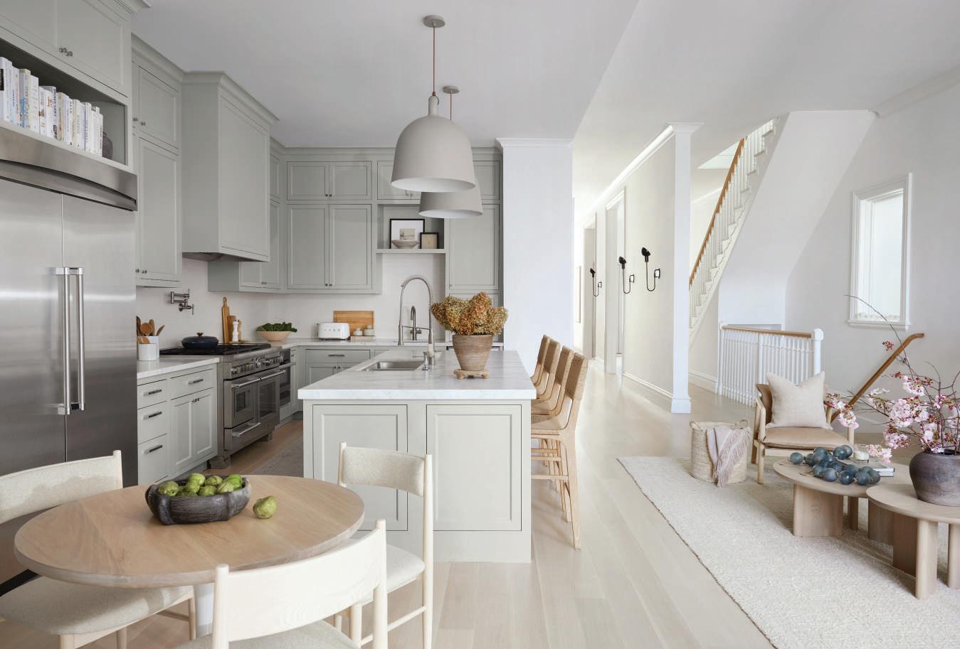
The kitchen’s island and perimeter are finished in Calacatta marble, with faucets by Grohe, pot filler by Elkay and a backsplash of glazed tiles from Ann Sacks. Stools from Worlds Away are paired with the island, illuminated by Normann Copenhagen bell-inspired pendants. Sconces from The Urban Electric Co. line the adjoining hallway.
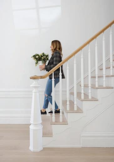
OPPOSITE TOP The Pacific Heights home, built in 1900, features classic Victorian architecture. OPPOSITE BOTTOM The designer applies some finishing touches.
“We wanted to give the home a modern, fresh feel, but it was very important that it look as if it had always been there,” explains Barnes, who employed vintage accessories and traditional millwork to temper modern elements. Addressing her firm’s approach to interior design, Barnes states, “Our ethos is to cultivate elevated living for everyday life,” and adds, “Every project offers an opportunity to provide a functional, comfortable space, but one that also sparkles.” For this commission, the Bay Area designer created an unpretentious yet aesthetically exciting environment, comprised of 5,000 square feet of living space spread over four stories.
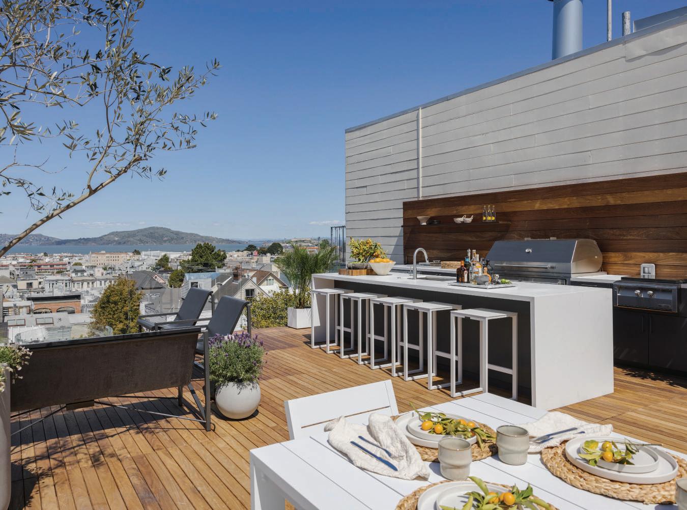
Barnes, collaborating with architect Brooks McDonald and Keith Schemmel of Osmun Construction, reinvented the flow of the home, integrating a formerly detached cottage and adding a new fourth floor with sprawling rooftop deck. To transport food and supplies from one level to another, Barnes ingeniously incorporated a dumbwaiter, an antiquated invention that the designer updated for the 21st century but camouflaged with vintage-style millwork. Offering spectacular, unobstructed views of the Golden Gate Bridge and Alcatraz, the newlycreated rooftop deck leverages the home’s entertainment value and captures the enduring magic of San Francisco. Occupying the multifaceted space are a prominent waterfall-edge island, heated outdoor furniture, firepit, and hot tub, all supported by a complete outdoor kitchen with built-in luxury appliances.
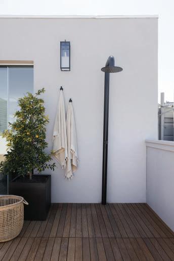
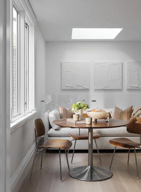
ABOVE Outdoor Shower on the rooftop deck. LEFT Breakfast nook with Eames molded-plywood chairs around the clients’ own modern table.
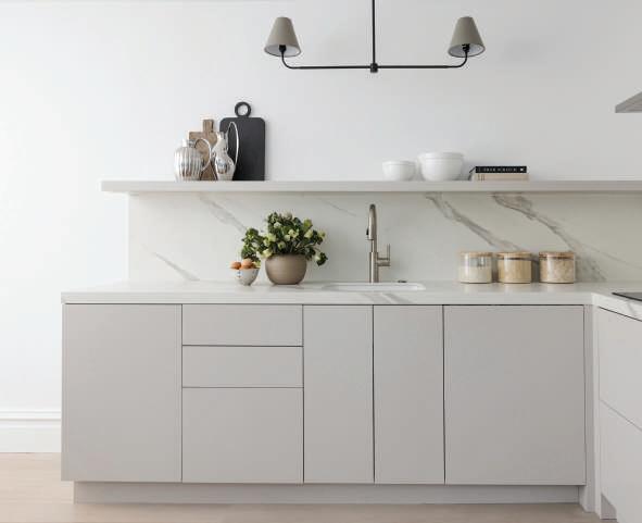
BELOW The chef’s kitchen, clad in Dekton Opera surfaces by Cosentino, includes Wolf, Liebherr and Miele appliances. A Franke undermount sink is paired with a Newport Brass faucet.
With views of the Golden Gate Bridge and Alcatraz, a new rooftop deck features a waterfall-edge island with stools by Terra Outdoor Living, fire table by Starfire, heated furniture by Galanter & Jones, and a complete amenitypacked kitchen. Landscaping, by Ryan Crouch of Zenful Gardens, includes a prominent olive tree.
On the main level, literally at the heart of the home, a spacious main kitchen (one of four distinct food preparation spaces) combines the functionality required by serious home cooks with a sense of glamour that impresses guests. This kitchen is anchored by a large, Calacatta marbleclad island, illuminated by oversized Normann Copenhagen bell-inspired pendants. Miele and Thermador
appliances are integrated into custom cabinetry, while a separate chef’s kitchen and butler’s pantry ensure maximum utility for entertaining.
Amanda Barnes has successfully created a contemporary environment with a nod to the artisanal craftsmanship that is a signature of Pacific Heights, reinforcing the home’s sense of place in a timeless San Franscisco neighborhood. CH

ABOVE Primary bath with countertops and shower sheathed in Calacatta marble, sconces by Visual Comfort and art by Caroline Pacula.
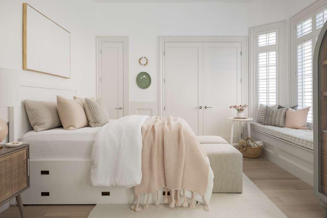
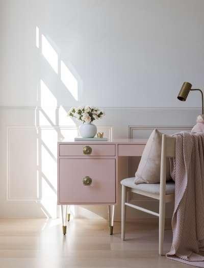
TOP LEFT An ultra-feminine desk by Anthropologie for a young lady.
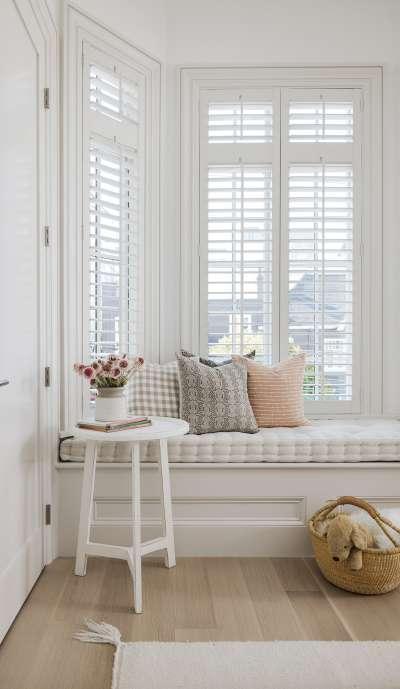
LEFT Custom window seating in daughter’s bedroom.
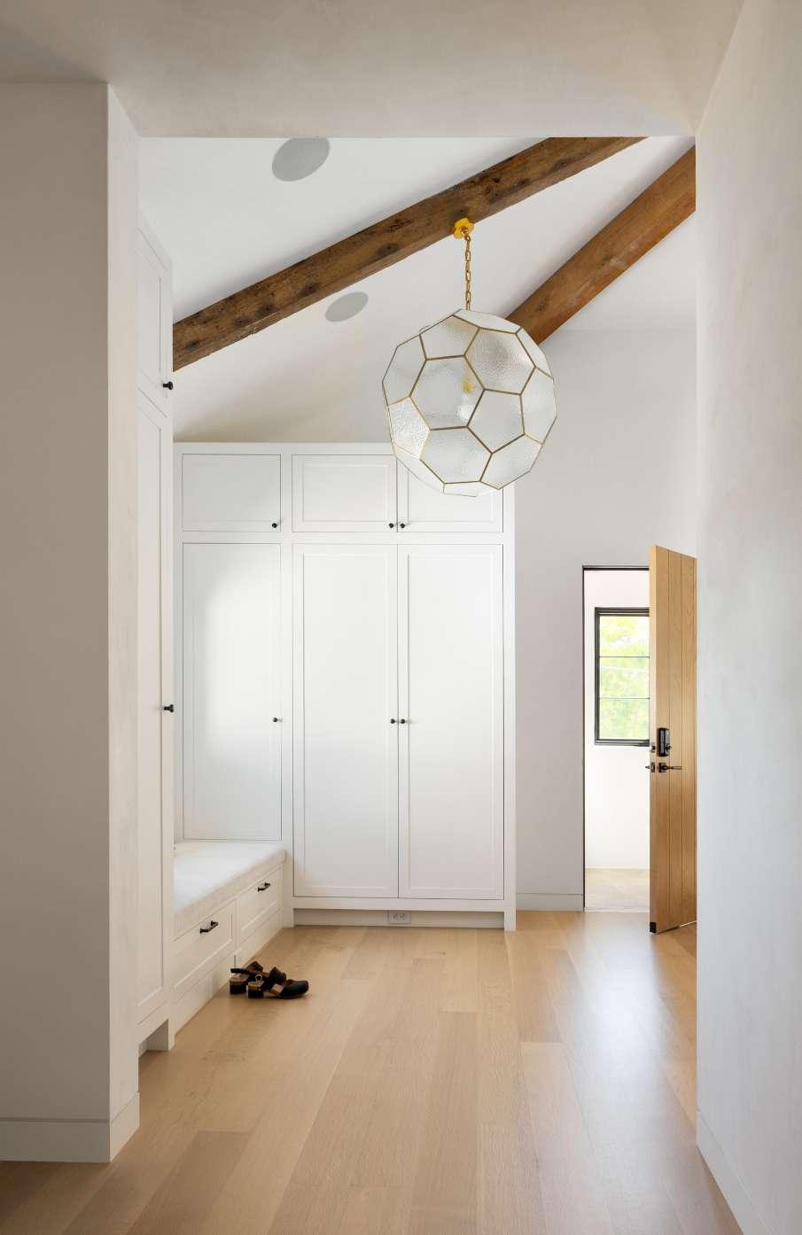
The homeowners wanted to avoid seeing visual clutter, so Jungsten built cabinetry to hold coats and outerwear in the entry. European White Oak flooring throughout the home adds to the bright, airy ambiance.
OPPOSITE Lowengart installed a glass and brass honeycomb lantern in the entry while selecting wicker pendants for the living and family rooms. Throughout, buffalotextured brown leather sconces from Fuse Lighting pierce the white walls.
ANN LOWENGART INTERIORS REVIVES A MILL VALLEY HOME
TEXT KENDRA BOUTELL | PHOTOGRAPHY PAUL DYER | STYLING YEDDA MORRISON
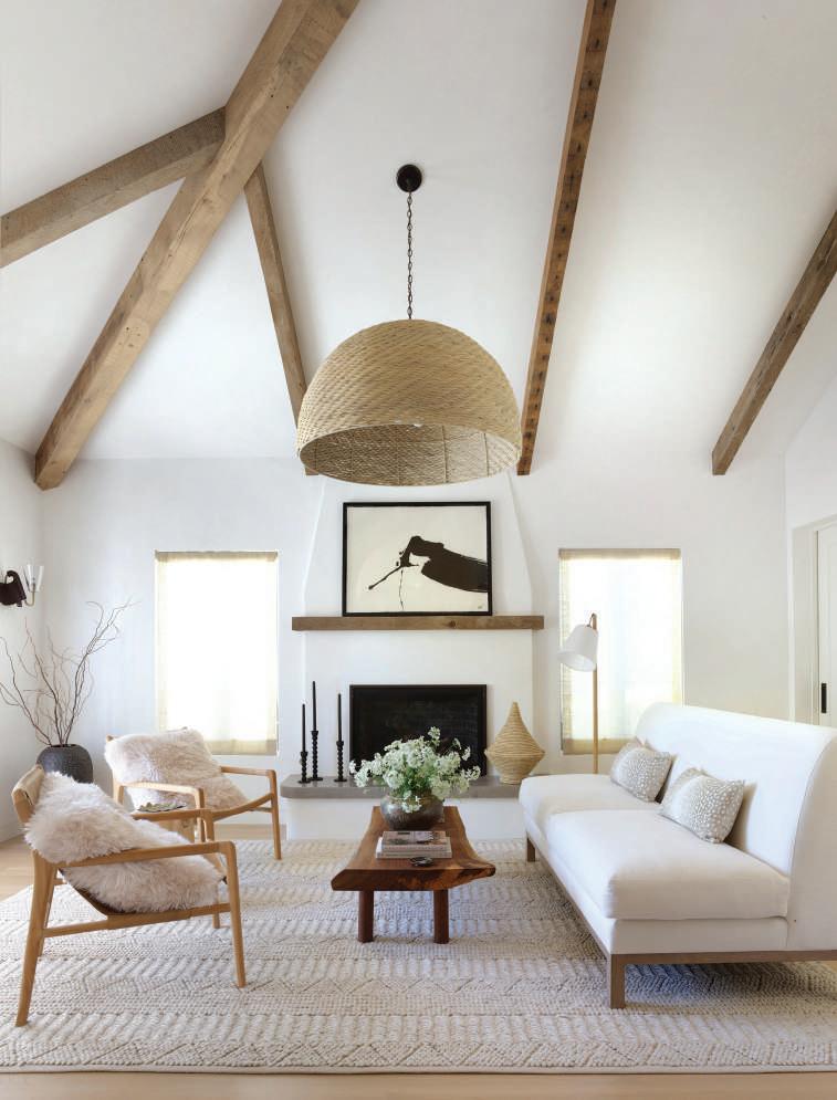
DESIGNER ANN LOWENGART’S clients purchased a Mediterranean Revival home in a tree-lined neighborhood of Mill Valley to raise their young children. Like many houses in the town, it started as a cottage built during the late thirties. Over time, it expanded without cohesion. Lowengart collaborated with Brad Hubbell of Hubbell Daily Architecture + Design and Jeff Jungsten of Jungsten Construction to gut and remodel the dark interiors and integrate the spaces. A lyrical color palette punctuated by organic textures and minimalist artisanal furnishings now welcomes family and friends.
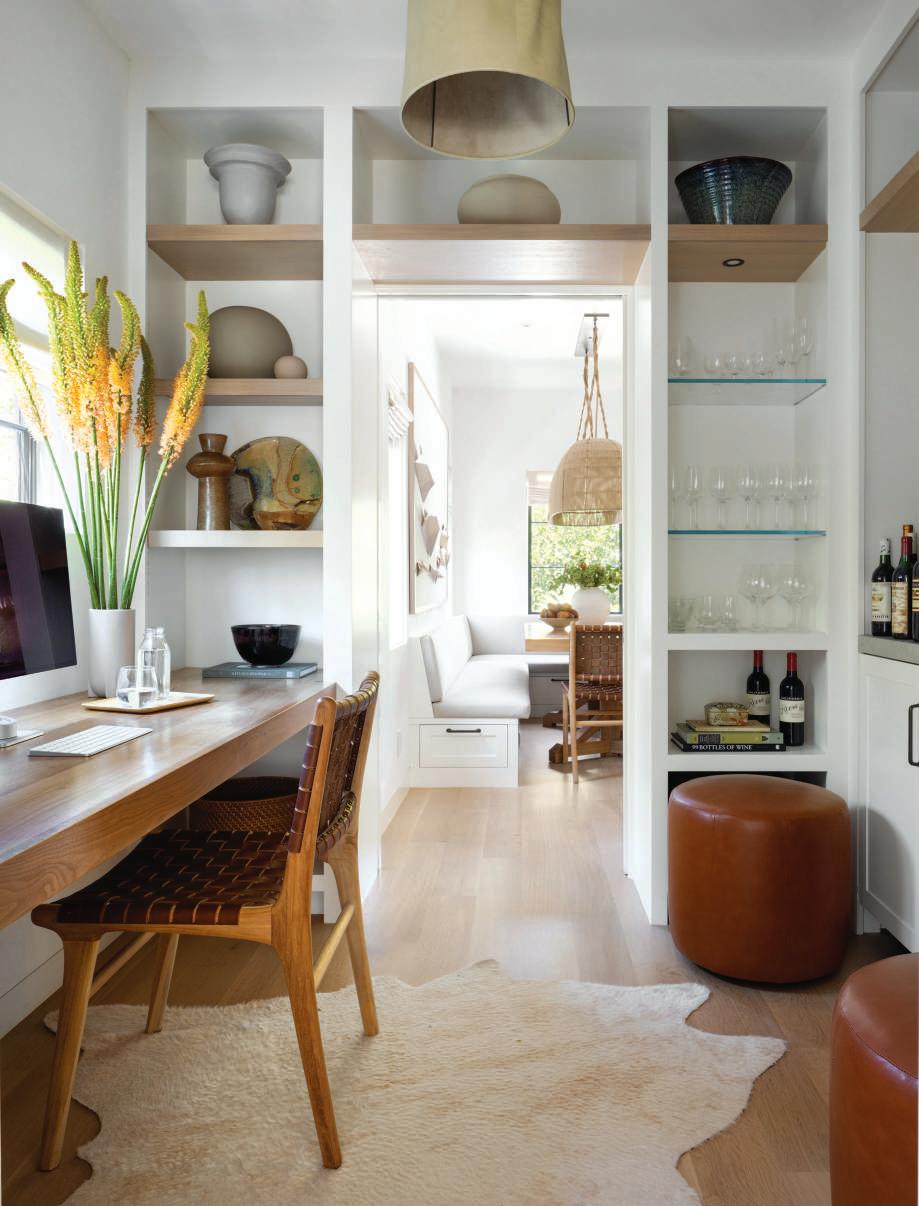
Adam Otlewski’s artisanal pendant with hand-dyed waxed leather shade illuminates the study while two cognac leather ottomans provide occasional seating. The space acts as a passageway between the living and dining rooms.
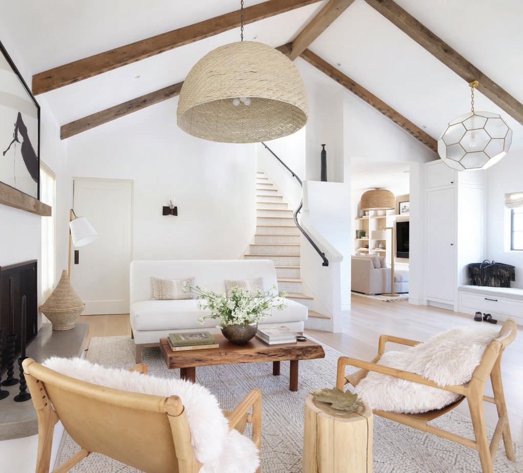
OPPOSITE The design team selected an ivory blend of linen and wool fabric from Rogers & Goffigon for the flat Roman shades flanking the fireplace in the living room. Hubbell added rustic wood beams to the space accenting the ceiling height and the house’s aesthetics.
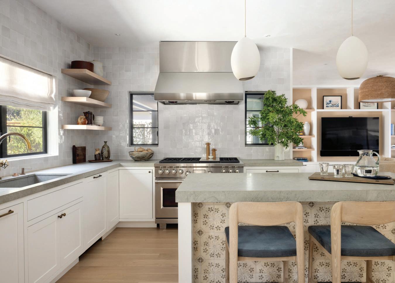
For casual dining, the family perches on Caste’s brutalist oak counter stools, upholstered in charcoal-colored leather from Holland & Sherry. The kitchen island features Tabarka Studio’s hand-painted terracotta tiles.
Lowengart utilized crisp white plaster throughout the house for the walls and ceilings, highlighted by Rocky Mountain bronze door and cabinet hardware. On the main floor, the front door opened abruptly to the living room. Hubbell and Jungsten reoriented it to what was a formal dining room, transforming the square footage into a light and airy foyer. The designer hung an oversized wicker pendant from the pitched beamed ceiling in the living room, where she arranged the conversation group in front of the fireplace. Over the mantel, John Mayberry’s gestural abstraction holds court. A live-edge walnut coffee table centers the seating, which consists of a linen armless sofa and a pair of beige leather sling chairs. Marc Phillips’ ivory wool rug grounds the space.
At the rear of the house, the design team flipped the kitchen and family rooms. Now, the family room flows from the foyer. A tailored sectional upholstered in C&C Milano’s natural-hued performance fabric is perfect for children and adults. Lowengart anchored the room with an ivory and black Beni Ourain rug. Built-in bookshelves flank the TV. In the kitchen, a floating island gives a clear sightline to the family room. The designer selected Bateig blue limestone for the countertops. Referencing the home’s architecture, a Mediterranean-inspired terra cotta tile in gray and off-white embellishes the kitchen island, while a pair of porcelain pendants by Farrah Sit illuminates it.
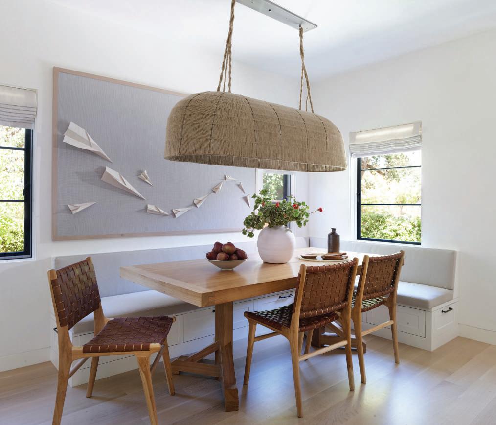
Eschewing a formal dining room, the homeowners wanted to eat in the kitchen. Lowengart carved out a dining area with a corner banquette upholstered in a greige Great Outdoors textile. A bleached walnut dining table companions Scandinavian-styled teak and leather chairs. The designer crowned the grouping with Bone Simple’s oblong dome rope pendant. Adjacent to the dining area, a small study doubles as a bar. Built-in shelves hold liquor bottles, and the wet bar displays an industrial-inspired copper faucet. A pocket door reveals a powder room showcasing Phillip Jeffries’ indigo wall covering. CH
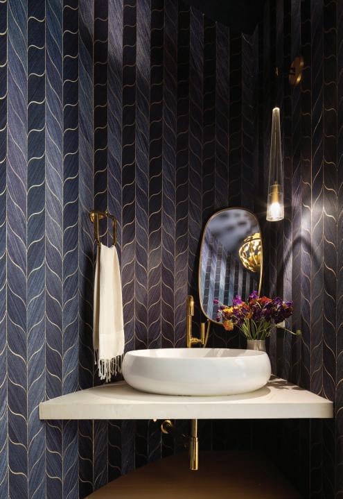
ABOVE Every home should have an unexpected room; in this one, it is the indigo-blue powder room. The diminutive space showcases Jonathan Browning’s lead crystal and antique bronze sconce. An oval brass mirror reflects the shape of the porcelain vessel sink.
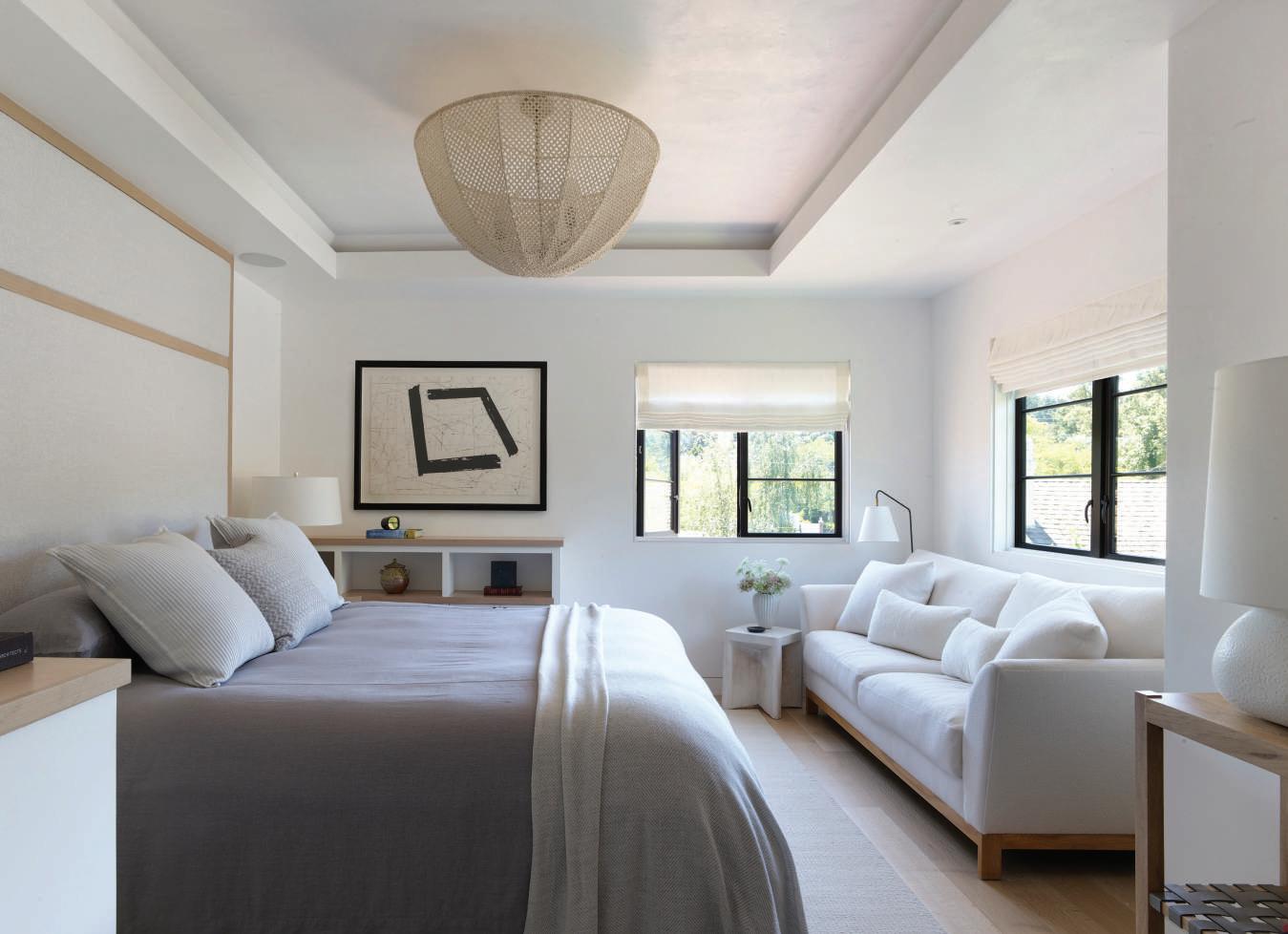
OPPOSITE Hubbell and Jungsten gutted the upstairs, creating a tranquil primary suite. Lowengart upholstered the headboard in Italian linen from Scalamandre. She added subtle texture with a Logan Montgomery Textile pillow and a graphic punch, installing John Mayberry’s artwork.



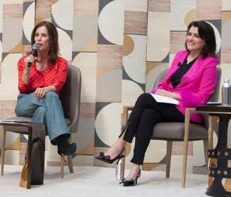
On International Women’s Day, March 8, Women in Luxury Design presented their first “Empowered Design Summit”, held at the Pacific Design center with nine impassioned speakers. These interviews featured design leaders speaking with candor and insights on all aspects of the business of design, from beat practices and sourcing creativity and inspiration to health and wellness. The day included pop-up shops, female owned businesses, jewelry, clothing, fine juices and coffees, book sales and signings. Thank you to Jobi Blachy of Quintus for the fabulous reception party, and Baker McGuire for the lovely lunch reception. Susan McFadden, Editor-in-Chief of California Homes magazine gave the kickoff welcome.






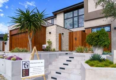

The 50th Anniversary CDM Home Tour featuring eight stunning homes was a resounding success. So many generous contributions; CDM families, homeowners, businesses and Co-Presenting Sponsors, VALIA Properties and Barclay Butera Interiors who went above and beyond making it one of the most significant fundraising events in Newport Beach. Mayor Will O’Neill opened the event with a proclamation followed by student performances, boutique shopping, Rose Bakery Cafe famous donuts, and a delicious catered lunch by Chef Pascal Olhats and Chef Annie Morgan.







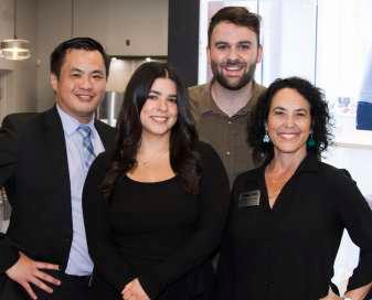
An event was held recently at the Pacific Sales, San Juan Capistrano Showroom celebrating Going Green. The event brought together manufactures and designers as they enjoyed the new renovation of the showroom, hosted by California Homes Magazine

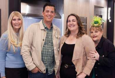



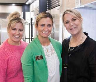
The Institute of Classical Architecture & Art – Southern California celebrates its 20th year in 2024.
Fortunate to be a pillar of the vibrant design community from San Diego to San Luis Obispo, our members are top builders, architects, interior designers, artisans, enthusiasts, and students.
Please join us in congratulating
recipient of our Ninth Annual Legacy Award.
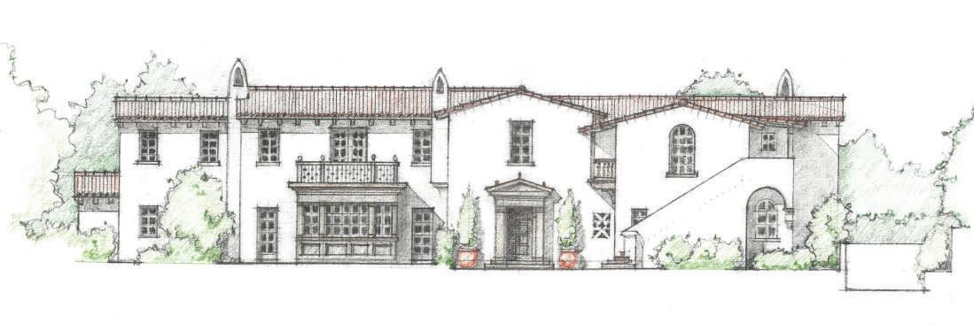
Join us in celebrating Erik’s contributions to classical education and the Southern California chapter he helped found at our annual Legacy Dinner, October 24th at The California Club.
For sponsorship opportunities or information about membership and exclusive events please email info@classicist-socal.org

On Sunday March 10th, the Farhang Foundation’s festival welcomed spring with its 14th Annual Celebration of Nowruz in Los Angeles. The daylong program included traditional music, arts and crafts, dance, food, children’s activities, stilt walkers, and the signature Grand Haft Sîn display. Nowruz, or “new day,” is an ancient celebration of the vernal equinox—a universal time of rebirth and renewal. It is the most


colorful and lively Iranian event of the year with horns blaring, dancers twirling, bright silk garments, and exciting storytelling. The joyous event welcomed over 20,000 guests from all over Southern California and beyond. A special ticketed event took place at UCLA’s iconic Royce Hall. The Nowruz Concert featured world-renowned musicians, many of whom flew in from around the world for this event.




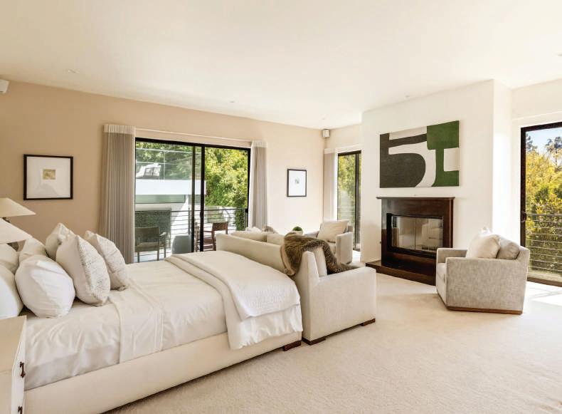
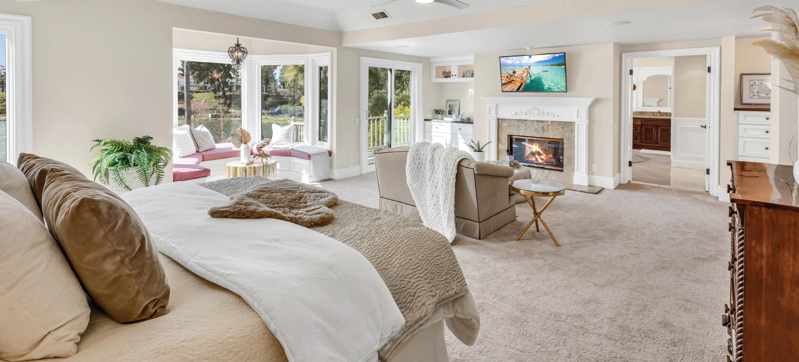

$4,000,000
5 Beds 5.5 Baths 5,449 SqFt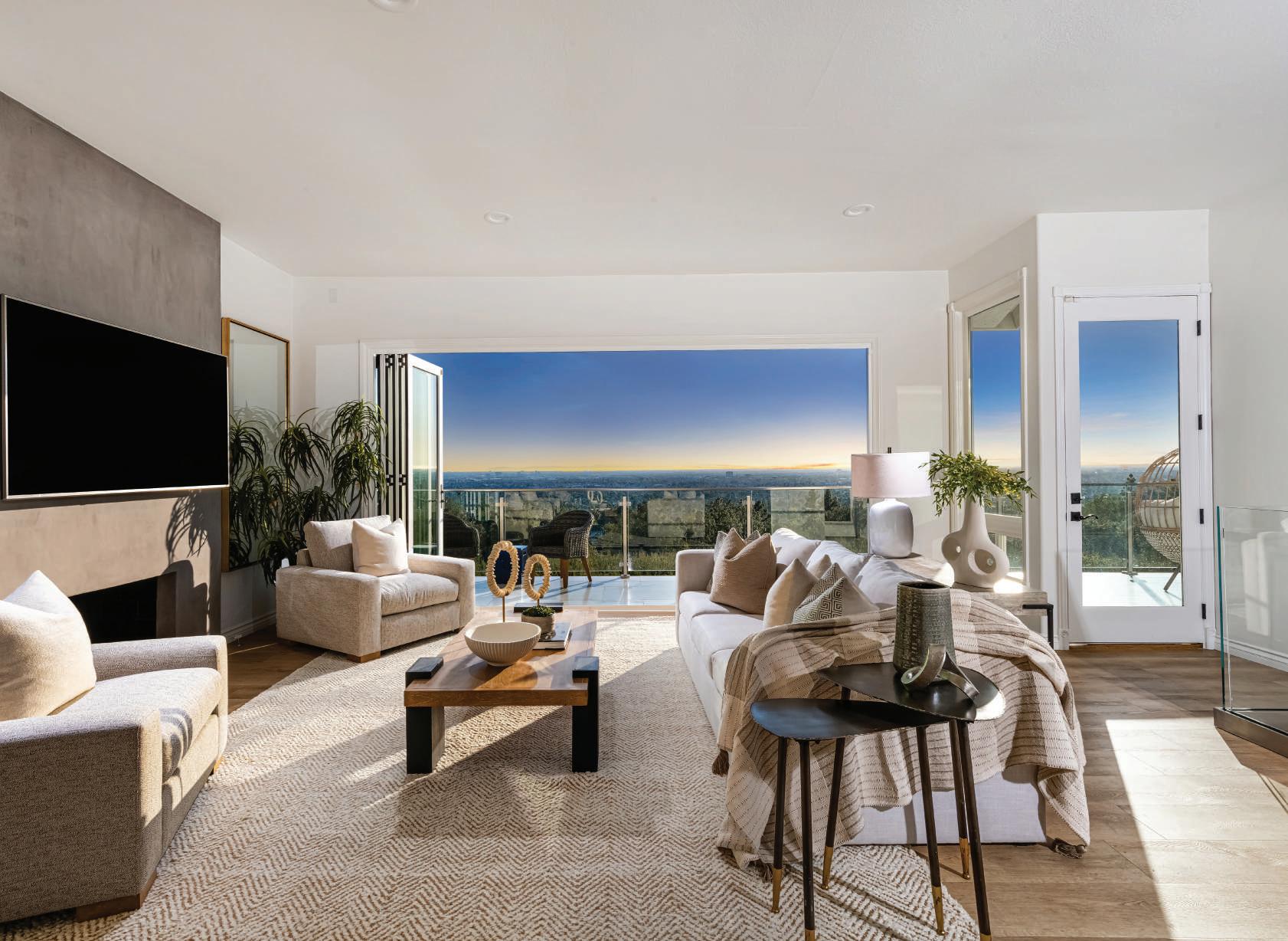
4 Beds
3 Baths

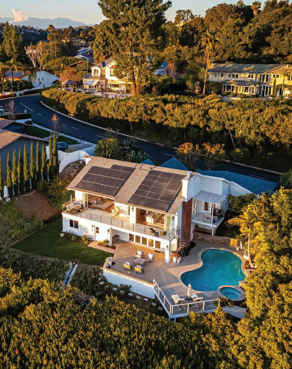
It goes without saying that your home has all the finest amenities. But what about your water? Pure Elements has created the ultimate custom HealthyHome Water Filtration System. Enjoy crystal clear water throughout your house for drinking, cooking, ice, bathing and cleaning. Water just doesn’t get any better than this.


ECO-FRIENDLY WATER
CONDITIONING SOLVES HARD WATER PROBLEMS – WITHOUT SALT OR CHEMICALS
No slimy, can’t-get-the-soap-off-me feeling. Wonderful for household use, plants, pets, and beneficial for swimming pools and spas. Better for you and the environment.
Enjoy clean, healthy drinking water and an enhanced bathing experience. Pure Elements systems address harmful chemicals including carcinogenic disinfection byproducts, chloramines, organics and pesticides. Also effective in reducing heavy metals including arsenic and chromium 6.
Water Visionary in Orange County for 39 years - Rick Allen, CEO of Pure Elements, Inc.that your home has all the finest amenities. But what about your water? Pure Elements custom HealthyHome Water Filtration System. Every house is unique; therefore every different. Plus, it’ll reduce hard water issues without the negative effects of salt. Enjoy throughout your house for consumption, cooking, cleaning, and bathing. Better for for pipes, better for your pool. It’s even better for your landscape. Water just doesn’t this.
We are committed to the health and safety of our clients. Social distancing and statewide rules are being followed to protect you, your family and our team. With bottled drinking water flying off the shelves, now is the time to take control and enjoy YOUR OWN UNLIMITED SUPPLY of healthy, safe water throughout your home and property.

LEAKS disruptive pinhole leaks direct result of water’s chemistry over epidemic through-
PREVENT DEVASTATING LEAKS IN YOUR PIPES
Avoid costly and disruptive pinhole leaks in your copper plumbing. These leaks are a direct result of changes in our water chemistry and have reached epidemic levels throughout southern California. Pure Elements systems stop pinhole leaks from occurring without expensive, intrusive re-piping or epoxy lining – Guaranteed.


1979
