Design Alive 2017 Collector's Edition/Milan

Page 1

THINGS ABOUT US DESIGNALIVEMAG.COM

NONETHELESS N°21 MILAN DESIGN WEEK 2017

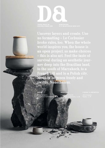
Uncover layers and create. Use no formatting – Le Corbusier broke rules, too. When the whole world inspires you, the house is an open project, so make choices – this is also art. Feel the taste of survival during an aesthetic journey deep into the Brazilian land, to the south of Marrakech, to a French hill and to a Polish city. Move in between freely and swiftly. Nonetheless. PEOPLE

ARCHICONS

A GUIDE TO AESTHETICS

Robert Konieczny The path to a man’s triptych – p. 36

A sculpture on the hill Le Corbusier in Ronchamp – p. 48

Life in a museum Brasília – p. 78

fot. Dawid Majewski

Tafla


fot. NAP

G-Table

zieta.pl


When arranging your interior, use the potential of modern design and advanced production technology combined with natural materials. Appreciate the virtues of the Barlinek floorboard, discover the exclusive wide Senses floorboards. Savour the stained floorboards from the Tastes of Life collection. join us on www.BARLINEK.COM


ROzmรณwki architektoniczne

MIE J S CA 6


C O NTENT S 2 1

The art of choosing Emilia Obrzut

48

Archicons Le Corbusier in Ronchamp

56

An open studio When art and antiques become the essence of your life

64

A loft in tower of a weapon factory Project by A+Z Design Studio

72

South of Marrakech Architecture as a set

78

A guide to aesthetics Brasília

86

Various faces of fashion It’s not enough for us

88

Photo shoot Nonetheless

94

Impressions from Paris Maison & Objet

Objects

The path to a man’s triptych Robert Konieczny

44

Places

People

36


8 E D IT O R ’ S L ETTE R

Nonetheless

the basic package. We also added “dadada” – a new column which is like a beauty spot broadening the horizon with topics that fascinated us and made us want to share them with you. See for yourselves what we have prepared for you together with editor Julia Cieszko, the men from Hopa Studio, Bartek Witkowski from Ultrabrand and the Vikings from Icelandic studio Or Type, and discover the source of our inspiration and of the new font in the titles. Let us now come back to the topic: it was supposed to be all over, but it wasn’t. The plan of a well-deserved rest began to crumble; the weather had improved, my

Photo Maite Felices

girl friends were already on their train

It was supposed to be all over this week-

closed and the last patches of snow lay

end. The next issue was to be closed, the

in the valleys.

from Gdańsk, the ski lifts were already

new mock-up refined, the photos selected

I went nonetheless, despite the

and 148 pages with a new layout sent for

grass, the mud, the work and the dead-

printing. Such was the plan, but it failed,

lines. And... it was fantastic! We entered

which is actually quite understandable

the mountain hostel just before nightfall

because we did it for the first time. Facing

with the skis still on our legs, the moon

the change was a big undertaking to us.

was shining brighter than a million torch-

Was it supposed to be a revolution or evo-

es, Venus, the Great Bear and the newly

lution? We travelled between Warsaw and

discovered planets were above our heads

the mountains to achieve what you now

and lights from towns and villages lin-

have in your hands: “Design Alive” with a

gered down below. Warm teas, cool beers

new layout. It’s more orderly and mature,

and a series of unexpected meetings...

but we haven’t given up the pleasure of mixing in some chaos.

Now we’re back down, in a small café closing in 15 minutes’ time, till the

Things say a lot about us and we talk

next winter. Through the window we see

about things, places and people gathered

the last white slope where we skied down-

around architecture and design – this is

hill to meet spring. Nonetheless.

Editor-in-chief Ewa Trzcionka


E D IT O R IA L TEAM

S P R IN G 2 0 1 7

9

Collector's cover

No n e t h e l e ss

Nature. Raw, organic, primitive and often wild. We imitate its forms, scents, colours and structures. The opposite side: object. The man’s creation and everyday companion inspired with nature and landscape. Photos by Piotr Hołub. (more p. 88) Design Alive since 2006

Advertising

www.desigalivemag.com

reklama@designalive.pl

Editor-in-Chief Ewa Trzcionka

m.krelinska@designalive.pl

e.trzcionka@designalive.pl

Deputy Editor-in-Chief Julia Cieszko

j.cieszko@designalive.pl Editorial Staff Aleksandra Tomczyk

redakcja@designalive.pl Columnists and Authors Monika Brauntsch, Piotr Hołub, Joanna Stolarek, Alicja Woźnikowska-Woźniak, Eliza Ziemińska Logo and layout Hopa Studio, Bartłomiej Witkowski Ultrabrand DTP Hopa Studio Translation Eleonora Joszko Print Drukarnia Beltrani / Kraków Subscriptions

prenumerata@designalive.pl

mob.: +48 602 57 16 37 Magdalena Krelińska International sale Mirosław Kraczkowski

mirekdesignalive@gmail.com Publisher Presso sp. z o.o. ul. Zdrojowa 238, 43-384 Jaworze, Poland

biuro@designalive.pl Publishing Director Wojciech Trzcionka

w.trzcionka@designalive.pl Board of directors Ewa Trzcionka (Chairwoman), Iwona Gach, Wojciech Trzcionka Copyright © 2017, Presso sp. z o.o. Reproduction in whole or in part without express permission is strictly prohibited. Design Alive will not return unsolicited materials and reserves the right to edit recieved materials. The Publisher is not responsible for the content of the featured advertising and has right to refuse to publish an advertisement if its form or con- tent are in conflict with the regulations or nature of the magazine or portal.


10 IN R U N

Design Anna Łoskiewicz-Zakrzewska, Zofia Strumiłło-Sukiennik Cooperation Patrycja Bołzan The mirrors are made to order. The product can be seen in the seat of Beza Projekt, ul. Hoża 70/24

Blurred mirrors Text Julia Cieszko

It is commonly believed that a mirror reflection should be

methods to create new spaces on the border of the reflec-

perfect and impeccable. However, the latest design by

tion. The resulting objects are unique and have the nature

Beza Projekt challenges this assumption. The mirror oc- of installations: captured in extraordinary frames, they cupies only a part of a glass pane, on which it is created

become unusual art works, pushing the function into the

by casting, abrasion or drawing. Thus, the creative motion

background. The entire project draws on organic postmod-

is emphasized, simultaneously becoming an inspiration

ernism, handicraft exploration and experiments with forms.

for untypical works. The designers apply traditional craft

www.bezaprojekt.pl


12 IN R U N

Yinka Ilori studied product design at the London Metropolitan University. He has had many exhibitions in Europe and Africa. You can see many of his pieces of furniture in his studio in London and in The Shop at Bluebird

The African parable Text Julia Cieszko

Yinka Ilori is a designer from London who gives new life

wants to provoke a discussion about important topics

to old pieces of furniture, turning them into collector’s

such as sexuality, hope or social divisions. His furniture

items. The way he works is unique and inspired by the

acquires new meanings, reminding us of omnipresent

culture he comes from. He goes back to his Nigerian

overproduction and excessive consumption. Ilori en-

roots such as fabric decoration, sunny colours and

chanted the British design circles during the last de-

bright details. His products refer to his childhood sur- sign festival in London, where he filled the Clerkenwell roundings, African parables and decorations. Dominant

gallery cellar with an installation entitled “A Swimming

ethnic patterns subtly intertwine with a modern style,

Pool of Dreams”. It presented six chairs made of vari-

resulting in truly contemporary objects. The collections

ous materials, which formed an exhibition combining

seem to be full of joy and fun, but Yinka Ilori actually

art with design.


Text Julia Cieszko

Bosa is a family company running its activity for over 30 years. It comes from Borso del Grappa – a small town in the Veneto region, which has been famous for ceramics for centuries. The brand is inspired by history; its traditional patterns created by craftsmen coexist with modern ideas of world-famous designers such as Marco Zanuso Jr, Palomba Serafini Studio, Patricia Urquiola and Jaime Hayón. Bosa’s latest accessory collection includes new daring objects. “Primates” offers meticulously decorated colourful monkey heads designed by Elena Salmistraro, while “Momonsters” is a series of ghost-shaped statues by Giovanni Motta. Yes, tongue-in-cheek design is Bosa’s trademark. www.bosatrade.com

14 i n ru n

Statues and ghosts


MICRO HOUSING SMART HOME COMMUNITY ZONE AGELESS LIVING

Schattdecor looks forward to seeing you at the Interzum Cologne, Booth C020/E029, Hall 6, between 16 and 19 May 2017.

www.schattdecor.com


16 IN R U N

"At it most basic, our option was to reclaim the original intent and conditions of the building but with the subtlety of providing an added something beyond a blind restoration. Something that could return the building to a function, to a use, to present day, to the street, to the city, and with enough flexibility to keep it going for an extra 120 years.” Tiago do Vale

Watching the history of a town Text Julia Cieszko

Photos João Morgado

The latest project of Portuguese studio Tiago do Vale

tions had blurred the building’s identity, but the design-

Arquitectos is an example of an incredible building doc- ers managed to bring back its original charm. The façade umenting the history of the place, architecture and ur- was completely recreated and the original windows and ban planning. The house, situated in Braga (southern

decorations were restored. The interior underwent a func-

Portugal), surprises the viewers with its Alpine style – an

tional division, but the original stairs were preserved. All

influence exerted by rich Portuguese citizens return- rooms are predominantly white – this colour covers the ing from Brazil in the 18th century. It housed servants’

walls, the ceilings and the wooden finish elements. The

rooms next to a small palace in the heart of the medi- building is currently both a house and an office space. eval part of the town. 120 years of amateur interven- www.tiagodovale.com


18 IN R U N

“With every new design, we aim at creating objects able to tell their own story and transform into true residents and friends in our homes” Kasia Nasiłowska and Jessica Russo

Craft patterns Text Julia Cieszko

Photos Claudio Pulicati

“Monreale’15” is a collection of glass plates and wooden

Studio – a team gathered by Kasia Nasiłowska and Jessica

stands with decorations inspired by the columns of the

Russo. The two designers deal first and foremost with utility

cathedral in Monreale, Sicily. It is an interpretation of the

design. They live and work in Florence, cooperating with

numerous patterns coming from various cultures which

local craft workshops. They have already had many exhibi-

participated in the construction of that church for many

tions, i.a. during Milano Design Week and in the Museum of

centuries. “Monreale’15” is more than visual stimuli: close

Modern Art in Rome. The collection is available on request.

your eyes and you can discover the secrets of the en- www.facebook.com/tuorlodesignstudio graved glass surface. The idea was created by Tuorlo Design


06-08.10.2017 II EDITION


20 IN R U N

Jan Ankiersztajn is an object and sound designer from Poland. He recently graduated from the Design Academy Eindhoven where he took part in the Master Department Contextual Design

The sound of furniture Text Joanna Szczygieł

Photos Rafał Kolasiński

Our homes are filled with objects designed mostly ac- of several objects: a sphere, a chair, a shelf, a wall and cording to visual criteria. In his “Soundscape” diploma

a column. The main protagonist is Kokon [cocoon] – a pale

project, Jan Ankiersztajn poses the following question:

elliptical sphere made of polyurethane resin. The light

what will happen when the sound takes over the func- aluminium chair with silicone elements makes no sounds tion of the visual sphere and becomes a significant de- when it is moved, but the resulting vibrations are transsign criterion? The author leaves behind the accidental

mitted to the ball, which transforms them into sound.

sounds generated by objects of everyday use and ap- The closed form of Kokon influences the wheezing tone plies technology to... design their sounds. The user may

of the chair sound it generates. The user can control the

generate what they hear simply by using the furniture

sounds of the objects by changing the location of Kokon.

and changing its configuration. “Soundscape” consists

www.janankiersztajn.com


22 IN R U N

Magdalena Kucharska graduated in graphic design from the Academy of Fine Arts in Poznań. She created her small ceramic studio in 2014

Austere patterns Text Julia Cieszko

Hadaki is ceramics created by Magdalena Kucharska, who

idea of Hadaki is simplicity and becoming closer to nature.

graduated in graphic design from the Academy of Fine

Constant technological experiments combined with the

Arts in Poznań. Her collections of utility vessels include

design process lead to unusual, refined forms. All works

unique, daring forms inspired by nature. She makes all her

are meticulously finished, but the natural imperfections of

works manually. From simple, austere patterns through

clay give them souls and highlight their shapes. The prod-

organic shapes to colourful objects – the vessels differ,

ucts will soon be available in the designer’s online shop.

but they maintain mutual aesthetic qualities. The main

www.hadaki.co


Text Julia Cieszko Lambert et Fils is a Canadian design studio which focuses on lighting for residential and public utility spaces. Each of its objects becomes a true work of art inspired by modernism and industrial aesthetics enclosed in a really minimalist form. The small team supplement their lamp collections with iconic motifs from architecture and design. Their products are made of brass, spray-lacquered aluminium and marble. The studio constantly enhances its work with new interesting materials, forms and technological solutions. www.lambertetfils.com

24 i n ru n

Shining works of art


Text Julia Cieszko

“Theo”, a collection that received numerous awards in 2016, was prepared by Stelton – the masters of Scandinavian design. The designers wished first and foremost to invite the recipients to spend a peaceful moment with a glass of their favourite tea of coffee. Therefore, to awaken the senses, they offered a series of objects with minimalist and at the same time very sensual forms. “Theo” was made of black matt stoneware with cast iron finish elements and bamboo accessories. The collection includes i.a. kettles, tea cups, sugar bowls, bamboo trays and a French press vessel. www.stelton.com

26 i n ru n

Black minimalism


27 designalivemag.com

Premium modules Text Łukasz Potocki

Photos Lucyna Kolendo

Atomy is a Polish brand of unisex bags. Those geometrical,

moods as well as the situation. The brand comes from

minimalist cowhide products function as modules which

Gdańsk; it cooperates with local tanneries, sews its bags

can be freely added, taken away or combined. The individual

in a befriended leathercraft shop and produces all additional

elements function both on their own and in sets – the cli- elements in other nearby companies. By supporting regional ent’s vision is decisive in their selection or transformation

craft, Atomy wants to invest in the community and shape

into entirely new designs. Such a solution is undoubtedly

increasingly stronger consumer awareness. Direct contacts

advantageous as changing the bag position on the belt

with subcontractors guarantee a full influence on the final

results in various styles adjusted to the user’s needs and

appearance and quality of the products. www.atomy-store.com


28 IN R U N

F a n a b e r i a Cr e p e s & C a f e

Interior decoration PB Studio Implementation September 2016 Location Sopot, ul. Dworcowa 7

A delicious design Text Julia Cieszko

Photos Jakub Piรณrkowski

PB Studio is an architectural studio founded by Hanna Balic

place: Fanaberia Crepes & Cafe. To match the daytime open-

and Jakub Piรณrkowski. They have experience in designs of

ing hours and the menu, the interior is light and serene:

various scales and purposes, but it is their restaurant inte- various shades of white are supplemented with expresriors that have become especially popular. Examples include

sive navy blue and russet details. The resort atmosphere

Gล รณwna Osobowa (a restaurant with an industrial atmos-

of Sopot is reflected by sea colours and whitewash wood,

phere in Gdynia) and Carmnik Kantyna. This time, PB Studio

while one of the main materials is rattan, which refers to

designed an equally delicious, though aesthetically different

beach baskets popular in the past. www.p-bstudio.com


29 designalivemag.com

The architects added chairs and stools from Fameg, which refer to the details in the staircases. They also designed plant stands, tables, desks and bathroom accessories.

A wooden cube Text Julia Cieszko

Photos PION

The architects from Projekt Praga have proved once again

additional functions: it serves as a cooker, toilet, bathroom,

that an object can be both functional and extremely origi- wardrobe, desk and bookshelf. The oak structure is the most nal. The studio designed the interiors of seven flats in the

important element in the minimalist flats and matches the

historic building of Vetter’s brewery in Lublin. The main aim

greenery. In white bedrooms of the bigger apartments there

was the creation of designs with an outstanding atmos- are platforms lined with felt which house beds in recesses phere making the flats noticeable among other offers of

and places for sitting. The walls are decorated with works

flats for rent. The architects gave up the standard division

from the Polish series of tourist posters by Ryszard Kaja.

into rooms. Instead, the open space features a cube with

www.projektpraga.pl


Text Julia Cieszko

Amarist is a studio founded by designers Arán Lozano and Clara Campo. In their work, they combine contemporary design with art, creating limited editions of interior furnishing elements. They offer both functional items and objects close to an artistic installation inspired by modern forms. They have designed i.a. “Atmosphere” collection, in which nature is an important point of reference. These objects are the designers’ manifesto: they represent the artistic discourse about the future of the Earth. The series includes dried plants under a glass cupola with lighting. The flowers grow on various kinds of substrate which symbolize geographical diversification and pollution types troubling our planet. www.amarist.com

30 IN R U N

Nature in glass


31 designalivemag.com

The mirrors hanging from the ceiling reflect light and space. Trains passing just in front of the cafĂŠ produce an additional effect of sparkling light captured on the back wall

A tropical impression Text Aleksandra Tomczyk

Eastern Amsterdam has a new restaurant: Bar Botanique,

set of colours and the organic shapes. The table tops are

designed by Studio Modijefsky, is full of green... and

made of green and pink marble, while the front of the bar

greenery. Two-storey windows, which are a part of a cor-

attracts attention with its tropical pattern. However, the

ner building façade, became a starting point for design-

most important elements inside are plants. The bar is full

ing the interior. The space was defined and divided using

of palms, philodendrons and monsteras which make the

numerous rails and handrails which reach the ceiling and

interior design alive and constantly transforming. When

mark the way from the bar to the lounge zone. The floor

the sun goes down on Amsterdam, the lamps cast spec-

combines warm oak elements with concrete fragments in

tacular shadows of the plants on the ceiling and walls.

cool green. The botanic atmosphere is visible both in the

www.barbotanique.nl


32 IN R U N

“In this collection, I wanted to go back to the jungle, so powerful and exotic. To its flora’s infinite green landscape and colourful exuberance, to its eternal animals, to the harmony of its ancestral beat. I wanted to go back to the jungle I knew in Colombia, where I was born. A jungle that is both a reality and a dream” Catalina Estrada

A Spanish form Text Julia Cieszko

Many designers wish to express passion, enthusiasm and

countries – their rhythm, creative atmosphere and mu-

authenticity through their works. In the case of Spanish

sic. They combine good fashion and perfect graphic

brand Arrels, these are visible to the naked eye in its visual

education with high quality functional production. The

identification, events and fashion. Its founders, cousins

latest collection of Arrels shoes features original illustra-

Pepe and Javier Llaudet, underline that the shoes they

tions by Catalina Estrada, Yoshi Sislay and Neil Harbisson.

create show real Spanish joy through colours, forms and

www.arrelsbarcelona.com

details. They are inspired by the tradition of Mediterranean


33 designalivemag.com

Kristina Dam graduated from The Royal Danish School of Fine Arts, Architecture and Design. In her designs you’ll find great love for architecture and minimalistic graphic lines

Minimalist sculptures Text Julia Cieszko

Kristina Dam Studio is a Danish brand which displays the

to be an artistic exhibition of plain, classical sculp-

most important features of objects in its designs, thus

tures. The brand focuses on the clarity and simplicity of

combining ascetic forms with timeless materials. The

forms. The designs show a clearly Scandinavian style,

objects from its collections are incredibly conservative:

visible mainly in the contrast of pale and dark colours.

they are reduced to their functions, minimalist decora- They also reveal significant architectural references. tions and basic accessories. Placed in rooms, they seem

www.kristinadam.dk


Some skills up my sleeve to help me do my job well... and turn my back to it – to negate it. I achieved everything that happened next because I moved freely in between. The present means going beyond

The path to a man’s triptych Robert Konieczny – p. 36

The art of choosing Emilia Obrzut – p. 44


p h o t o wojciech trzcionka

People

designalivemag.com

1/3 35


36 p e opl e

The path to a man’s triptych The first title of this interview was “The Host”. I was wondering if Robert Konieczny felt at home in the house he had designed for himself: not like in an icon or an architectural object, but just that – at home. For five years, I watched the concept change, the first walls appear and the entire house take shape. Who didn’t, anyway? Every person interested in Polish architecture kept an eye on him. After all, Konieczny is a recognizable creator and the winner of prestigious prizes in Poland and abroad. But what was hidden behind that façade then? Where was his own home when he kept designing dream-like houses for others? I went to Brenna with some cake. The leaves were already red and golden, and the air was incredibly clear. I found Robert on a deckchair behind the house, catching the autumn sun rays. He was calm and smiling. He felt at home. He was near the forest. I felt that I didn’t want to ask him questions about architecture: the day was too beautiful to do that Interviewed by Ewa Trzcionka Photos Wojciech Trzcionka


designalivemag.com

37


38 p e opl e

Oh,

what nice plastic plates. They greatly match the contemporary minimalist architecture. Stuff it. Don’t you care about such details? Was it the same in the past? No. When we designed the first houses, we even selected suitable cutlery for the clients.

Plates, chairs and everything else had to match. So you used to select them for the clients, but didn’t do that for your own new house? Well, we did try to. Patka [Patrycja, Robert Konieczny’s wife – editor’s note] chose nice porcelain tableware, but I don’t know the origin of these plastic plates, though I really like them. A new house. Maybe you have reached a higher level of existence. Maybe. (he laughs) Do you feel at home here? When I come here, I don’t want to go back to Katowice to work. This is my place and I feel good here. There’s always something to do. First of all, I feel that I’m the host here. I must tend to many things and check if everything is all right, like in every house. Did you have a house before? I was raised in a house. I spent the first nine years in my family’s house in Ruda Śląska and that house still appears in my dreams. When I had to leave it because my parents got a flat in Katowice, it was a drama to me. From that moment on, I felt alien. Was that your grandparents’ house? Yes, but my parents and I had our flat there. The great-grandmother lived downstairs and the grandparents lived in another

be fine.” Someone advised me to drink calcium. I drove around

part. It was an old family residence.

to find a chemist’s. It was Sunday, so I only found an open one

Multigenerational homes always have a good influence on

in Skoczów. I drank calcium, but I felt very bad at night and

people.

had difficulty breathing. It was a sleepless night with drinking

Yes, but today I understand why my parents wanted to move

calcium, so in the morning I went to my fellow physician in

out. I didn’t get it at that time because it was my best place in

Cieszyn – a gynaecologist. (he laughs)

the world. It meant a great childhood. You know the past life:

Yes, a gynaecologist is the best option when it comes to snake

children were able to run around morning till evening. They

bites.

only came back home when it got dark. It was full freedom. We

He was the only physician I knew and it was already Wednesday.

wandered across wild gardens, orchards, railway tracks, slag

I had blood tests and he said that it was some cross, not a viper.

heaps and bunkers. We built tree houses, too.

The locals say that vipers, smooth snakes and crosses of those

Do your girls enjoy similar freedom here in Brenna?

species live here, and that I was bitten by a smooth snake or

The times have changed. But we recently let them go and they

a cross. I felt bad until Friday. When I think that it could happen

ran to the river to play. They ran back squealing and told us that

to my child... A physician who lives up there always wears high

they had seen a snake and a viper. When you hear such a thing,

boots (and makes his children do the same) and keeps serum

you get a bit nervous because it’s dangerous.

in the fridge.

And what did you tell them?

What else lurks here?

Not to go there again.

Only snakes, ticks and vipers. They’ve always been here – we’re

How could you!

the guests.

And what would you have told them?

Do you feel like an intruder or assimilate?

To go away and not to tease the animals.

The entire idea of the house was about assimilation. That is why

They actually saw the viper one metre in front of them and ran

the concept changed. It took me two years to design the first

away. In fact, they go there anyway, but they wear rubber boots

house. When you design for yourself, you work hastily and over-

because a bite is nothing nice. I’ve already been bitten by a snake

time, so the initial design was a result of tiredness.

here. I didn’t notice it while leaving the car, so it got scared and

I remember it.

bit me. I spat on a finger and rubbed the leg because I was terribly

You remember “Paśnik” [the hay rack]?

dirty and I saw two red spots. The locals said, “Come on, you’ll

When did it occur to you that it was all wrong?


39

Maybe the wedding moment is a suitable one. The woman is then on site, I had to say that we were stopping the construction of a house designed for two years and that I needed to design it anew – and I said it. And Patka retorted, “Are you kidding me? How long will it take you to prepare a new design?” A bit scared, I replied, “Three days”. It was Saturday. I told the excavator’s operator not to accept any other jobs because I would contact him on Monday and we would continue. I don’t remember if we talked on our way home, to Katowice. I guess we didn’t. I erased that incredible burden from my memory, but I was simultaneously thinking what to do next and what that house was supposed to be like. And what was the first design like? It took a long time, so it was a result of tiredness. I wanted too much and I compromised: a window here, a terrace there... But with three days ahead, I had to work my a**e off! I rushed on and accepted no compromise. It was all about one idea: the house as a frame for the view. That’s understandable in such location. Who found this place? Patka started it all. She was looking for a plot. I didn’t want that. At first, she wanted to move to a house on the outskirts of Katowice, but it wasn’t logistically fine by me. She was quiet for half a year. Then she wanted mountains to get us an escape. We planned a small house, some 50 sq. m, but then we kept changing it and the surface area exceeded 100 sq. m. What is the surface area of the “Ark”? 100 sq. m of heated rooms and 40 sq. m of closed terraces, with I said that on the plot, on the second day of construction.

utility rooms downstairs and a non-utility attic above. That’s

We were sitting here with my dad, Lenka [the daughter – edi-

a lot already, but since I was to change the design, I wanted

tor’s note] and Patrycja, and after two days of digging I stopped

the house to become cheaper. It was also supposed to be safe.

the works. They had already dug a considerable foundation pit.

I twisted the one-storey house to detach it from the slope; the

I cannot explain that decision even today. It was both rational

entrance is on the ground level, but the sleeping room is on the

and abstract. I suddenly felt, “No and that’s final!” Is that profes-

first floor level. This gives us a feeling of safety.

sionalism? I guess not.

And views from every room. What a beautiful foal!

But it was your house. You were a professional as well as an

It was born recently, less than two weeks ago. Coming back to the

investor, an owner and a future resident.

concept, the most important fact is that the house is a “bridge”.

It took me some time to understand that it probably was a profes-

It stands on three walls positioned along the slope and water

sional decision. When I heard about landslides and collapsing

flows underneath; it doesn’t disturb the soil too much. The con-

houses in Poland, I was anxious. I decided to stop the construc-

struction took four years – a sheer nightmare to me. I grew old

tion of something much more hazardous than the idea that was

and suffered from insomnia. The design in Szczecin was being

to follow. I understood that I wanted the house to be in symbiosis

implemented at the same time [the construction of “Przełomy”

with nature, not to fight nature. Better late than never.

Dialogue Centre in Szczecin – editor’s note]. Sometimes I had

What was the main reason for the change?

to supervise the construction in Szczecin and then come here

If you dig a ditch for the foundations or a retaining wall across

to consult the highlanders [a construction crew with which Ko-

the slope and then backfill it incorrectly, water might fill it in.

nieczny has cooperated for years – editor’s note]. At times, I came

Then it reaches the superficial layers, which soften and slide.

back to Katowice on the same day. It was hell, all the more so

Everything goes down. The constructor advised me not to disturb

because I was working on my own house. I solved the problems

the soil too much, but how was that possible with a retaining

of a client, an architect and a contractor simultaneously. It was

wall? I didn’t know what to do, but I felt I had to stop it.

an incredible burden. I didn’t have enough money to build that

And what did Patrycja say? She was also waiting for her

house, either. Luckily, it was then that I learned how recogniz-

future house.

able I was as an architect. Many companies helped me; they

Imagine this: you’re going to the cinema with a guy and he sud-

contacted me themselves. I learned a lot from those contacts. For

denly refuses. A certain tension appears, but you can cope with

instance, I had been interested mainly in window frames in the

it. Now imagine my situation. I don’t know a good comparison.

past. I had not known the importance of glass. It turned out that

designalivemag.com

waiting and I say “No”. I don’t know who feels worse then. Back


40 p e opl e

panes were crucial! Crystal panes ensure perfect transparency

I had to move out. No home, no studio, no money. “No money”

from the view side, while southern panes block 50% of thermal

was the biggest problem.

energy, preventing the house from heating up, but there is no

Stressful?

visual difference between them. Back then I didn’t know that the

Terribly. I don’t know where I’d be without my mate who helped

“Ark” would become so popular in the media, but this makes me feel that I deserve those panes. (he laughs)

me then. He let me into a flat to be taken over by the City Office. He wasn’t able to rent it or do anything else with it. It was ruined

Let me come back to the essence of this house. Did Patrycja

and had no central heating. When I moved in, my highlanders,

make you the host?

with whom I’ve cooperated for years, helped me renovate that

Patka likes to move and travel. When the house was ready and

flat for free. They hacked off plasters, painted the walls and im-

we were about to come here again for some time, I heard, “What?

proved one bathroom; the rest stayed unchanged. Still, I have

The ‘Ark’ again?” I was dumbstruck! Come on! Did it mean that

a few funny memories connected with that place.

if I hadn’t built this house, we could travel to nice hotels till the

So that was the headquarters of KWK Promes?

end of our lives without any duties? I don’t regret that we have

Yes, it was the headquarters of that famous KWK Promes studio,

it. I grow attached to places. I’m not a home bird, but I like to

with me and two apprentices. Actually, one of them worked with

have a place to come back to. However, life made me move places

me for a long time to come. On that day, he moved in with one

continuously. None of them was mine. My family’s house still

more fellow. That flat was quite a mess, anyway. Some reoffender

appears in my dreams... and I have liked mountains since my

had lived there before and the police kept chasing him. One day

childhood.

we were sitting together to keep ourselves warm when the police

Which mountains have shaped you?

came. “What are you doing here?” “Sitting,” I said. “Whose flat

I spent my holidays under canvas with my grandparents since

is it?” “A friend’s.” “Where is he?” “At the seaside.” I lied to them

I was three. We camped for two full months. I was raised in the

a bit. (he laughs) And it began: they called the police station and

mountains – Beskidy and Pieniny. Their peaks were our home.

checked our IDs. I tried to talk to them, so I made one of them

There were no campsites: we simply came and set up camp by the

angry and he said, “If I find you here again, I’ll arrest you im-

river, such as the Danube or the Poprad. And Brenna Leśnica?

mediately.” I thought, “Oh f**k!” Afterwards, whenever I heard

I was here every year. That’s why it was so natural to me to build

the intercom ring, I ran to the door to check if it was the police...

a house here. Brenna isn’t the same as Wisła or Ustroń, which are

Robert, you’re telling those stories with a smile, but how did

already resorts with crowds of elegant strollers in promenades.

you feel then?

Here, I can slide down in rubber boots and nobody minds. It’s

Not good. Meetings with clients in the studio were very stressful

cool! It’s a normal place. As a kid, I was happy when grandma

because the police might come any time and take their “architect”

dressed me in old trousers and an old shirt. I knew I could roll

away – in handcuffs. (he laughs) Luckily, our stay there was short

around in it and nobody would be mad. I felt free. I wear such old clothes here, too.

and ended suddenly. It was winter. We recorded something like “This is KWK Promes...” on our answer phone – and remember

I’d like to talk a bit about the history of the places where you

that no activity was allowed there. Someone from the City Office

lived. You left your family’s house in Ruda Śląska and settled

called us and discovered the truth. My mate phoned and said we

in Katowice. What happened next?

had to leave immediately – in three hours! I took everything to

I lived there till the beginning of my studies. Then my grandpa

Patrycja’s flat on the tenth floor on the Paderewski housing estate

died and I came back to the family’s house for a while to live

in Katowice, where I was staying at that time. We managed to set

with my grandma, but it was incidental due to the studies and

up some working table. There were already four of us working in

friends. I visited her only from time to time. Then I met Marlena

the studio. Add to that Patrycja and a small child... A massacre.

[Marlena Wolnik, an architect and Robert’s ex-wife, with whom

So you already had a family.

he founded KWK Promes – editor’s note] and we settled in my

Yes, I was settling down, slowly and gradually, (he laughs) but we

parents-in-law’s house in Rybnik. I spent 10 years there.

didn’t have an Internet connection in that flat, so I used to visit

Did you feel at home there?

the previous flat secretly because I left a hidden computer there.

No. Never. It wasn’t my place.

It was freezing cold inside, with a total mess around. When we

How did you leave it after splitting up with your wife?

worked there it had been cold, too; we had worn jackets, hats

Moving out was a drama. It was a horror to me... When we split

and gloves all day long. We had only cut off glove fingertips to

up, Marlena left home and I managed the entire studio by myself.

make it easier to work with the computer. Then, I went there

Actually, KWK Promes at that time was me and two apprentices.

once to read an important e-mail. I opened it and read that we

It was unbelievable: the studio was already famous worldwide,

had received an award for the world’s best house...

with works published abroad, but I worked in my parents-in-

In that ruined illegal office?

law’s cellar and was about to leave! I was barely able to survive.

Yes! Moreover, they asked our phone number. My God... Some

It was before I received the award for the “Aatrial House” [the

woman called me. It was like a scene from a cheap, surreal film!

world’s best house according to the jury of WAN House of the

(he laughs)

Year Award 2006 – editor’s note]. I was finishing the design of

A tragicomedy!

an office building and the deal was that I would move out after

Add to that her joyful voice: “Hello! My most sincere congratula-

completing it. I finished the day before the Christmas Eve and

tions! You are invited for lunch when you collect the award in


Without the tickets to London, of course?

appear. I just live! For instance, I was planning to apply for gar-

No, tickets included. That’s why we didn’t fly there. We had no

bage collection in the commune headquarters, but then I decided

money at all... It was...

I would transport it myself. I don’t want to put anything next

Surreal... And what did you say to the lady from London?

to the house because animals visit us. They would dig in the

That I was too busy to come. “You know, I’m on the go all the

garbage and it wouldn’t be healthy to them, either.

time. Dubai! Hong Kong!” (he laughs)

Which animals visit you?

So you were crouching there in the corner in your hat and

The name “Ark” actually comes from the ark...

fingerless gloves when you learned that you were a world-

...that landed on the slope of Mount Ararat.

famous architect...

...or, better said, on the slope of Równica. (he laughs) This place

Such was the year of 2007 in KWK Promes, 10 years ago. It was

is magical: all animals from the vicinity started coming here.

a breakthrough year. Oh yes... Afterwards, we rented an office

Farm animals grazing nearby, like sheep and horses, have tram-

in Katowice. Things got better.

pled down the grass because they stay under the house and rub

Where did you live?

themselves against its intrados and edges... You can actually see

In Patrycja’s flat, so it still wasn’t my place. I constantly felt

how dirty the walls are in those places. Deer come here in winter.

that I didn’t have my own place. We both know how fantastic it

Only the hare does not rub itself against the walls because it’s

is. (he laughs) You never know what will happen to you, do you?

too small, but it lives here, too. There’s a nice story connected

What was next?

with it. We were staying in the house, when I saw a hare sitting

The company started to work great; we introduced order. Then,

still through the southern windows. It was like a Monty Python’s

Patka started to come up with various ideas. I’m grateful to her

sketch, where the scene keeps changing and one guy sits still.

today and I don’t regret it, but it was hard. First, she wanted to

We were walking around and turning on lights, but the hare

move out to the outskirts. I knocked it out of her head because

was sitting. We finally closed the walls and lifted the bridge. We

our location was comfortable: the kindergarten, the school, the

went to sleep. In the morning, I met the hare under the house.

work, the park and public transport were all close. The logistics

Do you know what it wanted? When we’re not there, it comes to

was great. I convinced her, but we made a deal that since our

sleep under the house. As it saw us, it was astonished (it stays

flat in Katowice was so small, we would build a house in Brenna.

here more often than we do) and was afraid to come to its lair.

However, building the house took a lot of time. Patrycja was

It only did so when we went to sleep. It’s usually alone, but one

astonished that it didn’t take half a year and kept saying that

time it came with a female.

we could have simply bought a cottage, but the cottages were

Everyone must settle down one day, you know.

smallish. Or smalley?

It showed the female the house...

Smallish.

...and whispered, “Look, baby. Konieczny designed it for me.”

Thus, we decided to get a bigger flat, but it was a problem to me.

(he laughs) Do you know what’s cool about this place? When

The “Ark” consumed my money and I had to take out a credit.

I come here in the evening, it’s very dark and I can’t see anything,

I don’t regret it now because we live on the same housing estate,

but if I catch the hare in the headlights, I know that the house is

only in a bigger flat. I have to admit that a woman motivates

empty. It’s safe. If the hare is absent, I’m more alert.

a man and sets up challenges. I feel proud.

It’s a good deal – security for accommodation. It’s what

You feel that you have a real woman by your side.

a good host would offer. Still, you mention the fear of staying

Yes – and new challenges all the time. (he laughs)

in the middle of nowhere. Is it changing?

Who’s the owner of that bigger flat?

It’s different now. Patrycja was afraid of staying away from

Both of us. I finally got my own place. I finally felt it. It was

other houses from the start, hence the solutions like detach-

two years ago. Patka actually told me that it was owing to her

ing the house from the slope or sliding walls from the slope

that I finally had something truly mine instead of living like

side. I wanted her to feel safe, comfortable and private here.

a playboy who always stayed at other people’s places – and it’s

It’s enough to spot a tourist approach the big window at night

true. She motivated me because all I had been good at before

to get scared. Still, I didn’t want all those solutions. Take the

was investing in cars.

drawbridge: I was sceptical because it meant technological

Right...

problems. I finally invented the solution consisting in connect-

Even when I was completely and a b s o l u t e l y broke, I had

ing the drawbridge with a shutter. When I’m alone here, I also

always been able to find a car that attracted me and made me

close the house from the slope side in the evening. It’s natural

spend all my money on it. I was a total idiot.

to me to separate myself from the surroundings. I still have the

But you had a car for visiting clients and making an impres-

view of Brenna. I really like it: an outline of the mountains and

sion. A flat has no wheels, after all. Maybe it was quite a stra-

house lights in the valley. I don’t care that others watch me from

tegic thought? But let’s come back to the “Ark”. How long have

the distance. I like to look beyond the house.

you lived here?

Right. The house. Your house.

A bit more than a year and it still has some unfinished things.

That’s great. It’s the place I can come back to – the place where

Then I dare say they will remain unfinished.

I can stay.

41

(he laughs) Such a danger exists, but I keep motivating myself. I call electricians, I urge on people and solve problems as they

designalivemag.com

London!” (he laughs) I made a quick calculation and it turned out that we could spend the award on a gas central heating...


42

What makes you the host here?

p e opl e

For instance duties. I must remember to turn off the taps and lights or close the windows. When the alarm turns on, I wonder what happened. It’s usually due to flies because it’s simply impossible to enter this house. Still, I wonder if some pipe broke... Aren’t you afraid of leaving the house unattended? It’s basically safe here and everyone around watches those who come. My neighbour Zbyszek always keeps an eye on the house, so he spots all strangers. And have you protected yourself against losing the view? Is there a chance that someone will build a house in front of yours? There are building plots down there, too. I do the lottery to buy them, but my motivation is weak because I have predicted no more than two numbers correctly thus far. (he laughs) Maybe it’s better to save money than wait for luck? Well said. I keep saying that it’s the way good God forces me to work. If I won, I’d laze around, but since I haven’t, I must do my job. The terrain itself is very difficult, most probably due to landslides. There’s another cool story about that. They came here to perform boreholes before starting the construction. I was absent, so I talked to Zbyszek afterwards. He approached them on a motorcycle and said that the area was pure rock. The guys drilled barely to a depth of one metre and made off. They actually failed to do that test. I got angry because we only saw what it was about when we were already digging the foundation pit: only clay and stones four metres BGL. I called the constructor and the geologist, who sent a girl here (probably his daughter) and she said that it was eluvial soil. I replied that no test had actually been carried out, so the matter was serious, and we took a closer look at the terrain. There is probably something below my house that stops the

A proper Saturday.

soil (you can tell by the terrain shape), but the risk of sliding

It rarely happens to me. I usually start thinking what I should

down remains. It’s like that all around here. Can you see that

do. I admit that if the grass hadn’t been mown, I’d be on my

nice little house with a grey roof down below? It belongs to

way to mow it because I know it would get worse otherwise,

a constructor working in Bielsko. She came to me once and

especially since the horses are turned in. It’s cool around here

said, “Do you know that we may become closer neighbours?”

and the people are nice. You have to do physical work, like my

I replied, “I do and I apologize in advance.” (he laughs)

neighbour: he brings down wood, works in the household, re-

You sound brave, but think about it: a lady living some

pairing and building, or goes somewhere. He’s always active.

300 metres away from you expects you to come round for

Shaking hands with him feels like touching a rock.

coffee with your own coffee, coffee maker and house. Do you

It’s real work. I sometimes feel that we’re occupied with

take into account that you might slide down?

abstraction...

Slide or roll... (he laughs) We may joke, but those are tough is-

So do I, and I feel humble. I “think things up”, while he does

sues because I’d lose both the house and the plot. What op-

things. Do you know what he once told me? He said he didn’t

tions would remain? A stone factory? A pasture? A field? Such

have to worry about his diet. We were talking about sausage

is life – that’s how I must approach it. Maybe this ark shape is

and I told him that pork was heavy and not too healthy. He

a sign?

replied that his grandmother ate pork and was still alive, ap-

How do you spend time here?

proaching 100 years of age. After field work she had been able

We walk in the mountains and visit hostels, such as those on

to eat everything. She had needed no diet because her organ-

Błatnia or Równica peaks. I also mow grass unless horses or

ism had digested any food. People like you and I sit down all

rams do it first.

day, so we have to be careful.

Does this house quiet you?

And we look for alternative movement, such as sport. Moreo-

I virtually wasted some time before you came: I washed my-

ver, we often work to hire other people, who sit our kids or

self, ate breakfast, sat at the computer for a while, did some

tidy the house. We go to a restaurant to eat a lunch cooked by

tidying and lay on the deckchair.

someone else. They do the most basic activities for us.

R ob e r t Ko n i e c z n y

Architect, graduate of the Faculty of Architecture at the Silesian University of Technology in Gliwice. Founder of KWK Promes, the team of which was put on the list of the world’s 44 best young architects in 2007 according to “Scalae”. Winner of the Minister of Culture’s annual award for outstanding achievements in Poland (as the second architect in history). In 2012, he became an independent expert of the Fundació Mies van der Rohe, which awards prizes in architecture every two years together with the European Commission. He won the prestigious House of the Year Award 2006 granted by World Architecture News for his “Aatrial House” design. He was also a laureate of Europe 40 under 40, organized by the European Centre for Architecture Art Design and Urban Studies. Designs by Robert Konieczny and KWK Promes have also won many other awards and distinctions, i.a. in Chicago, Barcelona and Berlin. Konieczny ranks among the Polish architects with one of the biggest numbers of works published abroad. Critic Hans Ibelings in his book “European Architecture Since 1890” lists KWK Promes as one of the contemporary Polish studios which have contributed to the development of European architecture.


43

them to the forest to collect brushwood and their son asked old! I built a bonfire using whatever was at hand; if you can’t do this here, you’re lost. You also need knowledge of mushrooms and a sense of direction. There’s always something to do here. I also design here, sitting at the kitchen table or on the veranda. You have no office here. I don’t need it. There’s no office in my studio, either. I work and draw anywhere, sometimes even on a newspaper or anything else I have at hand. I then have to tear it out and keep it. I’ve never paid attention to what I work on; I do most of the work in my mind. I imagine designs even when I drive and then just draw them at my work. Do you feel like a villager now? A local? Yes, and it really suits me. Look around: the locals have no fences or mark their area only symbolically. All the fences do is keep the fowl in. You can reach a hut from every side. Only urban people fence themselves off and build big walls. My two neighbours living just a while away are elderly ladies who often sit in front of the house and I can always join them. I don’t need a fence or pavement, either. Those stones by the entrance cost me just a little. I was thinking up and sweating over the idea of a path to the house, but then I saw small boulders in my neighbour’s yard. I bought them cheap, we laid them down and the path was ready! This is the best thing I’ve done here so far because I used to think hard about arranging the space around the house until I understood that lack of garden would be the best option and any necessary elements, like this path, would come from the mountains, not from the house. It’s an ark that sails through nature. And you watch nature from it. Weird, isn’t it? On the other hand, I like my job. This place

And that’s great! I watch the seasons of the year and various

gives me physical work for balance.

views. It’s all right here with nice weather, but during so-

You live in symbiosis. What about a garden? Have you consid-

called “bad” weather the area gets beautiful! During fogs or

ered arranging the space around the house?

rains I see magic through my window!

Yes, but only to extend the present state. There is an orchard

Fogs make you watch the foreground and you see the air

on the way here. I want to extend it to cover the view of the

move.

houses in the foreground. I also want to plant one tree up

Incredible. It’s the most beautiful weather. Or take storms:

there from the road side to protect my house against the possi-

I was once coming back home by bike. It was warm and rain-

ble fall of logs brought down from the forest. We’ll only make

ing hard. It was still calm down there, but I heard thunder-

a platform up there because I simply like this space and don’t

claps up here. It’s impressive in the open.

want to disturb it.

Why don’t you plant an ash tree by the corner of the house?

Since you want to plant fruit trees, will you make preserves

It’s how people used to protect huts against lightning strikes.

then?

It grows fast and tall. You’d have a perfect lightning conduc-

Not really. When the fruit falls off, the animals will eat it.

tor and a protection against the logs brought down.

It’s a real ark, Noah!

It makes sense. The furniture inside is made of whitewash ash.

This design has acquired a new meaning. It’s symbiosis in

Maybe I should really plant that ash tree?

action. The horses coming here are charming, but I let them

And then you’d only need a son to complete your triptych.

come because they mow my lawn in the first place. They save me 4.5 hours of work! And probably look better than you in the landscape... Especially when I have to work during a heatwave. (he laughs) My urban friends are totally lost in such situations. One day I was very tired and wanted to take a nap. My friends were staying here and didn’t know how to build a bonfire. I sent

designalivemag.com

me what “brushwood” was. Come on! He was thirteen years


THE A R T O F CH O O S IN G

p e opl e

44

Emilia Obrzut 2

por t r a i t M a x zieli ń ski

Graphic designer by education, she runs her activity under the name of “Obszar Roboczy” [workspace]. She loves to collect and promote vintage design; she founded Wysoki Połysk, Wystawka and Patyna projects. She lives and works in Warsaw

1

3

1

2

3

4

P r e t t y or ugly ?

B l a c k or w h i t e ?

Cr a c o w or W a rs a w ?

T h e E a s t or t h e W e s t ?

Well... ugly! My fascination with objects from flea markets had initially been related to all kinds of curiosities available there; only much later did I begin to notice good design. The latter one fills my shelves, but you can also find a charming ugly thing in any cupboard. My favourite one is Jeu de balle, found on a fair in Brussels – a plastic pyramid with a bust of a pharaoh cat, filled with golden glitter. What is it? A ballpoint stand, of course!

White and fluffy! When I took in Ronja, a husky bitch, I changed the black floor in my house and started wearing more pale colours. It is no use denying that the dog rules our house. I can only excuse myself by adding that she steals the heart of every person who meets her. Her acrobatic feats as she lies down even have their own fanpage on Facebook.

Warsaw. This city has an incredible dynamics and, in spite of appearances, is hospitable and open to people. I am convinced that my projects have developed because I moved from Cracow to Warsaw. Unfortunately, the smog I wanted to escape concerns Warsaw, too. I hope we will follow in the footsteps of Cracow residents, who have openly demanded actions from their authorities, with increasing effectiveness.

Since I moved to Warsaw, I have been in love with the Podlasie region. I come from Lower Silesia and have recently started to discover its charm, but the meadows by the Bug River are truly close to me. I regenerate there – the deeper into the wilderness the better. The western part of Poland, in turn, has the best antique warehouses and fairs; I especially recommend those in Lower Silesian towns.


45 designalivemag.com

5

4

6

7

8

5

6

7

O ld or n e w ?

P a p e r or s c r e e n ?

W a r m or c old ?

Old. I love objects with history behind them. Every scratch or distortion is an advantage to me. It is a very convenient approach: I don’t have to invest too much in renovation (she laughs). I love to make objects alive again by giving them a new role, putting them in an untypical context or creating new quality on their basis. However, I am an orthodox when it comes to renovation: it must be carried out with due respect for the designer.

My adventure with design began when I studied electronic processing of information. I value digital projects for their emphasis on user interaction; treating a project more as a service than as an object helped me a lot during the creation of Patyna. However, I read books only in the printed form. I had the pleasure to design Zacznij kochać dizajn [start to love design]; I also create photobooks with Magda Buczek. The newest one, Random Selection, has made it to the top ten of culture.pl.

Hot! I get cold easily and local people know me by my collection of jackets, which I wear even in the summertime (she laughs). I could spend the entire winter in bed and the entire summer in a kayak. My beloved city is Athens, where I spent my 30th birthday together with a bunch of twelve girl friends.

8

Co n s e rv a t i v e or c our a g e ous ?

I feel that my courage often stems from naivety: I get involved because I don’t know the consequences at the beginning (she laughs). As I watch the development of projects similar to Patyna, I know how much work their creators do and how often they miss success by a hair’s breadth. I advise everyone who begins their career to form a good team; mine is worth more than gold. Talking about gold, I am courageous with details: I supplement simple forms with a strong feature. I reckon that one element can be decisive in an entire set, so I indulge in Barbie doll style accessories.


Denying your own principles. The world in a broken postmodern mirror: many perspectives and a polyphony of artistic messages. A house which runs to meet you, wagging its aerials like a dog wags its tail

Archicons – A sculpture on the hill Le Corbusier in Ronchamp — p. 48

An open studio Art and antiques – p. 56

A guide to aesthetics Brasília — p. 78


p h o t o B ruce D amonte , G rant H arder

designalivemag.com

2/3

Places

47


48 MIE pl Ja S c CA es R O z m รณ w k i a r c h i t e kAt RoCHIC n i c z On Ne S

A sculpture on the hill

Not far away from the French-German border, there is a small town called Ronchamp with a chapel on the hill. This icon of modernist church architecture, designed by Le Corbusier in the 1950s, became a breakthrough piece of work both for the artist and the entire architecture of the 20th century. Reinforced concrete turned out to be the basic contemporary construction material and defined the meaning of sacrum anew Text Joanna Stolarek Photos Wojciech Trzcionka


designalivemag.com

49


50 pl a c e s

R

onchamp is situated in the Burgundian Gate, on the border of Franche-Comté and Haute-Saône regions in France. The town neighbours on the Vosges Mountains in the north-

A R CHIC O N S

east and on the Jura massif in the south-east. It hides a place with an enormous strategic and spiritual value ascribed to it since antiquity – a mystical hill with a sculpture-building: the pilgrims’ destination created by the most eminent architect of the 20th century. The reinforced concrete Chapel of Notre Dame du Haut, designed by Le Corbusier, is a work which revolutionized the perception and form of church architecture. It is a late afternoon in August. Ronchamp is bathed in sunlight and a lazy Saturday atmosphere. The hill and the huge chapel roof resembling a French nun’s coif are both visible above the town from the distance. As we drive upwards, we pass a closed historic mineshaft – a reminder of the town’s mining past. There is an entire building complex on the hilltop. We begin with a small museum devoted to the architect and the place itself. As we go through the procession entrance leading to the top, we pass by dormitories and the chaplain’s house. Both buildings represent the brutalist style; they were designed with particular precision inside and outside. We can also see the pyramid of peace in the distance:

onwards – Christians. Moreover, it was a strategic mili-

it is a monument to soldiers who fell during World War

tary spot, for which armies engaged in battles destroy-

II, erected using the remnants of the old structure. The

ing subsequent chapels. The last one, built after World

fascinating chapel shape, surrounded with rustic green- War I in the neo-Gothic style, was bombed during the ery, watches over the place. We have an impression that

battles of 1944. After World War II ended, a decision

the entire complex refers to the Acropolis of Athens.

was made to rebuild the chapel and Le Corbusier was

The detached structures are connected by a procession

chosen as the designer. The courageous idea of turning

road. We are surrounded with a breathtaking view and

to avant-garde artists not necessarily connected with

a soothing silence. A precious hill Franche-Comté is a mountainous land which

the Roman Catholic Church came from two French Dominican monks: Pie-Raymond Régamey and MarieAlain Couturier, who wrote articles for “L’art Sacre”. Owing to them, the town’s authorities, together with

played an important role in the past (it was crossed

the local heritage conservator, became directly involved

by a communication route connecting the neighbour-

in the negotiations with the Swiss architect. At first, Le

ing countries) and is now famous for delicious dairy

Corbusier was too busy with much bigger investments,

products and clockmaking. The history of the hill it-

so he refused. However, he happened to visit the region

self is rather extraordinary. It has always been a place

shortly thereafter and, stunned with the beauty of its

of worship, first for pagans and from the 11th century

landscape, accepted the challenge.


51

walls, it seems to soar above them. This is especially between the wall and the ceiling. Beside the spectacular appearance, the roof shape makes the water from its entire surface flow to one spout located in the northern wall and fall into a rainwater receptacle. The interior of the chapel is ascetic, without any golden ornaments, which do not match true Christian philosophy. It is dark, allowing for the play of light seeping through irregularly distributed stained-glass windows. It is filled with the aura of contemplation and a feeling that God really exists. On an everyday basis, the chapel is visited by a handful of parishioners, but on church holidays, its walls shudder due to the surge of crowds (20-30 thousand visitors). That is why Le Corbusier designed the second altar – an outdoor one, located on the eastern side. The Holy Mother statue (the only surviving reminder of old chapels) was placed between two glass panes, making it visible both from the outside and the inside. As we descend, we spot a recently built monastery designed by Italian architect Renzo Piano. The building was integrated into the hill to prevent it from competing with the icon on the top. Referring to Le Corbusier, Italian architect Bruno Zevi said that the Chapel of Notre Dame du Haut revealed his intellectual side, unrivalled in modern history. It is good to experience this place, spend some The alchemy of architecture We reach the chapel entrance. From the very beginning, the designer wanted to create a “vessel of intense concentration and meditation,” as he put it. Fascinated with alchemy, in his book about the Ronchamp chapel, he puts iconographic motifs together with their alchemical equivalents such as the Sun, the Moon, regular pentagon, snakes or hands, visible in his door paintings and stained-glass windows. The plan of the building is simple: a longitudinal nave, two side entrances, a central main altar and three side chapels under the towers which provide light for them. However, the walls, the roof and the floor are based on curved and rounded shapes. Interestingly, each of the four façades is different. Still, our attention is drawn primarily by the reinforced concrete roof, which seems both heavy and light. Supported by concrete pillars hidden in the

Le Corbusier’s five points of architecture: •• Free-standing pilotis supporting the house •• Roof gardens •• Free design of the ground plan •• Free design of the façade •• Huge (horizontal, ribbon) windows

time here, calm down and do careful sightseeing to notice the artistry of every structure. The entire complex contains many contexts and inspirations referring to the avant-garde art of the 20th century.

designalivemag.com

visible inside, where a streak of light gets into the chapel


A R CHIC O N S

pl a c e s 52


d e s i g n a l i v e . pl

53


54 pl a c e s A R CHIC O N S

L E c orbus i e r

His real name was Charles-Édouard Jeanneret-Gris. The 130th anniversary of his birthday falls this year. He is called the pope of modernism – a genius who revolutionized the contemporary architecture in the 20th century. He wrote 50 books, created his own current in painting and, first and foremost, shaped the architecture of our times. He was born on the 6th of October, 1887 in La Chaux-deFonds, Switzerland, as the son of a clockmaker and a pianist. As a teenager, he went to an art school in his home town and was interested in architecture from the very beginning. Still, he never graduated from any architecture school – journeys across Europe were his university. He designed his first building before turning 18 and as soon as two years later he made a turnabout in his architectural activity: he completely rejected ornaments in design. He kept making similar breakthrough decisions all his life, but the biggest one took place 15 years before his death. That period began with the inspirational, sculpture-like design of the Chapel of Notre Dame du Haut in Ronchamp (1950-1955). Its shape was totally different and strongly linked with the ground. Straight lines were replaced with curves and glass panes – with concrete walls and small windows. That building rejected his five points of architecture


designalivemag.com

55


56 pl a c e s

An open studio

When art and antiques become the essence of your life, you try to make your workspace ready for changes and new inspirations. Your place becomes an open project and a material you use to build subsequent layers of emotions and ideas. This is what has happened to the life of Laila and Lars. They bought land and have kept filling it with what they love most for eleven years. Together with architect Casper MorkUlnes, they have planned, designed and built until, after completing several investment stages, they finally create a studio for their passion Text Julia Cieszko Photos Bruce Damonte, Grant Harder


designalivemag.com

57


58 pl a c e s

Laila Carlsen is a painter. Lars Richardson from Norway is an entrepreneur who has connected his professional life with the art and antique market. They moved in together to a 120-are farm in Sonoma County in California


designalivemag.com

59


60 pl a c e s

The internal garden filled with colocasias, fig trees and bamboos subtly separates the kitchen from the dining room


Norway and Laila Carlsen de-

art, with natural ventilation and a northern exposure.

cided to leave San Francisco.

The Norwegian owners love wood as a construction

They moved in to a 120-are

material, so one-hundred-year-old facing from the

farm in Sonoma County in

old barn was renewed and used on the façade. This

California, leaving the city

allowed the owners to refer to the local farming tra-

noise behind. She was a painter.

dition and simultaneously lower the finishing cost.

He was an entrepreneur connected with the art and

Many old wooden elements were also used to build

antique market. They both needed a place where work,

furniture such as minimalist cupboards and tables.

passion and home would remain in symbiosis and

The rooms are dominated by concrete and plywood,

complement one another, surrounded by greenery

making a decent scene for a substantial collection

and friendly people. From the beginning, they also

of art and books. Everything is rather austere. The

planned to create a home studio. Richardson and

fittings have very simple forms and the furniture visu-

Carlsen needed an additional space for work – an of-

ally gives way to sculptures, paintings and selected

fice combined with a painting studio where they could

souvenirs from journeys.

keep works of art, antiques and other showpieces. Therefore, a minimalist building was construct-

The kitchen and the dining room virtually grow from the studio as a concrete pavilion. Called

ed using the plan of a barn which had previously stood

an “amoeba” by the owners, it is an organic counter-

in the purchased land. Its technical condition did

point to the more austere structure of the building.

not allow Laila and Lars to retain any part, but they

The heart of this part is nature: the landscape was

wanted the future studio to refer to the history and

virtually brought inside by creating a spectacular,

tradition of the place. A pavilion containing a kitchen

lush garden. Lars dreamed of a summer kitchen to

and a dining room was created at the second stage.

be used all year long, so designers gave him a jungle

The building with glazed windows entirely opens to a

with exotic plants: papayas, banana trees and man-

garden where the owners planted bamboo and edible

goes. “Lars and Laila continuously spread subsequent

plants: aloes, fig trees and grapevine.

ideas. The new pavilion in the garden became a new

The entire property is untypical: it seems to

piece of art in their marvellous world,” Casper Mork-

have been created spontaneously, in artistic chaos

Ulnes says. “It literally absorbs nature, capturing

and peace at the same time. This reflects the inves-

the landscape and creating an internal garden filled

tors’ creativity and tendency to experiment both at

with colocasias, fig trees and bamboos which subtly

work and in life. They have not introduced excessively

separates the kitchen from the dining room,” the

stylish interiors, fashionable furniture by interna-

architect explains.

tional brands or colours in vogue for a given season.

The studio of Laila and Lars combines Norwe-

Instead, they have made their own creation the most

gian simplicity favouring pragmatic and functional

important aesthetic component. “We wished to build

design with typical Californian openness to innova-

a place friendly to the outside and inside of human

tions. Thus, the construction implemented the stand-

– something comfortable, interesting and attractive.

ards of sustainable architecture. Casper Mork-Ulnes

We wanted a place created and operating according to

applied environmentally friendly solutions and ma-

sustainable development principles,” they emphasise.

terials wherever possible, minimizing the surface of

The starting point catalysing and determining

glass panes, using formaldehyde-free insulation ma-

the design process was the desire to recreate the

terials and certified wood coming from sustainable

barn, giving it a truly modern touch. The form of

crops as well as using the old foundations again in

the resulting building is an intriguing reference to

the entire area of the farm.

a traditional rural object with a gable roof. Its structure was partially made of steel from the previous

61

building. The inside houses perfect conditions for a studio – a space for creating and storing pieces of

designalivemag.com

E

verything started in 2005, when Lars Richardson from

S t ud i o a n d w or k s h op i n S o n o m a Cou n t y

Location: Sebastopol, California, USA Design: Mork Ulnes Architects


62 pl a c e s

The fittings in the rooms have very simple forms and the furniture visually gives way to sculptures, paintings and selected souvenirs from journeys


designalivemag.com

63


64 pl a c e s

A loft in tower of a weapon factory

No matter that living there is a bit like plunged into the world of the „Sin City” or the science fiction movie „Metropolis” of Fritz Lang. The architect and production designer Attila F. Kovács and his wife art director and stylist Zsuzsa Megyesi found this unusual giant space and movie set like environment ideal for making their home Text Łukasz Potocki Photos Beppe Brancato


designalivemag.com

65


66 pl a c e s

This is an island over the city, abandoned and peaceful environment with special aesthetics. Just like us. We love it so much. – Attila F.Kovács

A lof t i n a w e a po n f a c t or y

The HFF kniting factory complex is located in the southern part of the capital of Hungary, Budapest and dates as early as from 1913–1915. It was originally built as a weapon factory designed by Árpád Gut and Jenö Gergely. The Loft 19, this tower like 600 sqm four-story-building and the huge factory complex are protected industrial monuments. The design of the space is a personal mix of different styles and eras. It is full of special pieces, collected one by one during decades in flea markets, auctions and antique shops or created by the designers themselves. Huge windows, light, the unusual size rooms, the old structural elements and materials play the main role. Old iron doors were kept, original beams reused for book shelves. The bedroom level on the contrary was designed to be bold and private with a mid century ”boudoir like” atmosphere to it.


67 designalivemag.com

t h e S t ud i o

Location Budapest, Hungary Project by A+Z design studio

www.a-z.eu.com


68 pl a c e s

My favourite pieces are in the living room and in the bedroom. I love Gio Ponti’s lamp, Percival Lafer’s sofa and ceramic works of a Hungarian artist János Török because of their unique form and special material – Attila F.Kovács

Foot Map – Vintage indian painting on canvas, french chair from Merci-Merci Paris, antique glass and brass chandellier, artCore Bath tub with brass stand by Al-Z design, hungarian antique floor tile

The black PULI chair was designed by A+Z Design Studio in 2010, as was the creased lampshade on the wall


designalivemag.com

69


pl a c e s

70


71 designalivemag.com

The stainless steel kitchen was custom designed by A+Z Design Studio

A + Z D e s i g n S t ud i o

was founded in 2009 by Attila F.Kovรกcs and Zsuzsa Megyesi. Attila studied architecture, but became a leading figure of the Hungarian interior and set design in the last three decades. His museum, residential and commercial designs in Budapest are award-wining and have been featured in renowned international design magazines. Zsuzsa Megyesi begun as an art curator, lived in Berlin and Los Angeles where she worked for the cinema industry, then became more involved with interior design and styling. After years of working as design editor and interior stylist she became the art director of Stilus Magazine

Teak dressing table with mirror by Victor Bramwell Wilkins for G Plan's Fresco Range, 1960s. Ceramic rooster by Judith Nador, Zsolnay factory. "The thinker", "Mother with child", "Lovers" figurines by Jรกnos Tรถrรถk, Zsolnay factory, 1960s.


72 pl a c e s

South of Marrakech

Beautiful architecture is often photogenic, sometimes so much that it can serve as a set. Fobe House, which we described not too long ago, played in a film. Moreover, “Design Alive” got a supporting role! Text Eliza Ziemińska Photos Laurence Trémolet, Stijn Grupping


These words are the title of a

ditional house: they leave space for their residents.

debut film by Dimitri de Clercq

In a place stripped of meanings, the heroes cannot

– a Belgian director and pro-

pretend because any false note is clearly heard. At

ducer who is the host of Fobe

the same time, the emptiness demands being filled,

House. The film, like the song,

highlighting the isolation and alienation of the two

focuses on love; after all, lov-

people. The couple eventually becomes close and

ers sometimes lose their minds

establishes a delicate relationship.

and think only about each

Will it endure a test of trust? We’re not giving it

other... but what may happen when the lovers do not

away here as the film is still in the post-production

know each other at all and one of them has amnesia?

phase. However, we already know that we made our

The story begins in Sahara. Daphne wakes up

small contribution to it: “Design Alive” appears as

in an upturned car. The man next to her is dead. She

an element of the ascetic set searched frantically by

gets out and wanders in the desert. The next morning,

Kitty in the hope of regaining her identity.

powerless and unconscious, she is found by Jake, an

“And I find you spinning round in my brain like

architect leading a lonely life in the desert. He takes

the bubbles in a glass of champagne,” sings enam-

her to a doctor, who diagnoses post-traumatic am-

oured Billie. Jake is also stuck in Kitty’s thoughts like

nesia. Enchanted with the beauty of the mysterious

the bubbles in a glass. Therefore, let us toast the first

blonde, Jake tells her that they are married, changes

role of “Design Alive” and congratulate the architec-

her name to Kitty and takes her to his isolated house.

ture-loving director on his debut work.

73

become really powerful in Fobe House as its white, empty walls and simple planes do not resemble a tra-

designalivemag.com

"Y

ou go to my head,” sang Billie Holiday in one of her songs.

When the woman tries to remember who she is, he tells her a convincing story about their life together. “This is more than a crazy love story to me. It’s an

Fobe House, the set of You Go to My Head, was

act of love – a Taj Mahal in the form of a film. It’s

designed by French architect Guilhem Eustache. This

a paean and an ode to a woman: actress Delfine Bafort.

is how we described that building in the 10th issue

I’ve always reckoned that cinematography was created

of “DA”:

to record female beauty and grace. When I first saw

Located ten kilometres south of Marrakech, Fobe House – the

Delfine in Morocco, I had a proof of that,” says Dimitri

property of Dimitri de Clercq – coexists with its surround-

de Clercq. His simple story indeed seems to be just

ings. The Atlas Mountains linger on the horizon. Since the

a pretext for showing meditative, hypnotic images.

land is flat and the climate warm, the building’s shape was

“Cinematography is often viewed as a window on

designed so as to protect its residents from sun and wind,

the world, but I tend to think it’s a mirror reflecting

while the two ‘sails’ from the western side play the role of an

human soul,” the director adds.

acoustic and visual barrier. The space continuously opens up

In this case, the story is based on contrasts. The

and influences the change in perceiving forms and outlines.

cold, minimalist house in the middle of a hot desert is like a stronghold which protects its resident against the world, but also cuts him off from it. The beautiful woman fills the world of that mature man with hope of living his life to the full again and simultaneously becomes his next design. She’s like a tabula rasa – a novice that experiences and discovers everything for the first time. In one of the scenes, Kitty asks, “Who am I?” and Jake replies, “You can start anew and be exactly who you want to be.” These words

D e lf i n e B a for t

Born in 1979 in Belgium, she is an actor and a model. She has appeared on the covers on “Vogue” and “Harper’s Bazaar” D i m i t r i d e Cl e r c q

Born in 1967 in Belgium, he spent his childhood in Saudi Arabia and the United Arab Emirates. He studied direction and production in New York University’s Tisch School of the Arts


74 pl a c e s

Fobe House was featured on the cover of our magazine in 2014. Now it is featured in a film and “Design Alive� appears as an element of the ascetic set searched frantically by Kitty


designalivemag.com

75


76 pl a c e s

The cold, minimalist house in the middle of a desert is like a stronghold which protects its resident against the world, but also cuts him off from it


designalivemag.com

77


78 P L ACE S

Brasília

ing buildings in the city include Niemeyer’s designs such as the Metropolitan Cathedral, the Palace of the Dawn (the dreamlike seat of the president of Brazil), the National Museum, the parliament (the National

Tourists usually steer clear of it: located A G U I D E T O AE S THETIC S

ing centre (in the plane’s body). The most interest-

Congress) and Cláudio Santoro National Theatre. This unique city stirs up emotions, curiosity

deep in the country, it does not have

and astonishment in everyone. However, let us begin

Rio de Janeiro’s beaches or Salvador’s

with its disadvantages. Moving around on foot is

monuments. Brasília is first and foremost the country’s capital city with governmental buildings and a university. The National Museum with a famous dome designed by Oscar Niemeyer is one of the most interesting museum buildings in the world even though the city itself is not Brazil’s leading cultural centre Text Monika Brauntsch Photos Anna Kubitza

impossible here, good restaurants outside the service districts are best found with a GPS in the hand and if a trendy restaurant of your choice happens to be closed, you will need to travel some six kilometres to reach the next one of that kind. The centre itself is deserted: you forget that you are in South America unless coconut sellers standing next to the National Library or the National Museum remind you about that. Add to that the climatic conditions such as dry air or sudden tropical downpours, which literally paralyse the city traffic. Still, the space itself is impressive. You can admire the spectacular symmetrical city plan from the TV tower. When travelling by car (other options of transport are scarce here), it is hard not to appreci-

Few cities stir up more controversy with their aes-

ate fantastic traffic solutions or real pieces of art in

thetics and functionality. Both residents and visitors

contemporary architecture. Brasília may be liked or

are divided into two groups: the first one is delighted

disliked, but its concept is certainly exceptional. It

with the constantly developing urban and architec-

might resemble only Chandigarh in India – a mod-

tural creation, while the second one rejects the con-

ernist work by Le Corbusier, who took over Albert

cept as a degenerated one nowhere near an authentic

Mayer and Maciej Nowicki’s city plan.

city, which should be shaped and developed gradually depending on its residents’ needs.

The building of the National Congress (the Brazilian parliament) is one of the most famous examples of modernist architecture worldwide and one of the first governmental structures designed by Niemeyer. In 1987, it was put on the UNESCO World Heritage List

Compared with other Brazilian cities, increasingly overpopulated and cramped, the capital seems

The decision about moving the capital city deep

a true green oasis of peace. Brasília is not hundreds

into the country was made in 1955, though the idea

of kilometres away from civilization because many

had emerged as early as at the beginning of the 20th

localities have recently been created deep in the

century. The founding act was signed a year later

country (such as the nearby one-million city of

and the construction started immediately; it lasted

Goiânia, established in 1933), but it still gives the

3.5 years. The city plan was designed by urbanist

visitors an impression of being in the middle of an

Lucio Costa and architect Oscar Niemeyer, who was

enormous land, only recently taken away from na-

strongly influenced by Le Corbusier.

ture and superficially subdued. The view from the

Carefully planned Brasília is one of the few ex-

plane confirms this: the city’s borders end rather

amples of utopian cities and an authentic symbol of

suddenly and its plan is interwoven with patches of

modernism. Built on the plan of a plane, it is divided

intensely coloured black earth. Sitting on the terrace

into governmental buildings (in the cockpit), residen-

of the residence in Lago Sul (situated by the lake in

tial areas (on the longitudinal axis along the wings)

the southern wing), you appreciate the space, the

and public utility buildings – a cultural and trad-

greenery and the sound of cicadas; this is a luxury


79 designalivemag.com

One of the greatest tourist attractions in Brasília is Esplanada dos Ministérios – a promenade running among the buildings of ministries designed by Oscar Niemeyer. It features 17 harmoniously distributed glazed buildings separated by a big lawn

The National Museum in Brasília is another work by the city’s leading architect. The white dome is 26.3 m high and the entrance is a lifted ramp. The museum is a part of a cultural complex which also includes the Brasília National Library


80 P L ACE S A G U I D E T O AE S THETIC S

The National Congress building consists of twin towers and two domes, one of which is turned upside down. A closer look at the structure causes associations with the scales – a symbol of justice


designalivemag.com

81


82

in the capital, but just a standard in that particular

A G U I D E T O AE S THETIC S

P L ACE S

rich district.

Even the biggest fans of Brasília do not deny that it has its problems. Some claim that it is simply too

It is impossible to judge a city only on the basis

young and has to mature. Though the city’s functional

of its residents’ opinions, even those of wealthy ones,

aspects have not proved completely right, its plane-

because local patriotism and attachment prevail over

shaped plan has been preserved. The great work by

any authentic assessment of the quality of life. Brasília

the urban planning and architecture masters was

is no exception: my observations have shown that peo-

recognized by putting Brasília on the UNESCO World

ple who were born here or studied at the University of

Heritage List in 1987. Life in a museum may be fasci-

Brasília (one of the best universities in the country)

nating, but it has disadvantages, too. Still, whenever

are usually truly delighted with the city, while those

I am in Brasília, I notice its important merits: quite

who had to move here for reasons other than a good

a lot of greenery, a good safety level (compared with

position in public administration often complain.

that of the entire country), collision-free junctions

Work for governmental agencies certainly makes

and low buildings which allow you to admire the

people care less about the small inconveniences of

stars shining on this remote place at night. Unlike

life in the city because attracting employees to work

in other big Brazilian towns, life seems calmer in

in such a remote place has been related to prestige

this museum city.

and financial benefits from the very beginning. However, Brasília is not only clerks – this objection is raised by the authors of Brasília – Não vivemos em cartões postais (2013), a book available thus far only in Portuguese, the very title of which reads: we do not live in postcards. They remind the readers that a majority of the population lives in regions going beyond the plan of the plane. Brasília has no underground, but it does have a railway station, though trains do not run (which is no surprise in view of the entire country’s railway infrastructure). The city Mo n i k a B r a u n t s c h

Owner of KAFTI lighting brand and member of WILK Open Cluster of Design. She is also a co-founder of The Spirit of Poland, which promotes Polish design internationally and since 2013 has focused on projects in Brazil (their exhibitions were shown in MAM Rio de Janeiro and the National Museum in Brasília). She likes to combine travelling with interesting projects, which allows her to understand people and places better

was designed mainly for car traffic, but there are not enough pavements here, so even crossing a street may pose problems. 60 thousand workers, who had built this city in three years, finally settled down on its outskirts. The wealthy elite would find it hard to live here without them anyway. Brasília was designed for 500 thousand residents, but their present number is 2.5 million. It is the world’s biggest city which did not exist in 19th century. It also has Sol Nascente – an infamous favela [a poverty district – editor’s note] located on the outskirts, in Ceilândia administrative region. It is the biggest favela in Brazil and the entire South America. Thus, the avant-garde vision of the city has not managed to prevent crime or poverty. It does have several big parks, but most green areas can actually be admired only from a car. It is also criticized for the failure to respond to human, environmental and economic needs.

P U B L ICATI O N S A B O U T B R A S Í L IA

Elisabetta Andreoli, Adrian Forty, “Brazil’s Modern Architecture” Iwan Baan, “Brasilia–Chandigarh: Living with Modernity”Ana Helena Fragomeni, Ribamar Fonseca, Tauana Brandăo, “Brasília – Não vivemos em cartões postais” Laurence Kimmel, Anke Tiggemann, Bruno Santa Cecilia, “Architectural Guide Brazil”


83 designalivemag.com

Built on the plan of a plane, the city is divided into governmental buildings (in the cockpit), residential areas (on the longitudinal axis along the wings) and public utility buildings (in the plane’s body)

THE T R A F F IC

SUPERQUADRA

One of the most interesting ways of touring the city is travelling by car. Lucio Costa designed the streets in such a way as to make traffic lights irrelevant, hence the numerous loops instead of junctions. Sadly, traffic lights did appear towards the end of 1970s due to the intensification of traffic, but they remain relatively scarce given the size of the city. An example of this is Eixão (Eixo Rodoviário) – the main street connecting the northern and southern parts of the city: it still has no traffic lights except a few cases in the city centre! Brasília also has a railway station, but no trains or even tracks!

Lucio Costa’s plan assumed a division of the residential districts into units called superquadras. The side of a quadra is 280 long; the unit should contain eleven six-floor buildings and quite a lot of greenery. Each quadra should be autonomous, with its own school, playgrounds and commercial and service areas. Quadras are separated by trading streets. Though some of those ideas were implemented, others were modified by the fast development of the city. Most residents of those bocks of flats currently belong to the middle class, so they choose better schools, entertainment centres and shops instead of those available in their own quadras

THE L AKE

THE U NI V E R S ITY O F B R A S Í L IA ( U N B )

Lago Paranoá is an artificial lake created to increase air humidity in the city and retain water. It is a result of building a dam and a power plant. It is popular with local fans of windsurfing, wakeboarding and diving. The latter especially like Vila Amaury – a submerged village which was the home of the first workers brought to Brasília

It is one of the most prestigious universities in the country. It was established shortly after founding the city itself (i.e. in 1962). Dois Candangos Auditorium, where the opening ceremony of the school took place, was reportedly commissioned 20 minutes before the beginning of that ceremony. The first fields of study here were architecture and urban planning, and students began with practical classes


A white T-shirt from a chain store, a white T-shirt by a niche brand and a white T-shirt from a fashion house is still the same item. You choose your group and the values you treasure

Various faces of fashion It’s not enough for us – p. 86

Photo shoot Nonetheless – p. 88

Impressions from Paris Maison & Objet – p. 94


p h o t o M olehill

designalivemag.com

3/3

Objects

85


fashion

O B J ECT S

86

Various faces of fashion

At home Moye’s philosophy focuses on the quality and comfort of everyday life. The brand created a home underwear collection distinguished by simple cuts and a minimalist style. Gauzy slips, tops and dressing gowns all have a smooth finish. The materials used include pure silk, cotton and its high-quality derivatives such as

Fashion and product design interpenetrate; they use similar inspirations and are created for the same clients. An example may be the last Design Alive Awards ceremony, during which two fashion brands – ESTby ES. and Kaaskas – were rewarded by the public and Mazda, the contest patron. But it’s not enough for us. Take a look at a few Polish designs we liked last year

cuprammonium rayon, also known as cupro. www.moyestore.com

Prepared by: Julia Cieszko, Aleksandra Tomczyk

On the go Molehill has already become an accessory specialist. The brand designs and

Pattern

produces bags of beautiful, classical colours, from honey hues through noble crimson to black. Big weekender bags, made also from embossed leather, look fantastic as well. Crossbody bags available in three colours and linen

Kaaskas combines simple forms with Far Eastern

bags with inscriptions have already become Molehill’s signature products.

imprints. The brand’s founders, the Skórzyńskie sisters,

To maintain the simplicity of form, the brand’s creators begin product design

defined its style by merging sociological knowledge

with a selection of appropriate, natural materials. They emphasize craft,

with design skills. Kaaskas products are suitable for

precision and durability.

everyday life and special occasions. www.kaaskas.com

www.molehillgoods.com


87 designalivemag.com

Femininity Lous was created by designer and stylist Sylwia Antoszkiewicz. Her very feminine clothes have associations with comfort, functionality and big city elegance. Antoszkiewicz treats the brand as a reflection of the way of life. Her fashion refers to Zen philosophy, but its greatest inspiration is the power of woman. Lous offers season collections and Elements – the brand’s best-sellers which are permanently available. www.lous.pl

Transparency Elementy means clothes with well thought-out form and manufacture – both classical and new. Precision and selection of the best natural fabrics translate into a great result. The collections are available online at transparentshopping.com, a shop which reflects the brand’s core philosophy: price transparency and respect for the natural environment. www.elementywear.com

Craft Roboty Ręczne [knitting] offers designs by Marta Iwanina-Kochańska, who chose hand knitting and merged it with fantastic designs of pullovers, hats and shorts. The yarns she uses must meet stringent requirements, so the range

ESTby ES. is a brand known to women who

of materials includes hypoallergenic

love discreet elegance. Gosia Sobiczewska’s

wool of alpacas, the Australian Merino,

designs resist short-lived trends. The last

camels and yaks, as well as cashmere,

spring-summer collection is an attempt of

silk and subtle goat mohair. The brand

capturing life between work and free time.

also offers collections made of organic

A motif joining both areas is the brand’s own

cotton and bamboo.

imprint, where orderly lines and strokes

www.robotyreczne.com

freely alternate in space. The colourful silhouettes were made i.a. of satin cotton, viscose and polyamide. www.estbyes.com


88 obj MIE Je Sc CA ts R O z m ó w k i a r c h iPt H ek O tT o O nSi Hc Oz O n Te

Nonetheless

Nature. Raw, organic, primitive and often wild. We imitate its forms, scents, colours and structures. The opposite side: object. The man’s creation and everyday companion inspired with nature and landscape. They rarely meet. What a pity! They should unite more often Photos Piotr Hołub


89 designalivemag.com

The main idea behind the cooperation of Tabanda with August Design Studio was to combine two materials characteristic for the two brands: ceramics and wood. The resulting collection offers a delightful wealth of textures and hues. It was first shown during IMM fair in Cologne. All elements of the collection will soon appear on

www.tabanda.pl


R O z m รณ w k i a r c h iPt H ek O tT o O nSi Hc Oz O n Te

obj MIE Je Sc CA ts 90


91 designalivemag.com

1L Carafe is a carafe made of high quality borosilicate laboratory glass. It was developed for Tre by Dutch designer David Derksen, whose main idea was to create a simple vessel without irrelevant, distracting details. The only ornament on this minimalist product is a pattern of subtle black lines available in four variants www.treproduct.com

Couture, a green table from the series of Kinnarps multifunctional furniture, refers to the design tradition of the 1950s and the 1960s. Its modern, simple form makes it look very good in many colour and material variants. This furniture series is made of highest quality materials such as walnut, ash, teak, white laminate and Swedish green marble. The collection also includes armchairs and sofas www.kinnarps.pl


R O z m รณ w k i a r c h iPt H ek O tT o O nSi Hc Oz O n Te

obj MIE Je Sc CA ts 92


93 designalivemag.com

R-360 armchair designed in 1959 by Janusz Różański was discovered anew by Politura. The company gives new life to the most interesting (and often unknown) ideas of Polish designers after World War II and implements them in mass production. R-360 still enchants us with a courageous, modern shape. It can be adjusted to individual needs owing to a range of armrests, legs, covering fabrics, veneers and wood dyes www.politura-berlin.de

Nagano, a Japanese city and a prefecture capital, gave its name to a hanger designed by Claesson Koivisto Rune for Skandiform, which belongs to Kinnarps. This minimalist object is available in two colours: black or white. Its simple form highlights the atmosphere of places like halls or conference rooms www.kinnarps.pl

Matsumoto by Skandiform, from the portfolio of Kinnarps, is an oval table with an ash-veneered top dyed black or white. The leg consists of a base and a column; both are made of metal and dyed to match the selected basic colour www.kinnarps.pl


bazaar

O B J ECT S

94

Impressions from Paris

Giles Miller created The Gregorian Series – precisely constructed framed low reliefs. The miniature structures producing subtle light variations have three metal finish options: stainless steel, brass and copper. The first collection consists of twelve pieces and their materials represent subsequent months. The inspiration was the Gregorian calendar created by Pope Gregory XIII. The months are depicted in round

Maison & Objet is one of the most important trade fairs for design and interior decoration. Its January edition has shown again that fashion, graphics, art and architecture interpenetrate in a marvellous way. We brought you a few interesting designs from the French capital, conquered by design enthusiasts

compositions referring to the sun and the moon as light sources.

Prepared by: Julia Cieszko, Aleksandra Tomczyk, Wojciech Trzcionka

www.gilesmiller.com

Kapdaa uses fabric remnants, the massive amounts of which are produced by industries like fashion and interior decoration. Companies order its notebooks with covers made of fabric pieces coming from textile production. These beautiful, elegant

Pierre Emmanuel Vandeputte

objects have become custom-made souvenirs

created a portable desk “separator” allowing the users to cut themselves

which simultaneously utilize waste. Kapdaa was

off from the surrounding noise. An oak frame and a piece of rolled grey felt

established in Kingston upon Thames and the

form a three-dimensional screen. “Nascondino”, an object at which the

design was made by a graduate of the University

user can sit to cut themselves off from unwanted sounds, was created in

of the Arts London.

the same style.

www.kapdaa.com

www.pierreemmanuelvandeputte.com


95 designalivemag.com

Nomon specializes in decorative clocks both for residential and public utility rooms. Its avant-garde collections are created by JosĂŠ Maria Reina, who designs objects with truly contemporary forms; their aesthetics and craft quality are always put first. Nomon often crosses the boundaries of using patterns and materials to which we are used as clients. www.nomon.es

Zuza Mengham is an artist and a designer from London, fascinated with properties of materials. She combines old craft methods with contemporary creation. Thus, she creates modernist abstract works, from huge steel-neon chandeliers to small geometrical glass forms. She is currently working on a series of sculptures made of resin, obtaining incredible shapes by applying various colours and catalysis times. www.zuzamengham.com

Nikari is a company established in 1967 which

founder, designer Kari Virtanen, has

Chestnut and Ash

worked with the greatest Finnish archi-

is a brand created by Sebastian Cox in coop-

tects and designers such as Alvar Aalto

eration with furniture company Benchmark.

and Kaj Franck. However, he focused on

It was established as a result of research of

wood in relation to ecology and made

young chestnut trees and learning the pro-

makes high quality furniture according to sustainable development principles, utilizing certified wood. The brand’s

Nikari gather impressive resources of

duction possibilities according to sustain-

knowledge and designs. Nowadays, the

able development principles. The furniture is

company is managed by the next gen-

beautiful, light and durable, with rich natural

eration of enthusiasts.

texture. The collection has already received

www.nikari.fi

distinctions in several European contests. www.sebastiancox.co.uk


96 MIE J S CA ROzmówki architektoniczne

Table of ideas Sit down, make yourself at home and invite others: good company is crucial, isn’t it? Read, talk, broaden your horizons and have a rest. We can wait; we are not in a hurry. See the movie and touch the Design Alive Awards statuette prototype. If you wish, write a letter to the editorial team and take the new issue of our magazine with you. Look – we have changed. Get to know us anew. DA: Things about us Gdynia Design Days 30.06–9.07

org a n i s e r

Partner

Warsaw Home 6–8.10

p a t ro n D AA

S po n sors


97 S P R IN G 2 0 1 7 S T R O N G B ACK

Rene Kamminga

Ewelina Rivillo Selected by Alicja Woźnikowska-Woźniak Bookplate is a small graphical form used in the past to

showing delicate, intimate aspects of persons in an

mark book collections: the owner pasted a card with

allegorical illustration. The drawings are black and

an individually designed sign on the inside of the

white, thus highlighting the richness of details and or-

cover in every book they had. Nowadays, bookplates

naments used by the author to portrait the sign owner.

rarely play their informative role; instead, they have

One could think that bookplate as a form of

become collector’s items – symbolic portraits created

illustration will not survive next to contemporary

against individual orders.

technology or satisfy human needs. However, in spite

Passion for illustrations and the observation

of appearances, it is doing well: it has recipients and

of human nature has made bookplate the favourite

collectors as well as portraits the man in a perfect

form of illustrator Ewelina Rivillo. Inspired by nature,

way. Ewelina Rivillo is a good representative of Polish

the artist creates symbolic psychological portraits

artists dealing with this illustrative form.


S T R O N G B ACK

S P R IN G 2 0 1 7 98


30th june—09 july 2017

Set the course for changes. Full speed ahead!

Let’s meet in Gdynia, where the

and meetings with artists. This

10th edition of Gdynia Design

year’s theme is Storm – not in the

Days will soon start – it is the most

destructive sense but rather as

important summer festival of the

a creative force, which generates

design industry in the Baltic region.

the need for changes. We want the

By taking advantage of the charms

festival to be a time of transforma-

of a seaside resort and the advan-

tion, purification, discoveries and

tages of the modernistic port city

good beginnings. For the 10 days,

GDD will once again create a plat-

which the festival will last, there

form for exchange of ideas and best

will be plenty of opportunities to

practices for designers, entrepre-

check out the utility, social and

neurs and all design enthusiasts.

economic possibilities offered by

The rich program will be filled with

contemporary design and to feel

inspiring exhibitions, workshops

the atmosphere of creative pursuit. All hands on deck!

www.gdyniadesigndays.eu


m&o is Proud to announce

as

m&o Paris sePt. 8-12, 2017 Paris nord VillePinte the leading decoration show connecting the interior design & lifestyle community worldwide

#mo 17 www.maison-oBJet.com

info@safisalons.fr safi organisation, a suBsidiary of ateliers d’art de france and reed exPositions france / trade only / design © QuartoPiano – Be-Poles / image © oliVier amsellem


Turn static files into dynamic content formats.

Create a flipbook
Issuu converts static files into: digital portfolios, online yearbooks, online catalogs, digital photo albums and more. Sign up and create your flipbook.