MAGAZINE
 BY TRENDSETTERS
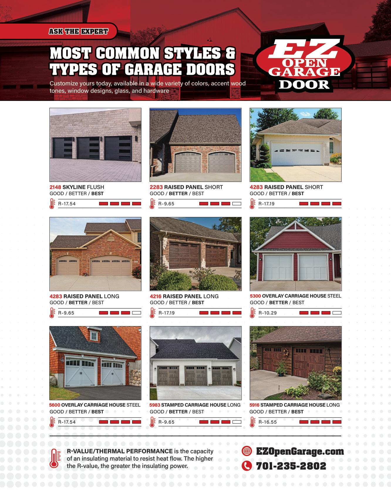
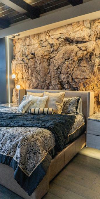
This 'boulder wall' bedroom remodel by Design 2 Sell will rock your world pg. 26
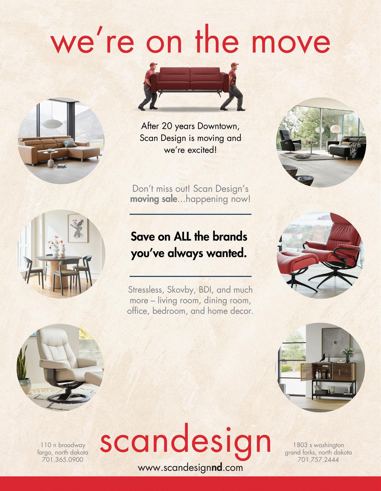
Fargo "A-Frame with a Twist" Airbnb feature pg. 36
COMPLIMENTARY ISSUE 004
Interior Designer
Plus





APRIL 2024

Mike Dragosavich
Brady Drake
Brady@SpotlightMediaFargo.com
Geneva Nodland, Grant Ayers
Kim Cowles
Ty Betts
Josiah Kopp
Nick Schommer
Kellen Feeney
Tommy Uhlir
Megan Suedbeck
Ben Buchanan
Austin Smith
Paul Hoefer
Paul@SpotlightMediaFargo.com
Sam Winter Sam@SpotlightMediaFargo.com
Al Anderson Al@SpotlightMediaFargo.com
Tori Helland Tori@SpotlightMediaFargo.com
Dave McSparron Dave@SpotlightMediaFargo.com
Austin Cuka
AustinCuka@SpotlightMediaFargo.com
ClientRelations@SpotlightMediaFargo.com
Jenny Johnson
Jessica Mullen
Miranda Knudson
John Stuber

Volume 1 Issue 004 HOME by Trendsetters is published by Spotlight LLC, Copyright 2024 HOME by Trendsetters & trendsettersfargo.com. All rights reserved. No parts of this magazine may be reproduced or distributed without written permission of HOME by Trendsetters, and Spotlight LLC, is not responsible for, and expressly disclaims all liability for, damages of any kind arising out of use, reference to or reliance on such information. Spotlight LLC, accepts no liability for the accuracy of statements made by the advertisers. Spotlight, LLC 4609 33rd Ave S Suite #304 Fargo, ND 58104 or info@spotlightmediafargo.com ADVERTISING: 701-478-SPOT (7768) HOME by Trendsetters is published 12 times a year and is available at area businesses and online at trendsettersfargo.com Publisher EDITORIAL Editorial Team Lead Editors Art Director Editorial Graphic Designer Creative Strategist INTERACTIVE Business Development Manager Business Development Associate Videographer Director of Creative Strategies Graphic Designer Web Developer ADVERTISING VP of Business Development Sales Manager Sales Representative Sales & Marketing Advisor Senior Business Development Representative Business Development Representative Client Relations Client Relations Manager Marketing Coordinator Operations Assistant DISTRIBUTION Delivery
BY TRENDSETTERS MAGAZINE


CONTENTS TABLE OF PARTNER CONTENT: Hearing Solutions LaValle Flooring ISSUE 004 16 26 KATIE SULLIVAN: DOMESTIC STUDIO ROXANNE KIRBY: "ROCK WALL" BEDROOM REMODEL 10 14 Katie Sullivan: Domestic Studio Roxanne Kirby: "Rock Wall" Bedroom Remodel Airbnb Feature: Fargo "A-frame with a Twist" 16 26 36

What’s up with earwax?
by Audiologist Dr. Matthew Frisk
Earwax, also known as cerumen, is a waxy substance that everyone has in their ears. Glands in the ear canal produce wax to protect the skin inside the ear. Earwax is actually not a wax, but rather it is a combination of skin cells, oil from the skin, cholesterol, and keratin. As much as it is a nuisance, earwax is necessary. Without it, the ear would be extremely itchy. In fact, cerumen also acts as a moisturizer, lubricant, and water repellent and also protects the lining of the ear canal from certain bacteria. Follow along as we learn more.
Color
Ear wax comes in a range of colors many of which you should not be concerned about.
Healthy: off-white, yellow, orange, light brown, or dark brown
Contact a Healthcare Professional if: green, black, or very brown with red streaks
A Note on Cleaning
Normally, the ear takes care of itself whereby the wax is automatically eliminated by daily activity movements of the jaw. Thus, most people don't need to worry about cleaning their ears. However, when you introduce a daily worn earplug, earbuds, or a hearing aid into the ear, a mild wax problem can become a big issue if not treated correctly.
About 5% of adults have excessive or impacted wax. In very small ear canal cases, the wax production may be normal but it gets occluded more easily. This is less of a “too much wax” and more of a “no room for it to go” problem. If you wear earplugs at work or engage
in prolonged earbud use, this can cause the wax to back up and eventually become impacted. A classic symptom of an impacted ear would be a significant and sudden reduction of hearing, along with a plugged ear sensation. Other symptoms include pain in the ear or a sudden increase in the sound of your own voice.
If you suspect that you have a wax occlusion or wax build-up, your first step would be to discuss this with your hearing care professional. In some cases, home treatment of earwax may be attempted. We as audiologists see several good home treatment methods to remove wax, but also see many bad ways to do it as well.
Acceptable Home-Cleaning Methods
• Cleaning kits such as Debrox or Earwax MD are effective agents and are safe on the lining of the ear.
• Irrigation of the ear canal— which involves using body temperature water along with a syringe and a drain cup that catches the water and wax combination. Note: can cause an ear infection if done improperly, and can be painful if the water is inserted too quickly.
Unacceptable Home Cleaning Methods
• Q-tips can push the wax further down the ear canal and can puncture the eardrum.
• Ear candling is the worst possible method to clean ears. It is NOT safe or effective.
Our Methods
• At the Hearing Clinic, we prefer the method called microsuction. Microsuction is the skilled technique of using a binocular

microscope along with a controlled suction to remove wax within the ear canal.
• A curet can also be used to remove cerumen if it is in the first half of the ear canal. A curet is a small curved tool that is inserted into the ear canal to scoop out the wax. For impacted earwax, or wax that extends past the second half of the ear canal, microsuction is recommended. In our clinic, we use microsuction to clean the vast majority of ears we see. Microsuction is a very precise way of cleaning the ears. The microscope allows us to accurately and comfortably remove cerumen at or near the eardrum. The procedure is usually painless, however the noise of the suction can be somewhat irritating. The process is not messy and usually takes about five minutes per ear.
After Treatment
After an ear cleaning is performed, we recommend that the patient use a small amount of a combination of mineral oil and vitamin E to lubricate the ear canal and keep it from producing more wax. Be careful of using ear drops that have added preservatives or many different ingredients as this may irritate the ear canal. Visit the clinic today!

| hearingsolution.net
| /hearingsolutionsfargo
| 701-232-2438
| 2700 12th Ave S Ste D, Fargo, ND 58103
Expert
Ask the
10 HOME BY | APRIL 2024


Never Stop Creating
One of my favorite things about April— besides the warmer weather—is watching the hibernating earth around me slowly wake up and bud with new life. I think spring is often overlooked and under-appreciated, in fact, I recently heard someone say spring is their least favorite season. But I want to challenge that for a moment and share why spring is such an important season. Spring is a season
of transition; it prepares you for what's next. Seasons like this are important in life as well. Maybe you're like me and sometimes find yourself in a creative rut (winter), just wishing for something to manifest itself. But that's not what makes life meaningful.
I would argue that we are all creative beings—created to create— it's embedded in our DNA in some way or another. You might say, "I
don't have a creative bone in my body!" But I think we all do—and a good place to start is by looking at what brings you joy. Lean into those creative outlets you have—the journey of creating is what gives life meaning. Embrace the spring in your life and take comfort in knowing that the finish line is meaningless without the journey of the race.
My second piece of wisdom is to share what you love with who you

EDITOR'S NOTE

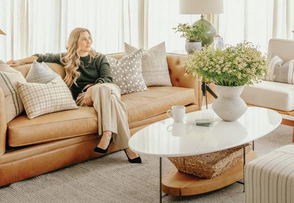
love; don't be an introvert with your passions—there are so many people around you who could be blessed by it. In fact, I recently had the privilege of sharing the story of someone who did just that—and she turned it into her full-time vocation. Katie Sullivan is a West Fargo interior designer who started as a blogger, sharing her creative passions through writing. She began sharing DIY updates and tips regarding her and her husband's new home. Katie's readership grew until she began offering professional design services. Now, she runs her original blog, Pretty Domesticated, alongside her fullservice design studio, Domestic Studio.
Whether you have an entrepreneurial curiosity or just want to start a new hobby, I encourage you to get out there and try new things this spring— who knows where it will take you. Spring blessings to you and your loved ones!
 Josiah Kopp Editor



From Blogger to Interior Designer
How Katie Sullivan Turned a Creative Outlet into a Career
By Josiah Kopp
West Fargo Interior Designer Katie Sullivan has always loved creativity and sharing her ideas with others through writing. But it wasn't until after having her first child that she realized she needed a creative outlet to keep herself engaged and inspired while being a stay-at-home mom. Because of her background and degree in journalism, she naturally took to writing, so, she started an online blog.
"It just happened that we bought our first home... my husband was super handy, and I had creative ideas," Katie said. "So when I was writing about stuff, the thing that most people were interested in was when I'd write about our house." And thus, her blog, Pretty Domesticated was born.
The Minneapolis native's journey into interior design was rooted in a childhood rich with creativity and encouragement. "As a kid, I was always super creative," Katie said. Despite not having a formal
16 HOME BY | APRIL 2024
Photo by Josiah Kopp
background in interior design, Katie's family nurtured her and her siblings' creative pursuits.
In addition to her visual arts talent, Katie developed a passion for writing during high school and college. "The outlet has changed, but there's always been a creative aspect of my life," she said. After graduating with a degree in print journalism from the University of Minnesota, Katie initially worked as a freelance writer. Her career path turned into marketing, predominantly with engineering companies. It wasn't until she had her first child that her career took a significant turn.
"I was planning to return [to my job] after maternity leave, but I didn't see myself pursuing that in the long run," she said. Instead, she embraced the role of a stay-at-home mom for about a year, during which she sought a creative outlet, and in 2016, she started Pretty Domesticated, a home and lifestyle resource blog.
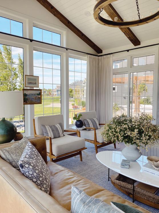
However, it wasn't until she and her husband Daren built their first home that Katie discovered her passion for interior design. "I found myself reading everything I could about design, [browsing] all the magazines, and looking for inspiration online," she said. This enthusiasm led to documenting the addition of a sunroom to her house on Instagram, a project that significantly increased her following and encouraged her to explore interior design.
Not having a formal design background didn't stop Katie from relying on her resourcefulness and passion for learning. "I made an effort to learn the
• Entrepreneur, Interior Designer, & Blogger
• Built an online community via Pretty Domesticated
• Wife & Mother
principles of design, to know proper scale and industry standards," she said. This self-taught journey for Katie was marked by studying the work of prominent designers like Trever Hill, Katie Curran, and Lindsey Grace, who became valuable mentors.
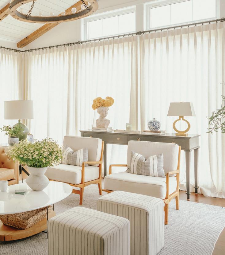
Katie's passion and drive quickly put her on the map, instantly making waves in the community and creating some truly beautiful interiors, many of which you can see in this story. After her confidence and portfolio began to mature, Katie realized the need to branch out into offering more established interior design services—yet she didn't want to do away with her DIY blog. So, in 2023, Katie expanded her brand into two sister businesses: the original Pretty Domesticated and a new full-service interior design firm, Domestic Studio. She explained that while Pretty Domesticated grew from a DIY and personal design background, Domestic Studio specializes in luxury services like full home renovations and new builds.
Yet, Katie noted the importance of maintaining Pretty Domesticated for its community, focusing on the personal side of design and continuing to offer
something to her DIY enthusiasts. "Pretty Domesticated still exists to document more of the personal, unpolished side, where I can share what we're up to, and then also have resources for people who want to [DIY]," Katie said. "With Domestic Studio, the community may not necessarily be the same. So I thought it would be best to have the separate businesses that are servicing the diverse needs [of homeowners]."
Domestic Studio: Katie's Newest Chapter
Domestic Studio offers a range of services to suit various client needs. Sullivan described her full-service design as a turnkey experience where everything, including furniture installation, is managed by the firm. For those who prefer a more hands-on approach or have smaller projects, Domestic Studio offers virtual design services, providing designs for clients to execute themselves. This service allows clients to implement the design in stages, accommodating different budgets and timelines.
Additionally, Domestic Studio provides one-on-one consultations. These can range from one-hour sessions to full-day sessions, which offer flexibility for clients who may need only specific guidance or who wish to manage most of the project themselves.
The essence of her brand lies in creating spaces that are not just aesthetically pleasing but also genuinely livable. "I want it to be beautiful, but not stuffy; it's

Project photos provided by Domestic Studio CONTINUED
17

not supposed to be a showroom. You want it to feel good when you're in it but you want to feel like you can live in it too," she said.
Sustainability is also a core component of Domestic Studio's design philosophy. Katie prefers using sustainable and natural materials and aims to be resourceful in her design approach. "I design for it to last," she said. While she incorporates current trends, her focus is primarily on creating a timeless space that reflects the homeowners' goals. "The goal is for [the home] to reflect the people living there and to have a timeless quality," she said.
Advantages of Working with Katie
Katie believes that the foundation of a successful design project is trust between the designer and the client, understanding the client's main goals, and choosing a design that supports their lifestyle.
One especially unique aspect of Domestic Studio's design process is Katie's use of AI and photorealistic renderings to assist her clients in visualizing potential designs. "I can create AI renderings that [aren't the final design], but get a feel—you can create some pretty dreamy spaces," she said. This approach enables her to present unique and personalized options while maintaining project efficiency.
Katie uses tools like Discord Midjourney to conceptualize AI designs, and from there works alongside contractors and architects to create the exact space to scale via photorealistic renderings, including every furniture and decor detail. She also offers an organized, streamlined process that aims to reduce stress and save money for her clients. She works in a step-by-step process and communicates upfront to clients, ensuring transparency and setting clear expectations regarding project cost and timeline.
Home Improvement Tips 3
1. Invest in high-quality, customized furniture that will stand the test of time in your main living spaces, then save elsewhere.
Performance fabric, in particular, will take you a long way. You can always recover a well-made chair or refinish a wood table if the styles change.
2. Skip the painted or wallpapered accent wall and do the entire room instead. This is a controversial take, but I promise you won’t regret it. The room will feel more finished.
3. Never underestimate the power of a fresh coat of white paint.
Benjamin Moore
Swiss Coffee is one of my go-to's, but always sample a large swatch on your wall. Paint can do funny things in the light, especially white.
18 HOME BY | APRIL 2024
Outlook for 2024 Trends
For her outlook on 2024 design trends, Katie highlights several emerging styles, including the return of 90s aesthetics, which she calls "country club chic" or "grandpa chic," characterizing them as warm, inviting, and rooted in the past, thus lending themselves to classic interpretations. She also mentions the trend of "quiet luxury," which combines luxury with livability, utilizing materials like linen that age well and look sophisticated.
"I'd say the biggest trend right now in making a space feel classic would be [the use of] red paint or reddish-purple
paints," Katie said. "10-15 years ago, everybody painted their accent walls red or muddy brown colors, and I never thought I'd be using red again. But it feels really good right now. And I think the way to make it [feel] classic and lean into the trend now is to go all out and do what we would call color saturation where you [paint] the trim, the ceilings—the whole thing. So you're not just painting one wall."
Lastly, Katie says murals are also making a comeback, transitioning from hand-painted art to more accessible wallpaper versions. She views murals as timeless due to their artistic nature.

CONTINUED
Photo by Josiah Kopp

Featured Projects from Katie's Career
A Balanced Family Home Renovation, Full-Service Design West Fargo, ND
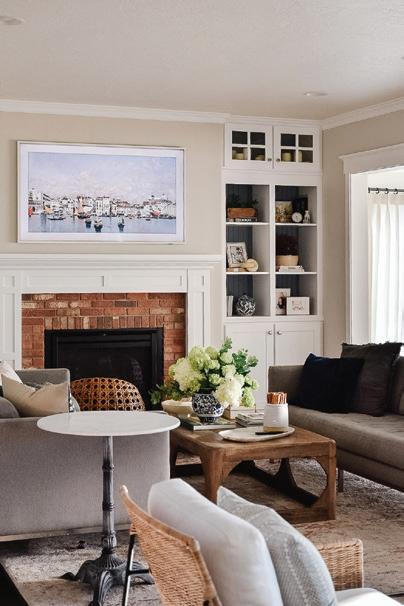
"What began as a builder-grade house was transformed over time into a family home filled with character and meaning—documented thoroughly on my blog, Pretty Domesticated. The end result is a sort of living gallery, a medium for personal artistic expression. It embodies our belief that the most memorable homes are the ones that mirror their owner’s essence."
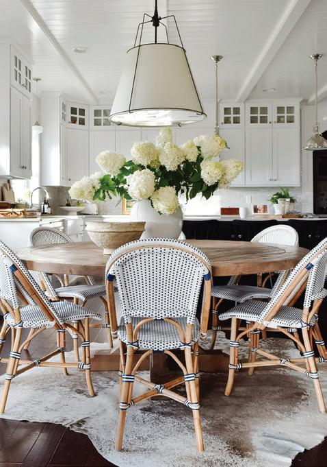
The above photos are Katie Sullivan's own home, which you can browse, room-by-room on prettydomesticated.com/shop-my-home. Here you can shop for every piece of furniture, decor, and paint swatch used in each room.
CONTINUED
20 HOME BY | APRIL 2024
Commentary from Katie Sullivan

A Character
Filled Bath
Remodel
Fargo, ND
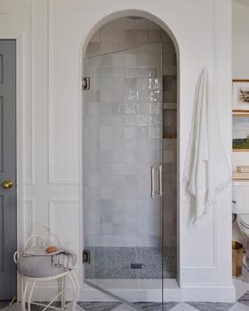
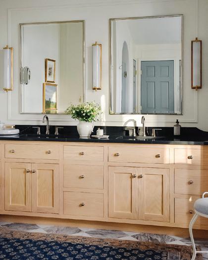
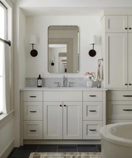
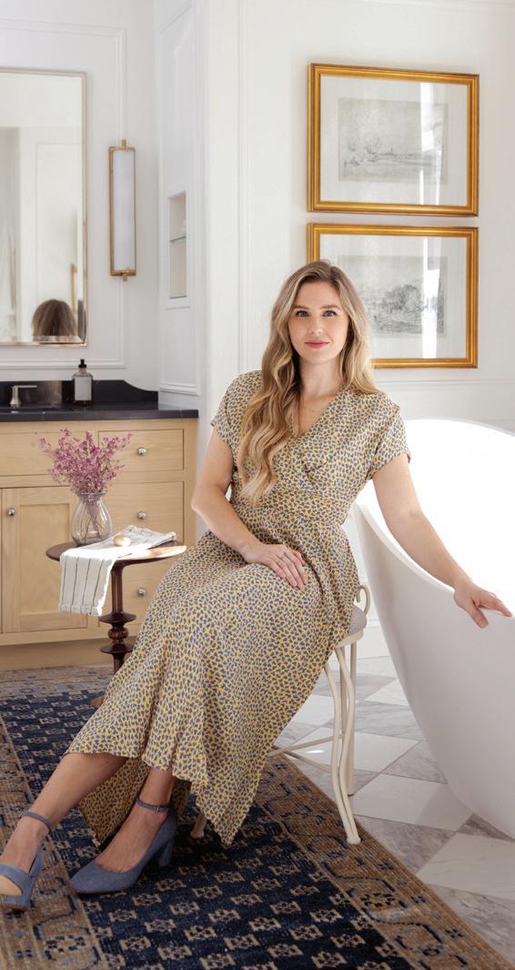
"The goal of this bathroom renovation was to brighten and modernize the space without carrying it too far from its classic roots that tied it to the rest of the home. We paid homage to the original blue and yellow color palette with accents of blue and gold against crisp white walls. We kept the original footprint, focusing instead on installing a timeless stone checkerboard floor and one-of-a-kind patterned curtains."
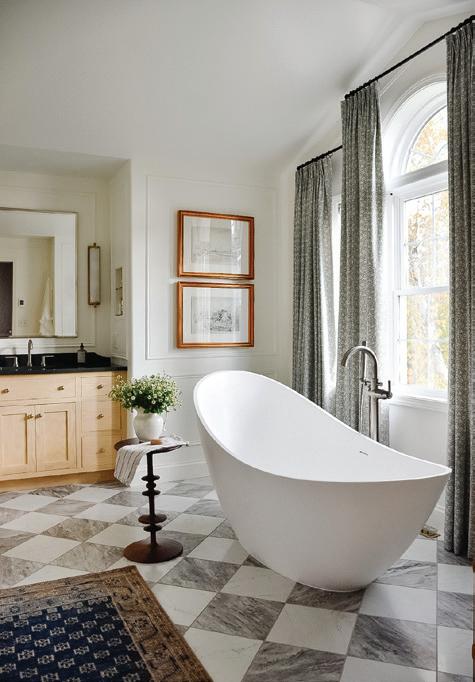
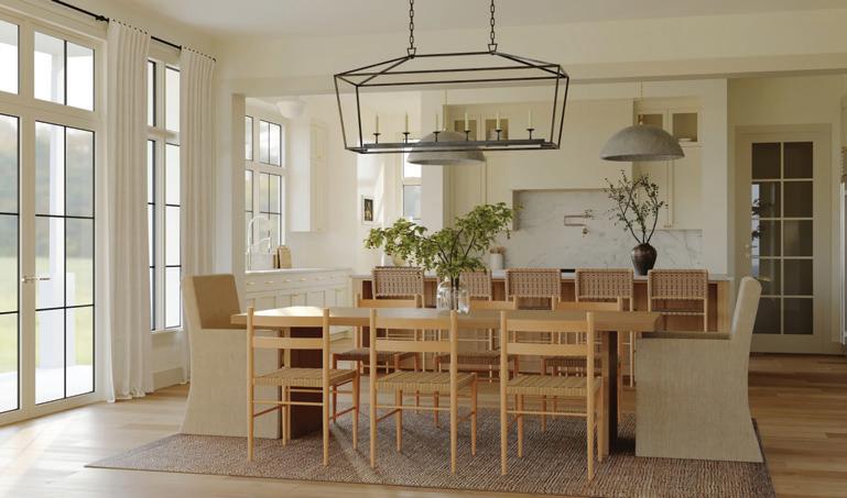
At first glance, these might look like photos. However, these renderings are a perfect example of the imagery Domestic Studio can provide clients before project execution.
An Organic Transitional Home
New Build
West Fargo, ND
Architect: Strom Architecture
Builder: Radiant Homes
"This home is a marriage of old-world charm and modern livability—a truly sensory experience of natural, enduring materials like solid oak, wool carpets, linen textiles, and curation of metal finishes. Inspired by the muted tones of natural landscapes, we chose soft, airy, and warm hues, utilized with intentionality to complement the existing architecture." CONTINUED

Featured Projects
23

Strom Architecture

Current Electric

McNeal & Friends
Local Home Professionals
Katie Recommends Working With 3
"Jackson Strom and his team are creative, professional, and talented. They share the value of exceptionalism over just 'good enough,' and above all they are a pleasure to work with."
"These guys are my go-to electricians. They are reliable and do great work."
"Great resource for quality furnishings. This is where I stop by when I'm in need of last-minute styling items."
with Katie Sullivan A&Q
One thing I really appreciate about you is how down-to-earth and relatable you are, even mentioning on your website, “I’m just a woman trying to figure it all out.” As a female business owner and a creative, what do you hope to demonstrate to other women in business or those with a dream of owning a business?
There’s the saying, “You can have it all, but you can’t have it all at once.” I think that’s so true. There’s so much out there about work and life balance and how to have it all, but I think it’s important to realize that pursuing a dream also comes with sacrifices. While my kids were really young my blog and social media content were taking off and people were reaching out to ask about hiring me for design services. It would
have been the perfect time professionally to dive into starting a design business, but I knew it wasn’t the right time for me personally. I made a conscious decision to keep my business small at the time. I’m pretty driven so it was hard for me not to try and do it all at once, but I’m glad I let my business evolve with me instead of rushing in.
Also don’t be afraid of a pivot. You have to try different things—that’s how people find what they’re meant to do.
You mentioned you enjoy baking—what’s been your favorite baked treat you’ve made for gatherings lately?
My baking habit tends to ebb and flow depending on my schedule, but when I have the time I love to bake
24 HOME BY | APRIL 2024
Photo by Jill Ockhardt Blaufuss
cakes of all kinds. I have all the tools and find the process almost therapeutic. However, my kids' preference is always good old fashioned chocolate chip cookies. You can find one of my go to recipes on prettydomesticated.com
You recognize that remodels are big investments, which is why you have your DIY blog, Pretty Domesticated, for people on a budget. Why is this blog so important to you and Domestic Studios’ story?
My story has been more of an evolution than a journey. Pretty Domesticated started as a passion project for a stay-at-home mom, but has always been dedicated to thoughtful, enduring interiors. That mission extends to my design firm, Domestic Studio. At the core of both brands is a mission to help people love their homes, whether that be through design tips on the blog or through our elevated design services at Domestic Studio.
A big priority in your design philosophy seems to be in creating spaces where people will want to make lifelong memories. How has having a family of your own shaped that philosophy?
I was lucky enough to grow up in a home that felt welcoming and beautiful, but what struck me most was that it felt very personal. It was professionally designed, but didn’t feel like any of my friends’ homes. My parents still live
there and while there are aspects of the home that could use an update, when I walk in it still feels beautiful because it’s undeniably an extension of my family’s story. Having my own family didn’t change my philosophy, it reinforced it. If you can come home, and actually feel at home, that’s great design.
You started pursuing this career after having your first child. Now, you’re a mom of three—how exciting! What has being a mom taught you about design and creating beautiful, livable spaces?
Kids don’t care about how beautiful a room is—they care if it feels inviting and if they can live in it. A great home holds space for what truly matters—all the messes, memories, and milestones. I make an effort to really understand my clients’ lifestyle and routines so that I can craft spaces that not only feel beautiful, but also enrich their lives.
Being a mom has taught me about what materials last because we put our furnishings through the ringer. If I recommend a material to a client with young children it’s because I can speak from experience that it’s going to wear well.
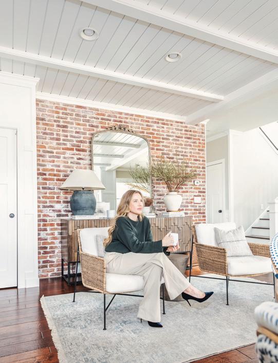
When you do need time to recharge and refresh, where do you go to get reinspired?
When I need to recharge and refresh, I unplug from technology and indulge in my own life. I feel calmest at our
lake cabin in Minnesota—life is slower there. I feel more connected to my family and the outdoors.
I’ve always been inspired by nature; the color palettes and tactility of my designs are inspired by what’s found outside my windows.
When I get a chance to listen to a podcast, I really love "The Interior Collective," which is a podcast featuring lessons learned from successful interior designers. I love learning from the experts who have paved the way.
My dad, who is a pro DIYer, once told me: If you’re going to hire a professional, ask to see their own home or homes where they’ve done work in. I think that’s brilliant. In fact, you have a tour of your home on your website. Why do you think that’s so important?
My home is my design lab and an honest reflection of myself and my family. My goal is to welcome people into that story. I take the biggest risks in my own space, so it’s a great reflection of what I can do. I don’t copy and paste my style onto others, but chances are if you see images of my home and they resonate with you, Domestic Studio would probably be a good fit for your project.

| domestic-studio.com | prettydomesticated.com | @prettydomesticated | @domestic_studio How to Support Katie 25
The Bedroom With a Rock Wall

HHere at HOME by Trendsetters, we have featured some of the most unique home design projects in the area, from in-home basketball courts to the fairytalelike Airbnb rental on the cover of our last issue—but you've never seen anything like this bedroom remodel.
a "rock" wall was born. Roxanne's immediate thought was, "This is a little wild—how are we going to do this?" But she and her team were up for the challenge—and the result is stunning.
 By Josiah Kopp
Photos Provided by Design 2 Sell
When the homeowners first approached Roxanne Kirby and the Design 2 Sell team regarding their remodel vision, they wanted something that reflected their love for the outdoors and their constant wanderlust: that's when the idea of
The homeowners wanted to create a space that felt unique to them; a sanctuary that felt like a collection of their experiences, memories, and travels. For them, the idea of
having a rock wall was a main priority. "We wanted to figure out some way to integrate a space that looks like you're living on the side of a mountain," Roxanne said.
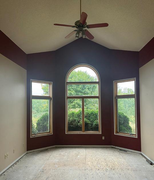
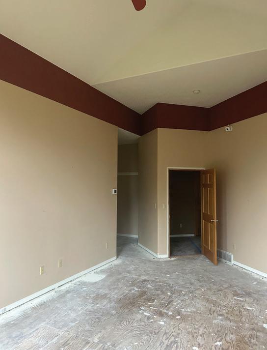
The second priority was replacing the honey oak trim and doors with updated, modern colors and tones. Roxanne's solution was integrating black trim, and incorporating more neutralcolored woods. The homeowners also wanted hardwood floors to replace the carpeting to add a level of luxury to the space.
26 HOME BY | APRIL 2024
The bathroom was a big undertaking, some divided walls were removed to open the space and allow for a large shower, which was another priority for the homeowners. The goal for the rest of the bathroom was to continue the dark and moody contemporary feel of the bedroom.
came in sizes far too small to cover an entire wall. So she had to seek another solution— which happened to be hiding in plain sight.
One of the first challenges Roxanne had to navigate was the vision for a rock wall in the bedroom. A quick online search will offer plenty of results such as pre-forms and 3D panels, but all of these
The homeowners have various wildlife taxidermy displayed in their home, with some pieces mounted on "faux rock" platforms. Roxanne researched the material, and sourced samples from a company in North Carolina. Finally, she had something she could work with to scale—a new problem arose, however. The foam panels had a repeating pattern. "I was like, 'Okay, wow. How the heck are we gonna make this look lifelike without people being able to distinguish all the different repeats of the pattern?' because that was a 12-foot by 10-foot panel," Roxanne said.

"When I got to this part in the researching and development of the design, we had everything else figured out, but this rock wall was the one hurdle for us."
That's when Roxanne called up an old friend and colleague, Hans Gilsdorf of Bucks Mill Brewing in Detroit Lakes. Gilsdorf proved to be the saving grace for the rock wall project. Earlier in his career, Gilsdorf worked for Blue Rhino Studios in Eagan, MN, an artistic exhibit fabricator and designer for museum exhibits, including the Smithsonian. With the connections Gilsdorf had, Roxanne was able to sample the materials Blue Rhino uses in their exhibits, which she described as a type of concrete composite board—
and the material proved to be a success.
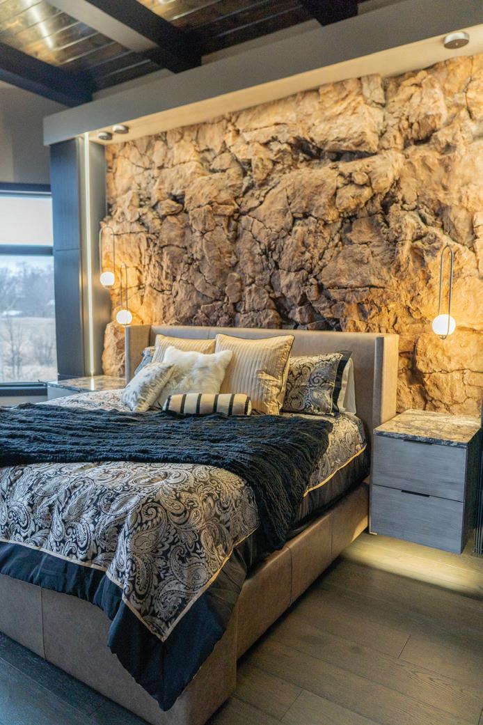
Dave Leak from Blue Rhino, the genius behind the design of the faux rock wall, chiseled and carved away with such detail that the final result looks like someone copied and pasted the side of a cliff right into a home—not just in detail, but in color and tone as well.
27
Continued >


How the Rock Wall Became the Centerpiece for the Rest of the Design
28 HOME BY | APRIL 2024
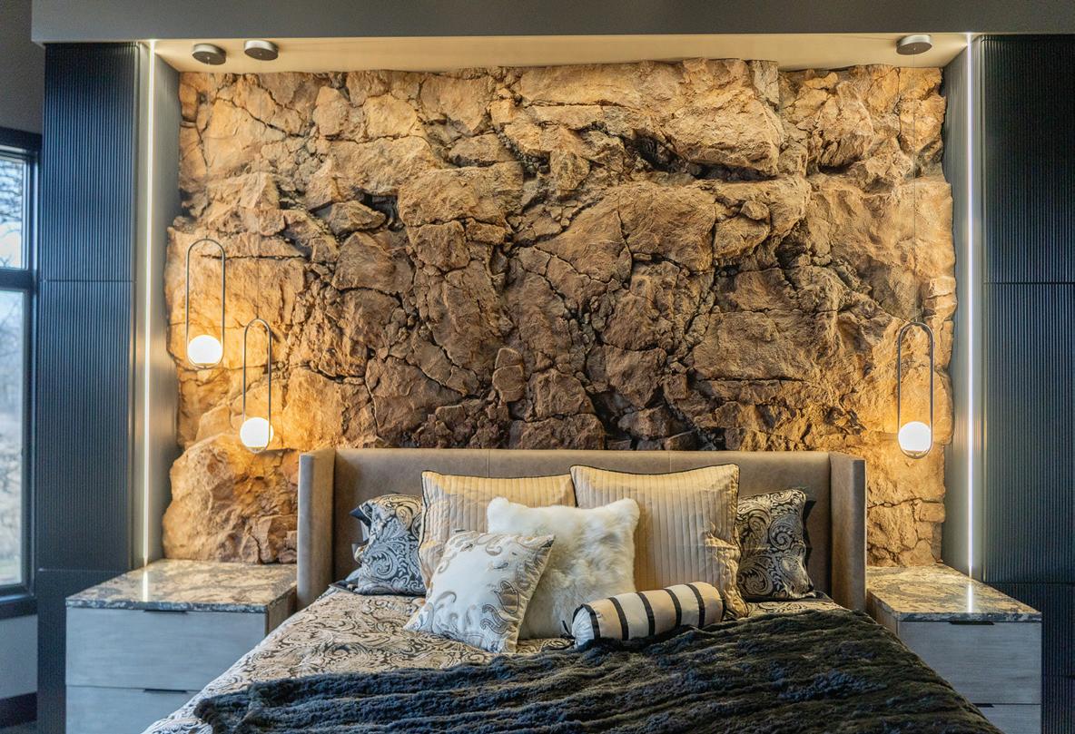
The faux rock wall acted as the centerpiece of the remodel, with everything else being designed around it in terms of mood, tones, and even lighting. Some of the inspiration for the remodel was also drawn from the homeowners' travels to Spain.
"We wanted [the space] to be moody and we wanted it to be natural and distinctive when you looked at it," Roxanne said. "But we also wanted the rock wall to have its own personality. The cool thing with natural rock formations is that when you look at one side versus the other side, it's not symmetrical.

That worked in our favor—we picked several SherwinWilliams paint colors and then played with [colors and tones] until we were happy."
Continued > 29

The Bathroom
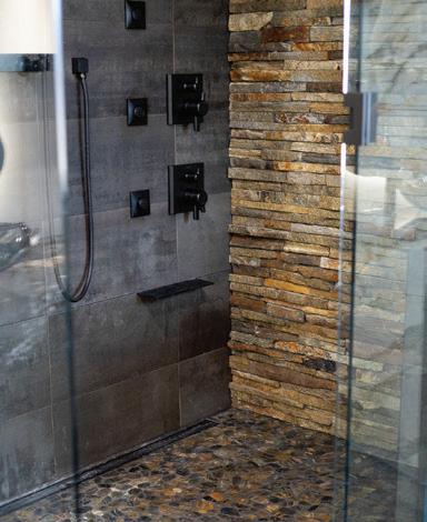
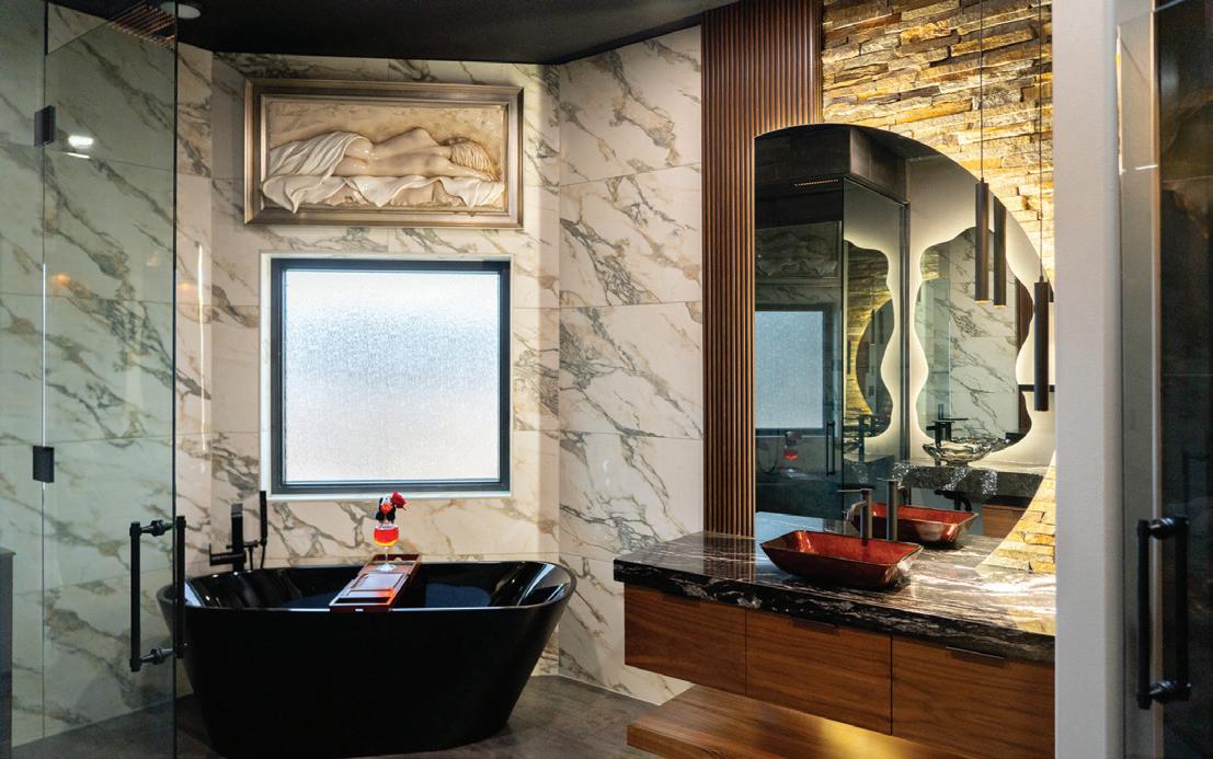
Stepping into the bathroom, you can see how the rock wall influenced things like the show tiling, which shows off a variety of tones and color variations. Roxanne says the secret sauce is in layering different products with different tones to help capture the overall essence they're trying to achieve. "It was so much fun and also eye-opening because now I'm in love with moody masculine design," she said.
As art collectors, the artwork above the bathtub was one of the many pieces the homeowners had displayed in their home, and Roxanne and her team found the perfect spot for this one, which complemented the marble wall perfectly while adding a unique element.
"It kind of plays into the sensuality of the space, complementing the dark, moody, and mysterious [elements] of the design, so I thought it was perfect," Roxanne said.
Another focal point of the design is the uniquely shaped mirror in the bathroom. The homeowners wanted two separate vanities with two separate styles, each

to have its own "moment," as Roxanne put it. Roxanne went to work drawing up a mirror shape that would create that wow factor moment. She worked with a local glass and door contractor who cut a custom shape, giving the vanity a one-of-a-kind personality.
"One thing that I enjoyed about this project was the ability to create lots of illusions," Roxanne said. "Sometimes a simplistic-looking design can be a lot more intense than you would imagine." The floating vanity and shelves are good examples of this, giving a sense of space and wonderment versus a standard design that meets the floor.
Continued >
31
How Lighting Played A Role
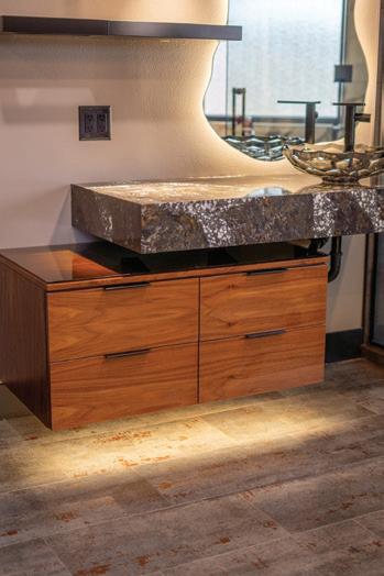
When the homeowners were able to visit the completed project for the first time and interact within their space, the reactions were nothing short of ecstatic. "The clients are absolutely in love with it; it's better than we could have ever imagined," Roxanne said.
"Whenever you have a vision for something meaningful to you—to be that [creative] medium for a client is so inspiring. The fact that we were able to have such a jawdropping before and after from concept to execution is incredible."
The out-of-the-box approach of creating a lifelike rock wall, the custom-shaped vanities, and all of the lighting solutions illuminating and giving mood to the space are what made this project truly special—and we can't wait to see what Roxanne and the Design 2 Sell team creates next.
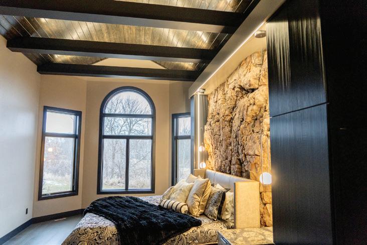
The bedroom had a pre-existing vaulted ceiling, which Roxanne decided to enhance with beams and lighting to help elevate the space and add character. LED strip lights were used on the beams, cleverly hidden while still offering full personalization and dimming control.
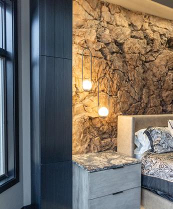
Additionally, LED strips were added along the top and sides of the bedframe to show off the dimensions of the rock wall. "We wanted to allow the rock wall to show all of the different thicknesses and texture and highlight the moodiness and shadowing with lighting," Roxanne said.
One lighting solution that Roxanne's team added was toe kick lighting under the floating nightstands, a trending style that adds a layer of safety when walking around at night. Toe kick lighting was also added under the vanities in the bathroom and LED strips were hidden behind the mirrors to give backlighting.


shopdesign2sellatthelakes.com
roxanne@design2selldl.com
/Design2Selldl
@design2selldl
@lakelivingdesigns2047 32 HOME BY | APRIL 2024
|
|
|
|
|



Fargo A-Frame
This Rental Feels Like a Cozy Cabin—But in Town with a Twist
 By Josiah Kopp
Top Features:
•3 bedrooms (3 beds), 1 bath
•Bi-level design
•Real wood fireplace
•Dedicated workspace
•Washer and dryer
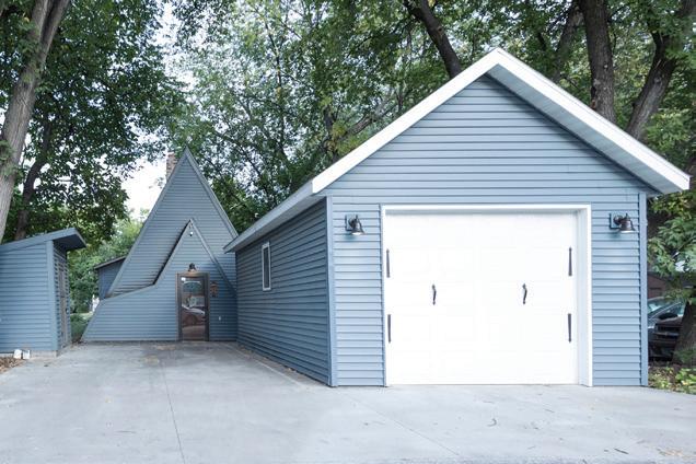
•Free single-car garage with additional driveway parking
•Jet soaker bathtub
AAre you looking for a unique stay within walking distance of downtown Fargo?
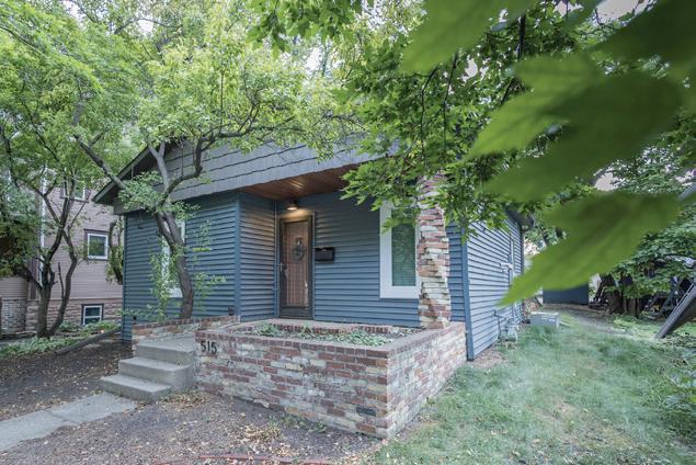
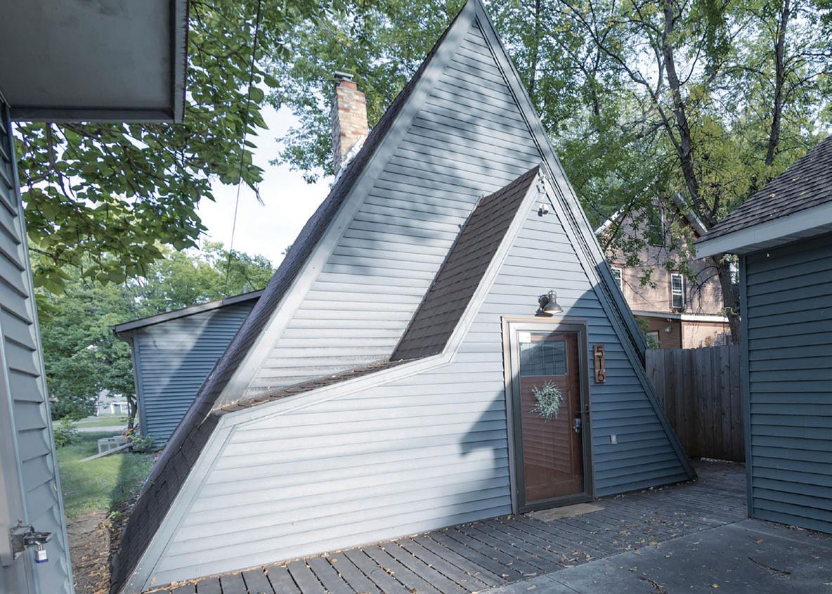
This A-frame rental in Hawthorne is one of the most unique Aribnbs we have found yet—and it comes with some really unique features.
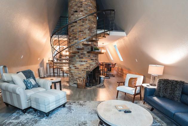
Owners Arika and Jim Elliott purchased the home to be their main residence after downsizing. They fell in love with the unique wood-burning fireplace, which is the focal point of the home. The Elliotts lived in the A-frame for several years before turning it into a short-term
rental after retiring and splitting their time between Florida and Pelican Lake, MN. Now, this beautifully unique rental can be enjoyed by guests looking for a fun and cozy getaway—without leaving the city.
Since the home is located in the historic Hawthorne neighborhood off 10th St S in Fargo, guests cannot stop or park on the street. Instead, the back entrance is used as the main entrance when arriving.
Photos provided by Alba Munro Photography
36 HOME BY | APRIL 2024


Continued>
Street-view entrance
Guest parking entrance


As you approach the rental, you will see how the A-Frame design stands out in the crowd of nearby homes with intricate masonry work off the front porch. As you enter the A-frame addition of the home, your attention is quickly diverted to the brick woodburning fireplace in the center of the room. The fireplace, with its floorto-ceiling design, is wrapped with a grand staircase leading into a secondstory loft space with an additional fireplace for a quaint surprise.
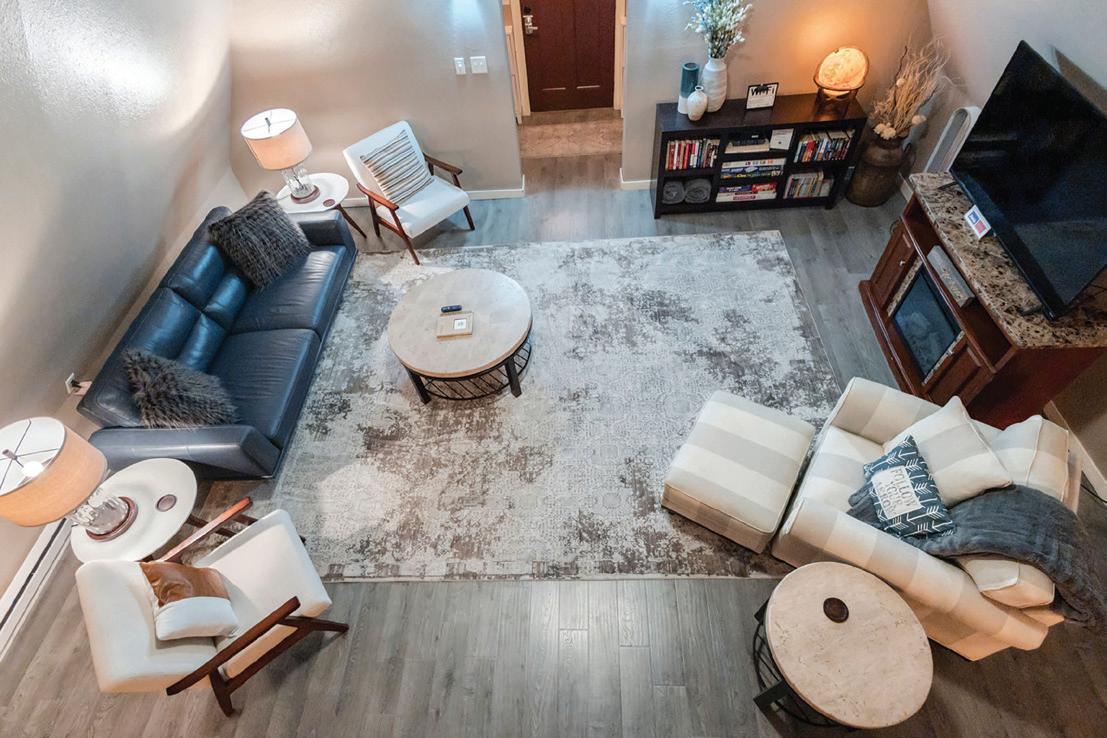
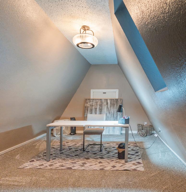
Up in the loft, guests can also enjoy the open view concept as they look down onto the spacious living room. A designated workstation in the loft also offers a cozy nook to get work done.
38 HOME BY | APRIL 2024

Did you know?
This Airbnb rental is located in the Hawthorne neighborhood—ranked 7th in the best neighborhoods to live in Fargo.
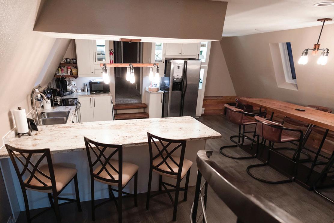
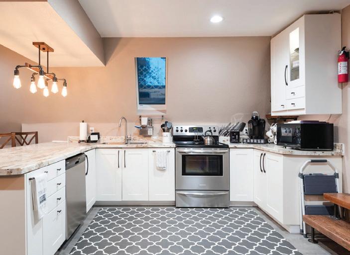
Back down on the main level, the living room offers plenty of comfortable seating with a large smart TV for cozy nights in. Past the staircase, guests have access to a full kitchen, complete with a stove/oven, microwave, and fridge for all of your cooking and food storage needs.
Granite countertop seating as well as a butcherblock-style high-top dining table offers plenty of seating for mealtimes and game nights.

Continued>
39


The hallway off the kitchen leads to the original home where guests will find 3 bedrooms, the bathroom, a laundry room, and the front door.
This rental is very popular amongst wedding parties but is also perfect for any kind of romantic getaway, special occasion, family gathering, or friendly reunion.
Scan this code to book your stay!
41


 BY TRENDSETTERS


 Josiah Kopp Editor


 By Josiah Kopp
Photos Provided by Design 2 Sell


 By Josiah Kopp
