

Interior
Interior
Interior


Interior
Interior
Interior


As summer makes one final stand, I’ve been trying to get out and make as many memories as possible, knowing I’m going to wake up one of these days to snowfall and regret all the warm weather I took for granted.
Reflecting back on this summer, I found myself all over the country for various work trips and personal travel endeavors, which means—I had quite a variety of places I was
able to call “home,” even if some were just for a night or two.
That got me thinking about what makes a home. Growing up, I always viewed “home” as a familiar place; somewhere I felt safe. For me, that meant my house, my grandparent's home, and a couple of close friends' homes.
Now, as an adult in his mid-late 20s, and in the midst of all of my travels, I discovered there are two main
attributes of what makes a home to me: a place to recharge and a place that inspires me. I like that this framework involves both the outside world (nature and my community) and myself—because "home" is a collage of your inner world and the elements of your community that inspire you and make you thrive.
Speaking of what makes a home, I can’t wait for you to see the contents of this issue—three local interior designers were challenged

with creating the ultimate mood boards—with a couple of fun twists—but I won't spoil it all here.
With love,

As I always encourage, get outside and enjoy the remaining days of summer and make lots of memories!

Josiah Kopp Editor



SEPTEMBER 2024
Volume 1 Issue 009
BY TRENDSETTERS
HOME by Trendsetters is published 12 times a year and is available at area businesses and online at trendsettersfargo.com
Publisher
EDITORIAL
Editorial Team Lead
Editors
Art Director
Editorial Graphic Designer
Creative Strategist
INTERACTIVE
Business Development Manager
Business Development Associate
Director of Creative Strategies
Graphic Designer Web Developer
ADVERTISING VP of Business Development
Sales Manager
Sales Representative
Sales & Marketing Advisor
Senior Business Development Representative
Business Development Representative
Client Relations
Client Relations Manager
Marketing Coordinator
Accounting Specialist
DISTRIBUTION Delivery
Mike Dragosavich
Brady Drake
Brady@SpotlightMediaFargo.com
Geneva Nodland, Grant Ayers
Kim Cowles
Ty Betts
Josiah Kopp
Nick Schommer
Kellen Feeney
Megan Suedbeck
Ben Buchanan
Austin Smith
Paul Hoefer Paul@SpotlightMediaFargo.com
Sam Winter Sam@SpotlightMediaFargo.com
Al Anderson Al@SpotlightMediaFargo.com
Tori Helland Tori@SpotlightMediaFargo.com
Dave McSparron Dave@SpotlightMediaFargo.com
Austin Cuka
AustinCuka@SpotlightMediaFargo.com
ClientRelations@SpotlightMediaFargo.com
Jenny Johnson
Jessica Mullen
Missy Roberts
John Stuber
HOME by Trendsetters is published by Spotlight LLC, Copyright 2024 HOME by Trendsetters & trendsettersfargo.com. All rights reserved. No parts of this magazine may be reproduced or distributed without written permission of HOME by Trendsetters, and Spotlight LLC, is not responsible for, and expressly disclaims all liability for, damages of any kind arising out of use, reference to or reliance on such information. Spotlight LLC, accepts no liability for the accuracy of statements made by the advertisers.
Spotlight, LLC

4609 33rd Ave S Suite #304 Fargo, ND 58104 or info@spotlightmediafargo.com
ADVERTISING: 701-478-SPOT (7768)

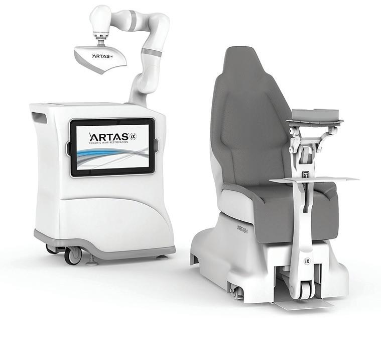
In recent years, hair restoration has seen significant advancements, with one of the most exciting being the introduction of the ARTAS™ iXi Robotic Hair Restoration system, a state-of-the-art technology revolutionizing the way hair transplants are performed by offering patients a more precise, less invasive, and highly effective solution to hair loss.
And Everest Regenerative Medicine is the exclusive provider of ARTAS iXi in Fargo and North Dakota.
The ARTAS™ iXi is an advanced robotic hair transplant system designed to perform follicular unit extraction (FUE) with unparalleled precision and accuracy. Unlike traditional hair transplant methods that rely on manual extraction and implantation, the ARTAS™ iXi uses cutting-edge robotics and artificial intelligence to automate these processes. This not only reduces the potential for human error but also significantly improves the overall results.

"It's a pretty impressive system," Everest's Dr. Beachy said. "Each follicular unit that it examines is being scanned 60 times per second. The human eye and the human brain can only scan things at about 10 to 12 times per second. The other nice thing about it is that it has a 44 micron resolution, which is about half the width of a hair. There are very few people in the world that can do what this machine can do."
The ARTAS™ iXi system is equipped with an intelligent algorithm that can identify and select the healthiest hair follicles for extraction. It then uses a robotic arm to gently and precisely remove these follicles from the donor area, usually the back or sides of the scalp. Once the follicles are harvested, the system carefully creates recipient sites in the areas experiencing hair loss. The ARTAS™ iXi then implants the follicles into these sites, where they will grow into healthy, natural-looking hair over time.

The ARTAS™ iXi’s robotic arm ensures that each follicle is extracted and implanted with precision. The system’s AI-driven algorithm also allows for meticulous planning of the hairline by taking into account the patient’s natural hair growth patterns.
Unlike traditional strip harvesting methods, which can leave noticeable scars, the ARTAS™ iXi performs FUE, a minimally invasive procedure that leaves no linear scars. This means patients can enjoy shorter recovery times and minimal discomfort.
The ARTAS™ iXi is designed to mimic the natural growth patterns of hair. The system’s precision in follicle placement ensures that the new hair grows in the same direction and density as the surrounding hair.
Thanks to its minimally invasive nature, patients undergoing ARTAS™ iXi hair restoration typically experience a quicker recovery period compared to traditional methods. Most patients can return to their normal activities within a few days.
The transplanted hair follicles are resistant to the hormones that cause hair loss, meaning that the results of an ARTAS™ iXi procedure can last a lifetime.
ARTAS™ iXi is suitable for both men and women experiencing hair loss who are looking for a long-term solution. Ideal candidates are those with sufficient donor hair and realistic expectations about the outcomes.
However, according to Beachy, it's important to understand that there can be many factors at play that contribute to balding and hair loss. That's why it's important to consult with a team like the one at Everest Regenerative Medicine to discuss options.
"95% of of male pattern baldness is androgenic alopecia, which is where as men get older, testosterone gets converted into a molecule called dihydrotestosterone (DHT)," Beachy said. "As DHT goes up, it enlarges your prostate and affects the blood flow to hair follicles. I always tell people hair loss is permanent, ongoing, and lasts a lifetime. However, healthy hair follicles are resistant to DHT. So, with the ARTAS™ iXi, we are moving DHT-

resistant follicles to the top of the head where most people experience hair loss. There are also medications we can explore to prevent or slow down further hair loss, but there is nothing that will make hair grow back. I think this isn't explained well very often."

| 3541 25th St S STE 200-B Fargo ND 58104
| 701-515-3030
| everestregenerative.com
| contactus@everestregenerative.com




Welcome to the HOME by Trendsetters interior designer mood board challenge! This is an idea my team and I have been working on for a while, and we're excited to share it with you!
We challenged three local interior designers to create mood boards—but it comes with a twist. Our team compiled a list of home interior themes, assigning two (very different styles) to each designer, seeing how they could take two wildly different concepts and create a whole mood board for each. But wait, there's more—each theme included a "wild card" Pantone color we selected, making it mandatory to include in at least one of the themes. Each theme required a mood board for a living area, kitchen, and bedroom.
The purpose of each designer having two themes assigned to them is to allow them to show off their creative expertise within different styles while giving you the reader inspiration for your next home refresh, remodel, or new build.
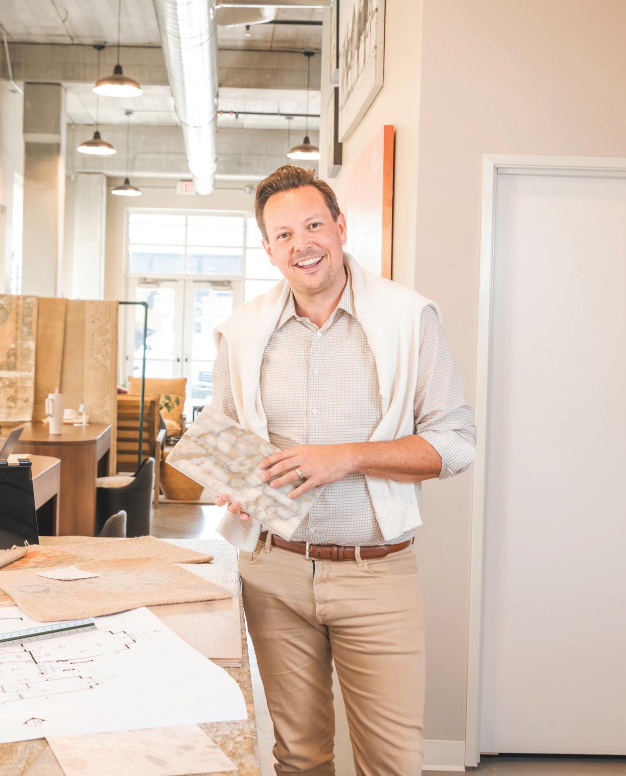
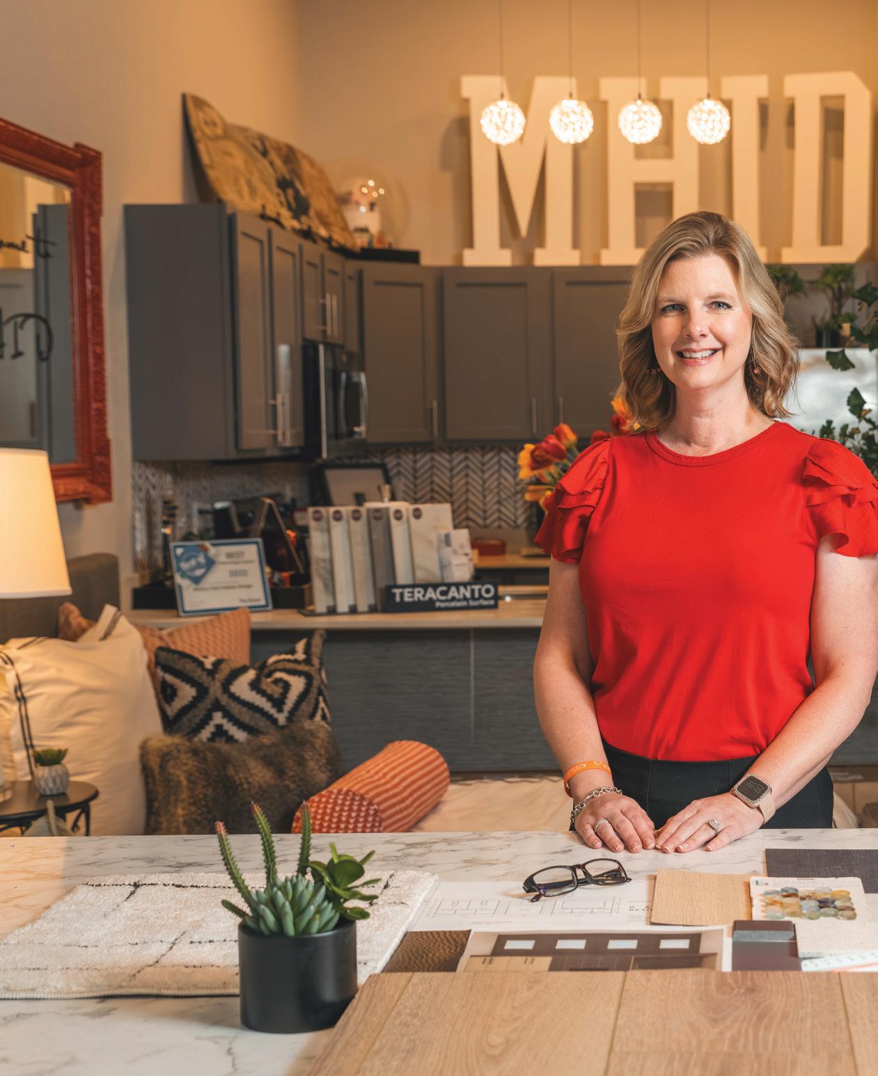
The three designers we chose for this challenge were Trever Hill, Monica Hart, and Katie Sullivan. Since you met these designers in our previous issues this year, we decided to bring them back to kick off this challenge!

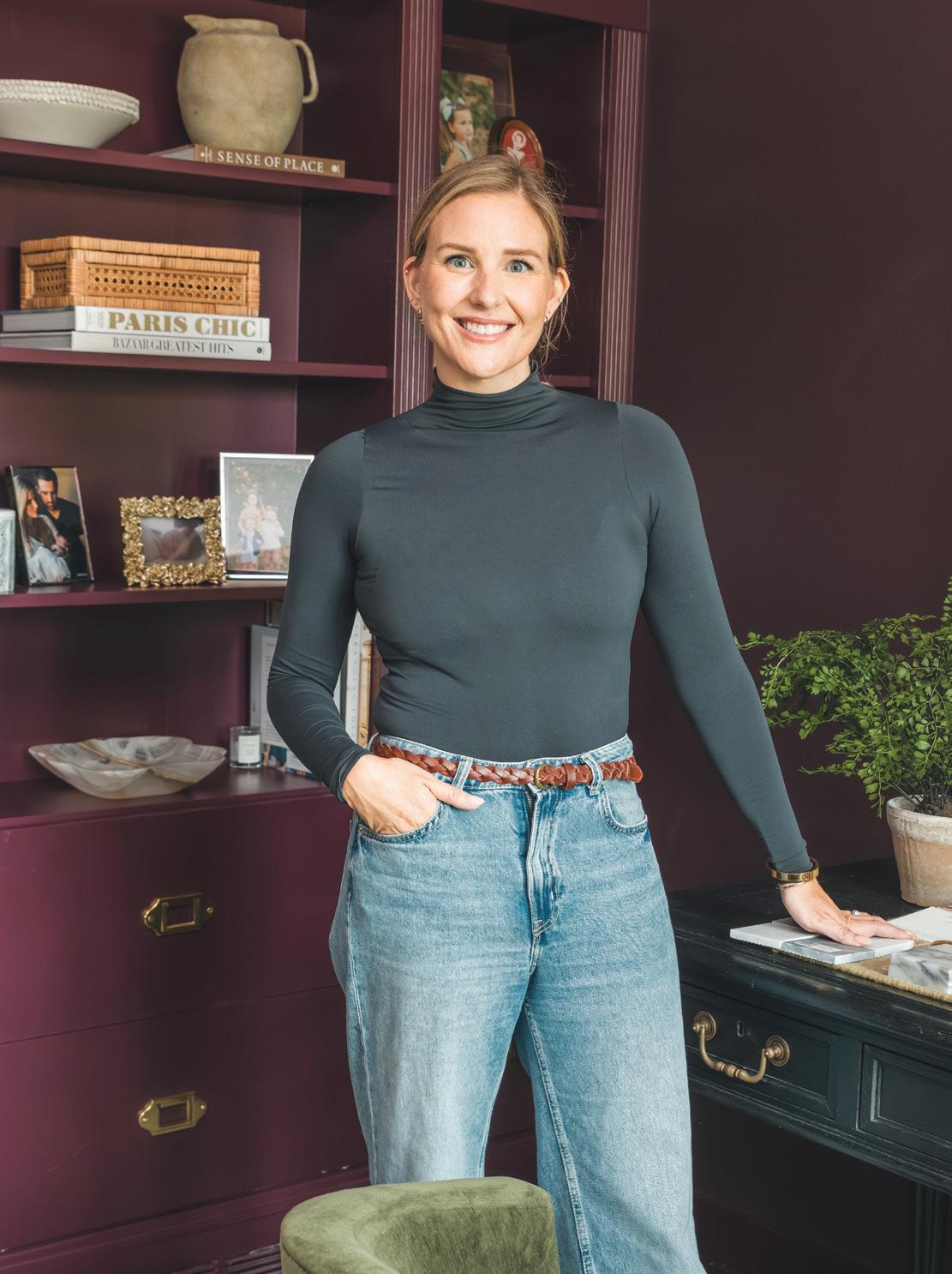
West Fargo's Katie Sullivan's introduction into the interior design world came in a bit of a different way than most. When she and her husband began remodeling their first home in 2016, Katie decided to start a DIY blog, documenting the journey. Her degree in journalism and love for home improvement became the perfect mix as she captivated readers through her blog, Pretty Domesticated. Her creative journey stemmed from that, leading to beautiful design projects that eventually led her to open her very own interior design firm, Domestic Studio in 2023. As a successful blogger, full-time interior designer, wife, and mother, Katie takes entrepreneurship to another level.


Commentary by Katie Sullivan
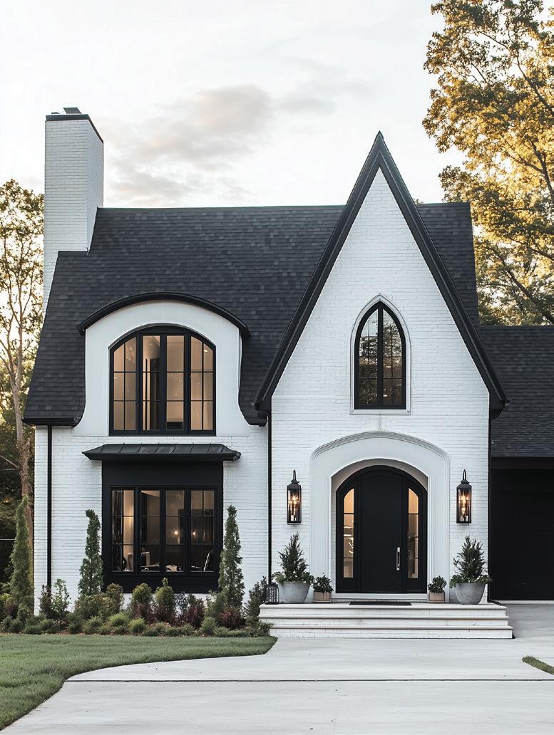
"Although I often avoid leaning too heavily into themes, it’s always good to have perameters in a project, rather than having 'the world is your oyster' mentality, because it leads to better design and creative solutions. To give myself a clear direction, I used AI to render an exterior. In a project, we would always start with the architecture before moving into the furnishings, so doing this helped me mimic the creative process I use when taking on client projects."
"For the 'Dark Velvet Modern Gothic,' I pictured it as a ground-up build, where the mock client was looking for a moody transitional aesthetic, drawn to modern gothic-style houses on Pinterest. A pointed arch, used for windows, doors, and decorative elements like porches, dormers, or roof gables, is the most recognizable feature of modern gothic homes, so I leaned into bringing the gothic element into the home through the architecture."
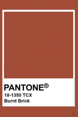
"For the wild card color Pantone 'Burnt Brick,' I opted for a more muted route, incorporating it mostly through subtle textiles. In the kitchen, it is indirectly incorporated—I used it as inspiration for the styling. The aged wood details have the same type of warmth. In the living room, the sofa and floral pillow reference Burnt Brick, and in the bedroom, you’ll find it in the textiles, including the pillows, throw blanket, and rug."


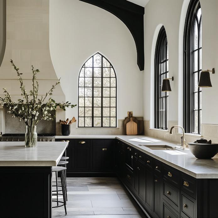

"In the kitchen, the design is centered around the pointed arch windows, which are really the star of the show. I didn’t want the kitchen to feel too dark; natural light is abundant in the space and I wanted to take advantage of that while still bringing an edgy and moody aesthetic. Instead of incorporating velvet directly into the kitchen, I used it as inspiration for the cabinets. The cabinets are painted Benjamin Moore Tricorn Black, a velvety dark color that has a lot of depth. Unlacquered brass hardware pops off the cabinetry and will age beautifully with time, adding to the old-world vibe. I pared back the rest of the finishes and styling for a refined look. Dark stained beams are also a nod to gothic architecture."
"I love the kitchen—I’m very drawn to modern tudors and modern gothic style. I’d probably consider moving into this house."


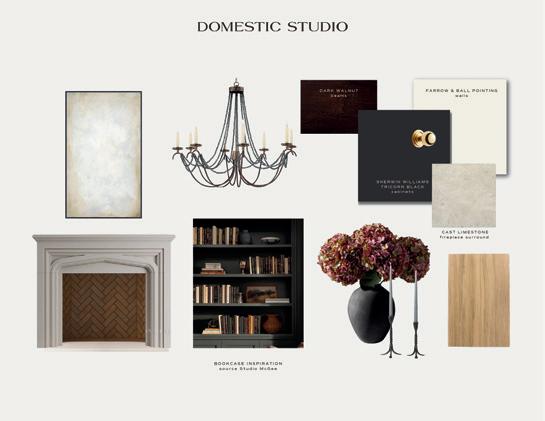
"In the family room, I chose warm white walls paired with the same deep paint color for the trim and cabinetry. The light fixture feels a bit gothic and was the perfect addition to the space. I then added high-end, transitional furnishings to make the space feel current. For materials, I mixed in lots of velvet for texture. The art, mirror, candles, flowers, and side table I added have Victorian influences without being too overt."


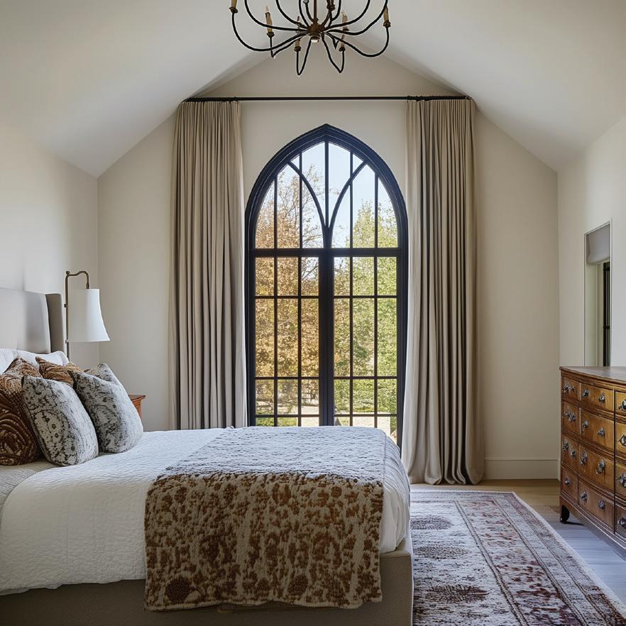
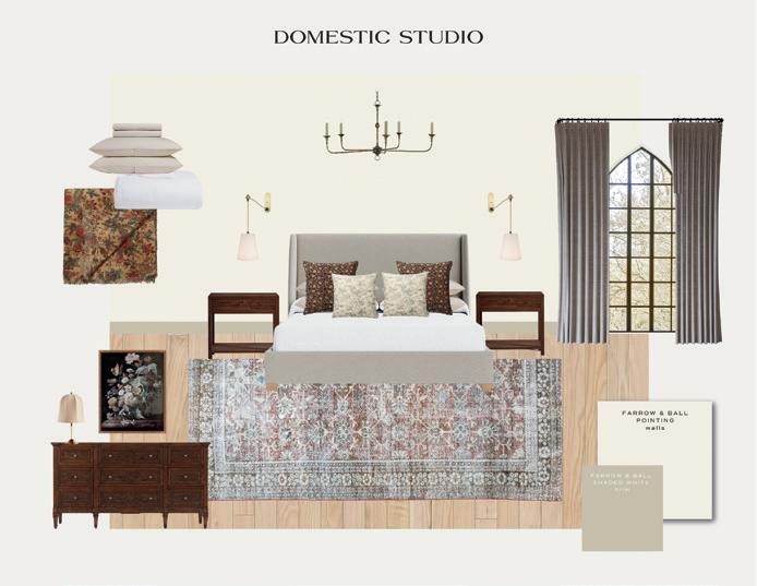
"For the bedroom, I wanted to change it up a bit, so I designed a more tranquil space. In a real home, you wouldn’t want every space to feel too moody or hit the same note. Again the focus is on the beautiful pointed window. The chandelier, dresser, and art are Gothic-inspired. When you think of Victorian style, florals are also a common element so I leaned into that with the textiles. I focused on mixing textures and patterns for a layered look. The bedroom feels congruent with the rest of the home, but a bit more restful."


Commentary by Katie Sullivan

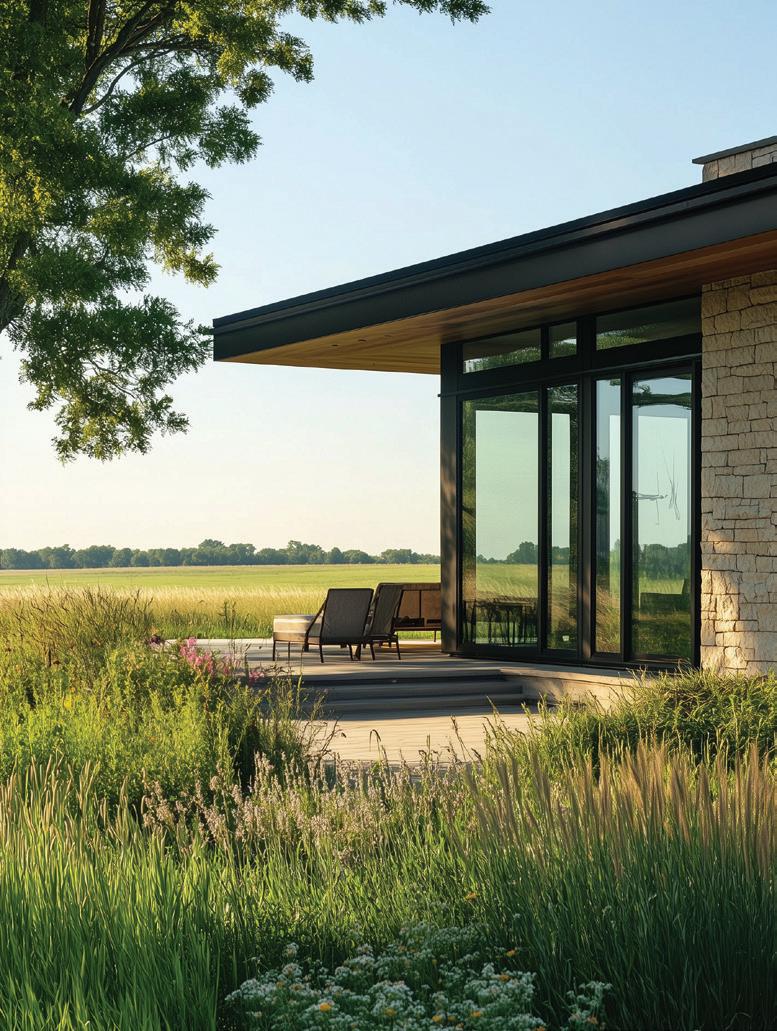
"Like the other theme, the first thing I did was use AI to render an exterior. I imagined this home to be for a larger family in Western North Dakota with lots of land, so the design was heavily influenced by the prairie, particularly through the finishes and color scheme. The original theme was Modern Chic, but I added the 'prairie' for a more distinctive style. The modern aspect comes into play through the architecture, while the chic element is found mostly through the furnishing choices."
"I had a lot of fun with the "Electric Blue Lemonade" wild card color. It’s used as almost a graphic element throughout the home. In the kitchen, you’ll spot it in the KitchenAid mixer. Then in the family room, I used it for a punchy flower moment and in the modern artwork. For the bedroom, you’ll find it in a few places; the bold pillow is the most obvious, but it's also used in the desk lamp and the art above the bed."
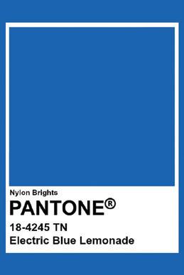
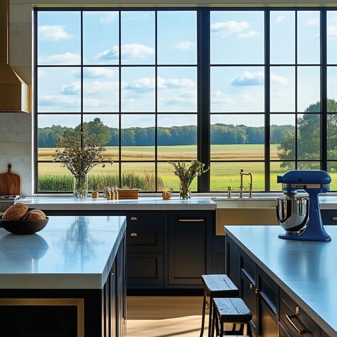
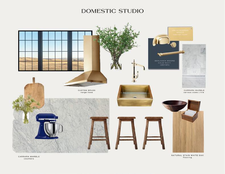
"The kitchen is the most modern space but has a little bit of unexpected glam. The bright blue wild card color was a huge influence on the space. I chose one of our favorite cabinet colors here, Benjamin Moore's Hale Navy. It’s a true navy blue that plays off the bright blue mixer well and still manages to feel neutral. Brass is prevalent throughout the space, which is a reference to the golden tones of the prairie outside and also adds a very chic feel. To add an unexpected twist, the end of the cabinets have a brass inset. These little details can really add to the chic factor."
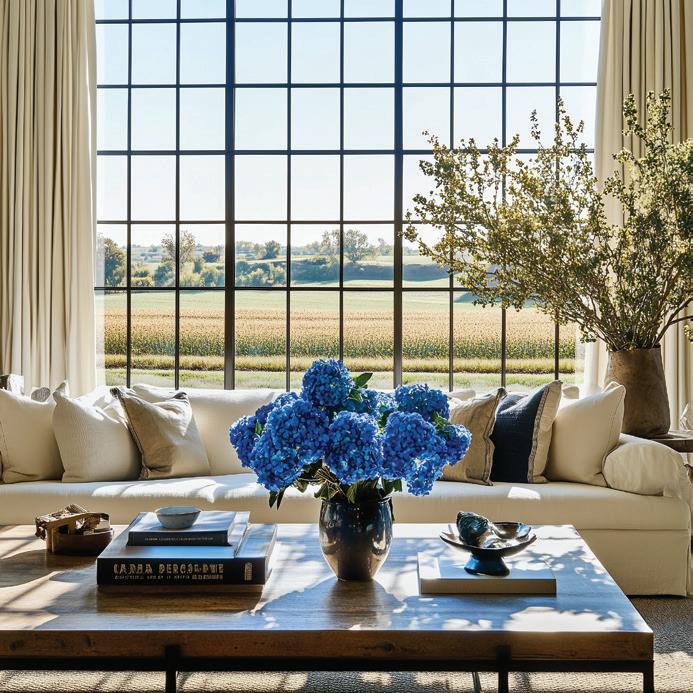
"The family room is very relaxed—I used a neutral color palette with a few carefully selected bright blue accents. For modern spaces, I think it’s especially important to streamline the look and pick just a few dramatic elements. The textiles and furnishings reference nature, while the huge windows, lighting, and fireplace bring in modern influences. I called back to the kitchen, with the fireplace’s brass detailing."
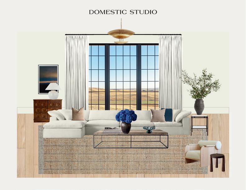

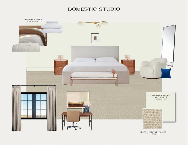
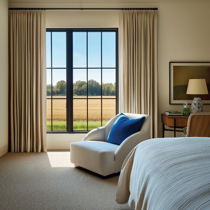
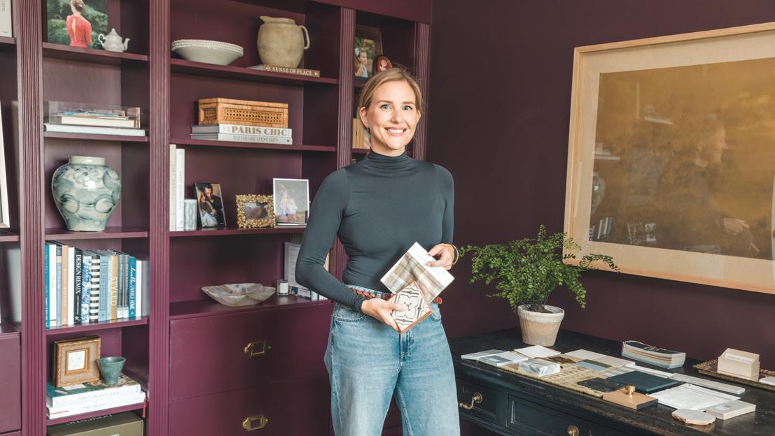

"The bold blue pops of color were my favorite aspects of the Modern Prairie Chic design. They're unexpected which makes the spaces so much more impactful. As I mentioned, limitations and perimeters are often where the magic happens. That’s why we start our process with design discovery and present a design direction early on in the process. We get to know our clients' interests, favorite colors, and preferences before we begin selecting furnishings, so we can add those impactful personal elements. As for the Dark Velvet Modern Gothic, I really love the kitchen. I’m very drawn to modern tudors and modern gothic style. I’d probably consider moving into this house."
"Also for this specific theme, 'modern' can often be more difficult to execute well than a maximalist design style. Every element needs to be very intentional. It’s harder to hit the mark when using less. You still want the space to feel warm and done, not empty and sterile."

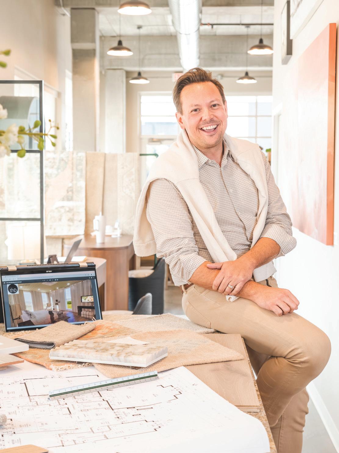
Whenever Trever Hill is a part of a home design, you know it's going to be incredible. The interior designer and entrepreneur has been a core part of the Fargo-Moorhead home and design community since his career jumpstarted in the early 2010s. Since then, Trever's career has taken him to many impressive places, working on projects across the United States, being featured in over 70 publications, and he even had a pilot filmed for his own HGTV show.



Commentary by Trever Hill


"When working on this design theme, we felt it was great to see the same space in two entirely different directions. I've often said if you hire five different designers for the same space you will get five very different outcomes—so make sure you feel it's a great fit with the person you hire."
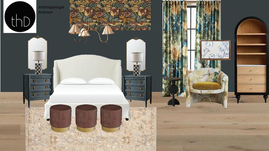
"You'll notice the use of color, vintage, floral, birds, and playful moodiness. We've never had a client ever request anything like this, so it was a fun exercise to work on. You can see side by side the same space (except for the kitchen window), the two spaces are identical but unique in their own way, being customized to the client."
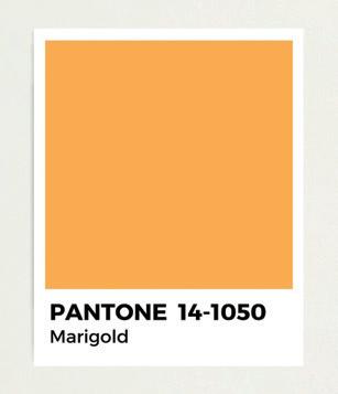
"For the wild card Pantone 'Marigold,' we opted to incorporate it in the drapery, accent pillow, art, and accent chair. "

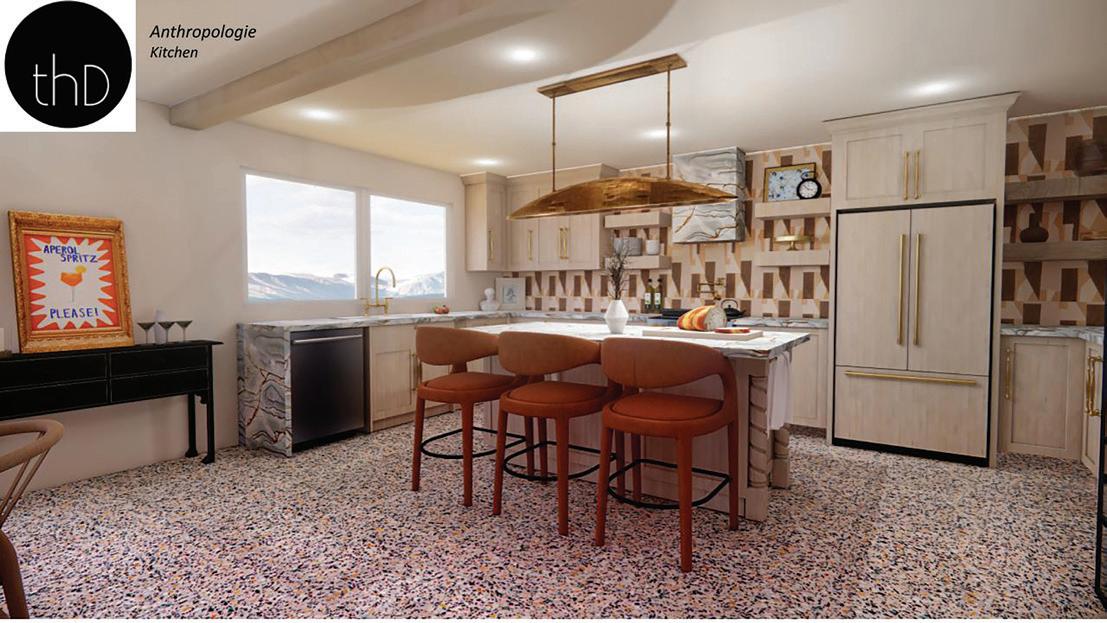
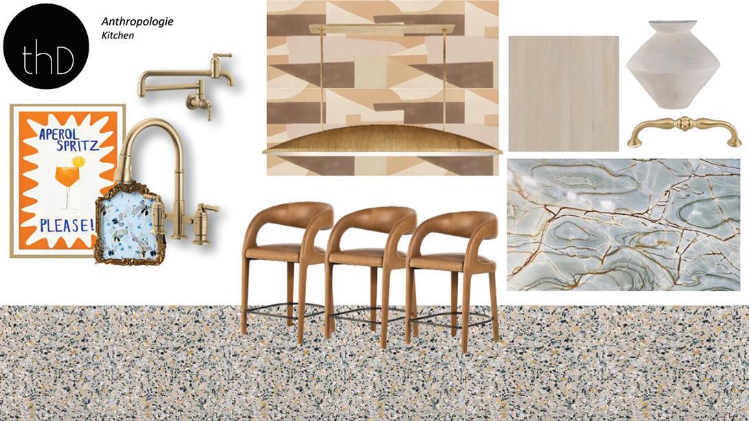
"For the kitchen, we removed the cabinetry by the window (from the Cottagecore theme), making the window larger and opening up the space more. The unique character of the Terra Italia Travertine floor tiles from Tile Bar also adds a lot of color and definition to the space with the various flecks of color, tying in both the dark and moody and the light and soft tones from the space. Azure quartzite countertop slabs blanket the kitchen with beautiful natural elements and unique patterns."
"The hanging pendant above the island from Kelly Wearstler continues the addition of natural elements while adding some curves, shapes, and heavy texture to the space. The wallpaper backsplash is also used on the posts next to the wine rack, extending the presence of the kitchen."
"The Hawkins counter stools from Four Hands add an extra layer of character to the kitchen space—and they're a fan favorite amongst my clients. The curve of the chair ties in really well with the pendant lighting, giving nods to the overall anthropology theme."
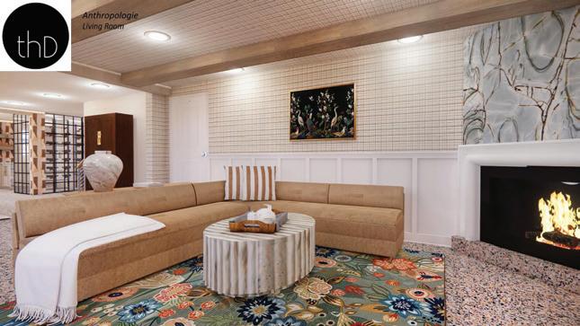
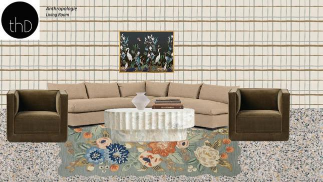
"For the living room, we opted to keep it a little lighter, but you can still see a lot of use of color and then patterns too—including the bold and colorful floral area rug from Rifle Paper Co. that feel vintage while also playing into the anthropology theme."
"I liked using the different wallpaper throughout the space, including this plaid wallpaper, which looks hand-drawn up close. The Terra Italia Travertine floor tiles continue into the living room and the Azure quartzite countertop slab you see in the kitchen continues above the fireplace for some natural elements while continuing the cohesive feel throughout the spaces."




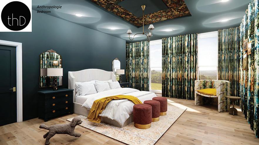
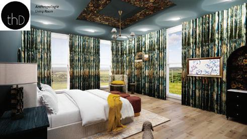
"Throughout the whole space, especially in the bedroom, I wanted to give it a little more of a moody feel, while also making it feel like a hotel. I would say, my inspiration for this bedroom would be similar to the Jasper here in Fargo."
"Then we used the wild card color Pantone 'Marigold' to add some life and brightness to the space, incorporating it into the seat cushion, throw blanket, and even adding golden hardware in the dresser knobs and light fixture."
Commentary by Trever Hill
"For this 'Cottagecore Whimsy' theme, you'll notice many hints of textural materials balanced with soft airy visuals—some of which are floral patterns (noticed even the wallcovering in the living room has this). Also with 'Cottagecore,' you'll often notice this sense of collecting items over time; you'll find some vintage-looking pieces next to something that feels or appears to be new, but that could have a timeless appeal."
"We channeled a handful of our current or previous clients while working on this theme—'Cottage' is a refreshed direction for many who want something approachable with charm and a moment of sophistication."
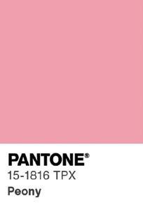

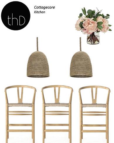
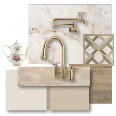
"Throughout the design and using the peony as inspiration, we wanted everything to have a sweet softness to it—you'll notice the use of florals and the materials having a lighter feel."
"I wanted the ceiling of that kitchen to have a coffered, old-world country cottage feel, so we used an inlaid wood veneer wallpaper.
Then we mixed that with traditional elements like the bridge faucet. We continue the cottage feel with the wishbone chairs, which are technically a midcentury modern style, but feel more cottage with the woven seats and are often used in many variations of the cottage style."



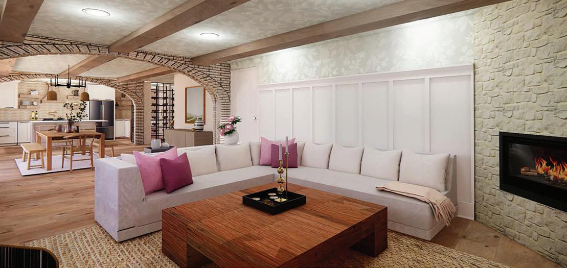
"In the living room, we used more floral patterns, but in a different way. The reason I chose that specific wallpaper was that the pattern didn't flow in any one direction; a lot of patterns move in a specific direction, which can sometimes be distracting for a space."
"I also added the two accent chairs for a slightly more traditional look and brought in the stone so that it's cohesive throughout the spaces. I also wanted to have a coffee table that had that old-world cottage feel that I mentioned before, giving a nod to something that could be repurposed from old wooden beams."
"We opted for a slip-covered sectional for those clean lines—and it's super comfortable in real life. In all three rooms, you'll see the use of clean crisp lines that bring things up to date, while tossing in some of those traditional elements—and then also balancing that with the softness of the florals."

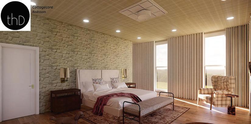

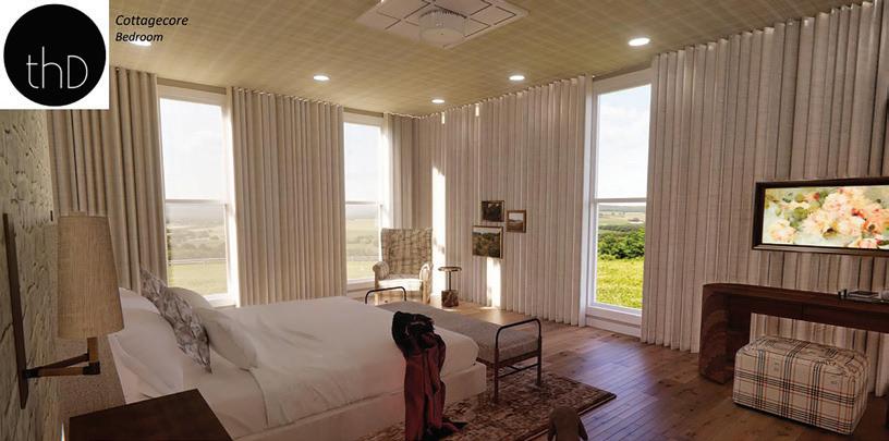
"Using patterns and texture to cozy the space was at the forefront. In the bedroom, for example, I wanted the feeling to be in the direction of your very own resort or high-end hotel room. I took experiences from my travels and even staycations to finish the bedroom."
"For the bedroom, you'll notice we did the headboard wall with stone because oftentimes, you'll see cottages have a stone fireplace or stone on the exterior. The marble side table was also a unique touch in adding natural elements with a hint of warm color."
"You'll also see the use of floral again and those traditional elements, like the area rug, and then bringing in some of the natural material of the wood floor, on the chairs, and on the desk. For the shades, we used Palecek, which is a woven shade that adds to the country cottage feel."
"Also when doing this challenge, I wanted to showcase a home that would apply to many in the Midwest and hopefully, they can have a takeaway for their own space."



"For the Vintage Anthropology theme, I love the use of color and playfulness, however, it looks mature and borderline moody. Whenever I design for a client, I never want two projects to look the same and I especially don't want someone's home to look like their designer's. I feel each project should be customized to the client and not the designer's bias."
"For the Cottagecore Whimsy theme, I love how soft and relatable it is for so many readers. So much of this design and the 'Cottage' theme as a whole is trending right now in various forms, including Modern Cottage, Country Cottage, European Cottage, and more."

When it comes to local interior designers, Monica Hart is a true veteran in the industry. Her career of over 15 years has touched the lives of over 600 homeowners and business owners across the Red River Valley and has inspired other local design professionals in the area. Monica loves serving the community and even became the first female president of the Home Builders Care Foundation in 2018. Most recently, Monica Hart Interior Design was named Best Interior Design firm in 2022 by Best Of Red River Valley.




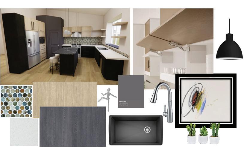

"This kitchen design means a lot to me because some of the selections are selections I just made for my own home remodel, which tends to go a little bit more on the modern side. One of the main highlights of this kitchen is the backsplash, which is based on an old form of Japanese ink printing, called Sumi-e. These backsplash circles are all handmade pieces of glass—not a single one is machine cut. And then the classic petty, round shape the cabinets are engineered wood made by Rehau."
"The island countertop, which is called "Signature Cosmos," is natural granite and feels like a little piece of artwork, given that it's pulled from the earth and has some quirks to it."
"The little human figure hardware for the cabinets is something I have been in love with for over 25 years—It's called Soku manhandle, and they are all hand forged. I chose two to put in my kitchen, one's name is Jerry; and the other's name is Carl. For the cabinets, I love having hopper doors that flip up—they function so well."
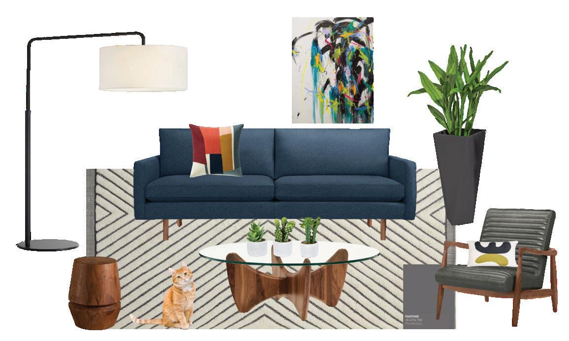
"With the living room design, the Jessica Wachter artwork was the central piece and then I based my other selections around it. I chose very clean lines for that midcentury type of look, including the sofa with the raised legs. I also chose the Noguchi-looking table—Noguchi is a classic in mid-century modern design. I wanted to bring in another texture with the leather chair, which is in the color of the Pantone Thunder Cloud. The walnut wood on the chair and the table helps warm up the space."
"The rug helps quiet the space, not bringing too much attention to the floor; I wanted the color in the other areas to be more of the focus. To complete the room, I always love oversized lighting, especially a lamp that reaches over. It's a very classic and modern design, but also very functional."

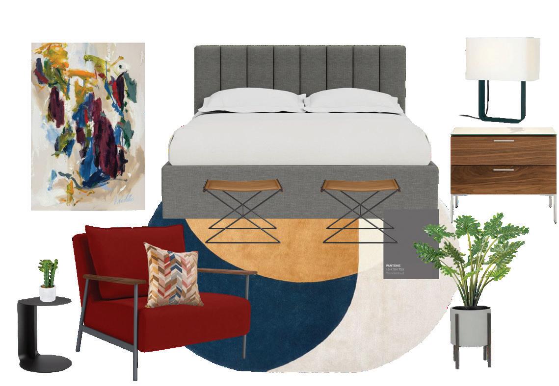
"For the bedroom, I selected another Jessica Wachter painting. I chose this particular painting because I think it brings in all of the colors from all of the rooms that I've done. I like to have a continuation of color between each room, even though the rooms may be separate or the rooms may highlight a different main color."
"I pulled the bright red out of there to do the fun little side chair again, keeping that mid-century modern style in mind with a wood arm. The bed is the main focus, which sports the Thundercloud wild card color."
"I liked that the rug had some fun elements to it with the color and not being a perfect oval. The stools are the Tavi stools from Room & Board, which are functional but still feel light. I even ordered one for my own house to go right by my front doors. The Walnut, again, at warmth, and I kept it simple for the lighting, letting the other elements shine."
Commentary by Monica Hart
"When piecing together the mood boards for this theme, I thought about what I would want in a rustic cabin. I knew I wanted lots of natural elements, cozy fabrics, comfortable furniture, and items that have been collected over time—so I selected pieces that reflect that. I also had to keep in mind the Pantone wild card color which was challenging!"
"As I was seeking out pieces to select to achieve the look and feel I was after, I went to Restoration Hardware. As a furniture store, their pieces embody many natural and classical elements along with quality, comfortable furniture that can appear aged or worn."

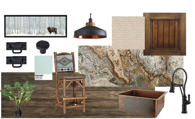

"I selected the pieces you see in the mood board because I felt the items selected gave life to what I interpreted a 'Rustic Cabin' theme to be without going overboard on the rustic theme. There needs to be some soft items to balance the hardness of the wood. Once I had those pieces set, I filled in with the rugs, artwork, and accessories from multiple sources including some of my own MHID items."
"Using Pantone Morning Mist was a challenge! I initially don’t think of a minty color as being rustic. I kept that in mind as I made my selections. What I did was use that color in the rug in the living room. I like it being scattered here and there among the soft green base and other subtle colors in the rug. I also used Morning Mist in the fabric for the back of the stool as well as the artwork in the Kitchen. That color was again used in the rug for the bedroom and subtly in the bench fabric."

"The rug was the centerpiece here and I thought it was a nice way to bring in the 'Morning Mist' to provide some color. At the same time, the rug has a worn look to it that went with the rustic cabin theme, which I loved."
"I then added the leather sofa from Restoration Hardware and paired it with the rustic nesting tables, then balanced those out with something lighter with the side chair."
"Along with the wood, the color I chose was a shade of green that you'd typically see in a rustic cabin palette, yet I think that olive green complements the morning mist very well."
"I chose the marble side table because, for a rustic cabin feel, I think of incorporating natural elements in it. The stool adds a charred wood look, and the lamp adds a touch of coolness to all of the warm elements."
"The space is then highlighted by an antler chandelier, and yet, I feel that this chandelier shape was a little bit unique."
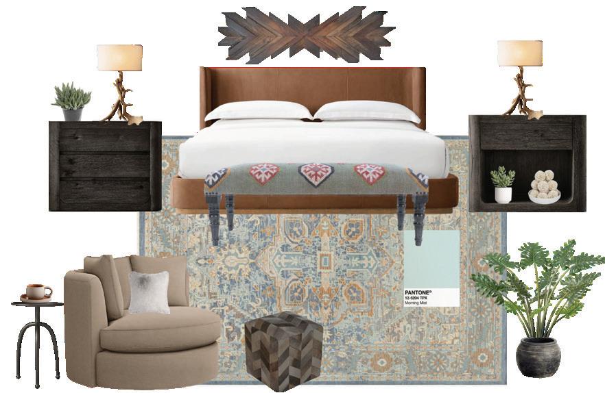



"The Rustic Cabin theme was a challenge for me, which I loved! I typically don't think of the Pantone color 'Morning Mist' as being part of something rustic. The rug was my secret weapon in bringing in that color. Overall, I liked working on this theme; I am currently working on a new rustic construction home so I have that on my brain right now. I enjoy creating something warm and enveloping—even on the screen, I feel this mood board looks like 'home.'"
By Josiah Kopp
Josiah Kopp
Founded in 1987 by Mike Arnold, Accent Kitchen & Bath in Fargo is a one-stop shop for home improvements, restoration, and interior design. As a teenager, Arnold kept himself busy doing lawn and snow care, introducing him to the world of home care and service, and igniting an entrepreneurial flame.
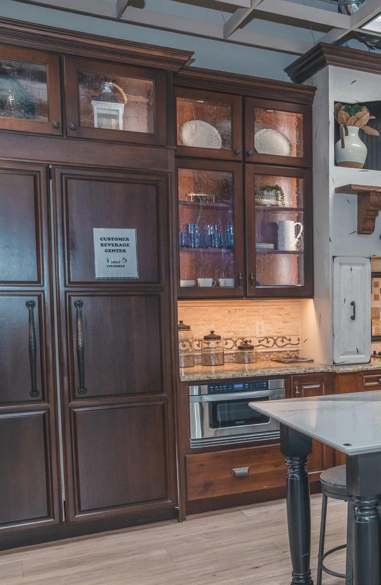
Accent Kitchen & Bath initially started out as a home restoration business, stabilizing properties by removing mold, fire, water, and other damage. Over the years, Arnold began adding new services to the company, switching from working with other home improvement establishments to being a single point of contact for clients needing anything from home restoration to full-service interior design and design-build remodeling.
One of the unique aspects of Accent is that they offer full-service installation but also have the option for homeowners to purchase products themselves. Rather than shopping at a big home improvement outlet, Fargo-Moorhead customers can get top-quality service and product selections, all while supporting a local business.
Another way the Accent team is setting themselves apart in the industry is how

they handle estimates upfront with customers, setting clear and transparent pricing.
"We design with the numbers on the front end," Arnold said. While many home improvement professionals put together a design plan first and then communicate the numbers, Accent believes in setting the right expectations from the beginning. "Our team is
exceptional at walking into a house and knowing within minutes where the price ranges will be. People enjoy not waiting several weeks for an estimate that might've been out of their budget the whole time."
Stress-free design experience for the end user
One-stop shop for all home improvement needs
CONTINUED >
High-quality services; no cutting corners
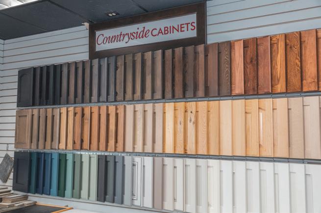
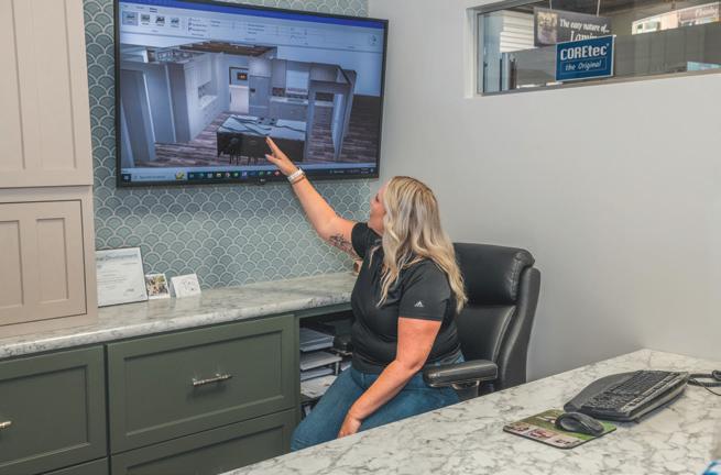
Accent offers a wide selection of cabinet wood stains by Countryside Cabinets to fit virtually any design and color theme you're trying to achieve. Find a cabinet color you like? Their design team can "install" it into a rendering showing what it will look like in your space!
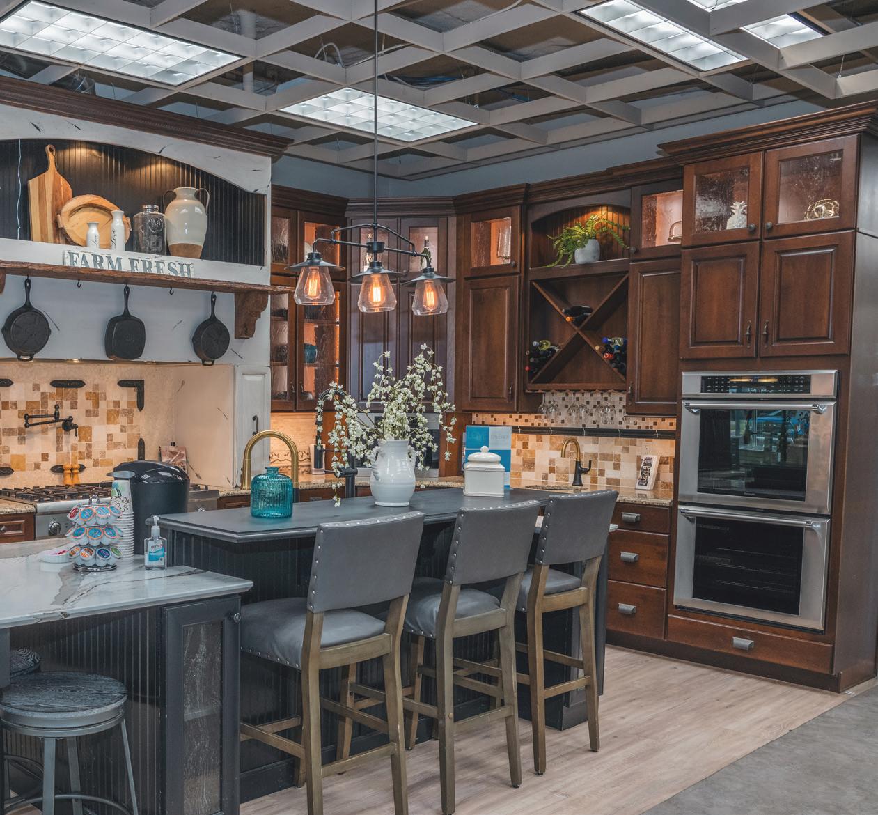
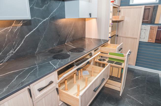
Throughout Accent's storefront, several showrooms give customers a proper visual of the different products, design styles, and accessories for their kitchens and bathrooms. This kitchen demo illustrates several of the latest in home design trends and industry offerings.
Several storage and organization layouts are available for cupboards and drawers—yet maybe the most impressive of this demo is the porcelain countertops complete with Invisacook, which houses magnet burners under the surface for a smooth and seamless cooking surface.
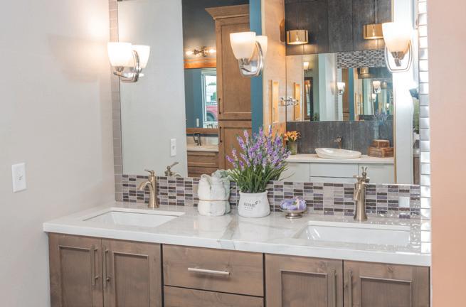
Moving into the bathroom demos, Accent offers a wide variety of materials and styles to fit your needs, from porcelain and quartz countertops to nickle and brass hardware. For homeowners looking for some color and "mood" direction, Accent Interior Designer Jessica Holen recommends warmer "blonde" tones, helping spaces feel cozy and inviting.


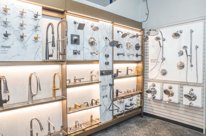

As a premier Kohler distributor, Accent offers the very best in kitchen faucets and shower heads. Whether you're looking for something simple or luxurious, Accent offers several styles at different price points, ensuring the vision for your space is fulfilled. In addition to Kohler products, Accent also offers other brands—contact them below or visit their store to learn more.
As an in-house interior designer at Accent, Jessica Holen works with clients by showing them renderings of their spaces and can input specific cabinets styles and designs that Accent carries so homeowners can get accurate pricing and realistic rendering of their space before any work is started. Holen can also take CAD drawings and blueprints/ layouts from architects and homebuilders if homeowners are working with another professional.
