
“We keep moving forward, opening up new doors and doing new things, because we’re curious... and curiosity keeps leading us down new paths.”
- Walt Disney


“We keep moving forward, opening up new doors and doing new things, because we’re curious... and curiosity keeps leading us down new paths.”
- Walt Disney

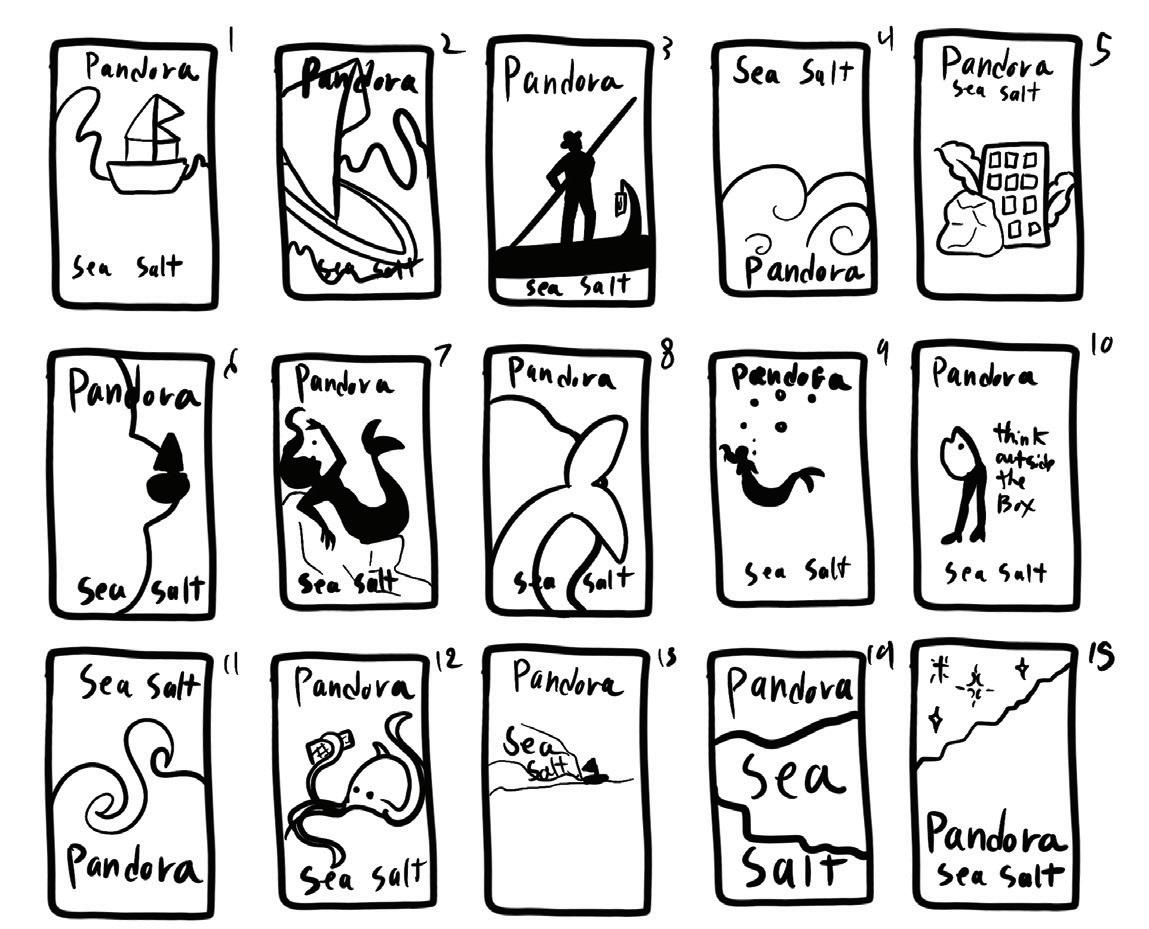
Pandora is a fictional company created by Wonka, a company owned by the Ferro Candy Company. For the campaign, they wanted to create a new luxury chocolate bar that would be showcased in a grocery exhibit. To do this they want the showcase and merchandise items to match the branding of the chocolate bar. To create the luxury feel, Pandora uses art to brand itself. “Presentation is just as important as the taste is” Pandora’s motto.
The first flavor in the chocolate bar line is the flavor of sea salt. To convey the flavor the art of the chocolate bar is a giant octopus that embodies the salty flavor of the sea.


In-store display mock-up
This is what would be at the end aisles of grocery stores.
Exit and item pick-up
After spinning the wheel attendees will stop at the table to pick up their merchandise and exit.
If an attendee is interested in future partnerships, they would be taken into a private area of the layout.
Banner
Banners that would be used to advertise the company/product.
Samples and entrance

Attendees would grab a free sample from the table and then be encouraged to enter the rest of the showcase.
The merchandise for the tradeshow is based on the artwork of the chocolate bar, with the waves of the storm reflecting the rain that falls during the use of the umbrella. It will make for a good conversation starter and stand out among the different patterned umbrellas in the scene.
The notebook takes advantage of the art as well but instead showcases the octopus instead of the waves. Focusing more on the dynamic character rather than the background. The notebook is meant to be eye-catching and then used out in public.
The mug is simple and straight to the point making it an easy giveaway item and fast to print.


Rugged Insurance is an auto insurance company. They requested some concept advertisements that used images as a base. The insurance company wanted one photoshopped ad targeted towards dads and their kids, and another that used a photograph from a traced image.
For the photoshopped ad, I focused on the idea that the truck is a toy that a baby girl is playing with, hinting at the future that she would have. The second ad is a dog racing his owner home.


Retail Me Not is a coupon-saving app that wanted to create a poster aimed at college students. They also asked to incorporate two college students with giant scissors. To make the cost of production cheaper, they wanted to use an image as a base for the poster.
To create the poster, I first did some rough layout sketches before deciding on one. I then had two models help to recreate my concept for the poster. Once I had the photo I started to recreate it in an illustrative style. Once the illustration was complete the type was added then it was done.


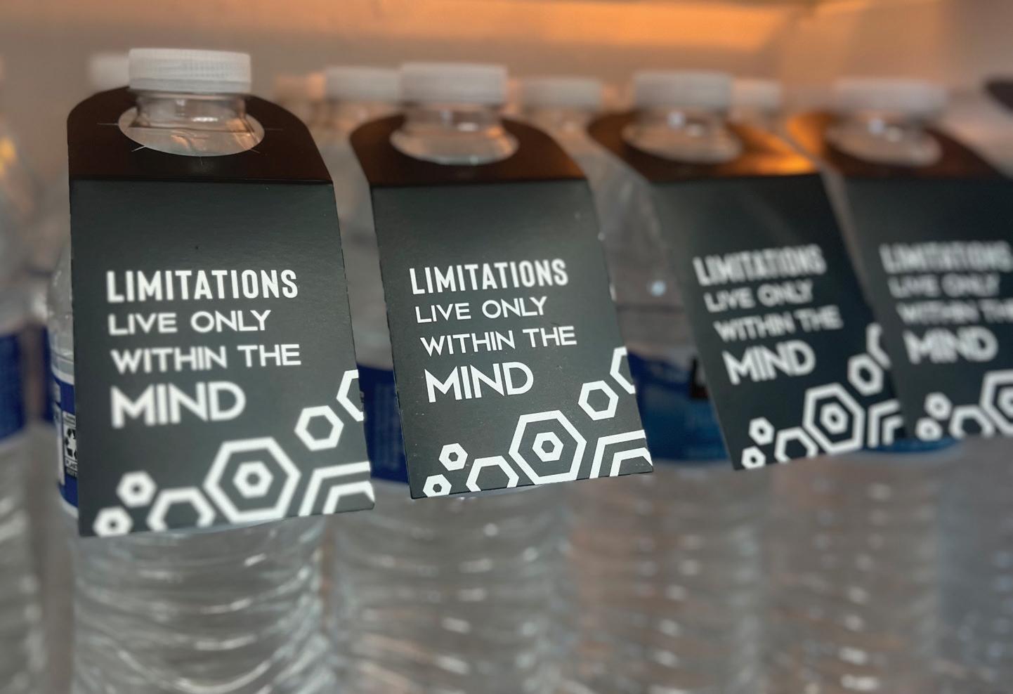
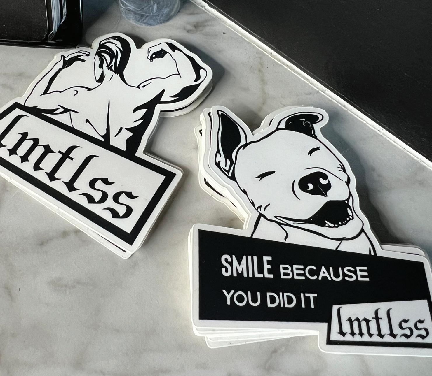
LMTLESS is a personal training business in Scottsdale, Arizona. LMTLESS wanted to create merchandise for their clients such as stickers, water bottle tags, and t-shirts. For the stickers, they wanted to use the owner and mascot to give to existing and new clients. For the water bottle tags, they wanted to incorporate the hexagonshaped lights in their studio.
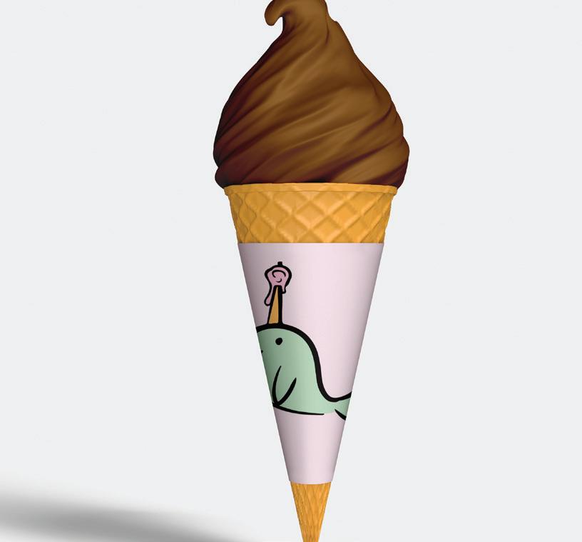
Nice Ice decided to rebrand themselves, but they were having trouble with what to rebrand themselves as. They wanted to keep an American illustrative style but with a bright color palette.
Keeping with the ice theme of their original name, ice was changed into the word frozen. The unicorn part relates to the fact that people call narwhals “unicorns of the sea”. The horn acts as the I and the scoop of ice cream as the O.
They also wanted a food truck design, cups, bowls, and ice cream cone covers. The design of them is made simple for low-cost printing.



Project Yellow Light is a competition to bring awareness to distracted driving. To do this I created a set of billboards that focused on the holiday season. As millions of people are driving during this season, it can be easy to encounter many people on their phone either calling their family or just simply changing the song. For the billboards themselves, I focused on the headline more than the creative assets.


For the second part of Project Light, I created a set of magazine ads tfor magazines would be placed in airplanes. The ads would follow the same theme as the billboards, but would provide more information about the mission of Project Yellow Light.

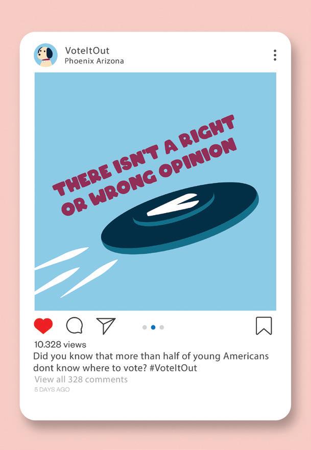
Vote It Out is a campaign aimed at encouraging first-time voters that their opinions matter. It can be hard to know who to vote for or what political terms mean, so Vote It Out aims to make sure to inform people regardless of their political standing.
For the campaign, there would be social media posts telling people to vote. These social media posts would be simple and focus more on the tagline of “When in doubt vote it out” The tagline is used not only to encourage people to vote but also to vote instead of thrash other’s options. A link to a website and information will be put into the description of each post.


These tables will be used to inform those interested.
The wall inside will have information regarding the mission of the company

Merch Table
Inside the booth will be a merch table the reason for it being inside is because they would have to enter and talk to someone before getting their item.
The first product is a water bottle with two colors. This would be the big item that would be given out to those who sit down for a quick ten-minute info session.
The second item would be a shirt. The shirt is what employees would wear during the event.
The third item would be a hat. The hat would be worn by employees but also be given away to people randomly.
The fourth and final item would be a planner. The planner would be a simple design featuring the campaign dog. The idea is for it to strike up a conversation.


Voyce is about making socks with more than one meaning. An example of this is one of the mismatched socks having an advertisement aimed at a company called Social Spin. That allows everyone to be able to have clean clothes.
So, for advertising, what if I made flyers with more than one use? The flyers would be double-sided with the recipient being able to choose which pattern side they want. There would also be instructions on one side of the flyer on how to fold a piece of origami. This piece of origami can be used as table décor or as a way to gift someone.


Appetizers Appetizers
Toothpicks – 6

Stacked Burger is a customizable burger bar. They have recently rebranded themselves and want a new menu to match their retro look. They wanted it to be double-sided with an unconventional layout.
Onion Rings – 6
Basket
Mozzarella Sticks - 8
6
Fried Mac-n-Cheese - 8
6
Signature Burgers Signature Burgers
Old American – 12
The Californian – 14
A
Cheese Lovers – 14
A
BLT – 12
A
Build Your Own Burger – 12
Build Your Own Burger – 12 Pick Your own
Patty
Cheese
Toppings
Premium Toppings

Additions Additions Add
The simple illustrations in the background keep with the retro theme of maximalism but with the opacity lowered to make sure that it is still readable. The hints of blue throughout the menu help to focus on less prioritized items on the menu.

Build Your Own Shake – 6
Build Your Own Shake – 6 Pick your ice cream, mix-ins, and toppings!
Mix-Ins/Toppings
Whipped Cream
Sauces
For The Little Ones - 6 For The Little Ones - 6

Drinks Drinks


Phoenix is planning on hosting the 2032 Olympics. To do this, they want to create a website with branding that will carry out through the rest of the event duration. They want a theme that is modern, but also includes parts of Phoenix. The website is to have a map of the hotels, arenas, and roads taken for the attendees to navigate. It will also have a navigation area with icons that will be used to navigate all the sports at the event. When someone clicks on their icon, all the information about the event will drop down.

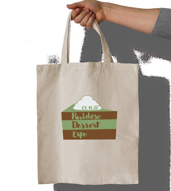
Ruidoso is a town in the mountains of New Mexico. For the event, they wanted an event emblem, badges, and a gift bag with merchandise. When creating the emblem for the event, I thought about the mountains, and when I thought about the mountains, I thought about its refreshing air. When thinking of fresh air, I thought about mint. So the emblem for the event is based on mint chocolate.


One of the merchandise items would be a foldable spork. The event has several different chocolate samples to try, and a spork would be a good item to give away. While vendors are to supply their utensils there is always a chance for a vendor to not carry them or to have run out.
The second item would be lip balm. The mountains cause tourists to become dehydrated faster. Because of this, their lips tend to get chap. To fix this, we would supply them with a single lip balm.
The third item that would be given away is a shirt. The shirt would be simple with just the logo on it. Not only would it be a fun souvenir that will have people asking, but it will also give people something to wear if they get their clothes dirty.
The final item is a tote bag that would be given to help carry their flyers, purchases, and merchandise.


For photography, I find product design to be an intriguing medium to photograph. There are many different ways to manipulate an image. The post prominent being the use of light which these images showcase.


