What Up!
My name is Brenton Jones and I’m a motion graphic designer. I love breathing life into static graphics through the limitless and beautiful medium of animation. I hope you enjoy this brief glimpse of my work over the past few years!

My name is Brenton Jones and I’m a motion graphic designer. I love breathing life into static graphics through the limitless and beautiful medium of animation. I hope you enjoy this brief glimpse of my work over the past few years!
I was asked to create a logo animation for a fictional studio. I did my best to incorporate aspects from rubber-hose animation since I love the style! I also chose Flying Pig Studios as the name because it has an interesting play on words that can be illustrated in the logo design. I made sure to separate out each part of the logo and pig character for easy animation, and ended up adding a textured background along with audio, camera shake, and chromatic aberration in the final render. To appeal to a large audience, I focused on incorporating as many aspects of 1930’s animation as possible to make the whole animation charming and nostalgic.


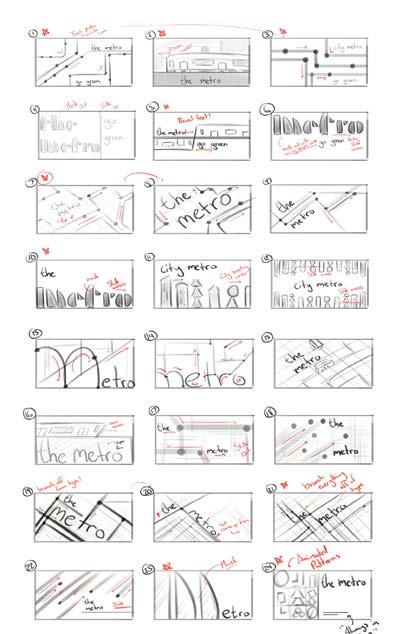
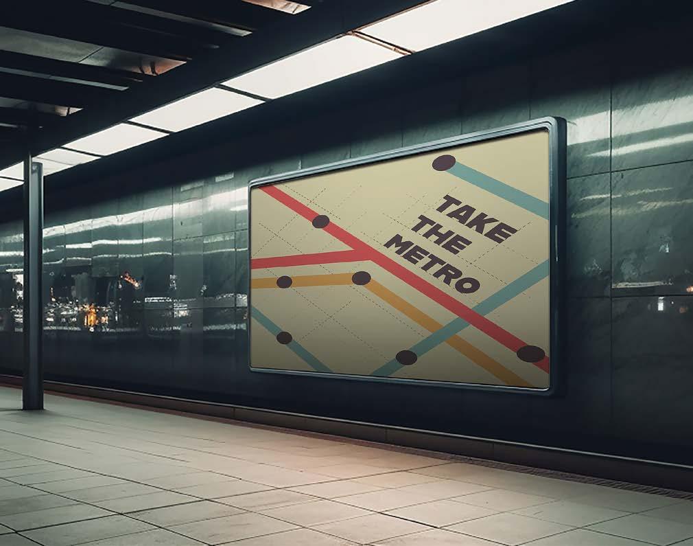
For this project, I was tasked with creating an advertisement that reflected the late modern style of the Bauhaus. I was inspired by Herbert Bayer’s isometric compositions along with his use of primitive shapes and primary colors. To make the advertisement effective, I focused on keeping it simple with high legibility and an obvious purpose.


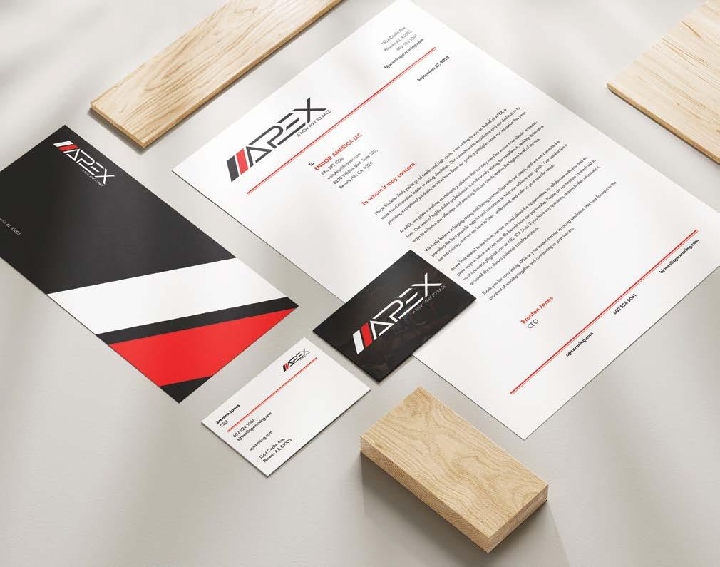
APEX, a revolutionary company designed to flip the racing scene on its head. APEX utilizes today’s highest quality racing simulators to allow absolutely anyone to get behind the wheel of a racecar. I was tasked with the creation of this company, along with all the branding, a complete stationery, landing page, and thirty second advertisement.
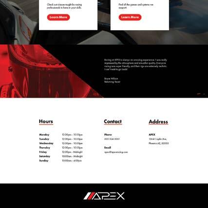
APEX’s website had to have the same high-octane energy as its company identity. I utilized the two dashes from the logo heavily to keep consistency throughout the website. I used images of racing simulators and actual cars to give customers an overview of what APEX does, and provide a general feel for the company. Ultimately, my goal was to make the company identity known without the viewer having to read anything on the page.
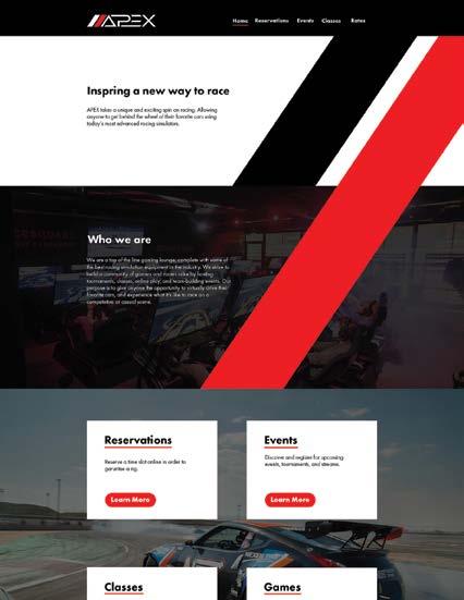
The landing page is quite simple in functionality, complete with the company’s slogan, their values, and buttons to book reservations, events, classes, and see their catalog of games and simulators.
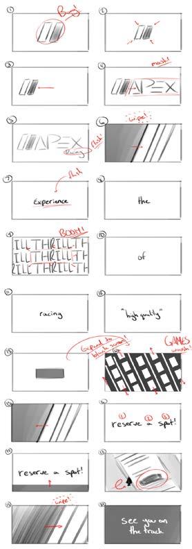
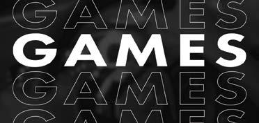
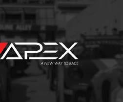
Along with the branding, stationery, and landing page, I created a thirty second advertisement to get people excited about visiting the lounge and racing against other drivers in a virtual space. I made sure to match the energy of the brand with flashy, bold, and snappy animations. I also made sure to sync as much of the video as possible to the lively background music.









For this project, I created a personal logo along with a short animation inspired by the monograms of Viennese Successionists. My goal was to create a monogram that was somewhat of a puzzle; where the B and J were not too obvious, but also not too obscure.

The strategy behind this design is to keep the viewer thinking about its meaning. If they have to take a few moments to determine the letters inside the box, it makes it more memorable.
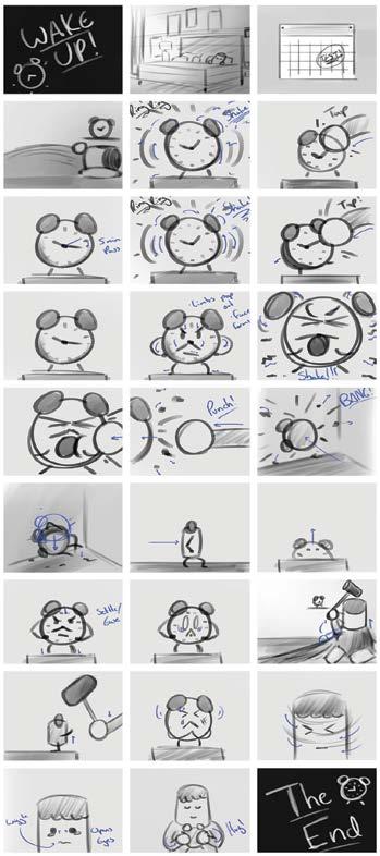
I was assigned to create a short narrative that included a proper story arc, fluid animations, and engaging characters. It had to be at least one minute long and filled with fitting sound effects and music. I decided to tell a story like something one would see in a Looney Tunes or Tom and Jerry episode. It had to be lighthearted, slapstick, funny, and most importantly, entertaining.



Behance: brentonjones
Instagram: @brenton.motion
Brenton Jones