![](https://assets.isu.pub/document-structure/230511221743-49ff56cab2b6b821125c62bb1388d8b2/v1/b11697e542185a7f80e68c94d868fea3.jpeg)
Personal Branding
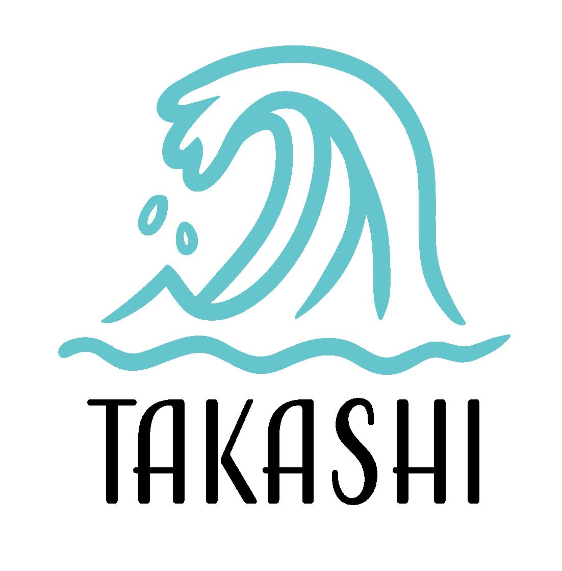
For my own brand, I wanted to do something more than just my initials. I felt like making something that would accurately represent me and my background, and immediately I had the idea to name my brand Takashi. Takashi stems from my middle name, being that of Kai-Takashi. Kai meaning “ocean” or “sea” whereas Takashi can translate to “warrior”, “strong”, or “noble”. Ideally, mixing both was the perfect way to design a brand that represents myself. What others may see as a simple wave represents how I usually tackle any type of task involving design. Strongly, and without regret.
![](https://assets.isu.pub/document-structure/230511221743-49ff56cab2b6b821125c62bb1388d8b2/v1/0f6f8742c99165a5eeb4d4ca89565307.jpeg)
![](https://assets.isu.pub/document-structure/230511221743-49ff56cab2b6b821125c62bb1388d8b2/v1/f03d53bfe076f1167d6af6bd1a86e58c.jpeg)
![](https://assets.isu.pub/document-structure/230511221743-49ff56cab2b6b821125c62bb1388d8b2/v1/0a6e00db6e6dbecdafb7344103e75e0d.jpeg)
#65c5cd R: 101 G: 197 B:205
C: 56 M: 1 Y: 21 K: 0
The wave is also symbolic of where I’m from as I grew up in Honolulu, Hawaii. I’ve been surrounded by water my whole life and it feels good to showcase it in my work.
![](https://assets.isu.pub/document-structure/230511221743-49ff56cab2b6b821125c62bb1388d8b2/v1/b2a5f9db4f19fa92523a4b6bf1020867.jpeg)
![](https://assets.isu.pub/document-structure/230511221743-49ff56cab2b6b821125c62bb1388d8b2/v1/001007ccd899c8b9be9964bf36f16c73.jpeg)
![](https://assets.isu.pub/document-structure/230511221743-49ff56cab2b6b821125c62bb1388d8b2/v1/8ac8bc653b7c2ee6a92d6eaf787230e2.jpeg)
![](https://assets.isu.pub/document-structure/230511221743-49ff56cab2b6b821125c62bb1388d8b2/v1/b1abfff4d862d9ecca16d092d21c777c.jpeg)
Personal Branding
![](https://assets.isu.pub/document-structure/230511221743-49ff56cab2b6b821125c62bb1388d8b2/v1/12144cead9a9a0b48e574a65a9023bbd.jpeg)
![](https://assets.isu.pub/document-structure/230511221743-49ff56cab2b6b821125c62bb1388d8b2/v1/4ab9b5aac6f2d3f5174cd1f3761dd02c.jpeg)
![](https://assets.isu.pub/document-structure/230511221743-49ff56cab2b6b821125c62bb1388d8b2/v1/a74381941ae9df6eb920fc2a186de223.jpeg)
![](https://assets.isu.pub/document-structure/230511221743-49ff56cab2b6b821125c62bb1388d8b2/v1/0bcae851c683e01e8b3411cec22d7614.jpeg)
![](https://assets.isu.pub/document-structure/230511221743-49ff56cab2b6b821125c62bb1388d8b2/v1/f2697723c7ae6b4900191776c88c3e58.jpeg)
![](https://assets.isu.pub/document-structure/230511221743-49ff56cab2b6b821125c62bb1388d8b2/v1/b1abfff4d862d9ecca16d092d21c777c.jpeg)
Personal Branding
![](https://assets.isu.pub/document-structure/230511221743-49ff56cab2b6b821125c62bb1388d8b2/v1/2027bb161d90305228a62db10525c0e3.jpeg)
![](https://assets.isu.pub/document-structure/230511221743-49ff56cab2b6b821125c62bb1388d8b2/v1/f155e5a3023d6799160e0f429ca98f15.jpeg)
![](https://assets.isu.pub/document-structure/230511221743-49ff56cab2b6b821125c62bb1388d8b2/v1/b1abfff4d862d9ecca16d092d21c777c.jpeg)
Personal Branding
![](https://assets.isu.pub/document-structure/230511221743-49ff56cab2b6b821125c62bb1388d8b2/v1/7fd53b7ac0ddfe58a56ca425dbde5290.jpeg)
![](https://assets.isu.pub/document-structure/230511221743-49ff56cab2b6b821125c62bb1388d8b2/v1/c8ddb1561f44f959a641971ca7a3942f.jpeg)
![](https://assets.isu.pub/document-structure/230511221743-49ff56cab2b6b821125c62bb1388d8b2/v1/4cc5f8f24d62eccecb9a491a0afb67bc.jpeg)
![](https://assets.isu.pub/document-structure/230511221743-49ff56cab2b6b821125c62bb1388d8b2/v1/d173248c34129248533229635a2347ce.jpeg)
![](https://assets.isu.pub/document-structure/230511221743-49ff56cab2b6b821125c62bb1388d8b2/v1/b1abfff4d862d9ecca16d092d21c777c.jpeg)
THE BLIND DATE
This piece was the product of working in a team of three to create a poster for GCU’s 2023 Film Festival. Our group had been assigned a film titled, “The Blind Date”. A comedy with a premise involving a teen who gets set-up on a quite literal blind date with a blind girl.
![](https://assets.isu.pub/document-structure/230511221743-49ff56cab2b6b821125c62bb1388d8b2/v1/6c5c2952457da32cc5a14ce4e717b877.jpeg)
The general premise alone made me want to create a poster involving emphasis on the literal term, hence why I went for something involving a scribble above the girl’s eyes. The same scribble was then added over the boy’s mouth in the poster as shown to showoff how badly he was at communicating with her. My decision alone was the one we decided to go with, and from then on it was a process of deciding what seemed fitting for a poster involving an awkward, romantic date between two people.
![](https://assets.isu.pub/document-structure/230511221743-49ff56cab2b6b821125c62bb1388d8b2/v1/b1abfff4d862d9ecca16d092d21c777c.jpeg)
Above you can see my partners contribution to the project involving a variety of sketches
![](https://assets.isu.pub/document-structure/230511221743-49ff56cab2b6b821125c62bb1388d8b2/v1/577d966a48c6d90787253229b824db26.jpeg)
![](https://assets.isu.pub/document-structure/230511221743-49ff56cab2b6b821125c62bb1388d8b2/v1/b1abfff4d862d9ecca16d092d21c777c.jpeg)
as well as their first drafts on the left of what the poster could have ultimately ended up looking like. We bounced a few ideas back and forth but in the end I was happy to push my own idea even further to make it into a full concept which eventually was picked to be the official poster for the film itself.
![](https://assets.isu.pub/document-structure/230511221743-49ff56cab2b6b821125c62bb1388d8b2/v1/69a3e3e6f028b90259097be335e56bbd.jpeg)
![](https://assets.isu.pub/document-structure/230511221743-49ff56cab2b6b821125c62bb1388d8b2/v1/af5809b375aec25f9529e7f3db8f8b02.jpeg)
![](https://assets.isu.pub/document-structure/230511221743-49ff56cab2b6b821125c62bb1388d8b2/v1/730d2a69a848da1afecce11f237dafe8.jpeg)
![](https://assets.isu.pub/document-structure/230511221743-49ff56cab2b6b821125c62bb1388d8b2/v1/8b7938315ead2f8f551eaf4e1de60ed5.jpeg)
![](https://assets.isu.pub/document-structure/230511221743-49ff56cab2b6b821125c62bb1388d8b2/v1/ee88428ccaf7755aec1ba42109624136.jpeg)
![](https://assets.isu.pub/document-structure/230511221743-49ff56cab2b6b821125c62bb1388d8b2/v1/9e51fe8f1aa5b7bff69c930a7e19da7d.jpeg)
![](https://assets.isu.pub/document-structure/230511221743-49ff56cab2b6b821125c62bb1388d8b2/v1/3be1a2ca9c18c1edd755a80ecb33a139.jpeg)
Candy Bar Redesign Package
Given any choice of a chocolate bar to update the packaging of, I decided to go with Ghirardelli simple because of how classy it seems to present itself as. Our task was to practice upscale printing and finishing p rocesses in order to make an updated box design for our chocolate bar of choice.
I wanted to keep the theme of class still present in my final product so when redesigning the package, I tried to imagine what it would look like in the colors of purple and gold seeing as both are typically colors associated with royalty and luxury.
![](https://assets.isu.pub/document-structure/230511221743-49ff56cab2b6b821125c62bb1388d8b2/v1/b1abfff4d862d9ecca16d092d21c777c.jpeg)
From then on, it was a simple process which doubled down to me making a few designs and selecting two flavors of my chocolate bar design to present to everyone. Milk and Dark Chocolate.
![](https://assets.isu.pub/document-structure/230511221743-49ff56cab2b6b821125c62bb1388d8b2/v1/ee8035d812f039a3c26de46460648be9.jpeg)
Candy Bar Redesign Package
![](https://assets.isu.pub/document-structure/230511221743-49ff56cab2b6b821125c62bb1388d8b2/v1/f72df705b08179686ba604d0f4a3170a.jpeg)
![](https://assets.isu.pub/document-structure/230511221743-49ff56cab2b6b821125c62bb1388d8b2/v1/fd1c4a0e712ccc66848a77a4ec47da12.jpeg)
![](https://assets.isu.pub/document-structure/230511221743-49ff56cab2b6b821125c62bb1388d8b2/v1/54a3a067d5cea887f07f8784b74de694.jpeg)
![](https://assets.isu.pub/document-structure/230511221743-49ff56cab2b6b821125c62bb1388d8b2/v1/4b7b8ae6b880a252220e082ecc76a2fe.jpeg)
![](https://assets.isu.pub/document-structure/230511221743-49ff56cab2b6b821125c62bb1388d8b2/v1/2ee62a5ed09aa4996a3e158bf6b8d6dc.jpeg)
![](https://assets.isu.pub/document-structure/230511221743-49ff56cab2b6b821125c62bb1388d8b2/v1/b1abfff4d862d9ecca16d092d21c777c.jpeg)
Food Truck Rebranding
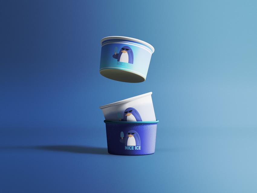
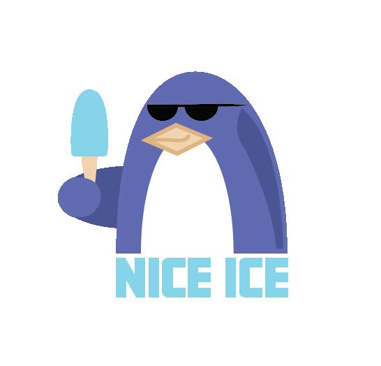
For a food brand called Nice Ice, I was tasked with creating a complete rebrand of the brand’s logo as well as food truck in order to better fit their product. Initially my design was to be focused on the word “ice” but I decided to generate a bit of a mascot instead to tie in closer with ice cream, hence the penguin and the ice cream.
I would also practice in making mockups for various stationery items you’d see in a food truck such as napkins, ice cream bowls, and cups as well.
![](https://assets.isu.pub/document-structure/230511221743-49ff56cab2b6b821125c62bb1388d8b2/v1/533add833858e68418e540c4fcd2cba9.jpeg)
![](https://assets.isu.pub/document-structure/230511221743-49ff56cab2b6b821125c62bb1388d8b2/v1/bbd12a48c37a6491b5ea8ab6537cd29b.jpeg)
![](https://assets.isu.pub/document-structure/230511221743-49ff56cab2b6b821125c62bb1388d8b2/v1/b1abfff4d862d9ecca16d092d21c777c.jpeg)
Above to the right are my sketches for both the logo itself as well as thumbnail designs for how the food truck should look in terms of both placement as well as color too. Overall I stuck close to the usage of cool colors for obvious reasons and ended up choosing a nice mix of white to go along with it.
![](https://assets.isu.pub/document-structure/230511221743-49ff56cab2b6b821125c62bb1388d8b2/v1/3d24ff29826b65df5faa23c946dacba4.jpeg)
![](https://assets.isu.pub/document-structure/230511221743-49ff56cab2b6b821125c62bb1388d8b2/v1/0ac1997aceb38f9337e1c77b3c12788b.jpeg)
Food Truck Rebranding
![](https://assets.isu.pub/document-structure/230511221743-49ff56cab2b6b821125c62bb1388d8b2/v1/7b891942c55ff7ae692007ac77c2b13d.jpeg)
![](https://assets.isu.pub/document-structure/230511221743-49ff56cab2b6b821125c62bb1388d8b2/v1/bd98ac8cf3bea595152f60102134f2b3.jpeg)
![](https://assets.isu.pub/document-structure/230511221743-49ff56cab2b6b821125c62bb1388d8b2/v1/475508c863a578c7243f42010eaf9b40.jpeg)
![](https://assets.isu.pub/document-structure/230511221743-49ff56cab2b6b821125c62bb1388d8b2/v1/19dd0991b4fed1623acd741cc331ebb4.jpeg)
![](https://assets.isu.pub/document-structure/230511221743-49ff56cab2b6b821125c62bb1388d8b2/v1/4f98daf2c13ebc750a78991ad2db2d84.jpeg)
![](https://assets.isu.pub/document-structure/230511221743-49ff56cab2b6b821125c62bb1388d8b2/v1/b1abfff4d862d9ecca16d092d21c777c.jpeg)
Package Label Rebrand
This project saw a complete package rebrand of another product, Papago Hive Honey. Not only did I have to create a new logo for the product but essentially it was changing the packaging designing, coming up with taglines, and making ads for the newly rebranded product.
![](https://assets.isu.pub/document-structure/230511221743-49ff56cab2b6b821125c62bb1388d8b2/v1/c365c1ffdb2f19dc508700bec0e7616a.jpeg)
![](https://assets.isu.pub/document-structure/230511221743-49ff56cab2b6b821125c62bb1388d8b2/v1/de3ac4d09a703405e692ab1a0c06ab40.jpeg)
![](https://assets.isu.pub/document-structure/230511221743-49ff56cab2b6b821125c62bb1388d8b2/v1/6a60df8d56077d472a854df124fabf06.jpeg)
This was a long-term project in which I would also have to make mockups and designs for alternate flavors involving the honey as well which were cinnamon roll honey as well as orange blossom honey.
![](https://assets.isu.pub/document-structure/230511221743-49ff56cab2b6b821125c62bb1388d8b2/v1/b1abfff4d862d9ecca16d092d21c777c.jpeg)
Some of the taglines I even made up were:
• Savor those sweet moments!
• Because you can’t “Bee-t” the classics!
• Made with Papago Pride
• All original. All organic
Package Label Rebrand
![](https://assets.isu.pub/document-structure/230511221743-49ff56cab2b6b821125c62bb1388d8b2/v1/0af88638a616f22ad7994a17d4acd7c3.jpeg)
![](https://assets.isu.pub/document-structure/230511221743-49ff56cab2b6b821125c62bb1388d8b2/v1/638d60e4a9c407440d53a97eeef71c67.jpeg)
![](https://assets.isu.pub/document-structure/230511221743-49ff56cab2b6b821125c62bb1388d8b2/v1/de0c360192ec0239061249514bfe3322.jpeg)
![](https://assets.isu.pub/document-structure/230511221743-49ff56cab2b6b821125c62bb1388d8b2/v1/1f8306fd6f2208138259022c9c399f9a.jpeg)
![](https://assets.isu.pub/document-structure/230511221743-49ff56cab2b6b821125c62bb1388d8b2/v1/069cf368184c81ead2170c203532ab0c.jpeg)
![](https://assets.isu.pub/document-structure/230511221743-49ff56cab2b6b821125c62bb1388d8b2/v1/95fd3b5ec017902691c007fce3175131.jpeg)
![](https://assets.isu.pub/document-structure/230511221743-49ff56cab2b6b821125c62bb1388d8b2/v1/b1abfff4d862d9ecca16d092d21c777c.jpeg)
Type Garden Animation
![](https://assets.isu.pub/document-structure/230511221743-49ff56cab2b6b821125c62bb1388d8b2/v1/b1abfff4d862d9ecca16d092d21c777c.jpeg)
This was my first use of animation involving Adobe After Effects in which the task was to first create a small array of insects out of literal letters and/or numbers in Illustrator and then animate them in a garden you designed. The animation itself was to be kept relatively short and we had to include five of our bug designs in there in which the camera would focus on all of them.
The link to the animation can be watched from the code below.
![](https://assets.isu.pub/document-structure/230511221743-49ff56cab2b6b821125c62bb1388d8b2/v1/4d7c06276edae26913bcfe1e57b3f7e4.jpeg)
Type Garden Animation
![](https://assets.isu.pub/document-structure/230511221743-49ff56cab2b6b821125c62bb1388d8b2/v1/b1abfff4d862d9ecca16d092d21c777c.jpeg)
Website Design: Interactive Redesign
![](https://assets.isu.pub/document-structure/230511221743-49ff56cab2b6b821125c62bb1388d8b2/v1/d1db45f9b5dd9a18613645cdb26b55a1.jpeg)
One of the many website we would work on in Adobe XD was an interactive one in order to get a feel for button mapping, placement, and overall design in a website as seen by my wireframes to the right. For this one, our task was to not only map buttons on a website to make it able to be navigated from the click of a button, but also to redesign a news website of our choice. My redesigned website of choice was none other than NPR. You can view it with the code below.
![](https://assets.isu.pub/document-structure/230511221743-49ff56cab2b6b821125c62bb1388d8b2/v1/b1abfff4d862d9ecca16d092d21c777c.jpeg)
Website Design: Event Concept
![](https://assets.isu.pub/document-structure/230511221743-49ff56cab2b6b821125c62bb1388d8b2/v1/8ae5b9e2f2c65082fff538e1a44e1ee7.jpeg)
![](https://assets.isu.pub/document-structure/230511221743-49ff56cab2b6b821125c62bb1388d8b2/v1/dd4ea7df89da344215df41160aa63fa7.jpeg)
![](https://assets.isu.pub/document-structure/230511221743-49ff56cab2b6b821125c62bb1388d8b2/v1/b1abfff4d862d9ecca16d092d21c777c.jpeg)
Another website I had worked on was one to highlight and concept an event of our choosing. Not only would I have to write the details of what the event is and where it’s at but I would also need to provide a call-to-action to showcase how the viewer could buy tickers if they wanted to.
![](https://assets.isu.pub/document-structure/230511221743-49ff56cab2b6b821125c62bb1388d8b2/v1/d63288a238209c57fe95dd10afe881b0.jpeg)
Also, we would have to make variations of our website to better fit other devices as well such as tablets and phones. The code can be scanned below to view the website.
![](https://assets.isu.pub/document-structure/230511221743-49ff56cab2b6b821125c62bb1388d8b2/v1/f600af6c457e284244f350b99bb565ff.jpeg)
Brand Repair Campaign
![](https://assets.isu.pub/document-structure/230511221743-49ff56cab2b6b821125c62bb1388d8b2/v1/b1abfff4d862d9ecca16d092d21c777c.jpeg)
This project was a bit different as it involved working with another person but not as a team. I was tasked with picking a brand of my choosing that isn’t doing so well and making a general creative brief on what could possibly be done to repair their brand image. Only once finished, I would have to trade it with a partner and try to make a new campaign to repair the brand they picked using their brief as well as create a few ads with taglines for them.
![](https://assets.isu.pub/document-structure/230511221743-49ff56cab2b6b821125c62bb1388d8b2/v1/f6b11a3602e50ec5e557497bf6b922ef.jpeg)
The brand I had been given was Dyson, and part of my idea to repair the campaign was to appeal to broader audience in which I would make a line of products that were affordable for those with a low-income. It was called Dyson Lite, and it included the same usual Dyson products but made with less utility compared to its usual counterpart. A cheaper option that still gets the job done.
![](https://assets.isu.pub/document-structure/230511221743-49ff56cab2b6b821125c62bb1388d8b2/v1/69a28025b6af17324c8231241ea6794b.jpeg)
![](https://assets.isu.pub/document-structure/230511221743-49ff56cab2b6b821125c62bb1388d8b2/v1/34e6f41a272a666e77add9e88e5a1ac0.jpeg)
![](https://assets.isu.pub/document-structure/230511221743-49ff56cab2b6b821125c62bb1388d8b2/v1/0b923440b639d13f7b93f43d8d55d9db.jpeg)
Brand Repair Campaign
![](https://assets.isu.pub/document-structure/230511221743-49ff56cab2b6b821125c62bb1388d8b2/v1/d56ae7bbef954e3c1edd5b49dfe7d086.jpeg)
![](https://assets.isu.pub/document-structure/230511221743-49ff56cab2b6b821125c62bb1388d8b2/v1/c3b48a8e19c1af676a22f49f7873374f.jpeg)
![](https://assets.isu.pub/document-structure/230511221743-49ff56cab2b6b821125c62bb1388d8b2/v1/9021a56e049eb9179ff90321a5867333.jpeg)
![](https://assets.isu.pub/document-structure/230511221743-49ff56cab2b6b821125c62bb1388d8b2/v1/fecfea3f0389d5b4288fecb408ff2372.jpeg)
![](https://assets.isu.pub/document-structure/230511221743-49ff56cab2b6b821125c62bb1388d8b2/v1/900cfe09fce67d1429bb6df6ed9c998e.jpeg)
![](https://assets.isu.pub/document-structure/230511221743-49ff56cab2b6b821125c62bb1388d8b2/v1/e5660af195d617ad5e8d6046a3d4a656.jpeg)
![](https://assets.isu.pub/document-structure/230511221743-49ff56cab2b6b821125c62bb1388d8b2/v1/b1abfff4d862d9ecca16d092d21c777c.jpeg)
Annual Report
![](https://assets.isu.pub/document-structure/230511221743-49ff56cab2b6b821125c62bb1388d8b2/v1/f1d94bab0791be172c26b99d58acf505.jpeg)
![](https://assets.isu.pub/document-structure/230511221743-49ff56cab2b6b821125c62bb1388d8b2/v1/b1abfff4d862d9ecca16d092d21c777c.jpeg)
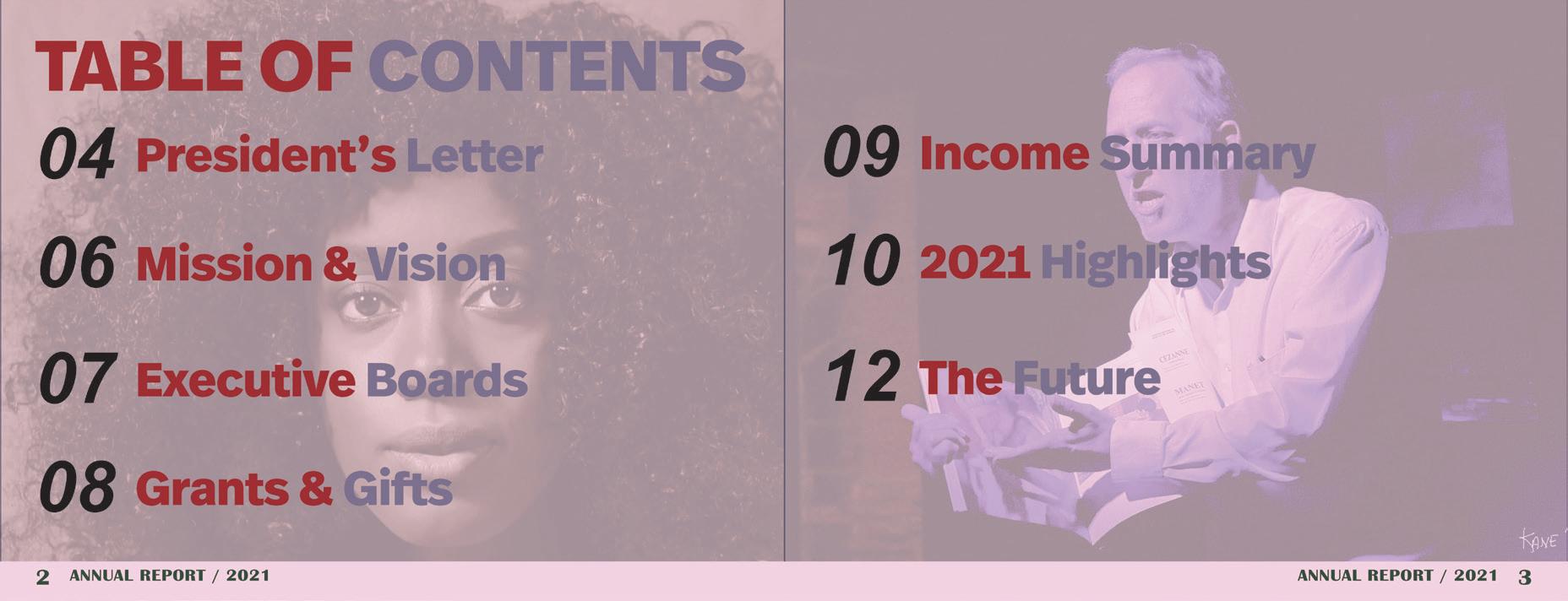
The last stop is my annual report which was made for the Emerson Theater Collaborative based on their 2021 analytics. I was given all the information about what to write in advance as well as pics to use in my report. It was simple a matter of making it presentable to people who would view it was well as creating graphs to showcase how much progress the ETC made in their year.
![](https://assets.isu.pub/document-structure/230511221743-49ff56cab2b6b821125c62bb1388d8b2/v1/64353b11daf7ee3300a1092938f896b0.jpeg)
![](https://assets.isu.pub/document-structure/230511221743-49ff56cab2b6b821125c62bb1388d8b2/v1/53d9538e30cb875513a0f0284529f676.jpeg)
Annual Report
![](https://assets.isu.pub/document-structure/230511221743-49ff56cab2b6b821125c62bb1388d8b2/v1/671aa0d824f2d3ae797be825d9f917dd.jpeg)
![](https://assets.isu.pub/document-structure/230511221743-49ff56cab2b6b821125c62bb1388d8b2/v1/f6cc8f9fe1eac73c472d337652a16e3c.jpeg)
![](https://assets.isu.pub/document-structure/230511221743-49ff56cab2b6b821125c62bb1388d8b2/v1/badde3cc28609ae1787a072499c1117c.jpeg)
![](https://assets.isu.pub/document-structure/230511221743-49ff56cab2b6b821125c62bb1388d8b2/v1/195cbbe6698ad39a0d1c8ac1cbcb4d33.jpeg)
![](https://assets.isu.pub/document-structure/230511221743-49ff56cab2b6b821125c62bb1388d8b2/v1/8d70cade0e29524c63f679b015b637c1.jpeg)
![](https://assets.isu.pub/document-structure/230511221743-49ff56cab2b6b821125c62bb1388d8b2/v1/606507cf2aa6f4ed160ff969a4fb12a5.jpeg)
![](https://assets.isu.pub/document-structure/230511221743-49ff56cab2b6b821125c62bb1388d8b2/v1/b1abfff4d862d9ecca16d092d21c777c.jpeg)