Chic FeminineHOME OFFICE


I am thrilled for 2023! This year has already started with an exciting announcement from the 33rd Annual ARTS Awards celebrating home industry excellence. The ARTS Awards is the premier awards program in the U.S. honoring top manufacturers, retailers, designers, and sales representatives.
IBB Design was named the “Best Furniture Store in the Country” once again, making this our fifth win! With this milestone win, we are officially entered into the ARTS Awards Hall of Fame. What an incredible honor! We are so thankful for our fantastic clients and customers, remarkable #teamIBB, amazing partners, and astounding manufacturers that continue to enforce sustainable practices. We couldn’t have done it without all of YOU! I am truly humbled and honored by this win.
We continue to expand and enhance our 90,000-square-foot store in Frisco, Texas, and I would love to personally invite you to come visit our vast showroom and meet our talented interior designers. We have expanded our resource center and private design rooms to help make each client’s home project experience the best it can be with the largest selection of curated fabrics, finishes, and furnishings available from markets around the world. My mission was always to have beautiful, high-quality, unique, and functional furnishings made available for our clients immediately off the showroom floor. IBB Design Fine Furnishings is that dream come true, and I welcome you to come discover what so many of our clients already live!
Get instant gratification at IBB Design Fine Furnishings, Monday through Friday, 10 am – 5 pm and on Saturday 10 am – 6 pm. I promise our showroom will WOW you! Come see what’s in stock today and get inspired!

Enjoy the 2023 spring issue of IBB at Home, and thank you for your continued support! We hope to see you soon!
All the best,
Beth Rafferty Owner & Designer IBB Design Fine Furnishingsbeth@ibbdesign.com
@ibbdesign
on InstagramOWNER/DESIGNER
PUBLISHER
BETH RAFFERTY
OWNER/DESIGNER
EDITOR-IN-CHIEF
SHAY GEYER
VP OF MARKETING
ANGIE TASSAN
CONTRIBUTING WRITERS
BRONSON BERRYMAN
MAEGAN BROWN
MAXINE BURT
ANGELA DAVIDSON
JORY GATTIS
SHAY GEYER
SHANNON GIDNEY
LORETTA GILLILAN

KAREN HOLLOWAY
PAM HOOD
ERIN LETRY
KAY LEWIS
LAUREN MACNAK
LYNDSEY MORGAN
LESA NEFF
MEGHAN SEBREN
RITA SKAGERBERG
WILL SMITH
ANGIE TASSAN
MAGAZINE DESIGN
IBB DESIGN
DESIGNERS
ANGIE TASSAN
DANIEL M. CHAVEZ
COPY EDITOR
KRISTIN PEBSWORTH

Sweet scents and vibrant colors abound throughout nature this time of year. There’s something about spring that evokes a fresh sense of renewal. It’s so inspiring!
This issue of IBB at Home is just that - so inspiring! With our cover story, we’re sharing our favorite tips for creating a chic and feminine home office. We’re also showing you ways to incorporate pale pink as well as punchy pastels into your home’s interiors. IBB designer Shannon Gidney showcases an elegant modern casual aesthetic, and Kay Lewis offers ways to freshen up your abode. Angela Davidson highlights a few design trends for 2023, and Meghan Sebren discusses how to successfully mix metals. I’m unveiling the design plan for the outdoor living areas for a lake house project we’re working on, and Rita Skagerberg demonstrates how Feng Shui in your home can help you feel more relaxed and balanced. Pam Hood shows us how to turn an unused room into a functional and beautiful space that you’ll enjoy. Karen Holloway offers tips for dining by design, and Will Smith guides us in getting the look of fresh flowers all year long. Maxine Burt points out how perfect pillows can add life to a room through a pop of pattern, texture, or color. Loretta Gillian, from Sunrise Blinds, shows us a creative solution to help us enjoy the perfect patio year-round, and Lesa Neff takes us on a tour of our latest model home installation for Highland Homes. As a bonus for this issue, we’re also featuring the newest townhomes by Highland Homes in Cypress, TX. Lyndsey Morgan, of NEAT Method, lists ways to maintain your organized spaces and Maegan Brown (The BakerMama) shares some delicious springtime recipes.

Grab your peach iced tea, get cozy on your patio, and enjoy our spring issue of IBB at Home!
Cheers to living in style!
Shay Geyer Owner & Designer Design Fine Furnishings



Enjoy the shades of spring this year with the subtle touch of Pale Pink Pantone 691-U. Pair it with Sky Blue or Mint Green for a refreshing pastel palette.


Pale Pink brings a calming effect to a space and can infuse tranquility into a stressful area. Want to go bolder with your pale pink room? Try using it with black for high contrast and a little drama in your home. A pop of pink can easily be added to a design with permanent botanicals, pillows, and books. For a bigger commitment, paint an accent wall or even an entire room in a soft pale pink.


PRO TIP: Always sample the paint in your space before diving in and painting the entire room. Just because it looks fabulous in your friend’s home, doesn’t mean it will look equally as stunning in yours. There are many factors which influence how paint looks in a space.
Follow our “Pale Pink" board on Pinterest for more inspiration on using this beautiful color in your home. pinterest.com/ibbdesign/palepink


A true knock-out this season is Punchy Pastels! Take pastels to their limit with daring yet soft hues of blush pink, ocean blue, tranquil teal, nature green, and sunny yellow for a perfect balance to a springtime room. For added seating in a tight space, bring in a pair of pastel pink leather ottomans. Adding a pair of blush pink lamps will help balance
the room and establish the right amount of soft lighting. Combining a performance rug in a soft, subtle pattern with a light credenza is a great way to brighten the room and add storage without losing its functionality. Finish off your space with statement art and accessories that speak to you such as florals, books, or metallic objects.

Today’s modern casual look features sleek lines while integrating organic shapes, natural tones, and a more minimal appearance. Blending style and comfort by mixing materials and sophisticated silhouettes helps to produce the feeling of a well-designed, balanced room. The neutrality of the palette lends itself to a timeless design that will last for years to come.

The modular sectional featured here is made up of four individual pieces that come together as one. Unlike the more traditional sectional, this sectional offers versatility to rearrange it in numerous ways to suit your space. The clean lined cushions, plinth base, and lower back design adhere to the modern construction, while the armless ends and weltless cushions give it a more casual feeling. I added contrasting pillows as well as a pair of round ones as an unexpected element of surprise. I feel
 Photography by Dan Piassick
contrasting pillows and throws often add that next layer of texture and color to a neutral upholstery piece.
The organic feel comes into play in the rounded shape of the swivel chairs and through the artwork and side tables showing cerused and open grained woods. The chairs are a lush leather that feature a wood element. The artwork brings in a leaf motif, and the abstract piece triggers one’s mind to wander and the freedom to interpret the art. Bridging the floating swivel chairs is a black round side table. It is hand carved from a wood trunk and is heavily textured with natural fissures.
Natural tones are found within nature, and in the design world, we typically refer to them as the more neutral shades and tones. Neutral palettes exude character by varying colors within the same hue. Interest is also created by contrasting light and dark tones, while layering textures.
This room comes together with the careful balance of neutral shades, both clean lined and natural shapes, to portray a modern, yet still inviting and warm style.
In today’s design world, when going for that modern look, less is more. I often say when there is less on your canvas, the more things stand out. You can make a greater impact investing in better quality pieces; buy the best you can afford. Utilizing less will also allow the architecture of your home to shine.
When planning a room’s design, no matter what style you are going for, consider all of the elements, and don’t skip over key features that truly help to make or break a room. Aside from the obvious things such as the layout, flow, and comfort, don’t forget custom drapery, multiple sources of light, and various textures to create that luxurious, overall look.

The vision was to do a bedroom that is masculine, but where a lady would also feel welcome.
The navy and gray are softened with ivory and shades of taupe for elevated comfort. I love the large-scale art in combination with the geometric navy string art. It certainly comes to life off of the Sherwin-Williams Naval walls. Add the soft gray leather recliner for a stress-free zone.
The window treatments are done in dual fabrics that bring a soft pattern forward, front and center. The navy solid retreats back into the wall color. The window treatments add to the overall look of the room, but are not the star of the show. That is always reserved for the bed.
The height of the headboard has a strong presence with a smooth neutral fabric. The straight angles of the sides of the headboard add a more contemporary look. The solid navy linens are by Ann Gish and are a washable silk. Being washable and soothing
 BY KAY LEWIS, IBB DESIGNER kay@ibbdesign.com | @mkaylewis on Instagram
to the touch make them perfect! The 22” x 22” pillows create the personality of the bedand can be changed so easily to give a completely different look for different seasons and events.
And who said you can’t mix gold and silver? This is demonstrated in the artwork above the headboard and enhanced with chosen accessories. The accessories were selected to give the room an uncluttered, simple look. Keep it fresh. Keep it clean. Keep it neutral. I have added a spot of yellow just to bring it to life. It’s happy, cheerful, and carefree.
The rugs are hand knotted and have a transitional flare, and while wonderful for this particular room, they can also be used in many other rooms and applications in future homes.
Escaping into this sanctuary will allow you to be at peace. You are at home and safe. That’s what we all strive for: to be at rest in the comfort of our home.


Color is making a splash on everything in 2023. Bold, warm hues from pale blushes such as SherwinWilliams Color of the Year, Redend Point, to Pantone’s shocking Color of the Year, Viva Magenta. You will see all shades of green that evoke nature, saturated blues, and neutral, warm, earthy undertones of white, beiges, tans, browns, and grays like Behr’s Color of the Year, Blank Canvas, that pairs beautifully with black.

Large, curvaceous sectionals and overstuffed, rounded chairs in jewel tones and contrast patterns are all the rage this year. Pair your living room seating pieces with items made

 BY ANGELA DAVIDSON, IBB DESIGNER angela@ibbdesign.com


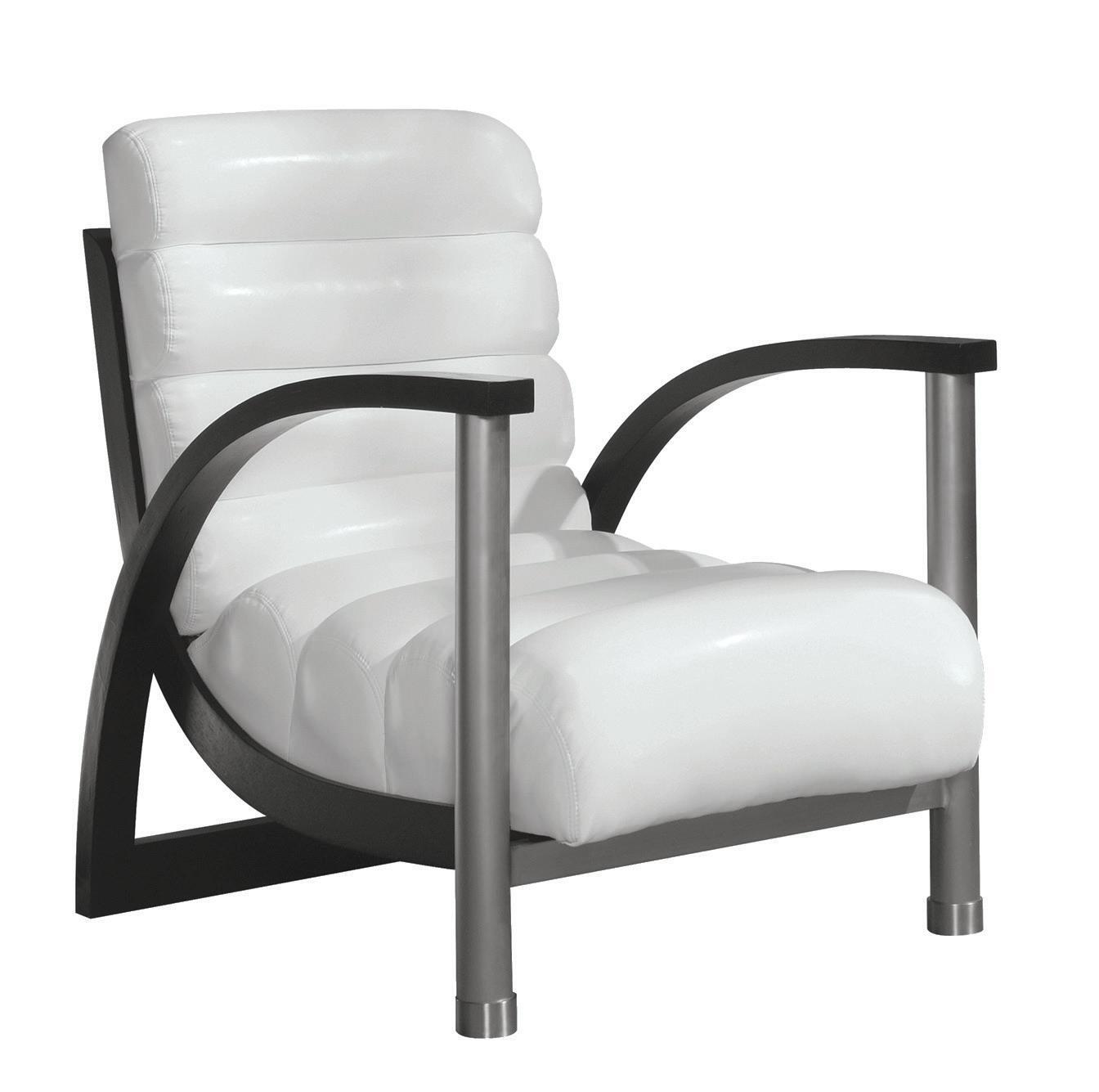
of natural elements and organic modern materials such as rattan, wicker, cane, petrified wood, solid stone, and mixed metals. Adding an art wall in your space is an interesting way to show off your personal style and can add a touch of color, texture, and personality to your home.
Bold, colorful wallpaper and layering area rugs that make a statement are big as well. The use of metallics, large modern 3D printed images, gradient color transitions from light to dark shades, and large bold prints are on-trend and add sophistication to your space.

Mixing metals can be tricky when applying them to your interior spaces. What used to be avoided – using silver or gold only – is now welcomed and actually quite difficult to avoid. Metallics are everywhere-from design, jewelry, fashion, and even makeup.. There are so many gorgeous, classic metals to choose from such as rose gold, brass, copper, nickel, and everything in between. How do you incorporate a variety of metallics without getting a too shiny overboard look? Too many shades can be distracting and take away from the classic beauty metallics hold. Mixing different hues of gold and silver gives a room an acquired, sophisticated look which has classic staying power. Follow these tips to confidently incorporate metals in your space to give it a curated and collected vibe:
• Keep the metals to three shades –selecting one as your dominant metal.
• Make sure your dominant metal is easy to match across manufacturers; bronze and gold shades vary among brands.
• Pair with cool or warm undertones. Contrast is important and will make the hues pop.
• Find an item such as a light fixture or drawer pulls that incorporate more than one metal. This will tie everything together.
• Combine textures! Mix hammered, matte, and polished finishes together for a layered look.
• Subtle is key – Mixing different bright, shiny metals together can make them compete for attention and distract from the space.
BY MEGHAN SEBREN, IBB VISUAL MERCHANDISER meghan@ibbdesign.com @meghansebren on Instagram
• Don’t choose shades of metals that are too close in color. It will look like you tried to match them but missed the mark.
• Use each shade of metal at least two times in the room, giving it a sense of purpose.

• Chrome and nickel finishes shouldn’t be mixed. They have different undertones and clash with each other.
When done right, mixing metals gives rooms a depth and sophistication that you can’t quite put your finger on – a look you can’t achieve with the “matchy” look. You should always go with what you love. By carefully applying these tips, you can accomplish that look while keeping all of your old treasures and adding in some new ones.
Photo by Dan Piassick

When my longtime friend and client asked our team to help her family design their new lake house, we couldn’t wait to get started. We walked them through the entire process-- from the initial architectural plans to the interior finishes and furnishings, pool, and exterior colors. Here’s a sneak peek at our design plan for their front porch and outdoor living spaces.
A pair of comfy fully upholstered sofas and two club chairs will offer ample seating by the fireplace. A navy patterned outdoor rug makes a stylish statement to ground the seating area. A teak dining table will be surrounded by blue and white woven dining chairs.
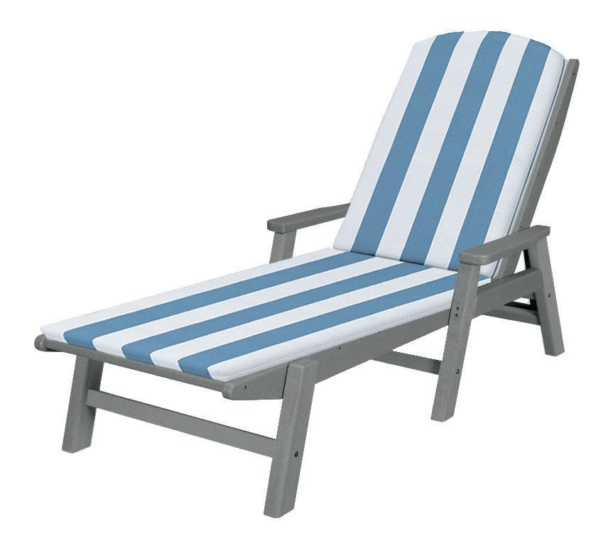
We designed six chaise lounges (one for each family member) in a bright sky-blue cabana stripe to designate a poolside lounge area. A scalloped navy-blue umbrella will be centered with each pair of chaise lounges. Navy planters will be placed throughout the deck to soften the deck areas and add color with greenery and flowers.


 Renderings by Daniel M. Chavez

The home will be painted in SherwinWilliams Hinting Blue. We selected Pure White for the trim, and we’re using Jubilee as an accent color. The front door will be navy blue, so we chose navy Adirondack chairs and planters to recall the blue on the front porch. A colorful patterned garden stool paired with the chairs gives a glimpse into the color palette that will greet you inside. All the exterior lighting will be in a satin nickel finish.


The firepit area will offer pristine lake views. Six navy Adirondack chairs will surround the linear firepit with mixed blue glass.

We can’t wait to share the finished product with you! Stay tuned to our social media for more sneak peeks and behind-the-scenes moments when we install this lakeside retreat!

Feng shui is the ancient Chinese art of arranging objects and space in an environment that achieves harmony and balance. Feng is roughly translated as wind, while shui means water. Dating back to 8,000 years ago, the concept of feng shui remains popular today as it aims to balance out the five main natural elements: Fire, Water, Metal, Earth, and Wood.
The main goal is to achieve harmony in your home and allow chi, or energy, to move freely. Chi is thought to be the life energy in every living thing. The Chinese belief is that if you cultivate chi, you will be healthier and happier. By removing any barriers to this life energy, chi can flow through your home and prevent bad energy. It may seem exotic or even strange to some, but its core concepts are beneficial when it comes to room design and layout, as it aims to allow a free flow of energy throughout the home.
This principle is best used with a minimalist approach to design as it focuses on open spaces and very little clutter, but can easily lend itself to all design styles, centering on energy and flow of a space. It promotes balance, peace, and harmony – and where better to start than the bedroom! These tips can help achieve symmetry and tranquility in your bedroom and hopefully promote a healthier sleep cycle.
 Photography by Audrie Dollins
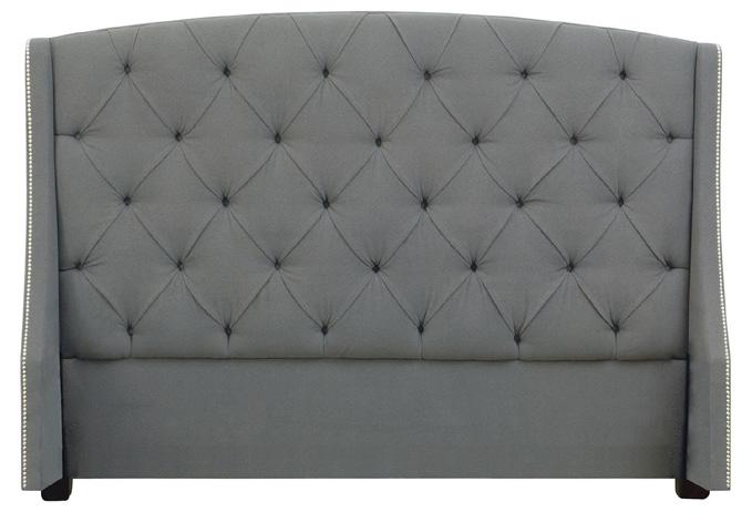
The bed is the largest and most important piece of furniture in the bedroom, so it’s an excellent place to start. Choosing a bed for a feng shui bedroom is a crucial decision! A large bed that allows plenty of space to sleep comfortably is the best option. Look for a bed with a solid headboard. Ideally, it should be made with one material. Wood is recommended, as it is one of the five main elements. It’s warm, sturdy, and makes you feel secure. If that’s not possible, focus on finding a headboard without any slats or cubbies. A single, solid headboard promotes good sleep and will help improve relaxation at night. It helps to ground the bed and provide support for sleep.
Bed placement is super important; this is what feng shui is all about! The bed should be placed in the middle of a wall, rather than under a window or in the corner of the room. When following feng shui, avoid placing the bed in a

defensive position. A feng shui bed should never be directly opposite the door to the room, as this unconsciously could create angst when sleeping. It emanates being in direct line of an intruder if one enters the room. This can make you feel nervous even if you are not aware of why. Instead, aim to place the bed diagonal to the wall with the bedroom door. If it must be on the opposite wall, make sure that the bed isn’t centered with the door. The door shouldn’t open onto the bed, either from in front or to the side of it. There should be some space between the door and the bed for optimal energy flow. Also consider what’s on the other side of the wall. Feng shui teaches avoiding having the bed against a toilet or sink on the opposite side. That symbolizes a drain of energy (and it can be noisy as well) and could disrupt sleep.
3. Create Symmetry in the Bedroom
Once the bed is in position, think about the other furniture and bedroom items. The goal is to aim for a symmetrical room that creates harmony and a sense of balance. For example, it’s better to have nightstands on each side of the bed, rather than just one. That helps to keep the room feeling even and balanced. Create symmetry through color, artwork, and the visual weight of the items. It doesn’t have to be perfect as long as it all comes together cohesively. Ideally, the best furniture for a feng shui room will have rounded corners. That allows chi to flow more smoothly around things. If possible, look for round bedside tables or softened edges rather than sharp corners.
4. Remove Screens and Electronics from the Room
There’s a lot of wisdom in feng shui that helps regulate sleep patterns; this can be implemented to its extreme or just by cherry-picking aspects that suit you best. You don’t have to go all-in. Personally, I removed the TV from my bedroom, but I keep my cell phone next to my bed. It’s about compromise! We live in a much more technology driven world than ancient Chinese philosophers could have ever predicted, but I am a firm believer that it is beneficial to unplug at nighttime. There have been many studies showing blue light from screens affects sleep. Taking it even further, feng shui recommends having no electronics at all if possible.
That means removing everything from cell phones and TV to an alarm clock and lamps. The idea is that any unnatural light disrupts the energy flow through the room. It can lead to disturbed sleep and interrupt natural sleep patterns. Leave phones, laptops, and tablets in another room. Try it for a week and see how your sleep pattern is affected. It might surprise you!
If you’re feng shui-ing your bedroom, you want to let in as much natural light as possible. Don’t block windows with heavy drapes or bulky furniture. Choose window dressings carefully to maximize natural daylight, and cut out any artificial light from outside, such as light pollution from streetlights, so you can sleep well. Opt for blackout drapes or blinds in a natural, calming color. It should block that bright artificial light and harmonize with the colors in your room. If you live in a rural area without much light pollution, you can go with thinner drapery fabric. That will allow natural light from the moon to filter through and encourage you to wake with the sun. More natural light leads to a regular circadian rhythm. As a result, you should wake up feeling rested, energized, and ready to go, and possibly experience improved focus, productivity, and mood! If you don’t get enough natural light, then go for soft, soothing light sources like table lamps - even better if they are dimmable.
You can also enhance the ambiance with candles. The warm, golden light they emit is perfect for the feng shui bedroom and creates more energy in the room.

Color palette is another important decision for your feng shui bedroom. Color psychology is a real phenomenon that shows how different colors’ qualities cause certain emotions in people. It easily applies to your home and can affect your mood and how you feel in a space. For example, bright colors like red, orange, dark purple, or yellow are very stimulating. They create energy and encourage the brain towards creativity, passion, and even anxiety. In contrast, your bedroom should promote calm, relaxation, and restfulness. The best colors for this are natural tones such as white, cream, beige, light brown, light blues, and pale green.
Paler pastels and light shades are preferable to saturated tones. Choose two to three different shades and use them throughout the room for continuity. Opt for natural and environmentallyfriendly materials. I recommend using natural materials and colors for your bedding. Go for high-quality linen or cotton for sheets and blankets with natural tones.
Feng shui-ing your bedroom is not as complicated as you might have thought. By following these tips, you can create a calm and relaxing space. It could lead to a better night’s sleep and feeling more refreshed and ready to go about the day. Your feng shui bedroom is the perfect place to escape from life’s stresses and allow yourself to rest.
Do you have a room in your home that almost never gets used? Clients have asked me to help turn rarely used rooms into wine/game rooms.
If your space is large enough, I love to use four swivel chairs with a round cocktail table or ottoman in the
 BY PAM HOOD, IBB DESIGNER pam@ibbdesign.com
middle for a setting that’s great for conversation.
The blue walnut bar cabinet acts as a beautiful focal piece and is the perfect place to store your barware.
The agate handle linen-wrapped chest is gorgeous and is storage for games, throws, and other bar
Photography by Dan Piassickaccessories. A console table can be used to serve off of, and if you would like some extra seating, you can tuck the small tuffet ottomans under it. A contrasting light-colored rug helps to show off the green chairs. Art in this space helps to tie in the blues and greens in the room and create a peaceful setting for relaxing at home. Lamps around the room bring mood lighting into the setting. Layering accessories adds a little touch of personality and creates the interest around the room. Greenery is a softening touch and ushers in the outside. I love the long succulent and crystal arrangement from The Shay Geyer Collection designed by Shay exclusively for us at IBB!


The dining room and the kitchen are generally the two main gathering spots for friends and family, and the common architecture of today often has only one main dining area, making it important for it to be not only functional, but aesthetically pleasing. Here are some ideas to consider:
BY KAREN HOLLOWAY, IBB DESIGNER karen@ibbdesign.comand dining table. As a general rule, the bottom of the fixture should be 34-38” above the tabletop.
1. 3. 4. 5.
Declutter in small dining areas. Bring focus to a main wall with a special piece of art and keep other accessories at a minimum.
Consider the “atmosphere” you want your area to project. A monochromatic scheme in light colors creates a feeling of openness, spaciousness, and cleanliness. Darker colors create a more intimate space, which is much easier to produce when there is a separate room away from the kitchen.
2.Evaluate the lighting of the space. All dining areas can benefit from a special light fixture that will add ambient lighting and a finishing touch to the verticality of the space. The size and shape of the fixture can be guided by the shape of the room
Make a bolder statement on the focal wall with a special sideboard. Either a sleek look for a more contemporary style or a special family heirloom joined with contemporary dining table and chairs is in keeping with today’s popular look.
The finishing touch of the window treatment and an area rug bring texture and softness to the dining experience. Determining the best choices for either of these will be guided by the style, scale, and color of the dining furniture.
 Photography by Dan Piassick
1 ORCHIDS


They come in a variety of colors and have a dramatic impact in a room.


 BY WILL SMITH, IBB DESIGNER will@ibbdesign.com @willtsmith on Instagram
I love the look and scent of fresh flowers; they’re a great way to finish off a space. Unfortunately, they die quickly and take a lot of time to prep. An easy solution is permanent botanicals! Yes, they cost more upfront, but they will last forever and require little maintenance. Here is a list of my top five favorite permanent botanicals:


5 SUCCULENTS

A variety of shapes and colors grouped together look fabulous.
2 HYDRANGEA

A classic, soft, elegant vibe. My favorites are plain white and soft blue.
3 PALMS / FIG TREES
Perfect to fill that empty corner and no dead leaves on the ground.

4 FERNS
A definitively southern vibe, charming and

 Photography by Dan Piassick
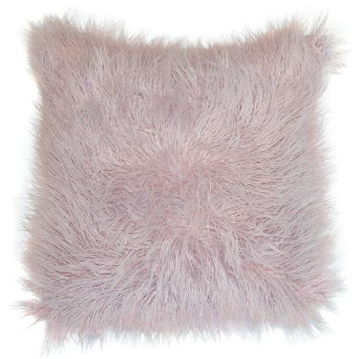
It’s time to put a little freshness in your homewhether it’s in your family room, bedroom, or patio. The artful display of pillows is all about harmony. By placing texture, color, shapes, and patterns together, movement is created, and it engages the eye to evoke a fresh, happy, peaceful feeling! Come in and let one of our designers help you create that perfect display from our large assortment of pillows.


Motorized retractable outdoor shades enclose and transform any outdoor space with the push of a button! These are a few of the many benefits of outdoor shades.

ENJOY THE OUTDOORS WITH YEAR-ROUND WEATHER PROTECTION.
Outdoor shades offer the use of the patio, porch, balcony, or gazebo in all four seasons. Enjoy the outdoors in the summer heat with an ideal and cool relaxation spot with adjustable screens, or lower them to protect from spring showers, autumn winds, or to keep warm in a winter snowfall.


Give your home an upgraded and stylish feature that will easily connect to your smart home for home remote comfort inside and outside.
The patio, balcony, or garage is a multi-use space that can have more versatility with a motorized screen. Work on home improvement projects in privacy and with full ventilation. Easily air out the space or even turn it into an enclosed leisure room for family fun.
Employ outdoor shades for privacy during your soak in the hot tub and put your mind at ease. Outdoor shades provide a peaceful, private space with fresh ventilation and easy airflow.
Experience the warmth and refreshing summer breeze without an invasion from pests. Enjoy the outdoors without the outdoors bugging you. Use shades to enjoy a springtime dinner outdoors without irritating mosquitos.







 BY JORY GATTIS, IBB DESIGNER jory@ibbdesign.com @jorya.gattis on Instagram
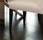
Garden stools have quickly become one of my favorite functional accessories. Whether they’re used indoors or outdoors, they’re a great opportunity to introduce an unexpected pop of color or texture. If they’re acting as bonus seating, nestled in under a console, or acting as a side table next to an upholstered piece, they’re an investment that you’ll be able to use for years to come! What could possibly be a more versatile accessory than one you can rest your feet on, have a seat, or place a drink on? It’s a 10 out of 10 in my book!


 BY ERIN LETRY, IBB DESIGN COORDINATOR erin@ibbdesign.com | @letryee on Instagram
Outdoor living spaces should be treated like an extension of your home. Fully upholstered pieces can help soften the space, while teak or wicker can add visual interest. Remember to look to your interiors for inspiration. Bring out the textures, colors, and patterns seen throughout your interiors to create a cohesive exterior space.


This year we will be seeing a movement toward warmer colors, creams rather than whites, and soft earthy neutrals. Cozy textual fabrics like bouclés are here to stay, giving your home an inviting feel. Leather can be a great addition to a textural space even in a bench, pillows, or accent chairs. Brass and black are here to stay; however, if they aren't your color, try a polished nickel over brushed to give your space a warmer hue.


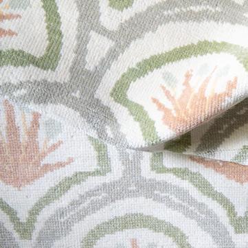
While pastels are typically associated with the springtime, they’re actually a classic palette! You can use them in a multitude of different ways, including incorporating them into a rug such as an Oushak rug or into a cashmere throw or silk pillows. What a pretty way to give your room a sense of glamour and softness. If you really want to go all out and create a beautiful classic statement to a room, hand-painted wall panels will give you a timeless look and be an instant showstopper to any home!


 BY BRONSON BERRYMAN, IBB ASSOCIATE DESIGNER


 bronson@ibbdesign.com @bronson_berryman on Instagram
If you're looking to create a chic feminine home office, we have some tips to help you get started!
We often start creating a room by first selecting the color palette. For this chic feminine home office, blush pink and viva magenta are a winning combination. Blush pink is a soft and soothing color that creates a calming atmosphere, while viva magenta adds a bold and vibrant touch. These two shades work well together to create a balanced and cohesive space.


We love a paneled room - especially a study or home office! Paneling the walls elevates the space, adding depth and visual interest. For this room, we chose a very subtle blush pink for the wall laquer. This creates a stunning backdrop for furniture and accessories and adds a touch of sophistication to the room.

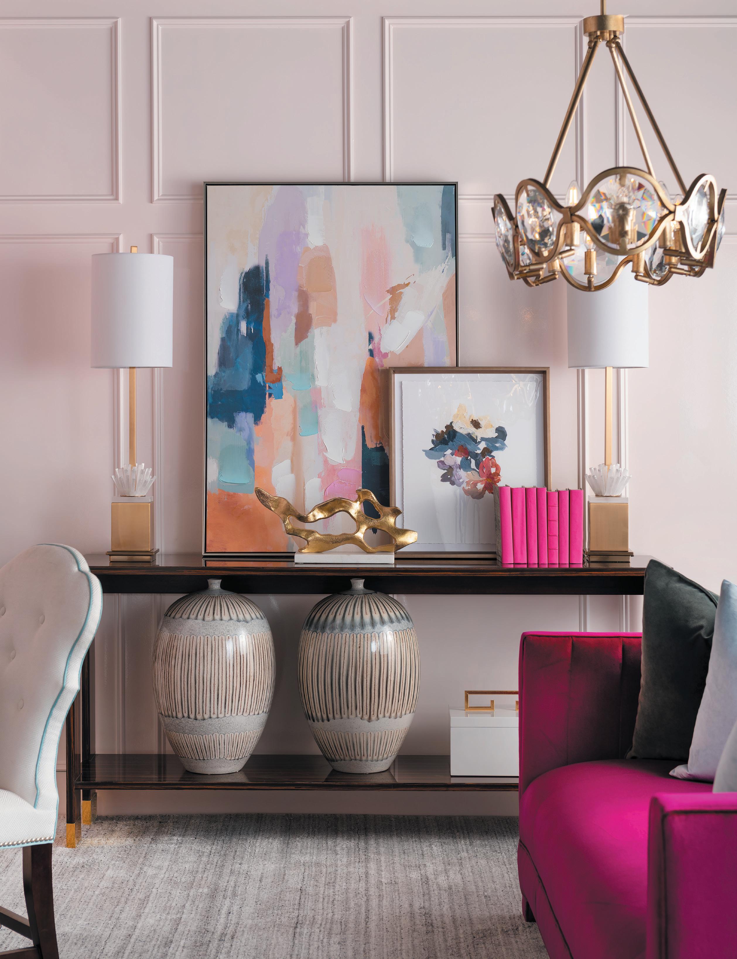

When it comes to furniture selection, choose pieces that are both functional and stylish. We chose a writing style desk finished in a rich espresso stain with soft curves and polished nickel ferrules and hardware. We paired it with a desk chair in a white fabric with a contrasting sky-blue welt. For the sitting area, we used a day bed in a bright magenta upholstered fabric, paired with a cantilevered drink table. Matching buffet lamps sit atop a console layered with stylish art and accessories.


The right lighting can enhance the ambiance of a room and act as jewelry for the space. This chandelier is a stunning focal point in the office, and the buffet lamps provide soft light and add beauty to the console. When selecting light fixtures, it's important to consider the purpose of the room and the mood you want to create.
 Photo by Dan Piassick
Artwork can make a room. It can be the focal point that ties the entire design together. In this design, we chose abstract art featuring shades of pink and neutrals to make a statement above the desk. It inserts a pop of color and brings the room to life. We also chose to add art to the top of the bookshelves and layered a few pieces on the console.


Choose carefully curated pieces that complement your color palette and add to the overall aesthetic of the room. For example, brass objects and books bound in bright colors are great options to fill the bookcases. A throw blanket and pillows layer in texture and cozy up the day bed.


When you have a dedicated and organized workspace, it can also help you stay focused and motivated, leading to increased productivity. An inspiring and functional home office can have a significant impact on your overall well-being, making it worth the time and effort to design and furnish a space that you love.


S h o p t h e c o l l e c t i o n o f b e s t - s e l l i n g c o o k b o o k s a n d h a n d c r a f t e d w o o d b o a r d s !


w w w . B o a r d s B y T h e B a k e r M a m a . c o m


HIGHLAND HOMES
SUBDIVISION: BRIDGELAND HOMES & TOWNHOMES | CYPRESS, TEXAS
DESIGNED BY IBB DESIGN FINE FURNISHINGS
LEAD DESIGNERS: BETH RAFFERTY & SUSAN NEFF
Photography Courtesy of Highland Homes
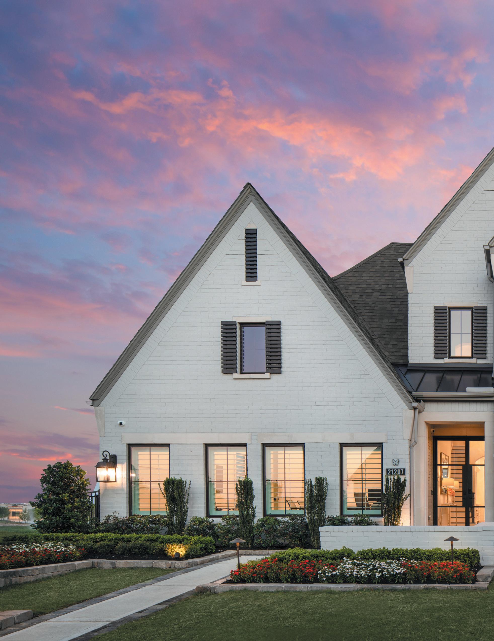
The Bridgeland community in Cypress, Texas boasts 3,000 acres of sprawling walking trails, lakes, and waterways. This community features homes on multiple lot sizes and a Luxury Townhome section built by Highland Homes. The neighborhood is perfect for every family at every phase of life with an on-site Activities Director organizing events from Empty Nester to “Mommy and Me” groups. We invite you to enjoy this “tour” of Bridgeland!

The design inspiration for the home came directly from the community’s focus on “Nature and Nurture.” We combined rich, warm wood floors with soft greens, cheerful corals, and touches of gold to create a color palette that is effortlessly elegant.

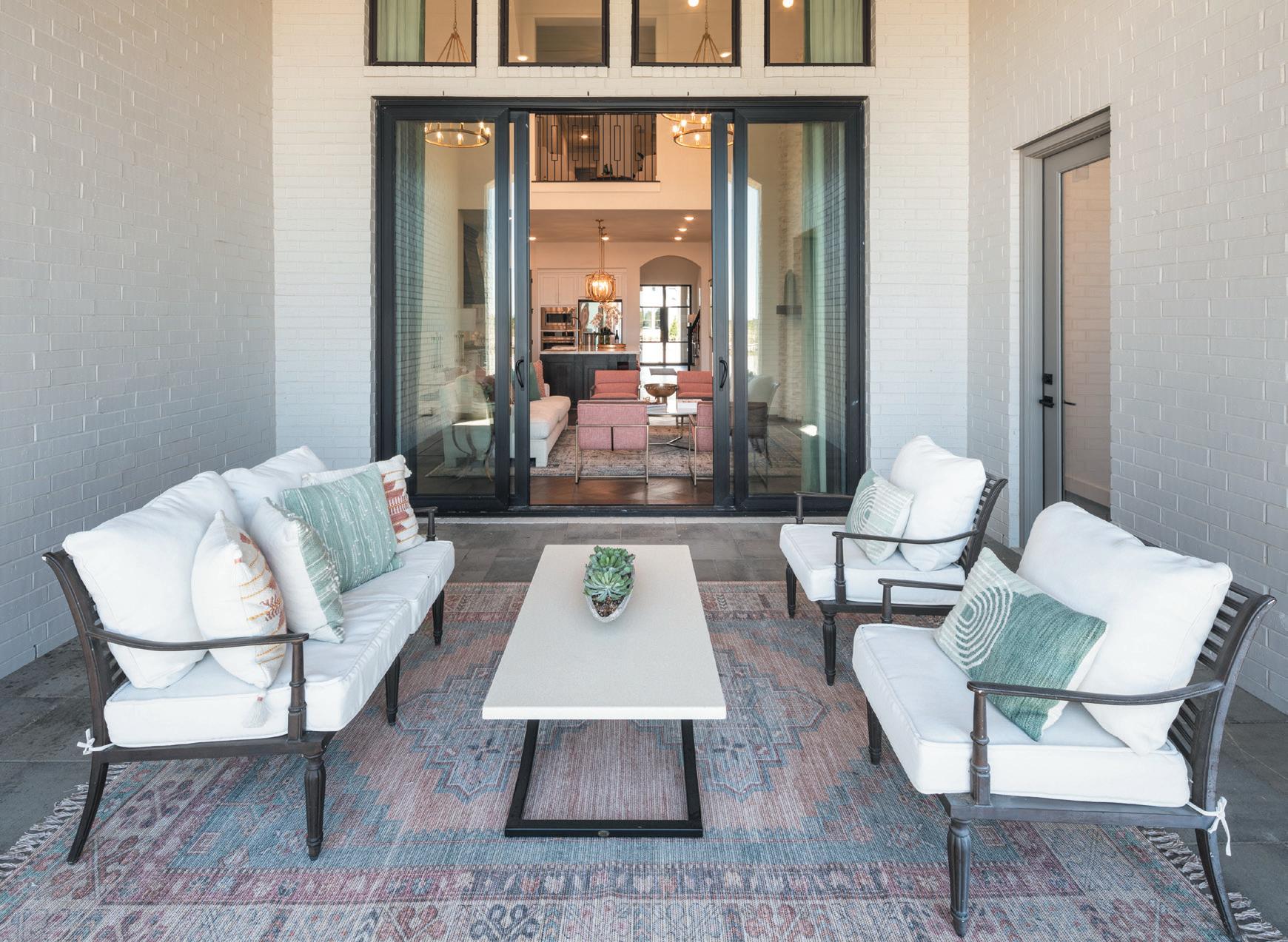

 The large covered patio is an extension of the family room connected by gorgeous sliding doors.

Spacious and light, the kitchen boasts a full walk-in pantry and wine hutch. We kept the selections simple and elegant, letting the gorgeous countertop with bold veining be the star of the show. Definition was added by staining the vent hood and island to match the warmth of the floors.

You’ll also notice the pop of color on our pantry door featuring the always gorgeous, Sherwin-Williams Evergreen Fog. Adding color to interior doors is one of our favorite ways to create personality in a home.


The awe-inspiring family room features vaulted ceilings, dark wood beams, and gorgeous chandeliers. We dressed the two- story windows in a rich green velvet drape to add a sense of softness to the room. Creating a cozy vibe that blends with luxury is created by layering modern lined furniture on a more traditional patterned rug. The fireplace is a gorgeous testament to the beauty of nature featuring split-faced marble from floor to ceiling.


The Dining Room is a lovely continuation of the family room. Rich wood barn doors flank the space adding depth, texture, and grandeur.


Dark wood built-in shelves and bold black and white art give the study an air of strength and purpose, and the sage green walls create a soothing atmosphere. What an awesome combination to enhance creativity and productivity!
The Piano Room is truly a must-See! Located directly off of the grand foyer, we turned this formal dining space into an entertaining parlor. The gorgeous baby grand, bold animal prints, and vintage black and white prints are the perfect portrayal of personality and elegant playfulness.


The Primary Suite was designed as a space to soothe and restore. We emphasized the lofted ceiling with crisp white paneling and furnished the bedroom with soft textures and layers of mixed metals.

This floorplan includes so many great spaces to enjoy being with your favorite people. Cozy up for a relaxing Movie Night, or pick teams and head upstairs for Family Game Night. The entertainment opportunities here are endless!


There are four secondary bedrooms in the 224 plan, three upstairs and one downstairs. Each room features ample furniture space and a private bathroom, perfect for family and guests alike.
To view this model in person and other homes in Bridgeland and the Houston area, log on to: www.highlandhomes.com/houston/cypress/bridgeland/

HIGHLAND HOMES
SUBDIVISION: BRIDGELAND CENTRAL | CYPRESS, TX

DESIGNED BY IBB DESIGN FINE FURNISHINGS
LEAD DESIGNERS: BETH RAFFERTY & SUSAN NEFF
Photography Courtesy of Highland Homes
IBB and Highland Homes are pleased to introduce this Luxury Townhome series to the Bridgeland Community. Our goal was to design townhomes that feel as spacious and luxurious as any free-standing home.
The IBB model team created eight design stories for the eight different floorplans. Each with its own color scheme and personality. Which one is your favorite?


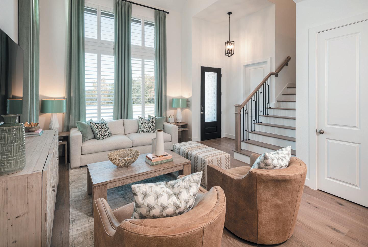
The Abbey townhome is built on a foundation of textures and natural elements. A deep grass green mixed with rich caramel leather tones is fresh and family friendly. This plan features four bedrooms and three full bathrooms.


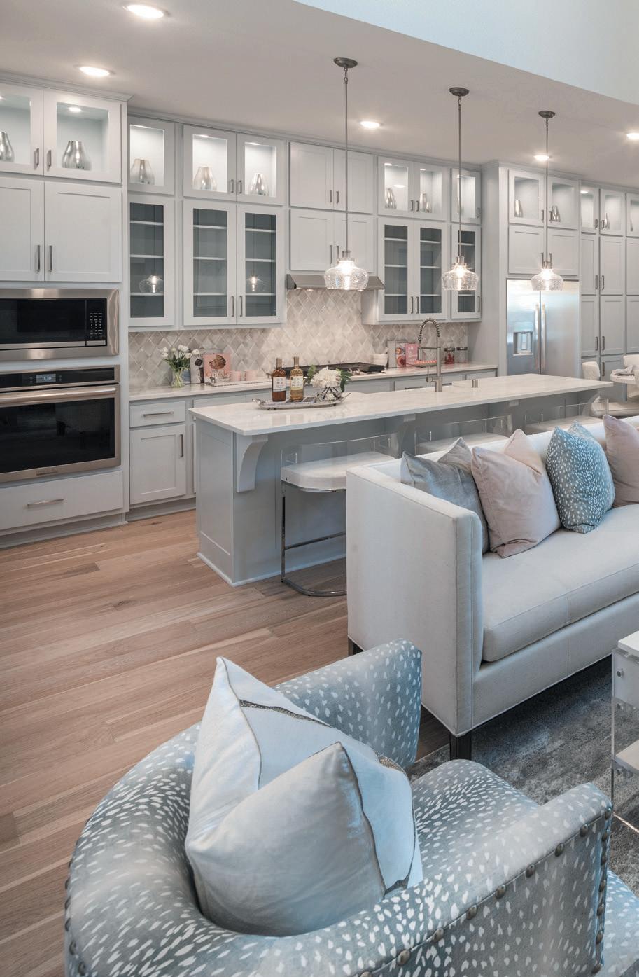


We designed our Ashford model in a more feminine palette of icy blue and splashes of soft pink. The kitchen is so spacious, with ample seating at the island and floor-to-ceiling cabinetry.
We cannot say enough about this floorplan! There is so much natural light that it is hard to believe it is an interior unit. Also, the crowning jewel is the large Primary Suite on the FIRST FLOOR! Ooh-la-la!


This sunset inspired home is full of cheerful color and personality. It features an oversized front patio for entertaining and a small shaded side patio, perfect for your morning coffee.


The first level of this townhome features a twostory family room, dining room, and kitchen with amazing counter space. Minty greens and soft golds give the home a fresh spring feeling. The primary suite is conveniently located on the first level and features a walk-in spa shower.




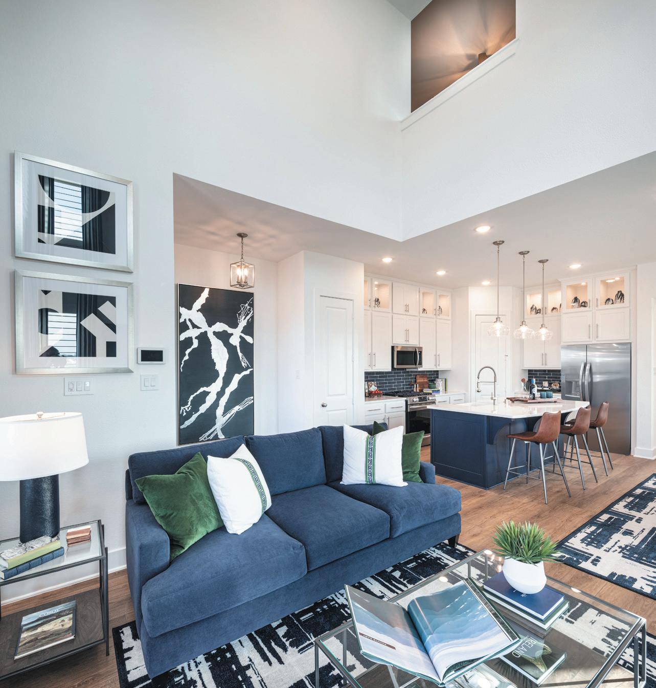

Also boasting a large front patio, The Casey floorplan is the brother to its sister, The Ansley. We put a modern spin on the time-honored color of Navy Blue by mixing it with rich leathers and pops of green.
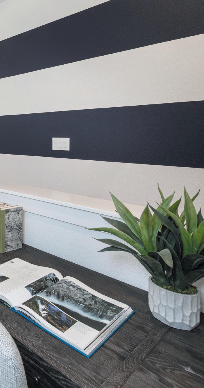


This natural color palette is set apart by contrasting the soft wood tones with bold dark stone and tile. The fireplace is a statement piece, enhancing the spaciousness and vast ceilings of the open floorplan.
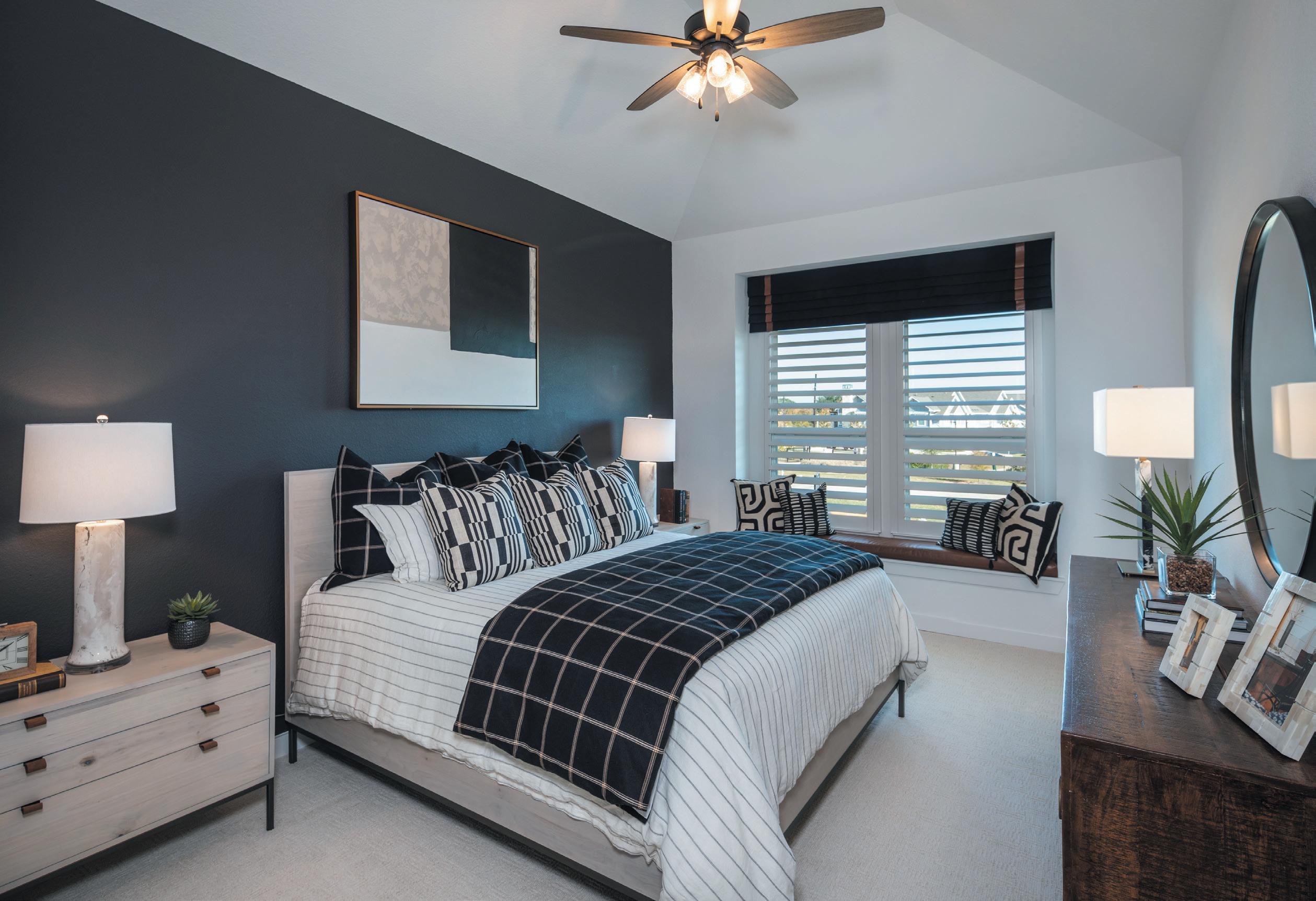


Bright and happy! Families will love spending time together amidst this palette of sky blue with pops of bright green and orange.


How about a little glamour? The Dorset model speaks to luxury in classic black, white, and gold. With four bedrooms, three full bathrooms, and loft keeping room, the Dorset offers the best of comfort and entertaining.


To view this model in person and other townhomes in Bridgeland and the Houston area, log on to: www.highlandhomes.com/houston/cypress/ bridgeland-central


So you've organized your space; now what? How can you ensure your new system doesn't fall apart? Maintenance is key but can be easier said than done. We're breaking it down and sharing 5 ways we maintain our own spaces that you can practice in your home.


1. Give every item a designated home. Nothing in your home should be left floating. Ensure that each category has a designated shelf, drawer, bin, or basket to prevent clutter from building on tables, countertops, and in between baskets. If you bring something into your home that doesn't fit into any category, take the time to create space for it. That may mean adding shelves or even decluttering to make more room.
2. Update labels.

If it's clear where something belongs, it will prevent items from being placed where they don't. Add labels to everything. They don't have to be big and in your face, but should make it clear what is stored where. Change them out should you ever reorganize to ensure the label reflects what is inside. Remember that just because you know what is in a particular bin or basket, doesn't mean the rest of your household does.
3. Put things away as soon as possible. Maintenance is a huge part of staying organized. Make a habit of returning items to their proper home
BY LYNDSEY MORGAN, OWNER, NEAT METHOD DALLAS-FRISCO
lyndsey.morgan@neatmethod.com
neatmethod.com | @neatmethod on Instagram
Photography Courtesy of NEATMETHOD
whenever you see something out of place. Doing this throughout the day or as a reset before bed will prevent clutter from building over time. Try walking around your house with an empty basket to collect anything that needs relocated and put it all away right then.

4. Shop with available space in mind.
Another important practice is to never purchase something you don't have room for. You wouldn't place a king bed in a tiny bedroom and similarly shouldn't buy bulk or back stock for a house with limited storage. Consider what you have room for when shopping and if needed, declutter and adjust to make room for what's important to you. Sometimes it's as simple as getting rid of expired items to make room, and other times it involves making the hard decision and telling yourself no.
5. Declutter frequently.
Avoid letting items accumulate that are no longer of use to you and make room for the items you truly love. Organized people do this daily. You may not be that tuned in to editing, and that's totally fine, but in order to avoid huge projects later, try to declutter at least monthly. Take stock of expired food, stained linens, broken toys, old makeup, outdated clothing etc. A great practice is to keep a donation bin somewhere in your home or garage. Once it's full, take it to your nearest donation center.
PREP TIME: 15 MIN. | COOK TIME: N/A | SERVES 8-10
INGREDIENTS:
Easy Chicken Salad Recipe:
Dressing:
• 1/2 cup light mayonnaise or Greek yogurt
• 1 tablespoon lemon juice
• 1 clove garlic, minced
• 1 teaspoon dijon mustard
• salt and pepper, to taste
Salad:
• 3 cups cooked chicken, chopped
• 1/2 cup red grapes, quartered
• 1/2 cup apple, chopped
• 1/2 cup green onion, diced
• 1/2 cup candied pecans, chopped
Breads, Fillings, & Sides:

• Croissants
• Sandwich bread
• Bibb lettuce
• Baked Bacon
• Sliced Tomatoes
• Sliced Avocado
• Carrots
• Hummus
• Grapes
INSTRUCTIONS:
1. To make the Chicken Salad: In a small bowl, stir together the mayonnaise, lemon juice, garlic, and dijon mustard. Salt and pepper to taste.
By Maegan Brown @thebakermama on Instagram TheBakerMama.com
PREP TIME: 5 MIN. | COOK TIME: 10-12 MIN. | YIELD: 24
INGREDIENTS:
• 1/2 cup (1 stick) unsalted butter
• 1 cup semi-sweet chocolate chips
• 1 cup granulated sugar
• 2 large eggs
1. Preheat the oven to 350°F. Lightly spray a 24-cup mini muffin pan with nonstick cooking spray and set aside.
2. Place the butter and chocolate chips in a large microwave- safe bowl. Heat in the microwave for 60 to 90 seconds, whisking every 30 seconds until the chocolate chips are melted and smooth.
3. Whisk in the sugar and add the eggs one at a time. Stir until smooth. Stir in the vanilla and add the flour, salt, baking powder, and cocoa powder.
• 1 teaspoon vanilla extract
• 3/4 cup all-purpose flour
• 1/4 teaspoon kosher salt
• 1/2 teaspoon baking powder
• 1/2 cup unsweetened cocoa powder
Stir until well incorporated. Scoop the batter evenly into the prepared muffin cups, filling each one almost full.

4. Bake for 10 to 12 minutes or until a toothpick inserted in the center comes out clean, rotating the pan halfway through.
5. Remove the brownie bites from the oven. Let the brownie bites cool completely in the pan. To remove, run a sharp knife around the edge of each bite and pop it out of the muffin cup.
2. In a large mixing bowl, add the cooked chicken, grapes, apple, green onion, and pecans. Stir to combine. Pour the dressing over the chicken mixture and gently stir until well coated.
3. Taste and adjust seasonings, as needed.
4. To build the board: Place a bowl of the Chicken Salad in the middle of a wood board. Surround the bowl with breads, fillings and sides.
5. Serve and Enjoy!


PREP TIME: 10 MIN. | COOK TIME: 50 MIN. | YIELD: 2 9X5 LOAVES
INGREDIENTS:
Bread:
• 3 cups all-purpose flour
• 1 and 1/2 teaspoons baking powder
• 1/2 teaspoon kosher salt
• 2 tablespoons poppy seeds
• 1 cup canola oil
• 1 and 1/2 cups milk
• 2 cups granulated sugar
• 3 large eggs
• 2 teaspoons lemon juice
• 2 teaspoons lemon zest
• 1 teaspoon pure vanilla extract
Glaze:
• 3/4 cup granulated sugar
• 1/4 cup orange juice
• 1 teaspoon lemon juice
• 1/2 teaspoon vanilla
• 1 tablespoon butter, melted
INSTRUCTIONS:
1. To make the Bread: Preheat the oven to 350°F. Lightly grease and flour two 9×5-inch loaf pans and set aside.
2. In a medium bowl, whisk together the flour, baking powder, salt, and poppy seeds.
3. In the bowl of an electric mixer fitted with the paddle attachment, beat the oil, milk, and sugar until well combined. Add the eggs, one at a time, beating until each egg is incorporated. Beat in the lemon juice, lemon zest, and vanilla extract.
4. Add the dry ingredients to the wet ingredients and mix until well combined.
5. Divide the batter between the prepared loaf pans and bake for about 50 minutes or until a toothpick inserted in the center comes out clean. If the top of the loaves starts to brown too much before the loaf is baked all the way through, tent the loaf with foil and let it continue baking until baked all the way through.
6. Let cool for 10 minutes before inverting to a wire rack set over a rimmed baking sheet.
7. To make the Glaze: In a medium bowl, whisk together the sugar, orange juice, lemon juice, vanilla, and melted butter until smooth. Pour evenly over warm loaves. Let the bread cool completely.
PREP TIME: 5 MIN. | COOK TIME: N/A | YIELD: 2 CUPS
INGREDIENTS:
• 1 (16 ounce) container whole-milk ricotta
• 1 tablespoon fresh lemon zest, divided (zest from a large lemon)
• 1 tablespoon fresh lemon juice (juice from half a large lemon)
• 1/2 teaspoon kosher salt
• olive oil, for drizzling
• toasted baguette slices, for serving
• fresh raw vegetables, for serving
INSTRUCTIONS:
1. Using a stand mixer fitted with the wire whisk (or hand mixer with a whisk attachment), whip the ricotta on high speed for 1-2 minutes or until light and airy.
2. Add 1 tablespoon lemon juice, 3/4 tablespoon lemon zest, and 1/2 teaspoon kosher salt to the whipped ricotta and whip again for another minute.
3. Transfer whipped ricotta to a serving platter and finish with a generous drizzle of olive oil, sprinkle of salt, and the remaining lemon zest.
4. Serve with toasted baguette slices and fresh vegetables for dipping.


JANUARY 6, 2023
THE ARTS AWARDS HONORS TOP MANUFACTURERS, RETAILERS, DESIGNERS, AND SALES. IBB DESIGN WAS HONORED FOR "BEST FURNITURE STORE IN THE COUNTRY!"


This fifth win puts IBB Design in the ARTS AWARDS Hall of Fame!


