

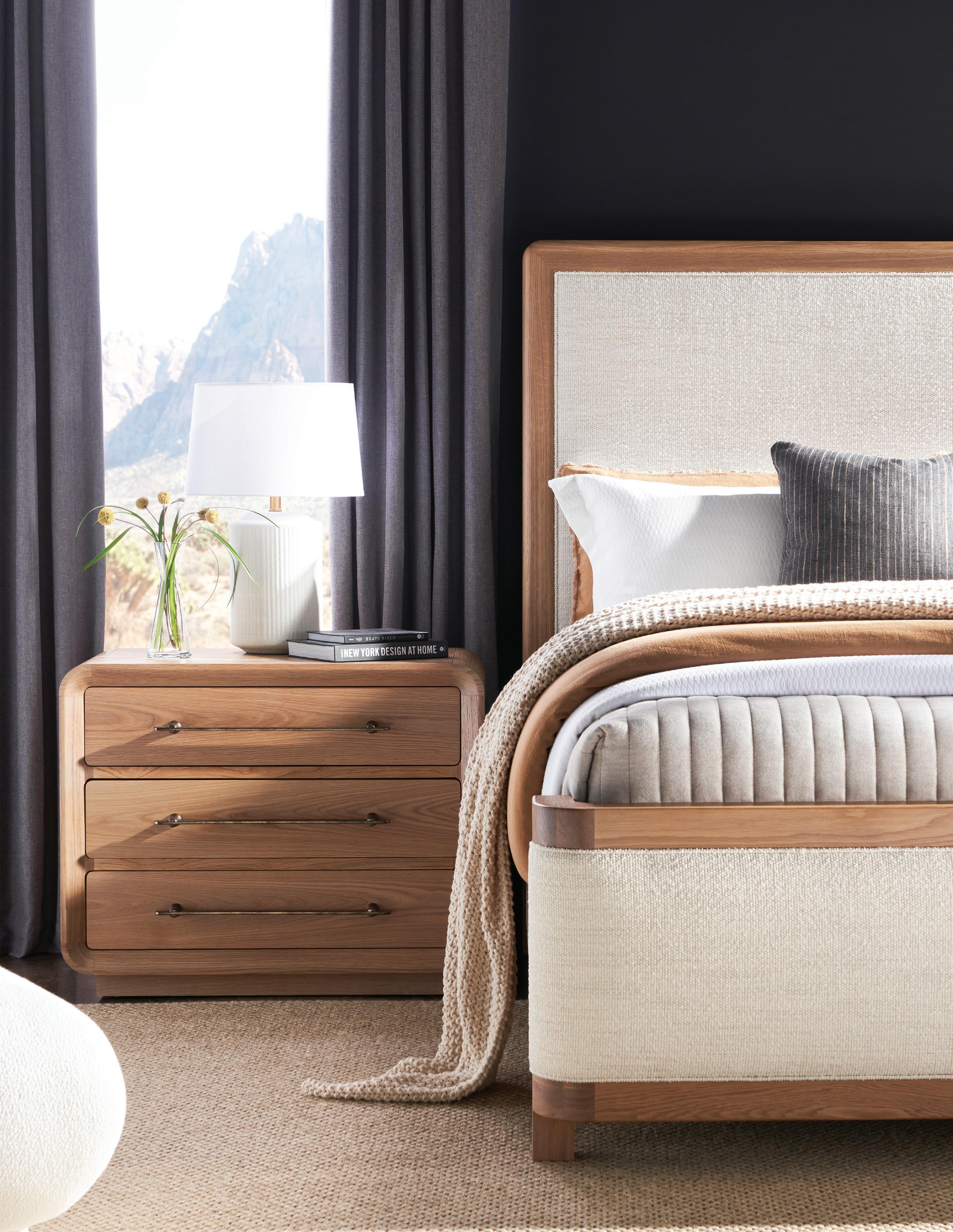
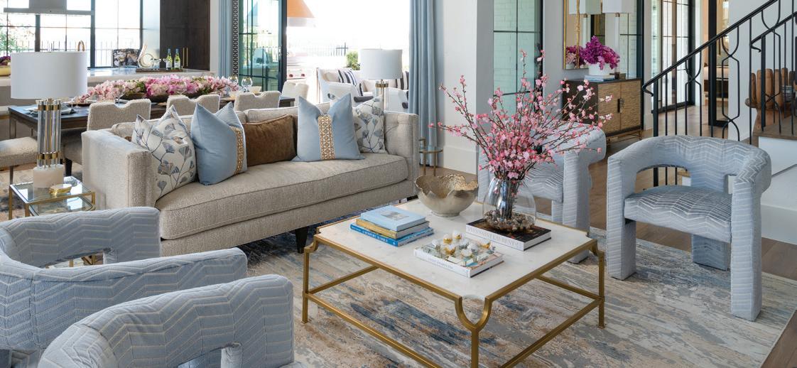
HAND CRAFTED IN AMERICA BY NINE DIFFERENT ARTISANS ASCOT SETTEE HANCOCKANDMOORE.COM


Welcome to the 10th Anniversary Edition of IBB at Home!
As I reflect on the extraordinary 2023 IBB Design Fine Furnishings has had, I am reminded how blessed we are to have gained so many wonderful design clients, store customers, manufacturing partners, and a growing #teamIBB! We had an incredible store pop-up event called the IBB Posh Pop-Up, and if you missed it, reach out to one of our designers for a fun recap! We introduced a few new accessory lines of rugs, fine art, and permanent botanicals that are gorgeous and available now.

We are honored to be celebrating 10 years of IBB at Home! If you are interested in seeing what’s coming next for IBB in 2024, be sure to subscribe to the magazine and our news emails, as well. Both are free and share our event announcements, design eye candy, featured projects, and our ever-changing store vignettes.
2024 is the year to visit IBB Design! With daily and weekly new arrivals of designer furnishings, home décor, and accessories, our visual merchandisers update our showroom vignettes daily to showcase current design styles and products in a variety of color palettes that can be used in your home. Our designers found some remarkable new pieces from the various markets this year, and you can view each piece or an entire room ensemble in one of our white box rooms to get a better idea of how it will look in your home. We challenged our manufacturers to get more creative again this year, and the results are sustainable, Made-in-the-USA product lines being made available for immediate delivery! Come by and see the new daily arrivals and talk with some of our interior designers.
Visit the IBB Design retail store and showroom at 5798 Genesis Ct, Frisco, TX 75034, Monday through Friday 10 a.m. – 5 p.m. and on Saturday 10 a.m. – 6 p.m. IBB Design is fortunate to continue to expand #teamIBB, so if you know of a talented designer who is interested in the possibility of joining #teamIBB, please have them send their resumé to career@ibbdesign.com.
Thank you again for your business and support. I am so grateful for you all!
All the best,
Beth Rafferty
Owner & Designer
IBB Design Fine Furnishings
beth@ibbdesign.com
@ibbdesign on Instagram

OWNER/DESIGNER PUBLISHER
BETH RAFFERTY
OWNER/DESIGNER EDITOR-IN-CHIEF SHAY GEYER
VP OF MARKETING
ANGIE TASSAN
CONTRIBUTING WRITERS
BRONSON BERRYMAN
MAEGAN BROWN
MAXINE BURT
JUDY CONLEY
ANGELA DAVIDSON
JORY GATTIS
SHAY GEYER
SHANNON GIDNEY
LORETTA GILLILAN
KAREN HOLLOWAY
PAM HOOD
ERIN LETRY
KAY LEWIS
LAUREN MACNAK
LYNDSEY MORGAN
LESA NEFF
TAMARA PEREIRA
MEGHAN SEBREN
RITA SKAGERBERG
LINDSAY STEUDTNER WILL SMITH
ANGIE TASSAN
MAGAZINE DESIGN
IBB DESIGN
DESIGNERS
ANGIE TASSAN
DANIEL M. CHAVEZ
COPY EDITOR
KRISTIN PEBSWORTH


As I reflect on the last ten years of publishing our magazine, IBB at Home, I can’t help being overcome with joy to see how much we’ve grown. It started as a twelve-page magazine as a means to get our designers’ work published and into potential clients’ hands, while avoiding the typical waiting game with national and local shelter publications. Today, each issue consists of at least 96 pages full of projects and tips from our design staff, vendors, and lifestyle partners. We’ve also grown our loyal subscriber following to more than 25,000 copies for each issue to households all across America. To say that I’m proud of #teamIBB would definitely be an understatement.
So much has happened around IBB as well over the last ten years. We’ve grown #teamIBB to more than ninety staff members. It takes a village to make our clients’ design dreams a reality. I may be biased, but I definitely think we have the best team around! We also brought all of our operations under one roof, nearly doubling our facility in Frisco to encompass 90,000 square feet of retail showroom, offices, workrooms, and warehouse space. Our operations allow us the utmost in efficiency and the ability to custom tailor each design specific to our clients’ needs. Our logistics and rockstar team have perfected “Destination Design” and have been installing projects all over the world. They have been busy traveling to Cabo San Lucas, Grand Cayman, California, Utah, Colorado, Oklahoma, Florida, South Carolina, and of course all over Texas just to name a few destinations.
We are grateful that you have shared in this inspirational journey with us over the last ten years and allowed us to share a glimpse of our team’s design talents.
Cheers to many more years of living in style! We can’t wait to show you what’s ahead in our future and we hope you’ll continue to be a part of it!
Shay Geyer Owner & Designer IBB Design Fine Furnishingsshay@ibbdesign.com




The 2024 Pantone® Color of the Year, Peach Fuzz, 13-1023 is a "velvety gentle peach whose all-embracing spirit enriches heart, mind, and body." We had to return back to our basics to consider where we are implementing this warm, mild peach tone with a neutral hue. Pairing it with a rich navy provides a bold contrast to an interesting room, while a deep classic blue or turquoise with some added yellow will soften your room’s feel and carry you into this spring of colors. While our initial reaction to Pantone®'s announcement was not great, we are reconsidering the use of Peach Fuzz. The "Peach Fuzz" color by any other name would definitely For now, we recommend keeping it as a complement to your color palette.


Follow our “Peach Fuzz" board on Pinterest for more inspiration on using this beautiful color in your home. pinterest.com/ibbdesign/ peachfuzz

BENJAMIN MOORE
2014-50 Springtime Peach
BENJAMIN MOORE
060 Fresh Peach
SHERWIN-WILLIAMS
6632 Neighborly Peach
BENJAMIN MOORE
137 Peach Pudding
BENJAMIN MOORE
139 Party Peach
PRO TIP: Always sample the paint in your space before diving in and painting the entire room. Just because it looks fabulous in your friend’s home, doesn’t mean it will look equally as stunning in yours. There are many factors which influence how paint looks in a space.


Outdoor seasonal updates can feel daunting but can actually be simple if you think about it like transitions for your wardrobe. For me, the start of 2024 is all about layers, warm tones, and cozy textures.
Regardless of your personal style, applying this simple concept for your outdoor refresh will allow you to add that extra layer of personalization and flare. The options for outdoors have grown immensely in the last few years, so there is no excuse to skimp on the extra styling!
 BY JORY GATTIS, IBB DESIGNER jory@ibbdesign.com @jorya.gattis on Instagram


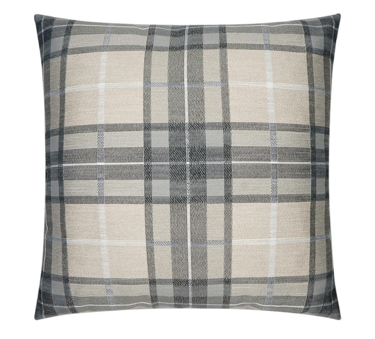
This palette screams Ralph Lauren vibes. Whether you have traditional wrought iron furniture or a more transitional fully upholstered look to your patio furniture, incorporating menswear-inspired textiles makes the space immediately feel rich and inviting. A traditional Persian style rug and table lamps add an unexpected “indoor” element to your patio that makes things feel cozy and warm. Outdoor rated permanent botanicals are an easy way to add yet another layer, and they are 100% maintenance free in that they don’t require watering, fertilizing, or even sunlight! They’re perfect to add an organic element to covered spaces. At the end of the season, just dust them off and haul them off to storage with the Christmas trees to be ready for the end of the year.




 TRADITIONAL PERSIAN STYLE RUG

I love the look of a chic quilted black leather Chanel handbag, but I also love their seasonal tweed collections that take inspiration photos from the vintage suits that everyone still loves. So many contemporary homes I’m working on now have these gorgeous, clean black and white exterior spaces that I’m obsessed with, but there is nothing wrong with adding in some organic texture and even some warm earth tones for richness. Clean boxwood topiaries in tall industrial pots add softness without breaking the form aesthetic, and throwing an asymmetrical assortment of pillows and casually draped outdoor throws creates a juxtaposition that adds interest.


 CONTEMPORARY MONOCHROMIC
BOXWOOD TOPIARIES


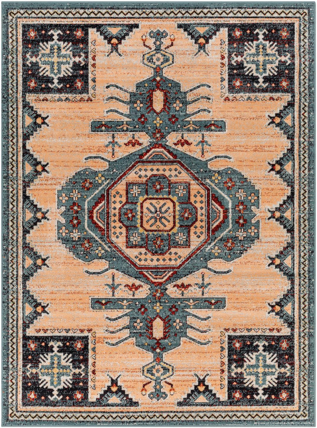

There is always that one quirky friend in the group who just can’t follow the rules; this one is for them! This whole vibe is colorful, funky, whimsical, and all about mixing and matching things to create a curated and quirky vibe that still looks polished. In this space, if there are extra toss pillows laying in the floor and things are a little messy, it only adds to the charm. Russet neutral tones, knits, and tribal prints bring warmth and character to a space that screams "Come curl up!" on those cooler weather days. This space always has random additions like this tall woven floor lamp, casual botanical arrangements, and bonus seating for last-minute guests.


 TALL WOVEN FLOOR LAMP

Expertly-placed lighting is a vital aspect of any interior design project. Adding additional dimensions, lighting brings a space to life.
Lighting serves many functions, such as creating depth and height, generating cozy spots, and drawing attention to a room’s most impressive areas. Light and the contrast of light and shadow affect our mood and enhance our perception of other elements. Colors, textures, features, and even furniture can be affected by skillfully designed interior lighting. The main categories are ambient, task, and mood lighting. All three serve different but equally important roles in a space’s overall lighting design. This delicate balance brings new energy to spaces and can change an ambiance and overall mood of a room by the flick of switch.


Ambient Lighting: The glow surrounding all spaces.
Also called general lighting, ambient lighting provides overall illumination for a room and is intended to create a uniform light level throughout a space. It should be independent of any special lighting needed in targeted areas of a room. Ambient lighting provides the foundation and general illumination of a room. Aside from basic functionality, advantageous ambient lighting generates that sense of warmth and depth in your space. Ambient lights most commonly hang from the ceiling, such as recessed lights, chandeliers, and track lights. Table and floor lamps can also contribute to a room’s ambient lighting, especially if using the lamp lights up the majority of the room.
Task Lighting: Illumination for specific jobs.
Task lighting, as the name suggests, is designed to help perform specific tasks. It provides concentrated light in a particular area to aid in activities such as reading, cooking, or working. The main consideration for task lighting is ensuring its brightness is fit for the intended purpose. It

should be brighter than ambient lighting and focused on the project or hobby at hand. Getting task lighting right means the difference between a comfortable workspace or one that is tiresome and distracting.

Mood: Create Atmosphere in the room.
Make sure to pay attention to any other light sources in the room in order to position task lights where they can do the most good. This may seem obvious, but placement is super important when it comes to effective and comfortable task lighting. For example, a reading chair with a window to the left needs a task light on the right to help eliminate shadows and more evenly illuminate the space. Situating a task light in front of a screen will create an unpleasant glare, while positioning a floor lamp in front of you can cast weird shadows down your book and produce light that is too bright on the page. Try to place desk lamps away from screens and monitors, keeping the overall light in the room bright and even. Use small desk lamps to illuminate key areas without creating a glare on whatever screen you may be using at the time.
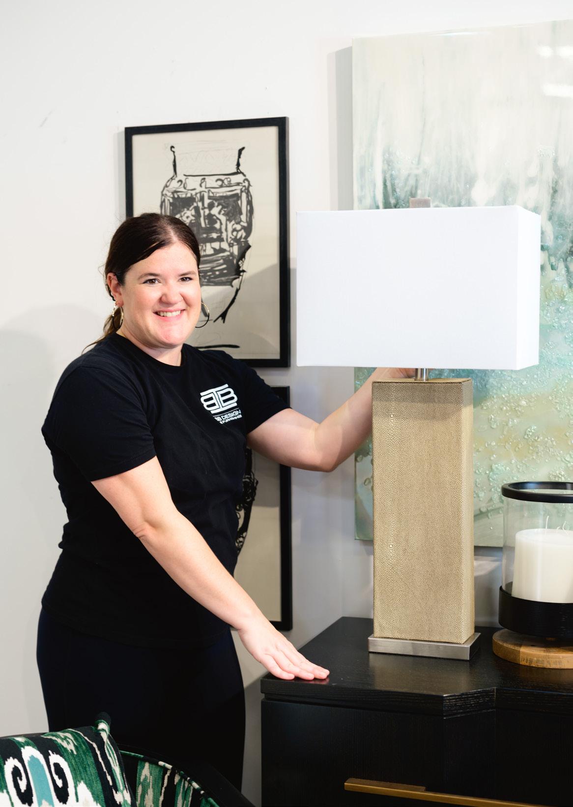
Mood lighting is using lighting to create a desired atmosphere in any room. It layers your lighting by having multiple sources of light such as lamps, wall lights and ceiling lights, so that you can change the light levels easily. It's all about being in control of the mood you want to create in your home. Keep cooler lights higher in the room (such as in overhead lighting) and warm lights lower (in table or floor lamps), for optimal functionality and mood. Avoid using a single overhead light fixture with one strong bulb, as the glare and shadows this can create are tiring on both the eye and brain functions. Instead, use several lesspowerful lights placed carefully around the room. Bulbs with lower wattage create a gentler glow. If possible, install a dimmer switch so you can change levels distributed by a single light fixture. Easy examples of mood lighting for a quick install are under-cabinet lighting, spotlights, picture lights, chandeliers, wall sconces, and table and floor lamps with dimmers or differently colored bulbs.
Choose your light bulb's strength and color by room. For example, bathroom lighting should energize in the mornings, while bedroom lighting should help calm and ready you for sleep. A sunrise projection lamp can rouse you from bed on those mornings when the snooze button is too tempting. Wall sconces can complement an overhead light and provide a non-distracting atmospheric backdrop. Fun fact: Red or amber light is the least likely hue of light to have an impact our internal clocks. Red light in the evening increases secretion of melatonin, which leads to better sleep at night and could ultimately help improve mental health!
Lighting is an essential feature of the ambiance and overall mood of a room. The right lighting setup can make a room feel larger. Combining incoming natural and artificial lighting sources is vital to making an old, tired room feel brand new or for taking a new room design to the next level. Lighting elements should complement the design and décor of the space, and in doing so successfully, the right light can achieve the perfect balance among style, comfort, and practicality.


Ever see a gorgeous or unusual piece of furniture, admire it, but then shake away the notion you could have something like that yourself? Most people feel they have a hard time choosing new pieces of furniture in general, especially ones outside their comfort zone. A statement piece is the perfect way to get something different in your home without committing to an entire room of a style you might regret.
How do you choose something? Go with your gut: That usually is your truest choice. And because it’s just one piece, is easier to commit. A statement piece should be unique in that it can stand on its own, tell a story, and breathe new life into the current space. If you’re on the fence, go for it and admire your courage when you smile every time you pass it.


 SHAY GEYER IBB OWNER & DESIGNER
ANNILEE B WATERMAN AW DESIGN STUDIO
LESLIE CAROTHERS SAVOUR PARTNERSHIP


I was honored to be invited by Leslie Carothers, Lightovation’s collaborating partner and principal of digital marketing agency, Savour Partnership, to curate the lighting selection and design the interiors for the cutting edge and first ever Metaverse Trendhouse. The Trendhouse allows people the immersive experience of walking through the virtual home in the Metaverse. Attendees at the latest Dallas market got a sneak peek at viewing the Trendhome in a whole new way. They were able to put on a VR headset and walk around the Trendhouse, while exploring the lighting from all angles in the Metaverse. It has brought a new way for people to visualize their room in a lifelike environment and to see how the design would come together.
“Presenting the world premiere of the first Lightovation Metaverse TrendHouse! Hop on a computer or slip on a pair of VR goggles and walk-through 2,000 SF+ of fabulous lighting and design. The house features the latest lighting trends curated by interior designer Shay Geyer of IBB Design Fine Furnishings, pulled from the 2024 Lightovation Trend Report written by global trend ambassador, Patti Carpenter. Architectural Design, 3d modeling & world build by Annilee B Waterman.”


To view the Trendhouse, visit:
https://www.spatial.io/s/Lighting-TrendHouse-2024-656e7 9e05e6352f1e9c34e84?share=6704163523573054290


 BY SHANNON GIDNEY, IBB DESIGNER & SALES MANAGER
shannon@ibbdesign.com
@designershannongidneyibb on Instagram
Photography by AD Media Group
Focusing on comfort and warmth conveys all the feelings that texture brings to the table. 2024 will be no stranger to the strong insurgence of the organic vibe. Embracing the outdoors and looking to nature are truly the best sources of inspiration when it comes to texture. We are seeing this throughout interior design from lighting to furnishings, rugs, and fabrics.
Textures present themselves in so many ways! Fabrics that make you want to reach out and touch them are abundantly spanning the upholstery world. Boucle, rich velvets, and embroidery are prevalent. We are seeing rich earthy hues such as bordeaux, deep bodied greens, satin brass, and rich corals enhance the vibe as well. Alongside these, an insurgence of trims, fringes, and tassels are making a comeback, too!
Furnishings are embracing those raw materials that were once thought to only be for the outdoors. Materials such as concrete, travertine, and burled woods can add such a richness to any palette. Natural teaks are being paired with metals to bring the outdoors in. Sculptural organic shapes are everywhere, from such small details as the edges of upholstery goods to gorgeous mirrors and light fixtures moving into shapely designs embracing a bit of traditional essence.
Rugs are also jumping on board the trend toward texture. Whether it is handwoven or power loomed, natural fibers, carved piles, and vintage hand-sheared rugs are showing up abundantly. Rugs under foot are a great way to warm up a room and ground the space.
So, while the temperatures are on their way down and cool breezes fill the air, cozy up with the feel-good textiles while adding depth and layers to your home. Think of those organic elements that inspire you and invite them in!


 BY LORETTA GILLILAN, SUNRISE BLINDS loretta@ibbdesign.com
Photography by Dan Piassick
Transform your windows with SILHOUETTE® sheer shades. Silhouette ClearView shadings offer superior view-through combined with precise light control, so you can enjoy a daytime view, while maintaining your privacy. A black rear sheer is featured on all ClearView fabrics to allow a more natural light view into and out of your home.
Harsh sunlight is transformed into beautiful natural daylight while preserving outside views, without losing daytime privacy. The elite motorized operating systems help you achieve perfect light control while providing UV protection and reflecting solar heat.
Soft fabric vanes tilt to achieve just the right amount of natural illumination and collapse to roll up and away completely into a fabric covered headrail. Child Safety is enhanced due to the absence of external or internal cords. Silhouettes® are the clear winner for transforming window coverings for your home!


 Photography by Dan Piassick
FIELDS SUBDIVISION LOCATED IN FRISCO, TEXAS
DESIGNED BY IBB DESIGN
LEAD DESIGNERS:
BETH RAFFERTY, SUSAN NEFF, SHAY GEYER, AND LESA NEFF
Photography by Dan Piassick
Exterior Photo Courtesy of Huntington Homes

We invite you to experience this extraordinary design created by IBB Design exclusively for Huntington Homes at Fields in Frisco.


We began this project with a conversation that went something like this: “Okay, so we are beginning with a traditional color palette and sophisticated dark wood tones. Now let’s make sure we have splashes of the unexpected mixed in. We want our traditional foundation to have a modern personality!”
To capture this motif, we paired a bejeweled John Richards chest with a rather surprising carved wood statue as a conversation piece. Both pieces are sophisticated and elevated in their own way, but together they create a “wow” moment to set the tone for the whole home.

The star of the kitchen is the absolutely stunning Cristallos natural stone that was hand selected for the countertops, splash, and waterfall island. An integrated sink cut from the same stone was added to create a flawless finish. The stone captures the sunlight streaming through the windows with its subtle golden flecks and is gorgeously contrasted with the rich wood cabinetry.
The prep kitchen cabinets are painted in Sherwin-Williams Meditative as a cheerful pop of color. Paired with a harlequin marble and brass backsplash, this space is anything but an afterthought.


The development of the Great Room is a Master Class in architectural elements and space planning. We added custom wood paneling in the entryway to act as its own form of art and carried it through to the cast stone fireplace.
The modern style chair profile creates a natural flow through the room, providing both ample seating and openness. Custom fabrics for the chairs and sofa pillows were selected to blend the stormy blues, soft caramels, and golds.

Dining is delightful in this open concept. To set the scene, we selected a table in dark wood with subtle metal accents. Chairs in a boucle fabric with hints of gold surround the table with a custom centerpiece as the crowning moment of this enchanting space.


Sometimes studies are tucked in a corner or hidden behind doors, but not this one! This glass-encased study was made to be seen! Natural sunlight from the patio enriches the organic grasscloth-papered walls and highlights the channel backs of the velvet swivel guest chairs. We mixed the traditional wood tones and furniture pieces with modern art in acrylic frames to brighten the whole mood of the room, with the focal point as the everintriguing Slim Aarons photography piece over the built-in credenza.
Custom upholstery is featured on the desk chair and adjoining pocket office chair to tie it all together.


The primary bathroom is a fabulous mix of modern amenities and classic style. Harlequin patterned marble floors are a dainty amuse bouche to the dramatic main event Maccha Vecchia porcelain walls.


The Game Room is designed for all types of activities and entertaining. The wet bar features a marble and glass patterned backsplash. Four caramel leather swivel chairs are perfect for cocktails, conversation, or games of all kinds. Three flat screens are featured to entice the gamers and sports fans in the family. We styled the room with a playful rug and zebra ottomans as personality splashes.

The media room in this home is directly off of the great room downstairs, so it was important to create a cohesive flow for the design while providing a cozy atmosphere for movie and TV viewing. We achieved this by selecting classic black and white photographs of iconic celebrities and entertainers. The oversized sectional pops off of the walls in SherwinWilliams Storm Cloud, and the touches of gold in the cocktail table, pillows, and bar cart provide an elegant touch.


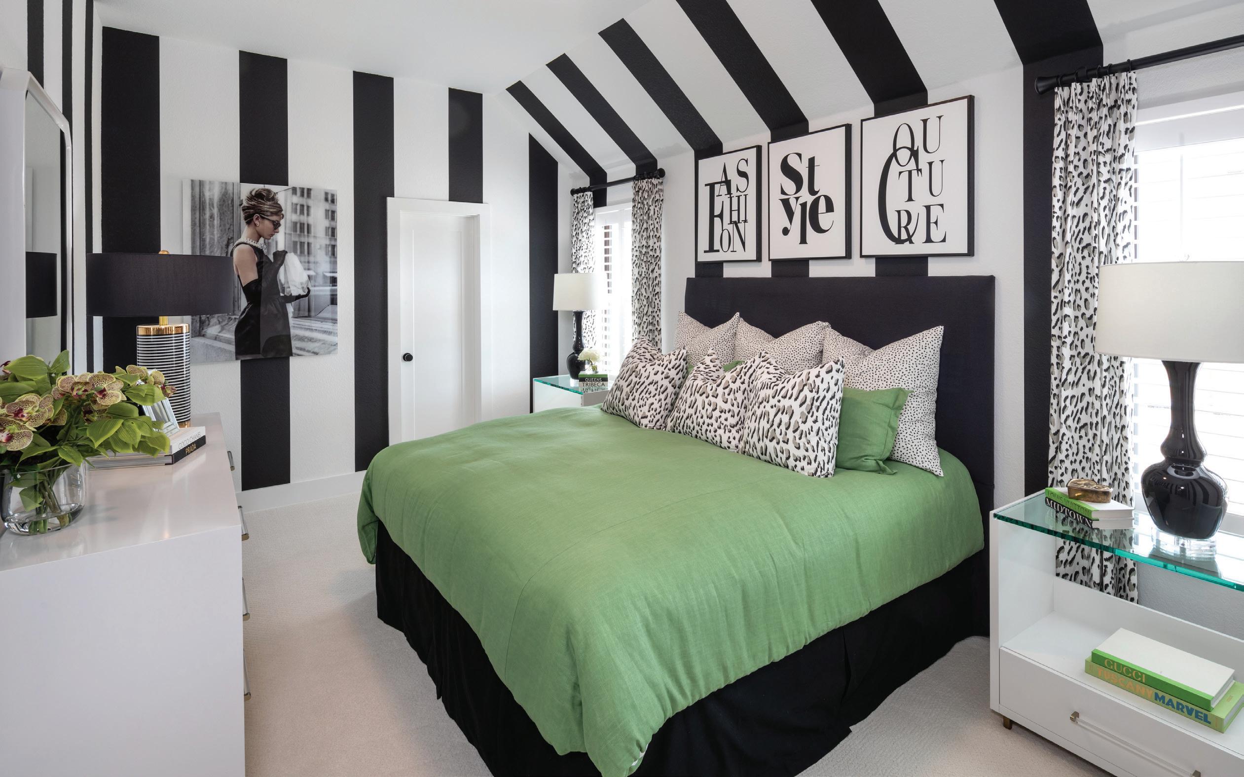
When developing the teenage girl’s room, we channeled the queen of charm and fashion herself: Audrey Hepburn. The custom paint in the tray ceiling is literally a frame for this decked out room. From the black velvet polka dots to the satin gold cirque

stripes, this room is the epitome of feminine and fun! The boy’s room is a nod to the PGA golf course surrounding the Fields community. Masculine plaids and leather touches create a room that any guy would be proud of.

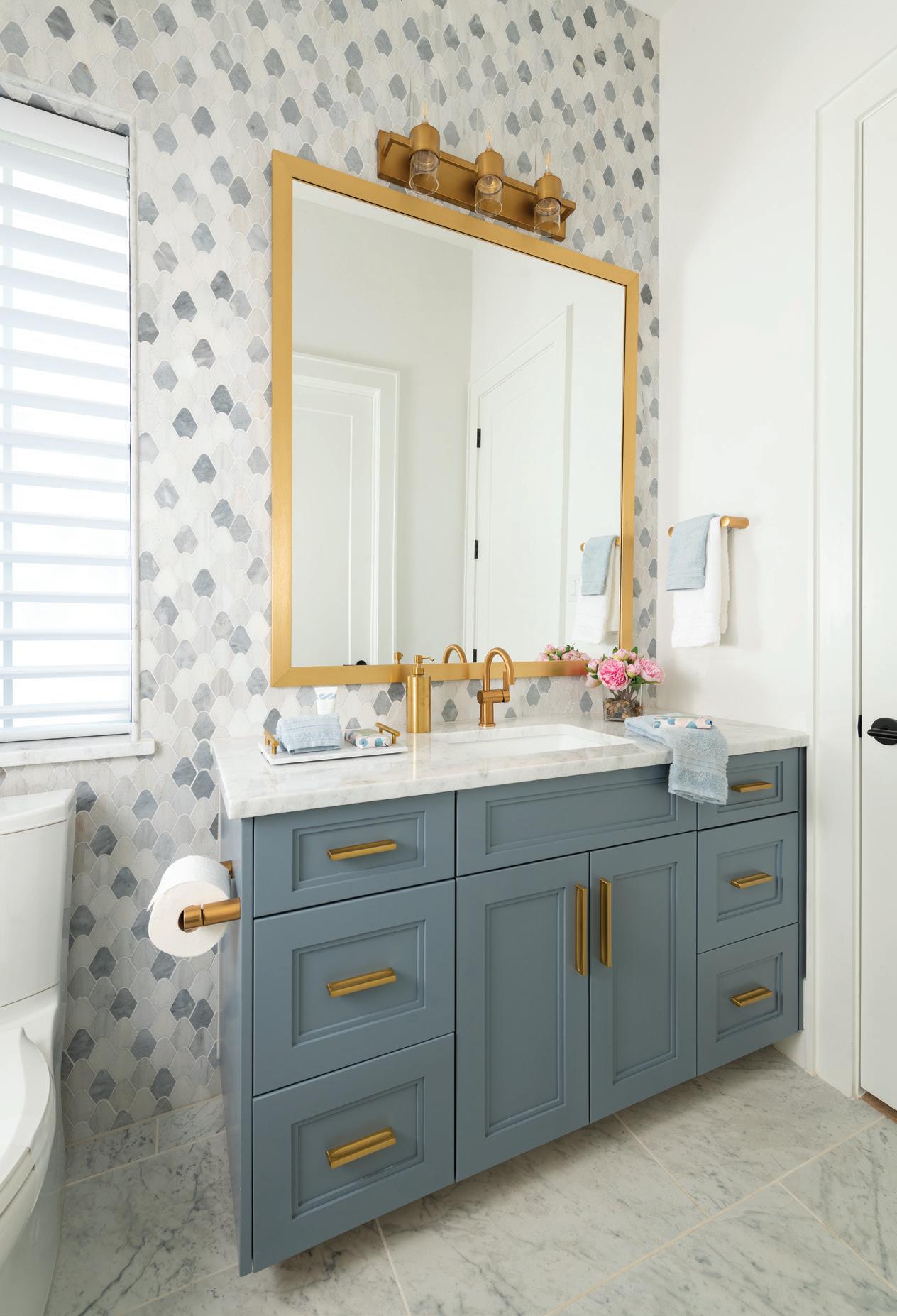
Our guest suite features walls in Niebla Azul that are the perfect soft backdrop for classic black and white hotel stitched bedding and dramatic draperies. The en-suite bath’s walls are dripping in rain drop-shaped marble in shades of blue.
To view this Huntington Homes model, log on to: huntingtonhomestx.com/ dfw/frisco/fields
The powder bathroom is a little taste of heaven with its floating vanity and waterfall sink. Hues of blue metallic gold in the wallpaper glow in the sunlit space.


 Photography by Dan Piassick

will@ibbdesign.com | @willtsmith on Instagram
Photography by Dan PiassickI’ve always been inspired by other people’s beautiful homes, and I knew one day I wanted to be part of creating beautiful spaces. To this day, many other designers inspire me. My design philosophy has always been, “If you love

“If you love it, it won’t be out of style!”
it, it won’t be out of style.” My clients’ tastes dictate the end result. Everyone’s style is personal, and my job is to help you create your dream room. I love the collaborative aspect of this industry. I like to get to know my clients and what items or rooms they find inspiring and then use that
as a jumping off point for pulling things together. I am here to help; I will always be honest about what I think, and I won’t let you settle for something just because it’s easy or fast.

Growing up with a mother who had exceptional vision and instincts in her own home provided me with a foundation and hunger for this profession, and I did not even know it at the time.
Composition of the different design elements and taking special care to make sure the texture, scale and proportions are right are part of the expertise I offer my clients. Clients see what they think is beautiful but may not know how to combine things or where to start, so I am their support and guidance to make sure mistakes aren’t made and so that they get an interior that is special and reflects what they want.
Photography by Dan Piassick

“I will give your project my ALL, and we will have fun in the process!”
Color seems to drive my personal approach to any interior. My inspiration comes from color, whether it is found in the sandy richness of a cast stone fireplace, the surprise color of a vein in a slab of marble, the deep contrast of black window casings, or luscious colors from fine fabrics and wall coverings. Color starts the ball rolling.
Collecting the information from my client is the most important beginning. Being a good listener helps me move the thought process in a direction that best serves my client – their tastes, their goals, and their budget. Yes, everyone has a budget, but a budget does not deny a client from
having expert interior design direction available to them.
I have always worked in interior design. It has never been a hobby or sideline for me. I have owned my own design studio, partnered with high-end luxury home builders, contracted my own remodel projects, worked at highend furniture retailers, and even specialized for a time in kitchen and bath design. From construction specification to holiday decorating and everything in between, I have the experience to bring a client’s goal to fruition.
I will give your project my ALL, and we will have fun in the process!
Design by Judy Conley, IBB Designer
Photography by Dan Piassick

“Keep design simple, elegant, and comfortable!”
While I was selling furniture to clients, I found that I enjoyed helping them arrange the furniture and put the finishing touches in their homes and offices. My design philosophy is to keep design simple, elegant, and comfortable!
Getting to know my client first – their background, tastes, family, needs, and wants and making them comfortable with me as their designer are my top
MAXINE BURT, IBB DESIGNER
maxine@ibbdesign.com
@designer_maxine on Instagram
Photography by Dan Piassick
priorities. My positive attitude with the ability to mix the “old” with the new to make it work together is my superpower. I have a good eye for color and easily adapt items to what my client wants to accomplish in their home.
It’s their home or office! I am here as a friendly designer to help them achieve their dream of a happy, comfortable home.

“A good design is never really done. Your home should grow and shift right along with you, your family, and your lifestyle.”

 BY JORY GATTIS, IBB DESIGNER jory@ibbdesign.com
@jorya.gattis on Instagram
Photography by Dan Piassick
Since I was young, I’ve always been obsessed with design. Whether I was rearranging my bedroom for the third time that week or decorating our family home for Christmas, (yes - my parents pretty much let me do this). I’ve always loved it! Once HGTV finally came to my small west Texas town, and I realized that was something you could actually do for a living, it was all over!
I heard a Louis Kahn quote in college that has stuck with me since. “Design is not making beauty; beauty emerges from selection,

affinities, integration, love.” Over the years, this has shifted meaning in my mind, but basically what this says to me is design is not about the individual pieces, but the overall vibe and function of the space that make it beautiful. I really love that the word love is in there too. ”Love” is a really fluffy word for an American architect to use, but I think it’s important because it emphasizes emotion, and that is incredibly important when it comes to design. A good design is never really done. Your home should grow and shift right along with you, your family, and your lifestyle. This doesn’t mean you need to throw everything away and start fresh every few years. I’m still a strong advocate of investing in great timeless pieces, but it does mean you shouldn’t be afraid of change. Small changes like swapping out some art and throw pillows can give a room new life, but so can converting the home office into a club room if that’s what better suits your life now. Your
home should be your sanctuary, and it should make you happy and serve you well, even as your needs change. I truly respect and love so many different styles. From very chic contemporary to more maximalist traditional and all the color to none of the color, it’s really a blessing that I get to play to so many different things each day. I also really love when one project starts to bleed over into another, bringing a funky unexpected juxtaposition to a space, making it truly unique!
New clients often ask what my design aesthetic is, and at the end of the day, my personal design style doesn’t really matter, because I’m not designing a house for me. As a designer, my job isn’t to push my design aesthetic on you, but rather to work side by side with you and help you elevate your own design style to make a space that is still 100% you!

“I aim to design timeless spaces!”
 BY SHANNON GIDNEY, IBB DESIGNER & SALES MANAGER
shannon@ibbdesign.com
@designershannongidneyibb on Instagram
Photography by Dan Piassick
I am passionate about transforming spaces and creating a home that is welcoming and makes everyone feel comfortable. I aim to design timeless spaces and tailor the details to be harmonious with my clients’ preferences. I personally tend to favor more neutral, textural palettes but do enjoy color as well. I like to begin by learning how my client lives and interacts in their space. I also like to decipher what they most love about their space and their greatest challenges in the space. Beginning here helps me achieve the best results. Keeping open the lines of communication and honesty are key!
I am both a right- and left-brain thinker. While being creative and intuitive, I am also highly organized and analytical. While having a degree in Interior Design, where I graduated with a 4.0 and Best Portfolio in my class, I also have a Bachelor’s degree in Psychology.
I have more than 25 years of residential Interior Design experience and have a strong passion for what I do. I have a long list of clients who would vouch for my skill set, professionalism, and excellent service. I am happily married with a teenage girl and 3 labrador retrievers.


I am always inspired by each client’s needs and how the constant changes in our industry allow for unlimited design and function options. I am of the belief that if the principles of design are faithfully incorporated in any project, the results are aesthetically pleasing, functional, and lasting.
My first approach to any project is to find out the client’s needs and preferences. How do they plan to utilize the space? Are there any particular aesthetic features they prefer? What is their budget?
Compared to interior designers as a whole, I am more flexible and willing to design a project according to the client’s wants and needs, and my architectural background offers great assistance to those interested in renovating a property. I don’t have a “look” or style that anyone would really tag to me. The materials (tile, furniture, textiles, color trends, etc.) of the time direct the design, along with the preferences of the client.
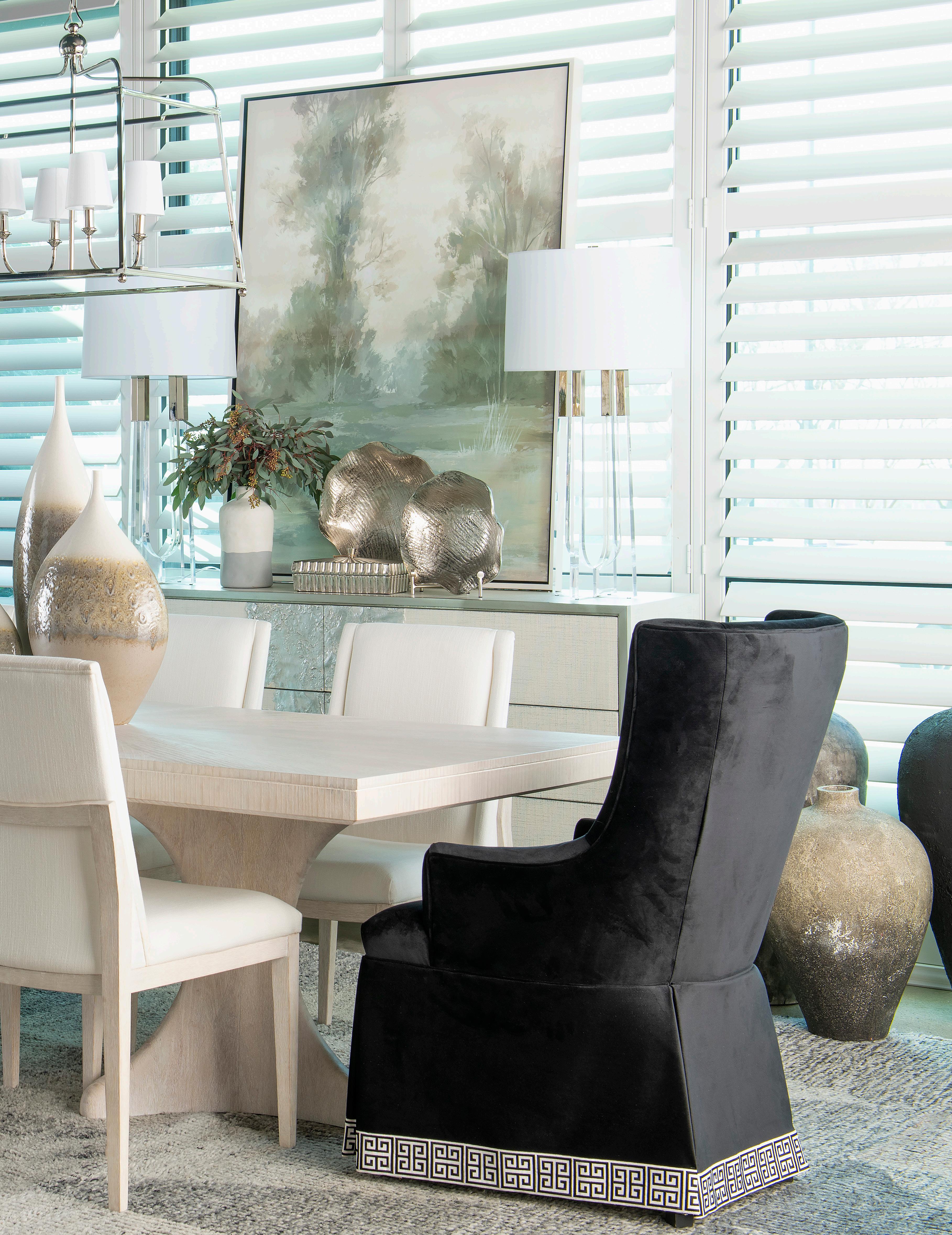
“If the principles of design are faithfully incorporated, the results are aesthetically pleasing, functional, and lasting!”

Working with the incredible furniture and accessories that we have at IBB is my inspiration to create beautiful rooms. The most rewarding part of my career is seeing my happy clients enjoying their new rooms. My design mantra is that a good design should be functional as well as beautiful. It should reflect my client’s taste and lifestyle.
I like to approach design with scale drawings of the rooms I am working in to help take the guesswork out of space planning. A floorplan gives me and my clients a clear picture of traffic flow, focal walls, and furniture placement. Over the years, my clients have thanked me for my patience, integrity, dependability, and attention to details. These are what drive me to help create the ideal spaces for my clients. My motivation is to help my clients create rooms they love. Respecting my clients’ tastes and budget is my top priority.
“Respecting my clients’ tastes and budget is my top priority.”


“My privilege is to be your tour guide, steering you through the process to allow your home to be you.”BY KAY LEWIS, IBB DESIGNER
kay@ibbdesign.com
@mkaylewis on Instagram
Photography by Dan PiassickI have been in the design industry for a long time and thrive on growing my expertise by learning from IBB’s vast resources. We have to stay on top of the game. We are with you from start to completion. This is what sets IBB apart from our competitors.
I love working with neutral foundations with lots of color layered in. A common “trend” has been to keep your home

neutral and light, which I find can be uninteresting. By adding layers of color, you bring in your personality to your space. It is now YOUR room, YOUR home.
My privilege is to be your tour guide, steering you through the process to allow your home to be you. I make sure to keep style, scale, comfort, and budget always top of mind.

 BY LAUREN MACNAK, IBB DESIGNER
@laurenmacdesigner on
Photography by Dan Piassick
“Every home should have some unexpected touches that are memorable.”
I wanted to get into design because of my love for architecture, textiles, and the beautifully vibrant industry of artisans and innovation that is the American furniture industry. I am still so inspired by the creativity of our industry and by the clients who want to partner in creating a beautiful and interesting backdrop to their lives in their homes.
A house can be beautiful and still create personality and interest that reflects the occupants. When a house functions well for their families, then that is a home! I aim to give my clients the very best version of their home that I can.
My background is in a variety of areas in the industry since I grew up in it. This gave me a wide range of knowledge as well as a unique perspective on color blending and pairing techniques. I have never met a color I don't like in the right application, and I enjoy discarding the "rules" for what should work best in the space I am working on, and instead I create a space the best that it can be for my client.
I truly love what I do. I tend to bring unique ideas and perspectives to a project, and I believe every home should have some unexpected touches that are memorable.

 BY ANGELA DAVIDSON, IBB DESIGNER angela@ibbdesign.com
I have always loved beautiful home interiors and architecture. When I purchased my first home, I had friends who would come to my home and tell me that I had a gift for interior design. That prompted me to take a few design classes, and the rest is history. I knew I had found my chosen career path.


“I design spaces that are functional yet personify my clients' tastes and lifestyles.”
My design philosophy is to design spaces that are functional yet personify my clients’ tastes and lifestyles. My approach to design is to truly get to know my clients, learn their likes and dislikes, wants and needs, and to work within their budget to design a home that reflects their own personalities.
I love working with diverse styles, mixing old with new, and creating eclectic yet aesthetically pleasing spaces. I believe your home should reflect your own personal lifestyle and taste, not mine. I am here to help guide you through the design process, not force my opinions.
 Photography by Dan Piassick

tamara@ibbdesign.com
| @tpereiraassociates on Instagram Design & Rendering by Tamara PereiraThey say a picture is worth a thousand words. True. When I think of creating a new home environment, excitement and joy overcome me. I can’t wait to start dreaming and playing; but that’s me! For others, fear can take the lead. What will it look like? Am I making the right choices? How will the area function and flow? Will it look good? These unanswered questions can paralyze some with worry. Short of a crystal ball or time travel, what can be done?
Fear not! 3-D renderings are here, allowing clients a peek into their new space before furnishings are purchased. I love space planning. It assures that form follows function (Layman’s terms: that the space is going to work). Through the years, designers have moved from T-squares
and architectural scales to space planning on computer programs, and now we are able to take those 2D images and translate them to 3D. Gotta love the progress of technology! With this advancement, clients can view their space like they are actually standing in it: 360 views!
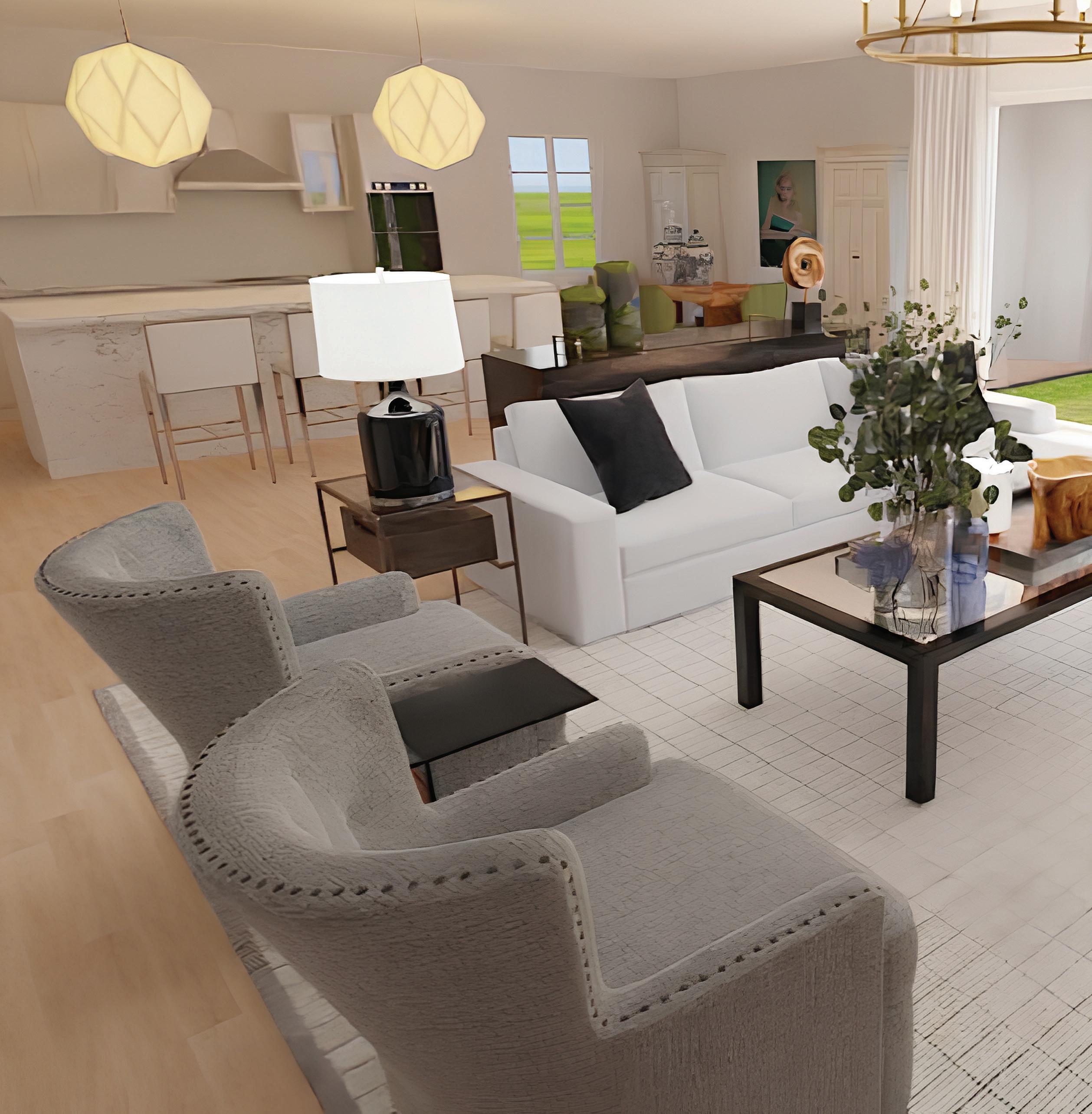
To create these images, I can work from plans or from photos and measurements. With these bits of information, a little patience, skill, and a scoop of magic, and the space comes to life. Though the actual pieces might not be the exact image of the furniture being bought, sizes can be adjusted, finishes tweaked, and fixtures added to closely represent the room. It’s called peace of mind.
Are you ready to visualize your dreams? Contact me for a consultation, and let’s start playing!
 BY PAM HOOD, IBB DESIGNER pam@ibbdesign.com
Art brings color and texture to a room and makes your space feel cozy and inviting. It reflects your personality, style, and taste. Art helps create the tone and mood. You can choose soft colors for a soothing, relaxed mood in your bedroom or bright, bold colors for a dramatic first impression entryway. Use art to highlight certain areas or pieces of furniture in your home by placing it over your favorite inherited antique chest. For the best visual appeal, mount your art placing the center at the average height of you and your spouse.

 BY LAUREN MACNAK, IBB DESIGNER
lauren@ibbdesign.com
@laurenmacdesigner
on Instagram


When picking a rug, always know how you use the room where it will be placed. High traffic areas should be given more durable rugs, while more delicate rugs can adorn rooms in which they won't take as much wear and tear. Oushak rugs are known for their exceptional quality, unique patterns, and color palette and tend to have a larger knot count compared to other Turkish rugs, resulting in a finer weave and an elegant appearance.


 BY ERIN LETRY, IBB DESIGN COORDINATOR erin@ibbdesign.com @letryee on Instagram
An easy way to elevate and bring together your space is with lighting. Chandeliers can help draw your eye up in a space, while a sconce can bring life to a gallery hall. Think of it as jewelry, adding a pop of drama while tying the whole space together.
 BY LINDSAY STEUDTNER, IBB SENIOR DESIGNER lindsay@ibbdesign.com

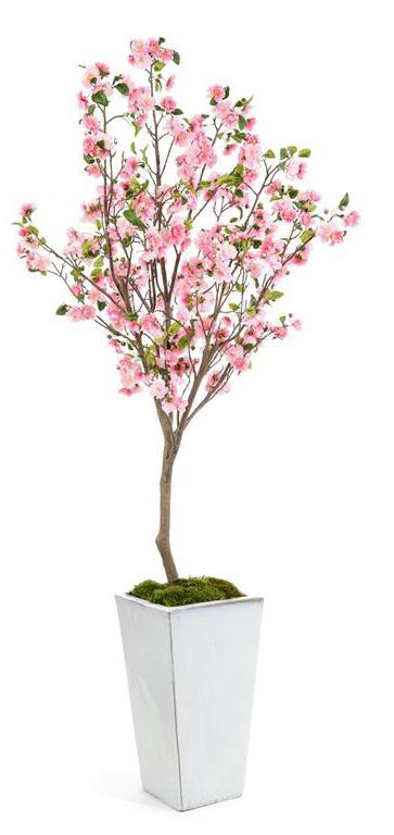
Flowers add beauty to a space and can really bring a room to life. While most of us can't bring in fresh flowers into our home weekly, an easy and more budget-friendly solution is to invest in life-like, real-to-the-touch permanent botanicals. These florals are beautiful yet maintenance-free and offer much more longevity. Just make sure no one tries to water them for you!


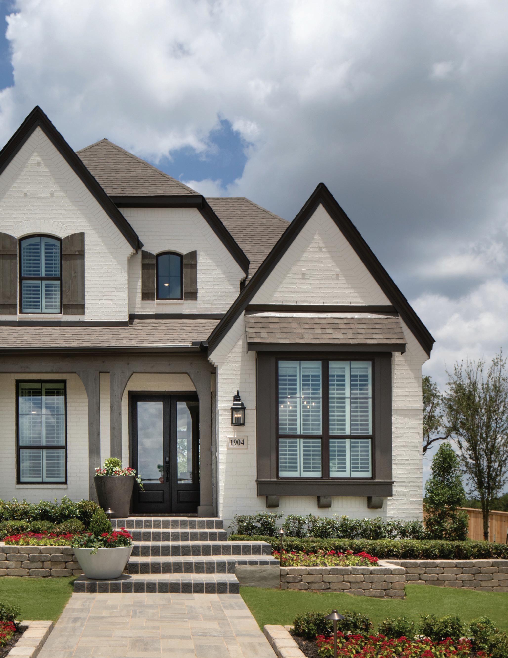
Welcome to New Braunfels! The sprawling neighborhood of Veramendi is set within the landscape of 475 acres of the best of the Hill Country. Our beautiful model is a reflection of this land and community. A mix of modern and traditional, the white painted brick is beautifully outlined with rich wood tones.
SUBDIVISION: VERAMENDI | NEW BRAUNFELS, TEXAS
DESIGNED BY IBB DESIGN FINE FURNISHINGS
LEAD DESIGNERS: BETH RAFFERTY, SUSAN NEFF, & LESA NEFF
Photography Courtesy of Highland Homes


Talk about making an entrance! We chose to dress this spacious entry as a chic and comfy lounge. The zebra chairs are the star of the show, and the gorgeous console in green establishes the home’s color scheme. The twostory drapes and the wine racks provide a dramatic backdrop and draw the eye up and up and up!


We continued the “Classic with a Little Pop” theme into the kitchen with warm wood tone cabinets and a Vivalioro Quartzite countertop with its caramel veining continuing up the backsplash. A touch of fireside orange on the barstools adds a bright spot of warmth with calming neutral tones.


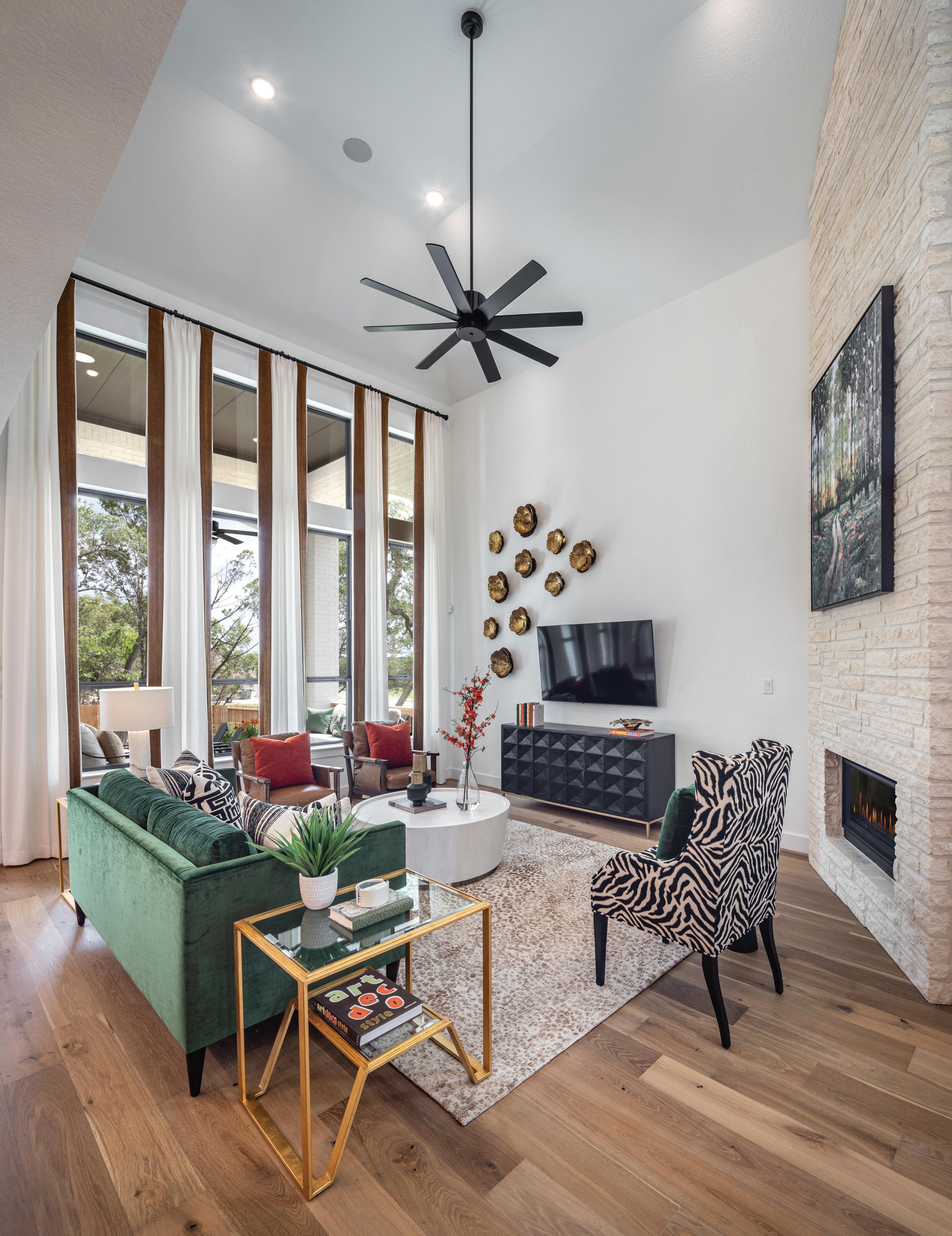
Art is a wonderful place to draw inspiration for design. The piece on the fireplace helped drive this home’s whole design. Nature meets luxury in this piece with various shades of green enhanced by nature’s own pops of corals and oranges. A natural ledgestone on the fireplace is an understated luxurious backdrop for our art.
The green velvet sofa and light brown leather chairs are placed on a tonal animal print rug.


Entertaining is easy in the open floorplan. The dining room is set in soft cream and gold tones. Elegant Greek Key-accented chairs surround the neutral table, giving the room an elevated feel.


This study has STYLE! A burled wood desk complements the open shelves, and the zebra hide rug makes everything pop!

Soft, tranquil, and full of life, this primary suite design is stunning. By painting the paneling a rich green, we have created a natural haven. The live wood accents on the furniture are the perfect touch of texture and complementing color. The Calacatta tiles in the primary bathroom tie in perfectly with the caramel tones of the bedroom.


With so much room in this floorplan, we decided to showcase a billiards room. Play a game of pool or lounge and laugh at one of two marble-top tables at the cozy window seat.
The first-floor media room is yet another place to spend time with friends and family. Enjoy ample space for movie watching on the caramel leather sectional.


This floorplan boasts four secondary bedrooms with en-suite bathrooms, making room for guests and children of all ages.


You’ll notice the tea party going on in our girl’s room…The local high school’s mascot is the Unicorn, so we couldn’t resist creating a little girl’s room with a nod to it. Come join the party and see this amazing home for yourself!
To view this Highland Homes model in person, log on to: highlandhomes.com/san-antonio/new-braunfels/veramendi


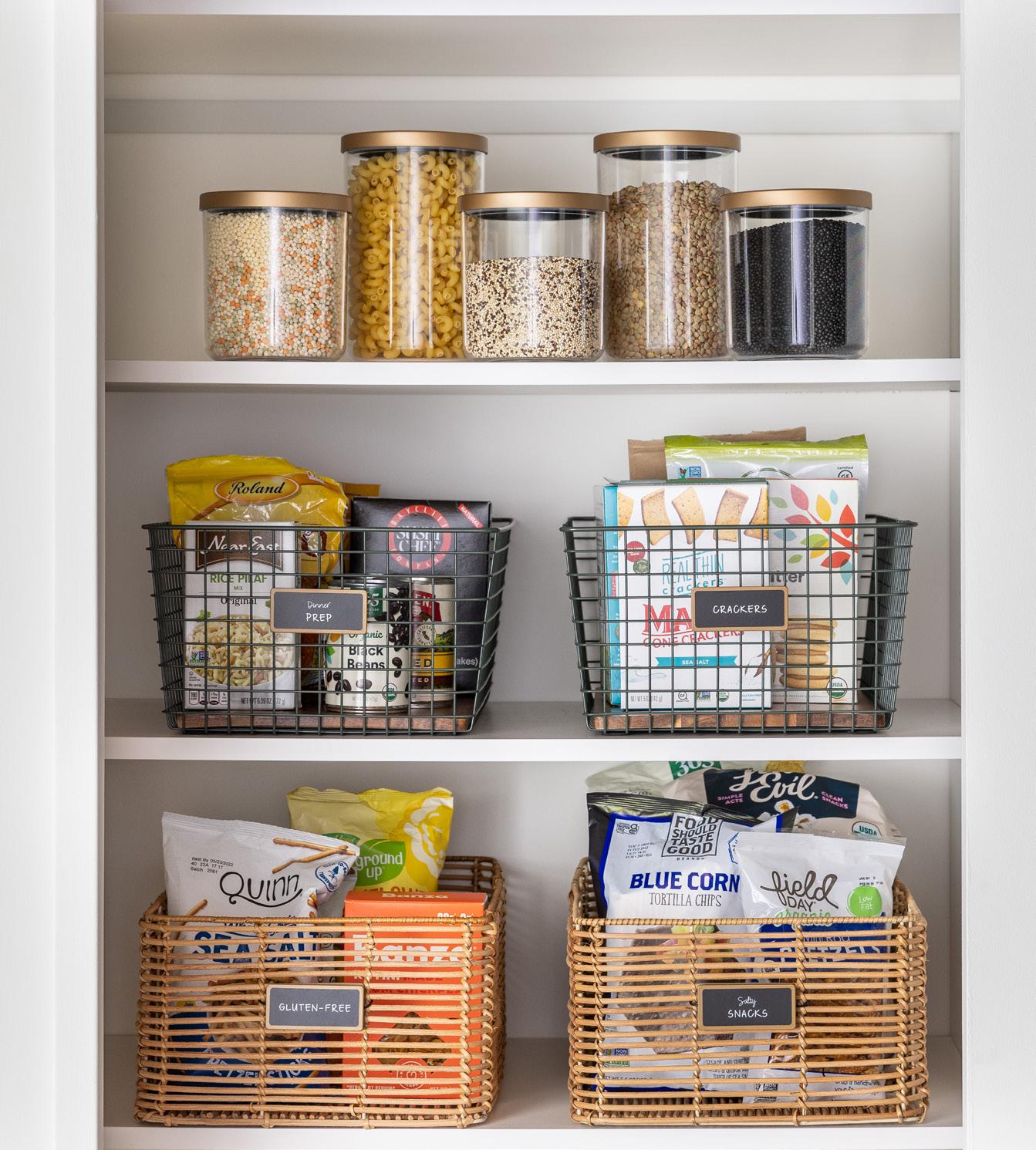
In Texas, our unlimited warm and sunny days typically mean more time for play! If you have an extra 30 minutes, you can tackle play zones with bite-sized projects to encourage independence all year long. We've created an easy-to-follow organizing method to simplify the process - because we know you don't need another complicated task as the school year is in full swing. As you work, don't forget to embrace the small steps toward a more organized home. Enjoy the process!
Pull all your board games out of the space they're stored in and take a moment to remove any that are missing pieces or that are no longer being played. If boxes are broken beyond repair, it's a good idea to gather all the pieces in a large zipper pouch. This is also a huge space saver and something that's really easy to do with puzzles. Return boxes and pouches back to the space. Try turning them on their sides to prevent toppling stacks and sorting by color for a cleaner visual.
Sort through costumes and dress-up items by doing an edit of anything that no longer fits. Next, determine whether they can be hung on a lower

 BY LYNDSEY MORGAN, OWNER, NEAT METHOD DALLAS-FRISCO lyndsey.morgan@neatmethod.com neatmethod.com | @neatmethod on Instagram Photography Courtesy of NEATMETHOD
closet rod or child-size clothing rack. If that's not an option, consider corralling all dress-up clothing in an oversized, lidded floor basket for easy access. If you want to take it to the next level, color code all hung items. Accessories can be gathered together in one or more baskets nearby.
Whether you're dealing with LEGOs or Lincoln Logs, we typically like to organize them within a cubby system or lidded bins. A small collection can go into a single cubby-sized bin, while a more extensive collection may need to be subcategorized. Depending on how your children play, you can categorize by color or set or dump them in a big bin all together. Add labels to each bin for easy cleanup.
Stuffed toy collections can easily accumulate, so regular edits are necessary in order to keep them from overwhelming your space. Once you've decided which toys are staying, corral them all together in a large floor basket or toy box. Whatever vessel you choose, limit the collection to only what will fit inside it. Don't forget! Remove donations before little ones stumble upon them.
neatmethod.com | @neatmethod on Instagram Photography Courtesy of NEATMETHOD
Saying goodbye to belongings that have begun to accumulate is necessary to keep clutter at bay. But it's a lot easier said than done. We've helped our clients through the tough decisions more times than we can count. Here are the most common items we remove from spaces.
1

2
This is one of the easiest ways to remove excess from your kitchen. Check all expiration dates and toss anything that is past its prime. Don't feel too bad if you have a garbage bag (or more) full. This is the case for most of our clients. However, we believe that once you have an organized system in place, you'll have a better visual and grasp of what you own and will be less likely to let food expire.
Still holding onto hope that that one Tupperware lid will eventually turn up? If so, it's probably time to say goodbye. If you're storing an assortment of different containers, it might also be worth investing in a new matching set that nests together nicely in your cupboard.
Really, any duplicate kitchen gadget you own that is never used simultaneously can go. The most common duplicates we see are pizza cutters, vegetable peelers, and can openers. If space is especially tight, remember that the job of specialty gadgets can often be replaced by a simple paring knife.
If one year later, you still don't know what that random cable connects, it's probably okay to recycle it. We suggest adding clear labels to identify any cords whose purpose you do know first. Then, set aside those you're unsure of and get a second opinion before parting ways.
Not feeling ready to edit on your own? We are here to help with organizing projects big and small!


 By Maegan Brown @thebakermama on Instagram TheBakerMama.com
PREP TIME: 10 MIN. | COOK TIME: 25 MIN. YIELD: 12 SKEWERS
INGREDIENTS:
• 36 frozen tater tots
• 12 (4 or 5-inch) wooden skewers
• 1/2 cup shredded cheddar cheese
• 2 tablespoons finely chopped real bacon bits
• 2 tablespoons ranch dressing
• 1 tablespoon finely chopped green onions
• 6 football picks, for decorating (optional)
INSTRUCTIONS:
1. Preheat the oven to 450°F. Spray a rimmed baking sheet with nonstick cooking spray. Place the frozen tater tots on the prepared baking sheet and bake for 20 minutes, shaking the tots around after 10 minutes. Let cool for 2 to 3 minutes.
2. Place 3 tater tots on each wooden skewer. Place the skewers back on the baking sheet. Sprinkle the cheddar cheese and bacon bits over the skewers, evenly covering all the tater tots. Return the baking sheet to the oven and bake until the cheese is melted, about 5 minutes.
3. Use a spatula to transfer the skewers to a serving platter. Immediately drizzle with the ranch dressing and sprinkle with the green onions. Decorate the skewers with the football picks (if using). Serve immediately.
PREP TIME: 20 MIN. | COOK TIME: N/A YIELD: 28 BITES
INGREDIENTS:
• 1 cup creamy peanut butter
• 1/2 cup (1 stick) unsalted butter, softened
• 1 teaspoon vanilla extract
• 9 cups Chocolate Chex cereal (12.8 ounce box)
• 1 and 1/2 cups powdered sugar, divided
INSTRUCTIONS:
1. In the bowl of an electric mixer fitted with the paddle attachment, beat the peanut butter, butter, and vanilla until well combined. Add the cereal and beat on low speed until just combined. Then turn the mixer to medium-high speed and beat the mixture until the cereal is thoroughly crushed. This will take several minutes.
2. Add 1 cup powdered sugar and beat at low speed until just combined and then on medium speed until well combined. Mixture should be thick and creamy enough to roll into balls.
3. Using a medium cookie scoop, scoop about 2 tablespoons of the mixture at a time and form into balls. Place on a parchment-lined baking sheet. You should get about 28 balls out of the mixture. Put the balls in the freezer for 10 minutes or the refrigerator for about 20 minutes to allow them to set.
4. Place the remaining cup powdered sugar in a large resealable baggie and add the balls to the bag. Seal the bag and gently toss the balls in the powdered sugar until they are all coated evenly. Remove one bite at a time from the bag and place it back on the parchment-lined baking sheet, reforming them into ball shapes, if necessary.
5. Serve immediately or transfer to a sealed container and store at room temperature or in the refrigerator.


1. To make the Frito chili pie bites: In a large pot, heat the olive oil over medium-high heat. Add half of the chopped onion and cook, stirring occasionally, until softened, about 5 minutes. Add the ground beef to the pot. Cook for 6 to 8 minutes, until the beef is browned, stirring occasionally with a wooden spoon to break it up into pieces. Drain off any grease, then add the chili powder, brown sugar, garlic powder, cumin, and salt and stir until well combined. Add the broth and tomato paste. Stir well; remove from the heat.
2. Preheat the oven to 350°F. Line a baking sheet with parchment paper.
INGREDIENTS:
PREP TIME: 20 MIN. | COOK TIME: 20 MIN. | YIELD: 75
• 1 tablespoon olive oil
• 1 medium white onion, chopped, divided
• 1 pound ground beef
• 2 tablespoons chili powder
• 2 teaspoons dark brown sugar
• 1 teaspoon garlic powder
• 1 teaspoon ground cumin
• 1 teaspoon kosher salt
• 1/4 cup beef broth
• 1 can (6 ounces) tomato paste
• 75 whole Fritos Scoops!
• 2 cups shredded cheddar cheese
• 3/4 cup sour cream
• 1/4 cup finely chopped hot-and-sweet pickled jalapeños
• 1 tablespoon hot-and-sweet pickled jalapeño juice

FOR MORE FESTIVE, BITE-SIZED RECIPE INSPIRATION, ORDER BRILLIANT BITES, AVAILABLE ANYWHERE BOOKS ARE SOLD!
3. Arrange the Fritos in a single layer on the prepared baking sheet with the scooped side facing up. Fill each one with the chili mixture, about 1 heaping teaspoon of chili, give or take. Top with a sprinkle of shredded cheese.
4. Bake for about 5 minutes, or until the cheese is just melted.
5. Meanwhile, make the pickled jalapeño cream sauce: In a small bowl, stir together all the sauce ingredients until well combined.
6. Top the bites with the remaining chopped onion and a dollop of the pickled jalapeño cream sauce. Serve with the remaining pickled jalapeño cream sauce on the side.
PREP TIME: 15 MIN. | COOK TIME: 65 MIN. | YIELD: 24
• 12 mini or small gold potatoes
• 1/4 cup olive oil, divided
• 1/2 teaspoon salt
• 1/8 teaspoon ground black pepper
INSTRUCTIONS:
1. Preheat oven to 400°F. Wash the potatoes and rub them evenly with 2 tablespoons of olive oil. Place them on a baking sheet and bake for 40-45 minutes or until potatoes are cooked through. Remove potatoes from the oven and let cool for about 10 minutes or until cool enough to handle.
2. Turn the oven to 450°F.
3. Cut each potato in half lengthwise and use a small spoon to gently scoop out the insides, leaving about 1/8-inch potato on the skin walls. Combine the remaining 2 tablespoons olive oil, 1/2 teaspoon salt, and 1/8 teaspoon pepper in a small bowl. Brush all over each potato
• 1/2 pound bacon, cooked and crumbled
• 1 cup shredded cheddar cheese
• 1/4 cup sour cream
• 2 green onions, sliced thinly (or chives)
skin with the olive oil mixture, inside and out.
4. Place the potato skins face down on the baking sheet and bake for 10 minutes. Turn the potatoes over on the skin side and bake for another 10 minutes. Remove from oven.
5. Sprinkle the insides of the potato skins evenly with the shredded cheese and crumbled bacon. Return to oven and broil for 2-3 minutes or until cheese is melted. Transfer the potato skins to a serving dish and top each one with a small dollop of sour cream and a few green onion slices. Serve and enjoy!


HOSTED BY IBB DESIGN | NOVEMBER 8, 2023
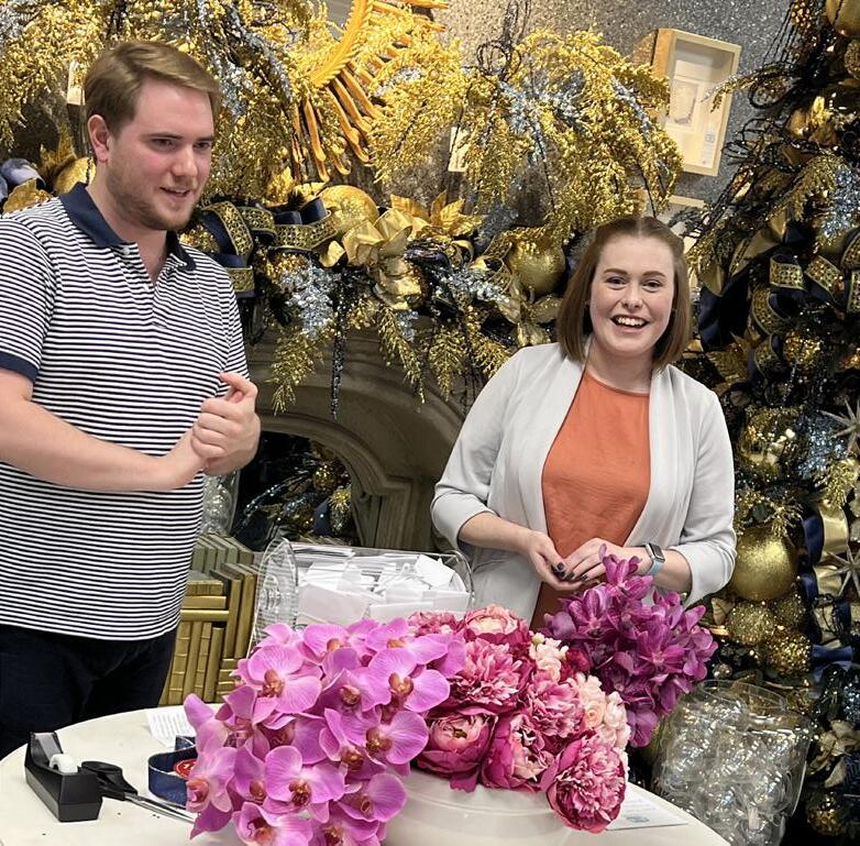
IBB GUESTS MET AND LEARNED FROM THE TALENTED #TEAMIBB INTERIOR DESIGNERS. THE EVENT FEATURED A CURATED COLLECTION OF VENDORS OF ART, RUGS, PERMANENT BOTANICALS, AND EVERYTHING YOU NEED TO STYLE YOUR HOME!
IT WOULDN'T BE AN IBB EVENT WITHOUT SIPS & BITES, DESIGNER WORKSHOPS, GIVEAWAYS, AND OF COURSE THE IBB SIGNATURE SWAG BAGS OF GOODIES.


