Application Number: 23135525
2021-2022
Jinwei ZHANG Works Collection
Email: jinwei_zhang0902@outlook.com
TEL: +86 15088968780
Apply for UCL, Bartlett School MArch Urban Design
PORTFOLIO
JINWEI ZHANG
Male China
Chinese, English
86-15088968780
jinwei_zhang0902@outlook.com


Wenzhou, Zhejiang, China
06
Architecture ( BEng Hons)
School of Architetcure and Built Environment/ University of Nottingham Ningbo China
Related Course: Architectural Design Studio/ Vertical Design Studio/ Architectural Humanities/ Integrated Design in Architecture/ Environment Sciencefor Architects/ Tectonics/ Practice and Management/ Urban Design Theory
Summer Research
Sortal GI Research of Traditional Chinese Graphic. ABE, UNNC
Project Instructor: Dr. Maycon Sedrez
Intern
Wenzhou Design Assembly Company., Ltd.


Advanced Research Projects
Re-imaging Hybrid Spaces Projects. DEZACT × LAC STUDIO
Fourth Place of the Faculty Cup basketball match of the university
University of Nottingham Ningbo China
Second Award
The 4th Bridge Design Competition of Faculty of Science and Engineer, UNNC
Undergrad Volunteer

The First UNNC Virtual Architecture Winter Exhibition 2022
The President's Scholarship of the university
University of Nottingham Ningbo China
The Best Performer of the Year
University of Nottingham Ningbo China
The Secretary of PR Department
SESA (Science and Engineer Student Association), UNNC
The Secretary of Student Society Centre
Student Society Centre Department of UNNC
The Organizer of Architecture Week
Department of Achitecture and Built Environment, UNNC
E P H S E D U C A T I O N P R O J E C T E X P E R I E N C E O N O R S & A W A R D S S T U D E N T W O R K E X P E R I E N C E C O N T A C T H O B B I E S S O F T W A R E Mobile ADOBE INDESIGN ADOBE ILLUSTRATOR ADOBE PHOTOSHOP ADOBE PREMIERE AUTOCAD AUTODESK REVIT RHINOCEROS GRASSHOPPER SKETCH UP VARY FOR RHINO UREAL ENGINE 5 MICROSOFT OFFICE HAND DRAWING MOVIE TRAVELING MUSIC BASKETBALL VIDEO GAME Birthday Email Gender Address National Languages
2021.08 - 2021. 09 2022.07
2022.09 2022. 01 2021-2022 2021-2022 2021.06- 2021.08 2019. 11 2019. 10-11 2019. 09- 2020.10 2020. 05 2019. 09- 2020.08
September 2, 2000 2019. 09- 2023.
-
URBAN DESIGN FORWARD



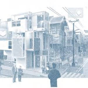
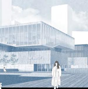
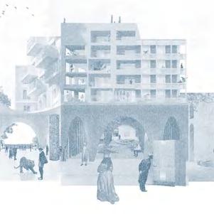
In the few years I studied architecture, there was a Japanese variety show that had a great influence on me: Dream House. In this show, architects embraced the love of life and used their expertise to create loving spaces with stories. I was particularly impressed by the episode titled "The Home That Was Originally a Bathhouse". It was a public bath in Aichi Prefecture, Japan, with a history dating back to the Showa era. Due to the changing times, the bathhouse had to close down. For the owners, the 80-year-old couple, reusing the dimly-lit bathhouse and reorganizing the circulation became a big challenge. Different from ordinary residential renovations, Shibata, the architect, did not simply solve the problem of living space, but boldly used modern design language to transform the historical traces of public bathhouses into components of living spaces. The former locker became the couple's shoe cabinet, and the original bathtub became a flower bed in the atrium. This case made me reflect on the old rule of architecture design: "form follows function", and it also made me start thinking about the complex relationship between space and function. In my opinion, in the contemporary era when urban functions become complex and the density increases exponentially, there is no longer a one-to-one relationship between architecture and function. Space is the carrier and stage for scene transformation. The fusion of functions and scene transformation stimulates new possibilities.
Therefore, after completing my undergraduate studies at University of Nottingham Ningbo China, I hope to continue my exploration of the multiple definitions of architectural space in urban scale. And the pioneer in urban research and practice, Urban Design MArch programme in University College London, has become my next destination.
01 02 03 04 2021. 12 2022. 03 2022. 08 2022. 11 Project 1 Project 2 Project 3 Project 4 Arcade
Fishery+ Cutural Hub Disaster Guidancebook Filtration Meditation Cabins CONTENTS of
2021-2022
Public Housing
works collection
ARCADE HOME
HOUSING COMPLEX IN NINGBO
UNNC 2021 Autumn Design Studio Housing Project with Community Facility in Ningbo, China
Instructor: Yat- Ming Loo, Andrea Palmioli
How to make the housing project relating the notion of dwelling and placemaking to ‘identity’ of the community and the city of Ningbo. How could a housing incorporate the brandscaping of the place.

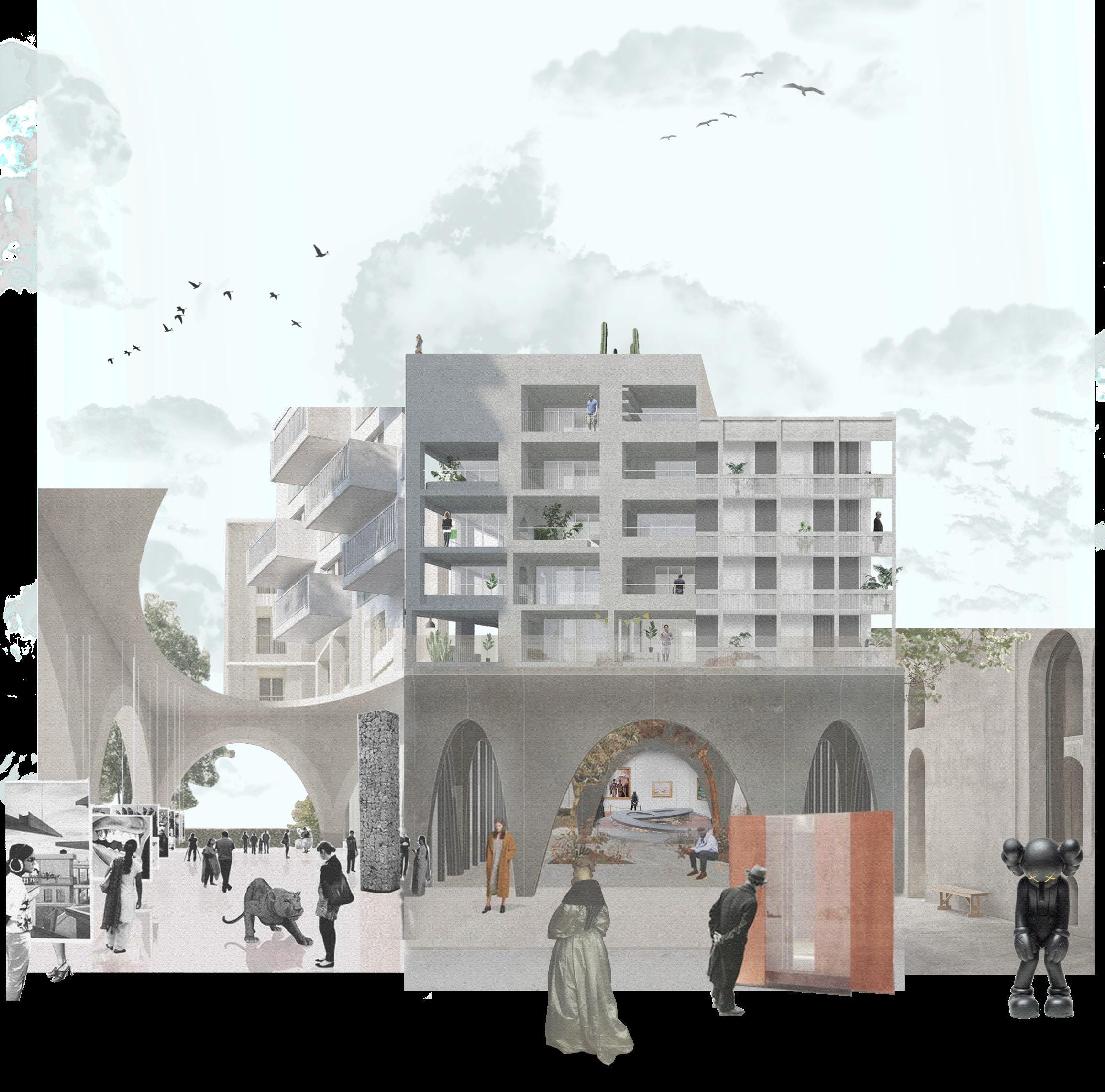
The project is located in an old residential area along the 'old bund' in the Sanjiangkou area of Ningbo, aiming to provide a multifunctional comprehensive residential community for specific groups of people in the area. The project mainly adopts the method of 'Hybrid', which is reflected in the mixing of functions. The building is divided into two large volumes, the upper and lower floors. The upper floor is used as a living area, and the lower floor is an open gallery exhibition space. The second is reflected in the The shape of the project is distinguished by the mixture of the square and straight modern residential language and the classical arch to distinguish the different functions of the project. It is hoped that in this way, an artistic living environment will be provided for the art design crowd, and the relationship between the original site and the surrounding environment will not be changed. back to the community.
The project combine the community housing and athe gallery program as a integrated architecture by hybriding two types of design language to make a contrast to indicate the function as well as the different spatial sense. For the ground floor part, the main elements are the arch to create a flexible and free sense of the gallery, and the function are more public, for the upper levels, the design language turn to frame, and contrast to the ground part. Therefore, the project want to create is the contrast of architecture language, function and space sense.
01
Individually Studio Work

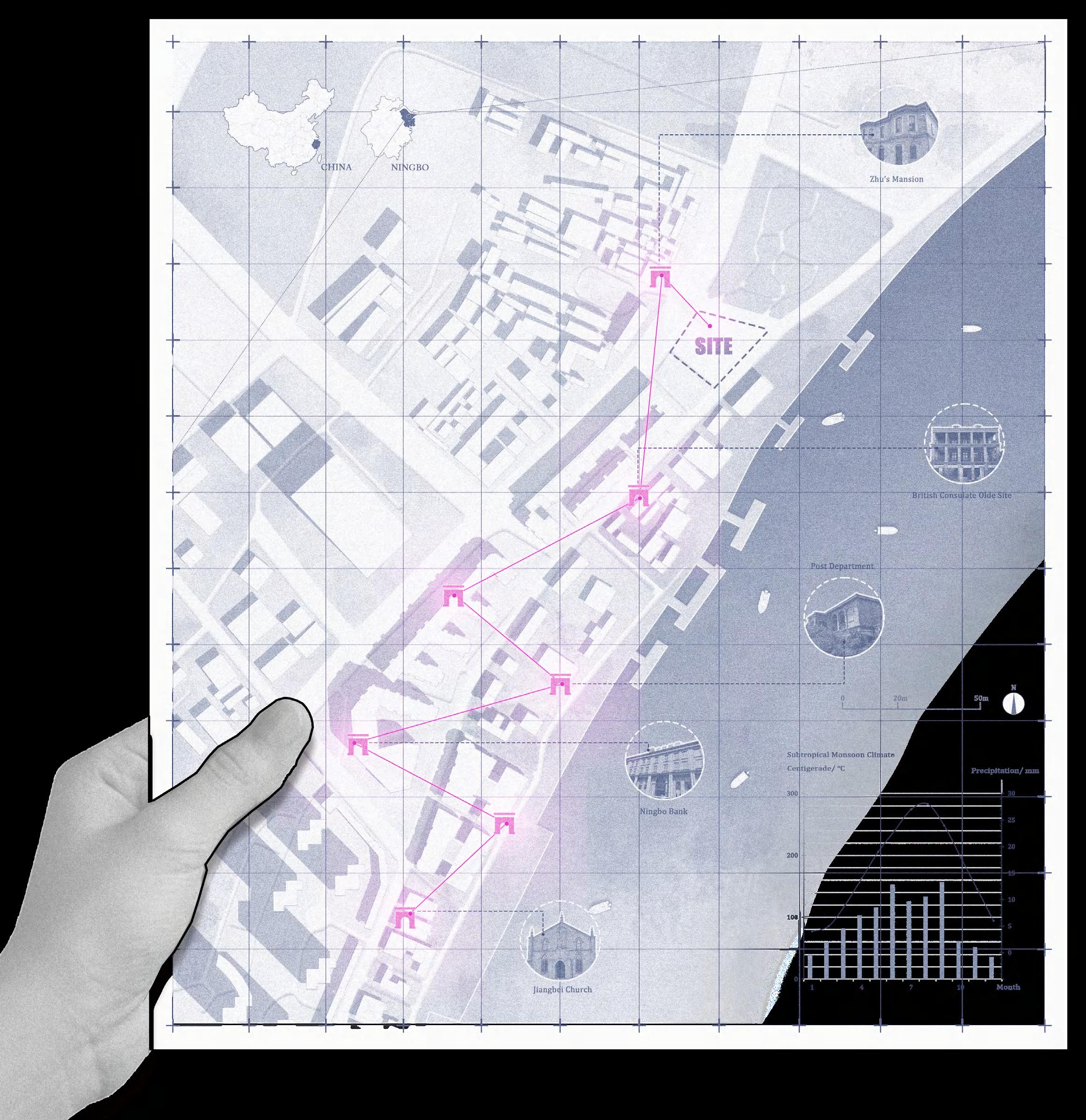
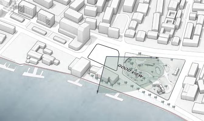
The Arch Distribution and Analysis of Site Surrounding SITE LIMITS RE URBAN PARK SPACE SIDEWALK CULTURALBUILDINGS BUILDINGS GREENLAND OFFICE/ MARKET SUN & WIND PATHS WINTER SUN SUMMER SUN ACCESS MAIN ATERY 2nd ATERY PEDESTRIAN SIDEWALK Background ResearchThe Arch in Ningbo
SITE INTRODUCTION

The project site is located in Ningbo, China. Ningbo is a coastal city in the east of China, and also a important port city of China. The site is located in the 'Old Bund' in Sanjiankou area of Ningbo, where is an waterway junction. Influenced by the treaty port, the architectural type and context sense are diverse and has Western elements, such as the Arch'.
From the past 50 years, Ningbo experienced a fast blooming in enconomics due to China's reform. The port brings Ningbo a great wealth and made it became a mordern city, while also let Ningbo lost its 'city identity'. To reshaping Ningbo's Brandscaping, I hope to design a gallery where is an exhibition hall displaying the memory of the city.
The selecting site is located at the end of the 'old Bund', it was a part of the city's memory, but now it has gradually been buried in an old residential building. Therefore, hope to provide a public place for this area while retaining the residence to awaken the urban memory of the 'Old Bund'.
Modern History

[1840] Opium War: Ningbo was opened as a treaty port.
[1862] Modernization: Colonists established consulates, hospitals and churches in Ningbo. Jiangbei established the earliest Bund in China.
[1854] New Route: A new wharf was built in Ningbo and opened the Shanghai Ningbo shipping route.
[1877] Battery: China won the battle in Zhenhai at Ningbo, several forts were built on both sides of Zhenhai mouth.
[1979] Ningbo Port: With China's reform and opening, Ningbo port was opened to the world.
[2017] Ningbo Zhoushan Port: Zhoushan Port became the world's first port with an annual cargo throughout exceeding '1 billion tons'.
The Port Culture Influnced Ningbo City The Arch elements in Site Nearby Maritime History Tang Dynasty (832) Ming Dynasty Qing Dynasty (1656-1684) 1870s-1950s 1840 2001-2022 2022 Mingzhou Port Ningbo Port Law of Maritime Prohibition Port Business in Full Bloom Limited Portbusiness Lack of Energy
Modern Before Modern
2022
CALL BACK THE MEMORY OF ARCH may arch reshaping the urban identity of port culture SITE EXISTING BUILDING
Target Client & Possible Program
Cultural and Creative Group


Cultural and creative production groups refers to people who engage in wrok realated to culture or do creative work, which really need inspiration, and an artistic atmosphere to stimulate their minds.
The range of people in cultural and creative industry is very wide, they can be painter, designer musician, writer, or photographers. While what significant to them is much similar and can be understood as to get ideas, process ideas, and display ideas.

Space Needs of Clients
- Neccessary Facilities

- Free/ Social Space
- Mess/ Disordered
- Artistic Atmosphere
- Good View/ Vision
- Privacy Protection
The Analysis of Target Clients and Program
WHY 'ARCH'


There are a considerable number of buildings around the site contain the elements of 'arch'. While, these buildings located seperately and showing a weak feeling of the arch. Thus, the using of arch in the design, can be a kind of echo to surrounding buildings, but also concentrate this feeling to make it stronger. To remind people of these cultural buildings and the old bund history of Ningbo.
The large-span arch structure and the whole glass window make the building facade more transparent, and let the entire space more art sense. Also, the arch structure could make the ground floor more open, so that the ground layer could have more relationship with the context and serve more for the public. Since the ground floor of sorrounding buildings are not high, so I wanna this project has a feeling of huge.

TYPE OF 'ARCH'


Arches in the ground floor space of this project will take on a variety of roles including structural support, space atmosphere creation, and facade decoration. Therefore, different types of arches will provide more diverse feelings and functions to the space. For example, types A and B will form a certain staggered level for the ground floor space to bring a sense of height difference, while the arch of type C will be used more as a facade decoration to continue the language of a part of the arch to the upper space.


'ARCH' FACADE

Possible Spaces for Clients Different Types of Cultural and Creative Group People Different Types of Arch Displayed in Facade 01 Work Studio 03 Public Shop 05 Exhibition Space 06 Lecture Room 04 Chatting Room 02 View Balcony THE STUDY OF ARCH FACADE how arch combined into a housing complex deisgn
TYPE A LARGE ARCH TYPE B MEDIUM ARCH TYPE C CLASSICAL ARCH wide type wide type single wide single thin double arch thin type thin type cantilever arch cantilever arch
The River Bund New Arch-Type
The project is located at the end of the old Bund, but not far from the river, the residents of the residence can enjoy the beautiful river view and the scenery of the nearby park. And the trails and parks along the river can be used as recreational public facilities for the residents here. As an art exhibition space open to the public, it connects the houses on the inner side of the river and the public space on the river bank.
The Block Forming Process


define the view
lift volume and office difine the public area

define the residential area

define the courtyard


add arch facade

refine the form
final form
N
The Masterplan of the Arcade Home
NEW URBAN MEMORY RESDENTIAL concentrate the arch and art feeling in a crossroad
Compared with the original old residences, the new residential complex makes good use of the advantages of the crossroads, and puts a space with multiple public functions at the intersection, which can well radiate the surrounding residents and the old Bund. tourists. At the same time, compared with the original building, the arched ground-floor exhibition space is visually more open and transparent, so the ground-floor space of the building returns to the city on an urban scale, and mobilizes the surrounding artistic atmosphere. The residential part of the entire building is presented in an L shape, in order to introduce the scenery of the park and the river into the residents' homes, so that the residents can enjoy an excellent view on the balcony.

The Typical Unit for Artist

Although this is a public rental housing for art workers, in order to enhance the adaptability of the housing, three different types of housing units are provided to provide suitable living space for singles, couples, families and other groups.
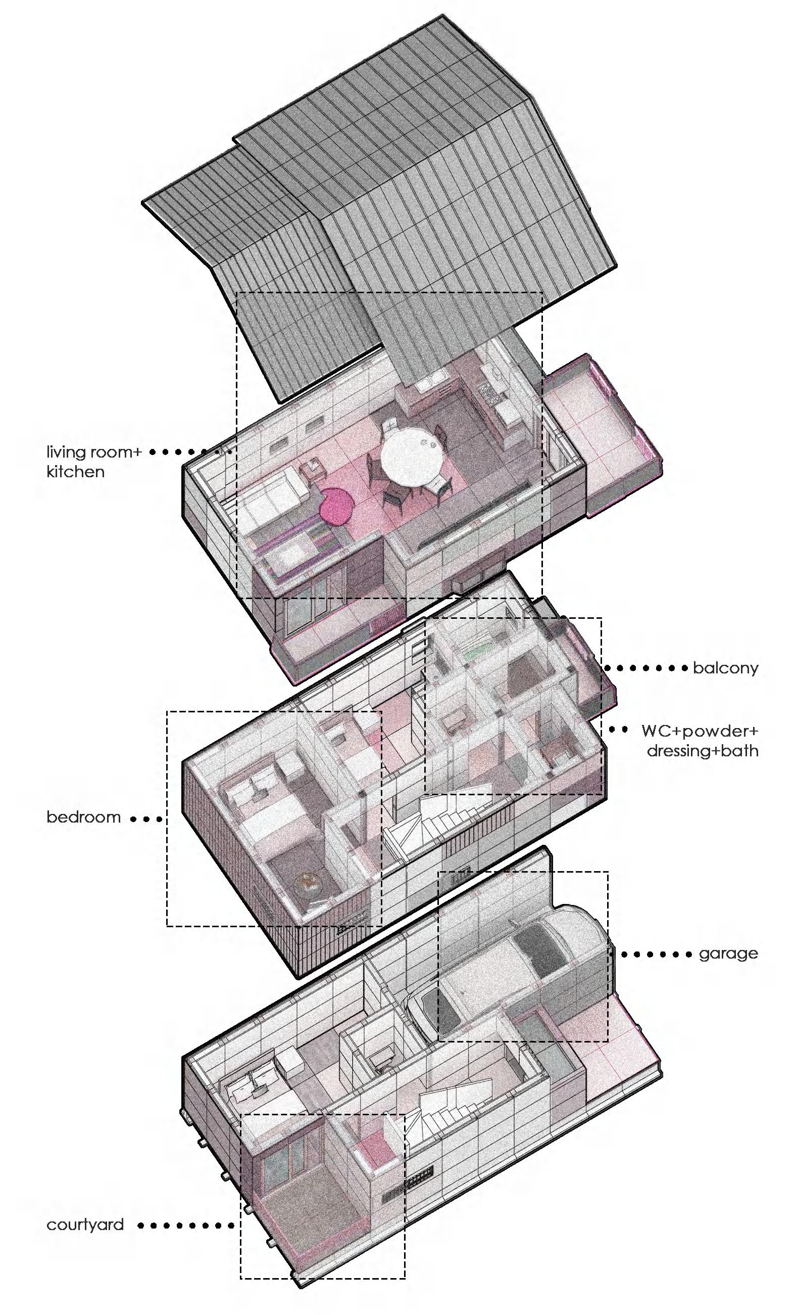
Typical Unit Axnometric UNIT AREA: 62 sqm
The unit shown in diagram is the most typical unit, with different area but similar rooms, for single and couple clients. The key point is that client could see the good view through the balcony and get relaxation and inspiration from the view. Also, moving the furniture in living room to transform into different usage can be a flexible workspace for artists.


1 Kitchen 1Bathroom 1 Living room 1 Balcony 1 Dining room 1 Bedroom
The Perspective
and Public Arch Space
Section of Residential Unit
living function studio function guest room
The section showing the relationship between the upper units and ground arch gallery, and the unit concrete wall structure consists from the upper to the arch footprint.
The Difference Between Building Layered
The housing complex is a 5 storeys building with one open ground floor to held art exhibition for the residents as well as the visitors.
From the plan of ground floor, it is obvious that there are open spaces created by the arch. The combination of cross arch columns, T-shaped arch columns and long strip arch columns forms a semienclosed and semi-enclosed ground floor, where the open side forms a height difference from the ground through the height difference of the arch, thus creating a The moving line of the exhibition from high to low.


On the first floor, there is a outdoor terrace and a public studio for residents to use. From the terrace, they can enjoy the view in courtyard on the ground floor. And from the terrace, the art worker living there could enter the share studio and work in there. Also, such a terrace increase their relationship between other artists, so the idea exchange happend more frequently.
From the second to the fifth floor, three typical floors can serve for 25 units, and nearly 70 residents in total. And each floor provide a chat room and a pocket library for redients, those facilities could provide certain public places for residents on each floor.
The Exploded Axonometric Showing 1-3 Floor
1F Plan (terrace)
GF Plan (gallery)
N 1 2 10m
2F Plan (typical)
How The Arch Gallery Works


The height difference let people appreciate the art works, especially the large sculpture and installation art in different view and sense different feeling.
Types of Exhibition
The exhition could happened under the arch gallery, the huge arch gives visitor a pure art feeling and also create enough spaces to hang the art works.
 A. Board Exhibition
B. Hanging Artwork
C. Display Table D. Large Sculpture/ Installation Art
The Human Perspective View from Arch Gallery
The two arches of different shapes on the ground floor distinguish the residential space from the public service space. As the traffic core of the residential area and the reception area, the elongated arch is a continuation of the language of the arch, emphasizing that it has a certain attribute of public space.


The space from the first floor belongs to the residence, but unlike the space on the top, the first floor has more interactive spaces with the ground floor, a terrace platform around the atrium, a shared studio and a common relax room, so that the overall space has a more reasonable transition from the ground floor to the top floor.

The principle of the interior is the view. As the research reveals a good view can be a great prescription for residents specially the art workers to create new project and stay in a pleasant mood. Though the area of each unit is not large, but the wide field of view undoubtedly increases the visual size of the space.
 The Comparison Between Upper and Ground Floor Design Language
EDUCATIONAL CULTURAL HUB IN NINGBO FISHERY+

UNNC 2022 Spring Design Studio
Cultural and Educational Museum in Ningbo, China
Instructor: Yat- Ming Loo, Andrea Palmioli

How could an architecture reinvent the city, community, place and identity. How a building could emphasis the 'Brandscaping City Identities'. To reflect and inspiring Ningbo's port culture, I choose to start with fishery, hoping to reshape and awaken Ningbo's fishery cuture memory through architecture.
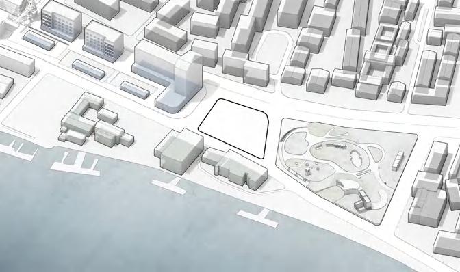
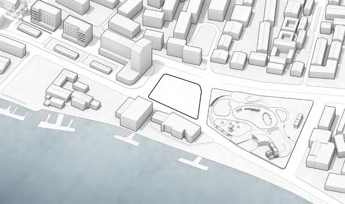
The project is located on the 'Old Bund' of the Ningbo Yongjiang River, sandwiched between the Ningbo Art Museum and the bar and dining street. The project hopes to effectively transition the atmosphere of the site with the greatly different functions through a cultural center with multiple functions. Therefore, the project combines the fishery culture of Ningbo, hoping to create a complex complex exhibition experience building by integrating the functions of fish market, seafood restaurant, fishery exhibition, aquarium and so on.
The feature of the project is that the building is divided into upper, middle and lower floors according to functions. The ground floor is an experiential market and fishermen's studio, the middle floor is an open mezzanine garden, and the top floor is an exhibition and reading space. Its most notable features are: The three-story space is connected in series by the transparent glass water tower in the center, and the glass water tower itself also functions as a transportation hub and aquarium viewing box, making the theme of the building more eye-catching.
02
Distinction Honor
On display in UNNC Library & Ningbo Urban Memory Exhibition
Individually Studio Work
From Sea to Market

To ensure the freshness of seafood, it usually takes only a few hours for these fish to reach the market from the sea. Efficient fishing has improved the industrialization of fisheries, but also lost the traditional culture.
Fishery in Ningbo
Fishery occupies a very important position in Ningbo, not only in terms of economic proportion but also in terms of culture. However, with the transformation of the city, Ningbo's traditional fishery has gradually declined, and its fishery culture urgently needs a carrier to inherit.

The port of Ningbo and surrounding area/ The fishery convey route
A New Archi-type Combine with Fishery

As analysed before, Ningbo's fishery culture are being ignored gradually. A key reason is that boring cultural education is not enough to arouse people's interest in paying attention.
However, if there is a place combined cultural hub and practical funcational spaces together, people may have a immersive learning experience in there. Therefore, the fishery culture could keep spread.

Vertical Connection Horizontal Connection
Feature Element 01 02 03
The central transition space connects other rooms so that the circulation are effective.
The tower can be the main traffic core of the building connects different storeys.
The fish in the tank can be a nice attaction for visitors, also indicates the theme of the hub.

 Hybrid function of the building may suit for more target vistors
THE FISH TANK a central building mark
A New Archi-type Resolve the Site Conflict

Using the central tower as a transition to divide two sides. To the commercial side, the wet market could blend into the bar street.


While the studio and exhibitions are consist with the museum. For vertical function, the library and gallery those quiet space are on the top level, so avoid bothered by the bottom.


The masterplan shows the overview of the Old Bund and see how the building in between the bar street and the musuem could connet two side and blend into the context. Also, it is clear that the how the waterfront walkway lead the path through the whole Old Bund as a main visitor's access.
 Noisy and busy bar street
SITE
Quiet and series musuem
Messy and smelly
Tidy and quiet
Human view from the bar walk along the terrace and see the building
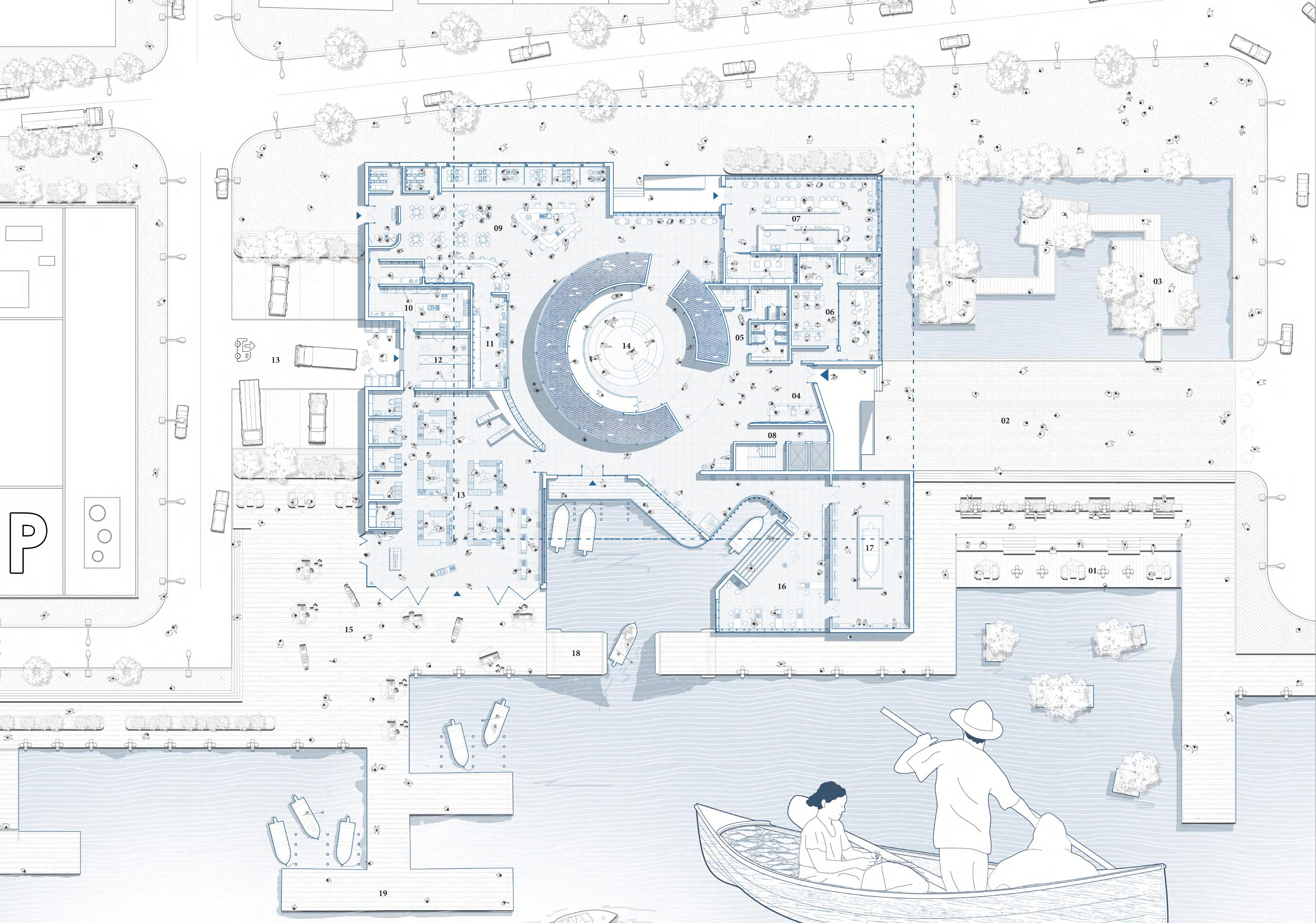
01 View Terrace 02 North Plaza 03 Floating Terrace 04 Entrance Lobby 05 Restroom 06 Staff Office 07 Cafe Room 08 Elevartor/ Stair 09 Restaurant 10 Back Kitchen 11 Front Kitchen 12 Stuff Storage 13 Wet Market 14 Central Tower 15 Outdoor Terrace 16 Fishery Workshop 17 Ship Exhibition 18 Ship Dock 0 1 3 5 10m
GROUND FLOOR PLAN
2F PLAN
The three level plans demonstrate a clear variation on the function. However, people can easily and logically journey in the building with the guide of the spaces and central tower.


1F PLAN
While the 1F is the most different where is totally an open space with high different surround the tower. Therefore, visitors can enjoy the nice river view as well as the fish in the tank.


Human Perspective of Inner Spaces 0 1 3 5 10m
Spaces Wraps Around The Centural Fish Tower
Space1- Wet Market
As the most practical and interactive space on the whole ground floor, the wet market seems quite open to the riverfront walkway, and the fish tank connected the market could let people enjoy the shopping and viewing the live fish.
Space2- Fishery Studio
Another space towards to the river is the fishery studio, and it can be understood as a semi-open space since the unsealing openings in the facade extend into steps leading to the river, where fishermen can anchor their boats for necessary delivery and showing fishery boat.
Space3- Open Terrace
The first floor is connected by four platforms with different heights and enclosed around the central tower, some of the parts are covered by the upper floor, but mostly are outdoor spaces. So the fish tower is completely exposed to the outside at this level.

Space4- Sunken Library
Since the form of the upper layer is generally tends to be a box. To break this sense of squareness, I made the corner part of the library a partially sunken wrap-around space. With the full-height floor-to-ceiling windows, people can have an excellent view here.
Space5- Fishery Gallery
The gallery and exhibition hall are the only public space cannot directly see the centural tower, since the showroom needs to maintain a specific light, and the cure wall scould make the space of the exhibition hall more free and flexible.
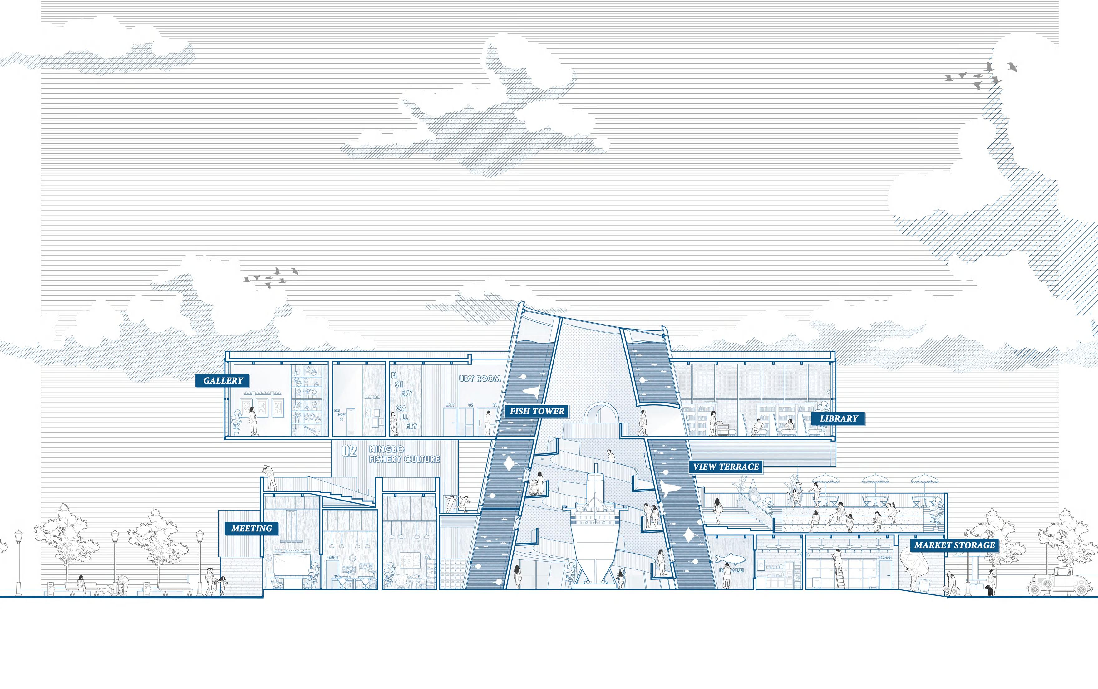
The Sectional Obligue Showing Different Spaces Around the Fish Tower
LONG SECTION OF ARCHITECTURE

different spaces surrounded the central tower
Since the project is a hybrid of different function spaces including market, workspace, library, gallery and the most important central fish tank tower. From the figure can clearly see that the tower connects and seprate the diverse spaces and links the upper and lower floor. The fish tank in the middle let people can see it from almost all the corner of the building. Also, the first floor was designed as an outdoor space, therefore visitors won't feel boring during their journey.
0 1 3 5 10m
Construction Studies
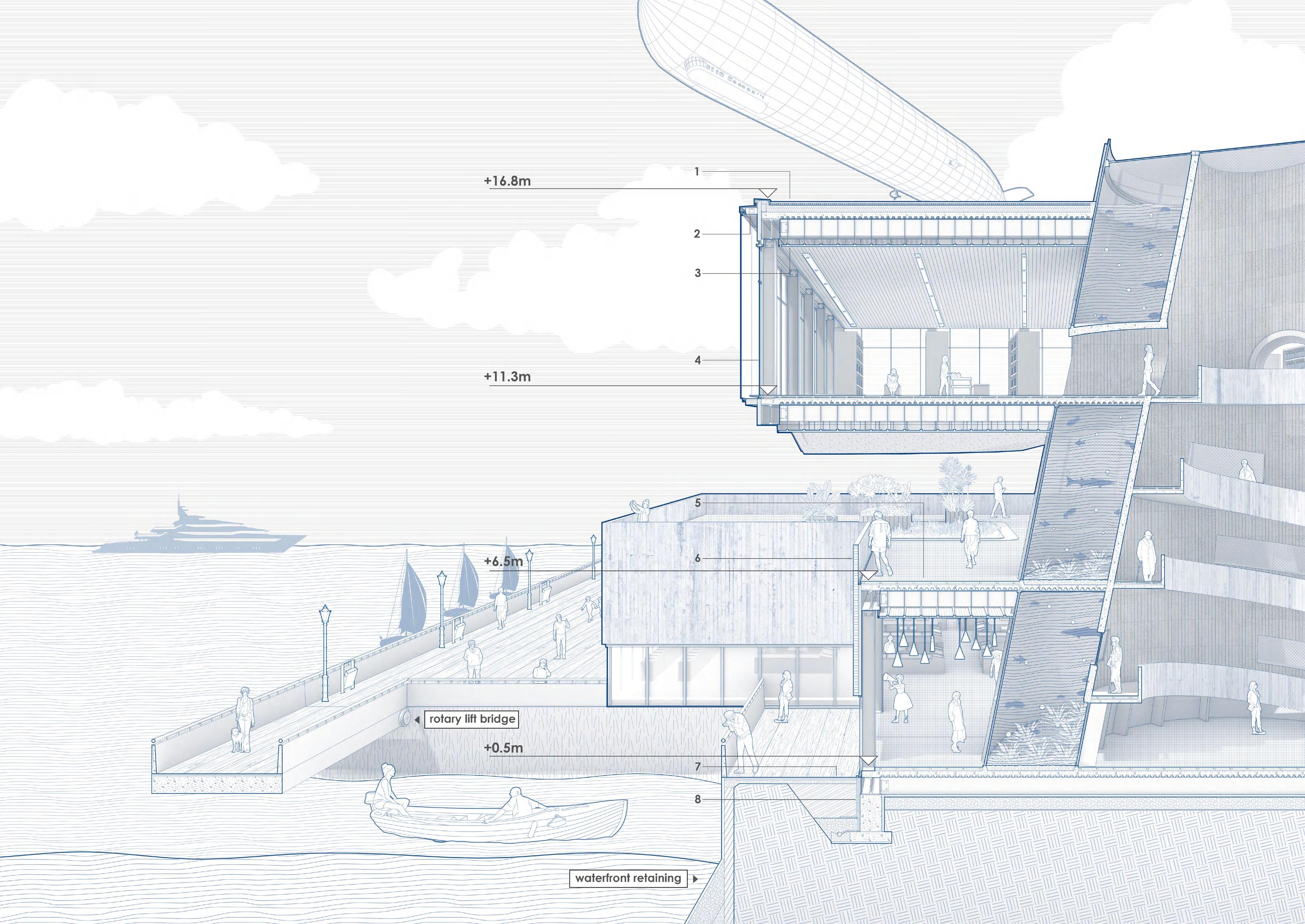
The main structure of the whole building adopts a steel frame structure to reduce the weight of the top, and it can also accommodate more glass with a larger area.As can be seen from the picture, the semi-cantilever at the top provides a huge semi-open space for the middle floor.
1. Roof Top Buildup
- Roof membrane, 15mm
- Gravel, 40mm
- Water dranage layer, 75mm
- Vapour barrier, 10mm
- Thermal insulation, 200mm
- Concrete topping, 200mm
- Sheet- metal parapet cap
- Sloping insulation
2. Translucent Facade Buildup
- Cantilever
- Steel flat, 150 ×150 × 20mm
- Aluminium frame
- Polycarbonate facade, 250mm
- Dot painting cladding coat, 10mm
- Eletric motor for panel opening
- Insulating glazing, 26mm 6/16/4
3. Typical Ceiling Buildup
- Steel beam with fireproof paint, 550 × 600mm
- Ventilated air gap
- Plaster panel, 50mm
- Suspended ceiling framework
- Steel Flat, 250 × 200 × 20mm
- Suspended ceiling framework
4. Window Frame Buildup
- Aluminiun plate, folded
- Insulating glazing, 25mm 5/15/5
- Plaster panel, 50mm
- Steel beam with fireproof paint, 550 × 600mm
- Thermal insulation, 80mm
5. Typical Flooring Buildup
- Wooden flooring, 30mm
- Wooden batterns, 45 × 45mm
- Screed, 35mm
- Concrete topping, 160mm
6. Typical Wall Buildup
- Striped concrete panel, 25mm
- White paint coating, 10mm
- Vapour barrier, 20mm
- Thermal insulation, 80mm
- Plaster panel, 50mm
7. Ground Floorng Buildup
- Harringbone brick paver, 30mm
- Fine sand, 30mm
- Fine gravel, 30mm
- Coarse gravel, 100mm
8. Typical Foundation Buildup
- Waterproof membrane, 5mm
- Backfill soil
- Porous boards, 50mm
- Thermal insulation, 80mm
- Dranage pipe
- Lean concrete
- Concrete column footing
- Base plate, 20mm
- Hardcore
- Steel column with fireproof paint, 550 × 400mm
- Screed, 35mm
META DISASTER RESILIENCE COMMUNITY IN OSAKA DISASTER GUIDANCEBOOK
DEZACT × LAC Studio 2022 Advanced Research Projects
Disaster Resilience Community Testing Meta Platform in Osaka, Japan
Instructor: Hadin Charbel
Collaborator: Yuxin Hu, Yingwen Zhu, Chenghan Yao, Xueying Huang
My work: Site Research, Survival Mode Exploration, Strategy, Conceptual and Architecture design, all drawings in this portfolio
'The world is crumbling, the future needs to be reshaped.' In the near future, our living environment has many possibilities. The boundaries between the real world and the virtual world are "collapsed" between different scales of the real world. How to use the platform of the virtual world to create things that are difficult to achieve in the real world and solve problems for the real world. We decided to focus the real world on disaster resilience, hoping to gamingfy disaster and guide people to improve the ability of a community to withstand disasters.
Taking Japan as the research object, this project aims to design a game interactive platform that helps to improve people's awareness of disaster protection and the ability of communities to rebuild after disasters. Through the platform to guide the reconstruction of people's houses, and the knowledge of escape. Due to the danger of disasters, through the game platform, the project hopes that people can experience the process of earthquake escape in the virtual world of the metaverse, communicate and negotiate the process of reconstruction with community residents, and independently design the process of rebuilding houses. Among them, the main method of house design is to collect and process the post-disaster ruin materials into different types of modular materials (Voxel). The general outline of the house is built by modular splicing. When it is in reality, it is built into a building by specific structural research.
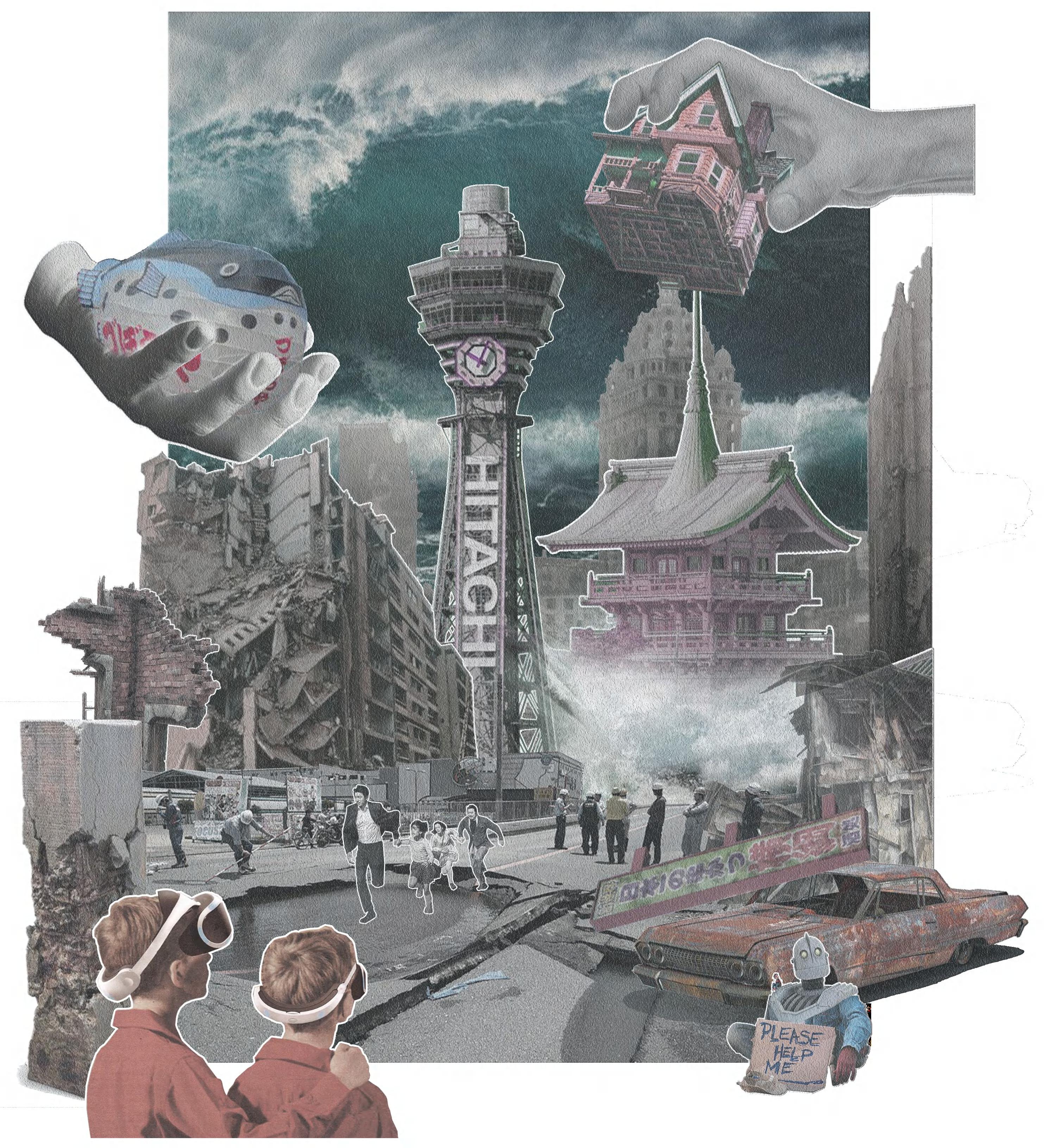
Since the project aims to build a platform that can be popularized and adapted to various forms, we try to use this strategy to design a single Japanese house and tarraced house with community functions to to verify the reliability of the platform.
03
Background Info: Disaster & Earthquake Narrow down to Japan
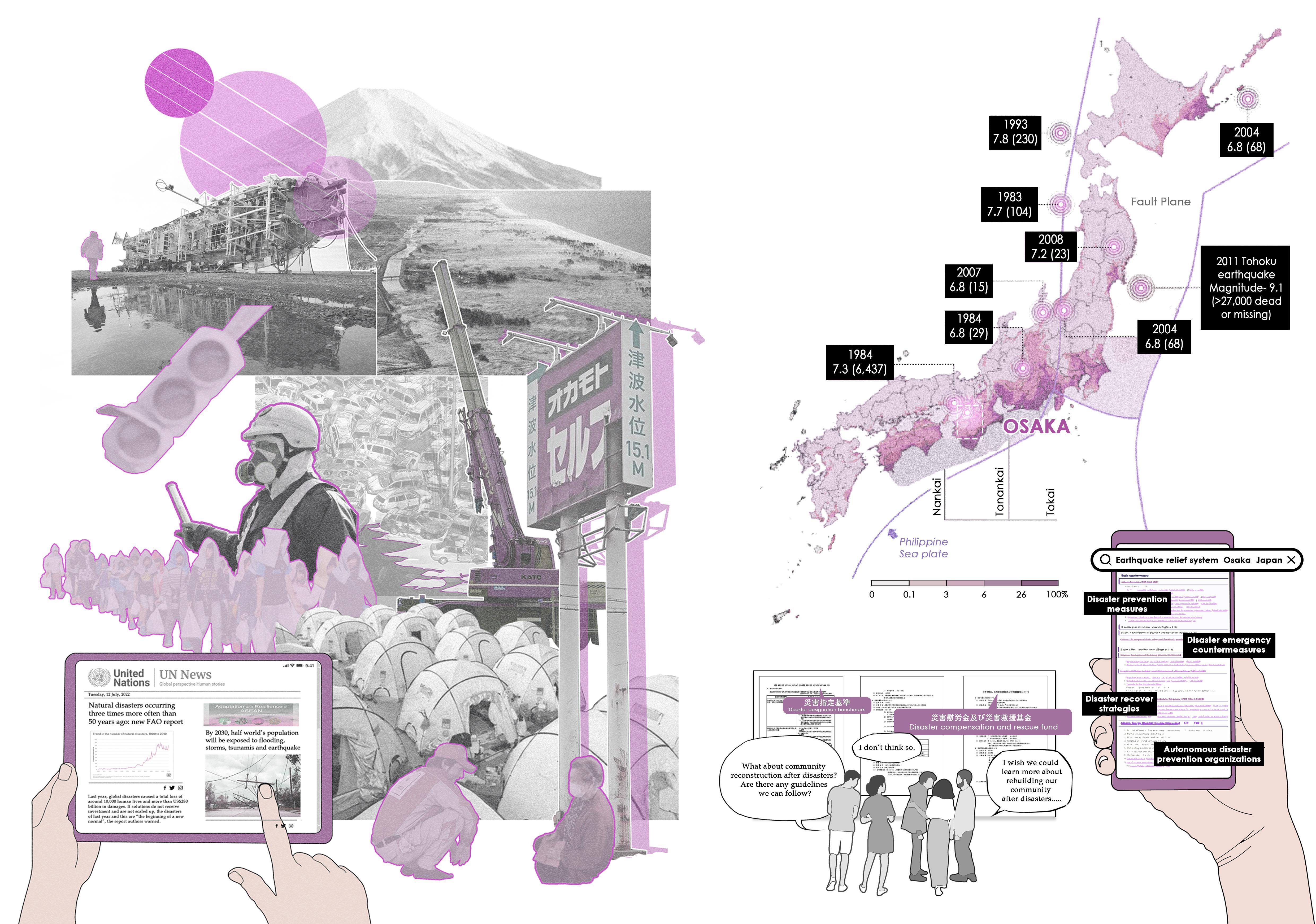
At present, disasters happen more frequently around the world, which have caused huge losses to all parts of the world, and the probability of natural disasters will be increased by three times in the future.
Focusing on the costal city Osaka, whose disaster prevention and disaster relief system are relatively comprehensive, but there still exist problems in disaster respond methods.
However, facing different natural catastrophe, the knowledge of disaster prevention and reconstruction policies varies around the world.
According to this governmentdesignated probability of ground motion diagram of Japan, areas close to the coastline are more likely to be hit by earthquakes in the next 30 years.
Government - designed probability of ground motion of seismic intensity of level ‘6- lower’ or higher (on a 7 maxiun intensity scale) in the 30year period starting in January 2010
What A Disaster Learning Platform Can Bring
1. Experience the disaster in virtual world to enhance residents' awareness of catastrophe.
2. Simulation, practice for neighbourhood collaborative.
3. Creating / Testing different, workable architecture system for real world.

Therefore, my will is to build a knowledge and information sharing platform, so that advanced disaster prevention education knowledge and postdisaster reconstruction measures from all over the world can be exchanged and practiced in this virtual platform. And since the Japan has a very strong foundation in disaster protection and game information industry and has a certain cultural foundation, so Japan is used as a specific research object to evaluate the feasibility of the platform.
1. Loading into the System...
2. Selecting Game Mode
3. Survival Mode Training
4. Community Replanning
5. Collecting Materials from Ruins
6. Building & Choosing Voxels

7. Selecting Housing Plans

8. Generate Buildings
9. Community Reconstruction
INPUT DATA LEARN DAMAGE REBUILD AGAINST ENHANCE SIMULATE
GAME COMMUNITY DISASTER RESILIENCE
The Data Stream Connect the Whole World
The Three Period of Osaka During the Earthquake
1 4 7 8 9 5 6 2 3
The Workflow of the Platform
The Frame of the Game Platform & 3 Game Mode


The main part of the platform consists of three modes: survival, community, and construction. The survival mode allow people to experience the disaster situation in a virtual environment and simulate the escape route to test their escape skills and the reliability of the route. These escape routes are simulated by 'Agent Simulation'. The community model is more of a platform for community residents to negotiate and communicate together. Residents can plan and transform the community to a certain extent through various operations provided by the platform, such as widening roads or improving infrastructure. The construction mode involves the translation of key construction outputs from virtual to real, which will be explained in more detail in the follow-up


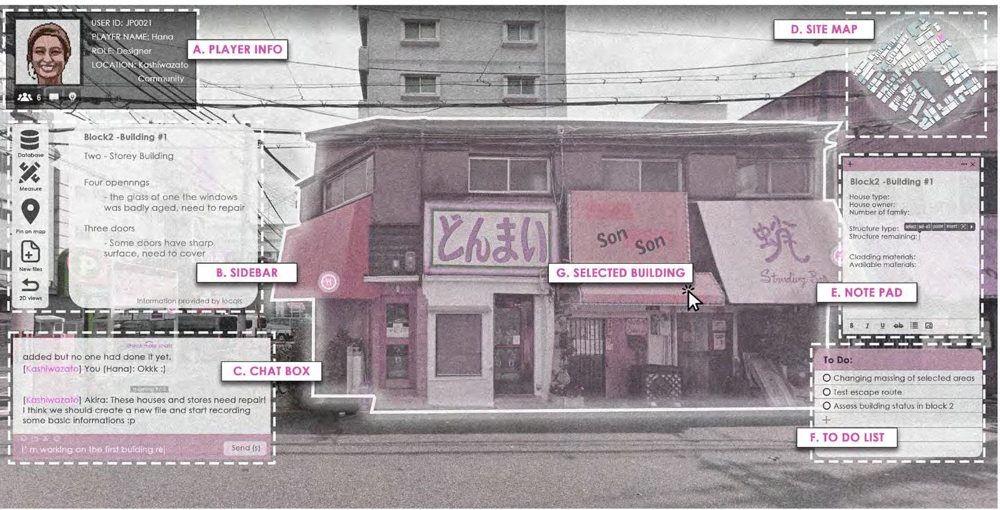


 The Workflow of Survival Mode System in the Game
SURVIVAL MODE INTERFACE COMMUNITY MODE INTERFACE CONSTRUCTION MODE INTERFACE
scan the code to view the full video
The Workflow of Community Mode System in the Game
https://youtu.be/AR0bWY_o1TQ
DISASTER GUIDANCEBOOK
Construction Mode: Materials Gernerating & Voxel Processing


Construction mode is the core part of the whole platform, it needs to integrate and submit the building modules designed by users in the database to reality. In the platform part, users can use this mode to select corresponding materials and synthesize voxel, and then combine the voxel into a desired house to complete the entire design. Finally, the data of the complete design process is transferred to the database, and the real construction company will translate it into real structures and materials for construction according to these data.


 The Workflow of Construction Mode System in the Game
The Construction Mode Interface
The Steps of Collecting materials from Ruins
THE VOXEL DESIGN LIBRARY to desian, adjust and reconstruct a housing easily


break into pieces combine into panel
deconstruction add voxel frame place the panel add reinforced structure
The Voxel Selecting Interface in the Platform


When player get construction mode, they need basic building elements, the voxel. In the voxel library, there will be a variety of voxels designed by players and preset by the system. The logic to generate voxel is a building component that is reconstituted from the materials left in the ruins of the site after the disaster. These materials are then placed in a cube frame block of size 1*1*1 for splicing and combination to form a regular-shaped module. These voxels are generally classified into categories such as walls, windows, roofs, floors and stairs, and each category is composed of a variety of voxels with different shapes and materials. When designing a house, players only need to select the voxel they need, and place it in the virtual house frame to make certain regular combinations to build their favorite house.

1
4 5 6 2 3
Individually Customization & Community Negotiation


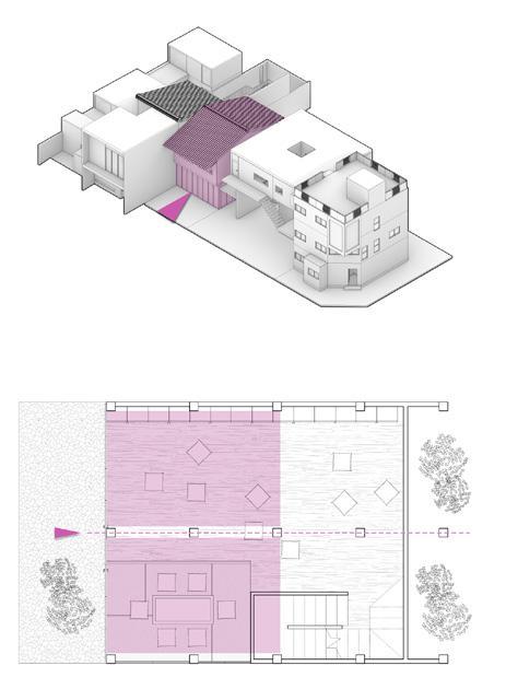
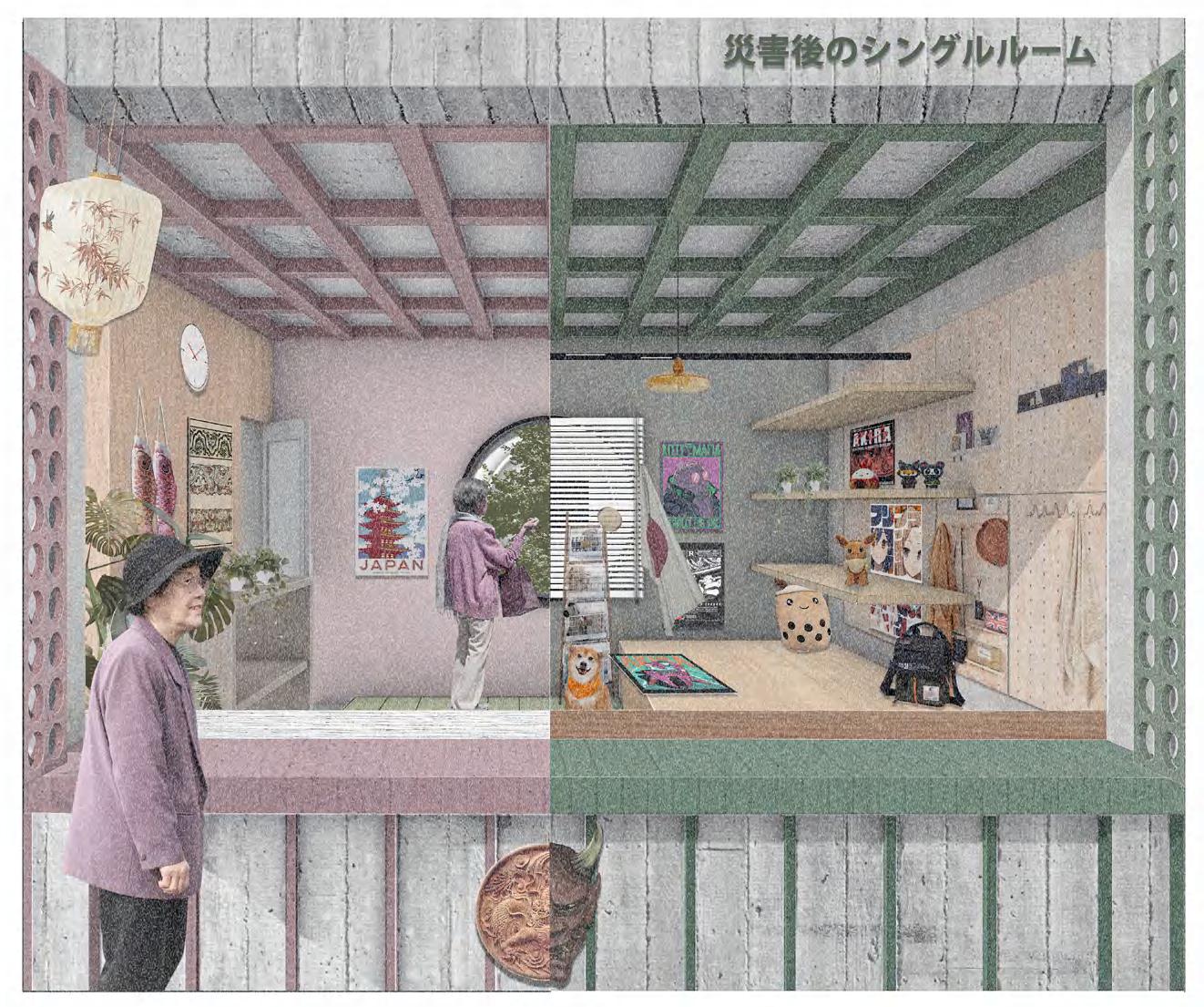
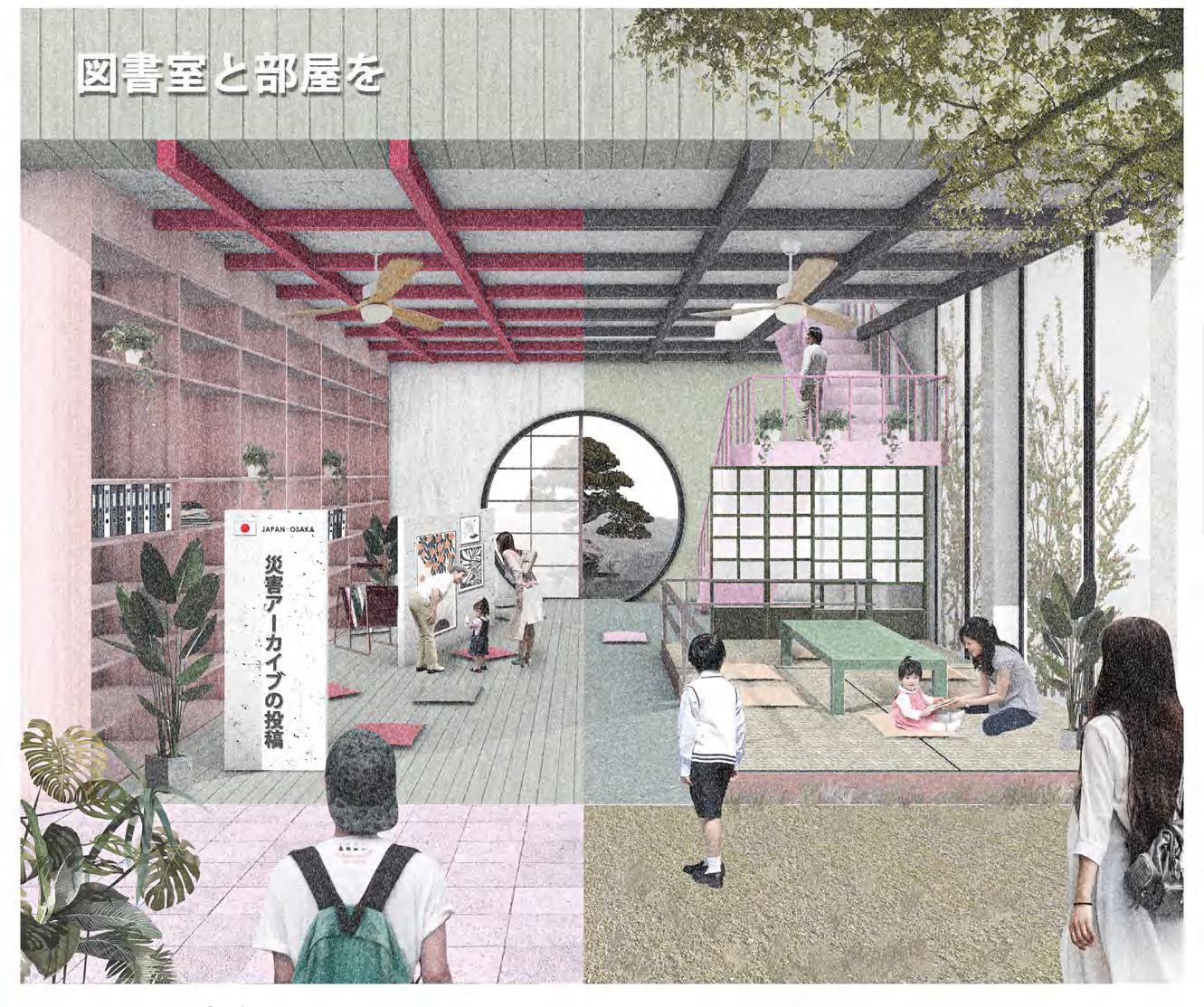
When the voxel generated, people could check them in the voxel library and selec the house type based on their needs. Here I use 3LDK House as a sample to illustrate. Since one layout voxel may have various types of materials, so people can customize their homes by arranging and combining voxels. Also, they can negotiate with neibours and design together to get a terraced house, or design their own internal spaces.
OF 3LDK HOUSE
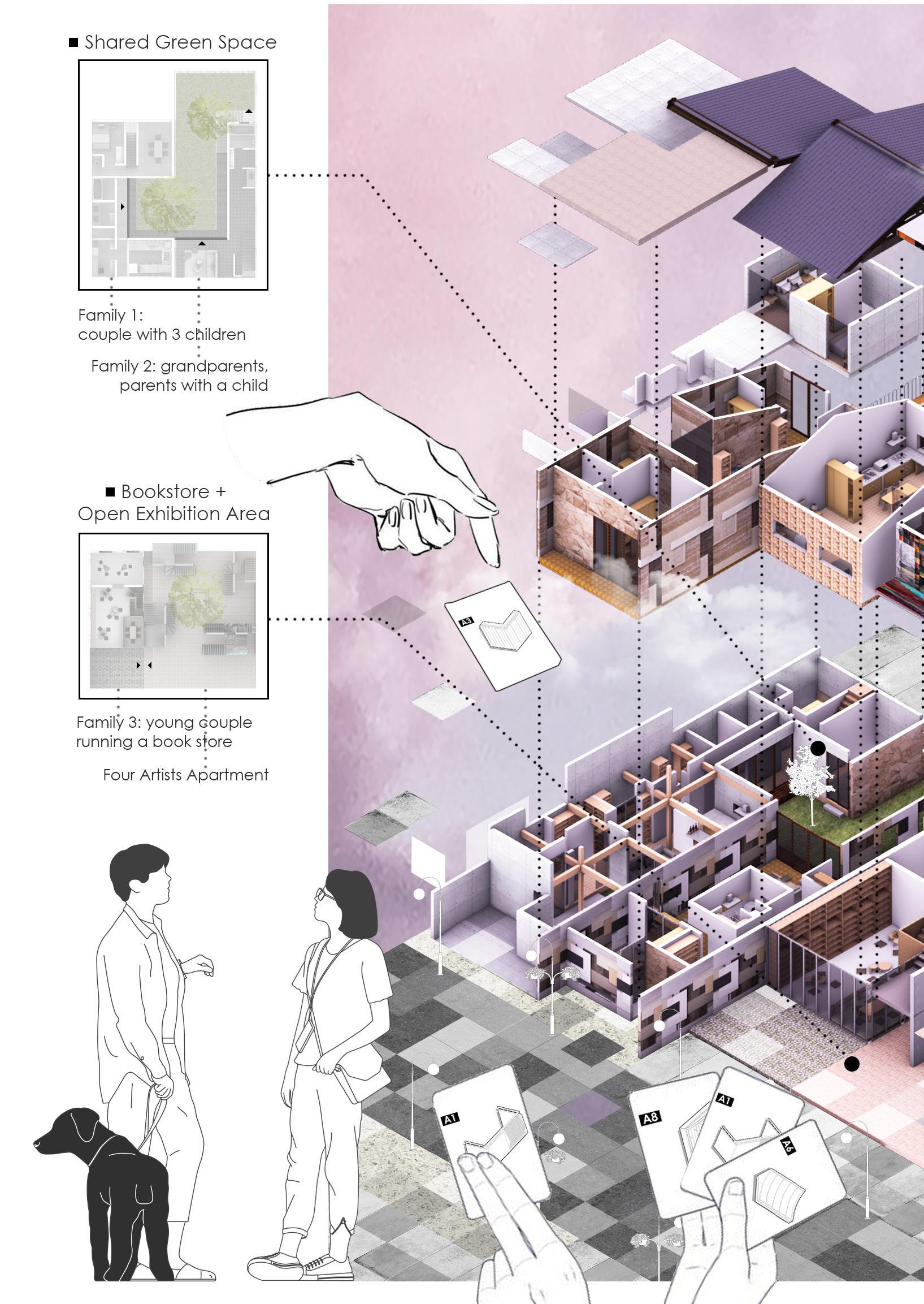
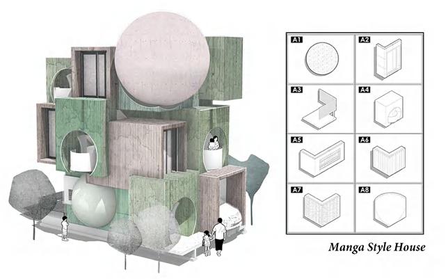
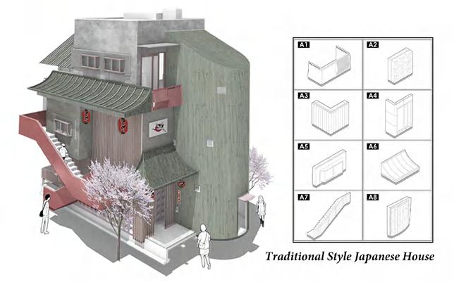
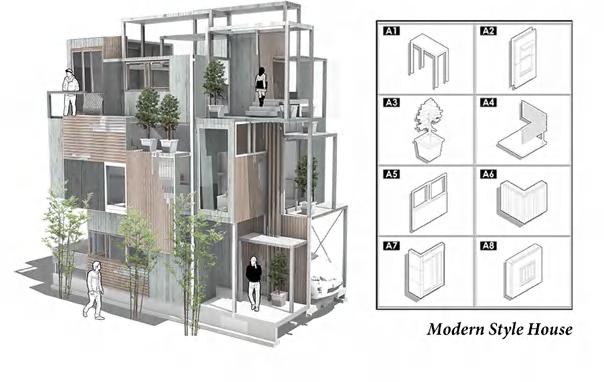
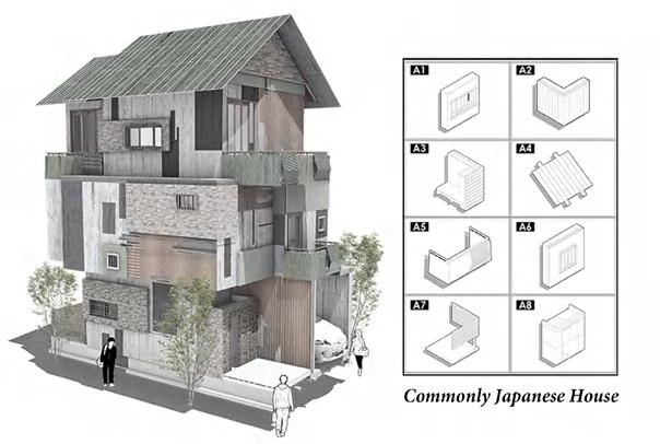
Japanese room research and materials variation
CUSTOMIZATION
01 02 03 04

building Negotiation
in
View of gallery house in tarraced building View
of library house in tarraced
of terraced house
community
The Realisation from Virtual Platform to Real World
Although in the game platform, with the blessing of virtual technology, people can intuitively see the whole process from the extraction of materials from the ruins of the house to the processing of modules to the final combination of personalized customization. However, in reality, the modules cannot be assembled as simply as a game. Therefore, in real situations, we will still tend to translate the voxel into a complete and systematic structural form by adopting the actual structural form.
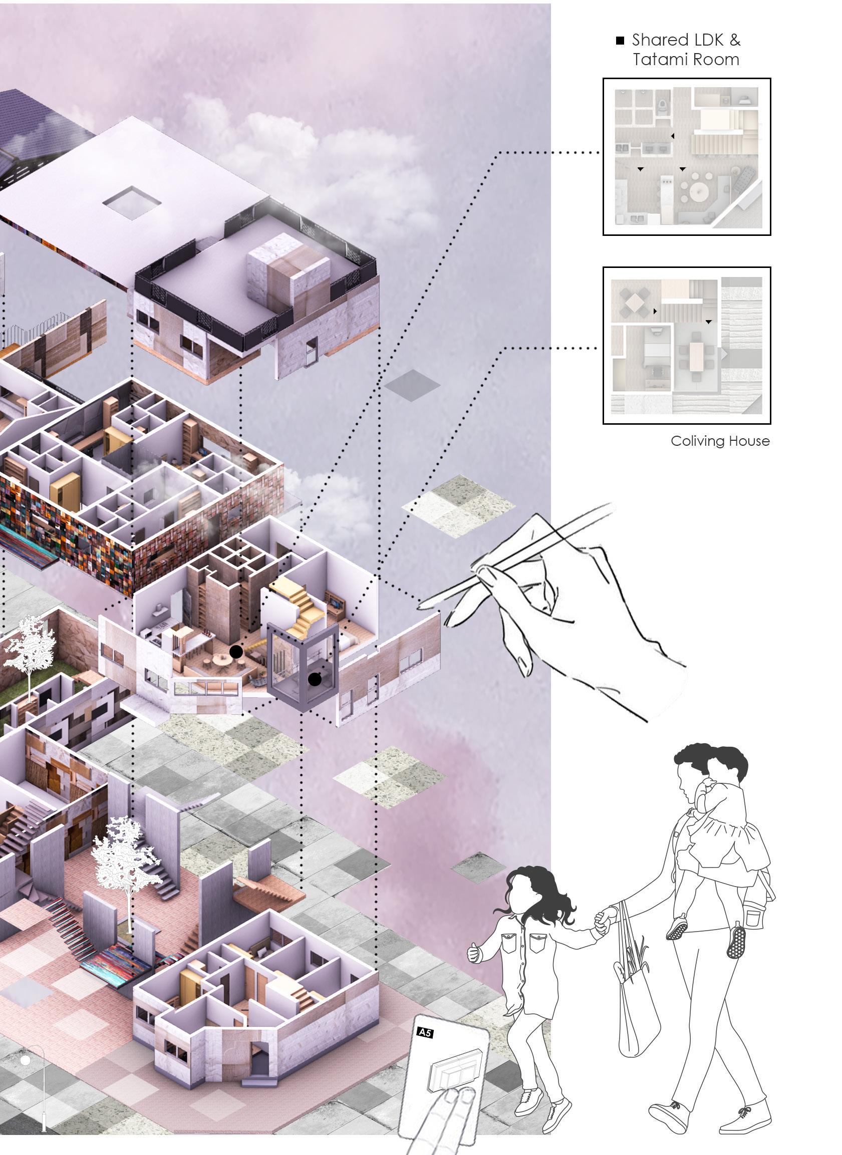
The picture on the right shows the rebuilding process of the post-disaster community. We expect the information and guiding ideology of the platform to be carried over to the real world. Therefore, as shown in the scene in the picture, people can scan the exterior of the building with digital devices such as mobile phones, and the platform will display The people involved in the reconstruction of the building, the names of the designers who participated in the design of voxel and the source of voxel materials, etc., to commemorate the community before the disaster, so that the houses destroyed in the disaster can still exist in a different way.

The following picture is a cross-sectional display of the townhouses. It can be seen that the houses jointly designed by different groups of people after negotiation can provide them with the functional space they need and enrich their ordinary living life.


 Shared Green Space
Shared Book Store
Shared LDK Tatami
The Construction System in Realisation
01 Junction Parts: The SE Method
The SE method of bonding system has the smallest cross section defect of the structural material, and uses the strong turned SE hardware to firmly connect the column and the flexible way.

04 Precast Cladding: External Wall
Materials were collected from ruins and then sent to factory, being combined and reproduced into modular precast claddings. During construction, workers can fix each peice according to residents’ expectation that has generated in virtual system before.


02 Diagonal Wooden Structure
By reinforcing on the diagonal of the wooden columns and beams, the load-bearing walls can be doubled or quadrupled in strength.
05 Precast Cladding: Flooring
Meanwhile, to make full use of damaged materials, precast modular boards are made from abandoned wooden pieces.
03 Combined Wooden Structure

To make full use of abandoned wooden pieces, combined materials can be made into lightweight, high strength of FRP materials after high pressure treatment. These wooden pieces will have a higher density and a better performance under earthquake.
06 Concrete Foundation


It distributes the weight of the building to the ground, thereby enhancing its seimsic capacity. Since the site is close to the river bank, the foundation is prone to liquefaction layer, the damage of which can be inhibited by replacing it with gravel.
CONSTRUCTION STUDIES
wooden structure system of Japanese dwelling
solar panels tiles
waterproof mambrane
plasterboard insulation
The house will firstly be transformed from voxel to a basic structure ( for Japan, usually is the wooden frame structure). The principle is to revert the form and layout into a reliable and systematic structure.

External Wall Junction Parts: The SE Method

Combined Materials: Wooden Pieses
Precast
Cladding:
Diagonal Wooden Structure System
Precast Cladding: Flooring Concrete Foundation
The Exploded View of Traditional 3LDK
DPM foundation
precast cladding
MICRO MEDITATION CABINS IN TOKYO TOSHI ROKA - FLITRATION
REDESIGNED ARCHITECTURE


COMPETITION
Proposal for Tokyo Urban Meditation Cabins
Instructor: /
Originally Collaborator: Yuxin Hu, Yingwen Zhu
The new design is totally an individual work
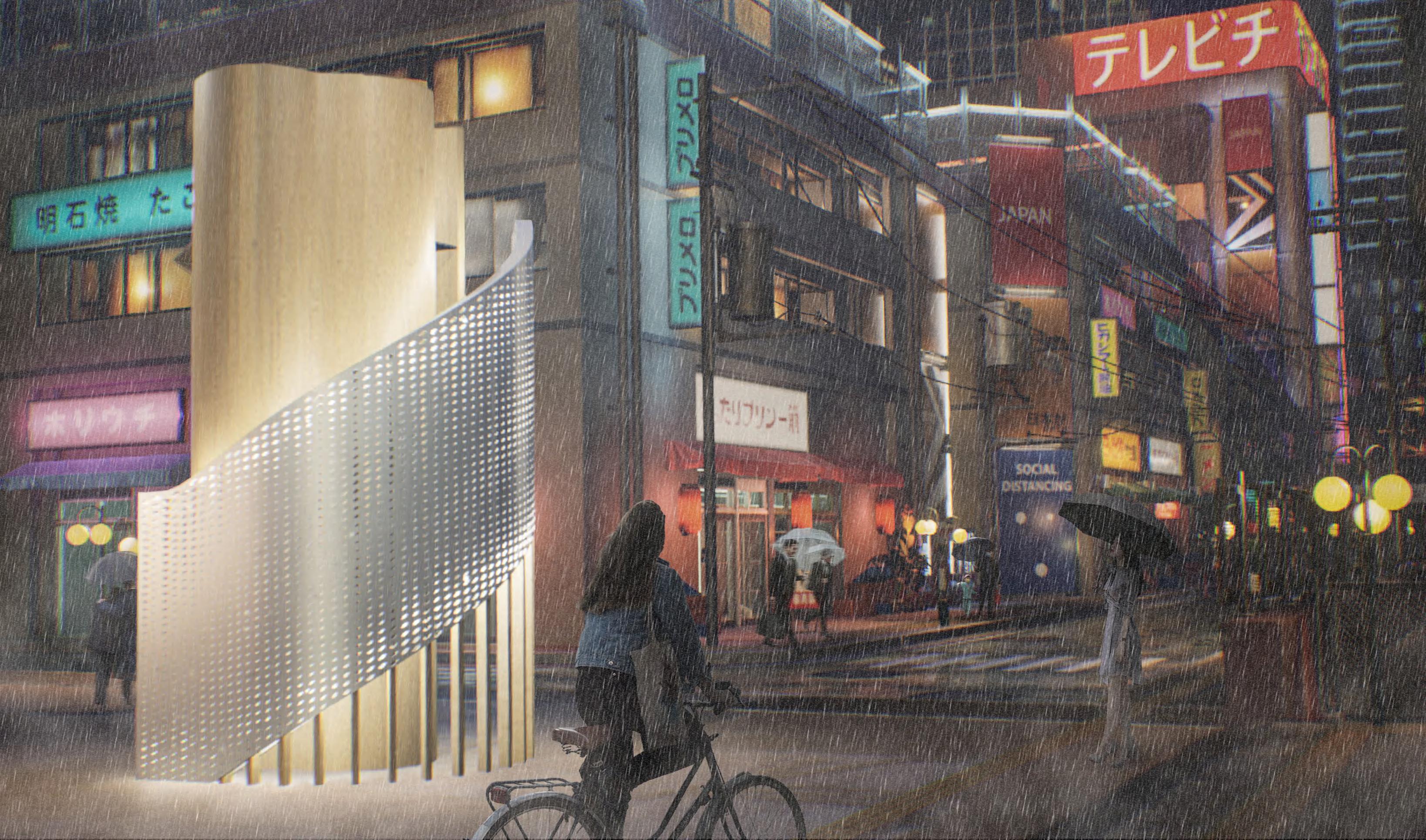
As one of the biggest and busiest cities in the world, Tokyo’s population often struggles with stress, anxiety, and depression, the causes of which are often linked to a dependance on digital devices. As a result, Tokyo’s cityscape is one of mostly modern and contemporary buildings, with a focus on high-rise residential buildings. Space is at a premium in Tokyo, and so recent developments have been built at ever-increasing heights in order to get the most properties from a smaller footprint.
Therefore, this project aims to design a series type of micro meditation cabins to help Tokyo citizens destress and reconnect with themselves. Due to the tight land and dense urban network in Tokyo, the project is expected to build an environment-friendly meditation space convenient for disassembly and portable under the limited footprint.
As electronic products and miscellaneous news are the main stressors for people, we hope that through a filtering method, people can be separated from anxiety and high-density information for a short time and enjoy a moment of filtered purity. At the same time, it also ensures that the space has a certain urban public attribute so as not to damage the continuity of the original urban context. Therefore, the design will use layering up and down and filtering as the main core. The layering up and down will ensure the urban public attribute of the lower layer, and different forms of filtering will ensure that the meditation space has a certain flexibility to adapt to different situations
04
Current Issue For Tokyo Citizen

As one of the biggest and busiest cities in the world, Tokyo’s population often struggles with stress, anxiety, and depression, the causes of which are often linked to a dependance on digital devices.
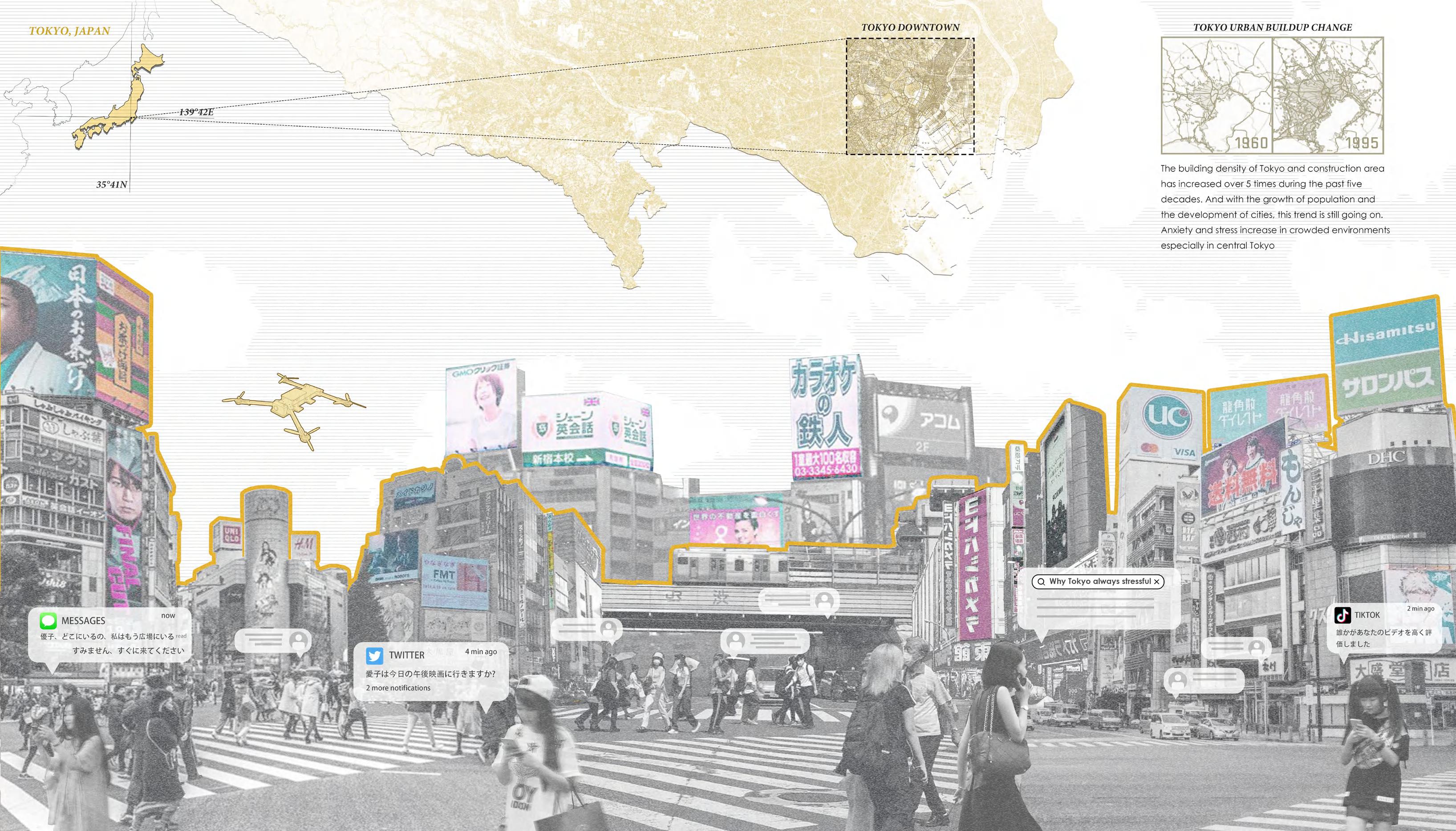

Also, Tokyo’s cityscape is one of mostly modern and contemporary buildings, with a focus on high-rise residential buildings. Space is at a premium in Tokyo.
Young people facing stress
Therefore, a micro meditation cabin can be a good solution to ease young people's anxiety in Tokyo, but without taking too much land. Also, it can implant some public function to enrich the urban context.

density (1990-2015) Tokyo land use commercial area individual area mountain area agriculture area others residential area Number of answers recieved = 259 Research done by OHEYAGO in 2022 Sources: *1 National Land Agency, “White Paper on the Tokyo Metropolitan Area 1999” (May 1999) *2 Bureau of Urban Development, Tokyo Metropolitan Government, “Tokyo Land 2014 (land-related data)” (October 2015)
Population
A B
Basic Module and Layering Strategy
A. MEDITATION SPACE WHY LAYERING

Since the space is at a premium in Tokyo, and so recent developments have been built at ever-increasing heights in order to get the most properties from a smaller footprint.
To maximize the use of space, divided the space into the upper and lower layers to achieve the functional distinction and also maintain a less footprint is undoubtedly a reasonable solution.
The upper layer can be more pure as a meditation space, while the lower level is more of a small node of the urban context, adding micro public functions to the surrounding without affecting the original urban context.
The upper floor is the core meditation space, keeping a certain distance from the city. The spiraling steps act as a traffic connection and a buffer between the stressful city and the small tranquil room.

The lower level is completely open to the public, minimizing the footprint of the installation and serving as a resting place and a tree hole for sharing stories, and chatting or just like a temporary shelter.
 B. URBAN PAVALLION
The Unroll Diragram of the Cabin
EXPLODED
and lower function differneces
Meditation Cabin Design Strategy
ISOMETRIC VIEW showing upper
Different Types of Filtration Opening Implatation
Design Strategy: Filtration Typology


To achieve the filtering effect of the meditation space on the environment, different forms of openings, skylights, etc. can be added to the basic configuration. Choose the appropriate form according to the target site to achieve the filtering effect.


The variety of types not only increases the shape change of this cabin, but also enables the space of this form to adapt to the surrounding context to the greatest extent and frame suitable scenery for people.
TYPE2: FILTRATION OPENINGS IN DIFFERENT SITU

FILTRATION TYPE LIST
Since the overall space presents a cylindrical shape, the installation position of the filter opening on its facade is more flexible. Disassemble several pieces of wooden panels in order and implant different forms of filter openings in the corresponding positions.


TYPE A TYPE E TYPE B TYPE F TYPE C TYPE G TYPE D TYPE H
Through the camera obscura, the outside scene is projected into the room to give people an immersive feeling.
C. Periscope skylight H. Striped seam opening
A. Cross groove window
E. Round opening window B. Stripe groove window F. Upward groove window
TYPE1: CAMERA OBSCURA
Darkroom Projected object Target view Pinhole
PROJECTION TYPE
apply in the area of open urban highlands, introduce scenery into the interior
FRAMING TYPE apply in the area of neibourhood street with the limited good view
SKYLIGHT TYPE apply in the area of surrounding high rise buildings to introduce the sky inside


In the surrounding areas with low building density , the open city scenery can be introduced into the interior to the maximum extent through the small hole by projection the light on the wall. Thus get rid of the limitation of dense space, so that people can feel open sense in the crowded.


In a medium density neibourhood , there are always some great views or nature sense disturbed by the surrounding houses, so these views can be individually filtered out and introduced into the interior through the way of framing.
In a very high density urban area , the view area completely blocked by the tall buildings. People can only look up at the sky to get rid of the steel forest. The skylight introduce the blue sky and daylight into the interior, so people feel like bathng in the light. low low low medium medium medium high high high

The material of the roof topping is wooden and attached with a layer of waterproof wax. The wood of the roof is divided into single shingles to increase the drainage of the roof.
The inner and outer facade used striped woode panel, one is because the wood is a light material. Also, it create a soft and warm feeling for people stay inside.

To create a quiet environment for the user, the acoustic foam panels are loaded between the inner and outer facades to insulate the noise. Also, the foam is light material which is easy to delivery.


The upper floor used mosaic wooden floor. It can save cost and control the shape more conveniently. Also, the same with the facade, wood seems more soft and warm for people to touch it.

Create a little variation in the mostly wood structure. And the perforation on the aluminum plate can create a translucent feeling, also, as an alloy, aluminum is light in weight and easy to transport.
The main supporting structure of the whole cabin is composed of wooden beams and wooden columns, and its lightness makes the whole building easy to build and disassemble.

 Wodden Topping
Striped Wooden Facade Panel
Insulation Layering
Wooden Stairing
Perforated Plate
Wooden Slats - vert & horiz
ROOF STRUCTURE
FACADE STRUCTURE
SOUND INSULATION
WOODEN FLOORING
ALUMINUM SHEET
Wooden STRUCTURE
The Interior of the Meditation Cabin
THE END
When you are lost in a huge city, you also need to stop to give yourself a little buffer, and learn to press a pause button for yourself. In the age of information, let the filter filter out the surrounding interference for you, and give you a pure space. Maybe it's not just Tokyo, each of us is surrounded by all kinds of temptations and information, and even falls into it without knowing it. But meditation gives us a chance to re-recognize ourselves and reorganize our lives. When walking on the street and tired, don't hesitate to come in and take a rest. Escaping is not terrible, what is terrible is that you lose the courage to face life again.


 A. Board Exhibition
B. Hanging Artwork
C. Display Table D. Large Sculpture/ Installation Art
The Human Perspective View from Arch Gallery


 The Comparison Between Upper and Ground Floor Design Language


 Hybrid function of the building may suit for more target vistors
THE FISH TANK a central building mark


 Noisy and busy bar street


 The Workflow of Survival Mode System in the Game


 The Workflow of Construction Mode System in the Game
The Construction Mode Interface
The Steps of Collecting materials from Ruins


 Shared Green Space
Shared Book Store
Shared LDK Tatami


 B. URBAN PAVALLION
The Unroll Diragram of the Cabin


 Wodden Topping
Striped Wooden Facade Panel
Insulation Layering
Wooden Stairing
Perforated Plate
Wooden Slats - vert & horiz
ROOF STRUCTURE
FACADE STRUCTURE
SOUND INSULATION
WOODEN FLOORING
ALUMINUM SHEET
Wooden STRUCTURE
The Interior of the Meditation Cabin
