

Create, innovate. Design.
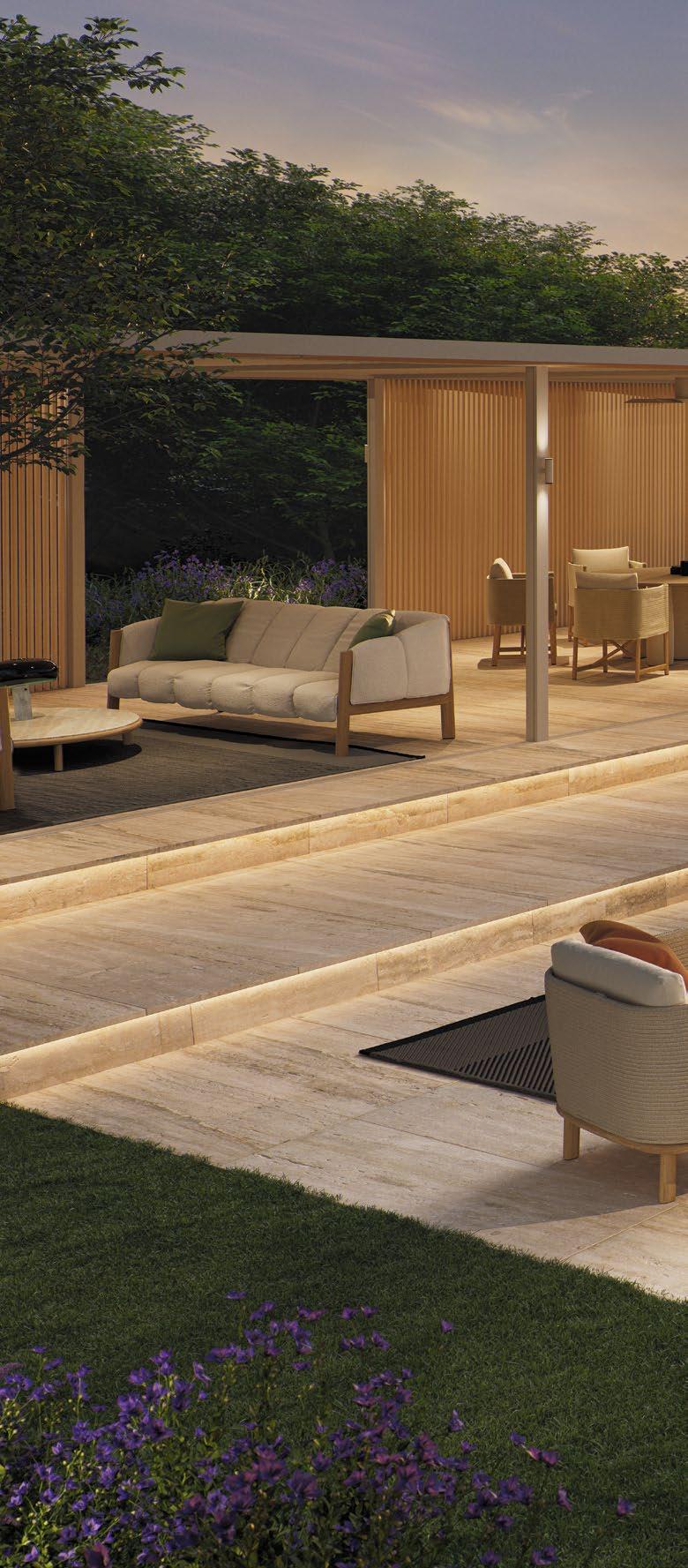


In a world where design meets purpose, it’s all about elevating environments where comfort and connection thrive – with the ultimate goal of creating spaces that inspire and foster meaningful interactions.
SPACES THAT CONNECT
In this edition of H+R, we embark on a journey through the transformative spaces crafted by CHIL Interior Design. With a guiding philosophy that “views insightful design as a backdrop to life”, CHIL masterfully creates environments where comfort and connection are at the heart of every detail. Their work in both residential and hospitality interiors provides an elevated perspective that continues to inspire us.
Among the gems in their portfolio, The Karl Lagerfeld Hotel in Macau reflects CHIL’s ability to translate Lagerfeld’s avant-garde vision into a living masterpiece of luxury. In Calgary, The Dorian channels the wit and eclectic spirit of Oscar Wilde, where every corner of this boutique hotel tells a story of boldness and charm. Then there’s Lucie in Toronto, a restaurant that whisks you away to the French countryside, where the warmth of nostalgia meets the rhythm of modern life.
Beyond CHIL’s impressive portfolio, we also spotlight other remarkable design highlights. The V Pavilion by Vincent Van Duysen for Kettal bridges indoor and outdoor spaces with a nod to 1950s American modernism. We are also blown away by Preciosa Lighting’s Crystal Pixels, a stunning handcrafted lighting piece that captures the elegance of early digital art.
Finally, let’s delve into awe-striking seating designs that redefine comfort and style while employing ample creative flair. From the lunar-inspired Supermoon chair to the feather-light Plume chair and the timeless Luchino chair, these pieces invite you to experience design in its most poetic form.
Kenneth Khu k.k@kenneth-media.com

The f ac t that our C onset a is s till in such good shape af ter 60 years is due to it s timeles s simplicit y And it s sophis tic ated modular s ys tem, which c an be configured into countless combinations From seat dimensions, armres t s and foot shapes through f abric s and colours to various cushion filling s, it c an be composed according to personal preferences and requirement s How about elec tric blue runners, for example?




PAROS by DEDON
by FLEXFORM

editorial
MANAGING EDITOR Kenneth Khu
DEPUTY EDITOR Pang Yin Ying
EDITOR Christine Lee
design
ART DIRECTOR Eric Phoon
SENIOR DESIGNER Sandy Liew
contributors
WRITERS Adele Chong, Lily Wong, Dorothy Lung
DESIGN STUDIO CHIL Interior Design
sales & marketing
SENIOR SALES MANAGER Edward Chen
SALES EXECUTIVE Kelvin Ong
publication
PUBLISHER Kenneth Khu
enquiries
ADVERTISING advertise@hotelresortdesign.com
SUBMIT EDITORIAL submit@hotelresortdesign.com
SUBSCRIPTION subscribe@hotelresortdesign.com
websites hotelresortdesign.com kenneth-media.com
contact
KENNETH MEDIA SDN BHD 4, Jalan Hopea U15/28B Elmina West, Seksyen U15 40170 Shah Alam, Selangor Malaysia.
T: +603 5038 3022
printer
PERCETAKAN IMPRINT (M) SDN BHD No.538, Jalan 20 Taman Perindustrian Ehsan Jaya, Kepong 52100 Kuala Lumpur Malaysia.
permit number
KDN PP18850/09/2015(034307) MCI(P) 085/03/2024
magazine
H+R | Hotel & Resort Design magazine is published three times a year and is circulated throughout the Asia-Pacific region. Opinions expressed are those of the contributors and not necessarily endorsed by the publisher.
copyright notice
All rights, including copyright, in the content of this publication are owned by Kenneth Media Sdn Bhd, Malaysia. You are not permitted to copy, broadcast, download, store in any medium,transmit, show or play in public, adapt or change any in any way the content of this publication for any other purpose whatsoever without the prior written permission of Kenneth Media Sdn Bhd, Malaysia.
credits
PHOTOS: Except otherwise noted, all photos and drawings are owned by photographer or design studio or project owner.
acknowledgement
COVER: CHIL Interior Design


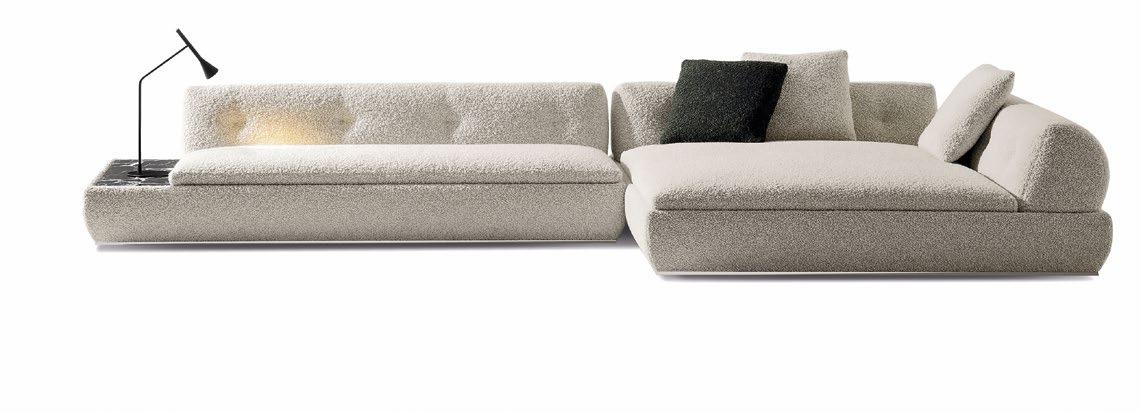
OVER THE MOON
Sculptural and elegant, Supermoon is designed as a standalone, nomadic piece yet effortlessly transforms into a modular system, enabling flexible configurations that adapt to any space. Unique backrests and armrests, inspired by lunar phases, poetically serve as the sofa’s signature details. These shapes, along with the seat cushions and marble or wood tops, are partially concealed in the upholstered base, resting atop a floating metal frame to evoke a lightweight effect.
LET’S GET TOGETHER LIGHTS, CAMERA, ACTION!
Perfect for enlivening outdoor areas, PAROS brings forth a fresh, contemporary appeal with its generous proportions, grounded presence, and luxurious comfort. Instantly recognisable by its low horizontal volumes, signature feet, and the strikingly natural new strand of DEDON Fiber, PAROS is a distinctive addition to DEDON’s collection. Blending rustic charm with refined elegance, this woven outdoor collection effortlessly becomes part of any communal space where friends and family come together.

Drawing inspiration from the timeless field chair or “director’s chair” used in the film industry, Antonio Citterio elegantly reinterprets the Luchino chair with luxurious materials and sophisticated detailing while preserving the chair’s classic qualities of comfort, lightweight design, and portability. Meticulously crafted from solid, hand-turned wood and sumptuous cowhide to complement its unique folding mechanism, this chair is a celebration of design excellence, where form meets function in perfect harmony.


OUT IN THE OPEN
From a yacht on the Côte d’Azur to a terrace in New York, MOOREA is right at home in any outdoor space. Designed by Carlo Colombo for Giorgetti, this collection features a robust inox steel structure for the base, armrests, and back elements, all encased in a solid Teak wood frame painted in a sophisticated mud colour. The upholstery is fully removable and available in various fabrics from the Open-Air collection.
CRUISE LINE
In collaboration with the Gio Ponti Archives and the heirs of the esteemed Milanese architect, Molteni&C is reviving the rare D.150.5 chaise longue, originally created for the Andrea Doria cruise ship in 1952. This new edition features two distinctive design elements: a continuous line uniting the backrest, seat, armrest, and footrest, and the precise angle radius between the seat and backrest as specified in Ponti’s 1953 Distex notes.
BLISS OUT NOW
Stunning yet incredibly cosy, the Ila armchair expresses a bold and sophisticated personality. Its sensuous curves and flexible lines sculpt a cocoon of plush relaxation, while a firm polyurethane foam outer shell and a soft inner foam offer both support and comfort. Perched on a sleek solid ash wood frame, its generous headrest adds a dramatic flair, making Ila a statement piece of refined luxury ideal for public and private spaces.


GRACEFUL DEMEANOUR
Emmi’s exquisite form is a nod to the plush, inviting armchairs of the 1970s, all while reflecting Minotti’s expertise in craftsmanship. Its subtle elegance is evident in every detail, from the graceful drape of the soft, nest-like cushions over the frame to the clear visibility of the front legs and supporting architecture. Featuring a rectangular shape with rounded edges, the legs are available in wood, glossy lacquer, or upholstered in leather.


LAPEL LUXURY
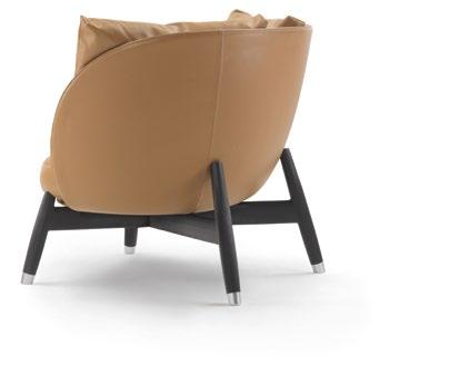
Echoing the style of jacket lapels, the Eri armchair incorporates elegantly sculpted lines that bring an air of sophistication to any space. Its hand-crafted legs lend a touch of artisanal flair, supporting a wellproportioned upholstered shell cradling plush goosedown cushions. Trendy yet meticulously crafted as a focal piece, this beauty comes in an extensive range of fabric and leather options, allowing you to create a unique combination that perfectly complements your style.
TIMELESSLY MINIMAL
Meet the Oki Side Table, a minimalist marvel that embodies lightness, balance, and geometric precision. Featuring a delicate wire frame and a sleek top, this streamlined table comes in two sizes and finishes— matt powder-coated bronze or black with matching leather pockets in Saddle Black or Saddle Coffee. The standout leather pocket, crafted from rich saddle leather, adds a touch of elegance and serves as a chic storage solution.


TIMELESS CURVES
The Bambola armchair, a gem from Mario Bellini’s Le Bambole collection created in 1972, now debuts in a stunning outdoor version. This new rendition retains the original’s soft curves and plush, cosy shapes that have cemented its status as a design classic. Crafted from recycled and recyclable, weather-resistant, high-performance materials, La Bambola Outdoor is revered not just for its aesthetic appeal but also for its durability and eco-friendliness.
NATURAL BEAUTY
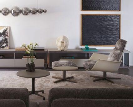
The beauty of nature comes through in the Clori armchair. Complemented by a coordinated ottoman on a matching four-spoke base, Clori seamlessly combines sophisticated style with sustainable materials. The armchair features a return swivel mechanism supported by a sleek five-spoke base of pewter-painted metal adorned with elegant Canaletto walnut inserts. Its inner frame, crafted from moulded rigid polyurethane, is elegantly enveloped in luxurious leather or flexible, eco-friendly Nuo wood.

WRAPPED IN COMFORT
Gio Ponti’s iconic D.154.2 armchair, originally crafted in 1954 for the Planchart collectors’ villa in Caracas, has been reimagined for outdoor living. This contemporary version honours the original design’s grace while delivering the durability synonymous with Molteni&C. Its captivating wrap-around form features a firm yet cosy shell juxtaposed with a luxuriously soft upholstered counter frame. The chair’s timeless allure lies in its curved lines and a harmony of rigid and plush elements.


SWING INTO SERENITY
Swingrest, designed by Daniel Pouzet, is a masterful evolution of DEDON’s iconic NESTREST hanging lounger. While it retains the basket-like base of its predecessor, Swingrest carves out a new realm of spaciousness, delivering unparalleled comfort in a more streamlined form. This innovative piece effortlessly blends with other collections, such as the Swingme Lounge Chair and Swingus 2-seater, creating a harmonious ensemble that transforms any space into a haven of relaxation.
FOREST CHARM


CHARACTER ARC
The Chanterelle collection of low tables brings the soul of nature indoors – with a distinctive flair. Designed by Tollgård & Castellani, this collection is inspired by a walk in the woods, reflecting the dynamic interplay of light and organic forms. Available in three sizes, Chanterelle captures both the branches of the trees and their graceful canopies, as well as the organic sculptural forms of the forest floor.
The Arc table exemplifies cutting-edge design with its innovative approach. Its base, inspired by modern technostructures, features a unique “light” cement blend that combines colour with a special fibrous material, creating strong yet lightweight structures. Printed as a single block and dyed, Arc’s design enables intricate shapes while ensuring durability and flexibility. Emphasising sustainability, the table boasts complete recyclability and a low environmental impact throughout its production cycle.
MOLTENI.IT


RARE SIMPLICITY

SUNNY OUTLOOK
The lightweight Osuu wooden chair showcases a unique blend of bentwood and plywood, creating a visually stunning and intricately designed piece. Its outer arch gracefully curves around the body, seamlessly transforming into the front legs, while solid, steam-bent roundwood forms the arms and upper backrest support. Available in elegant oak and rare nutwood—sourced from the Black Forest—the Osuu Chair exemplifies exceptional artistry in material selection and processing.
Perfectly crafted for both outdoor and indoor relaxation, Lamorisse’s sleek aluminium frame comprising oval legs and gracefully curved armrests complements any setting, from waterfront verandas and shaded patios to poolside retreats and ship decks. The plush, polyurethane foam cushion, supported by elastic belts, ensures unmatched comfort no matter where it is placed. Meticulously designed and versatile, the cushion’s modular sections zip together, allowing effortless updates without replacing the entire piece.
DASH OF GINGER
Antonio Citterio’s iconic Ginger chaise longue makes a distinguished return, blending timeless elegance with superior comfort. Updated with modern details, the chaise’s sinuous tubular metal frame supports soft seat and backrest cushions, complemented by a pivoting side table seamlessly integrated into the structure. The generously padded goose-down backrest cushion rests against a refined leather-clad cylindrical support on springs, providing optimal back support and an exquisite lounging experience.


LIGHT AS A FEATHER
Versatile, lithe and refined, the Plume chair exudes an ethereal lightness inspired by a feather. At its core, the chair features a solid ash wood structure supporting a padded plywood seat elevated by four cylinders. The foam backrest, with a firm back and soft front, is attached using screws concealed by Pau Ferro plaques. Piping along the seat and backrest elegantly covers the zipper closure, blending comfort with sophistication.
GIORGETTI.EU


VISION OF HARMONY
THE V PAVILION – WHERE FORM, FUNCTION, AND SUSTAINABILITY ARE IN PERFECT HARMONY, MEETS THE AESTHETIC AND FUNCTIONAL DEMANDS OF CONTEMPORARY LIVING WHILE SETTING A NEW STANDARD FOR ENVIRONMENTALLY FRIENDLY ARCHITECTURE.

THIS PHOTO: V Pavilion is based on the idea of creating a dialogue between different environments: the interior and exterior of architecture.

pavilion is subtly linked to the main building
the outdoor area at

When nature meets architecture, inspiration abounds. Designer Vincent Van Duysen’s latest project, the V Pavilion for Kettal, exemplifies this connection between design and the beauty of nature. With meticulously crafted elements strategically placed within a bright and open floor plan, this pavilion beautifully establishes a harmonious link between people and their surroundings.
At its core, the V Pavilion is designed to form a delicate link between the main building and the outdoor area, resulting in an effortlessly cohesive space. Drawing inspiration from 1950s American modernism, the pavilion embodies the era’s industrial trends and innovative building technologies. The design emphasises functionalism, featuring open-plan, multifunctional spaces that are flexible and adaptable to any lifestyle or environment.
Structurally, the pavilion incorporates aluminium porticoes placed at two-metre intervals along the length of the pavilion, supporting a cantilevered insulating canopy and allowing for modular construction.

BOTTOM: V Pavilion employs climate-sensitive technology, including eco-friendly materials, solar panels, a heat-insulating canopy, and a 75% recycled aluminium structure.
TOP: Inspired by 1950s American modernism, V Pavilion emphasises an open-plan space that can easily adapt to any lifestyle or environment.


These side columns frame and filter views of the garden, while the open areas between them can be customised with a variety of facings such as glass, adjustable louvres, curtains, solid stoneware panels, cupboards, a cooker, or a fireplace, allowing for a personalised space tailored to the client’s specifications.
A standout feature of the V Pavilion is its commitment to climate-sensitive technology and eco-friendly design. Located amidst a natural environment, the pavilion emphasises using durable materials with low CO2 emissions and solar panels to pave the way for energy self-sufficiency. Apart from a heat-insulating canopy, the pavilion is also constructed as a 75% recycled aluminium structure that can be easily disassembled and reused elsewhere in a different environment. Additionally, the bioclimatic ceiling provides overhead ventilation, further enhancing the pavilion’s environmental credentials. Integrating these innovative technologies significantly reduces carbon footprint and sets a precedent for sustainable architectural practices in the modern era.
“The V Pavilion project is based on the idea of creating a dialogue between different environments: the interior and exterior of architecture,” Kettal states. “The gentle connection between people and the environment through constructive elements, a free floor and the importance of light.”
BOTTOM: The open areas between the columns can be assembled with various facings, while the bioclimatic ceiling provides overhead ventilation.
& RIGHT: The structure consists of aluminium porticoes every two metres down the long side that support a cantilevered insulating canopy.
A STANDOUT FEATURE OF THE V PAVILION IS ITS COMMITMENT TO CLIMATE-SENSITIVE TECHNOLOGY AND ECO-FRIENDLY DESIGN. LOCATED AMIDST A NATURAL ENVIRONMENT, THE PAVILION EMPHASISES USING DURABLE MATERIALS WITH LOW CO2 EMISSIONS AND SOLAR PANELS TO PAVE THE WAY FOR ENERGY SELF-SUFFICIENCY.

THIS PHOTO: Nestled amidst natural surroundings, V Pavilion’s sustainable design demonstrates Van Duysen’s dedication to creating architecture that respects and preserves the environment.

Left: Adèle Rankin - Principal & Global Design Lead | CHIL Interior Design, Exeutive Director & Global Interior Design Lead | Surbana Jurong
Right: Paul Morissette - Senior Principal & Global Lead
50 YEARS OF CRAFTING ICONIC SPACES THROUGH STORYTELLING
DEDICATED TO EXCELLENCE AND INNOVATION, CHIL INTERIOR DESIGN MERGES GLOBAL EXPERTISE WITH UNIQUE CLIENT VISIONS TO CREATE UNFORGETTABLE EXPERIENCES IN HOSPITALITY AND RESIDENTIAL SPACES.
Celebrating its 50 th Anniversary, CHIL Interior Design stands as a globally acclaimed and award-winning pioneer renowned for its unparalleled approach to crafting exceptional hospitality and residential experiences. Rooted in a boutique approach, our teams in Vancouver, Toronto, and Hong Kong seamlessly merge global expertise with our clients’ unique visions, ensuring each space we design tells a unique and unforgettable story.
At CHIL, we understand that exceptional design emerges from a profound understanding of our clients’ aspirations and goals. Since 1974, our specialization in residential and hospitality interiors allows us to bring an elevated perspective to experiential and humanfocused design. We view insightful design as a backdrop to life, creating spaces that foster comfort and connection for individuals and communities alike. Our ethos is built on collaboration, thorough research, and informed design, supported by comprehensive documentation.
Our philosophy is driven by the belief in the power of storytelling through design: every brand and location have a distinct story to tell through the experiences they offer. We strive to communicate what inspires, motivates, and excites people, by reflecting the unique
character of the neighborhood while incorporating an understanding of current and future trends. We merge the essence of a brand with meticulous attention to detail, designing spaces that embody the art of life, the excitement of the journey, the pinnacle of luxury, and the satisfaction of a remarkable stay. With a process honed over decades in the hotel industry, we bring meticulous planning, attention to detail, and cohesive design to every project, regardless of scale.
Our design teams have successfully created iconic environments for leading hotels, resorts, mixed-use, and residential developments around the world. As we mark our 50 th Anniversary, we are honored to have the privilege of receiving numerous prestigious international awards that recognize our commitment to excellence and innovation.
At CHIL Interior Design, we are committed to bringing each client’s story to life through our innovative and thoughtful designs, making every project a testament to our dedication to excellence. With our 50 years of legacy as a foundation, we look forward to shaping the future of design for many years to come.
CHIL Interior Design is a member of Surbana Jurong Group. SJ Group is a collective of problem solvers for the built environment, continually reimagining ways to create a smart and sustainable future.

AN ULTRALUXURIOUS HOSPITALITY EXPERIENCE
CHIL IS PROUD TO COLLABORATE WITH KARL LAGERFELD AND GLP TO BRING THE LATE FASHION ICON’S ONLY HOTEL MASTERWORK TO LIFE.
THE KARL LAGERFELD | MACAU, CHINA

THIS PHOTO: The stunning mosaic tile mural is a testament to the intricacy & efforts in bringing Karl Lagerfeld’s vision to life

THIS PHOTO: The striking black tile feature channels Karl Lagerfeld’s iconic love for edgy, bold style, setting the stage for a fashionable arrival.


THE KARL LAGERFELD, the world’s first and only hotel with interiors entirely designed by the late fashion legend, opened its doors in December 2021. Located at the Grand Lisboa Palace Resort Macau (GLP), the 6-star hotel tower encompasses 242 guest rooms and 29 suites of multiple types. Superb amenities include the award-winning Portuguese restaurant Mesa, the Book Lounge inspired by the designer’s home library, the stylish Spa that fuses beauty and healing, and two Swimming Pools with stunning décor incorporating oriental elements, to name a few. The exquisite and luxurious setting offers guests an unparalleled immersion into Karl’s unique taste in modern Chinoiserie design infused with his inimitable fashion sense.
Appointed as the Executive Interior Designer, the boutique hospitality studio CHIL Interior Design was commissioned to oversee the delivery of Karl Lagerfeld’s striking design concepts, from his bold new vision of luxury hospitality design to every single fine detail visible by the guests. Working closely with the designer himself and the property’s owner, SJM Holdings, throughout the making of this one-of-its-kind masterpiece, CHIL perfectly captured the essence of Karl Lagerfeld’s vision and added value to the successful delivery of the project through its leading expertise in global hospitality interior design.

TOP: The lobby highlights the “east meets west” design narrative this hotel perfectly exemplifies.
Photo Credit: Jack Qin
BOTTOM: The striking concave seating area embraces bold contrasts with gold background, dramatic furniture and lighting, all quintessentially Karl Lagerfeld.

The interior of THE KARL LAGERFELD exemplifies Karl’s lifelong fascination with, and inexhaustible exploration of, design and style. Through the hotel’s design, Karl expresses lifestyle pleasures through a lavish and eclectic blend of Chinese and Western luxury manifesting the designer’s cosmopolitan philosophy and distinct artistic vision. Prominent symbols in Chinese culture including the peony, phoenix, and jade inform the design, which unfold throughout the hotel as guests enter and embark on a journey of style, rejuvenation, and splendor.
Upon entering the lobby, the guests will be amazed by the creative combination of bold colors and iconic patterns. Chinese elements are expressed through diversified forms, from the noble color tone consisted by black, gold, and red, overscale graphics, glittering texture, to the unusual shapes of custommade furniture. Their extraordinary proportions and composition represent Karl Lagerfeld’s sophisticated reimagining of modern Chinoiserie via traditional craftsmanship.

LEFT: The lobby’s library, inspired by Karl Lagerfeld’s personal collection, showcases his well known passion for collecting books.
RIGHT: The grand staircase makes a dramatic statement, its sweeping design and elegant details creates a breathtaking focal point.

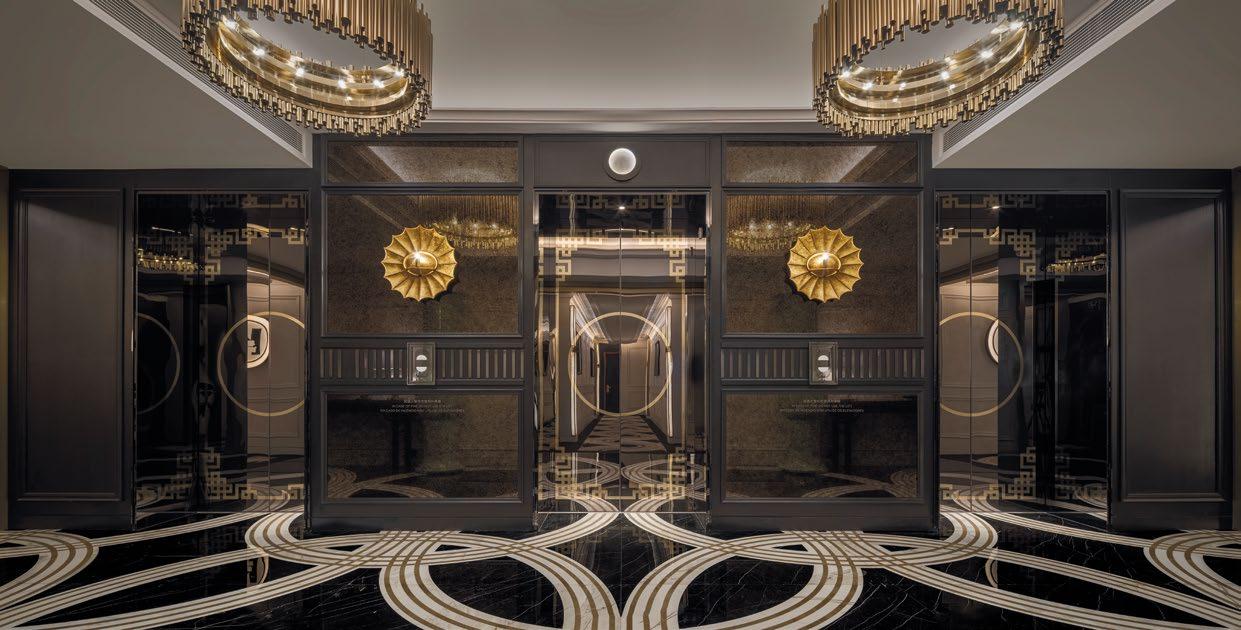
THIS PHOTO: This elevator lobby epitomizes bold opulence, with its lavish design and striking gold & black contrast, creating a truly unforgettable entrance.
“WE’RE THRILLED TO HAVE THIS UNIQUE PROJECT ADDED TO CHIL’S GLOBAL HOSPITALITY AND INTERIOR DESIGN PORTFOLIO MARKING A SIGNIFICANT ACHIEVEMENT AMONG THE VAST PORTFOLIO OF PROJECTS WE’VE DELIVERED FOR LUXURY HOSPITALITY CLIENTS ACROSS THE GLOBE.”

variety
textures, a vivid patterned tiled floor, and dramatic lighting fixtures infuse luxury into every corner of the hotel.
BOTTOM: The living area in the hotel suite combines luxurious furnishings with sophisticated design, creating a stylish and comfortable retreat.
Adèle Rankin, Principal & Global Design Lead of CHIL Interior Design, Executive Director and Global Interior Design Lead of Surbana Jurong Group
“It’s such a great honour to have worked with the widely respected and greatly admired designer Karl Lagerfeld, his team, and SJM on such a notable hospitality project over the past 7 years and to be able to witness how Karl’s sublime vision of ‘Europe meets China’ was turned into reality. The famed designer’s relentless pursuit of perfection and creativity coupled with his cross-boundary exploration, inspired us along the journey of working with him. We’re thrilled to have this unique project added to CHIL’s global hospitality and interior design portfolio marking a significant achievement among the vast portfolio of projects we’ve delivered for luxury hospitality clients across the globe.” said Adèle Rankin, Principal & Global Design Lead of CHIL Interior Design, Executive Director and Global Interior Design Lead of Surbana Jurong Group.

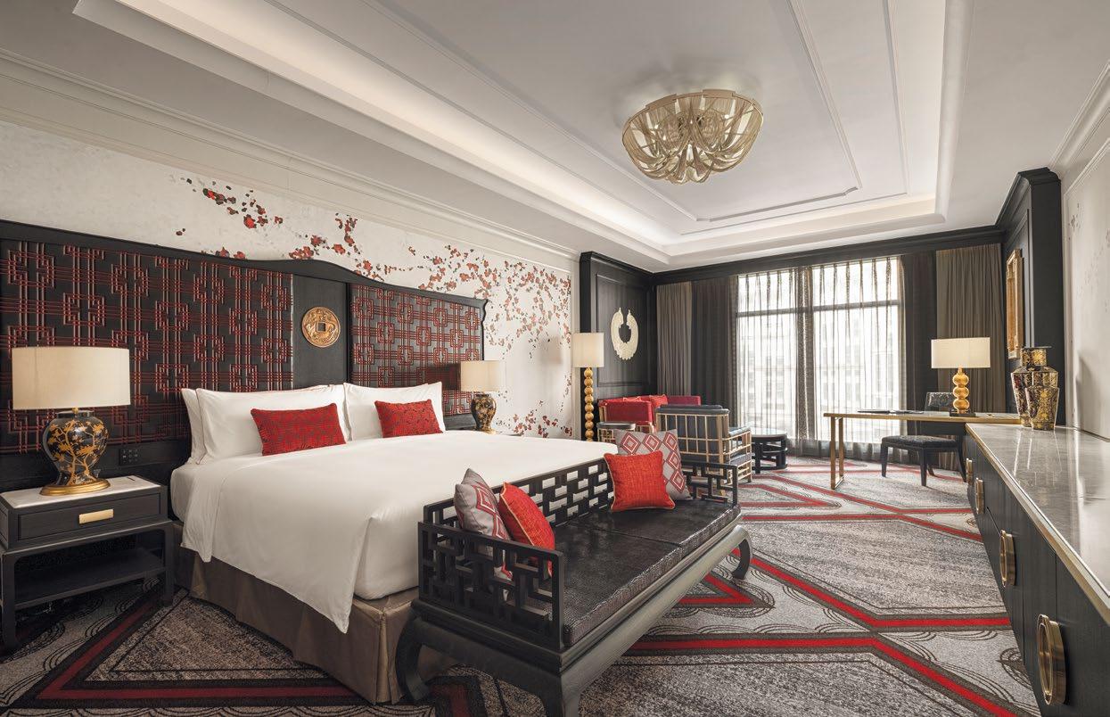
BOTTOM: The guestroom merges iconic Chinese motifs with traditional French details like crown molding and chandeliers for a unique juxtaposition.
TOP: The guestroom bathroom extends the lobby’s gold and black design, maintaining the luxurious ambiance.
Karl’s precise attention to detail is reflected throughout the intricate and opulent flourishes that inform the project’s immersive design. CHIL meticulously executed the project with a profound understanding of Karl’s core aesthetic that reaches beyond his widely celebrated style in fashion. Working with a perfectionist who has superlative attention to detail requires an equal adherence to perfection. With each pattern, material and design element personally conceived of or selected by Karl, CHIL coordinated a seamless integration of artistic design concepts with technical aspects. From the planning to project management, quality control and final delivery, CHIL merged Karl’s high concept vision with flawless execution, delivering a fashion hospitality project that dazzles guests through an exploration of the legendary designer’s boundless inspiration.
“THE KARL LAGERFELD in China is a unique hospitality project that Karl was able to complete before his passing. Having CHIL as the Executive Interior Designer throughout the entire process allowed us to execute every exacting detail of Karl’s design vision, from pattern ideas to furniture selection, making this project a great point of pride for the brand to carry on his legacy,” said of THE KARL LAGERFELD.


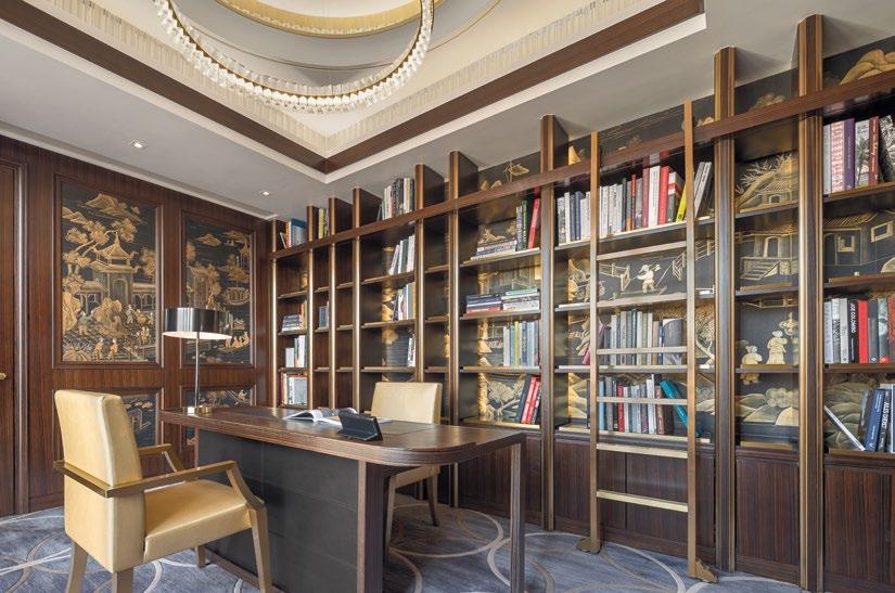
TOP: The presidential suite features a private library reminiscent of Karl Lagerfeld’s personal home, offering a sophisticated and elegant study.
BOTTOM: The presidential suite boasts a large circular dining table anchored by a large chandelier, harmoniously juxtaposed with elegant Chinese motifs and elements.
“THE KARL LAGERFELD IN CHINA IS A UNIQUE HOSPITALITY PROJECT THAT KARL WAS ABLE TO COMPLETE BEFORE HIS PASSING. HAVING CHIL AS THE EXECUTIVE INTERIOR DESIGNER THROUGHOUT THE ENTIRE PROCESS ALLOWED US TO EXECUTE EVERY EXACTING DETAIL OF KARL’S DESIGN VISION, FROM PATTERN IDEAS TO FURNITURE SELECTION, MAKING THIS PROJECT A GREAT POINT OF PRIDE FOR THE BRAND TO CARRY ON HIS LEGACY.” THE KARL LAGERFELD

THIS PHOTO: The circular headboard design symbolizes good fortune in Chinese culture

THIS PHOTO: Lagerfeld’s signature black, white, and gold tones are seen throughout the hotel, including the restaurant, Mesa by José Avillez


BOTTOM: A fashionable statement is made with the bold black & gold design in the private dining room
MIDDLE: Gold-gilded banquette seating with birdcage lighting and toile de Jouy wallcovering cleverly marry Eastern and Western design influences.
TOP: Impressive large-scale installations all around the hotel add bold visual statements that elevate the ambiance.

“THE KARL LAGERFELD IS A TESTAMENT TO THE LUXURY AND UNIQUENESS OF THE GRAND LISBOA PALACE, THE FIRST INTEGRATED RESORT TO INTRODUCE A FASHION HOTEL CONCEPT TO MACAU’S HOSPITALITY SCENE. WE ARE IMPRESSED BY CHIL’S PROVEN CAPABILITIES IN REALIZING KARL LAGERFELD’S AWE-INSPIRING DESIGN VISION AND DELIVERING EXCEPTIONAL HOSPITALITY EXPERIENCE THROUGH INTERIORS. WE BELIEVE THE KARL LAGERFELD WILL DELIGHT THE GUESTS WITH A FEAST OF SENSES, SETTING A NEW BENCHMARK FOR HOSPITALITY EXCELLENCE.”
SJM/GLP

“THE KARL LAGERFELD is a testament to the luxury and uniqueness of the Grand Lisboa Palace, the first integrated resort to introduce a fashion hotel concept to Macau’s hospitality scene. We are impressed by CHIL’s proven capabilities in realizing Karl Lagerfeld’s awe-inspiring design vision and delivering exceptional hospitality experience through interiors. We believe THE KARL LAGERFELD will delight the guests with a feast of senses, setting a new benchmark for hospitality excellence.” said of SJM/GLP.
Built upon the firm’s extensive expertise and experience with luxury hospitality brands worldwide, CHIL designs and creates unparalleled and unforgettable hospitality experiences inspired by infusing a deep understanding of local culture with global design best practices.
CHIL believes in the power of storytelling through design, seeking to translate each client’s story into physical spaces, providing vivid memories for guests to naturally associate with their brands.


BOTTOM: The French blue wallcovering at the private spa rooms add a touch of elegance and tranquility to the serene space.
TOP: The elegant spa reception exudes sophistication with its refined design, offering a warm and inviting welcome to every guest.

JOURNEY TO THE WILDE SIDE
LOCATED IN DOWNTOWN CALGARY, THE LATEST ADDITION TO MARRIOTT’S AUTOGRAPH COLLECTION IS AN ODE TO OSCAR WILDE.
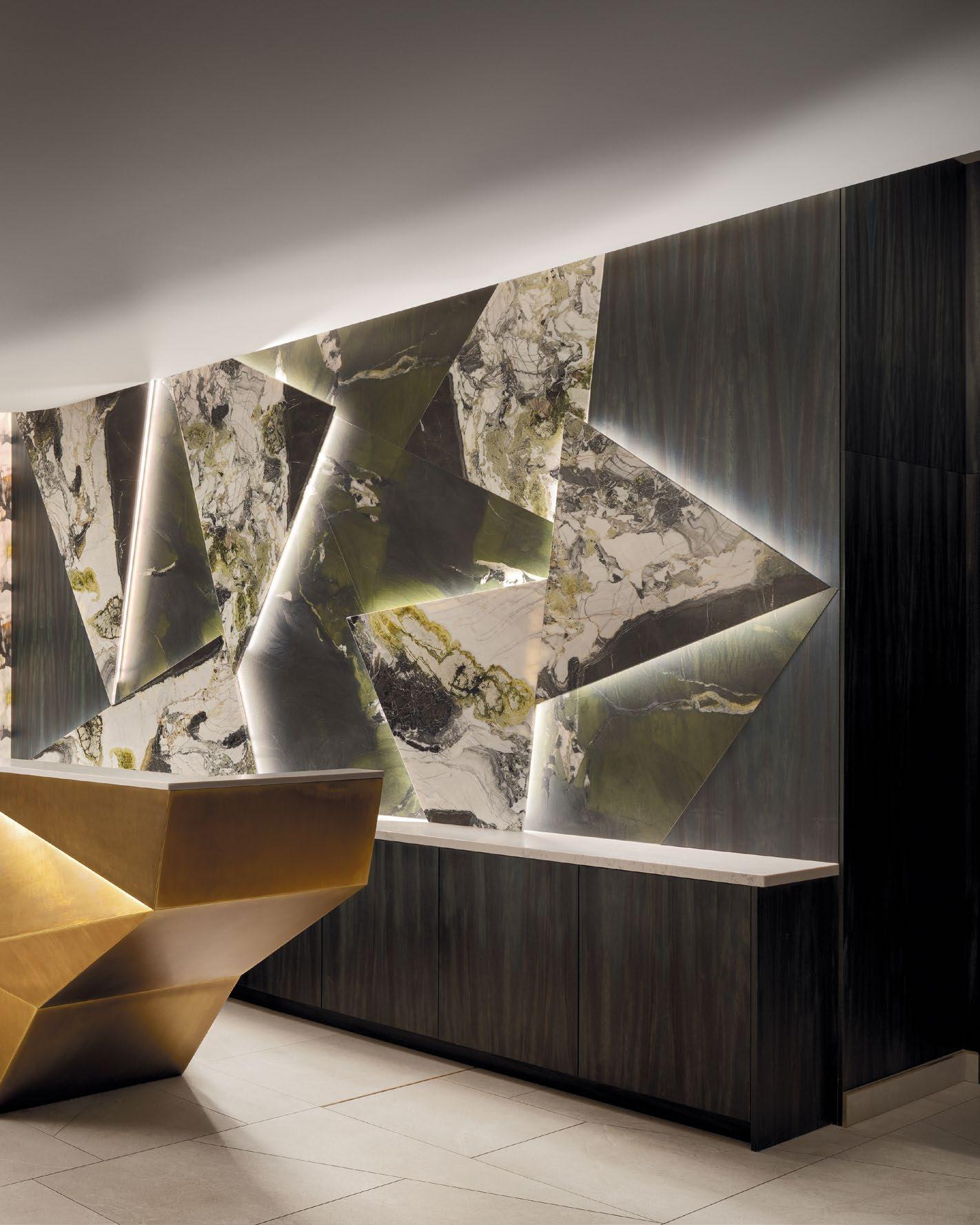
THIS PHOTO: The hotel lobby design plays with contrasts: oversized floral wallcovering against antique brass accents, sharp-edged features mixed with curved lines.


Awomen-led team of designers and developers have forged a new destination in downtown Calgary. Developed and owned by PBA Group and designed by award-winning interior design studio CHIL, The Dorian marks the arrival of Marriott’s premium Autograph Collection into Alberta’s largest city.
CHIL Interior Design has realized a unique vision for the 136 room hotel. The Dorian’s bespoke interiors carry forward the wit of author Oscar Wilde, along with the eclecticism and boldness of 19th-centuryinspired interiors.
A notable addition to CHIL’s extensive hospitality portfolio—which includes the likes of the Fairmont Chateau Laurier, Hotel Belmont, M Gallery, and Shangri-La Toronto—The Dorian offers an unparalleled hospitality experience throughout its guestrooms and suites, ground level bar and café, rooftop restaurant, fitness space, and events hall.


Photo Credit: Eymeric Widling
TOP: The fragmented design of the feature wall and reception desk is inspired by the iconic scene in “The Picture of Dorian Gray” where the mirror was shattered.
BOTTOM: The artwork at the end of the elevator lobby echoes the fragmented design throughout the lobby, playfully referencing the mirror-shattering scene

THIS PHOTO: This wall covering gives a sense of place with its traditional English floral design while remaining relevant in today’s terms.

THIS PHOTO: The series of artwork converges into a couple dancing, resembling stop-motion film frames, with mosaic tile flooring creatively marking each level

Design Inspiration
The Dorian’s name references The Picture of Dorian Gray, the iconic 1891 novel written by Oscar Wilde.
Throughout The Dorian, eclectic material and colour choices evoke the interiors and fashions of Wilde’s era, along with his hallmark eccentricity and biting wit.
Contrasting materials, bold colours, and the reinterpretation of traditional patterns such as tartans, houndstooths, and tweeds make for an experience that is richly layered, defined by contrasts, and underlined by a recurring sense of surprise.
A significant investment in downtown Calgary’s role as a hospitality destination, The Dorian aims to capture the city’s unique spirit. Instead of relying on cliches, The Dorian channels downtown Calgary’s independence of thought through its bold, directional, and unapologetic design.
The Lobby: An introduction to Oscar Wilde
The Dorian’s lobby represents CHIL’s ability to creatively interpret the hotel’s connection to Wilde.
This is most evident via the lobby’s shattered mirror, which references a pivotal moment in The Picture of Dorian Gray. The theme of shattering is carried forward across the lobby’s tiled floor and its check-in desk: an angular block of faceted brass.
A recurring material throughout The Dorian, brass exudes a sense of historic character and serves to reference the era of The Picture of Dorian Gray.
Similarly, the Victorian period’s appreciation for saturated colours and bold patterning is further evoked with contrasting surface materials, like marble, dark wood, and floor-to-ceiling floral wallpaper.

BOTTOM: The custom wool rug and furniture offer timeless elegance with a modern twist
TOP: The suite design blends modern elements with traditional details, creating an enchanting atmosphere that feels like stepping into a storybook.


Guestrooms & Suites:
Regal escapes
In guestrooms, custom wallcoverings are designed to match upholstered chairs and sofas, reflecting the flair and whimsy of 19th century interiors. This bold patterning is contrasted by understated brass accenting and leather headboards.
Suites contain expansive, independent sitting rooms that feature hardwood floors, custom-upholstered sofas, and unique artwork.
The use of smart technology, like sensor lights on nightstands and bathroom counters, conveys The Dorian’s elevated level of experience and considered attention to detail.

50 | H+R | HOTELRESORTDESIGN.COM TOP: The guest bathroom features peacock feather wallcovering, giving a nod to Oscar Wilde’s influence and adding a touch of grandeur.
BOTTOM: The guestroom captivates with its bold, immersive wallcovering reminiscent of Oscar Wilde’s era, a small mirror reflecting the book, and a modern portrait of Wilde.

“BRINGING THE AUTOGRAPH COLLECTION TO CALGARY REQUIRED CREATING A HOTEL THAT WAS NOT ONLY UNIQUE WITHIN THE CITY BUT THE ENTIRE COUNTRY OF CANADA. CHIL HAS FULLY REALIZED THAT VISION. TOGETHER, WE’VE DESIGNED A HOTEL THAT’S FULL OF SURPRISE, CHARACTER, AND A REFINED SENSE OF INDIVIDUALITY.”
Patricia Phillips, CEO of PBA Group
THIS PHOTO: The guestroom features a continuous bed and closet design, with wallcovering patterns echoed on the sofa, an upholstered headboard with metal detail, and a houndstooth carpet inset.

PHOTO: Brass detailing and ceiling coves, along with custom Axminster carpeting featuring a butterfly pattern, unify the hotel’s spaces with a nod to Oscar Wilde.

Conference & Event Areas
The Dorian features a 3,345 sq-ft ballroom, an executive boardroom, and prefunction areas.
The recurring use of brass, from inlay detailing to ceiling coves, establishes a sense of continuity with the hotel’s other interior spaces.
Both conference and prefunction areas feature custom Axminster carpeting.
The Fitness Centre
Adjacent to The Dorian’s lobby, a generous fitness centre is cloaked in an overscale plaid wallpaper. Contrasting the heavy tones of the cardio machines, free weights, treadmills, and Peloton bikes, the bleached wood flooring is illuminated by overhead spotlights and backlit mirrors.

BOTTOM: The fitness area contrasts demure traditional tartan wallcovering with a dramatic display of pendant lights, creating a striking visual dynamic.
TOP: The dramatic lines in the ceiling in the conference area creates a bold architectural statement

“THROUGHOUT THE DORIAN, WE’VE PAID AN INCREDIBLE AMOUNT OF ATTENTION TO DETAIL. FROM THE MATERIALS TO THE LIGHT FIXTURES AND EVEN THE ART, WE WANT VISITORS TO FEEL THAT EVERY MOMENT WAS CONSIDERED.”
Adèle Rankin, Principal & Global Design Lead of CHIL Interior Design, Executive Director and Global Interior Design Lead of Surbana
| H+R | HOTELRESORTDESIGN.COM THIS PHOTO: The Wilde references Oscar Wilde’s historic style, while seamlessly integrating modern touches to ensure relevance and appeal in today’s context.
Group
Jurong


The Wilde: An upscale dining destination
The Dorian’s 27th floor is home to The Wilde, an upscale restaurant helmed by Chef Joshua Dyer. With 7-foot glass windows and an outdoor patio space, The Wilde offers visitors expansive views of Calgary’s downtown from inside an atmospheric interior.
Upon exiting the elevator, guests enter a moody lounge housing low acrylic tables, a cluster of overhead puckshaped lights, and bold carpeting. Another reference to The Picture of Dorian Gray, a series of digital screens display the movement of a peacock.
In the dining space, dark wood floor, tiled pillars, custom lighting, and bespoke art exude a rich sense of atmosphere and depth. Maroon chairs and green benches nod to The Dorian’s historic inspirations, while brass accenting creates a thread of continuity with the lobby and other spaces.


BOTTOM RIGHT: The bathroom keeps the flow of the design with green tiles and brass mirrors
BOTTOM LEFT: The main dining area offers a lighter design, providing a serene contrast and a moment of calm within the dynamic, engaging space.
TOP: The lounge area features a digital screen showcasing the graceful movement of a peacock, adding a dynamic and elegant touch.

The Prologue: A lobby bar inspired by history
A café by day and an atmospheric lobby bar by night, The Prologue features a wraparound bar, large communal tables, semi-private banquettes, and round café tables.
Publicly accessible from both 5th Avenue and The Dorian’s interior, The Prologue carries forward the tradition of great and historic lobby bars as places where both visitors and locals mingle together.
The Prologue is carefully designed to evoke a distinct sense of place and time. Brass is found across light fixtures, seating, and tables. Tartan wallpaper, along with hunter green barstools, nods to the history of British interiors and fashions, while mosaic floor tiles reference both 19th-century English apothecaries and classic Parisian bars.


TOP: The tartan wallcovering introduces subtle color, drawing attention to the window wall
BOTTOM: While clearly inspired by 19th-century English interiors, the design at Prologue still feels fresh and contemporary.
“THE PROLOGUE EMBODIES OUR AMBITIONS FOR A HOTEL THAT IS NOT ONLY A PLACE TO BE ENJOYED BY VISITORS, BUT AS A DESTINATION FOR CALGARIANS TOO. THE DORIAN IS AN IMPORTANT ADDITION TO OUR CITY’S HOSPITALITY SCENE.”
Patricia Phillips, CEO of PBA Group

THIS PHOTO: Inspired by a traditional apothecary, Prologue features custom mosaic tile flooring and offers a distinct atmosphere, contrasting with the lobby’s design.
“WHAT WE’VE CREATED IS FULL OF SURPRISE, HUMOUR, AND ENDLESS ATTENTION TO DETAIL. FROM START TO FINISH, WE AIMED TO PRODUCE AN EXPERIENCE AT THE DORIAN THAT PROPELS DOWNTOWN CALGARY’S HOSPITALITY SCENE FORWARD.”
Adèle Rankin, Principal & Global Design Lead of CHIL Interior Design, Executive Director and Global Interior Design Lead of Surbana Jurong Group

DESIGN.COM THIS PHOTO: The layered design combines contrasting materials, colors, and patterns to craft a magnificent and immersive experience for guests.


BOTTOM: The bar’s design exudes elevated fine dining luxury with its elegant and meticulously crafted details.
TOP: The Wilde’s design creates a rich ambiance with moody dark wood floors, tiled pillars, custom lighting, and bespoke art.

A FRENCH FINE-DINING DESTINATION
THE 70-SEAT RESTAURANT DRAWS INSPIRATION FROM THE EPONYMOUS LUCIE’S UPBRINGING IN THE FRENCH COUNTRYSIDE AND HER LOVE OF FRENCH POP MUSIC.
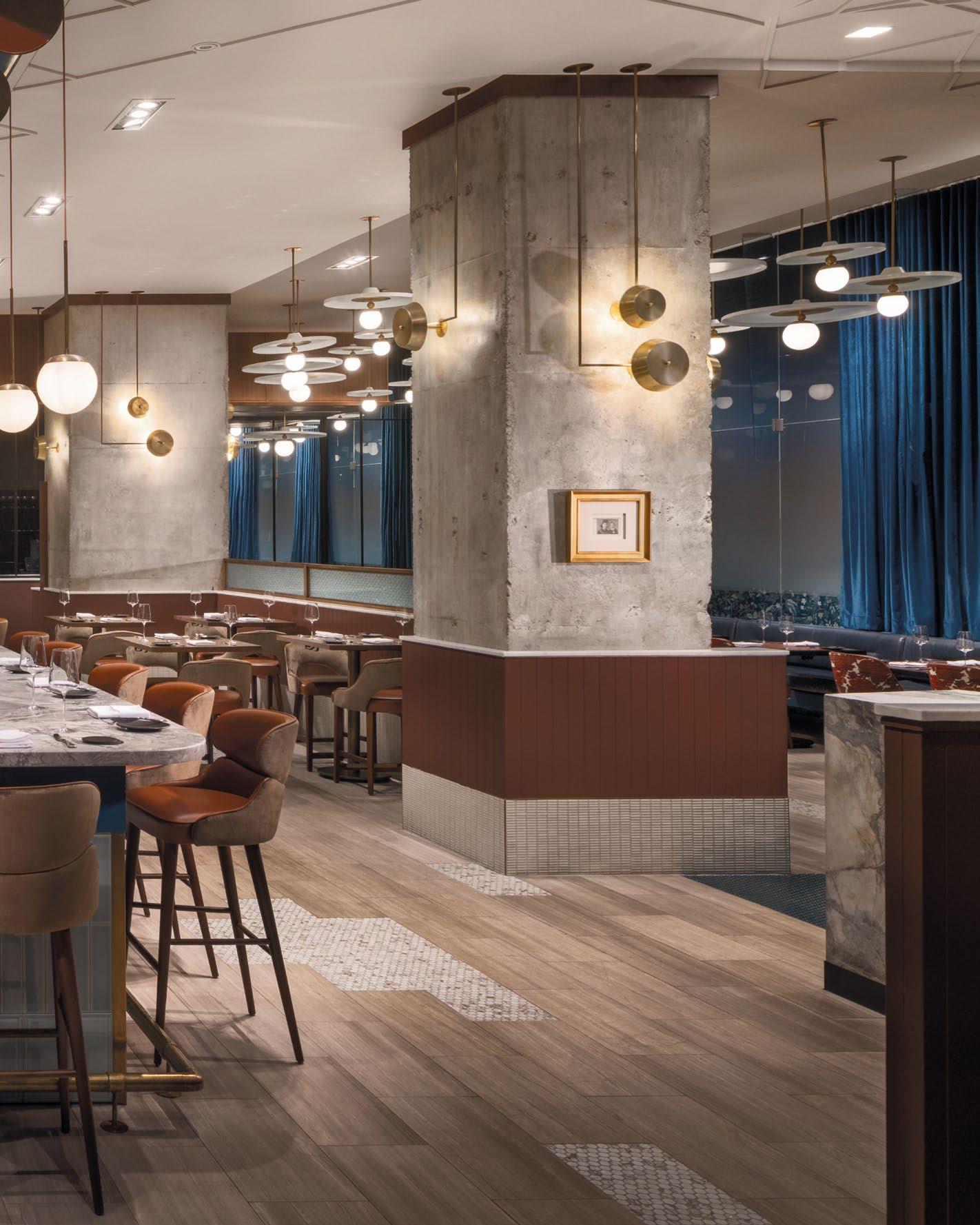
LUCIE | TORONTO, CANADA
THIS PHOTO: The design captures the charm of Bigourdan’s grandmother’s upbringing and passion for French cuisine
Lucie, a new fine-dining French restaurant in the heart of downtown Toronto, invites visitors to indulge in a world of moody sophistication and modern French cuisine. Designed by interior design studio CHIL, the 70-seat restaurant is an homage to owner and seasoned restaurateur Yannick Bigourdan’s grandmother, Lucie, and their shared love of cooking.
The 4,000 sq ft. interior is inspired by Bigourdan’s memories of his grandmother, her childhood in the French countryside, and the country’s unique cultural history, with emphasis on its classic pop music and period film stars. While the restaurant engages with nostalgia, Lucie is designed to a function as an appropriately intimate setting for executive chef Arnaud Bloquel’s modern French cooking.


Photo Credit: Adrian Ozimek
BOTTOM: Lucie’s material and color palette were key in transforming the industrial space into a cozy retreat

THIS PHOTO: A chain mail artwork depicting characters from the 1970 French film Borsalino culminates the space, blending industrial, moody, and pop culture.

THIS PHOTO: An arcade of brass globe light fixtures creates a cocooning alleyway structure, enhancing the intimate ambiance.
“THROUGHOUT THE DEVELOPMENT OF THE DESIGN, WE ALWAYS KNEW THAT LUCIE HAD TO EXUDE WARMTH. IT WAS AN INTERESTING AND COMPELLING DESIGN EXERCISE TO DETERMINE HOW WE COULD ACHIEVE THAT IN A SPACE THAT WAS INDUSTRIAL AT ITS CORE. IN THE END, IT WASN’T ABOUT COVERING UP THOSE INDUSTRIAL ELEMENTS, BUT ABOUT
CELEBRATING THEM AND LAYERING ON THE NEW.”
Bridget Bedard, Design Director (Toronto), CHIL

CHIL’s design team turned to Serge Gainsbourg, the French musical and cultural icon, as a narrative touchpoint throughout the restaurant’s design. Lucie strives to capture the mood of the 1962 evening that Gainsbourg and Juliette Greco penned the song “La Javanaise” at 33 Rue de Verneuil in Paris.
“Not only did Serge Gainsbourg offer us a connection to Yannick’s memories of his grandmother and the music that she loved, but it offered us a framework for how Lucie should feel,” says Bridget Bedard, Design Director (Toronto), CHIL. “Like Gainsbourg’s music, the restaurant is designed to be intimate and moody, while also functioning as a natural extension of Lucie’s incredible cooking and its celebration of French cuisine.”
Housed inside the ground-level of Scotia Plaza in Toronto’s Financial District, Lucie exposes its industrial structure, which includes concrete columns and similar elements. Creating a rich, warm, and intimate interior atmosphere in such a setting emerged as central design challenge for CHIL, addressed in large part through Lucie’s material and colour palette. Deep burgundy and royal blue tones feature heavily across walls, tables, and seating. Heavy velvet drapes offer a tactile contrast to the concrete, while also serving to absorb sound and reduce ambient noise.
“Throughout the development of the design, we always knew that Lucie had to exude warmth. It was an interesting and compelling design exercise to determine how we could achieve that in a space that was industrial at its core. In the end, it wasn’t about covering up those industrial elements, but about celebrating them and layering on the new,” explains Bedard.
BOTTOM: Velvet drapes contrast with concrete columns, enhancing the restaurant’s acoustics and ambiance.


To reduce waste and expedite construction, CHIL opted to preserve existing elements of the space, like the marble bar and maple wood flooring. Instead of removing and replacing the latter, which had been damaged over the years, CHIL celebrated the beauty and character inherent to minor imperfections by mending portions of the flooring with accent tile patches. This approach, akin to the Japanese concept of “wabi-sabi”, enabled the delivery of the design in within a constrained timeline.
The recurring use of brass further establishes a sense of warmth and understated luxury throughout Lucie. An arcade of brass globe lighting fixtures hovers above the 20-seat marble bar, creating a cocooning alleyway. Additional brass pendant lights hang above the bar’s opposite side and dining room, while brass sconces sit affixed to walls. Bigourdan even designed his own teak-and-brass-inspired rolling champagne cart, which offers table-side champagne service to guests.
References to Gainsbourg and other period cultural figures dot Lucie’s interior, adding visual interest for diners while serving as playful and nuanced nods to the restaurant’s inspirations and Bigourdan’s memories of his grandmother. Such references are both direct
and abstract, ranging from iconic song lyrics penned across walls to a bold biophilic wallcovering of juniper berries that references Gainsbourg’s favourite spirit, gin. A portrait of Gainsbourg, sourced from Bigourdan’s own private art collection, occupies a wall near the restaurant’s entrance. Elsewhere, a hanging chain link installation depicts a pair of characters from 1970 French film, Borsalino.
Both the biophilic wallcovering and chair backs, which are covered in a floral-like pattern, serve to reference Lucie’s life in the South of France’s countryside. Lucie’s house, which overlooked wildflower fields and was often filled with the aromas of home-cooked meals and freshly poured “vin sucre”, was where she often cooked Yannick lunch and dinners when he was a child.
“References to Lucie and Yannick’s memories of her are recurring throughout the restaurant. While some of these are more literal and others are more abstracted, they all stitch together to create an atmosphere that nods to Lucie’s love of cooking and the desire to connect with and care for others through food,” says Bedard.
TOP LEFT: Brass sconces and a marble bar contribute to the restaurant’s understated elegance and charm.
TOP RIGHT: Biophilic wallcovering and floral chair backs nod to Lucie’s life in the French countryside.

THIS PHOTO: Deep burgundy and royal blue tones create a warm atmosphere, complemented by custom artwork featuring lyrics from French pop songs.

CELEBRATING HISTORY AND LUXURY
THE RENOVATION DRAWS INSPIRATION FROM THE ROYAL VISIT OF 1939, HIGHLIGHTING THE HOTEL’S RICH HERITAGE WHILE INTEGRATING CONTEMPORARY ELEGANCE.

THIS PHOTO: CHIL’s approach honors the hotel’s past while creating a lavish environment for modern travelers.


The design of the extensive renovations at Fairmont Hotel Vancouver revitalizes the storied interiors with a blend of historical grandeur and modern elegance. Known as the “Castle in the City,” Fairmont Hotel Vancouver has been a pinnacle of elegance since its debut. The recent renovation reaffirms its status as one of Vancouver’s most iconic luxury hotels.
Entrusted with this transformative project, CHIL referenced the Royal Visit of King George VI and Queen Elizabeth in 1939. The design meticulously preserves the hotel’s historical significance. CHIL drew upon the romanticism of the era, capturing the essence of luxury travel and the hotel’s role as a Canadian Pacific Railway terminus. The design language is rich, ornate, and highly detailed, reflecting the opulence of the period while introducing modern amenities.

70 | H+R | HOTELRESORT
Photo Credit: Ema Peter
TOP: The renovation reinforces Fairmont Hotel Vancouver’s reputation for elegance and luxury.
BOTTOM: Warm woods, royal colors, and gilded accents define the revamped spaces, striking a balance between modernization and historical respect.

THIS PHOTO: The renovation merges the opulence of the 1930s with contemporary updates, featuring ornate and detailed design elements.


RIGHT: A rich color palette in the Gold Lounge merges heritage with contemporary luxury.
BOTTOM: The design celebrates the Royal Visit’s historical significance while updating elements to their original splendor.
“We were inspired by the hotel’s Royal Visit in 1939 and wanted the design concept to celebrate its historical significance while selectively updating elements to their original grandeur,” says Adele Rankin, Principal and Global Design Lead, CHIL Interior Design, Executive Director and Global Interior Design Lead of Surbana Jurong Group. “Our goal was to reflect opulence in a contemporary fashion, giving the hotel a unique personality. It’s a project that we all fell in love with.”
Warm woods, a royal and saturated color palette, and gilded accents define the renovated spaces. The design balances the need for modernization with a deep respect for the hotel’s unique heritage. CHIL Interior Design’s approach celebrates the past while creating a luxurious environment that meets the expectations of today’s discerning travelers.


BOTTOM: Warm woods, royal colors, and gilded accents define the revamped spaces, striking a balance between modernization and historical respect
TOP: Ella is one of the most popular employees at Fairmont Hotel Vancouver, embodying the hotel’s warm and welcoming spirit.
“WE WERE INSPIRED BY THE HOTEL’S ROYAL VISIT IN 1939 AND WANTED THE DESIGN CONCEPT TO CELEBRATE ITS HISTORICAL SIGNIFICANCE WHILE SELECTIVELY UPDATING ELEMENTS TO THEIR ORIGINAL GRANDEUR, OUR GOAL WAS TO REFLECT OPULENCE IN A CONTEMPORARY FASHION, GIVING THE HOTEL A UNIQUE PERSONALITY. IT’S A PROJECT THAT WE ALL FELL IN LOVE WITH.
Adèle Rankin, Principal & Global Design Lead of CHIL Interior Design, Executive Director and Global Interior Design Lead of Surbana Jurong Group

THIS PHOTO: The design captures the luxury travel essence and the hotel’s historical role as a Canadian Pacific Railway terminus.


The renovation included updates to the guest rooms, heritage suites, and the exclusive Fairmont Gold floors. Each room features deep navy blues, heather gray, gold metals, and marbles, with luxurious Axminster wool custom carpets. Original architectural elements, such as plaster crown moldings, woodwork, and decorative fireplaces, were carefully restored.
Located on the ninth and fourteenth floors, Fairmont Gold offers a private lounge with dedicated concierge service, designed for discerning travelers seeking personalized service. The rich and saturated color palette at the lounge and guest rooms, featuring luxurious textiles and materials in deep burgundy and navy blues layered with brilliant and textured earth tones, provide a seamless blend of heritage and modern luxury, ensuring an unforgettable stay.
BOTTOM: The renovation preserves the hotel’s historical elements while modernizing areas like bathrooms, maintaining a sense of old-time opulence.
TOP: Guest rooms are updated with deep navy blues, heather gray, gold metals, and marble, complemented by custom Axminster wool carpets.

EXPERIENCE TIMELESS GRANDEUR
A TRIBUTE TO ICONIC VISIONARIES, BLENDING HISTORIC ELEGANCE WITH MODERN LUXURY.

THIS PHOTO: The Hays Suite utilizes antique gold with silver and gray, reflecting the historical luxury and forward-looking style.

THIS PHOTO: CHIL’s renovation of Fairmont Château Laurier redefines the hotel’s suites with a fusion of past grandeur and present-day elegance.

The completion of the renovation at Fairmont Château Laurier marks another chapter in the history of this iconic symbol of grandeur in the heart of Canada’s capital. Poised between ByWard Market and the Rideau Canal locks, this historic hotel has hosted political leaders, film stars, and royalty for over a century. Known as Ottawa’s Castle, the hotel pays tribute to Sir Wilfrid Laurier, the Canadian Prime Minister at the time of its construction and the hotel’s namesake. The recent suite renovations, led by CHIL Interior Design, honor the hotel’s storied past and its influential figures, blending historical elegance with modern luxury. The new suite designs celebrate two of the most influential figures in the hotel’s history: Yousuf Karsh and Charles Melville Hays. CHIL drew direct inspiration from these visionaries to create a design for the suites that is as bold and unforgettable as the icon himself.


Photo Credit: Brandon Barre
BOTTOM: The design of the Karsh Suite is bold yet understated, allowing Yousuf Karsh’s iconic photography to take center stage.
TOP: The design for the Karsh Suite features dramatic lines and mirrored finishes, paying homage to Yousuf Karsh’s visionary work.
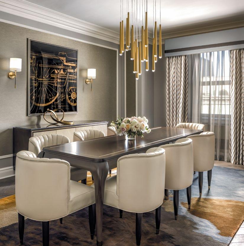

The Karsh Suite was once the home and studio of famed photographer Yousuf Karsh. Inspired by Karsh’s visionary work, the suite exudes boldness and unforgettable elegance. The intricate masonry and delicate mouldings of the original early 20thcentury design are complemented by deep golds, antique tones, and a mix of black and white focal points. Bold and saturated elements, like dramatic lines and mirrored finishes, balance the drama of the black and white portraits, such as Ernest Hemingway, which adorn the walls. The open bathroom design features a warm walnut central vanity and a freestanding soaker tub, offering guests a revitalizing private spa experience.

The renovation introduces modern amenities while maintaining a historic ambiance, merging contemporary comfort with classic elegance.
BOTTOM: Inspired by Charles Melville Hays, the Hays Suite incorporates bespoke art and lush textures to honor his railroad legacy.
THE KARSH SUITE WAS ONCE THE HOME AND STUDIO OF FAMED PHOTOGRAPHER YOUSUF KARSH. INSPIRED BY KARSH’S VISIONARY WORK, THE SUITE EXUDES BOLDNESS AND UNFORGETTABLE ELEGANCE. THE INTRICATE MASONRY AND DELICATE MOULDINGS OF THE ORIGINAL EARLY 20TH-CENTURY DESIGN ARE COMPLEMENTED BY DEEP GOLDS, ANTIQUE TONES, AND A MIX OF BLACK AND WHITE FOCAL POINTS.

THIS PHOTO: The Karsh Suite’s design features intricate masonry and bold elements that reflect the influential work of Yousuf Karsh.

THE HAYS SUITE PAYS HOMAGE TO CHARLES MELVILLE HAYS, PRESIDENT OF GRAND TRUNK RAILWAY AND COMMISSIONER OF THE HOTEL. THE SUITE BLENDS SHADES OF AGED AND ANTIQUE GOLD WITH SILVERS AND GRAYS, COMPLEMENTED BY LUSH TEXTURES AND BESPOKE ART REFERENCING HAYS’ RAILROAD LEGACY.
THIS PHOTO: The suites’ open bathroom design offers a private spa experience with a unique central vanity.


The Hays Suite pays homage to Charles Melville Hays, President of Grand Trunk Railway and commissioner of the hotel. The suite blends shades of aged and antique gold with silvers and grays, complemented by lush textures and bespoke art referencing Hays’ railroad legacy. Special attention is paid to respecting the historical luxury while delicately positioning this suite in a more forward looking aesthetic. Similarly to the Karsh Suite, an open bathroom design with a back-to-back vanity and soaker tub layout translates to the same independence and confidence that these inspiring figures represented.
The new interior renovation celebrates the unique character of this local landmark while, in the same breath, accentuating the beautiful and luxurious details that portrays “Canada’s tradition of grandeur”.

BOTTOM: The bedroom design aimed to create a space that feels both contemporary and timeless.
TOP RIGHT: To create a sophisticated and contemporary atmosphere, black and gold color scheme was used to bring opulence and modernity.
TOP LEFT: The thoughtful furniture selection enhances the space with nostalgic charm, evoking a sense of classic elegance.

MODERN LUXURY DINING WITH VUE
EXPERIENCE MODERN ELEGANCE AND PANORAMIC VIEWS AT OUE BAYFRONT’S NEWEST CULINARY DESTINATION.

THIS PHOTO: The dining area features a cathedral-effect barrel vault ceiling in oxidized copper, creating a grand and memorable atmosphere.

VUE is CHIL Interior Design’s latest design masterpiece. Perched atop the prestigious OUE Bayfront, VUE promises an unparalleled dining experience amidst panoramic views of Marina Bay and the iconic Singapore skyline.
Inspired by Singapore’s vibrant cosmopolitan energy, VUE’s design exudes modern elegance with subtle, intricate details and high-end, stylish finishes. From the carefully curated selection of Italian furnishings to the strategic spatial planning that maximizes the breathtaking views, every element reflects a commitment to enhancing the dining journey.
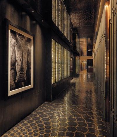
Guests embark on a sensory journey upon entering VUE via a private elevator, greeted by a jewel-toned entry hallway adorned with a floor-to-ceiling wine display and bespoke artworks. The dramatic mirrored ceiling sets a luxurious tone from the moment of arrival.

86 | H+R | HOTELRESORTDESIGN.COM TOP: The design harmonizes modern luxury with intricate details, setting a new standard for high-end dining in Singapore.
BOTTOM: Guests at VUE are welcomed by a jewel-toned hallway and a striking floor-to-ceiling wine display, setting a luxurious tone.
Photo Credit: Desmond Lim (Nieve Photography), Raymond Toh (Vineyard Production)

THIS PHOTO: CHIL Interior Design has crafted VUE to embody contemporary elegance, with refined details and premium finishes throughout.


CREATING A CATHEDRAL-LIKE CEILING AT VUE RESTAURANT DELIVERS A SENSE OF AWE AND IMPACTFUL ARRIVAL THROUGH THE USE OF COMPRESSION AND DECOMPRESSION SPACES. BY LEVERAGING THE INTERIOR ARCHITECTURE’S CONSTRAINTS AS PART OF THE DESIGN EXPERIENCE, THE DESIGN HAS CRAFTED A HIGHLY MEMORABLE AND UNIQUE GUEST EXPERIENCE.
88 | H+R | HOTELRESORTDESIGN.COM THIS PHOTO: The bespoke lighting solutions adapt to the time of day, aligning with the human circadian rhythm for optimal comfort.

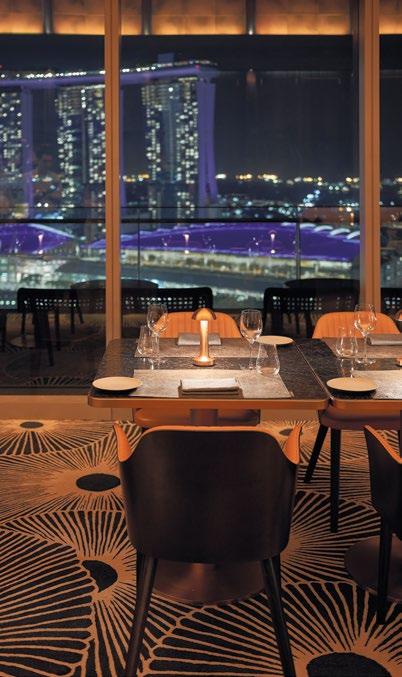
Entering the main dining area, guests are awed by the sudden expansion of spatial volume formed by the cathedral-effect, barrel vault ceiling made of oxidized copper and set against the backdrop of the spectacular Marina Bay, evoking a sensational moment. Luxurious ink and tan leather seating, complemented by warm lighting along the millwork walls, creates an inviting and sophisticated atmosphere.
Creating a cathedral-like ceiling at VUE Restaurant delivers a sense of awe and impactful arrival through the use of compression and decompression spaces. By leveraging the interior architecture’s constraints as part of the design experience, the design has crafted a highly memorable and unique guest experience.
The exclusive private dining room houses a smaller domed ceiling, and a recurring design motif that can be found above the al fresco bar. The room features a custom-made table crafted from exotic wood veneer, accompanied by chairs adorned with detailed leather upholstery and a plush wool and silk area rug. Gold accents and deep millwork enhance the luxurious feel, providing an ideal setting for intimate gatherings with unparalleled skyline views.

TOP: VUE at OUE Bayfront offers a modern dining experience with breathtaking panoramic views of Marina Bay and Singapore’s skyline.
BOTTOM: The finishes selection focuses on providing quality, a tactile experience

From the beginning, the design team was intuitively focused on quality throughout the selection of furnishings and fittings. Seated guests can feel this at an intimate level, akin to the experience of wearing a beautifully-crafted pair of handmade Italian shoes.
CHIL Interior Design’s meticulous approach extended beyond aesthetics to include echoless acoustics and sensory enhancements. Dark wood veneers, warm-tone leather finishes, and bespoke lighting solutions by Klaasen Lighting Design curated and programmed to adapt to the changing ambience throughout the day and night. The intention is to synchronise with the human body’s circadian rhythm as the day progresses, inviting a sense of calm and
well-being while enjoying the gastronomic experience. Custom patterned carpets made with wool, silk and viscose, and antique mirror cladded columns add both visual intrigue and acoustic comfort to the space, enriching the overall dining experience.
With VUE, CHIL Interior Design has set a new benchmark for culinary luxury in Singapore, creating a space where design innovation meets gastronomic excellence. Each visit to VUE promises to be an unforgettable journey of taste and sophistication, offering guests an elevated dining experience unlike any other.

TOP: Gold accents and deep millwork in the private dining room elevate the luxurious feel
CHIL INTERIOR DESIGN’S METICULOUS APPROACH EXTENDED BEYOND AESTHETICS TO INCLUDE ECHOLESS ACOUSTICS AND SENSORY ENHANCEMENTS. DARK WOOD VENEERS, WARM-TONE LEATHER FINISHES, AND BESPOKE LIGHTING SOLUTIONS BY KLAASEN LIGHTING DESIGN CURATED AND PROGRAMMED TO ADAPT TO THE CHANGING AMBIENCE THROUGHOUT THE DAY AND NIGHT.

THIS PHOTO: VUE’s private dining room boasts a domed ceiling, custom wood veneer table, and plush seating, ideal for intimate gatherings

SERENITY AND LUXURY
AN EXPERIENCE THAT EMBRACES HAINAN ISLAND’S RICH HERITAGE AND THE ALLURE OF THE PEARL.
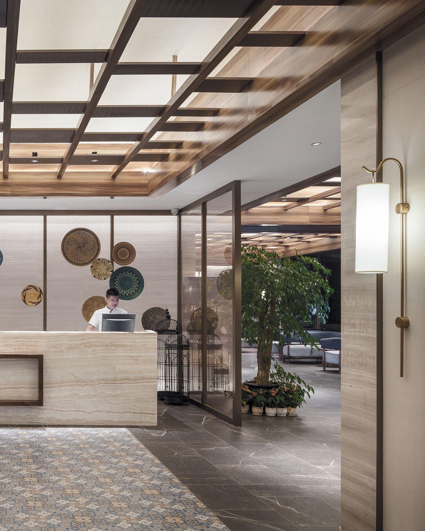
THIS PHOTO: CHIL Interior Design transforms Narada Resort Hotel into a serene oasis, reflecting the island’s lush backdrop and heritage.

DESIGN.COM
THIS PHOTO: Abstract textures and elegant furnishings were incorporated to reflect the essence of Hainan’s pearls.


Situated in Yuelan Bay with a mountain backdrop, the Narada Resort Hotel Sanya Pleasant Bay provides modern travellers a peaceful and relaxing retreat away from the hustle and bustle on Hainan Island, also known as the Eastern Hawaii.
CHIL provided interior design for key public areas and guest suites for the apartment tower.
The entire property is divided into two parts, with a beach resort to the west and separate apartments to the east, connected by public amenities shared by both parts. Guestroom and apartment wings emanate from either side of the lobby, maximizing the scenic view for each room. The space combines local cultural influences with the contemporary, minimalist trend, offering a unique tropic experience for the guests.

Photo Credit: Hu Yijie
BOTTOM: Exuding a refined and welcoming ambiance, the dining area combines modern elegance with traditional touches.
TOP: The design language balances between historical charm and contemporary comfort.
The interior design concept evolves from the alluring and magnificent pearl. China has a long and rich history with the pearl, dating back 4,000 years ago. Hainan Pearls were recognized and widespread, dating back to the Qin Dynasty (221 to 206 BC). Throughout history, pearls were widely used in ornaments, fine jewelry, medicine and beauty products, a practice that continues to thrive in the region today.
CHIL’s design aims to provide guests with a “wow” factor when they enter the room for the first time—a reference to when human beings first discovered the pearl that lies within the oyster.
The unique locale inspired the designers to integrate traditional cultural elements and classic Asian motifs in unusual ways. Materials, textures and patterns were inspired by the jewellery, accessories, and pottery from the local Li and Miao ethnic minority group.


TOP: The furniture and material selections integrate the outdoors with the indoors, using natural textures and earthy tones to bring the lush surroundings inside.
BOTTOM: Reflecting and embracing the beauty of the natural landscape at every corner

THE GLAMOROUS NAVY AND GOLD COLOUR PALETTE ELEVATES THE DESIGN BY LAYERING TEXTURE, PATTERN AND SPARKLE, WHILE THE RUSTIC AND UNIQUE FURNITURE SELECTION EVOKES A VACATION FEEL. THE SEAMLESSLY INTEGRATED ELEMENTS OF THE INDIGENOUS LOCATION AND LUXURY CAN BE DISCOVERED IN EACH SUITE LEAVING GUESTS FEELING AS THOUGH THEY’VE FOUND A RARE TREASURE.
THIS PHOTO: The resort’s public and private spaces are thoughtfully designed to evoke a sense of tranquil luxury and cultural richness
THE UNIQUE LOCALE INSPIRED THE DESIGNERS TO INTEGRATE TRADITIONAL CULTURAL ELEMENTS AND CLASSIC ASIAN MOTIFS IN UNUSUAL WAYS. MATERIALS, TEXTURES AND PATTERNS WERE INSPIRED BY THE JEWELLERY, ACCESSORIES, AND POTTERY FROM THE LOCAL LI AND MIAO ETHNIC MINORITY GROUP.

DESIGN.COM THIS PHOTO: The resort’s distinctive design elements, inspired by local jewelry and pottery, create a visually stunning environment.

Furniture and fixtures in the living zones host the elegant yet concise silhouettes associated. The suites are comprised of a collection of rich luxurious materials such as marble countertops, warm wood veneer and reflective polish found in the furniture and millwork details. The use of stone and wood recall the resort’s connection with the natural environment, while the abstract textures for floor tiles and credenza countertops are reminiscent of the pearl shell. The stunning headboard wall concept is taken from the exquisite metal work found on the headdress and jewelry of the Miao ethnic minority group and translated into a highly graphic statement piece. The glamorous navy and gold colour palette elevates the design by layering texture, pattern and sparkle, while the rustic and unique furniture selection evokes a vacation feel. The seamlessly integrated elements of the indigenous location and luxury can be discovered in each suite leaving guests feeling as though they’ve found a rare treasure.

BOTTOM: Each guest suite combines minimalist luxury with distinctive regional cultural touches for a cohesive experience.
TOP: The design celebrates Hainan’s pearl heritage with modern interpretations of classic Chinese aesthetics.

The public areas echo the vacation feel of those in the living zones, promoting a relaxed experience. The apartment lobby, bordered on one side by a graphic wall with regional patterns, connects with poolside pavilions by covered corridors. Sleek, soft tonal color palettes inspired by the textural essence of the Sanya natural landscape are balanced by dark wood materials that are widely used in public areas.

100 | H+R | HOTELRESORT
TOP: Elegant interiors flow effortlessly into serene outdoor spaces for the ultimate in indoor-outdoor hospitality experience
BOTTOM: The design highlights the natural beauty of Sanya through sophisticated, culturally inspired decor.

THIS PHOTO: The design the resort transforms traditional Hainan influences into a modern, upscale retreat for travelers.

A VIBRANT & BOLD REVIVAL OF HISTORIC ELEGANCE
GRANVILLE STREET’S ICONIC HOTEL EMBRACES PLAYFUL SOPHISTICATION AND LOCALLY INSPIRED DESIGN FOR A UNIQUELY INVITING GUEST EXPERIENCE.

THIS PHOTO: The renovation designed by CHIL Interior Design celebrates the hotel’s history while appealing to a younger, urban audience.


Located on the vibrant Granville Street, Hotel Belmont MGallery has a storied legacy dating back to 1912. The recent renovation by CHIL Interior Design brings new life to this historic building while preserving its original charm. Infused with locally inspired elements, this renovation celebrates the building’s storied history while introducing a vibrant, playful aesthetic that invites guests to embrace a lighthearted and adventurous spirit during their stay. Hotel Belmont MGallery caters to a mindset rather than an age demographic, attracting everyone from Wallpaper* magazine-reading urbanites to architecture buffs and art aficionados. The hotel’s design, while sophisticated, maintains an unpretentious and approachable vibe, ensuring guests feel both inspired and at ease.
104 | H+R | HOTELRESORTDESIGN.COM TOP: A photo gallery wall in the lobby showcases iconic Vancouver images, connecting guests with the city’s recent history.
BOTTOM LEFT & RIGHT: The hotel’s design narrative includes references to Vancouver’s rich history and the Belmont family’s Coat of Arms.
Photo Credit: Ema Peter, Henry Lo

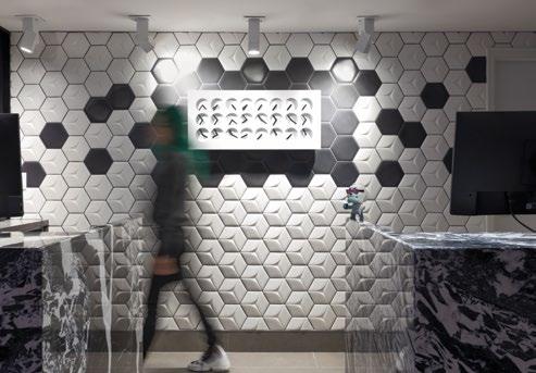
THIS PHOTO: The lobby features striking black and white hexagonal tiles and a dynamic wall clock for a bold first impression.

HUMOROUS WALLCOVERINGS ADORN THE CEILING, SETTING THE TONE FOR AN EXPERIENCE FILLED WITH DELIGHTFUL SURPRISES. ADJACENT TO THE RECEPTION, A VIBRANT SEATING AREA OFFERS GUESTS A COZY RESPITE, COMPLETED WITH A PHOTO GALLERY WALL SHOWCASING ICONIC VANCOUVER IMAGES FROM RECENT HISTORY.
| H+R
HOTELRESORTDESIGN.COM THIS
PHOTO: Intriguing textiles like cowhide and bright colors contrast with dark blue and green hues in the rooms.

The client’s vision for Hotel Belmont MGallery was to create a unique and diverse experience that reflects the building’s history while appealing to a younger, design-savvy crowd. CHIL Interior Design has masterfully achieved this goal by preserving historical details and blending them with modern, personalized touches. The design narrative is further enhanced by the color scheme inspired by the Belmont family’s Coat of Arms and the subtle references to Vancouver’s rich history that are found throughout the hotel.
CHIL’s bold and unique design approach is immediately apparent as guests enter the lobby. Striking black and white hexagonal tiles cover the wall behind the reception, complemented by a dynamic feature wall clock and reception pods made of dramatic stone slabs in the same color scheme, creating a bold contrast while maintaining a careful balance. Humorous wallcoverings adorn the ceiling, setting the tone for an experience filled with delightful surprises. Adjacent to the reception, a vibrant seating


BOTTOM: The playful design elements throughout the property remind guests to savor life and enjoy their stay.
TOP: “X” and cross motifs on drapes and corridor carpets symbolize guests “making their mark” at the hotel.


area offers guests a cozy respite, completed with a photo gallery wall showcasing iconic Vancouver images from recent history. Tactile furniture was strategically selected to highlight unique and playful accessories such as an ostrich feather lamp, zebra print pillows, and a pink neon light fixture, creating a whimsical and inviting atmosphere.
Each of the 82 guestrooms combines retro and modern elements to create a distinctive and inviting space. Bold paint swaths climb the walls, across artwork, and extend onto the ceilings, delivering a “wow” moment for guests. Graffiti artists were commissioned to adorn the sliding doors in guest suites. Intriguing textiles like cowhide contrast with bright colors, complementing the dark blue and green hues used elsewhere. “X” and cross motifs on drapes, wall art, and on the unique guest corridor carpet that run halfway up the walls, symbolize guests “making their mark.” Neon banana lights in the guestrooms and vibrant decor throughout the property create an atmosphere of whimsical energy, reminding guests to enjoy and savor life. In the bathrooms, playful mosaic tiles spell out “No Diving,” offering an element of fun and discovery for those paying close attention.
108 | H+R | HOTELRESORTDESIGN.COM TOP: Each guestroom combines retro and modern elements, delivering a distinctive and inviting experience for visitors.
BOTTOM: Playful mosaic tiles in the bathrooms spell out “No Diving,” offering a fun discovery for attentive guests.
EACH OF THE 82 GUESTROOMS COMBINES RETRO AND MODERN ELEMENTS TO CREATE A DISTINCTIVE AND INVITING SPACE. BOLD PAINT SWATHS CLIMB THE WALLS, ACROSS ARTWORK, AND EXTEND ONTO THE CEILINGS, DELIVERING A “WOW” MOMENT FOR GUESTS.

THIS PHOTO: Bold paint swaths climb walls and ceilings in guestrooms, creating visually striking and dynamic spaces.

CALGARY’S VIBRANT SPIRIT
EXPERIENCE A UNIQUE BLEND OF MODERN SOPHISTICATION AND NATURAL ELEMENTS INSPIRED BY CALGARY’S DYNAMIC CULTURE, HISTORY, AND ICONIC STAMPEDE.

THIS PHOTO: The natural palette and abstract textures reflect Calgary’s deep connection with nature and changing weather patterns.


The design at Delta Calgary Downtown was inspired by the vibrant and diverse spirit of Calgary itself. The design reflects the city’s unique blend of business, agriculture, and festive atmosphere, particularly during the iconic Stampede, capturing Calgary’s perpetual state of movement and evolution.
Drawing from Calgary’s deep connection with nature and its ever-changing weather patterns, the design employs a natural palette, clean lines, and abstract textures. Stone and wood elements evoke the surrounding nature, while refined silhouettes and high-end finishes keep the ambiance modern and sophisticated. Rope accents throughout the hotel are a nod to the early days of exploration along the Bow River, symbolizing the strength and unity of the city.
Photo Credit: Jamie Anholt
BOTTOM: Clean lines and refined silhouettes keep the hotel’s ambiance modern while paying homage to the city’s heritage.
TOP: The reception area features layers of textures that reflects Calgary’s diverse spirit.
Bright optimism and the youthful energy of Calgary are embodied in the use of color. Grey, brown, and black tones are accented with goldenrod and serene blues, creating a welcoming and playful environment. The thoughtful placement of these colors in architectural elements and unexpected locations invites guests to embrace the lively spirit of Calgary during their stay.
The design approach to the public areas and guestrooms encapsulates the diverse nature of Calgary. The design marries modernity with elements of nature, making the rooms feel airy, fresh, and functional. Guests experience a blend of bold yet earthy colors, creating a space that is both bright and restful, reflecting the dynamic and growing city.
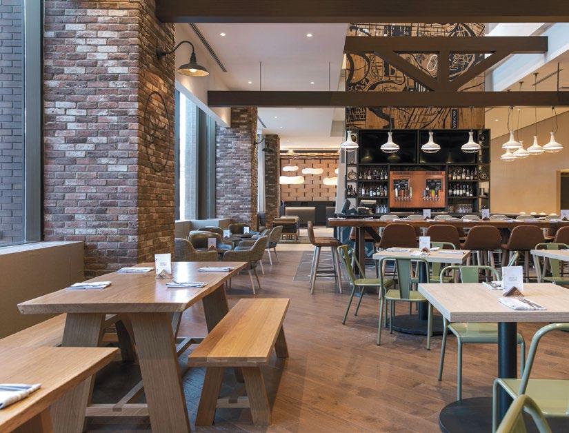
The hotel’s restaurant, Shoe & Canoe Public House, was designed to offer an authentically Canadian experience, appealing to both locals and guests. Inspired by David Thompson, a cartographer for the Hudson Bay Company and the first recorded European to visit the area, the design celebrates connections to people, land, and local history.


| H+R |
TOP: Inspired by David Thompson, the restaurant celebrates connections to Calgary’s people, land, and local history.
BOTTOM: Rope accents symbolize Calgary’s early exploration days along the Bow River, highlighting the city’s strength and unity.
THE DESIGN APPROACH TO THE PUBLIC AREAS AND GUESTROOMS ENCAPSULATES THE DIVERSE NATURE OF CALGARY. THE DESIGN MARRIES MODERNITY WITH ELEMENTS OF NATURE, MAKING THE ROOMS FEEL AIRY, FRESH, AND FUNCTIONAL.

THIS PHOTO: Shoe & Canoe Public House offers an authentically Canadian experience, appealing to both locals and hotel guests.

BRIGHT OPTIMISM AND THE YOUTHFUL ENERGY OF CALGARY ARE EMBODIED IN THE USE OF COLOR. GREY, BROWN, AND BLACK TONES ARE ACCENTED WITH GOLDENROD AND SERENE BLUES, CREATING A WELCOMING AND PLAYFUL ENVIRONMENT.
| H+R |
DESIGN.COM THIS PHOTO: The Delta Calgary Downtown design embodies Calgary’s vibrant spirit, business, agriculture, and festive elements seamlessly.


Intricate wood detailing throughout the restaurant draws inspiration from handmade canoes used to navigate the rivers, while a large central bar serves as the social hub, reminiscent of a trading post along the riverbanks. The back bar features a 20-foot tall graphic of a modern map of the city, paying homage to Thompson’s original cartography. Other design elements include brightly lit and colorful globes, natural materials, and a dramatic ceiling-mounted canoe light fixture. Copper and rope accents further connect the design to Calgary’s river exploration history.

BOTTOM: Bold yet earthy colors in the rooms create a space that is both bright and restful, reflecting Calgary’s dynamic growth.
TOP: The playful integration of textures & elements reflects Calgary’s youthful energy and bright optimism.

HONG KONG-STYLE AMENITIES AND CONTEMPORARY ENGLISH INTERIORS
AN INSIDE LOOK AT HOLLYBRIDGE: A CHIL-DESIGNED RESIDENCE WITH A KARAOKE ROOM, MAHJONG GAMING SPACE, AND WOK KITCHENETTES.

THIS PHOTO: CHIL’s design merges traditional English interiors with contemporary flair, creating a unique and sophisticated identity for Hollybridge


The newest phase of the three tower Hollybridge master planned community brings forth a fusion of old-world charm and contemporary elegance, boasting an array of amenities that cater to the discerning tastes of residents. Located along the Fraser River in Richmond, a Canadian city with a rich cultural tapestry where over 50 percent of the population identifies as Chinese, Hollybridge marks the arrival of a new waterfront community.
The international and award-winning interior design studio CHIL designed the interiors of the 12-story midrise residence developed by Aspac Developments. Building on CHIL’s extensive hospitality portfolio, which includes the like of Vancouver’s Shangri-La, Hotel Belmont MGallery, and Richmond’s Versante Hotel, the residential units and amenities of Hollybridge are akin to those of a boutique luxury hotel.
“Hollybridge is a case study in how hospitalityinspired and hotel-like amenities are increasingly defining multifamily residential developments today,” says Diana Ellis, Senior Interior Designer, CHIL.
“Hollybridge is the only waterfront development in Richmond and it required a unique design vision. CHIL combined its hospitality experience and international expertise to execute a thoughtfully curated residence that’s attuned to the local market,” says Jayme Colville, Director of Development, Aspac Developments.

120 | H+R | HOTELRESORTDESIGN.COM TOP: The Social Lounge blends traditional English elements and a coffered ceiling with vibrant artwork, infusing a playful and modern twist.
BOTTOM: By combining traditional English floral wallpaper with bold neon light details, a striking and unexpected juxtaposition is created at the Social Lounge.
Photo Credit: Eymeric Widling

THIS PHOTO: The main lobby features a striking starburst veneer patterning, an oversized Edison-inspired light fixture, and a series of original paintings by Vancouver Artist Christine Breakell-Lee

“THE DESIGN EVOLVED WITH A YIN YANG BALANCE OF COLOUR SCHEMES. WHILE BRIGHT AND LIGHT FINISHES AND FEATURES ARE POPULAR ACROSS RESIDENTIAL DESIGN, THE SOPHISTICATED AND BOLD APPROACH OF SOMETHING LIKE A BLACK KITCHEN OFFERS A REFRESHING OPTION FOR A MODERN HOME.”
Diana Ellis, Senior Interior Designer, CHIL Interior Design
| H+R | HOTELRESORTDESIGN.COM
THIS PHOTO: The South Club Room aligns with feng shui and includes a round dining table and automated mahjong boards.

Traditional English interiors with a contemporary twist
CHIL pulled inspiration from a variety of sources to create a distinct identity for the latest phase of Hollybridge. Referencing the unique history of the area in which Old English Oaks, European Ash, and other trees had been planted in the late 1800s by English pioneers, Ellis also drew inspiration from her experience living and working in the region of Macau and Hong Kong where she first recognized the timeless beauty of traditional English interiors and their influence. Combining the old with the new produced a luxurious and contemporary interior with a classic British twist.
In the main lobby, traditional English starburst or radial veneer patterning make up a statement wall panel that frames the reception desk. A contemporary
oversized Edison inspired light fixture hangs from above. Brass rivet wall coverings, a nod to 18th century English saddleback, function as studded accents to wall frames. Embossed leather sofas and sophisticated floor-to-ceiling curtain drapes create intimate seating areas. Dramatic black and white contemporary marble ties the space together.
Gestures to old English tradition can also be seen in the North Club Room, a social amenity space. A saddle brown embossed leather sofa faces a black granite fireplace and TV. Dark brown hardwood floors are set in a traditional herringbone pattern. A statement shuffleboard table draws attention with a game dating back to 17th century Britain. Lastly, a custom gold lighting feature cascades across the ceiling in a criss-cross shape reminiscent of a corseted dress.


BOTTOM: The coworking lounge at Hollybridge features a wood panel ceiling, millwork, and oversized pendant lights for a cozy, focused environment.
MIDDLE: The Karaoke Room features 3D soundproof paneling, luxurious curtain draping, and color-changing LED lights.

caters to the lifestyles of Richmond residents. Spaces like the karaoke room and a Mahjong table are unique and culturally relevant,” says Ellis.
Hong Kong-style amenities
Contemporary amenities include a Karaoke Room, which is acoustically treated with 3D soundproof paneling, luxurious curtain draping, and colour changing LED lights. The window-walled swimming pool with black and white tiling contrast the lush neighbouring tai chi garden that overlooks the river. The South Club Room aligns with feng shui and features a round dining table, while two automated mahjong boards, a traditional tile-based game popular in regions of China, Japan, South Korea, Vietnam, and Southeast Asia, activates the room.
“We designed an amenities package that truly
CHIL and Aspac identified coworking workspaces as a growing trend in Hong Kong dating back to the early 2000s. When the COVID-19 pandemic saw a sudden push towards flexible workspaces, CHIL expanded their vision for a coworking lounge at Hollybridge. Carrying forward biophilic features with natural lighting and plants, the coworking space includes variety of private meeting rooms as well as independent and collaborative work zones.
Other amenities at Hollybridge include a children’s playroom, fitness centre, half court basketball, and music room. The social lounge is outfitted with foosball, a billiards table, arcade games as well as a TV lounge and fireplace. Building out hotel-like spa amenities; a sauna, steam room, and hot tub flank the pool.

BOTTOM: The amenity offerings at Hollybridge, including the half court, are thoughtfully designed to cater to the buyers’ demographic.
TOP: The resort-inspired pool at Hollybridge is adorned by a stunning ceiling, accent walls, and black & white tile surrounds.
“HOLLYBRIDGE IS THE ONLY WATERFRONT DEVELOPMENT IN RICHMOND AND IT REQUIRED A UNIQUE DESIGN VISION. CHIL COMBINED ITS HOSPITALITY EXPERIENCE AND INTERNATIONAL EXPERTISE TO EXECUTE A THOUGHTFULLY CURATED RESIDENCE THAT’S ATTUNED TO THE LOCAL MARKET.”
Jayme
Colville, Director of Development, Aspac Developments

THIS PHOTO: The fitness area at Hollybridge features wooden beams with hidden lights going across the ceiling down to the floor to create privacy


Wok kitchenettes
CHIL designed kitchen spaces to include additional wok kitchenettes. Often referred to as fry kitchens or spice kitchens, wok kitchens are a popular feature in Asian homes. They specifically manage the concentrated flavors and high smoke points of stir-fried foods from permeating through the rest of the home. Across the larger unit collection at Hollybridge, the pantry-sized space is separated from the adjacent open concept cooking and dining area by a sliding door and is equipped with an additional Miele stove, prep area, and storage.
The wok kitchenettes are a complimentary feature to Hollybridge’s open concept cooking and dining area. Two distinct colour schemes were designed for Hollybridge that both include Italianmade finishes, engineered hardwood and white granite countertops with grey marble veining. The light scheme features English oak millwork while sophisticated grey cabinets make up the dark scheme. An all black kitchen upgrade, entitled the ‘Panther’ scheme, included matte black finishes and 24K brushed gold plumbing.
“The design evolved with a Yin Yang balance of colour schemes. While bright and light finishes and features are popular across residential design, the sophisticated and bold approach of something like a black kitchen offers a refreshing option for a modern home,” Ellis says.

BOTTOM: The luxurious changeroom at Hollybridge compliment the state-of-the-art amenities
TOP: Whimsical hand-painted murals on the walls and ceiling in the Children’s Playroom add an enchanting touch

DESIGN LIBRARY

CRYSTAL PIXELS by PRECIOSA LIGHTING

PIXEL-PERFECT BRILLIANCE
CRYSTAL PIXELS REIMAGINES LIGHTING WITH METICULOUS CRAFTSMANSHIP, BLENDING CRYSTAL ELEGANCE, DIGITAL NOSTALGIA, AND ARTISTIC TECHNOLOGY INTO A HARMONIOUS DISPLAY.

THIS PHOTO: Preciosa Lighting’s newly launched Crystal Pixels is characterised by the distinct charm of digital art aesthetics.

“COMPOSITIONALLY, CRYSTAL PIXELS IS ONE OF OUR MOST VERSATILE LAUNCHES TO DATE. INDIVIDUAL CRYSTAL PIXELS CAN BE USED SOLO OR STACKED VERTICALLY. LINEAR, GRID-LIKE OPTIONS ARE ALSO EFFECTIVE, WHILE COMPOSITIONS IN DYNAMIC CLUSTERS CAN BE DESIGNED TO EVOKE CLOUD-LIKE FORMATIONS, WAVES OR SWARMS.”
Andreas Klug, co-Creative Director of Preciosa

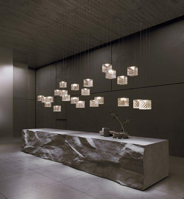

Much like paper, ink, and paint have been vital creative components, pixels also play a fundamental role in today’s digital landscape. Preciosa Lighting pays tribute to this contemporary creative element with the launch of its newest Signature Design, Crystal Pixels. Following the landmark Milan Design Week installation, Crystal Beat 2, Crystal Pixels encapsulates the allure of early digital art aesthetics. This lighting piece is meticulously handcrafted cube by cube, resulting in orthogonal grid structures, clean lines, and geometric shapes that capture the essence of early digital art’s elegance and accuracy.
Highly functional and adaptable, Crystal Pixels offers various lighting effects to create any desired atmosphere. In addition to the Injected Lighting effect that radiates light from all sides of the pendant, this lighting concept includes Functional Lighting, which directs the light beam downward through the bottom of each pixel component, effectively illuminating the space and surfaces beneath it. Another advanced option is the Directional Injected Lighting effect, which allows precise control over each of the five sides of the Crystal Pixel with RGBW lighting. Each pendant can also be individually programmed to generate dynamic and innovative lighting scenes.
Michael Vasku, co-Creative Director of Preciosa, describes Crystal Pixels as a minimalist object that
BOTTOM: Each suspended cube can be arranged in a unique cluster or enhanced by a dynamic lighting scene.
TOP LEFT & RIGHT: Crystal Pixels is created cube by cube, akin to how digital images are built pixel by pixel.
HIGHLY FUNCTIONAL AND ADAPTABLE, CRYSTAL PIXELS OFFERS VARIOUS LIGHTING EFFECTS TO CREATE ANY DESIRED ATMOSPHERE. IN ADDITION TO THE INJECTED LIGHTING EFFECT THAT RADIATES LIGHT FROM ALL SIDES OF THE PENDANT, THIS LIGHTING CONCEPT INCLUDES FUNCTIONAL LIGHTING, WHICH DIRECTS THE LIGHT BEAM DOWNWARD THROUGH THE BOTTOM OF EACH PIXEL COMPONENT, EFFECTIVELY ILLUMINATING THE SPACE AND SURFACES BENEATH IT.


highlights the rich visual quality of clear crystal without compromising functionality. He adds, “The opal Crystal Pixels can be seen as a highly decorative lighting system using PRECIOSA’s Directional Injected Light technology, making it stand out beyond any state-of-the-art alternatives.”
Crystal Pixels is available in three cube sizes (130mm, 170mm, and 210mm), three materials (clear crystal, bubbled crystal, and opal), and three imprinted patterns (radial, concentric, and diagonal). With customisable sizes, materials, and programming options for each cube, Crystal Pixels offers designers the freedom to create unique lighting scenes and realise their creative vision fully.
Andreas Klug, co-Creative Director of Preciosa, emphasises the versatility of Crystal Pixels. “Individual Crystal Pixels can be used solo or stacked vertically. Linear, grid-like options are also effective, while compositions in dynamic clusters can evoke cloudlike formations, waves, or swarms,” he explains.
BOTTOM: As part of Preciosa’s Signature Designs, Crystal Pixels can be completely customised for unique compositions.
TOP: Whether it’s ambient, injected, functional, or a mix of the latter two, Crystal Pixels creates a unique ambience in any setting.

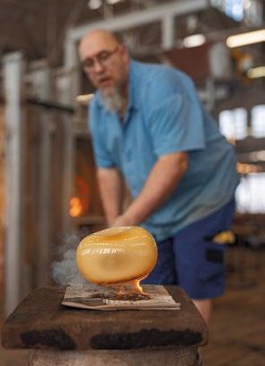


BOTTOM: Crystal Pixels is available in three handcrafted cube sizes, three materials, and three imprinted patterns.
TOP: Handcrafted from the finest Bohemian crystal, each component is meticulously handcrafted to perfection, showcasing the timeless artistry of skilled artisans.


CONNECT IN COMFORT
WITH ITS DYNAMIC AND MODULAR DESIGN, THE INSULA SOFA BRINGS A FRESH APPROACH TO TRADITIONAL SEATING, TRANSFORMING SHARED SPACES WITH STYLISH INNOVATION AND FUNCTIONAL AESTHETICS.
THIS PHOTO: The Insula sofa is Patricia Urquiola’s updated take on the traditional seating found in Arab majlis.

THIS PHOTO: The Insula sofa is versatile and can be adapted for all types of social gatherings, both indoors and outdoors.


In traditional Arab culture, majlis seating is more than just a place to sit – it’s a vibrant space where communities come together to discuss important matters, share stories, and entertain guests. Patricia Urquiola’s Insula modular sofa breathes new life into this traditional concept with a modern, stylish twist. Created with a distinctive form, this sofa captures the essence of communal warmth and interaction while offering a sophisticated design that adapts to contemporary lifestyles.
Just as the majlis seating area served as a hub for social interaction, the Insula sofa is designed to foster connection and conversation. At its core, Insula reimagines the seating piece with a sleek, low-profile design and an eye-catching roll backrest that draws attention to its horizontal elegance. Built on a sleek orthogonal aluminium base, the sofa features luxuriously soft cushions and comes in two sizes with a variety of backrest options, including individual, double, and angular.
This plush sofa seamlessly blends architectural finesse with practical functionality – it’s a versatile piece that adapts to various settings. Its adaptable configurations and modular design make it perfect for any environment—from creating a sophisticated reception area to offering a cosy retreat at home or in hotel suites. It is also suitable as a chic lounging spot in outdoor areas. With its refined aesthetic and exceptional comfort, the Insula sofa transforms any space into a welcoming haven for socialising and relaxation.
BOTTOM: The seats come in two sizes and can be combined with several types of backrests: individual, double, angular and others.
TOP: Insula features a low, modular design in smooth shapes with a roll backrest that accentuates its horizontal form.

CARPET COUTURE
WITH THE PRIVÉ COLLECTION, LAURENCE LLEWELYN-BOWEN’S COLLABORATION WITH ROYAL THAI ELEVATES THE ART OF CARPET MAKING, CREATING A COLLECTION DESIGNED TO BRING A TOUCH OF BRITISH GLAMOUR TO SPACES WORLDWIDE.

THIS PHOTO: Renowned interior designer Laurence Llewelyn-Bowen teams up with Royal Thai to create Privé, a stunning collection of exquisite handmade carpets.

H+R
HOTELRESORTDESIGN.COM THIS PHOTO: Roxy Black is designed with leopard-like prints, creating a bold statement piece for large areas.

Artistic elegance meets timeless luxury in Privé, a breathtaking collection of exquisite handmade carpets by Internationally acclaimed interior designer Laurence Llewelyn-Bowen for esteemed carpet brand Royal Thai. Creatively crafted to elevate any space, each iconic piece in this collection tells a unique and glamorous story, reflecting the rich aesthetics, history, and exquisite elegance of British handmade luxury.
The collaboration between Royal Thai and Llewelyn-Bowen is nothing short of a perfect fusion of artistry and craftsmanship. Llewelyn-Bowen’s vibrant and eclectic design language beautifully complements Royal Thai’s dedication to quality and detail. A renowned interior designer, writer, and TV personality, Llewelyn-Bowen’s foundation as a classically trained fine artist means that every project begins with an original hand-drawn sketch, giving each creation a distinctive and personal touch. This meticulous approach is evident in the Privé collection, where his expertise shines through in designs that ignite the imagination and elevate interior spaces to new heights of sophistication.

TOP & BOTTOM: Each opulent design within this collection tells a story, reflecting the aesthetics and history of British handmade luxury.


“The indulgent, unashamed luxury of handmade rugs has always held me in its aesthetic thrall. Exotic, voluptuous, colourful and sensual to the touch, throughout history, rugs have been used to define the most elegant of spaces,” Llewelyn-Bowen remarks.
Each design in the Privé collection expresses its own narrative. Sauvage, Salizada, and Pizzazz are inspired by the botanical world, capturing the delicate beauty of petals and vibrant hues, infusing spaces with natural elegance. Roxy Black, with its striking leopard-like prints, creates an immediate wow factor in expansive areas, making a bold and stylish statement. Orbany captivates with its classical geometric design, blending timeless patterns with modern luxury. Meanwhile, Madame enchants with its swirling patterns reminiscent of abstract art, showcasing Llewelyn-Bowen’s seamless blend of contemporary and classic influences.
“For the Privé collection I have used my knowledge of rug design’s centuries-old legacy and my experience as a global interior designer to create pieces that will delight the eye. Mingling traditional motifs with contemporary colour palettes, the Privé collection has been created to speak an international style of sophistication, quality, and comfort,” LlewelynBowen shares.
a floral-inspired
Llewelyn-Bowen’s vibrant design
BOTTOM: Pizzazz features
theme, capturing the beauty of petals and colours in the botanical world.
“THE INDULGENT, UNASHAMED LUXURY OF HANDMADE RUGS HAS ALWAYS HELD ME IN ITS AESTHETIC THRALL. EXOTIC, VOLUPTUOUS, COLOURFUL AND SENSUAL TO THE TOUCH, THROUGHOUT HISTORY, RUGS HAVE BEEN USED TO DEFINE THE MOST ELEGANT OF SPACES.”
Llewelyn-Bowen

THIS PHOTO: With its intricate motif and dazzling hue, Sauvage brings a touch of nature’s elegance into any space.


