H+R | Issue 09 | Trendsetting Hospitality Design

Page 1

DEDICATION TO EXCELLENCE:

LUXURIOUS HOSPITALITY PROJECTS ROOTED IN THE SPIRIT OF PLACE.

LTW | TROPICAL SANCTUARY | SOUL TO SEOUL | SONG DYNASTY STUNNER | HOLLYWOOD SPLENDOUR | GRAND BANKS KETTAL PATIO PANACHE | FAST LUSH LIFE | SCHIAVELLO DIVINE INSPIRATION | NIRO GRANITE MAGNIFICENT MARBLEVO

ISSUE

09

SINGAPORE | HONG KONG | MALAYSIA | INDONESIA | THAILAND | VIETNAM

HOTELRESORTDESIGN.COM


Sofa Mesh & Side Tables by Patricia Urquiola Cala Armchair & Centre Table by Doshi Levien

HEAD OFFICE KETTAL / CONTRACT BARCELONA: Aragón 316, 08009 Barcelona, Spain. T. (34) 93 487 90 90 SHOWROOMS KETTAL BARCELONA - LONDON - MARBELLA - MIAMI - NEW YORK - PARIS Export Manager Asia: Victor Moncho, victor.moncho@kettal.es T. +86 15001876948


3.

1.

CUSTOMISED LIGHTING SCULPTURES Brand van Egmond was founded by William Brand in 1989.The atelier, based in The Netherlands, is well known for their artistic and sculptural approach towards lighting.

4.

Every year new collections are born, and find themselve in some of the most beautiful spaces across the globe. Their clientele ranges from Royals till Rappers. Luxury firms like Louis Vuitton, Chopard and the Four Seasons hotels have invited Brand van Egmond to lighten up their spaces, but also some of the most exquisite private residences have embraced their characterful designs. As all lighting is created by hand, there is also the opportunity for tailor-made lighting: allowing for a perfect customised lighting sculpture for any given space. Visit their newly opened boutique in Kuala Lumpur, where guests can experience their lighting sculptures and receive professional advice.

5.

2.

1. 2. 3. 4. 5.

Kelp William Brand Ersa La Vie en Rose Arthur

www.brandvanegmond.com


HOLLYWOOD ICICLES Design by William Brand

LIGHTING SCULPTURES BRAND VAN EGMOND

BRAND VAN EGMOND Boutique Malaysia

www.brandvanegmond.com

Starhill Gallery 181 1st floor Jalan Bukit Bintang 55100 Kuala Lumpur Malaysia

info@brandvanegmond.com

hosseinkarimi@brandvanegmond.com.my


publisher’s note

INSPIRING INTERIORS, AUTHENTIC CULTURAL EXPERIENCES As designers and architects continue to explore far-flung lands for new ideas and inspiration, design has also taken on the role of cultural ambassador, offering us a gateway into different customs and societies by way of form, line and function.

O

ccasionally, an informed awareness of other cultures also offers renewed perspective into the values and societal sensibilities of a designer’s own native land, manifesting itself in his or her creative approach to objects and spaces. In this current issue, we showcase creative practices and individuals, for whom design exists as a canvas for celebrating cultural context, redefining heritage and creating a sense of place. Headquartered in Singapore with satellite offices in Beijing and Shanghai, LTW Designworks is an international firm with a reputation for geographically grounded and culturally informed interiors. Specialising in luxury hospitality interiors, LTW has long prided itself on its ability to adapt and its culturally sensitive outlook, which has culminated in an impressive portfolio melding style and substance. I’d like to thank LTW for the kind cooperation and for gracing our pages with its iconic projects. It’s truly an honour. In other news, I’d also like to announce that the H+R is shifting its focus in view of covering more hospitality-oriented projects. While our existing logo remains in place, the magazine will officially bear the new title ‘Hotel & Resort Design’ beginning with the next edition. It’s an exciting time for us and we’re introducing a number of new relevant brands in this issue to whet your appetite for future editions that feature our change in direction. Readers can look forward to uncovering the latest in hospitality trends and products in our new revamp. Thank you for reading and until the next time… Kenneth Khu k@kennethmedia.asia

ROLF BENZ 988 by Bodo Sperlein ROLF BENZ

12

| H+R |

HOTELRESORTDESIGN.COM


OFFICE CONCEPT V11N2 AUGUST EDITION 2018

CO-WORKING WORKSPACES BUILDING A COMMUNITY WITHIN A SMART OFFICE ENVIRONMENT

DISTRII TECHNOLOGY DEVELOPMENT DESIGNED BY DB&B

SIT EASY – ANYTIME, ANYWHERE A PRACTICAL, CONTEMPORARY STACKABLE CHAIR THAT SITS WELL ANYWHERE AND IN ALMOST ANY APPLICATION, THE PARA IS A MUST-HAVE FOR THE MODERN WORKPLACE. A STAR IS BORN REFRESHINGLY ORIGINAL, THE AUDACIOUS DESIGN OF THE ALLSTAR OFFICE CHAIR HITS ALL THE RIGHT NOTES, SETTING THE TONE FOR MORE FUN AND FULFILLMENT AT THE WORKPLACE. CRAFTING TRADITION HARKING BACK TO GIRSBERGER’S HUMBLE BEGINNINGS AS A CHAIR SPECIALIST, THE SWISS FURNITURE COMPANY’S RELAUNCH OF THE WORKSHOP STOOL PUTS A MODERN TWIST ON AN ICONIC DESIGN. OFFICECONCEPT.ASIA


contents

18

20

22

46

56

64

100

110

120

607 TALIESIN 1 by Frank Lloyd Wright CASSINA

ESTE by Antonio Citterio FLEXFORM

14

| H+R |

HOTELRESORTDESIGN.COM


26

32

38

72

82

90

122

130

134

SHIELDS MINOTTI

MEGA CHANDELIER MOOOI


team & partner

editorial MANAGING EDITOR Kenneth Khu DEPUTY EDITOR Pang Yin Ying EDITOR Christine Lee design ART DIRECTOR Eric Phoon SENIOR DESIGNER Sandy Liew

credits PHOTOS: Except otherwise noted, all photos and drawings are owned by photographer or design studio. acknowledgement COVER: Grand Hyatt Changsha, China by LTW Designworks

contributors WRITERS Adele Chong, Dorothy Lung, Giovanni Lee DESIGN STUDIO LTW Designworks sales & marketing SENIOR SALES MANAGER Edward Chen SALES EXECUTIVE Kelvin Ong publication PUBLISHER Kenneth Khu enquiries ADVERTISING advertise@hotelresortdesign.com SUBMIT EDITORIAL submit@hotelresortdesign.com CONTRIBUTOR joinus@hotelresortdesign.com SUBSCRIPTION subscribe@hotelresortdesign.com website www.hotelresortdesign.com contact KENNETH MEDIA SDN BHD 1002 Block D Tiara Kelana Jalan SS7/19 Kelana Jaya 47301 Petaling Jaya, Selangor Malaysia. T: +603 7887 4525 printer PERCETAKAN IMPRINT (M) SDN BHD No.538, Jalan 20 Taman Perindustrian Ehsan Jaya, Kepong 52100 Kuala Lumpur Malaysia. permit number KDN PP18850/09/2015(034307) MCI(P) 135/01/2018 magazine H+R | HOTEL & RESORT DESIGN is published three times a year and is circulated throughout the Asia-Pacific region. Opinions expressed are those of the contributors and not necessarily endorsed by the publisher.

GRAND HYATT CHANGSHA, CHINA by LTW DESIGNWORKS

16

| H+R |

HOTELRESORTDESIGN.COM

copyright notice All rights, including copyright, in the content of this publication are owned by Kenneth Media Sdn Bhd, Malaysia. You are not permitted to copy, broadcast, download, store in any medium,transmit, show or play in public, adapt or change any in any way the content of this publication for any other purpose whatsoever without the prior written permission of Kenneth Media Sdn Bhd, Malaysia.

PUBLISHED BY


mélange | PRODUCT

1

2

3

BETWEEN THE LINES

DIVIDE AND CONQUER

SOFT SPOT

Moooi has never been known to embrace the conventional. Evoking the Dutch design house’s devil-maycare approach, the Something Like This sofa by Martin Baas daringly goes against the grain. Turning the concept of a regular sofa on its head, Baas has brought to life a soft, unusually modeled chaise which celebrates his love for sketchy drawings. Composed of uneven blocks and featuring a craggy silhouette, this unique piece is unapologetically all about play.

Part of Marioni’s sumptuous Notorious collection, this statement-making piece gives new meaning to the words ‘sectional sofa’. Split quirkily in the centre, the Baia sofa is destined to be the focal point of any living space, owing to its elongated and distinctively shaped back. The existence of slender lines and exquisite materials emerge as a delightful contrast to the offbeat construction, giving rise to a chicly playful look and feel.

Daringly cutting edge, Edra’s furniture pieces are widely celebrated for their individuality. Take the Blu Velvet Chair by Fernando and Humberto Campana, for instance. Calling to mind ornate living spaces and intimate evenings in, this shapely armchair is upholstered in sumptuous velvet, underscoring its voluminous form. Exuding a presence all of its own, its uncanny power to instantly alter the atmosphere of a space regardless of the setting, will astound you.

MOOOI.COM

MARIONI.IT

EDRA.COM

18

| H+R |

HOTELRESORTDESIGN.COM


4

5

6

ABOVE THE FOLD

MODERN CLASSIC

MINIMALIST ELEGANCE

Designed in 1949 by none other than Frank Lloyd Wright, the 607 Taliesin 1 armchair was initially created for the legendary architect’s personal use in his Arizona home-studio. Taking a cue from the art of origami, this unusual piece, now produced by Cassina, was constructed out of a single piece of plywood. Shaped by angled components, the iconic chair’s complex geometric framework lends itself to stability while showcasing Wright’s flair for form.

Oozing comfort and sophistication, the Russell Collection by Rodolfo Dordoni Design sets the stage for flawless personal gatherings. Referencing the quaint domestic setting of the Fifties, this Minotti offering boasts modern charm as well as great vintage appeal. Proffered in fabric or leather, each individual piece features its own unforgettable silhouette, accented with comely details such as wooden spokes or a fixed cross structure in light bronze-coloured metal with feet sheathed in Mokashaded oak.

The Este collection from Flexform bears all the hallmarks of designer Antonio Citterio’s refined approach. Defined by clean lines and a pared-down neutral palette, the Este ottoman is one of the range’s key pieces. The down-filled rectangular frame may be upholstered in leather or a selection of exclusive textiles that include cashmere and velvet. A closer look reveals the slender yet sturdy metal legs, which play up Citterio’s fondness for polished details.

CASSINA.COM

MINOTTI.COM

FLEXFORM.IT


mélange | PRODUCT

1

2

3

THAT’S A WRAP

NOCTURNAL WONDER

GILDED AGE

Artistic yet wholly functional, the 357 Feltri came into being within Cassina’s Research Centre, a place associated with experimentation and avant-garde processes. Designed by Gaetano Pesce, this oneof-a-kind armchair showcases heightened flexibility thanks to its mattress-like seat. A striking feature, the wraparound back, is made of dense wool felt and is composed entirely of one piece. Paired with polyester wadding, a comfy quilt lines the inner section of the chair, making for a snug repose.

Exquisitely patterned quilting is what makes the Curtis bed by Minotti. Featuring a circle crossed by a vertical line, this simple yet elegant motif serves as the identity for the brand’s 2018 collection. The bed’s finely upholstered leathers and baby-soft fabrics are indicative of the quality of its workmanship and highlighted by a distinctive headboard. Paired with a handmade reversible bedspread and plaid available in various materials and colours, Curtis is truly a dream.

Doubling as art, the Joe table’s unusual geometric appearance is what catches one’s attention at first glance. A design collector’s favourite, this unique coffee table by Italian brand Marioni gives off serious Art Deco vibes owing to its hexagonal retro-lacquered tabletop and angular two-toned motif. Fashioned out of wood elements and brandishing a brushed brass structure that wonderfully accentuates its V-shaped legs, Joe is the ideal accompaniment for classy afterdinner drinks.

CASSINA.COM

MINOTTI.COM

MARIONI.IT

20

| H+R |

HOTELRESORTDESIGN.COM


4

5

6

STIMULATING CONVERSATION

ELEGANT EASE

LAYER OF LUXURY

Having made a career out of repurposing objects and materials into dynamically designed furniture, Fernando and Humberto Campana succeed once again with the Sade chair. This subtly seductive piece doesn’t compromise on comfort, thanks to its abundantly padded seat. Showcasing the Brazilian design duo’s penchant for the unexpected, this provocative lounge chair - composed of a plush velvet cover tethered with leather straps - does justice to its suggestive moniker.

This stunning Flexform sofa’s versatile nature comes through as one of its main selling points. Its prominent feeling of enveloping softness is owed to the generous layer of goose down contained within its voluptuous seat and back cushions. Available with or without a roll cushion, varying aesthetic and ergonomic effects may be achieved, depending on the version of choice. Simultaneously sleek and approachable, the Campiello conveys a delightfully inviting air.

Never underestimate the power of an attractive carpet - especially if the rug in question happens to be made by Franco Bianchini. Embodying fine craftsmanship and high-quality materials that extol the wonders of Made-in-Italy provenance, Franco Bianchini’s premium collections are created with classy, cosmopolitan lifestyles in mind. The Regale is no exception. Made with hand-tufting techniques and exquisite New Zealand wool, this striking piece commands attention with its understatedly sophisticated design.

EDRA.COM

FLEXFORM.IT

FRANCOBIANCHINI.IT


mélange | PRODUCT

1

2

3

PLAIN IMPRESSIVE

BENT ON EXCELLENCE

METALLIC REFLECTIONS

Flattering aesthetics and pleasing materiality figure heavily into the furniture designs of Lievore Altherr. Created in collaboration with Fast and composed of weather-resistant materials such as painted aluminium and stone, the Barcelona-based creative studio’s Moal table makes waves for its timeless simplicity and exemplary form. Built to withstand year-round use in domestic or public settings, this durable piece conveniently complements any chair in Fast’s catalogue. Available in several different formats.

Moving beyond mere furniture design, the Rolf Benz 988 table by Bodo Sperlein for the German brand embodies a nobler intent: to facilitate simultaneous connections between art, architecture, nature and culture. Available in varying table lengths and composed of oak or American walnut, its combination of stark lines and sensual biomorphic forms were conceived as a homage to craftsmanship while reiterating its existence as an artefact of the 21st century.

Crafted as a geometric volume, the circular-shaped Shields table features two offset parts that come together to form a cylinder. A shield rendered in curved steel sheet with black-nickel finish comes as an apt finishing touch. Boasting two luxurious finishes – pewter glossy-lacquer and sand – that contrast and complement one another, the two semi-circle parts are also defined by an artsy interplay of black and white, culminating in the look of a contemporary sculpture.

FASTSPA.COM

ROLF-BENZ.COM

MINOTTI.COM

22

| H+R |

HOTELRESORTDESIGN.COM


4

5

6

SEEING THE LIGHT

ULTIMATE ENCHANTMENT

SWEET EXCESS

As suggested by the collection’s exuberant moniker, the Neverending Glory pendant lamp range was conceived as a tribute to life’s finest moments. Created by Jan Plechá & Henry Wielgus for Lasvit, the range references iconic chandeliers associated with some of the world’s most prestigious concert halls and theatres. Featuring five scintillating silhouettes, these breathtaking designs harbour the capacity to turn any living room or public area into palatial spaces that ignite the imagination.

Although Siren’s bell-shaped body may appear traditional at first glance, this playful pendant lamp is anything but. Working with Preciosa Lighting, designer Dima Loginoff aspired to create a design that would ring true to the ‘Siren’ reference while reflecting his own creative ethos in uniting the traditional with modern and unique elements. With the option of customising colours and surfaces at hand, Siren adds an element of mystery to any space.

Those in search of a statement lamp probably won’t find anything more over the top than the Mega Chandelier by Moooi. Personifying the extravagant approach frequently employed by the famed Dutch design house, this custom-made lighting composition pulls out all the stops. A colourful mish-mash of different lamps from the Moooi collection, this chandelier – at once a functional lighting solution and a staged piece of art – is an experience to remember.

WWW.LASVIT.COM

PRECIOSALIGHTING.COM

MOOOI.COM


mélange | PRODUCT

GLACIAL SPLENDOUR Theatrical and fraught with emotion, handcrafted designs by Brand van Egmond are not for the faint of heart. The new Hollywood Icicles line wholly embodies this approach, drawing direct inspiration from the trees and natural forms encountered on founder William Brand’s travels while paying tribute to the ostentatious nature of its glittering namesake. Evoking the feel of a dark fairy tale, these distinctive chandeliers lend a touch of mystery to living rooms and public areas everywhere.

BRANDVANEGMOND.COM

24

| H+R |

HOTELRESORTDESIGN.COM


mélange | OUTDOOR FURNITURE

PATIO PANACHE BEYOND BLURRING THE BOUNDARY BETWEEN THE INDOORS AND OUT, KETTAL’S PH1 PAVILION CAN POSITIVELY POWER UP THE PATIO BY ADDING ARCHITECTURAL INTEREST AND CARVING OUT AN OUTDOOR RETREAT – COMPLETE WITH CREATURE COMFORTS.

26

| H+R |

HOTELRESORTDESIGN.COM


THIS PICTURE: The PH1’s minimalist structure not only adds architectural interest to the outdoors, but creates open spaces that segue and open into each other.


THE FRAME CAN BE PAIRED WITH ANY OF OVER FORTY COVERS TO DEFINE INDOOR AND OUTDOOR SPACES WHILE THE SLATTED TEAK WALLS SERVE TO PARTITION DINING SPACES FROM COOKING ZONES, AND ENABLING LIGHT, SOUNDS AND SCENTS TO PERMEATE THROUGH.

T

hinking of tricking out the outdoors with a communal space for family time, recreational activities, entertaining, or simply for peaceful reflection? The PH1 may just be the ticket to furnish the outdoors with style and practicality. While hewing to the traditions of shelter in the midst of nature, the PH1, designed by Kettal Studio, is a sophisticated reconfigurable outdoor structure suitable not only for a range of outdoor settings, ranging from maritime and mountain locations to urban and landscaped or architectural environments, but also for the people occupying it. Featuring a solid aluminium frame and teak slats, the PH1 boasts a minimalist structure designed to create open spaces that transition seamlessly into each other. The frame can be paired with any of over forty covers to define indoor and outdoor spaces while the slatted teak walls serve to partition dining spaces from cooking zones, and enabling light, sounds and scents to permeate through. The PH1 system can also make hosting and entertaining a breeze as it is accompanied by a kitchen module, which is available in two versions: island or

28

| H+R |

HOTELRESORTDESIGN.COM

LEFT: The movable marble panels of the kitchen module protect fittings and appliances from the elements and double up as work surfaces for cooking while teak doors below slide open to reveal a storage space.


THIS PICTURE: Defined by a minimalist simplicity as exemplified by a skin-and-bone structure, the PH1’s aluminium frame can be teamed with any of over forty covers that mark out indoor and outdoor spaces.


30

| H+R |

HOTELRESORTDESIGN.COM

THIS PICTURE: Slatted teak walls act as dividers between dining and cooking zones, enabling sights, sounds and scents to blend.


wall-mounted. An embodiment of practical functionality, the outdoor kitchen echoes the simple elegance of the PH1 pavilion. Outfitted with a sink and movable marble panels, which function as protective covering for all of the fittings, and work surfaces for cooking, this rectangular kitchen also features teak doors beneath that slide open to reveal a storage space for kitchen utensils. Along with back-mounted water and electricity connections in the case of the wall-mounted version and under-mounted ones for the island variant, the multifunctional module can also come arrayed with a fridge, wine cabinet, barbecue grill or ceramic hob. An optional trolley is on standby as a supplementary table and for transporting and storing tableware, such as bottles and plates. For those clamouring for even more creature comforts, their outdoor retreat can be decked out with an assortment of pergolas, blinds, net curtains, panels and ceilings. So, whether you are looking for a free-standing structure to provide a shaded area for lounging or dining or to incorporate one as part of a deck or patio design, Kettal’s PH1 has got you covered – not to mention that this addition can bump up the square footage of your home at a fraction of the cost of a full-scale extension!

TOP: An optional trolley is on standby as a supplementary table and to transport and store tableware.

RIGHT: A personalized outdoor living space can be configured from the PH1’s arresting array of pergolas, blinds, net curtains, panels and ceilings.

KETTAL.COM


mélange | LIGHTING ARCHITECTURE

32

| H+R |

HOTELRESORTDESIGN.COM


LIGHT, SCREENS AND SHADOWS LOCATED AT THE GRAND HYATT JAKARTA, SUMIRE RESTAURANT, THANKS TO THE NEW LIGHTING INSTALLATION, HAS A CONTRASTING ENERGY AND A CALMING ENGAGEMENT TO THE HECTIC SOCIAL SCENE JUST OUTSIDE ITS DOORS.

THIS PICTURE: Light, layered through wooden screens and ‘transition gates’, beckoned guests to enter the dining area at Sumire with a visual rhythm.


”FROM THE GET-GO, THE VISUAL DIRECTION OF THE INTERIOR WAS ALL ABOUT THE INTERPLAY OF WARMTH, INTIMACY AND PRIVACY THROUGH SCREENS AND SHADOWS. WE WORKED VERY CLOSELY WITH THE INTERIOR DESIGNER TO ACHIEVE THE SWEET-SPOT OF A SOCIAL SPACE THAT ALSO OFFERS A FEELING OF SECURITY AND INTIMACY.” Anni Kurniawati, Illuminate Lighting Design

Text: Illuminate Lighting Design

W

herever you travel in Jakarta, the noise of a continually moving population (now at around 9 million) can always be heard. In 2017, Sumire went through a soft refurbishment that involved an assiduous lighting redesign that created a contrasting energy to the city in the interior of the restaurant. As an homage to the Japanese cuisine served in the restaurant, Illuminate Lighting Design created an intimate feeling that mimics the lit quality of paper lanterns. Choice of colour temperature, details of integration, placement and scale of fixtures influenced the tacit sense of balance and harmony in the space. “Sumire is a beloved restaurant in Jakarta that boasts a loyal list of noteworthy clienteles. From the get-go, the visual direction of the interior was all about the interplay of warmth, intimacy and privacy through screens and shadows. We worked very closely with the interior designer to achieve the sweet-spot of a social space that also offers a feeling of security and intimacy,” said Anni Kurniawati, lead Illuminate lighting designer for the project. A guest would typically begin their journey at the welcome vestibule that connects to a semi-private seating area in the main dining hall. From the main dining hall, the journey branches into dining corners, which are either the specialised cuisine areas or private dining rooms. The main pathway in the dining hall is framed by a series of ‘transition gates’. Mounted at high level to the face of the columns are Wever & Ducre’s wall scones that form puddles of light onto the floor, heralding entrances through a visual rhythm, married into the overall mood and tranquility of the restaurant. Several layers of light were applied to the main dining hall to achieve its lantern lit quality. To the left

34

| H+R |

HOTELRESORTDESIGN.COM

MIDDLE: In the main dining area, lighting is about warmth and the interplay of light and shadow between material and textures.

BOTTOM: The tempura bar area is crowned with two lightboxes that mimic the lighting expression from paper lanterns.


THIS PICTURE: The lighting temperature were carefully chosen in the main dining area to bring out the golden hues and organic textures of the interior materials.


36

| H+R |

HOTELRESORTDESIGN.COM

THIS PICTURE: The sushi dining area is lit with a clear lighting hierarchy that highlights the fresh coloured seafood at display.


SEVERAL LAYERS OF LIGHT WERE APPLIED TO THE MAIN DINING HALL TO ACHIEVE ITS LANTERN LIT QUALITY. TO THE LEFT AND RIGHT OF THE PATHWAY CORRIDOR, UPWASH GRAZE LIGHT INTEGRATED ONTO THE BANQUET SEATS PROVIDES THE DINING HALL WITH AMBIENT LUMINESCENCE, WHILST BACKLIT GIVES VISUAL DEPTH TO DECORATIVE ELEMENTS.

and right of the pathway corridor, upwash graze light integrated onto the banquet seats provides the dining hall with ambient luminescence, whilst backlit gives visual depth to decorative elements. Tables are lit by oval-lenses 2700K retrofit MR16 downlights that were integrated onto the ceiling beams. Linear light was integrated beneath the seats to elevate a scene that would otherwise look dark. As a general approach, the ceiling plates in the restaurant are also lit by 120 degree linear light integrated to top surface of the beams, which gives the space an airy feel while at the same time brings out the golden hue of the bamboo rafter ceiling. Color temperature 2400K is chosen for all the linear light

used throughout the restaurant to create intimate ambience as well as to emphasize the interior wood material. Specialist dining areas in the restaurant, such as the teppanyaki and tempura bars, required closer integration with kitchen specialist. Not only did Illuminate pay attention to the functional light at chef working area, they also integrated linear light fixtures to the cooking hoods and gave a backlit to the Shoji paper frame. This treatment maintains the lantern-glow quality of the illumination throughout all areas of the restaurant.

TOP: The integration between pendant light and miniature downlight is deliberate to ensure that lighting still delivers functionality as well as aesthetics and ambiance.

ILLUMINATELD.COM


mélange | SHARING

FINDING INSPIRATION IN EVERYTHING FOLLOWING A LEADERSHIP CHANGE IN OCTOBER 2017, REBRANDED PREMIUM HOSPITALITY CARPET MANUFACTURER ROYAL THAI IS LIFTING ITS BRAND TO BOLD NEW HEIGHTS. WHILE TRADITIONAL CRAFTSMANSHIP AND THOUGHTFUL DESIGN ARE CORNERSTONES OF THE CARPET BUSINESS, THE COMPANY’S SUCCESS ALSO DEPENDS ON CONTINUAL REVITALIZATION AND REINVENTION ALONG WITH A RELENTLESS PURSUIT OF EXCELLENCE. H+R SPOKE WITH STEPHEN WONG, ROYAL THAI’S MANAGING DIRECTOR (ASIA, AUSTRALIA & EMEA), ON WHAT IT’S LIKE TO MANAGE A WELL-ESTABLISHED BRAND, THE SECRET BEHIND KEEPING THE A&D COMMUNITY AND THE MARKET EXCITED AND ENGAGED, AND THE RECENTLY ROLLED-OUT RE/FORM CARPET COLLECTION, AMONG OTHER TOPICS.

38

| H+R |

HOTELRESORTDESIGN.COM


THIS PICTURE: Ideally located within the stunning Catalina Mountain range, Loews Ventana Canyon is a premier destination among Arizona luxury resorts. Design Firm: Gensler, LA


40

| H+R |

HOTELRESORTDESIGN.COM

TOP: Translated into hand-tufted carpets, the highly-skilled hand-tufters and carvers represents reconfiguration, metaphorical renewal and transformation, a reflection of Royal Thai’s recent RE/Form collection.

BOTTOM LEFT & RIGHT: RE/Form is a celebration of Hadid’s legacy and Royal Thai’s passion for finding inspiration in everything.


ROYAL THAI BRINGS A MULTICULTURAL PERSPECTIVE TO THE FLOORING INDUSTRY. WITH A LEADERSHIP TEAM THAT COVERS EVERY TIME ZONE, A MANUFACTURING TEAM BASED IN THAILAND AND DESIGN TEAMS ACROSS EUROPE, ASIA AND THE AMERICAS, WE REPRESENT A WIDE VARIETY OF CULTURES AND A DIVERSE RANGE OF IDEAS.

Stephen Wong Managing Director of Asia, Australia, EMEA

Q: How many years have you worked at the company? And why did you decide to pursue the carpet business over the others? A: 18 years. I find the business to be very interesting as I get to work with different people from around the world in the industry, custom-designing carpets for each project. The sense of satisfaction from creating something from scratch is unbelievable!

The acquisition was completed on September 29 th, 2017. TCM Corporation saw the huge potential of combining the existing carpet company with Tai Ping’s Commercial Division, to form Royal Thai.

Q: What was the biggest challenge in the carpet business? And how do you overcome it? A: Understanding the specific needs of different stakeholders of a project, and drawing together their differences to provide the best carpet for each and every property. This is always a daunting task but can nonetheless be accomplished. First of all, I need to fully understand the product offerings of our company, and also the priority of user needs. I am then able to propose the best options to the client.

Q: Was the business failing? A: No. To Tai Ping, the Commercial Division was not failing but on the contrary. However, Tai Ping would like to return to its roots by focusing solely on highend hand-tufted market. To conclude, the acquisition is beneficial to both TCM Corporation and Tai Ping.

Q: What do you think are the key drivers of the company’s success? A: People, definitely people. Team work is also one of the key drivers of the company’s success. While job skill can be improved via on-the-job training and experience, employee mind-set is critical. A team with a shared vision that moves in the same direction together is another factor. Q: There was a big change in your company last year. Why did the acquisition happen? A: Yes, TCM Corporation, a public-listed company in Thailand, acquired the Tai Ping Commercial Division.

Q: What led to this decision? A: The merger presented the company with an even bigger opportunity in the Axminster hospitality industry.

Q: What is the strength of the new company? A: Royal Thai is now part of a well-diversified company, not only in the flooring business, but also in living products, e.g. sofa, automotive, real estate, charity, and hotel. With the support of other group companies, Royal Thai can grow at a much faster pace. As for TCM Corporation, it is a well-established public-listed company in Thailand with a great heritage and history, as well as a strong financial background. Q: Who is Royal Thai? A: For the past 50 years, Royal Thai by TCMC has been designing and manufacturing carpets for highend hospitality spaces across the globe. It is a familyoriented company founded by the Srivikorn Group with strong core values, which has helped elevate the lives of those around us.


own piece to enhance your brand and overall vision. With a focus on the hospitality industry, we can help you create a feeling that welcomes guests in and enhances their stay. No matter where in the world our carpets roll out, they capture attention and allow you to add the finishing touch to spaces and stories. Q: What is Royal Thai’s new 2018 collection? A: We have just launched the RE/FORM Collection in May 2018, a collaboration with Zaha Hadid Design, which we are launching globally.

Q: What are the core competencies of Royal Thai? A: We were already a horizontally - and verticallyintegrated carpet manufacturer before the acquisition. With the acquisition, we now have more machinery and have become one of the largest in the Axminster hospitality industry. We also have sales offices and agents all over the world. Royal Thai brings a multicultural perspective to the flooring industry. With a leadership team that covers every time zone, a manufacturing team based in Thailand and design teams across Europe, Asia and the Americas, we represent a wide variety of cultures and a diverse range of ideas. This aspect of Royal Thai not only elevates our designs, but also the way we operate and deliver services to our clients and partners.

A: We strengthen our team to be ‘quicker, better, faster’ in servicing our clients. We emphasize on the fact that we are a design-driven company supplying quality products and services.

Q: Can you elaborate on Royal Thai’s products and production process? A: We offer a full range of carpet products to the hospitality market. From woollen spinning and yarn extrusion, all the way to the finished products, they are all done in-house. We are a one-stop source, from planning through site measurements, installation, and after-sales service. From our carpets to our studios to our people, we are constantly in pursuit of excellence without compromising on our integrity.

Q: Royal Thai is working on design collaborations with many people from different fields all over the world. Why and what are the benefits doing this? A: Besides collaborating with interior designers for carpet collection, we reach out to professionals in different fields so we can offer ‘out of the box’ design ideas for our customers. For carpet designers and collaborators, inspiration comes from many places— from fine art, fashion and nature to our process, machinery and materials. Partnering with a wide variety of artists from around the world, we offer a multicultural perspective and have an extensive library of patterns to choose from, or you can customize your

Q: What is Royal Thai doing toward supporting the ever-changing expectations of architects and designers and the market itself?

42

| H+R |

HOTELRESORTDESIGN.COM

Q: We hear that Royal Thai finds inspiration from everything. Can you elaborate? A: At Royal Thai, we strongly believe that combining talents and ideas is better than one single point of view. That’s why we collaborate with artists from around the world, and from a wide variety of disciplines, to create truly custom carpet designs you won’t find anywhere else. Graphic designers, fine artists, photographers, fashion designers, architects—they can all lend a unique perspective and enhance the look and feel of our products.

TOP: Royal Thai Hand Tufted carpet at Club Lexus in Nagoya introduces new and custom colours with hues of turquoise, red, and green in the colour palettes.

Q: Is the collection any different from those of the past? A: RE/Form continues Royal Thai’s design-driven direction, solidifying the future of the brand through the lens of a legendary architect. The collection consists of 22 designs, inspired by four themes that feature prominently in Zaha Hadid’s work. Patterns of the collection capture Hadid’s signature use of interweaving, layering and play with light and shadow. Translated into Axminster and hand-tufted designs, each carpet represents reconfiguration, metaphorical renewal and transformation. The theme itself is a reflection of Royal Thai’s recent reformation. More than a collaboration, RE/Form is a celebration of Hadid’s legacy and Royal Thai’s passion for finding inspiration in everything. This collection was created in partnership with Zaha Hadid Design, the design arm of Zaha Hadid Architects focused on exhibitions, interiors, product, fashion and furniture. Q: Describe Royal Thai’s prestige projects. A: Terminal 1 of the Hong Kong International Airport, which is the largest Axminster project (85,000 sqm) in Hong Kong. Royal Thai won and outscored competitors from both Asia and Europe to clinch this project. Q: Did Royal Thai encounter any challenge? A: Technical requirements, e.g. colourfastness, size tolerance, etc. are far more stringent for these prestige projects than for ordinary hotels or casino projects. Q: Where is Royal Thai’s greatest growth opportunity? A: Asia and Australia. Q: What will be the business position of Royal Thai in the next five years? A: We might not be the biggest, but we will still be the best player in the Axminster hospitality industry.


PARTNERING WITH A WIDE VARIETY OF ARTISTS FROM AROUND THE WORLD, WE OFFER A MULTICULTURAL PERSPECTIVE AND HAVE AN EXTENSIVE LIBRARY OF PATTERNS TO CHOOSE FROM, OR YOU CAN CUSTOMIZE YOUR OWN PIECE TO ENHANCE YOUR BRAND AND OVERALL VISION.

TOP: Organic cellular shapes featured in this custom hand-tufted designer carpet imbue the CÉ LA VI, Hong Kong, with an otherworldly ambience.

BOTTOM LEFT & RIGHT: Royal Thai is a new kind of flooring company—elevating the industry with inspired designs that will help you enhance any space.

ROYALTHAI.COM


profile | LTW DESIGNWORKS

THE SPIRIT OF PLACE FROM THEIR OFFICES IN SINGAPORE, BEIJING, SHANGHAI AND MILAN, LTW DESIGNWORKS CREATE HIGHLY BESPOKE, SITEINSPIRED INTERIORS THAT SET NEW BENCHMARKS FOR THE LUXURY HOSPITALITY INDUSTRY. 44

| H+R |

HOTELRESORTDESIGN.COM


L

eading the hospitality design scene in Asia for nearly four decades, LTW Designworks is an international interior design studio specializing in luxury hospitality projects. With a highly selected portfolio that includes the world’s top hotel operators and visionary developers, LTW has designed over 100 hotels, resorts, restaurants, bars, spas, clubs and branded residential projects on five continents, and currently has over 20 projects in development around the world. Each LTW project reflects a dedication to excellence in design and execution, an aesthetic rooted in evoking a sense of place, and an unwavering passion for innovation. The studio approaches every brief with in-depth research, considering the property’s location, context, cultural and historic influences, and competitive set to create a compelling narrative and direction. The combination of inspired design concepts and technical proficiency forms the foundation of LTW’s design process and flows through each of the design phases until completion of the project. Based in Singapore with satellite offices in Beijing, Shanghai and Milan, LTW has assembled a diverse and experienced team of architects, interior designers, FF&E specialists, project managers, draftsmen and renderers that provide a full spectrum of interior design services.

At the heart of LTW’s creative vision and growth lies the dynamic synergy between founder and principal partner H.L. Lim and partner Su Seam Teo. Having previously worked with notable names in the design sphere, the duo have accumulated decades of experience in crafting luxury interiors from which they have developed a design approach that seamlessly interweaves the project’s location, culture and history with the architectural design, operator’s brand and the client’s development aspirations. Born in Singapore and educated in the United Kingdom, H.L. began his design career in London working in the hospitality industry. Upon his return to Asia in 1979, he established the Singapore office for Chhada Siembieda & Associates as managing director and quickly grew the firm’s hospitality portfolio, in the process establishing his reputation as one of Asia’s most talented and respected hospitality designers. In 1991, he founded H.L. Lim & Associates which quickly became the design “studio of choice” for many of global hotel brands such as Four Seasons, Hilton, Starwood, Taj, Oberoi and Shangri-la. Su Seam is a graduate from the prestigious Rhode Island School of Design (RISD) in the US and worked with renowned architectural and interior design firms in the States before getting recruited by HBA/Hirsch Bedner Associates that brought her back to her home-

town Singapore. After joining H.L. Lim & Associates in 1994, Su Seam oversaw a number of the firm’s landmark projects across Asia and quickly proved to be a rising star in the hospitality industry. Su Seam was named partner at LTW in 2001. A partnership founded on a shared passion for luxury interior design, their creativity and talent are reflected in each project, whether they design commissions individually or as a team. H.L. inspires with his innate ability to imbue a sense-of-place and keen understanding of the user experience. Su Seam takes a clear-minded approach to the design process and focuses pays particular attention to scale, proportion, forms, materials and details. Each office at LTW encourages in-depth research, cross-pollination of ideas and a true family spirit. Designers at all levels are encouraged to put forward creative new ideas and challenge the traditional norms found within the industry, from innovative new materials to re-inventing the guest experience. What is achieved is a distinctive end product that is designed to impress while subtly conveying “the LTW touch.”

LTWDESIGNWORKS.COM


showcase | RESIDENTIAL

TROPICAL SANCTUARY LTW DESIGNWORK’S FOUNDER H.L. LIM CREATES A STUNNING HOME IN THE HILLS ABOVE SINGAPORE’S METROPOLIS.

46

| H+R |

HOTELRESORTDESIGN.COM


SINGAPORE

HL’S HOUSE

THIS PICTURE: The triple-height living room and dramatic floating staircase act is the nucleus of the house, visible from all floors.


48

| H+R |

HOTELRESORTDESIGN.COM

THIS PICTURE: The expansive outdoor swimming pool leads out to the unobstructed skyline view of Singapore.


I

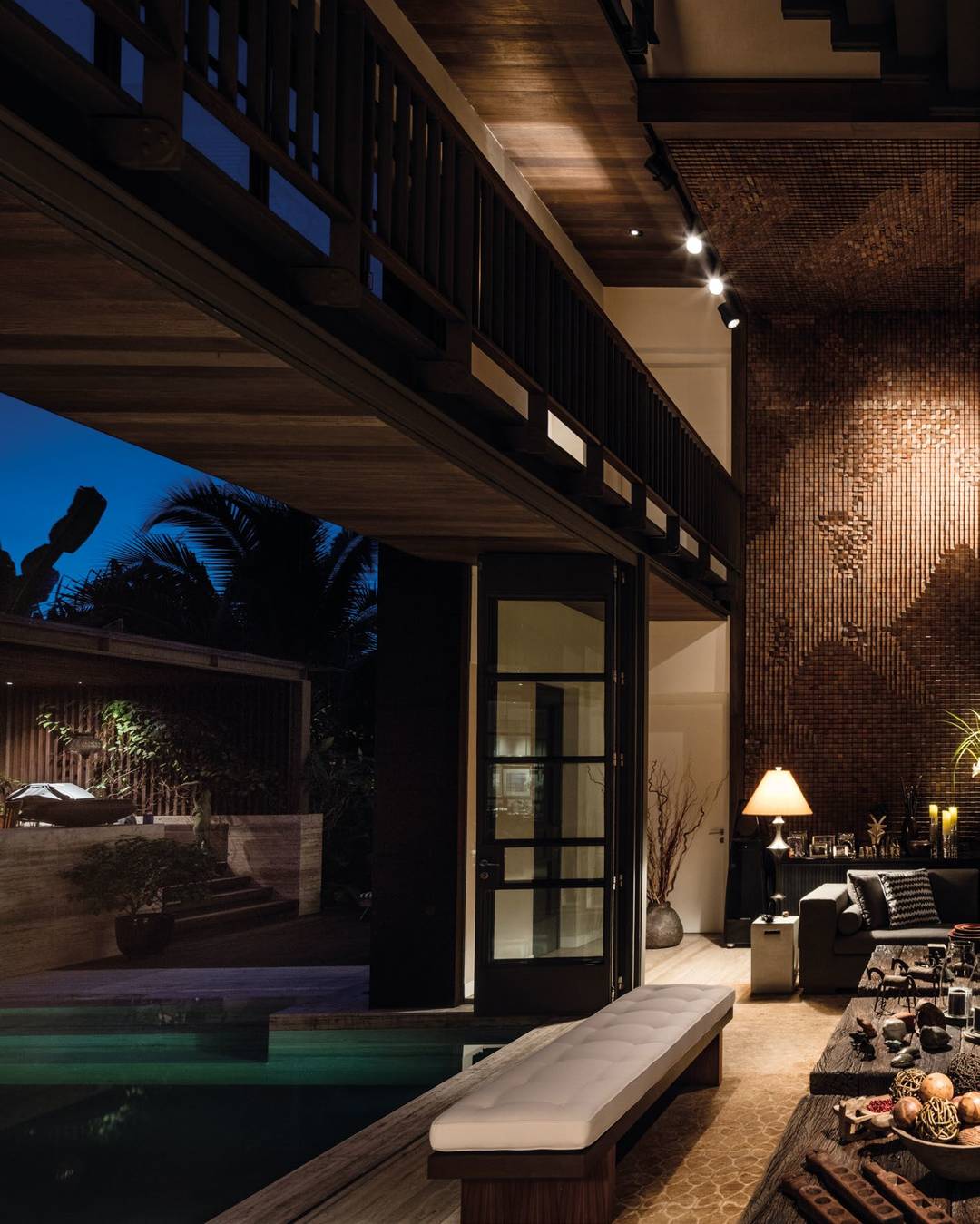
n the midst of the modern metropolis of Singapore lies a multi-level tropical sanctuary in the hilly Bukit Timah enclave, home to LTW Designworks’ principal partner H.L. Lim, wife Christine Lim and their two pet dogs. Taking inspiration from the site’s natural surroundings of lush green landscapes, unobstructed outdoor views and the ever-changing Singapore skyline, the house’s architecture blurs the boundaries between the indoor and outdoor space to create a relaxed and resort-like ambiance. Located on a steep hillside, the house is intentionally situated on the leeward side in order to maintain a high level of privacy and security, while maximizing the flow of natural air through the interior. “The open space-plan design creates a comfortable micro-climate for the home, especially during the night when accumulated heat from the ground leads to an increase in indoor temperature” says H.L., adding “as a result I’ve incorporated several water features around the house such as ponds and a swimming pool which helps to cool down the interior spaces when there is cross ventilation.” Unlike many other private homes in the region, the use of metal, particularly iron, was a key element in the home’s construction. H.L. describes “the iron cladding panels naturally oxidize over time, giving the home an incredible rustic aesthetic and texture, and also creates a visual contrast against the other natural structural materials such as stone and timber.” Altogether these materials and textures contribute to an earthy, visually-striking colour tone that blends into the surrounding landscape.

TOP: The design blurs the boundaries between the indoor and outdoor to create a relaxed and resort-like ambiance.

BOTTOM: Iron, stone and timber are the three major materials used in building the house. Altogether, these materials contribute to a visually-soothing, earthly colour tone.


Inside, H.L. and Catherine selected imported Italian marble for the bathrooms and corridors that complement the architectural colour palette, giving the interior walls a subtle layering effect. “The marbles come from a particular region in Italy that is rich in volcanic minerals and gaseous cavities,” explains Lim, “and while typically many homeowners choose to fill in the porous cavities and polish this kind of marble, we decided to keep them unfinished to respect the material’s natural state.” Additionally, floors and ceilings of the house are covered in teak wood that was reclaimed from old houses in Indonesia, and similar to the stone and iron work, these surfaces were left in their original matte finish to highlight their intrinsic colour, texture and beauty. To realize the concept of a ‘tropical home’ with a unique industrial quality, spaces were purposefully opened up such as staircase balustrades in order to allow natural airflow throughout. Framing the spacious living room is a double-height feature wall of wooden blocks rising up from the lower floor up and across the ceiling in dramatic fashion. Resembling an image of “hands pressed together” the custom-designed installation from a Beijing art studio is symbolic of peace, wellbeing and shelter. “We gave the artist the freedom to create any pattern he wanted,” says H.L. The result was a stunning artwork comprised of hundreds of wooden cubes stacked and cut at various chamfers, resulting in this amazing abstract pattern that reveals varying patterns when viewed from different areas of the house. “We want our guests to appreciate the house from different angles and spaces. The open planned layout and the layers of transparency allow for this to happen,” H.L. shares. For instance, the bridge and the staircase leading up to the third floor bedrooms

50

| H+R |

HOTELRESORTDESIGN.COM

TOP: Hundreds of individual wooden blocks are installed by hand at varying angles to create a seemingly random yet controlled art installation.

BOTTOM: Resembling one’s palms gently pressed together when viewed from afar, a symbolic representation of projection, shelter and wellbeing.


FLOORS AND CEILINGS OF THE HOUSE ARE COVERED IN TEAK WOOD THAT WAS RECLAIMED FROM OLD HOUSES IN INDONESIA, AND SIMILAR TO THE STONE AND IRON WORK, THESE SURFACES WERE LEFT IN THEIR ORIGINAL MATTE FINISH TO HIGHLIGHT THEIR INTRINSIC COLOUR, TEXTURE AND BEAUTY.

THIS PICTURE: The textured feature wall constructed from wood is two-storeys high and connects the living room floor with the ceiling.


52

| H+R |

HOTELRESORTDESIGN.COM

TOP: The patina of the iron is formed over time after prolonged outdoor exposure and natural oxidation.

BOTTOM: Incorporation of several water features like the pool helps to cool down the interior spaces.


THE IRON CLADDING PANELS NATURALLY OXIDIZE OVER TIME, GIVING THE HOME AN INCREDIBLE RUSTIC AESTHETIC AND TEXTURE, AND ALSO CREATES A VISUAL CONTRAST AGAINST THE OTHER NATURAL STRUCTURAL MATERIALS SUCH AS STONE AND TIMBER.

TOP: The beautiful hand-woven carpet sourced from Nepal is sun-bleached, giving it a textural, organic look.

BOTTOM: To realize the concept of a ‘tropical house’ with a unique industrial quality, spaces were opened up and exposed various parts and area partitions.


THE RESULT WAS A STUNNING ARTWORK COMPRISED OF HUNDREDS OF WOODEN CUBES STACKED AND CUT AT VARIOUS CHAMFERS, RESULTING IN THIS AMAZING ABSTRACT PATTERN THAT REVEALS VARYING PATTERNS WHEN VIEWED FROM DIFFERENT AREAS OF THE HOUSE.

are designed with thin steel rods and clear panels, giving an illusion of being suspended in mid-air. The vertical lines from the feature wall counterbalance the horizontal planes of the pond and outdoor swimming pool. When it came to discussing on the challenges H.L. faced when designing and constructing the house, he expressed that it was not a challenge and more importantly he wanted to let the landscape develop organically and so this was handled personally by H.L. and his wife, Christine. They have maintained the green spaces and planted a variety of fruit trees close to the pavilion, including bananas, papayas and avocados. Many areas of the house are designed for the couple to host their dinners, parties and gatherings. Particularly the rooftop, where they hold barbeques, guests can take in wide-angle views of the Singapore skyline and the city centre, including Marina Bay Sands while the dining room is located in the kitchen and is connected with the pavilion for hosting pool-side gatherings. Comfort was the main consideration when sourcing for furniture and accessories. Large sofas for the living room and armchairs made from woven plastic are selected instead of rattan as they are more comfortable and easier to maintain. All furniture and fittings match the immediate surroundings and the interiors. Flaring colours like red, loud decorative pieces and reflective surfaces were avoided. Accessories for the house were collected from the couple’s travel during their trips to India, Egypt, Africa and around the world. No items in the main living areas are too precious for them to be extra cautious when moving between the spaces. Valuing the “living experience” itself, it is important for them to feel completely at ease when they are at home.

54

| H+R |

HOTELRESORTDESIGN.COM

TOP: The dining room is held in the air-conditioned kitchen that allows the option to be turned on or off on extremely hot days.

BOTTOM: The pavilion, connected to the kitchen is used for hosting pool-side gatherings.


PROJECT DETAILS PROJECT: HL Private Residence CLIENT: HL Lim LOCATION: Bukit Timah, Singapore TOTAL AREA/SIZE: 10500sq ft / 6500 Built In DESIGN TEAM: LTW Designworks - HL Lim, Founder & Principal Partner ARCHITECT: AR+D Pte Ltd, Ali Reda PHOTOGRAPHY: Edmon Leong FURNITURE: Cheng Meng Furniture LIGHTING: Project Lighting Design, Stephen Gough

TOP: All furniture and fittings blend effortlessly with their immediate surroundings in a contemporary manner.

BOTTOM: Marble shipped from Italy is used around the bathroom complement the colour palette, giving the interior walls a subtle layering effect.


showcase | SHOWROOM

DREAM. SHOP. EXPERIENCE. LTW REIMAGINES KOHLER’S LATEST FLAGSHIP SHOWROOM INTO AN IMMERSIVE EXPERIENCE CENTER IN THE HEART OF SINGAPORE’S DESIGN HUB.

56

| H+R |

HOTELRESORTDESIGN.COM


SINGAPORE

KOHLER EXPERIENCE CENTER

THIS PICTURE: The Black Suite comprises of Kohler’s black hued bath fixtures, with glass encapsulated flowers that subtly add the glimmer of life.


58

| H+R |

HOTELRESORTDESIGN.COM

THIS PICTURE: The space is intelligently and deliberately revealed as a series of five semi-open “display suites”.


T

he Kohler Experience Center (KEC) is an interactive showcase for Kohler’s awardwinning sanitary product lines housed under one roof, offering a design-driven retail environment for designers, developers and private homeowners. Designed by LTW Designworks, the KEC in Singapore is part of a family of experience centers developed in key cities around the world including New York, London and New Delhi. Located in the heart of Singapore’s downtown district and housed in a historic 3-storey conservation shophouse on Peck Seah Street, the interior spaces are intelligently and intentionally revealed as a series of five semi-open display suites – each designed with a unique theme comprising:

DIFFERENT THEMES WERE CREATED FOR EACH BATHROOM SUITE TO SHOWCASE KOHLER’S SANITARY PRODUCTS IN A FUN AND INNOVATIVE WAY BY ALLOWING THE CONSTRUCTION OF THE SUITES TO BE COMPLETED IN A “POP-UP” MANNER.

• FASHION: Hollywood, flash bulbs, red carpet, fashion shows, fashion art and icons, a place where visitors get to rejuvenate their fashion senses and discover how sanitaryware integrates perfectly with glitz and glamour. Think plush drapery, stunning red textiles and clever touches like a travelling trunk for product display. • HI-TECH: Sleek. Modern. Minimalist. That is the aesthetic of the room. Clean lines with polished concrete flooring, reflective surfaces and innovative LED lighting combine to create a futuristic backdrop for Kohler’s most technologically driven products to be displayed. • FAMILY: It’s all in the family for this suite. Using an inviting shade of creamy salmon for the envelope, the Family suite is a room you want to spend time in. With its living room inspired direction, feel at ease with wall-mounted photo frames, comfortable high-back armchair, and reminisce of days gone by while glancing at the family’s growth chart etched into the glass wall. • CLASSIC: Bringing you back to the roots. Inspired by the days of Kohler’s founding, the interior is an updated version of the classic American home. Think white ceramic tiles, delicate wainscoting and luxurious textured wallpaper – a perfect envelope for Kohler’s iconic clawfoot bathtub and polished tapware. • BLACK: Black is back. Powerful, masculine and mysterious, this suite exudes sexy sophistication. This dimly lit suite heightens the senses to appreciate texture, shape and shadow. Focused lighting highlights key elements from washbasin to shower to artefacts. Natural flora floats within acrylic panels to soften the starkness and adds surprise. What hides in the darkness waits patiently for discovery.

MIDDLE: The Kohler Experience Center is housed in an iconic 3-storey conservation shophouse on Peck Seah Street.

BOTTOM: Artistic representation of sinks was displayed as jewellery pieces i.e. earrings, rings, necklaces.


“WE WANTED TO TELL A STORY ABOUT EACH COLLECTION THAT IS DRAMATIC AND MULTIFACETED, YET DIFFERENT FROM THE ADJACENT SPACE. IN A WAY IT’S A FANTASY COME-TO-LIFE TO GIVE ASPIRING CUSTOMERS THE ‘DREAM SCHEME’ ON HOW THEY COULD ENVISION KOHLER’S PRODUCTS IN THEIR OWN HOME OR DESIGN PROJECTS.” SU SEAM TEO, LTW PARTNER

Different themes were created for each bathroom suite to showcase Kohler’s sanitary products in a fun and innovative way by allowing the construction of the suites to be completed in a “pop-up” manner. Each space is semi-open and allows products to be updated periodically, and the varying themes encourage patrons to explore the entire centre to take on their own journey of discovery. “This was both a highly immersive and intensive process for us,” says LTW partner Su Seam Teo. “We wanted to tell a story about each collection that is dramatic and multifaceted, yet different from the adjacent space. In a way it’s a fantasy come-to-life to give aspiring customers the ‘dream scheme’ on how they could envision Kohler’s products in their own home or design projects.” The entrance of the Experience Center is anchored by a gallery space that showcases Kohler’s brand history, interactive digital media walls, glass display cases with original castings and special pieces re-imaged as jewelry. Light, timber-paneled walls with black metal trim, plush carpeting and open ceilings give the interiors an airy yet refined atmosphere. The remaining public spaces include a live kitchen, consultation areas, and flexible seating arrangements that can be adapted to suit various functions, meetings, events and exhibitions. As an ode to the conservation architecture and to reinforce the sense of place, LTW integrated features such as laser-cut batik panels and Peranakan-inspired flooring tiles in the rest zones. In contrast, loose furniture pieces were hand-selected from Restoration Hardware, a U.S. interior décor brand known for their contemporary rustic furniture, fixtures and accessories reminiscent of the Craftsman period. “We felt these items were a perfect complement to the 19th century American home aesthetic that alludes to Kohler’s beginnings as a company, as well as the historic nature of the building this Experience Center is located,” explains Su Seam, adding “And as the Kohler family has a private art collection, we want to create an intimate gallery setting to showcase several of their pieces which were shipped in from abroad.”

60

| H+R |

HOTELRESORTDESIGN.COM

TOP: The Classic Suite displays Kohler’s iconic clawfoot bathtub with textured wallpaper panelling and clean white ceramic tiles.

BOTTOM: 2nd Floor of the KEC featuring more of Kohler’s latest products with a selection of customizable faucets to choose from.


THIS PICTURE: Laser-cut batik panels and Peranakaninspired flooring tiles were used for the relax area to reinforce a sense of place.


“THE KOHLER FAMILY HAS A PRIVATE ART COLLECTION, WE WANT TO CREATE AN INTIMATE GALLERY SETTING TO SHOWCASE SEVERAL OF THEIR PIECES WHICH WERE SHIPPED IN FROM ABROAD” SU SEAM TEO, LTW PARTNER

62

| H+R |

HOTELRESORTDESIGN.COM

THIS PICTURE: Featuring Kohler’s most technologically driven products displayed in the Hi-Tech suite with iridescent backdrop to enhance the futuristic space.


The second and third levels of the Experience Center feature an open-plan layout to showcase Kohler’s branded product lines such as Jacob Delafon, Kallista, and their technology-driven control systems “Sustainability” and “Konnect”. Customers can ambulate throughout the floor to look at whatever catches their eye, with staff on-hand to demonstrate how the systems work using touch-screen display panels. Opposing sides of the floor are coloured in red on one end to symbolize creativity and innovation, and blue on the other end to represent collaboration (among various products and customers). Again with dedicated designs for Jacob Delafon housed in muted grey display cases and Kallista with an “out-of-the-crate” feel - think gemlike lapis blue and white veined marble pedestals and discreet lighting surrounded by raw shipping crates and packing hay – the spaces are interconnected in plan but feel totally unique and individual on their own. LTW’s Experience Center for Kohler brings sanitaryware shopping to an entirely new level with innovative new designs within a variety of immersive environments.

TOP: Kohler’s luxury brand Kallista, is displayed on raw wooden crates and pedestals of sodalite blue marble.

PROJECT DETAILS PROJECT: Kohler Experience Center CLIENT: Kohler LOCATION: Peak Seah Street, Singapore SCOPE: 3 Floor Shop House TOTAL AREA/SIZE: 950 sq ft DESIGN TEAM: LTW Designworks - Su Seam, Partner; Asi Cherdvivattanasin, Senior Designer; Verna Tan, FF&E PHOTOGRAPHY: Wai Kay ART: Kohler Bold Art LIGHTING: Nipek Pte Ltd AWARD: IDCS Design Excellence Awards - Best Exhibition Design - Silver Award

MIDDLE: A semi-open reception gallery showcases Kohler’s long history in a museum-like setting.


showcase | HOTEL

SOUL TO SEOUL

LTW DESIGNWORKS REDEFINES THE BENCHMARK FOR LUXURY DESIGN IN SEOUL WITH THE OPENING OF THE TIMELESSLY ELEGANT AND CULTURALLY SENSITIVE FOUR SEASONS HOTEL.

64

| H+R |

HOTELRESORTDESIGN.COM


SEOUL, SOUTH KOREA

FOUR SEASONS

THIS PICTURE: Gold-coloured metal reception desks wrapped with textured cast-bronze detailing help frame the entrance of the reception area.


A

plain stone marker nearby the hotel site proclaims its location to be Seoul’s “Kilometer Zero,” the point from which all distances around the city are measured. This is as downtown as you can get in the South Korean capital, right in the heart of the bustling Gwanghwamun financial district where the frenetic energy and flow of business hums through the air. It is this site where the Four Seasons Hotel is situated and comes to life. Known around the world for unsurpassed luxury and service, the latest iteration of the Four Seasons brand in Seoul represents both an international standard of design excellence but with a respectful and sensitive interplay of local traditional vernacular and historical motifs within a contemporary, residentialstyle interior. The team at LTW Designworks was tasked to create the next evolution of the Four Seasons brand in Korea and one that was decidedly influenced by the cultural heritage of the capital city, yet still reflective of the Four Seasons brand positioning. Early excavations at the site unearthed an amazing and fortuitous archaeological discovery that would justify the creative inspiration and direction for the hotel. Buried deep beneath the surface, a collection of neatly organized ondols (ancient under-floor heating systems dating back to the 16th Century) were discovered, revealing the preserved topology of the historic Gong-jo-gil Street, one of Seoul’s oldest and most famous thoroughfares. As these “lost streets” reflect Seoul’s bygone history, this in turn formed and justified the design direction for the interior – a seamless blend of traditional architectural and cultural elements with understated contemporary luxury. “When we started out, we already knew that we wanted to tap into the endlessly rich sources of Korean cultural traditions,” says LTW partner Su Seam Teo. “These archaeological treasures felt like a calling from the past. It was like a confluence of stories in time – using the materials, patterns, colours and architecture of local Korean history and recreating it in a timeless aesthetic that has a respect and sensitivity to both the new architectural design and the overall contemporary luxe interior we wanted to create.” One of the main features of the hotel is the lobby lounge where Four Seasons loyalists are known to congregate for meals, casual meetings, afternoon teas, restful shopping breaks and evening aperitifs.

66

| H+R |

HOTELRESORTDESIGN.COM

LEFT: Maru - lobby lounge + restaurant, facing the street. location of the lounge faces the street.


A SQUARE TIMBER FRAME SITS ABOVE A CENTRAL HEARTH WHICH IS ANCHORED IN BLACK STEEL JOINTS, GENTLY UPLIFT BY DISCREET PIN-SPOT LIGHTING. THE FIREPLACE HEARTH IS CONSTRUCTED OF ANTIQUED BRONZE WITH CUSTOM DESIGNED ARTWORK DEPICTING THE MAJESTIC MOUNTAINS AND ORGANIC CITY PLANS TO RESEMBLE OLD MAPS FROM CENTURIES AGO.

THIS PICTURE: The hotel’s lounge is anchored by a central hearth surrounded by bespoke furniture and lightweight silk panels.


68

| H+R |

HOTELRESORTDESIGN.COM

THIS PICTURE: Presidential Suite showcases a dramatic hand-blown glass chandelier that references the brushstrokes in Korean calligraphy.


THE MATERIALS USED FOR THE FOUR SEASONS GUESTROOMS AND PUBLIC SPACES PAY HOMAGE TO THE ORIGINAL ANCIENT BUILDINGS THAT HAD GONE BEFORE IT: SOLID TIMBER FRAMING WITH STEEL JOINERY, LACQUERED FRAMES WITH DELICATE SILKSCREEN INSERTS, LOCALLY SOURCED ART AND ARTEFACTS.

For Seoul, LTW crafted a residential style “living room” with deep, textured sofas and armchairs wrapped with subtly shimmering upholstery and plush, floral-patterned carpeting in subtle shades of grey, indigo and caramel laid underfoot. A square timber frame sits above a central hearth which is anchored in black steel joints, gently uplift by discreet pin-spot lighting. The fireplace hearth is constructed of antiqued bronze with custom designed artwork depicting the majestic mountains and organic city plans to resemble old maps from centuries ago. Hanging above the hearth are a band of suspended silk panels that mimic a traditional Korean house, or hanok. These panels add a layer of delicate softness and lead the eye upwards to allow guests to see all points within the lounge. As such the concept achieved is truly the best of both worlds: uncompromisingly luxurious and wellappointed in its detailing, proportions and amenities, yet a proud representation of the rich cultural heritage of the site. Traditionally, the chosen area, being situated close to the Royal Palace, had always been an area where visitors and locals of any conceivable social status and background would meet and mingle, and the hotel would likewise represent a meeting place of people, ideas and perspectives. The materials used for the Four Seasons guestrooms and public spaces pay homage to the original ancient buildings that had gone before it: solid timber framing with steel joinery, lacquered frames with delicate silkscreen inserts, locally sourced art and artifacts. There is very little repetition: each area is carefully crafted to break up a single space into separate storylines. The overall feeling is one of intimacy and belonging, a quiet respite from the bustle of city life below. The Four Seasons feels surprisingly spacious for a high-rise hotel in one of the most crowded areas of the capital. Most rooms are indeed larger than those in other five-star accommodations in the city (the

TOP: Guests entering the hotel’s lift lobby are greeted by a dramatic art work.

BOTTOM: Japan’s top floral artists, Nicolai Bergmann sets an on-site shop in Four Seasons Seoul with a team of designers who will help make any dream wedding a reality.


SPACE’ ITSELF IS A GIVEN – IT’S THE BOX YOU’RE GIVEN TO DESIGN IN. HOWEVER, ‘SPACIOUSNESS’ IS THE POSITIVE EMOTION DERIVED AND POSITIVE CONNECTION TO THE INTERIOR ENVIRONMENT THAT IS CREATED BY THE DESIGNER THROUGH CLEVER PLANNING, CAREFUL ATTENTION TO SCALE AND PROPORTION, AND THOUGHTFUL DETAILING AND USE OF QUALITY MATERIALS.

smallest guestroom starts around 43 square meters), but the expansive feeling is mostly due to a carefully crafted layout, with translucent panels and wooden frames creating sightlines that hint at something beyond. As Su Seam points out, “’space’ itself is a given – it’s the box you’re given to design in. However, ‘spaciousness’ is the positive emotion derived and positive connection to the interior environment that is created by the designer through clever planning, careful attention to scale and proportion, and thoughtful detailing and use of quality materials.” Korean architecture is always conscious of the delicate relationship between a place and its environment, and strives for a harmonious interplay between the two. Mindful of this heritage, the LTW Designworks team combined these traditional building elements with inspiration drawn from nature: gemstone colour palettes, wallpapers and silk screens that feature silhouettes of tree branches, lighting fixtures comprised of hundreds of delicate transparent glass tubes, like icicles suspended from the leaves. The plush carpets feature floral motifs, such as images of the exuberant yellow kenari spring flower, merged with hand-drawn geometries in muted, warm tones. The interplay of these two visual narratives, natural and man-made, are firmly rooted in the local culture and tells the story of Seoul like it has never been told before. The richly detailed suites feature hidden opaque lighted surfaces and paneled walls that, combined with a palette of muted earth tones, enhance the sense of lightness and openness. Even though the environment is rich in detail, there is absolutely no sense of clutter. The result is an amazing combination of freedom and intimacy; no small feat to achieve. The Four Seasons Seoul provides its guests with an unforgettable, immersive hospitality experience that forges a link between the the vibrant Korean culture of the past and the contemporary luxury Four Seasons is synonymous with.

70

| H+R |

HOTELRESORTDESIGN.COM

MIDDLE: The richly detailed Presidential Suite features custom-designed furniture and backlit headboard panels with inset floral motifs.

BOTTOM: The Four Seasons nail bar forms an important part of the hotel’s health and wellness facilities on offer.


PROJECT DETAILS PROJECT: Four Seasons Hotel Seoul CLIENT: Miare Asset Global Investments LOCATION: Seoul, Korea SCOPE: Public Areas, Maru Lounge, MICE Facilities, Health Club & Spa, 317 Guestrooms & Suites TOTAL AREA/SIZE: 724033.25sq ft DESIGN TEAM: LTW Designworks - HL Lim, Founder & Principal Partner; Teo Su Seam, Partner; Karen Chen, Designer PHOTOGRAPHY: Michael Weber CARPET: Tai Ping LIGHTING: Tino Kwan Lighting Consultants, Alto Lighting, and Preciosa AWARD: Ahead Asia 2017: Best Lobby & Public Spaces, Best Spa & Wellness

TOP: The sauna offers tailor-made Four Seasons experience that is quintessential to the Korean culture.

BOTTOM: The indoor pool features beautiful mosaic tile liner with natural light filling up the space.


showcase | HOTEL

SONG DYNASTY STUNNER PULLMAN KAIFENG BY LTW DRAWS INSPIRATION FROM THE LOCATION’S IMPERIAL PAST TO GIVE NEW LIFE TO A MODERN CHINESE AESTHETIC.

72

| H+R |

HOTELRESORTDESIGN.COM


KAIFENG, CHINA

PULLMAN

THIS PICTURE: Three organic, sculptural reception counters guard a dramatic feature wall hand-carved by local artists inspired by Song Dynasty architecture.


L

TW Designwork’s fundamental design philosophy, a sense of place is important for every project and Pullman Kaifeng is no exception. The city of Kaifeng, one of the eight ancient capital during the Northern Song dynasty in China, dating back more than 2700 years is steeped in rich history with numerous cultural attractions. Situated next to the ancient palace walls dating to the Song dynasty, Pullman Kaifeng evokes the elegance of traditional Chinese architecture with its sweeping roofs and expansive interior spaces. Offering 186 guestrooms, including 13 luxurious panoramic suites with beautiful views of the lakes and gardens of the ancient city, Pullman is proud to be the first international brand to deliver world-class upscale hospitality services to travelers in Kaifeng. “During the Song dynasty, the arts, poetry, ceramics, textiles and silks were absolutely beautiful,” says Lim Hong Lian (H.L.), founder and principal partner of LTW Designworks. “The period architecture gave us great inspiration. You can see the architect maintained the shape of the Song Dynasty rooflines – they’re very gentle compared to other dynasties,” shares H.L., adding, “There’s no other way except for following the architecture. It made it easier to decide the volume of the space inside – we just followed the curvature very honestly.” The design concept for the project draws inspiration from Kaifeng’s imperial past and unifies it within a contemporary envelope. Upon entering the hotel, guests are greeted by vast, open spaces and views

74

| H+R |

HOTELRESORTDESIGN.COM

TOP: Song Dynasty architecture inspired the rooflines with undulating eaves that extend into interior spaces.

BOTTOM: Ornate lattice screens create a sense of relaxed privacy with accented green and blue furnishes.


THIS PICTURE: Guests are greeted with vast, open spaces and views on both sides through soaring glass windows.


76

| H+R |

HOTELRESORTDESIGN.COM

THIS PICTURE: Traditional Chinese poetry surrounds the hotel’s sit down bar. The hotel sits down bar is framed by oversized traditional calligraphy. Calligraphic.


THE DESIGN CONCEPT FOR THE PROJECT DRAWS INSPIRATION FROM KAIFENG’S IMPERIAL PAST AND UNIFIES IT WITHIN A CONTEMPORARY ENVELOPE. UPON ENTERING THE HOTEL, GUESTS ARE GREETED BY VAST, OPEN SPACES AND VIEWS ON BOTH SIDES THROUGH SOARING GLASS WINDOWS TO THE MANICURED LANDSCAPE BEYOND.

on both sides through soaring glass windows to the manicured landscape beyond. LTW commissioned Korean artist Lee Hun Chung to create three giant pottery forms that are at least 2.4 metres long to act as reception desks. Another Korean artist, Ran Hwang, was commissioned to create a statement art piece made entirely of buttons, beads and pins sitting behind the reception counter on a wooden panel which depicts a wonderfully warped Song dynasty building. The spacious Xi Bar blends contemporary design with a traditional Chinese twist, juxtaposing modern furniture and lighting with ornate lattice screens. With the look of a scholar’s pad, traditional patterns on wooden lattice screens as well as a combination of bamboo barstools, lounge chairs and antique sideboards to achieve the aesthetic. Designed with a traditional Chinese architecture in mind, the Chinese restaurant Lu Hua however blends Chinese elements in a more contemporary manner. “While the ceiling patterns appear to be European, the design is actually that of traditional patterns found in the ceiling of the Forbidden City,” H.L. says. “The give it a modern twist, the patterns are in solid white.” Adds H.L. “The hotel’s design fits its location and gives it that distinctive sense of place”. The chrysanthemum, a symbolic city flower, is the central motif, seen on lacquered walls, carpet

TOP: The spacious Xi Bar blends contemporary design with a traditional twist, juxtaposing modern furniture and lighting with ornate dividers.

BOTTOM: Squared ceiling tiles were inspired from patterns and drawings found in the Forbidden City.


and light fixtures in the ballroom and guestroom. An abstracted version of the follow also appears as a vertical ceramic strip along the guestroom walls. Silvery butterflies can also be found fluttering across the guestroom walls, and coloured threads brought together to create decorative butterflies also feature in the all-day dining area. “You can find many different butterflies in the area’s wetlands,” explains H.L. Along with Song dynasty arts and culture, the wetlands were a key source of inspiration for LTW. “Because of the wetlands, we wanted to use materials like river reeds and bamboo,” says H.L. These come through in screens, and in wall and ceiling coverings. In the guestrooms and suites, floor-to-ceiling windows welcome in natural light and bring attention to the clean lines of the interiors. Headboard panels have inset murals depicting Chinese pagodas on a textured matte finish fabric and lit with customdesigned lighting fixtures inspired by traditional lanterns. Decorated in a palette of earthy brown, offwhite and blue, the guestrooms create just enough contrast and interest for the guest while not imposing a heavily ornate style.

78

| H+R |

HOTELRESORTDESIGN.COM

TOP: The design of the spa reception is based on soft tones from natural limestone to create a calming ambience for guests.

BOTTOM: The Club Lounge’s reception area is a perfect blend of traditional and contemporary aesthetic.


THE CHRYSANTHEMUM, A SYMBOLIC CITY FLOWER, IS THE CENTRAL MOTIF, SEEN ON LACQUERED WALLS, CARPET AND LIGHT FIXTURES IN THE BALLROOM AND GUESTROOM. AN ABSTRACTED VERSION OF THE FOLLOW ALSO APPEARS AS A VERTICAL CERAMIC STRIP ALONG THE GUESTROOM WALLS.

THIS PICTURE: Kaifeng’s signature flower, the chrysanthemum, is reinterpreted with hand-blown glass leaves in the hotel’s Grand Ballroom.


IN THE GUESTROOMS AND SUITES, FLOOR-TO-CEILING WINDOWS WELCOME IN NATURAL LIGHT AND BRING ATTENTION TO THE CLEAN LINES OF THE INTERIORS. HEADBOARD PANELS HAVE INSET MURALS DEPICTING CHINESE PAGODAS ON A TEXTURED MATTE FINISH FABRIC AND LIT WITH CUSTOM-DESIGNED LIGHTING FIXTURES INSPIRED BY TRADITIONAL LANTERNS.

80

| H+R |

HOTELRESORTDESIGN.COM

THIS PICTURE: Potteries sourced from different regions and precious artefacts stored in the den of the study of the Presidential Suite.


Bathrooms are well appointed with striking black and white bookmatched marble showers and blue ceramic tiles glazed and fired in local kilns using traditional techniques dating back centuries. Sliding timber panel doors can be opened up to reveal the bathroom to the room proper, or closed to create privacy, which allow the hotel to showcase the room in varying options. In the Presidential Suite, the curvature of the ceiling corresponds to the hotel’s undulating roof, with cove lights cleverly hidden to highlight these features. For the master suite’s bathroom, a combination of sleek marble and rustic wooden furniture reflect the interplay of new versus old. All suites also have customized Chinese ink paintings. The 870 square meter indoor pool is an expansive recreational area within the hotel. Full-height glazing on one side of the pool are maximized to allow ample connection to nature and to blur the line between indoors and out. LTW designed a skylight above the pool to allow sunlight to filter in and bathe the pool area with warm natural light.

PROJECT DETAILS PROJECT: Pullman Kaifeng Jianye CLIENT: Accor Hotels & Resorts LOCATION: Kaifeng, China SCOPE: Public Areas, F&B Outlets, MICE Facilities, Health Club & Spa, 185 Guestrooms & Suites TOTAL AREA/SIZE: 628052.64 sq ft DESIGN TEAM: LTW Designworks - HL Lim, Founder & Principal Partner PHOTOGRAPHY: Edmon Leong

TOP: The guestrooms are accessorised by murals depicting ancient Chinese art and lighting that is inspired by lanterns.

BOTTOM: Decorated in a soft, muted and earthly palette, creating a calming atmosphere that is perfect for this naturebased resort.


showcase | HOTEL

A CONTEMPORARY OASIS LTW DESIGNWORKS EVOKES THE CULTURAL SPIRIT OF LOCAL HAINANESE ETHNIC GROUPS FOR THE GRAND HYATT HAITANG BAY.

82

| H+R |

HOTELRESORTDESIGN.COM


SANYA, CHINA

GRAND HYATT

THIS PICTURE: Huan Spa, set within 16,000 sqm spa village and garden is an indulgent destination to restore calm and healing the body.


“THE CONCEPT OF THE HOTEL EVOLVED FROM THE IDEA OF A CONTEMPORARY FISHING VILLAGE, INVITING TRAVELING FAMILIES TO CONGREGATE, EXPERIENCE A SENSE OF COMMUNITY, AND ENJOY AUTHENTIC LOCAL TRADITIONS.” TEO SU SEAM, LTW PARTNER

G

rand Hyatt Sanya Haitang Bay Resort and Spa marks the hotel group’s first beach resort in China. A milestone project for LTW Designworks, who are synonymous with luxury hospitality projects, including Grand Hyatt Dalian, was commissioned to design the hotel’s lobby and public areas, all-day-dining restaurant, spa, and 435 guestrooms, suites and villas. “The concept of the hotel evolved from the idea of a contemporary fishing village, inviting traveling families to congregate, experience a sense of community, and enjoy authentic local traditions,” explains LTW partner Teo Su Seam. What was created was a relaxed yet refined interior that evokes the cultural spirit of the local ethnic minorities and taking advantage of the various physical connections to nature. Spanning across an impressive 190,000 square meters, the hotel’s architectural forms resemble oversized Chinese lanterns with pitched roof lines and glowing interior spaces. In line with the architecture, LTW employed a warm colour palette and natural materials to create an inviting arrival experience in the circular lobby, anchored by four large columns and domed ceiling while allowing the beach and sand tones to exude warmth. Inside, customized fretwork patterns resemble fishing nets in nearby Haitang Bay, and other elements such as fabrics and upholstery are inspired by traditional costumes. “To diffuse the scale of the columns, we added slats and used textured paint,” Su Seam explains. Within the double-volume space of the Lobby Lounge, the 15-metre high glass walls frame the area while lush greenery and a vertical garden enhances the tropical spirit. Adding to the cosy settling, lights in woven baskets hang from the ceiling, creating a relaxing setting for guests to unwind and escape from frantic pace of the urban world. Adding to the natural vibe, a faceted glass mural depicting the Tree of Life is displayed behind the reception desk, its prisms showcasing iridescent qualities.

84

| H+R |

HOTELRESORTDESIGN.COM

TOP: A faceted glass mural depicting the “Tree of Life” is displayed behind the reception with iridescent reflections bouncing light softly into the lobby.

BOTTOM: Island buffet counter in the Grand Cafe create an interactive dining experience.


THIS PICTURE: Warm colour palette and natural materials were employed to create an inviting arrival experience.


86

| H+R |

HOTELRESORTDESIGN.COM

THIS PICTURE: Textured natural materials, raw woods and a taupe and terracotta colour scheme create a warm and relaxing ambiance in the Spa Villa.


WITHIN THE DOUBLE-VOLUME SPACE OF THE LOBBY LOUNGE, THE 15-METRE HIGH GLASS WALLS FRAME THE AREA WHILE LUSH GREENERY AND A VERTICAL GARDEN ENHANCES THE TROPICAL SPIRIT. ADDING TO THE COSY SETTLING, LIGHTS IN WOVEN BASKETS HANG FROM THE CEILING, CREATING A RELAXING SETTING FOR GUESTS TO UNWIND AND ESCAPE FROM FRANTIC PACE OF THE URBAN WORLD.

The Li ethnic minority, the original inhabitants of Hainan, are renowned for their weaving and embroidery. Drawing on this tradition, LTW incorporated ethic elements in an eye-catching feature wall that serves to divide the various spaces within the grand lobby. Traditional woven patterns were also reinvented and paired with ceremonial colours and curated artwork to complement the deluxe marble, mosaics and streamlined furnishings, all impeccably styled for discerning resort travellers. Inspired by Hainan’s history as a fishing village, Grand Café – the resort’s all-day-dining restaurant – reflects the colours of the sea and the sand with an emphasis on blue and yellow. Fashioned as a beach house, the extensive use of timber adds a rustic tone. Echoing this theme, the stone floor is patterned with timber circles to represent drops of rippling water, reinforcing the hotel’s sense of place. As a final

touch, LTW sourced specially-designed artwork to adorn the walls of the restaurant. Meanwhile the guestrooms are provided with an elegant and contemporary design that highlights the spaciousness of the layout and unobstructed picturesque views of the ocean, garden or mountains. Continuing the fishing village theme, LTW used raw textured materials and natural palettes for the rooms, contrasted against sleek silhouettes. The beauty and delicacy of traditional local craftsmanship is evident in the artwork and bespoke wall coverings. Set against the backdrop of the panorama ocean or landscape views, burgundy tones also create a strong visual impact. “Our intention was once again to bring in the outside environment into the interior space with floor to ceiling windows,” says Su Seam. Continuing the hotel’s subtle design narrative, traditional symbols seen in Li’s cultural celebrations

LEFT: The spacious pre-function area is great for a whole range of occasions, both business and social.

RIGHT: The Grand Club Lounge offers premium guests a comfortable space to relax and unwind.


THE BEAUTY AND DELICACY OF TRADITIONAL LOCAL CRAFTSMANSHIP IS EVIDENT IN THE ARTWORK AND BESPOKE WALL COVERINGS. SET AGAINST THE BACKDROP OF THE PANORAMA OCEAN OR LANDSCAPE VIEWS, BURGUNDY TONES ALSO CREATE A STRONG VISUAL IMPACT.

are cleverly infused into the spaces, from the prefunction areas to the Grand Ballroom. The understated design, combined with refined lighting, creates elegant banquet spaces for any special occasion. Designed to resemble exclusive luxury residences, the seven meting and event salons of the hotel feature open kitchens to create one-of-a-kind event experiences. Within the meeting spaces, contemporary elegance is contrasted against tribal patterns in beautifully woven fabrics, once again a nod to the beauty of traditional Hainanese craftsmanship. The Grand Ballroom, featuring an expansive 900 square metre space and seven-metre high ceilings, includes large French doors along one side of the ballroom that open to an outdoor garden offering refreshing views of nature and sunlight. Huan Spa is set within its own 16,000 square metre spa village and gardens. An intimate environment for guests to feel refreshed and rejuvenated, LTW has used a neutral palette and natural materials to connect with the outdoor environment. To introduce outdoor elements into the space, colourful installations made with fresh flowers are dotted throughout the spa, further enhancing the guests’ sensory journey. Reflecting local culture and traditions, Grand Hyatt Sanya Haitang Bay is a haven of understated elegance and ample interior spaces fostering a relaxed resort lifestyle.

88

| H+R |

HOTELRESORTDESIGN.COM

TOP: Solid timber doors reveal a private study beyond.

BOTTOM: The fishing village theme is followed through to the guestroom with a natural palette of raw, textured materials, contrasted against sleek silhouettes.


PROJECT DETAILS PROJECT: Grand Hyatt Sanya Haitang Bay CLIENT: Sanya Gao Sheng Development Co., Ltd LOCATION: Sanya, China SCOPE: Public Areas, F&B Outlets MICE Facilities, 427 Guestrooms & Suites, 8 Spa Villas TOTAL AREA/SIZE: 2045142.98 sq ft DESIGN TEAM: LTW Designworks - HL Lim, Founder & Principal Partner; Teo Su Seam, Partner; Anupan Supathamakij, Design Director; Serene Ng, Project Manager PHOTOGRAPHY: Edmon Leong AWARD: MIPIM Asia Awards 2017 - Best Hotel & Tourism Development

TOP: Maintaining a complimentary design language between indoor and outdoor spaces was of paramount importance to LTW’s designers.

BOTTOM: The villas are designed with an elegant and contemporary design concept that promotes spaciousness.


showcase | HOTEL

HOLLYWOOD SPLENDOUR LTW CREATES A REFRESHING, UPSCALE TAKE ON OLD HOLLYWOOD GLAMOUR THAT AMAZES WITH SPARKLE AND TIMELESS LUXURY.

90

| H+R |

HOTELRESORTDESIGN.COM


MACAU

STUDIO CITY

THIS PICTURE: Thousands of glimmering crystals form a dramatic chandelier above the hotel’s arrival escalators.


92

| H+R |

HOTELRESORTDESIGN.COM

THIS PICTURE: A “whirlwind” of movie posters create a whimsical effect to lead views upwards toward black-andwhite movie iconography.


THE DRAMATICALLY DARK RESTAURANT WITH BLACK CHALKBOARD CEILINGS AND COLUMN CLADDING SERVES AS A PERFECT BACKDROP FOR HAND-DRAWN FILM REEL ARTWORK TO FLOW ACROSS THE SPACE AND BLACK-AND-WHITE PAGES FROM OLD SCHOOL MAGAZINES OF ACTORS AND STARLETS FORM A TORNADO EFFECT AS DOZENS OF PAGES TWIRL AND DANCE UP A CENTRAL COLUMN AND ONTO THE EBONY CEILING.

S

tep into a world of movie sets and your Hollywood inspired journey through Studio City Macau. Bringing a slice of Hollywood and its studio concept into the integrated resort on the former Portuguese settlement. The opening of the hotel welcomed Hollywood actors Leonardo DiCaprio, Robert De Niro and director Martin Scorsese, a truly star-studded affair. The hotel’s architecture is both dynamic and iconic, featuring an art-deco façade and a gigantic “Golden Reel” ferris wheel suspended in the middle of the massive curved tower, 130 meters above ground, connecting the two wings housing the 5-star Celebrity Tower and the 6-star Star Tower. According to the owning company, Melco Resorts & Entertainment, it’s like “two flaming asteroids crashed through the building façade in tandem, forming a pair of rings.” The guestrooms and suites for each tower boast customized design styles respectively that are both distinctive, lavish and elegant. Star Tower suites channel the glamour of old Hollywood by incorporating elements such as padded fabric and timber headboard panels with curved double-line gold trims, subtly picked up in the double gold lines of the pillowcases. The overall colour scheme includes a palette of black, white, gold and burgundy, reminiscent of the dramatic and sophisticated 1920s era. To inject a distinctive look for the Celebrity Tower guestrooms, LTW approached the design through bold and contemporary inspirations. The charismatic rooms are decked out using muted shades of red

TOP: The all-day dining restaurant features Old-Hollywood glamour, film reels and projectors, old movie sets and spotlights.

BOTTOM: The ‘grand stage’ is finished with black granite top, metal-framed cabinets with stud detailing, complete with vintage ovens and stove tops.


carpeting and grey walls with a dramatic black-andwhite film strip ribbon flowing across the headboard panel. Amenity areas such as the writing desk, TV console and minibar are all affixed to the side walls to allow rooms to be as spacious as possible. Spotlight is the hotel’s all-day dining venue with an interior inspired by old Hollywood films from the early 20 th century. The dramatically dark restaurant with black chalkboard ceilings and column cladding serves as a perfect backdrop for hand-drawn film reel artwork to flow across the space and black-andwhite pages from old school magazines of actors and starlets form a tornado effect as dozens of pages twirl and dance up a central column and onto the ebony ceiling. Black leather curved banquettes sit below tall black metal screens with glimmering wavy glass inserts that add sparkle to the dark matte surfaces. The buffet counter is designed to look like a stage while guests and diners sit around like audience members, watching the action on a film set. The “grand stage” is finished with black granite countertops, metal-framed cabinets with studded detailing, with the overall look complimented by vintage oven and stovetops. The movie theme extends all around the restaurant with names of famous movie stars and movie quotes etched onto the walls, allowing

94

| H+R |

HOTELRESORTDESIGN.COM

TOP: Patrons are greeted by an elegant tea display with curated tea pots and artefacts.

BOTTOM: The dining room exudes modern Asian and European elegance in an upscale and refined ambiance.


THE RESTAURANT FEATURES ASIAN CHINOISERIE ELEMENTS BLENDED CAREFULLY WITH A LUXURIOUS MODERN CLASSIC ARCHITECTURAL BACKDROP. BLACK METAL SCREENS WITH HUNDREDS OF CONVEX GLASS PIECES IN CONTIGUOUS GEOMETRIC PATTERNS ADD ADDITIONAL REFLECTIONS TO THE WAITING LOUNGE AND DINING ROOM WHILE PROVIDING SEMI-PRIVACY FOR DINERS.

THIS PICTURE: Spacious private dining rooms have relaxation areas, hand-cut patterned glass screens and curved chandeliers to elevate the dining experience.


96

| H+R |

HOTELRESORTDESIGN.COM

THIS PICTURE: The grand ballroom transport guests back into a time of decadence, the extravagance and spectacle of the golden decade.


guests to dine in an ultimate movie set experience. LTW received an accolade for its work for the allday-dining restaurant when it won Gold at the Hong Kong Restaurant Interior Design Awards 2016. The modern and elegant Chinese restaurant Pearl Dragon was designed as a blend of Chinese and European transitional style, a perfect interpretation of an East meets West theme. The restaurant features Asian chinoiserie elements blended carefully with a luxurious modern classic architectural backdrop. Black metal screens with hundreds of convex glass pieces in contiguous geometric patterns add additional reflections to the waiting lounge and dining room while providing semi-privacy for diners. Wall panels are carefully wrapped with softly shimmering fabrics, while smooth white marble pilasters with grey veining hold bespoke silver wall sconces. “As an upscale dining venue catering to primarily an affluent Chinese clientele,” says LTW head of development Robert Shen, “the private dining rooms are of particular importance, so we designed them as grand suites with ample space for lounging, dining and dish preparation and presentation.” Custom

TOP LEFT: Contemporary furnishes blends seamlessly in the Studio City’s art deco style hotel.

TOP RIGHT: Dramatically bold, brush stroke carpet patterns.

BOTTOM: The Zensa Spa brings the ultimate spa experience in a truly exquisite contemporary setting.


showcase | hassell - hospitality

THE CHARISMATIC ROOMS ARE DECKED OUT USING MUTED SHADES OF RED CARPETING AND GREY WALLS WITH A DRAMATIC BLACK-ANDWHITE FILM STRIP RIBBON FLOWING ACROSS THE HEADBOARD PANEL.

designed crystal chandeliers hang above, created by a series of curved, concentric panels lit with cool white light. Soft furnishings in the lounge areas have a more European style with curved lines and upholstered with textured shades of iridescent blue, pearl and celadon. By contrast, Chinese style mahogany bent-wood chairs surround the circular dining tables, made more comfortable with embroidered imperial yellow silk cushions. The artwork and accessories are curated by art and cultural specialists, and range from jade carvings, glazed teapots and ceramic crane figurines, to modern paintings with bold brush strokes to compliment the overall interior.

98

| H+R |

HOTELRESORTDESIGN.COM

MIDDLE: The Star Executive Suite offers guests complete relaxation in the most elegant surroundings with premium amenities and luxurious furnishings.

BOTTOM: With the study table cordoned at the corner of the living area, it carefully amplifies the walking space in the living area for guests.


PROJECT DETAILS PROJECT: Studio City Macau CLIENT: Melco Resorts & Entertainment LOCATION: Macau, China SCOPE: Public Areas, MICE Facilities, Health Club & Spa, 1600 Guestrooms & Suites DESIGN TEAM: LTW Designworks - Teo Su Seam, Partner; Anupan Supathamakij, Design Director; Maria Geraldine, Project Coordinator; Karen Chen, Designer PHOTOGRAPHY: Edmon Leong AWARD: Hong Kong Interior Design Awards - Hong Kong Interior Design Awards, Casual Dining Restaurant Category, Spotlight - Gold

TOP: Luxuriously appointed master suites are made more opulent with full height sliding panels.

BOTTOM: A separate bath and walk-in rain shower stands opposite sides of the freestanding bathtub.


showcase | HOTEL

100 | H+R |

HOTELRESORTDESIGN.COM


CHANGSHA, CHINA

GRAND HYATT

GRAND BANKS INSPIRED BY LOCAL RED INK-WASH PAINTINGS, THE GRAND HYATT CHANGSHA BY LTW IS A DRAMATIC BLEND OF CULTURAL NUANCE WITH MODERN SOPHISTICATION.

THIS PICTURE: Shades of the symbolic red colour are used to give deference to the artists’ work and a significant sense of place.


102 | H+R |

HOTELRESORTDESIGN.COM

THIS PICTURE: A dramatic feature wall of undulating ivory and red “waves” rendered in laser-cut enamel frame the triple-height lobby.


THE DOUBLE-HEIGHT LOBBY IS PURPOSEFULLY KEPT OPEN AND WIDE, ALLOWING GUESTS TO CIRCULATE THROUGH THE HOTEL’S VARIOUS FUNCTION SPACES EASILY AND EFFICIENTLY. A CENTRAL FEATURE WALL INSTALLATION ANCHORS THE LOBBY SPACE WITH VERTICALLY-ORIENTED, OFFSETTING THE WAVE PATTERNS IN SHADES OF IVORY AND RED AND TEXTURED & PATTERNED MOTIFS.

W

ith a history dating back 3,000 years, the city of Changsha – the birthplace of Mao Zedong – is a place of great historical and cultural importance in China. Situated at the apex of a landmark 61-storey building, the Grand Hyatt Changsha offers views of the majestic Xiang River and the city’s skyline, setting the scene for dramatic and sophisticated hotel interiors. A famous poem penned by the late Chairman Mao served as inspiration for two paintings: “Changsha” and “Ten Thousand Hills in Red” by local artists Fu Baoshi and Li Keran that depict the crimson hued mountains of Changsha and the grand riverbanks of the Xiang River. Thus, the interior design concept for Grand Hyatt Changsha is similarly inspired by these artworks and reflects a contemporary yet timeless Chinese aesthetic. Shades of the symbolic red colour are used to give deference to the artists’ work and a significant sense of place. The double-height lobby is purposefully kept open and wide, allowing guests to circulate through the hotel’s various function spaces easily and efficiently. A central feature wall installation anchors the lobby space with vertically-oriented, offsetting the wave patterns in shades of ivory and red and textured & patterned motifs. The island reception and check-in area is tucked back from the double-volume lobby and defined by a bold backdrop in embossed red leather and plush carpeting in contemporary patterns in red and white, visually drawing the guest inwards to the intimate reception upon entering the hotel. The adjacent lobby bar with the design language of colourful traditional patterned carpeting of the

MIDDLE: Central circular bar wrapped in top-lit variegated black and gold stained panels.

BOTTOM: Custom wrought-iron light fixtures give scale and illumination to dining tables in the cavernous Grand Cafe.


THE HOTEL’S MULTIPLE F&B OUTLETS OFFER A WIDE VARIETY OF CUISINE TO SUIT ANY PALATE WITH UNIQUE DESIGN CONCEPTS ROOTED IN STRONG STORYLINES YET ARE STILL WITHIN THE OVERALL DESIGN LANGUAGE OF THE HOTEL.

indigenous tribe surrounding burgundy sofas and muted yellow leather armchairs, and central circular bar wrapped in top-lit variegated black and gold stained panels. Event spaces are also inspired by the Chinese paintings and adapted as custom-designed chandeliers on painted lacquer panels in different hues of red to resemble portions of the painting in the ballroom and meeting rooms. Shades of muted red are used to accent the neutral palette of the rooms and suites, including the small red painted lacquer tiles integrated in the wall covering, red ceramic tile bathrooms and padded leather headboard. Suites are executed in a more Chinese theme with gold leaf circular sun motif at the bed with custom-designed furniture and lighting fixtures. The hotel’s multiple F&B outlets offer a wide variety of cuisine to suit any palate with unique design concepts rooted in strong storylines yet are still within the overall design language of the hotel. The Grand Café is an all-day outlet with dramatic triple-height dining rooms and interactive display kitchens that mimic the thriving marketplaces found along the riverbanks in China. A wide variety of foods from East to West are displayed on clustered buffet counters erected of grey and black marble and solid timber, while tall cubby shelves above discreetly hide mechanical equipment from view with locally sourced pottery and artefacts. The different dining halls are precincted into zones to allow diners a choice of seating options, from open tables to tan leather wrapped banquettes to long communal areas. The zones also allow for entire areas to be cordoned off for private events and functions. Custom designed wrought iron light fixtures hang above, with thin profiles to allow sight lines upward while providing illumination to the dining area.

104 | H+R |

HOTELRESORTDESIGN.COM

TOP: Pastry Shop creates local pastries that offers both in-house consumption and takeaway.

BOTTOM: Patrons are greeted at the entrance with a display of artistic teacups against a slate grey backdrop.


THIS PICTURE: The Italian brasserie is a casual restaurant wrapped with reclaimed timber columns, locally fired brickwork and patterned ceramic tiles from “mama’s casa.”


106 | H+R |

HOTELRESORTDESIGN.COM

THIS PICTURE: A section of the Chinese restaurant is designed with bamboo sticks hanging from the ceiling, referencing from stilt houses on the river banks of Xiang river.


CUSTOM DESIGNED WROUGHT IRON LIGHT FIXTURES HANG ABOVE, WITH THIN PROFILES TO ALLOW SIGHT LINES UPWARD WHILE PROVIDING ILLUMINATION TO THE DINING AREA.

The hotel’s Chinese Restaurant, Xiang Jiang 36, is similarly zoned into individual kitchens specializing in steam and noodle dishes, roast duck via the custom brick oven, and the dessert bar. Here the chefs are the ‘actors’ in the food theatre and put on their culinary show daily to entertain and enliven the dining experience for guests. Slightly varying design schemes are offered in line with the different kitchens, starting with the tea bar at the restaurant’s reception where waiting guests can partake in different teas from around China with a backdrop of delicate teacups on thin metal shelves lit from above. Dark grey slate flooring provides a matted surface for rustic timber furniture upholstered in red and yellow fabrics to sit amidst glazed blue and white checkerboard tiles and patterned glass screens that add a hint of subtle elegance. Overhead, hundreds of bamboo rods hang in unison yet at varying lengths, inspired by the fishing poles used by Xiang River fishermen. The hotel’s BBQ restaurant, aptly and simply named ‘BBQ,’ is derived from the stilt houses and fishing villages found along the banks of the river. Undulating floor levels and solid wood blocks stack together to form partitions that divide up the dining space into a series of semi-private areas. A custom backdrop of oversized carp artwork is applied to the surrounding walls by local artists, as if the fish are “swimming” through the restaurant. Rough timber panels frame the entire outlet while black and gold light fixtures glow above with hand-punched stipple patterns inspired by land and sea motifs. Perhaps the most sought-after space in the entire development is Casa Grande, a multi-function entertainment, bar lounge and F&B venue created by LTW from a formerly unused rooftop space. At one end, a two-storey entertainment bar with dance floor and stage was carved out to become a rooftop destination for night owls. A red-panelled mezzanine area was added above a 360-degree bar as a VIP room and chill-out space.

TOP: A private mezzanine above the bar was created to allow direct views to the stage and dance floor below.

BOTTOM: Mezzanine space was created above to allow diners to roam around the Italian restaurant freely.


Adjacent to the bar, seating spills into a casual Italian trattoria with a dramatic 2-story volume with a glass skylight and rough timber plank and rustic Italian tile flooring – certainly a nod to ‘Mama’s kitchen’. “We purposely designed the space to be overlapping,” says principal partner H.L. Lim, “so that even after the restaurant closes, patrons can spill from the bar area into the restaurant space, effectively extending the capacity for late-night business.” Al fresco seating continues outside the trattoria onto the roof deck, which connects via a series of vertical folding doors, to the indoor swimming pool for the hotel. The modern red panel and timber slatted pool deck acts as an extension of the al fresco area to allow for a larger group to occupy the entire rooftop for weddings, events, and private parties. There is no doubt Casa Grande has been created to become THE destination of Changsha.

PROJECT DETAILS

108 | H+R |

TOP: The uber-modern swimming pool doubles as a rooftop function space.

HOTELRESORTDESIGN.COM

PROJECT: Grand Hyatt Changsha CLIENT: Huayuan LOCATION: Changsha, China SCOPE: Public Areas, F&B Outlets and 354 Guestrooms & Suites TOTAL AREA/SIZE: 753473.73 sq ft DESIGN TEAM: LTW Designworks - HL Lim, Founder & Principal Partner; Liu Ye, Designer; Huang Xi Cang, Designer; Chaypol Apimonsiri, Designer; Sirileka Tivalai, Designer; Yan Jun, Designer; Shang Qi, FF&E; Tao Hua, FF&E PHOTOGRAPHY: Edmon Leong LIGHTING: Brandston Partnership Inc GRAPHICS & SIGNAGE: Corlette Design

MIDDLE: Warm colour tones from the public areas is spread to the bedroom and bathroom that offer a breathtaking highrise view of the city and river.


THIS PICTURE: The BBQ provides guest a quiet and peacefulness surrounding, mimicking fishing village concept with oversized golden carp murals for the backdrop.


showcase | HOTEL

SHANGHAI CHIC LTW BREATHES NEW LIFE INTO OLD SHANGHAI FOR THE CORDIS BRAND’S FIRST HOTEL IN CHINA.

110 | H+R |

HOTELRESORTDESIGN.COM


SHANGHAI, CHINA

CORDIS

THIS PICTURE: Peering into the Chinese restaurant, Ming Court at Cordis Shanghai.


112 | H+R |

HOTELRESORTDESIGN.COM

THIS PICTURE: Backlit display boxes in the lobby lounge depicting the typical street scenes of Old Shanghai.


THE HOTEL LOBBY SHOWCASES COMMISSIONED ARTWORK BY CHINESE SCULPTOR XIE AIGE, DEPICTING FIVE SCULPTURES NAMED “CERAMIC WOMEN” THAT PORTRAY FEMALE FIGURES DRESSED IN QIPAO OR TRADITIONAL ONE-PIECE CHINESE DRESSES, SOME HOLDING UMBRELLAS AND OTHERS WITH CHILDREN.

L

ocated in “The Hub” which comprises the Shanghai Hongqiao Railway Station, metro lines and a stone’s throw away from the Hongqiao International Airport, the Cordis Hotel Hongqiao in Shanghai is Langham Hospitality Group’s first Cordis hotel in China. Offering 396 luxurious guestrooms and suites, alongside stylish F&B outlets and banqueting venues, the hotel is exceptionally convenient for travellers. In response to the brand’s manifesto to create a modern re-interpretation of Chinese motifs and culture for the adventurous and tech-savvy traveller, LTW Designworks designed a clean, uncluttered interior concept for the hotel to serve as a respite from the heavily over-designed hotels in the city, as well as in counterpoint to the hustle and bustle of the sprawling city beyond. Although the building structure was nearly completed at the time of LTW’s involvement, the design team worked with the owner and contractor to create open space plans and rationalized layouts for both public areas and guestrooms so that guests would be able to easily navigate in and around the hotel’s various function spaces. The floor slab at the lobby area was cut away to create a double-volume space, allowing the arrival experience to feel more

TOP: The spacious dining room is flooded with indirect natural light.

BOTTOM: Turquoise blue upholstery adds subtle contrast to the clean, uncluttered interior concept for the lounge.


grand and welcoming. A central feature stair allows quick and easy access to the restaurants and function spaces while also serving as a sculptural installation placed adjacent to a suspended installation of falling glass leaves. A throwback to 1920’s Shanghai, vintage street scenes are subtly articulated in the design through contemporary expressions. Examples include the backlit display boxes in the bar showing Shanghainese street scenes from the early 20th Century, and elegant etched glass murals with stylized Chinese women and cherry blossoms. The hotel lobby showcases commissioned artwork by Chinese sculptor Xie Aige, depicting five sculptures named “Ceramic Women” that portray female figures dressed in qipao or traditional one-piece Chinese dresses, some holding umbrellas and others with children. Floating above the sculptures is a custom-designed chandelier, intricately laced to imitate falling rain drops, depicting the scene with ladies and children rushing on a rainy day in Shanghai. The general interior concept is kept fresh, fun and welcoming, all within a contemporary design language with gentle palettes of white, cool ashy grey and blonde maple. Colour accents are strategically placed around the hotel to create visual contrast, such as the mustard yellow leather seats in the Chinese restaurant Ming Court, which compliments the bronzed metal and decorative glass screens, cool shades of topaz and turquoise blue used in the upholstery and carpet design in both the lobby and lounge, and pops of orange and midnight blue set amidst the grey and white scheme in the rooms and suites.

114 | H+R |

HOTELRESORTDESIGN.COM

TOP: Elegant glass murals with stylized Chinese imagery of ladies in qipaos and cherry blossoms.

MIDDLE: Guests can partake in traditional tea ceremonies performed by tea “sommeliers.”


“THE GENERAL INTERIOR CONCEPT IS KEPT FRESH, FUN AND WELCOMING, ALL WITHIN A CONTEMPORARY DESIGN LANGUAGE WITH GENTLE PALETTES OF WHITE, COOL ASHY GREY AND BLONDE MAPLE.”

THIS PICTURE: Shades of mustard yellow seats in the Chinese restaurant, Ming Court compliments the bronzed metal and decorative glass screens.


GUESTROOMS HAVE SLIDING WALL PANELS THAT ALLOW THE BATHROOM TO OPEN UP TO THE ROOM. LTW PROVIDED A CIRCULAR DINING TABLE INSTEAD OF A TRADITIONAL WORKING DESK, WHICH NOT ONLY MAKES THE ROOM FEEL MORE RESIDENTIAL, BUT ALLOWS THE GUEST TO FLOW FREELY AROUND THE ROOM.

116 | H+R |

HOTELRESORTDESIGN.COM

TOP: Warm timber panels frame the spa’s treatment rooms and relaxation pods to create a relaxed environment.

BOTTOM: Open-plan layout in the bathroom and modern fittings create a spacious feeling within a tight room space.


By providing a straightforward and open plan layout, the hotel is able to operate and maintain the hotel easily and efficiently. Guestrooms have sliding wall panels that allow the bathroom to open up to the room. LTW provided a circular dining table instead of a traditional working desk, which not only makes the room feel more residential, but allows the guest to flow freely around the room. By cantilevering the desk without using table legs, this further supports the openness concept while allowing housekeeping to turn over rooms incrementally faster. The 24-hour Lobby Lounge is the social centre of the community where people meet to have breakfast, light bites, indulge in bespoke afternoon tea and coffee throughout the day. Connection 12, the roof top bar adjacent to the indoor swimming pool at the terrace provides the perfect ambience for social gatherings. A curated collection of local art and sculpture adorn the property. Located strategically around the hotel, the guest is invited to discover unique pieces such as the Chinese ceramic figures lingering in the arrival lobby, or the backlit display boxes in the bar that depict typical street scenes of Old Shanghai. The Chinese restaurant also includes elegant glass murals with stylized Chinese imagery of ladies in qipaos and cherry blossoms. These clever uses of art and artefacts help to augment the sense of place for the interior design, as well as helps to promote the work of local Chinese artisans.

PROJECT DETAILS PROJECT: Cordis Shanghai, Hongqiao CLIENT: Shui On Land LOCATION: Shanghai, China SCOPE: Public Areas, F&B Outlets, MICE Facilities, Health Club & Spa, 400 Guestrooms & Suites TOTAL AREA/SIZE: 312153.4 sq ft DESIGN TEAM: LTW Designworks - HL Lim, Founder & Principal Partner; Tao Hua, FF&E PHOTOGRAPHY: Edmon Leong ART: Kuai Fung Gallery

TOP: White-veined grey marble reception counter and rounded timber cocoon bench alludes to the iconic opium beds commonly found in Old Shanghai.

MIDDLE: Sliding timber panels reveal the bathroom to allow small rooms to feel larger and more spacious.


DESIGN LIBRARY 118 | H+R |

HOTELRESORTDESIGN.COM


SOMETHING LIKE THIS SOFA by Maarten Baas MOOOI

LUSH LIFE BY FAST GREEN IS IN BY JETCLASS DIVINE INSPIRATION BY SCHIAVELLO MODERN OPULENCE BY FRANCO BIANCHINI MAGNIFICENT MARBLEVO BY NIRO GRANITE


design library | INDOOR & OUTDOOR CHAIR

LUSH LIFE CELEBRATING EXUBERANT NATURE AT ITS FINEST, THE FOREST ARMCHAIR BRINGS US BACK TO THE BASICS IN HIGH STYLE, CREATING A NEW STANDARD FOR OUTDOOR LIVING.

120 | H+R |

HOTELRESORTDESIGN.COM


THIS PICTURE: A highlight from Fast’s bestselling collection of the same name, the Forest chair is a stackable aluminum wonder that pays tribute to natural forms.


122 | H+R |

HOTELRESORTDESIGN.COM

THIS PICTURE: The Forest chair, pictured here in sage green, provides ample support and unsurpassed comfort by embracing the sitter’s body within its distinctively patterned shell.


G

arnering increasing recognition for its imaginative take on outdoor living solutions, Fast is quickly becoming a go-to pick for furniture products that take materiality and design to another level. Established in 1995 by the Levrangi family, the Italian company emerged out of its founders’ ambitious desire to redefine the concept of outdoor furniture by displacing it from the realm of traditional lounging chairs through the introduction of versatile, cutting edge materials. A landmark year for the brand, 2007 saw the launch of the Forest collection. Designed by Robby and Francesca Cantarutti, Fast’s bestselling range came about as a result of the company’s partnership with the designers. The new line of products that followed Fast’s collaboration with the talented Cantaruttis featured a more sophisticated approach, notably bringing into play craftsmanship, industri-

alisation and styling research. More than a decade after the successful debut of Forest, the collection’s beloved stackable garden armchair is has yet to fade from the design connoisseur’s imagination. Made from extruded die-cast aluminum, the chair, like the rest of the range, was designed as an eloquent ode to nature. Emulating forms found in plant life, Forest stems from Robby Cantarutti’s studied look into the harmonious relations that define the organic world. For Cantarutti, nature’s teachings guide us closer to aesthetics truths. Looking at his glorious interpretation of what he has observed through his research, one can’t help but agree. Available in chrome finish or with polished legs, the Forest armchair and other collection pieces come in eight arresting shades.

TOP & BOTTOM: For added ease, one can opt for matching cushions that also lend a feeling of refined elegance to the chair’s overall design.

FASTSPA.COM


design library | GREEN COLLECTION

GREEN IS INNIRO

GRAN EDITO

GRACEFUL, ELEGANT AND RELEVANT, THE SHADES OF GREEN COLLECTION SINGS THE PRAISES OF NEOCLASSICAL DESIGN AND SUMMER’S COLOUR PALETTE OF WARM NEUTRALS.

124 | H+R |

HOTELRESORTDESIGN.COM


O NITE ORIAL THIS PICTURE: A glamorous collection that pays tribute to summer, Shades of Green won’t fail to add punch and pizzazz to contemporary interiors.


Bogart Sofa

LUXURIOUS YET RESTRAINED, OPULENT YET RELAXED, THIS ELEGANT NEOCLASSICAL STYLE COLLECTION OF SOFAS, ARMCHAIRS AND BAR STOOLS IS A “CLASSIC WITH A CONTEMPORARY TWIST,” INTRODUCING THE COMFORT AND COSINESS OF TRADITIONAL PIECES ALONG WITH THE CLEAN PROFILES AND UNDERSTATED HUES OF MODERN FURNITURE.

Charme Armchairs

Divus Armchairs

126 | H+R |

HOTELRESORTDESIGN.COM


Mystery Folding Screen

Dixon Bar Stool

Pierre Armchair

Scott Swivel Armchair

THIS PICTURE: Shades of Green series of furniture oozes contemporary chic in all its pieces ranging from seating and screen divider to TV stand.


L

ooking for a luxurious side of furniture with a deep-rooted sense of history but one that is not ornate, exuberant and over-the-top? Shades of Green by Portuguese furniture manufacturer Jetclass checks all those boxes, and more. Luxurious yet restrained, opulent yet relaxed, this elegant Neoclassical style collection of sofas, armchairs and bar stools is a “classic with a contemporary twist,” introducing the comfort and cosiness of traditional pieces along with the clean profiles and understated hues of modern furniture. Having quite a lot in common with modern furniture, the Shades of Green boasts straight shapes and lines, without fancy curves or decorations, with sometimes rounded corners and curved edges. Freshly unveiled to usher in summer, it is also timeless in craftsmanship and modern in terms of technology, making the pieces ideal for mixing and layering within a contemporary space. Check out the gorgeous pieces that make up this stunning summer selection: BLAKE ARMCHAIR Keeping modernity in mind, this seat stands out with its enveloping tub-shaped silhouette. BLUME COFFEE TABLE The embodiment of timeless elegance, this piece boasts a wooden hexagonal top and base which are a reverential nod to its neoclassical pedigree. BOGART SOFA Striking for its streamlined and modern aesthetic, this couch is sure to inject urban elegance to any space. BOHÉME SOFA Emblematic of the strength and character of noble ages, it embraces an overall laidback charm that’s nice to look at and easy to curl up and relax in. CHARME AND DIVUS ARMCHAIRS Evocative of the grandeur of the baroque period, this majestic pair makes an extravagant statement with their eyecatching details. DIXON BARSTOOL Fully upholstered, this cosy perch personifies contemporary luxe with its curved and buttoned back. MYSTERY FOLDING SCREEN Handcrafted with upholstered wooden panels, this enigmatic foldable accessory is offered in multiple fabrics and finishes. PIERRE ARMCHAIR Defined by a harmonious mix of rattan structure and rich but subtle upholstery, this comely piece emphasises simple elegance. SCOTT SWIVEL CHAIR AND SETTEE In an eye-catching channel back design, this dynamic duo conveys a strong attitude and message of natural versatility.

128 | H+R |

HOTELRESORTDESIGN.COM

TOP: Versatile and contemporary, the Scott settee brims with brio and features fabric and upholstery that are rich but subtle.

BOTTOM: Evocative of the strength and character of noble ages, the Bohème sofa and Blume coffee table are the embodiment of elegance and comfort.


THIS PICTURE: Keeping modernity in mind amid their neoclassical design pedigree, the Blake armchair boasts an enveloping tub-shaped silhouette while the Loft TV bureau emphasises clean, straight lines.

JETCLASS.PT


design library | GALLERY CHAIR

130 | H+R |

HOTELRESORTDESIGN.COM


DIVINE INSPIRATION BEAUTIFULLY SUITED FOR ITS GALLERY-BASED CONTEXT, THE GALLERY CHAIR BY CHRIS CORNELL FOR SCHIAVELLO IS EXEMPLARY OF CLASSIC AESTHETICS, ASTUTE ENGINEERING AND UNCOMPROMISED COMFORT.

THIS PICTURE: Designed by established Australian furniture designer Chris Cornell, the Gallery Chair recently garnered a prestigious Good Design Award for its lightweight properties and elegant construction.


”THE GREAT HALL’S ARCHITECTURE AND GLASS FRAGMENTS WERE KEY TO MY CREATIVE PROCESS, I WANTED A CHAIR THAT WAS STRONG AND LIGHT, FINE AND ELEGANT – IT HAD TO BE TIMELESS AND CLASSIC AND NEVER TAKE AWAY FROM WHAT MAKES THE NGV; ITS ART.” CHRIS CONNELL, ARCHITECT, INTERIORS AND FURNITURE DESIGNER

132 | H+R |

HOTELRESORTDESIGN.COM

BOTTOM LEFT & MIDDLE: Created especially for the National Gallery of Victoria, the multipurpose chair’s combination of refined aesthetics and deft engineering is a winner in any public space.


A

s a boy, Melbourne-based furniture designer Chris Cornell would apparently spend countless hours on the floor of the National Gallery of Victoria (NGV), where he remained transfixed by the gallery’s stunning Leonard French stained glass ceiling. Little did the Australian youth know that he would also one day make his own mark in the historic space by designing the award-winning multipurpose chairs used throughout the beloved museum. Recently named the winner of the 2018 Good Design Award – Australia’s most prestigious award for design and innovation – Cornell’s Gallery Chair, created in partnership with Schiavello, was developed for this year’s NGV Trienniale. Directly inspired by the same stained glass ceiling that enchanted Cornell many years before as well as the columns that support the ceiling itself, the Gallery Chair successfully fuses aesthetics and function, culminating in a refined piece brought about with

innovative engineering. Featuring vibrant colours, geometric angles and an upholstery stitch detail that recalls the famed ceiling, the chair’s lightweight steel frame and effective stackable quality made a particularly strong impression on the Good Design judges, as did its emphasis on comfort and easy maintenance. Boasting a dynamic lumber support that encourages the user to remain ergonomically upright, the chair cradles the body for maximum support. The practical addition of a removable and replaceable upholstered jacket simultaneously addresses acoustic issues and long-term care, making it well suited for public settings of any sort. Currently in use in the museum’s Great Hall, tearoom and restaurant, the Gallery Chair remains greatly popular with NGV’s many visitors.

BOTTOM RIGHT: Made for practical use and easy long-term maintenance, the Gallery Chair’s removable upholstered jacket may be washed, replaced and upgraded.

SCHIAVELLO.COM


design library | SOFA PEARL & DIAMOND COLLECTION

MODERN MAIN TITLE OPULENCE 2 TO 3 WORDS ART DECO MEMORABLY UNITED MODERNIST STYLES WITH CRAFTSMANSHIP AND RICH MATERIALS. OFFERING A RENEWED TAKE ON THE STYLE, FRANCO BIANCHINI’S SOPHISTICATED COLLECTIONS PAIR 1930S-INSPIRED GLAMOUR WITH CHIC SUBTITLE SUBTITLE SUBTITLE SUBTITLE SUBTITLE SUBTITLE ITALIAN TRADITION. SUBTITLE SUBTITLE SUBTITLE SUBTITLE SUBTITLE SUBTITLE SUBTITLE SUBTITLE SUBTITLE SUBTITLE SUBTITLE SUBTITLE SUBTITLE SUBTITLE SUBTITLE SUBTITLE SUBTITLE SUBTITLE SUBTITLE SUBTITLE SUBTITLE

134 | H+R | ISSUE 09

HOTELRESORTDESIGN.COM HRDESIGN.ASIA


THIS PICTURE: PICTURE:Featuring Input caption key pieces here with from20the upK25 Gong words collection, only. Caption this sumptuous caption living caption room caption is decked caption outcaption with resplendent caption caption captiontocaption references the Artcaption Deco era. caption caption caption.


O

ne of the most referenced aesthetics in history, the Art Deco movement ignited the international imagination with its focus on sleek forms and graphically ornate motifs, heavily influencing architecture, art, jewelry design, fashion and many other creative areas. Underscoring the western world’s increasing reverence for glamour, luxury and affluence, the movement, which began roughly around the 1920s and hit its stride in the 1930s, celebrated technological progress as well an exuberant view of the future. Drawing from this glorious period, Franco Bianchini creates upmarket furniture that pave the way to high style and uncompromised comfort. Collections bearing the established brand’s distinctive stamp are beloved the world over, not only for the head-turning designs they showcase or the unmatched quality of their production, but also as triumphant revisitations of Italian tradition. With each range, discerning design mavens can look forward to finely crafted products that sing the praises of an unapologetically cosmopolitan lifestyle. Impeccable construction and material choices play defining roles in the coming to being of each collection. In its ongoing quest for originality, the Italian brand considers innovation the key to the achievement of quality, which is why its designers and craftsmen are constantly encouraged to experiment with unexpected processes, cutting edge technology and material

136 | H+R |

HOTELRESORTDESIGN.COM

LEFT: Using cutting edge technology, the splendour of natural wood grain is enhanced in each finely crafted piece, lending the Diamond collection an air of timeless elegance.


COLLECTIONS BEARING THE ESTABLISHED BRAND’S DISTINCTIVE STAMP ARE BELOVED THE WORLD OVER, NOT ONLY FOR THE HEAD-TURNING DESIGNS THEY SHOWCASE OR THE UNMATCHED QUALITY OF THEIR PRODUCTION, BUT ALSO AS TRIUMPHANT REVISITATIONS OF ITALIAN TRADITION.

THIS PICTURE: Pieces from the Diamond collection were designed with varied pairing in mind, allowing for warm personal touches as well as everyday glamour.


138 | H+R |

HOTELRESORTDESIGN.COM

THIS PICTURE: A prominent aspect of this impressive walk-in wardrobe system, a central island composed of high-quality light blonde wood is a stylish storage maven’s heaven.


ONE OF THE BRAND’S BESTSELLING COLLECTIONS, DIAMOND WHOLLY EPITOMISES FRANCO BIANCHINI’S SIGNATURE BLEND OF GREAT GATSBY COOL AND MODERN ITALIANSTYLE LUXURY. COMPRISING A FULL RANGE OF FURNISHINGS CREATED WITH A HIGH-END WORKPLACE OR A CHIC HOME OFFICE IN MIND, THE COLLECTION’S FEELING OF IMPOSING ELEGANCE IS GIVEN A PERSONAL TOUCH THROUGH ITS THOUGHTFUL JUXTAPOSITION OF MATERIALS AND COLOURS.

combinations. These efforts are evident in the quality of the wood used in collections such as Diamond or Pearl. The starting point of each collection, the natural grain and colour of the material is brought to the fore through perfected techniques, creating a fine foundation for each crafted design. One of the brand’s bestselling collections, Diamond wholly epitomises Franco Bianchini’s signature blend of Great Gatsby cool and modern Italian-style luxury. Comprising a full range of furnishings created with a high-end workplace or a chic home office in mind, the collection’s feeling of imposing elegance is given a personal touch through its thoughtful juxtaposition of materials and colours. The versatility of each piece also offers users further customisation options. Featuring Castoro-painted Sucupira wood, polished transparent lacquering and polished brushed nickel accents, Diamond’s highlights include a leather-topped desk with six drawers, a swivel chair upholstered in Conchiglia nubuck and a wooden framed TV panelled upholstered in Cannella eco-nubuck. Inspiring inhabitants to live stylishly and fearlessly, the collection can be summed up as a stunning portrait of modern glamour. Glimpsed as a whole, its timeless appeal makes it clear why Franco Bianchini’s golden touch is here to stay.

THIS PICTURE: Showcasing aerodynamic lines and sleek materials, this central island within the space of a Franco Bianchini walk-in wardrobe evokes glamour and organisational prowess.

FRANCOBIANCHINI.IT


design library | PORCERLAIN TILE

MAGNIFICENT MARBLEVO EXUDING GLITZ, GLAMOUR AND GRANDEUR, THE MARBLEVO COLLECTION OF PORCELAIN MARBLE-LOOK TILES HAS BOTH THE LOOK AND FEEL OF MARBLE WITHOUT THE PROBLEMS THAT COME WITH THE REAL MCCOY.

140 | H+R |

HOTELRESORTDESIGN.COM


LEFT & RIGHT: Technology and aesthetics combine to create stunning surfaces in the marble-effect MarblEvo porcelain tiles, which boast incredible light-diffusing properties.


142 | H+R |

HOTELRESORTDESIGN.COM

THIS PICTURE: Without compromising on aesthetics, these long-lasting soft polished tiles with a hint of subtlety offer a practical, affordable and sustainable solution.


M

arble is truly a marvel. No small wonder as few natural stones have as many uses. Used around the world in sculpture, architecture, flooring, cladding and decoration, marble is experiencing a popularity that has never been stronger. Apart from its versatility in design, no two tiles are alike and patterns and tones can vary immensely. In fact, it is these imperfections in marble which make it so aesthetically appealing and can turn a blah space into something yah! So you love natural marble, but can’t stretch to cladding a whole wall or floor in it? Why not fake some luxury with Niro Granite’s MarblEvo porcelain marble-effect tiles which are practical, durable and just as pleasing to the eye – sans issues that come with marble? Sumptuous and stately, the new unglazed polished porcelain truly captures the inherent feel and presence of the natural stone. Thanks to an advanced digital technology which has successfully produced the most natural-looking colouration, every simulated swirl and vein being randomly generated further enhances the overall natural appearance. The MarblEvo is available in two types of finishes – a highly polished gloss to make a luxe statement and a soft polished one for a subtle effect. Given that all polishing is executed directly onto the body of the tiles, the result is that all the tiles are unglazed. Durable and easy to maintain, the tiles are offered in measurements of 80x80cm and 60x60cm, the larger format conceived with an open space in mind. The highly polished surface version is well-suited for floor and wall in residential or commercial areas with medium foot traffic while the soft polished surface variant for floor and wall in residential or commercial area with high traffic.

TOP RIGHT: MarblEvo’s highly polished variant is ideal for floor and wall in residential or commercial area with medium traffic.

BOTTOM RIGHT: Timeless and elegant, the soft polished 80x80cm slabs feature veins that create a powerful impact, and look especially grand in a white, open living room.

NIROGRANITE.COM


event | BRAND VAN EGMOND

theme:

Brand van Egmond new boutique opening in Kuala Lumpur, Malaysia

venue:

Starhill Gallery

website:

brandvanegmond.com


choice | V’ ART SPACE

Cherry Blossom Golden Field, 122cm x 122cm, Acrylic on Canvas

Ruby Tree Green Field, 122cm x 122cm, Acrylic on Canvas

INCREDIBLE SCENE A

rtist Soe Soe famous for his unusual technique and works of texture, by captures the dappled flecks of sunlight that spread over the terraced rice fields of the Northern Shan State of Myanmar. The vibrant energy of the works combines with rich and bright colour to attract the viewers’ attention, rejuvenating and delighting. The three-dimensional quality of his pieces catches the nature of these fields, such that one feels he is physically standing by the beautiful hills in Myanmar. Soe Soe captures the essence of his home country with creative energy and detail, galvanising basic elements of colour and design, and transforming them into brilliant visual effects. In his paintings, Soe Soe focuses on compositional art and then focusses on the art of light. Soe logically turns to another key force in creative painting - colour. In his in-depth pursuit of colour, Soe Soe is uncompromisingly determined to put in place his own independent direction, convinced that there is plenty of imaginative space. Through trials and errors, he rigorously cut the complexity of his work to the most elementary requirements. Ultimately, colour and design for the key to painting, lines and mass, rhythm and movement around it. His paintings eventually gave resonance, stillness and precision.

146 | H+R |

HOTELRESORTDESIGN.COM

VARTSPACEKL.COM


Turn static files into dynamic content formats.

Create a flipbook
Issuu converts static files into: digital portfolios, online yearbooks, online catalogs, digital photo albums and more. Sign up and create your flipbook.