HOME DESIGN & DECOR

Austin-San Antonio
SUMMER 2023 ®
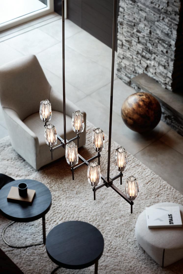


LIGHTS FANTASTIC PRO LIGHTING AUSTIN SINCE 1973 At Lights Fantastic Pro, our team of skilled lighting experts utilize the latest in lighting design and technologies to bring your dream home to light in a style that is uniquely yours. Schedule a lighting consultation at our premier showroom today and explore the possibilities. Your home in perfect light. 7532 BURNET ROAD, AUSTIN TX 78757 | 512-452-9511 | WWW.LIGHTSFANTASTICPRO.COM 50 YearsANNIVERSARY



32 CONTENTS SUMMER 2023 DWELL 12 ART A Center For Art, Artists and Art Lovers 14 SPOTLIGHT Multiple Expressions 20 PLAY Whimsical Woodland Treehouse 22 TRAVEL The Trost Influence: How Henry C. Trost Shaped The West Texas Hotel Landscape 26 DESIGN Windows With Intentionality 38 28 MARKET The “Austintatious” Guide For Selecting (The Perfect) Window Treatments HOME DESIGN 32 A MINIMALIST’S DREAM 38 THE PEMBERTON REVIVAL 44 ILLUMINATING THE NEIGHBORHOOD 50 IN PERFECT RHYTHM 56 THE CANVAS 62 AROUND THE TREES CONTRIBUTORS 66 REMODELER’S ADVICE Remodeling Trends For 2023 By Wells Mason of Buiders FirstSource Sponsored by Bes Builder SPOTLIGHTS 8 FROM THE EDITOR 44 56 6 HOME DESIGN & DECOR AUSTIN-SAN ANTONIO | SUMMER 2023
II’ve never actually picked a favorite issue but this one really makes me happy. It speaks to artful living, intentional living — at least my interpretation of it — and it’s something I’ve given a lot of thought to this year. When I look at the homes in this issue, I can imagine how the homeowners’ use their spaces, how their daily lives are impacted by the art and architecture of their homes — and how the creative minds behind each design purposefully created to that use in the most beautiful ways.

The artists featured in this issue may be better known for their contributions to the built design world, but that is intertwined with their personal expressions. Windows and backyard playscapes as works of art? Yes! I was also inspired by a recent trip to Marfa and one of my favorite hotels, Hotel Paesano, (I’m a Giant junkie) to highlight Henry Trost and his contributions to West Texas architecture.
And thanks to the David Wilkes Builder project, my unused hot tub has now been renamed “The Cocktail Pool!” Cheers, everyone!
Trisha Doucette



FROM THE EDITOR
ON THE COVER:
8 HOME DESIGN & DECOR AUSTIN-SAN ANTONIO | SUMMER 2023
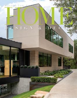
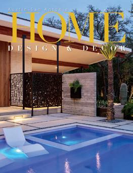
Hidden from the road behind a heavily wooded area, this dynamic home, designed by Dick Clark + Associates, appears to float among the trees. Page 32. Photo by Paul Bardagjy.
Austin-San Antonio
www.homedesigndecormag.com

Publisher Louis Doucette
Editor
Trisha Doucette
Contributing Editor
Wells Mason, Builders FirstSource
Writers
Claudia Alarcón, Alexa M. Johnson, Jacey Blue Renner, Kimberly A. Suta, Sarah Yant
Photography
Dror Baldinger, FAIA, Paul Bardagjy, Leonid Furmansky, Clay Grier, Madeline Harper, Lauren Myers, Brittany Dawn Short, Charles Davis Smith, FAIA

Architectural Publicist
Diane Purcell – Dianepurcell.com
Advertising Sales
Sandy Weatherford, Gerry Lair, Madeleine Justice
Business Manager
Vicki Schroder
Design and Production
Tim Shaw – The Shaw Creative – theshawcreative.com
Phone
512.385.4663, Austin - 210.410.0014, San Antonio
Address
10036 Saxet Drive / Boerne, Texas 78006
President Michael Kooiman
Email: louisd@homedesigndecormag.com
Website: www.homedesigndecormag.com
Home Design & Decor Magazine Austin-San Antonio is published by Big City Publications, LLC. Advertising rates available upon request. All rights reserved by copyright. No part of this publication may be reproduced in whole or in part without the express written consent from publisher. Every effort is made to assure accuracy of the information contained herein. However, the publisher cannot guarantee such accuracy. Advertising is subject to errors, omissions and or other changes without notice. Mention of any product or service does not constitute endorsement from Home Design & Decor Magazine. The information contained in this publication is deemed reliable from third party sources, but not guaranteed. Home Design & Decor Magazine does not act as an agent for any of the advertisers in this publication. It is recommended that you choose a qualified remodeling, home furnishings or home improvement firm based on your own selection criteria. Home Design & Decor Magazine, does not act as an agent for any of the realtors or builders in this publication. It is recommended that you choose a qualified realtor to assist you in your new home purchase.
Home Design & Decor Magazine will not knowingly accept advertising for real estate that is a violation of the Fair Housing Act. All real estate advertising in Home Design & Decor Magazine, is subject to the Fair Housing Act that states “We are pledged to the letter and spirit of U.S. policy for the achievement of equal housing opportunity throughout the nation. We encourage and support an affirmative advertising and marketing program in which there are no barriers to obtaining housing because of race, color, religion, sex, handicap, familial status or national origin.”


© Copyright 2023 by Home Design & Decor Magazine. All Rights Reserved.
DESIGN INSPIRATION
For more inspiring architecture and interiors with the most current design and product trends from Central Texas’ talented architects, builders, designers and showrooms, visit HomeDesignDecorMag.com.

VOL.
NO. 2
SUMMER 2023
18 |
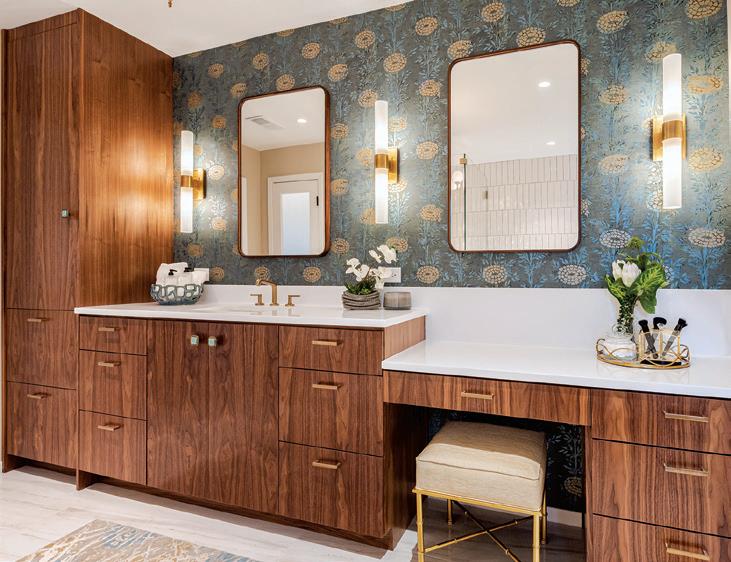
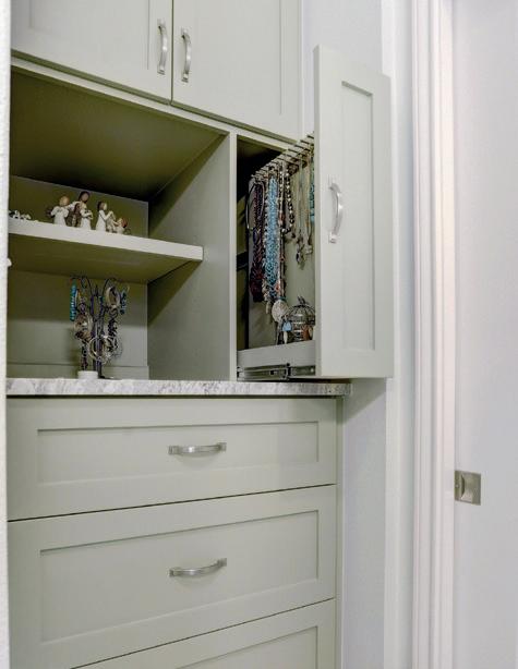
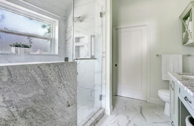
Adams Company is a woman-owned and operated business. The all-female team, including an in-house designer and two project managers, has won more than 40 awards in the past 10 years.


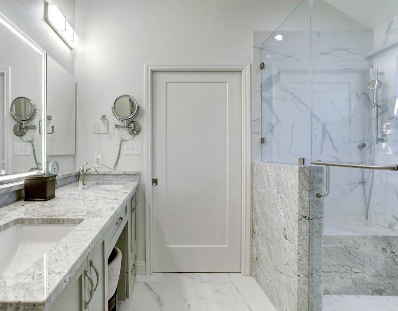
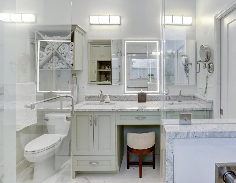
13740 N. Research Blvd, Building N, Suite 8, Austin, Tx 78750 512.785.7226 www.adamscompany.biz
Residential Bath
2023 REGIONAL WINNER
$50,001 to $75,000
DWELL

“BE KIND” VECTOR ILLUSTRATION
ON ACRYLIC, 1/1, BY ANALY DIEGO.
A CENTER FOR ART, ARTISTS AND ART LOVERS
COURTESY OF THE ROCKPORT CENTER FOR THE ARTS | PHOTOGRAPHY BY PAM FULCHER
RANKED AS ONE OF THE TOP 10 ARTIST COLONIES IN THE U.S. BY COASTAL LIVING MAGAZINE, ROCKPORT, TEXAS IS A THRIVING ARTISTS’ COMMUNITY.
AT THE END OF LAST YEAR, THE COASTAL CITY CELEBRATED THE GRAND OPENING OF THE NEW ROCKPORT CENTER FOR THE ARTS (RCA).
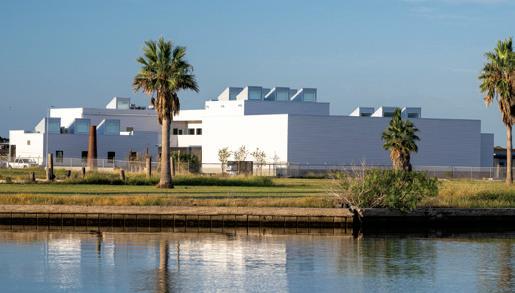
Located one block from Aransas Bay, the 1.2-acre site is the first original facility to be built for the celebrated 53-year-old nonprofit organization. “We are so pleased and proud to be opening this amazing new facility,” said Luis Purón, executive director for RCA. “Our membership, the community and others throughout Texas at large have been so supportive of our efforts to rebuild following the destruction brought by Hurricane Harvey in 2017; this is a testament to their efforts and we are so grateful.”
Sculptor Kent Ullberg noted, “I’ve been part of the Rockport Art community for more than 40 years, having had many exhibits there with artist friends. At the time, the Art Center was a small modest wooden house that was destroyed during Hurricane Harvey in 2017. We thought that was the end of the Rockport art scene but luckily … Luis Puron appeared with tremendous leadership abilities and everything changed.”
The new $12.5 million campus encompasses a two-story, 14,000-square-foot visual arts and art education building, serving as the home to art programs with four galleries and five classrooms dedicated to advanced workshops and handson classes for the public; the Rockport Conference Center, an adjacent 8,000-square-foot event center with a ballroom and culinary arts kitchen; and serving as a transition space between the two buildings is a sculpture garden. “With four
new galleries, a greater variety of artistic expression will be presented to the public, providing glimpses of the wide range of art that is possible,” said Karen Rester, mixed media artist.
Ceramicist Stan Irvin reflected on the impact art and artists have had on Rockport, saying, “Being a clay artist, I am very excited about the promise that the RCA holds for artists and art-viewing patrons in the area. Art has played an important role in defining Rockport since the creation of the Rockport-Fulton Art Colony of the late 1940s. Thanks to the new facility, Rockport is becoming a beacon for artists and art lovers in Texas and beyond. u
Hours of operation for the showroom, galleries and gift shop will be Tuesday–Saturday from 10:00am to 5:00pm, and Sunday from noon–4:00pm. Admission is always free. For general information, visit RockportArtCenter.com or call 361-729-5519.

SUMMER EXHIBITS
ROOTS OF ROCKPORT: PAST MASTER ARTIST EXHIBITION
June 9 – July 23
McKelvey Charitable Fund Gallery
KENT ULLBERG
June 16 – August 6
HEB Fund Gallery
DEBRA CHRONISTER
July 21 – September 24 Reception: September 15
Jeanie & Bill Wyatt Gallery
GOLDEN SUMMER: MEMBERS EXHIBITION
June 16 – August 24
Mendez Family Gallery
ART 12 HOME DESIGN & DECOR AUSTIN-SAN ANTONIO | SUMMER 2023
MULTIPLE EXPRESSIONS
DESIGNERS, ARCHITECTS AND OTHER RELATED PROFESSIONALS ARE A CREATIVE BUNCH. THEIR DAYS ARE SPENT IMAGINING BEAUTIFULLY LIVABLE SPACES FOR CLIENTS, AND ARE SUCCESSFUL AT ENVISIONING AND CREATING SOMEONE ELSE’S DREAM HOME. SO, IT’S NO WONDER THAT AS CREATIVES, SURROUNDED BY STIMULATING VISUALS DAILY, THEY WOULD DESIRE ADDITIONAL OUTLETS TO EXPRESS THEMSELVES ON A PERSONAL LEVEL. FOR SHEA PUMAREJO, ANALY DIEGO AND MALA VASUDEVAN, THEIR PROFESSIONAL AND PERSONAL ARTISTIC TALENTS COMPLEMENT EACH OTHER IN THE MOST WONDERFUL WAYS.
SHEA PUMAREJO Younique Designs
Shea Pumarejo, interior designer and CEO of her renovation and design firm, Younique Designs, says design definitely came before painting. She has more than 30 years of experience in the field and has been honored with 14 national design awards including the National Kitchen and Bath Associations Design Awards and Kitchen and Bath Design News Awards as well as the Trends International Design Awards and The International Design and Architecture Awards.

Growing up with a mother who has a degree in art and was always experimenting with watercolors, drawing, sewing and decorating, Shea’s inherent artistic nature was nourished and encouraged. The two collaborated on a mural for her daughter’s bedroom, but she still did not pursue art or seriously consider herself an artist until a few years later. “I never actually picked up a paintbrush to paint a painting until my 50th birthday four years ago when I booked myself a weekend workshop in Atlanta taught by an artist I had been following on YouTube. After that weekend, I was hooked,” she recalled.
Instruction continued back at home with various painting classes, and one oil painting class, in particular, at the Southwest School of Art that turned out to be her greatest inspiration. “The class was taught by a professional painter, Jerry Cabrera, who is a natural teacher. I’ve continued to study with him for multiple sessions, each time learning new techniques and styles, and growing as an artist,” said Shea. She switched from acrylic to oils and now makes time to paint a few times a month.
As a seasoned designer adept at many styles to suit her diverse clientele, Shea’s paintings are truly an outlet for her personal style. She explained, “As a designer, I design spaces that speak to my clients’ personalities as the spaces I design are for them to live in. Painting, on the other hand, is for me. I paint what I like without any consideration for what anyone else may think about the piece. It’s absolute freedom to create. I love everything about the process from creating a composition, to deciding which colors to use, to finally seeing the piece come together. For me, it’s a lot like designing a home. The process is similar and the freedom to create and see that space transform and come to life never gets old for me.”
So, what inspires her nowadays? “Inspiration can come from literally anywhere. I like to have fun with my paintings, so the subject matter is never too serious. I love color and quirky subjects that stand out and make a statement. Because of my design background, I think when I am considering a new painting, I envision it hanging in a room. My own home is an explosion of color, and very eclectic and quirky, so I suppose you could also describe my paintings the same way. I think art should be the one thing in a space that is bold, expressive and unexpected. Gone are the days of matching art to your sofa,” she said.
Shea said she has had no showings as of yet, but that could definitely change down the road. “For now, I’m enjoying finding my voice.”
SPOTLIGHT
MyYouniqueDesigns.com 14 HOME DESIGN & DECOR AUSTIN-SAN ANTONIO | SUMMER 2023




SUMMER 2023 | HOME DESIGN & DECOR AUSTIN-SAN ANTONIO 15



16 HOME DESIGN & DECOR AUSTIN-SAN ANTONIO | SUMMER 2023
ANALY DIEGO
Analy Diego Designs and UTSA School of Architecture
As a small child, Analy Diego’s grandfather, an accomplished artist himself, replaced children’s books with artists’ books. She remembers sitting on his lap while he read to her about the masters: DaVinci, Michelangelo, Picasso, Disney, Rembrandt, Degas, Kahlo, etc. “I am forever in debt to him for that. This early introduction to art inspired me to draw and color more than the average kid my age,” she said. A few years later, her mother signed her up for painting classes and she continued to explore various mediums, eventually joining Architecture School in 2004.
Other factors contributed to her early passion for art, and taught her that observing and understanding people and the environment are some of the qualities that make a good designer. Analy shares, “I was born in Laredo, Texas and grew up in Nuevo Laredo, Mexico; being a part of both countries and cultures has always felt like a blessing to me. As a kid, my family and I were fortunate enough to travel to different places in both Mexico and the U.S.: Mexico City, Morelia, Acapulco, Cancun, New Mexico, Los Angeles, New York, to name a few, all presented different color palettes in their architecture, flora, fauna and their skies. This early introduction to different environments sparked my interest in color, architecture and art.”
In 2015, Analy joined the UTSA School of Architecture faculty where she teaches design courses related to materiality, space planning and color theory, all practicums that complement her talents as an artist. However, there was a time when she had conflicting thoughts about whether she should label herself as a designer or an artist. “With time,
I have found that I can be both. I live and breathe art and design. 100% of my time is spent either creating, observing, learning/teaching, drawing inspiration from my surroundings or dreaming about ideas,” she said.
Today, Analy labels herself as a mixed media artist, mixing digital work with painting, glitter and resin, and displaying on different surfaces such as mirror, aluminum, acrylic and wood, among others. “That said, my path as an artist has taken a few twists and turns. I started working with watercolor and oils at an early age, and over the years I have worked with many other mediums in an effort to find my voice. During this time, I’ve found that digital art is one of my strongest suits, which is often regarded as not ‘true art.’ Slowly but surely, my work has taught people that art comes in different forms, and that a stylus pen can be just as powerful of a tool as a brush when creating art,” Analy explained. Some of Analy’s graphic illustrations have been adapted and installed as murals throughout the city, and have become part of interior spaces, which was always her vision and goal to combine her talents as an interior designer and an artist in multiple projects.
In her design practice, Analy Diego Designs, she continues to merge interior architecture, art curation, graphic design and art as one package for her clients, because she believes that as she is both an artist and designer, art and design are one.

AnalyDiego.com SUMMER 2023 | HOME DESIGN & DECOR AUSTIN-SAN ANTONIO 17
MALA VASUDEVAN Architectural Interior Designer
Mala Vasudevan’s extensive portfolio of her different art forms is impressive. And she says it all began with her art hobby as a child. As she got older, it was obvious that her hobby was actually directing her life and she decided to seriously transition it into a career.

“I was drawn to fashion because it was a wearable form of art. I majored in business and minored in textiles and apparel in undergrad, which eventually led me to a career in fashion in New York City. The need for a change led me to pursue a graduate degree in architectural interior design. For me, this was such an encompassing expression of art that was inhabitable and immersive,” said Mala of how she landed on her most recent career.
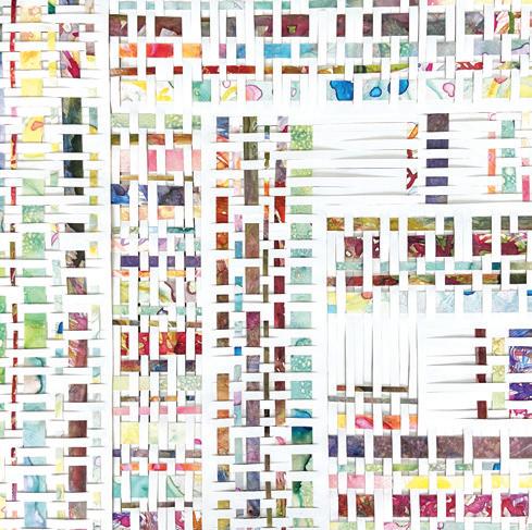
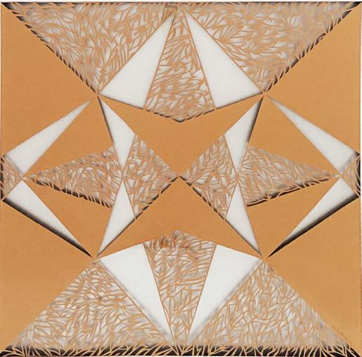
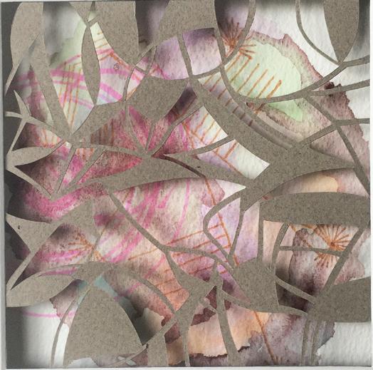
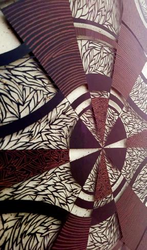
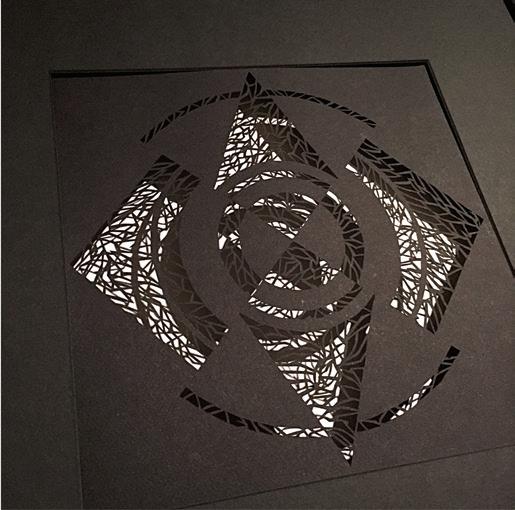
Her personal artistic expressions have expanded as well. She has explored a variety of mediums such as graphite, charcoal, pen and ink, acrylics, oil, pyrography and collage, and eventually discovered her passion for papercutting. “There is something deeply cathartic about using an Exacto knife, cutting away the non-essential and revealing a level of complexity and intricacy from a seemingly simple initial outline. I’m constantly testing new mediums, paper qualities and framing techniques; the experimentation is a joyful and meditative process,” explained Mala of the process and love of her Paperlace projects.
These lattice-like Paperlace designs have also inspired her textile designs as well as architectural designs where she incorporates her signature cutout patterns in both interior and exterior applications.
As for what Mala’s greatest influences are, she says, “Witnessing the brilliance of other artists and architects inspires me immensely and is a daily source of motivation. Whenever I travel, I find myself imagining the creative process behind their works and envisioning their work through their eyes. Agnes Martin and Josef Albers are two artists whose works have greatly inspired my own work. I also grew up with an appreciation for hand embroidery, hand-loomed textiles and traditional Indian block printing — several things that have influenced my work.” All of these techniques are evident in her designs with intricate woven, layered and kaleidoscopic patterns.
Mala’s work has been shown in local gallery spaces and shows, and she has participated in the EAST and WEST Austin studio tours in past years. She also continues to do commissioned works for private clients. u
@withlvm | mala@withlvm.com
18 HOME DESIGN & DECOR AUSTIN-SAN ANTONIO | SUMMER 2023


WHIMSICAL WOODLAND TREEHOUSE
BY SARAH YANT, FOUNDER AND PRINCIPAL, TWISTLEAF | PHOTOGRAPHY BY BRITTANY DAWN SHORT

PLAY
20 HOME DESIGN & DECOR AUSTIN-SAN ANTONIO | SUMMER 2023
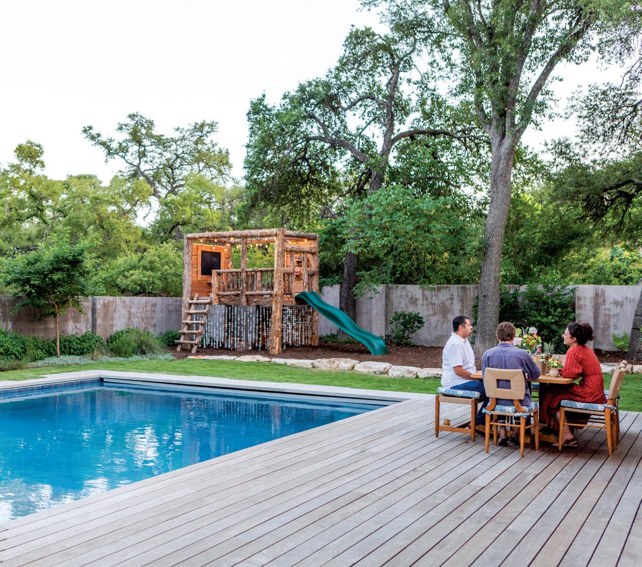
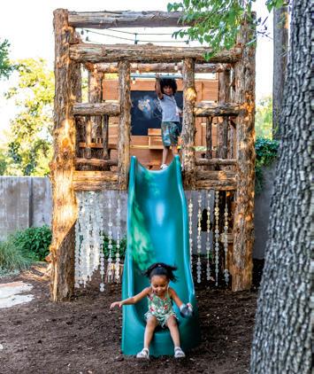
Our goals were to create a defined space for two lucky young children, and to maximize the amount of play possible within a small footprint in the homeowners’ backyard. The overall design is unique and allows harmonious integration between the fanciful children’s area and the more traditional ranch-style home.
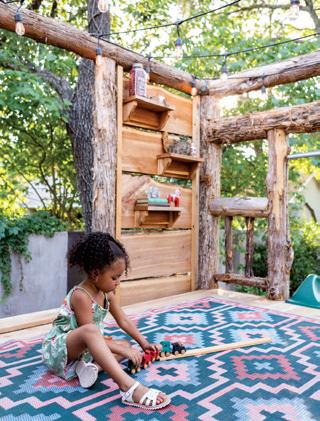
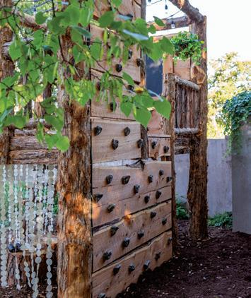
We chose not to rely heavily on common playscape materials like plastic and steel, and through our natural material choices were able to capture the magical spirit of a fairytale. We built the frame of the structure from natural-faced Eastern red cedar logs, a regionally specific material we appreciate for its durability and tactile quality. Two live edge cedar walls provide privacy from neighboring properties.
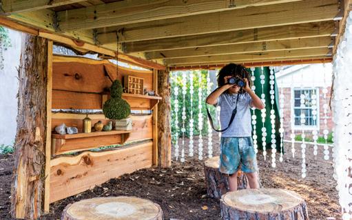
The open frame of the upper platform allows for plenty of light during the day, while the ceiling of string lights allows for play into the early evening. We created a second playspace, defined by capiz shell curtains, beneath the platform. The shell curtains make for a musical entry experience and catch the sunlight beautifully.
We wanted each element to inspire curiosity, and our design is full of interactive features like child-sized furniture made from tree stumps, a hidden climbing wall, a large chalkboard and a slide with a swing bar. We also added decorative accents such as a colorful outdoor rug, shelves for the children’s trinkets and a hanging basket to personalize and soften the rustic structure and bring it into relationship with the surrounding landscape.
For the other areas of the property, we created relaxing and serene outdoor spaces. Features including a net swing and a culinary garden of herbs and edibles encourage more outdoor play and family fun. Limestone boulder retaining walls and pathways add to the beauty of the site while improving site accessibility and drainage. Shade-loving native Texas plants like Turk’s cap and sedge envelop the front lawn, attracting pollinators and beneficial wildlife to the property, while water-saving drip irrigation prepares the lawn for potential dry spells and reduces water usage.
With thoughtful and creative design, our landscape project transformed this property into a tranquil urban retreat that promotes creative play and fosters a lifelong relationship with the natural world. u
 TWISTLEAF LAND DESIGN 512-489-0798 | Twistleaf.com
SUMMER 2023 | HOME DESIGN & DECOR AUSTIN-SAN ANTONIO 21
AT TWISTLEAF, WE BELIEVE THERE’S NO BETTER WAY TO FOSTER A CHILD’S LOVE OF THE OUTDOORS THAN TO CRAFT A NATURAL PLAYSCAPE THAT ENCOURAGES HOURS OF IMAGINATIVE ADVENTURE. THAT’S THE INSPIRATION BEHIND THE SPECIAL TWO-STORY TREEHOUSE THAT WE DESIGNED AND BUILT FOR AN AUSTIN FAMILY OF FOUR.
THE TROST INFLUENCE:
HOW HENRY C. TROST SHAPED THE WEST TEXAS HOTEL LANDSCAPE
 BY JACEY BLUE RENNER
Amongst the mesquite and grasslands, you’d be remiss if you didn’t pay homage to the distinctive architecture that has survived against all odds, within the region of West Texas. Despite the struggles so many small towns have faced over the years, the West Texas communities of Marathon, Alpine, Van Horn and Marfa are collectively continuing to highlight the history and design of well-known El Paso architect Henry C. Trost, while increasing tourism.
Whether you are a first-time visitor to West Texas or have the starry nights memorized, travelers are certain to have experienced the gorgeous and eclectically vast expanse of architecture as they explore the region. Trost’s architectural imprint spans hundreds of buildings across the Southwest, redefining both rural and urban communities during the
1920s and 1930s. With the help of investment and restoration, this design legacy continues today, encouraging the heritage tourism boom, and as unique stopovers on route to Big Bend and Guadalupe National Parks.
Originally from Toledo, Ohio, Henry Trost began designing buildings in the late 1880s, and found his way, with his brother Gustavus, to El Paso in 1903. Together, they co-founded Trost & Trost, an architectural firm that would innovate the American Southwest’s architectural landscape for the next several decades. Once brother Adolphus joined the firm in 1908, introducing new engineering technologies and reinforced concrete construction, their team was unparalleled, incorporating high quality materials and technologies from Chicago into their designs, meant to last forever.
TRAVEL 22 HOME DESIGN & DECOR AUSTIN-SAN ANTONIO | SUMMER 2023
In addition to their El Paso office, Trost & Trost capitalized on the region’s charms opening offices in Albuquerque and Phoenix. 1916 was a peak year for the firm, with 41 buildings under construction simultaneously and teams working 24 hours a day. Their design legacy spanned more than 600 buildings, with styles ranging from Art Deco and Moorish to Pueblo and Gothic, throughout the Southwest and in Mexico. It seems there wasn’t anything the brothers couldn’t design to fruition for the scope and imagination of every caliber of clientele.
“Henry was a man of exquisite taste,” Dr. Max Grossman, current Vice-Chair of The Trost Society, details. Trost’s involvement extended to every aspect of the design, from the exterior to the interior, bringing in specialists for each element. “The craftsmanship is jaw dropping. Each of the buildings is prominently sited, a showcase building for each of the towns for which it was built,” Grossman posits. The Trost Society itself, born of a desire to protect and prevent further demolition of Trost architecture in El Paso and across the region, was co-founded in 2013 by Malissa Arras and Mason Sales. Dr. Grossman and Marcos Fernandez joined shortly after.
And while El Paso holds much of the locus and beauty behind Trost’s designs, his reach extended far into the rural ranching communities of West Texas. The Gage Hotel, Hotel Paisano, Hotel El Capitan and The Holland Hotel, all share the Trost design lineage and have been restored and revitalized, capitalizing on the integrity and visionary talents of Trost & Trost as modern tourism reverts to heritage-based travel.
THE GAGE HOTEL in Marathon, built for San Antonio banker and rancher Alfred S. Gage in 1927, reflects the modern successes of the Trost narrative. At one-time Marathon’s epicenter of both the social and agri-business scene, the hotel fell into ruin, as the local economy fell apart in this small town, until Houston businessman J.P. Bryan took ownership in and revived not only the hotel, but Marathon itself. The Gage Hotel’s mission-style architecture has been beautifully renovated and restored, while boasting arguably the best steakhouse in the region, 12 Gage Restaurant, which locally sources its beef and wild game, and harvests vegetables from its in-house garden. If you go: consider a stay in the namesake suite and a fresh-squeezed margarita from the White Buffalo Bar.

SUMMER 2023 | HOME DESIGN & DECOR AUSTIN-SAN ANTONIO 23
THE GAGE HOTEL
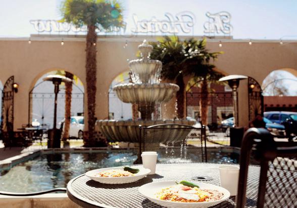
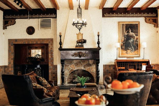
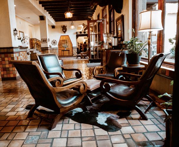
HOTEL PAISANO in Marfa was built by prominent El Paso businessman and hotelier, Charles Bassett, as one of five hotels meant to encourage tourism within West Texas and the El Paso area. After breaking ground on Trost’s design in 1929, the hotel opened its doors in 1930, catering to the cattle industry and tourists seeking the solace of the arid desert air as prescribed for improved health. Elizabeth Taylor, Rock Hudson and James Dean, cast of the 1956 film Giant, stayed and noshed here during filming. In 2001, hoteliers Lanna and Joe Duncan revived and restored the hotel, known for its mission style and pueblo accents. If you go: consider a stay in the James Dean room, where the actor stayed while filming, or the Elizabeth Taylor Suite overlooking the gorgeous courtyard.
THE HOLLAND HOTEL in Alpine was rebuilt by Carl Holland and designed by Trost & Trost in 1928. While it has changed hands over the years, its architecture remains classic, and demonstrative of Trost’s Spanish Colonial Revival style. Built at a time when the Southern Pacific Railroad was an integral interconnecting piece of West Texas, The Holland Hotel, still sits adjacent to the train lines, now Amtrak. In 2011, Greenwich Hospitality Group completed restoration of the hotel to its former grandeur. If you go: leave your cares at the door with a visit to the Mendias & Co. urban day spa. If you’re feeling peckish, book a chef’s table overlooking the open kitchen at hotel restaurant, The Century.


24 HOME DESIGN & DECOR AUSTIN-SAN ANTONIO | SUMMER 2023
HOTEL PAISANO, PHOTOS BY LAUREN MYERS THE HOLLAND HOTEL
HOTEL EL CAPITAN in Van Horn, named for the southern-most point of the Guadalupe Mountains, was also one of the five Gateway hotels designed by Trost and built by Charles Bassett in 1930. Meant as a unique stopover for tourists traveling through the crossroads to Carlsbad Caverns, Big Bend and Guadalupe National Parks, El Capitan’s pueblo-style architecture and European-style bathrooms provide a historic insight into Trost’s West Texas portfolio. A bank since 1973, Hotel Paisano owners, Lanna and Joe Duncan, purchased and restored Hotel Paisano’s sister-hotel, El Capitan, in 2007. If you go: consider dining in the oasis courtyard under a wide-open West Texas skyfall or enjoying a summer cocktail at the Gopher Hole Bar,
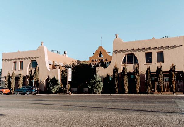

named for the original prohibition era basement bar. Fun fact: Van Horn is aptly nicknamed the gateway to the stars; not only are the skies laden with quiet star power, but Blue Origin, Jeff Bezo’s space flight company, is headquartered just south of town. u
Trost & Trost design impresses on West Texas, especially now, the charms of the Southwest region. Towns in this region, who have managed to conserve Trost’s historic touchstones and architecture, have found a new way to thrive and evolve. For more information on the Trost Society, visit TrostSociety.org.
SUMMER 2023 | HOME DESIGN & DECOR AUSTIN-SAN ANTONIO 25
HOTEL EL CAPITAN, PHOTOS BY LAUREN MYERS
WINDOWS WITH INTENTIONALITY
BY ALEXA M. JOHNSTON
EVERY BUILDING STRUCTURE TELLS A STORY — TO EVOKE A PARTICULAR MOOD, SERVE A SPECIFIC FUNCTIONAL PURPOSE, OR REFLECT A HISTORICAL MOMENT IN TIME. EACH ELEMENT THAT IS CHOSEN FOR A PROJECT, FROM THE TYPE OF FOUNDATION TO THE STYLE OF SHINGLES, LAYER TOGETHER TO ENSURE THE DESIRED EFFECT IS ACHIEVED. ONE ELEMENT OF A BUILDING THAT UNIQUELY INVITES THE INTERIOR TO SEAMLESSLY CONNECT WITH THE EXTERNAL ENVIRONMENT IS THE WINDOW.
Focusing on that environmental connection and the significance of the window itself rests at the core of the A. Gruppo Architecture firm. Principal architects, Thad Reeves and Andrew Nance, originally met in architecture school in the 90s, but both embarked on different career journeys until a project in 2004 allowed their paths to cross again, leading to the beginning of the specialized architecture firm.
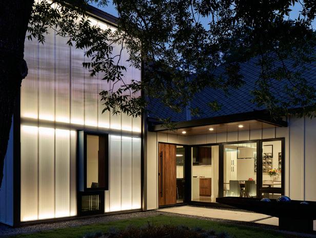
“The role of a particular window heavily influences how we think about designing the opening. If it opens to a bedroom or is adjacent to a street, there may be a need for an increased level of privacy,” Andrew said of their design focus. “We use windows to influence the interior experience — full height walls of glazing provide a connection to the outdoors; transparent walls (polycarbonate glazing) provide amazing natural light and privacy, while smaller windows may frame a view to a particular tree or vista outside.”
DESIGN
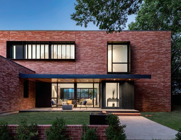
Perched high on a wall that overlooks the western sky, the steel window offers stunning views directly into the living room, while the fins help mitigate the afternoon light. The window wall sits directly beneath it, allowing natural light to flood into the home.
A single window protrudes from a window wall made with PCCS sheets filtering eastern light while a three-paned window wall invites views to and from the dining area.
PHOTO BY CHARLES DAVIS SMITH, FAIA
26 HOME DESIGN & DECOR AUSTIN-SAN ANTONIO | SUMMER 2023
PHOTO BY DROR BALDINGER, FAIA
The firm’s unique style of protruding windows developed from understanding the importance of the window and highlighting its role within the space. When designing a room or building, not only do the architects consider a client’s privacy, UV protection and insulation, but they meticulously analyze the overall configurations, how individuals will use that particular area, as well as how light and external views will impact or change the entire space. For instance, a protruding window may provide additional space in the room for storage and relaxation.
“Styles seem to have a lot to do with the building science and technology of the time. In our current time, most building materials are machine-made or fabricated,” Andrew said of how the firm developed its style. “The skilled craftspeople of today assemble these fabricated materials perhaps with the same spirit a 15th-century stonemason would, but use different tools and procedures. In any case, I think it is fair to say that the inherent machine-made character of many of the materials we use today informs the style of our work. It’s also greatly informed by the conversations we have with our clients.”
A. Gruppo Architecture maintains two office locations in San Marcos and Dallas, providing services to residences and commercial properties throughout Texas. u
A. GRUPPO ARCHITECTURE
512-557-2140 | AGruppo.com
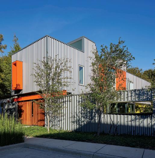
Orange visors contrast against the industrial exterior, while simultaneously offering protection from the western sunlight. Strategic elements of privacy were incorporated into the lower level, including glazing for the windows and a wooden rolling entry gate to shield the front patio from passersby. Two clerestory windows sit on both the east and west sides of the home, cascading light into the first level of the residence.
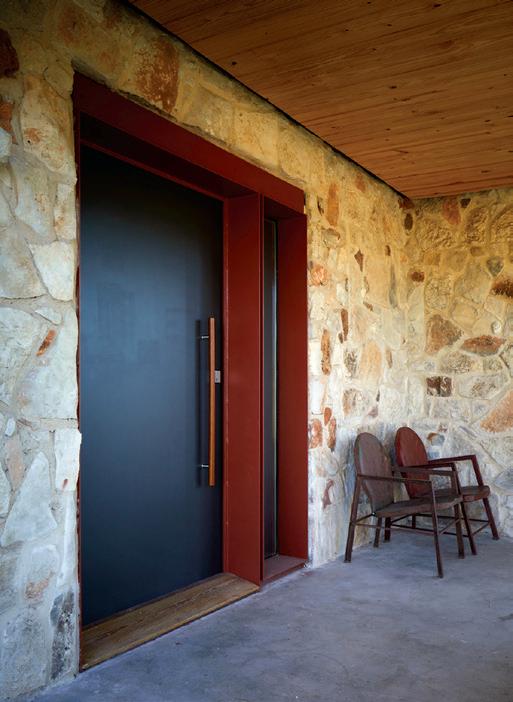
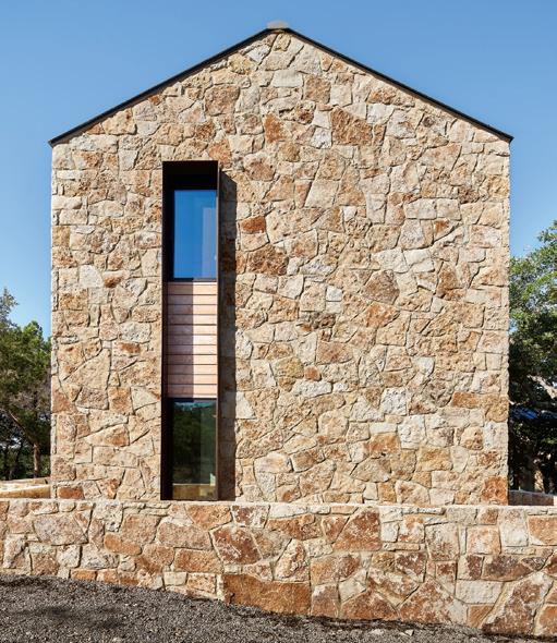
The narrow, vertical window juxtaposed against the flagstone wall complements the overall rustic exterior, while the subtle visor provides a reprieve from the sun into the bedroom.
The renovated 1920s home received modern influences including the custom projected door and window bay. Together, they cohesively create a square, which was a subtle nod to the origins of the home that initially had two Golden Mean Rectangle windows.
PHOTO BY DROR BALDINGER, FAIA
PHOTO BY DROR BALDINGER, FAIA
SUMMER 2023 | HOME DESIGN & DECOR AUSTIN-SAN ANTONIO 27
PHOTO BY DROR BALDINGER, FAIA
THE “AUSTINTATIOUS” GUIDE FOR SELECTING (THE PERFECT) WINDOW TREATMENTS
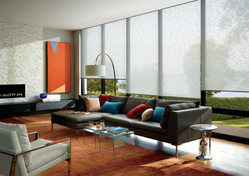
AUSTINTATIOUS BLINDS & SHUTTERS PULLS BACK THE CURTAIN AND SHARES EVERYTHING YOU NEED TO KNOW ABOUT SELECTING WINDOW TREATMENTS — FROM YOUR FIRST SHOWROOM VISIT TO INSTALL DAY.

 BY DREW HENRY
Building your dream home requires building the dream team. Twenty years ago, Norma Catano and Tracey Hopkins set out to make that dream a reality. The duo founded Austintatious Blinds & Shutters, and grew to become Austin’s leading custom window treatment dealer and a one-of-a-kind Hunter Douglas Gallery and Hunter Douglas Authorized Service Center. It’s safe to say this team knows a thing or two about window coverings. So, these experts are sharing their “Austintatious” guide to selecting window coverings.


MARKET
From left to right: Tyler Haug holding Bleu, Rachel Hewitt, Dennis Bowman, Amy Sanner, Caylin Mothersbaugh, Norma Catano, Tracey Hopkins, Tara Fagan, Chris Ballard, Lacey Willmore, Natalia Murillo, Shelby Rzansa and Collin Whiting.
App and additional equipment required for programmed
28 HOME DESIGN & DECOR AUSTIN-SAN ANTONIO | SUMMER 2023
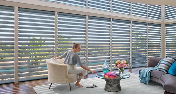
Designer Roller Shades with PowerView® Automation. The PowerView®
operation.
1. PLAN AHEAD OF TIME
Austintatious team member Amy Sanner says to begin planning before the walls go up. “Over 80% of our clients want motorized window treatments,” she explains. “Motorization (without battery operation) requires pre-wiring and specific logistics that low voltage/AV companies and builders need to account for in the early design and building stages. It is also crucial to work with the builder in window selections to ensure enough depth to accommodate the window treatment of choice.”
2. DO YOUR RESEARCH
Testimonials, experience and years in business carry a lot of weight when selecting a service provider. “Our designer and homeowner relationships are important to us, and we pride ourselves on our customer service. We have made great efforts in cultivating team members that are true experts in designing, ordering and installing the perfect window covering solutions,” says Tracey Hopkins, president and owner.
3. FIND A ONE-STOP-SHOP
“We’re a ‘well-oiled’ window treatment company that offers the most vetted, custom products with enhanced operating options, coupled with expert knowledge,” says Norma Catano, founder and owner. “We’ve curated the best quality design styles from brands like Hunter Douglas, offering standard and motorized shades, blinds, shutters and exterior solar screens. Our expert designers and local seamstress create the most stunning and trending custom draperies.”
4. VISIT THE SHOWROOM
While you might have an idea of what you want, visiting the Austintatious Blinds & Shutters showroom provides a chance to see and test options in person. Amy explains, “Our newly remodeled showroom is a great place to discover and work intimately with our team. This is where homeowners, interior designers, architects and builders meet to forge lasting relationships and allow us to educate and enlighten them to this ever-changing industry.”
5. KNOW YOUR OPTIONS
There are options available to fit every need and style. Smart
Shade Motorization is the most popular feature ordered today. “Purchasing the latest and greatest in Smart Shade technology allows a homeowner to ‘automatically’ operate their window coverings based on time of day, the temperature in or outside the home, or by just simply telling your favorite voice assistant what you want your shades to do,” states Tracey.
7. SCHEDULE A HOME CONSULT
The home consultation is the time to assess the needs of each room, take measurements, review wiring guidelines (pre-drywall stage) and finalize window treatment decisions. “We pilot and set expectations for our clients through the entire process,” says Amy.
8.
ADDRESS FUNCTION WITH STYLE
While picking out fabric colors and patterns is fun, window coverings take a function-first approach. “Our team analyzes the needed function of each room to assess the perfect solution,” says Tracey. Some top considerations include privacy concerns, sun exposure, views and the room’s purpose.
9.
PICK AN INSTALL DAY
Installation day is when the magic happens. “Prior to install day, if needed, we’ll conduct walk-throughs on larger projects to ensure everything is going to plan regarding framing window depths and wiring,” says Norma. “Our install management team is prompt to schedule your install upon careful coordination and verification of all needed materials prior to arrival.”
10. ENJOY!
The final step of the process is to sit back, pull back the shades (with the touch of a button), and enjoy the view of your beautiful new window coverings! u AUSTINTATIOUS
512-608-0302 | AustintatiousBlinds.com
FEATURED ADVERTISER EDITORIAL
BLINDS & SHUTTERS
© 2023 Hunter Douglas. All rights reserved. All tradmarks used herein are property of Hunter Douglas or their respective owners.
SUMMER 2023 | HOME DESIGN & DECOR AUSTIN-SAN ANTONIO 29
Pirouette with PowerView® Automation. The PowerView® App and additional equipment required for programmed operation.

DESIGN
MATT FAJKUS ARCHITECTURE |
PHOTO BY LEONID FURMANSKY
A MINIMALIST’S DREAM
BY KIMBERLY A. SUTA | PHOTOGRAPHY BY PAUL BARDAGJY

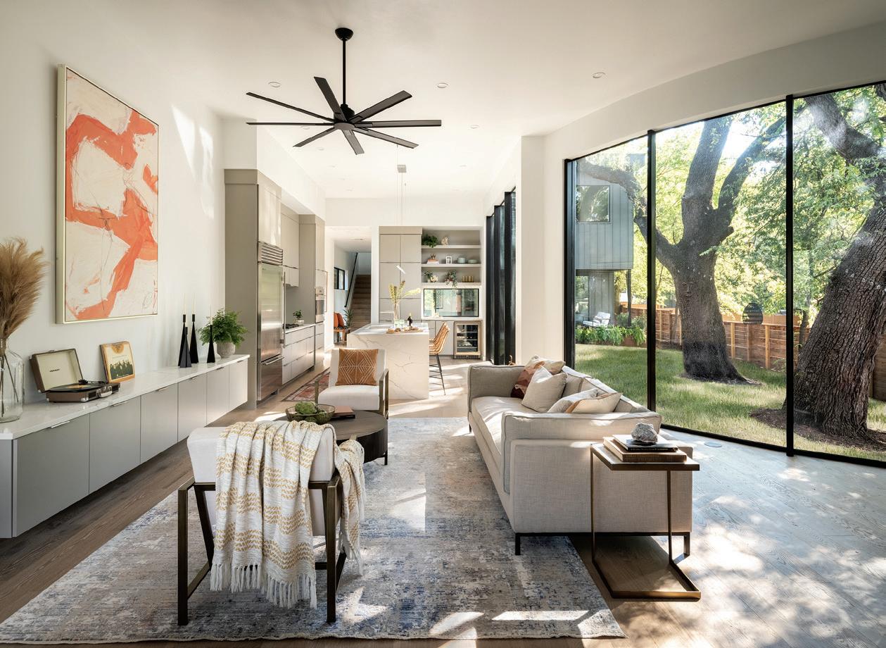
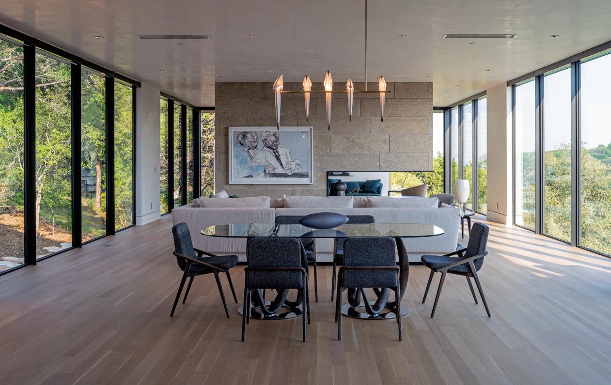
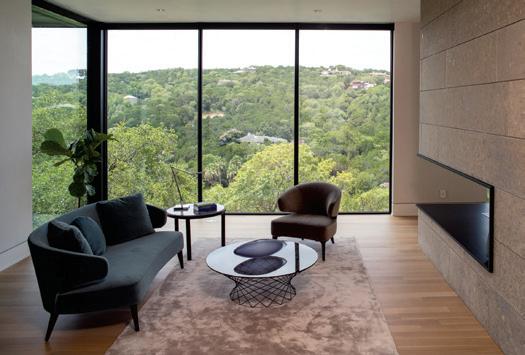
This long, open floor plan features a limestone fireplace, which matches the outside and is shared by both the dining room/kitchen and study on the other side. The space is meant to be more about what’s surrounding the house rather than what’s on the inside. The custom wood floor is made with white oak and site finished, which can be trickier but results in a pristine, uniform surface. The furniture throughout the house is by Scott + Cooner, a favorite of Kim’s because they are regional yet curate worldwide design.
TTHE HOME, WHICH WAS A NEW BUILD IN WEST LAKE Hills, came with a set of intriguing challenges, none of which daunted Kim. The site was unique with a steep topography and a well-established covering of mature live oak trees around and between the build site and the street.
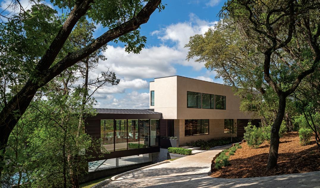
“There was an existing house that was torn down, which established a build site clear of trees, but it wasn’t capturing the potential of the site, so we slid the house along where the old house was but stepped it back a little bit to create a more dramatic sense of arrival at the front, and the coverage between the house and the street offers privacy and a feeling of being in the woods while inside the house,” explained Kim.
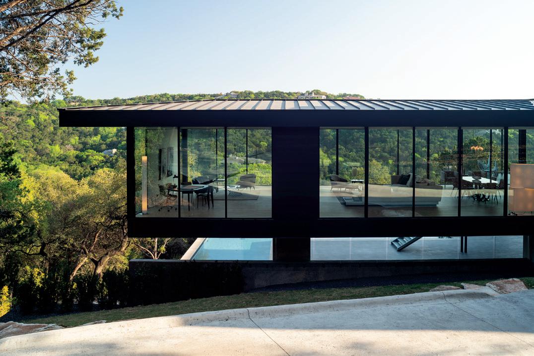
The long, linear and cantilevered house sits along the shelf of the hillside, bringing in the surrounding vegetation, and sets up picturesque views inside and out. However, the slope wasn’t Kim’s greatest challenge. Unlike most residential projects, which are initiated and planned with the homeowner, the client for this home was, in this case, the builder, Jon Luce Builder, who was also responsible for the interior design.
34 HOME DESIGN & DECOR AUSTIN-SAN ANTONIO | SUMMER 2023
IT’S OFTEN WHEN WE ARE MOST CHALLENGED THAT OUR GREATEST WORK EMERGES AND THIS RESIDENCE IS A STUNNING EXAMPLE. THE HOME WAS DESIGNED BY PARTNER KIM POWER, AIA OF AUSTIN-BASED DICK CLARK + ASSOCIATES, WHO WAS THE LEAD ARCHITECT ON THE PROJECT.
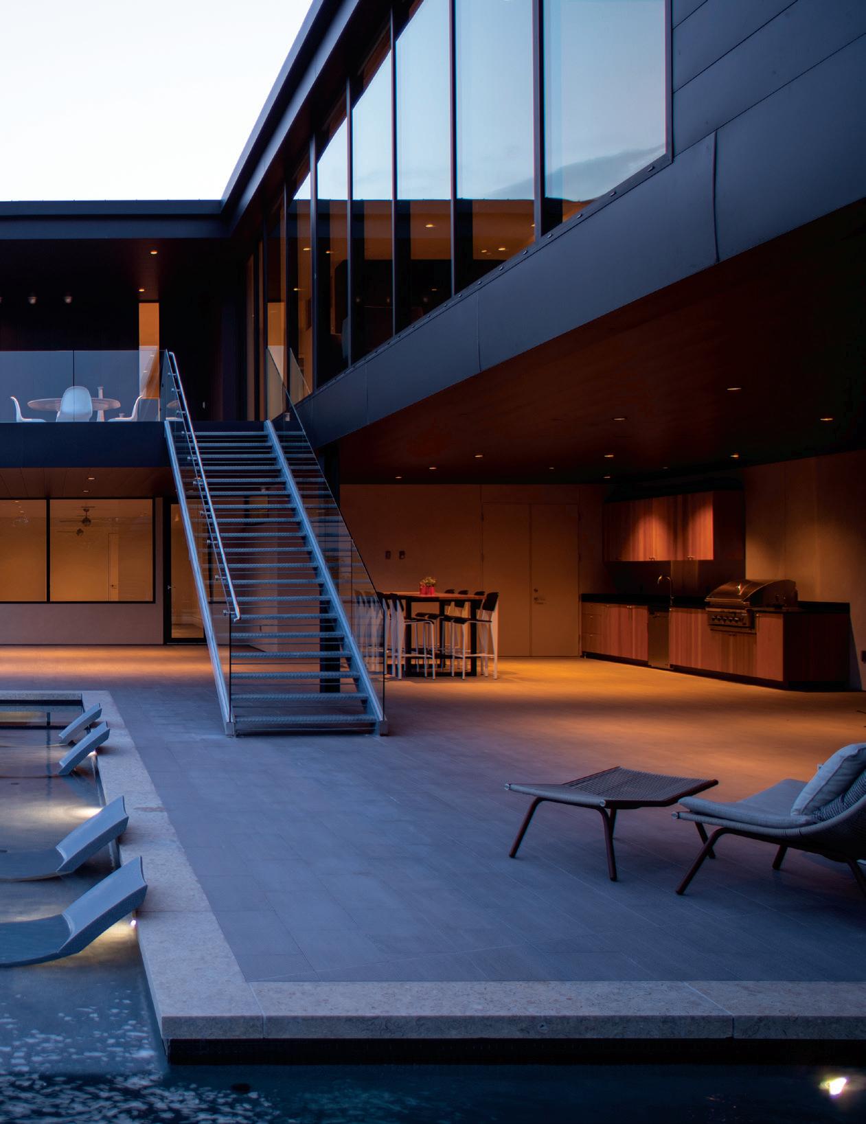
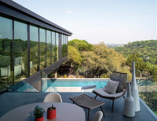
This fun, dramatic space overhangs the pool and is a very special spot, kind of an exclamation point, as Kim describes — a glass volume completely floating over the pool below, giving it a kind of treehouse vibe. Here again, you can enjoy the Texas-quarried limestone called Shellstone, which upon closer inspection features fossil inclusions of shells and corals that create fascinating textures and patterns. This column runs down to the ground floor of the pool and patio.
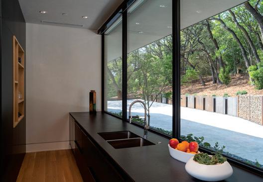
The kitchen dazzles with a paneled and integrated look as modern as they come, which is meant to read as truly a part of the house. The entirety of the back wall is a German kitchen system by Leicht (local rep is Arete European Kitchens) with a sink against the counter-to-ceiling window looking out the front of the house, but with no backsplash. This is Kim’s modern interpretation of a traditional kitchen orientation.

SUMMER 2023 | HOME DESIGN & DECOR AUSTIN-SAN ANTONIO 35
According to Kim, it’s rare for a builder/developer to invest in a spec house with this level of uniqueness, but that’s what Jon Luce does — they build one house at a time that’s very site specific. It’s a piece of art. The goal was for everything to be exceptional yet look effortless. It truly is a custom house in every sense of the word, including the approach and execution. The only thing that was different is that they hadn’t met the owner yet. “It added another dimension to the process. We had to use our imagination to anticipate what someone who lived here might want,” said Kim. “I felt like we had a little more creative freedom because the builder as the client approached it with a very open mind.”
Kim, who started working at DC+A 15 years ago after graduating from UT Austin’s architectural program, describes her architectural style as minimalist. “I like a clean palate and a restrained use of materiality and colors, but I enjoy infusing projects with details that represent the uniqueness and personality of each individual client,” she shared.
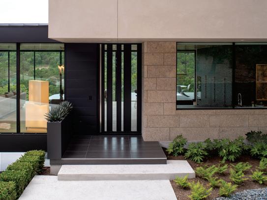
Kim’s natural talent for minimalism shines through in this modern residence, which features only three very intentional material choices on the exterior, including stucco, earthy-colored stone and dark (black matte) metal with a flat seam that blends in with the trees and recedes into the shadows, not to mention floor-to-ceiling glass, which is a big component of the house and reflects the surrounding hillside, foliage and sky.
For Kim and her team, designing a layered form for this house was a bold move with the main entry at ground level, along with the kitchen, living room, dining room, primary suite and study; a lounge and three bedroom suites are

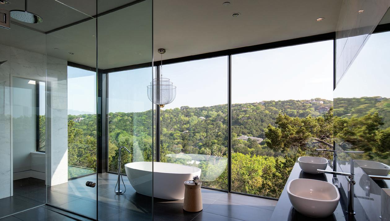
Imagine taking a bubble bath in this gorgeous tub by Victoria + Albert at sunset. Complete with Carrara marble, white oak cabinetry and unending views, it’s the stuff that our home-loving dreams are made of.
Kim is very proud of the entry, as it sets the tone for the house as welcoming and intriguing at the same time. This custom-designed steel and glass pivot door is 10 feet tall and 5 feet wide. The pattern of glass and steel gives you a hint of what’s inside while simultaneously giving the homeowners a sense of privacy.
Kim simply describes this patio area as a pretty awesome space tucked under the living room and surrounded by an L-shaped infinity edge pool that looks out past the hillside. The understated pool deck is made of porcelain tile made slip resistant with a textured surface that’s low maintenance. The cozy pool-drenched lounge chairs by Ledge Lounger complete the forest beach feel.
36 HOME DESIGN & DECOR AUSTIN-SAN ANTONIO | SUMMER 2023
upstairs, with a flex room, cabana, pool and bathroom on the lower level.
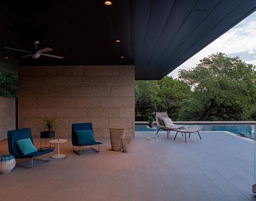
Where typically the pool is situated right outside of the main public areas, in this case because of the slope and shape of the lot, it was more synergistic with the environment to put the pool below the main level. In doing so, Kim created a visual marvel by floating the primary living spaces out over the pool.
It comes as no surprise that this residence was snatched up by very happy homeowners the minute it landed on the market. u
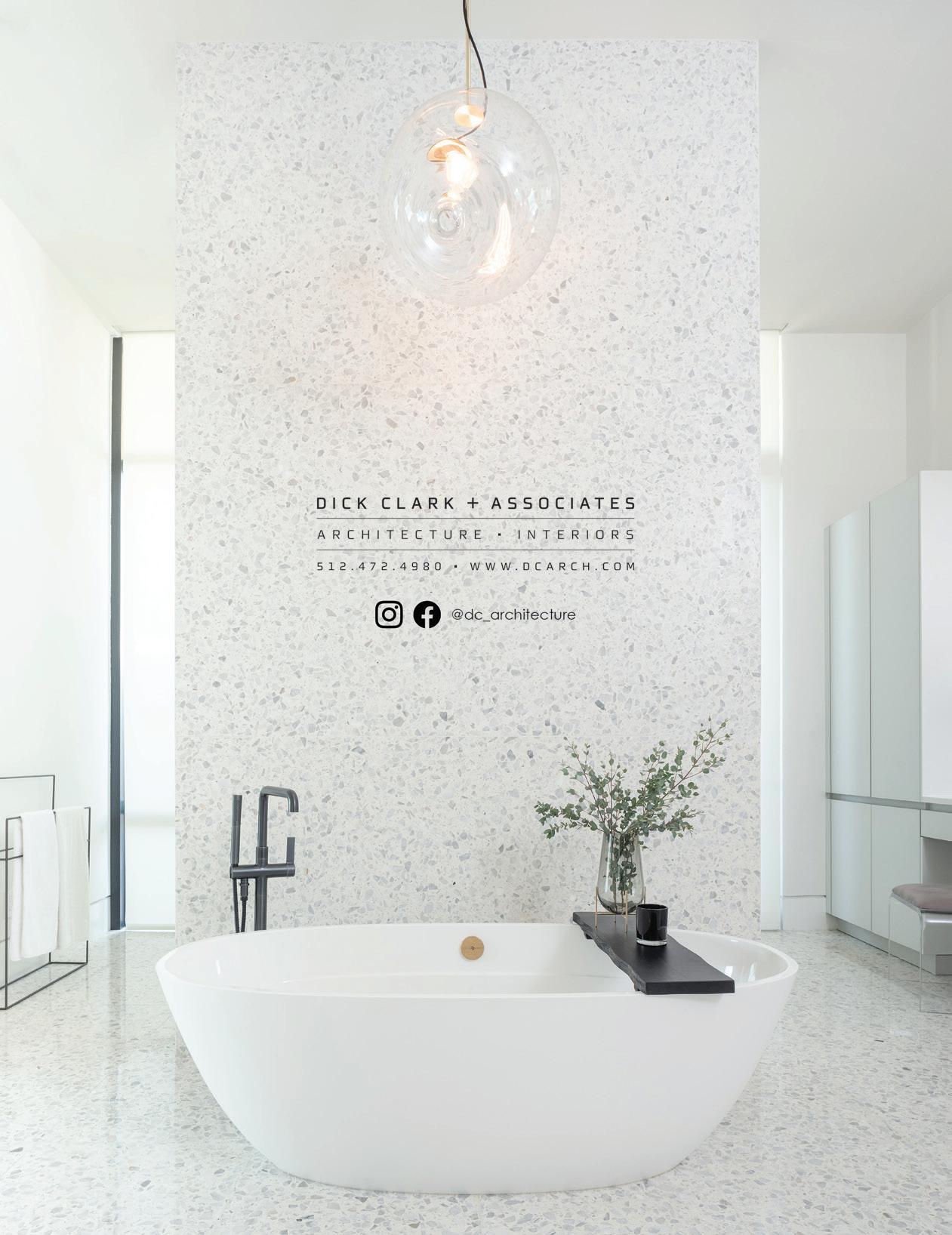
 DICK CLARK + ASSOCIATES
512-472-4980 |
DCArch.com
SUMMER 2023 | HOME DESIGN & DECOR AUSTIN-SAN ANTONIO 37
THE PEMBERTON REVIVAL
BY CLAUDIA ALARCÓN | PHOTOGRAPHY BY CLAY GRIER
WHAT STARTED AS A KITCHEN RENOVATION GREW TO A LARGER SCOPE PROJECT THAT TRANSFORMED A STUNNING 1939 HOME IN PEMBERTON, A BEAUTIFUL ESTABLISHED NEIGHBORHOOD IN OLD WEST AUSTIN.
38 HOME DESIGN & DECOR AUSTIN-SAN ANTONIO | SUMMER 2023
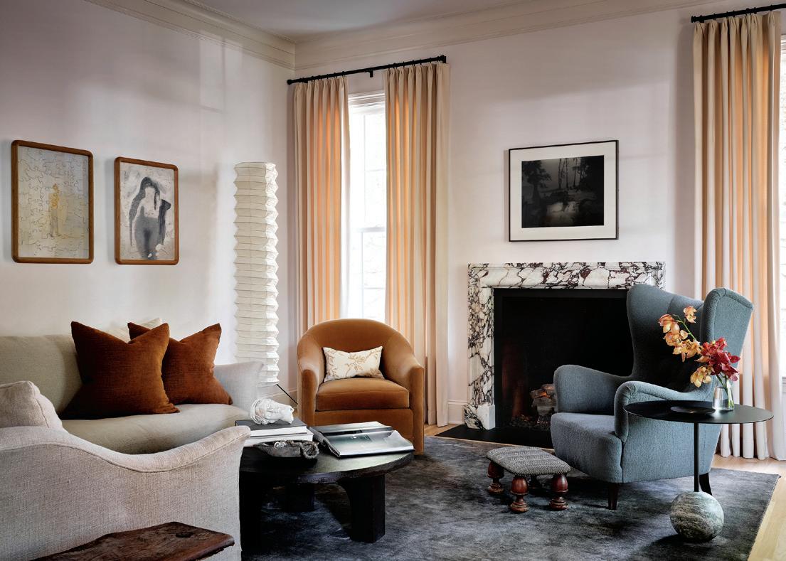
The living room was designed around the stunning marble fireplace from Ryan and Smith out of London, with furniture and rugs to complement. A custom sectional sofa from Ashby Collective’s own workroom was upholstered in Rose Uniacke linen. A vintage mid-century chair from Charish, refurbished with Mark Alexander boucle, offers contrast. The rug from Rettora Rugs in Houston matches the veins in the marble.
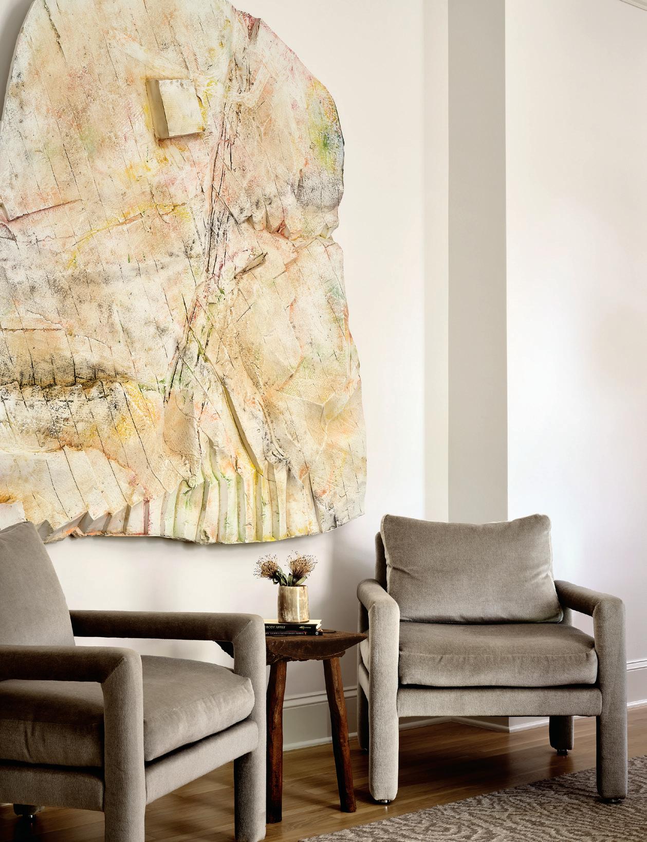
An impressive piece by Justin Matherly, created for the Skulptur Projekte Münster, was sourced from the Galerie Eva Presenhuber as a showpiece in the dining room. It’s flanked by two vintage Verellen dining chairs.
TTHE TRADITIONAL STYLE, 3,600-SQUARE-FOOT
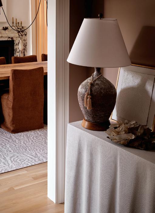
two-story home features five bedrooms and four-and-a-half bathrooms. The designers respected the original footprint, but the kitchen and main bathroom were completely gutted and redesigned. The team preserved the home’s classic architecture, pocket doors and 80-year-old moldings to give direction in creating the elegant interior design.
Principal designer Anne Grandinetti of Ashby Collective calls this home The Pemberton Revival. Architect Michael Stouse of Stouse Design joined her team to help Crowell Builders and Ashby Collective bring a breath of fresh air to the traditional architecture. The homeowners are young business professionals who wanted a relaxed, refined aesthetic and needed separate home offices.
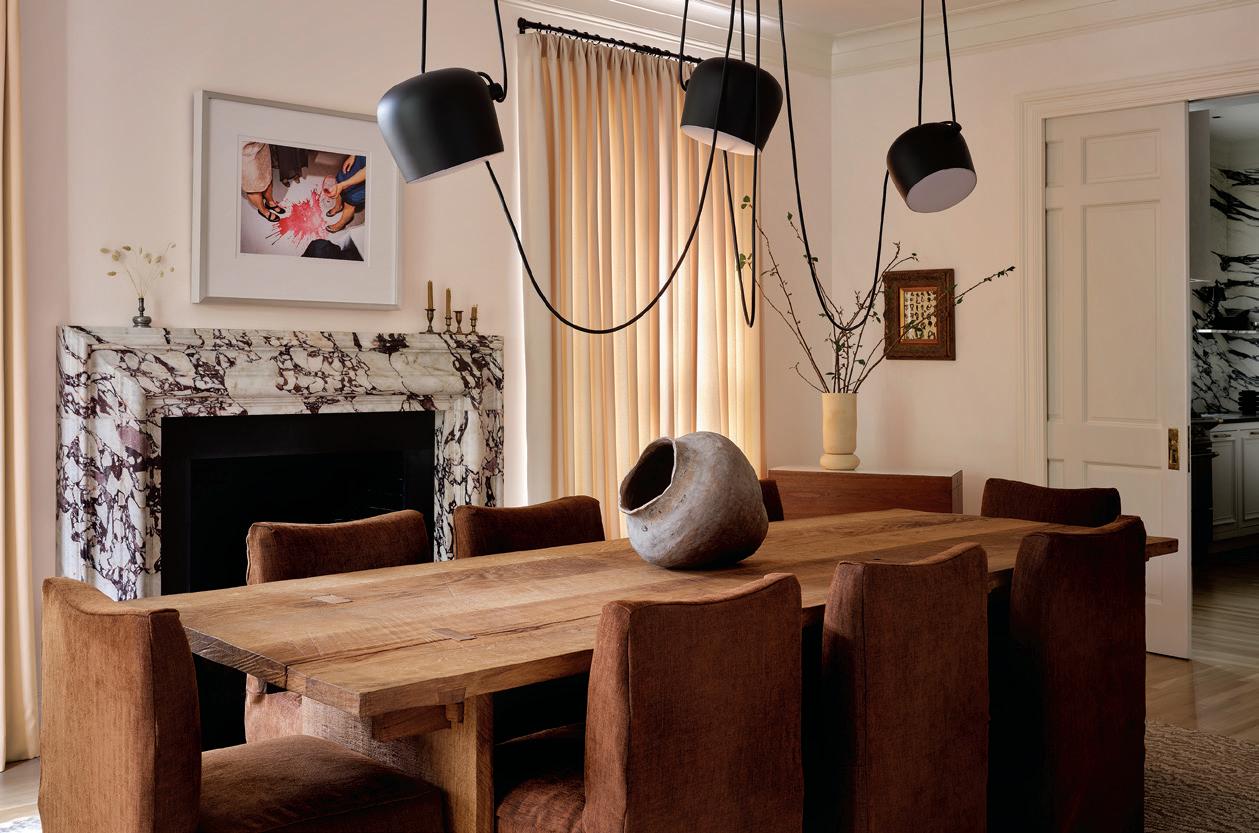
“The clients reached out to us to start the project, but soon after came lockdown so part of the renovation took place during the Covid shut down. All meetings and exchanges of ideas happened via Zoom. We spent the entire project under restrictions, and still managed to pull off a beautiful remodel,” said Grandinetti. The renovation project took just over a year.
The redesign references several periods, as some details inherited from the home were left in place to pay homage
40 HOME DESIGN & DECOR AUSTIN-SAN ANTONIO | SUMMER 2023
to its former life, such as the original moldings, pocket doors, ornate doorknobs and the original oak hardwood floors, which were refinished. The team also refinished the wood in the staircase, added a stair runner, and replaced the old wood banister with custom metal.
The homeowners preferred a natural color palette with soft hues, so the team avoided large patterns and bold
colors. “We approached the design concept with a relaxed refinement,” said Grandinetti. “The original design concept was a touch of ‘London Townhouse.’ There were very few rules; we let the design organically evolve. The clients understood the importance of high-quality finishes and the beauty of mixed materials. This provided a strong foundation for us to build upon.”
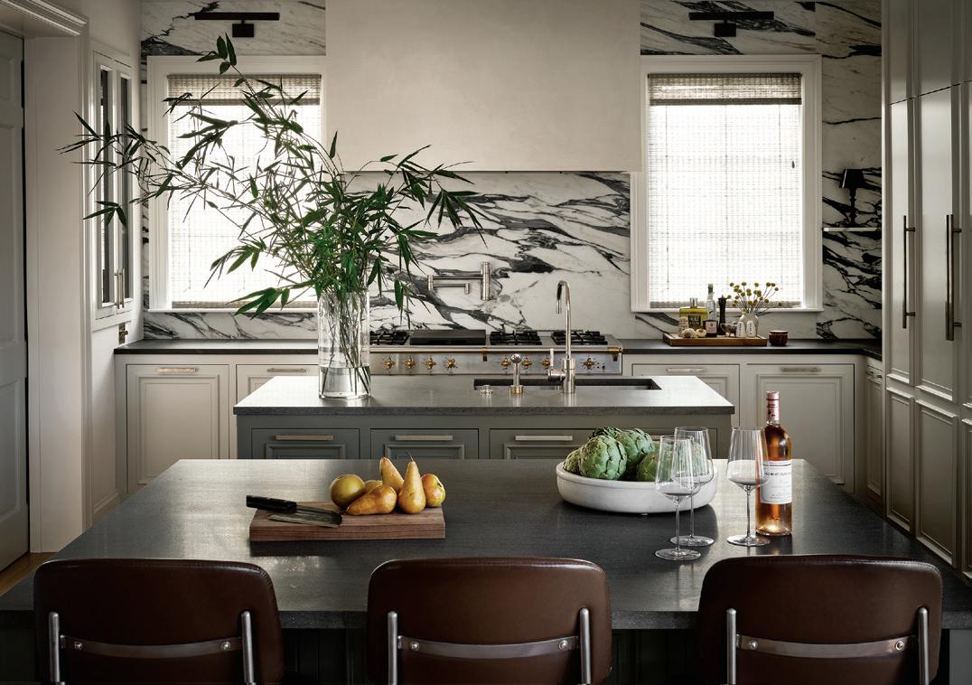
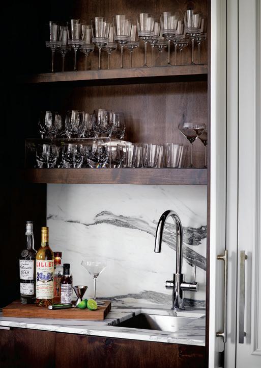
 The kitchen island countertop is made from a lava stone called Basaltina. The walnut cabinetry was manufactured by Kingwood Custom Cabinetry out of Fredericksburg, painted to match the clean look. There’s also a small bar nook at the far end of the kitchen, near the breakfast area.
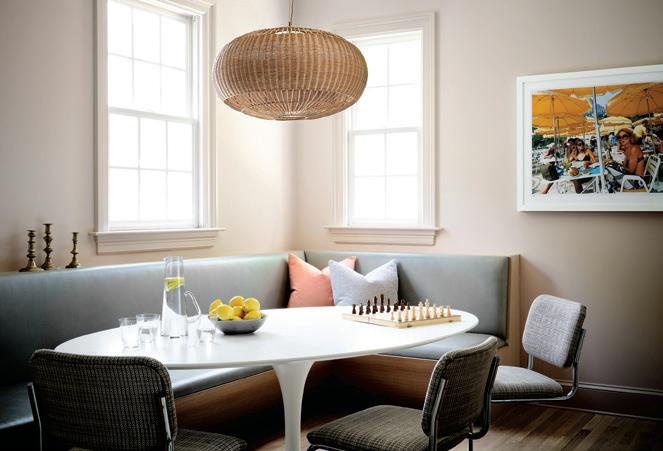
The comfy breakfast nook occupies a long narrow open space in the kitchen, across from the range and kitchen island. The wicker light fixture comes via SOHO Home. Custom banquette and vintage pieces were sourced from 1st Dibs, Chairish and local vintage shops.
SUMMER 2023 | HOME DESIGN & DECOR AUSTIN-SAN ANTONIO 41
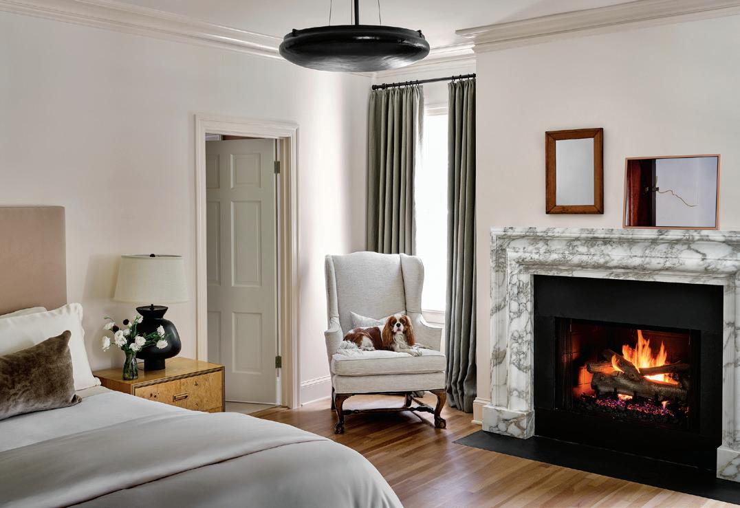
All the fireplace surrounds were sourced from Ryan and Smith in the U.K. The Breccia Viola marble for the dining room fireplace was selected for its deep violet veining, which set the tone for the color palette. The Viola, paired with the terracotta dining chair slipcovers, creates an attractive color combination. The centerpiece fixture above the craft wooden table by SÓHA is from Flos Lighting. The team created a small entry space as the original plan led directly into what is now the dining room, without a “greeting” moment.
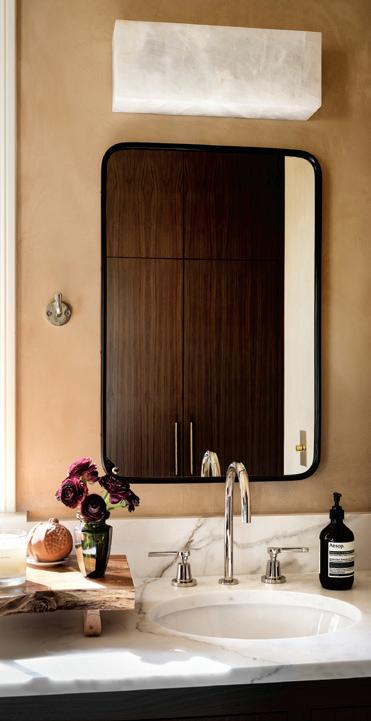

 In the powder room, they added a bit of whimsy with a Maya Romanoff wallpaper layered with a pink Italian mirror found through 1st Dibs.
42 HOME DESIGN & DECOR AUSTIN-SAN ANTONIO | SUMMER 2023
The kitchen was relocated to the opposite side of the room to create more space for cooking and entertaining, and the team incorporated double kitchen islands into the layout. The stainless Lacanche range from France is a stunning anchor for the space, so Grandinetti opted to keep the plaster vent hood simple to also showcase the bold veining in the Arabescato marble backsplash. “We let the stonework in the fireplaces and kitchen act as our statement pieces,” said Grandinetti.
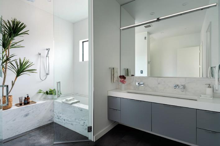
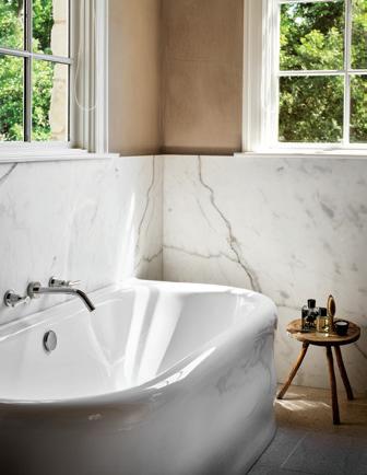
After completely gutting the main bath, it got a whole new look. They finished the walls and ceilings with plaster, including the shower, in Farrow and Ball’s Smoked Trout color to complement the veining in the marble backsplash and counter tops. The tub is by an English company, Water Monopoly. “It’s from the Soho Collection. We loved the simplicity and sophistication of the subtle details in this collection,” said Grandinetti.
With careful attention to the homeowner’s needs and respect for the neighborhood and its architecture, the design and build teams were able to deliver something simple and peaceful, yet sophisticated and elegant at once. u
ASHBY COLLECTIVE 512-524-1220 | AshbyCollective.com SUMMER 2023 | HOME DESIGN & DECOR AUSTIN-SAN ANTONIO 43
ILLUMINATING THE NEIGHBORHOOD
BY KIMBERLY A. SUTA | PHOTOGRAPHY BY MADELINE HARPER
ARCHITECT TIM BROWN, AND LINDSAY TODD, AN interior designer, met while working on a developer’s project about five years ago. It became immediately apparent to both of them, the benefits of working on a house together throughout the entire process.
A few years later, they co-founded Blair Austin Studio, which filled a gap in the residential home building industry by combining forces and offering comprehensive design services, from the bones of the house on down to the cabinet pulls.
“Historically, a homeowner hires the interior designer after the architectural design is completed, which if the designer has a different language than I do, it can be a contradiction,” explained Tim. “Lindsay’s and my aesthetic aligned really well. We have the same tastes. We found that more people were wanting an all-inclusive design team rather than hiring two different companies, so we made it an integral thing and joined our companies.”
“Now it’s so much more rewarding from inception for both of us. We’re able to consider all aspects of the home from start to finish,” added Lindsay.
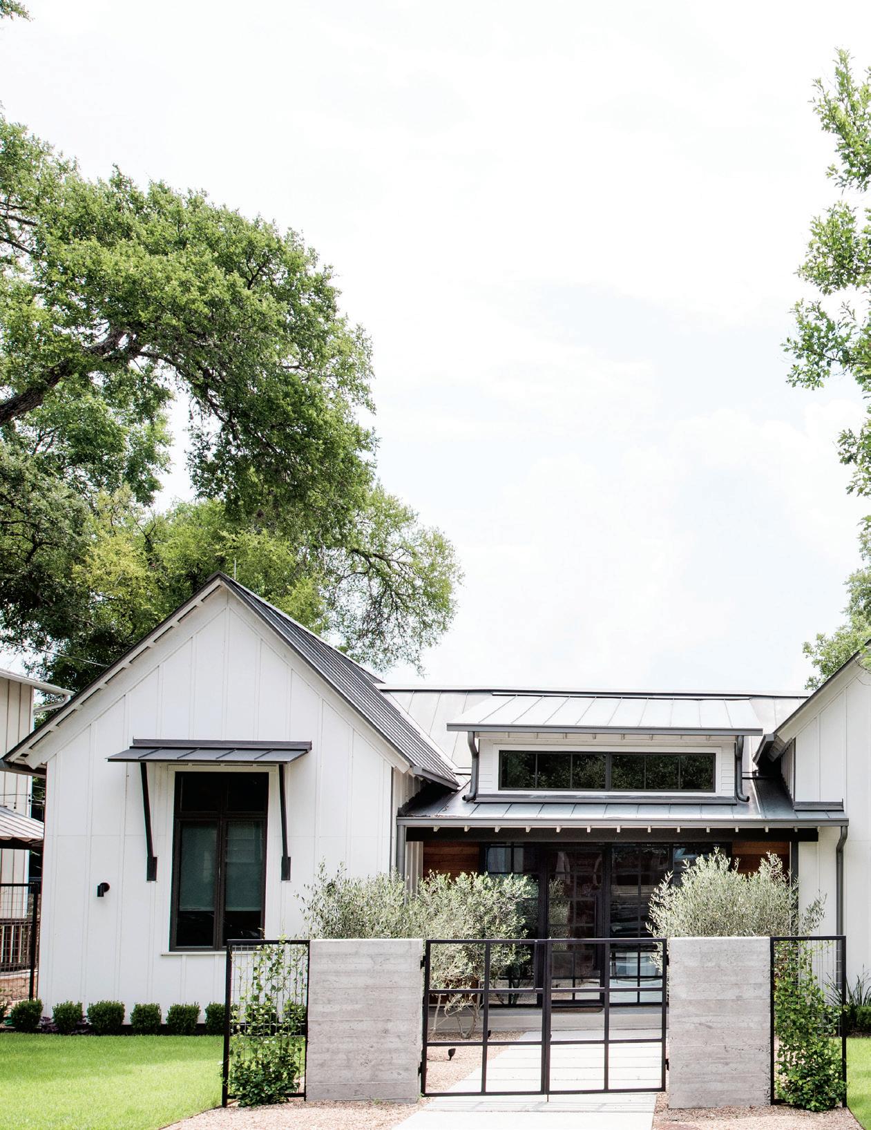
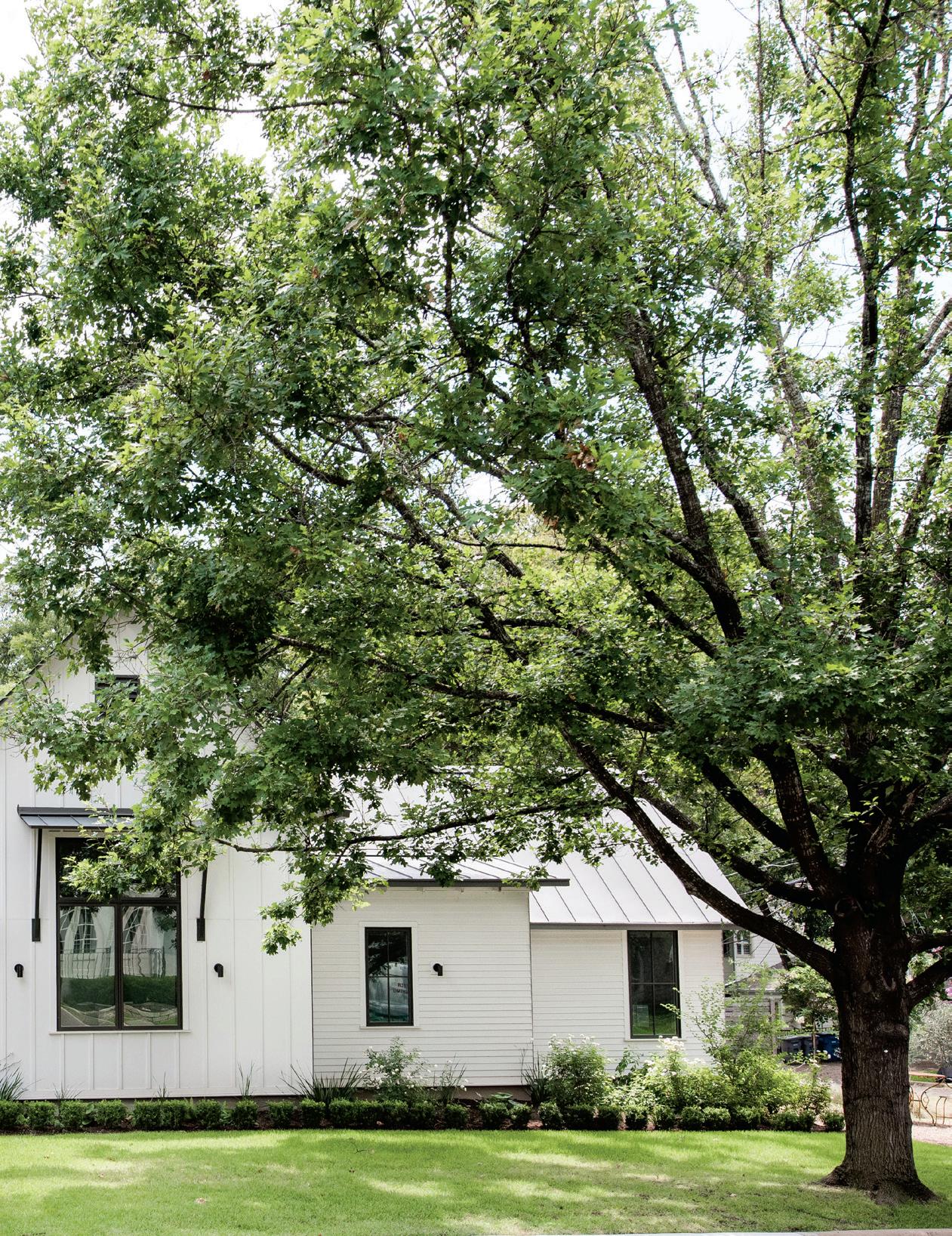
However, in this case, the charming modern farmhouse located in Tarrytown was designed by Tim before Lindsay
and he had partnered together. In fact, all of the furnishings are from the homeowners’ favorite furniture company, Restoration Hardware.
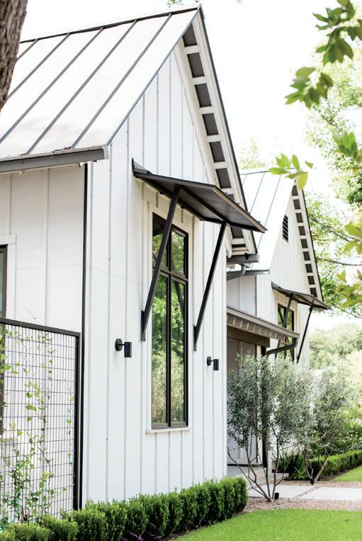
The homeowners had fallen in love with another modern farmhouse Tim had designed in Westlake and so chose him for the project. According to Tim, it’s something he’s become known for but his skillset far exceeds this sole style, which he explains is more accurately called Victorian Stick. You might well call it a cottage. It still has notable features such as the gables, but is proportionately scaled down and less ornate than a traditional Victorian home.
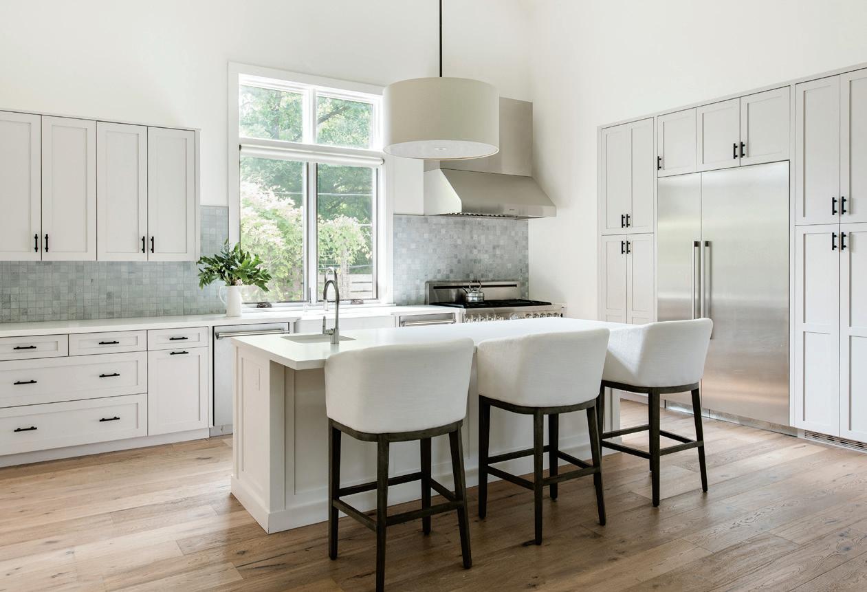
Like the entire home, the kitchen is bright and airy with lots of neutral colors that blend together while still engaging interest. The pantry and cabinet storage are recessed to offer more space and a streamlined look. Tim used white oak for the flooring in the kitchen and throughout the house. The marble backsplash of warm and cool grays serves to enhance the motif.
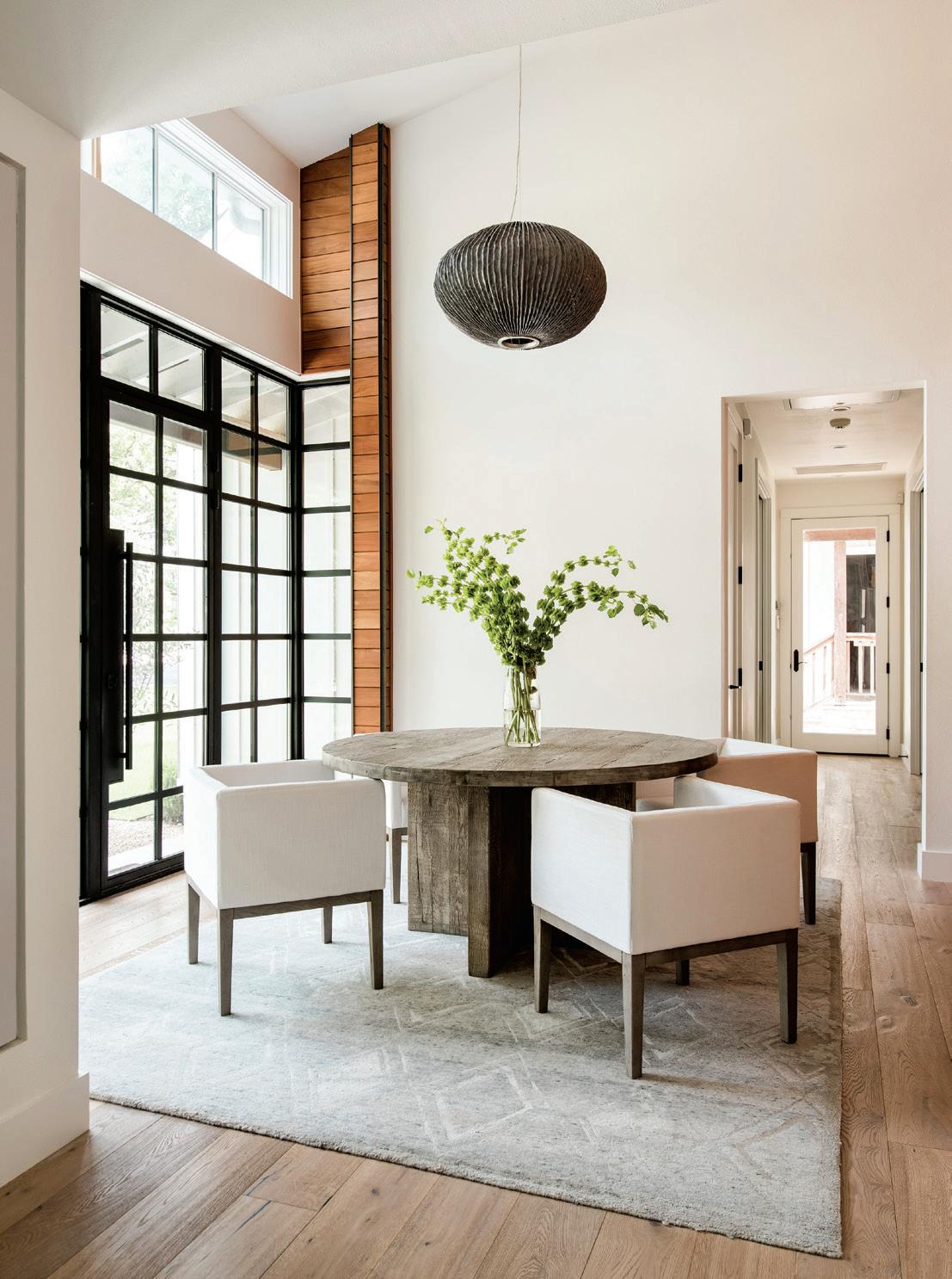
The dining room serves as the fulcrum of the home and features a vaulted ceiling with transom windows and striking Brazilian hardwood called garapa, which lends the room warmth and originality with its rich, brown tones. Interestingly, it’s the same wood used on the exterior of the home at the entrance. By doing so and connecting to the steel window system by Durango Doors, it gives a sense of being outside when in the dining room.
A
46 HOME DESIGN & DECOR AUSTIN-SAN ANTONIO | SUMMER 2023
SUMMER 2023 | HOME DESIGN & DECOR AUSTIN-SAN ANTONIO 47
After first considering a remodel for the homeowners, a mature couple without children, they agreed pretty quickly that a new build would best suit their needs. They wanted a home that felt cozy but still had a lot of space and was open and full of light, which happens to be right up Tim’s alley, who designs homes to utilize not only natural light, but natural ventilation as well.
The focus of this house was on creating welcoming spaces that foster the activities the homeowners love, such as cooking, entertaining and collecting wine. With that in mind, Tim designed an open floor plan that connects the kitchen and living room. “Everyone stands around the island in the kitchen, pours wine and conversations happen. This way no one gets left out,” Tim noted.
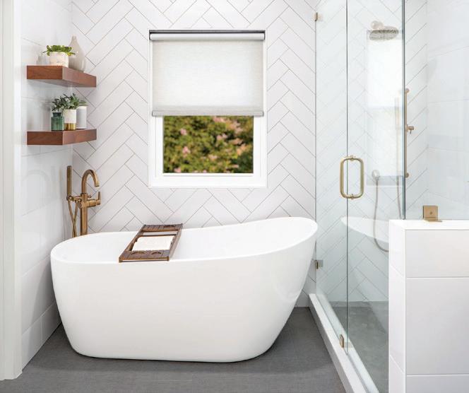
Additionally, the house features a primary bedroom, dining area next to the front door, office space, gym, custom wine closet and two decks in the backyard along with an outdoor shower that the homeowner enjoys using for a morning shower or after working with her plants and honeybee hives.
One of the aspects that Tim appreciates most about this home is the landscaping, which was performed by West Shop Studio, also based in Austin. “Instead of planter boxes, they used board form concrete. What’s unique is that it

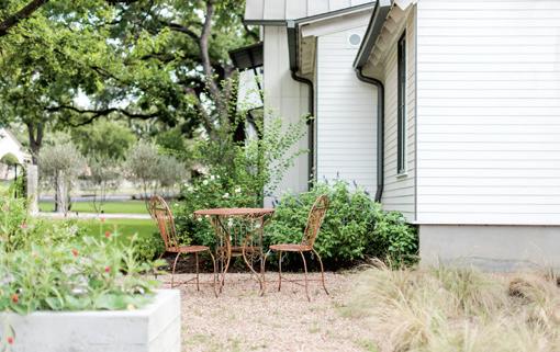
gets knots and figures from the wood that bleeds through and gets transcribed on the concrete, so it’s so much more organic and looks like a landscaped installation, adding to the cottage feel,” shared Tim.
When asked what he loved most about the home, Tim raved about the homeowners — their kindness and positivity. “They’re very open and neighborly people and the house reflects that for them. If you look at the gate, for example, it’s not even a gate, it’s more of a decorative monument that you can walk around. It implies privacy but they’re still vulnerable, in a good way,” said Tim. “When you drive by and the lights are pouring out of the house it looks like a beacon of dignity. I really like what we did for that corner of the neighborhood, and I’m very proud of it.” u
BLAIR AUSTIN STUDIO 512-637-0400 | BlairAustinStudio.com
48 HOME DESIGN & DECOR AUSTIN-SAN ANTONIO | SUMMER 2023


AWARD-WINNING INTERIOR DESIGN custom homes • condos remodels • commercial Stephanie Villavicencio Texas Registered Interior Designer 512.443.3200 www.bellavillads.com
IN PERFECT RHYTHM
BY KIMBERLY A. SUTA | PHOTOGRAPHY BY LEONID FURMANSKY
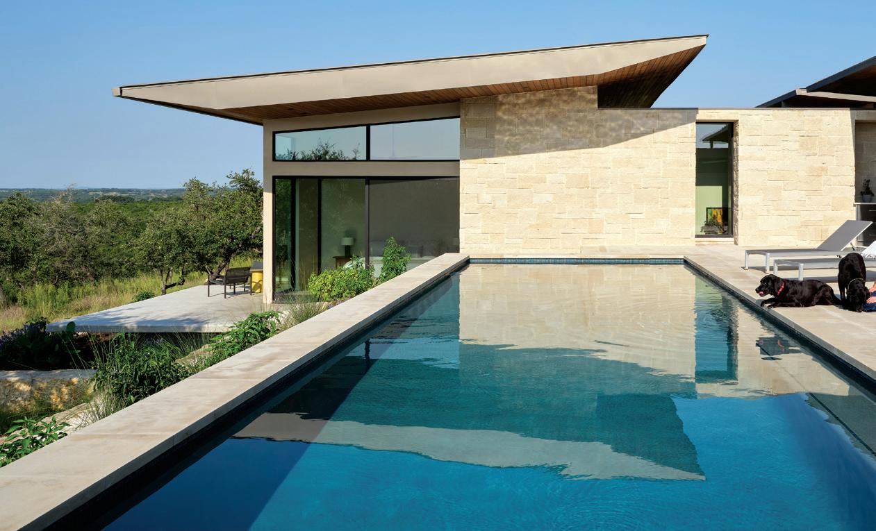
A WIMBERLEY RESIDENCE IS AN EXPLORATION OF HOW ARCHITECTURE CAN ENGAGE WITH AND DISSOLVE INTO THE NATURAL LANDSCAPE. THE HOME, DESIGNED BY MATT FAJKUS ARCHITECTURE (MFA), WAS INSPIRED BY THE SITE ITSELF AND THE NATURAL QUALITIES UNIQUE TO THIS SITE. THE RHYTHM OF SOLID, MASSIVE WALLS AND OPEN, GLASSY ROOMS ARE AN INTEGRAL COMPONENT OF THE HOME’S DESIGN.
50 HOME DESIGN & DECOR AUSTIN-SAN ANTONIO | SUMMER 2023
MFA APPROACHES PROJECTS A LITTLE MORE thoughtfully than most, with an almost esoteric, metaphysical exploration of a concept. This home epitomizes the uniqueness of this process.
The clients approached MFA about building a home on the property, which they had owned for some time. They had been venturing out on weekends, enjoying the various areas of the site via camping chairs and a bottle of wine — taking in the very essence of the landscape, both beneath their feet and as far as the eye could see.
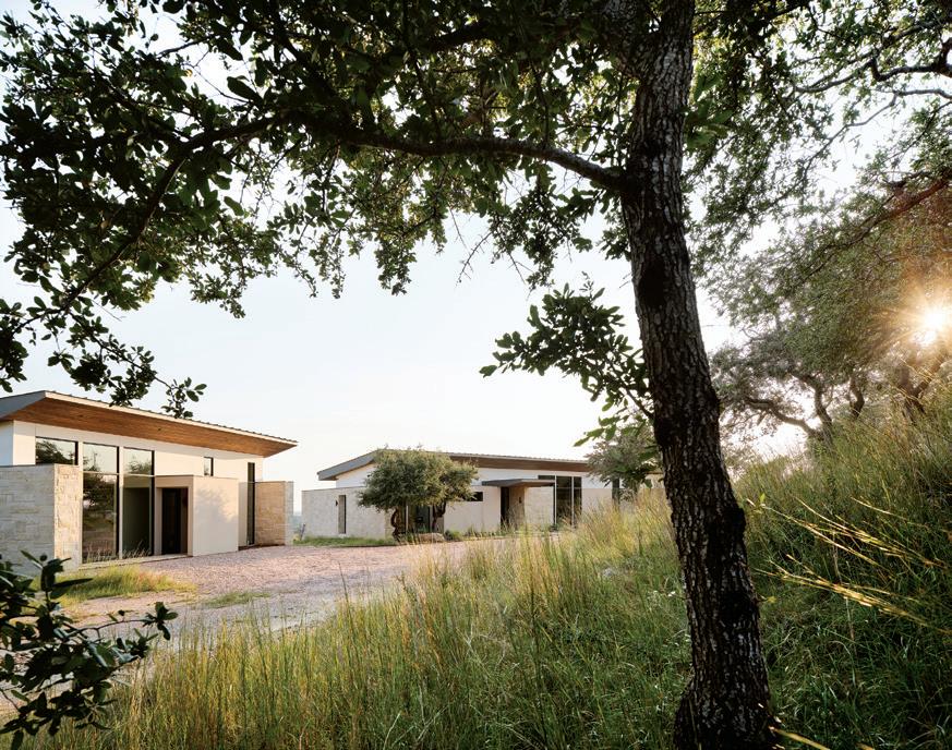
“They had a fair amount of intimate experience with the property and certainly had their own ideas about how the house might take shape or exist within the site, but they wanted our team to experience the site through our own eyes and form our own opinions. Ultimately, we were in close alignment with where to site the project within the two-acre property and agreed that the naturally flat “shelves,” uphill from the point of entry, would make for, not only a more cost-effective condition for the foundation, but also one that would naturally capture breezes, views and solar angles,” said MFA Principal Architect Sarah
MJohnson, who was the project manager for the project. “The clients wanted something that had a Hill Country aesthetic but was also timeless and modern. We interpreted this as direction to use natural materials, regional roof forms and a formal logic that would be influenced on the flow and function of the inhabitants.”
It became clear that the home would exist in a linear fashion along the length of the curved shelves of the site, and as one moves through the home, from one space to the next, there was a natural rhythm taking shape between the solid and the void. The solid elements are thickened, masonry walls that act to collect all of the private and/or bulky
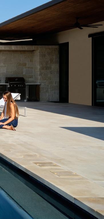
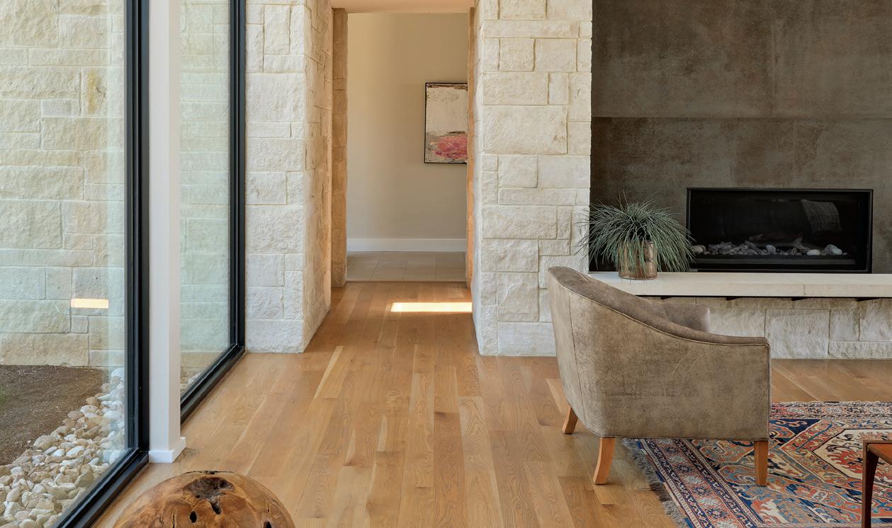
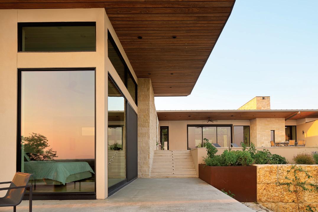
This elegant yet understated modern Texas Hill Country home was built with but a few materials, including Lueders limestone, a native Texas limestone, stucco, glass and metal. Although self-proclaimed modernists, what MFA means by that is the notion that form follows function — the function of the home informs the form or the massing of the home. According to Sarah, the almost agrarian simple shed roof plays an important role — the long roof overhang on the downhill side of the property protects against the sun, and the slope of the roof funnels breezes through the house.
SUMMER 2023 | HOME DESIGN & DECOR AUSTIN-SAN ANTONIO 51
52 HOME DESIGN & DECOR AUSTIN-SAN ANTONIO | SUMMER 2023
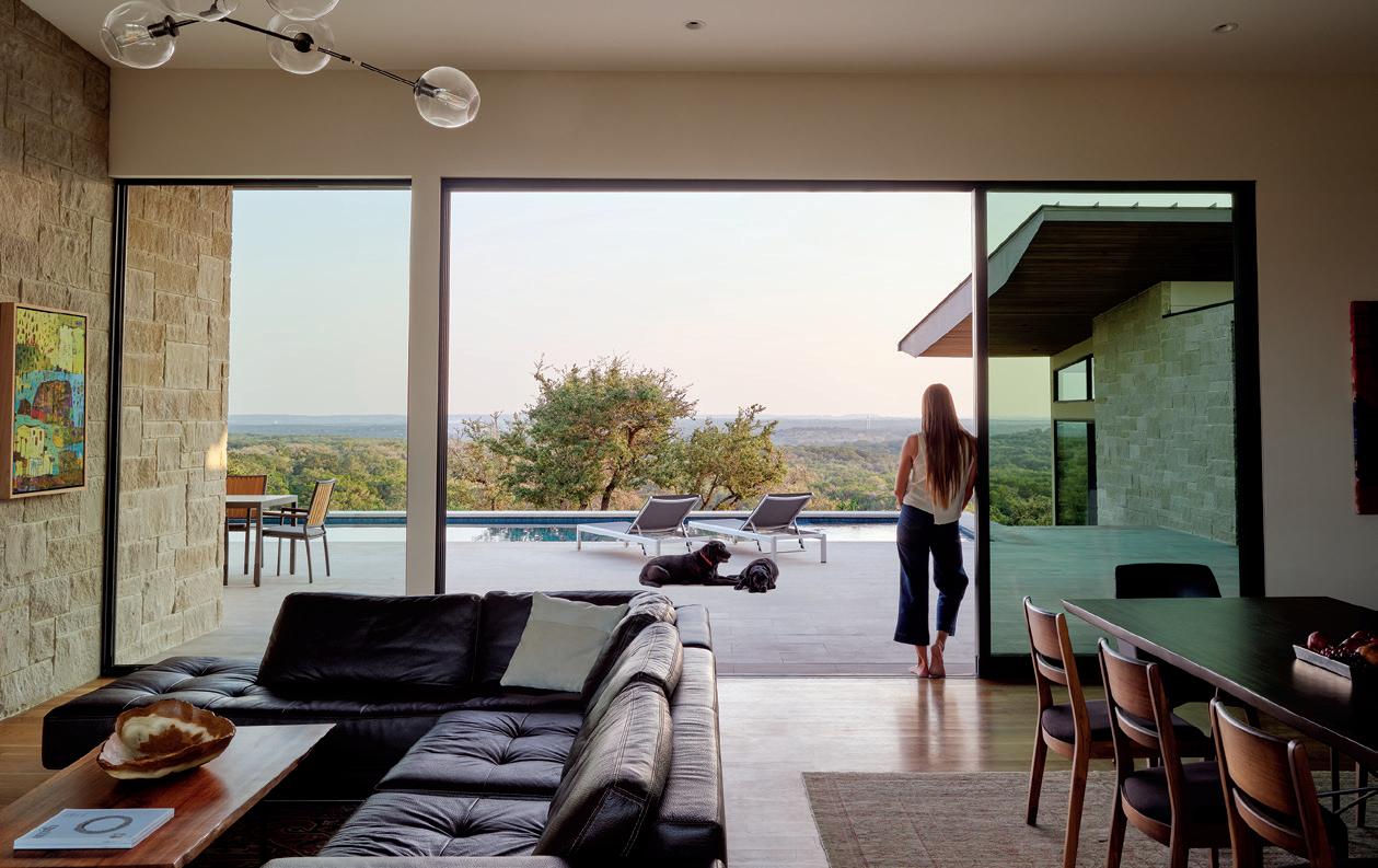
elements of a typical home: storage, equipment, lavatories, etc. By collecting these elements within these walls, it allows the space between to be completely open to capture views, daylight and breezes across the site. The architecture dissolves as much as possible in these void spaces to connect the owner with the very reason they fell in love with the property in the first place.
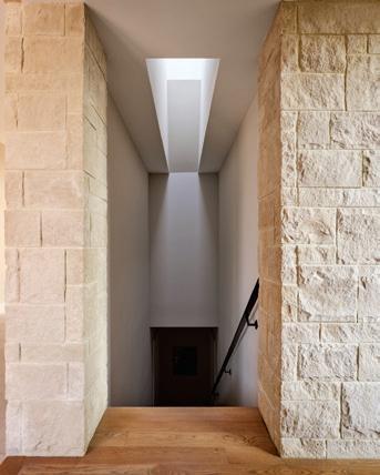
One of the widest thickened masses, adjacent to the home’s entry, holds private space for a guest and a dark, cozy media/flex room. The area between the open entry and open living room contains a storage space, a powder room and stair run that descends into the bedrock of the site to
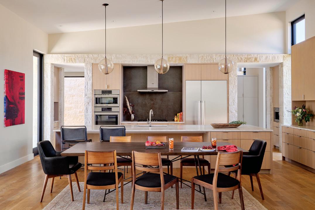
MFA designed an open floor plan where the kitchen, living room and dining room all share a glassy space made possible by the functional support of thickened walls on either side, which take on slightly different forms depending upon what is packed into them. In the kitchen, for example, they tucked in a coffee maker and tea nook, as well as the refrigerator and appliances. The backsplash tile has an almost metal-like visage, which you will notice is also used around the fireplace in the living room. The orbshaped lighting fixtures hanging over the island add functional light to the workspace while remaining light and airy, fitting of the space. White oak is used for the floors as well as the millwork, including the buffet piece at the end of the dining area.
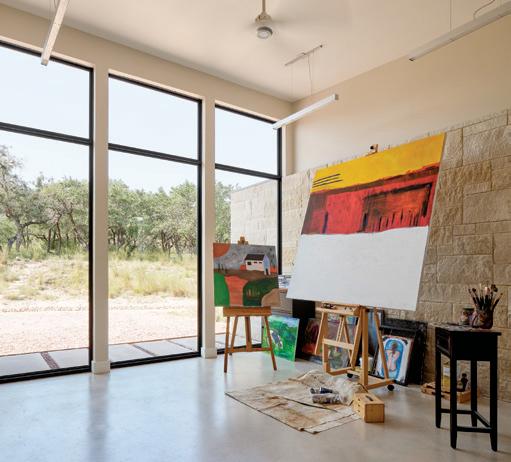
The guest structure follows the same formal language as the primary home but exists as a detached structure in order to provide additional privacy for long-term guests, as well as the owner, who uses the space as a studio for painting.
a wine room and storage/mechanical space below ground. Again, all spaces considered private and or “back-of-house” in nature.
Considering all the intricacies of the site, of the user, are an inherent part of the process for Sarah and MFA.
“We are advocates of sustainability, but we also appreciate that sustainability can manifest in many ways and at its root meaning, is simply how a building sustains. This can take shape through rainwater collection and solar arrays,
SUMMER 2023 | HOME DESIGN & DECOR AUSTIN-SAN ANTONIO 53
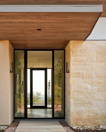
This house is simple yet requires attention to details that reinforce the architectural concept. In this case, the window mullion has a direct connection to the limestone wall, a detail you don’t often see. The purpose was to reinforce the relationship between solid and void, and the transition of the limestone from inside to out.
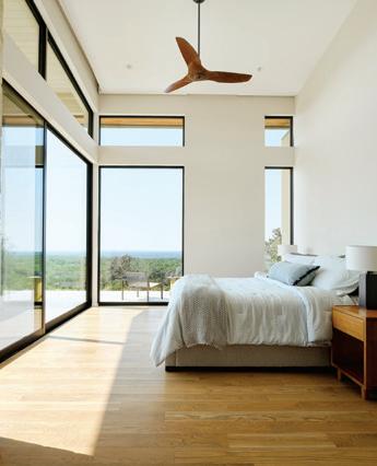
A long hallway leads down to the primary suite — almost a metaphor for the day’s transitions to morning and night, giving the homeowners time and space to invigorate or unwind. The room is simple with clean lines and again the same limestone and white oak floors, allowing the focus to remain on the landscape beyond. The organic-looking wood ceiling fan by Haiku blends in well.
From here, the owners have access to a private deck, as well as the pool and spa on the main level, in addition to a private courtyard on the back side of the primary suite with a garden and outdoor shower.
but it can also be a consideration of the materials used — materials of the earth and natural to the site — or even in the way we site a building and maneuver it for solar exposure/protection and natural breezes,” said Sarah.
“Ultimately, the idea was to create a building that felt like it belonged to the site but was also differential to the site. A structure that would provide the client with the modern comforts of a home while still evoking the sense of being within the natural landscape, which they loved so much. I think we achieved that,” said Sarah. u
 MATT FAJKUS ARCHITECTURE
512-432-5137
| MFArchitecture.com
54 HOME DESIGN & DECOR AUSTIN-SAN ANTONIO | SUMMER 2023


THE CANVAS
BY CLAUDIA ALARCÓN | PHOTOGRAPHY BY DROR BALDINGER, FAIA
A PATRON OF THE ARTS AND PHILANTHROPIST WANTED TO REIMAGINE A 1930S WEST AUSTIN HOME, EMPHASIZING COMFORT OVER PRETENSE AND PLAYFULNESS OVER FORMALITY. THE INTENTION WAS TO CREATE A GRACEFUL ESTATE MATCHING THE SCALE OF NEIGHBORING HOUSES, SURROUNDED BY MATURE TREES, WITH A CALM, YET POWERFUL PRESENCE, AS WELL AS A PLACE TO SHOWCASE THE HOMEOWNER’S LIFELONG COLLECTION OF MODERN ART.

SUMMER 2023 | HOME DESIGN & DECOR AUSTIN-SAN ANTONIO 57
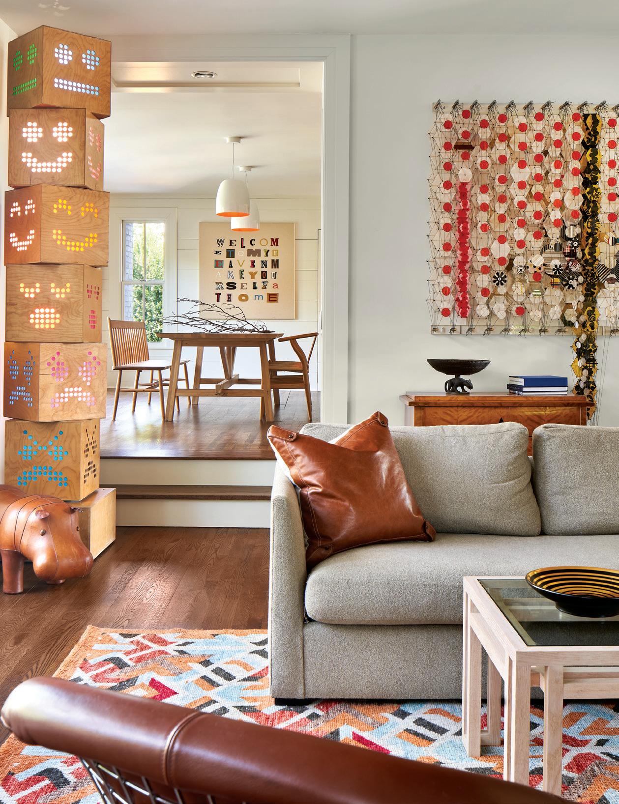
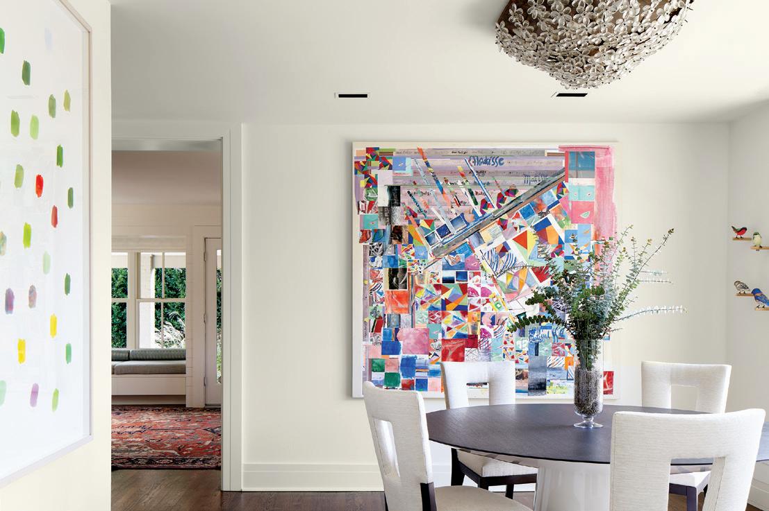
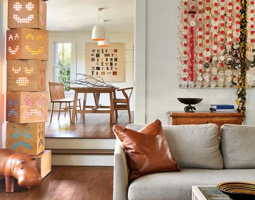
In the family room, the sculptural totem titled “Dream Machine” is by the Austin-based artist collection Okay Mountain, and the piece to the right is Jacob Hashimoto’s “PolkaDot Rumble.” The piece seen in the distance in the kitchen is Diane Guerrero-Macia’s “Welcome to My Heaven.” In the dining room is Franklin Evans’“Matissescape.”
TTHE HOMEOWNER WAS LOOKING FOR A HOUSE
that reminded them of the traditional homes in which they grew up. They liked the architectural style when they purchased the home, so they contacted the original architect, Nick Deaver, to work on the major renovation to update the home for their art collection and expand upon their work, as well as remodel the kitchen. David Wilkes Builders came on board to bring their vision into reality.
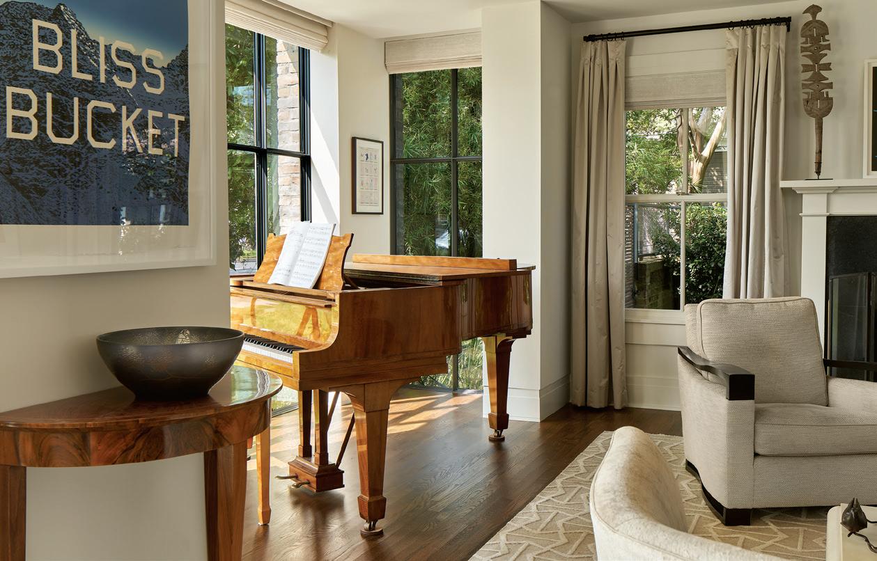
The design brief included a library, a study and a piano nook. The team also added outdoor details like an exterior foyer, floor-to-ceiling windows, a metal roof and lots of brick, as well as a pool and a new deck in the backyard, where the family loves to spend time.
The four-bedroom, three-and-a-half-bath mid-century American family house sits on .32 acres, but due to city code restrictions the home size could only be increased by 45 square feet, from 4,345 to 4,390. Adding the extra
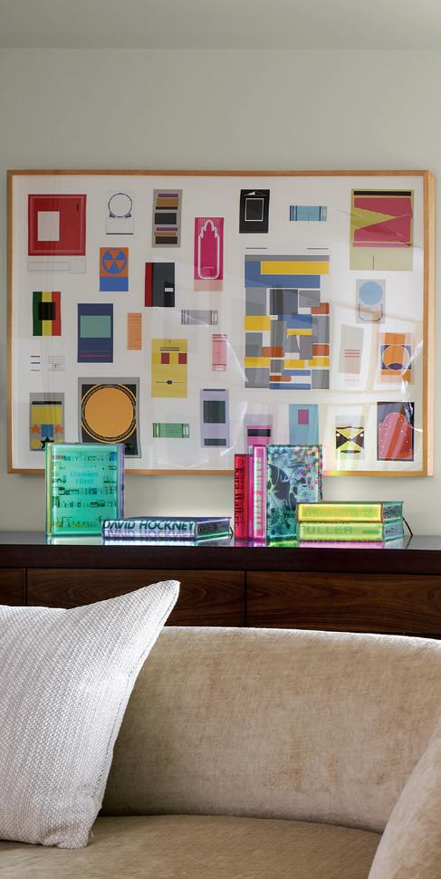
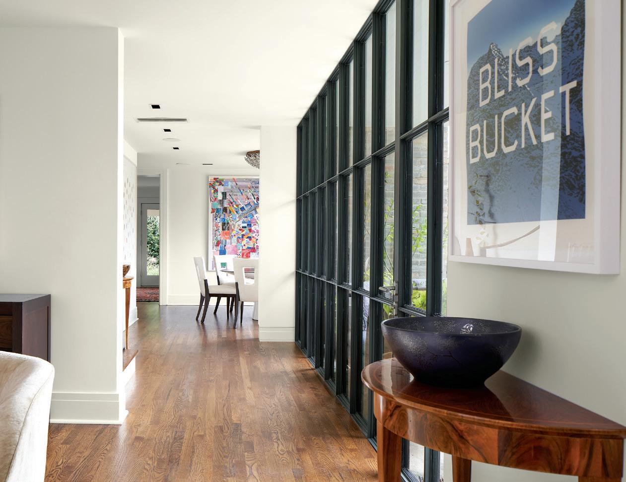
In the living room, Dario Robleto’s “The Ephemerist’s Dilemma” hangs above Airan Kang’s “Digital Book Project” series, and adjacent is “Bliss Bucket” by Ed Ruscha.

The library allows light to enter from three sides, illuminating a fireplace cut from steel plate and soapstone. Views of the Lueders limestone terrace, pool and a private garden are visible from seats surrounding the fireplace and a built-in, upholstered daybed.
Concern about dark interiors is one of the reasons many homeowners decide to tear down existing homes and start over. To solve the issue and illuminate the centrally located kitchen and upstairs hallway, the team cut a light shaft through the center of the building, providing diffused daylight.

58 HOME DESIGN & DECOR AUSTIN-SAN ANTONIO | SUMMER 2023


SUMMER 2023 | HOME DESIGN & DECOR AUSTIN-SAN ANTONIO 59
square footage where it would have the greatest impact at the south facing front entry allowed for a larger, more shaded entrance.
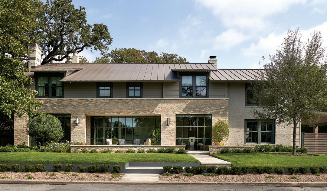
When visitors arrive, they are welcomed by a cut stone path at the curb that gently redirects them through a stepped landscaped terrace before crossing a low sitting wall with a Lueders limestone cap to create a seating area and more gracious, protected entry. The idea was inspired by country houses that are open and permeable to the landscape on multiple sides, as opposed to a formal front with a permeable backyard.
The new entrance boasts floor-to-ceiling steel and glass, leading to clean modern interiors meant to elevate the art collection. Above, a new standing seam metal roof with extended dormers and a sharper eave profile reinvents the older structure, creating a shaded portico entry below. This entry is defined by a horizontal brick box that feels intimate yet monumental, accentuating the length of the house and organizing the living and dining rooms on either side of the main gallery.
Both floors were outfitted with new windows, including floor-to-ceiling, steel-framed glass walls on the lower floor, selected for their minimal structure and to maximize sight lines and glass area. Painted classical wood trim touches the ceilings, dividing the walls into clear geometric white sur-
The facade was completely updated with a new brick veneer salvaged from the original house. Some of the painted bricks were reversed to the unpainted sides, and some of the painted sides were left to match the rest of the painted brick on the house for contrast on the front wall.
faces designed to showcase the colorful art pieces. The piano nook projects the living room into the landscape, with more expansive steel windows that capture the southern light.

The gallery-like interior walls were designed specifically for different sized artwork. “To accommodate the client’s art collection, we relocated electrical outlets and switches to make the walls clean and uninterrupted,” said Catherine Wilkes, of David Wilkes Builders. “We also added specialty wall wash lighting to highlight specific art pieces throughout the house. We added some rather large beams in the front of the house to have hidden privacy shades and drapery for the new glass walls.”
The kitchen went through a minor modification, adding a new coffee station, a space in the existing island for a second dishwasher, and modified cabinets to accept the new chef-style range and provide better door operation of upper cabinets. “Our in-house carpenters built all the new parts and did the cabinet modifications as most of the kitchen remained intact,” said Christian Bingham, Senior Project Manager, David Wilkes Builders. “We also installed
60 HOME DESIGN & DECOR AUSTIN-SAN ANTONIO | SUMMER 2023
additional task lighting and lights for the farmhouse table in the kitchen, and cleaned and sealed the marble counters to restore them and make them look like new.”
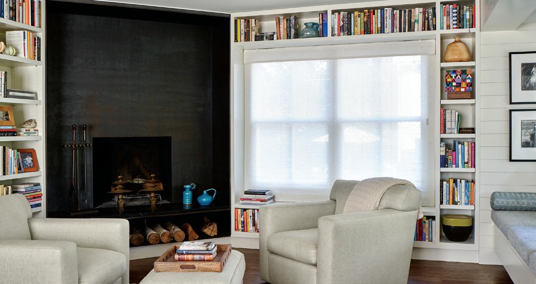
After discovering some rot in the living room oak floors, the team refinished them to match the original stain and finish. They also removed a small step up into the new office, formerly a sunroom, which had a small fireplace in the corner. “That room had floor-to-ceiling bookshelves on one whole wall and a built-in window seat opposite,” said Bingham. The fireplace was wrapped in blackened plate steel with sides and a new hearth that hid all but the original firebox.”
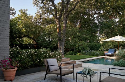
The Wilkes team built the new deck in the back that covers the entire width of the rear. It’s made from Ipe wood, with a corner step arrangement down to the new pool level, as well as integrated seats around the perimeter. The owner
has said that is one of their favorite spots in the house to sit with friends and enjoy a view of the small cocktail pool, which was installed by another contractor but mechanicals were coordinated though David Wilkes Builders.

This stunning remodel proves that, rather than demolish an existing home that fits the architectural style and history of a neighborhood, a smart architect and a professional builder can transform it into a stylish, modern abode that checks all the boxes. u


DAVID WILKES BUILDERS 512-328-9888 | DavidWilkesBuilders.com NICK DEAVER ARCHITECT 512-494-9808 | NickDeaver.com SUMMER 2023 | HOME DESIGN & DECOR AUSTIN-SAN ANTONIO 61
AROUND THE TREES
BY CLAUDIA ALARCÓN | PHOTOGRAPHY BY DROR BALDINGER, FAIA
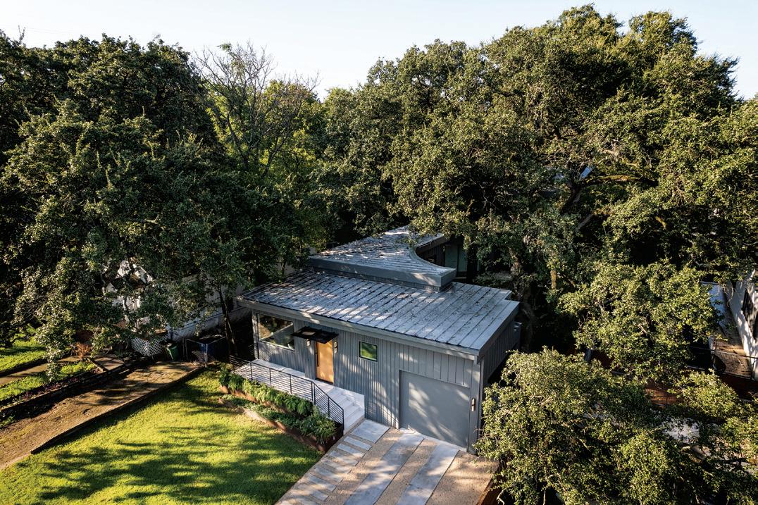
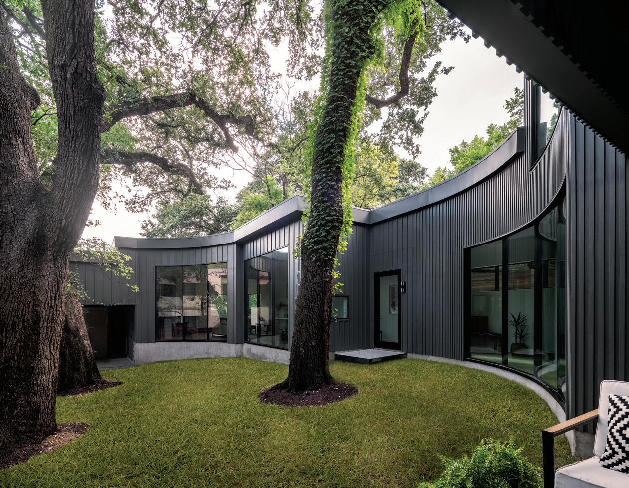
FFACED WITH THE CHALLENGE OF PRESERVING THE somewhat inconveniently located trees — one a protected live oak and three heritage live oaks dividing the property in two — and addressing the site’s grading, the architects at Workshop No. 5 approached the design as a modest, yet unusual and dynamic plan that’s deliberately unobtrusive from the street, revealing itself upon entry. A two-story volume with additional bedrooms and bathrooms, as well as flexible space, is also pushed to the rear to minimize the street presence.

This three-bedroom, three-and-a-half-bath 2,500-squarefoot single family residence in Austin’s Bouldin Creek
neighborhood replaced an existing cottage and grouping of outbuildings located among beautiful heritage oak trees. The previous buildings on the lot — a primary residence, a workshop, an accessory dwelling unit, a chicken coop and a meditation hut — gave way to an elegantly curved home with contemporary architecture, nestled among the trees’ trunks, branches and canopy.
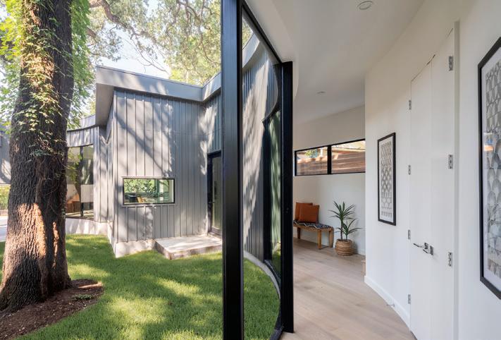
“Preserving the trees was the primary goal during the design of this home,” said principal architect Bhavani Singal of Workshop No. 5. “The main design feature of the house was to respect the root system of the trees, curving the building around them. In an effort to do that, we had to
62 HOME DESIGN & DECOR AUSTIN-SAN ANTONIO | SUMMER 2023
use innovative foundation designs that increased construction costs. To keep construction within budget, exterior materials were simplified to be Hardie® panels with a custom batten pattern. The home was consciously designed to keep a more pedestrian scale at the front of the property, while the second floor was pushed towards the back. We wanted it to feel unassuming and understated until you walked through the front door.”


SUMMER 2023 | HOME DESIGN & DECOR AUSTIN-SAN ANTONIO 63
Although conventional in organization — public spaces to the front, private domain to the rear — the plan places functions in a linear progression, with the central kitchen acting as a hinge. Floor-to-ceiling glass connects visually to the courtyard as the arc terminates in the main bedroom. The site’s grading — there’s an eleven-foot rise from the front right corner to the back left corner of the lot — also allowed for a play with levels, creating the ground level carport that connects to the house by a short run of stairs and a tucked-away mudroom.


The board-and-batten exterior is painted a deep gray, which blends in with the shaded site but is energized
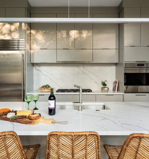
For economy’s sake, the kitchen cabinets from Texas Unique Cabinets were kept and painted; the same was done in the bathrooms. The kitchen island is made from quartz, sourced and built by Texas Unique Countertops. Under the island is an embedded Asko dishwasher; other appliances include a built-in fridge by Sub-Zero®, and a cooktop and convection oven from Wolf®.
64 HOME DESIGN & DECOR AUSTIN-SAN ANTONIO | SUMMER 2023
through the creative and varied rhythm of the battens. Inside, clean surfaces come to life with the constant play of light filtering through the leaves across the floor-to-ceiling glass walls. The floors are made from pre-engineered beech by Trinity Hardwood.
The design accommodates the sprawling canopy via a notch in the roofline to make room for one branch above the carport, and careful measuring to allow another to reach just over the second story unit. The bedroom wing was lowered to grade to keep the main branches above the roofline. The second-floor bedroom projects over the outdoor patio to create a covered space for the homeowners to enjoy, and possibly screen in to use yearround in the future.
The compact, meandering design created opportunities for unexpected nooks and concealed storage. For instance, behind the curved wall and staircase is a cleverly hidden laundry room. Built-in shelving, bookcases and storage cubes hold useful items and decorative mementos and plants. “We used every square inch of the house for efficient storage and utilities,” said Bhavani. “Since the
house is at about 2,500 square feet, using every inch was critical and very important to ensure that the kitchen would be fit for a family that enjoys connecting with nature and cooking together.”

This highly collaborative project between the City of Austin, the builder and the architectural firm yielded a stunning, efficient home that fits well within the established neighborhood, preserving the longstanding trees and incorporating them into the home’s design. u

WORKSHOP NO. 5 512-710-9705 | WorkshopNo5.com
SUMMER 2023 | HOME DESIGN & DECOR AUSTIN-SAN ANTONIO 65
In the bathroom, the showpiece is an Underscore® 60 x 30-inch alcove tub, outfitted with a DTV+ digital shower interface, by Kohler®. The stone resin sink is by ADM Bathroom.
REMODELING TRENDS FOR 2023

Remodeling trends are known to come and go as different times call for different projects. Who knew so many people would want a home office before 2020? Now that we’re in the middle of 2023, here are several other remodeling trends that are prevalent in Central Texas and around the country.
FLEXIBLE SPACES — A “flex room” is an area that can be used for a few distinct functions. The flex room might function as a combination home office, guest bedroom, home gym, kid’s playroom or media room. This allows people to shift between different work-related and home-based activities without adding additional square footage to their project.
PREP PANTRIES — “Prep pantries” are the new musthave in kitchen design. The evolution of a butler’s pantry, a “prep pantry” is a separate prep area that is usually located off the kitchen or dining area. This prep area provides an alternative staging area for dinner parties and social events, but is somewhat hidden from guests who might congregate in the kitchen.
FRIEND’S ENTRIES — Also known as the “luxury mud-
room,” the “friend’s entry” offers an additional — and often less formal and more practical — entrance into the home. Today, many homeowners are converting the mudroom into the friend’s entry. Sometimes those friends have four legs, so of course the friend’s entry can also be a luxury dog room!
MORE WINDOWS — Natural light plays a key role in the aesthetics of a room, as well as our health and wellness. Since many people work from home, optimizing natural light is more important than ever. New windows can lower your heating and cooling costs as well as prevent water from damaging your home. Plus, today’s skylights can illuminate areas that lack windows — like laundry rooms and stair wells — for additional natural light.
CHOOSE NARI — NARI remodelers can help you with any size remodeling project. They have the certifications and the skills you need. They can work with you to source and install the best materials for your project. u


For more information about the National Association of the Remodeling Industry in Austin or San Antonio, please visit AustinNari.org or RemodelSanAntonio.org
This column is sponsored by Bes Builder, a professional remodeler and longtime NARI member in Austin, Texas. This column is courtesy of Wells Mason, Business Development Manager for Builders FirstSource in Central Texas. Builders FirstSource is proud to be a NARI member in Austin and San Antonio.

REMODELER’S
ADVICE
www.BesBuilder.com 512.213.6270 2022 Local, Regional & National NARI CotY
WOMEN OWNED CONSTRUCTION &
WELLS MASON BUILDERS FIRSTSOURCE
Award-Winning Builder
REMODELING COMPANY Design Build & Home Renovations


 TWISTLEAF LAND DESIGN 512-489-0798 | Twistleaf.com
 BY JACEY BLUE RENNER


 BY DREW HENRY


 DICK CLARK + ASSOCIATES


 The kitchen island countertop is made from a lava stone called Basaltina. The walnut cabinetry was manufactured by Kingwood Custom Cabinetry out of Fredericksburg, painted to match the clean look. There’s also a small bar nook at the far end of the kitchen, near the breakfast area.
The comfy breakfast nook occupies a long narrow open space in the kitchen, across from the range and kitchen island. The wicker light fixture comes via SOHO Home. Custom banquette and vintage pieces were sourced from 1st Dibs, Chairish and local vintage shops.


 In the powder room, they added a bit of whimsy with a Maya Romanoff wallpaper layered with a pink Italian mirror found through 1st Dibs.


 MATT FAJKUS ARCHITECTURE

