Intersections
Manuela Sánchez Professional portfolio
2017 / 2022
Wayfinding design Editorial design Architecture
Intersections
This portfolio is an approach to understanding the exercise of design as a dialogue between disciplines that understand the social and spatial variables, so its results are measured not only in aesthetic results but also in terms of function, experience and democratization.
I believe in design as a tool with the potential to transform realities in unequal contexts such as Colombia.
Disclaimer:
Most of the projects shown in this portfolio were developed as part of the Mesa Estándar team. This portfolio is a sample of the projects in which the author had an active and leading participation.
Project category Page
CV Curriculum vitae
Motivation letter
Signage and archigraphy design
Signage and archigraphy for a public building Sports, recreational and cultural centre El Tunal 8
Wayfinding for a parking lot Antejardín building
Signage for a public park Parques del Río Medellín (Medellín River Parks) ............... 20
Editorial design Exhibition design
Book Architecture is not what it seems Architectural drawings edition 22
Book 12 projects in 120 constraints Book layout design
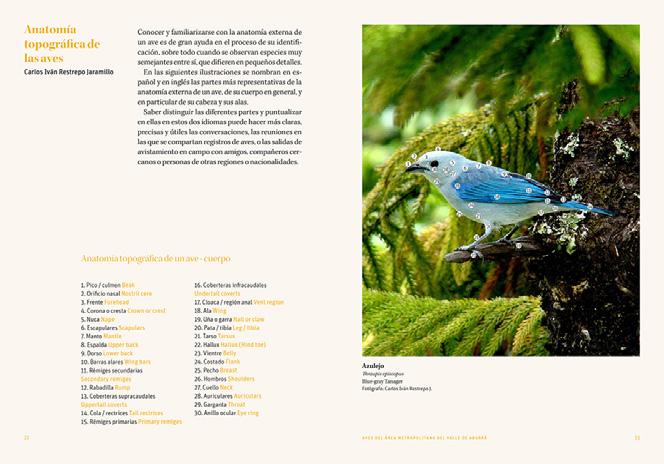
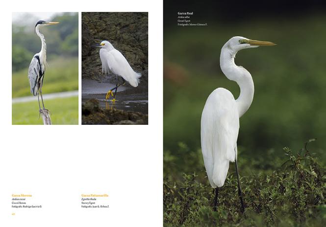
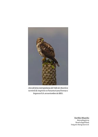
Book Birds of the Aburrá Valley Book layout design
Conditioning for a festival tent Literary exhibition design 30
Contents
..................................................... 4
......................................................... 6
......................................................... 14
......................................................... 26
......................................................... 28
Manuela Sánchez Aguirre Architect / Envigado, CO
Education
01.2012 - 06.2018
01.2001 - 12.2011
Date of birth 01.02.1995
Nationality Colombian
Email sanchezaguirre@live.com
Skype ID live:sanchezaguirre
Work experience
Bachelor’s degree in Architecture
Universidad Pontificia Bolivariana Medellín, Colombia. G.P.A.: 2.00 (German grading system)
Primary and secondary school Colegio La Inmaculada Itagüí, Colombia. Mesa Estándar
Graphic and editorial design studio
·Developing wayfinding and archigraphy systems for large-scale public spaces and architectural projects.
·Design, research and production of contents for art books, illustration and architecture.
·Exhibitions design. ·Professional internship.
10.2015, 07.2017
Taller Síntesis
Architecture and urbanism office
Achievements
01.2018 - 03.2022 05.2021 12.2018 11.2015 06.2015
·Support in developing projects for architectural competitions. ·Graphic design of architectural diagrams. Scholarship / Loan Colfuturo Selection to fund postgraduates studies abroad.
La noche de los mejores (The night of the best)
Colombian Ministry of Education. Recognition of the best scores in the Saber Pro test (Higher Education Quality Exam).
Best project
Faculty of Architecture - Universidad Pontificia Bolivariana. Workshop - 7º semester.
Academic excellence
Faculty of Architecture - Universidad Pontificia Bolivariana. Workshop 1:1 scale- 6º semester.
CV
4
Complementary studies
03.2022 - Present
German language course. Instituto Cultural Alexander von Humboldt Medellín, Colombia.
07.2016 - 09.2016
Italian language course. Linguaviva Language School Florence, Italy.
01.2016 - 06.2016
English language course. Centre of English Studies Leeds, England.
Basic courses in construction and architectural finishes. National Learning Service SENA Medellín, Colombia.
Basic photography course. Technological School of Arts Débora Arango Envigado, Colombia.
Languages
Skills
Adobe Suite
Interests Links
Spanish Native language
English Level: C1 / IELTS overall score: 7.5 Italian Level: B2
Adobe Illustrator Adobe InDesign Adobe Photoshop AutoCAD SketchUp
Books Geography and maps Experiential graphic design
Bachelor degree portfolio https://issuu.com/manuelasanchezaguirre/docs/portafolio_pregrado 24.04.2022
02.2012 - 08.2014 3D Modeling CAD Curriculum Vitae 5
Signage and archigraphy for a public building
Sports, recreational and cultural centre El Tunal
Year: 2018
Location: Bogotá, Colombia
Built area: aprox 13.000 m2
Client: FP architects
Design team: Mesa Estándar
Scope and participation:
· Graphic conceptualization.
· Spatial analysis and defining location strategies.
· Production of architectural plans and signage location report.
· Production of final artwork.
· Definying materials and technical development of the signage pieces.
Introduction:
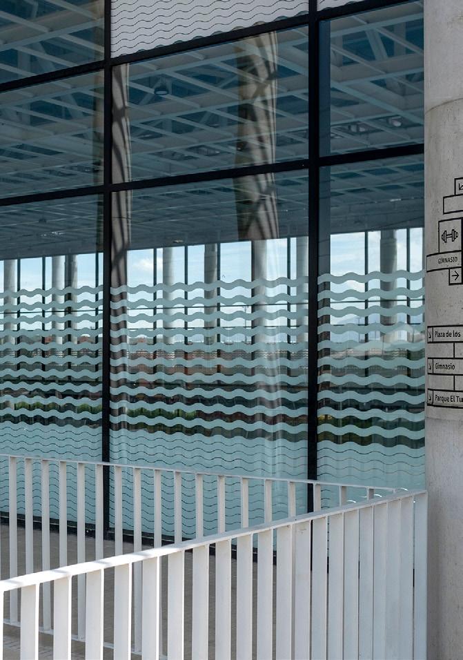
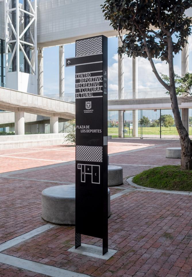
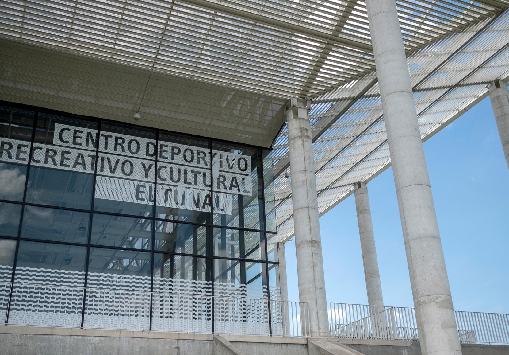
This commission was made by the architects of this large, multi-use public building, with the idead that the signage would not only fulfil the functionality of guiding a user through the spaces but that it would add extra character to the architecture.
Spatial analysis:
The first stage of development consisted of analysing the building’s operation and user routes to identify opportunities for intervention.
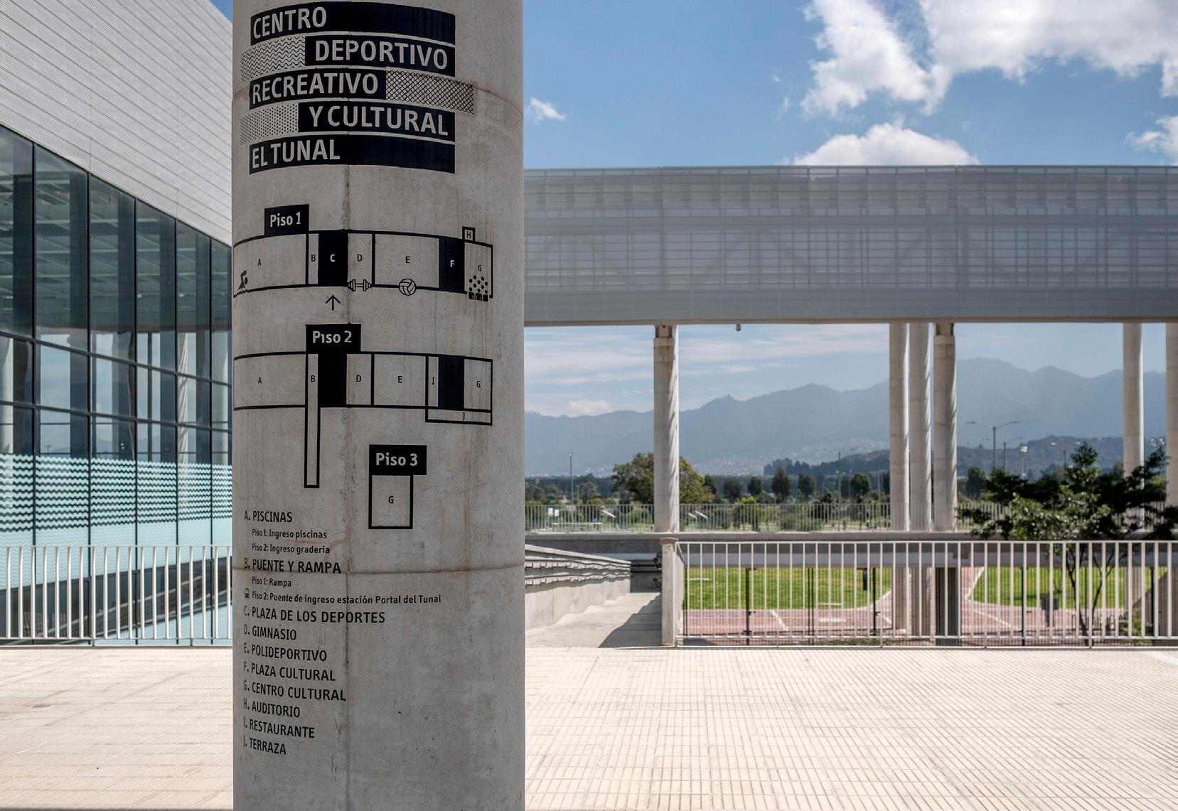
Photos of finished project.
Photos by Santiago Mesa.
Espectadores Nadadores Acceso piscinas Acceso tribunas Primer nivel
Segundo nivel
Parque Parque
Av Boyacá
Av Boyacá
6
Diagram by author.
7 Signage / Public building
Overview of the design process:
C D E F G
A 8
H A J B C B
A
D E F G J
D E F G J
H A C B D
H A C B D
J H
G
J H
G
F.Patio #2 G.Cultural centre H.Cinema I.Restaurant J.Cinema 1. Limit the spaces and uses on the architectural plan layout. ↓ 2. Adjust proportions with a geometric grid. ↓ 3. These are the resulting pieces that will compose the different sign types. ↓ 4. Additionally, pictograms and textures were designed to illustrate the main buildings according to their use so that they can be used as another element of graphic identity: H A J B C B
E F
E F
C D E F G H
J B C B D E F G J H A C B D E F G J H
A
A
A.Swimming pools B.Access bridge / ramp C.Patio #1 D.Gym E.Sports centre C D E F G
The graphic expression of the system takes from the architecture key aspects such as clarity the arrangement of the uses, transparency and geometric rationality.
The modular pieces deduced from the architectural plan are grouped to make sets for each type of sign: marking, orientation and directories:
Orientation signs
Maps in main entrances:
to other spaces: Orient to main buildings:
Directories signs
Marking
By the door of each space:
By the main access to each building: All arts by author and Mesa Estándar team.
PISCINAS
↑
Ludoteca Baños
Baños
↑
Grouping variations: EDIFICIO
EDIFICIO POLIDEPORTIVO
EDIFICIO CULTURAL Recepción Vestieres
Recepción Vestieres Lockers Sala 1, 2, 3 Ludoteca
Recepción Vestieres Lockers Sala 1, 2, 3 Ludoteca Baños EDIFICIO PISCINAS EDIFICIO POLIDEPORTIVO
Gimnasio Plaza deportes Plaza cultural Parque El Tunal Auditorio 2do Piso
EDIFICIO CULTURAL Sala de Ludoteca Baños EDIFICIO PISCINAS
↑
EDIFICIO PISCINAS
↑
EDIFICIO POLIDEPORTIVO
Gimnasio Plaza deportes Plaza cultural Parque El Tunal Auditorio 2do Piso EDIFICIO CULTURAL
EDIFICIO POLIDEPORTIVO
Gimnasio Plaza deportes Plaza cultural Parque El Tunal Auditorio 2do Piso
EDIFICIO CULTURAL
9 Signage / Public building
The expression of the signage materials seeks to be subtle and to adapt to the surfaces offered by the architecture, like glass windows and concrete walls or columns. The materials used are resistant black paint on walls and white adhesive on windows.
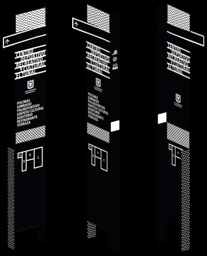
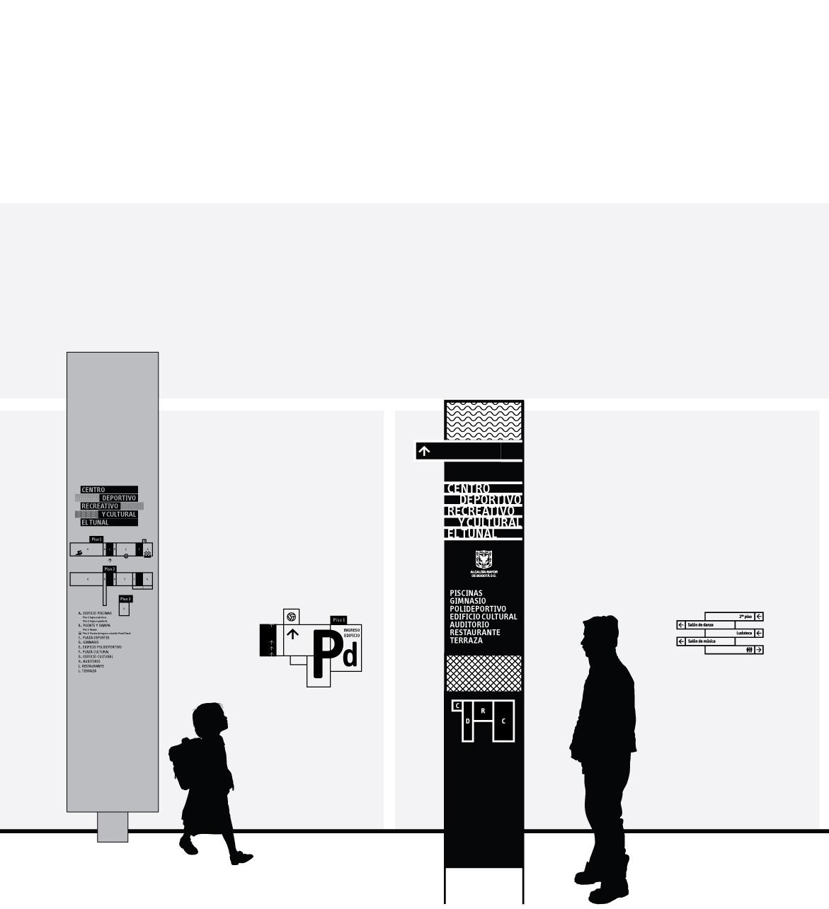
Signs family:
1.General map sign. Paint on concrete columns.
3.Totem signs. Hot rolled steel sheet.
2.Signs on building entrances. White adhesive on glass doors.
4.Direction signs. Paint on concrete walls.
All images by author.
10
5. Textures and name of buildings in main facades. White adhesive on glass.
6.Signs for specific spaces. Cold rolled steel sheet.
7.Directional signs. Paint on concrete columns.
8.Directional signs. Paint on concrete walls.
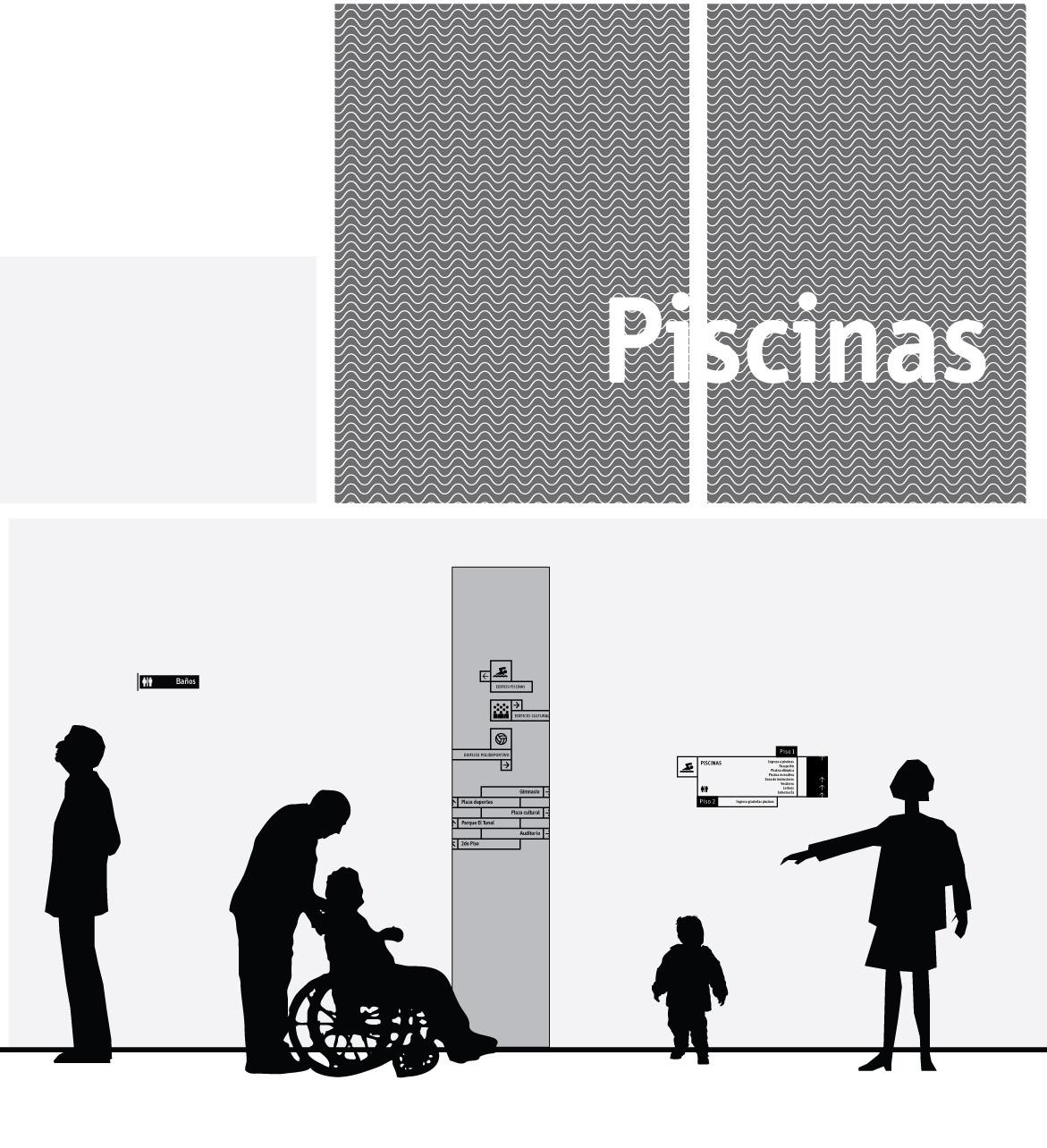
11 Signage / Public building
Wayfinding for a parking lot
Antejardín building
Year: 2019
Location: Medellín, Colombia
Client: Plan:b architects / Ménsula
Constructor
Design team: Mesa Estándar
Scope and participation:
· Conceptualisation of brand identity and naming.
· Graphic conceptualization of the signage system.
· Definition of materials and typologies.
· Spatial analysis.
· Defining location strategies.
· Assembling architectural plans for signs location.
· Production of final artwork.
· Technical development of the signage pieces.
· Installation supervision.
Introduction:
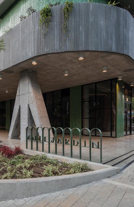
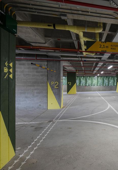
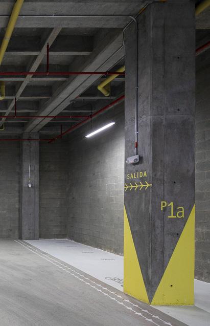
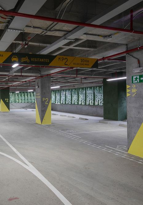
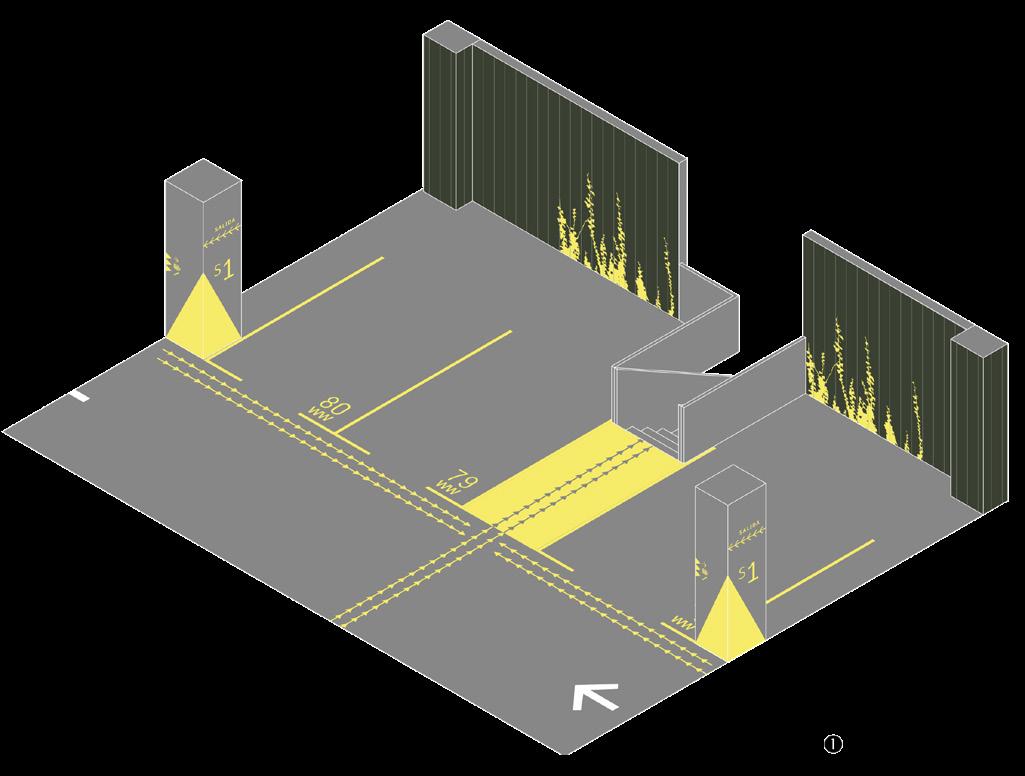
The graphic brand identity of the Antejardín building was developed in all stages. In the last phase, the client wanted to implement a signage system that would integrate with the existing architecture, avoiding the construction of additional supports to inform and guide users of the public car parks.
Photos of finished project.
Photos by Alejandro Arango.
12
the possibilities and wide uses of different arrow types to mark the clear directions for cars and pedestrians.
Graphic approach: Explore
The logo that was designed in previous stages. The arrow and its variations as a constant shape. S ALI D ▶ ▶ ▶ S ALI D A S ALI D A ▶ ▶ ▶ →→→→→→ S2 S ALI ▶ ▶ ▶ International symbols. Optimal typographies. S ALI D A S ALI D A ▶ ▶ ▶ →→→→→→ S2 S ALI D A S ALI D A ▶ ▶ ▶ →→→→→→ S2 S ALI D A S ALI D A ▶ ▶ ▶ →→→→→→ S2 S ALI D A S ALI D A ▶ ▶ ▶ →→→→→→ S2 S ALI D A S ALI D A ▶ ▶ ▶ →→→→→→ S2 13 Signage / Parking lot
Key elements:
LÁMINA METÁLICA
Painting a triangle on the edge of the columns creates a perspective effect so that the whole environment of the parking lot is homogeneous.
Avisos exteriores:
Elementos metálicos en lámina HR o CR (según especificación de fabricante) de mínimo 4mm y máximo 6mm de espesor. Acabado en pintura fondo verde o amarillo poliéster electrostática + Pintura epóxica transparente con propiedades antigrafiti para todas las piezas y en ambos lados.
The yellow colour is key in this proposal for being a good contrast to the concrete grey, making the signs easily recognisable and avoiding visual pollution.
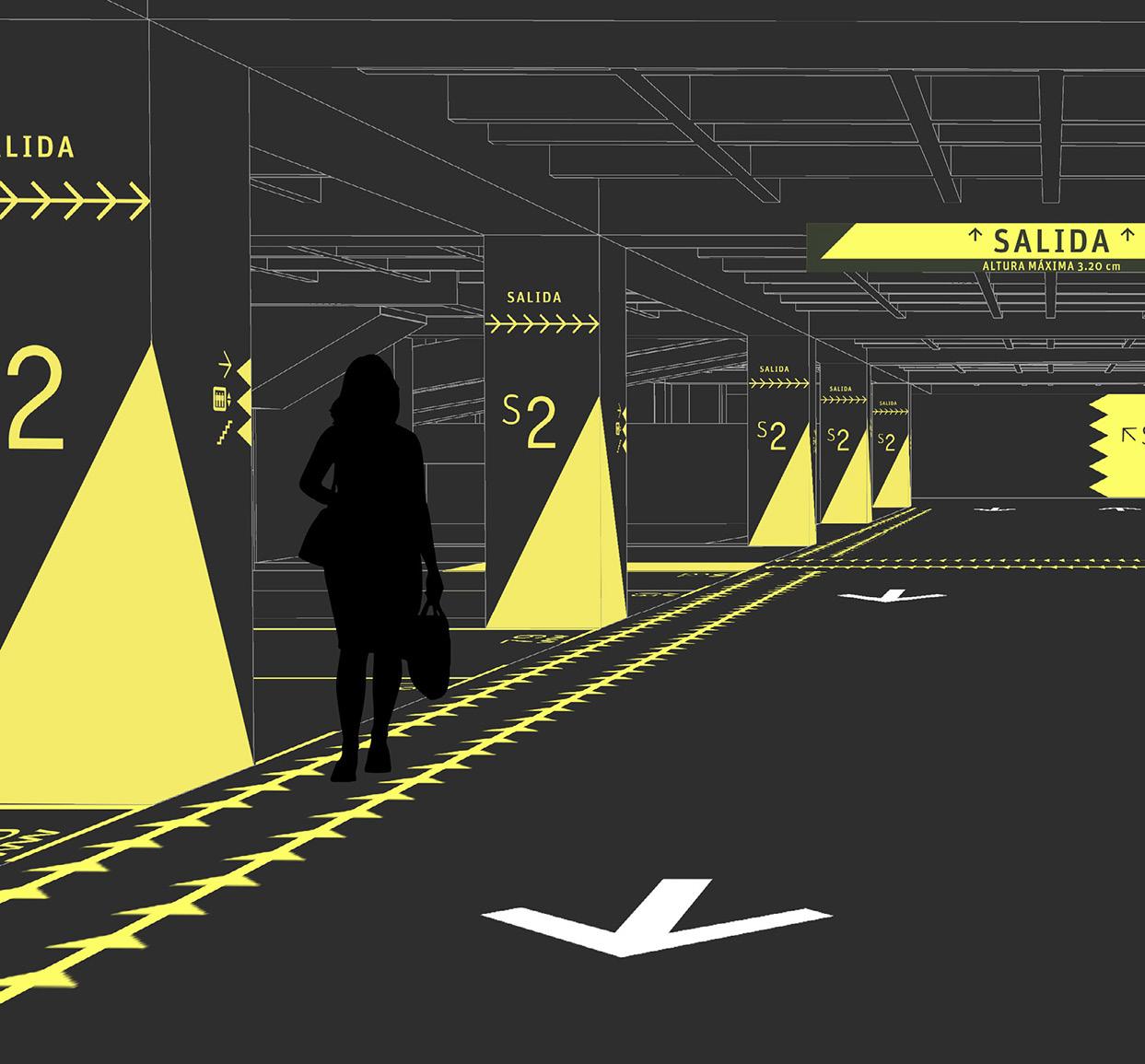
Some extra pieces were designed in materials different to painting:
Las especificaciones de anclajes, elementos portantes, detalles constructivos que requieran de obra civil se definirán según sugerencia del fabricante.
All imagenes by author.
La localización de los avisos dada en el informe se debe verificar en el lugar.
Colores:
Urban logo sign.
14
METÁLICA
interiores: metálicos en lámina especificación de mínimo 4mm y de espesor. pintura fondo verde electrostática; iconos, demás elementos pintura amarilla aplicación a pistola plantillas.
deben descolgarse concreto, las especificaciones de los elementos detalle constructivo según sugerencia del muros se fijan a la concreto con pega adherencia.

de los avisos dada debe verificar en BANANA SPLIT
Directional signs for cars.
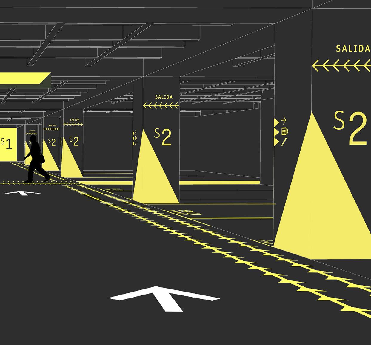
29 Isométrico Detalle
Piezas son vaciadas en concreto (base cemento blanco) reforzadas con fibra de vidrio, de 1.5 cm de espesor. Color aplicado mediante pigmento inorgánicos para la construcción.
Ascensores 36
Localización
VERDE AÑIL VD083-A Pintuco)
AM118-D Pintuco)
Floor number on elevators.
15 Signage / Parking lot
Intervention typologies:
After analyzing the possible routes and paths of the users and identifying the nodes (most important spots), location strategies are defined so the number of materials is limited and the system is clearer.

Detalle Localización
Urban naming signage. Hot rolled steel sheet.
Side A: Information for pedestrians.
Marking on columns. Painting on concrete.
Side B: Information for vehicles.
Cara frontal y lado 1
3.0m
Elemento metálico en lámina ó CR de espesor. Acabado en pintura fondo Pintura epóxica transparente Fijada a borde superior de la jardinera metálico o pernos
Floor number for elevators. Coloured concrete pieces.
Level indicator for cars. Painting on concrete walls.
La intervención de señalética en el parqueadero información para todos los tipos usuario; que direcciona tanto vehículos (carros, motos
peatones que
16
Localización
Marking of vehicle access. Painting on engraved concrete.
Isométrico
Isométrico

All imagenes by author.
Hung directional sign for cars. Cold rolled steel sheet.
Piezas son vaciadas en concreto (base cemento blanco) reforzadas con fibra de vidrio, de 1.5 cm de espesor. Color aplicado mediante

Delimitation of parking spaces for cars. Painting on the concrete floor.
Parqueadero
Isométrico
24 Parqueadero
Detalle
Direction guides for pedestrians. Painting on the concrete floor. 17 Signage / Parking lot
Signage for a public park
Parques del Río Medellín (Medellín River Parks)
Year: 2020
Location: Medellín, Colombia Built area: aprox 18.000 m2
Client: Medellín city government / Integral-Interdiseños Consortium Design team: Mesa Estándar
Context:
The River Park is the most important public space development for the city of Medellín, connecting the city transversally and seeking to restore the physical and environmental relationship with the river. The second stage of implementation of a previously designed signage system is presented below.
Scope and participation:
· Spatial analysis and location strategies
· Assembling architectural plans for signs location.
· Production of final artwork.
· Installation and production supervision.
Introduction:
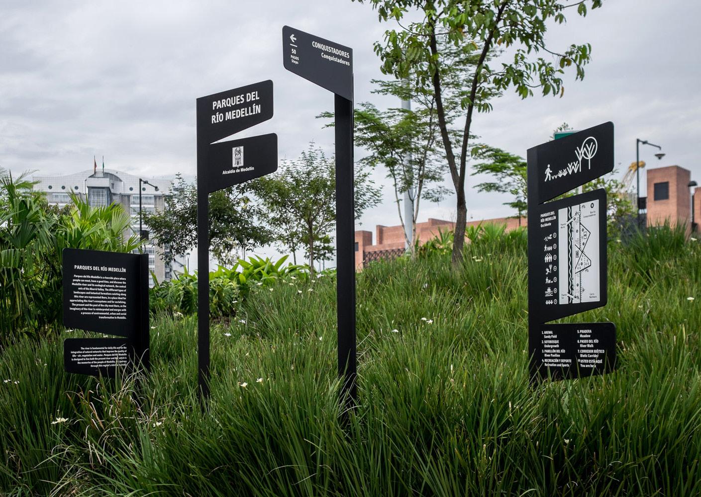
Photos of finished project. The sign forests have been designed so that they can be surrounded by plants or inserted in low gardens.
Photo by Santiago Mesa.
The main idea of the signs is that they aimed to be self-supporting and that they should be organised in a way that resembles the groupings of trees (forest of signs). Therefore, the signs in the park appear in groups of two or more elements and the heights of the signs that make up the groups are diverse.
18
PARQUES DEL RÍO MEDELLÍN Occidente CAMINA CON CUIDADO Watch Your Step PRECAUCIÓN BORDE DE RÍO Beware Riverbank PRADERA Meadow PASOS Steps PUENTE NORTE North Bridge PASOS Steps VÍA COMPARTIDA Shared Pathway 270 400 2.56 m 2.25 m 1.94 m 1.32 m 1.01 m 0.70 m GOLDEN SPOON, Byrsonima crassifolia. This highly resistant medium-sized tree can reach about 10 m. Its bunches of yellow owers turn red as they grow older. Its honey and fruit attracts animals, especially birds. This tree is used in processes of revegetation. DIENTE DE LEÓN, Taraxacum cinale. Planta perenne de hasta 40 cm de altura, común en los prados. Su tallo no tiene hojas, y termina en una or amarilla, muy vistosa. Es una de las principales especies de ora de interés apícola, ya que las abejas visitan sus ores para tomar néctar y polen. Por sus propiedades nutritivas se usa en la cocina. 1.63m Nivel de piso acabado PARQUES DEL RÍO MEDELLÍN Family of signs: Direction Naming and city logo Shared pathway Park maps Direction outskirts Botanic spaces Preventive Botanic species Spaces Ground level 19 Signage / Public park
Book Architecture is not what it seems
Architectural drawings edition
Year: 2020
Publisher: Mesa Estándar Editores
Number of pages: 32 Design team: Mesa Estándar
Scope and participation:
· Analysing and defining the main features to be highlighted in the drawing.
· Colour editing.
· Files preparation for printing.
Introduction:
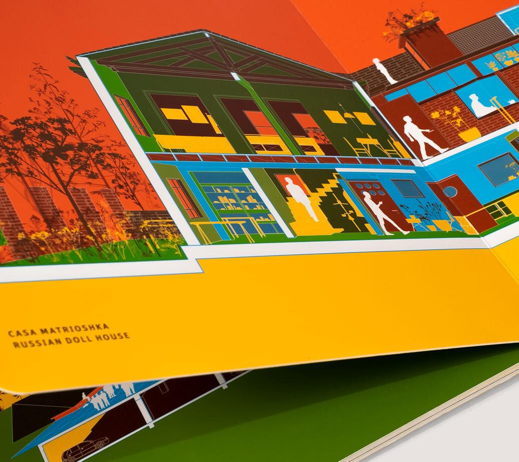
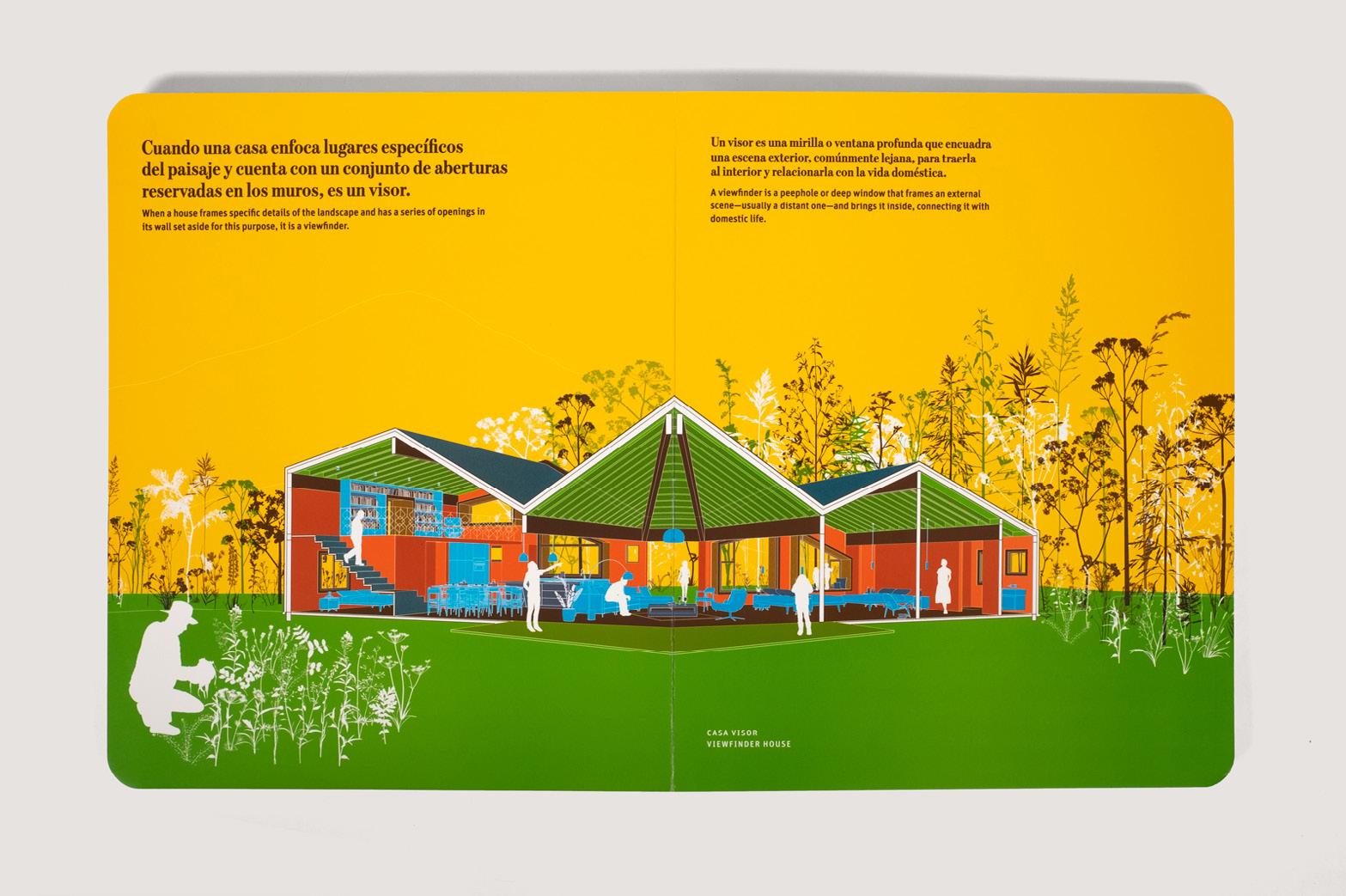
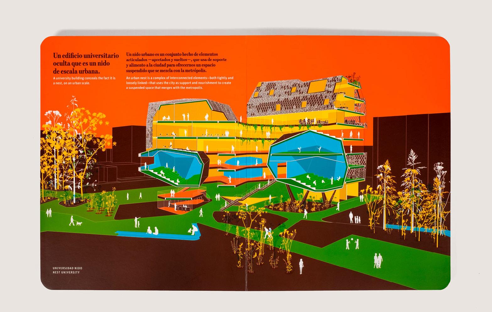
This book tries to show simply and colourfully 14 architectural projects in the tropics that reveal the basic and primary sense of architecture, seeking to make these principles more understandable to the general public. All buildings were designed by young architects of Colombia.
20
Photos of printed book. Photos by Mesa Estándar.
21 Book / Architecture
is not what it seems
Overview of the editing process:
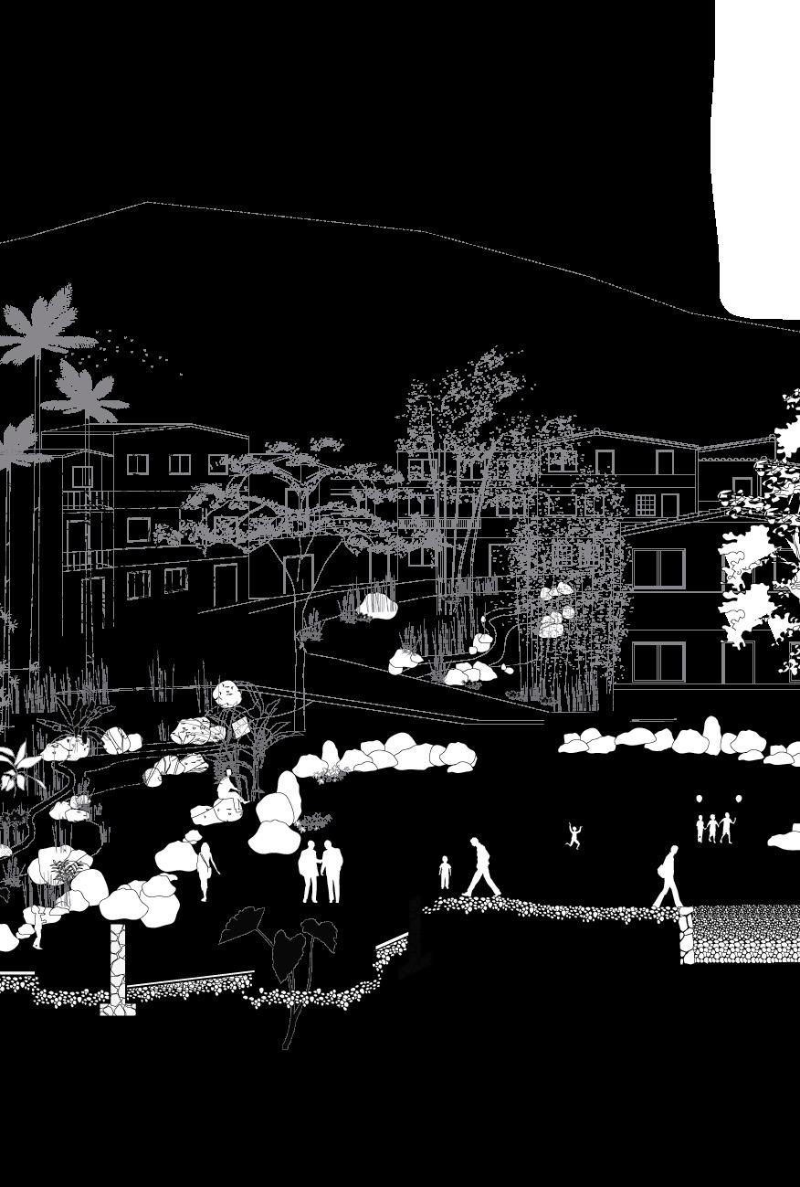
The editing process was based on drawings made by the architecture offices, all produced in AutoCAD software.
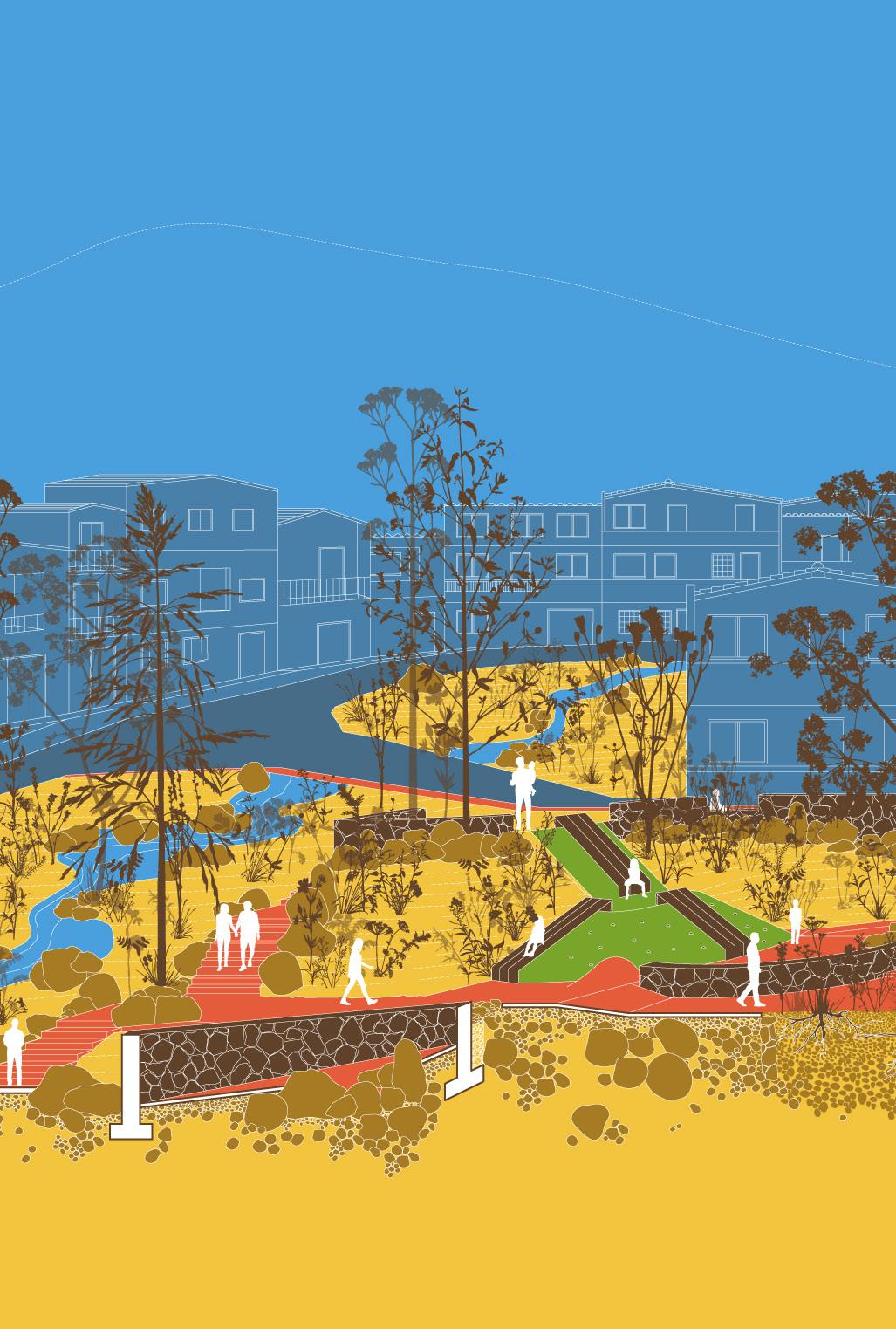
Within the editorial board, it was decided which architectural value should be shown more clearly by intervening the drawing with a palette of bright colours.
Original drawing. Black and gray lines.
Original drawing by Connatural Architecture.
22
Edited drawing by author.
In the case of this drawing, one of the most important elements was the stones that were originally found on the site and that were kept in the design of the park, resembling a riverbank. This is why the ground is assigned a brighter colour, including the green and soft area as an expression of the ground determining the park.
Edited
Architecture is not what it seems
23 Book /
drawing. Coloured fills and lines.
Scope and participation:
Book layout design
Year: 2021.
Client: Plan:b Arquitectos. Publisher: Oro Editions. Number of pages: 144. Design team: Mesa Estándar.
Introduction: In
describe 12 of their architectural projects in terms of the contextual limitations they encounter during the design process.
projects
constraints
Book 12
in 120
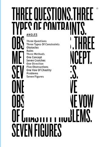
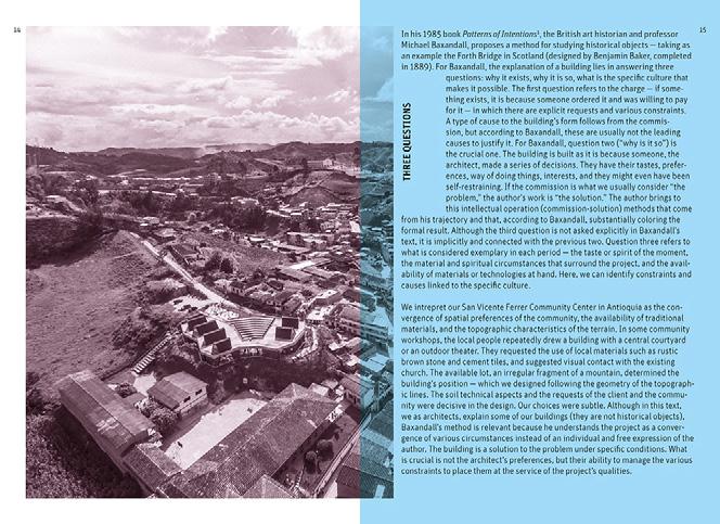
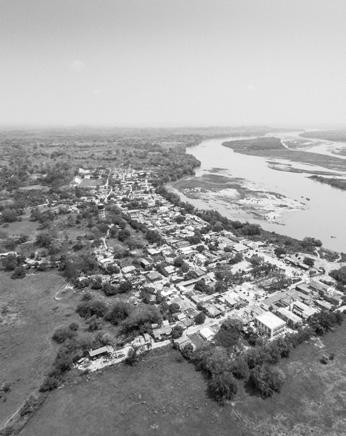
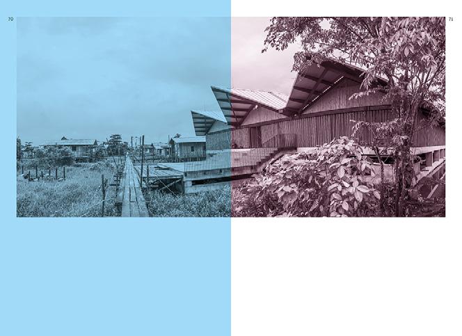
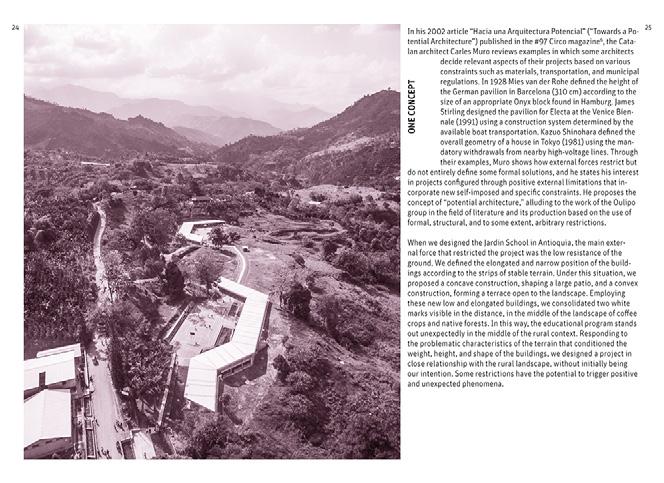
16 17 “Constraints and Conventions in the Arts” is the third chapter of the 2000 book Ulysses Unbound , in which the Norwegian social and po litical theorist Jon Elster, proposes three types of constraints that any artist or architect normally faces: intrinsic constraints, that are given and are, for example, inherent to the structural limitations of the material; imposed constraints, that come from external agents — persons or institutions commissioning a building — such as budgets, municipal regulations, aesthetic prefer ences of a client, etc; self-imposed constraints, which come from the author himself and normally seek to strengthen his work. For Elster, “the restrictions imposed on or chosen by the artist can take many forms. A basic distinction is be tween hard constraints and soft constraints or conventions. Hard constraints are formal, material, technical, or financial restrictions on the selection and combination of the con stituent units of the given medium. Conventions, as the word indicates, are restrictions that constitute a specific genre such as the sonnet or the classical symphony.” We see con ventions in architecture as formats, typologies, programs, and styles. For Elster, intrinsic, imposed and self-imposed constraints are different in creative terms: “On the one hand, preexisting or preset constraints enhance and stimulate the creative process. On the other hand, the creation of constraints is itself part of that process.” In our design for the Puerto Triunfo Community Center in Antioquia, we faced various intrinsic and imposed constraints. Our client and his advisors requested a resistant, low-maintenance construction that would take as reference some tropical buildings made of reinforced concrete. The budgetary limitations did not allow air conditioning, and the warm and humid climate of the place forced us to propose a permeable building affected by the municipal regulations of a corner lot. Our visit to a nearby ruin, in which concrete block walls configured shaded spaces amid native gardens, led us to work with some simple self-imposed constraints: using reinforced concrete as the primary building material (structure, facade, floor); to locate the structure on the perimeter to generate flexible interior spaces; to design a deep facade allowing the growth of gardens. From our perspective, intrin sic, imposed, and self-imposed constraints have changing influences according to the particularities of each project. We believe that under substantial imposed restrictions there is still room for quality archi tecture; although there is not much to decide, it is still crucial to guide contextual forces properly. THREE TYPES OF CONSTRAINTS
· Conceptualisation of graphic design. · Photos edition. · Layout. · Prepress, completing the files for printing.
24
this book, Plan:b architects
Overview of the design process:
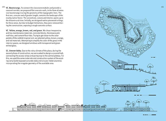
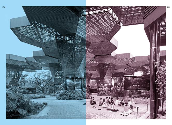

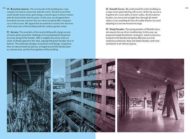
Limitations also based the concept of the book design, at the beginning, we set the number of tints to 3 (cyan, magenta and black). This constraint made the layout structure have to play with the resources available still seeking a diverse and pleasant book to read.

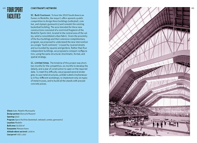
Interior pages. Double pages layout.
25 Book / 12 project in 120 constraints
Book Birds of the Aburrá Valley Book layout design
Year: 2021
Client: Antioquia Ornithological Society
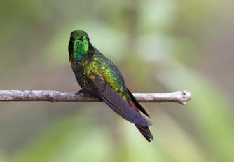
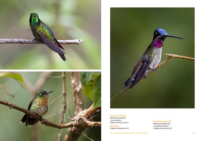
Number of pages: 172
Design team: Mesa Estándar
Scope and participation:
· Definition of graphic elements: format and typography.
· Layout.
· Prepress, completing the files for printing.
Overview of the design process:
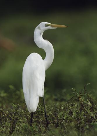
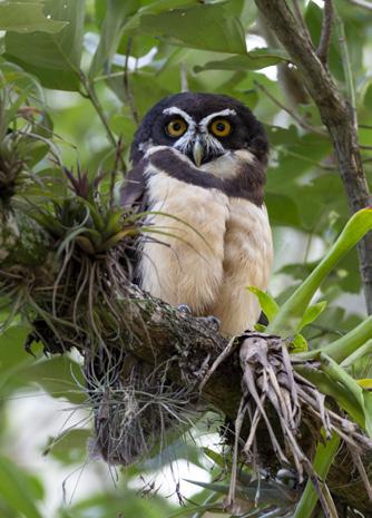
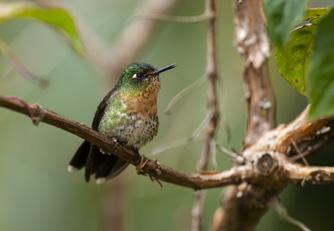
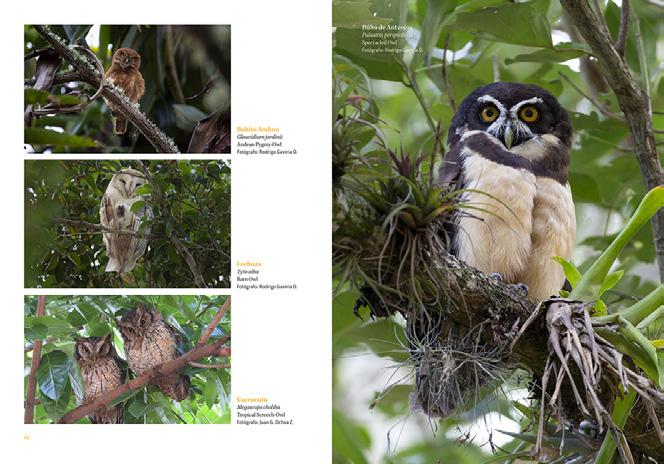
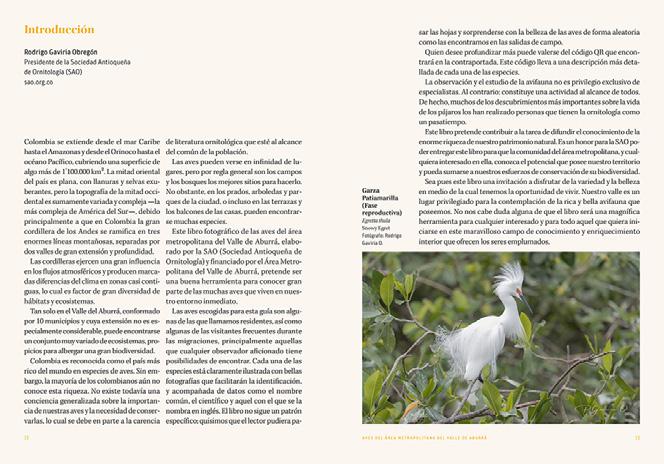
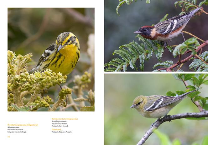
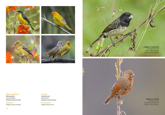
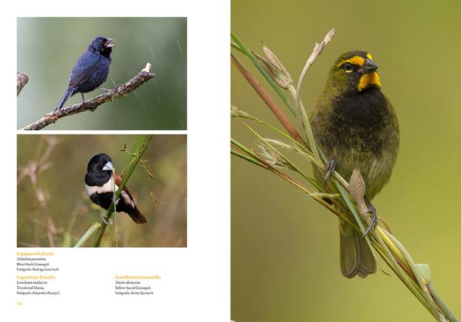
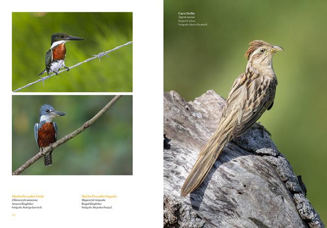
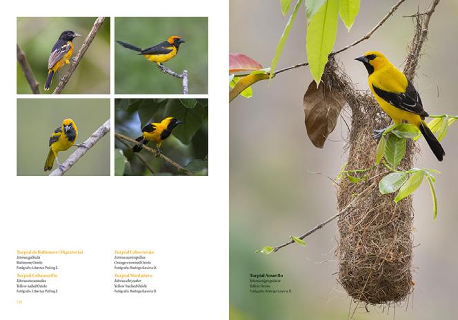
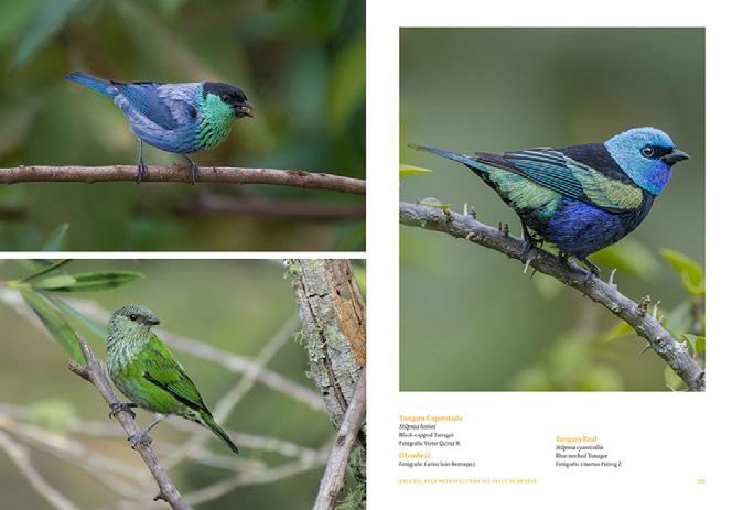
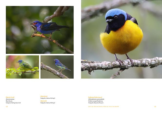
The commission for this book was limited by the client’s requests, who wanted to maximise the size of the page to get the photographs expressed in the largest possible size. This made the design process very direct and close to further proposals.
26
Interior pages. Double pages layout.
27
Book
/ Birds of the Aburrá Valley
Conditioning for a festival tent
Literary exhibition design
Years: 2017,2018 and 2019
Location: Medellín, Colombia
Client: Comfenalco Antioquia Design team: Mesa Estándar
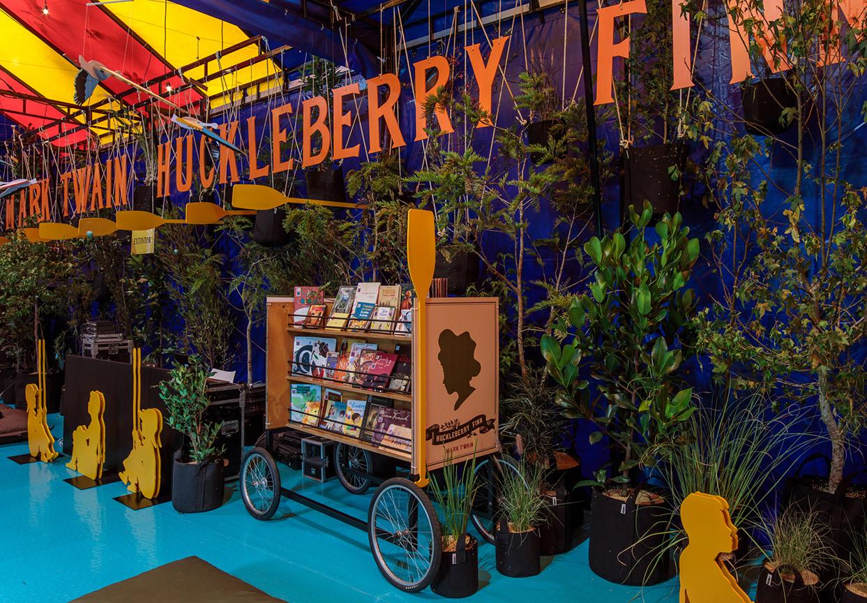
Exhibition images.
Image by author / Photos by Alejandro Arango and Mesa Estándar.
Scope and participation:
· Content research.
· Graphic conceptualization.
· Graphic development of all pieces.
· Presentation to clients.
· Production of final artwork.
· Installation and production supervision.
Introduction:
Every year, within the context of the Medellín city book fair, an exhibition is held inspired by and important literary work in history.
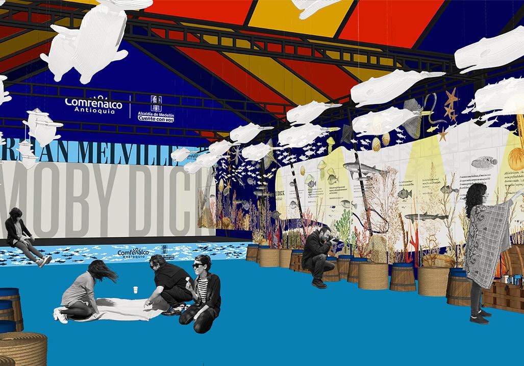
A temporary festival tent is set up for this purpose; the main conditioning factor for the design consists of the materiality and colours of the tent, therefore, the intervention tries to cover up the sides and leave the central space free for actitivities, trying to create an atmosphere that evokes the book.
2019 / Moby Dick
28
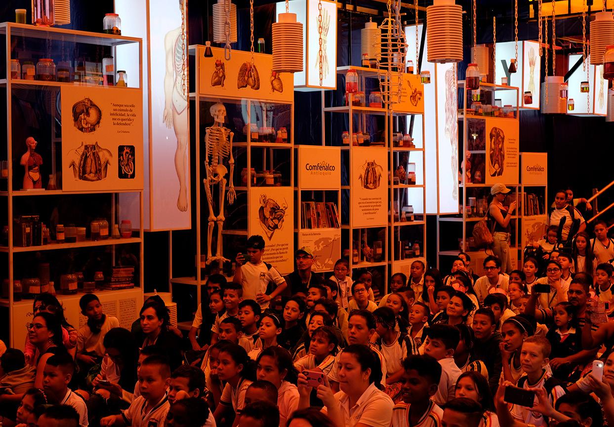
 2018 / Frankenstein; or, The Modern Prometheus
2017 / The Adventures of Tom Sawyer
29
Exhibition / Literary festival tent
Overview of the design process:


In the first stage, brief research about the book was made to determine the atmosphere to be represented within the space of the tent.
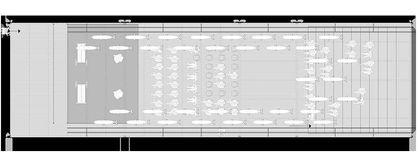
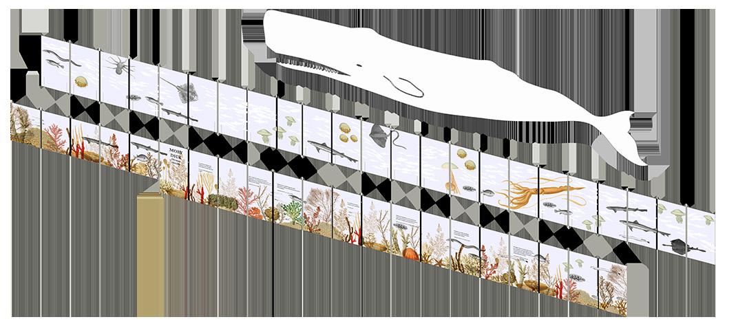
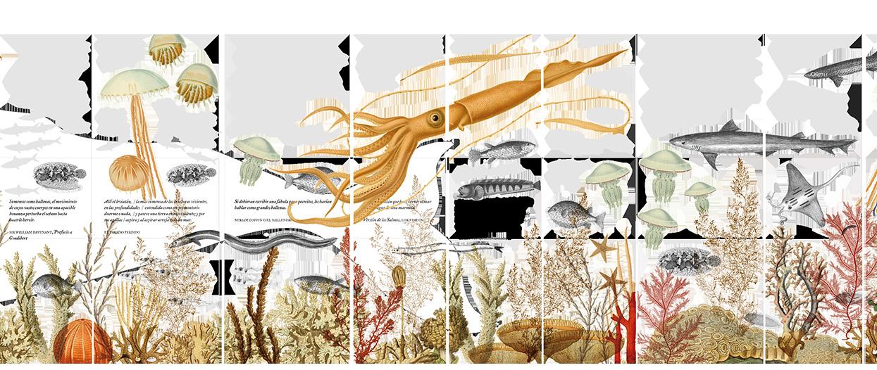
For the exhibition of the Moby Dick work, the aim was to recreate an aquatic environment, to simulate being submerged in the sea. This effect was achieved by installing a 3-layered diorama on both sides and suspending whale figures from the ceiling to reinforce the perspective towards the stage.
Diorama
Sperm whale models
Stage Grandstands
Backing
30
Access


1. 2. 2. 3. 3.
Frontal view of the diorama. Main side.
31
Exhibition / Literary festival tent
Manuela Sánchez Aguirre
sanchezaguirre@live.com +57 3195161570 skype: live:sanchezaguirre


 2018 / Frankenstein; or, The Modern Prometheus
2017 / The Adventures of Tom Sawyer
