Issue 227 07/08 2023
u pfront
Big ideas, innovation and projects, products and people through a future-centric lens
t h I ngs I’ ve L earnt
Director of consultancy at MCM, Graeme Hart, shares his top five career takeaways
h e I ght of D es I gn
Marco Oggian picks the one item he sees as the pinnacle of design


p ara D ox I ca LLy s peak I ng
Neil Usher on keeping workplaces free from boxes


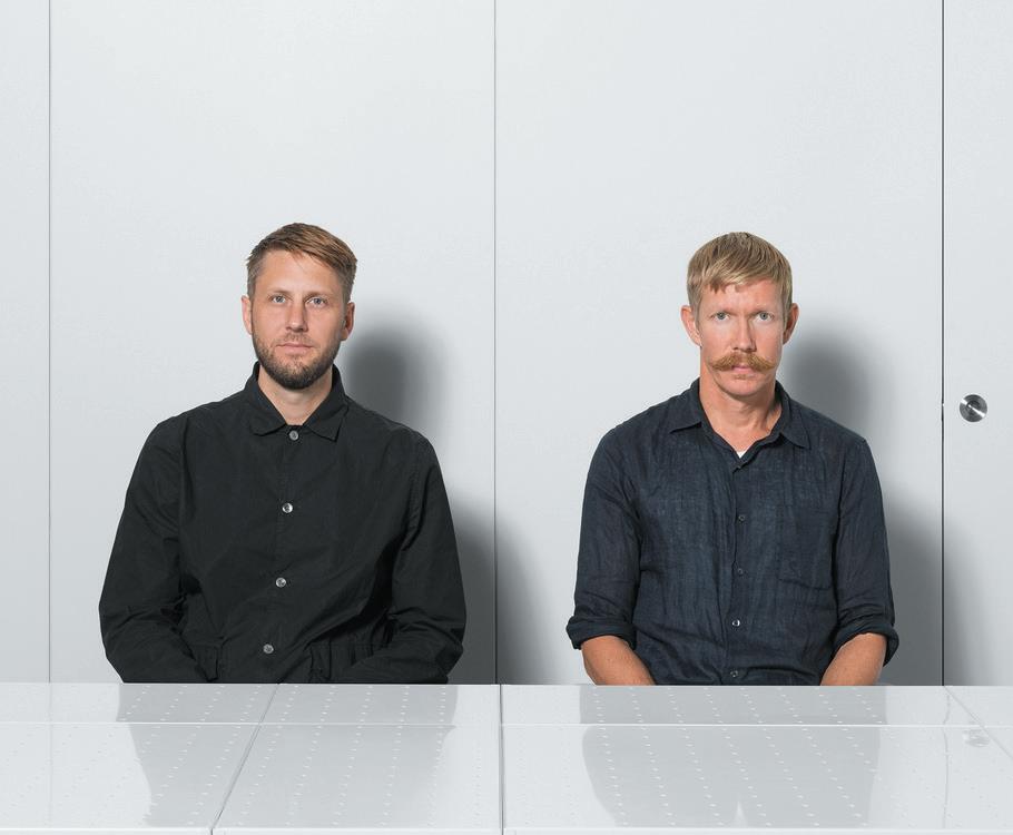
I n c onversat I on W I th : J onas p ettersson an D J ohn L öfgren
The founders of Form Us With Love offer insight on the philosophy behind their success


I n c onversat I on W I th : t at Jana von s te I n
Discussing a love for European design, the founder of Sella gives us a preview of her first furniture collection
t he a sk
Tina Norden queries the importance of designing spaces to suit social media





c ase s tu Dy : c hancery h ouse , L on D on
The Office Group’s largest coworking space, by dMFK and Norm Architects
case stuDy: humo, LonDon Wood takes precedence in this Mayfair dining destination by Afroditi
c ase s tu Dy : h ackney W I ck , e ast L on D on
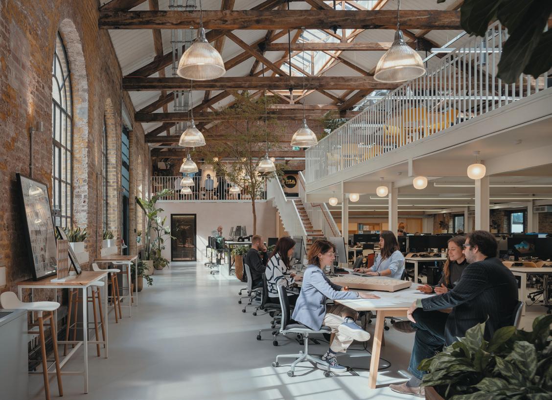
HTA Design transforms a Victorian warehouse into a modern workspace
c ase s tu Dy : L o I re v a LL ey L o D ges , t ours
A blueprint for design and nature coexisting harmoniously
1
12 22 23 24 26 32 38 40 48 54 62 54 128 26
c ase s tu Dy : B I rch ( s e L s D on ),
c roy D on The community-minded hotel blends work, play and stay
p os I t I ve I mpact : y oung v& a , L on D on After three years, the arts, design and performance museum reopens its doors to the public in Bethnal Green
f ast f orWar D : f I ras a L sah I n Can AI shape innovation and creativity? The co-founder of 4Space explores whether AI can generate ideas or is just a useful tool
c reat I ve t h I nk I ng
M Moser Associates’ Steve Gale considers the ESG acronym and the tick boxes to adhere to it
m I x r oun D ta BL e I n partnersh I p WI th 2 tec 2 How do we design to last in a period of change?
m I x r oun D ta BL e I n partnersh I p WI th a utex a coust I cs Design beyond the physical: how should our senses shape our spaces?
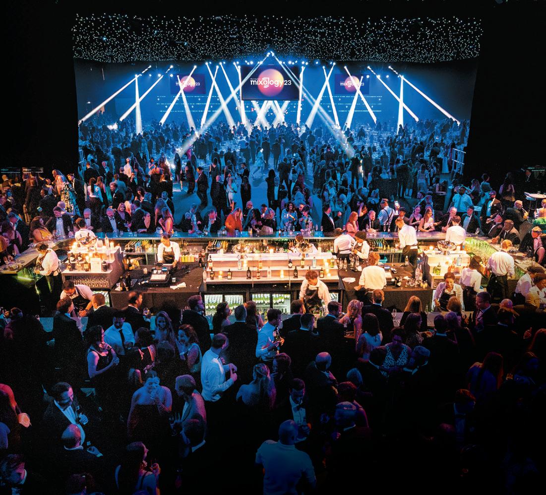
m I xo L ogy 23 W I nners
Highlights from the biggest awards ceremony in commercial interiors
30 u n D er 30 c L ass of 2023
Say ‘hello’ to the annual class of trailblazers from across the industry
e vents
Our round-up of industry events
m ater I a L m atters
Experiential design studio Atelier Ochre reveal the textiles behind Ember Locke in Kensington

I nnovat I ve m ater I a L s
Ottan Materials combats food waste
t he f I na L W or D
Criteo’s Mike Walley voices his concerns for Gen Z
2 68 74 80 86 88 96 104 128 139 142 143 144 104 32
40
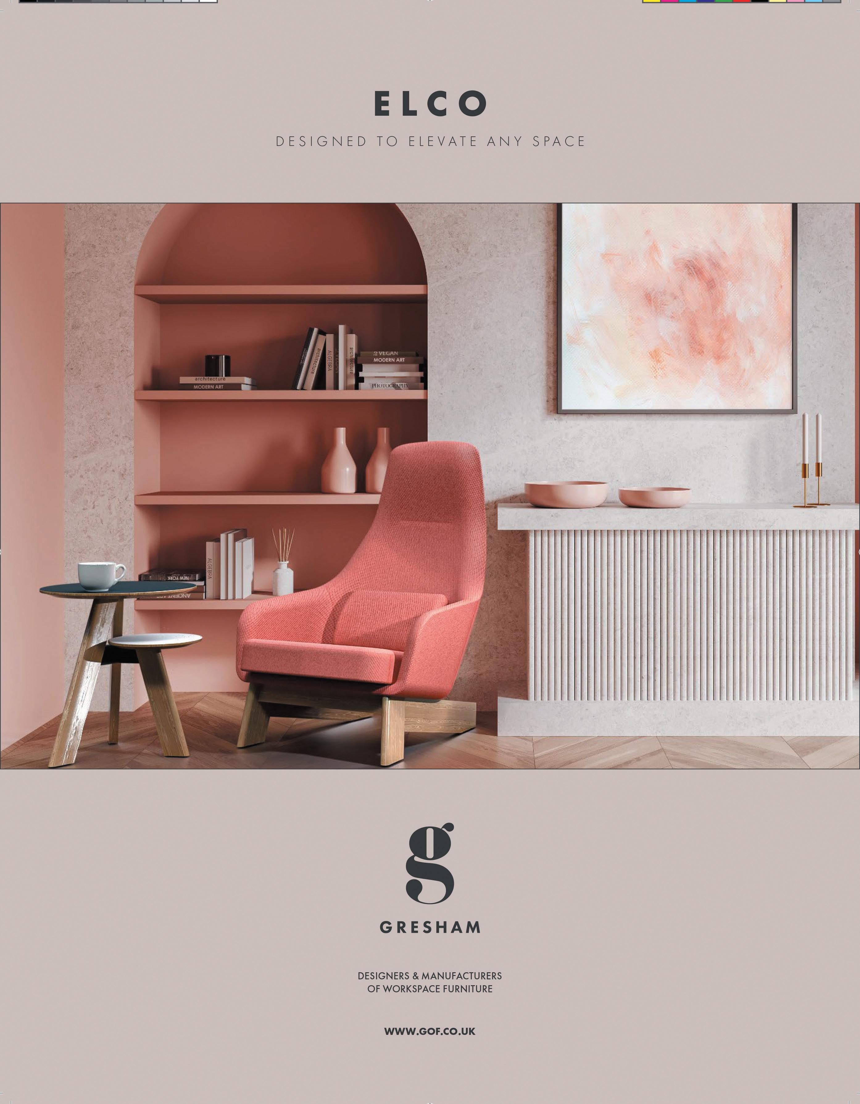
Logo

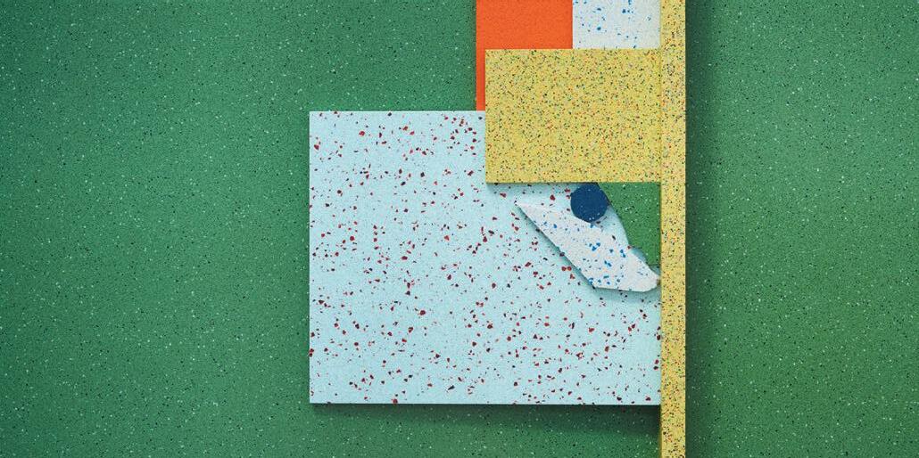
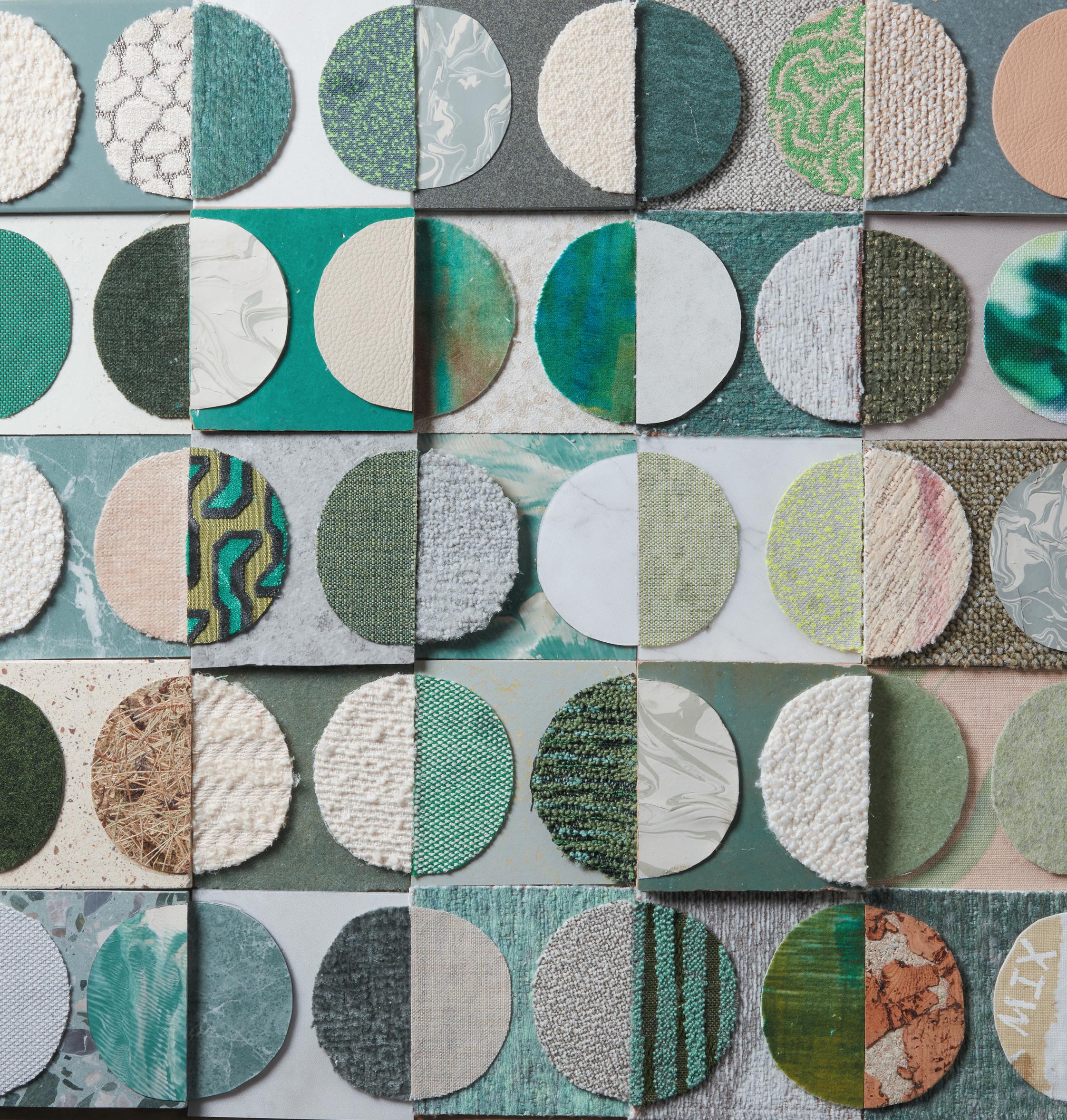
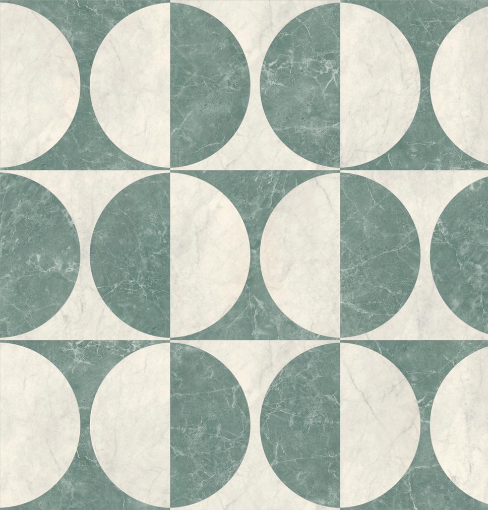
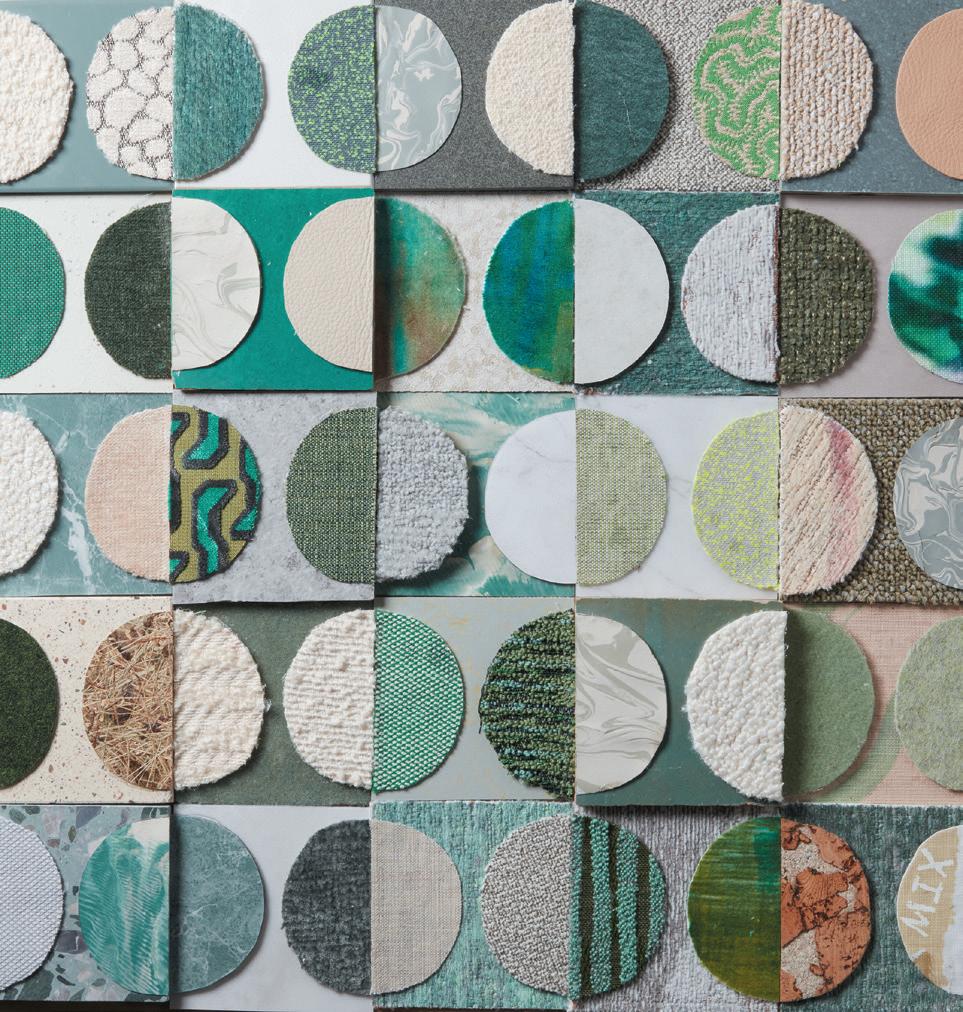
Inspired by the geometric design of Lune from Amtico’s new LVT Signature range, Trifle* has reimagined the pattern motif as a mixed media art piece that imitates a flat-lay – combining Amtico flooring with fabric offcuts and studio surplus to give new life to otherwise discarded materials; as well as emphasising circularity. “We loved the classic shapes of Lune’s design from Amtico and were inspired by the brand-new marble palette,” comments Trifle*’s Nadia Themistocleous. “We ‘mixed’ things up by utilising offcuts from past projects, picked because they evoked a sense of marble veining. We were even inspired to create our own ‘marble’ samples from leftover paints – the result a physical piece of art we will display proudly in our studio.”
triflecreative.com
Get in touch
MAnAging editor
Harry McKinley harry@mixinteriors.com
deputy editor
Chloé Petersen Snell chloe@mixinteriors.com
MAnAging director
Leon March leon@mixinteriors.com
boArd director
Marcie Incarico marcie@mixinteriors.com
heAd of operAtionS
Lisa Jackson lisa@mixinteriors.com
Account MAnAger Stuart Sinclair stuart@mixinteriors.com
MArketing MAnAger Paul Appleby paul@mixinteriors.com
eventS & editoriAl executive Yasmin Waters yasmin@mixinteriors.com
cover Image
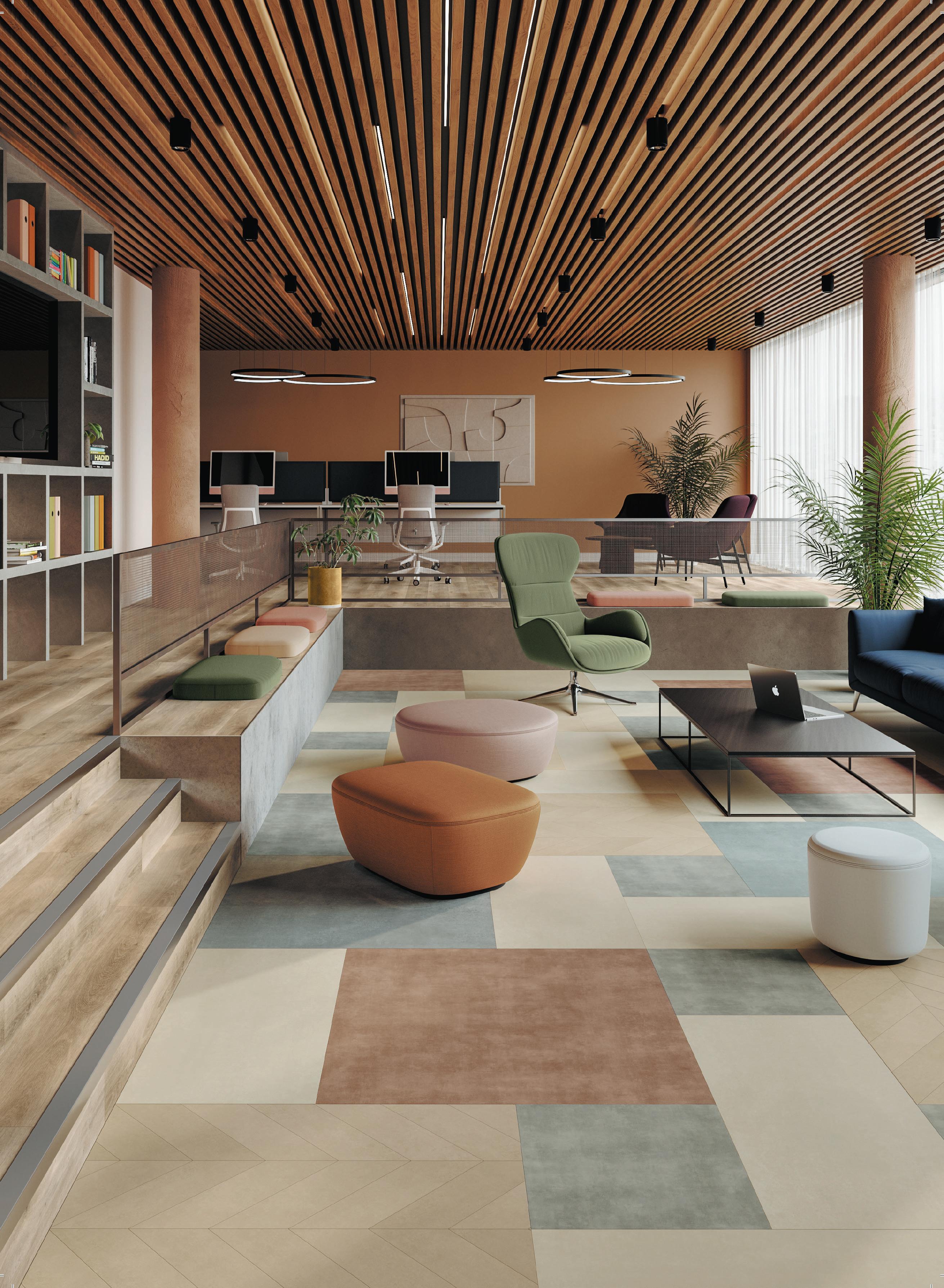
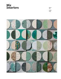
Amtico’s new Lune laying pattern, from its Signature LVT flooring collection, embraces curved stone design trends. Intricate and versatile, the precision-cut semi-circle shapes work well in bold combinations – such as Signature’s new Marbles – or paired with tonal shades from the collection’s updated Colour Edit palette for a more retro feel.
amtico.com/commercial

Subscribe to Mix
To ensure that a regular copy of Mix Interiors reaches you or to request back issues, call 0161 519 4850 or email lisa@mixinteriors.com

AnnuAl SubScription chArgeS
UK single 45.50, Europe 135 (airmail), Outside Europe 165 (airmail)
deSigner Tamzin Bell
founding publiSher
Henry Pugh
colu M ni S t S
Steve Gale, Tina Norden, Mike Walley, Neil Usher
contributor S Dominic Lutyens, Clare Dowdy
4
AddreSS Unit 2 Abito, 85 Greengate, Manchester M3 7NA Telephone 0161 519 4850 eMAil editorial@mixinteriors.com WebSite www.mixinteriors.com tWitter @mixinteriors inStAgrAM @mix.interiors linkedin Mix Interiors Printed by S&G Print ISSN 1757-2371 The Cover
Welcome
At Loire Valley Lodges, just outside Tours, owner Anne-Caroline Frey encourages guests to slip off their shoes and walk barefoot around their treehouses – the parquet floors realised in handsome oak. As she describes, it helps evoke ‘emotion’ and creates a ‘connection’.
We’re often encouraged to consider the success of designs on the basis of how they look; titles like this one flattening three-dimensional spaces into two-dimensional visuals to be appraised on aesthetics. Yet arguably the difference between art and design is that the former is to be looked at and pondered, while the latter has a job to do. Where galleries holler ‘please don’t touch’, design invites us to interact and engage – or at least it should. Good design shouldn’t just be about what our eyes can see then, but what our ears can hear and hands can touch – or feet, if you’re so inclined. With design studio Afroditi introducing the fragrance of moss into its latest restaurant project, Humo, there’s even room for scent – though, less glamorously, that may just mean making sure the microwave isn’t beside the boss’s desk.
The interactive, emotion-shaping and behaviour-affecting role of design is something we’ve considered deeply this issue, not only in these case studies but in our roundtable with Autex, in which we explore the role sensory design can play in crafting purposeful spaces. Though, of course, design writ large is entirely responsible for making spaces purposeful at all.
It’s here that design also differs from most art. It doesn’t only serve a purpose but can operate with purpose. In this issue’s Positive Impact feature, we look to the Young V&A, the recently revamped, first-of-its-kind gallery intended to not only inspire the next generation of creative, but contribute meaningfully to its surrounding community. In our roundtable with 2Tec2 we ask how designers can create to last in a period of change, so concepts live longer, reducing their impact on the environment. We also venture to Birch Selsdon, where stay, play and work collide under an ethos of bringing people together (with a rewilding initiative thrown in for good measure); and take a look at HTA Design’s new HQ, which doesn’t just prioritise the wellbeing of the studio’s team, but aims to bring social value to the neighbourhood.
I hope you enjoy digesting this issue, barefoot or otherwise.
5
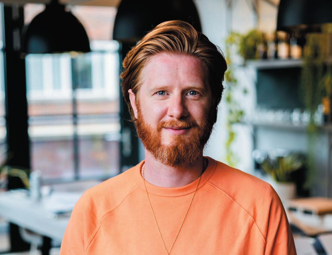
h arry m c k I n L ey M A n Aging e ditor mIx InterIors / iSSue 227




A catalyst for change
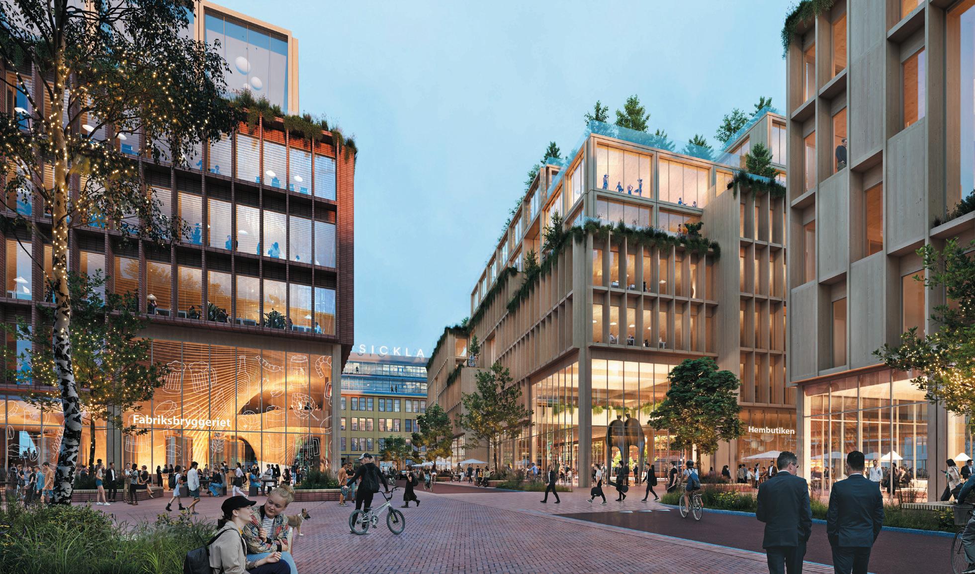
The first of its kind, atrIum LJungBerg has announced plans for building the world’s largest ‘wooden city’, with the help of Scandinavian practices, hennIng Larsen and WhIte arkItekter. Situated south of Stockholm in Sickla, the 60-acre project will feature 2,000 homes and three times as many office spaces, not only expanding Sweden’s economy but also offering a solution to the workspace deficit in the capital.
“StockholM Wood city manifests our future,” explains CEO of Atrium Ljungberg, annIca Ånäs. “From tenants there is a strong demand for innovative, sustainable solutions – a demand that we meet with this initiative.” The impending work is backed by numerous research studies, all of which show wooden buildings improve air quality, reduce stress, increase productivity and store carbon dioxide – making it a healthier material alternative for both people and the planet.
By investing in resource-efficient construction methods and circular material flows, Atrium Ljungberg is striving to change the role of the urban developer. At Wood City, rooftop solar arrays and underground borehole energy storage will contribute towards heating and cooling requirements. With wood also being a plentiful resource in Sweden, the timber used will be sourced nearby.
Reducing emissions even further, Henning Larsen and White Arkitekter plan to position employment centres, residences and retail within a five-minute radius across the district, eliminating lengthy commutes. Restaurants, stores and public spaces are also in the works. From a design perspective, all façades will mesh with existing brick buildings, many of which were former industrial spaces.
Stockholm Wood City will commence in two years’ time with completion of the first buildings expected in 2027.
12 upfront
aL se
Large as life
Think of diamond trading and one might conjure up Antwerp, Belguim – yet 90% of the world’s diamonds are cut and polished in in the Gujariti city of Surat, India. Answering the demand to adequately house this immense industry, the 7.1 million sq ft SurAt diAMond bourSe has recently opened, taking the Pentagon’s title of world’s largest office building. Knocking the US government building off the top spot after more than 80 years, the building is the first in a planned ‘smart’ city that will span south Surat.
Designed by Indian practice morphogenesIs, the building comprises nine rectangular structures connected by a central ‘spine’ that features a series of full-height, 15-storey atriums, overlooked by balconies on each level.
The spine fans out at its end to allow air to naturally cool the building and cold water is circulated underfloor to regulate indoor temperatures. Aiming to source materials as close to the site as possible, the practice used local Gwalior white sandstone and Lakha red granite for the cladding and spine.
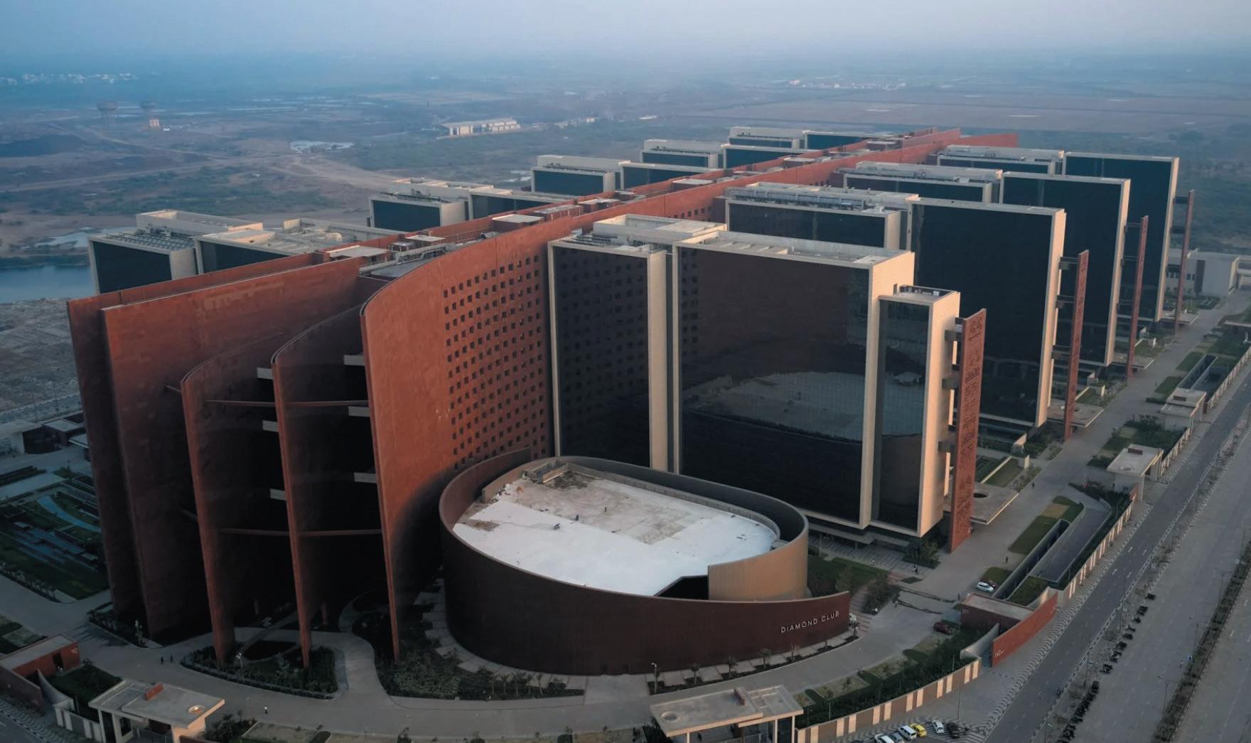
The interior design and architecture were informed by Morphogenesis’ research into the Indian diamond trade, providing traders with casual meeting spaces within nine enormous, self-shaded courtyards, complete with seating and water features. The project is set to welcome its first occupants in November 2023, with 4,717 offices for 67,000 diamond professionals alongside dining, retail, wellness and conference facilities.
morphogenesIs.org
14 upfront
A family affair
Flexitime is certainly better than it used to be, but the ongoing question of where children go during working hours is as contentious as ever. How can companies support parental wellbeing as well as their employees’ work? Enter, Israeli designer sarIt shanI hay
At a software company in Tel Aviv family time is integral, which is why it decided to turn part of its headquarters into an indoor playground. Spanning 180 sq m, the task was to encourage a sense of community within the workplace that emulates the feeling of joy and creativity that one feels outdoors – despite being 15 storeys high. A hammock, treehouse, climbing wall and floor-to-ceiling windows overlooking the city all support Shani Hay’s vision of creating a space that feels “between heaven and earth”.
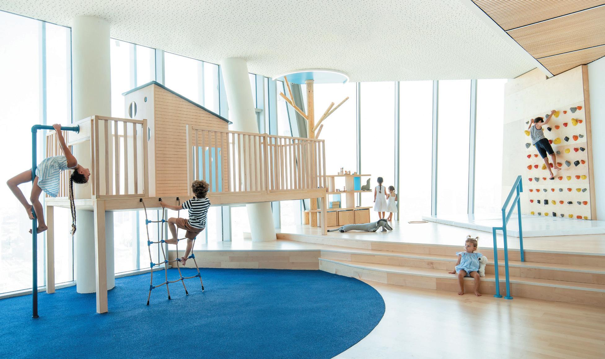
Signaling a closeness to nature, Nordic design principles and biophilia are weaved throughout, as well as splashes
of blue and green to break up the otherwise pale scheme. Wooden posts stretching from floor to ceiling resemble trees and a gridded plywood volume doubles up as storage, as well as somewhere to sit and climb on. Nearby, an integrated kitchen provides easy access for food preparation without interrupting workers, while a café allows employees to have a break with their little ones. To reduce the noise of children running around, the floor has been installed with cast rubber for a shock absorption effect.
Advocates for improving mental and physical health wherever possible, the philosophy at Shani Hay’s studio echoes its client’s approach, believing the benefit of children-focused design in an office to be profound yet simple. The two also believe it is possible to truly blend work and life. Food for thought, perhaps.
shanIhay.com
16 upfront
Old stool, new tricks
From 19 September to 6 October, Tokyo-based architect DaIsuke motogI’s research project and exhibition, Hackability of the Stool, will be on display inside the vItra and artek Tramshed showroom in Shoreditch, London. Developed by the designer and his studio DDaa LaB, visitors can expect to see 100 iterations of Alvar Aalto’s iconic Stool 60.
After being commissioned four years ago to create seating for a large-scale event, Motogi started discussions within communities, querying the purpose of stools. In a workshop, the feedback was that the furniture item could be made more multifunctional. Rather than designing a new product altogether, Motogi chose to evolve an existing masterpiece: Artek’s Stool 60.
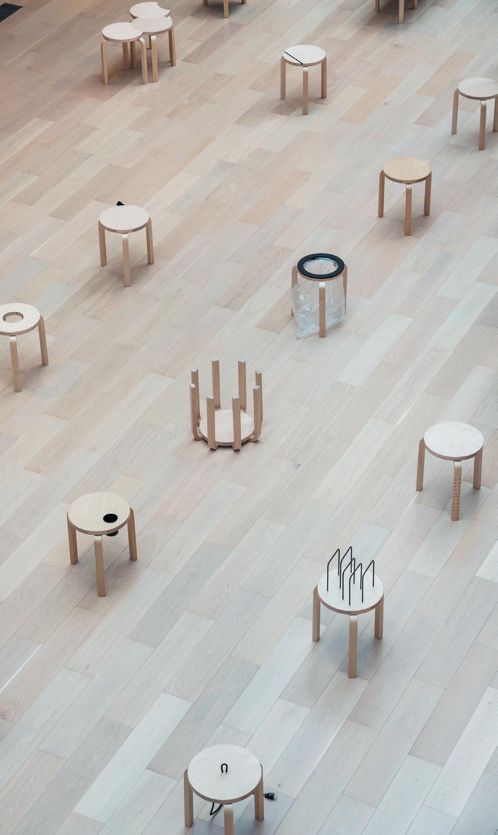
A pinnacle in modernist design, Aalto’s archetypal wooden stool was deemed ‘the perfect choice’ due to its wooden materiality, easy assembly process and it being stackable. Now, Artek’s simplistic three and four-legged stool has been overhauled in various creative ways. A chessboard, xylophone and vinyl record player are just some of the items used to transform the stool while other modifications include removing part of the leg or seat, resulting in charming and distinctive shapes.
“We hope visitors will be as surprised and entertained as we were when discovering Motogi’s interventions on Stool 60,” says managing director at Artek, marIanne goeBL. The new renditions come in the form of a reading light, clothes rack and a flowerpot or mirror, while other whimsical hacks transform the stool into a cat basket, a bin or an ironing board. “It’s a clever and inspiring exercise to share with a design-interested audience during London Design Festival, celebrating 90 years of Stool 60 by showcasing its universality through friendly hacking,” adds Goebl.
Dskmtg.com
18 upfront
Redefining landscapes
Once a timber warehouse in an industrial estate, DB55 is now a holistic and fluid ‘blended venue’ that supports nature and people. The concept by D/Dock operates predominantly as a workspace but also caters as a facility for leisure, events and sport for people of all ages.
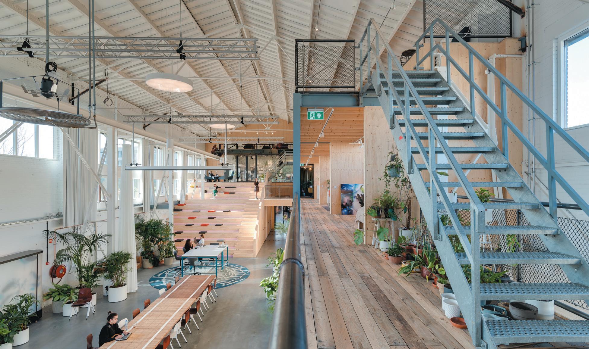
Found north of Amsterdam in Houthaven, the design team at DB55 curated the space from the inside-out. Façade openings were added to unexpected parts of the structure to expose interiors to viewpoints and natural daylight, while the building’s lightweight roof allows users to acknowledge changing seasons. Internally, biophilic elements feature in abundance, from the use of ecological materials, natural shapes and tones to the plotting of greenery, all of which strengthen DB55’s ties with the earth and support mental wellbeing.
Many of the materials throughout have been repurposed, including the concrete and glass walls. Lighting was obtained from overstocked products, run-outs or refurbished pieces and in the sanitary areas, tiling was sourced from leftovers. Adding to the narrative, floor finishes were initially laid on trains, meanwhile wooden planks served as prior roof boarding in residential properties. The audiovisual and kitchen equipment throughout is all secondhand, as is 70% of the furniture –a truly circular premises.
Open 24/7, DB55 exists as a community hub and home to the likes of sustainable furniture renovators furnIfy, who also worked on the project. Every square metre has been packed with purpose and for maximum flexibility D/DOCK kept the height of the building largely intact.
20 upfront
DDock.com
Things I’ve Learnt
graeme hart Director of Consultancy at McM
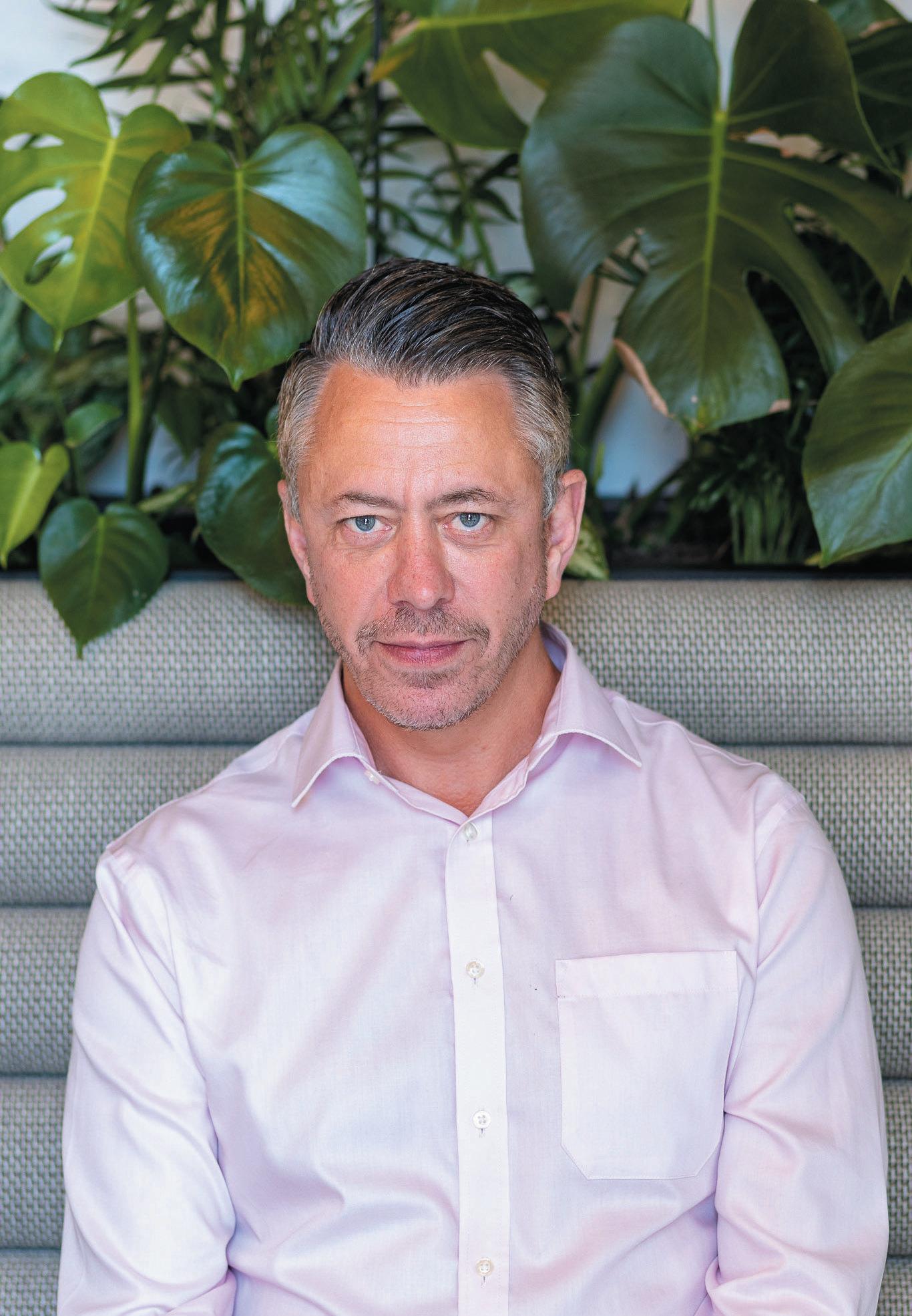
With experience across the full workplace spectrum, from strategy and visioning through cultural assessments and workplace change in the US and UK, hart has worked with clients such as American Express, Bloomberg, Chanel, Citi, Estée Lauder, Lloyds Banking Group, Liberty International and Tiffany.
mcm-uk.com
Lesson 1: contInuaLLy DeveLop your skILLs
The world is changing at a relentless and everaccelerating pace. The skills and competencies that helped you get ahead last year will not be sufficient this year. The only way to succeed in a sustained manner is to have an almost obsessive desire to learn and improve. I’m a big fan of starting with a beginner’s mind, looking at problems from different viewpoints and being open to different perspectives. Be curious and interested. I’ve been fortunate to work in a field that I find fascinating and which I’m passionate about.
Lesson 2: Be resILIent
If the world has taught us anything in recent years, it’s the constant potential for upheaval and disruption. One of the greatest skills we can ever learn is resilience and the ability to deal with change, be it personal or professional. Things will go wrong, best intentions will be thwarted, plans will be left redundant. How we navigate the difficult times, disappointments and trials will determine how we are able to cope with adversity. Focus on your mental health and be kind to yourself.
Lesson 3: shoW up as your authentIc seLf
So often we engage in the workplace wearing a mask, hoping to convince others that we are something or someone we’re not. I have had many times in my life and career where I have been expected to behave in ways that feel incongruent with my core values. I have learnt that not being true to yourself and playing a role you are not comfortable with is an unfulfilling way of living. Do not be afraid to be different or to offer something unique. Find work you are passionate about, where you can shine as your authentic self. Be the real you, accepting no counterfeits.
Lesson 4: BuILD your reLatIonshIps
Your relationships are critical to both your success and wellbeing. Surround yourself with people who will support, mentor and guide you. You need a team around you who will be honest about your strengths and shortcomings. People who will tell you where you are succeeding and where you need to improve. Encourage others to be authentic and open and welcome feedback of all kinds. Most of all be open to learning from people from diverse backgrounds and experiences. Everyone has a story to tell and skills that you can learn from. Nurture relationships of all kinds, be they professional, social or within your community.
Lesson 5:
heLp others, expectIng nothIng In return
We live in a competitive, corporate world that often prizes individual success and achievement over community benefit. But the longer I’ve been in my career the more I’ve recognised that the greatest satisfaction comes from helping and supporting other people. Ask yourself: “How can I be of service to others today?”. Help can come in many forms, big and small. Check in on a friend or colleague. Offer help and expect nothing in return. Seeing others overcome obstacles and thrive is one of the greatest gifts you can receive. And if you want true ninja status, tell no one of your good deeds!
22
The Height of Design
Item:
the Why:
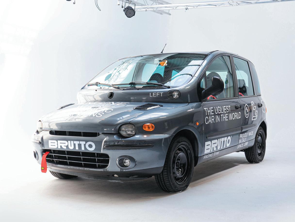
The Fiat Multipla was certainly one of the most interesting designs of the last 25 years, celebrating its 25th anniversary this year. It was designed by Roberto Giolito and marked an era that divided the international public into two distinct positions: those who love it and those who hate, calling it the ugliest car in history. It certainly doesn’t boast the elegance or aerodynamics of a Ferrari 458, but have you ever tried to drive it? We’re talking about a car born in 1998 when people still travelled a lot by car, because low-cost aviation hadn’t arrived yet, and the experience in the passenger compartment of a Fiat Multipla is almost unique. It’s not simply a successful design, it’s a design that marked an era.
hoW
Does It InspIre you or your Work?
Although there isn’t an immediate relationship between the Fiat Multipla and my work, there are multiple factors that determine a strong relationship between the car and my career. The Fiat Multipla was born as a democratic and fun car for families or groups of friends. My design is very similar in this aspect; I’m not an exclusive or luxury designer. Amongst other things, the Fiat Multipla breaks the concept of beauty and ugliness and for me this is the most important part. For me, and for us in the studio, do we create beautiful projects or objects? No, we create things that work. In a book edited by Stefano Giovannoni on narrative design there is a beautiful reflection by Andrea Branzi on the new stage of design, describing in particular the work of the very young Audrey Large. He says “I don’t know if I like it, I don’t know if it can be considered beautiful, but it sure is amazing”. This for me is the Fiat Multipla.
What Do you thInk has Been the Impact?
The Multipla was an innovative car, or rather groundbreaking, with an original aesthetic and a format that was unlike anything else. It actually resembled the Popemobile, the nickname by which it was known to many. Its large glass surface and its general cube shape allows panoramic views. In fact, if you have ever travelled in one you will have noticed that the elbow is resting on the base of the window and the glass reaches almost to waist level. The feeling of travelling in a Multipla is unique for this reason and almost all other cars seem claustrophobic by comparison.
the personaL connectIon:
In the course of my life I have owned two. I remember that on a family trip to Holland, my little brother rode his scooter in the back of the cockpit of the first, thanks to the three-seat system in the front. The second, my partner and I took from Italy to Spain in 2017 and it has become the official car of our studio (pictured). Between the other two cars that I have in the garage, it remains my favourite.
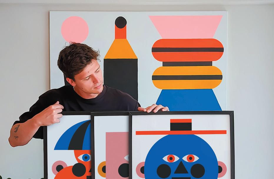
oggIan is an Italian multidisciplinary artist and art director, known for his use of simple shapes and bright colours to highlight critical, controversial social issues. Oggian has collaborated with the likes of Nike, Zara, Apple, Vogue, Samsung and Campari, and has exhibited his projects in galleries across the globe. mrcggn.com
23
With marco oggIan, Artist and Art Director
the
Fiat Multipla by Roberto Giolito
Unfurling the workplace strategist’s toolbelt, we often find, nestled amongst the old stalwarts – utilisation study, questionnaire, interviews and focus groups – a curiously shaped object, the purpose of which isn’t immediately apparent. As the study progresses, it transpires to be for the shaping of what our strategist calls ‘personas’.
The tool fashions boxes into which, following the deployment of the stalwarts, people can be placed on account of their working patterns or preferences, to which a label is then attached, usually from the natural world. Reliable, essential but unspectacular operator from Operations? Bee. Social, outgoing connector from Marketing? Butterfly, obviously. Highly prized, prodigious but elusive, from Creative? Congratulations, you’re a badger. It can cause the odd awkward moment when the food chain is considered, but otherwise we’ll all be happy in our boxes with other like-legged or winged creatures.
This categorisation reinforces the only unanimously agreeable (but inevitably misunderstood) statement in the entirety of workplace lore: “One size doesn’t fit all”. At this very moment, it’s nailed on that you’re vigorously nodding.
Even though, as we thereafter don’t like to admit, ‘one size’ is exactly what the brief always requires us to do, and we always make sure happens. It just must be the most elastic, flexible single size we can create, enabling a choice of settings for everyone, irrespective of the way they are or the way they choose to be, or the activity
Congratulations, you’re a Badger
they’re engaged in at any time. The characteristics of each of the personas can then be mapped to the new workplace with their own path, stopping-off points and favoured worksettings, to appear as though one size doesn’t fit all. Even though it does.
However, at the same time as we’re all being racked and stacked, every new workplace seeks to create opportunities to work differently, to experiment, to adapt to changes in the organisation’s environment or operation, or to adopt new technology or ideas. We’re first and foremost leaders of change, and that’ll be exactly what we’ve been asked to deliver and enable. In fact, even if pre-existing working patterns work just as beneficially in the new space, the encouragement to try harder, go further and aim higher will be heard by all.
Our paradox is therefore: we need to understand and model how everyone is, so that we can ensure they change. Because our Bees are too busy to be getting on with their work they don’t get to know anyone, our Butterflies are too focused on being social to get any actual work done, and our Badgers are so committed to being elusive that we’re not sure they’re even still with us, or that they ever were.
If we’re going to want people to change, and the workplace to be a contributing driver of that change, we have to wonder if our desire to put people in boxes is a worthwhile pursuit. Leaving the lids open, peering in occasionally and hoping something may happen isn’t really a strategy.
24 paraDoxIcaLLy speakIng WIth neIL usher
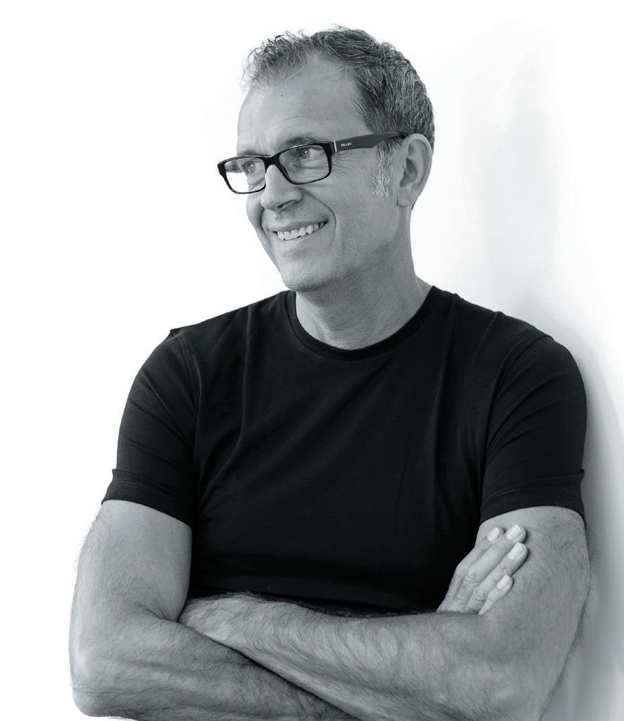
n e IL u sher is Chief Workplace & Change Strategist at gospace aI and author of The Elemental Workplace and Elemental Change
26
From Sweden with Love
For Swedish studio f orm u s W I th L ove , design is not just about creating beautiful things.
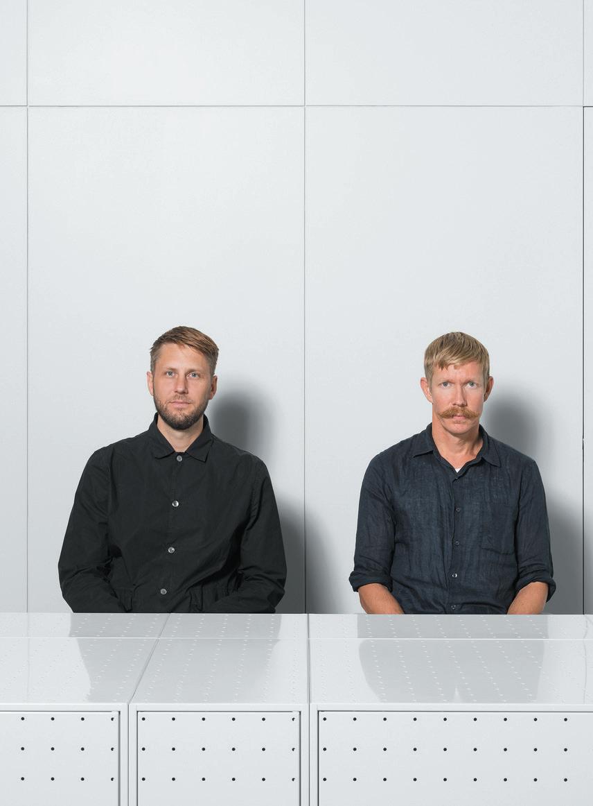
Founders of Form Us With Love, Jonas Pettersson and John Löfgren, join us via Zoom from Sweden, each in their respective sommarstuga, or summerhouse – places that hold a special place in Swedish culture. Most Swedes spend the summer months detoxing in these simple and beautiful houses, typical perhaps of the egalitarian nature of the Scandinavian country, where a holiday home is not a preserve of the wealthy. It’s hard not to wonder if their background in this type of society has impacted the work and design ethos of the studio.
Founded by Löfgren, Pettersson and Petrus Palmér in 2005, Form Us With Love is a Stockholm-based design studio, working across product design, consultation and strategy. Growing to become one of the most sought-after names in Scandinavian design, the studio celebrates 18 years in 2023, collaborating with the likes of +Halle, Ikea, Samsung and Muuto, and even launching its own sustainable acoustics company, Baux, in 2014. At the studio’s core lies a process that blends
traditional creative practices with strategic, researchdriven application, focusing on problem-solving for real people, and the planet.
The pair have been friends and then colleagues for many years. “We met as friends, drinking beer,” explains Löfgren, before a bad connection forces him to pause. Pettersson fills in with a more pragmatic answer, describing their meeting at industrial design school in Småland, the heart of furniture production in Sweden. “I think a big part of how we both approach design came from visiting production companies [while at Linnaeus University]: you’re bending steel, you’re bending plywood, you’re cutting things. That was one of the most fascinating things for both of us – the industrial process. The other is the curiosity of people – we met as friends, and we like to meet people. That is what design is about, understanding people and how they live and work. That’s where it started, by fusing those two worlds – it’s what Form Us With Love is all about.”
27 IntervIeW: form us WIth Love
WordS: chLoé petersen sneLL
Image on
prevIous page:
Jonas Pettersson and John Löfgren
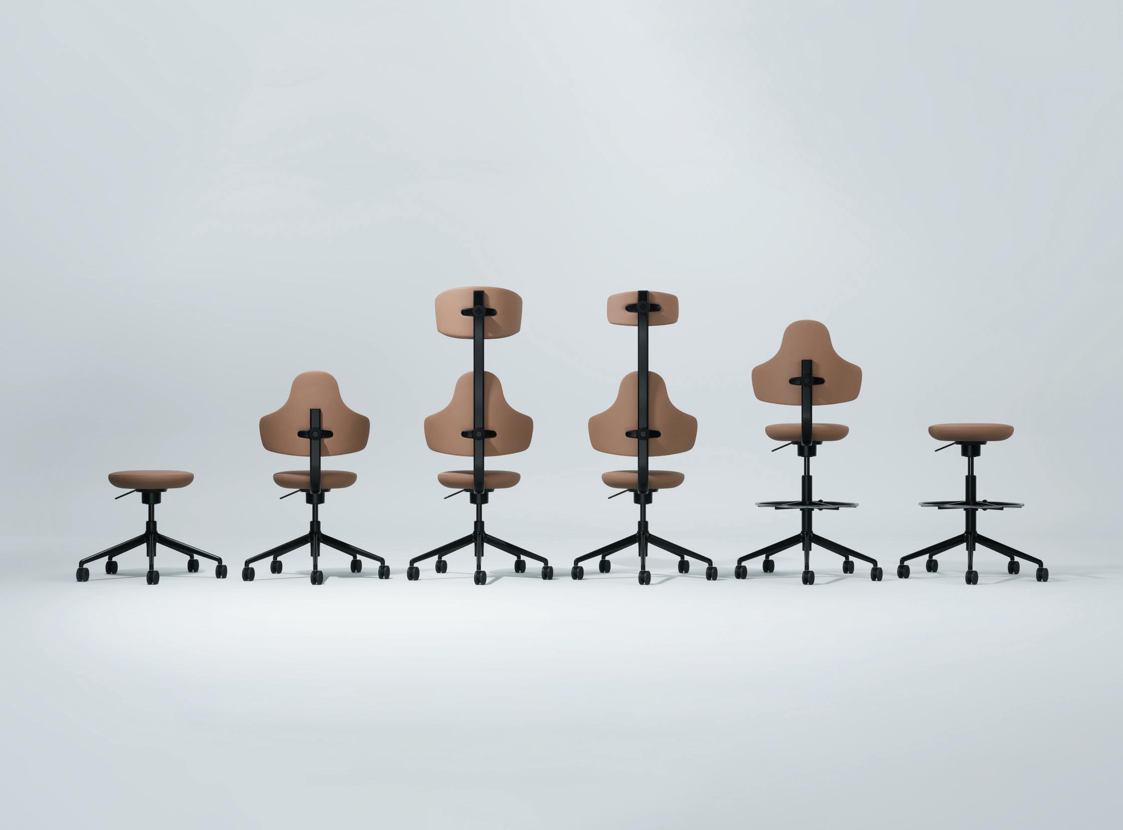
aBove Image: Spine chair for Savo
Problem-solving, collaboration and sustainability are the main tenets of FUWL, reflected not only in the final product design but also in the workshops, exhibitions and research the studio undertakes. Prototypa is an experimental forum, first held in 2017 in the studio’s office in central Sweden. Created to move the emphasis away from the polished, finished product and to look inside the important prototyping process – the first visualisation of an idea – the events are open to the public, asking how we can make better creative decisions to learn, to communicate and to collaborate. A success, the studio has held 29 of these events to date, from Stockholm to Milan, Toronto and beyond.
“The definition of our profession when we started was formgivare, which in Swedish is ‘giving shape.’ I
think that’s maybe the definition of a designer in many languages and I think that’s such a wrong definition of what we believe the work is,” Pettersson laughs. “That’s a really important part of it, but design is so much more. Everyone has problems in their lives, it could be the smallest thing, like how you do the dishes, or how you get the kids to bed. In a conversation you can pick up problems and solutions, and store them, even for years, then come back to them. As a designer it’s like connecting dots – collecting memories, collecting stories and then saving them for later.”
The studio will bring Prototypa to Stockholm Furniture Fair 2024, a dedicated area for workshops that focus on not only designers but other Scandinavian innovators: in materials, recycling
28
processes and production techniques. “A designer has one role, but I think there are other players that you need to bring into this industry to push it a bit more than just presenting new... shapes,” says Pettersson. “We need to rethink fundamentally how we make things and how things are consumed.”
“It’s our ambition to stir up what a traditional fair can offer,” adds Löfgren. “Could we cross-pollinate with other people with other experiences? Not just presenting another chair in another colour. It’s about meeting and what that meeting could hold.”
It was at Stockholm Furniture Fair where the world first met FUWL, the newly-formed studio launching Cord Lamp, which was picked up by Design Stockholm,
marking the studio’s first collaboration. Like much of FUWL’s work, the lamp is simple, functional and playful; a bulb seemingly defying gravity on a cord, the cable that provides its power also supporting it on tables or on the floor. The success of Cord paved the way for countless collaborations, perhaps most notably with Ikea – the now classic Odger chair made using a mixture of 70 per cent recycled polypropylene and 30 per cent reclaimed wood chips. Another hit, Muuto’s Unfold lamp, is a take on the typical industrial lamp shade, made from soft silicone rubber in gentle pastel shades.
“We have never been so into brands, we’re much more into finding the right people,” says Pettersson. “Sometimes that is a very known brand and sometimes it’s someone that no one has ever heard about. We get
29
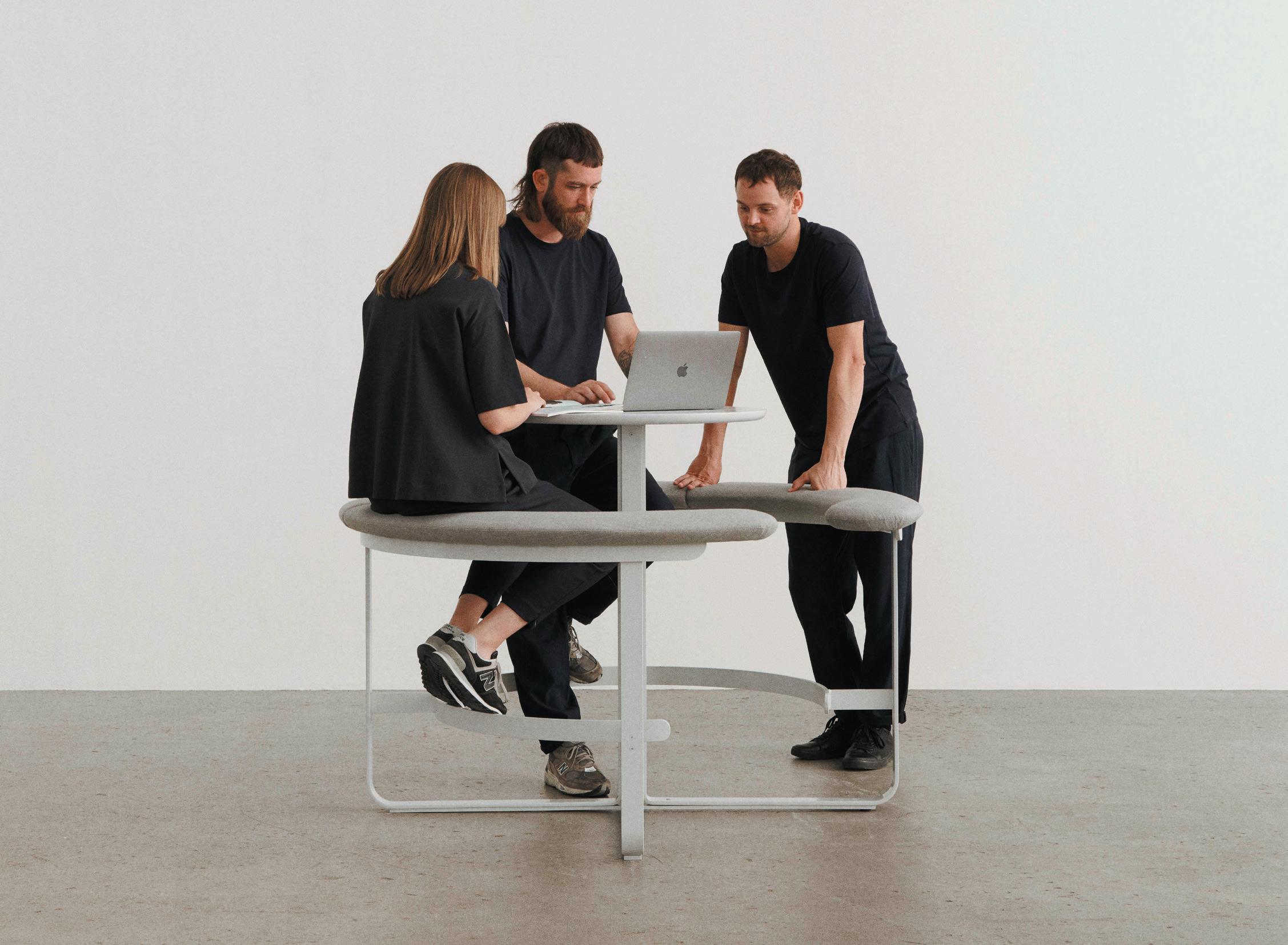
aBove Image: Picnic for +Halle
energy from people that are passionate, that have the resources and that want to push things forward. We think that’s so much important.”
Partnering with the progressive manufacturer +Halle on several products, the studio also helped to develop its Annual Briefing – a series of purpose-driven product development meetings between architects, urban planners, behavioural scientists and cultural entrepreneurs, to better understand public spaces. Each year +Halle invites designers and experts to investigate one specific theme, which provides a narrative and underpins the gathered experts’ opinions. Throughout the year, the teams meet to share thoughts and give feedback. Past meetings have resulted in the likes of Picnic, inspired by an outdoor picnic table, born from the theme Sharing. “During the Annual Briefings, we break the rules of mine and yours,” says Löfgren. “We’re not starting with, ‘this is my idea, and therefore…,’ instead, the process ensures that people can come together and say, ‘hey, can we do this instead?’”
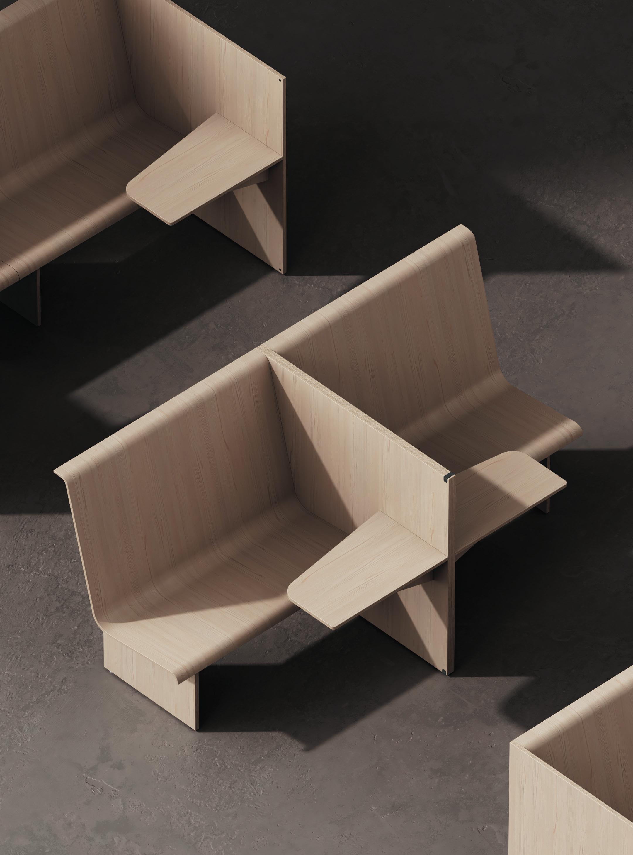
Various pieces of furniture are developed as a result of the briefings, each ‘forged by a collective mind’. This year’s theme, Producing, resulted in Cubicle, a new bench and wall system by FUWL for +Halle that was recently launched at Copenhagen’s 3daysofdesign. With spatial comfort and functionality tied strongly to ‘producing’ good work, Cubicle is inspired by a traditional cubicle,
such as a compartment seat on a train or library – a hideout and place to relax, to concentrate or escape, despite being out in the open.
“At first, we looked back: everyone had their own room,” says Löfgren. “Imagine just like in Jacques Tati’s film Playtime, but as we began to plan the space for today, the flexibility needed meant that we were left with a series of multiple bench-table-wall structures, still delivering on that same ‘my own space’ notion, but living openly in a network, where pieces appear together through multiple constellations.”
Working so consistently collaboratively, is it important for FUWL to retain a voice, a signature style? “We are quite far from artists,” says Pettersson. “For us our signature is more the approach, the methodology, which no one sees apart from our team. We have a structured way of working and thinking that leads to similarities in our work, but nothing we intentionally style.”
As for the name, there are a few stories to it, including a misspelt postcard. “We wanted to have something that was inclusive and collaborative,” Pettersson notes. “Form is what we do, Us is who we are as a team, With is the ones we collaborate with, and Love is our passion. Maybe that it was not how we thought about it from the beginning, but it’s ended up being so well explained, and it’s how we see design.”
opposIte page: Cubicle for +Halle
30
31
32
First act
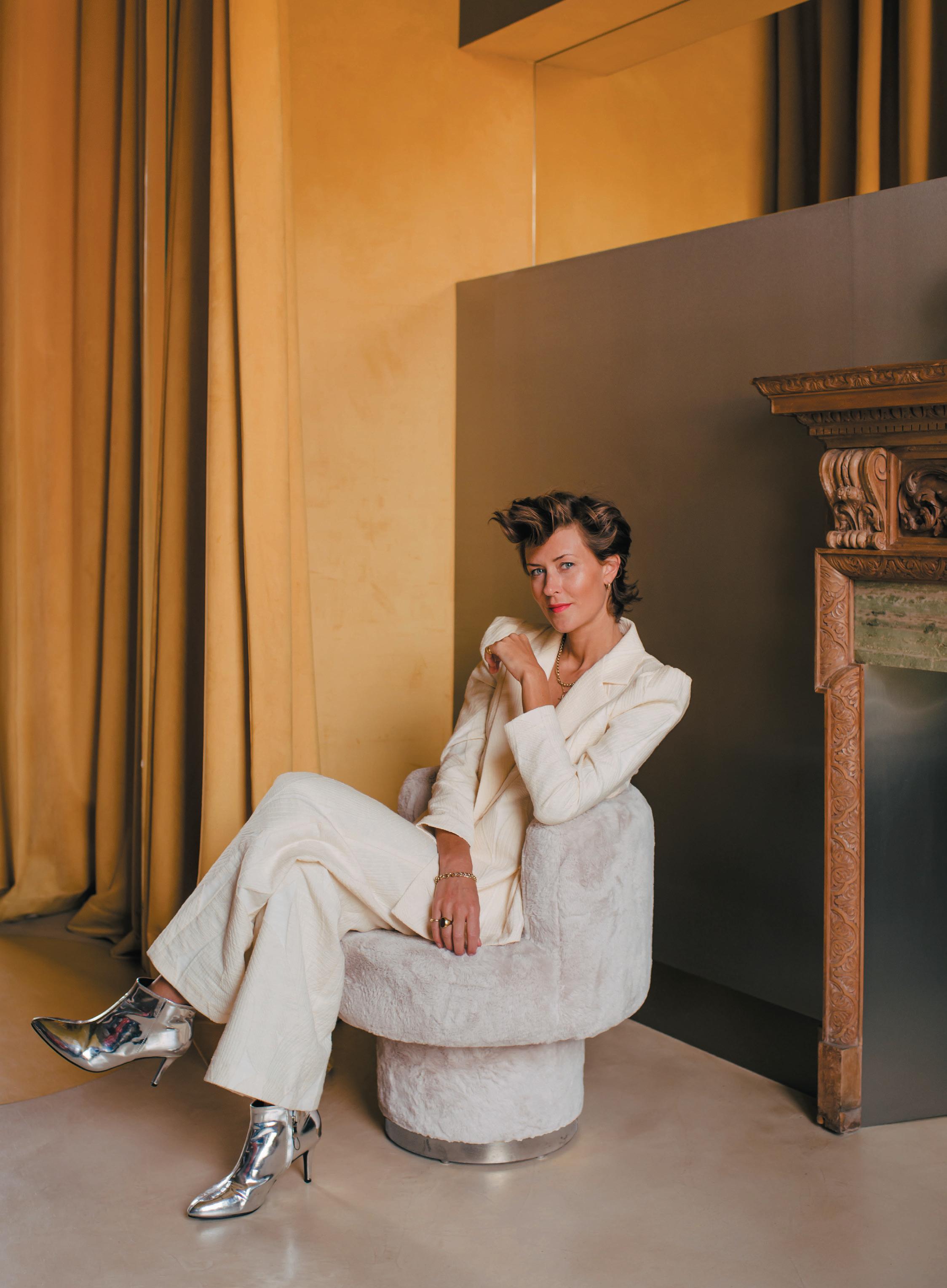
seLLa co-founder tatJana von steIn discusses bringing a classically European sensibility to interior design and the launch of her first furniture collection.
On the first floor of a double-fronted, Grade II listed former schoolhouse on a leafy road in Islington, Tatjana von Stein is going for a sense of European elegance. “Sumptuous flare with a modernist feel. That’s where I feel very at home,” she says.
Against a backdrop of pale yellow walls and thick green carpet sits some seating, a few tables and a bar cabinet. This furniture, with its rounded edges, sleek lines and rich upholstery comprises von Stein’s new collection. Called Mise en Scène (“setting the stage” in French), it’s the first collection under her own name.
Why would an interior designer who is having her biggest year of commercial project launches – a hotel in Zurich, another south of London, a big north London workspace and a private members’ club in Mallorca – bother with the effort of super-high-end furniture?
Because it’s a great calling card for clients, she says. Her eye is firmly set on appealing to more deeppocketed home owners and residential interior
designers, including those in the US and Continental Europe – while still considering the more boutique approach increasingly taken in commercial spaces, where designers opt for individual pieces from smaller studios, versus mega-brands. “The furniture will have its own life and that will attract clients,” she says, and then, of course, Sella will be able to specify them in its own projects. It has also given von Stein the chance to showcase her own creative expression (this time, she’s the client), and has meant she can collaborate with top-of-their-game craftspeople in a way that is rarely possible on traditional hospitality budgets.
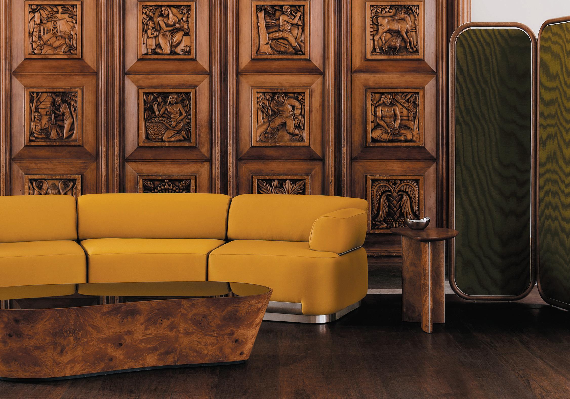
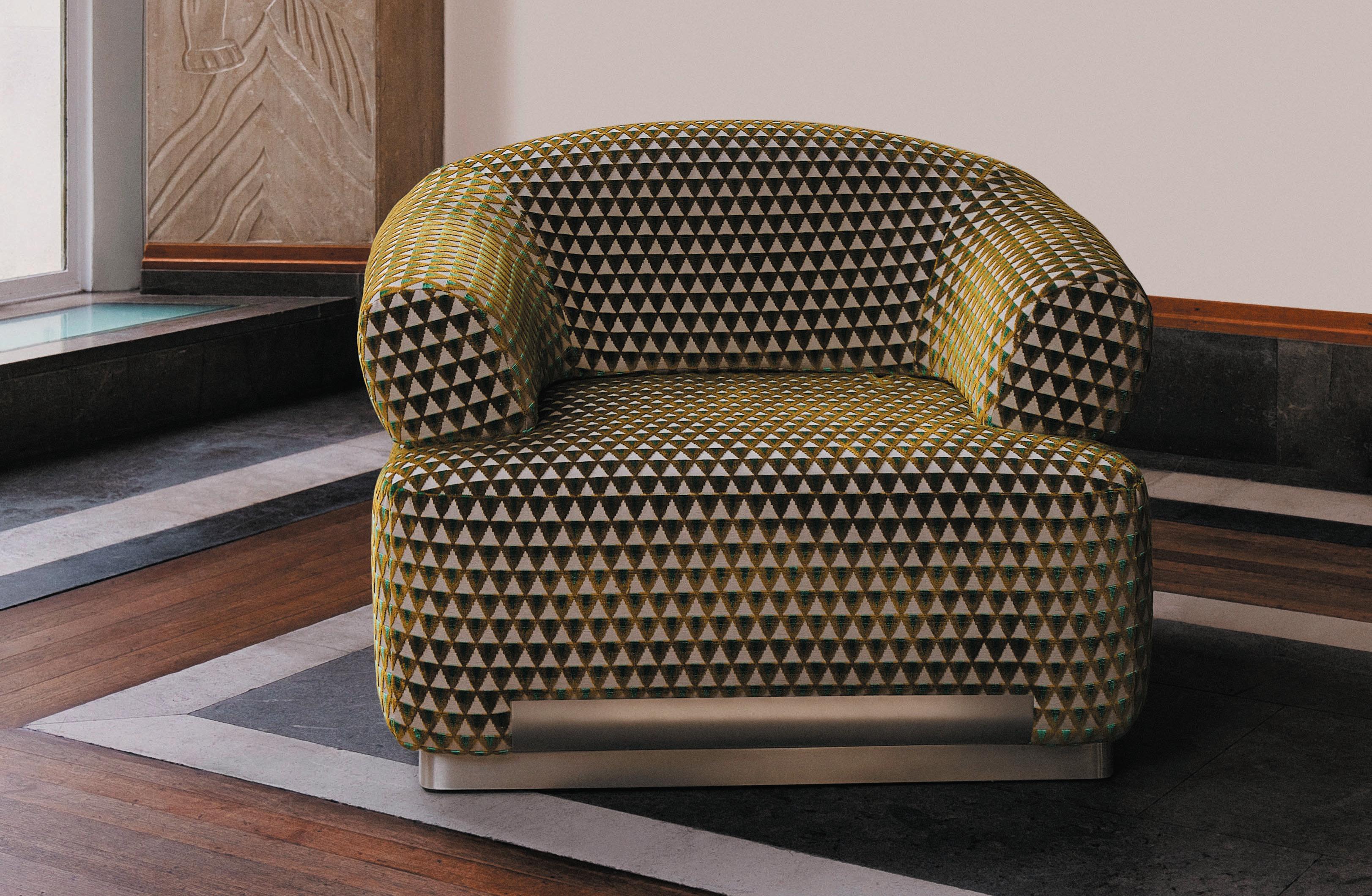
Mise en Scène’s bar cabinet, sectional curved sofa, lounge chair, three wooden tables – dining, coffee and side – and silk-panelled screen with rotating panels will be made by France’s “finest artisans”, she says, including Pierre Noire. A virtuoso of wood crafting, Noire is part of the restoration group Aurige, a collective of heritage conservators and expert artisans including stonemasons, fresco painters and sculptors, some who have worked on the restoration of Paris’ Notre-Dame.
33 IntervIeW: tatJana von steIn
WordS: cLare DoWDy
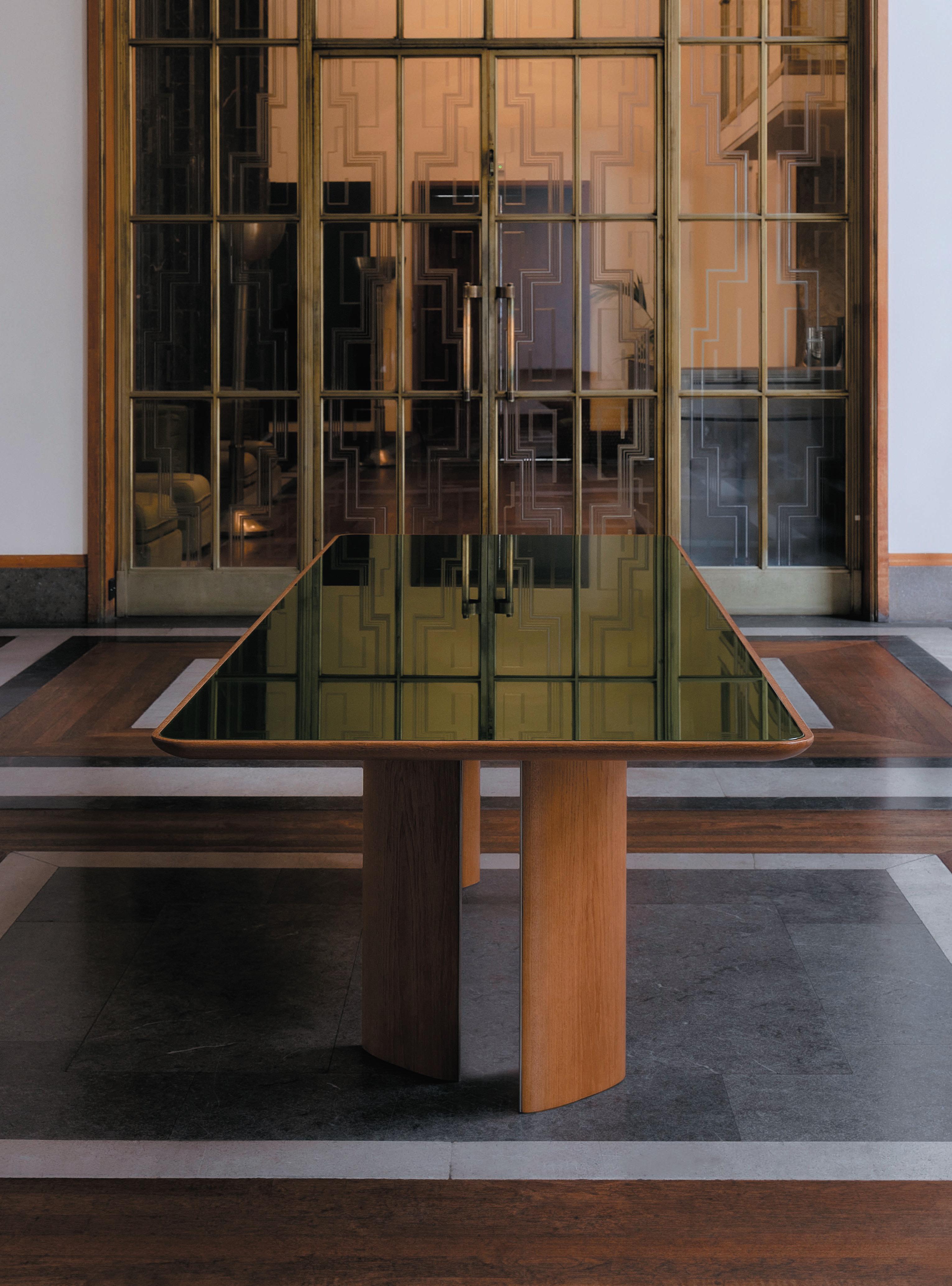
For the collection, she drew inspiration from the performing arts and the shapes of dancer’s bodies as they move across the stage. She was also influenced by the 2021 exhibition of the works of the late Japanese American sculptor Isamu Noguchi at London’s Barbican (which featured Noguchi’s collaborations with the dancer Martha Graham). Hence the elegant legs on the rectangular oak dining table. The pieces’ European roots are evident or suggested in the mirrored surfaces, high-gloss lacquer finishes, brushed-steel spinal inserts and colour palette of green, rust and golden yellow in a variety of rich textures.
Crafted as potential heirlooms, the numbered pieces range from £11,320 for the coffee table to £40,530 for the bar unit. Von Stein talks of “the romance of the longevity of these furniture pieces.”
By reclaiming design, von Stein means “owning a design narrative from start to finish and getting the opportunity to work with remarkable craftsmen from a quality and a positive impact standpoint; designing a furniture collection that withstands the test of time.”
Making these items in France makes sense culturally to von Stein, who is half-French, half-German. It also gets around the difficulties of shifting products to
and from the UK since Brexit. “We have quite a lot of international projects, it helps if furniture is coming straight from (continental) Europe.” Though she points out that “there are amazing British craftspeople.”
The continent isn’t just her heritage, it informs her aesthetic. “I’m a bit more European in style, that reflects the clients we attract.”
It’s ten years since von Stein first found herself in the interior design world. After completing a university degree in psychology, she went into set design, working on fashion shows and short films. Her first interior design client came by chance in 2013, when a friend introduced her to the founder of retail-restaurant-concept destination, Clerkenwell London. “I was dropped in the deep end,” she says, “we created an experience there.”
Then three years later she founded Sella Concept (now Sella) as a London-based interior architecture studio with her partner Gayle Noonan. With Clerkenwell London as their calling card, von Stein cold-called the owners of the De Beauvoir complex in Islington, and the studio was given the job of designing the ground floor area of the shared workspace set-up, De Beauvoir Block. This was good timing, as, “It was the beginning of the workspacehospitality culture,” she says.
Image on prevIous page: Tatjana von Stein
opposIte page: The Mise en Scene dining table | cleMente vergArA
34
35
aBove Image:
The sectional sofa in golden yellow
Since then, she has built the team up to nine people, including one from Foster and Partners, and another from Conran and Partners. And while her aspiration is not to become a huge agency, “I’m sure we’ll get a few more people.” In the meantime, she’s surrounded herself with “strong technical people”, to balance with her own intuition.
She contrasts hospitality with residential, saying the former “is never just a decorative job, it’s underpinned by operations and a huge amount of regulation. I look at the spaces in terms of how you experience them,” she says, and focuses on layouts and zoning, before applying design elements.
The make-up of her team has allowed her to take on big projects, like four floors of London offices for Dice, a global mobile ticketing platform, back in De
Beauvoir; and the 80-bedroom Locke Hotel in Zurich – her biggest project to date in scale; also Mallorca’s first members’ club Làlia; and Birch Selsdon hotel and members’ club in Croydon, where Sella did the signature restaurant and cocktail bar and revived the lido. “It’s a big crescendo year for us,” thanks to a post-COVID glut of delayed openings and “one thing leading to another”. All four of these commercial projects are being unveiled later this year – Birch Selsdon and Dice likely followed by Locke Hotel and Làlia.
She describes Locke Hotel as a juxtaposition between “a modernist approach due to the building and the heritage in Zurich with a more Swiss Grand Riviera style you find by the lake – modernist but indulgent.” Meanwhile, Dice is “a stainless-steel haven, a nod to the late Italian architect and designer, Gae Aulenti”. Làlia will be “artisanal but sexy”; and at Birch Selsdon (p68) she is “juxtaposing an earthy,
36
rewilding project with the finesse and grandeur of the building’s heritage”. Here, the 19th-century mansion has been remodelled by interior design and architecture studio A-nrd and Sella, and the rewilding of the golf course is being led by furniture designer Sebastian Cox.
As well as sourcing vintage pieces for these projects and commissioning others from local craftspeople, since 2019, Sella specified some of its own furniture. Its debut range was a series of stools featuring curvaceous forms inspired by the bathers at Hampstead Heath’s Ladies’ Pond. That experience has given von Stein the craft learning that informed Mise en Scène.
While these chunky projects must take plenty of thought-process and effort, von Stein still has an eye on her furniture collection. “I would love to add a desk. I woke up having dreamt of it.” She’d also like to add a few more key pieces such as a smaller armchair, and maybe different treatments for the lacquer doors of the bar cabinet. Then she’ll start on the second collection. She already has a clear concept idea for that, but she’s keeping it under wraps for the moment. In the meantime, Sella’s four major unveilings this year are likely to push the studio even further into the limelight.
37
BeLoW Image: Rich textures accentuate the armchair
A rather heated debate ensued at a recent panel discussion, hosted by our very own Harry McKinley, on the topic of designing for TikTok. After the Instagram moment, apparently this is the next frontier design should be aiming for. Most of the audience was probably beyond TikTok age – with the exception of a few intrepid young-at-hearts. But is it really about TikTok or whatever the next thing might be once too many old people have joined in and spoilt the fun?
Given we (and all the big brands) are onto it by now, it is probably already passé. This is where the real question comes in: should we be designing for any particular platform given how elusive they are?
Any design project typically takes a long time; hotels often many years. If we are working on something that might open in five year’s time, how can we even contemplate designing to the latest platform, as it likely doesn’t even exist yet? And are they really that different from each other that a new language needs to be found for each one?
What we are talking about are two things: creating something memorable for our audience and engaging with them in a visual language they relate to, while getting as much exposure as we possibly can. But social media is also about something completely different: it is about projecting a certain angle of ourselves, about creating our own narrative and being seen to live our best lives. So ultimately – and bluntly – it is about compelling us to share with others.
Should we be designing for TikTok?
As an aside, should the ultimate goal really be to have everyone filming or photographing themselves, or is it to make them forget about that completely and just enjoy the moment?
Anyway, it used to be about creating experiences that people, guests, enjoy to the extent that it actually remains in their memory. Those are probably the moments we would then tell our family and friends about, as something truly meaningful to us – or write about if we or journalists are so inclined.
Sharing on social media is exactly the same thing – just in a different medium and more instantaneous. But it also means what is hot now goes cold very, very quickly –which is the last thing a hotel that took five or more years to complete will want.
So it goes back to the very same thing it has always been about: creating spaces, places and experiences that resonate with audiences, whether they just enjoy the food or take a picture of it.
If we succeed in this, we capture our audience and entice them to share in whatever way they like.
So maybe we should stop worrying about the particular platform and concentrate on doing what we do best, creating good, meaningful and inspirational design. The rest will follow, it always does.
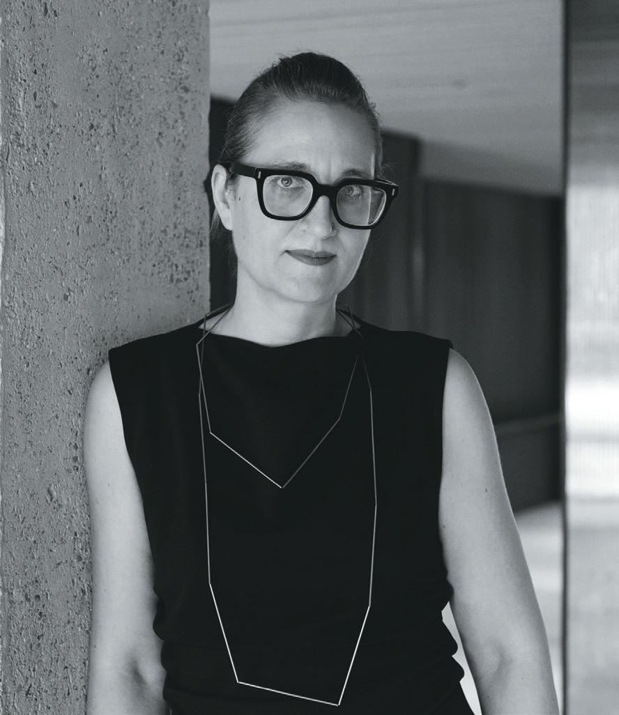
t I na n or D en is a principal and co-owner at conran anD partners
38
the ask WIth tIna norDen
Silver lining
 case stuDy: tog, chancery house
For the office group’s largest workspace, Dmfk and norm have brought thoughtful order to an otherwise labyrinthine space.

WordS: DomInIc Lutyens
photogrAphy: Jake curtIs
Image on
prevIous page: Terracotta, fawn and rust tones | JAke curtiS
aBove Image: Natural, matt materials
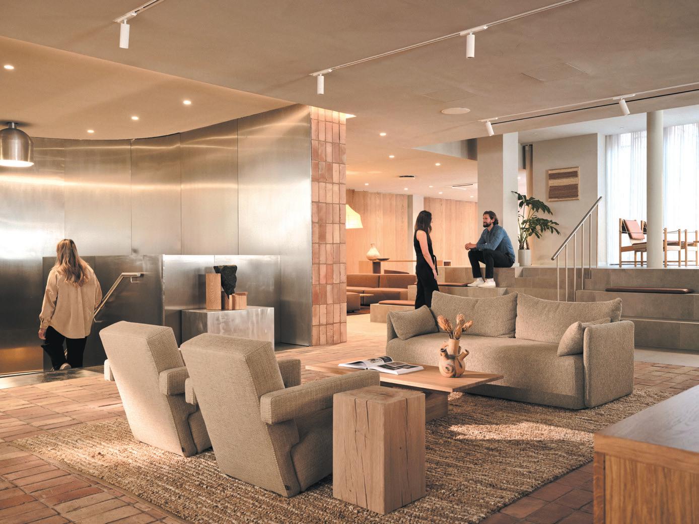
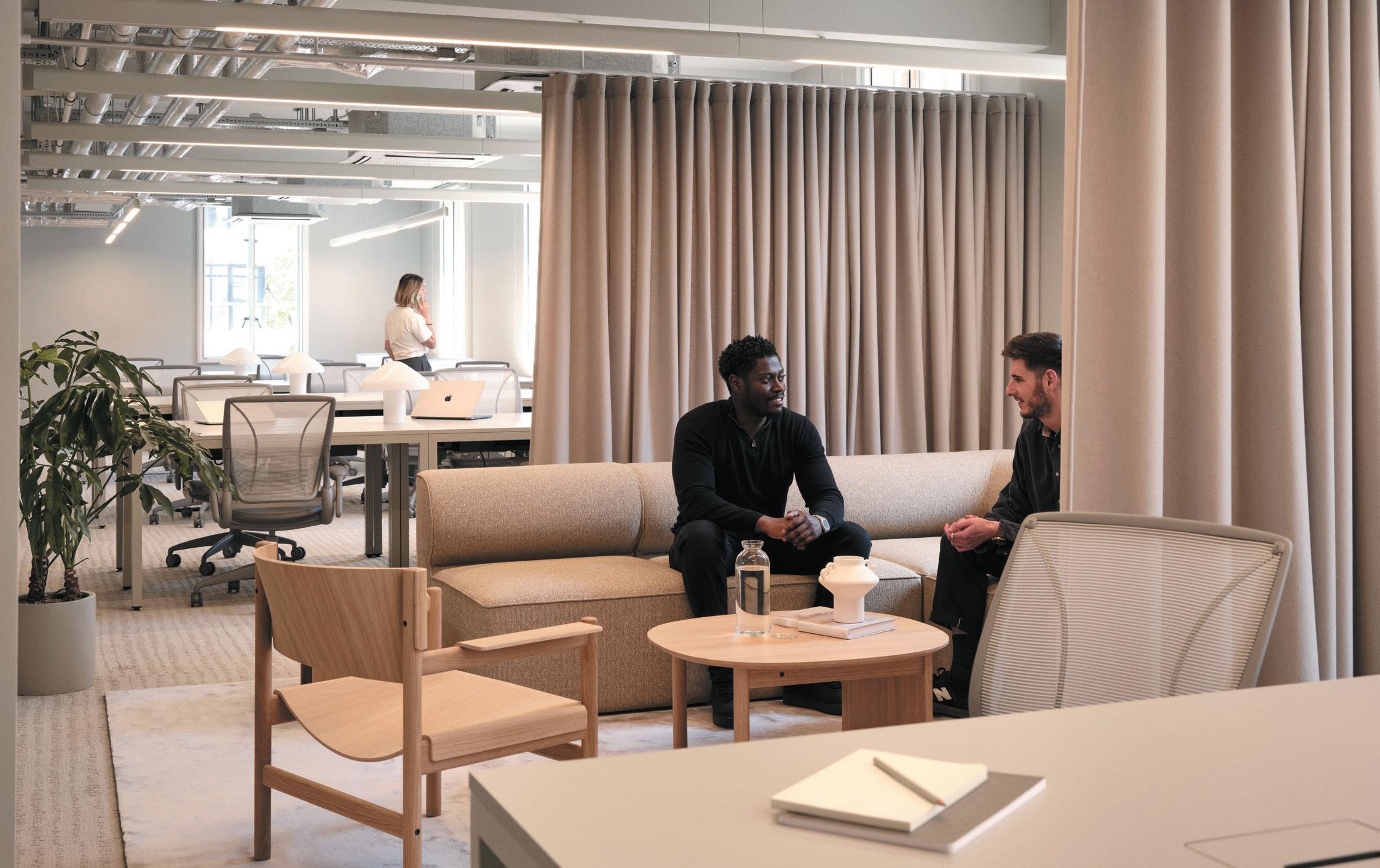
Chancery House in Holborn, Central London – which has been retrofitted, refurbished and reconfigured by dMFK Architects, while its interior design has been overseen by Copenhagen-based Norm Architects – is the biggest workspace of The Office Group (TOG). TOG specialises in flexible, design-led co-working spaces, and Chancery House is the ninth dMFK has designed.
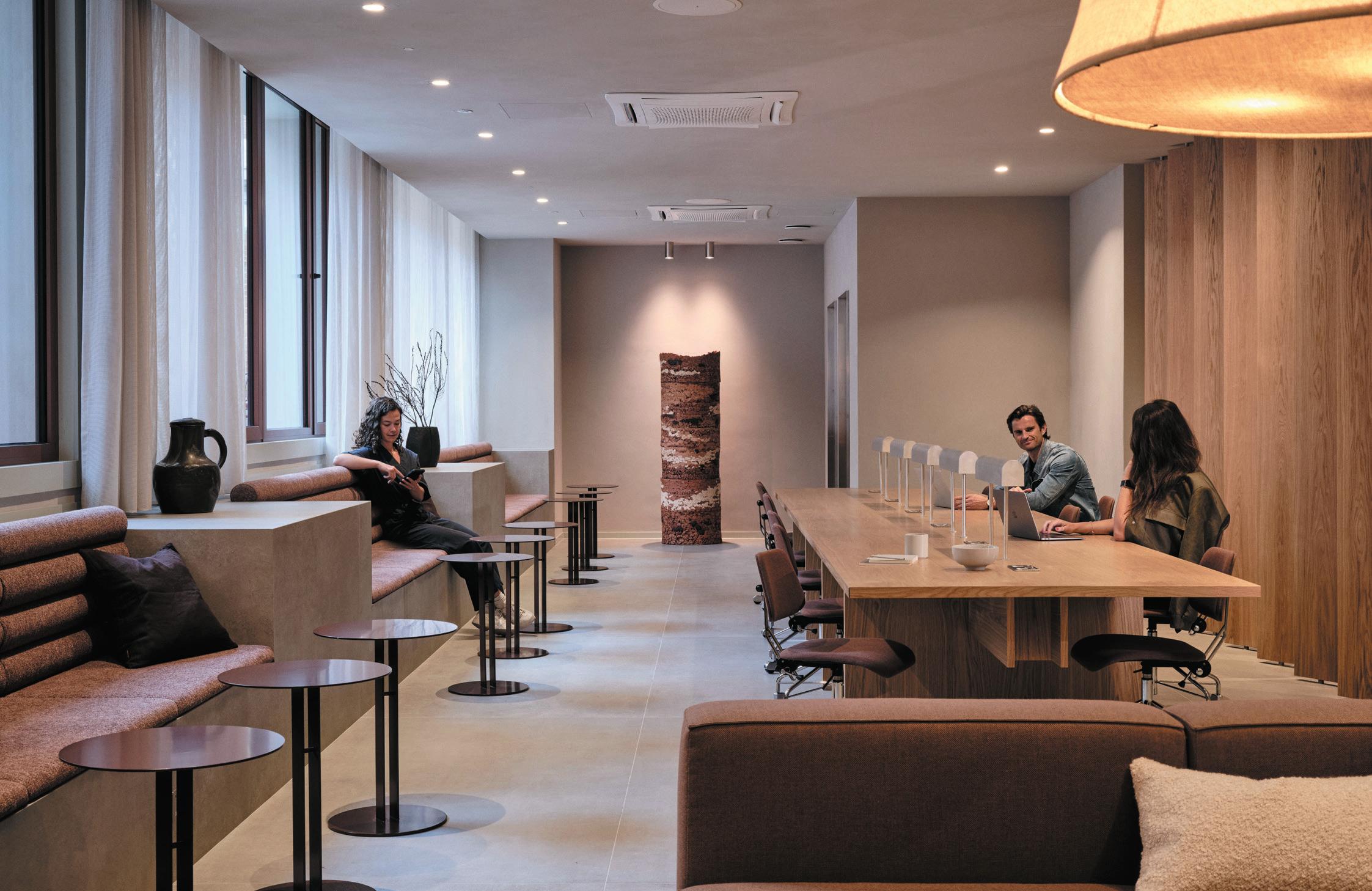
The gargantuan venue near Chancery Lane (previously owned by PSP Investments), with its complex layout, posed its own challenges to dMFK and Norm. Adding to the significance of the project is the history and prestige of the building. It stands above London Silver Vaults, a subterranean market that opened as The Chancery Lane Safe Deposit in 1885. During the Second World War, it was destroyed (although the vaults weren’t damaged). In 1953, a new building was constructed. It now houses silver dealers and is said to hold the world’s largest collection of silver for sale.
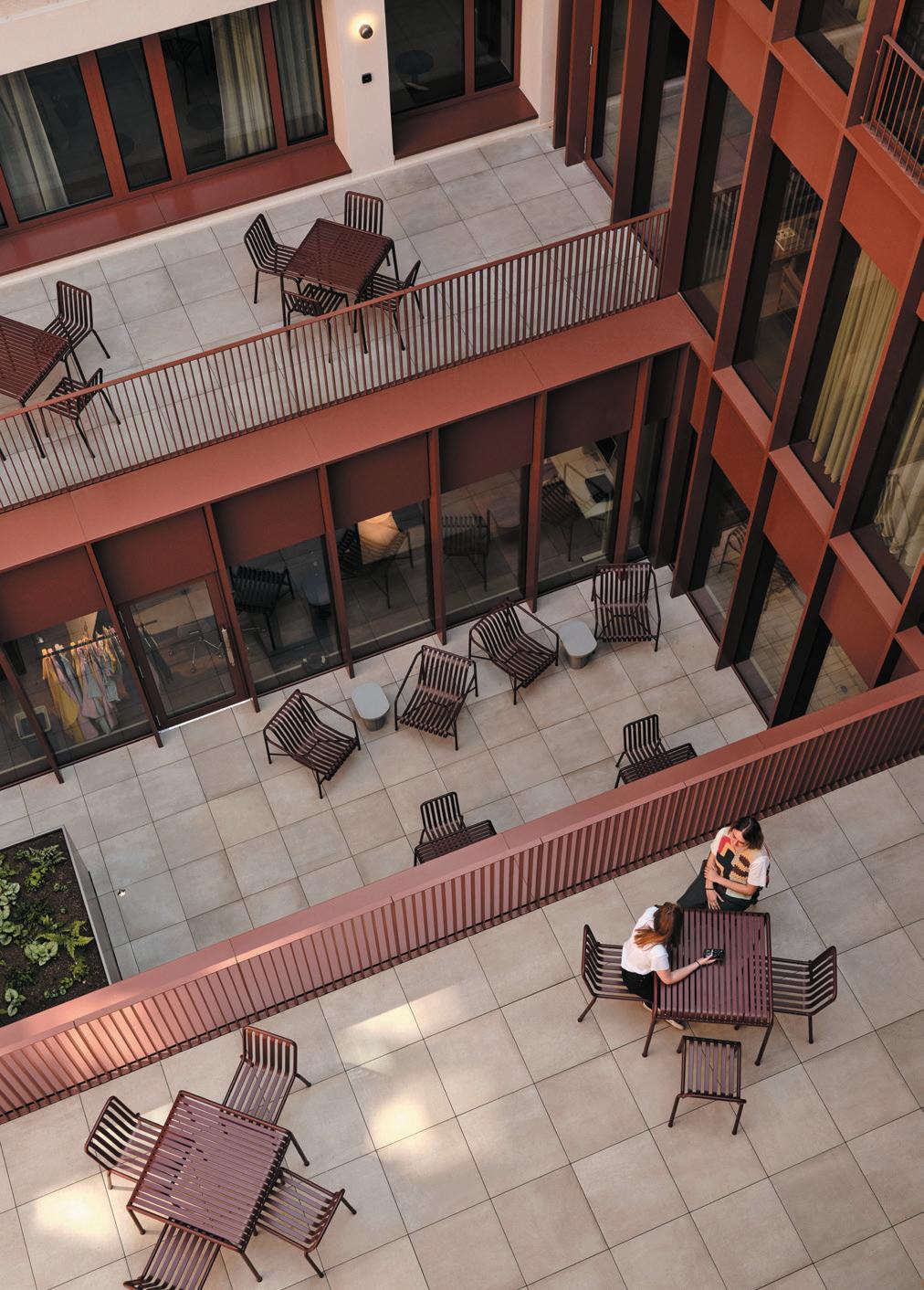
The reconfigured interior of the building, now owned by TOG, offers 130,000sq ft of office space, 1,495 desks distributed over eight storeys and 10,500 sq ft of outdoor space, encompassing a car park repurposed as a publicly accessible garden (created by landscape architects Spacehub) and outdoor terraces on different levels, planted with flowers and greenery. Other amenities include a café serving home-made, healthconscious food, 17 meeting rooms and event spaces and a parenting room.
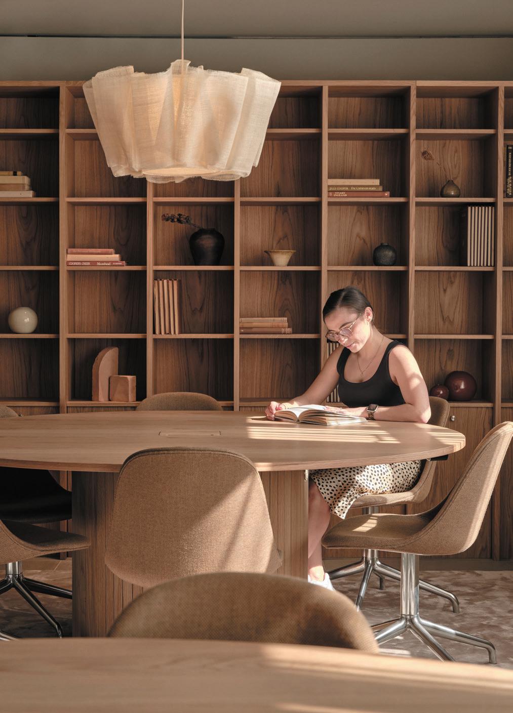
Wellness is high on the agenda at Chancery House. Indeed, its soothing, predominantly neutral colour scheme – think nuanced hues of fawn, terracotta and rust that pervade the entire building – is influenced by this. The wellness areas include a fitness studio offering Pilates and yoga classes, a gym and treatment room. There are also 222 cycle spaces and 22 showers.
42

Also reflecting the importance placed on wellness here is a strong presence of natural, matt materials, although the project nods to the building’s context and history too. Flashier metallic finishes reference the silver vaults: the main entrance is boldly framed in metal, while a brushedsteel staircase sweeps theatrically down to the basement.
“With the neutral palette derived from natural materials, we aim to create a timeless, calming design that provides a sense of comfort, warmth, tactility and quality,” says Sofie Thorning, architect and partner at Norm. The neutral shades were also chosen because they are more likely to be universally appealing, she believes: “We wanted to feature natural materials which engage with sensibilities that are universal, not bound by culture or geography.”
Chancery House’s reconfigured, open-plan, groundfloor lobby, boasting comfortable seating aplenty, is more redolent of a glam hotel than the reception area
of a coworking venue – albeit a serene, not bustling one. The architects worked carefully to achieve a sense of spaces flowing coherently, in what is a potentially labyrinthine, disorientating building.
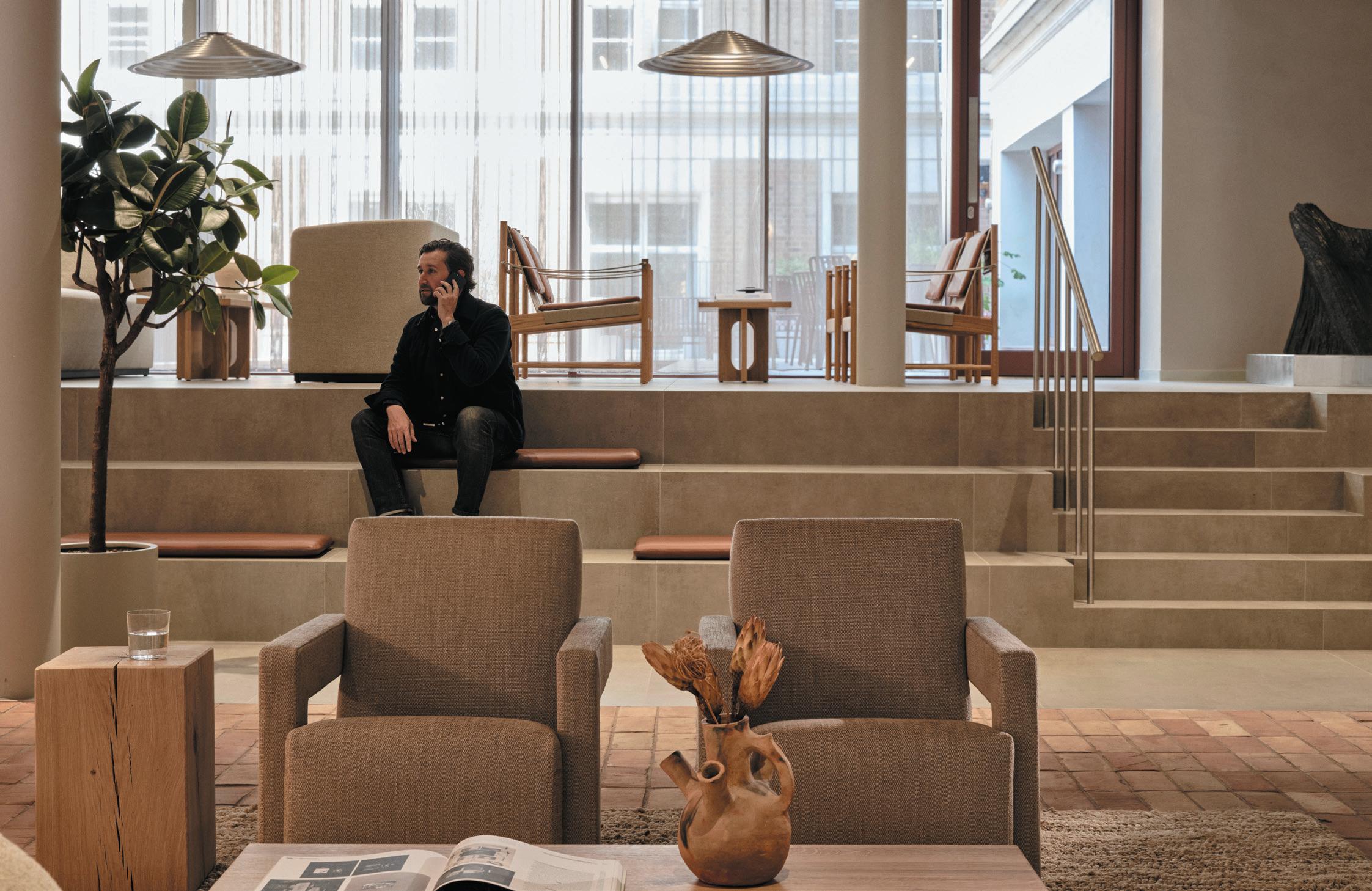
Yet, for the architects, it wasn’t simply a question of interconnecting spaces (even though one goal was to improve circulation). Corridors offering clear sightlines weren’t automatically desirable in this context, they explain. Instead, they favoured punctuating corridors with different functions and zones that could both create an element of surprise and ensure facilities such as tea points were within easy reach of working areas.
“It was evident to us that we needed to break down the scale of the building, especially the corridors, which could easily feel endless,” reveals Thorning. “Placing kitchens, tea points and lounges halfway down corridors made sense in terms of them being conveniently near offices and providing places of interest along the circulation space.”
44
BeLoW Image: Brickwork acts as a wayfinding device

46
Meanwhile, Julian de Metz, director at dMFK, says: “For such a large project, it’s important to spread a variety of communal spaces around the building to create a series of mini-communities. While the ground-floor entrance, café and flexible workspace and their connection to the basement, with its gym and other amenities, are the most significant shared space, a hierarchy of other communal spaces are located elsewhere, such as a third-floor meeting room suite with direct access on to a spectacular roof terrace. If all the shared spaces are centralised at the entrance, a flexible workspace can lose its balance. We’ve learned this through working on several projects for TOG.”
Arguably the materials and colour scheme here help to unify the scheme and interconnect different spaces. Bricks laid into the floor, which add warmth and look aesthetically pleasing, are also designed to act as a wayfinding device; the bricks create paved paths leading to other parts of the workspace.
The palette of natural materials also reflects a concern for sustainability. Many fittings, such as lampshades made of seaweed hanging in the café, are eco. The building boasts 80 solar panels, windows can be opened to provide natural ventilation and all energy used is renewable. The building’s ground and lowerground floors are set to achieve the WELL Platinum certification, while the entire workspace aims to achieve a BREEAM Excellent rating. And, for the record, sustainable fashion label Pangaia was one of the first companies to sign up to working at Chancery House.
cLIent
The Office Group
archItect
dMFK
InterIor DesIgner
Norm Architects
fLoorIng
Kronos, Prima Materia, Cenere, New Terracotta, Gravity, Ege Carpets
furnIture
Rawside, Menu, Hay, &tradition, Cassina, Frederica, Resident, Lemon, Brdr Kruger, Thonet
surfaces
Schüco, Stonecycling
LIghtIng
Lightforms (bespoke designs for Norm Architects) and Decode, Pinch, &tradition, Ferm Living, Ty Syml
other
Schüco, Jansen, Renson, Stonecycling, PAYE
opposIte page
cLockWIse from top: Acoustic curtains
Publicly accessible garden
Matt materials frame the workspaces
47
Dinner theatre
case stuDy: humo
At the afroDItI-designed huMo, the stage is set for chef mILLer praDa’s inventive, wood-fired cuisine.
WordS: harry mckInLey
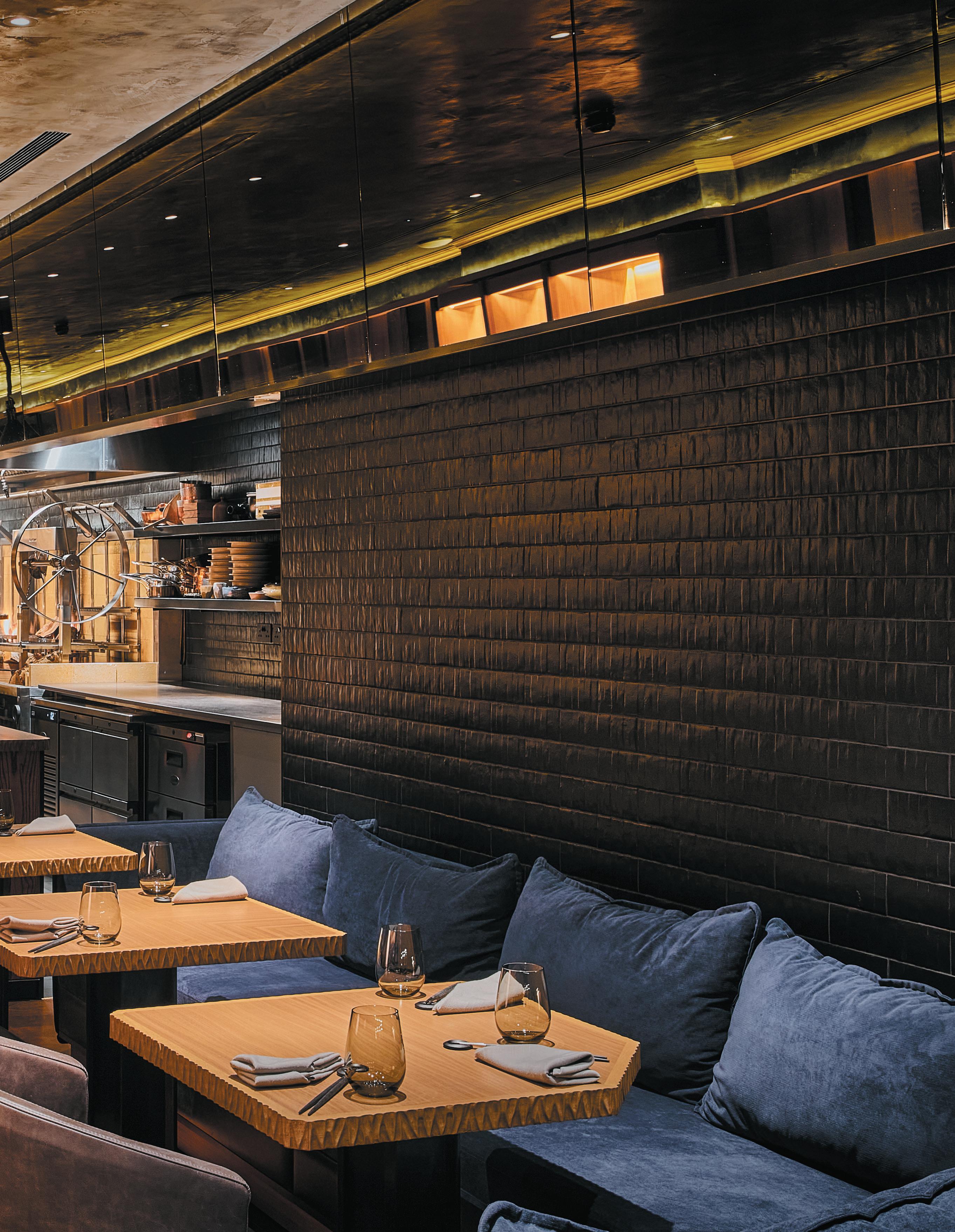
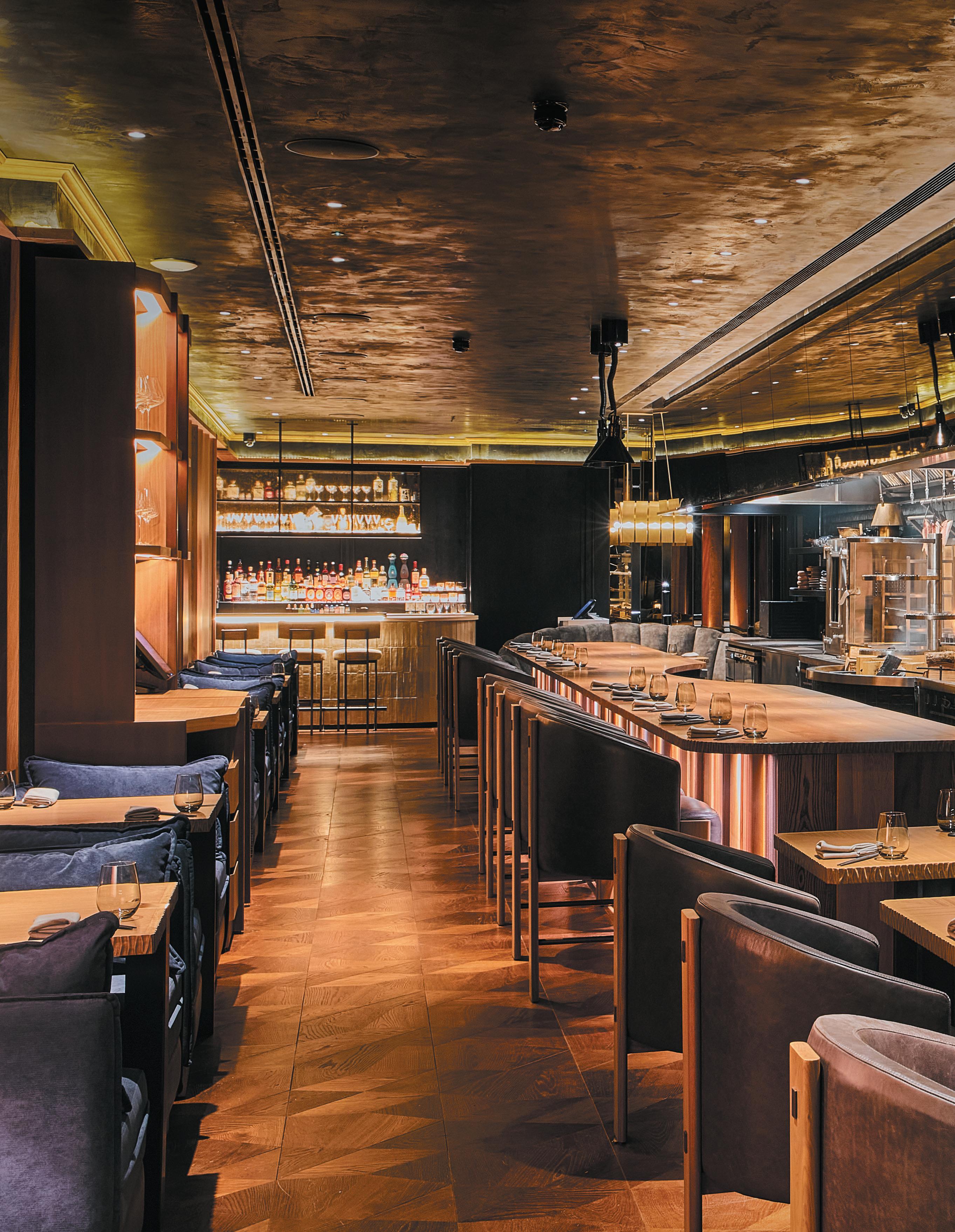
To describe a restaurant as theatrical can feel a little passé these days, such is the glut of open kitchens and at-seat dramatics – steely cloches lifted to reveal billowing dry ice or various fluids poured from great heights onto melting puddings. When paying the big bucks, we now expect, or even demand, some pizzazz; something video worthy and envy-inducing for the Instagram feed. But theatre Humo is, albeit of the slight, seductive and thankfully non-gimmicky variety.
A wood-fired dining concept in Mayfair, Humo represents the solo debut of Chef Miller Prada, a Colombian-born protégé of Endo Kazutoshi – the third-generation sushi master whose own West London restaurant holds a Michelin star. Though Miller doesn’t
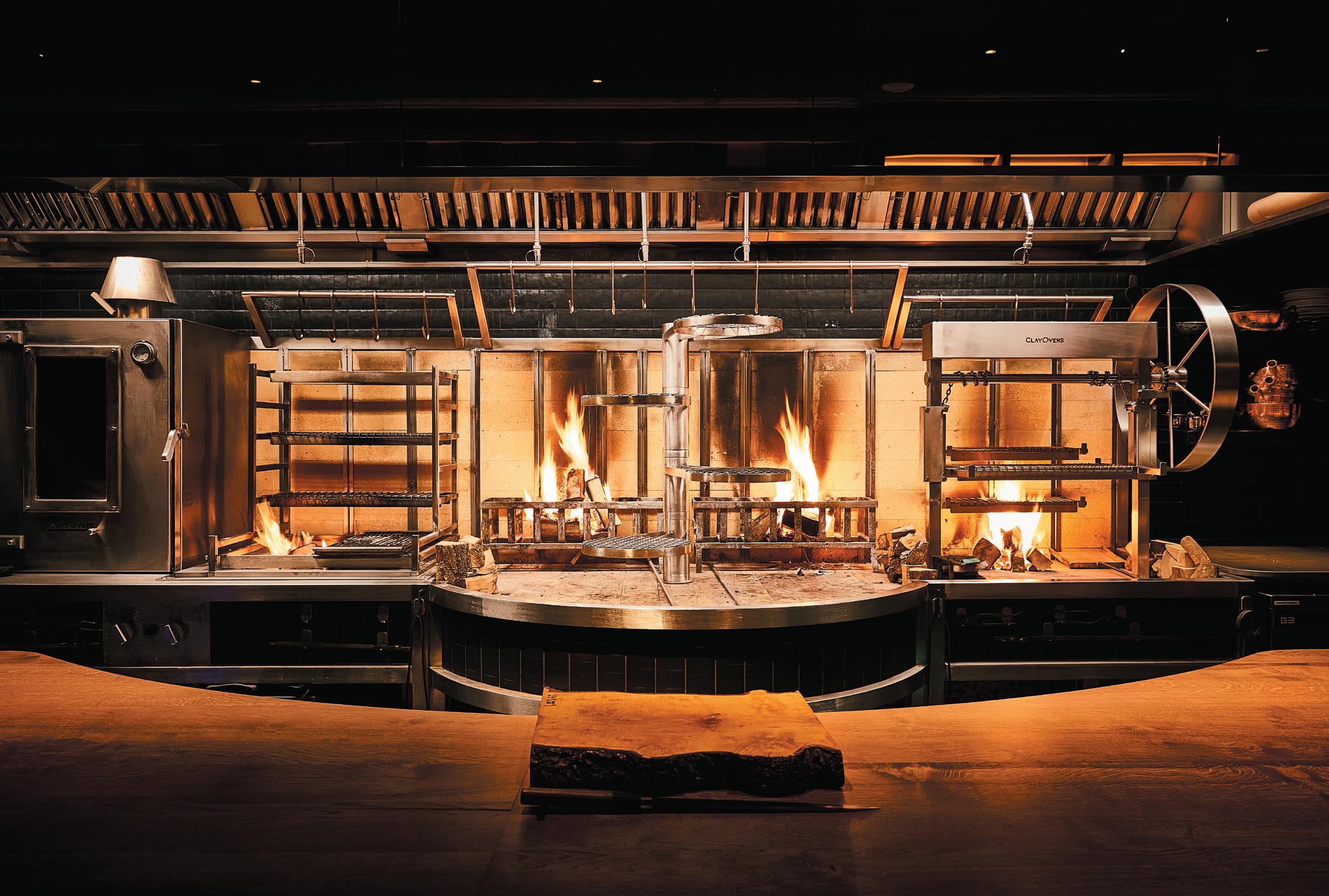
stick to sushi, at Humo the Japanese precision remains, even as the ingredients are more egalitarian and geographically diverse. In the preparation, no gas or oil is used – a tailor-made, four-metre-long grill both the focal point of the restaurant and the altar from which its complex dishes flow.
Wood, the central thread tying the menu together, is used both to cook and to flavour. Juniper, applewood, Aylesbury oak, birch, cherry and walnut – among a long list of others – scorch and caress, perfume and infuse, sourced from protected farms in the UK. Flames dance wildly in front of diners as great clumps of charcoal crackle, fracture and ultimately collapse into ash. Though an immersive experience, a state-of-
50
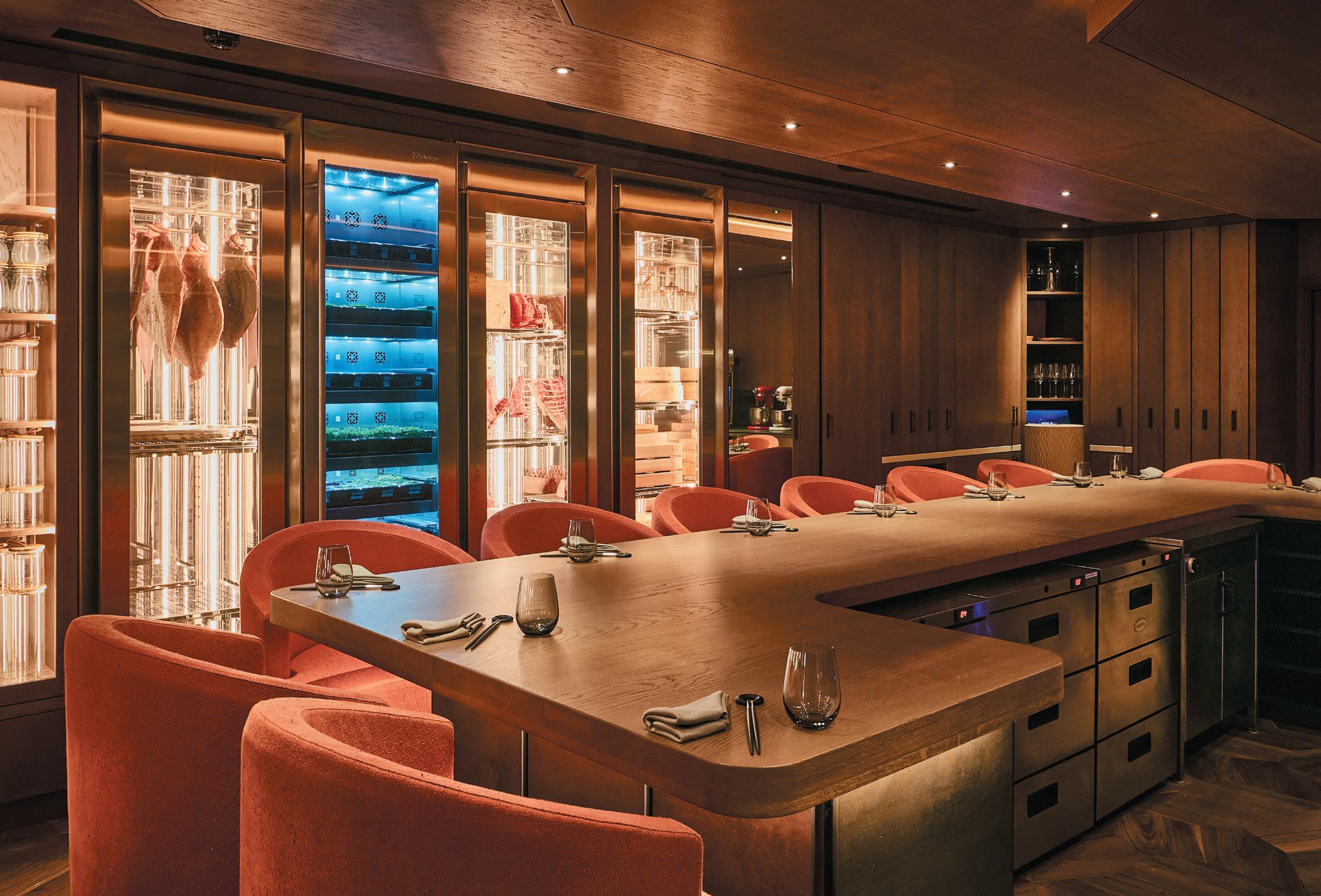
Image on prevIous page: The main dining room at Humo opposIte Image: Humo’s basement chef’s table
the-art extraction system ensures guests take only their memories and a full stomach with them, not the cloying scent of burning embers.
Appreciating Miller’s esoteric culinary approach is key to understanding Humo’s interiors, with the same ideas translated into a layered, material-driven scheme. London-based studio Afroditi led the design, of course most known for its work with titans of the hospitality world, including Gordan Ramsay, Heston Blumenthal and, recently, the disruptive Experimental Group.
“We wanted to create a restaurant that reflects the unique cooking personality of Chef Miller Prada,” explains the studio’s namesake founder, Afroditi
Krassa. “But we also wanted to challenge the current stereotypical expectation of a Mayfair dining experience, with a more subtle and timeless approach.”
It’s in sidestepping that ‘stereotypical’ approach, that the studio has been able to devise something imbued with drama, yes, but also quiet finesse – with wood the similarly unifying motif.
“The concept of the whole gastronomic offer is based on using wood as a cooking ingredient, so we also used this as our creative springboard,” Krassa continues. “We created a concept based on the playful exploration of timber as the predominant material of the interior; wood on wood in all its forms and guises.”
51
aBove Image: The open kitchen, featuring 4m bespoke grill
Humo’s floor is a polished patchwork of smoked European oak, in various hues and rich with grain. One wall is clad in the different species that Prada uses in his cooking; textured and almost coaxing diners to stroke. The long timber counter, centre stage and sitting directly in front of the cooking station, was created using a felled oak from the same farm from which Prada sources some of the menu’s ingredients – the design creating a conversation between the space and the dishes.
For Krassa, that sense of connectedness was crucial. “This is a small and intimate experience; it is a destination restaurant for an audience that cares deeply about provenance, ingredients and the artistry of cooking,” she says. “It was important that every minute element of the experience is perfectly conceived and delivered; that everything is fully harmonious and coherent. Even the colour palette has been chosen to complement the live fire and its warm light, as this is the hero of the experience. So we chose darker, warm and quite muted and matt tones that work well with the fire and allow it to literarily shine.”
The plush dark wood stains and black rough cut stone seen throughout equally echo the fire, smoke and ash so central to Prada’s practice, creating ‘additional material layers’ that add complexity, depth and tactility. With no sense overlooked, the studio introduced a subtle fragrance, of a wet forest and moss, to carry diners away from the cacophonous streets of London and into a fertile, even primal, environment.
Beyond the front row of the counter, the main dining room is peppered with more intimate seating, mostly engineered for pairs or small groups, while downstairs, below street level, lies a ten-cover chef’s table. Here, counter seats are arranged in a crescent around an open-kitchen and flanked by temperature-controlled units holding wine and tremendous slabs of fish and meat; added stage dressing.
Krassa is correct in suggesting that Humo eschews many of the glitzier conventions of the neighbourhood and, in doing so, it weaves a compelling, fully-realised tale – one where the narrative is more important than the theatrics and substance more important than putting on a show.
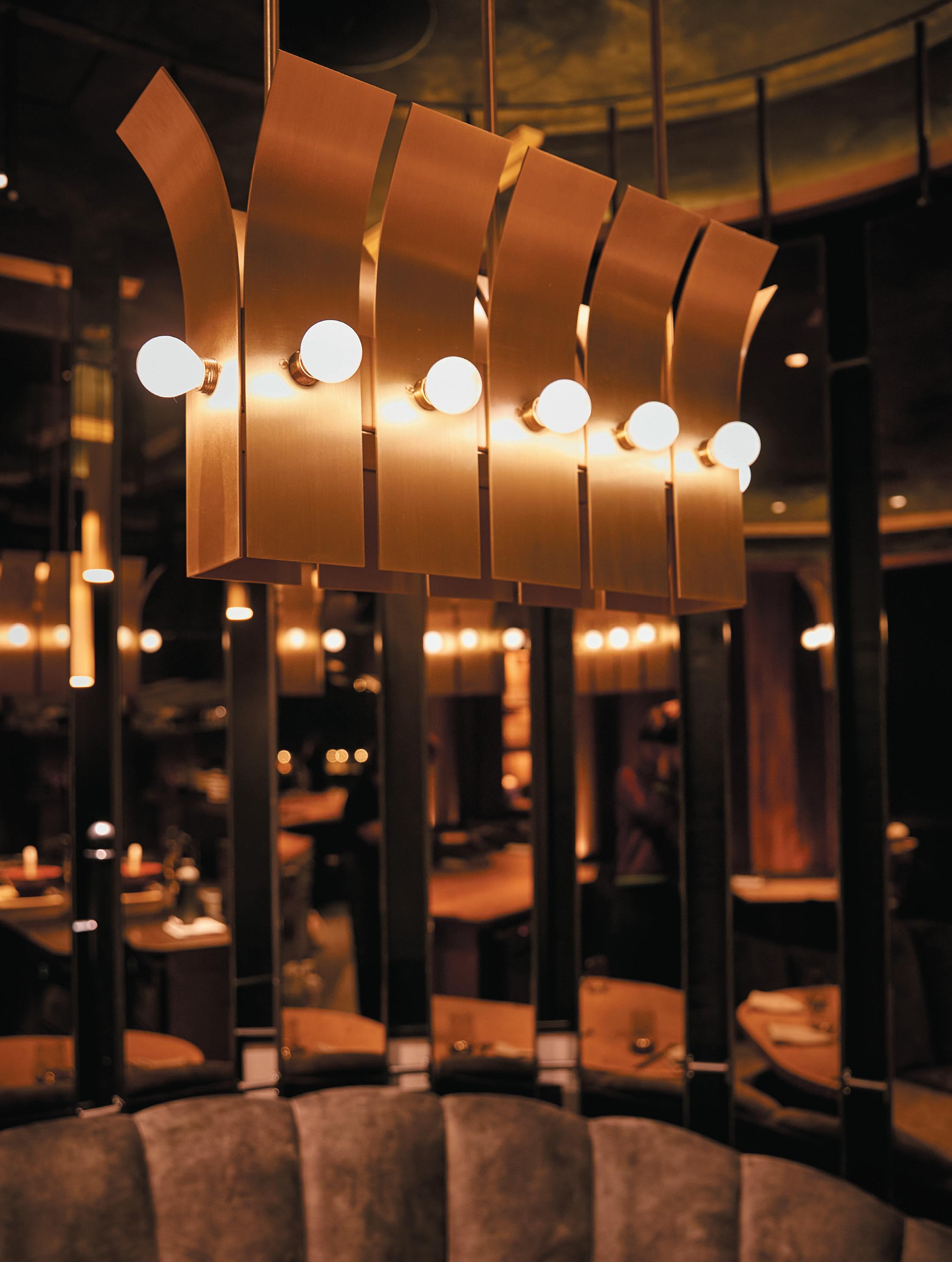
opposIte Image: Ambient lighting creates a seductive mood
52
53
Social listening
hta DesIgn’s new Hackney Wick home is a beautifully functional case study in adaptive reuse.
case stuDy: hta DesIgn
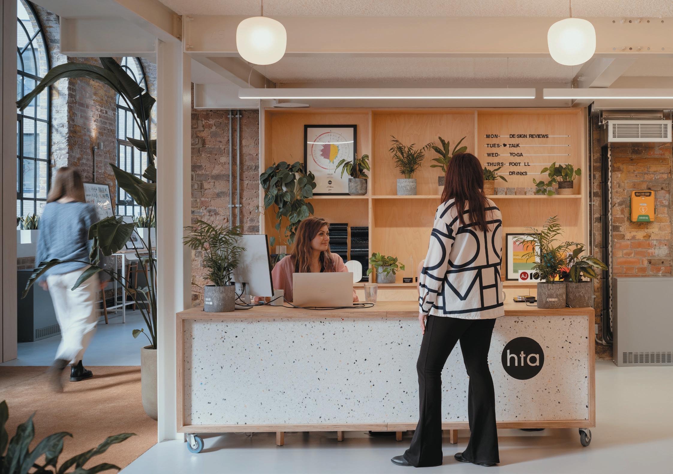
aBove Image: A bright reception welcomes the community
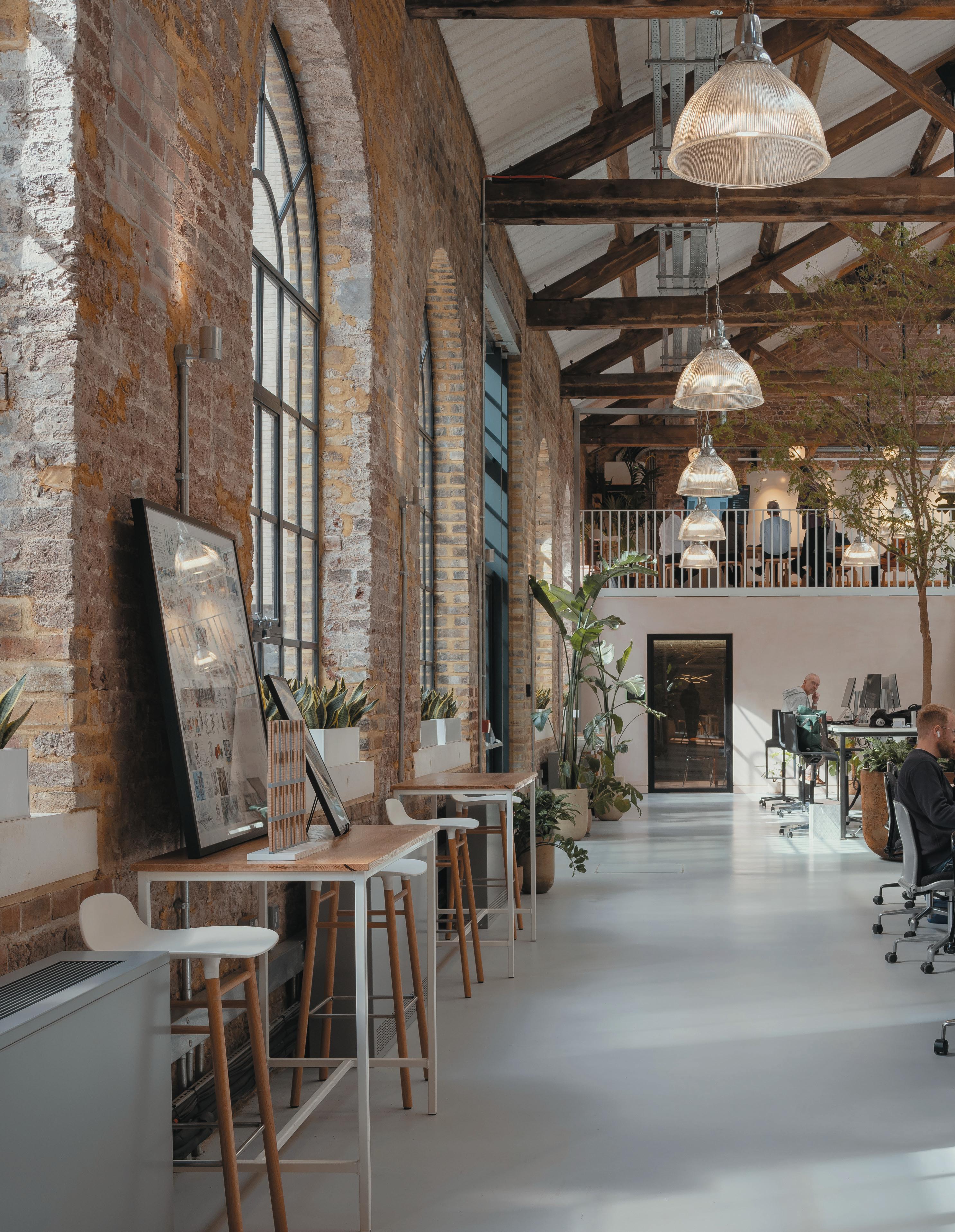
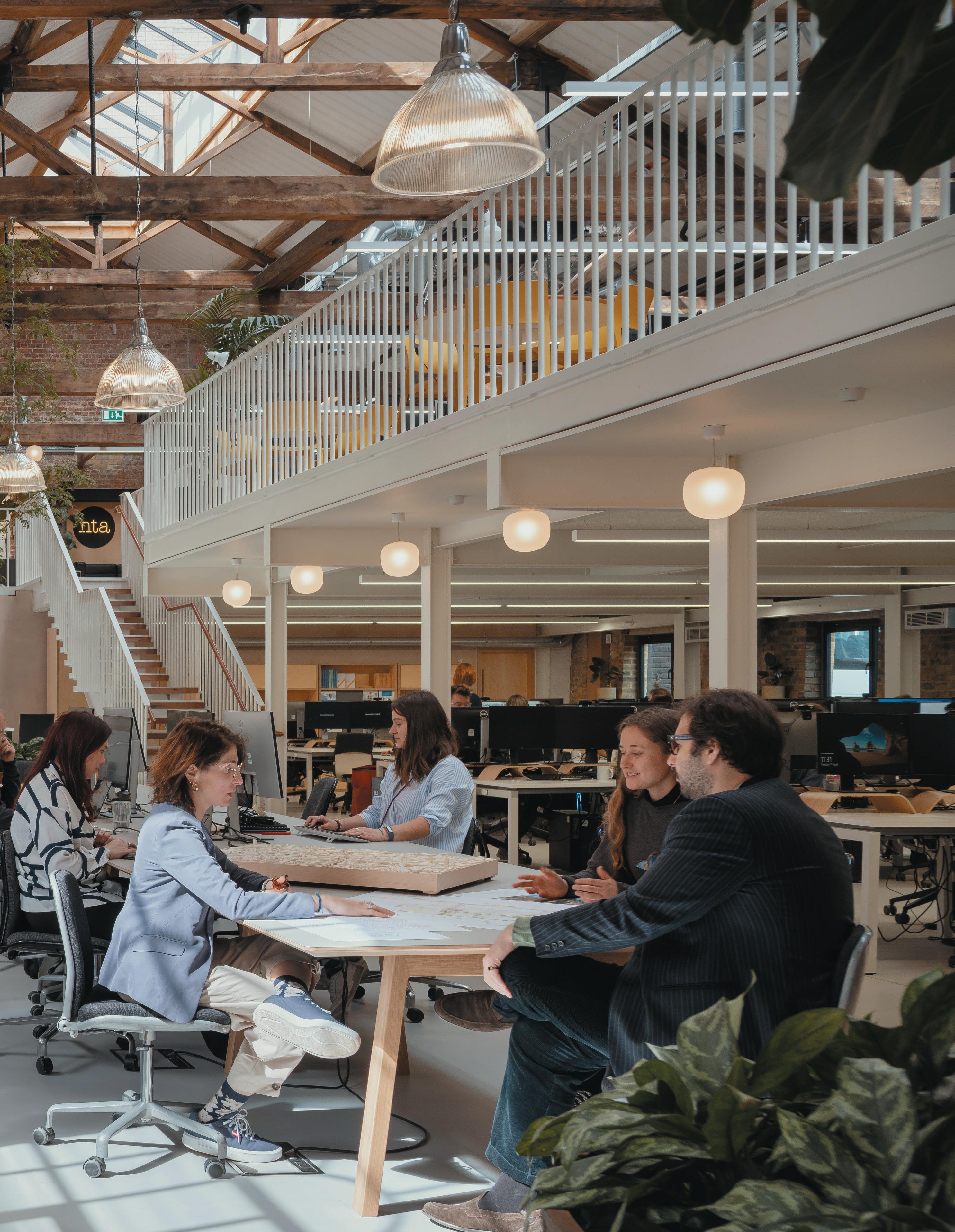
HTA Design has reimagined and repurposed a Victorian warehouse in Hackney Wick, East London, creating a permanent new home for its 200 London-based staff. Built in 1868 as a factory to manufacture the world’s first synthetic plastic, HTA’s transformation celebrates and preserves the warehouse’s historic character, whilst providing a new home for its collaborative and multi-disciplinary team.
“Hackney Wick has a history of innovation and making; a place where products and processes from confectionary to petrol, rubber and lace, were invented and manufactured over the course of 150 years,” says Simon Bayliss, managing partner at HTA Design. The factories and belching chimneys are long gone and, boosted by the 2012 Olympics, a new neighbourhood has emerged over the past decade, primarily as a place
to live. At the heart of this ever-changing landscape, 75 Wallis Road aims to bring an important piece of Hackney Wick’s heritage back into use – as a creative workspace for up to 200 people, the attendant life and activity that will enrich the neighbourhood and its community. “Our motivation was to create a truly great place to work. One that people would gladly travel to spend time each day, meeting colleagues and making friends, growing their professional careers with improved wellbeing, whilst also bringing the same benefits to the whole neighbourhood.”
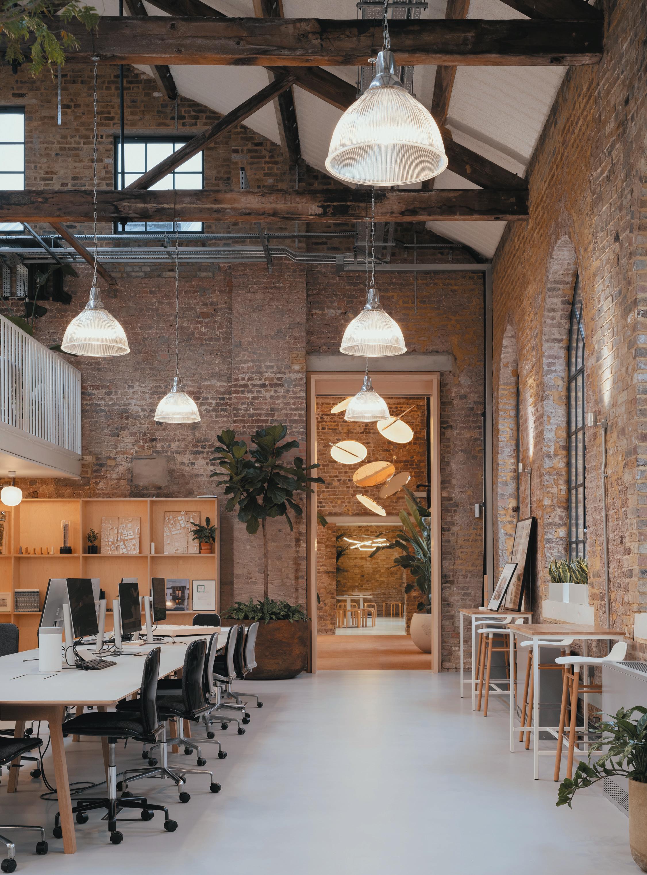
Four separate and distinctly different buildings have been linked together, celebrating the original architectural features, including the hugely varied brickwork and timber and ironwork roof trusses. New additions such as mezzanine floors and rooflights help
56
Image on prevIous page: The main workspace and mezzanine
connect the four-building warehouse into an accessible and interconnected workspace, with stairs made from Jarrah, a beautiful Western Australian hardwood that’s 150 years old (the same age as the building) previously used as railway sleepers and sourced by HTA’s landscape partners.
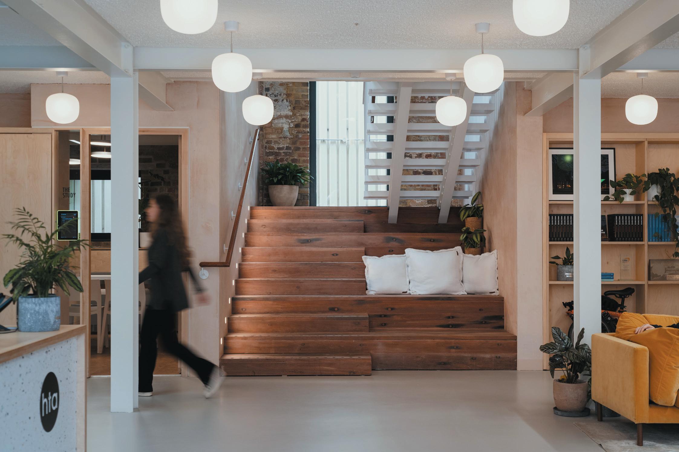
“It’s really solid and hardy but it’s really actually very lively,” says Bayliss. “It’s moving and cracking, after being outside for 150 years.” Most of the furniture is second hand, or brought along from the practice’s previous office, and a muted colour palette and natural materials such as recycled timber and cork create a bright and light-filled atmosphere for staff and guests.
A bespoke sculptural chandelier by Cameron Design House hangs in the lobby, designed by a former member of the HTA team. The light was inspired by the reflections of Lake Torsa in Finland, with brass mirrored discs reflecting light off one another and contrasting with the bare brickwork of the entrance space.
For HTA, keeping the carbon footprint of the refurbishment to a minimum was a priority. The practice’s in-house sustainability team prepared a comprehensive and holistic energy strategy which
58
BeLoW Image: The factory’s original features have been restored and renovated
60
significantly reduces operational carbon. Air-sourceheat-pumps and rooftop photovoltaic panels maximise renewable energy within an all-electric building, and passive design takes advantage of excellent natural light, ventilation through opening windows and rooflights, well-insulated roofs and floors, and the significant thermal mass of exposed brickwork.
A key ambition for HTA was to ensure its social value to the local Hackney Wick community, not only providing new business in the area but actively giving back to those that have welcomed them. Since moving into the warehouse space at the end of 2022, HTA has already established a growing network within the neighbourhood, providing an asset for use by local community groups and welcoming neighbours into the building. “In the short months HTA has been in Hackney Wick, the studio has become a fantastic place to host community events,” Bayliss comments. “This has included local design workshops with schools, startups and Cultural Interest Group meetings, welcoming over 266 guests into our home. We have also hosted 12 community events free of charge to enable funds to go straight to local causes as well as ensuring we support local business by buying supplies for community workshops.”
HTA has also hosted a series of four Echo Workshops – a programme that works on an economy of Hours, a social currency that helps others learn new skills and talents. It’s based on payment of Echo points by giving time, skills and venues to the local community. These points can then be used to attend various Echo workshops and events. It’s time, well spent: a new economy based on fairness, equality and reciprocity.
“The business case for taking on this project was simple: create a beautiful and practical studio space, protect the practice from the uncertainty of renting, and reduce our carbon footprint,” says Bayliss. “We set out to find a space that met that need, with a focus on repurposing an existing building to make it our own. This building has met our ambitions perfectly and is appropriately located in Hackney, where HTA’s own heritage was built. In the short time since moving in, our new home has already enriched the collaborative culture and creative ethos that facilitates our design of great places to live.”
cLIent
HTA Design
archItect
HTA Design
fLoorIng
Floortrak, The Floor Gallery, Matworks, Solus Ceramics, Ashwells Reclaimed Tropical Timber
furnIture
Cre8/Washroom, Icons of Denmark, Day 2 Interiors
surfaces
Henlys, Cre8/Washroom, Solus Ceramics
LIghtIng
Cameron Design House, Luceco, Nordic Nest, Muuto, Konstsmide, Illuma Lighting, Light Forms
other
House of Plants
opposIte Image: Bespoke lighting by Cameron Design House makes an impact
61
If you go down to the woods
case stuDy: LoIre vaLLey LoDges

WordS: harry mckInLey LoIre vaLLey LoDges, near Tours, provides a blueprint for how architecture, interior design and nature can coexist harmoniously.
Image on
prevIous page: One of the property’s 18 individually designed lodges
aBove Image: Owner Anne-Caroline Frey chose furnishings to complement the artwork
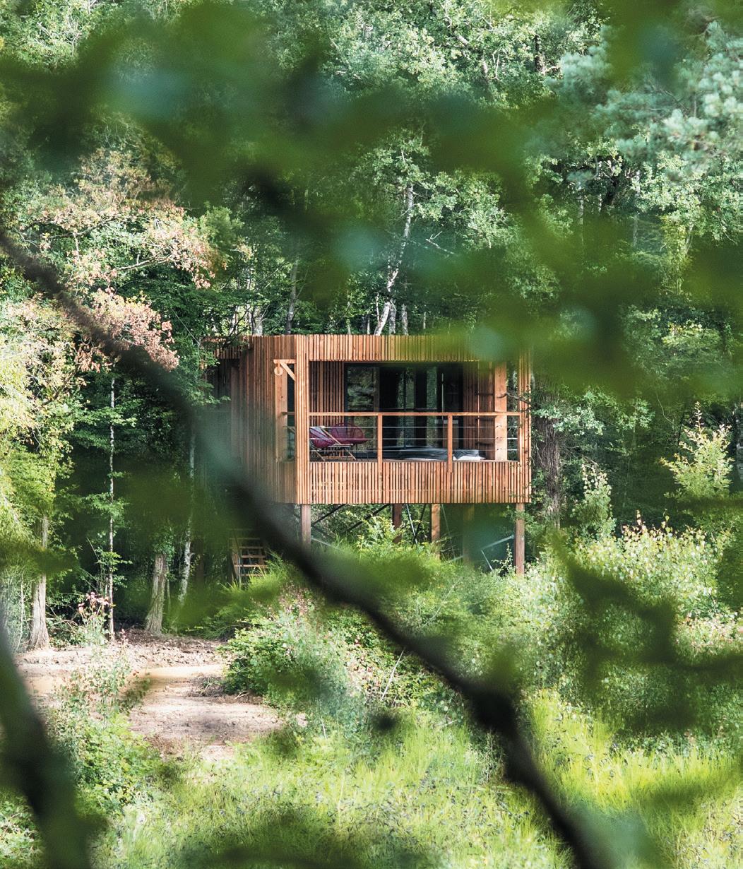
Loire Valley Lodges is something of a fairy tale for today – 18 stilted treehouses dotted across 300 acres of private forest, 20 minutes outside Tours. Once inside the alluringly labyrinthine estate there are no cars, and beyond the public spaces (two restaurants, a bar and pool area), Wi-Fi is non-existent. For weekending Parisians and international visitors, the property is an escape into nature – albeit one defined by ultra-slick design and a wealth of thoughtful luxuries.
The lodges themselves hug the treetops, architecturally designed by Tours-based Isabelle Poulain and fashioned from wood species present in the surrounding forest – the exteriors Douglas fir. Amidst a curtain of dense greenery, they are visible as intermittent bursts of modernity; stylistically man-made interventions, but seamless with the environment in their use of material.
Each treehouse features immense floor-to-ceiling bay windows, affording views of the ensconcing canopy and part of owner Anne-Caroline Frey’s philosophy that guests should be in direct contact with the forest ‘at every step’.
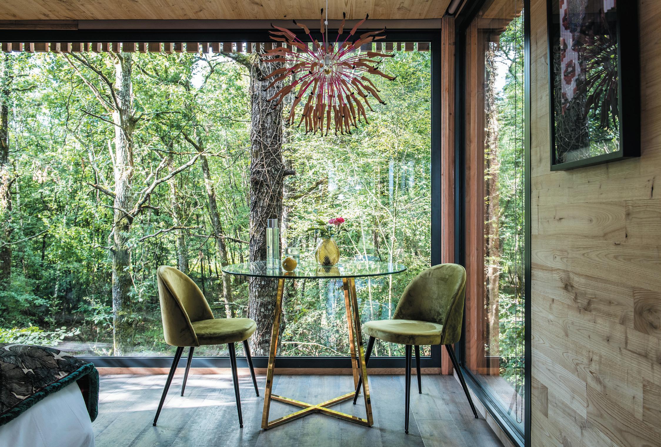
“We even made the decision that they shouldn’t open, so as to avoid a vertical upright in the middle that would pollute the view,” she explains. “It creates a window without joins; just an expanse of glazing so that, even in winter, one has the impression of being outside.”
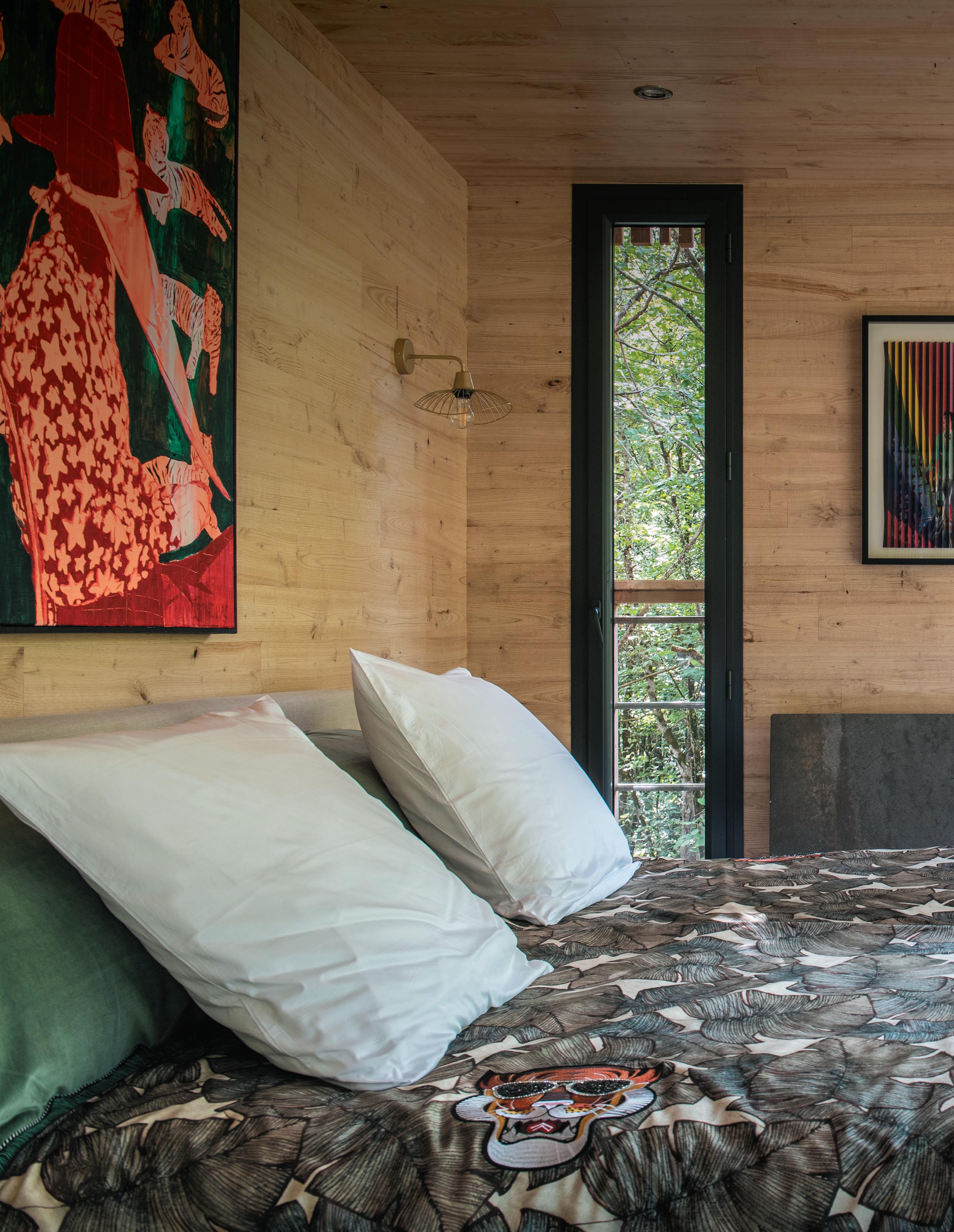
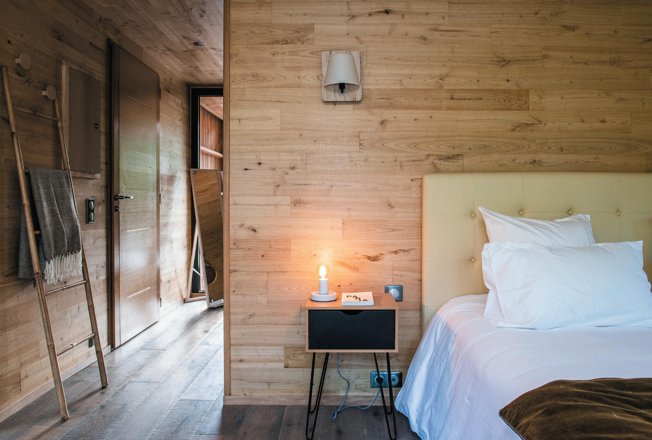
Frey led on the project’s interior design and while each lodge features an identical surface area and common bones (parquet floors in oak and chestnut walls), they are all different in attitude and aesthetic. Frey worked with a series of artists – some local and some from further afield –
64
to create a unique creative identity for each. Among those tapped to create or display pieces, Frey describes Philippe Pasqua, Jacques Bosser, Aurèle and CharlElie Couture as some of those with an important international dimension, while Michel Audiard, Cedric Marcillac and Charlotte Perrot are examples of those from the region; giving guests an opportunity to discover lesser-known talent.
Just as the exterior represents a highly-considered relationship between lodge and forest, so inside is a têteà-tête between Frey and her chosen creatives.
“I first worked with moodboards, in response to the works proposed by the artists,” describes Frey, “and then I hunted for small objects and furniture with the right colours. Everything coexists in harmony and every item resonates with the other. Material is very important to
me, for example. Often forgotten is touch and it’s vital to feel the soft, the cold and the hot, and to choose what feeling we want and at what moment. I always suggest that my clients walk barefoot in the lodges. It helps to create an emotion and a connection.”
Set some four metres off the ground, the height of the lodges also offered an opportunity for some uncommon flourishes. Breakfast is part witty design, part engineering exercise and part playful guest experience – food and drink delivered in a sturdy woven basket that has to be hoisted skyward on a spectacularly traditional pulley system.
Works by many of the same artists deployed in guest quarters are also displayed in the public spaces – a renovated, centuries-old farmhouse now serving as lobby, bar, bijou shop and restaurant twice over. One,
65
aBove Image:
All lodges feature identical surface area
Asperatus, is not only a swish dining spot for guests, but a destination restaurant with a revolving rota of guest chefs – some established names, others disruptive upstarts bringing exceptional, progressive cuisine to this slice of the Loire.
At Ardent, Loire Valley Lodge’s more relaxed eatery, Frey wanted to steer away from some of the region’s grander clichés. “It’s really different from the local codes of the Châteaux,” she says. “My objective was to create a cool, natural and actually quite simple atmosphere. Even though the service and food are gourmet, we don’t have white napkins and roses, just plain wooden tables, small wildflowers and handcrafted plates.”
Through their brand Elixe, Frey collaborated with Xavier Legrand and Laure Conte, recovering dead wood in the forest that Legrand works, ‘patinates’ and burns to reimagine as practical, beautiful objects – including a tray, butter dish, stool and coffee table. In this way, “the forest also comes back to the center of meals,” explains Frey.
The vast English-style gardens (devised by Frey’s green fingered husband, Bertrand) and woodland are described as a ‘living gallery’; the lines between indoor and out wooly and diffuse. Contemporary sculptures pepper the grounds, some monumental in scale, such as Philipe Pasqua’s metal whale skeleton – intended to highlight the impact of climate change – and Aurèle’s Lost Dog, blue and enormous, presiding over the entrance to the estate.
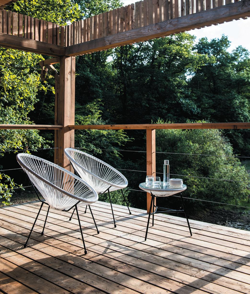
Sustainability and social justice are threads woven throughout the project which, far from a blight on the landscape, is instead intended to restore and protect. Frey, a keen environmentalist, is both conscientiousness and conscience-driven in her design and operation decisions. For the property’s outdoor garden furniture, she collaborated with Djilene Création, a young designer whose pieces are made in solidarity with children in difficulty in Senegal, from coloured fishing lines. More broadly, at Loire Valley Lodges she encourages guests to develop a meaningful relationship with nature –reconnecting with what ‘matters’ while taking time to disconnect from what we might otherwise think we can’t live without, even if that’s simply Wi-Fi.
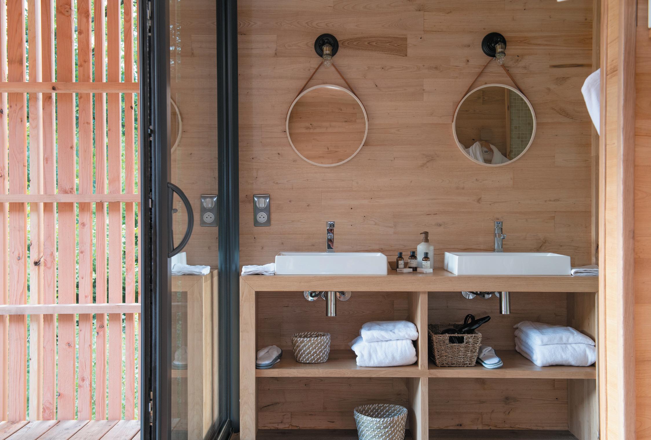
opposIte page, cLockWIse from top: Treehouses feature wellappointed bathrooms
Terraces come as standard
Lodges sit within a 300 acre private forest
66
67
Third space
Work meets play: Croydon’s BIrch (seLsDon) hotel is more than just a place to lay your head.
WordS: chLoé petersen sneLL
photogrAphy: aDam Lynk
case stuDy: the BIrch
70
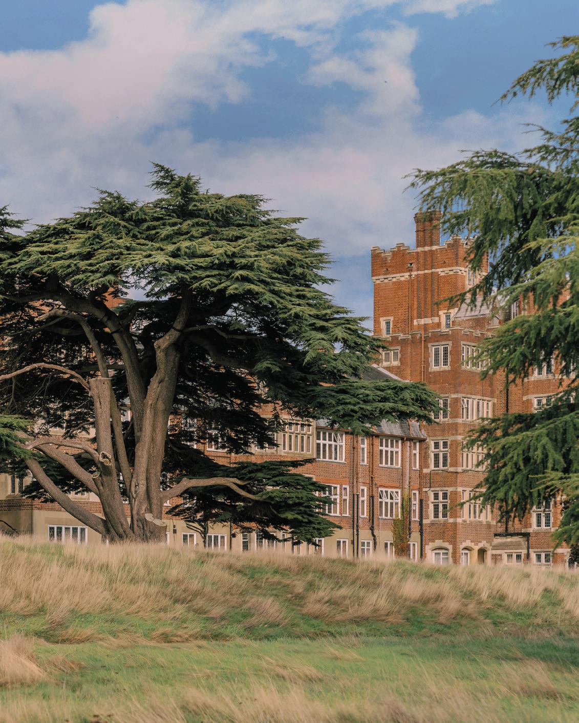
Nestled in 200 acres of sprawling parkland and a former golf course just 30 minutes from London, Birch (Selsdon) is a hotel and lifestyle concept according to nature. A blended environment of hotel-meets-workplace-meetsleisure, there’s nothing particularly new in its simplest sense (see: Soho House), but what Birch offers feels refreshingly different, with an elevated ‘home-fromhome’ concept and relaxed interiors that invite members and guests to escape the every day. ‘Polished, grown up, a little bit wild’ describes its literature, cultural currency that ensured the rave reviews of Birch’s debut opening, Birch (Cheshunt) – which launched to great acclaim in 2020. During a stay, hotel guests become temporary members, with a long list of activities available to experience, from Pilates and pottery to nature walks and even bee keeping. Members are invited to come for their 9-5, but clock off at 4 to enjoy a spritz on the terrace, a dip in the adjacent Victorian-inspired Lido and a bite to eat in either of the two Michelin-chef-headed restaurants designed by A-nrd and Sella.
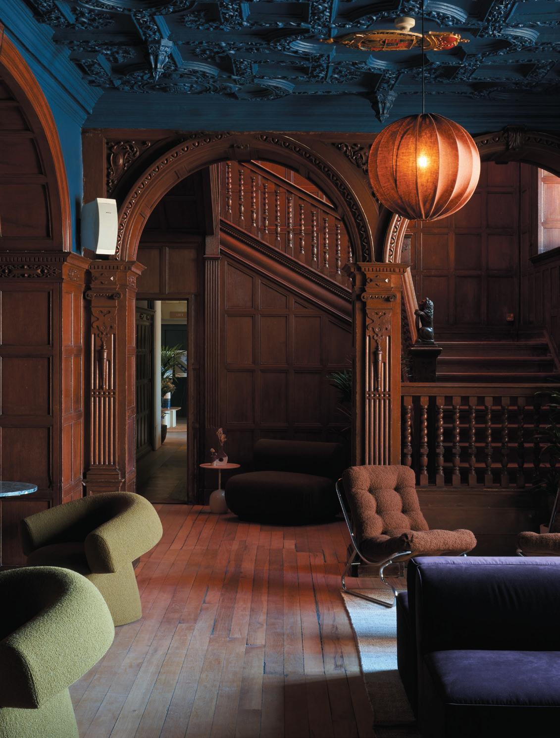
The rather imposing, gothic building creeks with history. Formerly a 19th century mansion, the story of the site dates back hundreds of years – once an Anglo Saxon Hall, a medieval farmhouse and a Tudor manor house where Henry VIII is rumoured to have courted Anne Boleyn. It makes sense then, that Birch Selsdon’s design would take a restorative approach, carefully peeling back the layers and mixing modern and trend-driven design with original dark wood staircases and stained-glass windows. After undergoing a major refurbishment and restoration by Alessio Nardi and Lukas Persakovas of A-nrd studio, the 181-room hotel presented hidden gems, including mosaic parquet flooring, hidden round bay niches and old decorative stone façades.
“The building inside and out is a very special place,” says Nardi. “It’s grand and historic, set in acres of beautiful land but, over the years in its various incarnations it had been modified in unsympathetic ways and we felt it had lost its way. Now, I think it’s a symbol of how hospitality, contemporary design and sustainability can combine in a very fresh and engaging way. Birch’s ethos to reuse and minimise waste and consumption where possible is directly in line with our studio and is reflected in the interiors.”
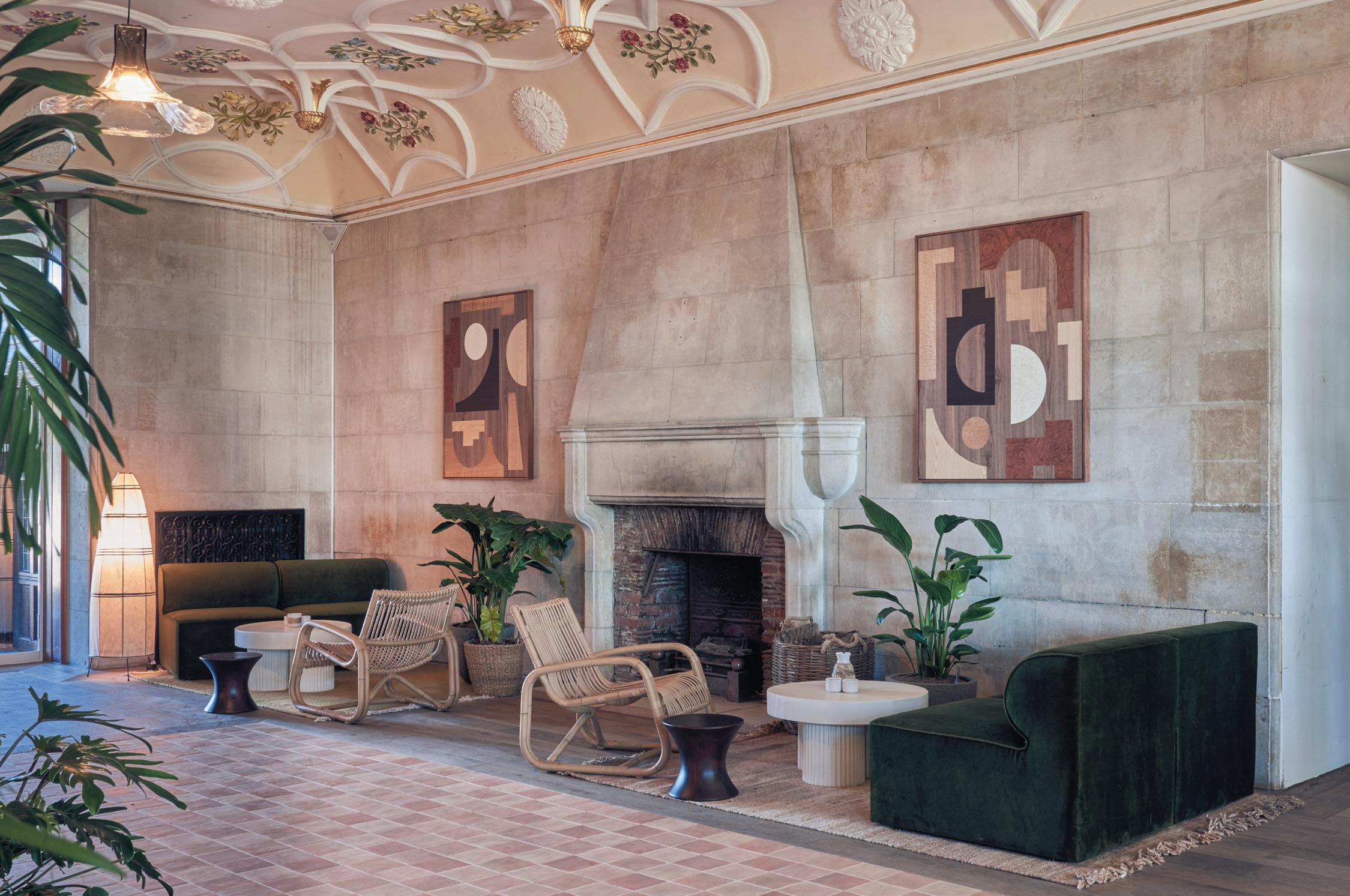
In the lobby, the original stone walls and fireplace are flanked by contemporary bespoke artwork by local artist Olly Fathers – reflecting the decorative floral bas-relief ceiling above. Timber flooring is broken up by terracotta
cLIent Birch (Sesldon)
archItect & InterIor DesIgner
A-nrd Studio and Sella
fLoorIng
The Floor Gallery, Forbo
furnIture
Massproductions, menuspace, Moroso, Not ma, Zilio, Jobs, Vinteriors, Caravane, Carl Hansen, Sebastian Cox
surfaces
Solus
LIghtIng
Michael Ruh, Ferm Living, HK Living, Valerie Objects
other
Yarn Collective, Casamance, Romo, Kvadrat, Kaldawei
Image on prevIous page: The Meadow bar looks on to a light-filled Orangery
opposIte page cLockWIse from top Left: The Snug workspace
Pared back guest rooms
The surrounding estate is London’s largest rewinding project
The Orangery
71
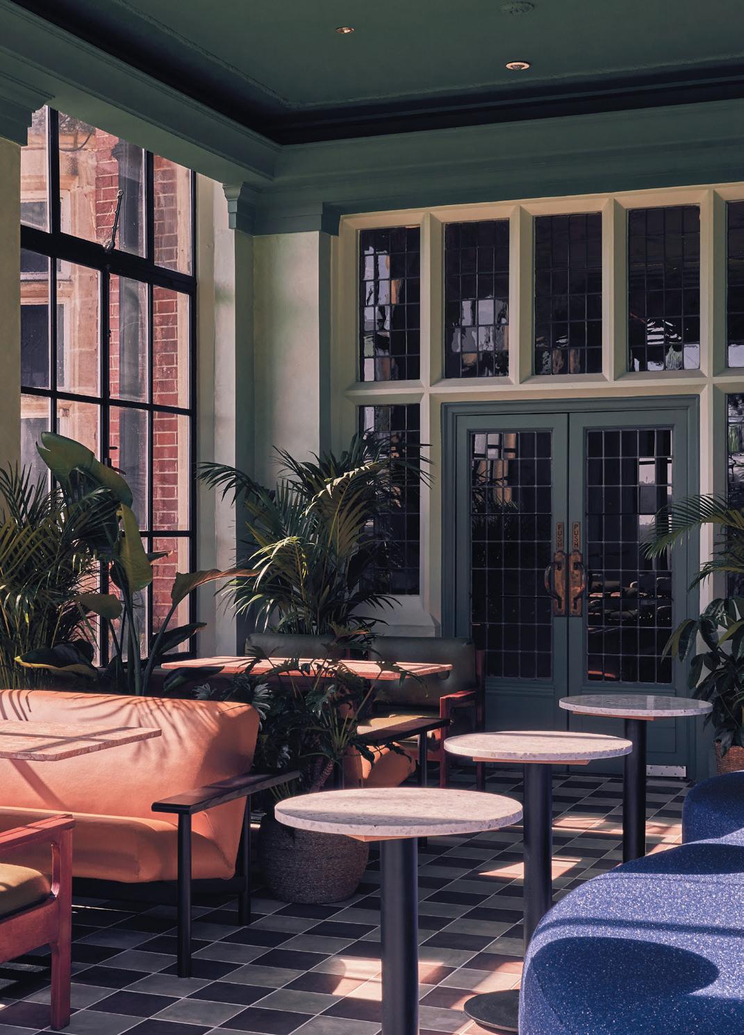
tiles and pockets of modern furniture zone the space, upholstered in muted tones of velvet, bouclé and rattan. The reception desks were designed by A-nrd, featuring a timber shakes finish using timber cut from the estate’s land. From the reception, guests can eat, work and relax in the light-filled Orangery, featuring original paned glass and a curved sofa upholstered in a bold Klein blue bouclé by Kvadrat X Raf Simons, which overlooks impressive views of the surrounding estate.
The 200 acres of land has been regenerated back to its natural state for local biodiversity, led by furniture designer and biodiversity champion Sebastian Cox. As one of the world’s most nature depleted countries, Britain sits in the bottom 10% globally for biodiversity. Now one of London’s largest rewilding projects, Birch’s approach allows nature to take its course. They stopped mowing and watering the once manicured golf course just 18 months ago, yet yellow-rattles, yarrows and long grasses
already spread across the rolling hills, soon to be joined by free-roaming Sussex cattle, wild ponies and pigs. These hardy herbivores will naturally turn the earth, exposing the sleeping wildflower seed bank underground.
“Our concept for what we grow and rear at Birch (Selsdon) is to look past the Victorian and Edwardian dominance of the site and revive the medieval farmstead that once stood at Selsdon,” Cox explains. “Everything we grow (including trees or shrubs we plant around the gardens) should have a use – for humans as food or pollination for wildlife.”
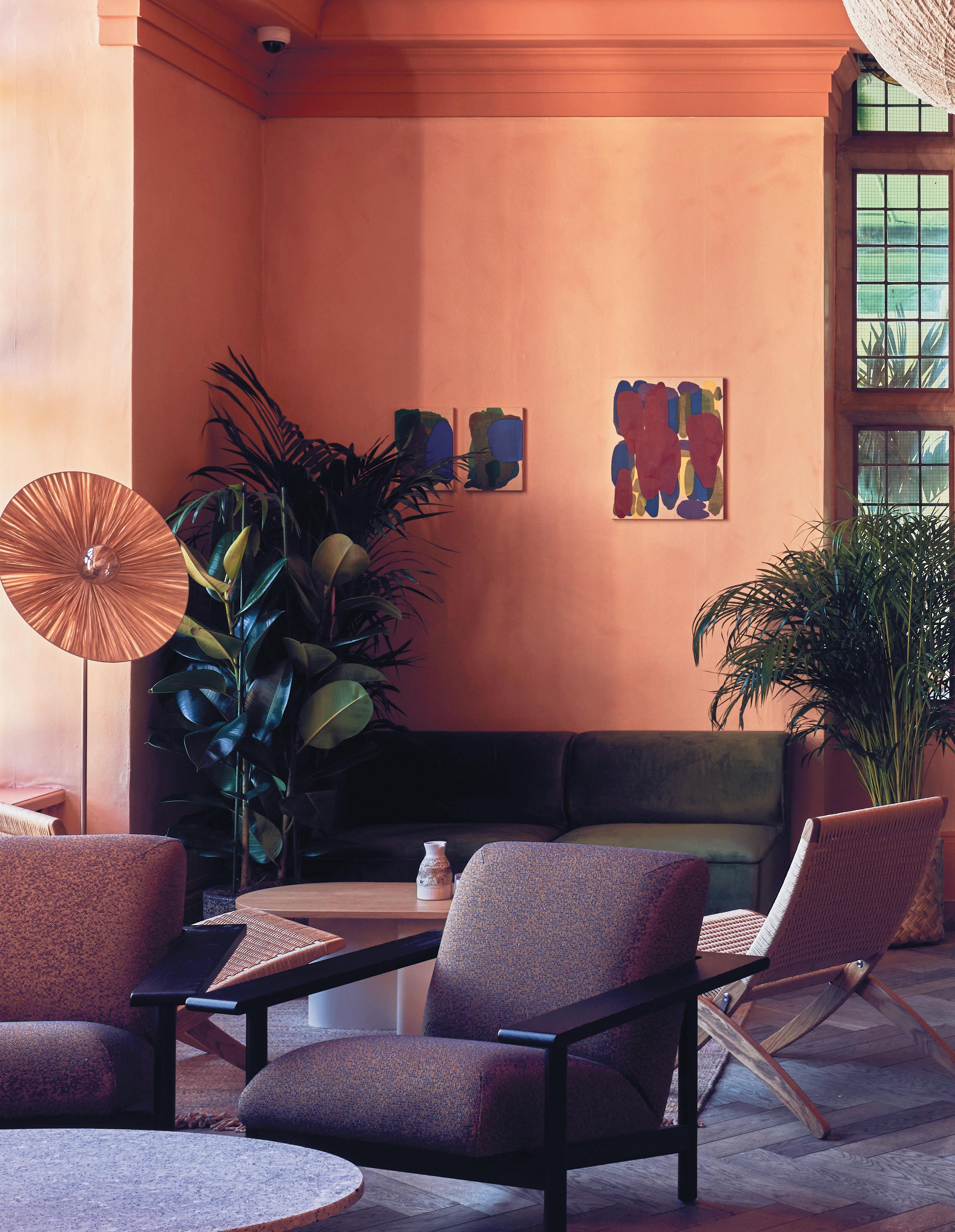
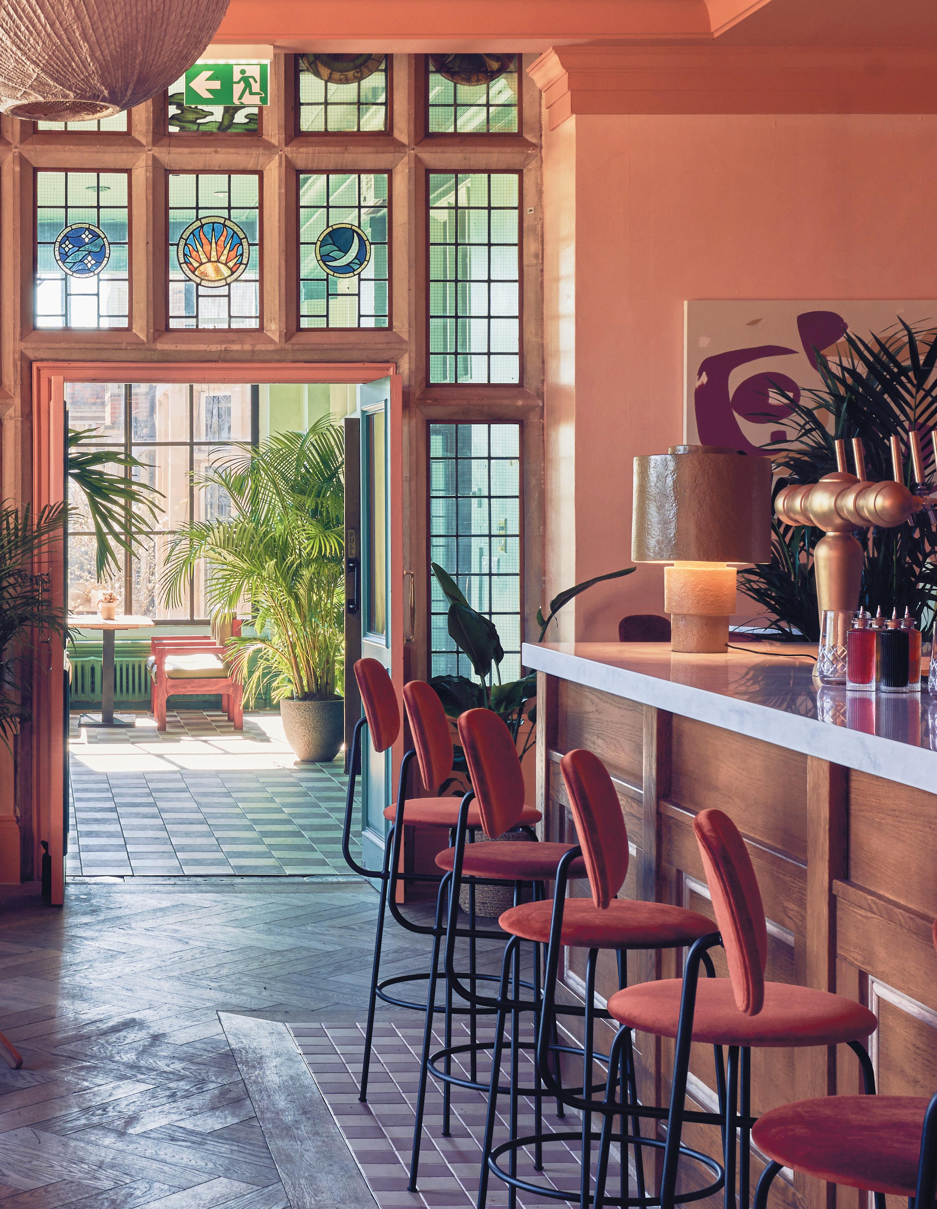
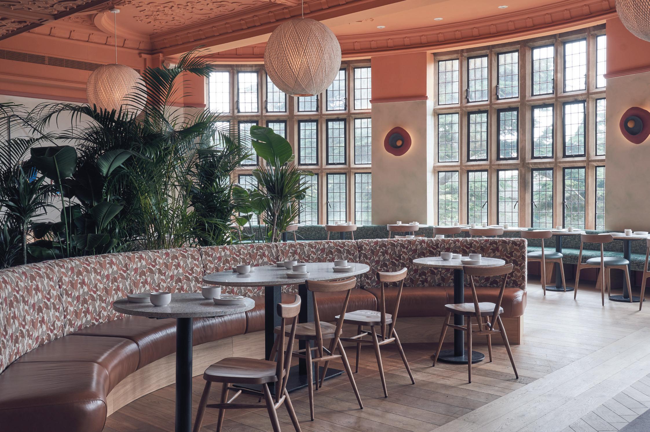
The surrounding meadow and woodland seeps into the interiors, in the large diffused ombré wall hanging from Casamance in the lobby, to the sage green limewash walls and terracotta tiles of the Orangery, and through to the warm apricot walls of the hotel’s bar and casual dining space, Vervain. Here, sweeping original windows sit above
72
aBove Image: Bespoke booths in the casual dining space Vervain
“Lukas and I began to craft the idea of bringing the outside in,” adds Nardi. “Pretty much wherever you are in the building, there’s views from the fantastic paned windows of the fields and woodland. We wanted to bring that connection to nature, that calmness and sense of tranquillity indoors so that guests feel instantly at ease and relaxed as they transition into the hotel and throughout all areas.”
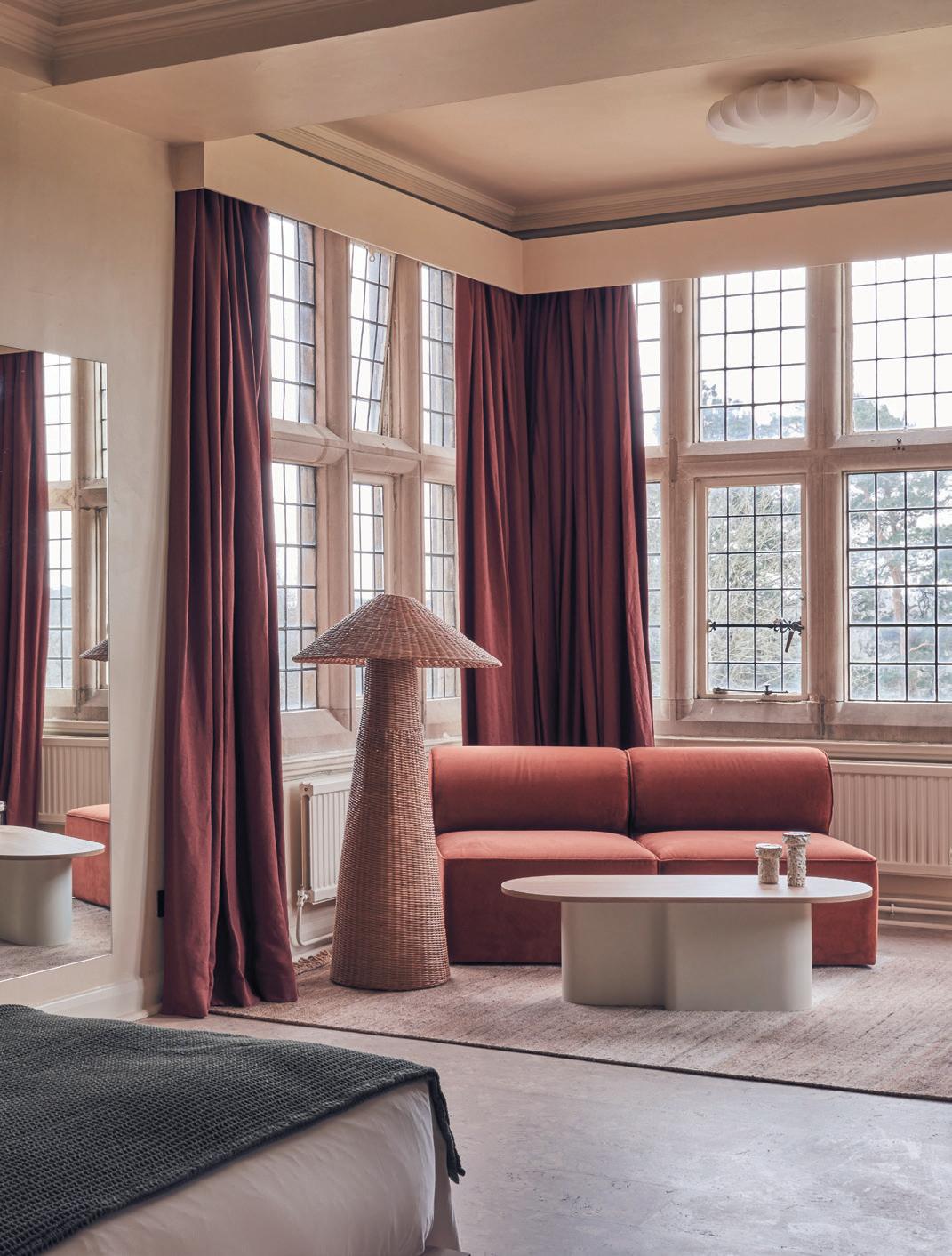
Typical of these historic, spawling buildings, private nooks and passageways can be discovered around every corner. In the ground-floor Snug, refurbished vintage lounge chairs and modern furniture in rich greens and plums contrast with the dark, original panelled walls and bas-relief ceiling, with oversized globe lighting
bringing the space into the 21st century. A bespoke 8-metre-wide neon light sculpture is installed on the main staircase, inspired by the towering stained-glass window depicting an ancient tree, complete with Latin-inscribed banner. “It creates a great juxtaposition of styles,” notes Nardi.
With ample space for working inside and out, dedicated coworking space ‘The Hive’ features large communal tables also made in collaboration with Cox, with seven ‘zoom rooms’ for added privacy. Focal to the space is a colourful art installation by Daniel Eatock which lines the back of the area: 38 diptychs painted on plywood. The space is busy and energetic – a welcoming place for the surrounding community to work and socialise. Indeed, upstairs in the pared back guest rooms, there are no televisions or desks – encouraging guests to take the chance to escape, converse and connect in these shared spaces.
73
aBove Image: Original stone features and contemporary furniture in the lobby
curved booths with rough sawn timber backs crafted from wood sourced from the estate by Cox, and upholstered in abstract camouflage fabric from Kirkby Design.
74
A national treasure
The first museum of its kind in London was built to inspire the next generation through the power of creativity. Now, after three years, the young v&a has reopened its doors.
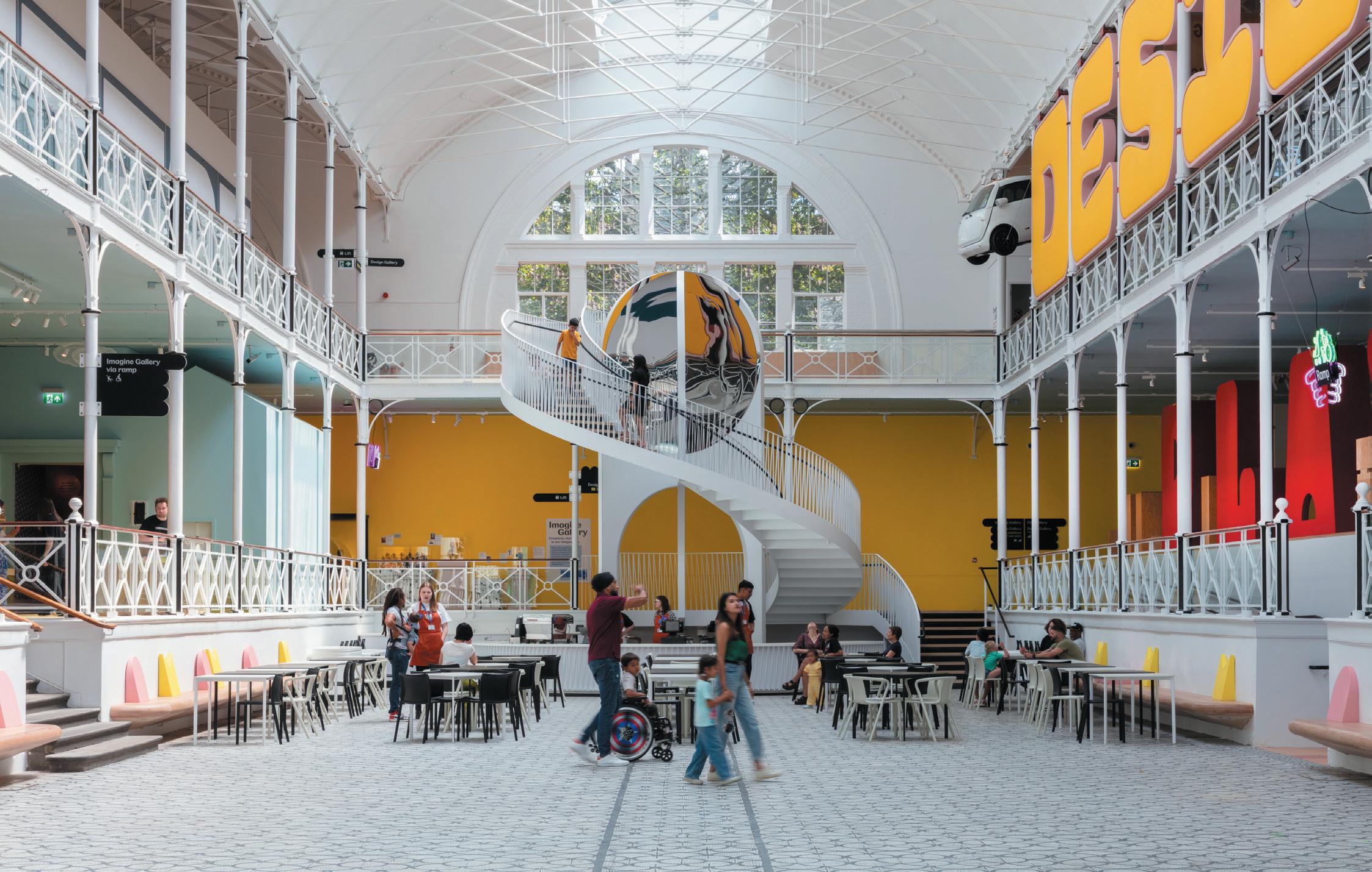
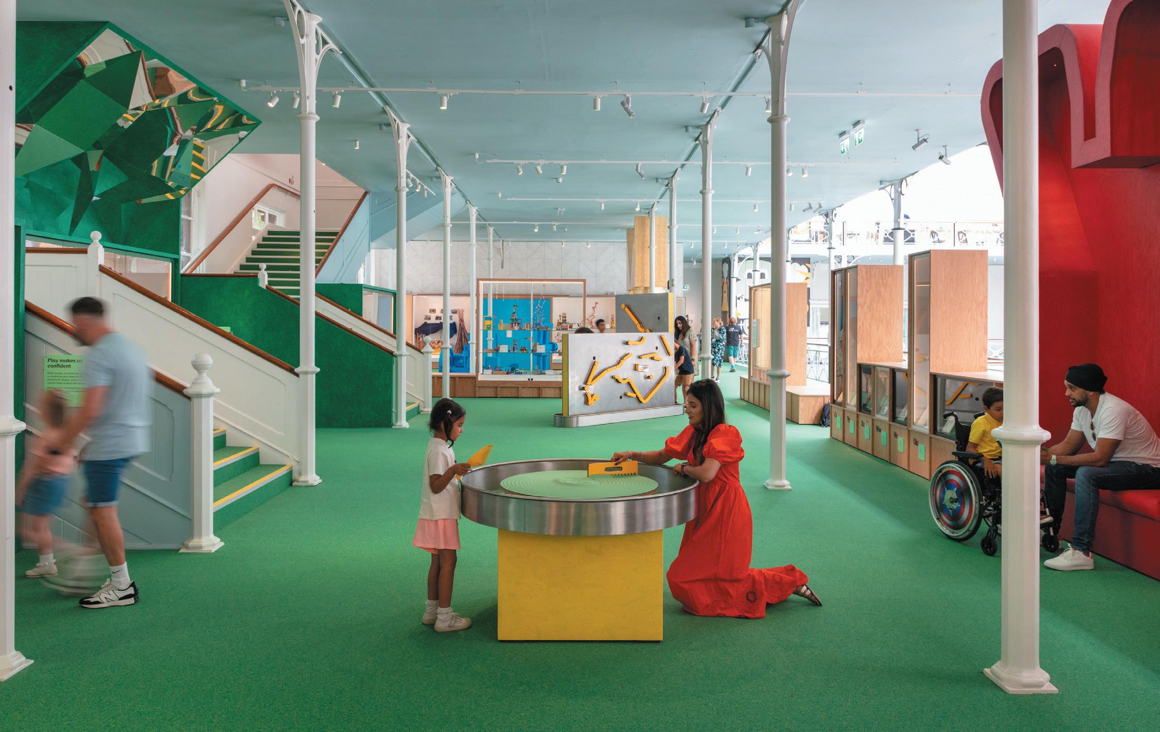
De Matos Ryan and AOC architecture worked with the Young V&A project team on the public space, with input from over 22,000 school children, teachers, Special Education Needs and Disabilities (SEND) community groups and locals. A pillar in its Bethnal Green community for 150 years, after a £13 million investment the art, design and performance museum highlights inspiring stories of children and young people’s ingenuity, alongside 2,000 works from the V&A’s collections.
“Young V&A has been designed with and for our youngest audiences,” says the museum’s director Tristram Hunt.
“It is a place where they can have fun, be imaginative and take inspiration from the V&A’s incredible collections.” Featuring accessible learning spaces, a purpose-built gallery for larger exhibitions and a shop and café, the interior has been inclusively designed for families of all ages to visit.
“The museum is the first of its kind and by continuing to work in partnership with teachers and schools – locally and across the country – it will become a national resource for supporting the teaching of art and design.”
Bearing flexibility in mind, a step-free and wheelchair accessible entrance welcomes people into the museum, while on the ground floor the Reading Room offers a multi-use quiet space for reading, praying or breastfeeding – somewhere to retreat from sensory
stimulation. On the north side of the building the three galleries, Play, Imagine and Design (designed by AOC architecture) cater to different age groups, from babies and toddler years through to young adulthood. Multiple sensory elements feature, including optical illusions, a self-portrait maker and a performance area and stage, as well as quiet areas and reading nooks to support neurodivergent visitors. In Imagine, the lighting is lower than in the other galleries.
Elsewhere, three new workshop spaces on the lower ground floor complement learning and educational activity. Due to launch in October, the Young V&A School’s Programme will offer curriculum-based workshops on design and creativity-orientated subjects, consulted on by teachers and parents. “For years this museum has been an important community space [and] a useful teaching resource,” says executive headteacher at Banabandhu and Globe Primary School, Marie Maxwell. “We were thrilled we were asked to play a role in the development.” Along with others, Maxwell worked closely with curators, artists, designers and architects to create a memorable experience for pupils.
Promoting user interactivity, visitors can expect to see interior and architectural features and commissions designed in part by young people, including the colour
75 posItIve Impact
WordS: yasmIn Waters
photogrAphy: Luke hayes
prevIous page
top Image: Town square with feature stair
Bottom Image: Play Gallery
palette throughout the museum which was curated by pupils to represent the Bethnal Green area. A new spiral staircase stands out in the main lobby, conceived throughout 40-plus workshops with local school children and inspired by the museum’s collection of optical toys. Elsewhere, and on a much smaller scale, a patchwork quilt made by students is on display, embroidered and dyed using sustainable practices to communicate thoughts on fast fashion.
Other items to be exhibited comprise furniture, fashion, ceramics, paintings, print and posters, as well as sculptures – including a Syrian rattle dating from 2300 BC and Japanese Samurai armour. Works by leading artists, designers and changemaker are also present, introducing names such as Icelandic-Danish artist Olafur Eliasson, climate activist Greta Thunberg and one of the most influential painters and printmakers of the 20th century, David Hockney.
Accessible and sustainable, many of the museum’s showcases have been reused in creative new displays. Timber taken from the former gallery has been repurposed and transformed into tables, and reclaimed timber studs from temporary exhibitions now serve as support structures. Visitors will also see terrazzo worktops made from former masonry rubble. On the first floor, The Factory and The Shed sample the roof trusses and the original ‘Brompton Boilers’ cladding profile to create new structures reminiscent of the area’s industrial heritage. Expressed components – designed for future re-assembly – are clad in corrugated sheets of low-carbon hemp fibre panels with sugar-based resin made entirely from agricultural waste. De Matos Ryan also worked on limiting carbon emissions by making the building more energy efficient.
Externally, the project celebrates and restores the building’s Victorian architecture. Original windows have
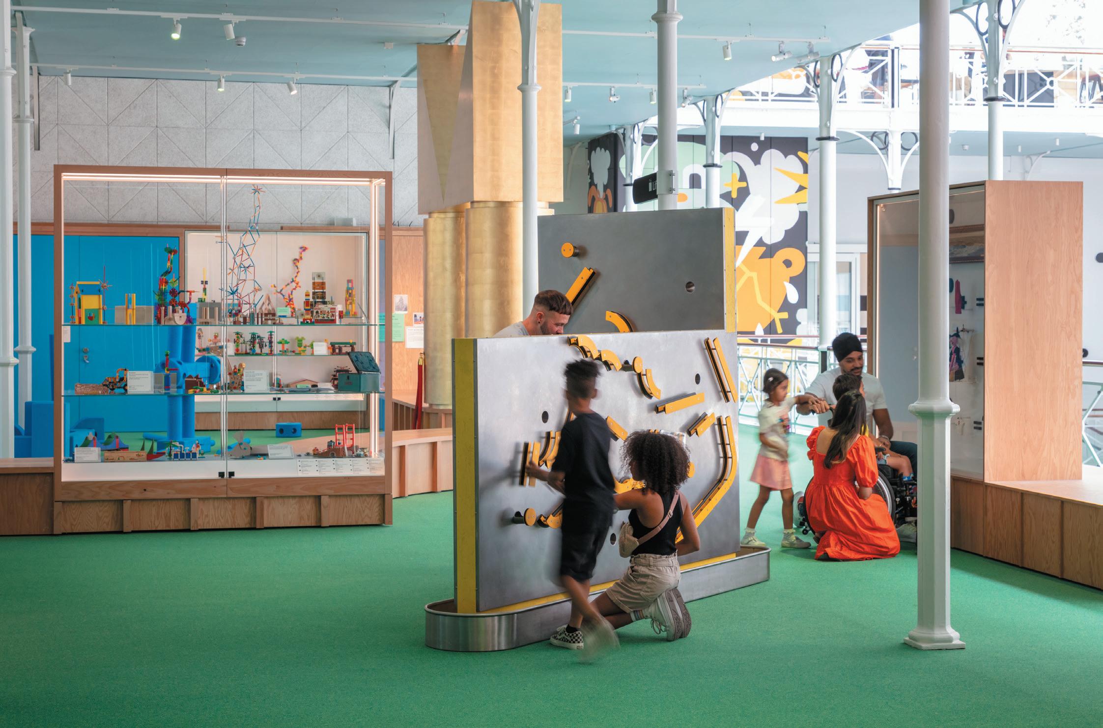
76
aBove Image: Marble Run

been uncovered to allow natural light to flood into the space and a 19th century marble mosaic floor has been reinstated. Significant improvements to circulation and noise have also been made to support SEND visitors. “Young V&A is an exceptional new cultural and educational resource,” says MP for Bethnal Green, Rushanara Ali. “It will continue to bring significant benefits to local young people and their families, while welcoming visitors from all over the country to experience the diversity, dynamism, creativity and history of this extraordinary area of London.”
Drawing on the best of the V&A’s collections and supporting under-18s through key stages of their development, the 5,200 sqm premises is considered a world-class centre of creativity and an essential public building for the local community.
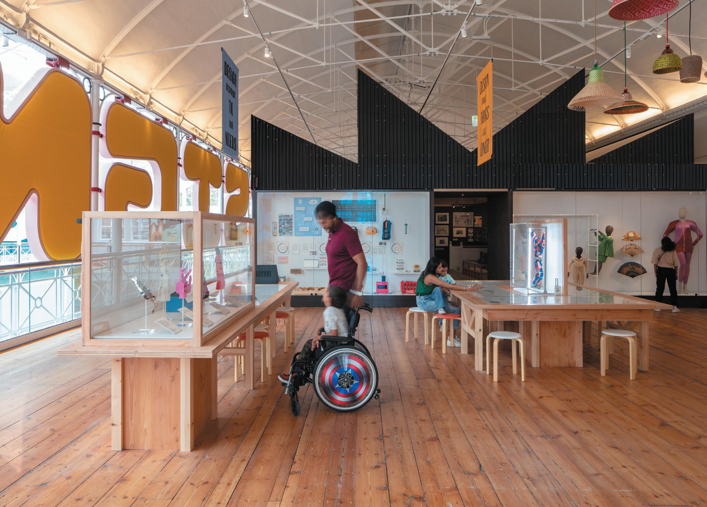
vam.ac.uk/young
young v&A MuSeuM was founded in 1872 and exists as a branch of the Victoria and Albert Museum, the UK’s national museum of applied arts. Specialising in objects by and for children, the heritage site offers free admission to families and schools and is open daily from 10.00 to 17.45. The 2023 refurbishment was completed by the Young V&A project team, de MAtoS ryAn, Aoc Architecture and approximately 22,000 children, young people and supporters.
78
BeLoW Image: Hero arm display
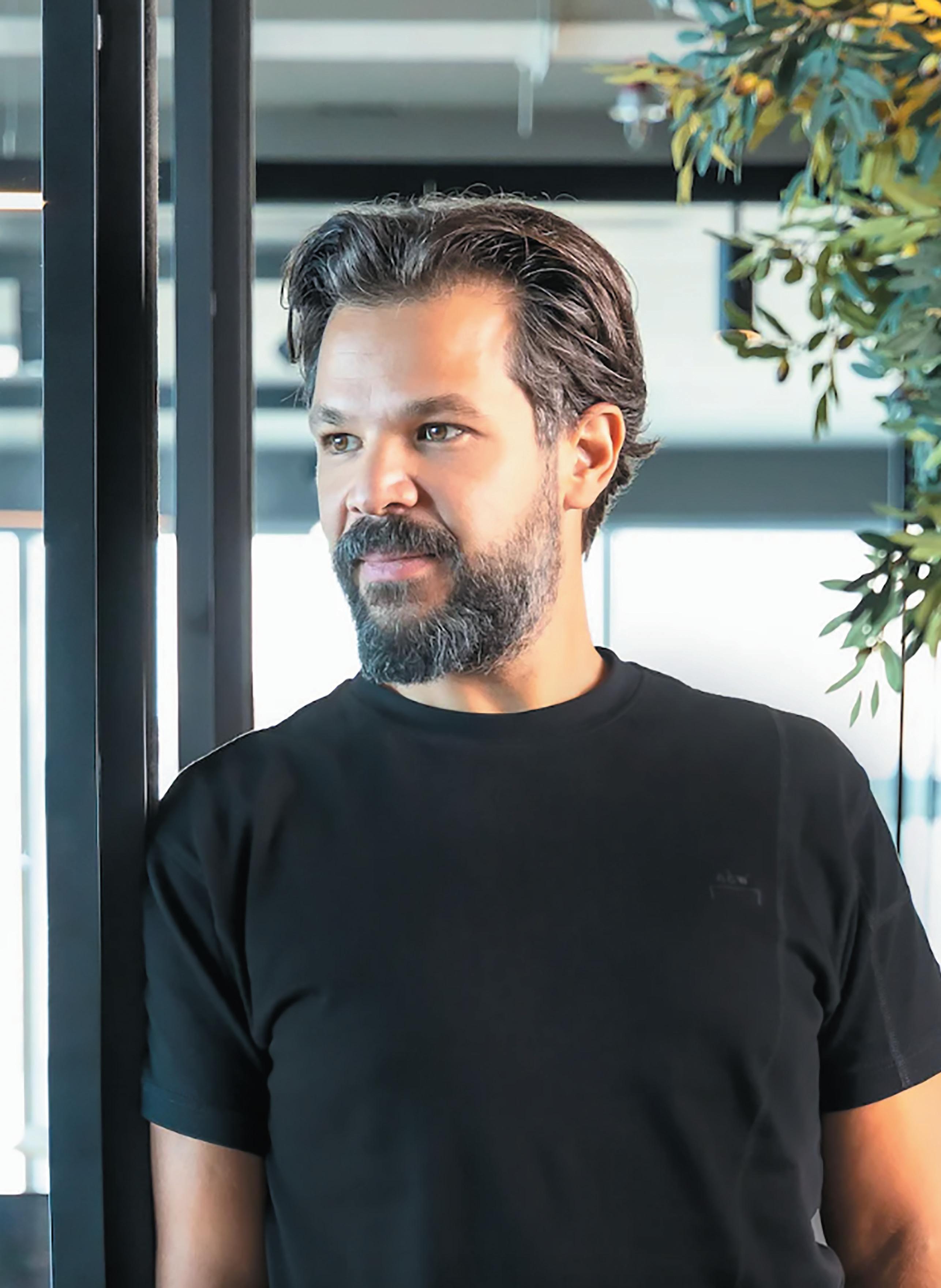
80
What role can AI really play in shaping innovation and creativity?
4SPACE co-founder and design director, firAS AlSAhin, explores whether AI can truly generate ideas, or if it’s simply a useful tool.
The intersection of artificial intelligence (AI) and design is emerging as a transformative development with the potential to redefine the creative industry. Studios like ours, 4SPACE, are arguably leading this revolution, adopting early and employing AI’s computational power to push the boundaries of traditional design paradigms. Historically, the process of design has been a deeply human endeavour. Designers have drawn from the well of their personal experiences, perceptions and surroundings to bring abstract ideas into tangible existence. Today, however, the integration of AI into this process is disrupting this age-old tradition, adding a new layer of possibility, efficiency and versatility to the realm of design.
The integration of AI into the design process, particularly in its early stages, has already led to substantial shifts in the industry landscape. At 4SPACE we produce high-quality outputs – such as highly personalised and detailed moodboards and design directions – all in a fraction of the time previously required. These improvements have led to increased productivity, reduced turnaround times and, actually,
a dramatic enhancement in the quality of work. It’s an approach that has positioned us at the forefront of this AI-driven transformation in the design world.
Despite these impressive advancements, the integration of AI in design has sparked critical and philosophical questions: can AI genuinely ‘create’? Does it have the capacity to produce ground-breaking, innovative work that surpasses human capability?
the
BIg questIon of aI’s creatIve aBILIty
The question of whether AI can truly ‘create’ is a complex and multifaceted one. AI has demonstrated its ability to generate unique and previously unimaginable designs. This capability to generate novel outputs based on data analysis and pattern recognition could suggest that AI can, in fact, create in a meaningful and impactful manner.
However, it’s crucial to recognize that AI, as it currently stands, is fundamentally a tool used by human designers. While it can indeed produce impressive outputs, the
81 fast forWarD
genesis of creativity still springs from the human mind. It is the human designer who deftly harnesses the capabilities of AI to explore uncharted design territories. In this sense, the human designer is the master artist and AI is the advanced brush that brings their vision to life.
The question, then, of AI’s genuine creative ability perhaps straddles the line between philosophy and technology. While the unique outputs generated by AI might be indicative of a form of ‘creativity’, the spark of inspiration and the process of ideation remain inherently human.
aI’s potentIaL for InnovatIon
Next question: does AI have the capacity to produce innovative, ground-breaking work? Well, the answer is far less ambiguous: a resounding yes. There’s simply no question at all that AI has demonstrated its potential to challenge existing norms within the design industry. 4SPACE’s innovative use of AI, transforming 2D designs into detailed 3D models, serves as a testament to its potential to usher in change.
There are also numerous instances of AI-assisted designs being lauded for their originality. These examples underscore AI’s capacity not just to enhance human creativity, but blur the lines between art and technology.
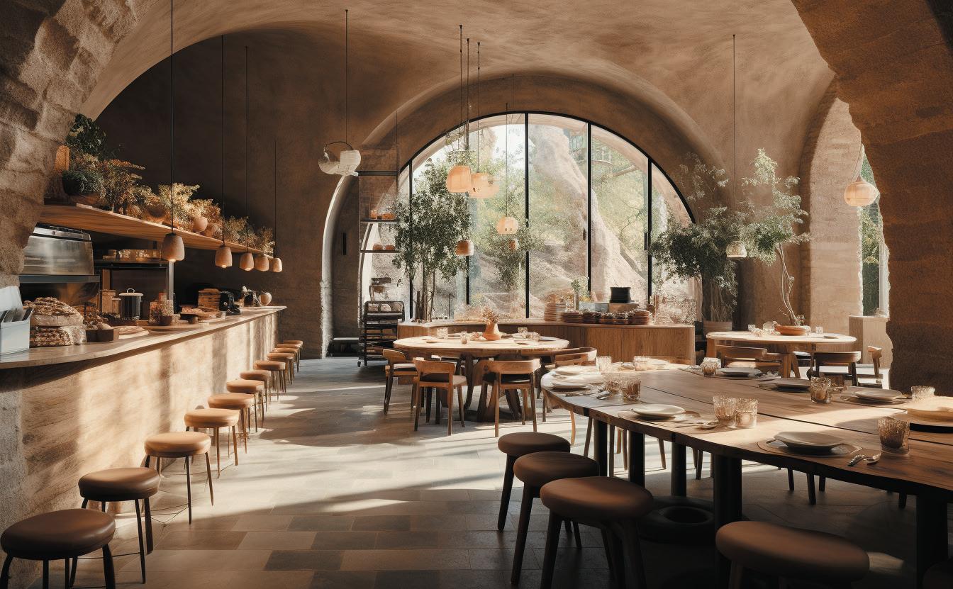
However, it’s essential again to acknowledge the indispensability of the human element in this equation. While AI provides precision, efficiency and novel insights, it is the human designers who imbue the process with emotional depth and creative spirit. These elements are integral to producing truly fresh, authentically human-centred designs that resonate with individuals on a deeply personal level.
the future of DesIgn WIth aI
Looking ahead, it’s clear that AI’s role in design is set to grow exponentially. As AI’s learning capabilities continue to evolve, its potential role in ‘creating’ and innovating in the realm of design can only increase. The implementation of AI across various industries has already led to the creation of designs and solutions that were previously thought to be unattainable. This trend
82
aBove Image: IDA, designed by 4SPACE
is clearly visible in our own work, particularly in projects involving the design of restaurants, cafes, bars and clubs. Through the power of AI, 4SPACE is not just creating visually stunning interiors but also revolutionising the way people experience these spaces. The firm is using AI to generate pioneering design ideas, tailored to customer needs and preferences, enabling them to deliver a highly optimised and personalised dining experience.
What’s more, AI-powered design systems allow us to quickly and efficiently experiment with different design concepts and approaches. This capability not only leads to faster results, but also opens the door for new possibilities; the previously unimaginable.
So where does that leave us? While AI’s ability to ‘create’ may remain a philosophical question, its impact on the design process is obvious and profound. The real revolution lies not in AI replacing human creativity but in the symbiotic relationship between human creativity and AI. It is this harmonious partnership that holds the key to the future of design, ushering in a new era of unprecedented innovation.mind.
4 space is a multi-award winning, international design studio based in Dubai.
4 space . ae
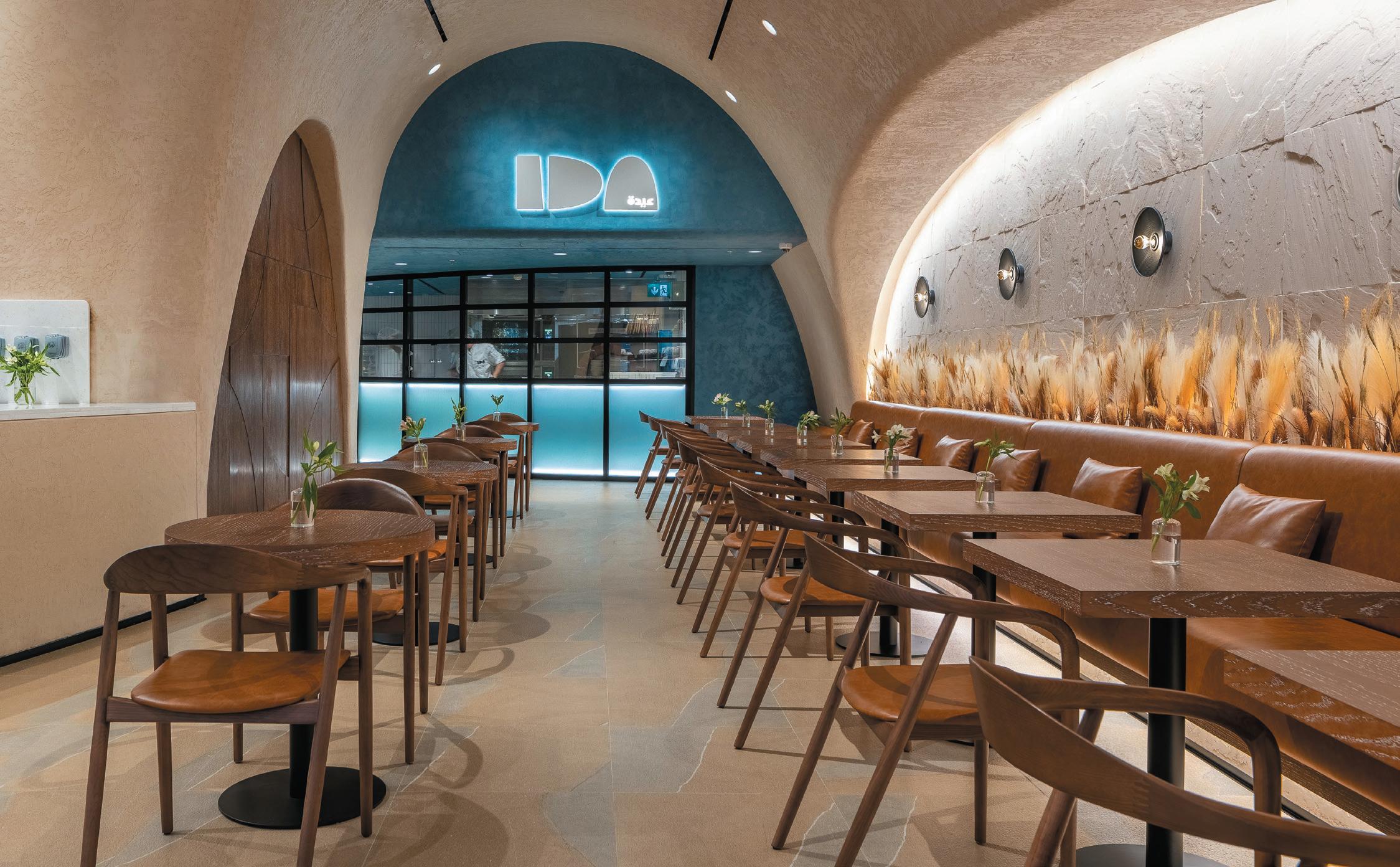
84
BeLoW Image: IDA is a bakery and bistro in Downtown Dubai
The ESG acronym is used a lot more than it is understood. Even when we know what the letters stand for, it is much less clear what our obligations are, because they cover a wide range of corporate responsibilities. How can the workplace contribute to a company’s reporting?
The three letters were spawned nearly 20 years ago in a United Nations report that aimed to encourage investors to value ethical behaviour, as well as financial prospects. The UN paper ‘Who Cares Wins’ promoted the idea that commerce has an important role in society, beyond its economic aims. While not an original idea, it encouraged legal definition and the ongoing development of regulations to protect people and natural resources from harmful exploitation. These regulations are still evolving in different jurisdictions, so ESG is the accepted shorthand for this whole area of business responsibility as it matures.
The environmental part (the ‘E’) is the easiest to grasp, as it’s part of the familiar domain of sustainability with its long pedigree, and it bears directly on the materials and operation of every workplace.
By contrast the ‘G’ for governance has far fewer implications for us – our influence over the selection and rotation of company officers is minimal, and the middle ‘S’ for social responsibility is equally, but wrongly, neglected. The social obligation bears on the workplace more than you might at first think.
The ‘S’ in ESG
It can be hard to imagine the impact of office design on wider society, but on the other hand we can also plainly see that a workplace touches the lives of all its occupants, and that number adds up to a significant chunk of any society.
We know the role of the office as a hub has ballooned in our imagined post-COVID era, and organisations are rethinking their priorities and giving prominence to collaboration and interaction over individual tasks and activities. Designers are encouraged to emphasise the social aspect of a scheme and how best to care for the whole range of users, making them feel welcome and valued, providing the ambience for hospitality and reflection. When this is done well the office can be a flagship for an organisation’s positive attitude to its people.
Consider also the aggregated impact on the working population and you will see a huge opportunity for design to make a difference in the wellbeing of society. This is a perfect fit with the intention behind the ‘S’ in ESG, so although environmental benefits might be easier to explain and measure, there is a strong case to give our social responsibilities the prominence they deserve.
We acknowledge now, more than before, that being productive is only part of the workplace ambition. A well-designed office should be an enjoyable destination for everyone and demonstrate how much an employer cares about inclusion and equality. We can help our clients tell this story in their ESG reports and give them the evidence they need in our finished projects.
s teve g a L e is head of business intelligence at m moser assocIates
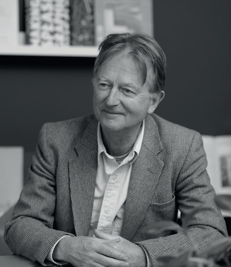
86
creatIve thInkIng WIth steve gaLe
How do we design to last in a period of change?

In this Mix Roundtable with 2tec2 we explore the fast-changing factors shaping how we live, work and socialise; consider what these mean for the spaces we inhabit; and ask how today’s design can still be relevant for tomorrow’s world.
In partnership with
Joe WILson Associate BDP



 Senior
88
LInDsay roth Principal and Design Director Gensler
BrIttany stInger Senior Designer IA Interior Architects
WordS And ModerAted by: harry mckInLey
rounDtaBLe
pauL ButterWorth Director and
Designer KKS Savills
grace agar Director, UK 2TEC2
steve WooD Interiors Director tp bennett


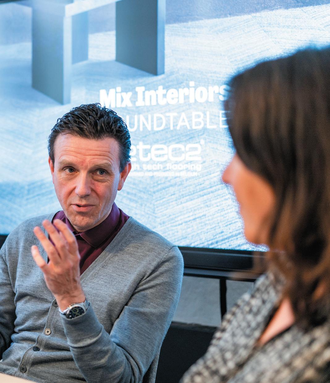
89
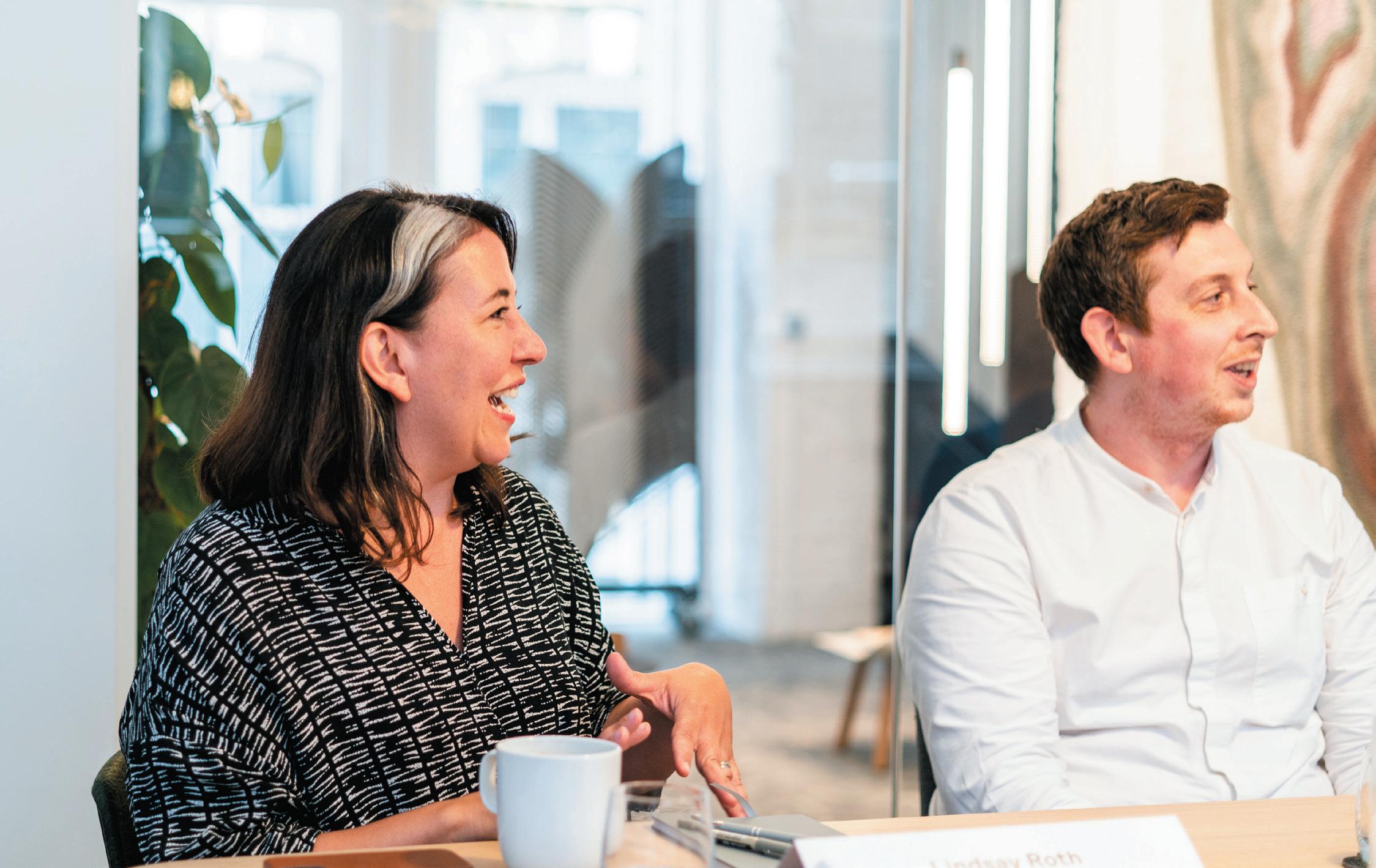
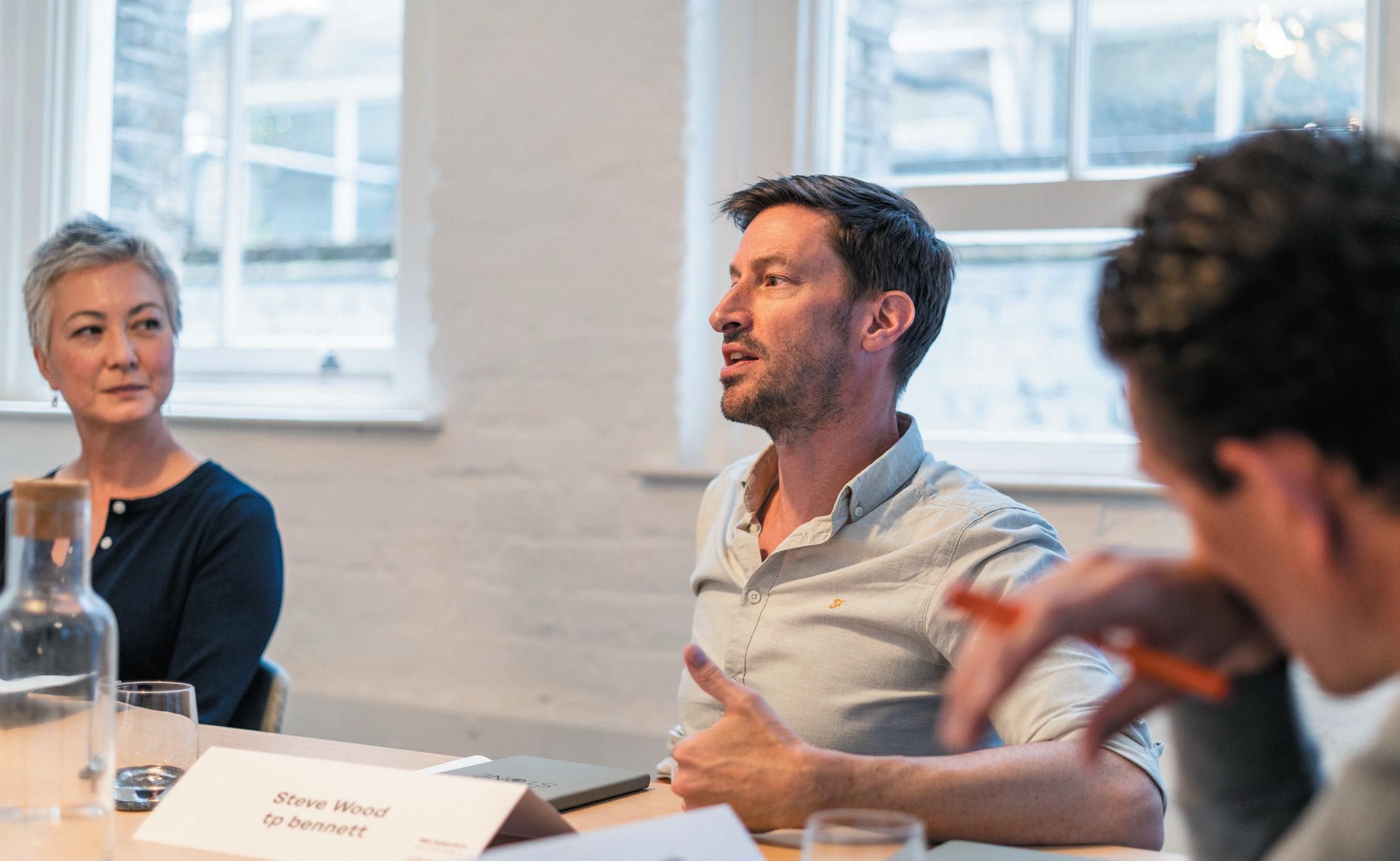
90
We’re DeaLIng WIth BIg changes anD DesIgners have a responsIBILIty to aDDress them.
Design has always responded to change – providing solutions to novel issues or adapting to shifts in culture and society. For those at the table however, today’s issues – and by extension, tomorrow’s – are of a particularly monumental scale. Whether the climate emergency or the need to consider inclusivity, conceiving and creating spaces requires grappling with big ideas and increasingly impactful consequences.
“Sustainability isn’t just a design consideration, it’s an existential issue,” explained tp bennett’s Steve Wood.
“As an industry, the carbon we produce is huge and the question of impact is one not just for the design sector, but society. Considering circular economies has to be part of how we develop projects, in terms of how elements can be reused, adapted and deconstructed. There’s no room to go back now, that has to stay.”
“It can no longer just be about ticking a box, it has to be integrated for projects to be viable into the future, as well as today,” emphasised BDP’s Joe Wilson.
For Paul Butterworth, KKS Savills, the climate crisis is the key force that must shape how design remains meaningfully fit-for-purpose. “We’re not killing the planet, we’re killing us,” he opined. “So it isn’t just a practical consideration, we need to change the conversation to introduce some urgency about what that means for design, both now and looking ahead.”
In creatIng spaces that are Both reLevant anD future proofeD, there has to Be room for experImentatIon.
Beyond our planet, wellness, neurodiversity, inclusivity and the encroachment of technology were all highlighted as core concerns – coloured with a mix of optimism and trepidation. Some of these issues feel timely and pressing, others requiring a degree of foresight in terms of how they may impact the spaces we inhabit.
“Diversity, and specifically neurodiversity, is now something that is incredibly important when it comes to design,” expanded Wood. “Our mental health has become a real focus and it’s something that’s only going to increase as it relates to spaces.”
“There’s clearly been a shift in the landscape of what people are looking for,” continued Gensler’s Lindsay Roth, “and part of that is having to really consider the value spaces have and how they’re devised with the user in mind. We can see that in the evolution of the workplace, which now has to deliver something worth getting off the sofa for. Post-COVID we’ve perhaps entered an era that allows experimentation, in considering all of these different factors, including inclusivity.”
IA Interior Architect’s Brittany Stinger agreed: “As a designer, you want to be able to test a bunch of different solutions and see what works and what doesn’t. That’s something that actually promotes good design. If we think of trends as purposeful, they often come from
91
a need as well as a want. Leaning into those as a point of experimentation can give us the answers we need to evolve in the right direction and create spaces that last.”
For Wilson, this process can yield positive results not just for a single studio or an individual, but for the design industry at large. “Looking at which pioneering ideas work or fail allows us to be students and to collectively learn from each other,” he explained. “There are times when we need to challenge and times when we need to listen, if we truly want to create spaces that will work for tomorrow.”
DesIgnIng for tomorroW shouLDn’t come at the cost of DesIgnIng for toDay.
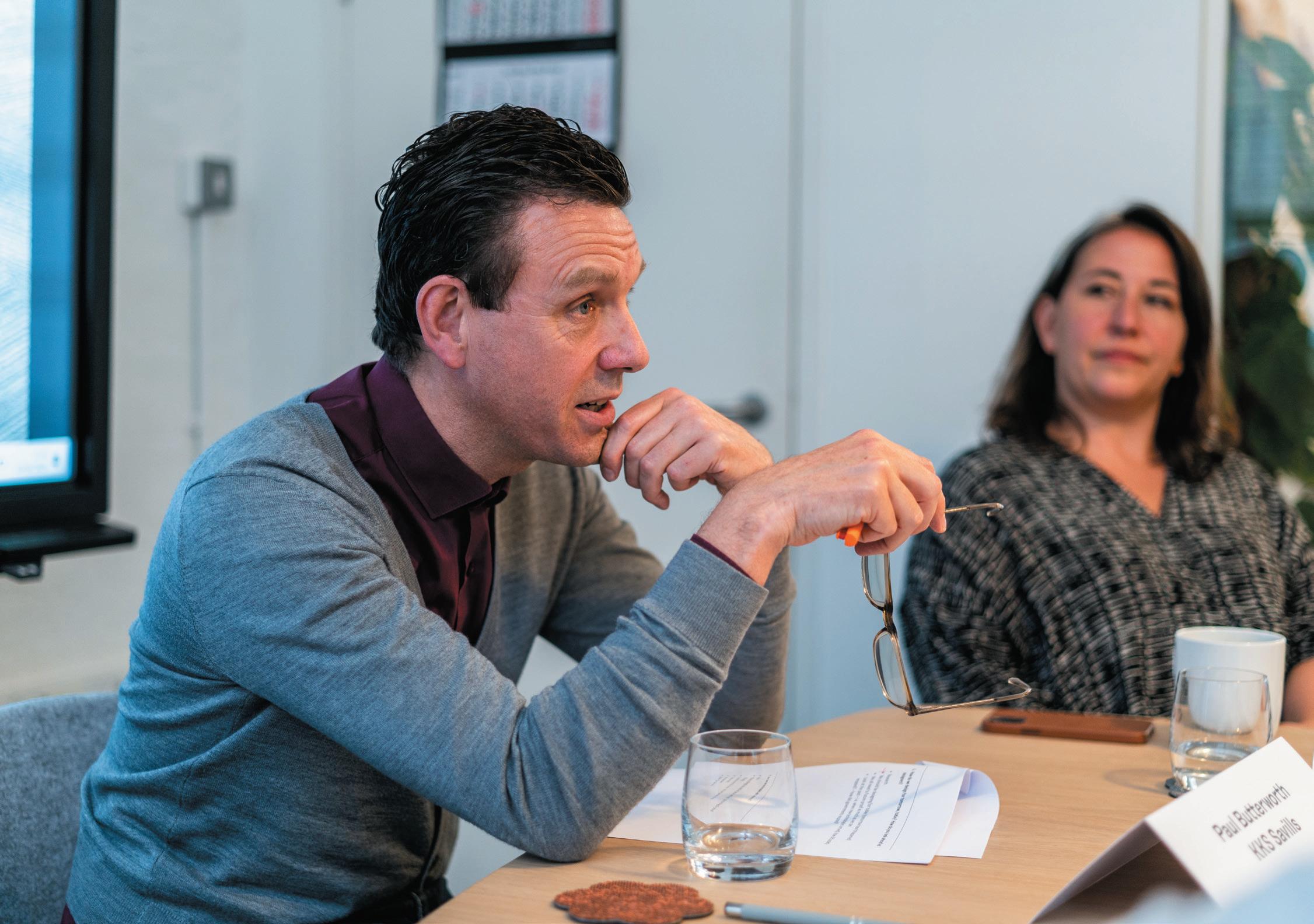
“We need to future proof as much as possible but, without sounding facetious, we need to design for today – tomorrow hasn’t happened yet,” said Butterworth, highlighting that in placing too much weight on how designs will last, there’s a risk they’ll be less successful right now. “We can’t anticipate the future, but we can create in a way that allows for adaptation or evolution. Designers have to be less precious, because it’s possible to create environments that look new and purposeful and for the moment, but understand they’ll also, at some point, have to adapt.”
“Considering how a space can be reconfigurable is part of that,” continued Stinger. “Sometimes that may seem like short-changing the immediate experience, but in designing
92
not just for today, but for the future too, it’s about finding a balance and the sweet spot between the two.”
as a socIety, our oBsessIon WIth ‘neWness’ Is a DouBLe-eDgeD sWorD.
Our appetite for innovation is one of design’s great drivers. But in a fast-paced society in which we’re arguably conditioned to gravitate towards the ‘new’, change for change’s sake is often anathema to genuine progress. So, in considering in how we design to last, is it time to slow down?
“I’d love to say that we’re not obsessed with the new,” said Stinger, “but I think it’s part of the human condition.
That being said, I think as designers we can train ourselves and our clients to look at things differently, test the boundaries and give something a fresh edge, even if to a degree, we’ll always want what’s new and shiny.”
Though opinions are divided as to whether our thirst for the new is healthy, the table is agreed that if it needn’t come at a cost, then it’s possible for sustainability and change to sit comfortably alongside one another.
“The way that our factory works, for example,” detailed Grace Agar, 2Tec2’s Director for the UK, “is that we don’t use any non-renewable resources, so it’s all incredibly circular. Our product has a minimum lifespan of 15 years. We also take back as well, and we have our own recycling
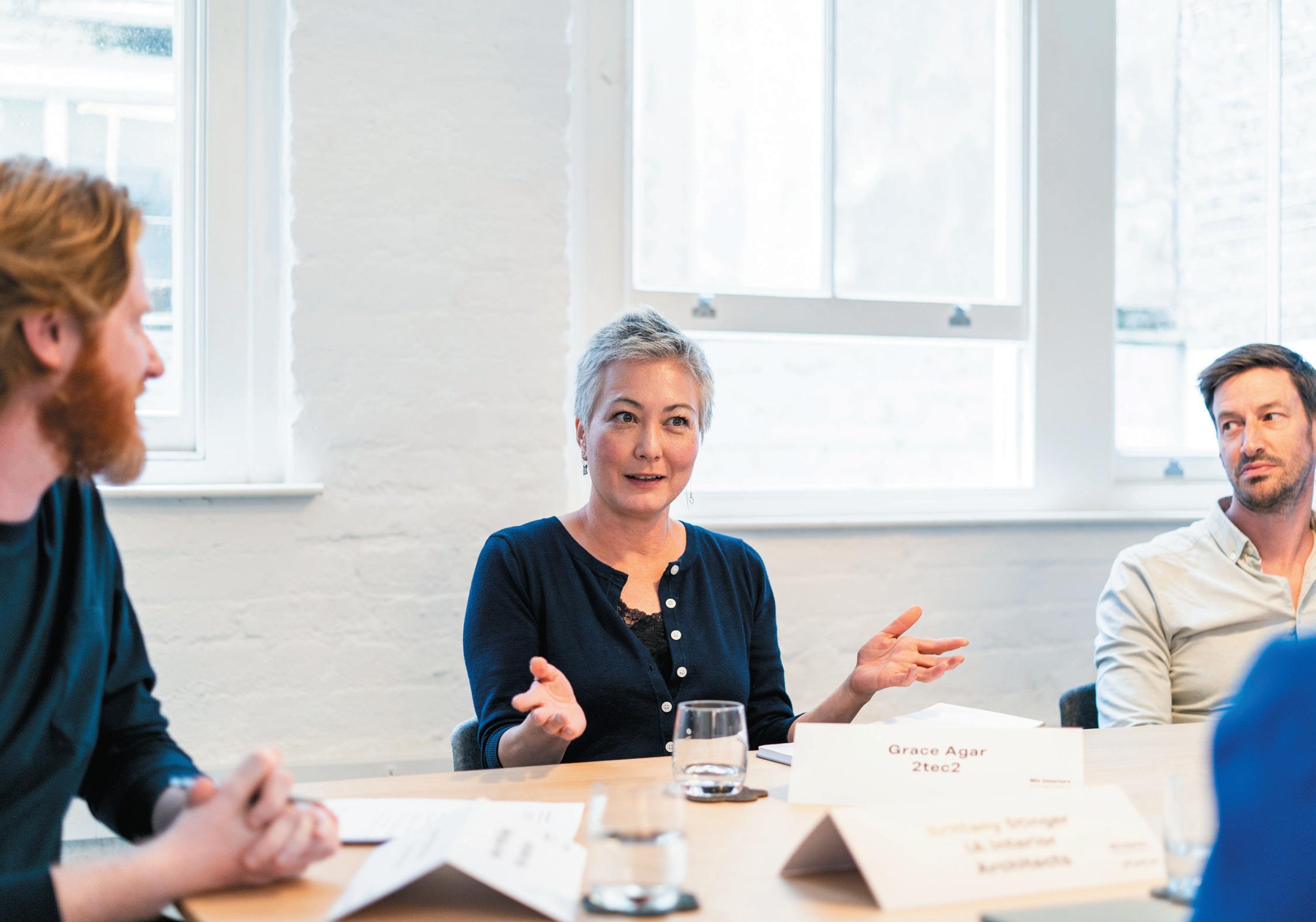
93
plants. And so, again, it speaks to the issue of balance – that the product lasts a really long time, but we take it back if there is a change, and we use it to make more product. 2Tec2 invests in the modularity of flooring that means you can pick it up and take it with you; that’s both designing to last but also designing for change, with flexibility and adaptability really baked in.”
“And as these elements do age, I think it allows us as designers to tell richer stories,” continued Roth. “Part of designing to last and designing for the future, today, means developing an appreciation for product that has had a life, or which we can give a new life. It allows us to dip into a pool of vintage pieces or materials that show signs of age, but which have developed a patina and become better for it. I like the idea that we create these spaces that are flexible, that have great bones, but they still create opportunities for moments of boldness and change in how we consider product, colour and material.”
technoLogy may Be a heLp, But It’s not necessarILy the soLutIon.

The role of AI in devising the spaces of the future is subject to much fevered debate. For some, there’s concern it has the potential to render designers obsolete but, at the table, the mood was optimistic.
“In creating some efficiencies and becoming a really useful tool, AI actually has the potential to elevate the position of designers,” explained Wilson. “We’re capable of bringing a humanity to design that AI isn’t and, in that regard, it’s possible designers could be considered along the same lines as craftspeople – with a very particular expertise and set of skills. AI can only be a product of what’s inputted into it. So will it be designing the spaces of the future; can it even meaningfully design the spaces of today? I think it still very much comes down to us, and will continue to.
94
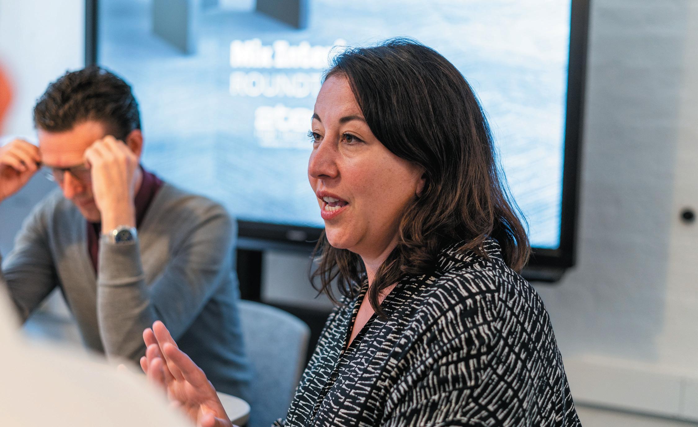
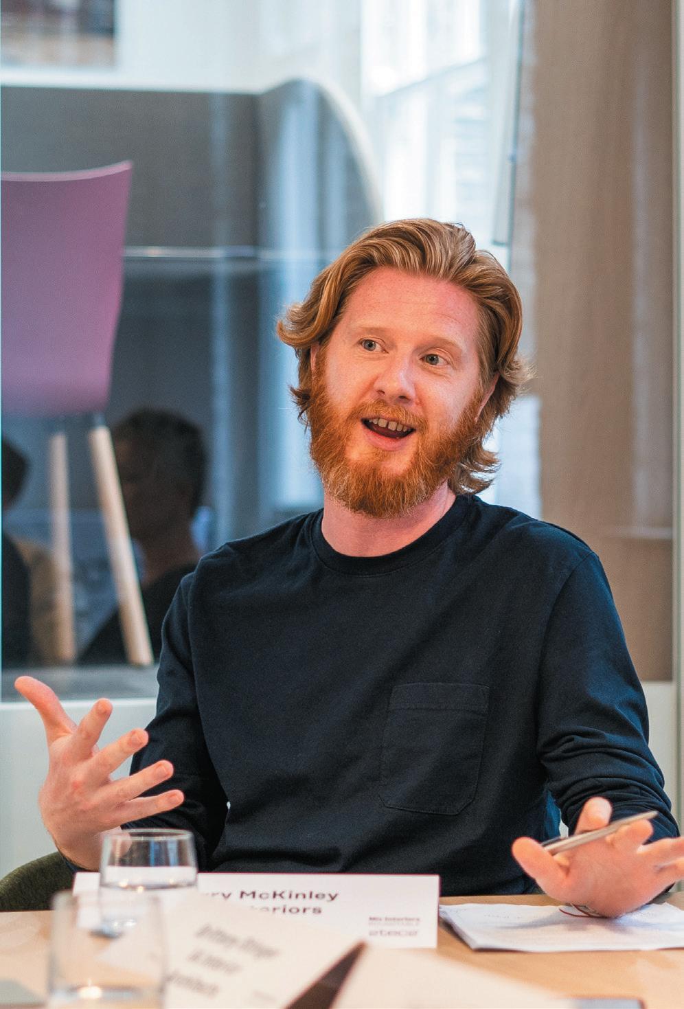
95
Design beyond the physical: how should our senses shape our spaces?
In this Mix Roundtable with autex acoustIcs we explore the role of sensory design in crafting purposeful places and ask if creating successful environments means considering more than what we can see.
In partnership with
Head of Design Management Modus Workspace
 Dan mcnuLty Interior Designer / Brand Experience Specialist
96
Perkins&Will
WordS And ModerAted by: harry mckInLey
rounDtaBLe
purvI parIkh
martyna skoczek Project Lead Designer Oktra
praveen paranagamage Senior Designer Holloway Li
amy marrocco Head of A&D Sales Autex Acoustics
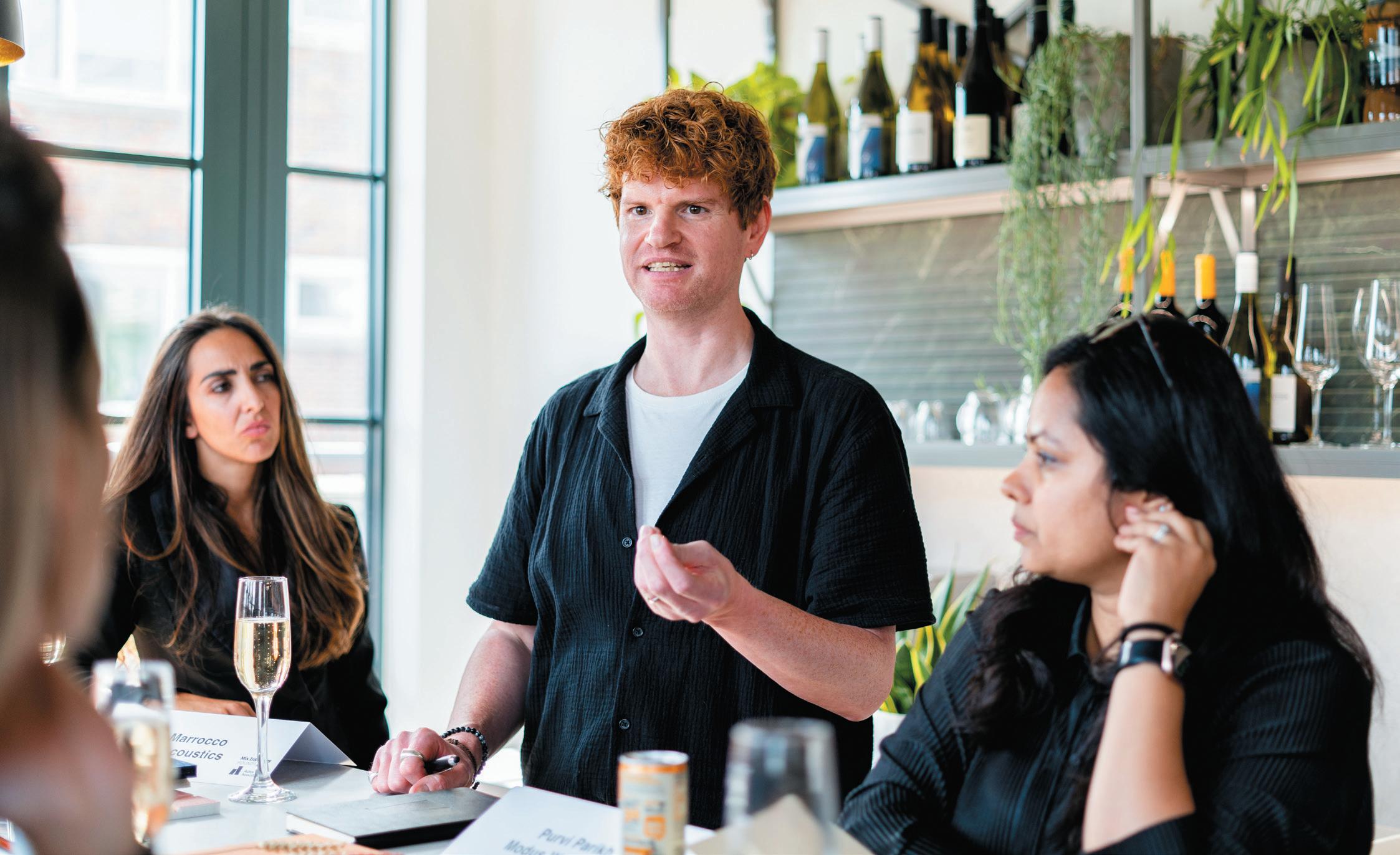
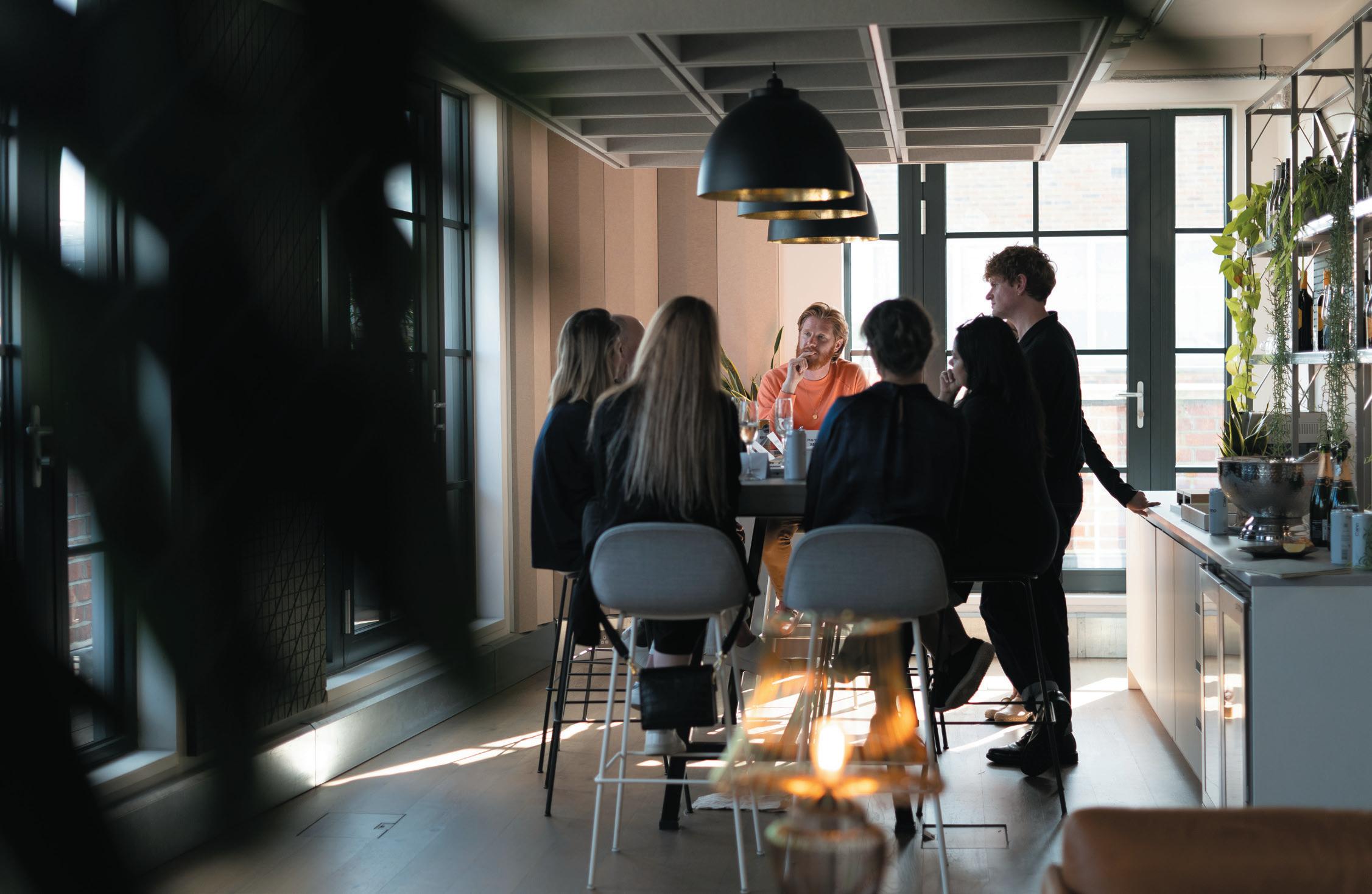
97
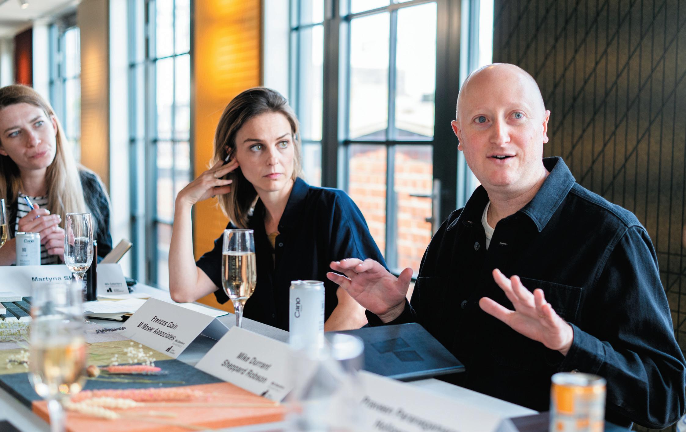
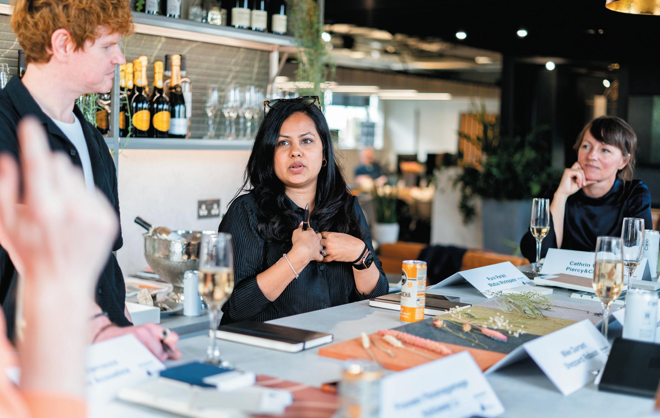
98
get personaL. DesIgners have the poWer to tap Into memory anD emotIon.
In considering all of our senses, design has the capacity to be not only functional and beautiful, but also transportive – evoking memory and emotion. As an opening exercise, our table were encouraged to interact with a variety of materials, including pieces by Autex, and consider elements such as tactility, colour and even scent – through dried flowers and an introduced lavender fragrance. In doing so, a variety of associations were sparked, from recollections of loved ones to connections with particular places.
“What it proves is that there is so much story tied to our senses,” said Piercy & Co’s Cathrin Walczyk. “For me, the scent evokes holidays and farms – positive associations, baked into my memory, that therefore engender a positive reaction to these items themselves.”
As Autex’s Amy Marrocco detailed the inspiration behind a particular product colour choice (the Highlands of Scotland), a deeper narrative emerged for some of the designers.
“It’s an example of how these elements can be thought about to tell meaningful stories,” explained Perkins&Will’s Dan McNulty. “It opens the door to ask: how does this smell or colour relate to your brand? How does it connect to what you do as a business? What’s the story behind it?”
“And as it relates to what we do as interior designers,” continued Holloway Li’s Praveen Paranagamage, “this allows us to draw people through a story within spaces. As a predominantly hospitality designer, multi-sensory design works when it can create a series of experiences and we can entice someone to go from one place to another in a very deliberate way; engendering curiosity and using these associations with memory and emotion to create connections.”
caterIng to our senses Isn’t Just aBout What’s there, But aLso What Isn’t.
“Our senses are so central to how we interact with a space that we also have to be conscious of sensory overload,” said Walczyk. “On the positive side, we can introduce elements to shape an experience, but there are sensory elements that can also be negative and, as designers, we have to consider those too.”
It’s an issue increasingly confounding in the world of work, as offices shrink to cater for more flexible models and different environments, intended to cater to different needs, rub up against each other more intimately.
“Here sound is a massive factor,” explained Modus’s Purvi Parikh. “In a previous office I found the noise of being in such close quarters energetic and dynamic. That sound travel can equally be a problem if people need quiet or to focus, and yet spaces devoid of sound
99
are not necessarily calmer, they’re often unpleasant to be in. So designers really need to consider solutions that findharmony and balance.”
For Martyna Skoczek, Oktra, some of the orthodoxy of workplace design needs revising: “We should not have banks of desks next to each other ever. That’s not working, in my opinion. Considering sensory design – in terms of elements like sound and light – means creating multiple controlled environments. That doesn’t have to mean walls and doors, but there can be other interventions that stop sound from travelling or control light levels, or even smell if we’re considering the types of necessities that a workplace requires – like kitchens or coffee stations.”
“Which is where truly considered spatial planning comes into play,” continued Sheppard Robson’s Mike
Durrant, “planning that takes into account the needs of the user, but also how those needs vary throughout a day. Add to that issues of wellbeing and how light can impact on circadian rhythms, for example, or how temperature can affect mood and productivity. Perhaps customisation is also key, giving people control over the sound, light and temperature of a space, so it can really work for their needs.”
“We often hear there’s no one solution that fits all,” said M Moser’s Frances Gain, “but maybe there is, and that’s having lots of solutions in one space.”
sensory DesIgn can make spaces more IncLusIve.
While there are commonalties in how our senses respond to stimuli, there are also clear differences –these differences thrown into even starker contrast

100
when we consider the likes of neurodiversity. For our table this is where considering how spaces impact on all of our senses can align with creating more inclusive environments.
“All design is arguably based on human character, desires and behaviour,” detailed Gain, “but these aren’t the same for everyone. For those on the neurodiversity spectrum, some feel energised by noise and colour, others need respite from these. So we arguably need to have both. Everyone has different needs and in order to bring everyone into a particular space, you need to be able to understand who it is that it works for, not necessarily on an individual scale, but for a certain group of people. I just don’t think we live in a world now where we can ignore anyone. Is a space too dark or too bright? Are the colours too bold? Is it too hot or too cold? These can be triggers for a person, either because
of brain wiring or physical disability, and we have to design with empathy and create a culture of belonging.”
As well as cultural belonging, perhaps there’s room also for the culture of design as a whole to evolve, with Walczyk noting the gender bias that often still exists in the creation of spaces (women experiencing sensory stimuli different to men), as well as the growing conversation around decolonizing design.
“And inclusivity means spaces really have to function for all,” continues Marrocco, citing Autex’s work in schools. “With those who have special educational needs, for example, sound quality is imperative and yet acoustics are often not properly considered in these settings. If kids cannot hear a teacher and a teacher cannot hear the children, poorly conceived design has deprived someone of an opportunity to learn. That has
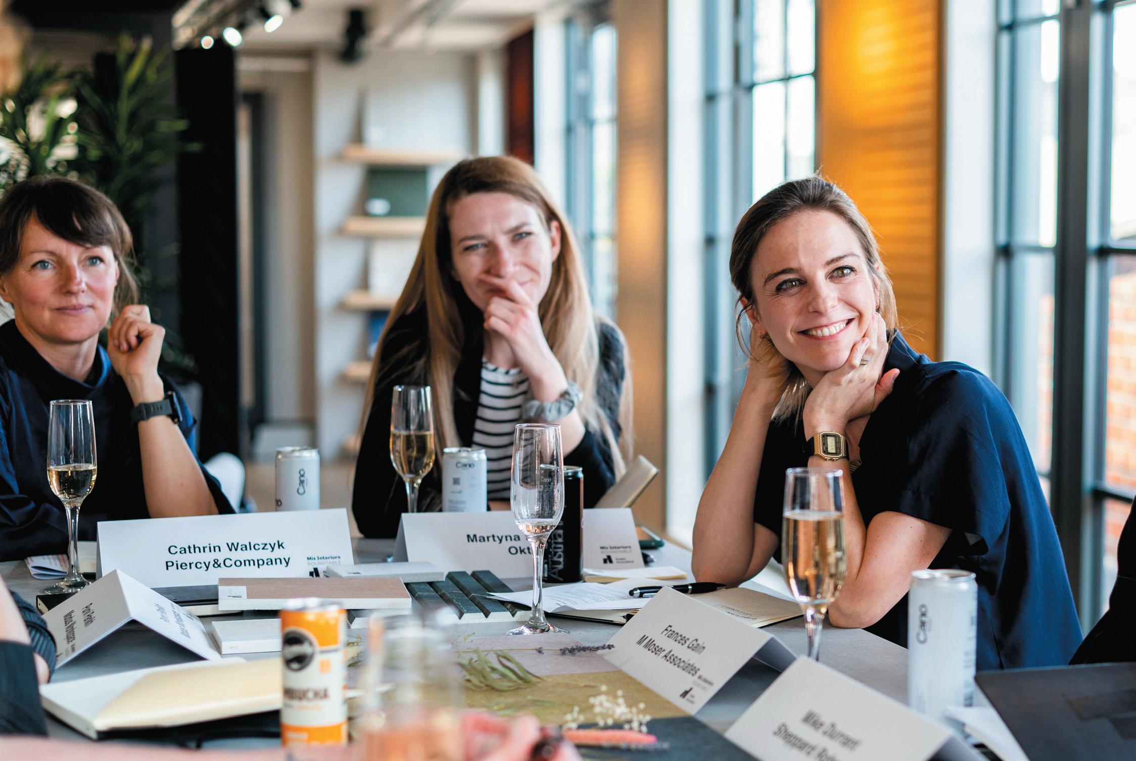
101
nothing to with how a space looks, but has everything to do with how well it serves its purpose.”
It’s not art, It’s DesIgn: spaces shouLD Be DesIgneD to Be InteracteD WIth.
“In hospitality, there can be very clear curation of the senses,” said Paranagamage, “where you go from a space that feels louder and more convivial to something that’s very soft and darker; which feels almost calming. In a very practical way, that’s a lot about using materiality and colour to control how different senses come together and how we experience a particular place; these places designed to be touched and interacted with.”
“Which is where architecture and interior design differ hugely,” continued McNulty. “Interior design is all


about tactility and feeling part of a space. Architecture is founded on beauty, but interiors have to speak on a more human level.”
Wrapping up, our table acknowledged that designing for all of the senses, and indeed varieties of people, is a challenge. For Gain, it’s predicated on recognising that the senses are ‘five friends’ that can either get along or fight, designers aiming for the former; for McNulty the solution is to remain open and to keep pushing boundaries; while for Parikh the perfect space doesn’t yet exist and the true test of a successful design is found in its coherence.
Concluding, Walczyk is buoyed by the growing emphasis on design beyond the superficial: “I think all of this can only ever be another tool in our toolkit, as we learn more about how to design better.”
102
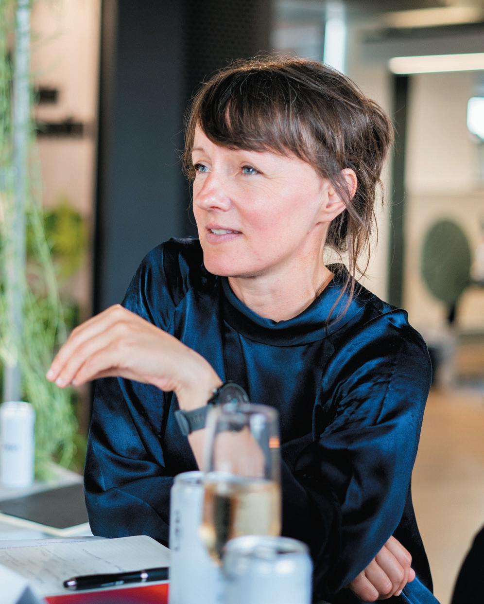
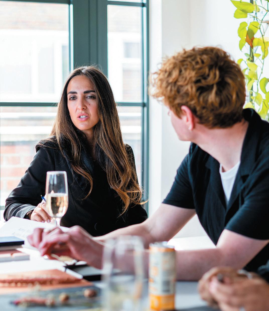
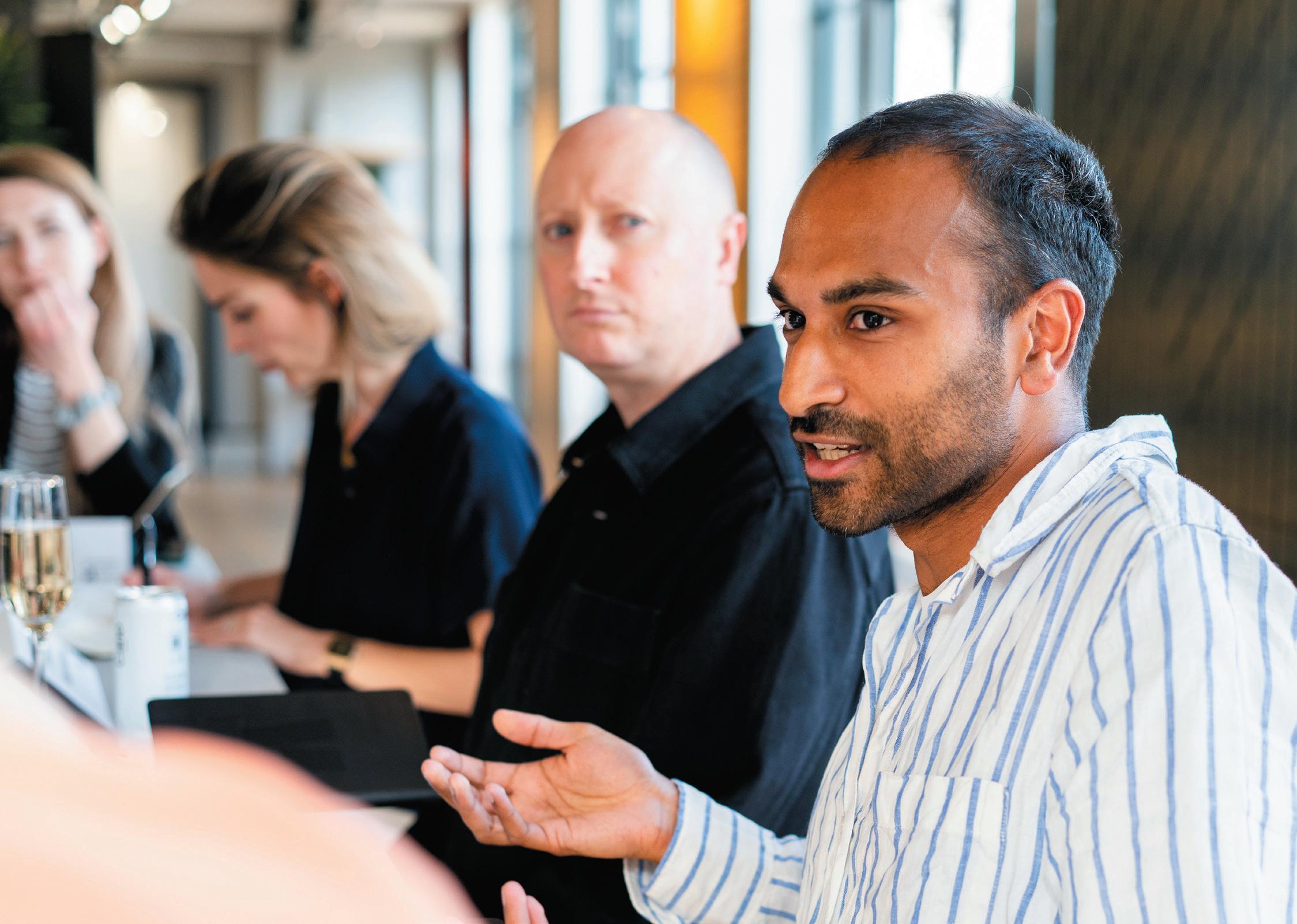
103
Mixology23
An unparalleled year for Mix Interiors in more ways than one, Mixology23 broke records from beginning to end. Starting with an unmatched number of entries – of a quality that raised the bar to new heights – to a room that featured more guests than ever before, we couldn’t be prouder to be part of this creative, innovative and diverse industry.
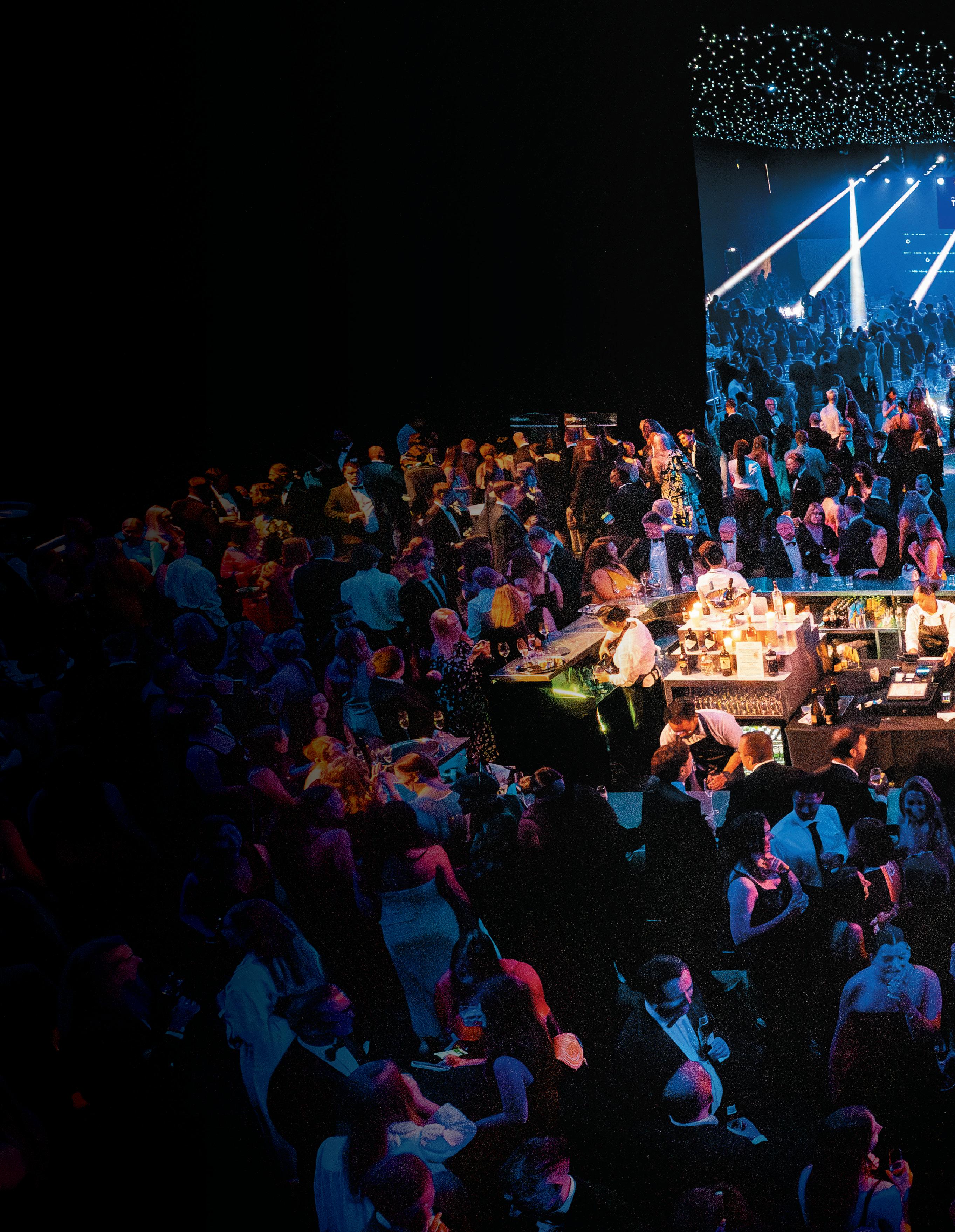
Starting the night with one of the UK’s most exciting live performances, Hackney Colliery Band greeted guests with a three-set special of genre-bending anthems performed in brass, reeds, percussion and electronics. Parading everyone to their tables, attendees sat down to a three-course feast before Mix Interior’s managing editor, Harry McKinley, took to the stage to announce the year’s allimportant winners.
Critiquing the products, projects and people was no easy feat for our 14-strong panel of industry judges. Experts in their respective field, they collectively remarked on design, sustainability, wellbeing and commercial viability before selecting their favourites. Debuting a new category – Product of the Year, Bathrooms – and by popular demand dividing Design Practice of the Year into ‘50 and Over’ and ‘Below 50’ employees, 23 winners were crowned, concluding with the coveted Henry Pugh Outstanding Contribution Award.
Following a myriad of trophy-hoisted photographs, guests flocked to the dance floor to be opposite Jeremy Healy, Tall Paul and Seb Fontaine – a trifecta of legendary DJs who performed back-to-back until the early hours. But, who got to take home an iconic yellow ball? Here’s a look back at special moments from the night itself and the announcement of this year’s finalists –and, of course, Mixology23’s winners.
For full event photography visit mIxInterIors.com
event
massIve thanks to our sponsors


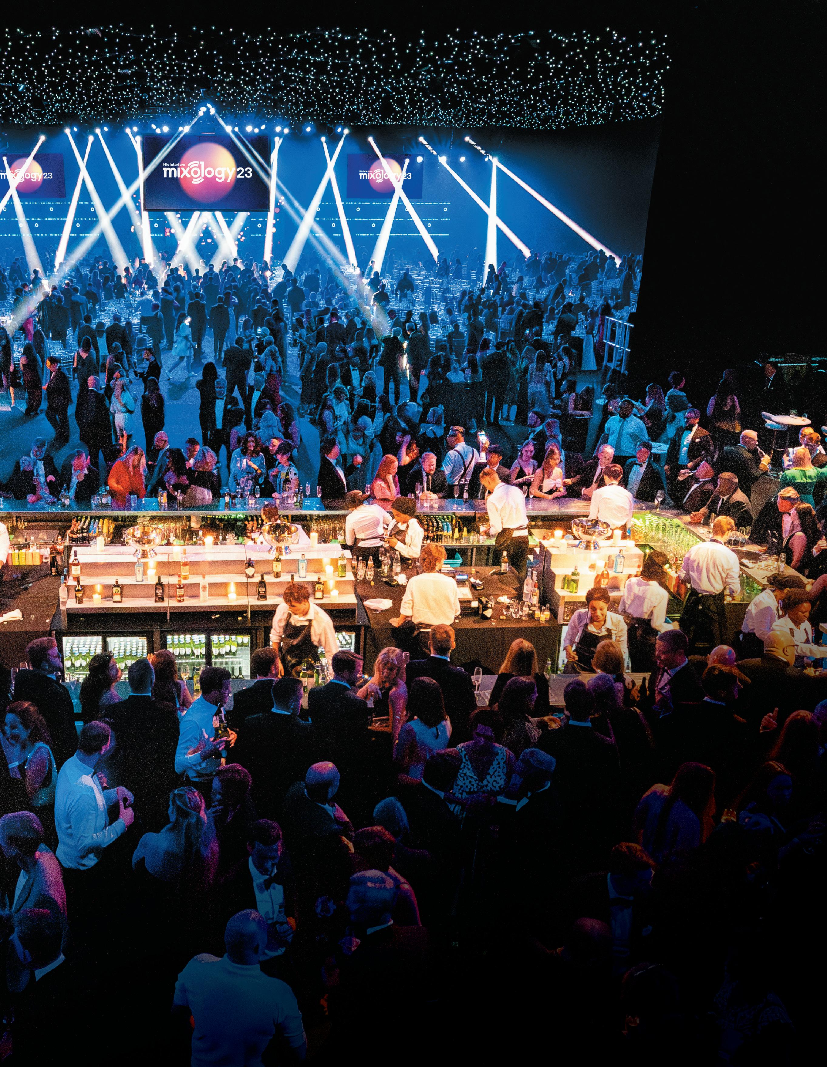
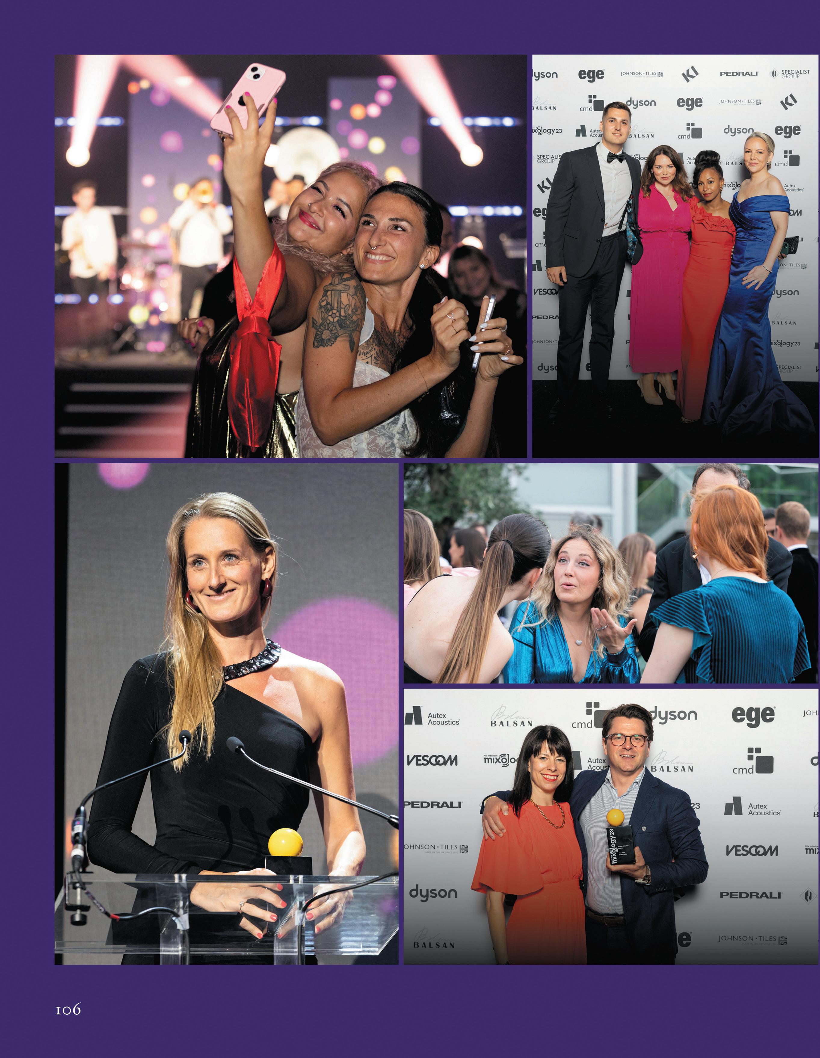
foraform
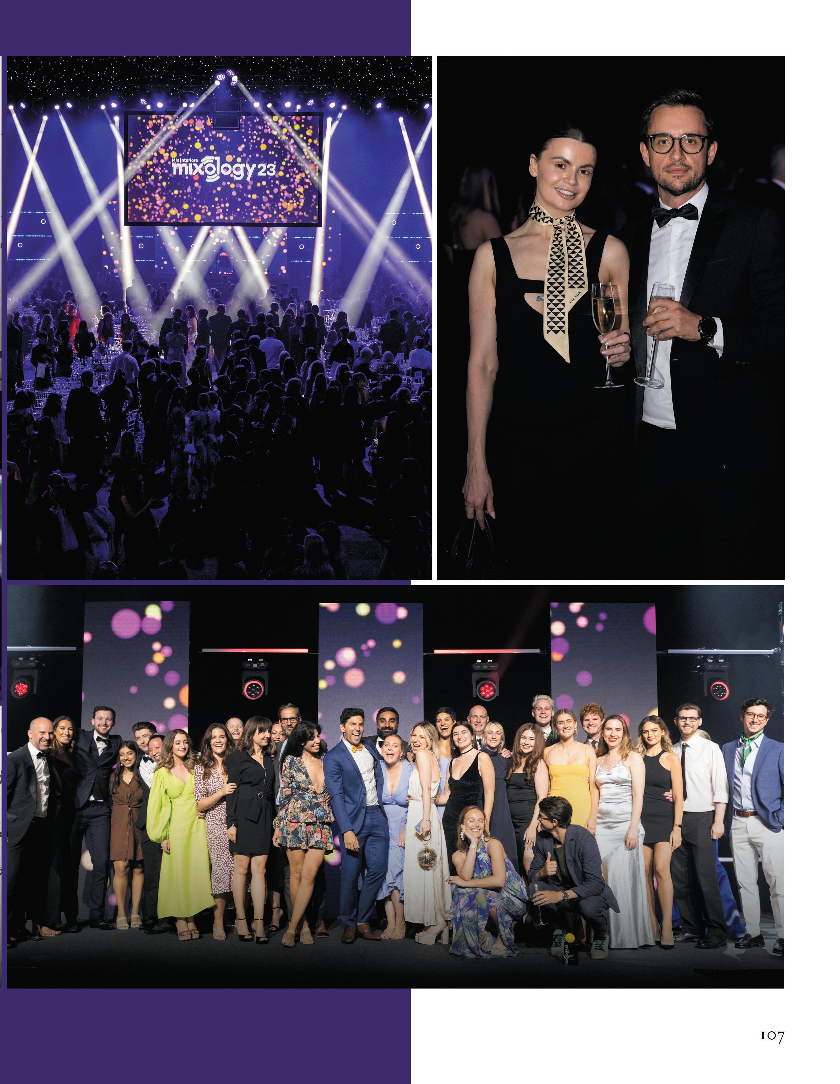
perkIns&WILL
Design & Build

k2 space
DTRE, London
moDus Workspace
Capital.com, London
morgan LoveLL
KAO, London
peLDon rose
MG Empower, London
oktra
Chrono24, Hertfordshire
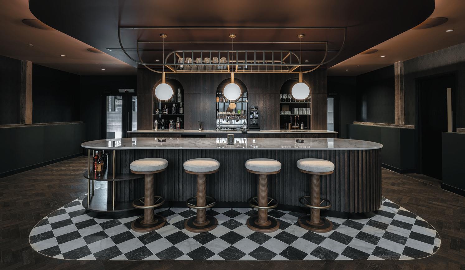
Best described as “a Swiss lab in the Hertfordshire countryside”, Oktra transformed Chrono24’s office space into a unique destination that combines hospitality and laboratory settings. Uniting all brands under one roof, a premium client lounge and flexible workspace was crafted, plus a high-specification watch workshop.
Flooring
2tec2 Strata Collection
amtIco
Décor Collection
Interface
Open Air
Ivc commercIaL
Immersion
karnDean commercIaL
Opus abstracts
mILLIken
Down to Earth
shaW contract
Shifting Fields
ege carpets
Eco Rustic
Based on the interaction between colours, materials, light and space, textile designer and colour alchemist Margrethe Odgaard developed 56 colours for Eco Rustic. Infinite combinations can be made from the flooring, with each shade relating and reacting differently to one another. What’s more, the underside is formed from PET-felt backing derived from plastic bottles.
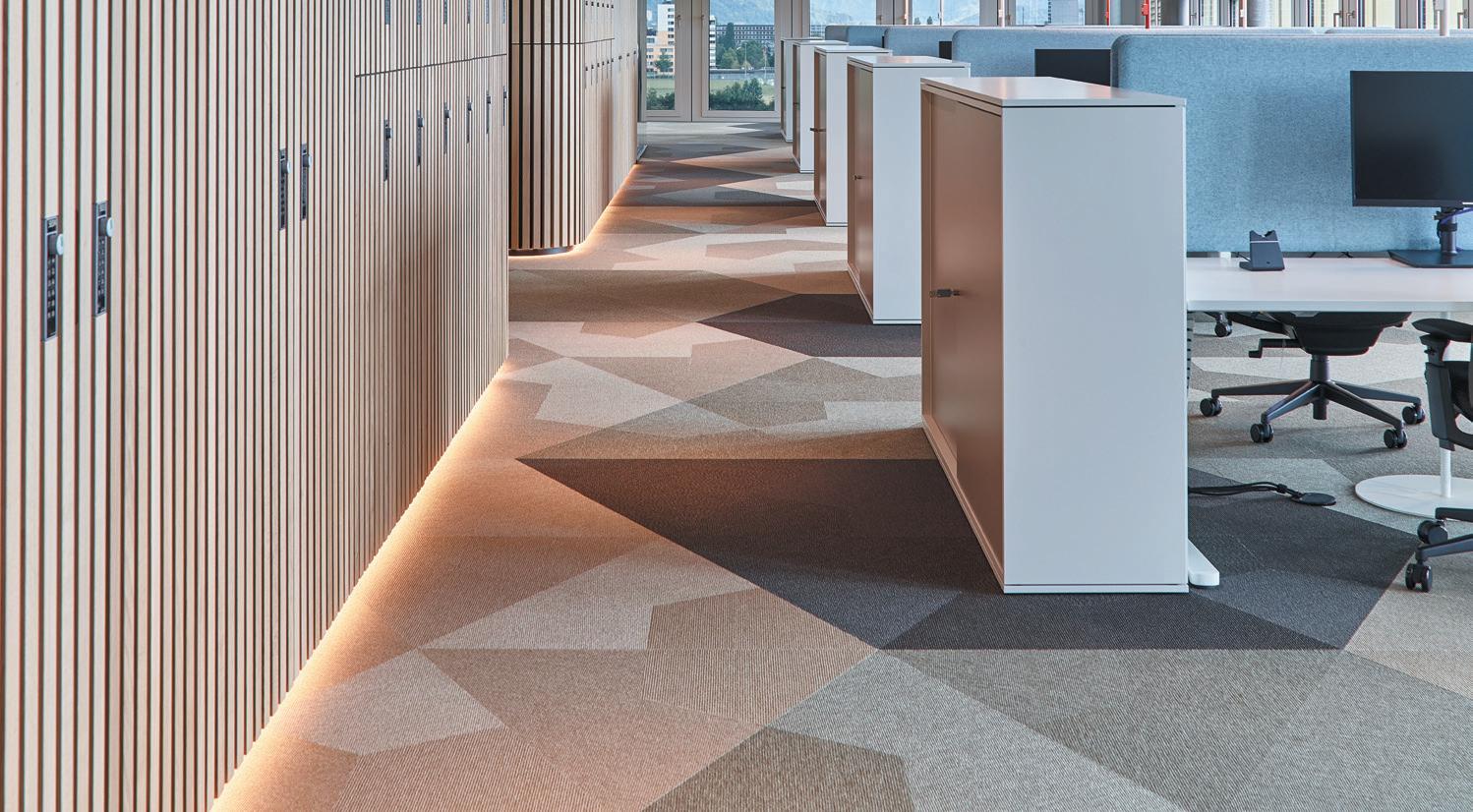
tarkett
DESSO & RENS
teD toDD
Crafted Textures Collection
tIer gLoBaL
Acoustix
v4 WooD fLoorIng
Bjelin Hardened Wood Flooring
108 P roject of the Y ear
WI nner
P roduct of the Y ear
WI nner
f I na LI sts f I na LI sts
Lighting
aBstracta
Moon Acoustic Light
future DesIgns
AERO 313
turf DesIgn Beam LED
The Forked Collection combines machine-cast and hand-spun solid metal with a unique fork detail. A range that explores new scales of proportion and celebrates the beauty of solid metals with a compelling new Buster + Punch aesthetic, this is the first modular lighting concept released by the lighting company.
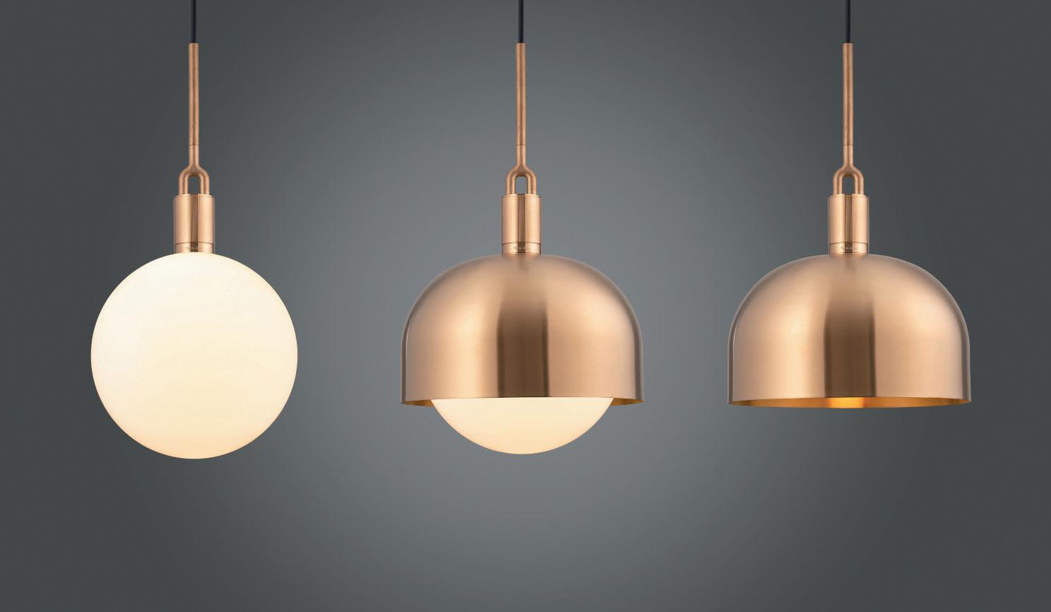
Hotel Interiors
DesIgn management partnershIp Parador 44, Cardiff
DesIgnLsm
Heythrop Park Hotel, The Cotswolds
goDDarD LIttLefaIr
Four Seasons Istanbul at Sultanahmet
scott BroWnrIgg
Hyatt, Stratford
thDp
Voco Venice Mestre The Quid
Conran and Partners paid tribute to modern Jakarta in Park Hyatt, as well as Indonesia’s natural beauty. Elements throughout the design feature lava stone, copper, intricate wood carvings and shields, traditional crafts and other indigenous natural materials – all sourced from local artisans and suppliers.
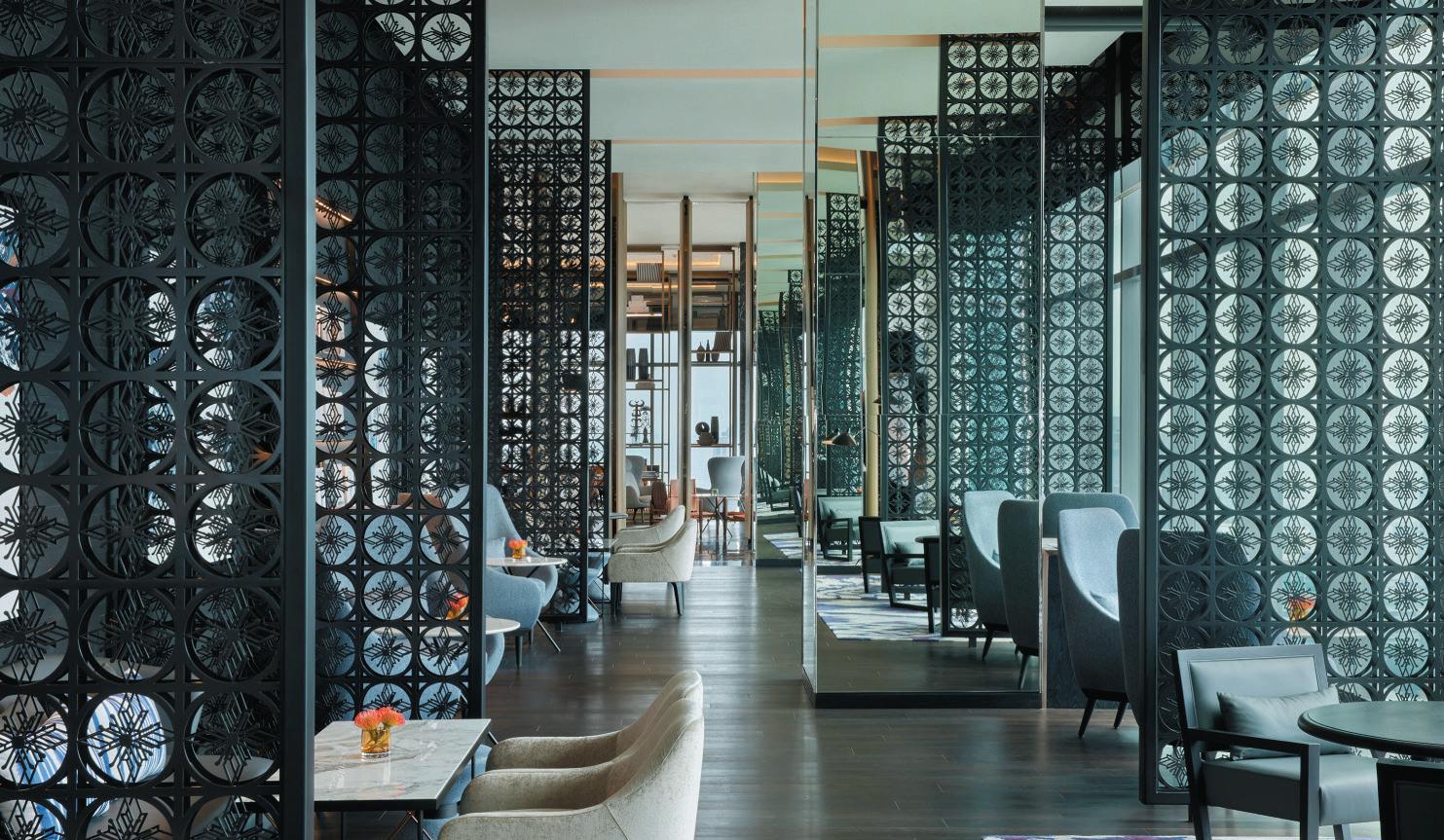
109 P roduct of the Y ear
Buster + punch Forked Collection
WI nner
P roject of the Y ear
WI nner
f I na LI sts f I na LI sts
conran anD partners Park Hyatt, Jakarta
Bathroom
kaLDeWeI OYO DUO
OYO DUO combines organic, natural design with durable materials made from recyclable Kaldewei steel enamel. As the latest to emerge from Kaldewei’s LUXSTAINABILITY world, this family business combines form and design by Stefan Diez with sustainability and resource conservation. The result is a graceful sculpture with the OYO DUO bathtub.
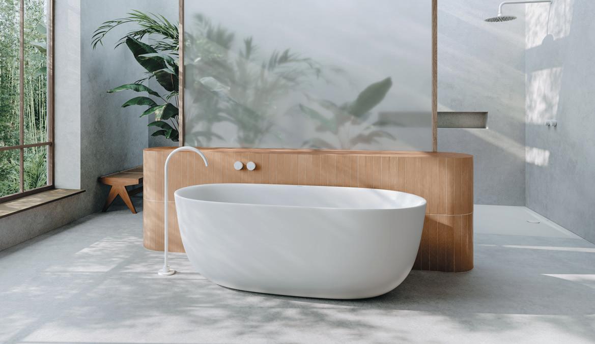
P roduct of the Y ear
Surfaces
autex acoustIcs
Lanes
Lanes is a battened-style acoustic system made from Autex Acoustic’s Cube material. Through the creation of 3D-interior façades, an air gap is created behind each lane providing enhanced low frequency absorption. This blend of true functionality and elegant design make the range suitable for a wide variety of spaces. Even more impressive, Lanes is a carbon neutral acoustic product.
Finalists
aLtro
Tegulis
BagnoDesIgn
Orology
Buster + punch
Cast Bathroom Collection
crossWater Sensor
DuravIt
Sustano
Johnson tILes
Santorini
keuco
Stageline
rak ceramIcs
RAK-Valet
camIra
Revolution
Johnson tILes
Darwin
knauf ceILIng soLutIons
Eleganza
panaz
EcoTwist
parksIDe
Principle
pLastIcIet
Mother of Pearl
smILe pLastIcs
Heron Material
specIaLIst group
Aria Glass Wall System
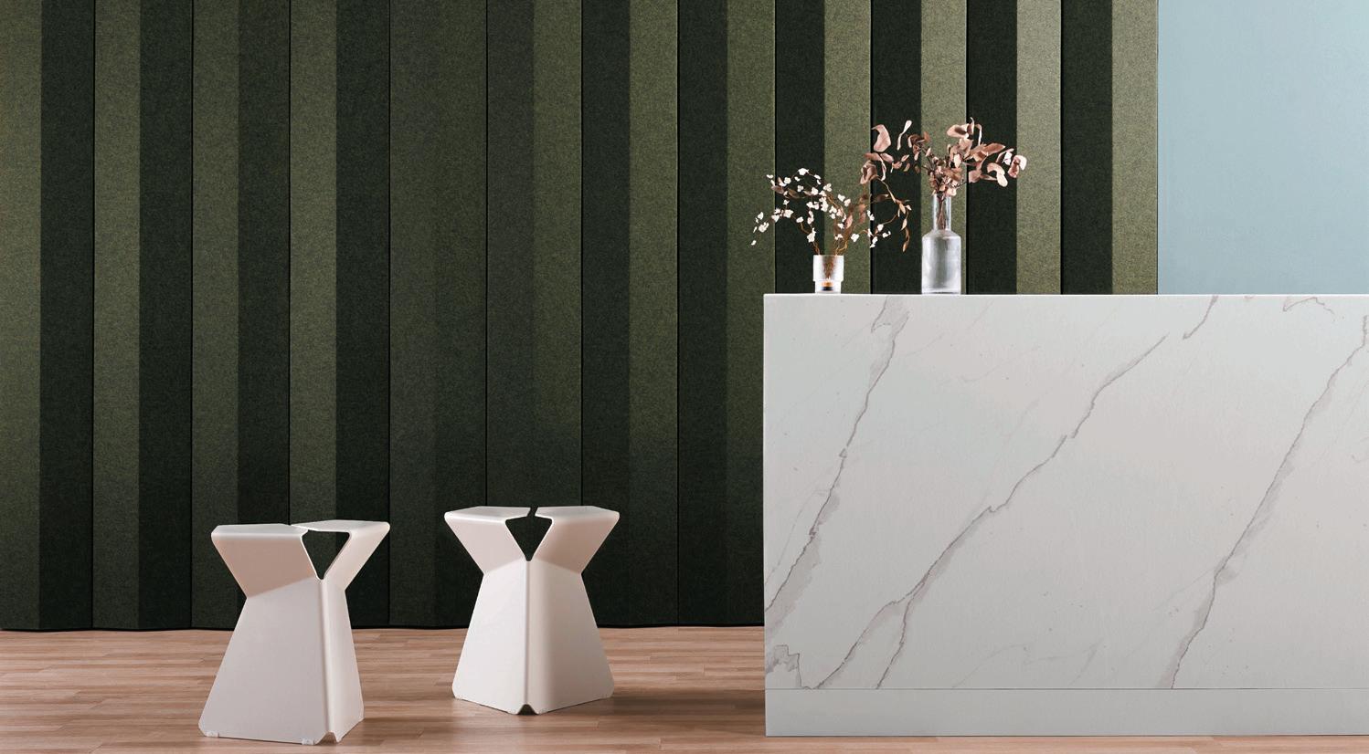
the coLLectIve
The Avon Collection
vescom
Foster and Auckland
Woven Image
Fuji
110 P roduct of the Y ear
WI nner
WI nner
WI nner f I na LI sts f I na LI sts
Bar & Leisure Interiors
area
Oche, London
BLacksheep
The Alchemist, Glasgow
DesIgnLsm
Gaucho, Liverpool
Doone sILver kerr anD ryDer archItecture
Orelle Restaurant, Birmingham
Ior group
Until Liverpool Street, London
JoLIe KITTEN, Manchester
kaI InterIors
Lucy Wong, London
mehraI DesIgn
stuDIo founD
The Libertine, London
One of London’s most exciting new hospitality venues, The Libertine is located in the underground vaults of the Royal Exchange. Working with Incipio Group, Studio Found transformed the hospitality venue through an extensive design and renovation process – paying extra attention to idiosyncrasies across the 7,000 sq ft destination.
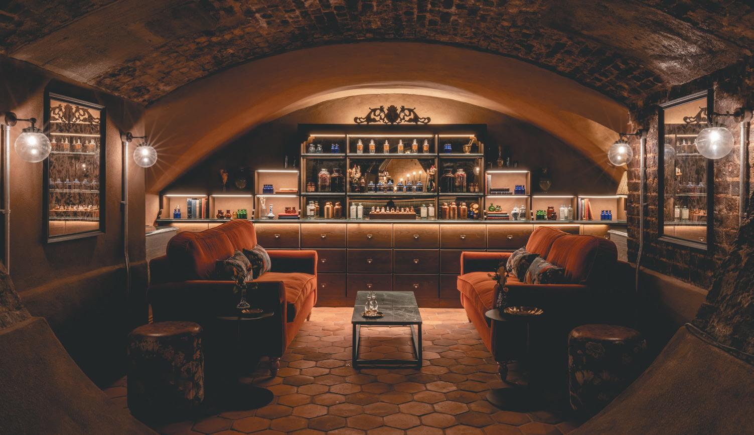
Boundary Shoreditch, London
stuDIo tWo InterIors Cut & Craft, Leeds
taner’s sons
Mark’s Skybar, London
tp Bennett
Brút & Kaffi Ó-le at Radisson Blu Hotel, Iceland
Furniture
P roduct of the Y ear Task
fLokk
HÅG Capisco Puls ‘Snow Plough’ Chair
IsomI Join
mara
Timmy Libro
staverton Scrumwall
WorkBench Pogo
Designed in collaboration with Todd Bracher and the Humanscale Design Studio, Path uses physics to comfortably fit 95% of users and body types without complex adjustments. Simple, seamless and inclusive, Path is Humanscale’s 26th net positive product – more than any other company in the world – and upcycles more plastic waste than any other in the industry.
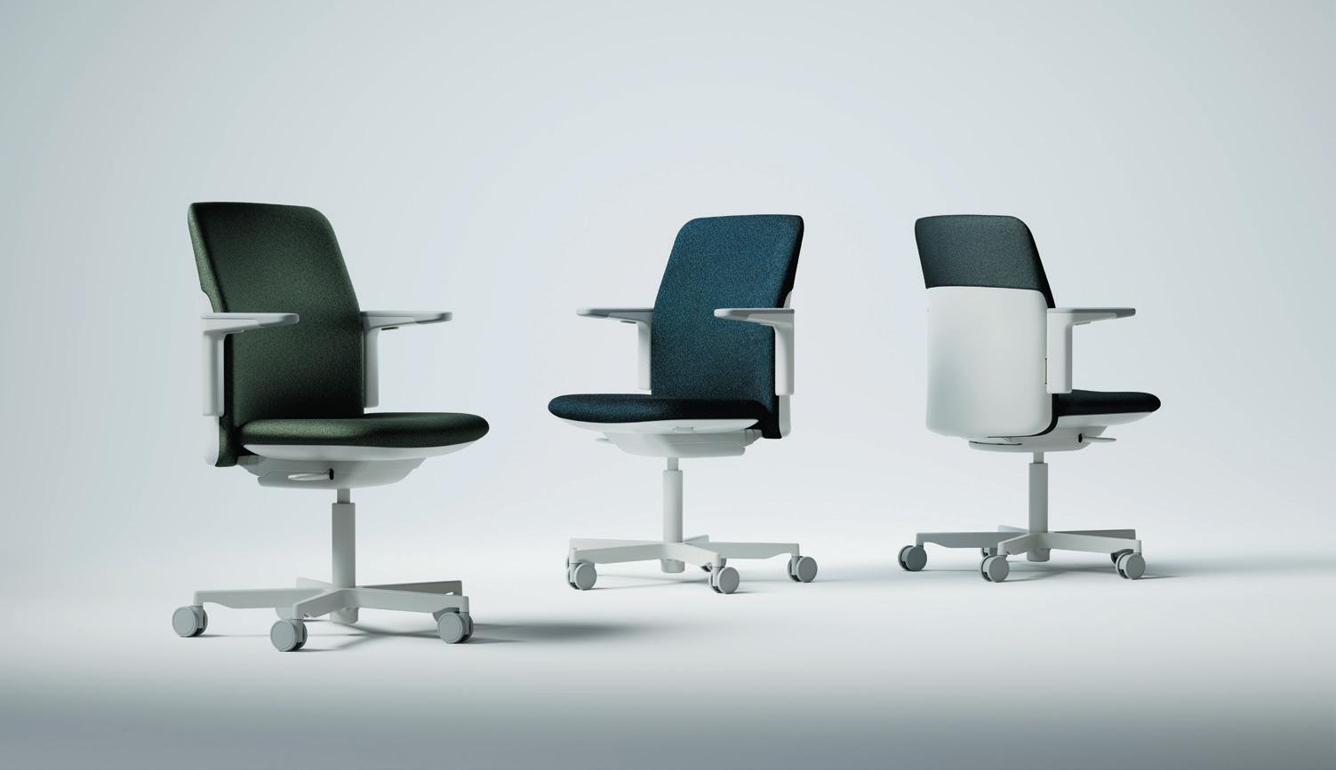
111 P roject of the Y ear
WI nner
WI nner
humanscaLe Path
f I na LI sts f I na LI sts
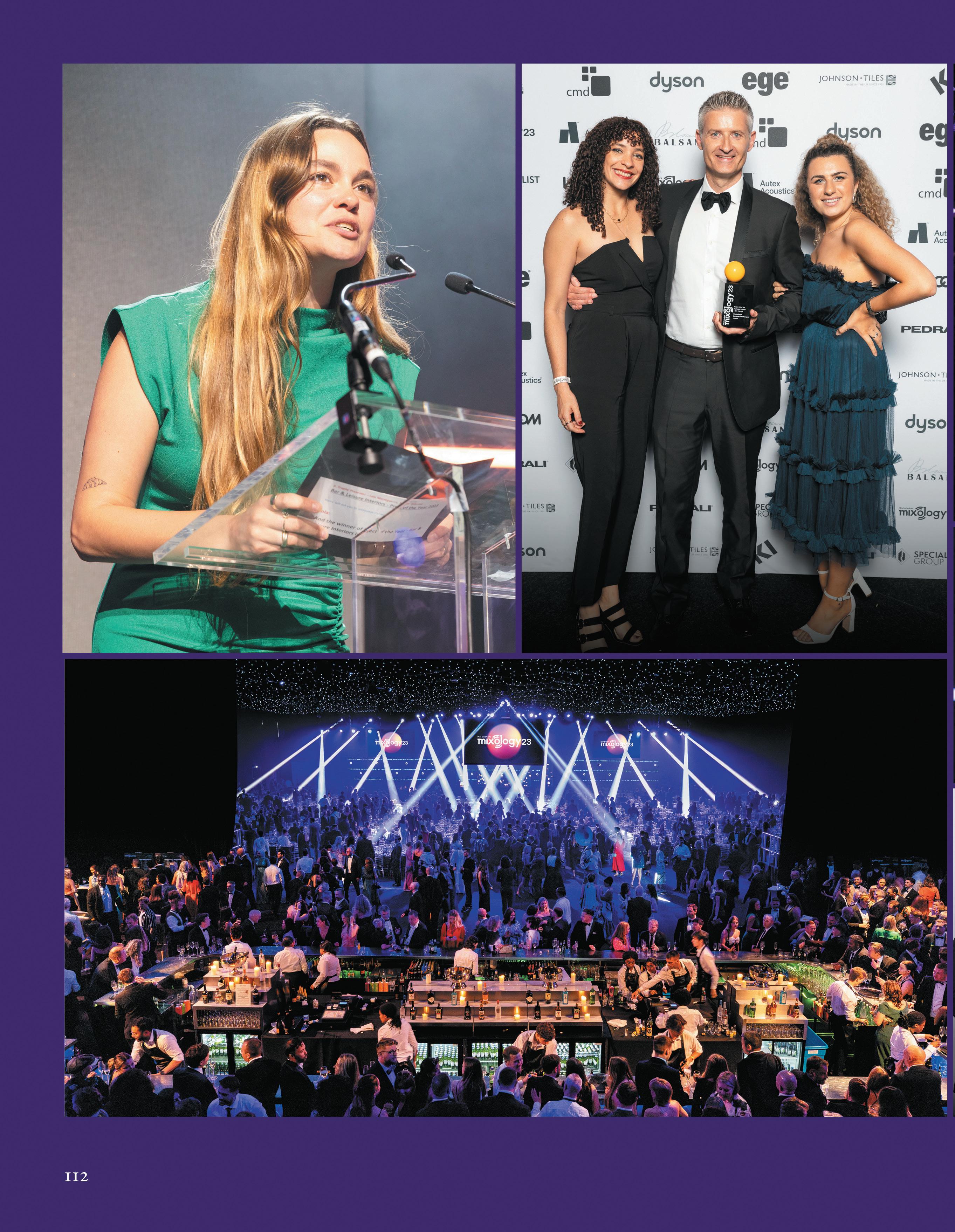 WooDs Bagot
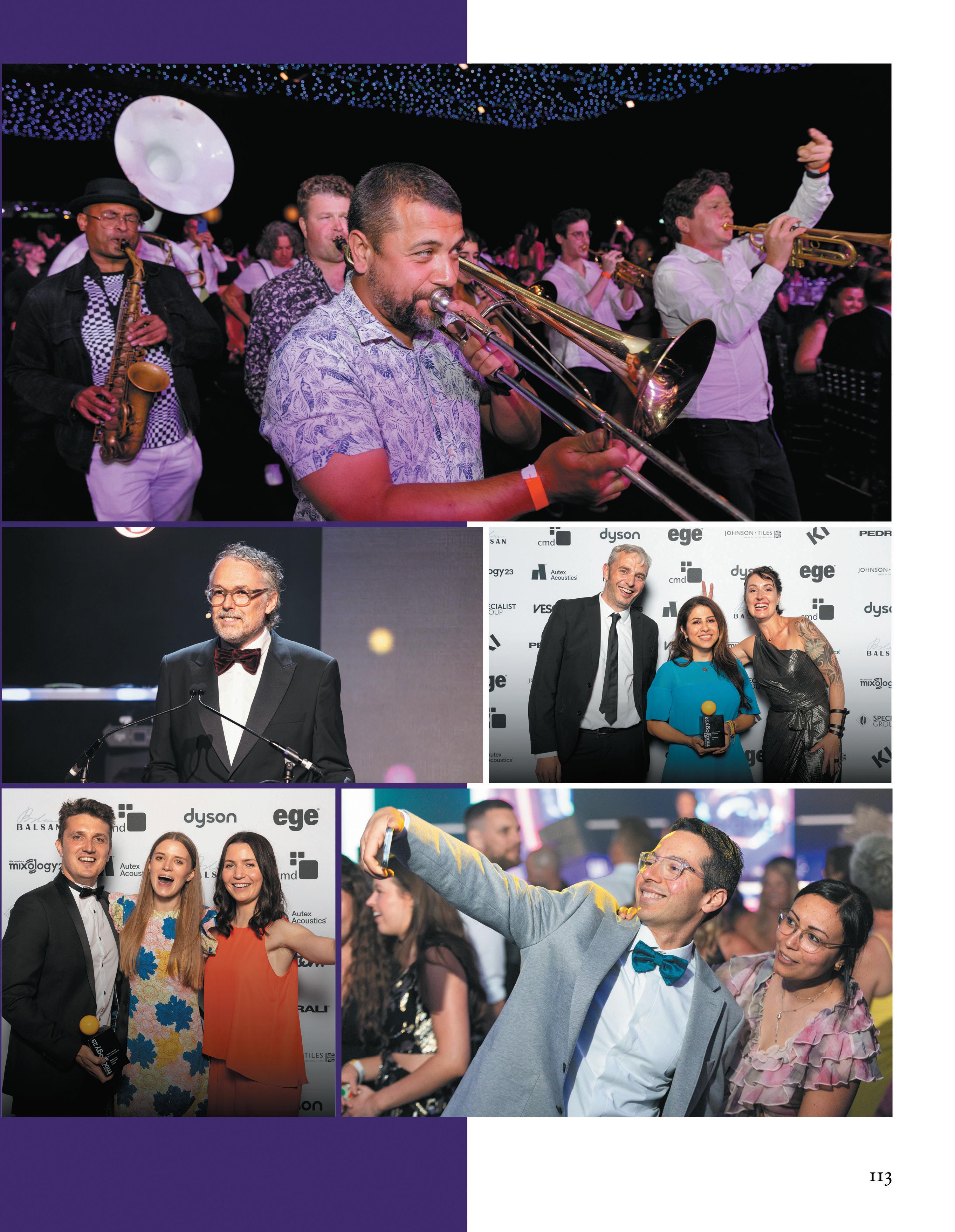
stuDIofounD
humanscaLe
Loose Furniture
mute
OmniRoom
OmniRoom is a complex, modular room-in-room system for building flexible office spaces to suit different sizes and purposes. Allowing for countless configurations, Mute predesigned 100 fully equipped ‘Rooms’ (including workstations, meeting places and lounge areas). Each can be placed separately or combined with others to make multifunctional, customisable hubs.
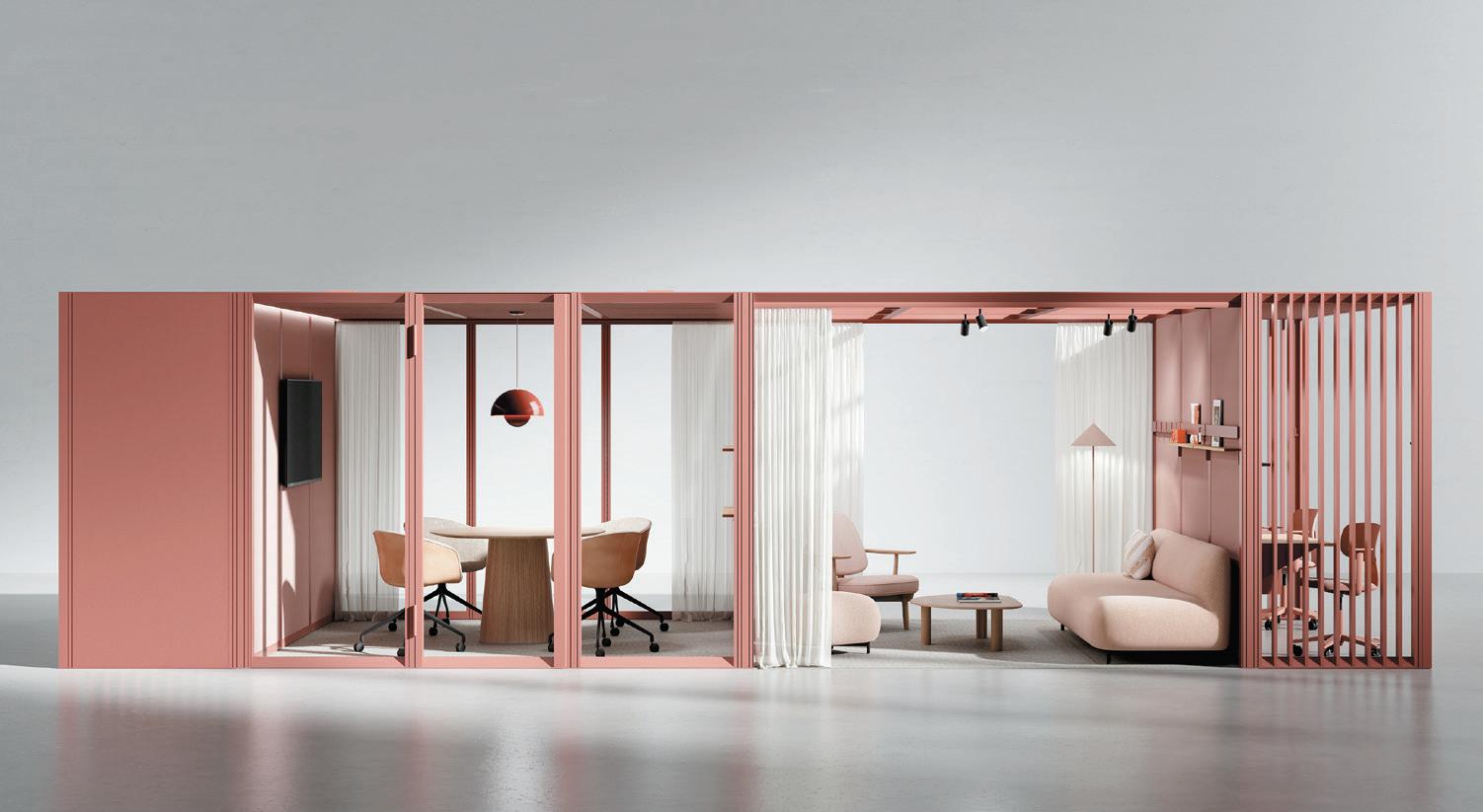
Public Sector & Cultural Interiors
WorkpLace creatIons
Northeastern University, London
Derived from the success of Phase 1, Phase 2 of works at Northeastern University’s first London campus was an exercise of enhancement and expansion to an international educational space. Workplace Creations created a cohesive design that modernised the traditional campus. Beaten metal, mirrors and writable surfaces encourage a forwardthinking and kinetic environment, complemented by an expansive palette of colours, textures and graphics.
Finalists
aLea
ITUBE
aLLermuIr
Ooty
arper Mixu
Bene
Casual
BIsLey Fern
Brunner Ray Soft Lounge
morph BrIcks
Morph
peDraLI Jeff
spacestor WIth gensLer
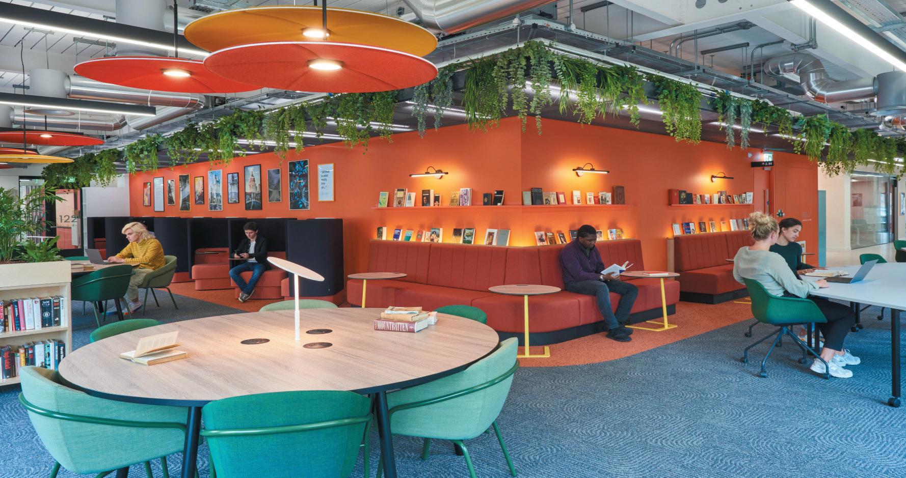
Arcadia
stansons Mowgli
vank BIO_BOX
aecom

HMRC, Stratford
haWkIns\BroWn
Havering Town Hall, London
resonate InterIors King Edward VI, Southampton
114 P roduct of the Y ear
WI nner
P roject of the Y ear
WI nner
WI nner f I na LI sts
Positive Impact
cast InterIors
210 High Holborn, London
eve WaLDron DesIgn Entopia, Cambridge
perkIns&WILL
EBRD, London
tétrIs DesIgn x BuILD JLL 20 Water Street, London
the offIce group
The Black & White Building, London
Developed by The Office Group and designed by Waugh Thistleton Architects, with interiors by Daytrip Studio, The Black & White Building is Central London’s tallest masstimber office building, and the first workspace development TOG has built in entirety. Its innovative construction and commitment to renewable materials make it a milestone in sustainable urban architecture, not to mention an inspiring place to work.
Our sustainability efforts
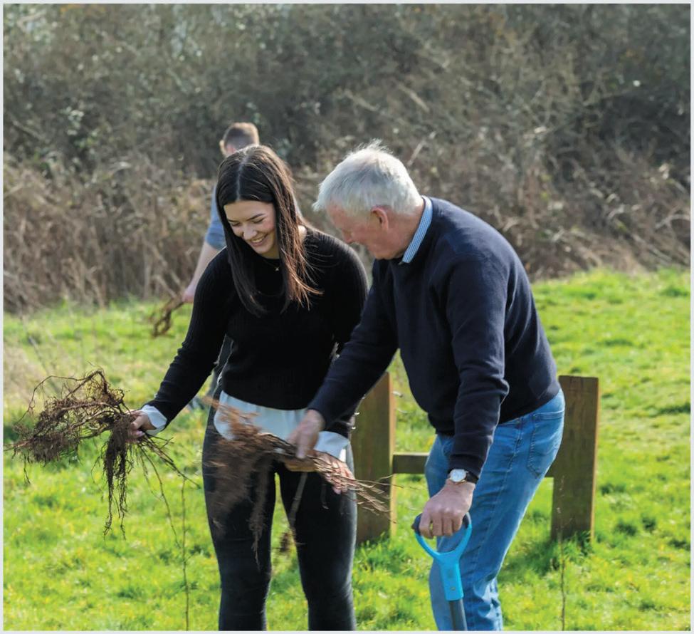
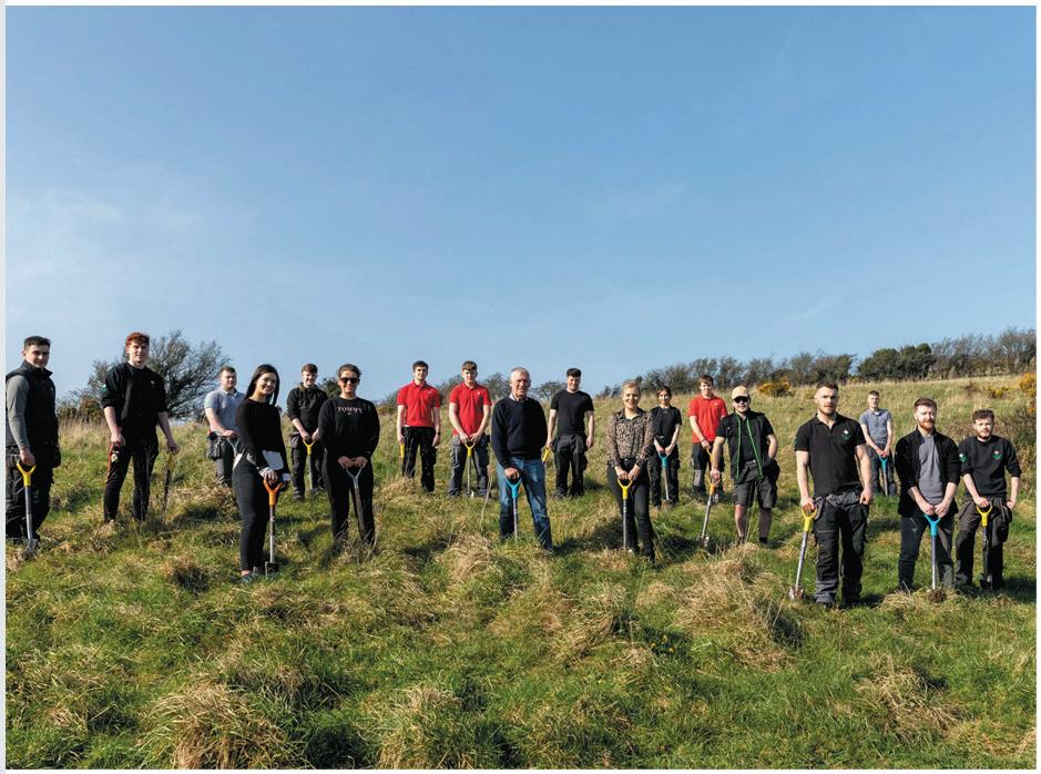
Expanding as the industry progresses, the Positive Impact award highlights projects that demonstrate an exceptional commitment to sustainability – be it social, economic and/or environmental. Launched in 2022, our judges decide the winner of this category by scoring on factors including innovation, use (or reuse) of materials and wider social impact.

Like most within commercial interior design, Mix Interiors is on a sustainability journey too. In recent years we have taken steps of action throughout Mixology: by changing our menu to one that emits less carbon, sourcing wristbands made from waste pulp and flower seed, swapping our printed brochures for digital and continuing to work with sponsors such as Specialist Group, who work with the Woodland Trust to plant a tree for every attendee. It is our hope that you see progress at each Mixology event, as we continue to work with the industry to make a truly positive impact.
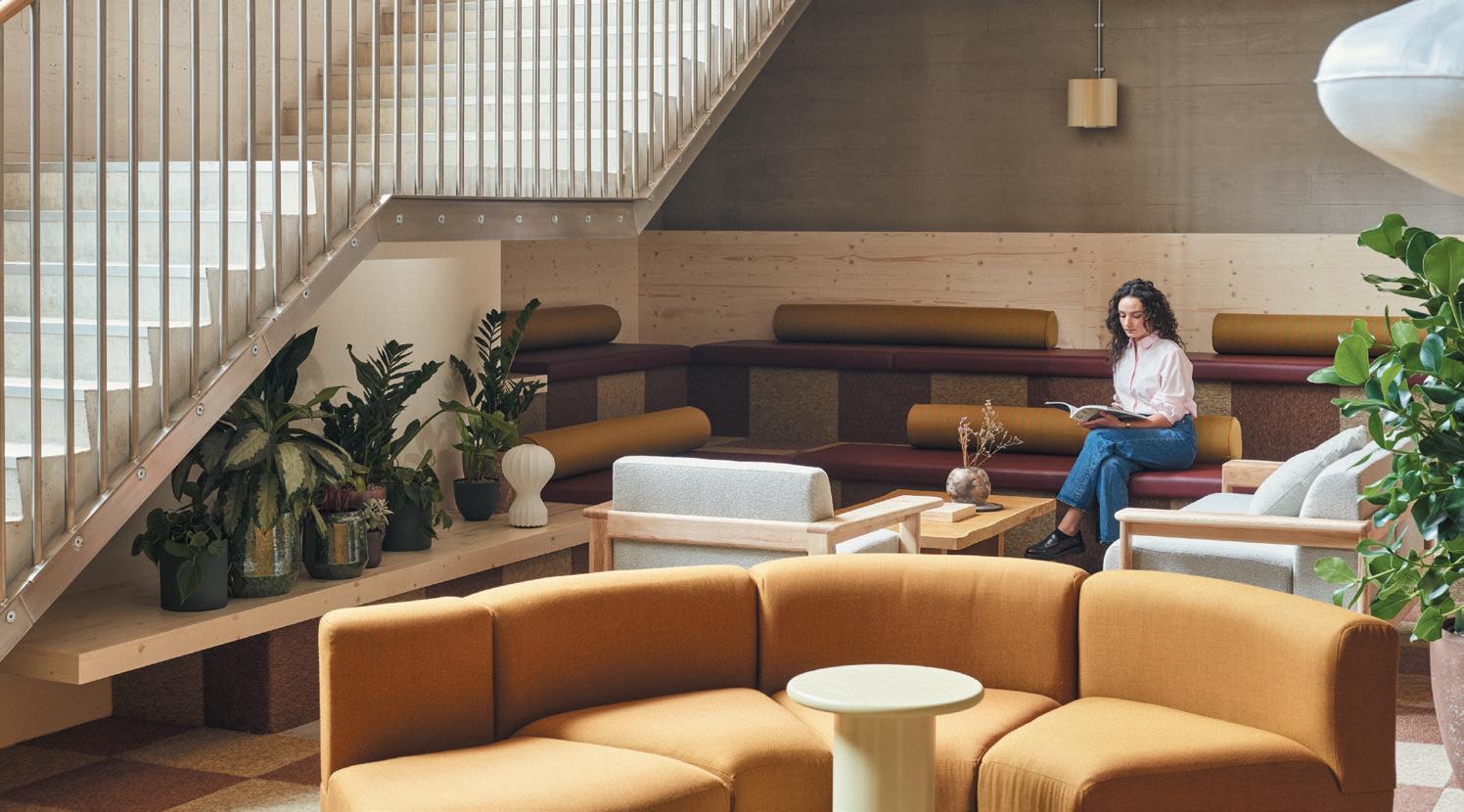
115 P roject of the Y ear
WI nner
f I na
Seating
fora form
Knekk Family
Fora Form’s family of solid wood furniture, Knekk, consists of chairs, bench barstools and tables all made from solid oak. Thinking pragmatically as well as aesthetically, designer Jon Fauske’s vision for Knekk was to tip it slightly, to ensure engagement pursues in settings that require attentive participants.
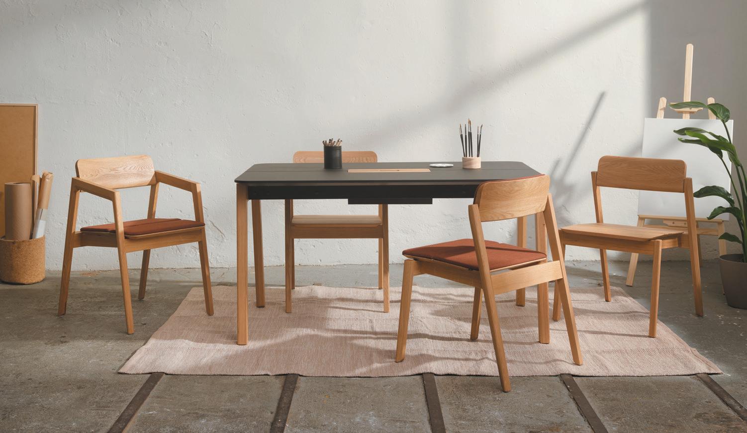
Living Interiors
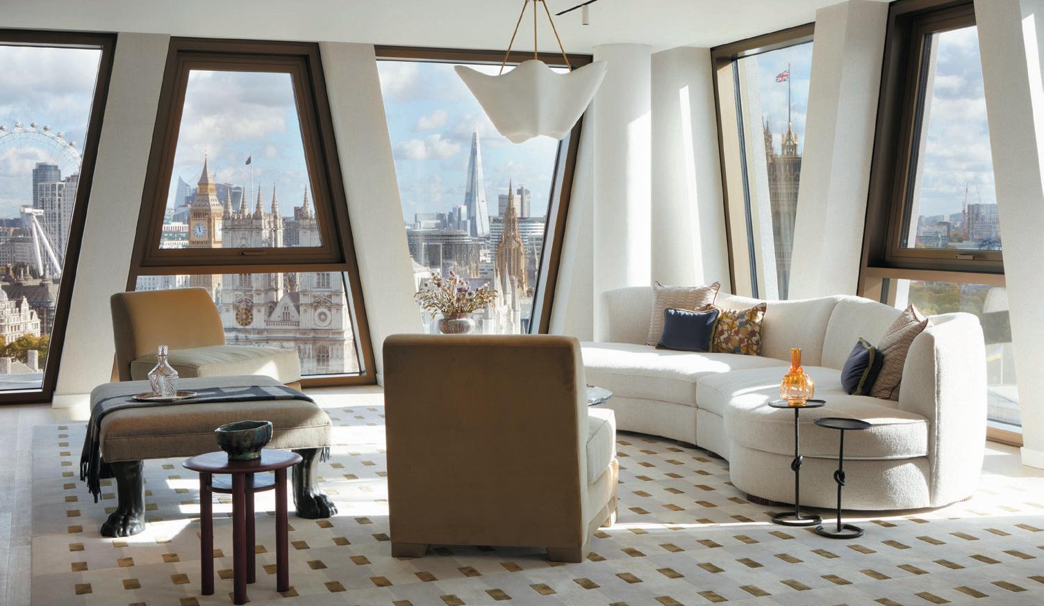
squIre & partners
The Broadway, London
The Broadway is a one million sq ft mixed-use development comprising residential, workspace and retail with a generous public realm. Squire & Partners provided total design at the Westminster destination, encompassing the masterplan, architecture and interiors to achieve a unified scheme and unique sense of place.
Finalists
aLLermuIr Bastille
haIken
Daaz by Noti
mara Icon Stool
mIssana
Worm bench
moDus
Edge Free
morgan Bilbao
normann copenhagen Bit Stool
omk DesIgn

Metro
peDraLI Lamorisse
soLIDWooL Welsh Mountain Hembury Chair
74 Enigma Square, Milton Keynes
ID:sr shepparD roBson
Portlands Place, London
thDp Venice Luxury Apartments
116 P roduct of the Y ear
WI nner
P roject of the Y ear
WI nner
WI nner f I na LI sts f I na LI sts
s P onsored b Y
Technology & Accessories

aqua LIBra Flavour Tap
feLLoWes Tallo
WorkBench Tide
zgo technoLogIes ZGDS & ZDock
your Workspace
Your WorkCharge
Your WorkCharge is a management system that gives facilities teams a real-time ‘picture’ of how workers engage. Not a standard charging port, Your WorkCharge maximizes office efficiency by tracking if a workstation is in use, by whom, and for how long. An integrated smart management system also provides an easy-to-use reporting tool which offers insight on workspace interactivity.
Workplace Interiors Sub 5k sq ft
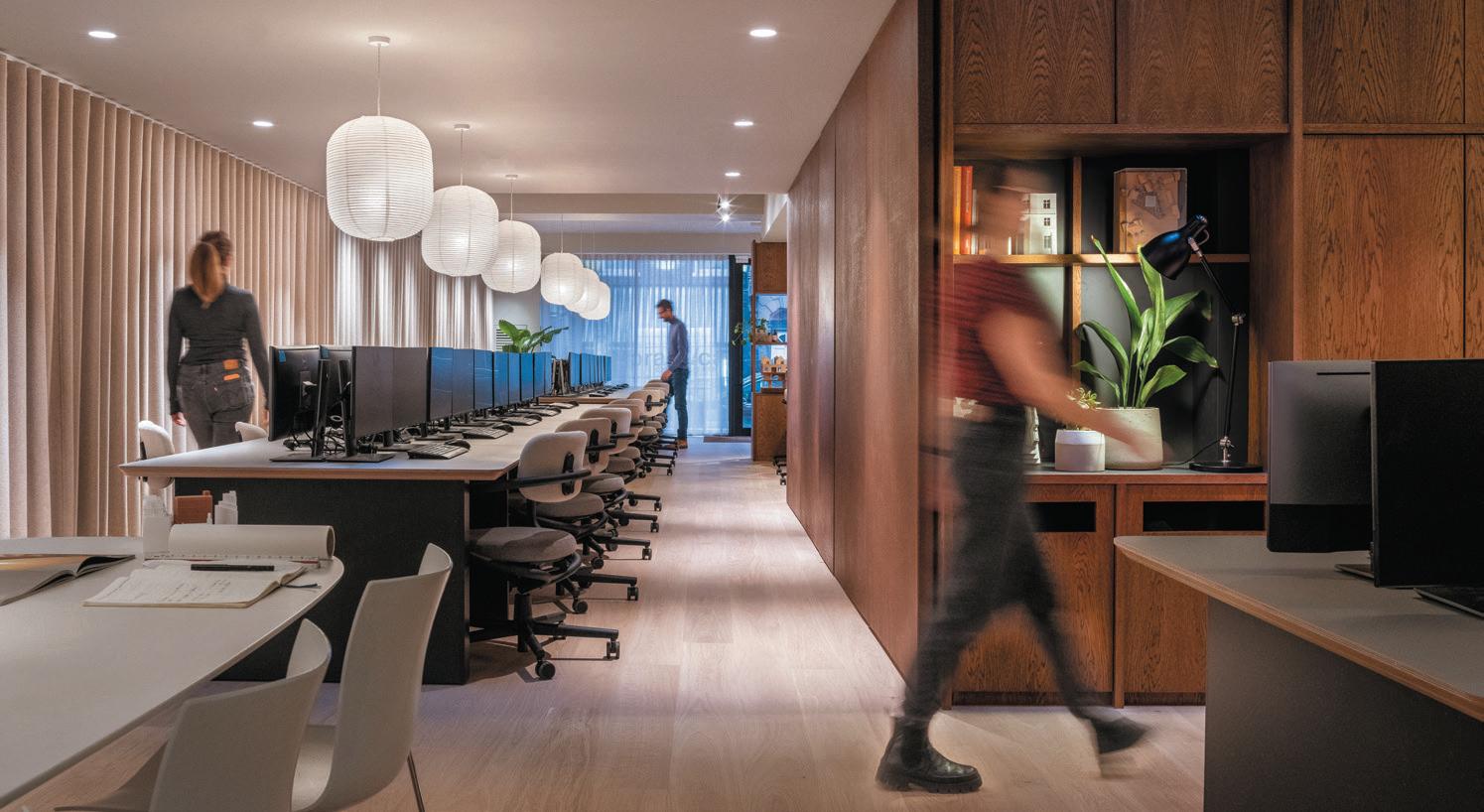
3equaLs1 DesIgn OE Showroom, London
conran anD partners 45 Mortimer Street, London
peLDon rose Brandpie, London
stuDIo JorDan Savoy Strand, London
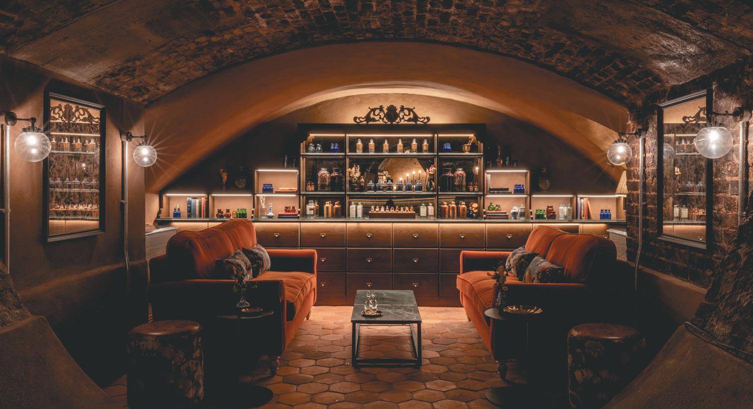
stuDIo rey Lifework Communities, The Cotswolds
Dmfk archItects anD sher + WhIte
76 Charlotte Street, London
76 Charlotte Street embodies how the next generation of creatives will work and feel; the street-facing studio is a showroom of both architectural product and process and focuses on comfort, calmness and face-to-face interaction. Outward-facing, light and flexible, the 2,200 sq ft space features three meeting rooms, focus booths, family tables and desk spaces for up to 45 people.
117 P roduct of the Y ear
P roject of the Y ear
WI
nner DatafLex Viewgo Pro peDraLI Hevea Partition
WI nner
f I na LI sts f I na LI sts
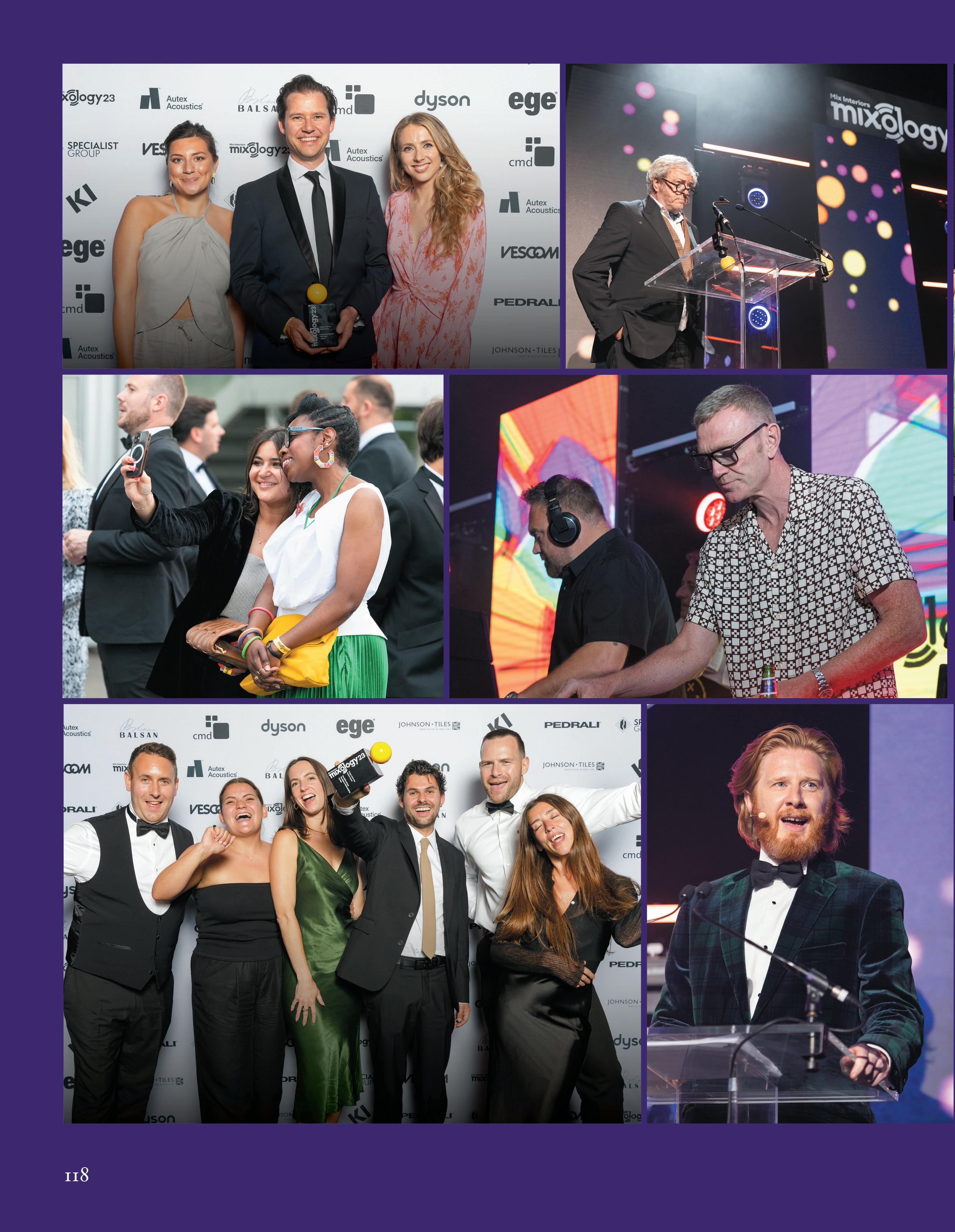
conran anD partners the offIce group anD DaytrIp
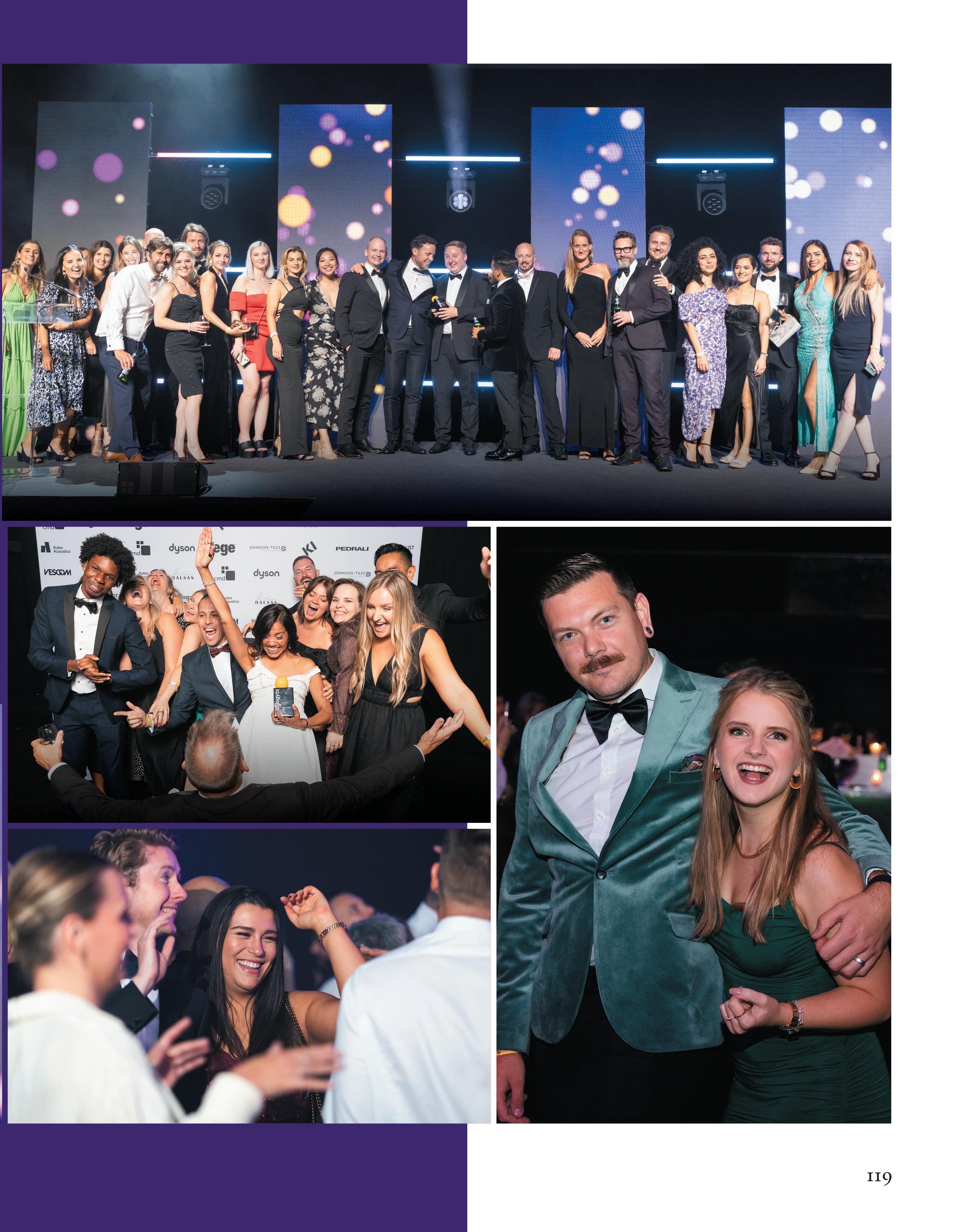
oktra
Ia InterIor archItects
Workplace Interiors 5-15k sq ft
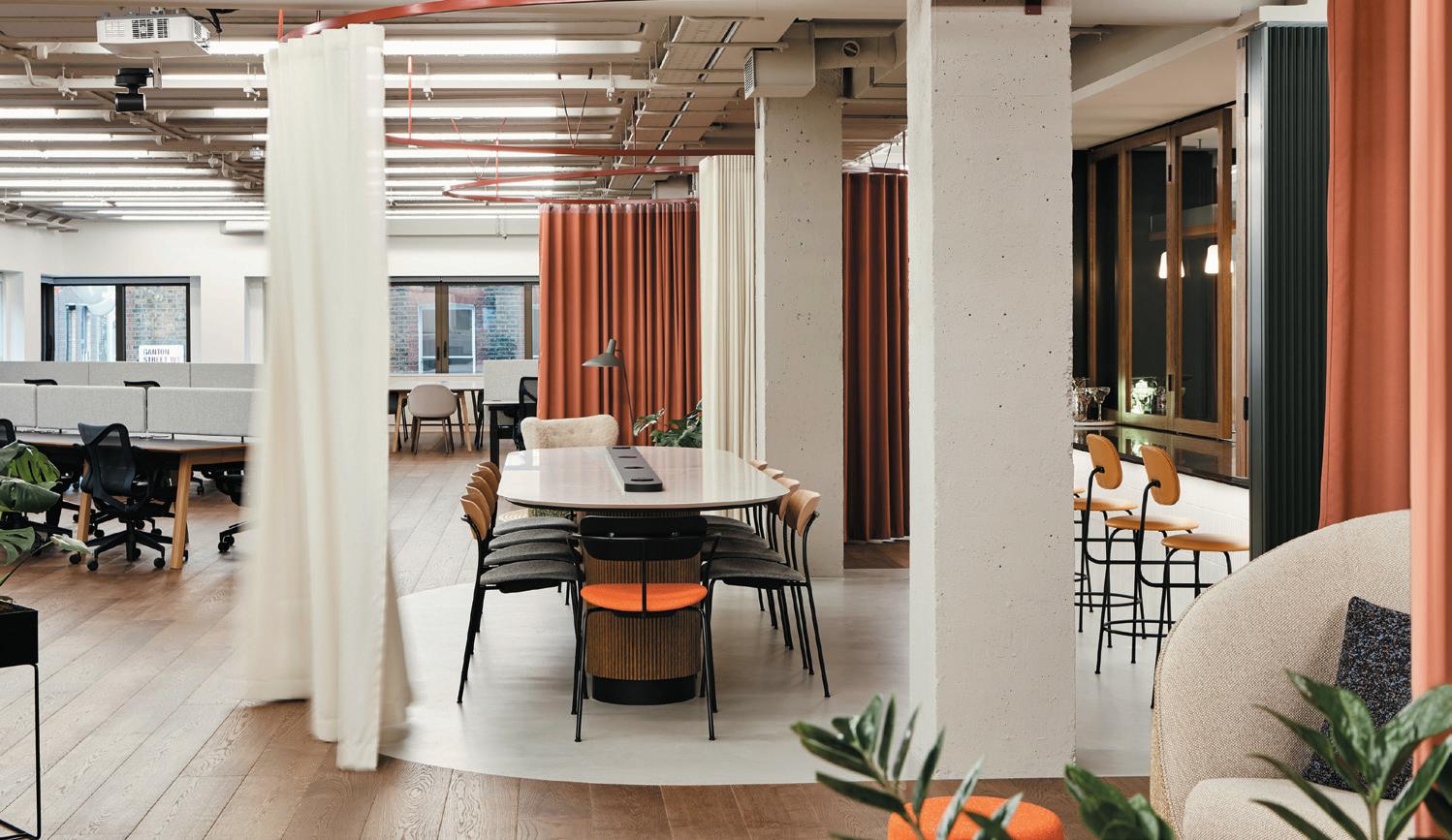
Area, Windsor
BLueBottLe
Getty Images, London
Dmfk archItects
43 Whitfield Street, London
haWkIns\BroWn
Clockwise, Southampton
mf DesIgn stuDIo
Confidential Project Mayfair, London
moreysmIth anD the InterIor Works
REVCAP, London
paoLa Leon DesIgn anD matt archItecture
Soho Estates, London
soDa stuDIo
BuckLey gray yeoman
Carnaby Club, London
The interior design for the Carnaby Club – a dedicated space for entertainment, hospitality and coworking – takes inspiration from the bold and rebellious fashion legacy of the street it resides on. BGY achieved this through the use of tactile materials and honest textiles with an emphasis on bespoke design pieces that prioritise natural materials and tones.
Workplace Interiors 15-30k sq ft
moDus Workspace Capital.com, London
Capital.com pushes the boundaries of exceptional office design as one of the most technically elaborate and unique workspaces in London. The state-of-the-art metaverse room is a fundamental feature of the office, creating visual intrigue with futuristic style that emulates the world within. Curved glass defines the space taking visitors on an immersive journey that ignites the senses.
Courier Media HQ, London
ttsp Diespeker Wharf, London
BDg archItecture + DesIgn
Tate and Lyle, London
chameLeon BusIness InterIors
Beal Homes, East Yorkshire
ekho stuDIo
AstraZeneca UK, London
gta InterIor
Campari House UK, London
haBIt actIon CDPQ, London
haWkIns\BroWn
Calico, Manchester
hLW
Kingfisher, London
m moser assocIates


Hudson River Trading, London
spaceLaB
Moore Kingston Smith, London
stuDIo Dsq
Bord Bia Global Hub, Dublin
tp Bennett
ANZ, London
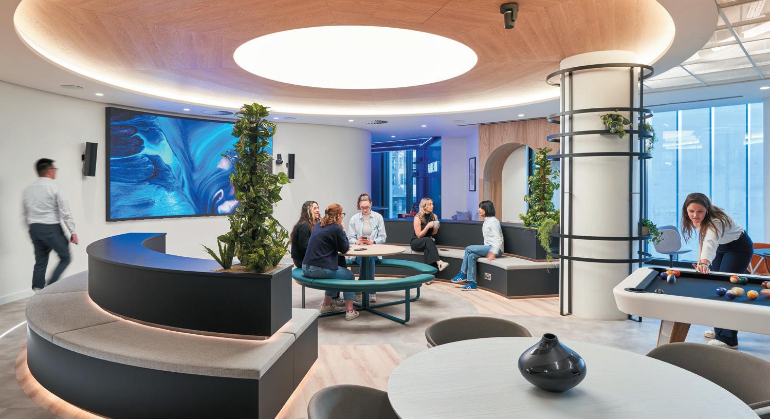
120 P roject of the Y ear
WI nner
P roject of the Y ear
WI nner
f I na LI sts
Workplace Interiors 30-70k sq ft
aIs
EFG International, London
eve WaLDron DesIgn
Entopia, Cambridge
gensLer


80 Charlotte Street, London
hut
6 Gracechurch Street, London
moDus Workspace
Fora Greencoat Place, London
scott BroWnrIgg
St Paul’s, London
squIre & partners
x+why Colmore Row, Birmingham
stuDIo tILt
WooDs Bagot
Convene at 22 Bishopsgate, London
Convene, the US-founded premium meetings, events and workspace company, has opened its first ever international location, Convene at 22 Bishopsgate. The finished design shows a mix of traditional architecture, the history of Bishopsgate and the modern cultural influence of local contemporary street artist Ben Eine, bringing together the old and new; the clean and decorative.
Workplace Interiors 70k+ sq ft
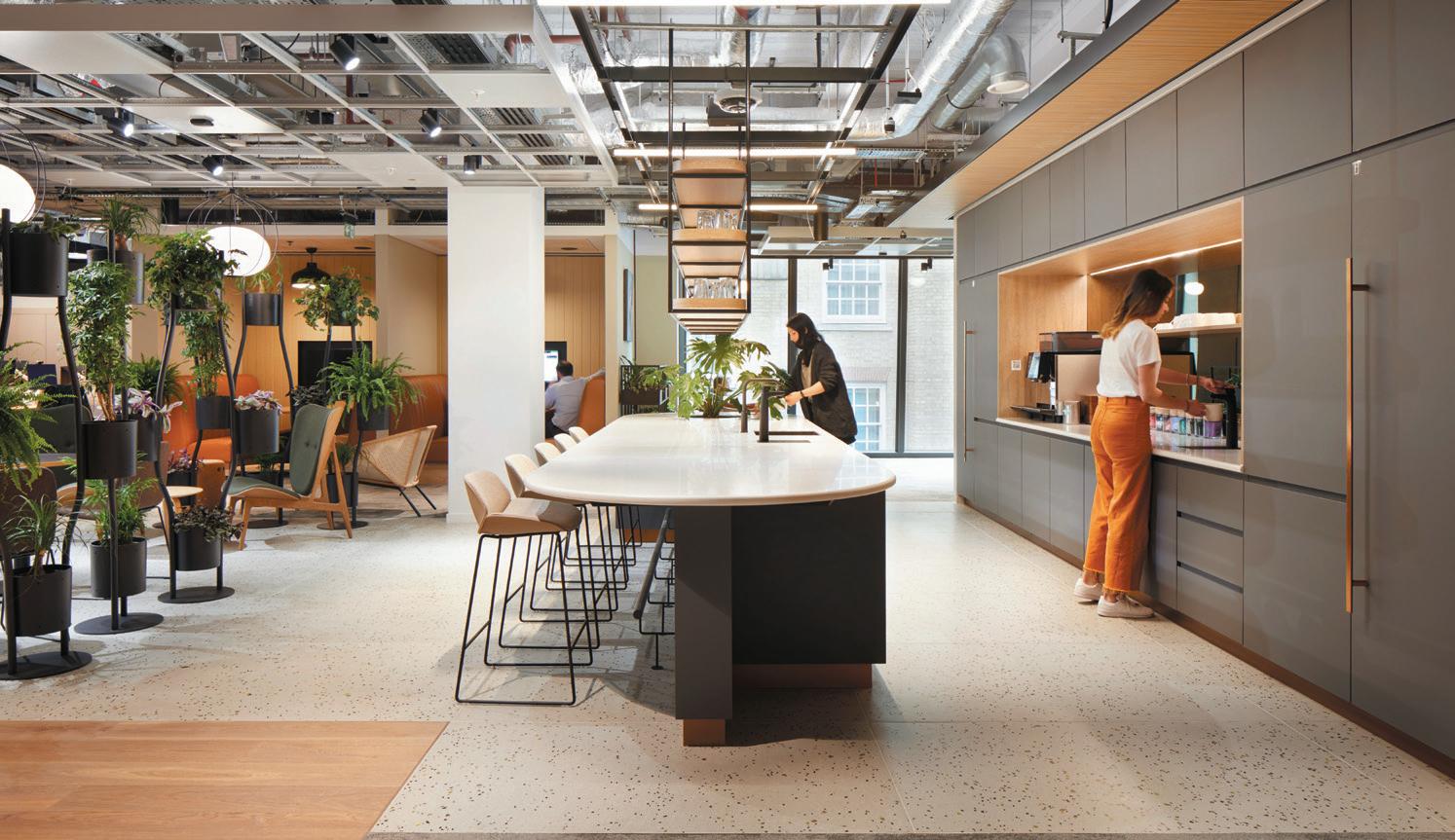
Diageo Global HQ, London
The new global headquarters for Diageo represents a return to the heart of London’s socialising and hospitality sector in Soho, as well as the brand’s vision to create a workplace ‘made for mixing’. A premium office that embraces efficient, agile and smart-based working, MCM’s design showcases Diageo’s heritage, brands, businesses and people.
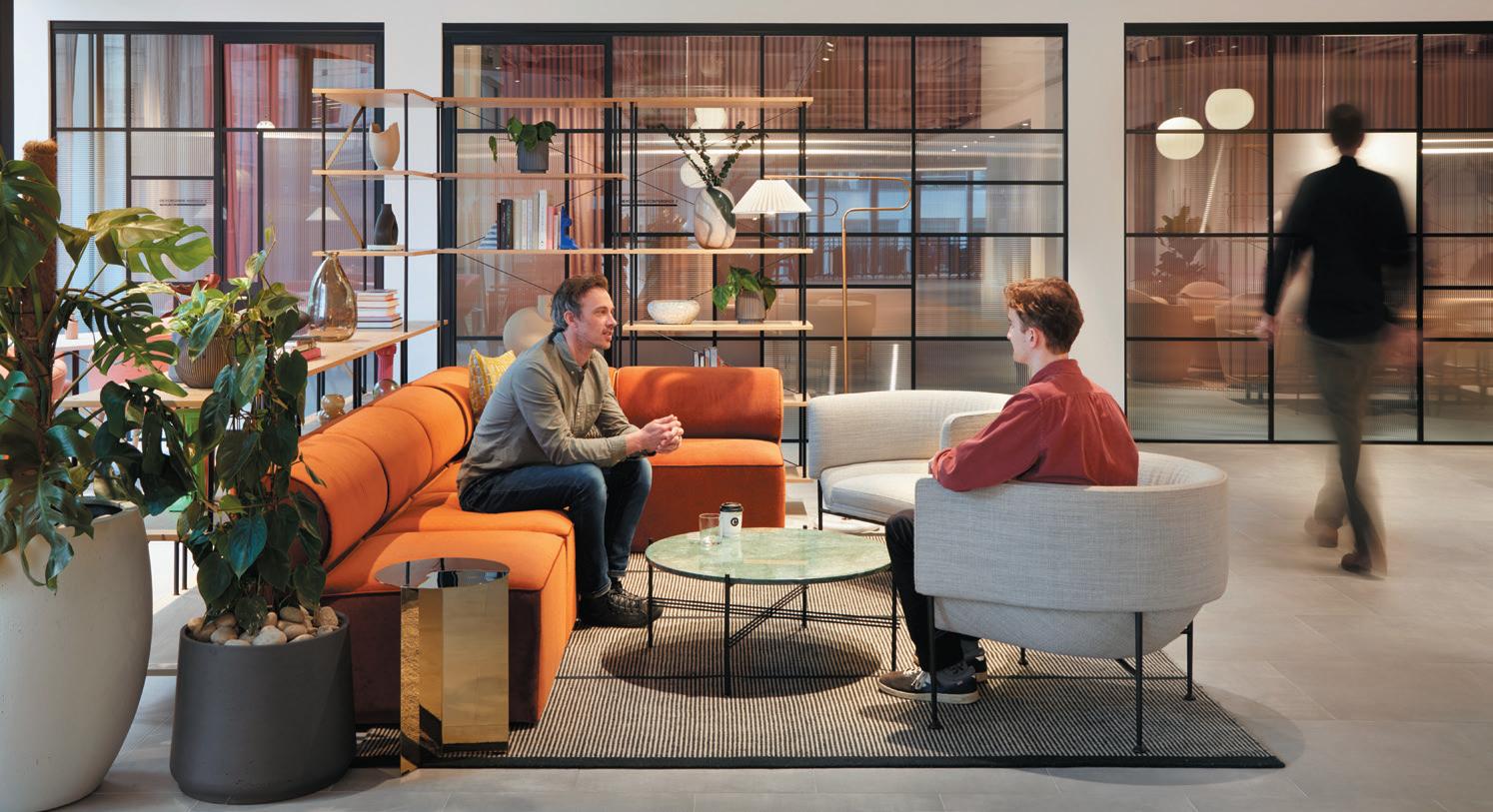
Hiscox Insurance, London
tétrIs DesIgn x BuILD
JLL 20 Water Street, London
tsk x entaIn
One Stratford Place, London
WooDaLLs DesIgn
TomTom, Berlin
BDp
PwC Northern Ireland, Belfast
haWkIns\BroWn
HERE + NOW, Reading
hLW
Roku UK, Cambridge
ID:sr shepparD roBson
BT One Braham, London
moreysmIth
Sony Music, London
perkIns&WILL
EBRD, London
sheILa BIrD stuDIo
The Fragrance Shop HQ, Manchester
squIre & partners
78 St James’s Street, London
tp Bennett
SMBC Group EMEA HQ, London
121 P roject of the Y ear
WI nner
P roject of the Y ear
WI nner mcm
f I na LI sts f I na LI sts
P onsored
s
Manufacturer of the Year
specIaLIst group
Specialist Group is a family business dedicated to delivering bespoke joinery for commercial interior projects by delivering a model synthesis of traditional craftsmanship with the latest in advanced robotics and digital manufacturing. The ‘one stop shop’ approach with joinery, glass and metal all under one umbrella is what sets it apart in the marketplace.
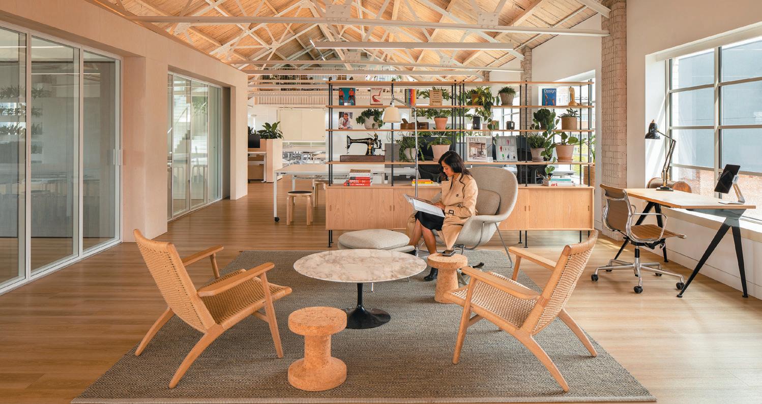

50 and Under Employees
Ia InterIor archItects LonDon
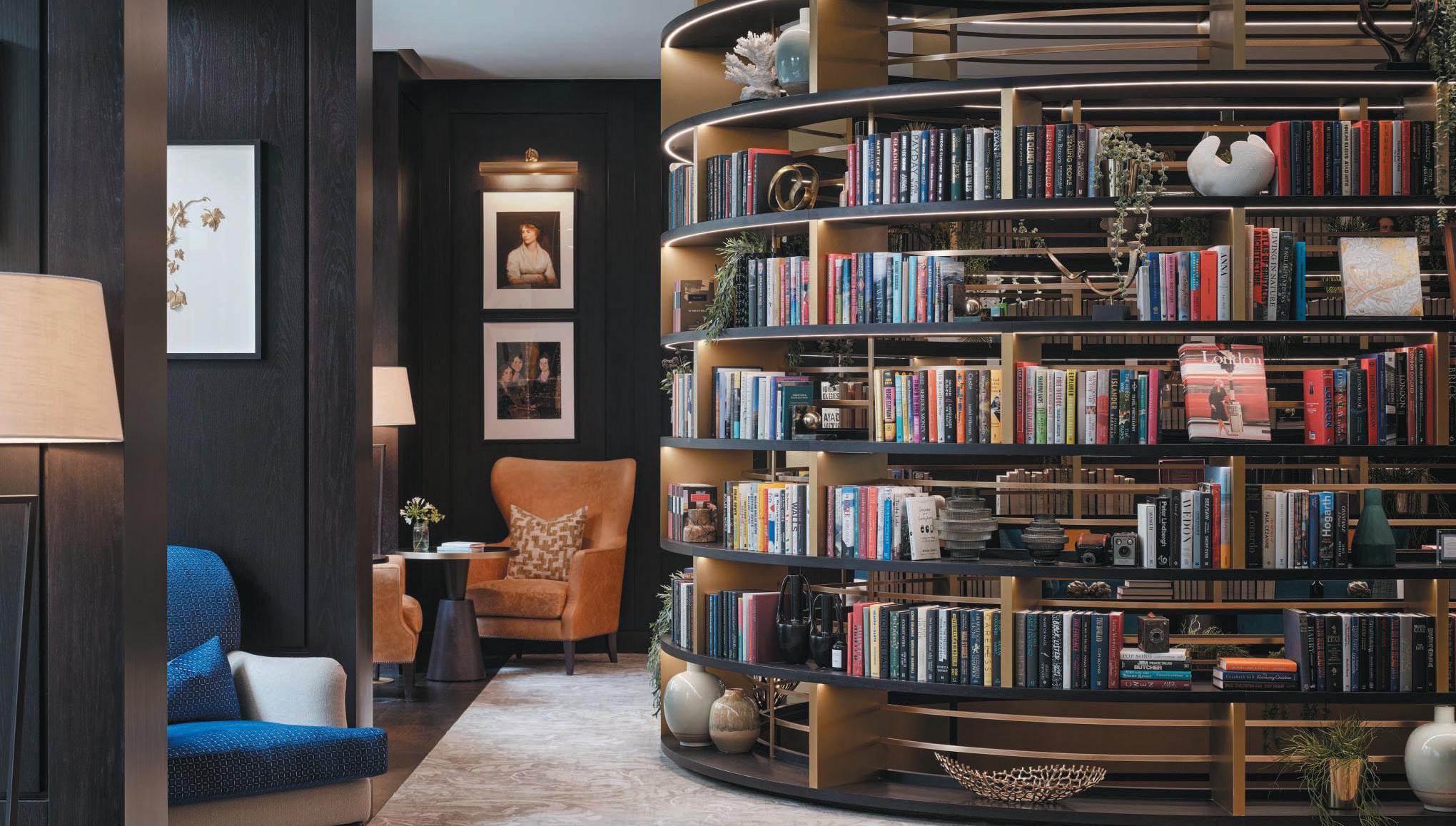
IA Interior Architects’ mission has always been to improve people’s lives through visionary design. Since 1999, the London studio of the firm has translated client goals, brands and culture into environments built around people, processes, technologies and business drivers. As architects, designers, strategists and environmental specialists, IA aligns business strategies and core values with a human-centric emphasis on the dynamic use of space.
Finalists
BLacksheep
BuILDgen
concorDe BgW group
hLW LonDon
JoLIe
resonate InterIors
shh
thDp
122
2tec2
WI nner
egger BIsLey d esign P ractice of the Y ear
autex acoustIcs
Denmark panaz orangeBox Johnson tILes WI nner f I na LI sts f I na LI sts peDraLI
Icons of
DaLe offIce InterIors
nner
WI
Over 50 Employees

BDp
BuckLey gray yeoman
ID:sr shepparD roBson LonDon
InteractIon
morgan LoveLL
tp Bennett LonDon
perkIns&WILL
LonDon
Over the last 12 months the London studio of Perkins&Will welcomed Jo Wright as its new, and first, female managing director, who led the team in their move to 150 Holborn. Last year also saw the integration of the Penoyre&Prasad brand with Perkins&Will, strengthening the practice’s architectural expertise, particularly across the healthcare and education sectors.
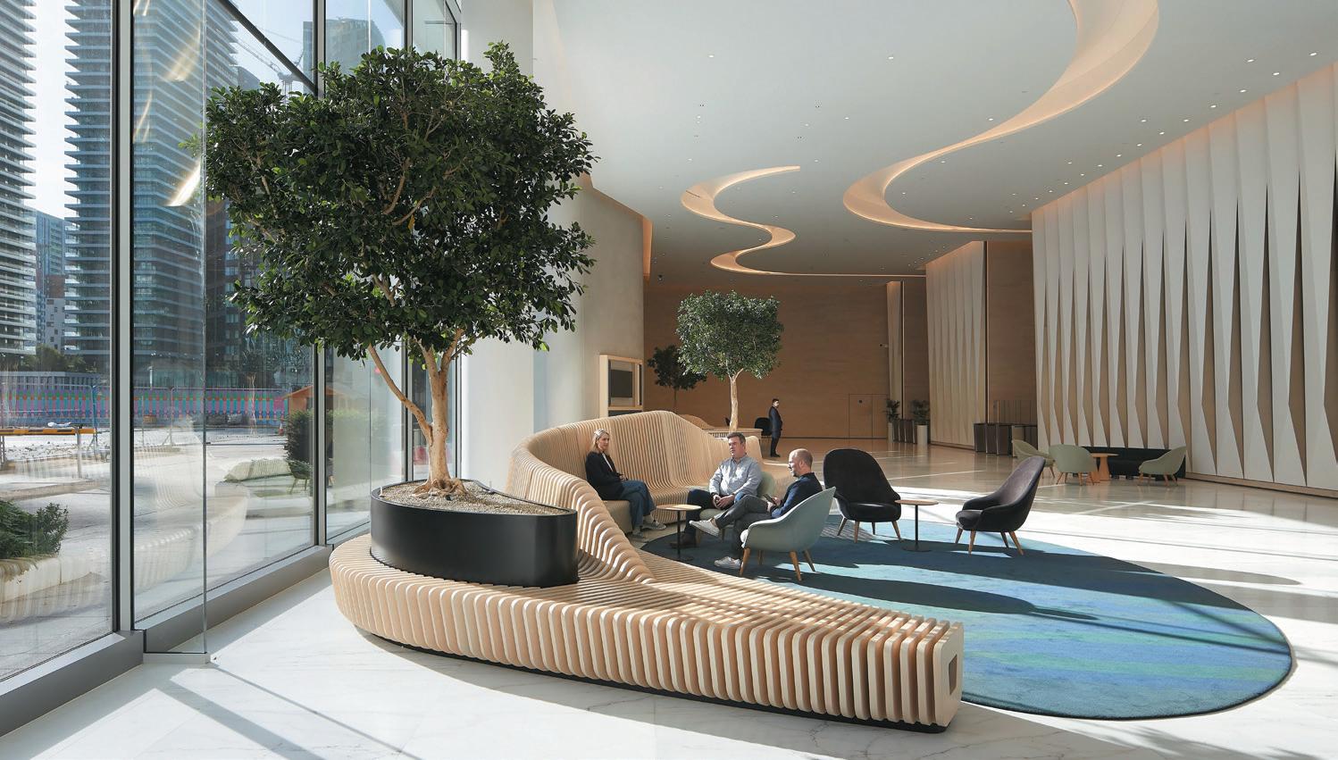
Henry Pugh Outstanding Contribution Award
Mixology23’s Henry Pugh Outstanding Contribution Award winner is a titan within the design industry – founder of eponymous studio, MoreySMith. As principal director for three decades, LInDa moreyBurroWs has reimagined the workplace, collaborating with some of the world’s biggest brands including Sony Music, Coca Cola, ASOS, LVMH and Primark.
When she started her business in 1993, Morey-Burrows did so with just a single landline telephone. From here, she went on to be one of the pioneers of human-centred design – creating spaces and environments not just good for companies, but good for people. Her projects have not only changed how we work, but also changed lives, resulting in happier, healthier, more fulfilled workplace communities – long before it was everyone’s priority.
 LInDa morey-BurroWs Founder and Principal Director, MoreySmith
WI nner
123 d esign P ractice of the Y ear
WI nner
autex acoustIcs
squIre anD partners
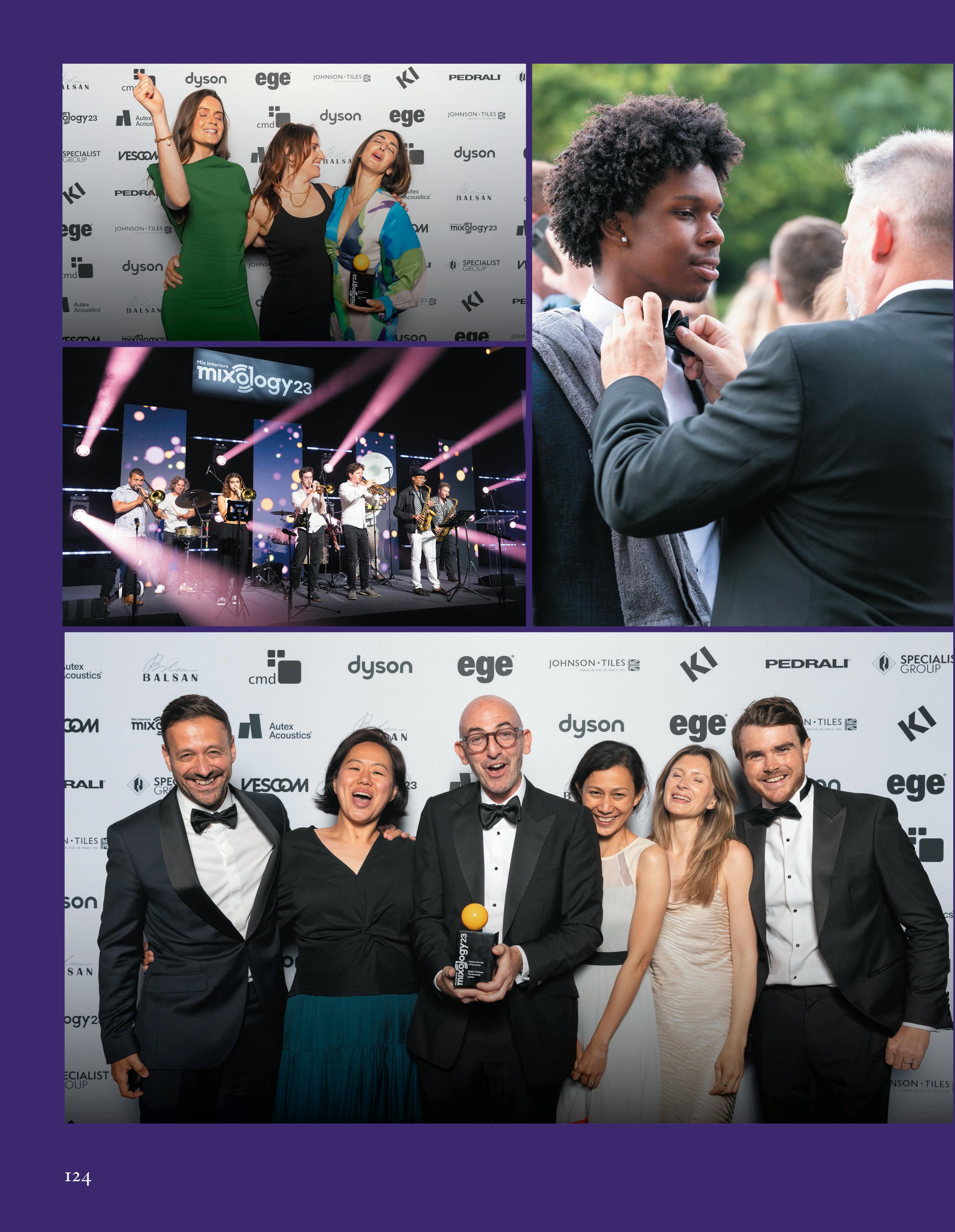
124
You heard it here first
This is a year of milestones. Amongst the architects and design studios celebrating, MoreySmith marks 30 years of design; Herzog & De Meuron, 40; BDP, 50; and Norman Foster commemorates a 60-year career at his retrospective at the Centre Pompidou, Paris.
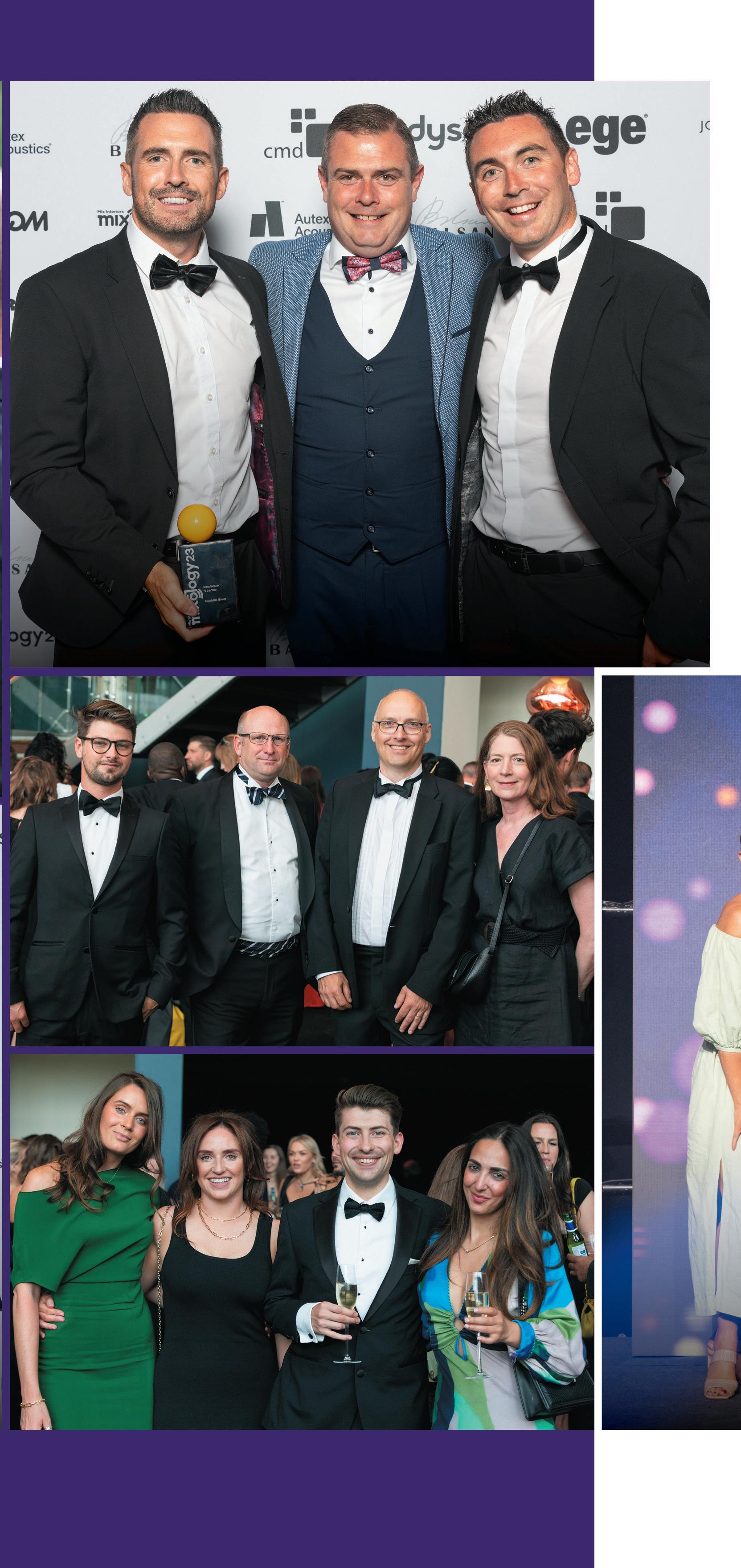
In the manufacturing sphere, The Furniture Practice marks a quarter of a century at 25, joined by Pedrali (60) and Herman Miller (100) respectively. Not one to shy away from celebrating, we feel as though now is the right time to look forward to next year – when Mix Interiors will celebrate two decades of the flagship Mixology event. We’ll be unveiling more details soon.
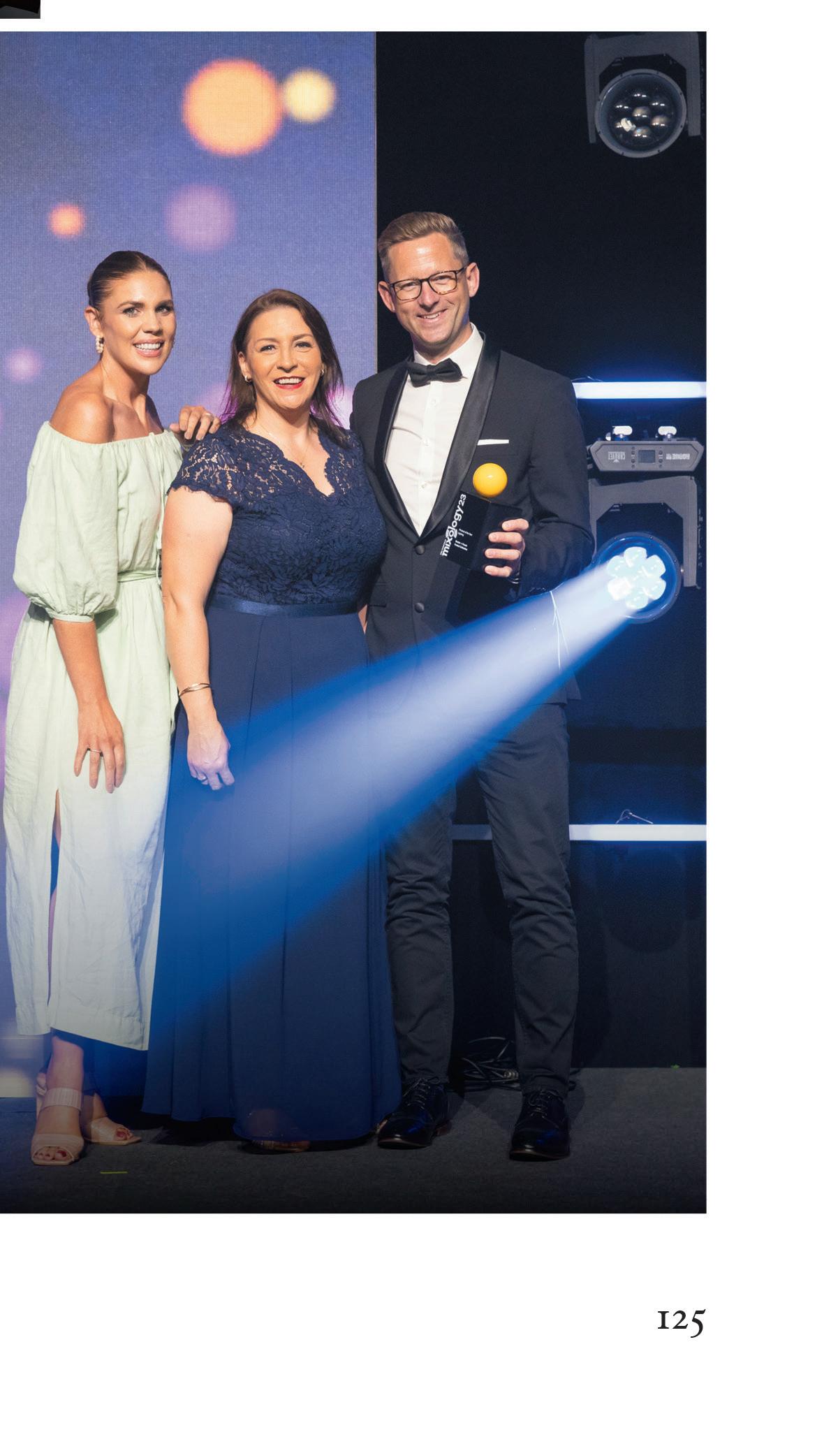 Buster+punch
specIaLIst group
While Mixology23 may have come to a close for another year, Mixology North23 will soon be back, bigger and better than ever before.

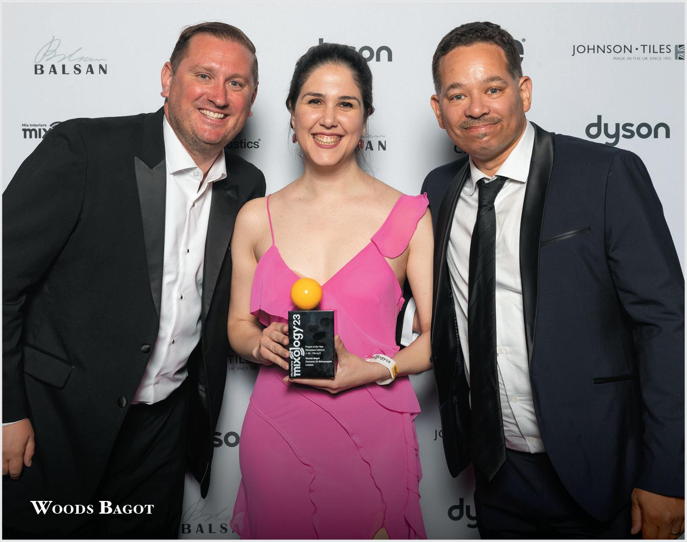
Returning to the iconic Manchester Central venue, guests can expect an uplifting night of celebration and recognition for the best projects, products and people across the north of the UK, topped and tailed by some of the country’s finest entertainers. Entries to submit your best work open 15 August and tickets are now available.


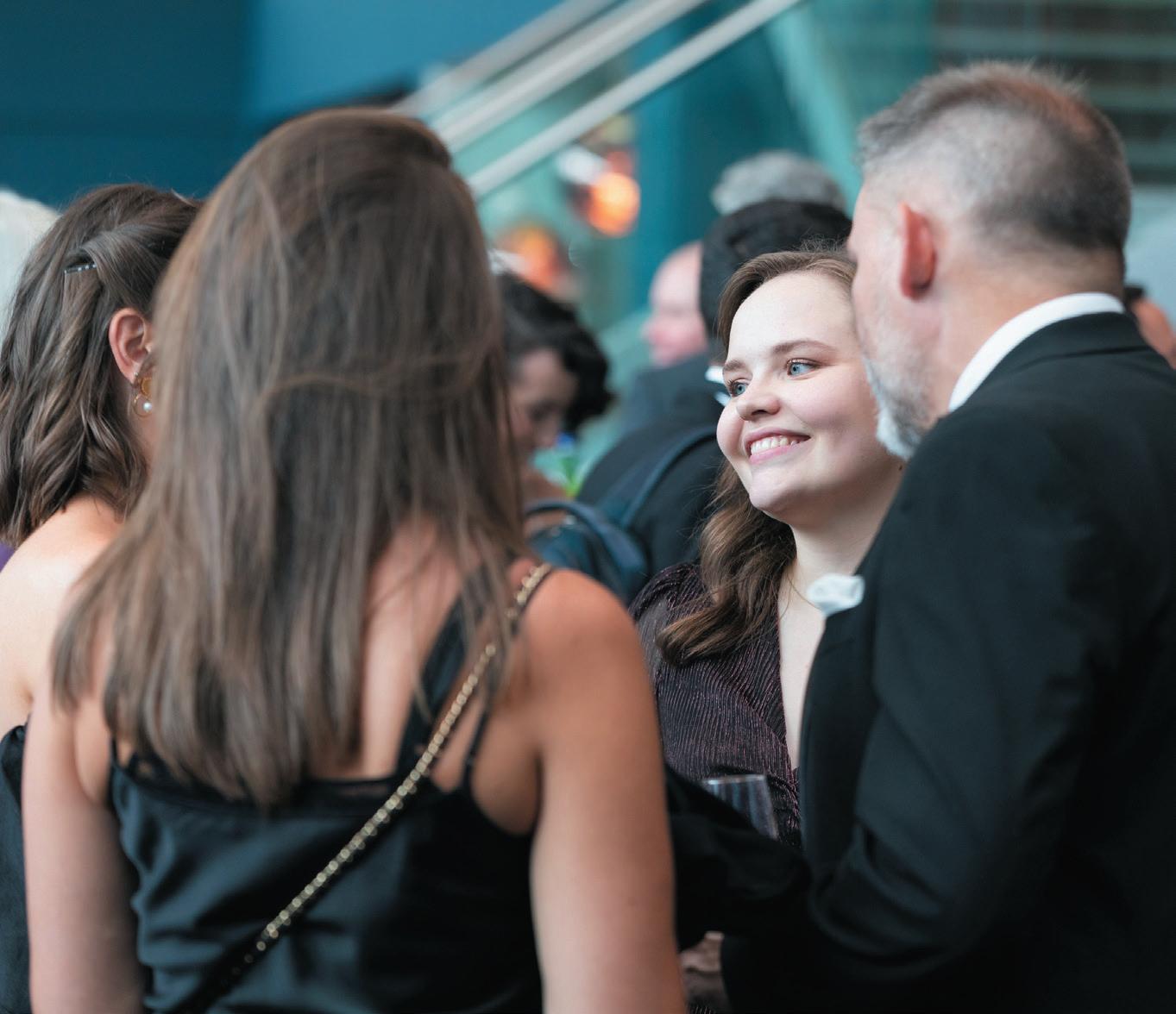
Scan the QR code below to purchase tickets for a sell-out night to remember on 30 November or visit


massIve thanks to our sponsors

126
mIxInterIors com/
events
Class of 2023

It’s finally here: the big reveal of this year’s trailblazers from commercial interior design and architecture. Back for an eighth year, mIx InterIors 30 unDer 30 is the annual class of exceptional designers who will be joining us to celebrate in Clerkenwell on September 7th with our headline sponsor senator | aLLermuIr, alongside amtIco, egger and hunters

In an industry that is on the move – from the blurring of the boundaries between sectors to the emergence of AI – these pioneers of tomorrow lead the pack with their creativity, work ethic and innovative ideas.





128 event: mIx 30 unDer 30
In partnership with heAdline SponSor
harrIet WhIte Interior Designer AECOM
Nominated for her drive, talent and overall tenacity, White’s most recent work includes ExxonMobil, Doha, of which White was involved during RIBA Stages 3 to 5. White helped support the senior design team on the Stage 3 technical design package with the production of joinery drawings and FF&E scheduling (as AECOM’s FF&E specialist). The ExxonMobil lead designer described White as an “all-round designer with a can-do attitude and willingness to go the extra mile”.
kate BonD Interior Designer AEW Architects
Bond’s prior experience in high-end residential equipped her with skills in client engagement, enabling her to connect and form a strong brief with clients. Bond is now successfully balancing high-quality design skills with a robust understanding of project viability and sustainability. This success is no more apparent than at her recent project for charity client Ronald McDonald House Manchester. Both staff and visitors are overjoyed with the space she has created for them, “surpassing all expectations”.
hannah mILBurn Senior Interior Designer BDP

Milburn joined BDP as a graduate and immediately impressed the practice with her creativity. Before long, and thanks to her experience in hospitality design, she rapidly established herself as a rising star – in demand from both the A&D teams. To date, she has worked on residential, workplace, F&B and education projects at BDP, displaying her broad skill set and abilities.

 Luke koLBohm Interior Designer Bruntwood
Since joining Bruntwood, Kolbohm has demonstrated his ability to adapt to different commercial workplace settings. Understanding not only the importance of aesthetic, but the equal importance of commercial viability, functionality and sustainable specification, he incorporates his values into his designs. Working directly with Bruntwood’s customers, Kolbohm is currently working to improve the firm’s customer proposition. Consciously designing sustainable spaces forms a huge part of this process; resourcing finishes, products and solutions that promote a circular economy.

At just 24, Taylor-Tate has already earned herself a stellar reputation at Claremont and with clients, including the practice’s most high profile to date – the global sports betting, gaming and entertainment provider, Flutter Entertainment plc. Part of the Claremont family since 2020 which she joined straight from university, Taylor-Tate has quickly advanced to become one of the business’s most creative interior designers. She is now the lead designer on high-profile Claremont projects with clients including MMC, Myenergi and Diageo.

129
Imogen tayLor-tate Mid-weight Interior Designer Claremont Group Interiors
rosa sheaves Interior Designer Gemco Contracts
Sheaves studied an interior and architecture degree in London and graduated with First Class Honours. Whilst in her third and final year of university, she won the ‘Award for Excellence’ in Technical and Computing for the School of Architecture. Joining Gemco in 2022, within the first year Sheaves worked on numerous live projects and proposals including the firm’s own Environmental Office Space base in Soho Square. Since starting, she has also won Office Employee of the Year as voted for by her colleagues.
aBIgaIL Weegram Interior Designer Gensler
Weegram’s experience in Australia has given her a global perspective that adds to her design capabilities. At Gensler she has worked on projects including the Paris and Berlin NBA Stores – the latter three times the size of the former. The diversity of her work is reflected in the typologies she has worked on, from banking to fashion, health and wellbeing to automotive and electronics. Besides NBA, Weegram has worked with Asics, Fitness First, Bupa, and Delphi and Bendigo Banks.
Laura graham Interior Designer HLM Architects
Graham joined HLM Architects as an interior designer at the beginning of 2021. Working mostly within the education sector, her focus is on creating spaces that are sensitive and tailored specifically for the culture, conditions and needs of different user groups. Graham excels at end-user engagement and the development of interior concepts that are creative and people-centric. She is a passionate advocate for designing for wellbeing and has the enthusiasm and drive to bring wellbeing principals to the forefront of each project agenda.
roByn smIth Interior Designer HLW International
After participating in HLW’s internship programme and completing her degree in design, Smith joined the practice full-time as a designer. She is a forward-thinking creative designer with a passion for creating workplaces that inspire and support employers and their teams. Whilst at HLW, Smith has worked across a number of varying projects from high profile tech clients to Cat A developer spaces. Global clients now view Smith as their designer of choice.



 sara WIneman Project Manager/Associate HOK
Wineman has excelled in her to career to date, quickly being promoted to a young Project Manager at HOK in San Francisco. With invaluable design knowledge, organisational skills and a strong work ethic, the practice has cited her as ‘one to watch out for’. She is currently working on a project with Allen & Overy at the historical 140 New Montgomery.
130
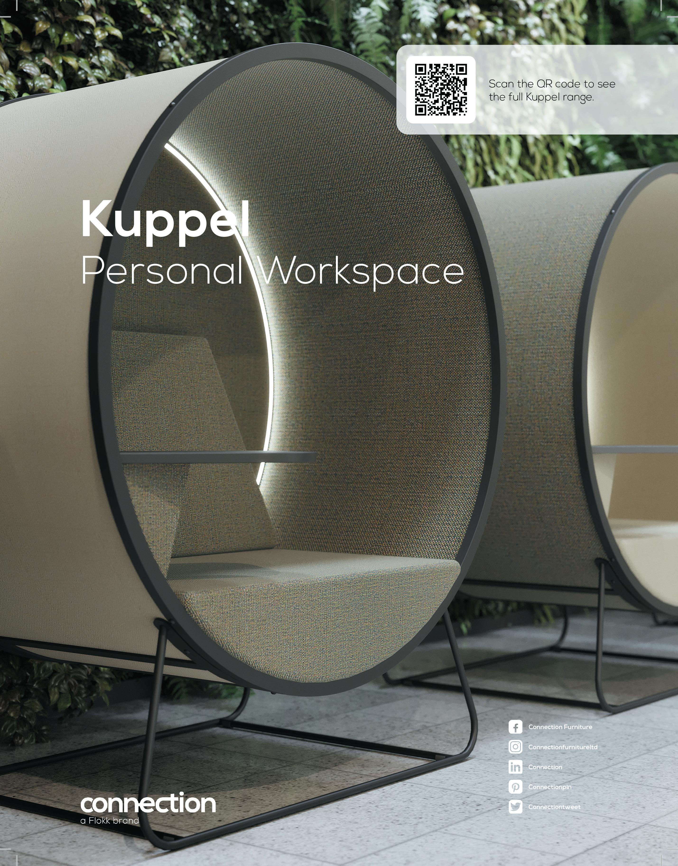 fLorence goater Intermediate Designer IA Interior Architects
Goater is described as a valued and vital member of IA Interior Architects (London) and her merit extends well beyond her exceptional design skills. With a genuine eco-warrior attitude that she brings to her day-to-day life, Goater is a sustainability champion for IA’s EMEA region and has attained WELL accreditation. She implements ecological practices throughout all of her work – making her a key figure in promoting sustainable design on behalf of the entire company.
reBecca fInney Studio Designer Jasper Sanders + Partners
As lead designer, Finney plays a crucial role in the creative direction of Jasper Sanders + Partners. While working collaboratively, Finney’s perfectionism, combined with her conceptually strong ideas, exemplify the passion she has for making life better through purposeful design. She leads a team of three other interior designers working across a number of UK-wide, high-profile projects. JP+S particularly love her buoyant energy and ‘heart on sleeve’ mentality.
 JackIe Lee Senior Associate Jump Studios
Lee has been instrumental in the development and growth of Jump Studios, which has seen her promoted twice to her current position of Senior Associate. As well as running projects, liaising with clients and coordinating with consultants, Lee also takes time to mentor younger members of the team – talking them through the design process, and overseeing the quality of the designs and of the visual intent. Her patience, drive and pursuit of perfection allows her to create show-stopping designs that consistently impress clients.

 Joyce yazBeck Architect LOM architecture + design
Yazbeck is one of LOM’s youngest architects and has a keen interest in social inclusion and sustainability. At LOM she played a key role in the creation of the Net Zero Carbon Client Guide while volunteering with LETI. Yazbeck is currently pursuing the AECB CarbonLite™ Retrofit Foundation course to broaden her expertise in the low carbon retrofit sector – during which she is championing this crucial way of working and gaining vital experience working on Listed buildings and cultural heritage projects.
 maDeLeIne mcLean Interior Designer M Moser Associates
Since joining the team in 2019, M Moser has been impressed by how much McLean has grown and developed as an interior designer. She now looks after some of the practice’s most high-profile media, financial and pharmaceutical clients across Europe. Her exceptional talent for maximising the lived-in experience, by adding unique colour and style combinations, is well-received by clients across various industries.

132
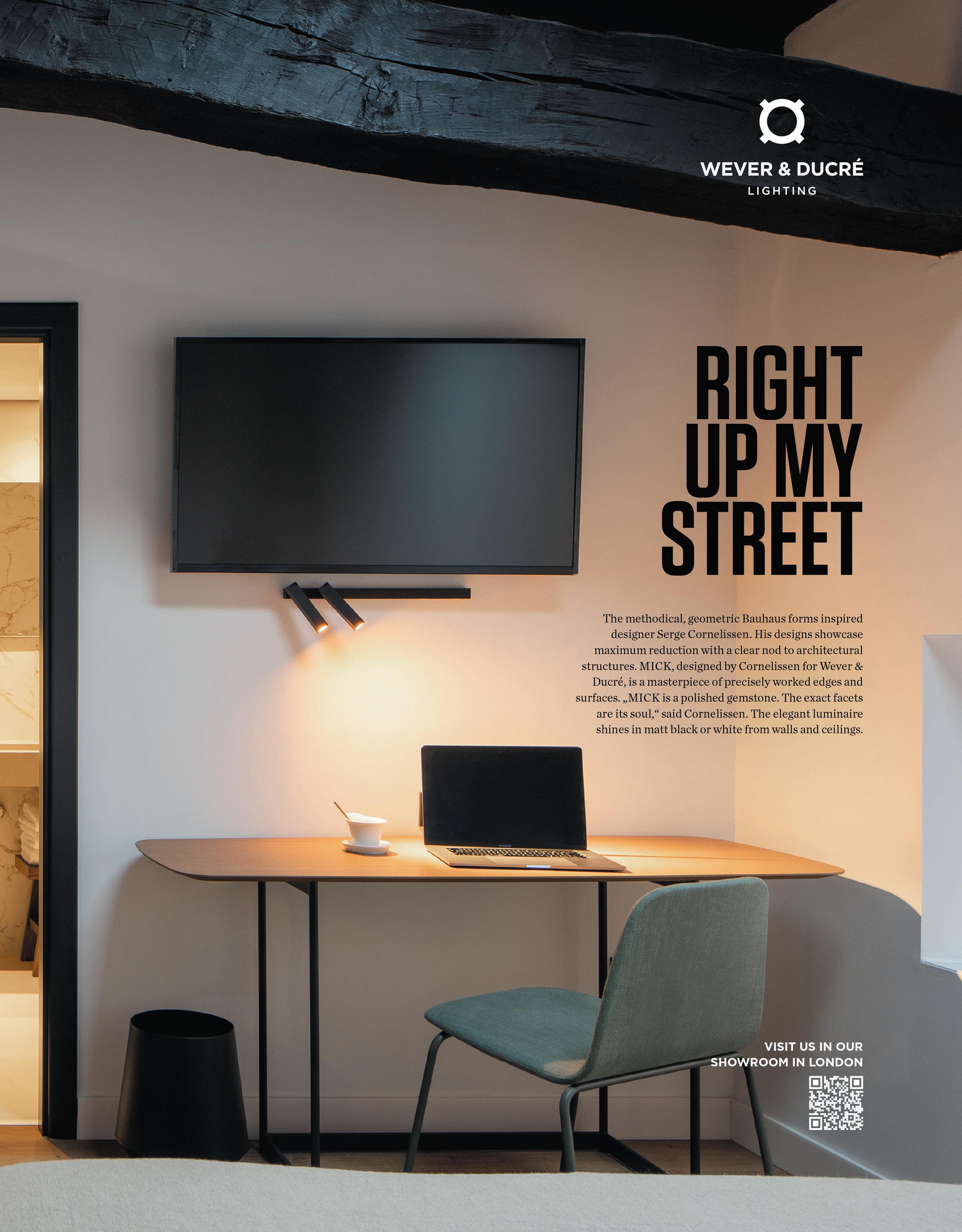
A standout designer, Prieto’s ability to understand a brief intimately allows her to get inside a project and make ‘trusted decisions that lead to results’. Recently she worked on a complex project for leading US legal firm Jenner & Block. With this being its only European office, there was a focus on creating a space that embodied the brand and added a European aesthetic. Prieto fitted seamlessly into the team, winning the trust of both the client and the design team.
Having been at Modus for over six years, Foster has worked on projects ranging from 5,000 sq ft to 50,000 sq ft, including office design for William Hill, Schindler UK, Numis and BC Partners. Working in tandem with the technical design and graphics team, plus 3D visualisers, every project is approached pragmatically with attention to detail and attentiveness. With a strong ability for teamwork, leading and inspiring the new wave of design graduates, Foster is a core part of Modus Workspace.
Having joined MoreySmith five years ago, Nock has become an integral part of the team. He brings a passion for eco-conscious design and leads the studio’s sustainability approach, regularly attending seminars to ensure MoreySmith is at the cutting edge of industry developments. His ability to question and challenge all elements of the design process makes him a key asset on each project. Nock was the Project Lead for Mixology23 finalist Revcap at Charlotte Street, London.

aston cooper-LoffLer Junior Interior Designer
Morgan Lovell
Cooper-Loffler has been a valued member of the Morgan Lovell design studio since she joined the business in 2022. Since starting she has continued to develop key relationships with her clients and project teams by listening to ideas and understanding what their aspirations are, whilst working with them through every stage of the project to deliver solutions in a ‘fun and creative’ way.

emma page Designer
Oktra
Page joined Oktra in November 2021 as a junior designer and has already progressed to become an interior designer. After demonstrating her capabilities early, she began assisting on larger projects, most notably Optiver at 20 Old Bailey. Emma took over the creative and technical design for LBBW at 100 Liverpool, which was successfully delivered. This was a challenging project for a high-profile client through which she was able to show her capability as an exemplary designer.


134
crIstIna prIeto Designer MCM
kIrsty foster Senior Designer Modus Workspace
WILL nock Technical Interior Designer MoreySmith
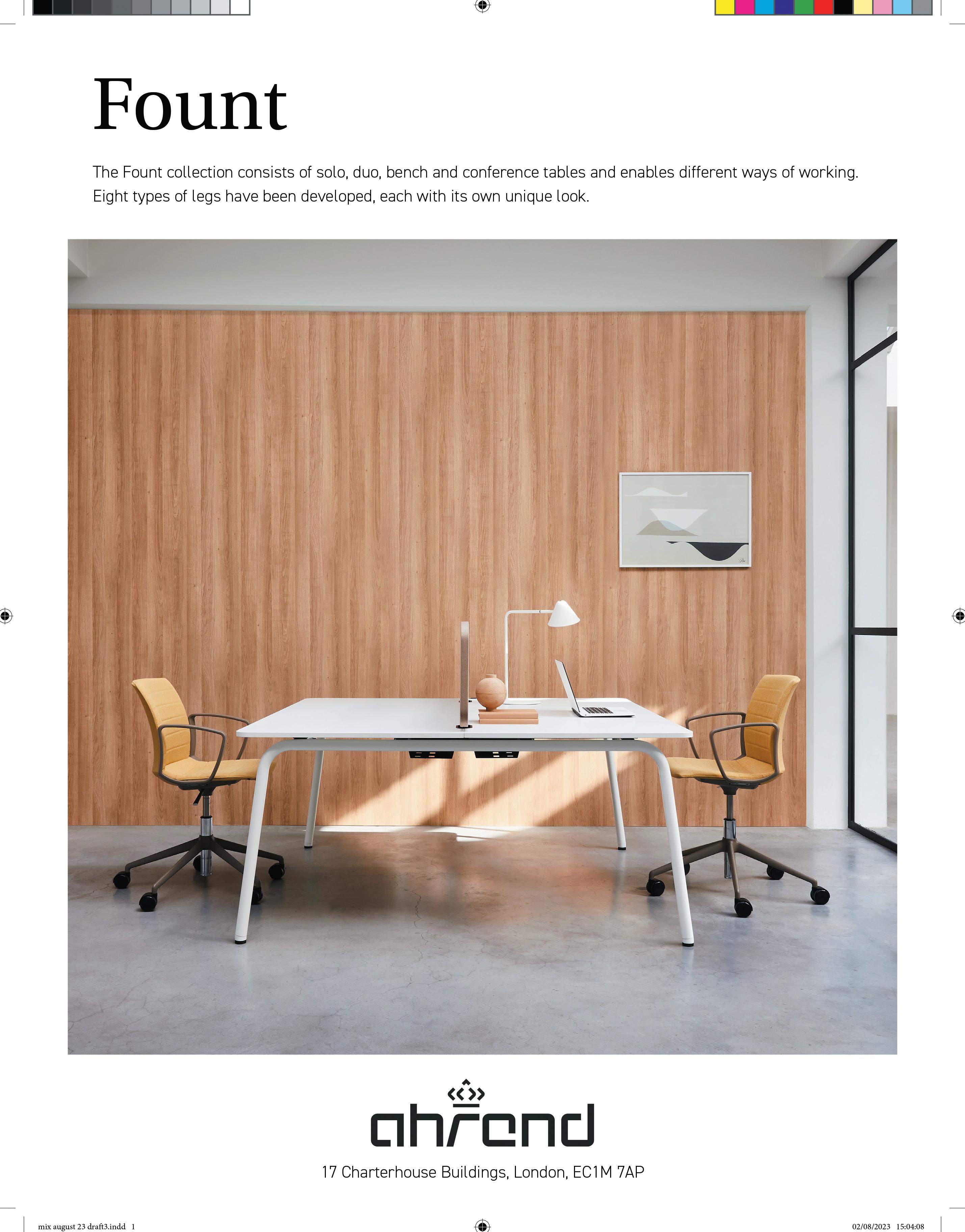 ashton hoLmes Interior Architect Peldon Rose
Described as one of the most exciting designers within Peldon Rose, Holmes always challenges the norm and is never afraid to flout the rules of interior design. Peldon Rose has watched Holmes share boundary-pushing concepts and ideas with clients, pushing the studio itself into new creative territory. Exemplary projects, such as Spacemade Wimbledon, saw Holmes create a home-from-home for the workspace provider, reimagining the coworking environment.
aBrar saaD Interior Designer Scott Brownrigg
Saad joined Scott Brownrigg as a junior interior designer and, in recognition of her creative skills and technical ability, was quickly promoted to interior designer in early 2023. She has been a key player in assisting senior designers with the design, development and delivery of some of Scott Brownrigg’s most notable projects, including the fit-out of offices in the UK and Poland for a renowned Global Financial Markets Infrastructure and Data provider.

 moLLIe ruttLe Interior Designer SpaceInvader
Since graduating in 2020, Ruttle began her career in design and quickly impressed SpaceInvader before joining the team in late 2021. With a number of high-profile workplace projects already under her belt, she has grown in professional confidence and assuredness, undertaking her own projects which have received excellent feedback from clients – including Nest at Glasshouse for Bruntwood Sci-Tech.
eLLIe WInter Senior Interior Designer Spacelab


Joining Spacelab for a week’s work experience six years ago, the studio has since learnt there’s not much Winter cannot do. An enthusiastic designer who will rise to any challenge, she is constantly looking for new and innovative ways to contribute towards her studio’s culture. Winter has worked on projects for Warner Bros, Bauer Media and most recently completed Dick White veterinary hospital in Newmarket where she built longlasting relationships with the client team, ensuring her promotion to senior designer.
Leanna Ioannou Interior Designer Studio Moren
Ioannou joined Studio Moren in 2021 and has since become a key member of the interior design team. She has worked on a range of projects at Studio Moren, both in the UK and internationally. These include BTR and co-living, as well as independent lifestyle and branded hotels. Ioannou designs with flair, passion, dedication and commitment.
136
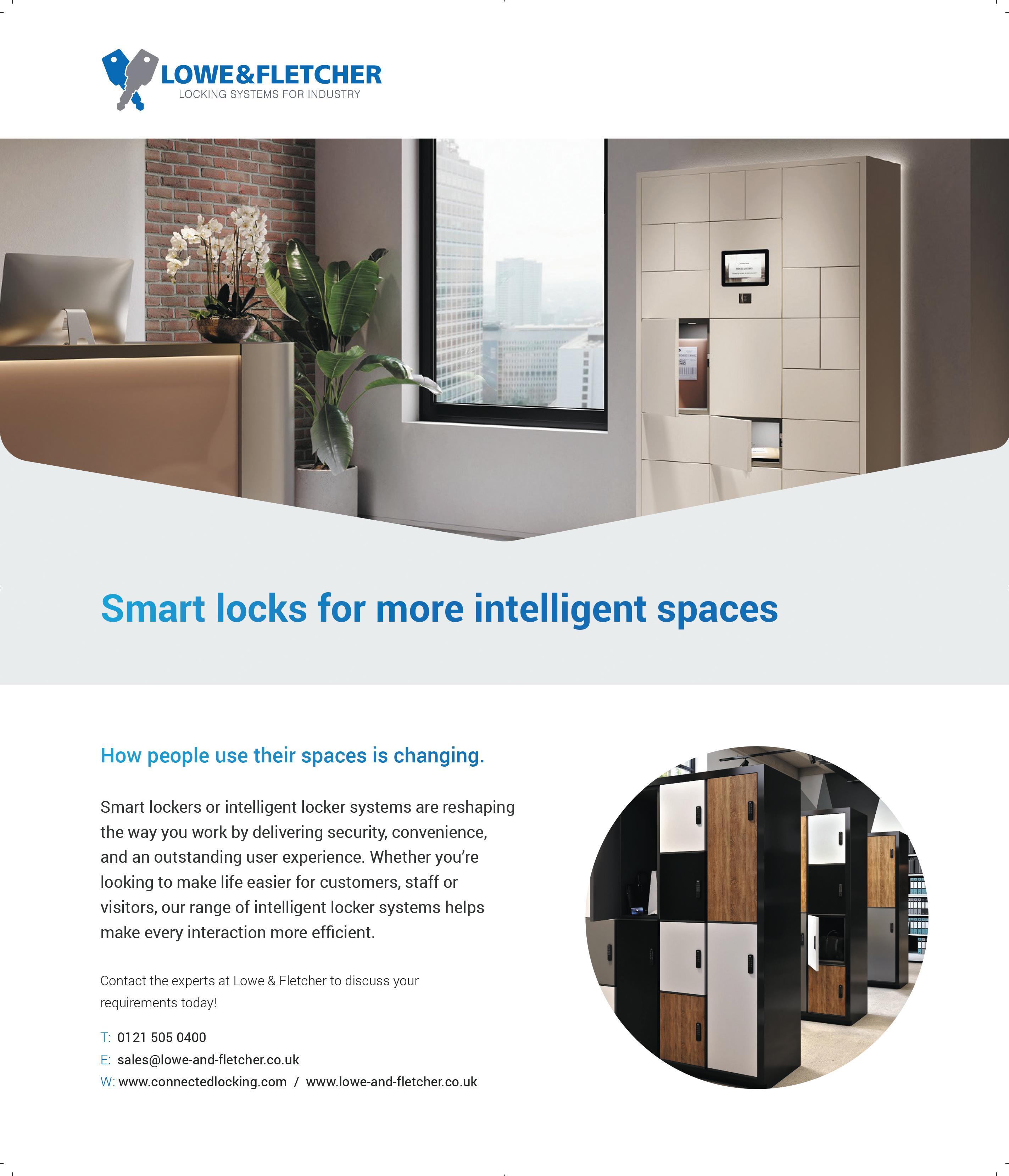 JeD saLmon Designer Thirdway
Joining the team initially as a junior-midweight designer, Salmon quickly exceeded Thirdway’s expectations. He demonstrated a fantastic ability to create an outstanding level of work and build and maintain strong relationships with clients. Since starting in March 2022, he has already been promoted to team lead pitch designer and has consistently managed to win over traditionally institutional landlords with his creative and bold designs, often working within the confines of a tight budget, consistently leading to repeat work.
 nathaLIa garcIa Interior Designer tp bennett
Garcia is a valued team player who worked with Inmarsat in the firm’s relocation of its head office in London to a 120,000 sq ft premises. Her work ethic, skill and passion for design were invaluable in the concept design stage; she took charge of delivering weekly design packages to the client and delivered powerful design concepts that pushed the boundaries of workplace design, subsequently demonstrating a ‘rising star quality’ within the industry.

 sarah ryLanD Interior Designer TTSP
At TTSP for over four years, Ryland is seen as a valuable team member. She is currently lead designer for a large client suite in central London, demonstrating a passion for sustainability with thoughtful design details. She played an essential role in creating and delivering the new office for SAP in the Scalpel – winning a Mixology award in 2021 for 15-30k sq ft Workplace Interiors Project of the Year.
emILy sherIDan Project Designer Two
Sheridan has worked in design and build for four years and her attention to detail ensures spaces are both beautiful and functional. She recently led the design on the Work.Life Red Lion Street expansion; a repeat client for Two and a challenging project. Sheridan, however, rose to the challenge with an exceptional level of professionalism, quickly absorbing the brief as well as embracing Work.Life’s brand identity.
Jenny oLver Interior Designer Woods Bagot
In the last few years at Woods Bagot, Olver has worked across several different commercial projects for clients such as Convene and Warner Music. Her open and engaged style has proven invaluable in terms of building strong relationships with wider consultant and contractor teams. It is this ability to connect with people at all levels that enables Olver to successfully pivot between multiple project requirements, roles and priorities.


138
London Design Fair 2o23
With one of the UK’s most influential design fairs just around the corner, here’s a preview of what to expect at LonDon DesIgn faIr, from 21-24 September 2o23

Based within the iconic Truman Brewery in Shoreditch, London Design Fair is the event for exploring cuttingedge design, brands, makers, pavilions and galleries. Throughout this year’s edition, attendees can expect a comprehensive lineup of industry talks – featuring Mix Interiors – as well as the latest sustainability offerings from lead designers.
The LDNdesign Talks stage will see established talent within A&D share insights on a range of hot topics, including the impact of diverse backgrounds and varied experiences on design and the power of colour by paint specialists Lick and 2LG Studio; the latter also collaborated on the fair’s arrival space, creating an immersive entrance that celebrates the resilience of the design community and visceral effect colour has on emotions.
Not to be missed, on 21 September Mix Interior’s managing editor, Harry McKinley, will take to the stage to ask, ‘are we still designing dangerously?’. In a
lively, provocative discussion, a panel of A&D experts alongside McKinley will explore if originality is dead, where the line is on being overly reliant on ‘safe’ ideas and if the future demands radical new perspectives. Other speakers on the programme include Interior Design Masters’ Frank Newbould – who will explore sustainable design – and Parisian design agency, Emilieu Studio, with an extensive run-through of its Ecole Camondo Mediterranee project on the French Riviera coastline.
This year’s Fair promises to give visitors the opportunity to anticipate future trends and mindsets. Trade tickets are free for those that work within the industry and available to book now.


139 events
cLockWIse from top Left: Judi Archer, Coldharbour Lights, Angus Ross Furniture, Edward Bulmer Natura
LonDonDesIgnfaIr.co.uk
Five decades of design
Commemorating a golden milestone, BDp celebrated five decades of multidisciplinary design amongst friends at its studio in Clerkenwell, London, supported by usm. Surrounded by a crowd of creative thinkers, five industry legends joined mIx InterIor’s managing editor hArry Mckinley for a retrospective look at some of the biggest themes in the last five decades.
“I would question it, because I think I’ve done pretty well,” said director at The Interior Design School and one of BDP’s founders, Iris Dunbar, when asked if there’s a lack of space for women at the top. Noting that she did have to stand tall in front of clients, Dunbar only felt supported by those in her immediate workspace: “It doesn’t matter what sex you are – as a designer, you have to raise the bar.”

Offering an alternative take, historian and academic at Kingston University, Penny Sparke, remarked how women traditionally were the minds behind interiors in domestic settings and pushed out by men in commercial: “There is a hidden history of women in interior design that we should revive, because they haven’t been given [enough] recognition.”
Ian Weddell, sustainability executive at USM agreed, praising the ‘powerful’ women he has worked with, including founder of MoreySmith and winner of Mixology23’s Henry Pugh Outstanding Contribution Award, Linda Morey-Burrows.

“[Counterculture] feeds design. It starts on the radical fringe and brings up perspectives impossible to come up with in an office,” said artist and designer Adam Nathaniel Furman, broaching punk icons Vivienne Westwood and Ron Arad as names who sledgehammered mainstream design. Weddell added: “Counterculture pervades everything that exists, everywhere – but sometimes it takes time to be absorbed,” to which Furman agreed and used Extinction Rebellion as a modern-day example.
Sparke referred to the 1960s and the pop revolution as an ‘explosion’ that ‘trickled up’ rather than down. “The same as punk, design comes through fashion, and filters through to interior spaces and architecture,” she explained. Meanwhile, Dunbar quoted inventor Robert Propst –“design always challenges change” – best known for his Action Office work with Herman Miller. Citing how Propst used agriculture and medicine as inspiration for design, Dunbar illustrated how the spectrum for design influence exists beyond ‘out there’ radical concepts.

140 events
genDer equaLIty Is not there yet
raDIcaL countercuLture feeDs Into everythIng
In partnership with
the Jury’s out on DemocratIc DesIgn

“Terence Conran liked things to be plain, simple, useful and economical,” said Conran and Partners’ principal Simon Kincaid about his practice’s late founder. Known for helming furniture retailer Habitat, Conran was a huge player in accessible design. “People didn’t know what design was, but had designer objects in their house because of Habitat,” Kincaid said, ticking items off such as the wok and chicken bricks.
IKEA was another name to be thrown into the ring, opposed by Weddell and Furman with the latter adding, “on an industrial scale there is no room for the designer [and] you can’t follow the supply chain.” The big question then, is how does a manufacturer lessen the obsession with newness while remaining commercially viable?
Weddell believes the answer lies in circular economies.
“The premise is that you create revenue by adding value in different ways so you can be sustainable,” he explained. From a consumer perspective, Dunbar believes education is crucial: it all goes back to schooling, teaching kids value and consideration of where things come from.”
the future of artIfIcIaL InteLLIgence LIes WIth us
AI divided the panel. Remaining positive, Weddell referred to his time working with Bob Johansen from Institute for the Future – a mastermind who helped found the internet – and said he was reassured by the futurist’s optimism. Also confident, Kincaid remarked how AI’s been used for years, through Alexa devices and Siri on iPhones for example.
“It’s 10,000 brains, but it won’t have some of the decisionmaking and curating skills we have,” he noted. “I’m hopeful it’ll push design forward.”
A rise of hands in the room showed most were also positive about AI, but Furman expressed his concerns: “In the 60s people were excited about technology, but then [a decade later] there was the nuclear arms race, new forms of colonialism, the Vietnam War – and nowadays people still aren’t using technology correctly.” Diplomatically, Dunbar and Sparke said the determining factor comes down to how it is used, and taught to be used, with the latter suggesting that, “in design, nothing replaces thinking with your pencil.”
the pursuIt of gooD taste Is futILe
“Shall I plunge into this big morass of stuff?” laughs Sparke when the subject of what defines good and bad taste is put to the panel. “It depends on who you are, what level of society you operate in and who you aspire to be and not be.” Believing individualism to be prominent in today’s world, Sparke said it now comes down to identity, ‘or identities’, in design to create for cultural, racial or tribal groups, which is a good thing.
Acknowledging ‘good taste’ to be increasingly subjective, Furman commented on how expression has been a ‘human biological urge’ since the days of cavemen: “Good taste is [often] the monopolization of what is considered acceptable by one group of people, whether that be within an industry or a class. What I like about the past 20 or 30 years is this idea that multiple taste cultures from lots of social backgrounds have become equally valid, and I love that.” The following applause suggested the room did too.
What are the best and worst things to happen in design in the past 50 years?
Ian WeDDeLL
beSt thing: Multigenerational workspaces

WorSt thing: IKEA
aDam nathanIaL furman
beSt thing: Increasing taste cultures
WorSt thing: The decline of the British ceramics industry
IrIs DunBar:
beSt thing: Steve Jobs
WorSt thing: Interior design TV shows
sImon kIncaID
beSt thing: Sustainability and wellbeing
WorSt thing: Lazy consumption
penny sparke:
beSt thing: The opening up of identities
WorSt thing: The word ‘design’
141
Material Matters
Atelier ochre is a collaborative and experimental design studio based in Paris and London, with a design process that investigates hidden opportunities and narratives for its clients. Fresh from designing Locke’s Ember Locke hotel in Kensington, in collaboration with House of Dré, the team share the key materials that made up the project. ateLIerochre.com
yarn coLLectIve


Yarn Collective weaves natural and recycled textiles in distinctive colour palettes from subtle neutrals and pastels to deep and fiery hues that worked perfectly with our aesthetic vision for Ember Locke. Most of the textiles specified for drapery and upholstery throughout the hotel are curated from recycled cottons to deep velvets and natural bouclés from Yarn Collective, all environmentally friendly textiles beautifully woven with recycled cotton from the fashion industry that otherwise would go to landfill.
yArncollective co uk
Durat
For the apartment kitchen worktops, we were looking for a durable yet sustainable and unexpected material which could bring an element of luxury to the joinery. We specified the forest green terrazzo effect material from the Finnish company Durat, which is a composite plastic cast into sheets. Paired with antique glass mirror splashback, this adds a sense of luxury and depth to the room.
SurfAceMAtter co uk
stuDIo knot
We collaborated with Studio Knot, a bespoke handwoven rug maker whose creative and conscious design ethos marries technological innovation with heritage and traditional skill. Designed in the UK and manufactured at a mill high up in the mountains of Nepal using ancestry craft, Studio Knot supplied all the bespoke hand tufted wool rugs for all the guest rooms as well as the public areas. As designers, we strongly care about sustainability, and identify with the values and heritage that Studio Knot believes in.

Studioknot deSign
BeJmat
tILes


For the entrance lobby of the hotel, we have used beautiful handmade terracotta white octagon zellige tiles, made in Morocco and supplied by Otto Tiles. We love the irregular effect of the handcrafted natural clay tile as well as tactility and reflective aspect of 5th glazing combined with the elegant and traditional laying pattern. Its origin and history creates a sense of authenticity to the space and brings the outdoors and nature into the internal spaces.
ottotileS co uk
142
Waste to wonder
Everyday food waste becomes a sustainable material that’s as functional as it is beautiful.

Overproduction, excessive consumption of natural raw materials and deforestation are three of the most significant factors causing climate change, and it’s not news that the construction industry is one of the leading contributors, responsible for half of all natural resource extraction globally per year. Materials company Ottan is working to combat this problem, offering innovative bio-composite materials using food waste – from wood alternatives and cladding materials with acoustic properties, from hazelnut and pistachio shells to frosted glass alternatives from expired rice and tile alternatives from eggshells, fallen plant leaves and fruit peel.
“Since the food and agriculture sectors will continue to exist as long as humanity does, it is crucial to harness the by-products and waste of these sectors for the economy,” says founder Ayşe Yılmaz.
Ottan Materials are both repairable and recyclable, as well as solvent free. With the ability to be cut, drilled and sanded, they can be treated like wood and revitalized by oiling or varnishing even after years of use. When no longer required, they can be recycled into new Ottan Materials within the company’s own premises – a process that uses 95% less energy than stone or wood production.
“The upcycling technology we have invented is highly portable and scalable,” explains Yılmaz. “The reason behind designing the technology this way was that waste and consumption issues are not limited to specific regions. Every region on Earth faces its own waste problems and natural resource consumption is a global concern. In our vision, our project will be established at waste-generating points worldwide, enabling the upcycling of tonnes of waste. With this circular system, we can eliminate numerous problems while not compromising on aesthetics and elegance, paving the way for a more beautiful and sustainable future.”
143
ottanstuDIo.com InnovatIve materIaL
I have talked before about hybrid working and how the office should now become a place for deliberate interactions, as opposed to a place we go to grind away at emails for eight hours each day. I am a fan of the ability to work from anywhere (note: I do not say “work from home”), but also enjoy those days where I can meet my colleagues in person.
The thing is, as a late era Boomer, I had early exposure to meeting and collaborating with other people. I did not take my first video meeting until 2006 and was in my fifties before ‘working from home’ stopped being a euphemism for skiving off. I learnt how to operate in an in-person world. The same cannot be said for Gen Z, and they are struggling.
For recent graduates, most of their university years were disrupted by COVID. They attended online classes, virtual social events and some even did online internships. As a result, many of Gen Z have poor interaction skills. They find it hard to present in person, lacking fluency and confidence, relying heavily on filler words such as ‘like’ and ‘um’. They find it difficult to read the room and see when they are losing or winning their audience; they talk too fast and do not make eye contact while networking.

Dress code is another minefield. Although to be fair ‘Business Casual’ as a description gives very few clues if you have spent the last two years in a student house attending lectures in your pyjamas. I have had to point
Gen Z finishing school
out that shorts and flip-flops are not appropriate for the office, irrespective of how hot it is.
The Wall Street Journal recently did an investigation and discovered that many universities, recruiters and companies are training new hires on developing the interpersonal skills that allow them to interact harmoniously with others in the workplace. KPMG, one of the world’s biggest accounting firms, is requiring new hires to attend the firm’s training facility in Florida, where they will practice interacting in person, in a variety of scenarios.
So, how does this sit with the trend towards flexible working? Is it a generational blip that will flow through and disappear? Or have we created a continuum of the lockdown era, as universities lean towards online classes and heavily reduced in-person time. When the Gen Z recruits start work, with days full of video calls and no opportunities to socialise with colleagues, it simply does not help them develop.
The maintenance of a company culture depends on colleagues being able to quickly connect and interact together. At the moment it feels like the older team members are leading that interaction, and so we do need to look towards schools and universities to help develop this skillset in the next generation. Business also needs to recognise the need to nurture new recruits, whilst allowing the freedom of hybrid working and to remember the value of routine face time.
144 the fInaL WorD WIth mIke WaLLey
m I ke W a LL ey is Senior Director of Global Real Estate & Workplace Strategy at c r I teo


 case stuDy: tog, chancery house


 Senior


 Dan mcnuLty Interior Designer / Brand Experience Specialist


 WooDs Bagot


 LInDa morey-BurroWs Founder and Principal Director, MoreySmith
WI nner


 Buster+punch
specIaLIst group


 Luke koLBohm Interior Designer Bruntwood


 sara WIneman Project Manager/Associate HOK
 fLorence goater Intermediate Designer IA Interior Architects
 JackIe Lee Senior Associate Jump Studios

 Joyce yazBeck Architect LOM architecture + design
 maDeLeIne mcLean Interior Designer M Moser Associates


 ashton hoLmes Interior Architect Peldon Rose

 moLLIe ruttLe Interior Designer SpaceInvader


 JeD saLmon Designer Thirdway
 nathaLIa garcIa Interior Designer tp bennett

 sarah ryLanD Interior Designer TTSP


