

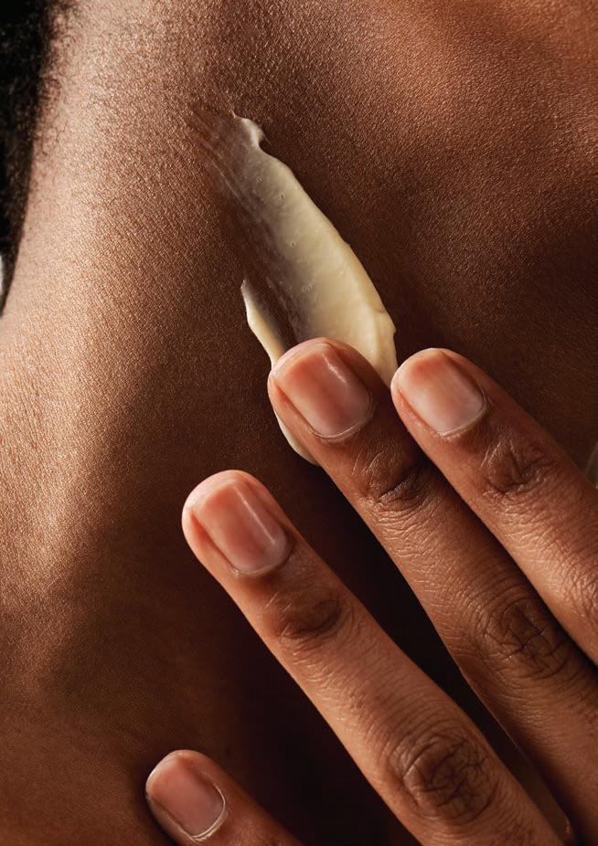

Goodleaf Wellness has upped the ante once again with the launch of their anti-stress skincare range — a fully certified, locally formulated collection dedicated to treating stressed out skin.
Goodleaf is in the business of calm, and therefore has a deep understanding of the impact of stress and anxiety – not only on our minds but also on our bodies. Being the largest organ, skin is one part of the body that is quick to show the negative effects of stress.
High levels of stress cause the body to release cortisol, often called the 'stress hormone', to help regulate the body’s processes. We are all familiar with those dreaded breakouts when under strain or feeling low, but there’s actually more to it. Sustained high levels of stress lead to an overproduction of cortisol which disrupts the hormone balance and can cause inflammation, compromising the skin’s natural barrier and resulting in common reactions like dry, itchy, or sensitive skin to more serious conditions like eczema, dermatitis, or psoriasis.
With a keen focus on clean beauty, Goodleaf only includes ingredients that are good for you and the planet. The unique formulations are mindfully created without sulphates, parabens, silicones, formaldehydes, dyes, fragrances, or toxins. In addition to the ethical and sustainable sourcing of organic and biodegradable ingredients as required and certified by international regulatory body COSMOS Organic, the packaging has received a complete overhaul, with an 85% reduction in plastic and the incorporation of more sustainable materials, allowing for the ongoing preservation and protection of our planet. These changes won approval from international skincare bodies.

Building on the concept of ‘formulas with feeling’, they are subtly scented with Exhale, an anti-stress essential oil blend of clary sage, petitgrain, patchouli, and rose geranium to improve mood and enhance relaxation.

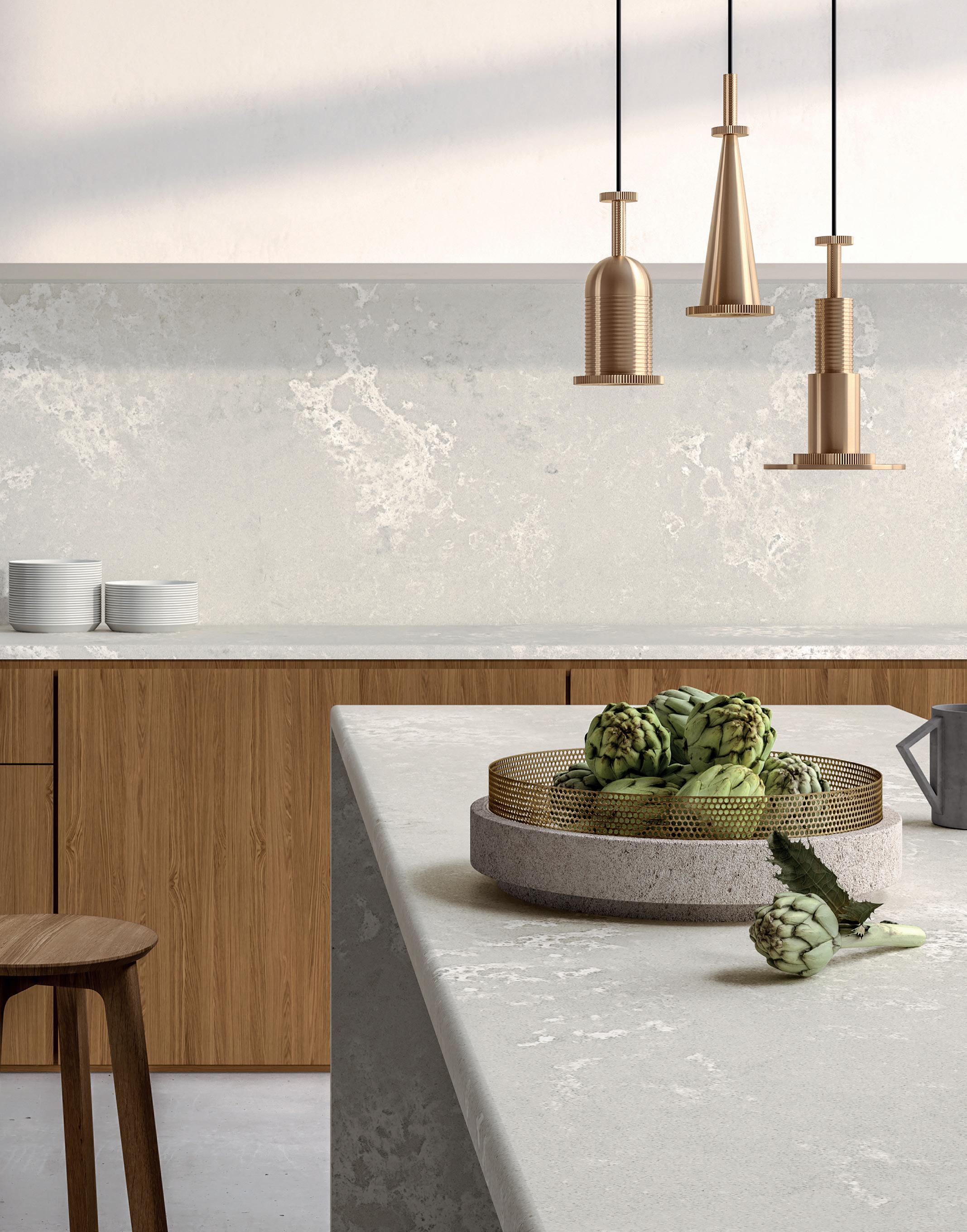
As the famous adage goes: Less is more. But as we move into the new year, our 2020s love affair with minimalism seems to be taking a cha-cha sidestep in favour of a ‘more is more’ aesthetic and applying it to, well, everything — more or less!

We’ve seen striking trends exploring this bold new frontier from the runway to interior design and it’s safe to say that we're here for this era of self-expression. I mean, why wouldn’t we be? Taking risks, celebrating uniqueness, and not taking ourselves too seriously sound like the perfect New Year’s resolutions to me.
It should come as no surprise, then, that Viva Magenta was announced as the Pantone Colour of the Year 2023. A brave, brand-new hue that revels in pure joy, encouraging experimentation and self-expression without restraint. Vibrating with vim and vigour, this electrifying and boundaryless shade is an unapologetic stand-out statement. Don’t worry, darling. If this is not the frontier you’ll be exploring in your own home, remember that maximalism is as personal as a toothbrush. In other words, you need to own it! Sometimes your version of taking it to the max is a crisp white wall, and hey, that’s groovy! We’ve got plenty between our pages for you, too.
From exciting houseplants and Mediterranean meanders to gorgeous tablescapes, dahlias in bloom, striking sculptures, and more — nature calls as we welcome the summer sun. Of course, what would an issue be without a good ol’ DIY home renovation to inspire you? Escape to luxury retreats in Franschhoek, explore wine farms with friends and family on a cheeky weekend trip, and step inside contemporary chateaus to let your imagination run wild. We trust you’re sitting poolside, bevvy in hand, and speaker close by to ‘turn up’ for sweet summertime. ‘Tis the festive season, after all.

Tatum Guercio, Founder of Online Plant and Lifestyle Brand, Mother of Plants
Art Meets Nature at This Award-Winning Home in Johannesdal, Stellenbosch
MAGIC
Rose Buchanan, Landscape Architect and Designer
A Romantic Wes Anderson Storytelling Set Meets Japanese Rural Pod at Franschhoek’s Camp Canoe, Anji Connell, Travel and Design Writer
Leroy Merlin’s Summer Styles
Denicke Cronjé, Event Floral Designer, The Grand Botanist
Create a Bright and Fresh Bathroom with Geberit
Mel Cook, Interior Designer and Founder of Cooked Studio

Lisa Barrett, Owner of Wildly Sown
Vergenoegd Löw The Wine Estate, Source Interior Brand Architecture
COLOUR ME HAPPY Be Inspired by These Eight Great Colourful Bathrooms
Outside & In Interviews Renowned South African Sculptor, Anton Smit
Johanna van der Merwe, Owner and Creative Lead at The Sourcing Lab

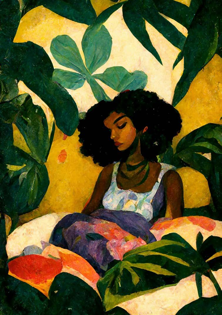

Ithink it’s safe to say there’s been a serious plant boom since we were stuck in the big L (aka lockdown). Urban jungles are now more popular than ever, giving us all the wonderful benefits of having aesthetically calming and air purifying qualities in our homes. We just can't deny the good vibes a plant or ten can bring! Since you’ve managed to keep the dependable ‘Mike the Monstera’ and fabulous ‘Phil the Philodendron’ alive for the past two years, why not step up your game and introduce some new trendy plant babies to your repertoire? What better way to start the new year than with some greenery to keep us inspired and growing?
Move over Monstera, from bright hues to intricate and exotic foliage, these gorgeous tropics are all the rage right now. The best part? Most of them won't give you grey hairs trying to keep them alive! Next time you go to your nearest garden centre, or hop online to check out the latest from your favourite plant store, try and add these unique varieties to your cart...
 Tatum Guercio
Founder of Online Plant and Lifestyle Brand, Mother of Plants www.motherofplants.co.za

@motherofplants.za
The perfect statement plant, the Philodendron Prince of Orange’s bright, fiery foliage will add plenty of warmth and colour to your home. The leaves of this fabulous houseplant change colour over time, the new growth in the centre starting with a starburst yellow before transitioning to a coppery orange and, finally, a mature green, resulting in a kaleidoscopic wonder year-round. This golden glory will add a welcome splash of tropics to your space. Plus, its easy-peasy care nature bears a high reward for a small amount of effort compared to many other exotic plants.
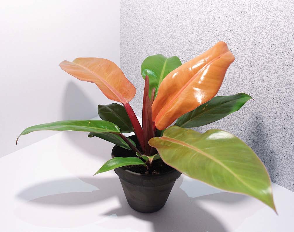
TLC: Place your prince in a bright location in your home or office out of reach of direct sunlight and in a spot where it will receive plenty of filtered light throughout the day. Water judiciously and use a pot with drainage holes so it won’t get waterlogged.
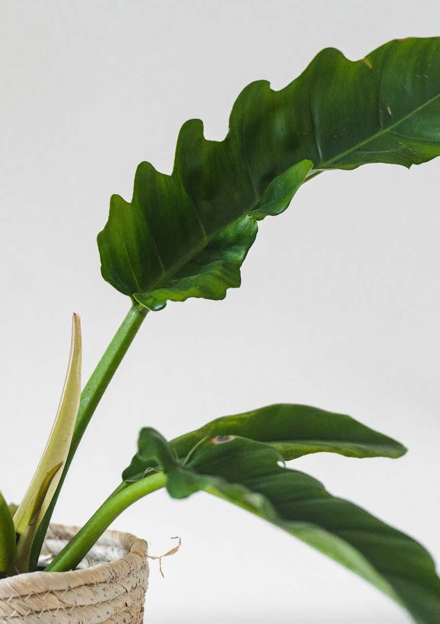
A great way to add some lush greenery to your home, this big plant baby comes with long, large, and narrow dark-green leaves with heavily serrated edges that exude exotic tropical vibes. Its unique, zig-zag leaves allow the plant to absorb even the tiniest traces of light and water in the home, making it totally fuss-free. Also called ‘Narrow Escape’ and ‘Jungle Boogie’—I mean, really?—this houseplant is a great substitute if you need an alternative to the traditional Monstera. Overall, its low-maintenance and easy-tocare nature make it an extremely popular choice among greenie beginners. Well, who can say no to a lil' jungle boogie?
TLC: Place your Tiger Tooth in a shady corner or in a sunny spot—it’s not fussy at all. Bright, indirect sunlight is best, as well as moist, well-draining soil. Mist or water once a week or when the top five centimetres of soil is dry. Make sure you don’t overwater and keep leaves dust-free by wiping with a damp cloth. Note: this plant’s jagged edges come with a warning of toxicity. Best to keep away from pets and children.
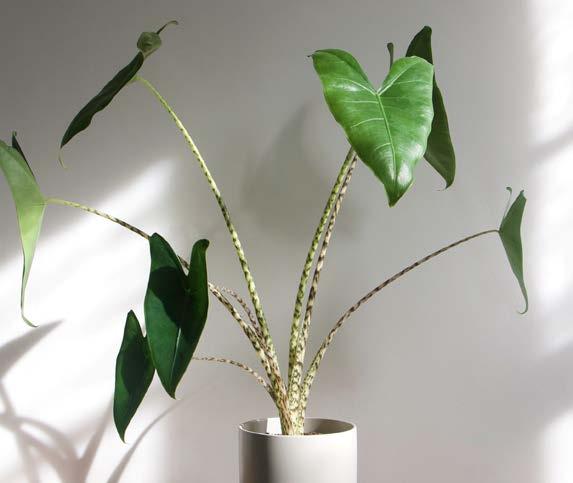
Alocasias have definitely become the new favourite this year, and will continue to become more popular as we discover new variations. But one statement piece that is almost impossible to overlook is the Zebra Plant variety. With its large size, glossy green arrow-tip leaves, and eye-catching zebra-striped stem (hence the name), this baby demands all of the attention. Keep in mind, like any tropical houseplant, this plant pal loves humidity.
TLC: Place your Zebra Plant in a south-facing room in bright, indirect sunlight. Use a pot with drainage holes and allow the soil to dry before watering. Pebble-filled trays with water are sure to increase the humidity this plant loves, but be mindful that the plant itself should not sit in water to avoid root rot. Remember to rotate your pot to promote even distribution of growth.
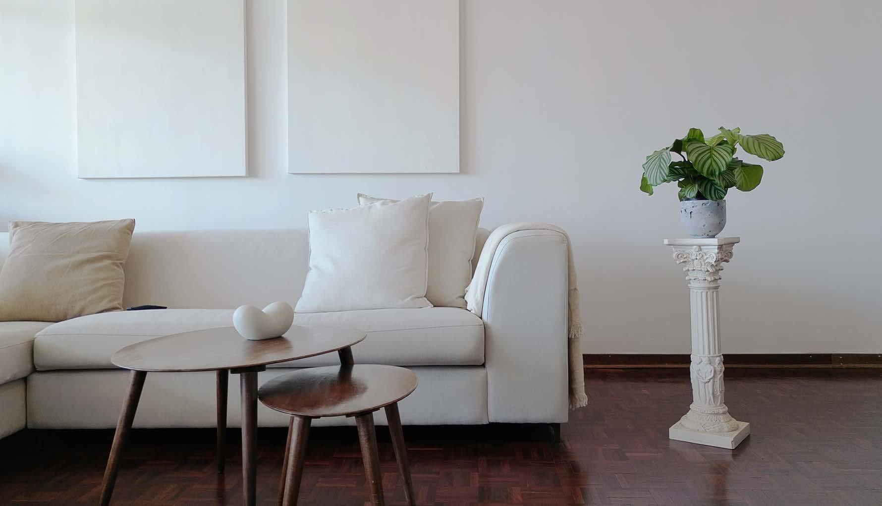
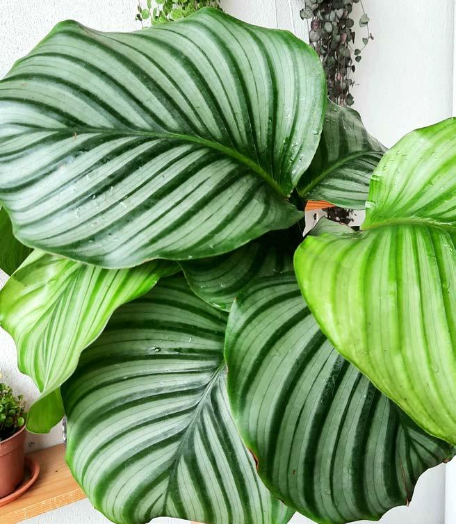
What would a plant bucket list be without a Calathea? Prayer Plants are having their moment and we are here for it! This sassy, showy diva of the houseplant world is a personal favourite. Her striking oversized, silvery-striped leaves make a bold, classic statement. Plus, a bonus is that the Calathea orbifolia is also pet-friendly, so safe for the fur babies too! As high maintenance as this tropical baby can be, any plant lover will find its fast-growing nature highly rewarding. Due to its air purifying qualities, this one is also a literal breath of fresh air. But be warned, she is a fussy pants and comes with high care instructions.
TLC: Place your Prayer Plant in dappled, indirect sunlight. While they need consistent moisture, these lush plants can't tolerate soggy roots. Keep the soil moist but not waterlogged. Mist regularly or place inside a bathroom for a humidity boost.
Microsorium musifolium 'Crocydyllus'
Feel like ferns are old fashioned and long forgotten? Think again! Introducing the new ‘leathery’ model, the Crocodile Fern. The leaves of this rare beauty have a highly unusual yet distinctive leathery appearance, pretty much resembling a crocodile’s skin. Although slow growers, they make great statement pieces and thrive in tropical indoor environments. Contrary to the danger their name suggests, Crocodile Ferns are safe for your cats and dogs. Characteristic of typical ferns, this croc loves water and humidity, making the bathroom or kitchen the perfect spot for them to flourish.
TLC: Place your Crocodile Fern in bright, filtered-to-low light. Keep the soil moist, but not oversaturated or soggy, using room temperature water. This faux leather plant will love regular misting, promoting lush and healthy growth.
If you’re a die-hard plant enthusiast with an impressive collection of plant babies already, then this bonus rare beauty might be new to you...
Caladium is a genus of flowering plants also known by its beautiful common names ‘Elephant Ear’, ‘Heart of Jesus’, and ‘Angel Wings’. Although traditionally used for shady outdoor gardening, Caladiums are slowly becoming the new indoor cool kid on the block. Their large lush leaves come in a wide array of colours and patterns, giving one the feeling of collecting a rare art piece. Caladiums are also a great substitute for having fresh flowers in the home, albeit longer-lasting. Their beautiful foliage with splashes of green, white, pink, or red is simply irresistible.
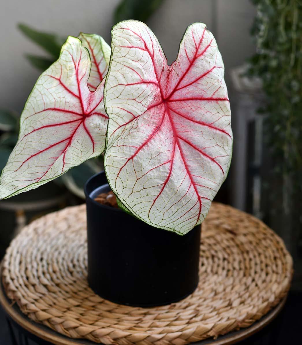
TLC: This fancy-leaf enjoys filtered, indirect morning sunlight and high humidity and temperatures. Water more or less once a week, keeping the soil moist not soggy, and never let it dry out. Keep away from your AC, water sparingly during winter, and take note that it can be toxic when eaten by pets or children.
There you have it! I hope that you've been inspired to venture out of your comfort zone by adding more variety to your indoor jungle this summer. Shout out to all the plant parents out there. Wishing you all positive vibes and healthy, thriving green babies for 2023!

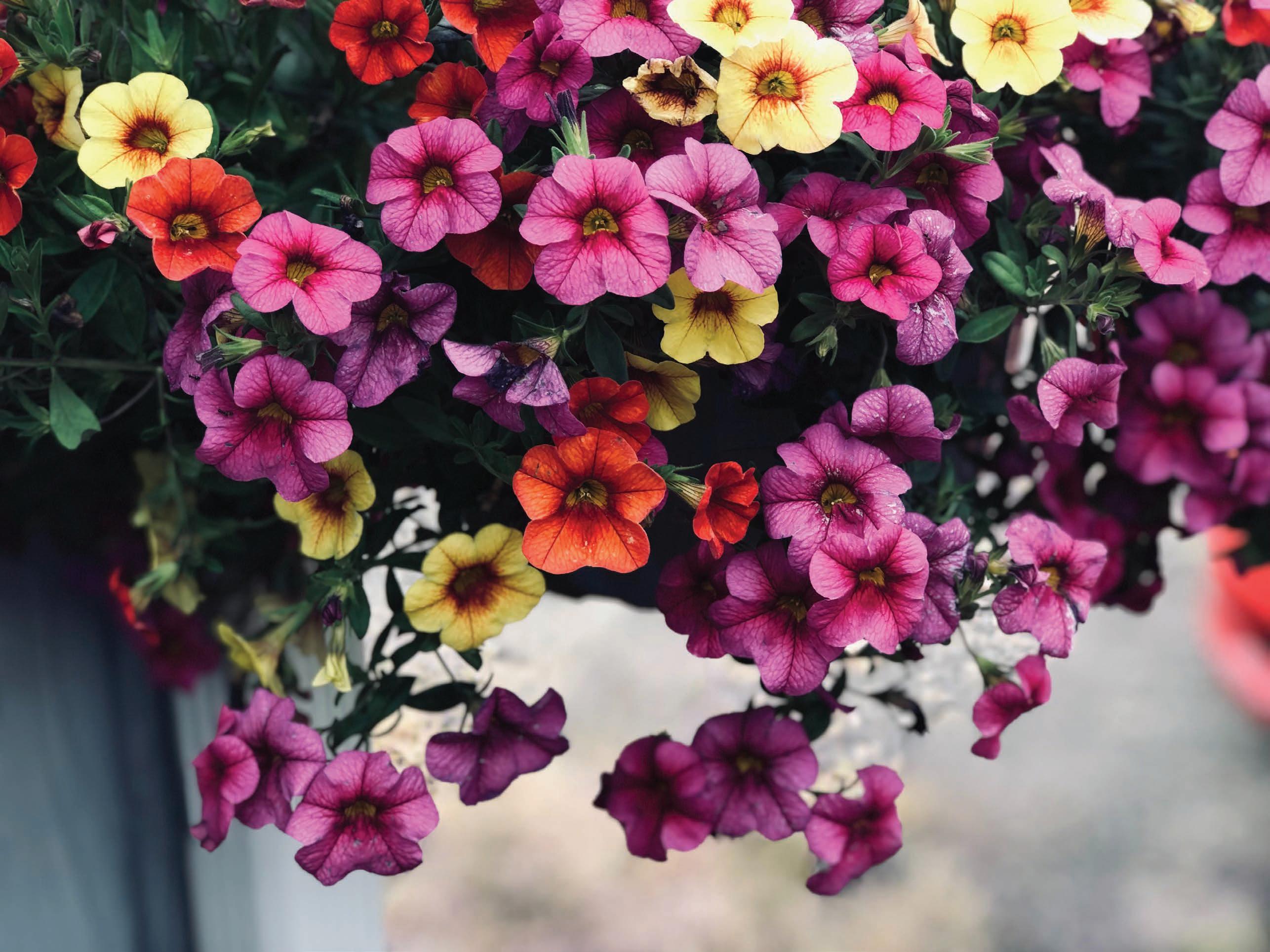













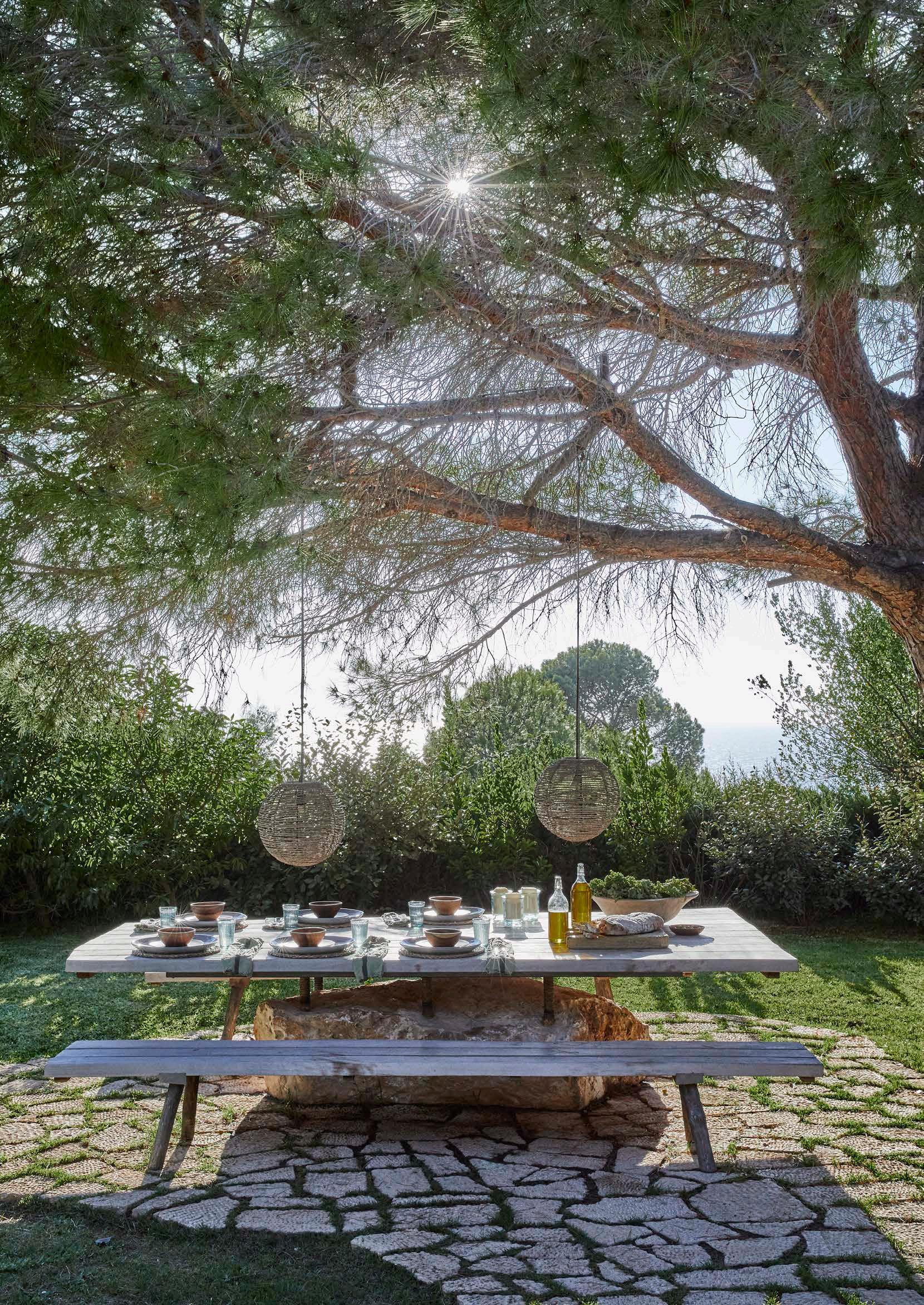

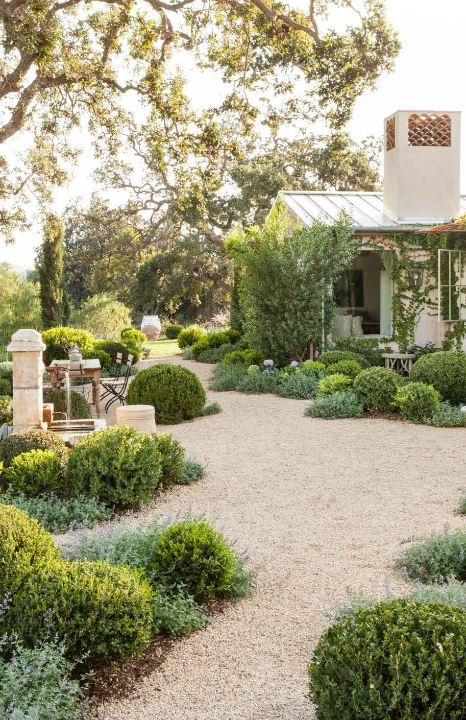
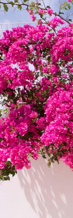
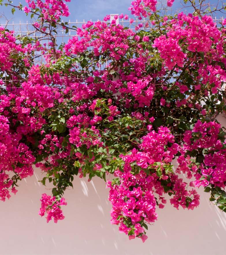
Agarden possesses the unmistakable gift of being able to create a magical sanctuary. It’s a space that allows us to be whimsical and romantic, simply through colour, sound, texture, and scent. Imagine, for instance, a pergola draped in Bougainvillea with the crunch of gravel beneath your feet, the softness of lavender at your fingertips, and the pungent scent of flowers in the hot afternoon sun. Add in a gnarled olive tree and some poplars in the distant rolling hills, and one could easily be somewhere off the coast of the Mediterranean!
Landscape Architect and Designer www.rosebuchanan.com @rb_landscape

But what if we don’t have to imagine this at all? Perhaps we can use our Mediterranean climate and drought-resistant plants to create our own Mediterranean magic? In fact, it is far more appropriate than our rolling English lawns and much more sustainable.
When considering the hardscape structure of a Mediterranean garden, we usually think of stereotypical staples such as stone pillars, walls adorned with motifs, the occasional chipped urn, and perhaps even a statue of a Greek god. While these elements provide a defined stylistic intention, they are more appropriate when used authentically. The secret to creating the right aesthetic lies in the nuance of materials. Materials such as fine gravel, large paving slabs, sturdy brick pillars, timber pergolas, and simple stone benches can create nostalgia while placing your garden firmly in the present. By using the hardscape as a backdrop, the planting can begin to set the scene, creating contrast and softness that is so typical of the Mediterranean landscape. Additional structure can be created using low, clipped hedges and topiaries, emitting a sense of formality which can be offset through the softness of the flowering plants.
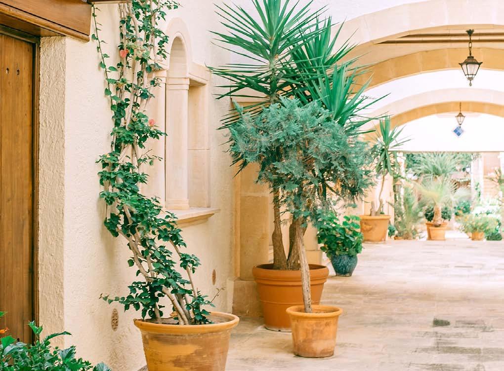
What makes the Mediterranean garden unique is its ability to thrive in winter rainfall and use the season to prepare to withstand the dry, hot summer months. This means that many of our indigenous South African plants — particularly fynbos — are perfect additions to these gardens. Groundcovers such as Gazanias and Arctotis provide beautiful flowering surfaces, spilling overs the edges of paving and raised planters. Other shrubs such as Agapanthus, Euryops, and Felicia can be used to create height, blending well with the exotics such as lavenders and Salvias. Unlike in the Northern climates, the Mediterranean plants are evergreen in our winter months, showering us with colour and texture throughout the year. Indigenous plants such as Plectranthus can provide us with a ‘second spring’ in autumn and even the drought-resistant Aloes can be used to create pops of colour in the middle of winter.
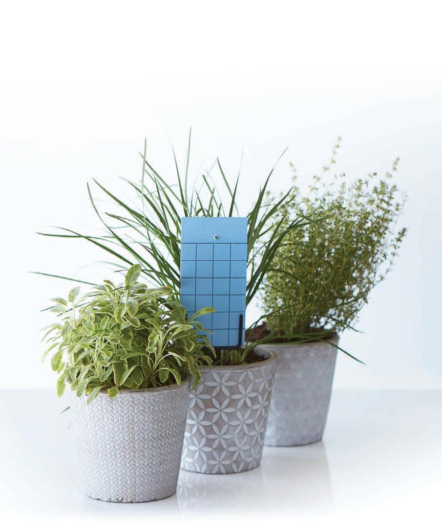
Another essential element of a Mediterranean garden is the herb garden. Allocate a sheltered, sunny area for herbs and structure it with squaredoff pathways and pavers to access easily for clipping and replanting. Hardy edibles include rosemary, thyme, and oregano and can be paired with fruit trees and trellises. Trellises and pergolas are also fantastic elements for a magical garden and plants such as Trachelospermum jasminoides (star jasmine), Tecoma capensis (Cape honeysuckle), Bougainvillea, and, of course, the deciduous grape vine all provide excellent coverage, focal points, and shade.











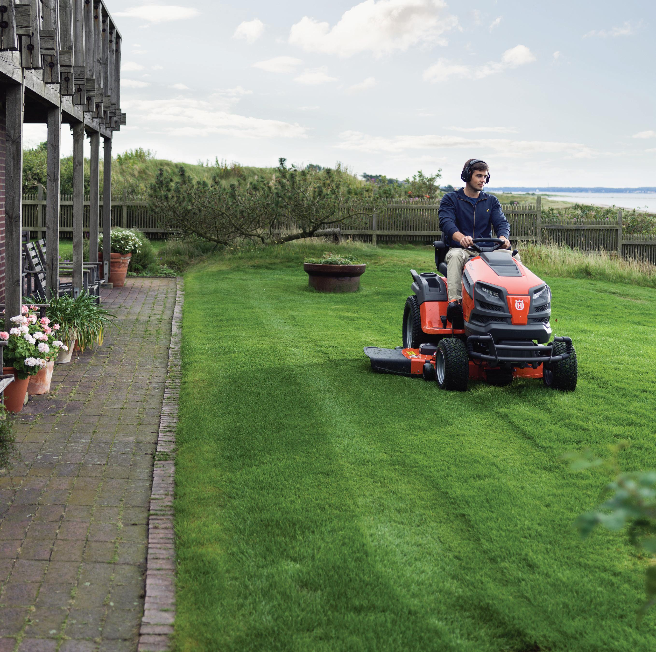
The TS 242D is ideal for homeowners and landowners with larger gardens who need a durable and comfortable tractor with high maneuverability. You are guaranteed maximum capacity even on areas that are cut less frequently. The locking differential transmis sion gives superior traction in slippery conditions and slopes, driven by a powerful Kawasaki V-Twin engine. The pedal-operated hydrostatic transmission and cast front axle means easy, trouble-free operation. Available acessories include a Collector and BioClip® kit.





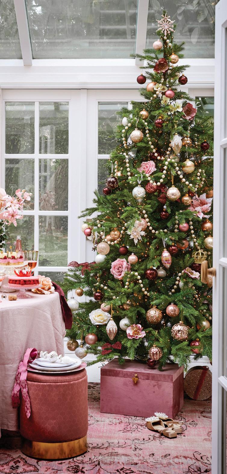

Whether it’s an office party, intimate wedding, baby shower, Christmas dinner, friends reunion, backyard braai, or your grandmother’s annual Sunday roast, we all love a good festive gather ing to signal the advent of the summer holidays. To help you deck your table to the nines, we’ve asked Wellington-based event floral designer Denicke Cronjé (aka The Grand Botanist) to share her take on the trendiest festive tablescapes. Pouring every drop of passion and creativity into these bold and elegant designs, there’s an aesthetic to tickle everyone’s fancy...
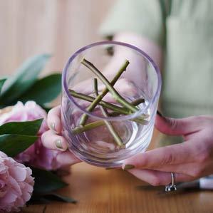
TIP : Remove the leaves from the stems below the waterline for a more intentional and curated look.
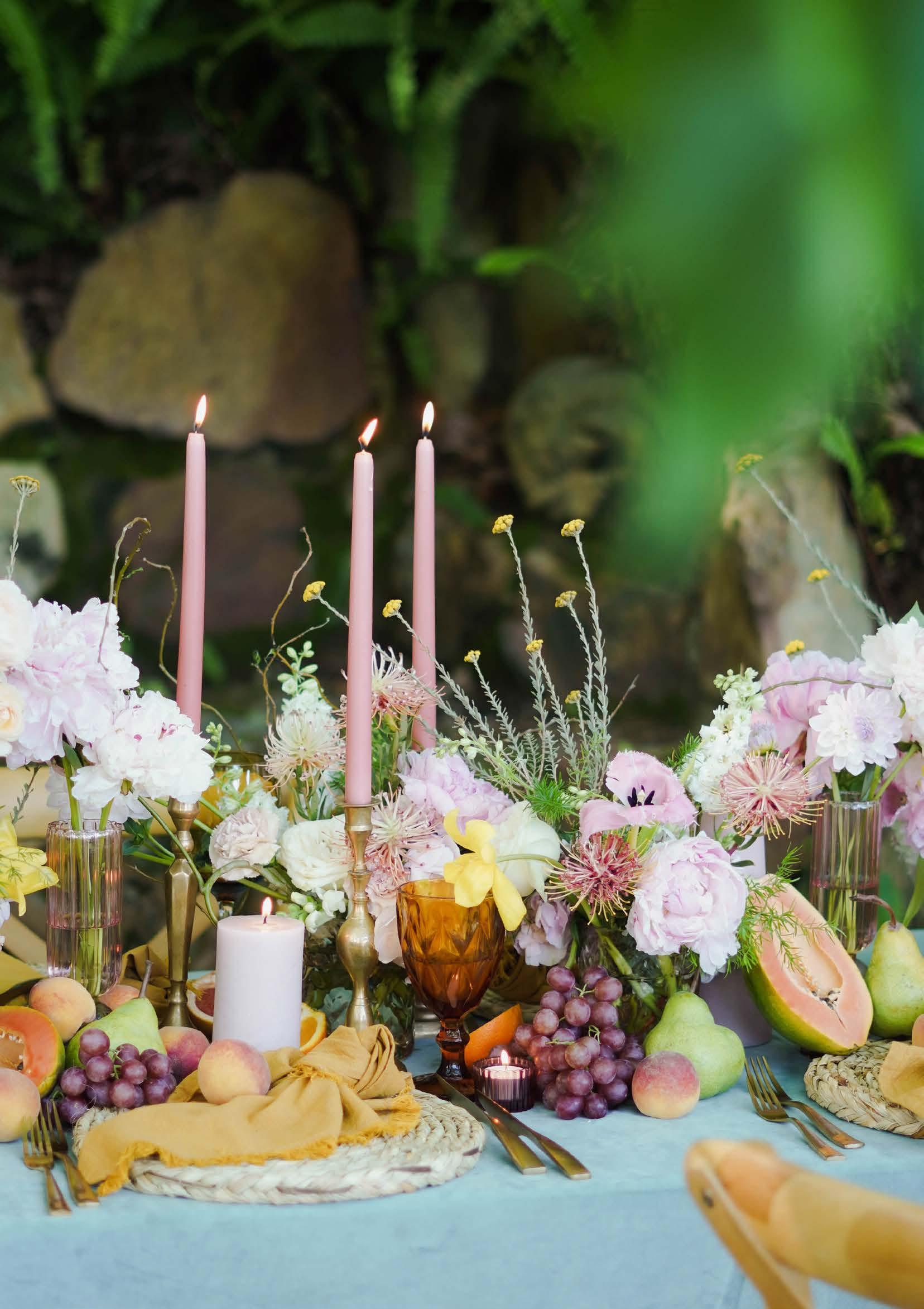
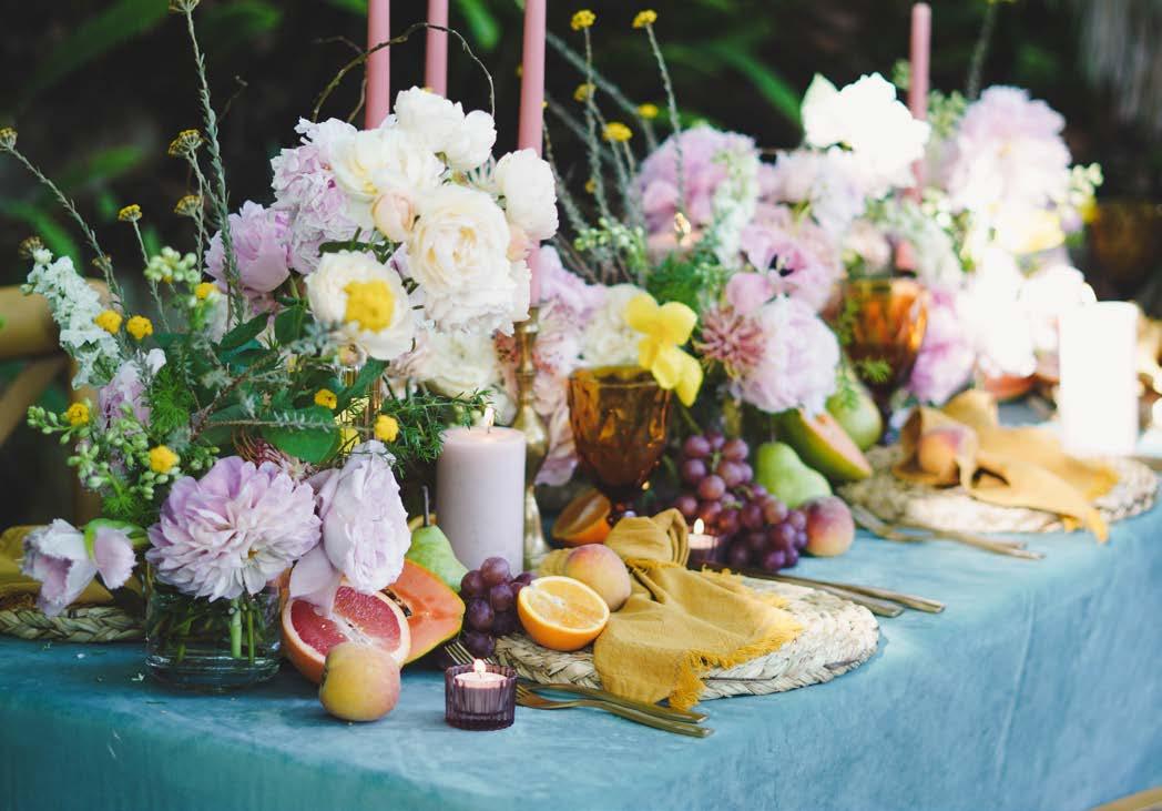
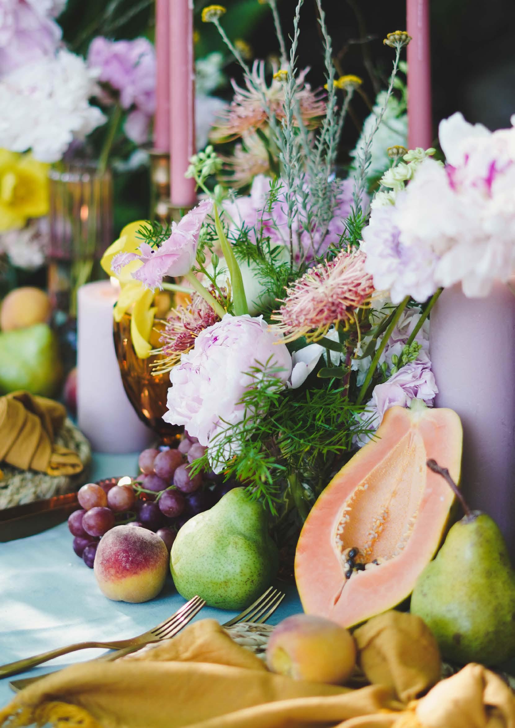
Ring in the end of a fruitful year by incorporating one of the most sensorial trends of the season. Fruit-filled tablescapes have been on the radar and no doubt flooding your Pinterest feed with zesty inspiration. Start with a classic sorbet palette and add pops of punchy citrus shades to create a playful and romantic setting.
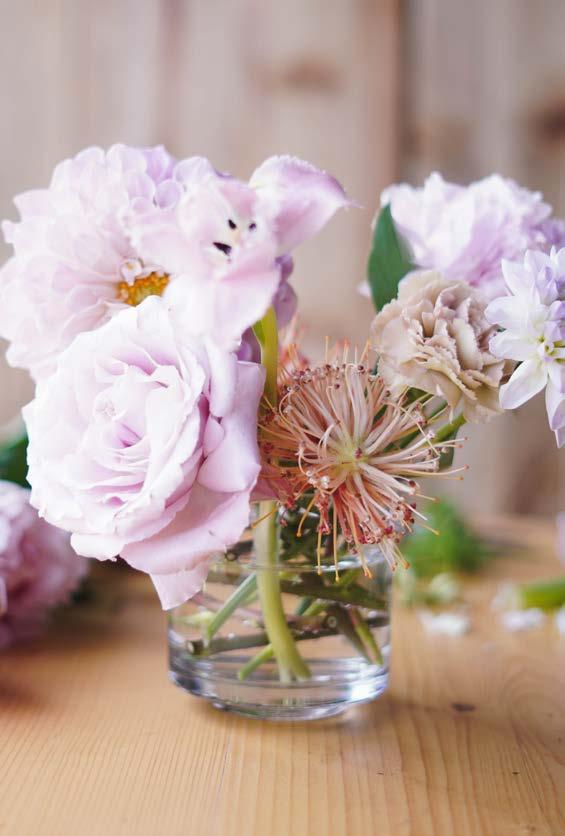
For these garden-style centrepieces, turn to your own backyard! There is something magical about foraging for beautiful and curious textured botanicals. Use a combination of focal flowers such as hydrangeas, garden roses, dahlias, and tulips, and add foraged textural elements such as pincushions, yarrow, and ‘Sprengeri’ fillers. Pair your vase arrangements with an abundance of fresh seasonal produce — pears, peaches, oranges, or grapefruit — to add an artisanal flair to your festive feast.
1. Take a vase and select a fresh woody stem (I used a rose stem).
2. Place the stem directly over the top of the vase with one end positioned inside. Snip the stem to fit snuggly so that it’s only supported by tension.
3. Repeat the process to create a supportive grid-like structure inside the vase in which flower stems can be arranged.
Mustard napkins
Open Weave Cotton Napkin
Mr Price Home
Rattan placemats
Hyacinth Round Arrow Weave
Candleholders
Amber glassware
To recreate this farm-to-table aesthetic, start with a pastel base and add pops of complementary citrus tones. We used a pastel turquoise tablecloth in a rich velvet texture paired with mustard linen napkins and rattan placemats. Contrasting decorative texture creates intrigue and adds to the sensorial feel of the tablescape. Try adding assorted glassware and mismatched candleholders to enhance the casual yet curated aesthetic of the feast.
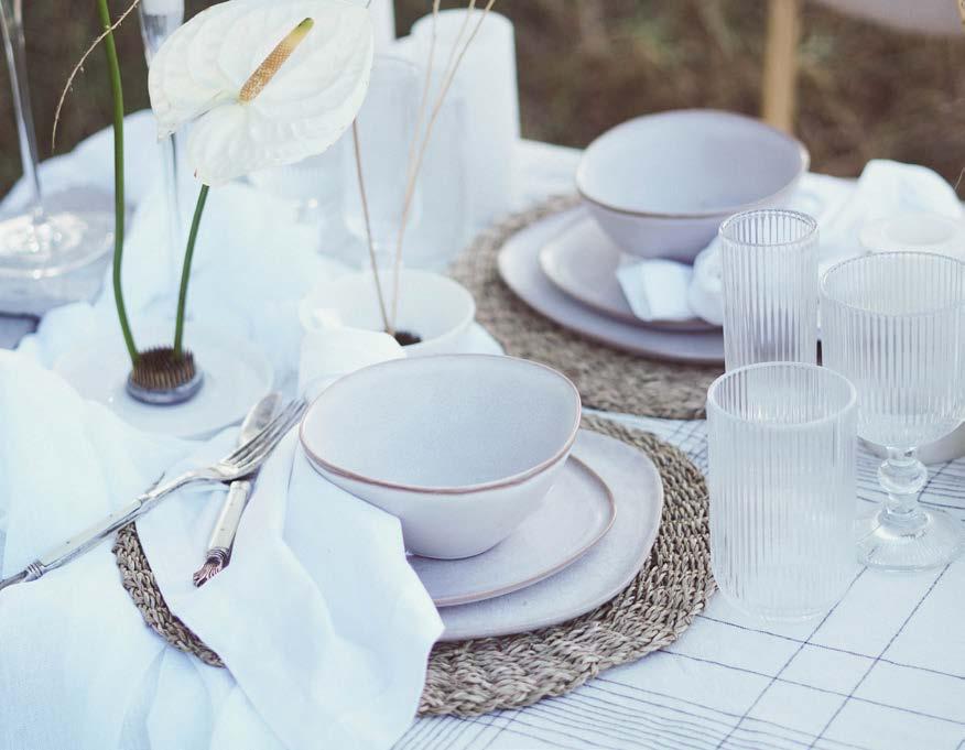
This year, neutrals have reigned supreme — especially when it comes to décor and floral design. The ivory, beige, and cappuccino colour palette might be muted, but I assure you it does not lack impact. The whitewashed trend adds a dreamlike ambiance that has left us all awash with inspiration.
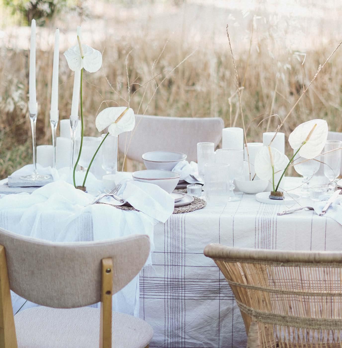
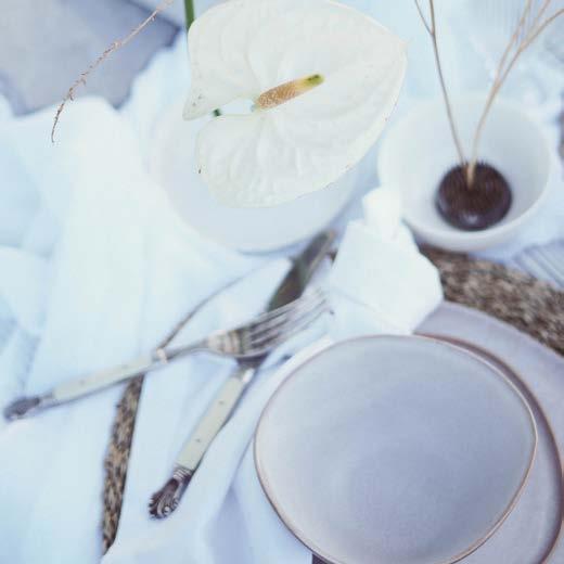
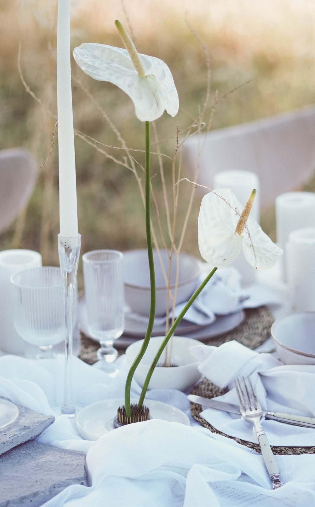
The botanical floralscape is inspired by Japanese ikebana design. This traditional artform is translated to 'living flowers' or ‘making flowers alive’ and is guided by a composition of three line placements: soe, hikae and tai (i.e., the tallest representing heaven, man as the flora in the middle between heaven and earth, and earth as the lowest point). The use of negative space serves to emphasise these simplistic principals. An assortment of low ceramic bowls with exposed kenzans (spiky frogs) creates a minimalist design focussed on line and movement. Select a focal flower to guide the arrangement — anthuriums, tulips, and orchids are well-suited for this style. Filler flowers and plant materials can also be used to add soft and ethereal textures to the overall tablescape.
Kenzans — or flower frogs — are Japanese devices used in the art of ikebana. These eco-friendly tools consist of a heavy lead base with erect brass needles. Tip: You can find one at www.wazashop.co.za!
1. Place the kenzan in a low vase or vessel and fill with water.
2. Cut floral stems with a sharp secateur.
3. Pierce the pins through the base of stems to hold in place.
4. Arrange the botanicals at different angles to create movement and intrigue.

Linen tablecloth
Stripe Print Cotton Tablecloth
Mr Price Home
Placemats
Malawi Sea Grass Placemats, Oatmeal
Mr Price Home
Crockery
Organic Dinner Plate, Satin White Iconomy
Cutlery
Laguiole Cutlery Set, Rustic Natural Poetry
Glassware
Tall Billy Tumbler Poetry
Glass candleholders
Dinner Candle Holder, Glass, 30 cm
@Home
This trend is guided by a pearlescent palette of white, beige, ivory, and cappuccino. The key to creating an ethereal tablescape is to focus on combining a multitude of tex tures. In this setting we paired ceramics with layered raw linen tablecloths and a muslin runner for the base. Add imperfect ceramic crockery with an organic rattan placemat to further heighten the textural intrigue. Style the table with translucent décor elements and glassware, Laguiole-inspired cutlery, and low ceramic bowls to interweave the ikebana-style floralscape.
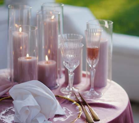
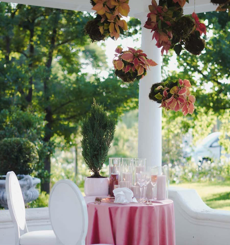
Want to make a statement this festive season? A gravity-defying festive tablescape is bound to create floor-to-ceiling appeal. A move away from the predictable festive colour palette, take a risk and explore this Barbiecore-inspired aesthetic by embracing a rose-tinted Christmas with subtle blush shades and classic festive elements.


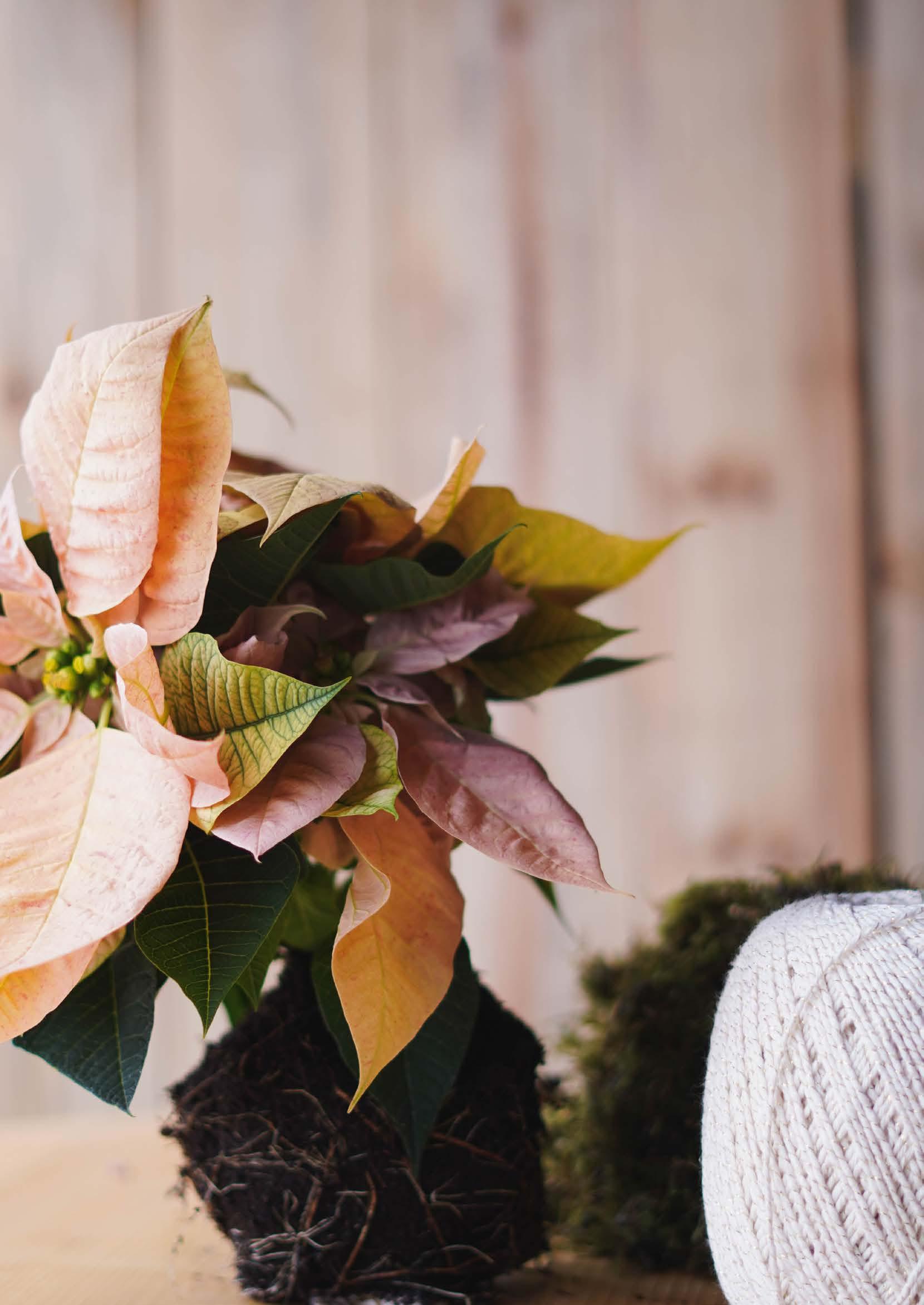
Take your Christmas table to new heights and add drama by creating a suspended pink poinsettia installation without sacrificing precious table space. Poinsettias are a classic Christmas element and widely available during the festive season. Suspend a collection of poinsettia kokedama above your festive table at different heights to create a show-stopping and unexpected impression.
The Japanese kokedama, literally translated to ‘moss ball’ in English, is a ball of soil wrapped in moss in which an ornamental plant can grow.
1. Carefully free the poinsettia from its container and remove any excess soil from the roots.
2. Take a sheet of moss and lay it flat on a surface.
3. Place your poinsettia in the centre of the sheet and add a handful of damp bonsai compost to the root system.
4. Begin to wrap the moss around the root ball of your plant.
5. Once the root ball is enclosed in moss, carefully shape the moss into a ball shape.
6. Next, wrap the ball with hessian or twine rope until the moss is snuggly secured around the root ball.

7. Finally, shape the ball into a symmetrical shape and suspend.
The Grand Botanist www.thegrandbotanist.com @thegrandbotanist
A rose-tinted soiree requires an abundance of blushy hues. Recreate this tablescape by selecting an analogous pink palette and layering a collection of fabrics and décor elements. We used a luxurious pink velvet tablecloth as a base and layered it with a soft pink chiffon fabric. Iridescent décor items with gold detailing elevate this glamorous festive design. We used lead crystal glassware, gold rim underplates, and matte gold cutlery to tie it all together, accentuating the luxurious aesthetic. Pink pillar candles create a halo of soft romantic light without drawing focus away from the suspended installation.


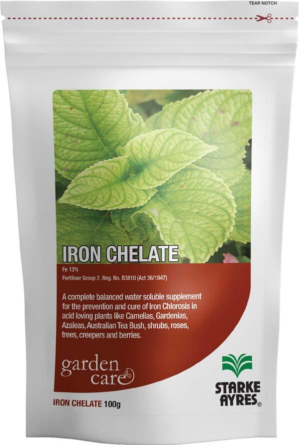
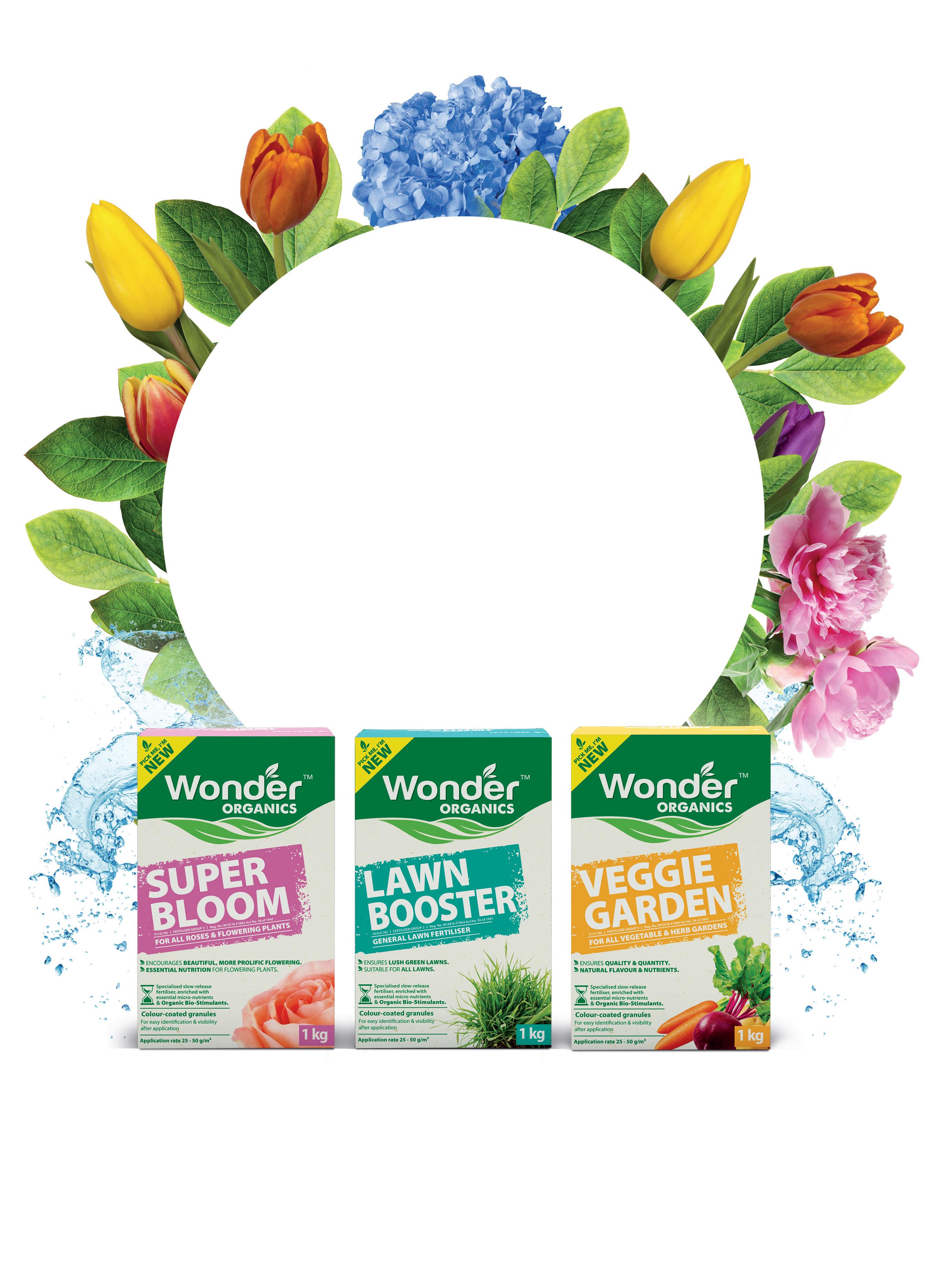
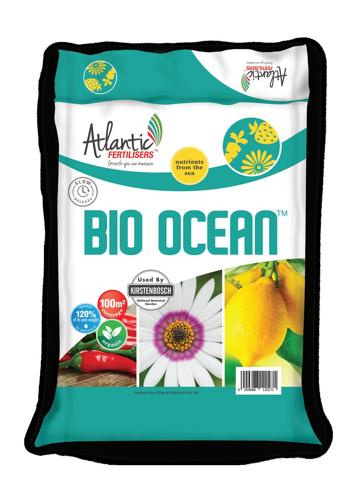
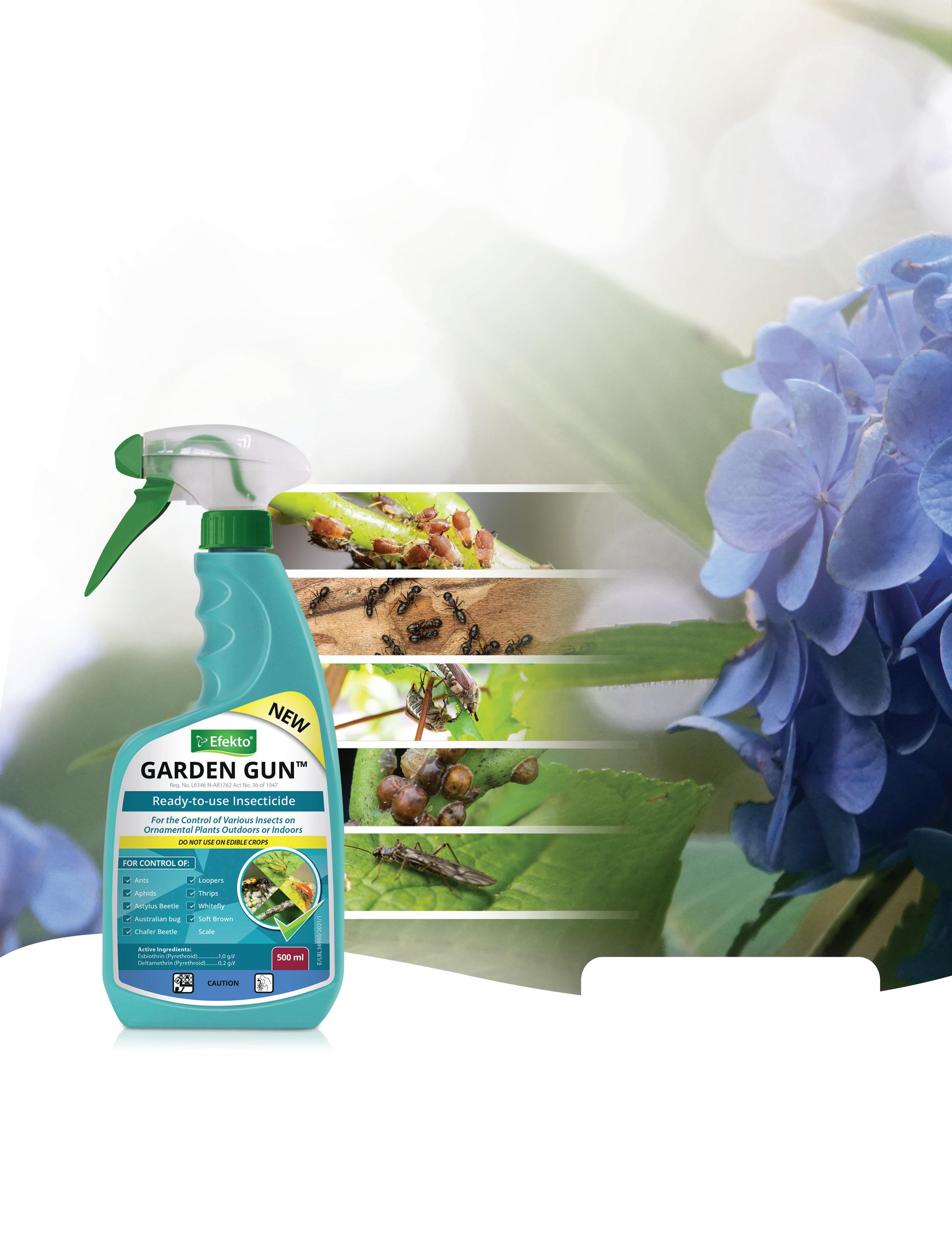
 shrubs, vines, ornamental and pot plants.
Iron Chelate (Reg No. B3810 – ACT 36 of 1947) Fertiliser Group 2 • Nutrisol (Reg No. K8591 – ACT 36 of 1947) Fertiliser Group 2
plant growth of all indoor and outdoor plants.

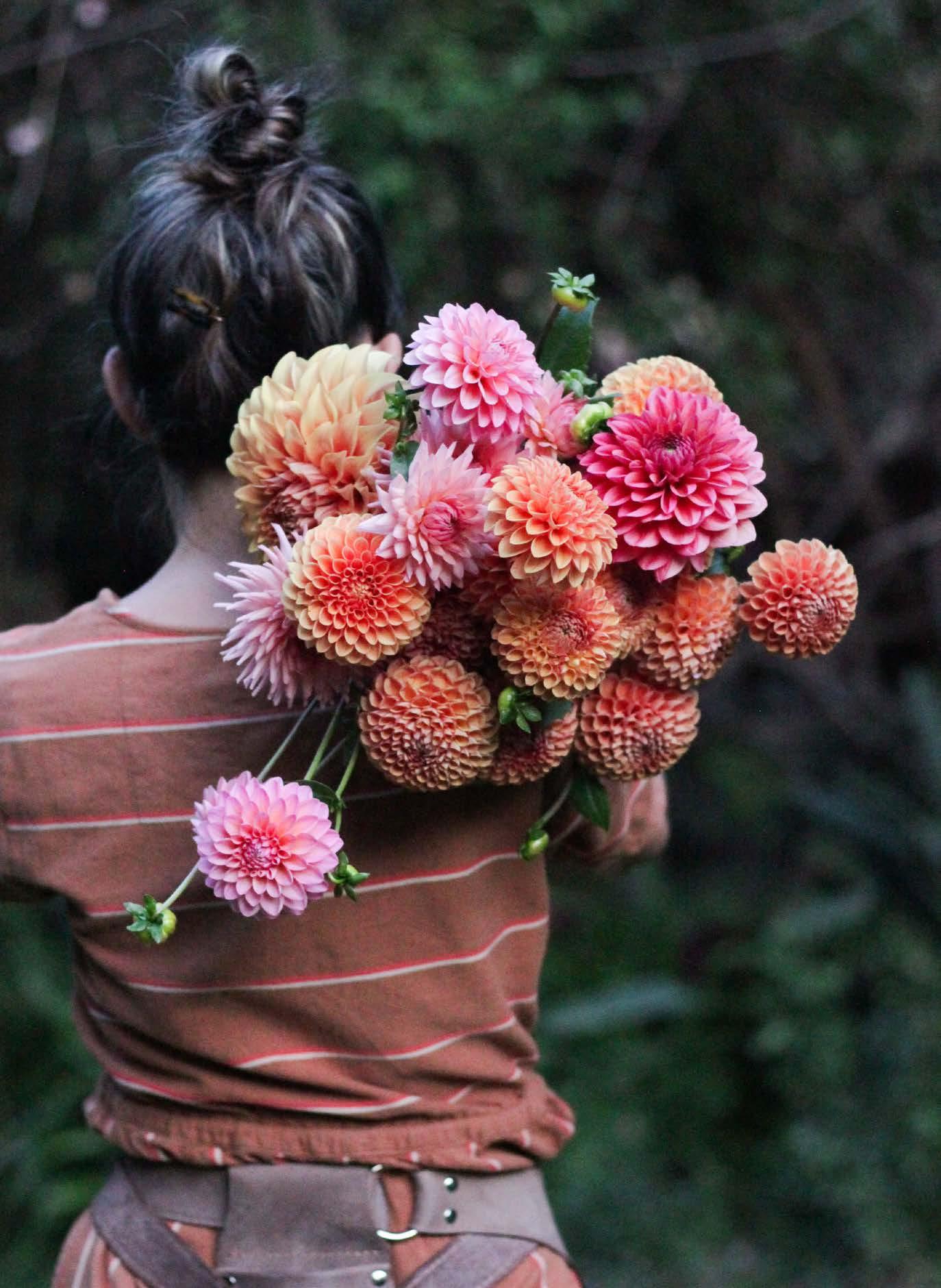
The flower-loving world has been swept up in dahlia-mania, and with good reason. These beauties boast generously petalled forms of such variety that descriptions the likes of pinwheel, waterlily, wild and romantically blowsy, and honeycombedbutton-cute all apply. Then there are the colours. The blushes and berries, apricots and salmons, ochres and bruised reds of sunrise and sunset are all there, and almost everything in between. Use only the flower heads and you have the ingredients for the mandala ombre flatlay of your dreams. Stick flower-heavy long stems in a vase and, as you watch them shift and fade as they age, you’ll be forgiven for getting lost for a while in ponderings of picking up those painting lessons after all.
Blooming from late spring through summer and into autumn, dahlia plants grow as substantial and confident as their blooms, pushing out continuous long-stemmed flowers — even more so when regularly cut for the vase. Just two rows of these beauties to wander through and cut from is enough to scratch any flower farmer wannabe itch. Grown from a tuber planted in early spring, each plant produces more tubers throughout the season, meaning next season’s dahlia plants will be larger and carry more flowers. Tubers can also be lifted during winter, divided, and then replanted as separate tubers in spring. These tubers will produce exact replicas of their mother plant. Just as exciting, thanks to pollinators, the seed saved from spent blooms will produce dahlia plants that are a unique genetic mix of the harvested seed’s variety and whichever other dahlias are nearby. That means these seeds will turn into a completely new and surprise dahlia variety every time!
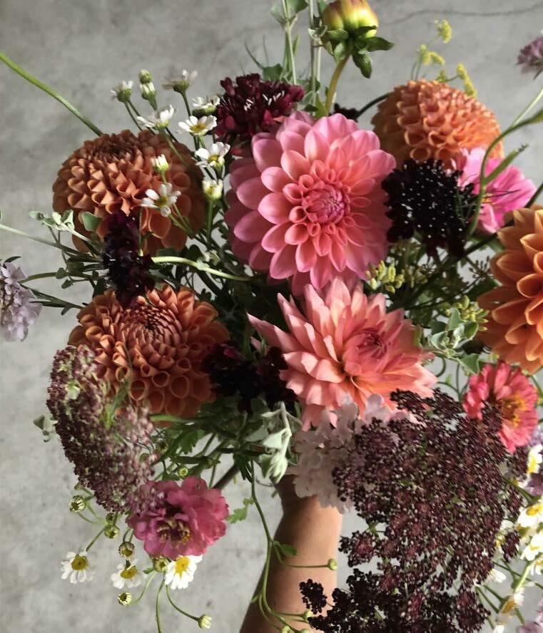


Dahlias enjoy six hours or more of daily sun and well-draining soil. Before planting, lightly rake in a balanced organic fertiliser and a five-centimetre layer of compost into your soil. Bury each tuber five to ten centimetres below the surface, lying on its side, with any visible ‘eyes’ (growth points like those we see on a potato, from which the leafy stems will sprout) pointing upwards. Dahlia tubers can rot in wet soil before their root system is established, so water very sparingly until leaves appear above the ground. Keep an eye out for slugs or snails and cutworms as the first stems and leaves emerge — young plants are an easy meal. When the plant is around 20 cm tall, snipping off the growing tip just above a set of leaves will encourage the plant to direct its energy into producing more leaves and side shoots, which will mean a bushier, sturdier plant with more flowers. Feeding your dahlias throughout the season with an organic foliar feed or homemade comfrey tea will help fight off the mildew they are prone to towards the end of summer and keep those blooms coming.
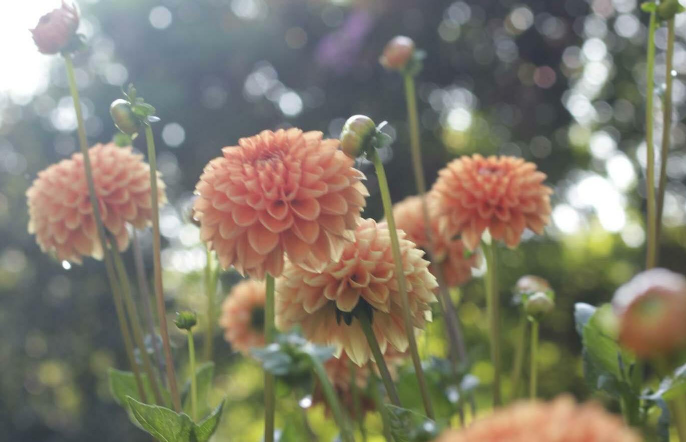
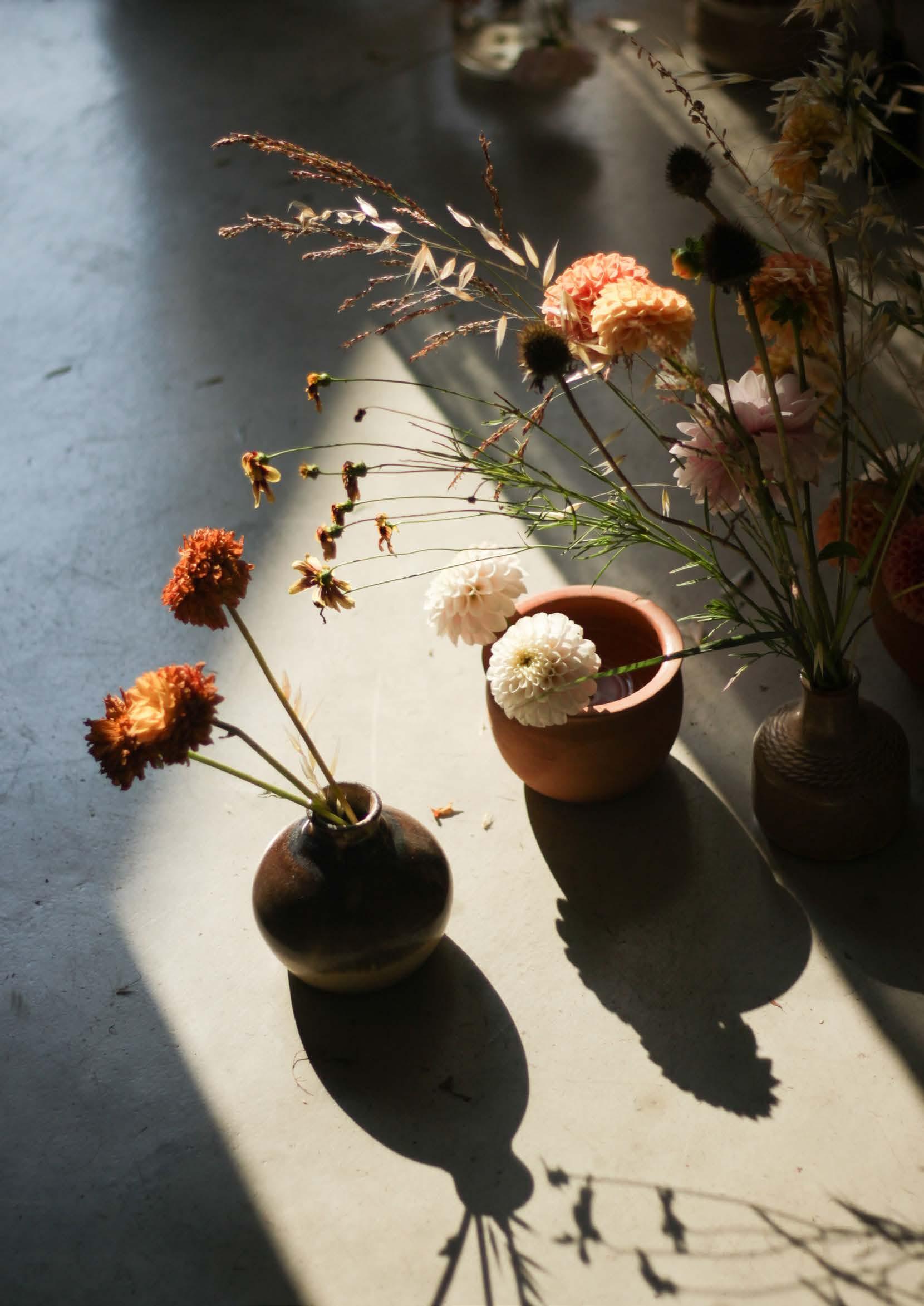
Pick dahlias just as they are about to open fully and dip the bottom inch of the stem into boiling water for ten seconds before placing inside a clean vase.

Allow a few of your beautiful flowers to go to seed for next year. The best time to pick is when the seed pod has ripened (turned a light browngreen colour) and dropped all its petals. Leave it to dry fully indoors before opening it, removing the seeds, and storing them in a dry dark spot until late winter. Plant these seeds indoors in a seed tray with germination mix, buried just below the surface of the soil. Keep the tray moist and in a light spot and the seeds should germinate in ten days. Come summer and you will have grown a completely new dahlia variety which form and colour will be a complete surprise (unlike that Christmas gift you wrapped yourself).
Ryobi has a wide range of garden equipment for both large and small gardens available. Including corded, cordless and battery operated machinery to meet all gardening requirement.

Ryobi prides itself in supplying long lasting good quality durable equipment. Find our entire range at any of our stockists or contact us directly for any assistance.


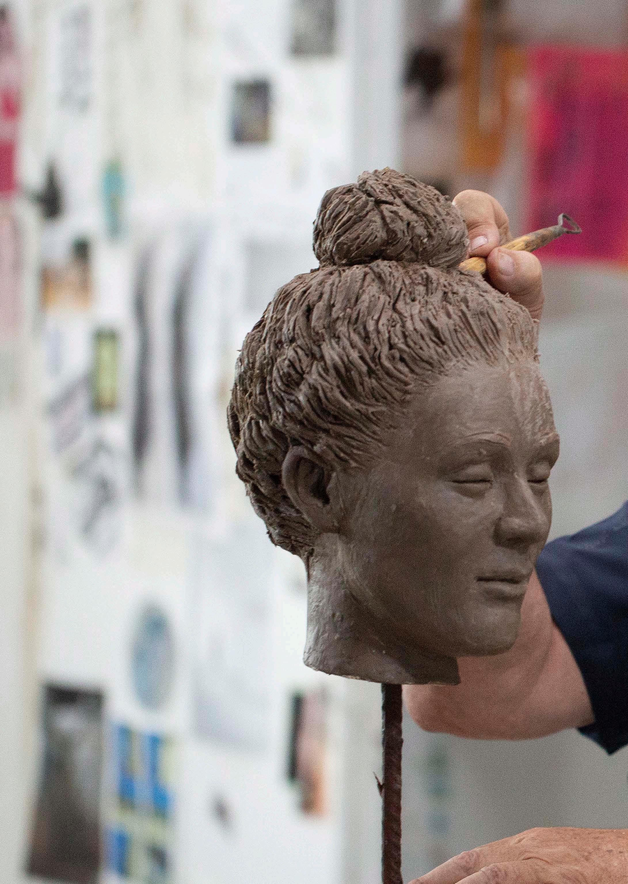
Renowned South African artist Anton Smit truly needs no introduction. Widely revered for his hulking heads, life-size figures, and monumental African sculptures, the accomplished sculptor’s work graces public and private collections both countrywide and around the globe. This summer, Outside & In had the wonderful opportunity to interview Anton about his sculptures and inspiration! Read along to find out why his striking art continues to capture the heart and imagination of all who peruse his work…
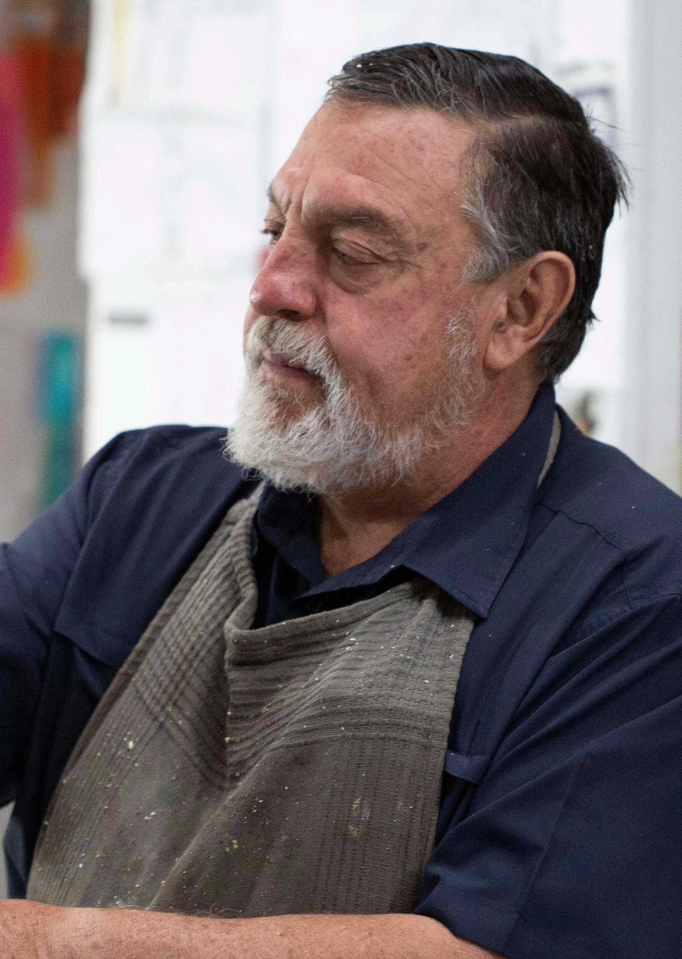
Q: Your journey as a sculptor goes back many years, with some of your work even being exhibited at President Nelson Mandela’s inauguration at the Union Buildings in Pretoria in 1994 and being scooped up by the late Nobel laureate Desmond Tutu. Take us through your artistic journey! How and when did you become an artist and what catapulted your career into what it is today?
My journey as an artist started at a very young age when I saw a photo of Michelangelo’s Pietà and determined that, one day, I would also create something equally as breathtakingly beautiful. I won my first sculpture competition during my second-last year of school and joined the Kraft pottery studio in Pretoria in the late 1970s. Throughout the 1970s and 1980s, my work was widely exhibited. In 1994, I reached a career highlight with a show of 35 of my sculptures in New York’s Grand Central Station. One of my sculptures titled ‘Age of Grace’ was featured on the front page of The New York Times. After this, my pieces were in high demand at many official galleries as well as corporate and private collections both nationally and internationally, and I was invited to exhibit my work in many countries worldwide.
Q: You currently have quite a few outdoor exhibitions, including the Anton Smit Art Route at your Anton Smit Sculpture Park at Bronkhorstspruit Dam in Gauteng and at Lourensford Wine Estate in Somerset West, as well as The Anton Smit Exhibition at Leonardslee Lakes and Gardens in the United Kingdom titled ‘The Walk of Life’. Set in harmony amidst the historical background and adding to the magnificent architecture, fauna, and flora of England’s woodland gardens, these gorgeous exhibitions present your talent with a backdrop of awe-inspiring greenery.
My intention is to make an impact through art, to create a visual experience. My work explores the idea that a vast majority of us have all but lost a vital link between how we identify with ourselves, and where we place ourselves in the space that surrounds us. I do not have any deliberate intention to tell a story, but for those who experience my work, I hope that they feel a part of it and that it will evoke emotion and a deep sense of interconnectivity. Almost like a seventh sense through the narrative of the quiet story it tells, each story is unique to personal interpretation and the emotion the particular artwork evokes. It begs for a personal dialogue between the viewer, the location, the artwork, and the way it resonates. The positioning of the artwork within each setting plays an integral part of a new experience and emphasises a new meaning, creating a new narrative for the viewer.
I am in many ways trying to recreate the version of the world that I once experienced as a child. It possessed a sense of ever-present awe and wonder. I try to form my own language through sculpture, the manifestation of my passion for expression, creation, and my faith. Ever still striving to capture that sense of connection to myself, my Creator, and the world I live in. My work is driven by faith, so the spiritual essence of every piece is an answer to that inner call. I strive to bring glory to God through my work.


My exhibition at Leonardslee Lakes and Gardens in the UK comprises more than 150 large to monumental sculptures installed across the vast garden on more than 65 positions. Organising and packaging two 12-metre containers was a huge challenge, given the time frame of the exhibition opening during Covid-19. With my experienced team and myself unable to be present to handle this huge installation in person, everything had to be supervised remotely via Zoom meetings. All 65 positions at different locations were carefully mapped using drone footage whereafter each piece was placed through extensive planning, paperwork, and navigation.
I also have permanent exhibitions at many gardens and galleries in South Africa, including at Grande Provence in Franschhoek, Lourensford in Somerset West, as well as Benguela Cove close to Hermanus.
“My intention is to make an impact through art, to create a visual experience . My work explores the idea that a vast majority of us have all but lost a vital link between how we identify with ourselves, and where we place ourselves in the space that surrounds us."
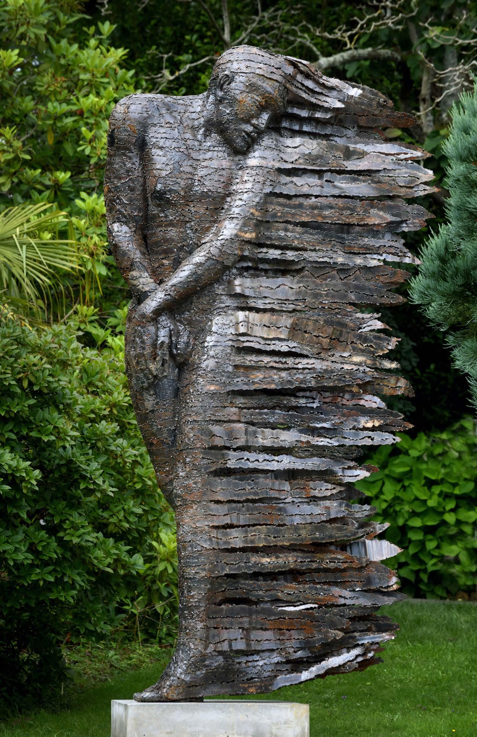

Apart from this, I also have three major exhibitions set against the backdrop of various urban landscapes. All of these projects are centred around community involvement. In Pretoria, I am honoured to be the solo artist for the Menlyn on Maine precinct titled ‘The Spirit of Tswane’ with the focal piece of the same title. This exhibition comprises more than 40 pieces ranging from medium-sized to monumental works. These pieces are exhibited at various locations in and around the precinct.
My most recent and second largest exhibition in South Africa is at Century City in Cape Town, where I have 30 pieces on display at various locations in and around the precinct. I am currently working on an artwork for a 33-metre-long subway wall titled ‘The Landscape of the Soul’. By introducing art in different forms, I want to enrich, motivate, and enlighten people to elevate their spirit. By introducing art to urban landscapes, I hope to create a totally new experience.
Q: Public parks, wine estates, and homeowners usually add sculptures to their green spaces to spark interest and conversation. These focal points draw the viewer’s eye to different forms and textures, bringing a colour palette to the garden that isn’t usually available in the natural world.
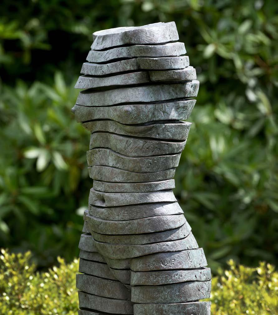
Although most people enjoy the way sculptures enhance green spaces, some hold the view that it overpowers or distracts from the natural beauty of creation and the garden itself. How would you describe your relationship with the natural world as it relates to your art? Do you envision your art becoming a part of nature, or adding a new layer to the existing created process?
I believe creation continues incessantly through the medium of man. Man himself, then, is mouthpiece, medium, and meaning all in one. My challenge as an artist is to recreate myself over and over again, finding new connotations and new concepts in given shapes, figures, and faces. Man emulates and assimilates nature, producing poetry in word and form. Art in different settings and environments almost creates a new reality, a new experience that enlivens the senses. Each piece should tell a story that not only interacts but speaks to the viewer. In each setting, my work becomes a part of nature, evoking an emotional inner dialogue that confronts the viewer with their feelings, giving each piece a new meaning — a new life. I believe art in nature is a therapeutic experience.
Q: How would you describe the process behind your material selection? Are there any materials, mediums, textures, figures, or shapes you enjoy working with or creating the most?
I create using a large range of materials, including stone, steel, metal, fibre-glass, and bronze. My aim is diversity and flexibility. I like to explore and experiment with different materials and to investigate the unique properties of each material in context of what the artwork requires. I constantly try to reinvent myself and stay in touch with the latest technology available. By using composite material (glass reinforced polymer) in some of my work, I can cut into the resin and play with shapes by drilling holes, adding rivets, and experimenting any way I like, which makes the material conducive to creativity, much lighter in weight, and less costly. Whilst there is a sure space for casting in bronze (the more traditional material), it has become prohibitively expensive. For this reason, one has to be versatile and sensitive towards different markets.
Q: Human form, emotion, and movement are clearly depicted in your work, with variations within each collection. Do you find yourself leaning towards an organic, natural, almost ‘neo-classical’ representation of humanity? Or a more slanted and abstract variant of the form?
I like to imbue my work with an illusion of movement or gesture, bodies curling up or limbs reaching out to the onlooker, inspirational figures, projecting tremendous emotion, and a call to movement.
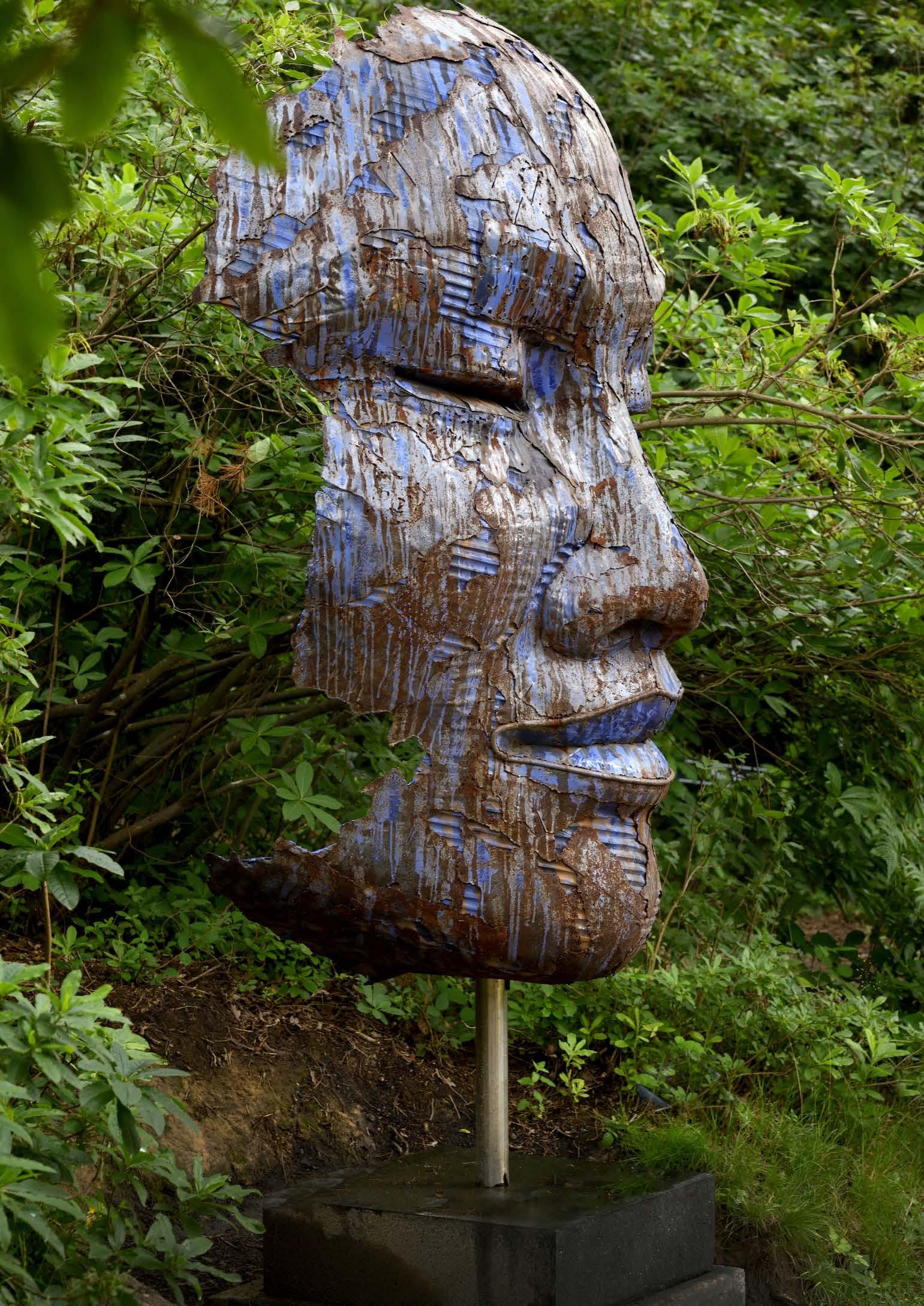
with positive elements. I believe we require a spirit of faith, hope, and love and we need to express it amongst each other, making this the basis of our national pride. I want people to identify with the piece and see humour and playfulness as well as the wonderful diversity of all our people and urban landscapes. On a lighter note, this is the ‘unbearable lightness of living in South Africa’. It’s so light you just want to stay here! The thought process is to create lightness. Children from various communities will be invited to participate in the making of their own masks as part of the project. These masks will be incorporated into the final artwork. If everything goes to plan, my new project ‘Subway Faces’ will be installed at Century City in June 2023.
Then on a personal note, I am also currently working on a whole new series in steel — something much different than what I am known for. Once the ‘New Futurism’ series is complete (perhaps later next year), I will exhibit and release the work.
Q: Where do you typically draw your inspiration from?
From various sources, visual images and concepts, poetry, and music, but mostly from Scripture in the Bible.
Q: How long, on average, do you spend sculpting a piece from concept to completion?
My life-size work typically takes three months working eight hours a day. However, most of my pieces are larger than life-size.
Q: What can we expect to see from Anton Smit Sculptures this summer? Do you have any exciting exhibitions, collections, or new pieces up your sleeve?

I am currently creating an artwork titled ‘Landscape of the soul’ for a subway wall comprising more than 60 different masks. I hope for this artwork to evoke conversation but at the same time have perennial appeal. The symbolic interpretation is very important to me as it is my intention to interpret what ‘Landscape of the Soul’ means and to infuse my interpretation

"If I had to describe my work in three words I would say: Look, See, Feel."
A dream is a wish your heart makes.
Find the Rose your heart has been dreaming about at Ludwig’s.


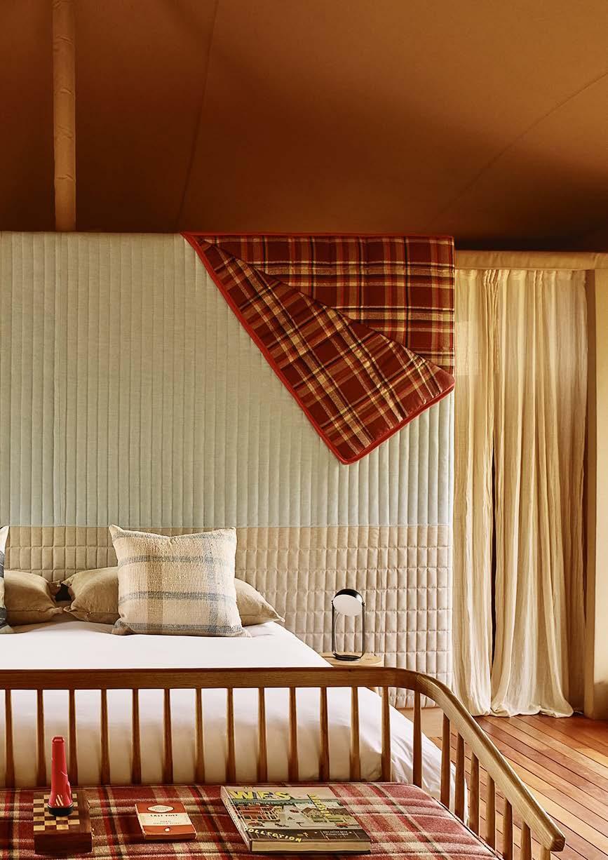 A ROMANTIC WES ANDERSON STORYTELLING SET MEETS JAPANESE RURAL POD
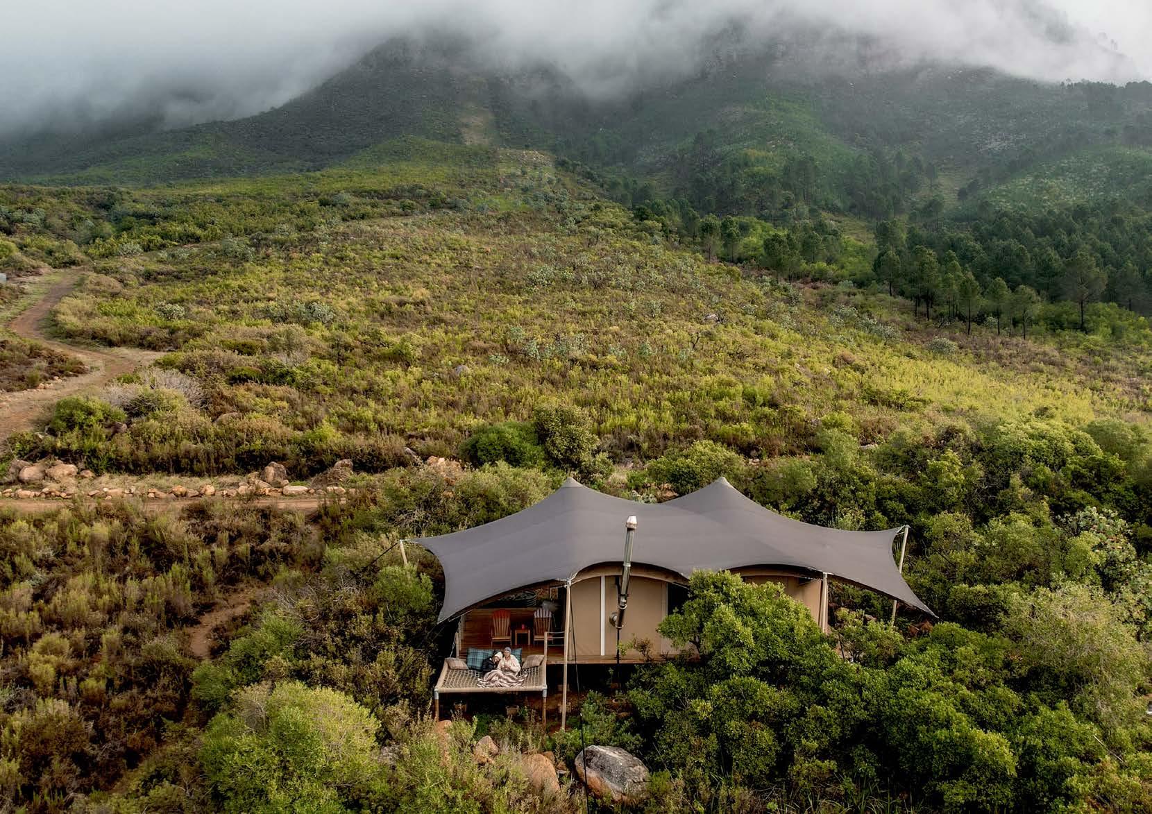
Pitched atop a beautiful peak on Boschendal Wine Estate, the luxury self-catering Camp Canoe invites you to switch off, wind down, and reconnect with nature as you leave the city behind and enjoy life's simple pleasures. Forget about your alarm, rise with the sun, and explore the scenic surrounds. From chilling in your personal woodfired hot tub, readied and waiting for you by the super-friendly Camp Canoe team, to gazing at the stars atop a comfy hammock, there’s plenty to do in this little slice of heaven. In the cooler evenings, light your wood stove and sit in the flickering glow with a sip of local wine. (They have a great list to order from that will be waiting in your fabulous tent on arrival – as will your pre-ordered Boschendal hamper!) Summer brings its own great adventure with lazy sunsets, horseback riding, and swims in the dam...
Pack your backs, because this new Franschhoek favourite takes glamping to another level!
Glamping is the combination of the words ‘glamour’ and ‘camping’, and although the neologism has only been around since 2005, the concept dates back over a thousand years — evidence that being in nature has always made us feel good! In sixteenth-century Scotland, the Earl of Atholl prepared a glamping experience for his visit to King James V and his mother. The Earl arranged the most luxurious tent to be decorated entirely with objects from his palace. During the same period, Henry VIII of England met François I of France for a diplomatic summit near Calais. The grandiose occasion, which later became known as the ‘Field of the Cloth of Gold’, hosted 2800 tents encircling a massive fountain spouting red wine. On the other side of the Mediterranean in Ottoman Turkey, the Sultan's imperial tents were more like lavish mobile palaces. He conveniently owned two: one to enjoy in the moment and another his servants could ready for his arrival at the next destination. It’s reported that the Sultan's tents were so large, it took six hundred camels to transport them. He totally got the ‘glamping’ thing!
Similarly, luxury tents and tented retreats are by no means a new thing in South Africa. In the early twentieth century, African safaris became the adventure of choice for wealthy American and British travellers wishing to try their hand at shooting game, primarily the ‘Big Five’ — lions, leopards, rhinos, elephants, and Cape buffalo. Not wishing to sacrifice the comforts of home for the pleasure of the hunt, the safari tents were equipped with the luxuries they were accustomed to, including everything from electric generators and folding bathtubs, to cases of champagne.
Today, city dwellers are increasingly seeking refuge in nature, looking to disconnect from day-to-day life without necessarily travelling far distances. More and more South Africans are choosing to be outdoors, without roughing it. Glamping offers the best of camping. It's camping made fun, and camping is good for you! It allows you to unplug, get away from screens, and connect with nature, letting the stress ooze away.
While survivalist camping may do it for some, for most of us, glamping is the way to go! Glamping involves camping with the luxuries of a home or hotel—and Camp Canoe is the perfect spot to enjoy these splendours and spoils. The retreat offers a delicious and unpretentious combination of indoor luxury and the great outdoors with all the perks of nature, spectacular views,
Interior Architect, Garden Designer, Travel and Design Writer www.anjiconnellinteriordesign.com @anjiconnell_acidplus

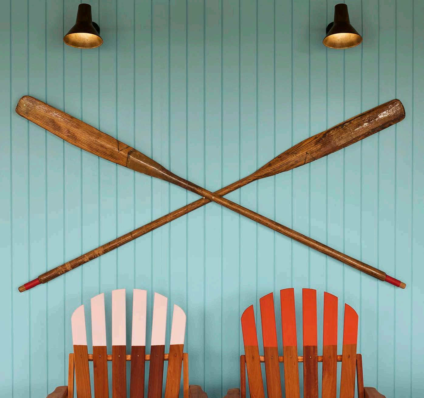
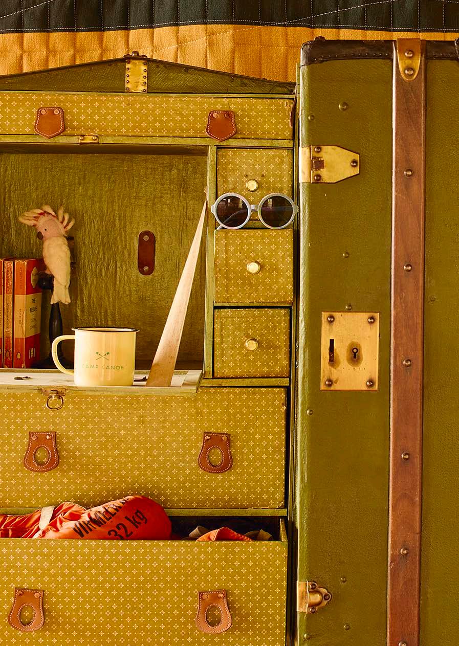
“The tents’ colourful interiors bring many fun elements of surprise. You don't expect a tented camp to feel and look like this."

canoeing, and hiking. The best part? You can enjoy all this without the usual bugbears of regular camping such as pitching the tent, dust, bugs, and shared ablutions – transforming it into a comfortable experience.
What makes Camp Canoe unique? The setting for one. The journey to the camp is nothing less than spectacular. Camp Canoe is situated high up at the foot of Simonsberg on the opposite side of Boschendal’s main attractions. A tree-lined avenue leads you straight up the mountain, where seven sizeable tents offer privacy and fuss-free, laidback living. The all-ripstop canvas tents were custom made by Tentickle. Surrounded by lush flora and with superb views of the mountains and sparkling dam, each unit comes with a wood-fired hot tub and a super-sized hammock to while away the days. The tents are a short walk from the View Point and many glorious hiking routes of varied lengths for diverse levels of ability. Expect spectacular sunrises and sunsets on tap!
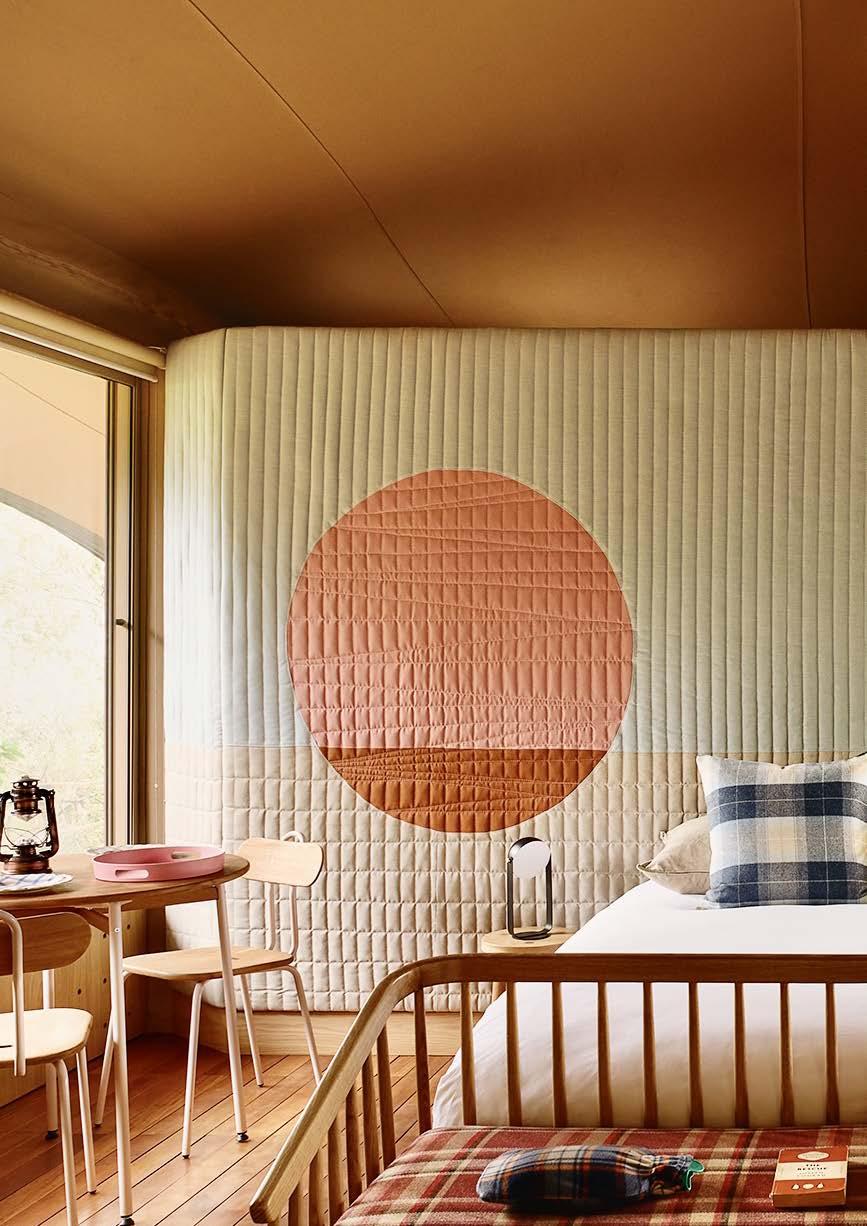
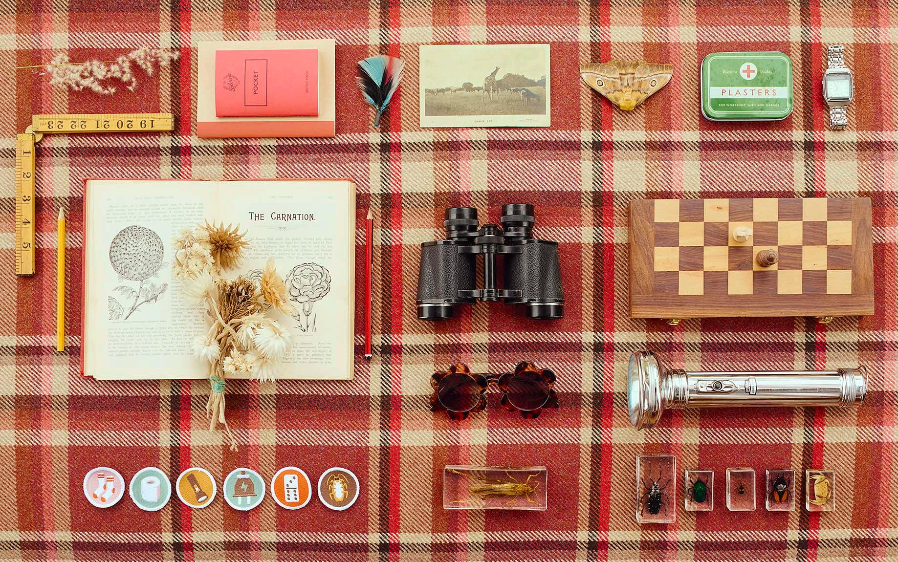
The brief from the owner — serial entrepreneur and hospitality whizz Amy Kropman — and her husband, Tal, was short and sweet: ‘Here are seven abandoned tents. Let's make them and this camp cool and memorable.’ Amy and Tal have been in the hospitality industry for many years. They created and ran the upmarket B.I.G Backpackers in Green Point and were looking for their next project. They decided to approach creative duo Rotem Shachar and Megan Bond from MR. Design Studio, who are known for creating and curating spaces and objects, giving them a story, and bringing that story to life. The pair behind the interiors of famous Franschhoek restaurants such as La Petite Colombe, Épice, and Protégé, absolutely surpassed the brief! Describing the camp’s aesthetic as ‘a Wes Anderson romantic storytelling set meets Japanese rural pod’, they took inspiration from ‘all things scout’ and Wes Anderson's iconic 2012 coming-of-age film Moonrise Kingdom. Inspired by the movie’s ode to first love and Anderson’s trademark style, MR.’s whimsical and witty colour-coded ‘set design’ is like a Norman Rockwell painting come to life. Rotem and Megan totally captured the famous filmmaker’s vibe! Camp Canoe is uber chic with delightful joy-sparking, quirky elements in a pastel palette — a far cry from the typical African bush-inspired tents on offer.
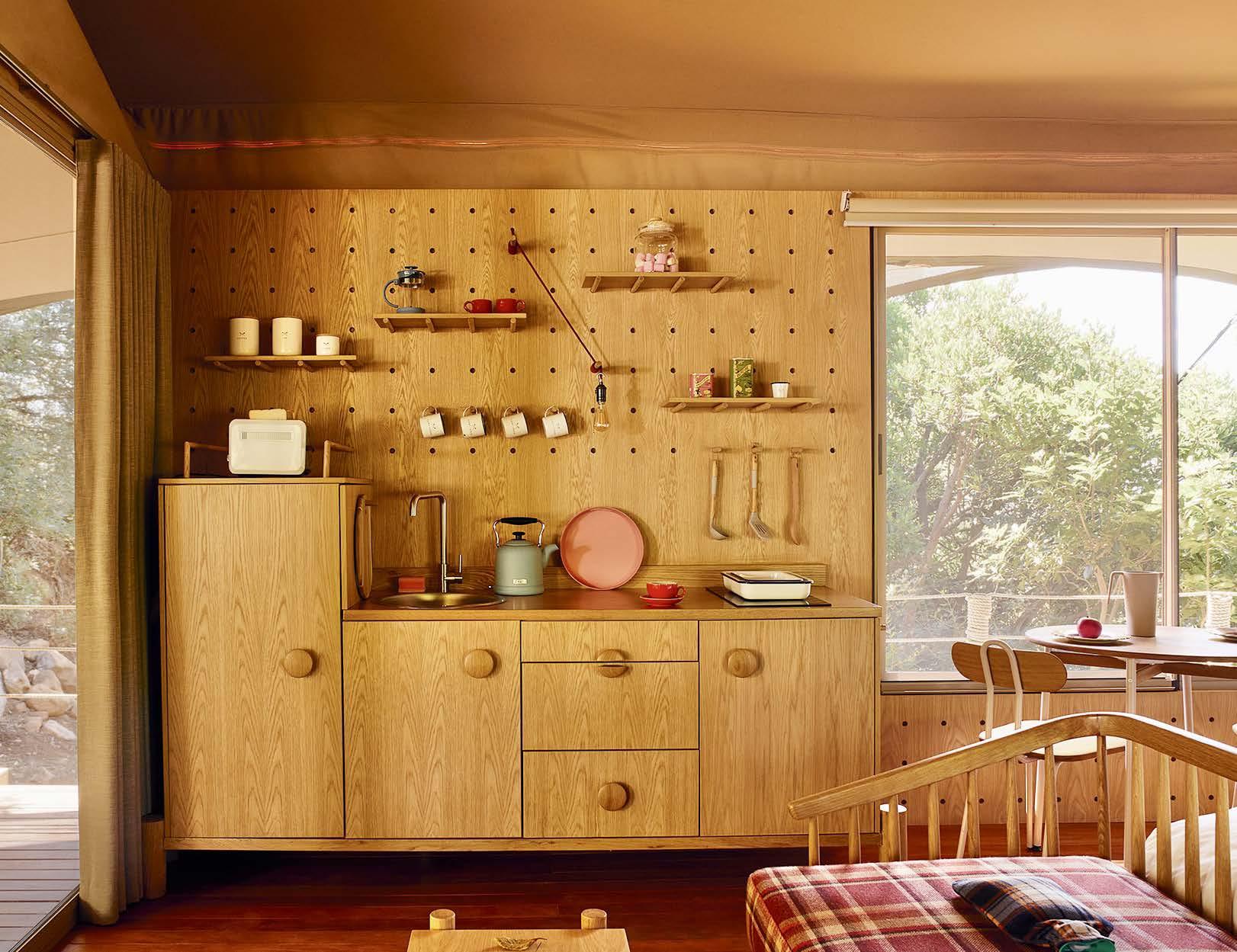
Camp Canoe invites you to a beautiful world of self-sufficiency—with the option not to be, as, in true glamping style, you can head to the nearby dining establishments on Boschendal Wine Estate. How much you do is up to you. Just remember to add a bit of what makes you happy. Maybe even give shinrin-yoku a try. In Japanese, shinrin means ‘forest’ and yoku means ‘bath’, hence the term ‘forest bathing’, meaning to bathe in the forest atmosphere, experiencing it through all our senses. Tree hugging increases oxytocin – the hormone of love, trust, and all the warm and fuzzy feelings – which makes you feel calm and helps in emotional bonding. Hugging trees also boosts your serotonin and dopamine levels, making you feel happier. For a take on real camping (well, with a Weber braai rather than a campfire), you can whip up tasty combos from your pre-ordered Boschendal hampers and pair it with some amazing wine from The Wine Agent. There's also a handy induction stove and fridge to store your goodies.
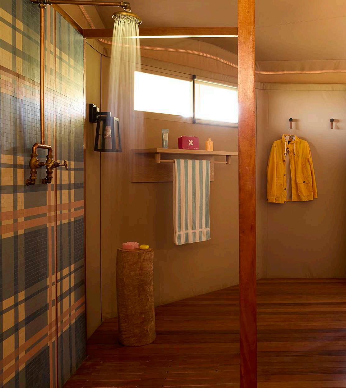
The revamp took a mere four months from brief until the first guest unzipped their tent. The tents’ colourful interiors bring many fun elements of surprise. You don't expect a tented camp to feel and look like this. ‘That is our job as designers, to surprise and reinvent and pay attention to details,’ says Megan. Conceived by MR. and made in collaboration with the talented team at Casamento, the soft wall behind the bed, designed as an oversized quilted sleeping bag, stands out as a particularly inspired design. The room is rounded off with a playful peg wall and Scandi-chic-meets-Japanese-rural kitchenette by Interdesign. The daybed is from Houtlander, the table and chairs are from Pedersen + Lennard, and the shower tiling is from Bit by Bit Mosaic.
www.campcanoe.co.za

“Inspired by the movie’s ode to first love and Anderson’s trademark style, MR.’s whimsical and witty colour-coded ‘set design’ is like a Norman Rockwell painting come to life."Camp Canoe
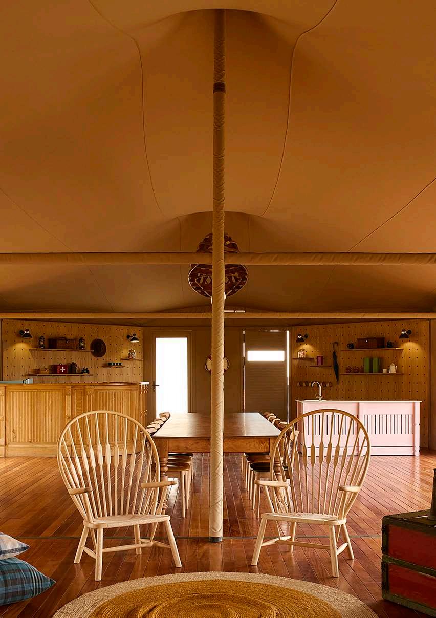
House Canoe is also available to hire for events and comes with a catering kitchen. The 14-seater table is from Boschendal’s woodworking shop, with chairs by Woodbender. The canoe frame on the ceiling is from Barn & Werf, with its central lighting strip made by Martin Doller. The wall panels are by Interdesign, and the wall lights are from Kooperasie. The highbacked chairs standing against a wall hanging by Casamento are from Aura Interiors. The Adirondack chairs and table on the left are from Patio Life.
Since Camp Canoe is going to be swamped as ‘the place to be’ in Franschhoek, I recommend you make a booking while you still can. This phenomenal experience is an all-year adventure trip with so many cool benefits, including having the fabulous Boschendal Wine Estate on your doorstep. Should you wish to meander away from your tent for a meal in true glamping style, head on down to the farm’s fabulous tree-lined avenue and cross the road to The Werf Restaurant and The Deli for your daily sustenance. Then there’s also the Friday Night Market, bicycle riding around the estate, and superb art in the Manor House (a collaboration with the Norval Foundation). Franschhoek village with all its restaurants, coffee shops, art galleries, artisanal shops, and spoils is, of course, only 15 to 20 minutes away. That’s if you can tear yourself away from the comforts of Camp Canoe... Happy glamping!


MR. Design Studio www.bymr.co.za @instabymr

Inge Prins - @inge_prins James Hughes - @cabin_fever_cpt



Colour is a visual language that has a profound influence on a space and the people who use it. Consistency within a bathroom colour scheme delivers not only a refined design aesthetic but also harmony and cohesion.
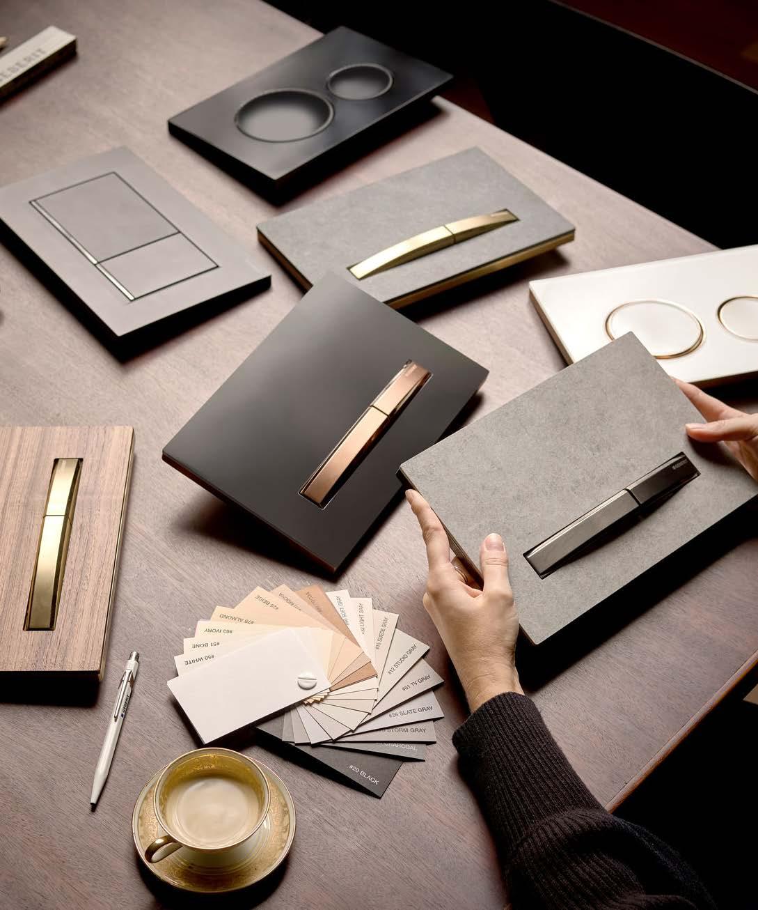
Colour shade variance comes from the different materials used in production, posing challenges when matching metal or plastic accessories with ceramic fixtures. Likewise, the choice of finishes can also impact colour consistency across the bathroom. Tapware, shower handles, and other bathroom hardware come in a variety of finishes, including chrome, brushed nickel, oil rubbed bronze, and stainless steel. While it’s relatively easy to find matching accessories for popular finishes such as chrome, this is not the case for every finish type. When selecting finishes, consider the amount of cleaning and maintenance required. For example, chrome is prone to fingerprint marks and water spots whereas brushed nickel is relatively easy to maintain and clean. On the other hand, a copper finish may require more care throughout its life, but develops an attractive natural patina. Improper care or an inferior quality finish can result in fading and cracking, so makes sure you do your research.
Overall colour perception in a bathroom can change throughout the day due to natural lighting variation or the type of bulb used for artificial lighting. The Geberit Option Mirror range features illuminated mirrors and mirror cabinets which can create a perfect sanctuary and ambiance at all times of the day.
Modern bathroom walls are painted in neutral shades, with beige, light grey, or powder colours giving a timeless, elegant touch. White washbasins and WCs look particularly sophisticated when combined with these colours. Moreover, since most bathrooms will be used for periods lasting 20 years, and renovated only once or perhaps not at all during this time, equipment and aesthetic durability is crucial. Classic white ceramics pair well with other colours and will never completely go out of fashion. We recommend using classic shapes and colours for sanware and bathroom ceramics, and soft, warm colours when designing the walls. But remember: less is more. Don’t attempt to mix too many different tones as it will create a chaotic, untidy appearance. Rather add splashes of colour with your decorations and accessories since these are easy and inexpensive to replace.
• Sand and nude tones add depth and warmth. They have a balancing effect on both the eyes and mind, conveying a sense of calm.
• Grey comes in a wide range of shades. Mixed with a little brown, grey has a warming effect, while a bluish tint has a cooling effect. Accessories in red, yellow, or turquoise harmonise especially well with grey bathrooms.
• Pastel colours like light blue, pink, and mint provide a sense of lightness and well-being in the room. The beauty of pastel colours is that they always cut a fine and friendly figure when combined with white appliances.
Match made in heaven
CREATE A BRIGHT AND FRESH BATHROOM WITH GEBERIT www.geberit.co.za
Matching accessories with tapware finishes can be difficult as not every item in the bathroom is identical. While colour-matching has been the traditional focal point of bathroom design, Geberit offers a new approach. By matching the flush button with the toilet, an overall impression of cohesiveness can be achieved. Geberit’ s new Sigma50 and Sigma60 flush plates complement the design aesthetic of any bathroom, achieving balance through its material likeness to white colour surfaces. Geberit’s Monolith Sanitary Modules are now available in the following new finishes: Lava Glass, Concrete, and Stoneware Glass. An integrated odour extraction unit, intelligent sensor technology, and convenient flush actuation are only three of its many virtues.

History, heritage, and harmony converge at one of the oldest and most intact of the early wine farms of the Cape of Good Hope. Founded in 1696, Vergenoegd Löw is a living, evolving national monument, part of the European Heritage Project, and a World Wildlife Fund (WWF) conservation site. Despite the status it once held, the farm had all but lost its shimmer. That was until seasoned hospitality expert Source Interior Brand Architecture was brought onboard to map a journey of discovery and engagement that would reposition and present the property as the incredible farm it once was to a new generation of guests. Working in tandem with a team of acclaimed professionals, the systematic reclamation of the 326-year-old farm, its buildings, its stories, and gravitas began.
Vergenoegd Löw is documented and dated by a series of watercolour studies of the farm in the permanent collection of the Rijksmuseum in Amsterdam. Captured by Jan Brandes, the paintings convey the wine estate’s stature and significance in the late 1600s. Importantly, these works also capture and date some of the key buildings on the property. Guided by the date of the paintings, the two long barns in the agterwerf are believed to be the oldest of their kind still existing in South Africa.
As a working farm, the land presents many challenges. The soil is a combination of wildly different patches ranging from acidic to richly fertile. With the entire farm also below the 100year flood mark, the tricky soil is often restrictively moist. These natural challenges combined with environmental issues like the ever-encroaching urban sprawl, borders defined by major motorways, and various droughts meant the struggling farm had lost its grandeur over the years. With the core principle that this is first and foremost a proud working farm, not an attraction, every piece of soil on the property has been considered in the restoration. The first visible change the team tackled was the dramatic but sensitive resettling of landscaping around the homestead. This was followed by the reinstatement of the historic entrance facing the Faure village rather than the ill-considered entrance close to the N2. With a firm vision of the total reinvention, the buildings were renovated one at a time, allowing each to establish its own identity within a larger overall sentiment.
Werf
The farm’s exquisite natural surroundings are by far the stars of the show. Despite Vergenoegd Löw’s location in Stellenbosch, the wine estate has the most magnificent view of Table Mountain over its dam. The team sought to radically yet respectfully elevate the working farm to its former glory by starting with the outdoor spaces. In front of the voorwerf, the once lush area was used as a gravel parking lot, the rerouted access points and muddled flow creating such an uncomfortable guest journey that one could hardly appreciate the beautiful architecture. The landscaping underwent major changes, with a new agricultural scheme, considered walkways, trails, and seating areas creating an effortless, comfortable, and welcoming guest experience. All of the experiential ‘in between’ spaces were linked together through subtle guidance of guest flow, well-placed wayfinding, and considered arrival points that present key vistas to celebrate the beauty of the farm. With historic access points and the lush landscaping restored, the werf is now presented to guests an air of poetry.
EXPERIENTIAL NARRATIVE AND INTERIOR DESIGN Source Interior Brand Architecture
CREATIVE DIRECTOR Mardré Meyer
PROJECT DESIGNERS Maryke van Niekerk (Werf) and Bianca Minnaar (Die Geuwels, Homestead, Clara’s Barn)
ARCHITECTURE OF THE HISTORIC BUILDINGS Marise Grobler, Urban Concepts
LANDSCAPING AND FARM SCHEME LAYOUT Anthony Wain, Planning Partners
PHOTOGRAPHY Sean Gibson Photography

Seating spaces are generous and vast areas are left unoccupied as the farm purposely endeavours not to crowd the property to retain its generous tranquility. In lieu of signage, large interventions attract guests to specific farm destinations. One of the most significant is the ‘corkscrew’ green tunnel that delivers guests from the parking space onto the werf. With the water quality on the farm far superior to municipal water, the werf presents tap points where guests can refill their glass water bottles provided when booking a picnic.
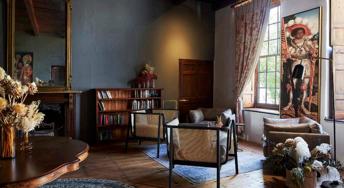
A focal point across the lawn, the Cape Dutch Homestead has undergone extensive restoration to reinstate its significant historical value. While keeping the rooms intact, the space needed to offer a series of events, including an intimate wine tasting and wine sales area, the option of private dining and conference rooms, a well-appointed guest lounge, and an authentic farm kitchen experience in the large kitchen with an open hearth. As the grand old house at the heart of the werf, the design team wanted the Homestead to be the building that was most explicit in its historic referencing, but with Cape Dutch references on wine farms generally being overused, the scheme focussed more on the property itself. Previous renovations, which took a more modern approach, attempted to dress the Homestead as an elaborate ‘manor house’. However, for this renovation, elements like garish chandeliers were specifically peeled back to reveal a spacious home. Uncovered patches of original trompe l'oeil revealed a scheme of dark green. Desaturating the tone, all the internal walls were painted a dark grey with the same tonal intensity as the original green, while the exterior walls were painted white both inside and out. The overall scheme references the age, architectural style, and history of the Homestead, but each element is reinvented to remain thoroughly modern for contemporary visitors and current usage — not a museum piece.
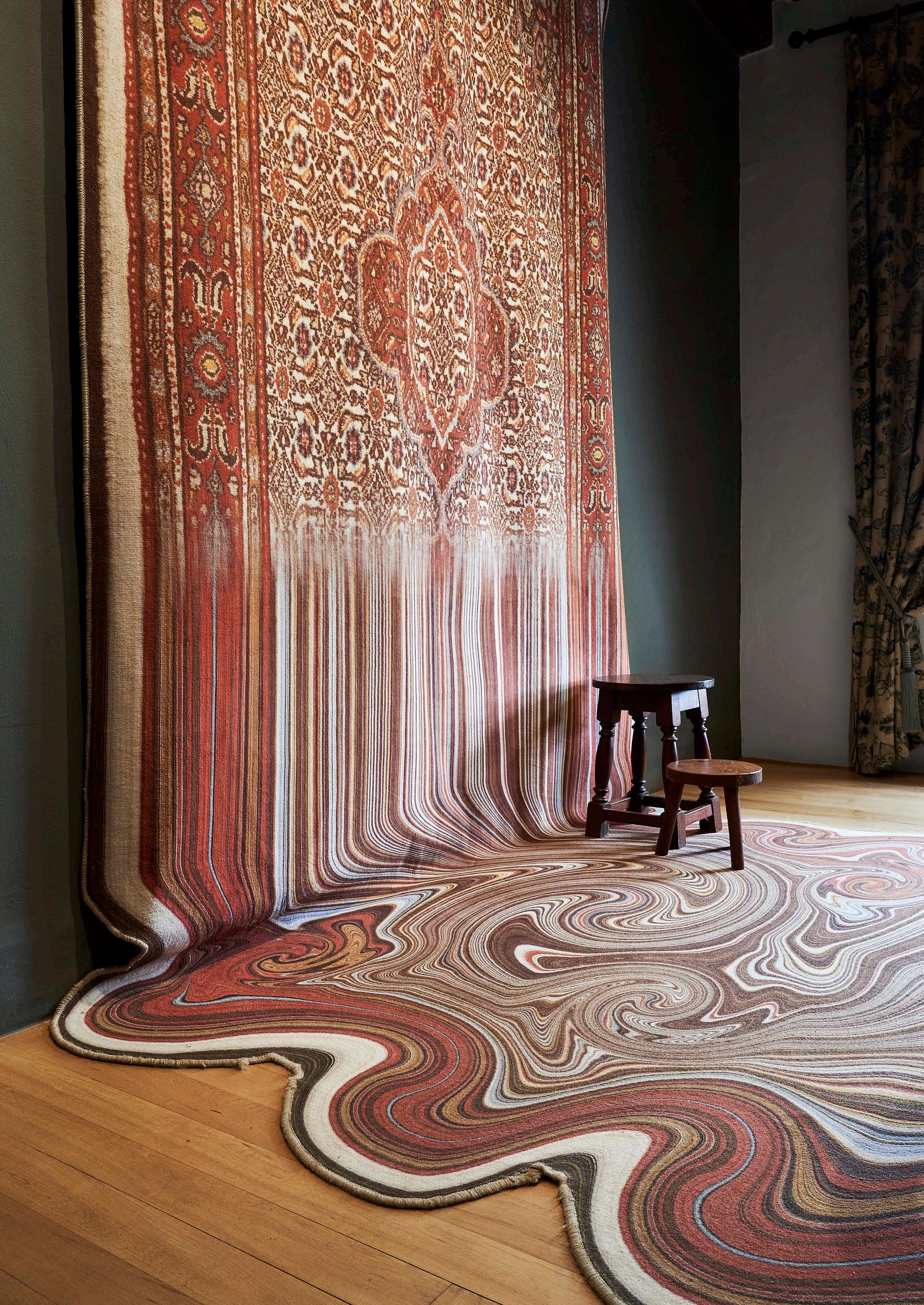
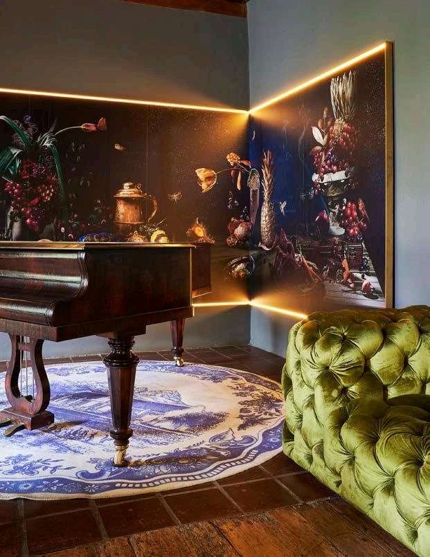
The original furniture and artefacts were badly stored all over the farm in sweltering attics and dusty pockets of space in barns and the like. So, while the intention was to use discovered elements in the design, it was often almost impossible to make them useable again. The eclectic mix of furniture that was found in the house was used as feature items in each room. New furniture in matte black celebrates the detail and grandeur of the original pieces while large artworks, which allude to classical Dutch paintings, are in fact photographs taken on the farm. A key element is the long handwoven mohair rug dyed with natural pigment seemingly melting into a puddle on the floor. The rug is an abstraction of the original Jan Brandes painting of the farm. A custom collection of wall-hung Delft plates in the foyer features various symbols representing key elements on Vergenoegd Löw. Then there’s also the ceiling installation of metal cow bells referencing the wine estate’s history as a dairy farm.
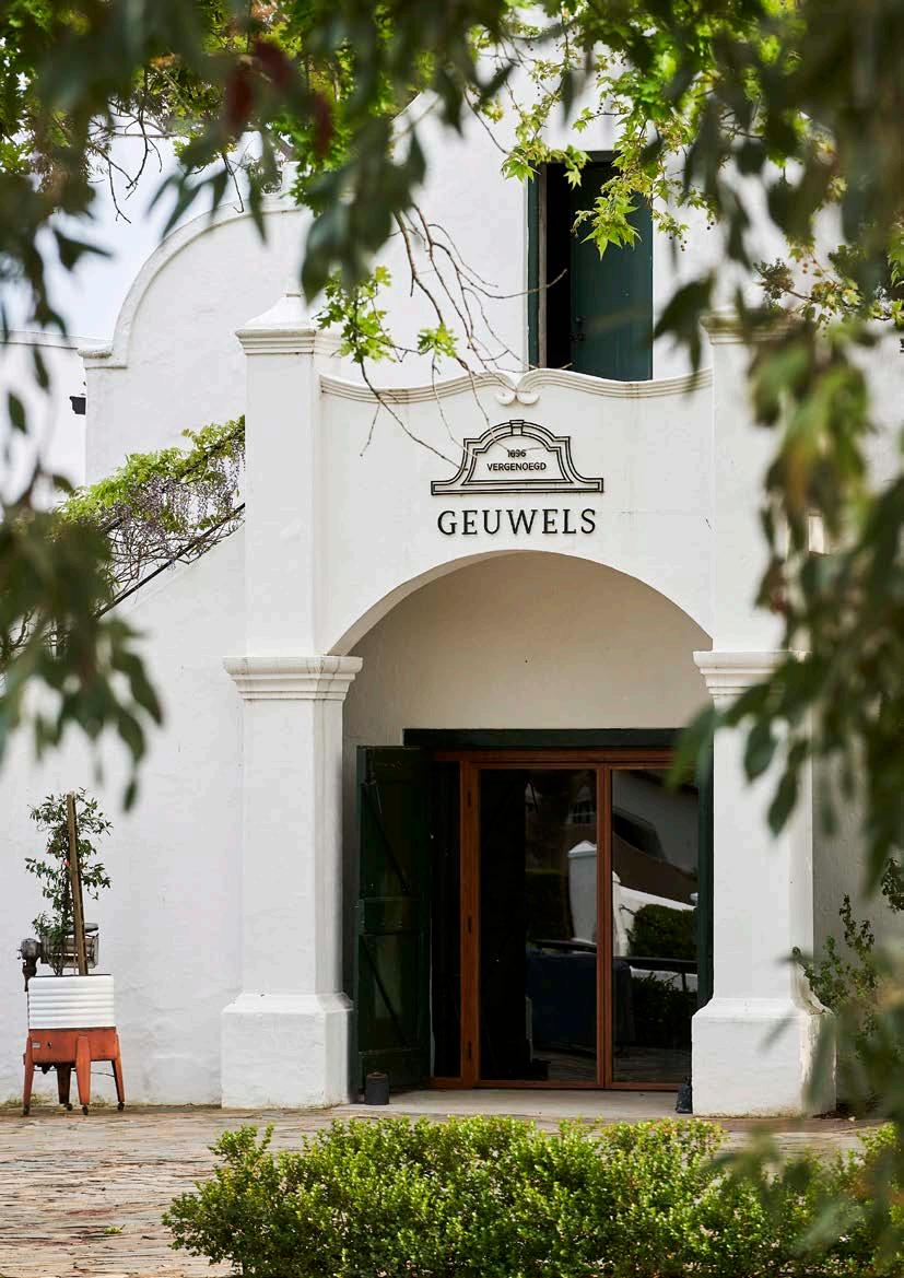
Geuwels, the Afrikaans word for ‘gables’, is a relaxed daytime-luxury Bertus Basson restaurant set in the gracefully restored Homestead. Drawing inspiration from South African produce and ingredients, Head Chef Drikus Brink dishes up breakfast, casual-style lunch, and leisurely afternoon picnics on the werf. The kitchen serves masterfully reinvented farm classics turning humble farm-fare into culinary art. Recently renovated from a wine tasting room and deli, the service concept evolved to a slower, more value-added offering with a series of unique environments within one building. The wine tasting room was moved to a different venue and the deli was upgraded to suit the new restaurant and design philosophy. The historic building’s series of small rooms posed serious limitations to how they could be combined together. Therefore, the design team shifted focus to make the most of each room individually to purposefully present it as a series rather than one event. Most of the spaces feature deliberately humble and unadorned schemes to celebrate the beauty of imperfect historic walls and honour the unpretentious agricultural setting. The series also includes an outside seating area overlooking the dam framing a view of Table Mountain, as well as a picnic area on the lush lawns.
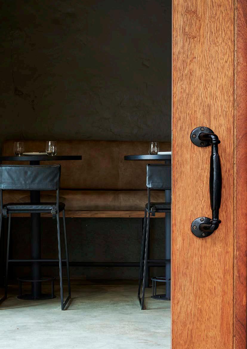
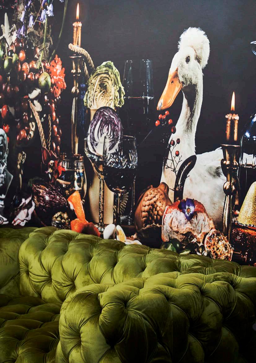
Affectionately known as the ‘Duck Room’, the room adjacent to the main kitchen had almost no natural light and was never able to attract guests. Rather than fight this key aspect, the design pushed the room’s appearance even further with black walls, a glowing fireplace, and some bold oversized artwork. Reminiscent of still life paintings, several photographs were commissioned on condition that they had to be shot on the farm. The large dining table in the Homestead was lavishly set in the style of the historic paintings, with one of the farm’s famous runner ducks making a cheeky appearance. The result is an oversized and maximalist printed wallpaper covering an entire wall of the room. The same table was also photographed from above and is applied across the entire ceiling to capture the once dreary room in a quirky celebration of its attributes.
“A key element is the long handwoven mohair rug dyed with natural pigment seemingly melting into a puddle on the floor. The rug is an abstraction of the original Jan Brandes painting of the farm."
As a surprise, the transformed ‘Duck Room’ is moody, bold, brave and thoroughly modern, reinforcing that, whilst history is at the core of the farm, it is now a decidedly modern operation with innovative offerings.
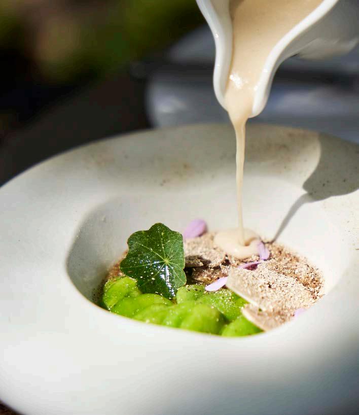
Clara’s Barn is a beautifully appointed fine dining restaurant set within the oldest barn in the Western Cape at Vergenoegd Löw. Tucked into the rear of the property, the dining establishment is surrounded by calm, tranquil greenery. At the start of the project, the farm in the forefround was so overgrown and neglected that the view was completely unrecognisable. Now rehabilitated, lush, and neatly planted, the view is absolutely breathtaking. The modern farmhouse kitchen is headed up by Chef Drikus Brink under the ever-expanding umbrella of Bertus Basson’s food establishments. Named in honour of the owner’s beloved wife, the design brief for the restaurant was in line with her clear, uncluttered preferences.
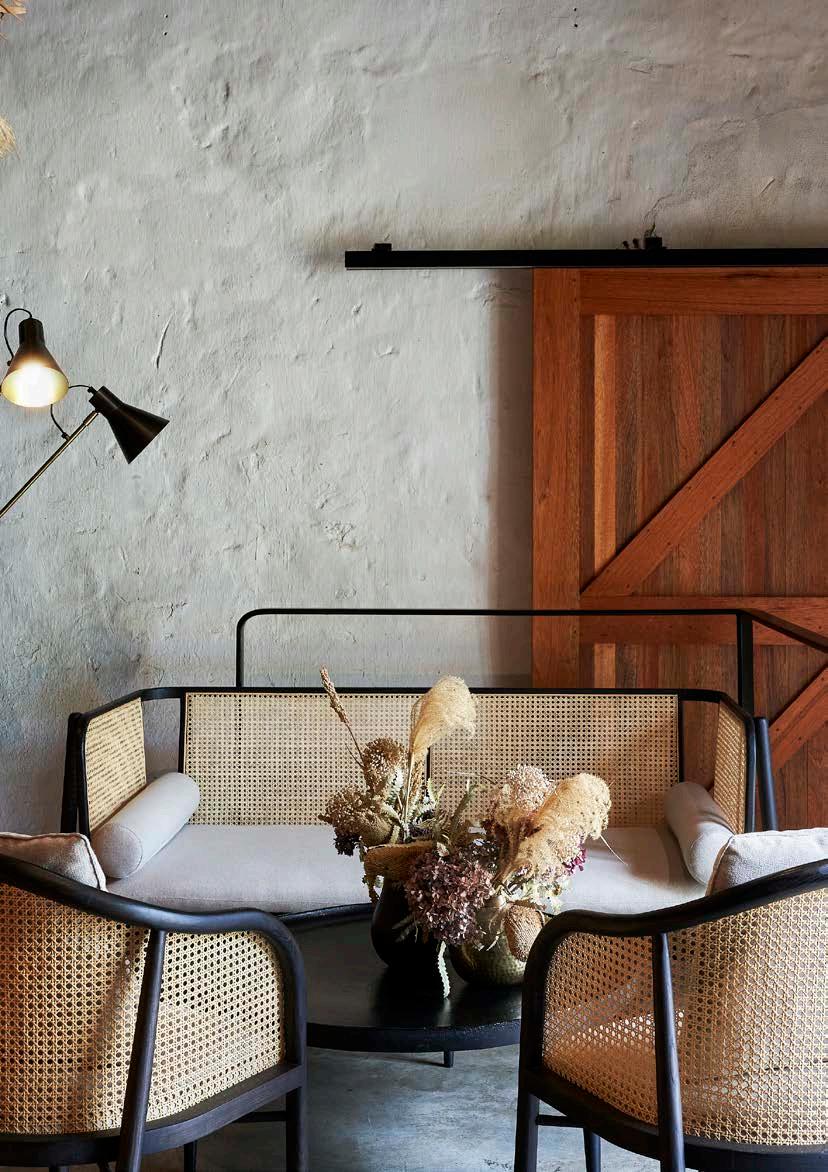
Original features were retained and purposefully presented in a scheme that feels humble yet elevated. A nod to materials typically found on the farm, the warm interior foregrounds oak, wrought iron, and thick sculptural limed walls. Originally designed to cater for large weddings, the space has the most gorgeous kitchen, which guests can view as they walk past the show kitchen and along what used to be the external wall of the barn. The perpendicular barn features the highly protected original pebble floor as well as floating timber flooring, which thoughtfully displays the original floor beneath. Through a magnificent arched window on the far end, Helderberg winks in the distance. A suitable layer of Bertus' more textured aesthetic is incorporated through rediscovered furniture pieces, large installations of ‘agriculture-like’ plants, a collection of vintage spades, and installation art constructed from bushels of grass from the farm. Despite its pared back, contemporary interior, the scheme evokes a romantically nostalgic sense of the beautiful life on a farm to inspire long lunches and engaging dinners.
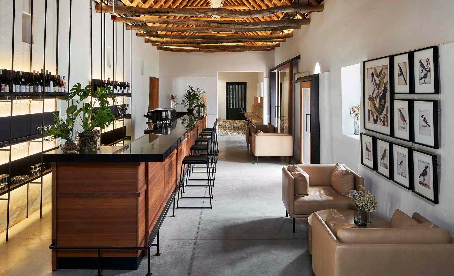
Through a timeous process of continued crafting, tenacious uncovering, inventive reimagining, thoughtful placement of strategic interventions, and often just peeling back the layers of irresponsible add-ons, Vergenoegd Löw The Wine Estate has been able to rediscover its once proud voice to gently reclaim its place as one of the Cape’s most significant farms.
www.sourceiba.co.za @sourceiba











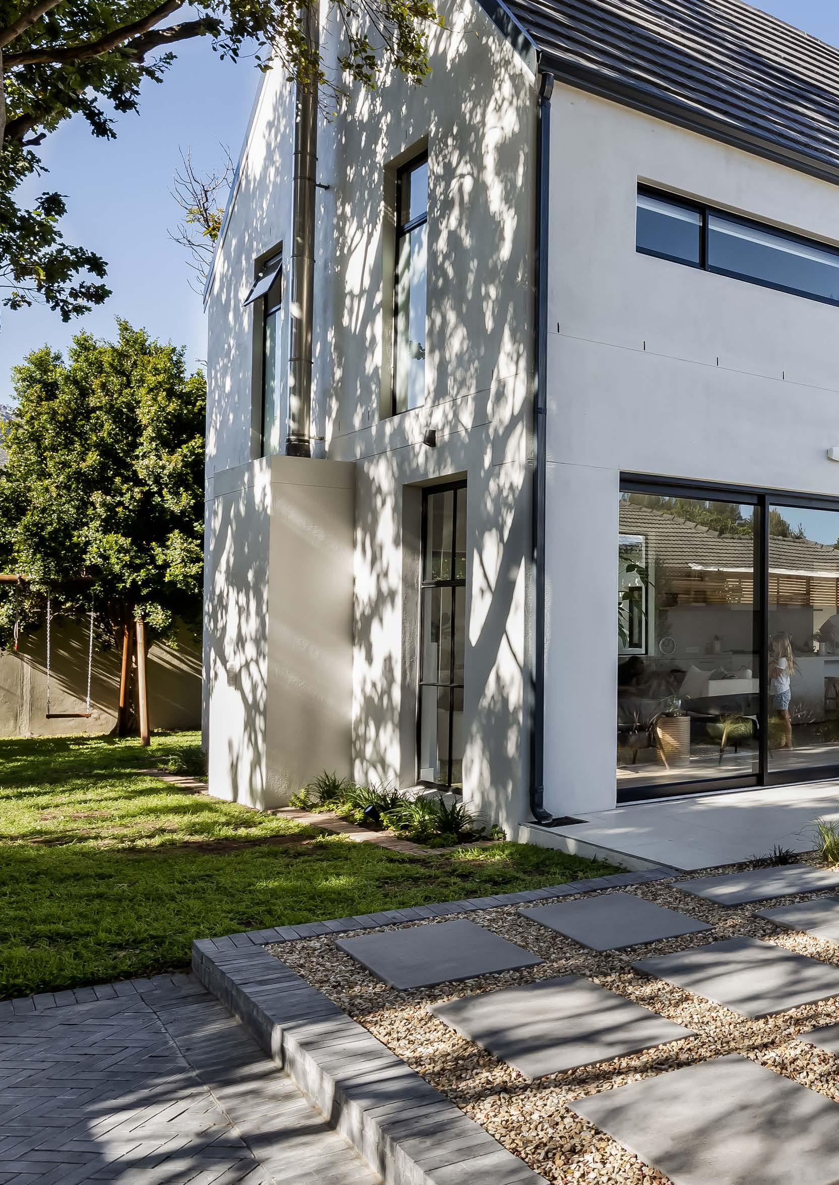
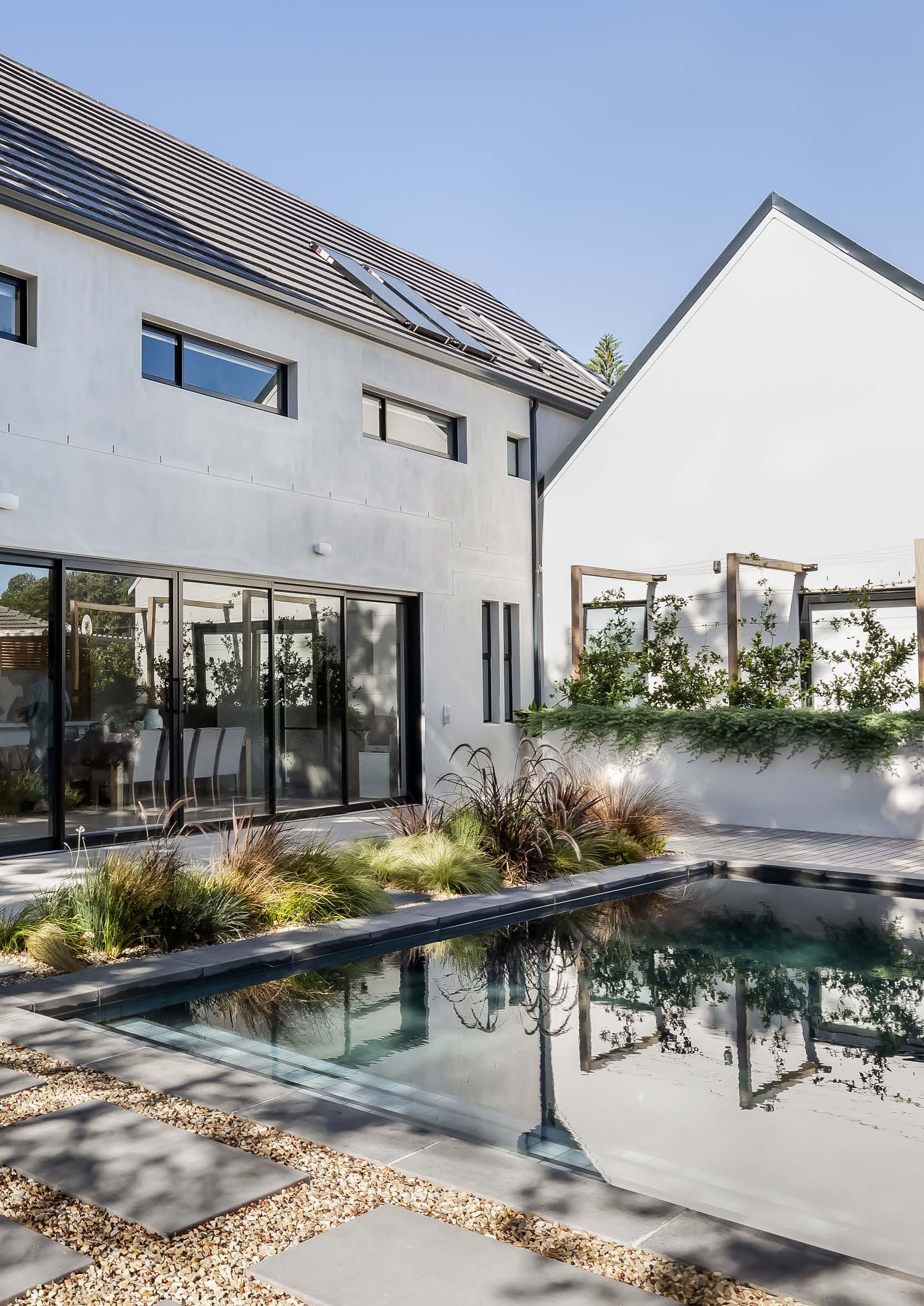
At Outside & In we live for a good renovation project, even more so when a designer gets to dream up her own family home! If the excessive styling of maximalism isn’t for you, then this mom of three’s DIY diary will inspire you to reimagine a modern minimalistic look. Read along as Johanna van der Merwe, the creative lead and owner of The Sourcing Lab (a design studio located in the leafy Steenberg Village in Cape Town), shares her clever design hacks and how you can recreate this design in your own home...

After years of designing and creating beautiful homes for our clients, the chance finally arrived for us to create our dream family home. I say ‘us’ because, although I did the architectural and interior design for the house, my husband Anton co-project managed and served as my sounding board on every visual element. After years of dreaming and watching Grand Designs (as one does), we wanted to be as hands-on as possible. Step one was finding our ‘golden oldie’ with all the right potential. We found just that in the beautiful Southern Suburbs of Cape Town. The house was screaming for a huge renovation and was perfectly located around the corner from our children’s school and across the road from our local park. Then came Covid and the first hard lockdown that delayed our transfer, increased the cost of raw materials, and impacted the availability of many essential products and finishes we needed. Like so many, we juggled working from home with homeschooling, all while trying to control every detail of what was happening on site. For both Anton and I, creating this home needed to be a family affair. We wanted our children to understand the concept that nothing is created without hard work, intention, and gratitude.
I would describe the architectural style of the home as a Scandinavianinspired contemporary farmhouse. We have many nods to the traditional farmhouse, namely the overall structure of the home being built in a barn style, a focal wood-burning fireplace, feature metal windows and doors, a mudroom, wainscoting on feature walls, and even a wine cellar. The Scandinavian influence comes in strong on the overall aesthetic of both the exterior and interior styling. The palette is very monochromatic while still being natural. Light finishes on the floor and in the living space are complemented by darker, moodier accents on the joinery, creating bold and contrasting focal points.
Growing up in The Netherlands, I have always felt inspired by the simple design principles associated with Scandinavian living. The idea that having less ‘things’ and therefore leaving more time and space for what is truly important is embedded in my family’s psyche. In a busy world driven by accumulating more, slow design embraces the pursuit of living with less. It embodies the idea that anything of significant value is birthed out of time and intention and is therefore intrinsically of higher worth. When we apply this pursuit of less to our designs, it’s here that we find that magical feeling of ‘home’. Therefore, we designed the house just purely with family in mind.
The interiors are led by nature. Natural finishes, neutral tones, natural light, and textures that add depth and interest. The style is versatile and leaves room for us to change and grow with it. We wholeheartedly believe in something I call ‘foundational design’ and enthusiastically applied it to the design of our own home. Foundational design is all about the finishes. Basically, if someone had to turn the house upside down and give it a good shake, then all the things that would stay in place. Finishes are what set the tone for every home, and sadly no amount of fancy furniture or clever styling hacks can hide bad finishes or the wrong pairing of good finishes.
The interior of our home extends beyond the structure of the building and into the garden. The dark swimming pool surrounded by indigenous wild grasses and olive trees was designed to imitate a natural rock pool found in nature. This view can be seen from the main living space and kitchen, making it not only a beautiful visual but also practical for a young family with small children.
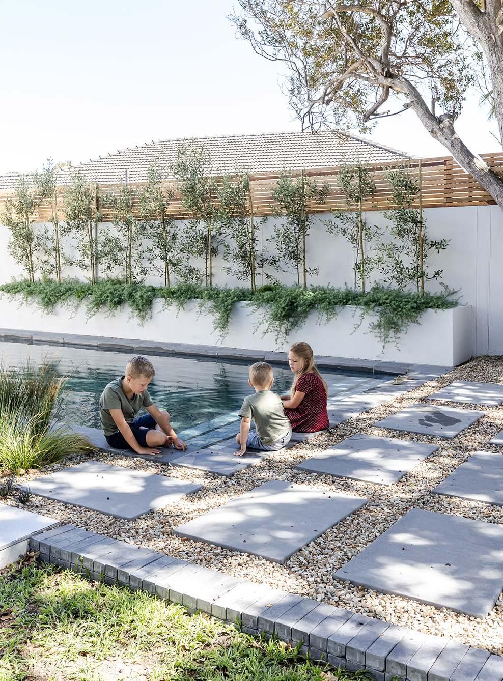
“The palette is very monochromatic while still being natural. Light finishes on the floor and in the living space are complemented by darker, moodier accents on the joinery, creating bold and contrasting focal points."
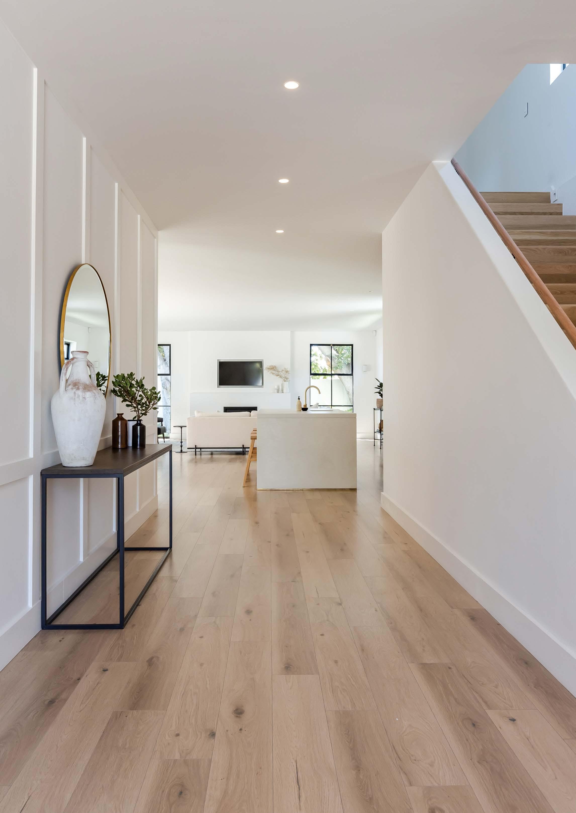
If walls could talk I often joke that I could probably be happy living in a box painted white. That being said, it needs to be the right shade of white and my personal favorite is Almost There by Midas. We used this paint colour for all our walls, ceilings, and trim work. This was offset by another favourite, a deep almost black colour called Tribecca Corner by Plascon. Tribecca Corner marries beautifully with the SupaMatt product we used on much of our darker joinery from PG Bison in the colour Kalapana. We used this dark accent in our study, wine cellar, mudroom, and master bedroom. The same product was used for the wardrobes in the children’s bedrooms, but in a more muted colour called Folkstone Grey.
LOUNGE
Rug Block & Chisel Stockholm armchairs Weylandts
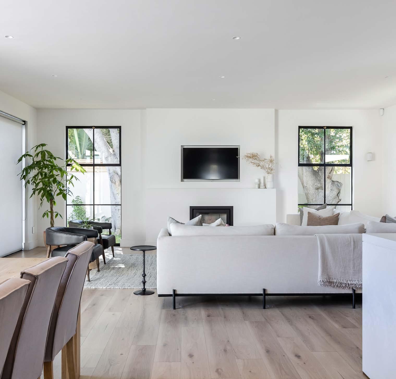
Steel doors Matte Black from Metal Windows
Optimise your quartz slabs by incorporating offcuts into the design wherever possible. We did this for our bathroom vanity tops, in the pantry, wine cellar, bedroom coffee nook, and fireplace mantels. Chat to your fabricator, find out what your offcuts are, and use them where you can. At the end of the day, you are paying for the stone, so make sure you use it!
Tapware
Meir from Flush Bathrooms
Island décor panel profiles
Orac Décor
Countertop
Cloudburst Concrete by Caesarstone
Stone fabrication Rock and Stone Works
Oak veneer doors
Alco Exotic
Appliances
Siemens South Africa
Cupboards
Duco sprayed fronts
Brass wall lights Lighting.co.za
The highlight and heart of our home is undeniably our kitchen. I am a passionate believer that simple design paired with beautiful, timeless finishes will always deliver a refined and considered result. Our kitchen set the design foundation for our entire home. It is a place where we gather, as a family or with friends, whether it’s preparing food, doing homework, or just reconnecting after a busy day. So, we wanted it to feel aligned to the rest of the home. There was no version one-point-one and one-point-two; no layout revisions or colour variation. The design in my mind is what you see right here!
Our design starting point was a beautiful engineered quartz countertop for the island. The textural nature of this stone together with its warm hues made it a must-have for us. Once we found this piece, every other material was selected to work in balance with it. For example, we chose a rugged concrete stone as its partner to bring our moodier scullery and mudroom to life. Our kitchen palette was completed with the introduction of warm timbers as seen on our oak floating shelves, oak folding doors, and on the floors throughout the home. Finally, we paired all our joinery with brass ironmongery and beautiful tiger bronze kitchen mixers.
TIPS:
• You don’t have to stick to the rules. Think about how you want the space to function for you.
• Keep your finishes simple. You don’t want to redo your kitchen every five years.
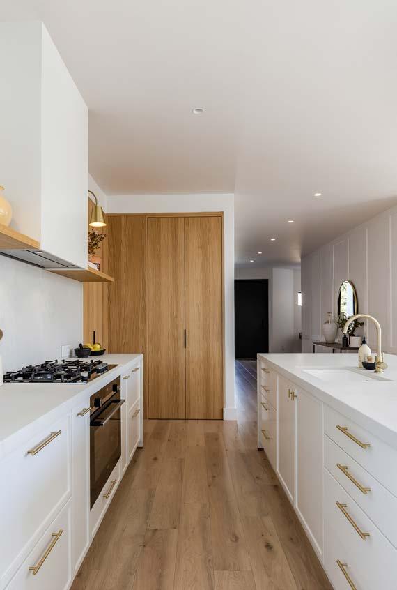
• Floating shelves are incredibly versatile and a great way to switch things up without revamping the entire kitchen. Experiment with different items and styling to personalise the space.
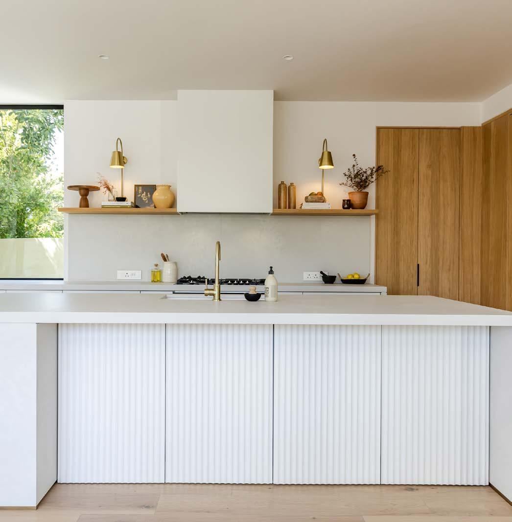
“I am a passionate believer that simple design paired with beautiful, timeless finishes will always deliver a refined and considered result."
This cheeky wine cellar was on the top of our ‘wants list’ when we started dreaming up the interior layout for our own home, and I’m super pleased we made it happen. It’s the perfect peek-a-boo kind of moment when your guests walk past and a great way to showcase your vino. We’ve used the Kalapana SupaMatt from PG Bison together with the rugged concrete by Caesarstone.
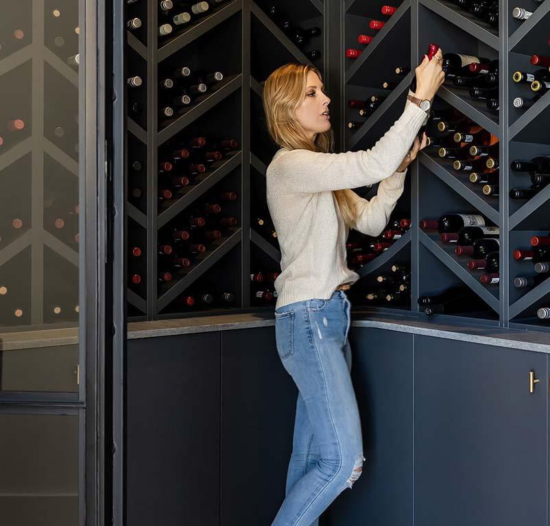
Joinery boards
SupaMatt in Kalapana by PG Bison
Joinery installation Kitch Me Up
Stone tops ‘Oh so Sexy’ Rugged Concrete by Caesarstone
Stone fabrication Rock and Stone Works
Steel doors Matte Black from Metal Windows Tiles Tilespace Lighting Lighting.co.za
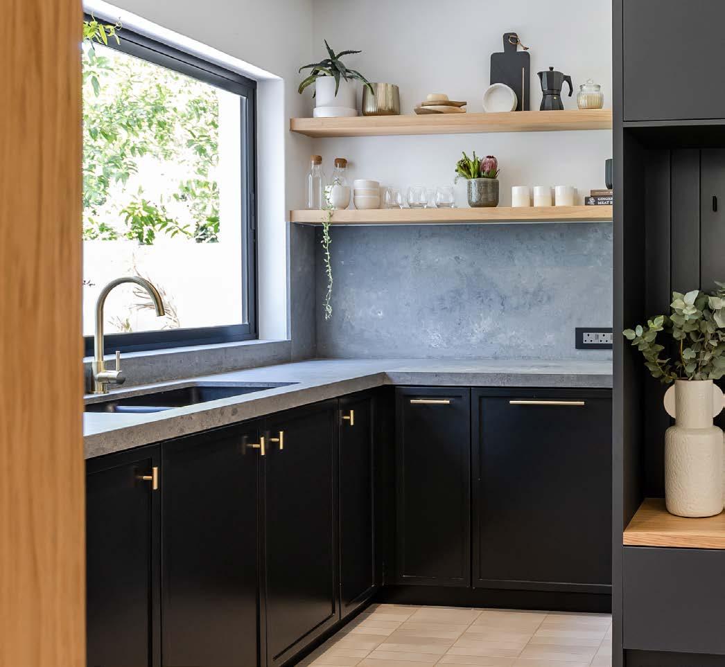
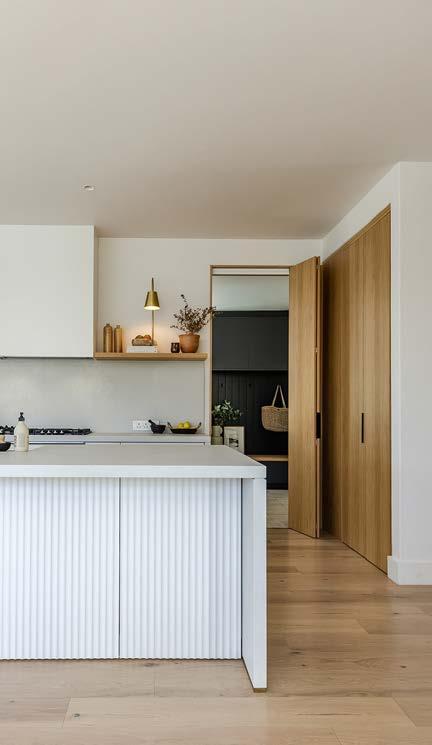
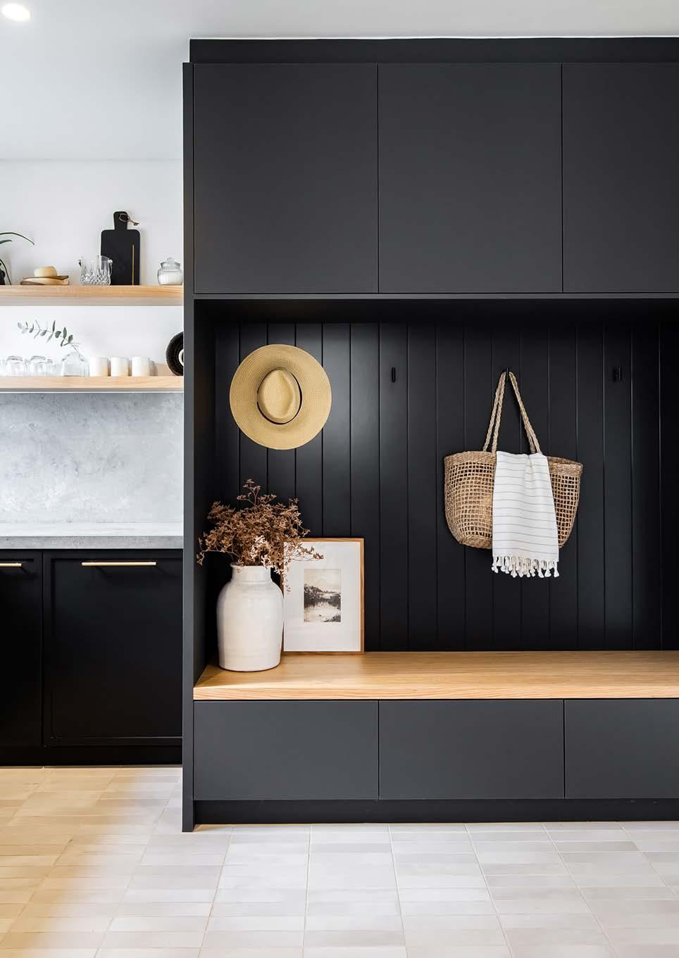
Tucked away behind oak panels in our kitchen are two doors — one leading to the walk-in pantry and the other into our scullery and mudroom. Landing zones in a home are vital for creating functionality and simplicity. When renovating or designing your home, it’s best to prioritise these spaces from the outset. For the mudroom, we wanted an area where our kids could take off their shoes and hang up their school bags before heading into the rest of the house. The mountain of winter coats and gum boots can finally be stashed away behind a clean, Insta-worthy design!
TIPS:
• First of all, storage space is super important. You can never have enough of it! Use this space to incorporate as many shelves as you can/want.
• Second, just because there’s a wall, doesn’t mean something has to be on it. So, don’t be afraid of those blank spaces. A design needs those spaces our eyes can just rest and land.
• Thirdly, and this is probably the most important thing, you are designing for you. So, create a space that you absolutely love. Trends are important, obviously be inspired, but create a space you would want to be in every day.

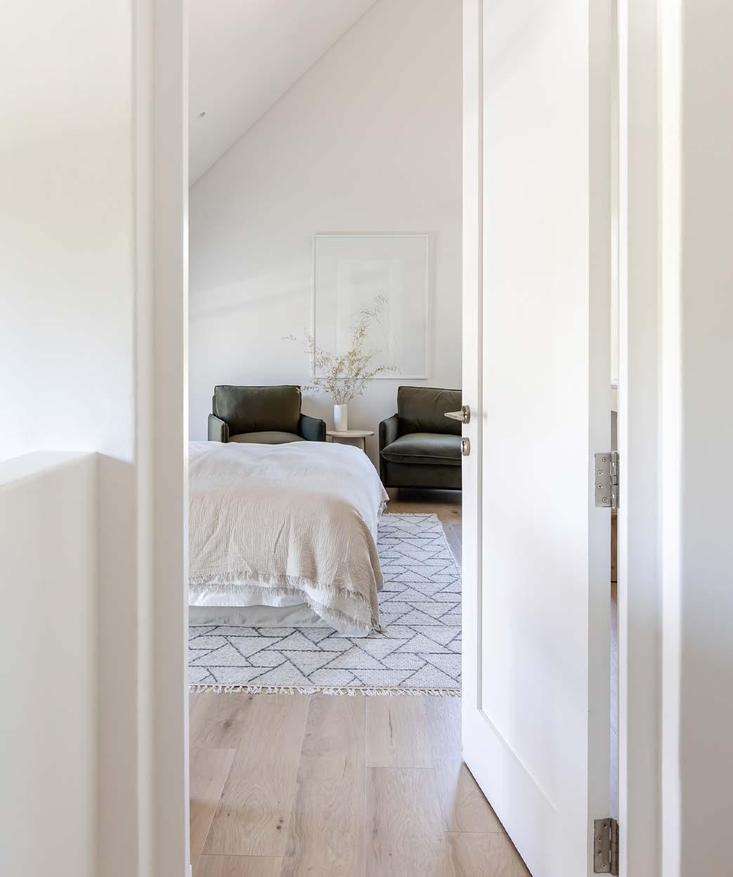
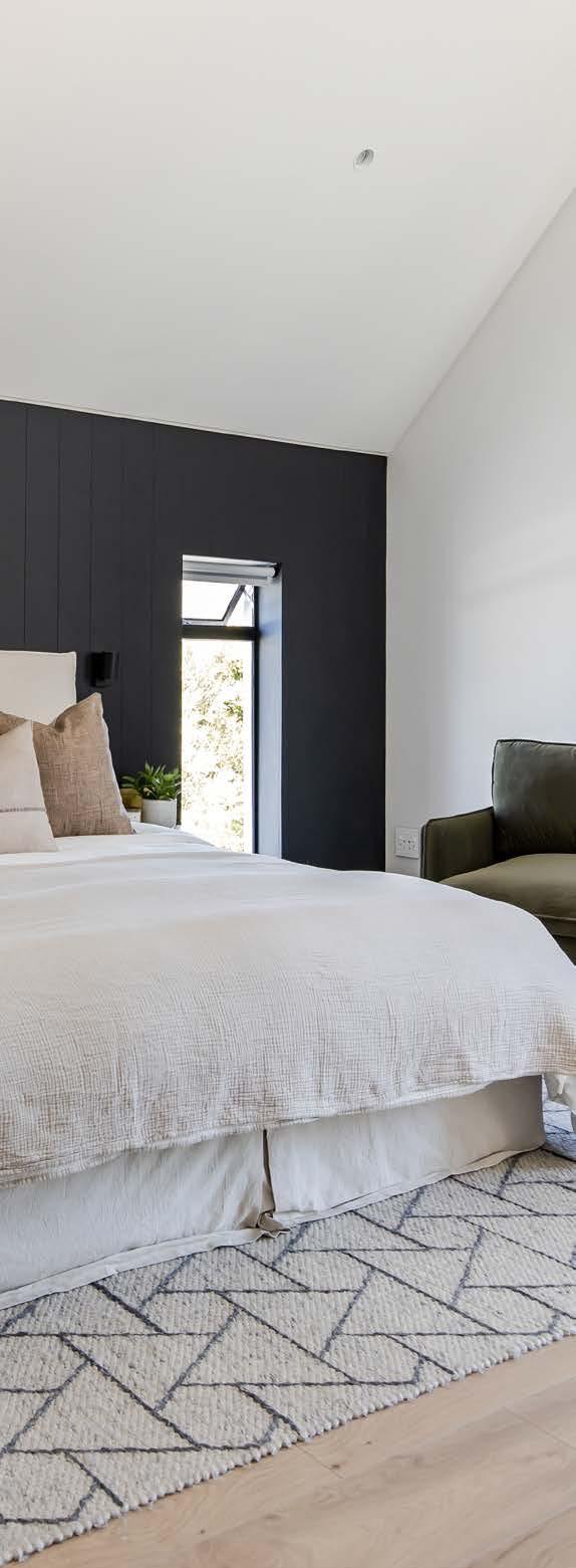
For our open-plan master bedroom, we really maximised the double-volume pitch of the roof. We kept the palette simple and monochromatic with white walls and dark panelling behind the headboard. A textured rug perfectly ties the area together. The bedroom is such a personal, intimate space, but there a couple of things that I suggest you keep in mind when you design or redesign yours. First, if you’re creating a master bedroom for you and your partner, sit down together and create a mood board you both like. Since the rest of our home is so minimalistic, we thought the master bedroom was a great opportunity to get a little more excessive with styling. Think about placing area rugs, baskets, and plants. If you have the space to incorporate a seating area (even if it’s just a single chair or bench), then do it. It transforms your bedroom from being just a functional area in which you sleep to being a place you can sit back, relax, and enjoy. It also creates the perfect connection point between the open-plan bedroom and bathroom. Allow your imagination to be inspired by all the things you love doing, and add items like an easel or even a musical instrument to curate a space you would love spending extra time in.
TIP:
Consider creating a coffee nook inside your master bedroom. We decided to add one inside our walk-in closet space, and it’s honestly so worth it! Now we can enjoy those slower mornings without having to run downstairs to get our morning fix.
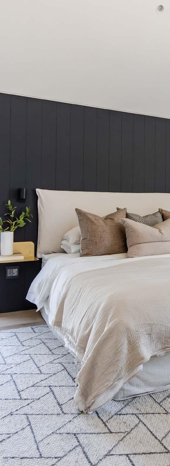
Headboard and base cover
Heimwee Huis
Brass floating bedside shelves
Acre Studio
Nature is calling Second to the kitchen, your bathrooms are the rooms in the house where you will be spending the majority of your budget. That’s why it’s important to choose timeless finishes so you don’t have to redo and upgrade them every five years. For our daughter Sienna’s (7) en suite, we allowed her to choose her own paint colour. Since her bathroom is very small and lacks a lot of natural light, we wanted to keep the scheme soft and natural. She chose a dusty peach, and I think all the blushy hues turned out so stunning paired with the brushed brass finish on the taps! The handmade pill-shaped concrete basin, oak vanity, walkin shower, arched brass mirror, and herringbone pattern tile, all complete the look beautifully.
For our boys, Ethan (3) and Jayden (9), we wanted to create a natural bathroom with a bit of a masculine feel that they could grow into. Almost like a transitional design. We used a plain grey floor tile and then a darker grey for the actual shower enclosure so that it stands out from the rest of the bathroom. Then there’s also a free-standing bath, but I don’t know how often the boys will actually use it! The boys’ bathroom is rounded off with an oak vanity with a single basin and black tapware. We wanted our master bathroom to feel like an extension of the bedroom. The design is super simple and gives that spa-like feel. We used one type of tile with a warm undertone, and then added a his-and-her shower and a long vanity with double basins. The toilet is tucked away and offers a beautiful view out the window for its occupant. Our freestanding bath with a matte finish is absolutely stunning.
TIPS:
• Keep it simple and choose classic finishes in a monochromatic, natural, or neutral palette.
• Gone are the days when all your bathrooms have to be the same! Get creative and give each bathroom their own mood board and colour scheme. But make sure there’s commonalities between them to tie them all together. In our case, it was the oak vanities and the stone we used on the vanity tops. But in your case, it might be the floor tiles or the sanitary ware.
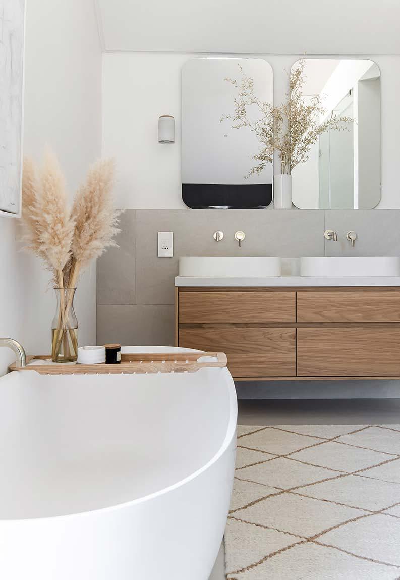
BATHROOM
Bath
Livingstone Baths
Tapware
La Torre from Yourspace Bathrooms
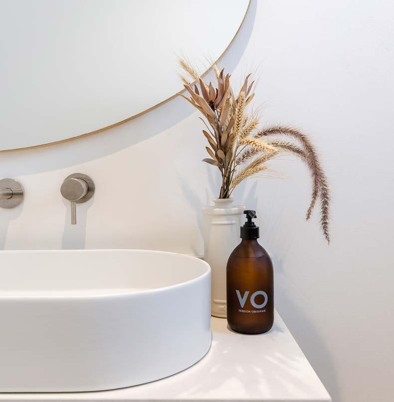
Tiles
The Best Tile Company
Vanity tops
Cloudburst Concrete by Caesarstone
Basins
The Concrete Corporation
Oak vanities
Repurposed shelf storage units from Weylandts
Cotton towel
The Cotton Company Handwoven rug Coral & Hive


This modern home set in the Banhoek Valley in the heart of the Cape Winelands brings together the owners' love of colour, quirky collectibles, and passion for the outdoors in a showcase of their remarkable creativity.
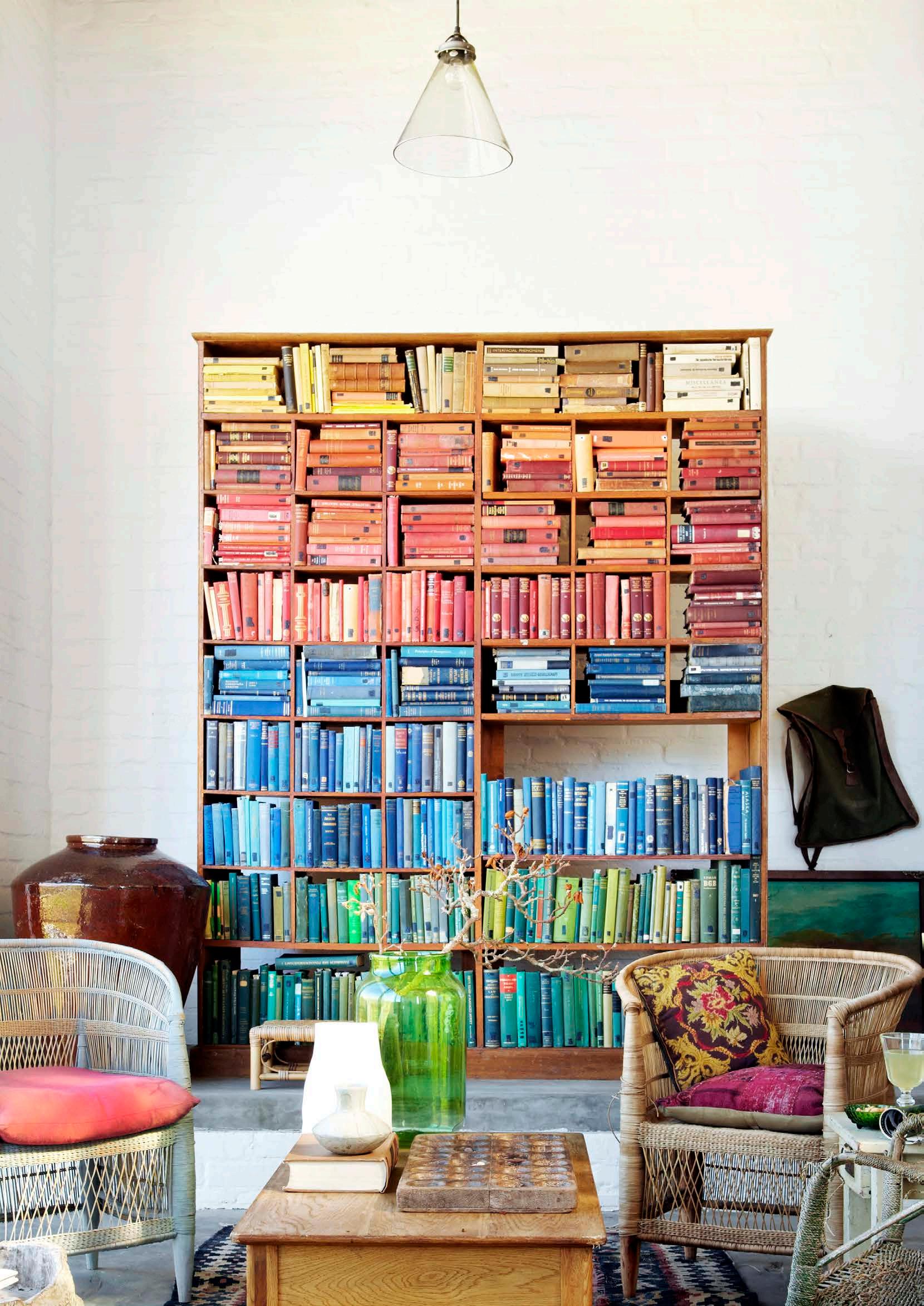
It's not hard to see why this house at Johannesdal garnered architect Henri Comri a coveted Cape Institute of Architecture Award. Inspired by Le Corbusier, its vast white lime-treated walls, expansive spaces, exposed brickwork, integrated industrial metal, raw concrete ceilings, untreated wood, limestone, and glass make a strong Modernist statement without feeling incongruous to its two-and-a-half-hectare smallholding or alongside the Cape vernacular architecture that characterises the greater area.
Owner Dane Erwee describes it as 'modern meets farmhouse', and explains that he and his partner Chris Willemse envisioned 'something that nestles; a modern exterior but with a farmhouse interior'. And their aesthetic flair is as much the reason for Johannesdal's success as is Comri's design.
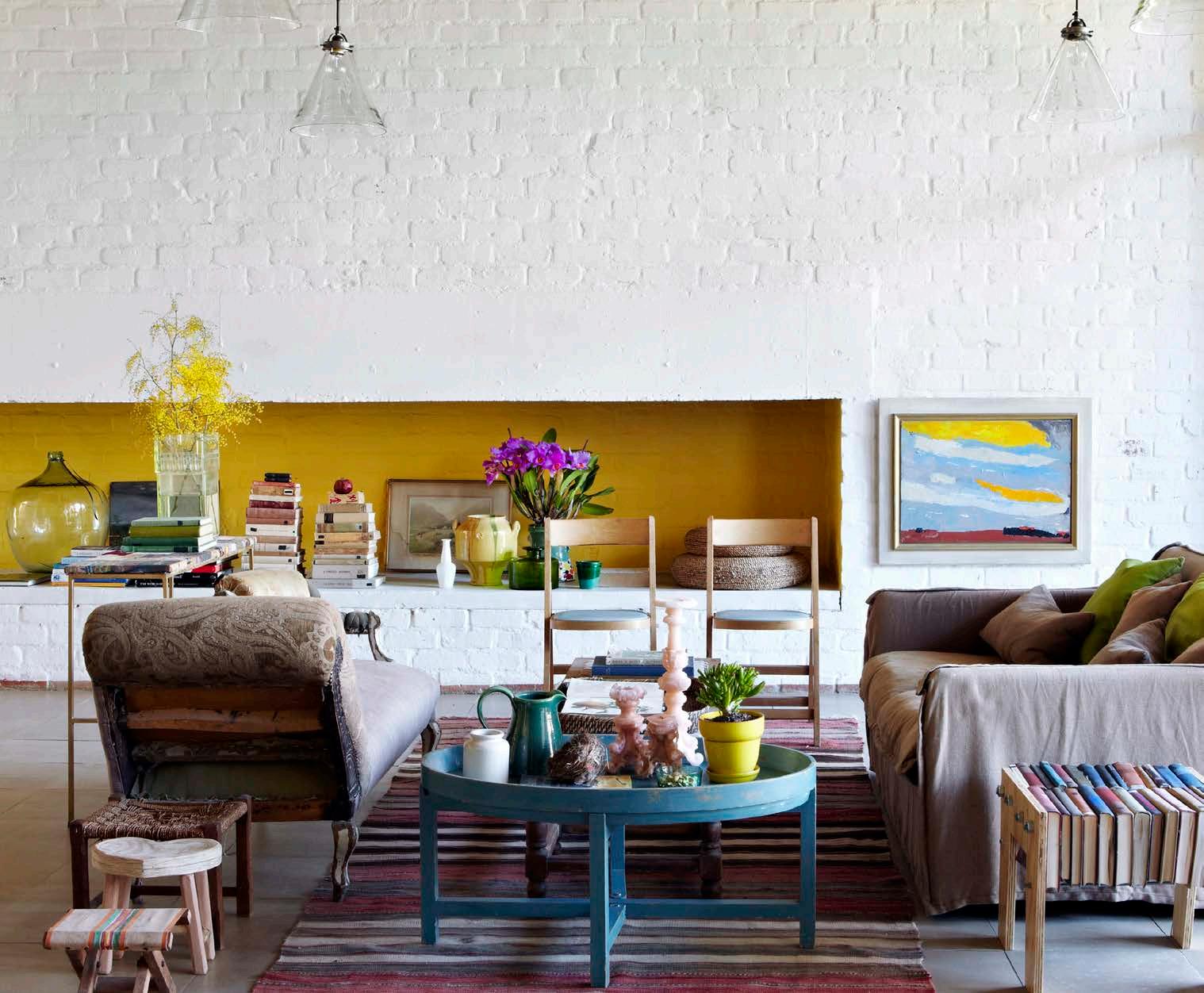
Creative expression comes easily to Dane and Chris; it's second nature to them: they not only live it, but make a living from it (Okasie florist and events company in Stellenbosch is their baby). With Johannesdal, they feel like they haven't had to 'try' hard at all. Instead, they've rather enjoyed the freedom to play.
'No fixed cupboards' is their only design rule and a light, almost mischievous, touch pervades everything. At every turn there's an unexpected vignette (a globe of the world and a pot-plant upon a weathered antique wooden chair under a line of artworks, for example) or a wild splash of colour (like the bright yellow fireplace) to arrest the eye. Yet while freely unorthodox and at times perhaps theatrical, there's a sense that every inch of the décor is underpinned by carefully-considered curation. 'Authentic and not forced,' is how Dane describes their design ethos. 'Styled as opposed to decorated; collections that tell stories.'
FAR LEFT: In the living area, a large bright yellow niche housing a curated collection of objects is a playful focal point.
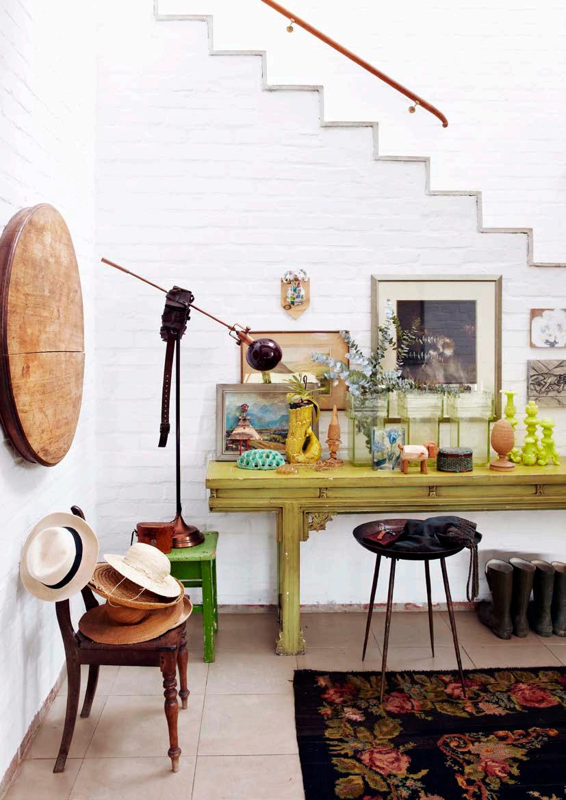
TOP LEFT: In the entrance hall, the arrangement of colourful decorative ornaments and bright Turkish carpet is grounded and contextualised by an old and cracked wall-mounted wooden tabletop. 'I like the way it interacts with the cubistic space,' says Dane. The large, dark painting is by Cora Coetzee.
TOP RIGHT: Chris and Dane’s scullery has direct access to their herb and vegetable gardens and often doubles up as a floral studio.
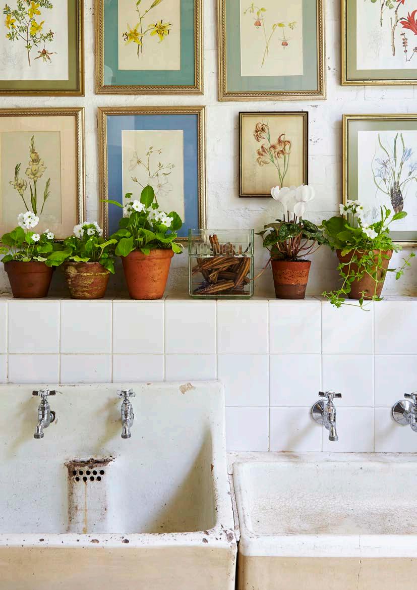
BOTTOM LEFT: 'Everything happens here,' says Dane of the dining and kitchen area. In keeping with their sole design rule of 'no fixed cupboards', this space has an antique Burr-cut Mahogany wardrobe reinvented to store crockery.
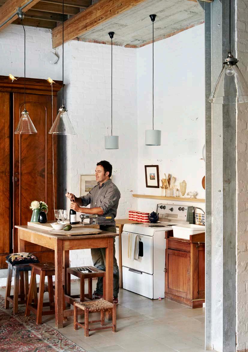
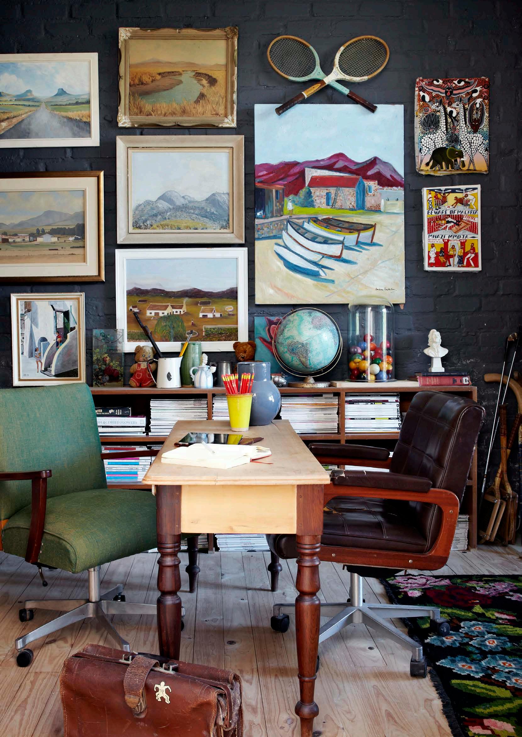
Collections are everywhere. 'What don't I collect?' says Dane. ' I like things that tell a story; things with dirt on them and not something I would find in a mall.' But however layered, colourful, and dramatic the many arranged collections may be, there's nothing uptight or 'precious' about them. Rules of symmetry aren't religiously applied; indeed, they seem to be deliberately thwarted.
These tableaux aren't mere messy jumbles, mind: each has a common thread that turns the assemblage of objects into an intellectually-engaging narrative as well as a visual treat. Their every element is invested with personal or historic meaning; they share a common soul. 'We don’t find them – they find us. They're mostly passed-on heirlooms, gifts, and junkshop or reclamation yard finds,' says Dane. 'For example, I grew up with the blue and white plates that hang on the wall in the living area; it was my mother's collection. I recently unpacked it and the vine growing through it is a new take on something old. In a way, I guess it may also be a nod to South African Dutch heritage, but that wasn't my specific intention.'
From the light-filled triple-volume entrance hall, with its honed limestone floors and raw concrete ceilings, to the untreated pine passage leading to the private study, main bedroom, wetroom, bathroom and dressing area; not to mention the open-plan dining and kitchen area with its exposed I-beam and the patinated lime-treated walls common to every space — the building itself is the star and its real 'it factor' is its interface with the natural surroundings. There can be absolutely no doubt of where in the world one is.
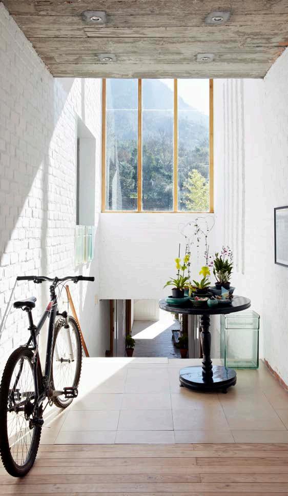
FAR LEFT: The walls of the private study are adorned mainly with South African landscape paintings. The boats are from Zanzibar.
LEFT: The main bedroom's unpainted plywood wall provides an earthy contrast to the vibrant Turkish carpet.
ABOVE: The combination of lime-washed walls, untreated wood, raw concrete, sandstone, and glass creates a modern frame with an organic feel in keeping with the natural environment.
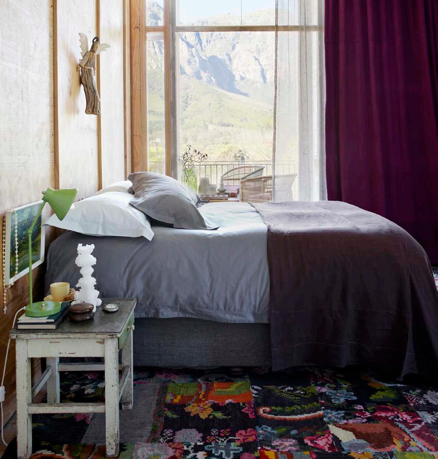
What's more, like these plates, each tableau has breathing room: Dane and Chris have made sure that there's plenty of neutral space to act as restful pauses for the eye; no matter how eye-catching, no vignette ever overshadows Johannesdal's structural character or its rooted sense of place.
South African landscapes dominate the subject matter of the many paintings clustered together in the private study. Generous verandas extend both the open-plan dining and kitchen area, and the study, main bedroom, bathroom, dressing room, and wetroom on the floor above. Large windows are everywhere from the stairwell to bathrooms, bringing in the views. A scullery leads to a kitchen garden. A wooden spout placed high in an exterior wall channels water to an appropriately farm reservoire-esque swimming pool. Unsurprisingly, seeing that both Dane and Chris grew up on farms, the grounds are even more lived-in than the house. 'We spend a lot of time in the garden and are mostly outside,' says Dane. 'We like things that are honest and true to our roots and lifestyle.' Johannesdal is the perfect illustration of exactly that, within a distinctly Modernist idiom.
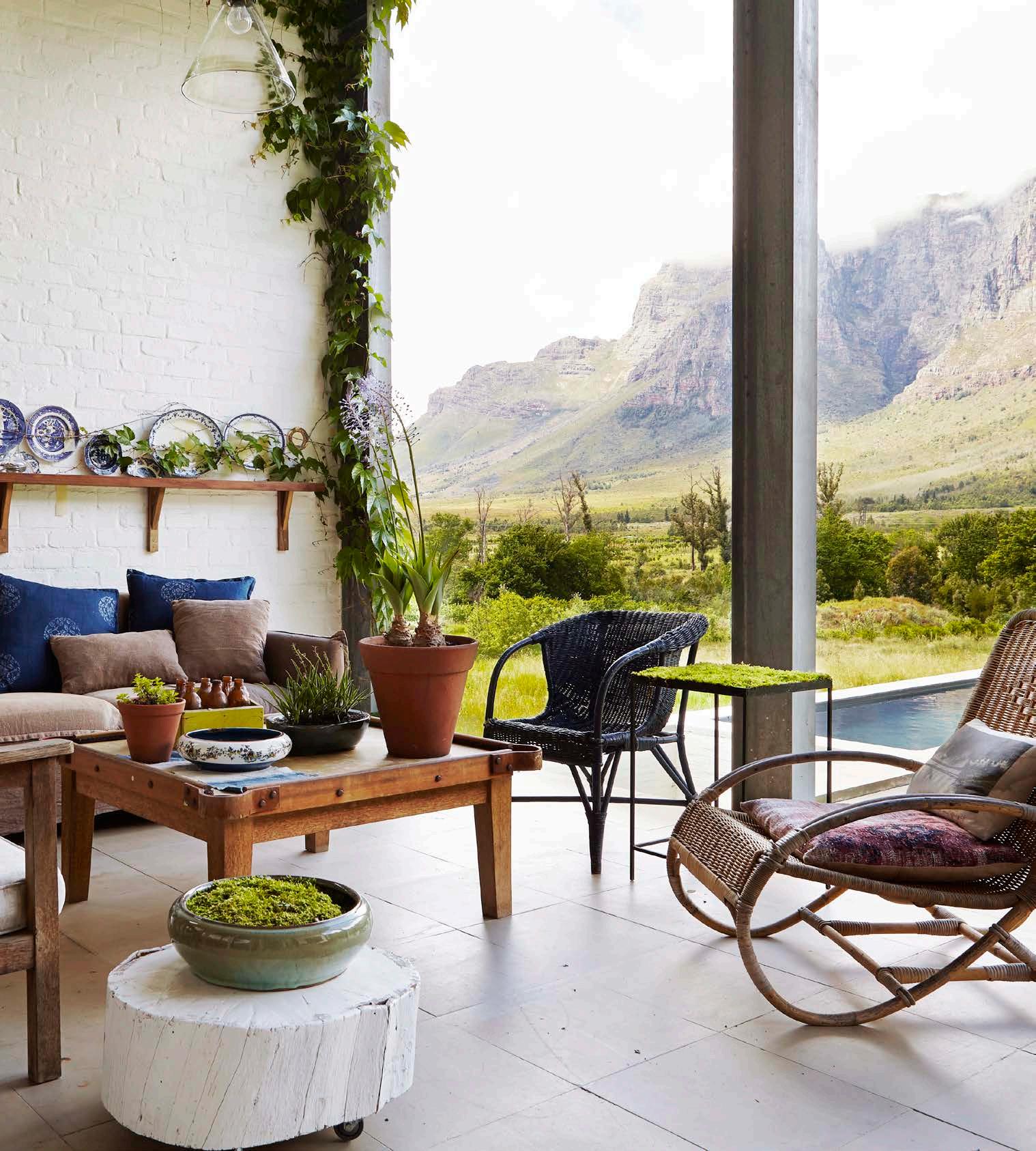
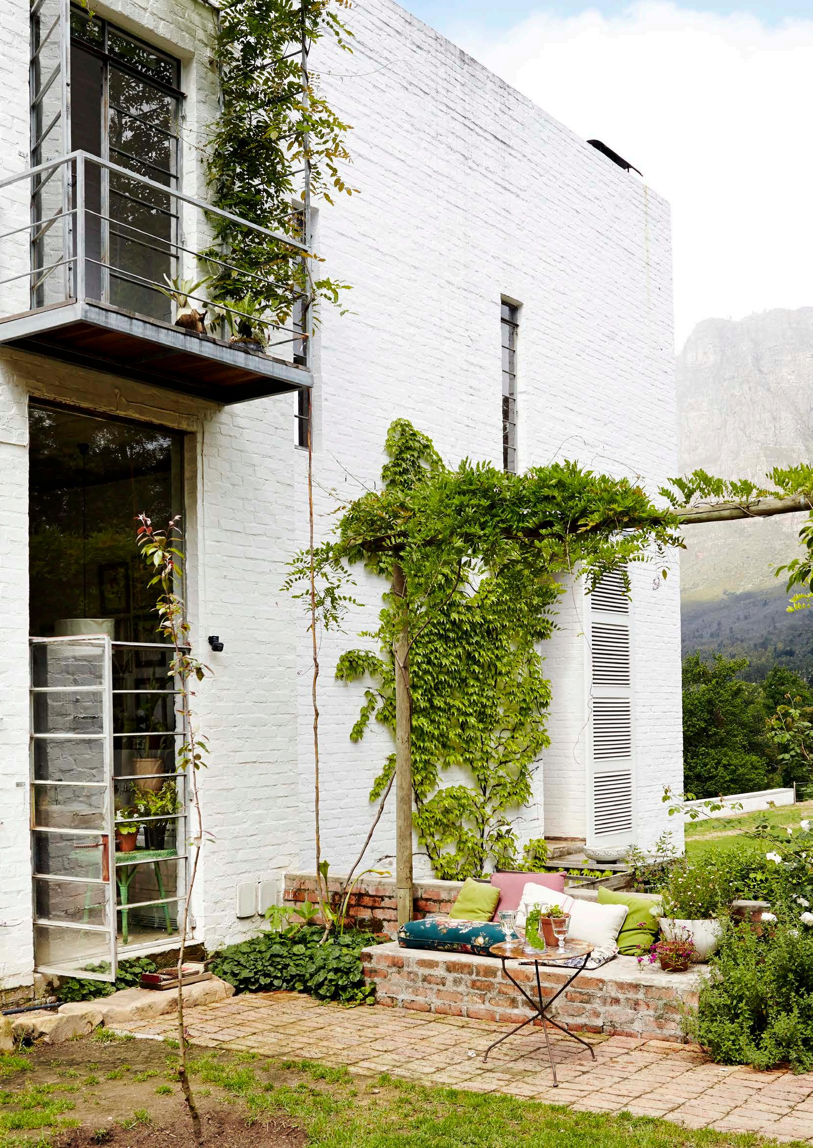
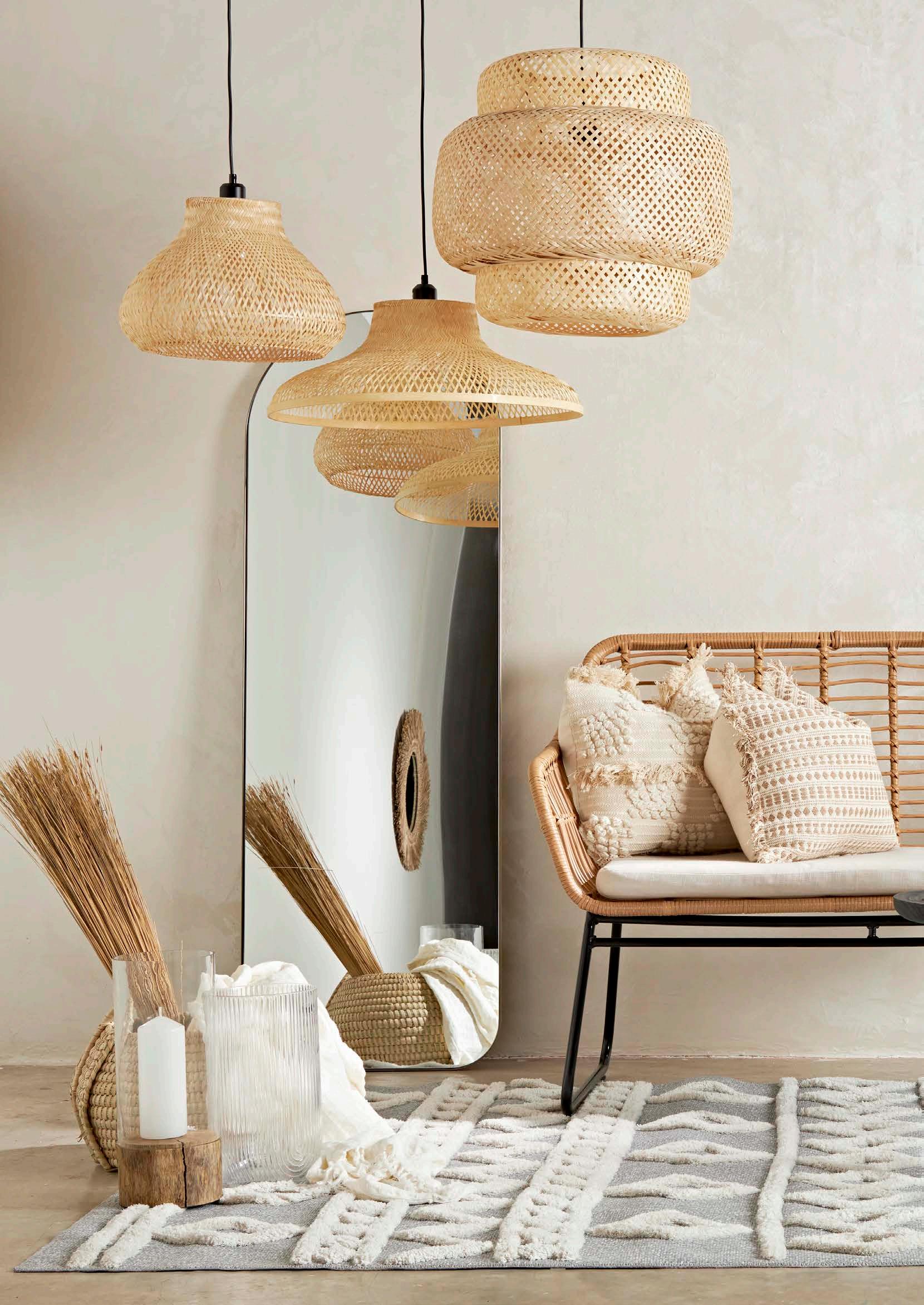


This new interior design trend effortlessly combines two opposite styles: modernity and authenticity. Showcasing colour palettes and materials that are natural, warmer, and a little darker than last year, this theme is all about promoting a connection to nature to balance our technologically immersive daily lives. Incorporating the Japandi trend of slat panels, the lines are contemporary with surfaces kept raw and rustic elements balanced by modern architecture. Continuing the previous season's interest in the wabi-sabi aesthetic, this look appreciates imperfect beauty by incorporating matte and slightly rougher textures. Shapes are curvy and smooth yet geometric, with a touch of irregularity and a contrast between hand-crafted and minimalist decorative objects.
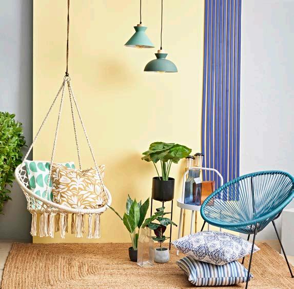
Decorative and oh-so luxurious, the retro refreshed style continues to infiltrate the commercial industry, displayed in restaurants, hotels, and bars globally. Signature ‘Glamour Core’ elements are rounded shapes and arches, terrazzo on walls and floors, and deep, rich colours on walls and furniture. Some essential items include velvet curtains and cushions, as well as gilded metallic structures for lighting and functional decorative accessories. Then there’s also geometric patterns, influenced by the Art Deco nostalgia of the 1930s. These interiors typically evolve from very soft, sweet, and ‘boudoir’ to layered and eccentric in colour palettes and materials. Add warm yellows, reds, and emerald greens to spark joy, and golden details, oblong lighting features, and coloured glass vases to keep the retro look consistent.
Country Charm is inspired by the 19th century cottage era and romanticises the authentic, rural, pastoral life on a working farm. Interestingly this style is one of the most researched concepts on the web by young adults today. The ‘New Cottage’ trend has become a type of Eden escape — an ode to the idealistic country life. Influenced by the diversity of country landscapes and their colours, this design theme makes use of reclaimed materials as signature elements. Get the look by incorporating dried flower tones, elements of straw, and a colour palette of yellow and grey green. Soft and sweet flower patterns can be added to textiles, wallpapers, fabrics, and tiles. Add some vintage hanging lights, framed wall panels, and Shaker-inspired shapes and furniture, and the look is yours!
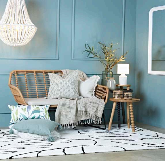
The Boheme Fashion trend brings a vibrant mix of eclectic colours — think Bo-Kaap's bright houses and the vibe of its lively streets. Unapologetically bold and eye-catching, this style is all about South African summer, surf culture, pleasure, and enjoyment. Add ethnic motifs and pop graphics to level up the fun! Incorporate some explosive hues and patterns with a norules, mix-and-match kind of attitude and your home will excite and stimulate all the senses. The best part? You can bring all these happy feels into your living space with Leroy Merlin!
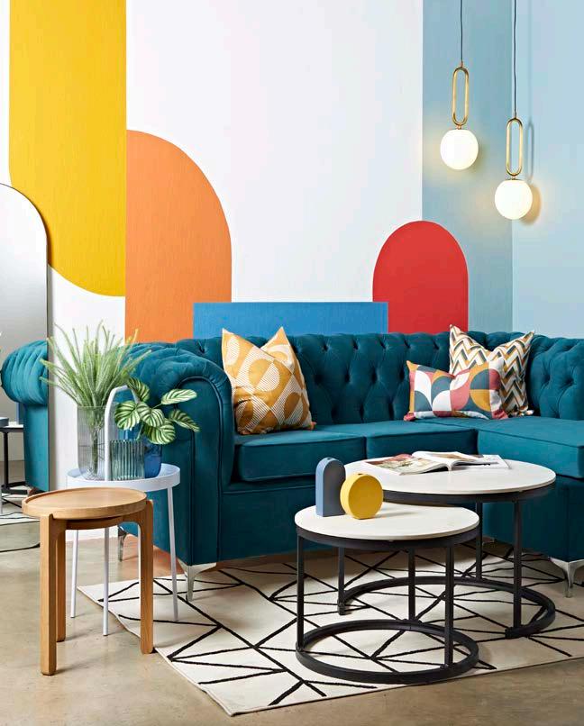
www.leroymerlin.co.za @leroymerlin.southafrica
Less is more… Well, more or less! Interior designers’ love affair with the millennial cult favourite, minimalism, has been maxed out in favour of a ‘more is more’ aesthetic. Or as we like to call it: organised chaos. Revived by a younger generation who values authenticity, self-expression, and finding meaning in the everyday, it should come as no surprise that maximalism has made a comeback in fashion, home interiors, and graphic design. But before you picture your grandmother’s cluttered house… Modern maximalism in the home is about mixing textures, colours, wallpapers, patterns, and prints — surrounding yourself with mementoes, art, and curios you love. If our homes are the spaces we spend the most time in, then it makes sense to curate the environment to fit our unique quirks and tastes.
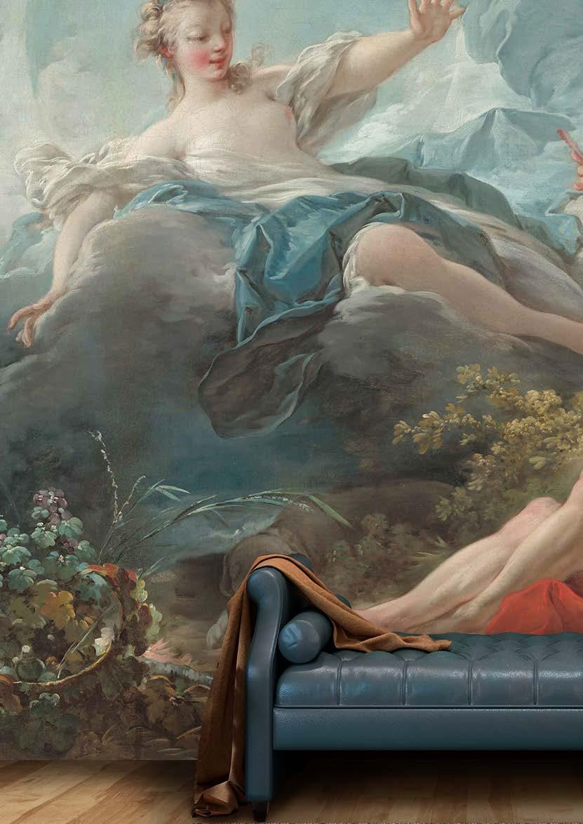
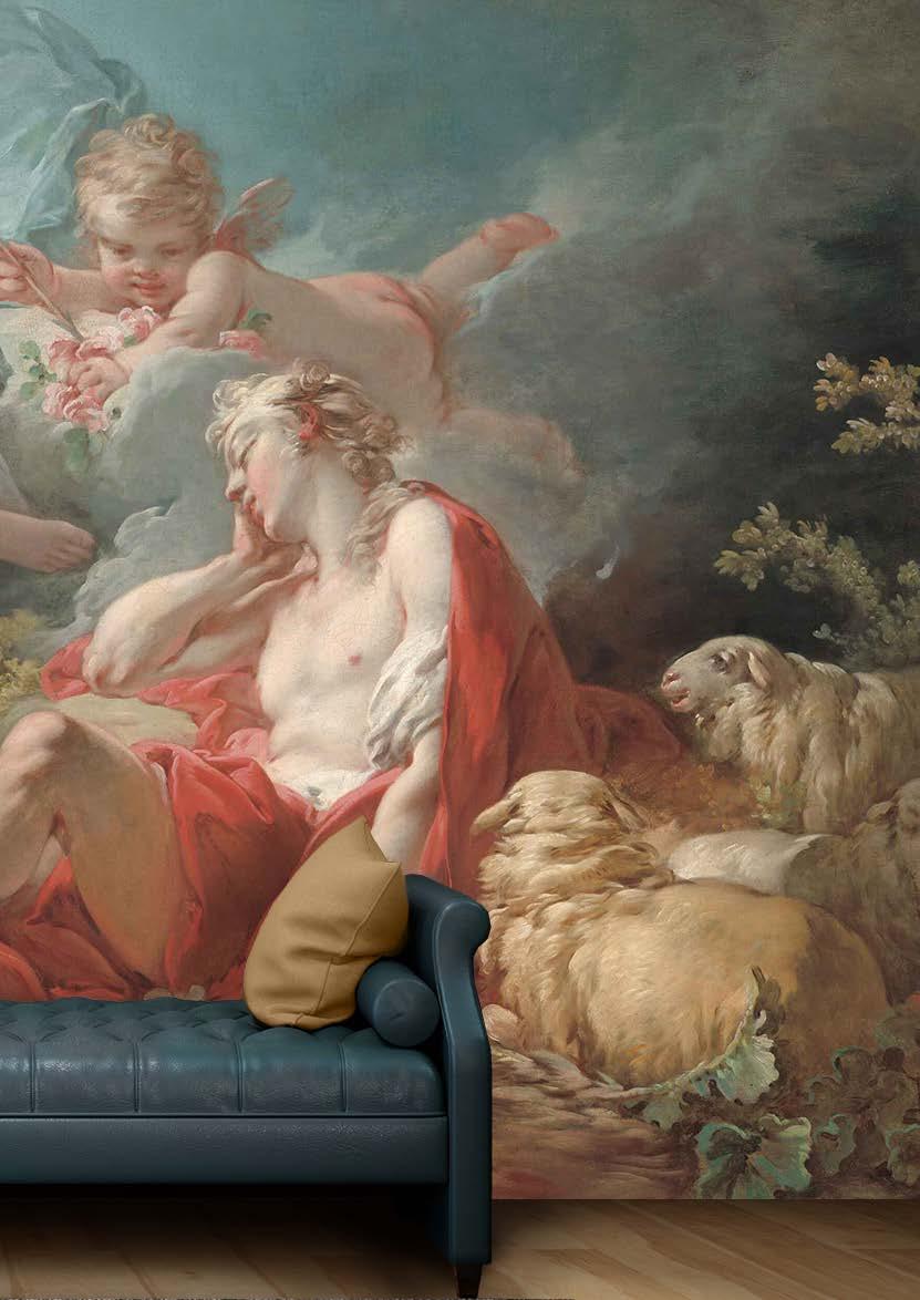
This summer, we invite you to immerse yourself in the rich tapestry of modern maximalism with Mel Cook from Cooked Studio (the fabulous interior designer behind the iconic Susu Bubble Tea in De Waterkant). Who knows? Maybe she’ll convince you to hop on board this trend train!
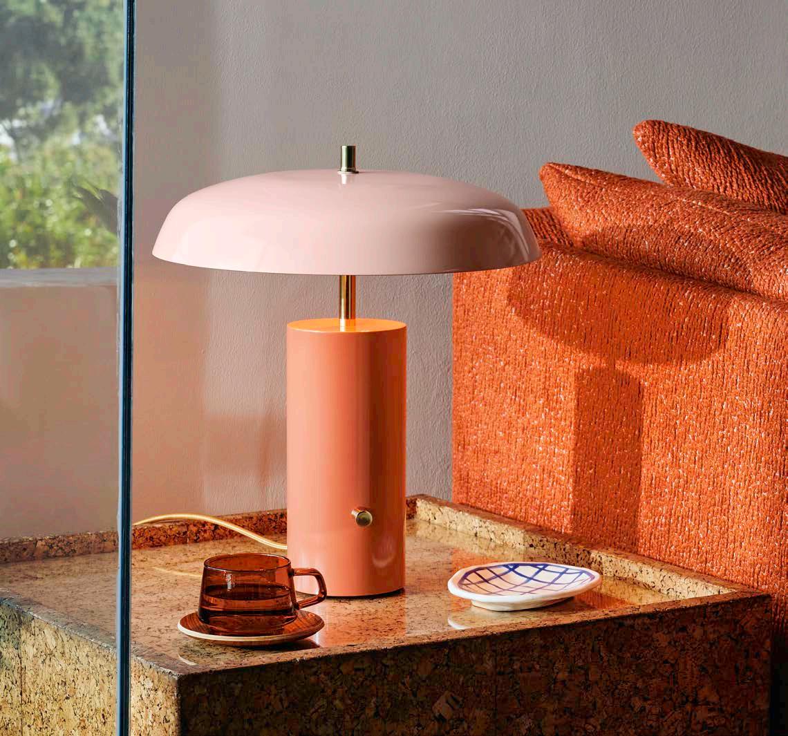
I must be dead honest; I didn’t really know maximalism was a rising trend at all, as I’ve always kind of naturally veered to it as a ‘more is more’ kinda gal... I’m generally not one to design on trend as I believe great design comes from intuitively developing a concept based on listening to how a client makes decisions and organically uses their space, and then building a story using layers of texture, colour, and pattern to make the space both versatile and adaptable.
Maximalism has actually been around for centuries, often shining through in the homes of wealthier communities in its initial expression. However, in the years since, the style has evolved to become more accessible to our culture. Rather than creating one or two focal points as we see in more common design practices, maximalism in its most honest form is about building visually appealing spaces by cleverly using unexpected contrasting combinations to empower and enhance the room as a journey. If I look at maximalist design trends from the ’70s and ’80s, the design ideology is pretty much the same, but we seem to use slightly bolder elements with brighter colour schemes and higher contrasts in the 2022/2023 version.
The only way you’ll ever be able to make any design aesthetic your own is by starting with one or two elements you are naturally drawn to, but which also ignite a little sense of excitement. For example, choose a colour you love and which also maybe even intimidates you a little, and then balance it with something that makes you feel a little calmer. I always tell my clients to go with the thing they love since it’ll continue to make them happy for a longer time than choosing something everyone else loves. If you just follow the trends, your space will also start to look like everyone else’s, so be brave and allow yourself to push the boundaries by focussing on your own individuality and self-expression.
The best way to achieve balance instead of chaos when applying a maximalist approach is by making sure that each element (colour, texture, pattern) has a ‘friend’ somewhere else in the room. This creates a sense of connection in your space and brings harmony within the boldness. So, what you’ll definitely need to practise is seeing how you can repeat detail to create balance. For example, if you want to bring in something super bold like leopard print, work with one or two scatter cushions in full print, and then add little accents like using the same fabric on another cushion’s piping, or perhaps a throw, or even a vase. I generally like to balance bright colours with black or white elements (or a stripe pattern) as I feel it grounds the brightness while still creating depth and contrast. If you’re using a large bright furniture piece, like a sofa or an armchair, see if you can bring the same pattern or colour into a finer detail on another element on the opposite side of the room. This could be something that picks up a colour from your wall artwork, a case, or, again, accent pillow piping.
“Maximalism has actually been around for centuries, often shining through in the homes of wealthier communities in its initial expression. However, in the years since, the style has evolved to become more accessible to our culture."
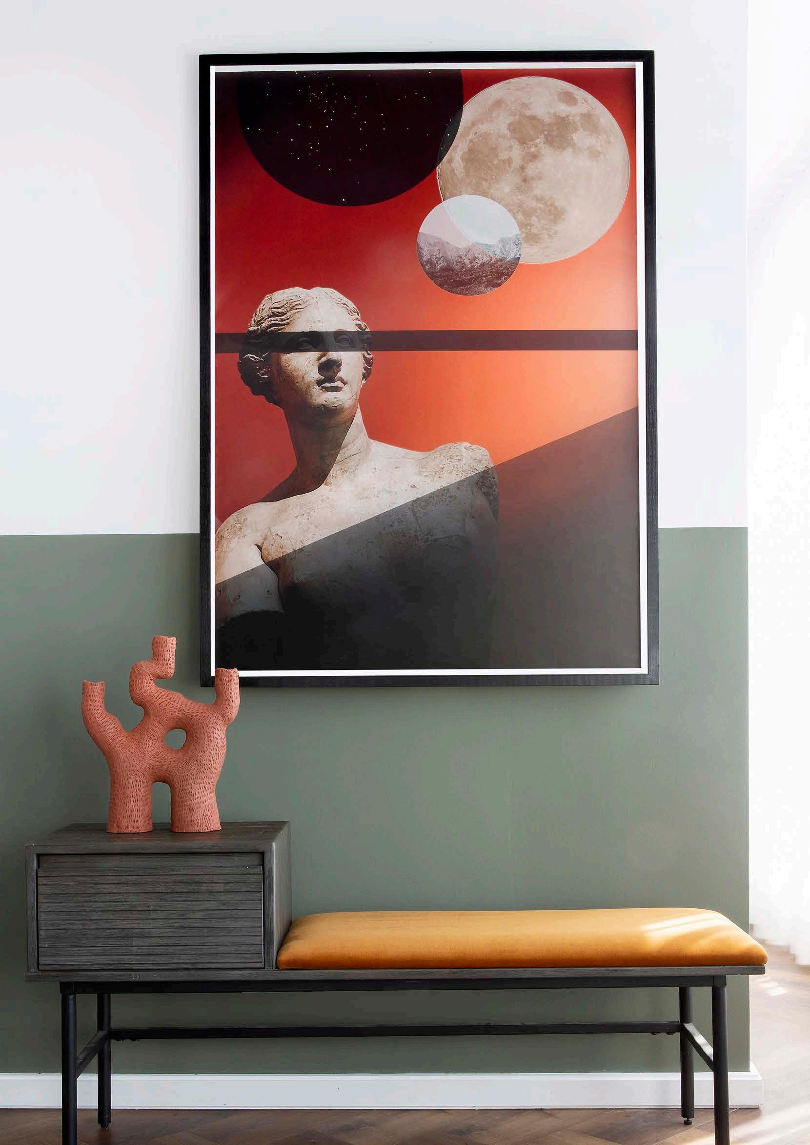

"
To me, colour sets the entire mood for a space. Yet, what’s important to consider is not simply the colour but also the tone of the colour."
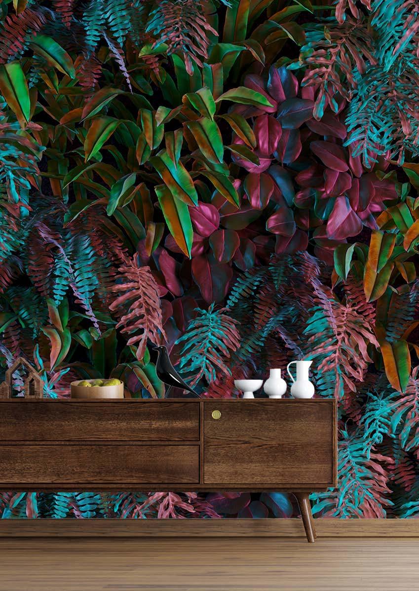
• Arrange Studio
• Akashic Tiles
• Lulasclan
• Wiid Design

• Cara Saven Wall Design
The bold and the beautiful Mel’s top tips to make your home pop from every angle
1. Start by focussing on one or two elements or pieces you absolutely love, and then build around these pieces by holding different colours and textures against them to see how the combinations make you feel.

2. Like icing a cake, painting with watercolours, or getting dressed in autumn, designing is all about layering. So, work in layers and see how it goes!
3. When you’re in the thick of designing your home, remember that it’s a marathon, not a sprint. It’s okay to take your time curating a space that makes you feel all the giddy feelings of being ‘home’.
4. Think about where you spend most of your time so you can prioritise those areas, and do the same for the spaces you entertain in.
5. Lastly, have fun! Don’t take yourself too seriously. Your space will evolve with you the longer you live in it, so give yourself room to let it grow with you.

To me, colour sets the entire mood for a space. Yet, what’s important to consider is not simply the colour but also the tone of the colour. For example, if you’re looking at green, spend a couple of minutes to see what other colours you see within the green pigment. Is it a little more blue? A little more brown? Maybe more on the yellow spectrum? Or purple? These undertones have the power to change the character of your chosen colour completely. A sunshineyellow feels bright, happy, and playful, whereas ochre or mustard hues tend to be more serious, masculine, and sultry. Likewise, purples such as lavender, indigo, and violet set three completely different moods. When selecting your colours, always ask yourself what kind of mood you’d like to feel within that space and how you personally feel when you look at colour X versus colour Y. It’ll help you make your decisions way more intuitively. When choosing colours, I also like to work in numbers using two to four base colours and then an additional two or three neutral colours (e.g., white, black, cream, or grey) to ground and complement the look.
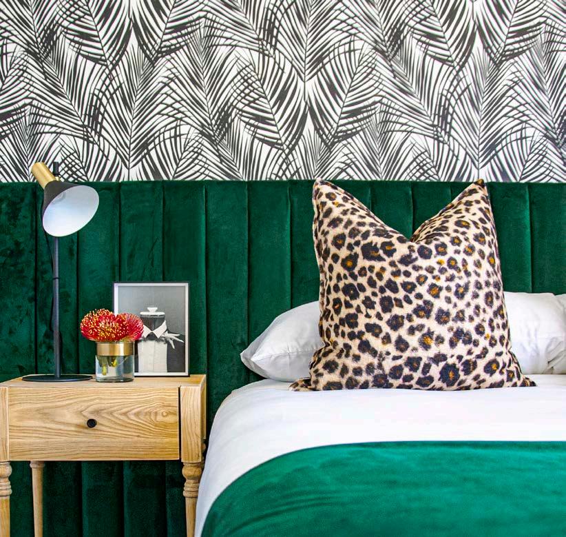

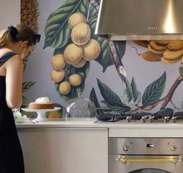
A few of my favourite spaces to play around and have fun with are entrances, lounges, and bathrooms. Guest loos are especially great as they give your guests something funky to look at. Plus, this is the only time they’re actually alone in your home, so make it cool for them to look around! Don’t be afraid to use bright contrasting colours. We recently did a design proposal using blues and corals and the result was awesome. Pick two colours that complement each other — i.e., where your eyes feel at peace and each colour is accentuated by the other — and then see if you can find the same colours in either lighter or darker tones to add your accent pieces. And for the love of everything both holy and unholy, for that matter, please add some life by bringing in plants and greenery! Plants have a way of making spaces feel wholesome and peaceful, regardless of colour and pattern schemes.
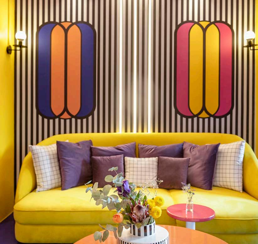
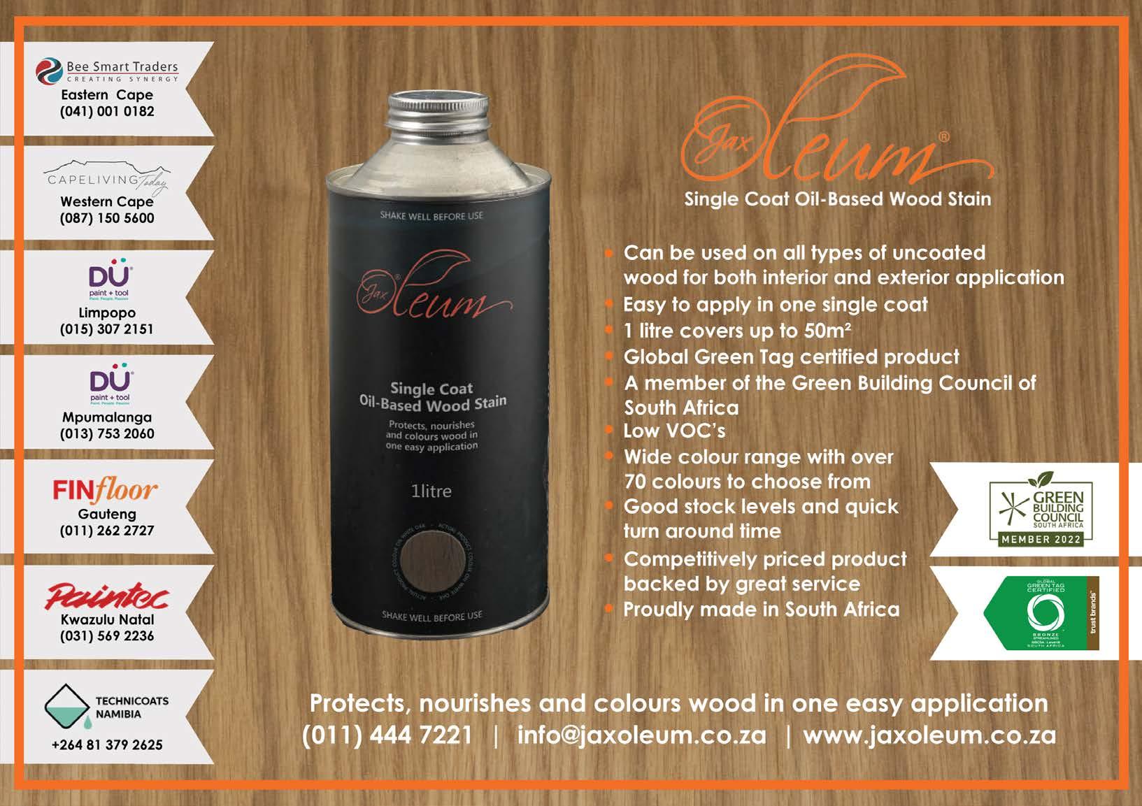


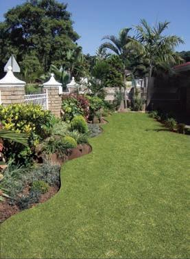




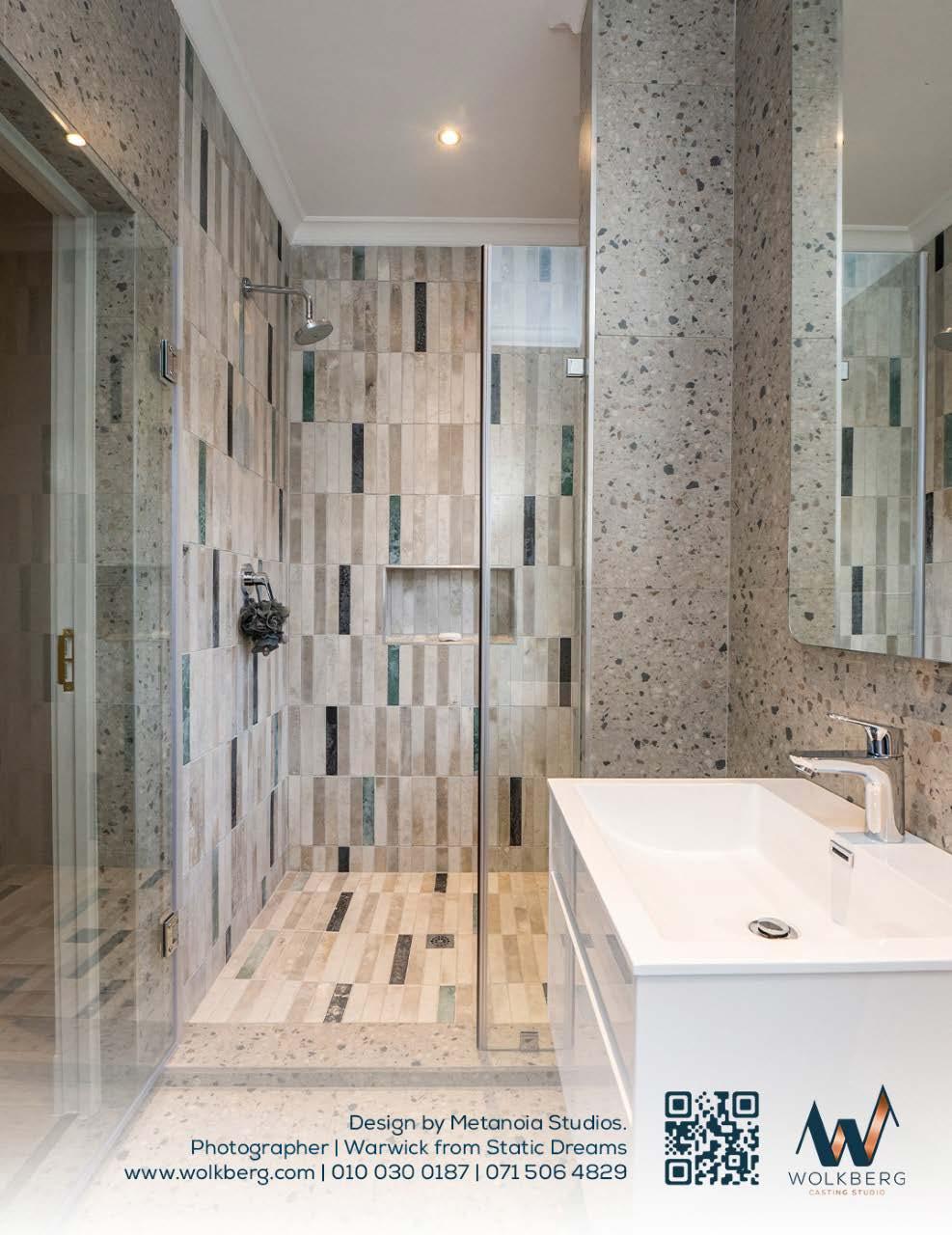
With this year’s show ethos we move ever closer to outdoor living spaces that are fully integrated with the indoors.
Interaction with the outdoors as a place to find peace, entertain, renew relationships with nature and grow plants for the dinner plate are all featured in the show.
The need for balance, harmony, peace of mind, health and pleasure is central to this vision and we take great pleasure in inviting you to visit and be inspired by Lifestyle Garden Show 2023.
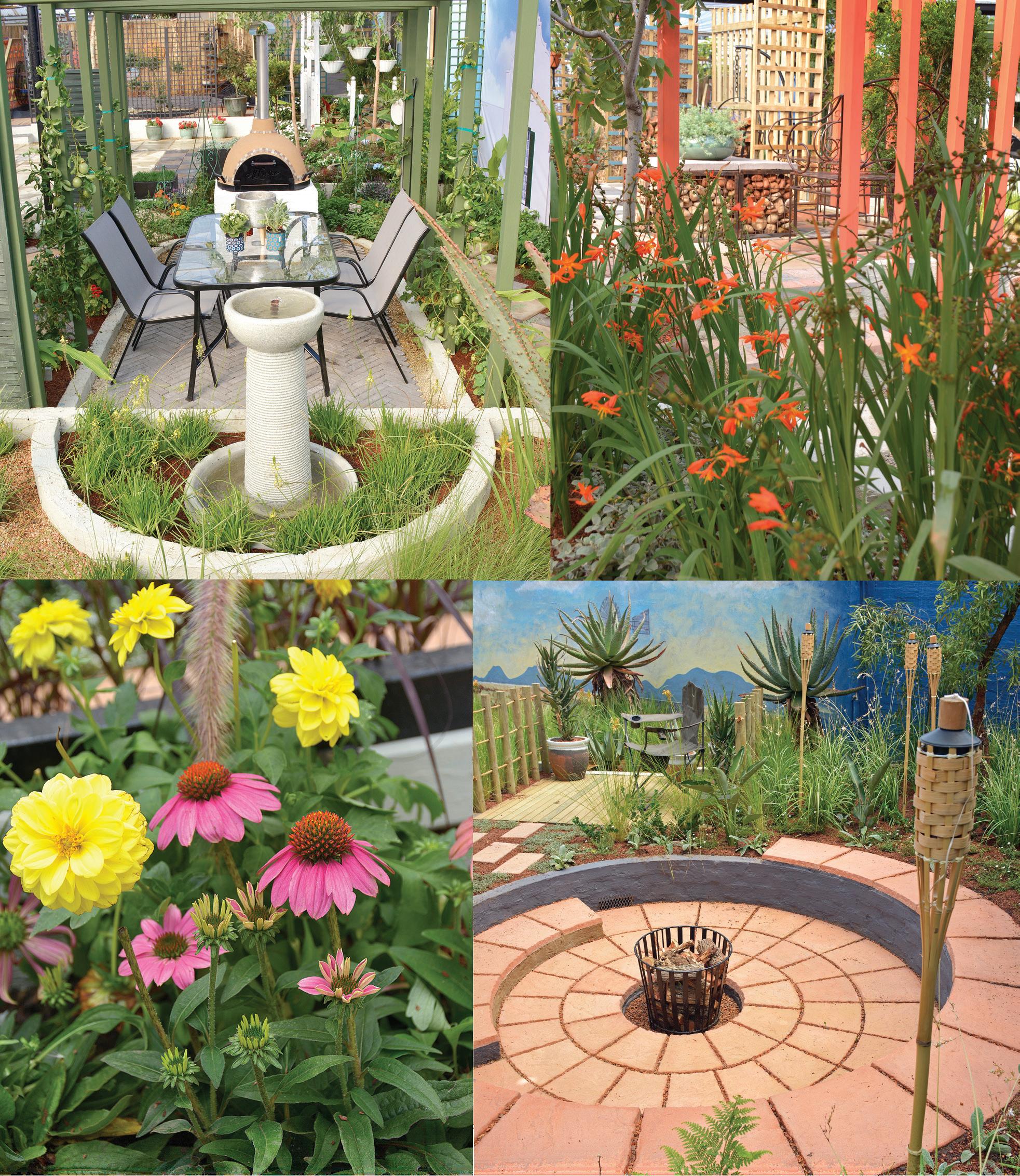
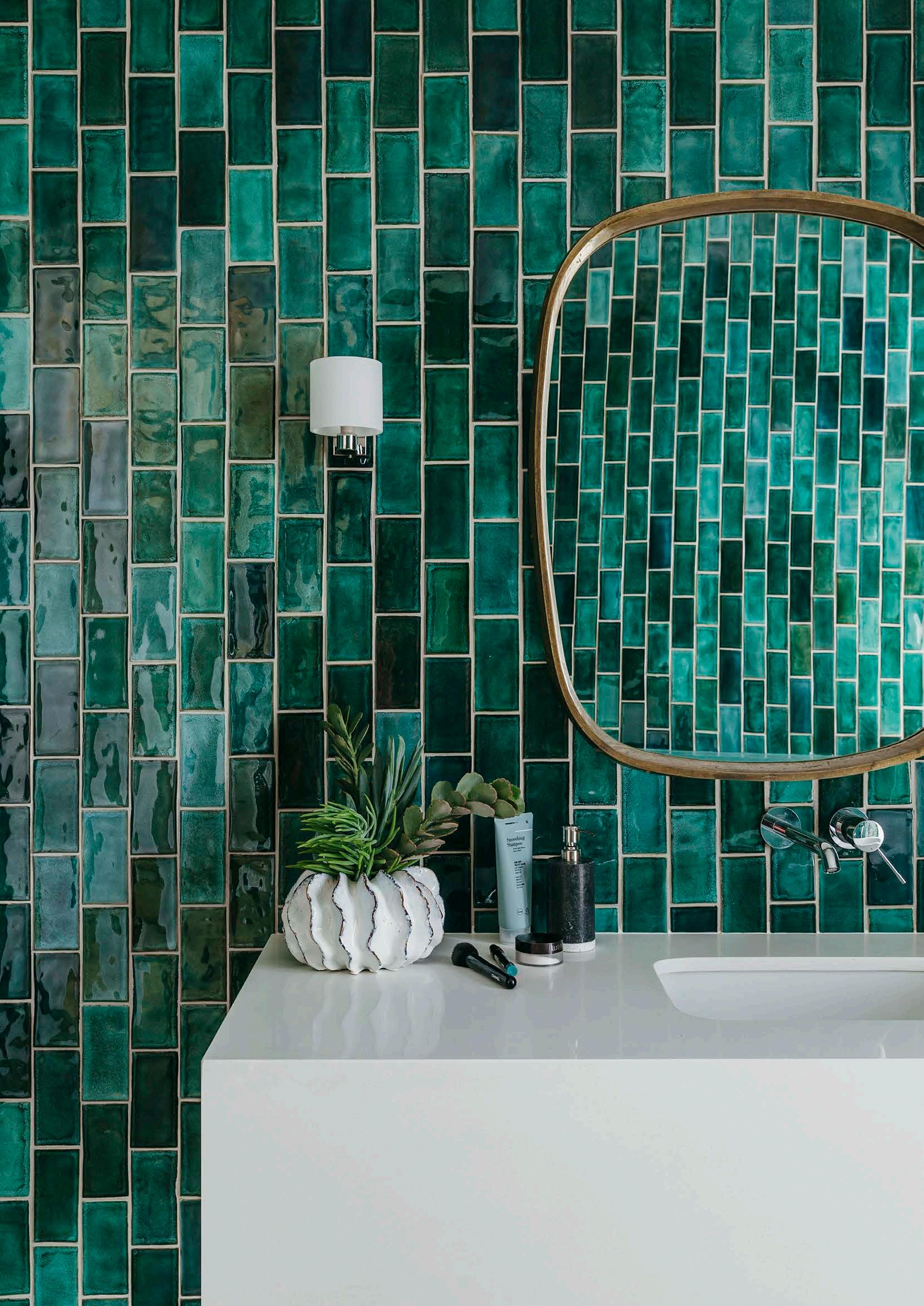
Colour is most definitely back in vogue for bathrooms and in a variety of ways, too. From ultrabright accents that provide energetic punch in monochromatic schemes to subtle and slightly 'off' tones of pastel pinks, blues, and greens, here’s all the inspiration you need to create a cool and contemporary lavatory.
In this laid-back beachside cottage, the main bedroom's en suite bathroom features Moroccan encaustic cement tiles in a brilliantly bold red pattern, which adds massive appeal to an otherwise simple space. It might seem counterintuitive, but not only does the flooring provide a colourful boost, the detailed repeating pattern on the tiles also helps make the small room seem larger.
Tip: Naturally inspired touches such as the woven floor mat (from well-known African basketry and weaving supplier Design Afrika), plus plenty of greenery in the form of leafy indoor plants, complete this bathroom’s easy-going look.
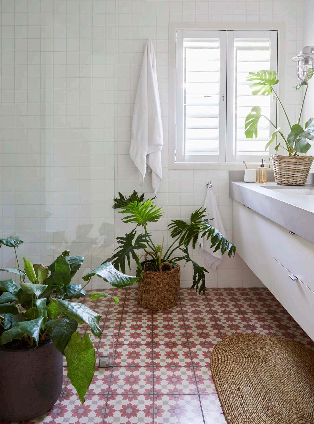
Reminiscent of the gleaming interior of an oldfashioned trinket or jewellery box, the walls of this guest bathroom in a contemporary family home in Durban are clad in handmade glasstoned green tiles from local manufacturers, Southern Art Ceramics. Applied in a vertical broken bond pattern that helps add a feeling of height to the compact space, they give a marvellously luxurious and dramatic atmosphere to the room.
Tip: With the tiles as the real stars of the show here, the rest of the fixtures are chosen to complement them while also contributing to the 'updated Art Deco' feel of the space. The mirror – with its curvy brass frame – and petite wall sconce are especially clever choices in this regard.
The ongoing appeal of millennial pink – the dusty, off-pastel shade that has been popping up in youthful interiors for years – is amply demonstrated in this bathroom, which forms part of a newly built apartment with a stylish, retro feel. The chunky granite cladding on the bath and charcoal-grey slate tiles on the floor of this 'wet room' space offer a practical way to ground and offset the soft pink shade on the walls.
Tip: There’s a lot going on here in terms of colour and texture, so keeping the shower enclosure, tapware, and other fixtures completely minimalist allows this compact space to intrigue rather than overwhelm the eye.
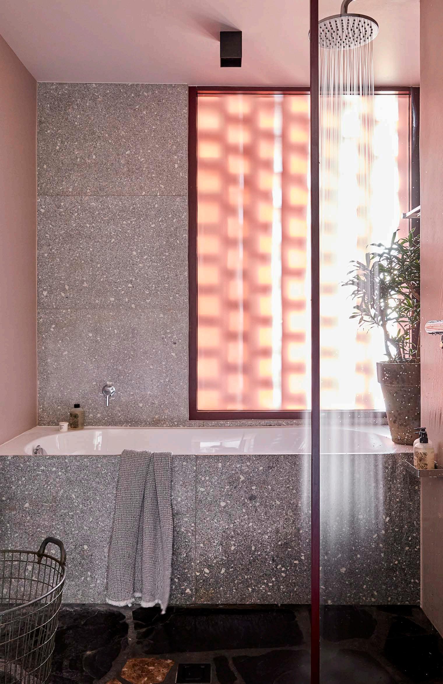
This family home makes use of plenty of bright colour against crisp, whitewashed backdrops, and includes a large en suite main bedroom that opens up onto this ultra-stylish bathroom. Here, seamless monochrome floor and wall tiling combined with bold, cartoon-style artwork creates a graphic feel worthy of a Roy Lichtenstein painting. It’s the very opposite of tranquil, and the perfect space for morning people.
Tip: Art in the bathroom is always a good idea. The Pop Art-inspired picture is by Democratic Republic of Congo-born artist Job Ngwanza. The fabulously futuristic Italian mid-century chrome light fixture, picked up at a local vintage dealer, adds to the pop feel.
Architect Gregory Katz has a penchant for using low-cost materials combined with bold colour in a way that creates unique contemporary spaces. This minimalist 'wet room' is completely clad in white tiles and sanitaryware – replete with a classic ceramic drain detail for the shower. The all-white effect is punctuated by almost jewel-like coloured glass panels in green and blue that add a fresh, insouciant energy to the space.
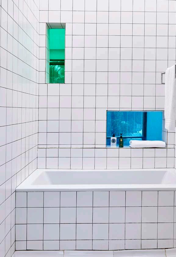
Tip: In a small area, white tiling taken right up from the floor to the ceiling works brilliantly well to draw the eye upwards and expand the sense of space. Almost any bright colour combination would work in place of the blue and green panels – red and pink, for example.
The combination of dusty pink and sea green helps make this bathroom vanity and storage unit a stylish exercise in retro chic. Combine the colours with a painterly terrazzo countertop and oversized tiles, as well as the geometry of the shapely oval unit and the perfectly round sinks (from Studio 19), and you’ve got a modern lesson in why more really can be lovely.
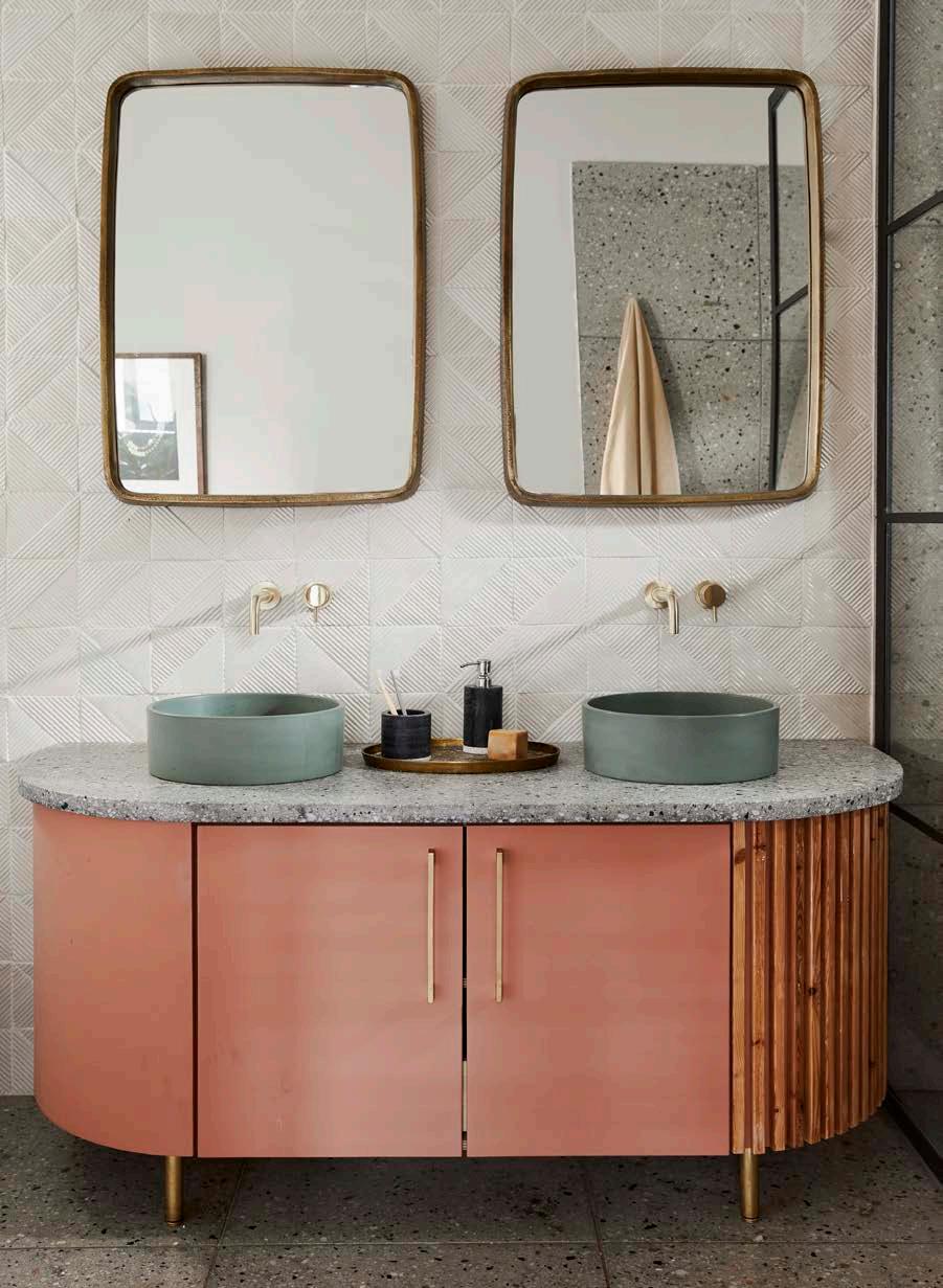
Tip: The multi-dimensional blend of textures, materials, and colours in this Cape Winelands bathroom is bold and fearless. An element that adds yet more appealing tactility to the space is the white wall tiles, handmade by bespoke tile manufacturers, Akashic Tiles.
The gallerist owners of this urban bolthole know just how to attract the eye. In this case, by adding a brilliantly bold yellow cabinet to an otherwise monochrome bathroom. Because the colour scheme and fittings – note the round retro lamps alongside the mirror and old-school pedestal basin – provide such a classic backdrop here, almost any bright item will 'pop' in this space, so you can change the colours easily and often, and without breaking the bank.
Tip: The cabinet, designed and made in Cape Town, is from Mother City Hardware. However, from vintage locker suppliers to hardware stores, this sort of industriallyinspired piece is easy to find just about anywhere.
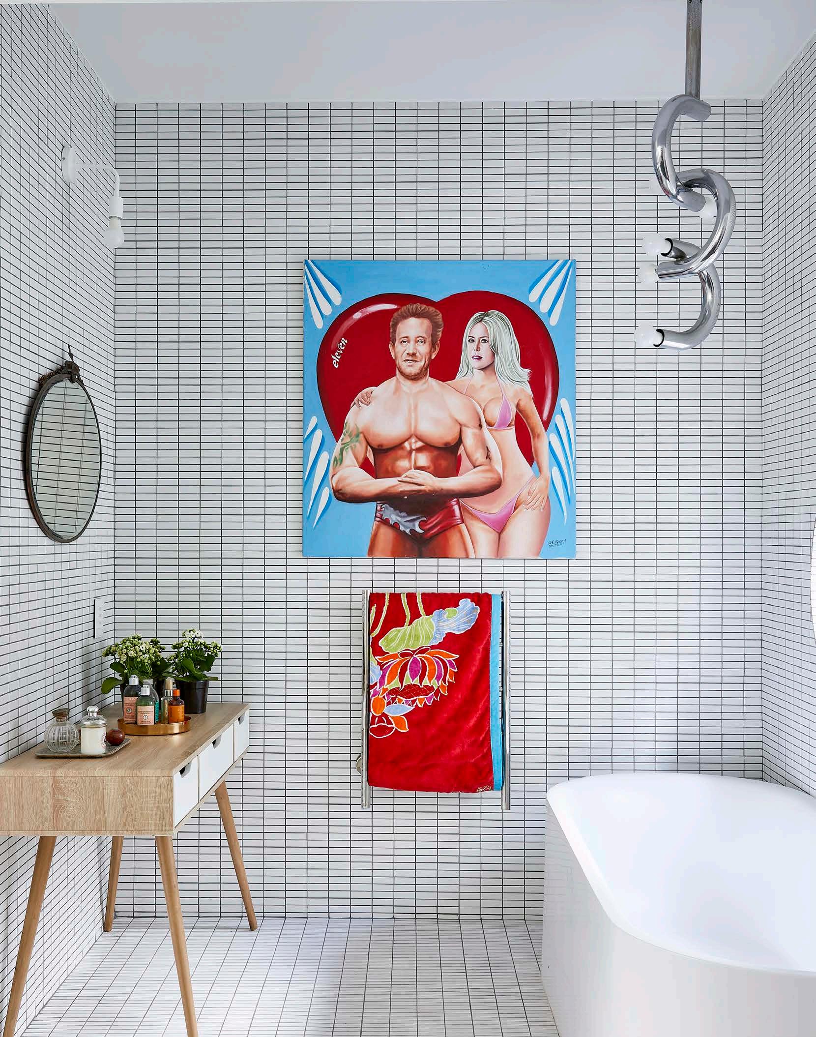

The tranquil, tonal colours used in this com pact bathroom – situated in a coastal cot tage located within a nature conservation area in Misty Cliffs – are inspired by the variety of green and blue shades of the surrounding landscape. Textural simplicity is key to making this small space feel restful and calm, with materials restricted to wood and ceramic elements, and tapware in a matte finish rather than gleaming stainless steel.
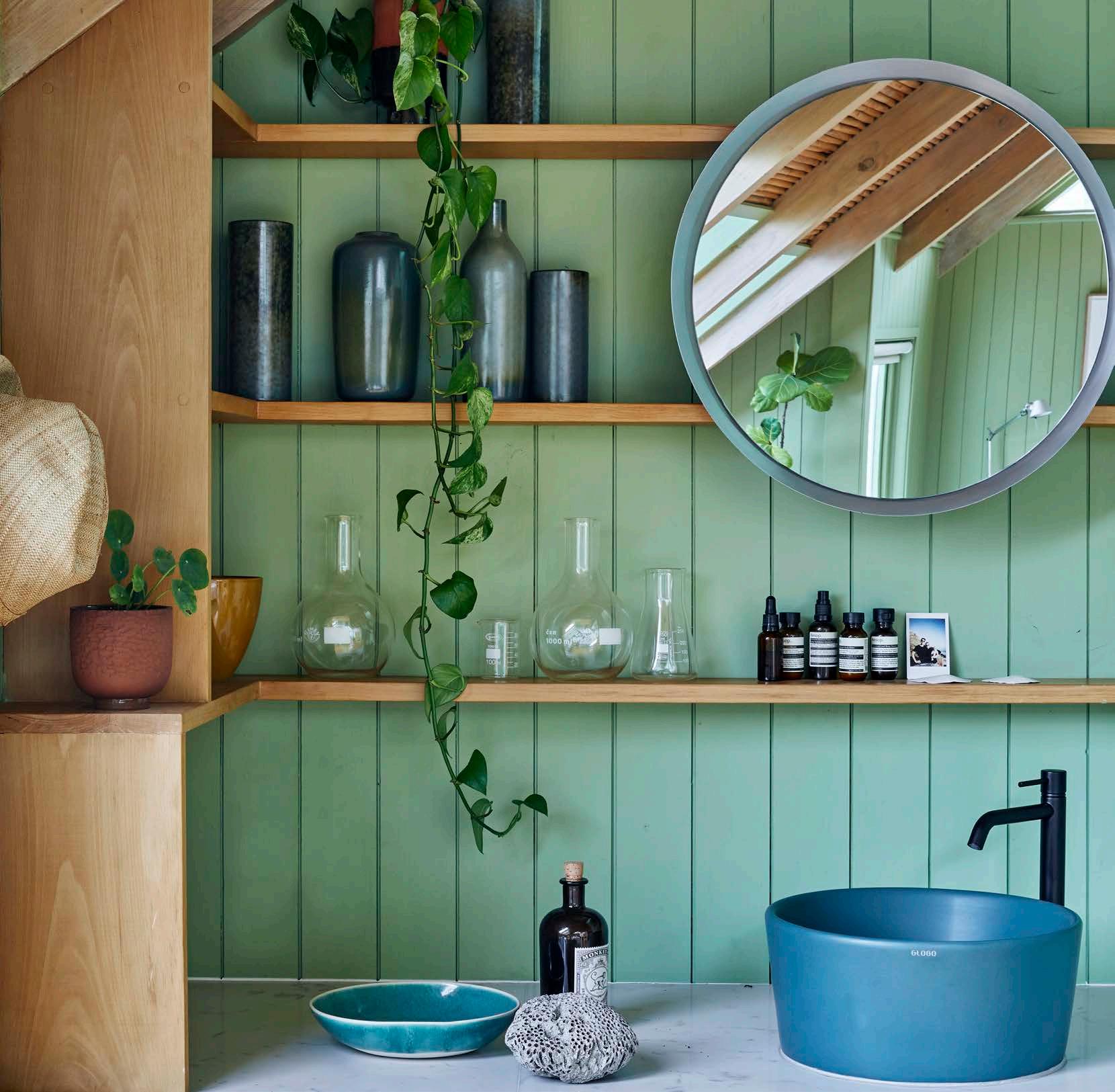
Tip: Adding plenty of narrow wall shelving provides sensible levels of storage for bath room essentials and an opportunity to add visual interest – seen here, for example, in the form of the grey ceramic vessels and vases from Vorster & Braye.
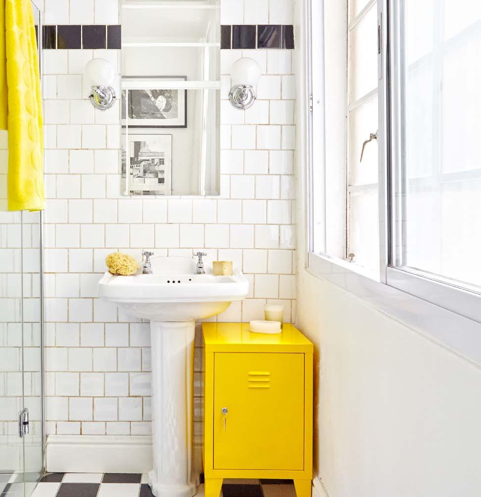
THERMO FIRES is a privately owned Proudly South African, Cape Town-based family business. We are manufacturers of Quality and Bespoke Braais & Fireplaces. With over 18 years’ experience in manufacturing and design, THERMO has become synonymous with quality and custom products. As proof of our commitment to our products, THERMO is the only company that gives a 20-year warranty against faulty workmanship.
