

In the realm of versatile and compact printing solutions, the imagePROGRAF TC-20M reigns supreme.


For interior designers, architects, engineers, and construction companies looking for an edge, this printer delivers time after time. The imagePROGRAF TC-20M effortlessly produces professional-grade large format prints with roll paper up to A1 size or cut sheet paper available in A3 or A4 dimensions, all from the comfort of the office, home, or any onsite location. With a focus on user-friendliness, sustainability, and superior performance, the imagePROGRAF TC-20M outshines the competition.
Features:
• Versatility
• Cost efficiency
• High-quality
• Green credentials
• Continuous printing
• Bright coloured pigments
• Small footprint
• Design support


• Suitable for multi-sport areas, playgrounds, landscaping and public parks.
• Ultra-durable, flexible and impact resistant surfacing.
• Low maintenance & sustainable.
• Available in 15 colours or multiple blends.
• Excellent shock absorption with high elasticity.
• Suitable for indoor or outdoor areas.
• Smooth and soft playground flooring allows children to play without risk of injury.

• Wet pour rubber can be applied at any thickness to conform to legal requirements.
• Licensed installers throughout Sub-Saharan Africa.

Come along as we explore the stimulating world of schools, universities, student residences, campuses, and everything in between. June marks the 1976 Soweto student uprisings and is an appropriate time to recognise the struggles of South Africa’s youth, the impact they had on the liberation of our country, and the ongoing need for innovative, inclusive, and equitable education for all.
As we turn our attention to academia, we delve into the dynamic realm of educational facilities, uncovering the indoor and outdoor spaces that shape our learning experiences, fostering growth, exploration, and meaningful interactions. From bright, bold play spaces to the soulless brutality of university buildings, we traverse a myriad of concepts and spaces tied to the classroom.
Moreover, we shed light on the fascinating world of colour psychology and unconventional seating, unlocking the
secrets of designing spaces that embrace and accommodate differently abled children and students. Fittingly for Youth Month, we extend a warm invitation to students nationwide to participate in our exciting Faces of the Future Student Competition, presented in collaboration with Geberit. Join us as we reimagine Robben Island, showcasing your talents to industry icons and challenging you to become an integral part of the solution.
But that's not all! Prepare to be dazzled as we revel in celebration with the 2021/2022 Corobrik-SAIA Awards of Merit and Awards for Excellence. In a 15-page roundup, we honour the outstanding achievements that define the past two years’ architectural highlights.
And finally, we bid you farewell until our next encounter, the forthcoming SALI Awards issue, titled The Terrain. So, without any further delay, let’s play!


Navigate
ENTREPRENEURS Startup Lions Campus
Presenting the Commendations and the Winners of the Awards of Merit and Awards for Excellence 43 NURTURING CURIOSITY
29 BRINGING THE HEAT BACK TO THE COMPETITION
With Alliance
The

Cue the confetti, because one of the biggest nights in the architectural calendar recently lit up the stage in Joburg!
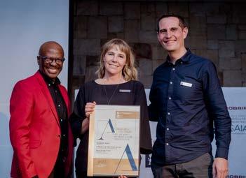
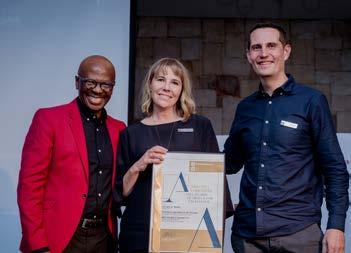
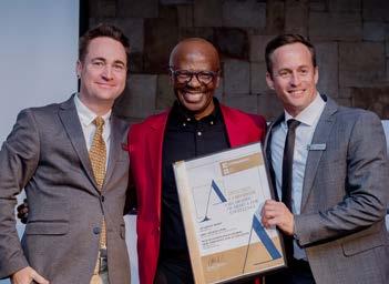
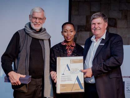
The 2021/2022 Corobrik-SAIA Awards of Merit and Awards for Excellence saw 35 excellent projects walk away with prestigious accolades. Amira Osman, SAIA President and Awards Convenor, along with a notable panel of adjudicators including Karabo MotsepeMarutla, Sushma Patel, Althea Peacock, and Reverend Michael Weeder, remarked that the quality of the submissions was especially impressive this year, and that we can all be extremely proud of what the profession has accomplished.
The awards programme is structured over a two-year period and is conducted in two stages. Stage one sees the regional awards for architecture presented by the nine regional institutes affiliated with SAIA. During the second stage, the winning projects are entered into the national awards and receive either a Commendation, an Award of Merit, and/or an Award for Excellence, which recognises exceptional achievement in the field of architecture.
After the shortlisting, the adjudicators visit the project sites for in loco inspections to walk through, experience, and engage with both the completed built project and architects. The awards look beyond just the image and plans to consider the conceptualising, client relationship, and the unique site conditions and constraints that ultimately lead to the success of the project.

With stylish, timeless appeal and impressive sustainability credentials - the enduring hues and textures of clay brick are low maintenance and look beautiful for a lifetime.
CBASA represents clay brick & paver manufacturers across Southern Africa and drives inclusive, sustainable practices in the industry. We inspire energy-efficient, contemporary architecture and paving that supports our local producers, landscapers and architects.
Free technical and construction guides for clay bricks & pavers at www.claybrick.org






UPPER WHEELAN HOUSE by Douglas & Company Architects
WATSON COTTAGE
by KLG ArchitectsLINKSFIELD SHUL AND COMMUNITY CENTRE
by Hubo Studio
THE BANK
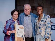
by Daffonchio ArchitectsRESEARCH PROJECT: NEIL AGGETT INQUEST
 by Savage + Dodd Architects
DIE GROENHUIS
by Slee & Co. Architects
HOUSE FERREIRA
by Pinard Architecture
ROOFTOP PRODUCTIONS ALTERATIONS
by Strukt ArchitectsCHRIST CHURCH SOMERSET WEST
by Noero Architects



BACK TO THE START
by WDesign Architecture StudioOGGIE SHOWROOM
by C76 ArchitectureHOUSE STRÖH (ADDITIONS, ALTERATIONS, AND POOL HOUSE)
by Len Joubert ArchitectsJEWEL CITY
by GASS Architecture StudiosTHE ONYX — JEWEL CITY
by GASS Architecture StudiosWESTBURY TRANSFORMATION & DEVELOPMENT CENTRE
by Ntsika Architects

ODE TO OAK PAVILION
by Rebel Base CollectiveST JOHN'S COLLEGE PREPARATORY SCHOOL
by Pencharc250 BUITENGRACHT STREET
by Team ArchitectsDUNKELD ROW HOUSE
by WDesign Architecture StudioBUFFELSDRIFT (MAIN HOUSE AND WINE STORE)
by SAOTA & Jaco Booyens ArchitectUFS MODULAR LECTURE SPACE AND ASSESSMENT CENTRE
by Roodt Architects and GXY Architects

HOUSE CAMPBELL
by Michael Lumby ArchitectureWGP
BLOOMINGDALES
HYBRID NEW ADDITIONS AND ALTERATIONS
by DMV ArchitectureHERSCHEL GIRLS SCHOOL ATRIUM EXTENSION
by KLG ArchitectsRESEARCH PROJECT: THE ARCHITECTURE OF PETER RICH: CONVERSATIONS WITH AFRICA


 by Prof. Jonathan Alfred Noble
Located on the corner of Upper Buitengracht and Carisbrook Streets, this Victorian property has undergone an extended grid overlay, a virtual carving up, and a primary division running centrally north to south along the length of the plot, to become a back-to-back, U-shape double dwelling around smaller external courts.
As urban planners, D&S Planning Studio wanted to maximise the long, sloping site’s potential, while carefully ensuring the new property is a contextual fit in terms of scale and street interface. The idea was to create a co-living and working space with the opportunity for passive rental income within the confines of a singular site. Their brief to TEAM Architects materialised into two main dwellings, the D&S Planning Studio office, and two flatlets to the rear of the 653 m² plot.
The stone and steel palisade boundary walls are of heritage value and have been retained as necessary elements for preserving the authenticity link to the streets. Largely echoing the materials of the original house, corrugated sheet metal and red brick are dominant throughout, and are responsive to the Victorian material palette without copying or creating a pastiche of the past. The architecture is one of enthusiasm, conceptually rich and playful, whilst addressing the issues of heritage, community, liveability, and connection.
This project is an important addition to the conversation around the possibilities mixed-use or mixed-programming buildings offer, as well as to the often-fraught dialogue on what constitutes appropriate architectural responses in heritage-sensitive or historically-contested contexts.
www.teamarchitects.co.za


The original House Ströh was built in 1957 on a rock outcrop on the western side of the exclusive suburb of Westcliff Ridge in Johannesburg. The home, built in a modernist tradition, was exemplary of typical suburban housing, rather than a fine example of modernist architecture. Len Joubert Architects was therefore tasked with fundamentally altering and disrupting the original workings of the three-bedroom house. The stark exterior face brick details were kept in the existing plain 1950s style, and steel and glass were added for a contemporary flourish. The interior is minimal. Wooden doors and floors surrounded by white walls throughout provide a receding backdrop for the client's art collection.


To the north, large, modern, newly-treated sliding glass openings take advantage of the 180-degree view. A glass passage connects private gardens, linking all three bedrooms and their new en-suites on the edge of the cliff. The owner is a landscape architect and lived and worked in the house while some ad hoc changes were made. Even with a few small concessions to the heritage elements, such as the original steel balustrade, the home seamlessly integrates these into the expressive architectural execution, creating one unified design language that holds the home together.
The pool pavilion is a homage to the glass box trope, with which we are all familiar. What distinguishes it is its dynamic construction. The roof of the pavilion structure in the garden is an engineering feat. Hung from slender steel columns and enclosed with glass, it makes for dramatic views of the Johannesburg sunsets.
Nestled in the foothills of Table Mountain, this 150-square-metre home is a sculptural piece of architecture in a suburban landscape. Contextually, it sits comfortably in the old neighbourhood of Vredehoek with established similar scale houses. Bespoke deep-set, black steel windows frame spectacular views, while one windowsill doubles up as a quirky basin, draining water directly into the garden bed outside. The landscape, designed by Room to Grow, is an important component of the architecture here, and is introduced wherever possible. The curves, a nod to the Art Deco heritage of Vredehoek, allow for façade planter boxes, and the zero-maintenance face brick was chosen so that, over time, the building could be enveloped in greenery.
The home is a study in compaction of space, and cleverly employs light and volume to uplift the constraints of the plan. Inexpensive materials are used throughout, but are balanced by custom detailing and craftsmanship. While the arrangement of the house is extremely efficient, it does allow for some surprising spatial luxuries. A split level in the living space affords a four-metre ceiling height as it steps down with the site, and a five-metre-high shower area is well worth the sacrifice of a bit of extra floor space above. A floating concrete staircase leads to perhaps the most surprising feature of all: a generous roof terrace replete with garden beds and a fireplace, with 360-degree views of the mountain, the city, and the harbour.


Rising from the lush green landscapes of The Country Club Johannesburg in Auckland Park, the Ode to Oak Pavilion is a masterfully crafted, sculptural, and functional canopy — even as it disrupts the formality of the surrounding heritage structures. The pavilion’s undulating roof creates a light and voluminous, intimate space for visitors. It hovers above the original Art Deco handrail, complemented by a new material palette of steel, concrete (in various forms and finishes), recycled clay paving, and glass. The rounded, perforated ceiling surface also allows for optimal acoustic performance by reflecting sound in different directions to minimise direct reverberation. The hero grand old oak tree is celebrated through a semi-circular cut-out in the eastern-most vault.
Challenging what has traditionally been held as sacrosanct heritage is clearly contested in a very deliberate and sophisticated way. The project is lauded for its contribution to opening up the dialogue about what it means to merge contemporary typologies, technologies, and materials with a more traditional Western architectural language. Indeed, the project provokes interactions and shifts perceptions of how we should approach historicised sites and build form within contested landscapes.


Nestled amongst the leafy Northern Suburbs of Johannesburg, Oggie’s new Sixth Street Parkhurst showroom is something of a retail retreat. With the option of rentable office space above and parking below, the open, customisable commercial space exemplifies contemporary design and functionality while showcasing Oggie’s extensive range of oak flooring and outdoor cladding and decking.
C76 Architecture displayed a clear sensitivity to and awareness of the role the users play in making buildings. Whether the users are employees, potential clients, or architects viewing products, there is a clear acknowledgment of the building's context, scale, and its relationship to the street and neighbours. A layering of brick, steel, and timber is complexly interwoven with the kinetic and intangible conditions of light, upward motion, and transparency. The dramatic entrance doorway has a mechanical tip-over door that is beautifully proportioned and detailed, while corporate signage was kept subtle and unobtrusive. The internal-external staircase wall is innovatively crafted and textured with handmade, basket-like brickwork. Light enters the double-volume building through timber screens, uplifting the floating loft and two beautifully landscaped east-facing courtyards.

The Westbury Transformation & Development Centre (TDC) grapples with the issue of spatial and social justice in a marginalised community, while simultaneously providing crucial social infrastructure. The mixed-use public building incorporated heritage buildings and houses a variety of social development programmes, such as a senior citizens daycare, food security unit, greenhouse, migrant unit, Early Childhood Development Centre (ECD), and offices. The project is centred around creating smaller safe spaces within a larger programme, while providing a generous public space along the street edge of the narrow site, to be used by the community for social activities.


The external façade is intentionally dark and used the ‘shou sugi ban’ charred timber technique, but as you enter the courtyard, you are immersed in bursts of colour — the world of a child. Bold formal colours and textural gestures are employed in the pursuit of creating a ‘pride of place’ and shifting perceptions of the neighbourhood. The result is a landmark building with an overall playful yet complex set of architectural values that satisfy client, community, and resilient urban and social futures.


The Onyx is a 13-storey residential building, comprising 348 studio, 226 onebedroom, and 91 two-bedroom apartments. The significance of the project lies in the sheer number of units achieved within the constraints of the site and budget, making it an ambitious inner-city housing proposition. GASS Architecture Studios worked intensively to find creative architectural solutions to address the pressing need for more accessible, affordable gap housing. Some of the ways in which the architects have been able to achieve this are through a deep understanding of economy of space, structure, material, and cost.

Even within its self-imposed structural limits, such as the sheer concrete walls that limit future adaptability, the project created other benefits (e.g. generous floor-to-ceiling heights in addition to a large number of units). Throughout the almost dark utility of the finishes, the very rational system installations and fittings, and the essentialising of building infrastructures, the project demonstrates a good response to some of the gaps in the housing market for the diverse demographic it will serve. The building can be read as a manual in design efficiency, while still creating quality living and socialising environments. The result is an overall responsible and sustainable housing solution, designed in detail to exact economic standards. Its overall execution is a positive departure and deep critique of similar housing models and projects within the city and elsewhere, and is executed superbly.

GASS ARCHITECTURE STUDIOS

www.gass.co.za


Located
CBD,
Jewel City precinct consists of six city blocks of various industrial buildings, some dating back to the 1930s, that was closed off to the public in the mid-90s and has remained an isolated and forgotten node until now. The precinct has been revitalised through the refurbishment and introduction of public open areas, multi-use offices, parking, schooling, and retail spaces as well as a major new development of housing based on sound urban and city principles. Extra care has been taken to ensure the development's total integration within the city and adjacent Maboneng. This is achieved through its strategy to introduce and reinforce a public pedestrian walkway and courtyards with seating, landscaping, and mural artworks and fountains that encourage people to slow down and use these spaces.
Despite being a private venture, conscious decisions were made to reduce and eliminate the standard defensive spaces we usually encounter in public open spaces. Its social upliftment success can be attributed to the decision to open the edges of the previously exclusive precinct. The project makes clear commentary on what can be done well with intentions that expand beyond the commercial. As urban infrastructure, the project shifts perceptions on how people can be provided for without compromising the physical value and benefit for developers. Through the introduction of a public square as an authentic and approachable public destination, civic life can flourish allowing people to gather for social and cultural activities. These decisions make for resilient inner city social and urban spaces.




Alliance has a wide selection of commercial inverter swimming pool heat pumps, which is rapidly becoming the technology of choice for resorts, hotels, gyms, swim schools, spa aqua therapy pools and other large Olympic size pools. The Alliance full Inverter heat pumps offer the ability to vary the heating capacity to suit different weather conditions resulting in reduced energy consumption and noise when compared to ON/OFF type pool heat pumps. Alliance’s Inverter swimming pool heat pumps are the perfect solution for consistent reliability as well as an affordable environmentally friendly solution to heating pools all year round.

Experience the Alliance difference today


Swimming is an essential skill that every child should possess, and at Sentraal High School in Bloemfontein, parents and educators share a common goal of equipping students with water proficiency and bolstering their confidence as strong swimmers.

In June 2022, Sentraal High School embarked on an ambitious project to transform its existing pool into a magnificent Olympicsized facility. Led by Principal Charles Liversage's vision to invest in top-notch sports facilities, this initiative aims to meet the growing needs of students and the school community. The upgraded pool would not only accommodate upcoming events, but also create the opportunity for swimming activities during the winter months, fostering a culture of excellence and embracing the spirit of aquatic achievement.
Liversage's vision came to fruition with the assistance of SHC Consulting Engineers, BC Building Contractors, and Ikhephu Air Conditioning. When faced with the challenge of how to heat 1,600,000 litres of water while consistently maintaining the desired temperature, even during the cold winter season in the Free State, Ikhephu Air Conditioning partnered with Fourways Group to supply them with Alliance Commercial Swimming Pool Heat Pumps. The choice of Alliance Pool Heat Pumps, known for their affordability and reliability, proved to be a perfect fit for this monumental undertaking.
Five powerful 91 kW Alliance Commercial Swimming Pool Heat Pumps were expertly installed to regulate and maintain the pool's temperature, ensuring optimum operation. These cutting-edge heat pumps efficiently transfer heat from the air to the pool water, allowing for the construction of larger temperature-controlled pools.
Alliance offers a range of heat pump sizes, from 22 kW to 91 kW, all equipped with cooling, heating, and auto modes. Similar to Alliance's air conditioning units, the pool heat pumps use environmentally-friendly R410 gas, which has a reduced impact on the ozone layer.


Alliance, supported by Fourways Group, an authorised distributor of leading HVAC brands, possesses over two decades of expertise. Fourways Group serves a vast network of over 2000 installers, contractors, and architects while also providing long-term supply of spares and parts for various models in the commercial and residential air conditioning and water-heating sectors.
Thanks to this innovative partnership and the state-of-the-art technology employed, Sentraal High School's transformed pool stands as a testament to the school's commitment to excellence and its unwavering dedication to providing students with exceptional aquatic facilities


Architectural design has a profound impact on human behaviour and development, including the process of learning. In the evolving world of education, learning environments are transcending traditional boundaries to adopt design strategies that foster both cognitive and emotional development in students. These innovations, ranging from flexible seating to biophilic design, are all aimed at enhancing the learning experience.
Colour psychology is one such tool used in recent educational buildings to stimulate different types of learning. Research by the University of British Columbia has shown that colours can have a remarkable impact on cognitive functioning. Following these findings, educational institutions such as the University of Applied Sciences in Utrecht and the University of Technology Sydney have strategically incorporated colour into their designs, thereby modulating student mood and concentration levels.
Moreover, blue is often associated with calmness, tranquillity, and concentration, and has been found to promote a sense of relaxation, improve focus, and enhance productivity. This makes it suitable for spaces where deep thinking and concentration are required, such as study areas or exam rooms. On the other hand, red is commonly linked to energy, excitement, and stimulation. It can increase heart rate and adrenaline levels, evoking a sense of urgency and passion. Red is often used in spaces where physical activity or high levels of energy are desired, like gymnasiums or sports facilities.
Yellow is associated with positivity, happiness, and optimism, and is considered to be an attention-grabbing colour that can stimulate mental activity and creativity. Yellow can be used to create an uplifting and vibrant atmosphere in learning environments, encouraging active engagement and enthusiasm. Green is frequently linked to nature, growth, and balance. It has a calming and soothing effect, promoting relaxation and reducing stress, and is commonly used in educational settings as it is believed to enhance concentration, improve reading comprehension, and create a sense of harmony. However, while these associations exist, it's important to note that individual perceptions and cultural backgrounds can influence the interpretation of colours.
The layout of learning spaces is also being transformed. Institutions are moving away from conventional rows of desks to more unconventional and flexible seating arrangements. For example, the Ørestad Gymnasium in Denmark boasts a 'learning landscape' with open spaces and varied seating, encouraging active learning and collaboration.
Natural light plays a pivotal role in these innovative learning environments. Studies have shown that natural light can boost mood, reduce fatigue, and enhance learning capacity. A prime example is the Liyuan Library in Beijing, where light enters the building through a complex lattice structure, creating a calm and serene environment that encourages focussed learning.

Biophilic design, which integrates nature into the built environment, has gained significant traction in educational buildings. Studies show that contact with nature reduces stress, enhances creativity, and improves attention span. But the incorporation of nature goes beyond just live plants. It also includes natural light, views of nature, and the use of natural materials and textures.
Learning spaces become nurturing and engaging environments when they support the holistic needs of the student. By utilising colour in a balanced, purposeful way, rethinking traditional seating options, including lots of natural light, and incorporating nature in its many forms, educational architecture transcends its function as ‘shelter’ and becomes so much more. Buildings and spaces turn into tools that improve mood, promote inclusivity, enhance focus, and reduce stress. As we navigate the future of education, our growing understanding and implementation of these inventive design principles will be crucial in cultivating learning environments that enrich student development in all its aspects.
"We shape our buildings; thereafter they shape us.”
– Sir Winston Churchill


Helsinki,
Fyra
Situated in the headquarters of a mobile game developer, this kindergarten is located just off the Baltic Sea, which is why nature is a strong theme throughout the interior design. The organic design language and the abundant use of wood speak both to the building and its surroundings. Wavy and round fish-like shapes soften the space and add to its playfulness. Photography by Riikka Kantinkoski.


Dorval, Canada
Taktik Design
Drawing on innovative international teaching methods, the spaces were opened up to create clear sight lines and relevant connections between functions while allowing more light into the heart of the school. Thematic rooms, like a greenhouse and a theatre, special signage, and a colour chart were developed to express the brand image, promote a sense of belonging among students, and facilitate orientation. A single colour is assigned per group and is clearly visible from the hallways. Photography by Maxime Brouillet.

Paragon Architects
This proposal for a new school incorporates colour psychology research. Green and yellow enhance positive cognitive outcomes, such as improved memory, problem-solving, and creativity.
Copenhagen, Denmark
3XN Architects
The project displays a visionary interpretation of openness and flexibility. Photography by Adam Mark.
Johannesburg, South Africa
Paragon Architects
Colourful furniture offers a range of seating options for students and brings fun and playfulness back into the classroom.

Tel Aviv, Israel
Sarit Shani Hay Design Studio
This public school supports the integration of students with disabilities into regular classrooms by creating a pluralistic learning environment that encourages accessibility, equality, and flexibility of universal design. Calm colours and natural wooden materials were used to avoid emotional overload. Photography by Roni Cnaani.

Paragon Architects
The design features communal courtyards with abundant greenery, interiors containing natural wood finishes, and an organic plan shape.

Brooklyn, United States of America
Palette Architecture
Embracing a strategy of abstracted nature, the architects embarked on a quest to replicate the palette and textures of nature through simplified biophilic forms that would enable children to learn through interactions with water, trees, dirt, and the collective landscape. Photography by Pavel Bendov.
Beijing, China
Li Xiaodong AtelierThe building is entirely glazed to allow ample natural light to filter through. The wooden sticks temper the bright light and spread it evenly throughout the space to provide a perfect reading ambience.


ESTELLE MEIRING Director

www.paragon.co.za
@paragongroupza

I t m a k e s s e n s e t o l o o k t o
h e a l t h c a r e e n v i r o n m e n t s a s
t h e b e n c h m a r k f o r
n e w s t a n d a r d s , a s v i n y l
s h e e t i n g h a s b e e n t h e
r e g u l a t o r y s p e c i f i c a t i o n i n
h e a l t h c a r e
e n v i r o n m e n t s f o r d e c a d e s ,
e s s e n t i a l l y f o r i t s h y g i e n e
a n d i n f e c t i o n c o n t r o l
p r o p e r t i e s .


Vinyl sheeting is widely used in hospitals, clinics and healthcare facilities. It provides a durable, resilient and impervious (non-porous) finish that is well suited to the requirements of a healthcare environment. The benefits that make this flooring so successful in the healthcare sector easily translates to enormous benefits for commercial buildings, work spaces, schools and educational facilities, particularly those with a need for hygiene, performance, durability and design functionality.

CREATING SENSORYFRIENDLY SPACES FOR CHILDREN WITH AUTISM SPECTRUM DISORDER

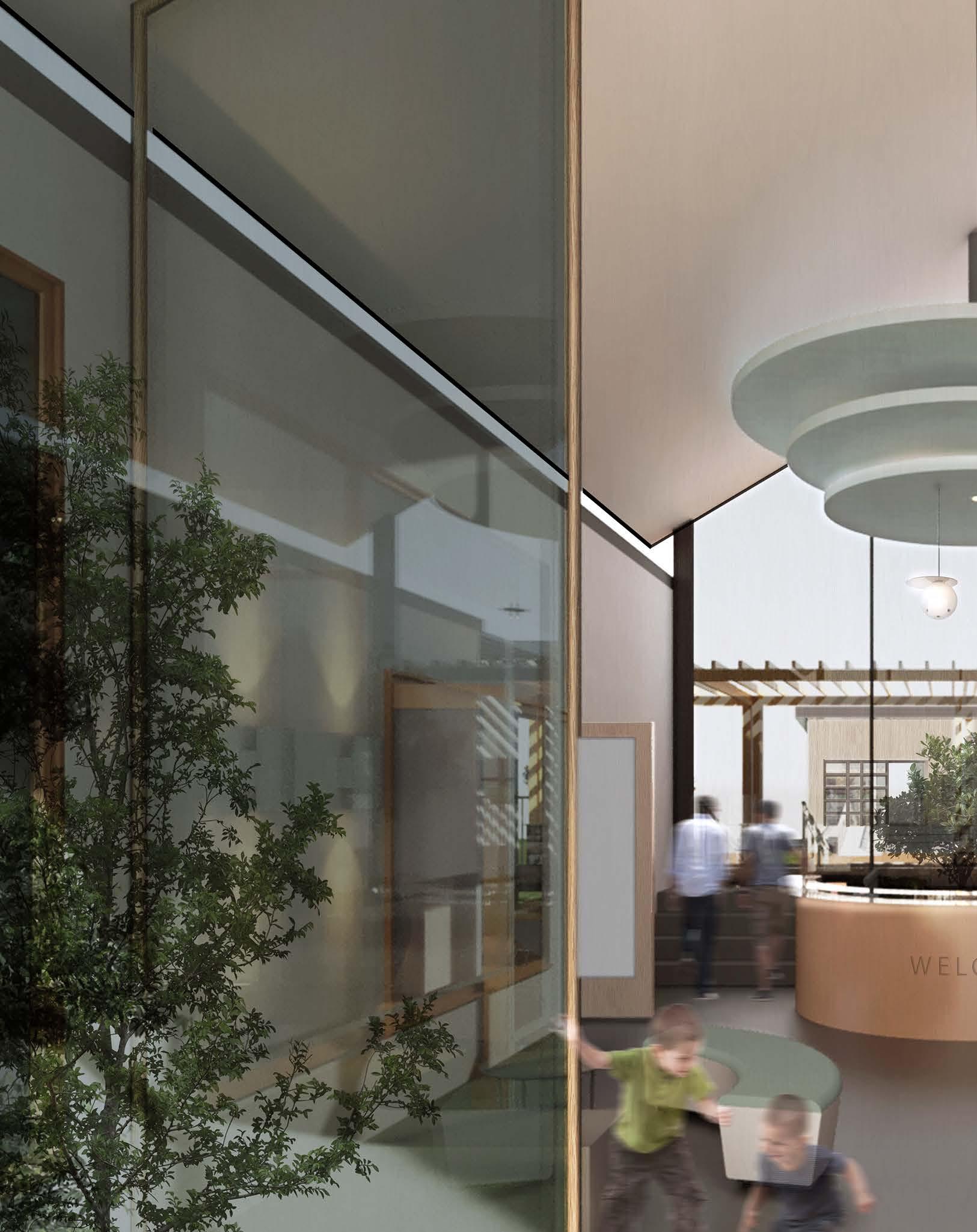
As an interior designer, Lucinda Bosch has always been drawn to the idea of creating spaces that are not only aesthetically pleasing, but also functional and supportive. When it was time for her third-year final submission at Inscape Education Group in 2020, she knew she wanted to tackle a project that would make a real difference in the lives of those who use it. That’s why she decided to design a sensory-friendly centre for autistic children in South Africa.

Autism spectrum disorder (ASD) is a neurodevelopmental disorder that affects communication, behaviour, and social interaction. Children with ASD often experience sensory sensitivities, which means that their sensory perceptions can be heightened or distorted. This can lead to sensory overload or discomfort in environments that are too bright, too loud, or too overwhelming in terms of sensory stimuli. Sensory-friendly educational and rehabilitative spaces are designed to address these sensitivities. However, for the most part, autism-friendly designs also make spaces more enjoyable for individuals and parents who do not experience ASD. In other words, autism-friendly design is just good architecture! The project also carries personal significance for Lucinda. Her mother is a teacher, and has often shared stories with her of children in her class who struggle with over-stimulation and sensory sensitivities. Hearing about those challenges first-hand inspired her to explore how design could address these issues and create a more supportive environment for children with ASD. She seeks to create a space that would not only meet the functional needs of children with ASD, but would also provide an environment that is welcoming, calming, and supportive. By incorporating sensory-friendly elements such as subdued lighting, muted colours, and specialised materials and equipment, her design aims to create an environment that would reduce sensory overload.
The chosen site is situated on a small holding in Vierlanden, Durbanville. The building currently functions as a family home and the site boasts spectacular views of the surrounding farmland. The suburban setting is ideal for creating a familiar, inviting, and sensory-friendly learning centre as it is located in a residential area which will make the children feel safe and directly connected to nature. Research shows that the sound of running water, wildflower meadows, and the life of the entire neighbourhood have great effects on the social and psychological behaviours of autistic children.

The design heavily emphasises sensory elements, such as textures, colours, patterns, acoustics, and lighting. The concept was to design the learning environment as to be as natural as possible using a combination of the four essential elements of nature: earth, air, fire, and water. For example, the circulation and fluidity of water, the lightness of air, the fresh and earthy colour scheme of earth, and the passion and warmth of fire.

The facility needs to be functional, educational, and therapeutic, with a multitude of programmes for music, art, therapy, play, and exercise. A one-way circulation scheme that builds on the special needs users’ affinity for routine is employed throughout the building. The circulation corresponds to the general daily schedule of the students’ activity as they move through the school. Outside pods have been designed on the premise that learning and creativity are processes involving the body. The secluded pods are important features as they provide relief for the autistic user in case of over-stimulation. The students can use this as a pause zone or to sit and do their homework outside. The shell is constructed out of treated pine.

“Overall, my project was a reflection of my passion for design that makes a difference and my desire to create supportive environments that help those who use them reach their full potential.”
The custom-designed round, bracketless shelves are meant to cover all sharp corners for safety. The luxury vinyl and cork flooring provide a soft, durable, and noise-reducing surface for the children, while the epoxy resin adds a smooth, textured finish.


Neutral and calming colours and the use of natural materials are best-suited for autism-friendly learning environments. Overly stimulating colours should be avoided. In this design, Dulux’s Mineral Mist and Tuscan Glade paint, as well as Hertex’s oxidised metal wallpaper, create a soothing atmosphere. Natural lighting is introduced with non-glare, anti-reflective glass to allow indirect sunlight without visual distractions. The benefits of sensory-friendly educational and rehabilitative spaces for children with ASD are significant. These spaces provide a supportive environment that can help children with ASD feel more comfortable, calm, and engaged in their learning and therapy activities. By reducing sensory overload and providing a structured and predictable environment, sensory-friendly spaces can help children with ASD better understand and navigate their surroundings, which can promote independence, self-regulation, and social skills development. The specialised materials and resources in these spaces can also support the educational and rehabilitative goals of children with ASD, helping them achieve their developmental milestones.


SEEING PLAYGROUNDS THROUGH A CHILD'S EYES

The importance of play in children’s development cannot be understated. So much so, that merging the concept of ‘play’ with learning and development during their foundation phases has evolved significantly in South Africa over the years.
We have seen a movement towards the use of more sustainable material in playgrounds and away from the plastic, sanitised, European-style play equipment. These Western materials are expensive and not suited to the climate of South Africa. Along with this, a new understanding of ‘play’ has emerged from ongoing childhood development research, leading to a burgeoning demand for more tactile, sensory-friendly playscapes. The result is a curiosity-driven play philosophy in which children are encouraged to engage with nature by encountering natural materials and textures to generate their own play. This exposure to natural elements, as opposed to prescribed play structures, allows children to explore their environment and create their own challenges, and encourages problem-solving by exposing them to ‘safe’ danger.
There are four fundamentals of play: construction (building elements), functional (physical play, such as climbing, running, etc.), sensory (stimulation of our five senses), and symbolic (imaginary play, storytelling, etc.). The Curiosity Approach expands upon these pillars of play and incorporates the following elements:

Trajection: Kids are captivated by movement, be it vertical or horizontal movement of objects or themselves. This element can be created by providing objects to throw, roll, or slide across.
Transportation: Children immerse themselves in moving objects or materials — either single objects or by filling up containers and moving those. This is facilitated through ‘loose play’ and the introduction of receptacles and movable objects or materials.
Rotation: Kids love spinning themselves, a friend, or an item around. Designs should provide objects to spin on, in, or around to fulfil this need.
Connection: Children are known to pack things in rows, connect them, or make them touch in the process. This can be achieved by introducing loose natural material and play elements.
Enclosure: Opening, closing, filling, and emptying are what kids do best. This can be incorporated by providing containers they can fill with items, or they can open and close, or even by giving them natural material they can dig in and bury things.
Orientation: Kids enjoy hanging upside down, standing at angles, and viewing objects and their surroundings from different perspectives. Integrate orientation elements by providing structures to hang upside down from as well as reflective or distortive surfaces, peep holes, or magnifying features.
Transformation: Children enjoy exploring the change of objects through mixing and adding elements together. The most common transformation of material in a playground is the creation of mud. Providing water and soil within the playground not only allows this transformation, but also exposes them to different textures.
South Africa still has a long way to go. The environment in which these playgrounds are built prevents them from incorporating the Curiosity Approach fully. Due to maintenance and budget constraints, artificial elements like special surfaces and loose play elements are needed. As landscape architects this should not deter us. It is an opportunity to lead the way in alternative designs for playgrounds, expanding the understanding of what play is and how this can facilitate education and development.
TIMOTHY SNYDERS Director and Landscape Architect


 Curro Century City Preschool Playground by Truform Landscape Architects


As Seamless Flooring Systems commemorates its twentieth anniversary, we're taking a moment to look back at the company's remarkable journey in revolutionising the flooring industry with innovative technology solutions. With a diverse and impressive suite of flooring options, the company has continuously expanded its offerings over the past two decades to address the ever-evolving needs of the industry. Seamless Flooring Systems proudly owns the renowned QUARTZ CARPET®, RIVERSTONE®, PLAYSAFE®, and SPECTRA® trademarked brands.
QUARTZ CARPET® is represented in over 60 countries worldwide, processed under strict ISO 9001 management standards, making it the preferred choice for specifiers and clients working within green building and eco-design parameters. The company’s stone-processing plant in Belgium holds the esteemed ISO 14001 certification for Environmental Management Systems. The resins are specifically formulated to withstand the harsh UV climate of Southern Africa and the Indian Ocean Islands while remaining 100% solvent and VOC-free.
PLAYSAFE® and SPECTRAPLAY® are industry-leading brands for playground and sports flooring in Southern Africa. Seamless Flooring Systems distinguishes itself as the only company in the industry providing certified installer training on the Code of Practice (COP) for wet pour playgrounds, aligning with South African Sports and Playground Industry (SASPI) standards. The company also represents MELOS EPDM and KRAIBURG rubber tiles, renowned German companies and global leaders in the sports and playground flooring sector.
The past few years have witnessed unforeseen events unfolding worldwide. Seamless Flooring Systems has weathered troubling market cycles, navigated the impact of Covid-19, embraced unimaginable technological advances, and adapted to changes in legislation and guidelines. The company's strength and resilience can be attributed to its valued customers, trusted partners, dedicated leadership team, and exceptional employees who are the backbone of the organisation. Owner and Managing Director, Jeremy Stewart, eagerly anticipates the next 20 years, as Seamless Flooring Systems remains committed to exploring the future of flooring and guiding customers on that journey with them.


Extremely honest, savagely direct, or coarse in speech or manner.
A distinctive practice, doctrine, system, or theory.
A brutal system with extremely distinctive courses and theories, indoctrinating either speech or manner. More professionally known as an institution at the highest level of education where you can study towards a qualification or conduct research.

Brutalism, as an architectural style, emerged in the 1950s and gained popularity throughout the 1960s and ‘70s. Although it garnered less popularity than the moon landing and Star Trek, but slightly more than the JohnnyCash-ignited forest fire of 1965, this monstrosity of a discourse was particularly prevalent in the construction of government buildings, university campuses, and public housing projects.

Brutalism is the kind of architecture that makes you question whether the intention is bold, innovative, and imposing, or soul-sucking, dry, and oppressive. After all, terms like heavy and utilitarian are often used to describe these designs. But if you're into the idea of unapologetically Orwellian dystopia meeting functional structures, then Brutalism might just be the architectural trend for you! What other 50-year-long relationship has the key characteristics of being raw and exposed, while prioritising purpose over form and still commanding attention? You might find yourself convinced that beauty was in the eye of the beer holder with this one.
The Brutalist movement in South Africa's university buildings and learning spaces is like the love child of a concrete factory and a Soviet-era bunker, but this grandiose design choice does play a bigger role than simply showing off industrial prowess. The monumentality of these buildings brings a sense of awe and inspiration to a place of developing minds. Practically, the very large and open spaces that concrete technology provides, allow for optimal educational conditions.
DANIEL FOUCHÉ Candidate Architect www.saota.com @_saota“Brutalism might be like the architectural pineapple on pizza — you either hate it or you love it — but there’s no denying the materialised motivations of the style speak for themselves in this arena.”


• Minimal distraction: Who needs ornate decorations when you're working towards a degree in computational neuroscience and astrophysics?
• Acoustic properties: When you're paying good money for an education, you can’t blame failing on the insufficient way sound behaves and interacts with a particular environment or material.
• Natural light: The only thing worse than being stuck in a lecture hall for hours is being stuck in a dark one.
• Durability: The average adolescent isn't exactly concerned with protecting the architectural history of our country. Let’s allow Brutalist design to take on the task while students continue on their beer-pong streak.


• Sense of community: Nothing says ‘we're all in this together’ like a monolithic building huddling over everyone on campus.

Sure, maybe we like to hop onto international trends — this one, in particular, stemming from the likes of Le Corbusier and Louis Kahn, with similar intentions in mind. It's not all unoriginal, though Our Brutalism is also shaped by local conditions, like the unique blend of social upheaval, diverse landscapes, and political tension that belongs to South Africa. Here are some examples of these controversial beasts within educational buildings:

 Nelson Mandela University, Gqeberha


Size: 1416 m²
Completed: 2021
Location: Turkana County, Kenya
Designed by Pritzer Architecture Prize-winner Diébédo Francis Kéré's studio, the Startup Lions Campus is an information and communication technologies (ICT) campus, located on the banks of Lake Turkana, Kenya. The project responds to the pressing challenge of youth unemployment faced in the region by offering high-level training and access to international job opportunities, allowing young entrepreneurs to thrive professionally without having to leave their place of origin.
The campus provides 100 new workstations and is the first step in an ambitious vision of spreading ICT networks in remote areas. The project celebrates the unique morphology and natural beauty of its site. Five linked buildings are built over two levels following the natural slope of the terrain, and feature extensive roof terraces with sweeping views over the lake. Inside, the building contains a mix of classrooms, flexible workshops and co-working spaces, alongside storage, administrative and technical facilities. The roof terraces are shaded by creeping vegetation, providing pleasant outdoor meeting spaces and opportunities for the informal exchange of ideas.
In a nod to the principles of nature, the project takes inspiration from the towering mounds built by termite colonies in the region. Tall ventilation towers create a stack effect, naturally cooling the main working spaces by extracting warm air upwards, while fresh air is introduced through specially-designed, low-level openings. This system allows the campus to withstand high temperatures, and is especially well suited as it prevents dust from damaging the IT equipment. In addition to their functional role, the towers also create a distinctly recognisable landmark in the surrounding landscape.

The campus is built out of locally sourced quarry stone with a terracotta-hued plaster finish. In choosing which materials and construction techniques to use, ecological sustainability, cost, and availability factors were weighed to arrive at the best compromise. Collaboration with the local community was key in this decision-making process, drawing from their experience and expertise.


Client: Learning Lions gUG (haftungsbeschränkt)
Architect: Kéré Architecture
Project manager: Kinan Deeb, Kéré Architecture

Contractor and engineer: BuildX Studio
Photographer: Kinan Deeb
www.kerearchitecture.com @kerearchitecture
 Location: Kimberley
Cool and eye-catchingly clever, the auditorium building on Sol Plaatje University’s campus is an imaginative addition to the hot and dry Northern Cape university. Ludwig Hansen Architects and Urban Designers was tasked with the development of a comprehensive Urban Design and Development Framework and Implementation Strategy Plan, which required the coordination of both architects and bulk infrastructure consultants. As the first new institution of higher learning since 1994, the university symbolises democracy, inclusivity, growth, and opportunity.
On an urban scale, the aim was to change the exiting city of Kimberley from a mining hub into a university town. This was achieved by introducing a variety of uses and functions in close proximity to each other to create a truly integrated and mixed townscape. The new university was to accommodate not only academic facilities, but also a mixture of residences, retail amenities, recreation spaces, and exhibition venues.
URBA Architects and Urban Designers won the auditorium building commission through an open design competition that called for culturally and environmentally appropriate responses within a tightly controlled framework. The triangular, external envelope of the building is derived from a rigorous urban design framework that facilitates cohesion and supports people-oriented placemaking.
The resourceful, solid, and abstract design of the building mirrors the domestic vernacular of the region, where even the smallest solid structures, typically made of stacked stone, shield users from the harsh climate by providing cool interiors. The building is a metaphoric ‘cool cave’ that allows students to continue with the important task of learning despite extreme climatic conditions outside.


Client: Sol Plaatje University
Architect: URBA Architects and Urban Designers, Henri Comrie, Amálie Comrie, Etienne Britz

Design development: Henri Comrie, Amálie Comrie, Burgert van der Walt, Etienne Britz
Urban designer: Ludwig Hansen Architects and Urban Designers

Main contractor: Qualicon Construction
Project manager: AECOM
Structural, electrical, civil, and fire engineer: Aurecon
Quantity surveyor: LimCo QS, Arbitration & Project Management
Photographer: Paris Brummer www.urba.co.za


External openings of varying sizes are carved into the solid brick envelope to invite optimal natural light into the building and to guide the movement of students into it. On its southern façade, the bold treatment of the sheer, vertical brick plane acts as a headboard that holds the shortest end of an intimate, shaded court while also casting much-needed shade over it. The other buildings that frame the court present a more permeable interface within a balanced, total space.

The hollowing out of the minimalist brick mass within the total envelope provided opportunities for the plastic articulation of space and for the controlled use of natural light. The three-dimensional sculpting of the interior provides a variety of pause and breakaway spaces located at different, yet visually connected levels. While the crust of the building is made of flush-jointed clay brick, the interior is made of rendered white walls and off-shutter concrete to allow for the infusion of spaces with natural light that migrates through them, creating moods linked to seasons and the time of day. The fine-grained, 20 mm-thick, black Indian limestone on the floor flows into the curves and can be cut along the perimeter to fit the shape like a carpet, without any skirtings.
The external minimalist planes of solid brick and internal white or béton-brut act as backdrops or frames for the installation, where more finely crafted, colourful elements are contrasted against or set into them. This brings a playful quality to the building in an environment that already blossoms with youthful optimism and the joys of student life, successfully cementing itself as the winner in the category of Completed Buildings for Higher Education and Research at the World Architecture Festival 2022.
Brick
Corobrik 011 871 8600
Ironmongery
Ironmongery Warehouse 011 444 8672 dormakaba South Africa 021 812 3500
Steel
Central Industries 082 805 2389
Aluminium and glazing
Glasfit 0860 123 423
Joinery and partitions
Craucor Joinery 084 878 2242
Lifts
KONE Elevators 051 444 2413
Lighting Regent Lighting 011 474 0171
Signage
Identisea 083 469 4492
Paint
Paintsmiths 051 444 5777
Flooring
Mazista 011 998 2600
Tiling Union Tiles 051 421 1285
Off-shutter concrete
Lafarge South Africa 011 657 0000
Fixed static seating
Rodlin Design 011 444 2061
Student environments should be conducive to open collaboration, communication, creativity and critical thinking. Comfort and ergonomics are key in student motivation and higher engagement. Which is why it is important to offer comfortable functional seating that creates a unique learning environment.
Extremely versatile, functional two and three seat seating systems with writing boards. An elegant solution for modern lecture and multi-media facilities, conference halls and auditoriums. The cleancut look is designed to meet requirements for rationality and comfort.


www.rodlindesign.co.za
• Johannesburg: 44 Galaxy Avenue, Ext 14 Frankenwald, Linbro Park, Sandton. 2090.
• Telephone: +27 (0) 11 444 2061
• Fax: + 27 (0) 444 8416
• Email: info@rodlindesign.co.za
• Cape Town: 11 Bremen Close, Airport Industria, Matroosfontein. 7490.
• Telephone: +27 (0) 21 534 9873
• Cell: + 27 (0) 83 797 1666
• Email: info@rodlindesign.co.za
SANS 1528-1 TEST LEVEL 3 COMPLIANT. Rodlin Design RD-8500 Rodlin Design Edu-Wing• Orbit LED Lights on average last 4 times longer than other LED lights and reduce landfill waste by as much as 75%
•
Are energy efficient with a near-unity power factor. This radically reduces your carbon footprint and energy usage by 50 to 67%
• Are recyclable and a void costl y disposable costs
• Are ideal t o use in conjunction wit h PV Plants (Solar Generation)
OrbitX LED lights are locally designed, assembled and tested to provide excellent light at the lowest life cycle cost in the market. This has been confirmed from research by Stellenbosch University.

8-year guarantees provide peace of mind for zero maintenance during the long lifetime of OrbitX lights. High efficiency ensures minimal energy cost while maximising light output.
www.orbitx.co.za

Trees available


100lt/
following

Size: 10 500 m²
Cost: R164 million
Completed: December 2022
Location: 48 Alexander Street, Bird Street, Stellenbosch
MySpace @Drostdy, the first project combining the expertise of dhk Architects and dhk Interior Design (dhki), is a complete reimagining of the Stellies student experience. Bold and colourful, the co-living hub is the third addition to MySpace Residence’s repertoire, joining MySpace @Dorpstreet and MySpace @Paradys in the family. Here, modern design meets comfort and convenience, with community-minded living central to its fun design.

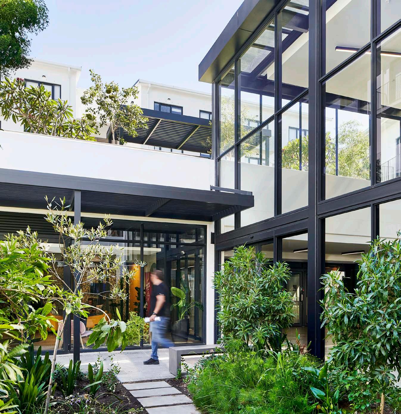
The existing retail centre behind the old historical Dros Hotel had to be demolished completely. Thereafter, the ground was excavated for two new parking basements below, and a new student residential complex was erected behind the old building. A glass-roofed atrium entrance space was constructed between the two buildings to tie them together and overlooking balconies were added to the apartments on the Bird Street side. The old Dros building was cleaned and painted and a new balcony was added to the old theatre entrance. Additionally, the surrounding pavement areas were repaved with klompie bricks to bring back some of the historical fabric to the area.
The brief was as practical as it was aspirational. dhki was tasked to create a space that is a home away from home, within a safe, vibrant container that inspires the occupants in their tertiary education path.
The intervention was focused on the public areas, lounges, deli, library, gym, laundry, and study areas, for which the client commissioned an identity that would appeal to a youthful audience and lifestyle. Site handover took place in April 2021 and the entire project lasted eight months.
Structural steel
LRJ Steel
021 556 1739
Anchor Steel Projects
021 905 4506
L X Steel Design
021 981 0870
Ebden Engineering
021 905 3566
Triomf Staalwerke
021 862 1630
Post-tensioned slabs
D & E Group
021 907 4700
PTS Solutions
083 708 2894
Handrails, balustrades, and bumprails
Magnet Engineering
011 908 3500
Aluminium shopfronts and louvres
Mazor
021 556 1555
Façade Solutions
021 788 2711
Everglaze Aluminium
021 982 0428
Skillfull 180
021 905 2172
NEO Aluminum
021 982 8899
Feature wall finishes
Marcoatings International
021 686 4225
Ironmongery and doors
Quantech Architectural Consultants
021 691 0977
SDA Joinery
021 386 7105
Contract Hardware
021 671 2071
Ironmongery Warehouse Africa
011 444 8677
Allandel
021 531 3791
Interior identity
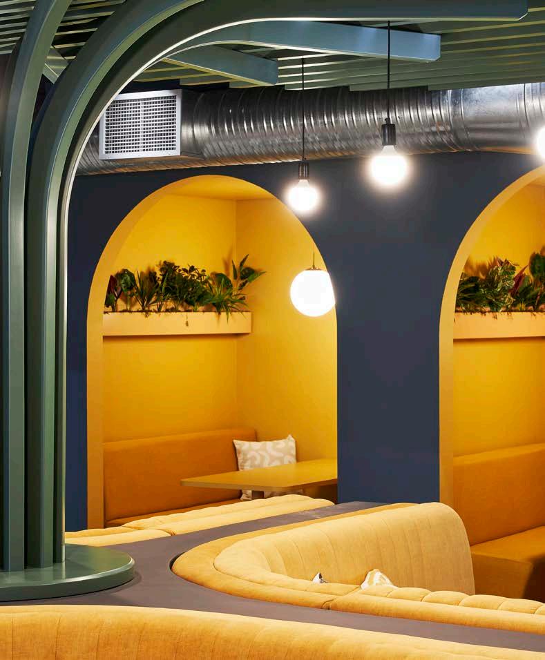
dhki employed bold and youthful colours — sunshine yellow, forest green, and blush pink on a neutral tone foundation — to denote the demarcation and functionality of each zone. Each colour was allotted a specific function in line with colour psychology research, with the intention that this will guide all future developments.
Another tool the interiors team employed was the use of large-format graphics on focal and feature walls to further emphasise the youthful energy of the space. They also considered the flexibility of this medium. In future, the simple change of a wallpaper design will ensure that the space stays current. Similarly, should the painted graphics need updating, this can be done with ease.
The finishes are corporate grade, selected based on their durability and ability to withstand a high-traffic student environment. The execution and application of these materials, however, maintains the youthful spirit and design dynamism of the space, despite their practicality, setting the residence apart from most student accommodation offerings. An example of this is the floor of the library, which features an inexpensive, durable corporate carpet tile, but installed in an unusual pattern for visual interest.
Community living
In addition to the lush, planted courtyard (ground floor) and terrace (first floor), which allow for communing outdoors, and fully-equipped recreational and gym spaces, there are various design choices that allude to the importance of a sense of community. A wide seating variety — from booths to cosy pods — allow for collaborative working and eating. Likewise, visual elements such as the custom designed joinery pieces and recognisable ‘tree’ structure are inspired by the concept of gathering. When people meet together under a tree, in the shade, we share ideas and build community. This element forms part of the key identity of MySpace, and will create a sense of cohesion across all its residences.

Client: Eikestad Properties
Developer: Abacus Development Company
Architect: dhk Architects
Interior designer: dhk Interior Design
Quantity surveyor: IQS
Main contractor: WBHO
Civil contractor: Keller
Electrical engineer: KLS Consulting Engineers
Civil, structural, lift, and fire engineer: Sutherland Engineers
Mechanical engineer: Southern Air Conditioning and Design it Green
Traffic engineer: EFG Traffic Engineers
Landscape architect: CNDV Landscape Architects
Heritage consultant: Urban Design Services CC
Land surveyor: Friedlander Burger & Volkman
Town planner: TV3 Town Planners
Wet services: Vortex
Health and safety: Eppen-Burger & Associates
Photographer: Sean Gibson Photography
www.dhk.co.za @dhkarchitects

www.dhki.co.za
@dhkinteriordesign

"The finishes are corporate grade, selected based on their durability and ability to withstand a high-traffic student environment."
Shower recesses and doors
Aluglass Cape
021 683 9094
Showerline Shower Doors
021 797 3695
Sanitary accessories
Ironmongery Warehouse Africa
011 444 8677
Contract Hardware
021 671 2071
Quantech Architectural Consultants 021 691 0977
Roller shutter door
Hyper Doors
023 007 0115
Roll-up Serranda
011 494 5809
Timber roof construction, covers, and insulation
Premier Roofing and Cladding
071 885 4848
GSM Roofing
021 762 7623
Chartwell Roofing
012 329 3788
Rooftech
021 207 3872
Elegant Roofing
021 931 1240
Scheltema & Company
021 638 3121
Rainwater gutters and downpipes
GSM Roofing
021 762 7623
Chartwell Roofing
012 329 3788
Watertight Waterproofing
084 804 0880
dhk and dhki interrogated the various ways in which people share knowledge and learn. The solutions implemented in the design encourage various levels of focus, ranging from intimate individual study nooks to larger collaborative spaces. With the belief that one can learn while having fun, the deli, coffee bar, and entertainment areas provide a playful, robust, and multifunctional setting for this exact reason.
This dynamic approach to accommodating various forms of learning is directly linked to an agile work environment. By creating this type of platform for students at the beginning of their career paths, they will be well prepared for future work environments and life in an agile world.
Tiling
RVV Tile Gallery
021 555 2597
Tile Africa 021 511 5815
Ohlhorst Africa 012 327 2414
Dynamic Flooring 021 706 4279
Pardal HL & Son 012 327 5454
Entrance walk-off mats
Pentafloor 011 440 6759
Peter Bates Cape Flooring 021 949 9765
KBAC Flooring 021 464 4320
Ceilings, bulkheads, and partitions
A&E Ceilings & Partitioning 021 905 7704
Dracon National 021 551 8333
ACP (Affordable Ceilings and Partitions) 021 906 8528
Scheltema & Company 021 638 3121
OWA 021 531 7511
Appliances
Smeg South Africa 021 418 9934
Speed Queen South Africa 011 553 3700
Furniture and joinery
Ram Shopfitting 021 202 7995
Libra Joiners & Interiors 021 797 5798
RMS Shopfitting 021 510 2133
LKSA 021 981 0415

Kitchen City 021 975 4439
Wilco Designs 082 829 8893
Franco & Son Woodwork 021 975 2378
Blackwood Furniture Co. 083 407 4507
Signage
Jalite 021 531 5209
Ultra Signs 021 510 3200
S & G Signs 021 510 3400
Jeff-Art Signs 021 447 1174
Lexan Burger Emoyeni Skylights 011 792 7742
Timber trellis screens Highveld Cape
Decks4Life 076 908 2175
Libra Joiners & Interiors 021 797 5798


Size: 2000 m²
Cost: R30 million
Location: 6 Shannon Street, Salt River, Cape Town
Born from a simple dream, a trapeze bar in a tree, a costume box, and a rusty car, Zip Zap Academy has set the stage for creative self-discovery. Thirty years later, the circus school has gone from tent to triumph, providing free education programmes in a uniquely designed building that empowers children through the art of circus.
Site history and context
The site for the new Zip Zap Academy is located in the semi-industrial area of Salt River. It is surrounded on three sides by two-to-threestorey-high factory buildings and its sole street edge faces a row of single-storey residential houses.
There was a dilapidated factory building on site, but after careful evaluation, it was deemed unsafe and too costly to reappropriate to fit the project brief. Consequently, the architect decided to demolish it to make room for a new building that would be tailor-made for Zip Zap Circus School.

For years, the school operated in a temporary tented structure on leased land behind the Artscape Theatre Centre in Foreshore, Cape Town. However, the tent was not conducive to a teaching environment. Noise levels were high and classes were not adequately separated. Zip Zap had long dreamed of having a permanent home, with separate classrooms and its own Trapeze Hall, and with the help of their sponsors, the school was finally able to procure a site in industrial Salt River.

SUPPLIERS
Windows and screen World of Windows 021 551 3235
Roofing Scheltema & Company 021 638 3121
Steel Mazor 021 556 1555
The client’s brief was to design a one-of-a-kind building that meets the practical needs of the circus school and stands as a landmark to inspire young kids. Since there are no clear precedents to draw reference on — most circus schools around the world operate from converted warehouses — the architect worked closely with the client to develop a new hybrid architectural typology that combines a circus, a theatre, and a school. The design combined three building types to meet the spatial requirements, and evolved around the following three main questions:

Drawing inspiration from the iconic, traditional big-top circus tents, the street façade is designed to generate maximum visual impact. The building’s dynamic angular form, clad with a big, brightlycoloured aluminium screen, generates a sense of excitement and inspires the children upon entry. The street edges create a userfriendly urban environment to be shared by circus students and the local community alike.

"Drawing inspiration from the iconic, traditional big-top circus tents, the street façade is designed to generate maximum visual impact."
Architect: Tsai Design Studio
Project architect: Cathy Skillicorn
Structural and MEP engineer: Sutherland Engineers


Contractor: NMC Construction
www.tsaidesignstudio.com
@tsaidesignstudio
How do we bring the drama of a theatre?
The building is arranged like a theatre to highlight the drama and excitement of circus training. The triple-volume Trapeze Hall takes centre stage. It is surrounded by the U-shaped school building in a layout that is reminiscent of a theatre auditorium, with viewing balconies and royal boxes. The multifunctional training spaces can be adapted to host a wide range of performances and events.


How do we create a unique learning experience for the school?
Zip Zap’s goal is to provide an alternative learning opportunity that will empower children through physical activities and self-discovery. To this end, the design layout includes many spatially-distinct training spaces and classrooms. To immerse the children in the full circus experience, all of the back-of-house operations are exposed and visible from the Trapeze Hall. This is achieved by a simple didactic signage system and clear windows to all the rooms.
Using passive design principles, the building is orientated to maximise natural daylight and cross ventilation to all the spaces. The triple-volume Trapeze Hall and the adjacent courtyard are orientated towards north to ensure constant natural light for training activities throughout the day. The courtyard, intended as a spill-out outdoor training space, is sheltered from Cape Town’s south-easterly wind. The classrooms and offices are south-facing to reduce the glare from direct sunlight. The steel screen on the east street façade serves as a sun louvre as well as a security barrier. All the rooms are naturally lit. Artificial lighting in public bathrooms is controlled by motion sensors to reduce power consumption.

Other passive solutions include high whirlybird vents to reduce the heat load during summer. In the Trapeze Hall, the industrial roller shutters can be opened completely to ventilate the big space — especially in summer. Moreover, the thermal mass of the concrete and brick retains the heat during winter.


Size: 1395 m²
Cost: R12.6 million
Completed: April 2023
Location: Klipfontein Road, Rondebosch, Cape Town
Bursting onto the scene at the Red Cross War Memorial Children's Hospital, you can’t help but smile at the brand-new technicolour playscape designed by KMH Architects. As fun as it is functional, the project is an inspiring endeavour to create a supportive and healing environment for young patients in care.
During the planning stage for the extension and redevelopment of the emergency centre at the hospital, the expanding building footprint meant the children’s play area and garden would be all but lost. The architect seized the opportunity to create a significantly improved replacement of the existing facilities that would prioritise the children's well-being and cater to their unique needs.
From the get-go, the architect recognised that play is an essential aspect of a child's development and recovery, especially during extended hospital stays. To ensure that young patients continue to learn and grow, the therapeutic play areas were designed to provide a stimulating and immersive experience. By integrating age-appropriate equipment and activities, KMH Architects aimed to create spaces where children could engage, explore, and find solace amidst their medical journey.
There are four therapeutic play areas in total, with the other two inside the hospital, and another at the hospital’s psychiatric unit. The main therapeutic play area, located at the hospital's entrance, immediately captures attention with its vibrant colours and diverse play structures.


Client: Children’s Hospital Trust

Architect: KMH Architects

Civil engineer: William Dau Civils
Consulting engineers: Triocon Consulting Engineers, Kantey and Templer Consulting Engineers, and Claassen Auret
Quantity surveyor: Meyers Summersgill Quantity Surveyors
www.kmh.co.za
@kmh_architects
Tunnels, ladders, bridges, slides, and miniature walls with ropes invite children to climb, slide, and navigate an exciting landscape. The careful selection of play equipment ensures that children of all ages and abilities can participate, fostering inclusivity and promoting social interaction.
Creating a safe environment was a top priority for the client. To them, the playground must go beyond slides and swings to become a safe place where children of all abilities are able to play and explore the world around them.
Microfibre flooring imported from Europe was chosen to deck the entire play area, providing a soft and cushioned surface that minimises the risk of injuries. The architects meticulously considered every detail to ensure that children could play freely without compromising their safety.

KMH Architects collaborated closely with healthcare professionals to understand the specific needs and challenges faced by children during their hospitalisation. The therapeutic play areas were designed as meaningful retreats, offering respite from the clinical environment and fostering a sense of normalcy. By incorporating natural elements into the outdoor space, the architects sought to create a connection with nature, providing a welcome escape from fluorescent lights, unnatural sounds, and the presence of unfamiliar faces.
That said, the therapeutic play areas at the Red Cross War Memorial Children's Hospital go beyond mere recreation. Instead, they serve as catalysts for healing, promoting emotional well-being, and aiding in the recovery process. By engaging in play, children can regain a sense of control, explore their creativity, and develop social skills. The therapeutic playground acts as a vital tool for physiotherapists and occupational therapists, facilitating rehabilitation and promoting physical and cognitive development.
Play equipment
Kidbuddie 082 093 6682
MiFitness 021 020 5000
Play Outdoor 083 630 0266
Rubber flooring Masterfibre 021 511 7411
Steel Twirldry 063 643 7219


