7 minute read
That Elusive “A” - an Applicant’s Perspective
By Paul Willyams APSNZ AFIAP MNZIPP
THEY SAY THAT you learn more from your failures than your successes – if so, then I am an expert in Associate applications! I finally got it last year after several failures, most of them unexpected, disappointing and frustrating. As I write this you might be sending off your Associate Honours set, or thinking about it for next year. So, what have I learned that you might use?
The first thing: I was not alone in having my set rejected. I know many now Fellows who struggled to get their “A”. The success rate is not high, about one in four I think, so each year there are grumpy photographers at our convention. The mood is not lightened when a newbie gets it on their first try!
Second thing: this is seriously difficult. The standard of photography and set design is at an advanced level. You are ‘competing’ against the top active club photographers in the country, trying to get into the top quartile. OK, so technically you are not competing, you are being assessed against a standard. But, the Board is not going to select every submission, so aim to be one of the best, not just to get to a standard. And beware, the standard goes up each year.
Third thing: the most important thing, the “one ring to rule them all”, is: quality. Bruce emphasised this in his video, and that is consistent with my experience. Each and every image must deserve to be in the set and be technically impeccable.
Remember, they will be peered at intently by those photographers who have missed out. You might get away with the odd issue that Paul’s set is available on the PSNZ website and is expertly analysed by Bruce Girdwood in the Honours Q&A video at https://vimeo. com/486655857 and go to 28m 44s on the timeline.
you didn’t notice, but don’t count on it.
Fourth thing: a set is not a selection of your best work. I have won lots of awards for individual images, but try to put those images into a set and it just doesn’t work.
This leads me to my main challenge – creating a set. If you have been following the grumblings over the last decade you will know the big question: themed or diverse. The guidelines have not been clear in the past. Successful sets have generally been of an excellent quality but highly themed, whilst diverse sets have done poorly. A perception emerged of an unwritten rule that a themed set was required and diversity was, if anything, a disadvantage. The Board made strong efforts last year to dispel that perception and reinforce the need for diversity.
Frankly, I believe the word ‘theme’ should not be used. It means different things to different people, so try not to think that way.
What the Board is looking for (based on Bruce Girdwood’s excellent Honours Q&A video) is a display of a range of advanced photographic skills, within a coherent set of images. Diversity is essential to show the range of photographic skills, but the set still needs incredibly careful construction to make a set that ‘hangs together’.
Some key words I picked up on to describe the positive attributes of a set, versus their antonyms, are:
• Flow – how does one image visually flow or link into the next, then the next. Versus disrupted, jarring.
• Consistent – sharing some key elements, but that doesn’t mean ‘all the same’. Versus jumbled up, disparate.
• Coherent – it makes sense that this image is here. Versus confusing, lacking a story.
These are quite fluffy concepts, so the Board requirements are still not crystal clear, but nor should they be. The guidelines leave plenty of room for creativity and innovation.
Allow me to explain the thinking behind my A set.
I submitted a diverse set of projected images – historically a recipe for disaster. I started and ended on strong images.
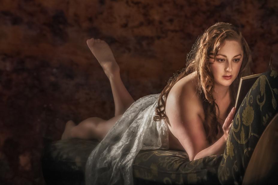
I had three posed models first up, with similar toning and style. I linked these to three nature subjects using a model that seemed to morph into a heron – that really created a ‘wow’ moment and I think this is a key point in the set where the judges would already take a positive view.
Now I must not disappoint them. The nature subjects are in the same position and looking the same way.
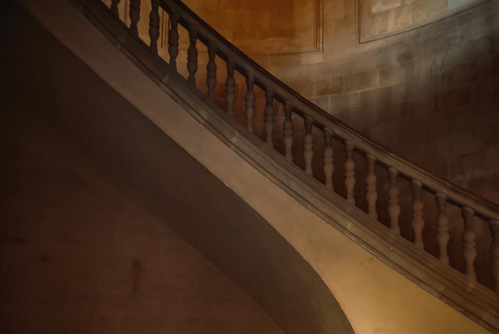
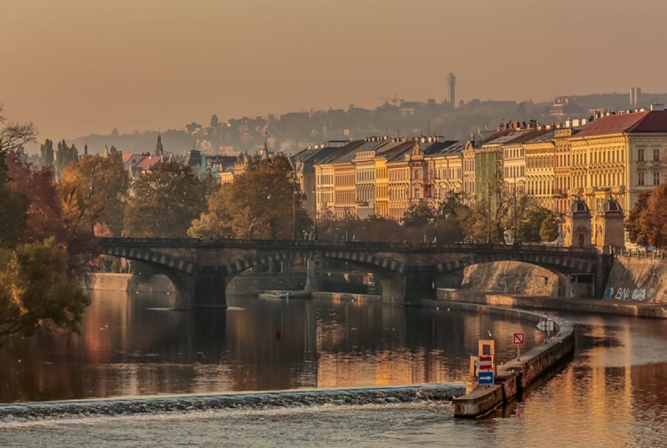
My link from nature to landscapes is the brown toning, and shapes – the slope of the hill matches the curve of the stairs, which is repeated in the sweep of the riverbank.
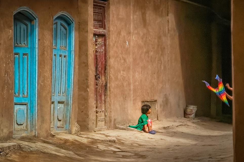
Then we zoom in from a wide cityscape to two street views, the first having similar tones but splashes of colour, the final image grey with splashes of colour.
I start and end the set with unposed street photography of people in their environment.
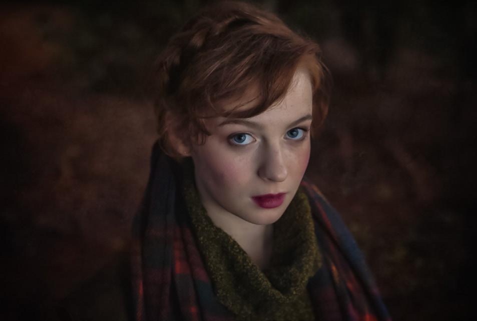
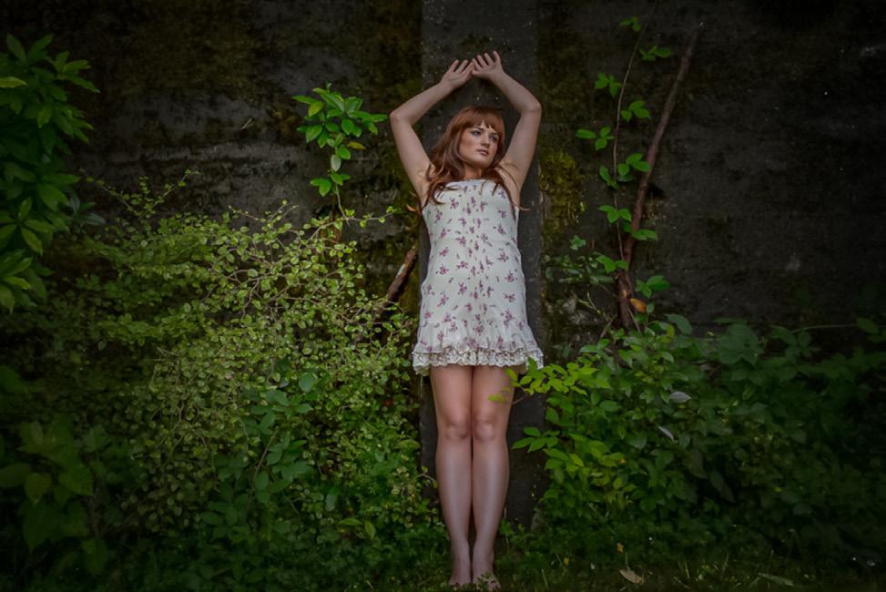
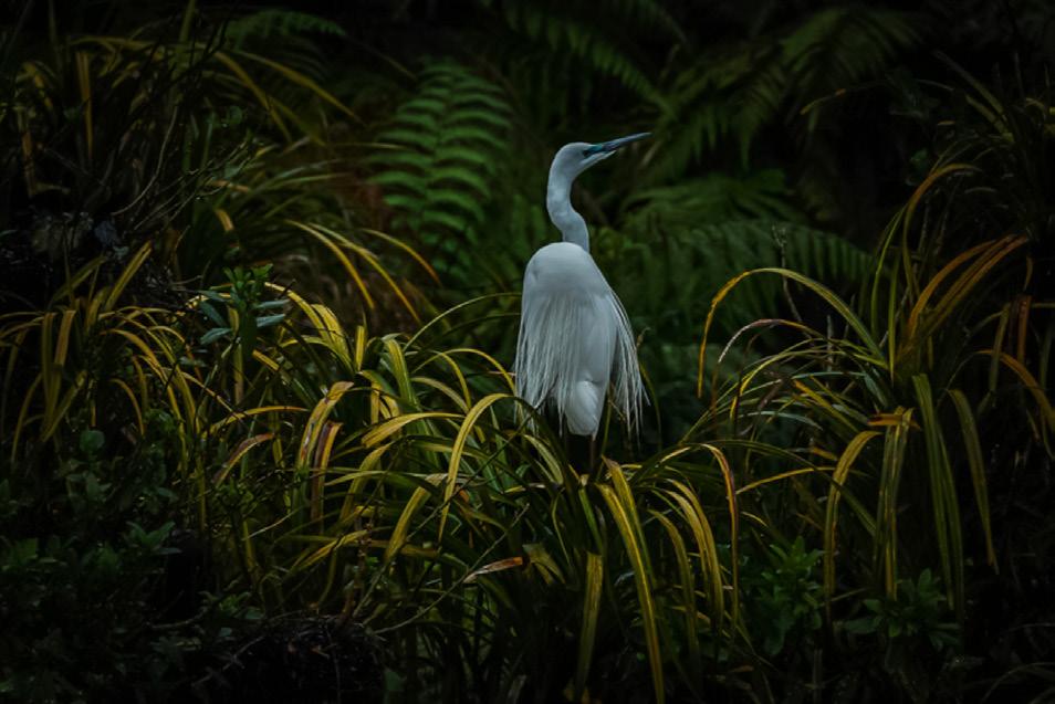


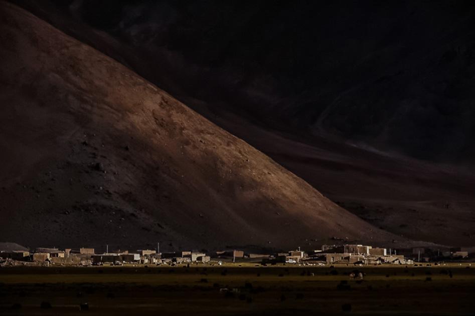
The final image has the subjects retreating, as if closing the story. Recall that the first shot has the subject reading a book, opening the story. These links might not be recognised but they still can affect the viewer.
I must emphasise the number of awardwinning images I threw out because they were too different and the number which were good but not good enough. I ended up with a couple of images I wasn’t even that keen on just because they fitted the set. Most of the images were taken a while ago – I could have put a set like this together years earlier, but I didn’t. I wasn’t brutal enough.
So, how do you start to build your set? You can start with a concept or idea, and build a set from scratch. Or you can grab a bunch of existing images and try to make a set out of them, reverse-engineering a concept.
I know the first approach is best. I look at the work of Ann Bastion FPSNZ EFIAP MFIAP and Helen McLeod FPSNZ GPSA ARPS and realise how much time they have spent planning their sets. Ann had to shoot across four seasons to create her botanical series. Helen’s composites are cleverly designed, pre-visualised and have a consistent style. This doesn’t happen by accident.
But I took the latter approach – creating a set from existing images. This is somewhat like solving a Rubik’s Cube. You are constantly swapping images in and out, searching for the right combination. You might re-process or even re-capture to get the perfect fit.
Either approach takes time. Do yourself a favour: start working on your 2022 A Set now. Don’t wait until December or January to start. If you haven’t got your A set ready for final printing and matting by the start of December then you are running late.
Pulling all these thoughts together, this is how I suggest you approach your Associate Honours set:
• Decide if you want to participate – do you really want to produce a set? Are you happier entering individual images to the
SONY National Exhibition and looking for medals?
• Read the guidelines carefully, watch
Bruce’s video, and read the CameraTalk articles.
• Aim for the highest standard you can achieve.
• Develop a concept, playing to your strengths and abilities.
• Design your set. Have a structure and a shot list.
• Make it a project to shoot your images.
This project could be a single shoot or a two year process.
• Post-process obsessively.
• Be 100% confident in all your images – no fill-ins. Be brutal.
• Ask someone else to critically review your draft selections and layout.
If you take all this advice and still don’t succeed, just remember that it is your set that is being judged, not you as a photographer.
Good luck!
Tip for developing a concept
An A set is 12 images total, typically arranged 3 high by 4 wide. So Google for “sets of 3”, “sets of 4”, “sets of twelve”. Also consider “sets of ten” with a lead in and lead out image, or “sets of six” with “pairs”. For example, 12 months of the year, three primary colours, or four riders of the Apocalypse.
