
5 minute read
CREATIVIDAD CREATIVITY


POOLSIDE. Para esta marca nueva de bebidas hard seltzer, refrescos con un punto de alcohol, Vibranding escogió una tipografía moderna y sencilla, unos colores llamativos y jóvenes y unos elementos visuales frescos y sugerentes: palmeras que nos llevan al verano y al lugar de origen de la bebida (las playas californianas) y un imagotipo basado en una P eslitizada a base de ondas que aluden al agua, tanto del mar como de una piscina (además, la P también se asemeja a un corazón, símbolo de vitalidad, positividad y amor). La composición es limpia y luminosa. La categorización por sabores, clara: Lime, verde lima; Mango, naranja; Wild Berry, morado. POOLSIDE. For this new brand of hard seltzer drinks, soft drinks with a touch of alcohol, Vibranding chose a modern and simple typography, bright and young colors and fresh and suggestive visual elements: palm trees that take us to summer and to the place of origin of the drink (Californian beaches) and an imagotype based on a stylized P based on waves that allude to water, both from the sea and from a pool (in addition, the P also resembles a heart, a symbol of vitality, positivity and love). The composition is clean and bright. The categorization by flavors, clear: Lime , lime green; Mango, orange; Wild Berry, purple. Silver Award Muse Design Awards 2021 Best Wine, Beer & Liquor Packaging.
VIBRANDING

HOLISTIC, ICONIC AND CONTEMPORARY DESIGN >DISEÑO HOLÍSTICO, ICÓNICO Y CONTEMPORÁNEO >REFRESCOS CON UN PUNTO DE ALCOHOL SOFT DRINKS WITH A TOUCH OF ALCOHOL
DR. OETKER REPOSTERÍA Packaging http://batllegroup.com
BATLLEGROUP
DR. OETKER REPOSTERÍA. El heritage ha sido el punto de partida de la agencia en la realización del rediseño completo del porfolio, de más de 50 referencias. Batllegroup ha creado un nuevo storytelling que pone en valor la experiencia de Dr. Oetker, tomando como producto insignia la levadura en polvo, reforzándolo con ‘Expertos en repostería casera desde 1891’. Se han homogeneizado los brand assets en el packaging, combinando códigos transversales y brand block con elementos de diferenciación que ayudan a segmentar las 3 variedades de producto. La nueva tipografía es casual y espontánea, para reforzar la idea de las cosas hechas en casa. Se ha implementado una nueva gama cromática, con colores cálidos y que transportan al mundo de la repostería tradicional y casera. También se ha actualizado el sistema de iconos sobre el uso del producto. DR. OETKER REPOSTERÍA. The heritage has been the starting point of the agency in carrying out the complete redesign of the portfolio, of more than 50 references. Batllegroup has created a new storytelling that values Dr. Oetker's experience, taking powdered yeast as its flagship product, reinforcing it with 'Experts in home baking since 1891'. The brand assets have been homogenized in the packaging, combining transversal codes and brand block with differentiation elements that help to segment the 3 product varieties. The new typography is casual and spontaneous, to reinforce the idea of homemade things. A new chromatic range has been implemented, with warm colors that transport us to the world of traditional and homemade pastries. The system of icons on the use of the product has also been updated.


LA DANSADA. Dos vinos, un tinto y un blanco de la Denominación de Origen Terra Alta, con un packaging diseñado por Dorian. La conexión con Terra Alta se consiguió a través del nombre «La Dansada», cuyo significado en catalán es «acto de danzar» y que además es una danza típica de la comarca que se baila en la fiesta mayor de algunos de sus municipios. Un nombre perteneciente a la celebración propia de un lugar, que además era fácilmente entendible en el resto de España y tenía unas connotaciones lúdicas y positivas. Para la imagen gráfica se buscó alejarse de los códigos propios del folklore tradicional para dar un giro estético, representando en las etiquetas a dos personajes que danzan e interactúan con el propio vino a través de un lenguaje muy sencillo a la vez que singular. LA DANSADA. Two wines, a red and a white from the Terra Alta Denomination of Origin, with a packaging designed by Dorian. The connection with Terra Alta was achieved through the name "La Dansada", whose meaning in Catalan is "act of dancing" and which is also a typical dance of the region that is danced at the festival of some of its municipalities. A name belonging to the celebration of a place, which was also easily understood in the rest of Spain and had playful and positive connotations. For the graphic image, we sought to move away from the codes of traditional folklore to give an aesthetic twist, representing two characters on the labels that dance and interact with the wine itself through a very simple and at the same time unique language.

DORIAN

>DISEÑADO PARA SER RECICLADO DESIGNED TO BE RECYCLED >VINOS CON SIMBOLISMO WINES WITH SYMBOLISM
PUSHANPANDA
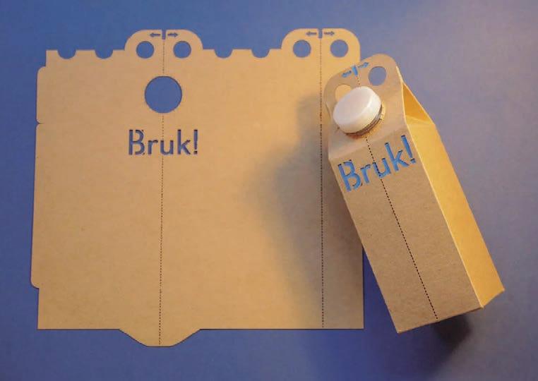
BRUK. Bruk es un envase de cartón sostenible para bebidas diseñado para ser reciclado. Cuando llega el momento de reciclarlo, el consumidor simplemente rompe el envase por la mitad y libera el revestimiento de HDPE para que pueda reciclarse por separado del cartón. Este proceso es rápido, simple y divertido. Es intuitivo e inclusivo, fácil para todos, independientemente de su capacidad física. Bruk es tan conveniente y fácil de usar como una caja de cartón convencional, pero usa menos plástico que una caja de plástico y es 100 % reciclable con equipos convencionales. BRUK. Bruk is a sustainable beverage carton designed to be recycled. When it’s time to recycle it the consumer simply tears bruk in half releasing the HDPE liner so it can be recycled separately from the cardboard. This process is fast simple and fun. It is intuitive and inclusive, easy for everyone regardless of physical ability. Bruk is as convenient and easy to use as a conventional carton, but uses less plastic than a plastic carton and is 100% recyclable with conventional equipment.


