SOUTH AFRICA’S FINEST DECOR MAGAZINE
AUGUST 2 0 1 9 R 5 5 , 5 0
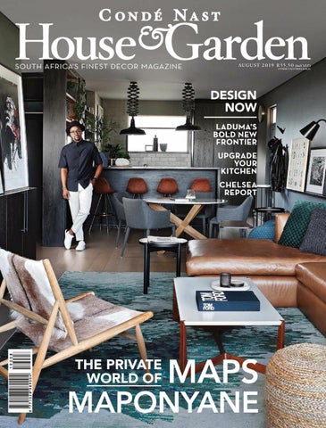
DESIGN NOW LADUMA’S BOLD NEW FRONTIER UPGRADE YOUR KITCHEN CHELSEA REPORT
THE PRIVATE WORLD OF
(incl. VAT)
OTHER COUNTRIES R 48,26
MAPS
MAPONYANE
RIMADESIO.COM WATERWAY HOUSE, CANAL DISTRICT, VICTORIA & ALFRED WATERFRONT, CAPE TOWN 8002, TEL +27 21 419 5445 9 KRAMER ROAD, KRAMERVILLE, JOHANNESBURG 2148, TEL +27 (0)11 262 5257 INFO@DOMUM.CO.ZA WWW.DOMUM.CO.ZA
THE SPIRIT OF PROJECT SPAZIO PARTITION WALL SYSTEM, SAIL SLIDING PANELS DESIGN G.BAVUSO
blu-line.co.za
new johannesburg showroom | coachmans park peter place bryanston cape town showroom opening soon | visit new website for more details
NEW JOHANNESBURG SHOWROOM NOW OPEN
kitchen architecture
CON TENTS august
62 21 10 15 18 21 26
4
FROM THE EDITOR Acting Editor-in-Chief Piet Smedy welcomes you to a bold new issue INSIDER The design manifesto of Laduma Ngxokolo RADAR The latest merch, must-see exhibitions and breaking talent SHOPPING Dining rooms get an upgrade with the best plates, tables and burnt-orange pieces PROFILE Michelin-star chef Jan Hendrik van der Westhuizen
HOUSE
GARDEN AUGUST 2019
D ESI G N 39
44 49 56
DESIGN SOLUTIONS Walls don’t need art to make a statement. A guide to rethinking paint, wallpaper and tiles STYLISH Inside SA designer Tristan du Plessis’s daring new project – a high-glam hotel in Rome SHOWROOM A master class in making the most of your kitchen ARCHITECT’S NOTEBOOK
Architect Karen Newman on how to maximise space
G AR DEN S 33
58 76
URBAN GARDENER A former mechanic’s workshop receives an an eclectic makeover into a nursery-meets-antique store KNOW HOW Raise your succulents right THE CHELSEA REPORT
The RHS Chelsea Flower Show is the biggest event on the international gardening calendar – and this year it broke all the rules
P H O T O G R A P H S : E L S A YO U N G
INS IDER
CON TENTS august
120 105
62
70 84
92
THE FRESH PRINCE An exclusive ďŹ rst look inside Maps Maponyane’s newly completed, Studio 19-designed apartment in Joburg HANDMADE TALE A former warehouse in Barcelona is made over into a minimalist, urban escape AMERICAN BEAUTY Fashion writer Derek Blasberg lives life in full colour – and his irreverently chic, New York apartment is testament to that LOVE, ACTUALLY Barefoot luxury in a Cape Town heritage home by La Grange Interiors founder Sumari Krige
CO N C I ER G E 99
33 6
HOUSE
GARDEN AUGUST 2019
105 120
GOURMET Cookbook author Samin Nosrat – the star of Netix’s Salt, Fat, Acid, Heat – gets real about food and fame TRAVEL Inside Bali’s design boom OBSESSION Daringly different, this month’s lust-worthy interior
SU B SC RI B E
To CondĂŠ Nast House & Garden and receive 12 ISSUES for only R433 087 405 2001 subs@magsathome.co.za ON THE COVER The Fresh Prince, page 62. Photographed by Elsa Young
P H OTO G R A P H S : K A R L R O G E R S ; S U P P L I E D
TH E ED I T
Newlands. Architecture & Interior Design: Zeanne + Goss. Oggie FSC European Oak Cerato Hand-chiseled Greymist with WOCA Denmark UV Oil - 20/6 x 260 x 2200
...wide plank oak oors handcrafted to your speciďŹ c design needs. Cape Town: 021 510 2846 | Paarden Eiland Johannesburg: 011 262 3117 | Sandton Durban: 031 000 1000 | Umhlanga enquir y@oggie.co.za www.oggieflooring.com
DISTINCTIVE CEMENT-BASED FINISHES
PIET SMEDY ACTING EDITOR IN CHIEF ART DIRECTOR
THEA PHEIFFER
SENIOR COPY EDITOR
LISA ABDELLAH
DECOR ASSISTANT
JANI ADELEY OOSTHUIZEN
GARDENS EDITOR
HEIDI BERTISH
MANAGING AND SYNDICATION EDITOR
LESLEY MATHYS
SYNDICATION ASSISTANT
JAMIE PILLAY
CONTRIBUTING EDITORS
FRANCHESCA WATSON JULIAN TREGER NALEDI MABUSE ASHLEY MADDOX
CONTRIBUTORS
CAYLEIGH BRIGHT JADE TAYLOR COOKE
ADVERTISING ACCOUNT MANAGER Nadia Pereira (CT) ACCOUNT MANAGER Anne Atkinson (JHB) ACCOUNT MANAGER Beverly Mwallo (JHB) AD LIAISON MANAGER Natasha O’Connor (CT) SALES REPRESENTATIVE ITALY Angelo Careddu (Oberon Media)
DIGITAL ONLINE EDITOR Molife Kumona DIGITAL CONTENT PRODUCER Gugulethu Mkhabela DIGITAL CONTENT PRODUCER Amy Saunders SOCIAL MEDIA OFFICER Arthur Mukhari
CONDÉ NAST INDEPENDENT MAGAZINES (PTY) LTD ACTING CEO Mbuso Khoza ACCOUNTANT Paul Myburgh PRODUCTION MANAGER Jean Jacobs PRODUCTION COORDINATOR CharnÊ Phillips PERSONAL ASSISTANT / OFFICE MANAGER Karen Shields CIRCULATIONS MANAGER Frederick Smit CIRCULATIONS COORDINATOR Bertina Ellis
DIRECTORS: CHAIRMAN Dr Iqbal SurvĂŠ Cherie Hendricks Takudzwa Hove
CAPE TOWN HEAD OFFICE CondĂŠ Nast Independent Magazines (Pty) Ltd TH &LOOR #ONVENTION 4OWERS (EERENGRACHT 3TREET #APE 4OWN s 0/ "OX 6LAEBERG 4EL www.houseandgarden.co.za
JOHANNESBURG BUREAU CondĂŠ Nast Independent Magazines (Pty) Ltd 3LOANE 3TREET +NIGHTSBRIDGE "LOCK ! "RYANSTON 3ANDTON 4EL REPRODUCTION Studio Repro PRINTING Novus Print Montague Gardens DISTRIBUTION !LLIED 0UBLISHING 0TY ,TD 7EPENER 3TREET "OOYSENS *OHANNESBURG s 0RODUCT -ANAGER -ADELEIN 3IMON 4EL $IRECT
“Raw becomes refined.�
SUBSCRIPTION ENQUIRIES 4EL &AX %MAIL SUBS MAGSATHOME CO ZA
Natalie Maier
Š 2019 CondÊ Nast Independent Magazines (Pty) Ltd. Copyright subsists in all work published in this magazine. Any reproduction or adaptation, in whole or in part, without the written permission of the publishers is strictly prohibited and is an act of copyright infringement, which may, in certain circumstances, constitute a criminal offence. Manuscripts, drawings and other materials submitted must be accompanied by a stamped addressed envelope. However, CondÊ Nast House & Garden cannot be held responsible for unsolicited material. ISSNs 1028-9895
Style-a-Space
R
Manufacturers of Distinctive Decorative Coatings www.cemcrete.co.za
0860 CEMCRETE
enquiry@cemcrete.co.za
The paper used for this publication is a recyclable and renewable product. It has been produced using wood sourced from sustainably managed forests and elemental or total chlorine-free bleached pulp. The producing mills have third-party management systems in place, applying standards such as ISO 9001 and ISO 14001. This magazine can be recycled at your local recycling point. Log onto www.prasa.co.za to ďŹ nd your nearest sites.
«Lions to me symbolize bravery», Cara Delevingne
Shot in real conditions by David Yarrow Discover more on Youtube and on tagheuer.com/car
TAG HEUER CARRERA LAD
TAG Heuer Boutiques; Sandton City & V&A Waterfront. Also at selected fine jewellers nationwide. For further information please call 011.669.0500. www.picotandmoss.co.za
from the editor
W
e’re all trying to make a connection. As makers, doers, creatives. As humans. After all, in an increasingly unsure world, isn’t it our connections that are both anchor and North Star? I’m talking about something that transcends the short-lived affirmation of likes, retweets and right swipes – it’s more complicated than that and I have Laduma Ngxokolo – MaXhosa creator, Condé Nast Luxury Conference speaker, IKEA collaborator, 100% Design South Africa featured artist – to thank for that realisation. For Laduma, the power to connect the global community to his heritage is nothing short of monumental. Pioneer, activist, revolutionary; weighty epithets that he wears with humble determination. One thing is clear: it’s becoming less and less about the influencers and more and more about the connectors. Which brings us to Maps Maponyane, who makes a long-overdue debut as the first local celebrity to grace the cover of this magazine in its more-than-20-year history. I don’t think anyone could be better-suited to the occasion. Here at Condé Nast House & Garden, we prize our connection to our spaces – they are our life stories, our living, breathing autobiographies – and, for Maps, that couldn’t be truer. From his growing art collection and his insanely cool hat wall, to the cocooning composition of texture and tone in his Joburg apartment (kudos to the team at Studio 19 for bringing this to life), these spaces offer us deeply personal insights into a life lived so publicly. Maps, like Laduma, is a connector, a social conduit; someone who, with seeming effortlessness, walks the tightrope of aspiration and relatability. Qualities that we hope will define your experience of this issue. Today, as always, we celebrate not just the power of African design to connect us all, but the tenacity, the strength and the honesty behind those making the connections. I hope, on these pages, you’ll find your connection, too.
ACTING EDITO R-IN - CH IEF
FAC E B O O K
WE BS IT E
Join the conversation @HouseGardenSA
Follow our daily posts houseandgarden.co.za
TABLET
NEW SLET TER
Read us on the go. Go behind the scenes Sign up to our Download your copy houseandgardensa weekly newsletter from zinio.com
DON’T MISS AN ISSUE SUBSCRIBE TO HOUSE & GARDEN ON ZINIO FOR YOUR MONTHLY DIGITAL DESIGN AND DECOR FIX, AND SAVE UP TO R114 PER YEAR. ZA.ZINIO.COM
PRIVATE TOUR
YOUR DAILY DIGITAL HIT OF STYLE, DECOR, DESIGN NEWS AND INTERVIEWS
TREND ALERT THE LATEST DECOR AS IT DROPS. THE H&G EDITORS BRING YOU A CURATED SELECTION OF MUSTHAVE PIECES FROM YOUR FAVOURITE DESIGNERS.
MEET THE MAKERS H&G GIVES YOU ACCESS TO THE WHO, WHAT AND WHY BEHIND THE BIGGEST NAMES IN THE GAME.
HOUSEANDGARDEN.CO.ZA FOLLOW US 12
HOUSE
Facebook HouseGardenSA Instagram houseandgardensa Pinterest housegardensa
GARDEN AUGUST 2019
P H O T O G R A P H S : E L S A YO U N G ( M A P S M A P O N YA N E ) ; K A R L R O G E R S ( J A N H E N D R I K VA N D E R W E S T H U I Z E N ) ; S U P P L I E D
online
GO BEHIND THE SCENES, GET THE FULL INTERVIEWS AND WATCH OUR EXCLUSIVE HOME-TOUR VIDEOS. THERE’S A WHOLE LOT MORE FROM THE WORLD OF H&G WITH NEW FEATURES GOING LIVE DAILY.
Don’t Miss
Ticket
(Original ticket must be presented at the door to gain entry. No photocopies will be accepted. T’s & C’s apply.)
Hall 1
+27 11 549 8300 decorexinfo@reedexpoafrica.co.za www.decorex.co.za
#CNAD19
C pl e ary
This ticket allows you complimentary access to DECOREX JOBURG on 7 or 8 August 2019. This ticket is valid for one person & one day ONLY.
Spiral Tier Pendant, Table & Floor Lamp Code: DL-KLCH-9250/12, DL-KLCH-9250/3 & DL-KLCH-9250/5
DESIGN • SER VICE • QUALIT Y Viewing Showrooms Only, K.Light Import supplies only to Retailers and not to the public directly. Cape Town: 7 Kunene Circle, Omuramba Business Park, Milnerton, 021 552 4370 Johannesburg: Units 8 & 9, The Arena, Capital Hill Business Park, Halfway House, Midrand, 011 312 1247 info@klight.co.za I www.klight.co.za I Facebook.com/klightimport
I want to be remembered as a pioneer, a visionary, a radical.
T E X T: P I E T S M E DY P H OTO G R A P H : N I C K A L D R I D G E
I want to be remembered for creating a change, especially in the African design sphere. But also within black consciousness, because most of what I do is about restoring black dignity
INSIDER THE SCOOP ON SHOPPING, STYLE, DESIGN & CULTURE J
OUS
N G
N CO
000
w INSIDER
earing his now globally recognised MaXhosa cardigan over a similarly patterned golf shirt, Laduma Ngxokolo casts a quietly conďŹ dent presence over the photographer’s studio in Cape Town where, after innumerable emails, texts and phone calls, he has managed to carve an hour out of his schedule for this proďŹ le. He is, after all, very busy these days (something he’s had to adapt to. He doesn’t ‘get much time to design in the studio anymore’, becoming something of a perpetual creative in transit). Laduma’s impact – not just on design, but African design – cannot be understated. Not unlike the work of Ndebele artist Esther Mahlangu, Laduma has championed African culture for a global audience in a way that 100% Design South Africa director Laurence Brick describes as ‘making heritage a modern entity’. It comes as little surprise that Laurence selected Laduma to be the featured artist at this year’s showcase in Johannesburg. ‘We are bringing colour to the show this year,’ he explains of the furniture collection he wants to produce. ‘Our view is to showcase a modern home setting as imagined by us. We want to change the way people live but also look beyond this, to the way the pieces are engineered. I’m questioning everything – why does a lamp look the way it does? How can it be switched on differently? Ultimately, I want to bring comfort.’ For Laduma, 100% Design South Africa is yet another validation of what he sees as the evolution of his lifestyle brand. ‘Here, we are able to expand our core offering: we are a design house that looks at the many ways we can bring our patterning to life.’ And validations are hardly in short supply. Earlier this year, in April, Laduma was a key speaker at the Suzy Menkesspearheaded CondĂŠ Nast International Luxury Conference, which was held in Cape Town, sharing the stage with, among others, Naomi Campbell and Jochen Zeitz. The focus of the annual summit, titled The Nature of Luxury was the perfect ďŹ t for the textile designer. ‘Africa has always been in the luxury space, since the beginning of time,’ Laduma declared to the conference hall packed with delegates, editors and designers. ‘And we are ready to create luxury African products for Africa and to make this market our ďŹ rst priority. The message that we are delivering is clear: we can create luxury brands as African people and we can do so independently.’ Back in the studio, photographer Nick Aldridge mentions to Laduma that he had shot his portrait before, four years ago for Forbes as one of the publication’s ‘ones to watch’ at his original studio in an industrial part of Cape Town. Much has changed since then, Laduma notes, with just a brief icker of wistful nostalgia. Or maybe he’s just tired. Today, Laduma shares a studio space in Joburg with artist Nelson Makamo and Black Coffee, the DJ. ‘They’ve taught me that patience is everything,’ he says. ‘We, as creatives, often think that we are owed success if we think what we’re doing is right. What they both have proven is that you must take your passion and grow with it, hone it–.’ He trails off. Despite his highproďŹ le and seemingly ubiquitous presence in the media, insights into Laduma’s creative process are surprisingly rare, earning the designer an almost stoic reputation. He seems to know this, ďŹ nishing his sentence, ‘They have taught me about humility.’ Our time is up, Laduma is running late for another appointment. I have one last question for him. With his continued success, is there anything that he still fears? He responds softly, even cautiously, as he does to all questions. ‘I fear the things that are beyond me. I think, “will what I started have an impact on economic development?â€? I am fearful I may not achieve that in my time. I aim to make works that will outlive me.’ I wager his legacy has nothing to fear. maxhosa.africa 100percentdesign.co.za Q
INSIDER
‘
I fear the things that are beyond me. I think, “will what I have started have an impact on economic development?” I am fearful I may not achieve that in my time. I aim to make works that will outlive me. LADUMA NGXOKOLO
‘
1
‘Topaz’, the dazzling new wallpaper collection from EijfďŹ nger, which is available from Dreamweaver Studios, comes to life with shimmering facets and deep gem tones that add instant glamour to any space. dreamweaverstudios.co.za
Chanel's ‘Paris-Riviera’ fragrance perfectly captures the joie de vivre of the CĂ´te d’Azur in the 1920s with a bouquet of floral and citrus notes. chanel.com
4
Inspired by aerial photography, from her own to satellite imagery, (re)stitched landscape is the third instalment from artist and rug designer Julia Swanepoel Pepler for Gonsenhausers. finerugs.co.za
The August Style Checklist The exhibitions, openings and merch on this month’s radar
2
The 'Queen Nenzima' server by Joburgbased brand The Urbanative pays homage to the eponymous Mangbetu royal with its curved, elongated shape. theurbanative.com
5
Dark’s lighting range features pendant, wall, standing and table lamps with an unapologetically modern approach to shape and material. newport.co.za
3
RADAR Named after the sleepy Zimbabwean town, the ‘Makuti’ chair by Woodbender, offers a minimalist design geared towards maximum comfort. woodbender.co.za
7
6
Opening this month, on the 24th, and running until May 2020 at the Norval Foundation, Why Should I Hesitate? will be the first exhibition internationally to address William Kentridge’s output as a sculptor. norvalfoundation.org
8
With its striking bottle design, the Italian wines of VOGA are as great to look at as they are to drink. vogaitalia.com
9
With summer around the corner, it’s time to start taking outdoor furniture seriously – and no one does it better than Douglas and Douglas. douglasanddouglas.co.za
10
Casa Leon, the new Cape Town showroom of Leon at CCXIX, is a fully immersive design experience arranged over two oors, and includes a cafe. leonat219.com
AUGUST 2019 HOUSEANDGARDEN.CO.ZA
19
SHOPPING ‘DRAGONFLY’ DESIGN PORCELAIN SIDE PLATE, R139, ZARA HOME
CARROL BOYES DINNER PLATE (SET OF 4), R999, YUPPIECHEF
‘MANDORI’ SIDE PLATE IN CORAL, R85, WOOLWORTHS
PORCELAIN PLATE IN WHITE/ POPPY, R79, H&M
‘EBISU’ PLATE (LARGE), R550, SETAMONO TABLEWARE
BLU PAVONE ART COLLECTION APERITIVO PLATE, R1 090, HAUTEEDIT.COM
CC
C Q
U C O S DECORATIVE PLATE, POR, ASH CERAMICS
‘VOK’ DINNER PLATE, R300, MICHAEL CHANDLER
COUNTRY ROAD TAPAS DINNER PLATE (SET OF 4), R448.99, WOOLWORTHS
JARS ‘WABI’ DINNER PLATE, R459, YUPPIECHEF
P H OTO G R A P H S : S U P P L I E D
Ready To Serve Mismatched, decorative plates are the new bone china
CERAMIC PLATE, POR, DAYFEELS
AUGUST 2019 HOUSEANDGARDEN.CO.ZA
21
SHOPPING
‘CAFÉ’ DINING TABLE, R8 695, BLOCK & CHISEL
‘CONO’ ROUND DINING TABLE, R14 999, @HOME
ROUND DINING TABLE WITH MARBLE TOP, R11 400, CÉCILE AND BOYD
EDRA ‘BRASILIA’ TABLE, POR, LIMELINE
‘BENVENUTO’ EXTENSION TABLE IN WALNUT, R21 619, KARE DESIGN
CANTORI ‘TRAPEZIO’ TABLE, POR, CASARREDO
Come Dine With Me Design-driven tables that serve up serious style
‘MAWARI’ DINING TABLE, POR, GENERATION DESIGN ‘SOHO’ DINING TABLE, R12 995, WEYLANDTS
22
HOUSE
GARDEN AUGUST 2019
P H OTO G R A P H S : S U P P L I E D
‘ILANA’ METAL TABLE IN RUST WOOD WITH PAINTED GLASS, POR, MAVROMAC
SHOPPING ‘YOGAN’ RUG, MADE TO ORDER, POR, MAE RUGS
PIERRE FREY ‘VASCO’ LINEN FABRIC, POR, MAVROMAC
‘DUAL’ FLOOR VASE , R2 148.70, MEZZANINE
PLASCON PAINT IN AFRICAN AMBER, FROM R195, BUILDERS WAREHOUSE
‘ANNE’ 3-SEATER SOFA IN VELOUR MATT AMBER, R10 999, ZA.SOFACOMPANY.COM
‘BUBBLE & BOTTLES’ GLASSWARE, R2 650, LA GRANGE INTERIORS; GLASS HANDBLOWN VASE, R499, @HOME ‘SOUTH KIKOI’ TOWEL, R375, MUNGO
Amber Alert JUG IN FLAME, R450, LE CREUSET
24
HOUSE
GARDEN AUGUST 2019
Terracotta, burnt orange and mustard tones bring the heat
P H OTO G R A P H S : S U P P L I E D
KARTELL ‘AUDREY’ ARMCHAIR, R11 867, TRUE DESIGN
T EXT JE SSICA R O S S PHOTOGRAPH KAR L R OGE RS
a place called home With his new Innovation Studio in Cape Town, chef Jan Hendrik van der Westhuizen returns to his roots 26
HOUSE
GARDEN AUGUST 2019
PROFILE
‘It’s a place where we will be inspired and create from what was passed on to us’
P H O T O G R A P H S : C O U R T E S Y O F J A N H E N D R I K VA N D E R W E S T H U I Z E N
JAN HENDRIK VAN DER WESTHUIZEN
T
hey say ‘home is where you make it’, and with a Michelin star for his eponymous restaurant in Nice under his belt, Jan Hendrik van der Westhuizen has certainly made it on the coast of the French Riviera. But for the chef, whose food is infused with the avours of South Africa from buchu to biltong, home is also very much the place where he grew up. ‘Some things remain important to you no matter where you go, and ever since I left beautiful South Africa, the concept of coming home has been one of those things,’ he explains. Jan’s return is an ode to the country in two movements: one bush-side restaurant, Klein JAN, emerging from the dusty plains of the Tswalu Kalahari Reserve; the other, an Innovation Studio, a hub for creativity, design and, crucially, skills development. A gutted former Victorian townhouse found on Cape Town’s well-trodden Kloof Street, this studio is part development
kitchen, part chef ’s table and part sustainable rooftop garden – a place where Jan can truly meditate on ingredients inherent to the country. ‘My idea is to share and bring back to the continent what I have gathered and learned from the world and also to take our talent back to Europe to show off with the skilful hospitality we have in South Africa,’ the chef notes. The studio’s kitchen has been purposefully designed around this idea. Washed in white, it’s a veritable blank canvas, banishing distraction so all focus is on the food. In contrast, the Farrow & Ball Hague Blue that’s become a signature hue at his restaurant covers the walls of the interior comprising a private dining space, an ofďŹ ce and a library, which will house the largest collection of South African cookbooks. ‘It’s a place where we will be inspired and create from what was passed on through generations,’ he says. It’s here that Jan gets
to ex the design muscle that he honed as a magazine stylist and artist in his early career, balancing classic style with touches of modernity. The experience culminates at the building’s rooftop terrace, which does double duty as both a sustainable garden, feeding directly into the kitchen, and an intimate bar. Stretching from the harbour across to Table Mountain, the view whips over Cape Town’s visual highlights, gearing it to summer soirees as the evenings grow warmer. Quoting author Simon Sinek, Jan explains his vision for the studio. ‘What good is an idea if it remains an idea? Try. Experiment. Iterate. Fail. Try again. Change the world.’ Jan’s goals are lofty: to provide a space that will foster talent and creativity, while celebrating its location and heritage. ‘Put simply, it will be a playground where we are allowed to make mistakes and push our limits to new heights.’ janhendrik.com Q
AUGUST 2019 HOUSEANDGARDEN.CO.ZA
27
SUBSCRIBE & WIN
Subscribe to House & Garden
12 issues for R433 (save 35%) and stand a chance to win 1 of 4 Nouwens Carpets artificial grass hampers worth R12 500 each If you’re concerned about the future water reserves of South Africa, it makes sense to stage a lawn intervention. Nouwens Carpets impressive artificial grass ranges are gorgeous and green all-year-round, harmonise with the natural environment and require little maintenance.
HERE’S HOW PHONE 087 405 2001
EMAIL subs@magsathome.co.za WEBSITE magsathome.co.za DIRECT DEPOSIT
ctp ltd t/a mags@home, nedbank a/n: 1232073059 b/c: 12320900 reference: initial & surname
DEBIT ORDER 087 405 2001 POST Choice of hand delivery or post
OR Download your digital subscription now by visiting
www.zinio.com/ houseandgardensa This offer is valid until 31 August 2019 and is for print subscribers with a South African address only.
AS UPMARKET FURNITURE AND INCREASE IN VALUE Comparable to top-notch decorative stores in London, New York and Paris
5
ANTIQUE, FRENCH, VINTAGE & CONTEMPORARY FURNITURE & ACCESSORIES Mirrors | Tables | Chairs | Settees | Sofas Chandeliers | Lanterns | Armoires | Chests Cabinets | Bookcases | Linen Presses Gilded Furniture | Candlesticks Candelabras | Crystal | Silver
0114636060 | info@thecrowncollection.co.za www.thecrowncollection.co.za thecrowncollectionstore 20 Ballyclare Drive, Bryanston, Sandton, Johannesburg
VISIT OUR STORE IN SANDTON BITALIAN | 126 RIVONIA RD | 011 883 0883 | WWW.BITALIAN.CO.ZA H O M E F U R N I S H I N G I N S P I R AT I O N S AT N AT U Z Z I . C O M
Design District, 7 Appel Rd, Kramerville, Sandton Johannesburg, , 2090 www.privatehouseco.co.za
shop@privatehouseco.co.za
011 465 5600
URBAN GARDENER
DESIGN
T E X T: C AY L E I G H B R I G H T; P H O T O G R A P H S : K A R L R O G E R S
KNOW-HOW AND DECOR DETAILS THAT MAKE THE LOOK
Green House Effect
Artisanal coffee meets an antique-market-slashinner-city-nursery that’s making the most of a blossoming affinity for all things green AUGUST 2019 HOUSEANDGARDEN.CO.ZA
33
c
offee isn’t hard to come by on Cape Town’s Kloof Street, and in recent years the neighbourhood has seen an explosion of spaces that are as much geared towards work as they are to meeting up. 117Kloof’s Daniel Holland is well aware of this, and that there’s no dearth of drinking spots in this neighbourhood, either – after all, he’s the owner of Yourstruly, one of the most popular establishments to combine the two. Having made a success of numerous branches of that business, Daniel was determined to do something quite different when he acquired this space, which at the time was a disused mechanic’s workshop. Enter the plants, the long central table and, of course, the range of antiques, for which Daniel and his mother, Sheila, share a fascination. This mix has attracted a pleasantly eclectic clientele: many of the neighbourhood’s pensioners have fast become regulars, popping in to browse the ever-changing antiques and enjoy the verdant environment, while Kloof Street’s cohort of stereotypical Cape Town creative freelancers are very much at home hooked up to the wifi, takeaway cups in hand fresh from the coffee hatch. A neighbourhood cat is settling in, and canines walking in with their owners are most welcome, but Seven, general manager Georgia van Zyl’s border collie mix, retains the title of top dog, so to speak. If the well-documented millennial fixation with their leafy loved ones is the result of a combination of this generation’s worse qualities and its best – an inability to commit to something more sentient than a delicious monster met with self-awareness and tendencies towards nurturing and conservation – then this might be the ideal hangout for coffee, contemplation, and community. After all, a passion for antique furniture isn’t far removed from a desire to go green: upcycling and the selection of older pieces top the list of methods to combat mass consumption, in addition to being a wise investment. On a shallower level, the space seems destined for popularity simply because it’s set to become a familiar sight on Instagram feeds everywhere – ready-made portrait settings range from armchairs surrounded by oldworld curiosities to elaborate mirrors and all-plant backdrops. At 117Kloof, all of the pieces on display are for sale, so if you form an attachment to a particular chair or painting, you can take it home. One exception to this rule is the monumental table in the centre of the space, which is set to play host to regular dinners at which guests will be able to bring their own wine and enjoy a meal made from locally grown ingredients. The menu will change, and so will the space – as pieces of furniture leave for their new homes and the two generations of Hollands bring in more from their antiquing excursions, 117Kloof’s look and atmosphere is ever-changing, and it’ll stay that way. @117Kloof Q
PREVIOUS PAGE SEVEN, GENERAL MANAGER GEORGIA VAN ZYL’S BORDER COLLIE MIX, FINDS A COMFORTABLE SPOT ON AN ANTIQUE SOFA THIS PAGE THE SELECTION OF PLANTS, RUGS AND ANTIQUES IS CONSTANTLY CHANGING; AN ANTIQUE CLOCK-TILL LOOKS ONTO THE MASSIVE CENTRAL DINING TABLE OPPOSITE PAGE BAGGED WHITE BRICKWORK AND CHAIRS SUSPENDED FROM THE CEILING ADD TO THE SPACE’S RUSTIC CHARM FOLLOWING PAGE TATENDA MUDZINGANYAMA TENDS TO THE PLANTS
URBAN GARDENER
All of the pieces on display are for sale, so if you form an attachment to a particular chair or painting, you can take it home
AUGUST 2019 HOUSEANDGARDEN.CO.ZA
35
URBAN GARDENER
This might be the ideal hangout for coffee, contemplation and community
36
HOUSE
GARDEN AUGUST 2019
We are currently sourcing Modern, Post-War and Contemporary Art for inclusion in our forthcoming auctions 021 683 6560 | ct@straussart.co.za 011 728 8246 | jhb@straussart.co.za www.straussart.co.za Strauss & Co: The global leader in the South African art market
Athi-Patra Ruga, Touched by an Angel (detail) R700 000 – 900 000 To be sold in Cape Town on 15 February 2020
Thinking of selling your art?
THE CLASSIQUE BATH IN AGED LEAD SKIRT ~ BATHROOM BY JOHN JACOB INTERIORS
DESIGN SOLUTIONS
Face Value
T E X T: P I E T S M E DY; P R O D U C T I O N : T H E A P H E I F F E R ; P H OTO G R A P H : S U P P L I E D
Your walls don’t need art to be art. Before you call the framers, try one of these inspired surface solutions
Print Power More than just a pretty pattern on a wall, wallpaper can be a powerful nod to heritage and culture when executed correctly. Maison Pierre Frey has released its Rituel collection,which is inspired by nonďŹ gurative geometric designs in the Ndebele tradition. mavromacandthegatehouse.co.za
AUGUST 2019 HOUSEANDGARDEN.CO.ZA
39
1
2 3
4
6 7 9 40
HOUSE
GARDEN AUGUST 2019
Can’t decide between paint, tiles or wallpaper? Then don’t. Simply think of it as the finishes equivalent of colour blocking, juxtaposing two or more in a way that pays off with double the style kudos. Tiles and wallpaper with metallic elements pair well with deeper jewel tones, while taupe and greige complement a monochrome or dual-tone geometric pattern.
1. PLASCON ‘QUICK SHOT’, FROM R190, BUILDERS WAREHOUSE; 2. ‘BRIGHT YOUNG THINGS’ STONE MOSAIC IN CIRRUS, CALACATTA, THASSOS AND BRUSHED BRASS, POR, NEW RAVENNA; 3. ‘LATICIA’ WALLPAPER IN NAVY, R890, WALLPAPER INN; 4. PLASCON ‘RAINFOREST DEW’, FROM R190, BUILDERS WAREHOUSE; 5. ‘SEMPLICE’ MOSAIC IN CIRRUS, CALACATTA, GOLD AND XANADU, POR, NEW RAVENNA; 6. ‘PANNELLO’ TILE, POR, STUDIO MASSON; 7. PLASCON ‘LEMON BUBBLE’, FROM R190, BUILDERS WAREHOUSE; 8. ‘MOTIF’ HEX MATT IN SILVER, FROM R650, ITALCOTTO; 9. ‘COMO’ MATT MOSAIC SHEET IN NATURAL STONE, R599, ITALTILE
5
8
Mixed Materials
DESIGN SOLUTIONS
Textured Tiles
P H OTO G R A P H S : S O N N I E H I L E S / U N S P L A S H .C OM ( T E XT U R E D T I L E S ) ; S U P P L I E D
Effective both indoors and outside, a tile with a rough, textured surface offers a lot more than that ‘rustic’ look (which, in the right setting, might be exactly what you need). Unlike smooth tiles, these uneven surfaces create pockets of shadow in changing light conditions, making for a dynamic chiaroscuro throughout the day.
AUGUST 2019 HOUSEANDGARDEN.CO.ZA
41
1
Modern Mural Applying paint to bare walls, in everything from bold, organic forms to light, watercolour effects, is an ingeniously simple way to add oomph, especially in the absence of an art collection. And it’s less committal than wallpaper. Don’t let the walls restrict you: extend the mural to the ceiling to add 3-D depth. Q
42
HOUSE
GARDEN AUGUST 2019
4
3 1. PLASCON ‘OLD COBBLESTONE’; 2. PLASCON ‘ATLANTIC OCEAN’; 3. PLASCON ‘PUNCH OF PINK’; 4. PLASCON ‘PETAL POSIE’; ALL FROM R190, BUILDERS WAREHOUSE
P H O T O G R A P H S : N E V I L L E L O C K H A R T; S U P P L I E D
2
Home living trends Mobelli furniture is the perfect marriage of style and comfort, drawing on the latest European trends for a refined family home.
Belmont Lounge Armchair – R9,995 | Belmont Ottoman – R3,895 | Chatham Side Table – R5,995 | Highline Shelving Unit – R5,795
Redef ining the value of style
mobelli.co.za | 0861 66 23 55 Paarden Eiland | Sea Point | Illovo | Fourways | Menlyn Piazza | Umhlanga Ridge
Roman Holiday South African designer Tristan du Plessis has brought his brand of gritty glam to Italy’s capital, discovers Piet Smedy L E F T CUSTOM FURNITURE WAS I N SP I R ED BY M I D-C EN T U RY I TA L I A N D E S I G N
P H OTO G R A P H S : G I U L I A V E N A N Z I ; PAO L A PA N S I N I
BE LOW ST U DI O A’S T R I STA N DU P LESSI S I S B EHI N D R O M E’ S M O ST EXC I T I N G N EW DE SI G N HOT EL
T
ake me through your initial approach to the project – what was your first impression of the space and how did it inform your design process? Coming from South Africa, it was amazing to work on a project where the building, a former hotel, was over a century old, as we don’t really have many buildings that old back home – so we really went to town showing that off. Layers of plaster were stripped off to reveal ancient brickwork. I wanted to expose the bones as much as possible. What are challenges that come up when you’re gutting a building that’s over a hundred years old? Our design process was reactive. We completely
44
HOUSE
GARDEN AUGUST 2019
overhauled and stripped down the hotel. Reallocating the floor plan was extremely difficult, as we were working with walls that weren’t straight. Which means that every room in the hotel has a different feel to it, which is special. Being in the historic Regola neighbourhood, there’s a lot of traditional Rome at play, but at the same time, you’ve introduced a bold edginess to the interiors. For me, staying true to the local environment was crucial. Rome is a city of many textures and I wanted to champion that notion in these spaces. I used steel as homage to the street’s name – Via di Santa Maria dei Calderari or ‘the street of blacksmiths’. Hundreds of years ago, their
STYLISH
AB OVE SE AT ING AT THE HOTEL’S LOBBY BA R RIG H T T H E LIV ING R OOMS WERE DESIGNED WITH MINIMAL ISM I N MIND B ELOW TH E MINIBA R FORMS PART OF A CUSTOM MODULAR STORAGE SYSTEM
AUGUST 2019 HOUSEANDGARDEN.CO.ZA
45
workshops ran the length of the street. There’s a lot of heritage in Rome to draw on; you have to embrace the culture. But, as much as it could be traditional, this hotel is unashamedly nontraditional – but still feels Roman. And nowhere is that more apparent than in the organic forms and graphic imagery used for the furniture pieces and art. When it came to designing the pieces, I was heavily influenced by mid-century Italian design, both in terms of shape and complementary dark green and rust tones. To be non-traditional, you need to be aware of tradition. Maurizio Cattelan for Seletti rugs and tabletops introduce a tongue-in-cheek irreverence, while Roman street artist Alice Pasquini’s graffiti-style work, coupled C LO C K WISE , F ROM TO P LEF T TRISTAN EXPOSED THE O R I G I NAL BR ICKWORK; A RT WORK BY CYRCLE AT T HE BA R ; ST RE ET ART BY A LICE PAS QUINI
46
HOUSE
GARDEN AUGUST 2019
STYLISH
with American collective David Leavitt and David Torres of Cyrcle’s backdrop to the lobby bar, bring a real urban grittiness to the public spaces. You use light, or a lack thereof, which dials the drama right up. What was the motivation behind this chiaroscuro approach? As with any project, lighting is the most important element – it’s how you make spaces come alive. I wanted mine to be theatrical, especially in the entertainment areas, where I played with various light sources, not just conventional downlights. For all its visual impact, there’s a solid functionality behind these pieces, particularly the vanity-cum-storage solution in the bedrooms. I designed it as an easy-to-assemble piece;
a moveable, modular, one-stop storage unit that could adapt to the size of the room it was in. The last thing I would have wanted to do was hide away the storage in built-in wardrobes because that makes rooms feel smaller. How would you say this project is indicative of your personal design vision? You could use labels like ‘industrial-chic’ or ‘pared-back glamour’, which apply, but that’s also the spirit of this type of project. I want the work to speak for itself. The most important thing is that it feels welcoming and lives well with its local surroundings. Studio A studioa.co.za; Chapter Roma chapter-roma.com Q
AUGUST 2019 HOUSEANDGARDEN.CO.ZA
47
SHOWROOM
1
Islands play both an architectural and functional role. Whether used for storage, dining at or preparing food, no kitchen is complete without one. Make sure yours ticks all the boxes.
P R O D U C T I O N : J A N I A D E L E Y O O S T H U I Z E N ; T E X T: S H A N N O N M A N U E L ; P H OTO G R A P H S : S U P P L I E D
2
PREP SCHOOL
From brilliant decor and design to essential gadgets and accessories, your master class in kitchen supplies
4
1. SALAD SERVER, R395, WEYLANDTS 2. KITCHENAID ARTISAN TILT-HEAD STAND MIXER IN EMPIRE RED, R9 999, BANKS KITCHEN BOUTIQUE 3. ‘SIGNATURE’ OVAL CASSEROLE IN MERINGUE-SAGE, R4 200, LE CREUSET 4. SMEG BUILT-IN ELECTRIC OVEN, R7 298, TAKEALOT
3 AUGUST 2019 HOUSEANDGARDEN.CO.ZA
49
AROUND THE ISLAND
These quartz options, which come in a variety of colours and ďŹ nishes, are the working surface of choice for chefs, including Jan Hendrik van der Westhuizen. caesarstone.co.za
The necessity for storage presents striking geometric opportunities. Notice the liner connection between the island and walls in this Poliform kitchen. poliform.it
Intelligent minimalism and ergonomic design can transform your kitchen. In this Bulthaup design, form and function combine to create an organic experience. bulthaup.com
No matter your decor style, you can’t overlook smart kitchen tech, which has become a crucial, life-changing component to a successful cooking space. samsung.com/za
50
HOUSE
GARDEN AUGUST 2019
SHOWROOM 1. ‘B SOLITAIRE’ GLASS STORAGE, POR, BULTHAUP 2. BOSCH STAINLESS STEEL 5-BURNER ELECTRIC STOVE , R15 099.99, HIRSCH’S 3. MARBLE PESTLE AND MORTAR IN GREEN, R220, POETRY
1 2
3
5
4
6
7
4. ‘TALIS S’ SINGLE-LEVER KITCHEN MIXER WITH PULL-OUT SPRAY, POR, HANSGROHE 5. SPOON REST IN COPPER, R180, WOOLWORTHS 6. ‘STRELITZIA NICOLAI’ SERVING TRAY, R398, KNUS 7. ‘JAVA’ WOODEN BOARD WITH ROPE HANDLE, R399.99, MR PRICE HOME
8
10 9
8. SMARTLINE ELEMENT WITH DUAL WOK BURNER, R19 999, MIELE 9. OVEN GLOVE IN POPART CORAL, R325, CARROL BOYES 10. FRANKE DOUBLE-BOWL UNDERMOUNT KITCHEN SINK, R3 829, CLASSIC LUXURY TILES & BATHROOMS 11. WHIRLPOOL ‘JET CHEF’ MICROWAVE OVEN, R3 799, MAKRO
11
AUGUST 2019 HOUSEANDGARDEN.CO.ZA
51
Want to nail the modern-glam look? Blu_line kitchens opt for dynamic, open-plan spaces that favour clean lines, deep tones and sleek ďŹ nishes. blu-line.co.za
Don’t let the elegance of this Eurocasa kitchen fool you – it’s loaded with Italian-designed functionality, from clever storage to maxed-out work surfaces. eurocasa.co.za
Hardwood ooring with a hand-crafted ďŹ nish is timeless, makes your space feel bigger and pairs easily with almost every design style. oggieooring.com
This EasyLife Kitchens design brilliantly frees up space by turning the kitchen island into a prep zone, storage unit, wine fridge and dining area. easylifekitchens.co.za
52
HOUSE
GARDEN AUGUST 2019
P H OTO G R A P H S : S U P P L I E D
OPEN SPACES
SHOWROOM
P H OTO G R A P H : S U P P L I E D
Use earth tones to create an instantly warm, casual effect. This palette is also the perfect opportunity for pops of colour and bold accent pieces. cremadesign.co.za
54
HOUSE
GARDEN AUGUST 2019
PROMOTION
Take a load off Smart technology and innovative design make laundry day more satisfying
L
et’s face it: when we’re at home, there are other things we’d rather be doing than laundry. The Samsung Addwash Front Load Washer is about to change all that. With conservation and state-of-the-art technology at the heart of its design, this machine is destined to revolutionise the way we wash our clothes. A Digital Inverter Motor uses less electricity and controls and reduces noise levels, giving you peace of mind and peace and quiet. Samsung’s Eco Bubble technology helps detergent to
penetrate material efficiently, removing tough, stubborn dirt, which means the laundry cycle is time- and costefficient. Thanks to Samsung’s userfriendly technology, you can even stop a washload mid-cycle if you want to add clothes you’ve forgotten, negating the need for a second cycle. The Smart Control function allows you to access and monitor the AddWash from anywhere, inside and outside your home, using your phone, so that you have complete control over your laundry – and your time. Q
samsung.com/za
KAREN NEWMAN SHARES HER THOUGHTS ON...
#5 FLOWTHROUGH ROOMS: passages, landings and transitional spaces Transitional spaces – namely, passages, anterooms and landings – should be given the same consideration as any other room when planning a house. A connecting space introduces the rooms to follow and dictates the ease of ow throughout the house CURRENT ARCHITECTURE STRIVES TO ENLIVEN TRANSITIONAL SPACES AND PRESENT AN OBVIOUS SENSE OF FLOW. THERE ARE SEVERAL WAYS TO CREATE WELCOMING AND FUNCTIONAL PATHWAYS OF CIRCULATION THROUGHOUT THE HOUSE: To avoid passages feeling hemmedin, ensure they have an ‘exit strategy’. The view from a door or window onto a garden is appealing. [1] Connecting spaces should include elements of all adjoining rooms. Consider introducing architectural features such as arches, architraves, changes in oor or wall ďŹ nishes, use of overhead beams or differing ceiling heights. [2] In compact houses, minimise the area used for circulation by avoiding passages completely. Flow should happen through rooms. [3] Create visual connections, such as doors that line up with something aesthetically pleasing at each end (a ďŹ replace, a window, a statement piece of furniture, a mirror or a view into a garden courtyard). In large houses, create wide passages. Art and objects enhance the
56
HOUSE
GARDEN AUGUST 2019
journey from room to room. Functionally wide passages can serve as any other room would – as a study area, a library, a family gallery or linen storage, for example. If possible, introduce skylights to lighten up these spaces. You can also carve out a small anteroom such as a TV nook or a seating area between bedrooms. Space allowing in a rectangular house, create passages that run the full length of the house and open or look out onto a south-facing garden or courtyard. This can be particularly effective in passages from which north-facing bedrooms and living spaces lead. [4] Square houses may include a central courtyard, which may interrupt the physical ow. As your endpoint should feel intuitively navigable, cast visual ow through windows or doors. [5] Passages can also double up as entrance halls from which other rooms lead. Landings at the top or bottom of stairs can be design elements in their own right. A decorative console table, wall art, or a comfortable armchair or window seat, adds an additional layer to the draw and functionality of the house. newmanarchitecture.co.za @newman_architecture_design
1
2
3
4
Q
5
INTRODUCE SKYLIGHTS TO LIGHTEN UP SPACES
ART AND OBJECTS ENHANCE THE JOURNEY FROM ROOM TO ROOM
A STATEMENT PIECE OF FURNITURE IS A VISUAL CONNECTION TO ADJOINING ROOMS
INTRODUCE ARCHITECHTURAL FEATURES SUCH AS OVERHEAD BEAMS
CARVE A SEATING AREA BETWEEN BEDROOMS
THE VIEW OF A SOUTH-FACING GARDEN THROUGH A DOOR OR WINDOW IS APPEALING
AUGUST 2019 HOUSEANDGARDEN.CO.ZA
57
KNOW HOW CLOCKWISE FROM LEFT SUCCULENTS GROW WILD ON TABLE MOUNTAIN; COTYLEDON PENDENS HAS ORANGE-RED FLOWERS; HAWORTHIA FASCIATA, ALSO KNOWN AS THE ZEBRA PLANT
Built to Last
Steadfast succulents maintain their vibrancy even in the colder months
Big features Alluaudia procera – This strange beast from Madagascar grows up to four metres high. Euphorbia – The most common species is Euphorbia ingens, but try to get hold of Euphorbia triangularis, Euphorbia trigona or Euphorbia grandidens for variation.
Shrubby succulents Aloes – There are so many to choose from, the most lovely of which are: Aloe striata, Aloe chabaudii and the grass aloe, Aloe cooperi. Kumara plicatilis is a more interesting, large-ish aloe, which grows slowly but is extraordinary. Adenium multiorum or Impala lily – This remains one of the most beautiful 58
HOUSE
GARDEN AUGUST 2019
of the southern African succulents. It has been greatly exported and blooms on the verges in downtown Dubai. Senecio barbertonicus – Extremely useful in larger spaces, this bushy succulent has a wonderful texture.
On the ground Crassula pellucida – Has dainty, lime-green leaves. Prefers a little shade. Aptenia cordifolia – With its easy character and bold red owers, this old favourite has proven itself robust during recent droughts. Malephora crocea – Has a neat, clumpy habit and jolly orange owers. Oscularia deltoides – Has the best texture, blue-grey leaves and pinkish stems. Bulbine latifolia – Gorgeous yellow owers on long stems and foliage that looks like a rosette. Will take a bit of shade, too. Crassula muscosa – Wonderful, funky, almost lush-green knobbly leaves. Spreads well. Gasteria carinata – Gasterias are all fascinating, make no mistake, but my
favourites are the clump-forming, dark-leaved varieties. Delosperma echinatum – An enchanting, clumpy succulent with shiny prickles.
Special species
Stapelia gigantea – This carrion ower has great form, handsome leaves and will form large clumps in the garden. Orbea variegata – Another carrion ower, which has huge spotted owers and grows wild on Table Mountain. Rhipsalis baccifera – Has incredible form and long, tube-like leaves. Will hang down like curtains. Kleinia fulgens – Or Coral Senecio. Has silky grey leaves and showstopping pops of red button-like owers. Great mixed into grasses. Euphorbia caput-medusae – So called because it looks like the head of Medusa, of Greek mythology. Superb longevity. Cotyledon pendens – It is rare in the wild and has the most lovely, oppy, green foliage and starry orange-red owers. Franchesca Watson 082 808 1287 franchescawatson.com Q
P O R T R A I T P H O T O G R A P H ; E L S A YO U N G ; P H O T O G R A P H S : S U P P L I E D
H
ardy succulents are front of mind in winter. They don’t need much water and they’re relatively easy to grow, but they also come in interesting shapes. Whether you use them as stand-alone features in containers or grow them together in shrubberies, they can be exciting and rewarding. These succulents are particularly lovely.
SLEEP REINVENTED We offer a full range sleep solution with only the best international brands, bringing you premium quality at a suitable price.
The World Leaders in Sleep Home of
Visit our Sleep Experience Centre for a complimentary sleep assessment from our world class consultants. Find your nearest showroom, www.vencasa.co.za / 0861 60 60 60 JOHANNESBURG: Clearwater Shopping Centre, Design Quarter, Kramerville, Hyde Park Corner, Bedfordview Shopping Centre PRETORIA: Brooklyn Mall, Menlyn Shopping Centre | WESTERN CAPE: Cavendish Square, Canal Walk Shopping Centre, De Waterkant Media Quarter, Table Bay Mall | KZN: The Crescent at Umhlanga Ridge.
PAP001/19
. . .
THE EDIT
P H O T O G R A P H : E L S A YO U N G
SUPERB HOMES AND STYLISH GARDENS
A CUSTOM GREENTINT MARBLE LA FORMA TABLE ECHOES THE COLOUR SCHEME IN THE JOBURG HOME OF MAPS MAPONYANE
Full story overleaf
AUGUST 2019 HOUSEANDGARDEN.CO.ZA
61
THE FRESH PRINCE
The newly renovated apartment of Joburg’s most stylish son is a cocoon of low-key panache and quiet charm, the ideal tonic to big-city living
TEXT JULIA FREEMANTLE PHOTOGRAPHS ELSA YOUNG
PREVIOUS SPREAD, FROM LEFT MAPS MAPONYANE’S ART COLLECTION IS A PRIZED ELEMENT OF HIS SPACE; A DEDICATED BAR AREA IS ADJACENT TO A LA FORMA DINING TABLE THAT HAS A GREEN-TINT MARBLE TOP THIS PAGE SHADES OF GREY AND GREEN AND SUBTLE, TACTILE MATERIALS ARE OFFSET BY BOLD ARTWORK AND BLONDE LAMINATE-WOOD FLOORS
000
OUS
GARDEN
9
H
igh-profile people live so much in the spotlight that the need for a space of their own – somewhere private and personal – is even more of a priority than it is for most. As a man whose professional side is so well documented – philanthropist, actor, entrepreneur, spokesperson – Maps Maponyane’s home needed to be totally the opposite of his public life, a low-key, low-traffic, high-comfort space designed with decompression in mind. As a result, when he decided to renovate his Craighall apartment in Johannesburg he needed a designer who would grasp this key element of the project and turn his apartment into a refuge, somewhere to escape to that would house all his passions and reflect his personality. Known for an incredibly sophisticated and contemporary, but layered aesthetic, Studio 19 was the ideal design firm to fulfil this wish list. In addition to it being a safe space to retreat to, it also needed to be somewhere that would re-energise Maps in between trips. A frequent traveller with a fast-paced schedule, often home for no more than a few days at a time, his routine is punishing and needed to be countered by a soft place to land that serves as an easy transition from his travels – a globally informed resting spot inspired by the cities he visits but rooted deeply in South Africa. ‘Because I’m away so much, I needed somewhere that I look forward to coming back to, somewhere tranquil that would inspire me,’ he explains. Mia Widlake of Studio 19’s response saw her dig down into what makes Maps tick. The result is a highly personalised and comfortable cocoon that could be in any cosmopolitan city in the world, but that simultaneously feels like home. A muted but masculine palette of charcoal, green and gold lends the space an understated sense of luxe – layered textures offering depth, but nothing overtly attention-seeking. ‘I wanted to use materials that would encourage you to come closer and touch them,’ he explains. The finishings have been carefully considered, from terrazzo-effect metro tiles rather than clinical white to matte-effect countertops reminiscent of leather, and clever patinated brass shelves that reflect the light. These are consistently used throughout, so as to create a beautiful cohesion. AUGUST 2019 HOUSEANDGARDEN.CO.ZA
000
The way the space is arranged has this same sense of coherence – the design allows you to move freely through it. What was once a stilted, multi-roomed oorplan has been transformed by Mia into an open living space with various dedicated but adaptable zones that encourage ow with multifunctional, well-proportioned furniture. Smart design details enhance the sense of space – slimline cabinetry that’s high rather than deep expands the living room, while cupboards at consistent heights, versatile occasional tables and a succinct palette make the scheme feel pulled together. Stackable doors to the balcony (previously accessed by a narrow, single opening) span the length of the room so it opens completely to the trees outside. ‘I don’t feel like I’m in the city here. And the light is different throughout the day – at sunset there’s an amazing glow that changes the whole personality of the apartment,’ says Maps. This clever detailing and level of thought extend to other rooms – like the chaise in the dressing room that can double as a guest bed and taps in the bathroom that swing around for easy access. It’s user-friendly but seamless enough that you don’t notice why. It’s been tailored speciďŹ cally to Map’s own proďŹ le, too. From taller cabinets to match his height in the kitchen to blackout blinds, a hotel-standard bed in the main suite that ensures restful sleep for the time he is at home, and a custom hat wall in the dressing room to display his beloved collection, it’s a space that’s easy for him to use (as something of a perfectionist) and the end result is polished. It really is a refuge in the true sense of the word – a serene oasis in the city where cool shades of green prevail (his favourite colour), tones are soothing on the eye, the textures feel good, light is soft and diffused and the art resonates. As an avid collector and appreciator of mainly South African and African work, the art collection was always going to form an integral part of his home. ‘I only buy work I feel a personal connection to. And it’s ďŹ nally grown to a size where I can call it a collection,’ he adds. A special biblio shelf, rather than picture hooks, allows him to swap and move pieces around if he feels he needs a change. ‘It allows me to give them all a turn, and it keeps the look of the rooms dynamic and fresh,’ he explains. Dynamic is a word that speaks to the space as a whole, and who he is as a person – both are self-contained but full of energy, layered but not in your face, stylish and sophisticated but unpretentious. Masculine but never a clichĂŠ. Cool, calm and collected. Studio 19 studio19.co Q
CLOCKWISE, FROM LEFT THE SOFA WAS REUPHOLSTERED IN A RICH TAN LEATHER, WHILE THE OLIVE GREEN WALLS CREATE A SOOTHING COCOON; IN THE GUEST ROOM, MAPS’ HAT COLLECTION IS GIVEN PRIDE OF PLACE; CUSTOM BRASS SHELVES WITH A LIP DETAIL BY STUDIO 19 OFFER A SPACE TO DISPLAY GLASSWARE, ART AND OTHER OBJECTS
A ’ T SUNSET THERE’S AN AMAZING GLOW THAT CHANGES THE WHOLE PERSONALITY OF THE APARTMENT’ MAPS MAPONYANE
BOX IN BLACK AND WHITE, R299, H&M
‘CRUDO RUSTIC’ NATURAL OIL WOODEN FLOORING, FROM R675, OGGIE FLOORING COUNTRY ROAD ‘WALI’ COASTERS, R179 (SET OF 4), WOOLWORTHS
COUNTRY ROAD ‘LORE’ PLACEMAT, R139, WOOLWORTHS POT HOLDER IN GOLD, R249, H&M
COUNTRY ROAD ‘LOFT’ MARBLE TRAY, POR, WOOLWORTHS
COUNTRY ROAD ‘TAPAS’ CONDIMENT BOWL, R55; ‘ETAL’ TRIVET, R299; TAPAS ESPRESSO MUG IN MATT BLACK, R249 (SET OF 4); ALL AVAILABLE AT WOOLWORTHS
‘RITUAL’ PATCHWORK MATT GLAZED PORCELAIN TILE IN GREY, FROM R749, ITALTILE
COUNTRY ROAD ‘ADO’ GRINDER, R498.99, WOOLWORTHS
COUNTRY ROAD ‘ENNA’ NAPKINS IN SLATE , R349 (PACK OF 4), WOOLWORTHS; ‘BLANCO BISELADO’ GLOSS GLAZED CERAMIC WALL TILE, FROM R249, ITALTILE
DESIGN NOTES
‘ORIGIN NOOK’ STOOL, R1 199, @HOME
‘MAASAI’ STANDING LAMP, R6 900, STUDIO19
MOTTLED SHELF, POR, STUDIO19
‘Carefully considered finishings create a beautiful cohesion’ MIA WIDLAKE, STUDIO 19
‘EMIN’ MODULAR SOFA IN CAMEL, FROM R94 980, WEYLANDTS
‘URCHIN ART’ WATER JUG VASE, R349, YUPPIECHEF
P H O T O G R A P H S : K A R L R O G E R S ; E L S A YO U N G
MARBLE AND SLATE ROUND BOARD, R280, POETRY
‘BEAU’ RUG, R2 390, RUGS ORIGINAL
WASHED COTTON CUSHION COVER, R439, ZARA HOME
POLISHED NERO MARQUINA MARBLE TOP ON BLACK EPOXY COATED GALVANIZED MILD STEEL CUBIC FRAME, POR, LIM
AUGUST 2019 HOUSEANDGARDEN.CO.ZA
69
Handmade
tale 70
HOUSE
GARDEN AUGUST 2019
A Spanish designer’s loft renovation becomes a gritty, authentic and carefully crafted tribute to life on the Med TEXT ROCIO LEY PHOTOGRAPHS PABLO ZAMORA
IN THE BEDROOM OF THIS BARCELONA APARTMENT, THE BED AND INDOOR GARDEN ARE EXPRESSED ARCHITECTURALLY. THE ROOM ALSO FEATURES A ‘KILIN’ LEATHER ARMCHAIR BY SERGIO RODRIGUES
AUGUST 2019 HOUSEANDGARDEN.CO.ZA
71
ABOVE A 40S FRENCH TABLE AND OLAVI HÄNNINEN CHAIR RIGHT A PETER MATTHEWS ARTWORK LOOKS ON TO THE 60S WALNUT TABLE AND CHAIRS BY OLAVI HÄNNINEN
72
HOUSE
GARDEN AUGUST 2019
CLOCKWISE FROM TOP LEFT A BUILT-IN DAYBED; THE KITCHEN FEATURES TURKISH MARBLE, A DORNBRACHT TAP AND STOOLS BY GIO PONTI; AN ITALIAN-MARBLE BATHTUB
S
eeing those grey and brown factories, their geometric forms stacked as if Juan Gris or Picasso had been charged with planning the skyline, takes me back to what first attracted me to this apartment,’ says Barcelonabased Spanish designer Gabriel Escámez. ‘I still take the time to contemplate them every morning when I wake up.’ Like many apartments in the El Poblenou district, the loft, which he shares with his partner Carlos and their pet bird, Bambino, is housed in a former factory building. An extensive yet until-recently abandoned industrial part of the city, El Poblenou has taken the route of gentrification à la Maboneng, becoming the embodiment of the gritty-urban brand of cool that siren calls tech start-ups, bob-cut gallerists and multidisciplinary designers, Gabriel himself not excluded. ‘This neighbourhood has not stopped transforming ever since we decided to move here last year,’ he says. As an art director and designer, Gabriel has his eye fixed on furniture pieces and lighting that resonate with a sense of Mediterraneanness, a feeling that has certainly come to define his own interiors and way of living. ‘We were introduced to the 160-squaremetre space after getting a tip-off from the building’s caretaker that it had become available and, when we stepped inside, instantly loved the free flow of rooms and, of course, the city views,’ says Gabriel. In the spirit of the neighbourhood, Gabriel and Carlos felt the apartment was in need of a careful restoration that would align with their modern lifestyle without losing any of its historical, albeit somewhat ramshackle, charm. To this end, the interior was essentially gutted, the concrete pillars sandblasted to reveal their materiality and the floor plan reallocated. ‘I was looking for AUGUST 2019 HOUSEANDGARDEN.CO.ZA
73
something that would not tarnish or date but, at the same time, would inspire me,’ he says. ‘Our approach is firmly grounded in rationalism coupled with an exotic accent, where we combine extravagant and sophisticated materials with ones that have been used for centuries.’ Echoing the traditional Mediterranean coastal vernacular, many functional furniture items – the bed, sofa, daybed, shelves – are executed architecturally rather than as freestanding pieces. The floors were updated with a microcement finish in the living and private zones, while in the kitchen Gabriel and Carlos opted for terracotta tiles, their earthen tone echoed by the red-brick lattice screen that separates the lounge and informal living area and terrace, as well as the profusion of hand-carved wood and aged-leather Spanish Modernist pieces and ceramics. In his quest to completely open up the sequence of living spaces, Gabriel left only
IN THE LIVING ROOM, A WOOD-AND-LEATHER ROCKING CHAIR AND HAND-CARVED STOOLS STAND BESIDE A BRICKLATTICE SCREEN
74
HOUSE
GARDEN AUGUST 2019
three permanent diving structures in place: the lattice brickwork; a solid wall-screen that doesn’t quite reach the ceiling and functions as a gallery space on the dining room side (a canvas runs its entire length) and as a wardrobe on the bedroom side; and a green-tiled divider that offers privacy in the bathroom. The simplicity of the interiors belie the careful, near-aphilosophical consideration behind their appointment while a mix of provenances (some pieces are market finds, others were acquired through antique dealers) only adds to the sense of unfussy elegance that Gabriel describes as the essence of his work, an eclectic mix of rationalist architecture, folklore and craftsmanship. Q
DESIGN NOTES
DECORATIVE VASES, R3 400, JADE PATTON CERAMICS
‘HANNA’ HANGING LAMP IN ROPE JUTE, R2 400, LA GRANGE INTERIORS
‘WITCHES’ STOOL IN NATURAL, R1 995, WEYLANDTS
‘We combine extravagant and sophisticated materials with ones that have been used for centuries’
MINI ‘SUBWAY’ WALL TILE IN EMERALD, R800, WOLKBERG CASTING STUDIOS
VASE IN BESALU GREEN, POR, KARE DESIGN
BICYCLE THIEVES BY MICHAEL TAYLOR, R36 000, MICHAELTAYLORARTIST.COM
GABRIEL ESCÁMEZ
‘CHEVELLE’ HORSE IN BROWN, R599, CORICRAFT
‘EARLY VICTORIAN GOTHIC REVIVAL’ OAK HALL CHAIRS, R10 500, THE CROWN COLLECTION
P H OTO G R A P H S : S U P P L I E D
TIVOLI ‘ROMA ELITE’ SWIVEL SPUT BASIN MIXER IN BRUSHED BRONZE, R2 299, ITALTILE
KARU X FRANCES V.H. ‘ABSTRACT LANDSCAPE’ MOHAIR RUG, POR, KARU
‘WATER HYACINTH’ BASKET IN NEUTRAL, R699, SUPERBALIST
AUGUST 2019 HOUSEANDGARDEN.CO.ZA
75
THIS YEAR SAW MANY FEMALE DESIGNERS AT CHELSEA. HERE, WEDGWOOD’S JO THOMPSON CAPTIVATED AUDIENCES WITH HER CONTEMPORARY ARCHED DESIGN AND PLANTING SCHEME IN BLOUSY SHADES OF APRICOT, PALE YELLOW AND BLUSH OPPOSITE PAGE, CLOCKWISE, FROM LEFT CANDY-COLOURED BUTTERCUPS AND WILDFLOWERS IN THE 11-ACRE WALLED RHS BRIDGEWATER GARDEN BY TOM STUART-SMITH, PINK LAMIUM ORVALA, SWATHES OF BUTTERY-COLOURED CALIFORNIA POPPIES, DIGITALIS AND PEONIES; THE RESILIENCE GARDEN BY SARAH EBERLE FEATURED DROUGHTTOLERANT PLANTS AND TREE SPECIES, INCLUDING A 13-METRE GIANT REDWOOD, ONE OF THE TALLEST TREES TO EVER APPEAR ON THE CHELSEA SHOWGROUNDS
The Chelsea Report The 2019 Chelsea Flower Show reveals a heady mix of natural planting schemes and a strong message to tread gently on the planet TEXT HEIDI BERTISH PHOTOGRAPHS MARIANNE MAJERUS
O
ne of my favourite books about gardens is Gardens are for People, by the legendary 20th-century Californian designer, Tommy Church. This would have been an appropriate title for the 2019 Chelsea Flower Show, which was green, natural and promoted the health benefits of gardens. One of its most distinguished supporters was the Duchess of Cambridge, who co-designed the Royal Horticultural Society’s Back to Nature garden. She was in this garden illustrating its purpose for her children so often that visitors must have thought it had become their new playground – the family certainly gave onlookers a dose of royal stardust. The Show’s gardens were undoubtedly the top attraction. Looking down the main avenue was like standing at the edge of a wood, such was the abundance of greenery; no garden was without at least one mature tree, and the range of species was impressive. The verdant greenness continued at ground level. Though not everyone did it as skilfully as Andy Sturgeon in his garden for the show’s sponsor, M&G Investments. His masterly combined foliage, including a palette of ferns, rodgersias, epimediums and euphorbias, ensured he scooped up the ‘Best Show Garden’ award. Creating a natural look is harder than it looks. Case in point: the Savills garden, designed by Andrew Duff, where grass and scattered buttercups predominated, was harshly awarded a bronze medal. To come across a tapestry of flowering plants was rare and exciting. One of the best was Sarah Eberle’s delightful, meadowy swathe in the Resilience garden, and another was Tom Hoblyn’s combinations in the Dubai Majlis garden.
ANTI-CLOCKWISE, FROM LEFT MOSS AND MAPLE TREES IN THE URBAN GREEN SWITCH GARDEN BY DESIGNER KAZUYUKI ISHIHARA WON GOLD IN THE ARTISANAL GARDEN CATEGORY; A PINK-FLOWERING DOGWOOD TREE IN THE RHS BRIDGEWATER GARDEN; THE WELCOME TO YORKSHIRE GARDEN FEATURED IMPRESSIVE ACER CAMPESTRE TREES; BLACKENED TIMBER WALLS, BUTTER-COLOURED, FLOWERING JAPANESE UDO AND ANTARTIC BEECH TREES IN ANDY STURGEON’S GARDEN FOR M&G INVESTMENTS
B est S h o w G arden
Fore st it As the most prestigious event on the horticultural calendar, the Chelsea flower show is the ultimate shop window for the latest trends and take-home ideas. This woodland garden by Andy Sturgeon scooped top honours, winning the coveted ‘Best Show Garden’ award. It was a fine example of the proliferation of trees, in every shape and size, seen at Chelsea this year. From the largest gardens that lined the main avenue to the tiniest of artisanal plots, the message was clear: mini forests are big. The Show promoted the cooling and pollution-guzzling benefits
of trees for cities. Not only do they look great; but they’re an environmental and ecological asset to any garden or outdoor space. Whether emerald, olive, lime, sage or chartreuse, the colour green predominated. The emphasis was on texture and foliage combinations, and an appreciation of natural tree forms and multi-stemmed species, as opposed to the primped and primed look.
The people-centred theme continued on the smaller Space to Grow and Artisan gardens. Most heartwarming in the former category was the CAMFED (Campaign for Female Education) Garden: Giving Girls in Africa a Space to Grow, which featured edible crops from sub-Saharan Africa. It combined charm and vitality with a significant message, which is not always easy to achieve. My favourite Artisan garden, Green Switch, demonstrated how nature can trigger our ability to relax and de-stress. Perhaps its best feature was the exquisite planting of Japanese maples, moss and slender purple iris.
Urb anite The City Living garden maximised green potential by using every inch of available space for greening – from an abundance of indoor plants to planted roofs – and highlighted the health and ecological benefits of cleaner air, noise reduction and increasing urban biodiversity, by providing a habitat for wildlife. Urban courtyards had traditional, hard surfaces with low, growing plants and grasses popped up in between the paving. Right-angled geometry was replaced by curved, organic shapes and a laidback, natural aesthetic. ANTI-CLOCKWISE, FROM LEFT THE GOLD-MEDALWINNING GREEN SWITCH GARDEN SHOWCASED MULTI-LEVEL URBAN LIVING, ACERS AND MOSS AS A THING OF GREAT BEAUTY; OUTDOOR URBAN LUXURY BY DESIGNER CHRIS BEARDSHAW; THE EPITOME OF RELAXED SMALL-SPACE LIVING, THE SAVILLS GARDEN BY ANDREW DUFF SHOWCASES GRASSES IN A FRESH, CONTEMPORARY SCHEME
80
HOUSE
GARDEN AUGUST 2019
A glimpse into the future The Chelsea Flower Show has always been in the vanguard of gardening taste and trends, which now involves the future of technology and sustainability. This was precisely the combination that inspired Ikea and Tom Dixon’s futuristic garden in the main marquee, Gardening Will Save the World. The RHS judges might not have been especially impressed, only awarding it a silver
medal. But visitors were entranced by the garden’s lower level, which was infused by lilac light to give an atmosphere of incubation. In a series of glass cabinets, hyper-natural, edible plants had been grown using hydroponic technology, demonstrating that food can be produced in an urban environment where traditional methods of production are impossible. Steps on both sides
of the garden lead to its upper level, described as a ‘botanical oasis that will encourage visitors to immerse themselves in a canopy-like ecosystem of trees, flowers and plants with medicinal, health and environmental benefits’. The whole thing was futuristic and like all things Ikea it was rooted in practicality. I have no doubt lots of people will be producing food like this in the future.
The link between gardens and peoples’ health and wellbeing was championed by the Chelsea Flower Show, which is the most famous and admired event to showcase garden design and horticulture. There were glimpses of the quality and bravado we’ve come to expect from the Show’s nursery displays in the main marquee, but the heady mix of sustainability and human happiness wasn’t as prominent as usual. Q
The naturalist The need to diversify planting, to achieve gardens that are resilient to climate change, was a strong theme at Chelsea. This saw a move toward a more natural aesthetic: meadowstyle planting palettes, unstructured edging and swathes of wild flowers. The look was abundant and frothy, the colour palette gentle. Peach, blush pink, gold, copper and pops of purple were among the favourites.
CLOCKWISE, FROM LEFT DAINTY BLOOMS IN SPLASHES OF GOLD; TOM STUART-SMITH’S WILDFLOWER MIX WITH DARK-STEMMED ANTHRISCUS ‘RAVENSWING’ IN THE RHS BRIDGEWATER GARDEN; YELLOW SLIPPER ORCHIDS IN ANDY STURGEON’S GARDEN HELPED HIM CLINCH ‘BEST SHOW GARDEN’; A NATURE-INSPIRED MIX OF ANGELICA AND DIGITALIS BY JO THOMPSON OPPOSITE PAGE, CLOCKWISE, FROM RIGHT COPPER-COLOURED BAPTISIA ‘CHERRIES JUBILEE’, QUEEN ANNE’S LACE, DIGITALIS AND APRICOT ROSES IN THE WEDGWOOD GARDEN; PINK, FOAM-COLOURED TIARELLA CORDIFOLIA; DRIFTS OF MOISTURELOVING RODGERSIA SPIRES
AUGUTS 2019 HOUSEANDGARDEN.CO.ZA
83
A CUSTOM VELVET SOFA CURVES TOWARD TWO OLIVIER MOURGUE CHAIRS IN THE SUNKEN LIVING ROOM. ON THE WILLY RIZZO COCKTAIL TABLE IS A MODEL OF DEREK’S DASCHUND BY MIUCCIA PRADA. ARTWORKS BY FRANCESCO VEZZOLI (LEFT WALL) AND DAN COLEN (RIGHT).
84
HOUSE
GARDEN AUGUST 2019
AMERICAN BEAUTY GLOBETROTTING WRITER AND FASHION-WORLD INSIDER DEREK BLASBERG CONJURES THE PERFECT SETTING FOR HIS NEXT CHAPTER – A SOPHISTICATED UPPER EAST SIDE APARTMENT IN NEW YORK
TEXT DEREK BLASBERG PHOTOGRAPHS GIEVES ANDERSON AUGUST 2019 HOUSEANDGARDEN.CO.ZA
85
I
moved from a small town in Missouri to New York in 2000, the year I turned 18. That means that last year, 2018, was the moment I had lived here for exactly as long as I had lived there. I didn’t realise it at the time, but buying this apartment (my first real apartment) on New York’s Upper East Side was the ultimate inflexion point in morphing from an overachieving Midwestern teenager in a small town into a New York City professional. Consistency is the word I’d use to describe my first 18 years: I lived in the same bedroom in the same house in the same suburban neighbourhood all my life. (Boring is another word, but it’s not as polite.) By the time I left, I had wallpapered the room – including the ceiling – with intricate collages made with cutouts from fashion magazines, filled the bookshelves with biographies of old Hollywood stars and Jackie Kennedy, and scribbled ‘New York or bust’ on my white cotton bedsheets with a black felt-tip pen. In New York, my experiences in the property market were scattered. Literally. My first-ever address was a New York University halls of residence. From there I moved to Brooklyn; a hovel in SoHo; a Lower Manhattan high-rise; and, just before I moved into this place, a charming prewar building on the West Side that featured the ultimate metropolitan extravagance: a doorman. To each apartment, I’d drag all my earthly possessions, which consisted of clothes, clothes, and more clothes, and a burgeoning collection of embroidered pillows. The thrill – if you want to call it that – of living in the city is that you never know what you’re going to get. Sometimes you’re lucky like I was with the West Side pad, which had hardwood floors, a walk-in closet, and an insanely low rent. (In fact, that place was so cheap that when I finished renovations on this apartment I was tempted to renew my old lease just because I can never say no to a good deal.) Other times you’re not so lucky, like the time my ex suddenly moved out in the middle of our shared lease, meaning I had to come up with twice as much money every month. He took all the pots and pans and my Eames lounge chair but left the framed photos of us together. You have to roll with the punches in New York. Could I have ever predicted my dream house would be on the Upper East Side? No way. I ended up here because two things changed in my early 30s: first, I met Nick Brown, my longterm boyfriend, who grew up in the ’hood. After we decided to buy a place together, he opened my eyes to local charms, like strolls in Central Park; coffees at quaint, overpriced cafés; and quiet night sounds that didn’t feature bar fights and sirens. And second, on the Upper East Side, this kind of apartment was, quite simply, less expensively priced per square metre than similar ones on the West Side and in parts of Brooklyn. An estate agent didn’t show us the place – we heard about it by eavesdropping. When I walked in I immediately had a good feeling: I had fantasised about a sunken living room ever since I saw Bette Davis’s apartment in All About Eve. Also, there was enough space to build an elaborate ‘cloffice’, a cute word estate 86
HOUSE
GARDEN AUGUST 2019
agents invented for a closet that doubles as an office, and a Gossip Room, a cosy nest I devised in which to sit with friends and share secrets. The apartment had languished on the market for a few years, and when our offer was accepted in late 2016 I was equally excited and terrified. Nothing feels more real than a mortgage. Contracts signed we assembled our dream team: architectural designers Yaiza Armbruster and Marina Dayton and decorator Virginia Tupker. Things moved swiftly because our design directive was clear: a classic New York residence (which was a few steps from Central Park and was built in the 1920s), layered in youthful modernism. The heavy lifts included combining two small maids’ quarters to create the Gossip Room and shifting a hallway to better organise the layout of the master bedroom, guest bedroom, and aforementioned cloffice. My request for a secret passage behind a mirror in the entrance hall to my desk required some clever engineering, and I love that it ended up resembling a glamorous submarine hatch. I know it sounds corny, but much of the design came to me in dreams. Once I woke up in the middle of the night and emailed Virginia about a vision of looking down at a Vladimir Kagan-style sofa centred in the living room. By the time I woke up, she had sketched it out. I also dreamed of a guest bedroom in pastel pink, a gilded French desk, and an island in the closet to be used as a base of operations for packing and unpacking luggage, which I do often as the head of fashion and beauty at YouTube. It’s always Fashion Week somewhere. A small-town boy moving to the big city is the classic American Dream. That’s why when I was coordinating interiors the first designer I thought of was Ralph Lauren. The label’s greatest contribution was textiles, specifically the graphic tattersall used on the walls, chaise longue, and curtains on the four-poster in the master bedroom. Ralph Lauren was also the source of the geometric print on the walls, sofa, and cushions in the
‘OUR DESIGN
ABOVE TWO RICHARD PRINCE INSTAGRAM PRINTS HANG IN THE DINING ROOM. PAINTING ON LEFT WALL BY NATE LOWMAN; ON RIGHT WALL BY JOHN CURRIN LEFT THE WALLS OF THE ‘CLOFFICE’ ARE PAINTED IN FARROW & BALL’S ‘COOK’S BLUE’. VINTAGE STILNOVO CHANDELIER; ON ANTIQUE DESK IS CRYING HORSE BY URS FISCHER
DIRECTIVE WAS CLEAR: A CLASSIC NEW YORK RESIDENCE LAYERED WITH YOUTHFUL TOUCHES OF MODERNISM’ DEREK BLASBERG
OPPOSITE PAGE DEREK AND HIS DOG, MONSTER AUGUST 2019 HOUSEANDGARDEN.CO.ZA
87
Gossip Room – which I loved because it felt like a stereotypically American version of a shisha bar – and the luxe green velvet on that curvaceous sofa in the living room. I had an incredible art mentor: mega dealer Larry Gagosian, whom I’ve worked with for five years. I asked my friend Dan Colen to create an installation of his stud paintings for the living room. Why studs? I thought the neighbourhood needed something a little punk and I loved how it looked like a giant wall of crushed-up disco balls. I sleep under a small Fernand Léger painting while my favourite fashion picture of all time, Richard Avedon’s Dovima with Elephants, is hung by the front door so I can admire it whenever I’m coming or going. Much to my boyfriend’s chagrin, his mother added to my embroideredpillow collection when she gave me a pouffe for the Gossip Room that reads: ‘If you can’t say something nice about someone come sit by me.’ The housewarming took place on my 36th birthday and it turned out to be the perfect christening for a home to host my next 18 years. One friend spilt red wine on the white carpet. Another knocked over a keg of beer, which leaked all over the kitchen floor. People were smoking everywhere. Surprisingly, I was fine with every bit of it. After all, I had dreamed up this apartment (literally), and the stains made me realise I was actually living in it. Q
LEFT A BANQUETTE IN THE DRESSING AREA DISPLAYS SOME OF DEREK’S EMBROIDEREDPILLOW COLLECTION
88
HOUSE
GARDEN AUGUST 2019
ABOVE A CUSTOM-COLOURED TATTERSALL BY RALPH LAUREN HOME COVERS THE MASTER BEDROOM WALLS, BED CANOPY AND HEADBOARD.
AUGUST 2019 HOUSEANDGARDEN.CO.ZA
89
DESIGN NOTES
EARLY VICTORIAN BURR WALNUT LIBRARY TABLE WITH END SUPPORTS AND CARVED DETAIL, R34 800, THE CROWN COLLECTION
‘SPUTNIK’ BRASS CHANDELIER WITH 18 SHADES, POR, CHAIRISH.COM
Gilded French antiques, a riot of print and pattern, and plush fabrics define this modern eclectic home ‘ROCK’ DINING TABLE, POR, GINGER AND JAGGER
‘HARPER’ SOFA IN VELOUR LUX DARK GREEN, R15 899, ZA.SOFACOMPANY.COM
ATHI-PATRA RUGA, PROPOSED MODEL FOR UMABELE-BELE (MANY BREASTED ONE), HIGHDENSITY FOAM WITH ARTIFICIAL FLOWERS AND JEWELS, POR, WHATIFTHEWORLD GALLERY ‘GRAN TORINO’ ARMCHAIR, POR, MUNNA
‘FAIRYTALE LIKE YOU’ CUSHION, R729, KARE DESIGN
‘KHENSU’ LAMP, R2 495, BLOCK & CHISEL
90
HOUSE
GARDEN AUGUST 2019
‘DELFT FLORAL GINGER’ JAR, R699.99, MR PRICE HOME
DESIGN NOTES BOUCLE FABRIC IN GREY, FROM R1 010, ST LEGER & VINEY
CERAMIC WALL TILE IN MATT WHITE, FROM R109.90, CTM; DULUX ‘VENETIAN CRYSTAL 4’ PAINT IN BLUE, FROM R255, DULUX ‘DEHLI BAZAAR 6’ PAINT IN YELLOW AND DULUX ‘VOLCANIC SPLASH 4’ PAINT IN RED, ALL FROM R275, ALL AVAILABLE AT BUILDERS WAREHOUSE
JAMES MALONE ‘M-POLOKWANE’ FABRIC IN PEACOCK, POR, HERTEX, TERRACOTTA CUSHION COVER, R129, H&M
COUNTRY ROAD ‘HEATH’ TONGS IN GOLD, POR, WOOLWORTHS
RALPH LAUREN FABRIC IN ICE HOUSE STRIPE DENIM, POR, ST LEGER & VINEY;, SALT AND PEPPER OWL, R199, H&M
PORCELAIN PLATE WITH MOTIF, R79.99, H&M
P H OTO G R A P H S : K A R L R O G E R S
SMALL VASE, R49.99, H&M
JAMES MALONE ‘M-POLOKWANE’ FABRIC IN OCHRE, POR; ‘CIRCUS’ FABRIC, POR, BOTH AVAILABLE AT HERTEX
GOLD PLATE, R299, H&M
AUGUST 2019 HOUSEANDGARDEN.CO.ZA
91
love, actually Through a quiet elegance, decorator Sumari Krige celebrates the interiors of this Cape Town heritage home 92
HOUSE
GARDEN AUGUST 2019
TEXT PIET SMEDY PHOTOGRAPHS ELSA YOUNG
LEFT THE LOUNGE FEATURES ‘THEO’ SHELVING BY VIETNAMESE DESIGN STUDIO DISTRICT EIGHT, WHICH INCORPORATES AN INTEGRATED DESK AND SHELVING SYSTEM OPPOSITE PAGE THE ENTRANCE HALL OF THIS CAPE TOWN HERITAGE HOME
t
here is a feeling in this home of being transported to a bygone era; a quieter, more charming time,’ says La Grange founder Sumari Krige, who oversaw the interiors of this heritage home in Cape Town’s leafy Fresnaye neighbourhood. ‘It’s the perfect, compact home; not excessively spacious and impersonal but also not small and stuffy – it’s a case of everything in its right place.’ With views of both the city lights and the ocean, the home is perfectly located just on the outskirts of the bustling City Bowl without taking on the dubious title of suburban. ‘I’d been travelling between Cape Town and London for years and always had this idea in the back of my mind that one day I’d buy a house in the city,’ says homeowner Tom Fox. So, on one
such visit, Tom decided to get the lay of the land and set up a day of viewings, only to fall for this one, the first he was shown. ‘The property is over a hundred years old, constructed out of sandstone with a flowing, open-plan layout inside,’ he says. ‘I had always assumed my Cape Town home would be ultramodern, filled with glass and concrete, but instead I found this one said more about what living in a seaside city is like.’ What Tom was looking for was an interior that didn’t feel uptight in any way, but rather had a sense of understated luxury that made it feel carefully selected rather than overdecorated. ‘I wanted the interior to pull back from that hard-edged, modern style to something more subtle
ABOVE THE ‘DISTRIKT’ ARMCHAIR AND OTTOMAN, BY DISTRICT EIGHT DESIGN, IS THE PIÈCE DE RÉSISTANCE IN THE LOUNGE AREA, LAYERED WITH FABRICS BY CASAMANCE AND MAVROMAC RIGHT THE SOLID FRENCH OAK DINING TABLE AND SERVER WERE CUSTOMDESIGNED BY LA GRANGE INTERIORS
‘Preserving the past and respecting the character of the house was imperative. For us, it was about creating a contrast to highlight the beautifully old with a sense of bold freshness’ SUMARI KRIGE
Materials were kept simple, almost hand crafted. Mirrors were used extensively throughout the house, amplifying the feeling of openness and space
CLOCKWISE, FROM RIGHT THE MONOCHROME LEAF-OUTLINE WALLPAPER USED IN THE GUEST BATHROOM IS BY HERTEX; LA GRANGE INTERIORS FOUNDER SUMARI KRIGE
– touches of timeless design that blend African and European inuences,’ he says. Having heard about Sumari from a friend, Tom quickly began researching his possible future decorator, only to once again fall in love – this time with La Grange Interiors’ brand of effortless, barefoot luxury. He made the call and Sumari was on board. ‘We always decorate with lots of layers. I feel it creates depth and a feeling of abundance,’ says Sumari, who approached the project with careful consideration. ‘From the outset, we knew that we had to let the architectural details, high ceilings and beautiful arches shine. Instead of trying to overpower them, we used this approach to champion them.’ For Sumari, achieving her goal would require 96
HOUSE
GARDEN AUGUST 2019
a mix of classic sensibilities with just the right amount of modern insouciance. Cue a profusion of graphic prints, balanced by a calming palette of blues and greys. Materials were kept natural and simple, almost hand crafted. Mirrors were used extensively to reect light throughout the house, amplifying the feeling of openness and space. ‘Preserving the past and respecting the character of the house was imperative. For us, it was about creating a contrast to highlight the beautifully old with a sense of bold freshness, which was then softened with texture and pattern. But, most of all, it was about creating comfort.’ Well, Sumari, mission accomplished. La Grange Interiors lagrangeinteriors.co.za Q
DESIGN NOTES ‘KEEP PALM’ WALLPAPER IN PINSTRIPE, POR, HERTEX
‘BUDAPEST’ PENDANT LAMP IN CHROME WITH CHAMPAGNE GLASS, R930, EUROLUX
‘Decorating with lots of layers creates depth and a feeling of abundance’ SUMARI KRIGE
‘COPENHAGUE CENTRE’ OUTDOOR CHAIR, R13 700, LA GRANGE INTERIORS
STONEWASH QUILT, R699, WOOLWORTHS
‘SAM’ OVAL DINING TABLE IN TEAK, R42 900, LA GRANGE INTERIORS
CUSHION IN BLUEBERRY, R930, CÉCILE AND BOYD
P H OTO G R A P H S : S U P P L I E D
‘SILK BLANCO’ MATT GLAZED CERAMIC FLOOR TILE, FROM R249, ITALTILE
HARD-FUMED OAK MIRROR, FROM R3 995, LA GRANGE INTERIORS
‘CLASSIQUE’ BATH ON IMPERIAL FEET, R22 000, VICTORIAN BATHROOMS AUGUST 2019 HOUSEANDGARDEN.CO.ZA
97
GOURMET INSPIRING CUISINE, TASTEFUL TRAVEL
Crowd Pleaser Salt, Fat, Acid, Heat. If you’ve cooked from the book or watched the show, you love Samin Nosrat. We all do. Which is why we just had to meet her and find out: why can we not get enough?
T E X T: A M A N DA S H A P I R O ; P H O T O G R A P H S : A L E X L A U
COOKBOOK AUTHOR AND NETFLIX DARLING SAMIN NOSRAT
AUGUST 2019 HOUSEANDGARDEN.CO.ZA
99
P
eople never used to look at me twice,’ Samin says, sitting on an overstuffed, overpillowed couch. ‘That was my superpower: when I met someone, I could decide whether to care about them based on whether they cared about me.’ A lot of people care about Samin now. I remember soon after her cookbook – Salt, Fat, Acid, Heat – came out in April 2017, a friend pressing it into my hands like something illicit. ‘You have to read this.’ Then her four-episode cooking-and-travel show based on the book appeared on Netflix, and it seemed like everyone was talking about those soy-braised short ribs or that miso egg. My friends who didn’t cook were posting photos of homemade focaccia. Something was happening. Today, Samin’s not only a James Beard Award-winning darling of the food world, she’s an internet meme (google ‘Samin Nosrat Golden Girls’); a think-piece subject (‘Salt, Fat, Acid, Heat is Marxist Fantasy Porn’); and a person who gets tweets from Hollywood directors (‘A treat to watch you,’ wrote Ava DuVernay). I’m here with Samin because I want to know what it’s like to have a fairly quiet career in food for almost 20 years – never running a restaurant, never appearing on MasterChef, just taking catering and teaching gigs as they came – then, at almost 40, become a full-blown food celebrity. I want to know why so many of us have fallen so hard for her at a time when we’re saturated with food content on every platform, when, on any given night, you can binge-watch more than 100 episodes of The Great British Bake Off. Why Samin? Why now? Full and obvious disclosure: I love Samin Nosrat as much as you probably do. I’ve watched the show and cooked the short ribs and read through Salt, Fat, Acid, Heat more times than I can count. When we meet, I feel like we’ve already spent time together. Her curly black hair is flecked with grey, her hands and forearms marked by cooking burns. The denim jumpsuit she’s wearing is missing a button. Before the trip, I pictured us in her cute kitchen making some delicious braise-y or bread-y thing, but I soon learn – and this will totally freak you out and maybe annoy 100
HOUSE
GARDEN AUGUST 2019
you – she’s doing a cleanse (a Gwyneth Paltrow one), and she feels incredible. So instead of cooking, Samin and I drive to a date farm that she’s known about since she was 19 and working at Chez Panisse, Alice Waters’ iconic Californian restaurant, where these particular dates are still on the menu. From her Subaru, she tells Siri to text her literary agent, Kari Stuart: ‘Are we millionaires yet?’ Then she laughs as only Samin does, like a fire hydrant bursting at full blast. She is not a millionaire yet, but maybe she will be once Kari sells her second cookbook. Salt, Fat, Acid, Heat sold to Simon & Schuster in 2013 after a bidding war among virtually every major publisher. Samin says, ‘It was the biggest deal for a first-time cookbook author I’d ever heard of.’ As of February, the book has sold 330 000 copies, which, for what it’s worth, is more than three times what Gwyneth Paltrow’s 2016 cookbook sold. Publishers are buzzing over her next book like flies over fruit. On the way to the farm, we stop at a vegan café for a cleanse-approved lunch – a salad with black beans – before arriving at a driveway with a small wooden sign reading ‘Flying Disc Ranch’. A woman comes out to introduce herself as Christina Kelso, the farm’s second-in-command. ‘You’re on that show, right?’ she says to Samin, smiling shyly. We walk the grassy paths that run between rows of gnarled date palms as the late-day sun filters in, and I feel like I’m on her show. As she does with the Italian olive producers in the ‘Fat’ episode and at the Japanese salt factory in ‘Salt,’ she peppers Christina with questions: how do you harvest? When do you drive to market? How does pollination work? We go into a packing room where hundreds of dates sit in cardboard boxes: fat, squishy Medjools; skinny, honeycoloured Deglet Noors; yellow-ish Zahidis. Samin moans as she bites into a round, thin-skinned date, so I follow her lead. The flesh dissolves in my mouth like a caramel cloud. ‘It’s called a Barhi,’ she tells me. Christina glows. Samin buys an obscene amount of dates, Christina undercharges, Samin overpays, there are hugs all round, and scene. By this point I’ve nailed down one obvious reason why you and I and my mom
and your dentist all love Samin Nosrat: she really wants you to love her, and she has an uncanny, non-smarmy ability to get you to do just that. ‘Luckily, as a Persian woman, I’ve had a lifetime of training making other people feel comfortable,’ she says. For a long time, Samin hated that she was such a people pleaser, but now she sees it as her greatest strength. It got her through high school in a rich, white neighbourhood as the daughter of middle-class Iranian immigrants. It got her a job that involved vacuuming the floors at Chez Panisse when she was a student. It helped her at Eccolo, a seasonal Italian restaurant where she was first a line cook and then a sous-chef, and at catering gigs, for celebrities and moneyed families she’d met through Chez Panisse. It’s why the editor who would go on to acquire Salt, Fat, Acid, Heat in 2013 wrote her a letter begging to let him publish the book after meeting her once. It’s how she managed to write about protein strands and coagulation in a way that made hundreds of thousands of people want to roast a chicken. It’s why everyone she meets on her Netflix show – even the most sceptical honey producers in the Yucatán – can’t help but smile when she’s around. ‘My friends in tech talk about the ‘user experience’,’ she says, as we drive back to her bungalow. ‘And I’d been thinking that way my whole life.’ Samin is the first to point out that there are chefs who are much more technically skilled than she is; she’s friends with a lot of them. But most chefs aren’t as comfortable in front of the camera, nor are they good at teaching us normal people how to do what they do. She abandoned two other book projects and dozens of ideas before Salt, Fat, Acid, Heat. But, at 39, she says she wouldn’t have wanted her success to come any earlier. ‘I’m so glad that I’ve had so much disappointment and can see so clearly,’ she says. ‘Twenty years ago, I would’ve been swept up.’ Samin’s success signals a new era of food celebrity: they’re magnetic without seeming media-savvy, and they’re often home cooks. Samin fits the bill: she takes press photos in the doorway because her kitchen is so small. Her cookbook is a compendium of times she messed up: undersalting the polenta, cramming too many courgette slices on a sheet tray.
SAMIN’S SWEET POTATOES, COOKED OVER COALS, THEN TOPPED WITH A HERBY, ZESTY CHIMICHURRI
A CITRUS SALAD WITH THE PERFECT BALANCE OF, YES, SALT, FAT, ACID AND HEAT
‘
‘My friends in tech talk about the ‘user experience’ and I’d been thinking that way my whole life’ SAMIN ROASTS BEETS IN A CAST-IRON SKILLET WITH A LITTLE WATER AND COVERED IN FOIL SO THEY STEAM WHILE THEY COOK
SAMIN NOSRAT AUGUST 2019 HOUSEANDGARDEN.CO.ZA
101
But if home cooking is having a renaissance, it’s not the kind that promises 30-minute meals or sings the praises of semi-homemade. Instead, it feels like a return to an even earlier era, the one where Julia Child first showed us how to make beef bourguignon. Today, our favourite cooks are again challenging us to tackle classics – sourdough, a whole roast chicken, or the perfect vinaigrette – in a totally down-to-earth, far-fromperfect way. ‘The best way to execute French cooking is to get good and loaded and whack the hell out of a chicken’ could’ve been a quote from Samin if Julia hadn’t supposedly said it first. Her expertise is her experience: here’s how to salt your pasta water (heavily); here’s how to roast vegetables (spread them out); here’s how to make focaccia (olive oil, olive oil, more olive oil). On the show, she usually plays the student, eager to touch, taste and ask questions. But rather than big-name restaurant chefs, her teachers are miso masters in Japan, literal grandmas in Mexico, her own mother. She’s endlessly curious about who they are and what they do, then she brings their wisdom home to us, the viewers, and quietly, one scene at a time, we see what a more egalitarian food world might look like.
BUTTERMILKMARINATED ROAST CHICKEN 4 SERVINGS The buttermilk and salt work like a brine, tenderising the meat on multiple levels: the water it contains increases moisture, and the salt and acid it contains disable proteins, preventing them from squeezing liquid from the meat as it cooks. As an added bonus, the sugars in the buttermilk will caramelise, contributing to an exquisitely browned skin.
1.6 to 1.8kg chicken Salt 450ml buttermilk 1. The day before cooking the chicken,
remove the wingtips by cutting through the first wing joint. Reserve for stock. Season it generously with salt and let it sit for 30 minutes. 2. Stir 2T of kosher salt into the buttermilk to dissolve. Place the chicken in a four-litre, resealable plastic 102
HOUSE
GARDEN AUGUST 2019
bag and pour in the buttermilk and tie the bag with a piece of twine. Seal it, squish the buttermilk all around the chicken, place on a rimmed plate, and refrigerate. Over the next 24 hours, you can turn the bag so every part of the chicken gets marinated, but that’s not essential. 3. Pull the chicken from the fridge an hour before you plan to cook it. Preheat the oven to 220°C, with a rack set in the centre position. 4. Remove the chicken from the plastic bag and scrape off as much buttermilk as you can. Tightly tie together the legs of the chicken with a piece of butcher’s twine and place it in a 25cm cast iron ovenproof frying pan or shallow roasting pan. 5. Slide the pan all the way to the back of the oven on the centre rack. Rotate the pan so that the legs are pointing towards the rear left corner and the breast is pointing towards the centre of the oven (the back corners tend to be the hottest spots in the oven, so this orientation protects the breast from overcooking before the legs are done). Soon you’ll hear the chicken sizzling. 6. After about 20 minutes, when the chicken starts to brown, reduce the heat to 200°C and continue roasting for 10 minutes and then move the pan so the legs are facing the back right corner of the oven. 7. Continue cooking for another 30 minutes or so, until the chicken is brown and the juices run clear when you insert a knife down to the bone between the leg and the thigh. 8. When the chicken’s done, move it to a platter and let it rest for 10 minutes before carving and serving.
EVERYTHING WE COOK...BECAUSE OF SAMIN Pasta al Ragù She makes the tagliatelle from scratch. The rest of us just make the ragù, and it’s still a revelation. Tahdig The crispy-bottomed Persian rice recipe that, according to Samin’s mom, works best in a R150 pot from Game. Caesar Salad The iconic dish that doubles as a master class in layering salt: anchovies, Parmesan, Worcestershire sauce, and salt-pounded garlic. Miso-Wrapped Egg In the ‘Salt’ episode of Salt, Fat, Acid, Heat, Samin wraps funky aged miso around hard-boiled eggs, and it’s the arts and crafts project everyone’s been waiting for. Soy-Braised Short Ribs Seasoned with dashi (Japanese stock made from kombu and bonito flakes), these short ribs are worth all four of the hours they take to cook. Focaccia In the ‘Fat’ episode, Nosrat makes olive oil-drenched bread with a secondgeneration Ligurian baker. The internet freaks out and buys a lot of flour. BUTTERMILKMARINATED ROAST CHICKEN
Q
Salt, Fat, Acid, Heat by Samin Nosrat (Penguin Random House), R590
THE HUMBLE FOCACCIA HITS CELEB STATUS
SALADS ARE A SIMPLE WAY TO MIX SALT, FAT, ACID, HEAT
Our holistic approach to kitchens is why 25 years later, we are still the country’s leading custom kitchen manufacturer.
Tel : 0860 788 346 info@kitchenstudio.com www.kitchenstudio.com
CAPE TOWN
MIDRAND
SANDTON
UMHLANGA
DURBAN
HILLCREST
GHANA
“Fashion fades, only style remains the same.” Coco Chanel French Fashion Designer
MONOCIBEC ONE- Gris 1200mm x 600mm. Natural Surface.
STILES - Cape Town
STILES - George
STILES - Mossel Bay
STILES - Knysna 17 Nelson Street Knysna, 6571 T: +27 44 382 2090 F: +27 44 382 7436 info@stiles.co.za
P H OTO G R A P H : S U P P L E D
LEFT POOLSIDE AT ALILA VILLAS ULUWATU
How Bali Got Its GROOVE BACK
Your next island getaway just got way more Instagrammable thanks to an upsurge of cool-factor hotels in the Indonesian island’s trendiest towns that offer an immersive experience for travellers with design on their mind TEXT JULIA FREEMANTLE AUGUST 2019 HOUSEANDGARDEN.CO.ZA
105
CLOCKWISE FROM LEFT THE SLOW BRINGS TOGETHER CULTURE, FASHION AND FOOD; LOWKEY LUXURY IS THE CORNERSTONE OF THE ISLAND HOUSES
Surrounded by the soothing sight of water and jungle vegetation LEFT JUTTING INTO THE SURROUNDING JUNGLE, A PAVILION AT HOSHINOYA BALI
TRAVEL
b
ali has re-emerged as a nexus for both high-end on-the-pulse design destinations and quirky spaces unique to the island’s culture – no doubt a result of merging cultural inuences, rich craft heritage, unbeatable scenery and an upswing in luxury hospitality. Whereas Bali used to be synonymous with hippies on sabbatical and dreamcatchers in doorways, now it attracts a cosmopolitan crowd courtesy of a major reboot. Intimate owner-run villas and glossy international chains are the new hotspots carrying Bali’s laidback undercurrent with serious style cred.
S P E C TA C U L A R O U T L O O K Alila Villas Uluwatu and Como Uma Canggu Como Uma Canggu and Alila Villas Uluwatu are two new jaw-droppers on the island’s south coast. Trademark Balinese sunsets are best enjoyed at Como Uma’s penthouse, which overlooks the famous surf, while Alila Villas is perched on a dramatic cliff edge. Located on Echo Beach, Como Uma is one of the newest ďŹ ve-star establishments to join Bali’s hotel scene. Its beach club, designed by none other than Paola Navone, has serious decor chops and elegantly fuses local and European inuences. The bells and whistles come as standard, from yoga (considered a religion in itself in Bali) to a spa. Alila Villas boasts sensational sea views and features private pools, cabanas and 24-hour butler service. The one-, two- and three-bedroom villas are the epitome of secluded luxury. alilahotels.com; comohotels.com
P H O T O G R A P H : C A R L E Y R U D D ( T H E S L O W ) ; N I KO L E R A M S AY ( T H E I S L A N D H O U S E S ) ; S U P P L I E D
U R B A N X - FA C T O R The Slow, Canggu The Slow, which is the brainchild of fashion-designerturned-hotelier George Gorrow and his partner Cisco Tschurtschenthaler, redeďŹ nes our notion of ‘hotel’. A hybrid place where you can eat, sleep, party and shop, it’s got style in spades and is frequented by the Canggu in-crowd for its all-day restaurant, live music, achingly cool gallery and boutique. The 12 stunning Brutalistinspired suites are almost an aside, given how much the spot has to offer visitors. Located just 300 metres from Batu Bolong and its popular surf spot, Old Man’s, The Slow brings together culture, fashion and food in a cool
concrete envelope. A profusion of timber and creepers countering the concrete makes for an unpretentious and understated open-air space, the ideal backdrop against which to enjoy the cosmopolitan menu. theslow.id
P R I VA T E PA R A D I S E The Island Houses, Seminyak, Gili Meno and Bingin Owner Annelies Audureau wanted The Island Houses to be a complete departure from the cold and impersonal experience at some big hotels. Bringing together personal elements and natural luxury was crucial to its success. Inspired by her own quirky, personality-ďŹ lled travelling experiences, Audureau drew on a combination of Balinese craftsmanship, culture and eclectic inuences to give each villa a unique, inimitable identity – from the exotic Indian-themed Desu House and the eponymously named, earthy Africa House, to the castaway fantasy that is Robinson. One thing they all have in common is a sense of seclusion, privacy and total escapism. theislandhouses.com
ZEN MASTERCLASS Hoshinoya Bali, Ubud Hoshinoya Bali was designed around water, which is a sacred element in Balinese Hinduism. It’s one of the most peaceful places you could imagine, surrounded by the sight and sound of water and enveloped by jungle vegetation. The Zen-inspired suites are minimalist without compromising on luxury. A contemporary take on Japanese simplicity adds to the sense of refuge, and the suites even have their own courtyards and outdoor pavilions. The service is unobtrusive but never-missa-beat, its ďŹ ne-dining menu pays homage to Balinese culture, and there are various on-site activities such as yoga at dawn and lessons in making traditional kwangen and canang sari devotional ower offerings. The spa overlooks the river, so a ower bath taken posttreatment, followed by a cup of warming turmeric tea, is bound to cement itself in your memory. Likewise, a picnic basket enjoyed on the pavilions, suspended above jungle sounds and rising mist, is unlike any breakfast you’ve had before. hoshinoya.com
ETHICAL OASIS Eco Gypsy Houses, Seseh The Eco Gypsy Houses are a passion project of Electra Gillies and her partner Lorenzo Sannito, an idea borne of Gillies’ travel magazine and offshoot fashion line. The traditionally handcrafted hideaways are an extension of her ethical craft-oriented approach and are located in the sleepy ďŹ shing village of Seseh AUGUST 2019 HOUSEANDGARDEN.CO.ZA
107
TRAVEL
close to Canggu. Each joglo (vernacular Javanese house) is carved by craftsmen and is a tranquil and otherworldly eco-escape in which you can lounge, barefoot and carefree. ecogypsyhouses.com
ECO E SCAPE S Bambu Indah & Green Village, Ubud Fifteen minutes west of Ubud, on the banks of the Ayung River, Bambu Indah is an eco-lifestyle boutique hotel designed around the community-centric concept of a village. A combination of antique homes from Java and handcrafted creations made mostly from bamboo, they are immersed in their surroundings in a way few places are. Designed by the same architects and equally as awe-inspiring in its embrace of vernacular architecture and materials, Green Village is a case study in contextual design. The bamboo houses illustrate how out-of-the-box thinking coupled with an eco agenda can create something special. bambuindah.com; greenvillagebali.com Q
P H O T O G R A P H : A L I N A V L A S OVA A N D T O M M A S ( G R E E N V I L L AG E )
CLOCKWISE FROM TOP THE LONG POOL AT THE ECO GYPSY HOUSES; GREEN VILLAGE IS HANDCRAFTED, MOSTLY FROM BAMBOO
5ME^^eXXE 5 2 5IPPIX 'YVRMRK +MrITPEGe 12Kw
FIRST FOR FIREPLACES
;I [IVI ǻVWX XS FVMRK TIPPIX ǻVITPEGIW XS & 2EOI YW ]SYV ǻVWX GLSMGI ;MXL &ƶW FIWX WIPIGXMSR SJ TIPPIX ǻVITPEGIW [L] PSSO ER] JYVXLIV$ *\TIVMIRGI XLI QSWX GSRZIRMIRX IǽGMIRX IGSRSQMGEP LSQI LIEXMRK [MXL XLI XSYGL SJ E FYXXSR 5VI WIX HIWMVIH SR SǺ STIVEXMRK XMQIW ERH XIQTIVEXYVIW JSV QE\MQYQ GSQJSVX ERH IRNS] IEW] GPIERMRK [MXL PIWW XLER EWL TVSHYGIH
NEW TO RANGE
5IXMXI 5IPPIX +MVITPEGI ` O[
NEW TO RANGE
(E]IRRI 5IPPIX +MVITPEGI &ZEMPEFPI MR O[
(PEWW 5IPPIX +MVITPEGI ` O[
;MXL SZIV [SSH FYVRMRK KEW ERH TIPPIX ǻVITPEGIW SYV VERKI MW XLI PEVKIWX MR & FSEWXMRK I\GPYWMZI TEXIRXIH XIGLRSPSK] EZEMPEFPI XLVSYKL XLI [MHIWX HIEPIV RIX[SVO 4YV WXEǺ MW VMKSVSYWP] XVEMRIH ERH SYV MRWXEPPIVW EVI GIVXMǻIH XS *YVSTIER WXERHEVHW =SY GSYPH WE] XLEX IZIV]XLMRK EFSYX SYV ǻVITPEGIW MW YRQEXGLIH
FIR T FOR FIREPL&CE |
WWW C&LORE CO >&
V I E W O U R C O 2 5 R E H E 3 . : * P R O D U C T R & N G E & N ) N &T I O N W I D E T O R E LO C &T I O N O N L I N E
PROMOTION
All things comfortable This season’s design trend is cosy, indoor living that brings the Danish hygge lifestyle home ensory rooms that draw on light, colour and texture is a top decor trend in 2019, according to the World Global Style Network. The answer? A range of eye-catching yet practical designs by Beetroot Inc., which can be customised to fit any space. Think textured materials such as wax, metal and reclaimed wood, and natural, earthy hues such as The Pantone Colour Insitute’s ‘Colour of the Year’, ‘Living Coral’. Beetroot Inc. creates intuitive, multifunctional designs such as the ladder stacker, which functions as a bookshelf, display cabinet and storage unit. beetrootinc.co.za
S
‘SIROC’ CHAIR IN DUCK EGG, R5 950; ROUND COFFEE TABLE IN MARINER, R795
LARGE LADDER STACKER, R1450
WINGBACK CHAIR, R6 495
‘LAYLA’ COUCH, R14 950 P H OTO G R A P H S : S U P P L I E D
ROUND OTTOMAN IN RED, R595
HALLSTAT P930 P900CL P900OP
LO FOTEN
T549B
QUBO
O 542
TRUMPET
O 476
JOY OF LIVING
Wake up to wellness
Latex mattress on an adjustable sleep system.
ADJUSTABLE
NERO Grip 2M
BEDS
King size from
R28 800
the exchange rate at time of publishing.
Includes 2 latex mattresses
STUDIOLINE M20
STUDIOLINE M60
STUDIOLINE M100
STUDIOLINE M60/14 STUDIOLINE M100/14 Relieve backache sleep on the ultimate sleep system
ADDRESS BOOK
Superior Quality Timeless Appeal Individually Handcrafted P‘ 0DKRJDQ\ ¿QLVK
CHESTNUT GROVE SAWMILLS Leading supplier of custom sawn Poplar & Blue gum timber, offering nationwide delivery.
Designed for you & delivered to you! Products: Square & Rectangular beams Rough Square beams Round poles Flooring & Ceiling boards and planks. 046 685 0676
- 083 489 2878
info@chestnutgrove-sawmills.co.za www.chestnutgrove-sawmills.co.za
ADDRESS BOOK tŝƚŚ Ă ƉĂƐƐŝŽŶ ĨŽƌ ƐƚLJůĞ͕ ƉƌŽƉŽƌƟŽŶ ĂŶĚ ĚĞƚĂŝů͕ EĞĨĞƌƟƟ ĞƐŝŐŶƐ ƐƉĞĐŝĂůŝƐĞƐ ŝŶ ƚŚĞ ĚĞƐŝŐŶ ĂŶĚ ŵĂŶƵĨĂĐƚƵƌĞ ŽĨ ŚĂŶĚ ĐĂƌǀĞĚ ǁŽŽĚĞŶ ĨƵƌŶŝƚƵƌĞ͕ ŝŶĐŽƌƉŽƌĂƟŶŐ Ă ĨƵůů ƚƵƌŶŬĞLJ ĚĞƐŝŐŶ ĂŶĚ ĚĞĐŽƌ ƐĞƌǀŝĐĞ ĨŽƌ ZĞƐŝĚĞŶƟĂů͕ ,ŽƐƉŝƚĂůŝƚLJ͕ ZĞƚĂŝů ĂŶĚ ŽƌƉŽƌĂƚĞ ƐĞĐƚŽƌ͘ ŶƋƵŝƌĞ ĂďŽƵƚ ŽƵƌ ďƌĂŶĚ ŶĞǁ /ƚĂůŝĂŶ ŝŵƉŽƌƚ ƌĂŶŐĞ ŽĨ ůƵdžƵƌLJ ĂĐĐĞƐƐŽƌŝĞƐ ͲZŝǀŝĞƌĞ͘ Tel: 011 784-9601 l 011 783-2882 ŵĂŝů͗ ŝŶĨŽΛŶĞĨĞƌƟƟĚĞƐŝŐŶƐ͘ĐŽ͘njĂ ǁǁǁ͘ŶĞĨĞƌƟƟĚĞƐŝŐŶƐ͘ĐŽ͘njĂ
To advertise here, contact: NADIA PEREIRA BUSINESS ACOUNT MANAGER
TEL: (021) 344 0675 CELL: 082 701 1912 EMAIL: nadia@condenast.co.za
Chief Executive OfďŹ cer: Roger Lynch CONDÉ NAST INTERNATIONAL President: Wolfgang Blau London HQ, Vogue Business, CondĂŠ Nast College of Fashion and Design THE CONDÉ NAST INTERNATIONAL GROUP OF BRANDS INCLUDES: US Artistic Director: Anna Wintour Vogue, Vanity Fair, Glamour, Brides, Self, GQ, GQ Style, The New Yorker, CondĂŠ Nast Traveller, Allure, AD, Bon AppĂŠtit, Epicurious, Wired, W, Golf Digest, Teen Vogue, Arts Technica, Pitchfork, Them, Iris
Resources @home home.co.za AKJP Studio 021 424 5502 Ash Ceramics ashceramics.co.za Belgotex belgotex.co.za Block & Chisel 021 691 0878 Builders Warehouse builders.co.za Bulthaup bulthaup.com Casarredo 011 786 6940 CĂŠcile and Boyd cecileandboyds.com Chairish chairish.com Coricraft coricraft.co.za Crown Collection 011 463 6060 CTM ctm.co.za Dayfeels dayfeels.co.za Design Afrika designafrika.co.za Enza Home enzahome.com Eurolux eurolux.co.za Generation Design 011 325 5963 Ginger and Jagger gingerandjagger.com Griffiths & Griffiths 011 444 5744
H&M 0860 690 707 Haut Edit hautedit.com Hertex hertex.co.za Italtile italtile.co.za Italcotto italcotto.co.za Kare kare-design.com Karu karu.world La Grange Interiors 021 447 3508 Le Creuset lecreuset.co.za LIM 021 423 1200 Limeline | MINOTTI 021 424 8682 Mae Artisan Rugs 021 461 2025 Mavromac & Gatehouse 011 444 1584 Mezzanine mezzanineinteriors.co.za Michael Chandler 021 424 4810 Mobelli Furniture & Living mobelli.co.za MRP Home mrphome.com Mungo 021 201 2374 Munna Design munnadesign.com New Ravenna newravenna.com Oggie oggieflooring.com Plascon plascon.com Poetry poetrystores.co.za
UK Vogue, House & Garden, Brides, Tatler, The World of Interiors, GQ, Vanity Fair, CondĂŠ Nast Traveller, Glamour, CondĂŠ Nast Johansens, GQ Style, Love, Wired FRANCE Vogue, Vogue Hommes, AD, Glamour, Vogue Collections, GQ, AD Collector, Vanity Fair
Private House Collection privatehouseco.co.za Robin Sprong robinsprong.com Rugs Original rugsoriginal.co.za Sofa Company za.sofacompany.com St Leger & Viney stleger.co.za Studio19 010 023 0071 Studio Masson 021 510 1946 Superbalist superbalist.com Tiletoria tiletoria.co.za True Design truedesign.co.za Victorian Bathrooms victorianbathrooms.co.za Wallpaper Inn 087 359 1682 Weylandts weylandts.co.za Whatiftheworld Gallery 021 422 1066 Wolkberg Casting Studios 071 506 4829 Woolworths woolworths.co.za Womag 021 447 6161 Yuppiechef 021 702 4969 Zara Home zarahome.com.za
Merchandise supplied by these companies has been featured editorially. Information was checked at the time of going to press, but CondĂŠ Nast House & Garden cannot guarantee that prices will not change or that items will be in stock at the time of publication.
Subscription Terms and Conditions This offer is valid for subscription orders received by 31 July 2019. By providing contact details, you're giving CondĂŠ Nast House & Garden permission to communicate with you via these channels, unless you end your correspondence with ‘NO’ to opt out. To avoid interrupted service upon expiry, your subscription will automatically be renewed and your debit order payment activated, unless instructed not to do so. Current renewal discounted rates will apply.
118
HOUSE
GARDEN AUGUST 2019
ITALY Vogue, Glamour, AD, CondĂŠ Nast Traveller, GQ, Vanity Fair, Wired, La Cucina Italiana, Experienceis GERMANY Vogue, GQ, AD, Glamour, GQ Style SPAIN Vogue, GQ, Vogue Novias, Vogue NiĂąos, CondĂŠ Nast Traveller, Vogue Colecciones, Vogue Belleza, Glamour, AD, Vanity Fair JAPAN Vogue, GQ, Vogue Girl, Wired, Vogue Wedding, Rumor Me TAIWAN Vogue, GQ, Interculture MEXICO AND LATIN AMERICA Vogue Mexico and Latin America, Glamour Mexico, AD Mexico, GQ Mexico and Latin America INDIA Vogue, GQ, CondĂŠ Nast Traveller, AD PUBLISHED UNDER JOINT VENTURE: BRAZIL Vogue, Casa Vogue, GQ, Glamour RUSSIA Vogue, GQ, AD, Glamour, GQ Style, Tatler, Glamour Style Book PUBLISHED UNDER LICENSE OR COPYRIGHT COOPERATION: AUSTRALIA Vogue, Vogue Living, GQ BULGARIA Glamour CHINA Vogue, AD, CondĂŠ Nast Traveler, GQ, GQ Style, CondĂŠ Nast Center of Fashion & Design, Vogue Me, Vogue Film CZECH REPUBLIC AND SLOVAKIA Vogue, La Cucina Italiana GERMANY GQ Bar Berlin GREECE Vogue HONG KONG Vogue HUNGARY Glamour ICELAND Glamour MIDDLE EAST Vogue, CondĂŠ Nast Traveller, AD, GQ, Vogue CafĂŠ Riyadh POLAND Glamour, Vogue PORTUGAL Vogue, GQ, Vogue CafĂŠ Porto ROMANIA Glamour RUSSIA Vogue CafĂŠ Moscow, Tatler Club Moscow SOUTH AFRICA House & Garden, GQ, Glamour, House & Garden Gourmet, GQ Style, Glamour Hair THE NETHERLANDS Vogue, Glamour, Vogue The Book, Vogue Man, Vogue Living THAILAND Vogue, GQ TURKEY Vogue, GQ, La Cucina Italiana UKRAINE Vogue, Vogue CafĂŠ Kiev Chairman of the Board of Directors: Jonathan Newhouse
OBSESSION
A Case of the Bends
Redesigning a 70s house in Puerto Vallarta, architect Utkan Gunerkan drew on an eclectic mix of Mexican and Spanish materials and colours. ‘My intention was to create spaces that evoke different feelings, like nostalgia and safety,’ he says. Here, the round-edge tiles create seamless connections that make the floating countertop feel light, despite its size, while the mix of mint and pink make for a hypnotic effect. utkangunerkan.com 120
HOUSE
GARDEN AUGUST 2019
THE CURVED TILES, SOURCED FROM DUTCH COMPANY DTILE, CREATE AN UNBROKEN GRID EFFECT THAT IS BOTH VISUALLY ARRESTING AND HIGHLY PRACTICAL
P H OTO G R A P H S : S U P P L I E D
Curved tiles and pastel shades – a high-impact interior with nostalgic nuances