4 minute read
Competitive Landscape
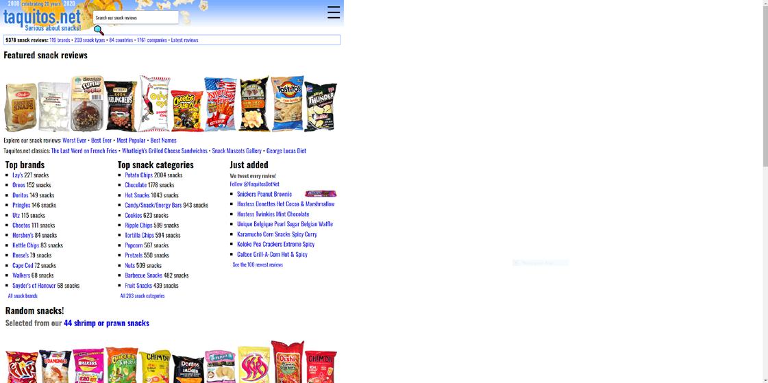
Taquitos - (Direct Competitor)
Taquitos is notable in being one of two websites that I could find that was designed to review snacks from around the world. Even though it fills the niche I am trying to create an application for, the engagement for this site is incredibly low, as it averages two page views a day.[7] The website is very dated from a UI/UX standpoint, with only half the screen being used on the desktop site, as well as an excessive amount of text on the pages, with no room for organization. Because of the dated look, it’s not only hard to access information on the site, it’s difficult to know whether the information is current or even trustworthy. It’s also not clear who or what is responsible for the reviews, making the reviews as trustworthy as review blogs are.[8]
Advertisement

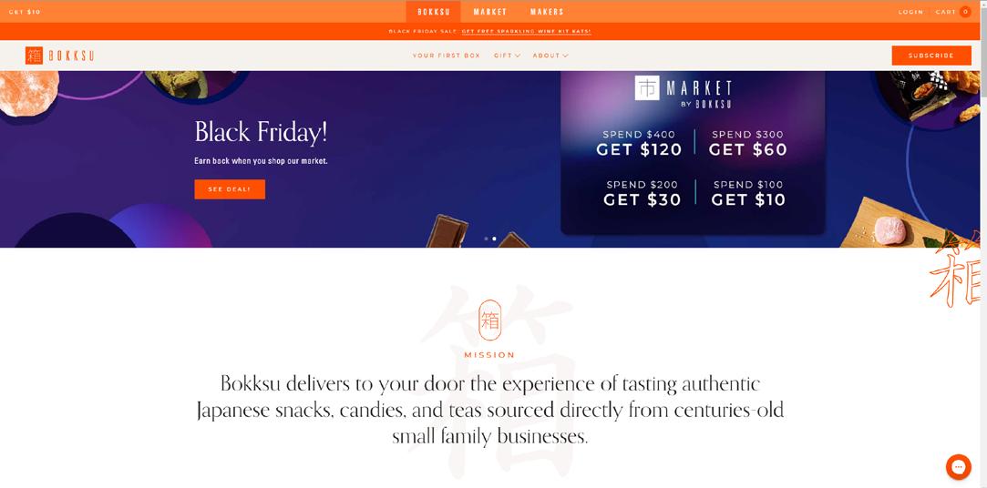
Bokksu - (Indirect Competitor)
Bokksu is a subscription service in which customers receive a crate of hand-picked snacks every month, curated by the company. On first impression, the site is beautifully designed and very inviting. The design is minimal and takes inspiration from Japan while being its own entity. The manner in which subscription boxes are a competitor to the snack application is in its goal of getting users to try Japanese snacks. There are some constraints in the medium, however. Users do not get to choose what snacks they receive, which is both a positive and a negative, though the application will be more about giving users freedom to choose what they want. The other limitation that Bokksu has is their selection. While admirable in its partnership with artisan Japanese confectioners, those are not products that the average user can be expected to get their hands on, making those snacks a hard sell to my audience. My application will try to be more
accessible to users by cataloguing snacks that can be purchased at ethnic markets or even their local grocer.[9]

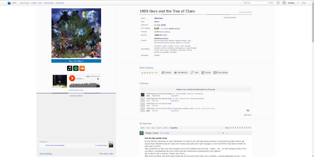
Rate Your Music
Rate Your Music (RYM) is a very conceptually similar site where users curate, rate, and recommend each other music from all around the world. While the draw of the site makes a strong case for users to stick around and continue using it, the application itself is very poorly disorganized and has not been updated for a long time. Finding any music that isn’t randomly highlighted on the home page or known to you previously is an immense challenge, which makes what should be an important aspect of the site very unappealing to use. The user interface is not friendly towards new users, and it’s often a complete challenge to do something as simple as recommending an album for your friends. That said, the ability to catalogue your own reviews in an organized manner is a huge boon for those who like to listen to and rate albums, which is what
keeps users returning to the site even if the user experience and interface are infamously subpar. There was an intended update called Soniqs, which was supposed to fix the UX/UI from the ground up, but most users stick to the original site as Soniqs has not been updated. [10] Even after an overhaul in November, the RYM experience still needs more fine tuning to reach more users.
Conclusions
With the investigations into consumer trends, there are two strengths and weaknesses to keep in mind when creating the product, gathered through analyzing the competitive landscape of the snack application
Strengths
Allow users to easily generate content for you. One of Rate Your Music’s best features is the community and its vigilance in cataloguing music. The creators do not have to make all the listings and significant development time could be spent improving other aspects of the application.
Make identifying snacks as easy as possible. One important barrier to cross for snacks from other places is to make sure that the information
is accessible in English so that users can make informed decisions about the snacks they’d like to purchase without risking dissatisfaction or a health emergency if their diet doesn’t allow for certain food items.
Weaknesses
Keep the Halo Effect in mind when designing your product. The trustworthiness, perceived quality, and engagement of an application are correlated with the quality of the application’s design. This goes both ways, so making sure the application is visually appealing to its users is a high priority.
Don’t make users fight the interface. Many successful applications that are analogous to the snack application fail to make the overall experience enjoyable because any additional features beyond the very core functions of the application are painful to execute as a user. Usability can coexist with aesthetics so long as the design of the application is user focused.


