
SELECTED WORKS UNIVERSITY OF LIMA | BARCH 2021 2018 -2020
RODRIGO AREVALO DESIGN PORTFOLIO
dear reader,
This is a compilation of four stories told in, what I’ve come to name, a visual projects portfolio. My approach to every project I’ve touched is normally to create a caracther out of it, to make up a storyline that can make me understand the insights and design in a more empathetic way.
I consider it to be visual because it focuses on the idea of following a thread through pictures and diagrams, which I have chosen to explain each project the most accurate way possible.
I selected this works out of my other projects because I find them to be relevant in today’s reality and they portrait meticulously my interests in the architecture field. That’s why I’ve labeled them in 4 keywords, 4 narratives, 4 characters. From the undeniable right of being able to access a place, to the astonishing advances of techonology in society.
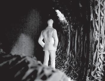
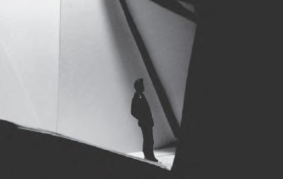
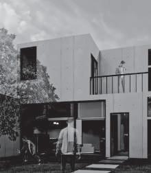
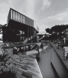
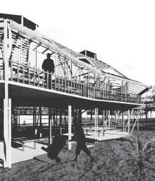
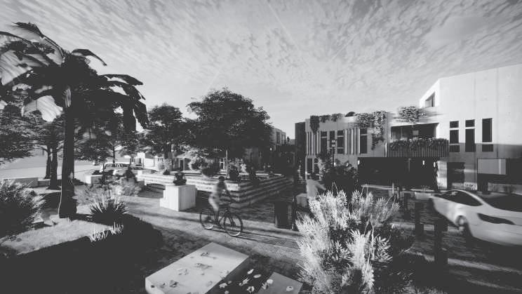
I hope that at the end of this reading my intentions and values in architecture become clear, as well as my future plans regarding the topics showned in each project. Thank you from the bottom of my heart for taking the time to go through these next pages.
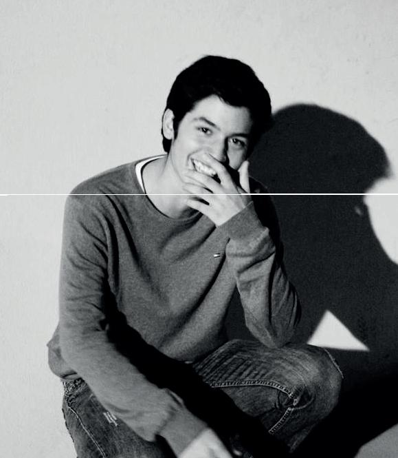
Rodrigo

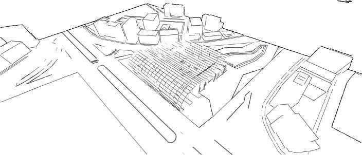
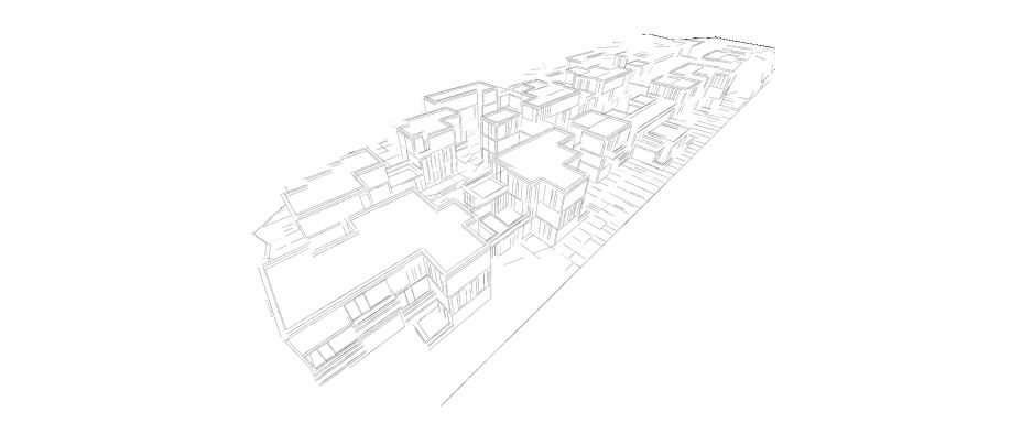
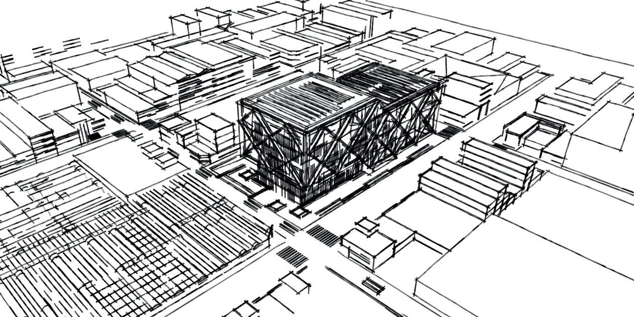
1. CEDAR Arts and recreation centre for the disabled Accesibility Individual project Movement Individual project Living Individual project Technology designed with daniela flemming Multifunctional bus station Post-pandemic housing complex Data Center and Communitary Service buildings 3. back to life 2. CONNECTION 4. urban server 2018 2019 2020 2020
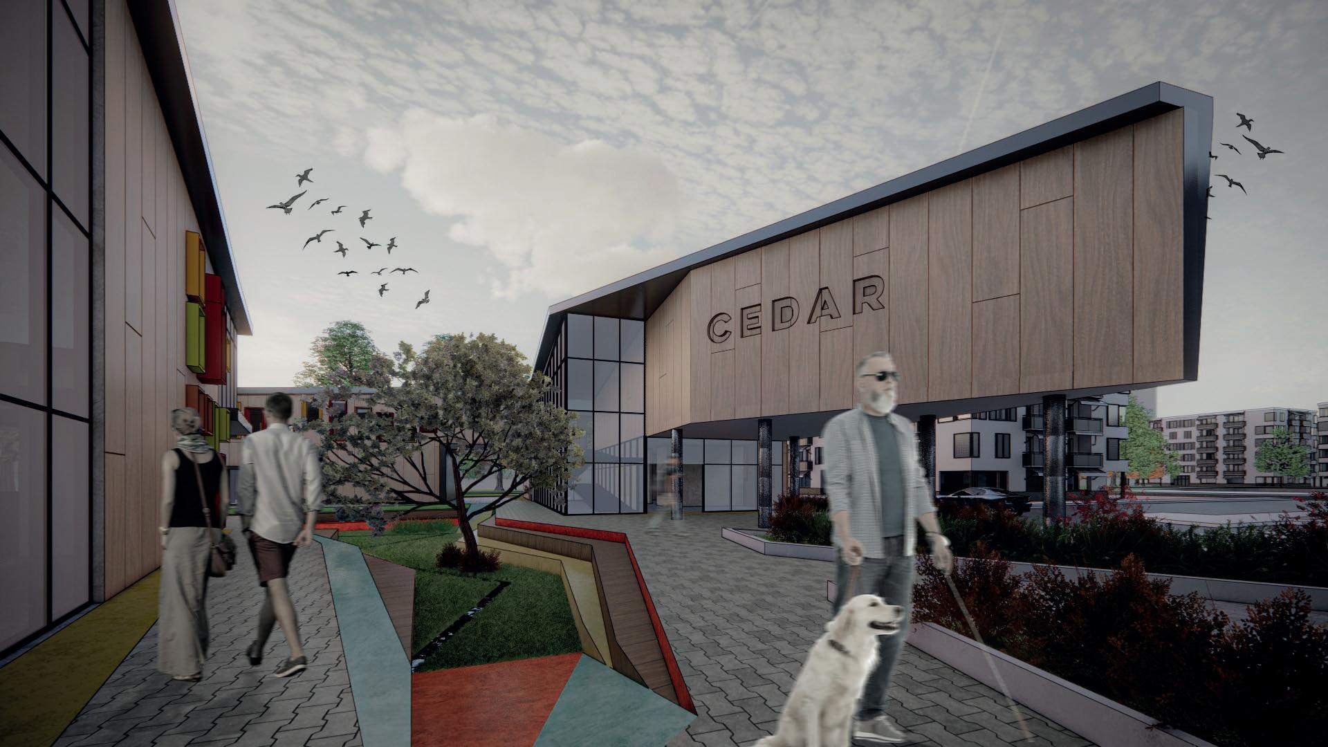
1. CEDAR
Arts and recreation centre for the disabled
ACCESIBILITY.
If we were to stop for a second and think about how easy it is for the people with no disabilities to walk, hear or watch around a building, we would crash ourself with a sad reality wall.
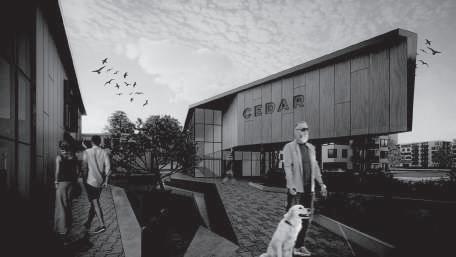
The project aims at the general public, however, primarily considering the rules established for accessibility for people with visual, hearing, or physical disabilities.
Taking ramps as the main protago nists, this proposal helps raise aware ness and think twice about the range of users that must be addressed when designing
Individual project 2018
THE SURROUNDINGS intersection
A line of axes was proposed from the streets that have access to the land and they are intersected.
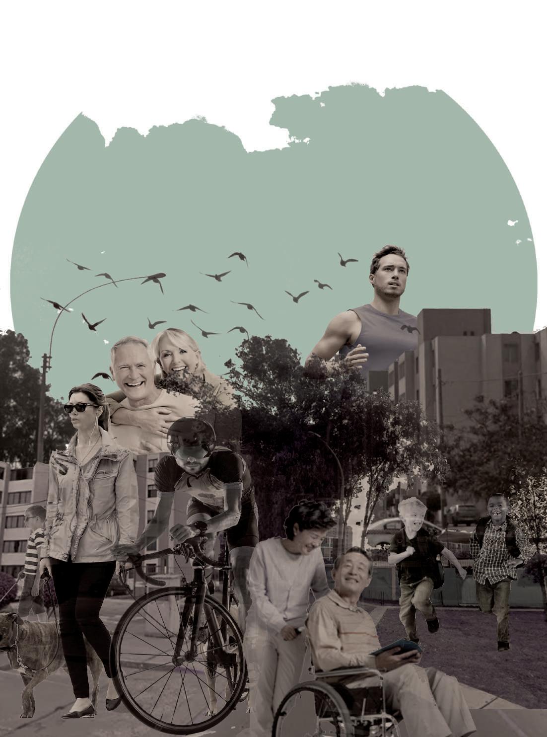
This building presents an extensive program with various activities that seeks to activate the environment in which it is located: a disused land confined between perimeter walls in the Limatambo housing complex. Elder people on daily walks, runners, bikers, people taing their pets out and kids playing are some of the activities to be found around the area of the proposed land. With a total area of 5,370.85 square meters, this land is confined between perimeter walls, creating a visual barrier for neighbors.
breakings
Establishing the axis-end relationship, the break points are shaped in the plan.
VISUALS
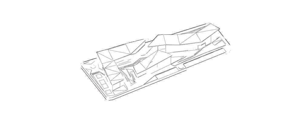
Finally, to generate a game of visuals inside and outside the project, breaks are created in the roofs.
The in and out of air and space quality is taken in consideration.

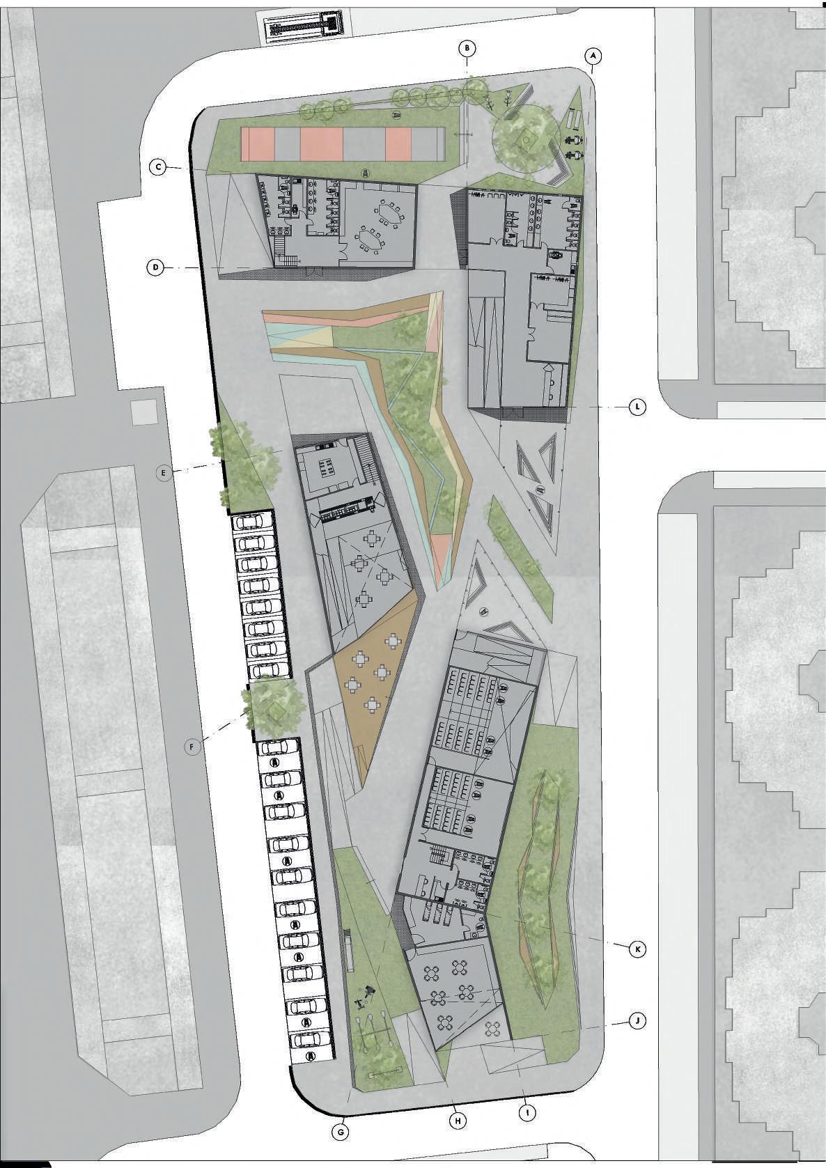
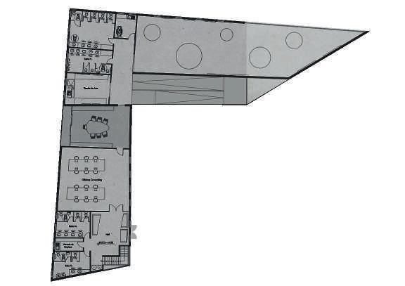
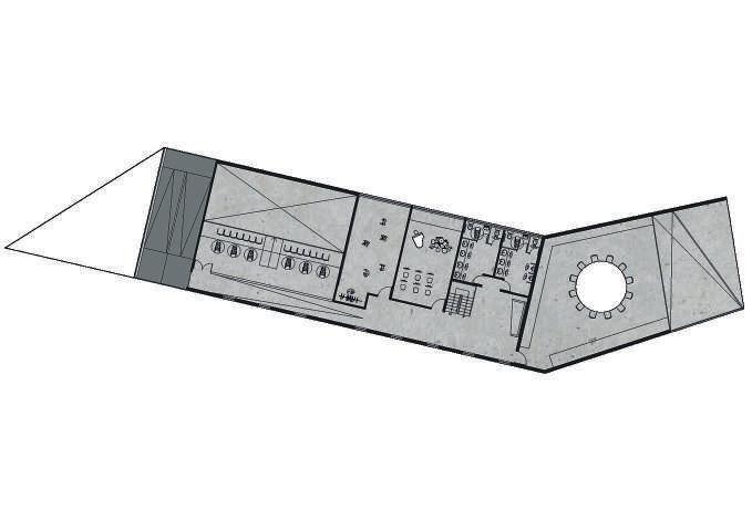
GROUND FLOOR PLAN
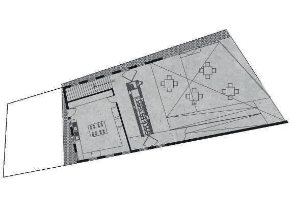
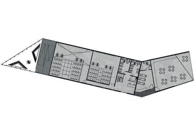

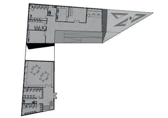
The project’s entrances blend with the neighbours everyday walking path. Every caved patio has access through ramps.
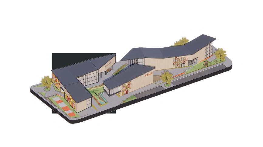
GROUP WORKSHOPS AND BUILDING MANAGEMENT RECEPTION OFFICE
Building A Customer service and offices
Main building for administrative purposes. Inside, customer service spaces, job orientation workshops, dance and yoga spaces are developed. Crossing the cantilevered volume, the administrative offices and meeting rooms are found.
FOOD COURT AND HEALTH SERVICES
AN EATING SCAPE
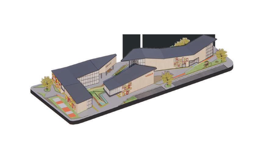
Food court and kitchen
The purpose of this building is to provide food for the workers in the area, of the centre and the participants of the workshops. It works as self-service. On the second level, the lounging space meets the best views.
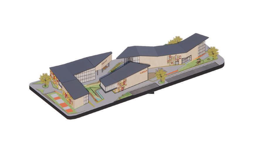
ARTISTIC AND INTELLECTUAL BUILDING
Building B Building C
The centre’s recreation area. Among its program is the auditorium, music and acting workshops and conference rooms. On the other corner, the public library seeks to serve mainly students from nearby schools.
Library Lv.1 and auditorium
READ OR FILM
streets v. the project
PUBLIC SPACES RECREATION
ARTS AND MANAGEMENT
Gallery and meeting rooms

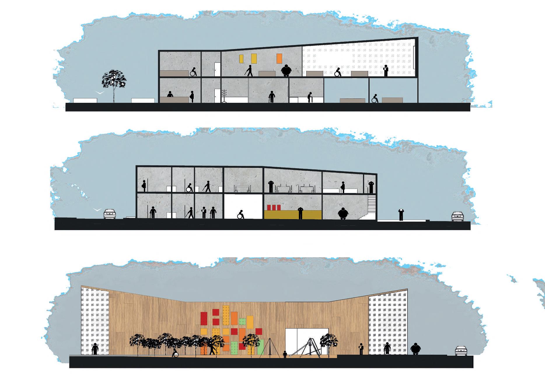

concept section



The best view
Terrace and services
THE MAKING OF ART
Workshops and bookclub

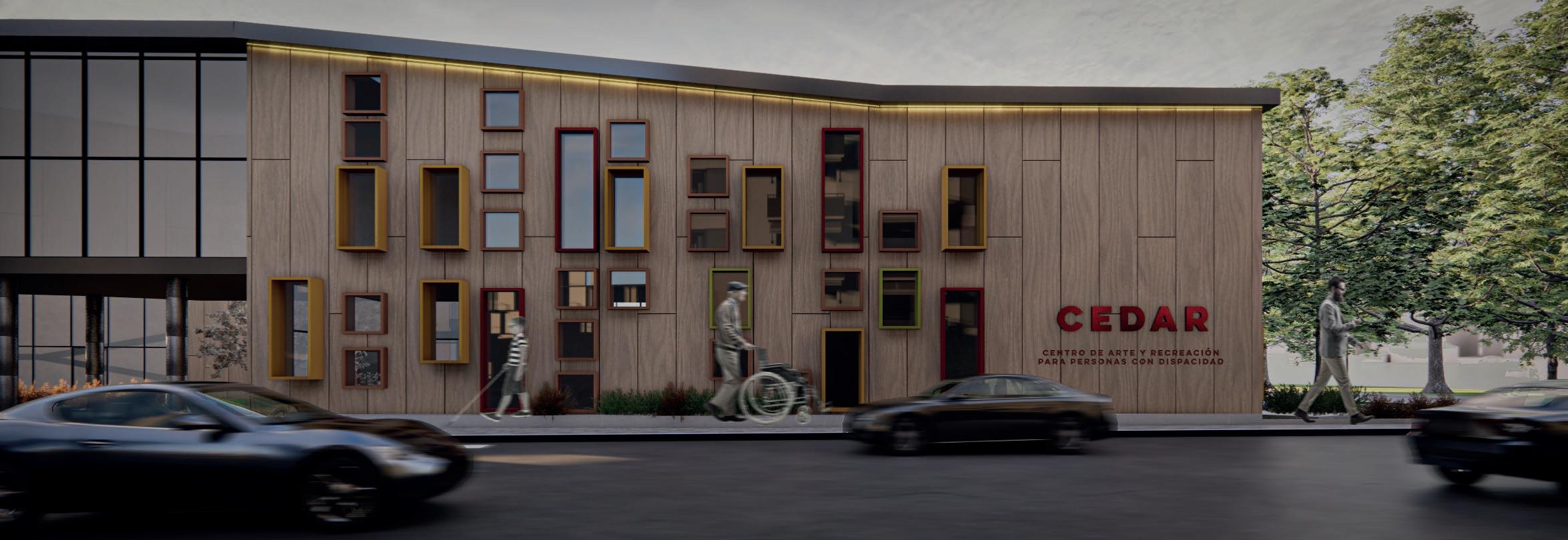

building a MAIN FACADE

2. CONNECTION
Multi functional bus station
Movement.
If we were to go outside for a second, all we would find ourself looking at it’s movement. People walking in the streets, the drivers in the roads, the buses full of people. All of them always heading somewhere.
The Peruvian public transportation system represents one of the government’s biggest deficiencies. Unregulated stops work as short stalls where buses park on the sides of the sidewalks, causing, most of the times, unnecessary traffic congestion.
95% of workers use public transportation everyday, only 45% arrive on time. The lack of a well-designed schedule shows off in the struggle of never knowing when a bus is coming or where exactly is it heading too.
Individual project 2019
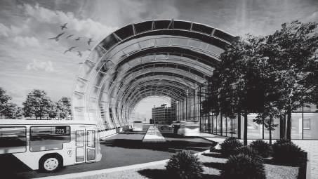
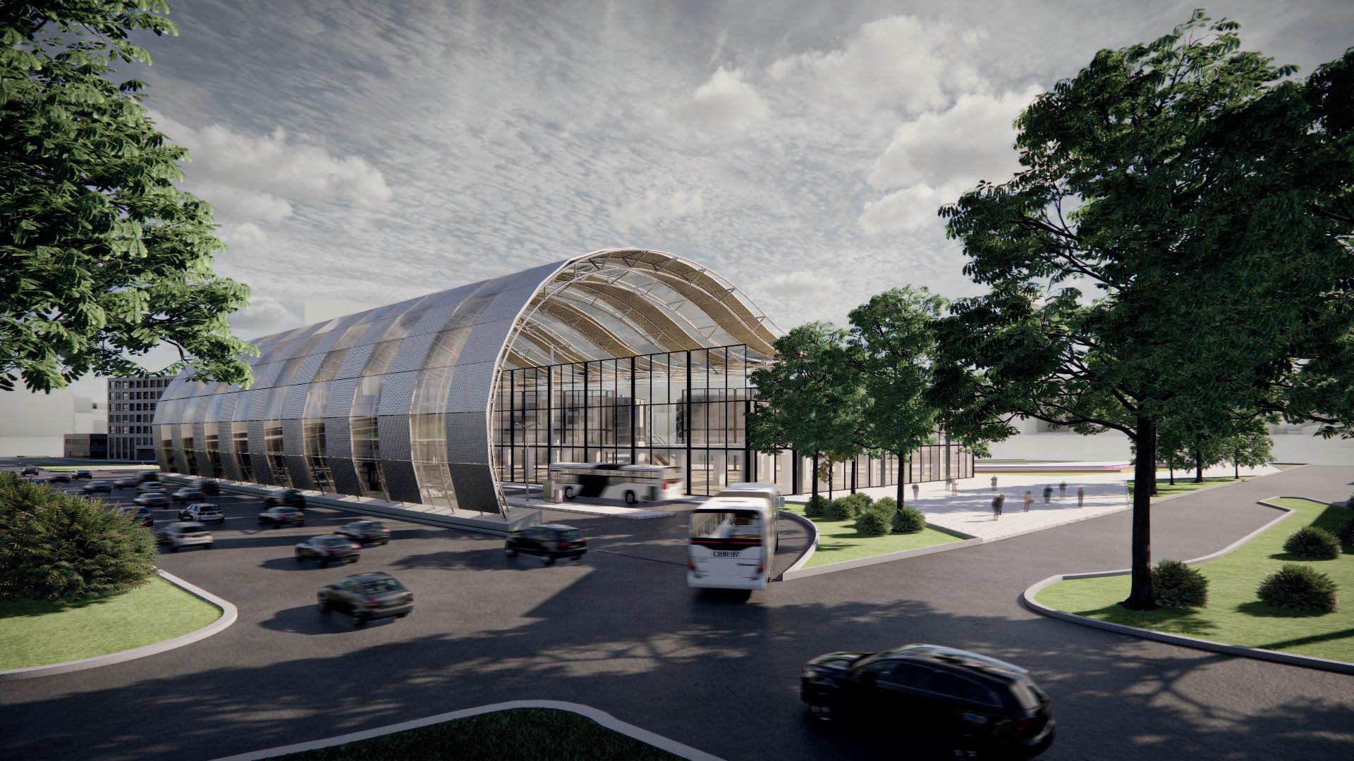
This project bases it’s relevance on achieving the intersection of urban routes at a single strategic point, within a suitable area to allow the buses’ tight agenda to function in a organised and efficient system. In addition to fulfilling the functionality of a bus stop, its program from within seeks to attend the needs of people living and working in the immediate surroundings.
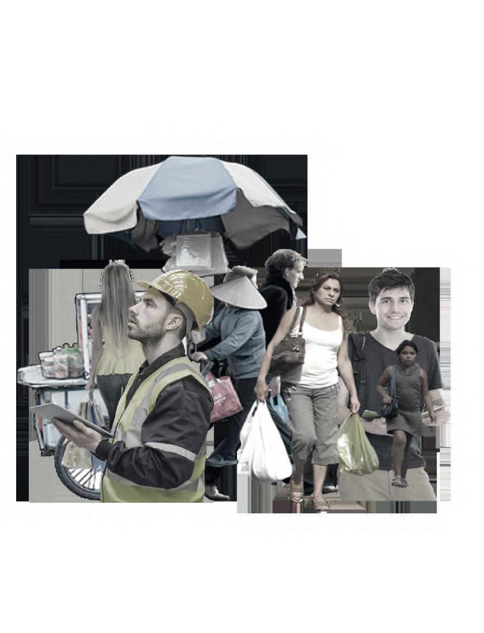
The proposed program is a shopping center that includes a food court as its main space. The analysis of the area shows that almost 70% of the surrounding population is dedicated to local commerce or small-scale industry, but that the presence of meeting and food spaces is scarce and needed.

WHAT HAPPENS IN THE AREA?
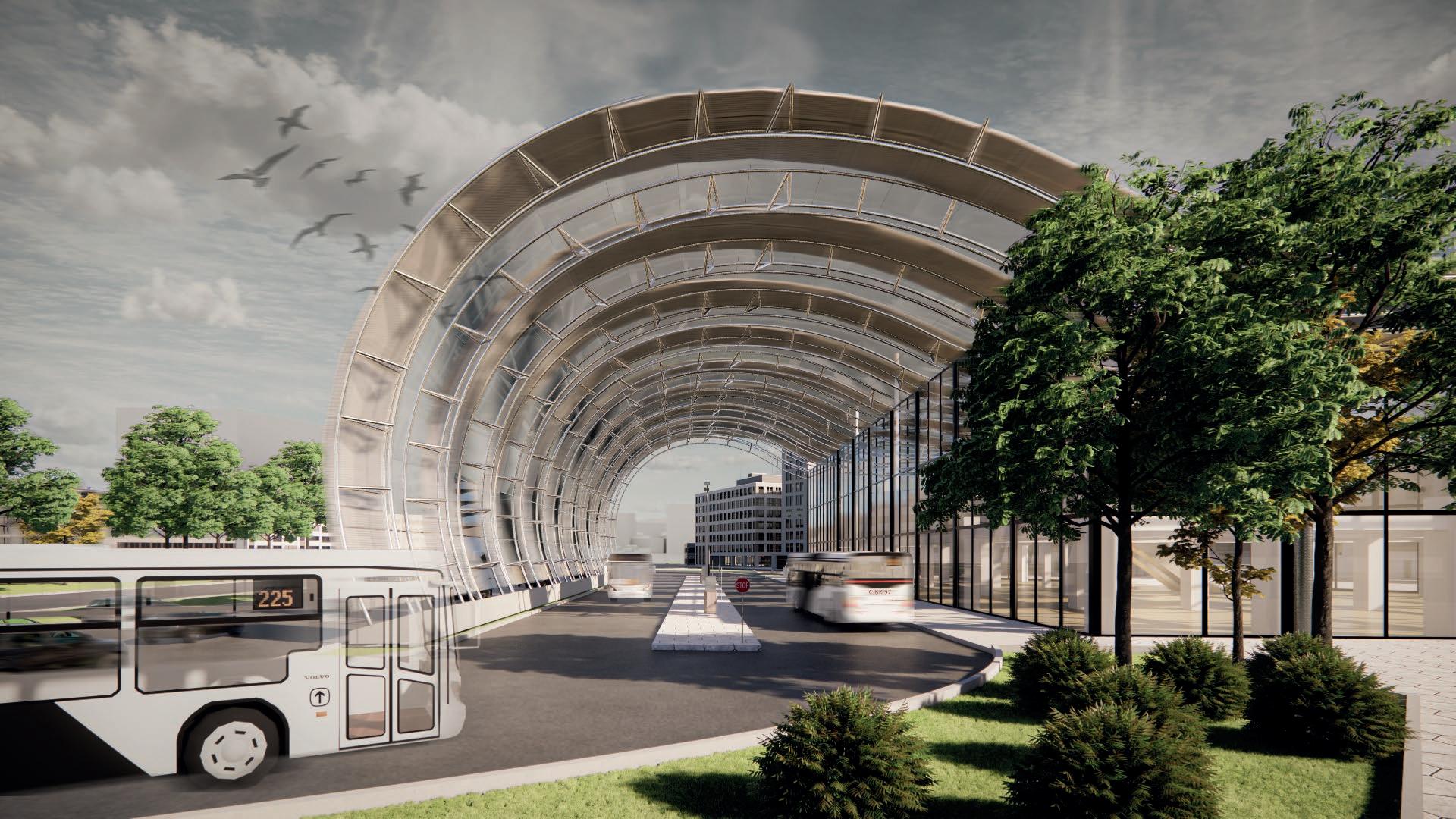
The project presents as a roof structure the unconventional geometry of a waving curve, which becomes an essential part of the final result of the proposal. It is meant to represent the rising of the ground to create the projects coverage in a shape that allowes the bus stops to have enough space for its functions.
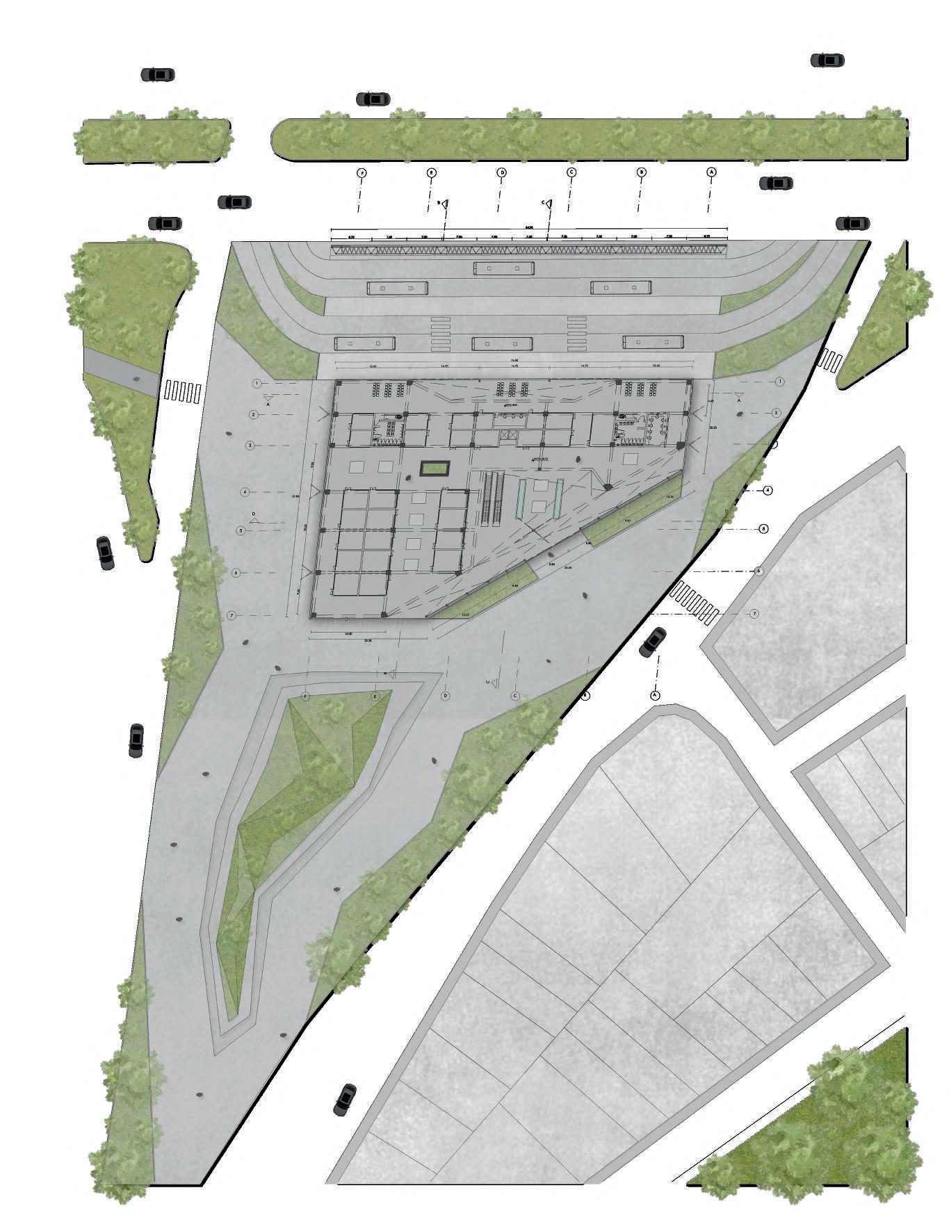
streets v. the project RENTED STORES BUS STOPS
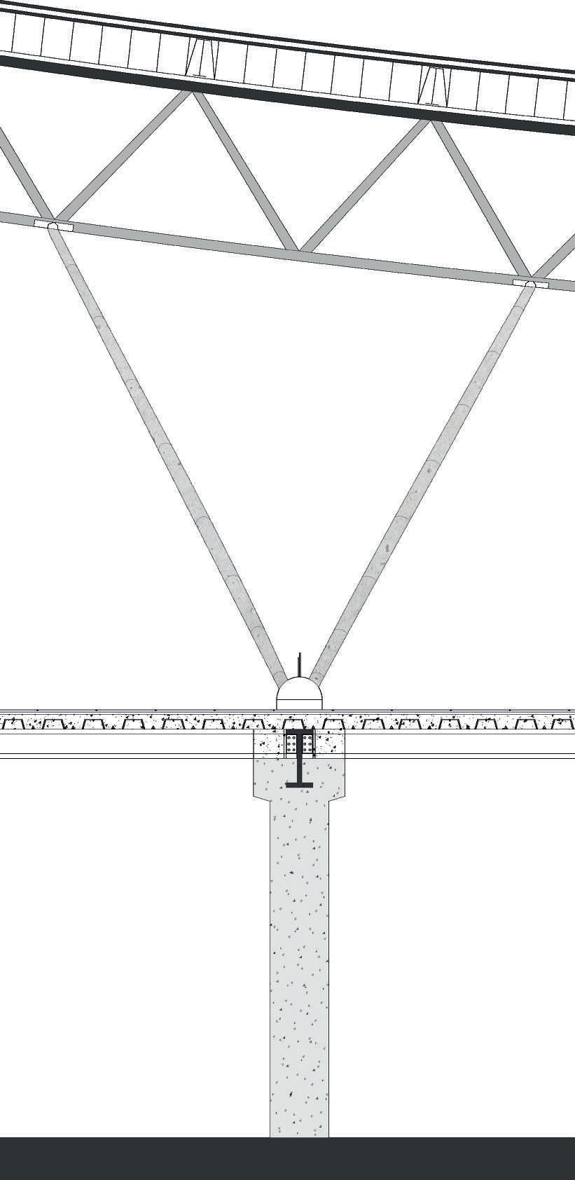
GROUND FLOOR PLAN ROOF STRUCTURE ELEMENTS
The lower level shows the development of the project through the bus stops and the shopping center.
Exterior coating of metal plates
Truss system Reinforced metal brackets Ceramic coating Ceramic coating 60 x 60 cm. Concrete column Metalic deck Secondary joists Metal plate for bolting secondary joists
Bracing bar system
FRONT LOOKING
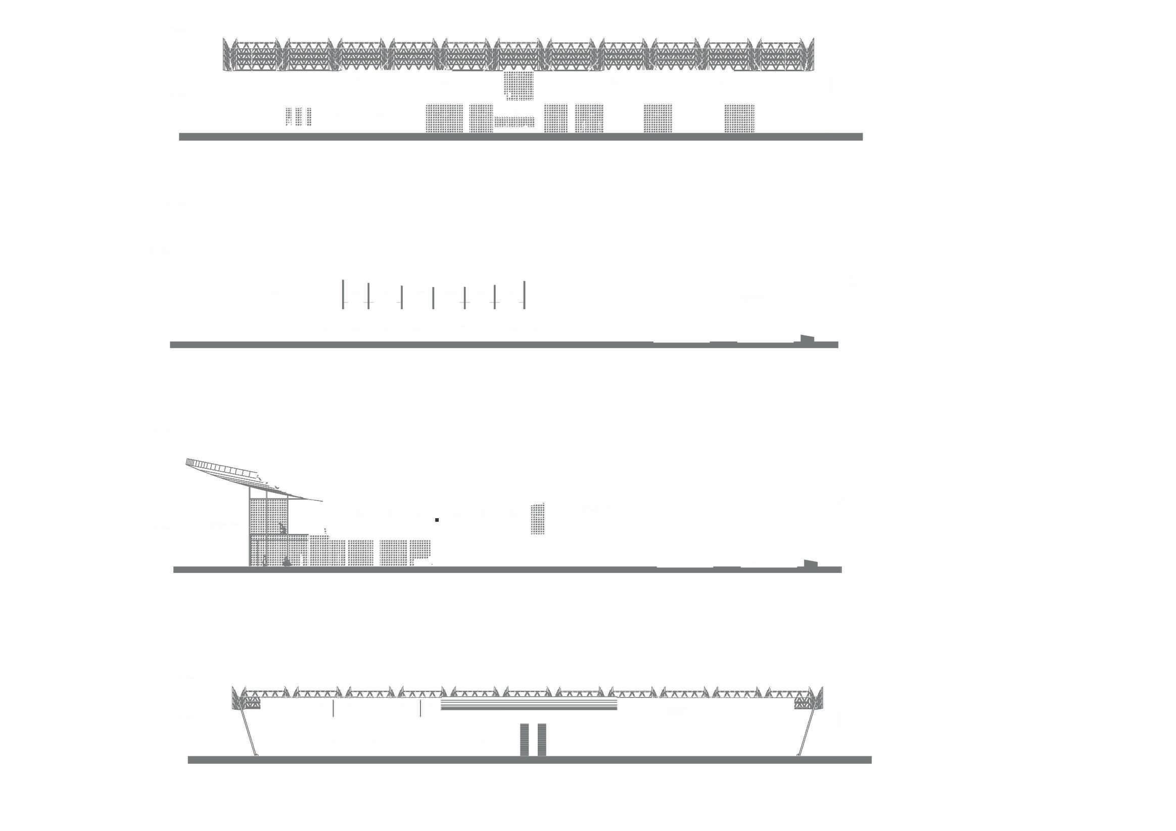
The second level is entirely dedicated to the food court. Section shows the projection of the structural beams o f the wrap-around roof, which ends up being the visual attraction from the inside.
curve section
DOUBLE HEIGHT
The food court’s area is developed around an L-shape structure basis from the ground level. There is a visual conection between the secondary entrance to the building and the court.
CONCEPTUAL MODEL STRUCTURE BASIS
The project’s main goal was to understand complex structural systems. The model was made under the first understandings of this matters.
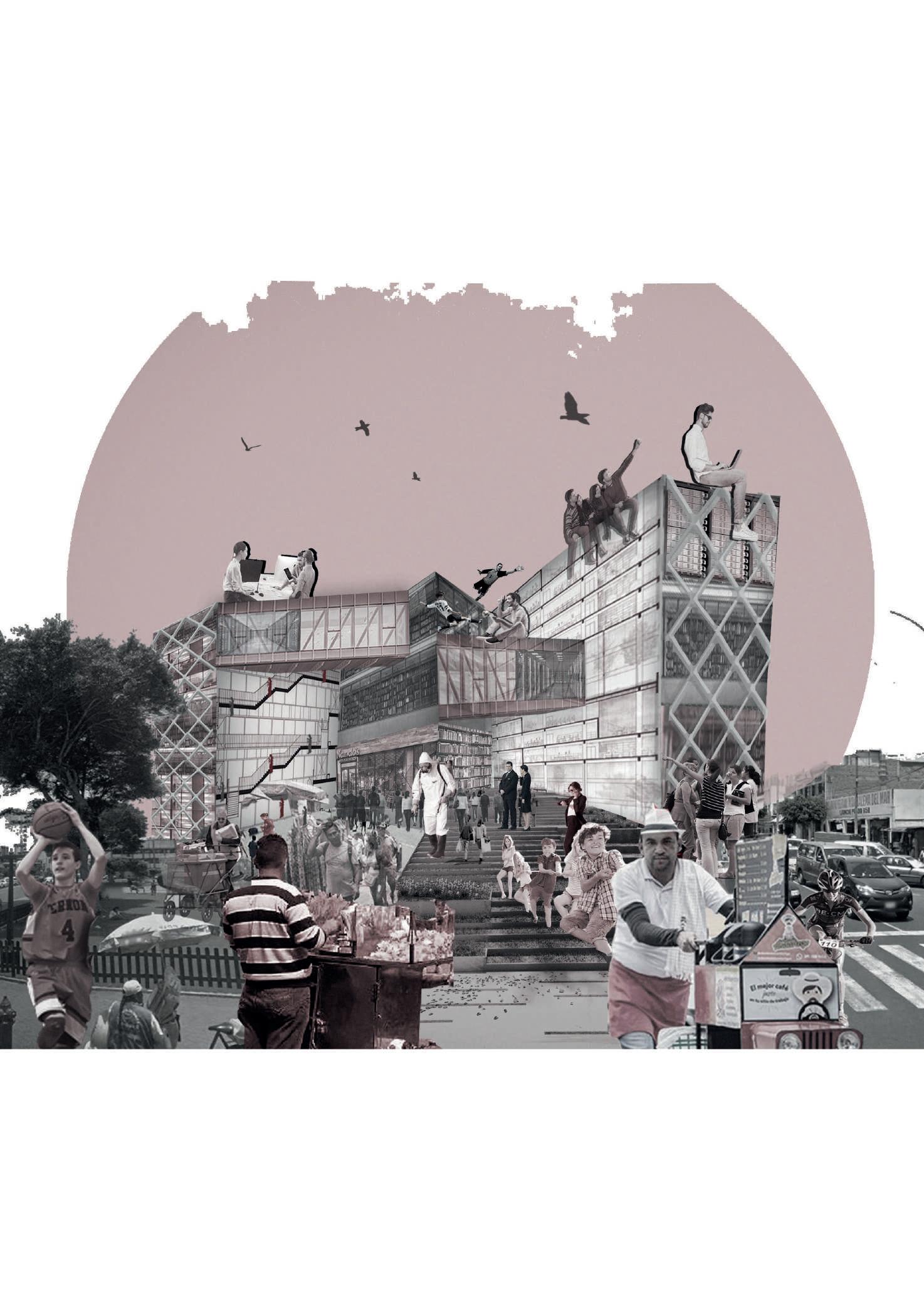
THE IDEA OF THE PUBLIC SPACE
BACK ELEVATION

The roof is a extraction of the ground up. The public area for recreation was thought as the space that penetrates the ground to create its edges.
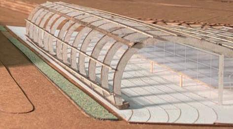
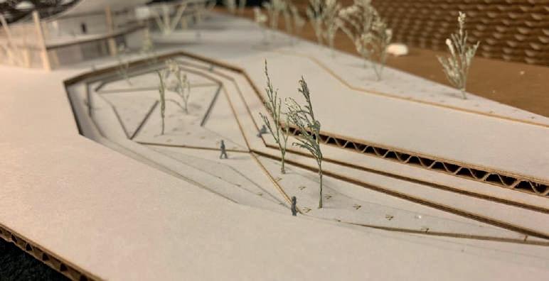
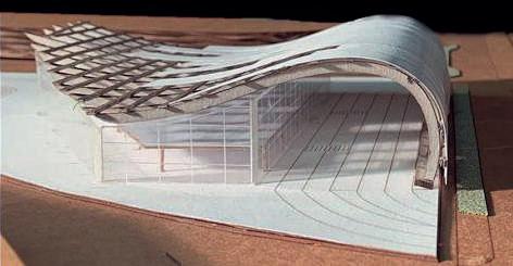
 The first conceptual model shows the funcionality of the bus ramp in contrast to the building itself. There is a first idea for the roof covering.
The bus stop occupies the front of the building, whilst the sales modules are located along the entire length and width of the area.
Spatial conection through automatic stairs between the food court and the ground level shopping centre.
EXPLOIDED FUNCTIONALITY
Lorem ipsum dolor sit amet, consectetuer adipiscing elit, sed diam nonummy nibh euismod tincidunt ut laoreet dolore magna aliquam erat volutpat. Ut wisi enim ad
FROM THE TOP DOWN
The covering. Perforated zinc panels and slightly frosted glass panels were distributed in large strips.
The structure. The truss systems fall upon the main framed structure of the building .
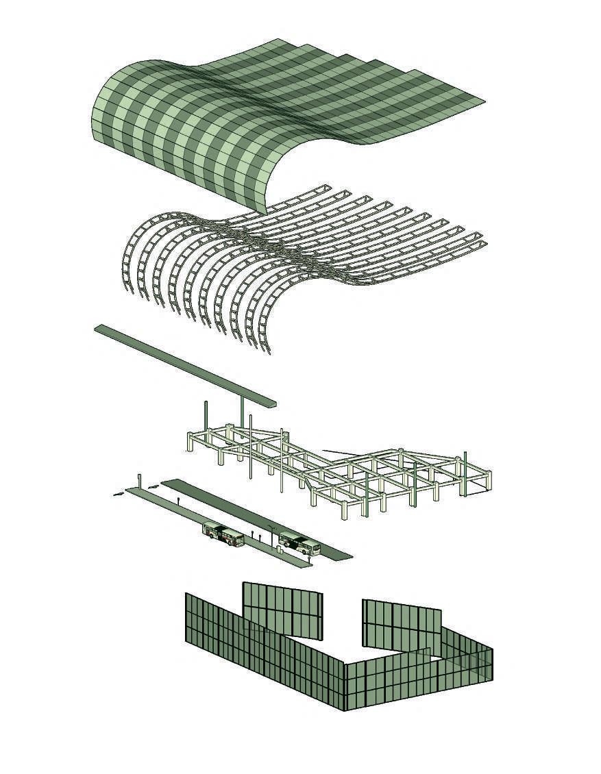
The path. The bus stops are placed under the highest point of the covering structure.
The skin. Glass panels are modulated to close the main building and create the fantasy of a floating roof.
GENERAL VIEW BUS ENTRANCE
 1. 2. 3. 4.

3. BACK TO LIFE
Postpandemic housing complex
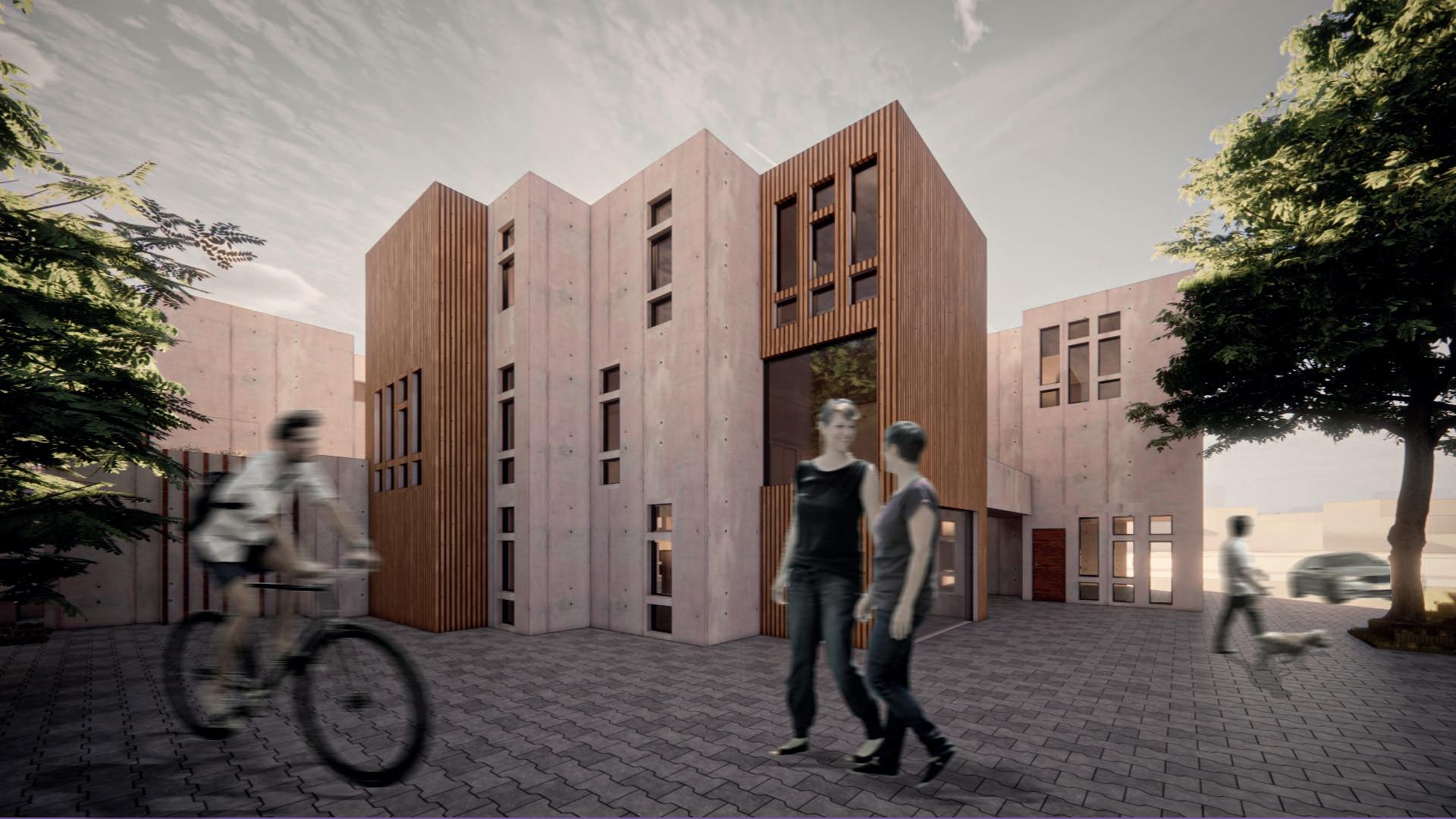
LIVING.
The concept of living is broad enough to be able to take it as a starting point in this project.
however, after the year 2020, where the COVID-19 pandemic teached us new ways to use the spaces inside the house, it can be said that there is a post-pandemic model to deal with in the every day.
Citizens will no longer have the same momentum to relate physically and the neighborhood relationship may be affected. This situation allows us to think of a housing unit capable of take family and neighborhood relationships and give a new value to social interaction. This projects presents a prototype of the new interactive housing.
Individual project 2020
FIRST APPROACH the sorroundings
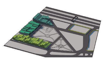
The project will be located near the panamerican highway. Understanding the access to it is the first step.
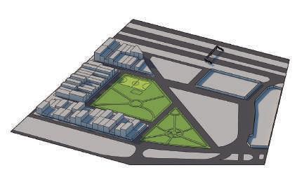
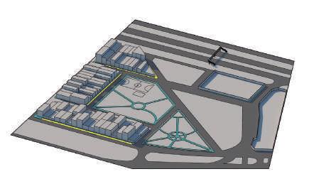

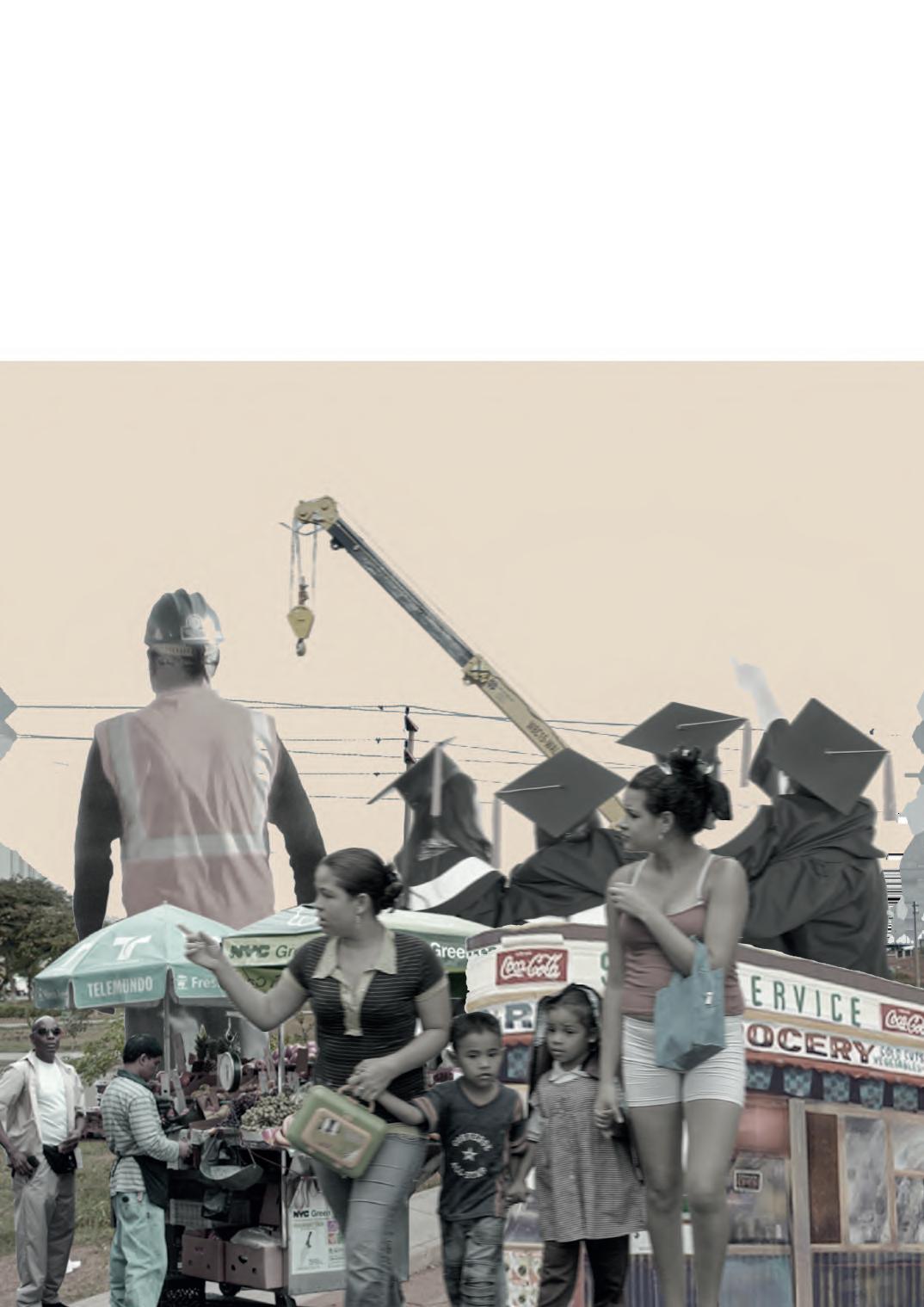
The neighbourhood can be shorten to the word chaos. different activities going on throughout the days, at the same time. from construction sites and markets to kids going to school andworkers taking the bus from the highway.
The land is, at the end, not interactive. it is surrounded by blind walls. this generates not only insecurity but also visual shortness for the neighbors currently occupying the land. in addition, most of the entrances from the pan american are blocked by bars or gateways. on certain streets this means potential. the objective is to transform this through location strategies and public space dynamics that will allow the concept of interactivity.
TRAFFIC ANALYSIS
there is a superiority of vehicular roads over pedestrian roads, which go almost unnoticable. these have 1.20 m. on average.
THE NEIGHBOURS
The blocks end up being segmented through the lanes. The structure of the lots does not allow interaction between neighbors and leaves the public space as residual.

recreation
the only two recreation spaces within the immediate area are parks that are only made up of sidewalk, which only generates circulation.
SHAPING THE FLOOR PLANS
assembly test of volumns
1,2,3
The houses will be develop by modulation creating different pattern for assembly. At street level, the volumes are joined so that they form 3 “l” shapes. The volume will be trimmed by voids and terraces-orchards.
assembly test of volumns 4,5,6
The volumes are deformed covering different areas on the ceilings of the first level. the orchards are oriented to the north and south and the top of the ground floor modules serve as a proposal for a public terrace.
Lastly, the roof of the second floor modules serve as a public space proposal. The vegetable gardens change position but with the same north-south orientation.
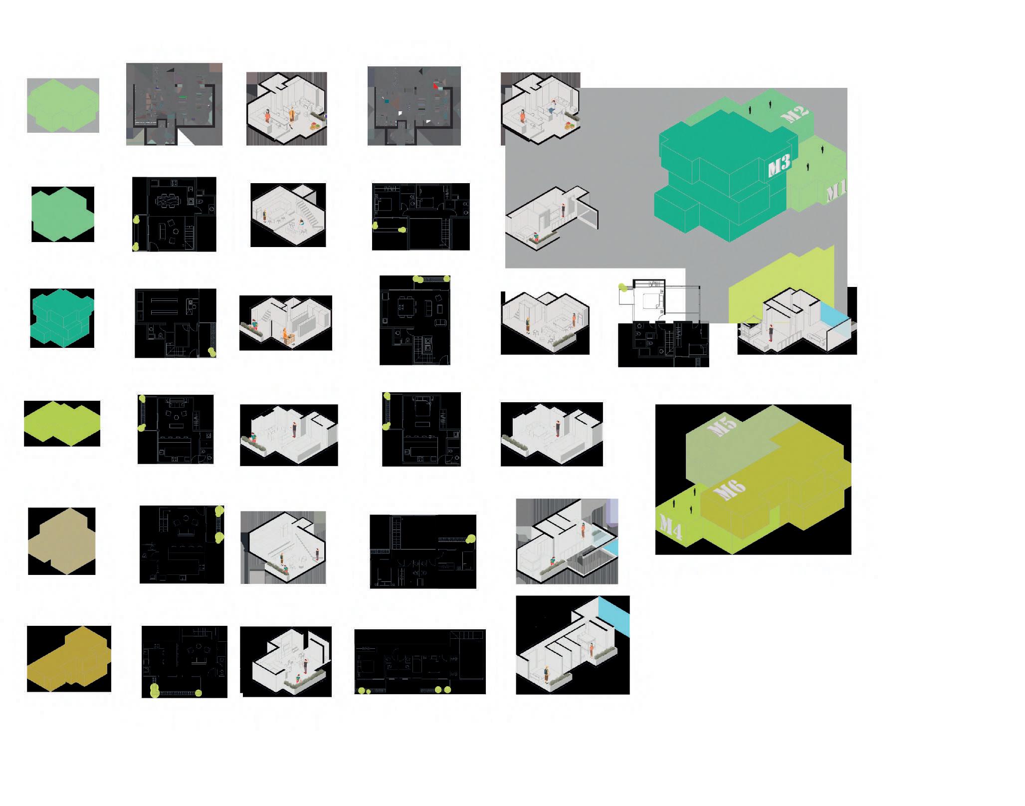
Along the design journey, there were many types of assembly. At the end, there were 3 types used for the project that then were spread around and joined on site.
 Type1
Final volumetric assembly 1
Final volumetric assembly 2
Type 2 Type 3 Type 4
Type 5
Type 6
1.
2. 3.
Accessibility and modulation
A direct visual relashionthip through recreation areas.


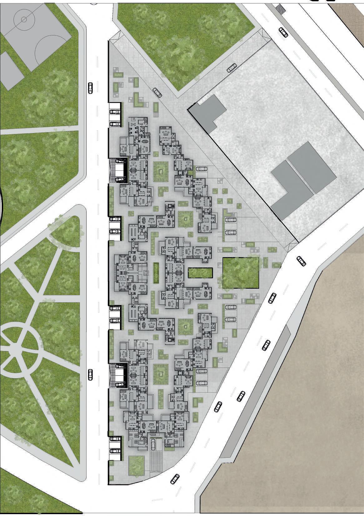


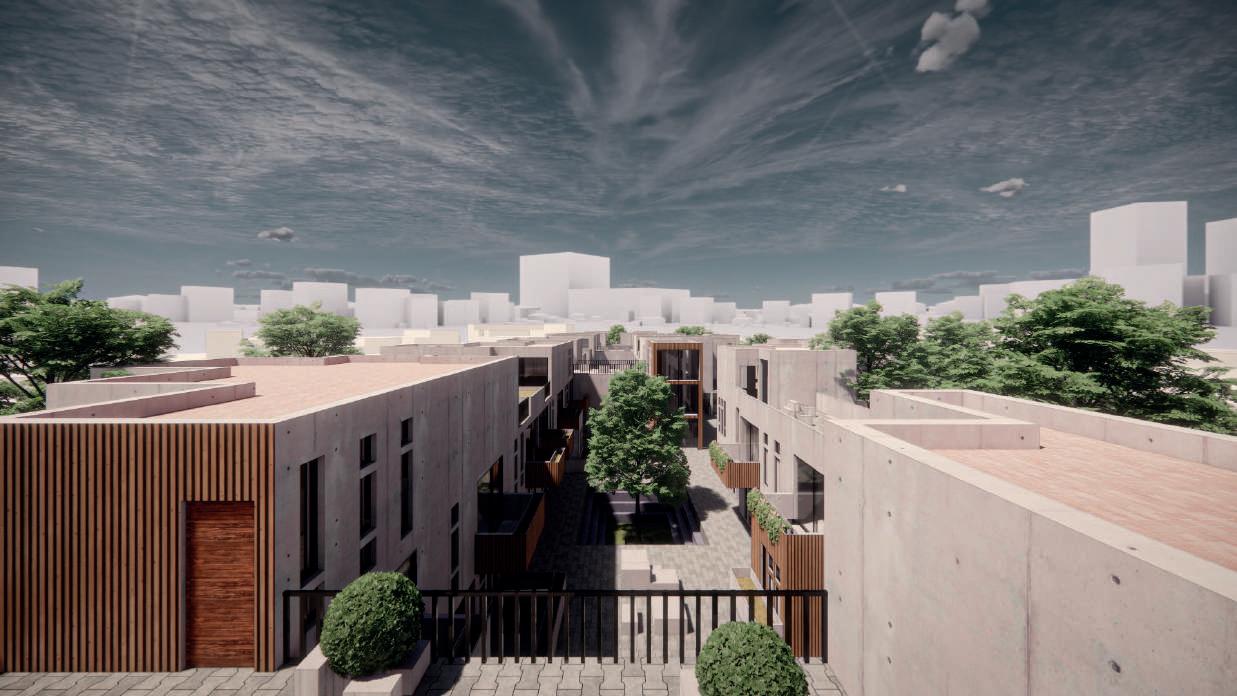 Inside the central communal space in the shape of a mini square caved into the ground
Rear public space designed to open the area for the walkers not to fell unsafe during the late nights. Steps are created to promote sitting and a park feeling to it.
GROUND FLOOR PLAN SECTION 1
SECTION 2
CENTRAL COMMUNAL SPACE view
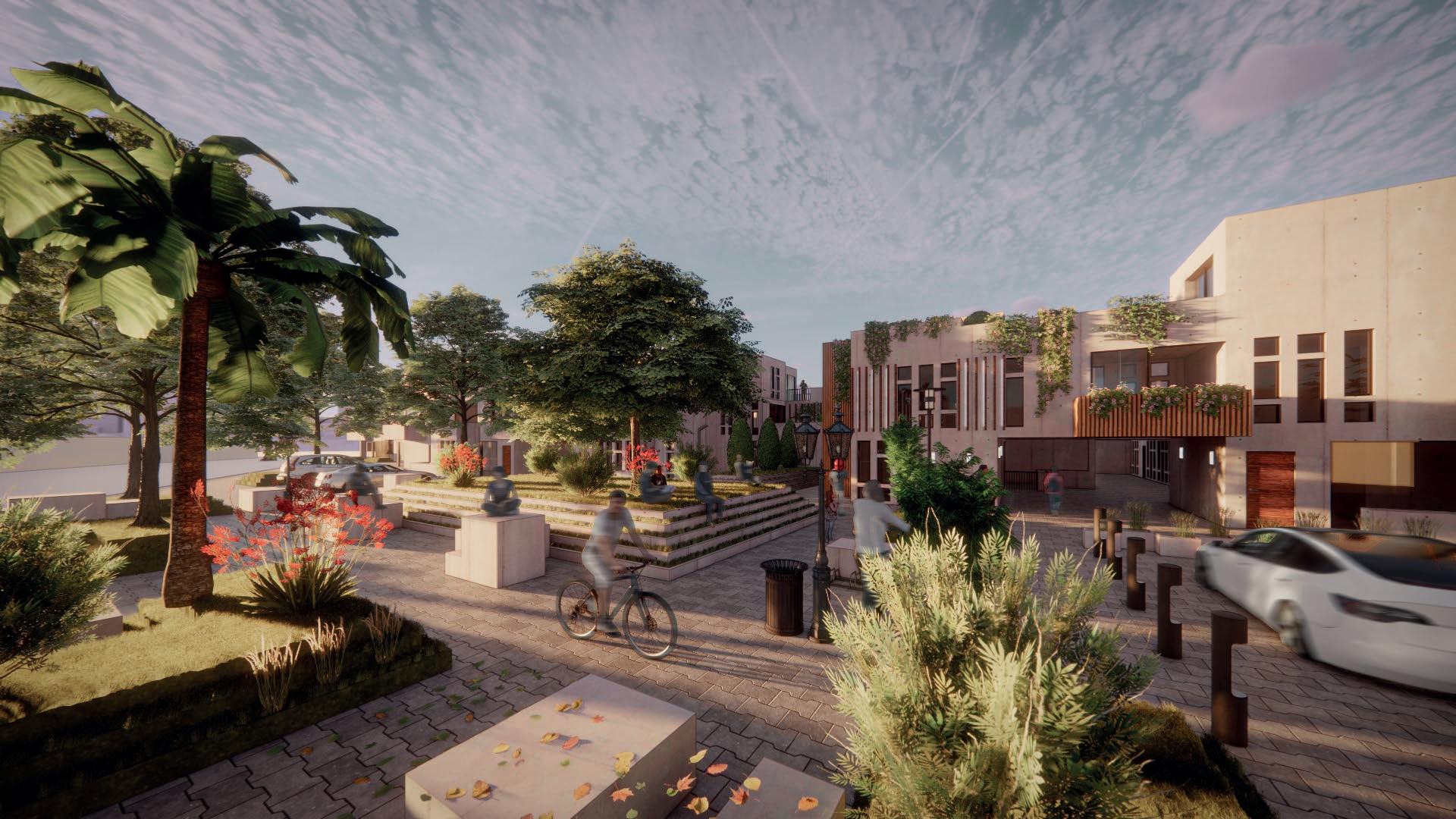
RECREATIONAL SPACE AT THE REAR

. UR B AN S E R V E R
D a t a Ce n ter a nd
C om m un i t a r y Se r vice buildi n g s
TECHNOLOGY.
Data has become the essential piece when it comes to information gathering or research. Our data is a minuscular part of a global network that, these days, is our everyday reality.
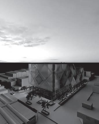
The goal of this project is to combine the approach of technology and data harvest to promote an optimistic view of the city, where the urban reality speaks of possibilities and architectural ideas.
The project should house a data center in the heart of the Magdalena district, but it will also explore how this center will coexist architecturally with a community services building aiming a sector of the city.
4
D E SIGNED W IT H D AN I EL A FLEM M IN G 2020
The concepts extracted from the analysis were used to generate a first instance of a building with public space and the data center surrounding this space. The possible functions of the community center, the potential users and diversifying the scale of the project, a certainly important aspect. We consider two areas of Magdalena, the public space and the commercial area. The façade structure of our benchmark, the Prada building, is also taken into consideration.

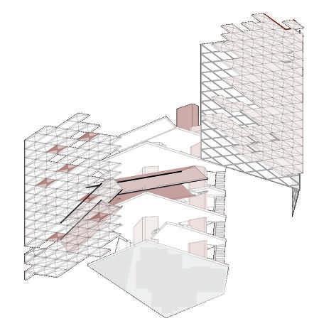
 The Prada building in Tokyo by Herzog & de Meuron was analyzed as a direct reference for the development of the project. Highlights include the use of horizontal pieces of program as structure and a surprising double facade.
FIRS T CONC E PT U A L IDE A PROJ E C T ANA LY SI S
Avenue Brazil functions as a connector of various districts and articulates each of these. Is the main avenue to access the project
THE CIT Y
Breaking the rectangular shape
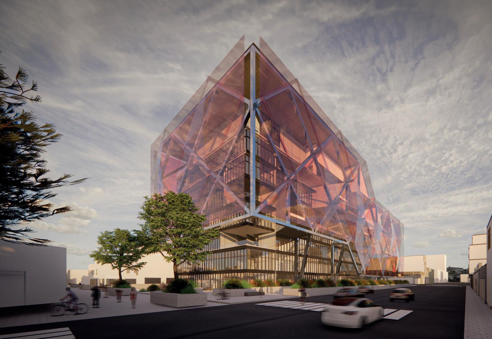
The proyect’s exterior skin follows the rectangular urban grid from the district. However, its approach to an innovative way of creating program in structure breaks it into a triangular secuence.

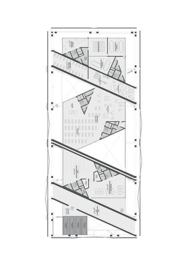
The upper floors of the building recreate the intention of a broken rectangle, creating program on itself.
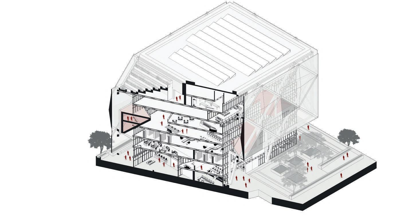
At some levels, the horizontal structure attached to the outer skin joins the triangular columns
SPATIAL RELATIONSHIP
Isometric section. Shows spatial connections

The columns go all the way up to the last floor. It was important to keep the structural attachement well though out.
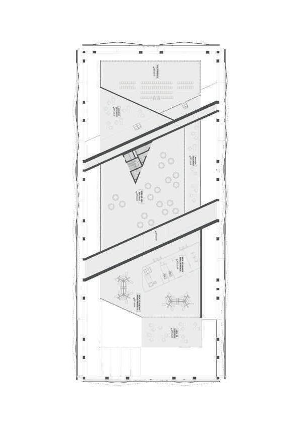
3rd floor GROUND FLOOR PLAN 4TH FLOOR 7TH FLOOR
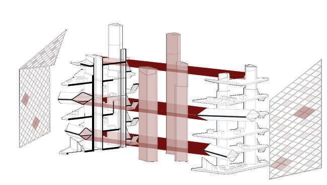
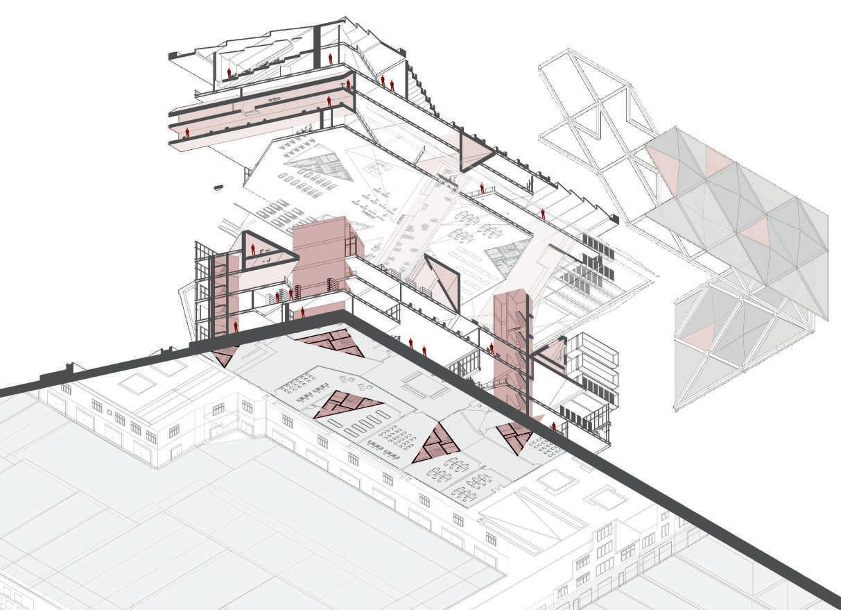
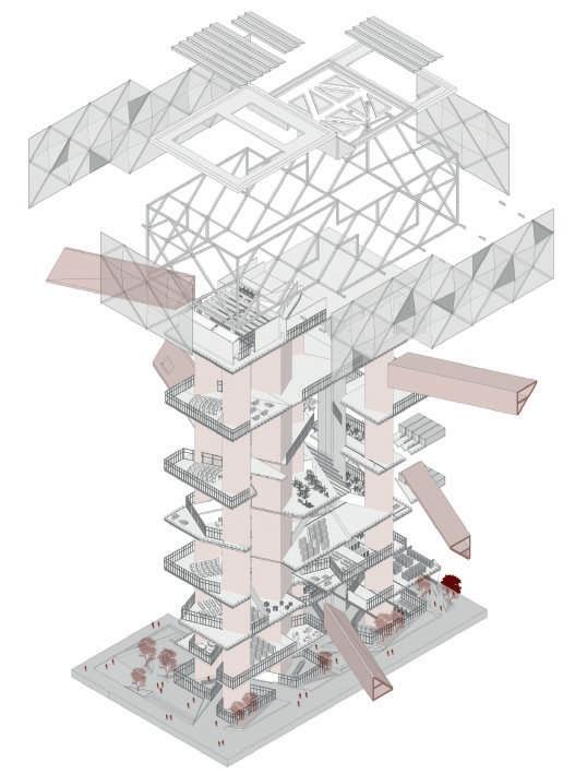
EXPLOIDED VOLUMN
A direct view to the inside of the building. and its components
STRUCTURE
Highlighted in red, holds the building together on its attachments

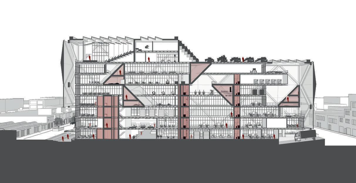
FACADE
Double structured facade. Steel holders and glass triangular panels close the building
LEVELS
The total 8 levels shape their floors to the existance of the structural points

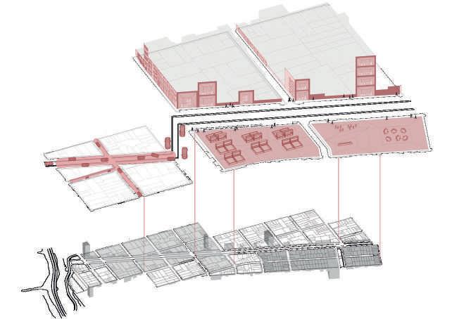
THE WORM DIAGRAM
Final diagrammatic drawing explains the project in its entirety. This begins with a worm view that allows the reading of the project located in the previously analyzed environment, to understand the hierarchy of this compared to the domestic and commercial scale found in the district.
A REPETITIVE PATTERN
The triangular pattern was meant to be repeated in the section view from the project. It was intented to have them attached to the horizontal structures.
Attachement points
Data containers away from the daily program
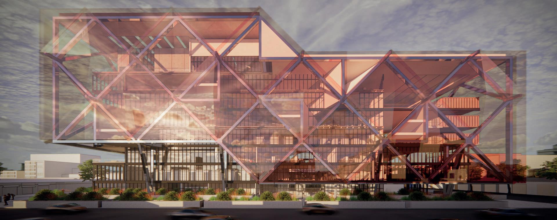
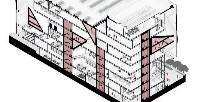
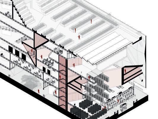
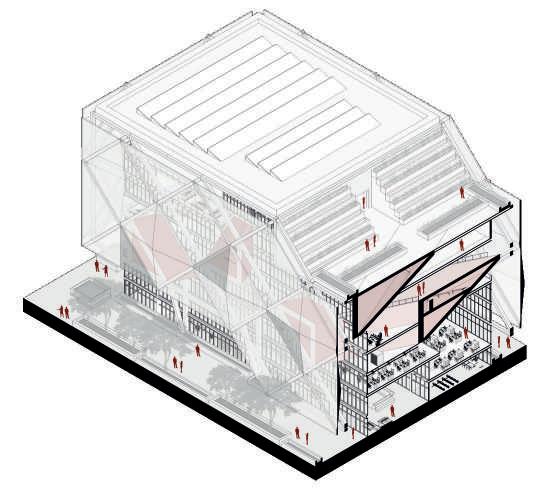
F A C AD E - STRUCTUR E D A T A CENT E R
Horizontal - Verticla connection
VE R TI C ALIT Y

+ CAMERA EYES
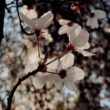
ARCHITECTURE PHOTOGRAPHIC COMPILATION
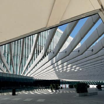
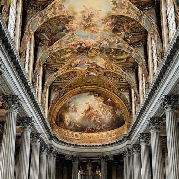
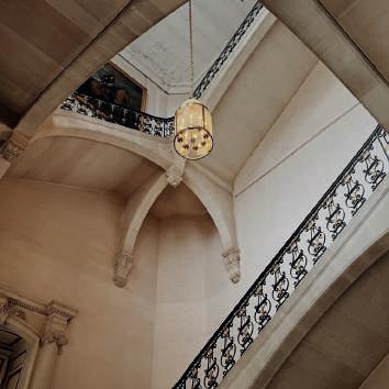
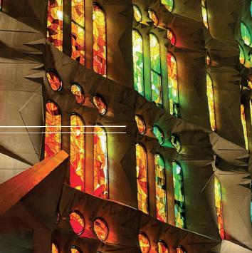
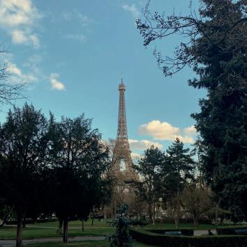
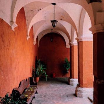
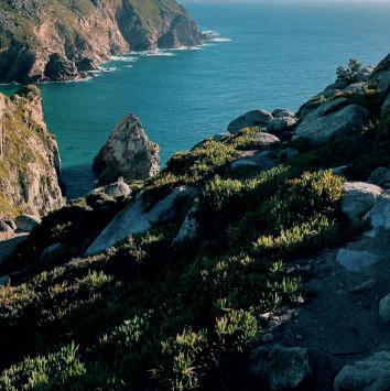
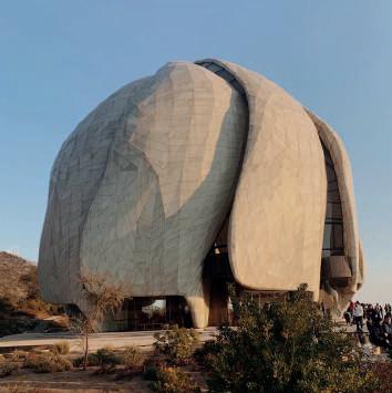
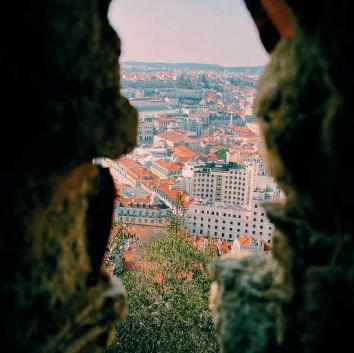
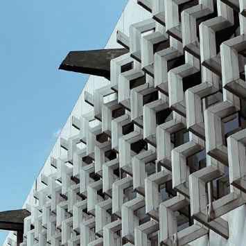
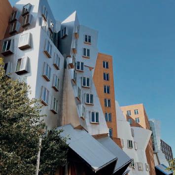
Over the last 3 years, I have envisioned architecture in a different perspective from the one I used to have. I turned trips and special visits into an experience and a challenge for me to portrait my views. However, I never planned it to be a touristic photographic session but a way to digitalize my point of view, as if I had a camera strapped inside my eyes.
Involuntarily, I started taking pictures of well-known buildings or landscapes considering perspective techniques and photographic standards. This is a compilation of the film roll inside me that has been filling up throughout these past times and that has motivated me to level up my own rules and get better and better at representing every single intention behind a piece of architecture in just a single photograph. I hope you find this satisfying and calming. This is my choice of closure for a portfolio that is hugely based on visuals.
PHOTOGRAPHIC WORK OWNED BY RODRIGO AREVALO
2019 - 2022
Arequipa, Peru. 2020
Mexico City, Mexico
Sintra, Portugal. 2022
Barcelona, Spain. 2022
Santiago, Chile. 2019
Lisbon, Portugal. 2022
Lisbon, Portugal. 2022
Versailles, France. 2022 Versailles, France. 2022
Santiago, Chile. 2019
Boston, USA. 2021
Paris, France. 2022
Dreams


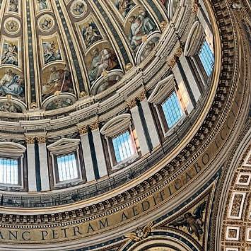
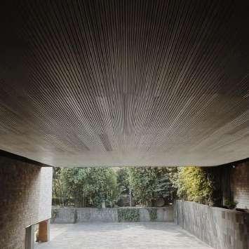

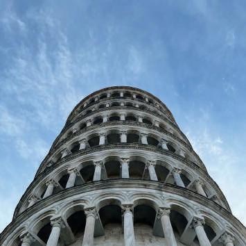
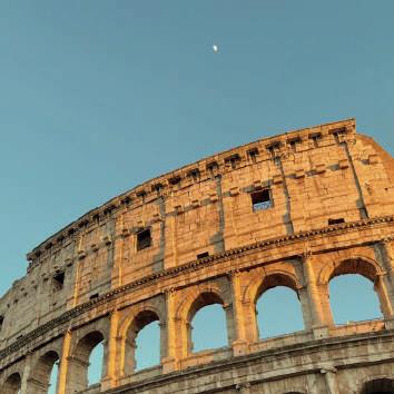
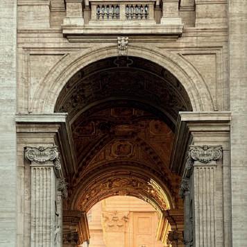
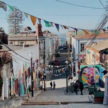
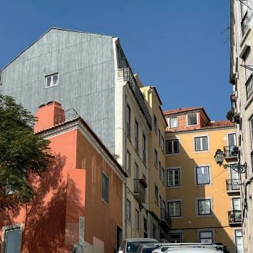
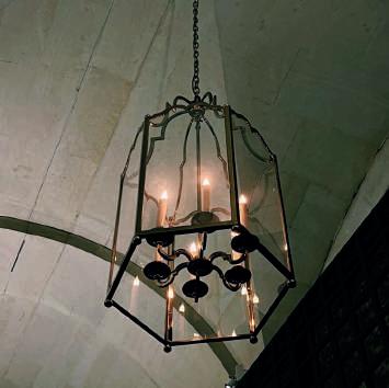
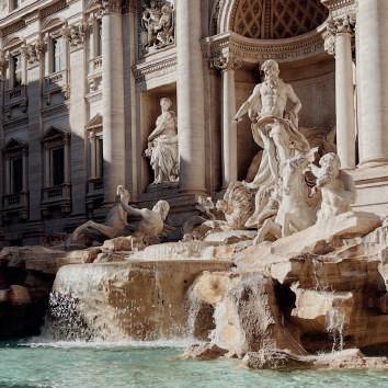
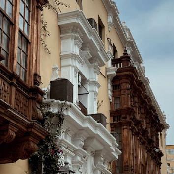
Words have been spread around forever about the definition of dreams. Whether they are the remains of our sleepful minds or a portrayal of our most ambitious desires. I picture an 11-year-old, elementary school version of myself when I think about the foundations of every decision I’ve made ever since. From that young age, architecture was the major I aspired to pursue, because of my love for crafted arts and logical science. London, architecture, technology, and people are the keywords when describing my life’s aspirations. I am aware of my youth, nevertheless, I am using it as a tool to keep learning and pushing myself to the limits. Constant learning is crucial, and as my curiosity strikes again, I have no doubt I will continue to study and grow as a person and professional.
 rodrigo arevalo
EXTRACT FROM APPLICATION STATEMENT
Versailles, France. 2022
Lisbon, Portugal. 2022
Vacitan City, Italy. 2022 Vacitan City, Italy. 2022
Lima, Peru. 2018
Mexico City, Mexico. 2022
Pisa, Italy. 2022
Valparaiso, Chile. 2019
Rome, Italy. 2022
Rome, Italy. 2022
Viña del Mar, Chile. 2019
Florence, Italy. 2022

SELECTED WORKS UNIVERSITY OF LIMA | BARCH 2021 2018 -2020
RODRIGO AREVALO DESIGN PORTFOLIO


 The first conceptual model shows the funcionality of the bus ramp in contrast to the building itself. There is a first idea for the roof covering.
The bus stop occupies the front of the building, whilst the sales modules are located along the entire length and width of the area.
Spatial conection through automatic stairs between the food court and the ground level shopping centre.

 1. 2. 3. 4.


 Inside the central communal space in the shape of a mini square caved into the ground
Rear public space designed to open the area for the walkers not to fell unsafe during the late nights. Steps are created to promote sitting and a park feeling to it.
GROUND FLOOR PLAN SECTION 1
SECTION 2
CENTRAL COMMUNAL SPACE view


 The Prada building in Tokyo by Herzog & de Meuron was analyzed as a direct reference for the development of the project. Highlights include the use of horizontal pieces of program as structure and a surprising double facade.


 rodrigo arevalo
EXTRACT FROM APPLICATION STATEMENT
Versailles, France. 2022
Lisbon, Portugal. 2022
Vacitan City, Italy. 2022 Vacitan City, Italy. 2022
Lima, Peru. 2018
Mexico City, Mexico. 2022
Pisa, Italy. 2022
Valparaiso, Chile. 2019
Rome, Italy. 2022
Rome, Italy. 2022
Viña del Mar, Chile. 2019
Florence, Italy. 2022